Prototyping with GPT-5.1, Bootstrap, and UXPin Merge simplifies product design and development. This method combines AI layout generation, a trusted UI framework, and real React code to create functional prototypes that developers can use directly. Here’s how it works:
- GPT-5.1: Generates layouts from text prompts using your design system.
- Bootstrap: Provides consistent UI components for reliable designs.
- UXPin Merge: Links design and development by using production-ready React components.
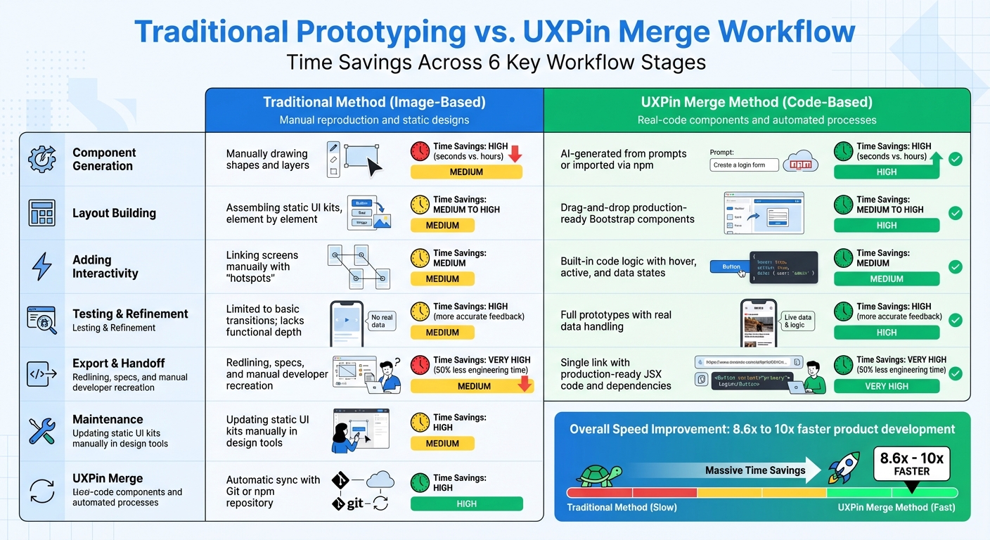
This approach eliminates static mockups, reduces rework, and speeds up workflows by up to 10x. Designers, developers, and managers can collaborate more effectively, ensuring designs align with production standards.
What you’ll learn:
- Setting up UXPin Merge with Bootstrap.
- Using GPT-5.1 for layout generation.
- Customizing components and adding interactivity.
Ready to streamline your design process and cut development time by 50%? Dive in to see how this trio transforms prototyping.
UXPin Merge Tutorial: Intro (1/5)

Prerequisites for Prototyping with GPT-5.1 and Bootstrap in UXPin Merge
Before diving into prototyping, make sure your workspace is ready and all necessary access is in place. UXPin simplifies the process by integrating Bootstrap and AI models directly, so there’s no need for manual library imports or separate AI accounts.
Requirements Checklist
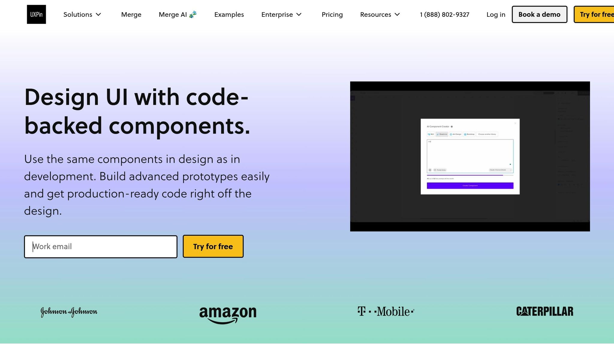
To get started, you’ll need a UXPin account with Merge AI access. This includes tools like the AI Component Creator, Merge technology, and code export capabilities. Bootstrap components are already built into the platform.
Next, activate GPT-5.1 layout generation by entering your OpenAI API key in the AI Component Creator’s Settings. The platform also supports other AI models, such as GPT-5-mini for quicker iterations and GPT-4.1 for tackling more detailed, structured designs.
Setting Up Your UXPin Workspace
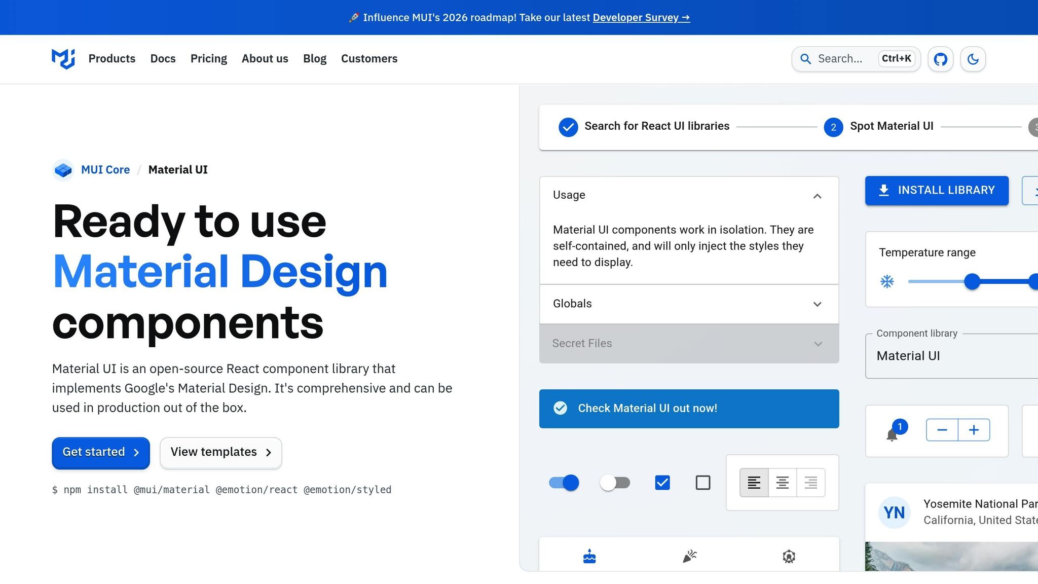
Once inside UXPin, create a new project and select "Design with Merge components." Choose Bootstrap as your framework. From there, you’ll have immediate access to a library of UI components, including buttons, forms, and navigation elements, all ready to use without extra setup.
If you’re working with a custom design system, you can import React components via npm or Git. Use the Merge Component Manager to map component props, enabling designers to tweak components visually without touching code. For teams that rely on version control, UXPin’s Enterprise plan supports Git integration, allowing seamless syncing of design updates with your codebase.
How AI Constraints Work in Merge
Merge AI respects the boundaries of your design system. When using GPT-5.1, it generates layouts exclusively from your integrated Bootstrap library, ensuring all designs align with your production standards and design rules.
The AI uses Bootstrap’s React components to create layouts. You can refine these layouts with the AI Helper (the purple icon). For instance, type commands like "increase padding to 20px" or "change button color to #0056b3", and the AI will make the adjustments while staying within Bootstrap’s guidelines. This minimizes the risk of AI producing off-brand or unusable designs, a common issue known as "hallucinations."
"The AI component creator is a favorite!"
With everything set up, you’re ready to move on to building your prototype in the next section.
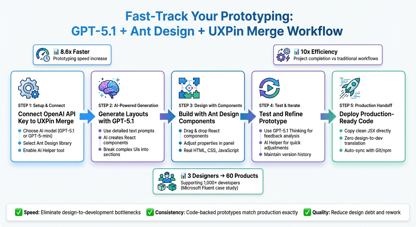
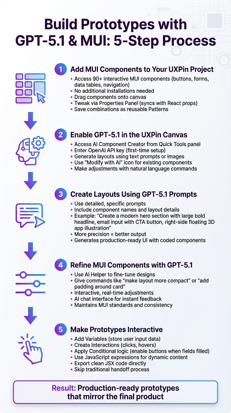
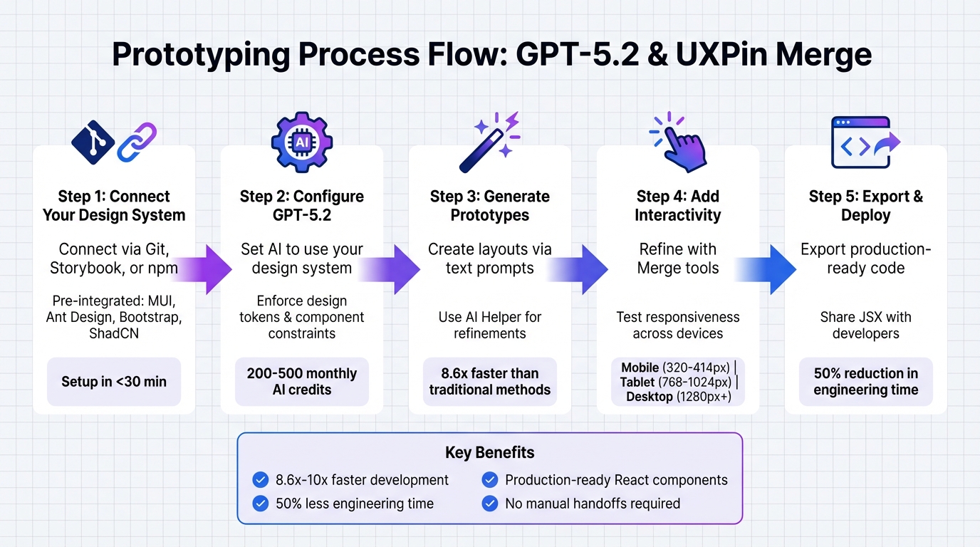
How to Build Prototypes with GPT-5.1, Bootstrap, and UXPin Merge
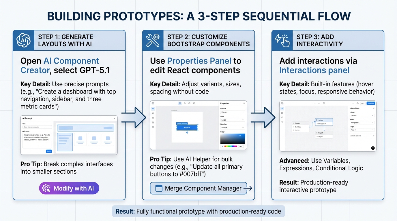
3-Step Workflow for Prototyping with GPT-5.1, Bootstrap, and UXPin Merge
Follow these steps to create a prototype: generate layouts using AI, adjust Bootstrap components, and incorporate interactivity.
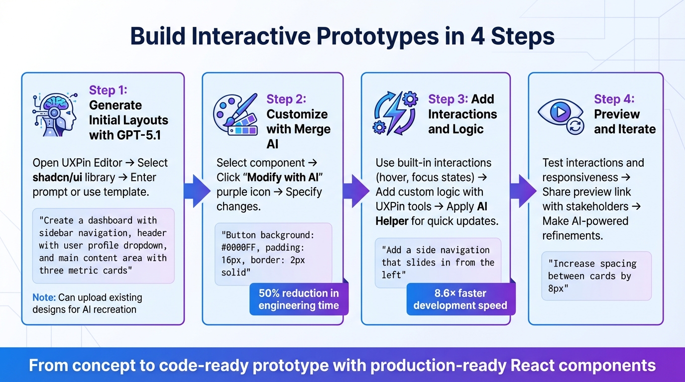
Step 1: Generate Prototype Layouts Using GPT-5.1 Prompts
Start by opening the AI Component Creator in your UXPin project. From the model dropdown, select GPT-5.1 – this version excels at creating detailed and structured layouts, unlike GPT-5-mini, which is better for quick, smaller iterations.
Use precise prompts, like: "Create a dashboard with a top navigation, sidebar, and three metric cards." The AI will generate a layout using Bootstrap components from your integrated library, ensuring it aligns with your design system.
For more intricate interfaces, break your requests into smaller sections. For instance, instead of asking for a complete checkout flow, generate the payment form separately from the order summary. This segmented approach improves precision and gives you better control over each part.
Not satisfied with the initial output? Use the purple "Modify with AI" icon to refine the design. For example, you can request changes like: "Change the button color to #0056b3 and add 20px padding." This iterative process saves time and keeps your workflow efficient.
Step 2: Customize Bootstrap Components in UXPin Merge
Once the layout is generated, move on to refining individual components. In UXPin Merge, you can customize Bootstrap components directly using the Properties Panel. These components are real React elements, so all the props and variants from the Bootstrap library are at your disposal.
Click any component on the canvas to access its editable properties. You can adjust button variants (e.g., from "primary" to "outline-secondary"), tweak input sizes, or fine-tune spacing. The Merge Component Manager links these React props to visual controls, allowing you to make updates without touching code.
Need brand-specific tweaks? The AI Helper can apply changes across multiple components. For example, you can type: "Update all primary buttons to use color #007bff and increase font size to 16px." This ensures consistency throughout your prototype.
Step 3: Add Interactivity and Logic to Your Prototype
With your layout and components in place, it’s time to add interactivity. Bootstrap components in UXPin Merge come with built-in features like hover states, focus indicators, and responsive behavior – no extra coding required.
For advanced functionality, use UXPin’s Variables, Expressions, and Conditional Logic. For example, create a variable called "isLoggedIn" to control navigation visibility based on user status. Or link form inputs to variables for dynamic updates as users type.
The Interactions panel lets you add click events, page transitions, and animations. Since these are real Bootstrap components, the interactions will behave exactly as they would in a live production environment.
sbb-itb-f6354c6
Best Practices for Prototyping with GPT-5.1 and UXPin Merge
Take your AI-driven prototyping to the next level with these strategies. By combining GPT-5.1 with UXPin Merge, you can ensure that every component aligns perfectly with your design system.
Ensuring AI-Generated Components Align with Your Design System
For precise AI results, detailed prompts are key. When using GPT-5.1 in the AI Component Creator, specify exact design values. For example, you might input: "primary button with color #007bff, 16px font, and 12px 24px padding" to ensure the output matches your design system perfectly.
If the result needs tweaking, use the purple "Modify with AI" icon to describe the changes – like adjusting border styles or spacing.
Since UXPin Merge incorporates real React components from your design system (whether you’re using Bootstrap, MUI, or a custom library), the outputs are production-ready. Unlike visual mockups, these prototypes function as fully interactive interfaces that developers can implement directly. Larry Sawyer, Lead UX Designer, shared:
"When I used UXPin Merge, our engineering time was reduced by around 50%".
Leveraging Bootstrap for Consistent and Scalable Design
Bootstrap’s responsive grid system and CSS variables make it an excellent choice for creating adaptable interfaces. Its expanded CSS variables allow for theme customization while retaining the framework’s core structure.
In UXPin Merge, you can use the Properties Panel to adjust component variants, sizes, and spacing. The Merge Component Manager connects React props to visual controls, enabling quick updates to button styles, input fields, and layouts with just a few clicks.
Improving Team Collaboration
UXPin Merge streamlines collaboration by removing the traditional design-to-development handoff. Everyone – from designers to developers – works with the same component library. Designers build with real Bootstrap components, while developers inspect those same components in Spec Mode, copying JSX directly for production. This eliminates rebuilds, translation errors, and design inconsistencies.
Integrating UXPin with tools like Jira and Slack ensures smooth project updates. When a designer modifies a prototype, developers and product managers are notified instantly. Additionally, public comments allow stakeholders to provide feedback without needing an account, speeding up approvals and fostering transparency.
Erica Rider, UX Architect and Design Leader, explained:
"We synced our Microsoft Fluent design system with UXPin’s design editor via Merge technology. It was so efficient that our 3 designers were able to support 60 internal products and over 1,000 developers".
This efficiency is possible because Merge directly connects to your component library, ensuring consistency across every platform and product.
Conclusion
Key Takeaways
This workflow reshapes how teams approach prototyping. By combining GPT-5.1, Bootstrap, and UXPin Merge, you get AI-powered efficiency, consistent code, and prototypes that behave just like the final product. The usual handoff challenges disappear – designers and developers collaborate using the same react-bootstrap components, ensuring a unified process.
The impact is clear. Teams leveraging UXPin Merge can develop products up to 10 times faster and cut engineering time by about 50%. These aren’t just static mockups; they’re fully interactive, responsive interfaces built with production-ready code.
From generating layouts with GPT-5.1 to fine-tuning Bootstrap components, this workflow offers rapid results without compromising on quality.
Next Steps
Now that the framework is laid out, it’s time to put it into action. Start by exploring UXPin Merge’s Bootstrap library. Use the AI Component Creator to generate your first layout and refine it with the "Modify with AI" feature.
For teams aiming to scale with custom design systems or manage multiple products, check out the Enterprise plan at uxpin.com/pricing. Enterprise users gain access to custom library AI integration, unlimited AI credits, Git integration, and dedicated support for a smooth transition. Reach out to sales@uxpin.com and take your workflow to the next level.
FAQs
How does GPT-5.1 enhance prototyping with UXPin Merge?
GPT-5.1 makes prototyping faster and more efficient by enabling designers to generate Bootstrap components using simple text prompts or even images. This approach simplifies the creation of detailed, code-supported prototypes, cutting down on time while boosting precision.
When combined with UXPin Merge, GPT-5.1 helps teams minimize design-to-development bottlenecks, maintain consistency, and speed up their workflows. The result? Sleek, functional prototypes that closely match development-ready code.
What are the advantages of using Bootstrap components with UXPin Merge?
Using Bootstrap components in UXPin Merge comes with several practical benefits. First, it promotes consistency between design and development. Designers can work directly with the same code-based UI elements – like buttons, forms, and modals – that developers use. This shared foundation minimizes errors and streamlines the design-to-development workflow.
Another advantage is Bootstrap’s pre-built, responsive components, which make it simple to create mobile-friendly prototypes quickly. Teams save time by skipping the need to design elements from scratch. Plus, these components are customizable, allowing teams to tailor them to fit specific branding requirements while keeping their functionality intact.
By combining Bootstrap with UXPin Merge, teams can enhance collaboration, efficiency, and precision in prototyping, enabling them to produce polished, production-ready designs more quickly.
How can teams ensure AI-generated designs match their design system?
To make sure AI-generated designs stick to your design system, start by pairing tools like GPT-5.1 with platforms such as UXPin Merge. This platform uses production-ready components from libraries like Bootstrap, which are already tailored to match your design standards. This integration helps maintain consistency right from the start.
It’s also important to establish clear rules and metadata that reflect your design language and branding guidelines. Regular testing of AI outputs against your design system is key, along with implementing feedback loops to improve results over time. By combining design tokens, consistent component libraries, and thorough validation processes, teams can ensure that AI-driven designs align seamlessly with their existing systems.