How Automated Accessibility Checks Improve Prototypes

Automated accessibility checks help designers create prototypes that are usable for everyone, including people with disabilities. These tools identify issues like poor color contrast, missing image descriptions, and keyboard navigation problems. Fixing these early saves time, reduces costs, and ensures compliance with standards like WCAG. Here’s what you need to know:

  • Benefits: Early issue detection, lower development costs, and better user experiences for all.
  • Key Features: Color contrast analyzers, keyboard navigation tests, and screen reader compatibility checks.
  • Why It Matters: Avoid legal risks, meet accessibility standards, and improve usability for everyone.

Early Accessibility Testing Advantages

Save Money by Identifying Problems Early

Catching accessibility issues early in the design process saves both time and money. Fixing problems during prototyping is much faster and cheaper than addressing them after launch.

"When I used UXPin Merge, our engineering time was reduced by around 50%. Imagine how much money that saves across an enterprise-level organization with dozens of designers and hundreds of engineers." – Larry Sawyer, Lead UX Designer

For instance, tweaking a color scheme in the prototyping stage takes just a few minutes. Compare that to the time and effort needed for major code updates after the product is live. Plus, this approach often leads to better design outcomes overall.

Designs That Work Better for Everyone

Building accessibility into your prototypes results in designs that are more user-friendly for everyone – not just people with disabilities. Here’s how:

  • Improved readability: High-contrast text and appropriate font sizes make content easier to read, regardless of lighting conditions.
  • Easier navigation: Clear menus and consistent layouts help users find what they need quickly.
  • Simpler interactions: Keyboard-friendly designs assist users with mobility challenges and even power users who prefer shortcuts.

Stay Compliant with Accessibility Standards

Testing for accessibility early helps ensure your designs align with Web Content Accessibility Guidelines (WCAG) right from the start. This approach helps organizations:

  • Avoid legal trouble: Meet regulatory requirements like those outlined in the Americans with Disabilities Act (ADA).
  • Lower legal risks: Reduce the chances of facing lawsuits related to accessibility issues.

Automated Checks in Practice

Common Accessibility Issues Found

Automated tools are great for spotting technical problems that impact accessibility. Some of the most frequently flagged issues include:

  • Color contrast violations that don’t align with WCAG 2.1 standards
  • Missing descriptive alternative text for images
  • Elements that can’t be accessed using keyboard navigation

These findings highlight where manual testing can step in to address gaps and refine the process further.

Automation vs Manual Testing

Automated tools are fast and efficient, but they work best when paired with manual testing. Here’s a quick comparison:

Testing Aspect Automated Checks Manual Testing
Speed Scans hundreds of elements in seconds May take days or weeks
Consistency Delivers uniform results Results can vary between testers
Technical Issues Excels at spotting code-level problems Limited in detecting technical issues
Context Understanding Can’t judge meaningful alt text Evaluates quality and context better
Cost Efficiency Great for repeated testing Requires more resources

"What used to take days to gather feedback now takes hours. Add in the time we’ve saved from not emailing back-and-forth and manually redlining, and we’ve probably shaved months off timelines."
– Mark Figueiredo, Sr. UX Team Lead at T.RowePrice

Live Testing Features

Live testing takes accessibility checks a step further by providing real-time feedback during the design process. For instance, UXPin’s live testing tools can instantly evaluate:

  • Color contrast ratios to ensure WCAG compliance
  • Keyboard navigation flow for usability
  • Screen reader compatibility to confirm accessibility

These features let teams catch and fix issues early, saving time and avoiding major revisions later. By addressing accessibility concerns directly within the workflow, designers can ensure their prototypes meet standards right from the start.

sbb-itb-f6354c6

4 Steps to Add Accessibility Checks

1. Select Testing Tools

UXPin offers built-in tools to help ensure accessibility, including:

  • Color contrast analyzer to meet WCAG 2.1 guidelines
  • Keyboard navigation tests to verify full accessibility
  • Screen reader compatibility checks to ensure proper HTML semantics
  • Component-level testing for code-backed elements

2. Establish a Testing Process

Incorporate automated accessibility checks into your workflow by:

  • Setting up testing parameters tailored to your project
  • Enabling real-time feedback and running automated checks with every update
  • Creating a detailed checklist of accessibility requirements

These steps help streamline testing and catch issues early in the design process.

3. Address Issues

Resolve identified problems step by step:

  • Review the test results from automated tools
  • Focus on fixing high-priority issues first
  • Use code-backed components to maintain consistency across designs
  • Document all changes for team collaboration and future reference

UXPin’s code-backed prototyping ensures that accessibility standards are consistently applied throughout your design system. After resolving issues, verify your fixes and make adjustments as needed.

4. Test and Update Regularly

Schedule regular tests to maintain compliance over time:

  • Run automated checks on all prototypes
  • Confirm fixes using UXPin’s built-in tools
  • Update your component libraries based on test results
  • Stay informed about accessibility standards and adjust your designs accordingly
Testing Phase Key Actions Benefits
Initial Setup Configure automated checks Identify issues early
Regular Testing Perform scheduled scans Maintain compliance
Issue Resolution Fix problems with code-backed components Ensure consistent standards
Validation Verify fixes using testing tools Confirm improvements

Automated Accessibility Testing by Anna Maier

Conclusion

Here’s a quick recap of how automated accessibility checks and UXPin’s tools can improve prototype quality.

Key Takeaways

Integrating automated checks early in the process offers clear advantages:

  • Quicker issue identification and fixes
  • Consistent compliance with WCAG standards
  • Reduced development costs
  • Designs that are more inclusive for all users

These points highlight the importance of incorporating UXPin’s accessibility tools into your prototyping workflow.

UXPin‘s Accessibility Tools

UXPin

"I think UXPin is an underrated powerhouse of design and prototyping that allows complex applications to design low, medium, and high-fidelity designs to communicate complex interactions all in one place quickly and effectively." – Benjamin Michel, UX Designer at Bottomline Technologies

UXPin’s testing tools make accessibility easier by offering features that improve workflow efficiency and design consistency. Here’s what the platform provides:

Feature Purpose
Color Contrast Analyzer Checks visual elements for WCAG 2.1 compliance
Keyboard Navigation Testing Confirms full keyboard accessibility
Screen Reader Compatibility Verifies proper HTML semantics for assistive technologies
Component-Level Testing Ensures accessibility is consistent across your design systems

These features help teams create accessible prototypes without sacrificing quality or efficiency during development.

Related Blog Posts

How to Build a Scalable Design Pattern Library

A scalable design pattern library ensures consistent and efficient UI/UX design across projects. It streamlines collaboration, saves time, and reduces development costs. Here’s how to build one:

  • Set Clear Goals: Define objectives like reducing inconsistencies, improving collaboration, and meeting accessibility standards.
  • Audit Existing Components: Identify duplicates, updates needed, and usage frequency.
  • Choose the Right Tools: Opt for platforms with component libraries, version control, and real-time collaboration.
  • Organize with Atomic Design: Break components into Atoms, Molecules, Organisms, Templates, and Pages.
  • Standardize Naming: Use clear, consistent names for components and document the rules.
  • Focus on Accessibility: Ensure WCAG compliance and responsive design.
  • Document Everything: Include usage guidelines, code examples, and accessibility notes.
  • Regularly Update: Schedule reviews, track changes, and gather user feedback to keep the library relevant.

Key Benefits: Teams using code-backed components report up to 50% faster development times. Start small with essential elements like typography and buttons, and expand as needed, ensuring alignment between design and development teams.

Building Your Own Pattern Library for the Web: Introduction

1. Initial Setup

Building a design library that works well starts with thoughtful planning.

Set Goals and Boundaries

Start by defining what you want to achieve with your pattern library. Some common objectives include:

For example, one design team shared that their productivity jumped after implementing a custom React Design System.

Once your goals are in place, take a methodical approach to review your current design assets.

Review Current Design Elements

Conduct a thorough audit of your existing UI components. Here’s how:

  • List all your current UI components
  • Spot duplicates or inconsistencies
  • Identify components that need updates
  • Map out how components relate to each other
  • Tag components based on how often they’re used
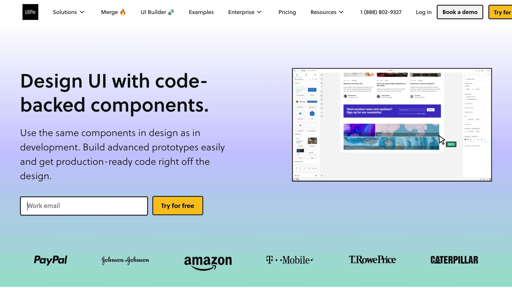
Choose Your Tools

The tools you choose should align with your library’s goals and technical needs. Look for platforms that include:

  • Component libraries tied to code
  • Version control features
  • Developer handoff tools
  • Real-time collaboration options
  • Built-in documentation capabilities

The right tools can save a lot of time for your engineering team.

Once you’ve picked your tools, set clear rules to keep the library organized and up to date.

Set Management Rules

Aspect Guidelines
Access Control Define who can view, edit, and approve changes
Update Process Outline steps for updating or adding components
Documentation Set standards for documenting components
Version Control Decide how versions will be tracked and managed
Quality Checks Establish criteria that components must meet before approval

2. Library Structure

An organized design pattern library makes it easier to find and use components. A clear structure ensures designers and developers can work efficiently while maintaining consistency across projects.

Use Atomic Design

Atomic Design

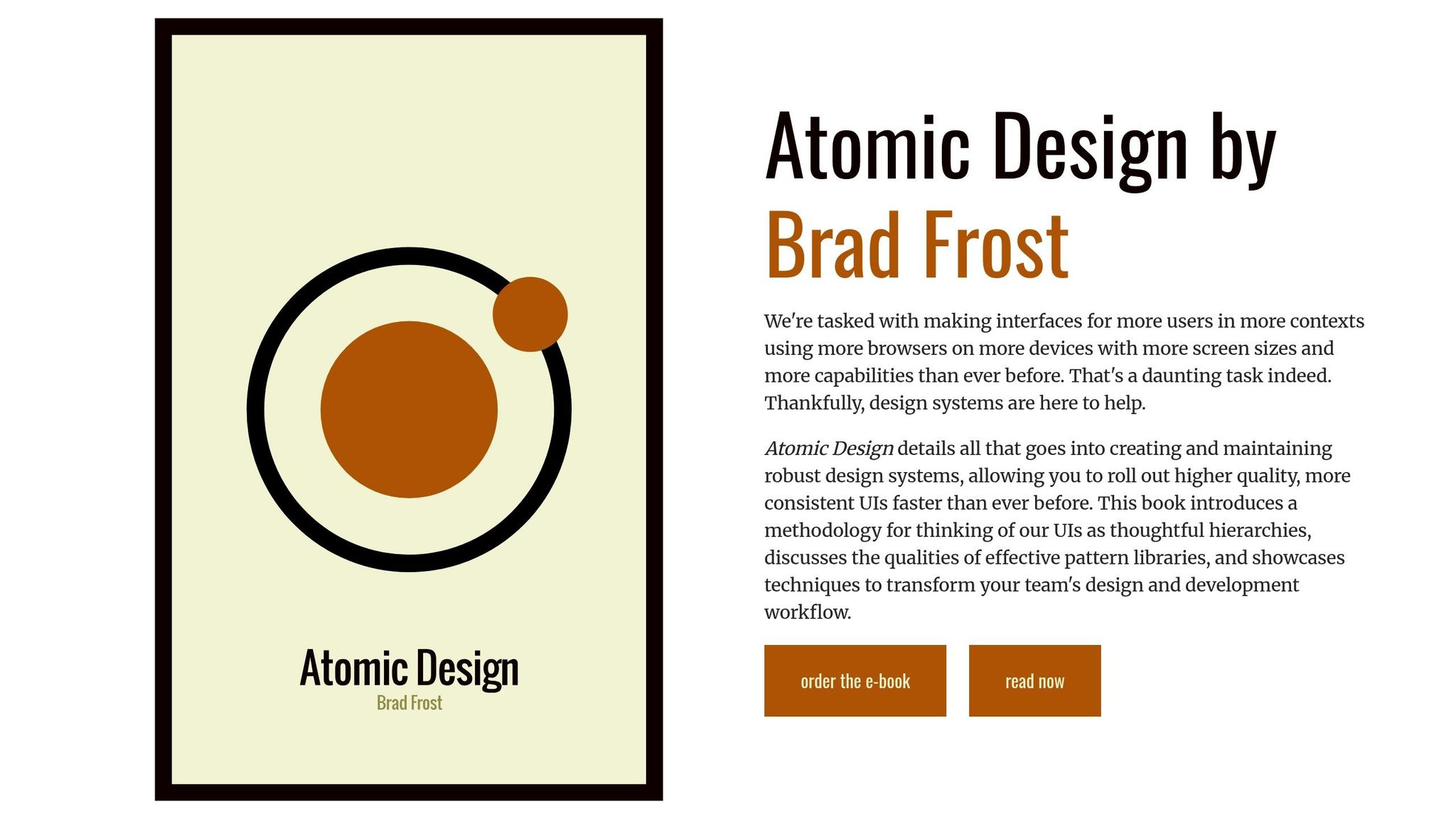
Atomic Design breaks components into five levels:

Level Description Examples
Atoms Basic elements Buttons, inputs, labels
Molecules Small component groups Search forms, navigation items
Organisms Larger UI sections Headers, product cards
Templates Page layouts Article layouts, dashboard grids
Pages Specific instances Home page, product detail view

Using code-backed components ensures uniformity. A clear hierarchy combined with consistent naming conventions makes components easier to discover and use.

Set Naming Rules

  1. Follow consistent patterns

Start with the component type, then add its variant and state:

button-primary-disabled card-featured-hover input-search-focus 
  1. Keep names clear

Use descriptive and readable names. For example, write ‘navigationMenuHorizontal’ instead of ‘navMenuH’.

  1. Document the rules

Include details like:

  • Approved prefixes and suffixes
  • Capitalization guidelines
  • Version numbering
  • Indicators for states and variants

When components are properly named and organized, they should also be built with accessibility and responsiveness in mind.

Focus on Accessibility and Responsiveness

Every component should meet accessibility and responsiveness standards:

  • Follow WCAG 2.1 guidelines
  • Include responsive breakpoints
  • Support keyboard navigation
  • Ensure proper color contrast

Component documentation should cover:

  • Behavior at different breakpoints
  • Accessibility standards and testing notes
  • Implementation instructions
  • Code examples
  • Known limitations or edge cases
sbb-itb-f6354c6

3. Component Creation

Develop reusable, code-supported components with thoughtful planning and clear documentation to maintain consistent design and functionality.

Build Reusable Elements

Components should be designed to work across various scenarios while staying consistent. Each one needs well-defined states, variants, and configurable properties that both designers and developers can work with seamlessly.

Here’s what to focus on when creating components:

  • State Management: Define how your components respond in different scenarios, such as:
    • Default
    • Hover
    • Active
    • Disabled
    • Error
    • Loading
  • Variant Support: Ensure components can adapt to various contexts while keeping their core purpose intact. Examples include:
    • Sizes: small, medium, large
    • Styles: outlined, filled, ghost
    • Contexts: primary, secondary, danger
  • Property Configuration: Standardize properties like colors, typography, spacing, and icon placement to maintain uniformity.

Provide Clear Documentation

Good documentation is essential for proper component usage and implementation. Here’s what to include:

Section Description Example Content
Overview Briefly describe the component Primary button for main user actions
Usage Guidelines Explain when and where to use it Use for key CTAs; limit to one per section
Properties List customization options Size, color, icon position, label text
Code Examples Offer sample implementations React component with props and styling
Accessibility Include compliance details ARIA labels, keyboard navigation, contrast ratios

Collaborate closely with your development team to ensure these guidelines translate into effective implementation.

Coordinate with Development

To keep design and development in sync, follow these steps:

  1. Version Control
    • Track changes to components
    • Document updates thoroughly
    • Ensure backward compatibility
    • Communicate any breaking changes
  2. Testing Protocols
    • Conduct visual regression tests
    • Test functionality thoroughly
    • Check cross-browser compatibility
    • Measure performance
  3. Implementation Guidelines
    • Provide instructions for initializing components
    • Specify required dependencies
    • Address performance considerations
    • Define supported browsers

4. Updates and Growth

Keep your design library up to date with regular reviews and a clear plan for growth.

Schedule Regular Reviews

Set up monthly audits to assess how your design library is being used, streamline components, and evaluate performance.

Focus on these key areas:

  • Usage Analytics: Monitor which components are used most often and decide if any need updates or removal.
  • Performance Checks: Build on initial testing by conducting regular performance evaluations.
  • Documentation Status: Ensure all documentation reflects the latest component versions.
  • Accessibility Compliance: Confirm components meet current WCAG standards as they evolve.

Track Changes

After each review, document all updates to maintain consistency and transparency. Use version control to keep everything organized.

Version Control Element Purpose Implementation
Semantic Versioning Track version updates Use format v2.1.3 (major.minor.patch)
Changelog Documentation Record changes Include updates and breaking changes
Migration Guidelines Assist with transitions Provide clear upgrade instructions

Proper version tracking ensures updates are communicated effectively and integrates user feedback smoothly.

Collect User Input

User feedback is essential for improving and expanding your design library. Combine this input with quality checks for the best results.

"What used to take days to gather feedback now takes hours. Add in the time we’ve saved from not emailing back-and-forth and manually redlining, and we’ve probably shaved months off timelines." – Mark Figueiredo, Sr. UX Team Lead at T.RowePrice

Here are some ways to gather feedback:

  • Direct User Surveys: Run quarterly surveys to gather input on component usability, documentation clarity, feature suggestions, and integration issues.
  • Usage Analytics: Analyze metrics like adoption rates, documentation views, search trends, and error reports to spot areas for improvement.
  • Team Workshops: Host monthly cross-functional meetings to discuss feedback, prioritize updates, and address technical challenges.

5. Growth Guidelines

Growing your design pattern library takes planning and teamwork to ensure everything stays organized and efficient. Here’s how to expand while keeping things running smoothly.

Start with the Essentials

Focus on the basics before diving into more detailed patterns. Build a strong base with key elements like typography, color systems, layouts, and interactive components. This foundation might include:

  • Text styles and headings
  • A consistent color palette with primary, secondary, and semantic colors
  • Layout elements such as grids and containers
  • Interactive components like buttons and form fields

Once your core components are solid, you can introduce advanced patterns based on team feedback and how the library is being used.

Align Design and Development Teams

Once your core components are in place, make sure your design and development teams are working in sync. Create shared documentation that covers component specs, usage guidelines, code examples, and design principles. Schedule regular cross-team meetings, like bi-weekly syncs, to review new proposals, discuss any technical challenges, and ensure smooth implementation.

Keep Performance in Check

As your library grows, keep an eye on performance. Track metrics like load times and resource usage to spot issues early. Regular monitoring ensures your library stays fast and efficient, making it easier to integrate across projects without slowing anything down.

Conclusion

Building a design library that scales requires careful planning, consistent upkeep, and collaboration. Studies reveal that using code-backed components can improve productivity and reduce engineering time by as much as 50%. Here are some practical tips to make it work:

A well-organized pattern library bridges the gap between design and development. As Design Leader David Snodgrass puts it:

Been a fan. The deeper interactions, the removal of artboard clutter creates a better focus on interaction rather than single screen visual interaction, a real and true UX platform that also eliminates so many handoff headaches.

To keep your pattern library effective:

  • Start with essential components like typography, colors, and basic UI elements.
  • Conduct regular reviews to assess how components are performing and being used.
  • Use metrics to measure the library’s impact.
  • Encourage teamwork by sharing documentation and maintaining open communication.

Related Blog Posts

How to Automate Interactive Prototypes with AI

AI tools are transforming prototyping by making it faster, easier, and more accurate. With features like code generation, automatic UI creation, and built-in libraries, these tools save time and improve collaboration between design and development teams. Here’s what you can achieve:

  • Generate layouts from text prompts: Quickly create code-backed designs.
  • Build interactive components: Add real-life interactions with minimal effort.
  • Streamline feedback loops: Cut review cycles from days to hours.
  • Produce production-ready code: Simplify handoffs to developers.

Key benefits include saving up to 50% of engineering time, improving design consistency, and reducing manual tasks. Whether you’re a UX designer or developer, AI-powered tools like UXPin Merge help bridge the gap between design and development, ensuring smoother workflows and faster results.

Prototyping with Generative AI – from idea to clickable …

Creating AI-Powered Interactive Prototypes

Building interactive prototypes with AI requires a clear and organized approach. Here’s how to get started:

Set Project Requirements

Start by defining the scope and goals of your project. Key areas to focus on include:

  • User interaction objectives
  • Necessary components
  • Data handling specifics
  • Performance expectations
  • Accessibility guidelines

Benjamin Michel, UX Designer at Bottomline Technologies, highlights the value of thorough planning:

"I think UXPin is an underrated powerhouse of design and prototyping that allows complex applications to design low, medium, and high-fidelity designs to communicate complex interactions all in one place quickly and effectively".

Set Up AI Prototyping Tools

Prepare your tools by configuring the environment and selecting the right resources. Here’s what to do:

Once your tools are ready, you can begin building layouts and refining interactions.

Build and Modify Prototypes

Leverage AI tools to create and enhance your prototype step by step:

  1. Generate Initial Layouts Use AI Component Creator to produce code-supported layouts from text prompts. This is particularly useful for common UI elements like:
    • Forms and input fields
    • Data tables and grids
    • Navigation menus
    • Modal windows
  2. Customize Components Tailor components to fit your needs by:
    • Adjusting properties and themes
    • Adding interactions
    • Implementing conditional logic
    • Setting dynamic variables
  3. Add Interactive Features Enhance your prototype with interactive elements to simulate real user experiences.

Review and Update

Evaluate your prototype by comparing it to your initial requirements. Key steps include:

  • Conducting user testing sessions
  • Gathering feedback from stakeholders
  • Monitoring performance
  • Using AI tools to refine and improve based on feedback

David Snodgrass, a Design Leader, underscores the benefits of this approach:

"Been a fan. The deeper interactions, the removal of artboard clutter creates a better focus on interaction rather than single screen visual interaction, a real and true UX platform that also eliminates so many handoff headaches".

While AI streamlines the prototyping process, the expertise of a designer is essential to ensure the final product meets user needs and project goals effectively. Balancing automation with human input is the key to success.

sbb-itb-f6354c6

Adding AI Prototypes to Design Process

Team Collaboration with AI

Incorporating AI-powered prototypes works best when teams collaborate effectively across departments. At AAA Digital & Creative Services, the design team embraced this by using their custom React Design System.

Here’s how to enhance teamwork with AI prototypes:

  • Build shared component libraries to ensure consistency
  • Use clear naming conventions for better organization
  • Enable automated notifications to keep everyone updated
  • Hold regular sync meetings to align efforts
  • Document how to use AI tools effectively

Mark Figueiredo highlighted how this approach cuts feedback cycles significantly – from days to just hours. This setup also makes it easier to transition into the development phase.

Connecting Design to Development

AI-powered prototypes make the link between design and development much smoother. Here are some key advantages:

  • Automated Code Generation and Consistency: AI tools turn designs into production-ready code while keeping components uniform.
  • Less Handoff Friction: Clear specs and maintainable code make implementation easier.
  • Real-Time Updates: Design changes are instantly reflected in the development environment.

This integration ensures the design matches the final product, bridging the gap between creative ideas and functional results. Design Leader David Snodgrass shared his perspective on this improvement:

"Been a fan. The deeper interactions, the removal of artboard clutter creates a better focus on interaction rather than single screen visual interaction, a real and true UX platform that also eliminates so many handoff headaches".

AI Prototyping: Pros and Cons

Advantages of AI Prototypes

AI prototyping brings faster workflows, consistent results, and improved quality to the table.

Here are some of the main benefits:

Benefit Impact
Time Efficiency Cuts engineering time by 50% for enterprise organizations
Quality Improvement Ensures consistency using standardized component libraries
Workflow Enhancement Shrinks feedback cycles from days to just hours
Resource Optimization Saves months of manual labor

However, while these benefits are impressive, teams still need to tackle implementation hurdles.

Common Issues and Fixes

AI prototyping isn’t without its challenges. To make the most of AI-driven workflows, teams should focus on these solutions:

  • Component Standardization: Use clear naming conventions and provide complete documentation for components.
  • Team Alignment: Schedule regular sync-ups between design and development teams to keep everyone on the same page.
  • Quality Control: Set up structured review processes to maintain design consistency while using AI tools.

These strategies help teams unlock the full potential of AI prototyping. Larry Sawyer, Lead UX Designer, shared his experience with these tools:

"When I used UXPin Merge, our engineering time was reduced by around 50%. Imagine how much money that saves across an enterprise-level organization with dozens of designers and hundreds of engineers."

Next Steps

To incorporate interactive prototypes into your workflow effectively, try these practical steps based on the AI-driven techniques mentioned earlier:

Start with AI Component Creation
Write clear prompts to generate UI elements like tables, forms, and layouts. Save these components with their code so you can reuse them across multiple prototypes, ensuring consistency.

Leverage Pre-Built Libraries
Take advantage of React libraries to align with development standards and speed up your design process. This approach simplifies the transition from design to development.

Brian Demchak, Sr. UX Designer at AAA Digital & Creative Services, shares his perspective:

"As a full stack design team, UXPin Merge is our primary tool when designing user experiences. We have fully integrated our custom-built React Design System and can design with our coded components. It has increased our productivity, quality, and consistency, streamlining our testing of layouts and the developer handoff process."

Improve Development Workflow
Export React code directly from your prototypes to make development smoother. Follow these steps to see immediate progress:

  • Start Small: Experiment with simple components to get comfortable with the AI Component Creator.
  • Build Reusable Libraries: Create component libraries and integrate production-ready code into your workflow.
  • Track Improvements: Measure time saved and the quality of your results to refine your process further.

Related Blog Posts

AI-Powered Testing for React Components

AI testing tools are transforming how React components are tested, making the process faster, more accurate, and efficient. By automating repetitive tasks, these tools catch browser compatibility issues, accessibility concerns, and performance bottlenecks early in development. Here’s what you need to know:

  • AI Benefits: Automates cross-browser testing, identifies subtle rendering and layout issues, and ensures accessibility compliance.
  • Core Methods: Visual regression, behavioral analysis, performance profiling, and accessibility testing.
  • Setup Essentials: Use tools like React Testing Library, Jest, and AI-powered plugins to streamline testing workflows.
  • Best Practices: Integrate AI testing into CI/CD pipelines and configure tests for Chrome, Firefox, Safari, and Edge.

AI testing not only reduces manual effort but also improves the reliability of React components, ensuring consistent performance across browsers and devices.

AI-Powered Functional Testing with Playwright

Playwright

AI Testing Fundamentals

Core AI Testing Concepts

AI testing for React components uses machine learning to analyze behavior, visuals, and interactions across different browsers. It focuses on pattern recognition and automated decision-making to identify issues before they reach production. Modern tools leverage computer vision and deep learning to detect visual regressions and validate interactions, complementing traditional unit tests. These principles form the groundwork for applying specific AI testing techniques.

AI Testing Methods

Building on these ideas, several methods ensure thorough validation of components:

Testing Method Purpose Key Benefits
Visual Regression Identifies unexpected changes in appearance Detects subtle layout and styling issues
Behavioral Analysis Monitors interactions and state changes Ensures consistent functionality across browsers
Performance Profiling Tracks rendering and load times Highlights areas for optimization
Accessibility Testing Checks WCAG compliance Promotes inclusive component design

Together, these methods create a strong testing framework that catches issues traditional approaches might overlook. AI algorithms also improve over time as they learn from new test results, enhancing their accuracy.

AI Testing Advantages

Using these AI methods enhances React component testing, as demonstrated by real-world examples:

"When I used UXPin Merge, our engineering time was reduced by around 50%. Imagine how much money that saves across an enterprise-level organization with dozens of designers and hundreds of engineers." – Larry Sawyer, Lead UX Designer

"As a full stack design team, UXPin Merge is our primary tool when designing user experiences. We have fully integrated our custom-built React Design System and can design with our coded components. It has increased our productivity, quality, and consistency, streamlining our testing of layouts and the developer handoff process." – Brian Demchak, Sr. UX Designer at AAA Digital & Creative Services

Key benefits include:

  • Automated detection of cross-browser compatibility issues
  • Reduced manual testing effort
  • More consistent and dependable test outcomes
  • Accelerated development cycles with automated validation
  • Earlier identification of potential issues during development

Combining AI-driven testing with traditional methods creates a well-rounded strategy. This approach helps teams deliver more reliable React components while cutting down the time and effort needed for testing.

sbb-itb-f6354c6

Setting Up AI Cross-Browser Tests

Tools and Initial Setup

To get started, you’ll need the following tools:

  • Node.js (version 16.0 or higher)
  • npm or yarn package manager
  • React Testing Library
  • Jest test runner
  • A modern code editor with testing extensions

First, configure your project’s testing environment by adding the required dependencies to your package.json file:

{   "devDependencies": {     "@testing-library/react": "^14.0.0",     "@testing-library/jest-dom": "^6.1.0",     "jest": "^29.6.0"   } } 

Once that’s done, it’s time to integrate AI testing tools into your setup.

Adding AI Testing Tools

Install the necessary AI testing dependencies and update your test configuration file. Here’s an example jest.config.js file:

module.exports = {   testEnvironment: 'jsdom',   setupFilesAfterEnv: ['<rootDir>/src/setupTests.js'],   moduleNameMapper: {     '\\.(css|less|scss)$': 'identity-obj-proxy'   },   // Add configurations specific to your chosen AI testing tools }; 

After setting up the AI tools, you can move on to preparing your cross-browser testing environment.

Configuring Browser Testing

Define the browsers you want to test against in your configuration:

const browsers = [   { name: 'chrome', version: 'latest' },   { name: 'firefox', version: 'latest' },   { name: 'safari', version: 'latest' } ]; 

Then, create a test runner to execute your tests across these browsers:

async function runCrossBrowserTests() {   for (const browser of browsers) {     await testComponent({       browserName: browser.name,       browserVersion: browser.version       // Add any additional AI tool configurations here if needed     });   } } 

Finally, execute your cross-browser tests using the following command:

npm run test:cross-browser 

Feel free to adjust the configuration to fit your project’s specific needs.

AI Testing Best Practices

Browser Code Compatibility

Use AI tools to spot and fix browser-specific CSS and JavaScript issues. This ensures your application’s rendering, DOM structure, and behavior stay consistent across various browser engines. These tools evaluate rendering patterns and style implementations to make cross-browser functionality more reliable.

AI-Based Layout Testing

AI tools go beyond compatibility checks by improving layout accuracy. They are particularly effective at identifying visual inconsistencies across different screen sizes and browsers. For example, AI-powered layout testing can evaluate how your React components adapt to responsive design by focusing on:

Testing Aspect AI Analysis Approach
Layout Structure Assesses component positioning and alignment across viewports
Responsive Behavior Observes how components respond to various screen sizes
Visual Consistency Verifies consistent styling across browsers
Component States Checks states like hover, active, and disabled for accuracy

Testing in CI/CD

Integrate AI testing into your continuous integration pipeline to maintain quality with every code change. Set up your CI/CD workflow to automatically execute AI-driven tests after each commit:

test:   stage: test   script:     - npm install     - npm run test:ai-layout     - npm run test:cross-browser   artifacts:     reports:       junit: test-results.xml 

These AI-powered tests examine both the code structure and visual output of your components. This approach catches problems that traditional testing might overlook, all while keeping your deployment process efficient. Set automatic failure thresholds to ensure only high-quality components are deployed to production.

Next Steps

AI Testing Outlook

AI-driven testing for React components is becoming more precise and efficient. Advances in machine learning have enhanced visual regression testing and component validation. Many testing frameworks now use AI to anticipate cross-browser compatibility issues before they affect users.

Here are some key advancements shaping AI testing for React:

Advancement Impact on React Testing
Self-healing Tests Adjusts automatically to minor changes in components
Predictive Analysis Flags potential compatibility problems early
Visual Learning Boosts accuracy in layout comparisons across browsers
Performance Optimization Speeds up test execution and streamlines workflows

Integrating these AI advancements with a reliable design-to-code platform can maximize their potential.

UXPin Integration Guide

UXPin

UXPin’s code-backed prototyping tools align seamlessly with AI testing workflows for React components. The platform’s AI Component Creator helps validate component behavior during the design phase, reducing errors early.

With UXPin’s Merge technology, you can connect React components directly to its testing environment. This allows for real-time validation of component states and interactions across different browsers. UXPin also includes pre-configured React libraries – like MUI, Tailwind UI, and Ant Design – enhanced with AI-driven testing features.

For enterprise teams, UXPin supports cross-browser testing through CI/CD pipelines. Its version control system tracks component changes, simplifying the process of fixing compatibility issues.

To set up your testing workflow:

  • Enable the AI Component Creator
  • Configure browser compatibility checks
  • Set up visual regression tests

This approach ensures your React components behave consistently across browsers while preserving the integrity of your design system throughout development.

Related Blog Posts

How to Integrate Collaboration Tools into Design Workflows

Design teams often struggle with slow feedback cycles, scattered communication, and inefficient handoffs. Collaboration tools can fix these issues, saving time and improving productivity. For example, T. Rowe Price cut feedback times from days to hours and reduced engineering time by 50%.

Here’s how to get started:

  • Identify workflow problems: Look for bottlenecks like scattered feedback, manual tasks, or version control chaos.
  • Choose the right tools: Prioritize features like real-time collaboration, version control, and design system integration.
  • Plan implementation: Roll out tools in phases, train your team, and set clear usage guidelines.
  • Centralize feedback: Keep all comments and reviews in one place for faster approvals.
  • Track performance: Measure success with metrics like project timelines, feedback speed, and team productivity.

5 workflows to make your design team hyper efficient

Identify Current Workflow Problems

Before bringing in new collaboration tools, take a close look at where your workflow is falling short.

Common Workflow Bottlenecks

The design team at T. Rowe Price faced challenges like drawn-out feedback cycles, messy email chains, and time-consuming manual redlining tasks.

Some typical bottlenecks include:

  • Scattered Communication: Feedback and updates spread across emails, chats, and comments on different platforms.
  • Manual Processes: Tasks like redlining and version tracking that eat up time and energy.
  • Handoff Issues: Miscommunication or inconsistencies between design and development teams.
  • Version Control Chaos: Multiple file versions with no single, reliable source.

To tackle these issues, start by identifying clear areas for improvement.

As Lead UX Designer Larry Sawyer shared:

"When I used UXPin Merge, our engineering time was reduced by around 50%. Imagine how much money that saves across an enterprise-level organization with dozens of designers and hundreds of engineers."

Define Team Goals

Once you’ve pinpointed the bottlenecks, set clear, measurable goals to address them. Design Leader David Snodgrass highlighted the impact of a focused approach:

"The deeper interactions, the removal of artboard clutter creates a better focus on interaction rather than single screen visual interaction, a real and true UX platform that also eliminates so many handoff headaches."

Here’s an example of how you can outline goals:

Goal Area Current State Target Improvement
Feedback Cycles 2–3 days Same-day response
Design Handoff 4 hours per feature Under 2 hours per feature
Version Control Multiple file locations Single source of truth
Team Communication 5+ platforms Unified communication tool

Select Team Collaboration Tools

Pick tools that directly improve your design workflow. The right platform can save time and enhance communication within your team.

Must-Have Tool Features

Look for tools with features that solve your team’s specific challenges. Benjamin Michel, UX Designer at Bottomline Technologies, highlights the value of certain functionalities:

"I think UXPin is an underrated powerhouse of design and prototyping that allows complex applications to design low, medium, and high-fidelity designs to communicate complex interactions all in one place quickly and effectively."

Here are some key features to consider:

Feature Category Key Capabilities Impact on Workflow
Live Collaboration Real-time editing and commenting Speeds up feedback and decision-making
Version Control History tracking and single source of truth Reduces confusion over file versions
Design Systems Component libraries and reusable assets Ensures consistency across projects
Handoff Tools Code export and spec generation Simplifies the developer handoff process
Advanced Interactions States, variables, and conditions Makes prototypes more realistic

Once you’ve evaluated these features, check how well the tools integrate with your existing systems.

Check Integration Options

Brian Demchak, Sr. UX Designer at AAA Digital & Creative Services, shares his team’s experience:

"As a full stack design team, UXPin Merge is our primary tool when designing user experiences. We have fully integrated our custom-built React Design System and can design with our coded components. It has increased our productivity, quality, and consistency, streamlining our testing of layouts and the developer handoff process."

Make sure the tool:

  • Works with your design systems and component libraries
  • Simplifies the design-to-code workflow
  • Syncs with communication and project management platforms
  • Is compatible with your version control systems

These integrations can greatly improve efficiency and make the transition from design to development much smoother.

sbb-itb-f6354c6

Add Tools to Your Workflow

Once you’ve chosen the right tools, the next step is to integrate them effectively. This requires careful planning and team training to ensure smooth adoption without disrupting ongoing work.

Plan Tool Implementation

Rolling out tools in phases helps reduce disruptions and streamlines the transition. Data shows this method can cut feedback times from days to just hours while automating repetitive tasks.

Phase Duration Actions
Pilot Testing 2-3 weeks Test with a small team, map workflows, gather feedback
Team Onboarding 1-2 weeks Train departments, set up workspaces
Full Integration 4-6 weeks Transition workflows, document new processes

Train Team Members

Training is key to making sure your team gets the most out of the tools and works more efficiently. Research shows that well-trained teams can cut engineering time by up to 50%.

Here’s how to structure training:

1. Initial Setup Sessions

  • Conduct hands-on workshops using real project scenarios.
  • Schedule sessions across time zones to include all team members.

2. Documentation and Resources

  • Provide quick-reference guides.
  • Share video tutorials and best practices.

3. Mentorship Program

  • Pair experienced users with newcomers for support.
  • Offer ongoing help during the transition.

Once training is complete, the next step is to set clear guidelines for how the tools should be used.

Set Tool Usage Rules

Consistent guidelines help keep projects organized and workflows efficient. Focus on these areas:

  • Project Organization: Use standard naming conventions and a unified file structure for assets and components.
  • Workflow Protocols: Standardize feedback processes, version control, and design handoffs.
  • System Integration: Set rules for using design systems and managing components.

Regularly review and update these rules to ensure they stay relevant and effective as your team’s needs evolve.

Improve Team Communication

Clear communication is essential for design teams. Modern collaboration tools help bring feedback together and make interactions more efficient.

Keep Feedback in One Place

When feedback is centralized, it reduces scattered conversations and keeps everyone on the same page. Mark Figueiredo, Sr. UX Team Lead at T.RowePrice, put it this way:

"What used to take days to gather feedback now takes hours. Add in the time we’ve saved from not emailing back-and-forth and manually redlining, and we’ve probably shaved months off timelines."

Use features like threaded review comments, link feedback directly to design components, and create dedicated spaces for reviews. This not only keeps things organized but also helps speed up approvals.

Accelerate Design Approvals

Simplifying the approval process can significantly cut down project timelines. Integrated collaboration tools make it easier to test designs and hand them off to developers. Here’s how you can make approvals faster:

  • Set clear review cycles with assigned responsibilities.
  • Use automated notifications to ensure timely feedback.
  • Keep a version-controlled record of design changes and decisions.

These steps make approvals smoother and keep projects moving forward.

Track Tool Performance

Monitor how your collaboration tools are performing by using clear metrics and gathering team feedback. This ensures workflows stay efficient and helps justify your investments. By building on smooth implementations and open communication, tracking performance highlights areas of improvement and success.

Measure Success Metrics

Use these metrics to evaluate how well your team is working:

  • Project timelines: Compare how long projects take before and after introducing the tool.
  • Feedback resolution speed: Track how quickly design feedback is addressed.
  • Engineering handoff efficiency: Measure the time from design approval to development.
  • Team productivity: Look at the number of completed design tasks per sprint.

These numbers provide a clear picture of productivity and smoother handoffs. For example, reduced engineering time can be a direct result of effective tool use. Combine these metrics with team feedback for a full understanding of performance.

Collect Team Input

Structured feedback from your team helps you identify what’s working and what needs adjustment. Focus on these areas:

  • Tool adoption rates
  • How often features are used
  • Workflow bottlenecks
  • How well the tool integrates with existing systems
  • Training gaps or areas where guidance is needed

Hold monthly team check-ins to assess tool performance and gather suggestions. A simple feedback form can also be helpful. Include practical questions like:

  • Which features do they use the most?
  • Where do they experience workflow issues?
  • What additional features would improve their work?
  • How have the tools made daily tasks easier?

This input allows you to fine-tune workflows and get the most out of your collaboration tools.

Conclusion

Using collaboration tools can significantly improve design workflows. For instance, T. Rowe Price saw feedback cycles shrink from days to hours, while cutting out manual redlining saved months on project timelines.

These tools deliver measurable results when implemented effectively. Here’s a simple approach to follow:

  • Identify workflow bottlenecks
  • Select tools that work seamlessly with current systems
  • Provide proper training and clear usage instructions
  • Centralize feedback management
  • Regularly track performance metrics

When integrated correctly, these tools break down communication barriers, speed up approvals, and make the design process more efficient. Teams can focus less on workflow issues and more on producing quality designs. By keeping track of metrics and gathering ongoing feedback, organizations can continue refining their tools and processes for even better outcomes.

Related Blog Posts

Testing Code Prototypes: Step-by-Step Guide

Want to test your code prototypes effectively? Here’s how:

  • Set up a test environment: Use tools like UXPin to sync React components and configure your workspace.
  • Develop test cases: Map user flows, write scripts, and set clear goals for functionality, performance, and compatibility.
  • Run tests: Combine automated tests for functionality with manual tests for user experience, cross-browser compatibility, and accessibility.
  • Refine prototypes: Analyze test results, fix bugs, and implement user feedback to improve performance and usability.

This guide walks you through each step to ensure your prototypes align with the final product while saving time and boosting collaboration between design and development teams.

Test Environment Setup

Testing Tools Overview

To set up an effective testing environment for code-backed prototypes, it’s crucial to choose and configure the right tools. UXPin offers built-in coded libraries like MUI and Tailwind UI, as well as the ability to sync custom React components directly from Git repositories.

When picking your testing tools, focus on platforms that enable:

  • Exporting production-ready React code directly
  • Seamless integration with online development environments
  • Synchronization with component libraries

Once you’ve chosen your tools, ensure your workspace is properly configured to integrate them.

Development Environment Setup

Your workspace should support both design and code workflows without friction. For instance, the team at AAA Digital & Creative Services successfully integrated their custom React Design System, which greatly improved their testing process.

Here’s how to configure your environment:

  • Set up component libraries and their dependencies
  • Enable the option to export code
  • Connect your workspace to online development platforms like StackBlitz

"As a full stack design team, UXPin Merge is our primary tool when designing user experiences. We have fully integrated our custom-built React Design System and can design with our coded components. It has increased our productivity, quality, and consistency, streamlining our testing of layouts and the developer handoff process."
– Brian Demchak, Sr. UX Designer at AAA Digital & Creative Services

With the environment in place, implementing version control will help you maintain stability and ensure smooth collaboration.

Version Control Implementation

Version control is essential for tracking changes, improving collaboration, and keeping your prototypes stable. Here are some best practices to follow:

  • Use dedicated branches for new features or bug fixes
  • Establish clear branching strategies to manage releases
  • Write detailed commit messages to document changes
  • Rely on pull requests for thorough code reviews before merging updates

Test Case Development

Test Goals and Limits

Establish clear objectives to confirm that features and interactions function as expected in real-world scenarios.

Key testing goals should include:

  • Functionality checks: Verify that all interactive elements perform as intended.
  • Performance benchmarks: Set acceptable response times for interactions.
  • Browser compatibility: Identify which browsers and versions need testing.
  • Device coverage: Specify target devices and screen dimensions.

User Test Scenarios

Turn these goals into practical user scenarios that reflect typical interactions.

Here’s how to create effective test scenarios:

  • Map user flows: Outline complete user journeys that demonstrate the main features of the prototype. Cover both standard use cases and edge cases.
  • Pinpoint interaction points: Highlight specific moments where users engage with components, such as:
    • Submitting forms
    • Navigating between pages
    • Validating input data
    • Triggering state changes
    • Activating conditional logic
  • Account for variable conditions: Test the prototype under different circumstances, like:
    • Various user roles or permissions
    • A range of data inputs
    • Different theme settings
    • Dynamic content updates

Test Script Creation

Well-written test scripts ensure consistent and reliable results for both manual and automated testing.

Each test script should include:

  • Preconditions: Setup steps and initial conditions required before starting.
  • Step-by-step actions: Detailed instructions for every user action.
  • Expected results: Clearly defined outcomes for each step.
  • Pass criteria: Indicators that confirm the test was successful.
  • Error handling: Guidance on addressing unexpected issues.

Ensure the scripts are detailed enough for anyone on the team – technical or not – to follow. Include precise instructions for interacting with components, modifying properties, and verifying outcomes.

Running Interaction Tests

Automated Testing Steps

Automated tests ensure that components work as intended. To get started, set up your testing framework to handle both unit and integration tests.

Here’s what to configure in your automated testing pipeline:

  • Run unit and integration tests: Validate individual components and how they work together.
  • Check state management and data flow: Ensure data moves correctly between components.
  • Test responsive behavior: Verify layouts and functionality across different screen sizes.

With UXPin’s exported React code, you can easily integrate these tests into your automated testing frameworks.

Once automation is in place, use manual testing to catch subtle user interaction issues that automation might miss.

Manual Testing Process

While automated tests focus on functionality, manual tests are essential for evaluating complex interactions and the overall user experience.

Component Interaction Testing

  • Verify component states and transitions.
  • Test how conditional logic is applied.
  • Ensure variables are handled correctly and data persists as expected.
  • Check form submissions and error handling.

This step ensures interactive elements behave consistently across different environments.

Cross-Browser Verification

  • Test on major browsers like Chrome, Firefox, and Safari.
  • Confirm layouts are responsive.
  • Check that interactions work the same across platforms.
  • Monitor performance for any inconsistencies.

Accessibility Testing

  • Ensure keyboard navigation works smoothly.
  • Test compatibility with screen readers.
  • Verify ARIA attributes are implemented correctly.
  • Check color contrast to meet accessibility standards.

Test Result Recording

Once testing is complete, organize and document the results thoroughly. Use a consistent format to make tracking and resolving issues easier.

Documentation Format

  • Test case ID and a brief description.
  • Details about the environment (browser, device, operating system).
  • Steps to reproduce issues, along with expected and actual outcomes.
  • Screenshots or recordings of any problems.
  • Assign priority and severity levels.

Store all test results in a central repository. This should include:

  • Detailed bug reports with clear reproduction steps.
  • Performance benchmarks and metrics.
  • User feedback and observations.
  • Actionable items for the development team.
  • Status updates on issue resolution.

Keep your test documentation under version control. This helps track changes, spot recurring issues, and confirm fixes during future prototype updates.

sbb-itb-f6354c6

Prototype Improvement

Test Result Analysis

Review test results carefully to identify and prioritize areas for improvement:

Performance Metrics Review

  • Evaluate load times for various components
  • Check how efficiently state management operates
  • Analyze resource usage patterns
  • Measure interaction response times

User Behavior Analysis

  • Study navigation paths, error occurrences, component usage, and how often users complete interactions

Use a prioritization matrix to rank issues based on their severity and frequency. This helps focus development on the most impactful fixes and enhancements.

Once priorities are clear, start addressing the identified issues.

Bug Fixes and Updates

Tackle fixes in order of importance: resolve critical problems first, then work on enhancements.

Critical Updates

  • Fix issues with component state management
  • Address data persistence errors
  • Resolve cross-browser compatibility problems
  • Eliminate performance bottlenecks

Enhancement Implementation

  • Improve interaction flow
  • Update UI components
  • Enhance accessibility features
  • Revise and expand documentation

Record all changes in version control for easy tracking and collaboration.

Feedback Implementation

After resolving issues, incorporate user feedback to refine the prototype further.

Feedback Prioritization

  • Assess its impact on the user experience
  • Consider technical feasibility
  • Evaluate resource needs
  • Align with the development timeline

"What used to take days to gather feedback now takes hours. Add in the time we’ve saved from not emailing back-and-forth and manually redlining, and we’ve probably shaved months off timelines."
– Mark Figueiredo, Sr. UX Team Lead at T.RowePrice

Create a cycle of continuous improvement:

  1. Log changes in version control
  2. Update and refine test cases
  3. Validate the effectiveness of improvements
  4. Gather fresh feedback

Monitor progress through key metrics like:

  • User satisfaction scores
  • Task completion rates
  • Reduction in error frequency
  • Performance gains

Software Prototype – Can You Help Me Test it?

Conclusion

Code prototype testing plays a key role in improving the product development process, connecting design and development in meaningful ways. At AAA Digital & Creative Services, combining code-backed prototypes with a custom React Design System has boosted product quality and sped up development timelines. By catching bugs early, verifying functionality across different scenarios, and speeding up feedback, thorough testing becomes an essential part of the workflow.

Testing Process Summary

The testing approach described in this guide highlights how teams can effectively check component functionality while keeping designers and developers working in sync. AAA Digital & Creative Services’ success with code-backed prototypes and their custom React Design System demonstrates how structured testing processes can improve both quality and efficiency.

Testing Tips

Getting the most out of code prototype testing requires smart workflows and clear communication. Here are some key strategies:

  • Prioritize Interaction Testing: Focus on how components behave and interact, rather than just their visual appearance. This ensures prototypes mirror the interactive features of the final product.
  • Centralize Communication: Use a shared source of truth for designers and developers to reduce misunderstandings and simplify the management of complex interactions.
  • Adopt Continuous Testing: Make testing a regular part of development to catch issues early and keep the project moving smoothly.
  • Use Component Libraries: Rely on reusable, pre-tested components to speed up testing, maintain consistency, and simplify handoffs between teams.

Related Blog Posts

Dynamic Data Binding in React Explained

Dynamic data binding is what makes React apps interactive and responsive. It ensures your UI updates automatically when the underlying data changes. Here’s what you need to know:

  • One-Way Data Flow: Data flows from parent to child components, making it easier to track changes and debug.
  • State and Props: React uses useState for managing component state and props for passing data down the component tree.
  • Controlled Components: Form inputs are tied directly to state, keeping the UI and data in sync.
  • Performance Optimization: React minimizes unnecessary re-renders by updating only the changed components.

Quick Example:

function Parent() {   const [user, setUser] = useState({ name: 'Jane', email: 'jane@example.com' });   return <Child user={user} />; }  function Child({ user }) {   return <div>{user.name} - {user.email}</div>; } 

React’s approach to data binding simplifies state management and improves performance, making it ideal for building scalable, interactive UIs.

Components & dynamic databinding in React JS | React JS …

Data Binding Mechanics in React

React’s data binding approach ensures applications are predictable and easier to maintain. Let’s break down its key mechanisms with practical examples.

One-Way Data Flow Explained

React uses a one-way data flow model where:

  • Data moves from parent components to child components through props.
  • Parent components retain control over the data, preventing child components from making changes.
  • React optimizes rendering by efficiently batching updates based on changes in data.

Using State and Props

State Management

  • Components manage their internal state using the useState hook.
  • Only the component that owns the state can modify it.
  • React schedules state updates intelligently to ensure performance stays optimal.

Props Flow

  • Props allow data transfer from parent to child components.
  • Props are read-only, meaning child components cannot modify them.
  • If props change, React automatically re-renders the child component.

Here’s a simple example:

// Parent Component function ParentComponent() {   const [userData, setUserData] = useState({     name: 'John',     email: 'john@example.com'   });    return <UserProfile user={userData} />; }  // Child Component function UserProfile({ user }) {   return (     <div>       <h2>{user.name}</h2>       <p>{user.email}</p>     </div>   ); } 

This demonstrates how parent-to-child data flow works seamlessly in React.

Form Controls and Event Handling

Controlled components in React bind form inputs directly to state, making the React state the single source of truth. This setup ensures instant synchronization between user interactions and the UI.

function LoginForm() {   const [formData, setFormData] = useState({     username: '',     password: ''   });    const handleChange = (e) => {     const { name, value } = e.target;     setFormData(prevData => ({       ...prevData,       [name]: value     }));   };    return (     <form>       <input         name="username"         value={formData.username}         onChange={handleChange}       />       <input         name="password"         type="password"         value={formData.password}         onChange={handleChange}       />     </form>   ); } 

This example highlights how React keeps the UI and state in sync, ensuring a smooth user experience.

Building Data-Bound Components

Managing State with useState

Start managing state in your components using the useState hook:

function UserProfile() {   const [profile, setProfile] = useState({     firstName: '',     lastName: '',     email: '',     phone: ''   });    const updateProfile = (field, value) => {     setProfile(prev => ({       ...prev,       [field]: value     }));   };    return (     <div className="profile-form">     </div>   ); } 

This approach lets you easily update specific fields in the state without affecting others.

Building Form Input Components

Reusable form components simplify data binding between the UI and your component’s state. Here’s an example:

function FormInput({ label, name, value, onChange }) {   return (     <div className="form-field">       <label htmlFor={name}>{label}</label>       <input         id={name}         name={name}         value={value}         onChange={e => onChange(name, e.target.value)}         className="form-input"       />     </div>   ); } 

You can use this component in a form like this:

function ProfileForm() {   const [formData, setFormData] = useState({     username: '',     email: ''   });    return (     <form>       <FormInput         label="Username"         name="username"         value={formData.username}         onChange={(name, value) => setFormData(prev => ({           ...prev,           [name]: value         }))}       />       <FormInput         label="Email"         name="email"         value={formData.email}         onChange={(name, value) => setFormData(prev => ({           ...prev,           [name]: value         }))}       />     </form>   ); } 

This setup ensures that changes to each input field are reflected in the component’s state.

Handling Data Changes

Efficiently handle data changes by combining useState with event handlers:

function ContactForm() {   const [formData, setFormData] = useState({     name: '',     email: '',     message: ''   });    const handleChange = useCallback((e) => {     const { name, value } = e.target;     setFormData(prev => ({       ...prev,       [name]: value     }));   }, []);    const handleSubmit = useCallback((e) => {     e.preventDefault();     console.log('Form submitted:', formData);   }, [formData]);    return (     <form onSubmit={handleSubmit}>     </form>   ); } 

Best Practices for Data-Bound Components

When building data-bound components, keep these tips in mind:

  • State initialization: Use meaningful default values to avoid unexpected behavior.
  • Optimize events: Use useCallback to prevent unnecessary re-renders.
  • Validate inputs: Implement error handling for form fields to improve usability.
  • Improve performance: Batch state updates to minimize rendering overhead.

These practices will help create efficient, maintainable, and user-friendly components.

sbb-itb-f6354c6

Data Binding Guidelines

Leverage React’s data binding to streamline state management and component interactions. Here are some practical tips to get you started.

State Management in Parent Components

Keep your state centralized by lifting it to parent components. This ensures a single source of truth, especially when multiple child components depend on the same data:

function ParentComponent() {   const [sharedData, setSharedData] = useState({     userPreferences: {       theme: 'light',       fontSize: 16,     },     notifications: [],   });    const updatePreferences = (key, value) => {     setSharedData((prev) => ({       ...prev,       userPreferences: {         ...prev.userPreferences,         [key]: value,       },     }));   };    return (     <>       <PreferencesPanel          preferences={sharedData.userPreferences}         onUpdate={updatePreferences}       />       <ContentDisplay          preferences={sharedData.userPreferences}       />     </>   ); } 

This structure ensures data updates are predictable and manageable.

Component Communication with Callbacks

Callbacks are essential for passing data updates from child components back to their parent:

function DataForm({ onDataUpdate, initialData }) {   const [formData, setFormData] = useState(initialData);    const handleFieldChange = (field, value) => {     const updatedData = {       ...formData,       [field]: value,     };     setFormData(updatedData);     onDataUpdate(updatedData);   };    return (     <div className="form-container">       <FormField         name="username"         value={formData.username}         onChange={handleFieldChange}       />     </div>   ); } 

This pattern promotes a smooth flow of data between components.

Reducing Component Re-renders

Minimize unnecessary re-renders by splitting components and using memoization techniques:

const MemoizedInput = memo(function Input({ value, onChange }) {   return (     <input       value={value}       onChange={(e) => onChange(e.target.value)}       className="form-input"     />   ); });  function DataBindingContainer() {   const [data, setData] = useState({ text: '' });    const handleChange = useCallback((value) => {     setData((prev) => ({       ...prev,       text: value,     }));   }, []);    return (     <div className="container">       <MemoizedInput         value={data.text}         onChange={handleChange}       />       <DataDisplay text={data.text} />     </div>   ); } 

Here are some tips to keep your components efficient:

  • Break down large components into smaller, focused pieces.
  • Keep state close to where it’s used.
  • Use useMemo to optimize expensive computations.
  • Stabilize functions with useCallback and wrap components with memo to avoid unnecessary updates.

These strategies will help you build a more efficient and maintainable UI.

Advanced Data Binding Methods

Building on the basics of state and event management, advanced techniques make data binding in React more efficient and reusable.

Data Binding with Custom Hooks

Custom hooks let you bundle complex data binding logic into reusable functions. Here’s an example of how to handle form data binding using a custom hook:

function useFormBinding(initialState) {   const [formData, setFormData] = useState(initialState);   const [errors, setErrors] = useState({});    const handleChange = useCallback((field, value) => {     setFormData(prev => ({       ...prev,       [field]: value     }));   }, []);    const validateField = useCallback((field, value) => {     const validationRules = {       email: /^[^\s@]+@[^\s@]+\.[^\s@]+$/,       phone: /^\+?[\d\s-]{10,}$/     };      if (validationRules[field] && !validationRules[field].test(value)) {       setErrors(prev => ({         ...prev,         [field]: `Invalid ${field} format`       }));     } else {       setErrors(prev => {         const { [field]: removed, ...rest } = prev;         return rest;       });     }   }, []);    return { formData, errors, handleChange, validateField }; } 

This pattern keeps your form logic clean and easy to maintain while ensuring validation is handled efficiently.

Using Context for Data Management

The Context API is a great choice for managing data that needs to be shared across multiple components, even when deeply nested. Here’s how you can set up a context for managing theme and user preferences:

const PreferencesContext = createContext();  function PreferencesProvider({ children }) {   const [preferences, setPreferences] = useState({     theme: 'light',     language: 'en-US',     notifications: true   });    const updatePreference = useCallback((key, value) => {     setPreferences(prev => ({       ...prev,       [key]: value     }));   }, []);    return (     <PreferencesContext.Provider value={{ preferences, updatePreference }}>       {children}     </PreferencesContext.Provider>   ); } 

This approach simplifies state sharing and makes your components more modular and easier to test.

UXPin for React Prototyping

UXPin

UXPin takes prototyping to the next level by enabling real-time data binding with React components. This means you can create interactive components that respond instantly to user input and state changes.

// Example of a UXPin-ready React component with data binding function UserProfile({ userData, onUpdate }) {   return (     <div className="profile-container">       <input         type="text"         value={userData.name}         onChange={(e) => onUpdate('name', e.target.value)}         className="profile-input"       />       <select         value={userData.theme}         onChange={(e) => onUpdate('theme', e.target.value)}         className="theme-selector"       >         <option value="light">Light Theme</option>         <option value="dark">Dark Theme</option>       </select>     </div>   ); } 

UXPin integrates seamlessly with libraries like MUI and Ant Design, letting you prototype complex, interactive interfaces that closely mimic your final product. Its AI Component Creator even generates React components directly from your designs.

Some standout features of UXPin include:

  • Real-time state management
  • Conditional rendering
  • Dynamic form handling with validation
  • Interactive data visualizations
  • Custom event handling

These tools make it easier to bridge the gap between design and development, saving time and improving collaboration.

Summary

Dynamic data binding in React is a key element for creating responsive and interactive user interfaces. It relies on a one-way data flow – from parent to child components – and effective state management to ensure components update instantly as data changes.

The foundation of successful data binding is React’s predictable one-way data flow. Information moves from parent to child components, and managing state properly helps avoid unnecessary re-renders and inconsistencies.

Here are some practical tips to keep in mind:

  • State Management: Keep state close to where it’s used, lifting it up only when sharing between components is necessary.
  • Event Handling: Use clear and predictable methods to manage user interactions and update data.
  • Component Communication: Pass information efficiently between parent and child components using props and callbacks.
  • Performance Optimization: Reduce unnecessary renders by applying techniques like memoization and structuring components thoughtfully.

These practices allow your React components to update dynamically, forming the backbone of interactive interfaces.

Tools like UXPin further simplify the process by enabling real-time data binding with code-backed components. This makes it easier to design, build, and test interactive features, streamlining development and improving user experiences.

Strong data binding practices lead to scalable and maintainable architectures that can evolve with your application’s growth.

Related Blog Posts

AI Tools for Detecting Component Errors

AI is revolutionizing how teams detect and fix component errors, saving time and improving quality. Here’s a quick look at how these tools are transforming workflows:

  • Real-Time Error Detection: AI tools spot issues immediately during development.
  • Pattern Analysis: Machine learning identifies recurring problems and predicts weak points.
  • Integration: Seamless compatibility with design and development platforms ensures smoother processes.
  • Automated Fixes: Some tools even suggest or resolve simple errors automatically.

Top AI Tools for Component Error Detection:

  1. Applitools Eyes: Focuses on visual regression testing across browsers and devices.
  2. UXPin: Ensures real-time validation and design system compliance.
  3. Testim: Creates adaptive tests for UI changes with root cause analysis.
  4. DeepCode: Analyzes code for bugs, vulnerabilities, and quality improvements.

Quick Comparison Table:

Tool Key Features Best For
Applitools Eyes Visual regression, cross-browser checks UI testing
UXPin Real-time component validation Design-to-development handoff
Testim Adaptive tests, visual validation Dynamic UI testing
DeepCode Code analysis, bug detection Code quality and security

These tools streamline error detection, reduce manual effort, and improve overall development efficiency.

Automated Detection of Labeling Errors in Semantic …

Core Functions of AI Error Detection

AI-driven error detection has transformed how component issues are identified and addressed. By leveraging machine learning, these tools provide real-time insights during development, allowing for faster and more accurate error identification.

Instant Error Detection

AI tools monitor components as they’re being created, spotting potential problems right away. For example, UXPin’s AI Component Creator, powered by ChatGPT, checks code-backed layouts during the build process. This ensures components meet design system standards from the very beginning.

Error Pattern Analysis

Machine learning algorithms are great at spotting subtle patterns in how components behave. By comparing historical data with current performance, these tools can predict weak points, identify recurring issues, and even recommend improvements based on past successes. This ability to analyze patterns is especially helpful in complex systems where many components interact, leading to better efficiency and reliability.

Integration with Development Platforms

AI error detection becomes most effective when it’s built directly into the development process. UXPin integrates with design systems to offer real-time validation and instant feedback as designs are refined. This smooth integration ensures a seamless transition from design to development while maintaining the quality of components.

4 AI Tools for Detecting Component Errors

Here are four AI tools designed to help identify and fix component errors effectively.

Applitools Eyes

Applitools Eyes

Applitools Eyes specializes in UI testing across various browsers and devices. Using machine learning, it identifies visual issues that might escape human detection.

Key features include:

  • Automated visual regression testing
  • Cross-browser compatibility checks
  • Layout comparisons across different screens
  • Tests that adjust automatically to changes

UXPin

UXPin

UXPin focuses on real-time validation for components and ensures design system compliance in code-backed prototypes.

Notable features:

Testim

Testim

Testim uses AI to create flexible tests that respond to UI changes. Its machine learning capabilities help analyze component structures and behaviors.

Highlights:

  • Intelligent element locators
  • Self-adjusting test mechanisms
  • Visual validation tools
  • In-depth root cause analysis

DeepCode

DeepCode

DeepCode applies AI to examine code repositories, spotting bugs before they cause problems. Its semantic analysis identifies complex patterns and vulnerabilities in the code.

What it offers:

  • Advanced code analysis
  • Bug detection and prediction
  • Security vulnerability identification
  • Code quality improvement

Each of these tools brings unique strengths to error detection, helping developers debug faster and maintain their systems more efficiently.

sbb-itb-f6354c6

Adding AI Error Detection to Your Process

Integrating AI error detection into your workflow can streamline your processes and enhance accuracy. Here’s how to set it up and make the most of it.

Setup Guide

  1. Repository Integration
    Connect your Git repository to your design platform to ensure consistent analysis of components.
  2. Configuration Settings
    Tailor error detection settings to fit your needs:
    • Define acceptable behavior ranges for components.
    • Set thresholds for visual regression.
    • Establish accessibility compliance standards.
    • Schedule automated testing.
  3. Team Access Management
    Set up role-based access to ensure secure and efficient use of the tools.

Once everything is configured, follow these tips to get the best results.

Usage Tips

  • Keep Tools Updated
    Regularly update your AI tools and schedule monthly maintenance to ensure smooth integration and functionality.
  • Train Your Team
    Offer training sessions to help your team work efficiently and minimize time spent on troubleshooting.
  • Document Processes
    Create clear documentation for error reporting, resolution workflows, and component validation to maintain consistency.

Common Problems and Solutions

Problem Solution Prevention
False Positives Adjust detection sensitivity Regularly calibrate AI settings
Integration Issues Verify API compatibility Keep documentation up to date
Performance Lag Optimize testing schedules Monitor system resources
Inconsistent Results Standardize testing environments Use unified testing protocols

Most challenges stem from misaligned configurations, so regular reviews can help avoid them.

"Been a fan. The deeper interactions, the removal of artboard clutter creates a better focus on interaction rather than single screen visual interaction, a real and true UX platform that also eliminates so many handoff headaches."
– David Snodgrass, Design Leader

Make it a habit to document errors, analyze trends, fine-tune parameters, and monitor performance regularly. This approach will help you get the most out of AI error detection tools.

What’s Next in AI Error Detection

AI error detection is evolving rapidly, with new trends reshaping how developers identify and address issues.

Improved AI Detection Techniques

Modern machine learning approaches now focus on understanding how components interact within a system instead of isolating individual problems. Neural networks analyze these interactions in real-time, uncovering subtle errors that traditional methods often overlook. This is especially useful when components deal with dynamic data or complex workflows.

Some key advancements in detection techniques include:

  • Contextual Analysis: Examines how components function within their broader environment.
  • Pattern Recognition: Uses historical data to predict and identify potential issues.
  • Real-Time Monitoring: Continuously analyzes systems during development.
  • Cross-Browser Testing: Tests compatibility across multiple platforms simultaneously.

Broader Error Detection Capabilities

AI tools are now equipped to identify a wider range of complex errors, enhancing their usefulness during development. Here’s how they handle specific error types:

Error Type Detection Features Development Benefits
Visual Regressions Compares pixels across different versions Maintains consistent UI design
Accessibility Issues Checks compliance with WCAG 2.1 standards Promotes inclusive design
Performance Issues Analyzes load times and rendering processes Improves overall efficiency
State Management Monitors component lifecycles Prevents memory leaks

These capabilities allow for more precise detection, reducing the chances of errors slipping through the cracks.

Automated Error Resolution

AI is also stepping into the realm of automated fixes, saving developers time and effort. Current systems can:

  1. Suggest Fixes: Provide multiple solutions based on established best practices.
  2. Automatically Resolve Simple Issues: Handle basic problems like syntax errors or formatting inconsistencies.
  3. Learn from Fixes: Enhance future accuracy by analyzing past successful resolutions.

Conclusion

Recent progress in AI error detection is reshaping how teams handle workflows, making processes faster and more effective. These tools quickly spot and resolve component issues, saving time and resources for businesses, especially in large organizations.

Feedback and collaboration now happen much faster – often within hours instead of days. Mark Figueiredo, Sr. UX Team Lead at T.RowePrice, shares:

"What used to take days to gather feedback now takes hours. Add in the time we’ve saved from not emailing back-and-forth and manually redlining, and we’ve probably shaved months off timelines."

Related Blog Posts

How Real-Time Code Preview Improves Design-to-Code Workflows

Real-time code preview tools are transforming how design and development teams collaborate, cutting engineering time by 50% and reducing feedback cycles from days to hours.

Here’s what you need to know:

  • What It Does: Designers work directly with production-ready code, ensuring designs match the final implementation.
  • Key Benefits:
    • Spot and fix design-code mismatches instantly.
    • Eliminate handoff issues with shared, code-based components.
    • Reduce iteration cycles and save time.
    • Improve team collaboration with better technical alignment.
  • How It Works:
    • Live rendering shows design edits in real-time.
    • Integrated component libraries ensure consistency.
    • Export-ready code simplifies developer handoffs.
  • Results: Teams using tools like UXPin Merge report a 50% reduction in engineering time and faster project timelines.

Generate web page / Games with AI with live preview | Free

What is Real-Time Code Preview?

Real-time code preview streamlines the design-to-code process by offering instant access to production-ready code. It bridges the gap between design and development, making workflows faster and more efficient.

Core Functions and Features

These tools let designers work directly with coded components, ensuring that designs translate seamlessly into functional, ready-to-implement code.

Brian Demchak, Sr. UX Designer at AAA Digital & Creative Services, highlights the benefits:

"As a full stack design team, UXPin Merge is our primary tool when designing user experiences. We have fully integrated our custom-built React Design System and can design with our coded components. It has increased our productivity, quality, and consistency, streamlining our testing of layouts and the developer handoff process."

Key Technical Capabilities

Here’s a breakdown of the main features:

Capability Function Impact
Live Rendering Instantly shows code output from design edits Provides immediate feedback
Component Integration Leverages production-ready components from libraries Maintains design-code alignment
Error Detection Flags potential issues during design Reduces bugs in development
Export Functions Outputs production-ready code for developers Simplifies implementation

These capabilities reshape workflows, moving away from outdated practices.

Current vs. Previous Workflows

Mark Figueiredo, Sr. UX Team Lead at T.RowePrice, explains the difference:

"What used to take days to gather feedback now takes hours. Add in the time we’ve saved from not emailing back-and-forth and manually redlining, and we’ve probably shaved months off timelines."

Traditional workflows often involved:

  • Manually converting designs into code
  • Endless back-and-forth emails and revisions
  • Time-consuming handoffs between teams
  • Frequent errors or misinterpretations during implementation

Modern real-time workflows offer:

  • Instant code generation directly from designs
  • Use of production-ready components
  • Smooth collaboration between teams

With tools like UXPin Merge, teams have cut engineering time by nearly 50%.

Benefits of Real-Time Preview

Real-time code preview has reshaped how design and development teams work together, offering immediate advantages that streamline workflows and reduce errors.

Speed and Iteration

With instant feedback, real-time preview tools make it easier to test and refine designs quickly. This reduces the time spent on back-and-forth adjustments and allows teams to focus on improving the final product.

Lead UX Designer Larry Sawyer shared his experience:

"When I used UXPin Merge, our engineering time was reduced by around 50%."

By speeding up feedback loops, teams can now accomplish in hours what used to take days or even weeks. This efficiency means more iterations can happen within the same timeline, leading to better results.

Error Prevention

Real-time preview tools help avoid common design-to-code issues by enabling designers to work directly with production-ready components. This reduces errors like:

  • Mismatches between design specs and the final product
  • Misunderstandings of design intentions
  • Components not behaving as expected

By catching these problems early, teams can save time and avoid delays in the development process.

Benjamin Michel, UX Designer at Bottomline Technologies, highlights this benefit:

"I think UXPin is an underrated powerhouse of design and prototyping that allows complex applications to design low, medium, and high-fidelity designs to communicate complex interactions all in one place quickly and effectively."

Team Communication

Real-time preview tools also improve collaboration between designers and developers. With a shared visual reference, teams can make decisions faster, avoid miscommunication, and simplify reviews and handoffs. This enhanced communication ensures smoother workflows and better overall results.

sbb-itb-f6354c6

Setting Up Real-Time Preview

Choosing the Right Tool

When picking a real-time code preview tool, focus on the features your team needs most:

  • Support for Component Libraries: Work with both built-in and custom component libraries.
  • Code Export Options: Generate code that’s ready for production.
  • Version Control Compatibility: Seamlessly integrate with your team’s version control systems.

For enterprise teams, tools like UXPin stand out. UXPin includes built-in React libraries (such as MUI, Tailwind UI, and Ant Design) and allows syncing with custom Git component repositories.

Once you’ve selected the tool, you’re ready to set up real-time preview functionality.

Steps to Get Started

1. Organize Your Component Library
Ensure your design system components are well-structured. Use existing libraries or create custom ones tailored to your needs.

2. Set Up Your Environment
Configure version control, connect component repositories, and install any necessary dependencies.

3. Train Your Team
Provide structured training sessions to help your team use the tool effectively.

Mark Figueiredo, Sr. UX Team Lead at T.RowePrice, highlights the efficiency gains:

"What used to take days to gather feedback now takes hours. Add in the time we’ve saved from not emailing back-and-forth and manually redlining, and we’ve probably shaved months off timelines."

Once your environment is ready and your team is up to speed, you can fine-tune your workflows for better results.

Tips for Smoother Workflows

After setting up and training, use these tips to improve your workflows:

Managing Components

  • Keep a centralized component library.
  • Provide clear documentation for each component.
  • Use consistent and logical naming conventions.

Best Practices for Version Control

  • Regularly sync updates to components.
  • Use branching to test and refine components.
  • Maintain detailed documentation of all changes.

Common Challenges and Solutions

Technical Issues

Real-time code previews often run into performance slowdowns and browser compatibility problems.

Improving Performance

  • Use code-splitting to load only what’s needed.
  • Add lazy loading for non-essential components.
  • Cache frequently used components.
  • Offload heavy computations to web workers.

Ensuring Browser Compatibility

  • Test across major browsers like Chrome, Firefox, Safari, and Edge.
  • Check how it performs on mobile browsers.
  • Regularly test different screen sizes.
  • Use automated tools for compatibility checks.

Handling these technical issues is key, but complex UI elements also bring their own hurdles.

Complex UI Elements

Advanced UI components can be tricky to manage in real-time preview systems.

Managing Animations

To handle animations effectively:

  • Break down larger animations into smaller, manageable parts.
  • Keep an eye on frame rates to avoid slowdowns.
  • Build fallback states for unsupported features.
  • Test animations across various devices.

Handling Component States

Keep track of multiple states by:

  • Following clear state management patterns.
  • Using dedicated environments for previews.
  • Leveraging tools to inspect and debug states.
  • Documenting state dependencies to avoid confusion.

Growth Management

As teams grow and projects scale, maintaining smooth workflows for real-time previews becomes more challenging.

Scaling Teams

  • Assign ownership of components and establish review processes.
  • Set up preview environments tailored to specific teams.
  • Automate testing to catch issues early.
  • Create clear documentation for everyone to follow.

Handling Project Growth

  • Perform regular audits to catch performance issues.
  • Use component versioning to track changes.
  • Develop clear usage guidelines for components.
  • Monitor the health of preview environments consistently.

Managing Resources

  • Automate resource cleanup and allocation.
  • Track usage to identify inefficiencies.
  • Use load balancing to distribute demand effectively.

Measuring Success

Performance Metrics

To understand the impact of real-time code preview tools on design-to-code workflows, it’s essential to track key metrics:

  • Engineering Time: Measure the hours spent by engineering teams. Some teams have reported a 50% reduction in these hours.
  • Feedback Cycle Duration: Assess how quickly feedback is collected and addressed.
  • Design System Consistency: Check how well teams stick to established design systems.

Progress Analysis

Start with baseline data and monitor changes over time to measure improvements effectively.

  • Compare pre- and post-implementation metrics to confirm productivity boosts and resource savings.
  • Keep an eye on key indicators to identify trends and areas needing attention.

Success Examples

Practical examples highlight the advantages:

"As a full stack design team, UXPin Merge is our primary tool when designing user experiences. We have fully integrated our custom-built React Design System and can design with our coded components. It has increased our productivity, quality, and consistency, streamlining our testing of layouts and the developer handoff process."

Here’s a snapshot of improvements observed after implementing these tools:

Success Metric Before Implementation After Implementation
Engineering Time Baseline 50% reduction
Feedback Cycles Days Hours
Design System Consistency Variable Consistent
Developer Handoff Manual process Streamlined workflow

These metrics demonstrate how real-time code preview tools enhance efficiency and provide a roadmap for refining workflows. Regular reviews of these metrics ensure continuous improvement and help teams maximize their benefits.

Conclusion

Real-time code preview tools are transforming how design and development teams work together. By cutting engineering time by 50% and shortening feedback loops from days to just hours, this technology creates a smoother, more efficient workflow.

These tools bring improvements in three main areas:

  • Workflow Efficiency: By using production-ready components, teams can avoid repetitive tasks.
  • Quality Assurance: Coded components ensure designs match implementation perfectly.
  • Collaboration: Shared, code-based components make team communication much easier.

Industry leaders are already seeing the benefits. Brian Demchak, Sr. UX Designer at AAA Digital & Creative Services, shares his experience:

"As a full stack design team, UXPin Merge is our primary tool when designing user experiences. We have fully integrated our custom-built React Design System and can design with our coded components. It has increased our productivity, quality, and consistency, streamlining our testing of layouts and the developer handoff process".

As more teams embrace real-time preview tools, the connection between design and development will grow even stronger. These tools are proving to be a game-changer for improving design-to-code workflows.

Related Blog Posts

How AI Improves Design Team Workflows

AI is revolutionizing how design teams work. It saves time, reduces costs, and boosts productivity by automating repetitive tasks, improving collaboration, and ensuring consistent quality. Here’s a quick breakdown of how AI enhances workflows:

  • Speeds Up Processes: Feedback cycles that took days now take hours. Tools like UXPin Merge cut engineering time by up to 50%.
  • Automates Tasks: AI handles tedious jobs like redlining, asset management, and updating design systems.
  • Improves Collaboration: Real-time coordination and code-backed prototypes streamline designer-developer handoffs.
  • Enhances Creativity: AI generates design options and suggestions in minutes, allowing teams to focus on creative problem-solving.
  • Supports Research: AI tools analyze user behavior and feedback faster, leading to smarter design decisions.

Key Tools: Platforms like UXPin’s AI Component Creator use natural language to create production-ready components, saving time and ensuring consistency.

AI is becoming essential for design teams, helping them deliver faster, better, and smarter results.

Ideas for Using AI in Design Work

AI Tools for Design Concepts

AI-driven design tools streamline concept creation and open up new creative possibilities.

AI-Powered Design Suggestions

With AI tools, designers can create layouts and design elements from simple text prompts, cutting manual effort from hours to just minutes.

For example, UXPin’s AI Component Creator, powered by ChatGPT, allows teams to generate complex UI components like tables and forms using natural language. This eliminates the need to code these elements from scratch. It’s especially helpful for teams using React-based design systems, as the components generated are already code-backed and ready for production.

These tools also ensure consistency by sticking to established design systems and component libraries. Teams without their own libraries can rely on built-in React options like MUI and Tailwind UI, providing a solid starting point. Beyond creating individual elements, AI can suggest diverse design directions, offering more creative flexibility.

Creating Design Options with AI

AI doesn’t stop at suggestions – it quickly generates multiple design variations, making it an invaluable tool during the initial stages of brainstorming.

Here’s how AI enhances the design process:

Benefit Impact
Speed of Creation Quickly produce multiple design options in minutes
Consistency Ensure all variations align with design system standards
Engineering Efficiency Save up to 50% of engineering time during implementation
Resource Optimization Free up designers to focus on creative decisions instead of repetitive tasks

Reducing Manual Design Tasks

AI is reshaping how design teams work by taking over repetitive tasks, freeing up time for more creative and strategic work. This shift reduces the manual workload and helps teams focus on what really matters – delivering standout designs.

AI for Asset Management

Managing design assets can be tedious, but AI simplifies the process. These tools can handle tasks like tagging, categorizing, and suggesting assets based on the needs of a project.

Here’s how AI supports asset management:

  • Automatically generates variations of assets
  • Identifies and removes duplicate files
  • Maintains consistent naming across files
  • Suggests assets relevant to specific projects

Keeping Design Systems Up to Date

AI makes updating design systems much easier by spotting inconsistencies and offering fixes. For example, UXPin can automatically update component libraries, ensuring everything stays current.

By streamlining these updates, AI also speeds up development with automated design-to-code workflows.

AI and the Design-to-Code Process

Code generation is often a bottleneck, but AI tools can automate this step. Tools like UXPin allow teams to:

When choosing tools, look for ones that:

  • Work seamlessly with popular design platforms
  • Support existing component libraries
  • Offer automated quality checks
  • Provide clear documentation and version control
sbb-itb-f6354c6

Team Communication and Feedback

AI tools are reshaping how design teams work together and provide feedback, making communication faster and more effective. These tools help close the gaps between designers, developers, and stakeholders while simplifying the review process.

AI for Team Coordination

AI-powered platforms make real-time collaboration easier, saving time and effort. For instance, at T. Rowe Price, AI-driven feedback tools have cut feedback cycles from days to just hours. Similarly, teams using code-backed prototyping platforms like UXPin Merge have experienced smoother collaboration and easier developer handoffs.

Beyond coordination, AI review tools take feedback to the next level by focusing on design interactions rather than isolated visuals.

AI Design Review Tools

AI design review tools are improving how teams evaluate designs by enabling clear, real-time feedback. Design Leader David Snodgrass highlights the benefits:

"Been a fan. The deeper interactions, the removal of artboard clutter creates a better focus on interaction rather than single screen visual interaction, a real and true UX platform that also eliminates so many handoff headaches."

This streamlined process not only speeds up development but also lowers costs for design and engineering teams. By improving communication and feedback workflows, design teams can work faster and deliver high-quality results on every project.

AI in User Research

AI is changing the way design teams approach user research by making it faster to collect feedback and spot important user trends. With modern AI tools, teams can gather and analyze data much more efficiently, helping them make smarter design decisions. This research directly influences design tweaks and improves workflows early in the process.

Understanding User Behavior with AI

AI simplifies the process of studying user behavior by collecting feedback and highlighting patterns that traditional methods might overlook. These insights guide design updates and improve workflow efficiency. By analyzing large sets of user interaction data, AI tools uncover patterns that help teams make informed, data-backed decisions.

AI-Powered Testing Tools

AI testing tools are essential for checking the effectiveness of design elements and user interactions. For example, UXPin’s AI Component Creator, which uses ChatGPT, allows teams to quickly create and test multiple design options. This not only saves time but also ensures consistency throughout the design process.

Adding AI to Design Teams

Strategically incorporating AI tools can transform your design workflow.

Selecting AI Design Tools

When picking AI design tools, focus on solving your team’s specific challenges. For instance, UXPin’s AI Component Creator, powered by ChatGPT, helps teams efficiently create code-backed layouts – especially useful for those working with React components.

Here are some key factors to consider when evaluating AI tools:

Factor What to Evaluate Why It Matters
Integration Capability How well it works with existing design systems Ensures smooth adoption into current workflows
Learning Curve Time required for your team to master it Affects how fast the tool can be implemented
Code Output Quality Accuracy and clarity of generated code Reduces friction during developer handoffs
Customization Options Flexibility to adapt to team workflows Aligns the tool with your specific needs

Choosing the right tools can simplify processes and boost efficiency.

Tips for Using AI Tools

Here are some strategies to make the most of AI tools:

  • Start small: Introduce one AI feature into your workflow at a time.
  • Track results: Monitor improvements in productivity and design quality.
  • Share insights: Develop team guidelines to ensure consistent use.
  • Review regularly: Hold monthly check-ins to evaluate how well the tools are working.

Addressing potential setup issues early can amplify the benefits of AI.

Solving AI Setup Problems

Challenges often arise during the setup phase. Tackle these head-on with clear protocols and support systems:

  • Technical Integration
    Ensure APIs and authentication systems are correctly configured. Assign a technical lead to oversee the process and troubleshoot issues.
  • Team Training
    Provide hands-on training tailored to your team’s workflows. Develop detailed documentation to guide usage.
  • Quality Control
    Set up review processes to check AI-generated outputs. Create feedback loops between designers and developers to quickly address any inconsistencies.

With proper planning and support, AI tools can seamlessly enhance your team’s design capabilities.

Conclusion: What’s Next for AI in Design

AI is changing the way design teams operate, and the coming years promise even more progress. The shift toward using code-backed design – where designs are created with production-ready code that directly translates into UI components – is just the start.

Here are three major trends to watch and prepare for:

Trend Impact Preparation Steps
Visual Code Building Allows designers to create UI elements without needing coding expertise Test out tools that connect design and code workflows
AI Component Generation Enables automatic creation of design elements through natural language input Learn how to craft clear and effective prompts for AI tools
Automated Design Systems Simplifies updates and maintenance of design systems through AI Focus on building adaptable and scalable component libraries

These advancements point to a future where design and code come together more smoothly than ever. AI tools will play a central role by analyzing user behavior, offering design options, and keeping design systems up to date. Teams that adopt these technologies while staying committed to quality and user experience will be ready to thrive in this changing environment.

Related Blog Posts

Customizing Design Pattern Libraries: Step-by-Step Guide

Customizing a design pattern library can streamline workflows, save time, and improve collaboration between designers and developers. Here’s what you need to know:

  • Why Customize? Tailored libraries align with brand identity, save up to 50% of engineering time, and meet specific project needs.
  • Preparation Steps: Conduct a project needs analysis, review existing components for updates, and identify missing elements.
  • Key Tools: Use design tools like UXPin Merge for code-backed components, version control for tracking changes, and clear documentation for team alignment.
  • Customization Process:
    1. Adjust existing patterns for consistency.
    2. Build new components for gaps.
    3. Test for usability, accessibility, and performance.
  • Implementation Tips: Integrate the library into workflows, train your team, and schedule regular updates to keep it relevant.

Quick Tip: Regularly review and update your library to ensure it evolves with your project needs. A well-maintained library can save significant time and resources.

Design Systems, Pattern Libraries & Style Guides… Oh My!

Before You Start

Before diving into customization, it’s crucial to evaluate your project’s needs. This step helps you identify gaps and opportunities, ensuring your design strategy aligns with the library’s customization.

Project Needs Analysis

Conducting a thorough needs analysis is the foundation for customizing your library effectively. As Mark Figueiredo, Sr. UX Team Lead at T.RowePrice, puts it, "Understanding user needs and aligning them with project goals is essential for creating a design pattern library that truly serves its purpose."

Here’s how to approach the analysis:

Analysis Area Key Considerations Expected Outcome
User Research Interviews, behavior patterns, pain points Clear understanding of user requirements
Technical Requirements Platform compatibility, performance, accessibility Document outlining constraints
Business Goals Brand guidelines, KPIs, timeline constraints Framework for strategic alignment

Studies show that defining project needs upfront can cut design time by up to 30%, saving significant resources by reducing unnecessary iterations.

Component Review

Take a close look at the components you already have. This review should focus on their practicality and how they align with current and future needs.

Key areas to examine include:

  • Usage Frequency: How often components are used in projects.
  • Maintenance History: Patterns of updates or recurring issues.
  • Technical Debt: Outdated code or design patterns that need attention.
  • Accessibility Compliance: Ensure components meet WCAG standards.

These insights will help you identify which components need updates or replacements.

"When I used UXPin Merge, our engineering time was reduced by around 50%. Imagine how much money that saves across an enterprise-level organization with dozens of designers and hundreds of engineers." – Larry Sawyer, Lead UX Designer

Missing Elements Check

To ensure your library is comprehensive, compare it with industry benchmarks, competitor libraries, and user feedback. Regular reviews and prototyping tools can help you validate any gaps before development begins.

A gap analysis framework that considers both current needs and future scalability will help you avoid roadblocks. This approach ensures your library stays relevant as project requirements evolve.

Setting Up Your Workspace

Once you’ve assessed your project needs, it’s time to set up a workspace that simplifies design pattern customization and boosts efficiency.

Tool Selection

Choose tools that bridge the gap between design and development while supporting teamwork. Here’s a quick overview:

Tool Category Key Features Advantages
Design & Prototyping Code-backed components, version control Saves engineering time, ensures consistency
Version Control Git integration, branch management Tracks changes, avoids conflicts
Documentation API documentation, style guides Aligns teams, eases onboarding

Tools like UXPin make this process smoother by offering code-backed prototyping to integrate design and development workflows.

Team Collaboration Setup

For effective teamwork, focus on building a system that encourages transparency and real-time communication. This includes:

  • A centralized component repository
  • Clear and consistent naming conventions
  • Shared access protocols for all team members
  • Channels for real-time feedback and updates

"What used to take days to gather feedback now takes hours. Add in the time we’ve saved from not emailing back-and-forth and manually redlining, and we’ve probably shaved months off timelines." – Mark Figueiredo from T.RowePrice

After setting up these basics, ensure you have processes in place to maintain and protect these collaboration improvements.

Change Management System

To keep your workspace running smoothly, establish a structured approach to managing changes.

1. Version Control Protocol

Define a clear process for tracking updates. This includes using consistent commit messages, branch naming conventions, and merge guidelines.

2. Documentation Framework

Keep detailed records of:

  • Component specifications
  • Guidelines for usage
  • Modification history
  • Approval workflows

3. Review Process

Schedule regular review cycles, assigning specific roles and responsibilities to stakeholders for efficient feedback and decision-making.

"When I used UXPin Merge, our engineering time was reduced by around 50%. Imagine how much money that saves across an enterprise-level organization with dozens of designers and hundreds of engineers." – Larry Sawyer, Lead UX Designer

sbb-itb-f6354c6

4 Steps to Customize Design Patterns

These steps help align your design library with specific project needs while ensuring consistency and efficiency.

Adjust Existing Patterns

Update current patterns to match project requirements without compromising design consistency. Stick to your design language throughout the process.

Key areas to focus on:

  • Component Analysis: Review your existing components and note what modifications are needed to ensure they integrate smoothly.
  • Visual Consistency: Maintain cohesive design by following clear rules for updates. Here’s a breakdown:
Aspect Consideration Implementation
Style Updates Color, typography, spacing Apply systematic changes across components
Functionality Interaction patterns, states Ensure consistent behavior
Documentation Usage guidelines, examples Update documentation to reflect changes
  • Technical Implementation: Use your design tools to make real-time updates to patterns while ensuring the underlying code remains consistent.

Once adjustments are complete, move on to creating new components to address any gaps in your design system.

Build New Patterns

After refining existing patterns, focus on building new components to meet additional requirements.

  • Pattern Framework: Define use cases, component specifications, acceptance criteria, and testing parameters before starting development.
  • Development Process: Build each component carefully to ensure quality and consistency.

"As a full stack design team, UXPin Merge is our primary tool when designing user experiences. We have fully integrated our custom-built React Design System and can design with our coded components." – Brian Demchak, Sr. UX Designer at AAA Digital & Creative Services

Test and Improve

Testing is crucial to validate your customized patterns. Companies that incorporate user feedback report a 34% increase in satisfaction and engagement.

Here’s how to approach testing:

  • Usability Testing: Focus on areas like:
    • User interaction patterns
    • Performance metrics
    • Accessibility compliance
    • Cross-platform compatibility
  • Feedback Integration: Use the following framework:
Phase Action Outcome
Collection Gather user feedback and testing data Identify pattern effectiveness
Analysis Review performance metrics Determine necessary adjustments
Implementation Apply validated changes Improve pattern usability
Validation Verify improvements Ensure changes meet requirements
  • Continuous Improvement: Keep monitoring how patterns perform and collect feedback regularly. Document successful updates and their impacts to guide future enhancements.

Using Your Custom Library

Add to Current Workflow

Integrating your custom library into your existing process can improve team efficiency. Teams using UXPin Merge, for instance, have reported better workflows thanks to code-based integration.

  • System Integration: Link your library with your current design and development tools. For teams leveraging code-based design systems, platforms like UXPin Merge allow smooth integration with React components, ensuring alignment between design and development.
  • Workflow Adjustment:
Phase Documentation Requirements Implementation Guidelines
Design Component specifications, usage rules Define when and how to use each pattern
Development Technical requirements, API documentation Provide code examples and integration steps
QA Testing parameters, acceptance criteria Detail validation procedures

Once integrated, focus on equipping your team with the knowledge and skills for consistent application.

Team Training Guide

Proper training is key to ensuring your team uses the library effectively. A structured program can help maintain consistency across teams.

Key Training Elements:

  • Host hands-on workshops and regular review sessions
  • Share detailed documentation and video tutorials
  • Pair new team members with experienced mentors
  • Track recurring challenges and document solutions

"Regular training and hands-on practice are essential for ensuring that team members can effectively utilize and maintain a design pattern library." – Jane Doe, UX Design Expert, UXPin

Update Schedule

Regular updates are crucial for keeping your library relevant and functional:

Quarterly Reviews

  • Analyze how patterns are being used
  • Check component performance
  • Revise documentation based on team feedback

Version Control

  • Log all updates in a centralized system
  • Share changes through team communication channels
  • Archive outdated components
Timeline Action Items Stakeholders
Weekly Fix bugs, make minor improvements Development team
Monthly Review pattern usage Design leads
Quarterly Add major updates or new patterns Entire team
Annually Conduct a full library audit Leadership, team leads

Conclusion

Main Points

Customizing design pattern libraries takes thoughtful planning and precise execution. It involves understanding project needs, fostering team collaboration, and committing to ongoing updates. Companies like AAA Digital & Creative Services have shown how integrating custom React Design Systems with modern tools can improve workflows and boost team productivity.

Here are some key factors to focus on:

Factor Impact Best Practice
Needs Analysis Sets the foundation Review components thoroughly
Tool Integration Boosts workflow Use platforms with code-backed prototyping
Team Collaboration Ensures consistency Maintain clear communication channels
Regular Updates Supports sustainability Schedule quarterly reviews

Getting Started

To begin, align your steps with your team’s skills and your project goals. As Senior UX Team Lead Mark Figueiredo from T.RowePrice explains:

"What used to take days to gather feedback now takes hours. Add in the time we’ve saved from not emailing back-and-forth and manually redlining, and we’ve probably shaved months off timelines."

Follow these practical steps to customize your design library:

  • Conduct a detailed analysis of your project needs.
  • Choose tools that support code-backed components.
  • Set up a system for managing changes effectively.

Companies that use modern design tools for their custom pattern libraries report better workflows and higher productivity. Code-backed design systems have proven their worth for teams aiming to streamline their design and development processes.

Related Blog Posts

What Are Design Tokens in React?

Design tokens in React are reusable variables that store design properties like colors, typography, spacing, and more. They act as a single source of truth for your design system, ensuring consistency and efficiency across your app. Instead of hardcoding values, you use tokens to centralize and simplify updates.

Why Use Design Tokens?

  • Consistency: Uniform look and feel across components.
  • Easy Updates: Change one token to update your entire app.
  • Better Collaboration: Designers and developers share a common language.
  • Faster Development: Simplifies implementing design changes.

Example

A color token might look like this:

{   "color": {     "primary": {       "value": "#0066CC",       "type": "color"     }   } } 

Key Categories

  • Colors: Backgrounds, text, borders.
  • Typography: Fonts, sizes, weights.
  • Spacing: Padding, margins, gaps.
  • Shadows: Elevation effects.
  • Border Radius: Rounded corners.
  • Breakpoints: Responsive design.

By integrating tokens into your React app with tools like Styled Components or theme providers, you can streamline workflows and maintain a scalable design system.

How to distribute design tokens from Specify to React

Design Token Basics

Design tokens are the backbone of modern design systems, bridging the gap between design decisions and code. They provide a structured way to ensure consistency and scalability in React-based design systems.

Common Design Token Categories

Design tokens are grouped into specific categories, each addressing a key visual aspect of your interface. Here’s an overview of the main types:

Token Category Purpose Example Token Usage
Colors Defines brand and UI colors color.primary.value Backgrounds, text, borders
Typography Sets font styles and sizes font.size.heading Headings, body text
Spacing Determines layout measurements spacing.large Margins, padding, gaps
Shadows Adds elevation effects shadow.card Dropdowns, modals, cards
Border Radius Controls corner rounding radius.button Buttons, inputs, cards
Animation Configures motion timing animation.duration Hover effects, transitions
Breakpoints Enables responsive design breakpoint.tablet Media queries

Instead of hardcoding values like #0066CC, you use tokens such as color.primary.value. This approach simplifies updates and ensures every component aligns with the design system’s standards.

Role in Design Systems

Design tokens are essential for building scalable design systems in React applications. They act as a shared language between designers and developers, streamlining workflows and ensuring consistency.

Key benefits of design tokens include:

  • Unified styling: Tokens ensure consistent styling across all components.
  • Effortless updates: Changing a token value updates the entire system instantly.
  • Improved collaboration: Tokens provide a common reference for design and development teams.
  • Cross-platform alignment: They maintain brand identity across different platforms.

Adding Design Tokens to React

When working with React, incorporating design tokens involves defining them clearly, integrating them into your styles, and adapting them for use with libraries to ensure consistent design across all components.

Setting Up a Token System

Start by defining your design tokens in a centralized file. Use a JavaScript or JSON file, stored in a /tokens directory, to keep everything organized and easy to manage:

// tokens.js export const tokens = {   colors: {     primary: {       value: '#0066CC',       type: 'color'     },     secondary: {       value: '#FF4400',       type: 'color'     }   },   spacing: {     small: '8px',     medium: '16px',     large: '24px'   },   typography: {     heading1: {       fontSize: '32px',       lineHeight: '40px',       fontWeight: '700'     }   } } 

Using Tokens with CSS-in-JS

React apps often rely on CSS-in-JS libraries for styling. For example, you can use Styled Components to apply tokens directly:

// Using Styled Components import styled from 'styled-components'; import { tokens } from './tokens';  const Button = styled.button`   background-color: ${tokens.colors.primary.value};   padding: ${tokens.spacing.medium};   font-size: ${tokens.typography.heading1.fontSize}; `; 

For larger projects, consider using a theme provider to make tokens accessible throughout your component tree:

// theme.js import { ThemeProvider } from 'styled-components'; import { tokens } from './tokens';  const App = () => (   <ThemeProvider theme={tokens}>     <YourComponents />   </ThemeProvider> ); 

This approach simplifies token usage across components and ensures uniform styling.

Applying Tokens in Component Libraries

Design tokens are especially helpful when building or using component libraries, as they promote consistent visuals. For example, AAA Digital & Creative Services successfully integrated tokens into their React Design System with UXPin Merge.

To use tokens effectively in libraries:

  • Define token-based props and create a clear, reusable styling API.
  • Implement theme switching for flexibility.
  • If you’re using UXPin, take advantage of built-in coded libraries like MUI or Tailwind UI, or sync custom Git repositories for tailored solutions.

Finally, document your tokens thoroughly. Include naming conventions, usage examples, and guidelines for applying tokens to components and themes. This ensures consistency and makes it easier for teams to follow your design system.

sbb-itb-f6354c6

Design Token Management

Effectively managing design tokens in React involves setting clear naming conventions, handling updates carefully, and ensuring consistency across multiple projects.

Naming Standards

Use clear and structured names for design tokens that indicate their purpose and hierarchy. Here’s an example:

// Good naming examples {   "color-primary-500": "#0066CC",   "spacing-component-lg": "24px",   "typography-heading-xl-size": "32px" }  // Avoid vague or generic names {   "blue": "#0066CC",   "big-space": "24px",   "large-text": "32px" } 

Stick to a format that includes a category prefix, a component identifier, and a variant suffix. Add a scale if needed to provide additional clarity.

Managing Updates

Updating design tokens without causing issues requires careful planning and coordination. Here are some strategies to follow:

  • Use semantic versioning for token packages to track changes.
  • Maintain a changelog to document updates and changes clearly.
  • Add deprecation notices for outdated tokens to give teams time to adjust.
  • Implement automated testing to catch unexpected style regressions.

For example, when introducing new tokens, aim for backward compatibility:

{   // Mark the old token as deprecated   "color-primary": "#0066CC", // deprecated   // Introduce a new, more specific token   "color-primary-500": "#0066CC",   // Add variations for flexibility   "color-primary-400": "#1A75D1",   "color-primary-600": "#0052A3" } 

This approach ensures smooth transitions and minimizes disruptions across teams.

Multi-Project Token Use

Managing tokens across projects requires centralized strategies to maintain consistency. Here’s how to do it:

  • Publish a centralized token package (e.g., to a private npm registry) for shared use.
  • Use tools like UXPin Merge to align design and development workflows.
  • Provide clear documentation on token usage, creating a single source of truth.
  • Establish a review process for token changes that affect multiple projects to prevent misalignment.

Design Token Tools for React

Design token management tools take your React workflows to the next level by simplifying how you handle design tokens. These tools build on the centralized token approach, making it easier to maintain consistency and apply real-time updates across your projects.

UXPin Features

UXPin

UXPin provides a practical way to implement design tokens in React projects. Here’s what it brings to the table:

  • Seamless integration with custom React component libraries.
  • Support for popular UI frameworks like MUI and Tailwind UI.
  • Live previews of design and token updates directly within components.
  • Code-driven prototyping to ensure designs translate smoothly into production.

Wrapping Up

Design tokens simplify React development by bridging the gap between design and code. They provide a structured way to maintain consistent design while speeding up development.

Key Highlights

Here’s a quick rundown of how design tokens can transform your workflow:

Some organizations using design tokens in React have seen efficiency gains, with certain teams cutting development time by as much as 50%. This approach not only keeps designs consistent but also accelerates project timelines.

For teams scaling their React applications, adopting design tokens is a smart move. They help maintain visual uniformity, lower technical debt, and boost productivity, ensuring a smoother transition from design to code.

Related Blog Posts

How To Choose The Right AI Solutions For Your Finance Department

The financial landscape is rapidly evolving, driven by an explosion of data. Gartner predicts that by 2025, 75% of enterprise-generated data will be created and processed outside traditional data centers. Finance departments are struggling to keep pace, facing challenges like manual processes, forecasting inaccuracies, and increasing regulatory burdens.

Artificial intelligence (AI) offers robust solutions, moving beyond the hype to provide practical applications like automating repetitive tasks, improving predictive analytics, and enhancing fraud detection.

AI in finance refers to using intelligent systems to perform tasks that typically require human intelligence, such as learning, problem-solving, and decision-making. Choosing the right AI solutions requires a clear understanding of departmental needs, available technologies, and implementation strategies. This article will guide you through this process.  

What Are The Key Needs Of Your Finance Department?

Finance departments today face a multitude of challenges. Manual data entry, a seemingly simple task, is often a significant source of errors, leading to costly reconciliation issues.  Forecasting inaccuracies can impact strategic decision-making and financial stability.  

Furthermore, the ever-increasing complexity of regulatory compliance, including KYC/AML checks, puts immense pressure on finance teams. These inefficiencies have a significant financial impact. These pain points highlight the urgent need for more efficient solutions, and AI offers a powerful way to address them. At the same time, businesses and individuals should also consider how loans affect credit rating when seeking financial flexibility.

AI Applications in Finance

AI has a wide range of potential applications within finance. Automation is a prime example, with AI accounting software capable of streamlining accounts payable and receivable, automating invoice processing, and managing expense reports. These automated systems can significantly improve efficiency.

Beyond automation, AI excels at forecasting and predictive analytics. The amount of data AI can improve the accuracy of revenue forecasting, cash flow prediction, and risk assessment.

Another critical area where AI can make a difference is fraud detection. Financial fraud costs are constantly rising, but AI’s ability to identify suspicious transactions and detect anomalies offers a powerful defense. 

AI fraud detection software can analyze vast amounts of data in real time, uncovering patterns that traditional methods might miss. These systems continuously learn and adapt, which helps improve accuracy over time, reduce false positives, and support compliance requirements.

AI algorithms can learn patterns of fraudulent behavior and flag potentially problematic activities in real time. In compliance, AI can assist with regulatory reporting and KYC/AML checks, ensuring financial institutions meet their obligations.

As regulations become more complex, AI’s ability to process and analyze large datasets becomes invaluable. Finally, AI-powered chatbots can enhance customer service by handling routine inquiries, freeing up human staff to focus on more complex tasks.

Prioritizing AI Initiatives

Given the numerous potential AI applications, prioritization is crucial. Finance departments should carefully evaluate their needs based on business impact and feasibility. 

A helpful framework for evaluation could involve assessing the potential ROI of each AI solution, considering the ease of implementation, and evaluating the availability of necessary data. By prioritizing strategically, finance departments can maximize AI’s benefits and significantly improve efficiency and effectiveness.

Exploring Available AI Technologies

Several key AI technologies are transforming the finance landscape. Machine learning (ML), a core branch of AI, enables systems to learn from data without explicit programming. Supervised learning, where the model learns from labeled data, is used in credit scoring and fraud detection.


Unsupervised learning, dealing with unlabeled data, helps market segmentation and anomaly detection. Reinforcement learning, where an agent learns through trial and error, can be applied to algorithmic trading. Standard ML algorithms in financial modeling include linear regression, decision trees, and support vector machines.   

Natural Language Processing (NLP) empowers computers to understand and process human language. In finance, NLP analyzes unstructured data like financial news, contracts, and customer feedback for sentiment analysis, information extraction, and process automation.

For example, NLP can assess market sentiment from news articles or extract key information from legal contracts.   

Robotic Process Automation (RPA) automates repetitive, rule-based tasks like data entry and invoice processing. RPA bots can integrate with AI solutions, acting as the “hands,” while AI provides the “brains.” A real-world example is RPA automating the reconciliation of bank statements, freeing up human staff for more strategic activities.   

Deep learning, a subset of ML, utilizes artificial neural networks with multiple layers to analyze complex data. Its ability to discern intricate patterns makes it particularly useful in fraud detection and risk management, where it can identify subtle indicators of fraudulent activity or assess complex risks.   

Finally, generative AI, a cutting-edge area, can create new content, including text, images, and even code. In finance, generative AI can be used for financial modeling, generating synthetic data for testing, report generation, and creating personalized financial content. This technology rapidly evolves and promises to revolutionize various aspects of the finance industry.

Evaluating And Selecting AI Solutions

Selecting the right AI solution is crucial. Key criteria include seamless integration with existing systems like ERP and CRM, ensuring smooth data flow. Scalability is essential to handle increasing data volumes and transactions as your business grows. Robust security measures are paramount to protect sensitive financial data. When evaluating AI vendors, ensure they align with established cybersecurity measures for accounting firms, including data encryption, access controls, and compliance with financial regulations. 

Consider the total cost of ownership, encompassing implementation, maintenance, and training. A vendor’s reputation, experience, and support are vital for long-term success. Explainability, the ability to understand how the AI arrives at its conclusions, is critical, especially for regulatory compliance.

A Proof of Concept (POC) is highly recommended to test the solution’s effectiveness in a real-world environment. Finally, reviewing case studies of successful AI implementations in finance can provide valuable insights and quantifiable results.

AI, Bots, And A New Domain Of Finance

AI-powered bots transform finance, from customer service chatbots to personalized financial advisors and automated trading systems. Crypto trading bots are gaining popularity due to their ability to operate 24/7 in the volatile cryptocurrency market. These bots offer potential advantages like speed and efficiency but also carry risks due to market fluctuations and algorithmic errors. 

Quantum AI, a hypothetical startup, exemplifies this trend. Their platform uses advanced algorithms to monitor market trends, analyze data, and automatically execute trades, providing 24/7 market monitoring and data-driven decision-making. The complexities of the crypto market, including its volatility and diverse influencing factors, make sophisticated AI a valuable tool. 

Quantum AI’s approach utilizes deep learning and other advanced AI techniques.  Backtesting and robust risk management are crucial for automated crypto trading, ensuring the algorithms perform as expected and potential losses are mitigated. Also, you shouldn’t neglect the implications of software for crypto tax since it’s becoming more and more regulated too.

Implementation And Change Management

Implementing AI solutions requires careful planning and execution. A phased approach is recommended to minimize disruption and allow for adjustments. Data preparation is critical; high-quality, clean, and properly formatted data is essential for successful AI implementation. Garbage in, garbage out applies strongly here.

Finance staff need adequate training and support to use and interpret AI outputs effectively.  Understanding the AI’s reasoning and how to integrate its insights into existing workflows is key. 

Finally, change management is crucial. Address potential resistance to change by clearly communicating the benefits of AI, involving employees in the process, and providing ongoing support. Fostering buy-in is essential for a smooth transition and maximizing the value of AI in your finance department.

Conclusion

Strategically choosing and implementing AI solutions is paramount for modern finance departments. A well-defined strategy, aligned with clear business objectives, will ensure that AI investments deliver maximum value. 

Finance leaders can improve efficiency, accuracy, and decision-making by carefully assessing needs, exploring available technologies, and prioritizing implementation.

The potential of AI to transform finance is immense, and forward-thinking organizations should begin exploring its possibilities today to gain a competitive edge and shape the future of their finance functions.

Testing Styled Components with React Testing Library

Testing styled components ensures your React app looks and behaves as expected. This guide explores how to set up tools like React Testing Library and jest-styled-components, write tests for styles and props, and handle themes and dynamic styles. You’ll also learn snapshot testing and best practices for maintaining clean, reliable tests. By focusing on critical styles and behaviors, you can catch issues early and keep your components consistent with your design system.

Testing In React Tutorial – Jest and React Testing Library

Test Environment Setup

Setting up a proper testing environment is crucial when working with styled-components and React Testing Library. Here’s how you can get started.

Tools You Need

Make sure to install these dependencies:

Package Version Purpose
@testing-library/react ^14.0.0 Core utilities for testing React apps
@testing-library/jest-dom ^6.1.0 Custom matchers for Jest
styled-components ^6.0.0 CSS-in-JS library
jest-styled-components ^7.1.1 Utilities for testing styled-components

Use the following commands to add them to your project:

npm install --save-dev @testing-library/react @testing-library/jest-dom jest-styled-components npm install styled-components 

Configuring Jest

To make Jest work seamlessly with styled-components, update your Jest configuration file like this:

module.exports = {   setupFilesAfterEnv: [     '@testing-library/jest-dom',     'jest-styled-components'   ],   testEnvironment: 'jsdom',   transform: {     '^.+\\.(js|jsx|ts|tsx)$': 'babel-jest'   } }; 

This configuration ensures Jest is ready to handle both JavaScript and TypeScript files, while also supporting styled-components for reliable style testing and snapshot comparisons.

Basic Test Writing

Component Render Tests

To ensure a styled component renders correctly and applies default styles, you can write a simple test like this:

// Button.js const StyledButton = styled.button`   background: #007bff;   color: white;   padding: 10px 20px;   border-radius: 4px; `;  // Button.test.js import { render, screen } from '@testing-library/react'; import { StyledButton } from './Button';  test('renders button with correct default styles', () => {   render(<StyledButton>Click me</StyledButton>);   const button = screen.getByText('Click me');    expect(button).toHaveStyleRule('background', '#007bff');   expect(button).toHaveStyleRule('color', 'white'); }); 

This test ensures your component’s base styles are applied as expected.

Style Props Tests

To verify how styles change based on props, you can write tests like this:

const StyledButton = styled.button`   background: ${props => props.variant === 'primary' ? '#007bff' : '#6c757d'};   color: white; `;  test('button applies correct styles based on variant prop', () => {   const { rerender } = render(<StyledButton variant="primary">Primary</StyledButton>);    expect(screen.getByText('Primary')).toHaveStyleRule('background', '#007bff');    rerender(<StyledButton variant="secondary">Secondary</StyledButton>);   expect(screen.getByText('Secondary')).toHaveStyleRule('background', '#6c757d'); }); 

This approach ensures your component adapts its styles based on the props provided.

Dynamic Style Tests

Dynamic style testing focuses on state-driven changes and more complex scenarios. Here’s an example:

const DynamicInput = styled.input`   border: 2px solid ${props => props.isValid ? 'green' : 'red'};   background: ${props => props.disabled ? '#f5f5f5' : 'white'}; `;  test('input applies correct styles based on validation and disabled state', () => {   const { rerender } = render(<DynamicInput isValid={true} />);    let input = screen.getByRole('textbox');   expect(input).toHaveStyleRule('border', '2px solid green');   expect(input).toHaveStyleRule('background', 'white');    rerender(<DynamicInput isValid={false} disabled={true} />);   input = screen.getByRole('textbox');   expect(input).toHaveStyleRule('border', '2px solid red');   expect(input).toHaveStyleRule('background', '#f5f5f5'); }); 

When testing dynamic styles, focus on the key changes that impact functionality and user experience. The toHaveStyleRule matcher from jest-styled-components is a great tool for verifying these transformations.

sbb-itb-f6354c6

Advanced Testing Methods

Theme Provider Tests

You can test ThemeProvider components like this:

const theme = {   colors: {     primary: '#0052cc',     secondary: '#6554c0'   },   spacing: {     small: '8px',     medium: '16px'   } };  const ThemedButton = styled.button`   background: ${props => props.theme.colors.primary};   padding: ${props => props.theme.spacing.medium}; `;  test('button applies theme styles', () => {   render(     <ThemeProvider theme={theme}>       <ThemedButton>Theme Test</ThemedButton>     </ThemeProvider>   );    const button = screen.getByText('Theme Test');   expect(button).toHaveStyleRule('background', '#0052cc');   expect(button).toHaveStyleRule('padding', '16px'); }); 

To simplify testing with themes, define a customRender function:

const customRender = (ui, theme = defaultTheme) => {   return render(     <ThemeProvider theme={theme}>       {ui}     </ThemeProvider>   ); }; 

This approach keeps your tests clean and reusable. After setting up, move on to snapshot testing to validate component outputs.

Snapshot Test Guide

Snapshot tests save a serialized version of the component’s output to compare against future changes:

test('styled component matches snapshot across prop variations', () => {   const { container, rerender } = render(     <ThemeProvider theme={theme}>       <StyledCard variant="primary" elevated>         <h2>Card Title</h2>       </StyledCard>     </ThemeProvider>   );    expect(container.firstChild).toMatchSnapshot();    rerender(     <ThemeProvider theme={theme}>       <StyledCard variant="secondary" elevated={false}>         <h2>Card Title</h2>       </StyledCard>     </ThemeProvider>   );    expect(container.firstChild).toMatchSnapshot(); }); 

Tips for effective snapshot testing:

  • Keep snapshots concise and focused on specific elements.
  • Carefully review changes in snapshot diffs to avoid missing unintended updates.
  • Use jest -u to update snapshots only when necessary.
  • Avoid using snapshots for components that frequently change, as this can lead to excessive updates.

Once snapshots are in place, you can test how global styles interact with your components.

Global Style Testing

Global styles can be tested with the following approach:

const GlobalStyle = createGlobalStyle`   body {     margin: 0;     font-family: 'Arial', sans-serif;   }    * {     box-sizing: border-box;   } `;  test('component renders correctly with global styles', () => {   const { container } = render(     <>       <GlobalStyle />       <StyledComponent />     </>   );    const styles = window.getComputedStyle(container.firstChild);   expect(styles.boxSizing).toBe('border-box');   expect(styles.fontFamily).toMatch(/Arial/); }); 

For components that modify global styles, ensure test isolation by cleaning up styles after each test:

afterEach(() => {   document.head.querySelector('style').remove();   jest.clearAllMocks(); }); 

This ensures that your test environment remains consistent and unaffected by previous tests.

Testing Tips and Common Errors

Writing Clear Tests

Focus on testing key behaviors and styles rather than every single CSS detail:

// Avoid this approach test('button has correct styles', () => {   const { getByRole } = render(<StyledButton>Click me</StyledButton>);   const button = getByRole('button');    expect(button).toHaveStyle({     backgroundColor: '#0052cc',     padding: '8px 16px',     borderRadius: '4px',     fontSize: '14px',     fontWeight: '500',     lineHeight: '1.5',     // Testing every single style property is unnecessary   }); });  // A better approach - focus on critical styles test('button renders with primary styling', () => {   const { getByRole } = render(<StyledButton variant="primary">Click me</StyledButton>);   const button = getByRole('button');    expect(button).toHaveStyle({     backgroundColor: '#0052cc',     padding: '8px 16px'   }); }); 

Keep tests concise and organized. Use describe blocks with clear, descriptive names to group related tests:

describe('StyledButton', () => {   describe('variant styles', () => {     test('applies primary variant styles correctly', () => {       // Test primary variant     });      test('applies secondary variant styles correctly', () => {       // Test secondary variant     });   }); }); 

Snapshot Testing Limits

While snapshots can be helpful, it’s important to use them wisely:

When to Use Snapshots When to Avoid Snapshots
Static components with minimal props Components with frequent style updates
UI elements that rarely change Dynamic content rendering
Basic layout verification Complex interactive components
Documenting component structure Components with many prop combinations

For components with dynamic styles, it’s better to use explicit style assertions instead of relying on snapshots:

test('dynamic styles update correctly', () => {   const { rerender, getByRole } = render(     <StyledButton size="small">Click me</StyledButton>   );    let button = getByRole('button');   expect(button).toHaveStyle({ padding: '4px 8px' });    rerender(<StyledButton size="large">Click me</StyledButton>);   expect(button).toHaveStyle({ padding: '12px 24px' }); }); 

Combining these strategies with design system tools can make your testing more consistent and efficient.

UXPin Integration

UXPin

Using tools like UXPin can further improve your testing process by aligning your development work with design systems. For example, UXPin’s React libraries allow you to apply the same testing patterns to components:

test('UXPin component renders with design system tokens', () => {   const { getByRole } = render(     <ThemeProvider theme={uxpinTheme}>       <DesignSystemButton variant="primary">         Design System Button       </DesignSystemButton>     </ThemeProvider>   );    const button = getByRole('button');   expect(button).toHaveStyle({     backgroundColor: uxpinTheme.colors.primary,     borderRadius: uxpinTheme.radii.medium   }); }); 

UXPin’s Merge technology ensures consistency by keeping your tested components and design prototypes in sync, reducing potential mismatches between design and development.

Summary

Using React Testing Library to test styled components helps ensure your app is reliable, easier to maintain, and consistently designed.

Key Advantages

  • Spot styling issues early in development.
  • Minimize unexpected changes in the user interface.
  • Test style props, dynamic styles, and theme variations to maintain a cohesive look and feel.

Connection to Design Systems

Thorough component testing plays a crucial role in supporting design system workflows.

Why Testing Matters

Testing styled components boosts code quality, simplifies ongoing maintenance, and improves team collaboration. By adopting regular testing routines, teams can deliver high-quality React apps while keeping the development process efficient.

"As a full stack design team, UXPin Merge is our primary tool when designing user experiences. We have fully integrated our custom-built React Design System and can design with our coded components. It has increased our productivity, quality, and consistency, streamlining our testing of layouts and the developer handoff process."

Related Blog Posts

High-Fidelity vs. Low-Fidelity Prototypes

In product design, choosing the right prototype fidelity is critical. Low-fidelity prototypes are quick and simple, ideal for brainstorming and early feedback. High-fidelity prototypes are detailed and interactive, perfect for usability testing and stakeholder presentations. Here’s a quick breakdown:

  • Low-Fidelity: Basic sketches, wireframes, or clickable mockups. Focuses on structure and functionality. Fast, cheap, but lacks detail.
  • High-Fidelity: Polished visuals, realistic interactions, and actual content. Mimics the final product but requires more time and resources.

Low Fidelity vs. High Fidelity Prototyping – What’s better?

Quick Comparison

Aspect Low-Fidelity High-Fidelity
Development Time Quick to create Time-intensive
Cost Low High
Design Detail Basic layouts Pixel-perfect visuals
Interactivity Limited Fully interactive
Testing Focus Concepts and flows Usability and specifics
Team Involvement Designers Designers + Developers

Use low-fi for early ideas and high-fi for refining details and securing approvals. Choose based on your project’s stage, goals, and resources.

Low-Fidelity Prototypes

Low-fidelity prototypes are basic visual drafts that highlight the main functionality of a design without focusing on its visual polish. They help teams test ideas quickly and at a low cost during the early stages of development.

Key Features and Types

These prototypes rely on simple shapes, placeholder text, and essential UI elements to outline the structure of a design. Common types include:

  • Paper Sketches: Hand-drawn wireframes created with pen and paper.
  • Digital Wireframes: Simple digital layouts that map out content and structure.
  • Clickable Mockups: Basic interactive prototypes with limited functionality.

These tools allow teams to experiment and iterate quickly, though they come with certain limitations, which we’ll explore further.

Strengths and Weaknesses

Aspect Strengths Weaknesses
Speed Quick to create and update Lack of detail for complex interactions
Cost Requires minimal resources May miss subtle usability issues
Feedback Focuses attention on functionality Can feel too abstract for some users
Flexibility Easy to make major changes Hard to evaluate visual design elements
Team Input Accessible for all team members Doesn’t fully represent the final product

When to Use Them

Understanding the strengths and limitations of low-fidelity prototypes helps determine the best situations to use them. They’re particularly useful for:

  • Early Concept Development: Testing multiple ideas quickly.
  • Stakeholder Alignment: Gathering feedback on layout and structure.
  • User Flow Testing: Ensuring navigation patterns make sense.
  • Requirements Gathering: Identifying essential features during the project’s initial phases.

The success of low-fidelity prototypes lies in their simplicity. Teams should clearly define their goals and ensure stakeholders understand the prototype’s purpose and scope. This avoids confusion about the final product while allowing for quick iterations and effective feedback.

sbb-itb-f6354c6

High-Fidelity Prototypes

High-fidelity prototypes provide a polished, detailed preview of a product, closely resembling its final appearance, behavior, and functionality. They feature advanced visuals, realistic interactions, and actual content, making them ideal for simulating the end product.

Key Features and Examples

High-fidelity prototypes stand out from simpler versions due to their attention to detail and functionality:

  • Pixel-perfect visuals: Accurate colors, fonts, spacing, and imagery
  • Advanced interactions: Animations, transitions, and dynamic state changes
  • Real content: Actual text, images, and data instead of placeholders
  • Interactive components: Elements that function as they would in the finished product

These features improve testing accuracy but also demand more resources. Modern tools like UXPin simplify the creation of these detailed prototypes by using code-backed components.

"When I used UXPin Merge, our engineering time was reduced by around 50%. Imagine how much money that saves across an enterprise-level organization with dozens of designers and hundreds of engineers." – Larry Sawyer, Lead UX Designer

Advantages and Challenges

High-fidelity prototypes are excellent for precise user testing and gaining stakeholder approval, thanks to their realistic representation of the final product. However, creating them requires more time and resources, which can slow down the iteration process.

This trade-off highlights how choosing the right prototype type can influence the overall design workflow.

Ideal Scenarios and Timing

Despite these challenges, high-fidelity prototypes are indispensable when validating detailed user experiences. They are especially useful during the final testing phase, where every aspect of the user journey needs to be evaluated, or during presentations to secure approval from stakeholders.

Low-Fi vs. High-Fi Comparison

Main Differences

Low-fidelity and high-fidelity prototypes vary in several key areas, including time, cost, design complexity, interactivity, and team involvement. Here’s a breakdown:

Aspect Low-Fidelity High-Fidelity
Development Time Quick to create in early stages Takes longer to achieve a polished look
Cost Requires minimal investment Demands a larger budget
Design Detail Simple wireframes and basic layouts Highly detailed and visually refined
Interaction Level Limited or no interactivity Fully interactive elements
Content Placeholder text and images Final, production-ready content
Team Involvement Primarily designers Includes designers, developers, and stakeholders
Testing Focus Focuses on early concepts and flow Emphasizes usability and detailed testing
Iteration Speed Fast and frequent changes Slower but more deliberate adjustments

Selection Guidelines

Choosing between low-fi and high-fi prototypes depends on your project’s stage and priorities. Here’s how to decide:

  • Project Timeline: Low-fi works best early on when you need quick iterations. High-fi is better for later stages when details matter.
  • Resources on Hand: High-fi prototypes often require advanced tools and specialized skills, while low-fi can be done with basic resources.
  • Stakeholder Needs: If you’re presenting to clients or executives, a polished high-fi prototype might be necessary.
  • Testing Goals: For testing detailed interactions or complex workflows, high-fi is essential. Low-fi is more suited for testing general ideas and user flows.

Effects on Project Flow

The choice between low- and high-fidelity prototypes can directly affect how efficiently your team works and how feedback is gathered. For example:

"What used to take days to gather feedback now takes hours. Add in the time we’ve saved from not emailing back-and-forth and manually redlining, and we’ve probably shaved months off timelines."

Similarly, high-fidelity prototyping can streamline complex workflows, as demonstrated by AAA Digital & Creative Services:

"As a full stack design team, UXPin Merge is our primary tool when designing user experiences. We have fully integrated our custom-built React Design System and can design with our coded components. It has increased our productivity, quality, and consistency, streamlining our testing of layouts and the developer handoff process."

These examples show how the right prototype fidelity can improve collaboration and speed up project timelines, ultimately driving better outcomes.

Prototyping Tools

Choosing the right tool can greatly impact how efficiently you move from a concept to a detailed design. The best tools support various levels of detail, adapting to different stages of the design process.

Low-Fidelity Software

When working on low-fidelity prototypes, speed and simplicity are crucial. These tools help designers quickly bring ideas to life without getting bogged down in details.

Tool Key Features Ideal For
Balsamiq Wireframing with sketch-like visuals Quick concept validation
Miro Collaborative whiteboarding and basic wireframes Team brainstorming
Whimsical Flowcharts and wireframes Early-stage planning
Sketch Vector-based wireframing Mac users, UI basics

Once low-fidelity concepts are solidified, it’s time to consider tools for more detailed, interactive designs.

High-Fidelity Software

High-fidelity tools allow designers to create polished, interactive prototypes that closely mimic the final product. One standout in this category is UXPin, which excels in handling complex projects with features like advanced interactions and code integration.

Larry Sawyer, Lead UX Designer, shared his experience:

"When I used UXPin Merge, our engineering time was reduced by around 50%. Imagine how much money that saves across an enterprise-level organization with dozens of designers and hundreds of engineers."

Transitioning from Low to High Fidelity

Modern design systems make it easier to move from low-fi to high-fi prototypes. By using code-backed components, designers can maintain consistency throughout the process, avoiding the need to recreate work at each stage.

Brian Demchak, Sr. UX Designer at AAA Digital & Creative Services, explained their approach:

"As a full stack design team, UXPin Merge is our primary tool when designing user experiences. We have fully integrated our custom-built React Design System and can design with our coded components. It has increased our productivity, quality, and consistency, streamlining our testing of layouts and the developer handoff process."

To ensure smooth transitions between fidelity levels, keep these points in mind:

  • Use a component library that scales with your needs.
  • Stick to consistent naming conventions.
  • Choose tools that work seamlessly across fidelity levels.
  • Add details systematically and in phases.

Summary

Key Points Review

Picking the right level of fidelity is key to project success and team productivity. High-fidelity prototypes are ideal for later stages when detailed interactions and polished visuals are needed, while low-fidelity prototypes are perfect for early brainstorming and quick iterations.

Here’s how fidelity choice affects different project aspects:

Project Aspect Low-Fidelity Impact High-Fidelity Impact
Development Time Speeds up early iterations Cuts down engineering time significantly
Team Communication Enables quick feedback cycles Provides clear, detailed specs for devs
Resource Investment Keeps initial costs low Requires more resources but offers precision
Stakeholder Alignment Validates early concepts Secures approval for detailed designs

These considerations are essential when deciding on the right prototyping tool.

Tool Selection Tips

Look for tools that make it easy to switch between fidelity levels. Design Leader David Snodgrass emphasizes the value of advanced interaction features:

"Been a fan. The deeper interactions, the removal of artboard clutter creates a better focus on interaction rather than single screen visual interaction, a real and true UX platform that also eliminates so many handoff headaches."

Key factors to consider when choosing a tool:

  • Component Libraries: Tools with built-in libraries or Git integration save time.
  • Advanced Interactions: Features like variables and conditional logic for dynamic designs.
  • Team Collaboration: Tools that simplify communication between designers and developers.
  • Code Integration: Options for generating production-ready code.

For example, AAA Digital & Creative Services saw a boost in productivity and quality by using code-backed components, which streamlined their workflow and ensured consistency across their projects.

Related Blog Posts