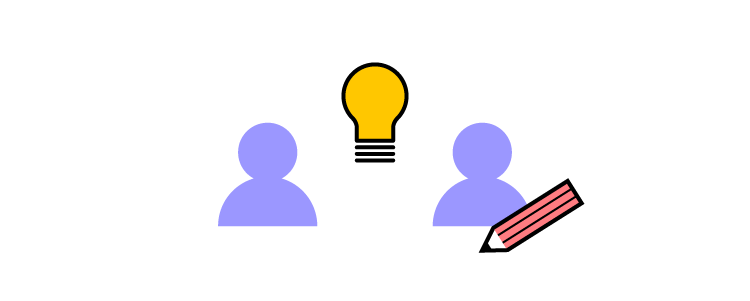
Design is much more than creating the look and feel of a product, isn’t it? It has a real impact on the people, processes, and business. We gathered top specialists who have influenced the way things are run in their companies to tell you their stories. It’s all for free!
Sign up and join us March 29th, 2022 to hear what you can do to improve strategic planning, scale and build design teams, and create efficiencies at work.
Let’s Introduce You to Speakers at Design Value Conference 2022!
Although the conference is only a one-day long, we invited a quite exciting group of design industry specialists that work on making design more efficient and impactful practice! The speakers include:
Maggie Dieringer, Design Operations Lead at Uber Eats, who helped grow the Design Program Management function at Uber from the ground up,
Erica Rider, Sr Manager UX at PayPal, who will talk about how she, together with her team, pioneered the next generation of DesignOps,
Salomé Mortazavi, Director of DesignOps at SiriusXM, who will give an overview of how she uses the Design Maturity Index to create business impact,
Omkar Chandgadkar, UX Design and Research Lead, who will share how he is reframing UX design as a “product offering” instead of a “process”.
https://t.co/CjYY3lBijK 🔥 What kind of value can you get from DesignOps? Join our Design Value Conference and hear how top leaders raise design impact in their organizations. Sign up now! pic.twitter.com/ryKcNbyg5r
Creating UI mockups is an essential part of the design process. Designers must take basic low-fidelity wireframes and bring them to life before moving on to high-fidelity prototyping and user testing.
This article explores the best practices designers to improve workflows and design better UI mockups. We’ll also recommend some helpful tools to help with guidance and inspiration.
With built-in icon sets and design libraries, UXPin allows UX designers to quickly build wireframes, mockups, and interactive prototypes. Sign up for a 14-day free trial to experience the versatility, flexibility, and speed of code-based design with UXPin.
Build advanced prototypes
Design better products with States, Variables, Auto Layout and more.
What are UI Mockups?
A UI mockup is an accurate visual representation of a final product’s screen. UI mockups are visual elements only; they have no functionality, and nothing is clickable. They’re just static mockups. UI designers use color, typography, assets, and actual content to create a final product or website mockup.
19 Best Practices for UI Mockups
Sketch Your Ideas First
Sketching is quick, easy, and risk-free.
Before diving into pixels and grid dimensions, sketch your thoughts to develop the first draft and organize your ideas on the page. Spend time brainstorming and experimenting with different concepts to get the creative juices flowing.
Paper is cheap, and you can sketch ideas wherever you feel most creative and comfortable–like a hammock in the backyard! Sketch different compositions and lay the various templates out for a side-by-side comparison to see which direction appeals the most–it only costs a little time and paper to explore ideas this way.
Start with Mobile Screens
Whether you’re designing mockups, wireframes, or prototypes, always start with the smallest screen and scale to the largest viewport. If you scale the opposite way, you often end up with unnecessary elements or complex layouts that don’t translate well to smaller screens, invariably taking you back to the drawing board!
Getting into a mobile-first design workflow ensures you prioritize the most content and UI elements first. Mobile-first design is also an essential strategy for responsive web design.
Use Wireframing & Prototyping Tools Compatible With Your Mockup Tool
If you’re using separate tools for different aspects of the design process, make sure they’re compatible-ideally you want one tool for wireframing, prototyping, and mockups. You should be able to go straight from mockups into interaction design, adding interactivity, animations, and page transitions to convert mockups into fully functioning prototypes.
UXPin is an end-to-end design tool with features and tools to take you from concept to design handoff fast! The Forms button on the left properties panel lets you choose from inputs, buttons, checkboxes, radios, and more to piece together wireframes in no time at all.
Or, skip wireframes and go straight to mockups with UXPin’s built-in design libraries, including iOS, Material Design (Android), Bootstrap, Foundation, and User Flows. Connect each screen (or Page in UXPin) with advanced interactions to build prototypes that look and function like a coded product. Teams can communicate through UXPin’s Comments, tag coworkers, and even assign comments to specific individuals.
Using a single tool for wireframing, mockups, and prototyping will save time transferring designs while eliminating errors from switching tools.
Sign up for a free trial and discover how UXPin can enhance your design workflow to build better user experiences for your customers.
Review Other Visual Successes
Sometimes the best way to learn is to observe.
Luckily, there are tons of resources for designers to find inspiration. Take advantage of these resources to check the latest trends and how designers approach similar concepts differently.
Here are five great resources for design inspiration:
Less is more when it comes to UI design. Cluttered user interfaces overwhelm users and severely impact cognitive load, resulting in a poor user experience.
Designers must design based on user research and only add UI elements, patterns, and components users need to complete a given task.
Prioritize these elements and remove the ones that aren’t necessary
Fit the remaining elements into a visual hierarchy based on importance
Create content blocks based on element categories
Add and subtract blocks into layouts according to priority
“Sculpt” designs at each iteration until they start resembling interface objects
Implement a Grid System
An organized grid system lets designs precisely measure alignments, white space, and content hierarchy to the pixel. Grids are also helpful for designing layouts for different screen sizes, maintaining consistency, and making it easier for engineers to develop the final product.
Take Advantage of Free UI Elements and Icons
Styling each button, icon, and graphic individually will often take longer than the mockup itself. Take advantage of UI kits and icon sets to design mockups faster.
UXPin offers several icon libraries and built-in design systems designers can drag and drop to build user interfaces. There is no need to import external files or install plugins; UXPin provides you with everything you’ll need to start designing mockups right away.
UI Patterns to Improve User Experience
UI patterns are critical for web/mobile apps or website design. These tried and tested patterns solve common usability issues and create familiarity for users to learn the new product quickly.
Designers must apply these patterns carefully and only use them to solve a specific usability problem. Unnecessary UI patterns take up space and could clutter a user interface, introducing further usability issues.
Use Vectors
Vector graphics scale quickly, adapting to high-definition, retina screens at two or three times the size. Designers should use vector files, like SVG format, for logos, icons, and other graphics to ensure that assets are always visually appealing across multiple devices and screen sizes.
Web-safe Typography
Always check your typography is web-safe before you commit to designing mockups. Wherever possible, try to choose from Google Fonts’ massive range of tested web-safe font sets.
If you’re going to use a custom font, make sure it’s web safe and chat to your developers about ways to optimize the delivery using a CDN so that they don’t affect performance.
Color Tools Save Time
Color is a significant factor designers must consider for mockups. Choosing the right color takes time, but luckily there are tons of tools to help you find a palette that’s right for your project.
Here are four awesome free tools we recommend for choosing color palettes:
Reusable components are a massive time saver and help maintain consistency. For example, you might want to use the same CTA button across multiple screens. You can create a component for the CTA and copy/paste it wherever you need it.
Master Component, which defines the properties of the Component.
The Instance Component is a single layer that mirrors the content from its master.
Any changes you make to the Master, copy to all Instances, thus saving time changing or copy/pasting properties manually.
Use Auto-Layout
Another time-saving workflow is auto-layout. Most design tools have an auto-layout feature that lets you group content to resize, fit, and fill your designs automatically.
UXPin’s Auto-Layout works on Flexbox principles which help developers understand the specifications and layout better at the design handoff.
Layers and files can quickly become a mess, especially if you’re saving individual layer files.
Whether working solo or in a team, develop a naming convention and system for organizing your files and layers. Following a consistent structure will streamline onboarding, handovers, and design handoffs.
Version control is critical if you’re working with a shared design system. How do you know when someone updates the design system? And how do you know if you’re using the most up-to-date version?
Version control allows you to see what version of the design system you’re using and even revert to earlier versions if necessary.
UXPin Merge’s version control system gives you the flexibility to manage your library version for each project. You can freely and easily switch between different versions you’ve added.
Make Files and Assets Accessible
Modern design teams work with remote team members, which means you need to make files, assets, and research materials accessible to everyone. The best option is to use cloud storage like Dropbox or Google Drive–be sure to follow a proper naming convention as outlined above!
UXPin lets you store assets and documentation inside the design tool, making it easier for engineers to find during handoffs. Engineers can also use Spec Mode to inspect properties, measure distances, and view the project’s style guide. By keeping everything in one place, UXPin helps teams reduce the margin for error or the risk of designers forgetting to upload specific files.
Preview on Live Devices
Live previews give you a glimpse of what your designs will look like on multiple devices after the development process.
UXPin’s Preview and Share feature lets you view designs in the browser or mobile devices using UXPin Mirror. You can also use the Auto set Preview Feature, which helps you see how your design behaves when you hit certain resolutions by manipulating the browser’s window.
Test, Test, and Then Test Again
UX design is about testing, making necessary changes, and testing again. It’s an iterative process to expose and solve usability issues so that they don’t end up in the final product.
While testing static mockups doesn’t provide as meaningful results as prototypes, designers can still get feedback on layouts or ask participants what they would expect to happen if they clicked a link or button. Mockups are also great for accessibility testing with visually impaired users to find out they’ve made the correct accessibility decisions.
Elicit the Right Feedback
Feedback can be brutal, but it’s so crucial for UX design. Aside from usability testing, designers should present designs to stakeholders and other team members for feedback. A fresh set of eyes and perspectives could expose things you hadn’t seen or thought of before.
Start Creating Great Mockups!
The most important thing to remember when creating mockups is that you’re trying to solve a human problem–not win a design contest! Consistency and cohesion are also significant factors designers must consider when adding color, typography, icons, assets, and other content.
Most importantly, you need the right tools! UXPin is an end-to-end design solution for designers to go from wireframing to mockups, prototyping, and the final handoff. Designers can also keep assets, documentation, and the org’s design system all in one place!
Ready to start designing UI mockups faster than any other design tool? With higher fidelity and more functionality? Sign up for a 14-day free trial and experience UXPin’s revolutionary code-based design tool.
Whether you design an ecommerce store or a simple website, landing pages are essential part of web design. They are often the first point of interaction between a potential customer and a brand. And you know what they say about first impressions – you can only make them once!
Therefore, in terms of landing page UI, it’s important that it’s both user friendly and gives visitors a unique feel. In this article, we’re going to discuss how you can design a landing page that is both appealing to the user and drives conversion rates.
What Does a User-Friendly Design Mean?
‘User friendly’ means an interface design that’s simple to use.
It all began back in the 1970s.
As computers continued to grow in popularity, a gulf appeared between those who could code – the primary way to design interfaces with a program – and those who couldn’t. With the market reaching a broader audience, it became essential to build programs that these new users could actually use.
Arguably, the biggest jump in user friendly design at that time came with the release of the Apple Lisa, i.e., the first publicly available computer with a graphical user interface (GUI), which is still with us today.
Today, developers, UI and UX design teams continue to perfect the user friendly experience. Especially nowadays when poor or ‘user-unfriendly’ design choices can hurt business.
A refined, user friendly web design should make the experience of using a website easier. Users should have no problems with navigating a website, a mobile app, or a game without having much cognitive load. The website should be fluid, intuitive, uncomplicated, and quick. And a UX design should be seamless and consistent across devices.
This calls for a question:
How to Design Landing Page UI?
We’re going to take a look at two stages – UI design and landing page testing. Let’s start with the former, that is the design stage where we will create a landing page.
Master the UI Design Stage
Let’s say you’re done with UX design. Either you completed this stage or you got help from a UX designer who created the Information Architecture of the landing page based on user research and other factors.
In the UI design stage of creating the landing page UI take care of the look of the landing page and interactions of all UI elements.
1. Trigger the right emotions by using the right color, typography, and images
Your brand is one of the most important assets you have – a way of differentiating yourself from the competition in a crowded market. Your company’s color palette, slogans, tone should all speak to the user. So should the imaginery, because as you might have heard a picture is worth a thousand words. All in all, a landing page should align with the visuals.
According to design tool Canva, ‘research shows that up to 85% of consumers believe color is the biggest motivator when choosing a particular product, while 92% acknowledge visual appearance as the most persuasive marketing factor overall.’
As you begin figuring out your landing page design, ask:
What message do you want to communicate?
What emotions do you want to convey?
What personality do you want to display?
For example, if your company creates homemade arts and crafts, you’re going to want users to feel warm and cosy. Respectively, if you operate a high-powered real estate agency, color palette, typography, and images will underline the values you want to convey, for example, professionalism, experience, and success.
2. Make sure it’s both desktop and mobile-friendly
There are around 29 billion connected devices in the world. By 2023, that figure’s estimated to be 31 billion. Your landing page should work on all of them. Not just because, in the US alone, 211 million Google searches were performed on mobile in 2020. Also, not only because ‘unresponsive’ websites harm your SEO rankings. Nor due to the fact that 63% of all organic Google searches are on mobile.
Namely, it’s also because a responsive, mobile-friendly design creates a positive user experience whatever device your users are on.
That being said, mobile responsiveness should be a consideration early on. This gives you time to assess the visuals on your site, like color, images, and even placements to make sure they’ll work or translate to different screen sizes and devices.
3. Acknowledge the power of images on user’s attention
As visual creatures, we’re drawn to images – particularly faces and moving vehicles; a primal response. Our brains tell us ‘this might be important’, so we subconsciously sit up and take notice.
Use this to your advantage when planning your landing page UI.
You can often direct the user’s attention to a specific part of the page, such as a CTA, with good image choice. One way is to use the image of someone looking in that direction. Our eyes then naturally follow their gaze. Just the same way that, when you see a chap on the street staring up at the sky, you’ll instinctively look up, too.
However, this isn’t always a fool-proof method for website design page UI. Some designs can have the reverse effect. This is particularly apparent when websites use an image to break-up the interface, which can also break the flow.
4. Use common UI elements
Familiarity is a really good way to keep your designs user friendly. Your design language should be consistent across your site or an ecommerce store, which makes it a lot easier and more efficient for users to navigate your page or site.
As tempting as it is, there is no need to reinvent the wheel. Instead, think of it like ‘levelling up’ the user. By deploying UI design principles like this, you can essentially ‘educate’ to in use skills across your entire site, not just your landing page.
If you don’t have it already, build a comprehensive UI kit with all the elements, so you can keep your design consistent and re-use the same elements instead of building them from scratch all of the time. Follow our guide on UI kits for creating quicker mockups.
5. Choose the right interface elements
You’ll want to use familiar interface elements, too. Think of the humble search bar or the hamburger menu. Users see these components every day, on millions of websites and ecommerce stores, so they already know how to use them and the expected outcome.
There are plenty of interface elements you can use, including:
Input controls like text fields, radio buttons, toggle switches, and date fields
Navigational components like breadcrumb trails, tags, and paginations
Informational components like icons, notifications, and progress bars
Containers
On occasion, you’ll come across two elements that both achieve the same objective.
For instance, you could use radio buttons or drop-down lists to gain information from a user. At this point, you’ll need to assess how each element impacts the user friendliness of the landing page. A drop-down list may save space on the web page, but it does make the data more difficult to parse.
If you need a landing page design template, see our blog post that goes through the elements of the best LP designs, such as designing testimonial boxes and other ingredients of a perfect landing page: Landing Page Design Trends That Increase Conversion.
6. Use the right UI design tools
You’re probably fizzing with ideas. You can’t wait to crack on with creating new design projects that have a positive impact on your users. To make sure your vision aligns with the end-product, use UI software that simplifies the process – from that initial idea to the on-going improvements. Let’s be honest, there is always feedback to listen to and changes to make. Choosing the right UI software helps speed up this part of the process.
UXPin is a great product design tool for creating interactive UI designs (among others, it offers states, conditions, interactions, and variables). You can keep all your designs and manage the entire design process through the tool (from simple wireframes all the way through to fully-interactive prototypes).
UXPin also offers Merge technology, which helps designers prototype with fully interactive components, meaning that you don’t have to design from scratch and add interactions over and over again. You can design interfaces using the same components that devs build products with. This means easier design-development handoffs, as both sides already have the components in the code, removing the need for constant back-and-forth communication.
Tips for Landing Page Testing
Best designers know that the work doesn’t stop with launching the site. You need to test the landing page to know if it works or not. The most popular way of doing that is through conducting A/B testing or compiling data via heatmaps or session recordings.
1. Run A/B tests
Once your design is up-and-running, it’s time to see just how user friendly your landing page UI really is. That means creating two versions of your page, running tests with users, and seeing which shows better conversions, sign-ups, or whatever goal you have.
If you feel conversions are too low, no-one is signing up to your webinar, requesting that ebook, or downloading a mobile app, A/B tests may tell you what’s behind that. There are a lot of things you can test, be it headers, imagery, colors, but remember to test one element at a time to get best results.
Continue running tests. Refine the ‘winning’ A/B test, create two more versions, and again, let users determine which one really works for you (they know best, after all). If you need any tips on running an A/B test, check our recent guide A/B testing in UX Design.
2. Use heatmaps and session recordings
As part of your testing, make use of heatmaps and session recording tools. These give you amazing insights into how users are viewing and using your landing page. It may be hard to take at first – especially when you’ve spent so long on a design – but know that this data will help you build a stronger, more successful end-product.
Look for trends and patterns. If users are spending too much time looking in the wrong places, and ignoring the elements with real business value, such as a CTA button, then see where changes can be made.
Not all landing pages perform poorly based on UI design alone. But using heatmap and recording tools will give you a better idea of where the issue lies, and how to fix it. It may be that you’re asking for a credit card and your users aren’t ready to commit to purchase yet or maybe the header is too big and it pushes the CTA button way too low on the page.
What’s now?
In today’s digital marketplace, creating user friendly experiences is critical, this also includes product page UI. With so many options just a click, tap, or app away, users are free to find the experiences that suit them.
As customer expectations continue to rise – and 58% of global users say they’ll ditch a brand that doesn’t meet these expectations – it’s the perfect time to place users at the heart of everything you do. This is as much a cultural shift as a technological one. A shift you can start today with UI software that delivers on your users’ expectations.
Begin your UI journey with a single, unified vision. A design that has a clear look and feel, aligned to your own brand; a design that conveys a clear message; a design that’s as easy to use whether your users are old enough to remember buying the original Apple Lisa, or they’ve only just bought their first smartphone. If you’re looking for a tool that will help you create unforgettable user experiences, then request access and check out UXPin Merge.
People often use web design and development to describe both design and development disciplines. In the early days of the internet, this description might have been accurate, but nowadays, these disciplines are as distinct as architect and builder.
This article will explore the difference between a web designer and a web developer and what modern website design and development looks like. We also look at various design and development job titles to understand the different disciplines.
UXPin bridges the gap between design and development with a revolutionary code-based design tool. Instead of rendering vector graphics, UXPin renders HTML, CSS, and Javascript so designers can build high-fidelity prototypes with the same functionality as a coded website. Sign up for a free trial.
Build advanced prototypes
Design better products with States, Variables, Auto Layout and more.
What is Web Design and Development?
Web design and development is a blanket term for describing the end-to-end process of building a website. The web designer creates a visual representation of the website, which they hand off to a developer who turns it into HTML, CSS, and Javascript.
What is Web Design?
Web design involves creating the visual elements, pages, and navigation of a website. Web designers are responsible for color, assets (images, logos, icons), typography, and components you see on screen. They must also decide how a web page must look across multiple devices, including desktop, tablet, and mobile–also known as responsive design.
Web designers work with design tools that produce a graphical representation or prototype of the website. Unfortunately, most design tools don’t render code, so developers must recreate the website following the designer’s mockups and prototypes.
What is Web Development?
Web development is the process of writing HTML, CSS, and JavaScript to create a functioning website. A professional Web development service also covers web servers, databases, security, and other elements that users don’t see – also referred to as the back-end.
There are two separate web development disciplines; some developers do both (full-stack developers), while others specialize in one or the other.
Front-end developer: develops everything the user sees (client-side) and interacts with, including websites and applications. They’re responsible for writing the HTML, CSS, and Javascript to turn a web design into a functioning website or app. Front-end developers must understand how different browsers and devices render information and write code to allow these differences.
Back-end developer: engineers server-side environments to make the website or application function. Users don’t see the back-end developer’s work, but it significantly impacts the website or application’s functionality and performance. Back-end developers must be competent in many programming languages, like Python, PHP, and Java, because they deal with servers, APIs, and even AI/machine learning so users can send and receive data from the website or application.
If you would like to know more about the history of web design and development, this fascinating timeline takes you on a journey from 1990 to 2017, highlighting each significant moment in time.
Web Design Job Titles and Career Paths
Web design is a broad term encapsulating many roles and disciplines. We’re going to four of the most popular web design disciplines, including:
UX design
UI design
Product design
DesignOps
UX Design
UX designers (user experience designers) focus on the usability and accessibility of a website or application. They conduct user research and create personas to empathize with customers, and design a website or application to meet their needs.
UX designers follow a design thinking process to fully comprehend a user’s problems and how to solve them. The five stages of the design thinking process include:
Empathize – Discover what your users need
Define – Determine the problem you want to solve
Ideate – Develop possible solutions to users’ problems
Prototype – Create prototypes
Test – Test your prototypes with users & stakeholders
UI design (user interface design) is a UX designer specializing in creating the visual design elements and interactions for a digital product or website–buttons, color, icons, typography, images, forms, and other elements and components. Additionally, UI design is concerned with interactivity like animations and microinteractions.
UI designers also follow the design thinking methodology, but they focus more on what users do and how they use their devices. Here are some other skills specific to UI design:
Product designers perform many of the same tasks as UX designers, except that they work with existing products. A large part of a product designer’s job is to develop a product to grow its revenue while ensuring the brand stays relevant and competitive.
Instead of designing elements and components from scratch, product designers use an existing design system to build new features and interfaces. Like UX designers, product designers must build prototypes for usability testing and design handoffs.
DesignOps is the youngest of these four disciplines but has grown in popularity and significance during the last decade. Rather than focusing on design itself, DesignOps looks at optimizing design processes and workflows.
DesignOps is a role, but it’s also a mindset. A company can implement DesignOps without someone managing it. As a company grows, a DesignOps leader can help to scale design, reduce inefficiencies, and improve collaboration.
Here is a typical end-to-end web design and development process:
Designers and developers receive a brief for a new website or product.
Designers start by conducting user, market, and competitor research. They create personas and user journey maps to empathize with users and understand the core problems.
Next, designers come up with design ideas with sketches and paper prototypes. These hand sketches make it easy for designers to collaborate and develop many ideas quickly.
After a few rounds of paper prototyping, designers create wireframes of the website or application. They use wireframes to design the information architecture and test navigation.
Next, designers create mockups and high-fidelity prototype replicas of the product or website for usability testing and sharing with stakeholders.
Once testing is complete, designers prepare their mockups and prototypes with documentation for the design handoff–the process of handing the designs over to the developers.
Developers must use the designs as a reference to build the website or application using HTML, CSS, and Javascript. They might use a front-end framework to help develop the digital product faster.
Front-end and back-end developers use packages, APIs, and other tools to enhance the website or application’s functionality or connect it to other products (both internal and external).
Once developers complete the development phase, designers conduct a quality assurance process to ensure the digital product looks and functions correctly.
Designers can use UXPin during every phase of the design process to create user flows, wireframes, information architecture, mockups, and prototypes. With Preview and Share, designers can use prototypes for testing or share ideas with stakeholders. Designers can use UXPin Mirror to share and test prototypes on any iOS or Android device when designing mobile applications.
UI designers can create beautiful icons and UI components with advanced interactions to create immersive user experiences for your customers.
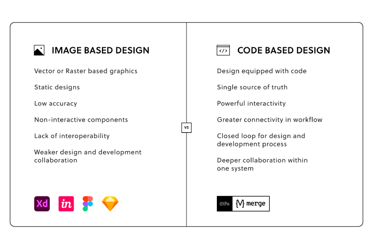
Unlike other design tools that render image-based designs, UXPin is code-based, giving your prototypes higher fidelity with more functionality. Here are four code-based features you won’t find in traditional image-based design tools:
States: Apply multiple states to a single element or component, each with different properties, interactions, and animations.
UXPin also allows you to create, manage, and scale a design system alongside your design projects. You can even set permissions and add documentation and guidelines for product and design teams.
Designing With MUI in UXPin
Not sure where to start designing elements and components? With UXPin’s new MUI integration, you can use MUI’s interactive React components to create fully functioning high-fidelity prototypes.
Designers can customize MUI components to meet brand and product requirements. At design handoff, developers copy the component’s props from UXPin to develop the final product.
Store your custom MUI components in a repository and use Merge to sync your new design to UXPin’s design editor for designers to design new features.
Ready to get started with web design and development in UXPin? Sign up for a free trial and experience how one code-based design tool can revolutionize your design projects.
Codification is an integral part of evangelizing a design system and getting adoption from teams. A design system’s documentation must educate teams about usage, company policies, best practices, governance, and branding with examples and tutorials.
Enhance collaboration between design and development while creating a single source of truth with UXPin Merge. Sign up for a free trial to explore UXPin’s revolutionary Merge technology through our MUI integration.
What is Codifying a Design System?
The Cambridge Dictionary defines codification as “the act or process of arranging something, such as laws or rules, into a system.”
Codifying a design system or design system codification is the process of organizing a design system’s components into a searchable archive or hub with guidelines, principles, documentation, tutorials, governance procedures, and more.
This centralized hub serves as a working document for team members to reference when building new products or searching for the correct component and how to use it–for example, proper color usage and header tag sizing.
The hub will also outline the design system’s governance procedures teams must follow to introduce new elements or promote patterns. Like GitHub’s Primer, some design systems display a release history so designers can learn what’s new and a design system roadmap for future releases.
Why Do You Codify a Design System?
Like any digital product, a design system needs documentation to learn and understand how to use it. Having a design system is one thing, but team members will invariably use its components based on opinion and interpretation without proper direction.
It Provides Clear Instructions
For example, if you purchase a 1,000 piece Lego set without instructions, there are endless possibilities. But, if you follow the instruction manual, you’ll use every piece as intended to build a single structure, consistently the same, every time.
Design system codification ensures every team member follows the same guidelines for designing new products. So, no matter who the designer is, they should always get the same result.
It Streamlines Onboarding
Another reason you want to codify your design system is to streamline onboarding. Instead of someone sitting with new team members to teach them about the organization’s design system, they can visit the documentation and learn everything they need to know without oversight.
11 Tips to Codify a Design System
There is no standard “how-to” guide for documenting a design system, but there are several things you must consider. Here are eleven tips for codifying a design system.
1. Overview with Design Principles
Every design system must include the organization’s core principles and values–preferably on the home page, so it’s the first thing team members see. These principles answer the why behind your design system and choices.
Clarity: Eliminate ambiguity. Enable people to see, understand, and act with confidence
Efficiency: Streamline and optimize workflows. Intelligently anticipate needs to help people work better, smarter, and faster
Consistency: Create familiarity and strengthen intuition by applying the same solution to the same problem
Beauty: Demonstrate respect for people’s time and attention through thoughtful and elegant craftsmanship
We have a complete guide about design principles and how to establish them for your company here.
2. Brand Style Guide
A brand style guide provides teams with direction on how to represent the brand through design and copywriting. Some companies, like Stack Overflow, also include the correct usage of its name.
You should also include your logo in multiple sizes, contrasts, and formats so team members can download and use the same files throughout your product.
3. Writing Style Guide
Some design systems include the writing style guide as a subheading in the branding guidelines. But, if you have a lot of writing or branding instructions, it’s best to keep these separate.
The writing style guide should provide instructions for all copy, including content, marketing, ALT text, and UX writing. Some points you might want include:
Voice and tone
Principles (writing grade, slang/jargon/joke policies, language to avoid, etc.)
Grammar
Structure (for long-form content like articles and landing pages)
Best practices include recommended (and mandatory) methods, tools, and processes for your organization’s design system. What image formats must teams use, how do they name them, and where do they store these assets to make them accessible to the whole organization?
You might separate your best practices by the department to avoid confusion–for example, design best practices vs. engineering best practices.
The goal of your best practices is to ensure cohesion and consistency in the way teams work so anyone can step in and take over someone’s work when they’re absent or if they leave the organization.
Stack Overflow includes a list of FAQs that explains some of the design system’s best practices (likely based on questions from team members), for example:
Why do we have to write CSS inline?
If CSS is inline, why do we need a style tag?
What is preview text?
5. Easy, Searchable Navigation
Designers must approach a design system the same way you would any other product–with a user-centered design approach. Your design system should serve users by providing easy, searchable navigation.
Separating your design system into menus and submenus can help teams narrow down precisely what they need. Note how Shopify Polaris uses simple submenus to categorize its design system.
Many design systems use a standard dashboard layout with category links on the left with primary navigation and a search form in the header. GitHub Primer, Salesforce Lightning, Shopify Polaris, and others use this format for their design system documentation.
6. Contributing and Governance
Managing and scaling a design system must be a democratic process where team members can contribute and make suggestions. Most leading design systems allow feedback and outline the governance procedures for making contributions.
GitHub Primer outlines various scenarios for team members to voice their opinions and suggestions:
Participate in discussions: Provide channels for teams to start and participate in dialogue through forums, Slack channels, Zoom calls, etc.
Propose a new pattern: Setup a specific channel or ticket for proposing new patterns and outline the processes and protocols to manage employee expectations.
Documentation improvements: As a working document, your documentation must be open to evolving with the product and technology. As GitHub Primer puts it, “we’re always trying to make it better and more useful.”
Bug reporting: Bugs adversely impact usability, so you should have a line of communication for teams to report issues so the DS team can fix them fast.
Contributing: Some designers and engineers love solving problems and want to be a part of the product’s evolution. Contributing gives team members ownership of the design system and recruits more evangelists to promote its benefits.
7. Component Library
Your component library forms the core of your design system documentation, and it’s where teams will likely spend most of their time. Here are some things you want to consider including in your component library:
An example of each component
Interactivity guidelines
Code snippets
Page and layout templates
Dark/light variations
Use cases
Dos and don’ts
Sizing
This list is by no means exhaustive; you may have to include more detail based on your product and team dynamic.
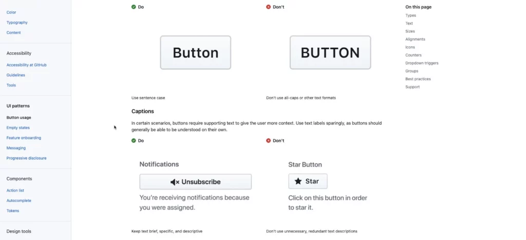
Also, use images to complement explanations, no matter how simple they may be. Look at this example from GitHub Primer, where the DS team uses images to explain dos and don’ts–even though you might assume capitalization would be obvious to interpret.
The problem is that team members use screenshots or color pickers to grab hex codes from other UIs, often a shade or two off. Over time this results in multiple shades of the primary color palette.
To avoid color inconsistencies, design system documentation must include color palettes in multiple formats, including:
Visual swatch or example of the color
HEX code
RGB code
Design token or CSS variable (if applicable)
9. Icons
Include a complete list of approved icons (whether you have a custom or stock set), their usage, and guidelines. Remember to include examples for multiple scenarios, for example, outline, circular, color, etc.
10. Typography
Your typography should include approved typefaces with examples for the various styles, like bold, semibold, regular, light, italic, etc. You should also stipulate when and how to use each font and style–for example, bold for headings and regular for body copy.
Other typography considerations include:
Desktop vs. mobile sizes
Scale, letterspacing, line height, weight
Alignment
Font stack or family (for CSS)
CDN link
File downloads for various applications – TFF, WOFF, OTF, etc.
Hierarchy
Color contrast
Accessibility
Locational rules – alerts, navigation, body, footer, etc.
11. Tools
You should include a list of approved tools and workflows with onboarding instructions for new team members. These tools include:
Enhancing Design System Management & Collaboration With UXPin
UXPin has a design system solution no matter where your organization is in maturity. With UXPin’s Design Systems feature, teams can build, manage, and scale a design system from scratch.
Organize your design system into four categories:
Colors
Typography
Components
Assets
Include documentation using descriptions for each element, including links, examples, usage, and more. You can also set permissions to prevent team members from making unauthorized changes.
A Single Source of Truth Using Merge
With UXPin Merge, you can sync an existing design system hosted in a repository to UXPin’s editor so design teams can build mockups and prototypes using code components–creating a single source of truth across the organization.
Any updates to components in the repository automatically sync to the design editor, and UXPin notifies teams of the changes. You can sync React components directly to UXPin via Git or use our Storybook integration for other popular technologies like Angular, Vue, Ember, HTML, and more.
Product development process involves 7 steps: ideation, research, prototyping, UI design, validation, development, launch; nevertheless, it’s not a linear process.
Before you jump into developing ideas, you need to build a strong strategy to guide your vision; figure out what you need to create and how you will measure its effectiveness.
Creating prototypes is essential, they help you refine the final product and they are here to make sure you’re developing the right product.
Another important aspect of product development is collaboration and transparent communication. Pick tools and a team model that supports those two things.
You may encounter a few challenges along the way, involving continuous iterations, finding the balance between requirements and key objectives, etc.
Did you know that as many as 49% of companies don’t follow a consistent product management process? No wonder that 21% of them fail to create products that meet customer needs! Developing products is challenging, which is why it’s crucial to approach them in a logical way, i.e., to follow a well-thought-out plan.
In this guide, we’re going to discuss what it takes to develop a digital product that customers will use for many years to come. We’ll begin by explaining the key elements of the product development and design process, and how you can build out a bullet-proof product strategy. We’ll also discuss the right approach to prototyping, how you can build the best team, and make the most of your product’s potential.
Buckle your seatbelt and let’s begin!
Understanding Product Development – A Step-by-Step Approach to Developing Products
Before we take a deep dive into the product development and design process, allow us to first provide you with a bit of context. Namely, each product goes through its own “journey”, known as the product life cycle. It’s built around five key stages:
Introduction, when you first bring the product to the market and promote it among potential buyers (i.e., ideally, those who align with your ideal customer profile.)
Growth, which comes once you’ve established awareness and continuously grow your customer base. You can think of it as the time you’re riding the wave and making the most of your product’s sales potential.
Maturity, when your product is at its peak and has reached its full capacity. Your goal here is to keep the good fortune going for as long as possible.
Decline, when the product sees a continuous decrease in users. At this stage, you can either withdraw it from the market or redefine it entirely in an effort to stay afloat. All products come to an end, though there are many factors that will influence whether it happens within a year, ten, or in a hundred years!
Now that you’re aware of these steps, let’s look at what happens before you bring your product to the market, as well as in its early development stages.
Product Development Process – 7 Main Steps Explained
While you’ll find a number of different approaches online, it’s important to know the most important elements of the product development process. These are:
Step 1: Ideation
As the name implies, it’s the process of generating and brainstorming ideas. The key here is to get together as a team and allow yourself to truly unravel your creativity.
Here are the top three methods you can use:
Problem analysis, where you seek to understand customer pain points, goals, and challenges,
Benefit structure analysis, which comes down to first identifying the key benefits of a product concept, and comparing which idea ticks the most boxes,
SWOT analysis, where you analyze the strengths, weaknesses, opportunities, and threats behind each idea.
Step 2: Research & Idea Screening
Once you’ve shortlisted your ideas, it’s time to engage in the initial research. We particularly recommend:
Running surveys to validate market demand for your product idea,
Launching a PPC campaign to check if you can genuinely intrigue people and get click-throughs, and
Creating a landing page, where you can see user on-site behaviour and if they’re interested in the solution.
Step 3: Prototyping
The first step where you generate visual concepts. Prototypes come in two forms – low fidelity (lo-fi) and high fidelity (hi-fi). Lo-fi prototypes have a very simplified layout, navigation, and interactivity (if any). They can be generated quickly, as they lack visual detail.
Meanwhile, hi-fi prototypes are much more sophisticated, with more interactivity, colors, and branding. We discuss them in the next step.
Step 4: Detailed Design
High-fidelity prototypes closely emulate what your real-life product could look and feel like. Here’s where you try to distinguish your solution from any competitors on the market.
While they take more time to develop, there’s also a possible workaround – namely, using a tool like UXPin Merge, which allows your designers to create interactive designs by using production-ready code components (coded and built by developers).
Step 5: Validation & Testing
At this stage, you engage in final validation of your product concept. One of the best ways is to do usability testing. You can, for instance, run remote usability tests, where you observe how people move around and comment on your product as they complete assigned tasks. Alternatively, you can engage in in-house tests, where you ask users to walk you through the product in their own way. The goal here is to give testers independence and see how they use your solution.
Step 6: Development
A traditional step known as the “developer handoff”. Your designers hand over designs and specifications, and your software developers use them to bring them to reality. As mentioned earlier, there are tools that could start design–developer communication earlier, allowing programmers to code the solution directly from the prototype’s component and copy-paste code, a process that is made possible with UXPin Merge.
Step 7: Launch
Finally, you prepare a go-to-market strategy and launch the product to the market. Here’s where you start analyzing real-life statistics, user engagement metrics, and continuously improve upon your idea.
There’s much more to say on each of the stages above. If you’d like a deeper dive, we highly recommend giving our product development process article a read!
Creating a Strategy as the Necessary Step to Effective Product Development
Every successful product development process requires a strategy, i.e., a blueprint that will guide your actions and decisions regarding product development. In some cases, this even includes adopting broader approaches like a super app strategy when building multi-service digital ecosystems. Specifically, there are three main reasons why you need to put one in place:
To develop and communicate your vision – unless you want to build the product by yourself, it’s worth sharing your idea and plan of action with the rest of your team. It will help you get them on board, and ensure you’re all going in the same direction.
To spot problems and prepare for them – let’s be honest, developing products is risky. Creating a product development strategy will not only allow you to identify potential threats but also better prepare yourself to tackle them.
To define and measure success – success means different things to different people. You need to find out what your definition of success is, and what metrics you’ll use to measure it.
How to Come About Creating a Product Development Strategy?
Let’s now take a look at a few tips that will be a good starting point to guiding your strategy.
1. Figure out what problem you want to solve
To develop a product and to successfully launch it, you first have to understand the problem you want to solve. This will require detailed research. Dig into your social media, Google Analytics, talk to your prospects, check what people say about competing solutions. You get the idea. Every decision you make has to be backed up by data.
2. Understand how you’re going to solve it
You identified the problem, now you need to come up with a solution. To develop a product, create a product roadmap that will list all features necessary to effectively tackle your target audience’s problems. Decide on each feature through the prism of functionality, usability, and desirability.
3. Visualize your masterpiece
You have to go through four stages:
Ideate – create concept drawings and prototypes to quickly identify strong and weak sides of your potential product,
Prove – make sure there really is a business case for it by collecting feedback. The key is to focus on the right target audience, otherwise, all the conclusions you’ll draw might be irrelevant,
Refine – based on the information you’ve gathered, you can start modifying your product to better meet users’ needs. Remove all unnecessary features which only clutter the user experience,
Build – you can finally start building your product. The success at this stage will depend on having the right team and making sure both developers and designers can effectively collaborate.
4. Measure success
Your product development strategy shouldn’t be set in stone, quite the opposite. Depending on your product’s performance you should continuously modify it. However, first, you have to understand what success means and how to measure it. It is the number of downloads, NPS score, or maybe your retention rate?
How to Create Effective Product Prototypes? Four Tips Worth Following
Now that you know the main product development stages and how you can approach creating a strategy, it’s time to zoom in on creating prototypes.
Before you proceed with prototyping, make sure that you can answer the following questions:
What will the purpose of the prototype be?
Is the prototype for users or stakeholders?
How will testing out the prototype help us get business-oriented answers?
What team setup and skills do I need to execute our vision?
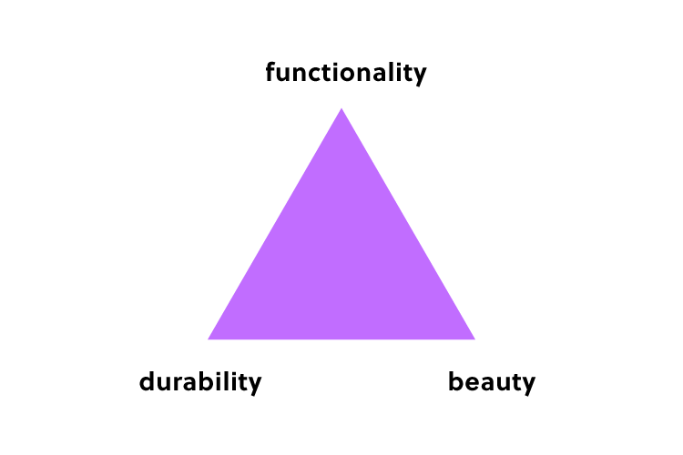
Once you’re clear on your goals and visions, we recommend turning to the Durability, Aesthetics, and Functionality triangle to identify your top priorities.
If you know that your prototype requires real-time updates and live data to be effective, prioritize Durability.
If the goal is to test our new or improved features, your top objective should be Functionality.
Respectively, if you’re going to evaluate visuals and branding, focus on Aesthetics. However, don’t jump to high-fidelity prototypes straight away, which brings us to the next point.
Remember about wireframing
Tempting as it may be, hi-fi prototypes should be developed only after you’ve thoroughly tested out your concepts, such as user journeys or informational architecture. As lo-fi prototypes are quick to develop, you can get a large number of testers in a relatively short time. As a result, you’ll know if each functionality or concept is not only understood by users but is also appealing to them.
Collect user feedback
There are a number of ways you can test out your prototypes, including surveys, live session recordings, and focus groups. This is the stage where you should value honesty and get comfortable with the uncomfortable. While collecting feedback might potentially delay your product launch or turn the entire vision upside down, ultimately, you’ll end up with a more user-centric solution.
Use the right tools
Without the right software, you’ll have no way to design, share, and collect feedback on your prototypes. While there are a number of prototyping tools on the market, from simple wireframing web editors to complex desktop apps, we can confidently say that one solution stands out – our very own UXPin Merge.
It functions as the link between your designers and developers. How so? Merge technology lets your designers create prototypes using ‘live code’ components, (in simple terms, the parts of software that your developers have already coded for the product).
As they’re using the latest version of the product to further improve upon their designs, it’s easy for design and software teams to collaborate and discuss project requirements.
Now that we’ve mentioned developer–designer communication, it’s worth giving the topic a bit more focus in the next section.
How to Build an Effective Product Development Team?
There are four areas worth focusing on while building a product development team: hiring, leadership, internal processes, and career progression. Let’s take a look at each in more detail.
Hiring
Whether you achieve success highly depends on the team you hire. Here are a few things worth keeping in mind:
Hire for both soft and hard skills
Build a skills inventory – identify the skills you have as well as those that you lack
Opt for the right skills assessment methods
Stay proactive – don’t expect the best talent to come to you, reach out first before someone else does
Leadership
Leaders play a crucial role in making sure that their product development team achieve their full potential. Not only are they responsible for building an innovative culture, but they also set the direction for the entire organization and ensure that everyone works towards one goal. The best leaders give their talent room to grow, trust them to make their own decisions, and stay away from micromanagement.
Internal Processes
In order to allow for smooth cooperation, it’s necessary to put the right internal processes in place. Here are a few aspects you should pay attention to:
Selecting the appropriate team structure – you can choose from a centralized, embedded, or flexible structure. We will discuss each one in more detail in the next section.
Use the right tools to boost dev-designer collaboration – you can consider Miro to facilitate your brainstorming session, and turn to UXPin Merge to make product prototyping smoother,
Writing product briefs – to make sure that everyone involved in the project knows what’s expected of them, it’s worth creating project briefs to define the scope of work,
Set up regular meetings – the best way to ascertain that progress is made and that everyone is on the same page is by meeting up regularly. Consider daily stand-ups, one-on-one’s, and team meetups.
Career Progression
As you’ve put a lot of effort into hiring your team, you have to give them room to grow if you want to keep them engaged. This involves designing career paths. Make sure that they align with your employee’s aspirations – not everyone wants to become a team leader. Therefore, it’s advisable to also include lateral career paths.
Now that you know how to build a team, let’s move on to another critical organizational question:
How to Remove Silos Between Your Design and Development Teams?
How designers communicate with software developers largely depends on the product development team setup. There are four key structures (if you’ve worked for a number of companies, high chances are, you’ve seen all of them!):
Centralized
Designers work on a number of projects under the same manager, who, themselves, report to the UX or Design Director. This structure is good for maintaining a cohesive product vision, but tends to be slow when it comes to roadmap execution.
Embedded
These teams are cross-functional, i.e., they have members of different departments (developers, designers, QAs, and others) on the same project. This model is popular, as it creates a sense of common purpose among employees from different disciplines.
Flexible
Each member reports to their direct manager (for example, the Design Team Leader), but collaborates with the project manager on a daily basis. This can disrupt work, as employees might hesitate which topics should be raised to their superiors, and which ones should be brought to the attention of the PM.
Contractual
Contractual teams are built of external contributors, who report to a specific in-house employee who oversees the project. These individuals might be in touch with one another, but ultimately, it’s the project lead who makes the final call.
As you can see, certain models are more prone to silos than others. That being said, there are some tips that will help ensure the right collaboration among teams, regardless of their setup. These are:
1. Determine which setup your team most closely resembles
How many designers are there on the team? How often do they communicate with developers on tasks? Consider where the current structure performs well and which areas require improvement. Don’t be afraid to question the status quo, and consider reorganizing the project structure.
2. Make sure designers have a voice
Usually, designers are outnumbered by developers on projects (just as in PayPal’s case). As a result, their opinions might not resonate strongly with the team. In the long run, this will not only lead to silos but also push user-centricity to the back seat. This would be catastrophic for your product. Leaders should advocate for all perspectives, even from single team members.
3. Give designers the right tools
To ensure effective collaboration with developers, it’s important that designers use UX, UI, and prototyping tools that help them find common ground with tech team members. Here’s where UXPin Merge will work amazingly well, as it allows your designers to use real-life code components imported from Git or Storybook. This will result in at least two benefits:
Your designers will speed up their work on designs, as they won’t have to create visuals from scratch,
The visuals will be more relatable to devs, as they’ll be based on the code they’ve developed.
Top 3 Challenges in Product Development and How to Overcome Them
Product development and design can prove challenging, there is no shame in admitting that. To show you that you’re not alone in your struggle, we’ve decided to talk to a few business experts to share the problems they had to face. Here is what they said:
Sep Niakan from Condoblackbook says that identifying your customer’s pain points is a challenge he faced while developing products. He believes that product goals should revolve around the needs of your target audience. While it might sound obvious, Sep claims that many companies do the opposite, i.e., engage in market research post-product-launch which is counter-productive and costly. Product testing should take place early in the development process and shouldn’t end at product launch.
Finding balance between immediate product requirements and long-term business objectives is a pain point that Robert Johansson from imgkits has shared. He says that it proves problematic to decide how much to invest in initial product development to still be able to meet long-term objectives. For this reason he recommends not skipping market research and prototyping as this will ensure that your money is well spent!
Michael Varga, Senior Designer at Creative Navy UX Agency, points to another common challenge – the need to adapt the product continuously. He says that sometimes, the team discovers a piece of insight that challenges the product vision. While it might be tempting to disregard it and stick to the original plan, he advises against it. It’s important to realize that the design process, despite being systematic, also comes with its set of uncertainties. A successful product will make up the time spent on its numerous refinements.
For more insights from experts, take a look at our product development challenges piece, in which 10 experts discuss the challenges and how to overcome them.
Product Development and Design – Improving Design Workflow and Operations
It’s safe to say that DesignOps is a crucial element of effective product development. It’s about improving processes, people, and technologies to boost product design and create more business value.
What can you do to enhance your design workflow and operations?
Let’s now take a look at a few tips that will help you improve your Design Operations.
1. Let designers focus on what they do best – design
It’s quite common to see designers performing a variety of tasks including UX research, creating design architecture, UX writing, etc. While this scenario might be unavoidable at a smaller company with a limited budget, it’s best to be avoided. Designers should be given enough time and mental space to focus on design work, as that’s what they’re competent in and what they were hired for.
2. Come up with good collaboration routines
If you want to improve your design workflow, then you have to ensure smooth collaboration between designers and developers. This calls for putting in place some collaboration routines including weekly meetings, and daily standups to make sure that all team members are on the same page.
3. Work towards the same goal
Clearly communicate company objectives – your product development team has to know what goal they’re working towards and how they can contribute to achieving it. It’s best to put everything in writing. Following the OKR methodology will make the entire process more transparent and easier to execute.
4. Use the right tools
It’s hard to do your job well and to collaborate effectively without having access to the right tool stack. UXPin is one of the tools worth adding to your list. It significantly shortens the time spent on prototyping as designers can design directly with elements made with real-life code. We discuss tools in more detail in the subsequent section.
What Product Development Tools are Worth Using? Three Top Categories
Throughout this guide, we’ve already mentioned a few tools worth using to ensure product success. In this section, we’d like to put them into three key categories.
These are:
UX, UI design & prototyping. These tools let you translate concepts into visuals. While UX design tools let you evaluate workflows and layout, with UI prototyping software, you can test branding, interactivity, and more sophisticated design concepts. Some tools, like UXPin Merge, allow you to use code components in designs (i.e., live code from the product). This greatly helps maintain the full consistency of the end product.
Product testing & feedback collection. There are a number of tools that let you collect product feedback – from surveys and usability testing, to live session recordings and product analytics. Ultimately, the insights you collect help you continuously refine your product before and after the launch.
Communication and collaboration. The key to successful projects also lies in transparency and proper teamwork. There are a few types of software you should use – from communicators to Kanban boards and advanced workflow planning software.
If you’d like to read about the exact tools on the market, take a look at our product development software piece, where we share our top 10 recommendations.
How to Develop a Product – Summary
As we’ve discussed in this guide, while product development is a complex process, it doesn’t have to be difficult if you know how to approach it! We hope that you’re now excited to embark on your product development journey. If you’re looking for a way to facilitate teamwork and set your digital product up for success, be sure to try out UXPin Merge – learn more about the solution and request access.
I bet most of us have at some point in our careers heard a UI designer complaining about the final product being very different from the one they designed. There are at least two potential culprits here – a lack of proper designer-developer communication and the use of the wrong UI design tools. Luckily, both of these challenges can be tackled by using the right design software.
In this piece, we mention the top 8 features you should look for in your design software – from the ability to set and re-use UI design templates, all the way through to seamless design handoffs and automatic layout resizing.
Top 8 Features to Look For in UI Design Tools
Here are the most important features you should consider when choosing a tool that will help you build user interfaces. Beginners may find it useful to know that UI design is created on top of UX design that consists of many stages, including the discovery phase in which you build user flows and other things and usability testing in which you see if your digital product is intuitive for the users.
1. Image-based vs. code-based prototyping tools
Designers for many years used Photoshop to create digital designs. Yet, even though Adobe has an excellent tools for creating illustrations and animations, it’s not perfect for creating complex UI designs that need to communicate transitions between pages and user flows.
That’s why a suite of different tools were created to fill that gap. Adobe came up with Adobe XD, but also there emerged tools like Figma, Axure, InVision that are what we call image-based tools for building user interfaces.
While that’s great for getting across a concept at creation point, these tools are limited when taking a product design further. Because no matter how close a UI designer gets to the real deal, image-based tools can’t give UX/UI designers the feel and opportunity to build a fully-functional prototype.
When a developer gets the design during the handoff phase, and begins to code micro-interactions, animations and the rest of the elements, there’s no true consistency. The tools can’t communicate, so designs can’t ever be precisely replicated in full and testing is all but impossible.
Products that work as designer envisioned them to work
Faster deployment and easier collaboration
Part of the problem here is cultural mindset. Designers create static images, and it’s up to developers to turn them into something more tangible (and functional). Some tools, such as Framer, Zeplin or Sketch, act as intermediaries between design and development, and aim at making the handoff process easier. Yet, it means that UI designers and developers need to employ another design tool.
It’s been this way for so long, it can be hard to break the mindset – the dangerous cry of ‘it’s always been done this way’ can stop creativity in its tracks, killing much-needed innovation across design and development teams alike.
Nevertheless, there are design tools on the market that can handle the jobs of many plugins and design tools and help designers create wireframes, low-fidelity prototypes, high-fidelity prototypes, and help with the handoff process. They are code-based design tools and one of them is UXPin.
2. Level of functional fidelity
A prototype that looks like the finished product is good. A prototype that acts like it is great. And that means using tools like UXPin Merge, which let teams create designs using ready code components – the same interactive components developers use to bring creations to life.
Raising the level of functional fidelity brings real benefits to your teams. First, by cutting down on morale-sapping back and forths between design and development, and the endless tread of iterations that eventually do what’s needed.
Second, when developers receive UI design templates, they can immediately work them up, since the prototype functions as it should. The prototype already features interactions and states coded by the dev team. Which leads to the third major benefit: consistency. From interactive prototype to end-product, the vision is maintained (well, until it comes to user testing, when all bets are off).
3. Collaboration (working on the same document at the same time)
The theme of modern life is this: communication.
We’re messaging, and posting, and texting, and sharing – and that’s as true in business as it is at home.
Or the bar. Or wherever else you last checked in on Facebook.
Making it simpler for teams to work together, to discuss projects, and share updates is essential. Especially when overseeing design and dev teams.
The relationship between design and development teams is a lot like that of a movie director and producer. The dreamer dreams, before being brought crashing down when told, ‘That’s just not how it works’. Rising frustrations have, on one or two occasions, been known to occur.
Using cloud-based design tools like UXPin helps bring team members closer together – working on the same designs at the same time, in real-time. This is especially important in the age of remote work, where online collaboration is fast becoming the norm. Teams cannot meet in front of a whiteboard anymore, but the need for real-time collaboration is still here. So is the need to share libraries, feedback, and conduct efficient remote brainstorming sessions is essential to delivering a final digital product that matches the original vision.
The handoff is one of the most important moments in your design process. The finished prototype is complete, and it’s time for the devs to work their magic.
It’s essential, then, that UI/UX designers can communicate their expectations of the final product, and developers can ask burning questions about the project. The idea, refined. Remember, the most successful handoffs begin long before they happen. Don’t include any nasty surprises in the developer handoff. Your solutions should have already been agreed upon by all teams.
Productivity hack, anyone? 🤷
Enter the spec mode & copy the production-ready code with a click of a button. Definitely a time saver for devs! 💪
Achieving that level of consistency usually demands pages and pages of dry documentation, created by designers and read, cover to cover, by the development team.
A woeful use of oh-so-precious time when you can save hours with automated design handoff tools that put everyone on the same page.
5. Saving time – Auto layout
When looking for features in your UI design software, anything that saves time is a must. One of the most common bottlenecks in the design process is the designs themselves. A designer sits down, creates an impressive mock-up of an app screen, and then…
Well, at least it looks good.
The team can visualize the concept.
But it doesn’t do anything.
It’s just a static design.
Which means, at some point, that work is going to be repeated. Or constantly tweaked to accommodate fresh thinking – different text on your call-to-action button, for example, or additional options on the menu. And don’t forget to keep the changes consistent across all on-screen elements.
So, let’s say you’re changing that call-to-action text. It’s longer now. But instead of having to go in and alter the size of the button to accommodate the new length text, the element (and every other affected element), automatically resizes on your UI design template.
See how easy that was?
6. Using real data inside the project
‘Why are we using that foreign language?’
Ever heard that before after lobbing a few lines of Lorem Ipsum into your design?
Ideally, your prototype should test the idea for the finished product. Thus, it should mimic real interactions as closely as possible. But many prototypes and mockups look exactly what they are – and that can really harm stakeholder buy-in for any proposed solution or even take people out of the moment. They can’t ‘see’ how the finished article should (or would) really look because what’s presented to them feels inauthentic.
Great UI design tools let you import real-world content – from avatars to high-quality stock images – to help make concepts feel real.
For example, UXPin offers the ability to import data from CSV, JSON, and Google Sheets docs in a single click. Fields can be instantly filled with the names and addresses of people in your database, immediately displaying a concept closer to the end-product.
7. Possibility of creating a design system
Think of a Design System as a constantly evolving product and web design bible. It’s your company’s ‘design truth’. A communication tool that informs designers and developments of the tools to use, the assets to deploy, the patterns to adhere to, even the values and beliefs of your brand. Anything, in fact, that offers clear, unambiguous direction and guarantees consistency between teams.
It’s critical to keep everyone on the same page throughout the creation of any product. It helps maintain consistency between design and development. But a Design System isn’t a static document. You’ll find that it’s built to adapt, to change, sometimes unexpectedly, as you take on new user interface design projects, or as fresh challenges or opportunities present themselves.
Your chosen UI design software tool must let you build a dynamic Design System that meets the brief of each individual project, so your brand always shines through.
8. Availability
The best UI design tools offer extended availability – i.e., the number of different device types the platform is available on. Design and development teams will all have their own preferred ways of accessing the tool, depending on how they use it and how it fits into their workflow.
That means factoring in availability from the outset. Your UI design software will need to be accessible on Windows and macOS, at the least. You should also consider a mobile app, so you can preview prototypes built for phone screens. If your teams are working remotely, the option to access the tool via a web browser should also be high on your list of requirements.
Choosing a tool with the right availability isn’t strictly about making it accessible to your entire team – although it’s incredibly important. It also means you can see how your prototype correctly behaves across different systems that your users are using. Let’s say, in preview, you notice that smaller screen sizes are cutting out elements or otherwise functioning as you, and the user, expect.
With a tool like UXPin, featuring availability across Windows, Mac, iOS, and Android platforms, you can quickly identify and rectify these errors – no matter what device you use, and before you roll out your product to the wider public.
What’s Your Choice?
Choosing the right UI design software is more than just what program to install. It’s about finding a tool that brings designers and developers closer together than ever before. Help your teams communicate ambitious ideas and create complex, consistent concepts that can be brought to market at lightning speed. If you are looking for a tool that will make working on your user interface design projects more effective and faster, then try out UXPin.
This is a guest post written by Shuffle.dev. Head on to their site to browse through the catalog of categorized UI components and get inspired. Let’s see what they say about eliminating writer’s block.
All of us have experienced designer’s block at some point. It’s not a pleasant place to be in, but don’t worry, you’re not the only one affected by it. Even the most creative designers and the most established people in the industry have been there. And they will most likely find themselves there more than once in the future.
In fact, you could even say that designer’s block is an integral part of the creative process. That’s why you need to approach it with reason. A temporary interruption in the supply of ideas does not mean that you have stopped being creative. It means that your mind is working, but looking for new ideas.
How to Overcome Designer’s Block and Get the Creative Juices Going
There are a bunch of ways to look for breakthroughs and each one is good as long as it works. However, we don’t all respond to them in the same way, so we have another idea for you to deal with your block.
1. Move Around a Bit
Sounds absurdly simple, but who among us hasn’t forgotten to do this when working long hours at the computer? This is the easiest and most intuitive way to deal with designer’s block. Take a walk, do a series of squats and bends, anything that makes you break out of your environment. Your mind literally works differently when you walk, and we have the research to prove it!
Let’s not kid ourselves, not every moment is good for a walk or workout. The next classic way to deal with a designer’s block is to try new things. Try doing your task, but with a different type of tool than the last time you did it.
It might be starting from a different starting point. It might be a new plugin in your favorite editor. You might try assembling a collage of your project from just pre-made elements.
By working in a different way, you will achieve different results. This is another truism that we forget. So really try working in a different way and you’ll be surprised how it changes the end result.
3. Do Things Intentionally Wrong
Whether you’re at the beginning of a project or in the middle of it, designer’s block usually means you can’t find a good solution. But what if you know what won’t work? Try making a project consisting of solutions that don’t fit.
In doing such a project, you may experience a whole series of enlightenments about how it should look. You may also be surprised to find that seemingly bad ideas in the process turn out to be pretty good after a small series of tweaks.
And once you have a version, you can always improve it. Such evolutionary work is often easier than starting with the one and only right idea.
4. Get Inspired
Yes, I know, you’ve tried. But we have a unique set of inspirations for you. Whether a designer’s block happened at the beginning of a project (which is predictable), or you’ve locked yourself in the middle on a particular element – a catalog of over 3900 components, divided into categories and style libraries will help you to find a new approach.
Additionally, if your developer tells you that it can’t be done and something can’t look exactly like that, you have good arguments to convince him that he is wrong. All the examples you’ll find in Shuffle have ready-made code under them, so you can even show him how to do it by showing him Tailwind Components, or in another framework.
A Few Words About Where the Designer’s Block Can Come From
We can be afraid of specific actions, because we know that if they don’t succeed, some things won’t happen in life. If you don’t like the project, you will have to do it from scratch, which involves additional work time or delaying other projects.
In my experience, it is more common that we are afraid to fail because we can’t handle the unknown. Fear of failure does not mean fear of its consequences, which are tangible. Being late with a deadline is disruptive, but it happens to everyone. Scarier is the sheer uncertainty of what will happen when we fail to get something done.
Read an article on how to deal with fear of failure: “if you are particularly anxious about failing, it’s the uncertainty about whether you will do so that bothers you more than the actual consequences”
For my part, I would say that it’s good to remind yourself that a deadline is just a social construct. Internalizing the idea that “better done than perfect” also helps fight the downtime of working to prove the next project. Every roadblock eventually passes :)
Learn how DesignOps can create a collaborative work environment
Dave Malouf is a household name to every person interested in Design Operations. He co-authored two books on the topic and helped many organizations set up and grow DesignOps teams. We asked him to share his experience with you during an upcoming webinar.
We’re meeting on February 17 to hear Dave’s presentation on Holistic Design Operations, which means transforming design’s role into a unifying force that helps design, dev, and product teams produce great outcomes together. If you feel that you need more unity, understanding, and collaboration in your organization – this talk will give you insights into how to make it happen.
You’d love the webinar no matter if you’re just learning about DesignOps or you’re looking for a ways to optimize it. At the end, we have a Q&A session with Dave where you can ask him questions. If you have any questions now, share them with us over Twitter of Facebook.
Key Takeaways for You
Dave will be talking from experience about the various aspects of DesignOps. He will help you understand:
How holistic design raises design’s value.
How DesignOps makes design integral part of the organization.
How to create your own impact instead of following product teams’ rules.
When combined with financial modeling, competitor analysis, and other initiatives, business design can strengthen a business plan by testing concepts and reducing risk. Researchers can use business design to test ideas, find a market, and identify a unique value proposition.
Organizations like Spotify, Netflix, and others have recognized the value of design thinking and how innovators can use this methodology to identify, test, and launch new businesses.
Got a business idea for a digital product or service? Design, prototype, test, and iterate with the world’s most advanced code-based design tool. Create high-fidelity, fully functioning prototypes to test design ideas with real users or pitch your minimum viable product to stakeholders and investors. Sign up for a free trial and start designing with UXPin today!
What is Business Design?
Business design is a business analysis process that utilizes IDEO’s design thinking techniques to research, test, and prototype business models. Researchers apply a human-centered methodology to align human needs with a profitable business model.
Desirability: Research consumer pain points to find business opportunities. Identify a new product or service that people want. What is the USP, and what will give you a competitive advantage?
Viability: Develop and test revenue models, determine what customers are willing to pay, and whether or not the business can generate a profit. When can investors expect an ROI? What are the societal and environmental impacts of the business model?
Feasibility: What capital and resources will founders need to start the new business? How long will it take to set up the business? Can the business leverage the founder’s skills to minimize hiring talent?
Business design thinking aims to reduce risk by testing ideas before committing capital and resources. Startups can also use business design to acquire seed investments by pitching a proven innovative, tested business model.
What is the Difference Between Design Thinking & Business Design?
Design thinking focuses on building products and features for specific end users. It identifies pain points and finds solutions through designing, prototyping, and testing. UX designers iterate over ideas until they find a design that solves the user’s problem that aligns with business goals.
Business design uses a similar methodology but seeks to uncover innovative ideas and competitive advantages entrepreneurs can use to build a sustainable business.
Another significant difference between design thinking and business design is that the former doesn’t always innovate. UX designers often use UX patterns and layouts based on industry and design standards. On the other hand, business design must be innovative to find gaps in the market or create new industries.
There is also a difference in how business designers and UX designers frame questions to participants. UX designers ask, “can you use this product?” while business designers ask, “will you use this product?”
The UX designer’s priority is usability, while the business designer looks for desirability.
The Importance of Business Design
Entrepreneurship is about taking risks. Every successful business leader has experienced failure at some point. We look at entrepreneurs like Elon Musk, Jeff Bezos, Richard Branson, and Sara Blakeley and only see success rather than the many iterations of failure it took to get there.
Traditional business analysis frameworks don’t do enough to test ideas. Founders make decisions on gut feelings rather than data and proven prototypes. Other factors like ego, location, timing, market demand, technology, legislation, and politics can end a fledgling startup as quickly as it launched.
Business design allows entrepreneurs to mitigate risks through thorough research, testing, and prototyping ideas to expose cracks, find innovative solutions, and iterate until you arrive at a sustainable business model with a robust competitive advantage.
How do you Prototype and Test a Business Model?
Prototyping a business is similar to product prototyping. Business designers must identify a gap in the market and create an environment to test ideas. Instead of testing for usability issues like a UX designer does during design thinking, business designers prototype for innovation and desirability.
The strategy is to build a prototype based on market research, present it to potential customers, get feedback, and iterate. Once a business designer has a desirable product design, they can begin testing the concept’s viability and feasibility.
It’s an iterative process where business designers return to prototyping whenever they expose viability and feasibility issues. But, the end result is a thoroughly tested business model that’s ready to go from concept to startup.
Here are a couple of ways business designers can use prototypes to test business models and find innovation.
Building a Minimum Viable Product (MVP)
An MVP is one of the best ways to prototype a business idea and see how it performs in the real world. Fabricating a physical product is challenging if you don’t have the skills or equipment. In contrast, digital product prototyping is far more accessible–even if you don’t have any design skills.
There are many no-code, low-code tools business designers can use to build minimum viable products. UXPin has several built-in design libraries, including Material Design UI and Bootstrap, that designers can use to build prototypes.
A good MVP solves one core issue. If you were rebuilding a complex platform like Amazon, you start by selling a single product – which is actually how Jeff Bezos founded the company by selling books.
The next challenge is to find willing participants that accurately represent your target market. If you were Jeff Bezos in 1995, you would probably contact book clubs and ask to attend their next meeting to showcase and test your product. Maybe even offer them a free book for their time, collecting their contact details for future marketing efforts.
Building a Landing Page
Another way to prototype a business model is by creating a landing page that describes the product with a simple email form, so people can signup to show their interest. You could even follow up with a survey asking what they liked most about the product and what they’d expect to pay.
You would need some capital to run Google/Facebook ads to your landing page, but you would build an email list and gain valuable user insights using tools like Google Analytics, Crazy Egg, or Hotjar.
You could also use platforms like Kickstarter or Indiegogo to pitch your product idea and see if people are willing to give you their hard-earned cash to see the business come to life.
Face-to-Face Prototyping
Face-to-face prototyping requires business designers to go out in public and engage with potential customers. The goal is to find a location frequented by your target market, like a mall, school campus, office park, farmers market, conference, or exhibition.
You can present a product/service idea or have an MVP for users to interact with. Engaging with people face-to-face will allow you to experience their reaction to the product and ask questions, like:
What would you expect to pay?
Would you buy it today if it was available right now at that price?
How would you use this product?
How would you benefit from this product?
Business designers can answer a lot of desirability, feasibility, and viability questions simply by going out and engaging with the people they seek to serve with their product offerings.
Final Thoughts about Business Design
Business design is not a replacement for traditional analysis; it’s a process to test and strengthen a business model or idea using design thinking methodology.
Entrepreneurs and business leaders recognize that every pain point is a potential business idea. Instead of testing for usability, business designers prioritize desirability.
How Design Thinking Adds Value to the Organization
Design Leaders can use business design and design thinking to prove the department’s value to the rest of the organization.
Instead of waiting to design the product, designers can use design thinking to identify business opportunities and develop a human-centric business strategy that creates value for the organization and its customers.
How Netflix & Spotify Use Design Thinking to Scale
Netflix built its initial business on design thinking and has used a business design process to create new content, design its UI, and introduce features that serve customers while generating significant business value.
Spotify uses “service design” to empathize and understand its global customer base to improve product experiences, design new revenue models, and scale the business.
When designers evangelize design thinking, stakeholders develop a better understanding of UX’s value and the importance of a user-centered mindset.
Improving Design Thinking With UXPin
UXPin is an end-to-end design tool with the features to go from idea to high-fidelity prototype fast! Designers can use built-in design libraries to build advanced prototypes with code-like performance, including:
States: Apply multiple states to a single element or component, each with different properties, interactions, and animations.
Variables: Capture and store user inputs and use that information to take actions or personalize a user experience.
Expressions: Create fully functioning forms, validate passwords, update shopping carts, and more with Javascript-like functions.
Design teams can run prototypes in the browser or sync to UXPin Mirror (iOS & Android) for mobile applications. Test your prototypes with potential end-users or send them to stakeholders for feedback.
Ready to start designing your big business idea? Sign up for a free trial to design, prototype, test, and launch your product with UXPin.
Enterprise design thinking was invented by IBM to compensate for the disconnect that enterprises often experience between teams, stakeholders, and end-users. It takes IDEO’s traditional design thinking methodology and changes it in a way to tackle the unique challenges of enterprise-level projects.
IBM’s Enterprise design thinking methodology has one major benefit. It prioritizes human connections throughout the entire process. In the end, designers get unique user insights that they cannot get from the traditional empathizing methodology.
One of the biggest challenges for large organizations is maintaining a human connection and relationship with their customers. Many companies make the mistake of investing heavily in technology and innovation without stopping to ask, “Does this solve a human problem?” or, “Is this product/feature desirable? Will people want it?”
When organizations lose touch with their customers, they prioritize innovation that fails to meet desirability–a core principle of design thinking.
Apple learned this the hard way with the Apple Newton, a personal assistant device (PDA) the tech giant launched and discontinued in the 90s. Although the PDA was incredibly innovative for its time, it was too expensive, didn’t perform well, and customers saw no purpose for a bulky handheld device four times the size of today’s iPhone 13.
There are many examples of corporations that failed to apply proper research and design thinking to prototype and test products effectively. Enterprise design thinking aims to solve this disconnect by developing a human-centered mindset that extends beyond the UX department so that teams can empathize with customers to solve real-world problems.
One way to improve inter-departmental collaboration and usability testing is by adopting the right design tool. UXPin is a code-based design tool built to enhance communication and collaboration between departments and stakeholders so organizations can design, test, and iterate faster.
When paired with UXPin’s Merge technology, enterprise design teams can create fully functioning prototypes and iterate faster. Discover UXPin Merge.
Reach a new level of prototyping
Design with interactive components coming from your team’s design system.
What is Enterprise Design Thinking?
Enterprise design thinking is a framework that re-envisions the traditional design thinking model more relevant to modern enterprises. Developed by IBM, “Enterprise Design Thinking is a human-centered framework to solve our users’ problems at the speed and scale of the modern enterprise.”
Framework Principles for Enterprise Design Thinking
IBM uses three core principles to guide its Enterprise Design Thinking framework:
Focus on user outcomes: Drive business by helping users achieve their goals.
Relentless reinvention: Stay essential by treating everything as a prototype.
Diverse Empowerment Teams: Move faster by empowering diverse teams to act.
The Loop of Thinking and Innovation
Enterprise Design Thinking replaces the five stages of the design thinking process (empathize, define, ideate, prototype, test) with an iterative loop for designing and prototyping:
Observe: Immerse yourself in the real world
Reflect: Come together and look within
Make: Give concrete form to abstract ideas
Team Alignment
Lastly, Enterprise Design Thinking uses a scalable framework to align teams towards a common human-centered purpose:
Hills: Align teams on meaningful user outcomes to achieve
Playbacks: Stay aligned by regularly exchanging feedback
Sponsor Users: Invite expert users into the work to stay true to real-world needs.
How Can Enterprise Design Thinking Help Organizations?
At its core, Enterprise Design Thinking aims to solve two significant corporate challenges:
Inviting customers into the design process to ensure ideas and innovation stay relevant to solving real-world problems.
Breaking down silos between teams, departments, and stakeholders by making collaboration part of the design thinking process.
Focused on User Outcomes With a Real-World Problem to Solve
The Keys of Enterprise Design Thinking focus heavily on user outcomes and solving problems with diverse teams. It starts with a Hill–a technique similar to a problem statement for empathizing with users to create a meaningful outcome or goal for teams to focus on.
Teams use three elements to create a Hill statement:
Who: The user persona. Who are you are designing for? The Who must be as specific as possible to create a human connection.
What: What are you trying to solve? The user’s need becomes the project’s goal.
Wow: Your unique selling point. How is your product different from the competition?
As long as the Hill includes these three elements, it doesn’t matter what order they’re in.
Using an example from IBM:“It should take no more than 30 minutes(Wow)for a developer(Who)to build and run an app using IBM and 3rd party APIs(What).”
With a Hill defined, teams have a clear objective to accomplish. This statement prioritizes a human problem over designing features or technological innovation. Instead, solving the problem becomes innovation.
Encourages Collaboration With Stakeholders and Teams
Traditional design thinking doesn’t consider collaboration and stakeholder involvement as a priority. In IBM’s Enterprise Design Thinking, Playbacks bring stakeholders into The Loop to align the organization’s goals with user goals.
In large organizations, it’s not uncommon for stakeholders and project teams to be misaligned, causing friction and frustration. Project teams think that stakeholders are out of touch, while stakeholders worry that the project is heading off-course or doesn’t align with the organization’s goals.
Playbacks encourage stakeholders to meet with team members regularly, share stories about the bigger picture, and exchange project feedback. The goal is to break down disruptive silos and eliminate the “us vs. them” (between teams, departments, and stakeholders) mentality many enterprises experience.
Improves Empathy With Reality
Enterprise design often involves designing products for highly skilled professionals or large organizations, like space agencies, medical institutions, government entities, large-scale production, and other industries.
It’s nearly impossible for designers to empathize with these users because they have no context or real-world experience of these complex work conditions, resulting in design solutions that make no sense to the end-users.
Enterprise Design Thinking adds Sponsor Users (industry experts) into the design loop, so designers go beyond empathizing and learn from real-world users with domain expertise. The goal is to find an expert who has a vested interest in the product succeeding. You also want someone who can be there throughout the design process, from concept to final product.
IBM vs. IDEO Design Thinking Methodology
Although there is nothing intrinsically wrong with IDEO’s design thinking, IBM needed a methodology that addressed unique enterprise challenges:
Breaking down silos with diverse team collaboration
Involving stakeholders in the design process
Adding domain experts to help develop design solutions
Managing with the scale and obscure challenges of enterprise-level projects
How to Apply Enterprise Design Thinking and Scale Design
In the free eBook Scaling Design Thinking in the Enterprise, author Julie Baher, Senior UX Director at Illumina, outlines a three-step process. While Julie’s process differs slightly from IBM’s approach, the underlying concept is the same–breaking down silos and including stakeholders in the design thinking process.
Step One–Recruit Your Core Supporters: Engage with stakeholders to educate them about design thinking to understand UX workflows and get buy-in.
Step Two–Converting the Organization: Use formal and informal events to scale design thinking across the organization.
Step 3–Following Through With Lean Startup: Using goals defined during design thinking exercises, start the iterative process of prototyping and testing.
Our free 55-page eBook dives deeper into these three topics to help you develop a framework to scale design thinking within your organization. Download your free copy of Scaling Design Thinking in the Enterprise.
How PayPal Scaled Design Using UXPin Merge
With only three designers to over a thousand developers and more than 100 products, PayPal’s Erica Rider, UX design lead for developer tools, had a serious challenge–how could she scale design without scaling the design team?
PayPal’s also had four major issues affecting the design process:
Inconsistent UI and design system usage
Departmental silos that prevent rapid prototyping
Poor communication between departments–particularly UX, product, and engineers
Little input and feedback from stakeholders during the design process
After testing several ideas using image-based design tools, Erica discovered UXPin Merge–a code-based design tool that syncs code components from a repository to UXPin’s design editor.
Product designers (without little knowledge of UX or how to use design tools) drag and drop these code components to build high-fidelity prototypes that look and function like the final product.
Better still, PayPal’s “novice” product designers built these fully functioning prototypes eight times faster than experienced UX designers using image-based design tools.
PayPal also achieved other benefits from UXPin Merge that align with Enterprise Design Thinking methodology:
Better collaboration and communication between UX, product, and development teams.
More involvement from stakeholders who interact with fully functioning prototypes and provide feedback on UIs using UXPin’s Comments.
Faster time-to-market with less coding to develop the final product.
A single source of truth with design teams and developers using the same design system components hosted in a company repo.
Meaningful feedback from usability participants because they can interact with fully functioning prototypes.
Learn how PayPal used UXPin Merge as the catalyst for a rapid development process to scale products for one of the world’s biggest FinTech organizations.
Summary
Enterprise design thinking adapts IDEO’s traditional design thinking methodology to cater to the unique challenges of enterprise-level projects.
To compensate for the disconnect enterprises often experience between teams, stakeholders, and customers, IBM’s Enterprise Design Thinking methodology prioritizes people and human connections throughout the process.
The result is an end-to-end design thinking process that encourages stakeholders to engage with teams and share stories that give team members a sense of purpose while aligning projects with business goals. By including domain experts, designers get unique user insights that they cannot get from the traditional empathizing methodology.
To get enterprise-level results, you need a design tool that provides enterprise-level solutions for collaboration, speed, and scale. As we saw with PayPal, UXPin Merge successfully bridges the gap between design and development while bringing stakeholders into the design process.
With UXPin Merge’s fully functioning prototypes, designers can follow IBM’s Enterprise Design Thinking Loop of observing, reflecting, and making to iterate solutions and design better customer experiences.
Learn more about UXPin Merge, the front-end frameworks we support, and how you can sign up to request access and join the code-based design revolution.
Design projects often come with many stakeholders, each with different interests, priorities, and goals. A stakeholder analysis can help you understand each individual and their potential impact on UX and the project.
Why is understanding stakeholders important?
Not everyone understands the workflows, challenges, and complexities of user experience. UX leaders and professionals must get buy-in from stakeholders for their vision and major design decisions. When you understand the key stakeholders, you can ensure your vision aligns with their expectations.
Even though this article looks at a stakeholder analysis through the UX lens, you can apply these strategies and principles to any business or project.
Designers often have to present ideas and concepts at every stage of the design process. UXPin is an end-to-end design tool that allows UX teams to share concepts and ideas and get feedback from stakeholders using Comments. See how effective collaboration can enhance design projects. Sign up for a free trial.
What is Stakeholder Analysis?
A stakeholder analysis is a process of identifying the people who have a vested interest or power to influence a project. The goal is to identify each individual to assess:
Each stakeholder’s role and authority.
Their level of influence.
Their priorities and expectations.
What about the project matters most to them.
How each stakeholder might influence the project and UX matters.
Understanding each stakeholder will also help you engage and communicate with them better, thus ensuring smoother collaboration.
What is the Purpose of Stakeholder Analysis?
Projects often have many stakeholders, each with their own opinions and agendas. Some of these people have authority over you and the project, while others don’t – but they might attempt to influence your department or decisions.
You also need to understand stakeholder relationships. Someone might not have influence over you, or the project, but they work closely with someone who does. Understanding these relationships and dynamics can help you strategize accordingly.
For example, a finance stakeholder might not directly influence a project’s direction, but your C-level stakeholders listen to their advice for business purposes.
Lastly, a stakeholder analysis will allow you to know what information matters most to each individual and prioritize your feedback – essentially you want to speak the same language. For example, a design lead is most interested in design-related matters rather than a lengthy breakdown of budgets and expenses.
Benefits of a Stakeholder Analysis
It puts the project management hierarchy into perspective.
Identifies stakeholders needs and interests.
Reduces the risk of conflict and misunderstandings.
Allows you to understand how to influence stakeholders.
Recognizes who could potentially cause problems for the project.
Segments different types of stakeholders into categories for feedback and reporting (a communication plan.)
How Often Should You Conduct a Stakeholder Analysis?
A stakeholder analysis is a working document that you start at the beginning of every project and update periodically. People tend to move in and out of the company and projects, which means you’ll have to analyze newcomers and re-analyze others.
It’s beneficial to keep track of people’s movements and update your stakeholder analysis as soon as you hear of any changes. You may also consider setting periodic assessments of your analysis to check that your information is still relevant and up to date.
How to do Stakeholder Analysis
Step 1: Identify Stakeholders
The first step is to identify the project’s potential stakeholders. Use a spreadsheet to list each person and consider adding the following columns:
Full name
Their position in the organization
Their role on the product or project
Email
Contact number
Their requirements or expectations relating to the project
Their requirements or expectations relating to your work
What impact or influence do they have over the project
Categorization (based on mapping in step two)
It’s crucial that you complete all of these fields (except categorization) before moving to step two. Completing this first step will determine how you conduct the rest of the stakeholder analysis.
Step 2: Stakeholder Mapping
Categorizing stakeholders is another critical part of a stakeholder analysis. Categorization will identify the key players and stakeholder interests.
There are two popular methods for categorizing or mapping stakeholders:
Power-interest matrix
Salience model
Power-Interest Matrix
A power-interest matrix is the most common stakeholder mapping methodology. Using four quadrants with power on one axis and interest on the other allows you to map stakeholders into a power-interest grid of four quadrants (categories) of importance:
Manage closely (top right)–high interest, high power: These important stakeholders have high authority and are highly vested in the project. You should engage with these people, listen to what they have to say, and make every effort to satisfy their needs and requests.
Keep satisfied (top left)–high influence, low interest: These stakeholders aren’t directly interested in the project but have the authority to influence decisions and outcomes. They’ll usually only get involved in the project if it impacts their work. Your job is to keep these people happy with periodic updates and ensure your project doesn’t infringe on their other work and initiatives.
Keep informed (bottom right)–high interest, low power: These stakeholders might not have much power over decisions and directions, but they’re interested in the project and its outcome. Make sure you copy these stakeholders on important correspondence, invite them to design debriefs, and share finished design elements like mockups and prototypes for feedback.
Monitor (bottom left)–low interest, low power: These stakeholders have little interest and power in your project, so it’s not worth spending too much time engaging with these people. Circumstances could change, and they could move into another quadrant, so it’s essential to monitor these stakeholders.
Salience Model
The salience model is a Venn diagram with three dimensions and eight categories. The four overlapping categories of the Venn diagram are the stakeholders you need to pay most attention to–like the top two quadrants of the power-interest matrix.
The three dimensions of the Venn diagram include:
Legitimacy: The stakeholder’s appropriate involvement in the project
Power: Works similar to the power-interest matrix in assigning a level of authority
Urgency: How quickly you should respond to this stakeholder’s needs and requests
These three dimensions come together to create eight categories of importance:
Discretionary stakeholders: These stakeholders have legitimate claims, but they don’t have much power or urgency.
Dormant stakeholders: These stakeholders have a lot of power but little legitimacy or urgency. Similar to the people in quadrant two of the power-interest matrix.
Demanding stakeholders: These stakeholders tend to make a lot of demands (urgency) but don’t have much power or legitimacy.
Dominant stakeholders: These stakeholders have high power and legitimacy but mostly little urgency. They’ll usually let you know when something is important to them, in which case you must prioritize their request as urgent.
Dangerous stakeholders: These stakeholders have power and urgency, but they have low legitimacy over the project.
Dependent stakeholders: These stakeholders have high urgency and legitimacy but little power in the project.
Definitive stakeholders: These stakeholders sit in the middle of the Venn diagram with the highest levels of legitimacy, power, and urgency-similar to the “manage-closely” stakeholders in the power-interest matrix. You should engage with these people, listen to what they have to say, and make every effort to satisfy their needs and requests.
Non-stakeholders: These non-stakeholders sit outside of the Venn diagram. They have no legitimacy, power, or urgency but might be interested in the project’s outcome.
Step 3: Prioritize Stakeholders
Once you have completed step two, you can prioritize each stakeholder and assign them a categorization (as per step one). Your prioritization will vary depending on which stakeholder mapping method you use in step two.
You might also create three stakeholder groups:
Key stakeholders: Individuals with the most power and influence
Primary stakeholders: The individuals most affected by the project or stand to benefit directly
Secondary stakeholders: People who are indirectly affected by the project–like customers or minority shareholders
Step 4: Interview Stakeholders to Learn Their Needs and Attitude
Next, according to step three, you want to interview each stakeholder in order of their importance. Touching base with stakeholders in a face-to-face meeting or video call is an opportunity to hear individuals articulate their needs and expectations. You also want to understand how, what, and when they want feedback and reports.
Step 5: Organize and Share Your Data
Once you complete your stakeholder analysis, you’ll want to put this data into a spreadsheet or document to share with your team. Recording and sharing your stakeholder analysis with the team ensures a coherent and consistent communication strategy.
It also helps if a team member needs to take the reins when you’re absent or leave the project/organization.
Improving Stakeholder Engagement With UXPin
One of the most effective ways to get stakeholder buy-in and meaningful feedback during the design process is by sharing high-fidelity mockups and prototypes.
Traditional image-based design tools often confuse stakeholders because they can’t interact with certain features, use forms, or complete user flows. With UXPin’s code-based design tool, designers can build fully functioning prototypes that look and work like the final product.
Stakeholders can access a UXPin prototype to view in their own time, and a comment feature allows designers and stakeholders to give and share feedback.
“Our stakeholders are able to provide feedback pretty quickly using UXPin. We can send them a link to play with the prototype in their own time and UXPin allows them to provide comments directly on the prototypes. UXPin’s comments functionality is great because we can follow along and mark comments as resolved once we address them.” Erica Rider, Senior Manager for UX – Developer tools and platform experience at PayPal.
UXPin’s high-fidelity prototypes don’t only influence stakeholders! The code-based prototypes also result in better testing and meaningful feedback from usability participants.
Why not try UXPin for yourself! Sign up for a free trial to explore UXPin’s powerful design and prototyping features to enhance your digital product’s customer experience.
Inclusive design aims at taking perspectives of diverse user groups when designing a digital product.
It considers temporary and situational factors that may play into user’s experience of a product.
There are 8 principles of inclusive web design that designers may use when creating inclusive experiences.
One of an exercise for designing inclusive web products is Microsoft’s inclusive design thinking.
A common misconception is that inclusive web design is an interchangeable term for accessible design. While there is a link, it’s important to recognize that accessibility is one component of inclusive design where we look at a feature or product from the perspective of multiple demographics.
Unfortunately, the word inclusivity is highly politicized, confusing designers about how to apply an inclusive midset. This article looks at inclusive web design, what it is, what it isn’t, and how design teams can build more inclusive user experiences.
Test product experiences on diverse user groups using code-based high-fidelity prototypes and get meaningful feedback with UXPin. Sign up for a free trial today!
What is Inclusive Design?
Inclusive design is a UX methodology where designers consider the environment and circumstances of diverse user groups and demographics to ensure products are accessible to everyone rather than a narrow set of users.
Following an inclusive design process encourages UX designers to think of permanent, temporary, and situational factors which prevent someone from using a digital product as intended.
Designers must avoid bias or assumptions when considering inclusive design like gender, age, race, and other generalized demographics. To view such broad demographics as limitations is biased (and potentially offensive) and could do more harm than good.
Inclusive Design vs. Accessible Design
Think of inclusive design as an umbrella term that encapsulates accessibility. Where accessibility focuses specifically on users with disabilities, inclusivity extends to other factors where users might feel excluded, such as language barriers, physical limitations, technical constraints, and even internet connectivity.
Accessibility addresses permanent limitations or disabilities, while an inclusive design approach looks at temporary and situational factors.
Permanent, Temporary, Situational Considerations of Inclusive Design
There are three categories UX designers use when considering inclusive web design:
Permanent
Temporary
Situational
Within each of these categories are several disabilities, limitations, or constraints:
Visual
Dexterity
Hearing
Cognitive
Speech
Design teams often make the mistake of only thinking about permanent disabilities when designing for accessibility/inclusivity, like someone with a permanent hearing impairment.
But what about those with temporary or situational hearing impairments?
Permanent: Someone who is permanently deaf or hearing impaired.
Temporary: Someone who has temporarily lost hearing ability due to injury.
Situational: Someone who cannot hear because of the environment, like a busy commuter train with no headphones.
Often when you design for a permanent disability, temporary and situational users benefit too. But designers must look at each situation independently to ensure the experience is fully inclusive.
In this hearing impairment example, video subtitles would benefit all three categories. Still, designers might consider starting the video muted, so the busy commuter train user (situational) doesn’t disturb people around them.
The Importance of Inclusive Web Design
Inclusive web design is not only a good idea from a social perspective; it’s also critical for business value. Products that exclude certain human beings create missed revenue opportunities for companies.
In another example, you assume that only people with a physical disability can’t use their hands. But what about someone who has injured their arm? Or the parent who’s holding a child and only has one hand available?
When you extrapolate disability, limitation, and constraint possibilities, you see the importance of an inclusive design approach and how it affects the business and its customers.
8 Principles of Inclusive Design
inclusivedesignprinciples.org lays out eight principles UX designers can use to create inclusive experiences for their users.
Provide comparable experience
Consider situational challenges
Consistency
Give users control
Offer choice
Prioritize content
Add value
Get diverse perspectives
Many designers might already apply these principles to designs, but understanding how they enhance inclusivity might encourage you to look deeper and find even more room for improvement.
1) Provide Comparable Experience
A user interface should enable all users to accomplish tasks with comparable value, quality, and efficiency. A great example is how we use alt text for icons, images, and other graphics so visually impaired users can digest visual content.
UX designers must also consider how technology might exclude users. Can someone complete the same tasks on desktop and mobile devices? Are there any differences between Android and iOS?
2) Consider Situational Challenges
How does someone’s environment impact their user experience? When designers empathize with users and test using digital products in various conditions, they can design solutions to meet situational challenges.
For example, designing a train ticketing app so that users with only one hand can buy a ticket also helps the busy able-bodied commuter purchase a ticket with only one free hand while walking to catch a train.
3) Consistency
Design consistency is vital for any digital product experience, but it’s even more critical when considering inclusivity. Users with cognitive issues often struggle to navigate user interfaces, so inconsistent designs or naming conventions could further confuse and frustrate people.
Building a design system is one way organizations can maintain consistency and create the foundation for accessibility. With an accessible design system, UX teams can spend more time solving core usability issues rather than using style guides to build UI components from scratch for every project.
With UXPin, you don’t need plugins, addons, or extensions to build, host, and share a design system. Sync your organization’s design system to all users, set permissions, and even add documentation for each element and UI component. Sign up for a free trial and build your first design system with UXPin today.
4) Give Users Control
A good design gives people the features to control their user experience. You also want to avoid overriding browser and device settings, such as orientation, font size, zoom, and contrast.
Users with disabilities often require specific settings to use a digital product. Overriding these will impede their usage and exclude them from the user experience.
Designers should also consider how they apply UX patterns and animation. Infinite scroll is a challenge for users who only use a keyboard or screen readers. Adding a “load more” button gives users control while providing the same level of convenience.
5) Offer Choice
UX designers must balance convenience with choice. For example, swiping is quick and convenient but not always possible for everyone. Providing a button or link to achieve the same task makes the feature accessible to all users.
6) Prioritize Content
Prioritizing content and layouts can help users complete core tasks and find information effortlessly. Designers can also use UI components like accordions to hide content that users don’t need right away.
For example, using an accordion for an FAQ section helps screen readers quickly find the answer they need rather than going through every Q&A. Other users also benefit from this FAQ format because they can scan each question to find the one they want.
7) Add Value
UX designers must leverage device features to increase value for users. A device’s microphone, camera, vibration, and geolocation are helpful tools that benefit a wide range of people.
For example, optimizing your product for voice search and commands not only benefits screen readers but people using Alexa, Siri, or Bixby.
There are many circumstances where UX designers can employ a device’s features to improve a digital product’s user experience and create more value for everyone.
8) Get Diverse Perspectives
UX designers must seek diverse perspectives from stakeholders and usability participants. Research and testing must include participants who might fall outside your user personas.
Maybe people with disabilities or limitations aren’t using your product because it excludes them. So, if you only conduct tests based on customer data and analytics, you might be unknowingly excluding people.
Get oriented: Start by educating yourself about user disabilities and limitations and how different people interact with technology.
Frame: Look at your designs through the lens of human limitations.
Ideate: Identify the mismatches between your designs and the limitations from step two. Recognize that there is no one-size-fits-all for product design.
Iterate: Build and test concepts with prototypes.
Optimize: Look at how inclusive design solutions impact the product experience, is it feasible, and how will it translate in real-world use?
Inclusive Web Design With UXPin
Prototyping and inclusivity testing during the design process is challenging. How do you test cognitive load or accessibility issues with image-based prototypes? How do you know whether the UI or prototype’s lack of fidelity and functionality is the cause of someone’s cognitive overload?
Designers must eliminate accessibility and inclusivity issues during prototyping and testing, or these end up in the final product, causing adverse effects for users. The problem is that image-based prototypes lack the fidelity and functionality for accurate testing. UX designers also struggle to get meaningful feedback from stakeholders.
UXPin’s high-fidelity, fully functioning prototypes allow UX designers to perform accurate tests during usability studies for meaningful results from diverse user groups, including those with impairments and disabilities.
Design teams can also impress stakeholders with immersive prototype experiences that prove design concepts and get buy-in from decision-makers.
Four code-based prototyping features you won’t find in popular image-based design tools:
States: Apply multiple states to a single element or component, each with different properties, interactions, and animations.
Sustainable web design is a growing movement as organizations look for every opportunity to reduce emissions and minimize their carbon footprint. If you follow responsive web design and mobile-first practices, you’re already on the way to reducing your environmental impact with greener digital products.
According to a March 2020 BBC article, Why your internet habits are not as clean as you think, the internet accounts for “3.7% of global greenhouse emissions.”–which includes devices, websites, apps, data centers, and all the supporting infrastructure.
This article looks at how designers, engineers, and businesses can do more to reduce emissions by making eco-friendly digital products and websites for their customers.
Create a greener UX workflow by reducing time-to-market with UXPin. PayPal used UXPin Merge to scale design and create massive efficiencies without adding more staff or resources. Find out more about this revolutionary code-based UX design technology and how to request access to UXPin Merge.
What is Sustainable Web Design?
Sustainable web design is the process of optimizing digital products and websites to reduce bandwidth and power consumption. Organizations must access several key emission-reducing strategies, including:
Design
Web Development
Content & Marketing
Hosting
Project Management
Business Operations
As you can see, sustainable web design extends beyond the design and development for a holistic impact assessment to reduce greenhouse gas emissions.
What Are the Benefits of a Sustainable Website?
Designing a sustainable website or digital product isn’t just beneficial for climate change; it also creates business value and reduces costs. One of the most significant savings is hosting.
Most hosting plans bill you for the amount of server space plus the number of monthly users or bandwidth. Reducing the size of your website saves server space while lowering bandwidth and requests. Companies that self-host require smaller data centers and save on energy bills.
So, businesses that optimize website and application performance benefit from cost savings and higher revenue, leading to a more sustainable business model.
How Do You Create a Sustainable Website?
Here are 12 sustainable web design tips that improve performance, save money, increase the user experience and reduce your website’s environmental impact.
1) Optimizing Visual Content & Lazy Loading
According to HTTP Archive, “Images are the most popular resource type on the web” and makeup 50% of the average web page size. WebP instead of JPEG or PNG can reduce file size by 25-35% while increasing page speed performance. Switching icons and logos to SVG format can also significantly reduce page weight.
Designers should use WebM instead of MP4 and GIF for video content. WebM is smaller and optimized for the web.
Lazing loading is another way designers can optimize image and video content. Instead of loading all of these resources simultaneously, the browser only loads what’s above the fold and then fetches additional images and thumbnails as the user scrolls.
2) CSS Sprites
CSS sprites is an old video game trick for loading multiple images with only one HTTP request. Instead of uploading each file individually, you stack the images vertically and combine them with a gutter between each one.
Developers use CSS to set the position and dimensions, hiding the rest of the stack, making it look like a single page image. CSS Tricks has an informative article about how to use CSS sprites, including package managers for automating the process.
3) Reducing Emails
According to a BBC article, “If every adult in the UK sent one less ‘thank you’ email, it could save 16,433 tonnes of carbon a year – the equivalent to taking 3,334 diesel cars off the road.”
Organizations should audit correspondence and eliminate wasteful emails. For example, how many emails does a customer receive when they complete a sale? Can you combine these into one?
According to marketing guru Neil Patel, marketers should purge email lists regularly. If you’re sending emails to inactive accounts or customers that don’t open or engage with your content, then you’re wasting money and adding unnecessary carbon emissions.
Optimizing design workflows can reduce rework, errors, and usability issues. These problems often put a strain on resources affecting departments beyond UX.
DesignOps can help organizations optimize UX workflows and create design efficiencies. Building a design system can also help reduce errors and time-to-market while improving the user experience with cleaner user interfaces that load faster.
5) Mobile-First Design
Mobile-friendly websites must be lighter to load faster on smartphones. So, adopting a mobile-first design strategy means designers create value for their users while saving the environment.
UXPin provides designers with predefined canvas sizes for web, iOS, and Android devices. Adaptive Versions allows designers to create multiple layouts for each viewport, like mobile, tablet, and desktop. Sign up for a free trial to experience mobile-first design with UXPin.
6) Minify HTML and CSS Resources
Minifying code removes unnecessary whitespace, reduces file sizes, and increases page speed. Developers can also combine resource files, so browsers have fewer requests.
There are loads of free tools for minifying HTML and CSS, including plugins for code editors and package managers. Minifying Javascript is a little more complicated, so leave this for a qualified developer to handle.
7) Choosing a Content Management System (CMS)
Choosing the right CMS can also significantly impact the size of your website and page speed. WordPress is often the most popular choice, but it’s bulky, outdated, and unnecessary for most websites.
Here are some lightweight alternatives for popular website use cases:
Ghost: A lightweight headless CMS designed for content creators, excellent for blogs, publications, and subscription websites.
Gatsby: Great for most websites, including eCommerce, single-page layouts, landing pages, web applications, portfolios, company websites, and much more.
Strapi: An open-source modern headless CMS alternative to WordPress. Build everything from one-page designs to eCommerce and complex mobile and web applications.
The Green Web Foundation has a hosting directory of 342 green hosting providers in 26 countries (figures correct as of December 2021). Green hosters use renewable energy like wind, solar, and hydro. In some circumstances, hosting providers generate more green power than they need, which they feed back into the grid.
You’ll be pleased to know that many big names, including AWS, A2 Hosting, Firebase Hosting, and Siteground, are listed as US-based green hosting providers.
9) Choose Fonts Wisely
Fonts are known to slow page speed, particularly custom, self-hosted fonts. Consider designing your website with one of 18 web-safe fonts compatible with all browsers–meaning the browser doesn’t need to download additional files.
If you are using a custom font, make sure it’s in WOFF or WOFF2 format so browsers can read and download it. You’ll also need to include a web-safe font in your font stack, or the browser will load New Times Roman if it can’t process the WOFF file.
Hierarchy and navigation play a crucial role in helping users find content and complete tasks quickly. Designers should prioritize essential navigation in the header (4-5 max) and secondary links in the footer.
Hierarchy helps users identify important content and complete tasks quicker. Visual hierarchy is also a crucial factor for user experience and website accessibility.
Teams should conduct regular website audits for broken internal and external links to ensure users never waste server requests with dead-end 404 errors. Use 301 redirects for internal links and find new resources for broken external links.
11) Use Fewer Web Pages
Every new page visit requires the browser to send a request to the server, which returns the page’s content and resources. The more page visits you have, the more work (and energy consumption) the server must do to serve content.
Designers should assess each project to determine how to reduce or consolidate pages. A single-page design is often enough for most portfolios, landing pages, corporate websites, local businesses, SaaS, and apps, to name a few.
Single-page designs are good for the environment and provide a better user experience for visitors on mobile devices who only have to scroll to find what they need.
12) Buy Refurbished Equipment
Businesses and designers should also consider buying refurbished equipment whenever possible. In an interview with Forbes, co-founder of UK-based Wholegrain Digital web design agency and author of Sustainable Web Design, Tom Greenwood points out that the lifetime carbon footprint of a 13″ MacBook Pro laptop is 185kg CO2, 80% of which is initial manufacture and transport.
So, buying refurbished equipment can significantly reduce your company’s carbon footprint.
Design agencies Wholegrain Digital and Mightybytes partnered on sustainablewebdesign.org, which provides companies with strategies organizations can implement to deliver more sustainable web design projects. The website also has a carbon calculator which shows you how to calculate your digital emissions.
When you buy an old pc or mac, make sure to remove malware so you can use the computer safely. Doing so is pretty easy with virus removal and malware removal tools, so always buy used computers if you can.
Design Better User Experiences With UXPin
Building a sustainable website starts during the design process. UXPin’s code-based design tool lets designers create fully functioning prototypes to eliminate costly usability issues before the design handoff.
Sign up for a free trial to see how the world’s most advanced code-based design tool can optimize design workflows and enhance your website’s performance for a greener end-to-end design process.
MUI is one of the top React component libraries that help front-end developers and designers create consistent user interfaces for their products. It contains a collection of ready-made building blocks that significantly speeds up prototyping. If you want to take the MUI for a test ride, you can try MUI Core 5 with UXPin Merge. Here’s how to do it.
Design better products with States, Variables, Auto Layout and more.
UXPin Merge’s Revolution
UXPin with Merge technology allows teams to prototype faster, because it uses real code components with built-in interactions, states, and variables. Engineers can integrate a React-based library or Storybook with UXPin Merge. Then, designers create digital products with the exact building blocks that engineers developed, and if needed, they can introduce global changes to components’ look and feel.
Such designs are powerful. Not only do they look like a finished product – they behave like one. Which means that designers get higher quality feedback from usability tests, product teams get stakeholder’s buy-in, and the collaboration between design and development gets stronger. No more gaps between product team members in the process.
You can use your own React components in UXPin. But what if you don’t have enough resources to build your own component library right now? There’s a solution – try one of the fully-fleshed libraries that sync with UXPin.
Try Open-Source Libraries with UXPin Merge
Using pre-built libraries, such as MUI, added to UXPin editor thanks to Merge technology can advance prototyping even more. Developers can use a widely-accepted library that has been documented and tested. Designers, on the other hand, can rest assured that it follows best UI practices.
As for product teams, they can release products faster and scale effectively the design process with an improved developer’s hand-off stage.
Ready libraries include pre-built components, such as buttons, navigation bars, containers, text fields, but also colors, typography, spacing, and grid system which can be adjusted.
The most popular libraries are open source, such as Bootstrap or MUI.
That’s Why We Added MUI to UXPin Merge
MUI is one of the most popular React component libraries for building responsive products. It is based on Material Design – a well-respected Google’s specification for designing for the web. It contains tips about how different elements should be displayed on the screen.
The MUI creators took those guidelines and they created an open-source code UI library on top of them. Everyone who wants to follow Material UI best practices for creating user interfaces can use the MUI library and save their time.
Benefits of Using MUI for Prototyping
As one of the largest libraries of UI components, icons, and styles, MUI offers tons of advantages for designers, developers, and product managers. It makes their jobs easier than before.
Here are 5 benefits of using MUI for design.
Based on real best design practices – It’s a UI library that was developed with the most widely accepted design guidelines at its core.
Accessible UI library – Since it follows Material Design guidelines, MUI has accessibility built into it, so your products can be used universally.
Customizable – You can adapt code components and slightly adjust them to your design.
Helps at optimizing design systems – Its efficiency makes it a great tool for implementing an accessible, mature design system at a fraction of time.
Well-documented – With a great, ready-to-help community comes heaps of documents you can access. They’re all written in a clear, easy-to-follow manner.
Creating prototypes based on MUI has many potential benefits for teams of any size. Since UXPin is a code-based prototyping tool, you can really leverage the power of MUI and get even more benefits of prototyping with code components – the kind that only code-powered prototyping tool can offer.
Code-powered Prototyping Gets You Even More
Aside from the benefits above, teams can achieve a greater efficiency of work using React-based code component libraries in a prototyping tool.
True functional fidelity – Because you design with real code components, you can test the actual experience that customers have when using your product.
Faster and risk-free delivery – Developers can ship products and features faster when the components are fully coded without compromising quality of work.
Design interactions you want – Oftentimes your interactions are not fully presenting what you had in mind when using vector-based tools; code-powered tools help you avoid that.
How it works
The MUI library gives you fully interactive building blocks to design with right on trial. Sign up for a 14-day free trial and see how easy it is to design with code components in UXPin’s editor. It gives you plenty of time to explore the library’s components in UXPin.
How to access MUI on trial
Create a trial account – MUI kit is available for 14 days.
Open a new prototype from the UXPin Dashboard.
Go to Design System Libraries in the Toolbar on the left.
The MUI library is named “MUI 5” among other libraries.
Drag and drop interactive components from the library and preview how they behave.
To design with code components from MUI, you need access to UXPin Merge. If you’re a UXPin Merge user, sign in to your account and you’ll see MUI 5 as one of the libraries.
If you haven’t tried UXPin Merge yet, just request access to UXPin Merge and use the MUI Core v5 to build fully interactive user interfaces you can test with users or hand off to engineers. The development team can then use the code, and designers have building blocks ready to create a fully interactive UI for their products.
UXPin Merge integrates with Storybook and Git repository to bring a coded design system into UXPin. More on that in the blog post, Meet UXPin Merge.
Test UXPin Merge with MUI
The MUI library is one of the most popular React libraries for building interactive experiences for the web and digital devices. Design high-fidelity prototypes in a matter of minutes with MUI as your code component library. Developers, on the other hand, can use the code of the components you use to create the final product. Try UXPin Merge with MUI and save time on designing fully functional prototypes.
We use cookies to improve performance and enhance your experience. By using our website you agree to our use of cookies in accordance with our cookie policy.


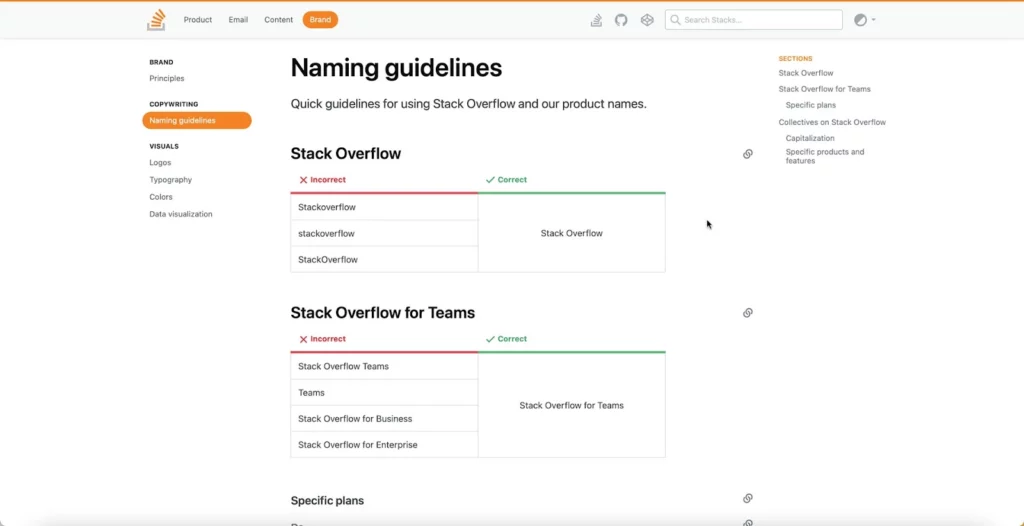
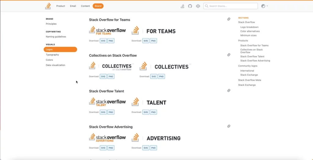