Encourage collaborative design to build better products

What Is a Prototype copy

“Design is a process. An intimate collaboration between engineers, designers, and clients,” Henry Dreyfuss, design pioneer.

Collaborative design has helped people make some of the greatest products in modern history.

Bill Gates and Paul Allen collaborated to build Microsoft, the world’s largest software company and Windows innovator. Steve Jobs and Steve Wozniak needed each other’s collective talents to found and grow Apple. Ben and Jerry made some of the world’s best ice cream by sharing ideas and working side-by-side. 

From the MacBook to cookie dough ice cream, collaborative design has proven itself a successful approach to product development.

You can build better products by encouraging collaboration that draws from your team’s collective talents and refines decent concepts into excellent designs.

Some UX/UI designers prefer working alone, so they don’t want to participate in cross-teams collaboration until they have concrete concepts that they love. Despite reluctance from some team members, a culture of collaboration results in better product outcomes. Minds mesh, ideas flow, and designers share a common goal: excellent, intuitive designs that make users feel comfortable.

Here are some tips to help you add a collaborative design process to your team’s workflow.

1. Set shared goals

UX design involves multiple processes, from brainstorming to testing, requiring various team members at all times. But not all these team members agree or share the same common goal. UX designers often work in silos — researchers research, designers design, and testers test. This segmented approach prevents a collaborative design process and blocks communication between people who can build on each other’s ideas. 

Setting shared goals helps solve this issue by making more people aware of the individual tasks and overall purpose of the project.

Setting shared goals — and communicating these goals properly — gives team members a clear focus and direction. Everyone knows who’s doing what, how, and when. Team members know what you want to achieve, and you know what they expect you to achieve.

Shared goals don’t always demolish silos, but they do add windows that let team members see the bigger picture. While communicating these shared goals it’s also best to let members of other parts of the product team have a seat at the table to improve the communication flow. 

2. Invest in collaborative tools

Team members often work in isolation because they use different tools. Design processes become fragmented, resulting in poor design. Imagine if you could centralize your entire UX/UI project with one tool.

UXPin Merge lets everyone collaborate on the same project, designing from one source of truth. Create design systems with pattern libraries, style guides, and libraries that give everyone access to approved assets.

Choosing a collaborative tool like UXPin with Merge technology also helps prevent software bloat that can contribute to inconsistencies in design and functionality. Merge lets your team approach projects from design and code-based perspectives to give you a straightforward, uncluttered way to create responsive prototypes that are almost production-ready! It’s possible thanks to using coded components that cut down the whole product development process including designing and coding. 

The collaborative design process becomes much easier when everyone from designers to developers can use the same tool to reach a common goal.

3. Communicate better

UX/UI teams underestimate the power of communication, especially with larger teams. Not articulating design thoughts, ideas, and processes could render an entire project useless from the start. 

Communication failures in UX/UI manifest themselves in various ways:

“A developer who receives the wireframes may assemble detailed feedback on missing functionality, not knowing that the functionality is beyond the scope of the deliverable,” says the User Experience Professionals Association. “The result is frustration about a seemingly incompetent usability professional who doesn’t understand what the system is about, and additional frustration when the developer learns that the feedback was in vain because it was way too early for scrutinizing wireframes on that level.”

How can you improve communication in a way that encourages collaborative design? Try:

  • Choosing project management tools like Trello or Asana that let you assign tasks and track their progress.
  • Getting UX/UI team members in the same room to discuss ideas and identify potential barriers to success.
  • Finding an application like Zoom or GoToMeeting that lets any remote workers you have participate from their locations.
  • Selecting a project methodology like Agile, Scrim, or Kanban that works well for your team.
  • Making sure everyone knows that they can come to the project manager to talk about their concerns without worrying about repercussions.

“By encouraging participants to suspend judgment of ideas, participants will feel free to generate unusual ideas, bold ideas, humorous ideas, and even absurd ideas,” says Forbes magazine.

4. Lead with collaboration in mind

Project managers need to lead by example. You cannot create a collaborative environment simply by telling people to work together. You must open yourself to the collaborative design process.

What does leading with collaboration in mind look like? It means you need to do things like:

  • Accept feedback without feeling personally attacked.
  • Ask team members to review your work and give you criticisms.
  • Sit down with designers — in person or virtually — to brainstorm ideas without judgment.
  • Introduce new team members to make sure they feel welcome.
  • Resist the temptation to dismiss ideas until you get more insight from your team.
  • Accept difficult tasks to show that everyone on the team must make sacrifices. 

Project leaders need teams that respect them and follow their management style. If you don’t demonstrate a commitment to collaboration, no one else will.

UXPin Merge makes collaborative design easier

It takes a village to build better products. Collaboration leads to better design outcomes, allowing researchers, prototypers, and designers to exchange creative ideas and streamline workflows. 

Choosing a collaborative design tool is one of the most important steps you can take to start building better products. Request access to UXPin Merge to discover features that bring every member of your team together so they can work toward a common goal.

Webinar: Interactive Design System in Enterprise

How do you manage and build a Design System for an enterprise? As you may already know, this single source of truth helps enterprises bridge the gap between designers and developers and speed up the development process. It is thanks to the set-out standards and reusable components that the design and development workflow is cut down and the digital experience is unified. 

Remember that Design Systems are not only an efficient solution for an enterprise. They are also a challenging process as you need to set out every piece of information in a clear and easy-to-use way. If you’re persuaded to build a Design System, or you already have one – new questions may arise. What are the best examples and practices to follow? How do you organize and manage your system in the best way possible? 

You may also wonder if your enterprise makes the most of a Design System and cares about the cohesive experience. After all, why should you go through all the work with standards and documentation if most product teams won’t be using them? Why not just use simple Style Guides? 

To clear some of the confusion and answer these questions, we decided to host a webinar with Johnson & Johnson: From Style Guide to Interactive Design System in Enterprise. J&J’s Experience Design Team will talk about their Design System examples and show best design practices to reach consistency and ultimate efficiency. 

You’ll learn about :

  • Transforming Style Guides into interactive Design Systems. 
  • Atomic Design and Rapid Interactive Prototyping. 
  • Promoting the adoption of Design Systems in your organization. 

Also, there will be a Q&A session to ask J&J’s experts some questions. 

Date: April 15, 2021

Time: 1:00 PM EDT / 7:00 PM CEST

Strategies to Design at Scale and Iterate Products More Efficiently

Over the last few decades, companies have learned that they need to embrace digital transformation and release digital products that meet consumer expectations. As a result, developers have added a lot of UX professionals to their teams. The change has forced designers to rethink how they can design at scale without creating an impossible amount of work.

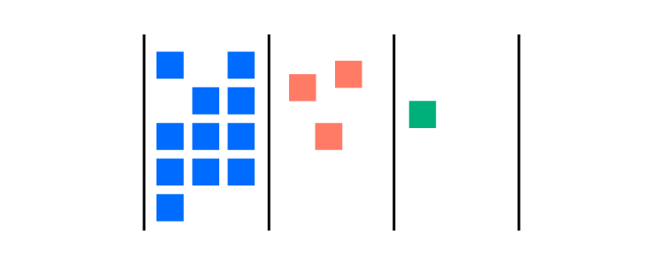
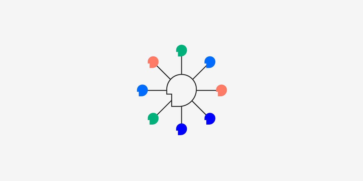
According to Erica Rider, UX lead for developer tools at PayPal, companies used to hire about 10 UX developers to every one designer. The designer would create what a product looked like. Then, developers would turn the designs into functional components. However, when supporting a great number of developers, the PayPal team needed to find the way to scale the design and support a lot of developers with a small design team. The only way was to enable product teams to do design on their own. That’s how now, three designers can work with about 1,000 developers on approximately 100 products.

As companies demand more from their designers, it becomes increasingly important for design teams to find strategies that let them scale design systems with little effort.

Recommended viewing: Scale design efficiently with DesignOps2.0, featuring Erica Rider

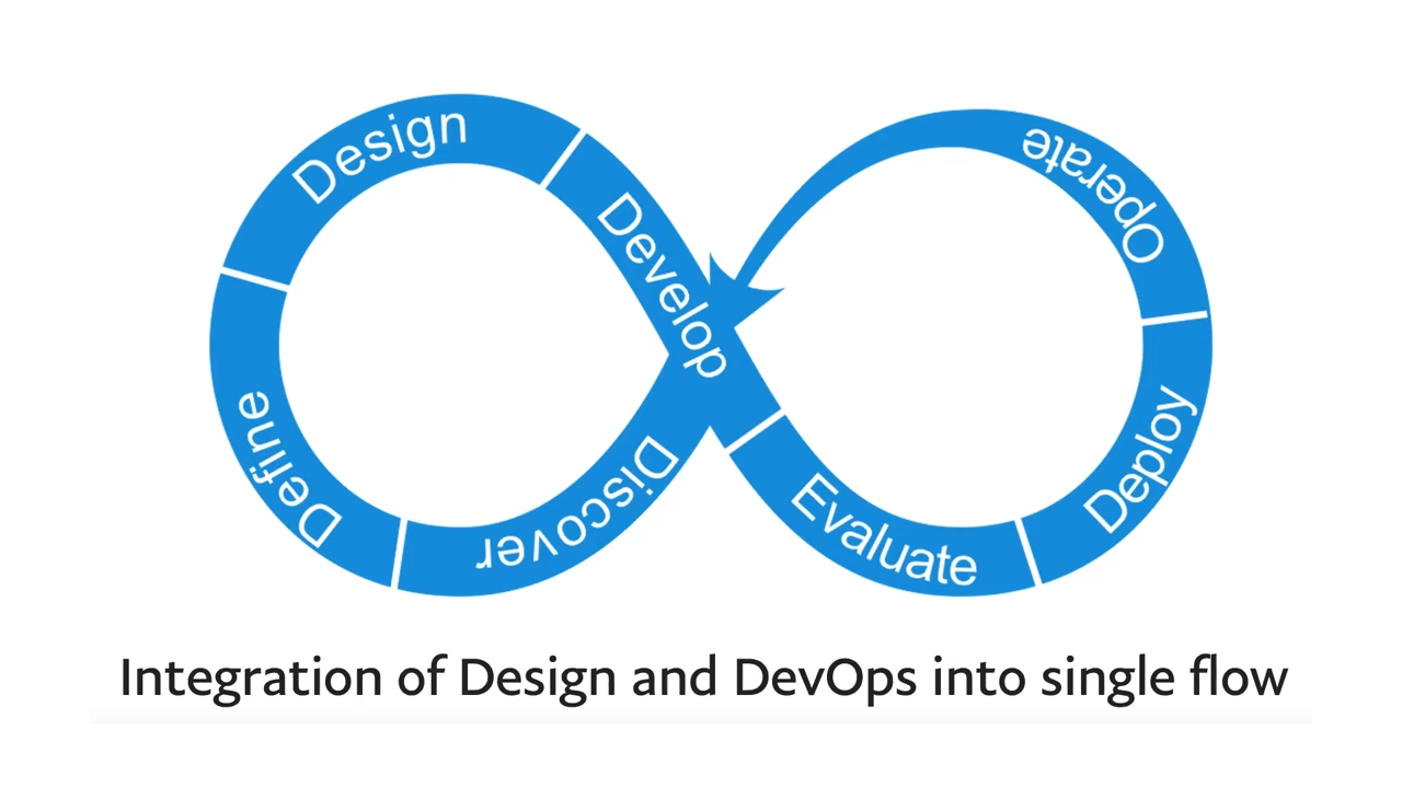
Integrate design and DevOps

The typical product design process doesn’t scale easily because it relies on several steps, including:

  • Product managers writing descriptions of their ideas and sending the descriptions to design teams,
  • Designers creating several versions of the ideas before they find a good design that matches the product manager’s concept,
  • Product designers sending their work to developers, who have to translate the designs into features that give the digital product exceptional usability, which isn’t always simple and fast.

Not surprisingly, the process involves a lot of back and forth before the project manager receives a completed prototype that works as intended.

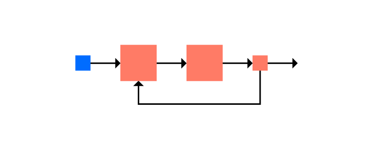
Teams can improve the process by integrating design and DevOps. A version of this approach might include:

  • Define
  • Design
  • Develop
  • Evaluate
  • Deploy
  • Operate
  • Discover

The process repeats to continue improving the product until the company discontinues it.

Create a design system of approved components

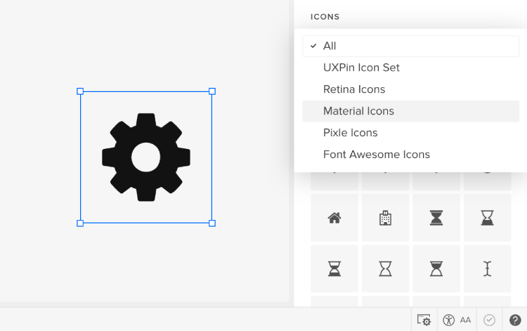
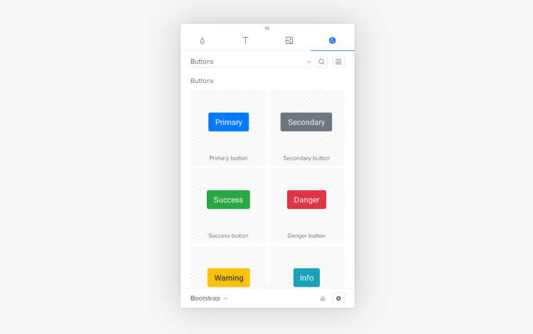
Few strategies matter more than creating a design system of approved digital assets for your product ecosystem. A good design system will include:

  • Pattern libraries
  • Design patterns
  • Typography
  • Brand language
  • Coded components
  • Iconography

Ideally, anyone with a question about building the product should find the correct answer in the design system. No matter how many people you add to a team, the workflow remains efficient because the design system solves problems at the source.

Adopt strategic UX concepts to Design at Scale

Applying strategic design principles can also help scale design systems as needed. Strategic design can include several concepts. Some critical considerations when you need to scale design systems include:

Making searches global

When UX designers need to find UI components, typography, icons, and other assets in the design system, they shouldn’t have to wade through multiple search results.

Product teams that search for an asset shouldn’t get a dozen results related to a dozen products. They should get the correct result for the query. Multiple results will only create confusion among team members and stakeholders. At the very least, it will slow the DesignOps and DevOps processes. At worst, it will lead to inconsistent UX design that confuses users.

Implementing guardrails

A small team of designers cannot let developers overstep boundaries. Implement guardrails that prevent developers from making mistakes. Ideally, you will adopt design tools that make it easy for you to make rules and boundaries clear.

Reducing variables

Reduce variables to simplify the roadmap from design to iteration. The fewer options people need to consider, the easier it becomes for them to work efficiently. Now, you can design at scale without adding more members to your group.

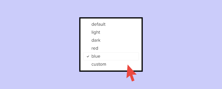
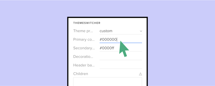
Make design system changes global and automatic

Designers should revisit their design systems at least once every few years. Otherwise, they will spend time supporting products that look outdated.

Changing something in your design system, however, shouldn’t mean that developers need to update every product’s code. It should happen globally and automatically. When you change icons in your design system, the icons should automatically update in your product.

If your design tools don’t let you coordinate at this level, you will waste hundreds of hours. No one, including large corporations and small startup operations, can afford that much-wasted effort. It’s best to have a single source of truth tool that lets the developer change the code of a component to update all the designs with it. Automatically. 

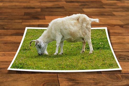
Narrow the differences between prototypes and products

https://uxpincommunity.cdn.prismic.io/uxpincommunity%2F469f590d-d37e-4741-ba52-5d81a4693ced_merge_3.mp4

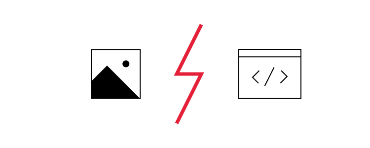
In an ideal world, you can’t tell the difference between a prototype and a finished product. How often does that happen, though?

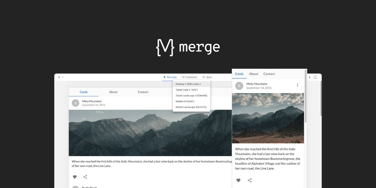
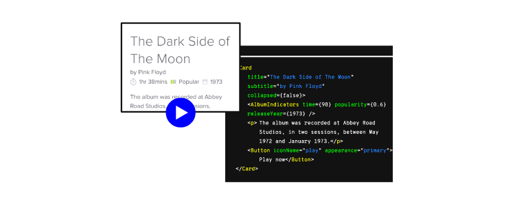
When you use UXPin Merge, you can have trouble noticing any differences between your prototypes and products. That’s because you get fully interactive prototypes that use real data and you build your prototypes with already-interactive components that are in fact, live code. You can interact with the prototype just like your users will interact with your finalized product.

Scaling your design system happens much more rapidly when you can test prototypes instead of products. Explore, experiment, and make mistakes during the prototyping phase. Your efforts will lead to a better product that impresses users. Considering that the Google Play Store offers more than 2.5 million apps and the App Store has more than 1.8 million apps, you need to make a good first impression for your product to succeed.

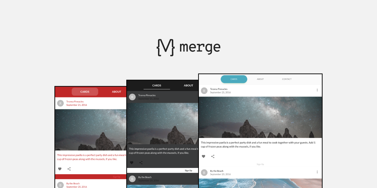
Adopt UXPin Merge so designers and developers can collaborate easily

Adopting UXPin Merge is one of the most important ways to scale your design system strategically. UXPin Merge adapts to the way that your teams work. Your developers can import React.js component codes, add Material UI Design System to libraries, and create prototypes within a drag-and-drop environment.

UXPin Merge will also turn your designers’ work into HTML and CSS without any coding knowledge or support from DevOps as the components that they use are already coded. Designers can also reuse existing interactive components, stop recreating lines that have already been turned into code, and use real data to test their interaction designs.

Discover how much easier designing, developing, and prototyping become when you rely on a code-powered tool with new technology. You don’t need to worry about scaling your design system. Anyone on your team can access it to design at scale as your company’s needs evolve.


How Collaboration Makes You a Better Designer

You probably think that you participate in design collaboration every day. You complete one stage of a design, then you hand it to someone else who works on the next step. That isn’t true collaboration, though. That’s more like working at an assembly line where everyone has assigned roles.

Real collaboration involves getting together with other people and contributing to every step of the design. This process could make you a better designer.

Use ideation to develop great design concepts

Ideation gives you a chance to consider the problem you want to solve and start looking for solutions.

You can think of ideas sitting in a room by yourself. Unless you have an extremely creative mind, though, you will probably find your thoughts returning to similar processes over and over. When an approach solves one problem, your brain uses it to answer the next question. It doesn’t take long before your brain falls into a pattern. The pattern might lead to solutions, but they get tired and boring after a while.

Making ideation a part of design collaboration opens your mind to new possibilities. Instead of having a conversation with yourself, you open your mind to ideas from other people. Suddenly, you have more approaches that could lead to a solution. Just as suddenly, your go-to ideas might not seem so great anymore.

Ideation techniques that you can use during design collaboration sessions include:

  • Brainstorming—when everyone shares ideas verbally.
  • Mind mapping—when people create visual ideas and use free association to add more thoughts connected to the original idea.
  • Storyboarding—when the group makes visual storylines that show how your product might work.
  • Worst possible idea—a rather fun approach that opens creative pathways by encouraging people to come up with their worst possible concepts.

Design collaboration doesn’t have to start when you begin drawing lines. It can start when people share ideas with each other.

Design collaboration gives you insights into your product

Design collaboration projects can include people who work outside of your skillset. No matter how much talent and experience you have with UX design, you need to get other people involved to make your products successful and gather their feedback.

Perhaps you don’t include them in every step of the collaboration, but you can get a lot of insight into your designs by requesting feedback from developers, sales reps, and customer service reps. Cross-team collaboration lets you see your product from multiple perspectives. If you can think about designing projects from a sales perspective, you might discover ways to make products more appealing to consumers. If you can see your design from the perspective of people who work in customer services, you could find that it makes sense for you to include features that answer questions for puzzled users.

How to make it seamless without going back-and-forth with email feedback? Make the most of your tool’s collaboration possibilities like leaving comments in the design, sharing access to the prototype with the people you want, and applying changes in real time – even while different teams are working on the same design. And went the project is ready, send its link with all the needed specifications to the developers.

Learn to accept constructive criticism

When you work in a creative field, you can become protective of your ideas. When someone criticizes your design choices, you can feel like you’ve been attacked personally. In most cases, the other person doesn’t intend to hurt your feelings. They just want to provide feedback on design that adds to the product’s success.

The more you open yourself to criticism and outside perspectives, the easier it becomes to accept constructive feedback without feeling defensive and improve the collaboration process

How does letting your guard down make you a better designer?

Imagine that you take your latest design concept to a meeting with four other people. Someone points out that they don’t think your navigation menu will go over well with the target audience. Perhaps you’ve made a design for highly sophisticated users when you should have created one for average users.

If you don’t know how to accept criticism, you feel hurt, and you return to your desk angry. You’re not in the right mood to do good work. You could waste precious hours nurturing your ego instead of looking for smart ways to solve the problem.

This level of defensive reaction rarely happens when you participate in a lot of design collaborations. You get so used to feedback that you don’t take it personally. It’s not about you, after all. It’s about making a product that users will love.

Unlearn your creative approach during design sprints

Building habits makes it easier for creative people to accomplish their goals. A process called “habit stacking” can even help you add useful habits to your day. The more habits you stack, the more you can move from one task to the next without putting much thought into the process.

At some point, habits can become limitations, though. When you use habit stacking to make sure you doodle design ideas while having your morning coffee, you get positive results. If you develop habits that force you to approach each project from the same perspective, though, you can hurt your creativity. It’s important to notice the difference between a positive and negative habit.

Participating in a design sprint with other people can knock you out of your humdrum process. Formal design sprints often take place over the workweek. During each day, you take steps toward your goal. Setting a time limit encourages you to think with your gut, which can lead to new creative ideas that never occurred to you before. 

If a week-long design sprint doesn’t fit your schedule, you can take a faster approach. The rapid sprints help people break the habit of worrying about the quality. When you only have a 25-minute design collaboration session, you work as quickly as possible. You make a lot of mistakes, but you make a lot of discoveries, too.

Add diversity to your design team’s skills

When you work alone, it’s easy to get stuck in a rut. Your designs get the job done, so you never think about developing new skills that could improve your work.

Design collaboration forces people to acknowledge their limitations and learn from other people. 

For the best results, seek out other professionals who have different backgrounds from you. Adding diversity to a workplace helps everyone perform better. You don’t have to rely on your team members to grow, though. Use social media to find potential collaborators who live in other parts of the world. You can learn a lot from each other.

Collaborating can improve your performance

Getting more work done doesn’t necessarily mean that you have to spend extra time fine-tuning your designs. Surveys find that collaborative work results in five times better performance.

Setting up a time to collaborate takes a little effort, but the result is worth it. 

Discover new design tools

Design collaboration gives you opportunities to see how other people work. You might find that some people use design tools you’ve never heard of. That’s like a painter discovering that someone uses a completely different type of canvas!

You can share UXPin easily with collaborators because it lets people experience your prototypes and leave feedback without creating accounts. As long as they have a link to your work, they can access it.

UXPin also has a real-time collaborative environment that lets you and others work on the same project simultaneously. Sign up for a free trial with UXPin now so you can start collaborating with other designers all over the world. You don’t even need to meet, you can collaborate virtually.

Guide to building a UI design system

Overview

A UI design system keeps your product design organized and consistent. Here’s how to create one for your next project.

  • UI design systems help you establish consistent design across your product. This consistent design is crucial for user experience and SEO. You won’t have an effective product without a good component design.
  • Effective component design starts with gathering market research and inspiration. Start with a mood board and let everything else branch off from there. Establish consistent elements including a color palette, type scale, icons, and forms.

The world of web design allows for more creativity than ever. Long gone are the days of static pages with neon fonts and background music. Evolving technology means web design can include so much more than previously imagined. It also means that design can be more complex than ever. Keeping your component design consistent can be a challenge. That’s where UI systems come in. Read on to learn how to design components to be uniform across the whole of your product.

Guide to building a UI design system

What is a component design system?

A component design system is a reference point for certain design standards that you’ve decided on prior to or while putting your product together. Think of it as a visual style guide, or an inventory for design components. This will include your color palette, type scale, icons, buttons, and any other design elements the product uses (more on each of these components and more below).

What’s the point? Having these elements in one place will make it easier for you to keep your design consistent. You’ll know exactly what color your buttons are supposed to have, the general style of your icons, your font sizes and style, and so on. UI systems eliminate the guesswork when adding future pages and features to your product.

To get a better idea of what this looks like, take a look at some UI design systems from recognizable brands and our free repository of available design systems and pattern libraries – Adele

Why do you need a component design system?

There are a number of reasons why a component design system is necessary, and a number of ways poor design can hurt you.

A well-designed website doesn’t just look good. It reads well and gets your message across with intuitive navigation. Your product, whether a website or an application, becomes the user’s first impression of your brand. Consistent design is the key to an intuitive design, as the user can get a good grasp of where to navigate, how buttons look, what an error looks like, and so on.

Ux-optimized design can also make or break your product’s visibility. SEO best practices may seem like a moving target, but today’s tactics are much more involved than the keyword stuffing of yesterday. Design and accessibility play big roles in SERP rankings, so if your product delivers a poor user experience, search engines will not look favorably upon it.

Creating a component design system

Building your own UI system isn’t something to be taken lightly. It’s a process that takes a lot of time and dedication. But it’ll be worth it when you have a consistent, high-quality design for your product. So don’t rush! You’re taking crucial planning steps for your product’s brand.

Mood board

Your first step to planning your component design should be constructing a mood board. Here’s where you gather images of anything that inspires your intended design. That can include current design trends, inspirational images, thematic graphics, and so on.

You’re essentially putting together a private Pinterest board. Once you have enough “pins,” you’ll be able to step back and see some common threads between them. And with these common threads, you can decide on components like colors, lines, and icons.

Color palette

Your product’s color palette should be based on your mood board and research into your product or service. For example, if your industry has anything to do with water (boats, sailing, fishing, conservation, etc), it may not make sense for you to have a palette with primarily warm colors. And the images you’ve gathered on your mood board would likely steer you in the direction of greens, blues, and purples.

But color palettes in UI design systems are more complex than that. You’ll want to decide on primary, secondary, and tertiary colors, as well as colors that indicate success or failure for relevant fields. (These will relate to your buttons and forms, described below.)

You’ll want a basic understanding of color theory to make an eye-catching color palette. This means understanding value, saturation, and color schemes. You’ll also need to decide how often to use each color, using primary colors and accents often enough to convey their importance. There’s a 60-30-10 rule that’s generally recommended for this purpose: your primary color gets used 60% of the time, secondary color 30%, and accents 10%.

Read more about choosing a color palette.

Shadows

With all our technological advancements, computer screens are still two-dimensional. But that doesn’t mean you can’t add some depth and perspective to your design, and it’s definitely something to consider. The use of shadow is a trending design element lately, and with good reason. Strategic use of shadows with your design components is an effective yet subtle way to add emphasis and draw the eye. Just make sure to keep these shadows consistent with direction, depth, and strength.

Type scale

When it comes to your text, you want to make sure the font stays consistent and legible. But you also want to pay attention to the scaling of your text and headers so that everything looks uniform. If your H2 on the homepage looks different from an H2 on your contact page, that’s not a good look. You also want to avoid your H2s looking too close in size to H1s or H3s. A standardized type scale helps with this by establishing uniform sizes and formats for your body text, headings, links, and so on.

If you need help establishing a type scale, there’s a free-to-use type scale online.

Icons

Keep your icons simple and uniform. Since they’re small by nature, too much detail can get lost. Inconsistent design with your icons will only look sloppy. There are free icon set packs available online if you have trouble nailing down a design but to make things much easier for you, we have ready-to-use icon library in UXPin

Buttons, sliders, forms, and other components

These are vital parts of your UI design, as these are the elements that your users will interact with the most. They must stand out and be identifiable, and their purpose should be obvious.

Buttons are like icons in the sense that simple design is best, and consistency across buttons is a must. This doesn’t mean button design has to be boring – there’s plenty of room to play around with the look of your standard buttons and radio buttons! If you need inspiration or want to add ready-to-use components to your design, you can find a ready library in UXPin with Material Design patterns.  

Keep your other components like navigation drop-downs and text fields visible without crowding the rest of your design. This is where your color palette and shadows can come into play.

Still working on that perfect design? Join the platform used by the best designers on the planet. UXPin helps you design and manage your whole UI project with one tool. Join for free now and get started without a credit card.

Make Theme Switching Easy with UXPin Merge

Theme switching is an essential part of designing prototypes. Whether that be changing between a simple light and dark mode or testing several client’s themes on a single prototype, it is something that all designers need to consider and have a well-thought-out process for.

Furthermore, this need has become increasingly important with the adoption of open-source Design Systems, such as Material-UI, which have become a valid choice for projects.

So, theme switching functionality – such an integral part of the design process, enables to dynamically test themes on-the-fly without using multiple design systems or layouts. It is an amazingly efficient and powerful feature to have at your disposal.

With the importance of this feature, we want to show how this can be done in UXPin, thanks to the power of Merge and designing with code.

Want to use the power of Merge yourself? – Get access to UXPin Merge.

Reach a new level of prototyping

Design with interactive components coming from your team’s design system.

Why do we need a Theme Switcher?

You don’t have to be a white labeling web design agency or a large-scale company with several brands to make use of a theme switcher, you could be a sole developer wanting to quickly test a new color scheme. But, switching themes is sometimes no easy task.

You don’t want to be making multiple layouts of a single prototype just with different themes – that’s an incredibly tedious process just so you can test something. 

Using the Material UI library, we can explain this limitation. Material UI has themes already built into their components but UXPin (and many other prototyping tools) don’t have a unified dynamic way to switch between themes that can be used by both developers and designers.

The power of Merge – designing with code solution

Merge gives you the freedom to design with ‘real’ production React code and vector-based tools together, breaking free of previous limitations. That’s why Merge is powerful.

You can make use of Styled-components. Styled components are the perfect solution to our problem as you can inject Javascript into the CSS to create editable theming capabilities.

So, creating themes is easy.

For each theme, create a file containing css values you want to inject into your styled components as properties. Then, from the list of imported themes, you can simply select the one you want and the styling of that theme will be passed as props to the html elements.

So, what if you just created files for each theme you wanted, import them into a wrapping theme switcher styled-component, and then pass those values down into each nested child component. Then, all you need to do is change the theme at the top-level component using the Javascript props injected into the Styled Components CSS.

Creating a Theme Switcher Component

First, we create a component named ThemeSwitcher, that functions as a top-level wrapper component, passing a selected theme’s styles to all nested components. When components are nested in the ThemeSwitcher, you can dynamically switch between any imported themes – themes, which can completely change the look and feel of components, while keeping all their functionality.

The code below shows the simplified structure of ThemeSwitcher and a breakdown of how it works will follow.

import blue from "./themes/blue";
import red from "./themes/red";
import dark from "./themes/dark";
import light from "./themes/light";
 
 
function ThemeSwitcher(props) {
 let selectedTheme;
 
 function getTheme(themeProfile) {
   switch (themeProfile) {
     ...
   }
   return selectedTheme;
 }
 
 function makeCustomTheme() {
   const customTheme = createMuiTheme({
     ...
   });
   return customTheme;
 }
 
 return (
   <MuiThemeProvider theme={getTheme(props.themeProfile)}>
     {props.children}
   </MuiThemeProvider>
 );
}

As you can see, it’s a simple React component using the Material UI’s imported hooks, only two functions, and a return statement to pass the theme down as props.

Inside the return statement, we have the MuiThemeProvider component. This is used as a wrapper component that passes the selected theme as props down to the child components.

getTheme()

We created themes using Material UI’s styling guidelines, then imported them into the Theme Switcher component.

import blue from "./themes/blue";
import red from "./themes/red";
import dark from "./themes/dark";
import light from "./themes/light";

To keep track of which theme is selected, we pass a drop-down target value into the getTheme function and pass the result as a theme prop in the MuiThemeProvider component in the return statement.

function getTheme(themeProfile) {
   switch (themeProfile) {
    // _.merge combines two themes together
     case "light":
       selectedTheme = _.merge({}, igloo, light);
       break;
     case "red":
       selectedTheme = _.merge({}, igloo, red);
       break;
     case "dark":
     selectedTheme = dark;
     break;
     case "custom":
       selectedTheme = makeCustomTheme();
       break;
     case "blue":
       selectedTheme = selectedTheme;
       break;
     default:
       selectedTheme = selectedTheme;
   }
   console.log(selectedTheme)
   return selectedTheme;
 }

return (
   <MuiThemeProvider theme={getTheme(props.themeProfile)}>

When in the  UXPin editor, this is what the theme selector menu populated from the getTheme function would look like.

makeCustomTheme()

Not only do you have the option to import completed themes, but you can also create custom temporary themes within the UXPin editor. We’ve only included a few properties such as primary and secondary colors for simplicity but you go into as much detail as you need.

Below is the code of the makeCustomTheme function. This makes use of Material UI’s built-in core function of createMuiTheme, which creates a theme based on options received. 

function makeCustomTheme() {
   const customTheme = createMuiTheme({
     ...selectedTheme,
     palette: {
       primary: {
         main: props.primaryColor
           ? props.primaryColor
           : selectedTheme.palette.primary.main,
       },
       secondary: {
         main: props.secondaryColor
           ? props.secondaryColor
           : selectedTheme.palette.secondary.main,
       },
       decoration: {
         main: props.decorationColor
           ? props.decorationColor
           : selectedTheme.palette.decoration.main,
       },
       headerBadges: {
         main: props.headerBadgesColor
           ? props.headerBadgesColor
           : selectedTheme.palette.headerBadges.main,
       },
     },
   });
   return customTheme;
 }

That concludes one way to include a dynamic Theme Switcher in your design system. Just a wrapper component (Theme Switcher) passing properties to nested child components, allowing you to dynamically change the theme without creating a new design system, page or layout.

Try Theme Switching in UXPin Merge

Using UXPin Merge gives you so much flexibility and creativity when comparing it with other design tools on the market.

Focusing on a code-based, single source of truth for styling and functionality creates an interconnected system, bridging the gap between designer developer handoffs. Anything you can create in a React component, you can bring to life in your design system. You don’t have to rely on 3rd party plugins or APIs to add important features to your design system. You’re free to create dynamic and interactive prototypes while changing styles with a single command. 

Want to find out more about Merge or would like to try it for yourself?

Design Your Own Design Process Step By Step

Managers have developed dozens—at least—of processes that they believe improve efficiency and get better results. Those series of steps, however, may not match the needs of your design team. You might also find that some projects don’t fit into the restrictions of established stages of design? Who says you can’t make a design process of your own?

Start by learning popular approaches to project management

You may want to establish your own design process, but you should still take some time to learn from established project management methodologies. They may offer steps and concepts that you want to incorporate into your process.

Agile

With Agile, you create an iterative process that includes steps for:

  • Planning the design process and defining goals.
  • Creating the product design according to your established guidelines.
  • Testing your design to find opportunities for improvement—UXPin works well during this step because it lets you create fully functional prototypes with interactive features and real data.
  • Finalizing the first version of your product and releasing it to consumers.
  • Using feedback from users to make additional product improvements.
  • Continue the cycle until you retire the project and decide to use the current version of the product.

Scrum

Scrum creates results quickly by planning ahead and relying on design sprints.

  • Choosing someone who will direct the design project’s vision.
  • Putting together a team of designers and developers with skills the project needs for success.
  • Selecting a “scrum master” who can run daily meetings.
  • Creating a list of the goals you need to meet during the design process.
  • Planning your design sprints.
  • Following a transparent workflow that lets everyone on the team see each person’s progress.
  • Meeting daily to discuss successes, failures, and barriers.
  • Making a prototype of the product to show the client – it’s very easy with a UXPin preview and share feature
  • Incorporating feedback into your plan and beginning the next design sprint.
  • Continuing until you finalize the product.

Kanban

Kanban gives you an extremely easy way to track a design project’s progress. You can use it successfully by:

  • Visualizing and planning your workflow—this usually involves making columns for tasks that have been “not started,” are “in progress,” and have been “finished.”
  • Determining all of the tasks that you need to accomplish during the design project.
  • Establishing rules like deadlines and task assignments.
  • Moving tasks through the categories until you have completed them all.

Lean

As the name suggests, Lean gives you a streamlined approach to managing design processes. Key concepts of Lean include:

  • Setting specific goals and breaking them down into the tasks your team must complete reaching those goals.
  • Spending more time working on the design project instead of planning the project.
  • (User) testing designs for functionality and aesthetics before giving a prototype to the client.
  • Making any necessary changes to satisfy the client’s needs. 

Waterfall

Waterfall design processes recognize that you must finish some tasks before you can move on to others. Project managers commonly approach this by:

  • Establishing the design project’s requirements.
  • Working on all of the tasks required to complete the design.
  • Bringing the designs together to create a prototype.
  • Verifying that every feature in the prototype works.
  • Delivering the product to the client.
  • Managing updates as needed.

Related article: Agile vs. Scrum vs. Kanban: Which Project Management Methodology is Right For Your Team?

Identify your user persona

Regardless of the design process you decide to follow, you need to create user personas that help your team understand its target market. When you develop a user persona, think about features like:

  • Pain points the user wants your product to solve.
  • The user’s age, level of education, income, etc.
  • Interests and values that will appeal to the ideal user.
  • The devices that your user persona likely owns.

At the end of the process, you should have a concrete description of your user persona. It might say something like:

“23-year-old woman who recently graduated from college, wants to find ways to move her job forward, volunteers at a local animal shelter, and owns the latest iPhone.”

From this point, you can start to think about how your design makes it easier for her to reach the goals in her life. Perhaps you decide to build a career-oriented app that posts job openings and offers tips for getting a new position. Depending on whether you want to focus on a smaller niche, you might even create a product that helps animal-lovers find jobs.

Every person has numerous problems to solve. Just make sure that solving those problems becomes a part of your design process.

Related article: How a Human Centered Design Process Infinitely Enhances Your UX and UI

Use wireframes to outline basic ideas

Many designers have big ideas in their heads that they can’t wait to create in software. You want passion in your designers. Those are the people that do amazing work and push boundaries!

At the same time, you might want to slow them down to make your design process more manageable. 

Requiring wireframes might accomplish that goal for your design team. Even as your expert designers roll their eyes at the rather boring process of making wireframes, you must admit that they have advantages like:

  • Centralizing the team’s vision instead of letting each person pursue their own creative ideas.
  • Improving development by ensuring that you have a sturdy structure before you add cool features.
  • Saving money by shortening the design process and avoiding errors.
  • Easier handoffs when one person can’t complete a task—perhaps she calls in sick—and someone else has to do the work.
  • Improving the user’s experience by forcing your designs to think about the project from multiple perspectives instead of just making the product look amazing. 

Build a library of approved assets

Early in the design process, you should build a system design that creates guardrails for your designers. The design system can include approved:

  • Colors
  • Typography
  • Assets
  • Components

UXPin lets you add descriptions within your system design. Hopefully, the descriptions will prevent designers from barging into your office to ask why they can’t [insert interesting but unrealistic idea here].

Without a design system, some designers will take paths that don’t lead to your desired result. Stop that impulse by restricting them to the project’s approved options.

Learn more about UXPin data systems here.

Get feedback from as many people as possible

You and the rest of your design team might feel a lot of enthusiasm for your work. You might even think that this project is the best thing you’ve ever done.

Get feedback from as many people as possible so you can get an outsider’s perspective. What seems amazing to the people working on a project could look odd to those outside of the team.

UXPin lets you get feedback from anyone, regardless of whether or not they have a UXPin account. When you send a link to your prototype, people with the link can interact with your design and leave comments. Hopefully, they will love your work as much as you do. If they find issues, though, take them seriously. There’s a good chance that other people will also dislike how the feature works.

Decide what steps do and do not work for your team’s design process

Experiment with design processes to identify steps that work for your team. If you find something that doesn’t get positive results, discard it. If you feel like your process misses something, brainstorm to find a new step that will improve your process.

You don’t have to follow someone else’s rules. You can make your own design process that helps your team get the best results.

Sign Up for a Free Trial With UXPin

UXPin has several features that will support your own design process. Start your free trial today to see how it can contribute to the evolution of your design process.

Benefits of Using a Random Name Generator

For a lot of people, random name generators provide a fun, easy way to come up with inventive names. You might use them to name a business, pet, or just to have fun. When it comes to developing products like websites and apps, though, you can get several benefits from using a random name generator. Learn about these six random name generator benefits to help you decide whether you want to have a free tool generate names for you.

No one likes Lorem ipsum

Lorem ipsum used to fill an essential role. With modern design software, though, you don’t need it. As fewer and fewer designers rely on Lorem ipsum, more managers and clients expect to see more realistic text in prototypes. It looks much more professional to use a random name generator than insert Lorem ipsum into text fields.

Basically, no one really likes Lorem ipsum. One of the random name generator benefits is that you can avoid annoying your bosses and clients.

Lorem ipsum can lead to embarrassing mistakes

Traditionally, designers have used Lorem ipsum to fill space where they expect to place text. Lorem ipsum can create a lot of problems, though. Some designers forget to replace the fake language with real text from their copywriters, which creates embarrassing situations for brands.

A random name generator lets you replace Lorem ipsum with real text. Consumers might scratch their heads in bewilderment when they see a random name like “Ellie-May Derrick” on a package, but at least they won’t know the designer completely forgot to do a part of their job.

You can use real names to test interactive features

Interactive features have become standard for today’s websites and apps. Interactive features like popups and content gates make it possible for companies to generate leads that increase sales and ad revenues.

You don’t want to send prototypes to clients until you have tested all of your product’s interactive components. Often, that means making sure fields can accept, predict, and sort text.

UXPin and a random name generator benefits your prototype by letting you test the functionality of your interactive features. UXPin’s prototypes can replicate practically any feature that you plan to include in your final product. You can create sortable tables that let users rearrange content by clicking their headings. Without a random name generator, you either need to spend time writing names or use strings of nonsense. 

Either way, you get a more efficient, trustworthy test by using randomly generated names.

Add novelty to your prototypes

Think about how many times your managers and clients review products before releasing them to consumers. After weeks or months of work, testing products can feel like a difficult chore. One of the benefits is that you get to add novelty to your prototypes during the testing phase.

Many online random name generators have different categories that you can choose. As a client, would you rather review products that use names you’ve seen a million times (William Shakespeare, Jane Austen, Ernest Hemingway, etc.)? Or would you rather see new names that make you giggle?

At the end of a long week, you would probably appreciate the laugh.

When you ask a random name generator to give you pirate names, you get results like:

  • Cap’n Scrawny
  • Sean Bones
  • Barry De Wales
  • Curvy Barry
  • Cutthroat Cosma the Sympathetic

Wouldn’t you rather see some new names instead of the ones that have bored you over and over for years?

Save your creativity for work that matters

You might think that you can get better results by writing your own names. That’s probably true. With some effort, you can think of funnier or more insightful names than the ones generated at random. You don’t see comedians standing on stages reading from Mad Libs templates. The jokes would get old very fast.

As a designer or project developer, though, it doesn’t make sense for you to waste your creativity on something as minor as fake names that act as placeholders for future content.

Every decision that you make during the day can literally lower your level of willpower to accomplish other tasks. Psychologists call it “ego depletion.” Not everyone succumbs to ego depletion as quickly as others. Some creative people seem like they can keep coming up with witty ideas forever. More likely than not, though, using your energy to write fake names doesn’t make sense. If nothing else, you have better ways to use your time.

Random name generators don’t need your help

Most random name generators will only create a handful of names at a time. You fill in a few variables (where you live, a pet’s name, etc.), and the generator uses the provided information to spit out a short list of names.

Not all random name generators work that way. Fake Name Generator lets you order up to 100,000 fake names at a time. The more you require, the longer it takes the website to fulfill your order. You don’t have to pay attention to it, though. The website will work in the background while you do other things.

Random name generators don’t need your help, so don’t expand your energy and time making up names.

Use real data or a built-in generator

Make your design process easier by taking advantage of the UXPin feature that allows you to generate and fill an element with the type of data that you choose like name, address, business, date, etc. If you already have a file with real data that you would like to include in your prototype, just import it from your Google Sheets, CSV, or JSON files.

All with just one click, so it’s time-efficient and makes your prototype much more reliable by getting rid of lorem ipsum. What’s more, it’s all built-in, so there’s no need to search for additional tools that can help you both importing and generating exemplary data. 

Conclusion

UXPin gives you the tools that you need to create fully functional prototypes that work with generated data. You don’t have to use nonsense anymore. Make your projects more impressive with interactive features that show off your creativity and expertise. Try UXPin by signing up for a free, 14-day trial. Whether you use a random name generator or not, you will love the prototyping features that come with UXPin.

Understanding DesignOps and Its Role in Design Teams

When you have a very small design team with just a couple of people, you might wonder why anyone needs a DesignOps professional. As your agency grows larger, you start recruiting help from more freelancers, or your products become more complicated, you will quickly realize that DesignOps plays a crucial role in design teams.

If you’re unsure whether you need DesignOps, consider some of the positive roles that design operations professionals can improve in your teams and projects.

DesignOps can build a team of diverse talent

Technology always moves forward, which means that your products will have to adjust to emerging trends quickly. Smartphones are literally everywhere, so it’s easy to forget that the first iPhone didn’t come out until 2013. Think about how much apps have changed within less than a decade! You have no idea what experts you will need on your team a few years from now.

Currently, your team probably needs at least one:

  • Project manager
  • Graphic manager
  • Animation designer
  • UI/UX designer

More complex projects might require:

  • Content creators
  • An art director
  • A brand manager
  • Developer

Are you certain that your team has the right members to complete challenging projects? A DesignOps professional can build a team of diverse talent that helps you attract high-profile clients, grow your brand recognition, and increase your revenue.

Related post: Design Team Structure: Ideal Setup for Small, Medium & Large Organizations

DesignOps can recruit the talent you need for individual projects

You don’t necessarily need all of those people on your payroll. According to the U.S. Bureau of Labor Statistics, animators earn about $75,270 per year plus benefits. As long as your animator stays busy, it makes sense to pay for a full-time employee. The situation changes when you only need someone to add animations to occasional projects.

When you don’t need a team member consistently, you can outsource tasks to a freelancer. DesignOps can make sure that the chosen freelancers have the right skills and talents for the job. You could hire a random person from a website like Fiverr, but that doesn’t guarantee you’ll like the results you get. You can trust DevOps to find the right person for the job.

Trust DesignOps to create great design systems

Your DesignOps professional acts like a coach that develops strategies and communicates plans to the team. Creating a great design system makes communicating project requirements and limitations a little easier.

DesignOps is the right person to create design systems because they communicate with everyone involved in a project, including the client or brand expert. Branding plays a critical role in product development. If your client makes its products more recognizable by using the same icons in every design, your team needs a design system that limits them to those icons. More often than not, DesignOps is the only person talking to the client often enough to know the importance of these decisions.

Give your DesignOps professional control of design systems to streamline the prototyping process and meet the client’s expectations.

Related post: How to Use a Design System to Make Great UX Design Decisions

DesignOps handles business issues so your team can focus on design

Wouldn’t it be great if your team could design products without worrying about budgets? They could do so many amazing things!

In the real world, every design project comes with countless business tasks like:

  • Tracking budgets
  • Logging hours
  • Responding to emails
  • Attending client meetings

More likely than not, your product designers don’t have any interest in these things. They’d rather spend their time doing the work they love. Let them focus on design by assigning business tasks to DesignOps. Without the burden of these tasks, your team will work more efficiently and build better products.

You need DesignOps to perfect project management

Your design team needs a system that helps members coordinate their efforts and reach common milestones. That means you need a project management methodology that works well for your team.

Some of the most popular management methodologies for design teams include Agile, Scrum, and Kanban. There are dozens of other options, though, that could make your team more effective.

It’s also possible that your team needs a unique approach to management. Creating your own design process can break down barriers and give your employees the freedom to explore radical ideas that lead to amazing features. 

Who decides what project management methodology your teams should follow. Leave that job to DesignOps. They already know a lot about your team members, projects, clients, and processes. It makes sense for them to take responsibility for choosing a management methodology that brings out the best in your team and technologies.

Related post: How Agile Environments Revolutionize a Team’s Workflow

DesignOps finds the technology your team needs to thrive

Your technology stack dictates—at least in part—what your design team can accomplish. You can’t make animations when you don’t have software with animation features. Similarly, you can’t test designs unless you have a tool that lets you interact with your prototypes.

When you search the internet for design tools, you will get dozens of results claiming that they offer the best features. Can you trust those statements? Even writers making best-of lists have partnerships that encourage them to position some design tools over others.

In other words, it’s best to get help from someone who knows how all of these products work. What reputations do they really have? Do they integrate well with other tools? Will other designers laugh when they find out that you use an outdated app? Are there any trends on the market that your team should follow? 

DesignOps professionals know the answers to these and countless other questions that you need to answer before you can choose a technology stack. They usually also follow tech novelties that can help optimize the whole product development process. 

For example, one of the burning issues in product teams is the disconnect between design and development – the handoff reality check is the moment when some of the design ideas can’t be implemented into production or take much more time than it was predicted. 

In such a situation, DesignOps would search for solutions like tools that can help convert the design to code, much more interactive prototyping tools to check the interactivity scenarios before passing the design to development, or even tech that allows designers to create a prototype with already coded components that are production-ready. 

The last solution simplifies and shortens the process of product development by making it faster for designers to prototype and for developers to launch the ready product. If you’re interested in that as a DesignOps or any other member of a product team, we have a solution – UXPin Merge. You can create designs with UI React components that are already interactive and easily reusable. It may sound complicated but in reality, there’s no difference between prototyping with standard elements and the revolutionary code-powered components. 

Sounds like a perfect solution?

You don’t have to trust our perspective of UXPin Merge. It’s best if you checked on your own how beneficial it may be for you. Designing with code can help you optimize your product development process a lot, so if you’re ready for implementing a revolutionary, yet not so complicated tech, just request access to Merge. 

Webinar Wrap-Up: 11 Ways to Start Your Inclusive, Accessible Design Toolkit

Inclusive design affects the ways that people interact with technology and feel about the world. Organizations that strive to make their digital products more accessible reap several benefits from considering the needs of diverse users. 

By offering more inclusive designs, businesses can potentially attract more customers and earn more money. They might also avoid fines by disenfranchising people with physical and cognitive impairments that block their access to products and services.

During our last webinar, with Piotr Źrołka accessibility Expert, UX strategist, and CEO of Kinaole, we focused on a deeper explanation of inclusivity, what it means for designers, and how UXPin’s features make inclusive design easier than ever.

Piotr addresses in this webinar common accessibility challenges that people with vision, motor, hearing, and cognitive impairments encounter when using digital products. Creating an inclusive, accessible design kit helps remove challenges. Instead of focusing on a target audience, inclusive designs try to reach as many users and customers as possible.

Piotr also provides real-world examples of how organizations add accessibility to their websites and apps. 

What You Will Learn

  1. Focus on the characteristics rather than demographic data.” – Piotr Źrołka. Piotr discusses using impact maps to identify user types, their needs, and design solutions that can meet those needs [7:44].
  2. Piotr shows examples of using UXPin to:
    • Add keyboard functions to designs [15:52].
    • Define page titles to help users know where they are [32:30].
    • Add pause and stop to give users the time they need to understand content [34:48].
    • Include headings that offer visual indications and site structure [44:22].
    • Use alt attributes that describe images and other non-text content [45:43].
    • Notify users what links are and where they lead [54:20].
    • Include language attributes that tell users what languages products use [55:02].
    • Make responsive designs that automatically reorient themselves to how users hold their mobile devices [56:26].
    • Use colors to make images easier for more people to see [57:11]
  3. We’re building better services for everyone.” – Piotr explains the customer service and financial benefits of designing inclusive products. [1:01:49]

Responsive Design with UXPin Merge

Responsive websites, mobile-friendly designs, adaptive images are crucial for user experience. So, being able to responsively design prototypes without using multiple layouts for different screen sizes is an extremely powerful and time-saving feature. It’s something that many people have wanted and thanks to the power of Merge, you can do just that by using actual React components to design with code

Continue reading Responsive Design with UXPin Merge

The Rules of Material Design

Material Design has become the standard for designing and developing Android applications and many websites. Before you can get the best results from Material Design, though, you need to learn a few rules that will improve your work’s consistency and help it operate on the Android platform.

You don’t have to accept the following as definite rules that you must follow. You can break most of the rules of Material Design while building terrific products. Overall, though, you and your users will have better experiences when you don’t deviate too far from the following guidelines.

Emphasize functionality before you focus on form

Do you feel a little argument brewing between your graphic designer and your developer? That can happen when you start using Material Design. Material Design makes it easier than ever to add responsive animations, transitions, and other effects that thrill designers. These components can add to an app’s functionality. Using too many of them—or using them in the wrong ways—can have the opposite effect.

You want an app that looks terrific, but you can’t sacrifice functionality in favor of form. When in doubt, side with your developer. A beautiful app might attract a lot of users, but they will abandon the product when they discover that it doesn’t work well.

Rely on the types of layouts that users expect to find

Material Design can tempt you to try some crazy things. It doesn’t take long to experiment, so why not build a layout unlike anything anyone has seen before?

Adrian Henry, found at Hungry Turtle Code, understands that impulse. “The urge is to always break the rules slightly to appear different,” he says. Going too far, however, “is just a jarring experience” for the user. Users “should know exactly where everything is and intuitively understand the UX flow.”

You can take a creative approach without breaking the rules of Material Design. Get feedback from as many people as possible, though. Hopefully, one of them will tell you when you need to rein in concepts that feel counterintuitive to new users.

UXPin makes it easy for you to get feedback before you release your product. When you create a link to your prototype, you make it possible for people to interact with it and leave feedback. You might feel disappointed when you learn that your favorite idea drives people mad. It’s better to discover the truth now than after you’ve released your app to the world.

Take advantage of interactive features

Keeping the first rule in mind, use Material Design to add more interactive features to your apps. Users tend to prefer products that respond to motion. When you glide your finger across a smartphone’s screen, you expect the page to turn. When you tap an icon, you want it to open for you.

Dig deeper below the surface, though, to discover ways that you can make your apps even more interactive. Look for opportunities to add meaningful micro-interactions. Micro-interactions like tapping notification alerts keep people involved and interested. Users might only need the “big” interactive features every few minutes. They can use micro-interactions multiple times a minute, though. It becomes a conversation between the app and the user.

Tap into Material Design libraries that make your work easier

Designers often enjoy taking time to create unique icons and interactions. It’s why they became professional designers! Not every part of your product needs a brand new design, though. Sometimes, you’re just wasting time “reinventing the wheel.”

Besides, many icons have universal meanings that help users understand how to use products. Taking your designs too far could confuse people.

UXPin gives you access to a library with more than 600 Material Design icons. Icons that indicate common functions like “share,” “charge,” “add to cart,” and “volume” don’t need new designs. At least they don’t when you already have a library full of attractive icons that users expect to find when they use your apps.

Track your metrics to make sure products work as intended

Ideally, Material Design will help your team save time and develop better products that people look forward to using. Do you get those results? You can’t answer that question until you start tracking key performance indicators (KPIs).

Some of the most important metrics that you should track include:

  • User growth rate
  • Mobile downloads
  • Installations
  • Uninstallations
  • Crashes
  • Retention rates
  • Session length

These pieces of information tell you a lot about how people use—or don’t use—your apps.

A high user growth rate probably indicates that you have a popular app that interests people. A lot of mobile downloads suggest the same, but it doesn’t mean much unless users follow through by installing the app on their devices.

Do users uninstall your product shortly after downloading and installing it? That’s likely a sign that they didn’t get what they expected.

Do people use your app for long periods at a time and return often? That probably means you’re doing something that your customers love.

If you discover a lot of crashes, it’s time to look under the hood of your app to see how you can improve its functionality. Users won’t tolerate frequent crashes. Solve the problem quickly or expect them to abandon your product and move on to the next thing that interests them.

Pay attention to user feedback

Tracking metrics can tell you a lot about what does and doesn’t work in your Material Design app. You don’t always have to rely on the numbers, though. People will tell you what they love and hate about your work.

When someone posts feedback about your app on Google Play, take time to read the response, think about what the person wrote, and respond kindly for their help. You might get a profane-laden review that makes your whole team upset. It doesn’t matter. Learn from that user’s frustration so you can improve your app. Other users will appreciate your work.

Keep learning about Material Design to stay ahead of trends

Google constantly improves its products and services, so you can expect Material Design to evolve over the years. Visit the Material Design website often to see how it has changed.

You don’t have to read every document on the website. That would take far too much time. You should, however, take time to look at examples that Google chooses to showcase Material Design on the web. Pay close attention to what these examples show. A keen eye will help you stay ahead of emerging trends.

Choose designing and prototyping tools with Material Design in mind

Adopting Material Design doesn’t mean that you can stop using design and prototyping software. It means that you need to make sure you choose tools that work in coordination with Material Design.

UXPin encourages designers to embrace Material Design. With UXPin prototypes, you can even test your designs before you finalize your products. An interactive prototype gives you an opportunity to test every aspect of your product before you hand it over to your boss or client.

Try UXPin for free to see how it can help you create prototypes and test your ideas. Thanks to its real-time collaboration features, you can even explore concepts with other designers.

Best Tools and Resources for Your Accessible Design

A good functional design is an accessible one. There are many reasons to go for an inclusive approach in designing and we believe that no one should be excluded from the benefits that bring the digital world. More than one billion people experience some form of disability, so remember that having accessibility in mind when designing matters. 

Continue reading Best Tools and Resources for Your Accessible Design

The Secrets of Effective Design Teamwork

Today’s designs often require the work of multiple professionals who have experience in areas like graphic design, animation, and coding. Whether you have two people or two dozen people working on a project, perfecting your approach to team design will streamline your processes and lead to better results.

The talents and personalities of your colleagues may influence how your team design projects, but you can typically rely on the following steps to make your work more effective.

Ready to start your next design team project? There’s no better tool than UXPin, an end-to-end advanced prototyping solution for making collaboration easier. UXPin allows you to build interactive prototypes, share them with others, and ship them to development. Start a free trial.

Build advanced prototypes

Design better products with States, Variables, Auto Layout and more.

Try UXPin

Select design team members wisely

Effective design teamwork starts with having a team with the skills you need to complete the project. Team composition is crucial, so make sure you choose members for the team design who can work together. That doesn’t necessarily mean selecting people who get along well—although that could play a role, too.

Things to consider when selecting design team members include:

  • Whether they work during the same hours as other people.
  • The skills they bring to the team.
  • How well they follow guidelines to keep the project on track.

You may have talented designers in your agency that don’t fit some projects. You don’t always need the best of the best. You need a team that can work toward a common goal.

Make an inventory of everyone’s skills

Don’t assume that everyone will fill a specific role during the team design project. As you move through design phases, it helps to know everyone’s skills so you can assign them tasks instead of forcing them to sit idle.

Your illustrator might have experience with animation. In today’s workplace, your illustrator might even have experience with development. They might not have the skills to develop a website or app, but they could have enough basic front-end knowledge to move the first stage of the project along. That will speed things up for the team and boost your illustrator job satisfaction. 

Choose a management methodology that fits your design team

Every design team needs to use a design project management methodology that fits their needs. Popular methodologies include Agile, Scrum, and Kanban.

Agile

Agile prefers vague outlines and goals that make design projects more flexible. It also puts an emphasis on adapting to feedback for ongoing improvement.

Here are some of resources for designers interested in Agile:

Scrum

Scrum is a version of Agile that uses design sprints that typically end with one or two weeks.

Kanban

Kanban uses a visualized workflow that shows the status of tasks within the project. As tasks move toward the “completed” category, the project draws closer to a conclusion.

Explore those and other project management workflows:

Set clear tasks and deadlines

During a team design, some people have to complete tasks before others can move forward. For example, the developer responsible for finalizing a website’s homepage can’t reach that goal until the graphic designer finishes creating all of the icons and other assets that will appear on the page.

You can integrate setting clear tasks and deadlines into any management methodology. Of course, unexpected things can happen during a project. The animator left a thumb drive at home, so you have to wait an hour while she retrieves it.

Since you know that delays will occur, give team members some flexibility with their deadlines. Make it clear, though, that they must communicate the delay to everyone. Accepting responsibility and solving the problem is good behavior. Sneaking away to fix a problem before others notice is unhelpful behavior that will get noticed eventually.

If you need a project management app to encourage communication, consider popular options like:

You may already use one of these apps for team design projects. If not, try their free trial versions before you commit to an option.

Celebrate the achievements of your team members

Team design can make some people feel anonymous. Eventually, they might start to neglect their work, show up a little late to meetings, or fail to check their messages.

A traditional approach to project management would use negative feedback to hold team members accountable. As a project lead, you may need to pull some people aside to point out their failures. Really, that should be your last option, though. Before you go negative, use positive reinforcement to keep team members encouraged and recognized.

It doesn’t take much to celebrate someone’s achievements. At the end of a mid-day meeting, you might say, “Great work on that layout, Anne. I really like it!” Everyone will hear the praise, which will make “Anne” feel included and responsible in a good way.

You can also celebrate team design accomplishments. Maybe you take a long lunch after meeting a milestone, or you have a pizza party when you send your first prototype off for approval. Gauge your team to choose a reward that they will appreciate.

Read also: Design Team Rituals.

Invite feedback from as many people as possible

It doesn’t take long before design teams can become blind to the problems in their products. When you work on something long enough, cognitive dissonance can make you see what you want to see instead of what’s in front of you.

You can fight cognitive dissonance by asking people outside of your team design project to give you feedback. Fresh eyes might notice irregularities immediately. That interactive arrow that the design team thought users would intuitively swipe might baffle a new person who picks up the product.

UXPin makes it easy for you to get feedback from as many people as possible. Once you make a prototype of your product, you can send a link to anyone and request feedback. They don’t need UXPin accounts to view your work and leave comments. By removing barriers, UXPin makes it more likely that colleagues and testers will take a few minutes to explore your product and give you feedback.

Use tools that offer features for real-time collaboration

As more companies move employees and freelancers to remote positions, you may not always have chances to gather your team in one place. Some people will miss the camaraderie of in-person collaboration. Remote work, however, has become increasingly normal. About 70% of business founders expect that they will let at least some of their employees work remotely even after the coronavirus pandemic ends.

UXPin makes it easier for design teams to adjust to remote collaboration by giving everyone a virtual environment where they can work together in real-time. If you can use Google Docs, you can use UXPin’s collaborative features. When one person changes the design, everyone sees the change happen simultaneously. It doesn’t matter whether your teammates are across the hall or on the other side of the world.

Try UXPin to improve team design projects

Most design teams find that they get terrific results when they choose UXPin because the tool gives them features for real-time collaboration, creating design systems, and making prototypes easily.

Sign up for your free trial today so you can experience the benefits that companies like HBO and PayPal get from UXPin.

You Can Become a Code-Based Designer Without Learning Code

Code-Based Designer Without Learning Code

When you hear about code-based design as an emerging trend in digital apps development, you might experience a shudder of panic. You enjoy design images, and you learned how to use software common throughout the industry so you could get a job. Now, they want you to learn to write code!

Knowing how to write basic code could open doors in your career, especially when you focus on popular languages like Swift and Java. Thanks to UXPin, though, you do not need to learn how to code to become a code-based designer.

Does that sound confusing? The following points will clarify how you can become a code-based designer without learning code.

Adopt a code-to-design prototyping solution

If you want to adopt interactive code-based design without learning to code, there’s a way! Just search for a solution that simply lets you add interactive components with a drag-and-drop feature. When you drop a feature into your design, the solution generates code that matches your work.

Most graphic design softwares still generate static images that developers need to remake to add functionality. UXPin Merge stands out as an excellent resource for designers that want to improve workflows and functionality by taking a code-to-design approach to digital design. Thanks to the single source of truth in Merge your design will look and behave just like the final product. 

Think beyond aesthetics to make your designs more functional

It’s easy for graphic designers to get stuck thinking about how they can make their work more attractive to users. That’s a significant part of the job, after all! The product that gets sent to consumers, however, needs more than intuitive navigation, beautiful color combinations, and meaningful icons.

Code-based design pushes you to think through the entire process of building a digital product. Don’t think of this as a burden. Learning to think beyond your specific role in product development will give you a more rewarding experience.

If you feel frustrated taking a code-driven approach to design, remember that it:

  • Will result in a final product that looks more like your original design. Image-based design forces developers to take some liberties when using code to build your work. Code-driven design makes that less likely.
  • Gives you more control over how components function, which means you have a greater influence over the user’s experience.
  • Improves collaboration between the design and development teams. Improve collaboration should lead to better products that perform well in the market.
  • Gets you to think about how the end-user will experience more aspects of your design. You’ve probably been disappointed by a website or application you worked on. Maybe the navigation didn’t work as you’d intended. Perhaps the interactions don’t feel as fluid as you’d imagined. Code-based design will help you overcome those limitations.

Aesthetics matter, but products with poor functionality don’t thrive. You can contribute to success by taking a code-based approach to design.

Get Friendly With Developers on Your Team

You can become a more effective code-based designer by communicating with developers. A no-code platform will let you create designs with interactive components, but you don’t automatically have access to every feature you might want to use. Someone needs enough technical knowledge to:

  • Connect your software to Material, React, and other libraries.
  • Push live components to make sure designers have access to the latest options.
  • Provide advice when designers want to make small changes to components in their libraries.

UXPin Merge has a very open command-line interface (CLI) that helps developers add new libraries and components to your designing and prototyping environment. If you don’t know how to connect with other libraries, use your relationship with the development team to gain access. They may do the work for you or take some time to teach you the process. Either way, making friends with developers will improve your code-based design abilities and speed up the design handoff! 

Sign up to experience code-based design with UXPin Merge

Are you ready to try code-based design? Get access to UXPin Merge to see how it works for you. You’ll discover that it lets you do much more than your typical design software will. It allows you to design with already interactive components that look just like the final product. It’s time-efficient and helps you make an extremely realistic prototype.