Case Study: How TeamPassword Builds Consistent Designs with UXPin Merge

This article is written in collaboration with TeamPassword, a simple-to-use password management tool that has started using UXPin Merge to design with code components.

__________________________________________________________________

Looking at the leading design systems, you may get an impression that they’re reserved for big brands that have time and resources to build one. Not at all! Today’s solutions allow teams of any size to create, maintain, and support a design system.

TeamPassword is one of such companies. When we met TeamPassword, they had a 2-person development crew with no designers in it. They plan on carrying on without designers, and it’s all thanks to UXPin Merge.

Reach a new level of prototyping

Design with interactive components coming from your team’s design system.

About TeamPassword

TeamPassword is a password manager for teams that keep all the logins and passwords in one place. Instead of passing passwords via email, chat apps, or other less secure communication channels for that purpose, teams can access login details whenever they want via a clean interface which makes sharing simple. The tool is easy to use and pretty straightforward, which makes taking care of access security truly accessible.

Challenge

Switching to React for Better Maintenance

Matthew Chigira joined TeamPassword as a fullstack developer as one of the two developers on the team. He suggested that the tool should switch to React, as it would be easier to maintain in comparison to the old framework.

Updating UI Design to Stay Competitive

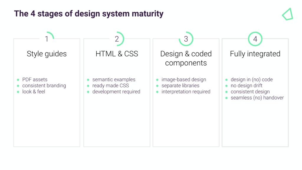
He also knew how convenient it is to create an app with a design system that stores and documents building blocks of the interface. There are also many other benefits for brands who use a design system from the very beginning instead of building interfaces with style guides or components that come from many different libraries instead of just one. Some of those perks of having a design system early on include faster work, better handoff, and of course, consistent UI.

Even if you’re building an MVP, consider following a design system. It will make the design process smoother and help you avoid problems with scaling UI when the team is bigger. Moreover, inconsistent look and feel may affect the way potential customers perceive the app.

“Brand is essential in this market.,” says Tony Caccavo, Director of Operations at TeamPassword, “Customers entrust us with sensitive information in their login records. Inconsistencies or an outdated design can cause some customers to question whether we are technologically up to date enough to keep that information secure. Front-end development builds trust and confidence in the backend performance.”

The same goes for feature shipment. If the team doesn’t act fast, someone will beat them to it. Yet, developing a product without designers doesn’t support easy-to-follow, consistent user interfaces.

Gaining Credibility through More Consistent UI Design

Many teams are facing a similar problem. They have exceptional engineers on board, but the need to move fast with development, which affects UI consistency and clarity. It doesn’t make it easy to create a powerful brand that stands out from the competition. Brand is essential in this market. Customers entrust the tool with sensitive information in their login records.

Inconsistencies or an outdated design can cause some customers to question whether we are technologically up to date enough to keep that information secure. Front-end development builds trust and confidence in the backend performance.

Hence, a design system was a must-have for TeamPassword, but it wouldn’t solve all of their problems. It would just help them make design decisions. They also needed a tool with which they could create a simple and effective front-end design, and that is where UXPin Merge came in.

Small Team Can Achieve Great Results

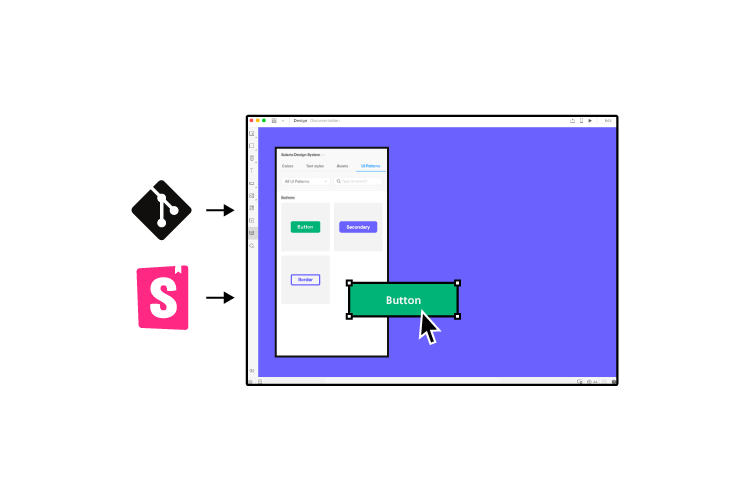
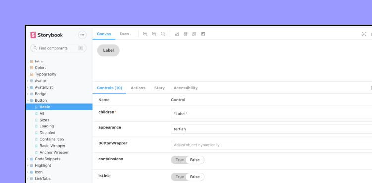
TeamPassword knew about UXPin Merge and its integration with code components libraries, specifically an open-sourced MUI. One of the main selling points was that they could get a themed version of MUI based on their brand from day one. They needed a design tool that would import MUI components and help them create prototypes by just dragging and dropping UI components onto the canvas.

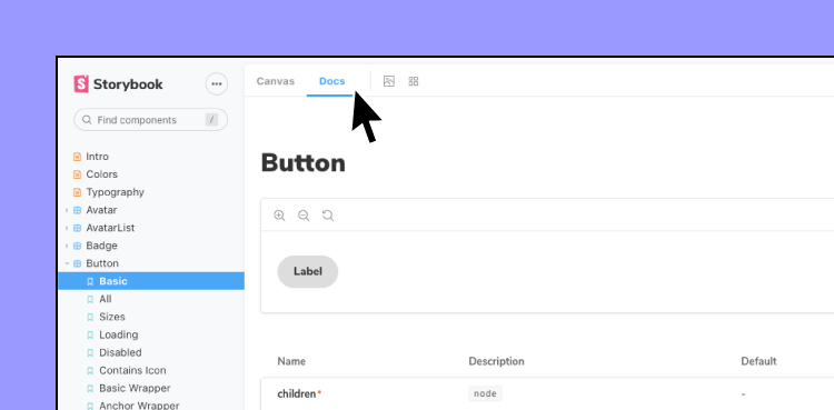
UXPin Merge can bring a MUI library full of React components to the UXPin editor. There are a couple of ways of doing that. TeamPassword could import them from a Git repository or use Storybook integration. Importing coded components is also possible thanks to a code-free import of UI components – Merge Component Manager that you can request access to it here.

As with all of our Merge clients, UXPin scheduled a workshop with TeamPassword to show them how to design with code components. “We had a training session with Jack which was really valuable”, said Matthew, “We learned how to set up the tool and use the editor. The team also showed us how to adjust components.”

With UXPin Merge, TeamPassword doesn’t need a designer to put together a realistic prototype. What’s more important is that the UI design not only looks professional, but it also acts like a developed product, since Merge uses real React components, rather than image representations of the said components that still need to be coded. TeamPassword can truly benefit their single source of truth both in development and design.

Apart from UI designing features, the team has much hope for versioning that UXPin Merge offers. They can quickly update the last version and the prototype gets updated too. Without this feature, they would have to update elements, one by one. Version control also helps to keep track of changes and switch between versions of the design if necessary.

The process of taking the finished design and developing it into a product got way faster, too. It is so rapid to export the prototype with all the specification and production-ready code. The time that the team normally had to spend on writing front-end code is saved.

Plans for the future

TeamPassword has a full game plan prepared for how they want to use UXPin Merge.

  • They want to start with a website redesign based on a chosen design system – the current website looks a bit outdated which may influence the purchase decision on some of the potential customers. Plus, its design is inconsistent. TeamPassword wants to give it a makeover.
  • Then, they aim to rebuild the interface of the app using MUI and UXPin Merge – the next task is redoing the application’s front-end design. They want to switch to React and use MUI as their component library for the app. Since they use the same building blocks for design and development – React components – the whole task shouldn’t take very long.
  • They will carry on building new features and growing TeamPassword – Their new approach to prototyping will help them design and develop their app that gives a unified user experience and cut down time to market

Summary

Using UXPin Merge helps TeamPassword to create UI design and export the code behind it in no time. They will finally be able to scale design, organize their workflow, and create consistent interfaces without having to hire a design agency. Small teams get design velocity that allows them to scale at the right pace. It’s a new level of working!

UXPin with Merge technology allows anyone to import UI code components from a library stored in Git, Storybook or via NPM packages. The teams can get a single source of truth for design and development even before they are ready to scale their product and team.

Request access to UXPin Merge and experience how fast prototyping can get. There’s no difference between a prototype and the coded product. It saves tons of time for a team of any size. Bring code components to the design tool and connect design and development workflow. Request access.

React Native vs. Reactjs – Understand the Difference

Understanding the difference between ReactJS vs. React Native helps designers communicate with engineers better, avoid costly technical issues, and minimize friction during design handoffs.

Designers don’t have to learn code or get into the technical details of Javascript or React to understand the fundamental differences between the two. The most significant difference that concerns designers is the different component libraries and their choices when designing web-based products vs. native mobile applications.

Take coded components from Git repo, Storybook, or through NPM and use them to create layouts faster. No designers needed to build stunning UIs. Check it out. Discover UXPin Merge.

Design UI with code-backed components.

Use the same components in design as in development. Keep UI consistency at scale.

What is ReactJS?

ReactJS, more commonly referred to as React, is an open-source Javascript library for building web-based user interfaces. The component-based frontend framework enables engineers to develop and scale websites and web applications quicker and easier than writing vanilla HTML, CSS, and Javascript. 

ReactJS allows developers to create reusable tags or components from basic buttons to complex charts and data grids which they can call with a line of code. Much like designers build a master component and copy/paste it to other parts of the user interface.

ReactJS Examples

Facebook developed React in 2011 for all of its web-based products and still uses the frontend framework for the web versions of WhatsApp, Messenger, Facebook, and Instagram.

Aside from Facebook, many global organizations and Fortune 500 companies use React for their websites and web applications, including:

  • Netflix
  • Salesforce
  • New York Times
  • Reddit
  • Cloudflare
  • Tesla
  • PayPal (read how PayPal scaled design using UXPin Merge synced to a React repository)

What is React Native?

React Native is the mobile equivalent of ReactJS used for cross-platform mobile Android and iOS apps, as well as web-based applications. Like ReactJS, React Native provides devs with reusable components to develop and scale mobile apps.

One of the biggest technical differences is that React uses the virtual DOM (Document Object Model) to render code in a web browser, while React Native uses native APIs to render UIs on mobile devices.

Why Did Facebook Create React Native?

Before React Native, developers had to create two separate native apps for iOS and Android using Apple XCode or Android Studio, respectively. React Native allows developers to develop a single application that automatically renders native code for iOS and Android.

React Native Examples

Facebook uses React Native for its native mobile applications, including Instagram, Facebook, Facebook Ads Manager, Oculus, and others.

Many global organizations also use React Native for their cross-platform native applications, including: 

  • Coinbase
  • Shopify
  • Discord
  • Skype
  • Bloomberg
  • Pinterest
  • Baidu Mobile

The Differences Between ReactJS and React Native

direction process path way

One of the most significant differences is that React is a Javascript library while React Native is a Javascript framework. 

  • A library is pre-composed code that makes it easier for engineers to develop websites and applications.
  • A framework is more complex, consisting of libraries, templating frameworks, APIs, and session management to build websites and applications.

Here are some other notable differences between ReactJS vs. React Native:

  • ReactJS uses Javascript and CSS for animation, while React Native uses an animated API.
  • ReactJS renders HTML in the UI, while React Native renders JSX.
  • Developers primarily use ReactJS for web development and React Native for mobile application development.
  • ReactJS uses React-router for navigating web pages, while React Native has a built-in Navigator library.

Understanding React Can Help You Design Better Prototypes

responsive screens prototyping

Here are some of the ways designers can approach React projects. 

Component-Based Design Approach

ReactJS and React Native used a component-based framework to build UIs. Designers must use a similar component-based design mindset. For every UI you design, ask yourself, “how can a developer break this down into its core components.”

If you’re designing for a React product, create components and reuse these consistently throughout your product design. Try to avoid changing font sizes and spacing within components, as this will require engineers to build a new component or write additional styling.

Adopting a Component Library

Building a design system for ReactJS or React Native from scratch will always present challenges and drift between design and development. Organizations overcome these challenges by adopting a customizable React component library.

Designing with a React component library enables designers to understand the limitations and constraints engineers face when converting designs into a final product.

Based on Google’s Material Design UI, MUI is one of the most comprehensive and widely used component libraries. Designers can use MUI as a foundation to build a design system for websites, web apps, and native applications.

UXPin’s MUI integration allows designers to use React components to build UIs. Designers can customize MUI components in UXPin’s properties panel to meet brand and product requirements. Sign up for a free trial and start designing with React components in UXPin.

Motion and Animation

Motion and animation often cause friction between designers and developers, particularly for native applications. ReactJS allows engineers to recreate design animation with relative ease while achieving the same results in React Native can be challenging or impossible without additional tools and packages. These additions cost time and money, which may exceed your project’s constraints.

Always discuss motion and animation with engineers at the start of your project to determine what’s possible to avoid friction at the design handoff.

Designing With React and UXPin Merge

uxpin merge git react storybook library

With UXPin Merge, designers can build fully functioning prototypes using React components. Designers use the React components like any other design tool but with significantly higher fidelity and functionality because they’re the exact components found in the final product.

While it’s not necessary to understand React to design with UXPin Merge, it can help you create prototypes with higher fidelity and functionality while improving communication and collaboration with engineering teams.

React Props

React components use props to define properties like color, typography, border, shadow, etc. Merge automatically recognizes props and displays them in the Properties Panel for designers to edit. Designers can also switch to a JSX to view and edit in code.

Props allow designers to make changes, but they also set constraints defined by the design system, like brand colors and typefaces. These constraints help maintain consistency and prevent team members from making unauthorized changes.

Because UXPin renders code instead of vector graphics, developers can simply copy/paste any changes designers made to a component’s props to quickly develop UIs.

Greater Fidelity and Functionality

Designing with React components allows designers to build exact replicas of the final product. For example, a functioning date picker is impossible to create in a traditional image-based design tool. But with UXPin Merge, you can prototype with any React component engineers add to your repository, including date pickers, charts, data tables, graphs, and more.

Defined Interactions

Interactions and animations can add significant time to a design project. Designers must recreate these interactions for each project, which can introduce errors and inconsistencies.

Merge allows you to prototype with functional and interactive elements generated from production code. Designers can change animation settings to match the new interface and components using props.

With animations embedded in the design system, designers can save time during prototyping while eliminating interaction inconsistencies.

More Frontend Frameworks With Storybook

With Merge, you’re not only limited to designing with React. Our Storybook integration enables you to sync other popular frontend frameworks like Vue, Ember, AngularJS, Web Components, and more.

You can use Storybook components exactly like React components to design high-fidelity prototypes. Instead of using props, you use Storybook Args to change properties, slots, styles, inputs, etc., in UXPin.

Build Interactive UIs without Design Skills

Import coded components to our design editor and assemble user interface that you can quickly translate into code. Build stunning designs without design skills. Discover UXPin Merge.

Web UI Design Examples and What You Can Learn From Them

web ui design examples

User interface design (UI design) is crucial for aesthetics, usability, and branding. It’s a balancing act of form and function, where designers must push the boundaries of creativity while designing a functional, cohesive user interface.

This article looks at some creative web UI design examples and what makes them great. We also include a checklist of 16 UI design principles designers can apply to create great customer experiences.

Creating exceptional customer experiences starts with comprehensive prototyping and testing. UXPin’s code-based design editor allows designers to build high-fidelity website prototypes that look and function like a coded website. Sign up for a 14-day free trial and experience code-based web design with UXPin.

What is UI Design?

UI design is the process of adding color, fonts, icons, images, and other content to convert wireframes or sketches into mockups. UI designers are also responsible for adding interactive design and animations to turn mockups into functioning high-fidelity prototypes.

UI Design Principles

Before we dive into our website design inspiration, we thought it would be helpful to understand essential user experience principles designers use as a guideline for UI/UX design.

  1. Focus on the user: Make sure you base every design decision on user research and testing. Start by empathizing with users to define the problem you need to solve—next, ideate and prototype before testing and iterating. Good designers recognize the user’s needs and design products and features to fulfill them.
  2. Be consistent: Consistency is one of the keys to a good user experience. Design elements, components, and interactions must be consistent across every user interface. A design system is an essential tool for developing product consistency and cohesion.
  3. Easy to digest: UI design and content should be easy for users to understand. Use basic language so users can absorb and understand how to use your web application or website.
  4. Don’t make users think: Your website navigation and content should be obvious to use. Someone shouldn’t have to think about what elements and components are supposed to do. Try to use industry-standard UI patterns to create familiarity and reduce cognitive load.
  5. Points, lines, and planes–understand visual grammar: Points, lines, and planes are the building blocks for design. Great UI/UX designers understand these principles and how they affect user experience.
  6. Identify the problem first: UX designers must study research and user feedback to find the root cause of a problem. Avoid designing on intuition and assumptions–always test these hypotheses to make informed design decisions.
  7. Simple language is best: Further to point 3, avoid using jargon and insider language that exclude users. Use obvious labels for UI elements, so users always know what to expect if they interact with your design.
  8. Have empathy for your audience: Empathy is the heart of human-centered design. Designers use empathy so they can relate with users, their struggles, and their environment. When you fully understand your users, you can design an intuitive experience that solves their problems.
  9. Provide feedback: UI designers must use microinteractions and animations that provide users with feedback and context. Users should always know what’s happening, and error messages should help users solve the issue.
  10. Don’t forget business value: UI designers must identify ways to solve user problems while increasing business value. For example, optimizing an eCommerce checkout benefits both the user and the company.
  11. User testing: Designers must constantly test user interfaces and design decisions with real users, especially when adding new UI elements, components, and patterns to a design system.
  12. Visual hierarchy: Designers use color, contrast, scale, typography, and grouping to create hierarchy and help users identify critical elements and content.
  13. Accessibility: Website UI design must be inclusive for users with impairments and disabilities. Designers should also optimize UI elements and layout for multiple viewports so users can access the website from any device.
  14. Give the user control: Users should always have control to opt-out or change their minds. UI design must allow for these options with explicit icons, text, and buttons. For example, adding a “back” button in an eCommerce checkout flow or making a subscription’s “cancel” button prominent on the user’s account page.
  15. Design handoff: UI designers must ensure they document their work and provide style guides so engineers can understand and develop the final website.
  16. Reevaluate and revise: Once a website project is live, designers should use tools and analytics to evaluate their designs and look for improvements. How do users interact with your designs? What happens if you A/B test different colors or language for CTAs? You should always look for ways to test and improve. Designers might also need to update interfaces to align with new trends or legislation.

9 Web UI Design Examples to Inspire Your Next Website Project

With an understanding of the principles, let’s explore some UI design inspiration you can apply to your next design project.

1) Boost’s On-Brand User Experience

web ui design examples 10

Boost does a fantastic job of aligning UI design with the product. Everything is on-brand, simple to navigate, and allows users to get to the checkout flow in no more than three clicks!

The product page uses minimal text with large button components to choose a single purchase or subscription plan. The bright orange ADD TO CART button on a white background screams “CLICK ME.” As soon as users click add it cart, the cart slides out so the shopper can begin the checkout process.

Boost’s website is an excellent example of UI design that helps users while providing significant business value through an engaging visual design and optimized checkout process.

2) Illuminating Radioactivity’s Creative Content Cards

web ui design examples 2

Users often scroll mindlessly without reading the content on a page. The Illuminating Radioactivity website solves this issue by designing content cards with a parallax effect. Scrolling causes the cards to move down slowly, drawing your attention to the content. 

It’s a simple concept but a creative and engaging way to get users to read important information. If you’re designing an informational website that relies on users to spend time reading your content, a scroll effect like this could help engage more users, reduce bounce rates, and increase click-through rates–all essential factors for SEO.

3) An Engaging and Entertaining Menu From Lunchbox

web ui design examples 7

Lunchbox’s designers had a lot of fun creating an engaging and entertaining UI design experience. Lunchbox helps restaurants digitize their menus, so everything is food-themed. 

The designers have changed the pointer to a chef’s knife and literally created a hamburger from the hamburger icon to access the main navigation. The menu has a strike-through hover effect, so it looks like the blade is cutting it in half.

Lunchbox’s entire website is filled with these immersive experiences that beg you to explore and read the content. If you’re looking for a lesson in how to use UI animation to sell a product, Lunchbox is definitely worth a visit!

4) Bennet Tea’s Engaging Color and Page Transitions

web ui design example 1

Like Boost, Bennet Tea’s UI is wonderfully on-brand with a striking color palette to match the product’s packaging. Even with lots of colors, Bennet Tea’s designers have done an excellent job of drawing the user’s attention to important content and CTAs.

Bennet Tea uses an immersive scroll effect giving you the illusion of staying above the fold while only the product images and description change as you scroll. It’s a clever way always to have a product and CTA in full view, enticing users to add to cart and checkout.

Bennet Tea’s theatrical page transitions feel like someone is pulling back the curtain to reveal a new visual experience. The three-page navigation is always visible in the top right of the screen (on desktop), making it easy for shoppers to explore the site.

5) Bauwerk’s Search Filter UI

web ui design examples 9

Bauwerk’s immersive and intuitive property search filter helps users narrow their search to find exactly what they’re looking for. The UI does an excellent job of highlighting the user’s selection and the ability to remove any field by clicking X–providing the user with clear feedback and control to change their mind.

The bottom left also shows the user how many properties they can expect with their current selection, thus managing expectations. Designers have cleverly used different, bright colors for the number of properties UI element and the “show results” button to attract users’ attention.

6) Apple AirPods Max Immersive Scrolling Experience

web ui design examples 3

What do you do when you’re trying to sell a $549 pair of headphones in a highly competitive market? Create an immersive UI experience that uses animation and effects to wow shoppers into buying your product!

Apple’s AirPods Max landing page is a masterclass in how UI design can showcase and sell a product. As you scroll, designers take you on an immersive product experience using typography, animation, color, images, and video. Apple has done an incredible job of using UI elements and movement to help tell the AirPods Max story, why these are the best headphones, and why you must have them!

By the time you get to the bottom of the page, you’ve learned every aspect of the product and why it’s worth $549. If you’re going to sell a high-ticket item, find a way to create an immersive UI experience that will convince users of your product’s value.

7) Glide’s Clear CTA

web ui design examples 6

Glide lets you create web applications using Google Sheets. The goal of their website home page is to get you signed up. Glide uses a luminescent blue for the CTAs throughout the home page, and a “Sign Up” button in a sticky header. 

Glide also does an excellent job of using color, images, GIFs, and typography to explain their product and the problem it solves–giving non-tech people the ability to create an application. As you scroll through the website and learn about the product, that luminescent blue CTA is always prominent; yelling CLICK ME!

Websites and landing pages with a single CTA work best. Users don’t have to think about where they should go next or choose between different options. Great UI design can help facilitate that call to action by using color and contrast to make important buttons and links stand out.

8) ETQ’s Responsive UI Design

One of the biggest challenges of responsive design is maintaining consistency between the desktop and mobile experience. ETQ’s minimalist responsive layout complements the brand and user experience consistently across multiple viewports.

Designers have used hero images and titles that maintain the same focal point on desktop and mobile. Their clever use of white space on the desktop website draws your eye to important content and images. Designers have done well to translate this same experience on mobile, creating a premium, luxury appeal that aligns with the brand.

Maintaining consistency across desktop and mobile helps build familiarity, trust, and brand loyalty. Users know they can access your website on any device without compromising on features or usability.

web design ui examples 5

While GDPR does a lot of good, it’s also spawned the annoying cookie popup! For most websites, it’s pretty irritating, and many don’t offer a straightforward way to decline cookies. You have to accept and use the website.

Vintageria’s cookie policy is transparent, entertaining, gives the user control, and uses language most people can understand–all fundamental UI design principles.

Improve UI Design With UXPin

Are you feeling inspired after reading the examples above? UXPin’s code-based design tool allows designers to build prototypes with significantly higher fidelity than any vector-based design tool.

With UXPin’s code-based design tool, you can enhance prototype fidelity with states, Javascript-like interactions, conditional formatting, variables, data capture and validation, functions, and more.

Get started with a free UXPin trial and discover how to create better customer experiences with code-based design.

VUI: Designing for Voice UI

VUI Designing for Voice UI

Just about every product features a voice user interface (VUI), from phones, wearables, and speakers to your car and even the fridge. According to Statista, the number of voice assistant devices will exceed 8.4 billion units by 2024-more than the world’s population.

As of May 2019, over 90,400 smart home devices supported voice assistants, more than 60,000 of which were for Amazon’s Alexa alone! It’s hard to say whether VUIs will replace screens, but there’s no denying the ever-growing demand for voice products.

Designing VUIs and the accompanying information architecture is a complex and exciting challenge for UX teams. This article looks at VUI design and how designers can create better voice experiences for their customers.

UXPin’s code-based design tool lets UX designers build complex high-fidelity prototypes that accurately replicate the final product. Sign up for a free trial to discover how UXPin can streamline and enhance your product design.

VUI Use Cases – Does Your Product Need Voice?

Just because any device or application can work with voice doesn’t mean it should. Designers must evaluate each product individually to assess whether voice commands, a screen UI, or a combination of both will best serve users.

For example, do you want an app dealing with sensitive data like finance or health blurting out your personal information? Designers must consider both ethics and legislation regarding this sensitive data. 

VUI’s best use cases are providing users with hands-free assistance during cooking, driving, exercising, and other activities that require attention, focus, or use of someone’s hands and body.

Thorough research and user interviews will help designers determine whether voice will effectively solve user pain points or help people complete tasks better and faster.

How Do VUIs Process Information?

search files 1

VUIs use a mix of artificial intelligence/machine learning, speech recognition, sound effects, and text-to-speech (TTS) to interact with users. 

How VUIs Talk to Users

Voice design expert Guillaume Privat Siri Manager Apple says, “VUI designers should differentiate between a prompt and a statement” because each requires a different authoring strategy.

  • Prompts: Questions from the VUI, like “What can I help you with today?”
  • Statements: VUI answers, comments, and other communication that don’t necessarily elicit a response. “Hello, Jane.” or “Playing Hit Me Baby One More Time by Britney Spears on Spotify.”

Prompts present a few challenges for designers because they need to manage users’ expectations while posing questions that favor system constraints. For example, open-ended prompts expose AI to the complexities of human communication, whereas closed-ended questions are easier to handle.

Designers can optimize prompts by limiting options to a maximum of three, which usually correspond to frequently used features. For example, in a banking app, the VUI might ask, “Would you like to check your balance, pay a bill, or something else?”

Designers must also consider how to program re-prompts to incase the user doesn’t respond right away. Re-prompts should sound natural and conversational, like the way you would talk to a loved one if you thought they hadn’t heard your question.

Statements provide users with answers to their questions, but they also confirm their instructions followed by a prompt. For example, “You want to pay your $20 to the electric company (statement). Is this correct? (prompt).”

8 Considerations for Voice User Interfaces

Managing user expectations is one of VUI design’s biggest challenges. Without proper error handling or clarity from the voice assistant, users often abandon the product with the view that it doesn’t work.

Designers must also overcome background noise, accents, clarity, volume, and other vocal nuances. Never mind the complexities of language itself!

We’ve researched several leading UX designers who’ve shared their successes in overcoming VUI design challenges.

1. User Personas

user pink 1

As with any design project, personas play a crucial role in empathizing with users. VUI user personas must include additional details like the tone of voice, common word choices, and sentence structure. Designers must also consider cultural differences–like how people talk in California, USA vs. Yorkshire, UK.

2. Devices

Most visual UI design focuses on mobile, tablet, and desktop experiences, while a voice interface is far more complex with many possibilities, including:

  • Smartphones
  • Tablets
  • Desktops
  • TVs
  • Smart speakers
  • Home theatre system
  • Car stereos
  • Wearables
  • Headphones
  • Internet of Things (IoT)
  • Home appliances

In some instances, a single VUI must work on several devices, impacting how the user and system interact. Designers must consider these factors and maintain a consistent user experience across multiple devices and environments.

3. VUI Microinteractions and System Status

Microinteractions provide reinforcement and feedback to enhance the user experience and provide feedback. Designers have a choice of sound effects, screen animations, haptic feedback, and LED illumination to show system status and states.

An essential VUI microinteraction is the “wake up” after the user says “Hey Siri” or “Hey Alexa.” Designers must indicate that the VUI is ready for the user’s instruction. Designers might have to use a specific LED for speakers and devices without a display to show the VUI is listening–like the illuminating bezel on the Amazon Echo.

4. VUI Triggers

Designers can use several VUI triggers to enhance a user experience and add value to users. Here are a few examples and use cases:

  • Voice: The primary trigger for activating and interacting with the VUI.
  • Touch: Using UI components or physical buttons. 
  • Motion: Some wearables and smartphones can detect specific movements to activate the VUI or features.
  • Time: Dates and times for reminders and events can trigger VUI responses or system actions.
  • Location: VUIs can use geolocation to trigger reminders or actions.

Machine learning opens a whole world of possibilities for VUI triggers and could provide life-saving feedback and advice. For example, if you’re driving through an unknown city, a voice assistant can alert you before entering high-risk crime areas or inform you of an accident up ahead.

5. Giving Users Control

Giving users control is a crucial user experience factor. Designers should consider how VUIs might force a user into listening to a long list of content, like “all the restaurants within a mile.” Users should be able to interrupt or add specific details like “with wheelchair access” without starting from scratch.

6. VUI Accessibility

Designers must also consider how to make VUIs accessible. Shaky voices, speech impediments, and second-language speakers are some voice recognition challenges designers must overcome.

accessibility

Cognitive disabilities and hearing impairments often make it difficult to digest information. One solution is to include the option to repeat slower or louder for the user. Designers must also consider keeping VUI prompts and statements succinct with the option to “add more context” or “elaborate.”

While adding wit, sarcasm, or slang might seem fun, designers should avoid ambiguous language that could confuse second-language speakers, people with disabilities, or cognitive challenges. Technical jargon, abbreviations, and acronyms could also make users feel marginalized

Designers must use whole words and natural language so that information is easy to absorb and interpret.

7) Graphical User Interface (GUI) Integration

Home management systems and IoT often come with a GUI touch screen or mobile app to support the VUI. GUIs can also help solve accessibility and usability issues by providing users with another option to interact with the voice assistant.

8) VUI Design Patterns

VUI is still in its infancy compared to visual interfaces, so there’s still a lot of work needed to develop industry-standard VUI patterns and accessibility guidelines. Still, you can find helpful information and guidance from Amazon, Samsung, Google, and Apple.

In Amazon Alexa’s Developer Documentation, the eCommerce giant divides its design patterns into four sections and summarizes each as follows:

  1. Be adaptable: Let users speak in their own words.
  2. Be personal: Individualize your entire interaction.
  3. Be available: Collapse your menus; make all options top-level.
  4. Be relatable: Talk with them, not at them.

Here are links to leading voice assistant documentation to get more ideas about VUI design patterns:

Final Thoughts

Voice user interface design is an exciting and ever-evolving field. AI and machine learning allow users to develop human-like bonds with virtual assistants and include them as part of the family–a unique quality other digital products do not share.

In one review on Amazon’s Echo Dot, a happy customer had this to say: “Artificial intelligence? Perhaps. But people rarely make me smile or laugh. Alexa rarely fails to do so. And the enjoyment I get from having her in my home is anything but ‘artificial.'”

UX designers must look for creative ways where VUI technology can excite users and enhance the human experience. When designed correctly, voice assistants can reduce the time people spend physically interacting with screens and devices.

Enhancing the User Experience With UXPin

No matter what project you have in mind, iterative improvement is the foundation of great design. When your design team has the tools to stay coordinated and aligned, they can reduce time-to-market, make smarter design choices, and amaze users with incredible product experiences.

UXPin is an end-to-end code-based design tool that fosters creativity and collaboration. UX designers can design, prototype, test, and iterate faster with higher fidelity and functionality than other leading design tools. Sign up for a free trial and see how the world’s best design tool can enhance your UX workflows and improve customer experiences.

The UI Enterprise Components You Need to Design Your Business App

The UI Enterprise Components You Need to Design Your Business App

Enterprise UI design is complex, challenging, and exciting. The scale of enterprise software projects and tough competition means organizations must optimize design workflows to minimize costs and be quick to market.

This article explores enterprise UI design, the challenges teams face, how to structure an enterprise team, the importance of a design system, and 5 tips to optimize enterprise user interface design.

Empower your designers with the world’s most advanced enterprise design tool. UXPin Merge bridges the gap between design and development while enhancing team communication and collaboration. Find out more about Merge and how your company can request access to this sophisticated technology.

What is Enterprise UI?

Enterprise UI refers to the tools, strategies, UI patterns, and components organizations use to build and scale B2B digital products. The most crucial of which is the enterprise’s design system (or systems).

Enterprises often have many internal and external digital products, making managing design systems and UX workflows extremely challenging. Many organizations still use basic UI kits or style guides, which can be even more problematic.

Enterprise UI Design Challenges

Aside from managing design systems and workflows, B2B enterprise apps present several challenges:

  • Busy UIs: Enterprise software often requires designers to fit large amounts of data within a viewport–like multiple tables or charts. Creating layouts to accommodate large amounts of data while avoiding usability issues is a significant challenge.
  • Complex IA: Enterprise applications are complex with multiple layers. Add APIs, plugins, and third-party applications, and the information architecture can get overwhelming for designers.
  • Design Flexibility: Many organizations require APIs, third-party integrations, and other customization to make an enterprise application meet their needs. If enterprise products are too flexible, it could lead to complications and increase costs.
  • Mobile-Friendly: With so much data and complex IA, creating mobile-friendly enterprise applications with the same features and functionality as the desktop version is challenging. Designers and engineers must make compromises to meet device constraints.
  • Enterprise UX Challenges: Modern enterprise user experience challenges include intuitive UIs, coherent navigation, user-centered design, and practical microinteractions. Companies recognize that usability significantly impacts business value and their ability to compete.

How to Structure an Enterprise UI Design Team

team leaders teams

An enterprise design team structure will depend on many factors. First, let’s take a look at enterprise design team roles.

  • Visual Designer
  • UX Designer
  • UI Designer
  • Interaction Designer
  • Information Architect
  • UX Researcher (Usability & Accessibility Expert)
  • Content Strategist
  • Systems Analyst
  • Data Analyst
  • Enterprise Architect

In smaller organizations, one user experience designer might cover two or more of these roles, while in an enterprise environment, you find more UX specialists due to the scale of work.

Some enterprise products will require all of these design specialists, while smaller projects will only select the designers.

Here are some examples of enterprise design team structures.

Cross-Functional Agile Software Team

Many organizations follow the Agile project management methodology, so a cross-functional Agile team is probably the best option. According to global software giant Atlassian, a typical Agile software team includes:

  • Product managers
  • UX/UI Designers
  • Marketers
  • Operations
  • Engineers

For those not working with Agile, this cross-functional team is also referred to as an embedded design team structure.

Flexible Design Team

A flexible or hybrid model is another typical enterprise team structure where designers have a product team leader and a UX Leader. Designers work in cross-functional teams on a specific product, feature, or domain.

Designers receive day-to-day instructions from the product team leader, while the UX Leader provides high-level UX direction.

How DesignOps can Help Enterprise UI Design

DesignOps is an essential component of modern enterprise design teams. DesignOps optimizes design workflows and processes so designers can focus on designing rather than administrative tasks and bureaucracy–which are common in corporate environments.

In our free eBook, DesignOps 101, we discuss the DesignOps mindset, which identifies three main areas:

  1. How we work together: Organize teams, collaborate, and humanize environments and gatherings for more efficient work
  2. How we get work done: Standardize processes, harmonize, so there’s a shared understanding of design intelligence, and prioritize projects
  3. How our work creates impact: Measure work to create accountability, socialize as a tool to educate others on the value of design, and enable design thinking and related activities

DesignOps delivers a measurable return on investment by increasing productivity and reducing time-to-market–two crucial factors for meeting enterprise product development’s competitive and user demands.

Enterprise UI Design System

Startups and small companies can get away with style guides and UI kits, but large organizations must have a design system with a dedicated design system team and proper governance.

Organizations building enterprise software often have thousands of employees with huge product, design, and engineering departments. Maintaining cohesion, consistency, speed, and scale is complicated in these enterprise environments without a design system.

Here are some benefits of an enterprise design system:

  • Consistency: With a single design system, product teams, UX designers, and engineers build products using the same components. This consistency is good for the brand and provides a positive user experience for end-users.
  • Teamwork: Design systems enhance teamwork and collaboration with one common language between teams and departments. This common language creates a single source of truth, reducing inconsistencies, miscommunication, and confusion.
  • Scalability: Instead of designing from scratch every time, teams can use a design system’s components to build new products and features. With a mature design system, teams can create new products with little or no code–significantly reducing time-to-market.
  • Onboarding: Design systems streamline the onboarding process because new team members can study the design system and documentation to start working independently much faster.

Enterprise Design System Maturity

There are four stages of design system maturity:

  1. Stage one – Style guides
  2. Stage two – HTML & CSS
  3. Stage three – Design & code components
  4. Stage four – Fully integrated
image 12

If you’re building enterprise software, it’s crucial to get to stage four as quickly as possible. With a fully integrated design system, designers and engineers build products using the same UI components, with no design drift and little coding.

An Enterprise Design Solution From UXPin Merge

Design systems sync automatically, and teams can simply copy and paste to build new products with less planning and communication. But how do organizations get to this single source of truth?

The first step is to adopt the right tools. UXPin Merge is an enterprise design solution that solves the single source of truth between design and development. 

Merge allows you to sync a design system from a repository to UXPin’s design editor so designers can build prototypes using fully functioning code components–without learning a single line of code!

Designers simply drag and drop components to build new products and user interfaces. Engineers can enable customization via the component’s props for React or Args when using the Storybook integration.

At design handoff, engineers copy any changes made to the props and develop the new product. Any changes they make to components in the repository automatically sync to UXPin’s design editor, notifying design teams of the latest version.

Visit Merge for React or Storybook for other technologies like Vue, Ember, Web Components, Angular, and others to request access.

5 Enterprise UI Design Tips

design system 1

Navigational Context

Enterprise user interfaces are complex, with many layers and submenus. It is essential to provide users with navigational context to know where they are and how to return to the previous screen or even the main dashboard.

Designers must use page titles for every interface with back buttons and breadcrumbs linking to previous screens. Good enterprise software empowers users to focus on completing tasks rather than learning to navigate a complex system.

Leverage Enterprise UI Patterns

Another way designers can help users is by using familiar, tested UI patterns for solving common usability issues. Enterprise software is complex and often challenging to digest and navigate.

Designers can leverage enterprise design patterns to reduce cognitive load and make UIs easier to navigate.

Check out Enterprise Design Patterns written by four experienced European enterprise designers and architects from the Intersection Group for more insights.

Searchable Design System

Using a standardized naming convention and searchable design system can help designers quickly find the components they need. 

For example, UXPin allows designers to switch between design systems and search the component library without leaving the canvas. When they find what they’re looking for, designers simply drag and drop elements to build UIs. UXPin also allows you to categorize components, making them easier to find.

Helpful Notifications for Enterprise Mobile Apps

Notifications are vital interactions for users–while actively using and not actively using the app. Notifications fall into several categories; warnings, errors, information, and confirmation. 

Android and iOS have frameworks to support asynchronous and synchronous notifications, along with user settings for privacy and personalization. Consider the following when planning notifications:

  • Use clear, simple language and avoid using jargon. Notifications must be helpful and provide context for users. They should have to check the documentation to decipher messages and instructions.
  • Remember to test how your notifications appear on different devices. The short version, which previews on mobile devices, should give users enough information to determine the notification’s urgency. e.g., “New message from Andy” or “New order waiting to process.”
  • Consider using color, icons, or text to indicate the type of notification to the user. Is it something that is urgent and must get fixed? Or is it just confirmation of a task successfully completed? Users are distracted by multiple sensory inputs, and these signals will help them prioritize.
  • Each notification should support the overall workflow for the user, particularly synchronous messages. The asynchronous messages should include context so that the user can jump back into the flow efficiently.

Use an Enterprise Design Tool

Enterprise UI design requires a tool that optimizes workflows and improves collaboration between designers and developers–and UXPin’s code-based design tool does just that!

A great example is how payment giant PayPal used UXPin Merge to scale its internal design team without adding more designers. PayPal’s product designers went from never using a design tool to building fully functioning prototypes with UXPin Merge–something they couldn’t achieve with traditional image-based tools.

PayPal’s product designers now build new products eight times faster, with significantly higher fidelity and functionality than they did before switching to Merge.

“One of the significant impacts of UXPin Merge is our ability to create higher fidelity prototypes. There’s a lot more confidence from everyone (including designers, C-suite, directors, and developers) about what the final product will look like, the user experience, and interactivity—giving us higher quality feedback from stakeholders. – Erica Rider, Senior Manager for UX – Developer tools and platform experience at PayPal.

If UXPin Merge can profoundly impact a global enterprise like PayPal, imagine what it can do for you! Check out our Merge page for more details and how to request access to this revolutionary code-based technology.

Responsive Design: Best Practices & Examples

Responsive design best practices

Designing a mobile-friendly website is a critical factor for modern website design. The highest priority for designers is to maintain consistency across multiple viewports.

Speed up responsive web design with code to design approach. Bring UI coded component to UXPin and enjoy full interactivity of prototyping. Learn more about Merge technology that makes it possible.

Reach a new level of prototyping

Design with interactive components coming from your team’s design system.

What is Responsive Web Design?

Responsive web design is the process of designing a mobile-friendly website that adapts depending on the visitor’s device–desktop, tablet, smartphone. Developers use CSS media queries to set breakpoints for each screen size so that users can browse a website within the constraints of their device.

These media queries change column layout, typography sizes, image sizes, or hiding and revealing content. The website’s functionality remains the same, but the content and structures adjust to different screen sizes.

Why is Responsive Web Design important?

UX design is about creating the best user experiences; this includes optimizing interfaces to adapt to someone’s device. Designers must create a consistent experience across different devices and viewports. 

Responsive web design is essential if you want search engines to index and rank your website. Google’s mobile-first indexing prioritizes responsive websites for mobile search results.

According to Google Search Central, “In the USA, 94% of people with smartphones search for local information on their phones. Interestingly, 77% of mobile searches occur at home or at work, places where desktop computers are likely to be present.”

In short, most people use their mobile devices to search the web. They’re also shopping for products and services, so your website must be mobile optimized to take advantage of these customers.

Designing great website experiences starts with ensuring you and your team have the right tools. UXPin is an end-to-end design, prototyping, and testing tool for organizations to build responsive websites and applications. Sign up for a free trial today!

Incorporating mobile optimization into your technical SEO checklist ensures your site meets search engine requirements and provides a seamless user experience.

Google offers a free Mobile-Friendly Test that evaluates whether your website is optimized for mobile devices.

The Responsive-Design Approach

responsive screens prototyping

There are two essential factors designers must consider for responsive web design:

  • Breakpoints
  • Visual Content

Breakpoints

Designers must identify these breakpoints and optimize layouts to match multiple devices during the UX design process. In most cases, designers only have to consider three viewports:

  • Smartphone/mobile
  • Tablet
  • Desktop

But, for a website to be fully responsive, designers should also consider both portrait and landscape layouts for mobile and tablet for a total of five breakpoints:

  • Smartphone/mobile–portrait
  • Smartphone/mobile–landscape
  • Tablet–portrait
  • Tablet–landscape
  • Desktop

Visual Content

Visual content includes images, videos, and GIFs. These visuals take up a lot of resources and can take a long time to load on mobile devices, so designers must compress and optimize visual content to reduce the file size.

10 Best Practices for Responsive Web Design

mobile screens

1) Flexible Everything

Flexibility is crucial for responsive website design. Layouts, images, text blocks, components, everything must all be responsive.

2) Modify Images

Responsive images are essential for mobile-friendly design, including sizing and cropping. Smaller screens might require you to crop certain images to retain their impact. For example, creating square versions of landscape images for mobile devices.

Mozilla has an excellent article on responsive images, including considerations for designers and developers.

3) Use Scalar Vector Graphics (SVGs)

Try to use SVGs in place of raster graphics, especially for icons and logos. Unlike raster graphics, SVGs alter their resolution based on image paths, not pixels, so they remain the same at any size.

4) Pay Attention to Breakpoints

Each web page should have a minimum of three breakpoints (mobile, tablet, and desktop). As mentioned above, we recommend five breakpoints for maximum device flexibility. In rare circumstances, designers might also need to consider how websites perform on iOS vs. Android devices.

5) Consider Card Interfaces

Card UI patterns act as content containers that are easier to move around, saving you a lot of time. With UXPin’s Auto Layout, you can automatically resize, fit, and fill designs to make cards and other components more responsive. UXPin’s auto-layout works on flexbox principles, making it easy for engineers to copy/paste CSS during design handoffs.

6) Minimalism Matters

Here are three reasons why minimalism is an essential best practice for responsive web design.

  1. Reducing content creates less clutter making it easier for users to read and digest.
  2. A minimalist UI design makes it easier to create consistency across multiple devices and different screen sizes.
  3. Web pages with less content, HTML, CSS, and Javascript load fast, creating a positive user experience for your website visitors and enhancing your SEO.

7) Mobile-First Design Approach

Mobile-first design means you start with the smallest screen size and scale to your largest viewport. Designers who start with the largest screen first often have to delete elements or make compromises as they scale down. 

Learn more about this approach in our free eBook, Responsive & Adaptive Web Design, where we analyze ten major companies, including Facebook and Hulu.

8) Prioritize and Hide Content Appropriately

With limited space on smaller screen sizes, designers must identify which content is always visible and what they can hide. The most common example is using a navigational drawer for the main navigation on mobile devices.

Designers can also use progressive disclosure to hide non-critical content and information for a cleaner, more minimalist user interface on all devices and screen sizes.

For example, most eCommerce websites hide size guides using modals, tabs, or accordions to reduce visible content and create cleaner layouts. Shoppers can still access these guides by clicking a link.

9) Large Clickable Area for Buttons

Fitts’s Law (explained in Interaction Design Best Practices: Book I) states that buttons with large clickable areas make it easier for user interaction. Designers must also create enough whitespace between links and buttons, so users don’t accidentally click the wrong one–which can be frustrating!

10) Research Competitors & Industry Leaders

One of the best ways to learn and stay on top of the latest responsive web design trends is by researching competitors and industry leaders. For example, if you’re designing an eCommerce website, look at how major global brands Nike, Asos, H&M, and others design their stores. These brands spend millions researching and testing best practices, so why not leverage that R&D to your advantage.

Responsive Web Design Examples

We’re going to deconstruct three globally recognized websites that do responsive web design right! Keep in mind that some of these websites might look different from the screenshots below, as brands continuously update their UI design. But, the principles of responsive web design are still relevant.

The Guardian

The Guardian is a famous British newspaper with a strong online presence and an excellent example of mobile-first design consistency.

In keeping with our mobile-first approach, let’s start the Guardian’s analysis with the smallest screen:

Smartphone View

image12

The smartphone view is cohesive and inviting, with all the essential elements presented in a clear visual hierarchy.

  • At the top, the necessities are in the banner, with login, search, and the site’s title.
  • Directly below are the most popular navigation categories (home, “US,” “world,” etc.) for easy access. The Guardian hides additional navigation links behind the hamburger menu (following the principle of progressive disclosure). 
  • The features story takes up most of the room with its enticing image, showing that it’s the most important element. 
  • The user can access multiple secondary stories making headlines with a quick scroll, thus facilitating browsing and giving users control.

No space is wasted on the mobile version, too–even the whitespace opposite the “headlines” title features weather information, providing extra value to mobile users.

Tablet View

image11
  • Above the user interface on the tablet view, the Guardian includes an ad for business value.
  • At the top, the banner remains the same, but the tablet view offers more room for additional elements (“jobs” and the country edition), labels for the icons, and the Guardian’s subheading below the logo. 
  • The hamburger menu remains, but there are more visible categories than the mobile version.
  • The most significant difference is that the tablet shows more stories and increases from a single column to four. This creative use of the card UI pattern allows the designers to prioritize stories using a size hierarchy.

Desktop View

image05

The desktop view reveals the true mastery of the Guardian’s website. The site is consistent across all three screen sizes, giving readers the same user experience no matter what device they’re using.

Each version is scroll-based, uses the same card components with similar header navigation and branding. The only significant difference is the number of stories per screen size.

Smashing Magazine

Smashing Magazine does well to follow its own advice on creating better mobile experiences with a fully responsive website.

Smartphone View

image04
  • The header is simple with the brand’s logo, search icon, and clearly labeled menu to open the navigational drawer.
  • Smashing Magazine shows its latest article with relevant metadata, and except.
  • Smashing Magazine makes it obvious that you must scroll to see more content on the home page.

Tablet View

image00

Smashing Magazine’s content remains the same, but the menu icon disappears, revealing the site’s full navigational links. Smashing Magazine also displays content categories for quick access to related content. The tablet view also includes a sidebar with search, newsletter signup, and promotional lead magnets–thus increasing the design’s business value.

Desktop View 

image10

Smashing Magazine’s desktop view is almost identical to the tablet view, but the main navigation and content categories move to the left.

One thing that remains consistent across all devices is the content. As a leading blog, Smashing Magazine wants its content to be the hero, no matter what device the visitor is using.

Lookout

Unlike our first two examples, Lookout is a service-based website that wants to onboard new customers. This time we’ll explore the website from desktop down to mobile.

Desktop View & Tablet

Lookout Desktop

Lookout maintains the same view for tablet and desktop users. The navigation, login, sales CTA, and search icon are all visible, albeit more whitespace, on the desktop viewport.

Lookout wants to generate more leads, so they use an eye-catching green CTA for multiple lead magnets. 

Smartphone View

Lookout Mobile
  • Lookout hides the main navigation behind a standard hamburger icon with login, sales CTA, and search still visible and accessible for users.
  • Lookout maintains the same design strategy for its mobile website with a prominent, eye-catching CTA to the company’s lead magnet.

All three of these websites are excellent examples of UI design consistency and prioritizing content as you scale from desktop down to mobile.

Summary

Responsive web design is no longer something designers “should consider,” you must embed it in your standard best practices and workflow.

In fact, you should prioritize mobile over your desktop experience with a mobile-first or progressive enhancement design approach.

Consistency in the design itself and design drift are also challenges designers must overcome–a problem UXPin Merge can solve!

Merge allows you to sync code components to UXPin’s design editor from a repository. Designers can simply drag and drop these fully functioning code components to build user interfaces that look and work like the final website or application.

The result? Designers can use high-fidelity prototypes to improve usability testing and design better customer experiences. By using code components, engineers have less coding to develop the final website, thus reducing errors and time-to-market.

Find out more about UXPin Merge and how you can request access to this revolutionary technology.


UI Animation – All You Need to Know and Examples

UI Animation

UI animation has come a long way over the last decade. Animations don’t just look cool, but they’ve evolved into a universal digital language people recognize and understand.

These microinteractions allow designers to communicate with users through movement and animation to provide guidance, context, and an immersive user experience.

This article explores UI animation, the types, principles, and everyday examples to improve user interaction for your digital product.

Create high-fidelity prototypes with advanced interactions and UI animations that perform exactly like the final product. Sign up for a free trial to explore code-based user experience design with UXPin.

What is UI Animation?

UI animation or user interface animation adds visual effects to UI elements and components to make them interactive. This interactivity helps guide users through a website or digital product while creating an immersive and enjoyable user experience.

UI Animations & Microinteractions

As we discuss in an in-depth article, microinteractions occur in four stages:

  • Trigger: user action or system state change
  • Conditions: system rules that define what microinteraction is triggered
  • Feedback: visual, audio, haptic changes to the user interface
  • Mode: what happens once the microinteraction is complete–state or UI changes

UI animations occur during the feedback and mode stages when the user interface changes in relation to the trigger and conditions.

Why is UI Animation Important?

The primary role of UI animations is to draw users’ attention to an important CTA or show them what to do next. UI animations allow designers to communicate with users without text. 

For example, a progress bar will animate to draw your attention so you can see how much of a signup process you must still complete. The alternative would be text somewhere on the user interface saying something like, “you have completed 20% of this signup process.” 

You can imagine that a user interface would get very cluttered and confusing if text replaced UI animation!

color id brand design

UI animation also allows designers to communicate with users across cultures and languages. Animating a button to show a user where to click (or tap) will attract their attention, no matter what language they speak.

Lastly, UI animation plays a crucial role in design psychology and reducing cognitive load. Designers minimize the mental effort required to use a digital product by providing context, familiarity, and consistency through animations.

Types of UI Animation

There are four primary types of UI animations:

  • Loading and progress
  • State changes
  • Navigation
  • Microinteractions
  • Branding

Loading and Progress

Loading and progress allow users to visualize where they are or what’s happening. 

  • Loading: an animation showing the user that the system is working. For example, a loading animation (throbber) or percentage indicator showing a user that a product is busy loading a page or processing information. These loading UI animations are critical because users might think that the product or website has stopped working without them–which could mean they abandon the product before it’s had a chance to load!
  • Progress: animations that show users where they are in a flow and how much they still have to complete. For example, a progress bar at the top of an eCommerce checkout flow animates each time the user moves closer to completion.

State Changes 

Designers often use animations to communicate a digital product or element’s state. 

For example, a button might remain dark and unclickable until a user complete’s the required form fields. Once the form is complete, the button’s state changes to active (or clickable), letting users know they can click the button to proceed.

Structure & Navigation

Navigational UI animations help users navigate user interfaces and find what they want. Designers will use animation to show users which page or tab they’re viewing or create page transitions that indicate which direction they’re moving.

UI animation is also helpful to communicate navigational hierarchy so users can understand the product or website’s structure–resulting in a more enjoyable user experience.

Microinteractions

Microinteractions convey feedback and information based on user interaction or system changes. This feedback and information almost always include some type of UI animation.

interaction click hi fi 2

A microinteraction we see every day is a mobile text or message notification. When you receive a text, a popup appears on your phone to alert you. In some instances, the alert will show you the whole text message before minimizing it to show the sender’s name. This entire notification sequence is a UI animation triggered by the system.

Another common microinteraction is how a digital product responds to scrolling or swiping. As you perform these actions, multiple UI animations may take place, like a page transition, content loading, navigational changes, and more.

Branding

Animations are a fantastic way to promote brand awareness and interaction with users. Designers will often use fun logo animations to give the brand a lighthearted, welcoming appeal.

UXPin’s code-based editor enables designers to create JS-based interactions that look and feel like the final product. With high-fidelity prototypes that behave like the final product, designers get significantly better feedback from usability testing and stakeholders. Sign up for a 14-day free trial to experience advanced interactions and animations with UXPin. 

UI Animation Examples

Here are four creative UI animation examples designers have used to improve a product’s user experience. 

1. An Ecommerce UI Animation That Gives Users Control

Dribbble freelance UI designer Dannniel uses UI animations to give users a sense of control while shopping online. In an animation UI design concept for a shoe-seller, Dannniel created an interface where users can learn basic information about a shoe (such as price and reviews). 

Dragging to the left will open a screen overlay (simultaneously activating several UI animations) where customers can choose their size and color preference.

Why Does This UI Animation Matter?

Even the most successful eCommerce stores struggle to make shopping engaging and fun. These sites often have cluttered page layouts that aren’t always obvious for users and involve lots of clicking or tapping to access dropdown menus. These cluttered user interfaces don’t create a sense of control or fulfillment.

With Dannniel’s UI animations, shoppers can access and select product variants using one hand–perfect for users on a mobile device. As you scroll through the sizes, the product changes too. These small details create an immersive, more enjoyable shopping experience.

2. A Budget App Built on Colorful Intuition

Design agency Tubik has made hundreds of animated user interfaces for its clients. This budgeting app stands out for its clever use of motion and color to help users with their financial goals.

When users open the app, they can see daily, weekly, and monthly expenses expressed in a segmented circle graph. Each segment represents a different expense with its own color, so users can easily differentiate between each one. When a user taps a segment, an exciting UI animation creates a horizontal bar chart to display the expenses differently.

Why Does This UI Animation Matter?

Most people dislike budgeting and personal finance. It feels uncomfortable to confront financial decisions, especially when you might need to cut spending to focus on saving money or repaying debts.

Here are two ways Tubik’s mobile app design and UI animations make budgeting easier for users.

  1. The UI animations gamify budgeting, making the experience of using the app and confronting your personal finance more enjoyable. The colors and motion help ease anxiety by connecting an undesired activity (budgeting) and something fun (video games). Users are more likely to use a personal finance app that gamifies the experience and rewards them with color and animation.
  2. The app allows users to visualize their personal finance in colors and charts rather than numbers on a page. These charts will enable you to absorb the information much easier, which could help you manage your finances better–at the very least, make you more aware of your income and expenses.

3. Animation UI Makes Failures Less Frustrating

Animated components can minimize the frustration of errors. For example, if you make a typo in Grammarly, the app highlights the word in red. When you click the word, Grammarly displays the correct word or suggestions for you to choose.

When you click the correct word, Grammarly automatically changes the word for you–no need to retype the word to correct your error.

Why Does This UI Animation Matter?

No one likes errors or failures. UX designers can create UI animations that make errors less frustrating and provide users with solutions to fix the problem.

4. UI Animations to Create Mood

Improve Your Design with This Calming App Design Template

Designers can use UI animations to create mood or energy through the digital product. UXPin’s Calming App template uses slow, smooth animations to convey calm and peace.

On the Breathe page, a large circle pulses in and out. This simple UI animation compliments the physical action of someone breathing, thus creating an immersive user experience.

Why Does This UI Animation Matter?

Designers must use appropriate UI animations for the product. Slow, smooth animations make sense for a breathing and meditation app because you want the user to be calm and peaceful while they’re using it.

Summary

UI animations play an essential role in guiding users through a product experience. Good product design uses UI animation to communicate with users to make digital products more straightforward and enjoyable to use.

UI Animation With UXPin

UXPin’s advanced interactions and animations let designers create immersive user experiences for high-fidelity prototyping and testing. We even provide you with common ready-to-use UI patterns complete with animations for you to copy to your projects.

Take your UX projects to the next level with the world’s most advanced user experience design tool. Sign up for a 14-day free trial and explore how UXPin can enhance your prototyping and testing to build better products for your customers.

UX Design Patterns You Should Focus On

UX Design Patterns

It’s a UX designer’s goal to create a seamless and positive user experience. UX design patterns are the universal building blocks design teams use to solve usability issues and create familiarity.

We see many familiar design patterns in the world around us. For example, most roads separate lanes with solid or striped lines. There are also traffic lights and road signs to help you navigate roads. If every country used a different system, drivers would have to learn a new driving pattern for every country they want to drive through—not practical!

UX design patterns work similarly. They provide users with the familiarity to navigate a digital product or web page without learning a new system.

UXPin comes with several built-in design system libraries with common UX patterns so designers can start building high-fidelity prototypes straight away! Sign up for a 14-day free trial.

Build advanced prototypes

Design better products with States, Variables, Auto Layout and more.

Try UXPin

What are UX Design Patterns?

UX design patterns are the familiar building blocks for building user interfaces. Designers use UX design patterns as reusable components to solve common usability issues. 

For example, a design pattern we see regularly is a breadcrumb. A breadcrumb shows the user which page they’re on and the path back to the home page.

How UX Design Patterns Improve the User Experience

Design patterns provide designers with building blocks to create user interfaces faster, but they also enhance the user experience.

UX design patterns typically follow a universal design standard familiar to users, thus reducing the time and cognitive load required to learn and navigate a new product or website.

In How We Decide, author Jonah Lehrer writes that recognizing familiar patterns releases a hit of dopamine—the chemical involved in motivation, reward, memory, and attention. That dopamine hit increases when the UX pattern works as anticipated.

Designers who use effective UX design psychology techniques, like familiar UI design patterns, can enhance the user experience and make product interactions more pleasurable.

Free eBook Resource: Designing Better UX With UI Patterns. Includes examples from Dribbble, Quora, MailChimp, Medium, and others.

Differences Between UX and UI Patterns

Most designers use the terms UX patterns and UI patterns interchangeably because the distinction is minor, there’s lots of overlap, and it can get confusing!

  • UX patterns: reusable patterns for user flows and navigation—infinite or continuous scroll on a social media platform or website. The user recognizes that they can scroll down to refresh the page.
  • UI patterns: reusable patterns for visual and interaction design—a hamburger icon. The user knows a hamburger icon will open the navigation.

When and How to Apply UI Design Patterns

Knowing when to use a design pattern is vital for product design and user experience. Designers must only use design patterns when there is an exact usability reason. If there is no problem with the user interface, then there’s no need for a design pattern—in other words, if it’s not broken, don’t fix it!

Here is a four-step, problem-centered approach to identifying user needs and applying UX design patterns:

  1. Pinpoint the problem—You can identify problems through a mix of analytics and usability testing. For example, you notice that your product’s signup flow has a high drop-off rate when capturing customers’ details. Through usability testing, you learn that a common pain point is that the signup process takes too long—your signup form requests full name, email, age, gender, city, and mobile number (many of these details are irrelevant to using the product).
  2. Find solutions through market and competitor research—Look to competitors and popular design libraries to find common UI patterns to solve your problem. Returning to our example above, you find that competitors usually only ask for a user’s full name and email address during signup. They also allow users to use social media accounts to signup and log in, thus streamlining the onboarding process.
  3. Customize the design pattern—You must customize the new UX pattern to match your brand and existing design system. For our user signup example, this customization might include adjusting the corner radius for inputs, social media buttons, and submit button. The placeholder text, input labels, and error/success messages will use colors from your style guide.
  4. Test your design pattern—Lastly, you must always test new design pattern implementations to ensure they meet usability and brand requirements.

The example above shows the importance of usability testing—identifying and applying user interface design patterns starts and ends with testing

Don’t add a design pattern just because a competitor has one or you think it’s the right thing to do. For example, does your web design need a breadcrumb? For eCommerce, it might be necessary so users can return to a product category or know where they are in a checkout sequence. But, for most other websites, it’s just adding extra data points for users to process.

Redundant patterns clutter user interfaces, making it harder for users to absorb the content and make decisions.

Common Examples of UX Design Patterns

Design patterns fall into six primary categories:

  • Data input and output
  • Content structuring
  • Navigation
  • Social media and sharing
  • Incentivization 
  • Hierarchy
ux design pattern

Data Input and Output

Data input and output is one of the most common user/product interactions. Users enter information, and the system returns data or completes an action.

A good example is a date picker which many websites and applications use. Although they look slightly different, most date pickers display a similar layout and functionality—month/year in the header, days of the week, and dates. 

When a user clicks a date, it’s highlighted to show the selection. Lastly, there’s a CTA (and sometimes a cancel button) the user can click when they’re done and ready to proceed.

Other examples of data input and output include:

  • Form submissions
  • Success/fail messages
  • App notifications
  • Progress bars/steps

Content Structuring

Have you ever noticed that most galleries use a similar block layout with image thumbnails? Or, how admin interfaces feature a navigation panel to the left and content to the right?

Using these familiar content structures and UI patterns can help users navigate a new digital product or website quickly. The goal is to minimize friction (such as learning a new interface) for a seamless and enjoyable user experience.

ux design pattern for content the rule of 3

Navigation

Familiar UI patterns can help users navigate a website or digital product with ease. There are different navigation patterns for desktop and mobile interfaces.

For example, the primary navigation is in the header or to the left in a desktop website or application. While in a mobile app, the primary navigation bar is in the footer, where it’s only a thumb reach away.

An infinite or continuous scroll is a typical navigation design pattern used by Instagram and Pinterest. As users scroll, the system refreshes to show more content. This design pattern is familiar and enhances the user experience because users don’t need to click a next button or pagination to see more content.


Extra resource: The 4 Types of Creative Scrolling Patterns.

ux pattern for navigation

Social Media & Sharing

There are several social media and sharing design patterns available to designers, including:

  • Branded social media icons for links
  • Sharing icons—either the arrow curving to the right or share icon with an open triangle and three dots
  • Testimonials—quote in inverted commas with the person’s name and image

These familiar design patterns help users find social proof to build trust in your product and brand.

These design patterns leverage psychology, encouraging users to perform desired actions. The goal here is to create a bond between the user and a product. This can be achieved through the use of hooks. Read more about hooks in this article, 6 Persuasive UI Design Patterns to Hooks Users

ux pattern for social media sharing

Incentivization

Incentivization UX patterns leverage design psychology to encourage users to perform tasks and actions, thus creating a user/product relationship.

Designers incentivize using design patterns to hook users through positive feedback, cognition, gamification, and more.

For example, gamified patterns encourage users to invite friends to earn rewards. A UI pattern will show users their current points with a CTA to invite more friends to earn more.

ux pattern that persuades users to do the task

Hierarchy

Hierarchy patterns are similar to content structure in that they create instant visual familiarity for users to quickly scan an interface and know how to complete the desired action.

Two common hierarchy patterns for a blog include headers and a table of contents. Users can scroll through a page to quickly find what they want or use the table of contents to jump to a specific section.

A breadcrumb is another hierarchy pattern eCommerce websites use to help users navigate product pages and checkout flows.

Extra resource: The Essential Guide to Mobile Design Patterns.

Prototyping and Testing Design Patterns

Prototyping and testing design patterns are critical to identifying usability problems and discovering effective pattern designs to solve them.

The problem is vector-based design tools don’t provide a way to design common design patterns like signup forms or date pickers. Meaning you can’t test these with usability participants!

UXPin is a code-based tool that allows you to build prototypes that look and function like the final product. Now you can test fully functioning design patterns to see if they’re the right fit for your digital product or website.

UXPin features advanced interactions with Javascript-like functionality. Designers can enhance prototype fidelity with states, conditional formatting, variables, data capture and validation, functions, and more.

With these advanced interactions, you can create a fully functioning signup form. The form will capture a user’s personal information and save that data to validate them when they log in—exactly like a coded application.

Try UXPin

UX design patterns are an essential part of the user experience because they minimize a product’s learning curve and human cognitive load. Designers must know when to use these UX design patterns and not just implement them out of habit or copy competitors.

Analytics and usability studies help designers identify which UX patterns are missing from an interface and then test whether they have implemented the correct one.


Can your design tool test fully functioning UX design patterns? Why not try UXPin to experience what it’s like to create advanced interactions to enhance your prototype fidelity and testing. Sign up for a free trial and start designing with the world’s most advanced code-based design tool!

What Are Storybook Args and How They Improve Your Storybook

What Are Storybook Args

In recent times, there has been an increased focus on having a pixel-perfect UI that is not only visually stunning but also fulfills the requirements of the user effectively. This renewed focus on UI has resulted in a massive growth in tools, frameworks, and environments that aid this movement. Storybook is one such tool that helps make UI development faster and easier.

Today, we take a brief dive into understanding Storybook and how Storybook Args can be helpful for us. We start with taking a quick look at Storybook and discuss some of its massive advantages. Then we move on to an overview of args and how we can use them.

What is Storybook

For the uninitiated, Storybook is a development environment for UI components that allows you to create and test components in an interactive and efficient way. You can easily browse a component library and view the different states of each component via Storybook. It serves also as an interactive design system for developers. 

Using Storybook, you can create different ‘Stories’. A story is a place where you can add your components and create and test various use cases in a sandbox environment. Storybook enables you to create small standalone components as well as complex pages for your web application. 

Storybook provides a whole ecosystem that makes it easy to learn, implement, test, and document the whole UI design process. You can start by installing the Github starter project. Storybook also provides detailed documentation as well as interactive tutorials that can help you become acclimated with the ecosystem. 

Why use it when developing UI

The best thing about Storybook is that it is an open-source tool. This in itself is reason enough for proponents of the open-source community that are on the lookout for a robust UI development tool.  

Apart from the fact that it streamlines UI development, testing, and documentation, one of the standout features of Storybook is the sandbox environment that allows you to build UIs in isolation. This enables you to shift your focus where it matters most, i.e. on implementing the right components and pages. In the meantime, you can forget about data, APIs, and business logic.

Storybook also allows you to mock hard-to-reach use cases, such key states can be a bit difficult to reproduce in the app but Storybook makes it extremely hassle-free. 

It also allows you to generate timely feedback by allowing your team to witness how the UI actually works. Storybook also comes with handy addons like Storybook Docs — allowing you to write high-quality, customizable Markdown/MDX.


What Exactly are Args 

Storybook Args provide us a better way to write stories by enabling stories to receive dynamic data through input arguments. They not only reduce the size of the stories but also allow portability, as well as the ability to reuse fixture data across multiple stories. 

Another way of understanding Args is to view them as an instrument deployed by Storybook to define arguments in a distinct JavaScript object. This helps to live edit components. It must be noted that there is no need to change the underlying component code in order to use Args.  

How to Use Storybook Args

First, let’s take a look at what an Args object is. The Args object is a serializable object in JSON. It comprises string keys that come with matching valid value types. These keys can be passed into a component for your framework. There are two ways to define an Args object; the story level and the component level.

At the story level, the args CSF story key is used to define the args for a single story to which they are attached. It may be reused via a JavaScript reuse object. In contrast, at the component level, the args apply to all the stories of the component. This holds true unless they are specifically overwritten.

The arguments of a story can be separated to compose in other stories. This can be extremely handy in writing stories for composite components, i.e. such components that are created by using various other components. These composite components can pass arguments as it is to their respective child components. Args allow us to directly compose the arguments. 

Another way of setting Args is via URLs. Args for the active story can simply be overruled using the args query parameter in the URL. This may be done manually by altering the URL or can be automated with the help of an addon called Controls. To enhance security, there are certain restrictions on the args defined by this method. For instance, only alphanumeric characters, numbers, spaces, dashes, and underscores. The Args that are implemented through the URL extend and override the args specified by default.

Component Modification

Merge technology provided by UXPin makes your life easier by allowing seamless integration of your own Storybook or any existing public Storybook. You can check out the step-by-step guide on storybook integration here. The code-based components can be brought into the interactive world of UXPin and you can get going with your design in minutes by using production-ready, interactive components for prototyping. 

​​Args allow you to effortlessly change the properties of components in UXPin’s design editor instead of doing that in the code. The great thing is that you don’t even need to have prior coding experience and can still build industry-standard prototypes. You don’t even need to worry about the specific Storybook framework as all frameworks are supported.  

Conclusion

There is no doubt that Storybook is a complete UI development ecosystem that provides an interactive and user-friendly way to design and test UI’s. Its ease of use and immense flexibility has made it one of the leading UI development tools in the industry.
UXPin allows you to harness the power of Storybook and has incorporated an easy way to benefit from Storybook args through its Merge technology. This enables you to easily solve all design-related issues and create stunning designs that are consistent with the final product.

How to Create Clickable Prototypes

Interactive prototyping helps ensure that your product works exactly as you plan. If you cannot test your prototypes before releasing products to the public, you could receive unexpectedly negative feedback. Learn how to create clickable prototypes so you can control the narrative and keep your users coming back often.

Interactive features have psychological effects on users

Some of the most successful apps rely on interactive features to keep users engaged. The social media industry, for example, has learned how to tap into numerous psychological traits that encourage people to keep using their apps. Instagram and Facebook have been accused of using “behavioral design” to condition people into treating their phones like addictive drugs.

Of course, you could level the same accusation at casino games. In a competitive industry, designers will find ways to make their products as appealing as possible. That may involve taking advantage of how humans interact with the world. Is it unfair, or just good design?

Interactive features like clickable buttons and icons create a physical connection between people and apps. Instead of passively watching content on a screen, they get to play a role in what happens. It has an obvious psychological effect that gives users rewarding feelings.

Interactive features make apps easier to use

Interactive prototyping isn’t just about increasing the presence of feel-good neurotransmitters in the user’s brain. They can also provide helpful information that makes it easier for people to use products, improving user experience in general

Adding microinteractions to websites and apps can:

  • Improve navigation by making it obvious where users can find the features they need.
  • Offer immediate feedback that tells users how to complete actions.
  • Direct the user’s attention to other features, tools, and pieces of content.

You know that you want your final product to have interactive features when you release it to customers. Why wouldn’t you use interactive prototyping to make sure all of those features work as intended?

First impressions matter, so test prototypes before you release products

Interactive prototyping lets you experience a mock version of your product before you face user reviews. It gives you a chance to check every detail to make sure they work perfectly. Honestly, you will probably miss a few tiny details. Don’t worry; users will let you know about any flaws they find.

The prototyping phase is where you test your ideas in an environment that’s nearly identical to the real world. UXPin makes clickable prototypes easier to test by letting you add real data to your tool. For example, you can simulate a data-sorting feature by including the feature and adding real data to make sure it sorts the information correctly.

You don’t get the same level of scrutiny when you use fake data or Lorem ipsum. With nonsense data in your table, you can’t determine whether clicking commands gives you the desired result. Did names in the column get sorted alphabetically? Or did the prototype just rearrange the letters randomly?

The first round of feedback that you get from users will influence whether other people choose to download and install your product. If they encounter interactive features that don’t work correctly, they will warn others to stay away. At that point, updating your product might not matter much. Some users have already been influenced to go elsewhere.

Interactive prototyping will make it easier for you to catch the major issues that annoy  early users. When your new release gets positive reviews, more people will install your product to experience it.

Save money with interactive prototyping

The cost of developing a website or app can vary wildly depending on its size, what features you want, and who you hire. The U.S. Bureau of Labor Statistics estimates that software developers earn about $51.69 per hour. That assumes that you use full-time employees who also receive benefits, though. In reality, you will probably use some freelancers in addition to your core team of designers and developers.

When you hire an app developer in the U.S., you can expect to pay them about $121 per hour. You can save a lot of money by hiring developers from Eastern Europe, but there may be language, time, and geographic barriers. It’s hard to collaborate with someone who lives in a time zone that’s 6 to 9 hours ahead of you.

No matter which option you choose, you will spend a lot of money designing, developing, and testing your product. That doesn’t even include any marketing that you might use to reach new users.

An interactive prototyping tool that lets you create clickable prototypes that can save you a lot of time and money. Consider that graphic designers get paid about half as much as software developers. Letting your graphic designers create and test features in a virtual environment helps ensure that you spend as little as possible on costly developers.

Eventually, you will need someone who knows how to use the latest coding languages for apps. Until then, you can save money by relying on your graphic designers.

Clickable prototypes get more people involved in the design process

Collaboration between cross-functional teams has become a useful trend in app development. When you want to perfect a product, it makes sense to get feedback from as many people as possible. Clickable prototypes make it easy for everyone from the lead developer to the graphic design intern to play with the product before it gets finalized and put into marketplaces.

When teams can’t interact with prototypes, they can only assume that the features work. If there’s a “share” button in the corner, pressing it must share content via social media or email. Does the feature actually work? No one knows until after production. Clickable, interactive prototypes let you identify and solve potential problems now so you can streamline every step of the production process. With a static prototype, you might have to go back to make repeated updates.

Create clickable prototypes in UXPin

UXPin gives your team a simple way to create and test clickable prototypes. Interactive prototyping in UXPin doesn’t even require coding. When working in the UXPin canvas, you can add interactions with a few clicks of your mouse. During the prototyping stage, you get the same level of functionality.

UXPin’s real-time collaborative environment means that your team members can work on clickable features simultaneously. As long as you have a reliable internet connection, you can collaborate with UXPin as easily as you do in Google Docs.

Start your free trial with UXPin to create interactive prototypes

Want to see how interactive prototyping works in UXPin? Get started today by signing up for a free trial. You don’t have to provide your credit card information, so don’t worry about getting automatically charged. Once you see how simple interactive prototyping becomes with UXPin, though, you will want to create an account that gives you and your team access to every feature.

Why Your Team Needs to Take a Code-Based Approach to Design

Why Your Team Needs to Take a Code Based Approach to Design min

Traditionally, product designers have used image-based designs created with software that doesn’t communicate well with the programming that websites and mobile apps need. When your design team hands vector or raster graphics to the development team, the developers have to spend a lot of time finding ways to write code that creates attractive, functional features for users. Graphic designers play a critical role, but they also generate a lot of extra work for developers.

Taking a code-to-design approach changes several things about the relationships between graphic designers, developers, and products. If you’re unsure why your team needs to take a code-based approach to design, read on.

Increase quality of usability testing, ship products faster, and improve communication with developers. Achieve all of that with UXPin’s Merge technology that syncs interactive components with UXPin. Discover UXPin Merge.

Reach a new level of prototyping

Design with interactive components coming from your team’s design system.

Image-based design creates too many challenges

Teams that rely on image-based designs create numerous challenges for themselves and developers. When developers receive image-based designs, they have to make changes that can disrupt:

  • The overall aesthetic of the original design, which could have a negative impact on user experience.
  • Force developers to reinterpret designs to make them more functional. This makes everyone unhappy because the developers have to do extra work and the designers see that they put a lot of effort into choosing colors, text, and other features that get changed during the production phase.
  • Prototyping and production as developers try to translate static images into interactive components with dropdown menus, sorting capabilities, and other features.

A lot gets lost in translation when your team sends image-based designs to the development team. Code-based design makes the handoff smoother.

Finally, your designers and developers can speak the same language

Right now, your design and development teams probably speak completely different languages. You might think that your artboard of static images will make sense to anyone who sees it. In reality, the developers will often feel confused by what you want them to do.

Code-based design lets your designers and developers communicate with each other much more accurately. Instead of delivering image-based designs that the developers don’t understand, your team can adopt code-based design that uses:

At first, this might sound like it puts a lot of extra work on designers by making them learn to code. That’s not the case, though, when you use a no-code designing and prototyping solution, like UXPin Merge. Instead of forcing anyone to learn new, challenging skills, you give designers and developers a common language that they both understand. You get better communication between teams simply by choosing the right application.

Code-based design streamlines your prototype and release processes

Developers must turn everything that your design team gives them into code. The attractiveness of your design matters, but all digital products run on code.

Code-based design streamlines your prototype and release processes by giving developers designs that they don’t need to recreate with code. The developers might want to make some subtle adjustments, but they don’t have to redo your work. This solution already lets you use elements that are code-based.

What’s in it for you? The elements that you use are already interactive so that your prototype will behave just like the end-product.  Get access to UXPin Merge to see how much your workflows improve. The hours you save add up quickly, which means you can work on more projects and earn higher revenues.

UXPin Merge offers code-based design

You need the right tool for your team to take a code-based approach to design. UXPin Merge makes the transition easy by:

  • Giving your team a drag-and-drop design environment.
  • Using components that already exist in the code repository without any additional work or need for coding expertise.
  • Saving reusable components to save you time on future projects.
  • Controlling properties to ensure that they work when the product reaches consumers.
  • Improving agile workflows without the time-consuming drawbacks of waterfall methods.

Now, your designers can abandon static images in favor of realistic, interactive components. It’s difficult to underestimate the benefits of code-based design, especially when you have support from a no-code tool.

Help your designers succeed with UXPin Merge

You can read about the benefits of code-to-design approach all day without truly appreciating how much value it adds to your team and workflows. Learn from experience by requesting access to UXPin Merge. Sign up now to see how you can improve communication between designers and developers and shorten your handoffs!

Best Phone Design Pattern Ideas for Your Mockup

Want to create an awesome but not so time-consuming design? Phone design patterns will help you prepare a perfect design for a mockup. The best ones show you an easy way to present menus, features, and information to users. Ideally, a new user should intuitively know how to use your smartphone application just by looking at the design. For example, they might include:

  • “Play buttons” that people know will play a song or video.
  • Hamburger menus that users know will open to show more navigation options.
  • Icons that communicate to users what they will find by pressing each button.

Whether you want to use lo-fi mockups without text or hi-fi mockups that draw from a design system, the following represent some of the best options.

Simple phone design pattern for an app’s first page

Source

The first page of a smartphone app should present information in a simple, straightforward way. This simple design from Adobe gives you an idea of how to place your introductory image, a short message, and a button.

The design shows four well-matched colors. No matter which one you prefer, you get an eye-catching mockup that makes your logo stand out on the page.

If you don’t have a logo for your business or app, you can follow advice from Chiara Aliotta, the creative force behind the Italian design firm Until Sunday. In an interview with UXPin, she says that some of the latest branding and logo design trends include:

  • Using custom typography instead of relying exclusively on drawings and pictures.
  • Creating logos that express something about the brand’s personality.
  • Developing animated, interactive logos.

A simple phone design pattern for your mockup can make your job easier, but you still need a memorable logo. A pattern and a mockup can’t get the job done on their own.

Productivity app transition mobile design pattern

Source

Aliotta believes that designers will rely more often on animated logos. You can also apply that approach to your entire phone application design pattern.

In this design, you find a productivity app that tells users when they complete their goals. The app doesn’t open immediately to a static page, though. Instead, the phone’s screen dissolves away to reveal the app’s workstation.

The design works well because it engages users – exactly what you want from a productivity app! It also has a place to personalize the screen with the user’s name. You could replace it with your client’s name to make it a little more appealing. With UXPin, you can also make unique designs for each accomplishment in the mobile app design. Why not replace the existing icons and messages with real data that applies to the buyer’s real life?

Smartphone design patterns for a messenger app

Source

You don’t necessarily need to create a new design from scratch when you build a messaging app. Why reinvent the wheel when you really want to show how your technology works? A smartphone pattern like the one above provides all of the basic design elements that you need to present your app concept. So, all you need to do is simply include those in your design! 

Later on, when you move from your design to a prototype, you may want to add some distinguishing features. When you first propose a messenger project, though, you don’t need to worry about design specifics. You just want an attractive layout that displays texts and images from more than one person. 

Mobile design pattern for calendar and daily schedule

Source

Google Play and the App Store have hundreds of calendar apps that users can download for free (with advertisements) or at low prices. Whether you want to break into this area of the app market or you need to create an in-house scheduling app for a company, you can start with a phone pattern that lets you concentrate on how the app works instead of what it looks like.

The above calendar app design works well because it lets users tap a date to see what they have scheduled for that day. It also lets multiple users share their accounts, which makes it useful for teams and families that need to communicate with each other quickly and easily.

The only problem with this phone mockup design pattern is that it uses lorem ipsum instead of real text. You might not mind using nonsense text during the first stage of your design process. Eventually, though, you will want a prototype that shows potential users what they can really expect from your app.

UXPin replaces lorem ipsum with real data instead of forcing you to waste time generating your own content for prototypes.

Get inspired by your design tool’s library patterns

To create your mobile app design you need some inspiration and some of the best ones you can probably find in your UX tool pattern library! 

At UXPin we have a lot of ready design patterns that you can use right away in your design or mockup, like Material Design. Take a look: 

UXPin LibraryPattern
UXPin Library Pattern

We’ve all kinds of screens for apps like reports, music albums, events, players, etc. 

View your design with a phone preview

What’s the best way to preview your mobile design? Well, a phone of course! Your design tool should have an option of phone preview so that you can see the design on the phone model you choose

Preview design on the chosen phone model

You’re then sure whether some of your design choices work or maybe there’s room for improvement. Here’s how it looks at UXPin phone preview:

UXPin PreviewFrame
UXPin PreviewFrame

We also have an option that can help you in viewing the prototype on your real mobile device! It makes your design come to life, allowing you to feel it and see how it behaves. 

UXPin Mirror App

Use the Mirror app on your device and scan the code to view the prototype.

UXPin makes it easier to create your own phone mockup design patterns

If you want to speed up the design process use UI kits to create mockups. No matter what approach you take, you will eventually need to develop elements that make your product unique.

Now, that you have all the ideas from design patterns and options to preview your prototype – it’s time to prepare a nice mockup! 

UXPin gives you an easy way to create designs and prototypes that use real data. Additionally, you have all needed design pattern libraries if you want to get some inspirations or just need a quick mockup! Start a free trial today to see how UXPin can turn your ideas into impressive prototypes. You might find the tool so easy to use that you stop relying on phone design patterns for mockups from other people.

Join our free webinar “11 ways to start your inclusive, accessible design toolkit”

We’re happy to let you know that we’re hosting a free webinar “11 ways to start your inclusive, accessible design toolkit” with guest speaker Piotr Źrołka, Accessibility Expert, UX Strategist, and CEO of Kinaole.

Date and time: Jan 28th, 2021 at 10:00 AM PST

Join now for free!

During the webinar you’ll learn:

  • How inclusive methods can build high-performance design solutions that work for all, 
  • How to start building an inclusive culture, 
  • Practical tips for accessible web design.

Video Game Prototyping – How To Do It and Why You Should!

How to Use Flowcharts to Plan Your Processes and Workflow copy 4

Video games might just be the most sophisticated and complex type of art today. It takes a perfect blend of technical skill and creative inspiration to develop an AAA title. Video game prototyping is one technique to help build a clear vision of the game you want to create early in the process – with minimal time and effort invested.

With so many factors, influences, and moving parts, it’s essential to have the flexibility to pivot or alter your initial ideas if they are no longer workable.

Perhaps, most importantly, knowing how to make promising prototypes can be the difference between whether your game gets picked up for development or not.


Luckily, we already have a set of techniques that deal precisely with this problem: Prototyping. More specifically, in this case, video game prototyping.

In this article, we’ll be looking at some of the most popular types of video game prototypes and how to use them to create a game as part of an iterative development process.

To keep things orderly, we’ll be looking at these prototyping techniques according to increasing fidelity and complexity levels.

Paper prototyping

The idea of simplifying your game into a raw, tabletop paper prototype might seem nearly impossible at first. The trick at this stage is to find the essence of your game to create the most minimal model that people can interact with.

01v

The benefit of paper prototyping is that it’s the cheapest and most accessible type of prototype to set up. Paper video game prototypes can be little more than doodles that approximate the size, position, properties, and actions of elements in your game.

You should use paper prototyping to answer some fundamental questions about your game, for example:

  • What is the orientation of the game world? For example, 2D or 3D environments.
  • What is the orientation of the camera/characters? E.g., top-down, first-person, etc.
  • In what dimensions can the character move in the world?
  • What will your inventory system look like? E.g., a list of items or grid?
  • What menu systems will you use?

A great example is if you were to recreate Tetris, how you could simply use different cutout shapes of papers that players can move around to play. A very innovative application of paper prototypes was made by the Spore team, who used paper cutouts of limbs, organs, and other parts that players could use as mutations to add or remove.

Wireframe prototyping

Ahh, wireframes. The staple of UX designers, particularly when it comes to website or mobile app interfaces. However, they can be just as useful in the early stages of developing a video game. 

If you squint your eyes a bit, you should just be able to make out the direction the project is going. However, a wireframe is NOT a piece of art. It’s a low-fidelity prototype meant to provide a better understanding of the layouts or mechanics of a game. 

A video game wireframe can accurately relay the placement and relationship between elements, like characters or environmental models. In-game menus, loading screens, or other mostly static experiences (such as conversations or Pokémon-Esque battles) can also be more accurately laid out. However, these representations should be free from the constraints of artwork at this stage.

Using a grid-like surface can help figure out scale and placement.

Wireframes will help you to start to define your game in terms of:

  • The playable/non-playable characters (e.g., types of characters)
  • The UI or HUD display (e.g., health and ability bars)
  • Some of the mechanics or set pieces in the game (e.g., dialogues)

Including artwork at this stage would lead to too much time and effort invested. It might also set you on a path that’s more costly to turn back from.

As an example, wireframe prototypes should be simple enough to create using something like Google Slides or PowerPoint. However, tools like UXpin allow designers to create wireframes much quicker while also being able to collaborate in real-time. Each static page may have buttons that take you to predetermined other static pages, depending on what you click.

Greybox prototyping

Greybox prototyping can be as simple as replacing the 2D representations with equally generic 3D ones. However, even for 2D games, the difference is that a greybox prototype will include some of the final product’s physics.

Example of a Greybox Video Game Prototyping Environment

For Burnout-type racing games, this may just mean grey cubes ramming into each other. However, you might already include some of the final steering, collision, and health/damage mechanics. If wireframes and mockups are meant to start showing you what a game will look like, greybox prototypes will show you what it feels like. You can also start building in the tracks or actual typography, laying the groundwork for creating individual levels.

Again, greybox prototypes shouldn’t be bogged down with finalized artwork. Even relatively simple texturing and styling for 3D models can be time and energy-consuming.

The cool thing about greybox prototyping is that you can start using the final tools you’ll be using to build your game. For example, you could use Unreal Engine with simple, geometric static mesh models and imported physics Blueprints. 

As you can imagine, it’s nearly impossible to script dynamic actions using paper prototypes or wireframes accurately. Greybox prototyping is also vital because it will help you analyze whether these interactions work and validate many of the initial ideas for your mechanics. You might find that many actions don’t turn out as you thought it would, thanks to the emerging complexity of adding physics to the mix.

What about rapid prototyping?

Rapid prototyping is a design methodology that depends on developing cheap and increasingly sophisticated prototypes in quick succession. It’s not exactly a new idea but is often viewed as a fun and exciting way to produce entertaining and successful games quickly. World of Goo is a famous example. The first level, Tower of Goo, was created within seven days as part of an Experimental Gameplay Project. 

The process involves rapidly going from one prototype to a slightly higher fidelity one in a short period of time. You continuously refine your ideas in small increments and iterate as many times as necessary. Video game prototyping is a more hands-on and intuitive game development process than brainstorming. As a bonus, it’s exhilarating to see how a single idea can change into a fun and complex game.

In conclusion

So, where do you go from here? Well, the logical next step would be to finalize your artwork and visual assets. If you’ve refined your physics and mechanics using greybox and high-fidelity prototyping techniques, it will be relatively simple to start importing your assets.

All-in-all, finalizing your game should be a much less stressful process. Using video game prototyping techniques to test and improve your initial ideas continuously, you should be much more confident in your ability to realize a working and, most importantly, fun game.

But more importantly, creating a functional prototype for a game is a collaborative effort. UXPin allows teams to create well-planned wireframes, while allowing your team to collaborate in real time.

The 30 Best Google Fonts for Your Website

The Best React Design Patterns You Should Know About copy 5

Google Fonts has a library with over 1,000 fonts that you can easily add to your website with CSS. Having access to so many options sounds great until you realize that you will never have enough time to look at them all. Luckily, you don’t have to. Explore 30 of the best Google Fonts to decide which ones will look amazing on your next website design.

To make the process even more comfortable, UXPin now lets you add Google Fonts to your prototypes. You don’t have to worry about finding a go-around that puts your favorite fonts into UXPin. Just choose an option that suits your project and get to work!

Why using the best Google Fonts matters

If you don’t work in website design, you might wonder why it matters whether you have an extensive library of fonts. As long as text gives readers the information they need, it does its job well, right? The graphics and layout make sites look appealing. Who cares about the text?

People make a lot of incorrect assumptions about fonts. Graphic designers probably recognize some of those mistaken assumptions in the above paragraph.

The biggest mistake is confusing text with fonts. Text gives readers direct information. Fonts use typography to guide the website visitor’s eye, emphasize certain pieces of information, and add to a website’s attractiveness.

Choosing the best Google Fonts for a website can also:

  • Create a visual hierarchy that makes some areas of the page look more important than others.
  • Control how much white space designers use on pages.
  • Add contrast between the page’s background color and the text’s font.

The best Google Fonts work well on mobile devices

Perhaps most importantly, today’s website designers need to think about how different fonts will appear on mobile screens. About 81% of Americans own smartphones. Most Europeans also own smartphones

By country:

  • 81% of French adults own smartphones.
  • 72% of adults in Spain have smartphones.
  • 71% of Austrians own smartphones.

With so many people accessing the internet via smartphones, it makes sense for website developers to choose fonts that will look clear on small screens. The trend toward smartphone ownership will only continue. A lot of people still use desktop and laptop computers, but smartphones play an undeniable role in how people browse content, shop, and communicate.

Fonts can add to a website’s brand

Some companies invest a lot of money to have graphic designers create unique fonts that make their brands stand out. When you see Under Armour’s font, you immediately identify it with a brand that makes reliable athletic clothing, shoes, and accessories.

Other fonts that you probably associate with specific brands include those used by:

  • Energizer
  • Apple Abercrombie & Fitch
  • BuzzFeed
  • Walmart

Once you start paying attention to fonts, you can’t ignore the subtle differences that make some more unique than others. Walmart uses an interesting “t.” Apple uses a thin font that gives practically every letter “feet.” (More on those feet in the next section.)

Categories of Google Fonts to explore

Before you can distinguish the small differences between the best Google fonts, you need to learn the general categories that people use when identifying fonts.

Serif fonts

Fonts 31

Serif fonts have small lines at the bottom of letters. The lines often look like little feet. Brands that choose serif fonts often want to look luxurious and intelligent.

Popular serif fonts used by today’s website designers include:

  • Romana
  • Ogg
  • Garamond

If you’re not familiar with the latest typefaces, think of Times New Roman. It’s probably the most famous serif font used today.

Sans-serif fonts (often referred to simply as “sans”)

Fonts 32

“Sans-serif” simply means “without serif.” These fonts don’t have the “feet.” Brands that use sans-serif fonts may want to create a modern, hip personality.

Popular sans-serif fonts include:

  • Futura
  • Circular
  • Graphik
  • Gotham

If you use word processing software, try Calibri to see a common sans-serif typeface.

The Best Google Fonts to Explore for Your Website Prototypes

Now, let’s look at 30 of the best Google Fonts available right now. They’re numbered, but don’t let that influence which one you choose for your next project. Always choose the best typeface for the project.

Fonts 1 2
  • Clean and curvy.
  • Elegant appearance
  • Looks strong without dominating the page.
Fonts 15
  • A readable typeface that works well for pages with a lot of content.
  • Can work as a headline or content text.
Fonts 3 1
  • A good choice for strong, bold headlines.
  • Has a traditional look when downsized.
Fonts 5
  • Clean, modern typeface that looks great as text for professional brands. 
Fonts 7
  • Extremely legible, which makes it great for long blocks of text or multiple blocks.
Fonts 9
  • Unique look that not many websites use.
  • A modern, fun twist on Courier
Fonts 30
  • Geometric sans serif commissioned by Google.
  • Meets the needs of diverse devices and screen sizes.
Fonts 11
  • Very easy to read.
  • Fresh. simple look makes it a strong choice for trendy brands.
Fonts 13
  • Manages to look beautiful and legible on screens of all sizes.
Fonts 17
  • Simple look manages to grab attention.
  • Futuristic aesthetic.
Fonts 19
  • Very modern, curvy typeface.
  • Wide spacing makes it useful for headlines, sub-headers, and pull-out quotes.
Fonts 21
  • Sleek look that looks great as a stand-alone sentence.
  • Unique curves make it charming without losing sophistication.
Fonts 23
  • Versatile font that will look great on any device’s screen.
Fonts 25
  • Extremely readable typeface for blog posts and articles.
  • Looks good with many other fonts, including Roboto and Oswald.
Fonts 27
  • Heavy typeface that demands attention.
  • Automatically adjusts itself to the reader’s device.
Fonts 29
  • Works well as an eye-catching display font.
  • Thoughtful spacing makes it a good choice for text blocks.
Fonts 2 1
  • A font for all languages, making it suitable for websites used by people around the world.
Fonts 4
  • Has rounded terminals that guide the eye from one word to the next.
  • Not an extremely popular option for websites, so you can use it to stand out.
Fonts 6
  • Modern aesthetic that exudes sophistication.
  • A diverse typeface that can work as headlines, block quotes, and sections of text.
Fonts 8
  • Made specifically for computer screens.
  • Adapts to mobile devices.
  • Looks great on pages with minimal text.
Fonts 10
  • Highly versatile typeface with 18 variants.
  • Multilingual features.
Fonts 12
  • Narrow text that looks amazing as a headline but can feel cramped as long-form text.
Fonts 14
  • Very readable on desktop, laptop, and mobile device screens.
  • Diverse options give designers more control over its personality.
Fonts 16
  • Attractive, modern text that doesn’t sacrifice legibility for style.
  • Good option for designers who want to add contrast to pages.
Fonts 18
  • Easy-going personality that puts readers at ease.
  • Diverse options make it a strong choice for designers with an eye for balance.
Fonts 20
  • Serif typeface that makes headlines stand out.
Fonts 22
  • One of the most legible Google Fonts.
  • Versatility makes it useful for text and headlines.
Fonts 24
  • Professional typeface for brands that want to reinforce trust and expertise.
  • Easy to read.
  • Works well in print and on screen.
Fonts 26
  • Stylized functional typeface that works in nearly any situation.
01 copy 32
  • Doesn’t distort regardless of screen resolution

Get started with a free trial from UXPin

Start adding the best Google Fonts to your website prototypes today by signing up for a free trial with UXPin. Once you see how UXPin makes it simple for you to create amazing websites, you’ll understand why so many other designers choose it.