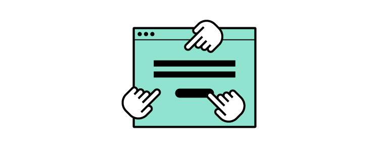
Design faster with our feature – Auto Layout. Align all the components the way you want within seconds and speed up your design workflow.
At UXPin, our goal has always been to simplify design process and make sure designers have enough time to focus on meaningful work. Auto Layout removes the pain of manual resizing and makes your work more intuitive. Try Auto Layout for free. Sign up for UXPin’s trial.
Build advanced prototypes
Design better products with States, Variables, Auto Layout and more.
Challenges of designing without Auto Layout
However, we want it to be true, designing isn’t only creative and fun work. You have to adapt to the constraints of your UI/UX tool. As designs are static by nature, without the proper technology, you can’t expect them to behave like a coded product.
This means every element you draw only visualizes how it’s supposed to look and work. For example, when you design a simple button, first you draw a rectangle and then add text. The moment you want to expand your text, you need to adjust the length of the rectangle as well. It shows how designers need to think about every relation between all the UI elements.
The disconnect between components translates into more repetitive work – constantly resizing multiple elements, adjusting them separately so that they can create a coherent whole. It takes too much time to do everything manually. On top of that, you have to keep the changes consistent in all elements, and let’s be honest – it’s easy to forget about setting the right paddings and gaps, especially when adding new elements to your design.
That’s when Auto Layout can remove all those bottlenecks.
Auto Layout gives you the freedom to focus on what matters and remove all the repetitive and manual work. We made sure that your UI won’t be constrained by the laws of static design but can benefit from the code-approach that we like so much. Thanks to Flexbox – CSS Flexible Box Layout, you can apply Auto Layout to groups as well as components to make chosen elements depend on one another’s position.
Auto Layout removes all the hassle and will take you just a few seconds to adjust the components the way you want. Let’s take for example a simple button – whatever you need to change in the text, the rest of the elements will adapt to the new text length. It’s only one of many cases when Auto Layout speeds up your work. If you design repeated elements like a menu and want to swap the items’ places, or add an expanded/collapsed view, our new feature will save you a ton of work.
Get started
Drop elements to the canvas, select the group or pick a component from your library. Add Auto Layout in the properties panel and your design will behave in a flexbox-like manner. You can also add Auto Layout components to a Design System.
Align all the elements within a few clicks – Auto Layout can help you:
Group scattered elements and wrap them how you want
Just by wrapping the elements, you can align them right away and adjust how many lines they should take by controlling their width or height. Say goodbye to moving the separate boxes around.
Lay out and distribute elements
If you want to distribute your components in relation to each other, just set the vertical or horizontal direction and choose how they should be laid out (start, center, end, or stretch).
Keep consistency
With Auto Layout maintaining consistency among gaps, paddings, borders, and radiuses is easy. When you apply the wanted value, all the elements with Auto Layout will align accordingly.
Resizing
Resizing comes in handy when you want to change one chosen element in the Auto Layout group. You can still maintain all the properties set for the group and play around with one element by changing the width, height, or filling out the main group.
TL;TR
Auto Layout automates some of the manual work that you have to do when tweaking, aligning, and resizing elements. Groups of items can now align intuitively to work as a whole. Check all the functionalities in our documentation. Need help? Ask our community.
If your organization is implementing DesignOps for the first time, it’s likely that something isn’t working. The first step is to identify the problems and bottlenecks design teams experience—exactly like you would during early research for your users!
You’re about to read a rewritten chapter of our “DesignOps 101” ebook. Get it for free and learn all that you need to know to launch DesignOps at your organization.
Start with a discovery process:
Interview design teams to identify common pain points
Interview stakeholders to find out how design impacts other departments
Survey designers to find out job satisfaction, workload/productivity, time on task, roadblocks, tool/software satisfaction
Understand that this discovery process will not be simple, especially when you’re trying to find time to interview people already stretched with their duties and responsibilities.
Look for opportunities to sit in with teams, including design, product, and engineering. So you can experience workflows and the challenges people must overcome.
When approaching your research and questions, think about the areas in chapter two where DesignOps is most helpful:
Seamless collaboration
Ability to scale the design process
Managing needs
Look for the places where these core DesignOps responsibilities are most lacking.
In an insightful blog post, first-time DesignOps manager Dave Cunningham interviewed 50+ designers to create five “pillars of focus” to structure his initial research:
Process—where are the bottlenecks and roadblocks in the design process?
Tools—what systems and services can optimize speed and execution?
Knowledge—how do teams share knowledge and work?
Strategy—how can you amplify existing strategies or implement new ones to optimize workflows?
Culture—skills pairing, mentoring, education, hiring, and onboarding.
You should also look for problems that most align with your strengths and have the potential to deliver the highest ROI, especially if you are working alone. Avoid taking on a big project you’re unsure of right at the beginning. Focus on the problems you’re most confident at solving first. These early wins will boost your confidence and build trust with your team(s) and stakeholders.
Pro Tip: Get into the habit of organizing and documenting everything from the start. If you’re starting DesignOps in your organization, you’re likely going to be the only person on the DesOps team!
Documenting your initial research will not only provide you with valuable references for your roadmap but help with onboarding or handing over to new DesignOps members later on.
Define the Value: How Will Your Team Benefit From DesignOps
Once you’ve researched and listed the design problems you need to solve; the next step is to assign a value. Where are your organization’s most significant issues, and what is the potential return for fixing these?
Be careful of spending too much time researching the possible return on investment. It’s easy to start trying to come up with detailed solutions to assign value. Also, remember to keep your strengths in mind to solve the problems where you’re most capable and experienced.
Don’t only think of value in monetary terms. Sometimes solving workflow problems will increase job satisfaction and productivity while reducing time to market—ultimately improving business value.
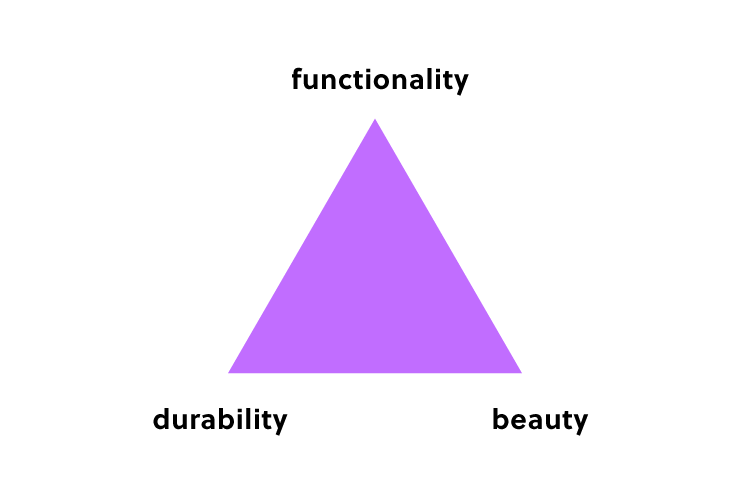
Most importantly, keep your customers front and center when ascribing value. Returning to Dave Cunningham’s example, he used a pyramid system for assigning value with the user value & experience at the top, followed by:
Design impact – added value to outcomes and user knowledge
Service standards – design quality, design efficiency & design principals
Risk reduction – Digital accessibility, content meaning
When you’re evaluating the problems and assigning value, think beyond the UX design department. How will your changes impact the entire organization?
For example, streamlining design system governance processes positively impacts design, product, and engineering teams. This example goes back to a point we made earlier: interview stakeholders to find out how design impacts other departments.
Prioritize And Roadmap: What Does Your Implementation Strategy Look Like
Lastly, it’s time to prioritize the problems you want to solve and pick your first challenge. Answer the following:
How do you plan to accomplish these goals?
Who is involved in the process?
Who are the decision-makers?
What’s the timeline for implementing change?
How do you generate buy-in from stakeholders?
What are your measures of success?
The last point is crucial for your implementation strategy. How do you measure where you are and where you want to be? What are your KPIs to determine if you’re on the right track? How do you report these metrics to teams and stakeholders? And what does success look like?
Use a holistic approach to measuring success rather than a single metric. For example, if you might need to consider several factors and KPIs to measure your strategy’s success, including (but not limited to):
Time-to-market
Time-on-task
Employee retention
Team member engagement
Employee happiness/job satisfaction
Design quality
Administrative tasks (increase/reduction)
DesignOps tool adoption
You should also identify KPIs to abandon or pivot your strategies so that you’re continuously improving and evolving DesignOps.
The Nielsen Norman Group has a helpful Initiatives Worksheet for you to visualize the problems you want to solve. The worksheet lists your pain points and three areas to create “impact.”
Focus Areas: What are the biggest pain points?
Strategic Goals: What high-level outcomes do you want to create?
Tactical Goals: What tactics can you try implementing to reach your strategic goals?
You should also assign realistic timelines for implementing each of your initiatives, with relevant metrics and KPIs.
Lastly, consider what DesignOps can do long-term so that designers only have to focus on design! And how would that benefit the organization? DesignOps’ goal is to eventually eliminate all of the tasks, processes, and systems that prevent designers from focusing on design.
If you have a small UX team that doesn’t need a dedicated manager, developing DesignOps thinking is highly beneficial to standardize design processes and workflows.
This DesignOps methodology will lay the foundation for scalability. It’ll also allow someone to step into a DesignOps management role without starting from scratch!
Your Company Isn’t Alone
Some of the biggest teams in the world started thinking about DesignOps from this starting point level.
Airbnb wasn’t always the household name they are today. A DesignOps implementation strategy helped them evolve and expand with agility. The Very Group is another company that created a DesignOps plan and implemented it to facilitate their growth and change during the early months of the COVID pandemic.
“It’s a given that each designer rightly has their own flair, tools and methods when it comes to how they deliver projects — and having that freedom and individuality is a fundamental aspect of creativity.”
Liam Charnock, a senior product developer.
The reality is that as design scales, so do the ways of working—and this is where issues can start to occur.
When we talk about design documentation, we’re not just talking about UI specs and style guides. The growing stack of designer responsibilities results in a rising complexity of design deliverables. DesignOps becomes vital for teams to think about growth, change work processes, and ensure long-term success. Even if the mindset change is difficult, the long-term outcome will be worth the initial challenges.
The Very Group’s DesignOps structure is similar to the outline above but simplified for their work model:
Design it: When you get desired outcomes and a project goes well, document it to create a process.
Contextualize: Create a resource framework that serves as the foundation for projects and processes.
Store it: Set a codified file structure that makes file naming, storage, and finding things later a more seamless process.
Looking Ahead
Once the mindset and team structure are in place, all you need are tools and systems to facilitate the DesignOps process. Discovering what tools and systems will work for your team is the final step to cementing your DesignOps philosophy and workflow on the path to long-term growth and success.
5 Key Takeaways for Getting Started With DesignOps
Start with a process of discovery to identify the problems. Remember to look beyond the UX department to explore ways DesignOps can help the entire organization.
Document early to avoid repeating research and processes.
Measure the value of solving design issues.
Prioritize problems and create a roadmap.
Identify the metrics for success and KPIs to pivot or abandon a poor-performing strategy.
Enjoyed the rewritten chapter? Get “DesignOps 101”, read the whole ebook and learn even more about implementing design operations in your organization.
Most designers are skilled craftsmen, not business people. Yet, they need to show business savviness, especially when talking with stakeholders, planning or scaling their work. Although learnable, such tasks waste a lot of time that could be used for designing. DesignOps can help with that.
***
Update Nov 30, 2021
The webinar got rescheduled for December 7 at 10 AM PDT / 7 PM CET. The webinar link remains the same but we encourage you to add a new event to your calendars.
DesignOps has a great potential to significantly decrease time to market, create a competitive edge, and smooth communication between developers and designers. It’s a growing field and there’s much to learn about it. For instance, we need effective tools to measure its impact.
We invited Patrizia Bertini from Babylon to talk to you about DesignOps and the ways it can bring efficiency to design and business. She’ll equip you with tools to quantify Design Operations.
The webinar is scheduled for November 30, 2021 at 10:00 AM PST / 07:00 PM CET (December 7 at 10 AM PDT / 7 PM CET.)
About the Expert
Patrizia has 20+ years of experience in design management as well as usability, user research, accessibility, and web design. She held leadership roles for international research teams and pioneered a lot of web accessibility, design facilitation with LEGO Serious Play, and co-creation work. Patrizia developed her own approach to DesignOps, one that helps improve organizational efficiencies.
Book your spot and learn:
What DesignOps is and how it impacts an organization.
What to improve in terms of DesignOps.
Methods of measuring the impact of DesignOps on design teams and business.
We’re always excited when we get feedback about how UXPin has improved our customer’s design experience. It’s even more special when that customer is one of the world’s largest digital payment platforms.
We had the joy of sitting down with Erica Rider, Senior Manager for UX – Developer tools and platform experience at PayPal, and Anthony Hand – Sr. UX Designer at Erica’s team.
In her own words, Erica explains the design challenge she had to solve at PayPal—bridging the gap between design, product, and development.
In most companies, the designer-developer ratio is one designer for every ten developers. At PayPal, there are five designers to over a thousand developers!
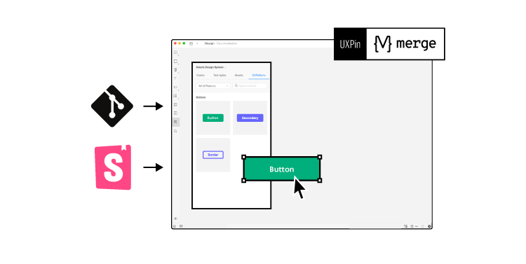
PayPal needed the tools and strategies to overcome this challenge. So, they turned to UXPin Merge and improved their DesignOps process.
Here’s how Erica and one of PayPal’s design teams revolutionized their design and development process using UXPin Merge. Scale design with UXPin Merge. See how to request access.
Reach a new level of prototyping
Design with interactive components coming from your team’s design system.
Challenges
Challenge of scaling design:
I have a small design team of five designers, including myself. We’re responsible for somewhere between 60 and a hundred products and well over a thousand developers.
As a small design team supporting such a large organization, we had to develop an innovative problem-solving approach. We were never going to get the budget to hire more designers, so we had to figure out how to scale design itself!
Challenge of consistency:
None of PayPal’s product teams had experienced UX people or UI developers. The result was a range of usability and design consistency issues—no two products looked the same!
So, I was assigned the challenging task of creating a cohesive and consistent user experience. With three designers and an infinite number of product teams, I knew that we couldn’t follow a traditional model to scale. And adding more designers wouldn’t solve the problem.
We had to scale design to empower product teams to be successful.
Before
The tools PayPal tried to use
To start, we knew that product teams were going to have to design products on their own. So, we looked at several different tools, starting with a traditional model, where we had design systems and standards.
Our initial idea was to adapt a traditional design approach while educating product teams about design. But, we quickly realized that with three designers trying to create documentation, providing support, and with the learning curve for design tools, the traditional model wasn’t going to work.
If product teams were going to design products successfully, we had to minimize the tools and skills they needed to learn.
The traditional way
In a traditional UX process, you have designers creating vector-based mockups, which they hand off to developers. Unfortunately, this process creates a gap between how components are supposed to work and what components are supposed to be there.
The result, lots of back and forth between designers and engineers to get design clarity and what the prototypes are supposed to do. Many times developers ask designers questions they hadn’t thought of because they were thinking purely about how the product is supposed to look and work.
Introducing UXPin Merge
For product teams to design products, we had to minimize this designer-developer gap while increasing collaboration.
Several years before I joined PayPal, I had a theory that to scale design effectively we had to include developers and product managers in the design process. I just didn’t know how we were going to do that. I knew the what, but I didn’t know the how.
Discovering Merge and UXPin opened the door to understanding how I could bridge the gap between design and development—and formed the catalyst to PayPal’s improved design process.
A traditional DesignOps process is about scaling. The usual ratio is one designer for every ten developers. First by adding designers and then building the supporting infrastructure to accommodate a large design team.
As an internal organization, we knew we would never get the resources to scale to the traditional one to ten designer-developer ratio. We had to find an innovative solution to solve our design challenges without adding designers.
So how does UXPin Merge work?
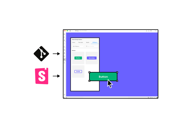
PayPal’s consumer-facing apps, services, Venmo, and other external services all use different technologies. We settled on Microsoft’s Fluent design system with UI controls for our internal tools development because they’re more enterprise-focused and better suited to internal user interfaces.
With UXPin Merge, we’re able to put our Microsoft Fluent Design System into a Github repo and import the components into UXPin’s design editor. Using this UXPin Merge setup, our product teams can design prototypes that leverage the exact components and UI controls our engineers use to develop these DevOps tools.
For example, a button on the canvas in UXPin’s editor renders exactly the same as it does in our developer tools, including hover/click effects, font styles, and other metrics. Designing with UXPin Merge brings significantly higher fidelity to our prototypes than we’ve ever had at PayPal.
With Merge
We knew we were going to save significant time designing with UXPin Merge during the initial rollout.
Some of PayPal’s senior management asked us to do a time-saving comparison between using UXPin Merge and a traditional design model.
So, I had one of my designers pick a one-page design comparison test. We did a one-page vector-based design with another design tool we use at PayPal. And then the exact same prototype in UXPin using our Merge component library. How would these two tools compare against the clock?
The results: Using Merge our designer took around eight minutes while using the other design tool the same prototype took over an hour! It’s important to note that this was from an experienced designer familiar and competent with the tool we chose as a comparison.
We didn’t feel comfortable providing product teams with this vector-based design tool. They would have to maintain documentation and educate themselves about how to use the tool before they could even start designing! Even with that training (which would take a lot of time), they wouldn’t reach the competency of an experienced designer or design the same prototype in an hour.
With UXPin Merge, some of our product managers can build similar one-page prototypes in eight to ten minutes—the same time it takes our experienced designers in UXPin!
Before, with our limited resources and designers, a one-page product would take two or three months just to design mockups. Now product teams can design and deliver a product within the same time frame.
Impact of using UXPin Merge
One of the significant impacts of UXPin Merge is our ability to create higher fidelity prototypes. There’s a lot more confidence from everyone (including designers, C-suite, directors, and developers) about what the final product will look like, the user experience, and interactivity—giving us higher quality feedback from stakeholders.
The C-suite people and the directors are able to give us stronger feedback about the ultimate direction because they experience the features and goals of these prototypes rather than just commenting about how, how these boxes don’t look like a text field, for example.
Now that we’re using UXPin with Merge my design philosophy and productivity have gone way up! I’m confident that I can implement a prototype in 30 minutes or less. Whereas with the tools I was using previously, it would take me half a day.
Feedback: Our stakeholders are able to provide feedback pretty quickly using UXPin. We can send them a link to play with the prototype in their own time and UXPin allows them to provide comments directly on the prototypes. UXPin’s comments functionality is great because we can follow along and mark comments as resolved once we address them.
Quality of the product: With this new UXPin approach we’re seeing a more collaborative, integrative design process. Rather than separating design, prototyping, and development, UXPin allows us to create an integrated flow where we engage engineering and product teams throughout the process. As a result, the product’s final quality has improved dramatically.
User testing: It’s been so helpful for us to have these high-fidelity prototypes built with UXPin. We build high-fidelity prototypes much quicker, and we get immediate feedback after the session. If there’s something we can fix immediately, we make that change before the next participant and get feedback much faster than before.
UXPin gives you the tools to go from concept to high-fidelity prototyping right away! Explore UXPin Merge and discover how advanced prototyping and testing will change your design process.
PayPal’s redefined design process
PayPal’s DesignOps is an end-to-end process.
Product teams must fully understand their users
Design products based on the users’ needs
Enable domain experts to complete designs based on their knowledge and testing
Validate the design’s success
A common internal issue is that product teams often see UX design as a bottleneck. So, our strategy was to start with removing that bottleneck and enabling the product teams to do the design on their own.
We achieved this with UXPin Merge which enabled us to perform this “snap-together” type design. We provide product teams with components they can drag and drop to build user interfaces.
Product teams were able to create layouts with fixed margins and components so everything looked and worked the way it was supposed to. Designers didn’t have to police anything or step in to design products.
Designers still help product teams when they’re not following standard design principles or when they’re stuck on challenging problems. But product teams are able to complete 90% of the work on their own, freeing designers to focus on bigger picture design problems.
Outcomes
Customer-focused
In my opinion, being customer-focused or design-driven doesn’t mean that designers are always leading. Everyone in the organization understands what it means to be design-driven.
When we do design at PayPal, it’s not focused on one little problem here or edge case there. We’re focused on solving problems at a global level, across the entire organization, and across the entire product line.
We must provide a cohesive and consistent experience to our users across all PayPal’s products, not just little corner cases.
While PayPal’s product teams and domain experts are doing design, our UX team acts as a mentor or coach. Where a UX designer used to work with a single product or maybe a single domain, with Design Ops 2.0 our product designers now work across 10 to 15 different products at a time.
Education in an enterprise
When our UX designers mentor our product teams, they’re not only giving them guidance on how to design better layouts or products, they’re also teaching design thinking.
Design thinking is not just about the UI design, but rather thinking about the complete user experience. How do API response times impact the user experience? How does latency impact the user experience?
We want design thinking from top-level UI all the way down. We want everybody to understand their impact on the user experience so that our product teams can make good decisions for their end-user.
Focus on what matters
My design team spends 50% of their time supporting various product teams and the other 50% is spent on larger UX initiatives that impact the organization globally.
Some of these UX initiatives include:
Do we focus on things like how do we build trust between users on a platform?
How do we build an intrinsic attachment between users on a platform?
How do we build user research into all of our products, so we’re not running studies, but rather understanding how users use our products, where the gaps are, how we fix them, and how do we provide that data back to our product teams?
Future investment
Scaling your design process is an investment that pays off in the long run. It takes a savvy team to look at the overall design and development life cycle, what that looks like today, and try to figure out how we are going to shorten it, rather than stating, “this step is too long.”
While the initial process of building all of the technology seems like a long time, it’ll actually save you significant time in the long run—for your entire development, design, and development process.
UXPin Merge and your design process
If UXPin Merge managed to solve a complex design issue for one of the world’s biggest digital financial platforms, imagine what it could do for your business!
Are you looking for an app design template to inspire your next project? Our design team has put together a calming app design template to showcase the possibilities of designing with UXPin.
The complete mobile app UI kit is suitable for iOS and Android devices, providing you with the foundation to build a beautiful product for yoga, meditation, or sleep aid – complete with audio files and soothing interactions.
Here’s what you’re going to learn in this article for the Calming app mobile template:
Components: reusable components to edit the current app or build new features
Interactivity: breathe life into your app with States, Interactions, and Page Transitions
Audio/Media: uploading audio and adding controls for play, stop, pause, looping, autoplay, and muting
UXPin Features That Make App Design Easy!
Before we get into the calming mobile app UI kit, let’s explore UXPin’s app design features.
Components
UXPin’s Components let you create reusable building blocks to maintain consistency and scale designs quickly. A Component could be a simple button comprising a rectangle and text, or a navigation bar complete with colors, states, and interactions.
UXPin components comprise of two aspects:
Master Component – defines the Component’s properties
Instance Component – a mirror of the Master Component
Any changes to the Master Component will immediately copy to its Instances. You can unlink any Instance so that it becomes an independent group of elements for you to edit.
UXPin makes it easy to edit Master Components. Instead of searching for the master, select any Instance, click the purple Edit Master button, make your changes, and click Back to complete.
You’ll find all of your Components in the Design System Libraries to the left of UXPin’s Canvas. If you have an extensive design system, you can sort Components by category or use the built-in search feature.
Without interactions, mobile app design appears dull and lifeless! We have a long list of triggers, actions, and animations to create immersive experiences for your users.
There are several ways to create interactivity in UXPin, but we’ll touch on two foundational elements, States and Interactions.
States let you create several different properties and interactions for a single element or Component, triggered by various user actions. Setting States for elements and Components is the first step to making your high-fidelity prototypes mirror the final product’s functionality.
For example, a button can have a default, hover, active, and disabled state and switch between each according to the user or system’s actions. You can set a button’s state to disabled, shaded grey, and unclickable until a user completes a form. When the required fields are complete, the button changes color, and the user can click submit.
Interactions allow you to create an immersive user experience with Actions and Animations through two types of Triggers:
Element triggers: user interactions—click/tap, hover, swipe, focus
Canvas triggers: a change in the canvas state (engineers will refer to this as a system trigger)
Interactions occur through a Trigger-Action sequence and can include a simultaneous Action/Animation:
Trigger—user taps/clicks a button
Action/Animation—opens a new page (Action) with a Slide up page transition animation (Animation)
UXPin also allows designers to create “if-then” and “if-else” Conditional Interactions to execute different Actions or Animations, precisely as you would in a Javascript function. This powerful feature lets designers test high-fidelity prototypes accurately to get meaningful feedback from usability participants and stakeholders.
Designers can take interactivity beyond what’s possible in most design tools using UXPin’s Variables and Expressions.
Variables: store user inputs and take actions based on the provided data inside the prototype.
Expressions: form validation, computational components like shopping carts, or checking if a password meets specific criteria.
UXPin lets you upload images and other static assets to your designs. You can also store these assets (like logos and custom icons) in your Design System Library for other team members to use.
Video and audio are often missing from high-fidelity prototypes because design tools lack the functionality to store and interact with this media. UXPin lets you link Audio and Video to your high-fidelity prototypes with interactions like Play, Stop, and Pause.
Now that you have an introduction to UXPin’s core features, it’s time to take a quick walk through our calming mobile app template.
Calming App Template Walk Through
The Calming App is one of four free app templates available from UXPin’s App Examples library. Our Calming app lets you explore five UXPin features in action:
Drag and drop the Calming App.uxp file from the unzipped file
Once the file uploads, you’re ready to go!
How to Preview
You can preview a prototype in the browser to test navigation and interactions. Click the dark triangle icon above the right sidebar or use the keyboard shortcut Ctrl + P to open the preview in a new browser tab.
You can also use UXPin Mirror to preview your prototypes on iOS and Android devices. Here how:
The Calming app template features four pages (app screens):
Home
Breathe
Relax
Sleep
You can view and switch between these pages by clicking the Pages & Layers icon in the bottom left or using the keyboard shortcut Alt + 1—get a complete list of UXPin’s keyboard shortcuts here.
In Pages & Layers, you can also add new pages or click the overview icon to see all of your project’s pages.
Calming App Template – Home Page
The home page features a text block and three large button Components, which link to the app’s other three pages.
Remember, to edit a Component, you must first select it and click the Edit Master button top left of the canvas or right sidebar under Instance.
Calming App Template – Breathe Page
The Breathe page features a text box, a hidden Breathe Component, and a circular Start button Component, that triggers multiple Actions and Animations and changes States.
Make sure you’re in Pages & Layers in the left sidebar and click the Start layer. Click Interactions in the right sidebar, and you’ll see the following Interactions:
Hide 2 elements: hides the Start button and text box
Show breathe: shows the hidden Breathe Component
Set State Breathe to Breathe In: changes the Start button’s State
You can also check out the Breathe layer’s Interactions by selecting it in the left sidebar and clicking Interactions.
The Breathe page would work nicely with audio, like adding a guided meditation.
Calming App Template – Relax Page
The Relax page of our Calming app is where things get interesting! We have a text block with eight audio Components.
To find the audio make sure you’re in the Pages & Layers window in the left sidebar, expand the Sound Component, and then the Button layer. You’ll see four layers, including one labeled Audio. When you click the Audio layer, its settings will appear in the right sidebar. Under AUDIO, you’ll see a URL for the audio file, including four options—the Calming app is set to Loop.
You can change the audio by pasting the URL to a hosted file.
Calming App Template – Sleep Page
Lastly, the Sleep Page features a text block, CTA, and setting moon animation. You can explore each of these layers using the Pages & Layers window in the left sidebar.
Have fun playing with the Calming app template. Check out our documentation to learn more about UXPin’s features and how to use the design editor.
More Design Templates
UXPin has three other app templates you can copy for inspiration or familiarize yourself with our design editor.
Smart Home: a mobile app template for controlling smart electronics in your home.
Exhibition: a modern web design template for an event.
Auction: an auction/eCommerce app template with scrollable content, product page, and inputs.
Get Started With a UXPin Trial
Ready to dive in and start designing with UXPin? Sign up for a 14-day free trial to the versatility and creativity of creating apps, websites, and digital products with the world’s most advanced design tool!
10x what? You might find yourself scratching your head if you’ve come across this buzzword for the very first time, even if you are a part of the UX/UI industry & community for some time. We don’t blame you because it’s a relatively new concept, but it’s becoming more and more prominent! Big companies are also starting to include 10x designers into their ranks!
You will be surprised to know that there are product designers who race against time to design applications faster than the ideal turnaround time. But not for the sake of beating time and delivering a bad product. Instead, because they are capable and up to the task, all while using the proper tools that allow them to move at an incredible rate even when collaborating with other design teams and departments. Their project organization and established workflow allow a 10xer to be lightyears ahead of an average designer.
In plain terms, a product designer who has mastery over UX, UI, and graphic design, is often referred to as a “10x designer” because they are considered to be 10 times more effective than an average designer. That’s due to their work ethic, productivity, and performance.
Also, outsourced software development companies use the same principle to build mobile apps and websites faster than the usual time is taken, allowing companies to focus on innovation and creativity. Is this technique widely known? If yes, what does it take to become one of those?
Let’s find out!
Who is a 10x Designer?
They are the generalists in your company.
They are not just 10 times more productive than the rest of your in-house designers but also thought leaders in their field of expertise. They lead a project from the back seat helping project managers with data-driven choices and impeccable user experience design that keeps everything moving forward smoothly.
If you can design each of the touchpoints of your product to create value, you will be able to grow exponentially. A great user experience involves designing with empathy that a quality every product designer should possess. You should also be able to design an experience that is unique, and tailored for each visitor to your product.
With all the information available, 10x designers are capable enough to make design decisions without being constrained by a conventional way of thinking.
For example – when a 10x designer is asked to do a redesign or implement a new feature, they will run every inch of their analytical and creative thinking to draw conclusions from all inputs and arrive at a decision.
The Origins
Recall a time when you came across a nerve-wracking problem! Who did you look for in a hurry to give you the most optimal solution at that very moment? Probably that one person who you think has solved a similar problem before. Or the one with the most experience. Why? Because this is an expert who will probably solve your problem much faster than you would. When it comes to problem-solving capabilities, we need to give credit where credit’s due – the developers.
Before there was a 10x designer, there was a 10x developer. A 10x engineer.
A 10x developer is someone who can write one line of code to solve ten lines of code worth of complexities. And that’s why you see a $10000 bill after the project completion.
This was the concept of 10x developer, originally. But apparently, the formula was practical enough to be implemented to the rest of the departments of a certain software development company as well. And thus, the 10x product designer was born.
That’s how the super-soldiers in the dev and design industry were born. But let’s move on to more hands-on information and actually advice on how to become a 10x designer.
How to Become a 10x Product Designer?
You need to take your UX design skills to the next level, leveraging technology that will enable you to create 10x better user experiences. It all boils down to tying every design decision via following a stringent UX process and getting your horses running at the speed of 10x times.
Starting from user research, empathy mapping, creating personas, designing user flows, and ultimately getting down to sketching wireframes and designing high-end clickable prototypes, there’s absolutely nothing that can go unnoticed. There should be no stone unturned.
A unique trait of 10x product designers is that they understand and absorb the principles of user-centered design. They pull an all-nighter to focus on the user more than the product. It takes responsibility, empathy, and deep expertise to come up with a product that’s exhilarating to use, in terms of user satisfaction.
The UX process is to be taken into account with due diligence when a company is trying to move at a fast pace. A lot of the time and effort we put into designing software is spent on creating usable components and functionality that other people have already built, yet we still start from scratch. That’s because UX to the average user means all the familiarity of previous products with a brand new flavor. Using parts of a design that already exists is the fastest way to do things, and keeps you from having to reinvent the wheel. Merge Technology enhances efficiency by reducing redundancy and integrating workflows. It lets designers take fully interactive components from devs’ coded design system (in Git repo or Storybook), and use them in their design! That’s how PayPal’s design team streamlined their design process.
A 10x product designer must be able to do a lot of things at once. Can you imagine how much work it would take to keep everybody involved coordinated? Well, they face a lot of criticisms, unsolicited opinions, and feedback from a 360-degree perspective to keep everything moving. This is from the inception stage to the deployment stage of an application!
A 10x product designer must be able to:
thoroughly plan a product’s structure
evaluate its design
find the appropriate feedback for each feature
build a relationship with users, and
understand their needs
Back and forth of verbal and written communication, endless meetings to address every loophole in the software designing process, and curbing the day-in and out challenges is what their routine day looks like. And we bet they have lost count of how many times a discussion goes through a dip to only come back to what was decided earlier.
A ten-fold improvement in the user experience design is meant to be paid off. Why? Because every step in the UX design process brings a product closer to satisfying its users’ needs.
Everything In a Nutshell
There are very few product designers who are able to make tangible progress in their field. And then they are ten times better than the typical designer (which is what we call them, even though they’re much more than this), these designers are much faster and able to create full-on user interfaces for customers in a fraction of the time. The 10x product designers give concrete feedback and suggestions to designers, developers, and startups.
“Everybody has opinions. The opinions that get implemented are backed by data and process.” 10x product designers are the kind of people whose ideas are implemented. They’re the ones who put in plenty of thoughts and use meaningful data to back their validations!
Are you one of those people? If yes, there’s no way you cannot be ten times better than what you already are! You can request access to our Merge technology to ease the pain of designing from scratch and spending too much time on adding interactions. It all can be just resolved with integration with devs’ repo!
One of the most common debates in the UX world is UX vs. UI design—where are the differences and similarities? Do you need a UX designer and a UI designer? Who does what? Should they be separated? How do they work together?
The confusion arises because most institutions teach user interface design as part of the UX design curriculum. UI is part of the user experience so, why are they separated?
In small businesses and startups, UI falls under the UX umbrella. But, as organizations and products scale, the user experience department splits into UX designers, UI designers, researchers, writers, UX architects, ResearchOps, DesignOps, and other UX specialists.
While these roles are separated, they all focus on user-centered design to create a fantastic customer experience. To do this, UX teams must work together to solve user problems within budget, product, and technical constraints.
UXPin is a collaborative design tool that cultivates strong communication between your entire organization, including UX teams, product designers, engineers, and other stakeholders.
Teams can communicate through UXPin using our Comments feature to create private or public comments, tag people and assign tasks. Try UXPin for 14 days to discover a collaborative design tool built to enhance user experience design.
What is User-Centered Design?
User-centered design is the glue that holds UX and UI together. To do their jobs effectively, UX and UI designers must use a user-centered design approach.
User-centered design is the process of designing a digital product with the customer as the central focus. Don Norman, former Apple employee and founder of the Nielsen Norman Group, coined the term in his 1986 book, User-Centered System Design: New Perspectives on Human-computer Interaction.
In it, he writes: People are so adaptable that they are capable of shouldering the entire burden of accommodation to an artifact, but skillful designers make large parts of this burden vanish by adapting the artifact to the users.
What Don is saying is that it’s the job of user experience designers (UX & UI) to A) solve a human problem and B) adapt the product to eliminate the user’s limitations.
What is UX Design?
UX design encompasses the broader user experience and how people feel when interacting with a product—including user interfaces. UX designers also focus more on navigation and user flows to optimize the product’s experience and make it more enjoyable and user-friendly.
UX Designer Responsibilities
Product structure: navigation, user journey, flows
Research: user, competitor, market analysis
Testing: low-fidelity and high-fidelity prototyping
User interface designers create the visual elements users interact with in a digital product or website—buttons, color, icons, typography, images, forms, and other elements and components.
Additionally, UI design is concerned with interactivity like animations and microinteractions.
Essentially, UI design is a specialist position within user experience design.
As you can see from the responsibilities, UI designers focus on aesthetics and interactivity, where UX designers look at the overall experience, structure, and navigation.
UX designers have a broad view of the product experience, while UI designers focus on what’s happening within each screen.
UX designers usually delve deeper into research and look beyond the user to competitors and market analysis. UI designers will also study users while researching visual design trends.
UX designer: focuses on user pain points, needs, and emotions
UI designer: focuses on the user’s environment, movements, and actions
Define
UX designer: defines the user’s problems and the goals they’re trying to achieve
UI designer: focuses on each step users need to take to achieve their goals
Ideate
UX designer: looks at the information architecture and navigation to solve users’ problems
UI designer: looks at the elements and components users will need to navigate a product
Prototype
UX designer: designs page hierarchy and user flows using wireframes—low-fidelity and high fidelity prototyping
UI designer: designs mockups and interactivity for high-fidelity prototypes
Test
UX designer: tests the overall user experience and wants to know how users think and feel while using the product
UI designer: tests how users interact with the product and asks practical questions
Similarities Between UX & UI Design
UX designers and UI designers both focus on user-centered design and follow UX design thinking principles. UX designers define users’ goals, and UI helps them achieve those goals. They both seek to optimize the user experience and solve usability issues.
It’s important to see UI and UX as one entity rather than two separate departments. Both are user experience designers—they’re just focused on different tasks within UX design.
If designers execute either of these tasks poorly, the entire user experience and product will fail—no matter how strong the other might be!
UX and UI designers must both consider accessibility. The UX designer focuses on product usability, such as layout, hierarchy, and placement, while the UI designer looks at user interface accessibility, including colors, fonts, sizing, and interactions.
UX & UI in the Product Design Process
Here is a typical product design scenario and the split between UX and UI responsibilities.
UX designer/UX researcher conducts user, market, and competitor research.
UX designers work with the product manager and stakeholders to develop an idea within product and budget constraints.
UX designers create the information architecture, initial sketches, wireframes, and low-fidelity prototypes.
UX designers/researchers conduct early testing to refine navigation and user flows.
UI designers convert wireframes to mockups using color, icons, buttons, and typography.
The UI designer adds interactivity to create high-fidelity prototypes.
UX researchers test high-fidelity prototypes, send to UX/UI designers for changes, and iterate.
Design teams collaborate with engineers during design handoff for the development process to begin.
This example is by no means an “industry standard” approach. UX and UI designers will work closely throughout the design process.
UX design always precedes user interface design. You cannot design a product’s interface without the supporting structure and architecture.
The UX designer lays the foundation while the UI designer focuses on interaction and aesthetics. To achieve these tasks, both designers must be aware of the user’s needs to create a delightful user experience.
UX and UI Design Tools
UX and UI designers will usually use the same design tool but for different tasks and objectives.
The UX designer will create wireframes and link each screen with basic click/tap interactions to create low-fidelity prototypes. They’ll build the structure of each page using a grid system and include navigation.
Once wireframing is complete, the UI designer will add color, interactivity, page transitions, animations typography, and more to create high-fidelity prototypes.
How UXPin Helps UX & UI Designers Increase Speed and Consistency
UXPin is an end-to-end user experience design tool UX and UI designers can collaborate on to build incredible products for their customers—from wireframing to prototypes to the final design handoff.
UX designers can design high-fidelity wireframes using built-in design libraries, so UI designers and stakeholders better understand screen layouts and flows.
By using tried and tested built-in design libraries, UX designers can get meaningful feedback from usability studies and stakeholders during early testing.
With most of the work complete, UI designers can refine design elements to meet branding and product requirements and immediately begin testing.
UXPin’s code-based design tool means UI designers can breathe life into the product with advanced interactions and animations. They can also use Conditional interactions to mimic final-product functionality for better results and feedback during usability testing.
Better Communication and Collaboration
Invite product teams, developers, and other stakeholders to preview prototypes in the browser. They can leave feedback via UXPin’s Comments functionality and even assign UX and UI designers tasks to action.
Why not try UXPin for yourself? Sign up for a 14-day free trial to discover a collaborative, code-based design tool built to enhance the user experience.
User experience design is a process of understanding human psychology. It’s why terms like user-centered design and user experience govern the design thinking process.
UX design psychology is about understanding the behaviors of the people whose problems you’re trying to solve and designing the user experience to align with those human behaviors.
UXPin provides designers with ready-to-use prototype examples that follow UX psychology and the Gestalt principles of visual perception.
Sign up for a 14-day free trial to explore UXPin’s innovative design editor and advanced prototyping features to create a better user experience for your customers.
Understanding Cognitive Psychology in UX Design
Cognitive psychology studies human mental processes, including attention and perception, memory, problem-solving and creative thinking—the foundation for user experience design.
Great UX designers understand these human mental processes and how cognitive psychology can help overcome the mental barriers to improve:
Usability
Navigation
Readability
Accessibility
The human brain constantly searches for patterns and recognizable objects to make sense of the surrounding environment, including digital products.
1. Cognitive Load and UX Design
Cognitive load is the mental effort required to process and learn new information – human processing power.
Good UX design understands the limits of cognitive load to optimize user interfaces and present content so users can absorb and process information fast.
If the processing power required to absorb and process information in a digital product exceeds the user’s cognitive load, they’re unlikely to continue using it.
2. Three Types of Cognitive Load
Here are the three types of cognitive load and how they affect UX design.
Intrinsic cognitive load is the inherent difficulty of a task. How do users absorb information while staying focused on the task at hand? A good example is an eCommerce checkout. Designers remove all navigation and only provide the content necessary for the user to complete a purchase. By reducing the intrinsic cognitive load, designers increase the likelihood that a user will complete the task at hand.
Extraneous cognitive load is how the brain processes the task’s non-essential problems—for example, fonts, microinteractions, or instructions. A user struggling to read a font or understanding instructions are examples of exceeding extraneous cognitive load in UX.
Germane cognitive load is the processing, construction, and automation of schemas. How users organize categories and relationships of information. When learning something new, the human brain will look for familiarities in the content to build schemas.
Gestalt principles and Visual Design
Gestalt principles describe how the human brain perceives visuals to create familiar structures.
A famous example of Gestalt psychology is the Young Woman or Old Woman illustration by a British cartoonist in the late 19th century. This “Gestalt switch” provides a fascinating insight into how the mind interprets elements on a canvas and the impact this can have on visual design.
These are the six primary Gestalt principles that apply to visual design:
1. Figure-Ground – how the brain differentiates the foreground from the background. UX designers must clearly distinguish the foreground and background to minimize cognitive load.
2. Law of Proximity – grouped objects appear to be more related than objects spaced further apart. If you have several categories of information, creating space between these categories will allow users to differentiate the content faster.
3. Law of Similarity – similar objects appear related—for example, objects with similar shape, color, shading, size, and other qualities.
4. Law of Closure – the brain’s ability to see a complete shape by filling in the missing information.
5. Law of Continuity – the human eye naturally follows paths, lines, or curves of a design. Like proximity, continuity can help users identify related content.
6. Law of Symmetry – the brain’s preference for dividing objects into an even number of symmetrical parts.
6 UX Design Psychology Principles Every Designer Must Know
1. Von Restorff effect
The Von Restorff effect predicts that in a group of objects, the one that differs stands out or is most likely to be remembered. The Von Restorff effect is one of the most critical principles in UX design psychology because it helps provide the user with clarity and direction.
UX designers apply the Von Restorff effect whenever they’re trying to highlight a prominent call to action button—for example, enlarging the CTA or making it a different color.
The Von Restorff effect is also helpful in other parts of a user interface. For example, if you have a series of tabs, you might indicate which tab the user is currently on by making it a different color. The same is true for highlighting the current page in navigation or the current step in a user flow.
2. Hick’s Law
Hick’s Law estimates that the more choices you give someone, the longer it’ll take them to make a decision—because you’re increasing their cognitive load.
Hick’s Law is a crucial psychological principle for eCommerce design. Firstly, if shoppers have too much choice, they may take multiple visits before deciding what to buy. The experience might be too overwhelming, meaning they never purchase anything!
UX designers must also pay attention to Hick’s Law during the checkout process. The steps it takes to complete a sale, and the number of form input fields can severely impact a store’s conversion rate.
UX teams must continually evaluate designs to ensure they only provide users with the least number of choices to complete a task or goal.
3. The Principle of Least Effort
The principle of least effort states that users will make choices or take action requiring the least amount of energy. If a product is too complicated or there’s a steep learning curve, users are less likely to use it.
The principle of least effort is also critical when making layout or user interface changes. Changing how users interact with your product might annoy them to learn a new process—do this too many times, and you’re likely to lose users.
The principle of least effort is not something that designers consider once to solve the problem. It’s an ongoing process of user testing and iterating to look for improvements continually.
4. The Serial Positioning Effect
The serial positioning effect states that people are most likely to remember the first (primacy effect) and last (recency effect) items in a list, sentence, or piece of content.
Psychologists suspect the serial position effect occurs because people expect the most meaningful information to appear at the beginning and end.
UX designers can use the serial position effect to create better user experiences. For example, placing the most important or most-used navigational links first and last.
The serial position effect is also effective for screen layouts by displaying critical information at the top and bottom.
5. The Principle of Perpetual Habit
The principle of perpetual habit states that people rely on familiar routines and habits. If you design a new car, you don’t put the steering wheel in the trunk because you want a clean, minimalist dash.
There are areas where you can exercise creativity and innovation, but there are some universal standards you should never change.
For example, users expect to find navigational links in the header and footer. The hamburger icon indicates where to find the navigation for mobile users. If you change this structure, users will have trouble with basic navigation resulting in a poor user experience.
Good product design goes as far as recognizing the different user habits across devices, from mobile devices to desktop, iOS to Android—and tweaking the product to align with the user needs.
6. The Principle of Emotional Contagion
The principle of emotional contagion or chameleon effect states that humans will mimic or empathize with the emotions and behaviors of others, including animals and animations.
UX designers can use the principle of emotional contagion to create engaging and immersive user experiences.
A good example is how Duolingo uses the Language Bird to encourage users to return to the app. If a user misses a lesson, Language Bird is upset and crying. But when you complete a class, Language Bird is cheerful and excited.
UX designers have an obligation not to abuse the principle of emotional contagion by shaming or manipulating users into taking actions that could harm them.
Psychology Principles Takeaways
By understanding UX psychology, you can build better products for your users. Design psychology also helps us understand the why behind product and interaction design.
We derive many UX design principles from human behavior to enhance the user experience. But these are powerful psychological tools that can do as much harm as good.
A good example is how social media companies use design psychology to manipulate people and compete for users’ attention in the name of profits.
Familiarize yourself with design psychology so you can learn to recognize these principles in participants during usability testing. There may be non-verbal cues you observe, allowing you to engage with users to get more meaningful feedback.
Improving Usability Testing with UXPin
Another way to get meaningful feedback is by creating high-fidelity prototypes that look and function like the final product. UXPin lets you turn ideas into experiences with sophisticated yet intuitive all-in-one prototyping software.
Take the UX principles from this article and apply them to your next project in UXPin. Sign up for a 14-day free trial and start designing better customer experiences today!
Developing and refining a UX workflow will ensure you follow UX design principles to delight your users and stakeholders.
An optimized design workflow reduces errors, improves collaboration, acknowledges the business value, and reduces time to market to save the organization time and money.
Does your design tool optimize UX workflows with features to enhance collaboration and digital product design? Why not try UXPin! The world’s most advanced prototyping tool. Sign up for a 14-day free trial.
Build advanced prototypes
Design better products with States, Variables, Auto Layout and more.
What is a UX Workflow?
A UX workflow is a step-by-step process designers must follow from conceptualization to design handoff. A typical UX workflow loosely follows the five stages of the design thinking process, but there is no specific workflow method.
How designers and organizations develop a UX workflow is a matter of preference, depending on multiple factors, including the product, organizational structure, policies, and tools, to name a few. Some workflows will include a few steps, while others might have ten or more.
8 Steps of a Typical UX Workflow
Defining the Business Need
Defining the business need or project scope is a crucial first step. UX is about solving users’ problems but within the context of the company and product.
UX designers will meet with the project manager and other stakeholders to discuss the business need and scope. This phase of the workflow might take several meetings and workshops to get input from all stakeholders.
The business need will include the following:
Project scope
Project roadmap
Timeframe and deadlines
Tasks and objectives
User data and analytics
Financial and technical constraints
Stakeholders, roles, and responsibilities
Conducting Research and Gaining Insights
With a clear goal and purpose in mind, UX teams begin the research phase. Research methods will include:
If it’s an established digital product, UX researchers might review old research or conduct usability studies relating to the new project scope.
Analyze Research & Ideate
UX teams will analyze research insights to define:
User personas
Empathy and journey maps
User problems and pain points
Where competitors win and fail
Business value opportunities
Teams can ideate to develop solutions with a clear picture of the users, market, problems, and business value opportunities. It’s a collaborative brainstorming exercise often involving stakeholders from several departments like product, marketing, and engineering to get diverse ideas and perspectives.
Creating Information Architecture & User Flows
Using research results, UX designers begin listing and organizing the screens they’ll need to design. Using these lists, they can create the information architecture or sitemap to define user flows and navigation.
Lo-Fi Prototyping
With information architecture and user flows defined, UX designers begin hand sketching wireframes to create low-fidelity paper prototypes. Paper prototyping is a collaborative effort where UX designers gather to simulate different user flows and identify the elements and components the product will need.
Once design teams have exhausted paper prototyping, they create digital wireframes and low-fidelity prototypes using a design tool. These lo-fi digital prototypes use simple click/tap interactions to test navigation and user flows.
Hi-Fi Prototyping
UI designers convert wireframes to mockups that resemble the final product’s aesthetics before adding interactivity to create functioning high-fidelity prototypes.
With UXPin, designers can build fully functioning high-fidelity prototypes with advanced interactions, animations, conditional formatting, variables, data capture and validation, expressions, and even give elements (like buttons) states – features you cannot get from other leading design tools.
Sign up for a 14-day free trial and to see how quickly you can build fully functioning prototypes with UXPin’s built-in design libraries.
Testing
We’ve put testing at step seven in this UX workflow, but ultimately, designers begin testing from the very beginning. They might not always test with participants, but designers will constantly experiment to validate ideas and concepts.
But the most critical testing happens once design teams have working prototypes. Late usability testing with end-users produces meaningful feedback for designers to make changes, test, and iterate until the product is error-free and working as intended.
Design Handoff
The final design handoff to the development team is a critical and often tense part of any designer’s UX workflow. If designers forget deliverables or the testing isn’t thorough enough, it could cost the organization time and money to fix it!
Like testing, the design handoff starts early in the design process. Product designers, UX teams, and engineers meet periodically throughout the project to ensure designs meet technical constraints and designers document their work correctly.
UXPin allows designers to create documentation in the design editor to keep all project details and assets in one place. Designers can also share a link to the final prototype where developers can use Spec Mode.
Spec Mode lets developers inspect element/component properties (size, grid, colors, typography), measure distances, and view the project’s style guide.
5 Tips to Improve & Optimize Your UX Workflow
Collaborate
As creatives, it’s easy to get stuck in a design bubble, switching off the world as you attempt to solve design challenges. But UX is about collaboration and communication.
Your ideas and collaborative input should be as diverse as your end-users. Designers should invite stakeholders and other departments to provide feedback from early paper prototypes to final high-fidelity prototypes.
Researchers should also connect with industry experts to solve complex issues or increase business value through design.
Leverage Your Design System to Improve UX Workflows
A good design system is a vital ingredient to optimizing a UX workflow. Design systems help maintain product consistency while giving designers the building blocks to build user interfaces and prototypes quickly!
Merge is UXPin’s advanced proprietary technology that allows you to sync code components from a repository (via Git or Storybook) where your design system is, to the design editor.
Syncing your design system this way allows teams to maintain a single source of truth because everyone uses the same code components. The best part, designers don’t need to know any code! They use UXPin’s editor the same way as any other popular design tool—but using components with much higher fidelity.
The result?
Prototypes look and function exactly like the final product
Meaningful feedback from stakeholders and user testing
Fewer errors
Quicker time to market
Smoother design handoffs
Read this article to learn more about design system governance and how it can optimize UX workflows.
Enhance Prototypes with Interactions
Ensure your prototypes include interactions that resemble those of the final product. Well designed interactions:
Improve user testing
Invite better feedback from stakeholders
Provide helpful references for developers at design handoffs
With UXPin’s code-based design tool, interactions are limited only by code! You can even set “if-then” then and “if-else” conditions to provide participants and stakeholders with an authentic, unique user experience.
Conduct Reliable Tests
Testing is a critical part of the UX design process. UX design aims to ensure the final product is optimized to the user’s needs. To do this, UX designers must ensure they conduct reliable usability tests with participants that represent the end-users.
Use the Right Tools
The UX design process relies heavily on many tools to complete tasks and objectives. The most important of which is, of course, the design tool!
Modern design tools must be accessible to non-designers (product teams) with the capability to design high-fidelity prototypes that mirror the final product for accurate testing. Create advanced prototypes with UXPin. Try it for free.
UX documentation is a crucial part of the UX design process. It serves as a reference, giving context to the product’s lifespan from the initial concept to the current iteration.
Good UX documentation is detailed yet lean. It should be highly focused, actionable, and purposeful.
UXPin lets you store UX documentation, prototypes, design systems, and style guides all in one place. Discover the world’s most advanced UX design tool. Try UXPin for 14 days.
Build advanced prototypes
Design better products with States, Variables, Auto Layout and more.
What is UX Documentation, and Why is it so Important?
UX documentation is a working document of a product’s journey from inception to the current release. This documentation is essential for several reasons:
Organizational memory—serves as a historical reference for user experience design decisions, workflows, research, and other processes teams have tried, including what’s worked and what hasn’t. UX documentation can prevent teams from making the same mistakes or exploring avenues others have already tried.
Onboarding & handovers—UX documentation is helpful when onboarding new team members or handing a product off to a new team. If the product or company is acquired, UX documentation will help facilitate a faster, smoother asset transfer.
Single source of truth—a single reference means every team and department knows a product’s history and how it got to where it is. No person or department can distort the facts to push an agenda or retry something that’s failed.
Fosters better communication & collaboration—effective design documentation allows every stakeholder to read about the UX design process and how the product has evolved.
A valuable R&D and IP—good UX documentation is a valuable intellectual property asset describing a product’s research and development. This asset can help develop future products or increase a product’s value when it comes time to sell.
What to Include in UX Documentation
What to include and how to create UX documentation will depend on your product, industry, company, research, and design processes.
Here are several elements of the user experience design process you must consider when compiling your docs.
Introduction
User Research
Initial Concepts & Sketches
Information Architecture
Wireframes & Mockups
Prototypes
Usability Testing Reports
Design System
Introduction
The introduction or brief should summarize your UX documentation and include the project’s goals, objectives, and vision. Your introduction must be easy to digest and understand for all stakeholders (including non-designers) who may not want to delve into the granular design details.
User Research
User research is an essential part of any UX research document, including user personas, empathy maps, user journey maps, interviews, market research, and any other information that pertains to the customer.
User research is one part of UX documentation where you can afford to include all the information you have to avoid speculation, guesswork, or misinterpretation of the results.
Initial Concepts & Sketches
Including a summary of initial concepts and sketches can help teams understand how the product’s journey began and the thought processes behind the product’s features.
You can also include sprints and brainstorming sessions reports to understand how various teams have solved user and design issues.
Information Architecture
Information architecture is an essential piece of UX documentation because it gives a bird’s-eye view of a product, navigation, and user flows. You can also include the architecture’s changelog so readers can see how the product has grown and evolved.
Wireframes & Mockups
Static wireframes and mockups allow stakeholders to inspect each screen to understand the product’s details. Wireframes provide context for the structure and hierarchy of each screen, while mockups highlight colors, typography, iconography, branding, and other visual elements.
Prototypes
Prototypes allow stakeholders to explore the product and understand the context behind usability testing and design concepts. Your UX documentation should only include the latest iteration rather than every prototype you’ve ever created!
UXPin is the world’s most advanced code-based design and prototyping tool. Provide a link in your UX documentation to the latest product prototype. In UXPin’s Preview and Share mode, stakeholders can interact with the prototype like the final product.
Team members can use Spec Mode to inspect properties (size, color, grid, typography), measure distances, and open the product’s style guide (design system).
Usability reports document the process and results of testing. It’s important to define a standardized reporting process as early as possible so your UX documentation is thorough and consistent.
Your docs should also outline the company’s usability testing process and reporting policies, so research teams maintain a high degree of quality and consistency.
Design System
Your design system or style guide outlines the product’s design patterns, fonts, colors, components, hierarchy, spacing, and other visual design standards. The style guide will also include guidelines and correct usage to maintain a single source of truth across the entire organization.
UXPin solves the single source of truth dilemma with Merge technology. Product designers, UX teams, and developers use the same design system components synced from a repo to UXPin’s design editor.
Read more about UXPin Merge, how it reshaped PayPal’s DesignOps workflow, and reduced time to market.
3 Tips to Create Great UX Documentation
These are three tips to improve your UX documentation from Yona Gidalevitz at Codal (an enterprise design and development agency).
Yona says you must ask two crucial questions about the UX documentation you generate:
Is the UX documentation going to drive decision-making?
Is your UX documentation usable to your team?
Give your UX documentation purpose by determining how it drives decision-making
Fact: UX documentation has a purpose if it drives decisions.
UX documentation has a wide variety of end-users—including designers, developers, QA specialists, stakeholders, and management—all of whom may (or may not) use a particular document to make informed decisions during their work.
In fact, any given document can impact decisions.
Let’s consider the Agile software development lifecycle (SDLC) for a moment. One document may impact a particular activity in the SDLC, while another document may affect several subsequent activities.
For this reason, it’s imperative to consider the lifecycle of the document. The lifecycle of a document refers to the path, from user to user, before it is no longer needed. It’s a matter of ROI.
In general—and there are exceptions—the longer a document remains relevant during the SDLC, the greater the return on time spent perfecting it. The reason for this ROI is because these documents drive decision-making across multiple stages.
In other words, UX specialists need only make documentation when it is necessary. Otherwise, you’re wasting time and money—not only creating it but for those who must consume it!
You may be wondering, but how do I determine the lifecycle of a document before I’ve even made it?
Determining the lifecycle of a document is as simple as looking at its various use cases.
For example, take the following empathy map Codal created for one of its clients.
UX specialists know that UX research documents tend to make great decision-making tools.
Let’s investigate the lifecycle of the empathy map above. To do so, we need to consider who is likely to use the document and for what? In Codal’s case, the document is a compilation of user research results.
User research results drive the entire product strategy during the SDLC. Even if developers and PMs don’t own the document, its insights will inevitably influence their work.
If we follow the logic presented earlier, an empathy map is an investment for the product’s future. Creating UX documentation as early as possible increases the ROI over time.
Make your UX documentation useful by meeting the requirements of the target audience.
Fact: a document can drive decision-making yet still be useless at the same time.
Developers don’t always have an equal say in page layouts—they usually follow the designs created by the UX & UI designers. Thus, the design documentation, however poor it may be, will drive development decisions.
In other words, “driving decisions” is one concept, and “driving good decisions” is something else altogether.
Documentation with a purpose and a target audience is likely to help stimulate good decision-making among targeted users.
The converse is also true.
Documentation that doesn’t consider the audience’s specific requirements might miscommunicate the UX specialist’s intentions.
Avoiding the pitfalls of non-targeted documentation is simple:
Deduce the target user-base.
Analyze how teams will use the document.
Craft the document so that it speaks the language of the user.
Consider the following interactive wireframe.
We can determine the target users of any document by examining its purpose.
Static wireframes are typically used as visual scaffolds so that the interface designer may craft a pixel-perfect mockup of the UX designer’s vision.
Interactive wireframes, however, can also be used by developers to gauge dependencies and interaction models. Product managers can also quickly assess the feature breadth (horizontal requirements) and depth (vertical requirements). QA specialists may even use the interactive wireframe to double-check the developer’s work to recreate functionality.
As such, we can deduce that the target audience for an interactive wireframe includes:
UI designers
Product managers
Web / mobile developers
QA Specialists
To ensure that the document is helpful, it must cater to the specific needs of each target audience above. Otherwise, our document is effectively useless.
Here’s how LookThink tailored its document to each audience created in UXPin:
To help UI designers – Estimate image and layout dimensions.
To help product managers – Note any “wobbler” features that may provide additional value but exceed the current scope.
To help developers – Add notes to clarify complex functionality and ask for input on feasibility.
To help QA specialists – Note which functionality is up for discussion and which the team accepts.
Improve documentation usability by keeping it focused.
Fact: documentation depends heavily on usability.
No matter how good documentation’s content is, it’s useless if readers can’t understand it. We can distill document usability down to one word: focus.
Often, UX specialists overwhelm UX documentation with too much information. This information overload can cause many problems, especially when the data gets lost in translation.
Human beings don’t like to read extraneous details. How many times in your life have you been thrilled to read a 20-30 page document? UX documentation must be focused.
Let’s look at the following sitemap, created by Codal for a client’s project.
This document is a fantastic example of focus.
Codal confined everything to one page with no extraneous details or excessive notes. The target audience only has to consume highly relevant data—nothing more, nothing less!
Achieving focus in UX documentation is simply applying the core principles of purpose and usefulness. The above document illustrates this point effectively.
UI designers and developers don’t need to hear every reason behind the choices you’ve made. Save it for an in-person discussion or only highlight the top 3-5 decisions.
There are exceptions, of course. For example, the QA team might require detailed reasons to test the software’s functionality adequately. It’s important to liaise with each department to learn what information is essential and what is redundant.
Bonus Tip:Create a documentation hub that links out to all relevant documents
As Autodesk shows below in UXPin, include explanatory notes in the hub rather than clutter the actual decision-making documents.
Improve UX Documentation With UXPin
UXPin lets you add documentation directly to your product’s prototypes allowing you to maintain a centralized reference within the design tool.
This centralized documentation fosters better communication and collaboration between product designers, UX teams, and developers to keep everyone on the same page.
Why not try UXPin for your next project? Discover how UXPin can enhance product design, streamline workflows, and improve team collaboration. Sign up for a 14-day free trial.
Equipping your team with the right product development tools is a big part of making sure that your product is a success. Using the wrong software (or not using any at all) can result in billions of dollars wasted due to serious productivity and communication issues.
In the following article, we’re going to mention our top 10 recommendations for product development software. We’re going to cover all the key areas – from ideation and user research, all the way through to prototyping, feedback collection, and team communication.
Let’s begin.
Reach a new level of prototyping
Design with interactive components coming from your team’s design system.
Top Product Development Software
There are a lot of product development tools out there that let you cover every step of the product development process.
To help you make sense of them all, we’ll split these tools into the following categories:
UX, UI design and prototyping
Product testing/feedback collection
Communication and collaboration
Let’s get started.
Category 1: UX, UI design & prototyping
Prototyping, UI, and UX design software focus on managing design effectively and bringing creative ideas to life. Use these tools to kick-start discussions about your planned project. They’ll help you visualize and share concepts with the right teams in the right way. During the early stages, your teams can explore and comment on each element of the build to guarantee the feasibility of the project.
Some of these tools, like UXPin, use live code – so designers and developers use the same elements for seamless collaboration and a consistent product build.
The following tools will make your product testing easier through improved speed, efficiency, communication, and collaboration.
Proto.io
Proto.io, as the name might imply, is all about prototyping. The tool uses a drag-and-drop interface, making it quick and accessible for anyone, at any skill level. You’ll also find customizable templates, animations, and a component library stacked with native UI items. There are a few other tools that designers can import their designs from.
This simplicity comes at a cost, though: Proto has limited wireframing options. You can preview prototypes or export them to HTML and PDF, but very little else.
NextUXDesign
NextUX, UX design software created ‘by a designer for non-designers’, is a simple visual editor – a way to get those ideas out of your head onto the screen. You and your team then leave feedback on designs to share thoughts and refine the product. There’s even a NextUX Chrome Extension.
But it should be noted that NextUX is still in beta (you can sign up for free during this period). This means it may not be as stable or offer the same level of support as more established tools. Like Proto, NextUX is aimed at those with low or no coding knowledge. And, like Proto, that ‘intuitive simplicity’ also means certain limitations for those looking for a more traditional, powerful tool.
UXPin
UXPin offers a unique proposition: it’s the only full-stack UX design software on the market. No more juggling multiple tools (and a minefield of miscommunication) to complete just one project. Your entire process, from wireframes to fully-interactive prototypes, can be managed through a single high-performance design tool that’s simple to use.
Powered by Merge technology, UXPin places collaboration at the heart of your DesignOps processes. It makes managing design a breeze. Designers create high-fidelity, ‘live code’ prototypes in code components from Git or Storybook that can be easily deployed in formats familiar to developers. You can then share code for interactive components coming straight from your developers’ repository (for handover), or send links to get contextual feedback from relevant teams, or conduct usability testing.
In other words, UXPin helps your teams ‘speak the same language’, so you can easily build error-free prototypes that look and operate just like the real deal.
With UX design software covered, we can now take a look at product testing and feedback collection tools.
Category 2: Product testing/feedback collection
Prototypes help you put your users first. It’s an opportunity to create a mock-up, test operation, collect feedback, and refine until you have something that precisely matches your users’ needs. A path, then, to a stronger, more successful product is in the hands (and thoughts) of your users.
Traditional feedback gathering tends to be direct; think of focus groups and phone interviews. Unfortunately, these take time and effort, and – frankly – present barriers to effective testing.
Make feedback collection easier for you and your users with tools that let you see how people engage with your product, and gain insights through detailed data on feature usage.
UXtweak
UXtweak is a user experience research platform full of powerful tools for collecting user feedback and testing your digital products — from prototypes to production. It empowers you to conduct usability tests, information architecture research, and perform comprehensive user behavior analysis, all in one seamless environment.
The suite of product testing tools offered by UXtweak allows you to make informed decisions based on data, thus enhancing user experience and increasing user retention. Gather valuable product feedback by creating tailored product surveys, observe session recordings of user using our products, analyze heatmaps, conduct protototype testing, and more to test the usability of your product and learn how users interact with it. Easy-to-read analytics and participant recruitment help are a staple of the platform.
Typeform
Typeform makes feedback collection more engaging. Why should it feel like an interrogation? Promising to help you ‘create forms, surveys, and quizzes that people enjoy answering’, conditional logic is applied to let you create more natural conversations with your users.
You can build strongly visual single-slide questions, featuring text boxes, radio buttons, and star ratings to make the whole process a lot more fun and interactive. As a result, you can reach a higher response rate and encourage valuable, thoughtful, honest, and actionable feedback.
Image and video libraries come as standard, to make your surveys really stand out. And everything from polls to order forms can be easily built using one of the many Typeform templates. No coding necessary. You’ll also find extensive support for third-party integrations, including the ability to sync responses to Google Sheets and send Slack alerts when surveys are completed
SurveyMonkey
SurveyMonkey is one of the biggest names in the feedback arena, and with good reason. The platform is incredibly easy to get to grips with. Your creations may lack the visual punch of Typeform, but if you want simple surveys, this tool delivers. The tool is ideal for creating multi-channel touchpoints throughout the user journey, letting you assess customer satisfaction levels.
The survey site is a great way to conduct market research fast, without any of the headaches and costs usually involved with this undertaking. Whether you just want a sense-check or test a big new idea, SurveyMonkey’s results analysis lets you track how your users really feel.
Hotjar
Hotjar is a genuinely user-centric tool that helps you track and understand your users’ behavior. Think your users are getting stuck and backing away from your site? Want to know where visitors are really clicking? There are few things more frustrating, after all, than stumbling across a site that’s half-broken.
Heatmaps are one of the biggest draws to Hotjar. You can create them to quickly and visually see how users behave, where they click, and how far they scroll. You’re also able to record and playback live sessions, watching users as they interact with their site – every click of the mouse, every flick of the cursor – to identify where changes can be made. Likewise, with access to high-quality qualitative and quantitative data, you’ll quickly see which changes are urgently needed to make the highest impact.
Mixpanel
Mixpanel wants to support your goal of building better products that increase conversion and retention. It does this through product analysis, generating detailed reports that identify your most popular features, and the audience that uses your products most. These insights can be broken down to create interactive reports. Use these to further test the impact of your product. Mixpanel’s workflows are very simple to create. You won’t need to learn code or hire a developer to observe user flows or build funnels that keep your users engaged.
Category 3: Communication and collaboration
Good product software development also depends on good collaboration and communication. Miscommunication has the power to completely derail even the simplest project. The cost of wasting time and money is hard to fathom. The creeping dread of a missed deadline, or, perhaps, even worse, designers and developers having different, often vocal ideas of what’s required of them.
With the rise of remote working, communication and collaboration tools have become increasingly popular – and powerful. With the following tools, it’s about keeping everyone focused on a single goal, a single vision, and knowing what they need to do to achieve it.
Trello
Trello is the digital project board. If you can click, type, and drag-and-drop, you can use Trello. Create a board, add cards, and share with other project stakeholders, so everyone can see what teams are working on and at what stage. This makes it perfect for tracking project milestones along a roadmap. You can also use this on a more granular level, to follow team and individual actions.
With Trello, you can get a little creative with your boards. For example, you might want to try making user interview notes: create multiple columns on a board, and align your question and answer cards. Add labels for greater visibility. You’ll be able to see, at a glance, user feedback without rifling through pages of notes. You might want to do similar when grouping together user pain points, or creating mood boards that make parsing information easier.
Recognizing that communication is key, you’ll find plenty of integrations with communication tools such as Slack, Google Drive, Confluence, and Dropbox.
Monday
Monday is designed to make workflow creation easy. Plan, track, and deliver projects within a single workspace. The platform lets you build project roadmaps, then transform them in the format that makes the most sense for your team. Visual timelines, Kanban boards, and calendars will all help coordinate multiple teams to get your product developed and launched faster than before. Elsewhere, Monday allows for automation, so you can reduce costly human errors and time-consuming, repetitive work, so teams can put their experience to better use.
The tool lets you deal with a range of tasks, like bug tracking and backlog management. And, as you’d expect, you’ll find integrations galore, including Slack, GitHub, and Jira.
Slack
Slack is one of the most popular communication tools available – keeping teams talking has never been easier. It’s not all instant messages, emojis, and GIFs. Slack brings greater communication efficiency by including options to send files like design assets, gather feedback, and send out design updates. All of this can be shared internally or with external contractors using Slack Connect.
The tool boasts of integrating with almost 2,500 tools. Many of these help you streamline work processes by connecting to tools and platforms such as Office 365 and Google Drive. However, among that impressive list of integrations, you’ll also find tons of design and software development tools. And if 2,500 isn’t enough, you can even create your own custom integrations when using in-house systems and processes.
Summary
The right product development software is the one that meets your objectives head-on – then exceeds them. The tools that make life better for your users and easier for your team.
With your focus on boosting the effectiveness of your team and your organization, start by determining:
What do you want to achieve?
Why is this your goal?
Who do you want to target?
How will you do it (for users and your team)?
Use your answers as a guide to identifying the product development tools best placed to support your success. And if it’s high-fidelity prototypes featuring consistent design and development, get started with UXPin Merge.
Design teams understand the value of a design system. But creating and maintaining a design system can be time-consuming and costly—meaning you’re less likely to get buy-in from management and stakeholders without presenting metrics proving a design system’s value.
But how do designers quantify design system metrics to:
Get buy-in from management for resources
Encourage designers, product, engineering teams, and other stakeholders to adopt the organization’s design system and governance procedures
We’re going to explore the benefits of a design system and how you can measure its impact with meaningful metrics to present to management, teams, and stakeholders.
Bring your UI components from your design system library and build prototypes with them, so you can bridge the gap between design and development. Request access to UXPin Merge.
Reach a new level of prototyping
Design with interactive components coming from your team’s design system.
Two Main Benefits of Design System
There are two primary design system benefits:
Consistency
Efficiency
A design system is crucial to avoid usability issues and maintain brand consistency. Every designer is different, and so are their design decisions. If teams can create new elements and components at will, each iteration will look different across teams and departments.
A design system ensures that every team member uses the same elements and components to maintain consistent aesthetics and functionality.
This consistency streamlines usability testing and creates a better overall user experience.
Design systems also increase efficiency. Instead of building elements and components from scratch, designers can pull what they need from the organization’s design system and start building interfaces immediately.
Design teams can minimize errors and increase productivity with consistency and efficiency, ultimately translating to a higher ROI and profits.
But, how do you gather accurate design system metrics to measure this success?
How to Measure a Design System’s Success?
There are two reasons why you need to measure a design system:
Adopting a new design system – management and stakeholders usually want to determine the feasibility and benefits
After significant changes or updates to a design system – management and stakeholders want to learn how the changes impact cost, efficiency, usability, accessibility, workflows, and design handoff.
Creating Measurable KPIs
In an informative white paper from Devbridge, Christopher Wilkinson outlines how to “Set clear KPIs to determine the efficacy and adoption of the design system within the organization.”
Christopher highlights three key metrics to measure:
Team efficiencies – measure how long it takes teams to build a new product using the organization’s design system
Speed to market – measure how long it takes teams to build and test prototypes
Effect on code – measure how much code developers change with each release
You should first measure these metrics without a design system to get a baseline and then with a design system to measure its impact.
With these three metrics, you can determine the following:
The efficacy of your design system
Prototype consistency for new products and user interfaces
How the design system impacts workflows
Whether the design system reduces error rates and usability issues
How the design system improves accessibility
How the design system affects handoffs
Whether or not the design system reduces code with each release
The impact a design system has on quality assurance
You can present your findings to management and stakeholders in quantifiable data that measure the success of your design system.
How to Prove a Design System’s Value?
In a detailed and informative article, Jack Reinelt from Somo outlines a 3-step process for proving a design system’s value.
Define – understand the context, objectives, KPIs, and stakeholders
Measure – use quantitative and qualitative research and data
Communicate – understand and present the data that’s most important to stakeholders
Step 1. Define
There are four elements you must define before you can measure a design system’s value:
Context: what drives the need for a design system, and what value will it bring to the organization?
Objectives: what are the design system’s objectives, how does this align with the organization’s mission, and how will you make the design system accessible to all teams?
KPIs: define how you will measure the success of the design system (read the Creating Measurable KPIs section above for ideas).
Stakeholders: understand the goals of your stakeholders so you know what metrics matter most to them. Recognize that the CEO, CFO, and CTO all have different priorities. Your goal is to present the data that matters most to each stakeholder.
Step 2. Measure
You can measure a design system’s value in two ways:
Quantitative: includes coverage across the organization, user research, business value. Make sure you get a baseline to measure the success of your design system implementation. Jack Reinelt also recommends re-running data every six months to track the design system’s performance.
Qualitative: management and stakeholders also want to understand how the design system impacts teams. Feedback from various departments can complement the quantitative data.
To quantify the efficiency and value, you need to compare a baseline (your current design method) vs. the impact of a design system.
Here are some metrics you want to collect and compare for your quantitative data:
Average time to design a single component
Average hourly design cost
Number of designers using the design system
Hours per month spent designing new components per designer
Design hours per month
Monthly cost
Present both the estimated monthly and yearly costs.
Step 3. Communicate
Communicating your findings and the design system’s value is critical to get buy-in for resources and organization-wide implementation. You must prove that the design system produces business value—how does it save time and money?
Remember to present your feedback so that every department head can see how the design system will benefit their teams. For example, the CFO might be more interested in saving time and money, while the CTO wants to know the design system’s impact on speed to market and reducing lines of code.
Ensure you have a system to track the design system’s performance for periodic updates to management and stakeholders—usually bi-annually or quarterly.
You can also provide details about your design system’s roadmap, how you plan to maximize value over time, and the resources you’ll need to implement new tools and procedures.
Implementing a design system is just the first step. With your design system in place, you need to look for ways to maximize its value.
1. Adopt Tools to Maximize Value
One challenge many organizations experience is how to manage a single source of truth for designers, developers, and product designers? How do you minimize manual processes keep tools and design systems synced?
PayPal solved this single source of truth challenge by switching from a traditional design approach to UXPin Merge and syncing their Microsoft Fluent Design System with a Github repo—the catalyst for PayPal’s DesignOps.
UXPin Merge lets you sync code components with our design editor, so designers, product teams, and developers all work with exactly the same components. Designers and product teams use these components to build interfaces as they would with any other design system.
By switching to UXPin Merge, PayPal’s product teams were able to build new products and interfaces with minimal input from designers, and at a fraction of the time, it took using a traditional design tool.
In fact, PayPal’s product designers build 90% of new products with designers providing advice and mentoring.
Finding tools like UXPin Merge to optimize your design system will provide efficacy while increasing adoption across the organization.
2. Effective Governance
Governance is crucial for a successful design system and long-term consistency. Without good governance, a design system can quickly fall apart, causing more problems than it initially solved!
Depending on the size of your organization, it’s a good idea to create a design system team to establish and maintain your design system standards, including:
How to introduce new elements
Promoting patterns
Reviewing and adapting patterns
Releasing design system updates
With these standards in place, you can ensure your design system maintains its integrity, consistency and continually provides value to the product and organization.
Creating and Managing Design Systems With UXPin
UXPin gives you complete control over your organization’s from a dedicated design system dashboard separate from the design editor.
Here your design system team can create, manage and update the design system. They can also set permissions to prevent team members from making changes—allowing you to maintain governance standards and consistency!
UXPin has four design system categories:
Colors: set up as many palettes as your design system needs, for example, primary, secondary, success, etc.
Typography: after setting these up in the editor, you can view your text styles, including font, size, and weight
Assets: upload your logo and other assets in SVG format
Components: like with topography, you can create components and save components in the editor
Use descriptions to provide documentation for development teams to implement design system changes.
Use UXPin Merge and bring your design system’s UI components to the design editor. Build fully functional prototypes by dragging and dropping those elements onto the canvas and release new features much faster. Read more about UXPin Merge.
It’s no secret that consumers are becoming increasingly demanding when it comes to the services they pay for. In fact, a recent study by Microsoft reveals that 55% of respondents expect to see better CX year over year. The numbers are even higher when we look at customers under 34 and stands at 70%.
Now, what does crafting ‘better customer experiences’ mean, really? It comes down to building products around users’ needs – and one bad experience can be enough to turn them to your competitors.
In order to make sure that you keep up with the pace and develop unmissable products, it’s essential to engage in product prototyping.
In this article, we’re going to answer ‘what is a prototype’, why it’s a business-critical tool, and how to get started.
Let’s begin!
What is a prototype?
Have you ever struggled to communicate a thought in your head to others? If you have, then you know how frustrating it is when others cannot see or understand your vision. The best way to tackle this challenge is by designing a prototype, which will help you bring your idea into life.
A product prototype is a sample version of your final product which helps you assess its market potential. It’s a good starting point prior to engaging in mvp development. While you can prototype both physical and digital products, in this article we’re going to focus on the latter only.
Low-fidelity prototypes are simple wireframes that can be either created digitally or hand-drawn – as they lack the detail and color, all you need is paper and pen to get started. Also known as lo-fi prototypes, they are perfect for visualizing basic functionalities or entire user flows, such as payment or adding items to a wishlist.
These types of prototypes are perfect for rapid testing, and help designers collect feedback and engage in product discussions before committing to a single vision.
High-fidelity prototypes
High-fidelity prototypes let designers create mock-ups that faithfully represent your vision. Although costing more than lo-fi designs, high-fidelity prototypes are colorful, engaging, and include interactive elements, such as links and CTA buttons. The accurate functionality gives you access to greater, more actionable data from users and stakeholders.
4 reasons why you should build a product prototype
Let’s now take a quick look at the benefits that prototype development brings:
1. Finding your product-market fit
A prototype lets you assess the feasibility of a product without spending unnecessary time and money designing something that doesn’t meet the users’ needs. Rather than rushing to launch, prototyping lets you pause, take stock, and examine how the market responds. You can then refine your designs and invest in developing a product that has a future.
2. Adding value for users
Prototyping is user-centric. It’s about building a better product for users (otherwise, why would they use it?). Your designs should be subject to extensive user testing. It’s impossible to add value – to make their journeys memorable and their mood satisfied – without understanding who they are and what they want. Every scrap of feedback you receive is data that tells you where to refine to meet those head-on.
3. Attract investors
If you’re seeking investment for a new product, prototypes are essential to securing that funding. Investors will want to see a working version of your design. As with gaining buy-in from key stakeholders in your organization, prototyping helps investors better visualize your end-product, making it a much more attractive offering.
4. Refining your designs
Feature creep (or mission creep) is real. And it is costly. When you start your design journey, it’s easy to get carried away with ideas. When prototyping, you can quickly gauge how users respond to these extra features, and whether they’re worth investing in. In other words, you need to chip away at everything that’s holding back the best possible user experience.
Tips to effectively approach prototype development
Now, you’re probably wondering what you can do to ensure successful prototype development. Here are a few tips that you can use:
Agree on initial requirements
When you and your team first lay the groundwork, your goal is to determine what you need to start fleshing out the idea. Treat prep-work for your MVP development just like any other business project.
Decide on the team and the necessary skills. What tools do they need? Are there company guidelines to follow? What interface preferences are in place?
Essentially, you’re preparing to prepare. You may not know exactly what you’re going to do, but by the end of this phase, you should know what you need to get started.
Figure out what you want to achieve
Innovating ideas. Overcoming challenges. Making enhancements. These are all great reasons to engage in prototyping. What’s yours?
Your product should solve a problem. Identify:
A clear purpose for your product prototype – your goal should be data-driven and aligned to the wider business objectives.
Whom this is for – your users, stakeholders, or both?
What success (and failure) looks like
What you’re testing
How you’ll collect feedback
Next, you must convey this vision. Prototypes are as much a communication tool as a design tool, and a well-defined objective allows for greater efficiency. In essence, work isn’t being duplicated or endlessly revised to match the original vision because everyone on the team knows what’s expected of them. Where possible, draw key stakeholders early into the conversations and the planning stage. This will help you boost internal buy-in and minimize objections.
Once you have a clear objective, you can identify your priorities and deliver on them.
A good way to picture this is as a project management triangle. Place Durability, Functionality, and Aesthetics at each point.
If your prototype needs live data, real-time updates, workflows, and coding, prioritize Durability.
If your prototype is focused on new or improved features and how they work, prioritize Functionality.
If your prototype has to look great and meet branding guidelines, prioritize Aesthetics.
So far so clear? Now, imagine pinning a star somewhere within the triangle, closest to the ones that are essential to the project. That star is your priority.
Let’s imagine you’re re-designing a landing page. Aesthetics and Functionality will be your top priorities. However, you will likely start concentrating more resources on Aesthetics, after you’ve made sure you’ve addressed all functionality.
Using your project management triangle as a guide helps you figure out the best way to begin prototyping.
Remember about wireframing
Make wireframing a core part of your design process. It’s tempting to rush past the wireframing phase. Now that you have a goal, you want to start prototyping your product. It’s an exciting moment. But building prototypes is about applying the brakes. At every stage, questioning, ‘is this right for our product?’.
You can create wireframes quickly, and they have a lot more business use than keeping it all in your head. They can be used as guides to elaborate on designs, or throw out unworkable concepts before wasting time on them. So, by taking the time to wireframe ideas, your product development process will increase in performance and efficiency.
Collect feedback
As mentioned earlier, prototyping is user-centric. You want to know what they really think so you can design the best possible product. Honesty is the best policy. While it may hurt (and delay your launch), it’s better to receive a drubbing at the hands of potential users, then act on that feedback, than to roll out a product that doesn’t meet the users’ needs.
Remember to ask questions that offer actionable insights. Look for areas where users can expand on their feedback. The more data you collect, the more powerful the end-product will be. Some of the ways to gather feedback include:
Focus groups
Bring users together to discuss their experiences in an open forum. Focus group conversations often prompt responses that might otherwise have gone unsaid. However, it’s important to select attendees carefully. Ideally, it should be a diverse cross-section of your users to gain a fuller picture.
Surveys
Platforms like Survey Monkey andTypeform let you make simple surveys with data at the back-end to help you make sense of all the feedback you collect. One of the biggest challenges is getting people to respond. Use email and social media channels. Keep surveys in a familiar format and on the shorter side. Tell users to expect them after testing, and follow-up with anyone who doesn’t get back to you. Offer incentives if you think this might help boost the response rate!
Phone interviews
Listening to users talk about your product and hearing the language they use can offer valuable insights into your audience. However, it’s not always easy to reach people on the phone. In the first instance, check in with a message, offering a heads up that you’d like to call and chat about your prototype. Have your questions ready as a prompt, but don’t be afraid to let the conversation flow – it can sometimes be revealing.
Use the right tools
Choosing the right tools is essential – no business wants to invest in software that doesn’t perform as expected or, worse, doesn’t get used at all.
Tools like UXPin Merge can help you improve the prototyping process by driving collaboration and efficiency. Think of it as the link between design and development. Your designers build prototypes using the same fully interactive ‘live code’ components that your developers use to build products.
In this way, the idea and the implementation are consistent. What you see is what you get. This makes it much easier to collaborate on projects since everyone’s ‘speaking the same language’.
If your focus is on driving efficiencies and streamlining processes, Merge helps you prototype with interactive elements based on your production code, speeding up the product development process.
On top of that, UXPin Merge makes prototypes more interactive and consistent with the end-product, which improves user testing and gives you more reliable data.
Hold regular team and cross-team meetings
It’s not always easy to keep your project on track. Communication is key, so it’s a good idea to run team- and cross-team meetings. An opportunity, really, to make sure everyone understands the objective – and everyone’s working towards the same goal.
This is especially important for those actually working on the development of a prototype. Get your designers and developers together regularly. If your teams are already using a tool like Merge, these conversations will be easier and more relatable given that your designers are working on components that your developers have already prepared.
Apply the feedback to modify your MVP
Once your prototype has been through user testing, it’s time to action the insights. This, after all, is what product prototyping is all about: gathering feedback to benefit the product.
When studying the feedback – and deciding your next steps – factor in how these modifications align to the overall objective. Will it affect the project timeline? Are new features required?
After another round of prototyping, test the new version. Remember to use the same batch of users as last time. This step is about refining, refining, and refining until you have a product your users just can’t do without.
Summary
If you want to make your ideas an unmissable reality for your users, product prototypes are essential to your success. At the prototype development stage, your focus will be on planning and preparation powered by data – with your target audience at the heart of every design decision. If you’re searching for a tool that will speed up your prototype development process, and make collaboration between designers and developers smooth then check out UXPin Merge!
White label design has emerged as a popular strategy for many design and development agencies. White labeling allows agencies to build a single product that multiple companies can buy and rebrand.
It costs agencies a lot of time and resources to design and engineer tools, apps, and websites. So, building white label products is significantly more profitable than starting a new design every time.
Today, we will explore white label design and demonstrate how UX teams and developers can collaborate to build amazing white-label products with UXPin. Keen to jump in and start designing?Sign up for a 14-day free trial to start exploring UXPin today!
What is White Labeling
White labeling is the process of rebranding a single product or service for multiple companies to sell as their own. White labeling benefits the manufacturer and the reseller.
The manufacturer can focus on production and not worry about marketing and selling, while the reseller can outsource production and focus on selling digital products through its sales and distribution networks.
A good example is Amazon’s Basics range. Amazon buys white label products from multiple manufacturers and sells them under the Basics brand. Amazon doesn’t have the means (or desire) to produce products, but they have a massive global retail network to sell Amazon Basics.
What is White Label Design
White label design services follow a similar concept. A creative agency builds tools, apps, and websites (templates) that companies can purchase and rebrand.
For example, a WordPress theme is a white label product. An agency or solo designer/developer can build a WordPress theme and sell it on marketplaces like Themeforest. Any company can buy what is essentially a white-label website and rebrand it accordingly—changing fonts, colors, content, etc.
Pro tip: Themeforest is the biggest white label product marketplace in the world. It’s a fantastic place to explore white-label product niches and see how you can improve on Themeforest’s best sellers.
In theory, white label design sounds simple, but in practice, it’s very challenging.
Challenges of White Label Design
One of the biggest challenges of white label design is making a product that appeals to a broad demographic that any company can rebrand as their own.
Making something for everyone is a lot harder than designing a product for a specific demographic.
White Label Products Must be Re-brandable
Usually, a digital product focuses on the user. But a white label product must consider two users—the end-user and the company buying the white label product.
So, the primary objective is to make a white label product re-brandable. A company must have the ability to make edits to the design system rather than compromising the brand to fit the product.
Flexible Information Architecture
Another challenge for design teams is building a white label product that provides many page layouts and navigational possibilities while maintaining the flexibility to adapt to the brand’s requirements.
Brands should have the ability to choose which pages and user flows they need to build their final product.
Conversely, agencies must understand the final users, so they don’t provide too many redundant pages and features. Too much flexibility and customization can increase costs and possibly introduce unnecessary problems.
UX teams will need to test their white-label design on a diverse range of participants to ensure the product is accessible.
The solution to these challenges (and the key to effective white-label design) is a flexible design system brands can easily customize with little or no code changes.
White Label Design System
A successful white label product features a flexible, well-structured design system that can adapt to any brand’s style guide. The goal is to facilitate significant changes with the slightest design system edits.
For example, changing the color palette with a few HEX code modifications.
Following atomic design principles can facilitate the flexibility required for a white label design system, starting with the smallest elements, which designers can build components for multiple page layout possibilities.
Instead of limiting designs to specific pages, designers use components to build features and layouts—providing customers with flexibility and customization through simple drag-and-drop changes.
We can break a white label design system into three parts:
Elements – colors, typefaces, icons, grids, spacing, brand assets
Components – buttons, tabs, page titles, form fields
Elements are the smallest pieces of a design system, but they play a critical role in maintaining consistency and facilitating customization.
Designers must allow easy color and typeface customization while enforcing strict rules for icons, grids, borders, and spacing to achieve design consistency.
Components
Components are the parts of the design system users will interact with the most. So, here designers must focus on the user more than the brands.
Flexibility is still important at the component level, but the changes are more subtle. Brands might change borders, corner shapes, or swap content from left to right and vice versa to customize components.
Modules
With flexible components, designers can build the modules to create any page layout the customer requires. If designers applied the atomic design principles correctly, building pages should be a matter of drag-and-drop.
Every change and customization at the module level should be drag-and-drop. Designers can customize modules quickly by swapping, adding, or removing components.
Customizing a White Label Design System Workflow
If designed correctly, it should be quick to change a white label design system to meet a brand’s requirements.
Designers start at the element level—changing colors and typography and uploading brand assets.
Next, designers modify components—adjusting component shapes (circle/rounded/square) and content configuration (for example, adding or removing an icon from a CTA button).
Designers use modules to build page layouts according to the customer’s requirements.
Instead of starting from scratch for every client, designers can use building blocks from a flexible design system to quickly design a white label product.
Agencies might build several white label design systems to accommodate various industries like restaurants, fitness, finance, and tech.
The Importance of Theme-Switching for White Label Design
Theme-switching is vital for a white label design system to accommodate different kinds of brand aesthetics. Most theme-switching changes happen at the element level and affect the secondary color palette.
Basic theme-switching requires two secondary color palettes:
The problem is that most design tools don’t provide an easy solution for theme-switching. It isn’t easy to switch themes with a vector-based system. But, with a code-based design tool like UXPin, designers can theme-switch with a few clicks!
Theme-Switching Made Easy With UXPin
With a bit of code preparation and utilizing the power of UXPin Merge, designers can use styled-components to inject Javascript into the design’s CSS to create editable theming capabilities.
UX designers can use UXPin’s theme switching for customizing other parts of the design, like quickly changing from circle to square-cornered buttons. It’s quick and easy!
Using UXPin Merge for White Label Design
Aside from theme-switching, UXPin Merge significantly improves white-label prototyping. Using code components, designers can build fully functioning prototypes fast!
Prototyping with UXPin Merge gives usability participants an accurate model with final product functionality, leading to high-quality testing and meaningful feedback.
These fully functioning prototypes can also help agencies to sell white label products to clients. Designers can impress clients by switching themes, use actual data (relevant to the brand), and make quick, on-the-fly changes during presentations.
Designers and engineers have two options for connecting code components with UXPin Merge:
Storybook—supports React, Vue, Angular, Ember, and many more
By using code components, agencies can ship final products faster with UXPin—saving resources and increasing profits!
Final Thoughts
Hopefully, this article has given some insight into how you go about white labeling. A carefully planned design system is the foundation for a successful white label product.
Like any design, UX designers must test white label products thoroughly to ensure the components and modules will work across multiple page layouts. Teams can use UXPin Merge theme-switching capability for testing both light and dark variations.
Getting Started with UXPin Merge
Here’s how easy it is to start building fully functioning high-fidelity white label prototypes with UXPin Merge.
Pass the prototype link to developers with all the ready component code they just need to copy into dev tools.
Get started with UXPin today and change how your design team builds, tests, and ships white label products. Increase productivity and profitability with the power of UXPin!
At the heart of every company, there is a critical function called product development that determines their long-term success. Regardless of what industry you operate in, your capacity to develop, validate, and bring new products to market is paramount. Research from the 280 Group showed that an optimized product development function on its own could increase company profits by 34.2%. This often comes down to having the right product development team on board.
In today’s article, we’re going to discuss how you can build and manage a team that will effectively support you in digital product development. Let’s dive right in!
Key Areas to Focus On While Building and Managing a Product Development Team
There are a few aspects that you need to consider from hiring and leadership all the way to career progression.
1. Hiring
It should go without saying that you want to assemble the best possible people as part of your product development team. Here are some principles to keep in mind that will help you do exactly that:
Hire for both hard and soft skills
It’s not enough to just hire technical wonderkids. Apart from first-class hard skills, they should also possess the right soft skills including communication, teamwork and problem-solving abilities. Only then they will be able to positively contribute to product and design development.
Create a skills inventory
Work on identifying the skills that you currently have access to and those areas in which you’re lacking. This exercise will help you understand the sorts of skills that you should be looking to go out and hire.
Use the right skills assessment methods
When you’re evaluating potential hires, it’s crucial that you use the right type of skills assessment test for the specific use case. This will help you ensure that you aren’t wasting time and resources on irrelevant assessments or candidates that aren’t fit for the role.
Be proactive when searching for talent
It’s important to remember that top performers almost never come through open job applications. They’re in high demand and usually, they can sit back and wait for opportunities to come to them. As such, it’s important that you use platforms like StackOverflow, LinkedIn, and referrals from your network to proactively search for the best talent and bring it into your team.
2. Leadership
The next important component to ensure smooth product planning and development is creating the right product culture. And that needs to be set from the very top. Ben Horowitz, famed entrepreneur, and businessperson, explains it as follows:
“Culture isn’t a magical set of rules that makes everyone behave the way you’d like. It’s a system of behaviors that you hope most people will follow most of the time.”
The way that you encourage these behaviors is by clearly communicating a vision for where you want the product and the team to go. Everyone is looking to the leaders for this clarity and it helps to ensure that everyone is pulling in the same direction and working towards achieving the same goal. Without this alignment, your culture is left to the whims of the lowest common denominator and that can be very harmful to overall team dynamics.
Another important principle is that you should aim to empower your team rather than micromanage them. The most talented designers and developers don’t want to feel like someone is watching over their shoulder all the time. They want to work independently and feel like they have the trust of their leaders. The role of a good leader is to support his team with whatever resources, direction, and incentives they can, but then step out of the way so that each person can do what they do best.
3. Internal Processes
The next step is to make sure that your internal operations are set up in the most efficient and effective way possible to enable smooth product planning and development. Here are some of the things that you should be considering here:
Decide on the right team structure
To maximize the collaboration in your product development team, you need to have a solid structure that creates the space that your people need to do what they do best. This is key – if you get it wrong, you’ll find that your progress is impeded quite significantly, and you might not even realize it. Here are three common structures that could work for your team:
Centralized Team Structure. In this setup, your entire product development team works in one location, all under one key decision-maker. When you do this, your developers work as mini-agencies, essentially being deployed to various projects as and when needed. You benefit from shared knowledge and experiences while also unifying the product development principles throughout the organization. The downside is that your team is somewhat isolated from the rest of the business which can lead to misalignment.
Embedded Team Structure. Here individual product developers are integrated into teams across the organization in a cross-functional way. This means that each individual is deeply embedded in specific products which is great for focus, but it does result in some duplicated work because other developers might not know exactly what you’re working on.
Flexible Team Structure. This is where you combine the centralized approach with the embedded one. Developers are still integrated into specific teams, but they also report to a head of product development that seeks to align everyone and unify the approach. This flexibility is very valuable but also can result in wires being crossed when team members aren’t sure who to report to and who should be making the final decision.
There is no one right option here because everything will depend on your unique company circumstances and the sorts of products you’re working on. It’s worth revisiting this every now and then to find the right option for you, also don’t be shy to experiment. A great example of this comes from Buffer, a social media automation company that has changed their product team setup multiple times until they stumbled across the right results in terms of effectiveness and information flow.
Use Tools That Improve Design-Development Team Collaboration
Great software can be a fantastic asset for improving the collaboration between your design and your development teams so that everything goes as smoothly as possible.
For brainstorming within the product development team you might want to consider tools like Miro that offer powerful visual collaboration spaces for teams of all sizes.
For building error-free prototypes fast, UXPin Merge will help you leverage ready UI code components to accelerate the process while also simplifying a few traditional product development processes like handoff.
There are a wide variety of other technological tools that could be helpful – so look out for those gaps in your processes, and see if there are solutions to help you tighten them up.
Create Product Briefs
Product development can very quickly expand beyond its original scope if you don’t have the right context and guardrails in place to keep the project on track. One of the best ways to do this is to codify your thinking and plans into comprehensive product briefs. These documents align everyone’s expectations and record the direction that the product is going in.
“A key ingredient in team success is ensuring they have all the context they need. I introduced this collaborative brief that designers develop alongside their product counterparts, so they always have the “why” defined before they start ideating. This helps us align on what problem we’re trying to solve and why this is important to the business at the outset of the hypothesis development stage.”
Organize Regular Meetings
Along the way, you should be looking to organize regular meetings for your product development team to come together and make sure that everyone is up to date with what’s going on. These could include the following:
Daily standup meetings to build accountability and ensure that the whole product development team knows what everyone else is working on.
One-on-one meetings with the team leader to clarify direction and look for opportunities to improve.
Team meetups to go through sprint planning exercises and retro meetings to assess progress.
These meetings are crucial to managing the project and should act as a valuable check and balance to keep everything in line.
Decide on Appropriate Performance Evaluations
It’s important that you select the right evaluation techniques to monitor and measure performance. This needs to be done not just on an individual level, but also at a team level. The most common framework implemented by great companies is the Objectives & Key Results framework (OKRs). One example is Sears who saw an 8.5% increase in hourly sales within 18 months of introducing the system. And those results have been repeated by numerous other companies who have done the same thing.
OKRs are a robust method for setting and tracking goals. The objective states what is to be achieved, and the key results explain what it’s going to take to achieve that objective. This allows you to create cascading goals that are systematically linked – pushing you towards the north star mission while managing all the smaller steps along the way.
4. Career Progression
Lastly, if we zoom out from one specific project and think about your product development life cycle as a whole, it’s crucial that you give your top performers a clear path in terms of career progression. You want to design career paths that align with the goals of your team members so that they feel valued and purposeful. Spotify does this with their Y shape progression which gives designers the decision between moving into management or continuing to refine their design skills to become an expert.
Having a clear progression makes for a much more stable working environment where employees know where they stand. This is critical for retention and for maintaining morale throughout each product development cycle.
Summary
And there you have it. Those are some of the core principles that can help you build and manage an effective product development team. When you implement these and focus on the key action steps – you’ll find that your digital product development moves to an entirely different level.
Operationally, there are few things that will deliver a better ROI on your time and investment than getting your product development team in sync. Now is the time to rethink your processes and get these best practices into your organization as soon as you can. And if you’re looking for a tool that will help you further optimize your product and design development, then check out UXPin Merge!
We use cookies to improve performance and enhance your experience. By using our website you agree to our use of cookies in accordance with our cookie policy.

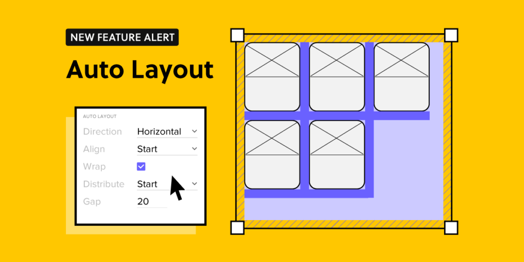


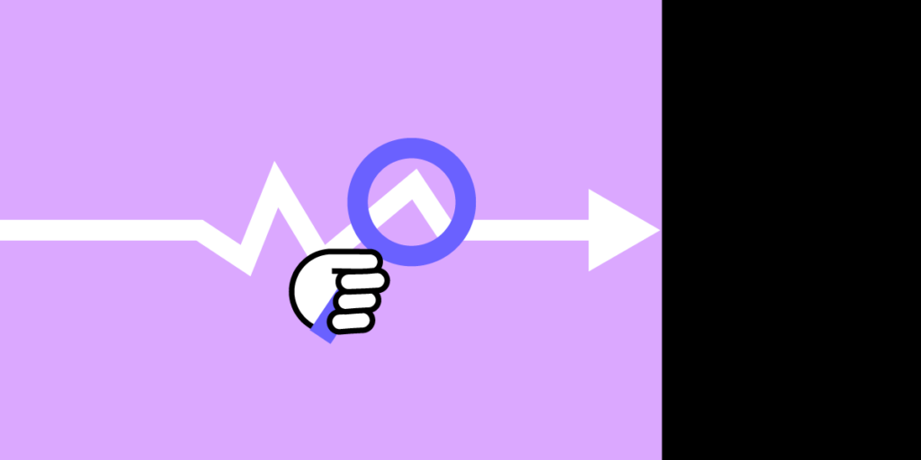


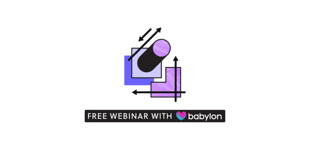

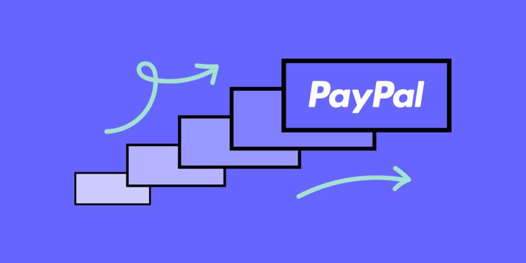

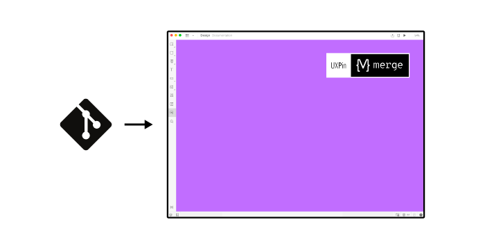
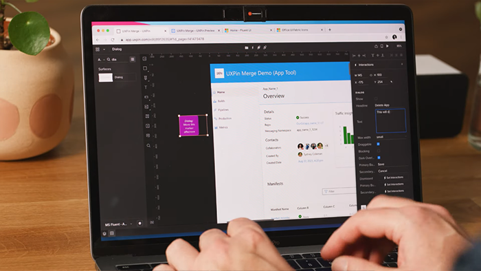

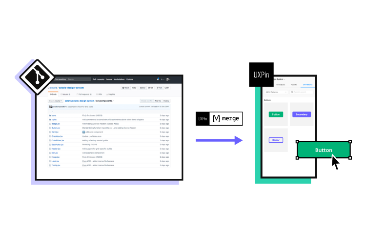

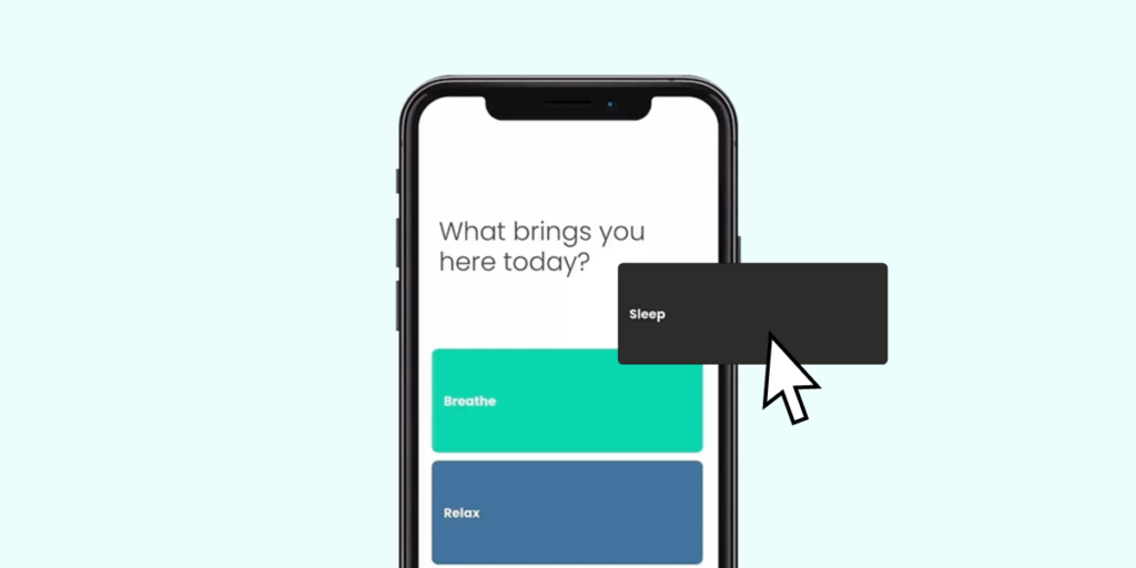
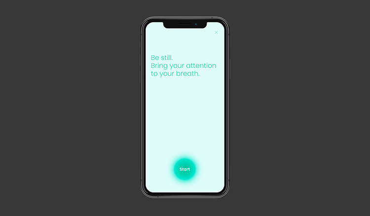
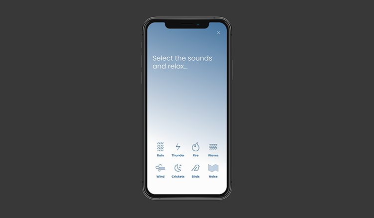
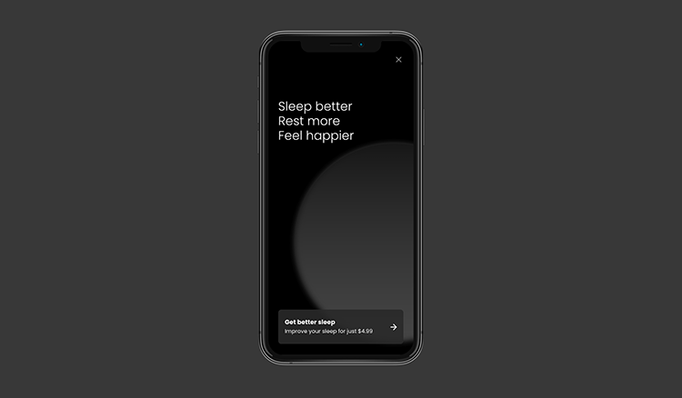

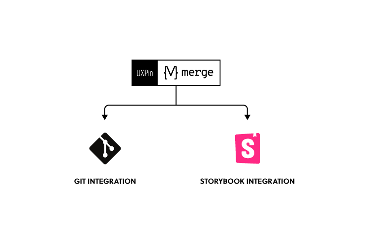
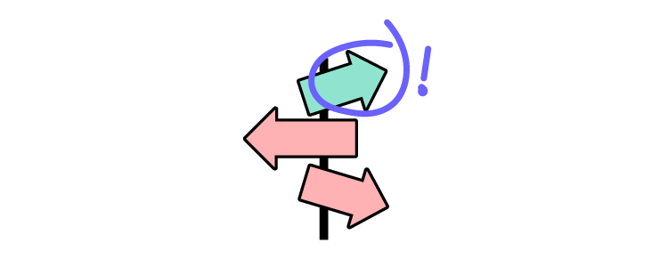


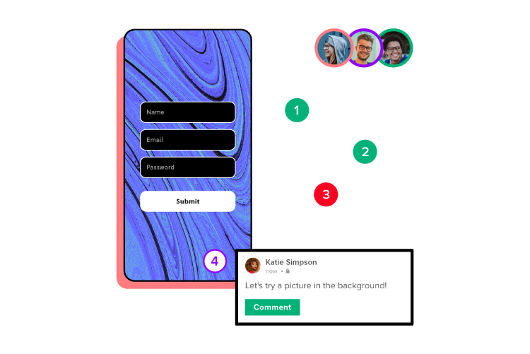


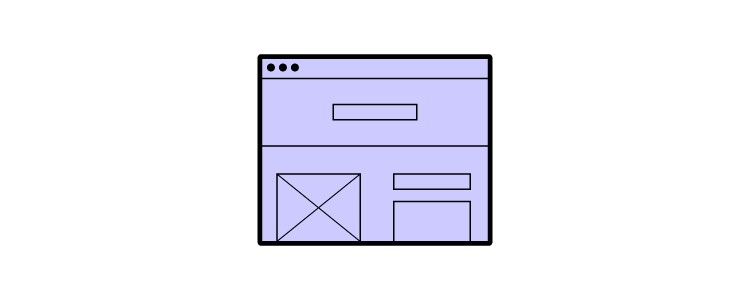
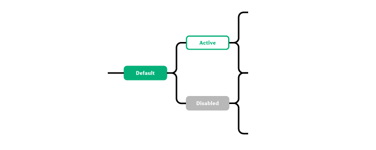

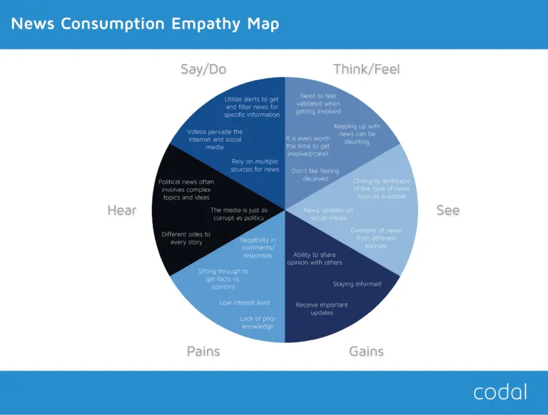
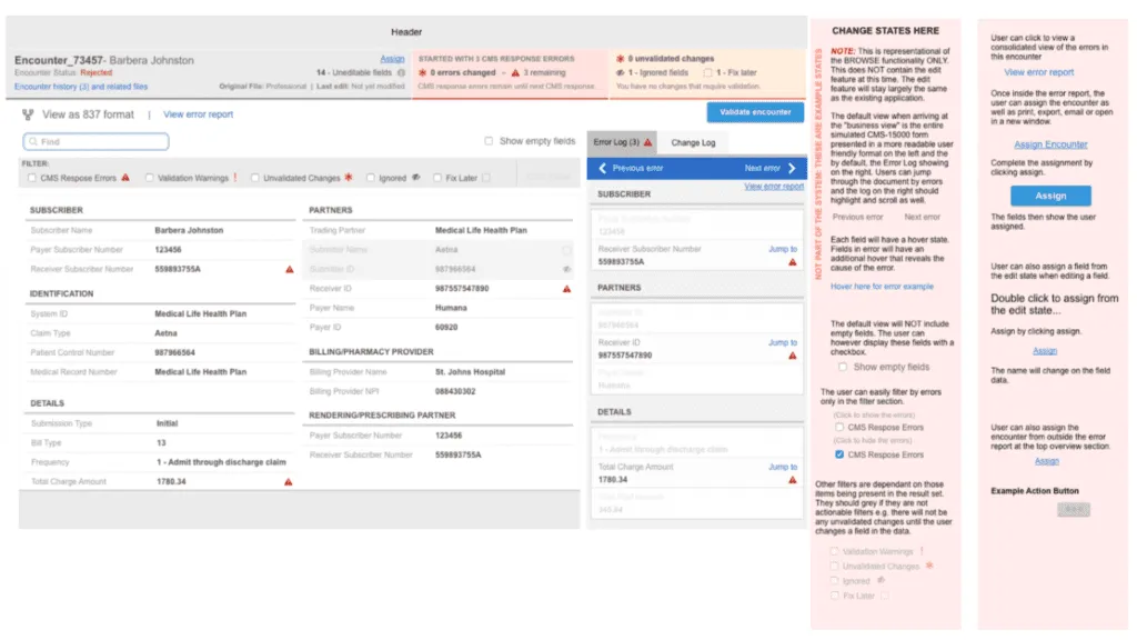
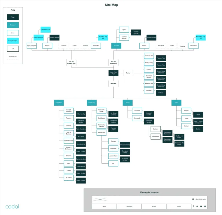

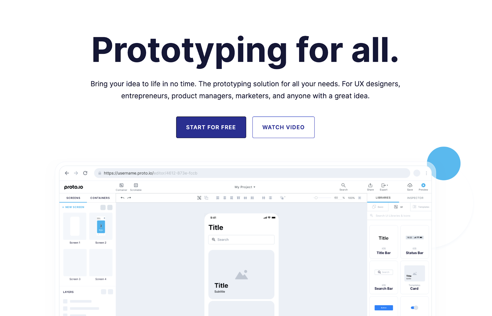
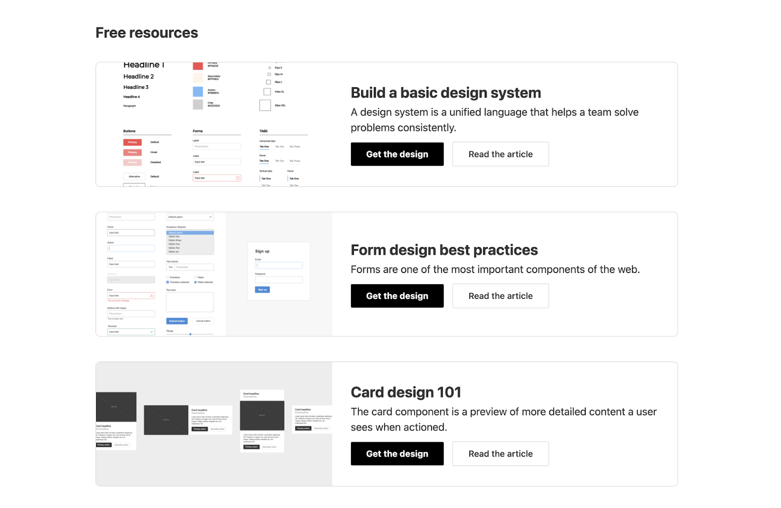
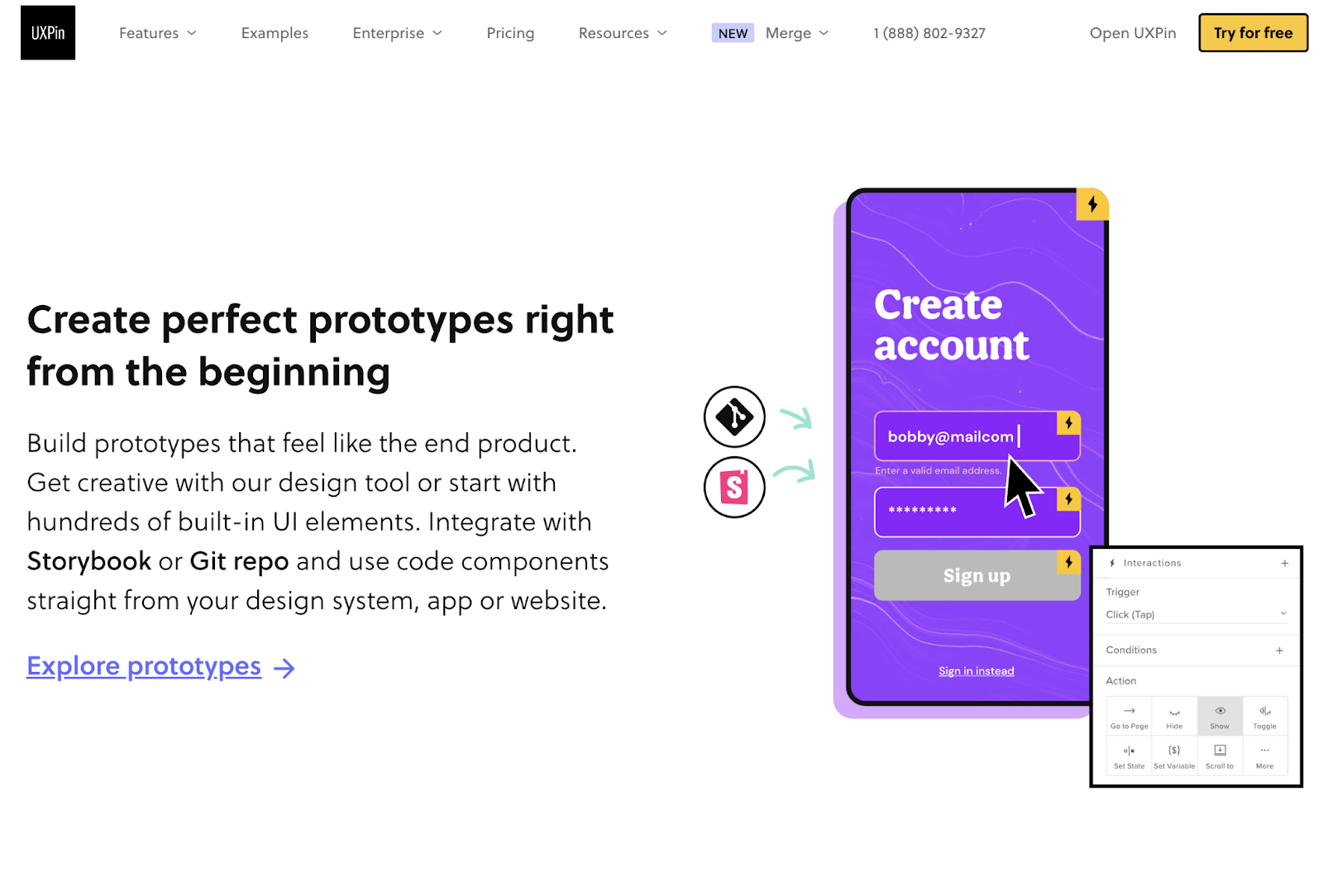
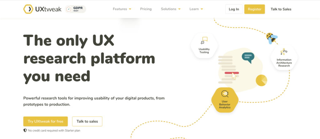
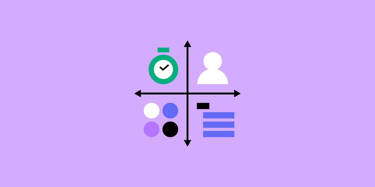

