White Label Designs – All About Implementation, Design Systems, and New Technology

White Label Design

White label design has emerged as a popular strategy for many design and development agencies. White labeling allows agencies to build a single product that multiple companies can buy and rebrand.

It costs agencies a lot of time and resources to design and engineer tools, apps, and websites. So, building white label products is significantly more profitable than starting a new design every time.

Today, we will explore white label design and demonstrate how UX teams and developers can collaborate to build amazing white-label products with UXPin. Keen to jump in and start designing? Sign up for a 14-day free trial to start exploring UXPin today!

What is White Labeling

White labeling is the process of rebranding a single product or service for multiple companies to sell as their own. White labeling benefits the manufacturer and the reseller.

The manufacturer can focus on production and not worry about marketing and selling, while the reseller can outsource production and focus on selling products through its sales and distribution networks.

A good example is Amazon’s Basics range. Amazon buys white label products from multiple manufacturers and sells them under the Basics brand. Amazon doesn’t have the means (or desire) to produce products, but they have a massive global retail network to sell Amazon Basics.

What is White Label Design

White label design services follow a similar concept. A creative agency builds tools, apps, and websites (templates) that companies can purchase and rebrand.

For example, a WordPress theme is a white label product. An agency or solo designer/developer can build a WordPress theme and sell it on marketplaces like Themeforest. Any company can buy what is essentially a white-label website and rebrand it accordingly—changing fonts, colors, content, etc.

Pro tip: Themeforest is the biggest white label product marketplace in the world. It’s a fantastic place to explore white-label product niches and see how you can improve on Themeforest’s best sellers.

In theory, white label design sounds simple, but in practice, it’s very challenging.

Challenges of White Label Design

One of the biggest challenges of white label design is making a product that appeals to a broad demographic that any company can rebrand as their own.

Making something for everyone is a lot harder than designing a product for a specific demographic.

White Label Products Must be Re-brandable

Usually, a digital product focuses on the user. But a white label product must consider two users—the end-user and the company buying the white label product.

So, the primary objective is to make a white label product re-brandable. A company must have the ability to make edits to the design system rather than compromising the brand to fit the product.

Flexible Information Architecture

Another challenge for design teams is building a white label product that provides many page layouts and navigational possibilities while maintaining the flexibility to adapt to the brand’s requirements.

Brands should have the ability to choose which pages and user flows they need to build their final product.

Conversely, agencies must understand the final users, so they don’t provide too many redundant pages and features. Too much flexibility and customization can increase costs and possibly introduce unnecessary problems.

Accessibility

UX designers must also consider accessibility, so products comply with WCAG (Web Content Accessibility Guidelines) standards.

UX teams will need to test their white-label design on a diverse range of participants to ensure the product is accessible.

The solution to these challenges (and the key to effective white-label design) is a flexible design system brands can easily customize with little or no code changes.

White Label Design System

A successful white label product features a flexible, well-structured design system that can adapt to any brand’s style guide. The goal is to facilitate significant changes with the slightest design system edits.

For example, changing the color palette with a few HEX code modifications.

Following atomic design principles can facilitate the flexibility required for a white label design system, starting with the smallest elements, which designers can build components for multiple page layout possibilities.

Instead of limiting designs to specific pages, designers use components to build features and layouts—providing customers with flexibility and customization through simple drag-and-drop changes.

We can break a white label design system into three parts:

  • Elements – colors, typefaces, icons, grids, spacing, brand assets
  • Components – buttons, tabs, page titles, form fields
  • Modules – cards, forms, heroes, charts, tables, carousels

Elements

Elements are the smallest pieces of a design system, but they play a critical role in maintaining consistency and facilitating customization.

Designers must allow easy color and typeface customization while enforcing strict rules for icons, grids, borders, and spacing to achieve design consistency.

Components

Components are the parts of the design system users will interact with the most. So, here designers must focus on the user more than the brands.

Flexibility is still important at the component level, but the changes are more subtle. Brands might change borders, corner shapes, or swap content from left to right and vice versa to customize components.

Modules

With flexible components, designers can build the modules to create any page layout the customer requires. If designers applied the atomic design principles correctly, building pages should be a matter of drag-and-drop.

Every change and customization at the module level should be drag-and-drop. Designers can customize modules quickly by swapping, adding, or removing components.

Customizing a White Label Design System Workflow

If designed correctly, it should be quick to change a white label design system to meet a brand’s requirements. 

  1. Designers start at the element level—changing colors and typography and uploading brand assets.
  2. Next, designers modify components—adjusting component shapes (circle/rounded/square) and content configuration (for example, adding or removing an icon from a CTA button).
  3. Designers use modules to build page layouts according to the customer’s requirements.

Instead of starting from scratch for every client, designers can use building blocks from a flexible design system to quickly design a white label product.

Agencies might build several white label design systems to accommodate various industries like restaurants, fitness, finance, and tech.

The Importance of Theme-Switching for White Label Design

Theme-switching is vital for a white label design system to accommodate different kinds of brand aesthetics. Most theme-switching changes happen at the element level and affect the secondary color palette.

Basic theme-switching requires two secondary color palettes:

  • Light – light background with dark elements
  • Dark – dark background with light elements

Designers must also use corresponding color scales to achieve accessibility and maintain consistency.

The problem is that most design tools don’t provide an easy solution for theme-switching. It isn’t easy to switch themes with a vector-based system. But, with a code-based design tool like UXPin, designers can theme-switch with a few clicks! 

Theme-Switching Made Easy With UXPin

With a bit of code preparation and utilizing the power of UXPin Merge, designers can use styled-components to inject Javascript into the design’s CSS to create editable theming capabilities.

UX designers can use UXPin’s theme switching for customizing other parts of the design, like quickly changing from circle to square-cornered buttons. It’s quick and easy!

Using UXPin Merge for White Label Design

Aside from theme-switching, UXPin Merge significantly improves white-label prototyping. Using code components, designers can build fully functioning prototypes fast!

Prototyping with UXPin Merge gives usability participants an accurate model with final product functionality, leading to high-quality testing and meaningful feedback.

These fully functioning prototypes can also help agencies to sell white label products to clients. Designers can impress clients by switching themes, use actual data (relevant to the brand), and make quick, on-the-fly changes during presentations.

Designers and engineers have two options for connecting code components with UXPin Merge:

  • Git repository—currently only supports React components
  • Storybook—supports React, Vue, Angular, Ember, and many more

By using code components, agencies can ship final products faster with UXPin—saving resources and increasing profits!

Final Thoughts

Hopefully, this article has given some insight into how you go about white labeling. A carefully planned design system is the foundation for a successful white label product. 

Like any design, UX designers must test white label products thoroughly to ensure the components and modules will work across multiple page layouts. Teams can use UXPin Merge theme-switching capability for testing both light and dark variations.

Getting Started with UXPin Merge

Here’s how easy it is to start building fully functioning high-fidelity white label prototypes with UXPin Merge.

  1. Choose if you want to integrate UXPin with your Git code repository or Storybook.
  2. Request access.
  3. Integrate with Git repo or Storybook.
  4. Drag and drop fully functional components.
  5. Make usability changes, test, repeat.
  6. Pass the prototype link to developers with all the ready component code they just need to copy into dev tools.

Get started with UXPin today and change how your design team builds, tests, and ships white label products. Increase productivity and profitability with the power of UXPin!

How to Build and Manage An Effective Product Development Team

How to Build and Manage An Effective Product Development Team

At the heart of every company, there is a critical function called product development that determines their long-term success. Regardless of what industry you operate in, your capacity to develop, validate, and bring new products to market is paramount. Research from the 280 Group showed that an optimized product development function on its own could increase company profits by 34.2%. This often comes down to having the right product development team on board. 

In today’s article, we’re going to discuss how you can build and manage a team that will effectively support you in digital product development. Let’s dive right in! 

Key Areas to Focus On While Building and Managing a Product Development Team

There are a few aspects that you need to consider from hiring and leadership all the way to career progression.

1. Hiring

It should go without saying that you want to assemble the best possible people as part of your product development team.  Here are some principles to keep in mind that will help you do exactly that:

Hire for both hard and soft skills

It’s not enough to just hire technical wonderkids. Apart from first-class hard skills, they should also possess the right soft skills including communication, teamwork and problem-solving abilities. Only then they will be able to positively contribute to product and design development.

Create a skills inventory

Work on identifying the skills that you currently have access to and those areas in which you’re lacking. This exercise will help you understand the sorts of skills that you should be looking to go out and hire.

Use the right skills assessment methods

When you’re evaluating potential hires, it’s crucial that you use the right type of skills assessment test for the specific use case. This will help you ensure that you aren’t wasting time and resources on irrelevant assessments or candidates that aren’t fit for the role. 

Be proactive when searching for talent

It’s important to remember that top performers almost never come through open job applications. They’re in high demand and usually, they can sit back and wait for opportunities to come to them. As such, it’s important that you use platforms like StackOverflow, LinkedIn, and referrals from your network to proactively search for the best talent and bring it into your team.

2. Leadership

The next important component to ensure smooth product planning and development is creating the right product culture. And that needs to be set from the very top.  Ben Horowitz, famed entrepreneur, and businessperson, explains it as follows:

“Culture isn’t a magical set of rules that makes everyone behave the way you’d like.  It’s a system of behaviors that you hope most people will follow most of the time.”

The way that you encourage these behaviors is by clearly communicating a vision for where you want the product and the team to go.  Everyone is looking to the leaders for this clarity and it helps to ensure that everyone is pulling in the same direction and working towards achieving the same goal. Without this alignment, your culture is left to the whims of the lowest common denominator and that can be very harmful to overall team dynamics.

Another important principle is that you should aim to empower your team rather than micromanage them.  The most talented designers and developers don’t want to feel like someone is watching over their shoulder all the time. They want to work independently and feel like they have the trust of their leaders. The role of a good leader is to support his team with whatever resources, direction, and incentives they can, but then step out of the way so that each person can do what they do best. 

3. Internal Processes

The next step is to make sure that your internal operations are set up in the most efficient and effective way possible to enable smooth product planning and development. Here are some of the things that you should be considering here:

Decide on the right team structure

To maximize the collaboration in your product development team, you need to have a solid structure that creates the space that your people need to do what they do best. This is key – if you get it wrong, you’ll find that your progress is impeded quite significantly, and you might not even realize it. Here are three common structures that could work for your team:

  • Centralized Team Structure.  In this setup, your entire product development team works in one location, all under one key decision-maker.  When you do this, your developers work as mini-agencies, essentially being deployed to various projects as and when needed. You benefit from shared knowledge and experiences while also unifying the product development principles throughout the organization.  The downside is that your team is somewhat isolated from the rest of the business which can lead to misalignment.
  • Embedded Team Structure.  Here individual product developers are integrated into teams across the organization in a cross-functional way. This means that each individual is deeply embedded in specific products which is great for focus, but it does result in some duplicated work because other developers might not know exactly what you’re working on.
  • Flexible Team Structure.  This is where you combine the centralized approach with the embedded one. Developers are still integrated into specific teams, but they also report to a head of product development that seeks to align everyone and unify the approach. This flexibility is very valuable but also can result in wires being crossed when team members aren’t sure who to report to and who should be making the final decision.

There is no one right option here because everything will depend on your unique company circumstances and the sorts of products you’re working on. It’s worth revisiting this every now and then to find the right option for you, also don’t be shy to experiment.  A great example of this comes from Buffer, a social media automation company that has changed their product team setup multiple times until they stumbled across the right results in terms of effectiveness and information flow.

Use Tools That Improve Design-Development Team Collaboration

Great software can be a fantastic asset for improving the collaboration between your design and your development teams so that everything goes as smoothly as possible.  

  • For brainstorming within the product development team you might want to consider tools like Miro that offer powerful visual collaboration spaces for teams of all sizes.
  • For building error-free prototypes fast, UXPin Merge will help you leverage ready UI code components to accelerate the process while also simplifying a few traditional product development processes like handoff.

There are a wide variety of other technological tools  that could be helpful – so look out for those gaps in your processes, and see if there are solutions to help you tighten them up.

Create Product Briefs

Product development can very quickly expand beyond its original scope if you don’t have the right context and guardrails in place to keep the project on track. One of the best ways to do this is to codify your thinking and plans into comprehensive product briefs. These documents align everyone’s expectations and record the direction that the product is going in.

Nicole Burrow, design director for CX at Spotify articulated this perfectly when she said:

“A key ingredient in team success is ensuring they have all the context they need. I introduced this collaborative brief that designers develop alongside their product counterparts, so they always have the “why” defined before they start ideating. This helps us align on what problem we’re trying to solve and why this is important to the business at the outset of the hypothesis development stage.”

Organize Regular Meetings

Along the way, you should be looking to organize regular meetings for your product development team to come together and make sure that everyone is up to date with what’s going on.  These could include the following:

  • Daily standup meetings to build accountability and ensure that the whole product development team knows what everyone else is working on.
  • One-on-one meetings with the team leader to clarify direction and look for opportunities to improve.
  • Team meetups to go through sprint planning exercises and retro meetings to assess progress.

These meetings are crucial to managing the project and should act as a valuable check and balance to keep everything in line.

Decide on Appropriate Performance Evaluations

It’s important that you select the right evaluation techniques to monitor and measure performance.  This needs to be done not just on an individual level, but also at a team level.  The most common framework implemented by great companies is the Objectives & Key Results framework (OKRs).  One example is Sears who saw an 8.5% increase in hourly sales within 18 months of introducing the system. And those results have been repeated by numerous other companies who have done the same thing.

OKRs are a robust method for setting and tracking goals. The objective states what is to be achieved, and the key results explain what it’s going to take to achieve that objective. This allows you to create cascading goals that are systematically linked – pushing you towards the north star mission while managing all the smaller steps along the way.

4. Career Progression

Lastly, if we zoom out from one specific project and think about your product development life cycle as a whole, it’s crucial that you give your top performers a clear path in terms of career progression. You want to design career paths that align with the goals of your team members so that they feel valued and purposeful. Spotify does this with their Y shape progression which gives designers the decision between moving into management or continuing to refine their design skills to become an expert.

Having a clear progression makes for a much more stable working environment where employees know where they stand.  This is critical for retention and for maintaining morale throughout each product development cycle.

Summary

And there you have it.  Those are some of the core principles that can help you build and manage an effective product development team.  When you implement these and focus on the key action steps – you’ll find that your digital product development moves to an entirely different level.

Operationally, there are few things that will deliver a better ROI on your time and investment than getting your product development team in sync.  Now is the time to rethink your processes and get these best practices into your organization as soon as you can. And if you’re looking for a tool that will help you further optimize your product and design development, then check out UXPin Merge

Design Handoff – Creating a Better Process

Design handoff

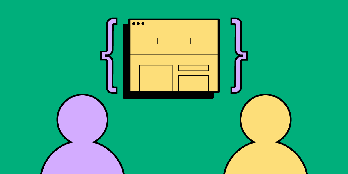
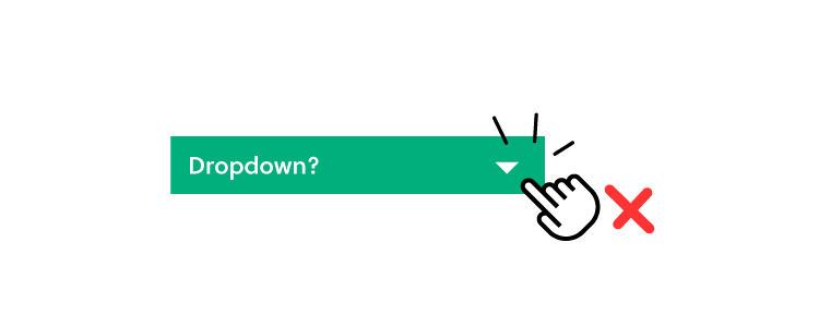
The design handoff is a critical part of any project. For many designers and engineers, the design handoff is a stressful experience. If either team misses something, it could result in product defects and delays.

While it’s primarily the responsibility of the UX team to produce prototypes, assets, and documentation, the design handoff process is a collaborative effort—starting in the early design stages.

There are three stages to a successful design handoff:

  • During Design (before the handoff)
  • During Handoff
  • After Handoff

Get rid of any design-product misalignments with our UXPin Merge. Avoid the pitfalls of poor communication, bridge the gap between the design and development teams, and streamline handoff with Merge. Learn more about Merge technology.

Reach a new level of prototyping

Design with interactive components coming from your team’s design system.

What to do at Design Phase to Improve Design Handoff?

A design handoff is not a single event in the design and development of a digital product. Instead, it’s a process that starts during the early design stages and ends after designers have completed the prototype.

Designers and engineers must communicate and collaborate to streamline the design handoff process, mitigating costly errors, design debt, and inconsistencies.

Discovery

During the early stages, designers and engineers should meet to discuss technical constraints concerning design ideas. While innovation is essential to build a competitive advantage, designers must work within the company’s resources and technical requirements.

A development team representative should attend user research to learn the “WHY” behind design decisions. By doing so, developers will better understand the user’s needs and the problems UX designers are trying to solve.

Planning

Including developers in design sprints is another way to align technology and design. Developers can work with designers during sprints to find solutions to user problems that align with technical constraints.

At the same time, developers can begin taking notes to research tools or packages they might need to build new features.
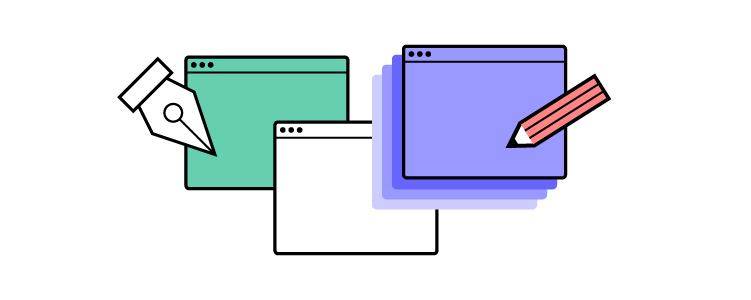
Prototyping

Developers can provide valuable feedback and insights during the prototyping phase—like how designs might look and function across different browsers, devices, and viewports.

screens process lo fi to hi fi mobile 1

Getting developers to sign off on designs and features during the prototyping phase can save a lot of time and heartache for the final design handoff. There’s nothing worse than going “back to the drawing board” because UX teams’ vision doesn’t align with the technical reality!

It’s also helpful for a development team representative to attend late-stage usability testing to visualize how users interact with the final product.

User Interface Design

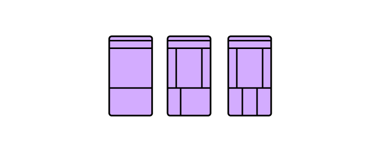
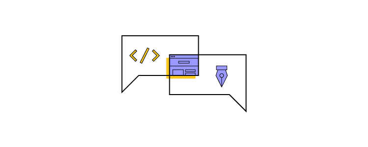
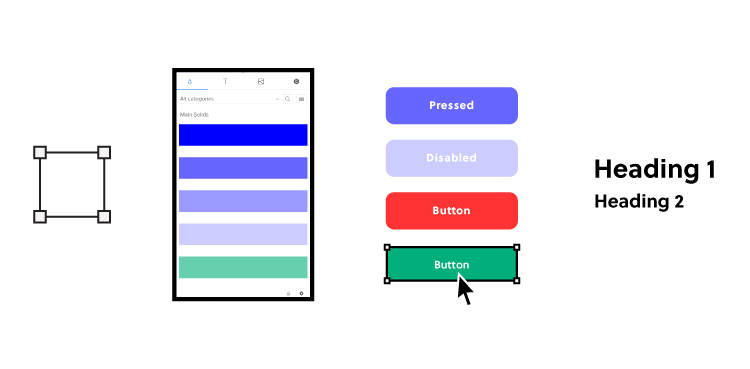
A well-documented design system is a crucial part of any digital product. Creating a component-based design system allows engineers to code reusable “widgets” to develop the final product efficiently.

Designers and developers can work together to ensure that the design system is consistent and that sizing conventions will translate to code effectively.

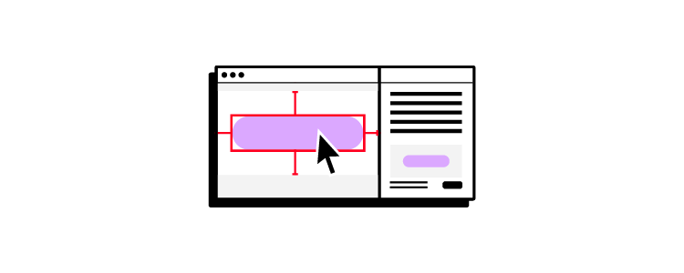
Developers can also provide technical specs for asset formats and sizes, so UX teams optimize content for product and web constraints.

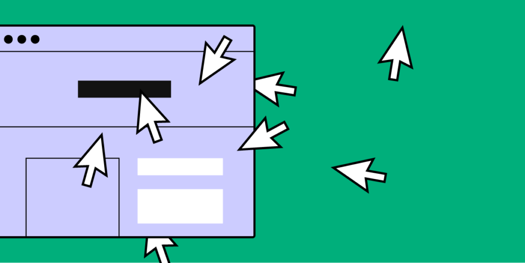
How to Structure Better Design Handoff?

If design and development teams communicate and collaborate effectively during the design process, the handoff should be a smooth process of double-checking and organizing.

How designers present a design handoff is as important as the documentation, files, and assets themselves.

Firstly, UX teams should delete unused layers and guides to avoid confusion. Designers must also double-check they have grouped and labeled components correctly. 

Using a consistent naming convention (like the BEM notation) will help developers quickly locate files, assets, components, and elements. Engineers might advise on a preferred file structure that aligns with an efficient development workflow.

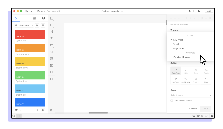
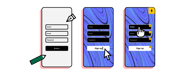
Explicit annotations are essential for developers to understand mockups and interactive prototypes. These annotations provide context or describe functionality that might be beyond the design tool’s capabilities.

Lastly, designers must walk through the product with the documentation to ensure developers receive a comprehensive design handoff.

Recommended resource: Design Handoff Checklist

How to Improve Collaboration After Design Handoff?

UX teams play a vital role in the implementation’s quality assurance (QA)—testing the final product against interactive prototypes and mockups. 

handoff spec

Once the final product is complete, designers and engineers should meet to discuss improving the design handoff process for future products and features.

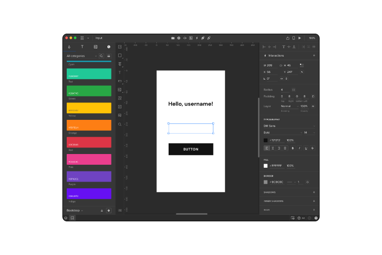
Design Handoff With UXPin

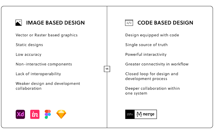
UXPin automates many mundane tasks to save UX teams valuable time during a design handoff. Unlike other design tools, UXPin requires no plugins or third-party apps to produce handoff documentation and annotations.

UXPin generates design specifications inside the tool, eliminating the need for external documentation while avoiding misunderstandings. Developers can download assets directly from UXPin’s Style Guide—no need to share via cloud storage like Dropbox or Google Drive.

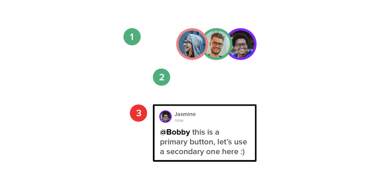
Design, development, and product teams can collaborate throughout the design handoff process with UXPin’s comments. Team members can tag one another, assign tasks, and choose whether comments are visible to the Team or the Public.

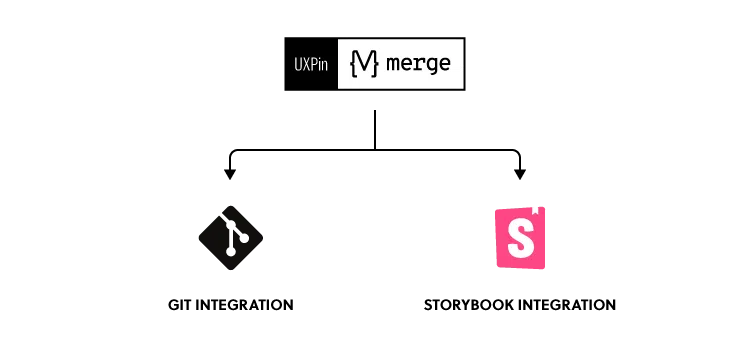
If you want to take design handoff to the next level and get rid of any product drifts – our Merge technology will be just the right fit.

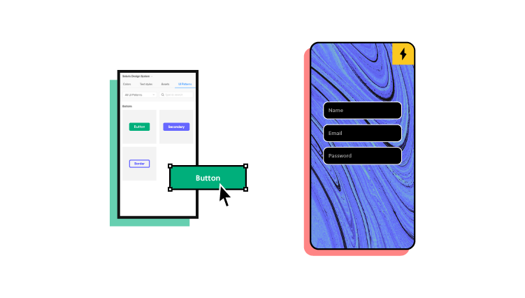
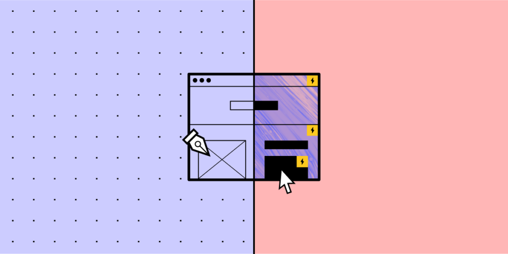
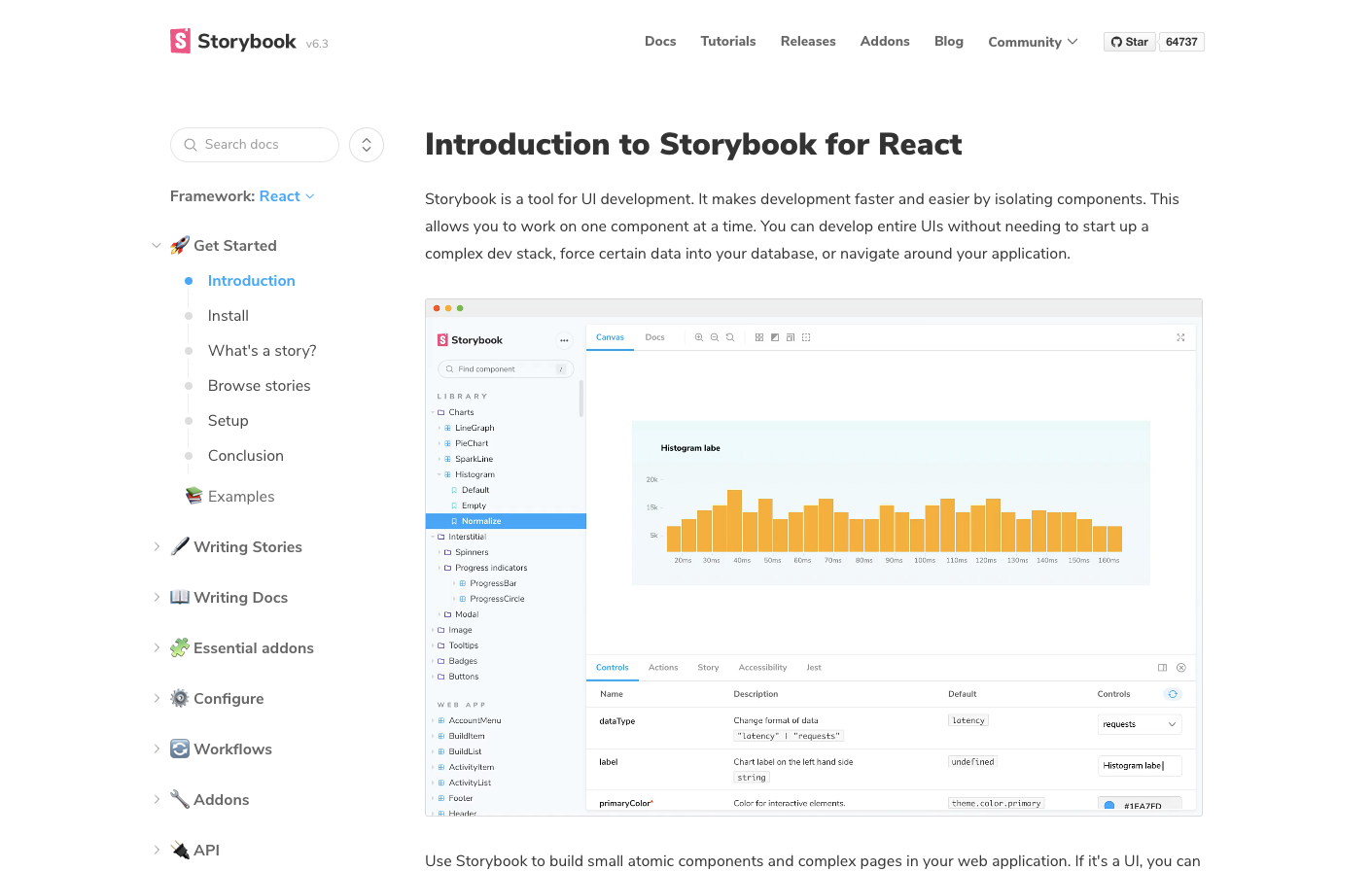
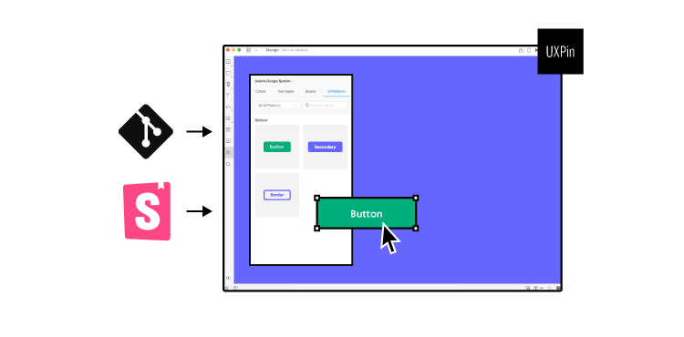
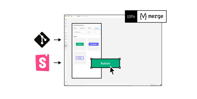
Designers can prototype with fully interactive components that developers build final products with. Thanks to designers and developers using the same components from the same coded design system that are stored in a Git repository or Storybook, they can be on the same page and avoid all the errors that come out in a design handoff process. 

See how UXPin Merge works – get rid of product drift and maximize your design systems.

UX Portfolio – All You Need to Know

UX Portfolio

In a competitive user experience design landscape, designers must ensure their UX portfolio stands out from the crowd. For some company’s a UX design portfolio is more important than where you went to school or what degree you hold.

User experience is about solving human problems, which employers want to see in a UX portfolio—along with teamwork, UX design processes, and what you’ve learned from successes and failures.

UXPin is a design tool that enables UX/UI designers to exercise creativity and build layouts fast. Design or update your UX portfolio using UXPin’s 14-day free trial.

Build advanced prototypes

Design better products with States, Variables, Auto Layout and more.

Try UXPin

What is a UX Design Portfolio…and Do You Need One?

A UX portfolio showcases your work experience, design skillset, project highlights, understanding of the UX design thinking process, and how you apply it.

A CV is usually one or two pages, which isn’t enough space to showcase all of the above. So, a UX portfolio complements your CV, allowing potential clients and employers to explore your work and knowledge.

Designers usually create UX portfolios in a website format as it’s quick and easy to share. A website is also likely to appear in search results, increasing the likelihood that potential clients will find and hire you.

The website itself also showcases your web design skillset and knowledge of responsive web design—so make sure you apply the same rules to your portfolio!

Do You Need a UX Portfolio?

All UX professionals (including UX specialists) must have a portfolio website—both freelancers and permanent job seekers. Most UX job applications request a link to your UX portfolio, and potential clients want to see your design skills before hiring you for a gig.

What You Should (and Shouldn’t) Include in a UX Portfolio

A UX portfolio should include the following:

  • Intro/homepage introducing yourself
  • Simple navigation
  • High-quality case studies—from initial concept to final results
  • About me page
  • Contact page
  • Link to download your resume in PDF format
  • Links to design-relevant social media—LinkedIn, Behance, Dribbble

UX Portfolio Homepage

Use your portfolio’s homepage to briefly introduce yourself, mention some career highlights, links to case studies, and any major companies or projects. 

You can also list your skills, tools you’re familiar with, and any areas where you specialize. Keep all of this information concise, bullet points where possible. 

Some designers include testimonials from previous clients to break the page up and provide social validation.

Marcos Rezende’s website is a perfect example of content to feature on a UX portfolio homepage.

Simple Navigation

A UX portfolio website should have simple navigation so potential clients and employers can quickly find what they need. 

Your header navigation should include:

  • Work/portfolio
  • About
  • Contact
  • Resume/CV

You can put any other links (including blog social media) in the footer. Remember, your UX portfolio is for busy clients and hiring managers (the users). Prioritize navigation to meet their needs. These primary users are not interested in your blog or social media. And if they are, they can find them in the footer navigation.

High-Quality Case Studies

Case studies are an essential part of a UX portfolio. It’s an opportunity to show off your skills at every stage of the design thinking process.

Your case studies should be comprehensive but concise. Here’s what to include in a UX portfolio case study:

  • Project overview (problem/goal/purpose/deliverables)
  • Your role & responsibilities (UX designer, researcher, project manager, solo project)
  • Initial user research summary
  • User personas & user journey map
  • Initial concepts and ideas – paper wireframes, digital wireframes, low-fidelity prototypes (consider redrawing your paper wireframes, so they’re neat and legible)
  • High-fidelity mockups & prototypes
  • Usability testing
  • Final designs after usability testing
  • Link to the final product or mockup (if available)
  • Product successes (did your design increase signups, revenue, etc.)

If you’re new to UX design, include detailed case studies from your UX course or complete two or three UX design challenges to show that you’re familiar with UX principles and user-centered design.

Marcos Rezende’s COVID-19 dashboard for Ontario, Canada, is a fantastic example of a UX case study to include in your portfolio.

Ready to design a UX portfolio like Marcos Rezende’s website? Set yourself a portfolio design challenge with a 14-day UXPin trial!

About Page

Your about page should include one or two pictures of yourself and three paragraphs max. The essential parts for a UX portfolio about page:

  • A brief intro about who you are, where you’re from, and where you studied—mention hobbies but don’t go into too much detail
  • Why you chose UX design as a career path
  • Your work ethic
  • Your career goals and aspirations

You can also include a brief section with career highlights, significant projects or companies, and any awards or accolades. Keep these as bullet points so people can scan and pick out important pieces.

Contact Page

Your contact page should be as minimal as possible—only a contact form (full name, email, message), preferably. You can include your email and contact number but be warned that you WILL get lots of spam. Rather keep these direct contact details in your PDF resume.

Most content management systems (CMS) allow you to upload PDFs for website visitors to download. Use this to upload your resume in PDF. Put a link to your resume in the main navigation, on the about page, and footer. That way, it’s easy for potential employers to find.

If you’re a freelancer, then including a resume is optional.

Some clients or employers might want to see more of your work or explore your professional experience. Design-related social media links might include:

  • Dribbble
  • LinkedIn
  • Behance
  • Medium (if you write about UX topics)

What You Shouldn’t Include in a UX Portfolio

The point of a UX portfolio is to showcase your work. As a UX designer, be mindful of your users (recruiters & clients) and respect their time. Make everything easy to find, avoid adding irrelevant content, and use animations that enhance rather than impede the user experience!

Here is what you shouldn’t include in your UX portfolio:

  • Non-UX related work history (mention any career highlights or awards but avoid going into great detail)
  • Details about your pets and family
  • Political or social opinions
  • Things you don’t like or annoy you (might appear hostile)

The Do’s and Don’ts of a UX Portfolio

Do

  • Demonstrate your problem-solving abilities — Ultimately, UX design is about problem-solving. Anyone hiring a UX designer is hiring someone for their ability to solve their users’ problems. As you describe case studies, make sure you tell a clear story about the problem and how you went about solving it.
  • Display your process and train of thought — Employers want to see your thought process and how you apply design principles. Showcase your process from initial user research to the final product.
  • Demonstrate your visual design capability — You must showcase your design skills in addition to the design thinking process—especially if you’re looking for a UI/UX role.
  • Show the results of your work (if available) — Describe how your designs led to successes, key takeaways, and the challenges you experienced to get there. Employers love to hear that you overcame challenges, created impact or worked within constraints to reach your goal.

Don’t

  • Focus only on the visuals — A common criticism nowadays is the “Dribbbleisation of Design” — many product designers seem to focus more on pretty work without any thought given to functionality or actual usability. Make sure you demonstrate your usability understanding and consideration. Conversely, don’t forget to include plenty of examples of your visual work!
  • Get bogged down on details — Employers don’t want a wall of text explaining every aspect of your project. For example, if you’re describing the initial UX research, do it in two to three sentences.
  • Emphasize quantity over quality — Choose two or three detailed case studies where you can showcase the complete design process rather than every project you’ve ever worked on. Show your best work, not all your work!

Need inspiration? Check Portfolio Examples that We Think Are Great

Design Your UX Portfolio With UXPin

If you’ve never worked with UXPin, then why not design your UX portfolio using the world’s most advanced design tool! By the end, you’ll have another design tool to add to your portfolio!

Sign up for a 14-day free trial to experience the speed and efficiency of designing with UXPin.

What is Usability Testing and How to Run It?

What is Usability Testing

Usability testing is a crucial part of the design thinking process. It’s an opportunity for UX teams to present their solutions to those whose problems they’re trying to solve—a nerve-racking and exciting experience!

UXPin is the world’s most sophisticated prototyping and usability testing design tool. Using UXPin with Merge technology, designers can create high-fidelity prototypes with final product functionality using fully interactive and ready code components. With UXPin, you get accurate testing and meaningful participant feedback. Sign up for a 14-day free trial to experience advanced prototyping and testing with UXPin!

What is Usability Testing?

Usability testing (also called usability studies) tests user interfaces and flows with real users. A UX researcher (moderator or facilitator) will ask a participant to complete a series of tasks (usually on a digital product prototype) while observing their behavior and actions.

The moderator might ask the participant to verbalize their thoughts and actions so UX researchers can understand how the person thinks and feels as they use the prototype.

Why do UX Teams Conduct Usability Tests?

Usability testing provides UX teams with valuable feedback and user insights, including:

  • Validating design concepts to solve users’ problems
  • Exposing usability problems to fix
  • Discovering opportunities for improvement
  • Learn more about the users

Usability testing is an iterative process of testing, exposing issues/learning about the user, making adjustments, and retesting.

The ultimate goal of the usability testing process is to fix and improve prototypes as much as possible before the design handoff, where engineers start the development process.

Usability vs User Experience Testing

There is often confusion and debate over the difference between usability testing vs. user experience testing. It’s incorrect to use these terms interchangeably because they refer to different areas of testing.

  • Usability testing – tests the product’s usability and performance—user interfaces, navigation, microinteractions, etc.
  • User experience testing – tests the user’s enjoyment and satisfaction while using a digital product.

While we define these terms differently, UX researchers test usability and user experience at the same time. 

For example, one UX researcher might observe how the participant completes a task during a usability study (usability testing), while another researcher studies the user’s actions and behavior (user experience testing).

These are two important metrics to consider during product testing. If a user can complete a task, UX designers might see this as a job well done. But what if the user was frustrated during the process? They’ll likely switch to a competing product with a better user experience.

Types of Usability Testing

There are two primary usability testing methods:

  • Moderated tests
  • Unmoderated tests

UX teams can apply both of these methods to remote and usability lab (face-to-face) testing.

Moderated

During a moderated usability study, the facilitator interacts with the participant, asking them to complete tasks while observing and asking questions.

UX teams can conduct usability studies in a lab or remotely using Zoom, Skype, or purpose-built testing tools.

Advantages of moderated usability testing:

  • Moderator ensures the participant understands and completes the tasks correctly
  • Moderator can engage with the participant, asking questions about their actions, responses, and behavior
  • The above points provide UX teams with accurate, meaningful feedback

Disadvantages of moderated usability testing:

  • Requires lots of planning to find a venue, participants, align with team schedules, organize equipment, etc.
  • Requires more resources, increasing testing costs
  • Limited participants due to cost and time constraints

Unmoderated

During an unmoderated usability study, the facilitator is absent but provides the participant with instructions to complete a series of tasks.

The participant might complete these tasks in a lab environment, the field (where the users will typically use the product), or remotely.

Advantages of unmoderated usability testing:

  • Researchers can test multiple participants at the same time
  • Fewer resources make unmoderated testing significantly cheaper

Disadvantages of unmoderated usability testing:

  • Relies on participants understanding tasks and instructions without guidance—might lead to uncompleted tasks or inconsistent test results

Usability Testing Methods

Card Sorting

Card sorting is an early-stage usability method for testing element hierarchy and establishing information architecture

The moderator presents a group of topics or categories for the participant to sort—usually by importance or group by relevance.

Paper Prototyping

Paper prototyping is another early-stage usability method where UX teams test user flows and information architecture.

UX teams rarely test paper prototypes with participants because usability tests are expensive, and paper prototyping doesn’t provide meaningful user feedback.

Still, paper prototypes can provide some insights into the user’s navigational expectations.

Digital Low-Fidelity Prototype Testing

Digital low-fidelity prototypes use a series of wireframes to test user flows and simple navigation. Like paper prototypes, low-fidelity prototyping provides limited feedback about the user experience.

High-Fidelity Prototype Testing

Testing high-fidelity prototypes allows UX teams to get accurate, meaningful feedback. Participants use a fully functioning replica of the final product to complete tasks.

UXPin Merge lets designers connect design elements with interactive components that also devs use to create high-fidelity prototypes with final product functionality. By designing with code components, participants can interact with a UXPin prototype better than any other design tool.

Why not try usability testing with UXPin’s 14-day free trial!

Click Tracking

Click tracking examines where users click or tap on a prototype. UX designers can use this information to see where participants most frequently click (or tap on mobile).

Click tracking can help validate link structure or whether participants can easily identify buttons and CTAs.

Eye Tracking

UX researchers use eye-tracking devices to learn how participants explore user interfaces or what elements catch the eye first. These insights can help UX designers decide how to prioritize screen layouts or where to place CTAs.

How to Conduct a Successful Usability Test in 6 Easy Steps

It’s crucial to have a plan and objectives for usability testing. Without a plan and goals, UX researchers won’t know what to test or the value of the test results.

We’ve broken usability testing into six easy steps:

  1. Define Goals
  2. Choose the Test
  3. Create User Tasks
  4. Write a Research Plan
  5. Conduct the Test
  6. Draft a Report

Step 1 – Define Goals

The first step is to define the usability study’s goals. These goals might ask broad or specific questions, for example:

  • Broad: Which checkout method can user’s complete the fastest?
  • Specific: Does animating a button increase clicks?

It’s important to prioritize goals and limit testing to a specific question you want to answer—like testing an eCommerce checkout flow or completing a new user sign-up process.

It’s tempting to make the most of usability test sessions and get as much feedback as possible, but this could lead to user fatigue and inaccurate results.

Step 2 – Choose the Correct Test

Once you know what you want to test, you can choose a suitable usability testing method.

In our free eBook, The Guide to Usability Testing, we outline 30 different usability testing methods, which to apply, and when.

We divide usability tests into four categories:

  • Scripted — These tests analyze the user’s product interaction based on set instructions, with specific goals and individual elements. (tree testing, hallway usability tests, benchmark testing)
  • Decontextualized — Ideal for preliminary user testing and user research (see the difference between user testing and usability testing). These tests don’t involve the product necessarily, but analyze generalized and theoretical topics, targeting idea generation and broad opinions. (user interviews, surveys, card sorting)
  • Natural (or near-natural) — Researchers analyze users in the environment where they’ll use the product most often. These tests examine how users behave, pinpointing their feelings with accuracy, at the cost of control. (field and diary studies, A/B testing, first-click testing, beta testing)
  • Hybrid — These experimental tests forego traditional methods to take a distinctive look at the user’s mentality. (participatory design, quick exposure memory testing, adjective cards)

Once you select the testing method(s), you can share them with the team, summarizing your goals and tactics in a usability planning document.

Step 3 – Create Your User Tasks

Everything you present to participants during usability testing, including questions and phrasing, impacts their response.

Usability tasks are either open or closed, and your tests should incorporate a healthy mix of both:

  • Closed – A closed task offers little room for interpretation—the user is given a question with clearly defined success or failure (“Find a venue that can seat up to 12 people”). Closed tasks produce quantitative and accurate test results.
  • Open – By contrast, participants can complete open tasks in several ways. These are “sandbox” style tasks: “Your friends are talking about Optimal Workshop, but you’ve never used it before. Find out how it works.” Open tasks produce qualitative and sometimes unexpected results.

Moderators must be mindful of how they phrase questions to avoid bias. 

For example, you want to know how a user will find a gift for their mother on an eCommerce store. If you phase the question as “can you search for a mother’s day gift in our store?” it might suggest that the participant use the search function instead of following their natural intuition. This question also sounds more like an instruction than a question.

A better way to phrase this question might be, “how would you find a mother’s day gift in our store?”

Step 4 – Write a Usability Research Plan Document

A usability research plan document should cover seven sections:

  • Background — In a single paragraph, describe the reasons and events leading to the user research.
  • Goals — In bullet points, summarize what the study hopes to accomplish. Phrase the goals objectively and concisely. Instead of “Test how users like our new checkout process,” write “Test how the new checkout process affects conversions for first-time users.”
  • Questions — List out around 5-7 questions you’d like the study to answer
  • Tactics — Where, when, and how UX researchers will conduct tests. Explain why you’ve chosen this particular test.
  • Participants — Describe the type of user you are studying, including their behavioral characteristics. You could even attach personas for more context.
  • Timeline — Recruitment start dates, test start and end dates/times, and when stakeholders can expect results.
  • Test Script — Include a script if you have one prepared.

Encourage suggestions and feedback from stakeholders to ensure everyone is on board, and you haven’t missed anything.

Further reading – The Plan That Stakeholders Love: The One-Pager.

Step 5 – Conduct the Test

Here are some times for conducting usability testing:

  • Make participants comfortable — Remind participants that you are testing the product, not their capabilities. Creating a script beforehand will ensure the moderator’s instructions, phasing, and tone are consistent.
  • Don’t interfere — This avoids bias and may reveal user behavior insights you hadn’t predicted. Meaningful insights come from participants interacting with the product in ways you never expected. Observe natural human behavior and let them inspire feature improvements.
  • Record the session — Teams may need to review usability studies at a later point. 
  • Collaborate — A Rainbow Spreadsheet allows everyone to record their interpretations of each usability test. UX researchers can compare notes to see what they observed in common and any unique observations. Rainbow Spreadsheets worked well to summarize results for stakeholders during our team’s Yelp redesign exercise. (Source: Rainbow Spreadsheets by Tomer Sharon)

Step 6 – Draft a Report

A usability study report is an effective way to summarize results to share with stakeholders. 

Here are some tips for compiling a usability report:

  • Don’t be vague“Users couldn’t buy the right product” isn’t very helpful because it doesn’t explain why. Explain the specific issue from a UX perspective—“users couldn’t buy the right product because they couldn’t find the search bar.”
  • Prioritize issues – Categorizing and prioritizing usability issues will help design teams know where to start. We recommend categorizing the report (e.g., Navigation Issues, Layout Issues, etc.) and using color codes for priorities (Low/Medium/High).
  • Include recommendations – Lastly, you’ll want to include the team’s recommendations to fix usability issues, so stakeholders know there is a solution.

Other considerations for a usability report include:

  • Formal usability report
  • Supporting charts, graphs, and figures
  • Previous testing documentation 
  • Videos or audio tracks of the test

Usability Testing With UXPin

UXPin is a comprehensive design and prototyping tool. Unlike other design tools, UXPin doesn’t require plugins and apps to fulfill wireframing, mockups, prototyping, and testing requirements.

And UXPin does so much more! With states and interactions in your prototype you can enhance participant’s product interaction while providing you with meaningful feedback and results!

Try UXPin for 14-days and experience a whole new world of UX design, prototyping, and usability testing!

10 Experts Discuss Top Challenges in Product Development & How to Overcome Them

10 experts discuss the top challenges in product development

Bringing a new digital product into the market can, undoubtedly, be a rewarding feeling. Few things will motivate your team as well as seeing their hard work pay back in the form of satisfied returning customers and ROI. That being said, it’s not always sunshine and rainbows. The road towards a successful launch can be a tough and arduous one, filled with product development risks. 

However, here’s the good news – if you’re aware and prepared for the potential digital product design challenges you can come across, you’ll make sure they don’t wreck havoc on your product development process.

We’ve asked 10 experts to share their experiences with challenges in product development and explain how they resolved them. Here’s what we’ve heard:

10 experts share their top product design challenges and how they tackled them

Let’s begin with the (arguably) most common challenge – making sure your customers’ needs and pain points are addressed. We’ve asked Sep Niakan of Condoblackbook and Tommy Galagher of Top Mobile Banks about their take. Here’s what they shared with us:

1. Identifying your customer’s pain points

​​

Sep Niakan, Managing Broker at Condoblackbook

Determining your clients’ pain problems should be at the forefront of your product development process from the start. You should be able to establish clear product goals that directly represent your clients’ needs based on their needs. While this may seem obvious, many businesses do the exact opposite: they do consumer research after a product has been launched. As you can think, this is a very backward, expensive, and time-consuming strategy. Product testing should begin early in the development process and continue throughout. Periodic and thorough testing will enable you to pinpoint exactly what your clients desire from your business and product.

Tommy Gallagher, Founder at Top Mobile Banks, agrees that customers should be at the center of product development:

The idea of developing a new product would fail miserably unless you have identified your clients’ pain points. Without consumer loyalty, there will be no money, which will eventually lead to the company’s downfall. Companies that operate without defined goals, fail to comprehend what they are prepared to pay, and fail to prioritize their demands are all factors that contribute to the company’s failure.

Even if the company has already launched the product and has opted to undertake research from the beginning, it would be quite costly. This can cause significant delays in the development of the product, as well as drain morale and potential market share through ineffective launch.

Ensure that the product is tested and experimented with throughout the development process, from conception to production. Many businesses start by designing a product and then looking for ways to sell it. Customers are at the center of a product’s ultimate success or failure. What they’re willing to pay and how it’ll meet their needs. Rather than waiting for the product to be fully launched, research, experimenting, and testing should be carried out throughout the development process.

4. Striking the balance between immediate requirements and long-term objectives

Robert Johansson, CEO & Tech Expert at imgkits

One of the product development risks that I have come across is not finding balance between immediate requirements and long-term objectives. It’s difficult to know how much money to put toward short-term demands versus long-term aspirations when it comes to product development. While the upfront expenditures of prototyping, research, and other services can be scary, it’s important to consider the big picture. Cutting corners during product development will end up hurting your business more in the long term.

3. Creative block

Garth McAlpin, an Architecture, Designer & Director & National Fulfilment Manager at Classic Architectural Group

One of the biggest challenges in product development for the team is facing creative blocks. Coming up with new and innovative ideas is a difficult task and even the most creative of people can feel a roadblock sometimes. This can happen due to a lack of insight on customer needs, organizational red tape, or desynchronization between the product development team and marketing. I too faced this challenge with my team last year, and it was one of the most difficult phases of my career. 

To overcome our creative block and restart idea generation, I set up ‘idea baskets’ throughout the organization. Each employee was encouraged to give their take on current products and what features or services they would want to see in a new product. The response was slow at first as everybody felt awkward or hesitant. But then we turned it into an inter-department competition. The winning department would be given a bonus for their team dinner allowance. We collected numerous ideas in a matter of days. 

The ideas were used as an inspiration for my product development team. Reading the opinions of their coworkers jogged their creativity and they were able to modify some of the ideas to come up with a viable new product. The employees whose ideas were used were also given credit for their effort.

4. Ideas’ generation

Robert Johnson, founder at Sawinery

Everything starts with an idea, however, creating an idea is not that simple. There are tons of factors that should be considered which makes it a very challenging task. To overcome such obstacles, every team should conduct brainstorming sessions wherein they can gather ideas from different perspectives. By doing so, the team can just easily evaluate each idea, or they can even connect one idea to another idea to come up with something that has high potential. 

5. Creating the right product architecture 

Darshan Somashekar, Founder & CEO at Spider Solitaire Challenge.

From the early stages of concept generation to design and implementation, a wide range of products and software development organizations have seen numerous setbacks when it comes to managing product competitive strategy and cost needs. It is commonly found that a few selling features are buried beneath complex design specifications and functional requirements, making it unable to address expected competition strengths. Similarly, once the solution is operational, it applies to the important requirements for time utilization and operational costs. Even if you strive for a particular level of competition in the eyes of your customers, you may not be able to earn income.

Just like building a new house, fine-tuning a product architecture after it has been developed and launched is difficult. Make sure to figure out whether you need to start with an existing product or start from the beginning. If you start from the beginning, the process is not impossible, but it will be time-consuming and expensive.

6. Assembling the right team

Mike Dragan, COO at Oveit

The development of a product is a collaborative endeavor. That is why putting together the best product development team is so important. While this group can be formed internally, some businesses find that working with an outside team of experts is beneficial. Having well-defined marketing, sales, and product launch plans is critical for successful product development and project management, whether your organization chooses to go the internal or external path.

7. Creating the right product architecture

Jason McMahon here, Digital Strategist at Bambrick

The failure to launch great product ideas on the market is largely due to a failure to properly organize and define the product management process. No results can be generated from initial brainstorming without the presence of a product owner. Even if the product owner is available, the majority of actions will not occur until the procedures are sufficiently established in order to progress past the concept stage. The product owner should not only be technically adept, but also adhere to the product’s primary objectives, such as customer satisfaction, profitability, and launch time.

When it comes to releasing a new product, product management is vital. Make sure you and your team are on the same page and that your objectives are clear. You must create a strategy, set clear targets, and determine the minimum profit margin you would accept for a new product. To achieve a positive customer response, define the marketing plans, sales plan, launch strategy, and call to action.

8. Adapting the product vision 

Michael Varga, senior designer at Creative Navy UX Agency 

It’s increasingly difficult to adapt the product vision as the project advances. We sometimes discover aspects that challenge our established vision late in the game. A lot of people prefer to ignore this new insight and rationalize away the contradictions or justify proceeding as initially established by saying “we need to launch this”. Vulnerability is at the core of these reactions. People are scared of failing (as product managers), of being wrong, of coming off as naive or short-sighted, etc. This fear is rooted in the false impression that our value lies in what we know and what we control. Great project managers know that if they feel like they know everything they actually don’t know anything just yet. The design process, while systematic, is plagued by ambiguity. People who look to uncover as much useful information as possible and successfully adapt to it build market-leading products. In the digital product niche, the winner takes it all. An amazing product can make up for the time spent on the previous 100 mediocre versions.

9. Working with remote teams asynchronously

Carey Fan, CEO at ChessKid

We are a pseudo startup faced with the challenge of having to work with a fully remote design team asynchronously, across multiple time zones. We’re small, so we have to scrap. That means our team wears multiple hats. For example, Guerson, our lead iOS developer, sometimes wears a product designer hat. He has good design instincts. By giving him some product ownership, we have more frequent releases. With Guerson at the helm of many key product design improvements, our ChessKid app went from a lackluster rating with fewer than 500 reviews to a 4.7 review with 17,000 reviews – despite the fact, Guerson was not hired to be our actual product design person! 

You also have to build a culture of openness: win-win-win. Product improvements and even major feature ideas can spawn from any level from inside our organization. By having a culture where we encourage product input from anyone, employees become more invested in the product. That love and passion don’t go unnoticed by our users. Every day, we get testimonials from kids who say things like “it’s the best online chess experience I’ve ever had.” In the end, it’s a win for scalability, staff, and customers. Checkmate!

10. Effective workflow management

Nathan Gill, Chief Product Officer at Epos Now

One of the most common issues and challenges in product development is leaders not being able to adequately manage workflow. If a team isn’t effectively working together, then the speed and quality of the final product will be hindered. A product manager needs to understand the importance of getting everyone on their team on the same page. They need to openly communicate with every member of the team, at the same time and resolve any conflicts quickly. 

A great tool that we use at Epos Now, to effectively manage workload, is Trello. This allows product managers to organize the operations surrounding the product. Teams can work from a centralized dashboard, where they have full visibility of their tasks and deadlines. This holds individuals to account and allows everyone to instantly communicate with each other.

Tackling product design challenges – TPX DesignOps 2.0 at PayPal

As the challenges mentioned above are most common for small-to-medium businesses, you might be wondering – how do enterprises tackle remote cooperation and workflow at scale? 

A great example is PayPal’s so-called DesignOps 2.0 approach. You can learn about their unique methodology by watching our dedicated UXPin Merge – PayPal webinar:

Among others, you’ll learn how PayPal:

  • Challenges the Traditional Product Design & Development Model
  • Prioritizes Velocity, Quality, and Community
  • Uses UXPin Merge to create clear guidelines and improve cooperation between designers & developers
  • and more.

Summary

As you’ve seen in this piece, there are several product design challenges your team can come across while developing a digital product. Our advice? Firstly, as the classic saying goes – learn from the mistakes of others! Secondly, make sure to use the right tools to facilitate cooperation between designers and developers. Here’s where a solution like UXPin Merge comes into play. As your designers use your existing code components, they can collaborate seamlessly with developers throughout the product development process. 

Lastly, we recommend saving this article for future reference or sharing it with your designers. We’re certain that the advice you’ll find here will be of great assistance in your product development endeavors. 

Good luck! 

How to Create the Right Strategy for Product Development to Improve Digital Product Design?

How to create the right strategy for product development

In today’s competitive digital landscape, success is a stream of fresh ideas. Innovative thinking. Audience-led and data-driven product design that meets the needs of your business and your customer – whether they knew they wanted it or not

But for every iPod, there’s a Zune. For every static, stifled Myspace or Friends Reunited, there’s a Facebook; creative, agile, and willing to adapt and improve to meet users’ constantly shifting digital demands. 

Whether you’re entering the marketplace with a creative new take or improving on an existing product, you can’t just jump in head-first and hope for the best. Success, however you define it, depends on a clear product design strategy. 

In this article, we’re going to discuss what a digital product design strategy is and what it takes to create a successful one.

What is a strategy for product development?

Product development strategy is the plan implemented by companies on their way towards successfully launching a new or modified product. Creating a successful digital product comes down to a number of methods and carefully planned steps. Just think of it – you wouldn’t build a house on a plot of land without a blueprint and the right foundations, and that’s what a strategy offers for businesses: stable foundations. 

Each stage of digital product design – from initial idea to final roll-out – should follow a roadmap with clear steps, objectives, and vision to keep the project focused and on track. 

A successful product design strategy will show an understanding of:

  • Your customers
  • Your business and teams
  • Your industry and competitors
  • The current marketplace
  • The risks
  • The opportunities.

With the above in mind, let’s answer another question:

Why do you need a product development strategy?

There are several actions that a product development strategy empowers you to do. Here are some of them:

Develop a vision

You have a vision. A new product, a new way of doing things. The exact details might be vague and hazy, but the idea itself is crystal clear – and it takes skilled teams to deliver it. 

Your product design strategy is a communication tool. A means to share your vision, and with the help of others, research it, refine it, and make it ready for market’s launch.

Here’s where the ‘design thinking’ mindset comes into play. Defined by David Kelley and Tim Brown, it’s ‘a human-centered approach to innovation that draws from the designer’s toolkit to integrate the needs of people, the possibilities of technology, and the requirements for business success.’ It encourages collaboration and the exchange of ideas between business, design, and development teams, which are all closely aligned and play towards a common objective. 

A common vision will also lower the risk of poor communication among team members, which is estimated to cost businesses $524,569 every year. 

Identify and prepare for risk 

If the last two years have shown us anything, it’s that we never know what life’s going to throw at us. But at least with a strategy for product development, you have the opportunity to:

  • Examine potential threats – know what to expect
  • Minimise risks – know how to prevent it
  • Prepare for recovery – know what to do if the worst happens.

Assess major threats:

  • Can your IT systems cope with a new service? 
  • What data security compliance standards will your new app have to meet?

Also, take into account smaller threats and those that, left unchecked, might derail the whole project, including processes or team member availability.

Measure success

At the end of it all (and, even, at every step of the way) you and your teams should have a clear idea of what worked and what didn’t. During the initial stages, loosely define what success looks like. Depending on the project, prepare to adapt if the goal is unrealistic or simply impossible. 

Once the project develops beyond the discovery stage, begin setting Key Performance Indicators (KPIs) and milestones to measure the success of your product. All teams should understand the goals that are being set, to facilitate collaboration and propel the product to a successful launch.

Tips to building a product development strategy

Your response to building a product design strategy hinges on whether you’re building a product from scratch or adding new features to your current one. With your approach in mind…

1. Gain a deep understanding of the problem you’re solving

During the early stages, you should be focusing on why you want to introduce or improve a product, and who it’s really for. A question Google Glass still appears to be struggling with. Is there a business need for your idea? Is there already a solution out there that achieves the same results? 

Best-selling author and marketer Neil Patel highlights five tools and techniques to understand your customers, which include creating buyer personas and engaging in customer journey mapping. 

Remember to dig into your existing data, drawn from website traffic, social media channels, and the likes. Build a clear picture of who your customers are and what they want. This should be data-driven and data-rich – avoid using broad, fictional personas. Ask yourself: why would a target user buy your solution instead of someone else’s?  

That being said, alongside customer analysis, research competitors. Find their strengths and weaknesses to identify your own product’s unique value proposition. 

When adding new features to your product, customer research lets you reassess your market positioning and current assumptions about what your product offers. Meanwhile, competitor analysis lets you see how developing new features and integrations can add value and make your product unique amongst rivals.

2. Define your product

You’ve identified the problem. Now, you need a solution. A real, precise, exact roadmap for solving the problem is required, detailing what features you’re going to include and how you’re going to achieve that. 

You should address:

  • Functionality – your solution should do what it sets out to do, and genuinely solve the problem. Imagine if Facebook didn’t let you connect with friends, or Google scuppered its own search engine. 
  • Usability – your product should be intuitive and easy to use. That’s what made both of the above companies so successful. Even if these sites aren’t your direct competitors, they’ve set user expectations on function and navigation. 
  • Desirability – your idea should appeal to users, but it should also be desirable from a business standpoint. Consider performance, UI, costs, and resources.

If you’re modifying an existing product, look at each of these areas to discover which ones are under-performing. 

It’s not easy to get your product right the first time. For this reason, it’s worth investing time in minimum viable product (MVP) research. You will be able to see how your target audience responds to new ideas and modify them based on their feedback. 

3. Visualize the product

This is where the fun begins. You and your team should now have a pretty good idea of what to create, so you can start the design process. There are four stages:

Ideate

During ideation, your team will be running on concept drawings, prototypes, and concept revisions to test a product’s strengths and weaknesses. This stage is defined by innovation and creation. Encourage a stream of ideas (there are no bad ones, remember) and nurture the best, i.e., the ones that fulfill a need. 

Prove

Show there’s a business case for your solution. Gather user feedback across all channels and mediums – from surveys and social media conversations to face-to-face interviews and your own experience and observations. The trick is to find the right audience. Especially, if you’re modifying a product and have built up a user-base that may not be the target for any new features. Look to any past feedback for any valuable insights or recurring issues you may have already collected. 

Refine

Armed with actionable insights from your target audience, you can begin to tweak your product based on the responses. For example, simplifying the user interface, or adding quick actions and links to popular spaces within an app. Again, beware of project creep as you balance the desires of the user with business needs. Teamwork is important here, as changes and refinements must be communicated. To modify the product, it’s best to use a tool like UXPin Merge – and if you haven’t used a DesignOps tool like this before, you’ll be introducing a better way to collaborate on digital product designs with developers. 

Build

It’s time to bring your digital product design together. Whether it’s a fresh product or a cool, new update, achieving the best results depends on having the right teams, following the right strategy and using the right tools. In addition to using components you’ve already developed, you can take advantage of open-source UI libraries like Material Design and Fluent UI to build the best product without breaking the bank. 

4. Measure your product’s success

The no. 1 question any digital product development team will ask themselves is: was it worth it? The only way to really know is by measuring performance against KPIs. As briefly mentioned above, KPIs help you track outcomes at every stage, monitoring the performance of staff, but it’s especially critical once your product is rolled out. 

Now you can begin to learn why (or why not) the project was a success. You can also find out where you can improve in a future launch or update. At a minimum, KPIs should be realistic and measurable. Avoid so-called ‘vanity’ metrics that make you and your team look great, but tell you little about how a product has been received. 

When modifying your product, analyze previous KPIs and compare them over time for significant or avoidable changes. So, for instance, if you noticed your NPS is lower, or your app retention rate has decreased, it’s worth further investigating it to get feedback and take action.

Summary

A full product design strategy gives you an advantage in the competitive digital space. Not only should it result in an unmissable new product or a wildly creative update, but it’ll also help you explore your market and those operating within it. 

That being said, it’s worth recognizing that digital product design will only be as good as the tactics and tools you use. To create truly cross-functional teams, it’s essential to create the right communication guidelines and use powerful collaborative tools like UXPin Merge. It will help you achieve full consistency from design to development of the final product. 

Interested in learning more?

5 Tips to Create Prototypes for Mobile Apps

5 Tips to Create prototypes for Mobile Apps

With the massive range of smartphones and screen sizes, creating and testing prototypes for mobile apps is a critical part of the design process. UX teams must thoroughly test designs and resolve usability issues before handing the final drafts over to engineering.

Developing an app is a time-consuming and expensive process. It’s much quicker and easier to redesign a prototype than it is to reengineer the final product.

UXPin enables UX designers to create fully functioning prototypes for mobile apps that look and perform like the final product. Sign up for a 14-day free trial and experience superior mobile app prototyping with UXPin.

What is a Mobile App Prototype?

A mobile app prototype demonstrates the functionality and aesthetics of a final product. With so many mobile devices on the market, a product must function effectively on every screen, including smartphones, tablets, and possibly a smartwatch.

These mobile app prototypes enable UX teams to see how design concepts and user flows look and operate on different screen sizes and how users interact with each one.

UX teams create mobile app prototypes throughout the design process—from lo-fi paper models to fully-functioning high-fidelity prototypes.

What is the Purpose of a Mobile App Prototype?

UX teams use mobile app prototypes for three primary purposes:

  • Testing & validating ideas
  • Usability studies
  • Presenting to stakeholders and developers for handoffs

Testing & Validating Ideas

During the early stages of the design process, UX teams experiment with lots of design ideas. It’s an exciting part of the project where UX designers think out of the box, often imagining wild and seemingly impossible designs.

UX teams create low-fidelity mobile app prototypes to test and validate these ideas, often laying hand-draw paper screens in sequence to visualize user flows. 

Usability Studies

Usability studies allow UX teams to test user flows, screen layouts, interactions, accessibility issues, and the overall user experience. This user-centered approach enables designers to create a product that meets the user’s needs.

Presenting to Stakeholders

Mobile app prototypes also make excellent tools for presenting concepts and design ideas to stakeholders. These prototypes can also help startups acquire early-stage funding.

Engineers reference mobile app prototypes from the design handoff to develop the final product.

Using Spec Mode in UXPin lets developers view the project’s color palette, screen size, typography, and other essential data. In addition, developers can inspect each element for its dimensions, CSS, and content.

Types of Mobile App Prototypes

There are two types of mobile app prototypes:

  • Low-fidelity prototypes
  • High-fidelity prototypes

Low-Fidelity Prototypes

UX teams use low-fidelity mobile app prototypes during the early stages of design. Built using wireframes, the primary objective of these low-fidelity prototypes is to visualize screen layouts, organize information architecture, and simulate user flows.

These lo-fi prototypes come in two forms: low-fidelity paper prototypes and digital low-fidelity prototypes. Both use simple wireframes (usually black and white) with placeholder content.

Paper prototyping is a fast, collaborative process where UX teams turn ideas into working models using just a pen and paper. In some cases, designers will build cardboard mobile devices to simulate scrolling, swiping, and other navigation interactions.

UX designers create digital low-fidelity prototypes using design tools like UXPin. These hi-fi prototypes feature clickable elements so designers can test user flows.

High-Fidelity Prototypes

High-fidelity mobile app prototypes are functioning models of the final product, complete with color, content, animations, and interactions. 

Hi-fi prototypes help UX teams test how users interact with the mobile application. High-fidelity mobile app prototyping plays a critical role in solving usability issues before designers hand off to engineers.

Design teams also use high-fidelity mobile prototypes for presenting designs to stakeholders. With a fully functioning prototype, stakeholders can get a “final-product experience” and provide meaningful feedback.

5 Tips for Mobile App Prototyping

Mobile app prototyping is an exciting part of the design process. Designers get to see their ideas come to life while gathering valuable insights from usability testing.

Here are our 5 tips to improve your mobile app prototyping.

Tip 1 – Test Early, Test Often

Testing is a primary objective for teams creating mobile app prototypes. Without testing, UX teams can’t validate design ideas or expose usability issues. 

UX designers should use paper prototypes to test as many ideas as possible during the design concept stage. Teams must take advantage of the fact that testing with pen and paper is inexpensive. Trying even the craziest ideas ignites creative thinking, which could lead to innovative breakthroughs.

High-fidelity prototyping allows UX teams to optimize mobile applications to meet the user’s needs. Usability studies incur many costs (participants, tools, facilities, etc.), so researchers must set clear goals and objectives while ensuring they test the right participants to achieve meaningful feedback.

Tip 2 – Test Mobile App Prototypes on Multiple Devices

UX teams often make the costly mistake of not testing mobile app prototypes on enough devices or screen sizes. This mistake could result in poor product performance or some features not functioning.

If you’re operating in a competitive market, users might abandon your poor-performing product for the competition!

UXPin allows UX teams to test mobile app prototypes on iOS or Android using our Mirror app. Any changes you make will instantly update the Mirror app—perfect for making changes on the fly during usability studies or during feedback sessions with stakeholders.

Experience mobile app prototyping in UXPin with a 14-day free trial. You can start from scratch or import existing Sketch designs to test your prototypes on multiple devices.

Tip 3 – Use UXPin to Create Better Mobile App Prototypes

The ultimate goal for prototyping is to create a mobile app prototype that looks and functions as close to the final product as possible. Unfortunately, most vector-based design tools lack the capability to achieve this!

UXPin is the most advanced prototyping design tool on the market. UXPin is a code-based tool that lets UX teams design with fully interactive components that devs built through UXPin Merge.

Using fully functioning components, UX teams can create mobile app prototypes that perform like a coded application, thanks to Git and Storybook integrations

Instead of imagining what a feature might do, users and stakeholders can interact with the mobile application through UXPin Mirror as if it was the final product.

Mobile app prototyping in UXPin enables UX teams to get more meaningful feedback and detect usability issues other design tools cannot.

Using React components from a Git repo gives engineers less code to write, accelerating the development process for faster product and feature releases!

Tip 4 – Don’t Get Side-Tracked!

Designing high-fidelity mobile prototypes is a fun process. Designers get to create interactions, transitions, and animations to enhance the user experience.

However, without clear objectives, designers can get side-tracked designing irrelevant features and interactions.

DesignOps sets project goals and KPIs to ensure UX designers focus on designing prototypes that meet the requirements for usability testing— rather than adding redundant “nice-to-have” features that don’t serve the end-user.

Tip 5 – Involve Other Departments

UX teams shouldn’t only reserve testing for end-user participants. Involving team members from other departments is an excellent way to build excitement about a new product or feature within an organization.

Team members from outside of the UX department might provide valuable feedback that designers hadn’t considered. For example, the marketing department might point out that email forms need a first name and email field because personalizing correspondence increases conversions.

Internal prototype testing could provide valuable feedback to improve the product for the company that UX teams might not get from participants.

Final Thoughts on Creating Prototypes for Mobile Apps

Building native mobile applications is a challenging task! Designers and engineers have to consider how products will perform across multiple devices and screen sizes.

Mobile app prototyping enables UX teams to test designs across these devices with diverse participants to catch any usability issues before committing to code.

Creating Mobile App Prototypes with UXPin

Create advanced mobile app prototypes with UXPin that look and function like the final product—something other design tools cannot do!

Here are three powerful UXPin features that UX designers can use to build better prototypes:

  • UXPin’s ready-to-use components inspire UX teams with screen layouts, interactions, transitions, animations, and more. These prototypes also enable designers to experience what’s possible when designing in UXPin.
  • UXPin comes with several design systems pre-installed. Designers can drag and drop elements from popular design systems like iOS, Material Design, and Bootstrap to build mobile app prototypes fast! You can also create your own design system featuring your brand’s colors, typography, assets, and components.
  • Using Variables, designers can store user inputs and take actions based on the provided data inside the prototype—tailoring the user experience as you would in a final product.
  • UXPin Merge lets you design using code components from a Git repo or Storybook to create fully functioning high-fidelity mobile app prototypes. Prototyping with Merge provides participants with an accurate representation of the final product allowing researchers to get valuable feedback they can’t get from other design tools.

Try UXPin for Free

Ready to start designing in the UXPin prototyping tool? Get started with a 14-day free trial to experience UXPin’s powerful mobile app prototyping features!

Product Development Process: A Step-By-Step Approach

Product Development Process

Bringing a new product to market is hard. The scary statistic is that 95% of new products fail despite all the time, effort, and resources invested to bring these ideas to life. But that shouldn’t discourage you from trying though, because when you get it right, you can transform your industry and build a business that you can be proud of.

To give yourself the best possible chance of success, one of the things you should focus on is maximizing the product development roadmap so that you launch something that can truly move the needle. In this article, we’re going to run through each phase of product development so that you have everything you need to build the next unicorn product. 

Let’s dive in.

The Life Cycle of Product Development (What Is It?)

Before we dive in and discuss the particular phases in product development, let’s take a bird’s eye view of the journey a product goes through. We call this the product life cycle. Regardless of what product you’re building, these stages are quite a common progression that we can use to understand each phase of creating/building a new product.

What are the stages of the Product Life Cycle?

Development. This is the very first phase where you’re still figuring out what the product is going to be. You iterate and test your assumptions as you build until you think that you’ve got something that is ready to take to market.

Introduction. In this phase, you launch the product to the market and try to build enough awareness around it to create demand. This is where promotion and marketing play the biggest role to get it in front of potential/future customers.

Growth. If you get to this stage, it means that you’ve found product-market fit and you have a growing customer base. Now, you focus on scaling your operations, sustaining your marketing, and leveraging economies of scale.

Maturity. A mature product is at the peak of its powers. It has fully saturated the market and has fulfilled its potential. This is when you just strive to maintain the results.

Decline. Everything must come to an end. As Neil Patel aptly notices, “even Coca-Cola will end one day. Maybe not the company, but its main product. This might take 100, 200, or even 1000 years. It’s impossible to predict. But every product reaches the end and concludes its life cycle”.

Your product will also eventually reach this last step in its life cycle. It might become irrelevant due to market changes, new innovations, or a million other things. You have two options: 

  • you can either retire it and move onto the next one,
  • or pivot and come up with product iterations to retain market relevancy and postpone the decline phase. 

Now that we have a sense of the long-term journey, let’s zoom in on the very first step – the development of your product.

What Stages Does the Product Development Process Involve?

While there is no single way to work through the product development process, there is a range of different approaches that can be used. It all depends on which one works for your specific business. Here are a few of the popular ones:

The Stage-Gate Model splits the development process into different stages, with a ‘management gate’ acting as a key decision-making process at regular points throughout.

The IDEO process focuses on engaging with the end-user and putting yourself in their shoes as you develop the product.

The Booz, Allen, and Hamilton (BAH) model is a carefully structured process based on management best practice that has been refined over the years.

With some of that background, let’s now look at the most common stages in product development.

Ideation

It all starts with idea generation. This is where you undertake a systematic search for new ideas and insights that can be transformed into products. In most cases, you need to wade through hundreds of ideas to find the one or two golden ones that actually have potential. According to the McKinsey Data Institute, only 4 in every 7 ideas make it to the development stage, and of those only one is actually successful. This is an art and a science, but here are some of the better methods to help you work through these ideas:

  • Problem Analysis is all about empathizing with the customer. Can you dig into the problem that they’re facing and let that drive you towards new ideas? What is the pain point? What does the customer need? Then look for ways to solve that.
  • Benefit Structure Analysis refers to when you compare ideas to each other based on the benefits they provide to the end customer. The key is to prioritize which benefits are of most importance and focus on the product ideas that deliver those most effectively.
  • A SWOT Analysis is a systematic process where you run through the strengths, weaknesses, opportunities, and threats of a potential new idea. Thinking in each of these different dimensions helps to give you a great sense of how strong the idea actually is.

Research and Idea Screening

Now that you’ve got plenty of good ideas, it’s time to select the most viable option. The best way to do this is to combine internal and external insights to verify whether your idea has legs:

  • Conduct surveys with your target market to assess the demand for such a solution.
  • Create a landing page for your product to see if it generates any interest.
  • Run a PPC campaign to get real data on how your product messaging resonates and to check if there is a real need for what you’re building.

Those are just a few examples of what you can do to get data on whether the product is likely to be successful. This proactive work is crucial so that you don’t waste your time on an idea that is not actually going to make a dent in the marketplace.

Prototyping

Now we get to a very crucial step – testing your idea in a visual format for the first time. Typically, the designers will step in here to create a bare-bones version of your product so that you can convey the product idea in a more tangible way for potential users.

There are two main types of prototypes:

Low-Fidelity Prototypes have simplified visual content, a highly simplified navigation hierarchy, and, usually, a limited interactivity. They can be built really quickly and give a potential user a sense of what the final product is going to look like. 

High-Fidelity Prototypes are much more interactive and clickable With realistic visuals, and a fully functional navigation hierarchy. They take more resources and time to create but they are also much closer to what the final product might look and feel like. We discuss these more fully in the next section.

When you use prototyping correctly, you can:

  • See how people respond to the product idea in its rough visual shape,
  • Collect feedback and implement changes to user flows and functionalities before you create high-fidelity designs (and start the actual coding), and
  • Verify your key concepts, modifying your go-to-market strategy if necessary.

The ultimate goal of all of this is to clear your prototypes for high-fidelity designs that come next. And one of the most important parts of this is choosing the right prototyping software. Whatever you choose needs to be able to function right from the early wireframing stage all the way through to launch. We genuinely believe that UXPin’s Merge is the best way to go about this. It allows your designers to design with fully interactive components that are also production-ready, i.e., they are already coded and built by developers. This makes the whole product development process faster and easier. It’s much better than designing from scratch and will enable you to spend more time actually engaging with customers.

Detailed Design

This step of the process is where you transform your low-fidelity prototypes into high-fidelity versions – adding in colors, interactions, images, and the like. This is where you seek to differentiate your product visually from any competitors.

Once you have your high-fidelity prototypes, you need to test them with potential users and collect feedback in an iterative manner. With each new iteration, you’re learning more about how your product is received in the marketplace and you can fine-tune how it’s built. Again, you can use a tool like Merge to speed up the design process. Your designers can use the code components your software developers have already coded and apply them to maintain consistency as you grow your product. 

Faster iterations mean a much more effective product at the end of the day.

Validation and Testing

The ultimate step before the product market launch is to go through the final validation processes. You should be looking to do a wide range of different usability testing to ensure that your product is working as expected and that it’s ready for launch. This can be remote or in-person and it typically takes the form of user session recordings, live walkthroughs, and more.

In each case, try to give the user as little information as possible and see if they can operate your product intuitively. If they can, then you’re on the right track.

Development

Now you hand off all the designs and specifications to the developers to start building the product. In the industry, this is typically called the developer handoff. The developers take all the insights and knowledge collected during the development process and bring it to life.

The success of this phase depends on the quality of your work before this. But if you’ve worked through things systematically the developers should know exactly what is required and they can get to manifesting your vision. 

What’s more, if your designers use UXPin Merge, your developers will be able to simply copy the code from the prototype’s component and paste it directly into their code editors. 

Launch

Finally, the day has arrived! The final stage is about bringing the product to market. Here you’ll come up with a comprehensive sales and marketing plan to announce your product and get it in front of as many potential customers as you can.

This is not to say that your work is finished though. You should still be monitoring progress, verifying the product’s usage, and refining it until you have everything dialed in to grow a loyal user base. Then you’re off to the races.

Product Development Process Redefined: A New, Faster Approach

Now that we’ve run through the entire product development roadmap, hopefully, you have a sense of what it takes to bring a product to market successfully. One of the key themes that you might have picked up is how easy it is for rifts to develop between designers and developers if you don’t have the right structures and processes in place. In addition, it can take a lot of time if you aren’t moving through the phases of product development efficiently.

Tools like UXPin Merge are invaluable for speeding up the process and helping designers and developers collaborate efficiently. In some cases, you might even be able to skip wireframing altogether and start at the detailed design phase because you can import and use interactive components that are 100% ready. All it takes is some small adjustments to the properties and you have a fully functional prototype without having to start everything from scratch. Why not give it a go?

With the right technology behind you and a systematic step-by-step approach, your product is destined for success. We can’t wait to see what you build!

Prototype vs. Wireframe vs. Mockup – What Are the Differences?

Prototype vs Wireframe vs Mockup

A successful UX project relies heavily on testing to achieve a project’s goals and objectives. Wireframes, mockups, and prototypes allow designers to create blueprints and models of the final product for usability testing.

The problem is that many people use wireframes, mockups, and prototypes interchangeably, when in fact, they’re all different and used at separate stages of the design process.

UXPin is a powerful design tool for UX teams to use, from concept to wireframing, usability testing, and final handover to developers. Sign up for a 14-day free trial to start building better products faster with UXPin!

We will explore wireframes, mockups, and prototypes in the order they appear during the design process.

What are Wireframes?

Wireframes form the initial blueprint of a digital product—website, app, game, or other pieces of software. These illustrations use lines and shapes to outline each screen with annotations to explain functionality.

Designers can create wireframes using a pen and paper (paper wireframes) or a design tool like UXPin (digital wireframes).

UX teams use paper wireframes to develop concepts and ideas before committing time to design cleaner, more refined digital wireframes on the PC.

Whether paper or digital, wireframes are referred to as low-fidelity designs because they’re usually black and white with limited or no functionality.

UX teams rarely share wireframes outside their department because the designs lack fidelity, making it difficult to get meaningful feedback.

Designers use paper and digital wireframes during low-fidelity prototyping—which we cover later in this article.

Paper Wireframes

Paper wireframes are hand-drawn sketches UX designers use to visualize page layouts and ideas—often using a black marker and A4 printer paper.

Paper wireframing is often a collaborative effort where teams get together to share and sketch ideas often with annotations for clarity.

Remote teams might use digital whiteboards to replace physical paper wireframes with apps like Google Jamboard, Miro, or Mural.

The major benefit of paper wireframing is that teams can create tons of design ideas fast in a collaborative environment at a minimal cost. It’s easy to cross something out or grab another piece of paper (or digital whiteboard) and start again.

Digital Wireframes

Digital wireframes appear similar to their paper counterparts using simple lines and shapes. Many designers use their final paper wireframes to reference when creating a digital version in a design tool.

While digital wireframes lack color and features, they start to look like an app or website with buttons, inputs, text areas, and headings. Most designers use boxes (square or rectangle with an X through the middle) and dummy text as content placeholders.

UXPin comes ready with a library of inputs and icons, so designers don’t waste time drawing every wireframe element. You can edit these basic elements and save them as components to quickly copy/paste throughout your design. Sign up for a free trial to create your first digital wireframe with UXPin.

Once UX teams have finalized the information architecture and exhausted testing wireframes, UX designers can begin the next design phase—creating mockups!

What are Mockups?

Mockups are accurate visual representations of a final product, app, or website. These illustrations include color, contrast, content (text/images/video thumbnails), icons, and other design details.

Where wireframes are the blueprints, mockups are the artist’s representation.

Mockups are often referred to as high-fidelity designs because they include features that enable users and stakeholders to visualize the final product.

Unlike wireframes, UX designers can only create mockups digitally using a design tool like UXPin. Even full-color paper wireframes are still low-fidelity designs because they don’t accurately represent the final product.

UX teams often use mockups for presentations to stakeholders or clients because they can explain features and design concepts. Mockups are also useful for certain usability studies but lack functionality, limiting any meaningful testing or feedback.

Many people confuse mockups with prototypes. While mockups might look like the final product, they don’t have any navigation or functionality. It is true, however, that designers use mockups and wireframes to create prototypes.

What are Prototypes

A prototype is “A simulation or sample version of a final product, which UX teams use for testing before launch.”

Designers can create prototypes using a single wireframe or mockup. As soon as you add any functionality to a screen, it becomes a prototype—for example, a click or tap on a hamburger icon to open the navigation menu.

Prototypes come in two forms:

  • Low-fidelity prototypes
  • High-fidelity prototypes

Low-Fidelity Prototypes

Low-fidelity prototypes use paper or digital wireframes primarily to test user flows. These low-fidelity prototypes also play a crucial part in creating the information architecture for a product or website.

During the concept stage, UX teams will use paper prototypes to test concepts and ideas. Team members will spread paper “screens” out on a desk/floor or pin them to a whiteboard.

Paper prototyping sometimes gets quite adventurous, with team members simulating taps, scrolls, and swipes to visualize how users navigate a product.

Moving from paper to digital low-fidelity prototypes allows UX designers to add basic click/tap interactions to test user flows. Like paper prototypes, digital low-fidelity prototypes use wireframes without color or content.

High-Fidelity Prototypes

Once designers complete a design’s mockups, it’s time to connect all the buttons and links to create a functioning high-fidelity prototype. 

UX designers need high-fidelity prototypes to look and function as close to the final product as possible so they can fix any usability issues before shipping the final draft to engineering.

Most design tools lack the capability to display real data, capture information from inputs, play video/audio content, or complete other actions you can only achieve using code.

High-fidelity prototyping is where UXPin exceeds expectations. With UXPin Merge, UX teams can create prototypes that perform exactly like the final product. 

UXPin Merge allows designers to connect design elements to React components from a Git repository, thus bridging (or merging) the gap between design and code.

When a user clicks a video thumbnail, it plays like it would in the final product!

Using UXPin’s Variables feature, you can capture data from user inputs and take actions based on the provided data inside the prototype. Users can complete a signup form, and UXPin will capture all of that data to present it on a profile page, for example—something other design tools simply cannot do!

When to use Wireframe vs. Mockup vs. Prototype?

Now that we’ve defined wireframes, mockups, and prototypes, it’s time to consider where we might use them in the design process.

It’s important to emphasize that there are no rules for using these design elements in any specific order. It all depends on the project and its team. We’re simply outlining the standard process for most products or websites.

When to Use Wireframes

UX teams typically use wireframes in the early design stages. Once a wireframe becomes a mockup, there’s no reason to go back—unless you’re redesigning the product!

When to Use Mockups

UX designers will create mockups from wireframes in preparation for hi-fi prototyping. UX Teams also use mockups for presenting designs to stakeholders or clients.

When to Use Prototypes

You’ll find prototypes throughout the design process, from conception to final handover. Without prototypes, usability testing wouldn’t exist. UX teams create lo-fi and hi-fi prototypes at every stage to test, get feedback, make changes, and repeat.

Low-fidelity prototypes rarely leave the UX department, while teams regularly use high-fidelity prototypes for testing or presentations to clients and stakeholders. Read our article on how to shift from lo-fi to high-fi

Tools Used for Wireframe vs. Mockup vs. Prototype

UX teams use many tools throughout the design process, including designing, messaging, presenting, testing, not taking, and more. For this article, we’ll focus on design-specific tools.

  • Paper wireframes use simple stationery items like pens, paper, and post-it notes. Sometimes teams will use cardboard to build a mobile device to hold paper screens.
  • For remote collaborations, UX teams use Google Jamboard, Mirro, or Mural to outline concepts and ideas. These tools are also helpful for organizing notes collected from usability studies and stakeholders.
  • There are many tools UX designers use to create wireframes, mockups, and prototypes, but most of these produce vector-based designs. UXPin is a full-stack, code-based tool that allows designers to build far superior mockups and prototypes. We’ve put together a comparison for many popular design tools, including Figma, Sketch, and Adobe XD to name a few. You can check these out to see how we (full)-stack up against the competition.
  • There are tons of tools for usability studies (we could write a whole article), but here are just a few for remote testing: Lookback, Checkealos, and UsabilityHub.

Summary

Hopefully, this article has given you a better understanding of the differences between wireframes, mockups, and prototypes and where to use them in the design process.

Here is the TL;DR version:

  • Wireframes use simple lines, shapes, and annotations to create screen layouts. UX teams use these low-fidelity designs in the early stages of the design process.
  • Mockups are high-fidelity designs that look like the final product but without any functionality. 
  • Prototypes are simulations of a final product used throughout the design process for usability testing. Low-fidelity prototypes use wireframes to test user flows and information architecture, while high-fidelity prototypes use mockups to test interactions, animations, transitions, and user interactions.

Getting Started with UXPin

UXPin provides designers with advanced tools and functionality to build better wireframes, mockups, and prototypes.

  • Use ready-made forms, buttons, icons, and more to create wireframes fast.
  • Build reusable high-fidelity components to create mockups of your final design.
  • Lastly, use UXPin Merge to connect React components to design elements for fully functioning high-fidelity prototypes for accurate usability testing and meaningful feedback from participants and stakeholders.

Ready to get started with UXPin? Sign up for a free 14-day trial and explore the capability of a full-stack design tool.

Product development and design: Tips to improve collaboration between designers and developers

Product development and design

Today’s technology means it’s never been easier to foster a collaborative culture between multi-discipline teams. Yet, here’s the rub: while 75% of employers say teamwork and collaboration are important, 39% of employees believe people don’t collaborate enough in their organization. 

In today’s article, we’re going to talk about:

  • What impacts team collaboration during design and development of products 
  • The tips to make work between designers and developers more effective during software product design
  • Share two brands that you can draw inspiration from.

Let’s dive right in. 

Product development and design – key factors that influence team collaboration

There are two major areas that impact the way teams work with each other. These are: the numbers and variety of roles and the design team setup. Let’s take a look at them below.

Numbers and types of design team roles

Design teams are an incredibly diverse group. In some organizations, it may only be one person, or it could be a large group, with each person bringing their own skills to a collaborative project.

In the pursuit of greater collaboration, it’s more practical to think of members like medical professionals (it’s not that far a reach) or a marketing team (perhaps, an easier comparison) with writers, social media handlers, data analysts, SEO execs. 

Similarly, each person on the design team has a unique role and specialization, from usability research and UX design, all the way through to user interface, branding, and interaction design. Every role connects with internal and external projects differently. 

Team setup

Design team structures, which influence how designers and developers work together, come in four flavors. 

1. Centralized

A centralized structure is characterized by a single decision-maker and a central base. It’s the most traditional and recognizable method of team management. Separate teams of designers work on separate projects under design managers who report to the UX VP or director. Centralized teams offer simpler collaboration and a shared vision for projects, however, design processes are slower and teams are siloed. 

2. Embedded

Embedded teams, sometimes known as decentralized or distributed teams, are cross-functional, with members from different departments working together on a particular project. For example, a new website landing page might bring together a designer, a back-end developer, a copywriter, all overseen by a project manager. Embedded teams foster greater company-wide trust and collaboration, focusing on each team member’s specific expertise, although it’s a structure that’s not always efficient. 

3. Flexible

Flexible teams take a pinch of centralized and a dab of embedded to form a hybrid hierarchy. Designers act as part of a multi-discipline cross-functional team, working day-to-day under a team leader, while being managed by a design manager. A flexible team is focused on the design process and is generally better suited to adapt to changing objectives. But the structure often leads to confusion over the chain of command, making it unsuitable for larger organizations.

4. Contractual

Contractual teams are external designers hired as freelancers. This method is often used by businesses that don’t have the budget for a full-time in-house team, or an existing team that needs additional support on a specific project. 

5 tips to improve collaboration between design & development teams

Let’s now take a look at the tips that will help you improve the design and development of products and boost cooperation between your teams. 

1. Assess what your current team setup is and what it needs

Hierarchies and processes will vary across organizations, and it’s important to explore the type that best works for your teams. This will depend on a number of factors, including:

  • Company size
  • Size of design team
  • Design project type
  • Design project demands.

Alongside key stakeholders, examine your current setup. Consider where it’s working and where you can make improvements. Where possible obtain feedback from those ‘in the thick of it’, who will likely have valuable insights into the process. 

This is an important – and often overlooked – aspect of any organizational transformation: employees want to feel valued and heard. Gaining buy-in from those affected by any change is critical if it is to be successfully embraced across teams. 

For example, you may currently deploy an embedded design team, but it’s apparent that multiple members are repeating the same tasks as each other. That’s a costly and inefficient endeavor (and it’s not going to have a positive impact on employee morale, either). At that stage, it may be time to trial a more flexible approach, which champions speedy, design-focused collaboration.

Always have a clear, attainable objective before making any changes to team structure. 

2. Designers should know to whom they report to

Every team in every business needs a clear chain of command. It establishes expectations, increases efficiencies, and helps team members seeking support.

It’s one of the biggest problems for designers in a flexible team setup. Designers find themselves wondering whether to discuss matters with the project manager or their own design team lead. It’s the sort of problem that’s all-too-easily papered over with quick fixes and promises of ‘next time…’, without ever addressing the real problem. 

At heart, it’s a communication breakdown. One wide-ranging study ‘cited an average loss per company of $62.4 million per year because of inadequate communication to and between employees.’ And poor communication kills collaboration. Teams face an endless carousel of projects with no direction, no purpose, no ownership, and no shared vision in an environment where no one dares innovate. 

Shifting to a centralized or embedded team type may be more desirable here. Both offer recognizable command hierarchies, improving communication either within a single team (centralized) or driving collaboration across departments (embedded). 

3. Make sure designers don’t feel disregarded

Developers almost always outnumber designers. It doesn’t matter the size of the business or the type of work. If there’s only one designer on a team with multiple devs, there’s always the risk that a designer’s opinions are disregarded. In emotional terms, it’s an empathy deficit. 

Developers and designers approach projects from very different angles. They don’t see what the other is seeing, because they’re not looking for it in the first place, so they can’t understand it.

This should be addressed swiftly to boost morale and team cohesion. Encourage mutual respect by highlighting the roles, responsibilities, and authority of every team member. Also, make sure to clearly define their areas of expertise. It’ll make it easier for designers to have their say and advocate from a design expert perspective. 

4. Give designers access to the right tools

Technology has made collaboration quicker, faster, and easier than ever before – no matter where in the world your team is. But choosing the wrong technology or keeping outdated tools and obsolete systems can be a costly decision. Efficiency. Competitiveness. Innovation. All of these can be increased by making sure designers have access to not just the best tools but the right tools. 

UXPin Merge transforms how designers and developers work together. 

And it works by bringing teams into the same ecosphere, instead of reinventing the wheel (or overhauling every system and process in the organization, at least).

Featuring powerful Git and Storybook integrations, designers can either use the same React components or any components existing in Storybook. It lets designers use the same technology as developers to achieve full consistency with the final product. At the same time, designers can focus on what’s most important to them: be it a clean UI, perfect UX, or immersive interactions.

As an end-to-end collaboration tool, Merge facilitates smooth communication. Because the same system is used by your designers and devs, both will be working seamlessly together throughout the design process.

5. A framework for developer handoffs

The handoff process is one of the most important stages of the product development and design cycle. 

Among others, a good handoff will: 

  • Stop avoidable last-minute changes
  • Communicate clear next steps
  • Increase efficiencies and prevent delays
  • Plug information gaps
  • Gain internal buy-in from key stakeholders early on
  • Highlight what each team needs from the other.

Clarity and accessibility should take precedence to ensure a smooth transition as teams work simultaneously on development and design. 

Software product development – examples of effective cross-team collaboration

Here are a couple of brands that you can draw inspiration from when it comes to software product design. 

Segment

Segment, a leading customer data platform, focuses its software product development process on two stages: discovery and delivery

The discovery phase, driven by product managers and designers, explores whether an idea makes sense. It questions a product’s usability and value to the customer, whether it’s even feasible, and at what cost. 

During this stage, user feedback, data analytics, competitive analysis, and experiments are all deployed. For Segment, discovery ‘drives a shared understanding of the problems customers are facing — without any indication (yet) of how exactly they might be solved.’ 

The delivery phase occurs after a successful ‘discovery’ has been made and handed over to a mixed team of designers and engineers. At this stage, the focus is on how exactly the product works. This may involve creating and documenting interactive prototypes that meet the software design descriptions, showing devs how a product should look, feel, and behave. The team will also review and agree on the final designs. 

Airbnb

Online vacation home company Airbnb was among the first to start thinking of code as a software product design tool. 

Recognizing a collaboration gap at the company, Alex Schleifer, former CDO, said, ‘we’re investing in code as a design tool. Moving closer to working with assets that don’t only include layout and design, but also logic and data. This helps bridge the gap between engineers and designers, thus reducing the need for design specs or redlines and the steps between vision and reality.’ 

The Air/shots tool is one example. Starting life as an off-hand comment – according to design technologist Luke Carter, ‘Schleifer mentioned in passing that it would be cool if we had some sort of tool where designers could see all of the different views of our app. This was exactly the type of project I felt could affect several departments within Airbnb.’ 

Carter’s hunch was right. 

Not only was the product development and design initiative useful to software developers, but the entire company. Engineers found they could use Air/shots to run experimental flows before launch; the tool made it easier for the localization department to improve translations. 

Summary

Organizations today understand the power of collaboration to boost productivity and efficiency and build a workplace culture to be proud of. However, attaining that goal can feel somehow just out of reach. It’s all too expensive and too complicated. 

It’s true, successful projects like Airbnb’s Air/shot take time. And few organizations have the resources to spare creating design teams to research innovative ideas and build collaborative tools – but everyone can use powerful, accessible tools like UXPin Merge

Merge makes it easy to nurture true collaboration between teams, simplifying workflows and communication without curbing creativity. Take it for a test drive, and see for yourself! 

High-Fidelity Prototyping vs Low-Fidelity Prototypes: Which to Choose When?

High Fidelity Prototyping vs Low Filedity Prototypes 1

Prototyping is an essential part of the UX design process. Prototypes allow designers to test design ideas and user flows before committing to the final product.

Prototypes help validate what works but also expose missing elements and features. Without the prototyping phase, companies would waste precious resources iterating over the final product. 

Low-fidelity prototypes allow teams to test information architecture and user flows, while high-fidelity prototypes introduce UI elements and how the user might interact with the final design.

In this article, we will explore low-fidelity and high-fidelity prototypes—which to use and when?

UXPin is a collaborative design tool allowing teams to create low-fidelity and high-fidelity prototypes to test at every stage of the design process. Sign up for a 14-day free trial today and start designing better products with UXPin.

Build advanced prototypes

Design better products with States, Variables, Auto Layout and more.

Try UXPin

What is a Prototype?

Before we begin, it’s important to define a prototype. Many people confuse prototypes with static wireframes and mockups. 

Prototypes use wireframes and mockups with clickable elements to simulate interactions and user flows.

UX teams might even create low-fidelity paper prototypes in the early design stages to demonstrate how a user might navigate through a product.

Low-Fidelity Prototyping

Whether UX designers use paper or digital wireframes, low-fidelity prototyping is the first step in testing design ideas and user flows.

Low-fidelity prototypes are either hand-drawn or basic digital wireframes without color or content. These low-tech designs allow UX teams to visualize each screen’s layout, test navigation, and experience user flows.

A great example of a digital low-fidelity prototype is a typical eCommerce checkout flow. After creating a wireframe or low-fidelity mockup, UX designers will use buttons or links to connect each screen and create a checkout flow.

The checkout flow might look something like this: 

home page > product page > cart > payment/checkout > confirmation > thank you.

Using a low-fidelity prototype, UX designers can experience the checkout flow—ensuring each screen has the correct elements and the user can navigate forwards and backward throughout the flow.

Types of Low-Fidelity Prototypes

  • Paper prototypes are the fastest way for teams to create user flows and imagine interactions. Paper prototyping is particularly beneficial during design sprints when teams have limited time to develop flows and iterations. With paper “screens” laid out on the desk or whiteboard, teams can visualize flows together, allowing effective collaboration and idea-sharing. None of the elements are clickable, but paper prototypes enable teams to design screen layouts and flows, reducing the time needed to create initial digital wireframes. 
  • Clickable wireframes are a low-fidelity digital representation of how screens and flows. Each frame will usually have simple lines and shapes with a prominent CTA for navigation. Modern UX tools like UXPin enable teams to collaborate effectively with comments, replicating the energy and excitement of a paper prototyping session.

Pros of Low-Fidelity Prototyping

  • Designers can make low-fidelity prototypes fast! This speed allows designers to make quick changes during testing or meetings to visualize fresh ideas.
  • Low-fidelity prototypes are time efficient – inexpensive, which means teams can test multiple variations and iterations at a low cost.
  • Anyone can create low-fidelity prototypes because they only use simple lines and shapes—even non-design team members can provide valuable input.

Cons of Low-Fidelity Prototypes

  • Due to the basic layout and functionality, low-fidelity prototypes don’t provide accurate results during testing. Stakeholders might also battle to visualize the final product resulting in poor feedback or confusion.
  • Without color, interactions, transitions, or animations, low-fidelity prototypes can feel dull and underwhelming.

High-Fidelity Prototyping

High-fidelity prototyping is where a product begins to take shape. Using mockups with color and content, designers can create hi-fi prototypes that look and function as close to the final product as possible.

Now designers can add interactions, transitions, and animations to create an immersive user experience—making high-fidelity prototypes perfect for usability studies and presenting to stakeholders.

If we go back to our eCommerce example, designers can include product images and colored CTAs to entice users down a particular flow—like completing a checkout. 

UX designers can also add interactions, like an overlay showing the user’s cart when adding a new item. They might also add screen transitions to indicate a user’s movement through the checkout flow.

Types of High-Fidelity Prototypes

  • A high-fidelity prototype using mockups gives users an accurate sense of how a product will look and function. The designs will include color and content, while every link and button should work as it would in the final product.
  • A high-fidelity prototype using code takes prototyping one step further. For example, with UXPin Merge, designers can use React  or Storybook components to create prototypes that function exactly like the final product. Research teams using prototypes from UXPin Merge get better results from usability studies and testing and cut down time to market.

Pros of High-Fidelity Prototyping

  • High-fidelity prototypes provide meaningful feedback during usability studies because participants can interact with the prototype like they would the final product.
  • UX designers can test interactions, animations, and transitions.
  • Hi-fi prototypes provide stakeholders with an accurate representation of the final product. These prototypes could help startups get early-stage funding or pitch product concepts to clients.

Cons of High-Fidelity Prototypes

  • UX designers must spend more time making changes with greater detail, so high-fidelity prototypes cost more to produce.
  • Without clear objectives, UX designers can get distracted trying to find the “perfect” interactions, animations, or transitions while creating high-fidelity prototypes. This fixation could lead to unnecessary delays.

Which Prototype to Use and When?

Now that you have a solid foundation of high-fidelity vs. low-fidelity prototyping, we can begin to explore which you would use and when.

When to Use Low-Fidelity Prototypes

Low-fidelity prototypes are best for the early stages of the design process. UX teams can use paper prototypes before they even sit down at the PC. These low-tech paper designs are also great for collaboration and exploring lots of ideas at speed—perfect for design sprints!

Digital low-fidelity prototypes help UX teams organize information architecture and user flows before committing to mockups.

When NOT to Use Low-Fidelity Prototypes

Unless you’re testing basic user flows, low-fidelity prototypes do not provide meaningful feedback during usability studies. Users might get distracted by the unfamiliarity of the product and thus focus on the wrong elements.

When to Use High-Fidelity Prototypes

UX teams should only move from lo-fi to hi-fi prototyping once designers have completed mockups to complete at least one user flow for testing. 

These mockups must include clickable links and elements, color, and content—but might not require interactions, animations, and transitions for the first round of usability studies.

High-fidelity prototypes are helpful for testing layouts and how page transitions or scrolling might affect content and elements. UX designers can also test how interactions, animations, and transitions affect the user experience.

High-fidelity prototypes should be the last stage of the design process before handing over to engineering.

When NOT to Use High-Fidelity Prototypes

UX designers must not build high-fidelity prototypes before researchers have thoroughly tested lo-fi prototypes and created mockups with content, and color.

If teams want to test design concepts fast, creating and editing high-fidelity prototypes will severely hamper progress.

UXPin – The Best Prototyping Tool

UXPin provides design teams with powerful tools for prototyping at every stage of the design process.

Teams can preview prototypes in the browser or scan a QR code to preview prototypes on any mobile device using UXPin Mirror—great for getting feedback from usability participants and stakeholders using multiple devices.

Lo-Fi Prototyping in UXPin

UX designers can design beautiful wireframes quickly with UXPin’s pre-built form fields and icons—create buttons, input fields, dropdowns, radios, checkboxes, icons, and more with just a few clicks.

With your wireframes complete, you can create basic lo-fi navigation between pages with tap/click interactions. Achieve vertical or horizontal scrolling with a single click.

With your lo-fi prototypes complete, you can preview your design in the browser or test on any device using UXPin Mirror.

Provide feedback and assign changes to designers using UXPin’s comments feature. Designers can create private notes for themselves and click resolve once complete.

Hi-Fi Prototyping in UXPin

With lo-fi prototyping complete, UX teams can begin high-fidelity prototyping in UXPin.

If you have ever worked with Figma, Adobe XD, and other popular design tools, then you’ll LOVE the added functionality UXPin provides—enabling you to take your high-fidelity prototyping to the next level and beyond!

Create reusable components to maintain consistency and build page layouts fast! If you need to make changes, simply edit the master, and the changes copy to all child components.

UXPin’s variables feature allows you to store data from user inputs and take actions based on the data provided. For example, on a signup page, the user enters their name. On the next page, you can use the name (let’s say John) to personalize the experience—Welcome to UXPin, John!

You might also want to store dummy credit card details so users can get a clearer sense of how the product will capture and display credit card information at checkout.

Start Prototyping with UXPin Today

Sign up for a 14-day free trial and experience the endless possibilities of prototyping with UXPin.

Best React Open-Source Projects for Beginners

React Open Source Projects for Beginners

Of all the frameworks out there, React may be the best choice for beginners. React can do what other frameworks can, but it doesn’t obscure your code. It is easy to learn and equally easy to master, as opposed to some other frameworks which can sometimes be difficult to understand.

Take UI components directly from Git repo, Storybook, or through NPM and drag n’ drop the coded components to create your layout faster. Discover UXPin Merge.

Design UI with code-backed components.

Use the same components in design as in development. Keep UI consistency at scale.

What makes a React open-source project good?

Choose a project that will keep your needs fulfilled. Avoid picking an open source project that’s too uncomplicated to change or debug. Find a project that you think will look appealing and useful to others.

Best Practices In The Industry

Open source projects can serve as guidance in front-end development and UX design to new and seasoned developers, especially when working with React is a big advantage in a startup environment that is working on cross-platform app development projects that requires an all-around when it comes to both front and backend dev.

Improve Your Skills

Sharing your knowledge, experience, and code with others (while they share the same in return) can prove quite a unique and effective method of learning new things.

Networking And Self Promoting

Being a part of an active open source community is also often a great way to polish your skills! Taking opportunities to get acquainted with other open source developers can help you build and establish a reputation for yourself within your targeted field.

How To Choose Worthwhile React Open Source Project

Choosing the right project can be tough if you don’t know where to start looking. However, to be certain of selecting an appropriate open-source project in the React ecosystem, keep these things in mind:

Active Community

It turns out that it is crucial to discuss the project with someone if a difficult problem appears that needs resolving.

Project Popularity (think GitHub)

If there’s a lively community of contributors working on open-source React projects. You can be sure that the project has grown in popularity and there will be thorough documentation to help you out along with plenty of help from other contributors.

Organized Documentation

The last piece of the puzzle to look for in an open-source React project should be clear and concise documentation so you can read up on any issues with a specific codebase or library.

Best React Projects for Beginners

It is crucial to learn the basics before diving into more complicated projects. Before you learn the fundamentals of how to build a site, it’s best to have a good understanding of the tools you will be using.

React Bootstrap

Source


React Bootstrap is available for free and it’s a powerful tool for building production-ready apps. If you’re looking for best practices for building the front-end framework for your project, check out React Bootstrap! It’s a great starting point for anyone looking to add interactivity and responsiveness to their app.

React Bootstrap gives you the freedom to choose how you want to build your app. You have the option of using the framework by itself or using it as a starting point for future integrations. Whether you’re looking for inspiration or you need a new tool to work with, React Bootstrap is a great option.

User Interface React Select

Source


The team behind React.js has made a UI experiment for select inputs. See how it works and learn how to develop your own version. When it comes to making an application, it’s important to have a good user interface(UI). 

Re-select is a library that allows people to select options from a list. This is a great tool for people who are building websites or web applications. It has many different features that make it easy for developers to create a rich user interface. The best part is, it’s open-source and available for free on Github.

Storybook

Source


Storybook is an open-source tool that allows you to develop UI components in isolation. One of the many benefits of this tool is that it doesn’t require a lot of overhead since it runs outside of your app and on a separate page. This helps you focus solely on the development process without worrying about application-specific dependencies.

Storybook creates test-driven projects by keeping track of different states or variations and helping product developers visually implement changes in each example without starting from scratch every time based on the end goal or specifications they must abide by.

Learn more from those resources:

4. Draft.js

Source


Draft.js is a library you can use to create a new open-source project. It’s used for writing markdown and transforming it into a wide range of formats.

You can take what you’ve written, and export it to a website, PDF, ePub, or a blog post. It’s used for web and mobile development and is easily customizable with a vast library of plugins and components. It’s maintained by a small group of developers, and the community is very active in creating new plugins.

Try Open-Source React Project

Getting started with React.js can be overwhelming at first. And so, if you’re just starting out with coding, we highly recommend looking into open source projects on GitHub.com as a way to dip your toes in UI development and UX design or get adept at iOS web apps, and maybe even tackle full-stack dev.

You can learn a lot by working on a project that’s already been developed by other people & take your web development skills to the Next.js level (pun intended). Want to include your React components in the design process? Discover UXPin Merge.

Top 10 Good Website Designs

Top 10 good website designs

Good website design must accomplish many functions—it’s an advertisement, but it’s also a tool. A website sells products and services, but it’s also a tool to acquire customers and educate users.

All of these examples provide a service to the user, so a good website starts with a user-centered design.

UXPin is a powerful collaborative design tool for web designers to create beautiful websites. Get a 14-day free trial and start designing better websites with UXPin today!

What is Good Website Design?

Good web design starts with two questions, “what is this website for?” and “who is this website for?”

Understanding the who and the what will enable you to design a website that best serves the user.

For a website to stand out, designers must use creativity but not at the expense of usability and utility. There’s a fine line between form and function. You want to impress visitors, but your web design must allow users to navigate to their end goal easily.

How Good Website Design Delivers Results

Good web design must perform across multiple metrics, including conversion rates (sales, email signups, etc.) and SEO.

And, to make things even more challenging, you have 15 seconds to grab the user’s attention and steer them towards a conversion. According to Crazy Egg, an industry-leading analytics tool, 15 seconds is the average time spent on a website.

Whether you’ve invested in content (SEO) or paid ads, you must ensure you optimize your web design for conversions. You must grab the user’s attention immediately and provide directions to solve their problem fast. And, you gotta look good doing it!

Designers must also consider responsive design and how a website will look and perform across multiple devices and screen sizes. 

10 Best Website Designs for 2021

We scoured the internet to find our 10 best website designs for 2021. We looked at how designers used visual assets, color palettes, and typography to deliver a strong user experience while exercising creativity and maintaining brand identity. 

We also considered each website’s call to actions (CTAs) and how the web design might inspire users to take action.

Fipadoc – France

Fipadoc is an international film festival in Biarritz, France. The website features a unique design with extra-large sans-serif headings to draw the user’s attention to take action.

Designers use smaller sans-serif typography for less important CTAs, but use a small rectangle to the right of the text to indicate a link. There are no buttons on the Fipadoc website, providing a clean aesthetic while elegant animations enhance the user experience.

The Fipadoc website features a black and white color palette with full-color images and video to create an engaging and immersive user experience—the perfect web design for a documentary website!

Spotify Design – Sweden

The Spotify Design website is an absolute gem to explore if you’re into art and pop culture! The vibrant colors and abstract shapes create excitement and intrigue that’s irresistible to explore.

The Spotify Design website is a window into Shopify’s global design team and how they create the streaming platform’s visuals and user interfaces.

The web design is clean with bold san-serif typography and large headings for CTAs. Spotify Design uses animations when loading a page or highlighting CTAs, like the eye-catching footer email signup. Every element and animation has a clear intent serving to guide the user through the website.

Slate Milk – United States

Slate Milk is a lactose-free, protein-rich chocolate milk brand. Their e-commerce website is a wonderful example of on-brand web design. 

Designers have captured Slate Milk’s brand image perfectly with color, custom animated icons, and bold typography. The website uses animations intelligently to draw the user’s attention to the product’s benefits.

Slate Milk’s product pages closely resemble the product itself, elevating the brand and making the website appear more professional. This professional aesthetic also helps establish trust with the user, which ultimately benefits conversion rates.

HALEYS – United States

HALEYS is a female-founded cruelty-free beauty brand from the United States. The website’s home page has an immersive scrolling effect taking the user on a journey through the brand and the product. Designers use a clever hero image where the model’s eyes steer the user to the “Shop Now” CTA.

The website’s color palette features earth tones to complement the brand’s cruelty-free, wholesome image. An elegant, custom icon set helps strengthen this brand image. The typography matches the product beautifully—a bold san-serif font with serif accents for product names.

HALEYS also does a fantastic job of using high-quality products and lifestyle images. Using a diverse mix of models, HALEYS demonstrates that the brand is fully inclusive with a product for every skin tone.

Wisr – Australia

Wisr is an Australian financial service company. In a highly competitive market, Wisr has intelligently used web design to separate itself from the competition.

The Wisr home page is one of the most innovative website designs we’ve seen, where users follow an animation as they scroll down, reading snippets of the company’s product offerings with relevant CTAs. It’s a truly immersive experience that instantly envokes interest and trust in the brand.

Even though Wisr uses several vibrant colors, the navy blue CTAs always stand out. The menu’s full-screen overlay allows the user to focus on the navigation and find precisely what they’re looking for. A light san-serif typeface helps deliver clear messaging and instructions to the user.

The unique page transitions and interesting scrolling effects provide interest and excitement, something you wouldn’t usually say about personal finance!

Krave Jerky – United States

Krave Jerky‘s website design captures the brand’s fun, energetic spirit wonderfully. The bright colors and prominent CTA’s help steer users toward checkout in an entertaining, interactive flow.

The large plus icons and vibrant hover effects for products on the shop page encourage users to add multiple mouth-watering flavors to the cart. The bright colors complement each product’s packaging, strengthening the brand experience.

Most of the website features a san-serif font with a custom typeface for product names or brand name. Custom bulky icons help give the web design professionalism and originality.

Singita – South Africa

Singita is a luxury resort group dedicated to “sustainability, environmentally conscious hospitality and the empowerment of local communities.”

The website’s earthy color palette and a mix of light san-serif for the copy with elegant serif headings complement the brand’s image. The home page features a soft scroll effect with HD images and video to tell the brand’s story and what guests can expect from a Singita African safari experience.

The website uses an off-white background with dark text using the brand’s light brown color for CTAs. As you scroll, a booking form appears, encouraging the user to explore and book one of Singita’s many African safari destinations.

Everything about the Singita website design exudes premium luxury, which closely aligns with the brand’s high-quality visuals and exquisitely furnished properties.

Au Club Alpin – Switzerland

Au Club Alpin is a Swiss resort with stunning Alpine scenery and luxury heavy wood accommodations. Designers have done a fantastic job capturing the resort’s atmosphere above the fold with short video clips and a prominent call to action to book a stay.

The Au Club Alpin web design uses black and white with slate grey accents, mimicking the resort’s minimalist luxury aesthetic. At the same time, custom icons enclosed in large boxes showcase Au Club Alpin’s activities and facilities.

The website uses beautiful pictures and videos with a vintage filter to support the brand’s rugged luxury aesthetic.

Superlist – United Kingdom

Superlist is a UK productivity startup “building the productivity tool of the future.” The futuristic loading sequence and website design with mouse tracking effects and scrolling animations help confirm the brand’s innovation statement.

The website features a blend of black-on-white and white-on-black with orange accents to attract users to important information and CTAs. Superlist’s minimalist sans-serif typeface complements the brand while delivering a clean, professional aesthetic.

Sneak in Peace – United Kingdom

Sneak in Peace is a premium sneaker merchant in the United Kingdom where customers can find the latest (and unreleased) sneakers. 

The clean and elegant home page shows a featured product with an attractive video sequence above the fold along with CTAs to men’s and woman’s sneakers. A sleek serif typeface establishes Sneak in Peace as a premium sneaker brand.

Immediately below are more featured collections, including “Upcoming Launches” to get the user shopping as quickly as possible. 

The clean layout and original product photography help establish Sneak in Peace as a premium, trustworthy brand. Clicking on any product opens a slide-in with the product’s details and more images. 

Sneak in Peace uses a black and white website design with the only color coming from the high-quality product images—effectively drawing the customer’s attention to the website’s premium offerings.

Final Thoughts on Good Website Design

We hope this article provided some fresh ideas for good website design. With multiple pre-installed canvas sizes, UXPin makes it easy to design beautiful, fully responsive websites.

UXPin also allows designers to set up Key Press, Scroll, Page Load, and many more interactions to visualize how the final website will perform.

Take your website design to the next level with UXPin—get a 14-day free trial and start designing better websites today!

Designing with Parallax Scrolling: The Do’s and Don’ts

Designing with parallax scrolling

Parallax scrolling is a creative tool for designers to create 3D experiences on a two-dimensional screen. The parallax scrolling effect can add depth and dimension, giving the user an immersive, engaging experience—something brands constantly strive to achieve!

What is Parallax Scrolling?

Parallax scrolling is a web design technique where elements appear to be moving at different speeds to produce a 3D scrolling effect.

Similar to the depth perception of driving in a car where close objects pass by the vehicle fast while things in the distance pass slower.

There are several types of parallax scrolling patterns, but they all use separate layers of content to produce the desired effect. By setting different scrolling speeds for each layer, designers create the illusion of objects moving around the screen as the user scrolls.

Want to create a parallax scroll in your design? It’s easy in UXPin! Get a 14-day trial and see how to do it quickly

A Brief History of Parallax Scrolling

Parallax scrolling dates back to the 1930s as a motion picture technique for animated films like Disney’s Snow White and the Seven Dwarfs. In the early 1980s, video game designers used parallax scrolling to create 3D effects for 2D games, most notably 1981’s Jump Bug.

It wasn’t until 2007 that parallax scrolling made its web design debut using Javascript and CSS 2 on Internet Explorer 6. With the introduction of HTML5 and CSS 3 in 2011, parallax scrolling effects became easier to produce and thus grew in popularity.

Today parallax scrolling can be incredibly complex, where web designers create immersive visual experiences.

When to Use Parallax Scrolling

Although it’s a highly effective tool for creating unique user experiences, designers must consider the downsides of parallax scrolling—it can have adverse effects!

Page Speed

Parallax scrolling is a page speed killer, especially for websites on shared hosting plans. According to Google, two seconds is the threshold for eCommerce websites. But for most other websites, the average is between 3-6 seconds.

So, when it comes to eCommerce, what are your goals? To impress the user with your web design skills or sell products? Unless you’re able to optimize your page speed, you might want to avoid parallax scrolling for eCommerce or websites where speed matters.

Check out this article on how to improve page speed for parallax scrolling.

How Does it Affect the Content?

Another question you must ask before adding a parallax scrolling effect is, how does it affect the content?

For example, on the Collage Crafting website, designers chose to add a parallax effect for the point of sales outlets. 

But it’s difficult to read some of the content as it gets cut off at the top and bottom as you scroll. This isn’t a good user experience as the user cannot consume all of the content properly.

If you need users to read your content, keep it simple! There are other ways designers can present content to users and still maintain legibility.

Does Your Parallax Scrolling Effect Distract or Annoy the User?

Parallax scrolling has its place. For a creative agency, it makes sense to impress potential clients with your web design skills. 

But if I’m looking for car insurance quotes, do I really want to waste time scrolling through some fancy parallax effect to get to the quotation form? Probably not!

For competitive industries where users want information fast, parallax scrolling could adversely affect bounce rates and conversions.

Always think about the content, context, and how the website is trying to serve the user.

9 Examples of Great Parallax Scrolling

We’ve found ten great examples of parallax scrolling. One theme that stands out for most of these websites is how designers have used parallax to help tell a story.

As you will see from these examples, parallax can be a powerful storytelling tool, but it takes a lot of careful thought and planning.

NIIKA

NIIKA is an Australian-based creative agency. The hero image features a beautiful abstract design with some subtle movement. Abstract objects move about the page while large moving headlines display the agency’s services as you scroll.

Further down, another parallax scrolling effect uses a custom map fixed in the background with the agency’s contact details scrolling over the top.

NIIKA also uses a parallax effect for its “WORK WITH US” call to action near the footer.

Even though NIIKA uses a lot of copy in its parallax scrolling, you never lose critical information or messaging.

CANN

CANN is an American cannabis-infused tonic drink producer. The website uses an immersive, seamless parallax scrolling effect to tell its brand story.

The developers have done a fantastic job optimizing CANN’s website to accommodate such a complex parallax scrolling effect. 

The copy and content are legible, and the parallax effect helps tell the brand’s story, complete with bubbles representing an effervescent tonic. The web design also uses color effectively to represent CANN’s three flavors.

Web designers have also done a fantastic job with CANN’s store, ditching fancy effects to optimize the design for conversions.

Toy Fight

Toy Fight is a UK-based creative agency. The website features a simple yet elegant parallax scrolling effect on the home page, with a clear call to action appearing in the center of the page.

Toy Fight uses a parallax effect on each page to transition from the hero into the page’s content. These transitions are clever because the animations are somewhat silly, while the rest of the content explains the company’s services and past work—almost like pulling back the curtain.

Toy Fight’s website is a fantastic example of how parallax scrolling can help tell a story.

Garden

Garden is an award-winning Portuguese design studio. The website uses a beautiful parallax effect for the hero image of a garden sunset with the sun going down as you scroll.

Further down, lines and icons appear as if being sketched as you scroll. The subtle effects draw your eyes to important information, like Garden’s services and headlines.

Smart Move

Smart Move is an initiative to attract and retain expertise in the Greater Örebro Area in Sweden. The website’s home page features an impressive horizontal parallax scrolling effect showcasing Örebro’s features and culture with relevant links to each.

The parallax effect cleverly takes you through several Swedish settings, including nature, commerce, home life, entertainment, and nightlife.

Bertani Wines

Bertani is an Italian winemaker. The website features a horizontal parallax effect with images, videos, and copy to tell the brand’s story. 

The effect uses a mix of horizontal and vertical movement to take you on a journey through the brand, its vineyard, and its wines. Bertani’s designers have done well to balance a complex horizontal parallax effect with compelling storytelling. Everything makes sense, and the messaging stands out.

Quentin Goupille

Quentin Goupille is a freelance art director, illustrator & filmmaker from Paris. His portfolio uses parallax scrolling effects to help tell the story behind each project.

Each page is different, and Quentin uses parallax effects to take the user on a journey through each of his films. The result is impressive as it helps showcase Quentin’s storytelling and creativity.

Quentin Goupille’s website is an excellent example of how creatives can use parallax effects to showcase their work in a unique and engaging way.

Crazy About Eggs

Crazy About Eggs is a Dutch egg farmer passionate about free-range and ensuring their chickens live a healthy farm life.

The website uses subtle parallax scrolling effects to introduce small elements and subheadings. The company’s egg boxes remain static as you scroll to halfway while the product’s benefits scroll on either side. 

This is an incredibly creative way to keep the brand front and so that the user becomes familiar with the product. Next time the user is in the supermarket, they’ll likely recognize Crazy About Eggs’ packaging.

Kibana

Kibana is a resort in France with accommodations, events spaces, gardens, a market, and other outdoor experiences.

The hero image features a text introduction. As you scroll, you’re immersed into one of Kibana’s beautiful gardens and instantly wish you were there!

As you scroll further, subtle movements draw the user’s attention to Kibana’s key features and beautiful images. Near the footer, designers use a clever parallax effect to introduce Kibana’s team.

Summary

Parallax scrolling is a powerful tool, but designers must use it to help tell a story rather than frivolous animations to impress users. Using parallax as effectively as the examples we showcase above takes a lot of time, collaboration, and planning.

Always keep the user’s needs in mind and don’t use parallax effects if they adversely affect the user experience.

Using UXPin to Design Amazing User Experiences

UXPin is a powerful collaborative design tool, allowing you to invite the entire team to contribute to a project’s success. UX designers can use UXPin to design immersive visual experiences and user interfaces. 

Start creating beautiful user experiences with a free 14-day UXPin trial today!