Interactive Prototyping with React Components

Interactive prototyping with React components transforms static designs into functional models that closely resemble final products. This approach bridges design and development, streamlining workflows and reducing costly revisions. Here’s why it works:

  • React’s component-based architecture: Creates reusable UI elements that integrate appearance and behavior.
  • Realistic prototypes: Simulate user interactions and transitions for better validation and collaboration.
  • Direct alignment with production code: Prototypes built with React components ensure smoother handoffs to developers.

To get started, you’ll need tools like Node.js, Vite, and a code editor like Visual Studio Code. Organize your project with type-based, feature-based, or hybrid structures depending on the project size and team. Tools like UXPin enhance the process by enabling designers to use real React components, offering advanced interactivity and seamless updates.

Key benefits include:

  • Faster iteration cycles.
  • Reduced design-to-code gaps.
  • Improved long-term consistency and maintainability.

React prototypes aren’t just concepts – they’re a bridge to production-ready code.

Turn Design into React Code | From prototype to Full website in no time

React

Setting Up a React Prototyping Environment

Creating a React prototyping environment requires the right tools and a solid structure. A well-prepared setup not only speeds up development but also ensures your prototypes are production-ready when the time comes.

Prerequisites for React Prototyping

Before you start, there are a few essential tools and dependencies you’ll need. Node.js is the JavaScript runtime environment that powers your development, while npm or Yarn serve as package managers to handle dependency installation. These form the backbone of any React project.

Choose a code editor that supports React well. Visual Studio Code is a popular choice, thanks to its integrated terminal, Git support, and a wide range of React-specific extensions.

When it comes to project scaffolding, Vite has become the go-to tool, surpassing the now-outdated Create React App. Vite offers faster server start-up, better hot module reloading, and more efficient bundling, making it a great fit for the iterative nature of prototyping.

For more complex prototypes, additional tools can make your life easier:

Tool/Dependency Description
Node.js JavaScript runtime environment
npm/Yarn Package managers for dependencies
Visual Studio Code Popular code editor with React support
Vite Build tool for fast development
Redux/MobX State management libraries
React Router Routing library for navigation
Material-UI/Ant Design Pre-built UI component libraries

Organizing Your Prototyping Project

Once your tools are ready, organizing your project is key to keeping things manageable. React doesn’t enforce a specific structure, so it’s up to you to choose one that matches your project’s needs. There are three main ways to organize your React code: type-based, feature-based, and hybrid structures.

  • Type-based structure: Groups files by type, such as components, hooks, or utilities. This method works well for smaller projects (fewer than 50 components) and teams of 1–5 developers. It’s a simple approach that’s ideal for prototypes or quick setups.
  • Feature-based structure: Organizes code by functionality, like user management or product listings. This is a great choice for larger projects with multiple teams or for applications that require long-term scalability. It fits well with projects exceeding 50,000 lines of code.
  • Hybrid structure: Combines both approaches, balancing feature isolation with shared resources. It’s a middle ground that works best for midsize projects (5,000–50,000 lines of code) and teams of 5–20 developers.

To improve your workflow, consider these tips:

  • Use absolute imports with jsconfig.json or tsconfig.json to simplify import paths.
  • Set up barrel files (e.g., index.js) to streamline exports.
  • Group related files – like components, styles, and tests – together to minimize context switching.
  • Stick to consistent naming conventions, like kebab-case, and limit folder nesting to 3–4 levels to keep things manageable.
Feature Type-Based Feature-Based Hybrid
Project Size Small Large Medium
Team Size 1–5 20+ 5–20
Scalability Low High Medium
Best Use Cases Prototypes, small apps Enterprise apps Mid-size apps

With a structured project setup, tools like UXPin can further streamline the prototyping process, ensuring a smooth transition from design to development.

Using UXPin for Prototyping

UXPin

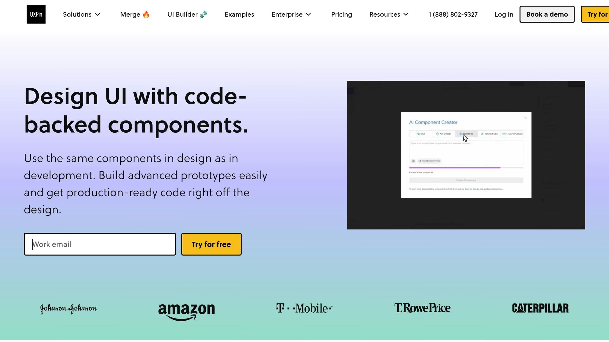
Once your environment and project structure are in place, UXPin can enhance your prototyping process by bridging the gap between design and development. This tool allows designers and developers to work with the same React components, creating realistic, high-fidelity prototypes that behave just like the final product.

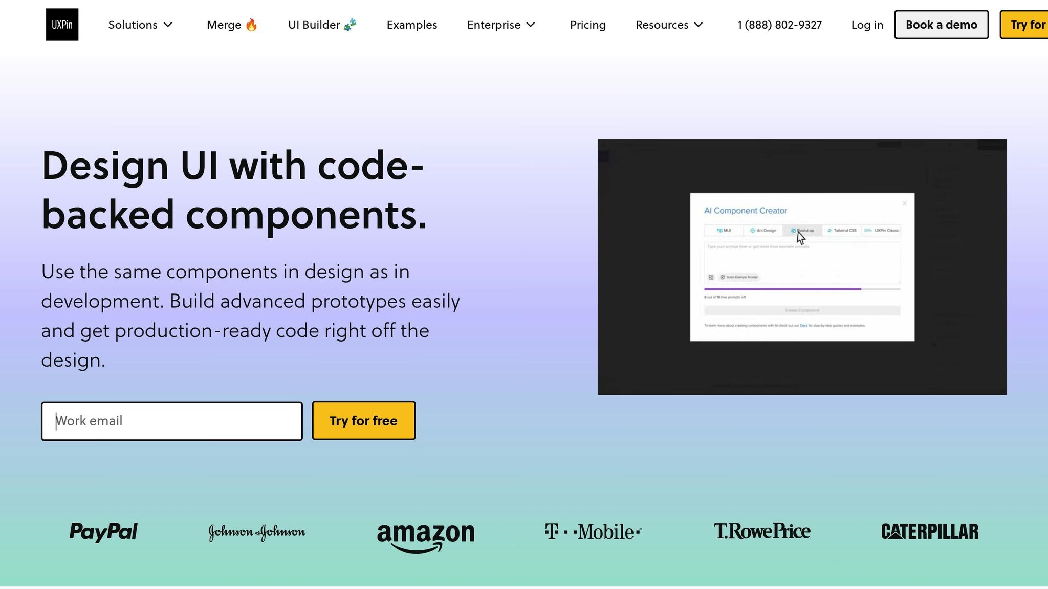
One standout feature is UXPin’s AI Component Creator, which generates React components directly from natural language descriptions. This cuts down on manual coding, letting teams refine and customize components as needed.

UXPin also supports advanced interactions, like conditional logic and state management, to simulate real user flows. This means your prototypes can mimic actual functionality, giving stakeholders a clear preview of the end product.

To keep everything aligned, UXPin integrates seamlessly with tools like Storybook and npm. Any updates to your codebase automatically sync with your prototypes, ensuring consistency throughout the development process and reducing manual updates. This integration makes UXPin a powerful addition to your React prototyping toolkit.

Building Interactive Prototypes with React Components

Once your environment is ready, you can dive into building your prototype. The secret to a successful React prototype lies in a modular approach – breaking your interface into smaller, manageable parts, building them step by step, and then layering in the interactions that make your design functional.

Breaking Down UI into Components

The first step in creating a React prototype is breaking your user interface into a hierarchy of reusable components. This method ensures that each piece has a clear role and can be developed, tested, and updated independently.

Start by identifying the major sections of your interface – think headers, sidebars, main content areas, and footers. Then, divide these sections into smaller, more focused components. For example, if a section feels too complex, split it into simpler pieces, each with a single responsibility.

Take a searchable product listing page as an example. A top-level component, like FilterableProductTable, might manage the entire interface. Within it, you could have a SearchBar for user input, a ProductTable for displaying results, ProductCategoryRow components for section headings, and individual ProductRow components for each product. Each component should focus on one specific task.

When deciding how to structure your components, think about UI segments that can be reused. Common patterns like buttons, cards, form fields, and navigation elements can often be abstracted into reusable components with customizable properties. To keep things organized, use consistent naming conventions for your components, props, and event handlers. This not only improves readability but also simplifies collaboration with your team. Additionally, plan how data will flow between parent and child components before diving into the code.

Once you’ve mapped out your components, start by building a static prototype to establish the application’s structure.

Creating and Testing a Static Version

Before adding interactivity, focus on building a static version of your prototype. This step allows you to work on the layout and structure without worrying about dynamic behaviors – essentially creating a solid foundation for your app.

Begin by setting up the basic structure of your components. For example, if you’re using a tool like Vite, a simple Header component might look like this:

import React from 'react';  const Header = () => {   return (     <header>       <h1>Product Catalog</h1>     </header>   ); };  export default Header; 

Develop each component as a static element, using props to test different scenarios, such as long product names or missing images. This process is crucial for ensuring that your layout works well and that each component displays data as expected. For instance, a static ProductCard component should clearly present product details without handling features like cart management or data fetching.

A solid static prototype makes it easier to introduce interactive elements later. Once you’re confident in the layout, you can move on to adding dynamic behavior.

Adding Interactivity to Components

With the static version in place, it’s time to make your prototype interactive. This is where React’s state and event handling come into play.

Use the useState Hook to give components memory, allowing them to store and update information as users interact with them. For instance, in an image gallery, you could use useState to track which image is currently displayed or whether a description is visible.

To handle user actions, attach event handlers to JSX elements. For example, when a user clicks a "Next" button, the event handler updates the state, triggering React to re-render the component with the updated information. Keep in mind that React schedules state updates for the next render cycle, so changes won’t appear instantly.

When working with state, always create new copies of objects or arrays to ensure the UI updates correctly. For example, a ProductCard component might receive an addToCart function as a prop instead of managing cart logic itself. This keeps the component focused on displaying product details and maintains its single responsibility.

sbb-itb-f6354c6

Adding Advanced Features to Prototypes

Once you’ve nailed down basic interactivity, it’s time to take your React prototypes to the next level. Adding advanced features like animations, conditional logic, and realistic user flows can make your prototypes feel much closer to fully functioning applications. Let’s break down how you can bring these elements into your designs.

Implementing Advanced Interactions

Animations and transitions can breathe life into your prototypes, giving them a polished, professional feel. Tools like React Spring and Framer Motion make it easy to craft engaging animations. React Spring, for instance, uses physics-based motion to create smooth, natural interactions, while Framer Motion specializes in micro-interactions that provide immediate feedback to users. Picture a button that changes size and color when clicked or a seamless page transition that guides users through your design.

When adding animations, keep them intentional. They should serve a purpose, whether it’s highlighting a feature or providing feedback. For example, a shopping cart icon could give a subtle bounce when an item is added, or a search bar might expand smoothly when clicked to signal its functionality. Timing matters too – quick animations (200–300 ms) are great for small interactions, while longer ones (500–800 ms) work better for bigger transitions like moving between pages. Don’t forget accessibility; always provide options to reduce motion for users who prefer simpler animations.

Next, let’s look at how conditional logic can make your prototypes even smarter.

Simulating User Flows with Conditional Logic

Conditional logic takes your prototypes from static to dynamic by making them respond to user behavior. By using variables and conditional interactions, you can create designs that adapt to user input or specific scenarios. For example, in an e-commerce prototype, the cart’s status could determine whether the user sees a "Continue Shopping" button or a "Proceed to Checkout" option. Similarly, a logged-in user might have access to different navigation options than a guest.

In React, state variables are key to implementing this kind of dynamic behavior. They can track everything from form progress to user preferences. Imagine a news app prototype that remembers what categories a user prefers and adjusts the homepage content accordingly. For more complex flows, like onboarding, conditional logic can customize the experience – offering extra guidance for beginners while streamlining steps for seasoned users. To keep everything running smoothly, document your variables and logic clearly. This not only helps maintain consistency but also makes collaboration easier during handoffs.

Using UXPin for Advanced Prototyping Features

To tie it all together, tools like UXPin can help you integrate advanced features seamlessly. UXPin combines design precision with real code behavior, working with popular React libraries like Material-UI, Ant Design, and Tailwind CSS. This ensures that animations, transitions, and conditional logic in your prototype align closely with the final product. Plus, UXPin’s code-backed platform can speed up rendering by 40%.

UXPin also excels at handling conditional logic. You can set up variables to track user actions, create expressions to determine what content appears, and design interactions that adapt dynamically. This is especially useful during stakeholder presentations or user testing, where demonstrating realistic workflows is crucial.

As your prototypes grow more complex, performance optimization becomes essential. UXPin’s ability to integrate with real code ensures that your advanced features not only look good but also function smoothly during testing and reviews.

Testing, Iterating, and Handoff in Prototyping

Creating advanced React prototypes involves more than just building a functional model – it’s about testing, refining, and ensuring a smooth transition into production. This phase determines whether your prototype becomes a successful product or gets stuck in endless revisions.

User Testing Interactive Prototypes

Testing your React prototype with real users can uncover insights that internal reviews often miss. The goal is to engage your target audience and ask clear, focused questions that validate your design choices.

Instead of vague instructions like "explore the app", give users specific tasks that mirror real-world goals, such as "Find and customize a product" or "Complete the checkout process." This approach helps you observe how users naturally interact with your interface and identify any friction points.

Set clear expectations from the start. Use introductory messages to explain the prototype’s purpose, and provide pre-task prompts to guide participants without leading them to specific answers. After completing tasks, ask open-ended questions to encourage honest feedback about their experience.

Focus on recurring issues – like confusing UI elements or common pain points – that multiple participants encounter. Prioritize these problems based on their impact on user satisfaction and task completion. Patterns across different user groups can also highlight features that work well for experienced users but confuse newcomers. Structured feedback methods, such as the "I Like, I Wish, What If" framework, can help you systematically capture strengths, areas for improvement, and innovative ideas.

These insights guide targeted refinements and set the stage for a seamless handoff to development.

Efficient Iteration on Prototypes

User feedback is the foundation for improving your prototype. Iteration transforms a functional design into a polished product, but it’s important to approach changes strategically rather than making random updates.

"There’s no one perfect user-interface design, and you can’t get good usability by simply shipping your one best idea. You have to try (and test) multiple design ideas." – Therese Fessenden, Nielsen Norman Group

Start by categorizing feedback into themes and levels of impact. Separate critical issues that block users from completing tasks from minor annoyances that affect overall satisfaction. Address the most pressing problems first, while scheduling less urgent fixes for later iterations.

Collaborate with your team to brainstorm solutions before diving into changes. A fresh perspective can lead to better approaches, and sometimes the obvious fix isn’t the best one. Once updates are made, validate them through additional testing methods like A/B testing, targeted usability sessions, or quick feedback rounds with a small group of users.

Even testing with just five users can uncover up to 85% of usability issues.

"Stay humble but also confident. You’ve talked to customers, built intuition, so go build the prototype and ship the V1. Then be humble by listening to feedback and iterating." – Tomer London, Co-Founder at Gusto

Smooth Handoff to Development

Once your prototype has been refined through testing and iteration, the next step is ensuring a smooth transition to development. Since React prototypes are built with components that align with production code, this process can be significantly simplified.

Start by organizing your component library with clear naming conventions and detailed documentation. Each component should include information about its purpose, props, and expected behavior. Highlight reusable components and make design files easily accessible. Centralizing product instructions and interaction details in one location helps developers avoid confusion and reduces back-and-forth communication.

Code-backed prototypes act as a clear guide for interactions, component states, and element behaviors, minimizing misinterpretations during implementation.

A handoff checklist can further streamline the process. Include details such as:

Be sure to document any conditional logic, dynamic behaviors, and associated variables or states. The more thorough your documentation, the easier the development process will be.

Finally, schedule regular check-ins with the development team. Brief walkthroughs of the prototype allow you to address questions early and ensure the final product aligns with your design vision. This collaborative approach helps turn your interactive prototype into a user-friendly, production-ready product.

Conclusion and Key Takeaways

Interactive prototyping with React components has reshaped how design and development teams collaborate. By using a component-based approach, designers and developers can create reusable building blocks that streamline workflows from the initial prototype to the final product. According to the Design Tools Survey from UXTools.co, the use of React for prototyping soared from 21% to 47% between 2019 and 2020, highlighting its growing popularity.

React’s declarative syntax and Virtual DOM allow for quick iteration cycles while enabling prototypes to handle real user interactions and data. Unlike static mockups, React prototypes can simulate dynamic user flows and behaviors, offering a more accurate representation of how a real application will function. This dynamic nature ensures that prototypes are not just conceptual but practical, forming a direct bridge to production code.

One of React’s standout advantages is its ability to transition prototypes directly into production. This eliminates the traditional design-to-development handoff, where developers often need to interpret static designs and recreate functionalities from scratch. Instead, prototype components can serve as the foundation for the final product, reducing development time and ensuring the design intent remains intact.

Platforms like UXPin take these benefits a step further. With built-in React libraries such as MUI and Tailwind UI, along with tools like the AI Component Creator, UXPin enables teams to build advanced prototypes without requiring deep coding expertise. This approach simplifies the process for designers and developers alike, fostering a more integrated workflow.

Beyond individual projects, React prototyping helps establish a shared language between design and development teams. This shared framework promotes better collaboration and leads to more cohesive design systems and predictable development timelines. For organizations, this means smoother processes and stronger alignment across teams.

FAQs

How do React components enhance the design-to-development workflow in prototyping?

React components simplify the journey from design to development by seamlessly connecting prototypes with production-ready code. They give designers and developers access to dynamic, interactive elements that mimic real application behavior, ensuring designs are both accurate and consistent.

When teams use React components during prototyping, they can test functionality early, spot potential problems, and improve collaboration. This method minimizes miscommunication, accelerates implementation, and ensures a smoother transition between design and development.

What are the benefits of organizing React projects by features instead of file types?

Organizing React projects around features can make your codebase more structured and easier to work with. By keeping all the components, styles, and tests for a specific feature in one folder, you create a system that’s easier to navigate and maintain. This setup also helps minimize unnecessary dependencies and makes the development process more efficient. It’s particularly useful for larger applications or teams, where maintaining a clear separation of concerns is essential.

On the other hand, structuring by file types – like putting all components, styles, and tests in separate folders – can lead to confusion as the project expands. This approach often makes it harder to locate or update files because related pieces of functionality are scattered across the codebase. A feature-based structure solves this problem by keeping everything for a feature in one place, making it easier to refactor and iterate quickly.

How does UXPin’s AI Component Creator simplify prototyping for teams without advanced coding skills?

UXPin’s AI Component Creator simplifies prototyping for teams with little to no coding experience. It can automatically turn images, text prompts, or existing design elements into fully functional, code-supported UI components. This means less time spent on manual coding and more time for teams to focus on creativity and teamwork.

The tool empowers non-technical team members to actively participate in creating interactive prototypes, which helps streamline workflows and boosts overall productivity. It’s an effective way to connect design and development efforts while ensuring polished, high-quality results.

Related Blog Posts

How AI Automates Design Tokens in the Cloud

AI is transforming how design tokens are managed, saving time and reducing errors. By combining AI with cloud platforms, teams can centralize design tokens, automate updates, and improve collaboration. Here’s how it works:

  • What are Design Tokens? They are reusable data files that define design elements like colors, fonts, and spacing, ensuring consistency across platforms.
  • Why Use AI? AI automates token creation, predicts patterns, and enforces uniformity, cutting manual work by up to 50%.
  • Cloud Benefits: Cloud platforms centralize tokens, enable real-time updates, and support distributed teams.

Key Takeaways

  • AI simplifies token management by automating repetitive tasks.
  • Cloud-based systems ensure instant updates and better collaboration.
  • Teams can reduce errors and save time while scaling design systems.

This combination of AI and cloud technology is reshaping design workflows, making them faster, more accurate, and easier to manage.

Atomic Design, Tokens, AI and the Future of Design Systems with Brad Frost, Ep28

Prerequisites for Automating Design Tokens in the Cloud

To fully embrace the potential of AI-driven automation for design tokens, it’s essential to establish a solid foundation. Here’s what you’ll need to get started.

Required Tools and Platforms

Automating design tokens involves three critical components: a design platform, AI tools, and cloud storage. Each plays a key role in extracting, processing, and distributing design tokens effectively.

  • Design Platforms: These serve as the starting point. Platforms like UXPin offer AI-driven tools and reusable UI components, ensuring structured token extraction. With code-backed prototypes, you can rely on consistent and accurate data.
  • AI Tools: These handle the heavy lifting. For instance, Style Dictionary is a build system that converts JSON-based design tokens into style variables across platforms. You can also integrate component properties into your workflow to allow for bulk template edits and custom styling.
  • Cloud Storage and Repositories: Cloud-based solutions help keep everything synchronized. Git-based platforms are excellent for version control, while cloud storage services handle larger assets. Look for options with APIs to ensure smooth integration.

Setting Up Cloud Infrastructure

AI-driven design token workflows demand more than just basic cloud storage. You’ll need scalable computing resources, reliable data storage, strong networking capabilities, and robust security measures. This is especially important given the intensive computing demands of AI.

Training and fine-tuning AI models require substantial resources. In fact, computing needs for AI have grown exponentially – by millions of times – over the last five years. To manage these demands:

  • Start small with pilot projects to test your infrastructure and refine your requirements.
  • Build modular systems that can evolve as your needs grow.
  • Consider hybrid setups that combine on-premises and cloud resources for added flexibility.

Cloud services can reduce upfront costs and make scaling easier compared to on-premises solutions. Using infrastructure as code ensures consistency and simplifies management.

The financial commitment can be substantial, but proper planning makes it worthwhile. According to Flexential’s State of AI Infrastructure report, 70% of businesses now allocate at least 10% of their IT budgets to AI-related initiatives. However, 35% of organizations have abandoned AI projects due to budget constraints, highlighting the importance of careful preparation.

Partnering with vendors and consultants who specialize in AI infrastructure can also make a big difference. For example, in 2025, Yotta Data Services partnered with NVIDIA to launch the Shakti Cloud Platform in India. This collaboration provided access to advanced GPU resources by integrating NVIDIA AI Enterprise software with open-source tools.

With scalable and secure cloud infrastructure in place, you’ll be ready to configure your workflows.

Configuring Initial Workflows

Once your tools and infrastructure are set up, it’s time to evaluate your workflows. Identify repetitive, time-consuming tasks and set measurable goals for automation, such as reducing processing time or eliminating manual data entry. These objectives will guide your implementation and help track success.

Develop an integration strategy to connect AI tools with your existing systems. Focus on API compatibility, standardized data formats, and robust security measures.

AI workflow automation combines technologies like machine learning, natural language processing, robotic process automation, and predictive analytics. Unlike traditional automation tools that rely on rule-based triggers, AI can handle unstructured data, analyze intent, and make decisions in real time.

Train your team on both the technical aspects and the mindset shifts required for AI integration. It’s crucial for team members to understand how these tools will transform their day-to-day tasks.

Finally, use analytics tools to monitor key performance indicators like token generation speed, error rates, and team adoption rates. Regular reviews and user feedback will help you refine and improve your automated processes over time.

According to S&P Global, 18% of organizations have already integrated generative AI into their workflows. By starting with a strong foundation, your organization can join their ranks and avoid common pitfalls.

Step-by-Step Guide to Automating Design Tokens

With your infrastructure ready to go, it’s time to create an automated workflow for design tokens. This approach simplifies design consistency across platforms by replacing manual processes with efficient, AI-driven operations.

Extracting Design Tokens Using AI

AI tools can analyze design files from platforms like Figma or Sketch and automatically generate design tokens for elements such as colors, fonts, and spacing. This eliminates the need for tedious manual cataloging. These tools can even assign intuitive semantic names like “primary-action” or “success-state” to tokens. Beyond just extraction, AI can detect token changes and automate updates to repositories and pipeline triggers. Tools such as Style Dictionary and AI-enhanced Figma plugins make token management smoother. However, human oversight is crucial to ensure the results align with brand standards.

Once tokens are extracted, the next step is to standardize them for consistent use across platforms.

Standardizing Tokens for Cross-Platform Use

To ensure tokens work across iOS, Android, web, and other platforms, they need to be converted into technology-neutral formats, often JSON. AI-powered tools can handle this transformation, converting design-specific values – like Figma’s color codes – into formats such as hex, RGB, or HSL. Typography settings can also be adjusted into platform-specific font families, weights, and sizes.

This process includes organizing tokens into hierarchies, separating base values (like specific color codes) from semantic tokens (like “primary button background”). Establishing a structured naming convention ensures AI tools can apply patterns consistently to new tokens.

Automating Testing and Validation

After standardization, it’s essential to verify the accuracy of the tokens through automated testing. This goes beyond checking if files compile correctly. AI testing tools can generate test cases, update scripts automatically, and even predict potential issues. Visual AI adds another layer by validating user interfaces across devices and screen sizes. For instance, AI testing can reduce QA time by over 80% while significantly boosting regression detection.

Metric Before AI-Testing After AI-Testing Improvement
QA Hours per Sprint 16 3 –81%
Pre-Merge Regression Detection 20% 95% +75pp
Time per PR Visual Check 15 min manually 4 min automated –73%
Production Visual Incidents/mo 2 0 –100%

AI tools can also be trained to ignore minor pixel differences caused by anti-aliasing or font rendering, focusing instead on meaningful changes like layout shifts or color mismatches. By integrating these tools into your CI/CD pipeline, you can receive immediate feedback with every code push, avoiding delays from manual testing. Given that 81% of software teams now use AI in their testing workflows, finding the right tool for your specific needs is vital.

Building Multi-Platform Outputs

Once tokens are standardized, they need to be adapted to the formats required by different platforms. This means converting JSON tokens into outputs like CSS variables for web, Swift constants for iOS, and XML resources for Android. Modern build tools can generate these outputs simultaneously, ensuring consistency across environments. AI can further customize these outputs to meet the unique requirements of each platform.

Additionally, AI can generate style guides that showcase token appearances, usage instructions, and recommended combinations. These guides are automatically updated with every change, keeping documentation current and useful.

Distributing Design Tokens to Teams

Distribution is where automation truly shines. Design tokens can be shared via package managers like NPM, through CDNs, or via APIs. Each method can be tailored to meet the specific needs of different teams. Using a CI/CD pipeline ensures that tokens are thoroughly tested and error-free before being distributed. Tools like Git enable version control, making it easy to track changes, collaborate, and roll back updates if needed.

Automation not only saves time but also reduces errors and improves scalability. For example, leveraging the Figma API can further streamline workflows, ensuring all teams receive synchronized, error-free updates without delays.

Using AI-Powered Tools for Design Token Automation

Modern design platforms are reshaping how teams manage design tokens, thanks to the integration of AI capabilities into their workflows. These advancements minimize manual work and enhance consistency during the crucial design-to-development handoff. Let’s take a closer look at how UXPin utilizes AI to streamline design token automation.

Using AI Features in UXPin

UXPin

UXPin builds on automation to simplify token management through its code-backed prototyping system and integrated token tools. It allows designers to import tokens effortlessly via copy-paste or by linking to JSON files and CDNs. With plans to support tokens for colors, fonts, spacing, and animations, UXPin is enhancing its automation capabilities. The platform is also preparing to integrate with popular token management tools, enabling teams to maintain their current workflows while benefiting from AI-driven automation.

A standout feature of UXPin is its Merge technology, which effectively bridges the gap between design and code. Larry Sawyer highlighted the impact of this technology:

“When I used UXPin Merge, our engineering time was reduced by around 50%. Imagine how much money that saves across an enterprise-level organization with dozens of designers and hundreds of engineers.”

This efficiency translates into quicker token implementation and fewer errors during handoffs. Another notable tool is UXPin’s AI Component Creator, which generates React components directly from design tokens, ensuring alignment between design and development.

Mark Figueiredo, Sr. UX Team Lead at T. Rowe Price, shared his experience:

“What used to take days to gather feedback now takes hours. Add in the time we’ve saved from not emailing back-and-forth and manually redlining, and we’ve probably shaved months off timelines.”

In addition to its built-in AI features, UXPin enhances scalability and validation by integrating with leading cloud-based AI services.

Integrating with Cloud AI Services

UXPin extends its capabilities by supporting integration with external cloud AI services, further refining token workflows. These integrations bring automation and validation to the forefront, ensuring design tokens are consistent and scalable. Cloud platforms offer AI-powered features that analyze and validate tokens, creating robust pipelines for quality assurance. This approach not only improves accuracy but also fosters collaboration across distributed teams, making the design-to-development process seamless and efficient.

sbb-itb-f6354c6

Pros and Cons of Cloud-Native AI Token Automation

Cloud-native AI token automation simplifies workflows and reduces errors, but it also comes with its own set of challenges. While the advantages are clear, implementing AI in the cloud requires careful planning to address potential hurdles.

Key Benefits of Automation

One of the biggest perks of automation is how much time it saves. Tasks that used to take days can now be completed in minutes, revolutionizing how design iterations are handled. By removing manual processes, AI automation ensures consistency across design systems, which becomes increasingly critical as teams and projects grow. This efficiency allows teams to focus on more creative and impactful tasks. As Romina Kavcic puts it:

“The highest-performing teams don’t manually transfer design decisions into code. They automate it.”

Another advantage is scalability. Automation supports the growth of design systems, with mid-sized teams often seeing a return on investment (ROI) of over 300% within two years. Additionally, cloud-native environments eliminate the need for hefty upfront investments, offering a flexible pay-as-you-go model for resource usage.

Common Challenges and Solutions

Despite its benefits, cloud-native AI token automation isn’t without obstacles. Here are some common challenges and ways to tackle them:

  • Data Privacy and Security: AI systems handle sensitive information, making security a top priority. Strong encryption for data both in transit and at rest, paired with regular security audits and a ransomware-proof backup solution, can reduce breach risks by up to 64%. Adopting AI-specific compliance frameworks has also been shown to improve audit outcomes by 71% .
  • High Implementation Costs: Setting up AI in the cloud requires significant investment in both infrastructure and expertise. However, using pay-as-you-go cloud services can help offset these initial costs.
  • Technical Complexity and Skills Gaps: A lack of professionals skilled in both AI and cloud computing can create bottlenecks. This can be addressed through targeted training programs and forming strategic partnerships.
  • Legacy System Integration: Many older systems aren’t compatible with modern AI tools. Incremental integration strategies and middleware solutions can help bridge this gap while minimizing disruptions.
  • Scalability and Performance Concerns: As data volumes grow, AI solutions must be built with scalability in mind. Well-designed architectures can adapt to changing workloads while maintaining performance.

Comparison Table of Pros and Cons

Here’s a quick look at the pros and cons of cloud-native AI token automation:

Aspect Benefits Challenges
Time Efficiency Changes deploy in minutes instead of days Initial setup may take over 18 months for AI-native systems
Cost Impact ROI exceeds 300% within two years High initial costs for infrastructure and expertise
Error Management Reduces manual errors 80% of enterprise AI projects fail due to poor architecture
Resource Allocation Optimized cloud resource usage May require up to 15x more computation power
Team Productivity Frees up time for high-value tasks Complexity demands specialized skills and training
Security 64% fewer breaches with strong frameworks Data privacy requires robust encryption and compliance
Performance 2–5x improvements in latency and throughput Legacy systems may struggle with compatibility
Scalability Grows without proportional effort Requires careful planning for large-scale data handling

The decision to adopt cloud-native AI token automation depends on your team’s needs and long-term objectives. While the challenges are real, the potential benefits – when approached strategically – can lead to more efficient and scalable design systems.

Conclusion

Automating design tokens with AI in cloud environments is changing the game for design workflows, introducing opportunities that manual processes simply can’t match.

With well-structured token systems, teams can cut design and development time by an impressive 30–50%. By 2026, it’s projected that 80% of organizations will have generative AI in production – an enormous leap from under 5% in 2023. These numbers highlight not just efficiency improvements but also the ability to shift focus toward more creative and impactful work.

The benefits go beyond just saving time. AI takes on the tedious tasks that often slow creative teams down – like spotting unauthorized color usage, identifying typography issues, and ensuring consistent spacing across platforms. This allows designers to concentrate on what truly matters: solving user challenges and crafting meaningful experiences. As the IDEO U Team aptly puts it:

“AI is your creative assistant, not your replacement. The magic happens when human intuition meets machine efficiency.”

On top of these creative advantages, cloud-native environments bring added benefits like scalability and seamless collaboration. These setups support rapid deployment and ensure that even if one service fails, your entire design system remains intact.

Moving forward, success will depend on a thoughtful approach. Use AI to handle repetitive tasks and ensure compliance, while keeping human creativity at the core. Machine learning can also play a role in analyzing user behavior and tailoring experiences. This blend of AI and human ingenuity is key to optimizing design token workflows in cloud-native environments.

As Kristina from MobiLab puts it:

“At MobiLab we only build things once, then we automate.”

This forward-thinking approach sets apart high-performing teams from those stuck in manual processes. The time to embrace these tools is now.

FAQs

How does AI help maintain accurate and consistent design tokens across platforms?

AI takes the guesswork out of managing design tokens by centralizing their control and ensuring they’re applied consistently across all platforms. It automates the detection and correction of inconsistencies, making it easier for teams to maintain a seamless design system without extra effort.

By simplifying workflows and cutting down on manual updates, AI keeps design tokens in sync, delivering a cohesive look and feel across devices and environments. This approach not only saves valuable time but also boosts the quality and dependability of your design system.

What should I consider when setting up cloud infrastructure for AI-powered design token automation?

Setting Up Cloud Infrastructure for AI-Driven Design Token Automation

When setting up cloud infrastructure for AI-driven design token automation, the first step is to establish clear goals. These goals will act as your roadmap, ensuring the setup aligns with your specific needs and workflows. Selecting the right AI tools is equally important – choose ones that integrate seamlessly with your processes.

To handle growth and demand, make sure your infrastructure supports scalability. Features like auto-scaling and distributed processing can help your system adapt to varying workloads. At the same time, prioritize strong security measures to safeguard sensitive data and maintain trust. Regular monitoring is another must-have, as it ensures your AI tools are performing at their best.

Using infrastructure as code (IaC) can simplify deployment and ongoing management, reducing manual effort and the chance of errors. Finally, a high-availability setup is key for reliability, especially in cloud-native environments. Following these steps will provide a solid, efficient foundation for automating design tokens with AI.

What are the best strategies for integrating AI automation into legacy design workflows?

Integrating AI automation into older design workflows can seem like a tall order, but with the right strategy, it’s entirely doable. One effective method is to use middleware or API wrappers. These tools act as bridges, allowing outdated systems to communicate smoothly with modern AI technologies. The best part? They let you exchange data efficiently without needing to completely replace your existing setup.

For a more manageable transition, think about incremental modernization. Instead of overhauling everything at once, focus on upgrading key components step by step. This approach minimizes disruptions and keeps risks in check. At the same time, prioritize compatibility and security by aligning updates with current standards and best practices. By taking these measured steps, organizations can fine-tune their workflows and make the most of what AI automation has to offer.

Related Blog Posts

Dynamic Input Masking with React Components

Dynamic input masking helps users enter data in a specific format, such as phone numbers or dates, while reducing errors. React simplifies this process with reusable components and libraries like react-input-mask and @react-input/mask. These tools allow developers to create flexible input fields that adjust in real time based on user input, improving both usability and data consistency.

Key points:

  • Input masking formats data as users type (e.g., (555) 123-4567 for phone numbers).
  • React libraries like react-input-mask and @react-input/mask offer components and hooks for easy integration.
  • Dynamic masking adapts formats based on input length or context (e.g., switching between U.S. and international phone numbers).
  • Accessibility and performance are crucial, with features like ARIA attributes and optimized rendering improving user experience.
  • Testing for edge cases, such as paste events or autofill, ensures reliability across devices.

React’s component-based structure makes it a powerful tool for creating dynamic input masks, improving form usability and ensuring consistent data formatting.

React Libraries and Tools for Input Masking

React

Top Libraries for Input Masking in React

When it comes to input masking in React, several libraries have carved out their niche. react-input-mask leads the pack with an impressive 585,065 weekly downloads and 2.3k stars on GitHub. Known for its focus on user experience, it supports older browsers like IE8+ and uses a simple mask string approach with predefined format characters. This makes it a solid choice for developers, whether you’re just starting out or have years of experience.

Another strong option is @react-input/mask, which sees 191,760 weekly downloads. What sets it apart is its dual offering – a component and a hook – giving you more control over masking. For instance, it can dynamically adjust masks, like substituting country codes while entering phone numbers, based on user input patterns.

For those dealing with complex scenarios, React Text Mask is a versatile tool. It handles a variety of data types and offers dynamic and regex-based techniques for advanced validation. This makes it a go-to for developers tackling intricate masking requirements.

If your project involves number formatting, react-number-format is a standout. It specializes in handling currencies, percentages, and other numerical inputs with built-in validation. This makes it especially useful for U.S.-based applications, such as those handling dollar amounts, taxes, or financial data.

For a lightweight and performance-optimized solution, Maska is worth considering. It supports dynamic masking and allows for highly customizable patterns, all while keeping things efficient and straightforward.

Library Comparison for Dynamic Masking

Here’s a quick breakdown of how these libraries stack up when it comes to dynamic masking and other key features:

Feature react-input-mask @react-input/mask maska react-maskedinput react-text-mask
Dynamic Masking No Yes Yes Some Yes
Customization Decent High High High High
Community Support Large Moderate Small Moderate Large
Learning Curve Moderate Easy Easy Steep Moderate
Performance Good with some overhead Optimized Lightweight More demanding Good
Weekly Downloads 585,065 191,760 N/A N/A N/A
Best Use Case Static masks, broad compatibility Dynamic phone/date formats Simple dynamic solutions Complex customization Advanced masking scenarios

Each library comes with its own strengths and trade-offs. react-input-mask is reliable and well-supported by its community but doesn’t support dynamic masking. On the other hand, @react-input/mask strikes a balance between ease of use and dynamic functionality, making it a great choice for applications like phone number inputs that need to adapt to different formats.

For lightweight and dynamic needs, Maska is an excellent option, though its smaller community might mean fewer resources for troubleshooting. Meanwhile, react-maskedinput offers extensive customization but can be more resource-intensive and complex to implement.

How to Choose the Right Library

Selecting the right library depends on your project’s specific needs. If your application requires dynamic mask formats – like switching between U.S. (XXX) XXX-XXXX and international phone numbers or handling varied credit card patterns – prioritize libraries with strong dynamic masking support.

Accessibility should also be a key consideration. For example, Syncfusion React Input Mask boasts a 4.5/5 rating from over 700 reviews on platforms like Capterra, G2, and GetApp. Look for libraries that integrate seamlessly with screen readers and maintain proper ARIA attributes to ensure compatibility with assistive devices.

Performance is another critical factor, especially as your application scales. Test input masks across various devices and platforms to confirm cross-platform compatibility. Lightweight options like Maska are ideal for performance-conscious projects, while more complex libraries like react-maskedinput may require additional resources for advanced scenarios.

Regular expression support is essential for validating specific data patterns. This is particularly useful for U.S.-based applications that need to handle Social Security numbers, ZIP codes, or state-specific formats. Regex capabilities provide the flexibility to enforce custom validation rules.

Finally, consider your development team and timeline. Libraries like react-input-mask offer extensive documentation and a large community, making them ideal for teams seeking quick implementation and reliable support. For projects with unique requirements, the advanced customization options in react-maskedinput might be worth the extra effort despite its steeper learning curve.

To future-proof your application, encapsulate mask logic within reusable components or hooks. This approach keeps your code organized and allows for easier library swaps if your requirements evolve over time.

Step-by-Step Guide: Building Dynamic Input Masks in React

Setting Up Your React Project

Start by creating a new React project using the following command:

npx create-react-app input-masking 

This will set up the necessary files and structure for your project. Next, install an input masking library to handle the masking logic:

npm install react-input-mask --save npm i @react-input/mask 

Once installed, you can import the library into your component. For example, to use react-input-mask, add this line at the top of your file:

import InputMask from 'react-input-mask'; 

The @react-input/mask package offers two options for implementation: the InputMask component and the useMask hook, giving you flexibility based on your needs.

If you’d rather load the library via a CDN, you can include it with this script tag:

<script src="https://unpkg.com/@react-input/mask/cdn"></script> 

With the setup complete, you’re ready to build reusable components tailored for different input scenarios.

Creating Reusable Input Mask Components

Reusable components in React allow you to keep your code modular and flexible. By passing props for the mask, input value, and onChange handler, you can create components that handle various input formats while maintaining consistent masking logic.

For example, to handle U.S. phone numbers, you can build a component that applies the standard format: (XXX) XXX-XXXX. This ensures consistency and simplifies reuse across your application.

For currency inputs, the react-number-format library is a great choice. It automatically formats numbers with dollar signs, comma separators for thousands, and precise decimal placement.

Date inputs, such as those requiring the MM/DD/YYYY format, can use a mask like 99/99/9999. Adding custom validation ensures that users enter valid months and days.

To enhance the user experience, make sure your components maintain the cursor position and handle edge cases like null or empty inputs. Use an onChange handler to update the state while preserving proper cursor placement, and display a placeholder mask when the input is empty.

Dynamic Mask Switching and Validation

Dynamic masking takes your components to the next level by allowing them to adapt in real time based on user input. This approach uses conditional logic to determine which mask to apply, making your components more flexible.

For instance, a dynamic mask function could switch between different formats based on input length. A practical example is a function that applies a CPF mask (999.999.999-99) for inputs with fewer than 12 digits and a CNPJ mask (99.999.999/9999-99) for longer inputs. This is particularly useful in scenarios where the required format changes depending on the data.

Another example is a phone number input that adjusts between 10-digit and 11-digit formats as the user types. By using a maskBuilder function, you can dynamically switch patterns to match the input length.

Time inputs, like those using the hh:mm format, also benefit from dynamic masking. Here’s an example implementation:

function TimeInput(props) {   const mask = '12:34';   const formatChars = {     '1': '[0-2]',     '2': '[0-9]',     '3': '[0-5]',     '4': '[0-9]'   };   const beforeMaskedValueChange = (newState) => {     const { value } = newState;     if (value.startsWith('2')) {       formatChars['2'] = '[0-3]'; // Prevents invalid times like 24:00     } else {       formatChars['2'] = '[0-9]';     }     return { value, selection: newState.selection };   };    return (     <InputMask       mask={mask}       value={props.value}       onChange={props.onChange}       formatChars={formatChars}       beforeMaskedValueChange={beforeMaskedValueChange}     />   ); } 

The beforeMaskedValueChange event from react-input-mask gives you control to tweak the mask just before the input updates, enabling real-time validation.

Finally, test these components on real devices to ensure consistent behavior across platforms. Pay attention to how autofill and paste events interact with your masks. By leveraging the formatChars prop, you can define custom masking characters using regular expressions, offering precise control over valid input values. This approach ensures your components are both functional and user-friendly.

Advanced Techniques and Best Practices

Complex Masking Scenarios

When working with U.S. input formats, advanced masking techniques are often necessary to handle specific requirements. For example, Social Security Numbers (SSNs) follow the XXX-XX-XXXX format and require strict validation to ensure accuracy. Certain rules – like disallowing ‘000’ or ‘666’ as the first three digits – must be enforced.

Here’s how to implement dynamic masking for SSNs with validation:

const SSNMask = ({ value, onChange }) => {   const validateSSN = (ssn) => {     const digits = ssn.replace(/\D/g, '');     const firstThree = digits.substring(0, 3);      if (firstThree === '000' || firstThree === '666' || firstThree >= '900') {       return false;     }      return digits.length === 9;   };    const beforeMaskedValueChange = (newState) => {     const { value } = newState;     const isValid = validateSSN(value);      return {       value,       selection: newState.selection,       isValid,     };   };    return (     <InputMask       mask="999-99-9999"       value={value}       onChange={onChange}       beforeMaskedValueChange={beforeMaskedValueChange}     />   ); }; 

Similarly, U.S. ZIP codes, which can be 5 or 9 digits (e.g., 12345 or 12345-6789), require a flexible approach. You can dynamically adjust the mask based on the input length:

const ZIPCodeMask = ({ value, onChange }) => {   const getMask = (inputValue) => {     const digits = inputValue.replace(/\D/g, '');     return digits.length > 5 ? '99999-9999' : '99999';   };    return (     <InputMask       mask={getMask(value)}       value={value}       onChange={onChange}       placeholder="12345 or 12345-6789"     />   ); }; 

For product codes, which often vary in length and format (e.g., UPCs with 12 digits or SKUs like ABC-123-XYZ), creating a dynamic masking function that adapts to different patterns is crucial. These flexible solutions ensure your forms can handle diverse input types while maintaining reliability.

Accessibility and Performance Optimization

Accessibility is non-negotiable. Nearly 39% of users rely on assistive technologies like screen readers. To enhance usability, use attributes like aria-describedby to link input fields with descriptive helper text. This ensures that users understand the expected format:

const AccessiblePhoneMask = ({ value, onChange, id }) => {   return (     <div>       <label htmlFor={id}>Phone Number</label>       <InputMask         id={id}         mask="(999) 999-9999"         value={value}         onChange={onChange}         aria-describedby={`${id}-help`}         aria-label="Phone number in format (123) 456-7890"       />       <div id={`${id}-help`} className="sr-only">         Enter your 10-digit phone number       </div>     </div>   ); }; 

Performance is equally vital, especially in forms with multiple masked inputs. Faster load times can significantly boost conversion rates – a site loading in just 1 second has a conversion rate three times higher than one loading in 5 seconds. To optimize performance:

  • State Management: Manage state locally within individual components to reduce unnecessary re-renders.
  • Memoization: Use React.memo, useMemo, and useCallback to cache complex mask calculations:
const OptimizedMaskInput = React.memo(({ mask, value, onChange }) => {   const memoizedMask = useMemo(() => computeComplexMask(mask), [mask]);    const handleChange = useCallback((event) => {     onChange(event.target.value);   }, [onChange]);    return (     <InputMask       mask={memoizedMask}       value={value}       onChange={handleChange}     />   ); }); 
  • Virtualization: For large forms, use libraries like react-window to render only visible fields.
  • Throttling: Avoid excessive API calls during real-time validation by throttling input changes:
const useThrottledValidation = (value, delay = 300) => {   const [throttledValue, setThrottledValue] = useState(value);    useEffect(() => {     const handler = setTimeout(() => {       setThrottledValue(value);     }, delay);      return () => clearTimeout(handler);   }, [value, delay]);    return throttledValue; }; 

Handling Edge Cases and Errors

Poorly handled edge cases can frustrate users, with 75% abandoning forms due to unclear error messages. To improve the experience:

  • Handle Paste Events: Clean and format pasted data to match the mask:
const handlePaste = (event) => {   event.preventDefault();   const pastedData = event.clipboardData.getData('text');   const cleanedData = pastedData.replace(/\D/g, '');    if (cleanedData.length === 10) {     const formatted = `(${cleanedData.slice(0, 3)}) ${cleanedData.slice(3, 6)}-${cleanedData.slice(6)}`;     onChange(formatted);   } }; 
  • Monitor Autofill Events: Adjust autofilled values to match the mask:
useEffect(() => {   const detectAutofill = () => {     if (inputRef.current && inputRef.current.value !== value) {       const autofillValue = inputRef.current.value;       const conformedValue = conformToMask(autofillValue, mask);       onChange(conformedValue);     }   };    const timer = setTimeout(detectAutofill, 100);   return () => clearTimeout(timer); }, [value, mask, onChange]); 
  • Error Handling: Show errors only on blur and hide them when users start correcting their input:
const [showError, setShowError] = useState(false); const [isValid, setIsValid] = useState(true);  const handleBlur = () => {   const valid = validateInput(value);   setIsValid(valid);   setShowError(!valid); };  const handleFocus = () => {   if (showError) {     setShowError(false);   } }; 

"Most people don’t like being told they are wrong – especially when they aren’t. Users therefore naturally find it very frustrating and (quite understandably) feel unfairly reprimanded when a site claims they’ve made a mistake before they’ve had a chance to enter a valid input."
– Christian Holst, Usability Expert, Baymard Institute

For incomplete inputs, provide helpful indicators rather than blocking the user. For example, if a phone number field contains (555) 123-, show a subtle prompt to complete the input instead of throwing an error. Similarly, handle empty values gracefully by clearing the mask while keeping the placeholder visible:

const displayValue = value || ''; const shouldShowMask = displayValue.length > 0;  return (   <InputMask     mask={shouldShowMask ? mask : ''}     value={displayValue}     placeholder="(123) 456-7890"     onChange={onChange}   /> ); 

Testing is key – verify edge case handling across browsers and devices, including mobile keyboards and voice input. These advanced practices, combined with dynamic masking strategies, create a seamless and reliable input experience.

React.js Tutorial to Mask your Input Fields With Validation in JSX Using react-input-mask Library

react-input-mask

sbb-itb-f6354c6

Using Dynamic Input Masking in UXPin

UXPin

UXPin bridges the gap between design and development by enabling interactive prototypes that mimic the behavior of the final product. This dynamic capability ensures smoother integration within UXPin’s environment.

Prototyping Dynamic Input Masks in UXPin

To set up dynamic input masking in UXPin, start by importing your React components via UXPin Merge. This feature allows you to pull your React components directly into prototypes, ensuring that input masks align perfectly with production code.

Begin by creating a new project in UXPin and linking your component library. If you’re using popular libraries like react-input-mask – which boasts over 1.5 million weekly downloads as of mid-2024 – these components integrate effortlessly. Drag your React input components onto the canvas and tweak their properties as needed.

For instance, imagine you’re prototyping a checkout form. You can include dynamic input fields that adjust to various formats in real time. As users type, the mask shifts from a generic 9999 9999 9999 9999 pattern to specific formats like American Express (9999 999999 99999) or Discover (9999 9999 9999 9999). This real-time validation gives stakeholders a genuine sense of the user experience.

The true potential of UXPin becomes clear when testing more complex scenarios. Take a phone number field, for example, that needs to handle both U.S. and international formats. In UXPin, you can prototype a dropdown menu that dynamically updates the input mask based on the user’s country selection. If "United States" is chosen, the mask becomes (999) 999-9999. Selecting "United Kingdom" switches it to +44 9999 999999. This level of interactivity is a standout feature of UXPin.

You can also test edge cases like paste events, autofill, and error validations directly within the prototype. These interactions feel authentic because they rely on the same React logic that will eventually power the final product.

By leveraging React’s dynamic masking capabilities, UXPin prototypes offer real-time validation and responsiveness. This approach not only mirrors production behavior but also streamlines the entire workflow from design to code.

Benefits of Code-Backed Prototypes

The advantages of these dynamic prototyping techniques go far beyond aesthetics. UXPin’s code-backed prototypes can reduce design-to-development cycles by up to 30%, as real component logic validates input behavior early in the process.

Traditional prototyping methods often create a misleading sense of readiness. Designers craft polished mockups, only for developers to uncover challenges during implementation that require reworking designs. With UXPin, these issues come to light during the prototyping phase. For example, if a specific input mask causes performance hiccups or accessibility concerns, these problems are identified while adjustments are still easy to make.

The design-to-code workflow becomes seamless because there’s no need for interpretation. The same React components used in prototypes serve as the foundation for production code. If a designer updates the validation logic for a ZIP code field in UXPin, that change is instantly reflected in the component library. Developers don’t have to guess or translate design specs – they’re working with the actual implementation.

User testing also becomes more meaningful. Instead of asking participants to imagine how an input field might behave, they interact with a functional prototype. This allows you to observe how users respond to dynamic mask changes, whether they understand error messages, and if the input patterns feel intuitive. The feedback gathered directly informs both design and development.

Accessibility testing is naturally embedded within this workflow. By using actual React components with proper ARIA attributes and keyboard navigation, you can validate accessibility during prototyping instead of addressing it later. Features like screen reader compatibility, keyboard navigation, and focus management are tested before production begins.

The collaborative benefits extend across teams. Product managers can experience complex input behaviors firsthand, leading to better-informed decisions about features. QA teams can start planning test cases based on actual component behavior rather than written descriptions. Even marketing teams can create more accurate product demos using prototypes that reflect the final user experience.

This method is especially effective for complex masking scenarios involving multiple interdependent fields. For example, in a shipping form, the ZIP code format might change based on the selected country, and the state field could dynamically populate based on the ZIP code. With UXPin, you can prototype this entire chain of interactions, complete with error handling and edge cases. Stakeholders get a clear view of the complete user journey, enabling smarter decisions about the final implementation.

Conclusion and Key Takeaways

Dynamic input masking in UXPin offers a practical way to reduce transcription errors and simplify data entry tasks. The process revolves around three main steps: selecting an appropriate React library, defining mask patterns, and building reusable components to handle edge cases effectively.

By enforcing predefined formats, input masks ensure data accuracy and consistency while improving user experience through real-time feedback. This immediate guidance on expected input formats minimizes errors and creates a smoother, more intuitive interaction for users.

To maintain performance as your application scales, consider using tools like PureComponent or memoization to avoid unnecessary re-renders. Encapsulating mask logic into reusable components or hooks further enhances efficiency.

UXPin’s code-backed prototyping, powered by UXPin Merge, facilitates the early validation of input mask behavior through React components. This approach allows teams to test and refine masking logic during the design phase, preventing issues from surfacing during development. The same components used in prototypes can transition seamlessly into production, bridging the gap between design and development.

This workflow benefits the entire product team. Designers can experiment with complex masking scenarios and realistic user interactions, developers gain validated component logic, and stakeholders experience authentic user flows before development begins. This collaborative approach ensures a smooth transition from design to production.

Achieving success with dynamic input masking requires a focus on precision, accessibility, and comprehensive testing across devices. By addressing these elements from the outset, you can create forms that are user-friendly, error-resistant, and ready to meet the needs of diverse audiences.

FAQs

What are the benefits of using dynamic input masks in React applications?

Dynamic input masks make filling out forms easier by providing real-time guidance as users type. They help ensure data is entered in the correct format, reducing confusion and making form submissions more accurate.

These masks also promote data consistency by enforcing specific input patterns. This minimizes errors and standardizes how information – like phone numbers, dates, or credit card numbers – is entered across your application.

What are the main differences between React libraries for input masking, and how can I pick the best one for my project?

React input masking libraries come with different features and levels of flexibility. react-input-mask is a great pick for straightforward tasks like formatting phone numbers or ZIP codes. It’s easy to use but doesn’t offer much room for customization. On the other hand, react-text-mask is perfect for more intricate needs. It supports dynamic masking and works well with a variety of data types, making it suitable for more complex scenarios. Lastly, there’s react-maskedinput, which is lightweight and adaptable but hasn’t seen much active maintenance lately, which might be a concern for long-term projects.

When deciding which library to use, think about your project’s specific needs. For simple, fixed formats, react-input-mask will do the job. If you’re working with more dynamic or complex inputs, react-text-mask is the better choice.

How can I make dynamic input masks in React accessible and optimized for performance?

Accessibility

To make your input masks usable for everyone, it’s important to provide clear instructions for users. Incorporate non-visual cues, such as ARIA attributes, to assist individuals relying on screen readers or other assistive technologies. Additionally, ensure support for alternative input methods like keyboard navigation, so users can interact with your input masks without needing a mouse or touch interface.

Performance Optimization

Efficient performance is key. Start by minimizing unnecessary re-renders through proper management of component state. Opt for lightweight and efficient masking libraries to keep the implementation fast and smooth. Also, pay close attention to how your input masks handle large datasets or complex interactions – introducing delays or lag can frustrate users and degrade the overall experience.

Related Blog Posts

React Components in Cross-Platform Design Systems

React components are the backbone of modern cross-platform design systems. They help create consistent, reusable UI elements for web, iOS, and Android platforms, saving time and ensuring a unified user experience. Here’s what you need to know:

  • Cross-platform design systems centralize reusable components, patterns, and guidelines to maintain consistency across platforms while meeting platform-specific needs.
  • React’s component-based architecture allows for modular, reusable pieces of UI that simplify updates and improve scalability.
  • Challenges include achieving native-like performance, maintaining consistent UI/UX across platforms, and handling platform-specific quirks.
  • Key practices include structuring components for reuse, using design tokens for consistency, and ensuring clear documentation and APIs.
  • Performance optimization techniques like memoization, lazy loading, and list virtualization keep components efficient across platforms.
  • Theming and customization rely on global themes with platform-specific overrides, ensuring flexibility without compromising design integrity.
  • Tools like UXPin bridge the gap between design and development by enabling teams to work with real React components during the design process.

Building Cross-Platform Component Libraries for Web and Native with React – Perttu Lähteenlahtii

React

Building Reusable React Components for Multiple Platforms

Creating React components that work seamlessly across multiple platforms requires careful planning and a solid architectural foundation. The goal is to design components that maintain consistent behavior and appearance while being flexible enough to adapt to different environments. This section dives into structuring components, ensuring consistency with design tokens, and the importance of clear documentation and APIs to maximize reusability.

How to Structure Components for Code Reuse

The backbone of reusable React components lies in separating business logic from the UI elements. This approach not only improves code quality but also simplifies maintenance when supporting multiple platforms. By isolating the core functionality from platform-specific rendering, you can reuse components without having to rewrite them for each environment.

One effective strategy is leveraging custom hooks to encapsulate logic. For example, instead of duplicating functionality across components, you can create a custom hook like usePasswordToggler.js to handle password visibility toggles. This hook can then be reused in various components, such as Login and Registration pages.

Another useful technique is employing wrapper components to abstract third-party APIs. Wrappers ensure consistent behavior across your app while shielding the rest of your codebase from changes in external libraries. That said, it’s important to avoid overcomplicating the architecture – simplicity is key.

Organizing your files in a component-centric structure also promotes reuse. For instance, you can group a custom input component’s logic, styles, tests, and assets into a single folder. This organization not only makes components easier to find but also simplifies updates and testing.

Lastly, aim to build portable, self-contained components with minimal dependencies. Using props to pass data between components keeps them flexible and easy to refactor. Combined with a well-thought-out structure, this approach ensures your components remain adaptable.

With a solid structure in place, the next step is ensuring consistency through design tokens.

Using Design Tokens for Consistency

Design tokens act as the building blocks of your design system, defining key properties like colors, typography, and spacing. They serve as a single source of truth for design decisions, bridging the gap between design and development.

"Design tokens are the visual design atoms of the design system – specifically, they are named entities that store visual design attributes. We use them in place of hard-coded values (such as hex values for color or pixel values for spacing) in order to maintain a scalable and consistent visual system for UI development." – Salesforce’s Design System team

By centralizing design properties, tokens allow for quick, system-wide updates. For instance, implementing dark mode or white-label themes becomes much simpler – updating a single token propagates changes across the entire system.

To avoid redundancy and token proliferation, establish a clear ownership model and decision-making process. Phased migration strategies can help integrate tokens into existing codebases without disrupting workflows. Additionally, syncing tokens between design tools and development environments ensures a seamless and consistent experience.

Once your components are structured and visually consistent, clear documentation and API standards are essential for widespread adoption.

Documentation and API Standards

For reusable components to succeed, clear documentation and consistent APIs are non-negotiable. Developers should be able to quickly understand how a component works, its purpose, and how to implement it effectively.

Good documentation includes:

  • A component’s purpose and supported props
  • Usage examples
  • Notes on platform-specific considerations

Providing real-world examples can also help developers see how to implement components in practical scenarios.

Consistent naming conventions across components reduce the learning curve and make it easier for teams to collaborate. Clear guidelines for organizing code, naming props, and structuring components are particularly important for teams working across different technologies.

Testability is another critical factor. Designing components with testing in mind minimizes bugs and ensures reliability across platforms. Tools like TypeScript can catch errors early, while default props and prop types add an extra layer of validation. Additionally, integrating a linter and adhering to its rules helps maintain code quality and consistency as your component library grows.

Theming and Customization in Cross-Platform React Systems

Creating a consistent yet adaptable design across platforms is a balancing act. The goal is to allow for brand-specific customizations and platform adjustments while preserving the core design principles that tie everything together.

Building Global Themes with Platform-Specific Adjustments

To effectively manage theming across platforms, start by using design tokens. These tokens act as a bridge between abstract design concepts and platform-specific implementations, enabling you to tweak themes by simply reassigning token values.

The first step is to audit your current design styles. Take inventory of every design property used across your products and platforms. Once you have a clear understanding, create a token architecture with a consistent naming structure that works universally across platforms.

Research shows that most design systems today cater to multiple platforms, often using React as the backbone. In fact, 52% of systems support React, with 42% supporting iOS and 35% supporting Android. This highlights the importance of a versatile theming system.

From your audit, define core token sets that represent your design values. Then, use tools like Style Dictionary, Specify, or Tokens Studio to generate platform-specific outputs from these core tokens. This process ensures that your global theme can be tailored to meet the unique requirements of each platform without duplicating effort.

By creating platform-specific overrides, you can adapt your global theme to align with individual platform needs while maintaining consistency. This approach eliminates the need for separate design systems and strengthens the uniformity of your components.

Customizing Without Breaking the System

Once you have a solid global theme, the next step is to introduce customizations without disrupting the overall design integrity. The key is to maintain flexibility while safeguarding the system’s core structure.

For instance, using a ThemeProvider allows you to load tenant-specific themes dynamically. This ensures that each tenant gets the correct theme, with all components styled consistently using the appropriate variables and colors.

Focus on building reusable components. By extracting stateful logic into custom hooks, you can separate appearance from functionality. This makes it easier to adjust styles without interfering with the underlying logic.

A utility-first CSS approach, such as Tailwind CSS, can also simplify customization. Predefined classes ensure that any changes remain within the constraints of your design system, minimizing the risk of breaking the visual hierarchy.

Additionally, pre-built component libraries provide a safeguard against inconsistent customizations. These libraries come with components that already adhere to your design standards, allowing for necessary variations while reducing the chance of errors.

Each platform has its own quirks – different interaction patterns, accessibility needs, and design preferences. Instead of resisting these differences, embrace them as opportunities to enhance user experiences.

React Native offers tools like the Platform module and platform-specific file extensions (.ios.js and .android.js) to handle these variations. The Platform module detects the app’s platform, enabling conditional logic, while file extensions allow React Native to automatically select the right implementation.

"Multi-platform React development is not about writing code once and running it everywhere unchanged. It’s about intelligently sharing business logic while creating platform-appropriate user experiences that feel native and performant on each target platform." – Kushal Shah

Web platforms often involve mouse and keyboard interactions, larger screens, stable network connections, and fewer memory constraints. Mobile platforms, on the other hand, prioritize touch-based interactions, smaller screens, fluctuating network conditions, and tight memory management.

To address these differences, your theming system should allow for platform-specific adjustments without requiring separate codebases. Use tools like Platform.select() and Platform.OS to conditionally apply styles. When differences are substantial, create platform-specific files to handle unique requirements . Regular testing on both iOS and Android devices is essential, as is optimizing your UI for various screen sizes using responsive design principles.

Many companies have successfully tackled these challenges by adopting strategies that balance shared functionality with platform-specific UI elements. The aim is to ensure consistency across platforms while adapting to individual constraints. By following these practices, you can maintain your product’s core identity and deliver a seamless user experience across all platforms.

Performance Optimization for Cross-Platform React Components

When working with cross-platform React components, keeping them fast and efficient is essential. Performance issues can snowball when components are used across multiple platforms like web, mobile, and desktop. A sluggish component on one platform can create headaches everywhere else. The key to avoiding this is identifying problem areas early and applying strategies that improve performance across the board. Let’s dive into common challenges and effective solutions.

Common Performance Problems

One of the biggest culprits in performance issues is unnecessary re-renders. This happens when components update even though neither their props nor state have changed in a meaningful way. It’s especially problematic in design systems, where a single component might appear on multiple screens.

Another issue is large bundle sizes, which slow down load times and can negatively affect user experience, SEO, and even conversion rates. Including heavy dependencies or unused code in your design system components means every platform that imports them will suffer.

Inefficient state updates are another frequent problem. This is particularly true when using React’s Context API without proper optimization, as it can slow down the entire component tree.

Even the Virtual DOM, which is designed to improve performance, can become a bottleneck. Components that frequently update large lists or complex nested structures – like tables or dashboards – can overwhelm the diffing algorithm, causing noticeable slowdowns.

Techniques for Better Performance

Here are some tried-and-true techniques to tackle these challenges:

  • Memoization: Tools like React.memo, useMemo, and useCallback can help prevent unnecessary re-renders by caching values and functions.
  • Code Splitting: Use React.lazy and Suspense to load components only when needed. For example:
    const MyComponent = React.lazy(() => import('./MyComponent'));  <Suspense fallback={<div>Loading...</div>}>   <MyComponent /> </Suspense> 

    This approach reduces initial load times.

  • List Virtualization: For components dealing with large datasets, libraries like react-window, react-virtualized, or react-virtuoso are invaluable. They ensure only the visible items are rendered, improving performance. For example:
    <FixedSizeList height={500} itemCount={1000} itemSize={35} width="100%">   {Row} </FixedSizeList> 
  • Throttling and Debouncing: These techniques limit how often functions execute in response to rapid events like scrolling, resizing, or typing in search inputs.
  • useTransition Hook: This allows state updates to happen without blocking the user interface, which is particularly helpful on devices with varying processing power.
  • Avoid Inline Functions and Styles: Inline arrow functions and CSS within render methods create new instances on every render. Instead, define event handlers inside components and use external stylesheets.

Testing and Monitoring Performance

To ensure your optimizations are effective, use tools like React DevTools and React Profiler to analyze component performance. For platform-specific insights, tools like Xcode Instruments (iOS) and Android Profiler are excellent options.

Real user monitoring (RUM) tools and automated testing platforms can catch issues before they become major problems. Services like BrowserStack and Firebase Test Lab are great for testing across different operating systems and devices.

Set up alerts for critical metrics like render times, error rates, and API response times to detect performance regressions early.

For React Native apps, tools like Flipper provide real-time performance monitoring, while BugSnag tracks crashes and UI freezes in production. Additionally, the react-native-bundle-visualizer can identify oversized dependencies that might need trimming.

sbb-itb-f6354c6

Managing Cross-Platform Design Systems

To ensure long-term success, managing a cross-platform design system requires more than just building reusable components. It demands consistent oversight, efficient processes for updates, and a focus on collaboration. As your system grows, keeping everything aligned – both in quality and consistency – becomes increasingly challenging.

Setting Up Governance Models

Governance acts as the backbone of a consistent design system. It sets clear rules about decision-making, contributions, and the standards everyone needs to follow.

"Governance is a framework for clarifying roles, responsibilities, and authority over decisions. Having that clarity ensures that decisions for the design system streamline decision-making." – Michelle Chin, Design Advocate at zeroheight

Start by forming a governance team that includes representatives from key areas like design, development, and product management. This team will oversee strategic decisions, manage the roadmap, and ensure the system aligns with your organization’s goals and brand identity.

Create clear contribution guidelines. These should explain how team members can propose changes, submit new components, or report issues. Include details about coding standards, design principles, review processes, and approval workflows. Keep these guidelines accessible and update them regularly.

A federated model can help balance contributions across teams while maintaining consistency. In this model, teams can contribute independently but must adhere to foundational standards and document their decisions thoroughly. To keep everyone on the same page, offer training sessions and feedback loops for contributors. Remember, governance isn’t static – it should adapt as your organization and design system evolve.

Once governance is in place, the next challenge is ensuring all platforms stay aligned.

Keeping Platforms in Sync

One of the toughest aspects of managing a cross-platform design system is preventing platforms from drifting apart. When inconsistencies arise, they can confuse developers and lead to disjointed user experiences.

Semantic versioning is a great way to communicate changes across platforms. The Major.Minor.Patch format provides clarity on the scope of updates. Teams that use semantic versioning often report fewer support requests and higher satisfaction among both developers and users.

Maintaining detailed changelogs for each platform is another essential practice. Changelogs keep everyone informed about updates and the reasons behind them, fostering transparency and trust. In fact, about 70% of software teams feel more confident in their releases when they follow a structured update framework.

Allow platforms to release updates on their own schedules, but ensure system-wide communication remains transparent. Regular sync meetings across platforms can help identify potential conflicts early, before they become major issues.

Where possible, use a shared codebase to minimize redundancy and streamline maintenance. This approach reduces the risk of divergence and makes updates easier to apply consistently. If technical constraints require divergence, document the reasoning thoroughly and establish clear guidelines for when it’s acceptable.

Finally, prioritize open communication among team members. Regular cross-platform reviews can catch inconsistencies early and keep everyone aligned on upcoming changes.

When platforms are synchronized effectively, rolling out updates and managing deprecations becomes much smoother.

Managing Updates and Deprecations

Rolling out updates while avoiding workflow disruptions takes careful planning and clear communication. Poorly managed updates can frustrate developers and lead to broken implementations.

Adopt a predictable release schedule and use CI/CD pipelines to automate testing and deployment. Teams using CI/CD often deploy updates 46 times more frequently while maintaining higher reliability. A steady release cadence also improves adoption rates and reduces integration issues, especially when ample testing time is built in.

Listen to user feedback to guide updates and improvements. Creating channels for developers to report issues or request features can significantly enhance satisfaction – feedback-driven updates often see a 20–30% increase in approval.

Automate repetitive tasks like tagging releases and updating version numbers to reduce errors and improve efficiency. In 2024, 75% of developers reported faster project turnaround times using automated version management, with 90% feeling more confident thanks to easy rollback options.

Document design decisions before coding begins. This ensures thoughtful choices about when platforms should converge or diverge, reducing the risk of breaking changes. Pair designers and developers during the update process to address implementation details collaboratively. As one team at Lyft explained:

"We design and build in parallel so any discussions on details that come up during implementation (and there are usually many) get addressed and considered together." – Linzi Berry, Kathy Ma, Sam Soffes at Lyft

When deprecating components, provide clear migration paths and give teams plenty of notice. Updates that incorporate user feedback tend to see higher satisfaction ratings – about 70% of such updates lead to better user experiences. By involving users in the deprecation process, you can address their needs and ensure a smoother transition.

Using UXPin for Cross-Platform React Design Systems

UXPin

When working on cross-platform design systems with React components, one major hurdle is bridging the gap between design and development. Traditional design tools often generate static mockups that fail to capture how components function in real-world applications. This disconnect can lead to miscommunication, rework, and delays. UXPin tackles this issue by letting designers and developers work with real React components throughout the design process.

UXPin prototypes are rendered using HTML, which ensures that designs reflect the actual behavior of components. This eliminates guesswork when translating designs into code, especially for projects spanning multiple platforms that demand consistency. This foundation sets the stage for UXPin’s powerful prototyping capabilities.

Prototyping with Code-Backed React Components

One standout feature of UXPin is Merge, which allows teams to integrate their React component libraries directly into the design tool. Designers can then work with the exact same components developers will use in production, ensuring a seamless match between design and final implementation.

Take PayPal, for example. In 2019, they cut prototype creation time from over an hour to just 8 minutes using UXPin Merge, all while achieving production-level fidelity.

This approach is particularly useful for multi-platform projects. Instead of building separate mockups for web, mobile, and desktop, teams can prototype with responsive React components that automatically adjust to different screen sizes and contexts. These components behave just as they would in the finished product, complete with animations, state changes, and interactivity.

UXPin also provides access to production-ready React libraries like MUI, Tailwind UI, and Ant Design, giving teams a head start with pre-tested components. For those building custom design systems, the platform integrates with Storybook and npm, making it easy to import and manage tailored component libraries.

Improving Design-to-Code Workflows

UXPin’s AI Component Creator simplifies the creation of new React components. Designers can describe the functionality they need, and the AI generates reusable, customizable React code that adheres to best practices.

In 2022, TeamPassword synced its custom MUI React library with UXPin Merge, significantly reducing prototype build times and minimizing design inconsistencies.

Beyond component libraries, UXPin connects with tools like Slack and Jira, streamlining communication and handoffs between design and development teams. The platform also features version history tracking, so teams can document changes, roll back updates, and maintain consistency across platforms.

With UXPin’s Patterns feature, teams can create reusable combinations of components and layouts. These patterns can be shared across teams working on different platforms, ensuring that common elements like navigation bars, forms, and data displays remain consistent while adapting to platform-specific needs. This efficiency strengthens collaboration and keeps design systems unified.

Better Collaboration and Governance

Cross-platform design systems thrive on collaboration between designers, developers, and stakeholders. UXPin supports real-time collaboration, enabling team members to work on prototypes simultaneously and provide feedback directly within the design tool.

By using the same React components across the board, UXPin eliminates the back-and-forth that typically slows down projects. When everyone works from the same foundation, there’s no confusion about how elements should look or function. This streamlined collaboration is particularly effective for tackling the challenges of cross-platform integration.

UXPin also prioritizes accessibility. Teams can use built-in accessibility checking tools and screen reader testing to ensure their components meet compliance standards across devices and assistive technologies.

For enterprise teams, UXPin offers advanced security features and unlimited version history, which support governance by providing detailed audit trails and protecting sensitive design work. The stakeholder approval workflows integrate with existing processes, allowing design system maintainers to review and approve changes before they’re implemented. This ensures quality and consistency while keeping projects on track.

Conclusion

React components have reshaped the way cross-platform applications are built, seamlessly uniting web, mobile, and desktop environments. By implementing design systems, organizations can slash design and development time by up to 50%. Meanwhile, teams leveraging frameworks like React Native report cutting development costs by around 30% compared to creating separate native apps.

The secret to achieving this lies in focusing on simple, reusable components. Whether you’re designing a basic button or a more intricate feature, this principle should guide every step of the process.

Performance optimization techniques like memoization and lazy loading can make a massive difference. For example, these strategies have been shown to reduce load times by up to 30%, improve user retention by as much as 30%, and, in some cases, cut e-commerce page load times by 40%, which led to a 15% boost in engagement.

On the technical side, practices like automated testing and thorough documentation play a pivotal role in reducing bugs by 40% and speeding up onboarding by the same margin. Isolating components further lowers bugs by 30% and enhances reusability by up to 60%. Together, these improvements lay the groundwork for leveraging advanced tools that streamline workflows.

Modern platforms, such as UXPin, take this efficiency to the next level by integrating design and development. By allowing teams to design with real React components and offering AI-powered component creation, tools like these ensure consistency while accelerating the development process.

To build a successful system, start small – focus on foundational components like buttons and typography. Gradually expand, creating modular and well-documented elements that work across platforms and reflect your brand identity. With up to 60% of code being reusable across platforms, a thoughtfully constructed React-based system delivers substantial long-term benefits for your entire product ecosystem.

FAQs

How do React components ensure a consistent user experience across platforms like web, iOS, and Android?

React components play a key role in delivering a seamless user experience across different platforms. They achieve this by utilizing design systems, shared design tokens, and component libraries. These tools ensure that UI elements look and behave consistently, no matter the platform or device.

With reusable components and tailored platform-specific adjustments, developers can strike a balance between maintaining a unified design and meeting the distinct needs of each platform. This method not only elevates the user experience but also streamlines the development process, making it more efficient and adaptable for growth.

How can you enhance the performance of React components in a cross-platform design system?

To improve the performance of React components within a cross-platform design system, you’ll want to focus on a few key strategies. Start by minimizing unnecessary DOM updates and using techniques like memoization to optimize rendering. Building responsive components that adjust fluidly to different device requirements is also crucial for creating a seamless user experience. Incorporating code-splitting and lazy loading ensures that components load quickly without bogging down the system.

Another important aspect is leveraging tools that allow for smooth integration of React components. This can simplify workflows and enhance performance across platforms. Finally, emphasize reusability and maintainability to create components that are not only efficient but also easy to adapt and customize.

How does UXPin help connect design and development when using React components in cross-platform systems?

UXPin makes it easier for design and development teams to work together by offering a direct way to import React component libraries using its npm integration. This feature lets designers build interactive prototypes powered by actual code, mimicking the behavior of the final product. The result? Smoother collaboration and fewer misunderstandings.

Since these prototypes use real React components, they’re not just functional – they’re also reusable. Developers can take advantage of production-ready code, cutting down on redundant work. This efficient workflow connects design and development seamlessly, saving time and boosting productivity for projects that span multiple platforms.

Related Blog Posts

Advanced Prototyping Techniques with Vue 3 Composition API

The Vue 3 Composition API is a game-changer for building prototypes. It simplifies how developers manage component logic, making it easier to create reusable, maintainable, and scalable code. Here’s why it’s worth your attention:

  • Cleaner Code Organization: Group related logic and state into composables instead of scattering them across data, methods, and computed.
  • Faster Prototyping: Developers report up to 45% faster development cycles and a 30% reduction in boilerplate code.
  • TypeScript Compatibility: Better type inference and workflow integration make it ideal for modern projects.
  • Improved Performance: Applications see a 30% reduction in refactoring time and smoother reactivity handling.
  • Reusable Logic: Use composables for tasks like form validation, animations, or API calls, making your code modular and maintainable.

Incorporating tools like UXPin for code-backed prototyping can further streamline collaboration between designers and developers. With Vue 3, you can build prototypes that are not only functional but also production-ready.

The rest of the article explores advanced patterns, state management strategies, and best practices for leveraging the Composition API effectively.

How to Use the Vue 3 Composition API for Global State Management (without Vuex)

Vue 3

Reactivity and State Management Fundamentals

Vue 3’s Composition API offers tools that make managing reactive state straightforward and efficient. It automatically updates your UI when data changes, which is incredibly useful for building prototypes that respond smoothly to user interactions.

Managing Local State with ref() and reactive()

Using ref() for Flexible State Management

The ref() function is a versatile way to manage state, supporting various data types like strings, numbers, booleans, and objects. It creates a reactive object with a .value property, which you use to access or update the data. This explicit syntax ensures clarity when working with reactive states.

import { ref } from 'vue'  export default {   setup() {     const userName = ref('John Doe')     const userAge = ref(25)     const userProfile = ref({ name: 'John', email: 'john@example.com' })      // Accessing values     console.log(userName.value) // 'John Doe'      // Updating values     userName.value = 'Jane Smith'     userProfile.value = { name: 'Jane', email: 'jane@example.com' }      return { userName, userAge, userProfile }   } } 

Working with reactive() for Object State

The reactive() function is designed for handling objects, arrays, and collections. Unlike ref(), it allows direct access to properties without needing .value, making it more intuitive for complex data structures.

import { reactive } from 'vue'  export default {   setup() {     const formData = reactive({       username: '',       email: '',       preferences: {         theme: 'dark',         notifications: true       }     })      // Updating properties directly     formData.username = 'newuser'     formData.preferences.theme = 'light'      return { formData }   } } 

Deciding Between ref() and reactive()

"Due to inherent limitations, ref() is recommended as the primary API for declaring reactive state."

This advice underlines why ref() is often preferred, especially in prototypes where flexibility is crucial for experimenting with different data structures or sharing reactive values between components.

Organizing State Effectively

For better organization, you can group multiple ref variables inside a reactive object. This approach combines the structured management of reactive() with the clarity of ref().

import { ref, reactive } from 'vue'  export default {   setup() {     const state = reactive({       loading: ref(false),       error: ref(null),       data: ref([]),       selectedItem: ref(null)     })      return { state }   } } 

Working with Computed Properties and Watchers

Vue’s computed properties and watchers are essential tools for managing derived state and responding to data changes.

Computed Properties for Derived State

Computed properties are perfect for creating values derived from reactive data. They automatically cache results and only recalculate when dependencies change. This makes them ideal for tasks like filtering data or calculating totals.

import { ref, computed } from 'vue'  export default {   setup() {     const products = ref([       { name: 'Laptop', price: 999, category: 'electronics' },       { name: 'Book', price: 15, category: 'books' },       { name: 'Phone', price: 699, category: 'electronics' }     ])      const selectedCategory = ref('electronics')      const filteredProducts = computed(() => {       return products.value.filter(product =>          product.category === selectedCategory.value       )     })      const totalPrice = computed(() => {       return filteredProducts.value.reduce((sum, product) =>          sum + product.price, 0       )     })      return { products, selectedCategory, filteredProducts, totalPrice }   } } 

Watchers for Side Effects

Watchers are used to trigger actions, such as API calls, when reactive data changes. They are particularly useful for handling side effects and asynchronous tasks.

import { ref, watch } from 'vue'  export default {   setup() {     const searchQuery = ref('')     const searchResults = ref([])     const loading = ref(false)      // Watching for changes in searchQuery     watch(searchQuery, async (newQuery) => {       if (newQuery.length > 2) {         loading.value = true         try {           const response = await fetch(`/api/search?q=${newQuery}`)           searchResults.value = await response.json()         } catch (error) {           console.error('Search failed:', error)         } finally {           loading.value = false         }       }     })      return { searchQuery, searchResults, loading }   } } 

Building Reusable Logic with Composables

Composables allow you to encapsulate reusable stateful logic. By isolating logic into functions, you can keep your prototype code modular and maintainable.

Creating Effective Composables

A good composable focuses on a single responsibility. It typically includes the primary state, supportive state (like loading or error indicators), and methods to manage these states. For example, a mouse tracking composable uses ref and event listeners to track cursor movement independently for each component that uses it.

import { ref, onMounted, onUnmounted } from 'vue'  export function useMouse() {   const x = ref(0)   const y = ref(0)    function update(event) {     x.value = event.pageX     y.value = event.pageY   }    onMounted(() => window.addEventListener('mousemove', update))   onUnmounted(() => window.removeEventListener('mousemove', update))    return { x, y } } 

Advanced Vue 3 Prototyping Patterns

Creating advanced prototypes with Vue 3 involves using sophisticated patterns that go beyond basic reactivity. These techniques are crucial for building interactive, high-performance prototypes that can handle intricate user scenarios and grow alongside your project. Below, we’ll dive into custom composables and methods for managing complex user interactions.

Building Custom Composables for Complex Logic

Custom composables are a game-changer when it comes to managing complex logic and state. The goal is to design composables that encapsulate specific functionality while remaining flexible for different scenarios.

For example, a data-fetching composable can manage loading states, error handling, and success responses all in one place:

import { ref, computed } from 'vue' import { toValue } from 'vue'  export function useAsyncData(url, options = {}) {   const data = ref(null)   const loading = ref(false)   const error = ref(null)   const retryCount = ref(0)    const isSuccess = computed(() => data.value !== null && !error.value)   const canRetry = computed(() => retryCount.value < 3)    async function execute() {     loading.value = true     error.value = null      try {       const normalizedUrl = toValue(url)       const response = await fetch(normalizedUrl, toValue(options))        if (!response.ok) {         throw new Error(`HTTP ${response.status}: ${response.statusText}`)       }        data.value = await response.json()     } catch (err) {       error.value = err.message     } finally {       loading.value = false     }   }    async function retry() {     if (canRetry.value) {       retryCount.value++       await execute()     }   }    function reset() {     data.value = null     error.value = null     loading.value = false     retryCount.value = 0   }    return {     data,     loading,     error,     isSuccess,     canRetry,     execute,     retry,     reset   } } 

Composable nesting is another useful technique. By combining smaller, focused composables, you can create more complex functionality. For instance, a form validation composable might build on a simpler field validation utility:

import { ref, computed, watch } from 'vue'  function useFieldValidation(value, rules) {   const errors = ref([])   const isValid = computed(() => errors.value.length === 0)    watch(value, (newValue) => {     errors.value = rules.filter(rule => !rule.test(newValue))       .map(rule => rule.message)   }, { immediate: true })    return { errors, isValid } }  export function useFormValidation(fields) {   const fieldValidators = {}    Object.keys(fields).forEach(fieldName => {     fieldValidators[fieldName] = useFieldValidation(       fields[fieldName].value,       fields[fieldName].rules     )   })    const isFormValid = computed(() => {     return Object.values(fieldValidators).every(validator => validator.isValid.value)   })    return {     fieldValidators,     isFormValid   } } 

Vue Storefront’s team demonstrated that extracting complex logic into composables makes code easier to maintain and test. This modular approach also ensures that each component using a composable gets its own isolated state, preventing cross-component interference.

Handling Complex User Interactions

Managing dynamic user interactions is another key aspect of advanced prototyping. Modern interfaces often involve drag-and-drop, multi-step workflows, or dynamic forms. Vue 3’s Composition API is well-suited for handling these scenarios.

For drag-and-drop functionality, you can combine Vue’s reactivity with native HTML drag-and-drop APIs. Here’s an example of a composable to manage drag state and interactions:

import { ref, onMounted, onUnmounted } from 'vue'  export function useDragAndDrop() {   const draggedItem = ref(null)   const dropZones = ref(new Map())   const isDragging = ref(false)    function startDrag(item, event) {     draggedItem.value = item     isDragging.value = true     event.dataTransfer.effectAllowed = 'move'     event.dataTransfer.setData('text/plain', JSON.stringify(item))   }    function handleDragOver(event) {     event.preventDefault()     event.dataTransfer.dropEffect = 'move'   }    function handleDrop(zoneId, event) {     event.preventDefault()      if (draggedItem.value && dropZones.value.has(zoneId)) {       const zone = dropZones.value.get(zoneId)       zone.onDrop(draggedItem.value, event)     }      endDrag()   }    function endDrag() {     draggedItem.value = null     isDragging.value = false   }    function registerDropZone(zoneId, config) {     dropZones.value.set(zoneId, config)   }    function unregisterDropZone(zoneId) {     dropZones.value.delete(zoneId)   }    return {     draggedItem,     isDragging,     startDrag,     handleDragOver,     handleDrop,     endDrag,     registerDropZone,     unregisterDropZone   } } 

For multi-step workflows, you need to carefully manage state to track progress, validate inputs, and navigate between steps. A composable can help simplify this process:

import { ref, computed, watch } from 'vue'  export function useMultiStepForm(steps) {   const currentStep = ref(0)   const stepData = ref({})   const completedSteps = ref(new Set())    const currentStepConfig = computed(() => steps[currentStep.value])   const isFirstStep = computed(() => currentStep.value === 0)   const isLastStep = computed(() => currentStep.value === steps.length - 1)   const canProceed = computed(() => {     const step = currentStepConfig.value     return step.validate ? step.validate(stepData.value) : true   })    function nextStep() {     if (canProceed.value && !isLastStep.value) {       completedSteps.value.add(currentStep.value)       currentStep.value++     }   }    function previousStep() {     if (!isFirstStep.value) {       currentStep.value--     }   }    function goToStep(stepIndex) {     if (stepIndex >= 0 && stepIndex < steps.length) {       currentStep.value = stepIndex     }   }    function updateStepData(key, value) {     stepData.value[key] = value   }    function resetForm() {     currentStep.value = 0     stepData.value = {}     completedSteps.value.clear()   }    return {     currentStep,     stepData,     completedSteps,     currentStepConfig,     isFirstStep,     isLastStep,     canProceed,     nextStep,     previousStep,     goToStep,     updateStepData,     resetForm   } } 

These strategies allow you to manage intricate user interactions while keeping your codebase clean and maintainable. By leveraging Vue 3’s flexibility, you can create prototypes that feel seamless and intuitive, even when dealing with complex functionality.

Vue 3 Prototypes in Team Workflows

Vue 3’s modular design makes it a great fit for team workflows, especially when prototypes are integrated to ensure seamless transitions from design to code. The Composition API’s modular structure naturally supports collaboration, but success hinges on having clear processes and the right tools to bridge design and development.

Code-Backed Prototyping with UXPin

UXPin

Code-backed prototyping simplifies the journey from design to production by enabling designers to work directly with code components. This approach ensures that designs stay aligned with the actual production code.

"Code-backed UI design is changing the way designers and developers work together. Tools like UXPin Merge are leading the charge by making it easy to integrate real code components into your design process."

  • UXPin

UXPin’s code-backed prototyping allows designers to use React components within their design environment, creating highly interactive prototypes with real code. While UXPin Merge focuses on React, Vue 3 teams can adopt a similar strategy by building custom component wrappers or leveraging UXPin’s libraries.

In this workflow, developers create Vue 3 components, and designers replicate their behavior in UXPin. This results in a unified component library that ensures design and development stay in sync. Both the prototype and the final product share the same interaction patterns and visual consistency, streamlining handoffs and reducing miscommunication.

A study highlighted that code-to-design workflows using UXPin Merge are over six times faster than traditional image-based methods. This efficiency comes from minimizing the back-and-forth that often arises when designs don’t account for technical constraints.

Teams can start by using UXPin’s pre-loaded libraries to build interactive prototypes and then gradually incorporate custom components that reflect their Vue 3 implementations. Designers can toggle between component variants, adjust properties, and better grasp the technical limitations of Vue 3 logic. This integration fosters stronger collaboration between designers and developers.

Team Collaboration Best Practices

Once prototypes align with production standards, effective collaboration becomes even more important. The flexibility of the Composition API is a major advantage, but maintaining consistency is key to avoiding fragmented workflows.

  • Establish clear coding standards. Agree on naming conventions for composables, component structures, and state management. Using the <script setup> syntax consistently makes components cleaner and easier for everyone to understand.
  • Ensure design consistency. Define patterns for prop definitions, event handling, and composable creation so that contributors can work together smoothly.
  • Conduct regular code reviews. These reviews catch errors early, enforce standards, and encourage knowledge sharing within the team.
  • Document thoroughly. As prototypes grow more complex, document composables, component APIs, and patterns to help current and future team members.
  • Use automated testing. While prototypes don’t need production-level testing, basic unit tests for composables and integration tests for user flows can catch regressions early.
  • Adopt version control best practices. Use branching strategies that allow for parallel development while keeping the main branch stable. Feature branches are ideal for experimenting with new components or interactions.
  • Leverage real-time collaboration tools. Regular sync meetings, shared documentation, and collaborative design reviews ensure that everyone remains aligned on goals and implementation details.
sbb-itb-f6354c6

Best Practices and Common Pitfalls

Creating effective prototypes with Vue 3’s Composition API requires knowing not just the best practices but also the potential missteps. While the Composition API offers a lot of flexibility, that same flexibility can lead to disorganized, hard-to-maintain code if not approached thoughtfully. Below, we’ll dive into strategies for keeping your prototypes clean and scalable, as well as common mistakes to avoid.

Organizing Prototypes for Growth and Maintenance

To ensure your Vue 3 prototypes remain easy to manage as they grow, focus on logical organization rather than rigid file structures. By structuring your code around specific concerns and using composables for reusable logic, you can create a foundation that’s both scalable and manageable.

Component Structure Tips

Keep your components focused and concise. If the <script> section of a component becomes too long, consider breaking it into smaller, more manageable components. Within each component, organize your setup function by placing refs at the top, followed by related code grouped logically. For example, group refs, computed properties, and methods based on their functionality. This approach makes it easier for others on your team to follow and update the code later.

File Organization Suggestions

A predictable folder structure can make a world of difference. Use dedicated folders for api, composables, constants, layouts, router, services, store, views, and components. Centralize API calls in an api folder, and include an index.js file for setting up Axios and handling interceptors.

State Management and Configuration

Pinia is a great choice for managing state, as it separates functional state from composition logic. For environment-specific settings, use multiple .env files tailored for local, staging, and production environments. This approach simplifies API integration across different setups. You can also implement variable-based theming with CSS variables to easily toggle between light and dark modes or other themes.

Common Mistakes and How to Fix Them

Even experienced developers can stumble over the Composition API’s new patterns. Understanding common pitfalls can save you from headaches and ensure your prototypes are more reliable.

Reactivity Missteps

One frequent issue is misusing reactivity primitives. Use reactive for objects, arrays, maps, and sets, and ref for strings, numbers, and booleans. A common mistake is using reactive for primitive values, which can disrupt reactivity. Also, avoid destructuring reactive objects directly, as this breaks their reactive connection. Instead, either access properties directly or use toRefs() to maintain reactivity. And don’t forget: .value is required when accessing ref values in JavaScript, but not in templates (except for nested refs).

Component Definition Errors

When using <script setup>, always declare emitted events using defineEmits. Developers sometimes mistakenly try to use Options API properties like name within <script setup>, which isn’t supported. For such properties, use a separate <script> tag to declare name, inheritAttrs, and custom options.

Lifecycle and Async Logic

Ensure that data fetching and event listener setup occur inside lifecycle hooks within the setup function. Placing these operations elsewhere can lead to memory leaks or unexpected behavior. For async components, use defineAsyncComponent instead of handling async logic manually. This ensures proper loading states and error handling.

Template Issues

Vue 3 supports fragments, so there’s no need for unnecessary wrapper elements in templates. Using outdated lifecycle event names is another common mistake. Additionally, neglecting to consult Vue’s updated official documentation can result in wasted debugging time.

Options API vs. Composition API Comparison

Deciding between the Options API and Composition API depends on your project’s needs, team experience, and long-term goals. Both have their strengths, as outlined below:

Feature Composition API Options API
Best for Medium to complex, multi-featured components requiring higher reusability Small and simple, single-feature components requiring low reusability
Learning curve Steep Shallow
Code organization Group by features Group by options
Bundle size Smaller Bigger
TypeScript support Yes (better) Yes
Flexibility More Less
Reusability approach Composables Mixins

When to Choose the Composition API

The Composition API is a strong choice for larger, more complex projects. Its modular approach simplifies code organization and enhances reusability. It’s also better suited for projects using TypeScript, as it offers more robust type inference. Additionally, the Composition API works well with advanced JavaScript features like async/await and third-party libraries, often resulting in smaller, more efficient bundles.

When the Options API Makes Sense

For smaller projects or teams new to Vue, the Options API is a simpler, more approachable choice. It’s ideal for quick prototypes or small components and provides a clear, declarative structure that many developers find intuitive. If you’re just starting with Vue.js, the Options API can be a great entry point.

Making the Right Choice

Ultimately, your decision should align with your project’s size and complexity. For prototypes that may evolve into full-scale applications, the Composition API often pays off despite its steeper learning curve. If you’re working with TypeScript, it’s generally the better option. However, both APIs are fully supported in Vue 3, so understanding their trade-offs will help you make the best choice for your specific needs.

Conclusion: Vue 3 Composition API for Better Prototypes

The Vue 3 Composition API is reshaping how prototypes are built, offering noticeable advantages that extend well beyond the initial development phase. For instance, 66% of developers have reported easier handling of complex components, along with a 30% reduction in time spent on refactoring tasks.

One of the standout features is the modularity enabled by composables, which significantly improves team collaboration. By breaking functionality into reusable, self-contained functions, teams can work more efficiently and with fewer conflicts. Real-world examples include companies like Shopify, Twitter Lite, and YNAB, which have seen tangible improvements: a 20% drop in bundle sizes, a 35% decrease in JavaScript footprint on mobile, and a 15% boost in developer productivity, respectively.

The API’s seamless integration with TypeScript is another game-changer. This integration not only minimizes bugs but also speeds up development. Applications using this approach have shown up to a 40% improvement in key performance metrics and a 20% reduction in memory usage. Additionally, development teams report a 25% increase in productivity and a 50% cut in onboarding time for new team members.

These technical improvements naturally lead to better collaboration. UXPin, for example, benefits from the Composition API’s modular and component-focused design. This approach allows for the creation of well-organized, reusable components that align perfectly with the fast-paced, iterative nature of modern product development.

FAQs

How does the Vue 3 Composition API simplify prototyping and improve development compared to Vue 2?

The Vue 3 Composition API and Prototyping

The Vue 3 Composition API simplifies the prototyping process by offering a more modular and streamlined structure. This approach makes it easier to manage complex interactions and application state. Unlike the Options API in Vue 2, the Composition API lets developers group related logic together, leading to cleaner, more organized code that’s easier to reuse and maintain.

This structure is especially helpful during prototyping, where rapid iterations and managing dynamic features are crucial. On top of that, the Composition API delivers improved performance and scalability, making it possible to create prototypes that feel much closer to fully-functional, production-level applications.

What are the best practices for managing state with the Vue 3 Composition API?

To manage state effectively with Vue 3’s Composition API, using composable functions can be a game-changer. These functions help you organize and encapsulate state logic, making your code more modular and easier to reuse across your application.

For more complex or larger projects, Pinia offers a modern and streamlined state management solution tailored for Vue 3. It provides a simpler and more intuitive API compared to Vuex, which is why it’s quickly becoming a favorite among developers.

By combining the flexibility of composable functions with tools like Pinia, you can build a state management system that’s clean, efficient, and perfectly aligned with Vue 3’s design principles.

How can teams use Vue 3 prototypes to improve collaboration and streamline their workflows?

Teams working with Vue 3 can take advantage of the Composition API to build modular and maintainable code, which is perfect for creating dynamic and interactive prototypes. This method not only strengthens the prototypes but also makes them easier to refine, helping bridge the gap between design and development.

For smoother workflows, integrating tools that support interactive, code-driven prototyping can make a big difference. Platforms like UXPin enable designers and developers to work together effortlessly by using reusable components and advanced interactions. This approach promotes clearer communication, speeds up iterations, and boosts overall team efficiency.

Related Blog Posts

Common Design System Documentation Mistakes

Design system documentation is critical for ensuring that teams work efficiently and consistently. But many teams face challenges that hinder its effectiveness. Here’s a quick breakdown of common issues and how to address them:

  • Disorganized structure: Poorly structured documentation wastes time and causes confusion. Centralize information, use clear navigation, and update regularly.
  • Missing or outdated content: Incomplete or old guidelines lead to inconsistencies. Assign ownership, review documentation during sprints, and use version control tools to keep it current.
  • Unclear language: Vague or inconsistent terms cause miscommunication. Use a glossary, standardize terminology, and provide specific, actionable instructions.
  • Lack of examples: Without clear examples, teams struggle to implement components correctly. Include code snippets, visuals, and edge case scenarios.
  • Ignoring developer and accessibility needs: Skipping technical details or accessibility guidelines slows development and excludes users. Include API references, accessibility standards, and interactive prototypes.

Strong documentation bridges the gap between design and development, improves workflows, and ensures consistent user experiences. Focus on clarity, organization, and collaboration to make it a reliable resource for your team.

Coding Design Systems – ep13 – Documenting design system, with Gaël Poupard

Poor Structure and Organization

When design system documentation lacks proper structure, teams often find themselves wasting valuable time searching for information. A disorganized setup disrupts workflows at every stage of product development.

How Poor Organization Affects Teams

Disorganized documentation slows progress and weakens the cohesion of a design system. Scattered information or poorly designed navigation can leave team members frustrated, struggling to locate what they need when they need it.

"Poor organization and structure within a design system can lead to a mess of confusion and lack of coordination, hesitation to share ideas and slow making amongst teams and members."

The consequences are far-reaching. For instance, 68% of product teams cite inefficiencies in design-to-development workflows as a result of poor design system adoption. On top of that, silos and inefficiencies can cost companies up to 350 hours annually. When team members can’t easily access component specs or usage guidelines, they often resort to creating makeshift solutions. This not only wastes time but also risks introducing inconsistencies into the design system. In many cases, developers may even recreate components from scratch, leading to variations that fragment the overall design language.

To avoid these pitfalls, documentation must be structured to meet the needs of all team members effectively.

How to Structure Documentation Properly

The foundation of effective documentation lies in centralization. A design system cannot succeed if its details are scattered or incomplete. By consolidating all information into a single, easily accessible location, teams can establish a reliable source of truth.

Ryan Tinsley, Staff Product Designer at eBay, emphasizes this point:

"We’ve seen teams level up their work dramatically by referencing our documentation."

  • Ryan Tinsley

To ensure usability, documentation should be structured around how teams actually work. Navigation systems should cater to the unique needs of designers, developers, and product managers, while content should be organized into logical hierarchies. Consistent templates and clear contribution guidelines help maintain uniformity across the documentation.

Keeping documentation up to date is equally important. Implementing update processes like semantic versioning and detailed changelogs ensures that the system remains relevant and valuable. Regular reviews provide opportunities to refine the structure and address any gaps.

Tools such as UXPin can simplify this process by centralizing and organizing documentation. These platforms allow teams to collaborate more efficiently and maintain consistency across projects, ensuring everyone stays on the same page.

Missing or Outdated Content

When documentation is incomplete or outdated, it can seriously undermine the effectiveness of a design system. Missing details or obsolete information can shake team confidence and, over time, even lead to the system being abandoned.

Problems with Missing Documentation

When key details are absent, teams are often left guessing, which can lead to inconsistent implementations and a fragmented user experience.

A lack of proper documentation has been cited as a major reason why design systems fail. Without clear information about components, usage guidelines, and implementation steps, teams might resort to improvisation – completely defeating the purpose of having a standardized system in the first place.

Outdated documentation isn’t any better. Teams might unknowingly follow old guidelines, introducing inconsistencies that can be just as harmful as having no documentation. This issue doesn’t just affect individual projects. Developers may end up recreating components unnecessarily, wasting time and effort, while fragmenting the design language. Meanwhile, designers might rely on outdated patterns or design tokens, creating visual inconsistencies that confuse users and weaken the brand’s identity.

Another critical gap is the absence of accessibility guidelines. Without clear instructions for inclusive design, teams risk creating barriers for users with disabilities. Beyond alienating users, this can expose organizations to legal and reputational risks.

To address these issues, systematic updates and clearly assigned responsibilities are essential.

Keeping Content Current

Keeping documentation up-to-date requires a structured approach that fits seamlessly into existing workflows. Treating documentation maintenance as a shared responsibility ensures it doesn’t become an afterthought.

One effective strategy is incorporating regular documentation reviews into sprint ceremonies. These reviews help ensure that documentation reflects the latest changes, preventing the buildup of "documentation debt".

Version control tools like GitHub and automation tools such as Style Dictionary can also help keep documentation synced with code updates. These tools streamline the process, ensuring that as the system evolves, the documentation evolves alongside it.

Clear and current documentation serves as a single source of truth, promoting alignment across teams. Assigning ownership to specific team members for different sections and establishing workflows that trigger updates when components change can help maintain reliability. Tools like UXPin simplify this process by automatically updating design specifications to match the latest component states.

User feedback is another valuable resource. A simple, one-question survey can help identify gaps or outdated content, offering actionable insights for improvement.

Unclear or Inconsistent Language

When design system documentation uses vague or inconsistent terms, it can create significant hurdles for teams trying to implement the system effectively. While language issues might seem minor, they can derail projects and undermine confidence in the system.

Problems with Unclear Language

Ambiguity in documentation often leads to misunderstandings during development. Vague terms like "use sparingly" or "avoid when possible" are open to interpretation, which can result in inconsistent implementations. For example, one team might interpret "use sparingly" as once per page, while another might think it means once per project.

Inconsistent terminology is another common issue. Referring to the same component as a "button", "CTA", or "action element" confuses teams and wastes time. In fact, this kind of inconsistency can increase miscommunication by 25%. When every group relies on its own terminology, even simple discussions can turn into lengthy clarification sessions.

Under tight deadlines, teams may skip seeking clarification and make quick assumptions about unclear guidelines. These rushed decisions often lead to implementations that deviate from the design system’s standards. Over time, such inconsistencies can pile up, eroding trust in the system. In some cases, teams might even abandon the system altogether, opting to create their own interpretations instead.

To address these challenges, it’s crucial to establish clear and consistent language guidelines.

Setting Language Standards

Clear language standards can streamline communication and ensure everyone is on the same page. As Afiya Smith, Design Manager at Epic Games, explains:

"Good documentation serves its purpose… What do you want this documentation to do? Who is it for? How are they going to use it?"

A glossary is a great starting point. By defining component names and standardizing terminology, teams can avoid confusion. When designers, developers, and product managers all use the same terms for elements like spacing, colors, and interactions, collaboration becomes much smoother.

Content standards are equally important. These guidelines provide a structured approach to organizing and managing documentation, including rules for content design and editorial processes. When followed, these standards ensure that all documentation feels cohesive and aligns with the design system’s goals.

Ambiguity should be replaced with clear, objective guidance. For instance, instead of saying "use this component sparingly", documentation could specify: "Use this component for primary actions only, with a maximum of one per page section." This level of detail eliminates guesswork and ensures consistent implementation.

Workshops can also play a key role in reinforcing language standards. By bringing together stakeholders from various teams, these sessions help everyone understand the terminology and why consistency matters.

Visual aids are another powerful tool. Research shows that pairing terms with visual examples can boost understanding by as much as 89%. Including visuals alongside terminology helps teams grasp both the language and the concepts more effectively.

For language standards to succeed, they must be easy to access and actionable. Teams should be able to quickly reference clear guidelines and see concrete examples of correct usage. This ensures that everyone can implement the design system consistently and with confidence.

sbb-itb-f6354c6

Missing Practical Examples and Guidance

Practical examples are just as important as organizational structure and timely updates when it comes to maintaining a design system’s usability and effectiveness. Without clear, real-world examples, teams are left guessing how to implement components, which can lead to inconsistencies and inefficiencies.

Why Practical Examples Matter

Examples rooted in real-world scenarios bridge the gap between theory and application. They show teams exactly how components behave in specific situations, making it easier to implement them confidently and consistently. These examples not only clarify how components work but also promote uniformity across projects.

Practical examples do more than demonstrate functionality – they highlight the rationale behind design choices. For instance, documenting a button component in various states – like loading, disabled, or paired with icons – gives designers and developers the context they need to make informed decisions. This reduces unnecessary back-and-forth communication and speeds up development timelines.

Edge cases are equally essential because they reveal potential weaknesses in the system. For example, in Amazon’s early days, users could order negative quantities, leading to significant financial losses. Addressing edge cases, such as handling long text strings, empty states, or unusual data formats, ensures that components are robust and error-resistant. These scenarios act as stress tests, helping teams build more resilient products and avoid costly mistakes.

Interactive prototypes take this a step further. By including functional examples in documentation, teams can test interactions, observe how components respond to user input, and fine-tune performance. This hands-on approach not only reduces implementation errors but also boosts confidence in the system.

Adding Code and Visual Examples

Practical guidance becomes even more effective when paired with tangible examples like code snippets and visuals. Code snippets connect design intent directly to implementation. Developers benefit from seeing exactly how to integrate components, complete with proper syntax, required parameters, and configuration options. Ready-to-use, copy-paste code examples eliminate guesswork and ensure consistency across teams.

Visual examples complement the technical details by providing a full context. Screenshots and real interface snapshots demonstrate how components should look and behave in different scenarios – whether it’s on various screen sizes, with different content lengths, or in unique interaction states. Seeing components rendered with real content (instead of placeholders) leads to better design decisions and fewer surprises during development.

Including edge case scenarios in documentation also strengthens testing strategies. Techniques like boundary value analysis and equivalence partitioning can help teams identify issues before they reach users. Calendar-related examples, such as EA’s racing game that failed on Leap Day 2024 or the infamous Y2K problem, highlight how overlooking edge cases can cause major disruptions. Accessibility considerations should also be a priority, showing how components work with screen readers, keyboard navigation, and other assistive tools.

Interactive prototypes, especially those built with production-ready React components, allow teams to explore real behaviors and test edge cases directly. By incorporating these prototypes into documentation, teams can identify potential issues early, reducing costly revisions later.

The goal is to make examples as actionable and specific as possible. Vague guidance leaves room for interpretation, while clear scenarios with predictable outcomes build trust in the system. When teams can rely on concrete examples to guide their work, they’re more likely to implement components consistently and with confidence across projects.

Ignoring Developer and Accessibility Requirements

When design system documentation focuses only on visual guidelines, it risks leaving out crucial developer details and accessibility standards. This creates significant obstacles, from implementation delays to products that fail to meet the needs of all users, including those relying on assistive technologies.

Documentation for Developers

A design system isn’t just about aesthetics – it needs to work seamlessly for developers, too. Developers require more than just visual mockups. They need clear API references and integration guides to implement systems without unnecessary guesswork. Without these resources, developers may end up reverse-engineering code, leading to wasted time, increased bugs, and miscommunication across teams.

The ripple effects of poor developer documentation can be costly. Without technical clarity, teams may face code conflicts, misaligned workflows, and higher error rates. Comprehensive documentation bridges these gaps, ensuring smoother collaboration and consistent results.

Good documentation also enhances reusability and helps onboard new team members faster. For instance, new hires can quickly learn how to use pre-built components and layout patterns, cutting down onboarding time significantly.

The business impact is clear: one enterprise reported a 15% faster time-to-market after implementing a well-documented design system, saving over $2 million annually in operational costs. This shows that investing in developer-focused documentation is not just practical – it’s profitable.

Just as technical documentation supports developers, accessibility guidelines are critical to ensuring inclusivity from the start.

Including Accessibility Standards

Overlooking accessibility in design system documentation leads to barriers and delays. In fact, 67% of accessibility issues stem from design flaws. With over 1.3 billion people worldwide – about 1 in 6 – experiencing functional limitations, accessibility isn’t optional; it’s essential.

Accessibility needs to be baked into the design process. Documentation should provide actionable, detailed guidelines to ensure a seamless user experience for everyone, not just the majority. Accessibility isn’t just the responsibility of one team – it’s a shared commitment. However, without clear documentation, team members may not fully understand their roles in creating accessible products.

Effective accessibility documentation should include practical steps that teams can apply immediately. For example, validating designs with diverse users – including those with visual, auditory, motor, or cognitive disabilities – is crucial. Documentation should also offer guidance on how to conduct this validation effectively.

Some organizations are already setting examples. Pinterest’s Gestalt integrates accessibility checklists directly into Figma, helping designers incorporate accessibility practices from the start. Similarly, the USWDS team uses a spreadsheet to track compliance levels, test statuses, and common failures for all design system components.

When accessibility is prioritized early on, teams avoid the need for retrofitting fixes later. Accessibility isn’t a one-time task – it’s an ongoing process that includes regular audits, user testing, and continuous improvement. For example, the USWDS aims to meet WCAG 2.1 AA standards, going beyond legal requirements to create more inclusive experiences.

Tools like UXPin also help teams integrate accessibility into their workflows. With features for creating interactive prototypes testable with assistive technologies, teams can address accessibility requirements during the design phase rather than scrambling to fix issues during development.

Lastly, design system documentation should highlight known component issues, suggest practical alternatives, and guide teams in making informed decisions. This ensures that accessibility considerations are central to the process, not an afterthought. By embedding accessibility into documentation and workflows, teams can create products that truly serve everyone.

Conclusion

Avoiding common documentation pitfalls can completely change the way teams collaborate. When guides are well-organized, up-to-date, clear, and inclusive, they bridge the gap between a design’s vision and its practical implementation. The result? Improved productivity and smoother workflows.

Here’s a striking statistic: 68% of product teams report inefficiencies in design-to-development processes due to poor documentation adoption. But systems with strong documentation – like Blade, which increased productivity for 80% of its users – show how impactful this can be. Ryan Tinsley, Staff Product Designer at eBay, puts it perfectly:

"We’ve seen teams level up their work dramatically by referencing our documentation."

Good documentation does more than just explain components – it standardizes them, speeds up onboarding, and eliminates redundant work. Tailoring content for different roles, like designers, engineers, and product managers, creates a shared language. This common understanding minimizes back-and-forth communication and accelerates decision-making.

To make documentation a core part of your workflow, integrate it into every release. Treat it as a living toolkit that evolves with your process. Since different team members need different types of information, success relies on understanding and addressing these unique needs. Focus on structure, keep content updated, use consistent language, and include practical examples to ensure your design system benefits everyone.

Tools like UXPin can simplify this process by allowing teams to create interactive UI components, document design systems, and manage updates – all in one place. With UXPin Merge, designers and engineers work with the same fully functional UI elements. As Nick Elliott explains, this creates "a single source of truth where designers and engineers are using the same design system components". Such alignment ensures documentation stays consistent with actual implementation.

Ultimately, investing in tools and processes to keep documentation current enhances adoption and consistency. Clear, inclusive documentation helps teams collaborate better, leading to stronger, more cohesive user experiences.

FAQs

What are the best practices for keeping design system documentation organized and user-friendly?

To keep design system documentation well-organized and user-friendly, start with a structured layout. Break it down into essential sections such as Overview, Foundations (like colors and typography), Components, and Patterns. Each section should provide clear explanations, visual examples, and practical usage tips.

Consistency plays a key role – stick to a uniform format for presenting design guidelines, technical details, and accessibility requirements. Make it a habit to review and update the documentation regularly so it stays accurate and useful. By balancing structure with a bit of flexibility, your documentation can adapt seamlessly to your team’s changing needs.

How can I ensure my design system documentation stays accurate and relevant?

To keep your design system documentation up-to-date and useful, set up a routine review process to ensure the content reflects any changes in your designs. Incorporating version control systems can help you track updates and keep everything consistent. Automating workflows to align documentation with design updates is another smart way to save time and minimize mistakes.

It’s also important to collect feedback from users and team members to spot outdated content or missing details. Organizing your documentation into clear sections – like foundations, components, and patterns – can make it much easier to manage and update. By following these steps, your documentation will stay a dependable resource for your team.

Why should design system documentation include practical examples and accessibility guidelines?

Including practical examples in design system documentation helps teams grasp design principles more effectively, ensuring consistent application across projects. These examples show how components work in real-world scenarios, making it easier to avoid confusion and mistakes during implementation.

Adding accessibility guidelines is another key aspect. It ensures digital products are usable for people with disabilities, creating a more inclusive experience for all users. Plus, accessibility practices help organizations comply with legal standards and broaden their audience, making them a crucial part of any well-rounded design system.

Related Blog Posts

How React Components Enhance Screen Reader Accessibility

React components can make your website more accessible for users relying on screen readers. By using semantic HTML, ARIA attributes, and proper focus management, React allows developers to create interfaces that are easier for everyone to navigate. Here’s a quick summary of how React improves accessibility:

  • Semantic HTML: React encourages using elements like <article> or <button> to provide clear structure for assistive technologies.
  • Reusable Components: Accessible designs can be applied consistently across your app.
  • ARIA Support: React supports ARIA attributes like aria-label and aria-expanded for better screen reader compatibility.
  • Focus Management: Tools like useRef and libraries like focus-trap-react help manage focus in dynamic content like modals and dropdowns.
  • Keyboard Navigation: Ensures users can interact with your app without relying on a mouse.
  • Testing Tools: Combine manual screen reader testing (e.g., JAWS, NVDA, VoiceOver) with automated tools like axe, Lighthouse, and eslint-plugin-jsx-a11y to catch issues early.

Breaking The Silence: Screen Readers and React Apps – Almero Steyn

React

Building Accessibility with Semantic HTML in React

Using semantic HTML elements like <article> or <nav> gives better context to both users and assistive technologies, improving accessibility and usability.

When creating React components in UXPin, focus on integrating semantic patterns. This approach helps build accessible component libraries that maintain structural integrity from design through development.

The key is to ensure the HTML structure aligns with the meaning of the content, rather than just its visual appearance. By prioritizing semantics over purely aesthetic considerations, React components can become more inclusive and functional for everyone.

Improving Accessibility with ARIA Roles and Attributes

Semantic HTML lays a strong foundation for accessibility, but sometimes complex React components need extra help to work seamlessly with assistive technologies. That’s where WAI-ARIA (Web Accessibility Initiative – Accessible Rich Internet Applications) steps in. ARIA provides a way to enhance screen reader compatibility when native HTML alone isn’t enough.

Introduction to ARIA in React

ARIA acts as a bridge between standard HTML and assistive technologies, adding extra context to elements. By using ARIA attributes, you can clarify the purpose and behavior of your React components, making them easier for screen readers to interpret.

ARIA includes roles (to define an element’s purpose), states (to show dynamic properties), and properties (for labels and descriptions). React fully supports all aria-* attributes in JSX, making it straightforward to integrate ARIA into your components. However, it’s important to remember that ARIA is meant to supplement semantic HTML, not replace it.

Practical Examples of ARIA Usage

Let’s look at some examples of how ARIA can enhance accessibility in React applications. ARIA attributes are especially helpful when additional context is needed for elements that might otherwise be unclear.

For instance, a button with an SVG icon might need an aria-label to describe its function:

<button aria-label="Close window">   <svg>...</svg> </button> 

If you’re working with expandable sections, the aria-expanded attribute can indicate whether the section is open or closed:

<button    aria-expanded={isOpen}   aria-controls="menu-content"   onClick={toggleMenu} >   Menu </button> 

For dropdowns, you can combine aria-haspopup, aria-controls, and aria-expanded to communicate its purpose, the element it controls, and its current state.

React’s event handling also supports accessibility. Using onBlur and onFocus, you can manage visibility for both mouse and keyboard users while keeping screen readers updated about state changes.

When elements need more explanation beyond their label, aria-describedby can link them to additional text. This provides extra context without replacing visible labels.

Balancing ARIA and Native HTML

While ARIA is a great tool, native HTML should always be your first choice for accessibility. Use ARIA only when native elements can’t meet your needs. For example:

  • Prefer <button> over a <div> with role="button".
  • Use <nav> instead of a <div> with role="navigation".
  • Stick to <input type="checkbox"> instead of a <div> with role="checkbox".

If you use ARIA to create custom controls, remember that you’ll need to handle features like keyboard accessibility yourself. For instance, adding role="button" to a <div> doesn’t make it keyboard-friendly – you’ll need to include attributes like tabindex="0" and implement the necessary keyboard interactions.

It’s also crucial to avoid redundant ARIA usage. For example, don’t use aria-label on elements that already have visible labels, as this can cause screen readers to ignore the visible text. Instead, use aria-labelledby to reference existing labels or aria-describedby for extra context.

ARIA shines when you’re building custom interactive elements that lack native HTML equivalents, such as data visualizations, sliders, or multi-panel interfaces. In these cases, ARIA ensures that assistive technologies can navigate and interpret your designs effectively.

Setting Up Keyboard Navigation and Focus Management

Keyboard navigation is a cornerstone of accessible React applications, ensuring that users who rely on keyboards – whether due to motor disabilities, screen readers, or a preference for shortcuts – can interact seamlessly with your interface. Without proper focus management, these users may find themselves lost or stuck within your app, which can lead to a frustrating experience.

Making Components Keyboard Accessible

To make your React components keyboard-friendly, start by using semantic HTML elements. Built-in elements like buttons, links, and form controls already handle key events like Enter and Space, so they’re naturally accessible. This approach not only simplifies your code but also ensures a consistent user experience.

However, there are situations where non-interactive elements need to be focusable. In these cases, the tabIndex attribute becomes your best friend. Use it carefully:

  • tabIndex="-1": Makes an element focusable programmatically without adding it to the tab order.
  • Avoid positive tabIndex values: These can disrupt the natural flow of navigation, creating confusion for users.

Here’s an example of a custom button component that handles keyboard events:

const CustomButton = ({ onClick, children }) => {   return (     <button        onClick={onClick}       onKeyDown={(e) => {         if (e.key === 'Enter' || e.key === ' ') {           onClick();         }       }}     >       {children}     </button>   ); }; 

React’s useRef and useEffect hooks are invaluable for managing focus. With useRef, you can target specific DOM elements, while useEffect ensures focus behaves predictably when components mount or update. This is particularly useful for dynamic UIs, which we’ll dive into next.

Managing Focus in Dynamic Content

Dynamic content, like modals, dropdowns, and expandable sections, requires thoughtful focus management. When a modal opens, for instance, the focus should shift to a logical element inside the modal – such as the close button or the first interactive element. When the modal closes, focus should return to where the user was before.

The focus-trap-react library can help enforce these patterns. It keeps users confined to the intended part of the UI, preventing them from tabbing out of areas like modal dialogs.

Here’s an example of managing focus for a modal:

import { useRef, useEffect } from 'react';  const Modal = ({ isOpen, onClose, children }) => {   const modalRef = useRef(null);   const previousFocusRef = useRef(null);    useEffect(() => {     if (isOpen) {       previousFocusRef.current = document.activeElement;       modalRef.current?.focus();     } else if (previousFocusRef.current) {       previousFocusRef.current.focus();     }   }, [isOpen]);    return isOpen ? (     <div        ref={modalRef}       tabIndex="-1"       onKeyDown={(e) => {         if (e.key === 'Escape') {           onClose();         }       }}     >       {children}     </div>   ) : null; }; 

For single-page applications (SPAs), focus management is even more critical. When users navigate between routes, resetting focus to a consistent starting point helps screen readers announce content changes effectively. This ensures smooth and predictable navigation.

Best Practices for Focus Indicators

Focus indicators are essential for helping users track their position within the interface. While custom designs often replace the browser’s default focus outline, it’s crucial to provide alternatives with good contrast and clear boundaries.

Here’s an example of a custom focus style:

.custom-button:focus {   outline: 2px solid #0066cc;   outline-offset: 2px;   box-shadow: 0 0 0 4px rgba(0, 102, 204, 0.2); } 

When testing keyboard navigation, use Tab to move forward, Shift+Tab to move backward, and Enter or Space to activate elements. For more complex widgets like menus or carousels, arrow keys should handle navigation within the widget. As Deque University explains:

"In short, when it comes to widgets, the ARIA keyboard pattern should be this: users can tab to the widget, then use arrow keys within the widget."

Focus management also comes into play during error handling. For example, when a form validation fails, shift focus to the first field with an error and provide clear error messages. This helps users quickly identify and address issues, improving usability for everyone.

sbb-itb-f6354c6

Testing React Components for Screen Reader Accessibility

Ensuring your React components work seamlessly with screen readers involves a mix of hands-on testing with assistive technologies and automated tools. This approach helps identify both technical issues and usability challenges that real users might face.

Screen Reader Testing Methods

To truly understand how your components perform, test them using the same screen readers your users rely on. According to user surveys, JAWS leads the market with a 53.7% share, followed by NVDA at 30.7%, and VoiceOver at 6.5%. Each screen reader has its quirks, which can shape how users experience your app.

NVDA, often paired with Firefox, is a great place to start. It’s free, open-source, and widely used, accounting for over 30% of global screen reader usage. You can download it from NV Access and learn its basic commands like Insert + Space to toggle between browse and focus modes, H to jump through headings, and Tab to navigate interactive elements.

For macOS users, VoiceOver comes pre-installed and works smoothly with Safari. Activate it with Command + F5, then use Control + Option + Arrow Keys to move around. Its rotor feature (Control + Option + U) provides quick access to headings, links, and form controls, making it a handy tool for checking component structure.

JAWS, though requiring a license, offers advanced customization options. When testing, focus on how your components are announced. For example, ensure dropdowns clearly communicate their expanded state and that loading indicators provide meaningful updates. Also, pay attention to the reading order – screen readers follow the DOM structure, not the visual layout. A visually logical arrangement might confuse users if the DOM order is inconsistent.

For guidance on keyboard navigation, refer to the earlier section on focus management. While manual testing is crucial, automated tools can complement your efforts by catching many accessibility issues quickly.

Automated Accessibility Testing Tools

After manual testing, automated tools can help identify accessibility problems efficiently. While they can’t catch everything – typically only 20–40% of potential issues – they are invaluable for regular checks. Using multiple tools is essential, as each has unique strengths and might flag different errors or false positives.

  • axe DevTools: A versatile tool that integrates easily into workflows. Use its browser extension for quick checks or incorporate axe-core into your Jest tests. For example, Dzmitry Ihnatovich demonstrated this setup in October 2024:
    import { axe, toHaveNoViolations } from 'jest-axe'; import React from 'react'; import { render } from '@testing-library/react';  expect.extend(toHaveNoViolations);  test('should have no accessibility violations', async () => {   const { container } = render(<MyComponent />);   const results = await axe(container);   expect(results).toHaveNoViolations(); }); 

    This approach integrates accessibility testing directly into your CI pipeline.

  • Lighthouse: Built into Chrome DevTools, Lighthouse provides accessibility scores alongside performance metrics. It uses axe-core under the hood but presents results in a beginner-friendly format with actionable recommendations.
  • eslint-plugin-jsx-a11y: This plugin flags accessibility issues directly in your code editor, such as missing alt text or improper ARIA usage. Adding it to your ESLint setup ensures you catch problems as you code.
  • Pa11y: Ideal for command-line testing and CI/CD integration, Pa11y can analyze multiple pages at once and generate detailed reports.
  • WAVE: A browser extension that highlights accessibility issues directly on the page. It’s especially helpful for developers who are still learning accessibility principles.

Combining manual and automated testing ensures your React components are accessible to a diverse audience.

Comparison of Testing Tools

Different tools are better suited for different scenarios. Here’s a quick breakdown to help you choose:

Tool Best For WCAG Support CI Integration Browser Testing Cost
axe DevTools Comprehensive testing, CI/CD WCAG 2.1 Yes Yes Free (paid features available)
Lighthouse Quick audits, performance insights WCAG 2.1 Yes Yes Free
Pa11y Command-line automation WCAG 2.1 Yes No Free
WAVE Detailed issue descriptions WCAG 2.2 Yes Yes Free (paid features available)
Accessibility Insights In-depth automated testing WCAG 2.1 No Yes Free
HTML_CodeSniffer Simple bookmarklet testing WCAG 2.1 Yes Yes Free

For React-specific workflows, pairing eslint-plugin-jsx-a11y with axe-core in your test suite is a powerful combination. This setup allows you to catch problems during development and prevent regressions through automated checks.

"Accessibility ensures that: Users with visual impairments can navigate your site using screen readers. People with motor impairments can use your site through keyboard navigation or assistive technologies. Those with cognitive impairments have a clear, easy-to-understand interface. Everyone, regardless of disability, can have an equitable user experience".

The ultimate goal isn’t to perfect every tool’s score but to ensure your React components provide a reliable, inclusive experience for all users. By integrating these testing strategies, you can consistently prioritize accessibility throughout your development process.

Conclusion and Key Takeaways

Creating accessible React components is about more than just meeting technical requirements – it’s about crafting digital experiences that everyone can engage with. By prioritizing accessibility, you ensure that no user is left out, while also improving the overall quality of your designs. Here’s a recap of the core principles to keep in mind.

Summary of Best Practices for Accessibility

The backbone of accessibility lies in semantic HTML and ARIA roles, which provide clear structure and context for screen readers. These tools help communicate complex interactions and dynamic content changes effectively, ensuring users with assistive technologies can navigate your site.

Keyboard navigation and focus management are equally critical. Every interactive element should be usable without a mouse. When content updates dynamically, managing focus logically ensures smooth, intuitive navigation for all users.

Visual cues should go beyond color alone. Incorporate additional indicators like text labels, patterns, or icons to ensure information is accessible to users with visual impairments.

Testing is essential for catching accessibility issues. Automated tools like axe can detect 57% of accessibility problems, but manual testing with screen readers is vital for a complete picture. Each screen reader behaves differently, so combining automated and manual methods provides better coverage.

Building an Accessibility-First Mindset

The real game-changer happens when accessibility becomes part of your workflow from the very beginning. Designs that ignore accessibility create barriers, while inclusive designs invite everyone to participate.

An accessibility-first approach means incorporating inclusive design principles from the start, getting content finalized early, and testing accessibility throughout development. This proactive strategy saves time and effort compared to fixing issues later on.

Accessible design doesn’t just benefit users with disabilities – it also improves usability, supports SEO, and ensures compliance. Don Norman captures this perfectly:

"Accessibility is about making it easier for everyone".

With tools like UXPin’s code-backed prototyping, you can design with real React components that maintain their accessibility properties from prototype to production. This ensures that semantic structure, ARIA attributes, and keyboard navigation are preserved throughout the process.

While following the W3C’s Web Content Accessibility Guidelines (WCAG) provides a strong technical foundation, the real impact comes when accessibility becomes a natural part of your design process. Test thoroughly with keyboard navigation and screen readers, and remember – web technologies are inherently accessible. Your role as a designer is to protect and enhance that accessibility.

FAQs

How can I make my React components more accessible to screen readers without overusing ARIA attributes?

To make your React components more accessible for screen readers, start by emphasizing semantic HTML and a well-organized content structure. Using native elements like <button>, <input>, <header>, and <nav> is key since they naturally support assistive technologies and improve usability.

Another important step is managing focus effectively. With React, you can use tools like ref and the focus() method to maintain a logical focus order, especially during dynamic content changes. This approach minimizes the need for ARIA roles, keeping your components simpler and more intuitive.

Finally, always test your components with keyboard navigation and screen readers to uncover and fix accessibility issues. While ARIA attributes can be helpful, they should complement – not replace – good HTML practices. By following these steps, you can build React components that are functional and accessible to everyone.

How can I ensure proper focus and keyboard navigation in dynamic React components like modals and dropdowns?

Best Practices for Focus and Keyboard Navigation in React Components

When working with dynamic React components, maintaining proper focus and keyboard navigation is essential for accessibility and usability. Here are some key practices to follow:

  • Implement a focus trap: Ensure the user’s focus remains within the active component (like a modal) to prevent accidental navigation to background elements.
  • Automatically focus the first interactive element: When the component opens, set focus on the first actionable element, such as a button or input field.
  • Hide background content from screen readers: Temporarily remove background elements from screen reader access to avoid confusion and create a smoother experience.

For more control, you can programmatically manage focus using JavaScript and set appropriate ARIA attributes to assist screen reader users. To simplify focus management, consider using libraries like react-focus-on or focus-trap-react. These tools can help you handle focus transitions effectively and create a more intuitive interface.

What are the best ways to test the accessibility of React components using both manual and automated methods?

To make sure your React components are accessible, it’s essential to combine manual testing with automated tools. Automated tools like axe-core or react-axe can quickly spot common accessibility problems, such as missing ARIA attributes or poor color contrast.

However, automated tools can only do so much. That’s where manual testing comes in. By simulating real user interactions – like navigating with a keyboard, managing focus, and testing screen reader functionality – you can catch issues that automation might overlook. These might include problems with logical reading order or missing focus indicators. Using both approaches together provides a more complete assessment of your components’ accessibility.

Related Blog Posts

How AI Improves Free Responsive Code Export

AI is transforming how web designs turn into responsive code. Here’s the gist:

  • Responsive code export creates layouts that adjust automatically to different screen sizes, ensuring a smooth user experience across devices.
  • AI tools automate this process, generating clean, efficient code in minutes instead of days. They also detect bugs, optimize layouts, and suggest fixes.
  • Free AI-powered tools make these advanced features accessible to small teams, freelancers, and students, removing cost barriers and promoting faster workflows.

Key Features:

  • Clean, structured code: AI tools produce semantic HTML and CSS that follow best practices.
  • Automatic layout adjustments: Designs adapt seamlessly to various devices.
  • Text-based UI creation: Simple text prompts can now generate functional layouts.
  • Framework support: AI tools work with React, Angular, Vue, and more.

Benefits:

  • Time-saving: Cuts design-to-code handoff time by up to 80%.
  • Error reduction: Identifies bugs 50% faster than manual methods.
  • Accessibility improvements: Ensures websites meet accessibility standards.

While AI speeds up workflows and reduces costs, it may produce code that lacks context or requires additional testing. The future promises even smarter tools capable of understanding design intent and delivering tailored solutions.

AI is reshaping web development, making responsive, high-quality websites achievable for everyone.

How To Use AI To Convert Figma into Code

Figma

Key AI Features in Free Responsive Code Export Tools

Modern AI-powered tools are reshaping how designers and developers approach responsive code export, making the process faster, smarter, and more efficient. These features are at the heart of today’s workflows, helping to create interfaces that adapt seamlessly across devices.

AI-Generated Clean and Readable Code

One standout feature of AI tools is their ability to produce well-structured, easy-to-read code. These systems generate semantic HTML and neatly organized CSS that adhere to industry best practices, making it easier for developers to understand and refine.

"AI code refers to code generated by artificial intelligence, often powered by large language models (LLMs). These sophisticated programs can write their own code, translate between programming languages, auto-generate documentation, and even surface relevant snippets in a snap." – CodeSubmit Team

Deep learning models take this a step further by understanding the meaning behind code and spotting potential issues early. By analyzing massive codebases, these systems uncover patterns and suggest improvements, ensuring the output is both functional and optimized for long-term maintenance.

The more specific the instructions, the better the results. For example, asking for "a three-column grid that collapses to a single column on mobile devices" produces far more accurate results than a vague request like "a responsive layout".

AI tools can also refine existing code. They can diagnose bugs based on plain language descriptions and propose fixes. For instance, if a developer mentions that a function "sometimes returns None unexpectedly", the AI can pinpoint the problem and offer a version that handles edge cases explicitly.

Automatic Layout Adjustments

Beyond generating clean code, AI plays a critical role in refining layouts to ensure they look great on any device. Algorithms analyze design elements and automatically adjust layouts for different screen sizes, which is crucial given that 96.2% of global users accessed the internet via mobile phones in the second quarter of 2024.

These systems consider factors like content hierarchy, spacing, and typography to create layouts that balance readability and user engagement. They dynamically reorganize elements based on their importance, ensuring a polished appearance across devices.

Some AI tools even take user preferences into account. By asking about the purpose of the site or specific design goals, they can generate professional-looking layouts tailored to various devices. This includes optimizing grids, spacing, and typography without requiring manual input.

Additionally, AI can generate custom CSS for different screen sizes, significantly reducing the need for coding by hand. In some cases, these systems adapt layouts in real time, such as enhancing mobile responsiveness during periods of peak traffic.

Text-Based UI Creation

Natural Language Processing (NLP) has opened up new possibilities for creating responsive interfaces. Designers can now use simple text commands to generate layouts and connect them directly to automated code generation tools, saving time and effort.

Take Framer AI as an example. It allows users to create fully functional websites with natural language prompts. Instead of manually arranging elements, a designer might type, "Create a landing page with a CTA button and a hero image", and the AI delivers an interactive web page that matches the description. This approach makes prototyping faster and more intuitive.

By translating text descriptions into design patterns, these tools enable teams to experiment with different ideas simply by tweaking their commands. This not only speeds up the design process but also boosts collaboration and creativity.

Together, these AI-driven features make responsive code export more accessible, accurate, and efficient. With the AI market projected to grow from $244 billion in 2025 to over $800 billion by 2030, the capabilities of these tools will only continue to expand.

How AI Improves Design-to-Code Workflows

The traditional design-to-code process often involves tedious manual work, consuming hours of effort to translate designs into functional code. AI is changing the game by automating many of these tasks, making workflows between design and development teams much more efficient. In fact, AI-powered automation can reduce UI implementation time by an impressive 30%-50%. This improved process not only speeds up handoffs but also enhances component matching and enables continuous refinement of code.

"If you are in the middle of evaluating AI strategies to boost developer productivity for your organization, you are not alone. I haven’t spoken to another CTO who isn’t knee deep in the same search for the right AI strategy." – Steve Sewell, Co-founder & CEO, Builder.io

AI’s strength lies in its ability to convert designs into pixel-perfect code. By removing much of the manual guesswork, it helps developers move through cycles faster and with greater precision. Let’s dive into how AI enhances workflows through component matching, real-time feedback, and support for multiple development frameworks.

Component Matching for Consistency

One standout feature of AI is its ability to recognize patterns in design elements and map them to existing code components. This ensures that common UI patterns remain consistent across projects, cutting down on repetitive coding tasks. When AI identifies similar design patterns, it can automatically reuse existing components, maintaining alignment with the current codebase.

To fully leverage this capability, teams need to prepare by mapping design system components to their corresponding code components. This ensures that the AI can accurately interpret and apply these mappings.

Beyond pattern recognition, AI also enforces coding standards. It flags inconsistencies in style and formatting, ensuring that the entire team adheres to the same guidelines. Additionally, it can recommend the most efficient approaches for writing new code.

Real-Time Feedback and Changes

Modern AI tools take collaboration to the next level by offering continuous feedback during development. These tools can generate code dynamically in response to changes, often maintaining a tree structure of components for quick updates. For instance, if a layout is adjusted, the AI can immediately reflect those changes in the code, eliminating the usual back-and-forth between designers and developers.

AI also acts as a smart assistant, identifying vulnerabilities or bugs as developers work. Think of it as an intelligent pair programmer, suggesting fixes and offering best practices based on historical project data. Some advanced tools even include chat-based prompts and live previews, allowing developers to tweak generated code using simple, natural language commands.

Support for Multiple Frameworks

AI doesn’t just stop at real-time updates – it also supports a variety of development frameworks. Whether it’s React, Angular, Vue, or Flutter, AI tools can generate consistent, high-quality code across multiple platforms. This flexibility means teams can choose the frameworks that best meet their technical needs without being tied to a single ecosystem.

Some platforms go even further, supporting a wide range of technologies like HTML/CSS, Tailwind, React, Vue, iOS, Android, and Flutter. Others focus on specific frameworks like React and Vue. AI tools also allow developers to tailor the generated code to meet team-specific standards and preferences, ensuring that the final output aligns with both design intent and coding guidelines.

Benefits and Drawbacks of AI-Powered Responsive Code Export

Using AI for responsive design-to-code workflows offers a mix of advantages and challenges. While it can significantly boost productivity and streamline processes, it also introduces certain risks that teams must carefully manage.

Advantages of AI-Powered Code Export

AI-driven code generation has the potential to save time and reduce errors. By automating repetitive tasks and creating boilerplate code, it enhances developer efficiency. Studies show that teams can achieve productivity gains of 20-30% when using AI for tasks like code refactoring. Additionally, development timelines can be shortened by up to 30%, making AI a valuable tool for meeting tight deadlines.

"AI code generation is changing how developers approach their work. Modern code completion AI tools like GitHub Copilot and ChatGPT offer faster development cycles, improved productivity, and the ability to automate repetitive tasks." – Legit Security

AI also improves error detection, identifying bugs 50% faster than traditional methods. It automates syntax checks and ensures consistency by following standardized coding patterns and best practices. These features not only reduce the time spent on code reviews but also help maintain a uniform coding style across teams.

Challenges of AI-Powered Code Export

Despite its benefits, relying on AI for code generation comes with its own set of complications. One major concern is the loss of developer control. The code produced by AI might not align with a developer’s vision or preferences, potentially leading to issues with long-term maintainability. Additionally, prioritizing speed over quality can result in buggy code that requires extensive review and testing.

AI tools also lack adaptability for diverse or evolving requirements, which can limit their usefulness in complex projects. This rigidity often shifts more work into the testing and deployment stages, increasing the overall burden on teams. Moreover, generated code may lack context, leading to potential misalignment with project goals.

Comparison Table: Pros and Cons

Here’s a side-by-side look at the benefits and drawbacks of AI-powered code export:

Benefits Drawbacks
20-30% productivity gains in code refactoring Loss of developer control
50% faster bug detection compared to traditional methods Buggy code when prioritizing quantity over quality
30% reduction in development time Increased burden on code reviews and testing
Automates routine tasks like debugging and code generation Limited flexibility for diverse or changing requirements
Consistent coding patterns adhering to best practices Missing context in generated code
Real-time error detection and suggested fixes Unexpected outages from buggy code
Reduces code review time via automated syntax checks Misalignment with developer vision and preferences

The Future of AI in Software Development

The adoption of AI in software engineering is expected to grow rapidly. Gartner predicts that by 2028, 75% of enterprise software engineers will use AI-assisted coding tools, compared to less than 10% in early 2023. The market for Software Development AI is projected to reach $602.4 million by 2026, with an annual growth rate of 20.9%.

To maximize the benefits of AI while minimizing its risks, teams should establish clear guidelines for how AI-generated code is used. Employing tools that allow for gradual code deployment and automatic rollback can also help mitigate potential issues. Ultimately, the key lies in striking a balance between AI assistance and human oversight, ensuring that the code aligns with project goals and adheres to established standards.

sbb-itb-f6354c6

Case Study: Responsive Code Export in UXPin

UXPin

UXPin provides a clear example of how AI can bridge the gap between design and development, particularly when it comes to responsive code export. By addressing common workflow challenges, UXPin showcases how AI-driven tools can simplify and enhance the design-to-code process. This case study highlights how these features are applied to create more efficient, design-driven development workflows.

AI Component Creator for Code-Backed Prototypes

One standout feature of UXPin is its AI Component Creator, which automates the generation of Tailwind CSS components based on simple text prompts. This eliminates the need for manual coding, allowing designers to instantly integrate responsive, functional UI components directly into their prototypes.

As noted in UXPin’s March 6, 2024 release, using the AI Component Creator alongside other platform tools can boost productivity by up to three times.

"Using UXPin Merge, you’re not drawing a design, you’re creating a UI with pre-built coded components – small building blocks that you can drag around the layout and… auto-generate the code straight off the design."

By interpreting text inputs, the AI Component Creator ensures that the generated components align with established design patterns and coding standards. This results in output that is not only functional but also consistent with modern web development practices.

Integration with React Libraries

React

UXPin enhances its functionality by supporting four widely used open-source component libraries: MUIv5, React Bootstrap, Ant Design, and Tailwind CSS. These libraries allow teams to work with pre-built components while retaining the flexibility to customize as needed. This integration speeds up layout creation by as much as 8.6 times compared to traditional vector-based design tools.

The collaboration between the AI Component Creator and these libraries enables teams to craft custom components that seamlessly integrate with existing design systems, offering a significant boost in efficiency.

Streamlined Design-to-Code Workflow

One of the most frustrating aspects of web development is often the handoff between design and development. UXPin tackles this issue head-on with a design-to-code workflow that minimizes friction. Designers can export responsive prototypes directly into a live development environment, like StackBlitz, with just one click.

To accommodate various team sizes and needs, UXPin offers multiple pricing tiers. These range from a free plan for basic prototyping to enterprise-level options with advanced features. Notably, the Merge AI plan, priced at $39 per editor per month, is tailored for teams looking to leverage AI-powered prototyping tools.

Future of AI in Responsive Code Export

The landscape of AI-powered code export is evolving quickly, promising to reshape how design and development teams work together. With advancements in natural language processing (NLP) and computer vision, AI tools are becoming more adept at understanding design goals and delivering tailored solutions. These developments build on the existing benefits of AI, opening doors to new possibilities in design-to-code workflows.

Better AI Understanding of Design Intent

AI is improving its ability to interpret what designers envision. Thanks to advancements in NLP and computer vision, tools are becoming more intuitive, allowing designers to use verbal instructions and enabling AI to recognize objects in images. This means AI can now suggest edits or enhancements automatically, making the design process more seamless.

In the near future, AI will analyze design systems to identify inconsistencies and suggest updates. For instance, tools like AI Co-creation (COAi™) are already making strides by using GPT4+ technology within Figma plugins to generate user interface designs based on text prompts. Beyond that, AI can assess user behavior to propose data-driven user flows and potential use cases, moving from simple code generation to creating optimized user journeys.

AI also has the potential to refine content by analyzing feedback and engagement data, ensuring that branding remains consistent. Additionally, it can process information from sources like social media, fashion events, and consumer trends to predict what’s next in design, helping teams make informed decisions.

More Customization and Automation

Future AI-driven tools will allow for even more precise customization of code. These tools will be capable of generating intricate design elements, including advanced animations and micro-interactions, all while keeping accessibility in mind. Moreover, they are expected to expand compatibility with a broader range of platforms and frameworks, ensuring smooth integration with popular technologies like React, Vue, and Angular.

AI will also streamline team communication and automate repetitive coding tasks, allowing developers to focus on more creative and strategic work. Integration of AI into design software will enable real-time code generation as designs are being created, effectively eliminating the traditional handoff process.

For teams looking to embrace these advancements, a gradual adoption of AI tools and regular assessments of their impact will be crucial.

Conclusion: AI’s Impact on Free Responsive Code Export

AI has transformed the way responsive code is exported, removing many of the traditional hurdles that once made web development expensive and time-consuming. By automating repetitive tasks and generating clean, semantic code, AI has drastically shortened design-to-code timelines – by up to 80%. This shift not only saves time but also enhances the overall quality and accessibility of the resulting code.

Efficiency and Accessibility

One of AI’s standout contributions is its ability to streamline workflows. For example, it can cut the time needed to identify and fix accessibility issues by a factor of 10. By automatically generating semantic HTML, AI ensures websites meet accessibility standards, addressing common problems like low color contrast or missing alt text. This makes the web more inclusive for users with disabilities, a critical step toward universal access.

Collaboration Benefits

AI has also revolutionized team collaboration. Tools powered by AI can reduce the design-to-development handoff from weeks to mere hours. This enables real-time collaboration between designers and developers, fostering a more seamless workflow. As Emily Johnson, a product manager, shared:

"We reduced our design-to-development handoff time from weeks to hours. This tool is a game-changer for our team." – Emily Johnson, Product Manager

These advancements not only save time but also improve team dynamics, creating more opportunities for innovation and efficiency.

Key Takeaways

AI’s influence on responsive code export extends beyond speed. It boosts developer productivity by as much as 45%, with even a modest 25% increase in AI adoption correlating with a 2.1% productivity gain. Unlike traditional coding, where quality often depends on individual skill levels, AI ensures consistent, high-quality code generation. This standardization minimizes errors and guarantees performance optimization across projects.

The cost savings are another major advantage. Startups, freelancers, and small teams now have access to professional-grade tools that were once out of reach. This democratization allows anyone, regardless of coding expertise, to build responsive, accessible websites.

The rapid evolution of AI tools is another exciting development. The number of unique large language models used in AI applications has grown by 92% in recent quarters, signaling even greater potential for future advancements in free responsive code export.

As one senior engineer put it:

"AI hasn’t replaced my decision-making, but it’s given me superpowers when it comes to implementation." – Tom, Senior Engineer

Looking ahead, AI is poised to deepen its role as a bridge between design and development. By understanding both creative intent and technical requirements, AI is shaping the future of web development – making high-quality, accessible websites achievable for all.

FAQs

How does AI help create responsive code that is accessible and meets industry standards?

How AI Improves Responsive Code Generation

AI plays a key role in making responsive code more accessible by spotting and fixing accessibility issues automatically. It works in real-time, analyzing designs and code to suggest updates like using proper semantic HTML, ensuring color contrasts meet accessibility guidelines, and assigning accurate ARIA roles.

This means developers can rely on AI to help build inclusive digital experiences that work smoothly with assistive technologies. Not only does this reduce the likelihood of errors, but it also saves valuable development time, resulting in a final product that’s both easy to use and accessible for everyone.

What challenges might arise when using AI for exporting responsive code, and how can they be addressed?

Using AI to generate responsive code comes with its own set of hurdles. One major concern is algorithmic bias, which can result in code that is either inaccurate or inefficient. Another challenge lies in integrating AI-generated code with older legacy systems. This can lead to compatibility problems or even create security vulnerabilities.

To tackle these issues, it’s crucial to train AI models on datasets that are diverse and well-represented to reduce bias. Equally important is for developers to rigorously test the AI-generated code within their existing systems. This helps uncover and fix any potential problems before the code is fully implemented. With a thoughtful approach and thorough testing, these challenges can be managed effectively, paving the way for a more seamless design-to-code process.

How can small teams and freelancers use AI tools to create responsive websites without breaking the bank?

Small teams and freelancers have a lot to gain from AI-powered tools when it comes to building responsive websites quickly and on a budget. These tools take the complexity out of creating clean, responsive code in formats like HTML, CSS, and JavaScript, meaning you don’t need to be a coding expert to get the job done.

With free or affordable AI-driven platforms, developers can simplify their workflows and concentrate on designing polished, professional websites – all without breaking the bank. For those working with smaller budgets, these tools provide an efficient way to achieve high-quality results, making them a practical solution for independent professionals and small teams alike.

Related Blog Posts

Designing Onboarding Microinteractions: Guide

Onboarding microinteractions are small design elements that respond to user actions, like animated buttons or instant feedback on forms. They might seem minor, but they play a crucial role in creating a smooth, welcoming first experience for users. Here’s what you need to know:

  • Core Components: Every microinteraction consists of a trigger (what starts it), rules (what happens next), feedback (response to the action), and loops/modes (managing ongoing behavior).
  • Why They Matter: They reduce friction, provide real-time feedback, and help users navigate tasks more easily. For example, progress bars or tooltips can guide users through complex processes.
  • Key Design Tips:
    • Keep it simple and focused on one task at a time.
    • Provide immediate, clear feedback, like green checkmarks or red warnings.
    • Use motion and animation sparingly to guide attention without overwhelming users.
    • Ensure accessibility by offering options to reduce motion.

App Onboarding Screens Design & Animation Using Figma | Figma Animation Tutorial

Key Principles for Designing Onboarding Microinteractions

Designing effective onboarding microinteractions requires a thoughtful approach. These microinteractions should help users navigate your product seamlessly, without unnecessary distractions.

Focus on Simplicity and Clarity

The best microinteractions are often the simplest. When users are exploring your product for the first time, they need interactions that are clear and easy to understand, reducing the mental effort required to engage.

Dan Saffer, author of "Microinteractions: Designing with Details," captures this idea well:

"Microinteractions are an exercise in restraint, in doing as much as possible with as little as possible. Embrace constraints by focusing on one task per microinteraction. Mies van der Rohe’s mantra of ‘less is more’ should be the microinteraction designer’s mantra as well."

Each microinteraction should have a single, clear purpose. Trying to pack multiple goals into one interaction often leads to confusion. Instead, break down tasks into smaller, focused moments. A great example is YouTube’s like and dislike buttons – they allow users to interact with content in a straightforward and intuitive way.

Familiar interaction patterns are especially important during onboarding. For instance, Google’s search auto-complete feature provides real-time suggestions as users type. This behavior feels natural because it builds on patterns users have already encountered.

Overcomplicating microinteractions during onboarding can overwhelm users who are still learning the basics of your product. By keeping things simple and focused, you create a smoother path for users to engage with your product. This foundation sets the stage for the next principle: providing timely and meaningful feedback.

Provide Immediate and Contextual Feedback

The timing and relevance of feedback are critical to a successful onboarding experience. In fact, 94% of web designers believe that a well-designed interface builds user trust. Immediate feedback plays a key role in fostering that trust.

Real-time validation helps users avoid frustration. For example, password strength meters and email format checks guide users as they input information, addressing potential issues before submission. This reduces cognitive load by eliminating the need to remember and fix multiple errors later.

Feedback should also match the specific task at hand. During profile setup, for instance, microinteractions should focus solely on guiding the user through that process. Visual cues like green checkmarks for success or red warnings with actionable suggestions make outcomes instantly clear.

Loading indicators are another essential element. Progress bars and spinners inform users about wait times, helping to manage expectations and reduce drop-off rates. When feedback is both timely and relevant, motion and animation can further enhance the onboarding flow.

Use Motion and Animation Carefully

Motion, when used thoughtfully, can be a powerful tool in onboarding. It helps guide attention, communicates system responses, and clarifies actions – all without overwhelming the user.

For animations to be effective, they should be subtle and purposeful. A duration of 200–300ms works best, as it’s long enough for users to notice while still feeling responsive. Incorporating easing and acceleration into animations can mimic natural movement, making them feel more intuitive. Animations that start slow, speed up, and then slow down again tend to feel smoother than linear movements.

A great example of using motion effectively is RememBear’s sign-in process. When a user enters the wrong password, the bear mascot turns red, and when it’s correct, the bear turns green. This playful animation not only lightens the mood but also clearly communicates system feedback.

However, accessibility should always be a priority. Some users experience motion sensitivity or vestibular disorders, making animations uncomfortable or even disorienting. Always provide an option to reduce or disable motion, ensuring that your onboarding process is inclusive.

Every animation should serve a purpose – whether it’s highlighting a state change, drawing attention, or providing feedback. Avoid overly decorative animations that might confuse or distract users. It’s also essential to test animations with real users, as what feels smooth to your design team might be overwhelming to someone new to your product.

Step-by-Step Guide to Designing Onboarding Microinteractions

Creating onboarding microinteractions that are simple, purposeful, and provide immediate feedback can dramatically improve how users engage with your product. Here’s a structured approach to help you design them effectively.

Identify Key Onboarding Moments

Start by mapping the user journey to find the points where microinteractions can make the biggest difference. Break the onboarding process into phases, focusing on moments where users might feel lost or unsure about their next step.

In the early stages, prioritize introducing core features and offering contextual tips that showcase your product’s value. As users move forward, shift to reinforcing learned behaviors and providing positive feedback to encourage continued engagement.

"Micro-interactions were created with the purpose of guiding customers through any obstacles they might encounter while using a service or product. The goal was to allow customers to become more product-savvy through subtle reassurance and feedback."
– New Target – The Digital Agency

Pinpoint areas where users commonly drop off or face challenges. These friction points are perfect opportunities for microinteractions. Examples include completing forms, discovering features, finishing tasks, or navigating through different sections.

For instance, Attention Insight, a Userpilot customer, identified their onboarding checklist as a critical area for improvement. By adding progress bars to their checklists, they boosted their activation rate by 47% within six months. The progress bar helped users understand what to expect and motivated them to complete the checklist.

Similarly, Grammarly uses small flashing icons, or "hotspots", during onboarding to highlight specific features exactly when users need them. This approach ensures users discover functionality at the right time.

Once you’ve mapped these moments, outline the specific microinteractions needed to address them.

Define Triggers, Rules, and Feedback

Design your microinteractions by focusing on their four key components: trigger, rule, feedback, and loops/modes. Tailor each element to the onboarding moments you’ve identified, ensuring they are clear and purposeful.

Simplicity is key here. Each component should have a clear role in improving the user experience. For example:

  • HubSpot‘s chatbot uses a "typing" indicator to show the system is processing a request, setting clear expectations during wait times .
  • Simplenote provides immediate feedback with its password error microinteraction, alerting users as soon as an issue arises.
  • Mailchimp incorporates celebratory GIFs to reward users for completing significant actions, offering a fun and encouraging experience .

Prototype and Test with UXPin

UXPin

Once your microinteraction structure is ready, bring it to life. Tools like UXPin allow you to build interactive prototypes that mimic the final product, leading to more accurate testing results.

To speed up the process, leverage UXPin’s pre-built React component libraries, such as MUI, Tailwind UI, or Ant Design. These libraries include standard microinteractions that ensure consistency in your design.

For custom interactions, UXPin’s advanced features let you create complex animations and state changes without needing to code. You can define triggers, set animation durations, and even use conditional logic to respond to user actions.

Additionally, the AI Component Creator can generate a starting point for new interaction patterns based on your description, which you can then refine further.

Collaborate with your team using UXPin’s real-time feedback and version history tools. These features allow you to gather input from stakeholders and track changes efficiently. Early and frequent user testing with interactive prototypes ensures you gather meaningful feedback on the flow and timing of your microinteractions.

Iterate Based on Feedback

User feedback is invaluable for improving microinteractions. Designers often have assumptions that don’t align with actual user experiences, so validating and refining based on real insights is crucial.

Gather both quantitative and qualitative data. Metrics like completion rates, task durations, and drop-off points can highlight areas for improvement. Pair this data with insights from user interviews and usability tests for a fuller picture.

Accessibility is another critical consideration. Some users may find animations distracting or disorienting, so include options to reduce motion and test your designs with assistive technologies.

For example, Talana uses context-sensitive tooltips triggered by user behavior and feedback. By monitoring user interactions, they fine-tune the timing, content, and placement of these tooltips to maximize their impact.

Focus on making small, incremental changes instead of overhauling everything at once. Adjusting timing, visual feedback, or trigger sensitivity can lead to significant improvements. Document your successes and failures to build a knowledge base for future designs.

sbb-itb-f6354c6

Common Mistakes in Onboarding Microinteraction Design

Designers often stumble upon challenges that can disrupt the effectiveness of onboarding microinteractions. Being aware of these common missteps is crucial for crafting a smooth and enjoyable user experience.

Overloading Users with Too Many Interactions

A frequent error is cramming the onboarding flow with an excessive number of microinteractions. Instead of helping users, this approach can overwhelm and confuse them. Microinteractions should enhance the primary task, not distract or clutter the experience.

"Pop-up error alerts are the tool of the lazy. If an error does occur, the microinteraction should do everything in its power to fix it first."

To keep things balanced, focus on the essentials – like form validation, progress indicators, and feature discovery. Use animations sparingly to highlight key moments rather than overloading users with flashy effects. Also, keep in mind that heavy animations can slow down the interface, especially on mobile devices. Opt for lightweight CSS animations instead of resource-heavy JavaScript libraries, and always test the onboarding flow across various devices to ensure smooth performance.

Inconsistent Design Patterns

Another pitfall to watch out for is inconsistency. When microinteractions behave unpredictably – such as similar actions triggering different responses or animation timings varying throughout the onboarding process – it can confuse users and erode their trust. A consistent design creates a sense of familiarity and makes the interface easier to learn.

"Consistency is the most fragile design principle that influences user trust and familiarity with your UI design or product."

Take Gmail‘s swipe-to-delete feature as an example – it offers a seamless and uniform experience throughout the app. To achieve this level of consistency, rely on style guides, design systems, and pattern libraries. These tools help document interaction standards and ensure that similar actions always yield predictable outcomes.

Neglecting Feedback and Testing

Even the best design ideas can fall flat without proper validation. Assumptions about what works may lead to clever but confusing interactions. Regular user testing and gathering feedback are critical steps to identify problem areas and refine the experience.

Accessibility should also be a priority. For some users, animations might be distracting, or they may need keyboard navigation to interact with the interface. Testing for accessibility ensures that your microinteractions are inclusive and functional for everyone, without repeating past mistakes or overlooking key user needs.

Conclusion: Designing Better Onboarding Experiences

Effective microinteractions can transform onboarding from a frustrating process into a smooth, confidence-boosting journey.

Key Takeaways

Let’s revisit some of the essential points. The heart of successful onboarding microinteractions lies in keeping things simple and purposeful. Each microinteraction should serve a clear function – whether it’s offering feedback, guiding users through tasks, or celebrating milestones. As Nick Babich explains:

"Micro-interactions are subtle moments centered around accomplishing a single task"

This focused approach helps avoid overwhelming users and keeps the experience manageable.

Immediate, contextual feedback is another cornerstone. Users need to see the results of their actions instantly, whether they’re completing a form successfully or encountering an error. This kind of responsiveness not only builds trust but also reduces the mental effort required to navigate the interface, making it feel intuitive and reliable.

Adding a personal touch can elevate the onboarding experience even further. Microinteractions that adjust to user behavior or preferences make the process feel more relevant and engaging, as demonstrated in earlier examples.

Consistency is equally important. Users should be able to predict how interactions will behave, which minimizes the learning curve and fosters familiarity. This consistency goes beyond visual elements – it includes timing, animation styles, and feedback mechanisms. Additionally, designing with accessibility in mind from the start ensures that your onboarding experience is inclusive, accommodating needs like keyboard navigation and support for users with visual impairments.

Next Steps

Here’s how to turn these insights into action. Start by mapping out your current onboarding process to pinpoint areas where microinteractions could make a difference, particularly in spots where users often struggle or lose interest.

Use tools like UXPin to prototype and test your ideas early. These tools let you create interactive prototypes backed by real code, making it easier to test your concepts with actual users. This step ensures your microinteractions enhance the user experience rather than complicate it. Keep testing and refining based on user feedback, and track metrics like activation rates, time-to-value, and satisfaction scores to gauge success.

Begin with the basics and expand thoughtfully. Focus first on critical areas like form validation, progress indicators, and error messages. Once you’ve nailed these, you can explore more advanced features like gamification or personalized touches. This gradual approach prevents users from feeling overwhelmed while laying a strong foundation for more sophisticated interactions down the line.

Ultimately, the goal is to create microinteractions that feel natural, helpful, and aligned with user goals. When done right, they subtly guide users toward success while seamlessly blending into the overall design. These small moments can have a big impact on user engagement and satisfaction.

FAQs

How do onboarding microinteractions enhance user engagement and satisfaction?

Onboarding microinteractions play a key role in boosting user engagement and satisfaction by making the onboarding process smoother, more enjoyable, and easier to navigate. These tiny, intentional animations or feedback cues help users complete tasks, clarify steps, and minimize any potential confusion.

By adding moments of delight – like gentle animations or uplifting messages – microinteractions create a more personal and emotional connection with users. They make the product feel approachable, build trust, and inspire users to explore and get comfortable with the platform.

What mistakes should I avoid when designing onboarding microinteractions?

When creating onboarding microinteractions, keep things straightforward. Users should instantly grasp what an interaction does without needing to figure it out. Overcomplicating the process can lead to confusion, which is the last thing you want during onboarding.

Another pitfall to avoid is neglecting clear and timely feedback. For instance, when a user completes an action, there should be a visual or auditory signal to confirm it – like a checkmark appearing or a subtle sound. This kind of feedback reassures users and keeps them engaged.

Also, be cautious with animations and effects. While they can make the interface more engaging, overdoing it can overwhelm users and distract from the onboarding goals. Instead, aim for microinteractions that are thoughtful, subtle, and easy to follow. This approach keeps the experience smooth and helps users navigate the process with ease.

How can designers make onboarding microinteractions accessible for all users?

To make onboarding microinteractions accessible, designers should aim for simplicity and clarity. Flashy or overly complex animations can be distracting or overwhelming, so it’s better to stick with subtle, intentional interactions that enhance the user experience without adding unnecessary friction.

Use clear visual cues and include text alternatives for any visual feedback to ensure accessibility for users with cognitive or visual impairments. Additionally, all interactive elements should be fully keyboard-navigable, and high-contrast color schemes should be applied to assist users with visual challenges.

Focusing on inclusivity and following accessibility guidelines allows designers to craft microinteractions that work well for everyone.

Related Blog Posts

How AI Syncs Design Systems Across Platforms

AI is transforming how design systems maintain consistency across platforms like iOS, Android, and desktop. By automating updates, tracking changes, and offering smart recommendations, AI ensures uniformity in user experiences while reducing manual errors. Here’s what you need to know:

  • What It Does: AI synchronizes design elements like colors, typography, and components across platforms in real-time.
  • Why It Matters: Users expect seamless experiences across devices, but manual updates often lead to inconsistencies.
  • How It Works: AI manages design tokens, updates components, and auto-generates style guides, cutting production times by up to 50%.
  • Challenges: Teams must address issues like algorithmic bias, data quality, and resistance to AI adoption.

AI-powered tools, such as UXPin, simplify integration by connecting design and development workflows. The result? Faster updates, fewer errors, and improved collaboration. However, governance and ethical AI practices are essential to ensure responsible use.

Design with AI using your design system – with Subframe

Subframe

Key Components of AI-Driven Design System Integration

AI is reshaping how design systems stay synchronized by handling three key elements – design tokens, components, and style guides. Together, these elements ensure a seamless, cross-platform experience while keeping brand identity intact. By leveraging AI’s ability to automate updates across platforms, these components lay the groundwork for efficient integration.

Core Elements: Design Tokens, Components, and Style Guides

Design tokens capture the core design choices – like colors, typography, spacing, and animations – that ensure consistency across platforms. These tokens fall into three main categories:

  • Primitive tokens: These are the raw values, such as hex color codes (e.g., #FF5733) or specific measurements (e.g., 16px).
  • Semantic tokens: These assign contextual meanings to values, like naming a color "primary-color" or a font size "body-text-size."
  • Component tokens: These apply design decisions to specific UI elements, such as "button-background-color" or "card-border-radius."

AI makes changes instantly across the board. For instance, updating a primary color in the system applies that change everywhere it’s used.

Components, like buttons, forms, navigation bars, and cards, are the building blocks of any interface. AI scans design files to ensure each component follows the established guidelines, automatically applying the correct brand colors, fonts, and styles. This minimizes manual errors and keeps designs consistent. Style guides, meanwhile, document how these elements should be used, and AI can even auto-generate component libraries to simplify team collaboration. Notably, companies that emphasize design-driven strategies report 32% higher revenue growth over five years compared to those that don’t.

How AI Tracks and Spreads Updates

AI transforms the way design systems handle updates by monitoring changes in real time. It analyzes data flow, predicts where updates are needed, and resolves conflicts before they become an issue. This creates a connected ecosystem where any design change is automatically applied across all platforms. For instance, if a designer updates a button on one platform, AI ensures that the change is reflected everywhere that button appears.

Platforms like Microsoft’s Fluent Design System and Adobe Sensei highlight AI’s ability to dynamically adjust UI elements and automate maintenance tasks. AI also helps flag accessibility issues and assists with tasks like tagging assets or suggesting layout improvements.

"The future of design systems isn’t about humans vs. machines – it’s about humans with machines. As AI tools evolve, they’ll handle the ‘heavy lifting’ of consistency and scalability, freeing designers to focus on what truly matters: empathy, storytelling, and innovation."

  • Jamie Zhang

While AI handles updates, maintaining safety and accountability in these processes is just as important.

Governance and Continuous Monitoring with AI

As AI takes on real-time updates, governance plays a crucial role in protecting design integrity. Strong governance ensures that AI models operate responsibly, with transparency and accountability. By keeping an eye on data flows and usage, AI can detect issues like bias, anomalies, or deviations from brand guidelines.

IBM’s AI Ethics Board is a prime example of how rigorous review processes can ensure ethical AI deployments.

"AI governance refers to the processes, standards and guardrails that help ensure AI systems and tools are safe and ethical."

  • IBM

With 80% of business leaders citing explainability, ethics, bias, or trust as major challenges to AI adoption, implementing clear governance frameworks is essential. These frameworks include oversight mechanisms to address risks like bias and privacy concerns, while also maintaining logs and audit trails for accountability. As Servion Global Solutions predicts that AI will power 95% of customer interactions by 2025, the need for responsible AI governance will only grow, ensuring that AI delivers consistent and ethical design experiences.

Step-by-Step Guide to Synchronizing Design Systems with AI

Synchronizing your design systems with AI involves laying a solid groundwork, defining design tokens, and integrating the right tools. By leveraging AI’s ability to seamlessly manage design tokens, components, and style guides, you can create a streamlined workflow. Here’s how to make it happen.

Preparing for AI-Driven Synchronization

Start by defining and documenting your core design elements – colors, typography, and spacing. These are the foundation of your design system, so keeping them well-organized and accessible is key.

Use design tokens (like primary-blue for a color) to connect design choices directly to code. Tokens simplify updates – change a token once, and it updates across the entire system. This approach not only saves time but ensures consistency. For example, Microsoft successfully applied this method in their Fluent Design System. By integrating AI, their system automatically adjusts UI elements based on user preferences and device types, enhancing both efficiency and accessibility for a wide range of users.

Next, set up integrations between your design tools and development environments. This connection lets AI monitor changes and ensures updates flow smoothly from design to production. Don’t forget to configure access permissions to maintain a balance between security and collaboration.

Finally, train your AI models using diverse datasets. This step is crucial for creating inclusive designs while avoiding bias. Focus on minimizing data collection and enhancing privacy to build trust with your users from the start.

Synchronizing a Design System: Step-by-Step Process

Once your system is ready, AI can take over much of the synchronization process. Here’s how it works:

  • Monitor changes: AI keeps an eye on design tokens, components, and style guides in real time. Any updates are automatically detected and logged.
  • Evaluate compatibility: AI analyzes how changes will look across different platforms. For instance, a button might look great on a desktop but need adjustments for mobile or tablet views. AI flags these issues early.
  • Propagate updates: AI applies changes systematically, managing dependencies. For example, if you update a primary color, AI ensures all related components update simultaneously to maintain consistency.
  • Verify implementation: Automated checks confirm that updates appear correctly across platforms. This includes visual regression testing and accessibility checks. If any discrepancies arise, AI alerts the team for manual review.
  • Update documentation: AI automatically refreshes your design documentation with every change, ensuring team members always have access to the latest guidelines.

Improving Team Collaboration with AI

AI doesn’t just streamline design synchronization; it also enhances teamwork. Here’s how:

  • Simplify version control: AI tracks all changes and maintains a clear history of modifications. This eliminates confusion about design decisions and helps resolve conflicts quickly.
  • Support design critiques: AI can analyze designs for inconsistencies, like slight deviations in spacing or color usage, helping teams maintain uniformity.
  • Enable real-time collaboration: AI provides insights to help teams make quick, informed decisions. If conflicting changes arise, AI can suggest resolutions based on your design principles and brand guidelines.

"AI is here to assist, not replace. By automating repetitive tasks and offering data-driven insights, AI can free up designers and developers to focus on the creative and strategic aspects of their work."

  • Harry Stone, Medium
  • Ensure transparency: Clearly communicate how AI is used, its limitations, and how decisions are made. Always provide options for human oversight when AI-generated changes need review – this builds trust and ensures AI complements human creativity.
  • Design inclusively: Regularly test AI-generated solutions with diverse audiences to uncover biases and improve accessibility. This ensures your design system works for everyone, regardless of their background or abilities.
sbb-itb-f6354c6

Benefits and Challenges of AI-Powered Synchronization

This section dives into the advantages and hurdles of AI-driven design synchronization, highlighting how AI reshapes collaboration and efficiency. While the benefits are clear, the challenges are equally real. Balancing these aspects is key to making informed decisions and setting achievable goals.

Comparison of Benefits and Challenges

AI’s role in design synchronization brings both exciting opportunities and practical roadblocks. Here’s a side-by-side look:

Benefits Challenges
Speed: Teams report up to 50% faster prototyping with AI integration Setup Complexity: Integrating AI with older systems demands significant technical upgrades and compatibility adjustments
Accuracy: Real-time synchronization minimizes design drift and reduces rework AI Misinterpretation: AI can miss key design elements during recognition
Scalability: Automatic tagging and categorization simplify component reuse across systems Data Requirements: High-quality, structured data is essential – poor data leads to poor results
Productivity: Generative AI tools improve performance by an average of 66% Algorithmic Bias: Datasets lacking diversity can reinforce stereotypes and lead to exclusionary designs
Collaboration: Automated documentation and smoother handoffs enhance teamwork Team Resistance: Designers may worry about AI replacing their creative roles

These figures illustrate AI’s potential to transform workflows while emphasizing the importance of thoughtful implementation. With 82% of companies globally already using or exploring AI, its impact is undeniable. AI helps enforce design standards, flags inconsistencies, and accelerates prototyping, reducing design debt by catching issues early.

However, challenges like algorithmic bias and data quality cannot be ignored. For instance, Facebook faced backlash when its ad-targeting algorithms displayed racial biases. This prompted the company to reevaluate its AI practices, prioritizing responsible design. As one designer at Facebook put it:

"We had to quickly reassess how we were using AI. It wasn’t just about designing – it was about designing responsibly." – Designer, Facebook

Solving Common Challenges

Overcoming these challenges requires a mix of strategic planning and practical solutions. Here are some approaches to consider:

  • Improve Data Quality: Poor data undermines AI performance. IBM tackled this by revamping its data collection processes, focusing on accuracy and diversity, which significantly improved outcomes.
  • Address Bias: Use diverse training datasets and conduct regular audits to avoid reinforcing stereotypes. Incorporate privacy-by-design principles, encrypt sensitive information, and let users control their data. Microsoft’s Seeing AI app is an excellent example of inclusive AI enhancing accessibility.
  • Reframe AI for Teams: Clear communication can ease fears about AI replacing jobs. At Wipro, designers initially resisted AI, but the company reframed it as a supportive tool. As one senior designer explained:

    "It’s like bringing in a new team member – just one who doesn’t need coffee breaks." – Senior Designer, Wipro

  • Upgrade Systems Gradually: Infosys encountered issues when their older tools didn’t sync with AI systems. They resolved this by ensuring compatibility between legacy and new technologies.
  • Keep Human Oversight: Define AI’s role as an assistant, not the decision-maker. Adobe uses AI to suggest tweaks, but designers always have the final say to align with the brand’s vision.
  • Centralize Design Systems: Maintain a single source of truth for projects and focus on phased integration rather than a complete overhaul.

Patience and a step-by-step approach are essential for a smooth transition. As one senior designer at Lloyd & Co remarked:

"We’ve always relied on our creative instincts, but now, we have to think like data scientists too." – Senior Designer, Lloyd & Co

AI is not here to replace creativity but to enhance it, offering efficiency while keeping the human touch intact.

Practical Applications and Best Practices Using UXPin

UXPin

UXPin simplifies the process of synchronizing design systems with its AI-driven tools and code-based prototyping. By bridging the gap between design and development, the platform tackles common synchronization challenges head-on.

Using UXPin for AI-Powered Design System Integration

UXPin’s AI Component Creator transforms how components are built by automatically generating React components from design inputs. This eliminates the usual disconnect between design and development, keeping components aligned from the very beginning. Additionally, UXPin’s Merge technology integrates directly with your existing React component libraries, ensuring seamless compatibility.

Traditional methods for creating components can take over an hour, but with UXPin Merge, the process is reduced to just eight minutes. This time-saving feature delivers a tangible boost in efficiency.

"When I used UXPin Merge, our engineering time was reduced by around 50%. Imagine how much money that saves across an enterprise-level organization with dozens of designers and hundreds of engineers." – Larry Sawyer, Lead UX Designer

UXPin’s token architecture centralizes design decisions, making updates to elements like colors, typography, and spacing effortless. Any changes to these design tokens automatically update connected components, cutting down on the manual errors that often disrupt design system maintenance.

The platform also excels in collaboration with real-time feedback tools and comprehensive version control. These features simplify team communication, speed up approvals, and ensure everyone operates from a single source of truth, eliminating the delays caused by endless email chains.

"What used to take days to gather feedback now takes hours. Add in the time we’ve saved from not emailing back-and-forth and manually redlining, and we’ve probably shaved months off timelines." – Mark Figueiredo, Sr. UX Team Lead at T.RowePrice

Next, we’ll dive into how UXPin’s AI-powered features can seamlessly fit into your team’s design workflow.

Best Practices for U.S.-Based Product Teams

To fully benefit from UXPin’s AI-driven efficiencies, teams should pair technical integration with thoughtful best practices.

  • Establish Clear Communication Channels: Use UXPin’s built-in commenting and approval workflows to coordinate updates without overwhelming stakeholders. This approach helps maintain a unified experience across platforms.
  • Automate Wherever Possible: UXPin’s automated design token application ensures consistent branding across platforms. Configure the system to automatically apply tokens for spacing, colors, and typography to new components, reducing manual oversight.
  • Encourage Team Contributions: Leverage UXPin’s suggestion and feedback tools to create a collaborative environment. Allow team members to propose new components or updates through structured processes, and consider rewarding valuable contributions to the design system.
  • Prioritize Accessibility: Use UXPin’s built-in tools like color contrast checkers and keyboard navigation testing to ensure inclusive designs. For U.S.-based teams, this is especially critical for meeting ADA compliance standards.
  • Adopt a Phased Integration Approach: Start by integrating the most-used components and expand gradually. UXPin’s component library structure supports incremental adoption without sacrificing consistency.

"As a full stack design team, UXPin Merge is our primary tool when designing user experiences. We have fully integrated our custom-built React Design System and can design with our coded components. It has increased our productivity, quality, and consistency, streamlining our testing of layouts and the developer handoff process." – Brian Demchak, Sr. UX Designer at AAA Digital & Creative Services

  • Maintain Version Control: UXPin’s history tracking ensures you can revert changes or track component evolution. With a 30-day version history (or unlimited for Enterprise plans), teams can confidently manage contributions from multiple members.
  • Integrate with Existing Tools: Connect UXPin to platforms like Slack, Jira, and Storybook for smoother handoffs between design and development. This integration helps maintain a single source of truth and prevents synchronization issues.

Conclusion: AI’s Role in Changing Design System Synchronization

AI is reshaping how design systems operate, turning what was once a tedious, error-prone process into an intelligent, automated workflow. Today, 49.5% of businesses use AI tools at least twice a week, and by 2025, AI is projected to manage 95% of customer interactions. This isn’t just about speeding things up – it’s about delivering more consistent and seamless user experiences across platforms.

AI serves as both a tool for automation and a strategic partner in design, helping teams streamline production while keeping designs consistent. A great example is Microsoft’s Fluent Design System, which uses AI to automatically create responsive design variants and optimize workflows.

"AI isn’t just something that will happen in the future, it’s already changing how design systems work, making digital experiences better, more efficient, and easier to access than ever." – eSparkBiz

This shift is clear in how teams now manage components and ensure cross-platform consistency. With over 80% of digital products relying on component-based design systems, AI has become essential for generating component variations, identifying inconsistencies, and suggesting accessibility improvements – all in real time.

What makes AI’s role so impactful is how it bridges design and development. By handling repetitive tasks that used to take hours, AI allows designers to focus on strategy and creativity. This has led to the rise of "evolutionary design systems" – AI-driven frameworks that adapt based on user behavior, refining elements to enhance usability and engagement over time. This kind of adaptability highlights the growing importance of collaboration between human designers and AI.

As 68% of interfaces now incorporate generative AI to structure content and manage interaction logic, teams that embrace this partnership will be better prepared to tackle the complexities of modern, multi-platform design. The future of design system synchronization lies in this balance – AI acting as a powerful assistant that enhances human creativity, enabling teams to craft consistent, accessible, and engaging digital experiences. From design tokens to style guides, AI is becoming a cornerstone of how teams create and maintain unified design systems.

FAQs

How does AI help maintain consistent design across iOS, Android, and desktop platforms?

AI streamlines the process of keeping design consistent across multiple platforms by automating the alignment of design elements, components, and style guidelines. It ensures these components are tailored for platforms like iOS, Android, and desktop while preserving a unified appearance and feel.

With a centralized system to manage design tokens and components, AI enables teams to implement updates effortlessly. This approach not only keeps designs consistent across platforms but also strengthens brand identity and delivers a dependable user experience.

What challenges come with integrating AI into design systems, and how can they be solved?

Integrating AI into design systems isn’t without its hurdles. Challenges such as ethical concerns, bias within AI models, privacy and security risks, and ensuring technical reliability can make adoption tricky and erode trust in AI-driven workflows.

To navigate these obstacles, teams need to take proactive steps. This includes setting up clear ethical guidelines, implementing strong bias reduction strategies, and crafting transparent, user-focused interfaces. Adding clear feedback mechanisms and prioritizing ethical AI practices can go a long way in building trust. By sticking to these principles, teams can develop cohesive, AI-powered design systems that enhance user experiences across platforms.

How can teams use AI to synchronize design systems while ensuring ethical practices and data privacy?

To align design systems with AI while ensuring ethical practices and safeguarding data privacy, teams need to focus on core principles like transparency, fairness, and accountability. A great starting point is incorporating privacy directly into the design process – this is often referred to as privacy-by-design. Teams should also ensure they comply with regulations like GDPR or CCPA and always secure informed consent when gathering or using user data.

It’s equally important to establish clear guidelines for responsible AI usage. This means incorporating human oversight, addressing potential biases in systems, and implementing strong security measures to protect sensitive data. By prioritizing these steps, teams can build user trust and create secure, cohesive design experiences across platforms.

Related Blog Posts

Ultimate Guide to Component Documentation

Component documentation is your go-to resource for understanding, building, and using UI components effectively. It bridges the gap between design and development, ensuring clarity, consistency, and efficiency across teams. Here’s what you need to know:

  • Purpose: Explains what a component does, why it’s needed, and how to use it.
  • Key Elements:
    • Overview: Outlines functionality, purpose, and context.
    • Props & API Tables: Technical details for developers.
    • States & Variants: Covers visual and interactive variations.
    • Usage Guidelines: Practical advice, accessibility notes, and common mistakes to avoid.
    • Visual Examples: Screenshots, live demos, and code snippets.
  • Why It Matters:
    • Boosts productivity: Teams spend less time clarifying and more time building.
    • Improves onboarding: New members quickly understand design systems.
    • Ensures consistency: Centralized details help maintain uniformity across projects.
  • Best Practices:
    • Use clear, jargon-free language.
    • Keep documentation aligned with code and design updates.
    • Regularly review and update content to avoid outdated information.
    • Highlight deprecations and provide migration steps for legacy components.
  • Tools to Consider:
    • Platforms like UXPin and Storybook streamline documentation with features like live demos, automated updates, and collaboration tools.

Good documentation isn’t just a manual – it’s a tool that drives better teamwork and scalable design systems.

Build it in Figma: Create a Design System V: Documentation

Figma

Core Elements of Component Documentation

Creating effective component documentation involves integrating several key elements that serve as a guide for both designers and developers. These elements ensure consistent implementation within your design system, helping teams understand, utilize, and maintain components across various projects.

Component Overview

The component overview acts as the starting point for anyone new to the component. It should clearly explain what the component does, why it’s needed, and how it fits within the broader design system. Think of it as answering the essential question: "Is this the right component for my task?"

Start with a concise description of the component’s role. For example: "This primary action button prompts users to complete important actions, such as submitting a form or making a purchase." This gives clarity on its purpose and use case right away.

Include details about the component’s relationship to other elements in the system. If there are multiple button types, explain their differences and when to use each one. This added context helps avoid confusion and ensures informed decisions.

Lastly, mention any key limitations or requirements upfront. For instance, if the component requires specific data formats, accessibility features, or works only in certain contexts, highlight these points early to prevent misunderstandings later.

Once the overview is established, move into technical details with Props and API Tables.

Props and API Tables

Props and API tables form the technical foundation of component documentation, giving developers the detailed specifications needed for successful implementation. These tables should include columns for the name, type, requirement, default value, and a description.

Leveraging JSDoc comments can further enhance this section by embedding context directly into the source code. Tools like Styleguidist can automatically generate documentation from these comments and propTypes declarations, ensuring the documentation reflects the most up-to-date implementation.

For props that accept complex data types, like objects or arrays, provide nested documentation. Don’t just list "object" as the type – break it down to show the expected properties and their individual requirements. This level of detail helps developers avoid common mistakes and saves time troubleshooting.

States and Variants

Components rarely stay static – they often have multiple states and variants that need to be documented for consistent use across different scenarios. This section should cover both visual variations and behavioral states that influence how users interact with the component.

Focus on documenting interactive states like hover, focus, active, and disabled. These states are critical for accessibility and user experience, so specify their appearance and the conditions that trigger them. For instance, focus states should meet accessibility standards and support keyboard navigation.

For visual variants, such as different sizes, colors, or styles, explain the reasoning behind each option and provide guidance on when to use them. This ensures that design choices are purposeful rather than arbitrary.

Don’t forget to include error states and loading states. Detail how error messages should be formatted, how loading indicators behave, and how these states transition back to normal. For complex components, consider creating a state matrix to visually map out how different states interact, ensuring all combinations are accounted for.

Usage Guidelines

Usage guidelines bridge the gap between technical specs and design intent, offering teams practical advice on how to use components effectively. This section should address when and how to use the component in real-world scenarios.

Include content guidelines to maintain consistency. For instance, if a button works best with action-oriented language, provide examples of effective text like "Submit" or "Buy Now", and explain why these phrases work better than generic ones.

Highlight accessibility requirements prominently. Document details like keyboard navigation, screen reader compatibility, and color contrast standards. This ensures teams can implement inclusive designs without needing deep expertise in accessibility.

Add layout and spacing rules to guide how the component interacts with surrounding elements. Specify margins, padding, and responsive behavior to maintain visual consistency across different screen sizes.

Finally, address common mistakes or anti-patterns. If certain misuses occur frequently, call them out explicitly and explain why they’re problematic. This proactive approach can reduce errors and support requests.

Visual Examples and Live Demos

Visual examples and live demos play a crucial role in showing how components should look and behave in real-world contexts. By combining screenshots, diagrams, and interactive demos, you can effectively demonstrate component structure, behavior, and practical applications.

  • Static examples provide quick visual references, showcasing all major variants and states with realistic content and consistent styling.
  • Interactive demos let users experiment with the component’s behavior. These should include realistic data and controls, demonstrating how the component responds to different inputs.
  • Code snippets should accompany examples, showing realistic implementation scenarios with proper imports and context on how the component integrates into larger applications.
  • Before-and-after examples can illustrate common design problems and how the component solves them. This storytelling approach helps teams see the benefit of using pre-designed components instead of creating custom solutions.
Example Type Purpose Best Practices
Static Screenshots Quick visual reference Use realistic content and consistent styling
Interactive Demos Hands-on experimentation Include major variants and realistic data
Code Snippets Implementation guidance Show proper usage with context
Before/After Problem-solving context Highlight specific improvements

Best Practices for Writing and Maintaining Component Documentation

Clear overviews and practical usage guidelines lay the groundwork for effective component documentation, but maintaining clarity and efficiency over time requires a solid, organized approach. Strong documentation practices ensure your components remain useful and relevant for both current and future needs.

Writing Clear and Consistent Documentation

To make your documentation accessible to everyone – whether they’re experienced developers or newcomers – use straightforward, jargon-free language. If technical terms are necessary, define them clearly to avoid confusion.

Consistency is critical. Stick to the same terminology throughout (e.g., always use "modal" instead of switching to "dialog box"), and consider including a glossary to ensure clarity across all component descriptions, code snippets, and usage examples.

Organize your documentation with a logical structure that mirrors how users interact with your components. Start with the basics and most common use cases before diving into advanced configurations or edge cases. This way, users quickly find the information they need without feeling overwhelmed.

Use documentation templates to standardize the presentation of information across all components. These templates should cover key sections like the component’s purpose, basic usage, props, states, accessibility considerations, and common examples. Templates not only ensure consistency but also make it easier for team members to contribute documentation that feels cohesive and complete.

Finally, ensure your documentation stays aligned with your code and design systems to avoid discrepancies.

Keeping Documentation in Sync with Code and Design

One of the biggest challenges with component documentation isn’t writing it – it’s keeping it up to date. To prevent inconsistencies, treat documentation as an integral part of your development process, just like tests or code reviews. This mindset helps prevent "documentation debt" and keeps everything accurate from the start.

Set up clear guidelines for how team members can suggest updates or changes to documentation. Use templates for proposing updates, style guides to maintain consistency, and review processes to catch errors before they go live. These systems encourage accountability and make it easier for everyone to contribute improvements.

eBay’s Design Systems and Design Technology teams have a great example of this in practice. They use a component status table to track implementation across platforms. As Cordelia McGee-Tubb, Staff Design Technologist at eBay, explains:

"A lot of our developers have been using this component status API to figure out, ‘Hey, does the component exist in the framework I build in? And is it up to date with the Figma version? Is it up to date with the Playbook documentation?’ That’s been a huge win."

Leverage tools like Style Dictionary to automate syncing design tokens between your design software (e.g., Figma) and your codebase. Combine this with custom linters to catch UI discrepancies and ensure documentation quality automatically.

Make documentation part of your sprint routine. Include reviews during sprint planning or retrospectives to ensure it reflects the latest updates. This regular integration helps identify gaps or inconsistencies before they become larger issues.

You can also integrate tools like Storybook with visual regression testing tools such as Chromatic. These tools automatically detect UI discrepancies between design and code whenever changes are deployed. Razorpay’s Kamlesh emphasizes this principle:

"What you see in design is what you get in code."

Version History and Release Notes

Once your documentation is clear and synchronized, managing version updates becomes essential. Use semantic versioning to indicate breaking changes, new features, and bug fixes. Maintain a detailed changelog to track updates and provide migration steps for teams.

For breaking changes, always supply migration guides. These guides help teams update their implementations without confusion, reducing friction and encouraging them to stay current with updates.

Build multiple checkpoints into your workflow to maintain quality. These might include peer reviews for major changes, automated tests to verify example code, and periodic audits to identify outdated content or gaps in coverage.

When phasing out components or features, clearly document deprecation timelines. Provide teams with ample notice – typically at least one major version cycle – and offer clear pathways for transitioning to recommended alternatives. This approach respects the effort teams have invested while guiding them toward better solutions.

Finally, use component status indicators to show whether components are stable, experimental, or deprecated. These visual markers help teams make informed decisions about which components to use in new projects and which might need updates in the future.

sbb-itb-f6354c6

Tools and Workflows for Component Documentation

Choosing the right tools can simplify component documentation while keeping design and development teams on the same page throughout the product lifecycle. Modern platforms often include features that automate documentation tasks, ensuring consistency and reducing manual effort. One standout example is UXPin, a platform that integrates technical specifications directly into interactive prototypes.

Using UXPin for Documentation

UXPin

UXPin takes a code-backed approach to prototyping, which makes component documentation more efficient. Unlike traditional design tools that rely on static mockups, UXPin allows you to build interactive prototypes using actual React component libraries. This ensures that your documentation reflects the real-world behavior of your components from the very beginning.

With its Spec Mode, UXPin automatically generates detailed technical information for developers, such as component specifications and automated redlining. This automation removes the need for manual documentation, saving time and ensuring accuracy. It also aligns with the principle of creating documentation that is both technical and user-focused.

Additionally, UXPin’s Documentation Mode lets you embed notes, guidelines, and other important details directly within your design files. By keeping this information close to the visual examples, team members can better understand both the components and the reasoning behind design decisions.

For teams working with custom component libraries, UXPin offers seamless integration with tools like Storybook and npm. This lets you import existing components directly into the documentation environment, ensuring your documentation stays in sync with ongoing code changes.

Adding Interactive Examples and Code Snippets

Interactive examples that include live code can bridge the gap between design and development. These examples show how components behave in different scenarios, highlighting edge cases that might not be obvious in written descriptions.

With UXPin’s code-backed system, interactive examples are created using the same code used in production. For instance, you can demonstrate a button’s hover state or a form’s validation process, giving a clear picture of how these interactions work in real-life applications.

UXPin also includes a Comment Mode, which allows team members and stakeholders to provide targeted feedback on specific parts of a design. This feature is particularly useful for complex components where input from multiple disciplines – such as design, development, and product management – is necessary. Designers can focus on visual details, developers can address technical aspects, and product managers can provide business insights, all within one platform.

By linking code snippets to live examples, you connect theoretical descriptions to practical implementation. Version history features further enhance this process by tracking changes to both visual documentation and underlying component behavior, making it easier to review and refine your components over time.

Collaboration and Accessibility Features

Real-time collaboration allows team members to work on designs simultaneously, ensuring that documentation evolves with input from everyone involved.

User management features let you control who can edit or comment, making it easy to gather feedback while maintaining the integrity of the final content.

Accessibility should be a priority throughout the design and development process. UXPin includes tools for checking color contrast, keyboard navigation, and screen reader compatibility, making it easier to document how components serve users with different needs.

Integrations with platforms like Slack, JIRA, and Microsoft Teams improve communication and project tracking. For example, notifications about documentation updates can be sent directly to your team’s preferred channels, ensuring timely reviews and collaborative improvements.

Feature Documentation Benefit
Real-time Collaboration Enables simultaneous contributions from team members
Comment Mode Allows stakeholders to provide targeted feedback
Spec Mode Automates technical specifications for developers
Documentation Mode Embeds notes and guidelines directly into designs
Tool Integrations Connects seamlessly with team workflows

To make the most of these collaboration features, it’s essential to establish clear workflows. Define who is responsible for updates, how feedback should be incorporated, and when documentation reviews should take place. This ensures that the tools enhance your design system rather than complicate it.

Maintaining and Updating Documentation

Keeping your component documentation up-to-date is essential for ensuring it remains a valuable tool for both design and development teams. As your design system evolves, regular updates help maintain accuracy and relevance. The trick is to create processes that make these updates feel natural and manageable.

Setting Up Ownership and Review Cycles

Good documentation maintenance starts with clear ownership. Assign specific team members to oversee particular components of your design system. This doesn’t mean one person does all the work – it’s about ensuring accountability for specific areas.

"The Design System informs our Product Design. Our Product Design informs the Design System." – Jina Bolton, Salesforce

This interdependence between product design and the design system requires active oversight. Establish a governance process for managing updates, whether it’s modifying, adding, or removing patterns. Define who can make changes, how those changes are reviewed, and the timeline for updates.

Regular reviews are key. Schedule monthly or quarterly check-ins to compare documentation with how components are actually being used in production. These sessions often reveal gaps or inconsistencies that need attention.

Set up communication channels like a dedicated Slack or Teams group, regular office hours, or other forums where team members can discuss documentation updates. These channels make it easier to share feedback and address issues in real time.

Feedback loops are equally important. Create a system where users – designers, developers, or anyone else – can report issues or suggest improvements. This input helps identify problems early and ensures the documentation stays practical and accurate.

Managing Deprecated and Legacy Components

"The biggest existential threat to any system is neglect." – Alex Schleifer, Airbnb

When components are deprecated, transparency is critical. Simply removing them can disrupt ongoing projects, but leaving them without explanation can confuse new users. The solution? Clearly mark deprecated components and provide guidance on how to transition to alternatives.

Use semantic versioning to indicate deprecation and include clear migration steps. For example, when phasing out a component, provide a timeline for its removal and detailed instructions for switching to the recommended replacement.

Legacy components often linger longer than expected. To avoid confusion, document them in a separate section of your library. Include warnings about their deprecated status and direct users to current alternatives.

Updating Documentation for Growing Design Systems

As your design system grows, scalable documentation processes become essential. Every new component should come with clear documentation from the start. Use version control to track changes, ensuring updates are logged and accessible.

Establish guidelines for contributing to the documentation. Provide templates, style guides, and a review process to maintain consistency as more people get involved. This structure ensures that contributions align with the overall quality and tone of your documentation.

Design components need to adapt to changes in your product, and your documentation should follow suit. Modular design principles – where complex interfaces are built from simple, interchangeable parts – apply here as well. Write your documentation in a way that allows it to grow and evolve alongside your components.

eBay’s Design Systems and Design Technology teams offer a great example. They maintain a component status table that tracks implementation across platforms like Figma, Playbook documentation, and various frameworks. Cordelia McGee-Tubb, Staff Design Technologist at eBay, explains how they use a custom linter to validate documentation, ensuring compliance with guidelines, accessibility standards, and naming conventions.

"People crave documentation… Even with a system as comprehensive as ours, we constantly hear ‘What about this edge case?’ or ‘Have you considered documenting this scenario?’ This continuous feedback loop drives us to refine and expand our resources – partners are not just passively consuming the documentation, they’re actively helping us shape it." – Ryan Tinsley, Staff Product Designer, eBay

Feedback loops, automated checks, and analytics are invaluable tools. They help you monitor how the documentation is being used, identify issues early, and prioritize updates. Analytics, for instance, can show which sections are most viewed, where users struggle, and what might be missing.

Finally, provide training and support to help users understand and make the most of the documentation. As your team grows, new members will need guidance on not just using the design system but also contributing to and maintaining its documentation.

Conclusion

Component documentation turns abstract design systems into practical, user-friendly tools. When done effectively, it bridges the gap between design vision and actual implementation, creating a shared framework that keeps everyone on the same page. These principles naturally align with the detailed practices discussed earlier.

Key Takeaways

Clear and well-organized documentation boosts team efficiency. It speeds up onboarding, minimizes misunderstandings, and ensures a unified user experience.

Think of documentation as a strategic resource, not just a formality. Successful teams set up clear contribution guidelines, maintain version control, and use change logs to manage updates efficiently. They treat documentation as a critical step before launching new components, ensuring that every release is backed by clear, actionable guidance.

Using tools like UXPin, which simplifies the workflow from prototypes to documentation, strengthens your design system as it grows and evolves.

Next Steps for Better Documentation

To improve your documentation process, consider these steps:

  • Know your audience. Tailor the content to their needs, whether they’re designers, developers, or stakeholders.
  • Establish clear ownership. Assign responsibilities for different sections, set up regular review schedules, and create channels for ongoing feedback.
  • Prioritize accessibility. Use clear headings, consistent formatting, and plenty of visual examples to make documentation easy to navigate.

And above all, gather feedback continuously. As the Splunk Documentation Team emphasizes:

"Reliable and accessible documentation requires thorough product knowledge. It also applies equally, if not more, on knowing your audience."

Regular feedback helps uncover gaps, correct errors, and focus on updates that matter most.

FAQs

How does component documentation boost collaboration and productivity within teams?

Component documentation serves as the go-to resource for your team, providing accurate and up-to-date information that everyone can rely on. It helps cut down on miscommunication and bridges knowledge gaps, making workflows smoother and keeping projects on track.

Keeping documentation well-organized also speeds up onboarding for new team members, reduces mistakes, and aids in making informed decisions. With clear instructions and a shared understanding, teams can work together more efficiently, save valuable time, and concentrate on delivering top-notch results.

How can I keep component documentation updated as code and design evolve?

Keeping your component documentation current as your code and designs evolve doesn’t have to be overwhelming. Start by establishing a regular review schedule and assigning responsibility to specific team members. This creates a sense of accountability and ensures updates are handled consistently.

Leverage version control systems and automation tools to streamline the process. These tools can help you track changes and cut down on manual tasks. Additionally, encourage collaboration between designers and developers. Open communication between these teams makes it easier to catch updates and reflect them in the documentation quickly. By staying on top of these practices, you’ll keep your documentation accurate and dependable.

Why is it essential to address accessibility in component documentation, and how can you do it effectively?

Including accessibility in component documentation is essential to make your product usable for everyone, including people with disabilities. It not only supports inclusivity but also helps comply with legal and regulatory requirements, while improving the overall user experience.

To achieve this, provide clear documentation on key accessibility features along with practical advice for developers and designers. Reference standards like WCAG‘s POUR principlesPerceivable, Operable, Understandable, and Robust – and include actionable details such as guidelines for alt text, instructions for keyboard navigation, and recommendations for media transcripts. This approach ensures your components are both inclusive and straightforward to use in accessible designs.

Related Blog Posts

Designer vs. Developer: Bridging the Gap in Design Systems


Key Takeaways:

  • The Problem: Miscommunication and siloed workflows between designers and developers cause inefficiencies and diluted design outcomes.
  • The Solution: Design systems act as a shared reference point, reducing misunderstandings and improving alignment.
  • Why It Matters: With growing demand for digital products and rising salaries ($82,104 for designers, $93,127 for developers), collaboration is increasingly critical.

Benefits of Design Systems:

  • Standardization: A single source of truth for components and guidelines.
  • Efficiency: Reduces wasted effort and speeds up workflows by 34%.
  • Improved Communication: Shared terminology and joint review sessions minimize misinterpretations.

Common Collaboration Challenges:

  • Unclear handoffs and missing specifications.
  • Workflow silos and timing mismatches.
  • Balancing design ambitions with technical constraints.

Solutions to Bridge the Gap:

  • Clear Documentation: Include detailed specs, edge cases, and technical constraints.
  • Reusable Components: Build modular elements collaboratively to ensure consistency.
  • Collaboration Tools: Platforms like UXPin help unify design and development workflows.

By treating design systems as a shared responsibility and focusing on open communication, teams can deliver better products while avoiding common pitfalls.

Design System Collaboration Between Designers and Developers

How Design Systems Help Teams Work Together

Design systems act as a bridge between designers and developers, bringing fragmented workflows together under one roof. Instead of juggling different tools and references, teams can lean on a shared foundation. This common language clears up confusion by providing a reliable, standardized point of reference that both sides can trust.

When implemented well, the benefits of design systems are clear. For example, design efficiency can improve by up to 34%. This kind of improvement isn’t just a small tweak – it changes how teams work and deliver results.

By offering a common reference point, design systems help eliminate friction between designers and developers. Instead of designers creating mockups that developers have to interpret, both teams work from the same set of components, documentation, and guidelines. This alignment cuts down on back-and-forth during handoffs and reduces the chances of misunderstandings. It’s a streamlined approach that sets the stage for better collaboration.

What Makes a Good Design System

The best design systems share a few key traits that make them invaluable for both designers and developers. At their core, they serve as a "single source of truth" – a centralized hub that removes any doubt about which version, component, or guideline to use.

A strong design system includes consistent, reusable components paired with detailed documentation. This documentation provides clear implementation notes, usage examples, and guidelines to ensure everyone is on the same page. Shared libraries and tools further reinforce this consistency. For instance, designers might use a Figma component library, while developers rely on a React library. By syncing these resources, teams avoid the drift that can happen when separate versions of components are maintained. Tools like UXPin take this a step further by allowing designers and developers to collaborate in a single, code-backed prototyping environment.

Real-world examples highlight the impact of well-structured design systems. IBM’s Carbon Design System has helped maintain uniformity across its products, improving user satisfaction and strengthening brand perception. Similarly, Airbnb’s design language system has reduced design debt, making it easier to implement quick revisions. These examples show how a solid foundation enables teams to work faster without sacrificing quality.

How Design Systems Fix Communication Problems

Beyond streamlining workflows, design systems also address common communication issues. Miscommunication between designers and developers often stems from different interpretations of the same requirements. Design systems tackle this by offering standardized references that eliminate ambiguity.

Shared terminology plays a big role here. By standardizing component names, behaviors, and constraints, design systems ensure that everyone is speaking the same language. This eliminates the need to constantly translate between design and development.

Joint review sessions also become more productive when a robust design system is in place. Instead of debating different interpretations of a design, teams can focus on implementing pre-agreed components. Research shows that teams that hold regular check-ins see a 30% increase in project success rates.

Communication breakdowns contribute to nearly 45% of team misunderstandings, but design systems can help reduce this significantly. Teams that document decisions effectively – a core feature of strong design systems – can cut down misunderstandings and rework by as much as 30%.

Chris Held, Development Lead, captures the essence of this: "A design system is really a design broken down into its smallest components and then you expand there… It just makes everything a lot more consistent across designs because you’re always going to be using the button… It simplifies documentation, because you’re only looking at one set of things".

The benefits go beyond just reducing errors. Teams report cutting UI design iteration time in half, and organizations using collaborative software see productivity jump by up to 25%. By reducing the time spent clarifying details, teams can focus more on innovation.

Design systems also help designers set clearer parameters, making design interpretations less subjective. With specific guidelines in place, developers are better equipped to bring design visions to life accurately.

The biggest transformations happen when design systems are treated as a shared responsibility between design and engineering from the start. When both teams contribute to building and maintaining the system, they gain a deeper understanding of each other’s priorities and constraints. This mutual understanding leads to stronger collaboration and better outcomes overall.

Common Problems in Designer-Developer Collaboration

Even with design systems in place, collaboration between designers and developers can hit roadblocks that disrupt projects and affect quality. Understanding these common issues is essential for fostering better teamwork.

Unclear Specifications and Handoffs

Miscommunication often starts with the handoff process. Designers may share mockups without detailing component states, interactions, or edge cases, leaving developers to fill in the blanks. This guessing game can lead to misaligned functionality. On top of that, inconsistent terminology – like referring to the same element as a "card" in one place and a "tile" in another – only adds to the confusion. While auto-generated specs might offer measurements, they rarely include the context developers need to implement the designs accurately.

Missing screens or incomplete flows are another frequent issue. Developers are often left improvising, which can result in inconsistencies that stray from the original design vision. This is where a well-documented design system becomes invaluable, as it can standardize specifications and provide clarity for all team members.

Workflow and Communication Problems

Fragmented workflows and poor communication can create a cascade of problems. When designers and developers work in silos, feedback gets delayed, and important context is lost. Decisions made in isolation often lead to changes that don’t align with the overall product vision. The use of multiple tools for design, messaging, and project management further complicates things, as critical decisions can get buried in endless chat threads.

Timing mismatches are another challenge. Designers may work weeks ahead of developers, only to find that technical constraints emerge later, making alignment difficult. A shared workflow and clear communication protocols – often supported by a design system – can help bridge these gaps.

Technical Limits vs. Design Goals

Another hurdle lies in balancing creative ambition with technical realities. Designers often push for innovative ideas, but these can clash with performance, compatibility, or accessibility requirements. For example, a sleek animation might slow down an app or drain battery life. Similarly, designs that look great in modern browsers might break in older ones. Accessibility adds another layer of complexity, as visually stunning elements may not function well with screen readers or keyboard navigation.

Without clear technical parameters in the design system, developers may struggle to decide which patterns to follow. This can lead to implementation choices that deviate from the intended design language. Setting technical constraints and accessibility guidelines upfront can help ensure that creative and technical priorities align more seamlessly.

sbb-itb-f6354c6

Ways to Bridge the Gap

Bridging the gap between designers and developers takes more than good intentions – it requires clear strategies that improve communication, streamline workflows, and integrate tools effectively. These methods build on the advantages of design systems, ensuring smoother collaboration at every stage.

Creating Clear Processes and Documentation

Structured workflows with well-defined checkpoints can help avoid costly last-minute revisions. Comprehensive documentation is key – covering everything from visual designs and interaction states to edge cases and technical constraints. This allows developers to identify potential issues early. Additionally, standardizing terminology across teams is crucial. For instance, ensuring that a "card" in design means the same thing as a "card" in development avoids unnecessary confusion.

Poor communication costs companies an average of $62.4 million annually. Regular cross-functional meetings and updates provide consistent opportunities for clarifying expectations and gathering feedback, keeping everyone on the same page.

Building Reusable Components Together

When designers and developers collaborate on building reusable components, the result is a seamless alignment between design vision and technical feasibility. Reusable components – modular building blocks of a system – promote consistency and scalability. To create effective components, start with a single, clear purpose and design with reusability in mind. Keep them small, focused on one responsibility, and use meaningful names that resonate with both teams. Including default values and prop validation helps reduce errors during implementation.

Accessibility should never be an afterthought. By following WCAG standards and incorporating ARIA attributes and keyboard navigation, teams can ensure these components are inclusive. Tools like Storybook make it easier to test components in isolation, and thorough documentation – complete with overviews, prop descriptions, and usage examples – enhances their usability.

Using Tools for Better Collaboration

Once processes are clear and reusable components are in place, the right tools can take collaboration to the next level. Forbes reports that nearly half of workers find ineffective communication hampers productivity. Instant messaging tools help teams get quick feedback, but the benefits don’t stop there. Tools that support project management and design reviews can make a big difference:

Tool Type Purpose Key Benefits
Communication Real-time messaging and calls Quick feedback and instant clarification
Project Management Cross-functional visibility Shared timelines and clear responsibilities
Proofing & Review Design approval workflows Organized feedback and version control

Platforms like UXPin are designed to bridge the designer-developer divide. By using the same component libraries, UXPin allows designers to create prototypes with actual React components, eliminating the disconnect between design and development. Its real-time collaboration features let both teams work together seamlessly, while integrations with tools like Storybook and npm ensure design systems stay aligned with development workflows. According to Figma research, this approach can boost design efficiency by 34%.

Cross-disciplinary training also plays a vital role. When designers understand technical constraints and developers grasp core user experience principles, the entire team benefits. Prioritizing problem-solving and encouraging open, respectful communication ensures alignment throughout the development process.

Best Practices for Staying Aligned

Collaboration in a fast-evolving design system requires constant effort to stay on the same page. As teams expand, keeping everyone aligned becomes even more important. Successful teams adopt habits that maintain cohesion and adapt to challenges as they arise. Below are some practices that can help ensure alignment throughout the project lifecycle.

Regular Cross-Team Reviews

Frequent, structured meetings between designers and developers are the backbone of alignment. These sessions should focus on reviewing new components, addressing recent feedback, and clarifying any specifications. The key is to make these meetings actionable – center them around specific challenges like component updates or technical constraints. By identifying potential misalignments early, teams can resolve issues before they escalate into costly delays.

Another essential element of these reviews is documentation. Keeping detailed records of design changes and organizing assets in a consistent way ensures everyone is working with up-to-date information. This not only reduces confusion but also provides context for design decisions, making it easier for all team members to stay informed.

Shared Ownership of Design Systems

A design system works best when designers and developers share responsibility for its success. This goes beyond simply using the system; it requires active contributions to its upkeep, improvement, and evolution.

To encourage this shared ownership, teams can rotate review responsibilities, co-author documentation, and onboard new members together. When designers and developers collaborate closely – whether by jointly creating documentation or working together to add new components – they build a system that’s both functional and efficient.

For example, involving both a designer and developer from the start of a new component ensures it meets visual and technical standards while avoiding potential issues. Joint responsibility for documentation also keeps it accurate and useful for everyone, further strengthening the system.

Getting Feedback and Making Improvements

To keep improving, teams need a steady flow of feedback. By setting up clear feedback loops, teams can quickly identify pain points and adapt to changing needs before minor issues grow into larger obstacles.

Feedback can be gathered through surveys, retrospective meetings, and open suggestion channels. These methods help pinpoint areas for improvement and ensure the design system stays relevant and effective.

Measuring alignment efforts is equally important. Metrics like the number of design-to-development discrepancies, time spent on handoffs, component reuse rates, and feedback satisfaction scores can help gauge whether alignment practices are working. Indicators such as reduced rework, faster onboarding, and greater consistency in the user interface signal that the team is on the right track.

Tracking which design system elements are used across projects also provides valuable insights. This data highlights the most impactful components and identifies areas where updates could make the biggest difference.

Tools like UXPin simplify this process by enabling real-time collaboration and providing a single source of truth for UI components. By using interactive, code-backed prototypes that draw from the same libraries developers rely on, teams can gather more precise feedback and achieve better alignment over time.

Conclusion: Better Collaboration Through Design Systems

Bridging the gap between designers and developers doesn’t have to be a constant challenge in product development. Design systems provide a clear and effective way to bring teams together, improving alignment, streamlining workflows, and producing higher-quality digital products. By creating a shared source of truth – through standardized components and well-documented guidelines – teams can eliminate much of the confusion that often slows down progress.

Centralizing components and documentation within a design system reduces unnecessary back-and-forth, speeds up onboarding, minimizes rework, and ensures consistency across projects. Studies back this up, showing measurable improvements in efficiency and collaboration.

The key to success lies in treating design systems as a collaborative effort. Shared ownership – through joint documentation, component reviews, and regular cross-team discussions – leads to systems that consistently deliver strong results.

The right tools can amplify these efforts. Platforms like UXPin help bridge the gap between design and development by enabling interactive, code-backed prototypes. This approach removes guesswork, ensuring that design intent is faithfully translated into production.

Ultimately, design systems are about more than efficiency; they’re about creating digital products that truly meet user needs. When designers and developers work in harmony, they can focus on delivering seamless experiences that align with both user expectations and business objectives. By adopting these practices, teams can transform their workflows and produce products that stand out for their cohesion and impact.

FAQs

How do design systems help designers and developers work better together?

Design systems streamline collaboration between designers and developers by providing a unified framework for UI components, design guidelines, and workflows. This shared foundation minimizes misunderstandings, maintains consistency, and accelerates the overall development process.

By consolidating design and code resources in one place, teams can stay on the same page, respond to feedback more efficiently, and ensure a seamless transition between creative and technical tasks. This approach strengthens communication and teamwork, effectively closing the gap between design and development.

What are the best practices for keeping a design system up-to-date?

Maintaining a design system takes effort, but it’s key to keeping your product consistent and cohesive. Start with clear documentation – this acts as a guidebook for teams, ensuring everyone is on the same page. Regular audits are also a must. They help you spot outdated components or gaps that need attention. Pair these audits with scheduled updates to make sure the system keeps up with your product’s growth and changes.

Another important piece? Version control. By tracking changes, you can maintain a single, reliable source of truth for your team. Bringing in cross-functional teams – like designers, developers, and stakeholders – helps keep the system collaborative, relevant, and adaptable. And don’t forget: making the design system user-friendly and easy to navigate ensures it stays a go-to resource for everyone involved.

How can teams keep their design system effective and up-to-date?

To ensure a design system stays effective and relevant, it’s important to regularly review and refine it. This process should involve gathering feedback from both users and team members. Staying ahead of the curve by keeping an eye on industry trends and adapting to changing user needs can help the system maintain its relevance over time.

Key metrics like team efficiency, time-to-market, and code quality are valuable for assessing the system’s performance. These metrics can highlight strengths and pinpoint areas that need improvement. Regular maintenance, a well-organized structure, and sticking to a single source of truth are critical for a design system’s long-term success.

Equally important is fostering collaboration between designers and developers. This teamwork ensures updates are seamless and that everyone stays aligned, keeping the system cohesive and efficient.

Related Blog Posts

How to Optimize Design Handoff with React Components

When it comes to design-to-code handoffs, clear communication and alignment between teams are key. React components simplify this process by acting as a shared resource for designers and developers. They combine logic and styling, reducing errors and ensuring consistency. Centralized component libraries and tools like UXPin help teams collaborate effectively, saving time and cutting down on revisions. Here’s how you can streamline your design handoff process:

  • Use React components: Embed both logic and styling to eliminate guesswork.
  • Build a shared library: Create a single source of truth for consistent design and development.
  • Collaborate early: Involve developers during the design phase to avoid late-stage issues.
  • Document thoroughly: Include usage examples, props, and edge cases to guide implementation.
  • Test for responsiveness and accessibility: Ensure designs work across devices and meet accessibility standards.

Design “handoff” is changing forever

Preparing for Design Handoff

A smooth design handoff doesn’t just happen – it’s the result of careful preparation and collaboration long before the files are shared. Teams that invest time upfront see fewer revisions and quicker implementation.

Designer and Developer Collaboration

Strong communication between designers and developers is the backbone of an effective handoff. When these teams work in silos, technical challenges often surface too late, forcing expensive redesigns and delaying project timelines. By involving developers early in the process, these hurdles can be avoided.

Tools like UXPin’s Merge technology make collaboration easier by letting designers use the exact same React components that developers rely on in production.

"I always begin by building primitive components that serve as the foundation for more complex components. I’ve found this approach ensures consistency and maintainability." – Alon Valadji, Software Architect

Regular communication throughout the design process helps identify potential issues early and keeps everyone on the same page. This teamwork naturally extends to unified component libraries, which ensure design consistency across the board.

Using Component Libraries for Consistency

Component libraries act as a shared resource that keeps designs and code aligned. When both designers and developers reference the same library, inconsistencies are nearly eliminated. A strong component library starts with the basics – buttons, input fields, typography, and spacing systems – that define the product’s visual and functional standards.

Many leading companies rely on component libraries to maintain consistency across their projects. UXPin’s npm integration simplifies this by allowing designers to directly import React component libraries without needing developer assistance.

"I emphasize comprehensive documentation as crucial for the adoption and maintenance of your component library. I make sure to include usage examples, props documentation, and common patterns." – Alon Valadji, Software Architect

Good documentation is vital for any component library. It should include clear usage examples, detailed information about component props, and standardized patterns to help current team members and onboard new ones. Proper version control also plays a key role, preventing disruptive changes during updates and enabling smooth migrations. Once the library is consistent, thorough testing ensures components function reliably across platforms.

Testing for Responsiveness and Accessibility

After laying the groundwork with collaboration and consistent libraries, rigorous testing ensures a solid handoff. Testing prototypes before the handoff helps catch problems early, saving time and money. Responsive design testing ensures that interfaces look and work well on screens of all sizes, from compact mobile devices (320px wide) to expansive desktop monitors (1920px and up). These tests also ensure usability and compliance with accessibility standards.

Accessibility testing should combine automated tools with manual checks. For example, color contrast ratios should meet WCAG standards (a minimum of 4.5:1 for normal text). Interactive elements must be keyboard-friendly, touch targets should measure at least 44x44px, and screen reader testing with tools like NVDA (Windows) or VoiceOver (macOS) can uncover missing alt text or confusing navigation.

Using React Components in UXPin

React

By combining strong collaboration tools with a unified component library, UXPin enables seamless integration of React components. This platform bridges the divide between design and development, allowing designers to work directly with production-ready code.

Importing React Components into UXPin

To bring your React components into UXPin, you’ll need to use Merge technology, which links your existing component library to the design environment. Start by forking the UXPin Merge Boilerplate repository, ensuring version control and smooth collaboration.

Since UXPin renders everything using HTML, CSS, and JavaScript, your React components retain their original functionality and styling. By connecting React.js components through UXPin Merge, designers gain access to production-ready assets while developers can continue refining components without disrupting the workflow. This integration creates a smooth transition from design to code, aligning both teams’ efforts.

Building Interactive Prototypes with React Components

Once imported, React components can be dragged and dropped onto your prototype canvas, maintaining both ease of use and consistency with the original code. Component sizing and positioning are governed by the same logic used in development.

The Properties Panel acts as a control hub, displaying predefined properties directly from the component’s code, ensuring that only developer-approved customizations are available. For added flexibility, UXPin supports custom CSS and Custom Props. To enable this, use @uxpin/merge-cli v3.4.3 or later, update the uxpin.config.js file with settings: { useUXPinProps: true }, and push the updated library version. Designers can also reorder components effortlessly using drag-and-drop or keyboard shortcuts, ensuring design iterations stay aligned with the final product.

Benefits of Code-Backed Prototypes

Using production React components for prototypes offers a high level of alignment between design and the finished product. Since these prototypes are built with the same code used in development, inconsistencies are significantly reduced. This approach also allows teams to identify issues early, including performance bottlenecks and accessibility concerns. Additionally, updates made to the component library automatically sync with existing prototypes, ensuring that designs always reflect the latest specifications and remain in step with the final product.

sbb-itb-f6354c6

Step-by-Step Design-to-Code Handoff Workflow

Building a smooth design-to-code handoff workflow with React components requires a clear and structured process. This ensures every detail transitions seamlessly from prototype to production, cutting down on miscommunication and delays.

Completing Prototypes with React Components

Start by using a trusted component library to streamline prototyping. In UXPin, customize components using developer modes to explore various states. If your design system includes custom components, you can import your code directly into UXPin, allowing you to generate and use these components on your canvas. The final prototype should capture the entire user journey, including all interactive elements, error states, and responsive behaviors. Test every clickable element, form field, and navigation path to ensure the prototype is complete. Once finished, document all specifications to guide the development process.

Documenting Design Specifications

Leverage UXPin’s Spec mode to document essential details like colors, typography, and CSS code. Go beyond the basics by including component behaviors, edge cases, error states, loading states, and accessibility considerations. For complex interactions, state transitions, or conditional logic, add annotations to clarify how the interface should behave in different scenarios. This documentation provides developers with a comprehensive understanding of both the visual and functional aspects of the design.

Real-Time Collaboration

Collaboration between UX designers and developers is key to reducing errors, avoiding rework, and speeding up delivery. Use real-time tools to keep communication flowing. UXPin’s commenting feature allows team members to leave feedback directly on the design. Regular meetings, such as daily standups or weekly syncs, help address technical constraints, edge cases, and design feasibility. A shared design system and component library act as a single source of truth, ensuring consistency across the board.

Maintaining Design Accuracy in Code

Provide developers with a prototype preview link that includes direct access to JSX code and component details. This eliminates the need for developers to interpret visual designs from scratch. Include annotations for interactions, responsive breakpoints, and component states. Deliver optimized assets, like SVGs and compressed images, alongside a checklist to confirm all resources and specifications are accounted for. These steps help ensure the final implementation aligns with the original design vision.

Joint QA and Review Process

A collaborative QA process identifies discrepancies early and ensures the implementation matches the design. Schedule regular design and code reviews, and include cross-functional usability testing to gather feedback from both UX designers and developers. Use a structured review system to document any issues and outline how to resolve them. Finally, plan for post-launch updates and improvements by conducting routine UI audits to refine the design system over time.

Best Practices and Common Mistakes

Getting the design handoff process right with React components hinges on careful planning and open communication. A well-prepared and collaborative approach ensures a smoother transition from design to development.

Here’s a closer look at how to refine your workflow with effective strategies and how to sidestep common pitfalls.

Best Practices for Design Handoff

Document everything thoroughly. When moving from design to code, your documentation should go beyond the basics. Include usage examples, prop definitions, and how to handle edge cases. Detail when and how each component should be used, distinguishing between required and optional props. This level of clarity significantly reduces errors during implementation.

Leverage version control. Keep a close eye on updates by using version control tools. When you make changes to a component in UXPin, ensure the corresponding code repository reflects those updates. This creates a reliable audit trail and keeps everyone aligned with the latest versions.

Stick to consistent design patterns. Using a unified approach, like the Container/Presentational pattern, improves code readability and simplifies maintenance. A consistent structure not only makes onboarding new team members easier but also ensures predictable handoffs.

Prioritize responsiveness and accessibility testing. Before handing off designs, test your prototypes across different devices and screen resolutions. Use relative values and breakpoints to ensure components adapt seamlessly. Additionally, verify keyboard navigation, screen reader compatibility, and color contrast compliance. This proactive testing minimizes development issues and reduces the need for revisions.

Encourage real-time feedback. Use collaboration tools to foster ongoing discussions between designers and developers. Regular check-ins help address technical constraints, design feasibility, and potential improvements early in the process, preventing last-minute surprises.

Design components with single responsibilities. Each component should serve one purpose to enhance reusability. This reduces complexity and streamlines the implementation process.

Common Mistakes and How to Avoid Them

Even with solid practices, certain missteps can disrupt the workflow. Identifying and addressing these issues early can save time and effort.

Misaligned expectations between designers and developers often arise from unclear communication about project goals and limitations. Avoid this by establishing clear communication channels and holding kickoff meetings to discuss constraints, timelines, and deliverables. Document these discussions for easy reference throughout the project.

Overlooking edge cases during the design phase can lead to problems down the road. Consider scenarios like error states, loading conditions, empty data sets, and long content. Include these in your UXPin prototypes and provide clear guidance on how the interface should handle them.

Inconsistent component usage can occur when team members stray from established patterns or create ad hoc solutions. Prevent this by maintaining a single source of truth for your design system and conducting regular audits to identify and consolidate duplicate components.

Poor documentation leaves developers guessing about implementation details. Replace vague instructions like "make it look good" with precise measurements, color codes, interaction behaviors, and accessibility guidelines. UXPin’s Spec mode can help automate this process.

Skipping collaborative reviews can delay the discovery of issues, leading to higher costs for fixes. Schedule regular design and code reviews, and include usability testing with input from both designers and developers. A structured review process helps document issues and provides clear steps for resolution.

Neglecting performance considerations during the design phase can result in visually appealing components that perform poorly in production. Be mindful of how design choices impact loading times, especially for mobile users. Optimize assets like SVGs and images before adding them to your component library.

The secret to avoiding these pitfalls lies in treating design handoff as a continuous collaboration rather than a one-time task. When designers and developers work together throughout the process, they can identify and resolve issues early, leading to better results and faster delivery.

Conclusion

Integrating React components into UXPin redefines the traditional design handoff, turning what was once a fragmented and error-prone process into a smoother, more cohesive workflow. By leveraging a component-based structure, teams establish a shared language, ensuring that designs align closely with what developers ultimately build.

This approach offers clear advantages. With prototypes powered by actual code, the guesswork that often complicates handoffs is eliminated. Instead of static mockups, developers receive functional components, saving time and reducing the effort needed to translate designs into code. This workflow also minimizes revision cycles by identifying potential issues during the design phase, before they escalate during development.

Collaboration plays a critical role in seamless handoffs. Frequent communication between designers and developers, supported by real-time feedback, helps align expectations and address technical constraints early on. An iterative review process ensures both functionality and design consistency, catching discrepancies before they become costly mistakes. Clear documentation further strengthens this collaboration by acting as a reliable guide for both teams.

Speaking of documentation, detailed component guidelines – including usage examples, prop definitions, and edge case handling – are invaluable. They go beyond basic design specs, reducing errors and providing clarity throughout the process.

Finally, React components bring scalability and maintainability to design systems. As your product evolves, investing in a robust component library translates to faster development cycles and a more consistent user experience, making it a smart long-term strategy.

FAQs

How does using React components in UXPin streamline the design-to-code handoff?

Using React components in UXPin streamlines the design-to-code process by allowing prototypes to be created with real, reusable code components. This ensures that designs and development stay in sync, cutting down on inconsistencies and removing the need for manual code tweaks.

With actual React components in play, teams can collaborate more seamlessly, rely on consistent UI elements, and speed up the overall product development. This approach reduces errors and creates a smoother workflow, bridging the gap between design and production.

What are the best practices for building and managing a React component library to ensure design and development consistency?

To create and maintain a React component library that promotes consistency, start with defining design tokens like colors, typography, and spacing. These tokens act as the building blocks for ensuring a consistent look and feel across all components. Pair this with scalable naming conventions to keep everything organized and easy to reference.

Focus on separating presentation from logic to make your components more reusable and easier to maintain. Tools like TypeScript or PropTypes can help with prop validation, ensuring that your components behave as intended. And don’t forget about version control – it’s crucial for tracking updates and keeping everyone on the same page.

Lastly, invest in detailed documentation. Clear guidance helps both designers and developers understand how to use the library effectively. To keep everything running smoothly, establish governance practices to maintain structure and ensure the library stays current. Incorporating a design system with React components can also simplify workflows and enhance collaboration.

How can teams ensure their prototypes are accessible and responsive before handing them off to developers?

To ensure prototypes align with accessibility and responsiveness standards before handing them off, teams can take a few crucial steps:

  • Leverage a design system: Use pre-built components that are both responsive and accessible to ensure consistency across the project.
  • Document accessibility requirements: Include details like color contrast ratios and keyboard navigation guidelines to assist developers in implementation.
  • Test thoroughly: Check prototypes on various devices and screen sizes to ensure responsiveness, and review accessibility compliance through built-in tools or manual evaluations.

Focusing on these elements during the design phase helps teams deliver prototypes that are inclusive, functional, and prepared for a smooth transition to development.

Related Blog Posts

ARIA Live Regions for Dynamic Content

ARIA live regions make dynamic web content accessible by ensuring screen readers announce updates to users in real time. This is crucial for notifications, form errors, or updates like shopping cart changes. Here’s what you need to know:

  • Why it matters: Screen readers process content linearly, so updates outside a user’s focus might be missed. ARIA live regions solve this by announcing changes without requiring user interaction.
  • Key attributes:
    • aria-live: Prioritizes announcements (polite, assertive, or off).
    • aria-atomic: Announces the whole region or just the change.
    • aria-relevant: Specifies the type of updates (e.g., additions, removals).
    • aria-busy: Delays announcements until updates are complete.
  • Best practices:
    • Use polite for non-critical updates and assertive for urgent ones.
    • Keep messages short and clear.
    • Test across screen readers (e.g., NVDA, JAWS, VoiceOver).
    • Avoid overloading pages with too many live regions.

Quick Overview of Use Cases

  • Form validation: Notify users of errors like "Password must be 8 characters."
  • E-commerce: Announce "Item added to cart" without disrupting navigation.
  • Live updates: Use for chats, sports scores, or status messages.

By following these steps, you can ensure your dynamic content is accessible, compliant with WCAG standards, and user-friendly for everyone.

Announce Content Changes with ARIA Live Regions

How ARIA Live Regions Work

ARIA live regions use specific attributes to guide assistive technologies on when, what, and how to announce updates to dynamic content. Let’s break down these attributes and how they impact live announcements.

ARIA Live Region Attributes Explained

ARIA live regions depend on four main attributes that determine how screen readers handle and announce updates:

  • aria-live: This attribute tells a screen reader that an element will be updated. It describes the type of changes users can expect and sets the priority for how those updates are announced.
  • aria-atomic: Controls whether the screen reader announces the entire region (true) or just the specific parts that have changed (false).
  • aria-relevant: Specifies the types of changes that should trigger an announcement. Options include additions (new nodes), removals (deleted nodes), text (content changes), or all (any modifications). By default, it’s often set to "additions text".
  • aria-busy: Indicates if the element is still updating. When set to true, screen readers delay announcements until the updates are complete, avoiding partial or confusing notifications.

Politeness Settings: Polite, Assertive, and Off

The aria-live attribute has three key values that determine how and when updates are announced:

  • aria-live="polite": Waits for the user to pause before announcing updates. This is ideal for non-critical messages like confirmation notifications or shopping cart updates.
  • aria-live="assertive": Used for urgent or time-sensitive updates. It interrupts any ongoing announcements to deliver the message immediately.
  • aria-live="off": Updates are announced only when the user interacts with or focuses on the region. This works well for background changes, like live sports scores or carousel updates.
Setting Behavior Best Use Cases
polite Waits for user to finish current activity Success messages, cart updates, minor alerts
assertive Interrupts ongoing announcements immediately Error messages, urgent alerts, warnings
off Announces only when user interacts or focuses Background updates, social feeds, live scores

How Screen Readers Process Live Region Updates

Screen readers process content in a linear way, which can make handling dynamic updates tricky. When an element is marked as a live region, screen readers monitor its content and announce updates without shifting the user’s focus. The way updates are handled depends on the politeness settings:

  • Polite updates are queued until the current speech finishes.
  • Assertive updates interrupt any ongoing announcements to deliver the message immediately.

Typically, screen readers announce updates only once and focus on changes rather than the initial content. To ensure announcements are triggered as intended, developers often start with an empty live region and update its content separately.

Implementing ARIA Live Regions for Dynamic Content

Using ARIA live regions effectively means knowing when and how to apply them. These tools make dynamic content updates accessible, ensuring users stay informed without a full page refresh. Here’s a closer look at how to make the most of ARIA live regions.

Common Use Cases for ARIA Live Regions

ARIA live regions shine in scenarios where real-time updates need to be communicated seamlessly. Some key applications include:

  • E-commerce notifications: When a user adds an item to their cart, a live region can announce, "Item added to cart", without interrupting their shopping flow.
  • Form validation: Live regions can instantly announce issues like, "Your password must be at least 8 characters long", helping users correct errors as they go.
  • Real-time chats: By using role="log" and aria-live="polite", live regions can keep screen reader users updated on new messages without disrupting their focus.
  • Live sports scores: Set aria-live="off" to ensure updates are announced only when the user actively focuses on the score area.

Live regions also work well for status updates, such as confirming a successful form submission or signaling completed actions. These are just some of the ways ARIA live regions can enhance user experience.

Step-by-Step Implementation Guide

To implement ARIA live regions effectively, follow these steps:

  1. Set up empty live regions on page load to prevent unintentional announcements:
    <div id="status-messages" aria-live="polite" aria-atomic="true"></div> 
  2. Choose the right politeness level based on the urgency of the update:
    • Use aria-live="polite" for general updates, allowing announcements during natural pauses.
    • Use aria-live="assertive" for critical updates, like error messages or security alerts.
  3. Configure attributes to fine-tune behavior:
    • Set aria-atomic="true" to announce the entire region, or aria-atomic="false" to announce only the changes.
    • Use aria-relevant to specify which changes (e.g., "additions text") should trigger announcements.
  4. Update the live region programmatically when dynamic events occur:
    document.getElementById('status-messages').textContent = 'Your password must be at least 8 characters long'; 
  5. Test across multiple screen readers, such as NVDA, JAWS, and VoiceOver, to ensure the updates are clear and reliable.

Best Practices for Reducing Disruptions

Once your live regions are set up, focus on minimizing distractions for users:

  • Limit the number of live regions on a page to avoid competing announcements.
  • Keep messages short and meaningful, as screen reader users process information sequentially. Concise updates are more effective than lengthy explanations.

"Live regions are powerful tools, but they work best when used sparingly and thoughtfully. Your goal is to keep users informed without overwhelming them." – Florian Schroiff, Writer

  • Ensure critical messages remain visible long enough for users to process them. For urgent alerts requiring immediate attention, consider using role="alertdialog", which keeps the message on screen until the user interacts with it.
  • Provide actionable and specific information instead of vague notifications. For example, instead of saying, "Error occurred", explain what went wrong and how to fix it.

Finally, always consider the user’s context. A message that’s helpful in one situation could be distracting in another. Testing your implementation with real users can help perfect the timing and clarity of your live region updates.

sbb-itb-f6354c6

Best Practices for Accessible Dynamic Content

Making dynamic content updates accessible requires careful use of ARIA live regions, thorough testing, and avoiding common mistakes that might make your interface confusing or overwhelming for users.

When and How to Use ARIA Live Regions

Use ARIA live regions only when absolutely necessary – focus on updates that users need to know immediately or during idle moments. For updates that aren’t critical, set the region to polite. Reserve assertive for urgent, time-sensitive changes. Avoid overloading the interface with too many live regions, as competing announcements can frustrate users.

During processes where updates are still in progress, consider using aria-busy="true". This prevents premature announcements and ensures users are informed only when the content is ready.

Certain roles like log, status, alert, progressbar, marquee, and timer act as live regions by default. For better compatibility, you can add aria-live="polite" to elements with roles like log and status. However, avoid pairing aria-live="assertive" with role="alert" – this combination can lead to issues like double announcements, especially on VoiceOver for iOS.

Lastly, always validate your implementation by testing with multiple screen readers to ensure reliable functionality.

Testing Compatibility with Assistive Technologies

Testing ARIA live regions with real screen readers is critical. Automated tools might miss nuances, as different screen readers process live updates in unique ways. Focus on widely used tools like NVDA, JAWS, and VoiceOver, each of which handles timing and behavior differently.

Test live regions in diverse scenarios, including during active navigation, idle periods, and rapid updates. Additionally, gather feedback from users who rely on assistive technologies to ensure the timing and context of announcements feel natural. Don’t forget to verify functionality on mobile devices, where screen reader behavior can differ significantly from desktops. This hands-on testing ensures your dynamic content is accessible and user-friendly.

Common Mistakes and How to Avoid Them

Even with testing, some common errors can hinder accessibility. Here’s how to address them:

Common Mistake Why It’s Problematic Best Practice Solution
Overusing assertive announcements Overwhelms users with unnecessary alerts Use aria-live="assertive" only for critical updates
Announcing every small change Bombards users with too much information Limit updates to meaningful changes that impact the user
Skipping screen reader testing Leads to unexpected issues across devices and technologies Test thoroughly with NVDA, JAWS, and VoiceOver
Providing unclear error messages Leaves users unsure of what went wrong or how to fix it Offer clear, actionable error messages
Using one live region for multiple updates Confuses users about the nature of updates Create separate live regions for distinct types of updates (e.g., errors, statuses)

Keep your announcements short and to the point. Long messages can become tedious for users relying on screen readers, which process updates sequentially. Use aria-atomic="true" if the entire live region should be announced, or aria-atomic="false" to announce only specific changes. The aria-relevant attribute can help fine-tune which updates trigger announcements, reducing unnecessary interruptions.

Finally, make sure live regions are empty when the page loads. This avoids unintended announcements during initial setup, ensuring that users only hear updates that are intentional and relevant.

Adding ARIA Live Regions to Design and Prototyping Workflows

Integrating ARIA live regions into your design and prototyping workflows can make dynamic content more accessible from the start. By addressing these considerations early, you can avoid costly fixes later. Modern design tools now allow teams to prototype, test, and implement ARIA live regions seamlessly, ensuring accessibility is part of the process from concept to production.

Prototyping ARIA Live Regions with UXPin

UXPin

UXPin stands out by enabling functional ARIA live regions during the design phase. Unlike static mockups, UXPin allows you to build interactive prototypes using real React components, complete with built-in accessibility features.

For example, when designing dynamic content like form validation messages or status updates, you can directly implement aria-live attributes in your prototypes. This lets stakeholders and team members experience how screen readers will announce these updates, making accessibility testing an integral part of the design review process – not an afterthought.

UXPin’s React libraries, including MUI, Tailwind UI, and Ant Design, come pre-configured with accessibility features, often including proper ARIA live region implementations. Tools like the contrast checker ensure your dynamic content complies with WCAG standards, while the color blindness simulator helps verify that key updates remain visible for users with various types of color vision.

Additionally, UXPin’s AI Component Creator simplifies the process of generating accessible components. You can describe the desired behavior – such as a polite status message or an assertive error alert – and the AI generates components with the correct ARIA attributes, saving time and reducing manual coding efforts.

Improving Collaboration Between Designers and Developers

Accessibility details often get lost during traditional design handoffs, especially when dealing with dynamic behaviors that are difficult to document in static designs. UXPin addresses this issue by allowing designers to create prototypes that developers can inspect for precise implementation details, including ARIA attributes and live region configurations.

For instance, if a designer prototypes a form with live validation feedback, developers can see exactly which elements require aria-live="polite", how error messages should be structured, and when updates should trigger announcements. This clarity eliminates guesswork, leading to more informed decisions and accurate implementation.

UXPin’s real-time collaboration features further enhance this process. Designers, developers, and accessibility specialists can review prototypes together, leaving comments directly on elements. This allows teams to discuss whether updates should be polite or assertive, or whether too many live regions might overwhelm users. These discussions happen in context, streamlining the workflow and ensuring accessibility remains a priority throughout development.

By integrating with tools like Storybook, UXPin ensures that accessible components created during prototyping can flow directly into development. Developers don’t need to start from scratch – they can build on the accessible foundation established during the design phase, maintaining consistency and minimizing errors.

Using AI and Reusable Components for Accessibility

AI and reusable components can significantly speed up the process of creating accessible designs. With UXPin’s component library system, teams can develop a collection of accessible patterns – such as notification banners, progress indicators, and form validation messages – that can be reused across projects. This ensures consistency in how dynamic content announcements are handled. Instead of each developer implementing ARIA live regions differently, everyone relies on the same tested, accessible components. This standardization reduces bugs and creates a more predictable experience for users of assistive technologies.

UXPin’s AI-powered tools also analyze your designs and suggest accessibility improvements for dynamic content. For example, the AI can recommend the appropriate ARIA live region configuration based on the urgency of a status message. This proactive guidance helps teams address accessibility issues during design, rather than discovering them during testing or after launch.

To further support accessibility, UXPin allows component documentation to include specific guidelines. For example, when using a notification component, designers can access clear instructions on when to use aria-live="polite" versus aria-live="assertive", along with examples of suitable message content.

The platform’s version history and pattern management features ensure that accessible components can evolve over time. If a particular live region implementation causes issues with certain screen readers, you can update the component once, and the improvements will automatically apply to all projects using it. This continuity ensures that accessibility is maintained from design through development, reinforcing the usability of dynamic content for all users.

Conclusion

ARIA live regions play a crucial role in bridging the gap between visual updates and screen reader announcements, making them indispensable for modern, interactive web applications. As these applications grow more complex, incorporating these accessibility features is no longer optional – it’s essential.

Key Takeaways

Here’s a recap of the main points and practical insights we’ve covered:

  • Compliance with WCAG 4.1.3: According to WCAG Success Criterion 4.1.3 (Level AA), status messages must be programmatically determined through roles or properties. This makes ARIA live regions not just a best practice but a compliance requirement.
  • Prioritize Urgency: Tailor announcements based on their level of urgency. This ensures users receive the necessary information without feeling overwhelmed.
  • Test Across Platforms: Screen readers handle announcements differently. Cross-platform testing is essential to ensure consistent and reliable accessibility.
  • Craft Clear, Immediate Messages: Live region announcements are transient, disappearing once delivered. This makes it critical to write concise, meaningful messages that users can grasp instantly.

As Level Access explains:

"Functionally, ARIA roles, states, and properties are analogous to a CSS for assistive technologies. For screen reader users, ARIA controls the rendering of their non-visual experience".

Next Steps for Designers and Developers

To apply these insights effectively, here are some key actions for designers and developers:

  • Start with Empty Live Regions: Initialize live region containers as empty on page load. This prevents unintended announcements and gives you full control over what gets announced and when.
  • Integrate Accessibility Early: Bring accessibility considerations into the design phase. Many prototyping tools now support ARIA features, enabling teams to test and refine accessibility before development begins. This proactive approach avoids costly fixes later in the process.
  • Write Clear, Specific Announcements: Instead of vague messages like "Error", provide actionable details, such as what went wrong and how users can address it. Screen reader users benefit from clarity and brevity.

As Gokulnath B from HurixDigital notes:

"Remember, web accessibility is an ongoing journey, and it requires a collaborative effort from all stakeholders involved in the website development process. By championing accessibility, we pave the way for a digital landscape that celebrates diversity and inclusivity".

  • Audit and Update Regularly: Accessibility isn’t a one-and-done task. Regularly review and update live region implementations to adapt to evolving content and functionality.
  • Avoid Overuse of ARIA: Misusing or overloading ARIA attributes can create confusion and hinder accessibility. Focus on dynamic content that genuinely benefits screen reader users. The goal is to keep users informed without overwhelming them with unnecessary details.

FAQs

What are ARIA live regions, and how do they make dynamic content more accessible for screen reader users?

ARIA live regions are part of the Accessible Rich Internet Applications (ARIA) specification, aimed at making web content more accessible for users who rely on screen readers. These regions help developers identify areas of a webpage where dynamic content changes occur, ensuring screen readers announce updates even if they aren’t visually apparent.

The aria-live attribute allows developers to manage how updates are communicated. For example, you can set the priority of these updates – polite for less urgent changes or assertive for those requiring immediate attention. This ensures screen readers deliver updates in a way that aligns with their importance. Whether it’s a new notification, an error message, or real-time data, users can stay informed without needing to refresh or navigate away. This feature significantly improves accessibility and makes the web more inclusive for those using assistive technologies.

How do I choose the right politeness level for ARIA live regions?

When deciding on the politeness level for ARIA live regions, think about how urgent the content updates are. Use ‘polite’ for updates that matter but don’t need immediate action. This allows screen readers to wait until the user is not busy before announcing the changes. For updates that demand instant attention, go with ‘assertive’, which interrupts the user to deliver the message right away.

To keep things user-friendly, try to stick to one ‘polite’ and one ‘assertive’ live region per page. This approach helps manage updates efficiently without overwhelming or confusing users.

How can designers and developers make ARIA live regions work effectively with different screen readers?

To make ARIA live regions work well across different screen readers, use the aria-live attribute with the right politeness level. Choose polite for updates that aren’t urgent and assertive for those that are critical. You can also use attributes like aria-atomic to ensure updates are announced in full, giving users clear and complete information.

Testing is crucial – try your setup with a variety of screen readers to identify any inconsistencies, as support can differ. Stick to accessibility best practices by providing clear, descriptive labels and avoiding unnecessary updates that might overwhelm users. These steps help create a more seamless and user-friendly experience for everyone.

Related Blog Posts

Ultimate Guide to Error Messaging Accessibility

94.8% of websites have accessibility errors. And error messages are a big part of the problem. Accessible error messaging ensures everyone – especially users with disabilities – can understand and fix issues on websites or apps. Here’s what you need to know:

  • Why it matters: Over 1 billion people live with disabilities. Clear, accessible error messages improve usability for all and help avoid legal risks.
  • Core principles: Make errors visible, write clear messages, and time them appropriately. Avoid using color alone and provide actionable guidance.
  • Coding tips: Use semantic HTML, ARIA attributes (aria-invalid, aria-describedby), and live regions (aria-live) for screen readers.
  • Testing: Use tools like JAWS, NVDA, or VoiceOver, and test error messages with real users.

Accessible error messages aren’t just compliance – they improve user experience for everyone. Start by following these principles and testing thoroughly.

How to implement WCAG 2.1 Success Criterion 3.3.1 Error Identification in code with examples

WCAG

Core Principles of Accessible Error Messaging

Crafting accessible error messages isn’t just about fixing mistakes – it’s about ensuring every user can easily perceive, understand, and respond to them. These principles play a key role in creating inclusive digital experiences and directly influence user success.

Making Errors Visible and Clear

Clear

Error messages should be easy to spot and placed near the field causing the issue. Visual design is critical here. According to the Web Content Accessibility Guidelines (WCAG 2.1), text should have a contrast ratio of at least 4.5:1 for regular text and 3:1 for larger text. But relying on color alone can exclude users with color vision deficiencies. Instead, combine multiple visual elements like bold text, high-contrast colors, and icons.

For example, CLEAR enhances accessibility by showing real-time indicators near password fields, outlining specific requirements as users type. This approach helps users avoid errors before they happen.

To ensure everyone, including screen reader users, can detect errors, provide a mix of text, visual, and programmatic cues. These strategies make error messages clear and actionable, guiding users toward resolution.

Writing Clear and Actionable Error Messages

The wording of error messages can make or break the user experience. Vague messages often frustrate users, especially those with cognitive disabilities, and may lead them to abandon the task.

A good error message does two things: it clearly explains the issue and provides specific steps to fix it. For instance, instead of a generic "Error 4002", use something like "Email cannot contain special characters." Similarly, replace "You entered an invalid ZIP code" with "We couldn’t find that ZIP code. Please enter a 5-digit ZIP".

Avoid technical jargon and language that feels accusatory. For example, swap "Invalid password" with "Enter a password with at least 8 characters" or reframe "!!! NETWORK FAILURE !!!" as "Network error – check your internet connection and try again". Clear and supportive language keeps users engaged and helps them resolve issues quickly.

Error Timing and Types

The timing of error messages is just as important as their content. Showing errors too early, like immediately after a user leaves a field, can create confusion.

Align error timing with its severity. For fields requiring specific formats, like phone numbers or emails, real-time validation works best, offering immediate feedback as users type. On the other hand, for required fields, it’s better to wait until users attempt to submit the form or move to the next section.

Critical errors, such as payment failures or system outages, should be highlighted prominently – modal dialogs can be effective here. For less urgent issues, like optional field suggestions or shipping delays, inline messages or toast notifications work well.

A good example is how Kohl’s handles shipping delay notifications. Instead of using alarming red text, they use subtle messaging to inform users without creating unnecessary stress. Thoughtful error timing and presentation ensure users stay informed without feeling overwhelmed, setting the stage for effective technical solutions.

Coding Techniques for Screen Reader Accessibility

Effective coding practices are essential for ensuring compatibility with screen readers. When designing error messages, it’s crucial to implement coding strategies that make them accessible and easy to understand for users relying on assistive technologies.

Semantic HTML and ARIA Attributes

The foundation of accessibility starts with semantic HTML. By using native HTML elements, you provide a clear structure that assistive technologies can interpret. When additional context is needed, ARIA attributes can enhance the existing HTML without overriding its natural behavior.

For error messages, two ARIA attributes play a key role:

  • aria-invalid="true": Indicates that a field contains an error.
  • aria-describedby: Links the input field to its corresponding error message.

Here’s an example of how to implement these attributes:

<input   id="address"   type="text"   required="required"   aria-invalid="true"   aria-describedby="address-error" /> <span id="address-error" class="error">Please enter a valid address.</span> 

In this setup, when a user focuses on the "address" field, the screen reader announces both the field label and the associated error message. This is achieved through the pairing of the input’s id with the aria-describedby attribute.

While static error messages are vital, handling dynamic updates requires additional attention.

Dynamic Error Updates with Live Regions

Static error messages only address part of the accessibility challenge. For real-time updates – like those triggered during form validation – screen readers need to be notified dynamically. This is where ARIA live regions come in.

"When content changes after a page loads – like adding items to a shopping cart or displaying error messages – these updates might go unnoticed by some users. That’s where ARIA live regions come in."

To announce changes immediately, use aria-live="assertive" or role="alert". For less urgent updates, aria-live="polite" ensures the message is spoken only when the user is idle.

Here’s an example of a live region for dynamic error messages:

<div aria-live="assertive" id="error-message"></div> 

Starting with an empty live region prevents unnecessary announcements during page load and allows precise control over when messages are communicated.

"ARIA alerts (using role="alert") help you communicate time-sensitive information to people using screen readers and other assistive technologies. When content marked with this role updates, it triggers a notification that screen readers announce straight away."

  • Florian Schroiff, Front-End Expert, The A11Y Collective

Properly linking error messages to inputs remains critical, even for dynamic updates.

Connecting Error Messages to Input Fields

To ensure accessibility, each error message must be clearly associated with its corresponding input field. The aria-describedby attribute creates this connection, allowing screen readers to announce the error message alongside the input field.

"The solution is to use the aria-describedby attribute on the control and set it to the id of the element containing the error message so screen readers can link the message to the correct field."

Here’s an example of a complete implementation:

<input   name="firstName"   id="firstNameInput"   type="text"   pattern="[^.]*?"   aria-describedby="firstName-length-error"   aria-invalid="true" /> <p id="firstName-length-error" role="alert">Your first name must have at least two letters and no unusual characters.</p> 

This approach connects the error message to the input field, flags the field as invalid with aria-invalid="true", and uses role="alert" to ensure the message is announced immediately. To avoid unnecessary announcements, activate aria-describedby only when an error exists and remove it once the issue is resolved.

Testing and Placement

Automated tools catch only 20–25% of accessibility issues, and even fewer for interactive content. To ensure your implementation works as intended, test it with actual screen readers like NVDA, JAWS, or VoiceOver. This hands-on testing helps identify potential gaps and guarantees a smooth experience.

Finally, place error messages close to their respective form fields in both the visual layout and the DOM. This proximity helps all users – especially those using screen magnifiers – quickly identify which field requires attention and how to fix the issue. These techniques are crucial for creating an inclusive and user-friendly experience.

sbb-itb-f6354c6

Best Practices for Designing and Testing Error Messages

Creating accessible error messages requires careful design and thorough testing. The aim is to make sure every user, regardless of their abilities or the assistive technologies they use, can grasp what went wrong and how to address it.

Designing Clear Error Messages

Clarity is key when crafting error messages. Users need specific, actionable instructions when something goes wrong. For example, instead of saying "Invalid input", offer a detailed explanation like: "Password must be at least 8 characters long and include one uppercase letter and one number."

Display all errors at the top of the page when multiple issues occur. This helps users understand the full scope of problems before they start fixing them. An error summary in a prominent spot, paired with proper heading structures, also aids screen reader navigation.

Strategically direct keyboard focus to guide users. When an error happens, moving the focus to the first problematic field or the error summary saves users from hunting for the issue, making the process smoother and more intuitive.

Use more than just color to indicate errors. Relying solely on color can exclude users with color vision differences. Instead, combine visual cues like bold text, warning icons, or distinctive borders to make errors stand out.

Write in plain, actionable language to ensure users understand what went wrong and how to fix it. Avoid technical jargon and focus on clear, straightforward instructions.

Testing Methods for Accessibility

Good design is only half the battle – testing ensures your error messages work for everyone, including those relying on assistive technologies.

Manual testing with major screen readers is a must. Familiarize yourself with tools like JAWS, NVDA, and VoiceOver. JAWS is popular in professional environments, NVDA is a free alternative with robust features, and VoiceOver is built into Apple devices, making it essential for macOS and iOS testing.

Test with at least two different screen readers to catch compatibility issues. Each screen reader processes content differently, so using multiple tools can uncover gaps. Pay particular attention to keyboard navigation, as many assistive tech users rely solely on keyboards.

Ensure error messages are clearly announced during testing. Use keyboard shortcuts to navigate forms and trigger validation errors, then listen to how the screen reader communicates the issues. Confirm that users are provided with enough guidance to resolve the errors.

Enhance manual testing with specialized tools. Tools like JAWS Inspect can generate transcripts of what JAWS announces, making it easier to review feedback. Similarly, the ARC Toolkit can identify technical issues in form elements and highlight accessibility compliance gaps.

Prioritize critical areas during testing. Forms and input fields deserve special attention. Each field should have a visible label that matches what the screen reader announces. Confirm that all elements are keyboard-accessible and that dynamic updates, like ARIA alerts, are properly announced.

Work with real screen reader users whenever possible. Their firsthand experience can reveal usability challenges that automated tools or basic manual testing might miss.

Make testing a continuous process. Don’t wait until the end of development to test for accessibility. Regular testing throughout the design and development phases helps catch and fix issues early, saving time and resources while maintaining accessibility standards.

Using tools like UXPin can help teams integrate accessibility practices early by allowing interactive prototypes that mimic real error message behaviors.

While automated tools are helpful, they only catch a fraction of accessibility issues. A comprehensive approach – combining manual testing, specialized tools, and real user feedback – ensures your error messages are functional and inclusive for all users. This balance between thoughtful design and rigorous testing creates a better experience for everyone.

Common Mistakes and How to Fix Them

Even with a solid understanding of core principles and coding techniques, certain missteps can undermine the accessibility of error messages. Recognizing and addressing these common issues is essential to ensure an inclusive user experience. A 2020 WebAIM analysis of one million web pages revealed that 98.1% of homepages had at least one WCAG 2.0 failure. Let’s explore some common mistakes and practical ways to fix them.

Relying Only on Visual Indicators

Using color alone to highlight errors is a common but problematic practice. For instance, developers often rely on red text or borders to signal issues. However, this approach can exclude users with color vision deficiencies or those relying on assistive technologies.

Screen readers, for example, cannot interpret color changes. Additionally, visual cues can be missed in environments with high glare or low contrast. To make error messages clear for everyone, combine color with other indicators like text or icons. Place error messages close to the corresponding form fields so users can quickly identify the issue.

Avoid language that relies solely on visual references. Instead of saying “click the red button” or “see the error highlighted in red,” use descriptive phrases like “click the Submit button” or “review the password requirements below.”

Remember, error messages should not only be visually clear but also compatible with assistive technologies to serve all users effectively.

Unclear Error Messages

Vague or generic error messages like “Invalid input” or “Error occurred” can leave users confused and frustrated. These messages fail to explain what went wrong or how to resolve the issue, often leading to trial-and-error attempts that may result in abandoned forms.

Technical jargon makes things worse. Messages filled with system codes or programming terms are unhelpful for users who simply want to complete their task. Instead, focus on clarity and specificity. Clearly identify the problem, explain why it occurred, and provide actionable guidance. According to WCAG 2.1 Success Criterion 3.3.1, input errors must be identified and described in text.

Using plain, conversational language can make error messages feel more approachable. For example, Shyft’s scheduling software uses error messages that are straightforward and actionable. If a scheduling conflict arises, the message specifies the conflict and suggests alternative times, helping users resolve the issue quickly.

Poor Screen Reader Support

Even with proper coding, errors in screen reader support can create significant barriers. For instance, if error messages are not programmatically linked to their form fields, screen reader users may know an error exists but have no idea where to find it. Similarly, dynamic error messages that appear without proper notifications may go unnoticed entirely.

To address these challenges, use ARIA attributes effectively. Link error messages to their respective form controls with the aria-describedby attribute, and mark problematic fields with aria-invalid="true". For dynamic updates, use aria-live regions or role="alert" to ensure users are immediately notified of changes.

Managing focus is equally critical. WCAG 2.1 Success Criterion 4.1.3 emphasizes that status messages should be programmatically determined without requiring a focus shift. In practice, this means moving keyboard focus to the first invalid field when a form is submitted with errors or providing an error summary at the top of the page for easy navigation.

Finally, test your error messaging with screen readers like JAWS, NVDA, or VoiceOver to ensure they are accurately announced and understood. Accessible design benefits everyone, from users with disabilities to those in challenging environments or using mobile devices.

Conclusion

Creating accessible error messages is about crafting digital experiences that truly work for everyone. It’s a mix of thoughtful design, precise coding, and thorough testing.

Start by ensuring errors are both visible and actionable. Use clear, concise text alongside ARIA attributes like aria-invalid="true" and aria-describedby – these help screen readers relay error information effectively to users.

Accessible error messages benefit everyone, addressing challenges like environmental distractions or device limitations. They also bring practical advantages: reducing support costs, instilling user confidence, and even increasing conversions.

Take the time to review your error messaging system. Test it with popular screen readers like JAWS, NVDA, or VoiceOver, and refine it to meet AA compliance standards. These efforts lay a strong foundation for future improvements.

While emerging trends, such as AI-driven error prediction, offer exciting possibilities, the focus should remain on clarity, specificity, and universal design principles.

By leveraging tools like UXPin’s design and prototyping platform, you can apply these strategies and test them with diverse users to create truly inclusive digital experiences.

Stick to these principles consistently, and you’ll contribute to a web that’s accessible and welcoming for all.

FAQs

How can I make error messages accessible for users with disabilities?

To make error messages accessible for users with disabilities, prioritize clarity and straightforward guidance. Clearly state what went wrong, point out the specific field causing the issue, and provide simple, jargon-free instructions on how to correct it. Offering real-time feedback allows users to fix errors as they occur, reducing frustration.

Ensure error messages are easy to spot by using sufficient color contrast and incorporating bold text or symbols when needed. For users relying on screen readers, include ARIA roles or labels to communicate error details effectively. These steps make it easier for everyone, including those with visual, cognitive, or motor impairments, to understand and resolve issues smoothly.

How can I ensure my website’s error messages are accessible for screen reader users?

To ensure your website’s error messages are accessible for screen readers, start by incorporating ARIA attributes like role="alert" or aria-live. These attributes make sure notifications are automatically announced to users. Additionally, position error messages close to the corresponding form fields so users can quickly understand what needs attention.

It’s also important to manually test your site with popular screen readers like NVDA or JAWS. This helps confirm that the messages are announced clearly and use straightforward, easy-to-understand language. Don’t forget to check that the text has enough color contrast to support users with visual impairments. By combining manual testing with automated tools, you can identify and fix any accessibility issues more thoroughly.

What are the most common mistakes to avoid when creating accessible error messages?

When creating error messages that everyone can understand, steer clear of vague or overly general language. Instead, aim for clarity by explaining exactly what went wrong and how users can fix it. For example, rather than saying "Invalid input," be specific with something like "Please enter a valid email address." This approach helps users quickly identify and correct their mistakes.

It’s also essential to make error messages accessible to all users, including those with visual or cognitive challenges. Ensure there’s enough color contrast for readability, and don’t rely solely on color to indicate an error. For instance, combine red text with an icon or descriptive text to ensure the issue is clear to everyone.

Lastly, avoid presenting errors in ways that disrupt the user experience – like intrusive pop-ups that take over the screen. Instead, design error messages to blend naturally into the interface, offering guidance without adding to user frustration.

Related Blog Posts