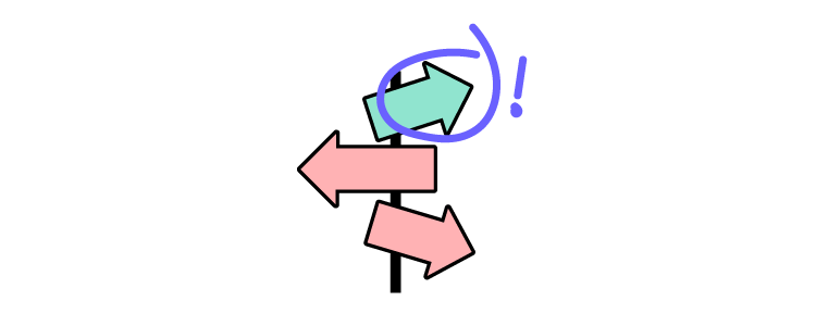
UX research is the bedrock for any design project. UX designers and researchers must gather insights about the market, competitors, and, most importantly, users.
This research continues throughout the design process as designers test ideas and gather feedback from participants and stakeholders. To be a good UX designer, you must be inquisitive and an active listener to truly understand your market and user needs.
In this UX research cheat sheet, we explore the research designers conduct at various stages of the design process and methods to gather and analyze data.
Get meaningful user testing and stakeholder feedback with code-based high-fidelity prototypes from UXPin. Sign up for a free trial and discover how UXPin can enhance your product’s user experience.
What can you Gain With UX Research?
Here are some of the primary benefits of UX research:
Eliminates bias and assumptions to help teams develop objective product designs that meet user needs
Allows you to create human-centered strategies and goals for your products
Provides insight into your users’ behavioral and usage patterns
Reduces the costs associated with inaccurate designs and strategies
Helps develop a long-term vision for the product roadmap
Provides data for stakeholders to support design decisions and secure resources
Research in the Design Process
UX teams conduct research and test through the design process. These research methods change with each phase:
Discover:Empathize and define
Explore:Ideate and prototype
Test:Test
Monitor: Post-implementation
Let’s look a look at each of these in greater detail.
Discover
Discovery research happens at the beginning of the design thinking process. This early research is called the empathize phase because UX designers must put themselves into the shoes of their users to see the world from their perspective.
Typical research methods during the discovery phase include:
Field research: Observing people in the environment where they use your product
User interviews: One-on-one interviews to understand users’ problems
Stakeholder interviews: Understand business needs and constraints
Diary studies: Users document using your product over a period
Internal research: Meetings with sales, marketing, support, etc. to gather insights from other teams
Review analytics: User analytics and heatmaps (if you’re designing for an existing product)
During discovery, UX designers must use this research to define user problems your product can solve. This research includes:
Competitive analysis: Identify competitor strengths and weaknesses and determine what their customers like and dislike about the products
User journey mapping: A visualization of how customers interact with your product
Empathy map: Identifies what users see, hear, think, and feel as they complete tasks or a user journey
User personas: A fictional character that represents a user demographic
Explore
Once UX designers have gathered and analyzed research, they ideate and prototype to solve users’ problems. Some explore research methods include:
Brainstorming: Use research to develop design ideas and solutions–typically a collaborative effort using a whiteboard and sticky notes.
Design: UX designers create sketches, wireframes, mockups, and other visuals to develop ideas for users’ problems.
Card sorting: Participants sort cards into categories they find relevant. These categories help UX designers build information architecture and structure page layouts.
Stakeholder feedback: Presenting user research and prototypes to stakeholders for feedback.
Test
Testing is a vital research tool that enables designers to validate ideas developed during ideation. While testing appears to be a separate step, UX designers conduct tests throughout the design process, particularly while ideating and prototyping. Some of these methods include:
Usability testing: Moderated and unmoderated tests with end-users on wireframes, mockups, information architecture, and prototypes.
Accessibility testing: UX designers must test prototypes and UIs against accessibility guidelines and users with disabilities.
Benchmark testing: Designers use benchmark tests to measure the success of product redesigns and upgrades.
Surveys: A quick research method for testing large groups of users with questionnaires.
Monitor
After a release, researchers must monitor the product and users to identify bottlenecks and pain points. The monitoring phase adopts many of the same tests and techniques UX designers use during discovery. Research methods include:
Product analytics: Researchers gather data to measure the releases’ impact on analytics like conversions, sales, funnel drop-offs, navigation, and more.
Support data: Researchers can use customer support data to determine if a design solution reduces tickets for the issues they were trying to solve.
User feedback: Aside from support tickets, UX designers must make it easy for users to comment, report issues, and ask questions. User feedback is particularly important for enterprise products where users rely on these tools for work.
A/B testing:A/B testing is a common research method to measure the difference between two design ideas. It’s also helpful for measuring subtle differences, like a red vs. blue CTA button.
Heat maps and screen recordings: Give researchers insights into how users navigate web pages. This data is essential for determining page layouts and hierarchy.
Beta testing: An early product release, often to a select group of users. Researchers often combine beta testing with dairy studies to get as much meaningful feedback as possible before the official release.
Search log analysis: A product’s search log can reveal a lot about user behavior which can help UX designers restructure layouts so popular items are easier to locate.
Business assessment: Aside from user research, UX designers must evaluate a product’s business value performance. This information is important for stakeholder feedback and securing funding for future projects.
Quantitative vs. Qualitative UX Research Methods
UX research involves a mix of qualitative and quantitative testing:
Quantitative: Tangible metrics and data
Qualitative: Behavioral observations, opinions, motivations, and emotions
Quantitative data is measurable, while qualitative data is subjective and open to interpretation. When combined, these two metrics can put research into perspective.
For example, you notice a drop-off in conversions when you redesign an eCommerce checkout flow. The quantitative data tells you conversions fell from 5% to 4%. From user interviews, you learn that the new shipping methods are confusing. The qualitative data reveals what’s affecting conversions.
What Does the Research Process Look Like?
The research process will vary depending on the method, but there are several vital steps UX designers follow:
Hypothesis: Many UX studies start with an idea researchers want to validate. For example, “we will make it easier for customers to find products and increase conversions if we put our best sellers on the home page.”
Planning & preparation: A UX research plan defines objectives, determines the correct methodology, the research location, and the information researchers need to gather.
Conducting research: Researchers conduct tests or research according to the plan.
Compiling & analyzing results: Researchers must organize data to find patterns and opportunities. They might also have to present these findings to stakeholders for further analysis.
Take action: Finally, UX researchers must use their results to determine the next course of action.
Improve Usability Testing With UXPin
UX designers rely on accurate user testing results. But most design tools lack the fidelity and functionality necessary to get meaningful feedback and test user experiences effectively.
UXPin is a code-based tool. So, designers can create code-like prototypes to provide usability participants and stakeholders with an accurate product experience.
Most design tools display a graphical representation of an input field. In UXPin, input fields work just like they would in the final product. Variables allow you to capture user inputs and use that data elsewhere in the application–like a custom welcome message or populating a profile page.
States
You can create multiple States for any component in UXPin with different properties for each one. From standard button states to accordions and complex navigational menus.
Interactions
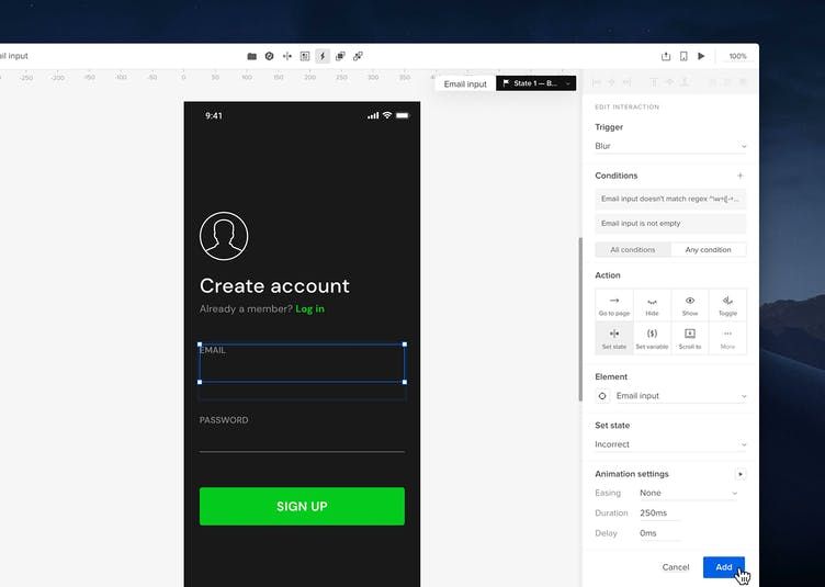
Interaction design is crucial for usability and product experience. UI designers can choose from an expansive list of triggers, actions, and animations to bring your prototypes to life.
UXPin takes things one step further than other design tools with Conditional Interactions, which allow you to create code-like “if-then” and “if-else” conditions which designers can use to validate an email or password. When combined with Variables, you can simulate a sign-up and login process–the possibilities are endless.
Expressions
Expressions give UXPin prototypes code-like functionality where designers can simulate form validation, build a functional shopping cart, validate credit cards, and more.
How many times have you searched “lorem ipsum” for dummy copy or scanned Unsplash for the perfect image? UXPin’s built-in content generator allows you to populate UIs with relevant content like names, dates, numbers, addresses, and more. You can even match content by layer name where UXPin auto-populates data according to naming conventions.
UXPin also allows you to use your own data from Google Sheets, CSV, or JSON, to give users and stakeholders an authentic product experience.
Improve your UX research and testing with the world’s most advanced code-based design tool. Sign up for a free trial to experience the power and versatility of UXPin.
The industry average for designer to developer ratio is between 1:10 and 1:20. Some of the biggest tech companies operate with much lower ratios between 1:5 and 1:8. Many factors influence the designer to developer ratio, and there is no secret formula early-stage startups can apply. Companies can take steps to optimize design workflows to make high designer to developer ratios more efficient.
In a quest to manage limited resources, many startups ask, “what is the ideal ratio of designers to developers?” While it’s a valid question, the answer isn’t that simple.
This article explores designer to developer ratios and what you can do to improve your design team’s productivity and efficiency. We also look at some of the biggest tech companies and how their designer to developer ratios have changed radically in the last decade.
Improve your design teams’ productivity and efficiency with UXPin Merge. A design tool that streamlines UX workflows and increases collaboration between designers and developers. Sign up for a free trial to experience the world’s most advanced code-based design tool.
What is the Designer to Developer Ratio?
An NN Group study that surveyed 557 people found “that half of respondents (50%) reported having at least 1 designer for every 10 developers at their organization.”
Here are the results of the NN Group’s survey in greater detail:
Measuring U makes an excellent point in the closing of their article, saying, “The number of UX staff you “need” depends on the needs of your product and organization. Ratios themselves might not be the right metric to determine whether you should hire a new designer or researcher.”
If you’re a startup looking for an industry-standard ratio or formula to make a decision, unfortunately, there isn’t a clear-cut answer. However, we can look to mature tech companies to see how their designer to develop ratios evolved.
Company Size & Maturity – Designer-to-Developer Ratio
Measuring U’s survey found that 61% of small companies (less than 10k employees) have a lower designer/developer ratio, with fewer than one designer for every 20 developers.
A 2017 article from TechCrunch demonstrated a similar finding when they examined how designer/developer ratios changed as the organization’s scaled and matured. It’s important to note that at the time of writing the TechCrunch article in mid-2017, the industry was experiencing a shortage of UX designers, and some companies expressed a goal of a 1:3 designer/developer ratio.
Atlassian
2012: 1 designer to 25 developers
2017: 1 designer to 9 developers
Dropbox
2013: 1 designer to 10 developers
2017: 1 designer to 6 developers
LinkedIn
2010: 1 designer to 11 developers
2017: 1 designer to 8 developers
Uber
2017: 1 designer to 8 developers (design team grew 70x from 2012 to 2017)
IBM
2012: 1 designer to 72 developers
2017: 1 designer to 8 developers
Alex Schleifer, VP of Design at Airbnb, says to“Grow design’s headcount in step with engineering and product hires.” Alex suggests a ratio of 1 designer for 6-8 developers. He says it’s important to set a baseline early on to help maintain consistency as the team scales.
Maturity also has an impact on designer/developer ratios. Measuring U found that 71% of companies in the initial and growth stages had fewer than one designer for every 20 developers vs. 40% for mature organizations.
The Rise of Design Thinking
The TechCrunch article also claims that factors other than size and maturity have impacted designer/developer ratios at big tech companies.
Companies have found that focusing on design thinking and user experience has proven to deliver excellent business value. People often quote a famous 2016 2016 Forrester report that claims, “…on average, for every dollar you spend on UX, there’s a 100X return!”
When you look at the numbers from the tech giants we mention above, it seems that companies are placing more emphasis on design than they did in the past.
A mature company like IBM, which has been around for decades, went from 1:72 to 1:8 in five years–mirroring the trend of its younger peers. So, even if you’re a startup or small business, investing in design could deliver a good ROI.
How Design Tools Impact Designer to Developer Ratios
PayPal had a disproportionate designer/developer ratio of 1 designer for every 200 developers. The entire design department had five designers with 60 products and over 1,000 engineers. Erica Rider, Senior Manager for UX – Developer tools and platform experience at PayPal, had the task of scaling design without growing the design team itself.
After much trial and error, Erica came across UXPin Merge–a tool that allows you to sync code components from a repository to UXPin’s design editor.
PayPal uses the Microsoft Fluent UI for its internal products. They synced Fluent’s React component library from a Git repo to UXPin, so design and development teams were using the exact same components to develop new products.
UXPin Merge’s drag and drop design process meant that PayPal’s product team could take over designing, prototyping, and usability testing, completing 90% of the work, leaving UX designers to focus on more high-level UX initiatives.
By switching to a code-based design tool and utilizing an existing component library, PayPal’s product teams were able to build fully functioning prototypes eight times faster than experienced UX designers had previously.
This significant boost in productivity meant that PayPal’s disproportionate designer/developer ratio no longer influenced the product development process. And, with such an impressive ROI, Erica was given resources to grow the UX department to scale user experience initiatives.
The key takeaway from PayPal’s case study is that tools could help companies scale design, even with low designer/developer ratios. Sign up for a 14-day trial to experience Merge using our MUI integration.
The Benefit of a Design System
Another way to increase productivity and consistency is through a design system. If you can’t afford to build and scale a design system, consider customizing a component library as PayPal did with Fluent UI.
Design systems allow designers to focus on building mockups, prototypes, and usability testing rather than designing from scratch every time. They also achieve a much higher degree of consistency and streamline design handoffs.
This increased efficiency means you need fewer designers to developers. The faster time to market also gives your company a competitive edge.
The Impact of DesignOps
DesignOps has proven to optimize UX workflows, scale design, and influence designer to developer ratios. Many organizations experience increased productivity, resulting in fewer designers completing more work.
“We were able to decrease the amount of investment required for rote design work by 75% after implementing DesignOps at a Fortune 100 financial company. This freed up considerable resources to invest in mission-critical UX research, design thinking, and product innovation.”
Startups and small companies often don’t recognize the need for DesignOps because they see it as a “nice to have” added expense. But, the benefits of DesignOps mean that your design team is more productive. If you can’t afford the designer to developer ratios that the tech giants above achieve, setting up DesignOps could help increase productivity with less cost.
Optimize Design With UXPin Merge
Hiring designers to scale your design operations is costly and unrealistic for many small businesses and startups. As demonstrated with the PayPal case study, UXPin Merge can significantly increase productivity and reduce time to market–even with a higher ratio of designers to developers.
Prototype, test, and deploy faster while creating better experiences for your customers with UXPin Merge. Sign up for a 14-day trial and get a taste of Merge through our free MUI integration.
Design System Ops is a way of operationalizing and standardizing design systems and its components
It can help teams reduce inefficiencies, optimize workflows, evangelize design system, and make it easy to scale the system.
Anyone can start Design System Ops, just find out who your users are, define the Design System Ops issue you want to get rid of, implement a solution, and measure its impact.
A good tool for Design System Ops is UXPin Merge that helps you import UI components from your design system and use them to create prototypes in the design editor.
More Ops roles appear as companies and departments look for efficiencies and reduce operational costs. You’ve probably heard of DesignOps, but what do you know about Design System Ops?
Find out what design system Ops does and how you get started in your organization. We highly recommend our free eBook DesignOps 101: Guide to Design Operations, which covers DesignOps fundamentals.
Optimize your design system with UXPin–the world’s most advanced end-to-end design tool. Whether you’re a startup with a team of one or a multinational organization with thousands of employees worldwide, UXPin has a solution to meet your needs. Sign up for a free trial to explore what UXPin has to offer.
What’s the Purpose of a Design System?
A design system must provide designers and engineers with the tools to build and scale products quickly, coherently, and consistently.
More than a collection of components–a design system provides users with documentation, best practices, principles, and guidelines to ensure team members ship products that meet brand and usability requirements.
What is Design System Ops?
Design System Ops seeks to optimize the processes and standards for taking new design system components and templates from design to release.
The aim is to reduce “decision fatigue” with a frictionless delivery process through tools and protocols. This optimization allows the design system team to spend more time on creativity, innovation, and quick delivery rather than operational procedures and decision-making.
Why Operationalize Design Systems?
As UX and design system expert Nathan Curtis famously said in a 2016 Medium post: “A Design System isn’t a Project. It’s a Product, Serving Products.”
Design System Ops must reduce workflow inefficiencies to serve its users and products while bridging the gap between design and development. The goal is to implement tools and processes that ensure new releases mirror the original design’s fidelity, functionality, and usability.
Who is Responsible for Design System Ops?
A design system Ops manager must be someone experienced with design and development. They must understand both processes to identify and fix problems effectively.
Design system knowledge and experience are also essential. An Ops manager cannot optimize the operations without a fundamental understanding of building, managing and scaling a design system.
Unlike traditional DesignOps, which focuses on design, and DevOps, which focuses on development, design system Ops straddles these two disciplines providing support to designers and engineers.
How Design System Ops Supports Developers
To ensure releases meet design specifications, design system Ops spends a lot of time creating tools to support developers. The operations look at the end-to-end development process to find inefficiencies and provide solutions.
Here are some examples of how Ops supports developers:
Design Handoffs – Optimizing Designs for Performance
Ops must define what happens to an image or asset from design to development. If they must convert an asset from PNG to webp, how do they do that–is there a tool, or do they do it manually?
What’s the best way for engineers to load assets?
What format do engineers use for assets (PNG, JPG, SVG, etc.)?
Do developers optimize images during the build, or do they use a CDN?
Standardizing and optimizing HTML and CSS markup for assets to deliver the best performance.
How do engineers use fonts for various platforms, including the web, iOS, Android, etc.?
The Developer Experience
Local development environments must be fast to set up so engineers can start building immediately. For example, creating a new project should be as simple as yarn start, npm start, or whatever your tech stack uses to initiate.
Ops must answer the question, “how do you build a new component?” What steps must developers take to ensure maximum consistency and efficiency?
Releasing updates should be effortless, preferably a quick single-button release–how does Ops implement such a process?
Testing
Ops must assess how devs run tests locally and how long that process takes. If necessary, they look for tools and methods to streamline testing so engineers don’t waste time waiting for tests to run.
Visual regression testing–how do changes to a component impact the design system, and how do devs test?
How can Ops optimize and automate accessibility testing? For example, using tools to inspect code for ALT tags.
These are just some examples of the design system Ops approach to supporting engineers. The overarching theme is “how do we make reduce decision-making so engineers can ship releases faster?”
The design system team and its users should never have to ask, “how do I do this?” or “where do we find that?” Ops’ goal is to maximize design system efficiency and reduce time-to-market for releases.
Design System Ops–Where to Start?
1. Who Are Your Users?
To implement design system ops, you must start with user research. The first question you need to ask is what tools and languages are team members using?
For developers: What is the current tech stack, and what IDEs do engineers use?
For designers: How do UX designers create wireframes, mockups, and prototypes?
When Ops understands how teams work, they can find and fix inefficiencies. The goal is to find bottlenecks and roadblocks in the design system release process.
2. Define the Problem
Once Ops identifies an issue, it’s crucial to define the problem to implement the correct solution. Is there something wrong with the process, or is it a matter of better training?
3. Implement Findings
Once Ops finds a solution for a specific problem, they need to implement it. Implementation might include providing training, workshops to promote usage, updating documentation, etc.
4. Measure and Monitor Results
Design systems Ops uses various tools and metrics for monitoring and measuring a design system and its users. If you have a website for your design system, tools like Google Analytics can track clicks, downloads, and other metrics to see how people use it.
Ops also want to monitor critical metrics to identify issues and bottlenecks, including:
Build time: How long does it take developers to build new components–from design handoff to release?
MTTR (mean time to repair): How long does it take to fix design system issues?
Quality: Error and rework rates. Frequency of usability and accessibility issues.
As Kaelig Deloumeau-Prigent mentions in UXPin’s Design System Ops webinar, “Success should be measured by the problems you solve rather than the tools you put in place.”
In other words, don’t be quick to fix something that isn’t broken. Design systems Ops isn’t about introducing tools; it’s about finding and fixing inefficiencies.
Optimize Your Design System With UXPin Merge
Bridging the gap between design and development has never been easier than with UXPin Merge.
Merge allows you to sync a design system hosted in a repository to UXPin’s editor so designers can build prototypes with fully functioning code components.
Remote design sprints have become increasingly popular as more people collaborate from different locations around cities and across the world. While the pandemic accelerated the move to remote work, the trend started long before 2020–when companies sort to build teams based on talent rather than location.
With proper preparation, remote design sprints can be as meaningful and productive as in-person events. This step-by-step remote design sprint guide provides tips and advice to ensure yours is a success.
Start by choosing the right tools. UXPin is a code-based design tool built to enhance teamwork and collaboration. Sign up for a free trial to test UXPin for your next design project.
What is a Design Sprint?
A design sprint is an intensive group session where a team gathers to solve a specific design problem in five days. The sprint includes a mix of group and individual work to develop ideas, choose the best one, build prototypes, test and iterate until they find a solution. The goal is speed and maximum efficiency.
A remote design sprint follows the same format, but team members connect via video conferencing like Zoom or Google Meet rather than gathering in a room.
Who is Responsible for a Design Sprint?
A facilitator organizes and leads a design sprint team. They’re in charge of:
Booking the venue
Setting the time and date
Liaising with teams
Gathering stationery and supplies
Organizing drinks and snacks
Running the design print
In some cases, the facilitator may have help from an assistant who takes care of the non-design-related details so they can focus on the sprint itself.
In a remote design sprint, it’s crucial to have a facilitator and assistant to organize and run the sprint–especially when you’re working across multiple time zones.
The Challenges of a Remote Design Sprint Process
A virtual environment doesn’t make it easy for organic conversations at the snack table or water cooler–which is often where great ideas originate.
It’s challenging to replicate the organic flow of dialogue and ideas you get in a live setting. Facilitators must make more effort to include participants in the conversation.
Aligning time zones is a significant challenge, especially where teams are on opposite sides of the world. Remote design sprints require lots of planning to overcome this issue.
Directions are often unclear when written down without explanation or context–information gets lost in translation. The design sprint facilitator must make an extra effort to ensure everyone understands the format and objectives.
Teams feel disconnected in a remote design sprint environment. Even though you can see people’s faces, there are fewer non-verbal communication and cues.
Poor video quality, lighting, audio, and background distractions can make communication and collaboration difficult.
While these challenges might seem overwhelming, there are tools and strategies that make it easier to run remote design sprints. With that, let’s dive into our step-by-step guide on remote design sprints.
Remote Sprint Preparation
A lot of planning and preparation goes into a “regular” design sprint. The remote version requires more planning and attention to detail. These are some things to consider to make your remote design sprint a success:
Lighting, Audio, and Video
Standard PC audio and video are insufficient for running a design sprint. We highly recommend everyone be on headsets for team members to be focused and tuned in.
It’s also essential that everyone have a good webcam–remote design sprints work best with everyone visible on a video call to maximize participation and engagement.
The sprint’s facilitator and assistant must have excellent sound, video, and lighting quality. If this means purchasing extra equipment, then make the investment; it’ll make for a smoother experience for everyone when they can see and hear instructions better. You can buy a webcam, headset, and portable light for just over $100.
If you can afford it, purchase a similar setup for every team member, so everyone experiences the same quality. Most companies provide a budget for this, so check with your finance department or team lead.
iPads & Additional Screens
Most people work with two or more screens these days. Check with team members to see who has a dual monitor setup, and consider buying an extra one for those who don’t.
A remote design sprint works best when splitting video conferencing with your work surface for notes, whiteboard, design tool, etc. That way, team members can always see each and what’s happening in the shared workspace.
iPads for sketches and note-taking go a long way to replicating a live environment and enhancing the design sprint experience. Not everyone has an iPad, and they’re expensive, but they’re the perfect tool for remote design sprints.
Choose the Right Tools
Choosing the right tools and platforms is crucial for a remote design sprint. Everything must be in-sync, even down to note-taking. You must also try to use as few platforms as possible.
For example, a tool like Basecamp or Notion can work for messaging/comments, note-taking, asset uploading, and whiteboarding (albeit with limited functionality), so all communication is in one centralized location. Avoid using additional tools like Slack or Microsoft Teams just for messaging.
When collaborating remotely, it’s also wise to protect your connection and shared assets with the best VPN service. This ensures your files and conversations remain secure while working with team members across different networks.
Here are some recommendations for remote design sprint tools.
Note-Taking & Discussion:
Basecamp: Built specifically for remote collaboration
Google Keep: A fantastic free collaborative note-taking application
Notion: Similar to Basecamp with excellent features for remote sprints
Virtual Whiteboarding:
Virtual whiteboards have come a long way in a short space of time. Here are some of my favorite options to replace stick notes/Post-Its:
While there are many collaborative design tools, you need an option with seamless collaboration for cross-functional teams. UXPin stands out as the best option for real-time prototype collaboration.
It has all of the features members of your team need. Even non-designers can use UXPin to build layouts and prototypes with built-in design systems–simply drag-and-drop components onto the canvas to design mockups and prototypes. Plus, you can test prototypes and get feedback from participants and stakeholders outside of your sprint.
They can view your work and leave feedback without a UXPin account giving everyone easy access without any barriers. Sign up for a free trial to explore UXPin for your next remote design sprint.
Choose a Date & Time
Scheduling a remote design sprint is a little more challenging than a live event–especially with remote teams across multiple time zones. Try to find a time within working hours or as much overlap as possible.
For example, hosting a design sprint with teams in Europe and the US would mean US participants start as early as possible while the Europeans do an afternoon/evening session.
Differences greater than 8 hours will require more scheduling and planning. You could get everyone together for briefings and group sessions and allow people to split for individual tasks during their working hours.
Another option is to separate teams into two groups and develop a strategy to run parallel sprints where you link up once a day to share notes.
Get an Assistant
It’s essential that you have a facilitator and assistant for a remote design sprint. The facilitator is focused on the sprint while the assistant monitors video for participation and cues, checks in with team members via chat, flags questions, and does all the admin necessary for a remote meeting.
Pre-Sprint Meetup
Once you have selected your tools and dates for your remote sprint, it’s essential to schedule a pre-sprint meetup. During this session, you outline the format, run through the rules, and introduce everyone to the tools.
It’s also a good idea to run through each person’s sound, video, and lighting setup to identify any issues before the sprint. You can even run a super-fast 15-20 minute design project where team members must use all available tools to create a single icon or small component.
A pre-sprint meetup aims to iron out any issues ensure everyone has what they need and knows how to use the tools so you can jump straight into sprinting from day 1!
Running a Remote Sprint
Always-On Video
Video is crucial for effective communication and collaboration during a design sprint. The sprint assistant also monitors video and chat if someone has a question or issue.
Treat Your Team
Consider ordering everyone on the team beverage of their choice (tea/coffee) each morning to start the day. Find out what each person’s favorite local is and get it delivered.
You can also provide lunch the same way or give everyone vouchers to order food. The aim is to team members maximum downtime for breaks and meals.
Breaks
In the “sprint manual,” Jake Knapp’s book Sprint recommends a break every 90 minutes, but this might be a little too long for remote sprints where screen fatigue takes its toll.
We recommend breaking remote sprints into 45-60 minute sessions with 5-10 breaks and then a 60-minute lunch/main meal break.
Some facilitators have found playing music during breaks allows team members to leave the room and return when the music stops. It’s a passive way to maintain control over breaks and get people back for the next session.
Remote Design Sprint Steps
A design sprint process uses design thinking with a day for each step:
Map: Use a collaborative digital whiteboard tool to map user journeys.
Sketch: To minimize screen time, consider allowing teams to sketch on paper for day two. They can take a pic or scan their ideas and post them to the whiteboard for presentation.
Decide: Use a tool like Basecamp or Notion with your digital whiteboard to brainstorm a plan of action and storyboard ideas.
Prototype: Use a design tool like UXPin to build prototypes of your product design idea.
Test: Test prototypes from UXPin with your preferred user testing tool.
Additional Remote Resources
Check out this article for a more detailed guide to running a design sprint with a distributed team. We also recommend these resources for remote work and design sprints:
See How UXPin Can Make your Remote Design Sprints Successful
UXPin is a collaborative design and prototyping tool that meets the demands of today’s remote design teams. As you start to rely more on remote design sprints, you need a platform like UXPin that lets teams create fully functional prototypes in real-time.
Start your free trial with UXPin today so you can see how much easier your sprints become when you have a tool with features created for how today’s designers work.
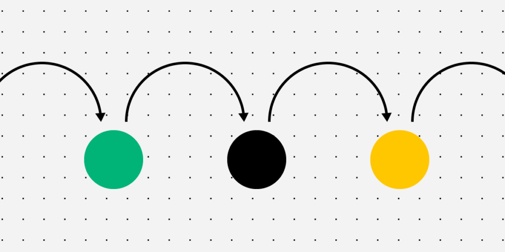
Feedback loops have three stages, that is action, effect, and feedback.
They are used to understand users, validate design ideas, build information architecture, as well as improve usability.
Feedback loops solve problems and answer questions, but they can be either positive (increase an input action) or negative (decrease an input action).
Understanding feedback loops is crucial for designers to create engaging user experiences. This feedback is also beneficial for failure-proofing design concepts so designers can avoid wasting time and resources building products and features users don’t need or won’t use.
These feedback loops aren’t always obvious, so designers must study data and use active listening methods to get to the heart of the problem.
To improve feedback loops in the design process, designers must learn to recognize these patterns throughout the real world. Everything is a feedback loop.
Our brains are constantly assessing the world through a series of feedback loops. This feedback is crucial for learning about the world and developing appropriate reactions.
We see these feedback loops in digital products too. The best designers understand these feedback loops are a critical part of UX design psychology and the overall user experience.
The most common example in digital product design is when a user posts something to social media:
Action: A user posts a photo
Effect: Other users comment and like
Feedback: Affirmation that people like your content
In this feedback loop example, a social media user gets the reward of affirmation from other users incentivizing them to repeat this action.
In an enterprise application, a user might use a digital product to streamline a workflow to complete tasks faster and more efficiently:
Action: A user completes a mundane task using a digital product
Effect: The product saves them time
Feedback: The user’s boss praises them for their efforts, or they have more time for other more important work
This powerful design psychology keeps users engaged and makes digital products more enjoyable to use. The more enjoyable the experience, the more likely people will continue using your product or website.
How Do Feedback Loops Apply to Product Design?
Designers use feedback loops throughout the UX design process to understand users and solve their needs.
UX design: Designers create feedback loops with microinteractions, system messages, etc. to help users complete tasks successfully or provide context to errors
Usability testing: Researchers study users to identify reactions when completing tasks
Why is a Feedback Loop Important in Design?
Understanding feedback loops in product design is vital for several reasons.
Cause and Effect Relationships
Feedback loops help UX designers understand cause and effect relationships for specific tasks and features in a digital product. Some of these relationships are immediate and obvious, while others have long-term impacts on users and society.
For example, social media is an addictive experience for teenagers. The immediate effect is that teens get a dopamine hit from likes and positive comments. They use the social media platform more, creating business value. But the long-term effects of teenage social media use are bad for mental health.
Not only is this bad for society, but it could result in fines or legislation, making it harder and more costly for the company to do business.
UX designers must constantly evaluate products and test ideas to fix or prevent adverse effects from feedback loops. For example, Instagram removed like counts test the impact on mental health. The idea is that people wouldn’t measure themselves against other users and feel less liked or important.
Idea Validation
User feedback helps designers validate ideas and hypotheses–how does the user react to a new component or feature designed to solve a specific problem?
For example, a UX designer might make error messages clearer and more helpful if users have trouble completing forms, providing a feedback loop to guide people through the process. These feedback loops might include an error message telling the user a password must be a certain character length or correct formatting for the email address.
Understanding Users Better
Feedback loops help UX designers understand users and behavioral patterns. By identifying what satisfies and frustrates users, UX designers can build better user experiences.
For example, users might express frustration when they cannot cancel a paid plan. Many product designers intentionally hide this feature, making it difficult in the hopes that the user gives up.
The problem with this strategy is that you damage trust in the brand by frustrating the user, making it less likely they’ll return as a paying customer in the future. Making the cancelation process easy satisfies the user, making it easier to nurture them back to a paid plan.
When UX designers understand human behavior and satisfying feedback loops, they can build positive product experiences that keep people coming back.
Prioritize Information Architecture and Layouts
Feedback loops and patterns help designers identify content and features that matter most to users. This information is crucial for organizing information architecture and prioritizing layouts.
A great example is how designers place the most important CTA above the fold on a website or prioritize navigation in the header vs. the footer. Designers can only achieve this by understanding user behavior and how they interact with a digital product through feedback loops.
Improve Usability
Feedback loops provide insights for designers to make usability and accessibility decisions.
Positive vs. Negative Feedback Loops
There are two types of feedback loops:
Positive feedback loops
Negative feedback loops
Understanding whether a feedback loop is negative or positive is crucial for designers to take the correct course of action.
It’s important not to get confused by the connotation of negative and positive; these titles don’t refer to feedback loops being either good or bad. Rather it’s a response to change, i.e., less or more.
Positive Feedback Loops
Positive feedback loops cause an increase in the input action. For example, if someone posts something on social media, they’re rewarded with affirmation and repeat the action.
In a more simplified example, adding a hover state to links and buttons tells users it’s a clickable UI element, thus increasing clicks and resulting in a positive feedback loop.
Negative Feedback Loops
Negative feedback loops cause a decrease in the input action. For example, if someone can’t find what they’re looking for on a search engine, they might get frustrated and use another service, resulting in less of the input action–searching.
You might think you need more positive feedback loops and fewer negative feedback loops to create a good user experience, but there are times when you might prefer one over the other.
For example, suppose you’re designing a productivity application that helps users organize and automate email tasks. In that case, your product will decrease the action of checking emails–which means your product is successful even though this is a “negative feedback loop.”
Best Practices to Improve Feedback Loops in the Design Process
1. Collect and Analyze Data
Data and analytics can tell you a lot about user behavior and feedback loops. If you’re redesigning a product or website, you can use various metrics to monitor its success.
2. Conduct Usability Testing
Data combined with real-life user interviews can help designers understand and pinpoint problems.
During usability studies, UX designers use empathy maps to put themselves in the user’s shoes. Empathy maps tell UX designers what someone thinks, feels, says, and does–which are essentially feedback loops resulting from interaction with a product.
3. Use Feedback Loops Ethically
UX design psychology and feedback loops have powerful effects on users and could potentially reshape society. A great example is how the world changed post social media.
UX designers and organizations have an obligation to use design psychology ethically and not manipulate users with feedback loops designed to encourage unhealthy behavior.
4. Feedback Loops Must Solve Problems and Answer Questions
UX designers must find solutions to common problems and questions. Here are some examples of questions a user might ask while interacting with a digital product:
How long will this take?: Using a progress bar during onboarding or checkout flow tells users how many steps they still have to complete.
Can I click this?: Designers must use color, states, hierarchy, and other UI methods to tell users what they can and can’t click.
Is this working?: Providing system feedback is crucial for users to understand when something is loading. You can also use error messages or haptic feedback to alert people to a problem that needs their attention.
Create Enjoyable User Experiences With UXPin
Prototyping and testing are crucial stages of the design thinking process. Prototypes allow designers to test and validate ideas with end-users. The problem is that most design tools cannot replicate the fidelity and functionality code.
UXPin is a code-based design tool with powerful features that allow design teams to build high-fidelity, fully functioning prototypes. Better prototypes result in meaningful feedback from usability participants and stakeholders, giving design teams accurate insights to make changes and iterate.
Sign up for a free trial to see how UXPin can enhance UX workflows and design product experiences your customers will love.
DesignOps is a fast-emerging and exciting UX discipline born from the success of DevOps for engineers. There are loads of opportunities to enter DesignOps as a leader or program manager at some of the world’s largest organizations.
This article will give you an introduction to the role of a DesignOps leader, the skills required, and how to land your first job.
As a DesignOps leader, it’s your job to find tools to streamline UX workflows. Discover the world’s most advanced collaborative design tool. Scale DesignOps with UXPin’s Merge technology. Request access to Merge.
What is a DesignOps leader?
The primary objective of DesignOps is to streamline processes and remove obstacles and distractions so that designers can focus on design.
A DesignOps leader works closely with a design leader to implement the systems and processes for the organization to achieve its design goals. This inward-looking role focuses on team performance and optimizing the end-to-end design process.
In Measuring DesignOps Impact, Patrizia Bertini, Associate Design Operations Director at Babylon, summarizes the roles of a design leader vs. DesignOps leader as follows:
Operations management: Creating an operations roadmap with long-term goals and identifying the training required to achieve milestones and objectives.
Process design: Creating the systems, processes, and tools teams need to complete their work, including frameworks for collaboration across the organization.
Project management: Managing UX workflows, assigning tasks, setting deadlines, and removing bottlenecks. The DesignOps leader also organizes and facilitates design sprints.
Communication strategy: DesignOps leaders ensure design teams communicate effectively among themselves and across the organization. They also create systems for storing and sharing data to be accessible to everyone.
Onboarding: Hiring new employees and providing the orientation and training to ensure they integrate with the team. Read our eBook on the topic of managing the team: DesignOps: How We Work Together
Culture: Organizing team-building activities to instill company culture and individual development.
Budgeting: A DesignOps leader must outline the design team’s operational expenses with justification for costs. They’re also in charge of assigning budgets and managing design operations’ cash flow.
Legal: Working with the legal team to create legal documentation like NDAs for usability participants.
Design procurement: Managing all purchasing decisions with the financial department.
IT & security: Working with the IT department to ensure compatibility and security of design tools.
DesignOps Skill Set
Change management is one of the core skills of a DesignOps manager or leader. They often introduce teams to new tools, processes, and workflows. As Patrizia Bertini puts it in Measuring DesignOps Impact, “DesignOps changes the existing reality to bring more value. It’s a very transformative discipline.”
DesignOps leaders have excellent project management skills, capable of leading teams towards a shared path and goals. Understanding design processes, software, and technology is vital for DesignOps leaders to manage team members effectively.
A DesignOps leader is an excellent communicator and collaborator. They must be capable of engaging with everyone from an entry-level UX designer to C-level management and stakeholders. They must also be confident public speakers to host workshops, design sprints, and other presentations.
DesignOps also requires excellent business acumen to manage budgets, communicate with stakeholders (HR, technical, finance, legal, IT, etc.), and develop strategies that align with the organization’s long-term business goals.
What Companies Have DesignOps Teams?
You’ll typically find DesignOps teams in large organizations where bureaucracy, silos, and other inefficiencies impede the design process. But any company can apply the DesignOps mindset without a dedicated team or leader.
Chapter one of DesignOps 101: Guide to Design Operations explores the DesignOps mindset teams can apply with or without a leader. The Nielsen Norman Group defines DesignOps in three primary areas:
How we work together: Organize teams, collaborate, and humanize environments and gatherings for more efficient work.
How we get work done: Standardize processes, harmonize a shared understanding of design intelligence, and prioritize projects.
How our work creates impact: Measure work to create accountability, socialize as a tool to educate others on the value of design, and enable the use of design thinking and related activities.
For insights on how DesignOps works in a large organization, we recommend reading Dave Cunningham’s article documenting his first six months as a DesignOps manager at Co-op Digital in the United Kingdom.
What is the Skills Matrix?
A skills matrix visualizes a team’s skills and competency to pair the right members for a given project. DesignOps leaders will use a skills matrix for three primary purposes:
Design skills pairing for projects
Identify skills gaps and arrange relevant training
Sourcing and hiring talent with a specific skill set to complement the team
You can learn more about the skills matrix and a step-by-step process for creating one here.
Where to Look for a DesignOps Job?
The first place to start is within your current job. In chapter five of DesignOps 101: Guide to Design Operations, we outline How to get started with DesignOps in Your Company so you can pitch the idea to management and stakeholders.
You can also find DesignOps jobs on all the popular job boards, including:
Indeed
Glassdoor
LinkedIn Jobs
ZipRecruiter
We recommend checking out DesignOps Assembly (DOA), founded by experts Elyse Hornbacher and Meredith Black. DOA helps people interested in DesignOps to learn and grow. They have chapters across the United States, South America, Australia, and Europe.
Solving DesignOps Challenges With UXPin Merge
By bridging the gap between design and development, UXPin Merge solves many DesignOps collaborative and workflow challenges. Merge allows you to create a single source of truth by syncing a component library or design system from a repository to UXPin’s design editor.
With Merge, DesignOps leaders don’t have to worry about syncing design systems for designers and developers or managing multiple tools for storage, communication, collaboration, and documentation. Everything is in one place for the entire team to access at all times.
Discover how UXPin Merge can optimize your UX workflows and enhance collaboration between design and development.
Did you know that as many as 88% of users will not come back to an app or site after just one bad experience? This only goes to show the importance of UI design, which goes way beyond aesthetics and has a crucial impact on user experience.
In the following guide, we’ll cover everything you need to know when designing a user interface – from explaining “what is UI?” and discussing the key elements, all the way through to sharing the newest UI trends for 2022 and beyond.
What is UI design?
UI design which stands for User Interface design refers to the process of creating a digital product’s graphical layout to support the final look and feel of the application. It includes a variety of elements that users interact with such as images, animations, sliders, text fields, buttons, etc. Good UI design translates into a friendly user experience, which is why it should be part of every software development process.
Let’s now take a look at the elements that you can use while designing an interface.
UI Design – UI Elements that Every Designer Should be Familiar With
There are a variety of UI elements, which you can use while designing a user interface. We can split them into three categories:
Input elements
Input elements are the most popular category. They require users to provide all sorts of information, such as, their age, reason for purchasing, etc. The input can come in a variety of formats including text, graphics or audio. Input elements can take the form of:
Dropdowns
Combo boxes
Buttons
Toggles
Text/password fields
Date pickers
Checkboxes
Radio buttons
Confirmation dialogues
Output Elements
Output elements are the outcome of the actions you take with input elements. Their character is never neutral – they display alerts, warnings, success or errors. For instance, if you upload an image whose format is unsupported, you’ll get a message saying “unsupported image” and you’ll immediately know that you have to provide an image in a different format.
Helper Elements
The third category falls into an umbrella term for all the elements that can’t be placed within the output or input categories. As the name indicates, they assist the user in understanding the contents of a site and/or finding their way around the interface.
Helper elements can be further broken down into three subcategories:
Navigational, that helps you navigate through the interface. Some examples include menus, breadcrumbs, link lists, etc.
Informational, that tells you which step of the user journey you’re currently at, or which processes the website is currently running. Progress bars, icons, and toolbars are all great examples.
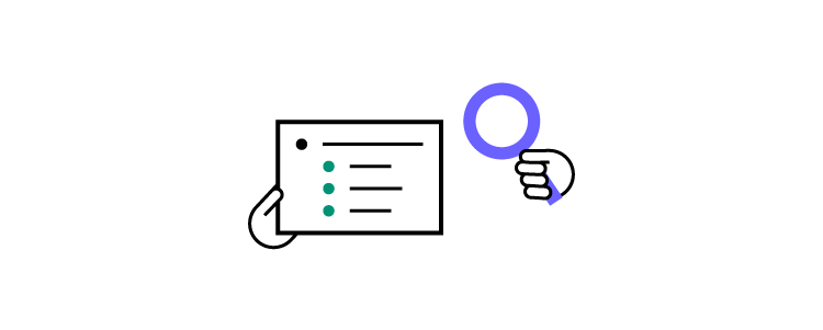
Containers/groups, which keep various UI components together. These elements most often come in the form of pop-ups, side bars, and widgets. A great example are newsletter sign up boxes like the one on the image below:
The box has a clickable CTA “sign me up” element, an input box and some text which provides information.
Why is it important to understand the differences among UI design elements?
As you can see from the three groups above, output, input, and helper elements all serve different purposes. That being said, UI designers should also properly distinguish among elements falling within the same group.
To give you an example, let’s imagine you’re adding a filter on an online grocery store page. You want your search results to display “vegan” products only.
From a UI standpoint, you could be looking at a number of input elements:
Radio button list, which lets you tap on the right option
List, where you can find the fitting element and click on “vegan”
Dropdown, where you scroll and tap on the right product tag (usually, the options will be listed in alphabetical order)
Checkbox, where you can choose “vegan”, but potentially also other elements, like “sugar-free” or “fair trade”.
To know which one to choose for your UI, you need to understand the goals of your users, and make it as simple and convenient for them to complete them!
Speaking of user goals and simplifying interactions, this leads us to the next section:
Best Principles of UI Design
What is UI design? Making life easy for your users.
That’s the key principle to successful UI design. By making users central to your ongoing design processes, you can increase engagement and retention. It’s about understanding how users think while using data to learn how they act. The result is a more refined product that meets your users’ needs and expectations.
And expectations are high. As users spend tons of time online, they have become more demanding than ever before. They know what a great user interface looks and feels like – even if they don’t realize it or call it ‘UI design’.
Because what happens when a user struggles to navigate your app or site?
They X out. It’s uninstalled.
So, it’s business-critical that you apply the right principles to simplify the user journey. To start, you should:
1. Minimize Actions and Steps Per Screen
Users should be able to get where they need to go in as few clicks or taps as possible. This is especially important when designing a user interface for devices with smaller screens, where space is at a premium and navigational techniques need to be big and bold, and thumb-friendly.
Keep designs focused – both in aesthetic and intent. It should be clear what the page or screen is about, what users need to know, and what they need to do. Take the Amazon checkout page as an example. The focus is on your items and price, your details and delivery options are auto-filled, and all you need to do is hit ‘buy’.
Time is precious, and with so many firms vying for a user’s attention, you can’t risk ‘losing the crowd’ to competitors without streamlining tasks and actions.
2. Reduce Cognitive Load
Remember the Million Dollar Homepage? It’s an incredible example of cognitive overload. Your eyes flicker across blobs of bright colors and barely legible words. You might be able to pick out a business – a casino, maybe, or a small retailer – but not before another flashy pixel ad else catches your eye, and you’ve forgotten everything that came before it.
Cognitive load is the amount of information taking up bandwidth in your brain. And the goal, when designing an interface, is to cut back on distractions your users don’t need, while making it easy to interact or parse the information they do need.
A common example is switching the color of a link a user has already clicked on. Instead of having to remember which pages they’ve visited, a user can see at a glance where they’ve been.
Great UI design means people don’t have to think. The action is intuitive, with users unaware of your savvy behind-the-scenes design skills that enable them to complete their tasks.
3. Ensure Dialogs Should Result in Closure
Think of the last time you bought an item online. There was a clear ‘narrative arc’ in three acts. In the beginning, you’re browsing different products. In the middle, you’ve selected your product and you run through the checkout. In the end, you receive an order confirmation.
That’s satisfying – our brains get a big kick out of cause and effect because it’s the easiest way to make sense of the world. If I throw this ball against the wall, it will bounce. If R2D2 holds the blueprints, then Luke can destroy the Death Star. If you click ‘buy’, you’re notified that the product is in your basket.
Apply the ‘three-act structure’ to user actions, adding feedback, like ‘Added’ notifications, at each step.
4. Provide a Clear Next Step
How often have you scrolled to the end of a webpage, only to find it as barren as Arrakis? Your journey has abruptly stopped, leaving you to scroll up, click back, or close the tab.
Make sure your app or site doesn’t make the same mistake. You’ve helped users get where they wanted, but what happens next?
A core part of UI design is guiding users through a journey. Subtly (or not-so-subtly) telling them where to go next, or what to do. Consider the location and function of call-to-action buttons. Use the data to focus on user intent and placement to maximize engagement.
Top 3 User Interface Design Mistakes and How to Avoid Them
Designing a user interface also comes with a set of risks and potential mistakes. As many of them can be easily avoided, we’ve reached out to several experts, asking them to share their observations. Here are three of the eleven user interface design mistakes we’ve gathered.
1. Putting Creativity over Usability
Josh Wright, CEO of CellPhoneDeal said that frequently businesses try too hard to stand out which has a negative impact on usability. While it’s recommended to design a UI which is memorable, cluttering it with too many images or animations is never a good idea. It can make your app or your website too hard to use. And instead of attracting attention, it might discourage users from using it, and push them into the hands of competitors. Focus on usability instead, and make sure that your UI is not only pleasant to the eye but also intuitive.
2. Relying too Heavily on Design Trends
Deepasha Kakkar, Founder at CRACKITTquiterightly pointed out that companies often fall victim to trends. And as we all know, trends come and go, which is why following them blindly without any initial evaluation is a mistake. Take a look at your performance metrics and see if it’s necessary to make any changes; if it’s not then don’t do it just because everyone else does. If you decide to modify your product based on a newest trend, then first check if there is any data which supports it, otherwise you might waste a lot of time and money.
3. UI Design Style over Substance
Another common obstacle is putting “style over substance”, as told us by Arek Nowakowski, Product Designer at spacelift.io.
Throughout his career, Arek has seen quite a few examples of designers wrapping up a useless (or non-existent) UX into beautiful branding. Such projects are set up for failure, as they only ‘look’, and do not ‘perform’.
A good analogy is thinking of a car without wheels – the jaw-dropping exterior and interior won’t matter if the vehicle can’t do the very basic thing it’s intended to and take you places.
To tackle this mistake, Arek suggests starting off with the website or app’s flowchart, and validating your hypotheses among potential clients. If your assumptions are proven true, you can then consider including them into your UI. The key here is to be consistent. So, what does design consistency mean? Let’s discuss this next.
Best design consistency practices for UI and UX designers
What is Design Consistency?
Design consistency is all about keeping visual and functional elements uniform across all platforms. You might even call it ‘design predictability’ – when your user performs X action, Y always occurs, whether on mobile, tablet, or desktop.
A simple example: your app places a green ‘Yes’ on the right and a red ‘No’ on the left of a dialog box. Users become familiar with this, the action becomes – as every UI designer craves – instinctive. But on certain screens, the placement is flipped. Suddenly, the user is selecting the wrong option. They eye every future choice with suspicion, thumb hovering a second too long over each interaction.
Inconsistent design shatters the contract between you and your user.
Best Design Consistency Practices
1. Perform User-Centric UI and UX Design Research
Begin your research by answering two questions.
What does your user want?
What does your user expect?
Before you can design a solution, you need to get into the user’s mindset. They’ve downloaded your app, clicked on your site. But why? UI and UX is awash with a cocktail of data and empathy.
Once you’ve identified the user’s need, focus on the user’s expectation. This means building on design familiarity. Google determined how we search online. Facebook influenced how we connect with friends. Amazon defined how we shop.
Where’s the homepage button on this page? Top left. No hesitation. Pure online consistency.
2. Define Product Design Patterns
The ‘rule of three’ helps you maintain consistency. You want to keep user actions down to a minimum. That means no more than three taps or clicks from where they are to where they want to be. You can do this in several ways.
Design hierarchy: direct users’ attention, making the most-used sections stand out.
Branding: your branding is what makes you stand out, from your color palette to your tone of voice. It’s all you, always.
Components: the various interactive elements should behave uniformly. A progress bar is always a progress bar.
Template: standardize layouts across all platforms, templates are an efficient way to maintain consistency.
3. Build Consistent Actions
You want users to just know how your product works. Consistent actions create an easy-to-use design flow – once a user knows that X action results in Y, they take that knowledge across your product. They won’t even need to think about it. Draw on existing influences and your own designs when building consistent actions.
4. Create Consistent Content
Keep your copy consistent. The way you ‘talk’ to users should be maintained across the product, especially when you’re using specific terminology. Consistency creates clarity, maintaining the user’s flow. On the branding side, it prompts users to remember they’re with you, not someone else.
Content should be presented and behave in a standardized way. When designing these, place user goals to the center.
5. Maintain Communication
The value of communication just can’t be understated. When users perform an action, they like acknowledgment – a chime, for example, when making a selection. The progress bar is the perfect example. The internet has taught us that patience is a virtue, if it isn’t instant, users want to know what’s going on.
Users shouldn’t be left wondering whether they’ve ‘done it right’, or if the product’s behaving correctly. Wondering leads to wandering.
Consistency also depends on internal communication. Everyone on the team is working towards a single vision – and how their roles help to build it. Strengthen your design consistency from ideation to implementation using code-based UI tools like UXPin. These allow cloud collaboration between designers crafting experiences with the same ‘live code’ elements used by your devs, so the product matches your vision.
What does ‘good UI design’ mean according to experts
Now that we’ve covered the principles of UI design and discussed some common mistakes, let’s look at what characterizes good design according to experts:
Designing a User Interface Requires Responsiveness
Technical Lead at ExaWeb Corporation emphasizes the importance of responsiveness, especially after Google made mobile indexing part of their top search ranking factors in 2019. While building an app or a website, it’s absolutely vital to make sure that it adjusts to different screen sizes to guarantee a good user experience irrespective of the device. Responsiveness, however, goes beyond screen size optimization, and also involves speed and performance. For this reason it’s key to abide by Google standards, and make sure that your UI design meets them on every device.
UI Design Needs to be Empathetic
Greg Findley, Designer at Mantra Design, says one of the most important good UI design traits is empathy towards the users’ needs. While one might think that it’s primarily a UX-related issue, he argues that we can’t forget that it’s the UI users interact with – not the processes behind it.
Greg says that the UI needs to reflect common people behavior, for instance, our ever-shortening attention spans. If the interface or its messaging is too focused on conversion, the user might abandon the site or app, feeling pushed towards the purchase way too early in their journey.
He suggest asking yourself the following:
How does the interface make our users feel when they first see it?
How do they experience it the second, tenth, and fiftieth time around?
How does the UI support maintaining empathy in all the stages of the product life cycle?
In essence, as Greg sums up, how an interface feels and resonates emotionally can make all the difference between a decent and great UI design.
These were just a few of the good UI characteristics designers have told us about – be sure to give our dedicated piece a read for more.
Good UI Design Should be Minimalistic
Karla Fernandes, UX/UI & Digital Product Designer at Vitamina K says that the purpose of every product should be to help users resolve a problem or achieve a goal which was identified during the user experience research. A minimalistic UI design will do so by using colors, font, and proportions that not only have visual hierarchy, but also promote user attention and reduce informational overload. This, among others, can be achieved by spacing and a careful selection of images and animations.
Karla also underlines that people love familiarity. When you use a repetitive pattern or element, you can rest assured that they’ll know how to find their way around. In the end, this positively impacts your product’s usability and reassures its role in peoples’ lives.
For more advice from experts, give our dedicatedgood UI design piece a read.
Best Practices for Mocking Up User Interfaces Fast
1. Sketch it
Time – we never seem to have enough of it, so you don’t want to waste it digitally working up concepts that may be doomed to fail (or totally unworkable, anyway). Sketching is quicker and cheaper, ideal for creating faster UI mock-ups. Just grab a pen and paper. It may be low-fidelity, it won’t look, feel, or function like the finished product. But it’ll give the team a clear idea of your vision, and how best to approach it.
2. Mobile-First
Start small – in this case, the small screen. Mobile is where a huge chunk of your audience is, so it makes sense from a business perspective. However, the mobile-first approach brings practical design benefits, too, whether you’re making mock-ups, prototypes, or wireframing your latest brainchild.
By creating for mobile-first, you’re including only the most important content (because space is at a premium). You’ll then find it easier to scale up, adding additional content for larger screens, rather than cutting, which usually leads to back-tracking and complicating designs.
3. Grid Systems
Grid systems remain somewhat controversial, like all the best things in life. But there’s no denying they’ve grown in popularity in recent years, becoming an essential tool for designers who need to build efficient and consistent mock-ups. Grids let you bring order to what might otherwise be chaos. The organized grid system helps you determine the best spacing, sizing, and hierarchy of your content. Horizontal grids are most common, but if you’re concepting typography, you may find it handy to implement a vertical grid.
Responsive Design or Adaptive Design: Which is Best?
What is Responsive Design?
Responsive design fluidly adapts to whatever screen size the user is on. It uses multiple CSS media queries to determine the display or size of the device and alters the style in response.
What is Adaptive Design?
Adaptive design presents a static layout based on breakpoints. So, if your user is on a 760-width screen, they’ll always see the 760 layout. Most adaptive design teams create adaptive designs for six screen sizes:
320
480
760
960
1200
1600
Pros and Cons of Responsive and Adaptive Design
Adaptive designs need more work to start – designers need to design for at least six screen sizes. But responsive design comes with complications, vulnerable to display issues if the proper media queries aren’t used.
This is most notable when sites deliver the full desktop experience. We’ve all come a cropper of this one. If we’re lucky and the site loads, it slows to a crawl. Deploying media queries can help, but responsive sites are never as quick as one designed specifically for a mobile screen size.
When taking the adaptive path, choose a UI tool like UXPin, which lets you introduce multiple breakpoints to maintain on-screen consistency across devices. You can see how easy this is yourself with a free trial.
Your design choice starts with your users. Answer: Who are your users? What devices do they use? Equipped with this knowledge, it’s easier to create a design that meets their needs. When most of your users are accessing your site on a 960 screen, you know which screen width to prioritize and optimize the content.
Your decision will also be influenced by whether or not you have an existing site. In the design world, responsive has become the go-to choice – adoption rates almost match dedicated mobile sites, with around 1/8 sites running a responsive design.
But popular doesn’t always mean good. One pretty clever test showed out-of-the-box responsive designs seriously impact your site load times. That means rigorous optimization is an absolute necessity. Adaptive designs require more investment, but will typically be the better choice for any mobile-first operation, since it only loads what the user will see, precisely how the user should see it. Find the right design choice for you in our showdownResponsive Design vs. Adaptive Design: What’s the Best Choice for Designers?
Now, we have a pretty clear idea of using the principles of UI design and responsiveness to efficiently craft brilliant user journeys. So, it’s time for a more granular look at how to perfect your mobile and landing page UI.
Mastering Mobile UI
What is Mobile App Design?
The mobile UI is everything displayed on the mobile screen. If a user can see it, tap it, swipe it, or do anything else, then it’s part of the mobile user interface.
Mobile design isn’t without its challenges. With smaller screens and touch-based interaction, the principles for designing an interface on mobile diverge from traditional desktop design.
Tips for Designing a Mobile Interface
1. Present a Clear Vision
Every project should start with a vision. A clear objective communicated to the team and key stakeholders. Be specific, and use visual aids where possible.
Everyone working on the project should leave that meeting understanding what your vision is and what’s required of them to deliver it. Counter any factor that might influence the end-product at this stage. For example, how will your idea gel with the brand colors, or the development tools you use?
Kicking off your project this way helps make the design and development process more efficient; the end goal isn’t a shifting interpretation filtered through multiple departments, with more and more features added with every regeneration.
2. Iterate Your Designs
‘Progressive enhancement’ describes the way you continually refine a design to its perfect point.
Creating a product takes up just about every resource a business can spare (and a few they can’t). Instead, you want to iterate an idea, working it up into a high-fidelity prototype the same way devs progressively develop modules. It’s a lot easier to start small, see what works (and what doesn’t), and build a product that really matches that initial vision.
UI design software like UXPin’s Merge offers a great way of achieving efficient progressive enhancement. No more endless back-and-forths or redesigning elements every time. By using fully interactive ‘live code’ components, designers can create designs that look, feel, and function exactly the way the final product will.
3. Stay Uniform
Mobile interfaces need to feature consistent designs. You could even argue that mobile design consistency is more important than it is in desktop design – at least our brains are switched when we’re sitting at a computer.
Keep buttons, icons, and colors uniform. The placement of key actions should also remain consistent. When we’re scrolling through our phones, half-watching the TV, we don’t want to think about what our thumbs are tapping. It should be instinctive. Find out more about Mobile UI.
Understanding Landing Page UI
How to Create a User-Friendly Landing Page UI
Trigger emotions
Your brand colors, tone, and imagery are a core part of your business personality. They’re what makes you you. Whether you’re a start-up or a veteran firm, these should all hold meaning for the user – and they should be reflected on your landing page.
At the earliest stage of design, determine:
The message to communicate
The emotions to convey
The personality to present
Your answers will inform the shape of your design.
Let’s say you offer online meditation services. Your landing page needs calming colors, soothing tones, a lightweight design with plenty of breathing space.
Don’t dismiss the power of color psychology, either. According to Canva, ‘85% of consumers believe color is the biggest motivator when choosing a particular product, while 92% acknowledge visual appearance as the most persuasive marketing factor overall.’
Use images
Images are insanely powerful when you want to attract your users’ attention. We’re drawn to images – it’s part of our DNA. Moving vehicles and human faces are especially effective at catching (and holding) the eye. So effective, in fact, that users will naturally follow the gaze of a person in a photo.
Use these tricks in your landing page designs to direct a user to look somewhere, or perform an action. However, make sure your image placement doesn’t break the compositional flow of the page.
A/B tests are one of the best ways to gauge the user-friendliness of your landing page. This sees you create two versions of your page, with different call-to-action copy, for example. Half your users will see page A, the other half will see page B. Now, you can see which generates more clicks or sign-ups, and so on.
Once you have a winner, you can continue creating A/B tests, refining the design as you go until you have an unstoppable landing page. For additional user testing, run your designs through a focus group of other UI designers and average users.
When selecting your software, you’re likely to come across a lot of image-based tools. They’re pretty common in the design world because designers can mock-up interfaces fast. It’s the software equivalent of a pad and pencil; great for getting that initial spark of an idea out of your head and onto the screen.
But they can’t go much further than that. You’re dealing with images, not functional elements. They only look awesome, too raw to develop into a tangible product.
Code-based UI software lets you craft sweet designs just like an image-based tool. But it uses UI components built from the same code used by your developers. Designs retain consistency from start to finish, and by easing the design and development process, deployments are faster.
2. Functional Fidelity
Struggling through handoffs with the devs? Tired of explaining ‘but it needs to look like this…’? Embarrassed seeing a finished product that’s only more or less like what you envisioned? Then it’s a sign you need to boost the level of functional fidelity in your designs.
Low-fidelity designs only give a sense of appearance. This makes it difficult for developers to translate into a working model – assuming it’s feasible.
High-fidelity designs, like those created in UXPin, look and act like the real thing. By harmonizing the components used by both design and development, everyone’s on the same page. The vision – along with everything else – remains consistent.
3. Working Together
In our connected world, communication and collaboration have never been easier to accomplish. Make sure your UI software isn’t the odd one out.
Your tool should be geared towards making it simpler than ever to work together, share the latest updates, and chat about projects. Cloud-based design tools bridge the gap within teams and across departments. Emphasizing the collaborative approach, UXPin enables teams to work on the same designs in real-time, access shared libraries, collect feedback, and conduct remote brainstorming sessions. From mock-up to handoff, you’re able to manage the whole design process in a single online tool.
The popularity of Lottie Animation continues to rise. One study shows searches for the animation technique rocketing 2300% over the last four years.
Lottie Animation is an open-source, JSON-based tool that lets you make animations really quickly. But don’t mistake these for mere GIFs. Lotties are smaller, while featuring far better image quality. It also offers greater control over your designs, letting you build and test each one before you display them on your site.
With animation experiencing a resurgence in UI design recently, and businesses keen to irresistibly attract users’ attention, expect Lottie’s user-base to grow.
2. Code-based tools
Design and development teams don’t always see eye to eye, right? Design wants a product that looks like this, but development knows it won’t work that way…
Ironing out these issues, especially when working remotely, is tricky since often it’s a case of communication breakdown. No one’s talking in the same language.
Because of frustrations in the process, teams are shifting to code-based design tools. Unlike image-based software, which can only accurately represent the look of a product, code-based UI tools use live code components. Designers are free to craft interactive, high-fidelity prototypes using elements built with the same code used by your developers. This means prototypes behave just like they would on your site or app, and devs are already familiar with how each element functions.
3. Voice UI
It’s easy to think of UI and UX in strictly visual terms – that’s where it manifests itself most commonly, after all. But don’t sleep on voice user interface.
Google, Amazon, and Apple have all helped mainstream VUI with their AI-powered smart speakers. Almost every modern smartphone now has voice capabilities. And by 2025, the speech and voice interface market will hit nearly $25 billion.
Designing for an audio audience is a major shift, bringing fresh opportunities (and a few challenges). However, users are increasingly familiar with and comfortable using voice UI. 2022 might be the right time to explore a new approach for interacting with your product.
Design User Interfaces in UXPin
While designing an interface can be a challenging process, it’s crucial for creating good experiences for your users (and so, your brand’s success). The good news is, this guide has given you all you need to know to begin on your UI design journey!
If you’re looking for a tool that will support your designers and developers in their product development, be sure to check out UXPin!
Let’s face it, forms are annoying! But they’re a critical conduit between you and your customers. Web form design has evolved dramatically over the years to enhance the user experience and facilitate faster, more intuitive data capture.
From a technical standpoint, forms are easy. A dollop of HTML, a dash of CSS, a serving of your favorite back-end code, and you’re ready to go. But your users aren’t.
User experience requires more than beautiful visuals with robust code. Web forms must guide users along a path, hint at what’s expected, and deliver on what’s promised. We’re going to explore some web form design best practices with examples from Amazon, Slack, Typeform, UXPin, Wistia, and Stripe.
Key takeaways:
There are a couple of rules that help design better forms, such as using step forms, leveraging autocomplete, or descriptive labeling; follow those rules and see how they increase your conversions.
We gathered 5 inspiring web forms from top companies to show you how to design a web form for best results.
UXPin has a great sign-up form template that will speed up your web form design.
UX designers can design, prototype, and test fully-functioning forms with UXPin. Sign up for a free trial to experience the endless possibilities of code-based design.
Build advanced prototypes
Design better products with States, Variables, Auto Layout and more.
7 Forms Best Practices
1. Less is More
While collecting as much data as possible enriches user personas, long forms can be overwhelming, resulting in high dropoff rates. Reduce fields and only ask for information necessary to complete a task or action. Avoid using optional form fields that clutter UIs and frustrate users.
If you only need an email and password for onboarding, don’t include redundant optional fields like “first name” and “last name.” Only use required fields to keep user interfaces clean and easy to navigate.
2. Leverage Form Field Types
Text fields, dropdowns, radio buttons, checkboxes, date-pickers, toggles, and other field types have specific use cases and help users complete forms quicker.
3. Use Step Forms
According to cognitive psychologist George A. Miller, “The Magical Number Seven, Plus or Minus Two: Some Limits on Our Capacity for Processing Information.” If your form has more than seven fields, consider breaking it into manageable chunks with steps of 5 or fewer to minimize cognitive load.
4. Use Geolocation and Defaults
Using tools like geolocation can help complete form fields, like the user’s country for a billing address. If most of your users are US-based, you can set this as the default.
Another strategy is to place your four most used options at the top of a long dropdown. For example, placing the United States, Canada, United Kindom, and Mexico at the top of your counties.
5. Match Keyboard to Input for Mobile
Consider displaying a numeric keyboard for number-only input fields like credit card numbers, phone numbers, CVCs, dates, and others for mobile apps and responsive designs. This small gesture helps users complete number fields without switching keyboards.
6. Autocomplete Whenever Possible
Autocomplete saves users time, especially on mobile devices. For example, country and state/province fields should always have autocomplete.
7. Use Explicit Names and Labels in Forms
Buttons must tell the user what will happen when they click it. Avoid using the generic “Submit Button” across your website or application. Even subtle differences like “Buy” or “Pay” could be confusing. Buy would be best for “add to cart,” while Pay indicates the final payment.
Labels must be short while being as specific and descriptive as possible. For example, “Name” is ambiguous if you only need a first name.
6 Inspiring Web Form Designs
Example 1: Stripe Payment Form
Stripe are arguably the masters of credit card form design. Before Stripe, credit card forms were uninspiring, slow, and often had limited card options. Now, most eCommerce stores, including Shopify, use Stripe to process credit card payments.
One of the keys to Stripe’s success was its trendy, intuitive web form design that turned payments into an immersive experience. You can check out several Stripe form examples with links to view the source code on GitHub.
Our key takeaways from Stripe’s credit card forms:
Firstly, Stripe recognizes the device you’re using to offer express checkout with GPay or Apple Pay. These options not only serve users but increase conversion rates with fewer dropoffs.
Placeholders provide implicit instructions for how users must complete the form, thus reducing cognitive load.
The processor’s logo appears as you enter your credit card details, so the user doesn’t have to select it manually, eliminating a form field.
Lastly, the confirmation button tells the user exactly what will happen when they click (Pay) and the cost ($25) to avoid surprises.
Example 3: Wistia Corporate Account Registration Form
Offering social media login options helps streamline onboarding, particularly for corporate registration forms, which typically require more than just a username and password.
Wistia allows users to sign up with Google or Microsoft, both applicable corporate social media accounts. It’s essential to use relevant social media logins. For example, Google or Microsoft wouldn’t be the best choices for a dating application–Facebook, Instagram, or Twitter would be better options.
Key takeaways from the Wistia Sign-Up Form:
Excellent use of whitespace draws attention to the sign-up form and task at hand. This layout also translates to mobile for a consistent experience across multiple screen sizes.
Wistia uses the password placeholder to prevent errors by instructing users about the minimum character count.
Example 4: Amazon’s Step Form
Step forms are excellent for capturing large amounts of data. They break the process into manageable steps while providing context for the user in the journey.
Amazon is constantly updating its checkout forms, so this one might be a little outdated, but the concept is still relevant. The form uses progress indicators to show shoppers the steps to complete checkout. Progress indicators help manage expectations and keep users engaged in the process–as recommended in Interaction Design Best Practices.
Key takeaways from Amazon’s step form:
Step forms are excellent for capturing large amounts of data or dynamic outcomes–like different forms for international and domestic shipping.
More steps don’t mean more fields! Entering large amounts of data is taxing for users, even with stepped forms. Eliminate unnecessary fields and form elements to minimize the user’s cognitive load.
Consider using a steps left pattern or completeness meter to show users how long they have to complete the task.
Example 5: Typeform’s Step Form
Typeform is a unique example in that they use multiple steps for every form with a single action per step. The smooth microinteractions and beautiful UI makes form filling enjoyable and exciting.
This style is excellent for dynamic website forms where one step can influence the next. For example, an event registration that changes depending on the venue or if you plan to attend the afterparty.
Key takeaways from Typeform’s step form:
A single action or input per step allows users to focus on one thing at a time to complete online forms quicker.
Typeform enables users to use the enter key to move to the next step, so they can keep their hands on the keyboard without reaching for the mouse. This strategy is more intuitive than using the tab or arrow keys.
Forward and backward buttons give users control to see what they still need to complete or go back to make changes.
Typeform shows estimated form completion times at the start, so users know what they’re committing to before starting.
Example 6: Slack’s Contact/Support Form Integration
Companies are always looking to reduce tickets by diverting users to FAQs and other resources. Slack provides users with several topics to start a conversation. The next step displays relevant FAQs with links to documentation.
Most importantly, Slack still allows users to contact support with a message box and file upload. Users can send a message via email or start a live chat.
Key takeaways from Slack’s contact form:
If you handle high volumes of customer support tickets, provide links to FAQs to help users before they submit a question.
Avoid using FAQs as a barrier to contacting your support team. Slack uses a two-step process with a message input to share feedback–showing that they’re there to serve their customers.
Create Code-Like Form Prototypes in UXPin
UXPin’s code-based design tool allows you to build fully functioning prototypes. Design web forms that capture data and use Variables to create personalized experiences during usability testing.
With Conditional Interactions, you can create dynamic experiences similar to that of Typeform–something you cannot achieve using an image-based design tool.
Expressions allow you to take your forms to the next level with password validation, check email formatting, simulate credit card capture, or even update computational components like shopping carts.
Get accurate results and meaningful feedback from usability participants and stakeholders to improve and iterate form designs.
On the surface, building a design system is a matter of designing a collection of elements, components, text styles, and colors. But the truth is it’s a more complex procedure. Building, managing, and scaling a design system requires principles and direction.
This article was inspired by the webinar about Design System with Carola Cassaro, which outlined the process of building a design system, including the principles that guide teams and decision-making. We have another webinar coming up in May! We will talk about building and scaling enterprise design systems with Amber Jabeen. Join the webinar for free.
In Defending Your Design System, we feature our revolutionary code-based design technology, UXPin Merge. Merge allows you to create a single source of truth between design and development by syncing code components from a repository to UXPin’s editor. Sign up for a free trial and see Merge in action with our MUI integration.
What are Design System Principles?
Principles define the why and purpose of building your organization’s design system. These principles guide decision-making and explain how the design system’s creators want team members to use the system.
A design system’s principles also streamline onboarding by helping new team members understand the company’s vision and priorities.
“Design principles are the guiding light for any software application. They define and communicate the key characteristics of the product to a wide variety of stakeholders including clients, colleagues, and team members. Design principles articulate the fundamental goals that all decisions can be measured against and thereby keep the pieces of a project moving toward an integrated whole.” – Luke Wroblewski, Product Director at Google
Carola Cassaro, Director of Product Management at Work & Co, and part of the team responsible for building and launching IKEA’s design system Skapa, broadly outlines design system principles as:
Single source of truth: Centralized resource that’s easy to access and relevant to its users
Inclusive & collaborative: Speaks to a wide audience, uses shared terminology, and fosters the exchange of ideas
Modular & reusable: Solves the majority (80%) of UX problems so that teams have more time to innovate
Living & breathing: Evaluated and evolved over time
Why Do You Need Design System Principles?
Building a design system is like building any other product. Without a set of principles guiding your decisions, you end up with the same problems your design system is supposed to solve, like design drift, conflicting opinions, and team friction.
With clearly defined principles, team members work together to solve design problems with shared purpose and consistency.
A Guide to Establishing Principles for a Design System
Back in 2015, UXPin used a five-step process to define its design system’s principles. The process is still relevant today.
Step 1 – Find product analogies
To avoid copying direct competitors, look for inspiration from successful products and brands outside your product category. The goal is to identify core values and qualities you want your product to have. What do you want people to experience when using your product?
For example, a red Ferrari might represent wealth, speed, exclusivity, status, and innovation. List these analogies and your reasons for choosing each one.
Step 2 – Find design principles in analogous products
Go through your list of product analogies and identify the qualities that make these products successful. Also, why do you want your product to have these qualities?
For example, a red Ferrari represents status. How does it do that for people? A simplistic answer would be its cost. But there’s so much more that gives a Ferrari status, like craftsmanship, quality parts, attention to detail, rarity, personalization, Formula 1, and the brand’s legacy.
Step 3 – Make the list real with existing user research
Connect the reasons for your choices with your product’s user research. Do user pain points contradict what you want your product to be?
For example, you want your product to be as simple and intuitive as an iPad, but users complain that they battle to use features or complete tasks.
Step 4 – Build value statements
Sort your analogies and reasons, prioritizing those most frequently mentioned by users to make value statements.
We want our product to be like [complete with your product analogy] because it [complete with the reason] and it’s important to [our users/me/us].
Using one of Marcin’s examples: “We want our product to be like a white Porsche 911 from the 80s because it brings the feeling of timeless quality and it’s important to us.”
Step 5 – Abstract your principles
Now remove the product references from your value statements to make them applicable to your design system.
For example, “we want our product to bring a feeling of timeless quality.”
From this five-step process, UXPin’s team developed seven design principles:
1. No distractions. Every redundant piece of the interface (lines, buttons, shadows, animations) is a source of distraction. As such, it should be eliminated to empower users’ creativity with a well-architected and inspiring design tool.
2. Design-centric. Users’ designs should lie at the center of UXPin. Our interface should be unobtrusive to the point of transparency.
3. Adaptive interface. UXPin’s interface should act according to the context of use. All the ‘inactive’ features should remain completely hidden until the user can use them (no inactive buttons and links!)
4. Space. UXPin’s interface should create a peaceful atmosphere, triggering users’ creativity. This ambiance can be shaped by leaving a lot of space around every piece of interface. The cluttered interface is the source of stress that produces cortisol and adrenaline; both block our creative powers.
6. InteractiveConsistency. Interface components, icons, and fonts should be consistent to create a predictable experience.
7. Predictable Architecture. UXPin’s architecture must be predictable and natural. Features should be placed in the right context for new users to discover easily. Example of predictable architecture: canvas settings should be placed next to the canvas.
Over the years, UXPin has found these principles prevent:
Endless subjective discussion
Unclear design requirements
Inconsistency at the most fundamental level
Finding Inspiration and Examples From Adele
Adele is a UXPin initiative that features an A-Z Design Systems Repository. Inspired by the 70’s design system pioneer Adele Goldberg, Adele by UXPin aims to encourage people to develop principle-driven design systems using inspiration from the world’s leading organizations.
The directory breaks each design system down into 31 categories, including components, framework, brand guidelines/principles, color palette, typography, grid, accessibility, documentation, and more.
Adele also provides links to each of these categories (where applicable), so you can quickly find references and inspiration. For the purposes of this article, we’ll outline the principles from four established design systems.
Estonia – Brand Estonia
As a country that’s marketing itself as “the world’s most digitally advanced society” and strategies to attract startups and remote workers like e-Residency and its Digital Nomad Visa, it’s no surprise that Estonia has one of the world’s best governmental design systems.
Brand Estonia comprises of three core messages or principles that designers must use to introduce Estonia:
Digital society: Estonia is the first country to function as a digital service. Our citizens and e-residents can get things done fast and efficiently.
Independent minds: Estonia’s biggest asset is our people.
Clean environment: Estonia has a lot of untouched nature and a low population density. This is very rare in today’s world. We know how to care for our environment and we are proud of it.
Estonia also has 11 primary industries or products, each with its principles that align with the country’s three core messages.
Coupled with messaging are Brand Estonia’s copy and design guidelines which define the country’s character in three words: Nordic, Surprising, and Smart. The visual language must always be:
Clean: as in uncluttered with unnecessary information and confusing typography
Simple: because we like to leave enough space around text and images – making them more legible and emphasizing only the essential
Brand Estonia is a wonderful example of how designers can use the nation’s values (or company culture) to define its design system’s principles succinctly.
The design system team has separated the guidelines into six categories:
Brand: reflects who we are and how we want our users to feel when they use our products
Foundations: the visual elements needed to create engaging layouts and end-to-end user experiences
Content: covers our voice and tone, and the mechanics of our grammar, and style
Components: each component meets a specific interaction or UI need, and has been specifically created to work together to create patterns and intuitive user experiences
Patterns: best-practice solutions help users achieve their goals and help ensure consistency across experiences
Resources: a collection of tools, kits, plugins, and guides to help simplify the creation process for our users
Within each category are several subcategories where Atlassian uses a sentence or two to reinforce the company’s principles. For example, under Brand, they have Mission: Our mission is to unleash the potential in every team.
Atlassian demonstrates that with clear design system principles, you can develop a complex suite of products with remarkable consistency and seamless integration.
Salesforce – Lightning Design System
Design system professionals often point to Lightning as an example of simplistic cohesion and consistency. Lightning’s guidelines are as comprehensive as the design system itself, with documentation for every component and layout.
Salesforce outlines four code principles behind its design system:
Clarity: Eliminate ambiguity. Enable people to see, understand, and act with confidence
Efficiency: Streamline and optimize workflows. Intelligently anticipate needs to help people work better, smarter, and faster
Consistency: Create familiarity and strengthen intuition by applying the same solution to the same problem
Beauty: Demonstrate respect for people’s time and attention through thoughtful and elegant craftsmanship
Salesforce’s goal for Lightning is to create a design system that allows team members to focus on their core tasks and responsibilities:
“The Salesforce Lightning Design System includes the resources to create user interfaces consistent with the Salesforce Lightning principles, design language, and best practices. Rather than focusing on pixels, developers can focus on application logic, while designers can focus on user experience, interactions, and flows.”
If you’re having trouble defining your design system’s principles, start by identifying a high-level goal and working your way down from there.
Stack Overflow – Stacks
Stack Overflow divides Stacks’ guidelines into four categories: Product, Email, Content, and Brand. Under Brand is where the company outlines its design system’s principles.
Stacks emphasizes four brand principles that “represent the approach and opinion all things Stack Overflow should have.”
Focused: Designs should focus the person on what’s important at hand. Designs should focus on the central goal, pushing distractions and interruptions to the side until the stated goal is completed.
Welcoming: Our designs shouldn’t feel “members only,” but inviting and approachable. Designs should be intentional and intuitive, not be some secret codex for users to decipher. While the subjects developers talk about may seem impersonal, our design approach shouldn’t be.
Purposeful: Everything in its right place. Our designs might be packed with information, but everything should be purposeful. Don’t add extraneous data or ornamentation, as it might distract people from the central goal at hand.
Five percent fun: We’re quirky, not corny. We enjoy the long joke. Our humor is dry and pops up in unexpected, but appropriate, places. We’re “business in front, party in the back.”
Stack Overflow also provides its teams with guidelines for copywriting and visuals. The design system team does a fantastic job of using simple language to describe the company’s principles, including images and graphics to clarify messaging.
UXPin Merge – The Ultimate Design System Tool
Building a design system is one thing. Managing and scaling it takes governance and proper tools. UXPin Merge lets you sync your design system from a repository to the design editor so designers can build fully functioning prototypes using code components.
This single source of truth means all teams, including product, design, and development, use exactly the same design system components to build products. When engineers update the repository, UXPin automatically syncs the changes and notifies all teams.
Build, manage, and scale your design system with the world’s most advanced design system technology. Sign up for a free trial to experience UXPin and Merge with React components from MUI.
Developing a design system is not about aesthetics and making things look pretty. It’s a powerful design tool that improves cohesion and consistency, reduces time-to-market, and enhances collaboration between teams.
“The primary purpose of design systems is to increase efficiency in product development. With a consistent design language in place, it becomes easier to design products at scale that are consistent in aesthetics, user interface, and user experience. Design systems also promote collaboration, since handoffs across distributed teams become easier.”
Enhance team collaboration and streamline design handoffs with UXPin. Simplify design system use, sharing, and maintenance with UXPin Merge, a technology that allows you to bring interactive components from a component library and use them to create powerful prototypes that can be easily shared with development team. Request more information about UXPin Merge.
Reach a new level of prototyping
Design with interactive components coming from your team’s design system.
Design System vs. Style Guide vs. UI Kit
Design system, style guide, and UI kit are not the same. Let’s explore differences between them.
Design System
An entire system including pattern libraries, components, iconography, typography, style guides, design principles, guidelines (design/copy/code), governance, assets, and other documentation.
Design systems usually include a UI kit for designers and code snippets for developers. With UXPin Merge, designers and developers use a single code-based design system hosted in a repository creating a single source of truth across the organization.
Style Guide
A style guide comprises of written guidelines and visual references for a product, including typography, color, UI components, assets, and other elements. Simply put, a style guide tells you how to use a design system’s UI elements.
UI Kit
A UI kit is an image-based version of a design system or component library that designers use to build user interfaces. UI kits have no functionality, but designers can use its elements and components to build prototypes.
Why Engineers & Designers Must Collaborate to Develop a Design System
One of the most significant benefits of a design system is optimized workflows for designers and developers.
Engineers copy/paste code snippets to develop the final product
Design handoffs go much smoother because engineers are familiar with components and require less explanation to understand the UIs.
A fully-integrated design system eliminates design drift, reduces friction, and streamlines QA processes, significantly reducing time-to-market. All of which benefit designers and developers.
Bridging the Gap
Designers and developers often use separate naming conventions or references–a button is a visual component to a designer and a few lines of code for a developer. Design systems provide designers and engineers with a single design language.
For example, design tokens define values for typography, color, spacing, and other UI elements, so designers and engineers speak the same language. Instead of using HEX or RGB codes for the brand’s color, team members reference a design token, e.g., brand-primary.
Aligning Constraints
When designers and engineers work together on a design system, they factor in one another’s constraints. So, when designers design a new product or interface, they don’t have to worry about drift or exceeding technical limitations.
Design System Governance
Implementing a system of governance is crucial for a design system to scale and evolve. Designers and engineers must work together to develop the processes and protocols teams must follow to update the design system.
These processes are especially important for products that must sync separate design systems for design and development–one image-based for designers and the other code components for engineers.
Design System Maturity
The ultimate goal is to have a single design system that automatically syncs design and development. Nick Elliott talks about the stages of design system maturity and its impact on design and development in his article, Re-Imagining Iress Design Tools.
Nick says the ultimate goal is to reach stage four: “a single source of truth where designers and engineers are using the same design system components.”
Tools like UXPin and Storybook can help bridge the gap between design and development, so the entire organization uses a single design system.
Building and Scaling a Design System With UXPin & Storybook
UXPin Merge and Storybook are the ultimate design system tools. With this combination, you can create an end-to-end, fully integrated design system:
Design UI elements and components from scratch in UXPin
Engineers convert designs to code and set up a Storybook (available for React, Vue, Web Components, Angular, and more)
Designers build new products and features using the Storybook design system in UXPin
At design handoff, engineers copy/paste components to begin development
Starting from Scratch
Designers design UI elements and save them as Components to a Design System in UXPin. Features like Auto-Layout allow designers to automatically resize, fit, and fill designs making editing and scaling designs much faster.
Engineers can use this information to convert designs into code components. They can then set up a Storybook that allows teams to view and test components in isolation.
Engineers can even invite designers to Storybook to perform QA and collaborate to make necessary changes.
Sync to UXPin
Once designers and engineers have completed the initial QA, they can sync Storybook to UXPin. Once the initial sync is complete, all future updates are automatic. Any changes you make in Storybook automatically update in UXPin’s design editor, and team members get notified.
Giving Designers Control Through Args
Engineers can use Storybook Args to give teams control but also set constraints. For example, engineers can create four states for a button and define multiple properties so designers only select default, primary, secondary, or disabled.
These constraints make it easy for designers to create consistent designs that meet the design system’s specifications.
Streamline Design Handoffs
Design handoffs are effortless with UXPin and Storybook. Engineers can replicate any changes to the component’s Args in Storybook and invite designers to perform QA.
Next, engineers can update the repository, and the changes automatically sync to UXPin.
Iterate and Scale
If the design system team wants to make changes, designers can start from scratch in UXPin and repeat the process. It’s quick and easy to scale with UXPin and Storybook because the DS team only needs to manage one design system using two tools!
Scaling Design With UXPin Merge
In our January 2022 webinar, Defending Your Design System, keynote speaker Carola Cassaro (Product Manager at Work&Co and part of the team that developed IKEA’s design system) summarized the benefits of a design system beautifully…
“Design systems have evolved to be more than just components and tools. They democratized design processes and best practices to empower product teams and businesses to ship great work at scale.”
How PayPal Scaled Design With Merge
Even though PayPal used Microsoft’s Fluent design system, they battled with inconsistencies. Using image-based design tools meant designers and engineers had separate design systems, “The result was a range of usability and design consistency issues-no two products looked the same!”
PayPal also had a disproportional designer/developer ratio with five designers and over 1,000 engineers across 60-100 internal products. To put that into perspective, an NN Group survey found that most companies operate on a 1-to-10 designer/developer ratio.
And PayPal wasn’t prepared to scale its design team. Erica Rider, Senior Manager for UX – Developer tools and platform experience at PayPal, had to figure out how to scale design without adding to the payroll!
After trying several solutions, Erica decided to give UXPin Merge a try. PayPal used Fluent’s React front-end framework, which they connected to UXPin using Merge’s Git integration.
With everything set up, PayPal decided to test UXPin Merge with a side-by-side using an image-based design tool. One of PayPal’s experienced UX designers built an identical one-page prototype using each tool–the results far exceeded expectations:
Image-based design tool: Over an hour with limited functionality and fidelity
UXPin Merge: Eight minutes with fully functional code components
PayPal’s small team of UX designers taught product teams (who had no experience using design tools) how to use UXPin. They now design and update all of PayPal’s internal products, with UX designers only stepping in to fix challenging usability issues and provide mentoring.
PayPal’s product teams now complete and deliver a product in the same it used to take to design a mockup–significantly reducing time-to-market! Some of the other benefits include:
From concept to prototyping immediately
Better feedback from stakeholders
Improved team/stakeholder collaboration using UXPin’s Comments
Streamlined end-to-end workflow
Dramatic improvement in quality
Enhanced user testing with the ability to make quick changes on the fly and get immediate feedback
UX designers have more time to focus on PayPal’s “larger UX initiatives that impact the organization globally.”
You can build, maintain, and scale your design system with UXPin Merge. Read more about it and request access to it. Discover Merge.
According to Emizentech, in 2021 there were as many as 3.48 million apps available on Google Play, with 2.22 million in the Apple App Store. Suffice to say, good UI design isn’t an option; it’s a necessity.
Now, the big question is: what does ‘good UI design’ actually mean? We’ve reached out to eight design experts and asked them for their take on the matter. Here’s what we’ve found.
8 Traits of the Best UI Design
We asked leading experts and compiled 8 traits of the best UI design. Those are universal pieces of advice and will come in handy no matter if you are designing a mobile app, landing page or other digital product.
1) Good UI Design is Intuitive
Daniel Florido, Chief Web Development & Designer, Director of Pixelstorm
The best UI design can be picked up quickly and easily by the people using it, without being too complex or long-winded for them to understand what you’re trying to say with your mobile app for Android, iOS or website design, etc. Let’s take icons for example. They are in every UI kit. They should have concise labels as well as being visually representative enough of the actual task they are replicating to allow for user intuition.
It’s also worth considering users who have various levels of tech-savviness; great UI design should be concise enough so that technologically illiterate people can still get to grips with using your design after just a short amount of time. After all, usability is something that cannot be compromised by UI design.
I consider this necessary because it saves the user time and effort. Using an intuitive design means that they’re not going to get lost in the structure of your webpage, app etc., and struggle to find what they want.
Many designers aim to create ‘intuitive’ interfaces. But what does ‘intuitive’ actually mean? It refers to something that may be grasped and comprehended readily and instinctively. But how can you make things understandable? Good UI is about making things ‘familiar.’
Something that looks similar to something else you’ve seen previously is called familiarity. You know how something acts and what to expect when you’re familiar with it. Identify items that your users are acquainted with and include them in your user interface. You can do that during user research phase.
Why is familiar UI design Important? Instead of learning a new system, people may start using your product straight away using their existing mental model. That shortens the time needed for onboarding.
Because there is no learning curve and the user can execute their work without difficulty, users will continue to use your product rather than the competition’s solution that looks and acts foreign to them. As the user utilizes a well-known solution, cognitive strain is reduced, allowing the process to go more quickly.
So, how to create a familiar UI? When a person grows dissatisfied with a website or an Android or IPhone app, they will most likely seek out another much easier to use and comprehend. The simplest method to avoid interface problems is providing simple instructions to learn and an interface that is pleasing the eye. It will assist your guests in getting to where they need to go. It is particularly true if their mental models are erroneous or wrong.
Nowadays, website visits come mostly from mobile devices, which is hardly surprising, given that it’s convenient to use an IPhone or an Android product. In 2019, Google has considered prioritizing mobile indexing as part of their top search ranking factors. Suffice to say, you need to have a responsive user interface.
By having a mobile-responsive website, you encourage users to stay on your website longer, which also reduces your bounce rate. If you’re building a website or app, it’s important to build an interface that can adapt to any screen size to ensure an optimized browsing experience. Nevertheless, responsiveness comes in many forms and mobile responsiveness is just one of them.
Responsiveness also means fast. In the industry that I work in, optimizing websites is one of our priorities. We make sure that every website we improve from a user experience design perspective also meets Google’s standards, and we use tools to help us give an idea on how to improve a website’s speed and performance. These solutions give us metrics that come in handy when we want to achieve both good UI and fast performance.
Here are the top two elements that can make or break UI design:
Consistency
Good UI design requires consistency. It is a fundamental rule to ensure that the application is easily learned and used. This includes both the visual and behavioral aspects of the design. The user interface shouldn’t be inconsistent with itself or its content and other design elements.
Consistency in UI design ensures an intuitive understanding of how different parts of an app interact. It allows for speedier navigation through menus and less time looking at tooltips to find out what happens when you do a specific action within your application’s environment.
The main goal behind this pattern is to make sure that all elements work together seamlessly so users can learn them more quickly; they should look like they belong together, and behave as a cohesive unit.
Clarity
Clarity is one of the most important features in UI design. It signals to your users that you know what you are doing and that the app they are using is trustworthy. Clarity in UI design can come from consistency, simplicity, and truth in messaging.
If you are consistent with your design, it will be clear to users. For example, if all of the text is left-aligned and in the same font on every page, then that’s very consistent and easy for people to read through quickly without getting distracted by other things.
On the other hand, if there are multiple fonts or alignment changes between pages, this does not convey a sense of clarity because it confuses users about what they should expect next time they come back to use the app again.
Clarity also comes from simplicity both in how clean a user interface design looks and of its interactions. Something like a button should look simple and be easy to interact with in a visual design layout, make it easy for users to complete a specific task. You can measure the clarity of interaction through usability testing.
User journey mapping is usually considered a UX issue, rather than a UI design challenge. But, when the UI becomes too focused on conversion with little or no empathy for new users, it can become a bigger challenge for the UI. So often we see marketing teams setting out the journey for a new user, especially when it’s a new product or service. Whether it’s an app focused on a trial sign-up, or a website funneling an ecommerce checkout, conversion rates become the benchmark.
As emotional creatures with shortening attention spans, we can often forget how challenging it can be to keep a new user engaged with the UI and the steps we’re guiding them through. Truly understanding the audience and their intent allows UI to engage with metrics beyond conversion.
How does the user interface design make the user feel the first time they interact, the second time, the fiftieth time? How does the UI evolve to support the user experience at different moments of the product cycle? Discovering how a user interface truly makes an end-user feel, can be the difference between good UI and intuitive UI design that resonates at an emotional level.
Your UI should, of course, be visible, but it should be ‘invisible’ when it comes to disruption in user experience. In other words, your UI design ethos would be centred around absolute minimalism. Simply put, you should only keep essential elements on the page, and get rid of everything else that can cause friction with functionality.
7) Minimalism is Key in User Interface
Karla Fernandes, UX/UI & Digital Product Designer at Vitamina K
Good UI 5
Every product or SaaS created wishes to help users complete a task or achieve a goal that was discovered during the user experience research. A minimalist user interface will express itself using typography, ratios, colors to create an expressive design hierarchy retaining high attention due to proportions and spacing.
Doing more with less and using repetitive visual design patterns will ensure the user knows what they are supposed to do and that it will work in ways that they expect it to work, thus, it doesn’t overshadow user experience.
By designing inclusively, designers acknowledge diversity. Not all users have the same needs. A good graphical user interface should be easy to use and understand for everyone.
A first step to designing inclusively is getting to know the users and understanding their needs. This helps UX designers create a product that is flexible, functional, and enjoyable for all. Here are some general principles all designers should use to create an inclusive design:
Use standardised ways to measure colour compliance. Calculate the colour contrast of two overlapping layers to ensure that the digital stimuli is perceived by all users;
Choose highly legible typefaces and text sizes to make sure you can communicate what you intend to;
Use your space wisely to create visual hierarchy that guides users and reduces their cognitive load;
Use written cues, colours, and symbols when giving user feedback;
Avoid using icons as stand-alone elements. Icons can be abstract and they are up for interpretation. The better approach is to use both icons and written text.
Summary
Making sure that your app is not only pleasing to the eye but also easy to navigate around is a must if you want to have high user retention. There are a number of factors that contribute to the best UI design, including your digital product be user-friendly, inclusive, functional, etc.
One of the methods of working effectively on your UI designs is using the right UX and UI design tools. Here’s where UXPin Merge clearly stands out, offering your UX and UI designers the option to prototype solutions using UI components that your frontend developers use while turning designs into product.
A design tool like UXPin Merge simplifies the handoff. Engineers and designers can finally speak the same language and get a clear understanding of what the final product’s look and feel be like once it’s in production. They can finally merge their workflows together.
With an estimated 14.1 billion smartphones globally, and 350 billion mobile apps downloaded in 2021, getting your mobile UI design right is paramount. The trend is clear: with almost half of all devices connected to the net being mobile, the desktop is no longer king. People like using apps – they like the speed and functionality, and they appreciate the “do anything anywhere” ethos.
With that in mind, we’d like to shed more light on what mobile UI is, how it’s different from desktop design, and how you can make sure your designs stand out from the crowd. Let’s begin.
What Is Mobile UI?
A mobile user interface, or mobile UI, is the display or screen on a mobile device. It’s the space where users can interact with what’s on the screen – from menu buttons to text fields (and everything in between, depending on whether users can tap, scroll, swipe, type, or just see it).
Most of these user interactions are touch-based and happen on colorful touch screen displays that are bursting with high-level interactions. Naturally, basic mobile UI design principles differ from those of a traditional desktop UI. After all, users are, by definition, on the move; control is limited, giving new meaning to the phrase ‘all thumbs’. Actions and information need to be big, bold, clear, and simple.
Why Is Mobile App UI Design Important?
As mobile adoption continues to rise year-by-year, it’s time to develop a mobile-first strategy, embraced by the likes of Facebook or other social networks, who make sure their iOS and Android apps offer a polished user experience on hand-held devices.
After all, when users have more choice and freedom to find mobile applications that work for them, a poor user experience can easily devalue your brand, hurt your revenue, and disengage your users.
Aside from investing in mobile applications, many ecommerce stores see the increase of purchases coming from mobile. If an online store doesn’t optimize checkout experience, usability or their mobile app design, they may lose market share or even render themselves obsolete.
8 Mobile UI Design Tips Every Designer Should Follow
To help you navigate the mobile UI realm, we’ve created a list of some of our top mobile app design tips.
1. Ensure that there’s a clear vision of the mobile app
Let’s start with some UI basics that you probably figure out during the early stages of the product design process: the vision.
The vision is what’s shared right at the start of your mobile app design. It should be clearly (and, if possible, visually) communicated to all key stakeholders, so that everyone, regardless of department, knows the purpose and goal of the project.
This stops people from working on what they think the vision is or should be, pulling in different directions, adding more and more features (and missing all those deadlines).
In short, with a clear vision, the entire design and development process is made more efficient. Everyone understands what success will look like, their roles on the project, and what’s required of them.
There are loads of different factors that will inform your overall vision, including business objectives, user needs, competitive landscape, etc.
2. Improve your product design in iterations
‘Progressive enhancement’ is a way to continually refine your design until it’s at the level you need it. So, instead of spending time, money, and other precious resources trying to create the perfect version in one go, you start with a basic concept– it may be in a form of a wireframe, mockup or lo-fi prototype that your team can refine until it matches the overall vision of the mobile application.
It’s not any different to the way software developers approach developing modules. Bit by bit. Little by little. That’s not as difficult as it might seem at first.
Using design tools, such as UXPin Merge, you can quickly begin prototyping mobile apps with fully interactive code components that look and act as the real Android or iOS app. Not only does it ensure the speed and efficiency of work, but it also come in handy when you run usability tests.
You can quickly put together prototypes that look and feel like a real mobile app, test the user experience design, and iterate based on tests. The UI elements you use for prototyping are live code. That means, these components look and act the same as the ones used by your development team for production.
3. Uniformity is key
Your designs should be consistent across the board, from buttons and icons to brand colors.
Visit Amazon on your mobile. It’s a masterclass in consistency for mobile app UI design. Every design aspect is uniform, from the color palette to page layout, whether you’re buying a new microwave oven or a second-hand book.
This isn’t just because it’s pleasing to the eye. It’s about helping users familiarize themselves with the app, so that eventually, they won’t even need to think about what they’re doing. Every action will be intuitive and engaging.
To ensure uniformity, you might find it useful to add a mobile UI kit to your design system.
Be specific where necessary. For example, are all your call-to-action buttons in a particular color? Must certain fonts be used or avoided? Ask yourself those questions before you need to answer them.
4. Make sure your splash screen is flawless
A splash screen should grab the user’s attention – and fast. While your app boots up in the background, you can use your splash screen to engage your users. Because, let’s face it, in the age of instant-everything, no one wants to sit, wait, and do nothing.
Eye-catching illustrations. Unmissable headlines. Brand promotion. User tips. These can all keep users engaged and stop them from quitting and uninstalling at the first hurdle. Consider adding a progress bar, especially if your app takes a while to load. Users like to know something is happening.
Just don’t overdo it.
Your splash screen should be simple. The app name, your logo, a background image – it doesn’t need to be fancy to make a great first impression.
5. Present stats in the clearest way possible
Layout is an important mobile UI design factor – especially when presenting stats and data. If these are a core part of your app, then take time to identify ways to make them easy to read, interpret, and extrapolate.
Ask: Is the text readable? Can users easily parse charts and graphs? Are icon meanings clear?
It might also be useful to consider how users can get that information off the app and onto other devices, for example, when using an accounting app.
6. Design for fast page loading
Users today are more impatient than ever. How often do you get tired of waiting two whole seconds for a video to play? Or a website to load? Because almost everything online happens instantly and in real-time, we have a low tolerance for slower-loading pages and apps.
In general, you should design for minimal page loading, which is about three seconds. Any longer than that, and your users start walking away.
Make sure images are small (and there aren’t too many of them)
Use contract, color, and whitespace to improve visibility and convey the right emotions
Typography is important – use font sizes 11pt or higher and limit the use of fonts to just two
Make every element count – can you replace text boxes with icons? That background image might look pretty, but is it necessary?
Remember, 94% of mobile users are using portrait mode, so you have to communicate a lot of information along a very narrow plain.
7. Remember about mobile accessibility
Accessibility is more than just a buzzword. It’s a whole design ethos. Microsoft is a great example of this, where accessible design (across computing, gaming, and mobile) essentially informs the entire company culture. And it’s something worth adopting in your own team. After all, it’s a great way to reach a broader audience, and show you value all your users.
One of the most common features is ‘color-blind mode’. You’ll also often see options to increase the size of texts or interactive elements. This has a dual advantage, helping those with motor disabilities to navigate your app, as well as helping those with visual impairments. This, in particular, is useful for those countries with an aging population.
Conversely, your accessible designs will be different if your target users are children. Kids have very different physical and cognitive abilities to adults (and even to each other). And while, on the face of it, this seems more a concern for a UX designer, your UI design team needs to consider aspects such as fonts, colors, and other visual interactive elements.
This doesn’t mean you have to alter your entire mobile UI design. You can include accessibility options within it, such as color-blind mode. Just make sure to alert users to its presence in the settings menu. However, it’s best to use tools that have accessibility features built in, like UXPin, to create mobile UI designs that work for everyone.
8. Follow the UI design principles
UI design principles keep designs efficient and user-friendly. Designers don’t have to fumble with elements. Guessing, experimenting, leaving it all to chance. By adhering to predictable, and probably successful, mobile UI design principles, you can create experiences your users love.
UXPin’s Basic Principles of User Interface Design helps you improve the way you work and the way your users interact with your mobile app, be it an app on an Android or Iphone device (hint: it’s about making life easier for them).
Let’s take an onboarding as an example of the place where you can apply UI design principles. Onboarding screens have a clear purpose: they walk users through the major functions of the app. They also familiarize them with an app UI. The principles of designing a mobile UI for onboarding include providing clear signposts and keeping things simple.
What about the home screens? One of the UI design principles for mobile apps’ home screens is to have a clear visual structure.
With more and more people connecting via mobile devices (and more and more apps being developed every year), getting your mobile app UI design right the first time is critical to attracting and retaining users. A great user interface should be simple to use, clear to navigate, and so completely intuitive and natural it’s almost invisible to the naked eye. UXPin can help you create digital products that work for designers, developers, and (most importantly!) mobile users. We have a bunch of tutorials for mobile UIs, templates and design inspirations.
Adopting and scaling a design system is challenging. You must get buy-in from the entire organization, which means evangelizing your design system to persuade stakeholders, product managers, development teams, and designers of its value.
Building a design system is just the first step; scaling and reaching optimal design system maturity costs a lot of time and money. Evangelizing a design system means you have to prove it will help teams be more efficient, productive, and free to tackle complex challenges.
When ExxonMobile created its design system, Unity, the company built more than 50 web apps in 10 months. Your goal is to demonstrate how your design system will create business value and deliver a return on investment (ROI).
This article explores how to get organizational buy-in, including practical resources to help pitch your design system to stakeholders and investors.
Whether you’re starting from scratch or have an existing design system, UXPin offers solutions to build, scale, and mature your design system using a single platform without plugins and extensions. Sign up for a free trial and see how UXPin’s code-based design tool can enhance your UX workflow to build better product experiences for your customers.
Why Do You Need to Evangelize a Design System?
Many stakeholders see building and managing a design system as a costly distraction from designing and optimizing revenue-generating products. They can’t see how a design system will generate ROI.
Designers also face the challenge of convincing other design teams, product managers, and engineers to adopt a single design system. When Spotify built its design system, Encore, in 2018, they had “22 different design systems floating around.” (And by around, they’re talking about spread across multiple continents!).
So, designers must evangelize a design system for two primary reasons:
Business value for stakeholders
Reducing workload and increasing productivity for designers, product teams, and engineers
Who’s Responsible for Getting Design System Buy-In?
Who is responsible for getting design system buy-in depends on the organization and the structure of your design department. The call can come from a product manager, web manager, design lead, DesignOps leader, or a lonely UX designer in a startup.
Solitary Team Model: You typically have a lone UX designer who might work with contractors and freelancers in a startup environment. They might pitch the need for a design system to manage consistency and minimize contractor (and future employee) onboarding.
Centralized Team Model: A typical team setup in medium to large organizations with a centralized team making design decisions. They often manage the design decisions for multiple products.
Federated Team Model: An enterprise structure where a committee of designers from across platforms and product lines collaborate to make design decisions collectively for a set period–similar to representatives in the US Senate.
When Do You Pitch a Design System to Stakeholders?
The longer you delay building a design system, the more time and money it takes to implement one. The problem is that most organizations (including multinationals like Airbnb and Spotify) realize this too late, which ends up costing a lot of money.
“Here’s the simple truth: you can’t innovate on products without first innovating the way you build them.” – Alex Schleifer is the VP of Design at Airbnb
When UXPin spoke to Dan Mall of design system specialists Superfriendly, we asked what size company benefits from a design system. Dan replied, “I don’t think that there’s any particular size that I can pinpoint, but I think it’s about how many digital properties they maintain or intend to maintain.”
Without a design system, the software development process gradually slows, and user experience suffers. You cannot hire more designers to scale design. More designers mean more “cooks in the kitchen,” resulting in a chaotic design process, inconsistencies, and design drift.
Here are some questions to ask:
Are you satisfied with the speed of product development?
Do our interfaces share the same design patterns, colors, typography, and other styles?
Do we always have enough time to deliver a quality product to meet KPIs?
How do departmental silos impact design?
How much time and money do we spend on redundant design or code tasks?
How much time and money do we spend cleaning up design or technical debt?
Answering these questions and highlighting design problems will help you build a case that your organization is ready for a design system.
How Do You Evangelize a Design System?
In our free toolkit, Evangelizing a Design System, we provide you with a proven template for getting buy-in from designers. You must conduct internal research to identify the problems your design system will solve and how it will deliver an ROI.
Here are 5 steps to prepare your presentation and evangelize your design system.
Step 1 – Conduct Research
The first step is to conduct research to discover your company’s design pain points. You should look at the facts objectively; perhaps your organization isn’t ready for a design system. Maybe a UI kit or style guide is a more realistic and cost-effective solution?
This approach might sound counter-intuitive, but remember that you’re likely to face resistance and scrutiny from stakeholders and other team members. Your goal is to ensure you have explored every avenue to prepare yourself for difficult questions.
Your research should also include interviews with product managers, design leads, customer support managers, engineers, and other team members to understand the problems and challenges they face.
What is the rework rate?
What are the issues with design handoffs?
How many support tickets relate to usability issues? And what is the effect on users?
How often does design and development experience drift?
The goal is to identify problems a design system can solve and deliver a positive ROI. Most importantly, how do these internal issues impact your customers?
Step 2 – Prepare a Presentation Based on Your Research
With over 40 slides in four sections, our Evangelizing a Design System template has everything you need to build a strong presentation for implementing a design system.
Our presentation template includes:
An introduction with facts from use cases and surveys
An outline of what a design system is and how it works
A template to calculate and present your ROI
A section for the next steps and how you plan to implement your design system
You’ll also need a system of governance and a design system team to maintain your design system’s consistency and integrity. Otherwise, you end up like Spotify with 22 design systems spread across the globe.
The size of your design system team will depend on your company and the number of products. Here is an example design system team that Superfriendly usually recommends for a centralized team model (see who is responsible for getting design system buy-in? above):
Product Owner
Design Manager
Tech Director
Senior Designer
Senior Engineer
Senior Analyst
Content Strategist
Associate Designer
Associate Engineer
QA
In smaller companies and startups, you might only fill 2-5 of these roles.
Step 3 – Finding Allies and Educating the Team
It’s essential to educate team members before you approach stakeholders. The more team members you get behind the project, the better your chances of convincing stakeholders.
Jordan Staniscia, a Senior Product Designer at Abstract, recommends finding “allies” from other departments who share your passion and vision for a design system. These ally evangelists can teach you how different departments will use a design system and how best to appeal to these team members. Employees from SurveyMonkey, HubSpot, and WeWork have all used this strategy to educate teammates.
You may gain further insights during this process to strengthen your presentation to stakeholders.
Step 4 – Presenting to Stakeholders
During your presentation to stakeholders, it’s important to present the following:
How design systems have helped other companies and competitors
The problems and pain points affecting your company
The cost of these inefficiencies
The current effect on customers
Feedback from team members
How your design system can reduce or eliminate these inefficiencies and associated ROI
The benefits specific to your company
A basic outline of the proposed design system’s structure
Summary of the design system’s team and governance
Our free template, Evangelizing a Design System, provides space for you to present these points succinctly to stakeholders.
Step 5 – Continuous Evangelism & Outreach
Like the design system itself, your evangelism and education are an ongoing evolution process. The design system team must continue to engage with team members.
Identify pain points and solutions to fix them
Encourage input, suggestions, and ownership
Educate teams about updates, scaling, and best practices
As you scale your design system, you’ll need more funding and resources. So, it’s crucial to evangelize your design system to stakeholders continuously:
Demonstrate how the design system has improved inefficiencies
Feedback from team members
Share feedback from user research related to the design system
How the design system improves usability and accessibility
The ROI
Your design system roadmap and how future changes will deliver business value
Building, Scaling, and Maturing a Design System With UXPin
Start your design system with minimal investment using UXPin’s Design System’s feature. Start your design system from scratch with Colors, Assets, Typography, and Components. You can also manage your design system with documentation and set permissions for your new components to prevent unauthorized changes.
UXPin also offers solutions for scaling and mature design systems with UXPin Merge. Merge allows you to sync a design system to UXPin’s design editor from a repository. Designers can simply drag and drop fully functioning code components to build new products and user interfaces.
With Merge, UX designers, product teams, and engineers all use exactly the same code components, thus creating a single source of truth across the organization.
The prototyping and testing phase is always a challenge for UX designers. Without the fidelity and functionality of code, image-based prototypes don’t produce accurate results during usability testing. They often result in design drift and friction with devs during the design handoff.
With code-based design tools like UXPin, that’s no longer the case. Designers can create immersive prototypes with fidelity and functionality that accurately represent a fully developed product. You can even personalize the experience, capture data, create functional signup forms, validate passwords, and more!
This article explores some of UXPin’s advanced features, including States, Variables, Expressions, APIs, and code-like interactions designers can use to create fully functioning prototypes.
If you haven’t got a UXPin account, sign up for a free trial and discover how code-based design can significantly enhance your prototyping and testing skills.
Code-Based vs. Image-Based Prototypes
While most leading design tools offer fantastic features, including interactions and animations, they do nothing to enhance prototype fidelity or functionality.
These image-based tools combine static artboards to create prototypes–which doesn’t make much sense when the final product is code. How do you test user inputs, onboarding flows, or a checkout experience?
Instead of static artboards, UXPin renders HTML, CSS, and Javascript. So, elements like form inputs work the same as in code. Designers can use Variables to capture data and use it elsewhere in the application–like personalizing the welcome sequence or populating a user’s account page.
With Expressions, you can take your prototypes to the next level by setting a username and password during signup and then asking the user to reenter those credentials to log in to the application–a standard sequence that’s impossible to replicate using artboards.
Even something as simple as changing an element’s state is unachievable using image-based tools. Designers often have to use GIFs, videos, or multiple artboards to simulate an experience that UXPin can accomplish with a few clicks.
8 Advanced Code-Based Features to Enhance your Prototypes
Now that you understand the fundamental differences between code-based and image-based design tools let’s dive into eight of UXPin’s advanced features to understand how they enhance prototyping.
1) Process Real Data with Variables
Variables alone put UXPin on a level above other image-based design tools. With variables, prototypes feel like an authentic product experience, operating on data or actions by users.
For example, you can collect information, like the user’s name and email address, and pass it to another page, like a greeting message–“Welcome John, thank you for signing up!”
You set UXPin Variables exactly as you would in Javascript by using a name–either camel case or underscore. So, for our signup form’s name input, we might use userName or user_name. We recommend using the same naming convention as your engineers to create cohesion between design and development.
States are important considerations for developers. They must set each component’s default state when the UI loads, and then program changes based on system changes or user interactions.
States give UXPin prototypes immersive interactivity with changes to the UI as a user hovers, clicks/taps, swipes, and other triggers. The most common example is a button’s default, hover, active, and disabled states.
But you can also use States for more complex interactions like content carousels, dropdown navigation, or switching the interface between light and dark modes.
3) Conditional Interactions
Conditional Interactions allow designers to set Javascript-like “if-then” and “if-else” conditions to validate the information.
For example, an if-then conditional interaction can check if the user has entered a valid email format (including @ and domain extension) or verify a password (character inclusions/exclusions, length, etc.) when creating an account. If everything is correct, the user can proceed to the next screen or log in.
If-else conditions allow designers to program what happens if a user doesn’t meet the if-then requirements—for example, setting a button’s state to disabled until the user completes the signup form correctly.
4) Expressions
With Expressions (basic Javascript functions), designers can extend UXPin prototypes even further, like advanced form validation or building computational components like a functional shopping cart.
UXPin allows you to write Expressions using:
Numbers
Strings
Variables
Content of elements
Function (Numbers, text, date, Regex)
Boolean values
A typical example of how you might use a text-based Expression ensuring you capitalize a person’s name using an input variable. Returning to our signup form above, let’s assume the user entered their name in lowercase: john, and we captured that input using the userName variable. To capitalize the first letter of John’s name, you would write the following expression: capitalize(“userName”).
5) Scrollable Content
Whether you’re designing a website or application, scrolling is a significant part of the user experience. With just a few clicks, designers can set horizontal or vertical scrolls to any piece of content.
Side note–With UXPin’s Content and Data feature, you can fill elements with real data from JSON, CSV, Google Sheets, or Unsplash with one click. You can even use Match Content by Layer Name, which recognizes keywords (like photo, date, time, login) and populates the fields with relevant content.
6) Use APIs to Communicate With Real Products
Another benefit of a UXPin’s code-based design tool is the ability to make API requests (GET or POST) to third-party services and applications. Like posting or fetching data from Google Sheets or a database. This feature is especially useful for prototyping an application to control smart devices, like a home lighting system.
Incorporating APIs into your prototypes extends the functionality and provides usability participants with a real-world user experience.
7) Improve Accessibility with Built-in Features
Accessibility is a time-consuming yet essential part of the design process. Most design tools require designers to test UIs using external applications or plugins–adding time and sometimes costs to the UX workflow.
UXPin features built-in design systems and a React component library through our MUI integration. Every component is completely customizable via UXPin’s properties panel. Designers also have the choice of switching to JSX to edit React components.
The benefit of designing with code components is that your prototypes have the same fidelity and functionality as a final product or website. You can also use MUI’s library as a foundation to build and scale your own design system.
With UXPin’s Storybook integration, you can import any public Storybook design systems, like Shopify Polaris, Salesforce Lightning, IBM Carbon, and many more.
Building a Signup Form Using UXPin’s Prototyping Features
We’ll use this simple Signup form example to demonstrate some of UXPin’s advanced prototyping features, including States, Conditional Interactions, interactive inputs, and logic.
The template has two pages, a signup form, and a confirmation page. The signup form has three states:
Base: The static default state
Empty: Displays a red error message when the user clicks the SIGN UP button, and either of the inputs is blank. The error reads, “Can’t be blank.”
Incorrect: Displays an email error “Incorrect email” if the user doesn’t use @ or a domain extension. It also shows an error for the password field if there are less than eight characters, “Must be at least 8 characters long.”
To get to the confirmation page, the user must meet all four conditions:
If the user doesn’t meet these conditions, the UI displays either an Empty or Incorrect error message below the relevant input field.
The confirmation page uses a variable from the email field to personalize the verification message. For example, if we used example@uxpin.com, the email message would read, “Confirm your email. We sent a verification link to example@uxpin.com.”
With this simple email form, you can begin to see the endless possibilities of prototyping in UXPin’s code-based design tool.
Building a design system is a time-consuming and costly exercise. But, as many organizations have shown, the benefits far outweigh the costs. A design system roadmap allows team members and stakeholders to monitor the design system’s maturity, milestones, and timeline.
Whether you’re just getting started or want to grow an existing design system, this article provides insights about how to convince stakeholders of the design system’s impact, promote its value and drive its adoption.
Design with interactive components coming from your team’s design system.
What is a Design System Roadmap?
A design system roadmap is a high-level working document charting the timeline, tasks, milestones, and deliverables. Like a product roadmap, it’s a strategic plan in timeline format for team members and stakeholders to visualize each initiative and milestone, thus creating transparency and managing expectations.
The design system team (or DesignOps) typically organizes the roadmap into quarterly releases so that everyone can see what’s coming up over the next few months.
A typical design system roadmap includes:
Recent releases
What teams are currently working on
What teams will work on next
Future releases (6-12 months in advance)
Why do you Need a Design System Roadmap?
A design system roadmap serves several purposes for the team and stakeholders.
Allows teams to plan and prioritize design system rollout
A design system roadmap enables stakeholders to monitor progress and measure the ROI of releases
Teams can use the roadmap to plan product releases
Improves communication and collaboration across teams and departments
Defines roles and responsibilities
Maintains consistency and prevents team members from duplicating work
What is the Difference Between a Release Plan and a Roadmap?
A roadmap is a high-level overview that outlines the design system’s release stages and milestones, whereas a release plan is a detailed view of the specific steps teams must take to meet each stage and milestone.
Teams use the design system roadmap to communicate with stakeholders and customers who aren’t necessarily interested in the release plan’s granular details and individual tasks.
A design system release plan is most beneficial for leaders to align with other teams and departments.
The first step is to establish the purpose for building your design system and creating the roadmap. These goals will guide you through the process and help prioritize your design system roadmap later.
Step 2 – Audit
Audit your product and user interfaces to list every style, element, and component. This audit is an excellent opportunity to identify inconsistencies and errors.
You can separate your audit into four categories:
Styles: Colors, fonts, sizing, spacing, etc.
Assets: Images, videos, icons, logos, and other visual design elements
UI Components: Buttons, CTAs, cards, forms, modals, breadcrumbs, etc.
Use this as a guideline; your organization might have different names or categories for the parts of your design system.
Step 3 – Research
Next, interview the design system’s users (UX designers, product teams, and engineers) to learn about current workflows, identify pain points, and how they might benefit from a design system (or how to improve an existing design system).
You will also want to gather copies of existing artifacts. For example:
The purpose of gathering these documents is to ensure you don’t duplicate work and that your new design system roadmap aligns with current strategies, processes, and protocols.
Step 4 – Define Build
Using your audit and research, define the parts of the design system you need to build. Separate your design system parts into the categories you used during the audit.
Nathan Curtis from EightShapes uses a whiteboard and sticky notes first to identify the “parts to build” in five categories and then arrange them by “now, sooner, later, & wait.”
The goal is to define and list every part of the design system you need to build or fix.
Step 5 – Prioritize
Once you have listed all the parts you need to build, it’s time to prioritize and create a timeline for your design system roadmap.
If you’re building a design system from scratch, prioritize your basic styles and elements first. We recommend using Brad Frost’s Atomic Design methodology to break your design system down to the smallest parts and scale.
For an existing design system, prioritize the elements and components relating to usability and accessibility issues as your most urgent.
Step 6 – Build & Test
With your roadmap in place, it’s time for designers to start building the design system. Based on our experience developing UXPin and interviewing 40+ design and engineering leaders, we’ve created a step-by-step guide to building a design system.
Before release, UX designers must test new components to meet usability and accessibility standards. Implementing a system of governance will ensure teams follow the correct processes and protocols before releases.
Designers can use UXPin to create high-fidelity prototypes with code-like functionality to provide accurate testing before releasing new design system components. Use advanced interactions, states, variables, and expressions to create prototypes that look and function like the final product. Sign up for a free trial to explore code-based design with UXPin.
Step 7 – Maintain
A design system is never complete. It evolves with your product, going through several stages of design system maturity until you reach a single source of truth between design and development.
Your design system roadmap is also never complete. Design teams must revisit and revise the roadmap at least once a quarter to keep the organization and stakeholders updated.
7 Best Practices for Creating a Design System Roadmap
Build a cross-functional team including UX designers, product managers, and engineers to create and manage your design system roadmap. A cross-functional team will ensure you have design system advocates from multiple departments to increase the likelihood of buy-in and usage.
Define the problem you’re trying to solve with your design system and roadmap. Each product and organization will have unique issues and priorities. By defining the problems, you know where to start and how to prioritize your goals.
Set goals and milestones for your design system and roadmap so that teams have a target and know when they have completed each task correctly.
Encourage feedback and contributions from the entire organization, particularly from UX designers, product teams, and engineers. This input will increase buy-in and give teams ownership of the design system.
Use soft launches and test projects with internal teams to get early insights before releasing and scaling your design system. These soft launches allow you to identify pain points in a controlled environment making it easier to implement changes and fixes.
Find tools to help manage your design system and roadmap. Using the right tools can optimize workflows and automate time-consuming administrative tasks, thus increasing the ROI of your design system.
Implement design tokens and a standardized naming convention before you even start designing your first component. These design tokens will help maintain cohesion and consistency as you scale your design system.
Creating and Scaling a Design System With UXPin
UXPin provides solutions for organizations to build a design system from scratch or manage an existing design system at any stage of maturity.
Building From Scratch
Creating a design system is simple with UXPin. You can build, share, manage, and scale your design system from one user interface–without external tools or plugins.
Each Design System consists of four sections: Colors, Typography, Assets, and Components. Designers can also include descriptions for documentation and set permissions to prevent team members from making unauthorized changes.
Sign up for a free trial and see how easy it is to build your first design system component with UXPin.
UXPin Merge for Design System Maturity
UXPin Merge is the perfect solution for organizations with mature design systems. Merge allows you to sync code components from a repository to UXPin’s editor so UX designers and product teams can build fully functional prototypes.
Merge solves many DesignOps challenges while creating a single source of truth by bridging the gap between design and development because you only have to maintain one design system. Any updates to the repository automatically sync to the editor, and UXPin notifies design teams of the changes.
We use cookies to improve performance and enhance your experience. By using our website you agree to our use of cookies in accordance with our cookie policy.


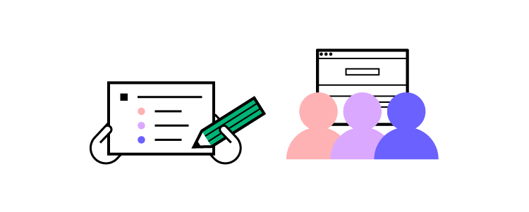

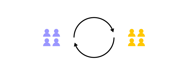
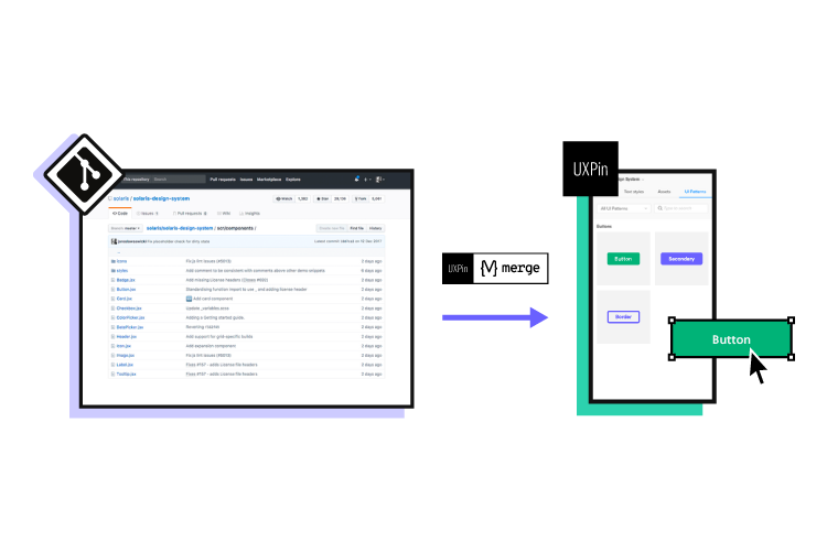

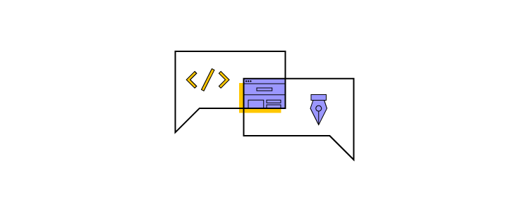


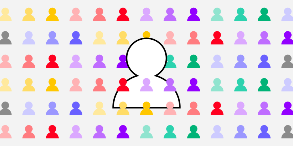


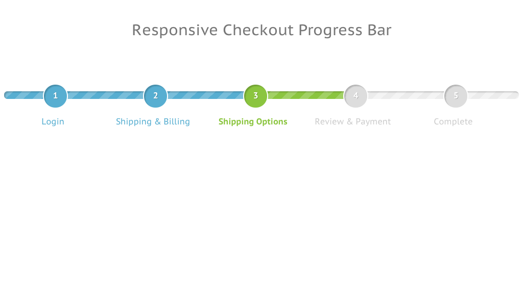
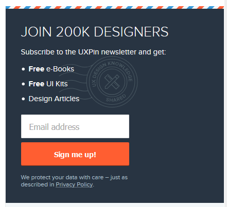


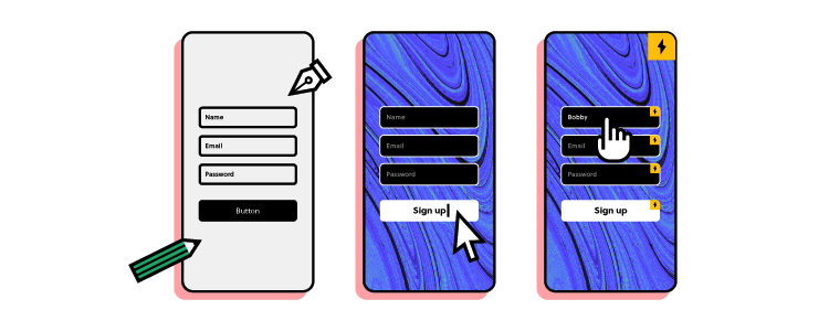
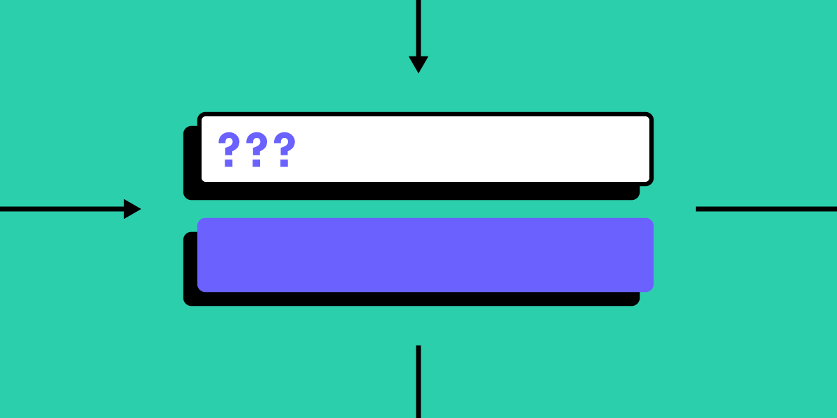


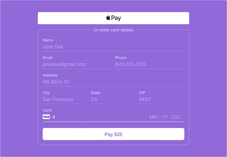
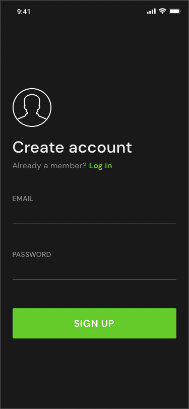
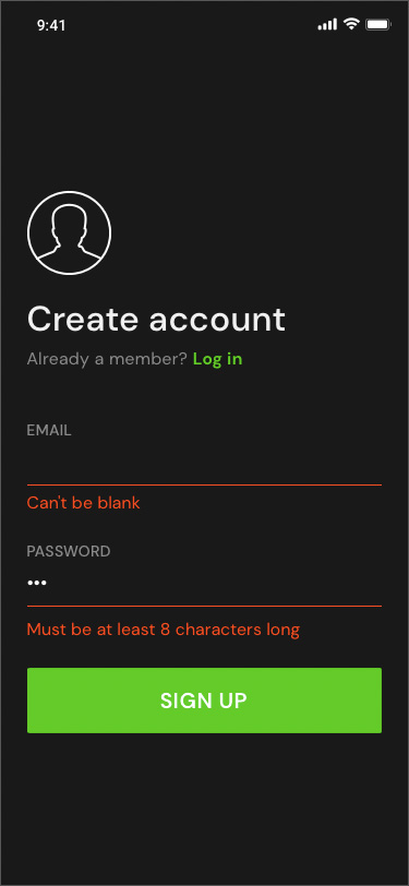
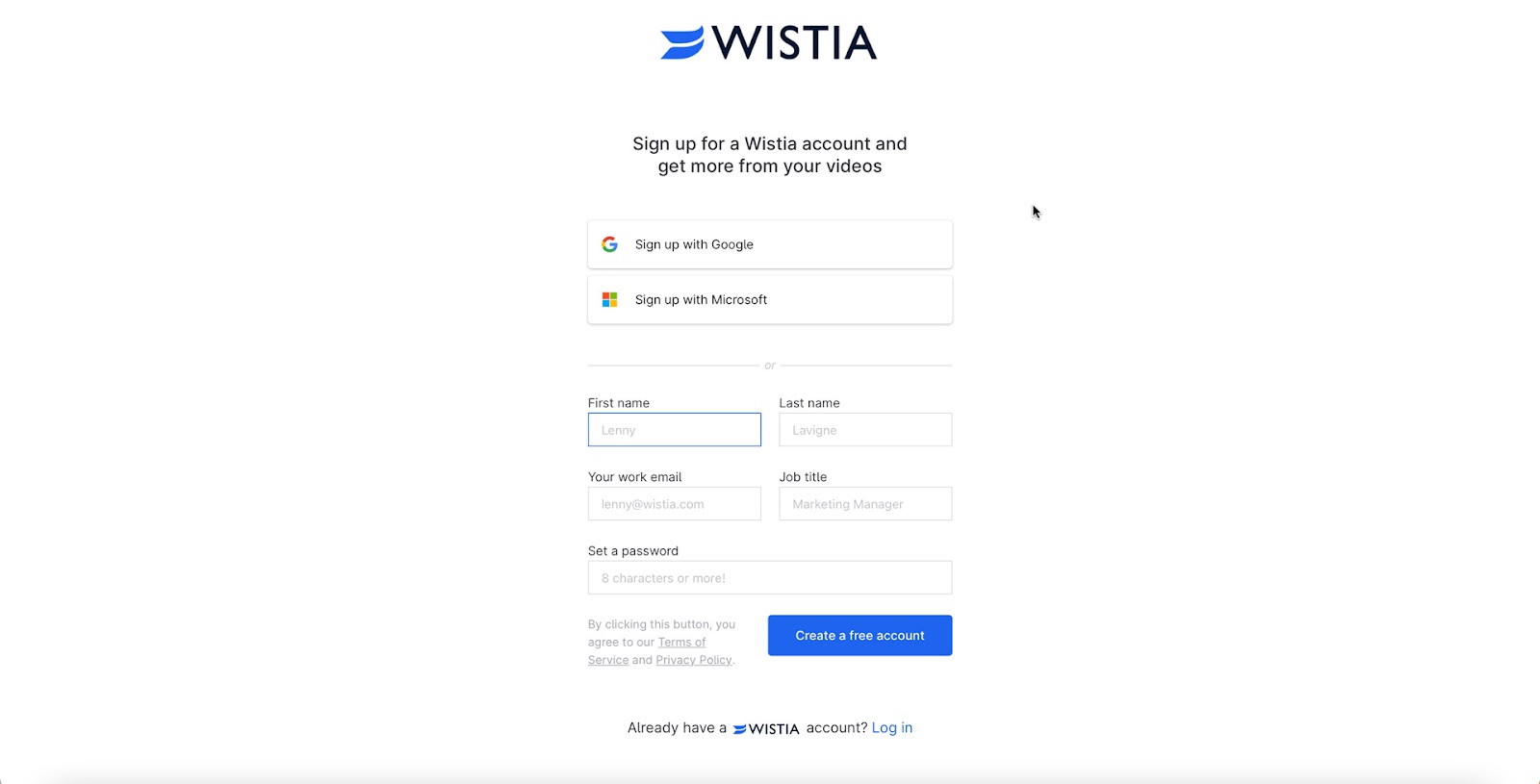
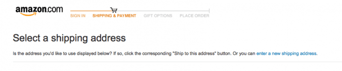
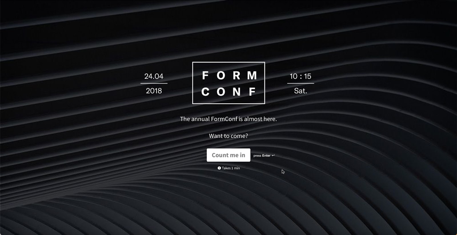
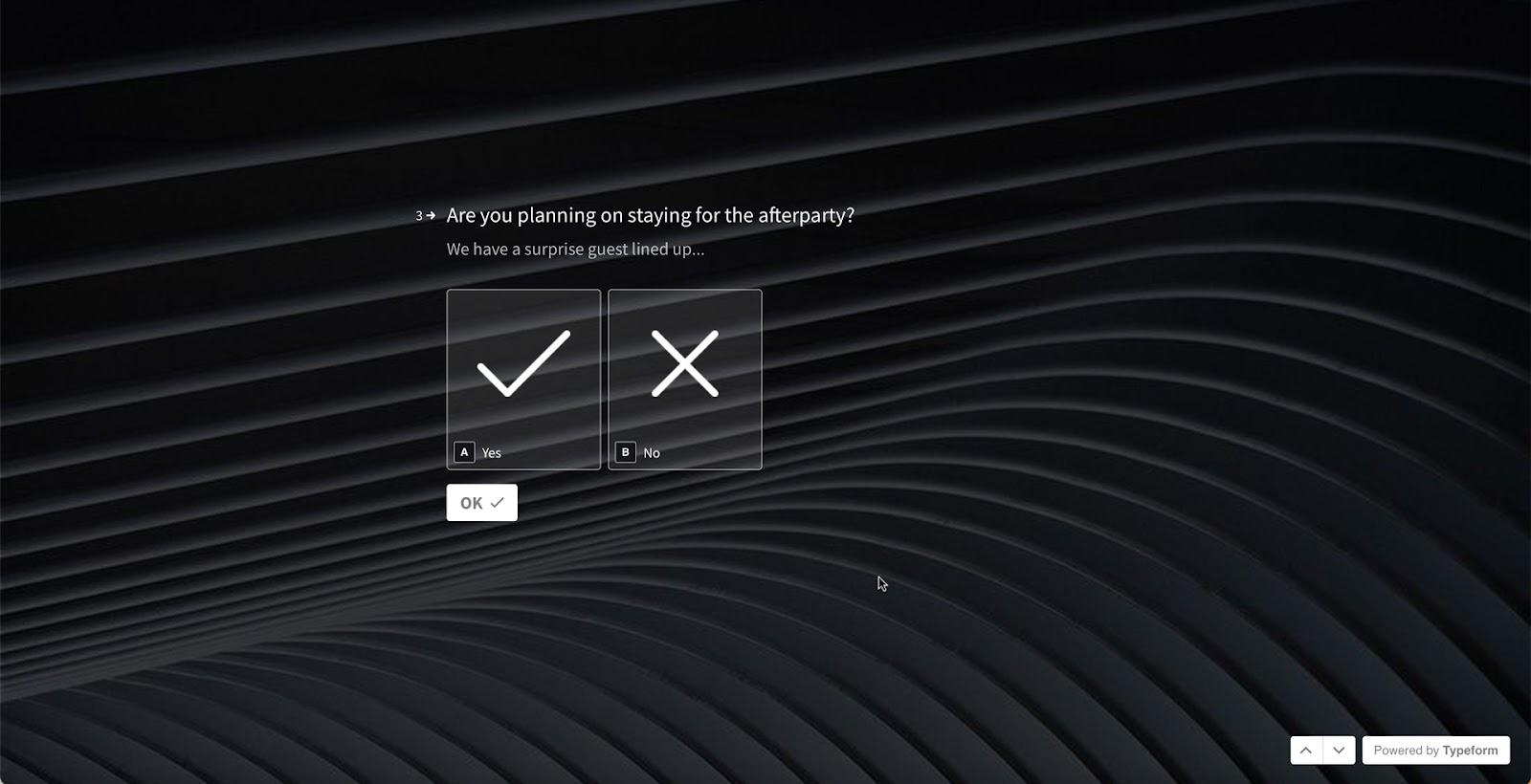
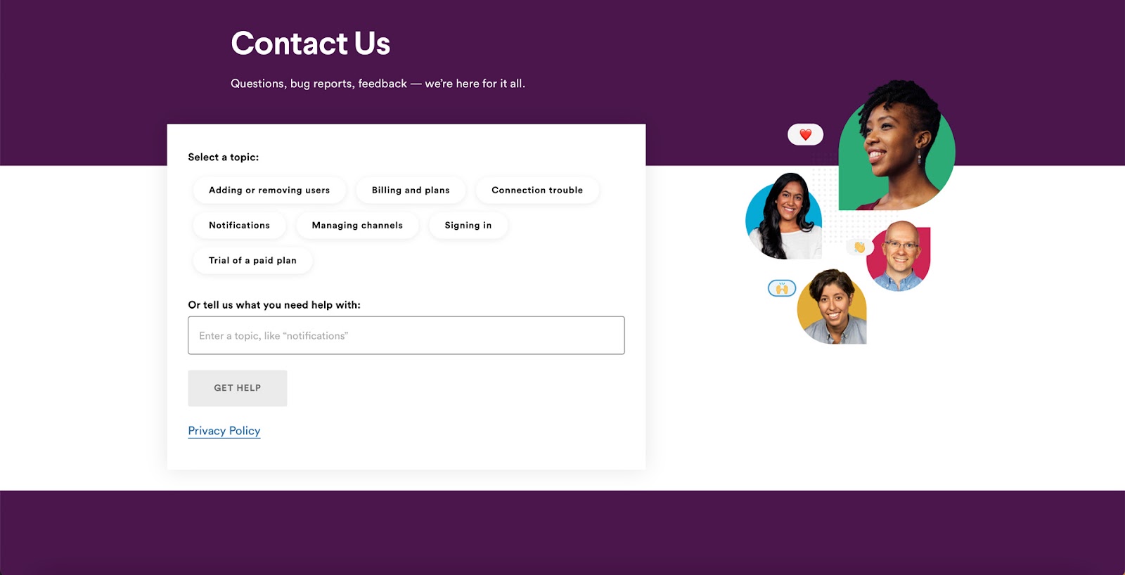
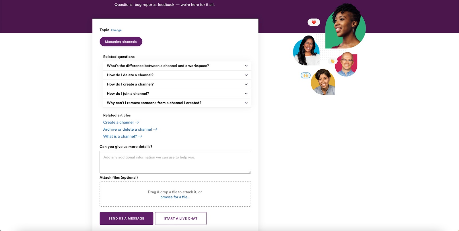

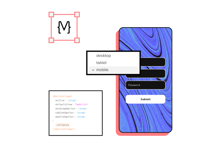


