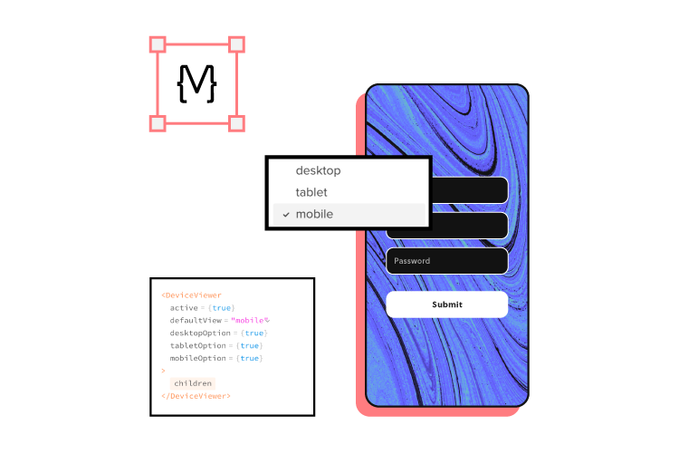
There are loads of web accessibility guidelines designers and engineers must follow when designing a website or application. It can be overwhelming to digest them all or know when to use the different levels.
This article simplifies the official web content accessibility guidelines with a web accessibility checklist for designers. We also explain the difference between WCAG 1.0 and 2.0 and the different levels (A, AA, and AAA).
What is the Purpose of an Accessibility Checklist?
A web accessibility checklist provides designers and engineers with a list of considerations for designing a website for people with disabilities and assistive technology.
Team members can reference the checklist against designs and code to ensure they meet Web Content Accessibility Guidelines (WCAG).
What is the Difference Between WCAG 2.0 and WCAG 1.0?
The Web Content Accessibility Guidelines (WCAG) must update and evolve with technology. Each update adds new guidelines that align with new devices.
Aside from the guidelines, there are also two iterations of the WCAG system. The first iteration, WCAG 1.0, used guidelines and checkpoints with priority 1, 2, or 3.
In 2008, WCAG 2.0 changed from checkpoints to level success criteria. The system we currently work with has:
Four design principles
Multiple guidelines within each principle
Testable success criteria levels A, AA, or AAA for each guideline
According to official documentation, WCAG 2.0 provides several key improvements:
Applies to more varieties of technologies and devices
Designed to evolve with future technologies
Requirements are easier to test with automated testing methods & human evaluation
Input and collaboration from the international community
Improved support material and documentation to make guidelines easier to follow and implement
3 Success Criteria Levels of Accessibility Compliance
WCAG 2.0 introduced three success criteria levels (or levels of conformance) to evaluate each guideline based on the product’s intended purpose and target audience.
Level A – Basic
Level AA – Acceptable
Level AAA – Optimal
WCAG Level A
Level A ensures websites meet the bare minimum accessibility standards. Level A compliance addresses core issues and elements to make websites more accessible, like responsive design, non-text alternatives (icons), keyboard navigation, and video captions, to name a few.
WCAG Level AA
Level AA covers a broader range of UI elements and best practices to ensure everyone can use your website. Most government websites worldwide require WCAG Level AA so that everyone in the population can access public content and services.
The idea is that able-bodied users and those with disabilities can digest content and complete tasks with a comparable user experience, functionality, and efficiency.
Some Level AA requirements include:
color contrast ratio (i.e., 4.5:1)
Alt text for images and icons
Navigation for all technologies
Accurate form field labels
Properly structured heading tags
Variable text size functionality
Assistive technology-specific requirements.
WCAG Level AAA
Level AAA is the highest conformance level, ensuring the maximum number of users can navigate your website and digest its content. As the Web Accessibility Initiative (W3C) notes on its website, “It is not recommended that Level AAA conformance be required as a general policy for entire sites because it is not possible to satisfy all Level AAA Success Criteria for some content.”
Designers should use Level AAA if the website or content caters to a specialized audience. The guidelines for Level AAA impact styling significantly (color contrast 7:1) and require sign language interpretation for audio and video.
Website Accessibility Checklist for Designers
We’ve selected the most important WACG guidelines for designers. These guidelines apply to visual elements, but these often relate to HTML elements, so designers and engineers must collaborate on accessibility. You can find the complete list of Web Content Accessibility Guidelines 2.0 on the official W3C website.
Content
Use descriptive link labels (Level A) – buttons and links must provide users with context. For example, a button that says “Click Here” is meaningless and might be misleading. See Info & Relationships SC 1.3.1.
Lower secondary reading level (Level AAA) – text must be in “plain language” free of jargon, idioms, slang, metaphors, sarcasm, and other complicated terms, ideally at an 8th-grade reading level. See Reading Level SC 3.1.5.
Text formatting (Level AAA) – text must not be justified (aligned left or right according to the language) with the ability to resize up to 200% without assistive technologies. Users must also have control over the foreground and background colors–i.e., dark/light mode switching. See Visual Presentation SC 1.4.8.
Test designs on specialized screens & devices (Level A) – visually impaired users use high contrast or inverted color modes. It’s important to test how content performs under these conditions. See Use of Color SC 1.4.1.
One H1 tag per page – the H1 header tag must describe what the overall webpage or article is about.
Structure headings in a logical sequence – nested headings must follow the conventional order of H1, H2, H3, H4, H5, and H6. For example, you would never have an H2 followed by an H4 and then an H3. You should never skip a header tag either, like going from an H2 to H4 instead of H2, H3, and then H4.
Headings and labels must describe a topic or purpose – headings and labels help users, and assistive technologies, like screen readers, find and digest content easier.
Non-text content must have a text alternative – images, icons, etc., must have descriptive alt text or a text alternative. Furthermore, if the image has text, this must be included in the alt text.
CAPTCHA – websites must provide alternative confirmation methods when using CAPTCHA, like human verification or text-based authentication, for example.
Decorative non-text content – alt text for images and media that are purely decorative must use “null” so that assistive technologies ignore this content.
Text alternatives for graphical representations – Graphs, charts, and other graphics must include text alternatives so assistive technologies can read them.
Choose the appropriate HTML markup – lists must use ol, ul, or dl syntax relating to the content and have a list’s appearance (or structure) so as not to confuse users.
Controls
Controls include all navigable UI elements like links and buttons.
Opening a new tab or window warning (Level A) – users must know if a button or link opens a new window or tab using text or an icon. People with cognitive disabilities often get disorientated when a new tab/window opens unannounced. See On Focus SC 3.2.1.
Focus states (Level A) – controls must have focus (or hover) states, so users (including those with assistive technologies) know when they’ve selected a link or button to activate. See Focus Visible SC 2.4.7.
Make links recognizable (Level A) – designers must use a combination of color and underline styling so users can quickly identify links. See Use of Color SC 1.4.1.
Use “skip links” (Level A) – skip links allow assistive technologies and keyboard users to bypass navigational menus and other blocks to jump straight to a web page’s content. See Bypass Blocks SC 2.4.1.
Forms
Form labels (Level A) – designers must label every input for visual reference and use the HTML ‘label’ tag for assistive technologies. See On Input SC 3.2.2.
Error messages (Level A) – place error messages above the corresponding input field with clear instructions for users to fix the problem. See Error Identification SC 3.3.1.
Message states (Level A) – don’t rely solely on color for error, warning, and success message states. Adding an icon or text can help visually impaired users identify the type of error state. See Use of Color SC 1.4.1.
Multimedia
Disable autoplay by default (Level A) – autoplay can be problematic for users with cognitive disabilities or seizure disorders. See Audio Control SC 1.4.2.
Remove seizure triggers (Level A) – strobes or flashing video can induce seizures. W3C’s documentation recommends no more than three flashes on a web page or video. See Three Flashes or Below Threshold SC 2.3.1.
Transcripts for Audio (Level A) – including transcripts in the audio description allows hearing-impaired users to digest audio content. See Non-text Content SC 1.1.1.
Color Contrast
Test color contrast for text (Level AA) – use a contrast checker and color blindness tester to ensure visually impaired users can read body text and UI elements. See Contrast (Minimum) SC 1.4.3,
Text contrast for non-text (Level AA) – non-text elements like icons, form inputs, etc., must be distinguishable for visually impaired users. See Non-text Contrast 1.4.11.
Mobile and Touch
Avoid horizontal scroll on mobile (Level AA) – horizontal scroll can be difficult (or impossible) for users with hand or finger disabilities. W3C provides guidelines for horizontal and vertical scrolling. See Reflow SC 1.4.10.
Website orientation (Level AA) – websites must be visible in any orientation for mobile and tablet devices. See Orientation 1.3.4.
Ensure adequate target sizing (Level AA) – there’s nothing more frustrating than not being able to activate a link or hitting the wrong one because they’re too close together–test targets with a wide range of hand and stylus sizes. See Target Size SC 2.5.5.
Extra Web Accessibility Resources
Web accessibility can seem overwhelming at first, but there are many helpful resources to help find and test your user interfaces.
Streamline your web accessibility testing with UXPin’s build accessibility tools, including a contrast checker and color blindness simulator. Sign up for a free trial to discover how code-based design can enhance your prototyping and testing to deliver more inclusive user experiences.
Automotive UX is one of the most rapidly evolving and exciting user experience disciplines. It requires designers to shift their thinking from keeping users engaged to designing for safety.
This article explores the exciting world of automotive UX and six key challenges designers must overcome to deliver safe yet enjoyable driving experiences.
Design, prototype, test, and iterate at a higher fidelity with greater functionality for accurate, meaningful results. Visit the UXPin Merge page to discover how component-driven prototyping can enhance your UX projects to deliver better user experiences for your customers.
What is Automotive UX?
Automotive UX is user experience design for the automotive industry. As more parts of a vehicle’s interior get digitized with car interfaces for control, so does the demand to make these UIs user-friendly and intuitive.
Touch screens are replacing knobs and dials in most cars, including gas and electric vehicles. Many cars also have voice user interfaces (VUI) which require careful UX design to ensure they’re safe and user-friendly.
UX UI Design Role in the Driving Experience
As cars evolve, so do user needs regarding the driving experience. Drivers no longer want to get from A to B; they want features that enhance the journey to make it more enjoyable–especially in cities where people spend hours commuting morning and evening.
Some features that enhance the driving experience include:
As people move away from car ownership to micro rentals (hourly or A-to-B car hire), we’ll likely see dedicated apps installed on the car’s touchscreen so users can start and end rides.
Ultimately, cars will become another Internet of things (IoT) gadget that integrates with a network of devices rather than a stand-alone mode of transport. This integration means connecting vehicle data and services through governed APIs that provide secure access to enterprise data sources in ways that maintain safety and user privacy.
Automakers also mount these in the steering wheel dash for drivers and rear headrests for passengers.
The first challenge UX designers must overcome is the design mindset. Traditional UX design looks for ways to keep users engaged, whereas automotive UX must achieve the opposite and keep drivers focused on the road.
Car user interfaces must be clean and minimal with large text, toggles, and buttons so users can use them with no more than a glance. UX designers must work with interior automotive design teams to match the user experience to the driver’s reach, line of sight, left vs. right-hand drive, etc.–all elements that could impact driver safety.
2. Infotainment Systems
Behind these touchscreens are infotainment systems, providing details about the vehicle and journey as well as entertainment, including music, radio (analog and digital), cameras, device connectivity, audiobooks, video streaming, weather, and more.
In cars with multiple touchscreens, front and back, UX designers must think about the user experience for each differently. It’s essential to display vehicle and journey information for drivers, but backseat passengers have different priorities, like being entertained during their trip.
These differences mean design teams must decide which infotainment features are available to drivers and passengers, what the priorities are, and the impacts on navigation and information architecture. Designers also have to consider safety–should drivers or any front screens have access to video streaming that could distract from the road?
3. Balancing Personalized User Experience With Shared Mobility
Every driver has a preference for seat position, mirror angles, and stereo setup. Car interfaces add another dimension of personalization, which can get complicated with shared mobility.
Getting a seat in the correct position is relatively simple, but what about the screen’s primary view preference, device connectivity, climate control, navigation, and infotainment?–all of which take time to set up.
UX designers must look at ways to personalize the driving experience while building features to accommodate multiple users. Creating user profiles is a good solution, but what about car-sharing services and rentals? Downloading these settings from a smartphone or smartwatch might be a better option, where the car sets everything up as soon as it connects to the driver’s device.
4. Safety Features
Safety is the foundation for every automotive UX design decision. Instead of capturing the user’s attention, the goal is to design UIs and present data a driver can consume with a glance.
UX designers must collaborate with automotive design teams to understand safety systems and how to present these to the driver, for example:
Lane assist–changing lanes and alerting drivers when they’re straying
Environmental sensors–telling drivers when they’re too close to other cars and objects
Speed warnings
Seatbelt notifications
Designers must also consider which user interactions promote safety and in which situations. For example, voice commands might be the best option while driving, or the driver can use a swipe gesture to change displays without taking their eyes off the road.
5. Driving Assistance
Advanced driver assistance systems (ADAS) are standard in most high-end vehicles nowadays, but simplified versions are slowly making their way into midrange and budget cars. These systems can perform simple tasks, like alerting you when you drift out of your lane to full autopilot–as we see with the Tesla range–complete with multiple sensors and cameras.
A Telsa can drive itself with all this data, but what if the driver has control and the vehicle’s systems detect a potential accident? While engineers focus on developing AI systems that avert accidents, UX designers must decide how they interact with the driver safely.
To do this successfully, designers must have a deep understanding of the Human-Machine Interface (HMI) and how interaction design impacts the driving experience and safety.
6. Designing From Scratch
One of the biggest automotive UX challenges is that designers must design from scratch for every model. Screens, buttons, features, dials, locations, and even operating systems often change with each release, so designers must rethink their designs from the ground up each year–significantly more challenging than going from iPhone 12 to 13!
Designers must also consider more screen sizes and viewports. Most vehicles use custom-fitted screens but also offer mobile apps that control the car’s system and features. They must prioritize features, layouts, and information architecture differently for in-vehicle and external applications–each with the potential to change annually!
Cars also stay on the road much longer than people keep mobile devices. For example, Apple released the iPhone 5 in 2012, but you’ll be hard-pressed to find someone still using one in 2022. Conversely, many people drive cars 10, 20, or even 50+ years old.
While this isn’t an issue for cars built 50 years ago, newer models with touchscreens and other technology must be maintained and updated. UX designers must constantly innovate for new models while future-proofing designs to maintain older systems.
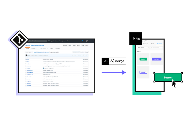
Faster Prototyping With UXPin Merge
Keeping up with the fast-paced automotive industry means designers must prototype, test, and iterate faster and with a higher degree of accuracy. With limited time, they also need better cross-functional collaboration and fewer errors.
UXPin Merge allows you to sync a design system hosted in a repository with UXPin’s design editor, so the entire product development team uses the same components. Any changes to the repository automatically sync to UXPin, notifying designers of the update.
With UXPin’s Version Control, designers can switch to an older version of the design system, perfect for maintaining older products–like the infotainment system for a 2019 car.
Scale Faster Prototyping With Patterns
One of the challenges with maintaining a design system is promoting new patterns and waiting for engineers to code them.
With UXPin Patterns, design teams can omit the development phase and begin prototyping with new patterns immediately. They can also save different component/UI states as patterns, allowing them to make quick changes during testing to iterate faster.
Smoother Design Handoffs
Design handoffs in Merge are smoother and faster because designers and engineers use the exact same component library.
The most significant benefit for organizations–faster time-to-market. A crucial factor for the fast-paced automotive industry.
Meaningful Feedback
Better prototypes result in meaningful, actionable feedback from usability testing and stakeholders. With a library of ready-made components, designers can make quick changes, test, and iterate faster.
“It’s been so helpful for us to have these high-fidelity prototypes built with UXPin. We build high-fidelity prototypes much quicker, and we get immediate feedback after the session. If there’s something we can fix immediately, we make that change before the next participant and get feedback much faster than before.” Erica Rider, Senior Manager for UX – Developer tools and platform experience at PayPal.
Face-paced automotive UX requires a rapid prototyping solution. UXPin Merge gives product development teams a platform to streamline the design process and deliver projects faster with higher quality and accuracy. Visit the UXPin Merge page to learn more and how to request access to this revolutionary technology.
Design leadership isn’t about micromanaging every little step. Rather, a good design leader is able to provide impactful direction for their team. How exactly does a design leader encourage a positive and meaningful product design work environment?
Let’s start by taking a look at the key steps to take for managing a design team successfully and what to avoid when building a cohesive team.
If you’re looking for a prototyping tool that will help your team to optimize their workflow and communicate better, we have something for you. Try UXPin Merge, a powerful technology that makes your team achieve a higher level of design maturity in no time. Read more about UXPin Merge.
Reach a new level of prototyping
Design with interactive components coming from your team’s design system.
Start with a design department audit
Just like you start with auditing UX design, look back at your design team goals. Having a roadmap in place will help you more clearly see what you need to achieve in regard to design goals at your organization. This roadmap will help you get there with fewer bumps in the road.
Your next step will be to audit your design team structure as a whole. You’ll want to take inventory of who you have on your team and confirm what their strengths and weaknesses are. Taking stock of these things is helpful to see if you have enough team members with the appropriate skills needed to achieve company goals.
Team meetings are an excellent way to gain a deeper understanding of your team as a whole. Furthermore, a design team audit will go a long way in determining how well overall day-to-day operations will go.
Auditing will help crystalize your team structure and will help to specify the role of all team members and the capacities in which they are expected to complete their roles. Clarity helps give everyone a higher sense of purpose and consistently set them to task without confusion or hold-ups.
Identify and acknowledge your wrongdoings
As a design team leader, you’ll need to apply an honest mindset when managing your team. Inherent assumptions and old assumptions are par for the course when working in a leadership role, however, external output is extremely valuable when working in a close team atmosphere.
Don’t be afraid to ask for external input in the form of team member feedback. This could be an anonymous survey or an all-hands call to gather information from those you work with every day.
While it can be tough to hear difficult feedback, taking direct note of such input will only help strengthen your team as a whole. Poor leadership manifests in a variety of different ways. Maybe your team has expressed that you repeatedly fail to set clear goals for the team or perhaps you tend to micromanage employees.
Whatever the shortcoming may be, be willing to identify and acknowledge where you can use a little work as a design lead. No one is perfect, you and your team members included.
Write a plan on what needs to be done
Equally as important to a successful team as improving leadership style and making a plan are the factors related to project management. This goes hand-in-hand with design audits. Questions you’ll want to take stock of: Do you need to hire more people? If so, can you tell which skill gaps in your current team structure need to be filled?
An adjacent item would be to run a skills gap assessment. Ask your team members what skills they feel good at. By requesting directly, you’ll likely find skills that weren’t readily apparent or might come in handy for future design projects.
If the specialized skills you need aren’t available locally, expanding internationally with EOR services allows you to hire top design talent from anywhere without the administrative burden of setting up foreign entities or navigating complex international employment laws
During any one-on-one or group meetings with your team members, you can ask them about the skills they’re determined to develop. This will help you plan out how their desired career path can integrate with the competencies of your design team as a whole. Offer ways for your team members to hone and develop their skills in order to close any skill gaps. If your team is looking to build new technical competencies, consider resources like Treehouse, which provides browser-based coding education and career training to help team members develop job-ready skills in web development, programming, and other technical areas.
During the planning stage, it’s important to note if you’re successfully building the design team during the recruitment and hiring process. Take note of any areas in which you might be falling behind. Ask yourself:
Are you seeing a high candidate drop-off rate?
Do your new team members continue to ask repetitive questions during the onboarding process?
Consider these questions and other potential improvement areas such as task distribution, management of workload, and consistent performance.
Decide how you will measure the results
Once you’ve taken stock of these items and implemented specific changes, you’ll want a solid plan as to how you’ll be evaluating said implementations. You’ll need it to measure whether or not the changes you’ve implemented have been successful.
When assessing the overall success of your results, ask yourself:
Did you solve the problem? – Design isn’t simply graphics and color palettes. At its core, it’s all about facilitating interactions and problem-solving through creative channels. If you identified a real problem (such as poor employee retention) and provided a better solution (more open communication and feedback) then you can count that as a success.
Did you improve the process? – Design doesn’t always have to be about supplementation. Rather, you might identify steps that were redundant and unhelpful during your research. Good design leadership might also mean cutting down or taking away what isn’t working. If you made a process more efficient through various channels of development, then congratulations, pat yourself on the back. Another success!
Did you open yourself for feedback? – Design success is just about the personal growth of employees and management alike. This can be shown through effective communication. A difficult skill to master, accepting feedback and open communication is one that every good leader should have. Shelve your pride and open yourself up to honest feedback. You and your team will all be better for it.
The recommended measurement methods will depend on the specific area you’re planning to improve. For example, if you were hoping to measure your own design leadership qualities, you could run a quantitative survey like an employee Net Promoter Score which is a metric that helps gauge how employees feel about the place at which they work.
Running surveys like this allows you to see how your score has changed over the course of three or six months. This is simply one avenue you can take but it is a common way to look at employee satisfaction.
For example, perhaps you want to improve your team member retention rates and avoid employee turnover. After taking the necessary steps needed for proper employee retention, you can measure how the average tenure has changed since the implementation of certain action items.
Or maybe you’d like to measure the number of tasks your team was able to successfully complete within a 2-week timeframe, you can compare these metrics on a bi-monthly basis. Measurements can be approached through Fibonacci sequence points which provide a realistic way to approach a variety of influencing factors.
Start transformation processes
Now you’re able to start streamlining how design teams work. Encapsulating the above steps and implementing them might look as follows:
1-on-1 meetings: holding one-on-one meetings are a great way for team lead and team members reports to connect individually on pressing issues and develop strong relationships. They also help ensure that employees feel like they’re valued contributors of product teams and that they are working successfully toward goals as well as improving their skill set. One-on-ones should not be used as status updates, rather, they should serve as a platform to give regular feedback and foster career growth and learning new skills.
Daily standups: whether you call them daily stand-ups or team huddles, the idea is the same. You want your entire team to feel informed and connected. This helps measure progress, highlight necessary areas of improvement or outstanding issues, and where the team stands in terms of work completed.
Team building activities: a variety of activities exist to help build morale and spark teamwork. They’re helpful exercises for bringing communication to the forefront and allowing a free flow of product team collaboration and an encouraging the best work atmosphere. This is especially valuable for remote or distributed teams where physical office interactions are limited. In such cases, many leaders also choose to get a virtual office—not only for mail handling and a professional business address but also to offer access to meeting spaces, receptionist services, or simply to build credibility in new markets. Team building helps product managers and employees alike learn more about each other outside of a traditional workplace setting. Your activity might be something fun and engaging like an escape room or a day at the golf course.
Growth and collaboration are crucial to a team’s success. As outlined in the first pillar of our DesignOps eBook, the well-being of a team of designers should be at the forefront of your management plan. The above steps are simply a few suggestions that can help your team thrive and feel cared for.
Don’t miss out on the power of iterations
Growth isn’t a linear process. Remember to check in with the members of your team on a regular basis. This will help you see what seems to be working and what techniques haven’t quite landed. Allowing you to pivot from there.
Again, ask your team members for honest feedback. This can be done either during face-to-face meetings or in a survey. Fostering an openly communicative environment is ideal for a well-running design process and product development workflows. Employees that feel noticed ultimately feel valued. Remember to focus on clear points of action, rather than generalities. Drill down to specifics and everyone will be better for it.
If you decide to go the survey route, make sure not to overdo the frequency. Firstly, the time frame in which you’ve gathered data might be too short to draw relevant conclusions. Secondly, you don’t want to ask team members to evaluate your decisions on a frequent basis, as it could come across that you’re unsure of your design leadership capabilities. Be sure of the direction you’re taking as a design lead and your team will appreciate it.
Iterate and experiment with improvements to your team collaboration and design team management methods. Remember: proper design team management is a marathon, not a sprint. Cultivating a good team takes trial and error.
Lead your team to success
The first pillar of design operations deals with the core of a good business: people. If you want to support your people, you need the right tech stack for the job.
UXPin Merge is such technology. It allows your team to bring your devs’ interactive components to the design editor and build prototypes that are easily understood by stakeholders, product managers, and above all else, developers. Bridge communication gap and strengthen the workflow in your organization. Read more about UXPin Merge.
Design systems can be very confusing and complicated if you don’t fully understand the terminology associated with them. It’s important for designers and developers alike to be on the same page for the most effective communication efforts.
For this reason, we have comprised some key terms along with associated applications and examples to provide a clearer understanding of design systems.
UXPin helps you build interactive prototypes and manage design systems like no other prototyping tool in the market. Build consistent interfaces 10x faster and speed up development that stays in line with your designs. Manage a complete library of interactive elements in UXPin Merge. Find out more about it.
Design System
Definition: A design system is a set of standards, best practices, components, and rules that define a design project’s approach to creating websites in a certain style or brand identity. A style guide, for example, is often included as part of the design system. A pattern library of samples and the real assets – fonts, images, CSS frameworks, JavaScript libraries, and so on – all components needed to complete the final product.
Application: Front-end developers and designers use these to replicate designs through pre designed components and elements. The elements can be repeated and reused, which saves teams a ton of extra time. By including guidelines within these systems, some entry-level designers may find them as useful educational references.
Definition: Components are the building blocks of a design system. They can be small (e.g., buttons, icons) or large (e.g., navigation systems, carousels). A core aspect of components is that they’re designed to be as simple yet as flexible as possible so that they can be used in multiple instances.
Application: Companies use/reuse components to create patterns within their systems and to improve user experiences. Overall, components improve the quality and effectiveness of workflows. Many design systems will have component libraries that help designers and developers share UI elements that have interactivity and responsiveness build into them.
Definition: A design system requires a governing model that acts as a set of rules. These are required to manage all components within a project. They might pertain to visual design (e.g., animation, colors, typeface) or refer to a more complicated aspect of a project, like the personality or style of the branding or writing.
Application: These act as guidance for decision-making processes through preset standards to be followed throughout a design system. They help keep design teams on track and moving in a consistent direction. Teams commonly follow them for advice on how to achieve goals. An effective foundation will provide a clear framework for the team’s ideal system.
Definition: A single source of truth is a reference point between designers and developers that help them make their product consistent. Design systems, or particularly component libraries serve as a great single source of truth that product designers, product managers, and devlopers can use when building products.
Application: Teams that struggle with removing silos, front-end UI debt or misalignment can develop a single source of truth as the first attempt to bring the whole team closer. They start with building coded UI component library that they can share across the whole product development process.
Definition: A prototype refers to a sample version of a product (or its specific aspect), used by designers to test the solution out before launch. It is used to test or de-risk ideas, simulate the final product, address any assumptions, and eliminate concerns towards any other elements of its conception quickly and inexpensively. This allows the designer/s to work on the project, making modifications or adjustments in direction on the end goal if necessary.
Application: Designers will commonly use prototypes to test their product and gain user feedback during an initial trial period prior to an official launch taking place. This helps them save money by testing the product for inefficiencies, which saves time and resources in the long run.
Definition: A component library is a collection of UI components that can be reused across multiple projects. It typically includes code, documentation, and guidelines on how and when to use each component.
Application: Component libraries help ensure effective communication and collaboration between teams. They provide a quick access point for reference guides and stored, reusable components. Front-end developers can use these to help reduce cross-browser and cross-device incompatibility. In addition, component libraries eliminate the need to convert design to code, which lowers code duplication.
Definition: Material Design is a visual language that Google developed in 2014. It’s based on the principles of how materials exist and interact in the physical world. Many companies have since adopted Material Design as their design system of choice.
The language aids in the development of digital experiences for platforms like Android OS, iOS, Flutter, and websites. The structure makes the technique for creating components such as grid-based layouts, animations and transitions, padding, responsive compositions, dimensional depth effects, and more straightforward.
Application: Material Design is used by designers to optimize the user experience through 3D effects and lighting/animation features in GUIs. The approach helps eliminate confusion among users and provides consistency. For designs, it’s a key feature for animations and getting feedback on graphics.
Definition: A design language is a set of rules, guidelines, and best practices that govern the design of a product. A strong design language will make a product more consistent, cohesive, and easy to use. It also defines the overall visual identity of a brand.
Application: Design language helps teams follow a specific set of rules and methodologies. It makes the design process run smoothly without inconsistencies or unnecessary confusion. By creating a set of standards to follow, users can feel more comfortable navigating designs that feel familiar to them.
Example: Apple’s human interface guidelines are a design language that governs the design of all their products.
Usability
Definition: Usability measures how easy it is for users to accomplish their goals when using a product. A product with good usability is tested through five criteria – learnability (i.e., a soft learning curve), efficiency, satisfaction (how satisfied users are after interacting with it), memorability, and the number of errors users make.
Application: Usability helps designers and developers measure how well they are adhering to the needs of their users. It is an approach that assesses the effectiveness, efficiency, and appropriateness of a system and helps to identify how easily users will be able to solve any potential problems on their own.
Definition: Typography refers to the practice of arranging type (letters and text) to ensure the copy is clear, aesthetically attractive, and supports the content and design. Variables within typography include font size and style, as well as spacing and the length of copy on a line and page.
Good typography should be invisible—the user should be able to focus on the content, not the typeface.
Application: Good typography carries a myriad of benefits for designers and developers. It is perhaps one of the most important elements of a design system and helps communicate things like tone, sentiment, and the overall message. Typography will typically be used to draw a reader in while providing legibility.
Definition: Icons are visual symbols that represent a concept, action, or object. They can be used to help users navigate a product or to provide additional information about a particular element on the screen.
Application: Designers use icons to help users quickly navigate through a system with graphical representations. Icons are a great tool because they help free up space for other things since they’re typically quite small. They’re also an ideal tool for marketing efforts to add visual appeal.
Definition: Spacing is the use of empty space to separate elements on a page. Good spacing can make a product more legible and easier to use. Spacing can be implemented across all aspects of a product, from the margins and gutters to the spacing between lines of text.
Application: Clear and concise spacing helps developers and designers maintain an aesthetically pleasing atmosphere for users. Spacing is typically very deliberate in the way that it is placed throughout a system. It allows for things like optimal readability, consistency, and harmony across a design system.
Grids
Definition: Grids are a system for organizing content on a page. They can be used to create structure and hierarchy or to divide a page into sections. Grids can be implemented in various ways, from simple columns to more complex multi-column layouts.
Application: Grids help designers develop a user-friendly system that’s low-cost and provides consistency across multiple devices. Grids are typically designed in one spot then reproduced in other areas of a design system. Overall, they’re a great tool for designers to use for organizing information and providing precision.
Style Guide
Definition: A style guide is a document that outlines the rules and guidelines for the design of a product. It includes information on typography, color, iconography, and more. A style guide is an essential tool for maintaining consistency across a product. It’s a must-have if you’re working on a design system.
Application: Style guides are generally used for entire teams to work together more cohesively. It allows designers, project managers, and developers to stay on the same page with project expectations. In addition, teams can utilize style guides to quickly transition new hires and get them up to speed with a particular project.
Definition: A UI Kit is a collection of graphical user interface (GUI) elements that can be reused in digital products. A UI Kit typically includes buttons, icons, input fields, and other basic elements that can be used to build user interfaces.
UI kits usually come from companies or design teams who want to share their work with others. They can be a great starting point for new projects or a way to speed up the development of an existing project.
Application: Most commonly, UI kits have two primary uses, which include prototyping and mobile and website design. They’re especially useful for rapid prototyping where design functions are shared with developers, stakeholders and designers while a design is still in production. UI kits are especially useful for designers with no coding experience.
Definition: Patterns are recurring solutions to common problems. They can be used to solve design challenges in a variety of ways, from layout to interaction. Within most design projects, patterns will be used to help with the structure and flow of the product.
Application: Patterns are commonly used for better consistency and for saving time by helping a team run more efficiently. By producing design patterns that are familiar to users, a team’s message and overall goal can be better focused on. Patterns make coming to decisions much easier due to the predictability that they bring.
Definition: Properties are the characteristics of an element that define its appearance and behavior. In CSS, for example, properties include things like color, font size, and margin. In HTML, this could be used to make an element bold, italic, or a certain color.
Application: Some designers can find benefits from visual properties such as image-rendering, drop-shadows, border-radius cascading style sheets (CSS), or linear gradient to help improve design tasks. They might also use properties (like bold or italics) to emphasize a set of text, so users can quickly identify keywords.
Definition: A pilot is a miniature, self-contained version of a larger project. Pilots are often used to test new ideas or approaches before investing in a full-scale implementation.
They can be a great way to get feedback on a design system before committing to a full rollout and will typically be used by a smaller team or group of users.
Application: A developer might put together a testing group for a new video game that has yet to be released. They will allow the group to offer feedback for the game and offer any helpful suggestions for improvements. Pilot projects are a great way to identify mistakes and mitigate risk prior to an official launch.
Tokens and Variables
Definition: Tokens and variables are used to store values that can be reused throughout a product. In CSS, for example, variables can be used to store colors, sizes, and spacing values. Tokens and variables can be a great way to maintain consistency across a product.
They can also make it easier to make changes to a product since you can update the values in one place and have those changes propagate throughout the solution.
Application: Tokens and variables are helpful for designers who are looking to make an update to their system or put together an entirely new project. They’re also helpful for maintaining future updates and managing a system that spreads across multiple platforms. For those using Material Design, tokens are optimal for features like dynamic color.
Definition: Classes are used to group elements together. HTML elements, for instance, can be grouped together by their class attribute. Classes can be used to create reusable components or to apply styles to multiple elements.
You could create a class for all of the buttons on your site. This would allow you to style all of the buttons in the same way and make it easy to update the styling if you want to change it in the future.
Application: By classifying certain elements on a site, designers can ensure that similar tasks are simplified in the future. This, in turn, saves time by making future updates quicker. In design software, designers can quickly group elements through a keyboard shortcut to optimize future processes.
Binding
Definition: Binding is the process of connecting an element to data. In HTML elements can be bound to data using the data-* attributes. This allows the element to display the data in a specific way.
Binding is a powerful way to create dynamic and interactive user interfaces. It can be used to build things like data tables, form controls, and charts.
Application: Binding is commonly useful by front-end developers to link components to variables. This can also be done by linking variables to components, which is also referred to as to-way-data-binding. Some developers will use binding techniques to link a user interface and the data that it shows. For enterprise applications requiring secure data access, platforms like DreamFactory provide governed API access to backend data sources, enabling developers to bind UI elements to enterprise data safely and reliably.
Definition: Slots are used to insert content into a component. They are a great way to reuse components and to make sure that your content is always up-to-date. Among others, by using slots you could create a slot for your site’s navigation and insert the latest links into it whenever the content is updated.
Application: Slot components help product designers by customizing certain components to save time with their designs. They help reduce the complexity of projects in order to make them more flexible. Many choose customized design system libraries with slot components, for example.
Definition: Events are used to trigger actions in a product. HTML elements, for instance, can be given event attributes that will cause them to respond to user input. They are a powerful way to create interactive user interfaces and be used to trigger things like modals, forms, and navigation.
Application: Events have a variety of applications, such as marking the start and end of a visitor session, obtaining visitor profile data, and changing a visitor audience level. Many applications allow users to access an events summary via a system dashboard. This report can usually be filtered to show most relevant data.
Framework
Definition: A framework is a collection of code that can be reused to build software products. They can include aspects of a project like libraries, tools, and best practices.
Frameworks can be a great way to speed up the development of a product. They can also make it easier to maintain a product over time. They are helpful for both small projects and large enterprise applications.
Application: Teams will commonly use frameworks to facilitate an in-depth analysis of certain issues and come up with a plan of how to take prompt action. Frameworks are an important part of any design system because they allow users to identify new insights at any given point in a design process.
Definition: A reference site is a website that provides information about a specific topic. You can use it to learn about new technologies or to find solutions to common problems.
Reference sites can be a great way to get started with a new technology or to troubleshoot an issue. They can also be an excellent resource for finding more information about a topic.
When designing a product or service, most teams will develop a reference site to ensure that everyone is using the same terminology, components, and processes.
Application: Reference sites are usually the first touchpoint for someone looking for a specific design system. These are posted by teams to make important information accessible in one centralized location. These generally include a component library along with a set of guidelines.
Design System Governance
Definition: Design system governance is the process of managing and maintaining a design system. This includes things like setting up standards, creating documentation, and enforcing rules.
Application: Design system governance is important for preparing a system for change. It ensures that everyone is following the same standards. Governance is key to managing requests and keeping track of decisions. For this reason, many teams use it for better collaboration efforts and contributions.
Definition: A design system graveyard is a collection of abandoned or outdated design systems. This can be a great resource for learning what not to do when creating a design system. When a design system is no longer being used or maintained, it is said to have been “put to rest” in the design system graveyard. This is usually because the product or service that it was created for has been discontinued or because the team has moved on to a new system.
Application: Designers and Developers can benefit from the design system graveyard by studying it and educating their teams on what not to do if they want to keep their system afloat. Some also find it effective to utilize the graveyard to construct alternative designs from abandoned data.
Definition: CSS Modules are CSS files which define, by default, animation and class names. By using CSS modules, you ensure that your CSS code is consistent across projects.
They are a great way to manage CSS in large projects. They can also be used to create reusable components that can be applied across multiple projects.
Application: CSS modules are commonly used to build element styles more granularly. They help developers write more legible, maintainable code and are ideal for situations where application styles are expanding. When they expand, the likelihood of two classes ending up with identical or similar names increases, so these modules help developers combat this issue.
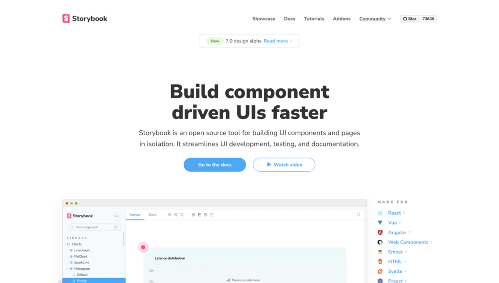
Definition: Storybook is an open-sourced tool that can be used to develop and test UI components. It allows for the creation of isolated environments for each component. The software can be used to generate static documentation for a component library.
Storybook lets designers test out different variations of a component to see what works best. It also offers the ability to generate documentation for a design system.
Application: Storybook helps designers and developers collaborate more cohesively. It’s used to locate inconsistencies through connecting common tools that designers use with the different tools that developers use. For example, Storybook connects components of JavaScript with (e.g., React) with prototyping tools like UXPin. Even more, the platform allows for UI review and feedback to be in one centralized location.
Definition: Also known as a design system maturity model, this refers to the way to measure the progress of a design system. It can be used to track the development of a system and to identify areas that need improvement.
There are four stages of design system maturity: initial, foundational, comprehensive, and integrated. Each stage has its own challenges and characteristics. These include;
Stage one – Style guides.
Stage two – HTML & CSS.
Stage three – Design & code components.
Stage four – Fully integrated.
Application: Design system maturity models are commonly used by companies to help them follow a more cohesive, consistent system. Their effectiveness vastly outweighs traditional models; therefore, they reap more promising results. The models help teams handoff a design with ease knowing everyone is on the same page, and, for this reason, it is especially useful for designers and engineers alike.
Definition: Atomic Design is a design system methodology, which is based on the idea of modularity and reuse. Atomic Design is made up of five stages – atoms, molecules, organisms, templates, and pages.
Application: One of the best uses for atomic design is gaining the ability to seamlessly switch between abstract to concrete. It allows users to switch and see their interfaces broken down to their atomic elements. Furthermore, atomic design breaks down the process of combining those elements to reach a final experience.
Definition: An atom is a design model that refers to the smallest unit of a system. In other words, it is the most basic building block. All atoms have the same structure and cannot be divided into smaller parts. Design-wise, this could refer to a simple component like a button or a form field.
Application: Atoms help designers and developers break down components into their smallest form (e.g., button). They can be matched with other components to form things like molecules or organisms (see below). They’re ideal for combining into molecules to make web pages.
Examples: buttons, inputs, labels
Molecule
Definition: A molecule is a design model that refers to a group of atoms that are bonded together. Molecules are slightly more complex than atoms but still considered basic building blocks. A step up from atoms, a molecule could be a button with an icon or a group of form fields.
Application: Molecules help teams build more complex structures out of existing atoms. For example, a profile molecule would be comprised of an avatar element and name label elements. Overall, molecules are great for bringing different elements together to form unique groupings.
Definition: An organism is a design model that refers to a group of molecules that are bonded together. Organisms are more complex than molecules but are still considered to be basic building blocks. An organism could consist of an element like a header, footer, or search form.
Application: The organism stage of atomic design helps take the process one step further from molecular level. It allows designers and developers to utilize it as a component that can be reused across numerous designs (although it is not yet a completed design).
Repository
Definition: A repository is a collection of code that is used to manage a design system. This can be used to store and share components, templates, and other assets. A repository can be hosted on a server, or it can be stored locally. Respectively a Design System Repository is a collection of code that can be used to manage a design system. It contains all of the assets needed to create and maintain a system.
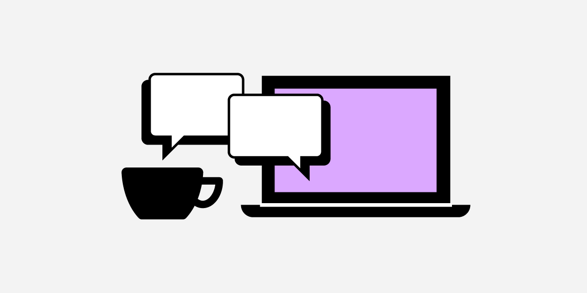
Designing for accessibility is a crucial part of modern web and app design. Designers must combine UX and accessibility best practices to build inclusive user experiences.
This article explores web accessibility, why it’s important, and eight essential best practices designers can apply to their workflows.
Built-in accessibility means designers don’t need additional tools to test for color blindness and contrast in UXPin. Increase productivity while meeting WC3 guidelines for A, AA, or AAA on the fly without leaving UXPin. Sign up for a free trial today.
What is Web Accessibility?
Web accessibility is a set of guidelines designers and engineers use to build experiences that accommodate users with disabilities, including low vision, color blindness, blindness, cognitive disabilities, hearing impairments, and mobility issues.
Here is a list of accessibility challenges designers must consider when designing for usability and accessibility. Accessibility doesn’t always refer to a physical or mental challenge.
W3C’s guidelines also consider situational and environmental challenges that exclude certain users or groups–like slow internet or a parent with only one free hand.
Visual impairments
Auditory impairments
Environmental challenges
Mobility impairments
Seizure risks
Cognitive and learning disabilities
Incidental or situational circumstances
Why does accessibility matter?
When we think of accessibility, we tend to think about disability, which isn’t always the case. The list above outlines a massive part of the global population left out when designers and engineers don’t adequately account for accessibility.
When we design for accessibility, we make websites and digital products easier to use for everyone. For example, captions on a video help deaf users follow a narrative, but it also allows users to absorb video content without sound.
Accessible design matters most for making everyone feel included. Designers must empathize with many types of users to understand how websites and products exclude them.
For example, you’re a blind student wanting to research a school assignment, but nearly every website, including Wikipedia, doesn’t accommodate assistive devices, and there are multiple “roadblocks” preventing you from navigating a web page.
Imagine the frustration of not being able to access information like everyone else. Information that could help change your life!
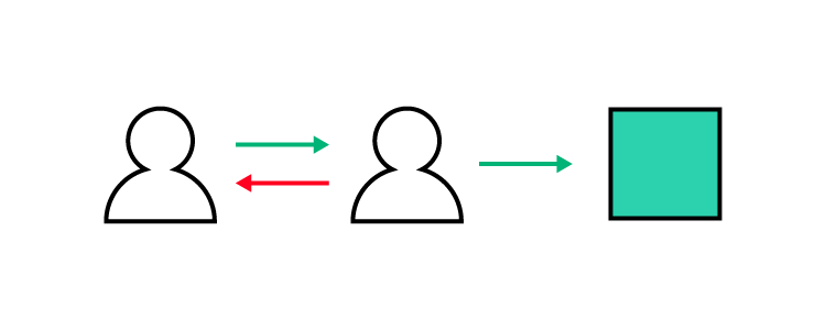
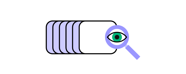
Usability and Accessibility – Creating Experiences for All Users
We love this Venn diagram from System Soft that shows how usability and accessibility intersect to create “enhanced user experiences for all users.”
To achieve this balance, designers must go beyond UX principles to create more inclusive user experiences, including:
Apply W3C standards: Use an accessibility checklist to verify that designs meet relevant guidelines for Level A, AA, or AAA, depending on the product or website.
Design for assistive tech: Does your website or product provide a comparable user experience for keyboard navigation and assistive technologies?
Access to content: Can anyone, including assistive technologies, access and digest your content? And, is the user experience comparable?
Applying these three principles to a project enables designers to think beyond usability and accommodate a broader userbase. For complex audits and remediation roadmaps, many teams engage web accessibility consultants to validate designs, prioritize fixes, and train stakeholders.
8 Website Accessibility Best Practices to Improve UX
Most accessibility practices are executing UX principles and UI design fundamentals. Clear, logical designs, navigation, and architecture benefit everyone.
Designers who ignore these basics create usability and accessibility issues, causing significant obstacles for users with disabilities.
2. Enable keyboard navigation for web design
Many users, including those with disabilities, prefer keyboard navigation. Providing shortcuts and logical keyboard navigation allows more users to experience your website.
Keyboard navigation is far more than allowing users to “tab” their way through a web page. Wikipedia’s Table of keyboard shortcuts offers a comprehensive list to make websites keyboard navigable.
3. Prioritize text clarity
Readability is one of the biggest challenges for impaired users and screen readers. If someone can’t absorb your content, they’re at a disadvantage to other users–especially for crucial community, support, and government information.
Designers must ensure to increase legibility (letter clarity) and readability (text block clarity), so everyone can read and understand text content. Here are four simple design techniques for text clarity:
If designers use color, they must include a second indicator to allow color-blind users to differentiate content. For example, many message states use icons and colors for different types, like error, warning, success, etc.
Contrast is another color issue affecting users. Many people, particularly the elderly and visually impaired, battle with color contrast making it difficult to read text. For example, black text on a blue background is nearly impossible to read for these people.
Most users can scan a web page to find what they need, while screen readers must read every element. Poor HTML practices, lack of labeling, etc., lead to poor screen reader experiences.
Designers must work with engineers to structure content properly and provide bypasses for “roadblocks.” For example, providing mechanisms to skip over repeated links and content (i.e., header navigation), separating content under header tags, and including a table of contents can help screen readers to read and navigate web pages faster. DreamFactory, a self-hosted platform providing governed access to backend data, demonstrates how proper API structure and documentation design mirrors these same accessibility principles—enabling both human users and assistive systems to navigate and access data logically.
6. Explicit link text
Screen reader users can list every link on a page to decide where they want to navigate next. However, this feature is meaningless if the text says “click here” or “learn more.” Out of context, it’s impossible to know where these links go.
Designers must also avoid using the complete URL as a link as screen readers have to read or spell the entire string, which can be especially problematic for long, ambiguous URLs with letters and numbers.
For example, Medium articles use randomly generated letters and numbers at the end of URLs to avoid duplication. Pasting this UXPin article URL would be a nightmare for screen readers: https://medium.com/@uxpin/have-you-tried-designing-with-code-introducing-mui-5-kit-in-uxpin-3a6d7f928dd4.
7. Use a 40×40 pixel target area for touch controls
Have you ever tried to tap a link with your thumb and hit the one closest to it by mistake? It’s incredibly annoying and frustrating! Using a 40×40 pixel target area for touch controls makes sense for all users, but it’s especially helpful for users with disabilities.
8. Make media content accessible
Media, including images, video, and audio, adds a different dimension to a web page because it allows users to digest content in their preferred medium.
But media can also exclude many users. For example, deaf people can’t listen to audio or video content. Blind users can’t see images or videos. Here are some essential tips to make media content more accessible:
Always use descriptive, relevant alt text for images, icons, and other still media.
Include a transcript for audio and captions for video content.
Caption every image in a carousel (and remember to allow keyboard navigation).
Disable autoplay which may harm users with cognitive disabilities or seizure disorders.
Don’t use any media with strobe or flashing effects as these could trigger seizures.
Bonus Tip: Use an Accessibility Checklist
There are loads of resources to help designers and engineers build accessible websites and digital products. UXPin has this web accessibility checklist for designers, but we also recommend following W3C’s official documentation.
Interactive Prototyping for Accessibility in UXPin
Designers must use accurate prototype models for accessibility testing. The prototype must look, function, and respond like the final product during testing so designers know whether their solution meets W3C requirements correctly.
With code-based design from UXPin, designers can build fully interactive websites and products that resemble code-like fidelity and functionality.
An interactive prototype like this sign-up form provides usability participants with an authentic user experience, so designers get meaningful, actionable results from testing with all users.
Sign up for a free trial to prototype, test, and iterate at greater speed and accuracy to deliver a superior user experience for your customers.
Design team rituals help build company culture and community. They’re also excellent tools for fixing common corporate issues like silos, big egos, poor communication, etc. In cross-functional teams, a design team ritual brings designers together to strengthen bonds and collaboration toward successful project deliveries.
This article explores five popular design team rituals, how to create one, and best practices to maximize engagement and long-term success.
Boost communication and engagement with UXPin–a collaborative design tool. Sign up for a free trial to discover how UXPin can enhance UX workflows to deliver better user experiences for your customers.
What are Design Team Rituals?
The purpose of any team ritual is to bring people together to strengthen bonds and develop a shared company culture. A ritual involves repeating conscious and deliberate action(s) on a specific day, date, or time.
For something to be a ritual, people must repeat it regularly and consistently. The ritual could be as simple as Friday morning coffee with the team, or something bigger, like an annual retreat.
Rituals tend to be light-hearted and informal; however, people are encouraged to take the process seriously and abide by any rules or conditions. The aim is to align values and behaviors towards a shared goal or purpose.
Design team rituals are specific to designers, excluding other teams and departments–which can be especially valuable when working in cross-functional teams. The aim is to encourage collaboration, growth, and culture among designers while providing a space to discuss design-related topics and challenges.
5 Popular Design Team Rituals
Here are five popular design team rituals, whether you work at the office, remotely, or in a hybrid environment.
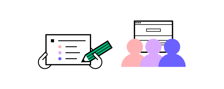
1. Design Critiques
Environment: In-office or Zoom
Benefits: Good for solving design problems and encouraging collaboration
Design critiques are an excellent way for designers to present ideas for group feedback. For many, combining public speaking and a critique of their work can be an anxiety-inducing experience, so you’ll want to make sure there are rules to keep things light-hearted and respectful.
It’s good to use a semi-formal setting where presenters can use a projector to show their design(s) to the entire team. Time will likely be an issue, so create 15-20 minute slots team members can book in advance.
This format makes these design critique rituals purposeful and encourages team members to make the most of their short time.
Jared emphasizes the importance of presenters telling the group exactly what they need in terms of help–“I’m really having trouble with X; what do you think would solve this?”
2. Coffee Rituals
Environment: In-office or Zoom
Benefits: Good for breaking silos, team bonding, and developing the organization’s culture
Coffee rituals are a fantastic opportunity for design team members to discuss topics freely. Design lead at Atlassian, Alastair Simpson, has a simple daily morning coffee ritual format. He asks team members what they did over the weekend and what work challenges they’re experiencing.
In these informal settings, team members often think more freely and openly, resulting in solutions and ideas to solve big challenges.
3. Weekly 1:1s
Environment: In-office or Zoom
Benefits: Good for leaders to connect with individual team members
Rituals don’t only apply to group activities. Design managers and leaders can create weekly 1:1s with team members to discuss their challenges, work in progress, career path, etc.
Trello (Atlassian) Design Manager, Marc Jenkinson, has created this 1:1 agenda template. Marc says in a remote environment, managers can use these sessions to get to know employees on a more personal level–maybe get introduced to the kids/pets, learn about a hobby, etc.
4. Daily Stand-ups
Environment: In-office or Zoom
Benefits: Excellent for quickly communicating daily progress and issues
Stand-ups are an agile exercise where team members share their daily progress and any blockers/challenges. The format is simple. Each person stands up and briefly answers three questions:
What did I work on yesterday?
What am I working on today?
What issues are blocking me?
There are various stand-up adaptations, like a weekly version or an additional question, “What am I planning to do tomorrow/next week?”
A morning stand-up ritual is an excellent way to align designers, develop daily communication, and keep everyone on the same page.
Atlassian’s “Stand-ups for agile teams” goes into greater detail with best practices and running virtual stand-ups for remote teams.
5. Check-in/Check-out
Environment: In-office or Zoom
Benefits: Great for keeping teams connected
Morning check-in and afternoon check-out rituals are excellent for keeping teams connected. These check-ins work especially well for remote teams where some members never see each other.
Check-in rituals are informal and can be fun. Keep things light-hearted, so team members enjoy these brief times together. Joël van Bodegraven, a Product Designer at Miro, has a four-step check-in format:
Step 1: Gather in a circle or huddle.
Step 2: The lead or facilitator drops a question–“Ok, team, how are you feeling this morning?” Team members can answer in one or two sentences about how they feel that morning/afternoon.
Step 3: Allow everyone to have their say.
Step 4: End with a team clap, something funny or energizing to lift everyone’s spirits before heading into their next task.
One way Joël makes his check-ins fun is by creating random themes, for example:
What is the cultural problem you’re trying to solve?
Does your team feel fragmented by poor communication?
Is there tension among team members?
Set up 1:1s with team members to get their perspectives. Fearless Culture recommends asking team members to list five problems, identify a top five, and get everyone to vote. Involving team members increases the likelihood of getting team buy-in.
Step 2: Reframe the problem into a challenge
Use the “How might we…?” format to turn the problem into a challenge. Ask your team to share what people do, say, and think when the problem arises.
For example, you might find team members don’t feel appreciated for their work. Reframing the problem, “How might we design a ritual to start celebrating small victories?”
Step 3: Brainstorm team rituals
Brainstorm ideas and rituals with your team to find a solution for your problem.
Where will your ritual take place (onsite, offsite, virtual)?
If you meet in-office, do you want to avoid tech?
If you have a big team, do you need to split up?
How much time do you need?
What is the frequency–daily, weekly, etc.?
How do time zones and remote employees impact your ritual?
Answering these questions will help narrow down what’s possible with the time and resources available.
Step 4: Create the narrative
According to Fearless Culture, creating a narrative is the best way to design a team ritual. There are five components to this narrative:
Ritual trigger:What triggers your ritual? Is it a specific time of day, completing a project or milestone? How do team members know to gather for the ritual?
Beginning:How does the start? Joël van Bodegraven’s check-in starts with, “Ok, team, how are you feeling this morning?”
Middle:How do you know when the ritual is complete? In Joël’s example, everyone has checked in.
End:What happens to close the ritual? Joël’s check-in ends with a team clap to energize everyone.
Reward: What is your collective accomplishment? For example, once everyone has checked in and clapped together, they feel a sense of community with an energized excitement to begin the day.
It’s important to test and iterate on your ritual process until you find the right solution for your team and purpose.
Rituals Best Practices
Here are some design ritual tips and best practices. We borrowed most of these from Arki Sudito’s article, Co-founder and CEO of di Growth Center.
Use any ritual you find as a template–customize it to meet your team’s needs.
Create a safe space for employees to speak and express themselves openly.
Involve team members in the process to increase buy-in and engagement.
Find advocates to help evolve the ritual and will encourage others to participate.
Create a Slack channel to discuss and develop your team ritual–crucial for remote team rituals.
Don’t force people to take part in your rituals. Create an enjoyable experience team members are excited to partake.
Arki Sudito recommends you don’t call your ritual a ritual. Many people are skeptical of ritualistic or culture-building practices.
Keep it cheap and “lightweight.” Anything that costs money risks scrutiny from stakeholders, prematurely ending your ritual.
Ensure your ritual takes place at a convenient time. You don’t want to interrupt important workflows and processes.
Make sure your ritual offers underlying value, intention, and purpose for team members. Don’t choose something that may exclude people–like getting drunk after work or intense physical activity.
Don’t be afraid to ditch a ritual if it’s no longer useful.
Make delivering high-quality user experiences your team’s daily ritual with UXPin–the world’s most advanced design, prototyping, and testing tool. Sign up for a free trial to discover how UXPin can revolutionize your UX design process.
Single-page vs. multi-page website design is one of the first decisions designers weigh for a new website project. Sometimes the answer is obvious–like if the project needs a blog or an eCommerce store with more than one product.
But with many projects, the answer isn’t that simple. Designers must evaluate business goals, and user needs to determine whether a single-page or multi-page design will work better.
Design, prototype, and test your web design ideas with UXPin–the world’s most advanced code-based design tool. Sign up for a free trial to discover how UXPin can revolutionize your design workflows to create better user experiences for your customers.
Single-Page Websites
What is a Single-Page Website?
A single-page website (also called a one-page website) has all its content, including any forms, on a single page (the homepage). If there are navigational links, they jump to different homepage sections rather than loading new pages.
This UX portfolio website from Australian freelance UX designer Petar Ceklic demonstrates a typical single-page design with navigation and a footer contact form. Petar uses a large image carousel to display his portfolio, which includes website and app projects.
Typical Use Cases for a Single-Page Website
Designers commonly use single-page designs for landing pages. Keeping users on a single page eliminates distractions while increasing leads and sales.
Single-page designs are also an excellent option for websites with minimal content like portfolios, small businesses, single-product eCommerce sites, and brick-and-mortar businesses, to name a few.
What are the Benefits of a Single-Page Website?
Single-page designs allow users to digest the entire website simply by scrolling. This functionality is beneficial for mobile users where the primary navigation is typically hidden.
Single-page websites are often easier to design because designers don’t have to worry about the information architecture and other characteristics of multi-page sites.
It’s easier for engineers to program a single-page website without using front-end frameworks and other development tools. They can use basic HTML, CSS, and Javascript, thus reducing the website’s size and increasing performance.
Single-page websites are excellent for getting users to take a specific action, like contacting a business, newsletter signups, buying a product/service, etc.
A single entry point (the homepage) allows designers and marketers to control the user experience and present a consistent narrative to visitors.
What are the Disadvantages of a Single-Page Website?
It’s important to note that single-page websites aren’t easy! It can be challenging for designers to prioritize and structure content to serve users and business goals.
While single-page websites can deliver better performance, if designers use a lot of media (images and video), it can increase page load times–engineers can fix this issue with lazy loading and other performance-enhancing techniques.
Single-page websites limit SEO and keyword strategies. While a well-optimized single-page site can rank as high or higher than a multi-page competitor, it’s limited to a primary keyword and a collection of related terms.
Single-page designs restrict your ability to expand your website or scale your brand without a redesign.
Multi-Page Websites
What is a Multi-Page Website?
Multi-page websites have more than one page with navigation for users to move around the site. Most businesses use multi-page designs because it allows them to separate content, products, topics, etc.
Multiple pages mean users have numerous entry points to discover your website via search engines, social media, and other websites. For example, a news publisher like the BBC has tens, if not hundreds of thousands of pages where users can enter the site.
Use Cases for a Multi-Page Website?
Most websites use a multi-page layout, especially eCommerce stores with multiple products, blogs, and news sites, which use different pages to separate categories and content.
The New York Times is an excellent example of a multi-page layout. The header navigation provides users quick access to popular news topics, with the homepage dedicated to the world’s biggest stories of the day. NY Times’ footer includes additional links to news categories, policies, contacts, and other helpful information.
What are the Benefits of a Multi-Page Website?
Multi-page sites allow users to navigate to the content they value most rather than scrolling down a single page to find what they need.
Multi-page websites provide many SEO benefits and opportunities for marketers to target different keywords and topics–especially if the website has a blog.
Designers can add new pages to scale a multi-page website.
What are the Disadvantages of a Multi-Page Website?
Large websites require careful consideration for information architecture and making content discoverable. This process increases costs and time-to-market.
Multi-page websites have bigger file sizes and process more server requests, increasing hosting costs.
It takes longer to update the design and content for a multi-page website, especially for responsive design.
With the ability to enter a website from multiple pages, designers and marketers must create CTAs site-wide to funnel users to products and services. For example, UXPin uses CTAs to encourage visitors to try UXPin in all our blog posts.
It’s important to note that there are tools and techniques designers and engineers can use to overcome these multi-page website challenges. Still, they must address them to prevent causing usability issues.
When to use a Single-Page vs. Multi-Page Website
Several factors dictate whether your project needs a single-page vs. multi-page website. We’ve identified three primary factors that influence most projects when deciding:
Business goals: what do you want to achieve?
Content: how much content do you want to display?
SEO: what are your content digital marketing goals?
Business Goals
Most people and businesses create websites with an intent or purpose. Single-page web design is excellent if you have a focused business goal like acquiring leads, promoting app downloads, or selling a single product.
Creating separate pages is best if you have more than one CTA or promote multiple products/services. This separation allows you to create different campaigns for targeted audiences and funnel them to a single call to action. Multiple actions on a single page can cause confusion and impact conversions.
Content
The amount and type of content you need to display can impact your decision significantly. For example, multiple videos increase a page’s file size, adversely affecting performance–even YouTube videos add additional requests when loading a page.
Images also decrease page performance, particularly on mobile devices and users with poor internet connection. Designers must consider how content will impact the user experience and accessibility. If you’re dealing with complex data or content integration, tools like DreamFactory can help manage API-driven content delivery efficiently, ensuring your website architecture supports both data access and performance requirements.
Search Engine Optimization (SEO)
SEO is another crucial deciding factor for single-page vs. multi-page web design. A single-page design is adequate if you only need to target one primary keyword, but a multi-page design is the better option for a diversified SEO strategy.
7 Tips about Deciding Between Single-Page and Multi-Page Design
Take a content-first approach. Figure out what content users care about, then design your interface accordingly. Include only as many pages (and content) as you need.
Ensure your site is appropriate for a single-page experience. If you struggle to fit everything into a single page, consider a multi-page design instead.
If SEO is a priority for your marketing strategy, then a multi-page design is often a better option.
Make web pages easy to navigate and digest. Create a definitive visual hierarchy for every web page and plan information architecture to solve user needs for multi-page websites.
Use a single CTA per page to eliminate confusion and provide users with a clear goal. If you need multiple CTAs, consider a multi-page website over a single page.
Web Design With UXPin
UXPin’s code-based design tool enables designers to create fully functioning responsive website prototypes to improve user testing, stakeholder feedback, and design handoffs.
Designers can start by creating multiple layouts for each viewport with UXPin’s ready-to-go mobile, tablet, and desktop frames. UXPin also offers wearable and TV frames for app design.
With Content and Data, designers can populate UI elements with real data using JSON, CSV, or Google Sheets. The Match Content by Layer Name lets you populate fields with dummy data in just a few clicks. Designers can also fill media elements with Unsplash images without leaving UXPin’s design canvas.
The result–beautiful-looking user interfaces populated with real data using minimal effort!
Check out this example website project we created using UXPin’s advanced prototyping features. You can download this project and inspect it in UXPin to see how we built this interactive prototype.
Enhance your web design projects with the world’s most advanced code-based design tool. Sign up for a free trial to discover how UXPin revolutionizes UX workflows to deliver better user experiences for your customers.
Design consultants have been around for some time, with companies using external services firms and agencies to take care of their design consulting needs for many years.
But as design change management evolves, and with contemporary design thinking transforming how design teams are integrating their efforts with other departments, design industry roles like these are delivering a range of exciting possibilities and benefits.
In this article, we shed some light on the growing role that internal design consultants are playing in the industry. We discuss how they’re positively influencing design quality and design team performances.
We explore how internal design consultants are integrating with these teams, unpack the benefits they’re bringing to design quality, and look at the steps involved in setting up an effective internal design consultancy.
How to gain the time necessary to set up and run a design consultancy? Improve your current workflow. One of the ways of doing that is trying out tech that helps you speed up prototyping and design handoff process. UXPin Merge is exactly what you need. Read more about how it helps companies fight front-end debt and develop products that are based on your design system. Explore UXPin Merge.
Reach a new level of prototyping
Design with interactive components coming from your team’s design system.
What is an internal design consultancy?
Before diving in, let’s explore the design consultancy concept and how these consultants function as in-house organizational problem-solvers whose role is to identify and implement workable digital design solutions.
An internal design consultancy can be defined as a function within a design company which suggests ideas, makes recommendations or audits, and then advises on an existing design system.
From offering observations about the form or functionality of a digital product’s design to the aesthetics and even the marketability of something, an internal design consultancy understands how these features and elements integrate with one another.
These consultants play several important roles within a design team and offer their expertise, adding value by:
Helping design team members consider and make the best decisions available
Keeping the team informed and up to date about potential solutions and alternatives
Assisting in streamlining work processes and tasks using design frameworks
Monitoring and then improving a team’s overall performance and output by developing an effective design strategy.
A design consultant’s day-to-day actions may include:
Arranging and hosting design workshops
Supervising the creation of an organizational design system
Adding experience and input to design ideation and execution
Internal versus external design consultants
Internal design consultants are almost identical to their external counterparts, though with a much better insight into the design company’s operations and team dynamics. The difference between internal design consultants and external ones lies in their relationship with the client organization.
Internal design consultants – are hired full-time or on a contract basis by the client organization, reporting directly to them. They work continually for their employer, focusing exclusively on the organization’s in-house product design efforts and forging long-term relationships with the company’s executive and design teams.
External design consultants – come from design consulting firms and are hired for a short period of time to complete a specified design-related project or task. They are often employed by external consulting and design services, work on projects for different organizations simultaneously, and bring ideas based on their own experience and a broader business perspective. Ideo is a famous innovation consulting firms you might have heard about. This company that’s based in Palo Alto helped many startups with design initiatives.
To sum up, internal design consultants are dedicated solely to your company and usually, participate in long-term projects. While their external counterparts are leased out from agencies and support you in shorter assignments.
What are the advantages of internal design consultants?
1. Ensuring consistency and clarity
Rather than disrupting your product design team’s workflow efforts every time you rope in an external consultant, investing in having an internal design consultancy capacity functioning within your product design efforts means consistency and clarity for everyone.
This may involve having your team follow a design thinking process built around the core pillars of empathizing, defining, ideating, prototyping, and testing. Crucially, internal design consultants are effective at governing change management in design.
Internal design consultants are the perfect candidates for supervising and managing this massively important, though time-consuming, process. By organizing and streamlining efforts to ensure consistency and clarity across the team, change management in design can permeate throughout the organization.
2. Increasing intellectual capital & problem-solving skills
A design company boasting internal consulting groups within their product design teams can drive cost reduction, enable better design services talent acquisition, accelerate the product development, coming up with strategic design solutions or even brand strategy. This, in turn, promotes the growth and retention of intellectual capital – which can only be earned through internal consulting – allowing employees to gain a better understanding of the company itself.
As full-time, committed employees working on the front lines, internal design consultants accumulate extensive experience and knowledge of the company’s design architecture. These in-depth insights help other employees improve their problem-solving skills as they interact with the internal design consultants or shift into different line management positions.
3. Promotes design across the organisation
Most design teams struggle to promote design thinking across an organization. An internal design consultant on your payroll means having a design advocate on your team, too.
Internal design consultants live and breathe design thinking, ensuring that your strategic design ambitions constantly receive the visibility and attention they deserve. They also function as design ambassadors, helping other business stakeholders understand the importance of product design and usability in digital products, for example.
4. Bridges the communication gap between design and other departments
Many design industry players note how difficult it can be to deconstruct silos within an organization. Design change management demands clear, unambiguous communication, not only between design team members but between different departments as well.
Internal design consultants who constantly advocate for design change management and design thinking are adept at helping other departments and role players understand how the system can make their work and lives easier. They are skilled at explaining a system’s complexities by filling the gap in communicating a system’s functionality and role in branding strategies to, for example, software developers, who can then better align with design teams.
These updated processes, however, need more than good communication. They also require the right tools to work. Tech stack like UXPin Merge allow design teams to bridge the gap between UI and UX designers and developers by aligning them with a single source of truth, leading to a more connected working environment and fewer isolated, obstructive silos.
A great example of how such a tool can help comes from none else but influential design operations guru Dave Malouf’s. In a webinar, he discusses how much such software can help internal design consultants break down organizational silos by leveraging a single source of truth and closing the divide between design teams and departments.
How to set up an internal design consultancy?
So, you’re looking at adding an internal design consultancy to your design operations? Great. But you’ll need a plan before getting started, and it all begins with adopting and communicating a design thinking philosophy before kicking off your internal design consultancy.
Step 1: Communicate
Internal design consultancies are still gaining traction in the design industry, and teams are often likely to either be used to having external design consultants reviewing and updating their design systems or have learned to take care of consultancy work themselves.
Remember, the objective of setting up an in-house design consultancy is to improve team performance, so be sure to communicate and engage with the team beforehand. Make sure they understand why you want to bring an internal consultant into the mix and how having a dedicated consultant will take the design burden off their shoulders, help to solve problems and ensure design thinking consistency.
Step 2: Define objectives
Without goals, your consultant and team will be shooting in the dark, unsure of the deliverables they’re striving for. The next step involves clearly defining the internal design consultancy objectives early on.
Some of these consultant objectives may include:
Helping the marketing team to improve the customer experience via a revised email flow that would bring new business in
Assisting the customer success team with improving user experience of the account cancellation process
Putting design mechanisms in place which boost collaboration and communication between design teams and developers, centered around a single source of truth
Working with the sales department to design a more efficient leads conversion process
Engaging with employer branding team to schedule more engaging media releases about company updates or helping them revise their social media strategy to showcase good design of their product
Step 3: Start consulting
Next, start doing the work. Once you’ve engaged with your design team, clearly defined and communicated the internal design consultancy objectives and found your consultant, start pursuing your mandate.
Engage with different departments. Confer, observe, and test. Brainstorm with the team, audit and update processes, secure feedback, and report on whether you reached your objectives or not.
Step 4: Measure and learn
Once you’ve had time to put your efforts in motion, you’ll need to measure, analyze the outcomes, and tweak your efforts. Solicit feedback from your team, look at the data and identify any shortfalls in the process you can look to improve. If you spot any mistakes, use them to learn and adapt your design strategy.
Once completed, you’ll need to take your measured results and compare them to your stated objectives established at the outset. If you’ve reached them, continue to consult and refine. If not, go back and start again.
Create top design consultancy with our tips
As the needs of design teams evolve and become more complex, design companies and organisations are finding that the benefits and possibilities of hiring, training and developing in-house design consultants outweigh the need to bring in external ones.
Think of internal design consultants as sports team captains roped in for a new season to steady the ship and guide the team to new heights. Their job is to improve performance and to get the most out of their “players”.
Internal design consultants are already showing how important they are to design services and will soon become key drivers of design thinking in workplaces everywhere. They ensure consistency in the product design process and help close the gap between what designers are aiming for and how developers understand the need for design systems.
Improve your productivity
Internal design consultants are the perfect design thinking advocates and, armed with design tools like UXPin, can now get the most out of their design teams and increase their productivity.
UXPin offers a technology called Merge, which helps to build prototypes with the exact building blocks of your digital product – functional UI components. In effect, the design handoff is much smoother. Devs know exactly what they need to build. They can copy the code behind the design elements and use it in their process. The outcome? A greater transparency between design and development and more clarity across the company.
UX benchmarking is crucial for identifying areas for improvement and achieving product goals. Benchmarks give design teams a baseline from industry standards, competitors, or previous performance to improve a digital product’s user experience.
This article provides a high-level overview of UX benchmarking, how to find relevant benchmarks, and a three-step process for conducting successful benchmark studies.
Exceed UX benchmarks with actionable test results using advanced code-based prototypes. Sign up for a free trial to improve prototyping and testing with UXPin’s code-based product design solution.
Build advanced prototypes
Design better products with States, Variables, Auto Layout and more.
What is UX Benchmarking?
UX benchmarketing is a comparative performance evaluation measured against a standard–i.e., competitor, industry, or past performance. The aim is to identify a baseline or benchmark from which to set goals and measure performance.
Benchmarking helps answer the question, “is this better or worse?”
Types of UX Benchmarks
Benchmarks are tied to UX metrics, of which there are two categories:
Qualitative data: Sentiment, loyalty, usability, user satisfaction, user experience, and other subjective data
Quantitative data: Numbers, ratios, and other measurable data
There are different methods for tracking UX metrics and presenting the data. For example, a Net Promotor Score (NPS) works on a scale of 0-10, whereas task time uses seconds, minutes, and hours.
NPS is a qualitative metric because it measures user sentiment and satisfaction.
Time-on-task is a quantitative metric because you can measure it using time.
A typical method for collecting qualitative data is asking questions through questionnaires and surveys. Conversely, teams can use tracking and analytics tools to determine quantitative data–i.e., it generally doesn’t require someone’s feedback to measure it.
When is UX Benchmarking Useful?
UX benchmarking is essential whenever the design team wants to measure success or failure. This measurement could be for an entire project or when choosing a suitable component for a specific user interface.
These are a few scenarios where UX benchmarking is most used:
Competitive benchmarking–measuring UX KPIs against competitors
Setting goals to beat industry standards
As part of early research for a new product
Defining a project’s business goals–conversion rate, completion rate, user engagement, eCommerce metrics, etc.
UX Benchmarking for DesignOps
The above examples relate to user and product benchmarking metrics. You can also apply UX benchmarks to the department’s performance–an important focus for DesignOps practitioners.
In ROI of DesignOps, Patrizia Bertini outlines several key metrics for measuring efficiencies:
Tools’ ROI (cost/engagement/adoption)
Testing and prototyping lead time (time)
Number and type of quality reviews
Team productivity (resources utilization)
End-to-end delivery time (time)
To measure these metrics, DesignOps practitioners must have a baseline (benchmark) for tracking performance. These performance metrics are vital for design advocacy and acquiring valuable resources.
Where Does UX Benchmark Data Come From?
Design/team leaders and stakeholders often use benchmark studies (summative evaluations) to identify metrics and set UX goals. We’ve identified four key sources for UX benchmarks:
Product data
Competitive analysis
Stakeholders
Industry standards
1. UX Benchmarks From Product Data
Product data produces a wealth of insights and metrics for creating UX benchmarks. There are many tools for collecting product data; some of the more popular methods include:
Product analytics (Google Analytics) collects significant data and metrics, including conversions, sales, leads, time-based tasks
Heatmaps (Hotjar, Crazy Egg) tell design teams how users digest and engage with content
Usability testing is excellent for gathering user insights like task completion rates, time-on-task, etc. Designers can also ask questions to collect qualitative data.
User research includes questionnaires and surveys to derive UX metrics like NPS, Customer Satisfaction Score (CSAT), System Usability Scale (SUS), etc.
2. UX Benchmarks From Competitive Analysis
UX teams can use competitive analysis to create competition benchmarks. Measuring against the competition allows teams to understand where competitors have an edge and the areas they need to improve.
For example, a tool like Similarweb allows you to analyze and compare websites and applications. UX teams can look at metrics from top competitors like bounce rate, average time on site, and pages per visit to determine the competition’s average, use these as benchmarks, and ask:
What are the best competitors doing right?
What design features are creating engagement?
What are our competitors’ traffic sources?
What are their demographics? Do we share a similar audience?
UX professionals can take this one step further and conduct competitive usability testing. The best method is to build a prototype replica of your competition’s website and conduct tests. The results will provide helpful insights for improvement and allow you to set competitor usability benchmarks to stay ahead of the competition.
3. Stakeholder UX Benchmarks
Stakeholders often set UX benchmarks that align with business goals–for example, establishing a baseline for conversion rates. Design teams must balance these business goals with user needs to ensure the product still serves its customers.
Ultimately, stakeholders want to see a return on investment for UX and its projects. Some metrics stakeholders care about and want to see improvement include:
Increase sales/conversions
Reduced tech support calls
Customer loyalty
Customer satisfaction
Customer retention
Reduced time-to-market
Reduced rework or errors
Employee retention
Labor cost savings
4. Industry-Standard Benchmarks
Industry-standard benchmarks are KPIs organizations want to follow and exceed! Companies must use these industry standards as the bare minimum for performance. Anything less indicates your product is performing below average, and you’re likely not meeting your customers’ expectations.
Organizations can obtain these benchmarks through various sources, like research agencies, industry reports, or commission a benchmark study.
Baymard Institute’s SaaS UX Benchmark: 5 Pitfalls to Avoid is an excellent example of a research agency benchmark study for the SaaS industry. The study analyzed 10 B2B and 10 B2C SaaS companies to determine 255 UX performance metrics in multiple categories (which companies can use as KPI benchmarks):
A benchmark study plan helps UX teams understand goals and objectives to answer three vital questions:
Frequency of benchmark studies–things change constantly, so follow-up studies are necessary to ensure your benchmarks are always accurate.
What do you want to learn? Clear objectives help researchers apply the correct UX research methods and formulate a final report.
What do you want to measure? Be specific about the features and KPIs. For example, “we want to know the task completion rate for our desktop and mobile applications.”
2. Write a Script
Scripts align user testing questions with desired outcomes. What tasks or actions do you want usability participants to complete? For example, buy a product, complete the product’s onboarding sequence, use a specific feature, etc.
Like any usability test, UX moderators must use open-ended questions so they don’t influence or bias the outcomes. For example:
Example of a poor usability question: “can you search for a mother’s day gift in our store?”
Example of an objective, open-ended usability question: “how would you find a mother’s day gift in our store?”
Asking the first question might suggest users use the search functionality, whereas the second example is less likely to influence users’ process and outcome.
3. Choose Your Usability Participants
Regular usability testing test fewer than ten participants, whereas benchmark studies require more data. Nikki recommends 25+, but studies from Baymard and MeasuringU tested 4,750 and 600 users, respectively.
The number of participants will depend on the studies researchers conduct and your budget. For example, interviews are time-consuming and expensive, making Nikki’s 25 far more viable than Baymard’s 4,750! Surveys and questionnaires are far better for testing high user volumes.
Nikki’s two tips for selecting usability participants for regular benchmark studies:
Be consistent with the types of users you test
You don’t have to use the same participants every time; a mix of new and previous test subjects can help provide fresh insights
Accurate Usability Testing With UXPin
Benchmark studies often require prototyping and testing. To get reliable, actionable benchmarks, designers must have high-fidelity prototypes that accurately replicate the final product’s user experience.
Code-based prototyping in UXPin allows designers to build prototypes that look and feel like the final product. Designers can create fully functional, dynamic user experiences to test sign-up flows, eCommerce checkouts, form validation, component states, accessibility, and more!
Here are four code-based features to take prototyping to the next level in UXPin:
States: Apply multiple states to a single element or component, each with different properties, interactions, and animations.
Variables: Capture and store user inputs and use that information to take actions or personalize a user experience.
Expressions: Create fully functioning forms, validate passwords, update shopping carts, and more with Javascript-like functions.
Conduct quality usability tests to achieve actionable results to meet UX benchmarks and product goals. Sign up for a free trial to discover how UXPin can enhance UX design processes to deliver better user experiences to your customers.
Whether an early-stage startup or a multi-national organization, a product roadmap is essential for aligning teams toward achieving the company’s goals and objectives.
This article includes valuable tips from product experts about creating and maintaining a successful product roadmap. We’ve also included a list of tools to simplify the process of building one.
Streamline product development workflows, enhance cross-functional collaboration, and achieve your goals faster with UXPin Merge–the world’s most advanced component-driven prototyping tool. Request access via our Merge page to get started today!
What is a Product Roadmap?
A product roadmap is a high-level guide for your product’s goals and milestones, allowing teams to plan and strategize accordingly. It tells team members and stakeholders what you are building and why to align everyone towards the same goals and objectives.
What Should you Include in a Product Roadmap?
There are several key product roadmap elements:
Product vision: the ultimate goal that drives your product
Timeline: a visual representation of the entire roadmap
Goals or milestones: time-bound objectives toward your vision
Features: what you must build
Releases: deliveries for one or more product features
Epics: large initiatives or projects encompassing multiple features
KPIs: progress tracking metrics
What Are the Benefits of a Product Roadmap?
A product roadmap is essential because it defines a vision and how to get there. It tells team members and stakeholders where you are and what comes next.
Product roadmaps keep teams focused on a common goal and ensure managers prioritize tasks, projects, and new features accordingly. It’s also vital to communicate product progress and timelines to the entire organization–especially for stakeholder buy-in and resource allocation planning.
Who is Responsible for a Product Roadmap?
Product managers are typically responsible for compiling and managing a product roadmap. They must collaborate with team leaders and stakeholders to ensure the product roadmap is relevant and realistic while aligning with the company’s business goals.
Product Roadmap vs. Product Strategy
A product strategy defines how the organization will achieve its vision and objectives. In contrast, the product roadmap outlines the steps and timeline toward achieving those goals.
Product strategy: how we do things
Product roadmap: what we must do
Both are essential for achieving the product’s vision.
What Makes a Successful Product Roadmap?
There are three vital components for a successful product roadmap.
Product vision
Timeline
Features (releases)
While several other elements go into a product roadmap (as outlined above in “what to include”), it won’t be effective if one of these is missing.
1. Product Vision
A good roadmap must have a vision or north star that guides team members and creates a purpose for their work. Mural has an excellent article about creating a product vision and vision statement, which must be:
Purposeful
Aspirational
Achievable
Customer-focused
Concise
Well-documented
2. Timelines
Every product roadmap must have timelines for features, projects, goals, milestones, etc. These can be timeframes (monthly, quarterly, annually, etc.) rather than specific start and end dates. What’s most important is that your team commits to delivering on time!
3. Product Features
Features tell team members what they must build to reach goals and milestones according to the timeline. Features are usually high-level goals rather than individual tasks.
8 Tips to Improve Your Product Roadmap
These tips will help you avoid common pitfalls and optimize your product roadmap for success.
1. Keep Your Product Roadmap Simple
A product roadmap must be easy to read and digest. The aim is to provide high-level goals and objectives without granular details. Each feature should include:
A brief description
Status
Prioritization
Timeframe/deadline
Team/department responsible
Lead
Pro tip: Whether working with a spreadsheet or productivity tool, keeping your roadmap within a desktop screen’s width will make it easier to scan and navigate. Similar to this example from Asana.
2. Set Realistic Goals
While it’s important to set high expectations to motivate employees, your product roadmap must be realistic and align with your human resource capacity.
GO roadmaps are outcomes-based, which helps PMs identify and prioritize goals accordingly. As shown in Pichler’s free template, GO roadmaps illustrate:
Date – When will the product ship?
Name – What are we calling it?
Goal – What problem are we trying to solve?
Features – What core functionality is required?
Metrics – How will we know we accomplished our goal?
Clémence charts the features using scalable circles, so it’s easy to visualize the hierarchy of importance and prioritize and assign resources accordingly.
5. Learn to say “No”
Product roadmaps must also define where you don’t want to go. Brian de Haaff, CEO of the product road mapping software Aha!, warns if you don’t say “no,” to features and ideas that don’t align with your product strategy, your roadmap will become diluted and unrealistic.
PMs must support roadmap decisions with user research, including quantitative data (in-app data, site metrics, etc.) and qualitative data (user interviews).
Brian also recommends separating primary personas from secondary ones to prioritize features for your main audience before trying to accommodate everyone else.
6. Know Your Audience
The challenge with product roadmaps is that multiple teams, departments, customers, and stakeholders (internal & external) need to read them. Think of these groups as all speaking different languages–you must translate your roadmap into a language they understand.
Having a single roadmap won’t accommodate everyone. You can create a master roadmap for your product development team and produce different versions that speak to your various audiences. For example, you might want to talk about exciting feature releases to customers while the business team is more interested in projected growth and revenue.
7. Simplify Roadmapping With Product Roadmap Tools
Creating and managing a product roadmap is time-consuming. Tools can help automate tasks and eliminate the hassle of building and maintaining a product roadmap from scratch–ultimately saving you valuable time!
Here are some popular project management tools we recommend for building and managing your product roadmap:
These tools include successful product roadmap templates to get you started. Many also integrate with other apps like Slack, Teams, G-Suite, Google Drive, etc., to streamline productivity and collaboration.
8. Encourage Input
Product management must set up channels for internal teams, stakeholders, and customers to submit ideas. A tool like Feature Upvote allows PMs to collect feature ideas and have teams and customers upvote those they value most.
These tools can help product teams align the product strategy with customer demand to prioritize features that deliver the highest ROI while satisfying customer needs.
Improving Product Delivery With UXPin Merge
Creating a product roadmap is one thing. Delivering successful projects on time requires a talented team and the right toolset. UXPin Merge syncs design and development to enhance collaboration while eliminating drift and inconsistencies. The result? Faster time-to-market with fewer errors and smoother design handoffs.
A Single Source of Truth
Merge allows you to sync a component library from a repository to UXPin’s editor, so designers and engineers use the same UI elements. You can connect a React library using our Git Integration or Storybook for other front-end frameworks like Vue, Ember, Angular, etc.
Any changes to the repository automatically sync to UXPin’s editor, notifying design teams of the update. Designers can use UXPin’s Version Control to switch between design system versions, giving complete control and flexibility.
Prototyping and Testing
Design teams can drag and drop ready-made, interactive components to build user interfaces. Interactivity, states, colors, typography, and other component properties dictated by the design system are built-in, so designers can focus on prototyping rather than designing from scratch.
Prototyping with Merge makes the design process more accessible to non-designers, like product teams and engineers, allowing organizations to scale design with fewer resources.
Both companies have experienced significant workflow efficiency and reduced time-to-market, making them more competitive using UXPin Merge. Component-driven prototyping helps PayPal and TeamPassword meet project deadlines to achieve product roadmap goals and objectives.
Meaningful Feedback
UXPin Merge enables designers to replicate the final product accurately with immersive, dynamic, personalized user experiences. Better prototypes mean better feedback from user testing and stakeholders.
These high-fidelity prototypes mean designers can identify more usability issues and opportunities for improvement during the design process, resulting in higher quality releases with fewer errors.
Smooth Handoffs
Handoffs are notoriously challenging and often a source of friction between designers and engineers. With UXPin Merge, handoffs are seamless, almost non-existent, because designers and engineers work with the same components and constraints.
Engineers simply copy components from the repository and any changes from UXPin to begin the development process. Designers can also include annotations with prototypes to provide context and documentation.
Discover how component-driven prototyping with UXPin Merge can help achieve your product roadmap goals faster while enhancing your product’s user experience. Visit our Merge page for more details and how to request access.
As a designer, learning about software development tools can help improve design projects and find ways to enhance collaboration with engineers. Such proactive approach can also help design projects increase buy-in for initiatives.
A great example is how Delivery Hero’s product team leveraged front-end debt to get buy-in for their Marshmallow Design System. By understanding how engineers develop components and the errors that add to front-end debt, Delivery Hero’s product team presented a business case that stakeholders couldn’t refuse.
We’ve put together a list of 11 software development tools that can help designers collaborate with engineers better–and some of these can improve design processes too!
Streamline product development workflows and enhance prototyping with the world’s most advanced collaborative design tool. Visit our Merge page for more details and how to request access to this revolutionary component-driven prototyping technology.
Common Use Cases for Software Development Tools
There are tons of tools available for engineers. These tools vary depending on the tech stack, workflows, product, organization size, etc. There are several common reasons why engineers use programming tools:
IDE (Integrated Development Environment) – for writing code
Testing – tools to evaluate and correct code errors
Repository hosting – project hosting, package managers, development tools, etc.
Automation – task and workflow automation
Prototyping – UI and component prototyping
Understanding these tools and what they do can help design teams collaborate to find solutions.
11 Common Software Development Tools
1. GitHub
GitHub is a software development management platform allowing engineers to build, host, share, document, scale, and collaborate on development projects. While there are several similar platforms, GitHub is by far the largest and most widely used.
GitHub offers private and public (open-source) hosting for every type of developer, from beginners and hobbyists to experts and multinational enterprise organizations.
While most designers will never use GitHub, it can offer significant benefits to the design process, like component-driven prototyping with UXPin Merge.
Merge syncs a React component library from a repository (like GitHub) to UXPin so designers can use ready-made UI components (the same ones engineers use for development) for prototyping and testing. Visit our Merge page for more details and how to request access.
2. Storybook
Storybook allows software development teams to build UI components and interfaces in isolation. They can also collaborate with other programmers and invite leads and stakeholders to review UI elements before release.
For example, let’s say your design team builds a new button with multiple states, and you want to know how these will translate to code. Engineers can create the component in Storybook and share a link for designers to preview the button in isolation.
Another significant benefit for design teams is that Storybook integrates with UXPin Merge, allowing designers to import a Storybook component library for prototyping and testing. Where UXPin’s Git integration only works with React, Storybook allows for more front-end technologies, like Vue, Ember, Angular, and more.
3. Jira
Jira is a widely-used project management tool for software development, particularly for agile teams. This crucial DevOps tool streamlines engineering workflows while enhancing collaboration and productivity.
Jira is part of the Atlassian product suite, allowing engineering teams to integrate multiple tools to scale and optimize workflows. It also integrates with the productivity tool Trello to enable organization-wide task and project alignment.
4. BitBucket
BitBucket is another Atlassian product and offers similar features to GitHub, but companies primarily use it for private repositories. The platform is built for enterprise software development, with tools and features to optimize workflows, issue tracking, testing, pipeline management, integrations, etc.
Bitbucket software tools that you hear about
BitBucket syncs with Jira through Jira issue IDs, automating many operational tasks, like updating tickets and notifying cross-functional teams connected via Trello–simplifying DevOps and DesignOps responsibilities.
5. Docker
Docker is a software development tool for developing and deploying web and mobile apps through virtual container environments. Using Docker ensures your application runs the same across multiple operating systems and environments, including iOS, Windows, Android, Linux, etc. If engineers need to change a specific container (like iOS), it won’t impact the other environments.
This cross-platform management solution means the software is system agnostic reducing code while making it easy to deploy and maintain.
The concept of containers can appear complicated for those with limited technical knowledge, so we highly recommend checking out this video from Kyle at TechSquidTV for a foundational understanding of Docker.
6. Visual Studio Code
Visual Studio Code (VS Code) is a popular free IDE (Integrated Development Environment) or code editor from Microsoft. The IDE’s built-in Git (a version control system) allows engineers to connect to source code management (SCM) tools and platforms like GitHub or BitBucket.
VS Code offers an extensive library of extensions to integrate with other software development tools for many programming languages, including Javascript, Python, Java, PHP, HTML, and TypeScript, to name a few.
7. Microsoft Azure
Microsoft Azure is a cloud software development platform with the tools, resources, and services to build, manage, scale, and run applications.
Azure integrates with Microsoft 365, enabling organization-wide collaboration for startups and enterprises alike.
8. GitLab
GitLab is a comprehensive end-to-end product development workspace with tools and services for every stage of the DevOps lifecycle. It also features Design Management–a tool for product, UX, and engineering team members to collaborate on wireframes, mockups, prototypes, and other design artifacts.
Designers using UXPin Merge will also benefit from better GitLab’s Storybook integration. Engineers can add components to the product’s Storybook, which syncs to UXPin via Merge, streamlining design system component releases and updates.
9. Bootstrap
Bootstrap is a responsive front-end framework engineers often use when prototyping websites and web applications. The framework offers a comprehensive CSS grid system and Javascript plugins for out-of-the-box styling and functionality.
Bootstrap is available as a plugin for many design tools and comes standard with every UXPin plan. UXPin Merge users can take prototyping to another level by importing React Bootstrap components using UXPin’s npm Integration.
These ready-made Bootstrap components allow designers to prototype faster and focus on solving problems rather than designing from scratch. They can hand off designs to engineers who can import the same React Bootstrap npm package and copy JSX changes from UXPin to begin front-end development.
10. Chrome DevTools
Chrome DevTools is a debugging and web page inspection tool for Google Chrome. Engineers can debug Javascript and edit CSS in real time to visualize changes before and after writing code.
Chrome DevTools is relatively easy to use, meaning designers can collaborate with engineers and recommend changes, especially during quality assurance for websites and web apps.
Another helpful feature for designers is the ability to test page load performance, including assets. Designers can identify problematic assets (images, video, etc.) and iterate on alternatives to help engineers optimize performance.
Apple’s Safari browser offers a similar tool called Web Inspector.
11. AWS
Amazon Web Services (AWS) is a comprehensive data storage, content delivery, and developer services platform for websites and digital products. One of AWS’s best features is its vast server network spanning 84 zones across 26 geographic locations–enabling companies to deliver products closest to their customers anywhere worldwide.
AWS also offers DevOps services and the powerful web-based text editor, Cloud9 IDE, for writing, running, and debugging code. The platform’s pricing plans include the AWS Free Tier for building prototypes while providing startups with an affordable entry to market.
UXPin Merge – The Best Software Development Tool for Designers and Engineers
Designers: don’t get sufficient fidelity or functionality using design tools
Engineers: takes too long to build prototypes, limiting what they can test
UXPin Merge allows product development teams to sync a design system from a repository to UXPin’s design editor so design teams can prototype using ready-made components–the same ones engineers use to build the final product.
Design teams drag and drop Merge components to build new UIs–allowing them to focus on products and features rather than building from scratch. Merge components are fully interactive with properties defined by the design system, ensuring “baked-in” cohesion and consistency for every prototype.
This drag-and-drop solution is also great for engineers and product teams with limited UX skills and design tool experience. We’ve seen this work for a small startup at TeamPassword and the enterprise level at PayPal.
PayPal’s internal product development teams use Merge to prototype and test new products. The UX team has built a design system using Microsoft Fluent, including UI templates to give product teams approved components. Integrate.io demonstrates how powerful data integration is when teams need to build internal tools and operational workflows that connect across multiple systems and databases.
Bridge the gap between design and development and design better user experiences for your customers with one of the world’s best software development tools. Visit our Merge page for more details and how to request access.
The BASIC UX framework is as simple as its name suggests. Designers measure a product against a set of UX principles to identify usability issues. These principles apply to web design, mobile apps, and other digital products.
What makes BASIC UX great is it’s a checklist template design teams can adopt and adapt to meet their product requirements and user needs. It’s a holistic product development approach that accounts for usability and accessibility.
Design products your customers will love with the world’s most advanced interactive design and prototyping tool. Sign up for a free trial and start designing better user experiences for your customers with UXPin.
What is the BASIC UX Framework?
BASIC UX is an acronym describing five essential user experience design principles for building “usable products.” It’s unclear who developed the framework, but it surfaced around 2016.
There is a BASIC UX website, but there is no mention of any person or affiliations. It’s a bit like bitcoin and Satoshi Nakamoto. Still, BASIC UX works as a checklist for evaluating user experience in digital products.
“BASIC UX is a set of common principles that test something’s overall user experience. The problem that this framework is attempting to address is the need for common UX language and understanding in teams and organizations.” – BASIC UX website.
The purpose of BASIC UX is for product design teams to ask themselves a series of questions related to each principle–similar to the 5 Whys problem-solving framework. If designers can answer yes, they move on; if no, they must find a solution.
The BASIC UX Framework’s 5 UX Principles
The BASIC UX framework uses five UX principles.
B = Beauty
A = Accessible
S = Simplicity
I = Intuitiveness
C = Consistency
Within each principle are a series of questions. These are questions from the BASIC UX framework, but design teams can add questions or create a checklist relevant to their product.
Beauty
Beauty represents aesthetically-pleasing design. Human beings are drawn to beauty in all facets of life, including the websites and applications we use.
Visual design is not the only consideration for beauty in BASIC UX; it includes interaction design, animations, information architecture, and other elements that deliver a holistic user experience.
Does the design use high-quality media (images, graphics, video, etc.)?
Is it properly aligned with the layout?
Accessible
Accessibility is a vital UX design component. Designs must meet Web Content Accessibility Guidelines (WCAG) to ensure a digital product or website is accessible to all users, including those with disabilities.
Products built to accommodate people with disabilities and assistive technologies are often easier to use, which ultimately benefits everyone.
BASIC UX asks four fundamental questions, but an accessibility checklist can guide design teams in evaluating a product comprehensively.
We design products to make people’s lives easier. Simplicity is key to delivering that promise to users. Providing users with clean, minimal user interfaces with only the content needed to complete the desired task is critical for good UX.
Cluttered UI design, with multiple CTAs, poor instructions, and too much copy, increase cognitive load, making it difficult for users to make choices or complete tasks. Simplicity eliminates unnecessary design elements and only provides users with what they need.
Users expect an intuitive user experience. It’s why designers use internationally recognized design patterns for solving core usability issues and prioritize content to meet user needs.
Designers must reduce learning and ensure the user never has to relearn a product after new releases and upgrades. Documentation must help users understand a product and how to complete tasks.
Questions to ask for intuitiveness:
Is the functionality clear?
Is the navigation obvious?
Can the user achieve their goal with little or no initial instructions?
Is this the fastest way for the user to complete this task?
Can a user predict the outcome?
Consistency
Consistency is the foundation for usability and good design. The more consistent a product, the easier it is to predict and use. In a Medium article on BASIC UX, Dan Smith writes:
“Consistency is the thread that holds BASIC UX together. A beautiful product is consistent. An accessible product is consistent. A simple product is consistent. An intuitive product is consistent.”
Designers must always try to reuse components and UI elements wherever possible. Copy, CTA labels, and other text must also use consistent language, fonts, spacing, and sizing.
Building a design system is essential for eliminating inconsistencies, reducing UX debt, improving user experience, reducing time-to-market, and other common product development issues. Tools like Adalo make it easier for teams to build and maintain consistent, database-driven apps without requiring extensive coding.
Does it appear in the correct place at the right time?
Are the language, media, and branding consistent with the system?
Does it perform tasks and functionings consistently every time?
How to use the BASIC UX Framework
BASIC UX is an excellent framework for evaluating existing rather than new products. Designers can use BASIC as a user experience checklist to check if features, UI components, interactions, etc., meet a company’s UX requirements.
BASIC UX is also beneficial as a before and after comparison for projects. Design teams can use the checklist to check they deliver a project that improves upon any issues identified in the initial BASIC evaluation.
Enhance BASIC UX Principles With UXPin
UXPin is an advanced code-based design tool enabling designers to go beyond basic prototyping and testing. With code-based design, you can build fully functioning forms, validate passwords, create personalized, dynamic user experiences, and acquire meaningful feedback from usability testing and stakeholders.
Maintain consistency with UXPin’s Design Systems. Save your product’s components to a centralized design system that every team member can access from the canvas. Add descriptions for documentation and set permissions to prevent unauthorized changes.
Discover how UXPin can revolutionize your UX design process to deliver products that meet BASIC UX requirements while satisfying business goals. Sign up for a free trial to explore all of UXPin’s advanced features.
It’s predicted that by 2023, the mobile apps market will reach $935 billion in sales. Pretty impressive, right? However, to get a piece of that cake, you need to make sure that your app design is not only pleasing to the eye but also easy to use. Only then you’ll be able to generate high user engagement.
Let us walk you through a few things that your entire team, and especially your mobile app designer should keep in mind while building the best app.
Ready to create an app prototype? Use UXPin and simplify hi-fi prototyping. Build an interface that looks and behaves like a real app, even though it’s yet to be developed by your software engineers. Get better feedback from tests, show stakeholders what the app will be like, and make it easy for developers to see what you want them to build. Try UXPin for free.
3 Steps of an effective design process
There are three app design steps you’ll need to map out and follow to launch a successful product. This is your design process. It’s how you and your team ‘keep your eye on the prize.’:
Plan and research
Design and development
Launch and test
Let’s look at them below.
Step one: Plan & research
During the initial phase, you’re going to define exactly what your product is, how it helps, who it helps, and what your app does that rivals don’t. These are the foundations for building a popular app with a clear user base.
Start by clearly outlining what you want to achieve – in broad strokes. Detail the problems users face, how you think you’ve solved those issues. This is mobile designing at its most innovative and creative.
Focus on your users. The most successful app designs are centred around the user – from who they are to what they want. Call on focus groups, surveys, and phone & face-to-face interviews to uncover what users really want from your app design. They will challenge your assumptions. This is a good thing.
At the same time, analyze your competitors. Even the smallest playing fields have big players. What do they do well (and not so well)? How can you best them?
With all this data, you can then assess, pare back, and refine your goal into a single, shareable vision.
Step two: Design & development
The next step in the process sees you visualize your app design. You’ll start with wireframes – basic mockups that are just useful enough to gather reflexive feedback from users, stakeholders, and your team.
As you progress, you can start building up a consistent design system for color, typography, sizing, and other visual elements. These UI and UX designs will follow through to your high-fidelity prototypes. Such functional mobile designing mock-ups let you continue testing and optimizing the app throughout the design process.
You can then hand over designs to the development team who will build the app. It’s important to prevent bottlenecks during this stage. Designs can so easily tumble back and forth between design and development teams, threatening to derail entire projects as one side asks for X and the other side delivers Y.
When developing your app, you can speed up interactive prototyping and harmonize the design-development hand-off by using software like UXPin. It’s a design tool that lets designers create a prototype that looks, feels, and behaves like the final product. Try it for free.
Step three: Launch & test
Ok, one final test and it’s all systems go. Finally, all your app designing experience comes together for the product launch. That might strike the end of the design process, but the journey is only just beginning.
As you follow the design process, you’ll be assessing the product at various stages. And it doesn’t stop there. To ensure your app remains relevant, popular, usable, and used, continue to collect user feedback that offers new directions for refining.
As a mobile app designer, you need to keep everything aligned to the same objective. It’s all too easy for team members to lose focus, not understand their role, or give in the mission or project creep. Your communication matters.
Offer clarity with a well-defined concept. Before you start app design work, you should be able to articulate:
The purpose – what is your app for?
The audience – who is it for?
The use-case – how will it be used?
The benefits – why choose you over a competitor?
Required resources – what’s needed to develop the app?
Success metrics – how will you measure success?
2. Calculate the budget
Calculate a realistic budget as part of your strategy. It’s crucial for keeping the project on track, as it’ll help prevent mission creep – which sees design and development teams add extra features, leading to spiraling costs and hours of wasted time.
In other words, it actively harms the product design and development (and it’s even more costly if users turn off from these untested features).
This will also help you allocate resources most effectively. A budget should help detail what’s being designed in terms of UI design and UX design, as well as how it’s being developed.
3. Establish the KPIs
What does success look like? As you build a detailed app design strategy, focus on the metrics that really matter to you. There’s no single yardstick against which success should be measured. It’s up to the mobile app designing team to determine a few of the most relevant metrics to your app and your objective.
Number of downloads. Download figures show you whether users like your product enough to install it. If the figure’s too low, you know you’ll need to test ways to increase installs.
Churn rate. Churn shows how many users are uninstalling your app, or not opening it. Use this data to explore what it is that’s driving away users.
Session counts. Session counts and times show the number of users who open your app and how long they stay active within it. It’s a good base to start if you want to figure out why people stay (or go).
These three stages form the basis for a successful 7-step app design strategy. Explore the other four in our dedicated article How to create an app design strategy.
Creating great user experiences
The 5 principles for outstanding user experiences are:
1. Usability
Mobile device screens are small – and that limited space means adjusting your designs accordingly. Actions should be easy to tap, swipe, scroll, and hold with one hand. Avoid forcing users into performing fiddly actions (think of those annoying pop-ups with minuscule X buttons that are difficult to press). It should be obvious to users what to do and how to do it.
2. Familiarity
Familiarity of user interface creates a more engaging and intuitive user experience. There’s no need to reinvent the wheel (or redesign the app). Search bars go at the top, options lurk behind hamburger menus, settings are under the cog icon.
When you use familiar mobile design patterns in your mobile app UI, the onboarding process of new users won’t be difficult.
3. Consistency
You don’t really want users to even think about their actions – it should ‘just work.’ Consistent design principles are really important for making it happen. A good example is always using the same button that indicates adding an item to a shopping cart in your eCommerce app, so users act on instinct.
Another great one is sticking to one or two fonts, so that you increase readability, as well as make your design consistent. At a broader level, every screen in your app should be consistently you to better brand yourselves and immerse the user.
Use UI kit or even better, a component library with a pre-made interactive UI elements such as Material Design, to stay consistent.
4. Accessibility
App designing for accessibility means considering the broad range of mobile devices on the market – and an even broader range of users. Does your app demand a high-speed internet connection? Can users with physical limitations still use your app?
5. Appeal
At the end of the day, a mobile app designer wants users to love their product. When building your own app, factor in audience appeal. Focus on how you can design experiences that are
Simplicity is about making key actions easy to find on-screen. The best way to do this is to limit each screen to one or two core actions. Through an engaging design hierarchy, you can then focus a user’s attention to the right places.
Look at the Amazon app as an example. It offers a masterclass in simple app navigation. Users aren’t overwhelmed with choices. The interface is clean, clear, consistent, leaving users in no doubt what steps to take, whether it’s searching for products or hitting the buy button.
2. Built for mobile
Design your app for mobile devices. It might sound obvious, but all too often mobile app designers effectively ‘port’ a website. While HTML-based apps give you a bit more freedom to update across platforms, the experience is less desirable. You’ll typically find web-like Android and iOS apps laggy, underpowered, and poorly optimized for mobile devices.
Great app design means respecting the user (and how they engage with your product). Ultimately, app designing in this way, in a highly competitive, user-focused marketplace, is a major risk.
3. True design tools
To create truly seamless experiences for all your users, you need the right tools for the job. This gives you the flexibility to build app designs in an efficient workflow, with tools dedicated to your craft. If you’re developing a custom database-driven mobile app, Adalo is a no-code app builder that pairs AI-powered generation with a visual multi-screen canvas, letting entrepreneurs and business teams design, build, and publish apps to the Apple App Store, Google Play Store, and web without requiring developers.
Design and prototyping tools like UXPin help you realize your ideas precisely as envisioned. The mobile app designing software helps designers and developers build creative, consistent products from wireframes to ready-to-launch apps. And by giving designers access to the same real-world code components used by your developers, you can ensure expectations match reality, no coding skills required. To find out the must-have features in your software, see the section Choosing the right app design tool.
So much for theory – let’s now look at some examples of great app design below.
Example One: Google Maps
Google Maps is a prime example of the app design mantra ‘form follows function.’ It’s perfectly built to fulfill its objective – helping users navigate the entire world from their desktop or mobile device.
The map app makes it simple for users to find specific locations, search by category, and get directions to just about any destination. Better still, it delivers incredible value to its users through imagery, reviews, street views, business information, and sat-nav capabilities.
Despite being loaded with functionality (and stuffed with the whole world), the Google Maps interface is delightfully subtle, never threatening to overwhelm the user. Even if you’ve never used an app before, you’ll know how to get around Google Maps, and how to get around using it.
Example Two: Pocket
Pocket is a clever app that lets you save articles and media to read or watch later.
The app’s interface is fresh and modern. Navigation is smart and intuitive. The experience centers the user, from easy-to-use actions to distraction-free options for concentrated reading. It even works without an internet connection, so you’ll always have something to read on-the-go.
In keeping with all successful apps, user testing was critical to improving today’s iteration of Pocket. Thanks to Google Ventures, developers were able to gather feedback from five users unfamiliar with the app. That feedback was used to create its classically simple interface.
Little wonder Pocket recently won a Webby award for its UX design. But what else would you expect from developers Mozilla, the firm behind the Firefox browser?
Example Three: Etsy
Etsy is the beating ‘art’ of the ecommerce apps, where creators and shoppers meet. The Etsy app is a notable example of simple, effective web and mobile app design – but perhaps that’s to be expected from the arts and crafts supremo.
Crack open Etsy and, unlike so many eCommerce apps, you’re not immediately bombarded with sales messages, deals, star products, and other irritations that clutter user interface. All users need to do is search for what they want or try Etsy’s suggestions.
It’s a strongly visual experience. Images take center-stage, alongside simple product headings. No prices or product names to distract you as you browse. It makes the user experience much more gentle and serene no matter if you use Etsy on Apple or Android devices.
Discover more real-world examples like Airbnb, TripAdvisor, and Uber in our dedicated article on great app designs.
How to avoid common app design mistakes
Don’t add too many features at once
There’s nothing wrong with a feature-rich mobile app. But one of the most common mistakes is when mobile app designers throw all those features into the app at once. Even the most highly functional apps add features over time. This allows them to see what works, what doesn’t, what users want, what they don’t. And it means the app delivers on its singular objective first.
When you begin the app designing process, start off with the core purpose of your mobile application. Make it guide your mobile app development process. You can then add additional features as your app grows in popularity. Be sure to test these features individually. Otherwise, the risk is that you’ll overwhelm users, clutter up your app, and waste precious resources on something that has no real viability.
Maintain a regular updates schedule
The development process starts when your product launches – and it doesn’t stop. Don’t let your app fester after launch. Maintain a regular schedule for updates. It’s a great way to attract and retain users, keeping your app feeling fresh and innovative.
After each update, check out reviews (or, better yet, conduct in-depth testing) to understand where improvements can be made in future.
Test with diverse user personas
User testing offers insights into how your app performs. And the best way to get the most valuable feedback is by drawing on the broadest possible range of users. When building a test group, choose different types of users – think gender, age, and background. All of them will be attracted to your app for varied reasons, and those reasons may surprise you.
By calling on a broad range of user personas, you’re better placed to identify specific and general behaviors that help improve the product. Without a diverse user group, you risk getting locked in a feedback loop, appealing only to a selected few. This can lead to poor app design, which can be expensive to fix post-launch. It’s better to get it right during the design-development phase, and lots of different user types will help.
Read more about the mistakes you should avoid in new app design in our article about bad app design.
Choosing the right app design tool
What should you be looking for when selecting the best design tool for your job? Here are a few characteristics you should keep an eye out for.
1. Simple design-dev handoffs
The moment the design team passes over their concept to development is one fraught with anticipation. It’s a stage in the process where bottlenecks are common, and projects have been known to come to a total standstill as some team members might debate over what the app needs to do versus what’s actually possible.
For this reason, you’ll want to choose a mobile app designing tool that simplifies the passing of design to development. UXPin gives designers the opportunity to design highly realistic prototypes. When devs see the prototype, they can use UXPin to generate CSS automatically.
This leads to easier design handoffs, since user experience and interface design as well as app development processes are connected. They all can meet in one tool. Try it for free.
2. Real-world data
One of the biggest issues with prototypes is just how artificial they feel. All that lorem ipsum and knocked-up design elements break immersion in test groups and fails to showcase the true flavor of your concept. It simply doesn’t look believable, or even look how it should at all.
The best design tools let you populate your prototypes with real-world data. Names, locations, text, and images can all be inserted into designs to better reflect what users will actually see when the product launches. Real-life data like this also gives your team and other key stakeholders a greater impression of what’s being built long before you invest resources into design and development.
3. Collaboration and sharing features
Collaboration is an essential part of the design process – from chewing over product concepts and strategizing your next steps to communicating core functions to other teams. With so many ideas bouncing around, it’s sometimes difficult to log everything and keep everyone fully informed. And that harms the perfecting of your app.
So, choose an app design tool that makes it simple and easy to share ideas and collect & collate feedback. UXPin features support for PDF, PNG, and HTML exports so everyone on your team can check out the latest designs.
To further enhance collaboration and sharing between teams, the UXPin Mirror app offers authorized users the ability to live-preview mock-ups on mobile devices. It’s the ideal way to understand how your app design looks, feels, and acts on other devices, be it Android or iOs. And with edits displayed in real-time, you’ll be able to compare before-and-after shots.
App design trends to watch out for in 2022 and beyond
1. Multidirectional navigation
Scrolling remains the primary way users experience apps today. Up and down and the occasional tap or input. It’s a functional means of navigation, but it’s not fulfilling – even if everything else on the screen is.
Multidirectional navigation introduces a more engaging experience than traditional and limited scrolling. Modern apps are deploying horizontal and vertical sliders that let users swipe and scroll through the app, to evoke more instinctive, natural interactions.
You’ll find this type of design heavily featured in multimedia and dating apps that let you swipe left and right to find everything from stunning shots and radio stations to potential life-partners.
2. Inclusive designs
Mobile devices are for everyone – and your app should be, too. They’re in the pockets and hands of youngsters, pensioners, and everyone in between. Unless you’re targeting a very niche market, a modern app needs to feature inclusive design.
You’re not just appealing to a broad user-base. You’re designing an app that’s accessible and usable by that audience. Whether they’re on a phone or a tablet, have physical disabilities or other accessibility issues.
Subtitles are one of the most common trends in inclusive design. Other examples include using buttons that are big and bold, reaching younger children and those with visual impairments. The same goes for sizing options and adding alt text to images for users with screen readers.
Color blind mode is another accessible feature worth including for those who need it. To make sure you’re creating fully inclusive app designs, UXPin hosts a ton ofaccessibility features, including a color-blind simulator and contrast checker, making it simple to build experiences for all.
3. Dark mode
Dark mode isn’t a new trend in app design. But it is an ongoing one. Users today want apps to be easy on the eye – even, or especially, when we roll over at 3 in the morning to check our inbox. Generally speaking, good UX is not blinding users with a bright white screen if dark mode is available.
Dark mode fits comfortably in mobile app design, as both an accessibility feature, and a user-focused enhancement. A classic case of ‘If they don’t need it, they want it.’ By switching to darker colors, users experience less eye strain, so they’re more comfortable using your app at all hours of the day.
For bonus UX points, let users set a dark mode schedule that turns on at specific times.
The road towards creating a successful, user-friendly mobile app can be lengthy and
time-consuming. The good news is, however, it does not have to be an arduous one!
If you follow a well-thought-out strategy, you’ll be boosting your chances of market success. For starters, it’s important that you divide your app design process into three phases – planning & research, design & development, and launch & continuous testing. Make sure to have a clear understanding of your budget and KPIs. It’s also equally important to use the right mobile app design tools.
If you’re just about to embark on your mobile app designing journey, we recommend taking UXPin for a spin. You’ll be using the absolute-best solution for team collaboration, leverage real data in your prototypes, and make design handoffs as easy as can be.
Irrespective whether you’re creating android or iOS app design there are a number of mistakes which you should avoid at all costs if you don’t want to design a bad UI. Among others, these are:
Including too many features which clutter the design
Did you know that there are about 2.8 million apps on the Google Play store and another 1.96 million on Apple App Store? This means that we don’t have to grind our teeth and tolerate bad app design. For anything we need, we can simply turn to one of the tens, if not hundreds of competing mobile apps.
So, the million-dollar question is – how to avoid user dropout in your app product design? Among others, it’s essential to spot and avoid the most common mistakes in iOS and Android app designs.
Most product design teams build a prototype to test their app design idea and avoid mistakes. If you want to design a prototype, try UXPin, it’s a design tool that allows you to build highly interactive prototypes that are ready for tests. Try UXPin for free.
9 new app design mistakes worth avoiding
Here are a few mistakes that you should avoid while creating android app designs and iOS app designs.
A big mistake that a lot of people make when designing a mobile app is incorporating too many features into the app straight off the bat. While you may want your app to cover a wide range of tasks, including too many features might end up taking away from the app’s core purpose.
In the first place, cover the core purpose, and only when the app becomes more popular and people become used to using it should you start to integrate new features slowly. This will avoid confusion, and it will allow your users to adjust to your user interface as the app evolves.
With that being said, you still need to know when to stop. If you bring in too many features, your app might end up with an information overload, that is your app becoming too cluttered and confusing, despite bringing in the features gradually.
Poor information architecture results in bad app design as the layout and structure of your app’s information aren’t easy to understand or use. As a result, users will be confused about navigating your app and will likely end up abandoning it.
Common problems with poor IA in mobile apps include:
Having too many screens or pages, which can be overwhelming for users and make it challenging to find the information they need
Not using clear and concise labels for buttons and other interface elements.
Having navigation that is not intuitive or easy to use
Using complex or unfamiliar terms instead of plain language
Placing important information in unexpected or hard-to-reach places
It is essential to consider your users’ needs and ensure that your app’s ease of use. By following some basic principles of good UX, you can help make your app more successful among your target audience.
The mobile app development process does not end with its launch. It begins there. So, regular app updates are critical for attracting new users and retaining the existing ones. Although it’s not related to your design process, be sure to gather user feedback once you release the app and try to implement new functionalities.
You can do this by keeping a check on reviews. It will help you get a clear view of the shortcomings and make app improvements as and when needed.
#4 Not displaying key information in a quick and prominent manner
An app’s first appearance and appeal are crucial in enticing a target audience. The first time they use the app, a user forms an opinion about its user interface and functionality. A user may not give an app a second chance if it appears to be complicated or boring, i.e., offers bad UX design and poor user interface design.
The importance of displaying useful information on the initial screen cannot be overstated. All relevant icons, such as login, logout, home page, search bar, contact information, and any other key features, should be on the initial screen.
On top of the above, the loading speed of the app should also be taken into account as a key aspect. Hence, the need for designing light-weight experiences – otherwise, users become bored and lose interest if it takes too long to start the app or load any critical feature. Finally, an app’s color palette should correspond to its function.
An app for professional usage, for example, should not have a quirky colour scheme, while leisure applications should not be dreary or monotonous. Users may become bored and have a bad first experience if the colors aren’t vibrant and solid.
User testing allows you to gather insights about usability, functionality, speed performance, and user experience by letting real people test out your mobile app.
It’s important to test across different types of users – from different gender, ages, and background as they might have different reasons for using your product displaying different behavior patterns.
This way, you can get an idea of the diversity in your users and identify unique behavior or what can be generalized to improve your design. So the takeaway here is to do user research prior to UX design! That’s not all, though.
Test your design with every user set. Show them different design examples, do other types of user testing, and check if you really have the right answer to a problem AKA good design.
If you test with just one user type, you risk being misled by actions that might be accidental or in a spur of the moment. This can lead to bad app design, and – as a result – low conversion rates and usability issues further down the line. It can be significantly more expensive to fix these once your mobile app has launched rather than performing user testing on multiple personas beforehand.
#6 Not launching an MVP version of your mobile app
Daving Stellini of All Front brings up another common mistake among app creators – launching a full-blown app based on assumptions, instead of going with a minimum viable product. With a no-code platform like Adalo, you can quickly build and test your MVP without requiring extensive development resources.
The idea behind an MVP is to identify one critical problem your users have and how you are going to solve it. This way you can focus on your main value proposition and prioritize core features that your users need the most. Instead, businesses add too many non-critical functionalities to impress stakeholders.
The result is a clustered design that can overwhelm visitors and lead to poor user experience. You also create more work for your developers which can result in slow development and delayed launch. All of this can have a negative impact on your business including discouraging people from using your mobile app, low perceived value and low-profit margins.
I had a chance to work on iOS and android app designs for one of the popular airlines. Our company had an extensive website with more than 3000 pages and an old iOS app.
Our job was to build new iOS and android apps that would keep the website functionality, including booking, offers, travel documents, and many other pages. My team and I designed apps from scratch. All the decisions were based on our deep research, interviews with users, and business. We knew all the customers’ problems, and new apps worked perfectly for new users.
When we analyzed the stats, we found out that new users had a better conversion rate than users who already had an account. So all user testing and interviews were based on the behaviors of new users. And we didn’t focus on the current web audience.
The problem was that existing users already had preferences and behaviors that didn’t match the new app structure. That’s why we had many drop-offs and found later users closed an app to continue the flow on the web.
The problem was solved by educational screens and tips for existing users. Also, the structure and IA of the web were updated later based on the mobile experience.
#8 Not including CTAs that would encourage users to share data
Ashley Regan-Scherf, Content Marketing Executive at RGC Advertising
Two of the most important key performance indicators (KPIs) for mobile apps are user downloads and logins. One of the most common mistakes web designers experience is not including enticing enough calls to actions or content to ensure their users hand over personal details, create logins, and interact further with the app.
However, it’s one thing to encourage app users to register, but it’s quite another to make them do so without annoying them enough that they delete the app. For example, some people are cautious of apps that collect too much data, so it’s a good idea to make it optional for users to sign up or register to use your app.
To avoid this common mobile app design mistake, UX design team should offer a good user experience to entice customers to sign up for the app without expecting anything in return. This could mean exploring products before urging them to subscribe, for example, if you’re developing a mobile application.
In iOS and android app designs, avoid hamburger menus unless you have a really compelling reason to use them. All too often, we see these menus being used when in all honesty, they shouldn’t be. Hamburger menus are the very design elements that hide features, reducing their value, and they are hard to reach with one hand when located in the top left corner.
There are many alternatives you can use instead, but we favor having core features visible to users as much as possible to improve user engagement and only reverting to a hamburger for secondary features if the app is complex.
Use UXPin for Good App Design
Want to avoid costly design mistakes? UXPin lets you design prototypes that behave like the final product. This way, you can test the real user experience and observe how your users interact with an app, not what they think they would click on, choose or go to. Start UXPin free trial.
If recent studies are to be believed, that’s how long users spend in apps on their mobile phone every day. It’s a massive 30% jump over the last two years – propelled by tech innovations, better understanding of app design UI UX, and, of course, the pandemic.
And 4.2 hours is just the global average. In certain territories, the average time mobile users are on their apps is more than five hours!
App usage is up. Screen time is up. iPhone and other smartphones sales are up. The digital space grows more competitive by the day. With so many companies vying for an audience’s undivided attention, it’s critical to create the best mobile app design possible. The one that grabs their attention, meets their needs, and, most importantly, keeps them coming back for more. And that’s what we will cover in this article.
Want to prototype a mobile app? Try UXPin to design your app’s prototype that looks and feels like a finished product. Add life to your prototype by using variables, states, and conditions that transform your prototype into a design that can be interacted with. Try UXPin for free.
What is mobile app UX design?
Putting the end user first. In a nutshell, that’s what the mobile app design user experience is all about. It emphasizes creating seamless, user-friendly, and intuitive experiences that chime with what the target audience wants, how they want it, whether it’s about an Apple or Android phone, tablet, or even a wearable device.
The best mobile app design takes into account the function of the app. The look. The feel. The need it fulfills in a user’s life.
Take the Twitter app as an example. Like most big tech companies, it offers a masterclass in getting app UX design right (if we ignore the constant tinkering and updates that seem to annoy half the user-base, of course). Almost anyone, anywhere in the world – whoever they are, whatever device they’re on – can pick up the Twitter app and use it efficiently.
To help you nail app design UX that really excites your users, let’s look at the best mobile app design practices.
5 principles of mobile app design
1. Usability
You have limited space on a mobile screen. Don’t waste it. We’ve all come across apps that fill the screen with clutter, or make X’s on pop-ups too small to press (rendering the whole app unusable – and a candidate for uninstallation). The trick is to find the balance between what your users need to see, and what you need to show to help them achieve their goal.
2. Familiarity
Users like what they know. Whether they realize it or not, they’ll carry that over even when an app design changes with future updates. Maybe it’s muscle memory. Maybe it’s just subconscious. A really good example of this is the ‘search’ icon. Instinctively, we look for this in the top-right corner of the screen. Because that’s where it’s found on almost every app and website. Use data to see what works. Build out from there. There’s no need to reinvent the wheel if it’s clear that users are familiar with the existing design (you can just make it smarter).
3. Consistency
Consistency is important to create seamless user experiences. Design consistency is all about making sure your app follows a single principle throughout. The colors for a particular action, for example, are always the same or feature the same words. A green tick for ‘approve’. A red ‘X’ for no. It allows users to navigate an app without even thinking about it, or worrying they’re on the wrong screen entirely.
4. Accessibility
Modern apps need to appeal to a seriously broad range of users – so that means taking into account the physical limitations of certain users, but also the many different devices that are being used (and where they’re being used – not everyone has access to super-fast internet speeds). You should also consider how your users are accessing functions. For instance, 51% of those over 55 rely on voice functions to access services within an app. An accessible app should reach as many users as possible.
5. Appeal
You want your users to enjoy their time with your app. So, ‘appeal’ should feature high on your mobile app design needs. The app shouldn’t just be a means to an end. You’ll want to deliver an experience that they want to use again and again – whether your aim is to get them to spend more money, or simply spend more time with you.
How to achieve the best mobile app design
1. Create an easy learning experience
Users like an experience that does what they need it to do, in the way they need it, without them even having to really think about it. Building an easy learning experience is the way to ‘train’ users to use your site.
Think of it as a video game. In Super Mario Bros., players are ‘trained’ to achieve their goals – press A lets them jump. Jumping on an enemy eliminates the threat. Eliminating an enemy rewards them with a coin (success!). By the time they face the final boss, players have learned all the necessary mechanics that allow them to win the game.
Steep learning curves will, inevitably, frustrate and discourage people from using an app. For this reason, you’ll want to apply minimalist app design principles that keep things really clear and streamlined. So, for instance, making key functions like a search bar or a link to the home page easy to reach and highly visible.
You don’t want to make users trawl through multiple menu options to reach these, and other popular actions. At the same time, you can add necessary but less popular functions within a collapsible menu, to reduce on-screen clutter.
2. Use push notifications wisely
Push notifications might not be a core part of your mobile app, but they play a major part in the overall app design UX since they help increase user engagement.
However, it’s really important to make sure you’re not just spamming app users with push notifications all the time. Deploy them only when relevant, and when users will consider them valuable. A great example of this is through Uber, which pushes through notifications to a user’s phone when they’re offering a specific deal, usually on a specific day. Or Duolingo, which sends practice reminders when a user hasn’t logged on after a specific number of days.
If you have access to the right data, you might try the same thing – sending push notifications on days when they’re more likely to place an order, or when offering sales on items in a range they’ve previously purchased from before.
Where possible, give your app users control over when and why they receive push notifications.
3. Put familiarity at the center
Base your beautiful app design on what works and what users are comfortable using. It’s easy to want to create all-new experiences that do things in new ways. But the truth is, when it comes to the best mobile app design concepts, building on what’s come before is often best.
That’s because users won’t even need to think about how to use your app. They’ve already done it before, on a thousand apps and websites. The trick is to make it feel new and engaging and on-brand, without disrupting the user journey.
Head to any eCommerce app and you’ll find an experience that’s very similar to the one provided by Amazon. The basket icon at the top-right of the screen. The product images, followed by a description, then the option to ‘Buy now’. And that’s because Amazon has ‘trained’ app users in how to purchase products. So, it makes sense for others to follow Amazon’s lead, to help increase conversions and build an experience that’s familiar to users across the globe.
4. Remember that your users are on the move
Mobile app design means you’re not just building experiences for the small screen. You’re building experiences that fit the user’s environment. You can’t blame (or stop) users from using mobile devices on the go, right? But you can craft minimalist app design experiences that ‘fit’ into that portable landscape.
Sure, they may be on your app. But then a sharp dress catches their eye in a shop window. A friend calls them over. That may break the user’s concentration. If you make it simple for them to dive straight back in where they were, it doesn’t have to break the user flow. Look at how users are using your mobile app, too. Are they looking to be entertained for endless hours or want a two-minute distraction between real-world tasks?
On the design side, remember users who are on the move will lack precision motor control, so don’t make buttons and actions fiddly. Think touch and gyro to help them navigate. And consider what users see. Whether you’re building a website or an app, designs should always be simple to parse at a single glance. This becomes even more important for users on the go, bobbing their heads as they walk and getting distracted by the world around them.
5. Don’t clutter your design
Prioritize simplicity in mobile UX design. That’s all users really want from a mobile application. Just look at the top downloads in any app store.
To bring this to life in your own beautiful app design, avoid clutter at all costs. It risks confusing and frustrating users.
Let’s say you’ve developed a smart translation app. There are loads of elements you could squeeze onto the page. Dictionaries, ‘word of the day’, options to translate voice and text, take a test… But decide what’s the core action you want on any single screen.
A clear focus means you won’t be tempted to clutter up the screen. Build this minimalist app design around one-handed navigation. Whether it’s a text field or a call-to-action button, it needs to be easy to see, read, and reach with one thumb.
Keep visual hierarchy top of mind. Use images, colors, different fonts, and sizes to direct users to the right place. Instead of using loads of text, display information visually wherever possible – a really great example of this is Google Calendar’s Schedule View. Graphic design is still important in UI design.
6. Use autocomplete and one-click actions where possible
As part of your ‘simple’ design look for other ways to remove friction.
Auto-completing forms, offering auto-sign-in, and one-click actions are good examples, especially if you’re deploying an eCommerce app. Adalo, a no-code app builder, enables teams to design database-driven apps that support these streamlined interactions without requiring extensive development resources.
For instance, everyone knows how hard it is to correctly input an address on a mobile screen. And, even if it isn’t, they may still need to look elsewhere (the contacts app, a wallet, even a little black book) to make sure they get it right. Autocomplete forms remove this. As do quick actions like ‘order again?’. In one tap, users have completed the user journey.
7. Remember about voice UI
When you’re focusing on beautiful app design, it’s easy to build around touch. Beauty is in the eye of the beholder. So, we consider the visual elements of the design first. We ask ‘does it look nice?’ and ‘is it a minimalist app design?’ and wonder what buttons a user needs to press to achieve their objectives. But don’t neglect voice user interface.
Voice UI – present in every smart speaker and almost every modern smartphone – lets your users interact verbally. VUI may become as much important as visual design in the coming years.
No need to touch or even look at the screen. It makes your app instantly more accessible, increasing your user base to include those with motor disabilities (or just those who want to use your app while driving their car).
The design process for planning Voice UI can take a long time to plan and execute when it comes to the app development process. Such user interface design requires a lot of ux research, testing and an extensive prototyping stage. Yet, it’s worth doing, especially if you want to make your user interface design accessible.
Use Those Tips in Your Next App Design UX
Nothing is more important than your users. They’re the ones downloading your app, coming back each day. In the competitive digital space, designers and developers can’t afford to create unfulfilling user experiences. The kind that overwhelms or leaves them lost, forcing them to hit ‘Uninstall’ faster than The Flash can sprint.
Good mobile app design UX has trained us all to expect the app to serve our needs, not the other way around. User-centric designs need to be intuitive to navigate and simple to use. As natural as opening the mail or closing a door. But a million times more fun for them.
Try UXPin for Mobile App Design
Ready to apply mobile app design tips? Sign up for UXPin’s trial and start prototyping your mobile app. UXPin is a powerful design tool that makes interactive prototyping fast and easy. Use variables, states, and conditions to breathe life into your design, share it with your stakeholders and see how they move around your app instead of just admiring its looks.
We use cookies to improve performance and enhance your experience. By using our website you agree to our use of cookies in accordance with our cookie policy.

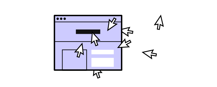


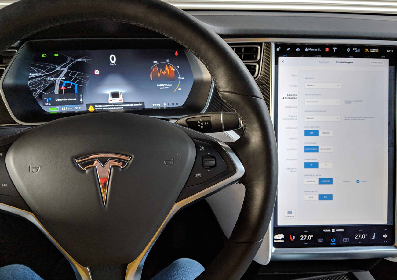


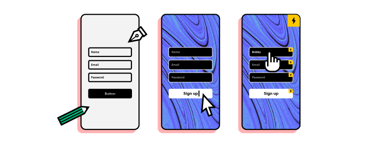


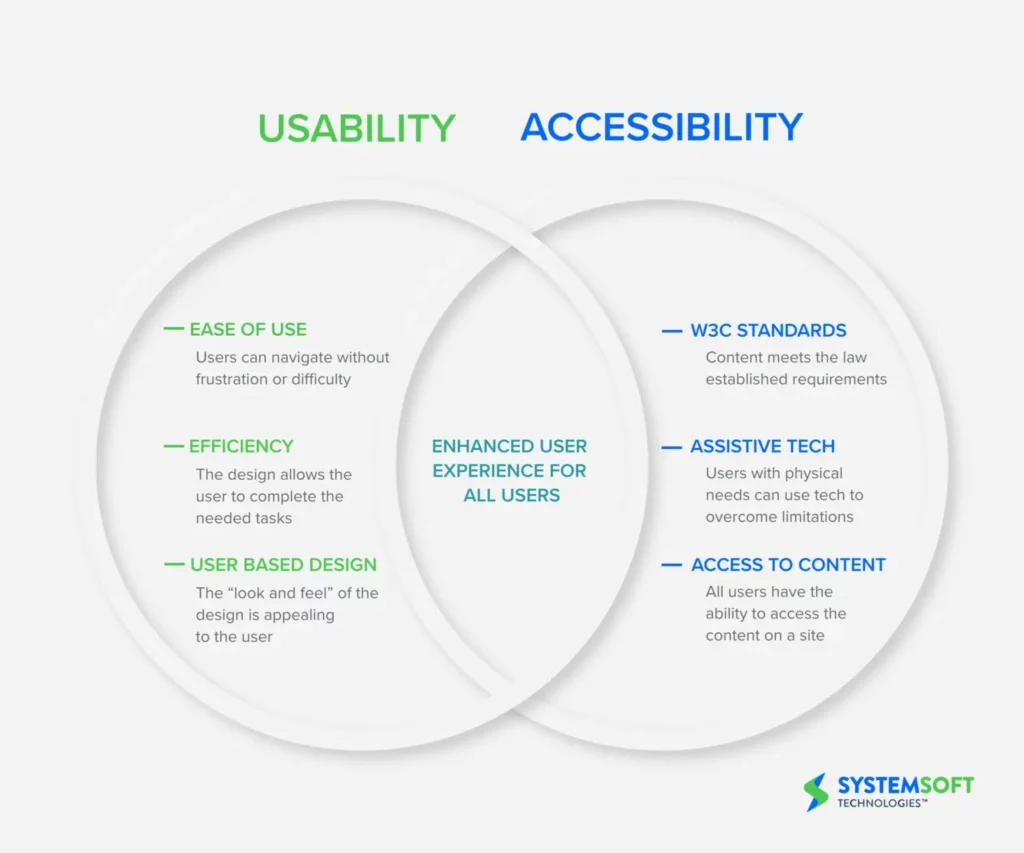
![5 Design Team Rituals that Will Bring The Team Together [+ How to Create Your Own]](https://studio.uxpincdn.com/studio/wp-content/uploads/2022/09/Design-team-rituals.png)