Microsoft’s Fluent UI is one of the most mature open-source design systems available. Used across Microsoft 365, Teams, Outlook, and Azure, Fluent UI provides a comprehensive React component library that solves foundational usability and accessibility challenges — freeing your team to focus on product development.
In this guide, you’ll learn what Fluent UI is, why it’s an excellent choice for enterprise products, and how to bring Fluent UI React components into UXPin using Storybook integration. By the end, you’ll be able to prototype with production-ready Fluent UI components in a visual editor — no coding required.
What Is the Fluent UI Design System?
Fluent UI (previously Fluent Design System and Office UI Fabric) is Microsoft’s open-source design system for building web and native applications. It includes:
React components — A comprehensive library of production-ready UI components (@fluentui/react-components).
Design tokens — Semantic color, typography, spacing, and shadow tokens that ensure visual consistency.
Accessibility built in — Components include ARIA attributes, keyboard navigation, focus management, and high-contrast mode support.
Theming system — Support for light, dark, and high-contrast themes, plus custom branding.
Cross-platform support — Fluent UI components are available for React (web), React Native, and Windows native applications.
Why Use Fluent UI for Enterprise Products?
Seamless Microsoft 365 Integration
If your product lives within the Microsoft ecosystem — Teams apps, SharePoint add-ins, Outlook extensions, or Azure portal integrations — Fluent UI ensures your product feels native. Users get a consistent experience across your product and the Microsoft tools they already know.
Enterprise-Grade Accessibility
Fluent UI components are tested against WCAG 2.1 AA standards. For enterprise products where accessibility compliance is a requirement (government, healthcare, finance), Fluent UI dramatically reduces the work needed to meet accessibility standards.
Mature Component Library
Fluent UI includes 60+ components covering common enterprise patterns:
Instead of designing and building foundational components from scratch, teams using Fluent UI can focus their engineering time on product-specific features. The component library handles the UI foundation.
Component-Driven Prototyping with Fluent UI
Component-driven prototyping means building prototypes from reusable UI components rather than drawing static screens. When those components are real React code — like Fluent UI — the prototype behaves exactly like the final product.
Benefits of component-driven prototyping:
Consistency — Every prototype uses the same components, ensuring visual and behavioral consistency.
Speed — Assemble screens from a component library instead of designing from scratch.
Accuracy — The prototype reflects real component behavior, including states, responsiveness, and accessibility.
Seamless handoff — Developers receive a prototype built with the exact components they’ll use in production.
How to Import Fluent UI into UXPin with Storybook
UXPin Merge supports a Storybook integration that lets you import any Storybook-documented component library into UXPin’s visual design editor. Here’s how to set it up with Fluent UI.
Prerequisites
A Fluent UI React project with Storybook configured
A UXPin account with Merge access
Node.js and npm installed
Step 1: Set Up Fluent UI with Storybook
If you don’t already have a Storybook setup for your Fluent UI components, initialize one:
npx storybook@latest init
Create stories for each Fluent UI component you want to use in UXPin. Each story represents a component variant that will appear in UXPin’s design panel.
Step 2: Install the UXPin Merge CLI
npm install @uxpin/merge-cli --save-dev
Step 3: Configure the Integration
Create a uxpin.config.js file in your project root that tells Merge which components to sync:
This command builds your Storybook, extracts component metadata (props, args, defaults), and syncs everything to your UXPin account.
Step 5: Start Designing
Open UXPin and you’ll see your Fluent UI components in the design panel. Drag them onto the canvas, configure props through the properties panel, and build interactive prototypes.
Using Fluent UI Components in UXPin
Configuring Props and Args
Every Fluent UI component synced via Storybook brings its props into UXPin’s properties panel. For example, a Button component lets you configure:
All prop changes render in real time using the actual Fluent UI React component — not a static approximation.
Building Interactive Prototypes
Combine Fluent UI components with UXPin’s interaction features:
Navigation — Link buttons and menu items to other screens
Conditional logic — Show dialogs, toggle panels, or change states based on user actions
Variables — Pass form data between screens for realistic flows
States — Define multiple component states (default, hover, active, error)
Alternative: Git Integration
If you prefer not to use Storybook, UXPin Merge also supports a direct Git integration. Point Merge at your React component repository, and it will pull components directly from your codebase. This is ideal for teams with private, custom-themed Fluent UI implementations.
Real-World Example: How PayPal Uses Component-Driven Prototyping
PayPal’s product teams use UXPin Merge to prototype with their production React components. Product managers and developers — not just designers — build and test prototypes using PayPal’s internal design system. The result: 90% of design projects are completed by product teams without dedicated designer involvement, dramatically accelerating their product development cycle.
This approach works because the prototypes are built with real components. There’s no gap between the design and what gets shipped.
Getting Started with Fluent UI and UXPin Merge
Ready to prototype with Fluent UI in a visual editor? Here’s how to get started:
Choose your integration — Storybook (recommended for Fluent UI) or Git
Sync your components — Use the Merge CLI to push Fluent UI components to UXPin
Start prototyping — Build interactive prototypes with real Fluent UI components using no-code tools or visual editors
Try UXPin Merge for free and bring your Fluent UI design system into a visual prototyping workflow.
Frequently Asked Questions
What is Fluent UI?
Fluent UI is Microsoft’s open-source design system for building web and native applications. It provides React components, design tokens, theming, and accessibility features used across Microsoft 365 products.
Can I use Fluent UI components in UXPin?
Yes. UXPin Merge lets you import Fluent UI React components via Storybook or Git integration. Once synced, you can drag and drop components in UXPin’s visual editor and configure props through the properties panel.
What’s the difference between Fluent UI and Fluent 2?
Fluent 2 is the latest evolution of Microsoft’s design language, with updated visual styles, improved accessibility, and a refreshed component library. The React implementation is available as @fluentui/react-components (v9+).
Is Fluent UI good for enterprise applications?
Fluent UI is specifically designed for enterprise applications. It includes data-heavy components (DataGrid, Table), accessibility compliance (WCAG 2.1 AA), theming support, and seamless integration with the Microsoft 365 ecosystem.
Do I need Storybook to use Fluent UI in UXPin?
No. While Storybook integration is the recommended approach, UXPin Merge also supports Git integration for importing React components directly from your repository.
How does UXPin Merge differ from Figma for design system prototyping?
Figma uses static design elements that approximate components. UXPin Merge uses real, code-backed React components with actual props, states, and behavior. Prototypes built with Merge are functionally accurate and developer-ready.
We’ve researched common mistakes design teams and product managers make when working with software engineers and how they can collaborate better. Reducing friction and roadblocks creates a smoother product development process while increasing Design’s value.
Enhance collaboration and bridge the gap between design and development with UXPin Merge. With this tech, you can bring your component library’s elements to UXPin and create functional prototypes that we’ll be developed exactly as you designed them. Check more about it. Visit our Merge page.
Reach a new level of prototyping
Design with interactive components coming from your team’s design system.
1. Using Image-Based Prototypes
Whether you’re an early-stage startup or part of an enterprise software development team, design handoffs are often a time of friction between designers and engineers. One of the biggest causes for this tension is prototype fidelity.
Image-based design tools produce poor prototypes that lack fidelity and functionality, making them hard to interpret and understand–for engineers, stakeholders, and usability participants.
The latter is a better solution because it removes reliance on engineering teams, significantly enhances prototyping capabilities, improves testing, and facilitates better designer/developer collaboration for smoother design handoffs.
The benefits of using a code-based design tool
UXPin’s code-based design tool enables designers to build prototypes that accurately replicate the final product experience.
Engineers and stakeholders never have to “imagine” doing something because UXPin’s fully interactive prototypes provide an experience comparable to code.
Here are four UXPin features that enhance prototyping:
States: Apply multiple states to a single element or component, each with different properties, interactions, and animations.
One of the biggest mistakes designers can make is not clarifying the why behind design decisions. How can engineers understand or empathize when they don’t know what user problems you’re trying to solve?
The key to clarifying design decisions is to be proactive. Get developers involved throughout the design process and avoid design handoff surprises.
Dev/design pairing: designers watch engineers build a feature after design handoff to understand the process and observe engineering challenges. Ideally, this process works best in person, with both team members in front of the same screen asking and answering questions live.
Ideate together: bringing engineers into ideation sessions allows them to understand the thought process behind design decisions while leveraging their technical know-how to improve ideas.
Design critiques: traditionally a design team ritual, but including engineers in the odd critique can bring new ideas from a fresh perspective. Engineers also benefit by understanding the design thinking process behind decision-making.
Designer/engineer retrospectives: an agile software development practice where teams reflect on outcomes from each iteration and discuss improvements. Designers and engineers can conduct retrospectives at the end of every release to identify design handoff’s pain points and solutions.
3. Not Educating Engineers About User Experience
Contrary to popular belief, UX teams are not solely responsible for a product’s user experience–it’s the entire organization’s responsibility. However, without effective design advocacy driven by UX designers, no one willingly learns about user experience.
Erica has developed systems to ensure “the UX team works with engineers to deliver a good user experience at PayPal, but the engineers are accountable for the final product.”
One of the biggest hurdles is a shift in thinking. Everyone outside of UX thinks the designer’s role is aesthetics and UI design.
Erica’s education methodology was to shift engineers thinking of user experience away from aesthetically-pleasing user interfaces to problems that cause bottlenecks and roadblocks over which engineers have absolute control. Some examples include:
Latency: If you click a button and it takes too long to load, that’s a poor user experience.
Availability: If a URL doesn’t load, that’s a poor user experience.
Security: If someone hacks my account, that’s a really bad user experience!
Error messages that are not “human-readable” or have no way for the user to resolve them:“Error Code 1578-B1273 – FAILED!” Why do you show users this message without telling them what it means or how to fix it? Another poor user experience.
Developing an organization-wide user experience mindset (starting with engineers) will increase empathy for users while sharing the responsibility.
4. Not Sharing User Research Findings
In a UX Tools article, Taylor Palmer shares insights from interviews with engineers about “how user research helps them create better experiences.”
Engineers care about user research because it helps them understand design decisions and, as one developer puts it, “make sure we’re building the right thing.”
Developers don’t need access to the design team’s entire user research archives, nor do they have time to sit in user interviews. They prefer summaries, notes, and recorded interviews.
Linking design files with research summaries so engineers can understand the “why”
Creating an open-door policy for interviews and usability studies
Getting feedback on all UX artifacts, including wireframes, mockups, and prototypes (low and high-fidelity)
Creating and sharing your internal research repository–over and above summaries so engineers can delve deeper into research if necessary
Sharing notes from design meetings and ideation sessions
Creating a regular user experience newsletter
5. Not Having a Single Source of Truth
One of the most significant challenges for product development teams is overcoming the disconnect between designers and engineers.
Designers and engineers speak different languages without a single source of truth from a fully integrated design system. The results?
Poor collaboration, design drift, friction, and other negative consequences adversely impact user experience and product quality.
How to create a single source of truth
Creating a design system doesn’t guarantee you’ll have a single source of truth. Traditional methods for building design systems mean designers and engineers use separate “truths.”
Designers use a UI kit or image-based design system
Of the four stages of design system maturity, this is stage three. Getting to stage four requires a tool to bridge the gap between design and development, where designers and engineers use the same component library.
Design in (no) code: designers drag and drop to build UIs using code components from a repository–no designing from scratch.
No design drift: UX teams, product designers, and engineers use the exact same components resulting in zero drift and less UX/front-end debt.
Consistent design: components include properties and interactivity defined by the design system, so designers don’t have to think about colors, typography, states, etc.
Seamless (no) handover: engineers already have exact copies of every component used for prototypes. It’s a matter of copying and pasting from the repository for front-end development, reducing the need to write code.
Iress used UXPin Merge to sync design and development. Merge pulls Iress’ component library from a repository into UXPin so designers can build code-based prototypes that look and feel like the final product–and designers don’t need to see or write any code!
This shared single source of truth means designers and engineers speak the same language and work within the same technical constraints. Reducing friction and streamlining workflows in the process. Visit our Merge page for more details and how to request access.
How UXPin Merge Syncs Design and Development for Better Collaboration
You’ve heard the results, but how does UXPin Merge work? Merge allows organizations to sync their design system from a repository to UXPin’s design editor.
Organizations can connect a React design system directly to UXPin using the Git Integration or Storybook for other front-end technologies, including React, Angular, Vue, Ember, and HTML, to name a few.
The component library appears in UXPin’s left sidebar for designers to drag elements onto the canvas to begin prototyping. Each UI component includes properties defined by the design system, like colors, sizing, typography, states, etc.
Designers can switch between these using dropdowns and selectors in the Properties Panel. Any changes render as JSX, making it easy for engineers to copy and paste to begin the development process.
Get your entire product development team to speak the same language with a code-based design solution from UXPin Merge. Visit our Merge page for more details and how to request access to this revolutionary technology.
Collecting feedback is an integral part of a product designer’s work – one which allows them to make sure that the product they’re designing is both intuitive and adds value to users’ lives. However, it’s not just about asking fellow designers, stakeholders, and developers for their opinions, per se. It’s about getting the most out of design feedback – and here’s where a design critique procedure is the most effective way of doing this.
Design critiques offer a tried-and-tested approach the opportunity for their prototypes to be explored and for user experience flaws to be quickly identified and fixed.
What is a design critique? How should you structure your design feedback sessions? Why is feedback so important for making better design decisions? In this article, we’ll cover everything you’ll need to know to improve your product designs through targeted design critiques!
UXPin is a design tool that enables real-time collaboration. It’s an end-to-end solution that covers the whole design process, from working on basic user flows to building interactive prototypes that can be easily shared with stakeholders and product managers. Try it for free now.
Build advanced prototypes
Design better products with States, Variables, Auto Layout and more.
What is a Design Critique?
In product design, feedback is key. It leads to good design and positive culture in which designers can flourish. Design critique simply refers to the process of analyzing a design or prototype to determine if it meets the criteria and requirements of the project.
What kind of feedback or pointers do designers seek from design critiques?
The design or prototype’s alignment with business objectives: Does it solve the user’s pain points? Has the designer implemented the features and capabilities outlined in the product strategy? Does the design adhere to the company or client’s branding?
The usability of the product and user flow: How accessible is this design? Is it intuitive and easy to use? How well does the prototype meet basic usability principles? Is the user flow clear?
Judging the technical feasibility of the design project: Simply, can this be built with the development team’s resources and the project timeframe? Will this application be able to run on end-user devices?
Remember, design critiques aren’t brainstorming sessions or usability tests. They’re a method for designers to get specific, actionable feedback from stakeholders about prototypes, wireframes, and other deliverables, so they can give constructive feedback and find the perfect design solution.
The primary goal of design critiques is to improve the product design – and so, the discussion should be focused on the objectives of the design project.
What does design critique look like?
Design critiques usually take the form of meetings or round-table discussions where designers share their prototypes for discussion. A design critique panel is made up of a handful of designers, developers, analysts, or other key stakeholders.
There are two main types of design critiques. These are:
Standalone critiques: Purpose-planned meetings to gather feedback on one particular aspect of a design.
Design reviews: Fuller evaluations of a prototype to judge its success in achieving product design heuristics. These tend to dive deeper into the usability, creative process, and project goals.
These days, design critiques don’t need to be held in person, or even at a set time. With real-time collaboration tools like UXPin, design critiques can be delivered asynchronously through iterative feedback.
Why are design critiques important? Can they really help you make better design decisions?
Are design critiques worth the hassle? Do they really improve the product’s design and usability?
Absolutely. Design critiques help break down silos, where individual designers or teams are disconnected in their approach from other colleagues and the wider business objectives.
Incorporating stakeholder feedback from the early stages of a product’s design process helps focus the features and objectives of the application. Here’s how:
Critiques reinforce the business objectives and pain points: Many designers get distracted by the visual design and lose sight of its strategic aims. A design critique is a great opportunity for stakeholders and product owners to remind designers what the product should be capable of.
Find a consensus between teams: By analyzing a design and sharing actionable feedback, designers can work collaboratively. They also use critiques to reach a consensus with developers on the features and functionality that should be included in a product. This results in a far more seamless development process.
Promotes an agile, iterative design ethos: Critiques allow design teams to quickly identify and correct problems. This fast-paced approach to product design helps dramatically cut down development time.
Who should be involved in a design critique?
What roles are important to implement to ensure a successful design feedback session?
Here are a few key ideas:
Facilitator: They are responsible for conducting the design critique and leading the session. A facilitator will define the scope of the critique and set out what sort of feedback should be collected. This is usually an executive, such as a VP of Design or Lead Designer.
Presenter: This is usually the designer that created the prototype or design that’s being critiqued. They’re responsible for showcasing the design, providing the necessary context, and discussing the goals of the prototype. A great presentation results in better feedback.
Critiquers: These are the people with the opinions. Remember, critiquers don’t need to be designers. They can be anyone who may have useful feedback on the product design – for example, developers, other executives, or clients. They’ll need to be specific on what’s not working and provide constructive pointers on how to improve.
How big should a design critique panel be? It’s important to get a variety of viewpoints, but larger groups are difficult to facilitate. We recommend anywhere between 3 to 7 members.
Step-by-Step: How to Structure a Design Critique
There are three key steps to a constructive design critique session. Let’s discuss them:
Step 1: Set out the goals and scope of the design critique
Before a design critique session begins, the facilitator should set out clearly what the scope and expectations of the critique are. This should be communicated through a written meeting agenda.
Here’s what it should clarify:
What design is being critiqued?
What is the scope of the feedback? What areas of the prototype should the feedback be focused on?
How long will the session last? How will feedback be collected and minuted?
What specific roles do panel members have? How should critiquers use their expertise to guide their discussions?
What are the main goals and business objectives of the product? Who is the primary audience? What are the problems and pain points you’re trying to solve? What KPIs are being measured here?
It’s also important for presenters to prepare the presentation and share the prototype with the rest of the panel. before the meeting to gather their thoughts!
Pro tip: We recommend letting critiquers explore the design solution before the session takes place. You can do so by sending over the designs in an interactive, collaborative tool like UXPin. Your participants will be able to easily add notes and ideas they’d like to cover during the meeting.
Step 2: Ask the right questions to encourage relevant feedback
How can you make sure you’re getting the right feedback? NN Group’s Chief Designer Sarah Gibbons suggests using one of these two key approaches during Q&A sessions:
Round robin: Participants take turns explaining their perspectives and asking questions until everyone has contributed. They can then ask follow-up questions once everyone has had a turn. This ensures that each panel member has a chance to share feedback.
Filling feedback quotas: Some participants may struggle to give their point of view, fearing it’s too harsh. A facilitator can transform it into a constructive criticism sessions, asking panel members to share a set number of positive and negative observations. This is a great starting point to find critical points. You should find that a more natural conversation will result where participants will carry on sharing their perspectives freely.
Step 3: Don’t forget about follow-ups
A key tenant of agile and iterative design is collecting follow-up feedback. Presenters should regularly keep a panel updated on how their feedback is being implemented in design iterations.
Why is it important?
Participants will feel motivated by the use of their feedback. This will boost the overall effectiveness of critiques across your organization.
Panel members can provide follow-up pointers if they believe their feedback has been misunderstood or ignored.
The iterative changes can generate new feedback – positive or negative.
With UXPin, it’s easy to share prototypes and collect feedback directly on your designs. As a result, you’re able to speed up your design iterations.
Among others, UXPin helps team work better together:
enables real-time collaboration – you can see how others interact with your designs as they review them
allows easy access to the prototype – you can share the link to the prototype via email. Your design critique participants don’t have to be UXPin users to ick on the link and they can start providing feedback
lets you ping and send email notifications to specific team members to ensure that you’ve collected all insight, so you can derive the highest quality insights.
Unlock agile product design and facilitate critiques with UXPin
Actionable feedback guides to great product design. Many designers struggle to break out of silos and worry about sharing their unfinished work with others.
Design critiques are a brilliant way to formalize this and turn it into a regularity. With good critiques, designers can easily collect relevant and actionable feedback on product prototypes. By incorporating designer and stakeholder feedback into the UX design process, you can reinforce your business goals and design products that better meet user needs.
How should you structure design critiques? The role of the facilitator here is crucial, as defining the scope of exploration can help designers get the most useful feedback from critique sessions.
To support the collaborative approach that design critiques and agile feedback promote, it’s worth using a collaborative design tool. With UXPin, you can build interactive designs easily and invite your team and stakeholders to collaborate on your projects.
Try it out for free and see how it can help you improve your product design process.
Design simplicity is a term companies use without truly understanding its meaning. As discussed in this article, simpler isn’t always better, and how designers apply simplicity can have positive and negative effects.
This article defines what UX design simplicity is (and isn’t), some common misconceptions, and strategies for implementing its principles.
Simplify your product design and development process with UXPin Merge–technology that allows you to design prototypes using production-ready components, and thus bridging the gap between design and engineering. Visit our Merge page to learn more about this revolutionary technology and how it can enhance simplicity in design.
Reach a new level of prototyping
Design with interactive components coming from your team’s design system.
What is Design Simplicity?
Design simplicity refers to the UX principle of helping users achieve goals efficiently using intuitive UIs and minimal roadblocks. To achieve this, designers must understand user needs, their end goals, and the tools and features they need to complete tasks.
Simplicity isn’t always the best option. The users, product, context, and environment all play a critical role in balancing design simplicity with usability.
Simplicity in Design Does NOT Mean…
Simplicity in design is probably better defined by what it is not. The word simplicity is somewhat subjective, and therefore, open to misinterpretation. Here are three common misconceptions about design simplicity.
1. Simplicity is not minimalist
When people hear design simplicity, they often think it refers to minimalism–this is an incorrect assumption. Minimal design creates beautiful aesthetics, but that doesn’t mean it’s practical or helpful.
There is always a time and place for minimalism, but designers must present the appropriate tools and UI elements for users to complete tasks efficiently.
For example, this Shopify Theme creates minimalism by hiding the primary navigation behind a hamburger for desktop users. This design looks great, but shoppers must click twice to navigate.
Creating additional steps in the name of minimalism does not conform to the principles of design simplicity. Designers must be mindful of how minimalism impacts the user experience and find an appropriate balance.
2. Design simplicity is not about aesthetics
Design simplicity is not about aesthetics. While it’s crucial to create beautiful UIs, it must not be at the expense of user experience. Aesthetics include static images, video, UI components, styling, and microinteractions.
Designers must always consider the value of design decisions and whether making something look aesthetically pleasing impairs usability. For example, using elaborate, drawn-out animations might seem like an excellent way to impress users, but it slows progression resulting in a poor user experience.
3. Simplicity is not simplification
This heading might seem contradictory, but it’s another common misconception about design simplicity. Oversimplifying a product or feature can create negative consequences or dull the user experience.
For example, eliminating user verification to simplify onboarding results in bots, spammers, and other criminal elements accessing the product that harm the company and its users. Simplifying this onboard process means:
Making sure the system sends users a verification email immediately
The email has minimal text and a clear CTA to complete the verification process
Designers must also consider when to simplify. For example, simplifying a game, so users always win doesn’t present enough of a challenge, and players will lose interest. The simplification in this scenario lies in the game’s controls–giving players the appropriate tools and features to complete difficult tasks.
How to Apply Good Design Simplicity
With a clear understanding of design simplicity’s misconceptions, it’s time to look at some guiding principles and strategies and how to apply them.
1. Designing only what’s essential
One of the essential ingredients to design simplicity is only providing the UI elements and features users need to complete a task. Executing this simplicity effectively means designers must have clear objectives while understanding users, their circumstances, and the environment where they’ll use the product.
Delivering what’s essential might seem obvious, but too much reduction leads to minimalism–which we’ve already established we want to avoid. Designers must consider multiple scenarios rather than getting users to a single end goal.
For example, when designing an eCommerce checkout, it’s tempting only to push shoppers in one direction–complete the purchase! What about shoppers who change their minds and want to go back or save their cart for a later date?
The essential elements in this scenario are controls to complete checkout efficiently while providing offramps for shoppers who change their minds.
Complex products and UIs require more thought, UX research, and testing. Designers must reduce and prioritize content as much as possible to avoid cognitive overload, guiding users to complete tasks efficiently.
Coherency, consistency, and familiarity
Coherency, consistency, and familiarity are essential design simplicity components. Maintaining these three factors throughout a product requires attention to detail and effective cross-functional collaboration.
A design system is the most effective method to achieve coherency, consistency, and familiarity in product development. Organizations can build a design system from scratch or use an open-source component library to ensure designers and engineers deliver high-quality outputs with minimal errors.
PayPal uses Microsoft’s Fluent UI design system with UXPin Merge for the company’s sixty-plus internal products. When Erica Rider, Senior Manager for UX – Developer tools and platform experience at PayPal, joined the company, PayPal’s products lacked cohesion and consistency, resulting in countless usability issues.
“Rather than separating design, prototyping, and development, UXPin Merge allows us to create an integrated flow where we engage engineering and product teams throughout the process. As a result, the product’s final quality has improved dramatically”–Erica Rider, PayPal
Offering the easiest solution
Design simplicity requires designers to think of the easiest path to completing a task. Ideally, designers want to reduce friction and obstacles to minimize cognitive load–there are exceptions to this rule, which we describe in this article about good and bad cognitive friction.
Designing an easy-to-use UI includes removing distractions and minimizing options. For example, designers often hide header and foot navigation for eCommerce checkouts and landing pages, so users only have one task to focus their attention.
Test, test, and test again
Testing is the best way to understand users and whether a design solution works. Seeing users struggle with a task and identifying the cause allows designers to fix the issue and simplify the process.
Routine UX audits are excellent for identifying usability issues that adversely impact simplicity. User testing and research during the design process often don’t tell the whole story. Designers must review analytics and monitoring tools to understand how users navigate the product and its features.
Designers can use UX audit insights to prioritize content, visual hierarchy, navigation, add/remove features, restructure layouts, and improve information architecture to simplify the user experience.
The progressive disclosure approach
Progressive disclosure is an interaction design technique for complex tasks and user flows. The idea is to break tasks into digestible steps to simplify a complicated process.
We commonly encounter progressive disclosure when a company has to capture lots of user data–insurance, visas, medical services, etc. Instead of presenting everything on one screen, designers split the form into multiple steps and categories. This user interface design technique makes forms less intimidating, allowing users to focus on one step at a time. For applications handling sensitive data or complex workflows, consider implementing an API-driven backend that simplifies data management and ensures secure role-based access to information as users progress through each step.
Context: “What lies in the periphery of simplicity is not peripheral”
Emotion: more emotion is better than less
Trust: simplicity = trust
Failure: some things aren’t meant to be simple
The one: subtract the obvious and add the meaningful
Simple UX Design With UXPin Merge
Simple design applies to the UX process as well as user experience. Bridging the gap between design and development enhances collaboration and streamlines handoffs while reducing errors and front-end debt.
UXPin Merge is an end-to-end product design solution that creates a single source of truth between designers and engineers. Merge allows organizations to sync a component library from a repository to UXPin’s design editor so everyone uses the same design system.
These ready-made, interactive components simplify workflows by giving designers the building blocks to create fully functioning prototypes that look and feel like the final product. With no designing from scratch, designers can focus on product development rather than component development.
Merge simplifies the design handoff process because engineers work with the same component library. Devs simply import the components from the design system’s repository and apply the JSX changes from UXPin to start front-end development. Less documentation. Less communictation between departments. Faster time to market!
Simplify your product development process with UXPin Merge. Visit our Merge page for more details and how to request access.
In the second quarter of 2022, internet users worldwide fell victim to around 52 million data privacy breaches. This clearly shows the importance of cybersecurity, and that the role of a UX designer goes beyond making apps user-friendly. It’s about finding balance between usability and security, which need to go hand in hand.
In this piece, we’re going to focus on security UX — including practices like secure file sharing — to show you how to use product design to protect your users’ data and detect vulnerabilities, as well as share a few tips on designing for data privacy and building security features.
Need to design a functionality that can be prone to data breach? UXPin is an end-to-end design tool that will help you with that and much more. You can design wireframes, interactive prototypes, and handle design handoff. Try it for free.
Build advanced prototypes
Design better products with States, Variables, Auto Layout and more.
What Should Designers Know about Cybersecurity?
A designer’s job is to make sure that navigating through a digital product is easy and pleasant. They always put users’ needs at the front. However, if we add cybersecurity to the equation, creating a frictionless experience becomes a challenge. At least that’s what a lot of designers might think.
The truth is, designers don’t have to choose one over the other. Making a product secure doesn’t mean it will be hard to use. Usability and security can co-exist, instead of competing. Let’s take a look at three statements that will help us debunk the myth about the relationship between the two.
Most people don’t know what cybersecurity risk is – If you make a product too secure, for example, by including geolocalization to services or notifying that an HTTPS certificate on a site they really want to visit has expired, it will push people into finding a way to bypass it. Think of things like VPNs for the former, download a VPN for every device, for example, or just heading over to the site despite Google’s instructions, for the other.
Security doesn’t mean locking everything down – If you want people to stick to your security measures, you should ideally make them invisible. If a user is blocked from executing simple tasks such as secure file sharing – adoption may crumble. Instead, use UX design to make them feel less like obstacles blocking users on their user journeys, and more like advocacy for their data security.
Design isn’t only about making things easy – If you find yourself making everything fast and easy, you probably need to understand users’ intent deeper. Sometimes you need to slow people down to highlight what’s important.
How can you protect your users’ data with design?
We’ve already clarified that both design and UX security are two important elements in the product development process. Still, it might initially seem that they are isolated from one another. After all, doesn’t security relate to the coded app itself, while design in the prototyping stage has nothing to do with security execution? Not quite.
Let’s take UX copy, for one.
With the right prototyping tool, instead of displaying the ubiquitous “lorem ipsum” on your wireframes, you can use real-life copy to inform your user about a number of security areas, like the reason why you require two-factor authentication.
Just think of how important 3DS verification has become for bank apps in recent years. This extra security level isn’t something happening in the backend of the app or website. It requires human action. When you design a 3DS verification module, the screens should show the exact message you want to display to users.
What it says depends on a number of factors – like, whether you’re legally obliged to conduct double identification, or it’s just recommended. In the case of the former, you’ll have to build out a user flow that blocks access unless the user completes the verification process. While, in the latter, you can simply encourage them to use a tool like Google Authenticator for that extra, recommended security layer.
By creating a well-thought-out ID authentication flow and providing the actual copy for it, you’ll collect accurate feedback. You’ll also understand whether the instructions and reasons for each step were clear. If you detect any bottlenecks, you’ll be able to improve your future iterations.
With that in mind, here’s a breakdown of seven tips that will help you ensure the highest cybersecurity and UX security standards in your designs.
7 tips on designing for data privacy and cybersecurity
1. Make authentication simple
No one likes all the formalities related to signing up or logging into an app. Among others, we can fail to remember the password, and might not be able to find our phones when there’s an SMS code we need to enter. Or even CAPTCHA, asking you to click on all images with ships or traffic lights. As mentioned in the previous section, a lot of how frustrating this process is comes down to your design.
Think of how you can simplify two-factor authentication or single sign-ins with the least possible effort.
If you’re designing a web or mobile app, then you could generate a unique URL and deliver it to your user’s email. Once they’ve clicked on it, they’ll already be logged in. No passwords necessary.
Another way to go about it is leveraging what the user always has on them, quite literally. A person who wants to switch on their phone or other device faces the camera, so you could go with Face ID or the simpler fingerprint authentication.
Or, better yet, you can explore automation to run two-factor authentication for the user. A great example comes from the Revolut app. When you want to see your credit card details, the app sends a verification SMS.
Still, you don’t have to do any copy/pasting, because – as soon as your phone receives the message – Revolut automatically draws up the code into the app. This means zero effort on the user’s end. As you can see, there are ways to guarantee the highest security standards while retaining good UX.
2. Let users know that phishing attacks happen
Data privacy plays an important role in preventing phishing. An online fraud where criminals pretend they’re a legitimate business and undertake steps to steal sensitive information. This can be done via email, phone, text, advertising, or other means. Education is the first step to addressing this problem. UX designers can prevent or at least reduce the probability of security risks by using pop-ups that would inform users of potential security threats. This, however, has to be done in a non-obtrusive way.
Along with these precautions, personal dark web monitoring can further help by alerting users if their credentials have been compromised and are circulating online, helping them take immediate action before damage occurs.
Additionally, design teams can go one step further and build security forums and team collaboration tools, which would allow users to report spam. These would help with protecting others from falling victim to cybersecurity and phishing attacks.
3. Introduce easy navigation
An intuitive desktop, mobile app or website is also more likely to be a secure one. After all, if your users know what each step does and are shown alerts for any cybersecurity threats, they’ll be more aware of the risks and use the digital product responsibly. Since intuitiveness is also one of the guiding principles of great UX, you’ll not only make it more secure but also enjoyable for the user.
After you’ve created a step-by-step user journey, try to fill the screens with copy that is both simple and specific about the end result. Anticipate user questions and concerns. Whenever you ask for an atypical piece of personal information, like “what was your mother’s maiden name?”, tell the user why. For example, that you’re only going to use the data to verify your identity if you ever talk to customer service outside the app.
This pledge to transparency will help put the user at ease and make them appreciate your dedication to their data protection. Simple tools like an IP lookup can also help users spot unusual access patterns and if your app serves users across regions, routing checks through an ISP proxy can help verify how content and access controls appear from different network environments.
4. Create a prototype before releasing your app
We know that making design both user-friendly and secure isn’t a piece of cake. That’s why to minimize the risk of getting it wrong, it’s good practice to test your app prior to releasing it. And this involves creating a prototype.
By using a tool like UXPin you will be able to quickly design an app prototype along with a login sequence. You can include features that will positively contribute to security UX such as authentication, and verify how users will respond to them.
Instead of making assumptions, you can observe how users interact with your design, and make adjustments if necessary. UXPin also helps with maintaining UI consistency, which positively impacts user trust.
5. Track long login times
Among others, cookies observe and count the duration of each individual user session. When a user agrees to cookies, they allow to be identified every time they visit your product or website. When it comes to session duration, the rule of thumb is that the longer you’re logged into a service, the bigger the threat of someone hacking into it.
The risk is particularly high whenever you’re idle in an app, i.e., it’s still running in the background, but you’re not using it. If there’s no automatic logout, then you could stay in the service for weeks on end.
For this reason, designers should create a pop-up or timer that shows when the end user is going to be logged out unless they confirm they want to stay on. An app or website could have an automatic logout timer (for example, 24 hours for an e-commerce store, or even just a few minutes for bank accounts).
If a hacker is successful in breaking into your user’s device, but your app has an automatic logout, then they’re much less likely to access the data stored in your product. It’s a win-win for both you and your user. While you’ll avoid any security breach penalties, your user – if they ever become a victim of an attack on their device– will be grateful that you’ve limited the fallout of the attack.
6. Collect only necessary data
To guarantee data privacy, you should aim at collecting necessary data only. And when you no longer need it, make sure to destroy it. There is a common belief that the more data you collect, the more personalized user experience you can create. While this statement is true, you should always put data security first. Pay a lot of attention to your data collection methods, and how you frame your questions.
In terms of notifications and permission requests, you should only consider them when you’re certain that end users will accept them. Also, make sure that both opening a user account as well as closing it is easy.
UX designers should also keep an eye out on what data is collected by third parties, and if possible, anonymize personal data. However, in order to do that they have to be aware of data privacy regulations including GDPR, HIPAA, and any other industry-specific ones. Tools like DreamFactory can help manage secure governed API access to data sources while ensuring compliance with data privacy standards.
7. Test security UX
Last, but not least, you should audit your security regularly. This will mean looking at two things – whether you’re compliant with the highest cyber security standards, and how each element of your interface is advocating for user data protection. Alongside these audits, incorporating user access review tools helps teams regularly evaluate who can access sensitive features and data, reinforcing strong security standards without compromising the user experience.
One of the methods you should apply is called regression testing. It’s a quality assurance process that helps you detect any bugs or usability glitches in an app. These might happen after you’ve changed a piece of code or altered an element of the interface. Generally speaking, the more contributors there are to your app’s design and code, the more likely the occurrence of these issues.
Running security audits and so-called bug bash sessions will help you ensure that your product is always easy to use, free of broken elements, and as efficient as can be.
Design Secure Apps in UXPin
Security and design are not only two important factors in the product development lifecycle – they’re connected in more ways than one. While the roles of software developers and system administrators in security are well established, this can’t be said about the designer. And unrightfully so, as they’re one of the first product team members to set the tone for the app’s security standards, as early as in the wireframing stage.
Designers are not only responsible for building out the security module layout. They’re also in charge of explaining the importance of security to users, and even educating them about how they can minimize the risk of unauthorized access through responsible use. Internally, design teams should adopt secure practices too – such as using a password manager for teams to protect and manage shared credentials across collaborative projects.
For this reason, it’s important for designers to use a prototyping tool that allows them to test UX. One of such tools is UXPin. It allows you to create designs with real-life UX copy, collect feedback in an iterative approach, and facilitate better design-developer handoffs. Give it a try, and see how you can set your app for success! Sign up for a free UXPin trial.
The aesthetic–usability effect gives UX designers fascinating insights into human behavior and why they must avoid prioritizing usability over visual appeal. Striking the right balance between form and function plays an important role in building a successful product.
A digital product’s aesthetics is the primary driver to entice users, while good user experience and usability retain customers. Apple is a fantastic example of this theory in practice. Apple’s products look sleek and attractive and deliver an exceptional user experience.
Even with Apple’s myriad of issues, including broken cables, terrible customer service, and mediocre product releases, Apple customers are loyal and quick to forgive–the aesthetic–usability effect might be one way to explain this loyalty.
Enhance prototyping and testing with the world’s most advanced design tool. Sign up for a free trial, and design user experiences your customers will love with UXPin.
Build advanced prototypes
Design better products with States, Variables, Auto Layout and more.
What is the Aesthetic-Usability Effect?
The aesthetic-usability effect is a psychological occurrence discovered by researchers Masaaki Kurosu and Kaori Kashimura, studying human-computer interaction (HCI) at the Hitachi Design Center in the 90s. Studies found that humans perceived aesthetically-pleasing products with usability problems as more usable than better-performing ones with less appealing visual design aesthetics.
Before prioritizing form over function for your next redesign, it’s crucial to note that the aesthetic-usability effect works on first impressions. As users use a product more, the usability issues (and even aesthetics) become annoying and frustrating.
The aesthetic-usability effect is also limited to minor usability issues–problems that aren’t obvious to users when they first use the product. If your app crashes, takes too long to load, has broken links, or has other frustrating problems, the aesthetic-usability effect probably won’t help.
Don Norman’s Nielsen Norman Group (NN Group) notes a study where users initially found the beautiful hero image on a website appealing, only to revise their opinion to “annoying” the second time when they battled to navigate and complete tasks.
Designers must also consider that beauty is subjective across cultures and demographics. Color schemes, typography, words, symbols, and other UI elements carry different meanings to various user groups. For example, a Korean user might perceive a UI as less appealing to someone in the United States.
The key takeaway is the aesthetic-usability effect works to entice users but won’t retain them if the product is difficult to use. Designers must use UX research to determine what users consider aesthetically pleasing.
Verbalizers: more influenced by words or verbal associations
Imagers: more influenced by images and aesthetics
A 1999 study on these two groups found that, interestingly, “user preference was significantly different between imagers and verbalizers, but that of the usability factor was not.”
Why Are Aesthetics Important for Interface Design?
As we see from the aesthetic-usability effect, great usability is not enough to entice people to use your product or even like it when it performs well. Finding a balance between form and function is crucial for product design, especially for startups or businesses entering a new market.
Competitive advantage
The first thing the aesthetic-usability effect tells us is that visually-appealing products and UI design provide a competitive advantage. Products that look great and perform well have a better chance of attracting new customers.
More tolerant users
Another key insight from the Hitachi Design Center’s study is that users are more tolerant of beautiful design. As long as you’re making a conscious effort to fix usability problems and communicating this to customers, they’re less likely to abandon your product–but don’t count on this retention lasting!
This “affect” could explain why users are more forgiving of usability issues when experiencing positive feelings toward a beautiful user interface. If designers solve these usability issues, they can leverage the aesthetic-usability effect and positive attitudes to enhance a product’s usability, creating a positive holistic user experience.
The Aesthetic-Usability Effect & User Testing
Designers must be mindful of the aesthetic-usability effect during user testing because it can bias the results. As we saw with the NN Group’s website study example, a user’s first impression was positive but changed the second time they used it.
Designers must observe user behavior carefully during testing because someone’s feedback might be positive, but they struggled at certain moments while completing tasks.
An NN Group article, First Rule of Usability? Don’t Listen to Users states, “To design the best UX, pay attention to what users do, not what they say. Self-reported claims are unreliable, as are user speculations about future behavior. Users do not know what they want.”
The article goes on to say how usability study participants will often rationalize their behavior, which could influence poor design decisions.
To avoid bias from the aesthetic-usability effect and other influences, designers must use multiple data points, including usability testing, interviews, analytics, user research, etc., to get a holistic picture of the design and user pain points.
Designers must also consider how the aesthetic-usability effect will impact stakeholder feedback and the possibility of favoring one design choice over another because it looks better.
How to Apply the Aesthetic-Usability Effect Principle in Product Design
There is no one thing designers can do to leverage the aesthetic-usability effect. Instead, designers must use a holistic approach to visual design, considering multiple factors influencing a product’s appeal.
Color Scheme
Your product or website’s color scheme plays a crucial role in beauty and aesthetics, resulting in positive feedback from users. Conversely, colors that clash immediately elicit negative emotions.
Conversation found, “According to color harmony theory, bright blue and red colors that they use for their promo campaign wouldn’t necessarily match their main brand color, purple.”
While color preferences differ from person to person, colors that clash significantly impact a user’s first impression. Designers must also pay attention to images and other visual content to reduce conflicting contrasts wherever possible.
Cluttered UIs
The ability to read and absorb content plays an essential role in aesthetics. Cluttered UIs, small illegible text, and too many options can overwhelm users, making a user interface less attractive.
Designers must prioritize content, create clear visual hierarchies, and use whitespace to separate UI elements as a foundation for aesthetically-pleasing design.
Whitespace
If you scroll through Behance or Dribbble, you’ll notice that the best designs use whitespace for aesthetics. Apple uses whitespace to perfection throughout its products and marketing touchpoints.
If you scroll through Apple’s homepage, you’ll notice how the tech giant uses generous whitespace throughout–usually with centered content to focus user attention. Apple also uses a predominantly black and white color scheme, with blue for links/CTAs, and the occasional red accent.
Consistency
Design consistency plays a vital role in usability and aesthetics. Consistency enables users to think less because they can find UI elements faster and predict outcomes.
Designers can enhance a product’s consistency by creating a design system. Design systems don’t only solve design inconsistencies but improve cross-functional collaboration and reduce time to market.
Motion
Microinteractions and animations are also crucial characteristics of aesthetics and usability. Interactive components breathe life into a digital product, giving users vital feedback as they navigate user interfaces.
Avoid Pitfalls of The Aesthetic-Usability Effect With UXPin
One of the challenges with prototyping is that design tools don’t have the same fidelity or functionality as the final product. Prototypes look beautiful but don’t accurately represent the user experience, adversely impacting the feedback and results during user testing.
The problem is that designers are trying to get accurate user feedback with tools that render vector graphics for a product developed in code. They can design beautiful UIs that deliver excellent results during testing but fail to meet user needs and expectations after release.
With UXPin, designers get the simplicity of a design tool with the fidelity and functionality of code. Instead of vector graphics, UXPin renders code, allowing designers to build prototypes comparable to the final product.
This increased fidelity and functionality mean designers can leverage the benefits of the aesthetic-usability effect using UXPin and avoid the pitfalls user testing might not reveal with an image-based prototype.
Get meaningful feedback at every stage of the design process with UXPin’s high-quality prototypes. Design beautiful UIs and reduce usability issues to deliver positive user experiences to your customers. Sign up for a free trial to explore UXPin’s advanced design, prototyping, and testing features.
Many organizations struggle to free themselves of legacy systems and the headaches they possess. These outdated ecosystems present many challenges, including user experience and digital innovation.
The burdens of legacy technology are why challenger banks can compete with traditional banks, adopt sophisticated technology, and deliver products to customers significantly faster.
This article explores the challenges of legacy systems and their adverse impacts on business and customer experience. We also look at how FinTech companies outperform traditional financial service providers without these legacy burdens and what the latter can do to modernize.
Modernize your UX workflows and create a single source of truth between design and development with UXPin Merge to deliver products faster while reducing time to market. Visit our Merge page for more details and how to request access.
Reach a new level of prototyping
Design with interactive components coming from your team’s design system.
What are Legacy Systems?
Legacy systems are hardware, software, and other outdated technology organizations still use. The company that built the legacy system is usually no longer in business, or they’ve stopped offering updates and support for the product.
Without updates and support, the organization must employ IT experts to maintain and operate the legacy system. The talent pool for these systems is small, so labor is expensive, and they often have to fabricate hardware replacements at high costs because parts aren’t readily available.
Legacy systems also require a significant amount of space. Many organizations operate on systems that are 30-50 years old. The hardware for these legacy systems is bulky, requiring significant real estate to operate and maintain efficiently. Institutions must also worry about data integrity and ensuring they don’t lose everything when a system crashes–and legacy systems do crash!
Legacy systems are still widely used in the banking sector and government institutions. Not only are legacy systems expensive to maintain, but they present significant security risks. To mitigate these risks, organizations must implement modern network defenses like IDPS security to identify and block malicious activity before it reaches the vulnerable core system.
According to a Forbes article, most US Federal Government systems are outdated. The US Treasury is one of the oldest systems at 51 years old, closely followed by Health and Human Services at 50.
Legacy Systems and User Experience
These technical issues present a challenge for UX designers trying to design a good user experience for a back-end held together with adhesive tape and bubble gum. Legacy systems offer several critical challenges for product teams:
Scalability limitations: legacy systems impede innovation
Poor cross-platform experience: restrictions on what users can do with mobile banking apps vs. desktop applications
Budget constraints: legacy banking systems are expensive–consuming valuable resources that could go to UX and digital product innovation
Silos and bureaucracy: make it challenging to compete with fast-moving FinTech startups and institutions that have embraced technology
Security constraints: legacy systems are more vulnerable to attack, adding more complexity and limitations
What Makes FinTech More Successful?
FinTech products solve the same problems as organizations running legacy systems but can compete because they have fewer constraints.
Here are some ways FinTech outcompetes multinational financial institutions with decades of experience and expertise.
1. FinTech moves fast
Speed to market is one of FinTech’s greatest strengths. With modern technologies, efficient workflows, and no silos or bureaucracy, FinTech product teams can innovate and deliver projects fast.
FinTech companies are also free to test and adopt new technology, like machine learning, blockchain powered by a web3 rpc provider, and artificial intelligence, which significantly enhance product quality and customer satisfaction.
This efficiency makes app-first investment products like Robinhood, and digital banking providers like Monzo, Chime, and Nubank, to name a few, successful. They offer clients a comparable financial product through sophisticated applications they continually innovate.
Traditional financial institutions battle to compete because they’re slow to market and are always two steps behind faster, agile FinTech organizations.
2. User-centric
FinTech organizations adopt a user-centric mindset for decisions and innovation. They understand user needs better than traditional financial institutions because they’re more in tune with modern digital software development, specifically, user experience and design thinking.
This user-centric approach enables FinTech organizations to prioritize customer needs and focus on core banking products that meet expectations–creating better trust, adoption, and retention.
3. Better data analytics
Data integrity and quality are significant issues for legacy system financial institutions. Legacy systems prevent holistic real-time analytics, which slows decision-making and innovation. Modern FinTech organizations use data integration platforms like Integrate.io to connect data across databases, APIs, and data warehouses for high-quality real-time end-to-end analytics that allow them to identify issues and opportunities.
These valuable insights enable stakeholders to make educated decisions aligned with the company’s vision, roadmap, and customer expectations.
This deeper understanding of customer behavior enables FinTech designers to prioritize products and services that meet user needs while identifying unique business opportunities.
FinTech organizations are also more adept at remote work environments, allowing them to draw from a global talent pool and onboard much faster.
Traditional financial institutions suffer from silos and, due to regulatory requirements and company policies, take longer to onboard talent and build teams.
How Designers Can Help With Modernizing Legacy Systems
1. Measuring and reporting
Measuring and reporting are vital components of modernizing legacy systems, including:
UX audits: identify usability issues linked to legacy systems and measure the annual cost of inaction
Service safari: get team members to use your products and competitors to gain insights from a user’s perspective
Using these methodologies is just the first step. Design teams must use these insights to present quantitative data to stakeholders. For example,
what is the cost of poor user experience from legacy systems, and what are the potential returns for modernization?
When Talabat’s product team battled to get investment for a design system, they built a business case around the costs of front-end debt. The team measured the time it took to develop a UI with and without a design system. The results demonstrated significant losses for Talabat’s front-end debt, convincing stakeholders to invest in the product’s design system.
Your problem and solution must include numbers to support your business case. Stakeholders want to see metrics and KPIs to assess:
The state and scale of the issue
How your solution improves these numbers
2. Prioritizing effectively using design thinking
Designers can use design thinking to prioritize projects and identify opportunities that maximize business value. Finding the balance between desirability, viability, and feasibility is an effective research technique for innovative products that deliver sustainable long-term growth and success.
Desirability: what do customers need vs. want? Needs are more valuable because people can’t live without them.
Viability: can the company afford it, and does it make business sense?
Feasibility: do you have the resources to build it? Is it right for the business? And, how long will it take to deliver?
Finding the sweet spot in this trifecta can maximize business value while solving customer needs. To be successful, the entire organization must embrace design thinking and user experience principles.
Design advocacy and design thinking workshops are crucial in getting buy-in from team members and stakeholders and steering them towards a modern, user-centered mindset.
As legacy-constrained institutions adopt these design thinking principles, it gets harder to justify “the old way of doing things” at the expense of users and the business.
3. Creating a single source of truth
Many organizations, including those on legacy systems, still operate without a design system. Even the “modern” digital payment giant PayPal only adopted a design system for its internal products in 2019!
Design systems ensure there’s an organization-wide single source of truth. Streamlining product development workflows and maximizing cohesion and consistency reduces usability issues while allowing designers to focus on solving user problems rather than building components for every project.
Although a single source of truth won’t solve your company’s legacy challenges, it’s a step towards modernizing workflows and reducing time-to-market–a significant issue for slow-moving financial institutions.
Merge also revolutionized PayPal’s development process and scaled design output without employing more UX team members–a key factor for organizations struggling with budget constraints!
Synced design and development
PayPal’s UX Lead EPX, Erica Rider, chose Microsoft’s Fluent UI design system. The DS team created custom components and templates, so designers only had to drag and drop elements to build user interfaces. As Erica calls it, “a ‘snap-together’ type design.”
PayPal used Merge to sync its Fluent UI React library to UXPin, so designers had all the same components. They used React props to set styling and interactivity constraints which designers adjust via UXPin’s Properties Panel.
Streamlined design handoffs
Design handoffs in Merge are seamless, almost non-existent–a far cry from the chaotic mess many organizations deal with when releasing new products and features!
With designers and programmers using the same component library, most front-end development is copy/paste and adjusting props to meet designs. UXPin provides JSX code, so designers can copy that too!
Minimal designing and coding from scratch reduce errors, technical debt, and time-to-market while enhancing collaboration and user experience.
Are outdated business processes and legacy systems affecting your UX team’s ability to compete and meet customer expectations? Create a single source of truth to enhance product development workflows and deliver better user experiences to your customers with UXPin Merge. Visit our Merge page for more details and how to request access.
Card UIs appear in many digital products, websites, and enterprise applications. Understanding card layout, visual hierarchy, and basic best practices are crucial for designing great card user interfaces.
This article explores card user interface design, the anatomy of cards, common use cases, and design inspiration for your next project.
Design, prototype, and test card UIs at higher fidelity and functionality with UXPin Merge. Visit our Merge page to learn more about component-driven prototyping and how to request access to this revolutionary user experience technology.
Reach a new level of prototyping
Design with interactive components coming from your team’s design system.
A card can be as simple as a title and image, such as this one from Google Maps.
Or, more complex, like this card from Instagram with an image, logo, dropdown/overflow menu, multiple actions, a comment section, and a date stamp.
Designers generally use cards to display a collection of content rather than a stand-alone item. These cards tell users that the content is related–like images in your Instagram feed or the latest blog posts on a website’s homepage.
Card Anatomy
We’ve borrowed this helpful dissection from Google’s Material Design depicting a card’s anatomy. Not every card will have these elements in this layout, but it’s an excellent illustration of the typical items designers use to create UI components.
Container: every card must have a container to house its content. These containers create separation between cards and surrounding content.
Thumbnail: an avatar, logo, or icon, usually displaying ownership or relation. Instagram uses this thumbnail for the user’s profile pic.
Header text: the card’s name or title. For a blog post, this might be the article’s H1 title.
Subheading: a subheading may contain additional information, like the date or location.
Media: cards often contain a relevant image or video. The Google Maps card above show pictures of Central Park and The Metropolitan Museum of Art on each card. Cards can have a single media item or carousel with multiple images and videos.
Supporting text: a summary or description of the card and its contents.
Buttons: CTAs with text (Read more, Add to cart, Buy now, etc.).
Icons: actions using icon buttons (like, share, etc.).
Buttons and icons allow users to perform various actions, but cards don’t need these actions to be interactive. Designers can make the entire card a link to a piece of content (a blog post) or embed actions (a double tap to like an Instagram post).
4 Types of Card UI Designs
There are many advantages of card UI designs, but one of the most important is the ease in recreating them in unique ways that will convey a website’s personality. There are a variety of card types, and when looking at the most popular and effective, the following four styles show up most consistently.
1. Pins
Based on the Pinterest platform, Pins are easily the most recognizable card layout. While 72 percent of internet users will access the web solely with smartphones by 2025, Pinterest is already accessed via mobile devices by 80 percent of their users. Unfortunately, the quick growth in popularity of this style of card UI was its downfall. Sites using Pins today often appear unoriginal.
2. Flat Design
Microsoft took a step away from the skeuomorphism employed in its early software designs and instead embraced bright colors and simple visuals. When looking at popular card patterns, their interface was likely the earliest widespread example most people were introduced to. Since that time, however, these cards have evolved to better reflect modern tastes.
3. Masonry (Grid)
One of the easiest card UI patterns to understand and browse is the masonry-style framework. These cards are arranged in a logical order, and they’re typically displayed in neat grids featuring equal spacing between cards.
4. Magazine Style
You once would only see Magazine Style interfaces on news and entertainment websites, but its popularity has pushed its use into other types of online platforms. Even content-heavy domains – such as portfolios and blogs – have taken to using this type of card. The layout merely features a text tag or teaser image that links to a full article on another page.
Regardless of the style of card UI being utilized, the main point is to showcase a large amount of content in a way that’s easily digestible to users without the potential of overwhelming them.
Common Use Cases for Cards UI Design
We see cards everywhere, from web design and mobile apps to games and streaming services. Here are some common use cases for card UI design and the problems they aim to solve.
Media cards
Designers use media cards to display visual content for social media posts or articles. The media (image or video) and title (headline) are prominent to attract attention and engagement. Most news websites use media cards to display their articles–like this example from the BBC’s homepage.
Modal cards
Modal cards are similar to media cards but present the user with several actions on tap/click. Streaming services, in-flight services, and car infotainment UIs use modal cards to display TV shows, movies, and other content.
These streaming cards generally feature an image of the program’s poster with a title. When the user clicks/taps a card, a modal appears with several options, like play, add to favorites, rate, etc.
Product cards
Product cards are optimized for selling products and services. They usually have a media item, product title, price, and CTA (Buy Now or Add to Cart).
Product cards might include additional information to create FOMO and entice shoppers, including a sale/discount tag, review score, and availability. This example from the Local Shopify theme displays the typical UI elements designers use for eCommerce product cards.
List cards
List UIs often use cards to display content like music playlists, contacts, tasks, etc. List cards generally feature a title, subtitle, and image (perhaps a checkbox for task cards). Designers might include a menu icon or swipe interactions to reveal the card’s options (edit, delete, archive, etc.).
This list card example from a Spotify playlist shows the artist/album image, song title, and artist’s name. The three-dot icon to the right opens a menu with several options.
Data cards
Data cards display analytics, graphics, and statistical information on an app’s dashboard UI. These UI cards are most common in enterprise design, but they also appear in consumer products like activity trackers, budgeting apps, and banking apps, to name a few. When building enterprise applications that need to access and display data from multiple sources, DreamFactory provides governed API access to any data source, enabling seamless integration of disparate data into card-based dashboards.
Real estate listings and booking platforms like Airbnb and Booking.com use similar UI card layouts:
Listing title: number of rooms or type of accommodation
Subtitle: location or distance from the area you’re searching
Price: purchase/rent/per night
Description: 1-3 sentences describing the property or icons highlighting key features (rooms, bathrooms, etc.)
Star rating (booking apps): guest reviews
Favorite icon button: adds the property to your favorites
CTA: Book or Contact
These property cards allow users to scan many options as quickly as possible. Clicking back and forth is time-consuming, creating a poor user experience. Designers must use UX research and user interviews to find out what data user value most.
Advantages of Card UI Design
As with any digital tool currently available, you’ll find those who absolutely love user interface cards and those who prefer other methods. If you’re still on the fence, check out the following advantages and why they can help you reach a wider audience while improving the user experience.
1. Intuitive Usability
Click and drag manipulation makes designing a card user interface simple for you, but the overall concept also provides ease for your users. It’s easy to decipher the information presented on card at a glance, and the variety of projects it can be used for (e.g. art, commerce, literature, etc) is seemingly limitless.
2. Ideal for Aggregated Content
If your website aggregates any type of content, the card UI is one of the best options on the table. This interface design makes it easy for users to find the information they’re looking for without being bogged down by what appears to be endless content.
3. Easy to Browse
Regardless of the project type, the ease in which card designs allow browsing cannot be disputed. Cards are easily viewed as a page is scrolled, and you can make certain elements stand out by increasing their sizes relative to the surrounding content.
4. Shareable
Pinterest is the sole case study necessary to prove how shareable card UI designs are. These are essentially the digital equivalent of a business card. The visual design shows users exactly what you want them to see without forcing them to digest unnecessary content.
5. Versatility
You understand your users better than anyone else, so you know what they expect from your content. Whether they’re looking for minimalist or elaborate displays, these cards can create just that. You can choose the level of complexity that works best.
6. Easy Manipulation for Personal Creativity
The material design of your website or mobile app can be easily manipulated with card patterns. This makes it simpler to add your own personal creativity to the design, and since this allows better brand presentation, it improves the overall user experience.
Disadvantages of Card Design
There are also drawbacks to card UI design, but understanding these in advance can help you avoid the most common issues. It all comes down to how you implement the usage of the design patterns, so don’t let these potential problems deter you from what could be a great improvement on your website.
1. They Can Be Played Out
Card interfaces are a type of experience design, but users have been experiencing them for a while. If you’re not original in your presentation, the people visiting your website could see these as non-creative and played out.
2. Require Nuanced UX Design
You can do just about anything with card UI tools, but you must remain nuanced in their presentation. It’s great to be able to provide detailed information to your users, but if this isn’t done subtly, the design may seem unprofessional.
3. Risk of Cluttered Feel
Your landing pages may have a cluttered feel if you don’t use appropriate negative space. Focus on your design patterns and ensuring the cards don’t bleed over into each other. This can take the potential for a great user experience and completely destroy it.
7 Best Card UI Practices
There are many strategies used to design effective card user interface patterns, but some of these practices are so essential that every professional will advocate their use. The following were presented by Carrie Cousin in her free ebook on web design trends.
Negative space: Effective card UI designs are all about organization, so make sure to use sufficient negative space (e.g. padding, borders) to avoid a cluttered screen.
One card, once concept: The cards you use are meant to simplify your site’s structure. Don’t accidentally undercut this focus by adding too much complexity to your cards.
Suitable images: Most images used on cards are small, so only utilize clear pictures. Also make sure they’re cropped to display appropriately where they’ll be used.
Simple typography: The text on card UI designs will be small just like the utilized images, so maintain legibility with simple typography.
Be unique: Since it’s one of the most popular user interface designs, you need to stand out when using cards. This could include anything from adding video, animated effects or new color schemes. We’ll discuss this more below.
Consistent grid: Ensure that your grid has the same spacing between cards while utilizing breakpoints and respecting various card sizes.
Apply Fitt’s Law: Check our Interaction Design Best Practices guide for an in-depth explanation of Fitt’s Law. When applied to cards, it dictates that the entirety of the card be clickable rather than just the image or text. This simplifies user interaction.
Your job is going to get more difficult as your card UI designs get smaller. This makes it imperative for you to properly apply the fundamentals of design in order to convey your message to users.
Personalizing Cards
As one of the main benefits of user interface card designs, it’s important to know how to take advantage of personalization strategies. It’s possible, for instance, to change the size of any specific card. This can depend upon how much content you want to display or whether the goal is to prioritize one card over another.
By shrinking or expanding any card UI pattern, you can dictate how much information is going to be displayed. You can also control whether just the text or image shows, the size of specific elements, and many other variations. This will greatly influence the overall personal style of the layout.
You’ll also find that many designers opt to play with animation in their cards. Oftentimes the animation only occurs when the user hovers the cursor over a card, and this tells the user that the card is a clickable feature.
Some sites even go as far as letting users manipulate the card UI themselves. This is typically only an option on mobile websites, but desktop sites are increasingly offering the ability. Users can move cards around on their own or even stack various designs on top of each other for easier navigation of a page.
Cards Design UI in Action
Here are five card UI tips and design inspiration for your next project.
1. Create visual hierarchy
The first step for card design is to create a visual hierarchy–what content matters most? It’s a good practice to structure cards with the most important content as high or large as possible. Color, whitespace, and fonts are also effective for creating separation and hierarchy.
For example, most product cards feature a large, attractive image, followed by the title and CTA. The price is slightly smaller, but its proximity to the eye-catching image and surrounding whitespace makes it stand out as the customer scans the card. This information is most likely to get the user to take action.
2. Minimize content
Too much content results in messy cards and increases cognitive load. Designers must reduce UI elements and, most importantly, keep text to a minimum.
As UX Designer Andrew Coyle states in this article, “The card should provide just enough information to help a user determine if they should further engage.” Andrew shows how reducing text to a maximum of 100 characters, or three lines, creates a cleaner aesthetic that’s easier to digest.
3. Differentiate actions
Another great tip from Andrew Coyle is clearly differentiating the primary and secondary actions. The best option is to use a filled button for your primary action and a text or flat button for the secondary, as displayed in Andrew’s example.
Material Design calls the primary action the card itself since most cards are clickable and don’t need CTAs. Supplemental actions belong in the card’s footer, including buttons and icons, as displayed below.
If you have more than two supplemental actions, Material Design recommends using an overflow menu to keep the card clean and uncluttered.
4. Create responsive card layouts
One of the most significant benefits of cards is their responsiveness. Designers can easily create a comparative user experience across multiple viewports.
The key is maintaining visual hierarchy while resizing and aligning cards to fit desktop, tablet, and mobile devices. This example from Material Design shows mobile and desktop/large tablet versions of the same card. Notice how the image, title, and call to action catch the eye in both designs.
5. Use one swipe gesture per card
Swipe gestures allow designers to hide actions, thus keeping cards clean and minimal. Multiple gestures (including an image carousel) can create confusion and usability/accessibility issues.
This example from Material Design demonstrates how multiple gestures create confusion, particularly for users with cognitive and dexterity disabilities.
Prototyping Cards With UXPin Merge
With UXPin Merge, design teams can import a UI component library from a repository to prototype and test using the same interactive components, including cards, which engineers use to develop the final product.
Merge cards include responsive layouts, buttons, typography, colors, images, icons, interactivity, and other properties defined by the design system so designers can focus on building and testing UIs–avoiding the time-consuming task of designing cards from scratch!
Designers can use UXPin Patterns to combine static UI elements and other Merge components to create new cards and promote them to the design system. Patterns are also helpful for creating multiple card states, allowing for quick changes during user testing or stakeholder meetings. Discover how component-driven prototyping with UXPin Merge can enhance your card design to create better user experiences for your customers. Visit our Merge page to find out how to request access.
Form inputs allow users to engage with digital products, brands, and other users. Choosing the appropriate input field and structure is crucial for designing a good form UX so users can complete tasks efficiently.
This article looks at individual input elements, the problems they solve, and how UX teams use them. We also provide tips on designing form inputs and common mistakes that could introduce usability or accessibility issues.
Increase prototyping speed and testing capabilities with fully functioning form input fields using UXPin. Bring interactive components to UXPin and assemble your prototypes, using those elements as a single source of truth between designers and engineers. Achieve parity between design and code. Explore UXPin Merge.
Reach a new level of prototyping
Design with interactive components coming from your team’s design system.
What are Form Inputs?
A form input (form field) is a UI element for capturing user feedback and data. Input types or form controls include checkboxes, date pickers, radio buttons, text inputs, toggles, and selects/dropdowns. Forms must also have a submission method like a submit button, link, or keyboard action (enter).
What are Form Input Attributes?
Form input attributes create rules and context for users. These attributes also provide the appropriate controls–like displaying a numeric keypad on a mobile device for a phone number field.
Five essential HTML form input attributes UX designers must pay attention to:
Required: means the user must complete the input to submit the form
Disabled: an input state that prevents a user from making changes–usually until they perform another task or for “readonly” inputs
Type attribute: the type of input that defines the formatting–for example, a password type hides the characters while an email type requires the @ symbol and domain extension (.com, .co.uk, etc.).
Label: tells users what the input is for–i.e., Password, Name, Email, etc.
Helper Text: provides an additional label for context and accessibility.
Types of Form Inputs
Here are several common form inputs and how designers use them.
Text Input
Text inputs (or text input fields) allow designers to capture a wide range of information, most notably names, emails, passwords, addresses, and other text-based user data.
If you need a user to enter information that’s longer than one sentence, it’s better to use a text area over a text field. Text areas are larger and allow more text–like the message section of a contact form.
Date Pickers
Date pickers provide a format that makes it easy for users to select a day, month, and year. They also ensure that users use the correct separators like commas, backslashes, and dashes.
UX designers have several date picker UI options and configurations. Choosing the right one depends on the user, device, and operating system (iOS, Android, Windows). This article offers helpful tips on designing the perfect date picker.
Selects/Dropdowns
Selects or dropdowns allow designers to present users with a collection of choices. Dropdowns work best for fixed variations or options–like a list of countries or t-shirt sizes. For long lists like countries or states, providing a search field allows users to find their choice quicker.
These dropdowns give users choices while ensuring they provide an accurate answer. For example, misspelling a country or state could result in an eCommerce order not reaching the customer.
Checkboxes
A checkbox performs two primary functions:
Allows users to make two or more selections
Provides a method to acknowledge legal requirements–like accepting terms and conditions or email newsletter opt-ins
Radio Buttons
Radio buttons perform a similar function to checkboxes but only allow one choice instead of multiple. For example, choosing a shipping option or answering yes/no questions.
Toggles
Toggles or toggle switches are basic on/off (boolean) form inputs. Switches offer users a quick method for making yes/no, on/off decisions. If you’re looking for an example, both Android and iOS mobile devices use toggle switches in their settings.
File input
File inputs allow users to upload images and documents. UX designers must use helper text to tell users which format the file input will accept, i.e., PNG, JPG, PDF, etc.
Understanding Form Input States
Input states allow UX designers to communicate with users through color and messages. The example below from Material Design Form shows how designers can use states for context and guidance.
Inactive: an input where the user has entered information
Focused: highlighted to show the user’s current selection
Activated: a completed input
Hover: shows desktop users that this is an interactive input when they move their cursor over it
Error: alerts the user to a problem–i.e., an incomplete field or incorrect information
Disabled: tells the user they can’t interact with the input
Every input element offers similar state variations to help users navigate and complete forms.
Using Form Input Prefixes and Suffixes
Prefixes and suffixes help users enter the correct information and format. For example, if you need the weight of something, adding lbs or kg suffix tells users explicit instructions for entering the right numbers.
UX designers can also use dropdowns for prefixes and suffixes to allow users to enter the data in a familiar format. For example, United States users might choose lbs and Canadians kg.
Prefixes are most commonly used for county code selection to capture the correct telephone numbers.
Why Good Form UX is Important?
Forms offer significant business opportunities, but poor design or too many form inputs can hinder user experience, adversely impacting conversions.
The first rule for good form UX is only requesting the information necessary for users to complete a task. For example, an eCommerce checkout form needs a customer’s full name, delivery address, email, contact number, and payment details (including billing address if different from the delivery address).
While capturing your customer’s age and gender might be valuable for marketing purposes, this additional form data adds to the completion time, is intrusive, and may prevent people from completing it.
The same rule applies to any form. Do you need a user’s name to create a new account, or will an email for verification suffice? UX designers must reduce form inputs and avoid capturing irrelevant data as a foundation for a good form user experience.
How to Design Great Form Inputs
1. Use short, descriptive input labels
Input labels must be short, descriptive, and fully visible. This example from Material Design shows how long labels can confuse users.
2. Use an appropriate color contrast
Form inputs are not the place for branding or creative color schemes. Choose a background color that contrasts nicely with the placeholder and input text.
3. Convey input requirements
Passports can cause confusion and frustration if UX designers don’t tell users the field’s requirements. UX Designer Salim Ansari shows how to design a password input field with explicit instructions.
Adding a “Show” button allows the user to double-check they have entered everything correctly, avoiding a potential time-wasting error.
4. Distinguish between required and optional
Telling users which fields are required and optional can reduce errors while allowing people to choose what they want to share. The standard practice is to add an asterisk (*) for required fields, but many designers place (required) in brackets next to form labels to be more explicit and help with accessibility.
UX designers must also consider the impact optional fields have on cognitive load and conversions. If a form field is optional, should you include it at all?
5. Put placeholder text
There is some debate about placeholders and their usage. UX Designer Andrew Coyle (formally Google, Flexport, Intuit) outlines several scenarios in this article about the dos and don’ts of placeholder text.
“It is tempting to provide text help for complex forms or omit input labels to improve aesthetics. However, employing placeholder text to do so causes many usability issues.” – wrote Andrew Coyle in the linked article.
Some highlights from Andrew’s article:
Don’t use placeholders or inline labels in place of labels
Don’t use placeholders in place of helper text
Use a lighter color shade for placeholder text to differentiate from the entered text
Placeholders should not disappear when a user clicks inside the input field, only once they enter the first character
6. Structure inputs to reduce thinking
Structured inputs tell users exactly what data and format you want. It also reduces thinking to complete forms faster. This example from Andrew Coyle shows a typical telephone number input field in a US format with an area code and two parts for the number.
7. Enable autocomplete
Autocomplete (autofill) allows users to complete forms much faster, especially for addresses–like using the Google Maps API to find an address.
If a user has an account, using this data to autofill a form saves significant time, increasing conversions while creating a positive user experience.
8. Use default values with caution
Default values offer similar benefits to autocomplete, allowing users to complete forms faster. However, default could result in errors or confusion. For example, location tracking to set a default value for a user’s country might be incorrect if they’re away from home or using a VPN.
9. Design mobile-friendly input fields
Mobile-friendly or responsive design is crucial for good form UX. Designers must use one-column layouts and optimize all form elements for touch/tap interactions.
Design Fully Functioning Form Inputs in UXPin
The problem with using a design tool to prototype input fields is that they don’t provide the same fidelity and functionality as code, limiting what designers can test during the design process.
With UXPin, input fields, including text inputs, function as they do in the final product. Instead of rendering static images like most design tools, UXPin renders HTML, CSS, and Javascript, giving designers the superpowers of code without writing a single line!
These superpowers enable design teams to build form prototypes indiscernible from code for accurate, meaningful feedback from usability studies and stakeholders.
Variables allow designers to capture user input data and use it elsewhere in the prototype, like personalizing a welcome message or populating a user’s account profile.
This example sign-up form created in UXPin shows how designers can use an email variable to personalize the confirmation screen after form submission.
Design teams can take form input testing to the next level with Expressions. In the same example, we see dynamic error messages when users don’t complete a form correctly.
You can also use Expressions for form validation, computational components, and matching password criteria to create realistic prototype experiences.
Use UXPin Merge and Import UI Components
Stop designing form inputs from scratch. Find ready-made components, such as Material Design forms, and enjoy their full interactivity and function thanks to UXPin Merge. It’s a technology that allows you to share a single source of truth between designers and devs, so the work of putting forms and other UI design elements doesn’t get duplicated by two teams. Visit Merge page to learn more.
Did you know that 80% of users delete an app if they don’t know how to use it?
They don’t reach out to the customer support team, nor do they research the instructions.
They simply remove it and move on to the next one.
While this is a harsh statistic, it highlights just how crucial the user onboarding experience is. If you fail to properly teach your users how to make the most of your product or service, they will take their business elsewhere.
How can you counter this? In this article, you’ll learn what UX onboarding is and why it’s so important to get it right. You’ll also read about the six tips that will help you create a great user onboarding experience for your product.
Want to see if your design idea for an onboarding user journey is successful? Use UXPin to build an interactive prototype of your your UX onboarding and see how users respond to it. Iterate on your idea, pass it developers, and enjoy an improved onboarding flow. Try our prototyping tool that makes the work faster.
Build advanced prototypes
Design better products with States, Variables, Auto Layout and more.
What is UX onboarding?
UX onboarding is the process of introducing new users to your product in a way that educates and delights them, setting them up for success from their very first interaction.
Technically, it’s a series of flows after the signup process, usually as screens or contextual cues within the app, that guide the user to the most important product features. This sort of a product tour highlights product’s values, and does so in the most engaging and quickest way possible.
Let’s imagine you’ve just downloaded a new app.
A good UX-focused onboarding flow would be one where you’re guided through each of the app’s core functionalities. The walkthrough would explain how everything works and how you can use these features to improve your life or work.
On the other hand, a poor onboarding experience – especially for a complex product – would throw you in at the deep end. You’d be left to figure everything out for yourself. An app experience like this would likely frustrate you and quickly lead you to give up.
With that in mind, it’s important to understand that an effective onboarding process is about more than fancy video tutorials or pop-up instruction manuals. It’s about reducing any chance of error that could portray your product in a bad light and making the entire adoption process smooth.
Why is it important to build an onboarding flow for users?
To answer this question, it’s worth putting yourself in your users’ shoes. If they’re using your product for the first time, they might be feeling any (or all) of the following:
Apprehensive
Intimidated
Overwhelmed
Excited
Curious
Your job is to design an onboarding experience that gently eases them into your product so they feel confident, understood, and supported every step of the way.
Make sure this happens the first time they use it. Here are some more reasons why this process is essential.
First impressions only happen once
A study by IPSOS reveals that there are three factors behind what we call a “first impression”. These are relevance, differentiation, and the price paid.
So, your onboarding flow needs to circle around proving that you’re relevant to the user’s needs, goals, and challenges. Secondly, it’s about showing what makes you unique, i.e., explaining what you’re better at than your competitors. The third aspect is subjective – given what they’ve seen, it’s up to your users to decide if the product was worth the price they’ve paid.
To help users navigate through the app
As a product designer, it’s your role to ensure that users can freely move through your app. The more complex the information architecture and the more features, the more important it is to build an effective onboarding sequence.
Let’s refer to the usability testing analogy here. Notice how user testing sessions feature tasks like “Go from the home page to your account settings and change your invoice details” or “Find the option to change the ingredients from US cups to grams”. These questions are important, as designers want new users to ease into the platform. So, it’s important to create an onboarding flow that shows how users can get from point A to point B. Doing so will help prevent confusion and user frustration.
To clearly convey your app value
While it might seem like a paradox, the more your app or platform can do, the higher the risk of certain users feeling overwhelmed. This doesn’t mean your app has to be simple and only offer one core feature. You can provide a complex app, but what matters is that your onboarding process makes it easy for them to find what they need and achieve the goal they came here for.
For example, say that you offer a suite of 10+ productivity tools, but a new user has signed up just for the time tracking feature. Upon logging in, they should be able to go right to it, but they might get distracted by all the other modules they don’t need (at least not yet).
Effective UX onboarding will help direct them to the right module quickly, all the while gently inclining that they can get much more value from your full offer.
To extend user lifecycles
A Salesforce study has found that there are two factors that can bring the user lifecycle to an abrupt end. 50% of respondents have admitted that they leave a business that:
fails to anticipate their needs
offers an app that isn’t easy to use.
These two risks can be minimized by your onboarding experience. Firstly, a good onboarding flow will showcase how your app can benefit the user. Secondly, it can give them a quick product tour and create a great product experience right after the account creation.
Beside those two points, app onboarding can increase retention rates and prevent churn, two metrics that product teams are concerned about.
To increase user engagement across the board
Taking all of the earlier points into account, a good onboarding experience will improve user engagement. This creates a whole range of benefits. From bringing value to your target user base and increasing conversion rates, to boosting app retention and even reducing customer support costs. Spending time on your onboarding process saves and makes you money.
Overall, it helps your product become as successful as it can be.
How do you design an onboarding experience?
With the importance of the UX onboarding experience fresh in your mind, let’s get actionable and talk about the onboarding flow itself. Whatever medium your process is in, these are six tips you have to bear in mind.
1. Understand whom you are onboarding
This is critical for any business decision, especially when we’re talking about UX onboarding. Ask yourself the following questions:
Who is your target user?
What are their needs, wants, and pain points?
How much do they know about your product?
The answers will inform your design decisions moving forward.
If you’re not sure where to get your answers from, do your research.
If you already have an existing product, look at your sales and existing user base. Conduct a customer satisfaction survey or NPS survey. Or, if you’re launching a new product and don’t have any user data yet, conduct market research. Look into similar businesses or niches.
As you can see, there are plenty of ways to get to know your target users better!
Ultimately, you must take one step at a time. Start by understanding who your users are before building out a user onboarding flow that assumes what they want.
There is no one-size-fits-all onboarding template you can turn to. You have to tailor it to your target market. We will discuss this next.
2. Personalize and optimize your flow
Personalizing the UX onboarding experience is about more than adding their name to an email or a virtual walkthrough (although that’s a nice touch). We’re talking about using the data you’ve collected to focus their onboarding on the features that matter the most to them.
The goal is to make the user feel like this experience has been designed just for them.
And it’s not as difficult as it might sound.
If you’re a SaaS business, for example, you can show new users different features of your product based on their role. For example, let’s assume that you’ve created a CRM software for sales, product, and marketing professionals. If the new user is a marketing specialist, guide them through the features that are most relevant to their role.
3. Don’t overdo it with the number of screens
One of the biggest mistakes you can make is overwhelming your users with lots of screens and information.
The UX onboarding experience should be short and sweet. Give users enough information to get started and nothing more.
You can always provide more info later on, in the form of tooltips or customer support. In fact, you should constantly be testing and adding new content to your onboarding flow based on user feedback.
Despite what the term might make you think, user onboarding is not always for new users only. Your existing users will also need a quick explanation of the new features and updates you’ve provided. Therefore, always design your UX onboarding flow with both of these user groups in mind.
4. Onboarding must align with the product
If your product is sleek, minimal, and professional, the onboarding must be sleek, minimal, and professional, too.
Think of your UX onboarding experience as an extension of your product. Everything from the colors you use to the tone of voice should reflect what your product is about.
The whole purpose of an onboarding process is to get your first-time users into using your product. It’s about them slipping into the value of your product, feeling your brand, and, ultimately, building loyalty.
If you’re distracting them with colors and content that don’t make sense, you’re not going to achieve this. User experience onboarding is not a time to get creative; it’s a time to be consistent.
Make sure your onboarding flow aligns with the product and its UX design. This way, your user can familiarize themselves with your app or service as early as in the onboarding flow. Next, they can transition into using the product with as little friction as possible.
UXPin is ideal when it comes to getting this process right. Product designers can use UXPin to quickly bring their onboarding ideas to life and build out a prototype of the onboarding sequence. You can share these prototypes with the team to collect feedback at any stage of the onboarding process. With multiple design iterations, you can easily test and evaluate each step and screen, until you’ve designed the perfect UX onboarding experience for your users.
5. Give users the option to skip the onboarding flow
While some users will appreciate an in-app onboarding experience, others will prefer to skip it entirely and find their own way around your product. This will be particularly the case if your desktop or mobile app has a simple information architecture and/or if some of your users are tech-savvy.
Take a simple project management board like Trello, for one. High chances are that your users have used similar platforms in the past and will understand how a Kanban board works. And even if they haven’t, the drag-and-drop feature is fairly self-explanatory.
So, add a clear “skip” button so that your new users can jump straight to using your product, at any step of the onboarding sequence.
6. Create an external onboarding sequence
Your UX onboarding experience doesn’t have to live inside your product only.
In fact, it’s often more effective when you balance having an in-app flow, and then accompanying that with an external tutorial. For instance, you could send out an automated email sequence that you divide into chapters and send out over a number of days. You’ve probably experienced this with products you use in your own life, especially if you operate in the B2B industry. Tools like Sendspark enable you to enhance these sequences with personalized video content, making your onboarding communications more engaging and memorable.
Again, you don’t want to bombard your users with too much information, but instead, give them a little nudge in the right direction.
The great thing about an external onboarding UX sequence is you can be a lot more flexible with the content and design. It’s also an opportunity to show your brand’s personality in a way that may not be possible inside the product.
But don’t think you’re only restricted to email.
You could also create a series of social media posts or even blog articles that new users can engage with to learn more about your product.
Consider where your target audience can be reached best, and target them there.
7. Don’t overuse words–swap them with graphics
Your UX onboarding experience should be as visual as possible. Words are definitely powerful tools. However, your screen has limited space, and users are experiencing depleting users’ attention spans. So, convey as much information as possible by leveraging graphics.
Make use of images, videos, and even animations to guide your users through your UX onboarding experience. For example, instead of a written description, you can record a 10-second video where you show how the user can download their invoice.
By using video and images where applicable, you simplify the onboarding process and, as a result, make it more effective.
Design an Onboarding Flow in UXPin
An effective UX onboarding experience is crucial to the success of your product, and if you click away from this guide with one thing, let it be this:
Your onboarding process must provide value.
If your product is the beach on a summer day, your onboarding is the GPS directions to get there. Make it simple for the best results.
And this is easy thanks to UXPin.
UXPin is a state-of-the-art prototyping tool that enables you to create prototypes and easily share them with the rest of your team. If you’re serious about creating an onboarding experience that will engage and educate your users, check out UXPin today.
We partnered with UXPin users dotSource to demonstrate how an agency working on multiple products, each with its own design system, leverages Merge technology to create a single source of truth between design and development.
Design with interactive components coming from your team’s design system.
Who is dotSource?
dotSource is a German-based digital product consulting and development agency that is “transforming companies into digital champions.” It has developed and implemented scalable digital products for marketing, sales, and services since 2006.
dotSource has established itself as one of Europe’s leading digital agencies with brands like ESPRIT, hessnatur, Ottobock, TEAG, KWS, BayWa, Axel Springer, C.H.Beck, Würth, and Netto Digital, trusting in the company’s vision and expertise.
dotSource Design Team and Process
dotSource uses a human-centered design process for its projects regarding UX design, consulting, audit, and conversion optimization. Designers focus on future users for concept creation and design solutions.
The company’s iterative design process ensures designers balance user needs with business goals while ensuring every project meets usability requirements and technical constraints.
What we love most about dotSource is their passion for sharing UX knowledge. Check out the company’s free eBook, User Experience Design Best Practices.
We now hand over to dotSource to explain how they use UXPin Merge to create a single source of truth for their product development projects while eliminating redundant work, enhancing cross-functional collaboration, and improving user experience.
Fighting Chaos with a Single Source of Truth
Promoting new patterns and components to a design system is chaotic, with many redundant processes. Most design system releases require updating in at least three places:
Instead of a “single source of truth” that gives “three single sources of truth” for every UI component–this seems counterintuitive and increases errors. If the design system’s update process and technologies don’t align, the team ends up with redundant work because a single change requires three updates.
Such an update process introduces a high risk of UX debt. UI kits and documentation become outdated if the design system team doesn’t respond to changes fast enough. As UX debt piles up, so does the effort to find and work through it.
The best way to circumvent these issues is to sync design, code, and documentation through a realsingle source of truth where:
There are no inconsistencies
One change automatically syncs design and code
Documentation is always up to date
Seamless collaboration between design and development
Single Source of Truth Should be Code-Based
Once a design system component is converted to your preferred design tool’s format, it’s subject to the limitations of image-based prototyping–resulting in a disconnect between design and development. The image-based component no longer has the fidelity, functionality, and interactivity afforded by HTML, CSS, and Javascript.
Switching to a code-based design workflow is the only way around these image-based limitations. A code-based prototyping tool like UXPin with Merge technology enables this workflow by rendering code (instead of vector graphics), just like a browser.
In UXPin, UI components look and behave exactly as they do for developers, effectively bridging the gap between design and development–a real single source of truth.
We use UXPin’s Storybook integration, which allows designers to use our design system’s Storybook components in UXPin’s design editor. The result: a perfect synchronization of code, design, and documentation, making it possible for:
Designers to participate in QA and help developers identify bugs
Close collaboration between designers and engineers
With this UXPin Merge workflow, we have overcome redundant processes and eliminated UX debt from design system updates. UX consistency is no longer an issue, and we have no design drift.
UXPin Merge–a single source of truth at work
dotSource’s design and delivery teams have relied on UXPin for several years. UXPin’s Merge technology allows us to integrate React libraries through their Git Integration or Storybook for other frameworks, including Vue, Angular, Ember, etc.
The design system team can use React props or Storybook Args to define component properties and set constraints. For example, using a color property for a component’s primary, secondary, and disabled states. These three options appear as a dropdown in UXPin’s Properties Panel.
Setting these constraints eliminates inconsistencies and increases efficiency because designers never have to think about properties or basic interactivity–everything is “baked into” the components.
One centrally maintained component library used by designers and engineers
No designing or coding from scratch (during the product development process)
No design drift
Flawless consistency
Seamless designer/developer collaboration with almost no handoff process
These reusable components include styles, code, and rules defined by the design system, enabling UI consistency across every touchpoint. The design system must be flexible, easy to maintain, and scalable to achieve this successfully.
Another crucial prerequisite, according to dotSource: all stakeholders must be onboard! They must see the benefit of using a design system and its efficiencies. They’ll be quick to point out that your “single source of truth” requires managing three vital components, increasing the possibility for drift and debt.
The only way to create a single source of truth is through a code-based design workflow and tools like UXPin Merge and Storybook to sync design and development while simultaneously updating documentation–one change automating three updates.
Thank You, dotSource!
We want to thank dotSource for sharing their experience as an agency using UXPin Merge to improve designer/developer collaboration and create a single source of truth for its product development projects, and continuing to spread knowledge about UX design on their blog.
dotSource uses UXPin Merge’s Storybook Integration. Here are some resources to learn more about how these technologies can benefit your product development workflows:
UXPin Merge has a solution for product development teams at every level of maturity. Our npm integration is excellent for leveraging open source component libraries to build minimum viable products, add new components to an existing design system, or create a design system from scratch.
Organizations have three options when syncing a design system:
After the initial setup, every repository update automatically syncs to UXPin, notifying design teams of the new version. UXPin’s Version Control allows designers to choose when to change to the latest release and switch to earlier versions if needed.
Better Prototyping and Testing
One of UXPin Merge’s most significant benefits is the ability to build fully functioning prototypes that look and feel like the final product–prototypes that previously required front-end developer involvement.
These fully functioning prototypes allow designers to test every aspect of the user experience, increasing a design project’s usability scope and effectiveness.
Designers can present accurate replicas of the final product to stakeholders who are able to interact with prototypes and deliver meaningful feedback.
“There’s a lot more confidence from everyone (including designers, C-suite, directors, and developers) about what the final product will look like, the user experience, and interactivity–giving us higher quality feedback from stakeholders.” – Erica Rider UX Lead EPX @ PayPal
Join the code-based design revolution with a component-driven solution from UXPin Merge. Enhance design project workflows, increase cross-functional collaboration, and create seamless design handoffs to reduce time to market while delivering outstanding user experiences.
Maximizing productivity is vital for UXers and product managers who are often under tight project deadlines. Startups and small teams also seek UX productivity tips to maximize limited resources.
Whether you suffer from procrastination or just want to increase your value as a UX designer, this article offers actionable advice to optimize your UX team’s productivity.
Streamline UX workflows with the world’s most advanced design tool. Try component-driven prototyping and 10x your productivity today. Discover Merge and see what it can do for you and your team. Find out more.
Reach a new level of prototyping
Design with interactive components coming from your team’s design system.
What Does it Mean to be Productive as a UX Designer?
Being productive as a UX designer means maximizing your output efficiently. While this statement applies to any profession, it’s essential for UX designers and DesignOps practitioners because they often have to demonstrate Design’s value.
Some examples of what UX productivity means include:
Implementing systems to spend less time onboarding
Effective use of design sprints and brainstorming sessions to solve big problems fast
Creating channels for cross-functional collaboration to maximize output and minimize errors, drift, and rework
Busy vs. Productivity
Sadly, there are many distractions plaguing our lives. These distractions are disguised as work, like email, pointless Zoom calls, Slack, etc. You can attend to these distractions and get nothing done all day–busy, not productive.
Productivity is about delivering outcomes that bring you closer to achieving goals. Productive UX designers help the organization meet its UX strategy and product roadmap vision.
7 UI/UX Design Productivity Hacks
Some of these productivity hacks apply to UI/UX designers, while others are more general and could apply to any profession.
1. Avoid starting from scratch
There is a misconception that it’s a UX designer’s job to make pretty UIs. UX design is less about visual design and more about user experience design–solving human problems.
When UX designers spend time creating components and user interfaces from scratch, they reduce their productivity, even though they’re doing design-related work.
UXPin has built-in design libraries so designers can build screens and layouts using user-tested components and design patterns. They can customize these components to meet product/brand requirements and save them to UXPin’s Design Systems, where designers can share libraries, set permissions, and create documentation.
2. Component-driven prototyping
Component-driven prototyping is the next iteration of adopting a design system. Designers use ready-made interactive components from a repository to design UIs. These UI elements include styling (color, typography, spacing, etc.) and constraints set by the design system, so designers only have to drag and drop to build products and features.
These interactive components allow design teams to build exact replicas of the final product, so usability participants and stakeholders can interact with dynamic, immersive prototypes. These advanced prototypes deliver meaningful feedback and actionable insights UX designers can use to maximize project outcomes.
Companies like PayPal, Iress, and TeamPassword use UXPin Merge to sync repository components to UXPin’s design editor, creating a single source of truth across the organization.
Merge, and component-driven prototyping significantly increased PayPal’s productivity, where product designers build UIs 8X faster than before!
3. Control of your workflow
Omkar Chandgadkar, a Senior UX Designer at Amazon Alexa Smart Home, created a design offerings framework to maximize his team’s planning and productivity.
Omkar’s team applies this framework to project intake and backlogs to quickly identify the next steps, assign resources, and begin work. The framework has three product offerings:
Horizons Class Project: creating and executing a product vision for the next X years (long-term projects)
Mountains Class Project: an end-to-end design project for launch within 12 months (medium-term projects)
Plains Class Project: optimizing user experience and fixing usability issues (short-term projects)
With a clearly defined design offerings framework, UX teams can maximize productivity by:
Reduce calls and meetings at project intake
Developing a roadmap for projects (shared product management tools like Trello, Asana, Airtable, Notion, etc.)
Assigning resources in advance
Identify resource issues early and make preparations–i.e., hiring new talent or contractors
Create specialized teams–i.e., a “Plains Project Team” that specializes in fixing usability issues
4. The DesignOps mindset
Implementing DesignOps creates operational efficiencies, which ultimately leads to increased UX productivity. The DesignOps mindset helps designers together to get impactful things done.
Many people see DesignOps as an enterprise UX solution, but even startups and small businesses can apply the mindset and principles. DesignOps is about standardized tools, templates, workflows, and policies for design-related tasks. When everyone follows the same protocols, UX teams increase collaboration, consistency, productivity, and quality outcomes.
In this article on DesignOps strategy, the four stages of DesignOps maturity. Initially (stage 0), no one is responsible (usually startups and small teams), but the UX team has tools and processes to maximize productivity.
By stage three, the DesignOps team has an established structure with a DesignOps leader and DPMs managing and optimizing operational processes.
The ultimate goal of DesignOps is to remove operation work from UX teams to focus on user experience and solving problems, thus maximizing Design’s effectiveness and productivity.
5. Engineering collaboration
Part of the DesignOps role is to facilitate design team and cross-functional collaboration. Even if designers don’t have this operational mechanism in place, creating channels to communicate and collaborate is essential for UX productivity. Platforms like Integrate.io can help streamline data and system integration between design tools and backend infrastructure, removing technical bottlenecks in the design-to-development workflow.
Designer/engineer collaboration is crucial because these teams must work together to deliver projects with different tools and constraints. Poor cooperation between these departments leads to design drift, friction, UX debt/technical debt, chaotic design handoffs, and project delays, to name a few.
Working to increase designer/engineer collaboration will only produce positive outcomes:
Airbnb:created the Design Language System–“Since the design language and code are often shared, we can now build and release features on all native platforms at roughly the same time…engineers and designers now share a common language.”
In his book Deep Work, Cal Newport outlines the importance of distraction-free work sessions. Deep Work is the practice of shutting off the outside world to focus on completing tasks and projects.
Cal provides several examples of the most successful people in history using Deep Work. In tech, the most famous example is Microsoft founder Bill Gates. Bill takes regular 7-day sabbaticals (Bill’s “think weeks”), where he retreats to a cabin with books and research materials to think about ideas and solve problems.
Retreating to a cabin is not a luxury most can afford, but there are some things UX designers can do to go deep and achieve comparable results:
Disconnect: set periods (90-180 minutes) of work where you completely disconnect from team members, family, social media, and all digital communications.
Plan: to avoid the internet and its many distractions, try to gather the research you’ll need before each session. This planning also limits time wasted trying to find materials, maximizing your focus on the task at hand.
Prioritize: set goals for each session with a to-do list. Cal recommends setting challenging goals so that it forces you to push to get things done!
Cal also highlights the importance of boredom–even in your personal life. For example, when waiting in a queue or enjoying downtime, our first instinct is to reach for our phones to check social media and other news feeds. Fighting this urge will train your brain to focus better during Deep Work sessions.
Sit or stand: switching to sitting and standing every 30 minutes “can reduce neck and shoulder and back pain and even help augment some of the positive effects of exercise.”
Time It Right: Andrew outlines three phases your body goes through during the day. Planning the type of work you do during these times can significantly impact performance and productivity.
Screen placement: ensuring your screen is straight ahead or slightly elevated will raise your alertness. If you’re constantly looking down, “neurons related to calm and sleepiness are activated,” making it difficult to focus.
Background noise: white, pink, or brown noise can help with focus during 45-minute sessions. Binaural beats (with headphones) are also effective in “increasing certain aspects of cognition, including creativity, and may reduce anxiety.”
Work environment: different spaces are more optimal for specific types of work, “consider using different locations: rooms, buildings, indoors or outdoors to help access specific brain states and the types of work they favor.”
Andrew’s podcast, Huberman Lab, is full of fantastic insights about how the brain works and optimizing your performance, focus, and productivity.
UXPin–The Ultimate Productivity Hack for UX Designers
Better prototypes result in meaningful feedback from usability testing and stakeholders, leading to high-quality design project deliverables and a faster time to market.
Revolutionize your product development workflows with advanced prototyping from UXPin. Introduce reusable components into prototyping and build interactive hi-fi designs faster than ever. That’s the best productivity hack you can implement as a designer. Read more about UXPin Merge.
Incorporating cognitive friction to improve user experience sounds like an oxymoron, but it can have positive effects in the right circumstances. Friction is vital for protecting users and ensuring they don’t complete tasks accidentally.
The more familiar users get with a digital product and design patterns, the more likely they are to work on autopilot, leading to errors and nonreversible actions. Cognitive friction is a strategy to avoid these issues and improve the user experience.
Solve complex usability issues and create digital experiences your customers love with the world’s most advanced end-to-end design tool. Sign up for a free trial to discover how UXPin can enhance your UX workflows.
Build advanced prototypes
Design better products with States, Variables, Auto Layout and more.
What is Cognitive Friction?
Cognitive friction in UX occurs when a user interface or feature forces users to stop and think, increasing cognitive load. It can also refer to instances where features aren’t intuitive or don’t function as they’re supposed to.
These “roadblocks” prevent or interrupt users from completing tasks, causing frustration that ultimately leads to product abandonment and fewer conversions.
UX designers are taught to avoid these scenarios and reduce decision-making by creating seamless, uninterrupted user experiences, getting users to an end goal as efficiently as possible.
6 Types of User Friction in UX Design
We have identified six primary types of user friction in UX design:
UI friction – cluttered user interfaces and incorrect design pattern usage
Interaction friction – UI elements aren’t intuitive and don’t function as expected
Language friction – incorrect word choice and poor instructions
Input friction – challenges completing forms
Navigational friction – poor navigation, unnecessary steps, broken links, etc.
System friction – slow load times, crashes, and other performance-related issues
Here are three common examples where design decisions cause cognitive friction.
Example #1. Broken links
Broken links commonly cause cognitive friction. Users think they’re navigating to a specific feature, but the link either doesn’t work or takes them elsewhere. Frustration compounds when there is no way to navigate back or they must repeat a task.
Example #2. Hiding features
It’s not uncommon for companies to make it difficult for users to downgrade a paid plan or delete their accounts entirely. The hope is that the user will give up and keep their subscription. Searching for hidden features is time-consuming and frustrating, leading to distrust in the product and brand.
Example #3. Unnecessary steps
Companies often collect excessive data or create unnecessary steps for tasks. These additional interactions mean users spend more time completing tasks and forms than they should.
For example, asking for a customer’s age, gender, and income bracket on an eCommerce checkout form might help with future marketing initiatives, but it’s intrusive and creates a point of friction. Additionally, misusing accordions, confirmations, dropdown menus, and other interactive UI elements adds unnecessary steps and interactions.
When is Cognitive Friction Good?
Here are four instances where UX designers intentionally create friction to improve user experience.
Two-Factor Authentication
Two-factor authentication (2FA) is a fantastic example of designers creating friction to improve cybersecurity. 2FA adds an extra step for user logins or confirming critical functions (like bank payments) to reduce the risk of someone other than the authorized user from completing these tasks, providing a robust security layer that works alongside a user’s primary password management tool.
Many products use apps like Google Authenticator or a one-time pin sent to a user’s email or mobile. The user must enter a six-digit code to complete authentication.
2FA creates additional steps but keeps people safe for high-risk products and tasks.
Confirmation dialogs
Designers often use UI dialogs or modals to confirm critical nonreversible actions–like deleting something or navigating away from a page with unsaved content. For example, “Are you sure you want to delete this project?”
While some people find these dialogs annoying, they’re quickly swayed when it prevents them from accidentally deleting a project that took many hours to create!
In some instances, UX designers create additional steps within the modal to prevent mistakes–like typing “DELETE” to confirm. This added friction forces users to stop and think about what they’re doing to prevent someone from mindlessly completing a critical nonreversible action.
User and task verification
Many products use validation systems to confirm a user has access to a given email address or mobile number. In this example, users are asked to verify their email addresses from UXPin’s sign-up form prototype.
Designers also use friction to verify the user made critical account changes. This example from Netflix shows an email sent after users change their mobile numbers. Users must click “Verify Phone” for the changes to take effect. This friction prevents unauthorized changes to someone’s account details.
System loading
Many digital products and websites use friction via loading icons and other microinteractions when a system is loading or working. This feedback tells users to wait while the system is busy.
It’s important that UX designers only use these microinteractions when it’s 100% necessary and never allow them to last more than a few seconds. If your product takes more than five seconds to process a task, you might need to work with the engineers on performance optimization.
When is Cognitive Friction Bad? (And solutions for improvement)
Cognitive friction is generally bad, and it’s a UX designer’s job to pinpoint these issues and find solutions. Here are four common examples of bad cognitive friction and how to reduce or eliminate them.
Design inconsistency
Design consistency is an essential UX design component. It helps create familiarity, making user interfaces and interactions more predictable and easier to use.
Design inconsistency creates friction resulting in usability and accessibility issues. For example, if a sign-up sequence uses a green button to proceed to the next step and randomly uses red on one UI, users must stop to think about whether or not this red button will perform the same action as the green.
Creating a design system or UI kit is a trusted methodology for improving design consistency. When product teams use the same library of approved components, there are fewer errors, and designers have to do less thinking (friction) themselves.
Too many steps
Designers must think of every step in a task, no matter how essential, as a point of friction. UX teams can use usability testing and user interviews to understand the customer journey and identify areas for improvement.
Sometimes these improvements will come from optimizing the UI components and input fields to reduce actions rather than removing steps. For example, is it better to use a dropdown or buttons for a product’s size options?
This example uses a dropdown, meaning users must click/tap twice to choose a size. This process is particularly challenging for users on mobile devices and people with dexterity issues.
In this second example, designers use buttons, so users only have to click/tap once to make a selection. Different process, same result, one less step, and reduced friction.
This example might seem like a small change, but finding similar improvements reduces overall friction and gets users to their end goal faster.
Unfamiliar patterns
Designers use internationally recognizable design patterns to solve fundamental usability issues. For example, everyone expects a hamburger icon will open the primary navigation. Using the hamburger to activate another feature or a different icon causes confusion and friction.
These patterns are essential in complex products where users must learn how to use the system. If they also have to learn to use new UI patterns, this adds to the learning curve, creating more cognitive friction.
Poor communication
Designers communicate with users through text, color, visual hierarchy, UI elements, images, and video, to name a few. Understanding user needs and how they absorb content is critical to effective communication and reducing friction.
A fantastic example is how UXPin uses multiple elements to communicate with users in its documentation.
The heading, Adding States, describes the task.
The explanation uses short sentences and plain language.
A blue highlight and text tell users which feature to click while blocks created to look like keys on a keyboard show the shortcut.
A video provides added context to help users who learn better through visuals.
UXPin’s docs make it easy for designers to quickly absorb the instructions to apply to their projects.
Effective communication throughout your product, from button labels to documentation tutorials, reduces the mental effort required to complete tasks.
Reduce Friction During the Design Process With UXPin
Reducing friction during the design process is often challenging for UX teams. Design tools don’t provide the same fidelity and functionality as code, making it hard to prototype and test effectively.
UXPin is powered by code, enabling designers to build complex user interfaces and components that look and feel like the final product. The tools, features, and design canvas look the same as any other design tool, but the results are significantly better.
Higher quality, realistic prototypes result in meaningful feedback from user testing and stakeholders–allowing designers to improve with every iteration.
Designers can test complex user journeys like fully functioning checkouts or forms that capture extensive data with multiple steps–sequences that often cause cognitive friction!Integrate.io helps teams manage these complex data flows and transformations to ensure forms and systems work smoothly without creating unnecessary friction in the backend.
Improve your product design projects, reduce usability issues, and enhance your product’s user experience with quality prototyping and testing in UXPin. Sign up for a free trial to discover all of UXPin’s advanced features.
Merge’s npm integration gives design teams more control to import fully functional component libraries from the npm registry. The benefit of designing prototypes with a component library is designers get full functionality and fidelity without writing a single line of code!
If you’re unsure what any of this “npm stuff” means, don’t worry, this article will explain everything you need to know, including how to create an npm package for your design system.
Deliver projects with minimal design or coding from scratch using UXPin Merge. Visit our Merge page for ways to import your company’s design system and discover the endless possibilities of component-driven prototyping in UXPin.
Reach a new level of prototyping
Design with interactive components coming from your team’s design system.
If you’re not technically proficient, you’re probably wondering, “what is a package?“
A package contains files and code required to run an application. There are two types of packages:
Dependencies: third-party packages needed for an application to work
devDependencies: packages engineers use during development (tools, automation, testing, etc.)
For example, if you want to build an application featuring Google Maps, instead of writing everything from scratch, you install the google-maps package and write a few lines of code to display a map and location.
For this article, we’ll focus on dependencies, more specifically component library packages. Here are some resources if you would like to go deeper into the technical aspects of packages and npm:
Anyone can create a package and publish it to the npm registry. You will need basic programming skills and an npm account to upload your package.
What is Component-Driven Prototyping?
As a designer, you’re probably wondering, “why do I need to know about packages and npm?” One of the things you can store in a package is a design system’s component library.
Engineers can install the design system’s component library in their project’s dependencies and write a couple of lines of code where they want these UI elements to appear. And, with UXPin Merge’s npm integration, design teams can use these components too.
UXPin Merge allows designers to import a design system from a repository for prototyping. Design teams use visual UI elements in UXPin and can move them around the canvas as any other design element created using lines and shapes.
The only difference is Merge components have code behind them, so designers enjoy the same fidelity and functionality as engineers. With designers and engineers using the same component library, design handoffs are seamless with minimal designing or coding from scratch.
Component-driven prototyping in UXPin allows design teams to build accurate replicas of the final product, significantly enhancing usability testing and stakeholder feedback.
There are several ways you can sync a design system to UXPin using Merge, but for this article, we’ll focus on how to publish your component library to the npm registry and import it into UXPin using the npm integration.
How to Turn Your Design System into a Package for the npm Registry
With UXPin’s new npm integration, designers can import their product’s design system into UXPin via the npm registry. If your design system doesn’t have a package, follow these steps to create one.
If you want to keep your design system private (only visible to people you authorize), you’ll need a paid npm account. Alternatively, you can upload a public package that anyone can install and use for their projects.
Step 2. Check your npm version
Private packages must use npm version 2.7.0 or greater. You can check which version your system is running by executing the following command in your terminal:
You must test your package to ensure it’s bug-free by executing the following command:
npm install my-package
(replace my-package with the name of your package)
Step 5. Publish the package
Again, we recommend following npm’s documentation for publishing private packages. Once you have completed these steps, your package should be visible on the npm registry by visiting its assigned URL (usually ending with your package name):
https://npmjs.com/package/*package-name
(replacing *package-name with the name of your package)
Step 6. Import the package’s components into UXPin
Once you have completed the steps above, you can import your component library into UXPin using the npm integration. The process will be similar to importing the MUI open-source library described in this step-by-step tutorial.
Using the Merge Component Manager (MCM), you can import each component and its associated properties (defined as React props in the design system package).
Design teams can scale the design system using UXPin Patterns, allowing you to combine multiple Merge and non-Merge UI elements to create new components and templates. Engineers can convert these patterns into code and add them to the package repository, making them available for designers to import via MCM.
UXPin Merge & npm integration Resources
Here are some more resources to get you started with component-driven prototyping in UXPin.
Many designers ask when trying to come up with the best way of presenting data: Are we designing a dashboard or report user interface? As with everything in product development and UX design, it depends on the user’s needs!
Understanding the difference between dashboards vs reports is crucial for presenting the right data visualization to the right people to make data-driven decisions. Some people value granularity, while others want a snapshot of key performance indicators (KPIs).
This article defines dashboards and reports and why UI designers would prioritize one over the other. We also share some examples to demonstrate how these UIs visualize data differently.
Design fully functioning, immersive dashboard and report user interfaces with live data using UXPin Merge. Sync ready-made data visualization components to test interfaces with stakeholders and end users. Visit our Merge page to find out more and how to request access.
Reach a new level of prototyping
Design with interactive components coming from your team’s design system.
What are Dashboards?
Dashboards are user interfaces that visualize multiple data sources (or reports) through numbers, graphs, and charts–typically on one screen, but some are scrollable. A dashboard can visualize one data set theme, like users, or summarize multiple data points for a high-level business performance snapshot.
What are the Benefits of Dashboards?
The most significant benefit is that dashboards can visualize large amounts of data on a single screen. Users can instantly identify issues or successes to investigate further.
For example, a sales executive notices a 20% revenue increase from the previous month. They can then investigate to uncover the cause of the significant bump in sales:
Which products performed best?
Was there a particular promotion responsible?
Which sales team generated the most revenue?
Real-time dashboards are also crucial for many industries, like manufacturing, last-mile logistics, fulfillment, and live sports analysis, to name a few. Users can monitor these real-time dashboards to respond to issues or predict outcomes.
Dashboard Examples
This sales dashboard from Barly Vallendito via Dribbble is an excellent example of a specific dataset theme (sales). The dashboard displays multiple data sets for the month, including:
Total sales
Average order value
Conversion rate
Best performing countries
Top selling products
Line graph plotting daily sales
Datapine’s manufacturing dashboard example displays production stats for an electronics company, aggregating data from many sources. These production dashboards typically feed real-time data so companies can react to issues immediately. The “Quick Stats” section is particularly important because it tells managers about operating capacity vs. order volume.
The manufacturing dashboard also feeds production managers sales and return data, so they can react to what’s happening in other parts of the business. For example, if they suddenly see a spike in Laptop A10 460M sales, they can order additional parts and take precautionary measures to ensure the relevant machines run optimally.
Dashboards also appear in B2C products like this activity tracker example from Outcrowd. The dashboard displays the user’s step count, average heart rate, step comparison chart, calories, and sleep. A second dashboard allows users to see their current progress vs. their daily goals.
These comparison dashboards are common for many digital products, consumer and enterprise, because they allow users to track performance and make adjustments to meet goals and targets.
What are Reports?
Reports are comprehensive datasets from a specific time period. They are more granular than dashboards, allowing users to dive deep into the data to pinpoint trends and events.
A report can be a single page or hundreds of pages long, including data tables, graphs, charts, and other visualizations. For example, a sales report might include a chart plotting daily sales for a week with a table displaying every transaction below it. Analysts can use the chart to identify anomalies and the table to drill down into the data for an in-depth analysis.
What are the Benefits of Reports?
Reports allow users to get a deeper understanding of data and identify causes. Analysts can run reports on different data points within a set to uncover trends, issues, and opportunities. Baremetrics, for instance, helps SaaS companies run detailed reports on subscription metrics, churn analysis, and revenue forecasting to uncover revenue recovery opportunities.
For example, a sales report might include data about the transaction (products, prices, total cost, TAX, shipping, etc.) and customers (names, addresses, sales history, etc.). Analysts can filter and sort this sales report to understand:
UX teams can use this data to understand customers better, update UX artifacts (user personas, user journey maps, etc.), and ultimately create a better user experience that aligns with the company’s business goals.
Report Examples
This report UI from Sharon Kalarikkal on Behance is a fantastic example of marketing efforts relating to revenue. Users can add or remove metrics at the top to generate custom reports.
A small visualization summarizes the data table below. The user can change the date range, filter, and sort the table for data analysis. There are also options to share, save, and export the report.
This report UI from Inflectra displays a software development project’s functional and system requirements. The report shows high-level business intelligence and allows users to drill into individual tasks via a dropdown. They can also filter, sort, and manipulate data using multiple tools.
These reports are common in project management software, allowing users to monitor projects and product roadmaps.
Ismail Hossain’s dairy inventory report is an excellent example of a report that, at first glance, looks like a dashboard. This type of report confuses many people, leading to the use of dashboard and report interchangeably.
Ismail’s UI design is classified as a report because it answers how and why–users have access to the supporting inventory data. If it were a dashboard, you wouldn’t have all the supporting data behind each metric.
Ismail’s mockup is a concept, so not all the data matches up, but it gives you a good idea of how people confuse dashboards and reports. If there were more products, the inventory would be scrollable so users could visualize all the data.
Dashboard vs. Report
Designers must understand users’ data needs to determine whether the dataset requires a dashboard or report. In most cases, users will probably need both, but understanding their needs will help prioritize the UI and menu options accordingly.
A simple way to start is to think of the key differences between dashboards vs reports is:
Dashboards answer what–what is this month’s sales and revenue?
Reports answer how and why–how did we achieve those figures, and why didn’t we meet our target?
Dashboards are easy to digest, while reports are more granular, requiring users to spend more time analyzing the data. There is no “better option.” Choosing a dashboard vs. a report boils down to your users and how they want to visualize data.
When to use a Dashboard?
Dashboard designs are best for summarizing data, preferably within a single desktop view. C-suite and executive stakeholders prefer dashboards because it gives them a quick snapshot of what’s happening and whether the organization is on track to meet its goals.
Dashboard UIs are also preferable for B2C products, like automotive UIs, activity trackers, banking apps, social media apps, etc. These dashboards provide users with snapshots of their activities which they can analyze further using reports, statements, transactions, and other data lists.
When to use a Report?
Reports are best for users who want to research and analyze data. Business analysts, data scientists, marketers, finance teams, and team leaders are all business users who value granularity.
They want to know precisely what’s going on and why so they can present findings to stakeholders, measure performance, recommend strategies, and guide decision-making.
Live Data Visualizations Using UXPin Merge
Prototyping dashboards and reports in image-based design tools are restrictive, and designers battle to get meaningful, accurate results.
Without functioning graphs, charts, data tables, and other visualizations, usability participants and stakeholders can’t interact with the prototypes as they would in the final product. Designers must rely on UX engineers or front-end devs to build code prototypes–a time-consuming and resource-hungry process!
With UXPin Merge, designers can import fully functioning data components and templates to create prototypes that look and feel like the final product. Design teams can add real data to these data components or use an API via IFTTT for live-data prototyping.
Prototyping dashboards and reports are one thing. Collaboration between designers and engineers with complex data components is another challenge altogether!
UXPin Merge facilitates smooth collaboration between designers and engineers because they work with the same component library hosted in a repository–a single source of truth bridging the gap between design and development.
Merge streamlines the design handoff process because engineers already have the components. It’s as simple as using the component library to copy the design team’s prototypes. Less friction. Faster time-to-market.
We use cookies to improve performance and enhance your experience. By using our website you agree to our use of cookies in accordance with our cookie policy.


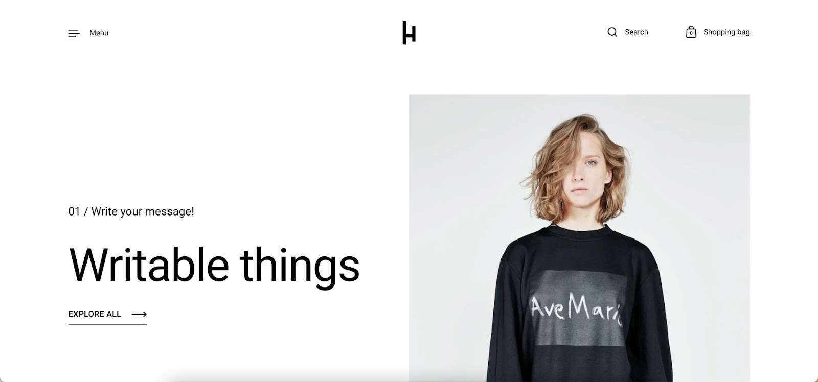
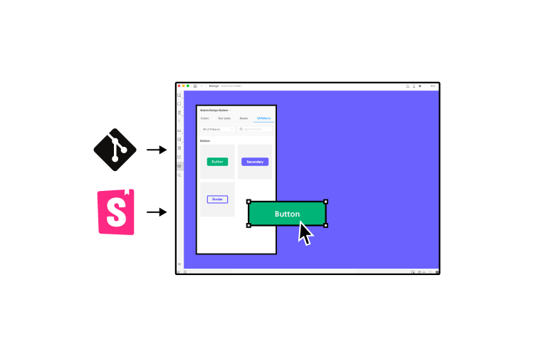


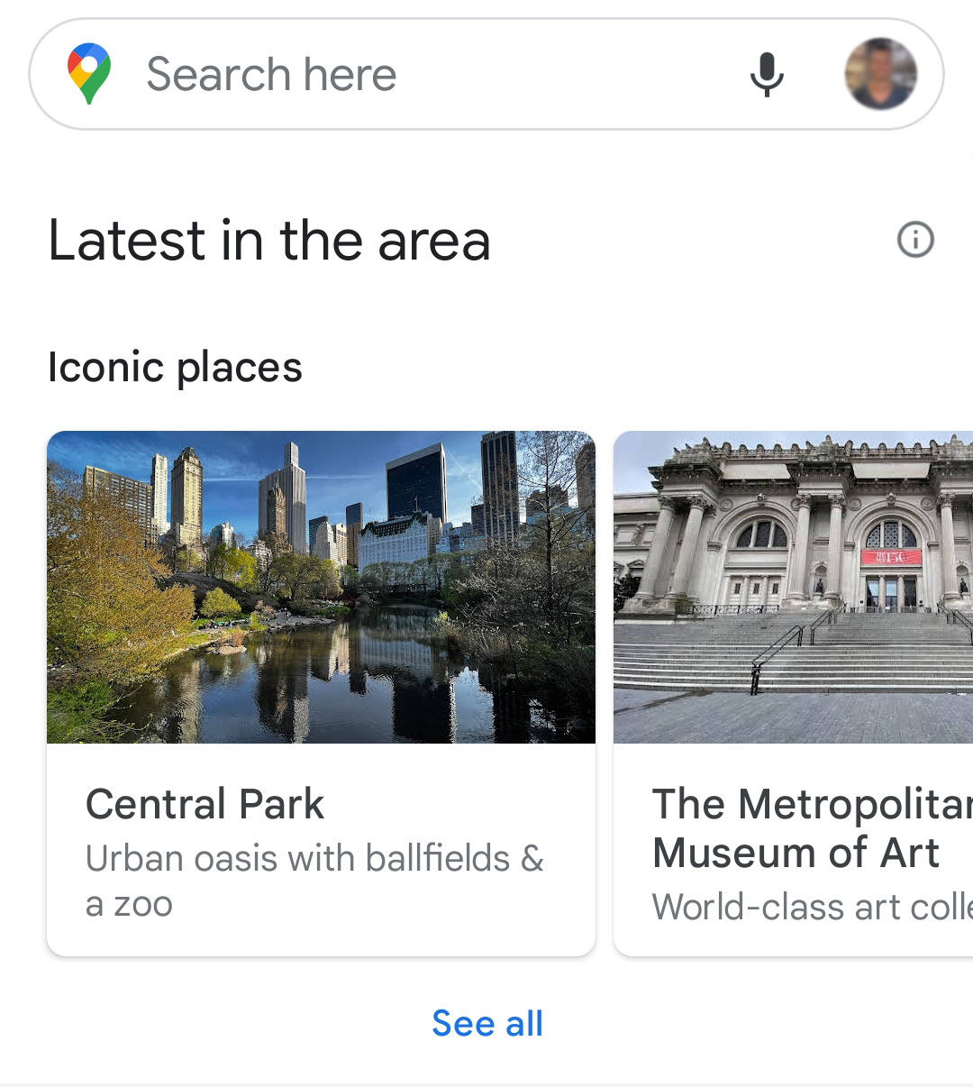
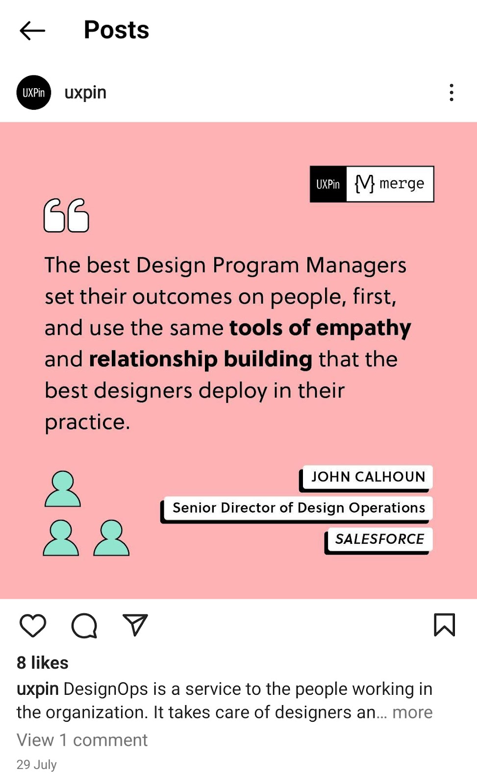
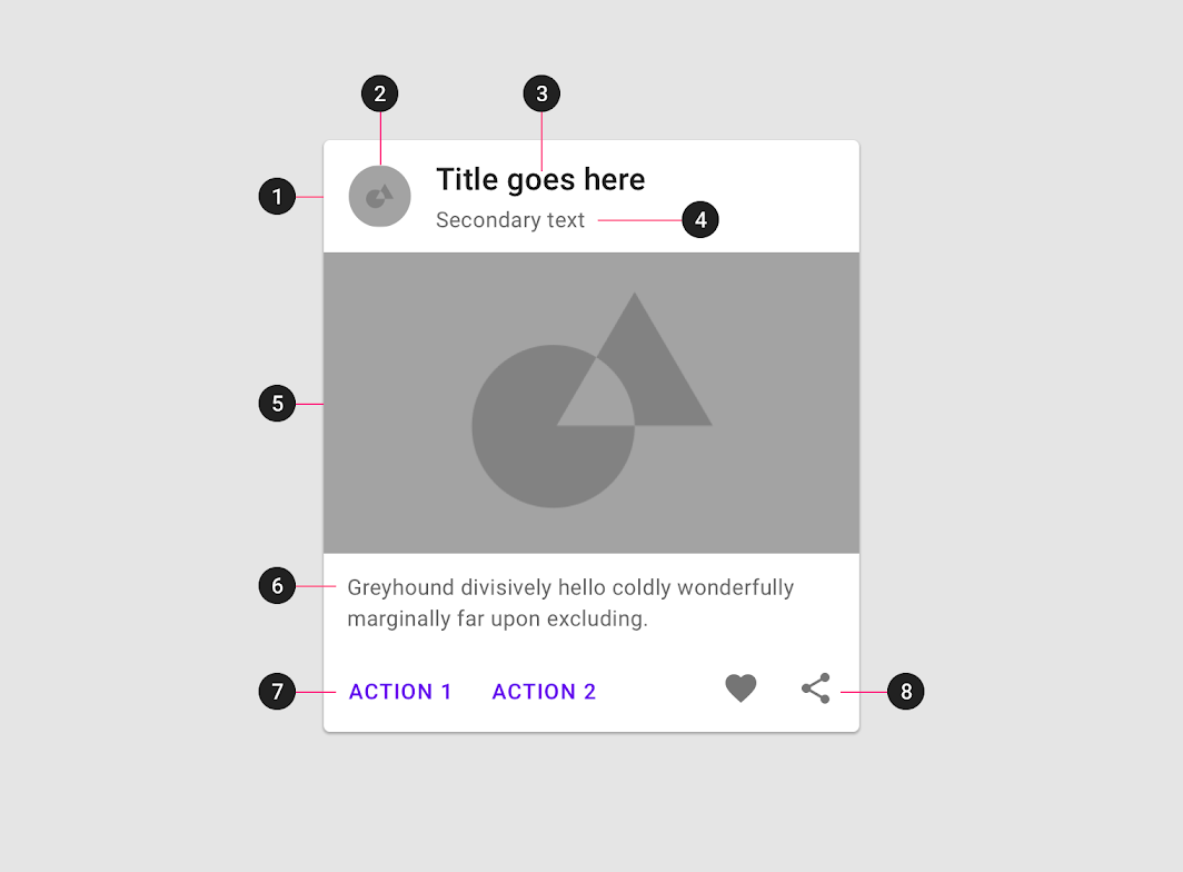
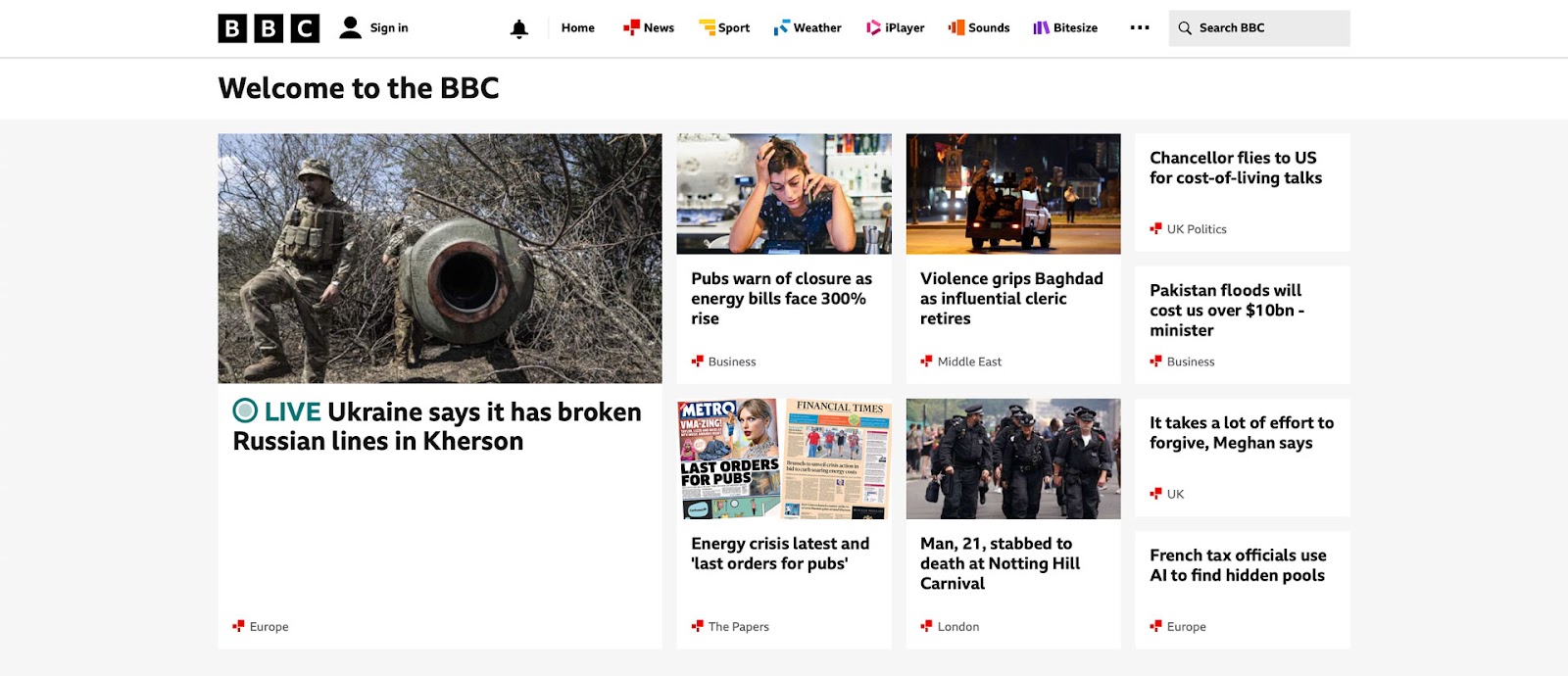
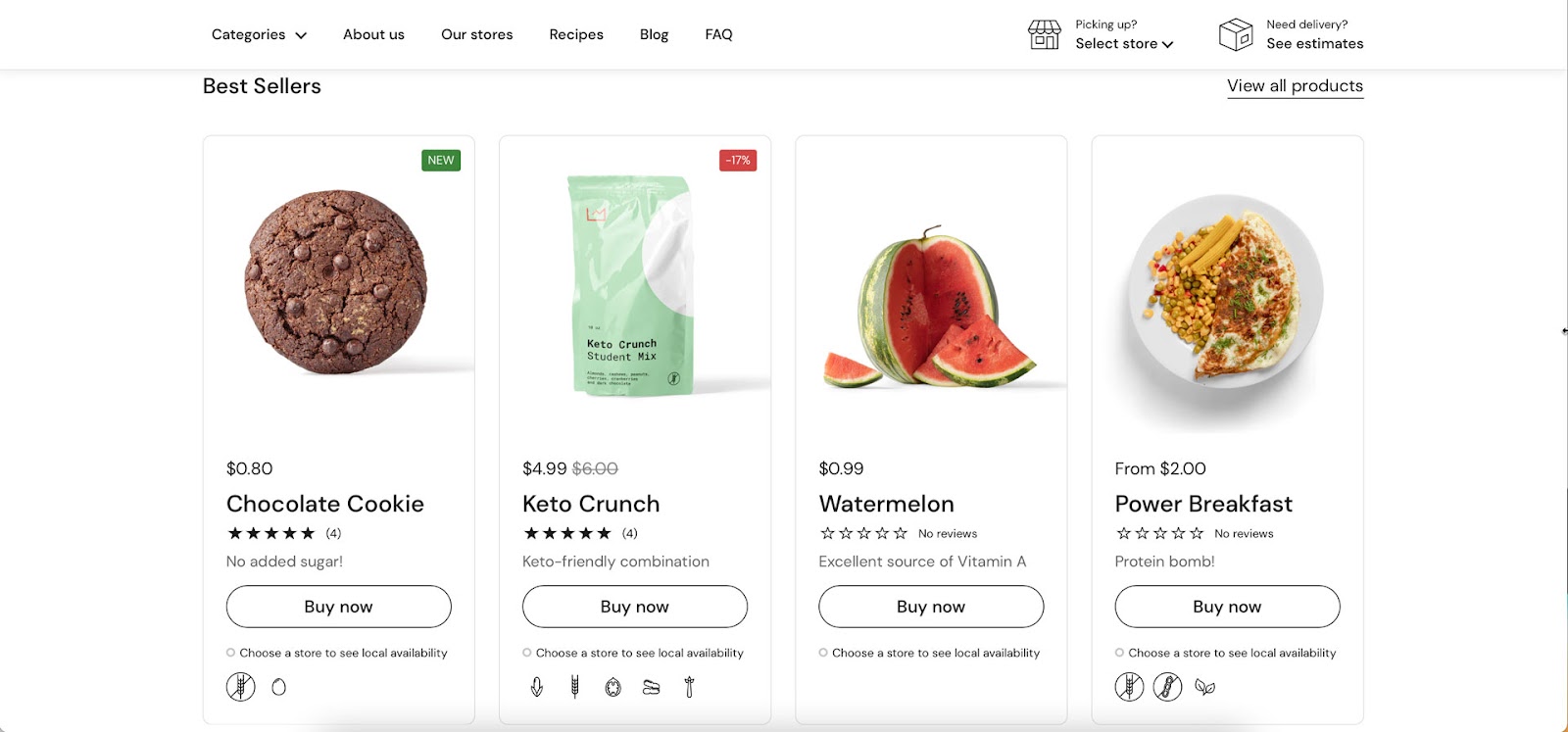

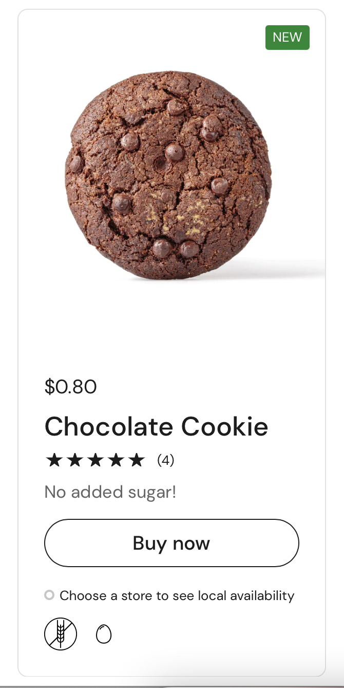
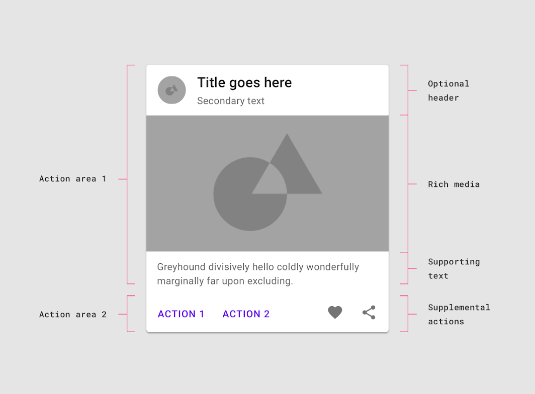
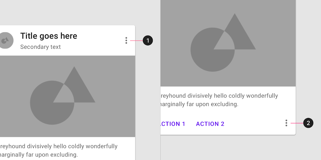
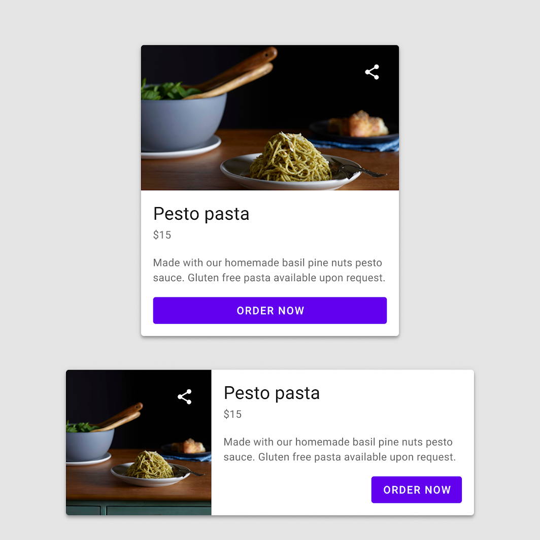

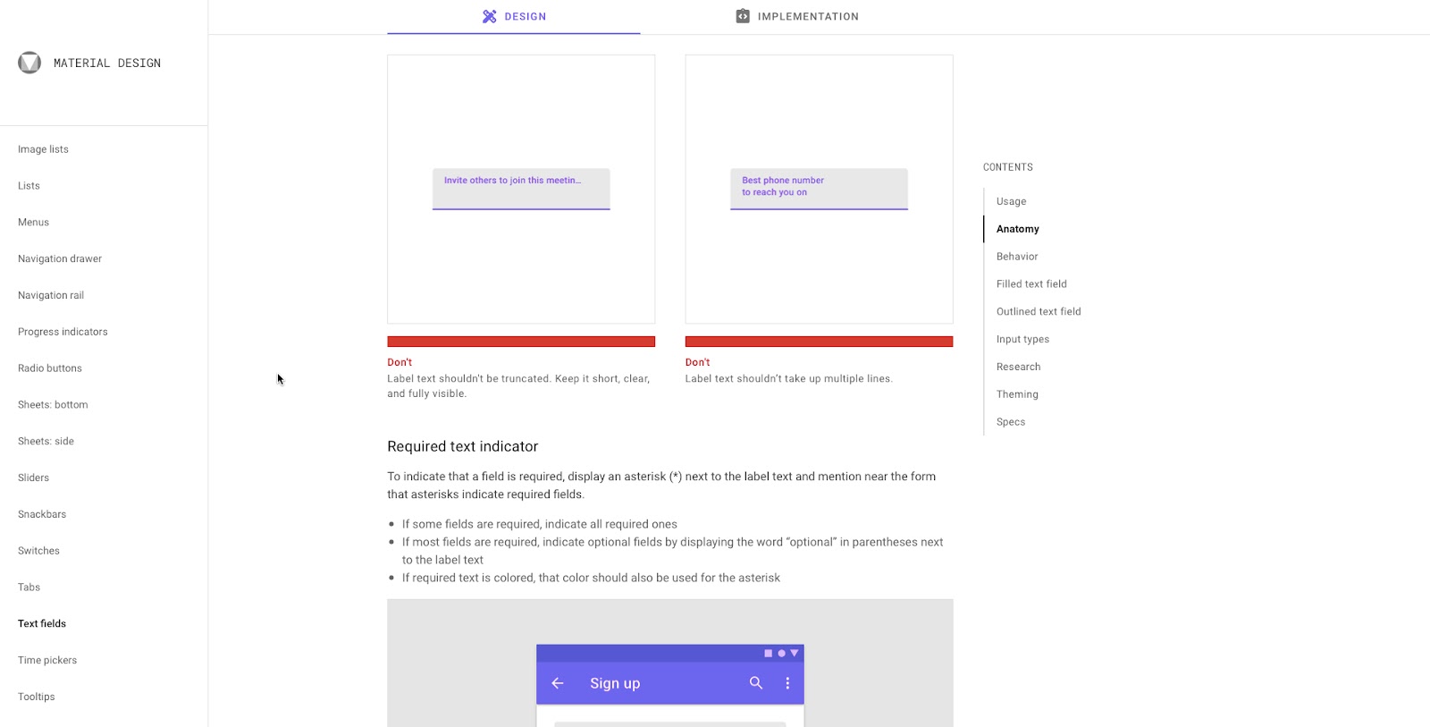
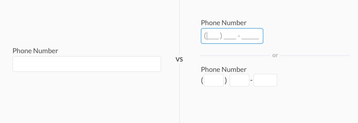


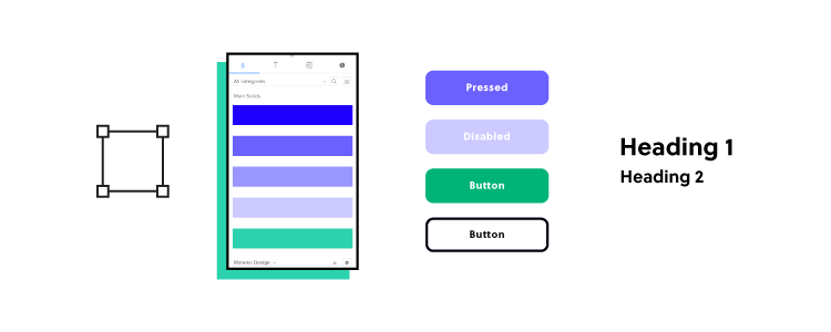
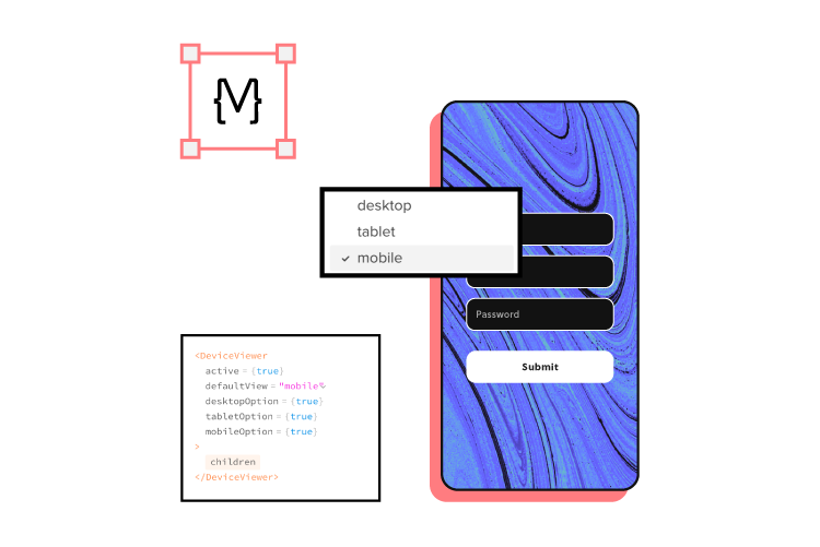
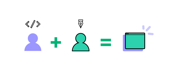


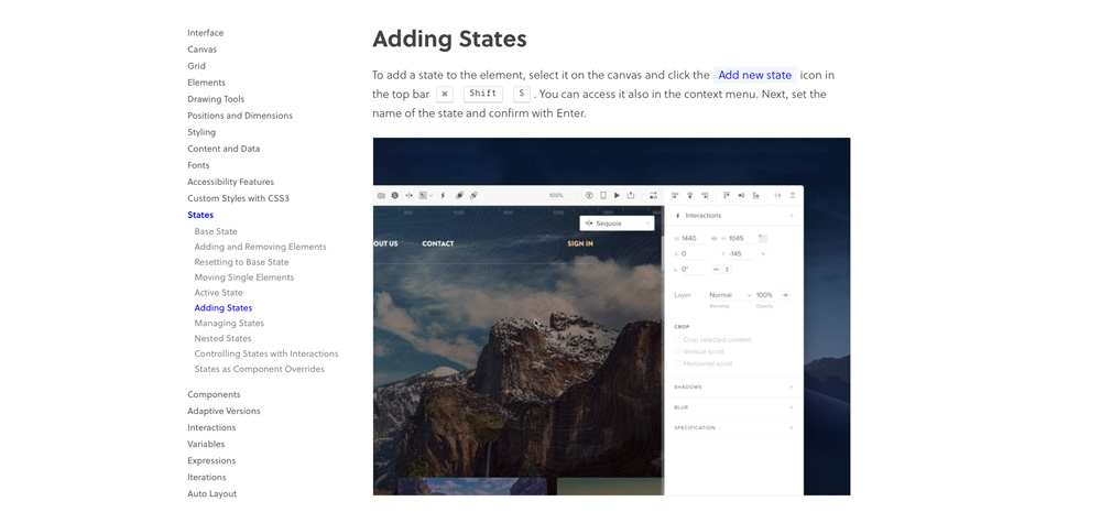

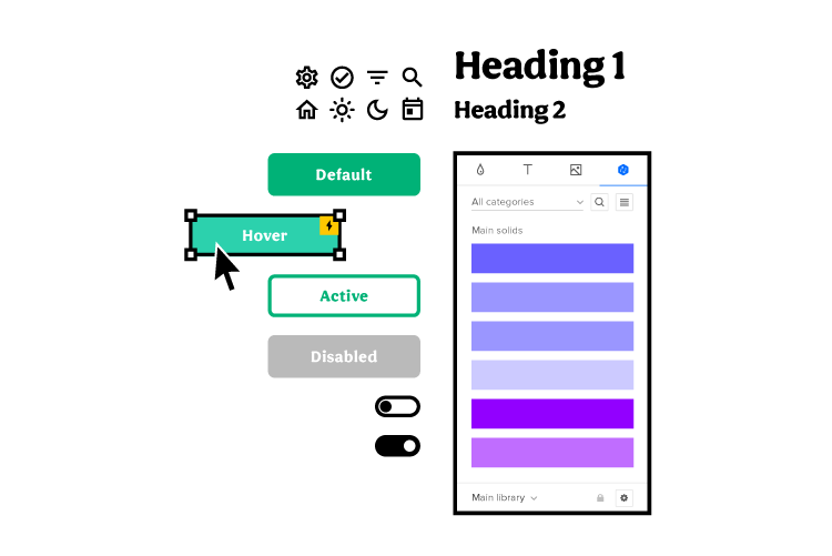