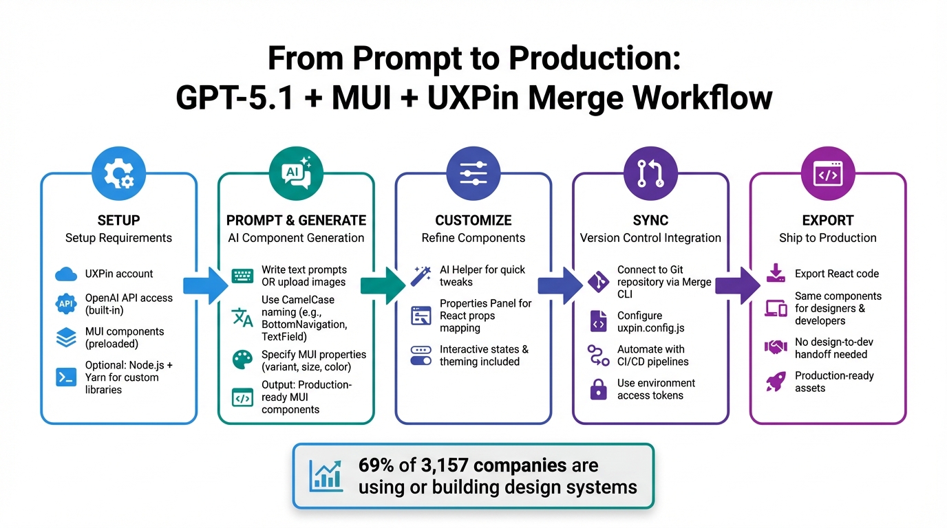
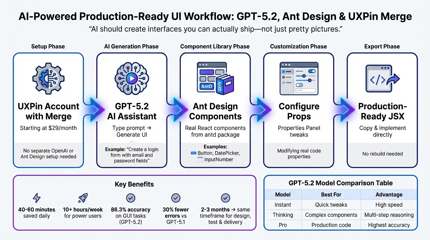
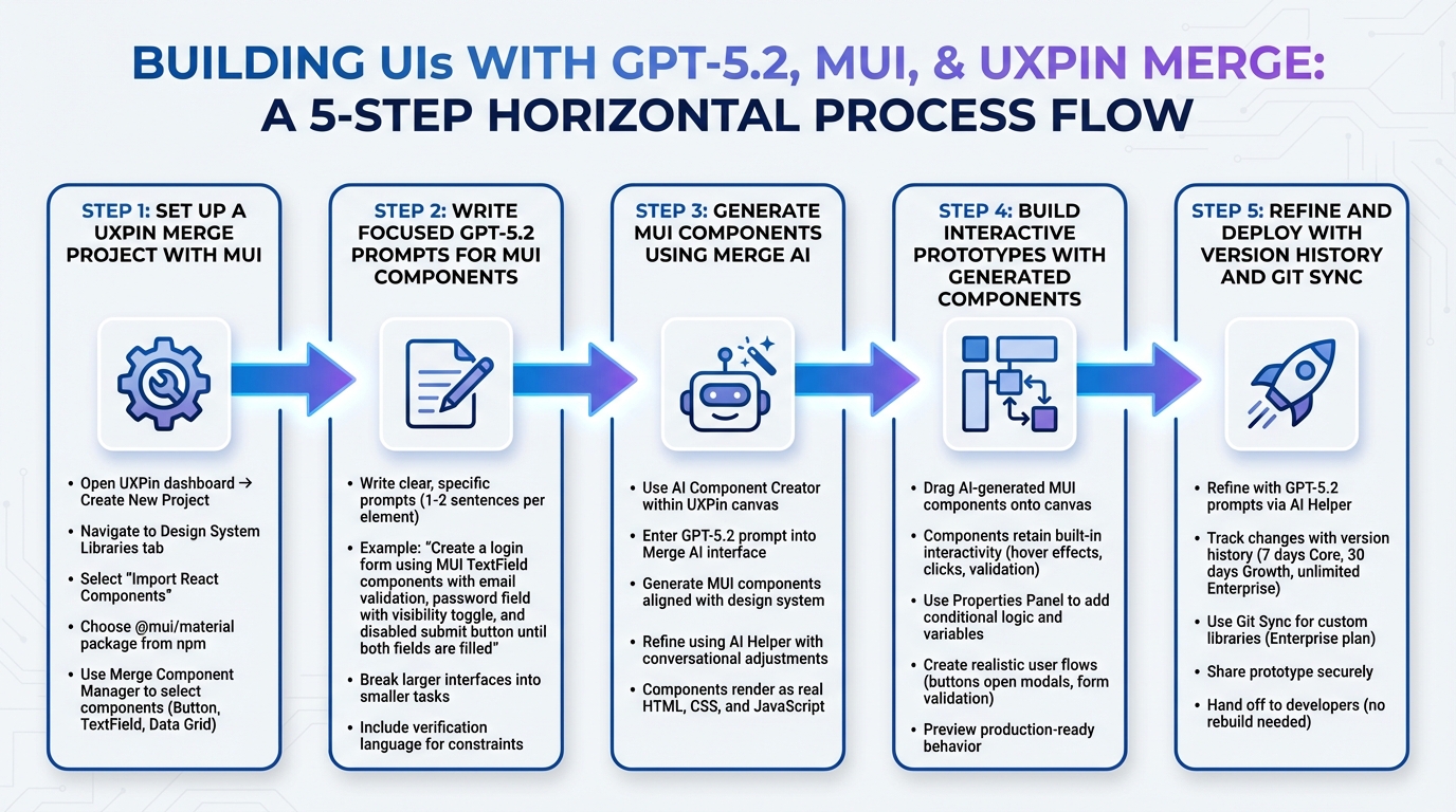
Creating UI has never been simpler. By combining GPT-5.1, shadcn/ui, and UXPin Merge, you can design and deploy production-ready interfaces faster. Here’s how it works:
- GPT-5.1: Generates UI components with precision, using your design system’s actual code.
- shadcn/ui: Provides customizable, accessible React components (buttons, cards, etc.).
- UXPin Merge: Lets you design with real, code-based components for seamless developer handoff.
This workflow eliminates design drift, reduces handoff issues, and accelerates the process. Whether starting from prompts, mockups, or custom libraries, you’ll create interactive, functional UIs ready for deployment.
How to set it up:
- Sync your React components in UXPin Merge.
- Connect GPT-5.1 via OpenAI API for AI-driven designs.
- Use shadcn/ui’s component library or your custom design system.
Key benefits:
- AI-generated designs are code-ready.
- No manual rebuilding for developers.
- Preserves accessibility and design standards.
Start designing smarter and faster with this streamlined approach.
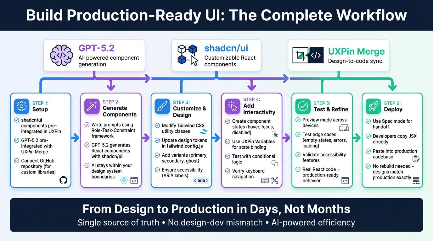
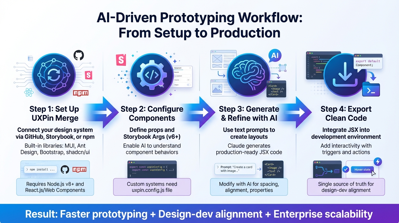
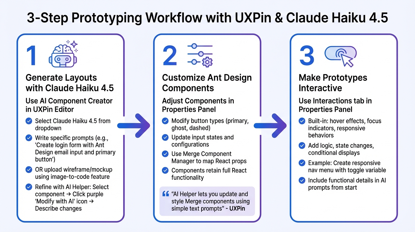
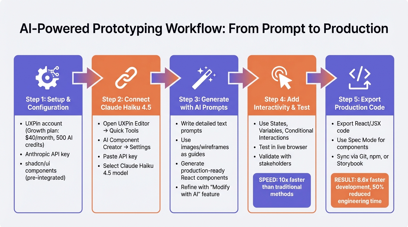
Setting Up UXPin Merge with GPT-5.1 and shadcn/ui

Integrating UXPin Merge with GPT-5.1 and shadcn/ui is a straightforward process. It eliminates the need for complex setups or manual imports, making it easy to get started. Here’s how you can set everything up efficiently.
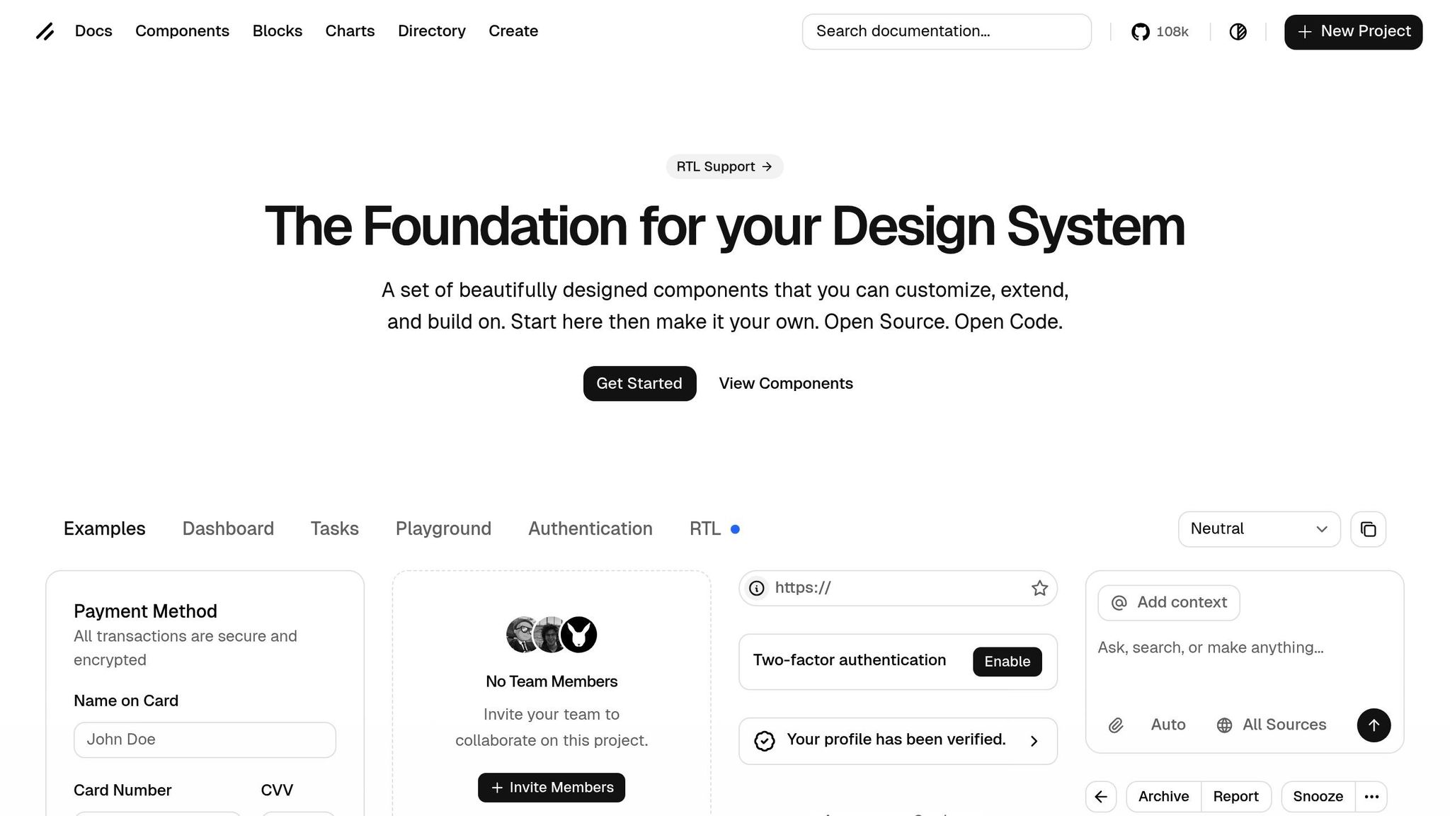
Creating a New UXPin Merge Project
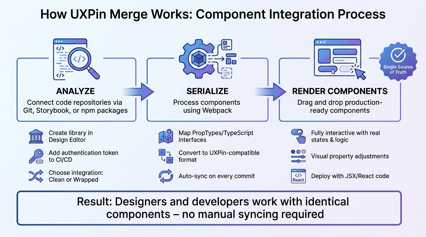
Begin by opening UXPin and creating a new prototype. UXPin Merge automatically syncs production-ready React components from your repository into the design editor. This enables real-time collaboration among team members, ensuring everyone stays on the same page.
Connecting GPT-5.1 with the OpenAI API
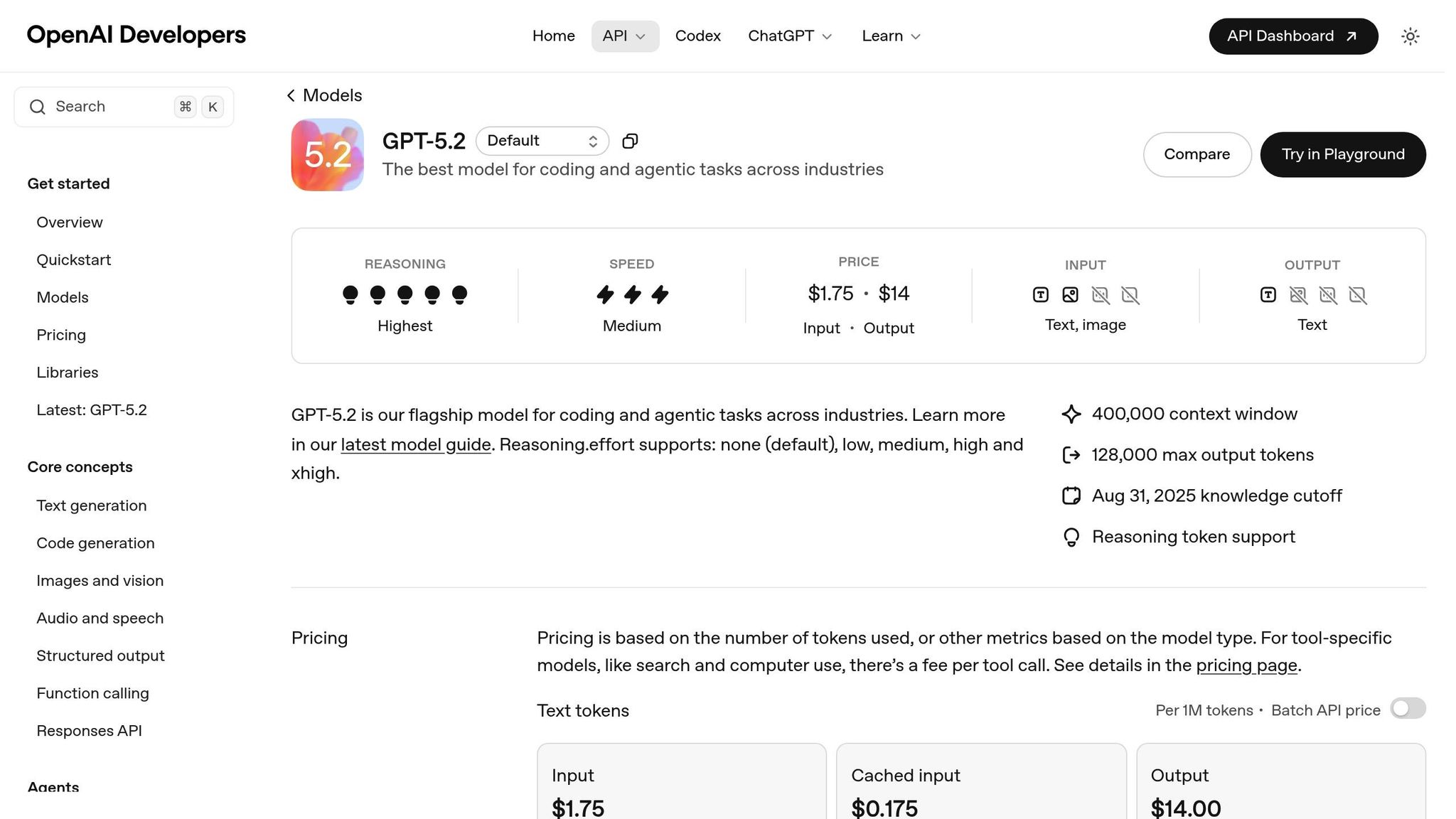
To link GPT-5.1, access the AI Component Creator from the Quick Tools bar. Paste your OpenAI API key, which can be retrieved from your API dashboard. GPT-5.1 pricing is straightforward: $1.25 per 1M input tokens and $10.00 per 1M output tokens, making it a cost-effective solution for design workflows. With a time-to-first-token of just 550ms in Instant mode, it ensures a responsive experience. For simpler layouts, you can opt for the none reasoning mode to speed up responses. This setup ensures your designs align with development standards, creating a seamless handoff between design and development teams.
Adding the shadcn/ui Component Library
The shadcn/ui library comes pre-integrated with UXPin Merge. To use it, open the global library settings and select shadcn/ui. The AI can then generate layouts using these components. If you have a custom design system, connect your Git repository to make proprietary components and tokens accessible to the AI. This ensures strict adherence to your design standards. The AI Component Creator leverages Tailwind CSS utilities and references CSS variables like --primary and --background, maintaining consistency across your design system.
sbb-itb-f6354c6
Generating UI Components with GPT-5.1
Once your environment is set up, you can create dynamic, production-ready UI components effortlessly. By combining GPT-5.1 with shadcn/ui’s React-based elements, you can bridge the gap between design and development with a smooth design handoff.
GPT-5.1 generates components that mirror production-quality code. These include features like auto-layout, variants, and Tailwind variables, ensuring that elements like buttons and cards function exactly as they would in a live environment. As shadcn, the creator of shadcn/ui, put it:
"This is the ultimate Figma kit for shadcn/ui. If I were to build a Figma kit, this is what I would’ve built."
With over 6,500 creators and teams relying on the shadcn/ui ecosystem, it’s a trusted foundation for integrating AI into design workflows.
Writing Clear Prompts for GPT-5.1
The effectiveness of GPT-5.1 depends heavily on how well you structure your prompts. To ensure the model selects the correct component, reference specific names from the shadcn/ui library. For instance, instead of saying "create a button", specify "Button variant=’outline’" or "CardHeader with a title and description."
Clarity is key since GPT-5.1 follows instructions with high precision. Mention your tech stack explicitly – such as Next.js (TypeScript), React, Tailwind CSS, shadcn/ui, and Radix Themes – to guide the model effectively. Use CSS variables like --primary and --background rather than hard-coded hex values to maintain consistency with your design system.
For minor tweaks, the none reasoning mode works well. For more complex layouts involving nested components, stick with the default mode. You can also include UI/UX best practices in your prompt, such as using multiples of 4 for spacing or limiting font sizes to 4–5 options.
Uploading Mockups for AI Analysis
When text-based prompts fall short, visual mockups can help the AI align better with your design vision. If you have wireframes or sketches, upload them to the AI Component Creator. GPT-5.1 will analyze your mockups and suggest shadcn/ui components that match your intended layout. This approach is especially handy for transforming legacy designs or client-provided sketches into functional interfaces.
The AI ensures Tailwind CSS alignment and respects your design’s visual hierarchy. After generation, you can use Spec mode to review properties, CSS, and documentation, making sure the output meets your technical standards. From there, refine the components to achieve your desired look and feel.
Editing AI-Generated Components
Fine-tuning components generated by GPT-5.1 is simple. Use Command + Click on nested components to adjust properties like spacing, colors, or typography directly in the Properties panel.
For more thorough testing, use the "fill with data" feature to replace placeholder text with real-world content from JSON or CSV files. This step helps identify how components handle scenarios like long product names or missing images while preserving React behaviors such as built-in interactions, state changes, and accessibility features.
Ryan Almoneda, a UX Designer at BlackDuck, shared his thoughts on using shadcn/ui:
"Our company selected shadcn as our primary design library… Its comprehensive variable system has significantly improved our efforts around branding and accessibility."
To test your prototypes further, you can preview them on actual devices using the UXPin Mirror app. By scanning a QR code, you can see how AI-generated components perform across various screen sizes in real-time.
Building Interactive UIs
Once components are generated and refined, the next step is making them fully interactive. With UXPin Merge, prototypes use production code, meaning your shadcn/ui components retain live React state and behavior.
Adding States to shadcn/ui Components
shadcn/ui components are built on Radix UI primitives, which come with built-in accessibility features and state management. For example, they handle open/closed states for dialogs or checked/unchecked states for checkboxes. The ecosystem currently includes 53 components and 183 variants, offering plenty of flexibility for interactive designs.
Because these components integrate directly with your React code, you have full control. This setup allows you to expose props like isOpen directly in the UXPin property panel, which enhances the pre-configured design system.
"The real power here is that this is your code now. Want to add a new variant? Edit buttonVariants. Need to change the default radius? Modify the Tailwind classes." – Paul Serban, Developer
If you want to extend interactivity without altering core files, you can create wrapper components. For instance, you could build a LoadingButton that wraps the standard Button component and adds custom state handling.
Using Variables and Expressions for Dynamic Behavior
UXPin Merge variables allow you to create dynamic UIs by connecting them to shadcn/ui component props. For example, you can link a variable to a "Progress" component to reflect changes in value or toggle between light and dark modes using CSS variables.
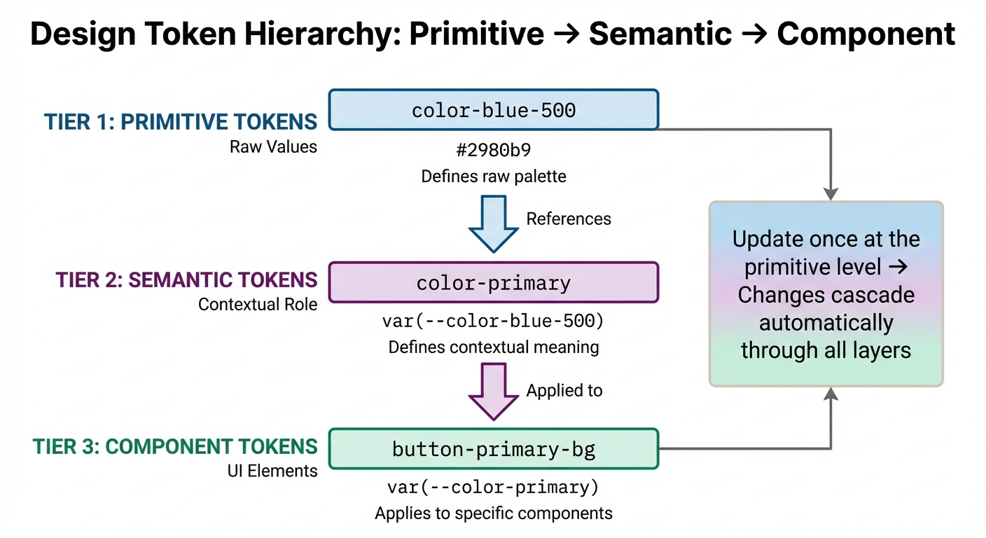
shadcn/ui relies on HSL color variables, making global theme adjustments as simple as toggling a CSS class. By defining design tokens as CSS variables in your global styles, you avoid hardcoded values and enable multi-theme functionality or white-labeling.
"Instead of hardcoding Tailwind values everywhere, define design tokens once and consume them everywhere." – Vaibhav Gupta
For hover and focus states, use CSS and Tailwind "group" classes instead of relying on JavaScript. This approach results in lightweight components – shadcn Buttons range from 1.2KB to 2.1KB, compared to Material-UI Buttons, which are between 15.2KB and 45KB.
Once these dynamic behaviors are in place, it’s time to test them.
Testing Prototypes in Preview Mode
Preview Mode in UXPin lets you test interactive UIs and verify Radix UI interactions. This includes features that work in React components but may not be functional in static designs.
You can test on physical devices using the UXPin Mirror app. This tool lets you see how your components perform across various screen sizes in real time. Use the "responsive mode" in the preview top bar to check how designs scale when switching between devices like iPads and iPhones.
"With Merge, designers can access components that already exist in the code repository without needing any coding expertise." – CMS Critic Staff
During testing, interact with components like toggles or inputs to ensure they maintain their defined states in React. If you need to confirm that components and properties render correctly before incorporating them into full designs, the "Dev Environment Editor" provides a simplified workspace for this purpose.
These methods ensure a smooth connection between design and development, so what you create in UXPin aligns perfectly with what developers deploy.
Exporting and Deploying shadcn/ui Prototypes
Once testing is complete, you can export production-ready code for developers to implement directly. UXPin Merge simplifies the process by bridging design and development, offering direct code export and smooth integration with essential tools.
Code Export and Developer Handoff
With just a single click, you can export production-ready React code, complete with dependencies and technical specifications. This approach eliminates the frustration of handing off static mockups that require developers to rebuild components from scratch.
Since shadcn/ui components are already backed by code, the export process delivers fully functional React components. Unlike tools that generate inline styles or generic layouts, UXPin Merge ensures the export includes proper prop and state management.
"When I used UXPin Merge, our engineering time was reduced by around 50%."
– Larry Sawyer, Lead UX Designer
The exported code keeps your Tailwind CSS utility classes and design tokens intact, translating visual details like colors, spacing, and border radius directly from design to development. This makes it easy to integrate the code into an iterative design process, enabling teams to refine shadcn/ui components while staying consistent. Additionally, you can export prototypes directly to StackBlitz, allowing developers to begin working with live code immediately.
Syncing with Development Tools
After exporting, you can maintain design consistency by syncing with integrated development tools. UXPin Merge offers several integrations to ensure designs align perfectly with code:
- Git: Sync React and Web Components directly from repositories.
- Storybook: Design using components already built by your team.
- Jira: Link prototypes to project issues for better tracking.
- Slack: Share updates and gather real-time feedback.
"What used to take days to gather feedback takes hours. Add in the time we’ve saved from not emailing back-and-forth and manually redlining, and we’ve probably shaved months off timelines."
– Mark Figueiredo, Sr. UX Team Lead, T.RowePrice
These integrations create a unified workflow between design and development, cutting down the lengthy feedback loops that often slow product teams. By establishing a single source of truth, teams can work more efficiently and collaboratively.
Benefits of Using GPT-5.1 and shadcn/ui in UXPin Merge
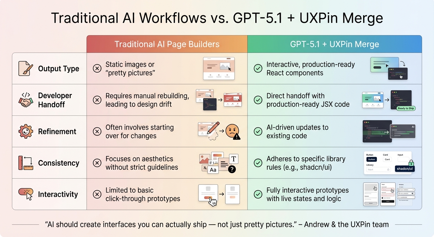
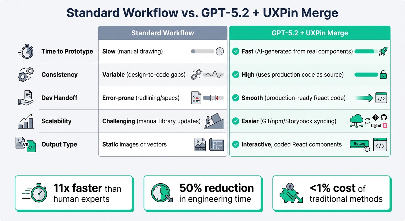
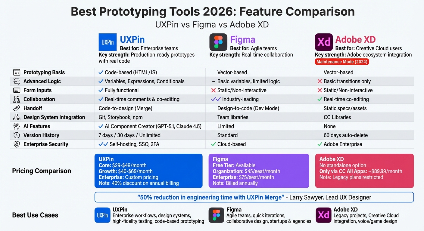
Traditional AI Page Builders vs GPT-5.1 + UXPin Merge Workflow Comparison
Pairing GPT-5.1 with shadcn/ui in UXPin Merge changes the game for UI development. Instead of generating static visuals that developers need to rebuild, this combination produces React components ready for production. GPT-5.1 understands the structure of your component library, ensuring that every layout it generates aligns with both semantic correctness and your design system.
What makes this workflow stand out is its iterative refinement capability. You can give simple instructions like "adjust spacing" or "change button style", and GPT-5.1 modifies the existing coded components without resetting the entire project. This eliminates the frustration of redoing work for small tweaks, a common issue with tools that require starting over for minor adjustments.
"AI should create interfaces you can actually ship – not just pretty pictures." – Andrew & the UXPin team
By using the same components as developers, teams can avoid design debt and the inefficiency of translating static designs into code. A survey of 3,157 companies found that 69% are either using or building a design system, yet many still face challenges in maintaining consistency between design and development. UXPin Merge solves this by creating a single source of truth, allowing designers and developers to work with identical assets throughout the product lifecycle. This approach not only simplifies workflows but also fosters better collaboration across teams.
Comparing Traditional Workflows to UXPin Merge
The advantages of UXPin Merge and GPT-5.1 become clear when compared to traditional AI tools. Here’s a breakdown of how they differ:
| Feature | Traditional AI Page Builders | GPT-5.1 + UXPin Merge |
|---|---|---|
| Output Type | Static images or "pretty pictures" | Interactive, production-ready React components |
| Developer Handoff | Requires manual rebuilding, leading to design drift | Direct handoff with production-ready JSX code |
| Refinement | Often involves starting over for changes | AI-driven updates to existing code |
| Consistency | Focuses on aesthetics without strict guidelines | Adheres to specific library rules (e.g., shadcn/ui) |
| Interactivity | Limited to basic click-through prototypes | Fully interactive prototypes with live states and logic |
Traditional tools output static designs that require developers to recreate them from scratch. In contrast, UXPin Merge generates code that developers can immediately use. Plus, shadcn/ui’s built-in accessibility features are preserved in the AI-generated designs, ensuring compliance from the outset.
Improving Team Collaboration and Scalability
Major organizations like Amazon, American Automobile Association (AAA), and T. Rowe Price use UXPin Merge to integrate their custom libraries with AI. For teams managing multiple products or platforms, connecting custom Git repositories allows GPT-5.1 to generate UI components using their proprietary design tokens and libraries. This seamless connection between design and production components reinforces UXPin Merge’s focus on creating a streamlined, code-ready workflow.
"Designers can use production code to design experiences even if they don’t know how to code, and developers can optimize and refine without disrupting the design layer." – CMS Critic Staff
Another standout feature is the image-to-code analysis. Teams can upload sketches or screenshots, and GPT-5.1 recreates them using shadcn/ui components, staying true to the original design. This complements the iterative refinement process, ensuring a smooth transition from concept to production-ready code. It’s a faster, more efficient way to bring ideas to life.
Conclusion
By integrating GPT-5.1 with shadcn/ui in UXPin Merge, interface development takes a leap forward. This approach bridges the gap between design and code by leveraging production-ready React components, minimizing design inconsistencies, and cutting down development time. You can design with actual components, fine-tune them using AI, and instantly generate production-ready code – whether you’re working on a single application or scaling across multiple platforms.
UXPin Merge starts at $29/month (Core) and $40/month (Growth), with custom enterprise solutions available by contacting sales@uxpin.com. Ready to speed up your UI workflow? Check out uxpin.com/pricing and start your journey with UXPin Merge today.
FAQs
What do I need in my Git repo to use UXPin Merge with shadcn/ui?
To integrate UXPin Merge with shadcn/ui, your Git repository needs to provide production-ready React components, along with tokens and styles. Make sure your project is built with React.js (16.0.0 or newer), Webpack (4.6 or newer), and the UXPin Merge CLI. Components should be defined in the uxpin.config.js file and synced via Git, Storybook, or npm. This setup ensures smooth integration and synchronization between your components and UXPin.
How do I keep my design tokens and themes consistent in AI-generated UI?
To keep design tokens and themes consistent in AI-generated UI, connect your design system with UXPin Merge. By using production-ready React components – whether from libraries like shadcn/ui or your own custom-built ones – you can ensure the styles and interactions match your established themes. Integrate your system through Git, Storybook, or npm, centralize token definitions, and tweak component props directly in UXPin. This approach ensures updates are reflected across all components seamlessly.
How can my team review and ship the exported React code safely?
UXPin Merge makes it easier for your team to review and ship exported React code with confidence. It integrates production-ready components – like those created by GPT-5.1 – directly into the design environment. With features like simulation mode, you can validate components and test interactions thoroughly. Plus, auto-generated specs simplify developer handoffs, ensuring everyone stays on the same page. By incorporating version control, you can track changes, maintain consistency, and minimize errors, all while fostering smoother collaboration between design and development teams.