Even in 2026 — with AI assistants, code-backed components, and cloud-based design tools — pen and paper remain one of the fastest ways to explore ideas in the early stages of UX design. Paper prototyping lets teams sketch, test, and iterate on concepts before investing time in digital tools or code.
This guide covers everything you need to know about paper prototyping: what it is, when it makes sense, step-by-step techniques for creating effective paper prototypes, tips for testing them, and how to transition your best concepts into high-fidelity, interactive prototypes.
Ready to skip straight to digital? With UXPin Forge, you can describe a UI concept in plain language — or upload a photo of your paper sketch — and get a working prototype built with real components. Start a free trial.
Build advanced prototypes
Design better products with States, Variables, Auto Layout and more.
What Is Paper Prototyping?
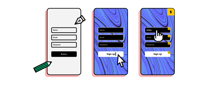
Paper prototyping is the process of sketching user interface screens by hand to visualize and test ideas before committing to digital design. Each sketch represents a screen or state in the application, and teams arrange them in sequence to simulate user flows.
Paper prototypes are low-fidelity by nature — they don’t have interactivity or pixel-perfect styling. Their purpose is to map out information architecture, validate navigation concepts, and gather early feedback before investing time in detailed design work.
Designs are typically sketched in black and white, using basic shapes for UI elements. Content is kept minimal — headlines and CTA labels may be legible, but body text is usually represented as wavy lines or lorem ipsum placeholders.
Advantages and Disadvantages of Paper Prototyping
Advantages
Speed — Sketching a screen takes minutes, not hours. It’s far easier to discard a 5-minute sketch than a polished digital mockup.
Low cost — Paper, pens, and sticky notes are all you need. Even stencil kits are inexpensive.
Increased creativity — The freeform nature of pencil and paper encourages experimentation and divergent thinking, which can be stifled by the precision of digital tools in early stages.
Team collaboration — Paper prototyping sessions bring cross-functional teams together in a creative, low-stakes environment. Everyone can sketch, regardless of design skill.
No learning curve — Anyone can participate, making it ideal for involving stakeholders, marketers, and developers in ideation sessions.
Documentation value — Paper prototypes become useful UX artifacts. Designers annotate decisions and rationale directly on the sketches for future reference.
Disadvantages
No real interactivity — Without functioning inputs, transitions, or states, user feedback is limited to high-level flow validation rather than detailed interaction testing.
Difficult to interpret outside the team — Stakeholders and test participants outside the UX team may struggle to understand rough sketches, limiting feedback quality.
May be unnecessary with modern AI tools — Rapid prototyping tools like UXPin and AI assistants like Forge can produce testable, high-fidelity layouts in minutes — making paper prototyping an optional extra step for some workflows.
Difficult to version and share remotely — Paper prototypes require photography or scanning to share with distributed teams, and tracking iterations is manual.
When to Use Paper Prototyping
Paper prototyping is most valuable in the earliest stages of the design process. It works best for:
Brainstorming sessions — When you need to generate many ideas quickly and explore different directions without tool constraints.
New product concepts — When you’re still defining the product’s core flows, information architecture, and key interactions.
Cross-functional workshops — When you want non-designers (product managers, developers, executives) to contribute ideas in a low-pressure format.
Early-stage user testing — When you want to validate broad navigation concepts and screen flows before investing in digital prototypes.
Remote or low-resource environments — When digital tools aren’t readily available or when you need a fast, no-setup ideation method.
Once you’ve validated the core concept on paper, transition to a digital tool to test interactivity, visual design, and responsive behavior. Research referenced by Nielsen Norman Group found that roughly 75% of usability issues can be identified with simple, low-fidelity prototypes — so paper prototyping delivers high value before you ever open a design tool.
How to Create a Paper Prototype: Step by Step
Step 1: Prepare Your Materials
Gather blank printer paper (avoid ruled paper — lines restrict creativity), fine-tipped black markers, colored markers for highlights, sticky notes, scissors, tape, and index cards. If you have a whiteboard, use it to map out overall flows before sketching individual screens.
Pro tip: Assign preparation to the team’s “arts & crafts enthusiast” — every team has one, and they’ll make sure you have more than enough supplies.
Step 2: Warm Up with Crazy Eights
Start with a warm-up exercise. Crazy Eights is a popular design sprint technique: fold a sheet into 8 panels and sketch a different version of the same screen in each panel (one minute per panel). After a couple of rounds, you’ll have dozens of ideas to expand on — and the time pressure prevents overthinking.
Step 3: Sketch One Screen Per Sheet
Draw one screen per piece of paper. This lets you rearrange, swap, and add screens flexibly when mapping user flows. Use basic shapes for buttons, inputs, and images — label key elements clearly so others can interpret your intent.
Step 4: Arrange Screens Into User Flows
Lay out your screens on a desk or floor in the order a user would encounter them. Walk through the flow as if you were a real user navigating the product. Identify gaps, dead ends, unnecessary steps, and opportunities to streamline.
Step 5: Simulate Interactions
Designate a team member as the “human computer” who swaps screens when the test participant taps a button or makes a selection. Some teams build cardboard device frames to simulate mobile or tablet screens for added realism.
Step 6: Annotate and Document
Add sticky notes with questions, assumptions, and design rationale to each screen. Photograph or scan your paper prototypes to create a digital archive before moving on to the next phase.
6 Tips for Better Paper Prototypes
Design mobile-first. Start with the smallest screen and scale up. This forces you to prioritize content and avoid desktop-heavy layouts that don’t translate to mobile.
Focus on quantity, not quality. The goal is generating many ideas. You’ll combine the best elements from multiple sketches into a refined concept.
Use color sparingly. Black-and-white sketches keep the focus on layout and flow. Use color only to highlight CTAs, status indicators, or important states.
Keep a “parking lot.” Capture off-topic or tangential ideas on a separate sheet rather than derailing the current session.
Time-box sessions. Paper prototyping works best in focused 30–60 minute blocks. Longer sessions often produce diminishing returns as energy fades.
Photograph everything. Paper gets lost, crumpled, or recycled. Take photos of each screen and the overall flow arrangement before cleaning up.
Testing and Presenting Paper Prototypes
Presenting paper prototypes outside the design team requires extra preparation. Participants need to “imagine” interactions, which can confuse or distract from the feedback you’re trying to gather.
Tips for effective paper prototype testing:
Assign clear roles — Have one person present and guide the session, and another play the “human computer” who simulates the product by swapping screens.
Rehearse before testing — The presenter and simulator need to be in sync so the demonstration flows naturally and doesn’t distract participants.
Follow usability test best practices — Test with at least 5 participants and record sessions. For detailed guidance, see UXPin’s Guide to Usability Testing.
Provide annotations — If participants inspect prototypes independently, include labels and instructions so they know where to focus and what actions are available.
Ask participants to think aloud — Verbal narration of their thought process reveals mental models and expectations that you can’t observe from actions alone.
From Paper to Digital: Transitioning to UXPin
Paper prototyping validates the concept. The next step is building something interactive that you can test at higher fidelity and share with distributed stakeholders.
UXPin offers two fast paths from paper sketches to interactive digital prototypes:
Option 1: Build Manually with Merge Components
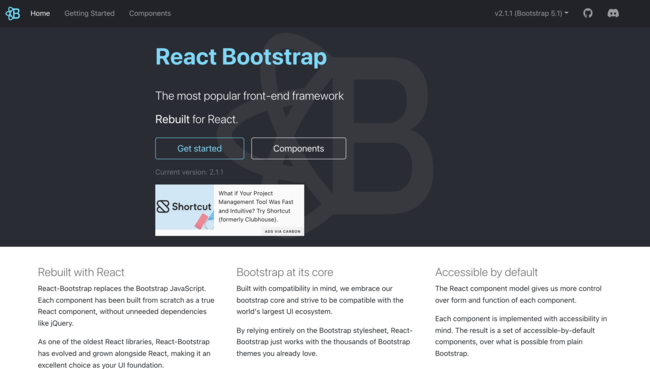
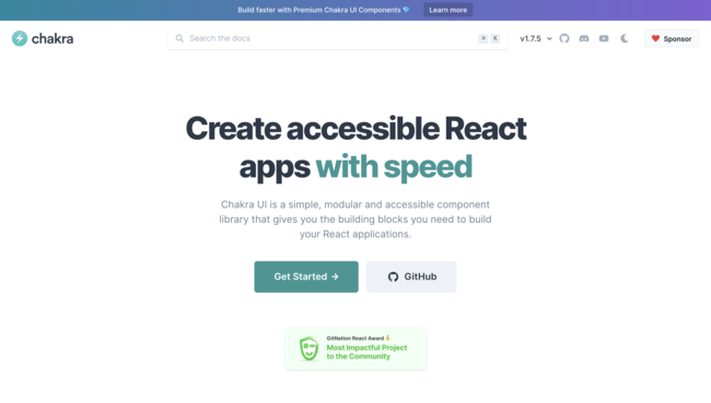
Open UXPin and drag pre-built, code-backed components from libraries like MUI, shadcn/ui, or Bootstrap onto the canvas. Because these are real React components, your prototype functions like the final product — with working inputs, states, and interactions.
Option 2: Use Forge to Convert Sketches Automatically
Forge accepts image uploads as input. Photograph your paper prototype, upload it to Forge, and the AI generates a component-based layout that matches your sketch — using your production design system’s actual React components. From there, refine it conversationally (“move the navigation to the left,” “add a search bar in the header”) and export production-ready JSX.
Either path eliminates the tedious manual translation work that traditionally slows the transition from paper to digital. Teams using Merge and Forge report 8.6x faster design-to-prototype cycles compared to vector-based tools. Sign up for a free trial and try both approaches.
Frequently Asked Questions
What is paper prototyping in UX design? Paper prototyping is a low-fidelity design technique where UX teams sketch user interface screens by hand and arrange them to simulate user flows. It’s used in early-stage ideation to explore concepts quickly before moving to digital design tools.
When should you use paper prototyping? Use paper prototyping during brainstorming sessions, new product conceptualization, cross-functional workshops, and early-stage user testing. It’s most valuable when you need to generate and compare many ideas quickly at minimal cost.
Is paper prototyping still relevant in 2026? Yes. While AI tools like UXPin Forge can generate layouts from text prompts, paper prototyping remains valuable for collaborative ideation, early-stage exploration, and workshops where you want non-designers to contribute. Many teams use paper prototyping for the initial concept and then transition to digital tools for testing and refinement.
How do you test a paper prototype? Assign a “human computer” to simulate interactions by swapping paper screens as the participant navigates. Follow standard usability testing practices: use at least 5 participants, record sessions, and ask participants to think aloud as they work through tasks.
What materials do you need for paper prototyping? At minimum: blank printer paper, fine-tipped black markers, and sticky notes. For more polished sessions, add colored markers, scissors, tape, index cards, UI stencils, and a whiteboard for mapping overall flows.
How do you convert a paper prototype into a digital design? You can manually recreate the layout in a design tool using pre-built components, or use AI tools like UXPin Forge to upload a photo of your sketch and generate a component-based digital layout automatically. Forge uses your real production components, so the output is immediately usable and on-brand.
Design thinking is the foundational problem-solving framework that UX teams use to understand user needs and build products that address real problems. It emphasizes collaboration, empathy, and iterative experimentation — placing human needs at the center of every design decision.
The five stages of the design thinking process are:
Empathize — Discover what your users need through research and observation
Define — Articulate the core problem you’re trying to solve
Ideate — Generate a wide range of potential solutions
Prototype — Build testable representations of your best ideas
Test — Validate prototypes with real users and gather feedback
These stages aren’t strictly sequential. Design thinking is an iterative process where teams move between stages as they learn — testing can send you back to empathize, prototyping can spark new ideation, and research insights can redefine the problem entirely.
UX designers use UXPin at every stage of the design process, from quick wireframes to complex, interactive prototypes. With Forge, teams can generate component-based prototypes from text descriptions in minutes, dramatically accelerating the prototype-test-iterate cycle. Start a free trial to build products your users will love.
Build advanced prototypes
Design better products with States, Variables, Auto Layout and more.
What Is Human-Centered Design?
The five stages of design thinking are rooted in human-centered design — an approach that places the people you’re designing for at the center of every decision.
Human-centered design broadens the traditional “user-centered design” concept. Rather than focusing narrowly on how someone interacts with a product, it considers the full human experience: emotions, environment, constraints, and motivations. This perspective helps design teams move beyond data and analytics to understand the why behind user behavior.
Without a human-centered approach, UX teams risk building features and products that are technically functional but don’t solve real problems — or that no one actually uses. Design thinking provides the framework to ensure every design decision is grounded in genuine human needs.
Innovative solutions rarely come from revolutionary technology alone. They come from deeply understanding difficult human problems and finding creative, practical ways to solve them.
Stage 1: Empathize — Understand Your Users
The empathize stage is essentially a research exercise. The goal is to deeply understand the people you’re designing for — their needs, pain points, behaviors, and motivations — before jumping to solutions.
A design team often sets out to solve problems they don’t personally experience. An empathic approach helps UX designers see the world through the eyes of the people they’re trying to help.
During the initial empathize stage, it’s helpful to think of those you’re designing for as humans rather than “users.” You’re trying to solve human problems. They become users only when they start interacting with your product.
UX designers must also consider a diverse range of people to eliminate bias in their research. Testing assumptions against varied demographics and contexts leads to more inclusive, effective designs.
Empathy Mapping
To get inside the user’s head, designers often use an empathy map. Empathy maps place the user at center with four quadrants:
Says — What does the user verbalize while trying to reach their goal?
Thinks — What are their internal thoughts and assumptions?
Does — How do they interact with products or navigate their environment?
Feels — What emotions surface — frustration, confusion, relief, satisfaction?
Research Methods for the Empathize Stage
To build empathy maps and understand users, teams typically combine multiple research methods:
Analyzing quantitative data and usage analytics
Reviewing relevant market and competitor research
Conducting one-on-one interviews with target users
Consulting domain experts and customer support teams
Running surveys to identify patterns at scale
Observing users in the environments where they’ll use the product
Reviewing customer support tickets and feedback channels
UX designers take detailed notes during the empathize stage to create user personas, journey maps, and user stories — artifacts that guide every subsequent design decision.
Stage 2: Define — Articulate the Problem
In the define stage, designers synthesize their research into a clear, actionable problem statement. Analyzing notes and data from the empathize stage, the team identifies common themes, recurring frustrations, and unmet needs.
UX teams create several tools to help crystallize their understanding:
User personas — A representation of a key user group, including goals, pain points, and behaviors
User stories — Brief narratives explaining what the user wants to achieve and why
User journey maps — A visualization of the steps users take to reach a goal, including touchpoints, emotions, and friction points
Problem statement — A concise summary of the core user need the team will address
Developing strong problem statements is the most critical output of the define stage. A well-crafted problem statement aligns the team around the user’s need rather than the company’s assumptions, and it serves as a north star for all subsequent ideation and design work.
During the define stage, UX designers also begin identifying potential features and functionality that could address the user’s problems — setting the stage for ideation.
Stage 3: Ideate — Generate Solutions
The ideate stage is where creative problem-solving begins in earnest. UX teams — often joined by stakeholders from product, engineering, and marketing — brainstorm a wide range of ideas for addressing the defined problem.
Ideation is a collaborative, high-energy exercise where quantity matters more than quality initially. Teams use “How might we…?” questions to frame challenges as creative opportunities, and techniques like the “worst possible idea” exercise to encourage out-of-the-box thinking and make team members comfortable sharing unconventional ideas.
During ideation, there are no rules or boundaries. No worrying about budget constraints, technical feasibility, or scalability — at least not yet. The aim is to explore as many directions as possible, then converge on the most promising concepts for prototyping.
Designers might sketch screen layouts, create quick paper prototypes, or use AI tools like UXPin Forge to rapidly generate layout concepts from text descriptions. Teams may even conduct quick internal tests to expand and validate concepts — breaking the seemingly linear design thinking process in productive ways.
Stage 4: Prototype — Build and Iterate
The prototype stage is where ideas become tangible. UX teams build representations of their best concepts — ranging from rough sketches to fully interactive digital prototypes — and use them to learn through testing.
Teams typically work across two fidelity levels:
Low-Fidelity Prototypes
Low-fidelity prototypes include paper sketches, simple wireframes, and basic screen flows. They’re fast to create and easy to discard, making them ideal for testing core concepts and navigation structures before investing in detailed design. Using pre-made form fields in UXPin, designers can quickly create wireframes for lo-fi prototypes.
High-Fidelity Prototypes
High-fidelity prototypes are fully interactive models that look and behave like the final product. They include visual design, real content, working interactions, microinteractions, and realistic data — providing the most accurate testing environment possible.
With UXPin Merge, designers build high-fidelity prototypes using production-ready code components. The prototype components are the same ones in the development codebase, so prototypes behave exactly like the real product. Design libraries sync with your Git repo or Storybook, so designers can start building immediately.
UXPin Forge accelerates prototyping even further — describe a layout in plain language, and Forge generates an interactive prototype using your real components. Then refine conversationally until it matches your vision.
Stage 5: Test — Validate with Users
The test stage is where design teams gather real user feedback — and it’s arguably the most important stage of the entire process. As the UX principle goes: “Test early, test often.”
Testing validates (or invalidates) the assumptions and decisions made during every previous stage. It can confirm that a solution works, reveal unexpected usability issues, or uncover entirely new user needs that send the team back to the empathize stage with fresh insights.
UX teams typically run usability studies with participants who match the personas created during the empathize stage. These studies use high-fidelity prototypes to evaluate:
Whether users can complete key tasks without confusion
Where friction, errors, or dead ends occur
How users interpret content, labels, and navigation
Whether the overall experience meets user expectations
Because UXPin prototypes built with Merge components function like the real product — with working forms, conditional logic, and state changes — usability testing feedback is significantly more reliable than what you’d get from static mockups or clickable wireframes.
Design Thinking Is Non-Linear
It’s worth emphasizing that design thinking is a non-linear process. Teams frequently jump between stages, revisit earlier phases, and apply methods from multiple stages simultaneously.
For example, designers might iterate between the empathize and define stages several times before moving to ideation. Usability testing might reveal a fundamental problem that sends the team back to research. Prototyping often sparks new ideas that restart the ideation process.
This fluidity is a feature, not a bug. The value of design thinking is in the mindset — staying curious, remaining focused on user needs, and being willing to iterate — rather than following a rigid sequence.
Running Design Thinking Workshops
A design thinking workshop brings cross-functional teams together for focused, collaborative problem-solving. Teams might convene to address a specific user issue, explore a new product concept, or improve an existing feature.
While in-person workshops tend to produce the most engagement, remote workshops via video conferencing also work well with proper facilitation. Planning is essential — define the workshop’s objectives, agenda, and expected outcomes so teams can maximize their time.
Design thinking workshops typically compress the framework into three focused activities:
Empathy — Review research, share user insights, and align on the problem
Ideation — Brainstorm solutions using structured exercises (Crazy Eights, How Might We, etc.)
Prototyping — Rapidly build testable concepts using paper, wireframes, or AI-assisted tools
The most successful workshops encourage participation from everyone — designers, developers, product managers, and stakeholders — which is why a collaborative, low-pressure environment is essential.
Applying Design Thinking with UXPin
UXPin supports the entire design thinking process in a single platform, from early wireframes to production-ready prototypes:
Empathize — After building and testing prototypes, take notes using UXPin’s Comments feature to capture user feedback directly on design elements.
Define — Review comments and collaborate with your team to synthesize findings and define usability issues.
Ideate — Use Forge to rapidly generate layout concepts from text descriptions using your real components. Explore multiple directions in minutes.
Prototype — Build interactive prototypes with Merge components from libraries like MUI, shadcn/ui, or Bootstrap — or import your own design system via Git integration.
Test — Share prototypes using UXPin’s Preview and Share feature and collect feedback from real users and stakeholders.
Merge is what sets UXPin apart from other design tools. With UXPin Merge, designers build with production code components that look and behave like the final product — making the prototype-test-iterate cycle dramatically faster and more reliable.
Enterprise teams using Merge have achieved up to 50% reduction in engineering time and 8.6x faster design-to-prototype cycles. Sign up for a free trial to experience design thinking with production-ready tools.
Frequently Asked Questions
What are the 5 stages of the design thinking process? The five stages of design thinking are: Empathize (understand user needs through research), Define (articulate the core problem), Ideate (brainstorm potential solutions), Prototype (build testable representations), and Test (validate with real users). The process is iterative — teams move between stages as they learn.
Is design thinking a linear process? No. Design thinking is iterative and non-linear. Teams frequently revisit earlier stages as they learn new information. For example, usability testing might reveal new user needs that send the team back to the Empathize stage, or prototyping might spark ideas that restart Ideation.
How long does the design thinking process take? Timelines vary widely depending on project scope. A focused design sprint can compress all five stages into a single week. A complex enterprise product might cycle through the stages over several months. AI tools like UXPin Forge can significantly accelerate the prototyping stage.
What tools are used in the design thinking process? Common tools include empathy maps and personas (Empathize), problem statements and journey maps (Define), brainstorming frameworks like Crazy Eights (Ideate), prototyping platforms like UXPin (Prototype), and usability testing software (Test). UXPin supports wireframing, prototyping, and testing in a single platform.
What is the difference between design thinking and agile? Design thinking focuses on understanding user problems and generating creative solutions. Agile is a project management methodology for iterative software development. They complement each other — design thinking identifies what to build (discovery), while agile organizes how to build it (delivery).
How does AI fit into the design thinking process? AI tools accelerate multiple stages. In Ideation, AI can generate layout concepts from text prompts. In Prototyping, tools like UXPin Forge create interactive, component-based prototypes in minutes rather than hours. AI can also help synthesize research data in the Empathize stage and automate accessibility checks during Testing.
ChatGPT has become a go-to AI assistant for designers — from brainstorming layouts and writing UX copy to generating code snippets and auditing accessibility. But when it comes to production UI design, generic AI output falls short. The components ChatGPT produces are disconnected from your design system, which means rework before anything ships.
That’s where purpose-built AI design tools change the equation. UXPin Forge generates, edits, and iterates using real React components from your production codebase — not generic pixels or one-off HTML. The output is exportable as production-ready JSX, so there’s no handoff gap between design and development.
This guide covers how designers use ChatGPT for UI work in 2026, where it hits its limits, the best prompts and workflows, and how Forge bridges the gap between AI convenience and production-quality output. Try UXPin for free to explore AI-assisted design with real components.
Design UI with code-backed components.
Use the same components in design as in development. Keep UI consistency at scale.
What Is ChatGPT?
ChatGPT is a large language model developed by OpenAI. It generates human-like text responses based on prompts and can handle tasks ranging from answering questions and writing code to summarizing documents and generating creative content.
Since its initial release, OpenAI has iterated rapidly — from GPT-3.5 through GPT-4, GPT-4o, and the reasoning-focused o-series models. Each generation has improved contextual understanding, code generation accuracy, and multimodal capabilities (including image interpretation and generation). For UI designers, this means ChatGPT can now reason about layouts, suggest component structures, analyze screenshots, and produce working code snippets when prompted correctly.
That said, ChatGPT is a general-purpose model. It doesn’t have access to your design system, brand guidelines, or component library — which is a critical limitation when designing production interfaces.
How Designers Use ChatGPT for UI Design in 2026
Despite its limitations for production work, ChatGPT is a useful companion across several stages of the UI design workflow:
1. Generating Layout Ideas and Wireframe Concepts
Prompt ChatGPT with descriptions like “Suggest a layout for a SaaS pricing page with three tiers, feature comparison, and a FAQ section” and receive detailed layout recommendations including HTML/CSS structure. GPT-4o’s vision capabilities also let you upload an existing design and ask for layout variations or improvement suggestions.
2. Writing UX Copy and Microcopy
ChatGPT excels at producing button labels, error messages, onboarding copy, empty-state descriptions, and placeholder text. Feed it context about your audience, tone, and product, and it delivers usable drafts quickly. This is one of the highest-value use cases for day-to-day design work.
3. Generating Code Snippets for Components
Ask ChatGPT to create React, HTML, or Tailwind CSS components and it returns working code. For example: “Create a responsive card component with an image, title, description, and CTA button using Tailwind CSS and React.” The code usually works but requires adaptation to match your component library.
4. Accessibility Auditing
Paste your component markup into ChatGPT and ask it to identify accessibility issues — missing ARIA labels, insufficient color contrast ratios, keyboard navigation gaps, or missing focus indicators. It’s a quick first-pass audit before running formal tools.
5. Brainstorming Design Patterns
Describe your use case and ChatGPT can suggest established UI patterns — whether you need a data table with inline editing, a multi-step wizard, or a dashboard layout for analytics. It’s effective for exploring patterns you may not have considered.
6. Creating User Research Artifacts
Use ChatGPT to draft interview scripts, generate persona frameworks, structure survey questions, or synthesize qualitative research notes into actionable insights. It accelerates the documentation-heavy parts of UX research.
The quality of AI output depends directly on prompt quality. Here are proven prompt patterns for UI design tasks:
Layout Generation Prompts
“Design a responsive dashboard layout with a sidebar navigation, top header with search and notifications, a main content area with 4 metric cards, and a data table below. Use React and Tailwind CSS.”
“Create a SaaS landing page hero section with a headline, subheading, email capture form, CTA button, and a product screenshot on the right. Mobile-first.”
UX Copy Prompts
“Write 5 variations of error message copy for a failed payment. Tone: empathetic, professional. Include a retry action.”
“Generate onboarding tooltip copy for a project management tool. 4 steps: create project, invite team, add tasks, set deadline. Keep each under 20 words.”
Accessibility Audit Prompts
“Review this React component for WCAG 2.1 AA compliance. Check for ARIA labels, color contrast, keyboard navigation, and focus management: [paste code]”
Design System Prompts
“Create a component specification document for a modal dialog component. Include: props, states (open, loading, error, success), accessibility requirements, and usage guidelines.”
Limitations of Using ChatGPT for UI Design
While ChatGPT is helpful for ideation and code generation, there are significant gaps when it comes to production UI work:
No design system awareness — ChatGPT generates generic components. It doesn’t know your company’s button styles, spacing tokens, or brand colors unless you paste them into every prompt.
Inconsistent output — Each generation is a fresh start. You can’t guarantee that two prompts produce visually or structurally consistent results across a project.
No visual canvas — ChatGPT works in text. You can’t see, arrange, or interact with the UI elements it creates without copying the code into another tool.
No in-context iteration — If you want to modify one element in a generated component, you typically need to regenerate the whole thing or manually edit code.
Output isn’t production-ready — The code ChatGPT produces rarely maps to your team’s actual component library, so developers must rewrite it before shipping.
No state or interaction modeling — ChatGPT can describe interactions, but it can’t produce a working prototype with states, conditional logic, or transitions.
This is precisely the problem that UXPin Forge was built to solve.
UXPin Forge: AI That Uses Your Real Components
Forge is UXPin’s AI design assistant. Unlike ChatGPT, Forge generates, edits, and iterates using real React components from your production design system — the same components your developers use in code.
Here’s what makes Forge fundamentally different:
Constrained to your design system — Every element Forge produces comes from your actual component library (synced via Merge), so output is always on-brand and consistent.
Visual + conversational — You see the result on a real design canvas and refine it through conversational prompts (“make the header sticky,” “swap the primary button for a ghost variant”) without regenerating from scratch.
Multiple input methods — Generate from text prompts, upload a screenshot or wireframe sketch, or paste a URL and let Forge convert it into a component-based layout.
Production JSX output — The result is exportable JSX that maps directly to your codebase. No handoff translation required.
Design System Guidelines — Brand rules are enforced across all AI output automatically. Forge can’t accidentally break your design standards because it operates within the guardrails you define.
Enterprise teams like PayPal use UXPin to support 60+ products with a 5-person UX team and over 1,000 developers — proof that this component-driven approach scales to the largest organizations.
ChatGPT vs UXPin Forge: Side-by-Side Comparison
Capability
ChatGPT
UXPin Forge
Design system awareness
None (generic output)
Uses your production components
Visual output
Text/code only
Interactive canvas with real components
Iteration
Full regeneration
Conversational, in-place editing
Code output
Generic HTML/CSS/React
Production JSX from your codebase
Input methods
Text + image (vision)
Text, image upload, URL-to-UI
Brand enforcement
Manual (via prompt)
Automatic via Design System Guidelines
Best for
Brainstorming, copy, code snippets
Production UI generation and prototyping
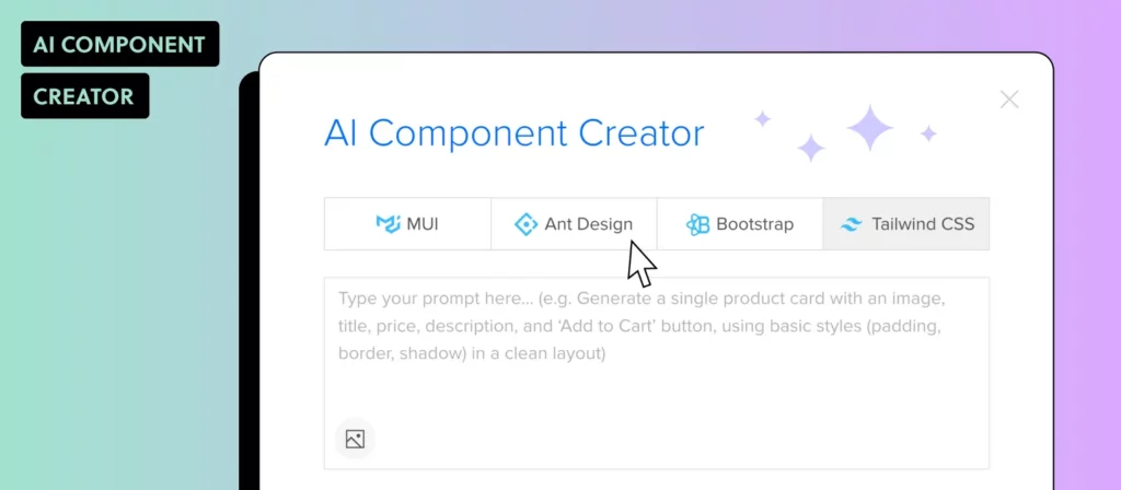
How to Generate UI Components with Forge
Here’s a walkthrough of generating production-ready UI with Forge inside UXPin:
Step 1: Open Forge in the Editor
Launch UXPin and open any project that uses Merge (code-backed components). Click the Forge icon in the toolbar to open the AI assistant panel.
Step 2: Describe What You Need
Type a natural-language prompt describing the component or layout:
“Create a pricing table with three tiers: Free, Pro at $29/mo, and Enterprise with a ‘Contact sales’ button. Highlight Pro as recommended.”
“Build a contact form with name, email, message textarea, and a primary submit button.”
“Generate a user profile card with avatar, name, role, and action buttons for Edit and Delete.”
Forge interprets the request and assembles the layout using your design system’s real components — buttons, inputs, cards, typography, and spacing tokens that match your production code.
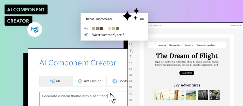
Step 3: Refine Conversationally
Not perfect on the first pass? Tell Forge what to change: “Make the CTA button larger” or “Add a secondary action link below the form.” Forge modifies the existing layout in place — no full regeneration needed. This conversational iteration is what separates a production design tool from a general-purpose chatbot.
Step 4: Export Production JSX
Once you’re satisfied, export the result as clean JSX that maps directly to your component library. Hand it to your developers — or use it yourself if you’re working in code. For detailed documentation, see the Forge docs.
Teams using Forge and Merge have reported 8.6x faster design-to-prototype cycles and up to 50% reduction in engineering time for enterprise customers. Try UXPin for free to see the difference.
Best Practices for AI-Assisted UI Design
Whether you’re using ChatGPT, Forge, or both, these practices will help you get better results:
Be specific in your prompts — Include details about layout structure, content, color requirements, and responsive behavior. Vague prompts produce vague results.
Provide context — Mention the platform (web, mobile), the target audience, and any constraints like accessibility requirements or brand guidelines.
Use AI for the first 80%, design the last 20% — AI gets you to a solid starting point fast. Use professional design tools to fine-tune spacing, visual hierarchy, and interaction details.
Always validate with real users — AI-generated UIs still need usability testing. Build interactive prototypes and test them before committing to development.
Keep your design system as the source of truth — Tools like Forge constrain AI to your component library, ensuring consistency. If you’re using ChatGPT, always cross-reference its output against your design system documentation.
Combine tools strategically — Use ChatGPT for brainstorming, copy, and accessibility audits. Use Forge for production UI generation. The tools complement each other rather than competing.
Frequently Asked Questions
Can ChatGPT design a user interface?
ChatGPT can suggest layouts, generate HTML/CSS/React code for UI components, and help with UX copywriting. However, it can’t produce visual designs on a canvas or output components tied to your production design system. For that, you need a purpose-built tool like UXPin Forge.
What is the best AI tool for UI design in 2026?
The best AI tool depends on your needs. ChatGPT is great for brainstorming and code snippets. For production-quality UI generation using your real component library, UXPin Forge is purpose-built — it generates, edits, and exports production-ready JSX from your actual design system.
How is UXPin Forge different from ChatGPT for UI work?
ChatGPT generates generic code without awareness of your design system. Forge is constrained to your production React components, produces output on a visual canvas, supports conversational refinement without full regeneration, and exports clean JSX — eliminating the gap between design and development.
Can I use ChatGPT to generate React components?
Yes, ChatGPT can generate React component code from text prompts. However, the output uses generic markup and styling rather than your team’s actual component library. You’ll need to manually remap it to your design system. With UXPin Merge and Forge, the components are your production components from the start.
Is AI replacing UI designers?
No. AI accelerates the design process — handling the repetitive 80% of layout assembly and component arrangement. But the strategic decisions, user research, interaction design nuance, and visual polish that define great products still require human designers. AI is a force multiplier, not a replacement.
What prompts work best for generating UI components with AI?
Effective prompts include: the component type (e.g., “pricing table”), specific content (tier names, prices), layout details (number of columns, alignment), styling constraints (brand colors, spacing), and functional requirements (responsive behavior, accessibility). The more specific you are, the better the output.
Next.js and React are closely related but serve different roles in the JavaScript ecosystem. React is a UI library for building interface components. Next.js is a full-stack framework built on top of React that adds server-side rendering, file-based routing, API routes, and production-ready optimizations out of the box.
Choosing between them — or understanding how they fit together — is one of the most common decisions frontend teams face in 2026. This guide breaks down the key differences in rendering, routing, SEO, performance, and developer experience, then explains when each makes the most sense.
Building a React or Next.js application? UXPin Merge lets you design interactive prototypes with your actual React components — the same ones in your codebase. Prototype 8.6x faster than with vector-based tools and export production-ready JSX. Try UXPin for free.
Design UI with code-backed components.
Use the same components in design as in development. Keep UI consistency at scale.
Next.js vs React: Quick Comparison Table
Here’s a high-level overview of the core differences before we examine each in detail:
Feature
React
Next.js
Type
UI library
Full-stack framework
Rendering
Client-side (CSR) by default
SSR, SSG, ISR, and CSR
Routing
Requires third-party (React Router)
Built-in file-based routing (App Router)
API Routes
Not included
Built-in serverless API routes
SEO
Requires extra setup for SSR/SSG
SEO-friendly out of the box
Code Splitting
Manual (via dynamic imports)
Automatic per route
React Server Components
Supported (with custom setup)
First-class support via App Router
Learning Curve
Lower (UI-focused)
Moderate (adds framework conventions)
Best For
SPAs, custom setups, embedded UIs
Full-stack apps, SEO-critical sites, eCommerce
What Is Next.js?
Next.js is an open-source React framework created by Vercel. It extends React with production-ready features that would otherwise require significant manual configuration — server-side rendering, static generation, file-based routing, API routes, and built-in performance optimization.
As of 2026, Next.js 15 is the current stable release, featuring improved React Server Components support, a refined caching model, Partial Pre-Rendering (PPR), and tighter integration with React 19’s concurrent features.
Key Next.js Features
Multiple rendering strategies — Next.js supports Server-Side Rendering (SSR), Static Site Generation (SSG), Incremental Static Regeneration (ISR), and Client-Side Rendering (CSR). You choose the optimal strategy per page or per component using React Server Components.
App Router with React Server Components — The App Router (default since Next.js 13) uses React Server Components to render parts of your app on the server, reducing client-side JavaScript and improving performance. Next.js 15 refines this with better caching defaults and Partial Pre-Rendering.
File-based routing — Files in the app/ directory automatically map to routes. Nested folders create nested routes, shared layouts, loading states, and error boundaries — no manual route configuration needed.
API routes and Route Handlers — Create serverless API endpoints alongside your frontend code, enabling full-stack applications in a single project.
Automatic code splitting — Only the JavaScript needed for the current page is loaded, reducing initial bundle size and improving Time to Interactive.
Built-in image and font optimization — The next/image component handles lazy loading, responsive sizing, and format optimization automatically. next/font eliminates layout shift from font loading.
Middleware — Run code before a request completes for tasks like authentication checks, A/B testing, or internationalization.
Turbopack — Next.js 15 ships with Turbopack as the default dev bundler, delivering significantly faster hot module replacement and build times compared to Webpack.
When to Use Next.js
Choose Next.js when your project requires:
SEO-critical pages — SSR and SSG deliver fully rendered HTML that search engines crawl immediately. This matters for marketing sites, blogs, and SEO-driven content platforms.
Fast initial page loads — Server rendering reduces Time to First Byte and eliminates the blank-page flash of client-rendered SPAs.
Full-stack capability — API routes and Server Actions let you build backend logic without spinning up a separate server.
eCommerce or content-heavy sites — ISR and PPR enable pages to be statically generated and selectively revalidated, combining SSG performance with dynamic data freshness.
Enterprise applications — The opinionated structure reduces decision fatigue and ensures consistency across large teams.
When Next.js May Not Be the Best Fit
Heavy backend applications — If your project is mostly server-side logic with minimal frontend, a dedicated backend framework (Express, NestJS, or Fastify) may be more appropriate.
Real-time applications — Chat apps, multiplayer games, or live collaboration tools that rely on persistent WebSocket connections aren’t what Next.js is optimized for.
Highly custom build setups — If you need fine-grained control over bundling, module resolution, or non-standard rendering pipelines, React with a custom Vite configuration offers more flexibility.
What Is React?
React is a JavaScript library developed by Meta for building user interfaces. First released in 2013, it remains the most widely adopted frontend library in the JavaScript ecosystem. React focuses on one thing: rendering UI components based on state and props.
React 19, the current stable version in 2026, introduces the React Compiler (which automatically optimizes re-renders), Actions for handling async operations, and native support for document metadata — reducing the need for third-party libraries.
Key React Features
Component-based architecture — Build UIs from reusable, self-contained components that manage their own state and logic.
Virtual DOM — React maintains a lightweight in-memory representation of the DOM and updates only the parts that change, minimizing expensive browser repaints.
React Compiler (React 19) — Automatically memoizes components and values, eliminating the need for manual useMemo, useCallback, and React.memo in many cases.
Declarative syntax with JSX — JSX lets you write HTML-like markup directly in JavaScript, making component structure easy to read and reason about.
Hooks — Functions like useState, useEffect, useActionState, and custom hooks let you manage state, side effects, and reusable logic in function components.
Unidirectional data flow — Data flows from parent to child via props, making state changes predictable and debugging straightforward.
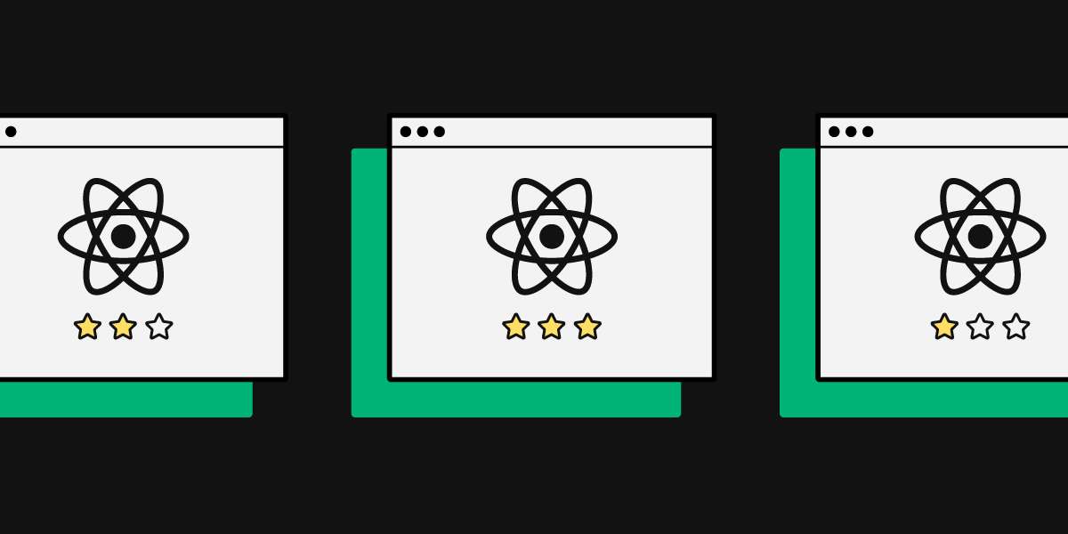
Massive ecosystem — React’s community provides libraries for state management (Redux, Zustand, Jotai), routing (React Router, TanStack Router), UI components (MUI, shadcn/ui, Ant Design), and more.
Cross-platform with React Native — React’s component model extends to mobile via React Native, allowing shared logic between web and native iOS/Android apps.
React is a UI rendering library — it doesn’t provide routing, server-side rendering, or API handling out of the box. For applications that need those capabilities, you’ll either add third-party libraries or choose a React-based framework like Next.js or Remix.
React also relies heavily on client-side JavaScript for rendering by default. If your target audience includes users with limited JavaScript support, or if SEO is a primary concern, server-rendered frameworks deliver better results.
Next.js vs React: Detailed Feature Comparison
Rendering Strategies
React renders entirely on the client by default. The browser downloads a JavaScript bundle, executes it, and then renders the UI. This means the initial page load shows a blank screen until JavaScript finishes loading and executing.
Next.js supports multiple strategies: SSR (render on each request), SSG (pre-render at build time), ISR (regenerate static pages on a schedule), and CSR. With React Server Components in the App Router, you can mix server and client rendering within the same page — even within the same component tree. Next.js 15’s Partial Pre-Rendering (PPR) takes this further, allowing parts of a page to be statically pre-rendered while other parts stream dynamically.
Routing
React doesn’t include routing. Most teams use React Router or TanStack Router, which require manual configuration of route definitions, nested routes, and code-splitting boundaries.
Next.js provides file-based routing through the app/ directory. Creating a file at app/about/page.tsx automatically creates the /about route. Nested folders create nested layouts with shared UI, loading states, error boundaries, and parallel routes.
SEO
React SPAs can struggle with SEO because search engine crawlers receive an empty HTML shell that requires JavaScript execution to render content. While Google’s crawler handles JS rendering, it can lead to delayed or incomplete indexing — and other search engines may not render JS at all.
Next.js delivers fully rendered HTML to crawlers via SSR or SSG, ensuring content is visible and indexable immediately. The built-in Metadata API and sitemap generation simplify on-page SEO optimization.
Performance
React performance depends on how you configure code splitting, lazy loading, and optimization. The React 19 Compiler helps by automatically memoizing components, but large SPAs can still suffer from slow initial loads if not carefully managed.
Next.js handles many performance optimizations automatically: per-route code splitting, image optimization, font optimization, prefetching of linked pages, streaming SSR for faster Time to First Byte, and Turbopack for faster development builds.
Backend and API Layer
React is frontend-only. You need a separate server or BaaS (Backend as a Service) for API logic, authentication, and database access.
Next.js includes API routes, Route Handlers, and Server Actions that let you build serverless backend endpoints alongside your frontend — enabling full-stack applications within a single repository.
Developer Experience
React offers maximum flexibility. You choose your own router, bundler, state manager, and styling solution. This is powerful for experienced teams but can lead to decision fatigue for new projects.
Next.js is opinionated with sensible defaults and conventions that reduce setup time. The trade-off is less flexibility for non-standard architectures. The Next.js CLI scaffolds a production-ready project in seconds.
Is Next.js Better Than React?
This isn’t a question of better or worse — they serve different purposes and operate at different levels of abstraction. React is the foundation; Next.js is one of several frameworks built on that foundation.
If you need server rendering, SEO optimization, and full-stack capabilities, Next.js provides them out of the box. If you need maximum flexibility, are building an SPA, or embedding UI components into an existing application, React with your own tooling may be the better choice.
In practice, many teams in 2026 start with Next.js as their default for new projects because it reduces boilerplate and provides production-ready features from day one. You can always opt out of Next.js-specific features and use it as a simple React setup if needed.
Should You Learn React or Next.js First?
Learn React first. Understanding components, state, props, hooks, and JSX is prerequisite knowledge that carries over to every React-based framework — including Next.js, Remix, and others.
Once you’re comfortable with React fundamentals, learn Next.js to understand server rendering, file-based routing, and full-stack patterns. Most job postings that mention Next.js expect React proficiency as a baseline.
Prototyping React and Next.js Applications with UXPin
Whether you’re building with React or Next.js, the design-to-development workflow benefits from prototyping with real components. UXPin Merge lets teams design with the exact same React components that ship in production.
Here’s what that looks like in practice:
Import your component library — Sync your React components from a Git repo or Storybook into UXPin via the Git Integration or Storybook Integration.
Design with drag-and-drop — Designers build layouts by dragging production components onto the canvas. No vector approximations — these are real, interactive React components with full prop control.
Use AI to accelerate — UXPin Forge generates layouts from text prompts, image uploads, or URLs — using your synced component library. AI generation is constrained to your design system, so every output is on-brand and production-ready.
Export production JSX — Copy the generated code directly into your React or Next.js project. No manual translation from design to code — no handoff gap.
Enterprise teams using Merge have achieved 8.6x faster design-to-prototype cycles and up to 50% reduction in engineering time. PayPal uses UXPin to support 60+ products with a 5-person UX team and over 1,000 developers. Try UXPin Merge for free.
Frequently Asked Questions
What is the main difference between Next.js and React? React is a JavaScript library for building user interface components. Next.js is a full-stack framework built on React that adds server-side rendering (SSR), static site generation (SSG), file-based routing, API routes, and built-in performance optimizations. React handles the view layer; Next.js provides the production infrastructure around it.
Is Next.js better for SEO than React? Yes. Next.js delivers fully rendered HTML via SSR or SSG, which search engine crawlers can index immediately. React SPAs rely on client-side rendering, which can delay or complicate indexing. For SEO-critical projects like marketing sites and eCommerce, Next.js is the stronger choice.
Can I use React components in a Next.js project? Absolutely. Next.js is built on React, so all React components work seamlessly. Next.js adds framework-level features — routing, rendering strategies, API routes — on top of the React component model.
Is Next.js full-stack? Yes. Next.js includes API routes and Route Handlers that let you build serverless backend endpoints alongside your frontend. You can handle authentication, database queries, and third-party API calls within the same project. React alone is frontend-only.
Should I learn React before Next.js? Yes. React is the foundation that Next.js builds on. Understanding components, state management, hooks, and JSX is essential before adding framework-level concepts like server rendering and file-based routing.
How does UXPin help with React and Next.js development? UXPin Merge lets teams design with production React components — the same ones used in development. Forge, UXPin’s AI assistant, generates complete layouts from text prompts using your component library. The output is exportable JSX that drops directly into your React or Next.js project — no manual translation needed.
A structured web design process ensures your site is user-friendly, visually consistent, technically sound, and aligned with business goals. Whether you’re a designer, developer, or project owner, understanding each phase — from initial planning through post-launch optimization — helps teams collaborate effectively and avoid costly rework.
This guide walks through the 8 key steps of the web design process in 2026, including how AI tools and code-backed design workflows are reshaping the way modern teams build websites and web applications.
UXPin helps teams move faster through the design-to-development pipeline. With UXPin Merge, you build prototypes using real, interactive code components — and with Forge, you generate layouts from text prompts using your production design system. Try UXPin for free.
Design UI with code-backed components.
Use the same components in design as in development. Keep UI consistency at scale.
Step 1: Define Goals and Requirements
Every web design project begins by answering foundational questions:
Use frameworks like SMART goals (Specific, Measurable, Achievable, Relevant, Time-bound) or OKRs (Objectives and Key Results) to formalize objectives. Document everything in a project brief that includes scope, budget, deliverables, and constraints.
Engage all stakeholders early to ensure alignment on priorities. Misaligned expectations at this stage are the most common cause of delays and scope creep later in the process.
Step 2: Research and Strategy
Research transforms assumptions into informed design decisions. This step establishes the strategic foundation for everything that follows.
Competitor Analysis
Evaluate competitor websites to identify design patterns, content strategies, and gaps you can exploit. Use tools like SimilarWeb and Ahrefs for traffic and SEO insights, and platforms like Awwwards, Dribbble, and Behance for design inspiration.
User Personas and Research
Build detailed user personas covering demographics, goals, pain points, and technology preferences. Conduct user interviews, review analytics data, and analyze support tickets to ground your personas in real behavior rather than assumptions.
Content and SEO Strategy
Define your messaging hierarchy, content types (landing pages, blog, case studies), keyword targets, and internal linking plan. SEO considerations should inform the site structure from the beginning — not be added as an afterthought. Map out which pages target which keywords and how they connect to each other.
Step 3: Information Architecture and Wireframing
Creating a Sitemap
Map out the website’s page hierarchy and navigation structure. Organize pages based on user journeys, prioritize important content, and plan internal linking that supports both usability and SEO. A clear sitemap prevents disorganized navigation and helps search engines understand your content hierarchy.
Designing Wireframes
Wireframes define the placement of elements — headers, navigation, content areas, CTAs, and footers — without getting into visual styling. Focus on:
Content placement — Position key elements strategically based on user priorities and reading patterns.
Responsive breakpoints — Plan how layouts adapt across mobile, tablet, and desktop.
In UXPin, you can use the Pages Panel to structure your sitemap, then build wireframes using components from the built-in UI library or your own design system via Merge. Real-time collaboration features let your team leave comments directly on wireframe elements, speeding up iteration.
Step 4: Visual Design and Interactive Prototyping
This is where wireframes become polished, interactive designs that stakeholders and users can experience.
Establishing Visual Identity
Define (or apply) your brand’s color palette, typography, spacing system, and component styles. In UXPin, create a design system with reusable tokens and components so every screen is visually consistent. If you already have a design system, sync it directly via Git integration.
High-Fidelity Prototyping
Build interactive prototypes that simulate the real user experience. With UXPin Merge, your prototypes use the exact code components that will ship in production — buttons, forms, modals, and navigation behave exactly as they will in the live site.
Accelerate this step with Forge. Describe a page layout in plain language — “Create a hero section with headline, subtitle, CTA button, and feature grid below” — and Forge assembles it using your real components. Iterate conversationally (“make the CTA more prominent,” “add a testimonial section”) without starting over.
User Testing Before Development
Test your interactive prototype with real users before committing to development. Because UXPin prototypes built with Merge function like the real product — with working forms, conditional logic, and state changes — the feedback you collect is significantly more reliable than what you’d get from static mockups.
Step 5: Content Creation and SEO Implementation
Writing Effective Web Content
Follow these principles for content that serves both users and search engines:
Clarity and scannability — Use headers, bullet points, and short paragraphs. Design for scanning behavior, not linear reading.
User-focused language — Address user pain points and goals directly. Match the tone to your brand and audience.
Structured data — Include JSON-LD schema markup (Article, FAQ, Breadcrumb) to enhance search result appearance and LLM discoverability.
Technical SEO Optimization
Keyword integration — Use primary and secondary keywords naturally in headings, body text, and meta descriptions.
Core Web Vitals — Optimize page load speed (LCP), reduce layout shift (CLS), and ensure interactivity responsiveness (INP).
Internal linking — Connect related pages to help both users and search engines navigate your site effectively.
Mobile-first indexing — Ensure all content and functionality works flawlessly on mobile devices, since Google indexes the mobile version of your site.
Step 6: Development and Implementation
Converting Designs to Production Code
This is where code-backed design workflows pay off. With UXPin Merge, the gap between design and code is minimal — the components in your prototype are the same ones in your React codebase. Developers can extract production-ready JSX directly, eliminating the manual translation that typically introduces inconsistencies and delays.
For teams using Merge, enterprise customers have reported up to 50% reduction in engineering time thanks to this single-source-of-truth approach.
Responsive Implementation
Ensure your site performs well across all devices. Use responsive design principles and test layouts at multiple breakpoints. UXPin’s Auto Layout feature helps designers visualize how elements resize and reflow before development begins.
Designer-Developer Collaboration
UXPin’s Spec Mode provides developers with detailed specifications — CSS properties, spacing measurements, component hierarchy, and downloadable assets — directly from the prototype. Combine this with real-time collaboration features (commenting, tagging, task assignment) to keep teams aligned throughout implementation.
Step 7: Testing and Quality Assurance
Thorough QA ensures your site works correctly and provides a positive experience across all conditions.
Types of Testing
Usability testing — Observe real users completing tasks to identify friction, confusion, and navigation issues.
Functionality testing — Verify that all interactive elements (buttons, forms, links, menus) work correctly.
Performance testing — Measure page load times, server response, and behavior under load.
Accessibility testing — Validate compliance with WCAG guidelines using both automated tools (axe, Lighthouse) and manual testing with assistive technologies.
Cross-Browser and Cross-Device Testing
Test on the browsers and devices your audience uses most (check analytics data). Tools like BrowserStack simulate different environments, helping you catch rendering inconsistencies and layout issues before launch.
Pre-Launch QA Checklist
Before launching, verify:
All forms submit correctly and validate input
Navigation works at every level of the site hierarchy
Images load and display correctly across screen sizes
Page load times meet Core Web Vitals thresholds (LCP < 2.5s, CLS < 0.1, INP < 200ms)
SEO elements (title tags, meta descriptions, alt text, canonical URLs) are in place
HTTPS is active with no mixed content errors
Analytics and tracking scripts are installed and firing correctly
Structured data validates without errors in Google’s Rich Results Test
Step 8: Launch and Post-Launch Optimization
Launch Day
Coordinate the launch with your marketing team. Have a rollback plan in case critical issues surface. Monitor server logs, analytics, and error tracking tools closely for the first 24–48 hours.
Post-Launch Activities
Monitor performance — Use Google Analytics and Google Search Console to track traffic, bounce rates, conversion rates, and keyword rankings.
Gather user feedback — Deploy on-site surveys, heatmaps, and session recordings to understand real user behavior.
Iterate based on data — Identify underperforming pages, test improvements through A/B testing, and update content regularly.
Schedule ongoing maintenance — Plan regular audits for broken links, outdated content, security patches, and performance optimization.
How AI Is Changing the Web Design Process in 2026
AI tools are accelerating nearly every step of the web design process:
Ideation — AI generates layout ideas, suggests content structures, and produces initial wireframe concepts from text descriptions.
Design — UXPin Forge generates page layouts using your real production components from a text prompt, image upload, or URL input. It gets you to 80% in seconds — then you use professional design tools for the final 20%.
Content — AI writing assistants help draft copy, meta descriptions, and alt text, though human editing remains essential for tone and accuracy.
Development — Code generation from AI-designed prototypes (especially with Merge) reduces the handoff gap and speeds up implementation.
Testing — AI-assisted accessibility auditing and automated visual regression testing catch issues faster than manual review alone.
The key advantage of tools like Forge is that AI generation is constrained to your production design system. Design System Guidelines ensure brand rules are enforced across all AI output, so you get speed without sacrificing consistency or quality.
Frequently Asked Questions
What are the steps of the web design process? The web design process typically follows 8 steps: (1) Define goals and requirements, (2) Research and strategy, (3) Information architecture and wireframing, (4) Visual design and prototyping, (5) Content creation and SEO, (6) Development and implementation, (7) Testing and QA, and (8) Launch and post-launch optimization.
How long does the web design process take? Timelines vary based on project scope. A simple marketing website might take a few weeks; a complex enterprise application can take several months. Using code-backed design tools like UXPin Merge and AI assistants like Forge can significantly compress the design and prototyping phases.
What is the difference between wireframing and prototyping? Wireframes define the layout and structure of a page — where elements go — without visual styling or interactivity. Prototypes add visual design, interaction, and functionality so stakeholders and users can experience the product before development. UXPin supports both stages in a single platform.
How does AI help in the web design process? AI tools like UXPin Forge generate page layouts from text prompts, convert screenshots into component-based designs, and produce production-ready code. AI also assists with content drafting, accessibility auditing, and visual testing — accelerating every phase of the process.
What tools do I need for web design? At minimum: a design and prototyping tool (like UXPin), a code editor, browser developer tools, and analytics/SEO tools (Google Analytics, Search Console). For modern workflows, add a component library (MUI, shadcn/ui), version control (Git), and project management software.
Why is prototyping important in web design? Prototyping lets you test the user experience before writing production code — catching usability issues, gathering stakeholder feedback, and validating design decisions early. With UXPin Merge, prototypes use real code components, so testing results accurately reflect the final product’s behavior.
Prototyping is one of the most important skills in product design. The right prototype at the right stage of development can validate assumptions, align stakeholders, uncover usability issues, and dramatically reduce the cost of changes later in the process.
This guide walks through seven prototype examples — from hand-drawn paper sketches to AI-generated, code-backed interfaces. Each type serves a specific purpose, and understanding when to use which fidelity level is what separates efficient design teams from those that waste cycles on the wrong deliverable at the wrong time.
Whether you’re a seasoned UX designer looking for fresh approaches or a newcomer learning the fundamentals, these examples will sharpen your prototyping strategy. And if you want to try building prototypes yourself, sign up for a free UXPin trial — it supports everything from simple wireframes to fully interactive, code-backed prototypes.
What Is a Prototype?
A prototype is a preliminary version or model of a product, system, or design built to test and validate concepts before full-scale production. Prototypes are used across industries — product design, software development, engineering, and manufacturing — to gather feedback, identify issues, and refine designs early in the development process.
Teams build prototypes for several key reasons:
Validate ideas early:Test assumptions before committing engineering resources.
Clarify requirements: Give stakeholders something tangible to react to, reducing misalignment.
Identify usability issues: Uncover problems early when they’re cheap to fix.
Communicate vision: Show investors, executives, or development teams what the product will be — not just tell them.
Read more about the prototype definition and types in our comprehensive guide: What is a Prototype?
7 Prototype Examples by Fidelity Level
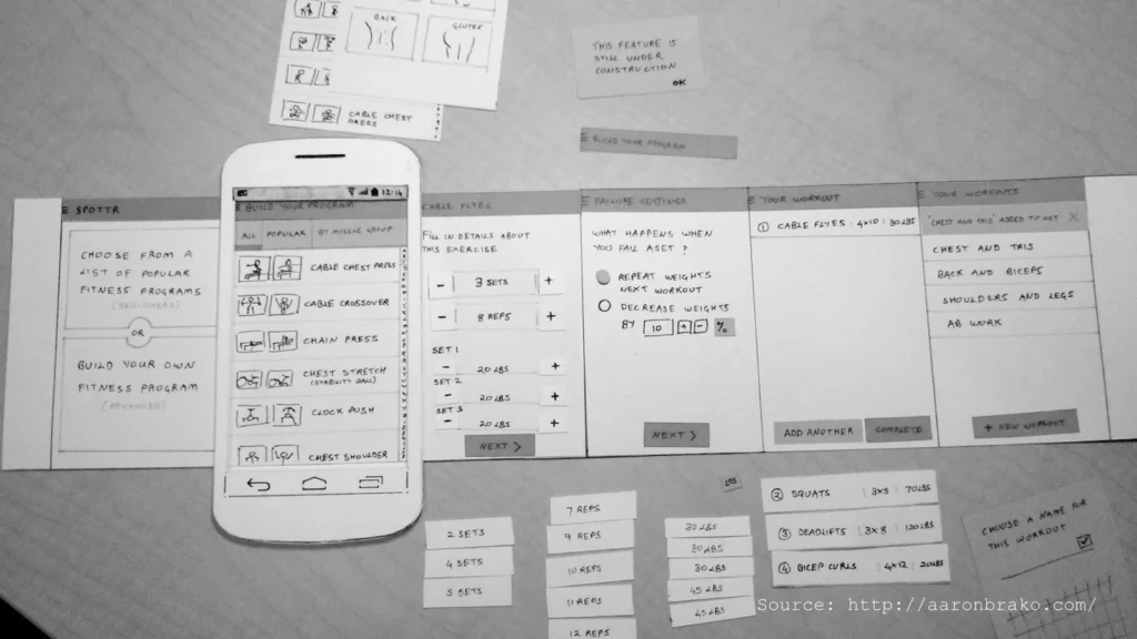
Example 1: Paper Prototype
Paper prototypes are low-fidelity representations of user interfaces created with pen and paper. They include rough sketches of UI elements like buttons and tabs, with each piece of paper representing a step in the user flow.
When to use: Early brainstorming, design workshops, and initial stakeholder discussions when speed matters more than detail.
Strengths: Extremely fast, zero tool investment, encourages collaborative ideation.
Limitations: Can’t test real interactions, limited for remote teams, hard to iterate at scale.
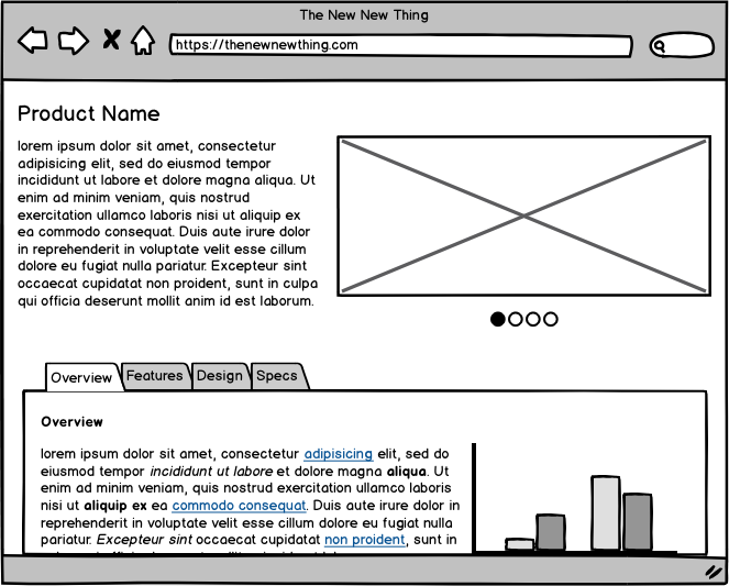
Example 2: Wireframe
A wireframe is a simplified digital representation of an interface that outlines basic structure, layout, and functionality without visual design details like colors or typography. Designers typically use tools like UXPin, Figma, or Balsamiq.
Limitations: Static — can’t test interactions or user flows. Stakeholders sometimes mistake mockups for finished products.
Example 4: High-Fidelity Interactive Prototype
A high-fidelity prototype combines detailed visual design with clickable interactions and navigation. It closely mimics the final product’s appearance and behavior, including branding elements, real content, and interactive flows.
When to use: Usability testing, prototype testing, and executive sign-off when realistic behavior matters.
Strengths: Provides realistic user experience, excellent for usability testing, identifies interaction issues.
Limitations: Takes longer to build than low-fidelity options. Changes can be more costly if the design direction shifts.
Example 5: Functional Prototype
A functional prototype simulates the actual behavior of the final product — not just navigation, but data handling, state changes, conditional logic, and dynamic content. It includes interactive elements like working forms, input validation, and state transitions.
The example above is a functional auction app prototype built in UXPin. It’s fully clickable, transfers data between screens, and responds to user actions — behaving like a production app without any code written by an engineer.
When to use: Validating complex interactions, testing with real data, demonstrating technical feasibility to stakeholders or investors.
Strengths: Reveals interaction issues that simpler prototypes miss. Convincing for investor demos and user testing.
Limitations: Requires more investment in prototype construction, though tools like UXPin make it significantly faster with features like states, variables, and conditional logic.
Example 6: Coded Prototype
A coded prototype uses real UI components rather than static design elements. In UXPin, coded prototypes are built with actual React components from production design systems via Merge. Unlike most design tools, UXPin renders real code — there is always code behind the design that can be handed off to development.
When to use: When you need prototypes that double as development specs, when consistency with the production design system is critical, or when engineering teams need to move fast from prototype to production.
Strengths: Eliminates the design-to-code handoff gap. What you prototype is what gets built. Enterprise teams like PayPal use this approach — a 5-person UX team supports 60+ products.
Limitations: Requires a connected component library (via Git integration or built-in libraries like MUI and shadcn/ui).
The newest addition to the prototyping toolkit is AI-generated prototypes. With UXPin Forge, you can describe an interface in a text prompt, upload an image, or paste a URL — and Forge generates a complete, interactive prototype using your production React components.
This isn’t generic AI output. Forge is constrained to your actual component library, so every generated element is a real, production-ready component. The output is exportable as JSX, and you can iterate conversationally — asking Forge to modify parts of the design without regenerating from scratch.
When to use: Rapid ideation, design exploration, converting legacy screenshots into modern components, or when you need a testable prototype in minutes rather than hours.
Strengths: Dramatically faster than manual prototyping (up to 8.6x faster with Forge + Merge). Outputs production-ready code. Maintains design system consistency automatically.
Limitations: AI handles the first ~80% well; designers still add the last 20% of polish and strategic refinement. Best results require a connected component library.
Choosing the Right Prototype Fidelity
The key to efficient prototyping is matching the fidelity level to your current stage and goal:
Stage
Best Fidelity
Example Type
Primary Goal
Ideation / Brainstorming
Low
Paper prototype
Explore concepts quickly
Information Architecture
Low-Medium
Wireframe
Define structure and flow
Visual Direction
Medium-High
Mockup
Stakeholder approval on aesthetics
Usability Testing
High
Interactive prototype
Test realistic user flows
Technical Validation
High
Functional prototype
Prove complex interactions work
Developer Handoff
Production
Coded prototype
Deliver buildable specifications
Rapid Concept Testing
High
AI-generated prototype
Test ideas in minutes, not days
The most effective teams don’t rigidly follow a fidelity ladder. With tools like UXPin, you can jump directly to high-fidelity coded prototypes when speed and accuracy are priorities — skipping intermediate steps that don’t add value for your specific situation.
Frequently Asked Questions
What is a prototype in UX design?
A prototype is a preliminary version of a product built to test and validate concepts before full development. In UX design, prototypes range from simple paper sketches to fully interactive, code-backed simulations that behave like the final product.
What are the different types of prototypes?
The main types are paper prototypes (hand-drawn sketches), wireframes (skeletal digital layouts), mockups (high-fidelity static designs), interactive prototypes (clickable with navigation), functional prototypes (simulating real behavior with data), coded prototypes (built with real components), and AI-generated prototypes (created from prompts using production components).
When should I use low-fidelity vs. high-fidelity prototypes?
Use low-fidelity prototypes (paper, wireframes) for early concept validation and brainstorming when details aren’t yet defined. Use high-fidelity prototypes (interactive, coded, AI-generated) for usability testing, developer handoff, and stakeholder sign-off when realistic behavior and visual design matter.
What is a coded prototype?
A coded prototype is built using real UI components rather than static design elements. In UXPin, coded prototypes use actual React components from production design systems via Merge, meaning the prototype’s code can be exported and used directly in development.
Can AI generate prototypes automatically?
Yes. UXPin Forge generates complete UI prototypes from text prompts, images, or URLs using your production React components. The output is interactive, code-backed, and exportable as production-ready JSX — making it the fastest path from concept to testable prototype.
What is the best prototyping tool in 2026?
The best tool depends on your needs. UXPin excels for teams that want code-backed prototyping with real components, AI-generated layouts via Forge, and production-ready JSX output. It’s particularly strong for enterprise teams with established design systems who need to maintain consistency at scale.
Start Prototyping with Real Components
These prototype examples demonstrate the full spectrum of prototyping approaches available in 2026 — from the simplicity of paper sketches to the power of AI-generated, code-backed interfaces. The key is choosing the right fidelity for your current goal and using tools that don’t create unnecessary handoff friction.
UXPin brings it all together: professional design tools for any fidelity level, Merge for code-backed prototyping with real components, and Forge for AI-generated prototypes that output production-ready JSX. No other tool spans this range from a single platform.
As UX designers, we need to create dashboards that are clear, purposeful, and user-centric. “Effective dashboards should not only present data but also convey the story behind it, guiding users toward making informed decisions without overwhelming them with details,” as UX Design World emphasizes. This statement underscores the essence of great dashboard design: presenting information in a way that is not only accessible but also actionable.
Creating data-driven applications with interactive dashboards can be complex and time-consuming, requiring seamless collaboration between designers, developers, and product teams. That’s where UXPin Merge comes in—a tool that bridges the gap between design and development, allowing teams to build highly interactive, production-ready dashboards using real components.
With UXPin Merge, design teams can import live components from a Git repository or Storybook and use them to create interactive UI designs that reflect the exact behavior of the final product. Request access to UXPin Merge.
Reach a new level of prototyping
Design with interactive components coming from your team’s design system.
What is a Dashboard?
A dashboard is a visual display of essential information needed to achieve specific business objectives. It consolidates data from various sources into a single interface, using visualizations such as charts, graphs, and tables to present insights clearly and concisely. Dashboards are primarily used for tracking and analyzing KPIs, identifying trends, and making informed decisions based on real-time data.
Types of Dashboards
By understanding the unique purposes and use cases of these dashboard types, designers can create more targeted and effective dashboards that cater to specific user needs.
Analytical Dashboards
A great example of analytical dashboard design comes from Semrush
Analytical dashboards are used to identify trends, patterns, and insights over time. They support strategic decision-making by presenting complex datasets through detailed visualizations like line graphs, scatter plots, and histograms. Typically used by data analysts or business intelligence teams, these dashboards help answer questions like, “What are the factors driving sales trends over the last quarter?”
Example: A sales performance dashboard that analyzes historical sales data, identifies top-performing products, and reveals seasonal trends. This dashboard could include charts that compare monthly sales figures year-over-year, helping stakeholders make strategic decisions about future campaigns.
Operational Dashboards
Bold BI created this operational dashboard design
Operational dashboards are designed for real-time monitoring and quick decision-making. They display data that is frequently updated, such as daily sales figures, website traffic, or production outputs. These dashboards are ideal for managers who need to track day-to-day operations and respond promptly to emerging issues.
Example: A customer support dashboard that monitors the number of open tickets, average response time, and agent availability in real time. This type of dashboard allows managers to allocate resources efficiently and maintain service quality.
Strategic Dashboards
Here’s an OKR dashboard example by Geckoboard
Strategic dashboards offer a high-level overview of the organization’s performance, focusing on long-term goals and outcomes. They are used by executives to monitor key performance indicators (KPIs) like revenue growth, market share, or customer satisfaction over an extended period. Strategic dashboards prioritize simplicity and clarity, presenting only the most critical data needed for executive decision-making.
Example: An executive KPI dashboard that tracks overall company performance metrics such as quarterly revenue, year-to-date profit margins, and employee engagement scores. This dashboard allows executives to assess whether the company is on track to meet its strategic objectives.
Tactical Dashboards
Here’s an example of a tactical dashboard design by Databox
Tactical dashboards bridge the gap between operational and strategic dashboards. They focus on short-term goals and provide insights into specific areas of the business, such as project management or marketing campaign performance. Tactical dashboards are used by mid-level managers to implement strategies based on analytical data and operational updates.
Example: A marketing campaign dashboard that tracks campaign performance, including ad spend, conversion rates, and customer acquisition cost. This type of dashboard helps marketers adjust their tactics in response to real-time performance data.
Why Dashboard Design Matters
Dashboards have become a crucial tool in modern business environments, serving as a central hub for data-driven decision-making. In the realm of App design, a well-designed dashboard is more than just a data visualization tool; it provides a structured and intuitive way to track KPIs (Key Performance Indicators), monitor business processes, and gain actionable insights at a glance.
The role of dashboards in decision-making extends beyond data presentation. They act as decision-support systems, helping stakeholders identify opportunities, pinpoint issues, and respond quickly to changes.
For example, a sales dashboard might track sales revenue, pipeline metrics, and individual performance to give managers a clear view of team performance and areas for improvement. By presenting this data visually, dashboards enable faster comprehension and a deeper understanding of complex information, facilitating data-driven decisions.
The Impact of Well-Designed Dashboards
When designed effectively, dashboards can significantly enhance business intelligence (BI) by transforming raw data into meaningful insights. Here’s how:
Improved Data Accessibility and Usability: Well-designed dashboards simplify complex data, making it accessible to non-technical stakeholders. With a focus on usability and intuitive layout, they reduce the cognitive load and help users find the information they need quickly.
Enhanced Decision-Making: By providing real-time data and key metrics, dashboards empower stakeholders to make timely decisions. This immediacy is crucial in fast-paced business environments where quick reactions to changes in performance can give companies a competitive edge.
Performance Tracking and Goal Setting: Dashboards allow businesses to monitor performance against set targets and KPIs. For instance, a marketing dashboard might show campaign performance in terms of reach, engagement, and conversion rates, helping teams align their efforts with strategic goals.
Research shows that organizations leveraging dashboards for BI see a higher return on data analytics investments, as they can turn insights into action more efficiently. For instance, a study by Dresner Advisory Services revealed that organizations with effective BI tools, such as dashboards, were twice as likely to experience improved decision-making capabilities and a 24% increase in revenue growth.
Common Issues with Poorly Designed Dashboards
Despite their potential, many dashboards fall short due to poor design practices, leading to low usability and ineffective decision-making. Common issues include:
Clutter and Overwhelming Layouts
Many dashboards suffer from information overload. When too many metrics and visualizations are crammed into one screen, users struggle to identify what’s most important. This cluttered layout can lead to confusion, making it harder to extract valuable insights.
Lack of Hierarchical Structure
Without a clear visual hierarchy, dashboards can fail to communicate the relative importance of information. Users might overlook critical data or spend too much time searching for relevant insights.
Inconsistent Design and Misleading Visuals
Inconsistent use of colors, fonts, or chart types can cause misinterpretation of data. For example, using the same color for positive and negative metrics can lead to incorrect conclusions. Read about design consistency and how to achieve it.
Neglecting User Context and Needs
A one-size-fits-all dashboard rarely works. Effective dashboards should be tailored to the specific needs and context of the user, whether they are a sales manager looking for revenue trends or a product manager tracking feature usage.
Key Characteristics of Successful Dashboards
Regardless of the type, successful dashboards share certain characteristics that make them effective tools for data visualization and decision-making. These characteristics ensure that dashboards are not only visually appealing but also functionally robust and user-centric.
Clarity: Ensuring Users Can Interpret Data Quickly
Clarity is paramount when it comes to dashboard design. A cluttered or confusing layout can obscure the most critical information and hinder decision-making. To ensure clarity:
Use a clear visual hierarchy to prioritize information.
Choose appropriate visualizations, such as bar charts for comparisons and line charts for trends, to present data effectively.
Limit the number of visual elements to avoid overwhelming users with too much information at once.
Flexibility: Allowing Customization and Interactivity
Dashboards should cater to diverse user needs by offering flexibility in how data is displayed and interacted with. Features like filters, drill-down capabilities, and custom views allow users to explore the data at their own pace and adjust the dashboard to suit their specific needs. Incorporating interactive elements can transform a static dashboard into a dynamic tool that provides deeper insights.
Tip for Designers: Use UXPin’s interactive components to prototype dashboards that include these features, enabling users to see how different configurations and interactions will work in the final product.
Responsiveness: Adapting to Different Devices and Screen Sizes
With the increasing use of mobile devices and varying screen sizes, responsiveness is a critical characteristic of any dashboard. A responsive dashboard adjusts its layout and visualizations based on the device, ensuring that users have a consistent experience whether they’re on a desktop, tablet, or smartphone. Key elements like font size, spacing, and the arrangement of visualizations should be fluid and adaptable.
Tip for Designers: Create responsive prototypes in UXPin to test how your dashboard design behaves across different devices. Use breakpoints and scalable design techniques to optimize the layout for various screen sizes.
Essential Dashboard Design Principles
Designing effective dashboards requires a deep understanding of visual hierarchy, consistency, cognitive psychology, and accessibility. A well-structured dashboard not only presents data but also guides users in interpreting it, making complex information more approachable and actionable. This section outlines the key design principles to consider when creating dashboards that prioritize usability, functionality, and inclusivity.
1. Establish a Clear Visual Hierarchy
In dashboard design, visual hierarchy is crucial for guiding users’ attention to the most critical information first. By using layout, color, and typography strategically, you can emphasize high-priority data and minimize distractions.
Layout: Organize information logically by placing the most critical data at the top or left-hand side of the dashboard, as these areas are naturally where users look first. Group related data points together and use white space to separate sections, making it easier for users to scan and locate key insights.
Color: Use color to differentiate categories and indicate relationships between data points. For example, use contrasting colors for KPIs that represent positive vs. negative trends or different departments. Reserve bright colors for highlighting anomalies or urgent information that requires immediate attention.
Typography: Utilize font size and weight to establish hierarchy. Larger, bolder fonts can be used for titles and main metrics, while smaller fonts work well for labels or less critical information. Keep font styles consistent across the dashboard to maintain a cohesive look and feel.
Tip for Designers: Use UXPin’s typography and color styling options to set up a style guide that ensures visual consistency across different dashboards and components.
2. Maintain Consistency
Consistency is a cornerstone of good design. When dashboards lack consistency, users can become confused and overwhelmed, reducing the dashboard’s effectiveness. Establishing consistent patterns for navigation, data labels, and interaction states creates a more intuitive user experience and improves the dashboard’s usability.
Consistent Visual Elements: Use the same color scheme, font styles, and chart types across different dashboards within a product. This practice helps users build a mental model of your dashboards and reduces the learning curve.
Uniform Interaction Patterns: Whether users are filtering data, drilling down into specific information, or switching between different views, ensure that these interactions behave consistently throughout the dashboard. This reduces confusion and builds user confidence when navigating complex dashboards.
Tip for Designers: Utilize UXPin’s design systems capabilities to create reusable components, such as buttons, menus, and charts, that ensure visual and functional consistency across multiple dashboards.
3. Minimize Cognitive Load
Dashboards are often used to display large amounts of data, making it essential to minimize cognitive load by simplifying the design and focusing on the essentials. Avoid unnecessary details and distractions that can overwhelm users.
Remove Non-Essential Elements: Reduce the number of visual elements on the screen by eliminating duplicate or redundant information. Use whitespace effectively to separate different sections and prevent overcrowding.
Focus on Actionable Insights: Highlight the most important insights and KPIs, and use interactive elements like tooltips or drill-downs to provide additional information on demand, rather than displaying everything upfront.
Simplify Navigation: Keep navigation straightforward, allowing users to quickly switch between different views or apply filters without getting lost.
Tip for Designers: Use UXPin’s conditional interactions and states to hide or reveal information based on user actions, ensuring a clutter-free interface that only displays data when relevant.
4. Make Data Accessible and Usable
The primary goal of dashboards is to make data accessible and easy to understand. This involves choosing the right visualizations and ensuring that all design elements support readability and clarity.
Use Appropriate Data Visualizations: Select chart types that align with the data you’re presenting. For instance, use bar charts for comparisons, line charts for trends, and pie charts for proportions. Avoid complex visualizations like 3D graphs that can distort data interpretation.
Contrast and Readability: Ensure adequate contrast between text and background colors. Dark text on a light background or light text on a dark background works best. Avoid using overly saturated colors or color combinations that can strain the eyes.
Tip for Designers: UXPin allows you to create prototypes with different data visualization options. Test your designs with users to identify which visualizations are most effective for your audience.
5. Incorporate Accessibility Standards
Accessible design is not just a nice-to-have but a necessity for inclusive dashboards. Designing for accessibility means ensuring that all users, including those with disabilities, can interact with and understand your dashboards effectively.
Color Blindness Considerations: Avoid using color alone to convey information. Use patterns, labels, or icons in conjunction with color to differentiate data points. Utilize tools like color blindness simulators to check your design’s accessibility.
Screen Reader Compatibility: Design your dashboard so that screen readers can easily navigate and interpret it. Use ARIA (Accessible Rich Internet Applications) labels and ensure that all interactive elements have appropriate descriptors.
Keyboard Navigation: Ensure that all interactive elements are accessible via keyboard navigation. This is particularly important for users who rely on keyboards or other assistive technologies.
Tip for Designers: Use UXPin’s accessibility features, such as ARIA attributes and interactive states, to create dashboards that are compatible with screen readers and other assistive devices.
Best Practices for Creating Dashboards
Designing an effective dashboard involves more than just presenting data visually—it requires a strategic approach that aligns with the needs of its users and the goals of the organization. By following best practices, designers can create dashboards that not only look good but also facilitate data-driven decisions. Here are some essential best practices for creating dashboards:
1. Define the Purpose and User Needs
Every successful dashboard starts with a clear understanding of its purpose and the needs of its users. The design process should begin by identifying what the dashboard aims to achieve and who will be using it. This foundational step ensures that the dashboard presents relevant data in a way that resonates with its target audience.
Conduct Stakeholder Interviews: Start by interviewing stakeholders, such as managers, analysts, and end-users, to understand their expectations and requirements. Ask questions like: “What key decisions will this dashboard inform?” or “What specific metrics are important to track?” Gathering this information helps define the core purpose of the dashboard and aligns it with organizational goals.
Identify Key Metrics and KPIs: Based on these discussions, outline the key performance indicators (KPIs) that the dashboard should monitor. Prioritize metrics that provide actionable insights and drive decision-making. For example, a sales dashboard might focus on metrics like revenue growth, conversion rates, and customer acquisition costs.
Create User Personas: Define user personas that represent different types of dashboard users. Consider their technical proficiency, data needs, and how they will interact with the dashboard. This helps in tailoring the design and functionality to suit diverse user groups, from C-suite executives to department managers.
Tip for Designers: Use UXPin’s collaboration tools to share early wireframes and prototypes with stakeholders, ensuring alignment on the dashboard’s purpose and key metrics before moving into high-fidelity design.
2. Organize Data for Clarity
The way you structure and present data on a dashboard significantly impacts its usability and effectiveness. A clear, logical flow of information helps users find what they need quickly and reduces cognitive load.
Logical Grouping: Group related data points together to create a coherent narrative. For example, in a marketing dashboard, metrics like campaign performance, budget allocation, and ROI can be grouped under a “Campaign Performance” section. Use visual elements like borders, spacing, and background colors to separate these groups and create distinct sections.
Progressive Disclosure: Use techniques like progressive disclosure to show information gradually, allowing users to access more details as needed without cluttering the interface. For example, start with high-level summaries and provide options to view detailed data through drill-downs or interactive filters.
Use Hierarchical Design: Place the most critical data points, such as KPIs or summary statistics, at the top of the dashboard. Secondary metrics and supporting information should be positioned below or within interactive panels that users can expand as needed.
Tip for Designers: Leverage UXPin’s data binding feature to connect your prototypes to real or sample data, ensuring that the layout and flow work effectively with actual content.
3. Use Drill-Downs and Filters
To avoid overwhelming users with too much information on a single screen, incorporate drill-downs and filters. These advanced techniques allow users to explore data at their own pace, accessing more granular information only when necessary.
Drill-Down Capabilities: Use drill-down features to let users click on high-level metrics and access more detailed views or historical data. For example, clicking on a sales revenue chart could reveal a breakdown by product category or sales region.
Interactive Filters: Include filters that allow users to refine data by date range, category, or other relevant parameters. This helps users focus on specific subsets of data without cluttering the dashboard with multiple static charts.
Responsive Visualizations: Make sure that the visualizations respond to user interactions. When users apply filters or drill down into data, ensure that charts update dynamically to reflect these changes, maintaining a seamless experience.
Tip for Designers: Use UXPin’s interactive states and variables to create prototypes with working filters and drill-downs, making it easy to test and demonstrate these features to stakeholders.
4. Highlight Key Metrics
Effective dashboards should emphasize the most critical data points, making it easy for users to grasp essential insights at a glance. This involves carefully selecting which metrics to highlight and using visual cues to draw attention to them.
Select High-Impact KPIs: Choose KPIs that reflect the organization’s goals and provide actionable insights. Avoid overwhelming users with too many metrics—stick to the most meaningful ones that inform decision-making.
Use Visual Emphasis: Employ visual elements like size, color, and position to highlight key metrics. For example, use larger fonts and bolder colors for primary KPIs, while using lighter shades or smaller text for supporting metrics.
Contextualize Data: Provide context by showing trends, benchmarks, or targets alongside the data. For example, display a target line on a bar chart to indicate whether a particular KPI is on track.
Tip for Designers: Use color psychology and contrast effectively in your designs. UXPin’s color palettes and text styling options can help you experiment with different visual treatments to find the best way to emphasize key metrics.
5. Iterate and Refine
Creating an effective dashboard is an iterative process that involves continuous refinement based on user feedback and evolving requirements. Regular testing and iteration ensure that your dashboard remains relevant and usable over time.
Conduct User Testing: Share your dashboard prototypes with a sample of actual users. Observe how they interact with the interface and gather feedback on usability, navigation, and content relevance. Identify any points of confusion or frustration.
Incorporate Feedback: Use insights from user testing to refine the dashboard’s layout, interactions, and visual design. Make adjustments to improve clarity, usability, and user satisfaction.
Continuous Improvement: Dashboards are not static—data needs and user preferences change over time. Regularly review the dashboard’s performance and effectiveness, and be open to making updates or redesigns as necessary.
Tip for Designers: Use UXPin’s collaborative feedback features to collect comments and suggestions directly on the prototype. This streamlines the feedback process and ensures all stakeholders have visibility into the changes being made.
Common Mistakes in Dashboard Design
Even the most visually appealing dashboards can fail if they don’t support effective decision-making or overwhelm users with irrelevant data. Avoiding common design pitfalls is crucial to creating dashboards that are not only visually compelling but also provide real value to users. Here’s a look at some of the most common mistakes in dashboard design and strategies for avoiding them.
1. Overloading Users with Information
The Mistake: One of the most common mistakes in dashboard design is overwhelming users with too much information. When every piece of data seems equally important, the dashboard becomes cluttered, making it difficult for users to find and interpret key insights. This often happens when designers try to fit too many metrics, charts, or filters onto a single dashboard screen, resulting in visual and cognitive overload.
How to Avoid It:
Prioritize Key Metrics: Focus on the most critical metrics that align with the dashboard’s goals. Remove any data that doesn’t directly support decision-making or provide additional context. Start with high-level summaries and allow users to access more detailed information through drill-downs or secondary screens.
Use Visual Hierarchy: Establish a visual hierarchy by organizing data logically and using visual cues such as font size, color, and spacing to differentiate between primary and secondary information. For example, place the most critical metrics in prominent areas like the top-left corner of the dashboard, where users’ eyes are naturally drawn.
Implement Progressive Disclosure: Use techniques like progressive disclosure, which involves revealing information gradually, so users see only the most relevant details first. This helps prevent information overload while allowing users to dig deeper when necessary.
Example Strategy: Use a simplified dashboard that shows only a few core KPIs at first glance. Include interactive elements like dropdown menus or hover actions to reveal more detailed information without cluttering the main view.
2. Using Inappropriate Visuals
The Mistake: Choosing the wrong type of visualization is a frequent mistake that can lead to misinterpretation of data. For example, using pie charts to represent changes over time or displaying too much data in a single line chart can make it difficult for users to derive meaningful insights. The misuse of 3D charts or overly complex graphics can also distort information and confuse users.
How to Avoid It:
Match Visuals to Data Types: Select chart types based on the nature of the data and the insights you want to communicate. For instance, use line charts to show trends over time, bar charts for comparisons, and scatter plots to highlight relationships between variables. Avoid using 3D charts or decorative visuals that don’t add value.
Leverage Visual Cues for Clarity: Use color, size, and shape to indicate relationships and emphasize important points. For example, using different shades of the same color to show different categories or applying color saturation to indicate magnitude can help users interpret the data more intuitively.
Simplify Visuals: Stick to simple and straightforward visualizations. Remove any unnecessary chart elements like excessive gridlines, borders, or decorative icons. Use annotations or tooltips to provide additional context without overcrowding the visualization.
Example Strategy: If you need to show revenue trends over multiple years, use a line chart with distinct colors for each year, along with a secondary axis or tooltip to show percentage changes. This keeps the visualization clean and interpretable.
3. Ignoring Context and User Workflow
The Mistake: Designing dashboards without considering the context in which they will be used or the workflow of the end-users is another common mistake. Dashboards that don’t integrate smoothly into a user’s daily activities or fail to provide the right level of detail at the right time can become a hindrance rather than a help.
How to Avoid It:
Understand User Needs and Context: Conduct user research and create user personas to understand how different users will interact with the dashboard. Identify their primary goals, the context in which they’ll use the dashboard, and the typical decisions they need to make. This ensures the design supports their workflow and provides information that is immediately actionable.
Design for User Roles: Tailor dashboards for different user roles. For example, a dashboard for a C-suite executive might focus on high-level KPIs like overall revenue and market share, while a dashboard for a marketing manager might include detailed campaign performance metrics.
Create a Logical Flow: Organize the dashboard content in a logical flow that aligns with user expectations and workflows. For example, start with a high-level overview and then provide more detailed views or filters that users can interact with to gain deeper insights.
Example Strategy: If you’re designing a dashboard for a sales team, include filters that allow users to switch between different time periods (e.g., quarterly or yearly), view sales data by region or product, and see individual performance metrics. This contextual information helps the sales team make decisions more effectively without having to navigate multiple screens or systems.
How to Evaluate and Optimize Existing Dashboard Design
Creating a dashboard is only the first step. Once it’s live, it’s essential to evaluate its performance and usability to ensure that it continues to meet user needs and provide value. Regular optimization and iterative improvements can significantly enhance the effectiveness of your dashboards.
Performance Optimization
Dashboard performance is a critical factor in user satisfaction. A dashboard that takes too long to load or responds slowly to user interactions can lead to frustration and decreased productivity. Here are some key techniques for optimizing dashboard performance:
Optimize Data Queries: One of the most common causes of slow dashboards is inefficient data queries. Optimize your SQL queries or API calls by using indexed fields, avoiding nested subqueries, and fetching only the necessary data. Consider implementing query caching for frequently accessed datasets to reduce load times. Use APIs with proper governance and role-based access controls to streamline data retrieval securely.
Reduce Data Points and Visual Complexity: Displaying too many data points or overly complex visualizations can slow down the dashboard. Limit the number of data points displayed in charts, and use simplified visualizations wherever possible. Aggregating data at a higher level can also reduce the amount of processing needed.
Leverage Asynchronous Data Loading: Implement asynchronous data loading for charts and widgets that don’t need to load simultaneously. This allows users to interact with parts of the dashboard while other elements continue to load in the background, providing a smoother experience.
Optimize Image and Asset Sizes: Reduce the size of images, icons, and other assets used in the dashboard. Use vector graphics or compressed image formats (e.g., SVG, WebP) to minimize loading times.
Implement Lazy Loading: Use lazy loading techniques for components that are not immediately visible or necessary on the initial screen. This approach ensures that only the critical elements load first, while others are rendered as needed, reducing the initial load time.
Tip for Designers: Test your dashboard’s performance regularly by using browser developer tools to measure load times, network requests, and rendering performance. This helps identify bottlenecks and optimize the overall user experience.
User Testing and Feedback Loops
User testing is a crucial step in ensuring that your dashboard is not only functional but also intuitive and effective. By observing how users interact with the dashboard and gathering their feedback, you can uncover usability issues and identify areas for improvement.
Conduct Usability Testing: Perform usability testing with real users who represent your target audience. Set up scenarios where users complete specific tasks, such as finding a particular metric or applying a filter. Observe how they navigate the dashboard, and note any points of confusion or difficulty.
Use A/B Testing: If you’re considering design changes, use A/B testing to evaluate different versions of the dashboard. Compare metrics such as task completion time, error rates, and user satisfaction to determine which version performs better.
Collect User Feedback: Encourage users to provide feedback on their experience with the dashboard. Use built-in feedback forms, surveys, or direct interviews to gather qualitative insights. Pay attention to recurring themes in feedback, such as unclear visualizations or missing data.
Iterate Based on Insights: Use the insights gained from testing and feedback to iterate on the dashboard design. Implement changes in small increments, and test each iteration to ensure it addresses the identified issues without introducing new problems.
Tip for Designers: Use UXPin’s interactive prototypes to create realistic dashboard simulations for user testing. This allows users to interact with the dashboard as if it were a live environment, providing more accurate feedback.
Tools for Dashboard Design Evaluation
Choosing the right tools can make evaluating and optimizing dashboards more efficient. Here are some recommended tools for different aspects of dashboard evaluation:
Usability Testing:
Lookback.io: Record user sessions and observe how users navigate your dashboard in real time. You can also conduct live interviews and collect qualitative feedback.
UserTesting: Create and distribute user tests to a large pool of testers, and receive video feedback along with quantitative data on user interactions.
UXPin Prototyping: Use UXPin to create interactive prototypes of your dashboards, enabling you to test functionality and gather feedback before development.
Heatmaps:
Hotjar: Use heatmaps to see where users click, scroll, and interact most on your dashboard. This helps identify which areas attract the most attention and where users might be experiencing difficulties.
Crazy Egg: Offers click maps, scroll maps, and confetti reports that show how users are interacting with the dashboard. Use this tool to refine layouts and improve engagement.
Performance Monitoring:
Google Lighthouse: An open-source tool for auditing the performance of web pages, including dashboards. It provides insights on load times, accessibility, and best practices.
New Relic: Monitor the performance of your dashboards and identify backend issues such as slow API responses or database queries. It provides detailed performance metrics and alerts for real-time monitoring.
Tip for Designers: Use these tools in combination to get a comprehensive view of how your dashboard is performing. For example, start with usability testing to identify major pain points, then use heatmaps to verify user behavior, and finally, employ performance monitoring tools to optimize loading times.
Future Trends in Dashboard Design
The field of dashboard design is evolving rapidly as new technologies and methodologies reshape how businesses interact with data. Emerging trends like AI-powered dashboards, augmented analytics, and heightened focus on data privacy are setting new standards for usability and functionality. Staying ahead of these trends will enable designers to create dashboards that not only meet today’s needs but are also future-proof. Let’s explore these key trends and their implications for dashboard design.
1. AI-Powered Dashboards: Automating Insights and Personalization
Artificial intelligence and machine learning are transforming how dashboards operate and deliver value. AI-powered dashboards go beyond static data presentation by leveraging algorithms to analyze data, detect patterns, and generate automated insights. These dashboards can identify trends, anomalies, and correlations that might be difficult for users to spot manually, enabling quicker and more informed decision-making.
Automated Insights: AI can scan through massive datasets and automatically surface key insights, saving users time and reducing the cognitive load. For instance, an AI-powered sales dashboard might highlight regions with declining performance or suggest potential causes for a sudden drop in revenue based on historical data.
Personalization: AI can tailor the dashboard experience to individual users by learning their preferences and usage patterns. Personalized dashboards can prioritize metrics and visualizations based on what’s most relevant to each user. For example, an operations manager might see real-time production data, while a finance executive views high-level financial KPIs, all within the same dashboard environment.
Predictive and Prescriptive Analytics: AI enables predictive analytics by forecasting future trends based on historical data, and prescriptive analytics by recommending actions to optimize outcomes. For example, in a product management dashboard, AI might predict product demand for the upcoming quarter and suggest changes to the supply chain to meet that demand efficiently.
Design Consideration: To incorporate AI-powered elements, ensure your dashboard design includes space for dynamic insights, recommendations, and alert systems that can update in real-time as new data comes in. Use UXPin’s interactive components to simulate how these AI-driven features would behave in a live environment.
2. Augmented Analytics: Making Dashboards More Actionable
Augmented analytics is a growing trend that enhances traditional dashboards by integrating advanced analytics features like natural language processing (NLP), conversational analytics, and automated data preparation. This trend is making dashboards more accessible to non-technical users and enabling more sophisticated data analysis without requiring advanced data science skills.
Natural Language Processing (NLP): NLP allows users to interact with dashboards using simple language queries, such as “What were our top-selling products last quarter?” or “Show me sales trends over the past year.” This capability democratizes data access, allowing users to ask complex questions without needing to know SQL or other programming languages.
Conversational Analytics: Integrating chatbots and voice-enabled assistants within dashboards provides an intuitive way for users to explore data. For example, a user can ask the chatbot to “Show me the highest performing campaigns in the last month,” and receive an instant, visual response.
Automated Data Preparation: Augmented analytics tools can automate time-consuming tasks like data cleansing, normalization, and aggregation. This ensures that the data displayed on dashboards is always up-to-date and ready for analysis, reducing the chances of errors and inconsistencies.
Design Consideration: Designers can support augmented analytics by incorporating search bars, chatbot interfaces, or dedicated panels for conversational queries. UXPin’s prototyping tools can help visualize these interactive elements, enabling designers to test and refine these features.
3. Data Privacy and Security Considerations
As dashboards become more sophisticated and data-driven, ensuring data privacy and security is paramount. With increasing regulatory scrutiny and data breaches making headlines, it’s essential to incorporate best practices for data security and compliance in dashboard design.
Data Encryption and Secure Access: All data presented on the dashboard should be encrypted, both in transit and at rest, to protect against unauthorized access. Implement secure authentication methods, such as single sign-on (SSO), multi-factor authentication (MFA), and role-based access control (RBAC) to ensure that users only have access to the data they’re authorized to view.
Compliance with Regulations: Ensure that dashboards comply with relevant data privacy laws and regulations, such as the General Data Protection Regulation (GDPR) in the EU or the California Consumer Privacy Act (CCPA) in the U.S. This includes providing users with options to view, export, or delete their personal data as required by law.
Data Anonymization: For dashboards that handle sensitive or personally identifiable information (PII), use data anonymization techniques to mask identities and prevent data breaches. This can include aggregating data at a higher level or using pseudonyms to replace sensitive fields.
Audit Trails and Monitoring: Implement audit trails to track who accesses the dashboard and what changes are made. This helps ensure accountability and provides a clear record of data usage. Use monitoring tools to detect and respond to suspicious activities in real time.
Design Consideration: To address security and compliance concerns, design dashboards with clear user permissions and access levels. Include visual indicators to show which data is sensitive and consider implementing features like secure data download or export options with additional authentication layers.
Recommended Resources for Dashboard Design
Here’s a list of resources that offer a well-rounded approach to mastering dashboard design—from foundational concepts and practical guides to community engagement and hands-on tools.
Books:
Practical Reporting: A guide covering practical strategies, visualization techniques, and design principles for creating effective dashboards.
The Big Book of Dashboards by Steve Wexler, Jeffrey Shaffer, and Andy Cotgreave: Features real-world scenarios and practical advice for designing dashboards across industries.
Information Dashboard Design by Stephen Few: Explores best practices and visual design principles to create at-a-glance monitoring dashboards.
UXPin: Create fully interactive dashboard prototypes using real components, enabling designers to test complex interactions.
Tableau Public: Experiment with different dashboard layouts and visualizations in a free and open platform.
Communities:
Reddit: r/DataIsBeautiful: Share your work, get feedback, and discover inspiring dashboards from the community.
Tableau Community Forums: Engage with other Tableau users to learn advanced techniques and get support for dashboard projects.
Frequently Asked Questions
What are dashboard design principles?
Dashboard design principles are guidelines that help designers create data displays that are clear, usable, and actionable. Core principles include establishing visual hierarchy, maintaining consistency, minimizing cognitive load, making data accessible, and incorporating accessibility standards.
What are the four types of dashboards?
The four main types are analytical dashboards (for trend analysis and strategic decisions), operational dashboards (for real-time monitoring), strategic dashboards (for executive-level KPI tracking), and tactical dashboards (for mid-level management and short-term goals).
How do I avoid information overload in dashboard design?
Prioritize key metrics aligned with user goals, use visual hierarchy to differentiate primary and secondary information, implement progressive disclosure (show summaries first, details on demand), and use drill-downs and filters rather than displaying everything on one screen.
What makes a dashboard accessible?
An accessible dashboard uses sufficient color contrast, avoids relying on color alone to convey information, supports screen readers with ARIA labels, enables keyboard navigation for all interactive elements, and follows WCAG guidelines for text sizing and spacing.
How can I prototype a dashboard with real components?
UXPin Merge lets you design dashboards using actual production React components from libraries like MUI or your own design system via Git integration. Prototypes behave like the final product, with working filters, drill-downs, and dynamic data — and the code is exportable for development.
Can AI help design dashboards?
Yes. UXPin Forge can generate dashboard layouts from text prompts using your production component library. Describe the dashboard you need, and Forge produces an interactive, code-backed prototype that you can refine and export as production-ready JSX.
Create Stunning Dashboard Designs with UXPin
Effective dashboards are the intersection of data science and design craft. They must be visually clear, functionally robust, and tailored to the specific needs of their users. The principles, best practices, and examples in this guide give you a solid foundation for building dashboards that drive better decisions.
UXPin Merge makes dashboard prototyping faster and more accurate by letting design teams work with real, production-ready components synced from Git repositories. The result: interactive prototypes that mirror the final product’s behavior, with working filters, drill-downs, and dynamic data updates.
Benefits of UXPin for dashboard design:
Code-Backed Prototyping: Design with real MUI, Ant Design, or custom React components. Your prototype behaves exactly like the production dashboard.
AI-Powered Generation: Use Forge to generate dashboard layouts from text prompts or reference images, using your actual component library.
Faster Iteration: Changes reflect instantly because you’re working with real components. Enterprise teams using Merge report up to 50% reduction in engineering time.
Production-Ready Output: Export JSX directly from your prototype. No redlining, no guessing — what you design is what gets built.
AI-powered UI generation has evolved rapidly. What started as experimental tools producing generic HTML and Tailwind snippets has matured into production-grade workflows where AI generates complete interfaces using your actual design system components.
UXPin has been at the forefront of this evolution. What began as the AI Component Creator — generating code-backed components from text prompts and images — has evolved into Forge, UXPin’s AI design assistant that generates, edits, and iterates on full UI layouts using real React components from your production codebase.
This article covers how AI UI generation works in 2026, what makes code-backed generation different from pixel-based approaches, and how to use these tools in your design workflow.
What Does It Mean to Generate UI with AI?
At its simplest, AI UI generation means describing what you want — via text, image, or URL — and having AI produce a functional interface layout. But the quality and usefulness of that output varies dramatically based on the tool.
Most AI design tools generate one of three output types:
Static images: Screenshots or mockups that look right but have no underlying code or interactivity. These still need to be rebuilt by engineers.
Generic code: HTML/CSS or Tailwind output that works technically but doesn’t match your design system. Developers spend hours adapting it.
Production-ready components: UI built from your actual component library — the same React components your developers already use in production. No adaptation needed.
UXPin Forge operates in the third category. Every layout it generates uses components from your connected library — whether that’s MUI, shadcn/ui, Ant Design, Bootstrap, or your own custom React components synced via Git integration.
How UXPin Forge Generates UI from Your Design System
Forge is the AI design assistant built into UXPin. It’s the only AI tool where generation, professional design editing, and production code output all operate from the same source of truth — your actual component library.
Three Input Methods
Forge accepts multiple ways to describe what you need:
Text prompts: Describe the interface in natural language. “Create a user settings page with a profile photo upload, name and email fields, notification preferences, and a save button.” Forge generates it using your connected components.
Image upload: Upload a screenshot, whiteboard sketch, or mockup. Forge analyzes the visual layout and recreates it using your production components. This is especially powerful for converting competitor references or hand-drawn concepts into buildable UI.
URL-to-UI: Paste a URL and Forge extracts the layout structure, then reconstructs it using your component library. The result matches your design system, not the source website’s styling.
Conversational Iteration
Unlike tools that force you to regenerate from scratch, Forge supports conversational AI iteration. After the initial generation, you can refine the output through follow-up prompts:
“Make the sidebar narrower and add a search field at the top.”
“Replace the data table with a card grid layout.”
“Add a confirmation modal that appears when the user clicks Delete.”
Forge modifies the existing layout in place — no full regeneration needed. This mirrors how designers actually work: iterating on an existing canvas, not starting over with each revision.
Design System Guidelines
For enterprise teams, Forge’s Design System Guidelines feature constrains all AI output to follow your brand rules. You define which components are permitted, which color tokens to use, spacing standards, and content guidelines. Every AI-generated layout automatically respects these constraints.
This is critical for organizations where non-designers (product managers, developers, stakeholders) also use the tool. The AI cannot deviate from the approved design system, ensuring brand consistency across all output.
From AI Generation to Production Code
The most significant advantage of code-backed AI generation is what happens after the design is created. Because Forge builds with real React components, the output is exportable as production-ready JSX.
This eliminates the traditional handoff gap:
No redlining: Developers don’t need to measure spacing or guess which components to use — the design already uses their components.
No interpretation: What the designer sees in UXPin is exactly what renders in the browser.
No rebuilding: Engineers can export the JSX and integrate it directly into their codebase.
Enterprise teams using UXPin Merge report up to a 50% reduction in engineering time for design implementation. When you combine Merge with Forge’s AI generation, teams achieve up to 8.6x faster design-to-prototype cycles.
Supported Component Libraries
UXPin’s AI generation works with the most widely adopted React component libraries:
MUI (Material UI) — The most popular React component library, with full theming support in UXPin.
shadcn/ui — The fast-growing, copy-paste component library built on Radix and Tailwind.
Ant Design — Enterprise-grade React UI framework used widely in data-heavy applications.
MUI components generated through Forge support full theming — your custom MUI theme is applied automatically, ensuring AI-generated layouts match your brand without manual style adjustments.
Practical Use Cases for AI UI Generation
Here are the most common scenarios where AI-powered UI generation delivers immediate value:
Rapid Prototyping
Go from a product requirement or user story to an interactive prototype in minutes. Describe the interface, let Forge generate it with your components, then refine the details manually. This is especially valuable for user testing — you can test concepts before committing to full development.
Design Exploration
Generate multiple layout variations quickly to compare approaches. Instead of spending hours building three different dashboard layouts, prompt Forge three times and evaluate the results side by side.
Legacy UI Modernization
Upload screenshots of legacy interfaces and let Forge recreate them using your current design system. This accelerates redesign projects and ensures the new version uses production-ready components from the start.
Stakeholder Communication
When a product manager describes a new feature in a meeting, you can generate a working prototype during the conversation. No more “I’ll have mockups ready next week” — the interface takes shape in real time.
Scaling Design Output
For enterprise teams managing large product portfolios, AI generation lets a small design team cover more ground. PayPal’s 5-person UX team supports 60+ products and 1,000+ developers using this approach with UXPin Merge.
How to Get Started
Getting started with AI-powered UI generation in UXPin takes just a few steps:
Yes. Tools like UXPin Forge generate UI using real React components from your production design system. The output is exportable as production-ready JSX — not static mockups or generic code. This means the generated UI uses the same components your developers already ship.
What is the difference between UXPin Forge and generic AI design tools?
Generic AI design tools generate pixel-based layouts or generic HTML/CSS. UXPin Forge generates designs constrained to your actual component library — MUI, shadcn/ui, Ant Design, or your custom React components. The output is production-ready JSX, not a screenshot that needs to be rebuilt.
What input methods does UXPin Forge support?
Forge accepts three input methods: text prompts (describe what you want), image upload (upload a screenshot or mockup), and URL-to-UI (paste a URL and Forge recreates the layout using your components). All three methods generate output from your production component library.
Which component libraries work with UXPin for AI generation?
How does AI UI generation fit into enterprise design systems?
UXPin’s Design System Guidelines feature constrains all AI output to follow your brand rules — permitted components, approved color tokens, spacing standards, and content guidelines. This ensures that AI-generated UI stays on-brand, even when used by non-designers across the organization.
Can I edit AI-generated UI after it’s created?
Yes. UXPin Forge supports conversational AI iteration — you can ask Forge to modify specific parts of the generated layout without regenerating from scratch. You can also manually edit any component in UXPin’s design editor, combining AI speed with professional design precision.
Generate Production-Ready UI Today
AI UI generation has moved beyond the experimental stage. With UXPin Forge, you can go from idea to production-ready, code-backed interface in minutes — using the same components your developers already work with. No handoff gap. No pixel-to-code translation. Just the fastest path from concept to shipped product.
Try UXPin for free and start generating UI with AI from your own component library.
Your UX design portfolio is the single most important asset in your career toolkit. It’s the first thing recruiters and hiring managers evaluate — and it often determines whether you get an interview before anyone reads your resume.
But what actually makes a UX portfolio stand out in 2026? With AI tools reshaping the design workflow and an increasingly competitive job market, the bar keeps rising. Recruiters want to see more than polished screens — they want evidence of how you think, research, iterate, and deliver measurable outcomes.
In this guide, you’ll find 16 real UX portfolio examples from designers who’ve worked at Google, LinkedIn, PayPal, and other top companies. For each one, we break down what works and give you a concrete takeaway you can apply to your own portfolio.
Key takeaways:
The best UX portfolios tell stories about process and impact — not just showcase final screens.
Quantified outcomes (“reduced checkout abandonment by 18%”) are dramatically more persuasive than vague descriptions.
Your portfolio is a UX project. Apply the same principles you’d use for any product: clear navigation, mobile responsiveness, fast performance, and accessible design.
AI-era portfolios should demonstrate how you work with modern tools — showing adaptability alongside foundational UX skills.
Want to prototype your portfolio before building it? Use UXPin to create a fully interactive mockup with clickable navigation, form states, and responsive layouts. Test it with peers before you commit to code. Or use Forge, UXPin’s AI assistant, to generate layout ideas from a text prompt. Try UXPin for free.
Build advanced prototypes
Design better products with States, Variables, Auto Layout and more.
What Is a UX Portfolio?
A UX portfolio is a curated presentation of a designer’s professional work — typically hosted as a personal website — that showcases your ability to research user problems, design solutions, and deliver measurable outcomes.
Unlike a visual design portfolio that focuses on aesthetics, a UX portfolio emphasises process: how you identified the problem, what research methods you used, how you iterated on solutions, and what impact your work had on real users and business metrics.
A strong portfolio typically includes:
3–5 detailed case studies with problem, process, and outcome.
A brief professional bio that communicates your focus areas and design philosophy.
Tools and skills — design tools, research methods, prototyping capabilities.
The bar keeps rising. Here are the qualities that separate portfolios that land interviews from those that get passed over:
Storytelling over screenshots — Recruiters want to see how you think, not just what you shipped. Walk through the why behind every decision.
Quantified outcomes — “Reduced checkout abandonment by 18%” is infinitely more compelling than “redesigned the checkout flow.”
Mobile-first design — Many hiring managers review portfolios on their phones. If yours breaks on mobile, you’ve already lost.
Speed and accessibility — Slow load times and poor contrast ratios signal a designer who doesn’t practice what they preach.
AI-era awareness — Showing how you work with AI tools for rapid prototyping, iteration, or design system enforcement signals that you’re current with modern workflows.
Cross-functional collaboration — Demonstrating how you work with developers, PMs, and stakeholders shows you can operate in real product teams.
16 UX Designer Portfolios Worth Studying
1. Alex Lakas
Alex Lakas brings over a decade of product design experience at companies like LinkedIn and Google Maps. His portfolio leads with a confident one-line bio, followed by a client list of household names — an effective hook that earns immediate credibility.
Why it works: Lakas transitions quickly from credentials to detailed case studies that reveal the reasoning behind major product decisions. The clean visual design mirrors his systematic approach to UX, and every section feels purposeful.
Key takeaway: If you have big-name experience, lead with it — then immediately prove the substance behind the brand names through well-structured case studies.
2. Olivia Truong
Olivia Truong is a product designer whose portfolio shows the depth and breadth of her work at companies like Facebook and Lyft. The homepage immediately sets the tone with a minimalist, content-first layout.
Why it works: Each project page combines clear visuals with narrative-style writeups that make the design process easy to follow. She balances brevity with depth — enough detail to satisfy curious hiring managers without overwhelming the casual browser.
Key takeaway: Minimalism works when every element earns its place. Remove anything that doesn’t help tell the story of your process and impact.
3. Simon Pan
Simon Pan is a design leader and former Googler whose portfolio exemplifies how to present complex systems design work. His UberEATS case study is considered one of the best-written portfolio pieces in the industry.
Why it works: Pan structures each case study as a narrative arc — context, challenge, exploration, solution, impact. This makes even dense enterprise work accessible to non-design stakeholders.
Key takeaway: Great case studies read like stories with clear beginnings, middles, and ends. Structure your work around the journey, not just the final screens.
4. Matt Murphy
Matt Murphy is a product designer who specializes in consumer-facing applications. His portfolio uses a card-based layout that lets visitors quickly browse projects before diving into detail.
Why it works: The portfolio balances visual appeal with functional clarity. Each project card provides enough context (client, role, outcome) to help visitors decide what to explore further, reducing friction in the browsing experience.
Key takeaway: Think of your portfolio homepage as a product itself. Apply the same information architecture principles you’d use for an app — progressive disclosure, clear hierarchy, and low-effort navigation.
5. Cofolios (Curated Collection)
Cofolios is a directory of portfolios from designers at top tech companies. While not a single portfolio, it’s an invaluable research tool — you can filter by company (Google, Meta, Apple, etc.) to see what successful designers at your target employer are presenting.
Why it works: Cofolios removes the guesswork from portfolio research by aggregating real examples from hired designers. It’s a benchmark tool for understanding company-specific expectations.
Key takeaway: Before tailoring your portfolio for a specific company, research what successful candidates at that company have done. Cofolios makes this easy.
6. Tony Dinh
Tony Dinh has built a portfolio that demonstrates his skill as both a designer and a builder. His site foregrounds product thinking — each project is framed around problems solved and outcomes achieved.
Why it works: Tony uses concise project summaries with prominent metrics, making the impact of his work immediately scannable. The overall site architecture is simple and fast-loading.
Key takeaway: If you build products outside your day job, show them. Side projects demonstrate initiative and end-to-end thinking that pure case studies can’t always convey.
7. Arin Bhowmick
Arin Bhowmick is the VP of Design at IBM, and his portfolio reflects the scale of enterprise design leadership. Rather than detailed UI walkthroughs, Arin’s portfolio focuses on strategic impact — team building, design culture, and cross-organizational influence.
Why it works: For senior and leadership-level designers, hiring decisions center on influence and vision, not pixel craft. Arin’s portfolio speaks directly to this audience.
Key takeaway: As you advance in your career, shift your portfolio from “what I designed” to “what I made possible.” Show team scale, organizational impact, and strategic outcomes.
8. Rachel Chen
Rachel Chen is a product designer whose portfolio demonstrates deep expertise in mobile and consumer product design. Her case studies follow a tight problem–process–outcome structure that’s easy to follow.
Why it works: Rachel’s portfolio balances visual richness with clear narrative flow. Each case study includes enough context for the reader to understand constraints and trade-offs, which is exactly what hiring managers are evaluating.
Key takeaway: Show your constraints. Explaining what you couldn’t do (and why) is often more revealing than showcasing what you did.
9. Priyanka Gupta
Priyanka Gupta is a UX designer whose portfolio reflects a clean, research-driven design philosophy. Her projects emphasize the discovery and research phase, making her portfolio a standout for research-focused roles.
Why it works: Research-oriented case studies with clear methodology sections show hiring managers that this designer doesn’t just make things look good — she validates ideas before committing to solutions.
Key takeaway: If user research is your superpower, lean into it. Detailed research narratives differentiate you from designers who skip straight to wireframes.
10. Lola Jiang
Lola Jiang is a product designer who has worked on large-scale design systems and enterprise products. Her portfolio stands out for the way it communicates complex design system work in an accessible, visually engaging way.
Why it works: Design systems work is notoriously hard to present in a portfolio because the output is often invisible to end users. Lola overcomes this by focusing on the impact — consistency improvements, developer adoption rates, and team efficiency gains.
Key takeaway: If you work on design systems, frame your case studies around organizational impact, not component specs.
11. Raul Frangella
Raul Frangella is a senior product designer whose portfolio uses bold typography and generous whitespace to create a strong visual impression. Each project is presented with a clear summary, making it easy to decide what to explore further.
Why it works: The bold visual identity is consistent across every page, reinforcing Raul’s personal brand. The portfolio itself demonstrates the designer’s ability to create cohesive visual systems.
Key takeaway: Your portfolio’s visual design is itself a case study. Make sure it demonstrates the same principles you apply to client work — consistency, hierarchy, and intentional use of space.
12. Jillian Ada Fisher
Jillian Ada Fisher is a designer, speaker, and educator whose portfolio communicates her multifaceted career clearly. The site balances case studies with writing, talks, and mentorship — reflecting a well-rounded design professional.
Why it works: For designers who also teach, write, or speak, Jillian’s portfolio shows how to present diverse activities without creating a cluttered experience. Clear navigation separates case studies from thought leadership.
Key takeaway: If you contribute to the design community beyond client work, make those contributions visible. They signal leadership and thought partnership.
13. Ryan Oliver
Ryan Oliver is a product designer with a portfolio that emphasizes interaction design and motion. His projects include animated transitions and embedded prototypes that bring the case studies to life.
Why it works: Showing interactions in context — not just static screens — demonstrates a deeper understanding of user experience. It also gives hiring managers a more accurate sense of the final product’s quality.
Key takeaway: If interaction design is central to your work, embed prototypes or videos directly in your case studies. Static images can’t capture the nuances of motion and timing.
14. Daniel Abayomi
Daniel Abayomi is a UX/UI designer whose portfolio demonstrates clarity and intentionality. Every element has a purpose, and the browsing experience mirrors the precision of his design work.
Why it works: The clean layout and logical flow make it easy for recruiters to quickly assess Daniel’s skills and range. Project thumbnails provide just enough visual context to hook the visitor.
Key takeaway: Treat your portfolio’s information architecture with the same rigor you’d apply to a product. Every click should feel intentional and rewarding.
15. Stefan Ostermann
Stefan Ostermann is a product and interaction designer whose portfolio makes excellent use of visual storytelling. Large images and embedded video walk visitors through complex projects in an engaging way.
Why it works: Stefan understands that portfolio visitors are often skimming. Large visuals and short, punchy text blocks make his work accessible even to time-pressed recruiters.
Key takeaway: Optimize for skimmers. Use large visuals, bold headings, and short paragraphs to communicate value quickly — then provide depth for those who want to go deeper.
16. Sharon Lee
Sharon Lee is a UX designer whose portfolio demonstrates how to present enterprise and B2B design work in an approachable way. Her case studies break down complex workflows into digestible narratives with clear before-and-after comparisons.
Why it works: B2B and enterprise design work can be difficult to showcase publicly due to NDAs and complexity. Sharon solves this by abstracting the essential story while still conveying meaningful detail about her process and impact.
Key takeaway: If your work is under NDA, focus on process and impact rather than final deliverables. You can anonymize specifics while still telling a compelling story.
Essential Elements of a Strong UX Portfolio
Based on the examples above, here are the non-negotiable elements every UX portfolio should include:
Element
Why It Matters
How to Execute
Case study structure
Shows your thinking process
Problem → Research → Ideation → Solution → Impact for each project
Quantified outcomes
Proves business value
Include specific metrics: conversion rates, efficiency gains, user satisfaction scores
Visual hierarchy
Demonstrates UX skills in practice
Clean typography, clear headings, progressive disclosure of detail
Mobile responsiveness
Recruiters browse on phones
Test on multiple devices; use responsive layouts and appropriate image sizes
Fast load times
First impression of your technical skill
Optimise images, use lazy loading, minimise third-party scripts
Easy navigation
Reduces friction for busy reviewers
Clear menu, project filtering, prominent CTAs to case studies
Contact accessibility
Enables the next step
Email, LinkedIn, and calendar link prominently placed
Actionable Tips for Building Your UX Portfolio
1. Lead With Your Strongest Case Study
Recruiters spend 30–60 seconds on an initial portfolio scan. Put your most impressive project first — the one with the clearest problem statement, the most rigorous process, and the strongest outcomes.
2. Write for Skimmers and Deep Readers
Use a clear visual hierarchy: bold key takeaways, use pull quotes for metrics, and structure each case study so someone can get the gist from headings alone — but reward those who read the full narrative.
3. Show Your Research Process
Include artifacts like user interview insights, affinity maps, journey maps, and competitive analysis results. This differentiates you from visual designers who focus only on the final UI.
4. Include Before and After
Where possible, show the original state alongside your redesign. The contrast makes your impact immediately visible and tangible.
5. Demonstrate Tool Proficiency
Mention the design tools you used — and show how your tool choices improved outcomes. Highlighting experience with modern tools like UXPin for code-backed prototyping or AI-assisted design tools shows you’re staying current.
6. Get Feedback Before Launching
Treat your portfolio like a product: prototype it, test it with peers and mentors, iterate based on feedback, then launch. This meta-application of UX process is itself a signal of your skills.
Prototype Your Portfolio With UXPin
Before investing hours in building your portfolio site, prototype it first. UXPin lets you create interactive mockups that look and feel like a real website — complete with:
Clickable navigation between portfolio sections and case studies.
Responsive layouts that you can test at different screen sizes.
Form interactions like contact forms with validation states.
Realistic content — add your actual text and images to see how the portfolio feels with real content, not lorem ipsum.
Forge, UXPin’s AI design assistant, can generate layout options from a text prompt — describe the portfolio structure you want and get a starting point using real React components. Iterate conversationally (“make the project cards larger,” “add a sticky header”) until the layout feels right.
When you’re satisfied with the prototype, you can export production-ready JSX and use it as the foundation for your actual portfolio build. Or share the prototype directly for feedback before committing to development.
A strong UX portfolio should include 3–5 detailed case studies showing your design process (research, ideation, testing, iteration), a brief professional bio, your core skills and tools, clear contact information, and measurable outcomes from your projects. Focus on storytelling and process over pixel-perfect mockups.
How many projects should I put in my UX portfolio?
Quality beats quantity. Include 3 to 5 of your strongest case studies that demonstrate a range of skills — user research, interaction design, prototyping, and final UI. Each project should walk through the problem, your process, and the measurable impact.
Should I use a website builder or code my own UX portfolio?
Either works. Website builders like Webflow, Squarespace, or WordPress let you launch fast without coding. A custom-coded site demonstrates technical skill. The most important thing is that the portfolio demonstrates strong UX principles — clear navigation, fast load times, mobile responsiveness, and accessible design.
What makes a UX portfolio stand out to recruiters?
Recruiters look for clear problem statements, evidence of user research, your unique design process, collaboration with developers and stakeholders, and real business outcomes. Quantified results like “increased conversion by 22%” or “reduced support tickets by 35%” make case studies significantly more compelling.
Can I create a UX portfolio without professional experience?
Yes. Include redesign concepts for existing products, personal projects, hackathon work, volunteer UX audits, or course projects. What matters is demonstrating your thought process — how you identified a problem, researched users, iterated on solutions, and validated your designs through testing.
How can I prototype my UX portfolio before building it?
Use a prototyping tool like UXPin to build an interactive mockup of your portfolio with clickable navigation, form validation, and realistic interactions. Test it with peers before committing to a final build. Forge, UXPin’s AI assistant, can generate layout options from a text prompt using production-ready React components — getting you from idea to testable prototype in minutes.
Desk research — also called secondary research or a literature review — is the process of gathering and analysing existing, published data to inform design decisions. It’s typically the first step in any UX project: cost-effective, fast, and essential for understanding the problem space before committing budget to primary research like user interviews or usability studies.
This guide covers what desk research is, how it differs from primary research, the most effective methods, a step-by-step process for conducting it, and how to turn research findings into testable prototypes.
Key takeaways:
Desk research gives UX teams a fast, affordable way to understand the problem space, identify trends, and form research hypotheses.
Common methods include literature reviews, competitive analysis, market reports, analytics review, and social listening.
Desk research should always be validated through primary research and interactive prototyping — never treated as the final word.
Turn desk research insights into testable prototypes with UXPin. Build high-fidelity, interactive prototypes that validate hypotheses with real users — using real components from your design system. Sign up for a free trial.
Build advanced prototypes
Design better products with States, Variables, Auto Layout and more.
What Is Desk Research?
Desk research is the systematic review and analysis of existing data from published sources — academic papers, industry reports, competitor products, analytics data, government statistics, and online resources. UX designers use it to understand the domain, explore best practices, identify industry trends, and make evidence-based design decisions before conducting original (primary) research.
The term “desk research” comes from the idea that you can do it from your desk — no lab, no participants, no fieldwork required. It’s the foundation that every other research activity builds on.
Primary Research vs. Secondary Research
Understanding the difference between primary and secondary research helps you decide when desk research is enough and when you need to go deeper.
Aspect
Primary Research
Secondary Research (Desk Research)
Data source
New, original data you collect directly
Existing data collected by others
Methods
User interviews, surveys, usability tests, field studies
Literature reviews, market reports, competitive analysis, analytics
Cost & time
Higher cost, more time-intensive
Lower cost, faster turnaround
Specificity
Tailored to your exact research questions
May not precisely match your context
Best for
Validating specific hypotheses
Exploring the problem space and forming hypotheses
Limitations
Requires participants, scheduling, and budget
Data may be outdated or biased toward original purpose
In practice, the best UX research programs use both. Desk research tells you what’s already known; primary research fills the gaps with insights specific to your users and product.
Why Desk Research Matters in UX Design
Desk research isn’t optional — it’s foundational. Here’s why it matters at every stage of the design process:
Understanding the Problem Space
Before you design anything, you need to understand the domain you’re working in. Desk research gives designers context: when designing a mobile banking app, reviewing existing literature reveals user preferences, common pain points, regulatory requirements, and emerging trends — all before a single user interview is conducted.
Building a Knowledge Foundation
Desk research helps you map the domain, understand your target audience demographics, and identify the business, technical, and user factors that will influence your design strategy. This foundation makes subsequent primary research more focused and efficient — you can ask better questions when you already understand the landscape.
Learning from Existing Solutions
By studying successful products, published case studies, and industry standards, you learn what works and avoid reinventing the wheel. Analysing navigation patterns from leading products ensures your navigation decisions are grounded in proven approaches, not guesswork.
Identifying Trends and Patterns
Market reports, published user surveys, and industry publications reveal emerging trends and shifting user expectations. AI-assisted design tools, for example, are reshaping how teams work — and desk research helps you understand these shifts before they affect your product.
Making Evidence-Based Design Decisions
Every design decision is stronger when backed by data. Desk research provides evidence-based insights that support choices from information architecture to interaction patterns — and give you ammunition to defend those choices to stakeholders.
Desk Research Methods and Techniques
Here are the most effective desk research methods for UX designers, along with when and how to use each:
1. Literature Review
Analyse academic papers, books, articles, and online resources to understand research findings and theoretical frameworks relevant to your design challenge. Use Google Scholar, university databases, ACM Digital Library, and platforms like Nielsen Norman Group for UX-specific research.
Best for: Understanding established principles, cognitive science foundations, and validated design patterns.
2. Market Research Analysis
Study market reports, consumer behaviour data, demographic trends, and industry analyses from sources like Statista, Gartner, Forrester, and industry associations.
Best for: Understanding market size, user demographics, adoption trends, and business context.
3. Competitive Analysis
Evaluate competing products’ strengths, weaknesses, features, and user experiences through systematic competitive analysis. Document what competitors do well and where they fall short.
Best for: Identifying opportunities, benchmarking features, and understanding user expectations established by existing products.
4. Analytics and Existing Data Review
Review your product’s existing analytics, support tickets, app store reviews, customer satisfaction surveys, and user research archives. This is often the richest and most relevant source of desk research data.
Best for: Understanding current user behaviour, identifying pain points, and prioritising areas for improvement.
5. Social Listening
Monitor forums (Reddit, Stack Overflow), social media, product review sites, and community discussions to understand how users talk about problems in your domain.
Best for: Discovering unmet needs, understanding user language, and identifying emotional pain points that don’t show up in quantitative data.
6. Government and Public Data
Access census data, accessibility statistics, regulatory guidelines, and public datasets that provide context for your design work.
Best for: Understanding accessibility requirements, demographic data, and regulatory constraints.
How to Conduct Desk Research: A Step-by-Step Process
Follow this structured process to get the most value from your desk research efforts:
Step 1: Define Research Objectives and Questions
Start by clarifying what you need to learn. Write specific research questions that your desk research should answer. Examples:
“What are the most common usability issues in mobile banking apps?”
“What navigation patterns do the top 5 competitors use?”
“What accessibility standards apply to our industry?”
“What demographic trends affect our target user group?”
Clear questions prevent you from drowning in data and keep your research focused on actionable insights.
Step 2: Identify and Select Reliable Sources
Not all sources are equal. Prioritise:
Peer-reviewed research — academic papers with rigorous methodology.
Industry reports from reputable firms — Gartner, Forrester, Nielsen Norman Group.
Your own product data — analytics, support tickets, previous research.
Government and regulatory sources — WCAG guidelines, census data.
Competitor and market data — product reviews, feature comparisons.
Be cautious with blog posts, opinion pieces, and marketing materials — these can be valuable for trend-spotting but shouldn’t be your primary evidence base.
Relevance — how does this connect to your research questions?
Confidence level — how reliable is this data for your context?
Use a spreadsheet, research repository, or tool like Notion or Dovetail to keep findings organised and searchable. Tag findings by theme so patterns emerge naturally.
Step 4: Synthesise and Identify Patterns
Once collection is complete, look for themes that appear across multiple sources. When three independent reports all identify the same user pain point, you have a strong signal. Synthesis methods include:
Affinity mapping — group related findings into themes.
SWOT analysis — for competitive research findings.
Journey mapping — plot findings against the user journey to identify gaps.
Insight statements — translate findings into actionable design implications.
Step 5: Document and Share Findings
Create a research summary that’s easy for stakeholders to act on. Include:
Executive summary of key findings.
Detailed findings organised by research question.
Confidence assessment for each finding.
Recommended next steps (including what primary research should validate).
Source bibliography for reference.
Limitations of Desk Research
Desk research is powerful but not infallible. Be aware of these limitations:
Data age: Published data may be months or years old. In fast-moving markets, trends shift quickly.
Context mismatch: Research conducted for a different industry, geography, or user group may not apply to your situation.
Publication bias: Published studies tend to report positive results. Failures and null findings are underrepresented.
Source bias: Market reports from vendors may emphasise data that supports their products.
No direct user contact: Desk research tells you what others have found — not what your users think and feel.
These limitations are exactly why desk research should be the starting point, not the endpoint. Use it to form hypotheses, then validate those hypotheses through prototyping and user testing.
Validate Desk Research Findings With Interactive Prototypes
The most valuable desk research leads directly to action. Once you’ve synthesised your findings, the next step is to turn insights into testable design concepts.
UXPin bridges the gap between research and validation. Here’s how:
Rapid prototyping: Build interactive, high-fidelity prototypes based on your research insights in hours, not weeks. UXPin’s states, variables, and conditional logic let you create prototypes that behave like real products.
Code-backed components: With UXPin Merge, designers prototype using real React components from the team’s production design system — libraries like MUI, shadcn/ui, or your own custom components. The result is a prototype that looks, feels, and behaves like the final product.
AI-assisted design:Forge, UXPin’s AI assistant, can generate initial layout concepts from a text description of your research-informed design direction — using your actual components. This gets you from insight to testable prototype faster than ever.
User testing: Share interactive prototypes with real users to validate whether your desk research findings translate into good design decisions. Because UXPin prototypes are interactive (not static mockups), you get more realistic feedback.
This research-to-prototype pipeline ensures that desk research doesn’t end up in a slide deck nobody reads. It becomes the foundation for validated, user-centred design. Try UXPin for free.
Frequently Asked Questions
What is desk research in UX design?
Desk research (secondary research) is the process of gathering and analysing existing published data — industry reports, academic studies, competitor products, analytics, and online resources — to inform design decisions. It’s the first step in most UX projects because it’s fast, affordable, and helps teams understand the problem space before investing in primary research.
What is the difference between primary and secondary research?
Primary research collects new, original data directly from users (interviews, surveys, usability tests). Secondary research (desk research) analyses existing data others have already collected. Primary research answers your specific questions; secondary research provides broader context and helps you form better hypotheses.
What are common desk research methods?
Common methods include literature reviews, market research analysis, competitive analysis, analytics and existing data review, social listening, and government/public data analysis. Most UX projects combine several of these methods for a comprehensive understanding.
What are the limitations of desk research?
Key limitations include: data may be outdated, research may not match your specific context, published studies can have bias, and desk research cannot replace direct user feedback. Always validate desk research findings through prototyping and user testing.
How do I validate desk research findings?
Validate findings by triangulating data across multiple sources, then testing hypotheses through interactive prototyping and user testing. Tools like UXPin let you build high-fidelity prototypes based on research insights and test them with real users — turning secondary data into validated design decisions.
When should I use desk research vs. primary research?
Use desk research at the start of a project to understand the problem space, identify trends, and form hypotheses. Use primary research when you need specific answers about your users, want to validate design concepts, or need to test usability. The most effective approach combines both: desk research to explore the landscape, then primary research to validate specific directions.
A design strategy is the bridge between what the business needs and what users deserve. Without one, design teams risk producing beautiful work that doesn’t move the needle — or worse, solving problems that don’t align with where the company is heading.
In 2026, design strategy has become even more critical. AI tools are accelerating design output, design systems are scaling across larger product portfolios, and cross-functional alignment is more complex than ever. A clear strategy keeps all of this on track.
This guide explains what a design strategy is, what it includes, how it connects to business strategy, and provides a 5-step framework for building one that your organisation will actually use.
Key takeaways:
A design strategy defines how design will achieve business and user goals — it’s a plan, not a style guide.
It includes business objectives, user research, design principles, an implementation roadmap, and success metrics.
The best design strategies are living documents that evolve with the business, not shelf-ware created once and forgotten.
Design systems and AI tools are the execution layer — they make strategy implementation faster and more consistent.
Execute your design strategy with a single tool that connects design to production code. Discover UXPin Merge to see how code-backed prototyping accelerates strategic design initiatives across teams.
Reach a new level of prototyping
Design with interactive components coming from your team’s design system.
What Is a Design Strategy?
A design strategy is a comprehensive plan that defines how design will help achieve business goals while meeting user needs. It’s not a style guide, a mood board, or a design system (though it informs all of those). It’s the decision-making framework that tells your design team what to prioritise, why, and how to measure success.
Think of it as the layer between business strategy (“grow enterprise revenue by 40%”) and design execution (“redesign the onboarding flow for enterprise users”). The design strategy connects those two statements with principles, priorities, research, and metrics.
What’s Included in a Design Strategy?
A complete design strategy document covers these components:
Component
What It Answers
Business alignment
How does design support the company’s strategic objectives?
User research summary
Who are our users, what do they need, and what are their biggest pain points?
Competitive analysis
How do competitors serve similar users, and where are the gaps?
Design principles
What beliefs guide our design decisions when trade-offs are necessary?
Initiative roadmap
What design projects will we pursue, in what order, and why?
Resource plan
What team structure, skills, and tools do we need?
Success metrics
How do we measure whether design is delivering on the strategy?
Governance
How are design decisions made, reviewed, and escalated?
Each component should be specific enough to guide daily decisions, but flexible enough to adapt as the business evolves.
How Business Strategy and Design Strategy Work Together
A design strategy doesn’t exist in isolation. It translates business objectives into design-specific actions:
Business goal: “Increase self-service adoption by 30%.” → Design initiative: “Redesign the help centre with better search, contextual guidance, and in-app support patterns.”
Business goal: “Reduce customer acquisition cost.” → Design initiative: “Optimise the sign-up funnel, reduce form friction, and improve first-run experience.”
Business goal: “Launch in 3 new markets.” → Design initiative: “Establish localisation guidelines, audit cultural assumptions in the UI, and create region-specific patterns.”
The design strategy should be developed in conversation with product, engineering, and business leadership — not in a design silo. When design strategy is aligned with business strategy, design teams get more resources, more trust, and more impact.
5-Step Framework for Building a Design Strategy
Step 1: Align on Business Context
Before designing anything, understand the business landscape. Interview executives, review the company’s strategic plan, and identify the 3–5 business objectives where design can have the biggest impact.
Key questions to answer:
What are the company’s top priorities for the next 12–18 months?
Which user segments are most strategically important?
What does success look like for the business — revenue growth, market share, retention, efficiency?
Where is design currently adding value, and where is it falling short?
Step 2: Understand Users Deeply
Ground your strategy in research, not assumptions. Combine desk research with primary user research to build a clear picture of who your users are, what they need, and where current experiences fall short.
Deliverables from this step:
Updated personas or user profiles based on current data.
Journey maps highlighting key pain points and opportunities.
A prioritised list of user needs aligned with business objectives.
Step 3: Analyse the Competitive Landscape
Conduct a structured competitive analysis to understand what users already expect. Identify:
Table-stakes features (must-have to compete).
Differentiators (where you can stand out).
Unserved needs (opportunities competitors are missing).
Don’t limit this to direct competitors. Study adjacent products and industries where similar user patterns exist.
Step 4: Define Design Principles, Goals, and Initiatives
With business context, user insights, and competitive intelligence in hand, define:
Design principles (3–5 beliefs that guide decisions): e.g., “Clarity over cleverness,” “Design for the 80% use case first,” “Accessibility is not optional.”
Design goals (measurable outcomes): e.g., “Reduce task completion time by 25%,” “Achieve WCAG AA compliance across all products.”
Design initiatives (projects that achieve the goals): e.g., “Redesign the checkout flow,” “Build a shared component library,” “Establish a user research program.”
Prioritise initiatives using an impact-effort matrix. Focus on high-impact, achievable work first to build momentum and stakeholder confidence.
Step 5: Plan Execution and Measurement
A strategy without execution is just a document. Build an implementation plan that includes:
Quarterly roadmap of design initiatives, aligned with product and engineering roadmaps.
Resource allocation — who works on what, and what skills need to be hired or developed.
Tool and process decisions — including design system tooling, prototyping platforms, and handoff workflows.
KPI dashboard with user metrics (task completion, NPS), business metrics (conversion, retention), and operational metrics (cycle time, design system adoption).
Review and adjust the strategy quarterly. The best strategies evolve with the business — they’re not fixed plans.
The Role of Design Systems in Design Strategy
A design system is the primary execution tool for your design strategy. It encodes your design principles into reusable components, patterns, and guidelines that ensure consistency at scale.
The connection between strategy and system works both ways:
Strategy informs the system: Your design principles define how components should look, feel, and behave. Your priorities determine which patterns to build first.
The system enables the strategy: A mature design system accelerates execution by eliminating redundant design work. Teams spend time solving new problems, not recreating buttons.
When the design system is code-backed — built with real React, Angular, or Vue components — the alignment between strategy and execution gets even tighter. With UXPin Merge, designers prototype with the same components developers ship. There’s no translation layer, no “that’s not how the component actually works” conversations, and no wasted engineering time rebuilding what designers already designed.
This is how enterprise teams like PayPal scale design strategy across large product portfolios. PayPal’s 5-person UX team supports 60+ products and 1,000+ developers by designing with production components — ensuring that strategic decisions made at the design system level cascade automatically to every product.
How AI Accelerates Design Strategy Execution
AI design tools are changing how fast teams can execute on a design strategy — though the strategy itself still requires human judgment.
Here’s where AI makes the biggest impact:
Rapid concept exploration:Forge, UXPin’s AI assistant, generates layout options from text prompts, uploaded images, or URLs — using components from your actual design system. Teams can explore five strategic directions in the time it previously took to mock up one.
Design system enforcement: AI generation that’s constrained to your component library means strategic decisions (brand guidelines, accessibility standards, interaction patterns) are automatically enforced in every output. UXPin’s Design System Guidelines ensure Forge always stays on-brand.
Faster iteration: Conversational AI refinement (“make the sidebar narrower,” “swap cards for a data table”) means designers iterate on strategic concepts without starting over. Teams report 8.6x faster design-to-prototype cycles with Forge + Merge.
Production-ready output: Because Forge generates with real components, its output is exportable as production-ready JSX. Strategic design concepts go from idea to shippable code faster than ever.
The key is that AI accelerates execution within a strategy. Without clear principles, goals, and priorities, AI just helps you produce unfocused work faster.
Common Challenges in Design Strategy
Even well-crafted design strategies face obstacles. Here are the most common challenges and how to address them:
1. Lack of Executive Buy-In
Solution: Frame design strategy in business terms. Don’t present “design improvements” — present the revenue impact, cost savings, and competitive advantage that design initiatives will deliver. Use data from desk research and competitive analysis to make the case.
2. Misalignment With Product and Engineering
Solution: Develop the strategy collaboratively. Include product managers and engineering leads in the process. Use a shared tool like UXPin Merge where design and development share the same component library — this creates natural alignment at the execution level.
3. Strategy Becomes Shelf-Ware
Solution: Make the strategy actionable with quarterly reviews, a visible initiative roadmap, and clear ownership for each initiative. Tie design KPIs to team OKRs so the strategy is embedded in daily work.
4. Scaling Strategy Across Multiple Products
Solution: Invest in a code-backed design system that serves as the strategic execution layer across all products. When every product team uses the same components and patterns, strategic consistency happens automatically.
5. Measuring Design’s Business Impact
Solution: Define measurable KPIs upfront (Step 5 of the framework). Track operational metrics (cycle time, component reuse) alongside user and business metrics. Enterprise design platforms like UXPin provide analytics on design system adoption and prototype testing.
Execute Your Design Strategy With UXPin
A design strategy is only as good as your ability to execute it consistently across teams, products, and over time. UXPin provides the tooling that makes strategy execution practical:
UXPin Merge connects your production component library to the design process, ensuring every prototype uses the components your strategy defines.
Forge accelerates concept exploration with AI that’s constrained to your design system — strategic guardrails are built into every generated layout.
Git integration keeps design and development in sync automatically, so strategic changes to the component library propagate everywhere.
Production JSX output means design strategy goes from concept to shippable code without a handoff gap.
Whether you’re defining a design strategy for the first time or scaling an existing one across a larger product portfolio, the right tools make the difference between strategy as aspiration and strategy as reality. Try UXPin for free or explore pricing.
Frequently Asked Questions About Design Strategy
What is a design strategy?
A design strategy is a plan that defines how UX and UI design will help achieve business goals while meeting user needs. It integrates business objectives with design principles, providing a decision-making framework for priorities, resource allocation, and success measurement.
What’s the difference between a design strategy and a business strategy?
A business strategy focuses on market positioning, competitive advantage, and financial goals. A design strategy focuses on how design helps achieve those business goals through better user experiences. They’re complementary — the design strategy translates business objectives into design actions.
What should a design strategy document include?
A design strategy document includes: business objectives and how design supports them, user needs based on research, competitive landscape analysis, design principles, an implementation roadmap with priorities, resource requirements, success metrics (KPIs), and governance structure for design decisions.
Who is responsible for creating a design strategy?
Typically the Head of Design, VP of Design, or DesignOps lead owns the design strategy. It should be developed collaboratively with product management, engineering leadership, and business stakeholders to ensure cross-functional alignment.
How does a design system relate to a design strategy?
A design system is a tactical tool that supports the design strategy. The strategy defines what to achieve and why; the design system provides the standardised components, patterns, and guidelines for consistent execution. Tools like UXPin Merge connect design systems directly to the design process, ensuring strategy implementation stays consistent.
How do you measure the success of a design strategy?
Measure through user metrics (task completion rate, NPS, usability scores), business metrics (conversion rate, revenue per user, retention), and operational metrics (design-to-development cycle time, design system adoption, component reuse). Track KPIs quarterly and adjust the strategy based on results.
React is a JavaScript library for building user interfaces, originally created by Meta (Facebook) and now maintained by a global open-source community. In 2026, it powers the front ends of companies like Meta, Airbnb, Netflix, Shopify, and thousands of startups — and it shows no signs of slowing down.
But with alternatives like Vue, Angular, Svelte, and Solid gaining traction, is React still the right choice? In this article, we break down 10 concrete reasons why React remains the dominant front-end library in 2026, covering its technical strengths, ecosystem advantages, and the design-to-development workflow benefits that make it uniquely valuable.
Key takeaways:
React’s component-based architecture makes it the ideal foundation for scalable design systems and UI libraries.
Server Components, the React Compiler, and concurrent rendering keep React at the cutting edge of performance.
React’s ecosystem is unmatched — from Next.js and Remix to React Native for mobile.
Design tools like UXPin Merge let teams prototype with real React components, closing the gap between design and production code.
Build prototypes with real React components — not static mockups. UXPin Merge lets designers drag and drop production React components directly onto the canvas. The result? Fully interactive prototypes that output production-ready JSX. Try UXPin for free.
Design UI with code-backed components.
Use the same components in design as in development. Keep UI consistency at scale.
What Is React?
React is an open-source JavaScript library for building user interfaces. Created by Meta engineer Jordan Walke in 2013, it introduced a declarative, component-based model for constructing UIs — you describe what the interface should look like for a given state, and React handles the DOM updates efficiently.
React is not a full framework like Angular. It focuses specifically on the view layer, which gives teams flexibility to choose their own routing, state management, and tooling. That flexibility is one reason React has maintained its dominance — it adapts to any architecture, from simple landing pages to complex enterprise dashboards.
What Is React Used For?
React is used across a wide range of application types:
Web applications: Single-page apps (SPAs), dashboards, e-commerce platforms, SaaS products.
Mobile applications: Cross-platform iOS and Android apps via React Native.
Static sites: Marketing pages and blogs with frameworks like Next.js or Gatsby.
Desktop apps: Electron-based desktop software (Slack, VS Code).
React pioneered the idea of building UIs from self-contained, reusable components. Each component manages its own markup, logic, and styling, which means teams can:
Build a library of reusable UI elements (buttons, forms, data tables) once and use them everywhere.
Assign different developers to different components without merge conflicts.
Compose complex interfaces from simple building blocks — a principle that aligns perfectly with atomic design methodology.
This component model is also the reason React integrates so well with design tools. UXPin Merge imports your actual React component library into a visual design canvas, so designers build with the same building blocks developers ship.
2. Server Components Change the Performance Game
React Server Components (RSC) represent the biggest architectural shift in React since hooks. They allow components to execute entirely on the server, sending pre-rendered HTML to the browser with zero JavaScript overhead for those components.
The benefits are significant:
Smaller bundles: Server Components don’t ship their code to the client, reducing JavaScript payload dramatically.
Direct data access: Server Components can query databases and APIs directly — no REST endpoints or GraphQL layers required.
Streaming: The server streams HTML progressively, so users see content faster.
Frameworks like Next.js (App Router) and Remix use Server Components by default, making this pattern production-ready and well-documented.
3. The React Compiler Automates Performance Optimization
React’s new compiler (formerly “React Forget”) automatically memoizes components and values, eliminating the need for manual useMemo, useCallback, and React.memo calls. This means:
Less boilerplate code.
Fewer performance bugs caused by missing memoization.
Developers can write straightforward React code and let the compiler handle optimization.
This is a major developer experience improvement that reduces cognitive load and makes React code simpler to write and review.
4. The Largest Front-End Ecosystem
React’s ecosystem in 2026 is unmatched by any other front-end library:
This breadth means that whatever you need to build, there’s likely a well-maintained, battle-tested React library for it.
5. Unmatched Capability for Rich, Interactive UIs
React’s declarative model and virtual DOM make it exceptionally good at building complex, data-driven interfaces — dashboards with real-time updates, drag-and-drop builders, collaborative editing tools, and interactive data visualizations.
Features like concurrent rendering (via useTransition and useDeferredValue) let React keep the UI responsive even during heavy computation. Users can type in a search box while thousands of results filter in the background — without jank or dropped frames.
This is why products like Figma’s plugin system, Notion, and Meta’s own apps rely on React for their most interactive surfaces.
6. One Language, Multiple Platforms
React’s component model extends beyond the web:
React Native lets teams build native iOS and Android apps with React components and JavaScript. Companies like Shopify, Discord, and Microsoft use React Native in production.
Expo simplifies React Native development with managed workflows, over-the-air updates, and a universal file-based router.
React Three Fiber brings React’s component model to 3D rendering with Three.js.
For teams that want to share code and design patterns across web and mobile, React is the only ecosystem that offers a mature, production-proven solution.
7. The Best Foundation for Design Systems
React’s component model maps directly to how design systems are structured — tokens, atoms, molecules, organisms. This makes React the most popular technology for building design system component libraries at enterprise scale.
When your design system is built in React, you unlock a powerful workflow:
UXPin Merge syncs your React component library into UXPin’s design editor. Designers drag and drop the exact same <Button>, <Card>, and <DataTable> components that developers use in production.
Forge, UXPin’s AI design assistant, generates layouts using your actual React components — not generic placeholders. Every AI-generated design is constrained to your design system, ensuring brand consistency.
The output is production-ready JSX, not a pixel-perfect image that needs to be rebuilt. Engineering teams can export and ship what the designer created.
This is how PayPal’s 5-person UX team supports 60+ products and 1,000+ developers — by designing with the same React components that power production.
8. The Strongest Job Market
React consistently ranks as the most in-demand front-end skill in job postings. The Stack Overflow Developer Survey and State of JS survey both confirm that React has the largest user base and the highest number of job opportunities among front-end libraries.
For developers choosing where to invest their learning time, React offers the best return: more job openings, higher average salaries, and transferable skills (React Native, Next.js, Remix) that multiply your career options.
9. First-Class TypeScript Integration
TypeScript has become the default for serious React projects. React’s type definitions are mature and well-maintained, providing:
Auto-complete for component props in your IDE.
Compile-time error checking that catches bugs before they reach production.
Self-documenting component APIs that make it easier for teams to use each other’s code.
The React Compiler also leverages TypeScript types for better optimization, making the combination even more powerful in 2026.
10. AI Tooling Is Built for React First
The AI-assisted development wave in 2026 favours React heavily. Code-generation tools, AI design assistants, and prompt-to-UI products overwhelmingly target React as their primary output format because:
React’s component model is easy for LLMs to understand and generate.
The massive volume of open-source React code provides superior training data.
JSX’s declarative syntax maps naturally to UI descriptions in prompts.
UXPin’s Forge is a prime example. It generates complete UI layouts from text prompts, uploaded images, or URLs — using your team’s actual React components rather than generic code. You can iterate conversationally (“make the sidebar narrower,” “swap the data table for cards”), and Forge modifies the design in place using production-ready components. The result is exportable as clean JSX.
React vs. Other Front-End Libraries in 2026
How does React compare to the alternatives? Here’s a practical comparison:
React’s advantage isn’t that it’s “better” at any single thing — it’s that the combined ecosystem of frameworks, libraries, design tools, AI tooling, and talent is deeper and more mature than any alternative.
Designing and Prototyping React UIs
One of React’s underappreciated strengths is how well it bridges the gap between design and development. Traditional design tools create static mockups that need to be manually rebuilt in code. But when your UI is built with React components, you can design with the real thing.
Designers then drag and drop those components to build layouts, configure props (like variant, size, color, disabled state), and create fully interactive prototypes — complete with states, conditional logic, and real data. No code required from the designer, but the output is code.
The results speak for themselves: enterprise teams using Merge report a 50% reduction in engineering time because prototypes don’t need to be rebuilt — they’re already made of production components.
How Forge Accelerates React Design
Forge takes this further with AI. Instead of dragging components manually, you can:
Describe the UI in a text prompt (“Create a settings page with a sidebar nav, profile form, and notification preferences”).
Upload a screenshot or wireframe and have Forge recreate it with your React components.
Paste a URL and have Forge reverse-engineer the layout using your design system.
Forge generates the layout using your real components, and you can iterate conversationally — refining the design without regenerating from scratch. Teams report 8.6x faster design-to-prototype cycles with Forge + Merge.
This workflow means React isn’t just a development choice — it’s a design choice that accelerates the entire product team. Try UXPin for free to see how it works with your React components.
Getting Started With React in 2026
If you’re new to React, here’s the recommended learning path:
Complete the official React tutorial at react.dev — it teaches modern React with hooks and functional components.
Pick a framework: Start with Next.js for full-stack web apps or Expo for mobile apps. These provide routing, server rendering, and build tooling out of the box.
Build a small project — a task manager, a weather app, a personal dashboard. Apply what you learn immediately.
Add TypeScript — it will improve your code quality and make collaboration with teams much easier.
For designers and product teams evaluating React as a design system foundation, explore how UXPin Merge connects your React components to the design process — or try one of the pre-built libraries like MUI or shadcn/ui to see code-backed design in action.
Frequently Asked Questions
Why is React still popular in 2026?
React remains popular because of its mature ecosystem, continuous innovation (Server Components, the React Compiler), strong job market demand, and unmatched library ecosystem. Its component model has also become the standard architecture for front-end development, making React skills highly transferable.
What is React used for?
React is used to build interactive user interfaces for web apps, single-page applications, mobile apps (via React Native), desktop apps (via Electron), and even 3D experiences. It excels at complex, data-driven interfaces like dashboards, e-commerce platforms, and SaaS products.
Is React better than Vue or Angular in 2026?
Each has strengths. React offers the largest ecosystem and job market. Vue provides a gentler learning curve. Angular is a complete framework for large enterprise applications. React’s flexibility and community size make it the most common choice for new projects, but the best option depends on your team and project.
Can designers use React components in design tools?
Yes. UXPin Merge lets designers drag and drop real React components from a production codebase directly onto a design canvas. Prototypes use the same components as the final product, and the output is exportable as production-ready JSX.
What are React Server Components?
React Server Components (RSC) allow components to render entirely on the server, sending pre-rendered HTML to the client with zero JavaScript overhead. This reduces bundle sizes, improves performance, and enables direct server-side data access. Next.js App Router uses RSC by default.
How do I get started with React in 2026?
Start with a React framework like Next.js (web) or Expo (mobile). Learn JavaScript fundamentals first, then work through the official React tutorial at react.dev. Build small projects to reinforce concepts, and add TypeScript early for better code quality.
The desirability, viability, and feasibility (DVF) framework is one of the most important evaluation tools in product design. Developed by IDEO, it ensures that design decisions aren’t just user-centered — they’re also practical to build and sustainable as a business. Teams that skip any one of the three lenses frequently ship products that fail: beloved features with no business model, technically brilliant solutions nobody wants, or profitable ideas that can’t actually be built on time.
In this guide, you’ll learn how each lens of the DVF framework works, see real-world examples that illustrate common pitfalls, and get a free design review template you can use in your next sprint to evaluate concepts against all three criteria systematically.
Does your design tool let you take a concept from research through prototyping to development handoff — without switching platforms? UXPin Merge lets teams prototype with production React, Storybook, or npm components, so what stakeholders review in a DVF session is what developers actually build. And with Forge, UXPin’s AI assistant, you can generate multiple concept variants from text prompts in minutes — using your team’s real component library.
Reach a new level of prototyping
Design with interactive components coming from your team’s design system.
What Are Desirability, Viability, and Feasibility in Design?
Desirability, viability, and feasibility is a design thinking methodology for evaluating whether a product idea has a unique value proposition and whether it’s worth investing resources to build.
Think of it as a three-lens stress test for product concepts:
Desirability: Do users actually want or need this? Is there genuine demand?
Viability: Does it make business sense? Can the organisation sustain it financially and strategically?
Feasibility: Can we realistically build it with our technology, talent, budget, and timeline?
A product that misses even one of these three criteria carries significant risk. The power of the DVF framework is that it surfaces weak points early — before engineering resources are committed to concepts that won’t deliver value.
Where Does This Methodology Come From?
IDEO, the global design and innovation consultancy, developed the DVF framework in the early 2000s as a core component of their human-centered design process. The foundational insight was simple but powerful: “great ideas” consistently fail when they satisfy only one or two of the three lenses. The most impactful, durable innovations sit at the intersection of all three.
Today, the DVF framework is used by product teams at companies of every size — from startups validating their first MVP to enterprise organisations evaluating features across large product portfolios.
Desirability: Do Users Want It?
Desirability is the first and most critical filter. If no one wants or needs your product, nothing else matters — not the business model, not the technical architecture.
When evaluating desirability, you’re asking whether your idea solves a real problem — and whether your solution is compelling enough that people will choose it over existing alternatives.
Key Questions for Evaluating Desirability
Does this product solve a real, validated user pain point?
Is this a need (essential to a workflow) or a want (nice-to-have improvement)?
Do competitors already solve this? If so, what makes your approach meaningfully better?
Would users recommend this to peers? (NPS signal)
How will using this product make people feel? What’s the emotional value?
How to Research Desirability
User interviews — Talk to target users about their current pain points, workarounds, and unmet needs
Surveys and market research — Quantify demand, willingness to pay, and feature priorities
Prototype testing — Build a high-fidelity prototype and measure emotional response, task completion rate, and stated preference
Competitive analysis — Map existing solutions and identify gaps or underserved segments
When testing desirability, UXPin’s ability to prototype with production code components means you can put a realistic, fully interactive experience in front of users — not static mockups that leave too much room for imagination to fill in the gaps. Real interactions produce more reliable desirability data.
Desirability Example
Imagine you’re designing a fitness app for workout tracking. Through user interviews, you discover that people don’t just want to log exercises — they want a sense of progress and accountability. A desirable solution would combine workout tracking with milestone celebrations and social features, not just another list of sets and reps. The desirability filter forces you to design for what users actually value, not what seems technically interesting.
Viability: Does It Make Business Sense?
Viability evaluates whether the product can sustain itself as a business. An idea might be deeply desired by users but impossible to monetise, or strategically misaligned with the organisation’s direction.
Key Questions for Evaluating Viability
Is there a sustainable revenue model (subscription, licensing, usage-based)?
Does this align with the organisation’s strategic priorities and OKRs?
What’s the total addressable market (TAM)?
Can we acquire customers at a reasonable cost (CAC)?
What’s the expected ROI and payback period?
Does building this create a competitive moat or strategic advantage?
How to Research Viability
Business model canvas — Map revenue streams, cost structure, key partnerships, and channels
Stakeholder interviews — Validate alignment with business leadership priorities and strategy
Market sizing — Estimate total addressable, serviceable addressable, and serviceable obtainable market
Viability Example
Your fitness app concept tests well with users (high desirability), but market analysis reveals the consumer fitness app space is saturated with free alternatives. A viable pivot might be to target corporate wellness programmes — a B2B niche where employers pay per seat, contracts are annual, and retention is driven by HR mandates rather than individual motivation. The viability lens forces you to find a sustainable business model before committing to development.
Feasibility: Can We Build It?
Feasibility examines whether the idea is technically and operationally achievable given your available resources, technology stack, talent, and timeline.
Key Questions for Evaluating Feasibility
Does the required technology exist and is it mature enough for production use?
Do we have the engineering talent, expertise, and capacity?
Can we build an MVP within our budget and timeline constraints?
Are there regulatory, legal, or compliance barriers (GDPR, HIPAA, SOC 2)?
What third-party dependencies or API integrations are required?
What’s the maintenance burden after launch?
How to Research Feasibility
Technical spike — Have engineers prototype the riskiest technical component to validate it works
Architecture review — Assess whether the proposed solution fits existing infrastructure and tech stack
Resource audit — Map available skills, budget, and timeline against requirements
Risk assessment — Identify, rank, and plan mitigations for technical and operational risks
Tools like UXPin Merge can accelerate feasibility assessment by letting designers prototype with the actual production components engineers will use. If a UI works correctly in the prototype — with real props, states, and interactions — it provides strong evidence that it’s buildable. This reduces the gap between “this looks possible” and “this is confirmed buildable.”
Feasibility Example
Your corporate fitness app requires real-time biometric syncing from multiple wearable brands (Apple Watch, Fitbit, Garmin, Whoop). A feasibility review reveals that some wearable APIs are unreliable, rate-limited, or behind expensive licensing paywalls — increasing both cost and technical risk beyond your budget. The feasibility lens leads you to descope the MVP to support only the top three wearable platforms, with expansion planned for later releases.
The DVF Venn Diagram: Finding the Innovation Sweet Spot
The DVF framework is classically visualised as a Venn diagram with three overlapping circles. The “innovation sweet spot” sits at the centre — where all three criteria are satisfied. Here’s what happens when you only hit two out of three:
Desirable + Viable but not Feasible: Users want it and the business case works, but you can’t build it with current resources or technology. Solution: Simplify the concept, extend the timeline, acquire the missing capability, or partner with a technology provider.
Desirable + Feasible but not Viable: Users love it and you can build it, but there’s no sustainable business model. Solution: Explore alternative revenue models, strategic partnerships, or adjacent market segments where willingness to pay is higher.
Viable + Feasible but not Desirable: The business case works and you can build it, but users don’t care enough to adopt it. Solution: Go back to user research, reframe the value proposition, or pivot to a problem users actually have.
Design Review Template: How to Apply DVF to Your Projects
Here’s a practical design review template you can adapt for your team. Use it at key project milestones — after research, after concept design, and before development handoff.
Use interactive prototypes, not static mockups. When stakeholders can click through a working prototype, feedback is more precise, edge cases surface faster, and fewer assumptions slip through to development. UXPin’s code-based prototypes behave like the final product, which makes DVF reviews far more productive.
Generate multiple concepts quickly with AI. When you need to explore several directions before a review, Forge can generate interface concepts from text prompts — using your team’s actual design system components. This means every concept you bring to a DVF review is already grounded in what’s feasible to build.
Invite the right cross-functional voices. Design reviews work best when design, product, and engineering are all represented. Each discipline naturally owns one lens of the DVF framework.
Set clear evaluation criteria upfront. Without structure, reviews devolve into subjective opinion sessions. The template above gives everyone a shared language and scoring framework.
Document decisions, not just feedback. Capture what was decided and why. This context is invaluable later when trade-offs inevitably resurface during implementation.
Review early and often. Don’t wait until a design is “finished.” Evaluating rough concepts through the DVF lens early saves significant rework downstream.
Run Better Design Reviews With UXPin
Design reviews are only as good as the artefacts you bring to them. With UXPin Merge, your prototypes are built with the same production components your developers use — so stakeholders evaluate real interactions, not aspirational mockups. What you review is what ships.
When you need to explore multiple design directions before a review, Forge generates interface layouts from text prompts, image uploads, or URL references — always using components from your team’s actual design system. This means every concept you bring to a DVF review is already constrained to what’s feasible and brand-consistent. Enterprise teams using UXPin report 8.6x faster design-to-prototype cycles with this workflow.
What is the desirability, viability, and feasibility framework?
The desirability, viability, and feasibility (DVF) framework is a design thinking methodology developed by IDEO. It evaluates product ideas across three lenses: desirability (do users want it?), viability (does it make business sense?), and feasibility (can we build it?). A successful product must score well on all three. Ideas that satisfy only one or two lenses carry significant risk of failure.
How do I use a design review template?
A design review template structures your evaluation around predefined criteria — typically desirability, viability, and feasibility. For each criterion, document the evidence (user research, business metrics, technical assessment), rate your confidence level, identify risks and unknowns, and assign action items with owners. Use the template at key milestones: after research, after concept design, and before development handoff.
What’s the difference between viability and feasibility in design?
Viability asks whether a product makes business sense — can the organisation sustain it financially and strategically? Feasibility asks whether the product can be built with available technology, resources, and timeline. A product can be feasible (technically possible to build) but not viable (no sustainable business model), or vice versa. Both must be satisfied for a product to succeed.
Who should participate in a design review?
A well-rounded design review includes representatives from design (desirability perspective), product/business (viability perspective), and engineering (feasibility perspective). Include a UX researcher if available to present evidence, and invite key stakeholders who will be directly affected by the design decisions.
How often should teams conduct design reviews?
Most effective teams conduct DVF reviews at three stages: after initial research and concept exploration, after high-fidelity design and prototyping, and before development handoff. For complex or high-risk projects, add a review after the first development sprint to catch implementation issues early and validate that design intent translated correctly.
What tools help run effective design reviews?
UXPin is particularly effective for design reviews because teams can interact with fully functional prototypes built with real code components — no static mockups to misinterpret. Forge, UXPin’s AI assistant, can rapidly generate multiple design concepts from text prompts using your production design system, giving reviewers realistic alternatives to compare. Other useful tools include Miro for collaborative workshops and Notion or Confluence for documenting decisions.
Every time a user lands on a new screen, they need to instantly understand what they can do and how to do it. The visual cues that make this possible are called affordances — and they are the backbone of intuitive interface design. A well-designed affordance makes an action obvious without requiring labels, tutorials, onboarding tours, or guesswork.
This guide explains what affordances are, where the concept comes from, breaks down the six types of affordances with real-world UI examples, and provides practical design principles for creating interfaces where the right action is always the obvious one.
Want to prototype and test affordances with realistic interactions — not flat mockups? Try UXPin free — build high-fidelity prototypes with States, Variables, and Conditional Interactions that behave like the real product.
Build advanced prototypes
Design better products with States, Variables, Auto Layout and more.
What Is an Affordance in UX Design?
An affordance is a property of an object — physical or digital — that suggests how it can be used. The concept was introduced by psychologist James J. Gibson in 1977 and later adapted for design by Don Norman in his landmark book The Design of Everyday Things.
In everyday life, a door handle’s shape tells you whether to push or pull. A coin slot tells you to insert a flat, round object. These are physical affordances — the object’s form communicates its function.
In UI and UX design, affordances work the same way. A button with depth and shadow affords clicking. A text field with a blinking cursor and placeholder text affords typing. A slider track with a draggable thumb affords adjustment. When designed well, affordances reduce cognitive load, minimise errors, and make interfaces feel intuitive on first contact.
Affordance vs. Signifier: Understanding the Difference
Don Norman later refined the concept by distinguishing between affordances and signifiers — a distinction that’s critical for UI designers:
Affordance: The actual possibility of an action. A button can be clicked — that’s the affordance. It exists regardless of whether the user knows about it.
Signifier: A cue that communicates the affordance to the user. The button’s label, colour, shadow, hover effect, or cursor change tells the user it can be clicked — that’s the signifier.
An affordance can exist without a good signifier (a clickable area with no visual indicator), and a signifier can exist without a real affordance (styled text that looks like a link but isn’t clickable). Good design pairs a real affordance with a clear signifier. Microcopy like “Click to create an account” is an example of a signifier reinforcing the affordance of a clickable button.
The Six Types of Affordances in UX Design
1. Explicit Affordances
Explicit affordances use visual appearance or direct language to make actions unmistakably obvious. A high-contrast button that looks raised and clickable affords clicking. An input field labelled “Enter your email address” with a visible border and placeholder text affords text entry.
Best for: Onboarding flows, first-time user experiences, primary calls-to-action, and any action where clarity is critical to conversion or task completion.
Design tip: Explicit affordances should be the default for primary actions. Use strong visual contrast, familiar shapes (pill buttons, bordered input fields), and descriptive labels.
2. Hidden Affordances
Hidden affordances reveal themselves only after a specific trigger action — hovering, clicking, long-pressing, swiping, or right-clicking. Dropdown menus, context menus, swipe-to-delete gestures, and tooltip reveals are all hidden affordances.
Design consideration: Hidden affordances reduce visual clutter and establish information hierarchy, but they carry a discoverability risk. Users may never find them unless another signifier hints at their existence.
Rule of thumb: Reserve hidden affordances for secondary or power-user actions — never for critical tasks or primary navigation paths.
3. Pattern Affordances
Pattern affordances leverage conventions that users already recognise from years of web and app usage. A website logo in the top-left corner affords navigation home. Underlined or differently-coloured text affords a hyperlink. A hamburger icon (☰) affords opening a navigation menu. A heart icon affords “favouriting” or “liking.”
Key principle: Pattern affordances provide mental shortcuts — they reduce learning time to near zero. Breaking established patterns forces users to relearn basic interactions, which should only be done with strong justification and user testing to validate the alternative.
4. Metaphorical Affordances
Metaphorical affordances use real-world objects as visual metaphors for digital actions. A magnifying glass icon affords search. An envelope icon affords messaging or email. A trash-can icon affords deletion. A floppy disk icon (still!) affords saving.
Context matters enormously. A magnifying glass next to a search input means “search,” but inside a PDF viewer or map application, it means “zoom.” The surrounding UI context determines which real-world metaphor the user maps to the icon.
Design tip: Test metaphorical affordances with your actual users, especially across cultures. Some metaphors are culturally specific or generationally dependent (the floppy disk is increasingly unrecognisable to younger users).
5. Negative Affordances
Negative affordances signal that an action is not available — either temporarily or permanently. Greyed-out buttons, disabled form fields, reduced-opacity elements, and “not-allowed” cursor changes all communicate inactivity.
Common use cases:
A “Submit” button remains greyed out until all required fields are completed, guiding users through the correct sequence
A premium feature is visible but dimmed, with a lock icon and “Upgrade to access” tooltip
Unavailable menu options are shown in lighter text to maintain spatial consistency while communicating constraint
Design tip: Always pair a negative affordance with a reason. A greyed-out button with no explanation frustrates users. Add a tooltip or inline message explaining why the action is unavailable and what the user needs to do to enable it.
6. False Affordances
False affordances appear to suggest one action but deliver another — or no action at all. Coloured, underlined text that isn’t actually a link is a false affordance. An image that looks like a button but doesn’t respond to clicks is a false affordance. A decorative element styled like a form field that doesn’t accept input is a false affordance.
False affordances are always a design failure. They cause user errors, erode trust, increase frustration, and directly damage conversion rates. Every element in your UI should either genuinely afford an action or clearly not look like it does.
How to Design Effective Affordances: 8 Practical Principles
Research your users. Understand their digital literacy, device context, and expectations. A power user and a first-time visitor need different affordance strategies.
Make primary affordances explicit. The most important action on any screen should have the most visually obvious affordance — strong contrast, familiar shape, descriptive label.
Use signifiers generously. Text labels, shadows, colour contrast, hover effects, cursor changes, and microanimations all reinforce that an affordance exists.
Follow established conventions. Pattern affordances work because users already know them. Don’t reinvent the hamburger menu or move the close button to the bottom of a modal.
Use size and visual weight to signal priority. Primary actions get the largest, highest-contrast affordance. Secondary actions get smaller, lower-contrast treatment.
Explain negative affordances. When an action is disabled, always communicate why and how to enable it.
Eliminate false affordances ruthlessly. Audit your UI for elements that look interactive but aren’t. Every false affordance is a trust erosion.
Test with interactive prototypes. Static mockups cannot reveal affordance problems — you need hover states, disabled states, transitions, and conditional logic to evaluate whether users discover and correctly interpret your affordances.
Affordances in AI-Generated Interfaces
As AI-generated UI becomes more common in 2026, affordance design takes on new importance. AI tools that generate interfaces from text prompts or images must produce elements with correct affordances — buttons that look like buttons, links that look like links, disabled states that communicate constraint.
This is where the quality of the underlying component library matters enormously. AI tools that generate from generic pixels often produce elements with weak or inconsistent affordances. Tools like Forge generate from real, production-tested components that already encode correct affordance patterns — hover states, focus rings, disabled variants, and responsive behaviours are all built into the components themselves. The affordances are correct by construction, not by luck.
Prototyping and Testing Affordances With UXPin
Affordances are inherently interactive — you simply cannot evaluate them in static mockups. Does the hover state clearly communicate clickability? Does the disabled button explain why it’s inactive? Does the dropdown reveal feel discoverable or hidden?
UXPin lets you build high-fidelity prototypes where hover states, disabled states, dropdown reveals, conditional interactions, and microanimations all behave like the final product. With UXPin Merge, you can prototype using your actual production components — so the affordances you test in design are identical to what users experience in the shipped product. There’s no gap between prototype behaviour and production behaviour.
Forge, UXPin’s AI assistant, can generate interactive UI layouts from a text prompt — using real components from your design system. Because those components already have correct affordance patterns built in (hover states, focus management, disabled variants), the generated layouts have strong affordances from the first iteration.
An affordance is a property of an interface element that suggests how it can be used. For example, a raised button with a shadow affords clicking, a text field with a blinking cursor affords typing, and a slider track with a draggable thumb affords adjustment. The concept was popularised by Don Norman and originates from psychologist James J. Gibson’s work on perception.
What is the difference between an affordance and a signifier?
An affordance is the actual possibility of an action — a button can be clicked. A signifier is the visual cue that communicates that possibility to the user — the button’s label, colour, shadow, or hover effect tells you it can be clicked. Good design pairs real affordances with clear signifiers so users understand available actions instantly.
What are the six types of affordances?
The six types are: explicit (obvious visual cues like buttons), hidden (revealed by interaction, like dropdown menus), pattern (based on conventions, like underlined links), metaphorical (real-world object metaphors, like a trash-can icon for delete), negative (signals that an action is unavailable, like greyed-out buttons), and false (misleading cues that cause user errors).
Why are false affordances bad for UX?
False affordances mislead users into expecting an action that doesn’t happen — like clicking coloured text that isn’t actually a link. They cause user errors, erode trust, increase frustration, and directly reduce conversion rates. Every false affordance in your UI is a point where users lose confidence in the interface.
How can I test affordances in my design?
Use interactive prototyping tools like UXPin to build prototypes with realistic hover states, disabled states, dropdown reveals, and conditional interactions. Then conduct usability testing to observe whether users discover and correctly interpret your affordances. Static mockups cannot reliably reveal affordance problems.
What is a negative affordance? Give an example.
A negative affordance communicates that an action is currently unavailable. The most common example is a greyed-out “Submit” button that only becomes active (full colour, clickable) after all required form fields are completed. Well-designed negative affordances also explain why the action is unavailable, using tooltips or inline helper text.
React remains the most widely used front-end framework in 2026, powering everything from startup MVPs to enterprise platforms serving millions of users. Choosing the right component library is one of the highest-leverage decisions a team can make — the right library gives you accessible, themeable, production-ready UI elements out of the box, so your team spends time on product logic instead of reinventing buttons, modals, and data tables.
This guide covers the best React component libraries available in 2026, explains how to evaluate them for your use case, and shows how tools like UXPin Merge let designers drag and drop real React components onto a visual canvas — creating prototypes that are already production code.
Design UI with code-backed components.
Use the same components in design as in development. Keep UI consistency at scale.
What Is a React Component Library?
A React component library is a curated collection of reusable, pre-built UI elements — buttons, form controls, modals, data tables, navigation patterns, and more — designed and optimised for React applications. Well-maintained libraries follow established design patterns, ship with accessibility (WAI-ARIA) built in, and offer robust theming APIs that align components with your brand’s design system.
Using a component library instead of building from scratch saves teams hundreds of hours of development and accessibility remediation work. In 2026, the best libraries also provide full TypeScript definitions, tree-shaking for minimal bundle sizes, and Server Component compatibility for modern React architectures.
How to Choose the Right React Component Library
Before evaluating specific libraries, establish your criteria. Here are the six factors that matter most:
1. Community, Maintenance & Release Cadence
Check GitHub stars, weekly npm downloads, release frequency, and how quickly issues and security vulnerabilities are resolved. A large, active community means faster bug fixes, better documentation, and a rich ecosystem of third-party plugins, templates, and examples.
2. Component Coverage
Does the library cover every element your product needs? Data grids, date pickers, autocomplete inputs, charts, file uploaders — gaps in coverage mean you’ll either build custom components or adopt a second library, adding dependency complexity.
3. Theming & Customisation
Look for design-token-based theming — whether that’s CSS custom properties, a ThemeProvider API, or Tailwind-based configuration. The ability to deeply customise components without forking the library source code is critical for maintaining a unique brand identity at scale.
4. Accessibility (a11y)
Strong accessibility out of the box — correct ARIA attributes, full keyboard navigation, focus management, and screen reader announcements — saves significant QA and remediation effort. Look for WCAG 2.2 AA compliance.
5. Bundle Size & Performance
Tree-shakability is essential in 2026. Libraries that support individual component imports keep your JavaScript bundle lean and your Core Web Vitals healthy. Also evaluate Server Component support — libraries that work with React Server Components (RSC) can significantly reduce client-side JavaScript.
6. TypeScript Support & Documentation
Comprehensive documentation with live, interactive examples dramatically reduces onboarding time. Full TypeScript definitions enable autocompletion, type checking, and safer refactoring.
The 8 Best React Component Libraries in 2026
1. MUI (Material UI)
GitHub Stars: 95k+
Weekly npm Downloads: 4M+
Styling: Emotion (CSS-in-JS) with design tokens; Pigment CSS for zero-runtime option
MUI remains the most popular React component library in 2026. Built on Google’s Material Design system, it offers one of the broadest component sets available — from foundational elements like buttons and forms to advanced data grids, date/time pickers, tree views, and charts via MUI X.
Why teams choose MUI:
Component breadth: 60+ core components plus premium MUI X additions for data-intensive applications
Theming:ThemeProvider and a design-token architecture make global theming straightforward. Override any component at the theme level or per instance.
Documentation: Best-in-class — every component has live demos, API reference tables, accessibility notes, and customisation guides
Ecosystem: Massive community, thousands of templates, and deep integration with the React ecosystem
UXPin integration: MUI is available as a built-in library in UXPin. Designers can drag MUI components directly onto the canvas and build fully interactive prototypes with real code — no handoff gap. With Forge, UXPin’s AI design assistant, you can generate complete layouts using MUI components from a text prompt, image upload, or URL.
Best for: Full-featured applications, teams that want the broadest component coverage, and organisations already using Material Design.
2. shadcn/ui
GitHub Stars: 80k+
Approach: Copy-paste component collection (not a traditional npm package)
shadcn/ui has become the fastest-growing component ecosystem in React. Instead of installing an npm dependency, you copy fully accessible, beautifully designed component source code directly into your project via a CLI tool. Components are built on Radix UI primitives for accessibility and styled with Tailwind CSS, giving you total ownership and zero dependency lock-in.
Why teams choose shadcn/ui:
Full ownership: You own every line of code — no hidden abstractions or upstream breaking changes
Excellent accessibility: Radix UI primitives provide robust ARIA, keyboard, and focus management
Tailwind-native: Components are styled with utility classes, making customisation instant for Tailwind teams
Rapid ecosystem growth: Community extensions, themes, and shadcn-compatible libraries are expanding rapidly
UXPin integration: Bring your shadcn/ui components into UXPin via Merge’s Git integration, or explore the pre-built shadcn/ui library in UXPin to start prototyping immediately.
Best for: Tailwind CSS teams, projects that need full component ownership, and developers who prefer composable, transparent code.
Developed by Ant Group (the technology organisation behind Alibaba), Ant Design is purpose-built for enterprise applications. It excels at complex, data-heavy interfaces — dashboards, admin panels, CRM systems, and form-intensive workflows — with advanced components like ProTable, ProForm, and ProLayout that handle enterprise UI patterns out of the box.
Why teams choose Ant Design:
Enterprise-grade components: Built-in data grids, form builders, and layout systems designed for complex back-office applications
Design tokens: AntD v5’s CSS-in-JS token system makes theming far more flexible than previous versions
Internationalisation: First-class i18n support with 60+ locale packages
Stability: Backed by Ant Group with long-term maintenance commitments
UXPin integration: UXPin supports Ant Design via npm integration, so teams can design prototypes with the same components their developers deploy to production.
Best for: Enterprise applications, data-heavy dashboards, admin panels, and organisations that need deep internationalisation support.
React-Bootstrap replaces Bootstrap’s jQuery dependency with clean, idiomatic React components. If your team already knows Bootstrap’s class naming conventions and 12-column grid system, the learning curve is nearly zero.
Why teams choose React-Bootstrap:
Familiar API: Teams with Bootstrap experience are immediately productive
Massive template ecosystem: Thousands of free and premium Bootstrap themes and templates
Responsive grid: Bootstrap’s battle-tested grid system, now with React component wrappers
Lightweight: Small bundle with CSS-only styling — no JavaScript runtime overhead
UXPin integration: React-Bootstrap is available as a built-in library in UXPin. Designers can also use the Bootstrap UI kit for rapid prototyping with Bootstrap components.
Best for: Marketing sites, landing pages, content-driven web apps, and projects where Bootstrap’s template ecosystem saves time.
Chakra UI prioritises developer ergonomics and accessibility. Its style-props API lets you apply responsive styles directly on JSX elements, and every component follows WAI-ARIA standards by default. Dark/light mode support is a first-class feature.
Accessibility-first: Every component ships with correct ARIA attributes, focus management, and keyboard navigation
Design tokens: Chakra’s theme object provides centralised control over colours, spacing, typography, and breakpoints
Developer experience: Consistently rated as one of the most ergonomic React UI libraries to work with
Best for: Teams that prioritise developer experience, projects that need accessibility-first design, and applications where dark mode and theming are core requirements.
Radix UI provides the accessibility primitives behind shadcn/ui as standalone packages. Each primitive (Dialog, Dropdown, Tabs, Tooltip, etc.) delivers fully accessible behaviour with correct ARIA attributes, focus trapping, keyboard navigation, and screen reader announcements — with zero visual styling.
Radix also offers Radix Themes, a styled component layer built on Radix primitives with a polished default design and token-based theming. This gives teams a choice: use Radix as bare-bones primitives and style them with your own CSS, or adopt Radix Themes for a complete, accessible, styled component set.
Best for: Teams building custom design systems from scratch, projects that need the highest level of accessibility compliance, and developers who want full styling control.
Headless UI is created by the team behind Tailwind CSS. It provides a focused set of unstyled, fully accessible components — Menu, Listbox, Combobox, Dialog, Popover, Tabs, and more — designed to pair perfectly with Tailwind utility classes.
Where shadcn/ui gives you a complete component collection, Headless UI gives you the interactive building blocks to create your own. It’s a smaller surface area by design — fewer components, but each one is polished and deeply accessible.
Best for: Tailwind CSS projects that need accessible interactive patterns without adopting a full component library.
React Aria is Adobe’s hooks-based library for building accessible React components. Rather than providing component JSX, React Aria exposes hooks (useButton, useTextField, useComboBox, etc.) that handle all accessibility behaviour — ARIA attributes, keyboard events, focus management, and internationalisation — while you provide the JSX and styling.
React Aria also includes a companion library, React Aria Components, which wraps these hooks in ready-to-use, styleable components for teams that want accessibility without building every element from scratch.
Best for: Teams building highly custom design systems where accessibility and internationalisation are non-negotiable, and organisations with strict brand requirements that can’t use off-the-shelf styled components.
Quick Comparison Table
Library
Best For
Styling Approach
TypeScript
Accessibility
Bundle Size
MUI
Full-featured apps
CSS-in-JS (Emotion)
Yes
Strong
Medium (tree-shakable)
shadcn/ui
Tailwind-native projects
Tailwind CSS
Yes
Excellent (Radix)
Minimal (you own the code)
Ant Design
Enterprise / data-heavy
CSS-in-JS tokens
Yes
Good
Medium-Large
React-Bootstrap
Marketing & content sites
Bootstrap CSS
Yes
Good
Small
Chakra UI
DX-focused, accessible apps
Style props
Yes
Excellent
Medium
Radix UI
Custom design systems
Unstyled (BYO CSS)
Yes
Excellent
Small
Headless UI
Tailwind interactive patterns
Unstyled (Tailwind)
Yes
Excellent
Very small
React Aria
Max a11y + i18n control
Hooks (BYO JSX + CSS)
Yes
Best-in-class
Small (per-hook)
Styled vs. Headless Libraries: Which Approach Is Right for You?
The React component ecosystem in 2026 splits into two camps: styled libraries (MUI, Ant Design, Chakra UI, React-Bootstrap) and headless/unstyled libraries (Radix UI, Headless UI, React Aria). Understanding the trade-off helps you choose correctly.
Choose a styled library when:
You want to ship fast with a cohesive visual design out of the box
You don’t have a dedicated design system team
Theming (rather than pixel-level custom styling) is sufficient
Choose a headless library when:
You have a mature design system with strict visual requirements
You want full control over HTML structure and CSS
Accessibility compliance is a hard requirement (WCAG 2.2 AA or AAA)
You’re using Tailwind CSS and want to style everything with utility classes
Many teams in 2026 use a hybrid approach: a styled library for standard UI (MUI or Chakra) plus headless components (Radix or React Aria) for highly custom interactive patterns like comboboxes, drag-and-drop, or complex menus.
Designing and Prototyping With Real React Components
One of the biggest challenges in product development is the gap between what designers create and what developers build. Static design mockups inevitably diverge from the production codebase, leading to costly back-and-forth, pixel-diff debates, and inconsistent UIs that erode user trust.
UXPin Merge eliminates this gap by letting designers work directly with production React components. Sync MUI, shadcn/ui, Ant Design, React-Bootstrap, or your own custom library into UXPin’s visual editor. Every prototype you create uses the exact same code that ships to production — including real props, states, and theme tokens.
With Forge, UXPin’s AI design assistant, teams can go even faster. Describe a layout in plain text, upload a wireframe image, or paste a URL — and Forge generates a complete interactive screen using your actual component library. Because Forge is constrained to your production design system, every AI-generated screen is brand-consistent and outputs production-ready JSX. Enterprise teams report 8.6x faster design-to-prototype cycles with this workflow.
This is why enterprise organisations like PayPal rely on UXPin Merge — their 5-person UX team supports 60+ products and 1,000+ developers, with a 50% reduction in engineering time compared to traditional design-to-development handoff.
Try UXPin for free and start designing with code-backed React components today.
Frequently Asked Questions
What is the most popular React component library in 2026?
MUI (Material UI) continues to be the most downloaded React component library, with over 4 million weekly npm downloads. It offers the broadest component set and the most mature theming system. shadcn/ui is the fastest-growing alternative, particularly among teams using Tailwind CSS — its copy-paste model and Radix UI foundation have made it extremely popular since 2024.
Is shadcn/ui a component library?
Technically, shadcn/ui is a component collection rather than a traditional npm package. Instead of installing a dependency, you use a CLI to copy component source code directly into your project. This gives you full ownership — you can modify any component without worrying about upstream breaking changes. Components are built on accessible Radix UI primitives and styled with Tailwind CSS.
Which React component library is best for enterprise applications?
Ant Design is purpose-built for enterprise use cases — data-heavy dashboards, complex multi-step forms, and admin interfaces. MUI is also an excellent enterprise choice, especially with MUI X’s advanced data grid, date pickers, and charting components. Both integrate with UXPin Merge for seamless design-to-code workflows.
Can designers use real React components without writing code?
Yes. UXPin Merge syncs React component libraries into a visual design editor. Designers drag and drop production components, configure props and variants, and build fully interactive prototypes — all without writing a single line of code. The output is production-ready JSX that developers can use directly.
What is the difference between a styled and a headless component library?
A styled library (like MUI, Chakra UI, or Ant Design) provides both component logic and visual design. A headless library (like Radix UI, Headless UI, or React Aria) provides only accessible behaviour and interaction logic — you supply all the CSS and visual styling yourself. Headless libraries give you maximum styling control; styled libraries give you faster time to a polished UI.
How do I choose between MUI and Chakra UI?
Choose MUI if you need the broadest component coverage, an established ecosystem, and advanced components like data grids and charts. Choose Chakra UI if developer experience, style-props ergonomics, and accessibility-first design are your top priorities. Both offer robust theming and full TypeScript support.
We use cookies to improve performance and enhance your experience. By using our website you agree to our use of cookies in accordance with our cookie policy.
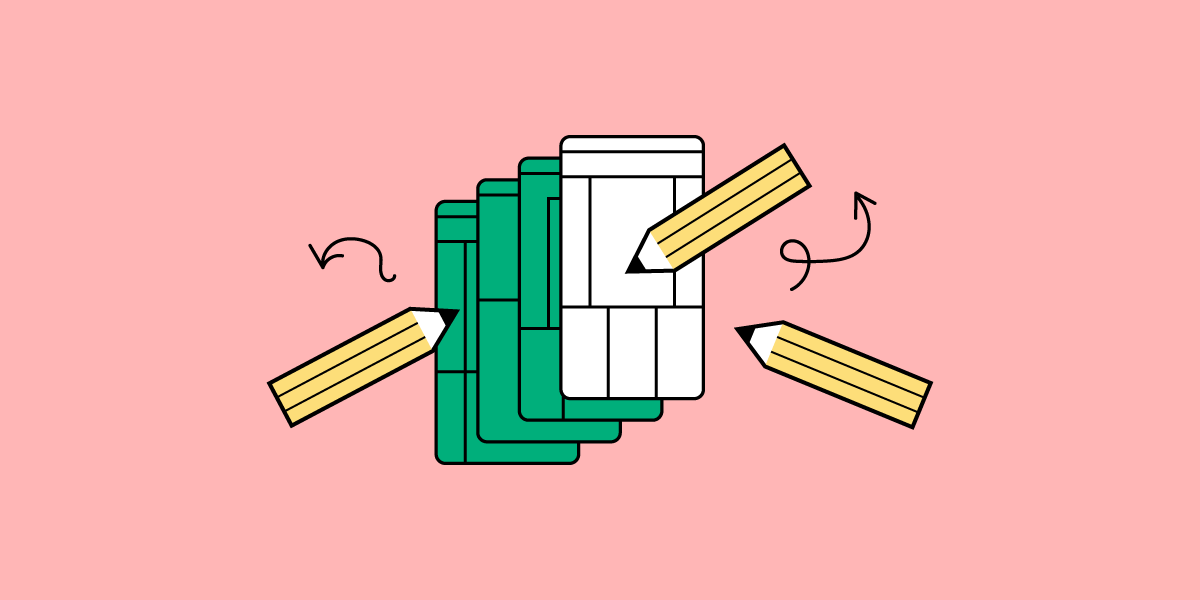


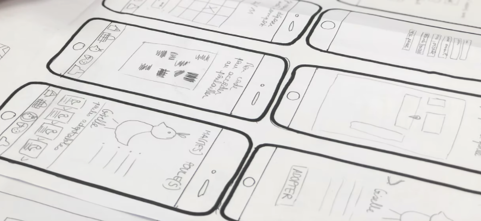


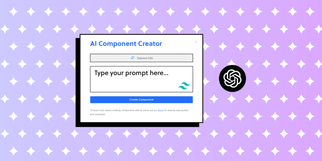


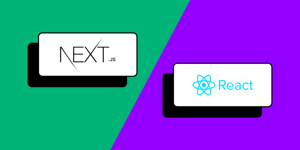