How to Conduct a UX Audit: Checklist, Benefits & Step-by-Step Guide (2026)

UX audit

Every digital product accumulates UX debt — inconsistencies, accessibility gaps, and friction points that creep in as features ship and teams scale. A UX audit is the structured process for finding and fixing these issues before they erode user satisfaction, conversion rates, and brand trust.

This guide walks you through how to prepare for, conduct, and report on a UX audit — including Nielsen’s usability heuristics, a practical checklist, and tips for turning audit findings into measurable improvements.

Need to test audit-driven improvements before shipping? UXPin Merge lets you prototype with production components, and Forge generates interactive alternatives in seconds from a text prompt. Start a free trial.

Build advanced prototypes

Design better products with States, Variables, Auto Layout and more.


Try UXPin

What is a UX Audit?

A UX audit is a systematic evaluation of a website, application, or digital product to assess and improve its overall user experience. The goal of a UX audit is to identify usability issues, design flaws, and areas for improvement in order to enhance the user satisfaction and effectiveness of the product.

This process is typically carried out by UX professionals, designers, or usability experts and it may be referred to as UX review or quality assurance of design.

user search user centered

A design audit allows UX designers to identify user pain points and business value opportunities using valuable real-world data. Testing during the design process is limited in revealing how a product will perform in the real world –especially if you have thousands or millions of daily users. 

An auditor will measure, test, and analyze the following during a UX audit:

  • Usability Evaluation – assessing the ease with which users can interact with the product. This involves evaluating navigation, clarity of information, and the overall flow of the user journey.
  • Visual Design – examining the aesthetics and visual elements of the interface to ensure they align with best practices, brand guidelines, and contribute to a positive user experience.
  • Content Evaluation – reviewing the quality, relevance, and clarity of the content presented to users. This includes text, images, and multimedia elements.
  • Interaction Design – analyzing the responsiveness and effectiveness of interactive elements, such as buttons, forms, and other user interface components.
  • Accessibility – ensuring that the product is accessible to users with disabilities by checking compliance with accessibility standards and guidelines.
  • Performance Assessment – evaluating the speed and responsiveness of the product, including page load times and the efficiency of interactive features.
  • Mobile Responsiveness – verifying that the product is optimized for various devices and screen sizes, with a focus on mobile responsiveness.
  • Broken Links – identifying and fixing any broken or dysfunctional links within the product to ensure a seamless user experience.
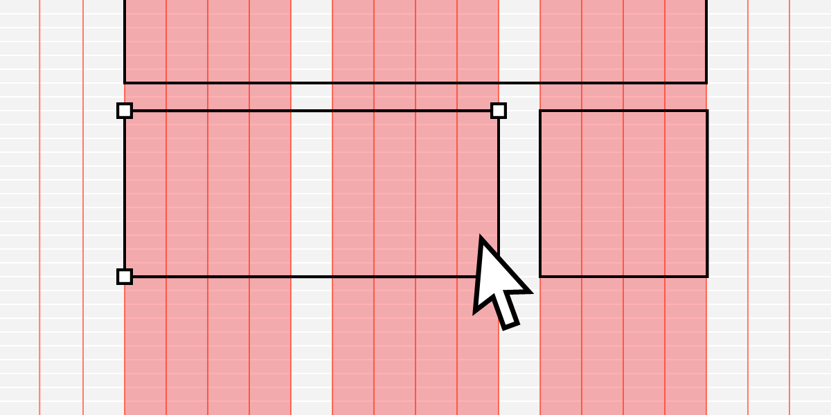
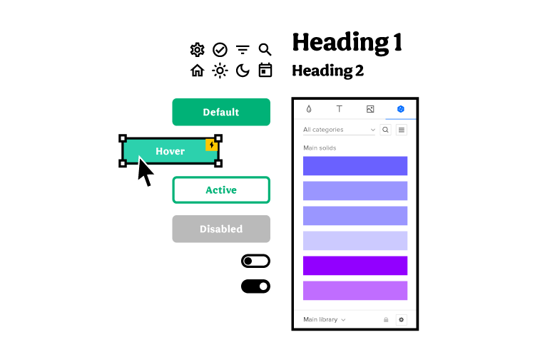
  • Design System Inconsistencies – checking for inconsistencies in design elements such as fonts, colors, patterns, and ensuring adherence to a cohesive design system.
  • Layout and Hierarchy Inconsistencies – reviewing the overall layout and hierarchy of information to maintain consistency and improve user understanding.
  • Outdated Content – identifying and updating any outdated or irrelevant content to ensure users receive accurate and timely information.
  • Customer Journey Bottlenecks and Roadblocks – analyzing the user journey to identify any bottlenecks or obstacles that may hinder a smooth progression through the product.
  • Usability Heuristics – applying established usability heuristics (such as Nielsen’s 10 heuristics) to evaluate and address potential usability issues.
  • Branding and Messaging – ensuring consistency in branding elements and messaging to maintain a coherent and recognizable brand identity.
  • Review Product Design Against Business and User Experience Goals – evaluating the alignment of the product design with both business objectives and user experience goals.
  • Traffic, Engagement, Conversion Rates, Retention, and Sales Analytics – analyzing relevant analytics data to gain insights into user behavior, engagement, and the product’s overall performance.
  • Legal Compliance (GDPR, CCPA, etc.) – checking the product’s compliance with applicable legal standards, such as data protection regulations (GDPR, CCPA, etc.)

At the end of a design audit, auditors generate a UX audit report with actionable recommendations to fix any issues or optimize the product.

When to Conduct a UX Design Audit?

Teams typically conduct a UX audit as part of the QA process whenever they release a significant product update or product redesign. Organizations may also schedule periodic UX audits to ensure a product meets business and user experience objectives.

Additionally, a UX design audit is recommended:

  • When experiencing a noticeable drop in user engagement or satisfaction metrics.
  • Before launching a new feature or major update to assess potential impact on the user experience.
  • After receiving significant user feedback or complaints about usability issues.
  • When considering a rebranding or significant change in the product’s visual identity.
  • Before embarking on a large-scale marketing campaign or expansion effort to ensure the product can effectively support increased traffic or usage.
  • Following changes in industry standards, regulations, or technological advancements that may affect the user experience.
  • As part of a competitive analysis to benchmark the product against industry peers and identify areas for improvement.
  • When seeking investment or partnerships, as a thorough UX audit can demonstrate a commitment to delivering a high-quality user experience. Overall, the timing of a UX design audit depends on the specific needs and circumstances of the organization and the product, but it’s essential to prioritize regular evaluations to maintain and enhance the user experience.

Who Conducts a UX Audit?

Who conducts a UX audit will depend on the size of the company and available resources. Many small companies and startups will likely use in-house design teams to perform UX audits.

To get an objective, non-bias UX audit, some organizations use external auditors to evaluate their products and deliver a report. Large companies might use a UX design agency, which can be expensive but produce thorough audits with meaningful feedback and insights. Smaller businesses and startups might consider hiring a freelancer to get similar results.

Recommended reading: How to Set Up Internal Consultancy?

How to Prepare for a UX Audit

A UX audit requires several benchmarks to evaluate a digital product. Without these benchmarks, auditors have no way to determine whether the product is meeting its KPIs, goals, and objectives.

If your company doesn’t have a UX strategy, you probably want to start by defining this before you conduct a UX audit. You can download our Free UX Process & Documentation Templates and read this article to outline your company’s UX strategy before your first design audit.

To prepare for a UX audit, you will need:

  • User personas
  • Clearly defined business goals
  • Product data and analytics
  • Previous UX audit results & changes
  • Audit constraints, deliverables, deadline, and stakeholders
user pink 1

User Personas

Identifying your customers and their personas before you conduct a UX audit will help determine if your current users (from analytics data) match your target users (from previous user and market research).

Suppose the UX audit reveals a change in user demographics. In that case, UX designers might need to apply the design thinking process to determine if the product adequately caters to this new group.

Clearly Defined Business Goals

Understanding the company’s business goals is another essential factor auditors must know in preparation for a UX audit. Auditors will need to assess whether the product meets the company’s business expectations and the design’s impact, whether negative or positive.

Product Data and Analytics

Auditors must gather relevant product analytics and information like heatmaps, click tracking, and other interaction data. Companies might acquire this data through Google Analytics, Kissmetrics, Hotjar, and CrazyEgg, to name a few.

This data is crucial to understanding how users navigate a digital product and whether designers need to consider changes to match this behavior.

Analytics can also provide auditors with conversion and revenue data to measure the product’s success metrics and KPIs.

Recommended reading: A List of Design Feedback Tools

Previous UX Audit Results & Changes

Auditors can use reports from previous UX audits to check if any of the same problems still exist. If there were any design changes after the last UX audit, auditors can determine whether the changes solved the problem and impacted user experience.

Audit Constraints, Deliverables, Deadline, and Stakeholders

Lastly, auditors must understand the audit’s budget/resource constraints, deliverables, deadline, and stakeholders for reporting. This information is as important as the audit itself because it will determine how auditors conduct the review to meet constraints and expectations.

Conducting a UX Design Audit

Once you have completed your preparation, it’s time to conduct a UX design audit. Auditors will examine four key elements of a digital product, including:

Usability Heuristics

Jakob Nielsen’s 10 general principles for interaction design form the basis for many UX design audits. Developed in the early 90s, Nielsen’s list of ten heuristics outlines a broad “rule of thumb” rather than specific usability guidelines auditors must follow.

  1. Visibility of system status—ensure users know the current system status to understand the impact of their interactions and next steps.
  2. Match between system and the real world—designs must speak users’ language with familiar words, phrases, and concepts. Products must feel logical and intuitive so users can achieve tasks and goals effortlessly.
  3. User control and freedom—designs should give users complete control to change their minds, exit, or redo tasks and flows. For example, providing a “back” button during user flows or a way to update/delete shopping cart items.
  4. Consistency and standards—design inconsistency can increase users’ cognitive load resulting in a poor product experience. Minimize what users must learn to use your product by following industry standards and maintaining design consistency.
  5. Error prevention—designers must do everything they can to prevent or eliminate error-prone conditions. 
  6. Recognition rather than recall—users should not have to remember what buttons, actions, and elements do. User interfaces must promote recognition (explicit labels & instructions) to reduce users’ cognitive load.
  7. Flexibility and efficiency of use—a digital product should provide users with the flexibility to customize their preferred workflow. For example, allowing users to create easily retrievable “favorite” links to their most-used features.
  8. Aesthetic and minimalist design—avoid redundant content and UI elements that don’t serve users. A minimalist screen layout will help users find what they need with minimal effort.
  9. Help users recognize, diagnose, and recover from errors—error messages should guide users with straightforward steps to solve the problem. Avoid meaningless error codes and instead provide links to product documentation or customer support.
  10. Help and documentation—product documentation must help users understand the product’s features and complete desired tasks.

Auditors might need to evaluate a mix of user testing and product analytics to audit these ten usability heuristics.

User Experience

As UX design follows a human-centered approach, auditing your product’s user experience is probably the most critical part of a design audit.

Auditors will examine analytics and interaction data to determine the design’s impact on user flows, navigation, and the overall user experience. If something stands out in analytics data, auditors may conduct or recommend usability testing to fully understand the problem.

uxpin design system components states icons 1

Design System Evaluation

A company’s design system is vital for maintaining continuity and consistency. Auditors must examine the product’s design system to ensure UI components and design patterns meet user experience goals and branding guidelines.

uxpin accessibility wcag color

Accessibility

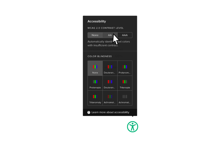
Accessibility is a vital factor in ensuring a product is inclusive for all users. Auditors need to consider whether the color palette, fonts, and components serve users with visual impairments. They may also look at whether the product allows users to switch between light/dark modes to accommodate users with sensitive eyesight.

UXPin’s built-in accessibility features help designers follow best practices, so products pass WCAG standards before the design handoff. Sign up for a 14-day free trial to discover more of UXPin’s built-in features to help optimize your UX workflow.

UX Audit Checklist

A UX audit checklist must take auditors through the necessary preparation through to the final audit report. 

UXPin’s 23-Point UX Checklist will help you avoid common design issues before reaching your final product to improve the overall user experience. You can also use this 23-point checklist as a guideline for creating your audit checklist.

5 Tips to Perform a Successful UX Audit

  1. Record everything: take notes, screenshots, and provide links to every flagged issue. These records will ensure you don’t forget anything and provide thorough, actionable feedback to stakeholders.
  2. Stay organized: depending on the scale of the product, you’re likely to collect a lot of data, including notes, images, metrics, etc. Use a spreadsheet to organize and analyze analytics data, and use cloud storage to save corresponding assets, like screenshots.
  3. Actionable recommendations: provide stakeholders with actions they can take to fix the problems you identify. These actions must align with real insights rather than guesses or assumptions.
  4. Be exact: when reporting, tell stakeholders the specific problem, where to find it, and recommendations to fix.
  5. Prioritize findings: let stakeholders know the importance of issues you identify—for example, low, medium, and high. You would typically prioritize these based on the severity of the problem and how it impacts the user experience.

Summary

Regular design audits are vital to determine how products align with user experience and business goals. If you are conducting your first UX audit, you must have a clear UX strategy, so auditors have benchmarks, objectives, and KPIs to measure against.

Jakob Nielsen’s ten usability heuristics provide a fantastic foundation for auditors to test a product’s components and features. Auditors should use these usability heuristics to look at a product objectively and ask questions from a user’s perspective.

Improve Your UX Audits With UXPin

UXPin provides several capabilities that directly support the UX audit workflow:

  • Code-based prototypes for testing: UXPin’s code-based editor produces high-fidelity prototypes that behave like the final product. Auditors can run usability studies on prototypes that replicate real interactions — not static mockups.
  • Forge for rapid alternatives: When an audit flags a problematic flow, Forge can generate alternative designs in seconds from a text prompt, screenshot, or URL — using real components from your design system. Test the new approach with users before committing engineering effort.
  • Merge for design-system consistency: Merge connects your production component library to the design canvas. Auditors can verify that every screen uses approved components and that design-system guidelines are enforced — the same components engineers ship.
  • Built-in accessibility tools: UXPin’s accessibility features include a contrast checker and blindness simulator, so auditors can evaluate WCAG compliance directly in the design tool.
  • Comments for issue tracking: UXPin’s Comments feature lets auditors annotate issues directly on screens and assign follow-up tasks to team members.
  • Production JSX output: Once audit-driven improvements are designed, engineers receive clean, production-ready code — no re-interpretation needed.

Start a free 14-day trial and discover how UXPin’s code-backed design tool improves both the audit process and the design changes that follow.

Frequently Asked Questions

What is a UX audit?

A UX audit is a systematic evaluation of a digital product to identify usability issues, design inconsistencies, accessibility gaps, and areas for improvement. It combines heuristic analysis, analytics review, and sometimes usability testing to produce actionable recommendations.

How often should you conduct a UX audit?

Most teams benefit from a comprehensive UX audit every 6 to 12 months, or whenever launching a major feature, redesign, or rebrand. Smaller spot-check audits can happen quarterly as part of ongoing quality assurance.

What is the difference between a UX audit and usability testing?

A UX audit is an expert-led evaluation using heuristics, analytics, and checklists. Usability testing involves real users performing tasks. Most thorough audits include both: heuristic analysis identifies likely problems, and usability testing validates them with actual users.

Who should conduct a UX audit?

UX audits can be conducted by in-house UX teams, external UX agencies, or freelance consultants. External auditors provide objectivity, while in-house teams bring deep product context. Many organisations use a combination of both.

What should a UX audit report include?

A UX audit report should include an executive summary, methodology, findings organised by severity (critical, major, minor), screenshots or screen recordings of issues, and prioritised, actionable recommendations for fixing each problem.

How can UXPin help with UX audits?

UXPin helps UX audit workflows in several ways: code-based prototypes for realistic usability testing, built-in accessibility features (contrast checker, blindness simulator), a Comments feature for annotating issues directly on designs, and Merge technology for ensuring design-system consistency.

Double Diamond Design Process Explained: 4 Phases, Examples & Tips (2026)

Double Diamond design process diagram showing Discover, Define, Develop, and Deliver phases

The Double Diamond design process is one of the most widely adopted frameworks for solving complex design problems in Web design. Developed by the British Design Council, it gives product teams a clear structure for moving from a vague challenge to a tested, shippable solution.

This guide covers everything you need to know about the Double Diamond: what it is, where it comes from, how each phase works, and how modern product teams apply it alongside tools like UXPin Merge to move from insight to interactive prototype faster.

What Is the Double Diamond Design Process?

The Double Diamond is a visual framework that maps the design process into two connected diamond shapes. Each diamond represents a cycle of divergent thinking (exploring broadly) followed by convergent thinking (narrowing to a decision).

  • Diamond 1 — Problem space: Discover the landscape, then Define the core problem.
  • Diamond 2 — Solution space: Develop possible solutions, then Deliver the best one.

The model encourages teams to resist jumping to solutions before they truly understand the problem — a discipline that consistently produces better outcomes.

Origin and History of the Double Diamond

The British Design Council formalised the Double Diamond in 2005 after studying the design processes at eleven leading companies, including LEGO, Sony, and Starbucks. The council found that regardless of industry, successful design projects followed the same diverge-converge pattern twice: once for the problem, once for the solution.

The concept has deeper roots in the divergence-convergence model described by Hungarian-American linguist Béla H. Bánáthy, who proposed that problem-solving naturally alternates between exploring broadly and focusing narrowly. The Design Council applied this principle to design practice and gave it a memorable visual shape — the two diamonds.

Since 2005, the framework has been adopted by government agencies (the UK’s NHS and Government Digital Service), global enterprises, and startups alike. It remains one of the most-referenced design process models in UX education and practice.

The Four Phases of the Double Diamond

1. Discover — Explore the Problem Space

The Discover phase is about divergent research. Teams cast a wide net to understand users, business context, and the landscape surrounding the challenge. Key activities include:

  • User interviews and contextual inquiry — Observe and talk to real users in their environment.
  • Stakeholder workshops — Align on business goals, constraints, and success metrics.
  • Analytics review — Mine quantitative data for behavioural patterns.
  • Competitive analysis — Understand how others address similar problems.
  • Service safaris — Experience the current product or service first-hand.

The goal is empathy and breadth — resist narrowing down too early.

2. Define — Frame the Right Problem

In the Define phase, teams converge. They synthesise discovery research into a clear, actionable problem statement (sometimes called a design brief or How Might We statement). Activities include:

  • Affinity mapping — Cluster research insights into themes.
  • Persona development — Create representative user archetypes.
  • Journey mapping — Visualise the end-to-end user experience and identify pain points.
  • Problem framing — Write a concise problem statement the team will solve.

A strong Define output ensures the entire team is solving the same problem — and prevents the common trap of building a solution nobody asked for.

3. Develop — Generate and Prototype Solutions

The Develop phase is where creativity peaks. Teams diverge again, this time generating a wide range of potential solutions before converging on the most promising ones. Key activities:

  • Ideation workshops — Brainstorm, sketch, and use techniques like Crazy 8s or SCAMPER.
  • Low-fidelity prototyping — Paper sketches, wireframes, and quick clickable mockups.
  • High-fidelity prototyping — Interactive prototypes that mimic real product behaviour.
  • Concept testing — Put early ideas in front of users to gather directional feedback.

This is where UXPin Forge can dramatically accelerate the process. Teams describe what they need in a text prompt, and Forge generates interactive prototypes using real React components from the team’s own design system. Instead of spending days wiring up screens, designers get a functional starting point in seconds — then refine with UXPin’s professional design tools.

4. Deliver — Test, Refine, and Launch

The Deliver phase converges on a final solution through rigorous testing and iteration. Teams work to validate that the solution actually solves the problem identified in the Define phase. Activities include:

  • Usability testing — Observe users completing key tasks with the prototype.
  • A/B testing — Compare solution variants with real traffic.
  • Accessibility audits — Ensure the solution works for all users.
  • Design-to-development handoff — Deliver final specs and assets to engineers.

With UXPin Merge, the handoff gap shrinks dramatically. Because designers prototype with the same coded components engineers use in production, the final design is the specification. Engineers receive production-ready JSX instead of static mockups, which enterprise customers report reduces engineering time by up to 50%.

Double Diamond vs. Design Thinking: How Do They Compare?

Aspect Double Diamond Design Thinking (IDEO/d.school)
Phases Discover → Define → Develop → Deliver Empathise → Define → Ideate → Prototype → Test
Structure Two explicit diverge-converge cycles Five stages (less explicit about diverge/converge)
Emphasis Equal weight on problem and solution Heavy emphasis on empathy and rapid prototyping
Origin British Design Council (2005) IDEO / Stanford d.school (2000s)

In practice, many teams blend both. You might use the Double Diamond’s two-diamond framing for strategic planning while applying Design Thinking’s five stages as tactical steps within each diamond.

How to Apply the Double Diamond in Your Team

Start With Real Research, Not Assumptions

The most common mistake teams make is skipping the first diamond entirely. Invest time in Discover and Define before jumping to solutions. Even a few user interviews can prevent months of building the wrong thing.

Timebox Each Phase

Without boundaries, the Discover phase can stretch indefinitely. Set clear timeboxes and commit to moving forward with the best understanding you have.

Use the Right Fidelity at the Right Time

Low-fidelity artifacts (sticky notes, sketches, wireframes) are ideal during Discover and Define. High-fidelity interactive prototypes belong in Develop and Deliver.

Integrate With Agile Workflows

The Double Diamond works well as a strategic overlay on agile sprints. The first diamond feeds the backlog with well-defined problems. The second diamond’s Develop and Deliver phases map naturally to sprint cycles.

Prototype With Production Components

In the Develop phase, teams that prototype with real UI components get more realistic user feedback and smoother developer handoff. UXPin Merge makes this possible by letting designers drag and drop coded components from libraries like MUI, shadcn/ui, or your own custom React library directly onto the canvas.

Who Uses the Double Diamond Framework?

  • Government: The UK’s Government Digital Service (GDS) and NHS use the Double Diamond as the basis for their service design approach.
  • Enterprise product teams: Companies like PayPal, where a 5-person UX team supports over 60 products and 1,000+ developers, rely on structured frameworks to ensure research-backed design decisions at scale.
  • Startups: Early-stage teams use the first diamond to validate that a real problem exists before investing in development. The framework’s emphasis on understanding the problem before building helps startups avoid investing in solutions that don’t address real user needs.
  • Design agencies: The framework’s clarity makes it an effective tool for communicating process to clients.

Common Mistakes When Using the Double Diamond

  1. Skipping the first diamond. Jumping straight to solutions without understanding the problem leads to wasted effort.
  2. Treating phases as strictly linear. In reality, teams often loop back — a usability test in Deliver may reveal a problem that requires returning to Define.
  3. Confusing divergent with unfocused. Divergent thinking still needs direction.
  4. Over-polishing in the Develop phase. The goal is to learn, not to ship.
  5. Neglecting the handoff. Even the best-designed solution fails if it gets lost in translation to code.

Accelerate the Double Diamond With UXPin

UXPin supports the Develop and Deliver phases with capabilities purpose-built for product teams:

  • Forge AI generates interactive prototypes from text prompts, image uploads, or URLs — using real components from your design system. It gets teams to 80% of a prototype instantly, then professional design tools handle the final 20%.
  • Merge connects your production component library directly to the design canvas. Designers and developers work from the same source of truth.
  • Interactive prototyping with states, variables, and conditional logic lets teams build prototypes that behave like the real product.
  • Production JSX output means engineers get clean, production-ready code instead of redline documents.

Try UXPin for free and see how code-backed prototyping transforms the Develop and Deliver phases of your Double Diamond process.

Frequently Asked Questions

What is the Double Diamond design process?

The Double Diamond design process is a framework created by the British Design Council in 2005. It visualises design work as two connected diamonds: the first focuses on understanding the problem (Discover and Define), while the second focuses on creating the solution (Develop and Deliver). Teams alternate between divergent thinking (exploring broadly) and convergent thinking (narrowing down).

What are the four phases of the Double Diamond?

The four phases are Discover (research and explore the problem space), Define (synthesise findings into a clear problem statement), Develop (ideate and prototype potential solutions), and Deliver (test, refine, and launch the final solution).

Who created the Double Diamond model?

The British Design Council formalised the Double Diamond in 2005 after studying the design processes of eleven global companies. The underlying divergent-convergent thinking pattern draws on Béla H. Bánáthy’s earlier linguistic model.

How does the Double Diamond differ from Design Thinking?

Design Thinking (popularised by IDEO and Stanford d.school) uses five stages: Empathise, Define, Ideate, Prototype, and Test. The Double Diamond covers similar ground but frames the work as two distinct problem-solution phases with explicit diverge-converge cycles. In practice, many teams blend elements from both frameworks.

Can I use the Double Diamond for agile product development?

Yes. Many product teams use the Double Diamond as an overarching strategy framework while running agile sprints within the Develop and Deliver phases. The first diamond’s research and definition work feeds the product backlog, and agile iterations handle execution.

What tools help teams apply the Double Diamond process?

Teams typically need research tools (interviews, analytics), collaboration tools (whiteboards, workshops), and prototyping tools. UXPin supports the Develop and Deliver phases by enabling teams to build interactive prototypes with production-ready components, test with real users, and hand off clean code to developers.

Design with Fluent UI Components: Free React Library for Prototyping (2026)

Design with Fluent UI components in UXPin — interactive prototyping with Microsoft's React library

Microsoft’s Fluent UI is one of the most widely adopted React component libraries for enterprise applications — and it’s available as a fully interactive, drag-and-drop library inside UXPin. Designers can prototype with the same production-grade components that developers ship, then hand off clean, copyable code.

This guide covers what Fluent UI is, why enterprise teams choose it, and exactly how to start prototyping with Fluent UI components in UXPin — including with UXPin Forge, which can generate complete interfaces from a text prompt using real Fluent UI components.

What Is Fluent UI?

Fluent UI is an open-source React component library developed and maintained by Microsoft. It powers the interfaces of Microsoft 365, Teams, Azure Portal, and other Microsoft products — and it’s available for any team to use.

Key characteristics of Fluent UI:

  • Enterprise-grade components — Pivot tables, data grids, command bars, date pickers, charts, and 70+ other components built for complex business applications.
  • Accessibility first — Every component ships with WCAG-compliant keyboard navigation, screen reader support, and high-contrast mode.
  • Cross-platform — Components work across desktop, tablet, and mobile, and across operating systems (Windows, macOS, iOS, Android).
  • Customisable theming — Override colours, typography, spacing, and border radius to match your brand while retaining Fluent’s interaction patterns.
  • Well-documented — Extensive documentation, Storybook examples, and an active GitHub community.

If your team builds enterprise dashboards, admin panels, internal tools, or any product in the Microsoft ecosystem, Fluent UI is a natural choice.

Why Use Fluent UI in UXPin?

Most design tools treat Fluent UI as a static UI kit — a collection of rectangles that look like buttons but don’t behave like them. UXPin is different. Through Merge technology, UXPin brings the actual React components onto the design canvas. That changes the entire prototyping workflow.

Design Faster With Drag-and-Drop Components

Build prototypes by dragging fully functional Fluent UI components from the library panel onto your canvas. No need to recreate buttons, dropdowns, or tables from scratch. Assemble screens, test with users, and iterate — all in a fraction of the time it takes with image-based tools.

Build Interactive Interfaces Without Code

Fluent UI components in UXPin are fully interactive out of the box. A DatePicker opens a calendar. A Dropdown expands with real options. A Toggle switches states. You can set up component properties — variants, sizes, disabled states — just as a developer would set props in React. The result is a prototype that behaves like the final product.

Streamline Design-to-Development Handoff

When you share a UXPin prototype with your engineering team, developers can inspect any component in Spec Mode and copy the ready-to-use code. Because these are the same components engineers import into their codebase, there’s no interpretation gap. What designers build is what developers ship.

Enterprise teams using UXPin Merge report up to 50% reduction in engineering time thanks to this single-source-of-truth approach.

Generate Fluent UI Interfaces With AI

UXPin Forge takes this even further. Describe the screen you need — “a user management dashboard with a data table, search bar, and filter sidebar” — and Forge generates an interactive prototype using real Fluent UI components. You can also upload a screenshot or paste a URL, and Forge will recreate the layout with production components.

Because Forge is constrained to your connected component library, every generated element is a real, buildable component — not a generic placeholder. After generation, use UXPin’s professional design tools to refine the last 20%.

Fluent UI Components Available in UXPin

The Fluent UI library in UXPin includes 70+ interactive components. Here’s a selection of the most-used ones:

Category Components
Inputs Button, Checkbox, ComboBox, DatePicker, Dropdown, RadioGroup, SearchBox, Slider, SpinButton, TextField, TimePicker, Toggle
Data Display DetailsList (data grid), Table, Avatar, Badge, Card, Label, Tag, Tooltip
Navigation Breadcrumb, CommandBar, Nav, Pivot (tabs), Link
Feedback Dialog, MessageBar, ProgressIndicator, Spinner, Toast
Layout Divider, Stack, Accordion, Panel, ScrollablePane
Data Visualisation Charts (bar, line, pie, donut), Sparkline, HeatMap
Pickers ColorPicker, PeoplePicker, SwatchColorPicker, Calendar

Each component supports property configuration on the canvas — change variants, sizes, labels, and states without writing code.

How to Start Using Fluent UI in UXPin

Getting started takes less than five minutes:

  1. Sign up for a free trial — Fluent UI is available immediately during the 14-day trial period.
  2. Create a new prototype from the UXPin Dashboard.
  3. Open the Design System Libraries panel in the left sidebar and select Fluent UI.
  4. Drag and drop components onto your canvas. Configure properties in the right panel — set labels, variants, disabled states, and more.
  5. Preview your prototype to see full interactivity — dropdowns expand, toggles switch, calendars open.
  6. Share with developers — they can open Spec Mode to inspect dimensions, spacing, and copy component code.

Fluent UI vs. Other Component Libraries in UXPin

UXPin supports multiple production component libraries. Here’s how Fluent UI compares:

Library Best For Components
Fluent UI Enterprise apps, Microsoft ecosystem, data-heavy tools 70+
MUI (Material UI) Consumer-facing apps, Material Design 60+
shadcn/ui Modern, minimal apps, Tailwind CSS-based 40+
Bootstrap Marketing sites, general-purpose web apps 50+
Ant Design Enterprise apps, Chinese market, data-intensive 60+

You can also bring your own custom React component library into UXPin using the Merge Git integration or Merge CLI tool.

Who Should Use Fluent UI?

  • Enterprise product teams building internal tools, admin panels, and dashboards.
  • Teams in the Microsoft ecosystem who want visual consistency with Office 365, Teams, and Azure.
  • Designers working with React developers who want a shared component language between design and code.
  • Accessibility-focused teams — Fluent UI’s built-in a11y support reduces the work needed to meet WCAG standards.

Start Prototyping With Fluent UI

UXPin is the only design tool where AI generation, professional design capabilities, and production code output all operate from the same source of truth — your actual component library. With Fluent UI in UXPin, you get:

  • Interactive prototypes with real component behaviour — no faking it.
  • AI-powered generation with Forge — describe what you need and get a working prototype in seconds.
  • Production-ready handoff — developers copy real code, not redline documents.
  • Design system consistency — every prototype is built from the same components your engineers use.

Start your free 14-day trial and prototype with Fluent UI components today.

Frequently Asked Questions

What is Fluent UI?

Fluent UI is Microsoft’s open-source React component library for building accessible, enterprise-grade web applications. It provides pre-built components like buttons, tables, charts, and date pickers that follow Microsoft’s design language and work across devices and platforms.

Is the Fluent UI library in UXPin free?

Fluent UI components are available during UXPin’s 14-day free trial. The library includes 70+ fully interactive components that you can drag and drop onto the canvas, configure properties, and preview in real time.

Can I copy Fluent UI code from UXPin?

Yes. UXPin’s Spec Mode lets developers inspect any Fluent UI component and copy its code. Because the components are real React code, the output maps directly to what engineers use in production.

How does Fluent UI differ from Material UI (MUI)?

Fluent UI follows Microsoft’s design language and is optimised for enterprise and productivity applications, with components like pivot tables and command bars. MUI follows Google’s Material Design and is more common in consumer-facing apps. UXPin supports both libraries.

Can I use Fluent UI with UXPin Forge?

Yes. UXPin Forge can generate interfaces using components from any library connected via Merge, including Fluent UI. Describe what you need in a text prompt, upload a screenshot, or paste a URL, and Forge builds an interactive prototype with real Fluent UI components.

What types of applications is Fluent UI best suited for?

Fluent UI excels in enterprise and productivity applications — dashboards, admin panels, data-heavy tools, and any product that integrates with the Microsoft ecosystem. Its built-in accessibility, responsive design, and complex components like data grids make it ideal for business software.

What Does User-Friendly Mean? Principles, Examples & How to Measure It (2026)

What does user-friendly mean in UX design

User-friendly is one of the most common terms in product design, yet it is often used loosely. When a stakeholder says “make it user-friendly,” what do they mean? And how do you measure and deliver user-friendliness?

This guide covers the definition, principles, real-world examples, and practical steps to make any interface easier to use.

What Is the Definition of User-Friendly?

User-friendly describes a product, interface, or system that is easy to learn, efficient to operate, and satisfying to use. The term originated in human-computer interaction (HCI) during the 1980s.

Formally, the closest equivalent is usability (ISO 9241-11): the extent to which a product can be used by specified users to achieve specified goals with effectiveness, efficiency, and satisfaction.

Core Principles of User-Friendly Design

1. Learnability

New users should understand the interface on first encounter. Clear labels, familiar patterns, and progressive disclosure improve learnability.

2. Efficiency

Experienced users should complete tasks quickly. Keyboard shortcuts, smart defaults, and streamlined workflows contribute to efficiency.

3. Memorability

Returning users should reestablish proficiency without relearning. Consistent navigation and logical information architecture support memorability.

4. Error Prevention and Recovery

Good design prevents errors through constraints and confirmations, and provides clear recovery paths with helpful messages.

5. Accessibility

A truly user-friendly product works for everyone, including people with disabilities. WCAG adherence is the industry standard.

6. Satisfaction

The experience should feel pleasant. Smooth animations, thoughtful micro-interactions, and consistent visual design contribute to satisfaction.

A Brief History of User-Friendly Design

  • 1960s–1970s: Command-line interfaces for technical specialists.
  • 1980s: GUI revolution — Xerox Star, Apple Macintosh, Windows.
  • 1990s: Web and HCI research emerge as disciplines.
  • 2000s: Mobile and accessibility gain prominence.
  • 2010s: Design systems for consistent experiences at scale.
  • 2020s: AI-assisted design. UXPin Forge generates prototypes constrained to production design systems, inheriting built-in usability patterns.

Examples of User-Friendly Interfaces

Spotify

Spotify prioritises content discovery while keeping core actions instantly accessible. Consistent layout across platforms means users never relearn.

Gmail

Gmail balances features with a clean interface. Smart replies, snooze, and priority inbox reduce cognitive load.

Amazon

Not the most polished visually, but extremely effective. One-click ordering, prominent search, and consistent product pages.

Notion

Demonstrates learnability through progressive disclosure. Users discover features as they need them via slash-commands.

How to Make Your Interface More User-Friendly

Step 1: Identify Friction Points

Use analytics for drop-offs and rage-clicks. Add qualitative research — usability tests, support tickets, interviews.

Step 2: Simplify Navigation

Reduce top-level items, use clear labels, implement logical hierarchy. Card sorting helps match user mental models.

Step 3: Improve Form Design

Keep forms short, use smart defaults, inline validation, and helpful error messages.

Step 4: Prototype and Test With Real Components

UXPin Merge lets designers prototype with the same React components engineers use in production, so usability findings translate directly to development.

Step 5: Iterate

Run regular usability tests, track SUS scores, maintain a UX improvement backlog.

How to Measure User-Friendliness

Metric What It Measures How to Collect
Task success rate Can users complete tasks? Usability testing
Time on task Efficiency Usability testing
Error rate Mistake frequency Testing + analytics
SUS score Perceived usability Post-test survey
NPS Recommendation likelihood In-app survey
Drop-off rate Abandonment points Analytics funnels

Synonyms for User-Friendly

  • Intuitive — minimal learning curve
  • Accessible — inclusive for all abilities
  • Usable — formal ISO 9241 term
  • User-centred — emphasises the process
  • Approachable — low intimidation factor

Build User-Friendly Interfaces With UXPin

  • Forge generates interactive UI from prompts, screenshots, or URLs — constrained to your production component library.
  • Merge syncs your coded components to the design canvas — single source of truth.
  • Built-in testing: Share prototypes via link or UXPin Mirror for mobile.
  • Production output: Engineers get clean JSX, not static screenshots.

Start a free trial and prototype your next user-friendly interface.

Frequently Asked Questions

What does user-friendly mean in UX design?

User-friendly means a product is designed so people can learn it quickly, complete tasks efficiently, and feel satisfied. It encompasses intuitiveness, accessibility, clarity, and error tolerance.

What is another word for user-friendly?

Common synonyms: intuitive, easy-to-use, accessible, user-centred, ergonomic, approachable. Formally, ‘usable’ (ISO 9241) is the closest equivalent.

How do you measure user-friendliness?

Through usability testing (task success rate, time on task, error rate), satisfaction surveys (SUS, CSAT, NPS), analytics (drop-off rates, rage clicks), and accessibility audits (WCAG compliance).

What are the key principles of user-friendly design?

Learnability, efficiency, memorability, error prevention and recovery, accessibility, and satisfaction.

Is user-friendly the same as accessible?

Not exactly. Accessibility addresses whether people with disabilities can use an interface. User-friendliness is broader, including efficiency, learnability, and satisfaction for all users.

How can I improve user-friendliness without a full redesign?

Simplify navigation labels, improve error messages, increase colour contrast, add loading indicators, reduce form fields. Use UXPin to prototype and test changes with real components before committing to code.

React vs HTML: Key Differences Explained (2026)

React vs HTML comparison showing key differences between HTML markup and React component architecture

HTML is the markup language that structures every web page on the internet. React is a JavaScript library that builds dynamic, component-based user interfaces on top of that HTML foundation. They serve different purposes, but every React application ultimately renders HTML in the browser.

This guide breaks down the core differences between HTML and React — covering architecture, rendering, data binding, performance, and practical use cases — so you can choose the right approach for your next project.

Key takeaways:

  • HTML is a markup language; React is a JavaScript UI library. They operate at different levels of the stack and are complementary, not interchangeable.
  • React uses a component-based architecture that enables reusable, self-contained UI elements. HTML does not natively support components.
  • React manages state and updates only what changes via a Virtual DOM. Pure HTML requires a full page reload for any view update.
  • React enables one-way data binding; HTML has no built-in data binding mechanism.
  • HTML is ideal for static content; React is built for dynamic, interactive application UIs.
  • Modern frameworks like Next.js solve React’s historical SEO and initial-load challenges through server-side rendering (SSR) and static site generation (SSG).

Design React UIs without writing code

UXPin Merge lets designers drag and drop real React components to build production-ready prototypes. Try it free.

Try UXPin Merge

What Is HTML?

HTML (HyperText Markup Language) is the foundational language of the web. Every website — regardless of the framework behind it — ultimately delivers HTML, CSS, and JavaScript to the browser.

HTML uses a hierarchy of tags (<h1>, <p>, <div>, <img>, etc.) to define headings, paragraphs, links, images, and other content elements. The browser reads these tags and constructs the Document Object Model (DOM), which determines what users see on screen.

A solid understanding of HTML is essential for anyone in web design or development — it is the starting point for every website and most web applications.

How HTML Works

When a user requests a web page, the browser fetches the HTML file from a server, parses it top-to-bottom, and constructs the DOM. If the HTML references external CSS stylesheets or JavaScript files, the browser fetches and applies those resources to style and add behavior to the page.

HTML follows a tree-like structure: the <html> root element contains <head> (metadata, stylesheets, scripts) and <body> (visible content). Within these branches, nested child elements define the page’s content hierarchy.

HTML Strengths

  • Universal browser support — every browser can interpret HTML natively.
  • SEO-friendly by default — search engines crawl and index HTML easily.
  • Low barrier to entry — one of the easiest languages for beginners to learn.
  • Fast initial load — static HTML pages begin rendering as soon as the file arrives.
  • Perfect for static content — brochure sites, landing pages, and documentation.

What Is React?

React is an open-source JavaScript library originally developed at Meta (Facebook). It lets developers build user interfaces from reusable components — self-contained pieces of code that encapsulate their own markup, logic, and styling.

Each component manages its own state and rendering. When data changes, React updates only the affected parts of the interface through a mechanism called the Virtual DOM — a lightweight copy of the actual DOM that React uses to compute the minimal set of changes needed.

React has evolved significantly since its early days as a single-page application (SPA) library. With frameworks like Next.js and React Server Components (introduced in React 18 and refined in React 19), React now supports server-side rendering, static site generation, and hybrid architectures that rival pure HTML for SEO and performance.

How React Works

React creates a Virtual DOM — a JavaScript representation of the UI. When a user interacts with the application (clicks a button, submits a form), React updates the Virtual DOM first, compares it to the previous version (“diffing”), and then patches only the changed nodes in the actual DOM. This process is far more efficient than re-rendering an entire page.

React organizes code into components that can receive data via props, manage their own state, and compose together into complex interfaces. Components can be as small as a button or as large as an entire page layout.

React Strengths

  • Component-based architecture — promotes reusability and consistency across large applications.
  • Efficient DOM updates — the Virtual DOM minimizes expensive browser reflows.
  • Rich ecosystem — thousands of libraries, tools, and a massive developer community.
  • Cross-platform — React Native extends the same paradigm to iOS and Android.
  • Enterprise-grade design systems — React’s component model makes it the most popular choice for building and maintaining design systems at scale.

Key Differences Between HTML and React

While HTML and React often work together — HTML provides the structure, React adds interactivity — they differ fundamentally in architecture, rendering, and capability.

Feature HTML React
Type Markup language JavaScript UI library
Architecture Document-based Component-based
Rendering Full page reload on change Virtual DOM patches only changed nodes
State management None (requires JavaScript) Built-in (useState, useReducer, Context)
Data binding None One-way data flow
Reusability Copy-paste (no native component model) Import and compose components
SEO Excellent by default Excellent with SSR/SSG (Next.js)
Best for Static sites, content pages Dynamic apps, SPAs, complex UIs

Functionality

HTML structures and presents content. React builds interactive user interfaces. HTML tells the browser what to display; React controls how the UI behaves when users interact with it.

Component Architecture

React’s component model is its defining feature. A <Button> component encapsulates its markup, styles, and behavior in one place and can be reused throughout an application. HTML has no native equivalent — reusing a pattern means copying and pasting code, which creates maintenance challenges at scale.

State and Interactivity

HTML alone cannot track user interactions or manage application state. A form submission in pure HTML triggers a full page reload. React components maintain their own state — a like button updates instantly without refreshing the page, because React re-renders only that component.

Rendering and Performance

Traditional HTML pages reload entirely when the view changes. React’s Virtual DOM diffs the previous and current state, then patches only the nodes that changed. For complex applications with frequent UI updates, this approach is significantly faster.

Data Binding

HTML provides no mechanism for syncing data between the UI and the underlying application logic. React implements one-way data binding — data flows from parent to child via props, making the data flow predictable and easy to debug.

Can You Spot the Difference Between an HTML Site and a React App?

In most cases, no. The browser renders HTML, CSS, and JavaScript regardless of whether the page was built with pure HTML or generated by React. The end-user experience depends on the quality of the implementation, not the technology choice.

testing user behavior prototype interaction

Even tools like BuiltWith can only make educated guesses about a site’s tech stack. The real differences are visible in the developer experience — how the code is organized, maintained, and scaled — rather than the end-user experience.

When to Use HTML vs. React

Choose HTML When:

  • You are building a static website (portfolio, brochure site, documentation).
  • SEO is critical and you want the simplest possible setup.
  • The project has minimal interactivity requirements.
  • You are prototyping a quick landing page or email template.

Choose React When:

  • You are building a dynamic web application with complex state (dashboards, SaaS tools, social platforms).
  • You need a reusable component library or design system.
  • The UI requires frequent updates without full-page reloads.
  • You plan to extend to mobile with React Native.
  • Your team already uses a React-based component library like MUI, shadcn/ui, or Ant Design.

HTML vs. React: Impact on User Experience

designops picking tools care

Performance

Static HTML loads fast — the browser renders content as soon as the file arrives. React apps historically suffered from larger JavaScript bundles and slower initial loads, but modern solutions like Next.js, React Server Components, and streaming SSR have largely closed this gap. For complex applications, React’s efficient update mechanism actually delivers better perceived performance because only changed elements re-render.

Interactivity

HTML requires additional JavaScript to create any dynamic behavior. React is JavaScript, so interactivity — form validation, real-time updates, animations, conditional rendering — is built into the development model.

Consistency

React’s component model makes it straightforward to enforce UI consistency across a large application. Every instance of a component shares the same code. With plain HTML, developers must manually ensure that repeated patterns stay in sync — a maintenance burden that grows with the application.

SEO

HTML has always been straightforward for search engines. Client-rendered React apps initially posed SEO challenges because crawlers received an empty HTML shell. In 2026, this is largely a solved problem: Next.js provides SSR, SSG, and incremental static regeneration (ISR) out of the box, and Google’s crawler handles JavaScript rendering effectively.

Progressive Web Apps

React is the dominant choice for building Progressive Web Apps (PWAs) that offer offline functionality, push notifications, and app-like navigation. You can build a PWA with vanilla HTML and JavaScript, but React’s component model and ecosystem make the process considerably easier.

Designing React UIs Without Writing Code

Whether your team builds with React, HTML, or both, the design phase benefits from prototypes that behave like the real product. That’s where UXPin Merge stands out.

Merge lets designers drag and drop real, production-grade React components onto a design canvas — the same components developers use in the codebase. The result is a fully interactive prototype that accurately represents the final user experience, with no re-coding required for handoff.

For teams that want to move even faster, UXPin Forge — UXPin’s AI design assistant — generates complete UI layouts from text prompts, image uploads, or URL references. Because Forge uses your actual component library, every generated screen respects your design system’s rules, spacing, and theming. Output is exportable as production-ready JSX.

From prompt to production-ready React UI

Forge generates layouts with your real components. Merge lets designers refine them visually. The output is clean JSX.

Try UXPin Free

Frequently Asked Questions

What is the main difference between HTML and React?

HTML is a markup language that structures content for web browsers. React is a JavaScript library that builds dynamic, component-based user interfaces. HTML defines what appears on a page; React controls how the UI behaves and updates when users interact with it. Every React application ultimately renders HTML in the browser.

Can React replace HTML?

No. React generates HTML — it does not replace it. React components return JSX (a syntax extension that looks similar to HTML), which React compiles into actual HTML elements in the browser. Think of React as a layer on top of HTML that adds interactivity, state management, and a component model.

Is React better than HTML for SEO?

Pure HTML is SEO-friendly by default because search engines can crawl it immediately. Client-rendered React apps historically had SEO challenges, but modern frameworks like Next.js provide server-side rendering (SSR) and static site generation (SSG) that deliver fully rendered HTML to crawlers. In 2026, React with SSR offers comparable SEO performance to static HTML.

Should I learn HTML before React?

Yes. HTML is a prerequisite for React development. React’s JSX syntax is based on HTML, and understanding the DOM, semantic markup, and accessibility attributes is essential for writing effective React components. Learn HTML and CSS first, then JavaScript fundamentals, then React.

When should I use React instead of plain HTML?

Use React when your project requires dynamic content, complex state management, reusable components, or frequent UI updates without page reloads — for example, SaaS dashboards, social platforms, or e-commerce experiences. For simple static sites with minimal interactivity, plain HTML (optionally with a static site generator) is more efficient.

How can designers prototype React apps without coding?

UXPin Merge lets designers build interactive prototypes using real React components from the production codebase — no coding required. UXPin Forge can generate entire React layouts from a text prompt or screenshot using your team’s actual component library, and the output is exportable as production-ready JSX.


UI Grids: The Complete Guide to Grid Systems in Design (2026)

A well-designed UI grid is the invisible backbone of every great digital interface. Grids give designers a reliable structure for aligning elements, establishing visual hierarchy, and ensuring layouts respond seamlessly to any screen size. Whether you are laying out a marketing site, a complex SaaS dashboard, or a mobile app, understanding grid systems is one of the most fundamental skills in UI design.

This guide covers every grid type, the anatomy of a grid, fluid and responsive grids, practical step-by-step creation, and best practices used by professional design teams in 2026.

Key takeaways:

  • A UI grid is a structural framework of columns, rows, gutters, and margins that organizes content on a screen.
  • Six grid types — manuscript, column, modular, hierarchical, baseline, and square — serve different layout needs.
  • Fluid grids use relative units (%, fr, vw) and are essential for responsive design across devices.
  • The 12-column grid is the most popular because 12 divides evenly into 2, 3, 4, and 6 columns.
  • An 8-point spacing system (multiples of 8 px) keeps vertical and horizontal rhythm consistent.
  • Embedding grid tokens in a shared design system ensures every team member — and AI tools — use the same spatial rules.

Build grid-based layouts faster with AI

UXPin Forge generates responsive layouts using your production design system components. Try it free.

Try UXPin Forge

What Is a UI Grid?

A UI grid is a two-dimensional framework of intersecting horizontal and vertical lines that designers use to organize content on a screen. Grids create a predictable spatial system so elements — text, images, buttons, cards — sit in harmonious relationship to one another.

In practice, a grid defines columns, rows, gutters (the space between columns), and margins (the space between the grid and the viewport edge). When every element snaps to this framework, interfaces feel consistent, balanced, and easy to scan.

Why Grid Systems Matter in 2026

Responsive design is no longer optional — users access interfaces on phones, tablets, laptops, desktops, foldables, and even car displays. A solid grid system lets you define a single spatial logic that scales across all of these breakpoints without redesigning every screen from scratch.

Grids also improve team collaboration. When designers and developers share a common spatial framework, hand-off friction drops dramatically. This is especially powerful when the grid is embedded in a shared component library — as with UXPin Merge, where designers work with the same code-backed components that developers ship to production.

AI-assisted design tools add another reason grids matter. When an AI generator like UXPin Forge creates layouts from a text prompt, it relies on your design system’s grid tokens — column counts, gutter widths, breakpoints — to produce output that follows your spatial rules automatically. Well-documented grids make AI output predictable and consistent.

Types of UI Grids

Manuscript Grid

The simplest grid type: a single large content area surrounded by margins. Manuscript grids are ideal for long-form reading experiences — blog posts, articles, eBooks — where uninterrupted text flow is the priority. If your layout is dominated by one content column, start here.

Column Grid

The workhorse of digital design. A column grid divides the page into a set number of vertical columns (commonly 4, 8, or 12) separated by gutters. Column grids are flexible enough for everything from simple card layouts to complex enterprise dashboards. The 12-column grid is the most popular because 12 is divisible by 2, 3, 4, and 6, giving maximum layout flexibility.

Modular Grid

A modular grid adds horizontal rows to a column grid, creating a matrix of rectangular “modules.” This is perfect for layouts with many similarly-sized elements — image galleries, product grids, data-heavy dashboards. Each module becomes a container that can hold a card, thumbnail, or data widget.

Hierarchical Grid

Hierarchical grids break away from uniform rows and columns. Instead, areas are sized according to content importance — a hero section might span the full width while sidebar elements sit in a narrower column below. News sites and portfolio pages frequently use hierarchical grids to create visual drama while maintaining alignment.

Baseline Grid

A baseline grid focuses on vertical rhythm. It defines evenly-spaced horizontal lines (typically matching your base line-height — e.g., 4 px or 8 px) so all text and elements align vertically. Baseline grids are critical for typography-heavy interfaces where consistent vertical spacing makes content feel polished and readable.

Square Grid (Pixel Grid)

A square grid overlays a matrix of equally-sized squares across the canvas. Icon designers and illustration-heavy interfaces use square grids to ensure perfect pixel alignment at small sizes. In UI design, square grids are less common for page layout but invaluable for icon and component design.

Quick Comparison: Which Grid Type to Use

Grid Type Best For Example
Manuscript Long-form text, single-column layouts Blog posts, eBooks
Column (12-col) Most web layouts SaaS dashboards, marketing sites
Modular Repeated same-size elements Image galleries, product grids
Hierarchical Mixed-importance content News sites, portfolios
Baseline Vertical rhythm and typography Text-heavy apps, editorial design
Square Pixel-perfect icon and component design Icon sets, illustration

Anatomy of a UI Grid

Every grid, regardless of type, shares these structural elements:

  • Columns — Vertical divisions that hold content. Web layouts commonly use 12 columns; mobile layouts use 4.
  • Gutters — The gaps between columns. Typical gutter widths are 16 px, 20 px, or 24 px. Consistent gutter widths ensure breathing room without wasting space.
  • Margins — The outer spacing between the grid and the viewport edge. Margins prevent content from touching the browser or device frame.
  • Rows — Horizontal divisions used in modular and baseline grids to create repeating vertical units.
  • Modules — The rectangular content areas formed by the intersection of rows and columns in a modular grid.
  • Regions — Groups of modules that form a distinct functional area — e.g., a sidebar, a content well, or a header.

Understanding Fluid and Responsive Grids

A fluid grid uses relative units (percentages, fr units, vw) instead of fixed pixel widths. Columns stretch and compress as the viewport resizes, keeping proportions intact. Combined with CSS media queries and breakpoints, fluid grids form the foundation of responsive design.

Modern CSS offers powerful grid tools:

  • CSS Grid Layout — A two-dimensional system that handles both columns and rows natively. Use grid-template-columns: repeat(12, 1fr) for a fluid 12-column grid.
  • CSS Flexbox — Best for one-dimensional layouts (a row of cards, a navigation bar). Combine with Grid for full layout control.
  • Container Queries — Supported in all modern browsers, container queries let components adapt based on their parent’s size, not just the viewport. This is a game-changer for component-based design systems.
  • Subgrid — CSS Subgrid (now widely supported) lets nested elements inherit the parent grid’s column and row tracks, simplifying alignment in complex layouts.

When prototyping responsive layouts, tools like UXPin Forge can generate grid-based layouts from a text prompt using your actual production components, so the prototype responds to breakpoints the same way your shipped product does.

How to Create a UI Grid: Step by Step

1. Define Purpose and Content Requirements

Before choosing a grid, map out what the page needs to display. A dashboard with many small data widgets suggests a modular grid. A long-form article needs a manuscript or simple column grid. A media-rich homepage might call for a hierarchical grid.

2. Choose the Grid Type

Match the grid to your content map. For most web apps, start with a 12-column grid and adapt from there. If you need vertical rhythm control for typography, overlay a baseline grid at 4 px or 8 px increments.

3. Set Margins and Gutters

Define outer margins first (common defaults: 24 px on desktop, 16 px on mobile). Then set gutter widths — 16–24 px works for most layouts. Keep gutters consistent across the page to avoid visual noise.

4. Define Column and Row Sizes

For fluid grids, define columns as fractional units (1fr) or percentages. For fixed-width elements, set explicit pixel sizes. If using a modular grid, define a consistent row height that creates square or golden-ratio modules.

5. Align Content Elements

Place elements so they snap to column edges. Text, images, and interactive elements should start and end on grid lines. Use alignment as the default — intentional “grid breaks” should be the exception, not the norm.

6. Break the Grid Intentionally

Once your grid is established, strategic violations create visual interest. A hero image bleeding past margins, an oversized heading spanning an extra column — these breaks work because the rest of the layout is disciplined.

Best Practices for Grid Systems in 2026

  • Start with content, not the grid. The grid should serve the content, not the other way around. Audit your content types before choosing a grid structure.
  • Use an 8-point spacing system. Aligning all spacing to multiples of 8 px (8, 16, 24, 32, 48 …) keeps vertical and horizontal rhythm consistent and simplifies developer implementation.
  • Design mobile-first. Start with a 4-column grid for mobile, expand to 8 for tablet, and 12 for desktop. This ensures your layout works at the tightest constraints first.
  • Embed the grid in your design system. When grid tokens (column counts, gutter widths, breakpoints) live in a shared design system, every team member uses the same spatial rules automatically.
  • Leverage container queries for components. In 2026, container queries are widely supported and let individual components adapt to their parent container rather than the viewport — essential for reusable component libraries.
  • Test across real devices. Emulators help, but nothing replaces testing on physical phones, tablets, and monitors. Pay attention to touch targets, text readability, and whitespace balance.
  • Document your grid decisions. Record column counts, gutter widths, breakpoints, and any intentional grid-break patterns. Future team members — and AI tools that generate layouts from your system — need this documentation.

Create grid layouts with production components

UXPin lets you build responsive grid prototypes using real React, MUI, or shadcn/ui components from your codebase.

Try UXPin Free

How to Create a UI Grid in UXPin

UXPin provides built-in grid tools that make it simple to set up column, baseline, and square grids on any frame:

  1. Open a new or existing project and select the artboard or frame.
  2. Go to the Grid & Guides settings in the right-hand panel.
  3. Choose your grid type: column grid, baseline grid, or square grid.
  4. Set column count, gutter width, and margins. Values update live on the canvas.
  5. Drag design elements onto the canvas — they snap to grid lines automatically.

With UXPin Merge, you can drag production-ready components (MUI Grid, CSS Grid containers, Flexbox wrappers) directly from your MUI library or shadcn/ui library and the layout will behave exactly as it does in code — breakpoints, responsive behavior, and all.

Need a layout faster? Forge, UXPin’s AI design assistant, can generate an entire grid-based page from a text prompt. Because Forge uses your real component library, every generated layout follows your design system’s grid tokens and spacing rules. You can then refine the layout conversationally — Forge modifies elements in place without regenerating the entire screen.

Frequently Asked Questions

What is a UI grid and why is it important?

A UI grid is a structural framework of columns, rows, gutters, and margins that organizes content on a screen. It ensures alignment, visual consistency, and responsive behavior across devices. Without a grid, layouts quickly become inconsistent and hard to maintain.

Which grid type should I use for a web application?

For most web applications, start with a 12-column grid. It offers maximum flexibility because 12 divides evenly into 2, 3, 4, and 6 columns. For data-heavy dashboards, a modular grid adds horizontal rows that help organize cards and widgets. For content-heavy pages, a manuscript grid keeps reading focus on a single column.

What is the difference between a fluid grid and a fixed grid?

A fixed grid uses pixel-based column widths that stay the same regardless of screen size. A fluid grid uses relative units (percentages, fr units) so columns resize proportionally as the viewport changes. Fluid grids are essential for responsive design.

How do I choose the right gutter width?

Gutter widths between 16 px and 24 px work well for most layouts. Use wider gutters (24–32 px) for spacious editorial layouts and narrower gutters (12–16 px) for dense data interfaces. Keep gutters consistent throughout the page and use multiples of your base spacing unit (typically 4 or 8 px).

Can I break the grid in my design?

Yes — intentional grid breaks create visual emphasis and variety. For example, a hero image might bleed past margins, or a pull quote might span an extra column. The key is that grid breaks should be deliberate design decisions, not accidental misalignments.

How does UXPin help with building grid layouts?

UXPin offers built-in column, baseline, and square grid tools with live canvas snapping. With UXPin Merge, you can use production-coded grid components (like MUI Grid or CSS Grid containers) directly in the design tool. Forge, UXPin’s AI assistant, can generate complete grid-based layouts from a text prompt using your actual design system components — and you can refine the result through conversational iteration.


22 Design Thinking Exercises to Boost Team Creativity (2026)

Design thinking exercises for team creativity and collaboration

Design thinking exercises are structured activities that help teams build empathy, generate ideas, prototype solutions, and reflect on outcomes. They transform abstract problem-solving into a collaborative, hands-on practice — and they work whether your team is in the same room or distributed across time zones.

This guide covers 22 proven design thinking exercises organized by phase: empathy and research, ideation and brainstorming, prototyping and testing, collaboration and co-creation, and reflection and learning. Each exercise includes a clear description so you can run it with your team immediately.

Key takeaways:

  • Design thinking exercises are structured methods that foster empathy, creativity, and collaborative problem-solving.
  • Exercises map to the five phases of design thinking: Empathize, Define, Ideate, Prototype, and Test.
  • The 22 exercises below range from rapid 8-minute sketching sessions to full-day collaborative prototyping workshops.
  • Combining physical exercises (sketching, sticky notes) with digital prototyping tools accelerates the path from idea to testable solution.
  • Teams that practice these exercises regularly build a shared design language that improves decision-making across projects.

Turn design thinking ideas into interactive prototypes

UXPin Merge lets your team build high-fidelity, fully interactive prototypes using real code components — bridging the gap from workshop to testable product.

Try UXPin Merge

What Is the Purpose of Design Thinking Exercises?

Design thinking exercises serve three core goals:

  1. Build empathy. Exercises like empathy mapping and customer journey mapping help teams see problems through the user’s eyes — uncovering needs, frustrations, and motivations that data alone cannot reveal.
  2. Generate divergent ideas. Brainstorming, Crazy 8s, and SCAMPER push teams beyond their first instinct, producing a broader range of possible solutions before converging on the best option.
  3. Validate quickly. Paper prototyping, Wizard of Oz testing, and collaborative prototyping sessions turn abstract ideas into tangible artifacts that can be tested with real users within hours, not weeks.

These design thinking workshops create a user-centered environment that encourages cross-functional collaboration. They help teams challenge assumptions, explore diverse perspectives, and approach problems from multiple angles.

Empathy and User Research Exercises

These exercises help teams develop deep understanding of user needs during the research phase.

1. Empathy Mapping

Empathy mapping creates visual representations of what users think, feel, say, and do. Teams fill in four quadrants based on research data, building a shared mental model of the target user. Run this exercise after user interviews to synthesize findings as a group.

2. Persona Development

Persona development turns research data into fictional but representative user profiles. Each persona captures demographics, goals, pain points, and behaviors. Personas humanize data and give teams a concrete reference point when making design decisions.

3. Customer Journey Mapping

Customer journey mapping visualizes the end-to-end experience a user has with your product or service. The map plots touchpoints, emotions, pain points, and opportunities across each stage of the journey. It’s one of the most powerful exercises for identifying where your product falls short — and where it delights.

Ideation and Brainstorming Exercises

team collaboration talk communication

Ideation exercises are essential to the design thinking process, generating a wide range of ideas before the team converges on the strongest ones.

4. SCAMPER

SCAMPER stands for Substitute, Combine, Adapt, Modify, Put to another use, Eliminate, and Reverse. This technique prompts teams to explore an existing concept from seven different angles, often revealing innovative modifications that would not surface in a freeform brainstorm.

5. Brainstorming Sessions

Classic brainstorming brings a group together for rapid, judgment-free idea generation. The key rule: quantity over quality. Participants build on each other’s suggestions without critique, aiming to produce as many ideas as possible in a fixed timebox (typically 15–30 minutes). Filter and prioritize afterward.

6. Crazy 8s

Crazy 8s challenges each participant to sketch eight distinct ideas in eight minutes — one idea per fold of a sheet of paper. The strict time pressure forces rapid divergent thinking and pushes people past their obvious first ideas. It’s an excellent warm-up before deeper design work.

7. Mind Mapping and Concept Mapping

Mind mapping creates visual diagrams that explore connections between ideas, themes, and user needs. Start with a central concept and branch outward. Concept mapping adds labeled relationships between nodes, making it useful for understanding complex systems and information architectures.

8. Design Studio Workshops

Design studio workshops bring cross-functional team members together for structured rounds of sketching, presenting, and critiquing. Each participant sketches solutions independently, presents to the group, receives feedback, and iterates — typically completing 2–3 rounds in a half-day session.

9. Worst Possible Idea

This exercise deliberately asks participants to generate the worst ideas they can think of. By exploring extreme or absurd solutions, teams break free from conventional thinking and often discover unexpected insights. After the laughs subside, flip each bad idea — what would the opposite look like?

10. 5 Ws and H

The 5 Ws and H (Who, What, When, Where, Why, and How) is a questioning framework that systematically explores different dimensions of a design challenge. It ensures the team considers the full context before jumping to solutions.

Prototyping and Testing Exercises

idea design brainstorm

These exercises turn ideas into testable artifacts and gather real user feedback.

11. Paper Prototyping

Paper prototyping is a low-fidelity technique where teams sketch rough interface layouts on paper. Paper prototypes are fast to create, easy to modify, and perfect for testing layout, flow, and content hierarchy before investing time in digital tools.

12. Rapid Digital Prototyping

When your team is ready to test interactions, fidelity matters. Tools like UXPin Merge let designers drag and drop real, production-grade components to build interactive prototypes in minutes — no coding required. Because the components are code-backed, the prototype behaves exactly like the final product, producing more realistic test results. For even faster starts, UXPin Forge can generate a complete screen from a text prompt using your team’s component library.

13. Role-Playing and Simulation

Role-playing exercises involve participants acting out specific user scenarios or personas. By physically stepping through a workflow, teams develop empathy for the user’s experience and identify friction points that are invisible on paper.

14. Wizard of Oz Testing

Wizard of Oz testing simulates the functionality of an interactive system while a team member manually controls it behind the scenes. This allows you to test user reactions to a concept without building a fully functional prototype — ideal for validating AI-powered features or complex workflows early.

Collaborative Exercises for Teamwork and Co-Creation

mobile screens pencils prototyping

15. Collaborative Prototyping

Collaborative prototyping brings the team together to build a shared prototype within a single day. Team members work in parallel — some on research synthesis, others on sketching, others on the digital prototype — and converge to assemble a testable artifact by end of day. This creates momentum and shared ownership.

16. Co-Design Sessions

Co-design sessions invite cross-functional team members and stakeholders — including non-designers — to actively participate in the design process. By leveraging diverse perspectives, co-design produces solutions that reflect the collective input of the team and reduces friction during implementation.

17. Collaborative Sketching

Collaborative sketching puts the entire team around a whiteboard (physical or digital) to collectively sketch ideas. Unlike individual brainstorming, collaborative sketching encourages real-time building on each other’s drawings. It promotes ownership and surfaces ideas that no single person would have reached alone.

18. Storyboarding and Visual Storytelling

Storyboarding uses sequential illustrations to depict user interactions, scenarios, or journeys. It transforms abstract user flows into concrete narratives, making it easier to spot gaps and communicate design intent to non-designer stakeholders.

19. Design Charrettes

Design charrettes are intensive, time-boxed collaborative workshops where team members tackle a design challenge through rapid rounds of brainstorming, sketching, prototyping, and critique. A typical charrette runs 2–4 hours and produces significant design progress by forcing focused, high-energy collaboration.

Design Thinking Exercises for Reflection and Learning

lo fi pencil

20. Rose, Thorn, Bud

The Rose, Thorn, Bud exercise asks participants to share positive outcomes (roses), challenges or pain points (thorns), and emerging opportunities (buds) from a project or sprint. It provides a balanced, structured framework for reflection that surfaces both strengths and growth areas.

21. Four Ls

The Four Ls (Liked, Learned, Lacked, Longed for) provides a structured framework for gathering feedback after a project, sprint, or workshop. Participants share what went well, what they learned, what was missing, and what they wish they had. The Four Ls create a safe space for constructive reflection that directly informs the next iteration.

22. Retrospective Exercises

Retrospective exercises — including formats like “Stop, Start, Continue,” “Sailboat,” and “Timeline” — are conducted at the end of a project or sprint to evaluate team performance and process. Regular retrospectives build a culture of continuous improvement that compounds over time.

From Design Thinking Exercises to Real Prototypes

Design thinking exercises generate insights and ideas. The next step is turning those ideas into something users can experience and give feedback on.

Traditional image-based design tools create static mockups that can only hint at how a product will actually work. UXPin Merge takes a different approach: designers work with real, code-backed components from the team’s production design system. The result is a fully interactive prototype that looks and behaves like the final product — making usability testing far more meaningful.

For teams that want to accelerate the path from workshop to prototype, UXPin Forge can generate UI screens from a text prompt or uploaded sketch. Because Forge draws from your actual component library, the output respects your design system’s rules, and you can iterate on it conversationally — no regeneration needed.

Bridge the gap from workshop to product

Build interactive prototypes with real code components. Test with users. Ship with confidence.

Try UXPin Free

Frequently Asked Questions

What are design thinking exercises?

Design thinking exercises are structured activities that teams use to build empathy for users, generate creative ideas, prototype solutions, and reflect on outcomes. They follow the five phases of design thinking — Empathize, Define, Ideate, Prototype, and Test — and range from quick 8-minute sketching sessions to full-day collaborative workshops.

How many phases does design thinking have?

Design thinking has five phases: Empathize (understand the user), Define (frame the problem), Ideate (generate solutions), Prototype (build testable artifacts), and Test (validate with users). The process is iterative — teams often cycle back through phases as they learn from testing.

What is the best design thinking exercise for brainstorming?

Crazy 8s is one of the most effective brainstorming exercises. It challenges each participant to sketch eight ideas in eight minutes, forcing rapid divergent thinking and pushing past obvious solutions. For more structured exploration, SCAMPER prompts teams to examine a concept from seven different angles.

Can design thinking exercises be done remotely?

Yes. Most design thinking exercises adapt well to remote settings. Digital whiteboards (Miro, FigJam) replace sticky notes and physical sketching. For prototyping exercises, tools like UXPin Merge enable collaborative design with real components in a shared online canvas. Remote retrospectives and voting exercises work especially well with digital tools.

How do I choose the right exercise for my team?

Match the exercise to your current phase and challenge. Use empathy mapping and journey mapping when you need to understand users. Use Crazy 8s and brainstorming when you need to generate ideas. Use paper or digital prototyping when you need to test a concept. Use Rose, Thorn, Bud or Four Ls when you need to reflect and improve.

How do design thinking exercises connect to prototyping tools?

Design thinking exercises generate insights and concepts; prototyping tools turn those concepts into testable artifacts. With UXPin Merge, teams can go from a workshop sketch to a fully interactive, code-backed prototype within hours. UXPin Forge can even generate a UI screen from a text description or uploaded sketch, accelerating the transition from idea to test.


What Is a CRUD App? Definition, Examples & How to Build One (2026)

What is a CRUD app — Create, Read, Update, Delete operations explained

A CRUD app is an application that performs four fundamental data operations: Create, Read, Update, and Delete. These four actions form the backbone of nearly every data-driven application — from content management systems and e-commerce platforms to CRM tools and task managers.

This guide explains what each CRUD operation does, shows real-world examples of CRUD applications, covers the design considerations for CRUD interfaces, and walks through the steps of building a CRUD app from prototype to deployment.

Key takeaways:

  • CRUD stands for Create, Read, Update, and Delete — the four basic operations for managing persistent data.
  • CRUD operations map directly to HTTP methods (POST, GET, PUT/PATCH, DELETE) and SQL statements (INSERT, SELECT, UPDATE, DELETE).
  • Nearly every SaaS product, admin panel, and internal tool is fundamentally a CRUD application.
  • Good CRUD UI design focuses on discoverability, inline editing, error prevention, and safe delete patterns.
  • Prototyping CRUD interfaces before development prevents costly rework and ensures usability.

Prototype CRUD interfaces in minutes

UXPin Merge lets you build interactive CRUD prototypes with real React components — tables, forms, modals, and all. No coding required.

Try UXPin Merge

What Is a CRUD App?

A CRUD application is a software application designed to perform four fundamental operations on persistent data:

  1. Create — Add new records to the database (e.g., creating a new user account, adding a product to inventory, writing a blog post).
  2. Read — Retrieve and display existing data (e.g., viewing a list of orders, reading a customer profile, browsing a product catalog).
  3. Update — Modify existing records (e.g., editing a user’s email address, changing a product price, updating a task’s status).
  4. Delete — Remove records from the system (e.g., deleting an obsolete product, removing a user account, archiving a completed task).

These four operations cover the vast majority of user interactions with data. Any application where users can add, view, edit, and remove information is, at its core, a CRUD app.

The 4 CRUD Operations Explained

Understanding each operation in detail helps both designers and developers build better interfaces and APIs.

Create

The Create operation adds new data to the system. In a REST API, this maps to the POST method. In SQL, it corresponds to INSERT INTO. From a UI perspective, Create typically involves a form, a modal dialog, or an inline “add” action. Design best practices include clear entry points (prominent “+” or “New” buttons), field validation to prevent bad data, and autosave to prevent accidental data loss.

Read

The Read operation retrieves and displays data. It maps to GET in REST and SELECT in SQL. Read is the most frequent operation in most applications — users spend far more time viewing data than creating or editing it. Effective Read interfaces include sortable and filterable tables or lists, preview panels, search functionality, and pagination or infinite scroll for large datasets.

Update

The Update operation modifies existing records. It maps to PUT or PATCH in REST and UPDATE in SQL. Good Update UIs make editing feel natural: inline editing for simple fields, modal forms for complex changes, clear “Save” and “Cancel” actions, and undo/redo support to protect against mistakes.

Delete

The Delete operation removes data. It maps to DELETE in REST and DELETE FROM in SQL. Because deletion is often irreversible, careful UI design is essential: confirmation dialogs for destructive actions, “Recently Deleted” or trash sections for recovery, undo options for soft deletes, and clear visual distinction between archive and permanent delete.

CRUD Operations Mapping

CRUD Operation HTTP Method SQL Statement UI Pattern
Create POST INSERT INTO Form, modal, inline add
Read GET SELECT Table, list, detail view
Update PUT / PATCH UPDATE Inline edit, edit form
Delete DELETE DELETE FROM Confirmation dialog, soft delete

Real-World Examples of CRUD Applications

Most applications you use daily are CRUD apps at their core. Here are five well-known examples:

WordPress (Content Management)

WordPress as a CRUD application
  • Create: Authors create new blog posts, pages, and media.
  • Read: Visitors read published content; editors browse drafts.
  • Update: Authors edit and update existing posts and pages.
  • Delete: Outdated content can be trashed or permanently deleted.

Salesforce (CRM)

Salesforce as a CRUD application
  • Create: Sales reps create new customer and opportunity records.
  • Read: Users view customer profiles, deal pipelines, and interaction history.
  • Update: Teams update deal stages, contact details, and account information.
  • Delete: Obsolete leads and duplicate records are removed.

Shopify (E-Commerce)

Shopify as a CRUD application
  • Create: Merchants add new products to inventory.
  • Read: Shoppers browse product listings; merchants view order dashboards.
  • Update: Merchants update prices, descriptions, and stock levels.
  • Delete: Discontinued products are removed from the catalog.

Facebook / Meta (Social Media)

Facebook as a CRUD application
  • Create: Users create posts, upload photos, and add comments.
  • Read: Users view their feed, friends’ profiles, and group content.
  • Update: Users edit posts and update profile information.
  • Delete: Users delete posts, comments, or their entire account.

Trello (Task Management)

Trello as a CRUD application
  • Create: Users create boards, lists, and cards for tasks.
  • Read: Team members view boards, track progress, and read card details.
  • Update: Users edit card details, reassign tasks, and update due dates.
  • Delete: Completed or irrelevant cards and boards are archived or deleted.

CRUD Equivalents Across Technologies

The CRUD concept applies across all database systems and API styles, with different naming conventions:

Technology Create Read Update Delete
REST API POST GET PUT / PATCH DELETE
SQL INSERT INTO SELECT UPDATE DELETE FROM
MongoDB insertOne() find() updateOne() deleteOne()
GraphQL mutation (create) query mutation (update) mutation (delete)

Designing a Great CRUD Interface

CRUD operations may be simple in concept, but the UI design determines whether users find them intuitive or frustrating. Here are the design principles for each operation:

Create: Make Entry Points Obvious

Place “New” or “+” buttons where users expect them — typically in the top-right corner of a list view or as a floating action button on mobile. Use forms with clear labels, inline validation, and logical field grouping. Autosave or draft functionality prevents data loss.

Read: Prioritize Scannability

Design data tables and lists with sortable columns, filtering options, and search. Use preview panels or expandable rows to show detail without navigating away from the list. Support pagination or virtual scrolling for large datasets.

Update: Make Editing Natural

Inline editing (click to edit directly in a table cell) works well for simple fields. For complex edits, use a modal or slide-over panel that preserves context. Always provide clear “Save” and “Cancel” actions, and consider undo/redo for safety.

Delete: Protect Against Mistakes

Require confirmation before destructive actions. Implement soft delete (move to trash) rather than immediate permanent deletion. Provide “Recently Deleted” sections where users can recover data within a grace period.

How to Build a CRUD App: Step by Step

1. Gather Requirements

Define the data model, user roles, and the specific CRUD operations each role needs. Run a design thinking workshop to align on user journeys, business objectives, and technical constraints. Translate requirements into desirability, feasibility, and viability criteria.

2. Prototype the Interface

Before writing backend code, prototype the CRUD interface. With UXPin Merge, you can drag and drop real React components — data tables, form inputs, modals, buttons — to build an interactive prototype that behaves like the final product. Test this prototype with users to validate the information architecture and interaction patterns before committing engineering resources.

For an even faster start, UXPin Forge can generate a full CRUD interface from a text prompt (e.g., “Create an admin panel with a user management table, add-user form, and delete confirmation modal”). Forge uses your production component library, so the output matches your design system out of the box.

3. Set Up the Database

Choose and configure a database that fits your data model. Relational databases (PostgreSQL, MySQL) work well for structured data with relationships. Document databases (MongoDB) offer flexibility for evolving schemas. Define your tables or collections, set up indexes, and establish data validation rules.

4. Build API Endpoints

Create RESTful or GraphQL API endpoints for each CRUD operation. Implement proper validation, authentication, authorization, and error handling. Follow consistent naming conventions and return meaningful HTTP status codes.

5. Connect the UI to the API

Build the front-end based on your validated prototype and connect the interface to API endpoints. If you prototyped with UXPin Merge, the production components are already the same ones your developers use — reducing the gap between prototype and shipped product.

6. Test Thoroughly

Validate each CRUD operation with unit tests, integration tests, and end-to-end tests. Test edge cases: What happens when a user tries to delete a record referenced by another? What if two users update the same record simultaneously? Ensure data integrity, error handling, and user-friendliness under all conditions.

7. Deploy

Deploy to a cloud platform (AWS, Vercel, Railway, etc.) with proper monitoring, logging, and backup strategies. Set up CI/CD pipelines so future CRUD feature additions are tested and deployed automatically.

Build CRUD interfaces with real components

Drag and drop production React components — tables, forms, modals — to prototype CRUD apps that behave like the real thing.

Try UXPin Free

Frequently Asked Questions

What does CRUD stand for?

CRUD stands for Create, Read, Update, and Delete. These are the four fundamental operations that most applications perform on persistent data. They map to HTTP methods (POST, GET, PUT/PATCH, DELETE) and SQL statements (INSERT, SELECT, UPDATE, DELETE).

What is an example of a CRUD application?

WordPress is a classic CRUD app: authors create blog posts, readers read published content, editors update existing posts, and admins delete outdated content. Other examples include Salesforce (CRM), Shopify (e-commerce), Trello (task management), and virtually every admin panel or internal tool.

What is the difference between CRUD and REST?

CRUD describes the four data operations (Create, Read, Update, Delete). REST is an architectural style for APIs that uses HTTP methods to implement those operations: POST for Create, GET for Read, PUT/PATCH for Update, DELETE for Delete. CRUD is the concept; REST is one way to implement it.

Do I need to know coding to prototype a CRUD app?

No. Tools like UXPin Merge let designers build fully interactive CRUD prototypes by dragging and dropping real React components — data tables, forms, modals, and buttons — without writing code. UXPin Forge can even generate a complete CRUD interface from a text prompt.

What database should I use for a CRUD app?

It depends on your data model. Relational databases like PostgreSQL or MySQL are ideal for structured data with relationships. Document databases like MongoDB offer flexibility for evolving schemas. For most straightforward CRUD apps, PostgreSQL is a reliable default choice.

Why should I prototype a CRUD app before building it?

Prototyping lets you test the information architecture, navigation patterns, and interaction flows with real users before investing engineering time. Catching usability issues in a prototype is far cheaper than fixing them in production code. With code-backed prototyping tools like UXPin Merge, the prototype uses the same components as the final product, so what you test is what you ship.


Empathy Maps: The Practical Guide to Creating 10-Minute Personas (2026)

UX designers know better than anyone — it’s what’s inside that counts. The user’s thoughts, feelings, motivations, and frustrations drive every interaction with your product, and the better your team understands them, the better your design decisions will be.

An empathy map is the fastest way to build that understanding. In as little as 10 minutes, a team can create a visual summary of a user’s inner experience — what they think, feel, say, and do — and use it as a lean persona to guide design decisions throughout a project.

This guide covers the empathy map format, a step-by-step creation process, practical examples, and how to integrate empathy maps into modern UX workflows.

What Is an Empathy Map?

An empathy map is a collaborative UX tool that helps teams visualise and articulate the user’s perspective. It organises user research insights into a structured format that’s easy to create, easy to share, and easy to reference throughout the design process.

Originally popularised by Dave Gray at XPLANE and later refined by the Nielsen Norman Group, empathy maps have become a staple of user-centred design — particularly in Lean UX and agile environments where speed matters.

Empathy maps work as lean user personas because they:

  • Quickly visualise user needs, especially for non-designers and stakeholders
  • Fit into agile workflows as a lightweight starting point for user understanding
  • Are fast to create and easy to iterate as assumptions get validated with real data
  • Prime cross-functional teams to think beyond their own experiences

When to Use Empathy Maps

Empathy maps are most valuable in these situations:

  • Project kickoffs: Align the team on who you’re designing for before any screens are created.
  • Sprint planning: Ground feature decisions in user context — not just business requirements.
  • After user research: Synthesise interview or survey findings into a shareable format.
  • Stakeholder workshops: Help non-design team members understand and empathise with users.
  • Before prototyping: Ensure your design direction addresses real user needs and pain points.

Empathy maps are not a replacement for comprehensive user research. Think of them as a synthesis tool — they capture and organise insights, but the insights still need to come from real user data (interviews, surveys, analytics, support tickets).

The Empathy Map Format

The standard empathy map is divided into four quadrants around a central user representation:

1. Says

Direct quotes and statements from user research. What does the user actually say during interviews, usability tests, or in support tickets?

Example: “I can never find the export button.” / “I wish this worked like [competitor].” / “I just need it to be faster.”

2. Thinks

What the user is likely thinking but may not say aloud. This quadrant captures internal dialogue, assumptions, and unspoken concerns.

Example: “Is my data safe here?” / “This seems more complicated than it needs to be.” / “I wonder if there’s a shortcut.”

3. Does

Observable actions and behaviours. What does the user physically do? How do they interact with the product, workaround limitations, or complete tasks?

Example: Opens multiple tabs to compare options. / Bookmarks the help page for frequent reference. / Exports to spreadsheet to do calculations the tool doesn’t support.

4. Feels

Emotional states and reactions. What frustrates, delights, worries, or motivates the user?

Example: Frustrated by the number of steps to complete a simple task. / Anxious about making irreversible changes. / Satisfied when a complex workflow completes without errors.

Extended Format: Pains and Gains

Many teams add two additional sections below the four quadrants:

  • Pains: Obstacles, frustrations, and risks the user faces. What prevents them from achieving their goals?
  • Gains: Desired outcomes and measures of success. What does “done well” look like for this user?

This extended format bridges the empathy map into actionable design direction — pains suggest problems to solve, and gains suggest outcomes to design toward.

How to Create an Empathy Map: Step by Step

Step 1: Gather Your Research

Before the workshop, compile available user data:

  • User interview transcripts or notes
  • Usability test recordings or highlights
  • Survey responses
  • Customer support tickets and common complaints
  • Analytics data showing user behaviour patterns
  • Product reviews or social media feedback

If you don’t have existing research, conduct even 3–5 quick user interviews. Assumption-based empathy maps have value as starting points, but they must be validated.

Step 2: Define Your User Segment

Each empathy map represents one user type. If your product serves multiple user segments, create a separate empathy map for each.

Give the user a name and brief description: “Sarah, a product manager at a mid-size SaaS company who uses our analytics dashboard weekly to prepare stakeholder reports.”

Step 3: Fill the Quadrants

Set a timer for 10–15 minutes. Working individually or in small groups, team members add sticky notes (physical or digital) to each quadrant based on the research:

  • Says: Use direct quotes where possible. If paraphrasing, stay close to the user’s actual words.
  • Thinks: Infer from research — what patterns suggest the user is thinking? What do their workarounds reveal about unstated beliefs?
  • Does: Focus on observable behaviour. Session recordings and analytics are particularly useful here.
  • Feels: Look for emotional signals — tone in interviews, frustration patterns in support tickets, satisfaction scores in surveys.

Step 4: Identify Patterns and Insights

Review the completed map as a team. Look for:

  • Contradictions: Does the user say one thing but do another? These gaps are design opportunities.
  • Recurring themes: What shows up across multiple quadrants? A frustration that’s said, thought, and felt is a high-priority problem.
  • Surprising insights: What did the team not expect? These often lead to the most innovative design decisions.

Step 5: Add Pains and Gains

Synthesise the quadrants into actionable pains and gains:

  • Pains: What are the user’s biggest frustrations, fears, and obstacles?
  • Gains: What outcomes would make this user’s life measurably better?

This step transforms the empathy map from a research artefact into a design brief. Pains become problems to solve; gains become success criteria for your design.

What to Do With Finished Empathy Maps

An empathy map sitting in a Miro board that no one revisits is wasted effort. Here’s how to keep empathy maps active in your design process:

Inform Design Decisions

Reference the empathy map during design reviews. When debating a feature approach, ask: “Which option better addresses Sarah’s pain of [specific pain]?” This grounds decisions in user context rather than personal preference.

Guide Prototyping

Use the pains and gains to prioritise what to prototype first. Build interactive prototypes that address the top user pains, then test them. UXPin makes this efficient by letting you build prototypes with real production components — so your test reflects the actual product experience, not an idealised mockup.

Align Stakeholders

Share empathy maps with product managers, executives, and engineering leads. They’re powerful alignment tools because they make abstract “user needs” concrete and visual.

Iterate and Validate

Treat empathy maps as living documents. After each round of user testing or research, revisit the map:

  • Were your assumptions correct?
  • What new insights emerged?
  • Have the user’s pains or gains shifted?

Feed Into Personas

Empathy maps often evolve into full personas as you accumulate more research. The four quadrants and pains/gains provide the foundation; layer on demographics, scenarios, goals, and technical context as data becomes available.

Empathy Maps and Modern UX Workflows

In 2026, empathy maps remain relevant — perhaps more so than ever. As AI-powered design tools accelerate the creation of interfaces, the risk of building without sufficient user understanding increases. Empathy maps counterbalance this by ensuring that speed doesn’t come at the cost of empathy.

A practical workflow:

  1. Research: Gather user insights through interviews, analytics, and support data.
  2. Synthesise: Create empathy maps to organise and visualise findings.
  3. Plan: Develop a design plan informed by user pains and gains.
  4. Generate: Use AI tools like UXPin Forge to quickly generate layout options based on your design system — informed by the needs you identified in the empathy map.
  5. Refine: Manually adjust the AI-generated output for the nuances that empathy revealed — edge cases, emotional moments, accessibility needs.
  6. Test: Prototype and test with real users, then update the empathy map with new findings.

This cycle keeps user understanding at the centre of the design process, even as AI tools accelerate the production side.

Frequently Asked Questions About Empathy Maps

What is an empathy map?

An empathy map is a collaborative UX tool that visualises what a user thinks, feels, says, and does. It helps design teams quickly build shared understanding of user motivations, pain points, and behaviours without the time investment of a full persona.

What are the four quadrants of an empathy map?

The four quadrants are: (1) Says — direct quotes and statements from user research, (2) Thinks — what the user is likely thinking but may not say aloud, (3) Does — observable actions and behaviours, and (4) Feels — emotional states and reactions. Some formats add Pains and Gains sections beneath the quadrants.

When should you use an empathy map vs. a full persona?

Use empathy maps when you need fast, collaborative alignment on user needs — especially at the start of a project or sprint. Use full personas when you need detailed, research-backed user profiles for long-term reference. Empathy maps can serve as a stepping stone toward richer personas.

How long does it take to create an empathy map?

A basic empathy map can be created in 10–20 minutes during a team workshop if you have existing user research to draw from. Without existing research, you’ll need to add time for interviews or data gathering first.

What is the difference between an empathy map and a customer journey map?

An empathy map captures a user’s internal state (thoughts, feelings, motivations) at a point in time. A customer journey map plots the user’s experience across multiple touchpoints over time. Empathy maps focus on depth of understanding; journey maps focus on the sequence of interactions.

Can you create an empathy map without user research?

You can create an assumption-based empathy map using your team’s existing knowledge, but it should be clearly labelled as assumptions and validated with real user data as soon as possible. Assumption maps are useful starting points, not substitutes for research.

Ready to turn empathy into action? Try UXPin free to prototype user-centred designs with real production components — and bridge the gap between understanding your users and building for them.

What Are Design Tokens? A Complete Guide (2026)

Design tokens are the atomic building blocks of a design system’s visual language. They store decisions — not hard-coded values — for colors, typography, spacing, elevation, animation, and more in a platform-agnostic format that translates into any codebase or operating system.

If you’ve ever struggled to keep colours consistent between a web app, an iOS build, and an Android release, design tokens solve that problem at its root. Instead of scattering hex codes and pixel values across separate stylesheets, you define each decision once and transform it automatically for every platform.

This guide explains what design tokens are, why modern design systems rely on them, how to structure and name them, and how tools like UXPin Merge help teams maintain a true single source of truth between design and code.

What Is a Design Token?

A design token is a named entity that stores a single, context-aware visual design attribute. Think of it as a variable that carries meaning — color.brand.primary rather than #0057FF.

Tokens are typically stored in JSON or YAML and run through a build tool (such as Style Dictionary) to generate platform-native outputs:

  • Web (CSS): --color-brand-primary: #0057FF;
  • iOS (Swift): let colorBrandPrimary = UIColor(hex: "#0057FF")
  • Android (XML): <color name="color_brand_primary">#0057FF</color>

The raw value is defined once. Every platform references the same token, which means changing color.brand.primary in the token file updates every platform simultaneously.

Why Design Tokens Matter in 2026

Design tokens have moved from a niche practice to an industry standard. Google’s Material Design 3, Salesforce Lightning, and Adobe Spectrum all ship token-based systems. Here’s why:

1. Cross-Platform Consistency

Modern products rarely live on a single platform. A SaaS company might maintain a web app, a native mobile app, an embedded widget, and an email design system. Tokens let you change a colour, font stack, or spacing scale in one place and propagate the update everywhere — no manual syncing, no drift.

2. Themability and Dark Mode

Tokens make theming trivial. Because your UI references semantic tokens (color.surface.primary) rather than hard-coded hex values, switching from light mode to dark mode is a token-set swap, not a find-and-replace operation across hundreds of components.

3. Design–Development Alignment

When designers and developers share the same token names, spec handoffs become unambiguous. A developer who sees spacing.lg in a design file knows exactly which value to use — no measuring, no guessing. Tools like UXPin Merge take this further by letting designers work directly with coded React components that already reference your token values, eliminating the handoff gap entirely.

4. Scalability for Large Organizations

Enterprise teams managing dozens of products need governance. Tokens act as a contract: change the contract, and every downstream consumer updates automatically. PayPal, for example, uses a token-driven design system to let a small UX team support 60+ products and 1,000+ developers.

The Three Levels of Design Tokens

A well-structured token architecture uses three tiers. Each tier adds a layer of semantic meaning:

Global Tokens (Primitives)

These are raw, context-free values. They describe what the value is, not where it’s used.

{
  "color": {
    "blue": {
      "500": { "value": "#0057FF" }
    }
  },
  "spacing": {
    "4": { "value": "4px" },
    "8": { "value": "8px" },
    "16": { "value": "16px" }
  }
}

Alias Tokens (Semantic)

Alias tokens reference global tokens and add semantic meaning. They describe intent rather than appearance.

{
  "color": {
    "brand": {
      "primary": { "value": "{color.blue.500}" }
    },
    "feedback": {
      "error": { "value": "{color.red.600}" }
    }
  }
}

Component Tokens

Component tokens scope a decision to a specific UI element. They reference alias tokens, creating a clear chain of inheritance.

{
  "button": {
    "background": {
      "default": { "value": "{color.brand.primary}" },
      "hover": { "value": "{color.brand.primaryDark}" }
    },
    "padding": {
      "horizontal": { "value": "{spacing.16}" }
    }
  }
}

This hierarchy means you can update color.blue.500 once and see the change cascade through alias tokens, component tokens, and ultimately every UI element that references them.

Design Tokens vs. CSS Variables

A common question is: “Why not just use CSS custom properties?” CSS variables are powerful on the web, but they have limitations:

Feature CSS Variables Design Tokens
Scope Web only Platform-agnostic
Output format CSS CSS, Swift, Kotlin, XML, SCSS, JSON, etc.
Semantic layering Manual Built-in (global → alias → component)
Tooling Browser dev tools Style Dictionary, Tokens Studio, custom pipelines
Theming Possible with overrides Native token-set swapping

In practice, design tokens produce CSS variables as one of their outputs. The tokens are the single source; CSS variables are the web-specific artefact.

Design Tokens vs. Atomic Design

Atomic Design (Brad Frost’s methodology) describes the structure of a component library — atoms, molecules, organisms, templates, and pages. Design tokens describe the visual values those components consume.

They’re complementary, not competing. An Atomic Design system might define a Button atom whose background colour references a design token called button.background.default. The token carries the value; the atom carries the structure.

How to Name Design Tokens: Best Practices

Good naming conventions make tokens discoverable, predictable, and maintainable. Follow these principles:

1. Use a Consistent Namespace Pattern

Adopt a category.property.variant schema. For example:

  • color.background.surface
  • font.size.heading.lg
  • spacing.inline.md

2. Prefer Semantic Names Over Literal Values

Name tokens by intent, not appearance. Use color.feedback.success instead of color.green. If the success colour changes from green to teal, the token name still makes sense.

3. Be Explicit About Scope

If a token applies only to a specific component, prefix it: card.border.radius, input.border.color.focus.

4. Avoid Abbreviations That Obscure Meaning

btn.bg.dflt saves characters but costs readability. button.background.default is unambiguous across teams.

5. Document Your Conventions

Create a token naming reference in your design system documentation. When new team members add tokens, they’ll follow the same patterns. UXPin’s Merge technology complements this approach — because designers work with the same coded components that developers use, token names appear consistently in both environments.

6. Plan for Scale

Anticipate growth. A naming scheme that works for 20 tokens might break at 200. Test your conventions against common expansion scenarios: adding a new brand colour, supporting a high-contrast accessibility theme, or introducing a new component library.

Design Token Examples

Here are three practical examples showing how tokens move from definition to output.

Example 1: Font Family

Token definition (JSON):

{
  "font": {
    "family": {
      "heading": { "value": "'Inter', sans-serif" },
      "body": { "value": "'Source Sans Pro', sans-serif" },
      "mono": { "value": "'Fira Code', monospace" }
    }
  }
}

CSS output:

--font-family-heading: 'Inter', sans-serif;
--font-family-body: 'Source Sans Pro', sans-serif;
--font-family-mono: 'Fira Code', monospace;

Example 2: Spacing Scale

Token definition:

{
  "spacing": {
    "xs": { "value": "4px" },
    "sm": { "value": "8px" },
    "md": { "value": "16px" },
    "lg": { "value": "24px" },
    "xl": { "value": "32px" },
    "2xl": { "value": "48px" }
  }
}

A consistent spacing scale eliminates arbitrary pixel values and enforces visual rhythm across every screen.

Example 3: Elevation (Shadow)

Token definition:

{
  "elevation": {
    "low": { "value": "0 1px 2px rgba(0,0,0,0.08)" },
    "medium": { "value": "0 4px 8px rgba(0,0,0,0.12)" },
    "high": { "value": "0 12px 24px rgba(0,0,0,0.16)" }
  }
}

Elevation tokens standardize depth across cards, modals, and tooltips so your UI feels physically consistent.

How Design Tokens Work in Practice

The Traditional Workflow (Without Tokens)

  1. A designer picks a blue and documents it in a style guide as #0057FF.
  2. A web developer adds color: #0057FF; to a CSS file.
  3. A mobile developer enters the same value in a separate platform-specific style sheet.
  4. Someone typos a digit. The blue is now subtly different on Android.
  5. The brand team decides the blue should be darker. Each developer updates manually — or doesn’t.

The Token Workflow

  1. The design system team defines color.brand.primary: #0057FF in a token file.
  2. A CI/CD pipeline runs Style Dictionary and generates CSS, Swift, and Kotlin outputs.
  3. Every platform imports its generated file. The blue is identical everywhere.
  4. The brand team changes the token value once. The pipeline regenerates every output. Done.

Tooling for Design Tokens

The ecosystem has matured significantly:

  • Style Dictionary — Amazon’s open-source tool for transforming tokens into platform-native formats. The industry standard.
  • Tokens Studio — A Figma plugin for visual token management, with sync to GitHub and GitLab.
  • UXPin Merge — Syncs production React components (which consume your tokens) directly into a design tool, so designers use the real thing rather than a static representation. Changes to tokens propagate into the design environment automatically.
  • Supernova — A design system management platform with built-in token support.
  • W3C Design Tokens Community Group — Working on a standardized Design Tokens Format specification for interoperability across all tools.

Implementing Design Tokens With a Code-Backed Design Tool

The real power of design tokens emerges when your design tool uses the same components and tokens as your production code. This is what UXPin Merge enables.

With Merge, you import your React, Storybook, or npm-published component library directly into UXPin’s design editor via a Git integration or CLI tool. Designers then build layouts with production-quality components that reference your real design tokens — not approximations of them.

When a developer changes a token value in the codebase, the next Merge sync brings that update into UXPin automatically. Designers see the new colour, spacing, or font immediately, with zero manual restyling. This approach has helped enterprise teams achieve up to a 50% reduction in engineering time by eliminating discrepancies between design and code.

UXPin’s AI assistant, Forge, takes this further — it can generate and iterate on layouts using your real coded components, with every output constrained to your design system’s tokens and guidelines. The result is production-ready JSX, not generic mockups.

Are Design Tokens Right for Your Team?

Design tokens offer the most value when:

  • You support multiple platforms (web, iOS, Android, email).
  • You maintain theming — dark mode, white-label products, or multi-brand systems.
  • Your design system is used by multiple teams or products.
  • You want to automate design–development handoff and reduce drift.

If you’re building a single-platform product with a small team, a well-maintained set of CSS variables or SCSS variables may be sufficient. But the moment you outgrow one platform or one team, tokens will pay for themselves quickly.

Frequently Asked Questions About Design Tokens

What are design tokens?

Design tokens are platform-agnostic key–value pairs that store visual design decisions — such as colors, typography, spacing, and animation values — so they can be shared consistently across design tools, codebases, and platforms.

What is the difference between design tokens and CSS variables?

CSS variables (custom properties) are scoped to web stylesheets. Design tokens are platform-agnostic and can be transformed into CSS variables, Swift constants, Kotlin values, or any other format. Tokens are the source of truth; CSS variables are one possible output.

What are the three levels of design tokens?

The three levels are: (1) Global tokens — raw values like color hex codes and pixel sizes, (2) Alias tokens — semantic references like color-primary that point to global tokens, and (3) Component tokens — scoped values like button-background-color that point to alias tokens.

How do design tokens improve cross-platform consistency?

Tokens store values in a platform-agnostic format (typically JSON or YAML). Build tools like Style Dictionary then transform them into native formats for each target — CSS for web, XML for Android, Swift for iOS — so the same design decisions are applied everywhere without manual duplication.

What tools are used to manage design tokens?

Popular tools include Style Dictionary (by Amazon) for token transformation, Tokens Studio for Figma-based token management, and UXPin Merge for syncing real coded components — which already reference your tokens — directly into the design environment.

Do I need design tokens for a small project?

For small, single-platform projects, CSS variables or a simple style guide may suffice. Design tokens become valuable when you maintain multiple platforms, support theming (e.g., dark mode), or need to keep a design system consistent across teams and products at scale.

Ready to close the gap between design tokens and production code? Try UXPin Merge to bring your real, token-driven component library into the design tool — or explore Forge to generate production-ready UI using your existing design system. Start a free trial →

404 Page Best Practices: UX Design Tips & Inspiring Examples (2026)

A well-designed 404 page turns a dead end into a helpful redirect. No matter how carefully a website is maintained, users will eventually land on pages that don’t exist — whether from a mistyped URL, a broken link, or outdated search results.

The UX design team’s job is to make that moment as painless as possible. A strong 404 page acknowledges the error, maintains trust, and guides users to the content they were looking for.

This guide covers 404 page best practices, essential design elements, real-world examples from leading brands, and tips for preventing 404 errors in the first place.

Key takeaways:

  • A custom 404 page is essential — browser-generated error pages lose visitors and conversions.
  • Every 404 page should include navigation, a clear error message, helpful links, and ideally a search bar.
  • Error prevention (fixing broken links, using 301 redirects) should be your first priority.
  • The best 404 pages maintain brand consistency while guiding users forward quickly.

Design, prototype, and test your website’s error pages with UXPin — the code-based design tool that lets you build interactive prototypes with production-ready components. Start a free trial.

What Is a 404 Page?

A 404 error occurs when a user requests a URL that doesn’t exist on the server. This happens when a user mistypes an address, clicks a broken link, or follows an outdated URL from a search result or external site.

A 404 page is the custom response your website displays when this error occurs. Without one, users see a bare-bones browser-generated message — no navigation, no branding, and no way forward except the back button.

A Brief History of 404 Errors

HTTP status codes were established as part of the early web protocol. Client-side errors fall under the 4xx class:

  • 400 Bad Request — Malformed syntax.
  • 401 Unauthorized — Authentication required.
  • 403 Forbidden — Server refuses to authorise.
  • 404 Not Found — Resource doesn’t exist.
  • 410 Gone — Resource permanently removed (stronger signal than 404).

The 404 code has become the most recognisable HTTP error, to the point where “404” is understood by non-technical audiences as shorthand for “not found.”

Why You Need a Custom 404 Page

The default server-generated 404 page is a dead end. It offers no navigation, no search, no context, and no reason for a visitor to stay. A custom 404 page addresses all of these problems:

  • Retains visitors: Users who see navigation and helpful links are more likely to continue browsing rather than leaving the site.
  • Protects conversions: A dead end at the wrong moment can cost you a sign-up, purchase, or lead. Redirecting users keeps them in your funnel.
  • Reinforces brand trust: A polished, on-brand 404 page signals that the site is well-maintained, even when something goes wrong.
  • Supports SEO: A custom 404 page that returns the correct HTTP status code helps search engines understand your site structure and handle crawl errors gracefully.

Essential Elements of a 404 Page

Every effective 404 page includes these core components:

  1. Clear error message: Tell users what happened in plain language. “This page doesn’t exist” or “We couldn’t find that page” is better than “Error 404.”
  2. Site navigation: Include your main navigation header and footer so users can browse normally.
  3. Search bar: Let users search for the content they were trying to find. This is particularly valuable for content-heavy sites.
  4. Helpful links: Suggest popular pages, recent content, or category pages that might match the user’s intent.
  5. Consistent branding: The 404 page should look and feel like part of your site — same header, footer, typography, and colour scheme.
  6. Correct HTTP status code: The page must return a 404 status code, not a 200 (OK). Returning 200 creates a “soft 404” that confuses search engines.

404 Page Best Practices

1. Prevent 404 Errors First

The best 404 page is the one users never see. Proactive error prevention should always be your first priority:

  • Implement 301 redirects whenever you move, rename, or delete a page. This preserves link equity and sends users to the right destination.
  • Audit internal links regularly using tools like Screaming Frog, Ahrefs, or Google Search Console’s coverage report.
  • Use consistent URL patterns to reduce the chance of broken links from typos or CMS changes.
  • Monitor external backlinks and set up redirects for high-traffic URLs that are being linked to incorrectly.

2. Keep the Design Simple and Helpful

A 404 page isn’t the place for complex layouts or heavy graphics. Users arrived here by accident and want to get back on track quickly. Prioritise clarity:

  • Use a brief, friendly headline.
  • Add a one-sentence explanation.
  • Provide 2–4 navigation options (homepage, popular content, search).
  • Keep the page lightweight for fast loading.

3. Use Your Brand Voice

A 404 page is an opportunity to show personality. If your brand is playful, a touch of humour works well. If your brand is professional, keep the tone helpful and direct. The key is consistency — the 404 page should feel like it belongs to the same brand as every other page.

4. Include Search Functionality

A search bar is one of the most valuable elements on a 404 page. Users who landed on a broken link often know what they’re looking for — they just need a way to find it. A prominent search bar turns a frustrating experience into a quick recovery.

5. Track and Analyse 404 Errors

Set up monitoring to identify patterns:

  • Google Search Console: The “Pages” report under Indexing shows URLs returning 404 errors that Google has encountered.
  • Analytics events: Track 404 page views in Google Analytics (or your analytics tool) to identify the most common broken URLs and their referral sources.
  • Server logs: For high-traffic sites, server logs provide the most complete picture of 404 activity.

Use this data to prioritise which broken URLs to redirect or fix first.

6. Avoid Soft 404 Errors

A soft 404 occurs when a page returns a 200 (OK) HTTP status code but displays content that looks like an error page. This confuses search engines — the status code says “this page is fine” while the content says “this page doesn’t exist.”

To avoid soft 404s:

  • Ensure your custom 404 page returns a proper 404 HTTP status code.
  • Don’t redirect all 404s to the homepage — this creates a soft 404 for every missing page.
  • Use specific 301 redirects for pages that have moved to known new locations.

Inspiring 404 Page Examples

These brands turn a dead-end moment into a memorable experience:

Google

Google keeps it minimal: a simple broken robot illustration, a clear “404. That’s an error.” message, and a brief explanation. No clutter, no unnecessary elements — just acknowledgment and a path forward through the persistent navigation and search bar.

GitHub

GitHub’s 404 page features a parallax illustration of a Star Wars-inspired scene that responds to mouse movement. It’s playful and technically impressive — appropriate for a developer audience — while still including navigation and a search bar.

BBC

The BBC uses a clean, on-brand 404 page with clear messaging and suggestions for finding content. It maintains the familiar BBC header and footer navigation, making it easy for visitors to continue browsing.

Slack

Slack’s 404 page uses friendly, on-brand illustrations with a helpful message. It includes links to the homepage, help centre, and status page — anticipating the most likely reasons someone might land on a missing page.

Pixar

Pixar features the character Sadness from Inside Out with the message “Awww…don’t cry.” It’s emotionally resonant, on-brand, and still includes navigation options. A perfect example of personality serving function.

Designing and Prototyping 404 Pages

A 404 page may seem simple, but it benefits from the same design process as any other important page:

  1. Define the goal: What action do you want users to take? (Search, browse, return to homepage.)
  2. Inventory elements: List what the page needs — headline, body text, search bar, links, illustration (optional).
  3. Prototype interactively: Static mockups don’t tell you whether the search bar works well or whether the suggested links are discoverable. Build an interactive prototype.
  4. Test with users: Drop a few test participants on the 404 page and observe whether they can recover. Note where they look first and what they click.

UXPin Merge makes this process efficient — you can build 404 page prototypes using your real production components (navigation bars, search inputs, link lists, footers), so the prototype matches what engineering will build. The result is less back-and-forth and faster implementation.

For teams working with established component libraries, UXPin offers pre-built integrations with MUI, shadcn/ui, and Bootstrap — so you can prototype error pages with production-grade components without any setup.

Frequently Asked Questions About 404 Pages

What is a 404 error page?

A 404 error page is the HTTP response displayed when a user requests a URL that does not exist on the server. It indicates that the server is reachable but the specific page or resource cannot be found. Custom 404 pages replace the default browser error with a branded, helpful experience.

What should a 404 page include?

An effective 404 page should include a clear error message explaining what happened, navigation links or a menu to help users find their way, a search bar, links to popular or recent content, and consistent branding so users know they’re still on the right site.

How do 404 pages affect SEO?

A few 404 errors are normal and don’t directly hurt SEO rankings. However, large numbers of 404s — especially on pages with inbound links — waste crawl budget and lose link equity. Use 301 redirects for permanently moved content and fix broken internal links to maintain SEO health.

What is the difference between a 404 and a soft 404?

A true 404 returns an HTTP 404 status code, which tells search engines the page doesn’t exist. A soft 404 returns a 200 (OK) status code but displays error-like content. Soft 404s confuse search engines because the status says the page is fine while the content says otherwise. Google flags soft 404s in Search Console.

How can I prevent 404 errors on my website?

Prevent 404 errors by implementing 301 redirects when you move or delete pages, regularly auditing for broken internal and external links using tools like Screaming Frog or Google Search Console, using consistent URL structures, and monitoring your site’s crawl reports.

Should 404 pages be creative or simple?

The best 404 pages balance both. Creativity — humour, illustrations, brand personality — makes the experience memorable, but the page must also be functional. Clear messaging, navigation, and a search bar should always be present. Build the function first, then add personality on top.

Ready to design better error pages? Try UXPin free to prototype interactive 404 pages with real UI components — and see the difference a code-backed design tool makes.

Design Planning 101: A Step-by-Step Guide for UX Teams (2026)

Design planning is the discipline that separates chaotic sprints from efficient, high-quality product design. It’s the strategic process of defining what you’re building, for whom, and how your team will execute — before anyone opens a design tool.

A strong design plan aligns stakeholders, reduces rework, and gives every team member a clear picture of the project’s direction. Without one, teams waste cycles on misaligned deliverables, undefined edge cases, and last-minute pivots.

This guide walks through each stage of the design planning process — from initial research to project management — with practical advice for UX teams working on digital products in 2026.

What Is Design Planning?

Design planning is a strategic process that outlines and organises the design approach for a digital product. It sets the foundation for effective collaboration, efficient execution, and successful outcomes throughout the product development lifecycle.

A design plan typically covers:

  • Clear objectives and success metrics
  • Design principles and brand guidelines
  • Information architecture and content structure
  • Interaction design direction
  • Visual design and branding decisions
  • Collaboration and communication frameworks
  • Project milestones and timelines

Think of it as the blueprint that keeps design work aligned with user needs, business goals, and technical constraints.

Why Is Design Planning Important?

Design planning matters because it prevents the most expensive kind of waste: building the wrong thing well. Here’s what effective planning delivers:

  • Reduced rework: Clear goals and defined scope mean fewer “that’s not what I meant” moments during review cycles.
  • Stakeholder alignment: A documented plan gives everyone — designers, developers, product managers, executives — the same reference point.
  • Better resource allocation: When the scope is clear, teams can estimate effort accurately and assign the right people to the right tasks.
  • Higher design quality: Planning creates space for research and exploration before teams commit to a direction.
  • Faster delivery: Counterintuitively, investing time in planning accelerates execution because the team spends less time debating direction mid-project.

Who Is Responsible for Design Planning?

Ownership depends on your organisation’s structure:

  • Design lead or UX manager: Owns the plan in most mid-to-large product teams.
  • Senior product designer: May own the plan in smaller teams or for individual feature work.
  • Product manager: Often co-owns the plan, particularly the business objectives and success metrics.
  • Cross-functional trio: In mature organisations, design, product, and engineering leads collaborate on the plan together.

Regardless of who holds the pen, the plan should be a shared artefact accessible to everyone on the project team.

The Design Planning Process: 7 Steps

Step 1: Understand the Problem

Every design project starts with a problem worth solving. This step builds the foundation of understanding that informs every subsequent decision.

Key activities:

  • Stakeholder interviews: Meet with product managers, engineers, support teams, and executives to understand business objectives, known pain points, and constraints.
  • User research: Conduct user interviews, review analytics data, examine support tickets, and analyse existing usability studies. If your timeline is tight, even a quick review of session recordings and heatmaps provides valuable insight.
  • Competitive analysis: Study how competitors solve the same problem. Identify patterns, gaps, and opportunities for differentiation.
  • Problem framing: Synthesise your findings into a clear problem statement. A strong format: “[User type] needs a way to [goal] because [insight], but currently [barrier].”

Deliverables: Research summary, user personas or empathy maps (see our empathy map guide), problem statement, and project brief.

Step 2: Establish Design Principles and Guidelines

Design principles are the decision-making guardrails your team agrees on before work begins. They help resolve debates and keep the work consistent.

Define design principles:

Choose 3–5 principles that reflect your product’s values. Examples:

  • “Clarity over cleverness” — Prioritise understandable UI over novel interactions.
  • “Progressive disclosure” — Show only what’s needed at each step.
  • “System first” — Reuse existing components before creating new ones.

Set usability guidelines:

Document accessibility requirements (WCAG 2.2 compliance level), responsive breakpoints, touch target sizes, and performance budgets.

Incorporate brand guidelines:

Align visual direction with existing brand standards — colour palette, typography, tone of voice, and imagery style. If your organisation uses a design system, this step involves confirming which component libraries and design tokens the project will use.

Step 3: Create Information Architecture

Information architecture (IA) defines how content and functionality are organised and accessed.

Conduct a content audit:

If you’re redesigning an existing product, inventory all current content — pages, features, settings, and data views. Identify what stays, what changes, and what gets removed.

Organise the structure:

Use card sorting (open or closed) with real users to validate your proposed hierarchy. Tools like Optimal Workshop make this efficient.

Create user flows:

Map the key paths users take to accomplish their goals. Focus on the critical flows first — onboarding, core task completion, error recovery.

Build wireframes and low-fidelity prototypes:

Translate your IA into rough layouts. At this stage, the goal is structure, not polish. UXPin Merge is particularly effective here — you can build wireframes with real coded components from your design system, which means even your low-fidelity prototypes use accurate sizing, spacing, and interaction patterns.

Step 4: Define Interaction Design

Interaction design specifies how users engage with your product — the transitions, gestures, feedback patterns, and micro-interactions that make an interface feel responsive and intuitive.

Map user interactions:

For each key flow, document what happens when users click, tap, swipe, hover, or submit. Include loading states, error states, empty states, and edge cases.

Design intuitive interfaces:

Follow established conventions where possible (users shouldn’t have to learn new interaction patterns for common tasks). Reserve novel interactions for moments that genuinely benefit from them.

Prototype interactions:

Static screens don’t communicate interaction design well. Build interactive prototypes that let stakeholders and test participants experience the flows. UXPin supports states, variables, conditional logic, and auto-layout — making it possible to prototype complex interactions like form validation, multi-step wizards, and dynamic content without writing code.

Step 5: Visual Design and Branding

This step translates the structural and interaction decisions into a polished visual language.

Key activities:

  • Colour system: Define primary, secondary, neutral, and feedback colours. Ensure all combinations meet WCAG contrast ratios.
  • Typography scale: Choose a type scale that works across all breakpoints. Define heading levels, body text, captions, and labels.
  • Iconography and imagery: Select an icon style (outlined, filled, duotone) and establish guidelines for photography or illustration.
  • Component design: Design or refine the UI components your product will use. If you’re building on an existing library like MUI, shadcn/ui, or Bootstrap, customise the theme to match your brand.

Step 6: Collaboration and Communication

Design doesn’t happen in isolation. Define how your team will collaborate:

  • Design reviews: Schedule regular critique sessions with defined formats (e.g., “present the problem, show the solution, ask for specific feedback”).
  • Developer handoff: Clarify how designs are shared with engineering. Code-backed design tools like UXPin Merge simplify this — because designers use the same React components developers will implement, the handoff is a review, not a translation exercise.
  • Stakeholder updates: Define cadence and format for executive or cross-functional updates.
  • Documentation: Decide where design decisions, rationale, and assets live (e.g., Notion, Confluence, a design system site).

Step 7: Project Management and Timeline

The final step translates your plan into an executable schedule:

  • Define milestones: Break the project into phases with clear deliverables at each gate (e.g., research complete, IA validated, visual design approved, development handoff).
  • Estimate effort: Use your team’s historical velocity if available. Account for research, design exploration, prototyping, user testing, iteration, and documentation.
  • Identify dependencies: Flag work that’s blocked by other teams — API readiness, content delivery, legal review.
  • Build in buffer: User testing almost always reveals surprises. Plan for at least one iteration cycle after testing.
  • Choose your tools: Select the project management tool (Jira, Linear, Asana) and design tools that fit your team’s workflow.

How AI Is Changing Design Planning in 2026

AI tools are transforming the early stages of design planning by compressing the time between ideation and tangible output.

Faster exploration: AI-powered design tools let teams generate layout options, component variations, and even full page concepts from a text prompt or an uploaded sketch. This is invaluable during planning when you need to quickly visualise multiple approaches before committing to one.

Constrained generation: The most useful AI design tools constrain output to your production components. UXPin Forge generates UI using real React components from your codebase, meaning every AI-generated layout respects your design system’s tokens, spacing, and interaction patterns. There’s no “translate the AI concept into real components” step.

Faster prototyping: What used to take days — building an interactive prototype from a wireframe — can now be done in minutes. Forge accepts text prompts, image uploads, and even URLs, then produces editable layouts with production-ready JSX output. This means your planning phase can include realistic, interactive prototypes rather than static sketches.

AI doesn’t replace planning — it accelerates the feedback loops within it. You still need clear objectives, research, and principles. But AI tools compress the time between “what if we tried this?” and “here’s what that looks like.”

Common Design Planning Mistakes

Watch out for these pitfalls:

  • Skipping research: Jumping straight to visual design without understanding the problem leads to beautiful interfaces that don’t solve real needs.
  • Over-planning: A plan that takes longer to write than to execute is too detailed. Focus on decisions that affect multiple people or have high reversal cost.
  • Ignoring technical constraints: Involve engineering early. A design plan that doesn’t account for API limitations, performance budgets, or platform capabilities will produce designs that can’t be built as specified.
  • No testing milestone: If your plan doesn’t include user testing, you’re betting that your assumptions are correct. They rarely are.
  • Siloed planning: Design plans created without product and engineering input often miss critical context. Plan collaboratively.

Frequently Asked Questions About Design Planning

What is design planning?

Design planning is the strategic process of defining objectives, research activities, design principles, information architecture, and timelines before a UX or product design project begins. It aligns stakeholders, reduces rework, and creates a shared roadmap for the design team.

Why is design planning important?

It prevents wasted effort by ensuring that design decisions align with user needs, business goals, and technical constraints from the start. Teams that plan effectively spend less time on rework and produce higher-quality outcomes.

Who is responsible for design planning?

Typically a design lead, UX manager, or product designer owns the design plan. In cross-functional teams, responsibility is shared with product managers and engineering leads to ensure alignment across disciplines.

What are the key steps in a design plan?

A typical design plan follows seven steps: (1) understand the problem, (2) establish design principles, (3) create information architecture, (4) define interaction design, (5) develop visual design and branding, (6) set up collaboration workflows, and (7) manage the project timeline.

How does AI change design planning in 2026?

AI tools accelerate early design phases by generating layout options, component variations, and full page drafts from text prompts. Tools like UXPin Forge generate layouts using real production components, so AI output is already constrained to the team’s design system — letting teams explore more options during the planning stage without additional effort.

What tools help with design planning?

Common tools include Miro or FigJam for workshopping, Notion or Confluence for documentation, and UXPin for prototyping. UXPin Merge lets teams prototype with real coded components, making it easy to move from plan to interactive prototype without fidelity gaps. Start a free trial →

Unity in Design: Principles, Examples & How to Apply It (2026)

Unity is the design principle that makes an interface feel like a cohesive experience rather than a collection of unrelated screens. When colour, typography, spacing, iconography, and layout follow shared rules, users perceive the interface as one unified product — not a patchwork of parts.

In UI and UX design, unity directly affects usability. Consistent interfaces are easier to learn, faster to navigate, and more trustworthy. Inconsistent interfaces create friction: users hesitate, second-guess their actions, and lose confidence in the product.

This guide covers what unity in design means, the difference between conceptual and visual unity, and a practical step-by-step process for building unified interfaces — including how design systems and modern tools make unity achievable at scale.

What Is Unity in Design?

Unity in design is the principle of arranging elements so they appear to belong together and form a cohesive whole. It’s one of the foundational principles of visual design, alongside contrast, balance, emphasis, rhythm, and proportion.

In practical terms, unity means:

  • Every button on the site looks and behaves the same way.
  • Headings follow a consistent typographic scale.
  • Colour usage follows predictable rules (primary for actions, neutrals for content, feedback colours for states).
  • Spacing between elements follows a defined grid or scale.
  • Iconography shares a consistent style (outline, filled, or duotone — not a random mix).

When these elements align, the interface feels intentional. When they don’t, the result is visual noise — even if every individual element is well-designed on its own.

Why Unity Matters in UI/UX Design

Unity isn’t just an aesthetic preference — it has measurable effects on usability and user experience:

1. Reduces Cognitive Load

Consistent visual patterns let users learn once and apply everywhere. A user who understands how one form works shouldn’t have to relearn form behaviour on a different screen. Unity creates predictability, which reduces the mental effort required to use the product.

2. Builds Trust and Professionalism

A unified interface signals that the product team pays attention to detail. Inconsistencies — even small ones, like mismatched button styles or irregular spacing — erode trust subtly but steadily.

3. Supports Scalability

Products grow. New features, new pages, and new team members are inevitable. Unity, enforced through design systems and shared components, ensures that the product stays coherent as it scales — rather than accumulating visual debt with every release.

4. Improves Navigation and Wayfinding

When visual hierarchy is consistent across screens, users always know where to look for primary actions, secondary options, and navigation. This spatial consistency is a key part of unity in UI design.

Conceptual Unity vs. Visual Unity

Unity operates on two levels, and both are necessary for a cohesive design:

Conceptual Unity

Conceptual unity means all design decisions support a shared theme, purpose, or message. It’s about why the design looks and behaves the way it does.

Examples:

  • A banking app that uses conservative colours, formal typography, and precise layouts to convey security and reliability.
  • A children’s learning platform that uses playful illustrations, rounded shapes, and vibrant colours to convey fun and accessibility.
  • A productivity tool that uses minimal chrome, high-contrast text, and fast interactions to convey efficiency.

Conceptual unity is established during the design planning phase when the team defines design principles, brand values, and the emotional tone of the product.

Visual Unity

Visual unity is the surface-level execution of conceptual unity. It’s about how elements appear and relate to each other on screen.

Visual unity is achieved through:

  • Repetition: Reusing the same visual patterns — button styles, card layouts, icon sets.
  • Alignment: Placing elements on a shared grid or baseline so they relate spatially.
  • Proximity: Grouping related elements close together and separating unrelated ones.
  • Consistent colour: Applying the colour palette systematically (not just using brand colours randomly).
  • Typographic scale: Using a limited set of font sizes and weights with clear hierarchy.

How to Create a Unified Design: Step by Step

Step 1: Define Your Design Brief

Start by documenting the project’s goals, target audience, brand positioning, and constraints. A clear brief gives every team member the same conceptual foundation.

Include in the brief:

  • Project objectives and success metrics
  • Target user profiles
  • Brand attributes (e.g., “professional but approachable”)
  • Known technical constraints
  • Competitive context

Step 2: Conduct a Design Workshop

Bring the cross-functional team together to align on direction. Useful workshop activities include:

  • Mood boards: Collect visual references that capture the intended feel.
  • Design principle definition: Agree on 3–5 principles that will guide decisions (e.g., “consistency over novelty,” “content-first layouts”).
  • Competitive teardowns: Analyse how competitors achieve (or fail at) visual unity.

Step 3: Establish a Visual Style

Translate your workshop decisions into concrete visual specifications:

  • Colour palette: Define primary, secondary, neutral, and feedback colours with specific hex values and usage rules.
  • Typography: Choose a type scale with defined sizes for headings, body text, captions, and labels.
  • Spacing scale: Use a consistent spacing system (e.g., 4px base unit) to maintain rhythm across all layouts.
  • Iconography: Select one icon style and apply it consistently. Mixing outline icons with filled icons breaks visual unity.
  • Elevation and borders: Define shadow levels and border treatments for interactive vs. static elements.

These decisions are most powerful when captured as design tokens — platform-agnostic variables that enforce consistency across every component and platform automatically.

Step 4: Build With a Component Library

The most effective way to maintain visual unity at scale is to use a shared component library. Rather than designing every button, card, form, and modal from scratch, teams build from pre-approved, pre-styled components that encode the visual system.

Component libraries like MUI, shadcn/ui, and Bootstrap provide strong foundations. For teams with custom design systems, UXPin Merge lets designers use the actual production React components in the design tool — guaranteeing that what’s designed matches what’s built.

Step 5: Prototype and Test

Create interactive prototypes to test whether your unified design works in practice. Static mockups can look unified, but interaction breaks unity if transitions, loading states, or error handling feel inconsistent.

Test your prototype with real users and watch for:

  • Moments of hesitation that suggest inconsistent affordances
  • Errors that suggest users expected a pattern that wasn’t followed
  • Positive feedback about the interface feeling “polished” or “professional” — indicators of perceived unity

Step 6: Gather Feedback and Iterate

Share prototypes with stakeholders and development partners. Look specifically for:

  • Inconsistencies across screens that slipped through
  • Edge cases (empty states, error states, loading states) that break the visual pattern
  • Accessibility issues where consistent colour usage doesn’t meet contrast requirements

Step 7: Hand Off to Development

A unified design only stays unified if development faithfully reproduces it. The biggest risk to unity is the design-to-code translation, where subtle differences in spacing, colour, and typography accumulate.

This is where code-backed design tools provide a significant advantage. With UXPin Merge, the components in the design file are the production components. There’s no translation step — developers receive designs built with the same React components they’ll use in the codebase, with every token and prop already correct.

How Design Systems Enforce Unity at Scale

For organisations managing multiple products or large teams, individual discipline isn’t enough to maintain unity. You need systemic enforcement.

A design system provides:

  • Shared components: Every team uses the same buttons, inputs, cards, and layouts.
  • Design tokens: Colours, spacing, typography, and elevation are defined as variables, not hard-coded values.
  • Usage guidelines: Documentation that explains when and how to use each component.
  • Governance: A process for proposing, reviewing, and releasing changes to the system.

Enterprise teams like PayPal use design system-driven workflows to maintain unity across 60+ products with a small central UX team. The design system becomes the single source of truth that every product team references — and tools like UXPin Merge ensure that the design tool and the codebase reference the same components.

AI design tools further strengthen unity when they’re constrained to the design system. UXPin Forge generates layouts using real production components, meaning every AI-generated screen automatically follows the team’s visual rules — colours, spacing, typography, and component behaviour are all governed by the existing system.

Frequently Asked Questions About Unity in Design

What is unity in design?

Unity in design is the principle of arranging visual elements so they appear to belong together and form a cohesive whole. It ensures that typography, colour, spacing, imagery, and layout work harmoniously to communicate a clear, consistent message.

Why is unity important in UI design?

Unity reduces cognitive load by creating predictable, consistent interfaces. When elements follow shared visual rules, users can navigate faster, learn patterns once and apply them everywhere, and trust that the interface is reliable and well-crafted.

What is the difference between conceptual unity and visual unity?

Conceptual unity means all design decisions support a shared theme, message, or purpose. Visual unity means the surface-level elements — colours, typography, spacing, iconography — follow consistent rules. Both are needed: conceptual unity provides the direction, and visual unity provides the coherence.

How do design systems help achieve unity?

Design systems provide shared components, design tokens, and guidelines that enforce consistent visual treatment across every screen and product. When every team uses the same components and tokens, unity is maintained automatically rather than relying on individual designer judgement.

What design principles support unity?

Key principles include repetition (reusing visual patterns), alignment (placing elements on a shared grid), proximity (grouping related items), consistency (applying the same styles throughout), and hierarchy (using size, weight, and colour to signal importance).

Can AI tools help maintain unity in design?

Yes. AI design tools that are constrained to a team’s component library and design tokens ensure every generated layout follows the same visual rules. UXPin Forge generates UI using real React components from a team’s production codebase, so unity is enforced automatically in every output. Try it free →

What Is a Mockup? Definition, Examples & How to Create UI Mockups (2026)

What is a UI mockup — the complete guide to mockup design

UI mockups are a critical milestone in the design process. They are where ideas first come to life with real color, typography, and content — bridging the gap between abstract wireframes and interactive prototypes.

Key takeaways:

  • A UI mockup is a high-fidelity, static visual representation of how a product’s interface will look.
  • Mockups sit between wireframes (low-fidelity structure) and prototypes (interactive, testable experiences) in the design workflow.
  • They answer critical visual questions — layout, color, hierarchy, typography — and give stakeholders a realistic preview before any code is written.
  • Modern tools like UXPin let designers build mockups with real code-backed components, then transition seamlessly to interactive prototyping.

Build advanced prototypes

Design better products with States, Variables, Auto Layout and more.


Try UXPin

What Is a UI Mockup?

A UI mockup is a high-fidelity, static visual representation of a digital product’s interface. It shows the final layout, color palette, typography, icons, imagery, and content hierarchy — essentially a pixel-accurate preview of how the product will look — but without interactive functionality.

Think of a mockup as a detailed architectural rendering. You can see exactly what the building will look like, but you can’t walk through the door yet. That step comes in prototyping.

What Are Mockups For?

Mockups serve several purposes in the design thinking process:

  • Visual validation: They answer questions about color, layout, and hierarchy that wireframes leave unanswered.
  • Stakeholder alignment: Unlike low-fidelity wireframes, mockups require little context — stakeholders can see exactly what the product will look like and give meaningful feedback.
  • Revealing hidden problems: A color that looks fine in a style guide may fail contrast checks in context. A layout that seemed logical as a wireframe may feel cramped with real content.
  • Developer reference: Engineers use mockups to understand sizing, spacing, colors, and typography. With UXPin’s Spec Mode, developers can inspect every detail directly.
  • Starting point for prototyping: Once the visual layer is locked, designers add interactions to transition from mockup to high-fidelity prototype.

Wireframe vs. Mockup vs. Prototype

Understanding the progression helps you use each artifact at the right time:

Artifact Fidelity Focus Interactive?
Wireframe Low Structure, layout, content hierarchy No
Mockup High Visual appearance — color, typography, imagery No
Prototype High Behavior — clicks, transitions, state changes Yes

The typical flow is wireframe → mockup → prototype, though experienced teams using established design systems sometimes skip directly from brief to mockup or even to prototype.

When to Use UI Mockups

Create mockups after you have resolved structural decisions during wireframing — screen count, layouts, CTAs, navigation, and information architecture. With those pieces in place, generating mockups and moving to high-fidelity prototyping becomes faster and more focused.

Teams using UXPin with a component library or design system can often skip the separate wireframing step entirely, since code-backed components already carry real visual styling.

Anatomy of a UI Mockup

screens prototyping

Content Layout

A mockup replaces wireframe placeholders with actual content — real (or representative) images, UI components, and text. The content drives the layout pattern (F-pattern, Z-pattern, card grid), as designers decide how to prioritize and arrange elements within the screen’s constraints.

Color & Contrast

Color defines branding, content grouping, hierarchy, and emotional tone. Contrast is essential for legibility and accessibility. UXPin’s built-in accessibility features include color-blindness simulation and WCAG contrast checking — no external tools needed.

Typography

Mockups are the first opportunity to see typography choices in context — font size, weight, line height, and spacing interacting with real content and surrounding elements. Pay special attention to readability at actual rendering sizes, not just in a style guide.

Spacing & White Space

Spacing improves legibility, defines visual hierarchy, and draws attention to key elements. Strategic white space around a CTA or hero image makes it stand out without adding visual noise.

3 Types of Mockup Tools

1. Graphic Design Software

Some designers use tools like Photoshop or Illustrator for mockups. The drawback: these are not prototyping tools, so you must recreate everything in a separate application to add interactivity. This extra step introduces errors and wastes time.

2. UX Design Tools

Specialized tools like UXPin are purpose-built for the wireframe-to-mockup-to-prototype workflow. Drag components from a design library or your design system, arrange them into mockups, and add interactions — all without switching tools.

With UXPin Merge, mockup components are real, production-grade code. An MUI Button in your mockup is the same MUI Button your developers ship. This eliminates visual drift between design and production.

3. Code-Based Mockups

Technically proficient designers sometimes build mockups directly in HTML/CSS/JS. This guarantees no surprises at handoff, but building and iterating in code is slow compared to using a visual tool.

UXPin bridges this gap: designers work visually, but the underlying components are code. You get the speed of a design tool with the fidelity of coded mockups. Libraries like MUI, shadcn/ui, and Bootstrap are available out of the box.

AI-Generated Mockups with UXPin Forge

In 2026, the fastest way to create a UI mockup is often to describe it. UXPin Forge generates high-fidelity mockup layouts from multiple input methods:

  • Text prompt: “Dashboard with a sidebar navigation, KPI cards, a line chart, and a data table using our design system.”
  • Image upload: Upload a sketch, screenshot, or whiteboard photo and Forge converts it into a component-based layout.
  • URL-to-UI: Point Forge at an existing page and it rebuilds the layout using your component library.

Because Forge generates from your actual production components — not generic shapes — the output is already on-brand and exports as clean JSX. AI handles the initial 80% of layout work; designers refine the remaining 20% with UXPin’s professional tools.

Forge also supports conversational iteration: instead of regenerating from scratch, you can say “Move the filters above the table” or “Replace the pie chart with a bar chart,” and Forge modifies the design in place. This makes the mockup creation process feel more like directing a skilled assistant than wrestling with a blank canvas.

From Mockup to Production Code

The traditional mockup-to-code handoff is where most design work loses fidelity. Developers interpret static images, make assumptions about spacing and behavior, and rebuild everything from scratch. This gap is where visual inconsistencies are born.

UXPin Merge eliminates this gap entirely. When your mockup is built from production React components, the handoff is not an interpretation — it’s a direct transfer:

  • Developers inspect real code: Every component in the mockup has actual props, states, and styling that engineers can inspect in Spec Mode.
  • JSX export: The layout can be exported as production-ready JSX, ready to integrate into the codebase.
  • No visual drift: Because the mockup uses the same components as production, what designers see is exactly what ships.

Enterprise teams using Merge report up to 50% reduction in engineering time for UI implementation — because engineers stop rebuilding what designers already assembled.

Best Practices for Creating UI Mockups

color brand design
  • Start mobile-first. Mobile-first design forces content prioritization. Scaling down from desktop often leads to compromises on small screens.
  • Avoid switching tools. Use an end-to-end design tool like UXPin for wireframing, mockups, and prototyping. Switching apps introduces errors and breaks context.
  • Use a component library. A UI kit or design system lets you build, test, and iterate mockups much faster than designing from scratch.
  • Don’t reinvent the wheel. Industry-standard UI and UX patterns reduce the learning curve for users. Apply familiar patterns and customize only where your product requires it.
  • Adopt a minimalist approach. Every element should earn its place. Remove anything that doesn’t support the user’s primary task.
  • Leverage design-tool features. UXPin’s Components feature lets you save and reuse elements, while Auto-Layout automatically resizes and rearranges content as you edit.
  • Name files and layers properly. A consistent naming convention keeps projects organized and makes documentation, handovers, and onboarding smoother.

3 Tips for Collaborating with Developers on Mockups

design system atomic library components
  1. Use Atomic Design methodology. Explain UI from smallest atoms to larger molecules, organisms, and page templates. This helps developers visualize the component hierarchy and build reusable code.
  2. Annotate interactions clearly. Static mockups don’t show behavior, so annotate animations, transitions, and state changes. Better yet, link to a UXPin prototype where developers can experience the interactions firsthand.
  3. Use code-backed components. When mockups are built with UXPin Merge, developers can inspect the actual component code, copy production-ready JSX, and skip the manual recreation step entirely. This can reduce engineering time by up to 50%.

Ready to build mockups that transition seamlessly to production code? Start a free UXPin trial and experience the difference code-backed design makes.

Frequently Asked Questions About UI Mockups

What is a UI mockup?

A UI mockup is a high-fidelity, static visual representation of a digital product’s interface. It shows the final layout, color palette, typography, icons, and content hierarchy — a pixel-accurate preview — but without interactive functionality.

What is the difference between a wireframe, a mockup, and a prototype?

A wireframe is a low-fidelity skeleton showing layout and structure. A mockup adds visual detail — colors, typography, images — but remains static. A prototype adds interactivity — clickable buttons, transitions, and real behavior. The progression is wireframe → mockup → prototype.

When should I create a mockup?

Mockups typically follow the wireframing phase, once layout, navigation, and information architecture have been decided. They are created before prototyping to lock in visual decisions and gather stakeholder feedback.

What tools are used to create UI mockups in 2026?

Common approaches include graphic design software (Photoshop), dedicated UX design tools (UXPin, Figma, Sketch), and code (HTML/CSS). UXPin is unique because designers can build mockups with real, code-backed components and transition directly to interactive prototyping.

Can AI generate UI mockups?

Yes. UXPin Forge generates high-fidelity mockup layouts from a text prompt, image upload, or URL — using your production component library. AI handles the initial layout, and designers refine the details with professional tools.

How do I hand off mockups to developers effectively?

Use a design tool with developer handoff features like UXPin’s Spec Mode. When mockups are built with code-backed components via UXPin Merge, developers can copy production-ready JSX directly — no manual recreation needed.

User Interface Elements: Every Type Explained with Examples (2026)


User interface elements are the building blocks of every digital product. Whether you’re designing a SaaS dashboard, a mobile banking app, or an e-commerce checkout flow, the UI elements you choose — and how you combine them — determine whether users can accomplish their goals quickly and confidently.

This guide covers every major category of UI elements, explains when to use each one, includes practical examples, and shows how modern design tools let you prototype with production-ready components instead of static shapes.

Looking to build prototypes with real, coded UI elements? UXPin Merge lets you drag and drop production React components — from libraries like MUI, shadcn/ui, and Ant Design — directly onto the design canvas. Try UXPin for free.

What Are UI Elements?

UI elements (also called UI controls or interface components) are the individual pieces users see and interact with inside a digital product. A button, a search bar, a navigation menu, a modal dialog — each is a UI element with a specific purpose.

Good UI design depends on selecting the right element for each interaction. Using a dropdown when a set of radio buttons would be clearer, or burying a critical action inside a hamburger menu, creates friction. Understanding the full palette of available elements — and the conventions users expect — is what separates competent UI work from great product design.

UI Elements vs. UI Components

In everyday conversation the terms are often used interchangeably, but there’s a meaningful distinction:

  • UI element — the visual and interactive concept (e.g., “a primary button”).
  • UI component — a reusable, coded implementation of that element with defined props, states, variants, and accessibility attributes. Components live in a design system and can be shared across products.

When your design tool works with actual coded components rather than static vector shapes, your prototypes automatically inherit the right spacing, states, and behavior. That’s the principle behind UXPin Merge, which imports production components so every prototype is pixel-accurate to what engineering will ship.

The Four Categories of UI Elements

Every UI element serves one of four high-level functions. Understanding these categories makes it easier to audit an interface and spot gaps in the user experience.

Category Purpose Common Examples
Input elements Collect data or trigger actions Buttons, text fields, checkboxes, dropdowns, toggles, date pickers, sliders
Output elements Display results, feedback, or status Alerts, toasts, badges, charts, progress bars, tooltips, skeleton loaders
Navigational elements Help users move through the product Menus, tabs, breadcrumbs, pagination, links, search bars, steppers
Container elements Group and organize related content Cards, modals, sidebars, accordions, panels, drawers

Input UI Elements

Input elements are how users communicate with the interface — entering data, making selections, and triggering actions. Getting input elements right is critical because they sit at the point of highest user effort.

Buttons

Buttons are the most fundamental interactive element. They trigger actions — submitting a form, navigating to a new screen, or confirming a decision. Best practices include:

  • Use a clear hierarchy: primary (main action), secondary (alternative), and tertiary/ghost (low-emphasis).
  • Label buttons with verbs: “Save changes,” “Create account,” not “OK” or “Submit.”
  • Provide visual feedback on hover, focus, active, and disabled states.
  • Maintain a minimum touch target of 44 × 44 px on mobile.

Text Fields and Password Fields

Text fields accept alphanumeric input. Well-designed text fields include visible labels (not just placeholder text), clear error states with inline validation messages, and appropriate input types (email, tel, url) so mobile keyboards adapt automatically.

Password fields mask input by default but should offer a “show password” toggle for usability.

Checkboxes

Checkboxes let users select zero, one, or multiple options from a list. Use checkboxes when the choices are independent of each other — for example, selecting notification preferences. Always include a label next to each checkbox; the clickable area should encompass both the box and the label text.

Radio Buttons

Radio buttons present a set of mutually exclusive options — the user must pick exactly one. Use them when there are 2–5 options and all choices should be visible simultaneously. For longer lists, consider a dropdown instead.

Dropdowns (Select Menus)

Dropdowns conserve screen space by hiding a list of options behind a trigger. They’re ideal when the option set exceeds five items but the user only needs to choose one. Pair them with a search/filter capability when the list is long (20+ items).

Combo Boxes

A combo box merges a text input with a dropdown. Users can either type a value or select from the list. This is useful for fields like “Country” where users may prefer to type the first few letters rather than scroll.

Toggle Switches

Toggles represent a binary on/off choice and take effect immediately — no “Save” button required. Use them for settings like “Enable dark mode” or “Receive marketing emails.” Don’t use toggles when the change requires a confirmation step; use a checkbox with a submit button instead.

Sliders and Range Inputs

Sliders let users select a value (or a range) along a continuum — price filters, volume controls, or image crop dimensions. They work best when the exact number matters less than the relative position. For precise values, pair a slider with a numeric text field.

Date Pickers

Date pickers let users select a date (and sometimes a time) from a calendar UI. They reduce input errors compared to free-text date fields. For date ranges, use a dual-calendar picker or predefined ranges (e.g., “Last 7 days”).

Confirmation Dialogs

Confirmation dialogs appear before destructive or irreversible actions — “Delete this project?” or “Discard unsaved changes?” — giving users a chance to cancel. Keep the copy specific: tell the user exactly what will happen if they proceed.

Output UI Elements

Output elements communicate information back to the user — results, status updates, warnings, and data visualizations.

Alerts

Alerts are prominent, inline messages that convey important information: errors, warnings, success confirmations, or informational notices. They typically use color coding (red for error, yellow for warning, green for success, blue for info) and an icon to reinforce meaning.

Toasts (Snackbar Notifications)

Toasts are brief, non-blocking messages that appear temporarily — usually at the bottom or top of the screen — then auto-dismiss. Use them for low-priority confirmations like “Settings saved” or “Item added to cart.” They should never require user action to dismiss.

Badges

Badges are small numeric or dot indicators attached to icons or menu items. They signal unread counts (e.g., 3 new messages) or status (e.g., “New” on a feature). Keep badge counts concise — show “99+” rather than an exact four-digit number.

Charts and Data Visualizations

Charts — bar, line, pie, scatter, heatmap — transform raw data into visual patterns. Choose the chart type based on the story: line charts for trends over time, bar charts for comparisons across categories, pie charts (sparingly) for part-to-whole relationships.

Skeleton Loaders and Progress Indicators

Skeleton screens display a placeholder layout mimicking the content structure while data loads, reducing perceived wait time. Progress bars and spinners indicate that work is in progress. Use determinate progress bars when you can estimate completion; use indeterminate spinners when you can’t.

Navigational UI Elements

Navigation elements help users move through the information architecture of a product. Poor navigation is the single most common cause of user frustration in digital products.

Navigation Menus

Navigation menus — top bars, side rails, hamburger menus — provide the primary wayfinding structure. Horizontal top menus work well for 4–7 top-level items; vertical side navigation scales to larger information architectures. On mobile, bottom tab bars offer the most thumb-friendly navigation pattern.

Tabs

Tabs divide content within a single view into logical sections. Users can switch between tabs without leaving the page. Limit tabs to 5–7 items and keep labels short (one or two words).

Breadcrumbs

Breadcrumbs show the user’s current location within a hierarchy — Home > Category > Subcategory > Current Page. They’re most useful in deep, multi-level architectures like e-commerce sites or documentation portals.

Pagination

Pagination breaks large datasets or content feeds into discrete pages. It gives users a sense of scale (“Page 3 of 12”) and allows direct navigation to a specific page. For content-heavy feeds, infinite scroll is an alternative, but pagination is better for task-oriented interfaces where users need to return to a specific result.

Steppers

Steppers guide users through a multi-step process — checkout flows, onboarding wizards, form sequences. They show progress, let users jump between completed steps, and reduce cognitive load by breaking complex tasks into manageable chunks.

Search Bars

A search bar lets users find content by keyword. For large applications, add autocomplete suggestions, recent searches, and filters. Position the search bar where users expect it — typically the top-right of the header or center of the top bar.

Links

Hyperlinks are the simplest navigational element. Use descriptive link text (“View your order history”) instead of generic text (“Click here”). Underline links or use a distinct color to differentiate them from surrounding text.

Container UI Elements

Containers group and organize related content, creating visual hierarchy and reducing cognitive load.

Cards

Cards are rectangular containers that bundle related information — an image, a title, a short description, and an action. They work well for grid layouts of similar items (product listings, team members, blog posts). Cards should have clear boundaries (shadow or border) and a single primary action.

Modal Dialogs (Overlays)

Modals appear on top of the main content and require the user’s attention before they can continue. Use them sparingly — for focused tasks like editing a record, confirming a destructive action, or displaying critical information. Always provide a clear close mechanism (X button, “Cancel,” or clicking outside).

Sidebars and Drawers

Sidebars provide persistent or collapsible secondary navigation, filters, or contextual information alongside the main content area. Drawers slide in from the edge of the screen (common on mobile) and overlay or push the main content. In enterprise applications, a left sidebar with collapsible sections is a standard pattern for navigating between modules.

Accordions

Accordions stack multiple collapsible sections vertically. Only one (or a few) sections are expanded at a time, conserving vertical space. They’re ideal for FAQs, settings panels, and any content where users need to scan headings before diving into details.

Widgets

Widgets are self-contained, interactive mini-applications embedded within a larger interface — a weather widget on a dashboard, a chat widget in the corner of a SaaS app, or a calendar widget in a project management tool. They should be movable or dismissible when possible.

How to Choose the Right UI Element

Selecting the correct UI element for each interaction is one of the most impactful design decisions you’ll make. Here’s a decision framework:

Interaction Need Recommended Element Why
User picks one option from 2–5 choices Radio buttons All options visible at once; clear mutual exclusivity
User picks one option from 6+ choices Dropdown / select Conserves screen space
User selects multiple options Checkboxes Independent selections; no mutual exclusivity
Binary on/off with immediate effect Toggle switch Instant feedback; no save step needed
User enters free-form text Text field / textarea Flexible input for names, descriptions, etc.
User selects a date Date picker Prevents formatting errors; visual calendar context
User needs to confirm a destructive action Confirmation dialog / modal Prevents accidental data loss
System needs to provide brief, non-blocking feedback Toast / snackbar Non-intrusive; auto-dismisses

Best Practices for Working with UI Elements

Knowing the element catalog is only half the job. How you combine and implement them determines the quality of the user experience.

Follow Established Design Patterns

Users bring mental models from every other product they’ve used. A magnifying glass icon means search. A gear icon means settings. Breaking conventions forces users to re-learn interactions, which increases cognitive load and error rates.

Maintain a Consistent Design System

Define each UI element once — its visual style, spacing, states, and behavior — and reuse it everywhere. A well-maintained design system eliminates inconsistency and speeds up both design and development.

Design for Accessibility

Every UI element must be keyboard-navigable, have sufficient color contrast (WCAG AA minimum), and include proper ARIA labels for screen readers. Accessible design isn’t optional — it’s a legal requirement in many jurisdictions and the right thing to do for all users.

Prototype with Real Components

Static mockups can’t demonstrate hover states, form validation, conditional logic, or responsive behavior. Prototyping with actual coded components ensures that what stakeholders review is what engineering will build.

UXPin Merge lets teams import their production React, Storybook, or Git-synced component library directly into the design editor. Every prototype inherits real props, states, and interactions — eliminating the handoff gap between design and code.

Generating UI Layouts with AI

In 2026, AI design tools have changed how teams assemble UI elements into complete interfaces. Instead of placing elements one at a time, you can describe what you need and let AI handle the initial composition.

Forge, UXPin’s AI design assistant, generates layouts using your team’s actual component library — not generic shapes or pixels. You can:

  • Describe the screen: “Dashboard with sidebar nav, four KPI cards, a line chart, and a data table” — and Forge assembles the layout from real components.
  • Upload a reference image: A whiteboard sketch, a screenshot, or a competitor’s page gets rebuilt with your own design system components.
  • Iterate conversationally: “Move the filters above the table” or “Swap the bar chart for a line chart” — Forge modifies the layout in place without regenerating from scratch.

Because every element Forge places is a production-grade component, the output is already consistent with your design system and exports as production-ready JSX. AI handles the initial 80% of layout work; designers refine the remaining 20% with UXPin’s professional design tools.

UI Elements for Mobile vs. Desktop

Mobile and desktop interfaces share the same element vocabulary but differ in implementation:

  • Touch targets: Mobile elements need larger hit areas (minimum 44 × 44 px) compared to cursor-based desktop interfaces.
  • Navigation: Desktop apps use top or side navigation; mobile apps favor bottom tab bars and gesture-based navigation.
  • Modals: On mobile, full-screen modals or bottom sheets work better than centered dialog boxes.
  • Text input: Mobile forms should minimize typing with auto-fill, smart defaults, and appropriate keyboard types.
  • Hover states: Hover doesn’t exist on touch screens. Mobile alternatives include long-press actions and visible affordances.

When designing responsive products, use components that adapt across breakpoints. MUI components in UXPin Merge include responsive behavior out of the box, so your prototype looks and functions correctly on both mobile and desktop viewports.

Frequently Asked Questions About UI Elements

What are the main types of UI elements?

UI elements fall into four main categories: input elements (buttons, text fields, checkboxes, dropdowns, toggles), output elements (alerts, toasts, charts, badges, progress bars), navigational elements (menus, breadcrumbs, tabs, pagination), and container elements (cards, modals, sidebars, accordions). Each category serves a distinct function in the user interface.

What is the difference between a UI element and a UI component?

A UI element is any visual building block in an interface — a button, icon, or text field. A UI component is a coded, reusable version of that element with defined properties, states, and behaviors. Components live in a design system and can be shared across teams. Tools like UXPin Merge let designers use production-ready coded components directly in the design editor.

How many UI elements does a typical application use?

A typical web or mobile application uses between 20 and 40 distinct UI element types. Most interfaces rely heavily on a core set of about 15 elements: buttons, text fields, dropdowns, navigation menus, cards, modals, checkboxes, radio buttons, toggles, tabs, alerts, icons, tooltips, progress indicators, and breadcrumbs.

How do I choose the right UI element for a specific interaction?

Choose based on the interaction context: use radio buttons when users must pick exactly one option from a small set (2–5 items), checkboxes for multi-select, dropdowns when space is limited and options exceed five, and toggles for binary on/off states with immediate effect. Always follow established design patterns so users can rely on familiar mental models.

Can AI generate UI layouts from a component library?

Yes. UXPin Forge generates full UI layouts using your team’s actual production components — not generic shapes. Describe the interface in a text prompt, upload an image, or point Forge at a URL, and it produces an on-brand layout exportable as production-ready JSX.

What are the most important UI elements for mobile design?

Mobile interfaces prioritize touch-friendly elements: bottom navigation bars, floating action buttons (FABs), swipe gestures, pull-to-refresh indicators, bottom sheets, and large tap targets (minimum 44 × 44 px). Responsive components that adapt between mobile and desktop viewports are essential for cross-platform products.

Start Designing with Production-Ready UI Elements

Understanding UI elements is the foundation of interface design — but the real advantage comes from working with components that behave exactly like the final product. UXPin Merge brings your team’s coded component library into the design editor, so every button, dropdown, and modal you place on the canvas is production-ready.

Combine that with Forge — UXPin’s AI assistant that generates layouts using your real components — and you can go from idea to functional prototype in minutes, not hours.

Try UXPin for free and start prototyping with real UI elements today.