React Hooks make it easy to handle device orientation in web applications by combining browser APIs with modern state management. With tools like the useDeviceOrientation custom hook, you can track your device’s position in real-time (alpha, beta, gamma axes) and integrate this data into components for interactive experiences. This approach simplifies setup, ensures clean event listener management, and supports unsupported devices gracefully.
Key takeaways:
- DeviceOrientationEvent API provides orientation data but requires user permissions on some devices.
- React Hooks like
useStateanduseEffectmanage state updates and lifecycle efficiently. - Custom hooks centralize logic, making it reusable across components.
Whether you’re building games, navigation tools, or responsive layouts, using React Hooks ensures your app responds dynamically to device movements while maintaining clean, maintainable code.
Device Orientation APIs and React Hooks Basics
Browser APIs provide orientation data, and React Hooks make it easy to manage that data within your components. Together, they create a solid foundation for handling device orientation in practical applications.
DeviceOrientationEvent API Overview
The DeviceOrientationEvent API connects your device’s physical sensors to your web app, delivering orientation data through three key properties: alpha, beta, and gamma. These values represent different types of device movements:
- Alpha: Rotation around the z-axis (0° to 360°)
- Beta: Tilt forward or backward along the x-axis (-180° to 180°)
- Gamma: Side-to-side tilt along the y-axis (-180° to 180°)
While this API is widely supported on mobile browsers (over 90% as of July 2024), desktop browsers – especially Safari on macOS – are less consistent in their implementation. Additionally, stricter privacy rules now require users to grant explicit permission before accessing orientation data. On iOS devices, extra security measures mean your app must handle permission requests gracefully to ensure a smooth experience.
Here’s a quick way to check if the API is supported and handle unsupported devices:
if (!window.DeviceOrientationEvent) { setOrientation(prev => ({ ...prev, unsupported: true })); return; } This fallback ensures your app can handle scenarios where the API isn’t available.
Managing Device Orientation with React Hooks
Once you’ve accessed orientation data, React Hooks provide a simple and efficient way to manage it in your app. By combining useState and useEffect, you can handle state updates and manage the lifecycle of event listeners with ease.
- useState: Stores the current orientation values, ensuring your UI stays in sync.
- useEffect: Sets up the "deviceorientation" event listener when the component mounts and cleans it up when it unmounts.
Here’s an example of how to set this up:
useEffect(() => { window.addEventListener("deviceorientation", handleOrientation); return () => window.removeEventListener("deviceorientation", handleOrientation); }, []); This pattern ensures that event listeners are properly removed when the component unmounts, reducing the risk of memory leaks or unexpected behavior. Each time a "deviceorientation" event fires, the state updates with the latest orientation data, allowing the UI to reflect the device’s current position in real time.
For teams using tools like UXPin, this hook-based approach integrates seamlessly into code-backed prototypes. It enables designers and developers to create interactive experiences that respond to actual device movements during testing. By creating a custom hook like useDeviceOrientation, you can centralize the logic for managing orientation data. This not only simplifies your code but also makes it reusable across different components, streamlining your development process.
Building a Custom useDeviceOrientation Hook
A custom useDeviceOrientation hook simplifies orientation tracking and makes it reusable across various components in your application.
Setting Up Event Listeners and Managing State
To track the key orientation values – alpha, beta, and gamma – you’ll need a state object. This state will also include a flag to handle unsupported devices:
import { useState, useEffect } from 'react'; function useDeviceOrientation() { const [orientation, setOrientation] = useState({ alpha: null, beta: null, gamma: null, unsupported: false, }); useEffect(() => { if (!window.DeviceOrientationEvent) { setOrientation(prev => ({ ...prev, unsupported: true })); return; } const handleOrientation = (event) => { setOrientation({ alpha: event.alpha, beta: event.beta, gamma: event.gamma, unsupported: false, }); }; window.addEventListener("deviceorientation", handleOrientation); return () => { window.removeEventListener("deviceorientation", handleOrientation); }; }, []); return orientation; } Every time the device moves, the handleOrientation function updates the alpha, beta, and gamma values, ensuring the UI remains in sync. This setup also accounts for devices that don’t support orientation data.
Handling Unsupported Devices and Browsers
Since not all devices or browsers support the DeviceOrientationEvent API, your hook needs to handle these cases smoothly. By checking whether window.DeviceOrientationEvent exists before adding event listeners, you can avoid runtime errors and flag unsupported devices.
This allows components using the hook to check the unsupported flag and adjust the UI accordingly – whether by showing fallback content or notifying users that orientation data isn’t available.
Additionally, keep in mind that certain platforms, like Safari on iOS, may require explicit user permission to access orientation data. While this adds complexity, you can extend the hook to handle such permission requests if needed.
Cleaning Up Event Listeners
Proper cleanup is just as important as setup. The cleanup function returned by useEffect ensures that event listeners are removed when the component unmounts:
return () => { window.removeEventListener("deviceorientation", handleOrientation); }; Without this cleanup, event listeners can persist, leading to memory leaks or performance issues, especially in single-page applications where components are frequently mounted and unmounted. This cleanup keeps your app efficient and responsive.
Using the Hook in a Component
After setting up the custom hook, you can use it in a component as follows:
import useDeviceOrientation from './useDeviceOrientation'; function DeviceOrientationDisplay() { const orientation = useDeviceOrientation(); return ( <div> <h1>Device Orientation:</h1> <p>Alpha: {orientation.alpha}</p> <p>Beta: {orientation.beta}</p> <p>Gamma: {orientation.gamma}</p> {orientation.unsupported && <p>Device orientation not supported.</p>} </div> ); } This component displays the current orientation values or provides a helpful message if the device doesn’t support the API. For teams using tools like UXPin, this hook can easily integrate into code-backed components, making it possible to test orientation-driven interactions in real time during prototyping.
Custom Hooks vs Third-Party Libraries
When deciding how to manage device orientation in your React app, you’ll often weigh the options between creating a custom hook or using a third-party library. Each choice offers distinct advantages and trade-offs that can influence both your development workflow and the end result.
Custom Hooks: Pros and Cons
Creating a custom useDeviceOrientation hook gives you complete control over how the feature is implemented. You can design it to meet your exact requirements, exposing only the orientation data you need and handling edge cases in a way that suits your application. This approach also keeps your app’s bundle size lean since you’re only including the specific functionality you require.
Custom hooks are particularly useful when you need highly specific behavior. For example, in a tilt-based game, you might only need gamma values. A custom hook lets you focus precisely on those needs.
But with great control comes greater responsibility. Developing a custom hook requires more upfront effort and ongoing maintenance. You’ll need to stay updated on browser API changes, test across multiple devices and browsers, and handle fallbacks for unsupported environments manually.
Third-Party Device Orientation Libraries
Third-party libraries, like the useOrientation hook from react-use or the hooks from @uidotdev/usehooks, offer pre-built solutions that simplify implementation. These libraries come with established browser support and are maintained by the community, which can save you significant development time.
For instance, the react-use library’s useOrientation hook provides an object with angle and type properties, making it easy to determine whether the device is in portrait or landscape mode and adjust your UI accordingly. This kind of plug-and-play functionality is perfect for projects with tight deadlines.
Additionally, third-party libraries often include built-in TypeScript support, sparing you the need to write your own type definitions. They also benefit from community testing, which helps identify and fix edge cases you might overlook. However, relying on a library means you’re limited to its API and features. You might also end up with unnecessary dependencies, and there’s always the risk of the library being abandoned or introducing breaking changes in updates.
Comparing Custom Hooks and Libraries
The choice between custom hooks and third-party libraries depends largely on your project’s needs and constraints. Here’s how they stack up:
| Aspect | Custom Hooks | Third-Party Libraries |
|---|---|---|
| Ease of Use | Requires manual setup and upkeep | Quick setup, minimal configuration |
| Browser Support | Must handle unsupported environments manually | Community-maintained and robust |
| Flexibility | Complete control, tailored to your needs | Limited by the library’s API |
| Bundle Size | Minimal, includes only what you need | May include extra features/dependencies |
| TypeScript Support | Requires manual type definitions | Built-in TypeScript support |
| Maintenance | Your responsibility | Handled by library authors |
For smaller projects or when precise control over performance and bundle size is crucial, custom hooks are often the way to go. On the other hand, if you’re working on a prototype or need reliable cross-browser support without the hassle of maintenance, a third-party library might be a better fit.
Take the @rehooks/device-orientation package as an example. With 23 stars and 4 watchers on GitHub, it reflects a moderate level of community interest. Before adopting any library, it’s essential to evaluate its maintenance status to ensure it aligns with your project needs.
In interactive prototypes – like those created in UXPin – choosing between custom hooks and third-party libraries can have a direct impact on both development speed and accuracy. The right choice allows for rapid iteration while maintaining the precision needed for a polished user experience.
sbb-itb-f6354c6
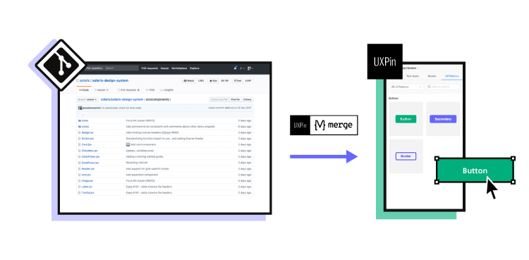
Using Device Orientation Hooks with UXPin

UXPin’s code-powered prototyping takes your design workflow to the next level by allowing you to integrate device orientation hooks directly into your projects. By embedding custom React components that leverage orientation data, you can create interactive designs that closely mimic the final product. This approach also simplifies collaboration between designers and developers. Below is an example of how to implement a custom useDeviceOrientation hook in a UXPin-compatible component.
Code-Backed Prototypes in UXPin
Here’s how you can use the useDeviceOrientation hook within a UXPin component:
import { useState, useEffect } from "react"; function useDeviceOrientation() { const [orientation, setOrientation] = useState({ alpha: null, beta: null, gamma: null, unsupported: false }); useEffect(() => { if (!window.DeviceOrientationEvent) { setOrientation((prev) => ({ ...prev, unsupported: true })); return; } const handleOrientation = (event) => { setOrientation({ alpha: event.alpha, beta: event.beta, gamma: event.gamma, unsupported: false }); }; window.addEventListener("deviceorientation", handleOrientation); return () => window.removeEventListener("deviceorientation", handleOrientation); }, []); return orientation; } // Usage in a UXPin component function OrientationDisplay() { const { alpha, beta, gamma, unsupported } = useDeviceOrientation(); if (unsupported) return <div>Device orientation not supported.</div>; return ( <div> <p>Alpha: {alpha?.toLocaleString("en-US", { maximumFractionDigits: 2 })}°</p> <p>Beta: {beta?.toLocaleString("en-US", { maximumFractionDigits: 2 })}°</p> <p>Gamma: {gamma?.toLocaleString("en-US", { maximumFractionDigits: 2 })}°</p> </div> ); } This component can be imported into UXPin as a custom code component, enabling your team to design with the exact components that will be used in production. Brian Demchak, Sr. UX Designer at AAA Digital & Creative Services, underscores the value of this approach:
"As a full stack design team, UXPin Merge is our primary tool when designing user experiences. We have fully integrated our custom-built React Design System and can design with our coded components. It has increased our productivity, quality, and consistency, streamlining our testing of layouts and the developer handoff process."
Real-Time User Interactions
UXPin goes beyond static prototypes by supporting real-time interactions powered by device orientation data. This means you can design prototypes that respond dynamically to device movements, adding a layer of realism to your designs. For instance:
- Rotate UI elements like compasses or steering wheels based on device tilt.
- Trigger animations when the device is flipped.
- Automatically adjust layouts between portrait and landscape modes.
Imagine a mobile game prototype where orientation data controls a character’s movements or gameplay mechanics. Or a navigation app prototype that updates compass directions as users move their devices, offering immediate feedback that mirrors the real experience.
UXPin’s emphasis on "deeper interactions" allows you to create prototypes that behave like the actual product. This not only helps identify usability issues early but also ensures that features relying on orientation data function as expected before development begins. Benjamin Michel, UX Designer at Bottomline Technologies, shares his thoughts:
"I think UXPin is an underrated powerhouse of design and prototyping that allows complex applications to design low, medium, and high-fidelity designs to communicate complex interactions all in one place quickly and effectively."
Accessibility and US Localization
Once your interactive prototypes are in place, it’s essential to ensure they are accessible and properly localized for US users. Orientation data should be presented with clear labels and formatted according to US standards. For example:
- Use text descriptions to explain visual changes.
- Avoid relying solely on color or motion to convey information.
- Ensure orientation-based interactions aren’t the only way to access core functionality.
Testing your prototypes with screen readers and keyboard navigation can help verify compliance with accessibility guidelines like WCAG. Additionally, when working with orientation-related data, follow US conventions:
- Dates: MM/DD/YYYY format.
- Time: 12-hour AM/PM format.
- Temperature: Display in Fahrenheit.
- Measurements: Use imperial units (feet, inches).
UXPin’s real-time preview and collaboration tools make it easier to test and refine these interactions across devices. This process helps teams gather feedback, iterate quickly, and meet accessibility standards before moving to development. David Snodgrass, Design Leader, highlights the collaborative advantages:
"The deeper interactions, the removal of artboard clutter creates a better focus on interaction rather than single screen visual interaction, a real and true UX platform that also eliminates so many handoff headaches."
Key Takeaways
Main Benefits Summary
React Hooks simplify managing device orientation. With custom hooks like useDeviceOrientation, you can bundle event listener setup, state management, and cleanup into a single, reusable function. This means you only need to write the orientation logic once and can apply it across multiple components effortlessly.
Orientation data plays a key role in creating dynamic, real-time updates for apps like navigation tools, games, and image galleries. These features respond intuitively to device movements, such as adjusting compass directions or controlling game characters based on the device’s tilt.
Properly encapsulating the logic also helps prevent memory leaks and ensures your app gracefully handles unsupported devices. This keeps your app reliable, even when running on devices that don’t support the DeviceOrientationEvent API.
Next Steps for Implementation
To take advantage of these benefits, start using the hook in your projects. Experiment with the provided useDeviceOrientation examples and test their performance in various environments. Pay special attention to compatibility with iOS devices, proper permission handling, and support for older Android browsers.
You can also integrate custom hooks into UXPin prototypes to test orientation-dependent features. Since UXPin supports custom React components, this allows you to simulate how your app will behave in real-world scenarios.
When implementing orientation features, focus on cases where they genuinely improve the user experience. Examples include adaptive layouts for portrait and landscape orientations, interactive gaming elements, or navigation tools that respond to device movements. Avoid adding orientation functionality just because it’s technically possible – make sure it addresses real user needs and adds meaningful value.
Lastly, prioritize accessibility and US localization. Provide alternative navigation options, format displays according to US standards, and test with screen readers and keyboard navigation. Avoid relying solely on orientation-based interactions for critical features. Tailor your implementation to your project’s specific requirements, as discussed earlier.
FAQs
How do I request and handle permission for device orientation data on iOS?
To access device orientation data on iOS, you must first get the user’s permission. This is because iOS requires explicit consent to use motion and orientation sensors. To do this, you can use the DeviceMotionEvent or DeviceOrientationEvent APIs and check if permission is needed by calling DeviceMotionEvent.requestPermission() or DeviceOrientationEvent.requestPermission().
If permission is required, prompt the user by invoking these methods and handle their response appropriately. For instance, if the user grants access, you can start listening for orientation changes using event listeners like this:
window.addEventListener('deviceorientation', callback); However, if the user denies access, your application should handle this gracefully. Consider offering fallback functionality or informing the user about the limitation to ensure a smooth experience.
What are the benefits of using a custom React hook like useDeviceOrientation instead of a third-party library for handling device orientation?
Using a custom hook like useDeviceOrientation comes with several perks compared to relying on third-party libraries. For starters, it allows you to fine-tune the functionality to match your application’s specific requirements. By crafting a solution tailored to your needs, you can avoid unnecessary features and keep your codebase cleaner and more efficient.
Another advantage is that custom hooks are lightweight. They eliminate the need for extra dependencies, which means a smaller app bundle size. A leaner bundle can boost performance and reduce the hassle of dealing with potential compatibility issues when third-party libraries are updated.
Lastly, creating your own hook enhances your understanding of React and browser APIs, such as window and DeviceOrientationEvent. This deeper knowledge can be a game-changer when it comes to debugging or expanding your app’s functionality down the line.
How can I make my app handle unsupported devices when using the DeviceOrientationEvent API?
To make sure your app handles unsupported devices smoothly, begin by verifying if the DeviceOrientationEvent API is accessible in the user’s browser. A quick check like if (window.DeviceOrientationEvent) can help you determine availability before diving into any functionality. If the API isn’t supported, consider providing a fallback option – this could be as simple as showing a message to the user or offering an alternate way to interact with your app.
It’s also a good idea to test your app across a range of devices and browsers. This proactive step helps spot compatibility issues early, ensuring your app delivers a consistent experience, even when certain features aren’t available.


![Responsive Design: Best Practices Guide [2025]](https://studio.uxpincdn.com/studio/wp-content/uploads/2022/01/Responsive-design-best-practices.png)