Andrew is the CEO of UXPin, leading its product vision for design-to-code workflows used by product and engineering teams worldwide. He writes about responsive design, design systems, and prototyping with real components to help teams ship consistent, performant interfaces faster.
React can help you build accessible components for users relying on screen readers like JAWS, NVDA, and VoiceOver. Accessibility isn’t just a legal requirement under the ADA and Section 508 – it also improves usability, reduces support costs, and broadens your audience. By following WCAG 2.1 Level AA guidelines, you ensure your app works for everyone.
Here’s what you need to know:
Semantic HTML: Use native elements (<button>, <nav>, <header>) whenever possible. They come with built-in roles and behavior that assistive technologies recognize.
WAI-ARIA: Use ARIA roles and attributes (role, aria-expanded, aria-label) to enhance custom components. Avoid overusing ARIA – it can confuse screen readers if misapplied.
Focus Management: Handle focus shifts programmatically when showing modals, dropdowns, or dynamic content. Use useRef and useEffect to manage focus transitions smoothly.
State Updates: Bind ARIA attributes like aria-expanded or aria-live to React state to keep users informed of changes.
Testing: Regularly test your components with screen readers and tools like eslint-plugin-jsx-a11y to catch issues early.
Accessibility isn’t just about compliance – it’s about creating better experiences for everyone. Start small by auditing one component at a time, prioritizing semantic HTML, and testing thoroughly.
5 Essential Steps to Build Accessible React Components with WCAG 2.1 AA Compliance
"How to Build Accessible React Components" by Catherine Johnson at #RemixConf 2023 💿
Building Accessible React Components with WAI-ARIA
WAI-ARIA (Web Accessibility Initiative – Accessible Rich Internet Applications) is a W3C specification that provides roles, states, and properties to improve how assistive technologies interact with web applications. One key principle of WAI-ARIA is: "No ARIA is better than bad ARIA." This means that improperly used ARIA roles or states can mislead screen readers, such as labeling a clickable <div> as a button without proper keyboard functionality. To avoid these issues, developers should prioritize semantic HTML and only use ARIA when native elements can’t achieve the desired behavior or structure.
The U.S. CDC reports that 1 in 4 adults in the United States has a disability, many of whom rely on assistive technologies like screen readers. This highlights the ethical and legal importance of designing accessible interfaces. ARIA becomes especially useful when building custom components from elements like <div> or <span> or creating complex widgets such as menus, tabs, and dialogs. It bridges the gap between native HTML semantics and the requirements of assistive technologies.
Using ARIA Roles in React
ARIA roles define what a component is for assistive technologies. React supports ARIA attributes directly through JSX, allowing you to use properties like role, aria-expanded, and aria-label seamlessly. For example, if you’re building a custom button using <div> or <span>, you can add role="button", tabIndex={0}, and handle both onClick and keyboard events (e.g., Enter and Space) for proper functionality.
For more complex widgets like menus, assign role="menu" to the container and role="menuitem" (or menuitemcheckbox/menuitemradio) to the items. Implement arrow-key navigation in React since ARIA does not include built-in behavior for these roles. Similarly, for dialogs, use role="dialog" on the modal wrapper, pair it with aria-modal="true", and manage focus within the dialog until it is closed. Always ensure that the ARIA role reflects the component’s actual behavior.
Communicating Interactive States with ARIA Properties
ARIA roles work best when paired with properties that communicate state changes. Binding ARIA attributes like aria-expanded or aria-pressed to component state ensures that updates are reflected in the UI immediately. For example, a toggle button should use aria-pressed={isOn} to indicate its state, while elements like accordions or dropdowns should use aria-expanded={isOpen} and aria-controls to link to the relevant content.
When state changes, React automatically updates attributes like aria-expanded, enabling screen readers to announce whether a section is "expanded" or "collapsed." In selection-based widgets like tabs or listboxes, use aria-selected to indicate the active option. For tabs, each element should have role="tab" with the appropriate aria-selected value. The active tab should also have tabIndex={0}, while inactive tabs use tabIndex={-1}.
For custom widgets that don’t support native disabled attributes, use aria-disabled="true". However, keep in mind that aria-disabled won’t block interactions, so you must prevent clicks and key events in your code.
For dynamic updates, use aria-live regions to notify screen readers of changes. For example, aria-live="polite" informs users of non-urgent updates like form errors, while aria-live="assertive" is reserved for critical messages. Be cautious not to overwhelm users with frequent or unnecessary announcements.
Finally, always test your ARIA implementations with screen readers like NVDA or VoiceOver. Tools like eslint-plugin-jsx-a11y can also help identify accessibility issues in your code. Regular testing ensures that your components function as intended for all users.
Using Semantic HTML with React
Using semantic HTML is a smart way to make your React applications more accessible. Elements like <button>, <header>, <nav>, and <main> naturally convey structure and meaning, which helps screen readers interpret roles, states, and relationships. Since React’s JSX compiles to standard HTML, incorporating these elements directly into your components ensures accessibility without requiring additional ARIA attributes. This builds on the foundational accessibility principles discussed earlier.
Relying too much on <div> and <span> for interactive elements can create problems for assistive technologies. These generic tags lack inherent roles, which means developers often have to manually add ARIA attributes to make them usable. This can lead to a "div soup", where screen reader users are forced to navigate linearly through a page without clear headings or landmarks. This slows down their experience and makes navigation more cumbersome.
Using Native HTML Elements for Accessibility
React developers should always lean toward native interactive elements because they come with built-in keyboard navigation, activation behaviors, and screen reader support. For example, a button implemented like this:
<button type="button" onClick={handleSave}> Save changes </button>
is automatically focusable, keyboard accessible, and correctly announced by screen readers. In contrast, using a <div> for the same purpose:
<div onClick={handleSave}> Save changes </div>
requires extra work, including adding attributes like role="button", tabIndex="0", and custom keyboard handlers. Even with these additions, the experience often falls short of what native elements provide.
For navigation, always use an <a> element with an href attribute. This ensures screen readers can recognize links and provide navigation-specific shortcuts. When using tools like React Router, the <Link> component should render a proper <a> tag underneath. Similarly, it’s best to stick with standard form elements like <form>, <label>, <fieldset>, and <input>, as these come with built-in accessibility features. Avoid creating custom controls unless absolutely necessary.
When organizing content, opt for semantic tags over generic containers. This helps screen readers announce heading levels and structural regions accurately, making navigation smoother.
Structuring Pages with Landmarks
Landmarks are essential for creating a logical page structure. They act as shortcuts for screen readers, allowing users to quickly jump between key areas like navigation, main content, and footers. Semantic elements naturally align with these roles: <nav> marks navigation areas, <main> identifies the primary content (used only once per page), and <header> and <footer> define banners and content sections.
In React, you can build layouts with these landmarks to enhance accessibility:
For pages with multiple navigation areas, use descriptive labels to differentiate them. For example, <nav aria-label="Primary"> can mark the main navigation, while <nav aria-label="Account"> can handle user-related links. Similarly, you can label sidebars or secondary sections with attributes like <aside aria-label="Filters"> or <section aria-labelledby="support-heading">. These labels help screen readers identify each area clearly.
You generally don’t need to add ARIA landmark roles (like role="main" or role="navigation") when using semantic elements – browsers already expose these roles to assistive technologies. Reserve ARIA roles for cases where semantic elements aren’t an option or when supporting very old browsers. The key takeaway is to prioritize native semantics and use ARIA sparingly to fill gaps. This approach complements the ARIA techniques we’ve previously discussed.
sbb-itb-f6354c6
Managing Focus and State in React
Ensuring accessible dynamic interfaces in React requires careful attention to focus and state management. Features like modals, dropdowns, and toasts can confuse screen reader users if focus isn’t properly controlled. When content appears or disappears, users relying on keyboards or assistive technologies need clear navigation paths to avoid losing their place. React provides tools to programmatically manage focus and announce state changes, making these dynamic updates more accessible.
Focus Management in Dynamic Interfaces
When opening a modal, focus should immediately shift to a relevant element inside it – usually a close button or a heading with tabIndex="-1". Before moving focus, store the currently focused element using document.activeElement in a ref. Once the modal closes, you can call .focus() on that stored element to return users to their previous position, preserving a logical navigation flow.
In React, useRef is particularly useful for holding references to DOM nodes. By combining it with a useEffect hook, you can programmatically call .focus() when a component mounts or updates. For example, when a dropdown menu opens, focus should move to the first item. When it closes, focus should return to the toggle button. This approach also applies to drawers, popovers, and other dynamic UI components.
For dropdowns and popovers, attaching onFocus and onBlur handlers to the parent element can help manage focus transitions smoothly. A handy technique is to delay closing the popover on onBlur using setTimeout and cancel the timeout in onFocus if focus shifts to another element inside the popover. This prevents accidental closures when users tab between items. React’s documentation includes an example that demonstrates these patterns effectively.
In single-page applications (SPAs), route changes don’t trigger full page reloads, which can leave screen readers unaware of new content. To address this, create a focusable main container – <main tabIndex="-1" ref={contentRef}> – and call contentRef.current.focus() whenever the route changes. This action moves the virtual cursor to the top of the new content, mimicking the behavior of a traditional page load and ensuring screen readers announce the updated page.
These focus management strategies lay the groundwork for effectively using ARIA live regions to communicate real-time state changes.
Using ARIA States for Dynamic Components
ARIA live regions allow you to announce updates to screen readers without disrupting keyboard focus. For status updates, include a visually hidden <div aria-live="polite" aria-atomic="true">. Use aria-live="assertive" sparingly for urgent messages or errors. When the application state changes, update the text content of the live region via React state, prompting screen readers to read the update.
To reflect state changes in components, bind ARIA attributes to the component’s state. For example, a disclosure button controlling a collapsible panel should use aria-expanded={isOpen} and aria-controls="panel-id". When isOpen changes, React updates the attributes, and screen readers announce whether the panel is "expanded" or "collapsed." Similarly, a toggle button can use aria-pressed={isOn} to indicate its on/off state, while list items in a tablist or selectable list can use aria-selected={isSelected} to signal which item is active.
For form validation, keep the keyboard focus on the first invalid field and use an aria-live="assertive" or "polite" region to summarize errors. After form submission, calculate the errors, focus the first invalid input using a ref, and update the live region with a summary like "3 errors on this form. Name is required. Email must be a valid address." Each input should link to its error message via aria-describedby="field-error-id" and include aria-invalid="true" to indicate a problem.
Prototyping accessible components in UXPin brings focus management and ARIA states into the design process from the start. With UXPin’s code-backed prototyping, you can create interactive React prototypes using both built-in and custom component libraries that include WAI-ARIA attributes. This setup lets you test ARIA roles and states directly in your prototypes, ensuring that the semantic structure and focus management behave as they would in a live application. By aligning with the ARIA techniques and focus strategies previously discussed, this method makes accessibility testing an integral part of the design workflow. According to case studies, teams using UXPin’s accessible libraries achieve WCAG 2.1 AA compliance three times faster, with screen reader errors in prototypes dropping by 70%.
Using Built-in React Libraries in UXPin
UXPin offers built-in React libraries like MUI (Material-UI), Tailwind UI, and Ant Design, which are designed with native support for ARIA roles, semantic HTML landmarks, and keyboard navigation. These pre-built components are tested with screen readers like NVDA and VoiceOver, minimizing the need for additional accessibility coding. For example:
MUI: Components like Button and TextField automatically apply ARIA attributes and focus states, enabling prototypes to announce statuses such as "required field" or "invalid entry" to screen readers.
Ant Design: Table and List components support ARIA roles, announce dynamic states, and provide robust keyboard navigation.
Tailwind UI: The Modal component comes pre-configured with attributes like role="dialog", aria-modal="true", and aria-labelledby. It also uses useRef for focus management, allowing screen readers to announce states like "Dialog, submit or cancel."
These libraries simplify accessibility features, while custom components allow for more tailored experiences.
Creating Custom Accessible React Components
UXPin also enables you to import custom React components by syncing your Git repositories. You can add ARIA attributes like aria-expanded or aria-live to these components to clearly communicate interactive states. For instance, a custom toggle component using aria-pressed={isToggled} ensures that screen readers announce state changes in real time, continuing the accessibility principles discussed earlier.
Additionally, UXPin’s preview mode includes tools like screen reader simulation for NVDA and VoiceOver, keyboard-only navigation testing, and an ARIA inspector to verify that roles and states align with WAI-ARIA standards.
Brian Demchak, Sr. UX Designer at AAA Digital & Creative Services, highlights the value of UXPin Merge:
"As a full stack design team, UXPin Merge is our primary tool when designing user experiences. We have fully integrated our custom-built React Design System and can design with our coded components. It has increased our productivity, quality, and consistency, streamlining our testing of layouts and the developer handoff process."
Conclusion
This guide has walked through the key steps to make your React components more accessible and user-friendly. Now it’s time to put these strategies into practice.
By focusing on accessibility, you’re not just meeting compliance standards – you’re creating better experiences for everyone. Using tools like semantic HTML, WAI-ARIA, and proper focus management ensures your React apps work seamlessly with assistive technologies like NVDA and VoiceOver, preventing the need for costly fixes down the line.
Start small: audit one component per sprint. Add semantic landmarks, refine keyboard navigation, and restore focus properly in modals. Avoid relying too heavily on custom elements without ARIA support, and don’t skip keyboard testing – it’s essential for ensuring usability.
Tools like UXPin make this process smoother by allowing you to prototype and test accessibility features early on. Validate ARIA roles, focus order, and landmarks before development even begins, turning accessibility into a core part of your design workflow.
FAQs
How do I make my React components accessible for screen readers?
To ensure your React components are accessible to screen readers, start by using semantic HTML elements – for example, opt for <button> or <header> instead of generic tags like <div> or <span>. These elements inherently provide meaning and structure, making it easier for assistive technologies to interpret your content.
When necessary, you can enhance accessibility by adding ARIA attributes such as aria-label or aria-hidden, or assigning specific roles. Use these sparingly and only when semantic HTML alone doesn’t convey the required context or functionality.
It’s also essential to test your components with screen readers to confirm they offer clear and intuitive navigation. Pay close attention to focus management, ensuring users can seamlessly interact with your interface using a keyboard or other assistive tools. By adhering to these practices, you can create interfaces that are more inclusive and user-friendly for everyone.
What are the key best practices for using WAI-ARIA in React apps?
To make the most of WAI-ARIA in React applications, it’s important to assign the right roles to elements, use ARIA attributes to clearly indicate states (like expanded or selected), and ensure ARIA labels are updated dynamically to reflect any changes in the user interface. Managing focus effectively is also key to providing smooth navigation for users relying on screen readers.
It’s essential to test your app with screen readers regularly to confirm accessibility. Following the official WAI-ARIA guidelines will help ensure your application remains compatible with assistive technologies, creating a more inclusive experience for all users.
How can I handle focus and state updates in dynamic React components for better accessibility?
When working with dynamic React components, it’s crucial to prioritize accessibility. One effective approach is to manage focus by programmatically directing it to the relevant elements after updates. Additionally, implementing ARIA live regions ensures that screen readers can announce content changes, keeping users informed. Don’t forget to update ARIA attributes to accurately reflect any state changes. These practices ensure that screen readers provide users with a seamless and inclusive experience, especially when real-time updates occur in the interface.
React components simplify the design-to-code process by turning UI elements into reusable building blocks. This approach ensures that updates to a single component, such as a button, automatically reflect across all screens, reducing inconsistencies and saving time. Tools like UXPin Merge allow teams to design with real React components, creating prototypes that match production code. This method improves collaboration between designers and developers, speeds up workflows, and ensures smoother performance in dynamic applications like dashboards or forms.
Key Takeaways:
Consistency: Updates to components ripple across designs and code.
Efficiency: React’s virtual DOM improves performance by only re-rendering necessary elements.
Collaboration: Teams use the same components, reducing handoff issues.
MUI (Material-UI) is a powerhouse in the React ecosystem, with over 90,000 GitHub stars as of 2024. It brings Material Design to life with a collection of prebuilt React components – like buttons, dialogs, and data grids – designed to assist both designers and developers throughout the product development process. Let’s dive into how MUI’s performance and adaptability enhance collaborative design workflows.
Real-Time Sync Speed
MUI leverages React’s virtual DOM to optimize updates, ensuring only the necessary components are refreshed. This approach cuts down DOM manipulations by up to 58% and boosts Largest Contentful Paint (LCP) times by 67%. For example, live analytics dashboards built with MUI can refresh counters and charts instantly, delivering a smooth user experience even during real-time updates.
Collaboration Features
MUI’s modular architecture combined with React’s hot module reloading allows teams to collaborate seamlessly. Developers and designers can make changes simultaneously, with visual updates appearing in real time. By adopting a shared MUI-based design system, teams can ensure consistency across projects while reducing the need for repetitive handoffs between design and development.
Customization Made Simple
MUI’s robust theming system and sx prop make customization straightforward. Designers can define global styles – like colors and typography – or apply inline adjustments effortlessly. For instance, tweaking a button’s color with <Button sx={{ color: 'red' }} /> updates the prototype instantly. Unstyled components also offer flexibility for creating custom designs while maintaining accessibility, making it easy to align with unique brand guidelines.
MUI integrates seamlessly with UXPin, where it’s available as a built-in coded library. Designers can drag-and-drop production-ready components directly into their prototypes. UXPin’s AI Component Creator, powered by OpenAI or Claude models, can even generate fully functional layouts – like data tables or forms – based on text prompts. This tight integration ensures that design and production code remain in sync. As Larry Sawyer shared:
"When I used UXPin Merge, our engineering time was reduced by around 50%."
Prototypes built with UXPin can be exported as production-ready React code, complete with all dependencies, for immediate use in development.
Tailwind UI takes a utility-first approach to React components, offering a premium collection of fully responsive UI elements. Created by the team behind Tailwind CSS, this tool builds on the popularity of Tailwind CSS, which boasts over 80,000 stars on GitHub. Tailwind UI provides production-ready components designed to speed up design workflows and ensure responsive updates.
Real-Time Sync Speed
Tailwind UI components combine React’s virtual DOM with Tailwind’s Just-in-Time (JIT) compiler, which generates only the CSS classes your project actually uses. This method significantly reduces CSS bundle sizes – often from hundreds of kilobytes to under 10 KB in production. React apps using these components also see a 58% reduction in JavaScript bundle sizes and a 42% improvement in time-to-interactive performance. Adjusting utility classes like gap-6 to gap-8 or bg-blue-500 to bg-blue-700 provides instant visual updates without the need to rebuild stylesheets, making design tweaks seamless and efficient.
Collaboration Features
Unlike traditional component libraries, Tailwind UI offers React snippets that are fully editable instead of precompiled packages. This "own your UI" approach empowers teams to directly inspect and modify components, with styles clearly visible in JSX through utility classes like flex items-center space-x-4. This setup encourages collaboration between design and development teams, as adjustments can be made directly in the code rather than relying on abstract style guides or specifications.
Customization Ease
Tailwind UI’s utility-first philosophy simplifies customization. Instead of dealing with complex CSS overrides or theme providers, developers and designers can directly edit class names in React JSX. For instance, a button component like <button className="bg-blue-500 hover:bg-blue-700 text-white font-bold py-2 px-4 rounded">Submit</button> can be easily adjusted by modifying its utility classes. This approach not only speeds up prototyping but also helps teams deliver final products 30–50% faster by cutting down the time spent on cross-file styling adjustments.
Integration with UXPin’s AI Tools
Tailwind UI also enhances workflows through seamless integration with UXPin. Within UXPin, Tailwind UI is available as a built-in coded library, enabling designers to drag and drop production-ready components into interactive prototypes. UXPin’s AI Component Creator, powered by OpenAI or Claude models, can generate complete layouts – like dashboards or data tables – using Tailwind UI components from simple text prompts. Designers can then visually customize these components by tweaking properties, switching themes, or adding advanced interactions, all while keeping the React code intact.
Ant Design simplifies creating robust, real-time design workflows with its enterprise-grade React components, making it a go-to choice for data-heavy interfaces. Developed by Alibaba‘s Ant Group, this library has earned over 90,000 stars on GitHub and powers the interfaces of major companies managing millions of daily transactions. Its suite includes advanced data tables, forms, and charts, all optimized for real-time applications.
Real-Time Performance
Ant Design stands out for its speed and efficiency, thanks to React’s Virtual DOM and a carefully optimized component structure. In data-intensive environments, it achieves a 67% improvement in LCP (Largest Contentful Paint) and reduces bundle sizes by 40% through tree-shaking and streamlined imports. Data tables in the library excel at handling large datasets using virtualization, ensuring state updates propagate in under 100 ms. This level of performance is critical for dashboards managing live updates, whether it’s inventory, financial metrics, or user data. Such responsiveness ensures smooth operations and supports real-time team collaboration.
Collaboration-Friendly Design
Ant Design’s modular components establish a shared framework for designers and developers, promoting seamless collaboration. Teams can pair Ant Design with tools like Socket.io for real-time editing scenarios. For instance, shared form builders allow multiple users to make edits simultaneously, with updates syncing instantly via WebSockets. React’s efficient diffing algorithm ensures that these concurrent edits don’t cause unnecessary re-renders, keeping the interface responsive even during active teamwork.
Easy Customization
With the introduction of the Design Token System in version 5, Ant Design makes real-time theming a breeze. By wrapping your app with the ConfigProvider component, you can apply global themes, locale settings, and design tokens effortlessly. Adjustments, such as changing button colors or spacing, are reflected in under 50 milliseconds, eliminating the need to manage cumbersome CSS overrides. The built-in Theme Customizer tool lets designers preview changes live, with updates syncing across team members in under one second. Whether you prefer Less variables or CSS-in-JS, Ant Design offers flexible styling options that make collaborative design faster and more efficient.
Integration with UXPin’s AI Tools
Ant Design is seamlessly integrated into UXPin as a built-in coded library, enabling designers to drag and drop ready-to-use components directly into interactive prototypes. UXPin’s AI Component Creator further enhances this by generating complex layouts – like data tables or multi-step forms – using Ant Design components from simple text prompts. This integration drastically reduces feedback cycles, cutting them down from days to just hours.
Pros and Cons
MUI vs Tailwind UI vs Ant Design: React Component Library Comparison
React libraries bring a mix of advantages and challenges when it comes to real-time design workflows. Building on the technical details discussed earlier, let’s explore how React components simplify design-to-code processes and improve team collaboration.
Criterion
MUI
Tailwind UI
Ant Design
Real-Time Sync Speed
Fast updates with React’s Virtual DOM and Fiber scheduler; instant theme adjustments.
Excellent performance with hot reload; utility class edits reflect almost immediately.
Strong performance for data-heavy interfaces; optimized for efficient state handling.
Consistent component APIs create a shared language for designers and developers; works seamlessly with Storybook for component sharing.
Code-editable snippets enable direct collaboration, though maintaining consistent patterns requires discipline.
Modular framework supports concurrent editing, though extra configuration may be needed for localization.
Customization Ease
Powerful theme system with adjustable palette, typography, and spacing; quick styling via sx props.
Highly flexible atomic utility classes allow rapid experimentation, though improper abstraction can cause inconsistencies.
Design token system supports global theming through a configuration provider, but deep customization often requires additional setup.
All three libraries are integrated into UXPin, where the AI Component Creator builds interactive, code-backed layouts. This reduces feedback loops and speeds up prototyping.
Each library aligns with specific design priorities, depending on team needs and project goals:
MUI: Offers a strong mix of pre-built components and theming options, making it ideal for SaaS products with strict branding requirements.
Tailwind UI: Perfect for teams that prefer a utility-first approach, offering unmatched control over visuals and enabling quick layout adjustments.
Ant Design: Best suited for enterprise-level projects with data-heavy dashboards, though U.S. teams need to account for localized settings like currency symbols ($), date formats (MM/DD/YYYY), and measurement units (imperial).
These comparisons underscore how React libraries support faster design-to-code workflows while fostering collaboration tailored to various team structures and project demands.
Conclusion
React components serve as a crucial link between design concepts and production-ready code, transforming how teams approach real-time design workflows. When paired with UXPin, React libraries like MUI, Tailwind UI, and Ant Design become shared design systems that help designers and developers stay in sync throughout the product development process.
Choosing the right library can make a significant difference in tailoring the design process to your team’s unique needs. For smaller teams or startups, MUI and Tailwind UI in UXPin offer lightweight customization and pre-built responsive elements that speed up iteration with minimal setup. On the other hand, enterprise teams working on complex, data-heavy dashboards may find Ant Design’s scalable components to be a better fit. For real-time applications, such as analytics platforms or live data feeds, React’s virtual DOM ensures seamless updates. Companies like T. Rowe Price have seen their feedback cycles shrink from days to just hours, thanks to these tools and workflows.
Whether you import your own React component library or use one of UXPin’s built-in options, this approach ensures your prototypes match production code. By treating code as the single source of truth, you eliminate discrepancies between design specs and the final product. This alignment strengthens the shared design language that drives effective collaboration in real-time environments.
Teams leveraging UXPin Merge have reported measurable benefits, including cutting engineering hours by nearly 50% and reducing feedback cycles from days to hours.
FAQs
How do React components improve collaboration between designers and developers?
React components make teamwork more seamless by providing a shared set of reusable, code-based UI elements that both designers and developers can rely on. This shared foundation not only ensures design consistency but also minimizes mistakes during handoffs and accelerates the overall iteration process.
With React components, teams can align on both design and functionality from the start, making updates and feedback loops more straightforward. This method simplifies workflows and enhances communication across teams, resulting in a more efficient and cohesive product development process.
How does UXPin Merge enhance design workflows with React components?
UXPin Merge simplifies the design process by allowing teams to incorporate real React components directly into their workflows. This approach ensures that both designers and developers are working with the exact same code-based components, cutting down on inconsistencies and reducing errors during handoffs.
With Merge, you can build fully functional, interactive prototypes that mirror the finished product. This not only saves time but also enhances teamwork. By leveraging React components, teams can speed up development while ensuring a unified design system across all projects.
How do libraries like MUI and Tailwind UI enhance real-time design workflows?
Libraries such as MUI and Tailwind UI simplify the design process by providing ready-to-use, customizable UI components. These components not only save time but also help maintain a consistent design across projects. With these tools, designers can quickly build high-fidelity prototypes without spending extra effort on manual coding.
When combined with platforms like UXPin, which support code-backed components, these libraries make collaboration between designers and developers much more efficient. This synergy allows for quicker iterations and a seamless handoff from design to development.
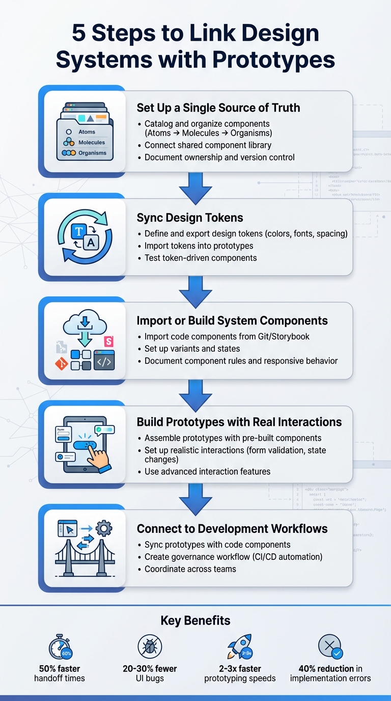
Prototypes often look polished but fail to match the final product. This misalignment wastes time, creates inconsistency, and frustrates teams. The solution? Directly connect your design system to your prototyping process. This ensures every prototype uses the same components, tokens, and patterns that developers build with – bridging the gap between design and production.
Here’s how to make it happen in five steps:
Centralize Components: Build a shared library of UI elements, organized with a clear structure.
Connect to Development: Link prototypes directly to production workflows for smoother handoffs.
This approach improves consistency, reduces rework, and speeds up collaboration between design and engineering teams. Tools like UXPin make it easier to integrate React components, test interactions, and ensure alignment from design to code.
Design System & Code Prototyping: Bridging UX Research and Engineering
Step 1: Set Up a Single Source of Truth for Components
To make sure your prototypes match production quality, start by building a unified component library. The goal here is to create a centralized library for all UI elements, patterns, and tokens. This approach eliminates the confusion caused by designers and developers using inconsistent versions of components – like buttons with slightly different padding or colors that don’t align with production code.
Catalog and Organize Components
Begin by conducting a UI inventory. Gather all the current UI elements from your products and design files. Look for duplicates, standardize naming conventions, and consolidate everything into a single, definitive version of each component. Organize these components using the Atomic Design methodology:
Atoms: Basic elements like buttons, icons, or input fields.
Molecules: Small combinations, such as a search field paired with a button.
Organisms: Larger, more complex sections like navigation headers.
This structure keeps your library easy to navigate and adaptable as your design system evolves.
Connect a Shared Component Library
Once your components are cataloged and organized, link the centralized library to your prototyping tool. For example, if you’re using UXPin, you can sync your React component library directly from your Git repository. This allows designers to seamlessly drag and drop production-ready components into their prototypes.
Brian Demchak, Sr. UX Designer at AAA Digital & Creative Services, shared, "We have fully integrated our custom-built React Design System and can design with our coded components. It has increased our productivity, quality, and consistency, streamlining our testing of layouts and the developer handoff process."
Document Ownership and Version Control
Clearly define ownership responsibilities for both visual and code components. Implement version control tools (such as Git with semantic versioning) and maintain detailed changelogs to track updates. This ensures everyone knows which version to use, how to update their work, and avoids the creation of outdated or "forked" components that deviate from the main library.
With your central library in place and well-managed, you’re ready to move on to syncing design tokens in the next step.
Step 2: Sync Design Tokens with Your Prototyping Tool
After setting up your component library, the next step is to integrate your design tokens. These tokens define the foundational design choices – like color codes, font families, spacing measurements, border radii, and elevation levels. Syncing them ensures that any updates to these elements in your design system automatically reflect across all prototypes and production components. Precision in defining these tokens is key to maintaining consistency.
Define and Export Design Tokens
Start by organizing your tokens into a clear structure that separates raw core values from their semantic roles. Core tokens include the basics – like specific hex colors, base font sizes, and spacing increments (measured in pixels). Semantic tokens, on the other hand, assign these core values to specific UX roles, such as color.button.primary.bg or typography.heading.h1. Save these tokens in formats like JSON or YAML, and use tools like Style Dictionary to export them into formats compatible with your prototyping tool. These formats might include CSS variables, JavaScript theme objects, or files tailored for design tools. Be sure to align tokens with locale-specific standards for seamless application.
Import Tokens into Prototypes
Once your tokens are exported, bring them into your prototyping tool. For example, in UXPin, you can link token values directly to component properties and styles by using variables or importing CSS with custom properties. Stick to referencing named tokens – this way, if you update a token like color.primary.500, every button, link, or icon using that token will automatically reflect the change. If your components are code-backed and synced from a Git repository, React components can also utilize the same token definitions – whether through CSS variables, design system packages, or theme objects – ensuring consistency between design and production.
Test Token-Driven Components
Before applying tokens across all screens, test them on a dedicated page with key components like buttons, text styles, inputs, cards, and navigation. Make controlled changes to tokens – such as tweaking the primary color, increasing the base font size, or adjusting the spacing scale – and check if the updates propagate correctly. Once you’re confident in the results, you can extend token usage across the entire system without hesitation.
Step 3: Import or Build System Components in Your Prototyping Tool
Now that you’ve set up synced tokens and a centralized component library, it’s time to bring production components into your prototyping tool. You have two main options: import existing code components from your production library or recreate components using the native features of your prototyping tool. The best approach depends on your team’s workflow and where your design system is maintained.
Import Code Components
If your team has a React component library stored in a Git repository or a tool like Storybook, importing those components directly into your prototyping tool ensures tight alignment between design and code. For example, UXPin allows you to connect your Git repository, enabling designers to use React components as native building blocks. However, engineering must ensure these components are cleanly structured and free from app-specific logic. Props should manage variants and content instead of relying on hard-coded states.
By using production-ready components, designers can eliminate inconsistencies between prototypes and final products. This approach enhances efficiency, quality, and consistency while making the developer handoff smoother.
Once components are imported, validate them on a test page. Check props, sizes, variants, and states against your live environment or Storybook. Pay close attention to spacing, typography, and theming to ensure everything matches. Any discrepancies should be logged as tickets for engineering to refine the shared library. After validation, configure variants and behaviors to replicate production interactions as closely as possible.
Set Up Variants and States
Define component variants and interactive states in a way that aligns with your codebase. Use a consistent schema that mirrors the structure of your code props. For instance, a button might include properties like variant=primary/secondary/ghost, size=sm/md/lg, and state=default/hover/focus/pressed/disabled/loading. This shared structure ensures designers and developers are speaking the same language.
Set up interactive states using triggers and transitions within your tool (e.g., hover transitions at 150–200ms or immediate feedback for pressed states). Don’t forget accessibility standards – ensure proper contrast ratios and keyboard focus behavior. If a component has numerous combinations, prioritize the most common ones and hide outdated or rarely used variants to keep things manageable for designers. Document these configurations to provide a clear reference for both design and development teams.
Document Component Rules and Responsive Behavior
Clearly document the rules for each component, including allowed content types, layout constraints, and responsive behavior at standard U.S. breakpoints (mobile: 320–414 px, tablet: 768–1,024 px, desktop: 1,280+ px). Specify interaction rules, such as which states are available and when to use them, and include accessibility guidelines like minimum 44×44 px touch targets and keyboard focus requirements.
To make this documentation easily accessible, embed it directly within your prototyping tool. Use annotation layers, dedicated usage pages, or description fields on components. This way, designers can find the information they need without searching through external wikis that may not always be up to date. Test responsive behavior by resizing frames to confirm proper wrapping, stacking, and readability. Treat your prototype as a living specification, combining interaction flows, visual details, and constraints into a single, cohesive artifact for developers to reference.
sbb-itb-f6354c6
Step 4: Build Prototypes with System Components and Real Interactions
Now that your components and tokens are synced and imported, it’s time to create realistic prototypes. This step transforms static designs into interactive experiences that mimic real-world functionality. These prototypes are invaluable for usability testing and gathering actionable feedback from stakeholders. By moving from static layouts to interactive prototypes, you’re preparing to validate user flows in the next phase.
Assemble Prototypes with Pre-Built Components
Start by using pre-built system components to construct screens and user flows. Instead of starting from scratch, leverage system-based templates for common layouts like login pages, dashboards, or checkout processes. These templates ensure consistency and save time by adhering to production rules for spacing, typography, and component variants.
Using system components not only speeds up the process but also guarantees uniformity across your prototypes. Build complete user journeys that include all possible scenarios – entry points, success paths, error handling, and exit flows. This approach ensures you’re testing the entire experience, not just isolated screens. By snapping components together, you can maintain consistent layouts and responsive behavior across devices, whether it’s mobile (320–414 px), tablet (768–1,024 px), or desktop (1,280+ px).
Set Up Realistic Interactions
Next, bring your prototypes to life by setting up conditional logic and event-driven behaviors. For example, configure if-then rules to simulate real app functionality: show an error message for invalid form inputs or switch a button to a loading state when clicked. In a shopping cart prototype, adding items should dynamically update the total price and item count, just as it would in the final product.
Implement form validation by defining rules for required fields, email formats, and input masks. Add visual feedback like red borders or error messages when users make mistakes. Include system feedback such as loading spinners, success notifications, error banners, and disabled states to mimic server responses or processing delays.
For interactive elements like toggles, accordions, tabs, and checkboxes, model event-driven state changes. For instance, when a user toggles a switch, the component should immediately reflect the new state. Use hover, focus, pressed, and disabled states to replicate real-world behavior. These realistic interactions help identify usability issues and validate user flows before any code is written.
With UXPin’s code-backed prototyping, you can use real React components from your design system. These components retain the same props, states, and logic as their production counterparts. For example, a modal with backdrop click-to-close functionality or ESC key handling will behave exactly as it does in the final app. This eliminates discrepancies and allows for precise testing and refinement.
Leverage variables in UXPin to store user inputs and drive conditional flows. Use if/else logic to branch interactions based on variable values, validations, or prior user actions.
"The deeper interactions, the removal of artboard clutter creates a better focus on interaction rather than single screen visual interaction, a real and true UX platform that also eliminates so many handoff headaches." – David Snodgrass, Design Leader
Connect data collections to your prototype elements to simulate real content, pagination, and filtering. For example, a dashboard prototype can dynamically update charts based on filtered data, or a form can process inputs to generate personalized outputs. This capability allows you to test edge cases like empty states, loading indicators, and error conditions with realistic data flows. These features make your prototypes more reliable for usability testing and stakeholder feedback.
Step 5: Connect Prototypes to Development Workflows
This step bridges the gap between design and implementation. Once your prototypes are built with system components and realistic interactions, it’s crucial to establish a workflow that keeps design, prototypes, and production code aligned. This approach minimizes rework and ensures what you design is exactly what gets developed.
Sync Prototypes with Code Components
Linking prototypes directly to production code is a game-changer. Tools like UXPin allow you to import React component libraries straight into your design environment. This means the components you use for prototyping are the same ones developers will implement, making the code the single source of truth. This eliminates common issues like visual or functional mismatches during handoff.
For example, if you update a primary color from #007BFF to #0066CC in your token source, the change automatically reflects across both prototypes and production. This kind of automation drastically reduces manual errors and can cut update times from days to just hours.
Brian Demchak, Sr. UX Designer at AAA Digital & Creative Services, shared his experience: "As a full stack design team, UXPin Merge is our primary tool when designing user experiences. We have fully integrated our custom-built React Design System and can design with our coded components. It has increased our productivity, quality, and consistency, streamlining our testing of layouts and the developer handoff process."
Create a Governance Workflow
A consistent process for managing component updates is essential to maintain synchronization across your workflow. Start by centralizing component ownership in a shared repository, like Storybook or UXPin libraries. Use semantic versioning (MAJOR.MINOR.PATCH format) to track changes systematically. Any updates to components should go through pull requests with peer reviews before being merged.
Automate the syncing process with CI/CD pipelines. For instance, when a component update is committed, tools like GitHub Actions can automatically import it into UXPin. This ensures prototypes remain current without requiring manual updates. Regular audits – monthly or quarterly – can help catch any discrepancies between design, prototypes, and production. Teams using this approach have reported cutting implementation errors by up to 40% and reducing prototype-to-production updates to within 24 hours.
Coordinate Across Teams
Once you’ve established a smooth update process, it’s equally important to align team communication. Use shared tools and regular check-ins to ensure everyone stays on the same page. For example, UXPin can handle prototypes, while Storybook serves as the source for component documentation, giving both designers and developers access to the same resources. Weekly meetings can help teams review updates, address challenges, and prioritize tasks.
Encourage feedback loops by leveraging tools like UXPin’s commenting features, where stakeholders can provide input directly on prototypes.
Mark Figueiredo, Sr. UX Team Lead at T. Rowe Price, highlighted the benefits: "What used to take days to gather feedback now takes hours. Add in the time we’ve saved from not emailing back-and-forth and manually redlining, and we’ve probably shaved months off timelines."
The results speak for themselves: teams report 50% faster handoff times, 20-30% fewer UI bugs due to token consistency, and prototyping speeds that are 2-3 times faster when using integrated design systems. By connecting prototypes directly to development workflows, you create a seamless process from concept to code.
Conclusion
Connecting design systems with prototypes bridges the gap between design and code. By following five straightforward steps, teams can establish a seamless workflow that aligns design with production.
This method offers clear, measurable benefits: smoother handoffs, consistent user interfaces, and quicker prototyping cycles. Reusing established components reduces unnecessary rework and design debt, while giving developers precise specifications to minimize implementation errors.
It’s a practical approach that builds on the concepts discussed earlier. By using shared components, teams across different platforms and time zones in the U.S. can work more efficiently and adapt quickly to changes.
Start by auditing your UI patterns and identifying essential design tokens. Test this process on a single feature to ensure it works for your team. Tools like UXPin make it easier to create prototypes directly from React component libraries, ensuring that your designs are closely aligned with the final product. Linking design systems with prototypes enhances consistency, speeds up workflows, and fosters better collaboration.
FAQs
Why is syncing design tokens important for consistent prototypes?
Keeping design tokens in sync ensures that elements like colors, typography, and spacing stay consistent across all prototypes. This consistency minimizes visual mismatches, streamlines the user experience, and cuts down on time spent making repetitive manual tweaks. With a unified style in place, teams can dedicate their energy to fine-tuning designs and delivering polished, high-quality results.
What are the advantages of using production-ready components in prototypes?
Using production-ready components in prototypes offers several important benefits. First, they enable the creation of high-fidelity prototypes that closely resemble the final product. This makes it much easier to test designs and gather meaningful feedback. Additionally, these components simplify workflows by minimizing handoff errors and providing developers with exportable React code that’s ready to implement.
How does connecting prototypes to development workflows improve teamwork?
Creating a direct link between prototypes and development workflows encourages stronger collaboration by providing a common ground for designers and developers. By working with the same components and code, teams can reduce miscommunication, streamline feedback, and make the handoff process much smoother. This approach not only saves time but also boosts overall workflow efficiency.
Screen readers are vital tools for millions of users with vision disabilities, helping them navigate digital content. However, even small issues in your code can create major accessibility barriers. This guide simplifies the process of identifying and fixing screen reader problems, ensuring your website or app works seamlessly for all users.
Key Takeaways:
Start with proper tools: Use screen readers like NVDA, JAWS, VoiceOver, and TalkBack on their respective platforms.
Test systematically: Combine keyboard navigation, screen reader testing, and developer tools to identify issues.
Common fixes include: Adding proper labels, managing focus, and ensuring dynamic content is announced correctly.
Document thoroughly: Record clear steps, expected behavior, and actual output for every bug.
Maintain accessibility: Use automated tools (like axe-core) in your CI/CD pipelines and conduct regular manual audits.
Fixing screen reader issues isn’t just about compliance – it’s about creating a better experience for users who rely on assistive technologies. Start with these steps to make your content accessible and user-friendly.
How to Check Web Accessibility with a Screen Reader and Keyboard
Record details like your operating system, browser version, screen reader/version, and key settings. This helps pinpoint whether an issue stems from your code, the browser, or the screen reader itself.
Choosing Screen Readers and Platforms
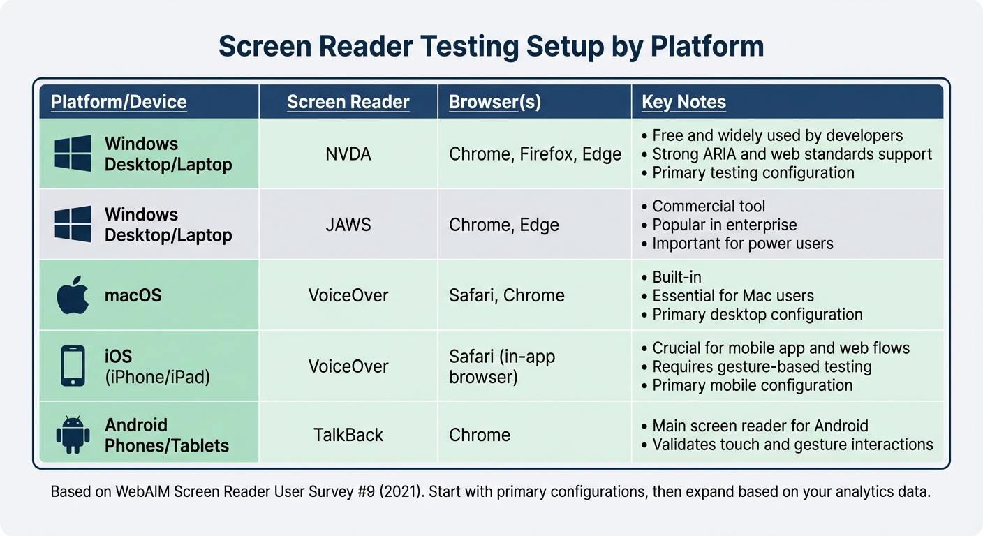
For testing in the US, focus on NVDA and JAWS for Windows, VoiceOver for macOS and iOS, and TalkBack for Android. According to WebAIM‘s Screen Reader User Survey #9 (2021), these are the most widely used screen readers, with NVDA and JAWS leading on Windows and VoiceOver dominating Apple platforms. The survey also revealed that most users combine Windows with Chrome or Firefox, making Windows + Chrome/Firefox + NVDA a key testing setup.
Start with NVDA + Chrome on Windows and VoiceOver + Safari on macOS as your primary desktop configurations. For mobile, prioritize VoiceOver + Safari on iOS and TalkBack + Chrome on Android. If analytics show most of your traffic comes from Windows/Chrome, begin testing there before expanding to other setups.
Platform / Device
Recommended Screen Reader
Typical Browser(s)
Notes
Windows desktop/laptop
NVDA
Chrome, Firefox, Edge
Free and widely used by developers; strong ARIA and web standards support
Windows desktop/laptop
JAWS
Chrome, Edge
Commercial tool, popular in enterprise; important for many power users
macOS
VoiceOver
Safari, Chrome
Built-in; essential for testing Mac users
iOS (iPhone/iPad)
VoiceOver
Safari (in-app browser)
Crucial for mobile app and web flows; requires gesture-based testing
Android phones/tablets
TalkBack
Chrome
Main screen reader for Android; validates touch and gesture interactions
Once you’ve established your screen reader and platform combinations, set up browsers and developer tools to inspect the accessibility tree.
Setting Up Browsers and Developer Tools
Browser tools let you examine the accessibility tree – what the screen reader interprets – before you activate assistive technology. In Chrome DevTools, go to the Elements panel, select an element, and switch to the Accessibility tab. Here, you can check the element’s accessible name, role, states, and ARIA attributes. Compare these details with the screen reader’s output to identify discrepancies.
In Firefox, use the Accessibility Inspector to view a tree of accessible objects, landmarks, and focus order. For Safari on macOS, enable "Show Web Inspector" in preferences. Inspect elements while running VoiceOver to confirm that roles and labels match VoiceOver’s output. Also, test keyboard navigation (Tab, Shift+Tab, arrow keys) with the screen reader enabled, as focus behavior can vary across browsers.
Enabling Logs and Speech Viewers
Logs and speech viewers capture screen reader output, helping you match spoken announcements with your code. In NVDA, activate the Speech Viewer from the NVDA menu to display announcements in a text window. Enable logging via NVDA menu → Tools → Log Viewer to record detailed events. These logs are invaluable for debugging and reporting issues.
For VoiceOver on macOS, use the VoiceOver Utility to enable logging options. This is especially useful for analyzing how VoiceOver handles complex ARIA widgets. Keep the browser console open alongside these tools to monitor JavaScript errors, ARIA warnings, and messages from accessibility libraries like axe-core. Comparing logs with your HTML and ARIA in DevTools can help you pinpoint whether the issue lies in your markup, the browser’s accessibility tree, or the screen reader’s interpretation.
Reproducing and Documenting Issues
Once your testing environment is set up, you’ll need a clear, systematic approach to reproduce and document screen reader issues. Without detailed reproduction steps and thorough documentation, bugs can become tricky to identify and fix. Before jumping into debugging, ensure that the issue can be consistently reproduced using written steps.
Defining User Tasks and Expected Results
When documenting bugs, think in terms of user tasks rather than isolated UI problems. For example, instead of stating "Submit button has wrong role", describe the issue as part of a broader task like "Complete and submit the checkout form." Define success criteria for each task based on WCAG guidelines.
For instance, in a form submission task, success criteria could include:
Each field announces a meaningful label, its role (e.g., "edit"), state (e.g., required or invalid), and any instructions.
Error messages are programmatically linked to fields and announced when focus lands on the field.
For a modal dialog task, success criteria might include:
Focus moves inside the dialog when it opens.
Tab and Shift+Tab navigation stays within the dialog.
The screen reader announces the dialog’s title and purpose.
Closing the dialog returns focus to the triggering element.
Document each bug using this format: Task → Precondition → Steps → Expected behavior (with WCAG references) → Actual behavior. Then, use a keyboard and screen reader to perform these tasks and capture real-time behavior.
Testing with Keyboard and Screen Readers
Start by confirming that keyboard navigation works as expected. Once that’s verified, enable your screen reader (such as NVDA, JAWS, or VoiceOver) and repeat the task, recording key announcements from the screen reader. For example, when interacting with a modal, encountering a validation error, or expanding an accordion, note the exact output.
Pay close attention to:
Missing or incorrect labels (e.g., "edit, blank" instead of "Email address, edit").
Incorrect or missing roles and states (e.g., checkboxes failing to announce whether they’re checked or unchecked).
Dynamic updates that aren’t announced (e.g., inline validation messages or toast notifications).
Compare the screen reader’s output with the accessibility tree in your developer tools. If the tree lacks a name or has an incorrect role, the issue likely originates in the code rather than the screen reader itself.
Recording and Prioritizing Issues
Once you’ve reproduced an issue, document it thoroughly using a structured bug report template:
Title: Include the component and assistive technology (e.g., "Modal close button not announced – NVDA + Chrome").
Environment: Specify the operating system, browser (and version), screen reader (and version), and any non-default settings.
Reproduction Steps: Detail the starting URL, initial focus point, keys pressed in order, and any special conditions.
Expected vs. Actual Behavior: Outline what should happen (e.g., announcements, focus behavior) based on WCAG and ARIA guidelines, and contrast this with the actual screen reader output and focus behavior.
Impact: Describe how the issue affects task completion (e.g., "User cannot identify which field has an error, making the form unusable for screen reader users"). Include the relevant WCAG reference and severity (e.g., "WCAG 2.1 Level A, 4.1.2 Name, Role, Value – Blocker").
Supporting Artifacts: Attach screen recordings with audio, screenshots showing visible focus, and excerpts from the Accessibility Tree.
Focus on resolving blockers first – issues that completely prevent users from completing tasks with a screen reader or keyboard alone. After that, address problems that cause confusion or misleading behavior, such as incorrect announcements or erratic focus movements.
sbb-itb-f6354c6
Fixing Common Screen Reader Problems
To tackle screen reader issues effectively, focus on three common problem areas: missing or incorrect labels, focus and navigation issues, and unannounced dynamic content. Let’s dive into the fixes for each.
Fixing Missing or Incorrect Labels
Start by using the Accessibility pane in DevTools to check the accessible names of all interactive elements. These names are what screen readers announce to users. If a name is missing, generic (e.g., "button" with no context), or doesn’t align with what sighted users see, you’ve got a labeling issue.
Form fields: Always associate form fields with visible labels. If that’s not possible, use aria-label as a fallback. For instance:
Here, the aria-hidden="true" ensures the screen reader skips unnecessary icon details.
Images: Use meaningful alt text for images that convey information (e.g., alt="Bar chart showing 40% increase in sales") and alt="" for decorative images so they’re ignored by screen readers.
Tools like Lighthouse or axe can help identify unlabeled controls quickly, but always verify fixes manually with screen readers like NVDA, JAWS, or VoiceOver to ensure they’re announced correctly in context.
Fixing Focus and Navigation Problems
First, test your page with a keyboard. Use Tab, Shift+Tab, arrow keys, and Enter/Space to navigate and interact with controls. Make sure the focus follows the visual order and doesn’t get lost.
DOM order: Check the DOM order in DevTools and remove any positive tabindex values (e.g., tabindex="1") that disrupt the natural focus sequence.
Use semantic HTML: Stick to elements like <button>, <a>, and <input> whenever possible. They’re inherently keyboard-accessible. Reserve tabindex="0" for custom widgets that need to be focusable and tabindex="-1" for programmatic focus without adding the element to the tab order.
Modals and overlays: Implement a focus trap to keep Tab and Shift+Tab cycling within the dialog while it’s open. Return focus to the triggering element when the dialog closes. Use aria-hidden="true" on background content to hide it from the accessibility tree while the modal is active. Ensure focus styles are visible – don’t use outline: none without providing a clear alternative.
Visually hidden but accessible elements: Use CSS clipping to hide elements that should still be accessible to screen readers. For elements that shouldn’t be reachable (like closed off-canvas menus), combine CSS hiding with ARIA attributes to remove them from the accessibility tree.
Announcing Dynamic Content Updates
To handle dynamic content effectively, ensure screen readers announce critical updates. Determine whether updates are critical (e.g., error messages or alerts) or informational, and use the appropriate ARIA attributes.
Low-urgency updates: Use aria-live="polite" or role="status" to announce updates without interrupting the user’s current task.
High-priority alerts: For urgent updates, such as error messages, use role="alert". This interrupts ongoing speech to deliver the message immediately.
When updating content, modify the text of an existing live region instead of creating and removing nodes repeatedly. Use aria-atomic="true" if you want the entire region announced rather than just the changed portion.
Form validation errors: Place an error summary at the top of the form within a role="alert" region and shift focus there on submit failure. Also, associate field-level errors with inputs using aria-describedby. For example:
<div id="error-summary" role="alert" aria-live="assertive"></div> <!-- On error --> <div>An error occurred. Please check your email and password.</div>
Toast notifications: Use a small container with role="status" and update its text when the notification appears.
Single-page applications: When navigating to a new view or section, update a hidden heading or live region with aria-live="polite" to describe the change (e.g., "Billing settings loaded") and shift focus to the new page heading.
Test your fixes with at least two screen readers, such as NVDA and VoiceOver, to ensure announcements are clear, timely, and not overly verbose. Always retest to confirm everything aligns with your initial testing.
Maintaining Accessibility Over Time
Keeping accessibility intact as your code evolves is no small feat. Changes like adding new features, refactoring, or updating dependencies can unintentionally disrupt accessibility. Once you’ve addressed initial issues, it’s essential to establish a system for continuous monitoring to ensure your hard-earned progress isn’t undone.
The best approach combines automated checks in your CI/CD pipelines with regular manual audits. Automated tools are great for catching common problems, but they typically identify only 20–30% of WCAG violations. Manual testing, especially with real screen readers, can uncover more subtle issues like confusing navigation flows or unclear announcements. By integrating both methods, you can spot and address regressions early.
Adding Accessibility Tests to CI/CD Pipelines
Tools like axe-core and Lighthouse CI are invaluable for embedding accessibility checks into your continuous integration workflows. These tools scan your application with every pull request and can flag critical violations before they make it to production. For example:
Lighthouse CI can be configured on preview deployments to enforce an accessibility score threshold (e.g., 90+).
axe-core works seamlessly with Puppeteer or Playwright, allowing you to test key user flows like login, search, or checkout. Builds can fail automatically if "serious" or "critical" issues – such as missing form labels or incorrect ARIA roles – are detected.
You can also set up a GitHub Actions workflow to install axe-core, run it against your staging environment, and post detailed violation reports directly on pull requests. While these tools act as a strong first line of defense, they aren’t a complete solution. They should be supplemented with more in-depth manual testing.
Running Regular Manual Accessibility Audits
For a more thorough approach, conduct manual audits regularly. Mature products may only need quarterly checks, but high-traffic applications should be audited every sprint or release. These audits focus on areas automated tools might miss, such as:
Screen reader navigation and flow
Usability of forms
Proper announcements for dynamic content
Keyboard interaction for all key user tasks
Use tools like NVDA (Windows) and VoiceOver (macOS/iOS) to simulate real-world scenarios. For example, try logging in, searching, or completing a checkout process using only a keyboard and screen reader. Verify that content is announced correctly, focus is managed logically, and interactive elements behave as expected.
Document your findings in a shared tracker with clear details: reproduction steps, expected vs. actual behavior, and severity ratings (critical, high, medium). Address high-impact issues, such as those affecting checkout or account access, within a single sprint. This structured approach helps maintain WCAG 2.1 AA compliance across even the most complex applications over time.
Using Design Tools for Accessible Prototypes
Accessibility isn’t just a development concern – it starts in the design phase. Tools like UXPin allow designers and developers to collaborate on prototypes using real, code-backed React components from your design system. These components already include essential accessibility features, such as ARIA attributes, keyboard navigation, and focus states, ensuring you catch potential issues early – before any production code is written.
With UXPin, you can design with components that mirror your actual codebase, creating prototypes that are both functional and accessible.
Brian Demchak, Sr. UX Designer at AAA Digital & Creative Services, shared: "As a full stack design team, UXPin Merge is our primary tool when designing user experiences. We have fully integrated our custom-built React Design System and can design with our coded components. It has increased our productivity, quality, and consistency, streamlining our testing of layouts and the developer handoff process."
Conclusion
Addressing screen reader issues isn’t just about meeting accessibility standards – it’s about creating digital experiences that work for the 2.2 billion people worldwide with vision impairments. For many of these users, screen readers are their primary way to navigate websites and apps. When things go wrong, it can drastically impact their ability to use these tools effectively.
To tackle these challenges, combine automated testing with manual reviews and real user feedback. While tools like axe-core and Lighthouse are excellent for spotting common problems, they often miss the more nuanced barriers. By blending these methods, you can build a more solid foundation for accessibility.
Making accessibility a priority means committing to regular audits, keeping thorough documentation, and retesting frequently. Focus on resolving issues that disrupt essential tasks – like logging in, completing a checkout, or filling out forms – as quickly as possible.
Collaboration across teams makes all the difference. When designers, developers, QA teams, and accessibility specialists work together early in the process, many problems can be identified and resolved before they become larger issues. Tools like UXPin, which allow for prototyping with accessible, code-backed components, can help catch these issues during development.
Screen reader compatibility deserves the same attention as visual design. By committing to continuous improvement, you’re not just meeting guidelines – you’re making the digital world more inclusive for everyone. That’s a win for all users.
FAQs
What are the best practices for creating a screen reader testing environment?
To create a solid screen reader testing setup, start by combining various screen readers and browsers to cover a range of platforms. Tools like NVDA, JAWS, and VoiceOver work well when paired with browsers such as Chrome, Firefox, or Safari, offering a thorough testing experience.
Make your testing environment as realistic as possible by using actual devices and configurations that mirror your users’ everyday experiences. Keep both your screen readers and browsers updated to account for the latest features and potential bugs. Additionally, get acquainted with accessibility standards like WCAG 2.1 to help spot and resolve common compatibility issues in your code.
How can I make sure screen readers announce dynamic content updates properly?
When working with dynamic content, it’s crucial to make sure screen readers can announce updates effectively. This is where ARIA live regions come into play. These attributes enable screen readers to pick up on changes and announce them automatically, without requiring any interaction from the user. For instance, using aria-live="polite" will announce updates in a non-disruptive manner, while aria-live="assertive" ensures more urgent updates are communicated immediately.
It’s equally important to test your implementation with a variety of screen readers to ensure everything works as intended. Tools like UXPin can be incredibly useful for prototyping and fine-tuning accessible designs, helping to create a seamless experience for everyone.
What are some tools you can use in CI/CD pipelines to ensure accessibility compliance?
To ensure your CI/CD pipelines align with accessibility standards, consider incorporating tools like Axe, Pa11y, and Lighthouse. These tools automate accessibility testing, making it easier to catch potential issues early in the development cycle. By integrating them directly into your workflow, you can efficiently identify and address problems related to screen readers or other accessibility features, helping your product stay compliant and user-friendly.
Keyboard navigation allows users to interact with interfaces using a keyboard, ensuring accessibility for everyone, including those with disabilities. While basic controls like buttons are straightforward, complex widgets – dropdowns, modals, tree views, and grids – require advanced navigation strategies. This guide explains how to implement efficient, user-friendly keyboard patterns for these widgets, following ARIA guidelines and best practices.
Key Takeaways:
Why It Matters: 27% of U.S. adults have disabilities, and 97.6% of screen reader users rely on keyboards. Poor navigation can violate WCAG standards and harm usability.
Core Techniques:
Use Tab/Shift+Tab to move between widgets.
Rely on arrow keys for internal navigation.
Implement Enter, Space, and Escape for actions and exits.
Focus Management: Ensure logical focus movement, prevent keyboard traps, and use visible focus indicators.
Common Patterns:
Dropdowns: Use Enter or Space to open, arrow keys to navigate, and Escape to close.
Modals: Trap focus within, cycle with Tab, and exit with Escape.
Tree Views: Navigate hierarchies with arrow keys, expand/collapse nodes, and jump with Home/End.
Multi-Select Lists: Separate focus and selection, using Ctrl/Shift for multi-selection.
Tools and Tips:
Prototyping: Use tools like UXPin to simulate keyboard behavior and test focus management early.
Testing: Validate with manual keyboard testing and screen readers like NVDA or JAWS.
Code Best Practices: Stick to semantic HTML, use ARIA roles sparingly, and apply the "roving tabindex" technique for smooth internal navigation.
Proper keyboard navigation isn’t just about compliance – it makes interfaces easier for everyone to use. Whether you’re designing dropdowns, modals, or tree views, these patterns ensure predictable, smooth interactions for all users.
Keyboard Navigation Deep Dive | Accessible Web Webinar
Keyboard Navigation Patterns for Common Widgets
Keyboard navigation for web widgets should mimic desktop application behavior to ensure accessibility. The WAI-ARIA Authoring Practices Guide (APG) outlines standard patterns for various components, aiming to create a seamless experience for users. Aligning custom widgets with these guidelines allows keyboard users – whether they rely on assistive tools or simply prefer keyboard shortcuts – to navigate interfaces without needing to relearn controls for every design.
The main principle for complex widgets is simple: use Tab/Shift+Tab to move in and out of the widget, while arrow keys and other navigation keys handle movement within it. This keeps the tab order logical and short, while still allowing detailed internal navigation. Let’s explore how this applies to dropdowns, modal dialogs, and tree views.
Dropdowns and Comboboxes
Dropdowns and comboboxes present a list of options, but their keyboard behavior depends on the type of widget – whether it’s a standard dropdown or an editable combobox with autocomplete.
For a simple dropdown or listbox, the interaction is straightforward. When the trigger is focused, pressing Enter, Space, or Alt+Down Arrow opens the list. Once open, the Up and Down Arrow keys let users navigate through the options, with changes happening instantly since they’re easy to reverse. Home and End keys jump to the first and last options, which is particularly helpful for long lists. Pressing Enter (or sometimes Space) confirms the selection and closes the dropdown, while Escape closes it without making changes.
When it comes to editable comboboxes with autocomplete, the behavior shifts. Here, the input field is the only element in the tab sequence. As users type, the widget filters options and displays suggestions. Pressing the Down Arrow moves focus into the suggestion list, where the Up/Down Arrow keys allow navigation without committing to a selection. Enter confirms the highlighted option, populates the input field, and closes the list, while Escape dismisses the suggestions without affecting the typed text. These widgets often use a "roving tabindex" approach, ensuring arrow keys – not Tab – control navigation within the list.
Modal Dialogs
Modal dialogs are designed to interrupt the main workflow, drawing attention to a specific task like confirming an action or entering information. When a modal opens, focus should automatically shift to the first meaningful element, whether that’s the title, a close button, or an input field. This ensures a smooth transition into the dialog.
Once inside, focus is trapped within the modal, meaning Tab cycles forward through interactive elements and Shift+Tab cycles backward, looping around as needed. This prevents users from accidentally navigating to background content. Pressing Escape closes the modal and returns focus to the element that triggered it. If the modal has action buttons like "Save" or "Cancel", pressing Enter or Space activates the highlighted button. While the modal is active, background elements should remain inert (non-focusable). The Nielsen Norman Group highlights that custom JavaScript widgets often require explicit focus management to meet accessibility standards.
Tree Views and Multi-Select Lists
Tree views and multi-select lists follow the same principle of using a "roving tabindex" to simplify navigation. Arrow keys are central to their functionality, keeping the tab sequence clean and manageable.
In a tree view, the container acts as a single tab stop. Once inside, the Up and Down Arrow keys move focus between visible nodes (expanded or root-level nodes). Pressing the Right Arrow expands a closed node or shifts focus to the first child of an open node. The Left Arrow collapses an open node or moves focus to its parent if the node is already closed. Home and End keys jump to the first and last nodes, while Enter or Space activates or toggles the selected node. Tab is used only to enter or exit the tree view.
For multi-select lists, the list container also serves as the single tab stop. Arrow keys navigate between items, and Home, End, Page Up, and Page Down allow quicker jumps in longer lists. Unlike single-select lists, multi-select lists separate focus movement from selection. Users rely on modifier keys like Ctrl+Space (or Command+Space on macOS) to toggle the selection state of the current item without affecting others. Combining Shift with arrow keys extends the selection range from the last "anchor" item to the current one, mimicking shift-click behavior on desktops. Clear visual indicators for focused and selected states, along with helper text (e.g., "Use Shift and Ctrl for multi-select"), can improve usability and reduce confusion. This distinction between focus and selection is crucial for creating frustration-free experiences in data-heavy interfaces.
Prototyping keyboard navigation early in the design process is a smart way to catch usability issues before they become bigger problems. This step ensures that every component aligns with the accessibility standards discussed earlier. With UXPin, designers can simulate keyboard behaviors, validate focus management, and standardize navigation patterns. This hands-on approach ensures that keyboard users get the same smooth experience as mouse users.
Simulating Keyboard Interactions
UXPin’s advanced interaction tools allow designers to simulate various keyboard events like Tab, Shift+Tab, arrow keys, Enter, Space, and Escape. For example, in a dropdown prototype, you can configure triggers to open the menu with Enter, Space, or Alt+Down Arrow. From there, arrow keys can move focus, and Escape can close the menu. This detailed simulation lets stakeholders and developers experience the navigation flow firsthand, rather than relying solely on written specs.
The platform also supports variables and conditional logic, which are crucial for creating roving tabindex behavior. For instance, in a tree view or multi-select list, you can design interactions where Tab moves focus into the widget as a whole, and arrow keys handle navigation within it. This setup shows developers that the widget should act as a single tab stop, with internal navigation managed by arrow keys – reducing the number of Tab presses required.
When prototyping modal dialogs, UXPin makes it easy to simulate focus trapping. You can define interaction flows where Tab cycles through elements within the modal, looping back to the first element when it reaches the last. This prevents users from unintentionally navigating to content outside the modal. Adding an Escape key trigger can also close the modal and return focus to the appropriate element.
Focus Management in Prototypes
Clear visual focus indicators are essential for keyboard accessibility, and UXPin’s component state management tools make designing and previewing them straightforward. You can define distinct focus, active, and disabled states with visible outlines or highlights that meet WCAG contrast standards. These indicators help keyboard users track their position as they move through the interface, which is especially critical in complex widgets like data tables, where users need to see which cell is currently focused.
With UXPin, you can also prototype spatial navigation for grid-based layouts. By setting up conditional interactions that respond to arrow key inputs, you can demonstrate how pressing the right arrow moves focus to the next cell, the left arrow to the previous one, and up/down arrows to cells above or below. This spatial navigation approach is far more efficient than linear Tab navigation for large datasets, and prototyping it early helps determine if it feels intuitive.
Testing focus behavior in UXPin prototypes is simple – use only your keyboard to navigate, keeping your mouse unplugged. Verify that Tab moves through elements in a logical order that matches the reading flow (left to right, top to bottom for English). Ensure focus indicators are visible at every step and that all interactive elements are accessible. For multi-select widgets, confirm that arrow keys move focus without changing selection, while modifier keys like Ctrl+Space toggle selection states.
Reusable Component Libraries
UXPin’s reusable, code-backed component libraries make it easier for teams to maintain consistent keyboard navigation patterns. By building a library of interactive widgets – dropdowns, modals, tree views, data tables – with proper keyboard behaviors already configured, designers ensure that every instance behaves consistently across prototypes and products.
The platform supports pre-built coded libraries like MUI, Tailwind UI, and Ant Design, or you can sync your own Git repositories. These code-backed components come with keyboard navigation patterns pre-implemented, aligning with ARIA standards. By using these components, designers save time and avoid having to create navigation logic from scratch for each project.
"As a full stack design team, UXPin Merge is our primary tool when designing user experiences. We have fully integrated our custom-built React Design System and can design with our coded components. It has increased our productivity, quality, and consistency, streamlining our testing of layouts and the developer handoff process." – Brian Demchak, Sr. UX Designer at AAA Digital & Creative Services
Larry Sawyer, Lead UX Designer, shared that using UXPin Merge reduced engineering time by about 50%, leading to significant cost savings in large organizations with extensive design and engineering teams. This efficiency stems from using code as the single source of truth, ensuring that the components designers prototype are the same ones developers implement.
When creating a custom component library in UXPin, take advantage of advanced interactions, variables, and conditional logic to define keyboard navigation behaviors once. For example, you can design a dropdown component with Tab/Shift+Tab navigation, arrow key selection, and Escape key dismissal already built in. Every designer using this component inherits these behaviors, eliminating inconsistencies and speeding up the design process.
Documenting keyboard navigation patterns within the component library is equally important. Use UXPin’s annotation features to specify ARIA attributes, focus movement, and keyboard shortcuts for each element. This documentation stays with the component, giving developers clear guidance during handoff and reducing the risk of accessibility issues in the final product.
The library approach also makes updates easier. If you need to tweak a keyboard navigation pattern – perhaps to reflect new ARIA guidelines or user feedback – you can update the master component, and the changes automatically apply to all instances across your designs. This centralized control ensures improvements are implemented everywhere without requiring manual updates.
"What used to take days to gather feedback now takes hours. Add in the time we’ve saved from not emailing back-and-forth and manually redlining, and we’ve probably shaved months off timelines." – Mark Figueiredo, Sr. UX Team Lead at T.RowePrice
sbb-itb-f6354c6
Implementing Keyboard Navigation in Code
Once you’ve finalized your designs and received stakeholder approval, the next step is turning those designs into functional code. This involves using the right HTML structure, ARIA roles, and focus management techniques. Getting these basics right ensures smooth navigation and accessibility for all users. Below, we’ll break down the key coding strategies to help you implement these patterns effectively.
Using Semantic HTML and ARIA Roles
The backbone of accessible keyboard navigation lies in leveraging native HTML elements. Tags like <button>, <a>, <input>, <select>, and <textarea> are inherently keyboard-friendly and support standard interactions like Tab, Shift+Tab, Enter, and Space without needing extra JavaScript. By sticking to these native elements, you save time and avoid many accessibility pitfalls. Plus, they automatically communicate their purpose and state to assistive technologies, making them the ideal choice whenever possible.
If native elements can’t meet your needs, you can use custom widgets built with <div> or <span>. However, these require additional effort to replicate native functionality. You’ll need to include attributes like role, tabindex, and ARIA states, along with keyboard event handlers, to ensure they behave as expected. For instance:
A custom dropdown might use a trigger element with role="combobox" or role="button", paired with aria-haspopup="listbox" and aria-expanded to indicate visibility. The dropdown list itself would use role="listbox, with each option labeled as role="option".
A tab interface would include a container with role="tablist", tabs marked with role="tab" and aria-selected, and panels defined by role="tabpanel", linked via aria-controls and id attributes.
In both cases, only the main interactive element – like the dropdown trigger or the active tab – should be part of the Tab sequence. Internal items should use arrow-key navigation, following ARIA guidelines for predictable focus management.
Another key consideration is keeping a logical DOM order. Screen readers interpret the DOM structure when reading content, so your visual layout (achieved via CSS) should align with the underlying document flow. Arrange interactive elements in a natural reading order (left to right, top to bottom for English) and avoid reordering elements with CSS alone. Using semantic tags like <header>, <nav>, <main>, and <footer> alongside proper heading levels (<h1> to <h6>) ensures a clear structure for both keyboard and screen reader users. Once the semantic elements are in place, the next step is managing focus effectively.
Managing Focus and Tabindex
Native interactive elements are already focusable, so use tabindex sparingly. Stick with the default behavior for native elements, adding tabindex="0" only when necessary for custom controls, and tabindex="-1" for elements that need programmatic focus but shouldn’t be part of the Tab sequence. Avoid positive tabindex values (e.g., tabindex="1") as they can create erratic focus behavior and are difficult to maintain.
For composite widgets like menus, listboxes, tree views, and grids, the roving tabindex technique is invaluable. This method keeps only one item focusable (with tabindex="0") while all others have tabindex="-1". Arrow keys then handle navigation by dynamically updating the tabindex values. To implement this:
Set the first item (or the selected item) to tabindex="0" when initializing the widget.
Use keydown handlers for Arrow keys to shift focus and update tabindex values as needed.
Ensure the composite widget remains accessible via a single Tab stop.
This approach minimizes Tab stops and simplifies navigation. For example, in a tree view with 50 nodes, the user can press Tab once to enter the tree and then use the Arrow keys to move between nodes instead of repeatedly pressing Tab. This reduces cognitive load and aligns with user expectations for these types of widgets.
When working with modals, trap focus within the dialog. Move initial focus to a meaningful element, such as the dialog container (with tabindex="-1") or the first actionable control. Intercept Tab and Shift+Tab to loop focus within the modal and prevent it from escaping to background content. Use role="dialog" or role="alertdialog" along with aria-modal="true" to signal the modal context to assistive technologies.
When the modal closes, restore focus to the trigger element that opened it. Store a reference to this element before opening the dialog and call .focus() on it once the dialog is dismissed. This small detail avoids focus jumping to the top of the page, sparing users from having to navigate back to their previous location.
To prevent keyboard traps, always provide a way to exit (e.g., using Tab, Shift+Tab, or Escape) and avoid blocking these keys with custom handlers. After any visibility change (like opening or closing a menu), set focus explicitly on a logical, visible element. Regularly test your interface using only the keyboard – Tab, Shift+Tab, Enter, Space, Arrow keys, and Escape – to catch any issues with focus traps or illogical navigation.
Communicating State with ARIA Attributes
ARIA attributes help bridge the gap between visual changes and what assistive technologies communicate to users. Three attributes are especially crucial for keyboard navigation: aria-expanded, aria-selected, and aria-activedescendant.
Use aria-expanded on toggle controls to indicate whether content is visible (true for open, false for closed). For example, when a user presses Enter on a dropdown trigger, update aria-expanded to "true" when the listbox appears, and back to "false" when it closes.
Update aria-selected to reflect selection changes in widgets like listboxes, tablists, and grids. For single-select widgets, moving focus with Arrow keys can automatically update aria-selected and any associated UI changes, such as switching tab panels.
In multi-select widgets, focus and selection should be decoupled. Arrow keys move focus without altering selection, while additional keys like Space or Ctrl+Space toggle selection. This ensures users can explore options without accidentally changing them.
For widgets that rely on dynamic focus, like autocomplete or listbox components, aria-activedescendant is invaluable. This attribute points to the focused item within a container, allowing assistive technologies to announce the active option without physically moving focus.
Testing and Validating Keyboard Navigation
Thorough testing is essential to catch issues like focus traps, missing focus indicators, and confusing tab orders. By doing so, you can confirm that your keyboard navigation aligns with the design principles outlined earlier and ensures accessibility for all users.
Manual Testing Techniques
Manual keyboard testing is the backbone of accessibility validation. Start by interacting with your interface using only a keyboard. Document the focus order and verify that it follows a logical reading flow – typically left-to-right and top-to-bottom for English content. Test both Tab and Shift+Tab to ensure smooth navigation in both directions.
Key interactions to test include:
Tab/Shift+Tab: Move through interactive elements.
Enter: Activate buttons or follow links.
Space: Toggle checkboxes or activate buttons.
Arrow keys: Navigate within menus, lists, or radio groups.
Escape: Close modals or exit menus.
For more complex components like menus, listboxes, and grids, check that Tab moves focus into the widget, arrow keys handle internal navigation, and Tab again moves focus out to the next element. Only one element within the widget should be reachable via Tab, with arrow keys (and sometimes Home, End, Page Up, or Page Down) managing navigation inside the widget.
Be vigilant for keyboard traps – situations where focus gets stuck. Navigate through your interface to confirm you can always use Tab and Shift+Tab to move forward and backward. For modals, ensure pressing Escape closes the dialog and returns focus to the triggering element. Document any areas where focus becomes stuck, as these are critical accessibility failures.
Create a checklist to test every interactive element on your page, including buttons, links, form fields, dropdowns, modals, menus, tables, and custom widgets. For specific components:
Dropdowns: Verify arrow keys open the menu and navigate options.
Radio groups and tabs: Test that arrow keys move selection correctly.
Trees: Check that arrow keys expand/collapse branches and navigate hierarchically.
For modals, ensure Tab and Shift+Tab cycle through all focusable elements within the modal without escaping to the background. The last focusable element should loop back to the first, creating a controlled focus trap. Also, confirm that background content is inaccessible via the keyboard while the modal is open.
Finally, test your interface across multiple browsers (Chrome, Firefox, Safari, Edge), as keyboard behavior can vary. Once manual testing is complete, validate these interactions with assistive technologies to ensure a seamless experience for all users.
Testing with Assistive Technologies
Screen reader testing ensures that users relying on assistive technologies can navigate and interact with your interface effectively. According to Nielsen Norman Group, keyboard-only users include not just blind users but also individuals with motor impairments, power users, and those in situational contexts (e.g., when a mouse is unavailable). This highlights the importance of robust keyboard access.
Test with popular screen readers like NVDA, JAWS, and VoiceOver. For each widget, confirm that the screen reader announces:
The widget’s role (e.g., "button", "dialog", "menu").
The current item’s label and state.
Available keyboard shortcuts.
Ensure that ARIA attributes are announced correctly based on earlier implementation guidelines. For complex widgets, screen readers should operate in Focus mode rather than Browse mode to follow intended navigation patterns. Test both basic navigation (using Tab and Shift+Tab) and widget-specific keys (e.g., arrows, Home, End) as defined in the ARIA Authoring Practices Guide. Some components may need on-screen guidance about keyboard navigation patterns – ensure these instructions are accessible.
Check that the screen reader’s announced reading order matches the visual tab order and the DOM structure. Validate state changes – when a user selects an item or expands a section, the screen reader should announce the updated state. To truly test the experience, turn off the screen and navigate using only audio cues.
The ARIA Authoring Practices Guide serves as a benchmark for testing widgets like comboboxes, menus, treeviews, grids, and dialogs. Compare your implementation to the guide, focusing on supported keys, focus movement, and selection behavior (single vs. multi-select).
Focus Indicators and Contrast
Focus indicators are a vital visual cue, showing users which element currently has focus. Every interactive element should have a clear, visible focus indicator with enough contrast to meet WCAG standards – a minimum contrast ratio of 3:1 is typically required.
WCAG 2.2 introduces Success Criterion 2.4.11 (Focus Appearance), which addresses weak or hidden focus states. Indicators must be large enough and maintain a contrast ratio of at least 3:1 against adjacent colors. Test these indicators across various backgrounds and lighting conditions to ensure visibility.
Common issues to watch for include missing indicators on custom controls, overly subtle focus styles, and indicators that vanish after certain interactions. According to Nielsen Norman Group, JavaScript widgets built with non-semantic elements like <div> and <span> often lack native focusability and require explicit keyboard support and ARIA roles.
Use browser developer tools to inspect focused elements. Ensure that styles like outline, border, or background-color provide noticeable visual distinction. Avoid CSS overrides like outline: none; unless you replace them with an equally visible focus style that meets contrast requirements.
Check for focus indicators being obscured by sticky headers, modals, or overlays. WCAG 2.2’s Success Criterion 2.4.12 (Focus Not Obscured) specifies that focused elements must remain visible without requiring scrolling.
The W3C highlights that losing focus, inconsistent focus order, or unexpected context changes are among the most frequent keyboard-related accessibility issues. Regular testing can catch these problems early. Include regression testing in your workflow, as changes to UI components or focus management can easily disrupt previously working keyboard support.
Conclusion
Keyboard navigation plays a crucial role in creating accessible and efficient user experiences. Whether it’s for individuals relying on keyboards due to mobility challenges, those who prefer the speed of shortcuts, or users navigating with screen readers, well-thought-out keyboard patterns make complex interfaces more intuitive and functional.
As discussed earlier, consistent focus management and adherence to established ARIA design patterns are key. From dropdown menus and comboboxes to modal dialogs, tree views, and multi-select lists, these patterns ensure predictability across widgets. For example, when arrow keys handle navigation within a widget, Tab moves between widgets, Enter confirms actions, and Escape exits dialogs, users can seamlessly apply their knowledge across different interfaces.
To enhance usability, focus management must include clear, high-contrast indicators (minimum 3:1 contrast ratio) and proper restoration of focus when closing modals. Avoiding keyboard traps is equally important to ensure smooth navigation for keyboard-only users and power users alike.
Prototyping early in the design process can help identify potential issues before they reach production. Tools like UXPin allow designers to create interactive prototypes that simulate keyboard navigation, focus states, and complex interactions. By leveraging built-in React libraries or custom components, teams can validate navigation patterns quickly, cutting feedback cycles from days to hours and reducing engineering effort.
A comprehensive approach also requires rigorous testing. Manual keyboard testing ensures expected behaviors across browsers, while screen reader testing with tools like NVDA, JAWS, or VoiceOver confirms that ARIA roles and properties are correctly implemented. Regular regression testing is vital to catch any issues introduced by updates, ensuring that keyboard accessibility remains reliable over time.
To further improve accessibility, audit your widgets and document keyboard shortcuts. Collaborate with developers to implement semantic HTML and ARIA attributes correctly, and make keyboard accessibility a standard part of your design reviews. According to the 2021 WebAIM Million report, 97.4% of home pages had detectable WCAG 2 failures, with keyboard accessibility among the most frequent issues. By following the practices outlined in this guide, you’re not just meeting accessibility standards – you’re creating better experiences for everyone, including the over 1 billion people worldwide living with disabilities.
When designers, developers, and QA teams align on keyboard navigation principles, the result is a product that benefits all users. Designers should prototype advanced interactions early with tools like UXPin. Developers must focus on semantic HTML, proper tabindex management, and ARIA attributes. QA teams need to include thorough keyboard testing in every release cycle. By working together with a shared commitment to accessibility, you can create interfaces that are both user-friendly and inclusive.
FAQs
How do I make sure my custom widgets follow ARIA guidelines for keyboard navigation?
When creating custom widgets, it’s essential to follow ARIA guidelines. Start by incorporating the right roles, states, and properties such as aria-label, aria-labelledby, and aria-describedby. Whenever possible, use semantic HTML elements, as they naturally support accessibility.
Ensure smooth keyboard navigation by managing focus with attributes like tabindex and aria-activedescendant. Additionally, always test your widgets with assistive technologies to verify they meet accessibility requirements and align with WCAG standards.
What are the best practices for handling focus in complex widgets like modals or tree views?
To manage focus effectively in complex widgets, start by ensuring a logical focus order that matches how users naturally navigate through content. For modals, implement focus trapping to confine keyboard navigation within the modal until it’s closed, preventing users from accidentally tabbing out. Use clear visual cues to highlight focused elements, making it easier for users to identify where they are. Finally, confirm that every interactive element is fully keyboard-accessible, enabling seamless navigation and interaction without requiring a mouse.
How does UXPin support designing and testing keyboard navigation patterns for complex UI widgets?
UXPin simplifies the process of designing and testing keyboard navigation patterns by enabling you to create interactive, high-fidelity prototypes that closely replicate real-world functionality. With tools like advanced interactions, conditional logic, and variables, you can simulate how users interact with complex widgets using just their keyboard.
By testing these prototypes, you can verify that your navigation patterns are easy to use, functional, and accessible before development begins. This proactive approach helps uncover usability issues early, ensuring a smooth and inclusive experience for all users.
Products and services succeed when they solve meaningful problems for the people who use them. At the end of the day, it’s all about the user: if they are happy, your business undertaking is happy (i.e., healthy). For that reason, user-centricity is the core philosophy of User Experience (UX) — originally a design principle and now a full-fledged business discipline.
What may be less obvious is that UX has become a strategic advantage for content distribution teams in creating their best-performing articles. The core principles of UX are applied to craft content that stands out in the crowded guest posting market.
Today, we unveil the details of this unusual symbiosis. Read on to learn about how to structure articles for superior readability, how to leverage user experience optimization to adjust content for different reading patterns, and how to leverage UX research to boost content performance.
To create a user-centered content (e.g., an article) optimized for UX, do the following:
Plan content creation with three UX principles in mind: practicality, information economy, and navigability.
Design the article with a simple visual hierarchy for improved readability.
Optimize the article for different reading patterns by giving meaning at different depths.
Approach guest posting with a UX lens, i.e., study the audience, their pain points and needs.
Use advanced UX research methods (heatmaps and drop-off points analysis) to improve content performance.
The UX Approach to Content Distribution
Applying UX principles to content distribution is like fertilizing a growing seed — the sooner you start this process, the better, i.e., the healthier and tastier the grown-up plant. Everything begins with the content creation and goes all the way up to optimization, distribution, and promotion.
Why Content Distribution Starts With UX
Distribution doesn’t begin when you hit “publish.” It starts earlier, at the point where you decide what the article is really doing for the reader and why it deserves space on another site. If you don’t know who you are writing for, outreach is just a lottery.
UX forces you to make choices. It requires you to understand how people read, what they look for, and which pages they abandon. UX also frames distribution as a matching process, not a broadcasting process.
A simple way to begin is to look at the signals you already have. UX insights reduce guesswork by helping practitioners contact site owners with audiences already interested in the content topic.
Even without fancy research tools, you can learn a lot by watching how readers respond to your initial work. If you lack that information, ask the editor to provide you with detailed guidelines and request their early feedback on your pitch.
🔑 The bottom line: The whole process is not complicated. You just start earlier, make better choices, and approach distribution as a continuation of the writing process rather than a separate tactic. That is why user experience optimizationsits at the beginning.
Key Principles of User-Centered Content
User-centric content starts with a job-to-be-done. It’s practicality, and it’s the first key principle. Someone arrived with intent, and the article should help them complete that intent faster than expected. Most articles fail because they talk around the job, not to it.
A second principle is the information economy. Not every fact serves the reader. Decisions about what to include are as important as the decision to write the piece at all.
A third principle is navigability. If the reader can’t map where they are inside the piece, they lose interest/engagement, and you lose momentum. UX focuses on reducing this friction through structure and sequence, carefully mapping the user journey and making it as smooth and effortless as possible.
To apply these principles in your work, start by setting a simple expectation for every section:
What action does this part (chapter/subchapter) support?
What specific question/user pain point does it answer/address?
Why does it belong here, and not anywhere else?
Does it help to move the reader forward?
Contrary to the popular myth, user-centric content does not avoid complexity. It just handles complexity carefully, introducing it only when the reader needs it. The rest is trimmed away.
This philosophy is perfectly applicable to the distribution. When an editor sees an article shaped by intent, which makes it feel targeted rather than broadcast, they are more likely to accept it.
By the way, that’s how UX moves from design into content strategy. Both focus on the path a person takes, not on the author’s need to express everything. If you solve for the path, the article stands on its own.
Designing Content for Reader Experience
Let’s now take a deeper dive into the art and practice of user-centric content creation. From guest posting through a clear UX lens, to article composition that favors readability and adjusts to particular reading styles.
Guest Posting With a UX Lens
Most guest posts underperform because they’re built for the writer, not the reader. A UX lens reverses that logic. It puts the reader’s situation at the center of the planning process.
The first step is understanding the audience on the host site, not your ideal customer in general. Editors look for pieces that feel “native” to their readers, and that comes from observing how people interact with the topic on that platform.
You can learn a lot from small observations. Scroll maps and comment threads are miniature research environments if you look at them with curiosity.
To make your research manageable, focus on four signals:
What the audience values in similar articles.
Which topics and content elements (e.g., statistics, graphs, or infographics) cause the most questions.
Which examples increase trust.
How much information is “enough”.
Website placement matters for the same reason. When a guest posting service filters opportunities by authority, traffic, and niche — features available through Adsy — bloggers can better match articles to audience expectations. These and other outreachbest practices reduce friction because the content fits the readers rather than forcing readers to adapt.
This approach also gives you a different metric for success: not the number of articles you submit, but the number of readers who finish the article. Completion is the best signal of fit, and UX helps you earn it.
🔑 The bottom line: UX simply reduces blind spots and uncertainty in the average guest blogging process. Instead of writing in your own patterns, you write in the patterns the audience uses.
Visual Hierarchy and Readability
Visual hierarchy is a design decision made through writing. It’s how you shape the order of ideas, so the reader sees the path without being told. Done well, it shapes attention without calling attention to itself.
Hierarchy relies on three tools: spacing, contrast, and grouping. Together, they structure the way a reader travels through your ideas. The more predictable they are, the easier the content is to parse.
Tellingly, readers process the page visually before they process it intellectually. If the page looks chaotic, they assume the argument will require effort.
The following short checklist can help you keep things sharp:
Use one primary heading style and one subheading style.
Give each section room to breathe with ample space above it.
Reduce long paragraphs into smaller units (2-3 sentences are enough).
Only use visuals when they reinforce a specific idea; not for the sake of decoration.
The way readers perceive your article largely depends upon… empty space. Strangely, but just like any physical object is largely made up of empty space bound together by the strong pulling forces of atoms, so is a good article made up of valuable information diluted by a smart use of empty space. Empty space creates contrast and emphasizes the role of text.
🔑 The bottom line: Readability is not only a product of good writing. It’s a product of design thinking applied to writing, often through the lens of relevant systems. If the structure makes sense visually, the ideas have a fair chance to land.
Optimizing Content for Different Reading Patterns
People don’t read the same way every day. Sometimes they want to learn something slowly, and sometimes they’re just checking if the page is even worth their time. It’s strange, but intent changes everything: the same article can feel “too long” or “not detailed enough” depending on the reader’s situation.
That’s why designing for a single “ideal reader” always falls apart in the wild. There is no perfect reader. In a guest blog posting, you’re dealing with different levels of attention, different devices, and different reasons for being here.
The practical trick is to give meaning at different depths. Someone who is rushing should still understand your main idea. Someone who is curious should find the full picture.
You can achieve that ideal balance of overall depth and sufficiency in every paragraph with a few habits:
Open sections with the point, not a cliché or an empty transition phrase.
Write paragraphs that can stand alone (it’s not always possible, but you should try).
Use examples that perfectly fit the context and solve real problems.
Let subheads carry a small argument, not just a label.
Sometimes that means letting go of the idea that “everything must build perfectly.” Real readers don’t consume content that way. They take what they need and leave when they’ve had enough.
And that’s fine. If the content helps them quickly, they may come back later. Or share it. That’s the performance angle UX brings into the writing process — letting different patterns of reading still lead to a good outcome.
UX Research That Improves Content Performance
Sometimes, the basic structural and user intent tweaks are not enough to make one’s content outperform the competition. For peak content performance, marketers leverage several UX research methods, including heatmaps and drop-off points analysis, as well as tracking UI metrics that provide additional clues into user behavior.
Using Heatmaps to Understand Scroll Behaviors
Heatmaps are simple tools, but they reveal patterns you can’t see with the naked eye, or in your fancy analytics dashboards. A graph may show the bounce rate, but it doesn’t tell you where the decision to bounce actually happens. However, heatmaps show the moment the reader stops caring.
It’s easy to assume the structure “makes sense” because it made sense in your head. Heatmaps come to the rescue here, too. They show you the parts readers found useful, and the parts they ignored.
Please note that with heatmaps, most insights come from the middle of the page, not the edges. Headlines and titles don’t tell you much, as most people read them anyway. The same goes for the end of the page (though the opposite is true — only a few people reach them).
However, the middle of the page is where the real decision-making magic happens. That’s your primary target for analysis and the source of meaningful insights.
A few other useful signals to track:
Track where attention dips suddenly.
Notice where attention recovers.
Consider that mobile readers behave differently.
Observe which visual elements draw the most focus.
Sometimes you’ll see odd results of applying user experience in guest posting: a single phrase draws attention while a whole section goes cold. That’s your cue to rewrite around what people actually care about, not the version of the argument you liked while drafting.
Heatmaps don’t judge the idea. They judge the delivery. If the delivery is off, the idea never gets a chance.
🔑 The bottom line: The real value of heatmaps is the confidence to make changes. You’re no longer guessing. You’re responding to the way someone actually read the thing you wrote.
Analyzing Drop-Off Points and UI Metrics
You don’t really understand your content until you see where people walk away. Before that, everything is just us imagining the perfect reader — the one we secretly write for. Drop-off data breaks that illusion in five seconds.
A drop-off always has a cause, even if the cause is boring. Lots of intros die because they take too long to get to a point. Other times, a section is so dense that someone skims, gets nothing, and leaves. It’s not mysterious — just easy to ignore if the numbers look big.
The interesting part isn’t the drop — it’s the timing of the drop. That timing says everything and gives you plenty of user interface (UI) clues to analyze.
When marketers are trying to understand it, they scribble questions next to the curve:
Was the article setting up too much before delivering anything?
Did the section switch tone too sharply?
Did the article answer a question nobody asked?
Or was the layout just dull at that point?
Drop-off analysis helps teams decide where paid link building will amplify proven content instead of boosting untested pages. This is the part most teams skip: traffic doesn’t fix a stalled article. It multiplies the stall.
Editing with drop-offs feels mechanical at first — move this here, delete that block — but the result is always a cleaner, more focused article. And once you do it a few times, you see the pattern everywhere. The point was too late. The journey was too slow. Fix those two things, and the UI usually rises.
The Key Takeaways
User experience as a business discipline and a major design principle can empower the creation of high-performing, user-centric articles that significantly improve content distribution. It does so by the application of its three core principles:
Practicality.
Information economy.
Navigability.
From the initial topic idea and all the way to the publication, content creation benefits from the three UX principles. And even after the publication, there is room to further enhance the articles’ performance by applying advanced UX research methods (e.g., heatmaps and user drop-off points analysis).
What’s interesting is that this value creation goes both ways: content distribution, in particular, guest blogging, can effectively help UX spread its ideas and materials across the web, delivering them to the right audiences at the right time and cost.
You just need to be curious enough to test the real article’s behavior after the publication to let the objective data guide the next iteration of the article.
When it comes to accessibility testing, automated tools can only catch about 30–57% of WCAG violations. The rest? You need manual testing for deeper insights into usability and user experience. Here are five tools that help you test accessibility manually:
NVDA: A free, open-source screen reader for Windows that helps identify issues like unclear alt text, incorrect reading order, and inaccessible widgets.
Orca: A Linux-based screen reader that tests GNOME applications and web content for accessibility barriers.
BrowserStack: A cloud-based platform to test accessibility across real devices and browsers, ensuring consistency for various platforms.
tota11y: A browser-based tool that overlays visual annotations to highlight issues like missing labels, poor heading structures, and low contrast.
Fangs: A Firefox add-on that emulates screen reader output, helping you analyze reading order and structural issues.
Each tool serves a specific purpose, from screen reader simulation to cross-platform testing, providing critical insights that automated checks can miss.
Introduction to Manual Accessibility Testing
Quick Comparison
Tool
Platform
Focus
Best For
Cost
NVDA
Windows
Screen reader testing
Validating screen reader output and WCAG compliance
To ensure thorough testing, combine these tools with automated checks and use them at different stages of your workflow. This layered approach helps uncover barriers that might otherwise go unnoticed, improving accessibility for all users.
NVDA (NonVisual Desktop Access) is a free, open-source screen reader designed for Windows users. It reads on-screen content aloud and conveys the structure and semantics of digital content, making it accessible for individuals who are blind or have low vision. Created by NV Access, NVDA has become one of the most widely used screen readers worldwide. According to the WebAIM Screen Reader User Survey #9 (2021), 30.7% of respondents identified NVDA as their primary screen reader, while 68.2% reported using it at least occasionally. This widespread use underscores its importance for manual accessibility testing, as it reflects how actual users interact with websites and applications – not just theoretical compliance.
NVDA is a prime example of why manual testing is essential alongside automated tools. While automated systems can verify technical details, such as whether form fields have labels, NVDA testing goes deeper. It evaluates whether the reading order makes sense, whether error messages are announced at the right time, and whether custom widgets, like dropdowns, are intuitive to navigate with a keyboard. These insights are critical for achieving practical compliance with ADA and Section 508 standards.
NVDA has earned accolades, including recognition at the Australian National Disability Awards for its role in digital inclusion. It is also frequently cited in university and government accessibility guidelines as a key tool for quality assurance teams.
Let’s dive into NVDA’s compatibility and the specific benefits it offers for accessibility testing.
Platform/Environment Compatibility
NVDA operates natively on Windows 7 and later versions, including Windows 10 and Windows 11, and supports both 32-bit and 64-bit systems. It works seamlessly with major browsers commonly used in the U.S., such as Chrome, Firefox, Edge, and Internet Explorer, making it ideal for testing web applications across various browser environments on Windows desktops.
One of NVDA’s standout features is its portable mode, which allows testers to run it on any Windows machine without installation. However, its functionality is limited to Windows. It does not support macOS, iOS, Linux, or Android, so teams must pair NVDA with other tools – like VoiceOver for macOS and iOS or TalkBack for Android – to ensure comprehensive cross-platform testing.
Accessibility Barriers Addressed
NVDA helps identify issues that automated tools often overlook, such as unclear alternative text, missing or incorrect form labels, and illogical reading orders. Some common barriers it addresses include:
Missing or vague alternative text for images
Incorrect or absent form labels
Poor heading hierarchy, which complicates navigation
Inaccessible dynamic content, such as ARIA live regions that aren’t announced when updated
Non-descriptive link text, like "click here"
Inaccessible custom widgets, including dropdowns, modals, and tabs
Missing or incorrect landmarks and roles
NVDA also verifies critical aspects like keyboard navigation, focus order, and dynamic updates, ensuring they meet WCAG 2.x and Section 508 standards. For example, it’s particularly effective at spotting issues in complex workflows, such as multi-step checkouts or onboarding processes. These scenarios often involve dynamic changes – like progress indicators or inline error messages – that automated tools might miss, leaving screen-reader users confused about what’s happening.
Additionally, NVDA supports over 50 languages and works with a variety of refreshable braille displays, making it invaluable for testing multilingual interfaces and for users who rely on tactile reading of on-screen text.
Primary Use Cases
NVDA’s technical capabilities make it a vital tool for several key accessibility testing scenarios:
Interactive Element Testing: NVDA ensures that all interactive elements are accessible through spoken feedback and keyboard navigation. Testers often turn off their monitors or avoid looking at the screen, relying solely on auditory feedback and keyboard shortcuts to navigate. This approach checks for logical tab order, visible focus indicators, and fully operable controls.
Regression Testing: When new features or UI updates are introduced, NVDA helps confirm that accessibility remains intact. Teams can create a standardized NVDA testing checklist – covering headings, landmarks, forms, tables, dialogs, and dynamic updates – to make regression testing consistent and thorough.
Semantic HTML and ARIA Validation: NVDA is instrumental in verifying that design system components and reusable elements are accessible by default. Early testing during prototyping stages can catch structural issues before they’re implemented.
Team Training and Empathy Exercises: NVDA is often used to train designers, developers, and QA teams, helping them understand how blind users interact with digital interfaces. This fosters more inclusive design decisions from the outset.
Limitations or Considerations
While NVDA is an essential tool, it does have limitations that teams should consider:
Platform Limitations: NVDA is exclusive to Windows and cannot simulate experiences on macOS, iOS, or Android. To achieve cross-platform coverage, teams must use additional tools like VoiceOver or TalkBack.
Focus on Visual Impairments: NVDA primarily addresses accessibility for users with visual disabilities. It does not directly test barriers faced by individuals with cognitive, motor, or hearing impairments. For these cases, additional methods – like keyboard-only testing, captions for multimedia, or usability testing with diverse user groups – are necessary.
Training Requirements: Effective NVDA use requires familiarity with its commands and navigation patterns. Without proper training, testers might misinterpret results or overlook critical issues. Organizations should invest in training their teams on NVDA shortcuts and user behaviors to ensure accurate and comprehensive testing.
Complementary Tools Needed: While NVDA excels in manual testing, it doesn’t replace automated tools. Automated scanners can quickly identify structural errors, color contrast issues, or missing attributes, while NVDA validates whether those fixes result in a usable experience for screen-reader users. Combining both approaches creates a robust testing strategy.
NVDA is a cornerstone of any manual accessibility testing toolkit, offering deep insights into real-world usability for screen-reader users. It works best when paired with other tools and methods to ensure a fully accessible experience across platforms and user needs.
Orca is a free, open-source screen reader designed for the GNOME desktop environment on Linux and other Unix-like systems. Created and maintained by the GNOME Project, it enables blind and low-vision users to navigate applications using speech output, braille, and magnification. For accessibility testers, Orca is a key tool for assessing how web and desktop applications interact with a Linux screen reader – an often-overlooked but crucial part of cross-platform testing.
Orca is particularly geared toward Linux users, a niche yet important group that includes government agencies, educational institutions, research organizations, and open-source communities. The W3C Web Accessibility Initiative highlights that testing with multiple screen readers across platforms exposes more compatibility issues than relying on a single tool. Adding Orca to your testing process ensures your product provides consistent accessibility for Linux users alongside other platforms.
Built in Python and leveraging the AT-SPI (Assistive Technology Service Provider Interface) framework, Orca gathers semantic details – like roles, names, and states – from applications. This makes it invaluable for confirming that your app’s underlying code communicates effectively with assistive technologies. Using Orca goes beyond visual checks, ensuring the accessibility layer is functioning as intended.
Let’s dive into how Orca fits into manual accessibility testing workflows and what testers need to know to use it effectively.
Platform/Environment Compatibility
To achieve thorough accessibility, addressing platform-specific nuances is essential, and Orca excels on Linux. It runs natively on GNOME-based Linux distributions like Ubuntu, Fedora, and Debian. It also functions on other AT-SPI-enabled desktop environments, such as MATE and Unity, though the integration quality can vary. Orca is often preinstalled on GNOME-based distributions or can be added via standard package managers (e.g., sudo apt install orca on Ubuntu).
Set up a GNOME-based Linux environment with AT-SPI-enabled applications to test with Orca. It works seamlessly with popular applications like Firefox, Chromium (Chrome), Thunderbird, LibreOffice, OpenOffice.org, and Java/Swing apps. For web testing, Firefox and Chrome are reliable options for AT-SPI support on Linux.
Orca also allows testers to customize keyboard shortcuts, enabling efficient navigation without a mouse. Settings can be tailored per application or profile, simulating various user preferences like verbosity levels, punctuation announcements, or key echo configurations.
Additionally, Orca supports braille displays through BRLTTY, offering both speech and braille output simultaneously. This dual capability ensures testers can verify tactile feedback alongside spoken output, crucial for braille users.
Accessibility Barriers Addressed
Orca excels at uncovering nonvisual interaction issues that automated tools might miss. By navigating using only keyboard commands, testers can identify problems such as:
Unlabeled or vague form fields: For instance, Orca might announce "edit text" instead of "Email address, edit text, required."
Improper focus order: Navigating through a page in an illogical sequence.
Non-keyboard-operable elements: Controls that require mouse interaction.
Incorrect or missing ARIA roles and landmarks: Misidentified or absent navigation regions.
Inaccessible custom widgets: Dropdowns, modals, accordions, and tabs that fail to expose state changes.
Silent dynamic updates: Content changes not announced via ARIA live regions.
By paying close attention to Orca’s feedback during tasks, testers can map these issues to WCAG success criteria related to perceivability and operability.
Primary Use Cases
Orca plays a vital role in ensuring inclusive design across platforms and complements other accessibility tools. Key use cases include:
Cross-Platform Screen Reader Testing: Ensuring web applications function correctly with a Linux screen reader, especially in browsers like Firefox or Chrome. This is particularly important for tools and applications used in government, education, or open-source communities.
Desktop Application Testing: Verifying that GTK, Qt, or cross-platform apps (e.g., Electron-based apps) expose accessibility information properly through AT-SPI. This includes checking that menus, dialogs, and custom controls announce their purpose and state accurately.
Reproducing User-Reported Issues: When Linux users report accessibility problems, Orca helps QA teams recreate and diagnose these issues in a controlled environment, ensuring fixes are verified before release.
Keyboard Navigation Testing: Orca provides a reliable way to test keyboard accessibility. By navigating through workflows like sign-up forms or checkout processes, testers can uncover problems with tab order, missing focus indicators, or non-operable controls.
For example, a practical workflow might involve enabling Orca on a GNOME-based Linux machine and opening Firefox. Testers could navigate login pages using keyboard commands, checking that the page title and main heading are announced upon load, input fields are described clearly, and buttons are reachable and properly labeled. Simulating error states, like submitting an empty form, can reveal additional accessibility gaps.
Limitations or Considerations
While Orca is a powerful tool, there are some limitations to keep in mind:
Platform Specificity: Orca is Linux-specific and doesn’t support Windows or macOS/iOS. A comprehensive testing strategy should include screen readers for all major platforms.
Variable Performance: Orca’s behavior may vary depending on the Linux distribution, GNOME version, browser, or application toolkit in use.
Learning Curve: Testers unfamiliar with Linux or screen reader conventions may need training to use Orca effectively. Developing scripted test flows can help improve consistency.
Complementary Role: Orca works best alongside automated tools like axe DevTools, WAVE, or tota11y. While automated tools catch structural issues, Orca validates whether fixes provide a usable experience for screen reader users.
To make Orca findings actionable, document issues with clear reproduction steps, including keystrokes, what Orca announced, and what was expected. Map findings to relevant WCAG criteria and internal accessibility guidelines. Sharing brief screen recordings with audio can help developers and designers understand issues more effectively. Repeated issues, like unlabeled buttons or inconsistent heading structures, should inform updates to design systems, code templates, or component libraries. For example, if Orca frequently announces generic "button" labels, teams can update shared components to enforce accessible naming conventions during development. This approach improves accessibility across all new features.
BrowserStack is a cloud-based testing platform that gives teams access to real devices and browsers for manual accessibility testing. Unlike automated scanners, it helps catch issues that might otherwise slip through the cracks. By eliminating the need for physical device labs, BrowserStack makes it easier to conduct thorough cross-environment testing, ensuring accessibility features work consistently across the wide range of devices and browsers commonly used in the U.S. Instead of relying solely on simulated environments, the platform tests Section 508 and WCAG compliance under real-world conditions. Below, we’ll explore its compatibility, accessibility challenges it addresses, use cases, and limitations.
Platform/Environment Compatibility
BrowserStack supports major platforms like Windows, macOS, iOS, and Android, offering access to thousands of real device-browser combinations. This allows testers to create detailed testing matrices, covering all major browsers and operating systems. Such broad compatibility is crucial for manual accessibility testing, as assistive technology often behaves differently across platforms. For instance, a screen reader may correctly announce a custom dropdown in Chrome on Windows 11 but behave unpredictably in Safari on iOS. By testing identical workflows on various devices, teams can identify these platform-specific discrepancies.
The platform also supports OS-level accessibility features, such as high-contrast modes, zoom settings, and screen readers like VoiceOver (macOS/iOS), TalkBack (Android), and NVDA (Windows). With BrowserStack Live for web applications and App Live for mobile apps, testers can interact with real devices in real time. This is particularly important since emulators often fail to replicate how assistive technologies interact with actual hardware and operating systems.
Accessibility Barriers Addressed
BrowserStack helps uncover issues like faulty keyboard navigation (e.g., illogical tab sequences, missing focus indicators, or controls that rely solely on mouse input), screen reader inconsistencies across devices and browsers, and visual problems related to contrast, touch targets, and focus management. Testers can navigate through forms, menus, and interactive elements using only a keyboard to confirm that all functionality is accessible.
By testing with screen readers on actual devices, teams can ensure that announcements are clear and consistent across different environments. For example, ARIA live regions may work seamlessly in one setup but fail to announce dynamic updates in another. Manual testing also helps identify visual accessibility issues, such as poor color contrast or layout problems at various zoom levels, ensuring text readability and design integrity. Testing on physical mobile devices further validates that touch targets are appropriately sized and spaced for users with motor impairments.
Focus management in complex interactions – like modals, dropdowns, and transitions in single-page applications – can also be thoroughly evaluated. Testers can confirm that focus moves logically, returns to the correct element when dialogs close, and remains visible throughout navigation.
Primary Use Cases
BrowserStack is particularly effective for cross-browser/device validation, regression testing, and troubleshooting user-reported issues. For example, teams can manually verify critical workflows – such as sign-up processes or checkout flows – across environments relevant to U.S. audiences. A typical testing matrix might include configurations like Chrome on Windows 11, Safari on iOS, Chrome on Android, and Edge on Windows. Testers can then use keyboard-only navigation and assistive technologies to spot-check these workflows.
Many teams pair BrowserStack with in-browser accessibility tools during remote testing sessions. For instance, a tester might run Lighthouse or axe DevTools within a BrowserStack session to quickly identify automated issues before manually verifying them in the same environment. This combination of automated detection and manual validation provides a more thorough assessment.
BrowserStack is also invaluable for diagnosing user-reported accessibility problems. When users report issues on specific devices or browsers, QA teams can use BrowserStack to recreate the exact setup, isolate the root cause, and verify fixes before deployment. This ensures that early design decisions – such as those made in tools like UXPin – translate into accessible, real-world implementations.
Limitations or Considerations
While BrowserStack is a powerful tool, its reliance on manual testing can make the process more time-intensive and expensive compared to automated options. Achieving meaningful coverage requires careful planning to select the right mix of devices and browsers. Additionally, manual testing is prone to human error and inconsistency unless teams establish standardized test flows and thorough documentation practices.
It’s worth noting that BrowserStack doesn’t include built-in accessibility rule engines or reporting tools. Teams need to develop their own processes for documenting findings, mapping issues to WCAG success criteria, and tracking remediation efforts. The platform also requires an active internet connection and human testers, so proper scheduling and resource allocation are key.
For design teams working in tools like UXPin, BrowserStack serves as a final checkpoint to ensure that accessible designs are fully realized in the deployed product.
tota11y is an open-source accessibility visualization tool developed by Khan Academy. It helps developers and designers identify common accessibility issues by overlaying annotations directly on web pages. Unlike traditional automated scanners that generate lengthy reports, tota11y provides real-time visual feedback, making it easier to pinpoint issues and understand their significance. This approach supports efficient manual testing and fosters a more intuitive review process.
The tool functions as a JavaScript bookmarklet or embedded script, compatible with modern desktop browsers like Chrome, Firefox, Edge, and Safari. It works seamlessly across local development environments, staging servers, and live production sites without requiring changes to server configurations. This flexibility makes it a handy resource for U.S.-based teams, offering a lightweight, always-available tool for front-end development and design reviews.
When activated, tota11y adds a small button to the lower-left corner of the page. Clicking this button opens a panel of plugins, each designed to highlight specific accessibility issues. To avoid overwhelming users, developers can enable one plugin at a time. The tool then marks problematic elements with callouts, icons, and labels. For example, images without alt text are flagged, headings with structural issues are labeled, and unlabeled form fields are clearly identified. This enables teams to see accessibility barriers as users might experience them, rather than relying solely on abstract error messages.
Platform/Environment Compatibility
tota11y integrates effortlessly into existing workflows, running in any desktop browser that supports JavaScript. It can be added to a webpage either as a bookmarklet or by injecting the script during development. Since it operates entirely on the client side, it’s perfect for use on localhost during active development, on staging environments for pre-release checks, or even on live production sites – all without altering server configurations.
This adaptability makes tota11y a valuable addition to front-end review checklists, design QA sessions, and manual accessibility testing. For teams utilizing advanced prototyping tools that output semantic HTML – like UXPin – tota11y can be run within the browser to ensure early design decisions align with accessibility best practices. By turning abstract guidelines into visible, actionable insights, it encourages collaboration among UX designers, engineers, and accessibility specialists.
Accessibility Barriers Addressed
tota11y highlights issues such as missing alt text, improper heading structures, unlabeled controls, and insufficient color contrast. When a plugin is activated, the tool overlays visual annotations directly onto the webpage, allowing testers to see problems in their actual context instead of sifting through code or deciphering error logs.
Primary Use Cases
tota11y is particularly effective for quick accessibility checks during manual reviews. Developers often use it for initial inspections during front-end development to catch obvious issues before formal audits. It’s also a great tool for collaborative design and code reviews, where teams can walk through a page together, observing live annotations. Additionally, it serves as an educational tool, helping teams new to accessibility understand and visualize common challenges.
For example, testers can activate tota11y via its bookmarklet, review the on-page annotations for issues like missing alt text or heading errors, and document necessary fixes. Once developers address the issues, the tool can be re-run to confirm that the problems are resolved. This iterative process fits well within Agile or Scrum workflows, where accessibility is checked regularly during sprints.
U.S. organizations aiming for WCAG 2.x compliance to meet ADA and Section 508 standards often pair tota11y with assistive technologies like NVDA and browser-based automated checkers. For instance, a team working on a responsive e-commerce site might use tota11y to identify missing alt text on product images, incorrect heading hierarchies, and unlabeled form fields in the "add to cart" section. After fixing these issues, they could use NVDA to ensure the page’s reading order, landmark navigation, and focus behavior meet accessibility standards. Combining tota11y’s visual overlays with assistive technology testing provides a more comprehensive view of accessibility.
Limitations or Considerations
While tota11y excels at highlighting common HTML issues, it doesn’t cover the full spectrum of WCAG requirements or handle complex dynamic interactions. It cannot fully evaluate keyboard navigation, advanced ARIA patterns, or intricate screen reader behavior – tasks that require manual testing with tools like NVDA or VoiceOver. Additionally, because tota11y relies on JavaScript, it may not reflect accessibility states accurately if custom frameworks fail to expose attributes properly. Lastly, it’s not designed for large-scale site scanning, as each page must be manually loaded.
Despite these limitations, tota11y is a valuable addition to accessibility testing. Its visual overlays make it easier to identify and address issues, and being free and open source, it’s accessible to teams of any size without licensing costs. When used alongside other tools and methods, tota11y enhances the overall accessibility review process.
Fangs is a Firefox add-on that provides a text-only simulation of screen reader output, offering a straightforward way to test web page accessibility. It converts web pages into a stripped-down, text-based view, mimicking how a screen reader like JAWS would interpret the content. By removing all layout and styling, it highlights headings, links, lists, and form controls in a logical order. When activated, Fangs displays two panels: one simulates the speech output of a screen reader, and the other lists headings and landmarks, much like navigation shortcuts used by assistive technology. This setup makes it easier to identify structural issues that could confuse users relying on screen readers.
Although Fangs is no longer actively maintained and is considered a legacy tool, it remains a popular choice for quick checks and as a learning tool for those new to accessibility. Its simplicity is particularly helpful for teams trying to understand the importance of semantic HTML and proper heading structures before diving into more advanced testing methods.
Platform/Environment Compatibility
Fangs operates exclusively as a Firefox extension and is compatible with desktop systems like Windows, macOS, and Linux. Since it runs directly in the browser, it doesn’t require additional assistive technology installations, making it a convenient option for secure corporate setups. Teams typically use Firefox ESR or the latest Firefox version on their QA machines or virtual environments and install Fangs through the Firefox add-ons marketplace.
However, Fangs is limited to Firefox, meaning it cannot replicate browser-specific behaviors in Chrome, Edge, or Safari. Additionally, it is designed for desktop web testing only, so it doesn’t emulate mobile screen readers or native app environments.
Accessibility Barriers Addressed
Fangs focuses on uncovering structural issues related to perceivable and robust content, as outlined in WCAG 2.x and Section 508 standards. It helps identify problems like skipped heading levels, vague link text, illogical reading orders, and missing or unclear labels and alt text. By showing how these elements appear in a linearized, screen-reader-like view, Fangs can catch issues that automated tools might miss or only partially detect.
For instance, an e-commerce product page might visually look fine but, when viewed in Fangs, reveal that key details like price and specifications appear after a long list of sidebar links due to poor DOM order. Developers can then adjust the HTML to ensure main content appears earlier and use semantic elements like <main> and <nav> for better navigation.
Primary Use Cases
Fangs is a practical tool for manual accessibility testing, especially for those less familiar with full-featured screen readers like NVDA or JAWS. It’s particularly useful for:
Validating headings, landmarks, and link text during early development.
Checking navigation and template structure after markup updates.
Demonstrating to stakeholders how poor structure affects screen reader users.
Teams often use Fangs during mid-development, once the basic markup is in place, and again during final manual checks before release. A checklist aligned with WCAG standards – covering headings hierarchy, unique page titles, clear link text, and properly labeled form controls – can help testers systematically review the Fangs output.
Limitations or Considerations
While Fangs provides valuable insights, it has its limitations. It offers a static snapshot of the DOM and semantics, meaning it doesn’t simulate dynamic interactions, live regions, or keyboard navigation. Features dependent on JavaScript, such as single-page apps and ARIA live regions, won’t be fully represented in the Fangs view.
Additionally, Fangs doesn’t generate automated reports or compliance scores, so results must be manually interpreted. Its compatibility with newer Firefox versions can also be inconsistent, as the tool is no longer actively updated.
For best results, Fangs should be used alongside other tools. Start with automated solutions like axe or Lighthouse for an initial scan, then use Fangs to examine structural elements like reading order and headings. Finally, confirm accessibility with full-featured screen readers like NVDA or JAWS. This layered approach is especially crucial in compliance-sensitive industries like government, healthcare, and finance.
Fangs works well when paired with tools like tota11y for visual overlays or BrowserStack for cross-browser testing. For teams using prototyping platforms that output semantic HTML, such as UXPin, running Fangs in Firefox can verify that early design choices align with accessibility standards. While NVDA and Orca excel at testing speech output and dynamic interactions, Fangs offers a unique advantage by focusing on the semantic structure in a simplified text view. Together, these tools provide a comprehensive understanding of accessibility barriers and their impact on users.
Comparison Table
The table below highlights key features and ideal use cases for five accessibility tools, making it easier to choose the right one based on your platform, team expertise, and specific challenges. These tools range from full screen reader experiences to quick visual feedback solutions, simplifying your decision-making process.
Tool
Platform / Environment
Type of Tool
Key Strengths
Best Use Cases
Pricing (USD)
Ideal User Role
NVDA (NonVisual Desktop Access)
Windows desktop; works with Chrome, Firefox, Edge
Screen reader
Real screen reader experience; Braille support; active community; frequent updates
Manual screen reader testing; WCAG conformance checks; keyboard navigation validation on Windows
Only major open‑source GNOME screen reader; native AT-SPI support
Testing Linux desktop and web apps for screen reader accessibility
Free, open source
QA engineers, developers working in Linux environments
BrowserStack
Cloud-based: Windows, macOS, iOS, Android (real devices and VMs)
Cloud testing platform
Cross-browser/device coverage; physical device testing and seamless QA integration
Manual keyboard/focus checks; visual accessibility issues; testing across many browsers and devices
Paid subscription with free trial
QA engineers, testers, accessibility specialists
tota11y
In-browser (JavaScript overlay); works in Chrome and Firefox on any OS
Visualization toolkit
Visual overlays for landmarks, headings, labels, and contrast issues
Quick page-level audits; early design and development testing; team training
Free, open source
Designers, front-end developers, product managers
Fangs Screen Reader Emulator
Firefox extension on desktop
Screen reader emulator
Emulates a screen reader’s text/outline view; quickly inspects reading order and headings
Inspecting reading order, heading structure, and link text during development
Free browser add-on
Front-end developers, accessibility beginners
Choosing the Right Tool for Your Needs
Platform compatibility is a key factor. NVDA and Orca offer full screen reader capabilities for Windows and Linux environments, respectively, while tota11y and Fangs focus on lightweight visual and structural feedback. If your team works across multiple operating systems, combining NVDA and Orca ensures consistent testing.
Tool functionality also dictates their best applications. NVDA and Orca provide a complete screen reader experience, including speech output, keyboard shortcuts, and Braille support. On the other hand, tota11y and Fangs are ideal for quick checks – tota11y overlays annotations directly on the page, while Fangs generates a text-based outline of how content will be read by a screen reader.
Each tool brings unique strengths to the table. NVDA benefits from an active community and frequent updates, ensuring it stays aligned with evolving web standards. Orca is essential for Linux users as the only major open-source GNOME screen reader. BrowserStack stands out for real-device testing, verifying accessibility across various platforms and browsers. tota11y’s visual overlays make it easy to spot issues like missing labels or skipped headings, while Fangs simplifies checking reading order and heading hierarchy.
Workflow Integration
These tools fit into different stages of accessibility testing. NVDA is great for in-depth audits on Windows, covering keyboard navigation, focus order, ARIA roles, and dynamic content. Orca performs similar tasks for Linux environments. BrowserStack excels in cross-browser and cross-device testing, while tota11y is perfect for early design and development phases. Fangs is especially helpful for developers needing quick structural checks.
Pricing and User Roles
Four of these tools – NVDA, Orca, tota11y, and Fangs – are free and open source, making them accessible to teams with limited budgets. BrowserStack, however, requires a subscription but offers a free trial. The ideal users for these tools vary: NVDA and Orca suit QA engineers, accessibility specialists, and developers familiar with assistive technologies. tota11y and Fangs are more approachable for designers, product managers, and front-end developers needing quick feedback. BrowserStack is versatile, fitting any role requiring extensive testing across devices and browsers.
Maximizing Accessibility Testing
For teams using design tools like UXPin, these manual testing tools can seamlessly integrate into your workflow. For instance, you can design components with proper semantic structure in UXPin, then test prototypes with NVDA on Windows or BrowserStack on real devices to ensure screen reader compatibility and keyboard accessibility meet WCAG standards.
While automated tools can identify 30–40% of accessibility issues, the rest require manual testing or assistive technology tools. A comprehensive approach might include starting with an automated scan, using tota11y or Fangs for structural reviews, and confirming accessibility with NVDA or Orca. BrowserStack can then validate functionality across different devices and browsers, ensuring a thorough and well-rounded testing process.
Conclusion
Manual accessibility testing tools are indispensable because automated scanners can only identify about 20–40% of accessibility issues. Challenges like keyboard traps, confusing focus orders, unclear link text, and inadequate error messaging require human insight and assistive technologies to uncover barriers that automation alone misses. Tools like NVDA, Orca, BrowserStack, tota11y, and Fangs play a critical role in this process.
NVDA and Orca help simulate the experiences of blind and low-vision users on Windows and Linux. They validate screen reader outputs, keyboard navigation, and ARIA semantics, ensuring your product is accessible to users reliant on these technologies. BrowserStack allows testing across real devices and browsers, helping identify platform-specific issues that may only appear under certain conditions. Meanwhile, tota11y provides instant visual feedback on structural issues such as missing landmarks, incorrect headings, or poor contrast. Fangs offers insights into how screen readers linearize and interpret your content, giving you a clearer picture of how accessible your design truly is.
The key to success lies in combining these manual tools with automated checks and incorporating them into your regular workflow. Instead of relying on one-off audits, make accessibility testing a consistent part of your process. This ensures critical user flows – like sign-in, search, and checkout – are thoroughly validated at every stage of development.
Beyond improving usability, thorough accessibility testing helps reduce legal and compliance risks. With thousands of ADA-related digital accessibility complaints filed annually, organizations that include real assistive technology testing alongside automated tools are better equipped to identify and address barriers before they impact users. Plus, these tools are highly accessible themselves – four out of the five mentioned are free and open source – making it easy for teams of any size to get started.
For teams using platforms like UXPin to build interactive, code-backed prototypes, these manual testing tools integrate seamlessly into the workflow. You can design accessible components in UXPin, validate them with NVDA on Windows, check for cross-browser compatibility with BrowserStack, and use tota11y for quick structural reviews. Catching issues early during prototyping is not only more effective but also more cost-efficient.
Incorporating these tools into your process enhances the experience for users who rely on assistive technologies. While automated tools are a great starting point, manual testing ensures your product meets both technical standards and real-world usability needs. Start small – choose one core user flow and a single tool, document your findings, and build from there. Over time, manual accessibility testing will naturally become an integral part of creating inclusive, user-friendly products.
FAQs
Why is manual accessibility testing still necessary when using automated tools?
Manual accessibility testing plays a crucial role because automated tools, while helpful, have their limits. They can catch technical issues like missing alt text or incorrect heading structures, but they often overlook context-specific challenges. For example, unclear navigation, difficult-to-read color contrasts, or elements that increase cognitive strain can slip through unnoticed.
By involving human insight and gathering feedback from actual users, manual testing provides a deeper and more nuanced assessment of accessibility. This method helps identify subtle problems that might otherwise go undetected, ensuring your product is designed to be inclusive and user-friendly for everyone.
How can I use NVDA to test accessibility in Windows applications effectively?
To get the most out of NVDA for accessibility testing in Windows applications, start by adjusting its settings to align with your specific testing requirements. Use NVDA to explore your application’s interface, verifying that all UI elements are accessible and properly announced. Pay close attention to scenarios like keyboard navigation and alternate workflows to uncover any potential obstacles.
Pair NVDA testing with manual reviews to ensure your application meets accessibility standards. Take note of any issues, such as missing labels or focus problems, and provide detailed documentation so these can be resolved during development. This method helps create a more user-friendly experience for everyone.
How does tota11y compare to BrowserStack for manual accessibility testing?
tota11y and BrowserStack each play distinct roles in manual accessibility testing.
tota11y is an open-source browser tool that helps you spot common accessibility issues right on your webpage. It adds visual overlays to highlight problems like low contrast or missing labels, making it a handy option for quick checks during development.
Meanwhile, BrowserStack is a platform designed to test websites across different devices and browsers. While it’s not specifically tailored for accessibility, it allows you to manually evaluate how accessible your site is in various environments. This is essential for ensuring your site delivers a consistent experience no matter where it’s accessed.
To get the most out of your testing efforts, try using both tools together – tota11y for pinpointing accessibility barriers and BrowserStack for broader, cross-platform testing.
Accessible documentation ensures everyone, including users with disabilities, can easily understand and interact with content. This article highlights tools and practices for creating and maintaining such documentation. Key takeaways:
Top Tools: Platforms like UXPin, Confluence, and Docusaurus integrate accessibility into workflows with features like versioning, collaboration, and live code examples.
Validation Practices: Use tools like axe, WAVE, and Lighthouse for automated checks and manual testing with screen readers (e.g., NVDA, JAWS).
Choosing the Right Tool: Focus on accessibility features, collaboration support, and ease of adoption. Test platforms with real-world tasks.
Quick Comparison:
Tool Type
Accessibility Features
Collaboration Support
Ease of Adoption
Knowledge Base Platforms
Strong semantic support
Inline comments, changelogs
User-friendly templates
Static Site Generators
Full markup control
Git-based versioning
Requires setup effort
Developer Wikis
Markdown-based structure
Git integration
Basic, straightforward UI
UXPin
Code-backed components
Shared libraries, real-time
Streamlined for teams
Accessible documentation benefits everyone while meeting legal standards. Start by auditing your current tools and processes, and integrate accessibility into your workflows.
A Designer’s Guide to Documenting Accessibility & User Interactions – axe-con 2022
How to Choose Accessible Documentation Tools
Picking the right documentation tool can be the difference between creating accessibility resources that teams actually use and having guidance that collects dust. A great platform does more than just store information – it helps teams actively design, maintain, and implement accessible practices across their products.
When evaluating tools, focus on three key aspects: core accessibility features, collaboration support, and ease of adoption. These factors are essential for ensuring your documentation remains effective and sustainable over time.
Core Accessibility Features
Start by checking whether the platform itself aligns with accessibility principles. A good documentation tool should support features like semantic headings, properly structured lists and tables, and landmarks to ensure content works seamlessly with screen readers and other assistive technologies. If the tool can’t generate well-structured HTML, your documentation might fail users relying on assistive tech right from the start.
Keyboard accessibility is another must. The platform should allow users to navigate entirely via keyboard, with visible focus indicators and fully functional controls. This ensures inclusivity for users who can’t rely on a mouse.
Built-in color contrast checking is a huge plus. Look for tools that validate contrast in real time, offer flexible typography, and adapt spacing to user scaling preferences. These features help ensure compliance with WCAG guidelines without requiring constant manual checks.
Some platforms go even further, prompting for alt text, flagging skipped heading levels, and warning when tables are misused for layout purposes. These built-in checks can catch common accessibility issues before content goes live.
For example, certain tools validate components against WCAG and Section 508 standards, while supporting ARIA attributes, customizable headings, and accessible templates. These features make it easier for teams to consistently produce compliant documentation.
Collaboration and Workflow Support
Accessibility is a team effort, and the right tools make collaboration seamless. Look for features like version control, audit logs, and changelogs, which help track how accessibility guidance evolves over time. This is especially important for organizations that need to demonstrate compliance with ADA or Section 508 regulations.
Inline comments, tagging, and review workflows are also key. These features let designers, developers, and accessibility specialists discuss specific decisions – like keyboard navigation or ARIA roles – right within the documentation. Integration with tools like version control systems, issue trackers, and prototyping platforms ensures that accessibility requirements flow naturally from design to implementation.
Take UXPin, for instance. It allows teams to create prototypes using React components that already include accessibility features like keyboard interactions, ARIA roles, and focus management. By documenting these components and referencing them in guidelines, teams can ensure that code snippets and examples match real-world behavior. Shared component libraries and the ability to attach accessibility checklists or notes directly to components further support accessible practices at every stage of development.
Ease of Adoption for Teams
Even the most advanced tool won’t help if your team doesn’t use it. Look for platforms that make it easy for new users to create, structure, and publish accessible content using pre-built templates. Accessibility-related options – like headings, alt text, and link descriptions – should be clearly labeled so authors know exactly what they’re building.
Training resources are crucial for adoption. Short, role-specific guides – like quick-start tutorials for designers, checklists for developers, and writing tips for technical communicators – help teams incorporate accessibility into their daily workflows. Accessible onboarding materials aligned with WCAG and guidelines like those from USWDS provide reliable reference points and reinforce best practices.
Embedded prompts and examples can also make a big difference. Tools that offer built-in documentation, quick training modules, and contextual help on accessibility concepts reduce the learning curve and keep teams focused on their work.
When testing tools, try real-world tasks like documenting a complex component with keyboard behavior, ARIA attributes, and usage guidelines. Evaluate each platform based on its accessibility features, collaboration tools, workflow integration, and ease of adoption. This hands-on approach will help you choose the tool that fits your team’s needs now and in the future.
The right documentation tool doesn’t just help teams meet accessibility standards – it makes accessibility the easiest and most natural path forward. By integrating with existing workflows and guiding teams toward inclusive outcomes, these tools become an essential part of creating accessible products.
Documentation Platforms with Accessibility Features
When choosing a documentation platform, it’s essential to consider how well it integrates accessibility into its core functions. Modern platforms are designed to streamline accessibility by incorporating features like semantic structure, keyboard navigation, and compatibility with assistive devices.
Platforms that generate clean HTML with proper heading hierarchies and landmarks make it easier for screen readers to navigate. Features like keyboard-only navigation with visible focus indicators allow users to interact with documentation without encountering barriers. This creates an environment where accessibility guidance can be seamlessly integrated alongside component details.
Embedding accessibility details directly into component pages and pattern libraries ensures documentation stays in sync with the actual components. With these tools, teams can document key aspects like keyboard behavior, ARIA attributes, focus management, and color contrast requirements right next to code examples and component specifications. This approach keeps accessibility guidance actionable and visible throughout both the design and development stages.
Versioning and workflow features are another critical consideration. These tools help maintain up-to-date accessibility documentation over time. Features like change history, approval workflows, and rollback capabilities ensure that guidance evolves accurately while providing traceability for compliance with ADA and Section 508 requirements.
Integration capabilities are also key. Platforms that connect with design systems, version control, issue trackers, and prototyping tools allow accessibility requirements to flow naturally from design to implementation. Linking written guidelines to live, accessible examples reduces confusion and improves consistency across teams.
Some design systems already include detailed accessibility reports. For instance, the U.S. Web Design System (USWDS) evaluated 44 components and published an accessibility conformance report using the VPAT 2.5 template, outlining how each component meets WCAG and related standards.
Search and navigation features are another area where accessibility matters. Robust search tools, clear information architecture, breadcrumb navigation, and effective tagging help all users – especially those relying on assistive devices – quickly locate the information they need, saving time and effort.
Analytics and feedback tools can also highlight how well accessibility documentation is working. Features like search logs, built-in analytics, and user feedback mechanisms reveal which pages are most visited, which terms are commonly searched, and where users might be running into dead ends.
Platform Feature Comparison
Here’s a breakdown of how different documentation platforms handle accessibility features:
Platform Type
Semantic Structure Support
Keyboard & Screen Reader
Alt Text & Media
Versioning & Audit Trails
Integration with Design/Code
Knowledge Base Platforms (e.g., Confluence, Notion)
Strong support for headings, lists, and tables with templates for consistency
Generally good keyboard navigation; screen reader compatibility can vary
Built-in alt text fields; some platforms prompt for captions and descriptions
Version history, page-level rollback, and change tracking
API integrations with tools like Jira and Slack; limited direct component linking
Static Site Generators (e.g., Docusaurus, Read the Docs)
Excellent semantic HTML output with complete control over markup and structure
Customizable keyboard behavior and focus management
Requires manual implementation but supports all accessibility features
Git-based versioning provides complete change history and branching
Direct integration with code repositories; can parse code comments and specs
Strong content modeling with categories, tags, and structured templates
Generally accessible authoring and reading interfaces
Dedicated fields for alt text and media descriptions within the editor
Version control, approval workflows, and detailed analytics
Integrations via API and webhooks; some support for embedding code examples
Knowledge base platforms are ideal for user-facing help centers and internal wikis, offering intuitive editors and robust content management features. However, the level of control over HTML structure and accessibility implementation may vary.
Static site generators, on the other hand, provide complete control over markup and accessibility. These platforms are perfect for developer-focused documentation, as they generate content directly from code and configuration files. While the setup may require more effort, the result is highly tailored documentation that meets WCAG and Section 508 standards.
Developer-focused wikis strike a balance between simplicity and technical functionality. They use straightforward Markdown editing and Git-based versioning, making it easy to align documentation with code changes. However, accessibility features often depend on the platform’s capabilities, so teams may need to add custom templates and guidelines for consistency.
Before committing to a platform, consider running a pilot project. Document a complex component, including its keyboard behavior, ARIA attributes, focus management, and color contrast requirements, to see how well the platform supports your workflow. Evaluate how accessible the platform’s interface is, how easily team members can find and use accessibility guidance, and how well it integrates with your existing tools.
Ultimately, the right platform does more than just store information – it actively supports your team in building and maintaining accessible practices. By choosing a platform that aligns with your workflow and accessibility goals, you create a foundation where accessibility becomes a natural part of the process.
sbb-itb-f6354c6
Tools for Accessible Design System Documentation
When it comes to design system documentation, the goal isn’t just to describe how components look – it’s about capturing how they function for all users, including those relying on assistive technologies like keyboards and screen readers. Tools designed specifically for design systems tackle this challenge by connecting reusable components, design tokens, and interaction patterns directly with accessibility standards such as WCAG mappings, ARIA roles, and keyboard behaviors.
Unlike generic documentation platforms that often treat accessibility as an afterthought, these tools are built around structured, component-based content models. They provide live or coded examples and integrate accessibility guidance right next to interactive previews. This setup makes it easier for teams to apply accessibility standards consistently across their system.
The most effective tools document ARIA roles, keyboard interactions, focus management, and semantic structures in reusable templates. They also display visual elements like color contrast and responsive behaviors for assistive technologies. This approach helps U.S.-based teams meet WCAG and ADA guidelines in a way that’s clear and audit-ready.
By using the same React components or design tokens for both the UI and documentation, these tools ensure that roles, focus order, and labels stay in sync. This minimizes the risk of discrepancies between what’s documented and what’s delivered to end users. Tools that integrate with source control can pull in real code, props, and states, displaying them alongside documentation so any updates to accessibility behaviors automatically reflect in the documentation.
Large systems like USWDS and Atlassian’s design system set strong examples by explicitly documenting accessibility expectations for each component. Embedding accessibility guidance directly into design tools and code-backed components – not separate static documents – helps teams apply standards consistently and closes the gap between design and development.
Each component should include details about input methods, keyboard flows, focus order, ARIA roles, color contrast, error messaging, and any limitations. This information must be accessible to designers and developers at the moment they’re making decisions, not buried in separate guides.
Sustainable workflows often include regular documentation reviews, versioning strategies for components and guidelines, and clear accountability for accessibility content within the design system team. Tools can track changes, flag when accessibility notes need updates, and create feedback loops where designers, engineers, and users with disabilities can report issues or request clarifications. For instance, Pinterest’s Gestalt design system uses surveys and feedback mechanisms to continually refine its accessibility documentation and training. This approach treats documentation as an evolving product, not a one-time task.
Specialized tools like UXPin take accessibility integration a step further by embedding it directly into the design process. UXPin allows teams to create documentation and prototypes using reusable React components. This ensures that accessibility attributes, keyboard interactions, and semantic structures defined in code are preserved throughout the design process. Designers can showcase accessible flows – such as focus states, error messaging, and alternative interaction paths – through interactive examples, giving stakeholders a realistic view of how users with disabilities will navigate the interface. This also keeps documentation and implementation tightly aligned.
UXPin establishes a single source of truth by using code as the foundation for both design and development. Teams can build reusable UI components from popular React libraries like MUI, Tailwind UI, and Ant Design, or sync custom Git repositories. This speeds up design system creation and ensures accessible elements are applied consistently across projects. By working directly with code-backed components, designers aren’t just creating mockups – they’re working with the exact elements that will go into production, complete with all accessibility behaviors.
With shared libraries and collaboration features, UXPin allows designers, engineers, and accessibility experts to refine patterns together. This helps establish a culture where accessibility isn’t treated as an optional extra but as a baseline requirement.
Advanced prototyping features like interactions, variables, and conditional logic let designers create high-fidelity prototypes that mimic the final product. This is especially useful for testing complex accessible user experiences, such as keyboard navigation, focus management, and dynamic content changes. Teams can validate whether a modal traps focus correctly, error messages are announced properly, or a multi-step form maintains logical tab order – all before writing production code.
UXPin even generates production-ready React code and design specs directly from prototypes, simplifying handoffs to developers. This ensures that the implemented components match the documented design system and its accessibility requirements. By streamlining the handoff process, teams can focus more resources on accessibility testing and refinement, rather than reconciling design and code.
AAA Digital & Creative Services, a full-stack design team, has fully embraced UXPin Merge for designing user experiences. They’ve integrated their custom-built React Design System, allowing them to design directly with coded components. Brian Demchak, Sr. UX Designer at AAA Digital & Creative Services, shared:
"As a full stack design team, UXPin Merge is our primary tool when designing user experiences. We have fully integrated our custom-built React Design System and can design with our coded components. It has increased our productivity, quality, and consistency, streamlining our testing of layouts and the developer handoff process."
The efficiency gains are striking. Larry Sawyer, Lead UX Designer, noted:
"When I used UXPin Merge, our engineering time was reduced by around 50%. Imagine how much money that saves across an enterprise-level organization with dozens of designers and hundreds of engineers."
This time savings means more resources can be allocated toward accessibility testing and refinement. By spending less time reconciling design and code, teams can ensure their design systems meet WCAG targets and effectively serve all users.
For teams operating under U.S. regulations like Section 508 and ADA, documenting accessibility at the component level is critical. Linking keyboard behaviors, ARIA attributes, focus rules, and contrast guidance to working examples provides a transparent, reviewable source of truth. Teams can establish WCAG targets (such as level AA compliance), map components to specific success criteria, and include any additional internal rules or U.S.-specific legal considerations that go beyond minimum standards.
UXPin’s AI Component Creator further accelerates this process by auto-generating code-backed layouts like tables and forms from prompts. These components come with semantic HTML and accessible defaults, which can then be refined and incorporated into the design system. This helps teams build accessible design elements faster while maintaining high standards for usability and inclusivity.
Accessibility Validation Tools and Practices
Creating accessible documentation is only part of the process; ensuring it remains usable and compliant requires thorough validation. This involves a combination of automated testing tools, manual reviews, and hands-on testing using assistive technologies. Together, these methods can uncover issues like unclear link text or poor keyboard navigation that automated tools might overlook. The goal is to align with WCAG principles by ensuring content is perceivable (e.g., providing text alternatives for images and maintaining proper color contrast), operable (e.g., keyboard-friendly navigation and focus indicators), understandable (e.g., consistent headings and navigation), and robust (e.g., semantic support for assistive technologies).
In the U.S., teams should aim for compliance with WCAG 2.1 Level AA, as well as Section 508 and ADA standards.
Interestingly, a large number of accessibility issues arise from prototypes. This highlights the importance of validating documentation and design artifacts early in the process, which can prevent problems before they escalate.
Common Accessibility Testing Tools
Automated tools like axe, WAVE, and Lighthouse are invaluable for scanning pages for common issues such as missing alt text, low contrast, ARIA errors, and structural problems. These tools can be integrated into CI pipelines to ensure routine checks. For example, WAVE visually overlays indicators on web pages to pinpoint where documentation fails WCAG criteria and explains the reasons behind those failures. Similarly, Accessibility Insights and browser DevTools’ accessibility panels guide users through audits, checking for keyboard access, landmarks, and logical tab order.
For design validation, tools like Stark are useful. They can test color contrast, simulate various types of color blindness, and evaluate typography legibility in mockups. While automated tools are excellent for detecting technical issues, they can’t assess contextual clarity, such as whether link texts are meaningful or if keyboard navigation flows logically. This is where manual testing becomes essential.
Using screen readers like NVDA, JAWS, and VoiceOver is another critical step. These tools help validate how users relying on assistive technologies navigate and interact with documentation. For example, they ensure that headings form a logical outline, landmarks guide navigation, and interactive elements announce state changes correctly. Additionally, keyboard-only testing ensures all features – like search functions, navigation menus, collapsible sections, and code playgrounds – are fully functional without a mouse.
Here’s a quick comparison of validation tools and their roles:
Incorporating accessibility checks into documentation workflows ensures issues are identified and resolved systematically. By making accessibility part of the "definition of done", no update is complete until it passes both automated and, when necessary, manual accessibility reviews.
Automated checks can be added to CI/CD pipelines or documentation build processes, triggering scans for key pages and components with every pull request. This helps catch regressions early and ensures new content meets established standards.
During content and design reviews, checklists based on WCAG guidelines and internal standards provide a structured way to evaluate elements like headings, link text, tables, media, and interactive examples. For instance, reviewers might confirm that heading hierarchies are logical, link text is descriptive, code examples meet contrast requirements, and interactive elements are fully keyboard accessible.
Accessibility issues should be logged with clear labels (e.g., "a11y-docs") and linked to specific WCAG criteria to streamline resolution. Grouping issues by component or content type can also help teams address root causes and update shared templates efficiently.
Quarterly audits of key documentation sections and component libraries are another important practice. These reviews are especially critical after changes like redesigns, theme updates, navigation restructuring, or large content migrations, as such changes can introduce new accessibility problems that automated tools might not catch.
Some design systems take accessibility validation a step further by publishing conformance reports. For example, the U.S. Web Design System produces an accessibility conformance report using the VPAT 2.5 template, providing transparency and a model for others to follow.
Feedback channels embedded directly into documentation – via issue links, feedback forms, or dedicated Slack channels – allow users, including those with disabilities, to report accessibility problems. Routing this feedback into the review workflow ensures accessibility remains a priority and evolves with user needs.
Finally, providing training sessions, such as bootcamps or office hours, equips documentation maintainers with the knowledge to interpret tool reports and address issues effectively. This ongoing education helps teams make informed decisions and maintain high accessibility standards as documentation evolves.
Conclusion and Key Takeaways
Creating accessible documentation is a cornerstone of effective design systems. The right tools and workflows can help reduce legal risks, cut down on rework costs, and ensure your designs reach a wider audience.
Good documentation tools should prioritize semantic structure, keyboard navigation, and built-in color contrast checks. They should also promote collaborative authoring, enabling designers, developers, and content teams to work together seamlessly. By integrating accessibility checks directly into the design and review process – rather than saving validation for the end – teams can catch issues early and avoid costly corrections later.
Solutions that centralize design, code, and documentation – like UXPin – are particularly helpful. These tools allow teams to document and validate accessibility as they design. When accessibility guidance is embedded in real, code-backed components, it bridges the gap between design intent and implementation. Engineers can see ARIA roles, keyboard interactions, and visual states all in one place, leading to fewer miscommunications and quicker handoffs.
Once the right tools are in place, the next step is to implement a straightforward evaluation process. Start small: use a checklist to verify headings, landmarks, role-based permissions, and connections to your issue-tracking system. Test one or two platforms with a real component – such as documenting a button’s keyboard behavior and focus states – and gather feedback from your team on the process’s usability and maintainability.
Automated tools like axe, WAVE, and Lighthouse are great for catching common accessibility issues quickly. However, they should be paired with manual testing, like hands-on keyboard navigation and screen reader validation. Make accessibility criteria a standard part of pull requests, design reviews, and content approvals to ensure testing is continuous, not a one-time task.
To keep your documentation up-to-date, schedule regular accessibility reviews – quarterly is a good starting point. Use these reviews to audit existing guidance, retire outdated patterns, and introduce new ones based on user feedback and updates to WCAG standards. Assign clear ownership, whether to an accessibility lead or a small team, to maintain guidelines, address issues, and support contributors.
A great way to begin is with a quick audit of your current documentation. Check if accessibility guidance exists for all key components, if it’s easy to locate, and if it aligns with WCAG 2.1 Level AA standards. Trial one or two tools for 30–60 days, set measurable goals – like reducing late-stage accessibility bugs – and collect feedback from your team on the documentation’s usability.
Accessible documentation doesn’t just meet legal requirements like the Americans with Disabilities Act (ADA) and Section 508; it also builds trust and improves efficiency. Beyond compliance, it shows your organization values inclusivity and systematically accounts for diverse needs. When accessibility becomes an integral part of your design system, it shifts from being an afterthought to a natural part of everyday decision-making – and that’s when it has the greatest impact.
FAQs
What key accessibility features should you consider when selecting a tool for documentation?
When selecting a documentation tool, prioritizing accessibility features is key to ensuring inclusivity for all users. Opt for tools that support screen readers, enable keyboard navigation, and offer options to customize text sizes and contrast settings. These features cater to a wide range of accessibility needs. Also, make sure the tool aligns with WCAG (Web Content Accessibility Guidelines) to ensure usability for individuals with disabilities.
It’s also worth exploring tools with collaborative capabilities. These allow teams to review and update content seamlessly while keeping accessibility in mind. By focusing on these features, you can create documentation that’s inclusive and user-friendly for everyone.
What are the best ways to include accessibility checks in your documentation process?
Teams can make accessibility checks more efficient by incorporating tools that align with accessible design workflows. Platforms that offer reusable components and interactive prototypes help maintain consistent accessibility standards throughout the documentation process.
Using software with built-in accessibility features allows teams to spot and resolve potential issues early on. This approach not only saves time but also ensures the documentation is user-friendly for everyone.
How do collaboration and streamlined workflows support accessible documentation?
Collaboration and smooth workflows play a key role in keeping documentation accessible. They make it easier for team members to work together effectively and stay on the same page. When designers and developers communicate effortlessly, accessibility needs can be tackled early and consistently throughout the project.
Tools like UXPin help streamline this process by enabling teams to craft interactive, code-based prototypes using shared component libraries. This approach integrates accessibility standards directly into both design and development, cutting down on mistakes, saving time, and ensuring a more inclusive experience for users.
Design systems need regular updates to stay effective. Without proper care, they can become outdated, leading to slower delivery, inconsistent products, and increased UX debt. Here’s a quick guide to maintaining your design system:
Ownership: Assign a dedicated product owner and core team to manage the system, prioritize requests, and ensure alignment across teams.
Audits: Regularly review design tokens, components, and documentation for consistency with the live product.
Accessibility: Test components for compliance with WCAG 2.1 AA standards and fix any issues promptly.
Versioning: Use semantic versioning to manage updates and provide clear migration guides for breaking changes.
Automation: Integrate CI pipelines to automate testing, documentation updates, and deprecation workflows.
Documentation: Keep all guidelines accurate and up-to-date to maintain trust and usability.
Maintenance Routine: Schedule regular sessions to review analytics, prioritize updates, and address feedback.
How To Maintain a Design System – Best Practices for UI Designers – Amy Hupe – Design System Talk
Governance and Ownership Checklist
Without clear ownership, design systems can lose direction. When questions go unanswered and decisions stall, teams often resort to creating their own disconnected solutions. Governance helps establish who makes decisions, how changes are approved, and when updates are implemented.
Treating your design system like a product – complete with a roadmap, backlog, and measurable goals – ensures it stays aligned with your organization’s strategy. Interestingly, many design systems fail not because of poor components but due to neglected governance. Experts even suggest that this lack of ownership poses the greatest threat to a design system’s survival.
Define System Ownership
The first step is to appoint a design system product owner with clear authority and accountability. This individual manages the roadmap, prioritizes incoming requests, and ensures alignment across stakeholders. Supporting this role is a core team that typically includes a design lead (focused on visual language, interaction patterns, and accessibility), an engineering lead (responsible for component architecture, code quality, and release management), and sometimes a content strategist or accessibility specialist.
To keep roles clear, document responsibilities using a RACI chart (Responsible, Accountable, Consulted, Informed). For instance, the design lead might handle reviewing new patterns, while the product owner makes final decisions on scope, consulting product managers to ensure alignment with broader goals.
Organizations with dedicated design system teams – usually between two and ten members in mid-to-large companies – report higher adoption rates and greater satisfaction compared to systems managed as side projects. Make your team’s roles and contact details easily accessible in your documentation so others know exactly who to reach out to with questions.
Tools like UXPin can be instrumental in supporting this ownership model. By hosting shared, code-backed component libraries, UXPin acts as a single source of truth. This synchronization between design assets and front-end code helps the core team maintain consistency and showcase how patterns perform across different states and breakpoints.
Once ownership is established, the next step is creating a structured process for contributions and reviews.
Set Up Contribution and Review Workflow
A well-organized contribution process prevents the team from being overwhelmed by random requests. Start with a single intake channel – like a form or ticket queue – where contributors can submit proposals. Each submission should include key details: a summary, use case, priority, target product area, and deadlines.
Clearly differentiate between what qualifies as a design system addition versus a product-specific pattern. Contribution guidelines should outline the required evidence, such as the user problem, constraints, usage examples, and metrics. Specify the expected level of fidelity – wireframes, prototypes, or code snippets – and documentation standards, including naming conventions, responsive behavior, and accessibility considerations.
Establish transparent review stages like "submitted", "under review", "needs more information", "approved for design", "approved for development", "scheduled for release", and "declined." Each stage should detail what happens next.
Document decision-making rules. For example, the design system product owner might have the final say on scope, the design lead on pattern decisions, and the engineering lead on technical feasibility. Set clear service-level expectations, such as response times for each review stage, so contributors know when to expect feedback.
Hold regular triage sessions to classify and prioritize requests. Categories might include "bug", "enhancement", "new pattern", or "out of scope." Assign owners and update status labels in a way that’s visible to everyone. This transparency reduces ad-hoc requests via Slack or email and manages expectations.
Maintain Operating Cadence
Once roles and workflows are defined, keep the system running smoothly with a regular operating rhythm.
High-performing teams use recurring rituals to ensure predictable maintenance. These might include weekly triage sessions, biweekly design and engineering reviews, monthly roadmap or backlog refinements, and quarterly strategy discussions.
Each meeting should have a clear agenda and be time-boxed. Align these sessions with product sprint schedules and consider U.S.-friendly time zones for distributed teams.
Document decisions from these meetings in shared resources like roadmap boards, backlogs, and change logs. This reduces reliance on institutional memory and builds trust. Teams that integrate governance into existing agile ceremonies – using shared backlogs, sprint rituals, and DevOps practices – find it easier to manage design system tasks alongside product development.
Set up transparent communication channels, such as a public changelog and release notes for every version, a central documentation hub with governance policies and contribution guides, and an open Slack or Teams channel for quick clarifications. This hub should detail roles, workflows, decision-making rules, meeting schedules, and links to roadmaps and release notes.
Define access and permission rules in your design tools and code repositories. Limit editing rights for core libraries to maintainers but allow broad read-only access to encourage adoption. Use branching and pull request templates in repositories to enforce reviews and prevent unintended changes.
Platforms like UXPin can further streamline this process by centralizing coded components, ensuring alignment between design and production. By connecting design libraries directly to production code, UXPin minimizes discrepancies and shifts governance discussions toward API contracts, versioning, and release management, rather than file organization.
Design Assets and Documentation Checklist
To maintain consistency between design and production, design assets and documentation must align with the current codebase. When they fall out of sync, trust in the system erodes, and teams often resort to creating their own, unsanctioned workarounds. In fact, surveys reveal that over half of design system practitioners identify "keeping documentation up to date" as a major challenge, often ranking it as a bigger problem than visual inconsistencies.
To address this, it’s essential to treat design assets and documentation as dynamic elements that evolve alongside code. This involves implementing regular audits, clear validation criteria, and automated workflows to minimize manual updates. These practices ensure alignment between UI assets, component libraries, and production code.
Audit UI Libraries and Tokens
Design tokens – named values for elements like colors, typography, spacing, elevation, and motion – act as the bridge between design tools and code. Any misalignment here can lead to inconsistencies across products.
Plan quarterly audits where designers and developers collaboratively review tokens against the live product and code library. Export the token list from your design tool and compare it to the codebase using a spreadsheet or script. Flag mismatches, deprecated items, or duplicates for review.
During these audits, evaluate tokens based on three key criteria:
Actual usage: Are tokens actively used in live products or just in experiments?
Standards compliance: Do they meet brand guidelines and accessibility standards, such as color contrast ratios?
Redundancy: Are there tokens with nearly identical values that can be consolidated?
For example, if the design tool includes numerous shades of gray but the codebase uses only six, reduce the design set to match the code and provide clear migration instructions for affected components.
Categorize tokens as "active", "deprecated", or "experimental." Deprecated tokens should either be removed or clearly marked to avoid accidental reuse. Similarly, review icons for consistency in stroke, corner radius, perspective, and color usage. Ensure export sizes, file formats (e.g., SVG for web, PNG for mobile), and naming conventions are standardized. Identify and consolidate redundant icons to maintain a streamlined library.
Organize icons into clear categories (e.g., navigation, actions, status, feedback) with usage notes to guide teams in selecting the right asset. This structure minimizes style drift and ensures quick, accurate asset selection over time.
Tools like UXPin can help synchronize design and code automatically. As Brian Demchak, Sr. UX Designer at AAA Digital & Creative Services, explains:
"We have fully integrated our custom-built React Design System and can design with our coded components. It has increased our productivity, quality, and consistency, streamlining our testing of layouts and the developer handoff process".
Validate Component Libraries
Once tokens and UI assets are aligned, ensure that component libraries adhere to the same standards. Each component should have a single, verified implementation that serves as the source of truth.
Check that every component is consistent in structure, behavior, and documentation across both design tools and the codebase. Avoid duplicate versions with different names or slight variations, as these create confusion. Map each design component to its corresponding code implementation with clear references, such as Storybook links or repository paths, to simplify verification and identify gaps.
For each component, confirm that the documentation includes all necessary states and variants, such as hover, focus, active, error, disabled, loading, and responsive behaviors across breakpoints. Missing states often lead to implementation errors. For example, a button component should showcase all its states, not just the default one.
Usage guidelines should address:
What problem does this solve?
When should it be used or avoided?
How does it behave?
Include configuration details (e.g., props, attributes, variants) and interaction behavior (e.g., keyboard navigation, focus management). Annotated screenshots or interactive prototypes can demonstrate proper usage in real-world contexts, reducing ambiguity.
Document common anti-patterns to help teams avoid misuse. For instance, "don’t use this button for navigation" or "avoid nesting this component within another of the same type." These guidelines empower teams to make informed decisions in complex workflows.
Accessibility requirements should be clearly outlined in a dedicated section. Focus on actionable items like contrast ratios, minimum touch targets (44×44 pixels for mobile), focus states, keyboard navigation, ARIA attributes, and labeling. For modals, include specifics such as trapping focus within the modal, providing a visible close button, ensuring keyboard navigation, and restoring focus to the trigger element upon closure. This approach keeps the documentation concise and actionable.
Keep Documentation Current
Outdated documentation erodes trust. When teams can’t rely on it, they default to tribal knowledge, which defeats the purpose of a design system.
Adopt a versioned documentation model where every change to a component or token triggers a corresponding update in the documentation. Include a "Last updated" timestamp in US date format (e.g., "Last updated: 04/15/2025") and a brief summary or link to a changelog. Enforce this process through code review checklists or CI checks that block builds if breaking changes lack documentation updates.
Assign a team or individual to ensure documentation stays synchronized with releases. This accountability ensures that API and interaction updates are always reflected in the documentation. Some teams include documentation reviews as part of their sprint ceremonies, treating updates as acceptance criteria for completing component work.
Living documentation sites – generated from component code comments or MDX files – can stay more aligned with the codebase than static style guides. These sites can automatically pull prop tables, code examples, and usage notes, reducing the need for manual updates.
Centralize all references in an internal portal or design system site with search and tagging by product area or platform. This makes it easier for teams to find what they need and discourages the creation of unsanctioned libraries.
Platforms like UXPin, which support interactive, code-backed components from React libraries, allow designers to prototype using the same components developers ship. Documentation pages can include links to UXPin examples, code repositories, and usage guidelines, creating a connected ecosystem where updates flow seamlessly.
"When I used UXPin Merge, our engineering time was reduced by around 50%. Imagine how much money that saves across an enterprise-level organization with dozens of designers and hundreds of engineers".
UI Library Audit Checklist: Verify naming conventions match the code, remove deprecated components, map each component to its code reference, confirm all states and variants are documented, and ensure responsive behavior is included.
Token Review Checklist: Categorize tokens by type (color, typography, spacing, etc.), mark tokens as active, deprecated, or experimental, verify contrast ratios and brand compliance, consolidate duplicates, and document migration paths for deprecated tokens.
Documentation Update Checklist: Ensure API and prop tables match the current code, refresh screenshots and examples, include US-style timestamps (MM/DD/YYYY), log changes in the changelog, and verify all links to repositories and prototypes.
Providing these checklists as downloadable templates – whether as spreadsheets or task lists – can help teams quickly adopt these practices and reduce the effort of starting from scratch.
Technical Implementation and Versioning Checklist
A strong technical foundation is essential for keeping updates and integrations smooth. When backed by consistent design assets and clear governance, this foundation allows teams to make updates confidently without risking production stability. However, without clear versioning rules, reliable distribution channels, and automated quality checks, even the best-designed components can become problematic. Engineering teams rely on predictable release cycles, transparent handling of breaking changes, and workflows that fit their current toolchains – whether they use monorepos, polyrepos, or legacy codebases.
The goal is simple: maintain a stable, high-quality codebase that integrates seamlessly with product repositories. This stability helps reduce maintenance costs, speeds up feature delivery, and minimizes production issues. In the U.S., engineering organizations often expect design systems to meet the same standards as other shared libraries, complete with CI/CD pipelines, pull request workflows, and alignment with sprint schedules.
Versioning Strategy and Backward Compatibility
Semantic versioning (major.minor.patch) serves as a clear way to communicate changes: major for breaking updates, minor for new features, and patch for fixes.
To enforce these rules, integrate automated checks into your CI pipeline. For example, if a pull request removes a component prop or changes its default behavior, the system should flag it as a breaking change. This ensures that such changes don’t slip through during code reviews.
Align release cycles with product sprint schedules. For instance, if teams follow two-week sprints, consider biweekly minor updates and monthly or quarterly major updates. This predictability allows teams to plan upgrades during sprint planning rather than rushing to fix broken builds mid-sprint.
Maintain a changelog for every release, categorizing changes into breaking updates, new features, bug fixes, and deprecations. Use git tags to mark releases and publish the changelog in your documentation. Each entry should include the version number, the release date (e.g., 03/15/2025), and a summary of changes. For breaking changes, provide direct links to migration guides.
Establish a deprecation policy that gives teams enough time to adapt. For instance, if a component is deprecated in version 2.3.0, maintain it through versions 2.4.0 and 2.5.0 before removing it in version 3.0.0. Communicate this timeline clearly in documentation, console warnings, and release notes, ensuring teams have at least one or two release cycles to plan migrations.
Provide migration guides with clear, side-by-side code examples. For instance, if a button’s variant="primary" prop is renamed to variant="solid", the guide should show both the old and new implementations:
Before (v2.x):
<Button variant="primary">Click me</Button>
After (v3.0):
<Button variant="solid">Click me</Button>
These guides should cater to both designers and engineers. Designers need to know which assets or components to update, while engineers benefit from detailed code snippets and prop mappings. To make migrations easier, consider offering codemods – scripts that automatically update codebases.
Publish deprecation policies in your documentation and use lint rules to flag deprecated components during development. This proactive approach minimizes friction when adopting new APIs and reduces unexpected breakages.
Integration and Distribution
Product teams need reliable ways to install and update the design system. A common practice is publishing the system as a versioned npm package, either public or private, allowing teams to install it with a simple command like npm install @yourcompany/design-system and upgrade using standard package manager workflows.
Define peer dependencies (e.g., React) to give teams control over library versions and avoid conflicts. For instance, if the design system requires React 17 or higher, specify it as a peer dependency rather than bundling React directly. This keeps bundle sizes manageable.
For monorepos, use workspaces (via npm, Yarn, or pnpm) to share the design system across multiple packages. This setup simplifies dependency management and enables local testing before publishing. In this scenario, the design system might live in a shared workspace (e.g., packages/design-system), allowing product apps to import it directly.
Provide clear installation and import instructions in your documentation, including examples for environments like Create React App, Next.js, and Vite. Add troubleshooting tips for common issues. For example, if teams need to configure a bundler plugin to handle SVG imports, include precise configuration snippets.
By integrating design and development through code-backed components, teams work from the same verified source. Tools like UXPin’s code-backed React components allow teams to sync a Git repository directly into the design tool. This ensures that updates to the design system automatically reflect in both production codebases and design prototypes, eliminating manual syncing and reducing drift.
Testing and Quality Gates
Automated testing is critical for catching regressions before they affect product teams. Set up a baseline test matrix that runs on every pull request and blocks merges until all checks pass. This matrix should include:
Unit Tests: Validate component logic, such as ensuring a button’s onClick callback works or that disabled buttons don’t respond.
Visual Regression Tests: Use tools like Percy, Chromatic, or Playwright to compare screenshots and catch unintended UI changes (e.g., a button’s padding shifting from 12px to 16px).
Accessibility Checks: Run audits with tools like axe-core or Lighthouse to flag issues like missing ARIA labels or insufficient color contrast. Configure your CI pipeline to fail builds if accessibility violations are detected, ensuring compliance with WCAG 2.1 AA standards.
Wire these tests into your pull request workflow using GitHub branch protection rules or similar tools. No pull request should be merged unless all tests pass.
Track metrics like code coverage and bundle size changes. For example, flag pull requests if code coverage drops below 80% or if a change increases the package size by more than 10 KB.
Platforms like UXPin allow teams to validate interactions, accessibility, and responsiveness earlier in the development process by prototyping with code-backed components. This approach reduces rework and helps teams catch issues before committing code. As Larry Sawyer, Lead UX Designer, explains:
"When I used UXPin Merge, our engineering time was reduced by around 50%. Imagine how much money that saves across an enterprise-level organization with dozens of designers and hundreds of engineers."
To ensure consistency, use actionable checklists. For example:
Pre-release checklist: Update the changelog, run the full test suite, publish the release candidate, and notify users.
Integration checklist: Verify dependency compatibility, smoke-test key user flows, and monitor bundle size changes.
Conduct regular technical audits – every quarter or release cycle – to identify and address any gaps in your versioning and integration workflows.
sbb-itb-f6354c6
Accessibility, Usability, and Quality Checklist
A design system that doesn’t work across devices or leaves users out of the equation loses its purpose. To prevent this, clear governance and thorough documentation are essential. These foundations ensure that accessibility, cross-platform functionality, and performance remain priorities. In the U.S., regulations like Section 508 make accessibility not just a best practice but, in many cases, a legal necessity.
The tricky part? Quality can degrade over time. A component that met accessibility standards six months ago might fail today due to an overlooked update. For instance, adding a new variant without proper ARIA labels could break compliance. Similarly, a lightweight button might become bloated after careless dependency updates. Regular audits, clear documentation, and automated checks are key to catching these issues before they impact users.
Accessibility Audits
Meeting WCAG 2.1 AA and Section 508 standards isn’t a one-and-done task. Teams need a repeatable checklist based on the four accessibility principles: perceivable, operable, understandable, and robust. For each component, check key factors like:
Color contrast: Ensure text meets minimum contrast ratios (4.5:1 for regular text, 3:1 for larger text).
Focus states and navigation: Verify logical tab order and visible focus indicators.
Keyboard accessibility: Confirm components work without a mouse.
Semantic HTML: Use elements correctly so screen readers can interpret content accurately.
While automated tools can flag basic issues, manual testing is irreplaceable. For example, a tool might confirm a modal has an ARIA label, but it can’t assess whether that label is meaningful for a screen reader user. Similarly, it won’t catch if focus gets trapped when the modal closes. Testing user flows with just a keyboard and then with screen readers like NVDA or VoiceOver helps uncover these subtleties. Document any issues, noting severity, affected components, and ownership.
Make accessibility part of your sprint workflow. Assign severity levels (critical, high, medium, low) and ensure each issue has a clear owner and a target sprint for resolution. This incremental approach avoids piling up issues into a daunting backlog.
Each component’s documentation should include an Accessibility section. Specify ARIA attributes (e.g., aria-label for icon-only buttons), keyboard behavior (e.g., arrow keys for navigating tabs), and focus management rules (e.g., returning focus to the trigger element when a modal closes). Include code examples showing correct implementations alongside common mistakes. For instance, if role="button" is often misused on non-interactive elements, highlight a “don’t” example with the correct alternative.
Tie guidelines to relevant WCAG success criteria. For example, if a button must have a minimum height of 44px, reference WCAG 2.5.5 (Target Size) and explain how this benefits users with motor impairments. These details help teams validate their work during design and code reviews without needing deep accessibility expertise.
Schedule accessibility reviews regularly – quarterly is a practical cadence – and align them with design system updates. Make accessibility checks a formal part of your "definition of done." No component should be considered complete until it passes both automated and manual accessibility tests.
Tools like UXPin can help teams validate keyboard flows, focus behavior, and component states in interactive prototypes before development begins. Prototyping with code-backed components allows designers to catch issues early, such as a dropdown menu that isn’t keyboard-navigable or focus that doesn’t move correctly through a multi-step form. Addressing these problems upfront reduces the need for fixes later and ensures accessibility is built into the design.
Cross-Platform and Responsive Design
Your design system must work seamlessly across the devices your users rely on. In the U.S., this typically includes iPhones, Android devices, tablets, and desktops. Start by defining a target device matrix that covers these platforms.
For each device and breakpoint, check that components maintain their layout, tap targets meet the minimum size (44px × 44px for touch interfaces), typography scales properly, and both touch and keyboard interactions perform as expected. Identify issues like overlapping components, excessive scrolling, or unusable elements, and feed these findings back into your design tokens and specifications to prevent recurring problems.
Use responsive preview tools and emulators during development, but always test on actual devices. While an emulator might show a button as tappable, only real-world testing can reveal if the tap target is too small or awkwardly positioned near the screen edge.
Component documentation should address both touch and pointer-based devices. For instance, if a component relies on hover states to display additional options, provide alternative interactions for touch devices. Specify minimum touch target sizes and ensure enough spacing between interactive elements to avoid accidental taps. These guidelines help teams create components that feel intuitive on any platform.
Interactive prototypes built with tools like UXPin allow designers to test layouts across different contexts before handing them off to engineers. By using custom design systems within the prototyping tool, teams can validate behaviors like navigation menus collapsing correctly on mobile or data tables remaining functional on tablets. Early validation minimizes the risk of inconsistencies between design and implementation.
Performance Monitoring
Performance issues in a design system can snowball fast. A single component adding 50 KB to the bundle might seem minor, but when used across dozens of pages, it can significantly impact load times. To prevent this, engineering teams need visibility into how design system updates affect application performance.
Use build tools to track per-component bundle sizes over time. Set thresholds to flag changes – for example, any pull request that increases the bundle size by more than 10 KB or pushes the total size above 200 KB should trigger a review. Automating these checks within your CI pipeline ensures performance regressions don’t slip through.
Monitor metrics like initial render time and interaction latency for key components. Profiling tools and real user monitoring can measure how long it takes for a modal to open, a dropdown to expand, or a data table to render. Label these components in logs so performance issues can be traced back to their source and optimized. For example, if a complex select component takes 300ms to render, consider solutions like lazy loading or virtualization.
Automate performance checks to compare current metrics against a baseline, and require targeted reviews for significant changes. These reviews help teams weigh trade-offs between visual richness and efficiency. Sometimes, creating a "lite" variant of a component – like a simplified table for pages with hundreds of rows – is the best solution.
Document performance considerations in your component specifications. If a component includes animations or dependencies that affect speed, explain these trade-offs and recommend when and where to use it. For instance, a carousel with rich animations might work well on a marketing page but be unsuitable for a fast-loading dashboard.
By using reusable, performance-conscious component libraries in design and prototyping tools, teams can preview behavior and constraints before implementation. These performance metrics, combined with accessibility and responsiveness checks, form a comprehensive quality assurance framework, reducing the risk of performance issues in production.
Incorporate clear checklists for accessibility, responsiveness, and performance into design reviews, grooming sessions, and release processes. These checklists turn expectations into routine practice. Regular knowledge-sharing sessions and concise release notes help distributed teams stay aligned, adopt updated components, and avoid creating workarounds that compromise system quality.
Tooling, Automation, and Workflow Checklist
Keeping a design system up-to-date manually is a daunting task, especially as it grows. The right tools can take over repetitive tasks, cut down on errors, speed up releases, and allow teams to focus on improving the system rather than getting bogged down with administrative work.
The tricky part? Picking tools that seamlessly connect design, code, and production without creating silos. For instance, if a designer updates a button variant, that change should flow effortlessly through prototypes, documentation, and deployed applications. Similarly, when engineers push a new component version, it should trigger automatic tests and documentation updates. Disconnected workflows lead to inconsistencies and extra work. Automation bridges these gaps, making updates smoother and more reliable.
Design and Prototyping Tools
Your design system’s components need to be accessible where designers work. If designers can’t find the latest button styles, form inputs, or navigation patterns in their prototyping tools, they’ll either recreate them or use outdated versions. This mismatch between design files and the coded system leads to extra work during handoff.
Organize components into categories like foundations, atoms, molecules, and templates, paired with clear usage guidelines and status labels (e.g., stable, experimental, deprecated). This structure helps designers locate the right components quickly and understand when and how to use them. Keeping these libraries synced with the codebase is essential. If a component’s behavior or properties change in the code, the design library should reflect those updates.
Tools like UXPin allow teams to design with real React components, enabling designers to test interactions, states, and data-driven behaviors before engineers write production code. For example, a designer working on a multi-step form can verify that focus moves correctly between fields, error messages display appropriately, and conditional logic works as expected – all within the prototype. Catching these issues early saves time and effort later.
Brian Demchak, Sr. UX Designer at AAA Digital & Creative Services, shared how his team integrated their custom React Design System with UXPin:
"We have fully integrated our custom-built React Design System and can design with our coded components. It has increased our productivity, quality, and consistency, streamlining our testing of layouts and the developer handoff process."
This approach eliminates translation errors between design and development. Components in prototypes include accessibility attributes, keyboard navigation, and responsive behaviors, allowing teams to validate these details before development begins.
A practical workflow starts with prototyping new or updated components in realistic user scenarios. Use these prototypes for usability testing or stakeholder reviews, and only add patterns that meet acceptance criteria to the official design library. Collaboration between design and engineering is key – review interaction details like states, transitions, and accessibility together to ensure they align with technical standards and platform requirements.
Mark Figueiredo, Sr. UX Team Lead at T. Rowe Price, highlighted the efficiency gains from this process:
"What used to take days to gather feedback now takes hours. Add in the time we’ve saved from not emailing back-and-forth and manually redlining, and we’ve probably shaved months off timelines."
For teams working in the U.S., ensure your design libraries include components that align with local formats – like dates in month/day/year, currency in dollars, and measurements in feet and inches. Prototyping tools should allow locale-switching previews so designers can confirm interfaces respect regional expectations without duplicating files.
Automation and CI Pipelines
Beyond design tools, robust CI pipelines are critical for maintaining a reliable design system. Continuous integration pipelines act as the system’s safety net, ensuring that every proposed change – whether a new component, token update, or documentation edit – is thoroughly tested before being merged.
Set up CI pipelines to run automated checks like linting, unit tests, and visual regression tests for every pull request. Linting ensures code and design tokens follow established guidelines. Unit tests confirm components behave correctly under various conditions, while visual regression tests flag even minor layout or style changes by comparing screenshots or DOM snapshots to a baseline.
Implement branch protection rules to prevent merging pull requests unless all CI checks pass. This safeguards the main branch from regressions that could disrupt downstream products. If visual regression tests detect differences, maintainers can quickly decide whether the change is intentional and update the baseline, or fix an issue before release.
Automating documentation updates is another time-saver. Instead of manually revising usage guidelines whenever a component changes, configure your build process to extract metadata from component files and generate documentation pages automatically. This ensures everyone has access to up-to-date, accurate information.
Deprecation workflows also benefit from automation. Mark components as deprecated in both code and design tools, provide clear migration paths, and use CI to flag deprecated items still in use. This approach helps teams transition smoothly without relying on outdated dependencies.
Analytics and Usage Tracking
Automated tests and documentation are essential, but tracking how components are used in the real world provides valuable insights for future improvements. Knowing which components are widely used – or overlooked – helps teams prioritize their efforts. Without this data, you might waste time refining a little-used component while neglecting a high-traffic one that impacts many users.
Track metrics like how often components are used, how frequently they’re customized, and where they’re duplicated or forked. These insights can reveal patterns that need attention. For example, if a component is rarely used but often customized, it may not meet user needs. Teams can then decide whether to create a more flexible version, simplify it, or deprecate it.
Design library analytics can show which components designers use most often, while code repository analytics highlight duplication or forks. Live product analytics reveal how components perform in real scenarios, helping teams identify elements that cause friction or slow down interactions.
Documentation analytics also offer useful feedback. Monitor which pages get the most traffic, which search terms yield no results, and where users drop off. For example, if searches for "date picker mobile" return nothing, you might need to create a new component or fill a documentation gap. If a high-traffic usage page has low engagement, the examples might need improvement.
Establish a regular review schedule for analytics. Weekly reviews can address design library updates and triage issues. Monthly reviews can focus on usage data and reprioritizing the backlog. Quarterly reviews can tackle broader audits of libraries, tokens, and documentation. This consistent rhythm helps treat the design system as a product that requires ongoing care rather than sporadic fixes.
Assign clear ownership for CI configurations, analytics dashboards, and tool integrations. Schedule periodic audits of pipelines and dashboards, and hold feedback sessions with designers and engineers. This ensures automation stays aligned with team workflows and that metrics remain relevant for decision-making. Letting tools and workflows run on autopilot risks them falling out of sync with team needs.
Maintenance Run Template
Keeping your design system in top shape requires regular attention. A maintenance run template helps streamline this process by embedding routine checks and updates into your workflow. By following a structured approach, you can stay ahead of potential issues and avoid last-minute fixes.
A good rule of thumb is to run maintenance sessions every 4–8 weeks, with a more comprehensive review each quarter. Keep these sessions short but effective – 60 to 120 minutes is ideal – and stick to a consistent agenda that addresses all key areas.
Standard Maintenance Agenda
A well-organized agenda ensures your maintenance sessions are productive. By breaking the meeting into focused sections, you can tackle immediate concerns while also planning for future improvements.
Start with a pre-work review before the session. Assign someone to gather unresolved issues, feedback from team members, and performance metrics. This preparation saves meeting time and ensures everyone comes ready to contribute. Look at analytics to identify which components are most used, which documentation pages are popular, and where users encounter friction.
Kick off the session with a state of the system check-in (10–15 minutes). Review the overall health of your design system by examining key metrics. For example, check how often components are being customized or duplicated, as this might indicate unmet needs. Look for deprecated components still in use or spikes in support requests that point to confusion or inefficiencies.
Next, move into feedback and backlog triage (20–30 minutes). Organize incoming issues by their impact, such as user experience challenges, accessibility problems, performance concerns, or team efficiency improvements. Use a simple prioritization system to balance effort against impact. Address critical issues – like accessibility violations or major bugs – in the next sprint, while lower-priority items can be scheduled for future updates.
Spend time auditing design tokens and components (30–40 minutes). Check that design tokens like colors, typography, and spacing match what’s live in production. Ensure components meet brand and accessibility standards and behave consistently across platforms. Identify any deprecated elements still lingering in your libraries or codebases, and document gaps that require updates or new components.
Review documentation quality (15–20 minutes). Ensure pages are accurate, clear, and aligned with recent changes. Retire outdated content and fill in any gaps with examples or improved structure. If analytics reveal high-traffic pages with low engagement, it may signal the need for better examples or clearer explanations.
Plan for deprecations and breaking changes (15–20 minutes). Identify components slated for removal, outline migration paths to newer patterns, and set realistic timelines. Communicate these updates through changelogs, announcements, and upgrade guides. Clearly mark deprecated components in both design and code libraries to prevent their use in new projects.
Wrap up the session with action assignment and communication (10–15 minutes). Assign tasks, set deadlines, and decide how to share updates with the broader team. Determine what should go into release notes, what requires training or additional documentation, and what needs follow-up in the next maintenance run.
This agenda provides a reliable framework for keeping your design system in check. While the timing for each section can be adjusted, the sequence ensures all critical areas are covered.
Tracking Maintenance Tasks
Use a simple tracking table to monitor progress and accountability. Include columns for Checklist Item, Owner, Frequency, Status, and Notes:
Checklist Item
Owner
Frequency
Status
Notes
Review component usage analytics
Design System Lead
Monthly
Complete
Button component customized in 40% of instances – investigate flexibility needs.
Audit color tokens against production
Designer
Quarterly
In Progress
Found 3 legacy tokens still in use; creating a migration plan.
Run accessibility audit on form components
Accessibility Specialist
Bi-monthly
Not Started
Scheduled for 1/15/2026.
Update documentation for navigation patterns
Technical Writer
As needed
Complete
Added mobile-specific examples and keyboard navigation details.
Deprecate old modal component
Engineering Lead
One-time
In Progress
Migration guide published; removal scheduled for 2/1/2026.
Test responsive behavior of card components
QA Engineer
Quarterly
Complete
All breakpoints validated; no issues found.
Review CI pipeline performance
DevOps
Monthly
Complete
Build time reduced from 8 to 5 minutes after optimization.
The Notes column is particularly useful for capturing context and tracking decisions over time. Update this tracker during each maintenance session and make it accessible to everyone involved in the design system.
For teams using tools like UXPin, maintenance runs can be even more efficient. Code-backed components allow designers to test changes in realistic scenarios before they’re implemented. This minimizes back-and-forth between design and engineering, ensuring updates work as intended before they go live.
Regular maintenance sessions help you catch small issues before they escalate, keep documentation accurate, and ensure your design system continues to meet team needs. Use this template to stay organized and maintain momentum in your continuous improvement efforts.
Conclusion
The true strength of a design system lies in its continuous care and attention. Regular updates and maintenance ensure it evolves into a scalable, dependable resource that grows alongside your products and teams. By keeping components, tokens, and documentation aligned with current needs, designers and engineers can work more efficiently, avoiding inconsistencies and unforeseen issues.
Incorporating a maintenance routine into your workflow can save time and build trust. Start small – a monthly audit, a quarterly documentation review, or a bi-weekly bug triage session – and stick with it for a few months. Use the provided checklist as a foundation: add it to your project management tool, assign clear responsibilities, and set deadlines. These small, steady efforts can lead to meaningful improvements, creating a system that’s both robust and reliable.
Code-backed components help bridge the gap between design and development, making updates – like token adjustments or accessibility enhancements – easier to implement across multiple products. Larry Sawyer, Lead UX Designer, shared this insight:
"When I used UXPin Merge, our engineering time was reduced by around 50%. Imagine how much money that saves across an enterprise-level organization with dozens of designers and hundreds of engineers."
Measure success with simple metrics: fewer system-related bugs, higher adoption rates for official libraries, and shorter handoff times between design and development. Pay attention to qualitative feedback too – reduced reliance on ad-hoc patterns and improved satisfaction in internal surveys signal that teams trust and depend on the system.
With disciplined upkeep, your design system becomes a tool for efficiency, not a roadblock. Treat the checklist as a living document, adapting it to fit your team’s needs. By making maintenance a routine, you’ll create a system that scales with your organization, minimizes risks, and earns the trust of everyone who relies on it. A well-maintained design system isn’t just a resource – it’s a long-term investment in your organization’s success.
FAQs
What steps can organizations take to maintain effective governance and ownership of their design systems?
To keep design systems running smoothly and effectively, organizations need to set up clear roles and responsibilities for their teams. Having a dedicated design system manager or team in place ensures someone is always accountable for updates and maintenance.
It’s also important to regularly revisit and refresh the design system. This keeps it aligned with changing brand standards, user expectations, and new technologies. Bringing together designers, developers, and stakeholders for collaboration helps maintain consistency while allowing flexibility to adapt when needed.
Lastly, make sure guidelines and processes are well-documented. Clear documentation ensures everyone on the team knows how to use the system and contribute to it. This approach keeps things consistent while giving teams the freedom to create within defined boundaries.
What are the common challenges of keeping design system documentation up-to-date, and how can they be solved?
Keeping design system documentation current isn’t always easy. Shifting design standards, irregular updates, and limited teamwork can leave resources outdated or incomplete, slowing down your team’s workflow.
To tackle this, start by setting up a well-defined update process. Assign specific roles to team members to ensure accountability, and schedule regular reviews, especially after major design updates. Leverage tools with real-time collaboration features and built-in version control to keep everyone on the same page. Finally, invite feedback from both designers and developers – this collaborative input can highlight missing pieces and elevate the overall quality of your documentation.
Why is it important to regularly review and update design tokens and UI libraries in a design system?
Keeping your design tokens and UI libraries up to date is key to ensuring a cohesive and effective design system. Regular reviews help keep everything in sync with your brand guidelines, address user expectations, and adapt to new technology trends.
By conducting audits, you can spot outdated components, resolve inconsistencies, and simplify processes for both designers and developers. This kind of forward-thinking maintenance reduces technical debt, enhances teamwork, and supports a smooth, unified user experience across all platforms.
Want your website to work for everyone? Start by making it screen reader-friendly. Screen readers convert on-screen text to speech or braille, helping visually impaired users interact with your site. But poorly structured code can create barriers. Here’s how you can fix that:
Use semantic HTML: Stick to native elements like <button> and <header> for better assistive tech support.
Organize headings properly: Only one <h1> per page, no skipped levels, and logical nesting.
Write effective alt text: Describe images and icons clearly without overloading details.
Enable keyboard navigation: Ensure all interactive elements are accessible with the Tab key and have visible focus indicators.
Test thoroughly: Use screen readers like NVDA, JAWS, or VoiceOver to catch issues automated tools might miss.
These steps improve accessibility for screen reader users and benefit everyone by creating a smoother, more navigable experience. Accessibility isn’t just a feature – it’s a necessity.
How to Check Web Accessibility with a Screen Reader and Keyboard
Use Semantic HTML Elements
Leverage native HTML elements before turning to ARIA. Whenever possible, stick to native HTML elements instead of relying on ARIA roles or attributes. Native elements are easier to implement, more reliable, and widely supported by assistive technologies.
Organize your page with landmark elements. Incorporate elements like <header>, <nav>, <main>, and <footer> to define distinct regions of your page. These landmarks help users, especially those using assistive technologies, navigate efficiently by creating a clear map of the page’s structure.
Opt for semantic form elements. When designing forms, use elements like <button> for actions instead of styling <div> or <span> elements to look clickable. Pair <label> elements with form inputs using the for attribute to ensure clear associations, and select input types like text, email, password, checkbox, or radio to communicate the expected data type.
Follow a logical source order. Structure your HTML content in a logical sequence, even if CSS visually rearranges it. Screen readers process content in the order it appears in the HTML, so maintaining a logical flow ensures users receive information in a coherent manner.
Stick to one <h1> per page. Use the <h1> element exclusively for the main page title. This helps establish a clear starting point for your page’s content hierarchy and makes navigation easier for users.
Avoid skipping heading levels. When nesting headings, follow a sequential order. For example, place an <h3> under an <h2> rather than skipping directly to an <h4>. Skipping levels can confuse screen reader users and disrupt the logical flow of your content.
Craft meaningful heading text. Headings should clearly describe the content that follows. Think of them as guideposts for users navigating through headings – they need to be specific and informative.
Provide descriptive page titles. Include a clear and meaningful <title> element in your page’s <head> section. Screen readers announce this title when the page loads, immediately giving users context about the content and purpose of the page.
Create Proper Heading Structure
Organizing content with proper heading structure is essential for accessibility, especially for users relying on screen readers. Unlike visual readers who can quickly scan a page’s layout, screen reader users depend entirely on the underlying code structure to navigate and understand content. This is where heading hierarchy becomes crucial – it acts as a roadmap, allowing users to move between sections, grasp relationships between topics, and form a clear mental picture of the content’s organization.
When headings are used correctly, screen readers announce both the heading level and its text. For example, a user might hear, "Heading level 2: Keyboard Navigation", followed by, "Heading level 3: Making Elements Keyboard Accessible." This instantly communicates that the second topic is a subtopic of the first, helping users understand the content’s flow. Problems arise when developers skip heading levels or use multiple <h1> elements, disrupting this logical flow and causing confusion.
How to Structure Headings Correctly
Start with a single <h1> that introduces the primary topic of your page. This heading serves as the entry point for screen reader users, clearly stating what the page is about. From there, ensure all headings follow a sequential order – an <h3> should always be nested under an <h2>, which in turn falls under an <h1>. Avoid skipping levels, such as jumping from <h2> to <h4> or <h1> to <h3>, as this breaks the logical structure and can leave users disoriented.
Think of heading levels as a content outline. For instance, if your page covers web accessibility with sections on semantic HTML, heading structure, and keyboard navigation, the structure might look like this:
Headings should also be clear and descriptive, functioning as signposts for navigation. Screen reader users often skip between headings to locate specific information, so vague titles like "Details" or "Information" are unhelpful. Instead, opt for precise headings like "Screen Reader Compatibility Guidelines" or "Keyboard Navigation Requirements", which immediately inform users about the content of the section.
It’s important to remember that screen readers follow the HTML order, not the visual layout created by CSS. This means your heading hierarchy must make sense when read in sequence, independent of the page’s visual design.
Heading Structure Checklist
Use a single <h1> and maintain proper sequence: Ensure your page has exactly one <h1> that describes the main topic, with all subsequent headings progressing logically. For example, every <h3> should have an <h2> parent, and so on.
Make headings relevant: Each heading should clearly describe the content it introduces. If a heading is too vague, rewrite it to provide more context.
Test with a screen reader: Navigate your page using heading shortcuts (commonly the "H" key) to confirm that the structure is logical and easy to follow without relying on visual cues.
Ensure consistency across pages: If similar sections appear on multiple pages, use the same heading structure to create a consistent experience for users.
Avoid using headings for styling: Headings should only be used for semantic structure. For decorative text, use CSS on elements like <p> or <span>.
Review source order: Check your HTML source code to confirm that headings appear in a logical order when read sequentially, even if CSS visually rearranges elements on the page.
Write Alt Text for Images and Icons
Writing effective alt text is a crucial step in making visual content accessible for screen reader users.
Alt text acts as a bridge, translating visual elements into descriptive text that screen readers can interpret. Without it, screen readers simply announce "image", leaving visually impaired users without context or understanding of what the image represents. This creates a gap in the experience, as sighted users gain immediate insights from visuals that others might miss.
By adding alt text, you provide a meaningful description of the image’s content or purpose. For instance, if an image displays a search button with a magnifying glass icon, the alt text "Search" clearly communicates the button’s function to users relying on screen readers.
Alt text goes beyond description – it ensures that everyone receives the same information, regardless of how they interact with the content. This is especially critical for functional images, like buttons or icons, where understanding their purpose is essential for navigation and usability. Below are practical guidelines for crafting effective alt text.
How to Write Good Alt Text
Follow these strategies to create alt text that meets accessibility standards:
Be specific but concise: Keep alt text between 100–125 characters, focusing on the image’s key details without unnecessary elaboration.
Provide relevant context: Describe the image’s content or purpose in a way that aligns with its role in the surrounding content. For example, instead of "photo of a person", write "Sarah Johnson, UX Designer at TechCorp" if that detail is relevant.
Include text from images: If an image contains text, such as a screenshot or poster, include that text verbatim if it’s essential. For example, an error message in a screenshot should be included in the alt text for clarity.
Summarize complex visuals: For charts or graphs, offer a brief summary in the alt text, such as "Quarterly sales increased 25% from Q1 to Q4 2025", and provide full details in a linked table or description.
Use proper punctuation: Add commas, periods, or other punctuation to improve how screen readers interpret and present the text.
Match descriptions to context: Tailor the alt text to the image’s purpose. For instance, for an e-commerce product, describe key features like color, size, and style: "Blue cotton t-shirt with crew neckline, size medium."
Avoid redundant phrases: Skip phrases like "image of" or "picture of", as screen readers already announce the element type.
Alt Text Checklist
To ensure your alt text is effective and accessible, use this quick checklist:
Add alt attributes to all images: Every image should have an alt attribute, even if left empty for decorative visuals.
Keep it concise: Limit descriptions to 100–125 characters while including essential details.
Focus on functionality for interactive elements: For buttons or icons, describe their purpose (e.g., "Search" instead of "magnifying glass icon").
Use punctuation for readability: Structure alt text with proper punctuation to make it easier for screen readers to interpret.
Skip decorative images: Use empty alt text (alt="") for purely decorative images to avoid cluttering the screen reader experience.
Test with screen readers: Tools like NVDA, JAWS, or VoiceOver can help you ensure your alt text works as intended.
Avoid keyword stuffing: Write for users, not search engines, prioritizing accessibility over SEO.
Provide detailed descriptions for complex visuals: Summarize charts or infographics in the alt text and link to additional resources for more in-depth information.
sbb-itb-f6354c6
Enable Keyboard Navigation and Focus
After addressing semantic structure and alt text, the next step in creating a screen reader-friendly experience is ensuring proper keyboard navigation. This isn’t just about making elements accessible – it’s about ensuring users can navigate and interact with your site efficiently, especially those relying on keyboards due to visual or motor impairments.
Keyboard navigation is a cornerstone of accessibility. It’s critical for users who depend on screen readers, individuals with motor disabilities, or even those who simply prefer using a keyboard for faster navigation. Poor focus management can leave users disoriented, making essential tasks like filling out forms or navigating menus frustrating or impossible.
Make Elements Keyboard Accessible
The key to effective keyboard navigation is ensuring the tab order aligns with the visual and reading flow, typically left-to-right and top-to-bottom. When the source code order doesn’t match the visual layout, screen reader users can face unnecessary confusion.
Start by using semantic HTML elements like <button>, <a>, <input>, and <select>. These elements are naturally keyboard-accessible and included in the tab order by default. But if you’re working with custom components using <div> or <span>, you’ll need to add extra code to make them accessible.
The tabindex attribute plays a vital role in managing focus and navigation. Here’s how to use it effectively:
Use tabindex="0" to include elements in the natural tab order.
Use tabindex="-1" for elements that need programmatic focus but shouldn’t be part of the regular tab sequence.
Avoid positive tabindex values, as they can disrupt the natural flow and confuse users.
For dynamic content like modal dialogs or dropdown menus, focus management is especially important. When a modal or dropdown opens, shift focus to the first interactive element. When it closes, return focus to the element that triggered it. For components like dropdown menus or autocomplete fields, arrow keys should allow users to navigate through options.
Each interactive component has specific keyboard conventions:
Buttons: Activate with Enter or Space.
Links: Activate with Enter.
Form inputs: Accept text and respond to Tab for navigation.
Checkboxes and radio buttons: Toggle with Space.
Dropdown menus: Open with Enter or Space, and navigate options using arrow keys.
Modal dialogs: Trap focus within the dialog and close with the Escape key.
Visual focus indicators are another must-have. These outlines or highlights show users which element currently has focus, helping them navigate confidently. If you remove the default focus indicators, be sure to replace them with something equally visible.
Lastly, avoid creating keyboard traps. Attributes like role="presentation" or aria-hidden="true" on focusable elements can block navigation. Make sure all ARIA controls remain fully functional with a keyboard.
Keyboard Accessibility Checklist
Use this checklist to verify that your site supports seamless keyboard navigation:
Navigate the entire website using only a keyboard (Tab to move forward, Shift+Tab to move backward).
Ensure the tab order mirrors the visual layout and reading flow.
Use semantic HTML elements like <button>, <a>, and <input> for built-in keyboard functionality.
Confirm all interactive elements have clear, visible focus indicators.
Test buttons, links, form fields, dropdowns, and custom controls to ensure they respond correctly to keyboard inputs.
Use tabindex="0" for custom interactive elements and avoid positive tabindex values.
Manage focus dynamically for modals, dropdowns, and other interactive elements.
Verify custom keyboard shortcuts don’t conflict with screen reader, browser, or operating system shortcuts.
Test your implementation with popular screen readers like NVDA, JAWS, or VoiceOver.
Allow users to control media playback and navigation instead of automating interactions.
Ensure no elements trap keyboard focus, allowing users to navigate freely.
For custom components, implement appropriate keyboard event handlers (e.g., Enter, Space, Arrow keys, and Escape).
Test and Validate Your Code
You’ve taken the time to implement semantic HTML, structure your headings, write alt text, and enable keyboard navigation. Now it’s time to validate your efforts using screen readers and accessibility tools.
Automated tools can help pinpoint technical issues like missing alt text, incorrect heading levels, or poor color contrast. However, they only catch 30-40% of accessibility problems. These tools can’t assess whether your alt text is meaningful, your reading order makes sense, or your keyboard navigation feels natural. That’s why manual testing with real screen readers is an essential step to ensure your site delivers a truly accessible experience.
Test with Actual Screen Readers
Testing your site with screen readers ensures that your code provides a coherent and functional experience for users who rely on assistive technology. It’s important to test across multiple screen readers to cover a range of user environments.
The most commonly used screen readers are JAWS (Job Access With Speech), NVDA (NonVisual Desktop Access), and VoiceOver. JAWS is widely used in enterprise settings and by experienced users, while NVDA is a free, open-source option that’s gaining traction. VoiceOver is built into all Apple devices, making it the default option for Mac, iPhone, and iPad users.
For Windows testing, NVDA is a great starting point because it’s free and easy to access. On Apple devices, VoiceOver is readily available without extra cost. For Android devices, you can use TalkBack, which is also built-in. If you need to test JAWS, trial versions or educational licenses are often available, and some web accessibility services provide temporary access to JAWS for testing.
When testing, navigate your website using only the keyboard while the screen reader is active. Check that every element is announced correctly and that navigation feels logical and efficient.
Make sure to test in both browse mode and focus mode. Browse mode is used for scanning content like headings and links, while focus mode handles interactive elements like forms and custom controls. Both modes should function smoothly for a seamless user experience.
Pay particular attention to your heading structure. Most screen readers allow users to navigate between headings using shortcuts. Try navigating through your headings without reading the body text – does the structure alone provide a clear outline of your content?
For forms, use Tab and Shift+Tab to navigate through fields. Ensure each field has an associated label that the screen reader announces when the field is focused. Test error messages by submitting invalid data and confirm that required field indicators are announced audibly, not just visually.
For images, verify that all alt text is concise and descriptive. Avoid redundant phrases like "image of" or "picture of", as screen readers already announce the presence of an image. Ensure the alt text effectively conveys the image’s purpose in context.
Accessibility Testing Checklist
Here’s a checklist to guide your final testing phase:
Run automated accessibility audits with tools like WAVE, Axe DevTools, or Lighthouse to identify technical issues and establish a baseline.
Test with multiple screen readers, including NVDA (Windows), VoiceOver (Mac/iOS), and TalkBack (Android), to ensure compatibility across platforms.
Confirm semantic HTML, using proper tags like <header>, <nav>, <main>, <article>, and <button> instead of generic <div> elements.
Validate heading structure, ensuring one <h1>, no skipped levels, and clear, descriptive headings.
Check alt text for all images, ensuring it is concise and meaningful without redundant phrases.
Test keyboard navigation by navigating the site entirely with Tab, Shift+Tab, Enter, Space, Arrow keys, and Escape, ensuring all interactive elements are operable.
Verify focus indicators are visible and follow a logical order that matches the visual layout.
Test forms to confirm labels, error messages, and instructions are properly announced by screen readers.
Ensure language declarations are set in the HTML and that any multilingual content has the correct language tags.
Review ARIA usage, ensuring attributes are applied only when native HTML elements can’t achieve the same result.
Check source order, ensuring content reads logically when accessed sequentially.
Eliminate keyboard traps, ensuring users can enter and exit all elements without getting stuck.
Disable autoplaying media, giving users control over navigation and interactions.
Test in browse and focus modes to ensure smooth functionality in both contexts.
Conduct real user testing with screen reader users to uncover issues that automated tools and manual testing might miss.
While automated tools are a great starting point, they’re not enough on their own. Manual testing with actual screen readers is critical to uncovering contextual and usability issues. Make accessibility testing a regular part of your development process to maintain an inclusive experience throughout your project.
Key Takeaways
When it comes to making your code accessible, every decision matters – especially when it comes to ensuring compatibility with screen readers. Thoughtful coding not only improves usability for screen reader users but also enhances the overall experience for everyone.
Start with semantic HTML. Elements like <header>, <nav>, <main>, <article>, and <button> are more than just tags – they provide essential context for screen readers. For example, a <button> is inherently interactive, while a styled <div> lacks that functionality. Using the right elements ensures assistive technologies can interpret your content effectively.
Organize with proper headings. A single <h1> followed by logically nested headings acts like a roadmap for users. Think of headings as signposts – they should clearly describe the content they introduce, helping users navigate your site with ease.
Alt text matters. Every image needs descriptive alt text that conveys its purpose. For functional elements like buttons or icons, focus on explaining their action rather than their appearance. The goal is to provide visually impaired users with the same context and information that sighted users gain from visuals.
Keyboard accessibility is key. Many screen reader users rely on keyboards to navigate. This means all interactive elements must be accessible via keyboard, with a logical tab order that mirrors the visual layout. Avoid hover-only actions, ensure users can enter and exit elements freely, and stick to native HTML elements like <button> and <a> for built-in keyboard functionality.
Test thoroughly. While automated tools can catch some issues, manual testing with screen readers is essential. This ensures alt text is concise, the reading order makes sense, and keyboard navigation works smoothly. Testing across different screen readers and platforms helps confirm your code is usable for all assistive technology users.
These strategies don’t just help screen reader users – they lead to cleaner, higher-quality code and make your content more accessible for users with cognitive disabilities or those on mobile devices. Accessibility is about breaking down barriers, and creating screen reader-friendly code is one of the most impactful steps you can take to ensure your digital content is inclusive.
FAQs
How can I create a heading structure that works well for both visual users and screen readers?
To make your website’s heading structure both accessible and visually pleasing, it’s essential to maintain a clear and logical hierarchy. Use HTML heading tags like <h1>, <h2>, and <h3> in the correct order to mirror the structure of your content. This ensures screen readers can effectively communicate the page’s layout to users.
Don’t skip heading levels or use headings just for their visual style. Instead, use CSS to adjust elements like font size or weight for design purposes. A properly organized heading structure not only boosts accessibility but also creates a smoother, more enjoyable experience for all users.
What mistakes should I avoid when writing alt text to ensure images are accessible for screen readers?
When crafting alt text for images, steer clear of being too vague or overly detailed. The goal is to provide a brief description that highlights the image’s purpose within the content. For instance, instead of writing "Image of a dog", a more helpful description would be "Golden retriever playing in a park", as it adds relevant context.
Avoid starting with phrases like "image of" or "picture of", since screen readers already indicate that the content is an image. If the image is purely decorative, it’s best to leave the alt text blank by using a null alt attribute (alt=""). This ensures screen readers skip over it, allowing users to concentrate on the essential content without unnecessary interruptions.
Why is keyboard navigation important for accessibility, and how can I test it on my website?
Keyboard navigation plays an important role in making websites accessible. Many individuals, including those with motor disabilities or visual impairments, depend on keyboards or assistive tools like screen readers to move through online content. Ensuring your website works seamlessly with just a keyboard not only enhances usability but also aligns with accessibility guidelines.
Want to test your site? Start by navigating it without a mouse. Use the Tab key to jump between interactive elements like links, buttons, and form fields. Check that the focus indicator (the visual cue showing where you are on the page) is easy to spot. Also, confirm that all key actions – like submitting a form or accessing a menu – can be completed using only the keyboard. For deeper insights, try using a screen reader to experience firsthand how accessible your navigation truly is.
Google has officially confirmed a significant redesign of its Gemini AI platform, aiming to address user feedback and enhance accessibility. The tech giant has revealed plans for a major user experience (UX) update, referred to as "Gemini App UX 2.0", and the development of a native macOS application. These updates are part of Google’s broader effort to improve the interface and functionality of Gemini, which some users have described as falling behind competitors like ChatGPT in terms of ease of use.
The current Gemini app on Android has received regular updates, but the forthcoming UX redesign promises a much more intuitive experience. The overhaul will focus on making the platform’s powerful AI features easier to locate and use in everyday scenarios. Google’s commitment to improving UX was emphasized by Logan Kilpatrick, lead product for Google AI Studio and Gemini API, who confirmed that the company is investing heavily in this redesign.
sbb-itb-f6354c6
Native macOS App in Development
One of the most notable announcements is Google’s plan to launch a dedicated Gemini app for macOS. At present, desktop users can only access Gemini through a browser, which often leads to slower and less seamless performance compared to native applications. Competitors like ChatGPT already provide native apps for both macOS and Windows, giving them a usability edge.
The native macOS app will bring several advantages, including smoother integration with local files and applications. Tasks such as uploading multiple files – a process that can be cumbersome in the browser version – are expected to become significantly easier. Such functionality is especially critical as AI models evolve to include more sophisticated "agentic" capabilities, requiring deeper interaction with users’ digital environments.
Although no specific release date for the macOS app has been announced, rapid progress in the Gemini platform’s development suggests users may not have to wait long.
In addition to improvements aimed at general users, Google is also catering to developers and AI enthusiasts with a new mobile app for its Google AI Studio platform. Tentatively titled "Build Anything", this app will be available for both iPhone and Android devices. It aims to extend the utility of Google AI Studio by allowing developers to work on coding and testing the Gemini API even when away from their desktops.
Closing Thoughts
Google’s latest updates signal a clear intention to close the gap between Gemini and its competitors while making the platform more accessible to a wider audience. By addressing feedback on UX and extending its applications to macOS and mobile devices, Google is positioning Gemini as a more versatile and user-friendly AI solution. As Logan Kilpatrick confirmed, the company is making significant investments to bring these changes to life, and users can look forward to a more streamlined experience in the near future.
Design and development teams often clash due to different priorities and workflows. Designers focus on user experience and visuals, while developers prioritize functionality and technical feasibility. These differences can lead to delays, wasted resources, and frustration. Miscommunication, timeline misalignment, and unclear specifications only make things worse.
Key Takeaways:
Misalignment is costly: A 10-person team can lose $58,500/month due to inefficiencies.
Communication gaps: Shared terms like "user flow" can mean entirely different things for each team.
Timeline issues: Late design changes disrupt development schedules and extend deadlines.
Solutions:
Early collaboration: Involve developers during the design phase to avoid technical roadblocks.
Clear communication: Use structured handoff templates and regular check-ins to reduce confusion.
Retrospectives: Regularly review processes to identify and fix recurring issues.
By aligning workflows and improving communication, teams can save time, reduce costs, and deliver better products.
Bridging the Gap Between Design and Development
Common Workflow Conflicts Between Design and Development
Pinpointing where friction arises between design and development teams is key to resolving it. These clashes often come down to differences in priorities, communication styles, and workflows.
Technical Feasibility vs. Design Vision
Designers aim to create compelling and user-friendly experiences, while developers focus on building systems that are efficient and reliable. These differing goals can lead to tension, especially when design decisions are made without considering technical constraints. For example, a designer might envision a sleek, interactive feature with user emotions and visual appeal in mind. Meanwhile, developers evaluate the same feature for its complexity, performance impact, and implementation hurdles. What looks simple on the surface might demand a complicated technical foundation – issues that could be avoided with early collaboration.
When designs are finalized without developer input, teams face tough choices: either compromise on the technical quality or invest time and resources in reworking the design. Larry Sawyer, Lead UX Designer, highlighted the potential savings here:
"When I used UXPin Merge, our engineering time was reduced by around 50%. Imagine how much money that saves across an enterprise-level organization with dozens of designers and hundreds of engineers."
In addition to technical challenges, mismatched timelines can further strain these relationships.
Timeline Misalignment
Design and development teams often work on different timelines, which makes coordination tricky. Designers refine visuals and interfaces, sometimes introducing changes late in the process, while developers are busy coding based on earlier drafts. These last-minute updates force developers to revisit their work, delaying projects and extending deadlines. The feedback loop can also be slow, with designers waiting days for feasibility input while developers continue working on outdated designs. This misalignment creates a ripple effect that disrupts both teams.
Mark Figueiredo, Sr. UX Team Lead at T.RowePrice, explained how streamlining processes can make a difference:
"What used to take days to gather feedback now takes hours. Add in the time we’ve saved from not emailing back-and-forth and manually redlining, and we’ve probably shaved months off timelines."
Communication Gaps and Unclear Specifications
Beyond technical and scheduling issues, communication breakdowns often deepen the divide between teams. Even when both sides are eager to collaborate, differences in terminology and tools can create confusion. For instance, designers might talk about "responsive design", while developers focus on "breakpoints". Designers rely on visual tools, whereas developers work within IDEs and CI/CD pipelines, making it harder for each team to fully grasp the other’s processes.
Incomplete or vague design specifications add another layer of frustration. Details about edge cases, responsive behavior, error states, or interaction nuances are often missing, leaving developers to fill in the gaps. This can result in implementations that stray from the original vision. David Snodgrass, a Design Leader, emphasized the importance of clarity:
"The deeper interactions, the removal of artboard clutter creates a better focus on interaction rather than single screen visual interaction, a real and true UX platform that also eliminates so many handoff headaches."
Power dynamics can also complicate communication. Developers may hesitate to voice feasibility concerns during design reviews, causing issues to surface later during development – when changes are far more disruptive. Research shows that using structured handoff templates can cut clarification questions by 50%, proving that many communication challenges stem from process inefficiencies rather than individual mistakes.
Strategies for Resolving Workflow Conflicts
Bridging the gap between design and development teams takes more than just good intentions – it requires clear strategies to improve collaboration and reduce inefficiencies. Misalignment between these teams can lead to costly delays and frustrations, whether it’s due to inconsistencies between design and code, juggling multi-stakeholder reviews, or managing last-minute changes. Here’s how teams can tackle these challenges head-on.
Early Collaboration Between Teams
One of the best ways to prevent conflicts is to bring developers into the conversation before designs are finalized. Including them in early planning sessions allows developers to weigh in on feasibility and technical constraints, while giving designers a chance to adjust their ideas early in the process. This shared approach not only leads to more realistic expectations but also speeds up workflows. Designers can adapt their work based on developer feedback, and implementation becomes smoother.
Larry Sawyer, Lead UX Designer, highlighted the impact of this method, noting that it cut engineering time by about 50%.
By overlapping collaboration rather than relying on rigid handoffs, teams can avoid costly surprises during final integration – where conflicts often emerge and are harder to resolve.
Clear Communication Channels and Documentation
Building strong communication habits is just as important as early collaboration. Regular check-ins, like weekly alignment meetings, help teams stay on the same page about short-term priorities, blockers, and recent handoffs. Daily standups can also be used to focus on dependencies and upcoming tasks, ensuring everyone is working toward the same goals.
Documentation plays a huge role here, too. Structured handoff templates that specify design details and acceptance criteria can reduce back-and-forth questions by as much as 50%. A shared definition of what “done” means – covering both functional requirements and design standards – ensures everyone knows the end goal. Even something as simple as agreeing on terminology (e.g., what “user flow” means) can go a long way in minimizing misunderstandings.
Conflict Resolution Protocols
No matter how well teams collaborate, conflicts are bound to arise. That’s why having a structured approach to resolving them is so important. High-performing teams treat design and development as equal partners in creating the product experience. When disagreements happen – say, over the feasibility of a design or how polished something needs to be – time-boxed discussions can help both sides voice their perspectives while keeping the focus on user needs and product quality.
Addressing deeper tensions, like historical power dynamics, requires creating a space where everyone feels safe to contribute. Developers should feel comfortable offering feedback during design reviews, and designers should be able to ask technical questions without hesitation. Tools like detailed handoff checklists, quality gates, and cross-functional training can help both sides better understand each other’s challenges, leading to fewer revisions and a stronger final product.
The BRIDGE Framework offers a practical 90-day roadmap to improve collaboration through six key principles: Build shared understanding, Routinize communication, Integrate tools and processes, Define clear handoff criteria, Govern with metrics, and Evolve continuously. In the first month, teams can identify pain points and introduce structured handoff templates. The second month can focus on testing unified workflows on smaller projects and exploring tool integrations. By the third month, teams can scale these practices with detailed checklists and track success through metrics like handoff time, design bugs, team satisfaction, and delivery speed. This step-by-step approach ensures lasting improvements in how teams work together.
sbb-itb-f6354c6
Using Collaborative Tools for Better Workflows
Even with solid strategies in place, design and development teams need the right tools to collaborate effectively. When workflows are isolated, feedback gets delayed, and efficiency takes a hit. The answer lies in using collaborative tools that bring everyone onto the same page. These tools create a shared workspace where teams can access the same information, exchange components, and stay in sync throughout the product development process. Let’s dive into how code-backed prototyping and other features can streamline these workflows.
Code-Backed Prototyping
Traditional design tools often leave developers guessing. Static mockups don’t always convey the full picture of how interactions should function or how the final product will look. That’s where code-backed prototyping comes in. These platforms allow designers and developers to work from a shared source of truth. For instance, designers using code-backed tools with React components can create prototypes that mirror the actual codebase.
This approach addresses a common communication gap: designers tend to think about the entire user experience, while developers focus on technical details like APIs and data states. Code-backed prototypes bridge this gap by incorporating advanced interactions that closely simulate the final product. This means designers can test and refine their ideas in a realistic setting before development begins.
Take UXPin as an example. Its code-backed system lets teams build interactive prototypes using reusable UI components that match the finished product. This not only improves accuracy but also saves time – engineering efforts can be reduced by about 50%, allowing developers to concentrate on more complex tasks rather than decoding design intent.
Real-Time Collaboration Features
Collaborative tools with real-time features take teamwork to the next level. When designers and developers work in silos, coordination problems are almost inevitable. Real-time features like version history, shared component libraries, and integrations with tools like Jira, Storybook, and Slack help keep everyone aligned. These frequent touchpoints ensure that progress on both sides remains visible and coordinated.
Additionally, real-time collaboration fosters trust between teams. Early feedback from developers on designs can help identify and resolve potential roadblocks, ensuring that designs are implemented more smoothly.
Design-to-Code Workflows
The handoff from design to development is often a sticking point. Miscommunication during this phase can lead to frustration and rework. Streamlined design-to-code workflows ensure that what gets designed is accurately built. Using structured handoff templates can cut clarification questions by half, while clear quality gates help set expectations for both functionality and design fidelity.
Automated checks further simplify this process by maintaining consistency and tracking improvements. Metrics like handoff completion time, the number of design bugs, team satisfaction, and feature delivery speed provide valuable insights into workflow efficiency. These measures help ensure that teams stay on track and deliver a product that aligns with the original vision.
Continuous Improvement and Process Evolution
Resolving conflicts effectively isn’t a one-and-done deal – it requires ongoing tweaks to processes. Building on early collaboration and clear communication, teams need to embrace regular reflection and refinement to strengthen long-term teamwork. Without this, old issues tend to resurface, leading to wasted time and resources. Instead of waiting for problems to escalate, teams should proactively seek ways to improve.
Regular Retrospectives and Feedback Loops
Retrospectives provide a structured way to evaluate what’s working and what’s not. These sessions help teams refine their processes and make collaboration smoother. Ideally, retrospectives should be scheduled at regular intervals, such as after major project milestones or on a monthly basis, to catch patterns before they turn into larger issues.
A productive retrospective involves team members from both design and development, with discussions centered on three key areas: what went well, what didn’t, and what could be improved. The focus here is on shared responsibility, steering the conversation away from blame and toward collective problem-solving. It’s about addressing “our challenge” rather than pointing fingers.
Topics for discussion might include recurring blockers, the clarity of handoffs, communication gaps, or friction with tools and workflows. If the same issues crop up across multiple retrospectives, that’s a red flag signaling a deeper process problem. Assigning clear owners to action items and diligently tracking progress can turn these sessions into actionable opportunities for change rather than just venting exercises.
To further streamline collaboration, teams can implement daily standups that include both designers and developers to address dependencies, blockers, and upcoming handoffs. Weekly alignment meetings and pre-project planning sessions ensure everyone is on the same page regarding goals, constraints, and success criteria. Monitoring key metrics – like handoff completion times, post-implementation design bugs, team satisfaction, and feature delivery speed – can highlight areas in need of attention. Quarterly reviews of these metrics provide a broader view of what’s working and what needs adjustment.
Documenting and Sharing Best Practices
The insights gained from retrospectives are valuable and should be captured as best practices. A centralized repository for these learnings ensures that successful strategies aren’t lost over time. Without proper documentation, teams risk wasting effort on solving problems that have already been addressed. This repository should include the context of past challenges, the solutions applied, and the measurable outcomes achieved.
Version-controlled documentation for design systems, technical constraints, and implementation guidelines ensures that both designers and developers have a single source of truth. For example, progressive enhancement guidelines help developers prioritize critical features while keeping broader goals in mind. Organizing best practices by categories – such as communication protocols, tool workflows, or conflict resolution strategies – makes them easier to access. Adding visual aids and checklists can also simplify onboarding and help avoid repeating past mistakes. Quarterly updates to this documentation keep it relevant and reflective of recent projects.
The BRIDGE Framework provides a systematic way to introduce process changes over a 90-day period. By rolling out adjustments gradually, teams can avoid overwhelming themselves while building sustainable practices. Establishing baseline metrics before implementing changes helps measure impact and demonstrate return on investment. Tracking improvements – like reduced handoff times or fewer design bugs – keeps teams motivated and shows stakeholders the tangible benefits of refining processes.
Cross-functional training is another powerful way to align team efforts. When developers gain a better understanding of user experience principles, they can make smarter implementation choices. Similarly, designers who grasp technical constraints can create more practical designs, reducing the need for revisions. Hosting monthly lunch-and-learn sessions, where team members share their expertise, can further strengthen this collaborative mindset and reinforce the unified workflow developed earlier.
Conclusion
Although design and development teams aim for the same outcome – delivering outstanding user experiences – their differing methods and priorities often lead to friction, wasted resources, and slower progress.
To overcome these challenges, a shift in perspective is essential. Instead of seeing each other as separate entities, designers and developers should act as co-owners of the product experience. Early collaboration, clear communication, and the use of integrated tools can help teams work faster, build trust, and avoid common implementation roadblocks.
The benefits of effective communication are clear. For example, structured handoff templates can reduce the need for clarification by 50%. Cross-functional training allows developers to make smarter implementation decisions while enabling designers to create more practical and feasible designs. Meanwhile, integrated tools streamline workflows by bridging the gap between design and development. Platforms like UXPin, which support design-to-code workflows and code-backed prototyping, help eliminate translation errors and minimize manual handoffs, keeping teams aligned and productive.
Sustained improvement, however, requires ongoing effort. Regular retrospectives, well-documented best practices, and metrics tracking – such as handoff completion times, design bugs, team satisfaction, and delivery speed – are vital for maintaining progress. For organizations looking to embed these changes, the BRIDGE Framework offers a structured 90-day plan to ensure these practices become part of the team’s culture.
Change doesn’t need to happen all at once. Starting with one impactful adjustment – like adopting handoff templates, hosting weekly alignment meetings, or testing unified workflows – can build momentum and showcase the tangible benefits of better collaboration. As products grow more complex and user expectations rise, teams that excel at integrating design and development will deliver faster, reduce inefficiencies, and create superior products.
FAQs
How does early collaboration between design and development teams help avoid workflow issues?
Early collaboration between design and development teams can make a big difference in how smoothly a project runs. When developers are part of the design process from the beginning, it’s easier to tackle potential technical hurdles upfront and ensure that the designs are practical to implement. This alignment helps avoid unnecessary back-and-forth later on.
Leveraging tools that connect design and code can also help eliminate inconsistencies and make handoffs more seamless. These tools simplify the transition from design to development, cutting down on time and reducing the need for rework. Ultimately, this approach promotes clearer communication and a more efficient workflow across the team.
How can design and development teams improve communication to avoid workflow conflicts?
One practical approach to closing the gap between design and development is to encourage collaboration right from the start. When teams align on shared objectives, set clear expectations, and keep communication channels open throughout the project, it creates a stronger foundation for success.
Leveraging tools that connect design and code can also reduce mismatches and simplify the handoff process. Interactive, code-based prototypes are especially helpful, enabling both teams to work more seamlessly and produce a unified final product.
How can code-backed prototyping improve collaboration between designers and developers?
Code-backed prototyping enhances teamwork by aligning design and development efforts. By integrating actual code into prototypes, it ensures that designs are not only visually appealing but also practical for real-world application. This reduces the chances of miscommunication and cuts down on unnecessary revisions.
With a shared platform, teams can build interactive prototypes that use real code. This makes testing ideas, refining user experiences, and transitioning from design to development much more efficient. The result? A faster, more seamless journey from concept to finished product.
Design tokens simplify managing styles in React by centralizing visual properties like colors, fonts, and spacing. Instead of hardcoding values across your app, you define reusable tokens (e.g., primary: '#4A00FF') that automatically update everywhere when changed. This approach ensures consistency, speeds up design updates, and supports features like theming (light/dark mode) and multi-platform compatibility.
Dynamic Theming: Easily switch between themes (e.g., light/dark mode).
Flexibility Across Platforms: Convert tokens into CSS variables, React themes, or platform-specific formats (iOS, Android).
Improved Collaboration: Tokens create a shared language between designers and developers.
Scalable Design Systems: Use primitive tokens (raw values) and semantic tokens (context-aware) for better organization.
Quick Steps to Get Started:
Define Tokens: Store values in JSON/YAML (e.g., colors, spacing, typography).
Use Tools: Tools like Style Dictionary transform tokens into CSS variables or other formats.
Integrate with React: Apply CSS variables in components using inline styles, CSS modules, or libraries like styled-components.
Enable Theming: Create separate token sets for light/dark modes and switch dynamically.
By adopting design tokens, you ensure consistent styling, reduce maintenance overhead, and make your React project more efficient.
Composable theming with React and design tokens: Consistency and control across apps
Setting Up a Design Token System
Laying the groundwork for a design token system involves breaking the process into clear, manageable steps that can grow with your team’s needs.
Defining and Structuring Design Tokens
The first step is deciding how to store your design tokens. JSON and YAML are popular options because they’re easy to edit and work across platforms. These formats allow you to organize tokens in a hierarchical structure that aligns with your team’s workflow.
Each token uses a consistent value property, making it easier to transform and manage. Establishing a clear naming system is just as important. A good naming convention should provide context and scalability. For instance, instead of naming a token simply blue, you could use a descriptive name like wm-material-button-background-primary-on-hover. This approach ensures clarity about the token’s purpose and usage.
To maintain organization, group tokens into categories like color, spacing, and typography. This separation not only reduces complexity but also allows you to apply different modes – such as light or dark themes – to specific groups of tokens as needed.
Finally, it’s crucial to distinguish between primitive tokens and semantic tokens for better system management.
Primitive vs. Semantic Tokens
Understanding the difference between primitive and semantic tokens helps create a flexible and scalable design system.
Primitive tokens are the raw, foundational values. Think of them as the building blocks of your system – specific values like a hex code (#3366FF) or a pixel measurement (16px). Examples include:
color.blue.500: #3366FF
spacing.scale.4: 16px
Semantic tokens (or alias tokens) are context-aware and reference primitive tokens. Instead of directly using color.blue.500, you might define a semantic token like color.primary or button.background. This abstraction allows you to make changes to a single semantic token and have those updates automatically cascade across all components that use it. Semantic tokens also improve collaboration by focusing on design intent rather than raw values.
For example, updating color.primary in one place would instantly update all buttons, headers, or other elements referencing it. This layered approach ensures your system remains easy to maintain as it evolves.
Once you’ve defined your tokens, the next step is to implement them using transformation tools.
Tools for Managing Design Tokens
Managing tokens manually across platforms isn’t practical, especially as your project grows. That’s where transformation tools come in. These tools take your centralized token definitions and generate platform-specific outputs automatically.
One popular option is Style Dictionary, which converts tokens stored in JSON or YAML into formats like CSS, Sass, iOS, Android, or React. For React projects, Style Dictionary often outputs CSS custom properties applied at the :root level:
Another tool, Knapsack, helps manage tokens and export them into usable formats while maintaining consistent naming conventions. These tools also handle the complexities of scaling your design system, offering configuration options to customize output without needing to write custom code.
Using Design Tokens with React and CSS Variables
Design tokens become incredibly powerful when paired with React and CSS variables. By linking tokens to your components via CSS variables, you gain flexibility and dynamic theming options that static values simply can’t offer.
Converting Tokens to CSS Variables
The transformation of design tokens into CSS variables happens during your build process. Tools like Style Dictionary can take your JSON token definitions and turn them into CSS custom properties, ready for use in your app.
Start by creating a centralized stylesheet (e.g., tokens.css or design-tokens.css) where these variables are defined at the :root level. Here’s an example of what the output might look like:
With this setup, updating a primitive value will automatically cascade changes to any tokens that reference it.
When naming your tokens, use a clear and consistent system. A simple format like --[category]-[concept]-[variant] works well, yielding names such as --color-primary-default or --spacing-md. For more complex projects, you might adopt a detailed structure like PatternFly‘s --pf-t--[scope]--[component]--[property]--[concept]--[variant]--[state]. Choose a naming convention that suits your team’s workflow and project scale.
Once your token file is ready, import it into your main stylesheet – usually index.css or App.css.
Using CSS Variables in React Components
With tokens defined as CSS variables, you can use them in React components through a few different approaches, depending on your styling strategy.
Inline styles are great for dynamic values that depend on props or state. Just reference your tokens directly in the style prop:
import styles from './Button.module.css'; function Button({ children }) { return <button className={styles.button}>{children}</button>; }
CSS-in-JS libraries like styled-components or React-JSS let you use CSS variables while keeping styles encapsulated within your components. Here’s an example with styled-components:
For most projects, the best approach combines external CSS files for token definitions with CSS modules or styled-components for component-specific styling. This keeps your code organized and ensures consistency across your app.
Setting Up Dynamic Theming with Tokens
To enable dynamic theming, define separate token sets for each theme and switch between them. This allows you to transform your app’s appearance without modifying individual components.
Start by creating theme-specific token files. For example, a light-theme.css might look like this:
In your React app, use a state management solution or context provider to track the current theme. Then, apply the appropriate class to the document.documentElement or a top-level container:
When the theme class changes, all components referencing tokens like var(--color-background) will instantly reflect the new theme. This method leverages CSS’s cascade and specificity for efficient theme switching.
To handle edge cases, use fallback values in your styles: background: var(--color-background, #ffffff). This ensures your app remains functional even if a variable isn’t defined.
Beyond light and dark modes, you can create themes for different brands, accessibility needs, or user preferences. The key is to keep token names consistent across themes while varying the values. This way, your components remain independent of any specific theme, and adding new themes is as simple as defining new token sets.
sbb-itb-f6354c6
Synchronizing Design Tokens Across Tools and Teams
Design tokens lose their effectiveness when they exist in isolation. If token values differ between design tools and code, their potential is wasted. By building on the dynamic theming setup mentioned earlier, synchronizing design and development environments transforms design tokens from a theoretical concept into a practical, scalable system.
Connecting Design Tokens with Design Tools
The divide between design and development has long been a source of frustration. Designers craft mockups with specific colors, spacing, and typography, only for developers to manually translate those decisions into code. This handoff process often leads to errors, inconsistencies, and wasted effort.
Modern design tools have stepped in to close this gap by incorporating code-backed components. When your design tool uses the same React components as your developers, both teams operate from a shared foundation, ensuring design tokens stay synchronized.
For instance, UXPin allows teams to integrate custom Git component repositories directly into the design workflow. Designers can prototype with actual coded components from the repository, meaning they’re working with the design tokens embedded in those components. Since the tokens are part of the codebase, updates sync automatically whenever developers push changes to Git.
Brian Demchak, Sr. UX Designer at AAA Digital & Creative Services, shared his team’s experience: "As a full stack design team, UXPin Merge is our primary tool when designing user experiences. We have fully integrated our custom-built React Design System and can design with our coded components. It has increased our productivity, quality, and consistency, streamlining our testing of layouts and the developer handoff process."
For teams using traditional design tools that lack support for code-backed components, synchronization becomes more manual. Typically, this involves exporting tokens from the design tool (often as JSON), then transforming them using tools like Style Dictionary to create CSS variables for React applications. While effective, this approach requires strict processes to avoid drift between design and development.
This type of integration lays the groundwork for a fully automated workflow, which we’ll explore in the next section.
Automating Token Updates Across Environments
Once design-to-code integration is in place, automating token updates ensures consistency across all environments. As your design system grows and your team expands, manual updates simply can’t keep up.
Start by centralizing your token definitions in a single JSON or YAML file stored in version control. This file acts as the single source of truth. Any token changes are made here first, and updates flow from this central definition to all other environments.
Set up your build pipeline to handle transformations automatically. When someone commits a token change to the repository, your continuous integration (CI) system should generate platform-specific files, run tests to catch any breaking changes, and deploy updates to your staging environment. This eliminates human error and ensures consistency across the board.
Larry Sawyer, Lead UX Designer, highlighted the benefits of automation: "When I used UXPin Merge, our engineering time was reduced by around 50%. Imagine how much money that saves across an enterprise-level organization with dozens of designers and hundreds of engineers."
Consistency in naming conventions is key. A token named color.primary in your JSON file should translate to --color-primary in CSS, tokens.colors.primary in JavaScript, and follow similar patterns across other platforms.
Building a Collaborative Workflow
Technology alone can’t guarantee synchronization – you also need processes that keep teams aligned. Design token updates should follow the same review and approval workflows as code changes.
Manage your token repository using standard version control practices. Use feature branches, peer reviews, and semantic versioning to maintain order. For example, apply major version updates for breaking changes (like removing a token), minor versions for introducing new tokens, and patch versions for small value adjustments. This allows teams to manage dependencies and coordinate updates effectively.
Document tokens in a registry that includes names, values, and examples of how they’re used. Visual aids like color swatches, typography samples, and spacing scales can help team members quickly understand the purpose of each token. Whenever possible, automate the generation of this documentation directly from your token definitions.
Establish clear governance for proposing and approving token changes. In smaller teams, this process may be informal. Larger organizations, however, might require a design systems committee to review changes and ensure they align with broader design goals.
Regular audits are essential for maintaining consistency. Use automated tools to scan your codebase for hardcoded values that should be tokens, unused tokens that can be removed, or tokens that no longer match their definitions. These audits can run as part of your CI pipeline, catching issues before they make it into production.
The ultimate goal is to create a workflow where token changes are intentional, reviewed, and automatically applied across all environments. By following these practices, you’ll ensure that dynamic theming and token updates work seamlessly across your entire application, supporting the scalable system discussed earlier.
Best Practices for Scaling Design Token Systems
Scaling your design token system is essential as your React application grows from a handful of components to hundreds, and your team expands from a small group to multiple squads. What starts as a simple setup can quickly spiral into chaos without proper structure and guidelines.
Organizing Tokens for Large Applications
A well-structured token system can save developers hours of frustration. The key is creating a clear hierarchy that mirrors natural design decisions.
Start by categorizing tokens into functional groups like colors, typography, spacing, sizing, borders, shadows, and animations. Within each group, use a three-layer structure:
Primitive tokens: These are raw values, such as --color-base-red: #dc2222.
Semantic tokens: Context-aware values that reference primitives, like --color-error: var(--color-base-red).
Component-specific tokens: Tokens tailored for specific elements, such as --button-background-primary: var(--color-primary).
This layered approach balances flexibility with order, ensuring your system can grow without becoming overwhelming.
Consistency in naming is another cornerstone. Use a predictable pattern that includes a category prefix and describes the token’s purpose. For example:
Color tokens: --color-[category]-[shade] (e.g., --color-neutral-300, --color-primary).
Typography tokens: --ff-[family] for font families or --fs-[size] for font sizes.
Spacing tokens: Descriptive names like --spacing-small, --spacing-medium, and --spacing-large.
Uniformity across platforms is non-negotiable. A token like color.primary in your JSON file should map directly to --color-primary in CSS and tokens.colors.primary in JavaScript. This consistency reduces confusion and supports automation.
Tools like Style Dictionary can help by converting tokens into platform-specific formats while preserving your hierarchy. This ensures that your system remains organized, no matter where the tokens are applied.
Avoiding Common Mistakes
Scaling a design token system comes with its challenges. Here are some common pitfalls to watch for – and how to sidestep them:
Inconsistent naming: A lack of clear naming conventions can make your system impossible to navigate. Set rules upfront, document them thoroughly, and enforce them through code reviews and linting tools.
Hardcoding values: When developers bypass tokens and use raw values like #dc2222 directly in CSS, it disconnects components from your token system. Regular audits can help catch and fix these issues.
Blurring the line between primitive and semantic tokens: Always use semantic tokens (e.g., --color-error) in components instead of raw values like --color-base-red-500. This keeps your system adaptable.
Poor documentation: Without clear guidance, team members may misuse or duplicate tokens. This can lead to unnecessary complexity during updates.
Lack of automation: Relying on manual processes like spreadsheets or file copying is a recipe for errors. Invest in tools that streamline token management.
No governance: Without a clear process for adding new tokens, your system can become bloated. Establish criteria for when to create new tokens and review additions regularly.
Atlassian discovered that manual token management doesn’t scale, prompting them to develop automated tools to streamline adoption.
Addressing these issues early ensures a smoother scaling process.
Documenting Token Usage
Good documentation transforms tokens from obscure variables into a shared language for your team. Without it, even the best token system can fall apart.
Start by creating a token inventory and catalog. Organize tokens by category and include details like names, values, and visual examples. For instance:
Color tokens: Show swatches.
Typography tokens: Include sample text.
Spacing tokens: Use diagrams to illustrate distances.
Develop a naming convention guide that explains your prefix system and hierarchy, with examples of correct and incorrect usage. This guide should clarify questions like when to create new tokens versus reusing existing ones or how to override tokens for specific components.
Provide implementation guidelines tailored to different contexts, such as CSS, JavaScript/TypeScript, and design tools. Include concrete examples to help developers integrate tokens seamlessly.
Explain the token hierarchy – how primitive, semantic, and component-specific tokens relate to each other. Visual diagrams can make these relationships easier to understand.
For features like dark mode, include theming documentation. Detail how tokens enable theme switching, how to create overrides, and what happens during theme changes.
In TypeScript projects, helper functions can offer type safety and IntelliSense support, making it easier for developers to find and use tokens without memorizing names.
Finally, ensure your documentation stays up-to-date and searchable. Tools like Storybook or dedicated design system sites can host this information and sync automatically with token changes. The goal is not just to list tokens but to educate your team on how to use them effectively. With strong documentation, your token system becomes a tool for collaboration, not just a technical detail.
Conclusion
Design tokens bring all design choices into one unified system, replacing scattered, hard-coded styles with a consistent, scalable approach.
The Benefits of Design Tokens in React
Design tokens do more than just manage styles – they make teamwork smoother and improve efficiency by cutting down on repetitive code and manual updates. A single update to a token ensures that styling stays consistent across the entire system.
Tokens also simplify the handoff between designers and developers. They act as a shared language, reducing miscommunication and speeding up workflows. As Mark Figueiredo, Sr. UX Team Lead at T. Rowe Price, explained:
"What used to take days to gather feedback now takes hours. Add in the time we’ve saved from not emailing back-and-forth and manually redlining, and we’ve probably shaved months off timelines."
When paired with CSS custom properties, design tokens unlock runtime theming without needing code recompilation. This flexibility supports features like dark mode, responsive design, and user personalization.
Larry Sawyer, Lead UX Designer, shared his experience:
"When I used UXPin Merge, our engineering time was reduced by around 50%. Imagine how much money that saves across an enterprise-level organization with dozens of designers and hundreds of engineers."
These advantages set the stage for practical adoption.
Next Steps
You don’t need to overhaul everything at once to start using design tokens. Begin small by defining primitive tokens for frequently used values like colors, spacing, and typography. Convert these into CSS variables to gradually integrate them into your components.
As your system grows, explore tools that connect design and development more seamlessly. For example, UXPin allows teams to work with code-backed components, enabling real-time collaboration between designers and developers while keeping design and production code aligned.
To ensure long-term success, put clear governance and documentation in place. Define when to create new tokens versus reusing existing ones, use version control to track updates, and maintain detailed usage guidelines. These steps will keep your token system organized and scalable.
FAQs
How do design tokens enhance collaboration between designers and developers in React projects?
Design tokens serve as a bridge between designers and developers, creating a unified system for managing a product’s styles and components. By consolidating design elements like colors, fonts, and spacing into reusable tokens, teams can minimize confusion and make collaboration smoother.
This method not only makes updates easier but also cuts down on mistakes, helping teams work more quickly while ensuring a consistent and polished user experience.
What’s the difference between primitive and semantic design tokens, and why does it matter?
Primitive tokens are the foundation of any design system. These are the raw, reusable values like colors, font sizes, or spacing units. They don’t hint at any specific use; for example, a color token could be named something like primary-100 or neutral-200, with no indication of where or how it should appear in the design.
Semantic tokens take things a step further by assigning these basic values to specific roles or contexts in your design. For instance, you might have tokens like button-background or header-text-color that clearly define their purpose within the user interface.
Understanding the difference between primitive and semantic tokens is crucial for keeping your design system organized. Primitive tokens act as the essential building blocks, while semantic tokens bring clarity and consistency by mapping those building blocks to their intended functions in your application.
How do I use design tokens and CSS variables to enable dynamic theming in a React app?
To bring dynamic theming to life in a React application, you can combine design tokens and CSS variables for a smooth and efficient solution. Design tokens serve as the central repository for your app’s style properties – like colors, fonts, and spacing – while CSS variables make it easy to apply and manipulate these styles directly in the browser.
Here’s how it works:
Start by defining your design tokens in a JSON or JavaScript file. These tokens will act as the single source of truth for your app’s visual elements.
Next, map these tokens to CSS variables. You can do this using a global stylesheet or a CSS-in-JS library, depending on your project setup.
To enable dynamic theming, update the CSS variables at runtime. This is typically done by toggling a theme class (e.g., dark-theme or light-theme) on the root element, such as <html> or <body>.
This method ensures that your app’s styles update instantly when switching themes, without triggering a full re-render. The result? A faster, smoother user experience that feels modern and responsive.
Automating responsive design in React can simplify your workflow and make your components more reusable. Instead of relying on scattered CSS media queries, you can integrate responsive logic directly into your React components using JavaScript. This approach ensures consistency, reduces redundancy, and centralizes your responsive behavior.
Key Highlights:
Use React Hooks like useState and useEffect to detect screen sizes dynamically.
Define breakpoints in a single file for consistency across your app.
Create reusable components and custom hooks to manage responsive logic efficiently.
Test thoroughly using browser DevTools, real devices, and cloud-based platforms like BrowserStack.
Build a responsive website in React using Styled Components – Intermediate React Project
Step 1: Set Up Your React Environment
To automate responsive design with React components, you first need a properly configured development environment. A solid setup ensures smoother implementation and easier maintenance of responsive features throughout your project.
Install Core Dependencies
Start by installing the foundational React packages:
npm install react react-dom
Next, decide on your styling approach. Here are some popular options:
For CSS-in-JS styling, install styled-components:
npm install styled-components
This allows you to write CSS directly within your JavaScript, with dynamic styling based on component props.
For utility-first styles, go with Tailwind CSS:
npm install tailwindcss postcss autoprefixer
After installation, initialize Tailwind with:
npx tailwindcss init
Tailwind’s responsive classes (like md:flex or lg:grid-cols-3) make it easy to create layouts while keeping your CSS bundle size optimized.
For pre-built responsive components, consider Material-UI:
Material-UI provides ready-to-use components like Container, Grid, and Box, all equipped with responsive props. For example, you can define column sizes for different breakpoints using props like xs={12} md={6} lg={4}, eliminating the need for custom media queries. It also includes a useMediaQuery hook for detecting screen sizes and rendering components conditionally.
Many projects combine these approaches – for instance, using Tailwind for layout and spacing and styled-components for more complex, dynamic styling. Don’t forget to install autoprefixer to automatically add vendor prefixes to your CSS, ensuring compatibility across browsers.
If you need tools for responsive detection, packages like react-responsive or react-use provide hooks and components to simplify media query handling without manually writing CSS.
Once your dependencies are installed, focus on structuring your project to support scalable and efficient responsive design.
Organize Your Project Structure
A well-organized directory structure is key to managing responsive design effectively. Consider the following setup:
This setup promotes a component-driven architecture, where you build and reuse documented UI elements instead of starting from scratch. It also makes it easier to integrate popular UI libraries while keeping your custom responsive logic clean and consistent.
Finally, update your package.json with scripts for development (npm start), building (npm run build), and testing (npm test). To maintain code quality, set up tools like ESLint and Prettier. For quick feedback during development, you can use Vite’s built-in hot module replacement or install react-hot-loader for instant updates as you tweak your responsive components.
Step 2: Detect Screen Size with React Hooks
Now, let’s dive into using React Hooks to dynamically track and respond to changes in screen size. This approach allows your app to adjust seamlessly to different window dimensions.
Using useState and useEffect to Track Screen Size
React’s useState and useEffect hooks are a powerful duo for monitoring window size changes. With useState, you can store the current window width, while useEffect sets up an event listener to update that width whenever the window is resized.
This example initializes the state with window.innerWidth and updates it whenever a resize event occurs. The cleanup function in useEffect ensures the event listener is removed when the component unmounts, avoiding memory leaks. The empty dependency array ensures the listener is added only once.
To make this functionality reusable, you can encapsulate it in a custom hook:
With this custom hook, any component can access the current window width by calling const windowWidth = useWindowWidth(). This approach reduces redundancy and keeps your codebase cleaner.
Optimizing Performance with Debouncing
Resize events fire frequently as users adjust their browser window, which can lead to excessive state updates and re-renders. To address this, you can implement debouncing, which delays state updates until the resizing stops:
This debounced version minimizes unnecessary re-renders, ensuring your app remains efficient even during rapid resize events.
Defining Breakpoints for Responsive Design
With screen size detection in place, the next step is to define breakpoints that map screen widths to specific device types. Common breakpoints include mobile (0–480px), tablet (481–768px), and desktop (769px and above). However, you should tailor these values to your app’s design needs.
Start by centralizing your breakpoints in a configuration file:
This component automatically switches between a single-column layout for mobile and a two-column layout for desktop. Unlike CSS media queries, this approach allows you to adjust not just styles but also the behavior and structure of your components.
Using React Context for Global Responsive State
For larger applications, managing responsive state globally can simplify your code. React Context is perfect for this purpose:
Wrap your application with <ResponsiveProvider> at the root level, and any component can access the responsive state using useContext(ResponsiveContext).
Step 3: Add Media Queries to React Components
Now that you’ve set up dynamic screen detection in Step 2, it’s time to apply media queries to style your React components. Whether you’re using traditional CSS files or CSS-in-JS libraries, media queries allow your components to adapt seamlessly to different screen sizes.
Translating Design Breakpoints into Media Queries
Design tools like Figma or Adobe XD often include specific breakpoints for layouts – such as 320px for mobile, 768px for tablets, and 1024px for desktops. Converting these breakpoints into media queries is essential for maintaining a cohesive and consistent design across your application.
For traditional CSS, you can centralize your breakpoints and apply them in your stylesheets like this:
This approach works well for projects with dedicated stylesheets, but it can lead to challenges when managing styles and behavior separately in CSS and JavaScript files.
A more streamlined method for React applications involves keeping media queries close to your components. For example, you can define your breakpoints in a shared file and import them into your CSS modules:
This ensures your breakpoints remain consistent throughout the application and are easy to update.
CSS-in-JS for Media Queries
CSS-in-JS solutions bring your styles and components closer together, making your code easier to manage. Instead of maintaining separate stylesheets, you define styles directly within your component files.
Here’s a simple example using styled-components:
import styled from 'styled-components'; const ResponsiveDiv = styled.div` background-color: lightblue; padding: 10px; @media (max-width: 600px) { background-color: lightcoral; padding: 5px; } `; const MyComponent = () => { return <ResponsiveDiv>This div changes color on mobile</ResponsiveDiv>; };
To make this even more efficient, you can use centralized breakpoints. Import them into your styled components and reference them directly:
If you’re working with a utility-first framework like Tailwind CSS, media queries become even simpler. Tailwind includes predefined responsive prefixes like sm:, md:, and lg:, which you can directly apply in your JSX:
This approach reduces custom CSS and keeps your responsive logic clear and readable.
Testing Media Queries
Always test your media queries on both emulators and real devices. Use browser DevTools to simulate various screen sizes, including small screens (320px) and ultra-wide displays (1920px or more). Real device testing is crucial for catching issues like touch interaction problems or unexpected rendering quirks.
These practices, combined with tools like UXPin for interactive prototypes, ensure your components remain responsive and aligned with the design vision. Media queries bring your React components to life, allowing them to adapt beautifully to any screen size.
sbb-itb-f6354c6
Step 4: Build Reusable Responsive Components
With your media queries and hooks in place, it’s time to create components that handle responsiveness effortlessly. The aim here is to build components that can seamlessly adapt to different screen sizes and be reused across your application.
Create Responsive Container Components
Container components form the backbone of responsive layouts. These components wrap other elements and adjust their layout, spacing, and styles automatically based on the screen size. For instance, using a responsive grid container simplifies this process. Instead of manually setting column counts for every breakpoint, you can leverage CSS Grid’s auto-fit and minmax() to create a layout that adjusts itself dynamically:
When designing responsive containers, keep these principles in mind:
Flexibility: Use relative units like percentages or rem instead of fixed pixels.
Breakpoint Awareness: Adjust layouts based on predefined screen size thresholds.
Reusability: Encapsulate responsive logic so components can adapt to multiple contexts.
Extract Responsive Logic into Custom Hooks
Custom hooks are a great way to keep your responsive components clean and maintainable. By centralizing screen size detection and breakpoint logic into hooks, you can simplify your components and make your codebase easier to manage.
For example, you can use or extend the useResponsive hook to handle screen size detection. The typeof window !== 'undefined' check ensures compatibility with server-side rendering.
This hook can then be used to conditionally render layout variations:
React’s component-based structure makes it simple to build responsive applications. Components can be reused and rearranged for different screen sizes, ensuring consistent behavior throughout your app.
For an even cleaner API, consider using responsive props. Instead of passing multiple props for various screen sizes, use a single object that defines how the component should behave at each breakpoint:
Testing is the backbone of ensuring your responsive React components work seamlessly across different devices and environments. Even the most carefully crafted components can behave unpredictably at certain breakpoints, so thorough testing helps catch these quirks before users encounter them.
Test with Browser DevTools
Browser DevTools are your go-to tools for testing responsive designs without needing physical devices. By activating Device Emulation mode, you can simulate different device viewports. This feature comes with predefined options for devices like the iPhone 12, iPad Pro, and a variety of Android phones. These presets make it easier to check how your components behave across a range of screen sizes. You can also manually adjust the viewport dimensions to test specific breakpoints defined in your code.
For example, if your layout shifts from one column to two at 768px, test at 767px and 769px to ensure the transition happens smoothly. This method helps you catch edge cases where layouts might break or behave oddly.
Use the Inspector and Layout panels in DevTools to confirm that your media queries are being applied correctly and that your grid or flexbox layouts behave as expected. You can toggle media query conditions on and off to see how styles adapt in real time.
Expand your testing to cover screen widths from 320px to 2560px and check both portrait and landscape orientations. DevTools also let you simulate different network speeds (like 3G or LTE) and monitor performance metrics such as frame rates, CPU usage, and rendering times. Tools like Lighthouse can offer additional insights into performance bottlenecks.
Some common issues to watch for include content overflow, unexpected layout shifts, and inconsistent spacing across breakpoints. These problems can often be addressed by using responsive spacing techniques, like CSS variables or styled-components. Also, ensure interactive elements like buttons meet accessibility standards, with touch targets no smaller than 44×44 pixels.
Once you’re satisfied with your DevTools testing, move on to real devices for a final validation step.
Test on Real Devices
While emulators are a great starting point, real-device testing is essential for capturing the nuances of actual user interactions. Emulators can’t always replicate hardware behavior, network conditions, or touch inputs perfectly. Testing on a range of real devices – including iOS and Android smartphones, tablets, and desktops – provides a more accurate picture of how your components perform.
If your access to physical devices is limited, cloud-based platforms like BrowserStack can give you remote access to thousands of devices. These platforms are especially helpful for testing on hardware you don’t own. The React DevTools browser extension is another useful resource for inspecting your app’s components during real-device testing.
Pay close attention to key interactions like touch input, scrolling, and how layouts adapt when switching between portrait and landscape modes. Performance testing is particularly important on lower-end devices, as they may struggle with components that perform well in emulated environments. Check for smooth load times, animations, and scrolling behavior.
Document your testing process in a matrix that outlines the devices and breakpoints you’ve tested, along with screenshots or videos showcasing responsive behavior. This documentation not only helps communicate issues to your team but also serves as a reference to prevent regressions in future updates.
"As a full stack design team, UXPin Merge is our primary tool when designing user experiences. We have fully integrated our custom-built React Design System and can design with our coded components. It has increased our productivity, quality, and consistency, streamlining our testing of layouts and the developer handoff process." – Brian Demchak, Sr. UX Designer at AAA Digital & Creative Services
When issues arise, create detailed bug reports. Include the viewport size where the problem occurs, the expected behavior, the actual behavior observed, and steps to reproduce the issue. For instance: "At 375px width (iPhone SE), the navigation menu overlaps the hero image instead of stacking below it." Use tools like Jira or GitHub Issues to log these problems and assign appropriate severity levels for resolution.
Conclusion
Automating responsive design simplifies adapting your application for multiple devices. By following the five steps outlined here – setting up your React environment, using hooks to detect screen size, implementing media queries, creating reusable components, and thoroughly testing – you can build a system that minimizes repetitive manual adjustments while ensuring consistent breakpoints across your project.
The secret to making this process efficient is centralizing your responsive logic. By using custom hooks for screen size detection and defining breakpoints in a single configuration file, you create a unified source of truth. This not only reduces redundant code but also makes updates seamless – adjusting a breakpoint in one place updates it across your entire application automatically.
React’s component-based structure naturally supports automation for responsive design. Instead of simply hiding elements with CSS, you can conditionally render entire component trees based on screen size, improving both load times and performance on mobile devices. Pairing this with CSS-in-JS solutions allows you to colocate styles with your component logic while still leveraging the flexibility of traditional media queries.
Tools like UXPin further enhance this workflow by bridging the gap between design and development. Designers can use actual React components to build prototypes, ensuring that responsive behaviors are validated early in the process. These prototypes can then be transitioned seamlessly into production code. With support for popular libraries like Material-UI and Tailwind UI, as well as syncing with custom Git repositories, UXPin ensures that design and development stay aligned from start to finish. This streamlined design-to-code workflow helps eliminate manual adjustments and ensures consistency throughout the entire development cycle.
FAQs
What’s the best way to test responsive React components on various devices and environments?
To thoroughly test responsive React components, it’s important to use a mix of tools and strategies. Start with browser developer tools to simulate different screen sizes and resolutions. This is a quick way to see how your components adjust for devices like smartphones, tablets, and desktops.
For a deeper dive, test on physical devices or use device farms to check how your components perform in real-world conditions. On top of that, automate your testing process with tools like Jest or React Testing Library. These tools can help confirm that your components behave as expected when the viewport size or orientation changes. By combining these approaches, you can ensure your components deliver a smooth experience across all devices.
What are the advantages of using CSS-in-JS tools like styled-components for responsive design in React?
CSS-in-JS tools like styled-components bring a lot to the table when it comes to handling responsive design in React applications. They let you write CSS right inside your JavaScript, which means you can tweak styles dynamically based on props, state, or other variables. This flexibility makes it much simpler to create designs that adapt seamlessly to different screen sizes or user interactions.
One of the standout perks is how these tools scope styles specifically to individual components. This eliminates the hassle of style conflicts and helps keep your codebase more organized and easier to maintain. Plus, with built-in features like theme management and smooth media query integration, CSS-in-JS solutions make building consistent and responsive designs across your app a whole lot easier.
How can I improve the performance of React components when handling frequent window resize events?
To improve the performance of React components during frequent window resize events, you can rely on techniques like debouncing and throttling. These approaches minimize the number of resize event calls, reducing unnecessary re-renders and enhancing overall efficiency.
Using React hooks like useEffect and useState can also make state management smoother. For instance, you can set up a resize event listener inside a useEffect hook and ensure proper cleanup when the component unmounts. This prevents memory leaks and keeps your app running efficiently.
For more complex scenarios, libraries such as lodash or resize-observer-polyfill can simplify event handling and further optimize performance. These tools are especially helpful when you need more robust solutions for managing resize events.
The design-to-code handoff can either streamline workflows or create chaos. When done poorly, it leads to miscommunication, delays, and wasted resources. But when executed effectively, it saves time, cuts costs, and improves product quality. Here’s the key takeaway: collaboration and clarity are essential.
Key Insights:
Common Issues: Miscommunication, unclear specifications, and inconsistent designs.
Solutions: Early developer involvement, clear communication channels, and detailed documentation.
Benefits: Faster timelines, fewer errors, and stronger teamwork.
Tools: Platforms like UXPin help bridge the gap by providing shared design systems, real-time collaboration, and production-ready code.
Bottom Line: Treat handoffs as a continuous process, not a one-time task. By aligning designers and developers early and using the right tools, teams can avoid headaches and deliver better results.
Understanding the Design-to-Code Handoff Process
What is Design-to-Code Handoff?
The design-to-code handoff is more than just passing files from designers to developers – it’s about ensuring a seamless transition from creative vision to functional reality. This process involves sharing design assets and details while explaining the reasoning behind each decision. It covers everything from layout structure and color palettes to typography, spacing, and interactive behaviors.
When done right, this handoff builds a collaborative environment where designers and developers work from the same components and speak the same "language." The ultimate goal? To make the code the single source of truth, eliminating the disconnect that often arises when designers and developers rely on separate tools or workflows. Instead of treating it as a one-time transfer, this process thrives on continuous collaboration, ensuring that design intent is faithfully carried through to the final product.
Common Problems in Poor Design Handoffs
When design handoffs are poorly managed, the gap between designers and developers grows wider, creating unnecessary challenges. Ambiguities in design intent force developers to make assumptions, leading to inconsistencies and the need for repeated clarifications. This back-and-forth not only wastes time but also drains resources.
Another issue is the lack of a unified source of truth. Designers and developers often work with different tools and specifications, which can result in confusion about which details are accurate. Minor inconsistencies in UI elements, such as spacing or button styles, can snowball into a fragmented user experience. Slow feedback cycles and manual adjustments further delay progress, straining both timelines and team relationships.
Benefits of Efficient Handoff Processes
A well-executed handoff process can transform the way teams work together. It speeds up timelines, cuts engineering time by nearly 50%, and improves product consistency – all while fostering stronger collaboration. Feedback cycles that once took days can shrink to hours, and in larger projects, streamlined handoffs can save months of development time.
The cost savings are substantial, especially for larger organizations. When both designers and developers rely on a shared source of truth, the product stays true to the original vision, avoiding compromises caused by guesswork or miscommunication. Clear specifications, interactive prototypes, and well-documented design decisions help developers get things right on the first try, reducing the need for rework.
Beyond efficiency, streamlined handoffs enhance team synergy. Developers gain a clearer understanding of design intent, while designers see their ideas implemented accurately. This mutual respect and understanding not only improve communication but also lead to a better final product – one that reflects the collaborative efforts of both teams.
Design “handoff” is changing forever
Strategies for Better Collaboration During Handoff
Think of the handoff process as an ongoing conversation rather than a one-time exchange of files. This mindset fosters smoother collaboration and ensures everyone stays aligned from start to finish.
Involve Developers Early in the Design Process
Getting developers involved early in the design phase can make a world of difference. By identifying technical constraints and refining designs before they’re finalized, teams can avoid unnecessary rework later on. Early feedback helps designers operate within realistic technical boundaries, saving time and resources.
For instance, a startup used collaborative design tools to enable real-time feedback between designers and developers right from the beginning. During early prototype reviews, developers pointed out that certain animations would be too resource-intensive to implement. Designers adjusted these animations without sacrificing the user experience. The result? A faster launch and a product that was both visually polished and performance-friendly.
"As a full stack design team, UXPin Merge is our primary tool when designing user experiences. We have fully integrated our custom-built React Design System and can design with our coded components. It has increased our productivity, quality, and consistency, streamlining our testing of layouts and the developer handoff process." – Brian Demchak, Sr. UX Designer at AAA Digital & Creative Services
To keep things efficient, schedule checkpoints where developers can provide input without needing to attend lengthy meetings. Breaking handoffs into smaller chunks – like individual features or components – lets developers review elements as they’re completed, ensuring technical feasibility while keeping the design process moving forward.
Starting collaboration this way lays the groundwork for clear and ongoing communication throughout the project.
Set Up Clear Communication Channels
Early collaboration is only the beginning. To keep everyone on the same page, establish strong communication systems. Use messaging platforms for quick clarifications and schedule regular meetings for deeper discussions. Project management tools can track progress, dependencies, and unresolved questions, ensuring nothing slips through the cracks.
Design reviews during the build phase are another effective strategy. These sessions give teams a chance to review components together and confirm alignment before moving too far into implementation. Collaborative workshops, where designers and developers dive into detailed specifications, can also help prevent misunderstandings and ensure shared goals.
A large company saw the benefits of this approach by creating clear communication channels and centralizing documentation. This reduced the time spent clarifying design elements, boosted efficiency, and improved team morale. Members felt more empowered to contribute, knowing their input was valued.
Document Design Intent and Specifications
Once collaboration and communication are in place, detailed documentation helps solidify shared understanding and minimizes the risk of errors. Pair visual assets with clear explanations of the design’s purpose. When developers understand not just what they’re building but why it matters for the user experience, they can make smarter implementation choices.
Good documentation should include specifics like component functions, interactions, and edge cases. Inline annotations within design files can clarify decisions, cutting down on back-and-forth questions.
If your team uses a design system, documentation becomes even more streamlined. A centralized source of truth – covering standardized components, typography, and color guidelines – reduces confusion and ensures consistency across the board.
Some tools even generate production-ready code alongside specifications, making the handoff process smoother. By working with code-backed components, designers can convey functionality and technical requirements directly, eliminating the need for extra manual documentation.
The key is to strike a balance: create enough documentation to prevent misunderstandings, but keep it lean enough that it doesn’t bog the team down. This way, everyone can spend more time focusing on what really matters – building outstanding products.
Using Design Systems for Consistency
A well-thought-out design system acts as a bridge between designers and developers, creating a shared language that eliminates confusion. By relying on the same standardized components, both teams avoid lengthy back-and-forths and work within a unified framework. This ensures that everyone is on the same page about what needs to be built and how it should function.
When designers and developers collaborate using a shared design system, they remove the guesswork that can derail projects. These systems clearly outline both the look and behavior of components – how they respond to user interactions, the states they can exist in, and how they adapt to different screen sizes. With this clarity, developers can implement designs confidently, knowing they’re aligned with the original vision.
Building a Shared Design System
The process of creating a design system begins with identifying the patterns and components your team uses most often. Instead of tackling everything at once, start with the elements that appear repeatedly in your products. Common starting points include buttons, form fields, navigation elements, and cards.
Each component should be thoroughly documented. Include details like dimensions, hex codes, typography, and spacing rules. Go beyond visuals by outlining interaction patterns, animation guidelines, and accessibility standards to provide a complete picture of how components behave.
For even greater alignment, code-backed components ensure that designers and developers are working with the same building blocks. Tools like UXPin allow teams to integrate custom-built React Design Systems, making it possible for designs to directly match what developers will implement.
"We have fully integrated our custom-built React Design System and can design with our coded components. It has increased our productivity, quality, and consistency, streamlining our testing of layouts and the developer handoff process." – Brian Demchak, Sr. UX Designer at AAA Digital & Creative Services
Consistency also relies on shared terminology. Establish naming conventions that both designers and developers can understand instantly. For example, when a designer refers to a "primary-button-large", developers should immediately recognize the component. This shared vocabulary eliminates confusion and speeds up the workflow.
Governance is another critical aspect of maintaining a design system. Assign a person or small team to oversee updates and approve changes. Implement a process for proposing new components or modifications, and use versioning to ensure everyone knows which iteration they’re working with. Regular audits can help identify and remove unused components, keeping the system streamlined and relevant.
The most effective design systems are built collaboratively. When designers and developers contribute their expertise, the result is a tool that meets everyone’s needs. This collaboration ensures the system doesn’t end up as just another forgotten documentation project but becomes a vital resource – a single source of truth for the entire team.
Using Design Systems as a Single Source of Truth
When a design system is treated as the single source of truth, it revolutionizes team collaboration. Instead of designers creating mockups that developers interpret and rebuild, both teams rely on the same centralized repository throughout the process. This shared framework ensures that every update is reflected consistently across the entire product.
This approach eliminates a common pain point: developers making assumptions about design details, leading to inconsistencies between the final product and the original vision. With a well-documented design system, developers can inspect components, understand their behavior, and implement them correctly from the start.
The benefits become even more apparent when updates are needed. A change to a component in the design system automatically applies across all instances, saving teams from the tedious task of manually updating dozens of buttons or form fields. This centralized approach ensures consistency and reduces repetitive work.
For growing teams, design systems are also invaluable for onboarding. New designers and developers can explore the system to learn the team’s standards without requiring extensive one-on-one training. They can see how components are used, understand the established patterns, and gain insight into the reasoning behind certain design decisions. This makes design knowledge accessible to everyone, rather than relying solely on senior team members.
Handoffs between teams also become much smoother. With both designers and developers using the same components, there’s no need for clarifying questions about spacing, colors, or behaviors. Everything is documented and readily available, allowing teams to spend less time in meetings and more time building.
Taking it a step further, making code the single source of truth – where designers work directly with coded components – simplifies maintenance and ensures that what gets built matches the original design. Designers can generate production-ready code and specifications directly from their work, creating a seamless connection between design and development.
Ultimately, a design system becomes more than just documentation. It’s a dynamic tool that evolves alongside your product, maintaining the consistency needed for exceptional user experiences while adapting to new challenges and opportunities.
sbb-itb-f6354c6
Tools and Techniques for Better Handoffs
Modern handoff tools have transformed the way designers and developers collaborate, creating shared workspaces that enable real-time teamwork. By eliminating static mockups and exhaustive specification documents, these tools reduce delays and miscommunication that often slow down traditional workflows.
The best handoff tools go beyond simply displaying designs. They act as a bridge between creative concepts and technical execution. When teams use tools tailored to their workflows, they spend less time clarifying details and more time bringing user-focused products to life.
Important Features in Handoff Tools
Certain features can make or break the handoff process. Here are some key capabilities to look for:
Real-time collaboration: Teams can work together on the same designs simultaneously, ensuring immediate feedback and reducing the chances of miscommunication.
Version control: This keeps track of changes and provides a clear history of the design’s evolution.
Annotation capabilities: Designers can add context directly to the design files, explaining their decisions, clarifying interactions, and highlighting edge cases. This helps developers understand not just how the design looks but also the reasoning behind it.
Support for multiple file formats: Compatibility with various design assets ensures smooth transitions and prevents delays caused by format issues.
Development platform integrations: Seamless connections between design tools and coding environments allow for easy access to specifications and assets, making implementation smoother.
Component-based workflows: Instead of handing off entire pages, teams can focus on specific features or components. This granular approach supports ongoing collaboration and incremental progress, avoiding the need to wait for full design completion before development begins.
These features are essential for improving the handoff process, and platforms like UXPin incorporate them to enhance collaboration.
UXPin takes these features to the next level with its integrated approach to aligning design and development. One of its standout features is making code the single source of truth. Designers work directly with production-ready components – like buttons, forms, and navigation elements – built using the same React components developers use. This eliminates gaps between design and implementation, ensuring both teams are always on the same page. The result? Improved productivity, quality, and consistency in handoffs.
UXPin also integrates with popular React libraries like MUI, Tailwind UI, and Ant Design, as well as custom Git repositories. This allows teams to maintain their design systems while leveraging code-backed prototyping.
The platform’s advanced prototyping capabilities let designers create functional prototypes with complex interactions, variables, and conditional logic. These working prototypes go beyond static screens, showcasing behaviors that help developers implement features with confidence.
"The deeper interactions, the removal of artboard clutter creates a better focus on interaction rather than single screen visual interaction, a real and true UX platform that also eliminates so many handoff headaches." – David Snodgrass, Design Leader
When it’s time to hand off designs, UXPin generates production-ready code and detailed specifications straight from the design file. Developers receive clean React code along with precise details for spacing, colors, typography, and responsive behavior. This eliminates the tedious task of translating designs into code and significantly reduces back-and-forth clarification cycles.
"What used to take days to gather feedback now takes hours. Add in the time we’ve saved from not emailing back-and-forth and manually redlining, and we’ve probably shaved months off timelines." – Mark Figueiredo, Sr. UX Team Lead, T. Rowe Price
Another game-changer is UXPin’s AI Component Creator, which can auto-generate common UI elements like tables and forms based on simple prompts. This speeds up the design process while keeping everything consistent with the team’s design system.
Finally, UXPin supports real-time collaboration, allowing designers and developers to work side by side throughout the design process. Getting early technical feedback helps catch potential issues before they’re locked into final designs, saving time and avoiding costly rework later on.
Measuring Success and Improving the Handoff Process
Refining the design-to-code handoff process isn’t a one-and-done task – it’s an ongoing effort that requires careful tracking and adjustment. By keeping an eye on key metrics and fostering open communication, teams can streamline workflows and boost efficiency.
Key Metrics to Gauge Handoff Effectiveness
Metrics are like a report card for your handoff process – they show where things are working and where they’re not. Here are some to focus on:
Handoff Time: Track how long it takes for developers to pick up finalized designs. If the timeline shrinks over multiple projects, it’s a sign your process is getting smoother.
Design System Adherence: Check how often components align with your design system. If adherence is low, it might be time to revisit your documentation or refine the system itself.
Rework Rates: Measure how much rework stems from miscommunication or misunderstandings. High rates point to gaps in clarity or collaboration.
Error Rates and Clarification Questions: Fewer errors and fewer questions from developers suggest that your documentation is clear and your process is working well.
Time-to-Market Reduction: Look at how much time you’re saving on project delivery. For instance, Mark Figueiredo, Sr. UX Team Lead at T. Rowe Price, noted that improving the handoff process shaved months off their timelines.
Design System Consistency: Audit the final implementation to ensure it aligns with approved designs. Consistency here reflects a solid handoff process.
These metrics give you a clear picture of how well your handoff process supports your team’s goals.
Gathering Feedback to Strengthen Collaboration
While metrics tell part of the story, feedback fills in the gaps. Surveys and review sessions can uncover the subtle issues that numbers might miss. For example, enabling developers to annotate designs as they work can highlight recurring challenges, like unclear spacing specifications.
Keeping the feedback loop open allows teams to tackle minor issues before they snowball into bigger problems. This input is invaluable during retrospective sessions, where actionable steps to improve the process are identified.
Retrospectives: A Tool for Continuous Improvement
Retrospectives are a chance for designers and developers to come together, reflect on how the handoff process went, and figure out how to make it better. These sessions can be scheduled after major projects or on a consistent basis, like monthly or quarterly.
Here’s what an effective retrospective should include:
Reviewing data from tracked metrics, such as changes in handoff time or error rates.
Discussing specific examples of miscommunication or rework to ground insights in real scenarios.
Documenting concrete steps for improvement, assigning owners, and setting deadlines.
Prioritizing changes based on their potential impact and feasibility, starting with quick wins that deliver immediate results.
Conclusion
Smooth design-to-code handoffs are the backbone of strong teamwork and shared understanding. When designers and developers collaborate seamlessly, the results are better products, fewer mistakes, faster delivery, and a more cohesive team dynamic.
The secret to effective handoffs is treating collaboration as an ongoing process. Bringing developers into the fold early, setting up clear communication channels, and documenting design intent all help reduce errors and avoid unnecessary rework. These steps tie back to earlier points about early developer involvement, open communication, and the value of shared design systems. Design systems, in particular, act as a central reference point, ensuring everyone is aligned and working toward the same goals.
Modern design-to-code tools enhance these efforts by automating repetitive tasks and improving accuracy. These tools don’t just save time – they change how teams operate, making collaboration more efficient. But no tool can entirely eliminate handoff challenges. Teams need to track progress using metrics like time spent on handoffs, rework rates, and how closely designs are followed. Regular feedback and retrospectives are essential for spotting areas to improve and keeping the process on track.
Shifting from traditional handoffs to more integrated and iterative workflows goes beyond process – it’s a cultural change. It encourages shared ownership and continuous learning. Daily collaboration helps designers better understand coding limitations and gives developers a deeper appreciation for user experience. This mutual understanding strengthens the entire team.
FAQs
What are the essential steps for a smooth design-to-code handoff?
To make the transition from design to code as smooth as possible, start by establishing your design system components. These act as the backbone of your project, ensuring consistency and clarity. Then, develop a high-fidelity prototype that mirrors the final product, complete with interactions and responsive behaviors. Finally, leverage tools that can generate production-ready code straight from your designs. This approach helps developers implement designs accurately, cutting down on guesswork and minimizing errors. The result? A more efficient workflow and stronger collaboration between designers and developers.
Why is it important to involve developers early in the design process?
Getting developers involved early in the design process leads to smoother collaboration, fewer misunderstandings, and ensures that technical constraints are considered right from the start. Their insights can shape design decisions, making solutions more practical and efficient.
This early teamwork also makes the transition from design to code much easier. When everyone is aligned on goals from the outset, it reduces inconsistencies and speeds up development. The result? A final product that feels more polished and unified.
How do design systems enhance consistency and streamline design-to-code handoffs?
Design systems are essential for bridging the gap between designers and developers, establishing a common language that keeps everyone on the same page during product development. By bringing together reusable components, clear guidelines, and standardized practices, they ensure both visual and functional consistency throughout the product.
On top of that, design systems make handoffs smoother by cutting down on misunderstandings and reducing the need for constant back-and-forth communication. This not only saves time but also boosts the efficiency of the entire development process.
We use cookies to improve performance and enhance your experience. By using our website you agree to our use of cookies in accordance with our cookie policy.