Andrew is the CEO of UXPin, leading its product vision for design-to-code workflows used by product and engineering teams worldwide. He writes about responsive design, design systems, and prototyping with real components to help teams ship consistent, performant interfaces faster.
AI is changing how design-to-code handoffs work, making the process faster, more accurate, and less frustrating for teams. Traditionally, developers spent nearly 50% of their time translating designs into code, which often led to errors and delays. Now, AI tools can directly convert design files into HTML, CSS, or React components, saving time and reducing mistakes.
Here’s what AI brings to the table:
Automated Code Generation: AI extracts design details (spacing, colors, typography) and produces production-ready code.
Faster Iterations: Teams using AI tools report shipping features 3x faster.
Improved Collaboration: Designers and developers can work with shared tools and real-time updates, reducing back-and-forth.
Design System Integration: AI links design elements to pre-built components, ensuring consistency and reducing rework.
Detailed Annotations: Adding notes to design files helps AI generate precise and accessible code.
While AI boosts efficiency, human oversight is still critical to refine the output, manage edge cases, and ensure the final product meets project needs.
Key Takeaway: AI simplifies repetitive tasks, allowing developers to focus on complex challenges. By combining automation with human expertise, teams can deliver high-quality products faster.
Figma MCP + Cursor: The New AI Design System Workflow
Setting Up Design Files for AI-Driven Handoff
The key to a smooth AI-driven design-to-code handoff lies in how you structure your design files. AI tools rely on well-organized information to interpret your design intent and generate clean, functional code. If your files are messy or lack structure, AI tools can struggle, leading to issues like incorrect spacing, missing styles, or misaligned components. This not only creates extra work for developers but also undermines the goal of efficient handoffs. By aligning your design files with coding structures, you set the stage for AI to produce accurate and usable code.
Organizing Design Files for Better Results
Clear organization of layers is essential for generating semantic code. Use descriptive names that convey the purpose of each element. For instance, instead of naming a button layer "Layer 1", label it something meaningful like "Primary/Button." This helps AI tools understand the function of the element and produce code that aligns with its purpose.
Keep the hierarchy simple and logical. Group related items together – like placing all navigation elements under a "Header" group or organizing fields within a "Contact Form" group. This mirrors the way developers think about components, making it easier for AI to translate designs into code.
Break designs into components rather than treating entire pages as single entities. By creating reusable elements like buttons, input fields, or cards, you enable AI tools to recognize patterns and apply consistent code generation across your project. Naming components with terms like "Header", "Footer", or "Card" helps AI associate them with common UI patterns, resulting in cleaner HTML and CSS.
Using Design Systems for Consistency
A design system acts as a shared language between teams and is particularly valuable when working with AI tools. With a design system in place, handoffs become smoother because many components and styles are already defined. AI tools can refer to these standardized elements during the code generation process.
For example, UXPin demonstrates how design systems can integrate seamlessly with AI workflows. By using code-backed components from libraries like MUI, Tailwind UI, or Ant Design – or syncing with a custom Git component repository – you ensure that design elements are directly linked to their code counterparts. As Brian Demchak, Sr. UX Designer at AAA Digital & Creative Services, explains:
"As a full stack design team, UXPin Merge is our primary tool when designing user experiences. We have fully integrated our custom-built React Design System and can design with our coded components. It has increased our productivity, quality, and consistency, streamlining our testing of layouts and the developer handoff process."
This approach ensures that AI generates production-ready code using components already in your development environment. The result? Code that aligns with your existing product, minimizing the need for developer adjustments.
Design systems also simplify updates. If you need to tweak a button style or adjust a color palette, these changes can be applied as code diffs instead of regenerating entire files. This approach keeps developer customizations intact while maintaining consistency across your product.
Adding Notes and Documentation to Design Elements
Annotations are the bridge between design intent and technical implementation. While AI tools are excellent at processing visual details, they need context to understand the reasoning behind your design decisions. Adding detailed notes about spacing, typography, colors, interaction states, and behaviors ensures AI has the specifications it needs for precise code generation.
Be specific in your annotations. Instead of writing "make this button stand out", provide clear instructions like "Primary action button: 16px padding, #007AFF background, hover state: #005BBB, disabled state: 50% opacity." Such detail allows AI to generate React components with accurate styles, states, and accessibility features.
Document how elements should behave across different screen sizes, what happens on hover or click, and any animation requirements. This additional context helps AI incorporate responsive behavior and interactivity into the generated code, reducing back-and-forth between teams.
Don’t forget accessibility. Include notes on color contrast, keyboard navigation, and screen reader requirements. These considerations guide AI in producing code that meets accessibility standards upfront, avoiding the need for retrofitting later.
Version control is critical when working with annotated files. Ensure everyone on your team has access to the latest specifications and that updates are communicated clearly. When everyone works from the same source of truth, AI tools can maintain consistency across iterations, and team members can trust the generated code.
AI-Powered Code Generation and Review
When your design files are well-organized and properly documented, AI tools can transform them into functional code with impressive speed and accuracy. This marks a major shift in the design-to-development process, cutting down on the manual work that often bogged down developers and introduced errors.
Automating Code Generation
AI tools analyze structured design files and convert visual elements into production-ready code for various programming languages and frameworks. Common outputs include HTML, CSS, and React components, but the tools can adapt to generate code for other frameworks based on your project’s needs.
These tools don’t just churn out generic code – they interpret design intent and follow coding best practices to produce precise, responsive components. For example, when AI detects a button in your design file, it doesn’t stop at creating a basic button. It takes into account the styling, spacing, typography, and states you’ve defined, resulting in a fully functional component with proper CSS classes and responsive behavior.
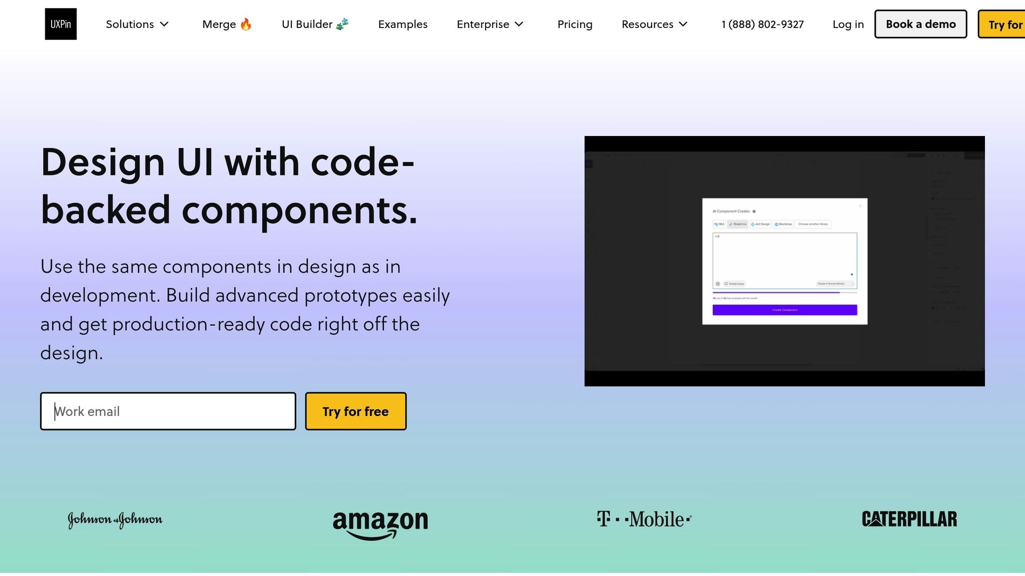
One standout example is UXPin’s AI Component Creator, which allows users to generate code-backed layouts like tables or forms directly from text prompts, leveraging models like OpenAI or Claude. Designers can then work with these AI-generated components to build high-fidelity prototypes, integrating them with libraries like MUI, Tailwind UI, or Ant Design – or even syncing with custom Git repositories.
The impact on productivity is undeniable. Teams using AI design-to-code tools report delivering features three times faster with pixel-perfect precision compared to traditional handoff methods. This shift transforms how teams approach UI development, replacing manual interpretation with automated precision.
"When I used UXPin Merge, our engineering time was reduced by around 50%. Imagine how much money that saves across an enterprise-level organization with dozens of designers and hundreds of engineers."
Larry Sawyer, a Lead UX Designer, highlights how this efficiency translates to tangible savings. With AI handling the heavy lifting, developers can focus on refining and integrating the generated code.
Improving AI-Generated Code
While AI speeds up code generation, the output still requires human oversight to meet project standards and ensure quality. By automating repetitive UI translation tasks, AI frees developers to tackle more complex challenges, like building robust architectures, optimizing performance, and solving technical problems.
The review process shifts from writing code from scratch to refining AI-generated output. Developers focus on making sure the code aligns with team conventions, handles edge cases, and integrates seamlessly with backend systems. This evolution changes the role of developers, emphasizing refinement and integration over initial creation.
AI has its limits – it can’t grasp the nuances of business logic, performance optimization, or architectural decisions that experienced developers make. For instance, while AI might generate a perfectly styled form component, a developer still needs to connect it to validation logic, error handling, and data submission workflows tailored to the application’s architecture.
The most effective approach combines AI’s efficiency with human expertise. AI handles the initial translation and routine tasks, while developers focus on quality assurance, security, and long-term maintainability. Together, this partnership results in a more reliable and efficient development process.
Checking Code for Accuracy
AI tools can also scan generated code for errors, such as missing assets, alignment issues, or deviations from design system standards. By systematically checking for inconsistencies, these tools ensure that the code stays true to the original designs. This reduces errors significantly before the code even reaches production.
For example, AI can detect misalignments, spacing issues, or missing breakpoints. On some platforms, it can even apply fixes as code diffs, preserving any customizations developers have already made.
This feature is particularly useful in iterative design processes. When designs evolve after developers have customized the code, traditional methods often required starting over. AI platforms, however, preserve developer modifications while applying only the necessary design updates. This keeps both the design system and the implementation intact.
That said, final verification still depends on human judgment. While AI can flag potential issues, it’s up to developers to assess whether these are genuine problems or intentional variations. Developers must consider context and business needs to make the final call on code quality and implementation.
sbb-itb-f6354c6
Improving Collaboration Between Designers and Developers
AI is transforming how designers and developers work together by creating shared workspaces where both teams can contribute simultaneously. This approach not only reduces friction but also speeds up project timelines. By connecting better communication strategies with real-time workflow updates, AI is reshaping collaboration in dynamic ways.
Improving Communication with AI Tools
One of AI’s standout contributions is its ability to auto-generate detailed specifications and documentation, removing much of the guesswork that can slow down projects. Modern AI-powered platforms can scan design files and instantly produce annotated documentation, code snippets, and handoff notes. This ensures everyone is working with the same, up-to-date information, cutting down on misunderstandings that might otherwise derail progress. Think of this documentation as a "Rosetta Stone" that translates design intent into a language developers can easily act on – critical for smooth teamwork.
Take UXPin, for example. This platform allows designers and developers to collaborate in a single environment using code-backed components. When designers use UXPin’s AI Component Creator, they’re not just making visual prototypes – they’re creating functional components that developers can dive into immediately.
AI-enhanced communication tools like Slack GPT, Gemini, and ChatGPT further sharpen team interactions, making it easier for product teams to stay aligned across different roles.
Supporting Real-Time Feedback and Changes
Clear documentation is just one piece of the puzzle. Real-time collaboration tools are equally vital for speeding up project iterations. Traditionally, handoffs between designers and developers often created bottlenecks, with delays in feedback slowing progress. AI-powered solutions are changing this by enabling instant collaboration and validation. Tools like Figma allow teams to comment, annotate, and make updates simultaneously. Meanwhile, other AI-driven systems can automatically generate and validate code. For instance, when a designer updates a component, the corresponding code is refreshed instantly, letting developers review and provide feedback on the spot [2, 6].
This kind of real-time interaction drastically cuts down feedback loops and accelerates iteration cycles. It also enables developers to start working on finalized UI components immediately, rather than waiting for entire page designs to be completed.
Creating Shared Responsibility in the Workflow
AI tools also play a key role in fostering transparency and shared accountability between designers and developers. By centralizing updates and tracking changes, platforms like UXPin create a "single source of truth." This setup helps developers understand the reasoning behind design choices while giving designers insight into technical constraints. For example, UXPin’s AI Component Creator can generate initial layouts based on design prompts, offering a consistent starting point for both teams.
This transparency extends to version control and design system documentation. When updates are made – like re-exporting Figma designs – AI can apply changes as code differences rather than overwriting entire files. This preserves any customizations developers have made while keeping designs consistent. Collaborative testing sessions further ensure that the final product aligns perfectly with design intent.
Organizations that integrate AI-driven workflows often see faster shipping times and improved product quality. Companies like Zapier and Plaid have successfully used detailed documentation and continuous communication to align their workflows [3, 5]. The key to maintaining this success lies in training teams to understand and maximize the potential of AI tools. When designers and developers fully embrace these technologies, traditional silos start to disappear, leading to a more cohesive and efficient workflow.
Benefits and Limitations of AI in Design-to-Code Handoff
Let’s dive into how AI is reshaping the design-to-code handoff process. While AI brings speed and precision to the table, it also introduces challenges that require careful consideration.
Benefits of AI Integration
AI tools for design-to-code handoff can dramatically accelerate workflows, cutting out the tedious manual translation process that often eats up nearly half of a developer’s time. These tools can automatically extract design details like spacing, color schemes, and typography, generating code that closely aligns with the original design. This not only reduces errors but also ensures consistent components throughout the project .
By automating repetitive tasks, such as extracting specifications and generating code, developers can shift their focus to solving more intricate problems . A great example is UXPin’s AI Component Creator, which allows designers to generate functional React components directly from design prompts. This creates a smooth transition from design intent to working code, saving time and effort.
These efficiencies highlight AI’s potential to transform workflows, but they also come with their own set of challenges.
Limitations and Challenges
AI-driven handoffs, while impressive, are not without flaws. Human oversight is still critical, as AI-generated code often needs fine-tuning to meet specific project standards and best practices . Complex or ambiguous designs can trip up AI tools, especially when dealing with edge cases or custom functionality .
The accuracy of AI tools heavily depends on how well-organized and annotated the design files are. Additionally, managing updates can become tricky – when designs evolve after code generation, there’s a risk of overwriting custom adjustments that developers have made.
Comparison Table: Benefits vs. Limitations
Here’s a quick side-by-side look at what AI brings to the table and where it falls short:
Benefits
Limitations
Speeds up shipping by eliminating manual translation
Requires human review and adjustments
Generates accurate, design-aligned code
Struggles with complex or ambiguous designs
Saves up to 50% of developer time on repetitive tasks
Can’t handle edge cases or unique logic well
Ensures consistency by adhering to design systems
Relies on well-structured input files
Boosts real-time collaboration
Managing updates post-generation can be challenging
Automates documentation and specification extraction
Limited understanding of business logic and context
The real strength of AI lies in its ability to handle repetitive, time-consuming tasks. By pairing AI automation with human expertise for more nuanced work, teams can strike the right balance between efficiency and quality . In the next section, we’ll explore practical strategies to seamlessly integrate AI into your workflow while keeping human input at the forefront.
Conclusion: Best Practices for AI-Driven Design-to-Code Handoff
Integrating AI into your design-to-code workflow isn’t just about adding new tools – it’s about reimagining how your team works together. The most successful teams don’t simply layer AI onto existing processes; they rethink workflows entirely, blending automation with human expertise for the best results.
Actionable Best Practices
Here are some practical steps to get the most out of AI in your design-to-code handoff:
Collaborate early and often: Designers and developers should connect at the wireframe or prototype stage, instead of waiting for polished designs. This early feedback loop ensures technical feasibility and avoids last-minute surprises.
Tackle smaller chunks of work: Break the handoff into smaller, feature-based components rather than full pages or flows. This lets developers work incrementally and adapt as needed.
Organize design files for AI efficiency: Clean up unused elements, label layers clearly, and maintain a well-structured file. The cleaner the design file, the better the AI output will be.
Use design systems with shared components: Predefined, reusable components agreed upon by both designers and developers minimize friction and improve the accuracy of AI-generated code. Tools like UXPin, which generate code-backed components, can make this process seamless.
Provide detailed specs: Be specific about colors, typography, spacing, and component behavior. The more context you provide, the better the AI tools will perform, reducing guesswork for developers.
These steps create a smoother handoff process, blending automation with the expertise only humans can provide.
Balancing Automation with Human Expertise
AI can handle tasks like generating specifications, converting designs to code, and flagging inconsistencies. But human judgment is still critical for ensuring the final product meets project-specific needs. Developers can focus on solving complex technical challenges, building scalable architectures, and optimizing performance, rather than spending hours translating UI designs.
Forward-thinking teams are also shifting their structure. Instead of working in isolated silos, they align around the product vision. Designers, developers, and hybrid roles that combine creative and technical skills work together to move directly from concept to code. AI supports this by automating repetitive tasks, but it’s the human touch that ensures quality and innovation.
Think of AI-generated code as a starting point, not the end goal. While AI can extract details like spacing, colors, and typography, human review is essential to ensure everything aligns with your project’s needs. This approach reinforces the importance of optimizing both design files and AI tools for maximum efficiency.
Final Thoughts
The real power of AI in design-to-code workflows comes when teams embrace it as part of a broader transformation. Companies that report faster delivery and better results don’t just use AI – they rethink how their teams collaborate. For example, UXPin’s code-backed approach allows designers and developers to work with shared, reusable components in a unified environment, turning code into the single source of truth. This eliminates the traditional translation layer, which can eat up nearly half of a developer’s time.
Start small. Focus on specific features or components, document your new workflow, and share examples to help your team get comfortable. Each successful handoff builds momentum, saving time and setting the stage for faster, more efficient product development across your organization. AI isn’t just a tool – it’s a catalyst for rethinking how we work together.
FAQs
How do AI tools ensure accurate, high-quality code from design files?
AI tools play a key role in ensuring precision and quality in code generation by interpreting design files and converting them into clean, functional code. Leveraging advanced models, these tools produce code-backed layouts that adhere closely to design requirements, minimizing errors and the need for manual corrections.
Additionally, they simplify workflows by automating repetitive tasks and maintaining uniformity across components. This allows developers to dedicate more time to fine-tuning and enhancing the final product.
How can design teams prepare their files for a smooth AI-powered design-to-code handoff?
To make the AI-driven design-to-code handoff smooth, design teams should prioritize creating well-structured and organized files using code-backed components. These components help translate designs into production-ready code with minimal errors and less manual effort.
Using tools that support one-click exports and sticking to consistent design systems can significantly improve collaboration between designers and developers. This approach not only saves time but also boosts overall workflow efficiency.
How does AI enhance collaboration between designers and developers during the design-to-code process?
AI helps bridge the gap between design and code, making collaboration between designers and developers much more seamless. By providing a shared framework, it ensures that design concepts are translated into functional code with greater precision, minimizing misunderstandings and reducing manual errors.
With the ability to automate repetitive tasks and generate code directly from design elements, AI frees up teams to concentrate on creativity and solving bigger challenges. This not only speeds up the development process but also helps maintain high standards of quality and consistency throughout.
Reusable components simplify prototyping by saving time, improving consistency, and enhancing collaboration between designers and developers. These modular UI elements – like buttons, input fields, and navigation bars – are built to work across multiple projects without needing to be recreated. By using a shared library of components, teams can focus on refining user experiences instead of repetitive tasks.
Key takeaways:
Time Savings: Teams report cutting design and engineering time by up to 50%.
Consistency: Components ensure uniformity across screens and projects.
Collaboration: Shared libraries bridge the gap between design and development.
Reusable components are most effective when:
Designed with a single purpose in mind.
Organized in a centralized library with clear naming conventions.
Paired with thorough documentation to support team alignment.
Using tools like UXPin Merge or libraries like MUI and Tailwind UI, teams can integrate code-backed components directly into prototyping workflows. This approach eliminates common handoff issues and ensures prototypes closely match the final product. While setup and version management require effort, the long-term benefits of reusable components outweigh these challenges.
Figma tutorial: Build reusable components [3 of 8]
How to Build and Manage Reusable Components
Creating reusable components that work seamlessly requires a well-thought-out approach that balances adaptability with consistency. This process typically unfolds in three key phases: designing, organizing, and documenting components. These steps are essential for embedding reusable components into any design system effectively.
How to Design for Reusability
Reusable components thrive on modular design. Each component should focus on doing one thing exceptionally well instead of trying to handle multiple functions.
A critical tool for building scalable components is design tokens. These are variables for elements like colors, typography, and spacing, ensuring uniformity while simplifying updates across the system. For instance, if a brand color changes, updating the corresponding design token automatically propagates the change throughout every component that uses it.
Flexibility is another cornerstone of reusable design. A button component, for example, should work across various contexts – adapting to different sizes, states, and content types – while retaining its core look and functionality.
Scalability should guide every design choice. Components must perform equally well in a straightforward mobile app and a complex enterprise dashboard. This forward-thinking mindset ensures that designs meet both current and future needs.
How to Organize and Catalog Components
Once components are designed, proper organization transforms them into a functional and accessible library. A centralized component library is key, acting as a single source where teams can access the most up-to-date components.
Version control is vital for managing evolving components. Teams should adopt a systematic approach to track changes, maintain compatibility, and provide clear paths for updates. This prevents confusion when different team members work with varying versions of the same component.
Clear naming conventions are another essential element. A structured system – like including the component type, variant, and state (e.g., "button-primary-disabled" or "card-product-hover") – makes it easier for team members to locate specific components quickly.
The benefits of proper organization are evident in real-world examples. In 2025, AAA Digital & Creative Services fully integrated their custom React Design System with UXPin Merge. Brian Demchak, Sr. UX Designer, shared:
"As a full stack design team, UXPin Merge is our primary tool when designing user experiences. We have fully integrated our custom-built React Design System and can design with our coded components. It has increased our productivity, quality, and consistency, streamlining our testing of layouts and the developer handoff process."
Tools like MUI, Tailwind UI, and Ant Design showcase how well-organized component libraries can simplify workflows. Their categorization, intuitive hierarchies, and search functionality make thousands of components easy to find and use.
How to Document Components for Team Collaboration
After designing and organizing components, clear documentation ensures smooth collaboration across teams. Documentation bridges the gap between design and development, providing both specs and production-ready code with dependencies for developers to act on.
To foster alignment, documentation should serve as a single source of truth. When designers and developers rely on the same specifications, guidelines, and code examples, collaboration becomes much more efficient.
The best documentation includes code-backed components. These not only capture the visual design but also the functional behavior, keeping documentation aligned with actual implementation.
Comprehensive documentation should cover usage guidelines, interaction states, accessibility considerations, and integration examples. Including real-world scenarios helps team members understand when and how to use specific components or variants.
Regular testing and validation are essential to maintaining reliable components during updates. Gathering feedback from users and stakeholders during the documentation process can uncover issues and opportunities for refinement before they affect production.
Automation tools are increasingly handling repetitive documentation tasks, reducing manual effort and errors. These tools can automatically generate component catalogs, sync design tokens, and update usage examples as components evolve.
Investing in thorough documentation pays off significantly. Reduced development time and improved system consistency are just some of the benefits. Larry Sawyer, a Lead UX Designer, highlighted the impact of well-documented, code-backed components:
"When I used UXPin Merge, our engineering time was reduced by around 50%. Imagine how much money that saves across an enterprise-level organization with dozens of designers and hundreds of engineers."
How to Connect Reusable Components with Design Systems
Once components are designed, organized, and documented, linking them to design systems ensures a seamless flow from prototype to production. Together, design systems and reusable components create consistent experiences across products, aligning both design and development efforts. Let’s dive into how design systems uphold uniform practices and streamline production-ready prototypes.
Creating Consistency with Design Systems
Reusable components act as the foundation of design systems, translating their principles into reality. They ensure that visual styles, behaviors, and interaction patterns remain uniform across products. Whether it’s a button, a form, or a navigation bar, every element adheres to the same guidelines. This alignment not only creates a cohesive user experience but also reduces design inconsistencies and simplifies brand management on a larger scale.
Design tokens play a key role in maintaining this consistency. These tokens automate style updates – if a brand color changes, for instance, updating the corresponding token applies the change across all components instantly. This eliminates the need for tedious manual updates, keeping designs consistent and up-to-date effortlessly.
The real strength of this approach shines when teams adopt code as the single source of truth. Using the same components in both design and development bridges the gap that often leads to inconsistencies between prototypes and the final product. With this unified strategy, designers and developers are effectively working in sync, speaking the same "language."
Prototyping with Design-System-Backed Components
Prototyping becomes far more effective when it leverages code-backed components. This method produces realistic, interactive prototypes that mimic the behavior of the final product. Teams can either sync custom Git repositories with prototyping tools or use prebuilt libraries like MUI, Tailwind UI, or Ant Design.
A standout example of this workflow is UXPin Merge, which allows designers to create interfaces using the same code-backed components that developers rely on in production. By syncing a custom React Design System directly into the prototyping environment, teams ensure perfect alignment between the design and development phases.
This process involves selecting components from synced repositories, crafting high-fidelity prototypes, and exporting production-ready React code. The result? A seamless transition from prototype to production, saving time and reducing errors.
By using the same components for both prototyping and production, teams eliminate the traditional handoff challenges. Developers receive specifications that directly translate to implementation, removing the need for interpretation or rework.
How to Keep Documentation Updated
Once documentation is in place, keeping it current is crucial. Automated workflows now make it easier to synchronize component specifications across design and development. The key is to treat code-backed components as the ultimate source of truth, ensuring documentation updates automatically as components evolve.
Version control is essential for tracking changes and maintaining compatibility across projects. Teams should establish clear processes for documenting breaking changes and offering migration guides, making it easier to transition to new component versions without disrupting workflows.
Regular feedback loops involving both designers and developers are critical. By reviewing documentation collaboratively, teams can identify and address potential issues before they impact production. This ongoing input keeps documentation relevant and practical.
Automation tools are increasingly taking over repetitive documentation tasks, reducing manual effort and minimizing errors. These tools can generate component catalogs, sync design tokens, and update examples as components evolve – all without constant manual intervention.
Well-maintained, code-backed documentation isn’t just a time-saver; it’s a game-changer. With accurate, up-to-date specifications, teams can spend less time troubleshooting and more time focusing on innovation. Instead of being a chore, documentation becomes a powerful tool that boosts productivity and accelerates project timelines.
sbb-itb-f6354c6
Best Practices for Prototyping with Reusable Components
Successfully using reusable components in prototyping requires thoughtful strategies that boost efficiency, encourage collaboration, and ensure long-term usability. By following these practices, teams can make the most of their component libraries while avoiding common challenges that might slow down their progress.
Use Templates and Automation
Templates and automation can significantly speed up prototyping with reusable components. By creating standardized templates for frequently used interface patterns, teams can quickly assemble prototypes without starting from scratch every time. This approach saves time on repetitive tasks and ensures that prototypes maintain a consistent look and feel.
Automation tools have become a game-changer for handling routine design tasks. These tools can sync libraries, generate documentation, and update design tokens across prototypes automatically, reducing manual work and minimizing errors. Design tokens, in particular, are crucial for ensuring that brand updates are instantly reflected across all components and prototypes.
For example, teams using tools like Jekyll have successfully connected reusable UI components and assets, enabling them to create and iterate on prototypes quickly. These same components can then be reused in the final product, demonstrating how efficient and scalable this workflow can be.
Modern platforms like UXPin take this a step further by offering AI-powered automation and built-in component libraries. These features allow teams to generate components, sync with Git repositories, and maintain consistency between design and development without needing constant manual updates.
Next, incorporating structured feedback loops can further improve the efficiency of these automated practices.
Set Up Feedback Loops
Structured feedback loops are critical for refining reusable components and ensuring prototypes meet both user and stakeholder expectations. Regular feedback helps teams identify issues early and make improvements before moving forward.
Teams should schedule regular stakeholder reviews, focusing specifically on the usability and functionality of components. Weekly or bi-weekly review sessions with designers, developers, and product managers can help evaluate performance and gather suggestions for improvement.
Using unified environments for feedback collection makes the process much smoother. When feedback is scattered across emails, chat threads, or separate tools, it can easily get lost or delayed. Centralized collaboration on prototypes ensures feedback is immediate and actionable, saving time and reducing miscommunication.
A/B testing and iterative updates also play a key role here. By testing different variations of components and analyzing how users interact with them, teams can base improvements on real data rather than assumptions.
When working with code-backed components, feedback becomes even more impactful. These prototypes closely mimic the final product, making stakeholder input directly relevant to both design and development efforts.
A strong feedback process not only improves components but also supports version management efforts.
Keep Components Compatible Across Versions
Maintaining version compatibility is one of the toughest challenges when managing reusable component libraries. Teams need to strike a balance between introducing new features and supporting existing prototypes and systems.
Code-backed components provide a reliable way to maintain compatibility. When prototypes use the same components as the production code, updates can be managed with practices like semantic versioning and deprecation warnings, ensuring backward compatibility.
"Make code your single source of truth. Use one environment for all. Let designers and developers speak the same language."
Aligning design and development teams around a shared source of truth reduces the risk of compatibility issues caused by inconsistent implementations. Version-controlled repositories allow teams to track changes, document updates, and provide migration paths when breaking changes are necessary.
Direct integration between design tools and component repositories further simplifies version compatibility. When prototyping platforms sync with Git repositories, designers always have access to the latest components while retaining the flexibility to work with specific versions when needed.
Introducing breaking changes requires careful planning and clear communication. Teams should provide advance notice, migration guides, and dedicated support to minimize disruptions while allowing the component library to evolve.
Treating component libraries like products with their own development lifecycle ensures stability and reliability. Practices like automated testing, continuous integration, and organized release management help maintain compatibility across versions and use cases, keeping the system robust and dependable.
Benefits and Challenges of Reusable Components in Prototyping
Balancing the advantages and challenges of reusable components is crucial for making smart prototyping decisions. While the upsides are compelling, the hurdles demand thoughtful planning and continuous effort to address effectively.
Reusable components can significantly boost efficiency. Many teams report cutting design and development time in half, with some enterprise organizations documenting engineering time savings of around 50%. Let’s take a closer look at how the benefits and challenges stack up.
Benefits vs. Challenges Comparison
Benefits
Description
Challenges
Description
Efficiency
Minimizes repetitive tasks, speeding up prototyping workflows
Setup Time
Requires substantial upfront effort to establish component architecture and organization
Scalability
Supports growth without a matching increase in workload
Documentation
Demands detailed, ongoing documentation to ensure proper use
Collaboration
Fosters better alignment between designers and developers through shared frameworks
Version Management
Updates must be carefully coordinated to avoid disrupting active projects
Maintenance
Centralized updates automatically apply across all implementations
Over-Engineering
Overly complex components can become difficult to manage or adapt
Beyond the table, it’s worth noting how collaboration and simplicity play a big role. Reusable components not only improve workflows but also smooth handoffs and strengthen team alignment. Brian Demchak, Sr. UX Designer at AAA Digital & Creative Services, highlights this benefit:
"It has increased our productivity, quality, and consistency, streamlining our testing of layouts and the developer handoff process."
Despite these challenges, data shows that organizations often achieve 30-50% reductions in design and development time when reusable component systems are implemented effectively. The key? Treat component libraries as products. This means committing to ongoing maintenance, clear governance, and regular updates informed by team feedback and evolving needs.
That said, teams should be cautious about the risk of over-engineering. Overly ambitious components that try to address every possible use case can end up being hard to use and maintain. Striking a balance between flexibility and simplicity is an ongoing process that requires regular evaluation and fine-tuning.
Accessibility is another critical consideration. While reusable components can promote accessibility by embedding standards into shared elements, they can also create gaps if accessibility isn’t prioritized during the design phase. Teams need to establish clear processes to ensure components meet accessibility requirements across various contexts.
Ultimately, success with reusable components hinges on viewing them as a long-term investment. Organizations that dedicate time and resources to proper setup, documentation, and maintenance often see major gains in efficiency, consistency, and collaboration across their teams.
Conclusion
Reusable components have become a game-changer for modern prototyping, cutting engineering time by nearly half and significantly improving the quality of prototypes. Studies reveal that organizations with well-structured component systems not only achieve these efficiencies but also ensure greater consistency across their designs. The key to unlocking these benefits lies in committing to proper setup, thorough documentation, and ongoing maintenance – steps that lay the groundwork for long-term success.
Design systems take these advantages to the next level by offering a unified framework that promotes consistency and fosters collaboration between designers and developers. With a shared library of organized components built on common standards, teams can streamline their workflows and deliver seamless user experiences.
Adding code-backed components into the mix further enhances efficiency. Tools like UXPin allow teams to prototype using production-ready React components, enabling the creation of high-fidelity, interactive prototypes that closely resemble the final product. This approach reduces the friction typically associated with design-to-development handoffs and ensures both designers and developers work from a shared source of truth.
Of course, challenges like setup time and version control can arise, but strategic planning mitigates these issues. The most effective teams focus on designing modular, single-purpose components, avoiding unnecessary complexity, and maintaining regular feedback loops to keep their libraries relevant and functional.
To sustain these improvements, clear organization and continuous documentation are essential. Teams starting this journey should prioritize laying a solid foundation, documenting processes from the outset, and treating their component library as a critical organizational asset. By investing in a well-maintained component library, teams can achieve faster prototyping cycles and create consistent, high-quality user experiences.
FAQs
How do reusable components enhance collaboration between designers and developers?
Reusable components act as a crucial link between designers and developers, offering a shared language that ensures consistency throughout a product. They help eliminate confusion and make the handoff process smoother by providing a clear and unified framework for both design and development.
With reusable components, teams can work more efficiently, reduce mistakes, and concentrate on creating a seamless user experience. This method not only saves time but also strengthens collaboration and alignment between design and development teams.
What are the best practices for ensuring version compatibility in reusable component libraries?
To keep reusable component libraries compatible across versions, start by adhering to semantic versioning principles. This approach categorizes updates into major, minor, or patch changes, making it easier for teams to gauge the scope and impact of updates.
Make it a habit to maintain a detailed changelog. This allows developers to track changes effortlessly and adjust their implementations as needed. When introducing updates, aim for backward compatibility by phasing out outdated components gradually rather than removing them immediately. This gives teams the breathing room to transition at their own pace.
For managing and testing reusable components, consider using a design tool like UXPin. Its features, such as code-backed prototyping and custom React libraries, can simplify updates and help maintain consistency throughout your design system.
How do design tokens help maintain consistency across projects?
Design tokens are reusable building blocks of design – think colors, typography, spacing, and other style elements – that help maintain consistency across projects. By centralizing these components, teams can streamline their workflow and ensure designs stay aligned.
When used within a design system, tokens allow for effortless global updates. For instance, updating a primary color in the token library instantly applies the change across all designs and prototypes. This not only saves time but also ensures a consistent look and feel throughout the entire product development process.
What’s the best way to manage design systems? It depends on your needs. AI-driven methods excel at automating repetitive tasks, speeding up workflows, and ensuring consistency. Manual approaches offer unmatched control and flexibility for projects that demand precision and custom solutions. Here’s a quick breakdown:
Key Insights:
AI-Driven Management: Automates updates, ensures consistency across teams, and reduces human error. Great for scalability and efficiency.
Manual Management: Relies on human expertise for detailed, tailored designs. Ideal for projects with complex requirements or strict oversight.
Hybrid Approach: Combine AI for routine tasks and manual input for critical decisions.
Quick Overview:
AI Pros: Faster workflows, fewer errors, better scalability.
AI Cons: High upfront cost, limited customization.
Manual Pros: Full control, highly tailored results.
Manual Cons: Time-intensive, prone to errors, less scalable.
Finding the right balance between automation and human oversight can save time, cut costs, and improve outcomes. Read on to see how each method works and when to use them.
AI-Driven Design System Management
How AI Management Works
AI-driven design system management takes the hassle out of managing complex design workflows by automating tedious tasks. Using machine learning algorithms, it tracks changes, rolls out updates, and ensures version control across entire design systems – all without manual intervention.
For instance, when a designer tweaks a UI component, AI instantly updates every instance of that component across the system while handling versioning and rollback options. Real-time feedback loops validate design changes on the spot, flagging any elements that don’t comply with standards. This keeps teams aligned and reduces inconsistencies.
AI also leverages historical data to make smart recommendations. It might suggest a button style or color scheme that has performed well in similar contexts, helping designers make decisions based on user engagement metrics.
The collaboration between design and development teams also gets a major boost. When a designer updates a component, AI can automatically generate corresponding code snippets, documentation, and specifications. This ensures developers have instant access to accurate resources, streamlining the entire handoff process. These efficiencies pave the way for the broader benefits discussed below.
Benefits of AI-Driven Methods
AI’s automation capabilities translate into faster development, better scalability, and greater consistency. Development tasks can be completed in half the time compared to manual methods, especially when dealing with repetitive or boilerplate work. This can reduce the manual effort required for large-scale projects by as much as 50%.
Managing growth becomes easier, too. As design systems expand, AI allows teams to handle increasingly complex component libraries without requiring a proportional increase in manpower. This is especially helpful for organizations juggling multiple product lines or scaling their digital presence.
Another game-changer is the democratization of design processes. Low-code and no-code tools powered by AI let non-designers – like marketers, product managers, or business analysts – contribute to digital projects. These tools suggest layouts and components that align with pre-approved standards, ensuring consistency while speeding up prototyping and iteration cycles.
AI also takes the guesswork out of enforcing consistency. Instead of relying on manual checks, AI systems continuously monitor for deviations from design standards, catching issues before they become widespread. This automated quality control reduces the workload for design teams and ensures brand consistency across all platforms.
While the upfront costs of AI tools may seem steep, the long-term savings are undeniable. Automating routine tasks and reducing errors leads to significant productivity gains, often outweighing the initial investment.
What You Need for AI Implementation
Implementing AI-driven design systems requires a solid upfront investment in technology, infrastructure, and training. Organizations must allocate resources for AI tools that integrate seamlessly with existing workflows. Although the initial costs can be a hurdle, the efficiency improvements over time typically make the investment worthwhile.
To make it work, you’ll need team members skilled in both design and AI. Upskilling your current team or hiring specialists with expertise in these areas is essential. AI speeds workflows and boosts consistency; teams often hire AI developer support to manage complex design systems while keeping quality high. This can slow down adoption initially, so it’s important to plan for training and resource allocation.
Establishing clear governance and change management processes is another key step. Teams need protocols for handling AI recommendations, validating automated outputs, and ensuring human oversight where creativity and strategy are involved.
The success of implementation also hinges on integration. The AI platform you choose must work smoothly with your existing design tools, development environments, and project management systems. Collaborative workspace integrations are particularly useful for enabling real-time updates across teams.
Platforms like UXPin offer a practical starting point for organizations looking to adopt AI-driven management. Their tools combine automation with manual design capabilities, allowing teams to ease into AI workflows without disrupting existing processes.
Finally, organizations should prepare for ongoing maintenance and optimization. Unlike traditional software, AI systems evolve over time, learning from new data and adapting to changing scenarios. Regular reviews and adjustments are necessary to keep the system performing at its best[6].
Manual Design System Management
How Manual Management Works
Manual design system management puts human expertise at the forefront of every decision. Unlike AI-driven automation, this approach relies entirely on human professionals to design, build, and maintain UI components, often starting with organizing component relationships through a mind map. Designers manually create and refine elements, developers write code from scratch, and teams stay aligned through direct communication and traditional version control methods. Every detail is crafted with care, guided by the creative judgment of experienced professionals.
The process typically begins with designers using tools to create components and specifying their details. These specifications are then shared with developers, who implement them in code. Teams rely on meetings, documentation, and shared files to ensure everyone is on the same page. Every decision – whether it’s about colors, layouts, or interactions – is shaped by human insight, ensuring that solutions align with user needs and business objectives.
This hands-on approach gives designers full control over how tasks are executed, making it possible to deliver highly customized solutions. Whether it’s optimizing performance for critical systems or managing complex business logic, manual management allows for tailored results that automation might struggle to achieve. However, this level of control and customization comes with its own set of challenges.
Benefits of Manual Methods
Despite being labor-intensive, manual design system management offers distinct advantages. It excels in projects where precision, creativity, and expertise are essential. The ability to fine-tune every detail leads to solutions that are optimized for specific needs, whether those are technical, aesthetic, or business-related.
This approach allows teams to craft bespoke designs that feel personal and resonate with users. Unlike standardized patterns generated by AI, manual designs can establish emotional connections and deliver a polished experience that reflects the brand’s unique identity.
Manual methods are particularly valuable in security-critical applications. Industries with strict compliance requirements often prefer manual processes because they provide transparency and complete control over every design and coding decision. Developers can anticipate and address unusual scenarios, creating systems that are both reliable and compliant with industry standards.
When it comes to performance optimization, manual coding shines. Developers can control every aspect of code execution, enabling fine-tuning that’s critical for high-performance systems. This level of detail is especially important in complex algorithms or unique architectures where off-the-shelf solutions may fall short.
Additionally, manual workflows thrive in projects with complex business logic. When dealing with intricate edge cases or specialized requirements, human creativity and critical thinking are indispensable. These scenarios often demand tailored solutions that automated systems can’t replicate.
Problems with Manual Management
While manual management offers precision and control, it also comes with significant drawbacks, especially as projects grow in scale. The most obvious challenge is the time commitment. Manual workflows require substantial effort for every update, which can slow down progress and increase costs.
“What used to take days now takes hours.” – Mark Figueiredo, Sr. UX Team Lead at T.RowePrice
Another issue is the increased risk of human error. Mistakes in measurements, calculations, or design details can easily occur when every step depends on meticulous attention. These errors can snowball, leading to inconsistencies that are both time-consuming and costly to fix.
Scalability is another major hurdle. As teams expand and projects become more complex, coordinating manual designs across multiple stakeholders can become chaotic. Communication breakdowns and version control issues often arise, leaving team members working with outdated or incorrect components.
“When I used UXPin Merge, our engineering time was reduced by around 50%. Imagine how much money that saves across an enterprise-level organization with dozens of designers and hundreds of engineers.” – Larry Sawyer, Lead UX Designer
Manual workflows also struggle with collaboration and flexibility. Sharing designs and implementing changes requires significant effort, as every update must be manually recreated. Without real-time updates, teams risk misalignment and inefficiencies.
Lastly, data management becomes increasingly difficult as the volume of components and specifications grows. These challenges are especially pronounced under tight deadlines, making manual processes less practical for large-scale projects or enterprise-level systems.
Balancing the strengths of manual expertise with the efficiency of automated tools is often the key to managing scalable design systems effectively.
AI vs Manual Management: Side-by-Side Comparison
Comparison Table: AI vs Manual Methods
Here’s a quick look at how AI-driven management stacks up against manual methods. Each approach has its own strengths and challenges, influencing everything from daily tasks to long-term growth.
Factor
AI-Driven Management
Manual Management
Speed & Efficiency
Cuts time by 85-94% for repetitive tasks; completes assessments in 15-20 minutes compared to 2-3 hours manually
Requires significant time for updates and changes
Consistency
Delivers consistent results with real-time version control and built-in error checks
Quality can vary; prone to human error and inconsistencies across teams
Customization
Limited to predefined patterns and algorithms
Offers complete creative control over every detail
Relies on manual communication, meetings, and shared documents
Scalability
Efficiently manages large-scale systems and teams
Becomes harder to manage as projects and teams grow
Initial Cost
Requires higher upfront investment in technology and training
Lower initial costs with minimal tech requirements
Long-term Cost
Reduces operational expenses through automation and lower labor needs
Costs rise as manual work scales with project complexity
Error Rate
Minimizes mistakes with automated checks and validations
Higher likelihood of errors in calculations, measurements, and design details
Now, let’s dive into when each approach works best.
When Each Method Works Best
AI shines in fast-paced, scalable environments where consistent output is critical. It’s perfect for large teams that need to expand quickly without compromising quality. For example, AI can generate multiple design variations, suggest code snippets, and keep specifications synchronized across stakeholders.
Manual management, on the other hand, is ideal for projects that demand deep customization and creative flexibility. Boutique studios, for instance, benefit from having full control over brand-specific projects. When every design choice needs to align with a unique brand vision or specialized user experience, human expertise becomes indispensable.
Industries with strict compliance or security requirements often favor manual oversight. The ability to ensure transparency and control over every design and coding decision is vital when regulatory compliance is a must. Similarly, projects involving complex business logic or unusual scenarios rely on the creative problem-solving that only humans can provide.
Ultimately, the best choice depends on your team size, project scope, and creative goals.
Combining AI and Manual Approaches
A thoughtful combination of AI and manual methods can bring out the best of both worlds. By blending their strengths, you can overcome the limitations of each.
AI takes care of repetitive tasks like automated documentation, version control, and compliance checks, while human designers focus on creative direction, solving complex problems, and communicating with stakeholders. For instance, AI might generate initial design drafts or handle routine validations, leaving the final touches and strategic decisions to human team members.
To make this hybrid approach work, set clear boundaries between AI-driven and human-led tasks. AI should handle data-heavy processes like generating code snippets, maintaining version control, and ensuring compliance. Meanwhile, human designers should focus on creative strategies, user experience decisions, and quality assurance of AI outputs.
Regular reviews are essential to ensure AI-generated components stay aligned with brand standards. Teams should also invest in training to help designers and developers adapt to AI-enhanced workflows while preserving their creative edge. This balanced approach combines AI’s efficiency with human creativity, delivering the best of both worlds.
sbb-itb-f6354c6
How to Choose the Right Method for Your Team
Key Factors to Consider
Picking the right design system management approach requires careful thought about several important factors. These considerations will help you tailor a solution that fits your team’s needs.
Team size and expertise play a crucial role in your decision. A small team with strong design skills might find manual management more adaptable and less overwhelming. On the other hand, larger teams or those with limited design expertise might benefit from automation to streamline workflows.
Technical expertise is another major factor. AI-driven solutions often require upfront investment in training and technical skills. If your team lacks this expertise, implementing such tools might pose challenges, requiring additional training or even new hires. Evaluate whether your current team can manage these demands or if you’re ready to close the skill gap.
Project complexity and type should guide your choice as well. AI-driven methods shine when scalability and rapid iteration are priorities, while manual management is better suited for projects that require a unique visual identity or highly customized designs.
Budget considerations go beyond just the initial costs. AI-driven tools often come with higher upfront expenses for software, infrastructure, and training. However, they can save money in the long run by reducing errors and automating repetitive tasks. Manual management, while less expensive to start, may lead to higher ongoing costs due to its labor-intensive nature and slower processes.
Creative control requirements can be a deciding factor for many teams. Manual management offers the most creative flexibility, allowing designers to fine-tune every element of a design system. In contrast, AI-driven tools may limit customization to predefined patterns, which could be a drawback for projects needing unique solutions.
By weighing these factors, you can find a balance between automation and manual precision that aligns with your team’s goals.
UXPin understands that no two teams are alike, which is why its platform supports both AI-driven and manual design system management approaches.
For teams leaning toward AI-driven workflows, UXPin offers powerful tools to automate repetitive tasks and generate design suggestions. Features like the AI Component Creator allow you to quickly create multiple design variations, giving your team more options to explore. Real-time feedback and automated version control ensure your designs stay consistent and up-to-date.
For those who prefer manual control, UXPin provides reusable UI components and advanced interaction tools that let you customize every detail. Its design-to-code workflows ensure that your manual decisions are accurately translated into development, preserving the precision of your work.
UXPin also makes it easy to combine these approaches. Use AI to handle routine tasks like draft generation or version control, while keeping manual oversight for creative and quality-critical decisions. With built-in React libraries like MUI, Tailwind UI, and Ant Design, UXPin integrates seamlessly with both automated and manual workflows. This flexibility lets you choose the best method for each project phase or component.
Additionally, UXPin’s integration capabilities with tools like Slack, Jira, and Storybook ensure smooth communication across your team, no matter which approach you’re using.
Building Your Custom Workflow
Crafting an effective design system management workflow starts with an honest look at your team’s goals and current processes. Begin by mapping out your workflows to identify pain points and areas where automation could make a difference.
Define your strategic objectives. Are you aiming to speed up delivery, focus on creative differentiation, or improve operational efficiency? For example, boutique design agencies often stick to manual methods to create highly customized, emotionally engaging designs.
With your goals in mind, design a workflow that balances efficiency with creative control. Pinpoint bottlenecks where your team spends excessive time – like updating documentation or managing version control. These tasks are perfect candidates for AI automation. On the flip side, areas requiring strict oversight or compliance might benefit more from manual processes.
Decide where manual input adds the most value. Tasks that demand precision, such as maintaining brand consistency across intricate designs, often require a manual touch. Use this insight to clearly define which tasks will rely on AI and which will remain human-led.
Start small with pilot projects to test your approach before rolling it out fully. This allows you to tweak your workflow without disrupting ongoing work. Many teams find success with hybrid models, using AI for routine updates and manual methods for critical or creative tasks.
Finally, make regular evaluations part of your process. As your team grows or takes on new kinds of projects, your workflow might need adjustments. The goal is to build a system that’s flexible enough to evolve while maintaining consistency and quality in your design management efforts.
Conclusion: Getting Design System Management Right
Main Points to Remember
When it comes to managing design systems, the choice between AI-driven methods and manual approaches depends on your team’s priorities – whether that’s speed, customization, or budget constraints. AI tools shine when speed and consistency are critical. For example, they can boost design and development efficiency by as much as 100% for routine tasks, all while ensuring uniformity across your design system. However, relying solely on AI without oversight can sometimes stifle creativity.
On the other hand, projects that require highly customized visuals or strict compliance standards are better suited to manual methods. While AI tools often require upfront investments in technology and training, they tend to reduce long-term costs by automating repetitive tasks. In contrast, manual workflows may lead to ongoing expenses due to their labor-intensive nature.
The most effective teams find a way to combine both approaches. Use AI for tasks like version control or component updates, where speed and consistency are essential. Reserve manual efforts for areas like creative direction, quality checks, and solving complex design challenges.
It’s also important to regularly review and validate AI-generated outputs. Without human oversight, there’s a risk of introducing security issues or creating designs that fail to meet specific project needs. Striking this balance ensures quality and alignment with your goals.
Moving Forward
The design world is evolving at a rapid pace, with faster turnarounds and increasingly complex projects becoming the norm. Teams that embrace modern tools and strategies are better positioned to compete in this shifting landscape. The trick is finding the sweet spot between automation and human input to build scalable, high-quality design systems.
Start by mapping out your system’s tasks to determine which ones can be automated and which require manual attention. Look for tools that bridge the gap between these approaches. For instance, platforms like UXPin offer AI-powered features alongside manual design capabilities, allowing you to create interactive, code-backed prototypes while retaining creative control.
As automation becomes more integral to the industry, teams that adapt their workflows will gain a clear advantage. Whether you’re a small agency focused on detailed craftsmanship or a large organization managing extensive design operations, your tools and strategies should align with your growth goals while maintaining the quality users expect.
Finally, don’t forget to regularly revisit and refine your workflow. The design landscape isn’t static, and staying competitive means evolving with it. Teams that adapt while staying true to their creative vision will be the ones that thrive.
AI that knows (and uses) your design system
FAQs
What are the benefits of combining AI and manual methods for managing design systems?
Combining AI tools with human oversight can streamline your team’s workflow in a big way. AI features are great for automating tedious tasks, like creating design variations or keeping components consistent. This saves time and cuts down on mistakes.
At the same time, human input ensures that creativity and thoughtful decision-making remain at the forefront. This approach lets teams spend more energy on strategic and creative work, delivering high-quality results that align with both user expectations and business objectives.
What should I consider when choosing between AI-powered and manual design system management?
When weighing the choice between AI-driven and manual design system management, it’s essential to think about factors like efficiency, scalability, and accuracy. AI-powered tools excel at automating repetitive tasks, simplifying workflows, and maintaining consistency across design systems. This not only saves time but also helps minimize errors. On the flip side, manual management provides greater control and flexibility, making it a better fit for projects that demand a high level of customization or for teams with unique needs.
Consider your team’s specific requirements, the complexity of the project, and your long-term objectives. For instance, modern AI tools often come with features like reusable code-backed components and advanced integrations. These capabilities can help bridge the gap between design and development, paving the way for quicker iterations and smoother collaboration.
How does AI help maintain consistency and minimize errors in managing design systems?
AI simplifies the way design systems are managed by taking over repetitive tasks and ensuring that design elements stick to set standards. With AI, designers can produce layouts supported by code, ensuring consistency across projects and minimizing the chance of mistakes.
On top of that, AI-driven tools make workflows smoother by spotting inconsistencies and providing instant suggestions. This not only saves teams time but also helps them deliver polished, dependable designs.
Responsive code export tools simplify turning designs into React components, saving time and reducing errors. They convert design files from platforms like Figma into production-ready, responsive React code. This eliminates manual coding, ensures consistency, and improves collaboration between designers and developers. Tools like UXPin, Visual Copilot, Anima, Locofy, and FigAct offer features like responsive layout generation, clean React code, and seamless integration with design tools.
These tools streamline workflows, improve collaboration, and ensure responsive designs work across devices. By reducing manual work, they help teams focus on functionality and user experience.
How to Transform Design into React Code using Anima | Build React Portfolio Website Figma Design
What to Look for in Responsive Code Export Tools
When it comes to responsive code export tools, finding the right one can make a huge difference in your React development workflow. A good tool helps you work faster and more efficiently, while a poorly chosen one might slow you down. Here’s a breakdown of the key features to look for when evaluating these tools.
Responsive Layout Support
One of the most essential features to prioritize is automatic breakpoint generation. A top-tier tool will create CSS media queries that adapt seamlessly to any screen size. This means your React components will automatically adjust from desktop (1200px+), to tablet (768px–1199px), and down to mobile (below 768px) without requiring extra manual effort.
Another must-have is support for fluid grid systems. Instead of relying on fixed pixel values, the best tools use flexible containers and relative units. This ensures that your layouts maintain their structure and visual balance across various devices, whether it’s a smartphone or a large monitor.
Don’t overlook the ability to handle different screen orientations. Modern applications need to work smoothly in both portrait and landscape modes, especially on tablets where users often switch between the two.
Also, check for tools that incorporate design tokens. These predefined values for elements like spacing, colors, and typography help ensure consistency across your breakpoints. When a tool exports these tokens alongside your components, it simplifies maintenance and scales better as your project grows.
Clean and Production-Ready React Code
Responsive layouts are just one part of the equation – code quality is equally important. Look for tools that generate structured code following React best practices. This includes functional components with clear prop definitions, logical hierarchies, and minimal use of inline styles or deeply nested elements.
The best tools require minimal post-export modifications, meaning the exported components can be integrated into your React project with little to no extra work. This includes proper import/export statements, consistent naming, and adherence to your coding standards.
Modern tools should also use React hooks and contemporary patterns to ensure compatibility with current development practices. The components they generate should be modular and reusable, making it easy to include them in different parts of your app without causing conflicts.
Finally, consider performance optimization. High-quality tools avoid unnecessary re-renders and use React patterns like memo() where appropriate. This ensures that your components don’t negatively impact your app’s performance metrics, keeping things running smoothly.
Design Tool Integration
A seamless connection between design and code is critical. Tools that offer direct plugin support for platforms like Figma and Sketch simplify the process by reducing manual handoffs and potential errors.
Features like real-time synchronization are becoming increasingly valuable. When designers tweak layouts, colors, or spacing in Figma, the best tools automatically update the exported React components, ensuring that your code stays in sync with the latest design changes.
Compatibility with design systems is another big plus. Tools that work well with established libraries like Material-UI or Ant Design make it easier to integrate exported components into your existing codebase, keeping everything consistent.
Maintaining design fidelity is non-negotiable. The tool you choose should accurately preserve spacing, typography, and visual hierarchy from the original design. If the exported code doesn’t match the design, developers will end up spending extra time fixing it.
Lastly, collaborative features can streamline the handoff process. Tools that allow designers and developers to leave comments, annotations, or shared specifications reduce miscommunication and keep everyone on the same page.
For a more professional workflow, consider tools that support version control integration. Being able to commit exported components directly to a Git repository – with proper commit messages and change tracking – bridges the gap between design updates and deployment, saving time and effort.
Best Responsive Code Export Tools for React Projects
When it comes to converting designs into responsive React components, a few tools stand out for their ability to streamline workflows and bridge the gap between design and development. Let’s dive into some of the top options and what makes them so effective.
UXPin goes beyond static mockups by enabling designers to work with interactive prototypes built from real React components. It supports libraries like Material-UI, Tailwind UI, and Ant Design, making it easier to create designs that align with actual production code.
One of UXPin’s standout features is its AI Component Creator, which simplifies the process of generating new components. It also integrates seamlessly with tools like Storybook and npm, allowing developers to pull custom React components directly into the design environment. This ensures prototypes are built with the same code that will be used in the final product.
According to UXPin, teams using their platform can cut engineering time by nearly 50%. This efficiency comes from eliminating the traditional handoff where developers have to interpret static designs and rebuild them from scratch.
Visual Copilot takes Figma designs and transforms them into React components that are ready for production, complete with responsive breakpoints. Its AI-powered engine analyzes design files to generate components that follow modern React patterns.
What sets Visual Copilot apart is its repository integration, which allows developers to push generated components directly into their codebase, avoiding the need for manual copy-pasting. This approach significantly reduces errors and inconsistencies.
Builder.io reports that its platform can boost development capacity by 20%, allowing teams to focus more on strategic initiatives. Tim Collins, CTO at TechStyle Fashion Group, highlighted this benefit:
"Thanks to Builder, we diverted 20% of our development budget from content management maintenance to strategic growth initiatives."
Additionally, Visual Copilot offers real-time collaboration, ensuring updates made in Figma are instantly reflected in the generated code.
Anima
Anima focuses on creating clean, responsive React components directly from Figma designs. It uses design tokens and recognized component patterns to maintain consistency in the exported code. The platform automatically generates media queries and flexible layouts, ensuring designs look great across all screen sizes.
Anima’s interactive preview feature lets teams test responsive behavior before exporting the final code, saving time on manual adjustments. Its emphasis on component modularity ensures that the exported React components are reusable and follow best practices, including proper prop definitions and clean hierarchies.
Locofy offers real-time previews that update with every change made in Figma, giving designers immediate feedback on how their layouts will behave across different screen sizes. The platform excels at responsive design accuracy, using CSS Grid and Flexbox to create layouts that adapt seamlessly to various devices.
Another key feature is design token extraction, which automatically identifies and exports reusable elements like color palettes, typography scales, and spacing values. This makes it easier to maintain visual consistency throughout your React application.
Locofy also supports popular CSS frameworks like Tailwind CSS and Bootstrap, giving developers flexibility in how they implement responsive styles.
FigAct specializes in converting Figma designs into React components with built-in functionality. It automatically generates useState and useEffect hooks where needed, creating components that are ready for interactivity.
The tool also includes React Router integration, automatically setting up navigation patterns based on Figma prototype links – a huge plus for multi-page applications. Its mobile-first CSS generation ensures responsive layouts that scale gracefully to larger screens, aligning with modern web development practices.
For TypeScript users, FigAct provides properly typed React components, enhancing type safety and making the code easier to maintain.
sbb-itb-f6354c6
Feature Comparison of Code Export Tools
When choosing a responsive code export tool for React projects, it’s crucial to understand how each platform performs across key areas. These tools vary in their strengths, such as handling responsiveness, producing clean code, integrating with design software, and offering unique features tailored to different development workflows.
Comparison Table
Tool
Responsive Layout Support
Code Quality Rating
Design Tool Integration
Custom React Components
Pricing (USD/month)
Key Differentiators
UXPin
Advanced (Flexbox/Grid)
Production-ready
Figma, Sketch, Adobe XD
Yes (Built-in libraries)
From $29/editor
Real React components, AI Component Creator, Storybook integration
Automatic TypeScript definitions and React hook generation
This table highlights the unique strengths of each tool, making it easier to identify the right fit for your team.
When it comes to code quality, tools like UXPin and Visual Copilot stand out by producing code that’s nearly ready for production, requiring minimal adjustments. On the other hand, Anima, while excelling in animations and interactive elements, often necessitates additional cleanup, particularly for spacing and layout code before deployment.
For responsive layout support, implementation approaches differ significantly. Locofy uses modern CSS techniques like Grid and Flexbox to automatically generate responsive layouts, while Visual Copilot employs AI to create responsive breakpoints directly from Figma designs. UXPin’s use of real React component libraries ensures responsiveness matches production standards from the outset.
Design tool integration is another area where these tools diverge. While most platforms connect with Figma, UXPin offers a more dynamic workflow, syncing design changes with code repositories through Storybook and npm integration. Visual Copilot simplifies the process further by allowing developers to push generated components directly into their codebase, removing the need for manual copy-pasting.
Pricing reflects the tools’ target audiences and feature sets. UXPin starts at $29 per editor, with pricing scaling based on advanced features like the AI Component Creator and enterprise-grade security. Locofy offers a more affordable entry point at $25 per month, while Visual Copilot, starting at $49 per month, caters to larger teams with features like CMS integration and real-time collaboration.
For teams with established design systems, custom React component support is a key factor. UXPin shines by letting teams import their existing component libraries directly into the design environment. FigAct, meanwhile, focuses on modern React practices by generating TypeScript definitions and React hooks, making it a strong choice for teams prioritizing type safety.
Up next, discover how to seamlessly integrate these components into your React projects.
How to Use Exported Code in React Projects
When working with responsive, production-ready code exported from design tools, the goal is smooth integration into your React project while ensuring compatibility, consistent responsiveness, and high-quality code.
Code Quality and Maintainability
Start by reviewing the exported code to ensure it aligns with your project’s standards. Use tools like ESLint and Prettier to clean up unused imports and redundant styles. If inline styles are present, refactor them into your preferred CSS method, whether that’s CSS Modules, styled-components, or another approach. Double-check that all required dependencies are listed and that the components follow modern React practices.
For better maintainability, consider breaking down complex components into smaller, reusable ones. This modular approach not only simplifies debugging but also makes your codebase more scalable. Document any changes you make during this process, including the reasons behind them, to help future developers understand your decisions.
To keep things organized, you might want to set up a dedicated component library within your project. This method makes it easier to track which components were imported from external tools, ensuring consistency across your application.
Once you’ve refined and documented the components, they’ll be ready for seamless integration into your React project.
Adding Exported Components to Existing React Projects
After ensuring the code is clean and maintainable, the next step is to integrate the components. Begin by creating a separate branch to avoid disrupting your main development workflow. This way, you can test the integration thoroughly before merging changes into production.
Before diving into full integration, test the components in isolation using tools like Storybook. This helps confirm that the components render correctly and maintain their responsive behavior outside of the design tool environment.
To avoid CSS conflicts, scope or namespace styles. If your project uses CSS-in-JS solutions like styled-components, wrap the exported components to isolate their styles. For projects with a design system in place, map the exported styles to existing design tokens or variables to maintain visual harmony.
Once integrated, verify responsive behavior across different screen sizes and devices. Ensure that the components use relative units like rem, em, or percentages, and rely on modern CSS techniques like Flexbox or CSS Grid. Test all breakpoints thoroughly to confirm the components adapt seamlessly to your layout.
If your project uses state management solutions like Redux or the Context API, make sure to connect the components to your data flow. This ensures they work seamlessly with your application’s logic and user interactions.
Finally, update your project documentation to include details about the source of the components, any modifications made, and their usage. Keeping a changelog for these imported components can also help track changes and make future troubleshooting easier.
For example, Builder.io shared a case study where a SaaS company reduced front-end development time by 40% by exporting React components directly from design files. They achieved this by minimizing manual adjustments during integration, thanks to careful preparation and selecting the right tools.
To wrap up, run visual regression tests to catch any unintended style overrides or layout issues. These tests help ensure that the new components integrate smoothly without disrupting the existing user interface.
Conclusion
Responsive code export tools are transforming the way React development teams bridge the gap between design and implementation. By addressing long-standing challenges, these tools streamline workflows, cutting down project delays and easing the collaboration between designers and developers.
Leaders in the field report impressive results, including up to a 50% boost in development efficiency and the ability to shave months off project timelines. These tools not only speed up the process but also improve the quality of the output. By converting design prototypes into production-ready React code, they ensure designs are faithfully translated into functional applications. This eliminates many of the manual coding errors that often occur during traditional handoffs, while also guaranteeing that responsive behavior works seamlessly across devices.
Cost-efficiency is another major advantage. With flexible pricing models and free trials available, these tools are accessible to teams of varying sizes and budgets. They make enterprise-level design-to-code capabilities attainable for smaller teams, leveling the playing field and enabling more teams to reap the benefits of streamlined workflows.
Looking forward, advancements in AI are pushing these tools even further. New features like intelligent component creation, automatic responsive layout adjustments, and smooth integration with design systems are becoming standard. These innovations promise even more dramatic efficiency improvements as the technology continues to mature.
For React teams, adopting responsive code export tools isn’t just about saving time – it’s about elevating collaboration, producing consistent, high-quality code, and delivering responsive, high-performing applications across all devices. These tools are quickly becoming an essential asset for any team aiming to stay competitive in today’s fast-paced development landscape.
FAQs
How do responsive code export tools improve collaboration between designers and developers in React projects?
Responsive code export tools make collaboration between designers and developers much easier by allowing both teams to work with shared, reusable components and consistent design systems. This common framework minimizes miscommunication, enhances teamwork, and simplifies the handoff process.
These tools also streamline the design-to-code workflow, helping teams save valuable time. This means they can concentrate on crafting high-quality, responsive React applications without compromising on efficiency or creativity.
How can I ensure exported React components stay responsive and maintain design accuracy across devices?
To make sure your exported React components stay responsive and maintain their design accuracy, it’s important to use tools that integrate code-backed design systems and support responsive workflows. These approaches help align the design and development stages, ensuring the final product matches the original design vision.
It’s also smart to choose platforms that let you work with custom React components and provide reusable UI elements. This not only simplifies your workflow but also minimizes inconsistencies, making your designs easily adaptable to various screen sizes and devices.
How can teams ensure exported React code is ready for production and fits their project standards?
When you’re preparing React code for production, it’s essential to focus on tools that generate clean, reusable code and work seamlessly with your existing component libraries. This not only keeps your project consistent but also cuts down on development time.
Platforms offering design-to-code workflows with React component support are a game-changer. They enable teams to craft interactive prototypes and export code that meets their specific standards. By using these workflows, designers and developers can collaborate more effectively, streamlining the entire development process.
The gap between design and development often slows down product creation. No-code automation tools solve this by directly converting design files into production-ready code, saving time, reducing errors, and improving team collaboration.
Key Points:
Design-to-code means turning design files into functional code (HTML, CSS, JavaScript, etc.).
Problems with manual workflows: Time-consuming handoffs, miscommunication, and mismatched versions.
Tools like UXPin allow designers and developers to work in the same environment, using code-backed components for seamless collaboration.
By automating repetitive tasks, teams can focus on refining products instead of struggling with inefficient workflows. Platforms like UXPin streamline processes, improve accuracy, and cut development time significantly.
How No-Code Automation Solves Design-to-Code Problems
No-code automation platforms are changing the game when it comes to design-to-code workflows. These tools cut out the tedious manual steps that often bog down traditional processes. Instead of relying on time-intensive handoffs and manual coding, they create a direct pipeline from design concepts to production-ready code.
By automatically generating clean, maintainable code straight from design files, no-code platforms eliminate the need for manual recreation. This shift not only speeds up development but also ensures consistency and accuracy, setting the stage for smoother product development.
No-Code Platforms in Product Development
No-code platforms do more than just automate – they allow teams to focus on meaningful work instead of repetitive tasks. By addressing common design-to-code challenges, these tools streamline workflows and improve collaboration across teams. The result? Development timelines shrink significantly.
One standout feature is component mapping. These platforms link design elements directly to their corresponding code components, ensuring changes are applied consistently across the entire product. For instance, if a designer updates a button style, that update is automatically reflected everywhere the button appears in the codebase.
These platforms also handle quality checks, convert wireframes to fully functional prototypes, and tag design tokens – all automatically. This frees up designers and developers to focus on improving user experiences and creating robust architectures, rather than getting bogged down in manual translation tasks.
"When I used UXPin Merge, our engineering time was reduced by around 50%. Imagine how much money that saves across an enterprise-level organization with dozens of designers and hundreds of engineers." – Larry Sawyer, Lead UX Designer
Benefits of No-Code Automation
The real impact of no-code automation becomes clear when you look at real-world results. For example, in 2023, PayPal‘s product teams revamped their internal UI development process using interactive components. Tasks that used to take over an hour for experienced designers were completed in under 10 minutes. This shift allowed teams to allocate their time and resources more effectively.
Microsoft provides another example with its AI-powered Fluent Design System. This system automatically adjusts UI elements to match user preferences and device types, ensuring a seamless experience across the Microsoft ecosystem. By eliminating manual adjustments, Microsoft reduces inconsistencies and speeds up responsive design workflows.
Collaboration is another area where no-code platforms shine. By using the same code-backed components, designers and developers create a shared language that eliminates miscommunication. Conversations become more focused and actionable, leading to better outcomes.
"As a full stack design team, UXPin Merge is our primary tool when designing user experiences. We have integrated our custom-built React Design System and can design with our coded components. It has increased our productivity, quality, and consistency, streamlining our testing of layouts and the developer handoff process." – Brian Demchak, Sr. UX Designer at AAA Digital & Creative Services
Error reduction is a major advantage, especially in complex projects. No-code platforms generate production-ready code that aligns with coding standards and best practices, eliminating common human errors in syntax and structure. This consistency is invaluable for maintaining large design systems or managing projects across multiple teams.
The financial benefits are hard to ignore. When engineering time is cut by 50% or more, organizations with large teams of designers and engineers can save a significant amount of money. These savings grow over time, especially when you factor in fewer bug fixes, design revisions, and rework caused by manual errors.
Real-Time Collaboration Features That Fix Workflows
Traditional design-to-code workflows often feel disjointed. Designers work in one tool, developers in another, and feedback gets lost somewhere in between. No-code platforms with real-time collaboration features flip this script by creating shared spaces where everyone – designers, developers, and stakeholders – can work together at the same time.
These tools reshape team communication and iteration. Without real-time updates, delays and misunderstandings are almost inevitable. But with immediate interaction, those issues fade away, creating a smoother, more efficient workflow. This sets the stage for game-changing features like real-time editing and unified design systems.
Real-Time Editing and Feedback
Real-time editing allows teams to collaborate simultaneously without stepping on each other’s toes. For example, when a designer tweaks a component, developers can see the update instantly and understand how it impacts the codebase. This seamless interaction bridges the gap that often exists between design and development.
The feedback process also becomes much more streamlined. Stakeholders can review prototypes and leave comments directly on specific elements, skipping the endless back-and-forth of screenshots or external review tools. Everything happens in one place, in real time.
AI tools take this even further by tracking updates to components and style guides, flagging inconsistencies, and speeding up iterations. Teams using AI for version control and design tracking report fewer errors and faster progress. Think of it as a safety net, catching potential problems before they escalate into costly issues. This kind of automation helps teams move quickly while maintaining high-quality standards.
While real-time editing smooths collaboration, having a unified design system ensures everyone stays on the same page.
Single Source of Truth
Version control can be a nightmare in design-to-code workflows. No-code platforms solve this by making code the "single source of truth." Design elements are tied directly to their corresponding code components, so updates – like tweaking a button style – are automatically applied everywhere that component is used.
"Make code your single source of truth. Use one environment for all. Let designers and developers speak the same language." – UXPin
This unified approach eliminates the need for lengthy design specs and reduces errors caused by miscommunication. Designers and developers can finally speak the same "language", making collaboration much more intuitive.
The impact is clear in real-world examples. PayPal, for instance, revamped its internal UI development process by using interactive components. This change cut design tasks for experienced designers from over an hour to less than 10 minutes. The key? Removing the translation layer between design and code.
Centralizing design systems as a single source of truth brings consistency and efficiency to the forefront. Everyone works from the same foundation, ensuring visual and functional harmony across the board. Updates – like changes to color palettes or typography – flow through the entire system automatically, keeping brand consistency intact without the need for constant manual checks. It’s a win-win for speed and quality.
UXPin addresses the challenges of design-to-code workflows by creating a unified platform where designers and developers collaborate using the same components. This approach eliminates the usual hurdles – delays, miscommunication, and inconsistencies – by allowing teams to build directly with code-backed elements.
What makes UXPin stand out is its focus on making code the backbone of the design process. By designing interfaces with actual React components, designers produce assets that align perfectly with the developer’s codebase. This streamlined integration ensures production-ready results, offering tangible benefits in prototyping, AI tools, and team collaboration.
Code-Backed Prototyping and Component Libraries
With UXPin’s code-backed prototyping, every design element is a live React component. This means prototypes not only look like the final product but also function authentically from the start. Interactions, animations, and behaviors are all true to life.
The platform supports popular coded libraries like MUI, Tailwind UI, and Ant Design, along with custom Git component repositories. Teams can seamlessly sync their existing design systems with UXPin, ensuring consistency between design and development workflows.
"When I used UXPin Merge, our engineering time was reduced by around 50%. Imagine how much money that saves across an enterprise-level organization with dozens of designers and hundreds of engineers." – Larry Sawyer, Lead UX Designer
This integration enables the creation of high-fidelity prototypes with advanced interactions, variables, and conditional logic. Designers can also export production-ready React code and detailed specifications, minimizing handoff issues and saving valuable development time.
AI-Powered Tools and Reusable Components
UXPin’s AI Component Creator uses advanced AI models to generate code-backed layouts from simple prompts. Need a data table or a complex form? This tool can quickly prototype elements using your existing component library, speeding up the process while keeping everything aligned with your design system.
The platform also features a reusable component system, allowing teams to build a library of pre-documented, ready-to-use elements. Designers can assemble interfaces by combining these components without writing any code, while developers gain a clear understanding of the components they’ll be working with. Updates made to any component automatically apply across all designs, ensuring consistency and reducing manual upkeep.
Collaboration and Workflow Integration
UXPin redefines team collaboration by eliminating the need for traditional handoffs. Instead of passing static files back and forth, everyone works in the same environment using identical components. This shared setup minimizes miscommunication and keeps projects on track.
The platform integrates seamlessly with tools like Jira, Storybook, Slack, and GitHub. These integrations ensure that design updates sync directly with project management systems, giving developers immediate access to the latest specifications without switching between apps. Version history tracking also lets teams review changes and revert if necessary.
Real-time collaboration features make it easy for stakeholders to review prototypes and provide feedback directly on specific elements. Comments and suggestions appear instantly for all team members, eliminating the need for lengthy email chains or external review tools. This keeps everyone aligned and ensures projects move forward efficiently.
sbb-itb-f6354c6
Pros and Cons of No-Code Automation
No-code automation offers a mix of opportunities and challenges, particularly when addressing the hurdles of design-to-code workflows. It introduces significant efficiency gains but also requires thoughtful implementation to fully realize its potential.
Benefits of No-Code Design-to-Code Automation
Time Savings One of the standout advantages is the dramatic reduction in time spent on tasks, cutting workflows from over an hour to under 10 minutes.
Consistency and Quality Automated UI adjustments ensure design execution remains consistent and polished.
Better Collaboration and Fewer Errors Shared component libraries and real-time feedback streamline teamwork and reduce the chance of errors.
Refocused Developer Efforts By automating repetitive tasks, developers can shift their attention to solving complex problems and refining business logic, which enhances both product quality and job satisfaction.
Aspect
Traditional Workflow
No-Code Automation
Delivery Speed
Slower, manual handoffs
Faster, automated code generation
Consistency
Prone to errors
High, with code-backed components
Collaboration
Siloed, prone to miscommunication
Unified, with real-time editing and feedback
Error Rate
Higher, manual coding risks
Lower, with automated quality checks
Developer Role
Manual, repetitive tasks
Focus on complex logic and refinement
While these benefits are compelling, teams must also tackle several challenges to make the most of no-code automation.
Drawbacks and How to Address Them
Learning Curve Designers need to familiarize themselves with code-backed components, while developers must adapt to new collaboration workflows. Solution: Offer robust training programs and start with small pilot projects to build confidence before scaling up.
Complex Initial Setup Establishing component libraries, design systems, and integration workflows can be daunting initially. Solution: Start with prebuilt component libraries to deliver quick wins while gradually developing custom standards.
Dependence on Design Organization Poorly structured design files can lead to subpar code output. Solution: Create detailed design system guidelines and conduct regular audits to ensure consistency and quality.
Ongoing Maintenance Design systems and component libraries require regular updates to remain effective. Solution: Assign team members to maintain these systems and schedule periodic reviews to keep workflows optimized.
Integration Challenges Integrating no-code tools with existing systems and legacy workflows can be tricky. Solution: Map out your current workflows to identify integration points early, and choose platforms with strong API support to minimize disruptions.
Misconceptions About Developer Roles Some may worry that automation replaces developers, which can create resistance. Solution: Emphasize that automation is designed to handle routine tasks, freeing developers to focus on more complex and creative problem-solving. Involve them in selecting and implementing tools to ensure buy-in.
Conclusion: Improving Design-to-Code with No-Code Automation
Shifting from manual workflows to no-code automation brings major improvements in efficiency, consistency, and teamwork. As discussed earlier, tools like these streamline processes, allowing teams to achieve impressive outcomes. Take PayPal, for example – by adopting automated design-to-code workflows, they significantly cut down task completion times. This shift not only saves time but also allows teams to focus on solving complex challenges instead of getting bogged down by manual handoffs. Platforms like UXPin are perfectly positioned to help teams unlock these advantages.
UXPin stands out by addressing these challenges through its code-backed prototyping and AI-driven automation. By using the same React components for both design and development, it establishes a single source of truth, effectively minimizing inconsistencies and reducing the risk of design drift.
The real key to success is how you implement these tools. Start small with pilot projects to build confidence within your team. Make sure to set clear design system guidelines and choose platforms that offer robust component libraries and seamless integration. The goal here isn’t to replace creativity but to eliminate repetitive tasks, giving your team more time to innovate and create.
For teams still relying on manual processes, the pressing question isn’t whether to adopt no-code automation – it’s how soon they can make it work effectively. Platforms like UXPin lay the groundwork for faster iterations, improved consistency, and products that better align with user needs.
FAQs
How does no-code automation enhance collaboration between designers and developers?
No-code automation makes teamwork smoother by letting designers and developers use the same set of components. This approach helps maintain consistency across projects and minimizes miscommunication. The result? Clearer collaboration and a faster product development cycle.
These platforms break down the wall between design and code, allowing teams to concentrate on crafting excellent user experiences without being held back by technical hurdles.
What challenges might arise with no-code automation in design-to-code workflows, and how can they be resolved?
One of the biggest hurdles in no-code automation for design-to-code workflows is keeping designs and development aligned. When design tools and development platforms don’t work well together, the handoff process can become clunky, leading to mistakes and wasted time.
A practical way to tackle this issue is by using platforms that support designing with code. These tools allow teams to work with reusable components and code-powered prototypes, ensuring that designs are precise and development-ready. Features like real-time collaboration also make it easier for designers and developers to stay on the same page, smoothing out the entire workflow.
How does UXPin help speed up the design-to-code process and minimize errors?
UXPin makes the design-to-code process smoother by allowing teams to build interactive prototypes that are powered by real code. This approach ensures that designs are not only visually precise but also functional, minimizing potential errors when passing work to developers.
With tools like one-click code export and real-time collaboration, UXPin bridges the gap between designers and developers. By improving communication and cutting down on back-and-forths, it helps teams save time and work more efficiently during product development.
AI is transforming how design and development teams collaborate. By integrating version control with design-to-code workflows, teams can eliminate miscommunication, reduce manual tasks, and save significant time – up to 50% in engineering efforts. Tools like UXPin and GitHub Copilot are leading this shift, leveraging AI to automate routine tasks, predict issues, and ensure consistency.
Key Takeaways:
Design-to-code workflows replace traditional handoffs, enabling designers and developers to work with shared, code-backed components.
AI-powered version control automates tasks like merge conflict resolution, rebase strategies, and quality checks.
UXPin specializes in bridging design and development with features like the AI Component Creator and real-time synchronization with React libraries.
GitHub Copilot and similar tools focus on coding tasks, such as commit message automation and conflict prediction.
AI tools are reshaping workflows by automating repetitive tasks, improving collaboration, and reducing errors. Whether you prioritize design-development alignment or coding efficiency, choosing the right tool depends on your team’s specific needs.
Crafting design context for agentic coding workflows | Schema by Figma 2025
UXPin bridges the gap between design and development by combining AI-driven design tools with code-backed prototyping. Using production-ready React components, it allows teams to create interactive prototypes that align seamlessly with actual development workflows. This unique approach eliminates miscommunication between designers and developers while leveraging AI to simplify version control and ensure consistency.
AI Capabilities
One standout feature of UXPin is its AI Component Creator, which generates React components directly from design specifications. This ensures that design elements remain consistent and code-backed. As design systems evolve, the AI examines existing patterns and suggests updates, helping teams maintain alignment with established design principles.
The AI also identifies duplicate components and suggests consolidations, preventing unnecessary clutter in the design system. By avoiding redundant components, teams can reduce maintenance headaches and improve consistency.
Another key area where AI shines is quality assurance. It flags potential issues like accessibility problems, spacing inconsistencies, or deviations from design tokens during version updates. This automated checking reduces the need for time-consuming manual reviews, helping teams update design systems more efficiently.
These AI-powered tools integrate naturally into existing workflows, making it easier for teams to maintain high standards without disrupting their processes.
Workflow Integration
UXPin connects directly to development workflows through Storybook and npm integrations. Teams can import production React libraries, creating a unified source of truth for both design and development.
The platform offers real-time synchronization between design updates and component libraries. For example, when a developer updates a component in the codebase, those changes automatically reflect in UXPin prototypes. This two-way sync ensures that prototypes stay current and aligned with the actual product.
Version control is handled at the component level, allowing teams to track changes to individual elements. Each component has its own version history, making it easy to revert changes without impacting the entire design system. This level of granular control is especially useful for large organizations managing complex design systems across multiple products.
Scalability and Collaboration
For enterprise teams, UXPin offers unlimited version history, ensuring complete traceability. It also includes advanced security features like single sign-on (SSO) and role-based access controls, which are essential for organizations with strict governance protocols.
The Patterns feature allows teams to create reusable design templates that include both visual elements and interaction behaviors. These templates can be updated independently, enabling teams to tweak interaction flows without affecting the overall visual design.
Collaboration is seamless with real-time editing. Multiple team members can work on the same prototype simultaneously, with changes reflected instantly. The platform keeps track of who made specific edits and when, providing a detailed audit trail for design decisions.
Governance and Compliance
UXPin meets the governance needs of enterprise organizations with comprehensive access controls. Administrators can regulate who can edit, approve, and publish components, ensuring that critical design elements remain secure.
The platform provides detailed audit trails, documenting every modification – who made it, when, and what was changed. This level of documentation is particularly valuable for organizations that need to demonstrate compliance with internal standards or external regulations.
To further ensure consistency, UXPin supports change approval workflows. Updates to design systems require sign-off from designated stakeholders before they are implemented. This ensures that all changes align with brand guidelines and technical requirements before reaching the development phase.
2. Other AI-Powered Version Control Tools
AI-powered version control tools are changing the way developers manage design-to-code workflows. These tools tackle everything from generating code to resolving conflicts before they become a problem.
AI Capabilities
Tools like GitHub Copilot bring AI into the coding process by suggesting updates and even automating documentation. Graphite focuses on code reviews, identifying potential issues early. Meanwhile, PromptLayer handles versioning for AI-related assets like prompts, models, and configurations.
One standout feature across these tools is their ability to predict and resolve merge conflicts, which helps avoid delays. They also automate the creation of commit messages and release notes, keeping documentation up-to-date without requiring extra effort from developers.
These AI features are designed to fit smoothly into existing workflows, making them easy to adopt.
Workflow Integration
AI-driven version control tools mark a step forward in simplifying development processes. By automating repetitive tasks, they let developers concentrate on the creative aspects of their work. Some tools integrate directly with Git repositories, while others may need adjustments to your current workflow. A major perk is their ability to learn from team habits, tailoring suggestions to align with preferred practices over time.
Feature
Traditional VCS (e.g., Git)
AI-Powered VCS Tools
Commit Message Generation
Manual
Automated and context-aware
Merge Conflict Resolution
Manual
Predictive and automated
This kind of integration not only simplifies day-to-day tasks but also scales effortlessly as teams grow.
Scalability and Collaboration
In environments where design and code intersect, these tools excel at managing collaboration. By automating routine tasks, they make it easier for teams to work together, especially as they grow. Predictive features help coordinate changes across multiple contributors without constant manual checks. For distributed teams, these tools offer intelligent insights into code changes and their potential effects. Over time, as the AI gathers more data from team interactions, its recommendations become even more aligned with team preferences and project needs.
Governance and Compliance
AI-powered tools also play a role in maintaining coding standards by flagging issues before they reach the main codebase. However, teams should ensure that AI suggestions complement, rather than replace, human judgment. Automated compliance tracking adds another layer of value, simplifying audits by keeping a detailed record of changes and their rationales. This reduces manual work while improving the overall quality of documentation.
sbb-itb-f6354c6
Pros and Cons
When it comes to design-to-code workflows, weighing the advantages and limitations of each platform is crucial. This helps teams align their creative goals with technical execution. AI-powered version control tools bring unique benefits and challenges, and understanding these can help teams select the right tool for their needs.
UXPin’s Strengths and Weaknesses
UXPin stands out for its ability to connect design and development seamlessly. Its AI Component Creator and code-backed prototyping simplify the process by automating React component generation, reducing the friction of handoffs. Larry Sawyer, Lead UX Designer, shared a compelling insight:
"When I used UXPin Merge, our engineering time was reduced by around 50%. Imagine how much money that saves across an enterprise-level organization with dozens of designers and hundreds of engineers."
However, relying heavily on UXPin’s AI features could limit creative exploration, as automated suggestions might overshadow manual design iterations. Additionally, integrating UXPin into custom toolchains can sometimes be tricky. Despite these challenges, its design-to-code focus sets it apart from other AI tools.
Comparative Analysis
Many other AI-powered version control tools, like GitHub Copilot, emphasize code management rather than design integration. While these platforms excel at tasks like automating commit messages or predicting merge conflicts, they often lack design-centric functionality.
The decision between UXPin and other AI-powered tools often depends on team structure and workflow priorities. UXPin is ideal for teams that require close collaboration between design and development. Its code-backed approach ensures that designs align precisely with what developers build, maintaining visual consistency across projects.
On the other hand, traditional AI-enhanced version control tools cater more to development-heavy teams. These tools focus on automating code management and integrate seamlessly with Git-based workflows, but they rely on separate design tools and manual handoff processes.
A shared challenge across all AI-powered platforms is explainability. Whether it’s generating code or suggesting changes, teams must validate AI-driven decisions – especially in regulated industries where documentation is critical.
The learning curve also varies. UXPin introduces a unified design workflow, eliminating the need for tool-switching and manual file handoffs, which can simplify processes over time. In contrast, Git-based tools leverage familiar development practices, offering a smoother transition for teams focused on coding.
For teams prioritizing streamlined design-development collaboration, UXPin’s integrated approach can save time and reduce communication gaps. Meanwhile, teams centered on traditional code management might find Git-based AI tools better suited to their established workflows.
Conclusion
AI is reshaping version control in design-to-code workflows, moving away from traditional file management toward intelligent systems that simplify collaboration and speed up development. Industry experts often describe this shift as a major turning point, where automation takes over repetitive tasks, freeing teams to focus on innovation. These advancements tie back to earlier discussions on how version control has evolved.
Platforms like UXPin demonstrate how this transformation bridges the gap between design goals and technical execution. For example, engineering time has been cut by nearly 50%. By treating code as the single source of truth, UXPin creates a unified space where designers and developers can truly "speak the same language."
What sets UXPin apart is its ability to tackle design-to-code challenges comprehensively. While many AI tools focus solely on automating coding tasks, UXPin’s integrated features – like its AI Component Creator and real-time collaboration tools – offer a more holistic solution. That said, teams deeply embedded in Git-based workflows might prefer other AI tools that specialize in automating tasks like commit messages, predicting merge conflicts, or managing large codebases. However, these tools often require separate design platforms and manual handoff processes.
As workflows evolve, the growing integration of AI in design and version control systems suggests that the boundaries between design and development will continue to fade. UXPin’s design-centered approach highlights the potential of unified workflows, while the broader development of AI tools refines these processes even further. Teams looking to stay ahead should embrace unified systems and explore how AI can automate tedious version control tasks.
Success lies in finding the right balance between automation and human oversight. Whether you lean toward UXPin’s design-first philosophy or prefer development-focused AI tools, it’s crucial to maintain clear documentation, conduct regular code reviews, and invest in team training. This ensures that AI enhances productivity without compromising code quality or project integrity.
FAQs
How does AI-powered version control enhance collaboration between design and development teams?
AI-driven version control streamlines teamwork by ensuring that designers and developers stay aligned, working with the same components and following a shared workflow. This minimizes inconsistencies, cuts down on miscommunication, and makes the handoff process much smoother.
With code-backed design elements and automated updates, teams can shift their focus to creating high-quality products more efficiently, all while staying in sync throughout the entire design-to-code process.
How does UXPin’s AI Component Creator improve design-to-code workflows?
UXPin’s AI Component Creator simplifies the design-to-code process by leveraging advanced AI models like OpenAI and Claude. With just a written prompt, you can generate functional components – think tables, forms, or layouts – that are ready to use right away.
How do AI tools like UXPin support compliance and consistency in design systems?
UXPin’s AI-powered tools bring a new level of compliance and consistency to design by using code-backed components. These components ensure that every design element aligns perfectly with the established design system, reducing errors and eliminating inconsistencies.
With reusable UI components and advanced design-to-code workflows, UXPin makes it easier for designers and developers to work together. This not only ensures that products meet governance standards but also delivers a smooth and cohesive user experience.
AI error detection is transforming how teams identify and fix bugs in code. By analyzing patterns and providing real-time feedback, these tools help developers catch issues early, saving time and resources. Here’s why it matters and how to make the most of it:
Key Benefits: AI tools flag common coding errors, security vulnerabilities, and performance issues like slow load times or memory leaks. They ensure accessibility compliance (e.g., WCAG standards) and reduce manual review time by up to 50%.
Real-Time Feedback: Integrated with platforms like GitHub and GitLab, these tools provide instant suggestions, speeding up development cycles.
Improved Collaboration: AI bridges gaps between designers and developers, ensuring design-code consistency and smoother handoffs.
Continuous Improvement: AI systems learn from your codebase, becoming more precise over time through feedback loops and regular model updates.
To implement effectively, define clear goals (e.g., error types to target), train models with relevant data, and integrate tools into your workflow. Regular updates and team feedback ensure long-term success. AI won’t replace developers but enhances their ability to focus on complex problems while automating routine checks.
I Found the BEST AI Tool to Review Your Code… and it’s Free! (CodeRabbit CLI)
Benefits of AI Error Detection in Design-to-Code Workflows
AI error detection brings a lot to the table, from improving collaboration to boosting code quality and speeding up development.
Better Code Accuracy
One of AI’s standout strengths is spotting issues that might escape manual reviews, such as syntax errors, logical flaws, or performance hiccups. By catching these problems early in the development process, teams can avoid expensive fixes down the road.
AI tools also help streamline code reviews by flagging common coding mistakes and security vulnerabilities automatically. For example, platforms like UXPin utilize AI Component Creators to generate production-ready React code and clean specifications directly from prompts. This process results in clean, production-ready code right from the start, reducing the likelihood of errors during the initial stages.
Additionally, these tools ensure adherence to design systems by monitoring component lifecycles, verifying compliance with WCAG 2.1 standards, and analyzing load times.
Real-Time Feedback for Faster Development
Another major advantage is real-time feedback. AI review agents integrate seamlessly with tools like GitHub, GitLab, and Bitbucket, offering instant suggestions and identifying issues early. This reduces debugging time and allows teams to iterate quickly without sacrificing quality.
Better Team Collaboration
AI error detection bridges the gap between designers and developers by establishing code as the single source of truth. With AI Component Creators, teams can produce code-backed layouts and components that stay consistent from prototype to production, cutting down on miscommunication and making handoffs smoother.
Beyond that, AI tools promote best practices and enhance security. Teams can tag sections of code handling sensitive data for manual review or generate TODO comments for areas needing additional attention. This level of scrutiny is particularly vital when integrating services from a Zero Trust provider, as it ensures that every interaction with sensitive infrastructure is verified and logged.
Up next, explore how to integrate these strategies to make your workflows even more efficient.
How to Implement AI Error Detection
To make AI error detection work effectively, start by defining clear objectives, leveraging machine learning for precision, and seamlessly integrating tools into your existing workflows.
Set Clear Goals for AI Monitoring
Begin by identifying the specific types of errors you want to target – such as syntax mistakes, accessibility issues, or security vulnerabilities. Think about your team’s current challenges. Are manual code reviews slowing down your process? If so, focus on automating repetitive tasks like detecting coding standard violations or common logical errors. If security is a concern, prioritize identifying sensitive data handling problems and potential weaknesses in your system. This objective should also prioritize advanced protections like session hijacking prevention to ensure that user sessions remain secure against unauthorized takeover. Clearly document these objectives so you can measure progress over time.
It’s important to set realistic expectations. AI can handle many routine checks automatically but won’t replace human insight entirely. A hybrid approach works best: let AI manage the repetitive tasks while developers focus on tackling more complex problems.
Once your goals are in place, the next step is preparing your system to recognize patterns through machine learning.
Use Machine Learning for Pattern Recognition
Machine learning models are great at spotting recurring error patterns that traditional tools might miss. To make the most of this, feed the system with historical project data, such as resolved bugs, review notes, and performance metrics. The more tailored the data, the better the model will be at identifying errors that matter to your workflow.
Establish a feedback loop where developers provide input on the model’s performance. This ongoing refinement ensures the system stays accurate as your projects evolve. Regularly retrain the model to account for new error types and patterns that emerge as your codebase grows.
Once your model is trained, focus on integrating it into your team’s daily processes.
Integrate AI Tools Into Your Workflow
For AI error detection to be effective, it needs to integrate smoothly with your current development environment. Connect AI tools to your version control systems for automated feedback during code reviews and align them with your design tools to maintain consistency throughout the design-to-code process.
For example, tools like UXPin’s AI Component Creator can generate production-ready React code directly from design prompts. This reduces early-stage errors and ensures alignment with your design system. By incorporating AI into every stage – from initial component creation to final code review – you can catch issues early and maintain consistency throughout the development process.
Tailor the AI tools to fit your team’s workflow. Set up automated checks for pull requests and deployments, and fine-tune alert thresholds to minimize false positives. Start small with a pilot project to work out any integration challenges before scaling up.
Experts recommend fostering collaboration between developers, designers, and AI specialists to ensure the system adapts as workflows evolve. Keep track of lessons learned during implementation to help future team members adopt best practices and avoid repeating mistakes.
sbb-itb-f6354c6
How to Maximize AI Error Detection Performance
Once your AI error detection system is operational, its long-term effectiveness depends on continuous refinement. The goal is to catch genuine issues while reducing unnecessary false alarms.
To achieve this, focus on three key areas: real-time monitoring, keeping models updated, and leveraging feedback loops.
Set Up Real-Time Monitoring and Alerts
Real-time monitoring is essential to make your AI error detection system proactive. Configure alerts based on error severity to ensure critical issues demand immediate attention while minor ones are summarized for later review. For instance, critical security vulnerabilities should trigger instant notifications to the entire team, enabling swift action like isolating faulty code or rolling back deployments. Meanwhile, less pressing issues can be compiled into daily reports. Tools like UXPin benefit from this by flagging design-code discrepancies as they occur, ensuring prompt resolution.
Keep AI Models Updated
AI models can become less effective over time if they’re not updated to recognize new error patterns. Regularly retrain your models with the latest code samples and error data to address emerging vulnerabilities. Schedule periodic performance reviews to identify trends, such as missed errors or an increase in false positives. Adjust configurations as new vulnerabilities arise to ensure your system remains agile and effective in detecting issues.
Use Feedback Loops for Better Results
Every resolved error is an opportunity to improve. Establish a straightforward process for developers to flag false positives and provide context about why an alert was unnecessary. Regular feedback sessions with your team can help refine detection metrics, allowing the system to adapt to nuanced, context-specific error patterns. Striking a balance between technical precision and usability is key – metrics should measure both detection accuracy and developer satisfaction. This approach builds trust in the AI system and ensures it remains a valuable tool for your team over time.
Conclusion
AI error detection has become a game-changer for design-to-code workflows, catching mistakes early and saving resources. For example, it can cut bug-related costs by up to 30% and boost software quality by 20-40%. The key to success lies in blending automated AI checks with human oversight. This balance works best when teams focus on three main areas: setting clear monitoring objectives, seamlessly integrating AI into existing processes, and refining workflows through continuous feedback. Skipping these steps can lead to serious problems – one CTO shared that their team faced outages every six months due to inadequate AI code review practices.
Real-time monitoring plays a critical role in preventing production issues. AI tools that integrate with platforms like GitHub, GitLab, and Bitbucket offer instant feedback as developers write code. This not only keeps problems from reaching production but also helps maintain the team’s momentum and productivity.
Another essential practice is documenting and auditing all AI-generated code, including the tools used and the review methods applied. This step enhances traceability and helps teams identify trends in error detection. Additionally, regular training ensures developers can craft security-focused prompts and recognize potential gaps in AI-generated code. Documentation and training together create a solid foundation for combining automated checks with human expertise.
AI error detection isn’t about replacing human judgment – it’s about enhancing it. The best results come from combining automated tools, manual reviews, and ongoing updates to AI models. This integrated approach helps teams adapt to changing coding standards and new vulnerabilities, ensuring consistency throughout the design-to-code process.
Ultimately, treating AI error detection as an evolving system is the key to long-term success. Regular performance reviews, model updates, and team feedback keep your error detection practices sharp and relevant as your codebase grows. This dynamic approach ensures quality and consistency remain at the heart of your workflows.
FAQs
How does AI error detection enhance teamwork between designers and developers in a design-to-code workflow?
AI-powered error detection plays a key role in keeping designers and developers on the same page by ensuring they use consistent, code-supported components throughout the design-to-code process. This not only cuts down on misunderstandings but also reduces mistakes, creating a more seamless workflow.
By catching inconsistencies early on, AI tools help teams stay coordinated, saving valuable time and boosting efficiency. This approach strengthens communication and ensures the end product aligns with both design and development expectations.
How can I seamlessly integrate AI error detection tools into my current development workflow?
Integrating AI error detection tools into your development setup can make a big difference in your workflow, but it requires a thoughtful approach. Begin by taking a close look at your current processes to spot areas where AI could make a real impact – think debugging, code reviews, or optimization. From there, choose an AI tool that fits well with your tech stack and aligns with your team’s specific needs.
After selecting the right tool, the next step is to configure it for seamless use within your environment. This might mean installing plugins, setting up APIs, or linking it to your version control system. Once everything is in place, make sure your team knows how to use it effectively. Provide training sessions if needed and keep an eye on the tool’s performance over time to ensure it’s hitting your benchmarks for accuracy and efficiency.
Integrating AI tools in this way can streamline your development process, reduce errors, and ultimately improve the quality of your code while saving valuable time.
How does AI-powered real-time feedback enhance code quality and speed up development?
AI-driven real-time feedback improves code quality by catching errors as they happen, giving developers the chance to fix problems immediately. This not only cuts down on debugging time but also leads to cleaner, more efficient code. By simplifying workflows and providing practical suggestions, these tools enable teams to produce top-notch results more quickly, making the development process more efficient.
Refactoring React code can be tedious and error-prone, especially in large projects with legacy components. AI tools simplify this process by automating repetitive tasks, suggesting updates, and improving code quality. Here’s a quick look at the best AI tools available today:
GitHub Copilot: Provides real-time suggestions for refactoring React code, including converting class components to functional ones and cleaning up logic. Integrates with popular IDEs.
Tabnine: Focuses on privacy with local deployment options and team-specific coding style adaptation.
Google Gemini Code Assist: Specializes in large-scale refactoring, offering inline previews and multi-file updates.
Zencoder AI Coding Agent: Automates complex workflows like dependency updates and multi-repo refactoring.
Sourcery: Helps maintain clean code by identifying duplicated logic and inefficiencies.
Each tool addresses specific challenges, from legacy updates to privacy concerns. Start by evaluating your project’s needs and testing free trials to find the best fit for your team.
AI HELPED ME TO REFACTOR A REACT COMPONENT STEP BY STEP
How to Choose AI Refactoring Tools
Selecting the right AI refactoring tool means focusing on its ability to analyze code, fit seamlessly into your workflow, and maintain security standards. These factors ensure you avoid disruptions and achieve meaningful improvements.
Code Analysis and Refactoring Capabilities
The backbone of any AI refactoring tool is its ability to analyze code intelligently and suggest meaningful updates. Look for tools that can identify redundant code, inefficient functions, or outdated patterns, especially in frameworks like React. For instance, Google Gemini Code Assist excels at modernizing React components by converting legacy class components into functional ones using hooks like useState and useEffect. Similarly, Sourcery pinpoints areas for optimization and offers suggestions you can accept or reject.
When evaluating tools, test them on a sample of your codebase to see if their recommendations align with your project’s unique coding standards. A tool that delivers context-aware suggestions while respecting your coding style is invaluable. Once satisfied with its analysis, check how well it integrates into your development process.
Developer Workflow Integration
A tool’s ability to integrate seamlessly with your current development environment is critical for maintaining productivity. Many top-tier AI refactoring tools are designed to work within popular IDEs like VS Code, IntelliJ IDEA, and Visual Studio, while also syncing with version control systems like Git. For example, UXPin enhances collaboration between design and development teams through its Merge feature, which syncs Git repositories and exports production-ready React code to projects or online environments like StackBlitz.
"As a full stack design team, UXPin Merge is our primary tool when designing user experiences. We have fully integrated our custom-built React Design System and can design with our coded components. It has increased our productivity, quality, and consistency, streamlining our testing of layouts and the developer handoff process." – Brian Demchak, Sr. UX Designer at AAA Digital & Creative Services
Also, consider whether the tool supports multi-file refactoring. Tools like Google Gemini Code Assist and Zencoder excel at handling changes across multiple files and repositories, which is essential for larger, more complex projects. A smooth multi-file refactoring process can significantly reduce the time spent on tedious updates.
Security and Data Privacy
Security is a top priority when choosing an AI refactoring tool. Opt for tools that safeguard your code and provide clear, transparent change logs. For example, Tabnine offers robust privacy controls by running locally and supporting private models, ensuring your code remains within your organization’s network.
It’s also important to verify that the tool complies with relevant privacy standards and offers on-premise deployment if needed. Some tools process code snippets on external servers, which may not align with your security requirements. Additionally, tools like Zencoder and Google Gemini Code Assist emphasize transparency by requiring developer approval for every change. These tools also provide detailed breakdowns of suggested modifications, allowing you to validate updates before applying them. Reviewing each change not only protects your code but also helps you better understand its structure and quality.
Best AI Tools for Refactoring React Code
When it comes to refactoring React code, the right tools can make all the difference. By focusing on code analysis, seamless integration into workflows, and robust security, these AI tools stand out for their ability to streamline development and address specific team needs.
GitHub Copilot takes React development to the next level with its context-aware suggestions. It can refactor legacy class components into functional ones, split large render methods into smaller, more manageable functions, and simplify complex component logic. It also helps clean up repetitive patterns, rename variables, and improve code maintainability.
This tool integrates effortlessly with popular IDEs like VS Code, IntelliJ IDEA, and Visual Studio. By reducing the need for manual refactoring, Copilot speeds up development while fitting neatly into existing workflows.
Tabnine emphasizes privacy and customization. Its adaptive autocompletion works locally or on private servers, ensuring your React code stays secure – an essential feature for industries with strict data protection standards.
The tool learns your team’s coding style, tailoring its suggestions to match your conventions. With on-premises deployment options, Tabnine provides strong privacy controls, making it a trusted choice for teams handling sensitive projects.
Google Gemini Code Assist focuses on structured editing and transparency. It offers inline previews of proposed changes, allowing developers to review and approve updates before implementation. This feature is especially valuable for large-scale projects, as it minimizes migration risks while ensuring the code remains accurate.
The inline preview feature ensures developers know exactly how their code will change, addressing the validation needs critical to enterprise environments.
Zencoder AI Coding Agent automates complex refactoring workflows with precision. For $19 per user per month, it connects to local systems and version control to handle tasks like breaking down monolithic components, updating dependencies, and running thorough tests.
Developers retain full control, as every change requires explicit approval. This ensures that the refactoring process is both comprehensive and aligned with the team’s goals, from initial analysis to testing and documentation.
Sourcery is all about maintaining code quality. It continuously scans for duplicated logic, inefficient functions, and inconsistencies, offering real-time suggestions for improvement. Developers can accept or decline specific refactoring recommendations, such as optimizing state management patterns or improving rendering logic.
By monitoring code over time, Sourcery helps teams prevent technical debt and maintain a clean, efficient codebase.
The platform’s Merge feature ensures that Git repositories stay synchronized, enabling designers and developers to export production-ready React code effortlessly. Whether exporting code to projects or online environments like StackBlitz, UXPin streamlines collaboration and boosts efficiency.
"When I used UXPin Merge, our engineering time was reduced by around 50%. Imagine how much money that saves across an enterprise-level organization with dozens of designers and hundreds of engineers." – Larry Sawyer, Lead UX Designer
sbb-itb-f6354c6
Tool Comparison
Selecting the best AI refactoring tool boils down to understanding your team’s priorities, budget constraints, and workflow specifics. Each tool has its own strengths tailored to different needs. Based on earlier discussions about workflow and security, here’s a side-by-side breakdown that highlights the key features, integrations, and costs of popular options.
Standard security, with enterprise options available
From $24/month per editor
When it comes to pricing, GitHub Copilot and Tabnine are accessible for individual developers, offering straightforward monthly plans. On the other hand, tools like Google Gemini Code Assist cater to enterprise clients, with custom pricing reflecting their advanced capabilities for large-scale modernization projects.
Security is another differentiator. For industries like finance or healthcare, where privacy is paramount, Tabnine’s on-premises deployment is a major draw. Meanwhile, GitHub Copilot appeals to smaller teams with its seamless IDE integration, despite relying on cloud processing. Integration options also vary: Zencoder AI Coding Agent excels in managing complex, multi-repository environments, while UXPin bridges the gap between designers and developers by generating React code directly from design files.
The tools span a wide range of use cases. GitHub Copilot shines in everyday coding with real-time suggestions, while Google Gemini Code Assist supports large-scale refactoring for legacy systems. UXPin takes a unique approach, focusing on design-development collaboration by creating production-ready React code, which can help reduce future refactoring needs.
Ultimately, these tools offer scalable pricing and flexible features, making it easier for teams to evaluate their options through free tiers or trial plans before committing to a paid subscription.
Conclusion
AI-driven refactoring tools are reshaping how developers approach React code maintenance and updates. By automating repetitive tasks, cutting down on technical debt, and speeding up development workflows, these tools not only save time but also help maintain high-quality code. Beyond individual productivity, teams are seeing concrete benefits – fewer bugs, quicker release cycles, and substantial time savings that translate directly into business gains.
The six tools highlighted here each tackle specific challenges within the React ecosystem. GitHub Copilot shines with its real-time IDE integration, making it a go-to for daily coding tasks. Tabnine, with its privacy-focused features, is an excellent choice for enterprises with strict compliance needs. For teams working with older codebases, Google Gemini Code Assist simplifies the transition to modern React practices, such as converting class components to functional ones with hooks. Zencoder AI Coding Agent offers powerful multi-step refactoring, while Sourcery emphasizes maintaining clean, secure code with its real-time feedback and vulnerability detection. On the design front, UXPin bridges the gap between design and development, streamlining prototyping workflows for React projects. Each tool’s unique capabilities have already delivered measurable results across various industries.
For instance, Mark Figueiredo from T. Rowe Price shared that feedback cycles that once took days now happen within hours, dramatically shortening project timelines by months. These real-world outcomes highlight the importance of aligning tool capabilities with your team’s specific needs.
When choosing a tool, focus on the challenges your project faces. Teams dealing with legacy codebases may find Google Gemini Code Assist indispensable for seamless modernization. Organizations prioritizing data privacy will benefit from Tabnine’s on-premises deployment options. Design-heavy teams working on component libraries or prototypes might find UXPin invaluable, while developers looking for everyday coding assistance will appreciate GitHub Copilot’s real-time suggestions.
To ensure a smooth adoption, start small. Take advantage of trial periods to test how well a tool integrates into your workflow. Match the tool’s strengths to your team’s bottlenecks, whether it’s legacy upgrades, privacy concerns, or design-to-code transitions. And don’t forget – always validate AI-generated changes, especially for critical code, and maintain rigorous code review practices to uphold quality and foster team learning.
As React development evolves, these AI-powered tools are becoming indispensable for delivering faster, cleaner, and more maintainable code. By investing in the right tool for your needs, you’ll not only boost productivity but also set your team up for long-term success.
FAQs
How can AI tools like GitHub Copilot and Google Gemini Code Assist help streamline refactoring React code?
AI tools such as GitHub Copilot and Google Gemini Code Assist are transforming the way developers refactor React code. These tools use machine learning to analyze your codebase, offering smart, context-aware suggestions, automating repetitive tasks, and flagging potential issues as you code. The result? A smoother, faster workflow.
By taking over tedious manual tasks and reducing the likelihood of errors, these tools allow developers to focus on what really matters – enhancing code quality and ensuring consistency across projects. They’re especially helpful when working on large or intricate React applications, where refactoring can often feel like an overwhelming and error-prone process.
What should I look for in an AI tool to refactor React code, especially regarding integration and security?
When picking an AI tool to streamline your React code, start by considering how well it fits into your current development setup. Does it work smoothly with your favorite IDE, version control systems, and the React libraries you rely on? A tool that aligns with your workflow minimizes hiccups and keeps your process running smoothly.
Another key factor is security. If your codebase includes sensitive or proprietary information, you’ll want a tool that takes data privacy seriously. Features like encrypted data handling and adherence to industry standards are non-negotiable. Prioritizing these aspects ensures you can boost productivity without putting your codebase at risk.
How does UXPin’s design-to-code feature help streamline React development for teams?
UXPin’s design-to-code feature bridges the gap between designers and developers by allowing teams to craft interactive layouts using real React components. This approach ensures that designs aren’t just visually precise but also fully functional, streamlining the transition from concept to implementation.
By exporting production-ready React code straight from prototypes, teams can cut down on time, reduce handoff mistakes, and speed up development. This smooth workflow helps maintain consistency and efficiency throughout projects, making collaboration more effective.
Accessible form validation ensures everyone can complete online forms, regardless of disabilities or assistive technologies. Many forms fail to meet accessibility standards, creating barriers for users. This guide explains how to make forms user-friendly by following accessibility principles and WCAG guidelines.
Key Takeaways:
Clear Labels: Use <label> elements with the for attribute for all input fields. Avoid relying solely on placeholder text.
Error Messages: Make them specific, actionable, and linked to fields using aria-describedby and aria-invalid.
Required Fields: Indicate visually with asterisks and programmatically with the required attribute.
Validation Timing: Combine real-time feedback for critical fields, on-blur checks for formatted inputs, and on-submit validation for comprehensive error reviews.
Flexible Inputs: Accept common variations (e.g., phone numbers, dates) and normalize on the backend.
Testing: Use tools like WAVE and Axe for automated checks, and test manually with screen readers and keyboard navigation.
Accessible forms benefit everyone by improving usability and ensuring compliance with legal standards like the ADA. By structuring forms properly, designing effective validation, and maintaining accessibility through regular testing, you can create forms that are functional for all users.
Creating accessible forms starts with thoughtful organization. Arranging fields, providing clear instructions, and ensuring smooth navigation are essential steps. While these practices benefit all users, they are particularly critical for those relying on assistive technologies such as screen readers or keyboard navigation.
The 2023 WebAIM Million report revealed a troubling fact: 59.6% of home pages had form input elements lacking proper labels, posing significant challenges for users with disabilities. This underscores the importance of addressing structural issues to make forms usable for everyone.
Below, we’ll explore strategies for structuring labels, managing required fields, and adhering to U.S. formatting standards to ensure forms are both accessible and user-friendly.
Labeling and Instructions Best Practices
Labels are the backbone of accessible forms. Always use the <label> element with the for attribute to connect labels to their corresponding input fields:
<label for="fullName">Full Name (First and Last)</label> <input id="fullName" name="fullName" type="text" required>
Keep labels clear and specific, like "Full Name (First and Last)." Position them above input fields rather than beside them. This layout improves readability for users with cognitive disabilities and ensures screen readers process the label before the input. It’s also more practical for mobile devices, where horizontal space is limited.
When it comes to instructions, place them above the relevant fields so users encounter them before typing. Avoid relying solely on placeholder text – it disappears once users start typing and may not be read by screen readers. For more detailed guidance, use the aria-describedby attribute to link instructions programmatically:
<label for="password">Password</label> <input id="password" type="password" aria-describedby="passwordHelp" required> <small id="passwordHelp">Must be at least 8 characters with one number and one special character.</small>
This approach ensures users hear both the label and the instructions when the field is focused, making the form more accessible.
Handling Required Fields and Indicators
To indicate required fields, combine visual cues with programmatic attributes. Use an asterisk for visual clarity, paired with aria-hidden="true" to prevent redundancy for screen readers. Additionally, include the required attribute in the input field:
For added clarity, you can include "(required)" in the label text: "Email Address (required)." This eliminates any confusion about which fields must be completed.
When grouping related fields, such as checkboxes or radio buttons, use <fieldset> and <legend> elements. This provides context for screen readers and improves usability:
This structure makes it clear how fields are related and ensures users understand the context of their choices.
Following U.S. Formatting Standards
For forms aimed at U.S. users, following familiar formatting conventions reduces errors and simplifies data entry. Use standard formats for common fields:
Provide clear formatting guidance, such as "Date of Birth: MM/DD/YYYY", and consider using input masks or placeholders to assist users without replacing labels:
<label for="phone">Phone Number</label> <input id="phone" type="tel" placeholder="(555) 123-4567" aria-describedby="phoneHelp"> <small id="phoneHelp">Please enter your 10-digit phone number.</small>
Where possible, support flexible input formats. For example, users might enter phone numbers as "555-123-4567", "555.123.4567", or "(555) 123-4567." Ensure your backend normalizes these variations to avoid frustrating users with overly rigid requirements.
For currency fields, you can use type="number" with the appropriate min and step attributes or provide clear formatting instructions for text inputs. Always specify the currency symbol in the label, such as "Purchase Amount (USD $)."
To refine accessible form structures, consider prototyping with tools like UXPin. Using reusable React components with ARIA attributes allows you to test and tweak designs before development, ensuring they meet both usability and accessibility standards.
How to Implement Accessible Validation Techniques
Once you’ve laid the groundwork with accessible form structures, the next step is creating validation that effectively communicates errors without overwhelming users. Accessible validation focuses on delivering clear, timely, and helpful feedback, ensuring users – including those relying on assistive technologies – can navigate forms with ease. Striking the right balance here can greatly impact completion rates and user satisfaction.
Choosing the Right Validation Timing
The timing of validation plays a crucial role in accessibility and user experience. Here’s a comparison of common validation timing methods:
Validation Timing
Accessibility Pros
Accessibility Cons
Usability Pros
Usability Cons
Technical Complexity
Real-time (on input)
Provides instant feedback
Can disrupt screen reader users if not delayed
Helps catch errors quickly
May interrupt user flow
Medium
On blur
Less intrusive for screen readers
Errors detected only after leaving the field
Allows users to focus on completing input
Delays error discovery
Low
On submit
Consolidates all errors at once
No feedback until submission
Offers a clear error summary
Requires fixing multiple errors at once
Low
For critical fields like password strength or username availability, real-time validation can prevent common mistakes. However, to avoid overwhelming screen reader users, delay announcements by about 500 milliseconds.
On blur validation works well for fields like email addresses or phone numbers, where users benefit from completing their input before receiving feedback.
On submit validation acts as a final safety net, ensuring no errors are overlooked. It’s particularly useful for providing a comprehensive error review before submission.
A combined approach often works best: use real-time validation for critical fields, on blur for formatted inputs, and on submit for an overall review. Next, focus on crafting error messages that help users resolve issues efficiently.
How to Design Effective Error Messages
Error messages should be visible, actionable, and accessible to all users, including those using screen readers. Use the aria-describedby attribute to link error messages to their respective fields:
<label for="email">Email Address</label> <input id="email" type="email" aria-describedby="emailError" aria-invalid="true"> <span id="emailError">Please enter a valid email address, such as example@yourdomain.com</span>
The aria-invalid="true" attribute alerts screen readers to invalid input, while aria-describedby ensures the error message is announced when the field is focused.
Make error messages precise and easy to act on. For instance, instead of saying "Invalid input", specify what’s wrong: "Please enter a valid email address, such as example@yourdomain.com." This approach aligns with WCAG guidelines and helps users correct errors quickly.
Place error messages immediately after the related input field for better visual accessibility. Avoid relying solely on color to indicate errors; combine red text with icons or bold formatting to assist users with color blindness.
For real-time error alerts, use ARIA live regions with a "polite" setting to avoid interrupting other screen reader announcements:
Allowing multiple input formats can reduce frustration and improve accessibility, especially for users with cognitive disabilities or assistive technologies. Instead of enforcing rigid formats, design your validation to accept common variations and standardize inputs on the backend.
For example, phone number fields should accept various formats:
<label for="phone">Phone Number</label> <input id="phone" type="tel" aria-describedby="phoneHelp"> <small id="phoneHelp">Enter your 10-digit phone number (e.g., 555-123-4567 or (555) 123-4567)</small>
The U.S. Social Security Administration updated their forms to accept multiple phone number formats, leading to a 22% drop in abandonment rates and a 15% rise in successful submissions among users with disabilities.
Similarly, date fields should handle both MM/DD/YYYY and M/D/YY formats. For example, "12/25/2025" and "12/25/25" should both be valid. While HTML5 date inputs can help, always provide fallback instructions for unsupported browsers.
When it comes to currency, allow users to input values with or without dollar signs and commas. For instance, "$1,250.00", "1250", and "1,250" should all be processed as the same value.
Postal code fields should also be flexible. > The UK Government Digital Service found that supporting various separators and letter cases improved completion rates by 18% for international users.
Provide clear guidance on acceptable input formats, and use JavaScript for client-side formatting while validating and normalizing data on the server side. This ensures consistency while maintaining a smooth user experience.
Finally, test your validation methods with real users, including those who rely on assistive technologies. Prototyping interactive forms using tools like UXPin can help identify and address usability issues before development begins.
sbb-itb-f6354c6
How to Communicate Errors and Success States
Clear communication of errors and success states is essential for helping users understand what happened and how to proceed. Thoughtful feedback ensures a smoother experience for all users when interacting with forms.
Announcing Errors and Success Messages
As mentioned earlier, ARIA attributes play a key role in delivering accessible feedback. ARIA live regions, in particular, allow screen reader users to receive updates without disrupting their workflow. Timing these announcements properly is crucial to avoid confusion.
To set up a live region for form announcements, use the "polite" setting:
The "polite" setting ensures announcements wait for natural pauses in screen reader activity, preventing interruptions. For real-time field validation as users type, add a slight delay before triggering announcements. This avoids rapid-fire messages like "invalid" immediately followed by "valid" as the user completes their input.
When using blur validation (triggered when a user leaves a field), timing conflicts can arise. For example, the ARIA live announcement may overlap with the screen reader’s focus on the next field. A combination of strategies – such as delayed real-time feedback for critical fields, blur validation for inputs like email addresses, and an error summary after submission – can create a more seamless experience for users.
Once announcements are in place, the next step is to provide actionable error guidance.
Providing Clear Error Suggestions
Error messages should do more than highlight a problem – they should guide users toward fixing it. WCAG 3.3.3 (Error Suggestion) emphasizes the importance of suggesting corrections when errors can be identified automatically.
Instead of vague messages like "Invalid input", use specific instructions such as "Email is required" or "Password must contain at least 8 characters". Effective error messages should address three key points: what went wrong, why it matters, and how to resolve it. Here’s an example:
<span id="passwordError"> Password must contain at least 8 characters, including one uppercase letter, one lowercase letter, and one number. Example: MyPass123 </span>
To ensure accessibility, link error messages to their respective fields using aria-describedby and mark invalid inputs with aria-invalid="true":
<label for="phone">Phone Number</label> <input id="phone" type="tel" aria-describedby="phoneError" aria-invalid="true"> <span id="phoneError"> Please enter a valid phone number such as (555) 123-4567 or 555-123-4567 </span>
This approach allows screen readers to announce both the invalid status and the specific error message when the user focuses on the field. Keep the language straightforward and easy to understand.
Success Confirmation and Feedback
Success messages are just as important as error handling, as they reassure users that their actions have been completed. While not a WCAG requirement, success messages enhance trust by confirming completed tasks. Here’s an example of a clear success message:
<div aria-live="polite" id="successMessage"> Your order for $1,234.56 has been submitted successfully. Confirmation date: 11/15/2025 </div>
Follow U.S. formatting conventions: MM/DD/YYYY for dates, $x,xxx.xx for currency, and commas for thousands.
For forms handling sensitive data – such as financial or legal information – consider adding a detailed confirmation page. WCAG 3.3.4 (Error Prevention) recommends using techniques like this to help users verify their submissions. A summary might look like this:
Order Summary: Name: John Smith Address: 123 Main Street, Anytown, NY 12345 Phone: (555) 123-4567 Order Total: $2,456.78 Submission Date: 11/15/2025
Success messages should remain visible long enough for users to read and process them. Providing clear next steps – like informing users that a confirmation email has been sent – can further guide them.
Testing is critical to ensure both error and success messages are effective. Use automated accessibility tools, collect feedback from real users, and test with screen readers like NVDA (Windows) and VoiceOver (macOS) to confirm that messages are clear and navigation is smooth.
Platforms like UXPin can simplify this process. UXPin’s prototyping tools allow teams to design, test, and refine accessible feedback systems in interactive prototypes, ensuring compliance with usability and WCAG standards.
Testing and Maintaining Accessible Forms
Keeping forms accessible isn’t a one-and-done task – it requires regular testing and updates to ensure they remain compliant and user-friendly. WebAIM reports that over 60% of form accessibility issues stem from incorrect labeling and error handling, making consistent testing a must.
Accessibility Testing Tools and Methods
Testing for accessibility works best when you combine automated tools with manual methods to uncover both technical glitches and user experience challenges. Tools like WAVE and Axe are great for scanning forms for missing labels, incorrect ARIA attributes, and poor color contrast. While these tools are excellent for spotting technical errors, they can overlook context-specific issues that affect real users.
Manual testing is where you step into the user’s shoes. For instance, keyboard navigation testing ensures users can tab through all form elements and interact with them using keys like Tab, Enter, and Space. Meanwhile, screen reader testing – using tools like NVDA (for Windows) or VoiceOver (for macOS) – checks whether labels, instructions, and error messages are properly read aloud for those with visual impairments.
Don’t skip visual inspections either. Confirm that focus indicators are easy to spot, error messages are readable with sufficient contrast, and validation states don’t rely solely on color to communicate. Also, test forms at zoom levels up to 200% to ensure usability for individuals with low vision.
The most effective strategy combines these methods systematically:
Testing Method
Best For
Frequency
Automated Tools (WAVE, Axe)
Spotting missing labels, technical compliance
Every code change
Keyboard Navigation
Verifying focus management and control accessibility
Before each release
Screen Reader Testing
Ensuring proper announcements and user experience
Major updates
Together, these approaches create a reliable framework for testing.
Setting Up Regular Testing Cycles
To keep accessibility at the forefront, integrate regular testing cycles into your development process. Automated checks should run with every code update through a CI/CD pipeline, catching issues early.
Manual testing should align with key development stages. Conduct keyboard and screen reader tests before major releases, after updates to forms, and at least quarterly for critical forms. This schedule keeps accessibility a constant priority rather than an afterthought.
Use a standardized checklist based on WCAG criteria to document issues like missing aria-describedby attributes, unclear error descriptions, or poor focus management. Assign team members to fix these issues and set realistic timelines for resolution.
Team education is equally important. Regular workshops on accessibility best practices can help designers and developers identify potential problems early, reducing the need for costly fixes later. By building accessibility into every phase of development, you create a sustainable process that protects the work you’ve already done.
Meeting Legal and User Expectations
Beyond technical testing, compliance with legal standards and meeting user needs are essential. In the U.S., the ADA requires digital forms to adhere to WCAG 2.1 AA standards, which include clear error messages, detailed instructions, and preventive measures.
But it’s not just about meeting legal requirements. According to the CDC, 26% of adults in the U.S. live with some form of disability, representing a significant portion of your audience. These users expect forms to work seamlessly with assistive technologies, provide clear feedback, and allow them to review their input before submission.
Regular accessibility audits can help you stay ahead of both legal obligations and user expectations. Including users with disabilities in your testing process can uncover barriers that automated tools might miss. Feedback from user surveys, support tickets, and form analytics can also highlight problem areas needing attention.
Finally, maintain thorough documentation of your testing processes, fixes, and compliance efforts. This not only shows your commitment to accessibility but can also be invaluable if legal questions arise. As WCAG guidelines evolve and new assistive technologies emerge, update your protocols to stay current and effective.
Conclusion and Key Takeaways
Creating accessible forms isn’t just about meeting compliance standards – it’s about ensuring your digital experiences are inclusive for everyone. Considering that 1 in 4 U.S. adults lives with a disability, accessible form validation isn’t optional; it’s essential. According to the 2023 WebAIM Million report, 96.3% of home pages had detectable WCAG failures, with form labeling and error identification among the most common issues. These findings underline the importance of applying the best practices outlined earlier.
At the heart of accessible forms are clear and explicit labels. Don’t rely solely on placeholders; instead, use semantic markup to support screen readers effectively. For required fields, combine visual indicators with text labels like "(required)" to ensure clarity for all users.
Error messaging is another critical piece. Implement ARIA attributes like aria-describedby and aria-invalid so screen readers can relay errors accurately. Make error messages actionable and specific – for example, “Please enter your phone number in the format (555) 123-4567 or 555-123-4567.” This level of detail helps users correct mistakes without frustration.
When it comes to validation timing, use a combination of inline validation (triggered when a field loses focus) and summary error messages. This approach gives users control over how and when they receive feedback. Pairing these techniques with thorough testing ensures your forms are truly accessible.
For high-stakes transactions, like those involving financial or legal information, error prevention is a must. WCAG guidelines require users to have the ability to review, confirm, and correct their information before submission. This step not only prevents costly errors but also builds trust and confidence in your forms.
Consistent testing is your safety net. Automated tools such as Axe and WAVE can catch technical issues, but manual testing with keyboard navigation and screen readers like NVDA or VoiceOver uncovers usability challenges that automated tools might miss. Incorporate automated tests with every code change and conduct manual reviews before major releases.
Prototyping tools like UXPin make accessible form development more efficient. With built-in accessibility features, reusable components, and design-to-code workflows, these tools help teams maintain accessibility from the start while speeding up the development process.
FAQs
What are common accessibility mistakes in form validation, and how can they be fixed?
Some frequent mistakes in form validation include unclear error messages, missing or poorly associated labels and instructions, and relying solely on color to highlight errors. These challenges can create significant barriers, particularly for users who depend on screen readers or have visual impairments.
To address these issues, focus on crafting error messages that are clear, specific, and actionable. For example, instead of saying "Invalid input", opt for something like "Please enter a valid email address." Make sure every form field has descriptive labels and instructions that are properly linked to input elements using the for and id attributes. Lastly, don’t rely only on color to convey errors – combine it with text or icons to ensure accessibility for all users.
By implementing these strategies, you can design forms that are more inclusive and align with WCAG guidelines, enhancing usability for a broader audience.
How can I implement real-time form validation without overwhelming users who use screen readers?
To make real-time form validation accessible, it’s crucial to prioritize a thoughtful approach that avoids overwhelming screen reader users with unnecessary or repetitive alerts. The goal is to provide feedback that is clear, concise, and relevant to the user’s actions.
Leverage ARIA live regions to dynamically announce validation messages, but only trigger these messages when the user interacts with a specific field. Instead of announcing changes with every keystroke, wait until the user exits the field or submits the form. This reduces interruptions and keeps the experience smoother. At the same time, include visible error messages near the corresponding fields. This ensures that all users, including those who don’t use screen readers, can easily identify and address issues.
By combining thoughtful design with real-time feedback, you can ensure a more user-friendly and inclusive experience for everyone.
Why is it important to allow flexible input formats in forms, and how can you ensure data accuracy while doing so?
Supporting a variety of input formats in forms not only enhances accessibility but also improves the overall user experience by catering to different user preferences and needs. For instance, letting users enter dates in multiple formats, phone numbers with or without country codes, or addresses in varying layouts makes the process more intuitive and user-friendly. This approach is particularly beneficial for individuals with disabilities or those relying on assistive technologies.
To ensure flexibility doesn’t compromise data accuracy, incorporate real-time validation and data parsing into your forms. Provide clear, actionable error messages to help users make corrections when necessary. Adding helpful examples or placeholders within form fields can also reduce confusion. Tools like code-backed prototyping platforms can simplify the design and testing of these features, ensuring they align with WCAG standards for accessibility.
Svelte is a fast, lightweight framework for building web apps, and its growing ecosystem includes several UI libraries that can speed up prototyping. These libraries range from pre-styled options for quick setups to unstyled, flexible tools for custom designs. Here’s a list of the 10 best Svelte UI libraries to help you build prototypes efficiently:
SVAR Svelte Parts: Optimized for data-heavy apps with built-in components like DataGrid and Gantt charts. Lightweight (155 KB) and SSR-friendly.
Melt UI: Offers headless components for full customization. Ideal for accessible and flexible designs.
Svelte Headless UI: Focuses on functionality without pre-styled components, giving you complete styling control.
Each library has strengths tailored to specific needs, from fast prototyping with pre-styled components to building custom, scalable designs. Choose based on your project’s requirements, whether it’s speed, flexibility, or compatibility with tools like Tailwind CSS or SvelteKit.
The UI tools you use shape how you build your app. The right one lets you work fast and is easy to change. The wrong one can slow you down with big, slow code or fixed looks you do not like. Here are things to think about when you choose what to use.
First, see if the library has real Svelte parts. Those built for Svelte work best with it. If a tool is not made for Svelte, it may run slow, make your code bigger, and not work well with other parts.
How big the bundle is also matters. One of Svelte’s big plus sides is that it makes small, lean code. So, do not pick tools that will make your code much bigger. Choose ones that let you only use what you need. Some, like SVAR Core, are light and quick, with a bundle size of just 155 KB, which is great for fast work. Big tools can make your site load slow and hurt your flow.
How you style things is up to what you need. If you want to get things done fast, tools like Skeleton or Flowbite-Svelte come with built-in looks ready to use. But, if you want more say on how things look, tools like Bits UI let you change styles any way you want. You can use Tailwind CSS or plain CSS to make it fit your needs.
Do not forget access for all. Pick tools that help people use your app no matter how they get to your content. Look for keyboard help, screen reader support, and special tags so everyone can use your work. These save you time and help real users.
If you use SvelteKit, your tools should work well with SSR (server-side rendering). SSR can make your pages show up faster and help people find your site on search engines. Your UI tools need to work well both on the server and in the browser, or you will get errors or bugs.
How well the tool works with SvelteKit and Tailwind CSS can make things easy. SvelteKit is a top choice for those who work with Svelte. Tailwind CSS is used a lot for styles. Tools like Skeleton and Flowbite-Svelte work well with both, so you spend less time setting things up and more time building your site.
In short, always look at if the tool fits with Svelte, how big it is, how you can style it, if it helps with access, if it works well with SSR, and how it works with SvelteKit and Tailwind CSS. If you keep these points in mind, you will pick the best tool for you and your app.
Way
How Fast To Set Up
How You Can Change
How Big
Best Use
Ready-Made (Skeleton, Flowbite-Svelte)
Quick
Only what’s given
Bigger
Fast try-outs
Plain Parts (Bits UI, Melt UI)
Not too quick
Change all you want
Smaller
Make your own look
Copy and Paste (shadcn-svelte)
Not too quick
Change all you want
Changes
If you know shadcn/ui
In the end, try not to fall for the same old traps. Bad notes and old tools can make things tough and slow you down. If you work with SvelteKit, be sure to test it with SSR from the start so you know it works. Try out a few ways or tools before you make a choice. This helps you pick what fits you best.
Pick what works for you and your way of doing things. If you want things fast, pick tools that come with styles set up. If you want to change more things and tweak stuff, go for tools that let you build from the ground up. If you want to be in the middle, use the way where you copy and paste bits that work for you. This way, you find what feels right and makes your job simple.
SVAR Svelte Parts is a Svelte set made for Svelte 5. Other sets use wrappers, but SVAR does not. Each part in SVAR is made in Svelte from start to end. This means it runs fast, works well, and uses Svelte state and updates just like you would expect.
The set is built for apps that use lots of data. It brings strong parts like DataGrid and Gantt charts, with Scheduler and Filter parts coming soon. These bits fit great for dashboards, admin screens, and so on.
Styling Is Easy
SVAR makes style easy with scoped CSS. All is kept neat, with no extra tools to learn or use. Each part has style on it from the start, so you don’t wait long to make things. Want to change looks? You can do it with normal CSS, no fuss. You change styles without working with JavaScript. Good looks and strong fit with server-side work (SSR) mean SVAR goes with many needs.
Made for All and SSR Ready
SVAR cares for all users. You get easy keyboard use and screen reader help. The parts let all people use them well. With SSR, SVAR works great with SvelteKit. It fits both server and browser use with no trouble. Smooth SSR help is good for quick smart mockups.
SVAR has its own style tools, but you can use it with Tailwind CSS too, for more class help. SVAR Core is only 155 KB, so your pages stay fast and light. The code gets new updates all the time, and fixes for real problems come quick. Most parts of SVAR do not cost money and you can see or change them on GitHub as open code.
Melt UI is a Svelte set of tools that does not come with styles. You get basic blocks that you can use as you like. Other kits may have ready parts that look a certain way. Melt UI lets you make things the way you want, so you get to set up your own look for your test apps or your site.
Native Svelte Components
Melt UI is made just for Svelte. It uses the Builder API way, so you get to choose each part and how it works. You can set what it does and how it shows up. Melt UI works well with Svelte 5, so you are safe to use it as you make new things.
Here is a sample of how you might build a part that opens and shuts with Melt UI:
You can try things with this method and change how things look and work with ease. You are not locked into styles that are set ahead of time. If you want to try new looks or need parts that bend and shift for your tests, this way is good.
Change Styles Your Way
Melt UI is made with basic tools and build steps that give you power over how things look. You can make it match your brand or try fresh ways to build new things. It does not box you in.
Since it is "headless", you can shape how it looks with style rules, CSS tools, or quick style kits like Tailwind CSS. You get to choose, so your tests and samples match your ideas and plans.
Built-In Help and Shared Styles
All pieces in Melt UI follow rules that help folks with tools like readers and keys, and use clear, easy HTML. The setup has guides that help, like simple use with keys or clear words for readers. That way, your work can be used by most people from the start.
Melt UI also fits well with SvelteKit, and works right from the server or in the browser. It runs smooth, no matter how or where you use or share your work.
Easy Start with SvelteKit and Tailwind
To start, it is easy and quick – just put it in with npm, and you are ready to go.
npm install @melt-ui/svelte
When you use Melt UI and Tailwind CSS together, you style things fast. You add small, quick parts to change looks in a snap. This helps you shape your work in less time. Melt UI does not get in your way, so you can use Tailwind just as you want.
Melt UI is quick and light. It only adds what you use, making your work small and fast to load. Your files stay lean, and your pages open fast, which helps when you show shares or pitch ideas. It gives you what you need and leaves out what you do not use.
Svelte Headless UI is a powerful tool for building fast, customizable prototypes without compromising on code simplicity or accessibility. Borrowing tried-and-true patterns from React and Vue, it offers 10 essential components (like Dialog, Menu, and Popover) that focus solely on functionality. Styling is left entirely in your hands, giving you complete creative freedom.
Native Svelte Components
This library brings familiar Headless UI APIs to Svelte, making it an easy transition for developers who’ve worked with React or Vue. Each component follows a predictable structure and naming convention, which means less time learning and more time building.
Here’s an example of how a basic dialog component looks in Svelte:
This shared API approach allows teams to leverage their existing knowledge and easily adapt patterns across different frameworks. It also ensures a consistent development experience, reducing friction when experimenting with new technologies.
Total Styling Control
As a fully headless library, Svelte Headless UI gives you the freedom to style components however you like. It takes care of the heavy lifting – like focus management, keyboard navigation, and screen reader support – while you focus on the design.
The library works exceptionally well with Tailwind CSS, as its structure aligns closely with Tailwind UI patterns. You can quickly add utility classes to components, making it easy to create cohesive designs. Whether you’re refining a brand’s look or trying out bold new visuals, you can adjust styles without worrying about the underlying logic.
This flexibility lets you create prototypes that feel polished and production-ready. It’s a great fit for developers who value a hands-on approach to both design and functionality.
Seamless Integration with SvelteKit and Tailwind
Svelte Headless UI is designed to work effortlessly with modern tools like SvelteKit and Tailwind CSS. Its components come equipped with built-in accessibility features, including ARIA attributes, keyboard navigation, and focus management, ensuring your prototypes are inclusive and user-friendly.
The library also supports server-side rendering (SSR) through SvelteKit, which helps deliver fast load times and reliable performance.
To get started, install the library:
npm install @rgossiaux/svelte-headless-ui
Once installed, you can combine the unstyled components with Tailwind CSS utility classes to create polished, functional interfaces. This setup is perfect for teams that need to move quickly without sacrificing the ability to build custom design systems later. With Svelte Headless UI, your components are ready to grow with your project, from initial prototype to finished product.
shadcn-svelte takes a unique approach by generating component source code directly into your project rather than relying on pre-built packages. Like other libraries we’ve discussed, it focuses on modularity and performance, but it stands out with its full code-generation capabilities. As an unofficial Svelte port of the popular React shadcn/ui library, it gives developers full control over their components while maintaining the ease and speed of a traditional UI library.
Native Svelte Components
Designed specifically for Svelte 5, shadcn-svelte offers native components built from scratch to ensure smooth integration and high performance.
What sets it apart is its CLI-based workflow. Instead of installing components as dependencies, you generate the actual source code directly into your project:
Once generated, you can import the components as you would any standard Svelte module:
<script> import Button from '$lib/components/ui/button.svelte'; </script> <Button>Click me</Button>
This method gives you complete ownership of the code, allowing for easy modifications without being tied to specific library versions. It also opens the door to more flexible styling options.
Styling Flexibility
shadcn-svelte strikes a balance between ready-to-use components and extensive customization. The components come pre-styled with Tailwind CSS, making it easy to prototype and maintain consistency. You can tweak spacing, colors, and layouts using Tailwind’s utility classes or dive into the component code for deeper adjustments.
Since the source code resides in your project, you’re free to strip away the default styles for a headless implementation or adapt them to fit your branding. This flexibility is particularly useful for teams building custom design systems. You get production-ready components right away, but you’re not locked into the library’s design decisions as your project evolves.
Accessibility and SSR Support
shadcn-svelte components are built with accessibility in mind. They include ARIA attributes, keyboard navigation, and full support for server-side rendering (SSR) with SvelteKit. By adhering to the same accessibility principles as the original shadcn/ui library, these components meet modern standards, ensuring an inclusive user experience.
Whether rendering on the server or hydrating on the client, the components perform seamlessly, making them a reliable choice for any SvelteKit project.
Seamless Integration with SvelteKit and Tailwind
Integrating shadcn-svelte into a SvelteKit project is straightforward. It works seamlessly with Tailwind CSS v4 and aligns with SvelteKit’s file-based routing and component structure.
The setup process takes care of scaffolding configuration files and ensures Tailwind is ready to support the components. This means you can dive straight into prototyping without worrying about setup conflicts or tedious configurations.
Since the library only generates the components you need, your project stays lean and well-organized. You can add components as your project grows, keeping the development process efficient and focused.
With the recent addition of chart components, shadcn-svelte has expanded its prototyping capabilities. This ongoing development ensures the library remains aligned with the latest trends and tools in the Svelte ecosystem.
5. Smelte
Smelte combines the principles of Material Design with the flexibility of Tailwind CSS, offering a collection of over 30 components. These components bring Google’s design language to life while leveraging utility-first styling. With Smelte, you get ready-to-use Material components that look polished right out of the box, but you also have the ability to customize them extensively using Tailwind’s utility classes. This makes it easy to create professional-looking interfaces quickly while retaining the freedom to tweak layouts, colors, and spacing to suit your needs.
Native Svelte Components
Smelte’s components are built specifically for Svelte, taking full advantage of its reactivity and performance. They integrate naturally into Svelte’s component lifecycle and state management, making them intuitive to use.
To get started, install Smelte and Tailwind CSS:
npm install smelte npm install -D tailwindcss
Once installed, you can import and use Smelte components directly in your Svelte files:
These components are designed to feel right at home in a Svelte application, adhering to its conventions and keeping your code clean and easy to read. This makes the development process smoother, especially during prototyping.
But Smelte doesn’t stop at just functionality – it also gives you powerful styling options.
Styling Flexibility
Smelte strikes a balance between pre-styled Material Design components and the customization power of Tailwind. The Material Design foundation ensures your interfaces look polished from the start, while Tailwind integration gives you the ability to tweak styles quickly without writing custom CSS.
For example, you can easily customize a button’s appearance using Tailwind classes:
This approach lets you experiment with color schemes, spacing, and layouts on the fly, all without diving into component internals or managing separate stylesheets.
In addition to styling, Smelte ensures your prototypes are accessible and optimized for performance.
Accessibility and SSR Support
Smelte components include built-in ARIA attributes and support for keyboard navigation, aligning with Material Design’s accessibility standards. This means your prototypes are already on track to meet accessibility requirements, reducing the need for major overhauls as you transition to production.
The library also works seamlessly with server-side rendering (SSR) in SvelteKit. This ensures fast initial load times and better SEO, as components render on the server and hydrate on the client without issues.
Seamless Integration with SvelteKit and Tailwind
Integrating Smelte into a SvelteKit project is straightforward. After installing the necessary packages, you’ll need to update your Tailwind configuration to include Smelte’s styles and ensure unused CSS is properly purged.
Once set up, Smelte components can be used alongside your own Tailwind-styled elements without any conflicts. This gives you the best of both worlds: the convenience of pre-built components and the creative freedom of Tailwind CSS for rapid prototyping and iterative design.
Skeleton stands out among Svelte UI libraries by offering more than just tools for prototyping – it provides a complete design system paired with a Figma UI Kit. This combination makes it an excellent choice for teams aiming to maintain design consistency from the initial prototype to the final product. Skeleton simplifies the development process with pre-styled components while allowing extensive customization, ensuring both speed and scalability.
Native Svelte Components
Skeleton’s components are built using Zag.js primitives, ensuring they integrate seamlessly with Svelte’s reactive framework. This approach eliminates unnecessary wrappers, resulting in better performance and a more natural fit within the Svelte ecosystem.
Getting started is easy. First, install Skeleton and its dependencies:
This straightforward integration ensures your prototypes run smoothly and align naturally with Svelte’s architecture, making the leap to production much easier. Additionally, Skeleton emphasizes adaptability in styling.
Styling Flexibility
Skeleton offers a dual approach to styling: pre-styled components for quick setup and headless options for full customization. It uses Tailwind CSS as its foundation, allowing developers to either stick with the default design or tailor components to meet specific needs.
For example, you can easily tweak a pre-styled component using Tailwind classes:
If you need more control, Skeleton’s primitives let you create entirely custom interfaces while retaining essential functionality and accessibility features. This flexibility is especially helpful during the prototyping phase, where experimenting with different designs is often necessary.
Accessibility and SSR Support
Accessibility is baked into Skeleton’s components, ensuring they are usable by everyone from the outset. Features like ARIA attributes, keyboard navigation, and screen reader compatibility are standard, so you won’t need to add them manually.
Skeleton also supports server-side rendering (SSR), making it a great fit for SvelteKit projects that prioritize performance and SEO. This means you can test your prototypes in environments that closely mimic production, without worrying about compatibility issues.
Seamless Integration with SvelteKit and Tailwind
Designed to work effortlessly with SvelteKit and Tailwind CSS, Skeleton requires minimal setup. After installing the necessary packages, you can configure Tailwind to include Skeleton’s theme by updating your tailwind.config.js:
Once configured, you can immediately start building with Skeleton components alongside your custom Tailwind designs. The inclusion of a Figma UI Kit further bridges the gap between design and development, ensuring smoother collaboration and consistent results from concept to code.
Flowbite-Svelte offers over 60 pre-styled components built specifically for Svelte, all grounded in the Flowbite design system. By combining the visual harmony of a well-established design system with Tailwind CSS’s utility-first philosophy, it’s a go-to option for creating polished prototypes quickly. Here’s a closer look at what makes it stand out.
Native Svelte Components
Flowbite-Svelte isn’t just a wrapper around components from other frameworks – it’s built natively for Svelte. This ensures smoother performance and fewer compatibility hiccups.
Getting started is simple. First, install it in your project:
With components like dropdowns, navbars, modals, buttons, and cards, Flowbite-Svelte provides everything you need to create complete, functional interfaces without writing custom components from scratch.
Flexible Styling Options
Flowbite-Svelte doesn’t just deliver pre-styled components – it also lets you tweak them to fit your design. Using Tailwind CSS, you can easily customize the default styles to match your vision.
For instance, here’s how you can style a button with a gradient:
This balance between ready-to-use components and the freedom to adapt them makes it perfect for both quick prototypes and more tailored designs.
Accessibility and SSR Compatibility
Accessibility is a priority with Flowbite-Svelte. Components come with built-in ARIA attributes and support for keyboard navigation, ensuring usability from the start. Plus, it integrates seamlessly with SvelteKit’s server-side rendering (SSR), making it easy to create fast, SEO-friendly prototypes.
Smooth Integration with SvelteKit and Tailwind
Flowbite-Svelte works effortlessly with SvelteKit and Tailwind CSS. Once installed via npm, you can jump straight into building with its components. Tailwind utility classes ensure consistent styling, while its straightforward setup process gets you up and running quickly.
With active maintenance and a supportive community, Flowbite-Svelte is a reliable choice for prototyping and can adapt as your project grows.
Bits UI offers a headless approach to Svelte component libraries, giving developers full control over how their prototypes look. Specifically designed for Svelte 5, this library focuses on providing the core logic and accessibility features while leaving all styling decisions up to you. It’s an excellent choice for teams building custom design systems or prototypes that need to meet strict branding requirements.
Native Svelte Components
Bits UI is built as a native Svelte library, meaning it operates without any wrappers or compatibility layers. This ensures smooth performance and seamless integration, allowing you to dive straight into its headless functionality.
To get started, just install the library:
npm install bits-ui
Here’s an example of using a Bits UI component with your own custom styling:
<script> import { Button, Dialog } from 'bits-ui'; let dialogOpen = false; </script> <Button.Root class="bg-blue-600 text-white px-4 py-2 rounded hover:bg-blue-700 transition-colors" on:click={() => dialogOpen = true} > Open Dialog </Button.Root> <Dialog.Root bind:open={dialogOpen}> <Dialog.Portal> <Dialog.Overlay class="fixed inset-0 bg-black/50" /> <Dialog.Content class="fixed top-1/2 left-1/2 transform -translate-x-1/2 -translate-y-1/2 bg-white p-6 rounded-lg shadow-xl"> <Dialog.Title class="text-xl font-semibold mb-4">Custom Dialog</Dialog.Title> <p>This dialog is completely styled with your own CSS classes.</p> <Dialog.Close class="mt-4 px-4 py-2 bg-gray-200 rounded hover:bg-gray-300"> Close </Dialog.Close> </Dialog.Content> </Dialog.Portal> </Dialog.Root>
Full Styling Freedom
Bits UI’s headless design means the components come without pre-defined styles. Instead, they expose class and style props, letting you apply your own CSS or use frameworks like Tailwind CSS or UnoCSS. This flexibility allows you to seamlessly match your project’s design system.
For example, here’s how you could style a dropdown menu using Tailwind CSS:
This approach ensures that you have complete control over the look and feel of your components, making Bits UI a great option for rapid prototyping while maintaining alignment with your design vision.
Accessibility and SSR Compatibility
Accessibility is built into Bits UI from the ground up, with support for WAI-ARIA standards to ensure that all interactive elements work seamlessly with assistive technologies. Additionally, the library integrates well with SvelteKit’s server-side rendering (SSR), which is perfect for projects requiring fast initial loads or better SEO performance. Its components handle hydration properly, ensuring everything functions as expected after the initial server render.
Tailwind and SvelteKit Integration
Bits UI works effortlessly with Tailwind CSS, as its components allow direct use of class props. This makes it an excellent choice for SvelteKit projects, especially when speed and flexibility are crucial. While the lack of pre-designed themes means you’ll need to style everything yourself, it also ensures that your prototypes can be tailored exactly to your needs.
Wrapping up this list, Svelte Material UI (SMUI) delivers a polished Material Design experience tailored for Svelte. With over 40 Material Design components and more than 2,000 stars on GitHub as of late 2025, SMUI has become a dependable choice in the Svelte ecosystem. It’s ideal for creating professional, consistent interfaces that align with established design principles.
Built for Svelte
SMUI is crafted entirely with native Svelte components, ensuring it works seamlessly with Svelte’s reactivity system. This native approach not only enhances performance but also makes the components feel intuitive to use. To get started, you can install SMUI components like this:
This example highlights how SMUI leverages Svelte’s reactivity while maintaining a smooth and natural development experience. The components are designed to be both functional and easy to customize, making it simple to adapt them to your project.
Flexible Styling Options
SMUI provides a strong starting point with pre-styled Material Design components, but it also allows for extensive customization. Whether you prefer using CSS variables, SASS, or class overrides, SMUI has you covered. For instance, you can define a custom theme with CSS variables:
This flexibility allows you to build on Material Design’s foundation while adding your own unique touch.
Accessibility and SSR Compatibility
SMUI prioritizes accessibility by including ARIA attributes, keyboard navigation, and focus management across all components. This ensures a smooth experience for users relying on assistive technologies. Additionally, SMUI supports server-side rendering (SSR), making it a great fit for SvelteKit projects.
Optimized for SvelteKit
SMUI integrates effortlessly with SvelteKit, Svelte’s official application framework. Setting up is straightforward, and you can quickly start prototyping. For instance, you can include Material Design fonts in your project’s main HTML file:
While SMUI includes its own styles, it also plays well with Tailwind CSS, ensuring layout flexibility without conflicting styles.
With its rich component library, reliable codebase, and supportive community, SMUI is a fantastic option for developers looking to implement Material Design without the hassle of building components from scratch.
Sveltestrap brings Bootstrap 5 patterns directly into Svelte, making it a go-to tool for rapid prototyping. If you’re already familiar with Bootstrap, transitioning to Sveltestrap is straightforward. It combines Bootstrap’s design principles with Svelte’s reactivity and performance, giving you the best of both worlds.
Native Svelte Components
Every component in Sveltestrap is built natively in Svelte, ensuring smooth performance and reactivity. To get started, install it with:
npm install sveltestrap bootstrap
Here’s an example of creating a responsive navigation bar:
This example highlights how Sveltestrap integrates Svelte’s dynamic structure with Bootstrap’s familiar components, making it easier to build responsive layouts quickly.
Styling Flexibility
Sveltestrap gives you access to pre-styled Bootstrap 5 components, making it easy to hit the ground running. You can also tweak styles using Bootstrap’s utility classes and CSS variables. Here’s an example of using the responsive grid system:
<script> import { Container, Row, Col, Card, CardBody, CardTitle, Button } from 'sveltestrap'; </script> <Container> <Row> <Col md="6" lg="4" class="mb-4"> <Card> <CardBody> <CardTitle>Quick Prototype</CardTitle> <p class="text-muted">Build interfaces rapidly with familiar Bootstrap components.</p> <Button color="primary" size="sm">Learn More</Button> </CardBody> </Card> </Col> <Col md="6" lg="4" class="mb-4"> <Card> <CardBody> <CardTitle>Responsive Design</CardTitle> <p class="text-muted">Bootstrap's grid system ensures your prototypes work on all devices.</p> <Button color="success" size="sm">Get Started</Button> </CardBody> </Card> </Col> </Row> </Container>
To customize further, you can override Bootstrap variables in your CSS:
Sveltestrap adheres to Bootstrap 5’s accessibility standards, ensuring that your prototypes are user-friendly. It supports ARIA guidelines, semantic HTML, and proper keyboard navigation, making it accessible to all users. Additionally, its native Svelte components work seamlessly with Svelte’s server-side rendering (SSR) capabilities.
Seamless Integration with SvelteKit and Tailwind
Sveltestrap integrates effortlessly with SvelteKit. You can start using its components in your SvelteKit pages or layouts without additional setup. Here’s an example of a simple SvelteKit page:
<!-- src/routes/+page.svelte --> <script> import { Alert, Button, Modal, ModalBody, ModalFooter, ModalHeader } from 'sveltestrap'; let showModal = false; let alertVisible = true; </script> <svelte:head> <title>Prototype Dashboard</title> </svelte:head> {#if alertVisible} <Alert color="info" dismissible bind:isOpen={alertVisible}> Welcome to your prototype dashboard! </Alert> {/if} <Button color="primary" on:click={() => showModal = true}> Open Modal </Button> <Modal bind:isOpen={showModal}> <ModalHeader>Prototype Feature</ModalHeader> <ModalBody> This modal demonstrates how quickly you can build interactive elements with Sveltestrap. </ModalBody> <ModalFooter> <Button color="secondary" on:click={() => showModal = false}>Cancel</Button> <Button color="primary" on:click={() => showModal = false}>Confirm</Button> </ModalFooter> </Modal>
If you’re using Tailwind CSS, make sure to manage CSS specificity to avoid conflicts with Bootstrap styles.
For teams already comfortable with Bootstrap, Sveltestrap simplifies the process of creating Svelte prototypes while maintaining consistent design patterns. It’s a practical choice for building prototypes quickly without diving into unfamiliar tools or frameworks.
Library Comparison Table
Picking the right Svelte UI library hinges on your specific project needs and technical goals. To simplify your decision, here’s a table that outlines the core features of each library:
Library
Component Coverage
Styling Approach
Accessibility Features
SSR Compatibility
Best Use Cases
SVAR Svelte Components
Extensive enterprise suite (155 KB core)
Plain CSS
Yes, ARIA support
Yes, SvelteKit ready
Data-heavy dashboards, enterprise apps
Melt UI
Headless primitives
Customizable CSS
Yes, accessibility-first
Yes, SSR compatible
Custom accessible interfaces
Svelte Headless UI
Headless components
Bring your own styles
Yes, built-in accessibility
Yes, SSR support
Fully customizable, accessible UIs
shadcn-svelte
Modern component set
Tailwind CSS
Yes, accessible by default
Yes, SvelteKit integration
Custom modern UI prototyping
Smelte
Material Design components
Tailwind CSS + Material
Partial accessibility
Yes, SSR compatible
Material Design prototypes
Skeleton
Comprehensive design system
Tailwind CSS
Yes, ARIA compliant
Yes, SvelteKit optimized
Design system prototyping, Figma integration
Flowbite-Svelte
63+ ready-made components
Tailwind CSS
Yes, accessibility features
Yes, SSR ready
Fast modern web apps, SaaS MVPs
Bits UI
Headless primitives
Tailwind/UnoCSS
Yes, accessibility-first
Yes, SSR support
Custom accessible component libraries
Svelte Material UI (SMUI)
Full Material Design suite
Custom theming system
Yes, Material standards
Yes, SSR compatible
Google Material Design compliance
Sveltestrap
Bootstrap 5 components
Bootstrap CSS
Yes, Bootstrap accessibility
Yes, SvelteKit integration
Bootstrap-based rapid prototyping
The table offers a quick overview, but let’s dig deeper into the standout features of these libraries.
Component coverage is a key factor. Libraries like SVAR and Flowbite-Svelte shine with their extensive collections. SVAR caters to enterprise-grade needs with advanced controls, while Flowbite-Svelte delivers over 63 ready-to-use modern components. On the other hand, headless options like Melt UI and Bits UI offer fewer pre-styled components but allow for unparalleled customization.
Styling approaches vary widely. Tailwind CSS dominates libraries like shadcn-svelte, Skeleton, and Flowbite-Svelte, enabling fast and flexible customization. Sveltestrap, however, sticks to Bootstrap CSS, making it a natural choice for teams already familiar with Bootstrap workflows. For those preferring plain CSS or custom theming, SVAR and Svelte Material UI (SMUI) provide straightforward options for tailored styles.
Accessibility is a priority across the board. Libraries such as Bits UI, Flowbite-Svelte, and Skeleton go the extra mile with full ARIA support, keyboard navigation, and screen reader compatibility. Even headless libraries like Svelte Headless UI ensure accessibility is baked in, helping teams adhere to best practices without extra effort.
SSR compatibility is another strong point for these libraries. All modern Svelte UI libraries integrate seamlessly with SvelteKit, making them ideal for production-ready projects that require server-side rendering.
When it comes to best use cases, the choice becomes clearer. SVAR is perfect for enterprise applications with data-heavy requirements, while Skeleton and Flowbite-Svelte are excellent for teams working with Tailwind CSS who need to build quickly. Sveltestrap suits teams familiar with Bootstrap, and Svelte Material UI is ideal for projects adhering to Google’s Material Design standards.
Ultimately, your choice will depend on your team’s expertise and project timeline. Libraries with extensive components, like SVAR and Flowbite-Svelte, can save significant time on complex projects. Meanwhile, headless options like Bits UI offer unmatched design flexibility, though they require more effort for styling. With this breakdown, you’re better equipped to pick the right library to elevate your Svelte prototypes.
Best Practices for Svelte Prototyping
Creating effective prototypes with Svelte UI libraries isn’t just about picking components – it’s about tapping into Svelte’s strengths while making smart decisions that balance architecture, performance, and user experience.
Take advantage of Svelte’s reactivity. One of Svelte’s standout features is its built-in reactivity. With reactive statements ($:), you can instantly update your UI when the state changes, eliminating unnecessary code and making it easier to test user interactions. This makes Svelte an intuitive choice for dynamic prototypes. Pairing this with the right framework can amplify your efficiency.
Use SvelteKit for production-ready prototypes. SvelteKit is more than just a framework – it’s a tool that bridges the gap between prototyping and production. Its server-side rendering (SSR) capabilities boost performance, improve SEO, and streamline navigation. Plus, prototypes built with SvelteKit can easily evolve into full-scale applications, saving time and effort when moving to production.
Pick the right styling approach. How you handle styling can significantly impact your workflow.
Pre-styled libraries like Smelte and Flowbite-Svelte provide ready-made components that speed up prototyping. These libraries are especially useful when working with familiar design systems like Material Design or Bootstrap, helping you quickly validate ideas.
Headless libraries like Bits UI and Svelte Headless UI, on the other hand, offer unstyled primitives, giving you complete control over the look and feel. This is ideal for custom branding or unique user experiences but requires more effort to implement.
The choice is simple: go pre-styled for speed and consistency, or headless for flexibility and customization.
Make accessibility a core focus. Accessibility isn’t just a nice-to-have; it’s a must from the beginning. Choose libraries that come with built-in accessibility features like keyboard navigation and ARIA attributes. Bits UI and Flowbite-Svelte are great examples, offering strong accessibility support out of the box. Test your prototypes with screen readers and follow WCAG guidelines to ensure inclusivity for all users.
Prioritize performance, even in prototypes. Svelte’s compiled output is naturally efficient, but you can push it further. Use native Svelte components and fine-grained reactivity to reduce unnecessary re-renders. Lightweight libraries, such as SVAR Core (just 155 KB), are excellent for data-heavy prototypes without sacrificing performance. Incorporate lazy-loading for components and assets, and use browser developer tools to identify and address bottlenecks.
Think ahead for scalability and maintainability. A forward-thinking approach can save you headaches later. Keep your code modular and document everything – component choices, customizations, and accessibility practices. Building a shared component library with clear documentation ensures a smoother transition from prototype to production. This approach also strengthens collaboration between design and development teams.
Test with real users and data. Prototypes shine when they mimic real-world scenarios. Use realistic content and test with actual users whenever possible. For US audiences, ensure proper localization – use the dollar sign ($), MM/DD/YYYY date formats, and imperial units where applicable. These small details lend credibility and improve the quality of user feedback.
Start fast, then refine. Kick off your project with pre-styled libraries for rapid iteration. Once the core concepts are validated, transition to headless or custom components as your design evolves. Skeleton is a great example of this dual approach, offering both quick prototyping and extensive customization through its Figma integration and Tailwind-powered primitives.
Code-Backed Prototyping Platforms
Svelte UI libraries provide the foundation for building interactive prototypes, but code-backed prototyping platforms take things further by merging design and development into a unified process. These platforms allow teams to create prototypes using actual component code instead of static mockups, enhancing collaboration between designers and developers. This approach aligns seamlessly with the rapid prototyping strategies mentioned earlier.
Take UXPin, for example. This platform enables a code-backed workflow where designers and developers build interactive prototypes using built-in or custom React component libraries. With features like advanced interactions and reusable components, UXPin streamlines product development. While it primarily focuses on React, its principles can also enhance workflows for Svelte-based projects.
The advantages are striking. Engineering teams using these platforms report up to 50% faster development times. One senior UX designer highlighted how this efficiency impacts large-scale organizations with dozens of designers and hundreds of engineers:
"What used to take days to gather feedback now takes hours. Add in the time we’ve saved from not emailing back-and-forth and manually redlining, and we’ve probably shaved months off timelines." – Mark Figueiredo, Sr. UX Team Lead at T.RowePrice
When paired with Svelte libraries, these platforms become even more effective. Libraries like shadcn-svelte, Bits UI, and Melt UI allow native Svelte components to integrate directly into workflows. This ensures designers and developers work from the same code, reducing redesign cycles and maintaining consistency throughout the process.
The real game-changer? Establishing a shared component language between design and development teams. When both teams use the same Svelte components, the traditional friction of design handoffs disappears. Designers can create with real component behaviors and constraints in mind, while developers receive prototypes that closely mirror the final product.
"As a full stack design team, UXPin Merge is our primary tool when designing user experiences. We have fully integrated our custom-built React Design System and can design with our coded components. It has increased our productivity, quality, and consistency, streamlining our testing of layouts and the developer handoff process." – Brian Demchak, Sr. UX Designer at AAA Digital & Creative Services
Svelte’s performance advantages make it particularly well-suited for this approach. Its compile-time framework reduces browser workload compared to runtime frameworks, resulting in prototypes that are faster and more representative of the final product. Pairing Svelte with headless libraries like Bits UI or Melt UI adds flexibility, enabling teams to prototype unique interactions while preserving the performance benefits of Svelte’s native components.
The design-to-code workflow becomes seamless with this setup. Prototypes built using native Svelte components can transition directly into production-ready code, eliminating the need for developers to refactor or resolve discrepancies. This single source of truth ensures that the design intent matches the final implementation, which is especially crucial for complex, data-intensive prototypes. Libraries like SVAR, with its lightweight 155 KB core and virtual scrolling capabilities, further enhance performance and accuracy from prototype to production.
Conclusion
Throughout this guide, we’ve looked at how 10 Svelte UI libraries can streamline prototyping by offering the performance and flexibility developers need. Tools like Flowbite-Svelte, with its extensive collection of over 60 components, can cut development time in half for common UI patterns, making it a standout option for speeding up your workflow.
Performance remains a key strength of these libraries. With native Svelte integration, options like SVAR, Skeleton, and Flowbite-Svelte ensure prototypes stay fast and responsive, even as complexity increases.
Modern Svelte libraries also prioritize accessibility and inclusivity. Built-in ARIA attributes, keyboard navigation, and screen reader support make it easier to conduct real-world user testing without requiring extensive manual adjustments.
When it comes to design flexibility, libraries such as shadcn-svelte, Smelte, and Melt UI shine. They allow teams to craft prototypes that align closely with their product vision. Integration with popular styling frameworks like Tailwind CSS further simplifies customization while ensuring consistent visuals across projects.
To get the most out of these tools, choose a library that aligns with your project’s specific needs for design, performance, and customization. Libraries with detailed documentation and active user communities, such as SvelteUI and shadcn-svelte, can make onboarding easier and troubleshooting quicker during the prototyping phase.
For projects based in the United States, don’t overlook localization needs. Libraries like SVAR include built-in features to handle currency, date formats, and measurement units seamlessly.
Thanks to their ready-to-use components, native Svelte performance, and extensive customization options, these libraries are invaluable for rapid prototyping. Whether you’re working on data-heavy enterprise tools or consumer-facing applications, they provide a strong foundation for creating prototypes that are both functional and aligned with your final product vision.
FAQs
What should I look for when selecting a Svelte UI library for my project?
When choosing a Svelte UI library, prioritize features such as support for code-driven components, tools for building detailed prototypes, and options to export ready-to-use production code. Opt for libraries that let you work with pre-made components or seamlessly incorporate your own from a Git repository.
These capabilities streamline your process, helping you design and prototype interactive UIs efficiently while ensuring an easy handoff to the development phase.
What’s the difference between headless Svelte UI libraries and pre-styled libraries when it comes to customization and flexibility?
Headless Svelte UI libraries focus on delivering essential functionality and components without enforcing any predefined styles or designs. This approach allows you to tailor every aspect of the user interface to suit your project’s specific needs. They’re perfect for developers who want full creative control over their designs.
On the other hand, pre-styled libraries come with ready-made styles and design systems, making them faster to set up. While they save time and ensure consistency, they can be limiting if you require extensive customization. These libraries work well for quick prototypes or projects where maintaining a uniform design and speed is a priority.
What is server-side rendering (SSR) in Svelte UI libraries, and why does it improve performance?
Server-side rendering (SSR) in Svelte UI libraries involves generating HTML content directly on the server before it’s sent to the user’s browser. This method speeds up how quickly users see content since the page arrives fully rendered, cutting down on the time needed for the browser to process and build it.
Beyond performance, SSR plays a key role in improving search engine optimization (SEO). By delivering pre-rendered content, it ensures search engines can easily index the page, which helps with visibility. It also benefits users with slower internet speeds or less powerful devices by reducing the amount of JavaScript their browser has to handle. In short, SSR helps build applications that are faster, easier to access, and more user-friendly.
Benefits: Saves time, reduces errors, ensures consistent design, and improves collaboration.
Challenges: Requires well-structured design files, close designer-developer communication, and proper tool setup.
Automation doesn’t replace developers – it handles repetitive tasks, freeing up time for more complex work. With tools like UXPin, teams can align designs with production-ready React components, cutting UI development time by up to 50%. The key to success lies in preparation, organized workflows, and collaboration between teams.
Figma MCP – From Design to Production Code in Minutes | Live Demo
Requirements and Setup for Automation
Getting started with design-to-code automation involves more than just picking a tool – it’s about laying the right groundwork to ensure your design and development workflows align smoothly. The effort you put into preparation can either save your team countless hours or lead to frustrating delays down the road.
Design Systems and Component Libraries
A strong design system is the backbone of successful automation. Think of it as the shared language that connects your design and development teams. At the core are code-backed components – the same elements designers use in their tools and developers implement in production.
To make this work, use reusable UI components organized into well-structured libraries. You can start with established options like MUI, Tailwind UI, or Ant Design, or sync your own Git component repository with your design tools. This creates a unified source of truth, ensuring both teams reference the same components.
"We have fully integrated our custom-built React Design System and can design with our coded components. It has increased our productivity, quality, and consistency, streamlining our testing of layouts and the developer handoff process." – Brian Demchak, Sr. UX Designer at AAA Digital & Creative Services
When your design system is properly set up, automation tools can generate production-ready code straight from your design files. This eliminates the need to write UI code from scratch since the designs are already aligned with the actual codebase, producing functional interfaces directly.
Preparing Design Files for Automation
The quality of your design files plays a huge role in the success of automation. Tools like Figma work best when files are structured and annotated – flat images or screenshots won’t cut it. Automation tools need detailed information about layers, components, and their relationships, which only well-organized files can provide.
Here are some best practices to follow:
Use descriptive naming conventions. For example, naming a component "toast notification" is far more useful than calling it "Rectangle 47." This helps automation tools understand your design intent.
Leverage Figma’s auto layout features. These features help define responsive behavior and improve how AI interprets complex designs.
Organize components and layouts. Group background elements, tidy up overlapping containers, and align text boxes closely to their content for more accurate rendering.
Scale elements realistically. Ensure design dimensions match practical, real-world sizes to avoid mismatches.
One crucial step is working with your development team to map Figma components to existing codebase components. When designers use mapped components, the AI recognizes them and applies the corresponding code instead of creating duplicates. This keeps your codebase lean and consistent.
With well-prepared files, designers and developers can collaborate effortlessly, ensuring smoother workflows and better results.
Designer and Developer Collaboration
For automation to work effectively, designers and developers need to collaborate closely. The old "handoff" approach – where designers pass files to developers without much interaction – doesn’t align with automation workflows.
Teams should establish clear communication protocols about which components are available in the development environment and how they should be represented in design files. This includes documenting component specifications, creating detailed handoff documentation, and aligning naming conventions between design and development.
Before rolling out automation across the board, consider starting with a small pilot project. Focus on a limited set of components to test current workflows and identify areas for improvement. This approach is manageable while still revealing challenges you might face on a larger scale.
Collaboration also extends to infrastructure and security. Security teams need to understand how code is generated and ensure privacy measures are in place. Meanwhile, leadership and infrastructure teams require clear documentation on automation processes, data flow, and security protocols to align with company policies.
The ultimate goal is to create a shared workflow where designers and developers are on the same page. By working from the same set of coded components, both teams reduce miscommunication and improve product consistency.
Before diving into automation tools, start by pinpointing repetitive tasks that could benefit from automation – like recreating components or translating styles. Begin with a pilot project to test the waters. For instance, choose a single UI task, such as one web page or app screen, that includes 3–4 subcomponents and can be implemented in a single commit.
Gather feedback from your team during this trial run. Ask them to document any challenges or observations they encounter. This step helps you understand potential efficiency gains and refine your automation strategy before scaling it to larger projects.
Step 2: Organize Design Assets
Properly structured design files are key to successful automation. Ensure all components are mapped to existing code, and define export settings for images and media assets. This ensures that elements intended as images are correctly handled by the automation process.
For example, UXPin can generate production-ready React code directly from your designs, ensuring the code reflects the original design intent. This approach bridges the gap between design and development, making the process smoother and more efficient.
Step 4: Review and Refine the Code
Even with automation, quality control is non-negotiable. The generated code should go through a review process before it’s merged into production. During this phase, check for semantic accuracy, accessibility, performance, and adherence to coding standards. Refine the code as needed to ensure it meets all requirements.
Collaboration between designers and developers is crucial here. Automation tools provide a shared environment that allows both teams to work together, ensuring the final product stays true to the design while meeting technical standards. Over time, as you refine your automation setup and review processes, you’ll build a more efficient and effective workflow.
sbb-itb-f6354c6
Tools and Technologies for Design-to-Code Automation
Advances in design-to-code automation are making the journey from initial design to production-ready code smoother than ever. Modern tools are eliminating tedious handoffs, ensuring that user experience quality and technical precision go hand in hand.
UXPin redefines the design process by allowing designers to work with code-backed components instead of static visuals. This creates a unified system where both designers and developers rely on the same building blocks, minimizing inconsistencies right from the start.
One standout feature is UXPin’s AI Component Creator, which uses OpenAI and Claude models to generate functional components from simple text prompts. For instance, designers can describe a complex data table or a multi-step form, and the AI produces a fully functional, customizable component. This automation lets teams focus on fine-tuning instead of starting from scratch.
UXPin also supports advanced interactions, variables, conditional logic, and direct code export. Designers can create prototypes that behave like the final product and, when ready, export clean React code for production.
Larry Sawyer, Lead UX Designer, emphasized the impact of UXPin Merge on efficiency:
"When I used UXPin Merge, our engineering time was reduced by around 50%. Imagine how much money that saves across an enterprise-level organization with dozens of designers and hundreds of engineers."
Additionally, UXPin allows teams to integrate React libraries directly into their workflow, offering even greater flexibility.
UXPin’s integration with React libraries ensures that prototypes are built with the same components as the final product. Teams can choose between two main options:
Built-in coded libraries: For teams without existing libraries, UXPin includes open-source options like MUI, Tailwind UI, and Ant Design.
Custom design systems: Teams with their own libraries can sync a Git component repository with UXPin, ensuring updates are automatically reflected in the design environment.
Once components are integrated, designers can tweak properties, apply themes, and add interactions – all while preserving the underlying code. When the design is finalized, the code can be exported directly, opened in tools like StackBlitz, or integrated into existing projects.
Collaboration and Accessibility in UXPin
UXPin’s collaborative features tackle common pain points in the design-to-development process by providing a shared workspace where designers and developers work with the same components. This unified approach reduces miscommunication and speeds up iterative improvements.
Key collaboration tools include real-time editing, live comments, and version control, which keep everyone on the same page. Accessibility features – like contrast checking, keyboard navigation support, and ARIA attribute management – help teams meet WCAG standards from the beginning.
Benefits and Challenges of Design-to-Code Automation
Automation in design-to-code workflows offers a mix of advantages and hurdles. By understanding both, teams can make smarter decisions about how to integrate these tools into their processes.
Benefits of Automation
One of the biggest perks of automation is speed. Automating the conversion of design assets into production-ready code eliminates repetitive tasks, allowing teams to iterate faster and respond swiftly to design changes. This is especially helpful for projects with tight timelines or frequent updates, as automation tools can quickly regenerate code when designs are updated.
Another benefit is design consistency. When teams rely on a shared component library, automation ensures that all UI elements follow the same design system. This consistency applies not just to visuals but also to interaction patterns and accessibility standards, creating a smoother user experience.
Automation also helps with reducing human errors. Manually translating designs into code can lead to inconsistencies – like a padding value being 16px in one component but 18px in another. Automation applies design tokens and spacing rules uniformly, eliminating such mistakes.
Lastly, automation fosters better collaboration between designers and developers. Using unified component libraries, both teams work from the same foundation, minimizing miscommunication. Developers can focus on complex functionality instead of perfecting visual details, leading to a more efficient workflow.
Common Challenges
While automation offers many benefits, it comes with its own set of challenges. The learning curve is often the first obstacle. Designers need to understand how their decisions impact code generation, while developers must learn new tools and workflows. This adjustment period can temporarily slow progress.
Another challenge is the complexity of setup. Automation tools aren’t always plug-and-play. Teams need to carefully integrate these tools with their existing design systems and codebases, map design components to their code equivalents, and configure settings – all of which can be time-consuming.
Automation also depends heavily on well-organized design files. Poorly structured or annotated designs can lead to inaccurate code generation, putting more pressure on design teams to maintain high standards.
Finally, integration issues can occur when the generated code doesn’t align with existing architectural patterns or coding standards. Teams may need to tweak workflows or customize tools to fit their specific needs.
Pros and Cons Comparison
Advantages
Challenges
Faster delivery and iteration
Learning curve for new tools and workflows
Consistent design
Complex setup with existing systems
Fewer manual coding errors
Requires high-quality design files
Better collaboration between teams
Ongoing need for code review and refinement
Frees developers for more complex tasks
Potential integration issues with existing codebases
Scales well with growing design systems
Requires structured workflows and clear conventions
To get the most out of automation, teams should invest in training, maintain clean and organized design systems, and encourage close collaboration between designers and developers. Running small pilot projects can help identify challenges and refine workflows before fully adopting automation. Ultimately, automation is best seen as a tool to amplify human effort – not replace it.
Conclusion: Improving Workflows with Automation
Design-to-code automation bridges the gap between design and development, creating a seamless workflow where both teams collaborate from a shared foundation of code-backed components. Instead of treating design and development as separate steps with manual handoffs, this approach unites the process, making it more efficient and cohesive.
Research highlights the impact of this shift. For example, industry reports indicate that design-to-code automation can cut UI development time by up to 50%. Additionally, a 2023 survey revealed that over 60% of teams experienced faster iterations and stronger collaboration through automation. These aren’t just time-saving perks – they represent a fundamental change, allowing teams to prioritize creative problem-solving over repetitive tasks.
A tool like UXPin illustrates this transformation by allowing designers to work directly with production-ready React components. With UXPin’s code-backed prototyping, designers aren’t merely crafting mockups – they’re using the same components developers will implement in production. This alignment not only reduces engineering time but also ensures design intent is fully realized in the final product. Such an approach underscores the value of close team integration and shared workflows.
The key to successful automation lies in preparation and collaboration. Teams that establish structured design systems, maintain well-organized design files, and foster communication between designers and developers achieve the best results. Starting with smaller pilot projects helps refine processes and builds confidence before scaling automation to larger initiatives.
As automation tools continue to advance – offering support for multiple frameworks, AI-driven features, and greater customization – the potential for teams to streamline their workflows will only expand. The real question is no longer if teams should adopt design-to-code automation but how quickly they can integrate these tools to stay ahead in a fast-moving product development world.
To take advantage of these benefits, teams should assess their current workflows, pinpoint areas ripe for automation, and begin experimenting with tools designed to close the gap between design and development. Investing in these solutions can lead to faster, more consistent, and ultimately more impactful workflows.
FAQs
How does design-to-code automation enhance teamwork between designers and developers?
Design-to-code automation streamlines collaboration by aligning designers and developers around code-based components. This unified workflow minimizes miscommunication, maintains consistency, and accelerates the handoff process. With automated code generation, teams can dedicate their efforts to improving the product itself instead of manually converting designs into code. This not only saves time but also reduces the likelihood of errors.
How can I prepare my design files for smooth design-to-code automation?
To make design-to-code automation as smooth as possible, you’ll want to prepare your design files thoughtfully. Start by organizing your layers and giving them clear, descriptive names. This makes the structure easy to follow and avoids confusion. Steer clear of adding unnecessary layers or groups – they can make the conversion process more complicated than it needs to be.
Consistency is key when it comes to styles. Use the same colors, typography, and spacing throughout your design. This not only keeps your design uniform but also minimizes the chances of errors when automating the process. If your design tool offers reusable components, such as UI libraries, take full advantage of them – they can save time and make everything more efficient.
Finally, don’t forget to test your design for responsiveness. Think about how it will look and function on different screen sizes and devices. By doing this, you’ll ensure that the generated code stays true to your design, no matter where it’s viewed.
What are some common challenges teams face when adopting design-to-code automation?
Adopting design-to-code automation can bring significant changes to how teams work, but it’s not without its challenges. Teams often need to adapt their workflows to fit the new tools and processes, which can take time and involve a learning curve. Maintaining alignment between design and development expectations is another common issue – when goals don’t match up, it can lead to unnecessary inefficiencies.
On top of that, integrating automation into existing systems might require technical tweaks or close collaboration between designers and developers to ensure everything works smoothly. But once these obstacles are tackled, teams often see faster handoffs, fewer inconsistencies, and a more efficient product development process overall.
First Contentful Paint (FCP): Measures how fast the first visible content appears. Ideal: under 1.8 seconds.
Largest Contentful Paint (LCP): Tracks when the largest visible content loads. Aim for under 2.5 seconds.
Interaction to Next Paint (INP): Evaluates how quickly a site responds to user actions. Keep it below 200 ms.
Cumulative Layout Shift (CLS): Focuses on visual stability. Target a score of 0.1 or less.
Total Blocking Time (TBT): Highlights delays in interactivity caused by JavaScript. Good: under 200 ms.
Throughput: Measures how many actions a component can handle per second. Useful for high-traffic scenarios.
Error Rate: Tracks the percentage of failed user actions. Keep it under 1%.
Response Time: Analyzes how long it takes for user actions to trigger visible updates. Ideal: under 100 ms.
Memory and CPU Usage: Ensures components run efficiently, especially on low-resource devices.
Animation Frame Rate: Tracks smoothness of animations. Aim for 60 frames per second.
These metrics combine lab testing and real-user data to identify bottlenecks and improve performance. Platforms like UXPin integrate these benchmarks into workflows, enabling teams to optimize UI components early in the design process. By focusing on these metrics, you can create interfaces that perform well, even as complexity grows.
Performance Testing Tip 11 – Client Side Performance Testing OR UI Performance Testing Introduction
1. First Contentful Paint (FCP)
First Contentful Paint (FCP) measures how long it takes from the moment a page begins to load until the first piece of content – whether text, an image, or an SVG – appears on the screen. Essentially, FCP signals to users that the page is responding to their actions, like clicking a button or opening a modal. This is the moment users start to feel that the site is doing something, which is critical for keeping their attention. A fast FCP can make the wait feel shorter, while a slow one risks frustrating visitors and pushing them to leave.
Why FCP Matters for User Experience
FCP plays a big role in shaping how quickly users feel a page is functional. It focuses on what users see and interact with, rather than what’s happening behind the scenes. This makes it especially useful for evaluating essential features like buttons, forms, navigation menus, and other interactive elements.
Here’s the thing: speed matters. Research shows that 53% of mobile users will abandon a site if it takes longer than 3 seconds to load. For e-commerce, this is even more critical. If product details or search results load quickly, users are more likely to engage. But if these elements take too long, bounce rates can soar.
Google’s guidelines set the bar for FCP at 1.8 seconds or less for a "good" experience. Anything over 3 seconds is considered poor. The best-performing sites? They hit FCP in under 1 second.
One of the great things about FCP is that it’s straightforward to measure. Developers can use browser APIs and performance tools to track it. Tools like Lighthouse, WebPageTest, and Chrome DevTools are ideal for lab testing, while real-user monitoring tools, such as Google Analytics and the Chrome User Experience Report, provide insights from actual users.
To get started, teams often use performance monitoring scripts or the PerformanceObserver interface. Platforms like UXPin also allow designers to prototype and test FCP early in the process, helping to catch potential issues before development even begins.
Improving FCP for Better Performance
FCP is a vital metric for improving how quickly users see content. Teams can speed up FCP by tackling render-blocking resources, deferring non-essential scripts, and focusing on loading visible content first. Popular strategies include:
Code splitting for large JavaScript files
Optimized image loading techniques
Browser caching to reduce load times
Setting performance budgets specifically for FCP during development can help maintain high standards and prevent slowdowns. Regular performance checks can also uncover new ways to improve.
Real-World Applications of FCP
FCP is relevant in a wide range of scenarios, from e-commerce sites to SaaS dashboards. However, it can be tricky for dynamic interfaces built with frameworks like React, which depend on JavaScript to render content. In these cases, users might experience delays because the framework needs to load before displaying anything.
To overcome this, teams can use techniques like server-side rendering (SSR), static site generation (SSG), or hydration to ensure that critical content appears as quickly as possible.
FCP isn’t just a one-time metric – it’s a tool for ongoing improvement. By tracking FCP performance over time and comparing results to industry benchmarks, teams can spot trends, set goals, and measure how optimizations impact the user experience.
Next, we’ll dive into Largest Contentful Paint (LCP) to explore another key aspect of load performance.
2. Largest Contentful Paint (LCP)
Largest Contentful Paint (LCP) measures how long it takes for the largest visible content element – like a hero image, video, or text block – to appear on the screen after a page starts loading. Unlike First Contentful Paint, which focuses on the first piece of content rendered, LCP zeroes in on when the main content becomes visible. This makes it a better indicator of when users feel the page is fully loaded and ready to use.
LCP is a key part of Google’s Core Web Vitals, which directly affect search rankings and user satisfaction. It reflects what users care about most: seeing the primary content they came for as quickly as possible, whether it’s a product image on an online store or the main article on a news site.
Why LCP Matters for User Experience
LCP is closely tied to how users perceive a website’s speed and usability. In the U.S., where fast, smooth digital experiences are the norm, a slow LCP can frustrate users and lead to higher bounce rates. Google’s guidelines are clear:
Good: LCP under 2.5 seconds
Needs improvement: LCP between 2.5 and 4.0 seconds
Poor: LCP over 4.0 seconds
Pages that hit the under-2.5-second mark often see better engagement and conversion rates. For instance, a U.S.-based e-commerce site reduced its LCP from 3.2 seconds to 1.8 seconds by compressing images and deferring non-essential JavaScript. This resulted in a 12% boost in conversions and a 20% drop in bounce rates.
Measuring and Tracking LCP
LCP is easy to measure using both lab and field data. Tools like Google Lighthouse and WebPageTest provide controlled testing environments, while real-user monitoring tools, such as the Google Chrome User Experience Report, capture performance across various devices and network conditions.
Modern workflows make LCP tracking even simpler. Browser developer tools now display LCP metrics in real time, and platforms like UXPin integrate performance monitoring into the design and development process. These tools help teams identify and address issues before they go live. Additionally, LCP measurements adapt to dynamic content, ensuring accurate tracking of the largest visible element, no matter the device or browser.
Optimizing for Better LCP
Improving LCP not only speeds up the perceived load time but also boosts overall user interface performance. Here are some effective strategies:
Compress images
Minimize render-blocking CSS and JavaScript
Prioritize loading above-the-fold content
Teams can also integrate LCP monitoring into their continuous integration pipelines. For applications built with React or similar frameworks, LCP can even be measured at the component level, allowing developers to fine-tune specific UI elements.
Real-World Applications of LCP
LCP is especially critical for content-heavy sites, such as e-commerce product pages, news articles, and dashboards. These types of sites rely on fast rendering of key content to keep users engaged and drive conversions. It’s also adaptable to the diverse devices and network speeds used by U.S. audiences.
With the growing emphasis on real-user monitoring and continuous tracking, LCP has become a practical and actionable metric. It allows teams to monitor performance trends, compare results to industry benchmarks, and measure the impact of their optimizations over time.
3. Interaction to Next Paint (INP)
Interaction to Next Paint (INP) measures how quickly your website responds to user actions – whether it’s a click, a keystroke, or another interaction – and highlights delays that might frustrate users. Unlike older metrics that only focused on the first interaction, INP evaluates responsiveness throughout the entire user session. This makes it a solid indicator of how smoothly your interface performs in real-world use. Instead of just focusing on how fast a page initially loads, INP ensures that every interaction feels quick and seamless.
This metric has replaced First Input Delay (FID) as a Core Web Vital. Why the change? Research shows that most user activity happens after the page has loaded, not during the initial load phase. For elements like buttons, forms, dropdown menus, and modals, INP provides valuable insights into whether these components respond fast enough to feel reliable and intuitive.
Relevance to User Experience
How responsive your site feels can make or break the user experience. Google has set clear benchmarks for INP: interactions under 200 milliseconds feel instant, while delays over 500 milliseconds can frustrate users. To provide a smooth experience, aim for at least 75% of interactions to stay under the 200 ms threshold. If INP scores are poor, users may double-click buttons, abandon forms halfway through, or lose trust in your site’s reliability.
JavaScript-heavy applications often face challenges with INP, especially during complex tasks like adding items to a cart, submitting a form, or opening a menu. These actions can overload the main thread, creating noticeable delays that INP captures.
Ease of Measurement and Implementation
Thanks to modern tools, tracking INP is easier than ever. Platforms like Chrome DevTools and Lighthouse allow you to measure INP in real-time or through simulations, while real-user monitoring tools aggregate data from actual user sessions. For developers, JavaScript’s Performance API (performance.mark() and performance.measure()) provides a way to track the time between user input and UI updates.
This detailed tracking helps pinpoint the exact components causing delays – whether it’s a slow-loading modal or an unresponsive form field. Better yet, INP monitoring fits seamlessly into today’s development workflows. Teams can integrate it into continuous integration pipelines to ensure new code doesn’t degrade responsiveness.
Impact on Performance Optimization
Improving INP starts with keeping the main thread free. Break down long-running JavaScript tasks, minimize unnecessary DOM updates, and use web workers to offload heavy computations. For interactions like scrolling or rapid clicks, debounce and throttle events to avoid overwhelming the browser. These optimizations ensure your app delivers immediate visual feedback, even if some back-end processing takes longer.
Performance budgets also play a key role in maintaining strong INP scores. By setting limits on resource usage and complexity, you can prevent new features from slowing down interactions over time. This proactive approach helps ensure your site stays responsive as it evolves.
Applicability to Real-World Scenarios
INP is especially important for dynamic apps and high-stakes interactions like checkout flows, form submissions, and dashboards. Even if your page loads quickly, poor INP can reveal laggy components during actual use. For apps that rely on frequent API calls or real-time state updates, INP data is invaluable for pinpointing and fixing bottlenecks. These insights drive meaningful improvements to user experience where it matters most.
4. Cumulative Layout Shift (CLS)
Cumulative Layout Shift (CLS) tracks the total of all unexpected layout movements that happen from the moment a page starts loading until it becomes hidden. Unlike metrics that focus on speed or responsiveness, CLS is all about visual stability – how often elements on a page move unexpectedly while users interact with it. These shifts can disrupt the user experience, making this metric critical for assessing how stable a page feels.
The scoring system is simple: a CLS score of 0.1 or less is considered good, while scores above 0.25 indicate poor stability and require immediate attention. This single number captures the frustrating moments caused by an unstable layout.
Why CLS Matters for Users
When a page’s layout shifts unexpectedly, it can lead to accidental clicks, abandoned actions, or even lost trust. For instance, imagine trying to tap a "Buy Now" button, only for it to move at the last second. Over 25% of websites fail to meet the recommended CLS threshold, meaning sites that prioritize stability have a significant edge.
Some common causes of high CLS scores include:
Images or ads without defined dimensions.
New content that pushes existing elements around.
Web fonts that load in ways that cause reflow.
Each of these issues can create a domino effect, making the entire layout feel unstable.
Measuring and Addressing CLS
Modern tools like Lighthouse and browser APIs make measuring CLS straightforward. These tools provide both lab and real-world data, helping teams identify and address layout shifts effectively.
Incorporating CLS monitoring into development workflows is seamless. For example:
Add CLS checks to CI/CD pipelines to catch problems before deployment.
Use dashboards to monitor visual stability in real-time.
Leverage JavaScript’s Performance API for programmatic tracking.
Tools like WebPageTest can even show visual timelines pinpointing when and where shifts occur.
With these insights, teams can focus on targeted fixes to improve layout stability.
How to Optimize CLS
Reducing CLS involves simple but effective strategies:
Reserve space for images, ads, and dynamic content using CSS aspect ratios and fixed dimensions.
Avoid inserting new content above existing elements unless triggered by user interaction.
Use font-display: swap for web fonts to prevent reflow during font loading.
These steps help ensure a predictable layout, even as elements load at different times. To maintain low CLS scores, set performance budgets and monitor regularly in both staging and production environments.
Real-World Applications
Optimizing CLS isn’t just about better design – it directly impacts business outcomes. For example, an e-commerce site reduced its CLS by reserving space for images and ads, leading to a 15% increase in completed purchases. This connection between stability and user engagement shows why CLS deserves attention.
Dynamic content, like third-party ads or social media widgets, often poses the biggest challenges. To address this, work with providers to reserve space for these elements and use synthetic tests to simulate scenarios where shifts might occur.
Tools like UXPin can help teams tackle CLS issues early in the process. By integrating performance monitoring into the design phase, UXPin allows teams to simulate layout behavior and make adjustments before development begins. This proactive approach prevents costly fixes down the line and ensures a smoother user experience from the start.
5. Total Blocking Time (TBT)
Total Blocking Time (TBT) measures how long the main thread is blocked for more than 50 milliseconds between the First Contentful Paint (FCP) and Time to Interactive (TTI). This blocking delays the UI’s ability to respond, often caused by intensive JavaScript execution. Essentially, it highlights how long the interface remains unresponsive during critical moments.
While TBT is a lab metric – measured in controlled setups using tools like Lighthouse and WebPageTest – it’s a reliable predictor of real-world interactivity issues. This makes it a key indicator for evaluating the performance of UI components.
Why TBT Matters for User Experience
TBT significantly affects how responsive users perceive a website or app. When the main thread is blocked, the interface can’t process user inputs like clicks, taps, or keystrokes, leading to delays and a sluggish feel. This is especially noticeable during the initial load or when heavy scripts are running .
Here’s a quick benchmark:
Good: TBT under 200 ms
Poor: TBT above 600 ms
High TBT often results in frustrated users and higher bounce rates, particularly on mobile devices or low-powered hardware where delays are more pronounced.
Measuring and Improving TBT
TBT is easy to measure with tools like Lighthouse, WebPageTest, and Chrome DevTools . These tools automatically calculate TBT and can be integrated into CI/CD pipelines or local development workflows, helping teams identify issues early and prevent regressions.
To improve TBT, focus on reducing main thread blocking:
Break up long JavaScript tasks.
Defer non-essential scripts.
Use code splitting to load only what’s needed.
Optimize third-party scripts.
Profiling tools like Lighthouse and Chrome DevTools can help pinpoint problem areas, allowing developers to target specific bottlenecks. Regular benchmarking during development and before releases ensures these optimizations are effective.
Real-World Benefits of TBT Optimization
Lowering TBT doesn’t just improve metrics – it directly enhances user experience. For instance, an e-commerce site reduced its TBT by 300 ms by refactoring and deferring scripts, leading to a 15% boost in conversions and fewer users leaving the site. This metric is particularly relevant for complex UI components, where heavy JavaScript logic can otherwise drag down responsiveness .
Platforms like UXPin allow teams to prototype and test interactive UI components with real code. By integrating performance metrics like TBT into the design-to-code workflow, teams can detect bottlenecks early and refine components for better responsiveness. This collaborative approach between design and engineering ensures that performance remains a priority throughout development.
6. Throughput
While earlier metrics focus on speed and responsiveness, throughput shifts the spotlight to capacity. It measures how many operations, transactions, or user interactions a UI component can handle per second, typically expressed in operations per second (ops/sec) or requests per second (req/sec).
Unlike response time, which zeroes in on individual actions, throughput evaluates the overall capacity of a component. It answers a crucial question: can your UI handle multiple users performing actions simultaneously without crashing? This metric doesn’t just complement response time – it expands the analysis to encompass overall system responsiveness under load.
Relevance to User Experience
Throughput has a direct impact on user experience, especially during times of high traffic. A system with high throughput ensures smooth interactions, even when usage spikes. On the flip side, low throughput causes delays, unresponsiveness, and frustration.
Think about real-time dashboards, chat applications, or collaborative platforms like document editors. In these cases, low throughput can create a ripple effect – one bottleneck slows down the entire system, leaving users stuck and annoyed.
For example, data from 2025 reveals that components with throughput below 100 ops/sec during peak loads experienced a 27% increase in user-reported lags and a 15% higher rate of session abandonment. For interactive dashboards, the industry benchmark stands at a minimum of 200 req/sec to ensure a seamless experience during heavy usage.
Measuring Throughput Effectively
To measure throughput, you need to simulate real-world user loads using automated performance testing tools and load-testing frameworks. These tools create scripts that replicate user actions – like clicking buttons, submitting forms, or updating data – at scale. The goal is to determine how many operations the system can process successfully per second.
However, for accurate results, testing environments must mirror real-world conditions. This means accounting for variables like network speed and device performance. A common challenge teams face is integrating throughput tests into CI/CD pipelines.
Modern tools can simulate thousands of concurrent users, pinpointing bottlenecks with precision. The key is to design test scenarios that reflect actual user behavior instead of relying on artificial patterns.
Insights for Performance Optimization
Throughput metrics often uncover bottlenecks that might go unnoticed with other performance indicators. By identifying these limits, teams can zero in on specific issues – whether it’s inefficient event handlers, unoptimized network requests, or resource management flaws.
One effective strategy is batching network requests. Instead of sending individual API calls for each action, grouping requests reduces server strain and boosts the number of operations processed per second.
Code optimization also plays a big role. Improving client-side rendering, refining state management, and streamlining data workflows can significantly increase throughput without requiring additional hardware.
Real-World Scenarios Where Throughput Matters
Throughput becomes a make-or-break factor in scenarios where performance directly affects outcomes. Think of e-commerce platforms during Black Friday sales, financial trading systems handling rapid transactions, or collaborative tools with many active users.
For instance, a major e-commerce site learned this lesson during a Black Friday rush. Initially, their checkout system handled 500 transactions per minute before latency issues emerged. By optimizing backend APIs and improving client-side rendering, they increased throughput to 1,200 transactions per minute.
Tools like UXPin can help teams prototype and test UI components with real code, allowing them to measure throughput early in the design process. By integrating performance testing into the workflow, teams can address throughput concerns before deployment. This proactive approach ensures performance is a priority from the outset, rather than an afterthought.
Next, we’ll delve into the Error Rate metric to further explore UI reliability.
7. Error Rate
When it comes to UI performance, speed and capacity are essential, but reliability is just as critical. Error Rate measures the percentage of user interactions with the UI that result in failures or exceptions. These can range from visible issues – like a failed form submission – to hidden problems, such as JavaScript errors that quietly disrupt functionality without alerting the user.
Unlike throughput, which focuses on how much the system can handle, Error Rate is all about reliability. It answers a simple but crucial question: How often do things go wrong when users interact with your interface? To calculate it, you divide the number of error events by the total number of user actions and express the result as a percentage.
Why It Matters for User Experience
Error Rate has a direct impact on how users perceive your product. Even small errors can chip away at trust and reduce satisfaction, which often leads to lower conversion rates. Frequent errors can make users see your product as unreliable, driving them away.
Research shows that improving error rates in key UI processes – like checkout or account registration – by just 1-2% can significantly boost conversions and revenue. For critical interactions, acceptable error rates are usually below 1%.
Common culprits behind high error rates include JavaScript exceptions, failed API calls, form validation errors, UI rendering glitches, and unhandled promise rejections. These issues can derail workflows and frustrate users, highlighting the importance of robust error tracking.
Measuring and Tracking Errors
Measuring Error Rate starts with logging failed operations using analytics and tracking tools. It’s important to separate critical errors from minor ones and filter out irrelevant noise to focus on meaningful issues. The challenge lies in achieving thorough error logging across all environments without overwhelming developers with unimportant alerts.
Modern tools can help by automatically categorizing errors by severity and sending real-time alerts when error rates spike. However, teams must still review logs regularly to fine-tune their tracking and ensure the data remains actionable.
How It Helps Optimize Performance
Tracking Error Rate gives teams a clear view of reliability issues that hurt user experience and system stability. By monitoring trends and spikes, developers can prioritize fixing the most disruptive problems, leading to quicker resolutions and a more dependable UI.
Sometimes, Error Rate uncovers patterns that other metrics miss. For example, a component might have fast response times but still show a high error rate due to edge cases or specific user scenarios. This insight allows teams to address the root cause rather than just treating the symptoms.
Combining proactive error monitoring with automated testing and continuous integration is a powerful way to catch issues early in development. This approach helps prevent errors from reaching production, keeping error rates consistently low.
Real-World Applications
Benchmarking Error Rate is valuable for both internal improvements and competitive analysis. For instance, if a competitor’s UI has an error rate of 0.5% while yours is at 2%, it highlights a clear area for improvement.
This metric is also useful during A/B testing and usability studies, helping teams identify changes that reduce errors and improve satisfaction. Reviewing error logs alongside user feedback can pinpoint which fixes will have the biggest impact.
Tools like UXPin make early error detection easier by integrating design and code workflows. This helps teams identify and resolve issues before they reach production, keeping error rates low and reliability high. With Error Rate under control, the next step is to examine how speed – measured through Response Time – affects user interactions.
sbb-itb-f6354c6
8. Response Time (Average, Peak, Percentile)
Response time measures how long it takes for a user action – like clicking a button or submitting a form – to trigger a visible reaction in the UI. This is typically analyzed in three ways: average, peak, and 95th percentile. These metrics provide a well-rounded view of performance. For instance, if the 95th percentile response time is 300 ms, it means 95% of actions are completed within that time, while the remaining 5% take longer.
Each metric serves a purpose: the average response time shows what users experience most of the time, but it can hide occasional performance issues. Peak times highlight the worst delays, while the 95th percentile reveals how consistent the performance is for most users.
Relevance to User Experience
Response time has a direct influence on how users perceive your product. Actions that respond in under 100 ms feel instantaneous, while delays longer than a second can interrupt the user’s flow and reduce engagement. These delays aren’t just frustrating – they can hurt your bottom line. Research shows that a 1-second delay in page response can lower conversions by 7%. In e-commerce, improving response time from 8 seconds to 2 seconds has been shown to boost conversions by up to 74%.
Measuring Response Time
Tracking response time requires adding timestamps to your UI components – one at the start of a user action and another when the UI updates. Tools like Lighthouse and WebPageTest make it easier to measure and analyze these metrics, offering insights into average, peak, and percentile performance.
However, environmental factors, such as network conditions, can influence these measurements. Outliers can also skew averages, which is why relying solely on the mean can hide critical performance issues.
Why It Matters for Optimization
By monitoring average, peak, and percentile response times, teams can uncover not just common performance patterns but also rare, extreme cases that affect user satisfaction. Focusing on high-percentile and peak times is particularly important for spotting severe slowdowns. These slowdowns, even if they only impact a small percentage of users, can leave a lasting negative impression. Setting clear goals, like ensuring 95% of interactions stay within a specific time limit, helps guide optimization efforts.
Real-World Implications
In practice, slow response times can have serious consequences. In e-commerce, delays during key actions like "Add to Cart" or "Checkout" can lead to abandoned carts and lost revenue. For SaaS platforms, lag in dashboard updates or form submissions can harm productivity and user satisfaction.
Modern tools and frameworks now support real user monitoring (RUM), which collects data from actual users across various devices and network conditions. This provides more accurate insights into how your product performs in real-world scenarios. Platforms like UXPin even integrate performance tracking into the design phase, allowing teams to catch and resolve response time issues early.
Consistent benchmarking against past releases, competitors, and industry standards helps ensure your product meets evolving user expectations. Regularly tracking these metrics keeps teams focused on delivering a fast and reliable user experience.
9. Memory and CPU Usage
Memory and CPU usage are crucial indicators of how efficiently your UI components handle workloads. While memory usage measures how much RAM is being consumed, CPU usage reflects the processing power required for rendering and updates. These metrics are especially important when your application needs to perform well across a variety of devices and environments.
Unlike metrics that capture isolated moments, memory and CPU usage provide continuous insights into your components’ performance throughout their lifecycle. For example, a component might load quickly but gradually consume more memory, potentially slowing down or even crashing the application over time.
Relevance to User Experience
High memory and CPU usage can lead to sluggish interactions, delayed rendering, and even app crashes – issues that are especially noticeable on lower-end devices. Users might experience lag when interacting with UI elements, stuttering animations, or unresponsiveness after extended use. For instance, a React component with a memory leak can cause a single-page application to degrade over time, while excessive CPU usage on mobile devices can quickly drain battery life.
Google advises keeping main-thread CPU usage under 50 milliseconds to ensure responsive interactions. Research also shows that even a 100-millisecond delay in website load time can reduce conversion rates by 7%.
Ease of Measurement and Implementation
Tools like Chrome DevTools, the React Profiler, Xcode Instruments, and Android Profiler make it easier to measure memory and CPU usage. These tools often require minimal setup, although interpreting the results – especially in complex component structures – may demand some expertise. Regular tracking of these metrics complements other performance indicators by offering a clear view of resource efficiency over time.
Impact on Performance Optimization
Efficient resource management is a cornerstone of UI performance. Monitoring memory and CPU usage helps teams pinpoint bottlenecks, prioritize optimizations, and set performance benchmarks for components. Common strategies include reducing unnecessary re-renders, using memoization, optimizing data structures, and cleaning up event listeners and timers to avoid memory leaks. In React, techniques like React.memo and useCallback can cut down on redundant computations, while lazy loading components and images helps manage resources more effectively.
One e-commerce site discovered that its product listing page became unresponsive after prolonged use. Profiling revealed a memory leak in a custom image carousel component. After refactoring the code to properly clean up event listeners and cache images, the team reduced memory usage by 40% and improved average response time by 25%. This fix resulted in better user engagement and fewer bounce rates.
Applicability to Real-World Scenarios
Monitoring memory and CPU usage is especially vital for applications targeting mobile devices, embedded systems, or users with older hardware, where resources are more limited. In these cases, keeping resource consumption low is essential for maintaining smooth performance. Single-page applications that stay open for long periods face additional challenges, as memory leaks or CPU spikes can accumulate over time, degrading the user experience.
For example, UXPin allows teams to prototype with real React components while integrating performance monitoring into the workflow. This approach helps identify inefficiencies early in the design process, smoothing the transition to production and ensuring that UI components remain efficient as new features are introduced.
10. Animation Frame Rate and Visual Performance
Animation frame rate and visual performance determine how seamlessly UI components handle motion and transitions. Frame rate, expressed in frames per second (fps), measures how many times an animation updates visually each second. The gold standard for smooth animations is 60 fps. When performance dips below this level, users may notice stuttering, lag, or jerky movements.
Visual performance extends beyond frame rate to include consistent transitions, responsive feedback, and smooth rendering. Together, these elements create a polished and engaging user experience.
Relevance to User Experience
Smooth animations play a crucial role in how users perceive the quality and responsiveness of an interface. When frame rates drop – especially below 30 fps – users may experience visual disruptions that erode confidence and reduce engagement. Research indicates that users are 24% less likely to abandon a site if animations and transitions are fluid and responsive. Even minor delays, such as a 100-millisecond lag in visual feedback, can be noticeable and off-putting. Components like dropdowns, modals, carousels, and drag-and-drop interfaces are particularly sensitive to performance issues.
Poor animation performance can also increase cognitive load, forcing users to work harder to interpret choppy transitions or endure delayed feedback. This is especially problematic in applications with high levels of user interaction.
Ease of Measurement and Implementation
Thanks to modern development tools, measuring animation frame rates is straightforward. Tools like Chrome DevTools Performance panel, Firefox Performance tools, and Safari Web Inspector offer frame-by-frame analysis, helping developers identify dropped frames and pinpoint performance bottlenecks. For ongoing monitoring, developers can use performance scripts or third-party services to gather frame rate data during user sessions. Automated testing frameworks can also track these metrics in both lab and real-world environments. These tools provide actionable insights that guide optimization efforts to ensure smooth animations.
Impact on Performance Optimization
Tracking frame rates allows teams to uncover and address performance issues that impact user experience. Common culprits include heavy JavaScript execution, frequent DOM updates, oversized image files, and poorly optimized CSS animations. Effective optimization strategies include:
Using hardware acceleration with CSS properties like transform and opacity
Minimizing layout thrashing
Breaking up long JavaScript tasks into smaller chunks
Implementing asynchronous processing
Simplifying animated elements
Regular monitoring ensures consistent frame rates and helps prevent performance regressions in future updates.
Applicability to Real-World Scenarios
Benchmarking animation frame rates is particularly important in areas like interactive dashboards, gaming interfaces, mobile apps, and complex transitions. Mobile devices, with their limited processing power, are especially prone to performance issues, making frame rate tracking vital for apps targeting a variety of hardware. Single-page applications with rich interactions face additional challenges, as simultaneous animations can compete for system resources. For e-commerce platforms, financial dashboards, and productivity tools, smooth transitions are essential for guiding users through intricate workflows, directly influencing conversion rates and user satisfaction.
Tools like UXPin enable designers and developers to prototype and test interactive React animations during the design phase. By previewing performance early, teams can identify and resolve frame rate issues before deployment, ensuring smooth visual transitions and maintaining high user engagement. Addressing these challenges early on helps avoid choppy animations and keeps the user experience seamless.
Metric Comparison Table
The following table provides a clear snapshot of the strengths and limitations of various performance metrics. Choosing the right metrics often means balancing ease of measurement, user experience (UX) relevance, and their ability to reflect performance improvements.
Metric
Pros
Cons
Ease of Measurement
Relevance to UX
Sensitivity to Changes
FCP
Simple to measure; reflects perceived load speed; supported by many tools
May not represent the full user experience if initial content is minimal
High (lab and field)
High
High
LCP
Strong indicator of main content load; aligns with user satisfaction
Less responsive to changes in smaller UI elements
High (lab and field)
High
High
INP
Captures runtime responsiveness; mirrors real user interactions
Complex to measure due to focus on worst-case latency; newer metric with evolving tools
Moderate (lab and field)
Very High
High
CLS
Focuses on visual stability; prevents frustration from layout shifts
May overlook frequent minor shifts; influenced by third-party content
High (lab and field)
High
High
TBT
Highlights main thread bottlenecks; ties to responsiveness issues
Limited to lab environments; doesn’t reflect real-world experiences
Easy (lab only)
High
High
Throughput
Measures system efficiency under load; aids capacity planning
Weak direct UX connection; requires load testing
Moderate (lab and field)
Moderate
Moderate
Error Rate
Tracks reliability; simple to understand
Lacks insight into performance quality when components function correctly
High (field primarily)
High
High
Response Time
Offers detailed performance data (average, peak, percentiles)
Affected by network conditions; doesn’t fully capture client-side rendering
High (lab and field)
High
High
Memory/CPU Usage
Crucial for low-resource devices; helps detect memory leaks
Requires specialized tools; varies across devices
Moderate (lab and field)
Moderate
Moderate
Animation Frame Rate
Directly impacts visual smoothness and perceived quality
Needs frame-by-frame analysis; influenced by hardware limitations
Moderate (lab and field)
High
High
Each metric serves a distinct purpose in evaluating performance. As previously discussed, FCP, LCP, and CLS are essential for understanding user experience and are part of the Core Web Vitals. These metrics are relatively easy to measure and highly relevant to UX, making them key indicators for most projects.
On the other hand, metrics like INP introduce complexity. While it’s crucial for assessing interaction responsiveness, its focus on worst-case latency rather than averages makes it challenging to monitor effectively. However, its value for interactive components cannot be overstated.
TBT, while insightful for identifying main thread bottlenecks, is restricted to lab environments. This limitation means optimization efforts based on TBT are generally confined to development stages, with real-world performance requiring additional metrics for validation.
For resource-heavy components, such as data visualizations or animations, Memory/CPU Usage and Animation Frame Rate become indispensable. They uncover issues that other metrics might overlook, especially on devices with limited resources.
When deciding which metrics to prioritize, consider the nature of your components and user scenarios. For example:
Interactive dashboards: Focus on INP, TBT, and Animation Frame Rate.
Content-heavy components: Emphasize FCP, LCP, and CLS.
Transactional interfaces: Track Error Rate and Response Time.
Metrics with high sensitivity to changes, like LCP, INP, and CLS, are particularly useful for tracking the impact of optimization efforts. In contrast, metrics such as Throughput and Memory/CPU Usage may require more substantial adjustments to show noticeable improvements.
This breakdown provides a foundation for the practical benchmarking strategies that follow in the next section.
How to Benchmark UI Component Performance
Evaluating the performance of UI components requires a mix of controlled testing and real-world data collection. Start by defining clear goals and selecting metrics that align with your components and user scenarios. The first step? Establish a performance baseline.
Establishing a Baseline
Before diving into optimizations, measure the current performance across all relevant metrics. This initial snapshot serves as a reference point for tracking progress. Be sure to document the testing conditions – things like device specifications, network settings, and browser versions – so you can replicate tests consistently.
Combining Lab and Field Data
A well-rounded benchmarking approach uses both lab and field data. Lab tests offer controlled, repeatable results, making it easier to pinpoint specific performance issues. Tools like Lighthouse, WebPageTest, and browser developer tools are great for generating consistent metrics under standardized conditions.
On the other hand, field data provides insights into how components perform in real-world settings. Real User Monitoring (RUM) solutions automatically collect data from production environments, highlighting variations across devices, networks, and usage patterns. For instance, RUM can reveal how a component behaves on high-end smartphones versus budget devices with limited processing power.
Interpreting the Data
Always analyze performance metrics in context. For example, an Interaction to Next Paint (INP) measurement of 200 milliseconds might look fine in isolation. However, field data might show that 25% of users on older devices experience delays exceeding 500 milliseconds during peak usage. This kind of discrepancy underscores why both lab and field testing are essential.
When comparing performance across components or releases, consistency is key. Use the same tools, environments, and testing conditions to ensure fair comparisons. Normalize your metrics – for example, measure response times per interaction – to make the data meaningful.
Segmenting and Analyzing Data
Segmenting field data by device type, network speed, and even geographic location can help identify patterns and outliers. For instance, a React-based data visualization component might work flawlessly on desktop browsers but struggle on mobile devices with limited memory. This segmentation helps pinpoint which components are most responsible for performance issues.
Percentile analysis is another effective technique. Instead of relying on averages, look at the 75th and 95th percentiles to understand typical and worst-case user experiences. For example, a component with an average response time of 150 milliseconds but a 95th percentile of 800 milliseconds clearly has significant variability that averages alone would miss.
Continuous Monitoring and Iterative Improvements
Benchmarking isn’t a one-and-done activity – it’s an ongoing process. Automated tools can track key metrics in real time, alerting you when performance falls below established thresholds. This proactive monitoring helps catch regressions before they impact a large number of users.
Set performance budgets with specific thresholds for each metric – for instance, keeping Largest Contentful Paint (LCP) under 2.5 seconds and INP below 200 milliseconds. Regularly monitor compliance with these budgets, and when components exceed them, prioritize fixes based on user impact and business value.
Use iterative improvement cycles to guide optimization efforts. Analyze trends to identify performance bottlenecks, implement targeted fixes, and measure the results. This approach ensures that your resources are focused on changes that deliver measurable benefits to user experience. Over time, these cycles refine your original baselines and drive continuous progress.
Using Production Data to Prioritize
Production data is invaluable for uncovering scenarios where performance suffers. For example, a search component might perform well in controlled tests but slow down significantly when users submit complex queries during high-traffic periods. Addressing these real-world issues ensures your optimizations are meaningful to users.
Platforms like UXPin can help by integrating performance testing into the design phase. Teams can prototype with code-backed components, test performance in realistic scenarios, and identify bottlenecks early. Catching these issues before development begins can save time and resources later.
Sharing Insights
Finally, effective documentation and communication ensure that benchmarking insights reach the right people. Create regular reports that showcase trends, improvements, and areas needing attention. Use visual dashboards to make complex data more accessible, even to non-technical stakeholders. This fosters a shared understanding across teams and emphasizes the importance of maintaining high-quality user experiences.
Using Performance Metrics in AI-Powered Design Platforms
AI-powered design platforms are transforming the way performance metrics are integrated into design-to-code workflows. Instead of waiting until deployment to uncover performance issues, these platforms allow for real-time monitoring during the prototyping phase, making it easier to address potential problems early.
By leveraging AI, these platforms can automatically detect performance bottlenecks and recommend targeted fixes for key metrics like First Contentful Paint (FCP), Largest Contentful Paint (LCP), and Interaction to Next Paint (INP). For instance, if a component’s INP exceeds the recommended 200-millisecond threshold, the system might suggest breaking up long JavaScript tasks or optimizing event handlers to improve responsiveness. Let’s dive deeper into how these intelligent systems integrate performance tracking into component libraries.
Integrating Metrics into Component Libraries
Platforms such as UXPin allow teams to prototype using custom React components that actively track performance metrics in real time. This approach gives designers and developers the ability to simulate real-world scenarios and gather actionable data on how components perform – before any code is deployed.
Here’s how it works: performance monitoring is embedded directly into reusable UI components. For example, if a team prototypes a checkout form using custom React components, the system can instantly flag performance issues and suggest improvements to ensure the form meets responsiveness standards. This integration bridges the gap between design and development, streamlining the workflow while maintaining a focus on performance.
Automated Validation and Testing
These platforms go beyond simply collecting performance data – they also automate validation processes. By simulating user interactions, AI systems can test conditions like Cumulative Layout Shift (CLS) during dynamic content loading or Total Blocking Time (TBT) during animations. This automation speeds up the feedback loop, ensuring that every component meets quality benchmarks before moving into development.
During validation, components are subjected to standardized test scenarios, generating detailed performance data. Teams can then compare these results against previous versions, industry benchmarks, or even predefined performance budgets. The insights from these tests feed directly into performance dashboards, providing a continuous stream of valuable data.
Real-Time Performance Dashboards
Real-time dashboards take the guesswork out of performance tracking by visualizing trends over time. These dashboards use US-standard formats to display metrics like response times in milliseconds (e.g., 1,250.50 ms), memory usage in megabytes, and frame rates in frames per second. This level of detail helps teams monitor improvements, spot regressions, and benchmark performance against clear reference points.
AI analysis can also uncover patterns across varied conditions – for example, showing that a data visualization component performs well on desktop browsers but struggles on mobile devices with limited memory. These insights enable teams to make targeted improvements that address specific challenges.
Streamlining Cross-Functional Collaboration
When performance metrics are integrated into the workflow, they create a common ground for designers and developers. Designers can make informed decisions about component complexity, while developers gain clear performance requirements backed by real-world data. This shared visibility fosters accountability and ensures that design choices align with performance goals from the start.
Automated alerts further enhance collaboration by notifying teams when components exceed performance budgets. This allows for quick action, reducing delays and promoting smoother teamwork across departments.
Continuous Optimization Cycles
AI-powered platforms don’t just stop at monitoring – they enable ongoing performance improvement. As teams iterate on designs, the system tracks how metrics change and provides feedback on whether updates improve or hinder performance. This continuous monitoring ensures that performance standards are maintained as component libraries evolve, offering real-time insights to guide daily decisions in both design and development.
Conclusion
Performance metrics are the backbone of user-friendly UI components. By keeping an eye on key indicators like First Contentful Paint (FCP), Largest Contentful Paint (LCP), and Interaction to Next Paint (INP), you gain actionable insights into how users experience your application. For instance, even a 1-second delay in page response can slash conversions by 7%, while maintaining an INP below 200 ms ensures smooth interactions – anything beyond 500 ms can feel frustratingly slow.
Benchmarking performance isn’t just a post-launch activity; it’s a proactive process. By identifying bottlenecks during development, teams can address issues early and make targeted improvements. Combining lab tests with real user data provides a well-rounded view of how your components perform. Benchmarking against both previous iterations and industry benchmarks helps set clear goals and measure progress effectively.
Performance metrics also serve as a bridge between design and development. When teams share a data-driven understanding of how components behave, decision-making becomes more straightforward. Tools like UXPin streamline this process by embedding performance considerations directly into the design stage, ensuring that prototypes align with user expectations.
But the work doesn’t stop there. Monitoring performance is an ongoing commitment. Since users interact with your app well beyond its initial load, continuous tracking ensures your UI remains responsive over time. By consistently analyzing these metrics and using them to guide optimizations, you can build components that not only scale but also deliver the seamless experiences users expect.
Ultimately, focusing on metrics like Core Web Vitals, which reflect real-world user experiences, is key. No single metric can capture the full picture, but a combined approach ensures every aspect of UI performance is accounted for. This investment in thorough benchmarking pays off by enhancing user satisfaction, driving better business outcomes, and maintaining technical reliability.
FAQs
How does tracking performance metrics during the design phase benefit the development process?
Tracking performance metrics right from the initial design phase can streamline the entire development process. When teams rely on consistent components and incorporate code-backed designs, they not only maintain uniformity across the product but also minimize errors during the handoff between design and development. This method fosters stronger collaboration between designers and developers, speeding up workflows and enabling quicker delivery of production-ready code.
Prioritizing performance metrics early doesn’t just save time – it also helps ensure the final product aligns with both technical requirements and user experience expectations.
How can I optimize Interaction to Next Paint (INP) to improve user responsiveness?
To improve Interaction to Next Paint (INP) and make your site more responsive, it’s crucial to minimize delays between user actions and visual feedback. Start by pinpointing long-running JavaScript tasks that clog up the main thread. Break these tasks into smaller chunks to keep the thread responsive.
You should also focus on streamlining rendering updates. Reduce layout shifts and fine-tune animations by using tools like requestAnimationFrame() to ensure smooth transitions. Implement lazy-loading for non-essential resources to boost performance further. Lastly, regularly test your UI with performance monitoring tools to catch and fix any responsiveness issues before they affect users.
Why is it important to use both lab and field data when assessing UI component performance?
Balancing lab data and field data is key to accurately assessing how UI components perform. Lab data offers controlled and repeatable results, making it easier to pinpoint specific performance issues under ideal conditions. Meanwhile, field data captures how components behave in real-world settings, factoring in variables like diverse devices, user environments, and network conditions.
When you combine these two data sources, you get a well-rounded view of performance. This ensures your UI components aren’t just optimized in a controlled setup but also deliver smooth, dependable experiences in everyday use.
67% of accessibility issues start in design, not code. This means the design phase is where most problems arise, making it crucial to address accessibility early. Accessible design systems and clear documentation help teams create digital products that work for everyone, including users with disabilities.
Key takeaways:
Accessible Design Systems: Libraries of styles, components, and patterns designed to ensure usability for all.
Why Documentation Matters: Guides teams to apply accessibility standards consistently and avoid costly fixes later.
Core Benefits: Saves time, ensures product consistency, improves usability, and supports compliance with laws like ADA and WCAG.
Key Elements: General principles, component-level guidance, and style guides for visual and editorial consistency.
Best Practices: Embed accessibility into every stage, use collaborative tools, and update documentation regularly.
A designer’s guide to documenting accessibility / Stéphanie Walter #id24 2022
Core Benefits of Accessibility Documentation
Creating detailed accessibility documentation can transform how teams work, making processes more efficient, consistent, and compliant. By embedding these standards into design and development from the start, accessibility becomes a seamless part of the workflow rather than an afterthought. This approach leads to smoother, more inclusive design practices.
Boosting Efficiency and Cutting Down on Rework
Well-documented accessibility guidelines save time and effort by reducing repetitive tasks. For instance, when teams document elements like color contrast ratios, keyboard focus styles, and ARIA labeling patterns, these solutions can be reused across multiple projects. This eliminates the need to start from scratch every time, streamlining workflows and reducing unnecessary rework.
Pre-approved color palettes and clearly defined focus styles allow teams to focus on creativity instead of repeatedly testing for compliance. This not only speeds up project timelines but also lowers costs by minimizing redundant work.
Ensuring Consistency and Supporting Growth
Clear documentation doesn’t just make things faster – it also ensures consistency. When accessibility standards are applied uniformly across all products and teams, users with disabilities experience predictable and reliable interactions. For example, documenting guidelines for keyboard focus order, labeling conventions, and interaction patterns ensures that users can navigate seamlessly across different parts of a product or ecosystem.
As organizations expand, having well-documented standards simplifies onboarding for new team members and helps scale accessible practices across various projects. This prevents the fragmentation that can arise when different teams interpret accessibility requirements differently. In addition, thorough documentation fosters a proactive approach to accessibility, embedding it into the design culture rather than treating it as a reactive fix.
Enhancing Usability and Meeting Compliance Standards
Accessibility documentation doesn’t just benefit users with disabilities – it improves usability for everyone. Features like clear labels, logical layouts, and strong color contrast make interfaces easier to navigate in any setting.
Moreover, having documented standards helps teams meet ADA and WCAG requirements, reducing potential legal risks. In the United States, where ADA compliance is closely monitored, clear processes and standards demonstrate a company’s commitment to inclusivity. This also provides a solid foundation for meeting regulatory requirements.
Key Components of Accessibility Documentation
Effective accessibility documentation is built around three core components that guide teams from initial planning to final execution. These components ensure that inclusivity is not just an afterthought but an integral part of every design and development decision. Each serves a specific role, from setting overarching standards to offering detailed, actionable instructions.
General Accessibility Principles
At the heart of accessibility documentation lies a clear statement of your organization’s commitment to inclusivity. This section sets the tone by referencing established standards like WCAG 2.1 Level AA and outlining relevant U.S. legal requirements, such as the Americans with Disabilities Act (ADA) and Section 508 of the Rehabilitation Act. It provides a high-level overview of accessibility practices, techniques, and resources that teams can rely on during every stage of a project.
By sharing these foundational principles, organizations ensure that all team members – whether new or experienced – have a shared understanding of the baseline expectations. This ensures that every decision aligns with the organization’s accessibility mission and creates a consistent approach across the board.
Once this framework is in place, the documentation must shift focus to actionable, detailed guidance for specific interface elements.
Component-Level Accessibility Guidance
For individual user interface (UI) components, detailed instructions are key. Each component’s documentation should include precise specifications that designers and developers can implement right away. For example, a button component might require:
Proper ARIA attributes, complete with markup examples
For more complex elements like tab panels or dropdown menus, the documentation should go further. It might include interaction patterns, keyboard navigation flows, and visual diagrams that demonstrate how users with varying abilities interact with these components. By addressing these details early in the design process, teams can identify and resolve potential accessibility issues before they become larger problems.
Beyond technical details, maintaining consistency in both visual and editorial elements is critical for fostering a truly inclusive experience.
Style Guides for Visual and Editorial Consistency
Visual style guides play a crucial role in ensuring that all interface elements meet accessibility standards. These guides should include:
Verified color palettes with appropriate contrast ratios
Readable typography choices
Iconography guidelines that cater to users with visual impairments
Specifications for minimum target sizes for interactive elements
Examples of accessible focus indicators
On the editorial side, style guides ensure that written content is both clear and inclusive. They provide rules for crafting body text, headings, form labels, instructions, notifications, and error messages. Additionally, they emphasize the importance of inclusive language and offer guidance on writing effective alternative text for images. For instance, they explain when to use empty alt attributes or how to describe complex graphics in a way that remains meaningful for screen reader users.
Component
Focus
Elements
General Principles
Organizational standards
WCAG compliance, ADA requirements, accessibility philosophy
Component Guidance
Implementation details
Color contrast, focus indicators, ARIA roles, keyboard navigation
Visual Style Guide
Interface accessibility
Color palettes, typography, iconography, target sizes
Editorial Style Guide
Content accessibility
Clear language, labels, alt text, inclusive terminology
sbb-itb-f6354c6
Best Practices for Creating and Maintaining Accessibility Documentation
Creating accessibility documentation that truly works requires a thoughtful approach and consistent updates. The best teams treat their documentation as a dynamic resource that grows and adapts alongside their products and the needs of their users.
Building Accessibility Into Every Stage
Great accessibility documentation starts with embedding accessibility considerations into every step of your design and development process. It’s not something to tack on at the end – it needs to be part of the foundation, starting from the concept phase and carrying through to the final product.
For example, during the early stages – like discovery or mockup creation – you should document user needs, keyboard navigation paths, color contrast requirements, and interaction patterns right in your design files. This approach not only avoids costly fixes later but also ensures smoother collaboration between design and development teams. Think of it as setting the stage for success by addressing potential accessibility issues before they even arise.
Accessibility details, such as ARIA label requirements or keyboard interaction patterns, should be just as easy to find as visual design specifications. When these elements are integrated early, teams can rely on collaborative tools to keep everything up-to-date and actionable as the project evolves. Using automated checks, including tools like an AI detector for accessibility issues, can further help identify patterns that may otherwise be missed.
Using Collaborative Tools for Documentation
Once accessibility is baked into the early stages, maintaining alignment requires the right tools. Relying on scattered documentation across multiple platforms often leads to confusion and outdated guidance.
Platforms like UXPin solve this problem by allowing teams to create interactive prototypes with accessibility features built right in. Designers and developers can work with the same React components, embedding critical elements like ARIA roles, keyboard navigation, and focus management directly into the prototypes. This shared framework eliminates discrepancies between design intent and development execution.
The benefits of using such tools are clear. Teams save time and avoid repetitive tasks. Mark Figueiredo, Sr. UX Team Lead at T. Rowe Price, highlights this efficiency boost:
“What used to take days to gather feedback now takes hours. Add in the time we’ve saved from not emailing back-and-forth and manually redlining, and we’ve probably shaved months off timelines.”
By maintaining a unified source of truth for both design specs and accessibility requirements, teams ensure consistent guidance across all projects.
Regular Updates and Feedback Loops
Accessibility standards are always evolving, which means your documentation needs to keep up. Regular updates are essential to reflect new guidelines, browser advancements, and improvements in assistive technologies. Scheduling periodic reviews – like quarterly updates – helps ensure your documentation stays relevant.
Feedback plays a crucial role here. Create channels where both internal teams and users with disabilities can report issues or suggest enhancements. Atlassian’s Design System is a great example of this approach. It provides detailed accessibility documentation for each component, covering keyboard interactions, ARIA attributes, and usage guidelines, while continuously refining its guidance based on user research and audits.
Automated tools can help flag common accessibility issues, but they’re no substitute for human review and testing with people who have disabilities. Regular reviews involving cross-functional teams ensure that the documentation remains practical and actionable for everyone, regardless of their expertise in accessibility.
Ultimately, successful accessibility documentation is a team effort. By keeping it collaborative and adaptable, you can create resources that truly support inclusive design and development.
Implementing Accessibility Documentation in Design Systems
Turning accessibility principles into actionable design assets requires more than just good intentions – it demands a clear strategy. By embedding accessibility documentation directly into design tools and workflows, teams can ensure these guidelines are not only understood but actively applied. This approach bridges the gap between planning and execution, making accessibility an integral part of the design process.
Adding Documentation to Design Tools
One of the most effective ways to ensure accessibility is by incorporating documentation directly into the design environment. This eliminates the need to switch between platforms, providing guidance right when and where it’s needed.
For example, UXPin integrates accessibility specifications – such as ARIA roles, keyboard navigation patterns, and focus management – into its code-backed components. This setup allows designers to address accessibility concerns during prototyping, reducing guesswork and ensuring smoother handoffs to development teams.
Why does this matter? Research from Deque reveals that 67% of accessibility issues can be traced back to design prototypes. Tackling these issues early, with embedded documentation, saves both time and resources.
UXPin takes this a step further by using React components, embedding accessibility attributes and documentation directly within the component definitions. When designers export production-ready code, these features are automatically included, creating a seamless workflow where design and development work from the same source of truth.
Using Documentation for Onboarding and Collaboration
Accessibility documentation isn’t just about compliance – it’s a powerful tool for onboarding and teamwork. New team members can quickly get up to speed by referencing documented patterns and principles, avoiding the pitfalls of learning through trial and error. This ensures consistency and alignment from the start.
The benefits extend beyond onboarding. When accessibility documentation is integrated into shared design tools, it becomes a central resource for cross-functional collaboration. Designers can use it to guide reviews, developers can follow it during implementation, and product managers can better understand its implications during planning.
Brian Demchak, Sr. UX Designer at AAA Digital & Creative Services, highlighted these advantages when his team adopted UXPin Merge:
“As a full stack design team, UXPin Merge is our primary tool when designing user experiences. We have fully integrated our custom-built React Design System and can design with our coded components. It has increased our productivity, quality, and consistency, streamlining our testing of layouts and the developer handoff process.”
This integration creates a unified workflow where designers and developers stay aligned. The results are tangible – Larry Sawyer, Lead UX Designer, reported that using UXPin Merge reduced engineering time by nearly 50%. Embedding accessibility documentation into this process not only improves clarity but also amplifies these efficiency gains.
Comparing Documentation Formats and Effectiveness
Different teams have different needs, and the format of accessibility documentation can significantly impact its effectiveness. Here’s a breakdown of common formats:
Format
Pros
Cons
Embedded (in design tools)
Provides instant, context-specific guidance; minimizes errors during handoffs; stays updated with components
May lack comprehensive detail; relies on specific tools; can become fragmented
Standalone (wiki/website)
Offers detailed, organization-wide coverage; ideal for training and reference
Harder to access during daily tasks; risks becoming outdated; may not be utilized during handoffs
Component-level pages
Ensures consistency; includes detailed implementation notes
Requires regular updates; can lead to scattered information; risks duplicating content
The best approach often combines these methods. Embedded documentation is invaluable for daily workflows, offering guidance exactly when it’s needed. For example, organizations like Atlassian include detailed accessibility guidelines – covering keyboard interactions, ARIA attributes, and usage tips – within their design systems.
Standalone documentation, on the other hand, is essential for broader training and capturing organizational standards. It provides the depth and context that embedded tools might lack. Together, these formats create a comprehensive accessibility knowledge base, supporting teams throughout the design and development process.
Conclusion
Accessibility documentation plays a crucial role in creating design systems that prioritize inclusivity. By embedding accessibility guidelines directly into design workflows, teams can make informed decisions that benefit a diverse range of users right from the start.
Consider this: a Deque case study found that 67% of accessibility issues originate in design prototypes. This underscores the importance of documented accessibility checklists, which are a staple in many successful design systems. These checklists help teams catch and address common errors early, fostering collaboration and reducing costly rework down the line.
The collaborative aspect is further amplified by modern design tools that integrate accessibility into every phase of the process. For example, UXPin’s code-backed prototyping platform shows how accessibility features, like ARIA roles and keyboard navigation, can be seamlessly incorporated into reusable React components. This ensures that accessibility isn’t an afterthought but a foundational element from the outset.
But accessibility documentation isn’t a one-and-done effort. As web standards evolve and user needs shift, these resources must be regularly updated through feedback and collaboration. This ongoing process not only ensures compliance but also speeds up onboarding and promotes consistency across teams. Regular updates help align everyone with a shared vision throughout all stages of design.
Investing in thorough accessibility documentation isn’t just about meeting requirements – it’s about creating digital experiences that are inclusive for everyone. When accessibility becomes a core value rather than just a compliance checkbox, it transforms the design process and delivers meaningful, lasting impact.
FAQs
How does including accessibility documentation in design tools enhance team workflows?
Incorporating accessibility documentation directly into design tools streamlines the workflow by offering pre-documented, ready-to-use components. This approach not only ensures uniformity across designs but also makes collaboration between designers and developers smoother, cutting down on mistakes and speeding up the handoff process.
When accessibility guidelines are built into the tools, teams can easily follow best practices, making it simpler to create inclusive products. This saves time and enhances the overall efficiency of the design process.
What makes accessibility documentation effective, and how does it enhance a consistent user experience in design systems?
Effective accessibility documentation plays a crucial role in making design systems inclusive and user-friendly for all. It should include straightforward guidelines, real-world examples, and practical advice for applying accessibility principles. These components help teams consistently meet accessibility standards across their projects.
When accessibility documentation is well-organized, it fosters better collaboration between designers and developers by serving as a shared resource for accessibility requirements. It also ensures that interfaces are not only functional and visually consistent but also accessible to everyone, creating a seamless experience for users of all abilities.
Why is it important to keep accessibility documentation up to date, and how can teams make sure it stays useful?
Keeping your accessibility documentation up to date is crucial for ensuring your design system aligns with current standards and meets user needs. Accessibility guidelines, tools, and expectations often shift over time, and outdated documentation can create inconsistencies or barriers for users with disabilities.
Here’s how teams can ensure their documentation stays relevant:
Regularly review and update: Make it a habit to revisit your documentation, especially after updates to accessibility standards or changes within your design system.
Engage a variety of contributors: Include accessibility specialists and users with disabilities in the review process to gather valuable feedback and uncover any gaps.
Focus on clarity and practicality: Use straightforward language and include real-world examples to make the guidelines easy to understand and apply.
By prioritizing well-maintained, user-centered documentation, teams can build design systems that are both inclusive and effective.
The design-to-development handoff is a critical stage in product creation. If done poorly, it can lead to errors, inconsistencies, and delays, directly impacting user experience. Effective handoff tools and practices ensure developers receive clear, detailed design intent, reducing miscommunication and rework. Key takeaways:
What is the handoff? It’s the process of transferring design assets, specs, and rationale from designers to developers.
Why it matters: Poor handoffs can result in issues like inconsistent spacing, missing interaction states, and extra revisions, harming UX.
Design to Developer Handoff in Figma – Full Tutorial
Core Elements of Effective Handoff Processes
Getting handoff processes right means more than just sharing files – it’s about ensuring the design intent is crystal clear and carried through to development without losing quality. This involves precise communication, detailed specifications, and close collaboration between teams, setting the groundwork for a seamless transition from design to implementation.
Clear Specifications and Interactive Prototypes
Interactive prototypes are the backbone of effective handoffs. They don’t just show how an interface looks – they demonstrate how it behaves. These prototypes respond to user actions, adapt to different scenarios, and provide developers with a clear understanding of the intended functionality. When paired with production-ready, code-backed components, prototypes eliminate guesswork, ensuring the final product aligns perfectly with the original design.
These prototypes go beyond static visuals by showcasing intricate details like micro-animations, state changes, and responsive behaviors. Developers can see exactly how the design should function, leaving no room for misinterpretation. Alongside these prototypes, detailed specifications – such as measurements, color codes, typography details, and interaction states – should be provided. Automating this process through code-backed components reduces errors and ensures consistency across the project.
Team Reviews and Regular Communication
Frequent team reviews and open communication are essential for catching potential issues early and keeping everyone on the same page. Regular meetings and feedback sessions help teams address concerns as they come up, avoiding costly misunderstandings or last-minute surprises. This is particularly critical in complex or fast-moving projects.
When designers and developers collaborate closely, they gain a mutual understanding of design decisions and technical constraints. Bringing developers into the design process early helps avoid creating features that are difficult – or even impossible – to implement. This shared approach fosters a stronger partnership, improving the overall quality of the project. Over time, these practices naturally lead teams to adopt standardized design systems, which further streamline workflows and enhance collaboration.
Using Design Systems in Handoff
Design systems are a game-changer for handoff processes. They provide reusable components, clear guidelines, and thorough documentation, making it easier to create consistent and scalable products. Studies show that incorporating design systems – especially in Agile environments – can help solve communication and workflow challenges during handoff.
"As a full stack design team, UXPin Merge is our primary tool when designing user experiences. We have fully integrated our custom-built React Design System and can design with our coded components. It has increased our productivity, quality, and consistency, streamlining our testing of layouts and the developer handoff process."
When both designers and developers rely on the same code-backed components, discrepancies between design files and the final product are nearly eliminated. This shared foundation ensures that the user interface looks and functions as intended, reducing inconsistencies and improving the overall user experience.
The benefits of design systems don’t stop there. Teams often see faster development cycles, fewer back-and-forth revisions, and more time to focus on solving user problems. By aligning everyone on a single source of truth, design systems make handoffs smoother and more efficient, helping teams deliver high-quality products with less friction.
Research Shows Benefits of Handoff Tools
Using effective handoff tools can significantly cut down on errors, speed up development, and ensure that design and development teams stay on the same page. Let’s break down the main advantages of adopting these practices.
Fewer Errors and Less Rework
Research highlights that breakdowns during handoffs are a major source of UX problems. Issues like inconsistent spacing, missing interaction states, or poorly organized assets can pile up, harming the user experience and delaying product launches.
By leveraging code-backed components, teams ensure that everyone is working with the same foundational elements. This approach reduces miscommunication and minimizes the need for revisions.
For developers, this means less time spent trying to interpret design files and more time focused on actual coding. The result? Fewer errors and a smoother workflow.
Faster Development Timelines
When errors decrease, the pace of development naturally accelerates. Clear design specifications and interactive prototypes allow developers to dive straight into implementation without waiting for clarification. This streamlined process cuts down on delays caused by back-and-forth communication or revisions.
Mark Figueiredo, Senior UX Team Lead at T. Rowe Price, shared the impact of these tools:
"What used to take days to gather feedback now takes hours. Add in the time we’ve saved from not emailing back-and-forth and manually redlining, and we’ve probably shaved months off timelines." – Mark Figueiredo, Sr. UX Team Lead at T. Rowe Price
For large-scale enterprise projects with multiple stakeholders, these time savings add up, creating noticeable efficiency improvements.
Better Alignment Between Design and Development
Handoff tools serve as a bridge between design and development, ensuring that the final product stays true to the designer’s vision. When teams rely on code-backed components and shared design systems, everyone benefits from a unified understanding of how layouts should behave across various devices and screen sizes.
David Snodgrass, a design leader, emphasized this point:
"The deeper interactions, the removal of artboard clutter creates a better focus on interaction rather than single screen visual interaction, a real and true UX platform that also eliminates so many handoff headaches." – David Snodgrass, Design Leader
This shared framework not only enhances collaboration but also ensures a cohesive product experience. By aligning design and development workflows, teams can deliver a polished end product that resonates with users.
UXPin tackles the common hurdles of design handoff by bridging the gap between designers and developers. By integrating shared, code-backed components, it moves beyond static mockups and allows teams to create functional prototypes that mimic the final product. This approach not only simplifies collaboration but also enhances the overall quality of user experiences.
Better Handoff with Code-Backed Prototypes
One of the biggest challenges in traditional handoff processes is maintaining design intent. UXPin solves this by leveraging code-backed prototypes that go beyond mere visuals. Designers work directly with real React components, ensuring that the prototypes are accurate representations of the final product.
The impact of this approach is evident. For example, one team using UXPin Merge reduced their design-to-code translation time from 6 weeks to just 3–5 days. Here’s a quick comparison of workflows:
By replacing static mockups with dynamic, code-backed prototypes, teams can streamline workflows and significantly reduce the time spent on revisions and clarifications.
AI-Powered Design and Reusable Components
UXPin also introduces tools that ensure consistency and scalability. With the AI Component Creator, designers can generate code-backed layouts – like tables, forms, and complex UI elements – using AI-powered prompts from OpenAI or Claude models. These components are ready for immediate use, ensuring consistency across the product.
The platform supports built-in coded libraries such as MUI, Tailwind UI, and Ant Design, and teams can even sync their own Git component repositories. This means designers and developers work with the same set of building blocks, treating code as the single source of truth.
Brian Demchak, Senior UX Designer at AAA Digital & Creative Services, highlights the benefits:
"As a full stack design team, UXPin Merge is our primary tool when designing user experiences. We have fully integrated our custom-built React Design System and can design with our coded components. It has increased our productivity, quality, and consistency, streamlining our testing of layouts and the developer handoff process."
Instead of developers having to recreate components from scratch, they can focus on functionality and backend integration, saving valuable time and effort.
Real-Time Collaboration and Design-to-Code Integration
UXPin transforms the traditional handoff process into a seamless, ongoing collaboration. Designers can provide production-ready React code complete with dependencies, which developers can export directly to environments like StackBlitz.
This tight integration eliminates common friction points, such as version control issues or outdated specifications. Any updates made by designers automatically refresh the developer’s specifications, ensuring everyone stays on the same page. By aligning design and development in real time, teams can cut development timelines from weeks to just days.
With UXPin, the handoff process becomes more than just a transfer of files – it’s a collaborative effort that drives efficiency and improves the final product.
Best Practices for Using Handoff Tools to Improve UX Quality
Handoff tools can significantly enhance collaboration between design and development teams, leading to better user experiences and increased efficiency. But to fully leverage these tools, teams need to adopt strategies that ensure smooth workflows and open communication.
Key Points for Better Handoff Processes
One of the most effective ways to streamline the handoff process is by using code-backed components as the single source of truth. When designers and developers rely on the same components, inconsistencies vanish, and communication improves. In fact, teams using code-backed prototypes report cutting engineering time by 50% and reducing feedback loops from days to just hours.
Another critical practice is involving developers early in the design process. Waiting until designs are finalized can lead to costly revisions. Instead, developers should join design reviews to identify potential implementation issues before they escalate. Regular collaboration and review sessions ensure that problems are addressed early, saving time and resources.
Clear documentation also plays a crucial role. A successful handoff goes beyond sharing static files – it requires detailed explanations of design intent, interaction behaviors, and user flows. The most effective teams treat handoff as an ongoing dialogue rather than a one-time transfer of files.
Reusable components can further speed up the process. Whether teams use libraries like MUI and Tailwind UI or custom-built repositories, consistent component libraries boost both speed and quality. This approach not only streamlines current projects but also sets the foundation for more efficient workflows in the future.
How Handoff Tools Will Shape Future UX Workflows
Looking ahead, handoff processes are evolving rapidly. Experts predict a shift toward a "No Handoff" methodology, where designers create production-ready prototypes that developers can build on directly. AI-powered tools are already making this a reality, with features like automated component generation from simple text prompts.
Modern handoff tools are also becoming smarter, offering real-time collaboration features that keep design and development in sync. Updates made by designers automatically refresh developer specifications, eliminating the version control chaos that often disrupts traditional workflows.
Industry leaders are already seeing the benefits of integrating design and development workflows. This approach not only shortens delivery times but also ensures consistency across projects. More importantly, it’s changing the way teams think about the design-to-development process.
The growing adoption of code-backed design tools reflects a shift from treating design and development as separate stages to viewing them as an integrated workflow. When teams embrace these advanced practices, they can deliver better user experiences faster and at a lower cost. Those who make this transition aren’t just improving incrementally – they’re redefining how they work together to create exceptional products.
FAQs
How do interactive prototypes improve the handoff between design and development?
Interactive prototypes serve as a crucial link between design and development, offering a tangible, working model of the final product. They showcase real interactions, behaviors, and user flows, helping to clear up any potential misunderstandings and keeping everyone on the same page.
When teams utilize code-based prototypes, they can cut down on inconsistencies, improve collaboration, and accelerate the transition from design to development. This method ensures developers receive clear, actionable deliverables that are ready to be built.
How do design systems enhance the efficiency and quality of UX handoffs?
Design systems are essential for streamlining the collaboration between designers and developers, acting as a common language that bridges the gap between these roles. They serve as a centralized hub containing reusable components, detailed design guidelines, and documentation, which helps cut down on miscommunication and inconsistencies during development.
By standardizing elements such as typography, color palettes, and UI components, design systems ensure that teams can maintain both visual and functional consistency across projects. This approach not only saves time but also strengthens teamwork and delivers a more polished user experience.
Why is it important to involve developers early in the design process?
Involving developers early during the design phase leads to stronger collaboration and helps avoid expensive changes later. Developers bring in technical expertise that ensures designs are practical, scalable, and fit within project limitations.
When teams collaborate from the beginning, they can spot issues early, simplify processes, and make the handoff from design to development much smoother. This forward-thinking strategy not only conserves time and resources but also enhances the overall user experience.
Testing React UI components ensures your app works as expected, improving reliability and user experience. Here’s what you need to know:
Why Test React Components?: Prevents bugs, improves code quality, and supports refactoring with confidence.
Key Tools: Use Jest for fast testing and mocking, paired with React Testing Library for user-focused tests.
Setup Basics: Install tools with npm install --save-dev jest @testing-library/react @testing-library/jest-dom. Commit lock files and document your setup for team consistency.
Core Techniques:
Test rendering with render and user actions with userEvent.
Write clear, user-focused assertions using @testing-library/jest-dom.
Creating a solid testing environment is key to ensuring reliable React component testing. With the right tools and configuration, you can maintain high code quality across your team. Let’s dive into selecting and setting up the essentials.
Choosing Your Testing Tools
For React applications, Jest is a standout choice. It’s fast, includes built-in mocking capabilities, provides detailed coverage reports, and often requires little to no configuration for many projects.
Pairing Jest with React Testing Library is a smart move. React Testing Library focuses on testing your UI from the user’s perspective, encouraging tests that are both maintainable and adaptable, even as your components evolve. Together, these tools create a strong foundation for modern React testing.
Installation and Configuration
To get started, install Jest and React Testing Library by running the following command in your project directory:
npm install --save-dev jest @testing-library/react @testing-library/jest-dom
If your project uses Create React App, Jest is already configured, so you’ll only need to add React Testing Library. For custom setups, you may need to configure Jest manually. Create a jest.config.js file in the root of your project to define the test environment, set coverage options, and handle module resolution.
Update your package.json to include a test script, such as:
"scripts": { "test": "jest" }
Organize your test files by following Jest’s naming conventions or placing them in a __tests__ directory for automatic detection. Additionally, create a setupTests.js file to import utilities like custom matchers from @testing-library/jest-dom, ensuring consistency across your test suite.
Environment Setup Best Practices
To keep your testing environment consistent, always commit your lock file (package-lock.json or yarn.lock) to version control. This ensures all team members use the same dependency versions, avoiding scenarios where tests pass on one machine but fail on another.
Document your setup in a README.md file or similar. Include installation steps, configuration details, and any project-specific requirements. Clear documentation makes onboarding new team members easier and simplifies continuous integration processes.
Regularly updating your testing dependencies is another best practice. Check for updates and security patches periodically, and thoroughly test your setup after any changes to ensure everything runs smoothly.
Lastly, take advantage of Jest’s built-in coverage reports. These reports highlight untested parts of your codebase, helping you target areas that need more attention without obsessing over achieving 100% coverage.
With your testing environment set up, it’s time to explore the essential techniques for testing React components. These methods ensure your components work as intended and deliver a seamless experience for users.
Testing Component Rendering
The render function from React Testing Library is the cornerstone of React component testing. It mounts your component in a virtual DOM, creating a realistic environment without the need for a full browser.
This approach mirrors how users interact with your app, making your tests more reliable.
When selecting DOM elements, use the screen utility to perform user-focused queries. Favor methods like getByRole, getByText, and getByLabelText instead of relying on CSS selectors or test IDs, which can make tests brittle.
This user-centric approach ensures your tests remain stable, even when you update your component’s internal structure.
To cover all bases, test both typical use cases and edge cases. For standard scenarios, confirm that the expected content appears. For edge cases, test error messages, loading states, or situations where data might be missing.
Once rendering tests are in place, the next step is to simulate user interactions.
Simulating User Interactions
The userEvent utility from React Testing Library is the go-to tool for simulating user actions. Unlike older methods that directly dispatch events, userEvent replicates the series of events triggered by real user interactions.
Since userEvent methods return promises, always use await to accurately simulate real-world interactions.
For forms, userEvent offers methods that closely resemble how users interact with inputs. For instance, userEvent.type() simulates typing, one keystroke at a time:
test('updates input value when user types', async () => { render(<SearchForm />); const searchInput = screen.getByLabelText(/search/i); await userEvent.type(searchInput, 'React testing'); expect(searchInput).toHaveValue('React testing'); });
This not only validates the interaction but also ensures the UI updates as expected.
After simulating interactions, use clear assertions to verify the outcomes.
Writing Clear Assertions
Assertions are critical for validating test results, and Jest matchers make these expectations readable and precise. The @testing-library/jest-dom library further enhances Jest with matchers tailored for DOM testing.
This structure makes tests easier to read and understand while ensuring they effectively validate your component’s functionality.
Advanced Testing Practices
Once you’ve got the basics of rendering and interaction tests down, advanced testing practices take things a step further. These methods help ensure your components perform reliably in various scenarios, making your tests more robust and maintainable over time.
Mocking External Dependencies
Mocking external dependencies is a powerful way to isolate React components during testing. By simulating APIs, third-party libraries, or child components, you can focus on the component’s internal logic without external interference.
For example, if your component relies on API calls, you can use Jest’s jest.mock() to replace actual network requests with predictable responses:
// Mock the API module jest.mock('../api/userService'); import { getUserData } from '../api/userService'; import { render, screen, waitFor } from '@testing-library/react'; import UserProfile from './UserProfile'; test('displays user data after loading', async () => { // Mock the API response getUserData.mockResolvedValue({ name: 'Jane Smith', email: 'jane@example.com' }); render(<UserProfile userId="123" />); await waitFor(() => { expect(screen.getByText('Jane Smith')).toBeInTheDocument(); expect(screen.getByText('jane@example.com')).toBeInTheDocument(); }); });
This approach removes variability caused by external systems and keeps your tests consistent.
When testing parent components, you can mock child components to simplify the test setup. For instance:
// Mock a complex child component jest.mock('./DataTable', () => { return function MockDataTable({ data, columns }) { return ( <div data-testid="data-table"> Table with {data.length} rows and {columns.length} columns </div> ); }; });
This allows you to verify that the correct props are passed to the child component without diving into its implementation details.
Similarly, you can mock third-party libraries to control their behavior during tests:
By mocking these external elements, you can keep your tests focused, maintainable, and efficient.
Testing Edge Cases and Error States
Edge cases and error states are where a lot of bugs tend to hide. Testing these scenarios ensures your components can handle unusual inputs and failures gracefully.
Start by testing boundary conditions. For example, in a search component, you might test how it behaves with empty strings, very long queries, or special characters:
test('handles empty search query', async () => { render(<SearchComponent />); const searchButton = screen.getByRole('button', { name: /search/i }); await userEvent.click(searchButton); expect(screen.getByText(/please enter a search term/i)).toBeInTheDocument(); }); test('handles very long search query', async () => { render(<SearchComponent />); const searchInput = screen.getByRole('textbox'); const longQuery = 'a'.repeat(1000); await userEvent.type(searchInput, longQuery); expect(screen.getByText(/search term too long/i)).toBeInTheDocument(); });
Error handling is just as important. For instance, you can test how your components respond when an API call fails:
test('displays error message when API call fails', async () => { getUserData.mockRejectedValue(new Error('Network error')); render(<UserProfile userId="123" />); await waitFor(() => { expect(screen.getByText(/failed to load user data/i)).toBeInTheDocument(); }); });
Don’t forget to test loading states as well. For example, ensure the loading indicator displays correctly and disappears when data is loaded:
Even seasoned developers can fall into testing habits that undermine the reliability of their tests. These missteps might seem minor at first but can gradually erode your team’s efficiency and confidence in the code. Recognizing and addressing these common pitfalls early on can help you craft a stronger, more dependable testing strategy. Let’s dive into three key mistakes and how to steer clear of them.
Focus on Behavior Over Implementation
One of the most common mistakes in React testing is focusing too much on how a component works internally rather than what it delivers to the user. Tests that rely on implementation details tend to be fragile and break easily with even minor refactoring.
Take a login form as an example. A behavior-driven test ensures that users can input their credentials and submit the form successfully. On the other hand, an implementation-focused test might check for specific CSS classes, internal states, or the exact structure of the form. While the behavior-based test remains valid even if you update the component’s internal logic, the implementation-focused one will likely fail with each structural change.
This approach aligns with how users interact with your app. By focusing on user-facing behavior, your tests become more resilient and useful for catching real bugs. Libraries like React Testing Library encourage this method by promoting queries that mimic user interactions, such as targeting elements by accessible roles or visible text instead of internal details.
Avoiding Redundant Testing and Redundancy
Building on the idea of focusing on behavior, it’s also important to avoid redundancy in your tests. Redundant testing happens when multiple tests cover the same functionality or include trivial assertions that add little value. This can unnecessarily inflate your test suite and increase maintenance overhead.
For instance, if you have a component that displays a user’s name and email, you don’t need separate tests for each prop. A single test verifying that both pieces of information are displayed is enough.
Another common redundancy involves testing specific HTML structures rather than focusing on the rendered content. For example, asserting that a div contains a particular CSS class isn’t as valuable as verifying that the component behaves correctly from a user’s perspective.
To identify redundancy, review your test coverage reports and look for overlapping or low-value assertions. Focus on unique behaviors, edge cases, and integration points rather than minor variations. Overly redundant tests can increase maintenance costs significantly, especially when they’re tightly coupled to implementation details.
Preventing Brittle Tests
Brittle tests are those that fail due to minor changes in the DOM or styling, even when the app’s behavior remains correct. These types of tests can cause false alarms, wasting time and reducing trust in your test suite.
The main culprit behind brittle tests is reliance on selectors tied to specific implementation details, like class names or deeply nested DOM structures.
// ❌ Brittle test relying on DOM structure test('shows error message', () => { render(<ContactForm />); const errorDiv = document.querySelector('.form-container .error-section .message'); expect(errorDiv).toHaveTextContent('Please fill in all fields'); }); // ✅ Resilient test using user-facing content test('shows error message', () => { render(<ContactForm />); expect(screen.getByText(/please fill in all fields/i)).toBeInTheDocument(); });
Focusing on user-visible outcomes makes your tests more robust. Even if you restructure your HTML or update your CSS, the test will still pass as long as the error message is displayed as expected.
When you need to target elements without clear text content, using data-testid is a better option than relying on complex selectors:
// Better approach for elements without clear text test('opens modal when button is clicked', async () => { render(<ProductPage />); const openButton = screen.getByTestId('open-modal-button'); await userEvent.click(openButton); expect(screen.getByRole('dialog')).toBeInTheDocument(); });
That said, use data-testid sparingly. Overuse can lead to tests that don’t reflect real user interactions. Always prioritize queries based on accessible roles, labels, or visible text, as these better represent how users interact with your app.
Lastly, keeping each test focused on a single assertion can also reduce brittleness. Narrowing the scope of your tests makes failures easier to diagnose and minimizes the impact of changes elsewhere in the codebase.
Incorporating UXPin into your design process enhances your ability to identify and address UI issues early on. UXPin allows teams to test React UI components during the design phase, merging design and testing seamlessly. This integration builds on the advanced practices already discussed, helping to catch potential problems before development begins.
One of UXPin’s standout features is its ability to bridge the gap between design and development. By using real, production-ready React components, teams can create interactive prototypes that mirror the final product. Instead of relying on static mockups that developers must interpret and recreate, UXPin enables you to prototype directly with the same React components used in production. Teams can even sync their own custom Git component repositories, ensuring the prototypes behave exactly as the final product will.
Prototyping with real components offers a significant advantage: it allows you to simulate interactions, test component states, and validate behavior early in the process. For example, if you’re designing a multi-step form, you can prototype the entire flow, complete with real validation logic, error states, and conditional rendering. This approach catches usability issues and edge cases that might otherwise go unnoticed until later stages, such as unit testing or user acceptance testing.
UXPin also supports advanced interactions like variables, conditional logic, and realistic user flows. This means you can test scenarios such as form validation, dynamic content updates, and responsive design changes directly within your prototype. The benefits extend beyond usability; some teams have reported substantial time savings. One enterprise user highlighted that engineering time was reduced by approximately 50% thanks to UXPin’s code-backed prototyping features.
Another key feature is UXPin’s design-to-code workflow, which generates production-ready React code directly from your prototypes. This eliminates the traditional friction of design handoffs, where misunderstandings between designers and developers can lead to errors. By minimizing these misinterpretations, the workflow ensures a smoother transition from design to implementation. As Brian Demchak explained:
"As a full stack design team, UXPin Merge is our primary tool when designing user experiences. We have fully integrated our custom-built React Design System and can design with our coded components. It has increased our productivity, quality, and consistency, streamlining our testing of layouts and the developer handoff process."
UXPin also supports accessibility testing at the prototype stage. By simulating keyboard and screen reader interactions, teams can identify and address accessibility issues early, avoiding costly fixes later in the development cycle.
Collaboration is another strength of UXPin, as it enables real-time feedback between designers and developers. Working with the same components, developers can review and test prototypes more effectively, while designers can make adjustments based on technical constraints or testing outcomes. These faster feedback loops can significantly shorten development timelines, improving overall efficiency.
Summary of Best Practices
When it comes to testing React components, the focus should always be on how users interact with the interface rather than the internal workings of the code. Tools like React Testing Library and Jest are highly recommended because they replicate real user actions – like clicking, typing, and navigating – helping you create tests that are both reliable and easy to maintain.
A great way to structure your tests is by following the Arrange-Act-Assert pattern. This approach involves setting up the test environment, performing the necessary actions, and then verifying the results. It’s a simple yet effective way to ensure your tests are clear and easy to debug.
Be mindful not to over-test or include redundant assertions. Each test should focus on a single user behavior rather than digging into implementation specifics. To make your tests more resilient to UI changes, use selectors like getByRole or getByLabelText, which are less likely to break if the interface evolves.
While coverage metrics can help identify gaps in your testing, keep in mind that achieving 100% coverage doesn’t guarantee your code is free of bugs. It’s important to test both common "happy paths" and edge cases. Additionally, mocking external dependencies can make your tests faster and more predictable.
For teams looking to align design and testing efforts, integrating tools like UXPin can be a game-changer. According to Sr. UX Designer Brian Demchak, UXPin Merge simplifies testing workflows and enhances productivity by validating interactions early in the process.
FAQs
What’s the difference between testing behavior and implementation details in React components?
Testing behavior is all about ensuring a component works the way a user would expect. This means checking that it displays correctly, reacts properly to user actions, and manages state or props as it should. In essence, behavior testing confirms that the component performs well in practical, user-focused situations.
In contrast, testing implementation details dives into the inner mechanics of a component – like specific methods, state transitions, or interactions with dependencies. While this might seem thorough, it often leads to fragile tests that can fail if the internal code structure changes, even when the component’s behavior remains unaffected.
For tests that are easier to maintain and better reflect user experiences, it’s smarter to focus on behavior testing rather than getting bogged down in the intricacies of implementation details.
How can I avoid redundant tests and ensure my React component tests focus on meaningful functionality?
When writing tests for your React components, aim to focus on behavior and outcomes rather than getting caught up in the internal workings of the component. The goal is to ensure your tests validate how the component responds to user interactions, renders based on props and state, and works smoothly with other parts of your application.
There’s no need to test functionality that React or external libraries already handle. Instead, concentrate on testing critical user workflows and edge cases that matter most. Tools like React Testing Library are especially helpful here, as they encourage tests that simulate real user behavior. This approach not only makes your tests more reliable but also reduces their dependency on the component’s internal details.
How can I effectively mock external dependencies when testing React components?
Mocking external dependencies plays a key role in isolating React components during testing. Tools like Jest and Sinon are popular choices for creating mock versions of functions, modules, or APIs. For instance, you can mock API calls by substituting them with predefined responses, allowing you to simulate different scenarios without relying on actual network requests.
The goal is to ensure test reliability by making your mocks behave as closely as possible to the real dependencies. Techniques like dependency injection or mocking utilities can help swap out external services without modifying your component’s logic. However, it’s important to strike a balance – over-mocking can result in fragile tests that break when real-world conditions shift.
With well-planned mocks, you can create a controlled testing environment that lets you evaluate how your components perform under various conditions, ensuring they meet expectations.
We use cookies to improve performance and enhance your experience. By using our website you agree to our use of cookies in accordance with our cookie policy.