A UX competitive analysis is a crucial part of UX research. It’s an opportunity for designers to leverage what works, avoid what doesn’t, and identify gaps to gain a competitive advantage.
A UX competitor analysis can also help designers understand their users better. By looking at the competition through customers’ eyes, UX researchers can empathize better to discover what excites and frustrates them.
Get better results from user testing with UXPin’s advanced prototyping and testing tool. Design high-fidelity prototypes with code-like functionality that mimic your product’s user experience. Sign up for a free trial to explore all of UXPin’s advanced features.
Build advanced prototypes
Design better products with States, Variables, Auto Layout and more.
What is a UX Competitive Analysis?
A UX competitive analysis is a technique that UX researchers use to understand the competition, identify opportunities, and find an edge. This analysis provides UX design teams with valuable insights to develop a UX strategy and enhance a product’s user experience as well as business value.
A UX competitive analysis focuses primarily on design and interaction, but UX researchers also consider how business and other facets impact the overall user experience.
Why Should You Do a UX Competitive Analysis?
There are several reasons why you want to conduct a UX competitive analysis.
Understand your market position and share
Develop a UX strategy and prioritize the design process
Discover how competitors solve similar usability issues
Learn about failures and how to avoid them
Determine competition strengths and weaknesses
Learn about trends and innovation
Support user and market research
What’s the Purpose of a UX Competitive Analysis?
A UX competitive analysis aims to complement other UX research to get a comprehensive picture of the market, competitors, products, and users. Here are several scenarios where designers conduct competitive analysis:
Building a new Product or Feature
UX competitor analysis is a crucial part of discovery-phase research. UX teams use this competitive analysis to understand the competitive landscape and find opportunities.
Identify Market Gaps
UX researchers can use competitive analysis to identify gaps and opportunities. These gaps could be product innovation or simply a better pricing structure.
Finding a gap in the market gives a company an edge over the competition, making their product more desirable.
Design teams also use a UX competitive analysis to confirm a hypothesis or support user research.
When Should You Do a UX Competitive Audit?
UX teams conduct a UX competitive analysis at the start of a new project during the early stages of the design process. As the competitive landscape and market change regularly, designers keep informed by conducting periodic competitor research.
Types of Competitors to Audit for UX
Competition falls into two categories:
Direct competitors
Indirect competitors
Understanding direct competitors can help improve your product and pricing to make your brand more desirable, while indirect competition could expose new opportunities.
Who are Direct competitors?
Direct competitors offer the same goods and services to the same or overlapping target market. These competitors generally compete on price because their offerings are so similar.
Instagram, TikTok, and Snapchat are direct competitors offering similar products to a similar target market.
Who are Indirect competitors?
Indirect competitors operate in the same market space but offer different products. While these are different products, they usually fulfill the same need, so the customer chooses one over another.
Instagram and LinkedIn are indirect competitors. While these platforms fulfill different needs, they both compete for user attention.
For example, many couples go out for dinner and a movie. A cinema with a restaurant in the foyer competes with other local cinemas (direct competitors) and restaurants (indirect competitors).
In tech, we often see indirect competitors with product overlaps. For example, Twitter and YouTube are indirect competitors, but the former offers video hosting for Tweets to keep users on the platform.
Before Twitter offered video hosting, users had to upload video content to their YouTube account and share the link in a Tweet. Nowadays, Twitter users don’t need a YouTube account to share video content, and you can embed Tweet videos in blog posts, resulting in less traffic for YouTube.
6 UX Competitive Analysis Research Methods
Here are six methods for analyzing the competition.
SWOT Analysis
SWOT (strengths, weaknesses, opportunities, and threats) is an analysis technique companies can use internally or against the competition. Companies can conduct a SWOT analysis on an entire industry, market, competitor, product range, or a single product.
A SWOT assesses four key areas:
Strengths: Where is a competitor strongest? Areas where the competition makes it most difficult to compete.
Weaknesses: Where is your competition weakest? What don’t they offer or do poorly? Pro tip: You can usually find this answer in your competitor’s 1-star reviews.
Opportunities: What opportunities are open to your competition that they’re currently not exploiting? This opportunity could be a simple feature like one-click checkouts for an eCommerce brand to increase conversions.
Threats: What could potentially harm your competitor’s business? These threats are usually external, like competition, legislation, politics, technology, etc.
One of the easiest ways to “spy” on your competition and gather data is using their products. For example:
Firstly, what are your competitor’s touchpoints? What happens when you land on their website, download the app, read a blog article, etc.? How does the competition turn traffic into users and then paying customers?
How does your competitor present its products and pricing to customers?
What happens when you sign up for a free trial?
How easy is it to upgrade? And more importantly, do they make it easy to cancel–what’s that process like?
Analyze the overall UI design, including layout, microinteractions, colors, typography, etc.
Use the product as a customer to complete tasks. Were there any pain points? What does your competitor do well and poorly?
Treat yourself as a usability participant by using an empathy map to record your feelings and emotions using your competitor’s product. Maybe you were confused and frustrated by an unclear pricing structure, or the intuitive UI and microinteractions made it fun to use the product.
Reading Competitors’ Reviews
Reviews from mobile app stores, social media (Facebook pages, Twitter mentions), marketplaces, and websites like TrustPilot are excellent resources for analyzing competitors (and also your product’s UX). These customer reviews allow you to find out what customers love and hate about your competition.
Tools like Apify can help collect and organize review data, making it easier for teams to spot recurring themes and user insights.
Comparison Chart
Comparison charts are best for direct competitors that offer similar product features. For example, you might want to compare a paid plan to your competitors to determine which company offers customers the most value.
This article from EdrawMax provides a breakdown of the five kinds of comparison charts and how to conduct one.
User Journey Comparison
User journeys map how customers complete tasks from start to end. Optimizing this end-to-end process can enhance the user experience and increase conversions.
Comparing your user journeys to successful competitors could uncover the keys to their secret to their success. For example, you might discover your competitors use fewer steps or strategic CTA placement to convert more customers.
Usability Test on a Competitor’s Prototype
One way to compare the competition is by building a prototype replica of their product or flow to see how users interact and engage with it. Designers can use these insights to revise their designs and make improvements.
The aim isn’t to copy your competition. Instead, you’re studying participants’ reactions and asking questions about which prototype they find more intuitive, attractive, and engaging.
Prototyping and Testing in UXPin
UXPin’s code-based design tool allows designers to build intuitive and engaging prototypes with user interfaces that look and function like the final product.
UXPin prototypes get actionable feedback from stakeholders and meaningful results from usability studies to improve the product and create the best user experience.
UXPin also enhances collaboration between design teams and engineers, resulting in less rework and smoother design handoffs. This enhanced workflow reduces time-to-market–an crucial metric in today’s competitive market.
Designers can also use built-in design systems like Material Design, Bootstrap, iOS, and Foundation to prototype ideas fast!
Enhance your end-to-end design process and get an edge over the competition with the world’s most advanced code-based design tool. Sign up for a free trial and start designing better user experiences for your customers with UXPin.
UX design process is systematic, iterative, and structured series of actions that is necessary for designing user experience. It helps teams to follow easy-to-replicate steps to deliver interfaces while meeting the organization’s quality standards.
Build prototypes with UI components that are backed with code and never let pixels derail your UX design process ever again. Then, copy production-ready code off your UI design. Meet tight deadlines and release quality products. Discover UXPin Merge.
Reach a new level of prototyping
Design with interactive components coming from your team’s design system.
What is UX Design?
UX design is a digital product design methodology to solve a human problem. “UX” stands for user experience. This human-centered design approach ensures design teams make decisions based on user feedback rather than assumptions.
Empathy is at the core of this human-centered approach. UX designers must understand the user problems, as well as what target users want to achieve with a digital product and the pain points they might encounter along the way.
What is a UX Design Process?
A UX design process is an iterative, step-by-step methodology UX design teams use to complete projects. While specific methods and steps can vary between projects and organizations, a typical UX design process often includes applying various research methods, defining project scope, using prototyping tools to create a solution and iterate on it until UX teams perfect it for real world scenarios.
What’s the Difference Between UX Design Process and Design Thinking Process?
The design thinking process is a five-step process for developing user-centered solutions to human problems. A UX design process is a multi-stage, end-to-end methodology that incorporates design thinking for delivering UX projects.
A UX design process is derivative from a design thinking process. As in design thinking process, UX designers spend time empathizing with the user, learning about the business, context, and defining problem scope.
While companies base their UX design process on design thinking principles, the steps and methods might differ slightly.
Why is a UX Design Process Important?
Here are some reasons why companies standardize a UX design process:
Ensures projects meet quality and consistency standards
Ensures designers design solutions without bias and assumptions
A typical UX design process has 7 UX design steps, from defining the product’s goal to design handoff and making sure everything works as intended.
Step 1: Define project & scope
The first step of a UX design process defines the project’s goal and scope with team members and stakeholders from multiple departments–usually consisting of representatives from:
This early design phase aims to identify the problem the new product or feature must solve. The product team will also outline the project’s scope, plan, deliverables, and delivery date.
Step 2: Perform UX Research
Next, designers research the problem to find possible solutions. During the research phase, UX designers conduct several types of research, including:
User research: Studies potential users to understand who they are, what they need, and what context they operate. They may invite focus groups to explore user needs or do a desk research. The outcome of UX research are user personas, user journey maps, and so on.
Market research: Analyzes the market to determine market segmentation and product differentiation.
Competitive research: A competitive analysis to understand how competitors solve similar problems and identify opportunities.
With a clear understanding of their users, market, and competitive landscape, designers can run a brainstorming session to make initial drafts of what a solution would look like, which is often referred to as the ideation phase. Designers may use paper and pen during early visual design planning or jump straight to digital UX tools.
The team might also use a design sprint to solve a specific problem with their stakeholders or other team members.
Step 4: Design high-fidelity mockups and prototypes
Next, the UI design team converts wireframes into mockups to build high-fidelity prototypes that look and function like the final product. If the company has a design system, designers will use the UI component library to build interactive prototypes.
Step 5: Conduct usability testing
The primary purpose of high-fidelity prototypes is usability testing. UX designers test these prototypes with real users to:
These sessions are also a wonderful opportunity to explore user behavior regarding digital safety and awareness. For example, teams can educate users on how to prevent threats like email viruses, improve their overall experience, and reduce security risks.
Steps 2 to 5 are iterable. Using test results, designers return to stage two or three to iterate on ideas until they find a solution that meets desirability, viability, and feasibility criteria.
It’s important to note that even though user testing is the fifth stage, design teams conduct multiple tests throughout the UX design process to validate ideas and hypotheses. These tests include internal testing with team members or sharing ideas and prototypes with stakeholders for feedback.
Step 6: Arrange Design Handoff
The second to last stage of the UX design process is the design handoff, where the design team hands over the final design and its documentation to the development team to start the engineering process.
Although the design handoff is near the end of the UX process, designers and engineers start collaborating during ideation to streamline the transition from design to development while ensuring designs meet technical constraints. Their collaboration is facilitated through different tools that make communication easier.
The final stage of the UX design process is a launch and a clear inspection of the new release. It’s time to ensure that the new release meets the project’s business goals, user experience, and accessibility requirements.
Best Practices for a Great UX Design Process
While the UX design process might not be the same for all organizations, projects, or teams, there are some best practices designers can follow to streamline the process.
Apply User-Centric Thinking
Designers must keep end-users at the center of design decisions to ensure designs meet users’ needs. This human-centered mindset delivers products that users want while reducing costs on irrelevant UI components and features.
Practice Empathy
One of the ways to maintain a user-centered mindset is by empathizing with users. As designers progress through the UX design process, they can drift from focusing on users to designing features that look great but don’t serve a specific user need.
By practicing empathy throughout the UX design process, designers stay focused on solving users’ pain points.
Build a Design System
Design systems can significantly reduce time to market while enhancing consistency and coherency across the organization. If you can’t afford to build a design system from scratch, consider using a themeable open-source component library like MUI or Bootstrap.
UXPin has built-in design libraries, including Material Design UI, Bootstrap, iOS, and Foundation so that design teams can build mockups and prototypes quickly.
Take prototyping to the next level using UXPin Merge–a tool that connects UXPin’s design editor to a component library, so designers can build fully functioning prototypes their dev’s components.
Communicate and Collaborate with Devs
Communication and collaboration are vital for a successful UX design process. Designers must connect with other design teams and open communication with engineers, business managers, product teams, and stakeholders.
DesignOps can help facilitate better communication and collaboration while streamlining other time-consuming operational and administrative tasks.
Enhancing the UX Design Process With UXPin
A successful UX process relies on tools that allow design teams to make changes and iterate fast. UXPin is an end-to-end design solution, providing designers with features for every stage of the UX design process.
Fully Interactive Prototypes
Designers can use one of UXPin’s built-in design libraries or import their dev’s component library to start prototyping immediately. Because UXPin is code-based, prototypes feature higher fidelity and more functionality than image-based prototyping tools.
Quality User Testing
With code-based prototypes, UX designers can conduct accurate, more comprehensive tests. Better quality testing means fewer errors and usability issues make it into the final product.
Insightful Stakeholder Feedback
Stakeholder feedback is crucial during the iterative process of UX design. If prototypes aren’t intuitive, stakeholders battle to understand design concepts that could impact buy-in and funding.
Whether you’re using UXPin, prototypes have significantly higher fidelity and interactivity than other popular design tools. In turn, designers enjoy meaningful, actionable feedback from stakeholders.
Speed up your UX design process
Instead of designing from scratch, use drag and drop components to build fully functioning prototypes that look and work like the final product. Leverage ready layouts, patterns, and AI in your workflow. Discover UXPin Merge.
FAQS: UX Design Process
1. What steps are involved in UX design? The UX design process involves several structured steps: defining the project scope, conducting user research, creating wireframes and prototypes, performing user testing, refining designs based on feedback, and launching the final product.
2. Why conduct UX research before designing? Conducting UX research before design helps uncover user behaviors, needs, and pain points, providing essential insights to ensure the final design effectively meets user expectations and creates meaningful experiences.
3. How do personas help in user-centered design? Personas help designers empathize with users by providing detailed, research-based representations of target audiences, guiding design decisions that align closely with real user preferences and behaviors.
4. Why is prototyping essential in UX design? Prototyping is essential because it allows designers to create interactive versions of their designs, facilitating early usability testing, identifying potential issues, and refining solutions before committing to final development.
5. Can you explain the difference between UX and UI? UX (User Experience) design focuses on the overall user journey, emphasizing functionality, ease of use, and user satisfaction. UI (User Interface) design specifically addresses the visual aspects like layout, colors, typography, and interactions. Together, they create cohesive digital experiences.
6. How can I assess the success of UX? Assess UX success through user feedback, usability tests, analytics (conversion rates, task completion rates, bounce rates), and surveys measuring user satisfaction, which indicate how effectively the design meets user goals.
7. How does design thinking connect with UX? Design thinking complements UX design by emphasizing user empathy, iterative problem-solving, and testing. Both methodologies prioritize understanding user needs deeply and iteratively refining solutions to improve user experiences.
8. What are post-launch UX activities? Post-launch UX activities include gathering ongoing user feedback, analyzing usage data, performing A/B testing, and continuously refining the product to ensure it remains effective, relevant, and aligned with user expectations.
Tables are essential components for many enterprise UX projects. UX designers must find the best UX table design solution to visualize and sort data according to user needs.
This article explores table UX design best practices with examples to solve common content and usability issues. We also provide links to resources to help research specific topics further.
Key takeaways:
Data table UX design involves organizing and presenting data in a way that allows users to easily find, understand, and interact with information.
Effective data table design involves layout selection, data organization, legibility, and user task functionality.
Data table designers should prioritize readability, create visual hierarchy, ensure responsiveness, order columns sensibly, and focus on accessibility for a better user experience.
Data table UX design and prototyping are challenging for designers using image-based design tools. These tools lack features to create basic table functionality like sorting, search, scrolling, actions, etc.
With UXPin Merge, designers can sync a fully functioning data table or use a component library like MUI to design, prototype, and create their own table using live components. Try UXPin Merge for free.
Design UI with code-backed components.
Use the same components in design as in development. Keep UI consistency at scale.
Data Table UI Design
First, let’s break down the data table anatomy and how these elements fit together so users can visualize information.
Table Header: The labels for each column in the data table
Rows: Each entry from the database
Toolbar: Tools to work with the data (search, edit, delete, settings, etc.)
Pagination: A UI pattern for displaying multiple pages of data
Row checkbox: Used to select one or more rows to complete tasks, i.e., delete, copy, process, etc.
Sorting: Allows users to sort a specific column, i.e., ascending or descending
Horizontal rule: A horizontal line (the <hr> HTML element) separating each row
What Makes a Good Data Table?
There are four primary ingredients to designing good data tables:
Use the correct data table UI for the content you want to display.
The data table provides users with the functionality to complete tasks.
First and foremost, your table must be sufficient to display all the data users need. UX designers must also prioritize data correctly, with the most crucial information starting from the left.
A good data table has a clear header and description, so users know what they’re viewing. Designers must also use legible typography and adequate spacing between columns and rows to make it easy for users to read and absorb content.
Lastly (and most importantly), your data table must be user-friendly. It must solve users’ needs and be intuitive to use. There should be little or no learning curve, so users can focus on analyzing data rather than learning how to use the data table.
How to Design User-Friendly Data Tables?
Here are some best practices for designing user-friendly data tables.
Data Table Readability
Readability is crucial for data table UX. Designers must assess several elements to make data tables readable, including:
Reduce visual noise: Only display content and UI elements necessary for users to read and manipulate data.
Use legible fonts: The data table’s typeface, sizing, white space, and letter spacing must be adequate for users to read content–even if this means using a different font from the rest of your application.
Create separation: Padding, spacing, alignment, and lines can help create separation so users can differentiate and absorb data easily.
Consistency: Using fonts, spacing, sizing, etc., creates consistency and familiarity so users can scan tables faster to find what they need.
Fixed headers: Keeps headers visible even when users scroll so they always have context.
Create Visual Hierarchy
Linked to readability is creating a visual hierarchy–where designers use typography, sizing, spacing, and other elements to differentiate data and make tables scannable.
Use bold and slightly larger font sizes for column and row headers.
Use shading to differentiate between headers and table content.
“Zebra stripes” help create divisions between rows, making them easier to read.
Use a contrasting color for links, so users know what content is clickable.
Data Tables Must be Responsive
UX designers must understand how users use these tables while completing day-to-day tasks to create a consistent and cohesive user experience across the platforms and products.
Data tables must be responsive so users can analyze data anywhere in the business. The sales team might want to access the data from their mobile device on the go, while warehouse employees primarily use tablets.
Order Columns According to Data Relevance
An article from the NN Group recommends, “The default order of the columns should reflect the importance of the data to the user and related columns should be adjacent.”
UX designers must arrange and group columns according to their relevance. For example, location details like address, city, country, and zip code must be together. Placing these apart would create more work for users as they scroll or scan the table to compare columns.
Table Captions: An HTML element <caption> placed after the opening table element provides context for screen readers. While HTML falls on engineers, UX designers must provide the appropriate caption description based on user research and testing.
Identify Row and Column Headers: UX designers must use appropriate row and column headers so screen readers can identify content correctly.
Associate the Data Cells with the Appropriate Headers: The scope attribute tells screen readers whether a header belongs to a row or column. For example, <th scope=”col”>Name</th> and <th scope=”row”>Jackie</th>. The scope attribute makes it easy for screen readers to jump around the table like a user would scanning it visually.
Use Proportional Sizing, Rather than Absolute Sizing: Using percentages rather than fixed pixel cell sizing allows tables to automatically adjust to a screen’s dimensions, making it easier to read for visually impaired users.
Large datasets require horizontal scrolling to accommodate many columns. UX designers must decide which content is most important to users to prioritize what is always visible and what users must scroll to view.
This preference may change across an organization, so allowing users to personalize what’s visible by rearranging the columns is crucial for creating a good user experience.
It’s advisable to place identifiers in the first column and fix it so users always have a reference as they scroll. Allowing users to fix multiple columns can help when comparing different data.
Expandable Rows and Columns
Expandable or resizable columns serve two purposes for users:
Allow users to view cells with exessive content
Allow users to minimize cell widths for the content they deem less important
UX designers might also consider making rows and columns “hideable” to reduce visual noise and make it easier to read the content that matters most for the task at hand.
Expandable rows allow UX designers to include detailed information only visible when users need it. This example from CodePen shows a series of job cards with a brief description and status. Users can open the accordion to display additional notes and job costs.
Row Focus Data Table
This hover effect allows users to focus on a single row at a time. If you have multiple columns and data points, this effect enables users to highlight a row, making it easier to read.
Here’s a real-world example of this hover effect. We built a pricing table with React-Bootstrap components. To compare features between the plans, the user can hover over the feature and quickly see what feature they are comparing. Open the preview of this UXPin’s example: Bootstrap Pricing Example.
The same effect is used in our Ant Design table. The hover effect makes the user focus on the employee they want to check. See this effect live at: Ant Design Dashboard Example.
In a similar example, this data table highlights a specific cell with a raised hover effect.
Infinite Scroll Data Table
Infinite scroll is helpful for tables with lots of data. It’s an excellent alternative to pagination, where instead of having to click, users only have to scroll to see more content.
Column Sorting
Column sorting is essential for users to reorder data according to their preferences. For example, a warehouse manager can sort orders from the earliest first to monitor progress and address issues early. They can also sort by shipping preference and ensure that same-day orders are on track to leave before the deadline.
Inline Filters
Data table filters help users narrow their preferences to only display relevant entries. This data table example allows users to apply multiple filters to find exactly what they need. These inline filters are especially helpful for large datasets where users can eliminate irrelevant content.
How to design a table in UXPin
UXPin is an advanced prototyping tool for building interactive, high-fidelity prototypes. Instead of creating multiple static artboards to simulate one interaction, UXPin enables designers to utilize States, Variables, and Conditions to design functional components using just one artboard (‘Page’).
To insert a table in UXPin, click on the “Search All Assets” search icon (command + F / Ctrl + F), type “table” into the input field, and then click on “Table” under the “Components” heading.
Importing data into a table component
To populate the Table Component with real data, connect it to an external data source such as a JSON file, CSV file, or Google Sheet. It’s best to do this before styling the table to get a better idea of the content that you’ll be designing for.
First, you’ll need to ensure that the Layer names match that of the JSON/CSV/Google Sheet table headers. See the image below to understand how this would work with a Google Sheet.
To sync the data, select the Layers that you’d like to populate, click on the “Fill with Data” icon in the horizontal toolbar, navigate to “JSON / CSV / Sheets”, and then either click on “Browse File…” (to import data from a local JSON or CSV file) or paste a URL to an external JSON, CSV, or published-as-CSV Google Sheets file into the “Import from URL” input field.
After that, the data will appear in the Table Component (if the structure matches up correctly).
Adding sorting functionality to a table component
It’s also possible to make the data sortable using States and Interactions.
First, select all of the Layers that would be different in the new State (which in this case would be all of the Text Layers from a specific column). After that, click on the “Add state” (command + shift + S / ctrl + shift + S) icon in the horizontal toolbar and then give the new State a name using the “Set state” input field.
Next, reorder the table cells (e.g. numerically, alphabetically, or however you want). The best way to do this is by creating an alternative external data source (Google Sheets would be best in this case) and then repeating the previous steps to pull in the new data.
After that, switch back to the original State (which should be called “Base” by default).
Finally, select the relevant table header, click on the “New Interaction” icon (“+”) in the “Properties” panel, choose “Set State”, choose the relevant element under “Element”, and then choose the State that you created under “Set state” (plus any additional settings that you’d like to specify).
Styling the table component
Next, you’ll want to style the Component. It’s already structured and styled in a way that commits to the UX design best practices outlined in this article, however, you can still use the Properties panel to adapt it to your design’s visual aesthetic.
If you’re using Design Systems in UXPin, you can speed up this step by reusing your Design System’s Color Styles and Text Styles. To do this, select the Layer that you’d like to style, navigate to your UXPin Design System Library by clicking on the “Design System Libraries” icon (⌥ + 2/ alt + 2), and then selecting the Style you’d like to apply.
Don’t design from scratch. Use open-source components.
A better way is: import an open-source React components to UXPin or use one of built-in libraries. In UXPin Merge, you can find MUI, Ant design, and Bootstrap data table components. Just take them out of the library and drop them on the canvas.
Then, just import your data, adjust component properties to match your needs, and you’re ready to show your design to stakeholders. It’s done! Since the table is backed with code, you can copy it directly to your development environment like StackBlitz.
Traditionally, UX designers would need programming skills or have to rely on engineers using HTML, CSS, and Javascript to build functioning data tables. Merge puts UX designers in control, and they don’t need to write a single line of code to use components. They can also make changes and iterate without input from engineering teams. Try UXPin Merge for free.
Frequently Asked Questions: Table UX Design
1. What is table UX design? Table UX design focuses on creating user-friendly data tables that are easy to read, navigate, and interact with. It involves optimizing layout, typography, sorting, filtering, and responsiveness to improve the overall user experience when displaying large datasets.
2. Why is good table UX important? Good table UX is important because it helps users quickly find, understand, and analyze data. Well-designed tables enhance usability, reduce cognitive load, and improve decision-making, especially in data-heavy applications like dashboards, reports, and admin panels.
3. What are the best practices for table UX design? Key best practices for table UX design include using clear headings, enabling sorting and filtering options, optimizing for responsiveness, minimizing clutter, using consistent alignment, and providing visual hierarchy through typography and spacing.
4. How do I improve the readability of data tables? To improve readability, use consistent fonts, align text properly (left-align for text, right-align for numbers), add sufficient white space, and apply alternating row colors (zebra striping) to help users distinguish between rows easily.
5. Should I use fixed headers in data tables? Yes, using fixed headers is recommended, especially for large tables with vertical scrolling. Fixed headers keep column titles visible as users scroll, improving context and making it easier to interpret the data.
6. How can I make data tables responsive for mobile devices? To create responsive tables, consider using techniques like horizontal scrolling, collapsible rows, or card-based layouts. Prioritize key information, hide non-essential columns on smaller screens, and use touch-friendly controls for better mobile usability.
7. What is the difference between a static table and an interactive table? A static table displays data without user interaction, typically used for simple information display. An interactive table allows users to sort, filter, search, and even edit data directly within the table, providing a dynamic and engaging user experience.
8. How do sorting and filtering improve table UX? Sorting and filtering help users find relevant information quickly by organizing data based on specific criteria. This improves efficiency, reduces cognitive load, and enhances the overall user experience, especially when dealing with large datasets.
9. What are sticky columns in table UX, and when should I use them? Sticky columns remain visible when users scroll horizontally, usually applied to important data like row labels or key metrics. They improve navigation and context, especially in wide tables with multiple columns.
10. How do I handle large datasets in table UX design? For large datasets, use features like pagination, lazy loading (infinite scrolling), search functionality, and performance optimization techniques. This ensures the table remains fast, responsive, and easy to navigate.
11. What role does visual hierarchy play in data tables? Visual hierarchy guides users’ attention to the most important information. You can achieve this by using bold or larger fonts for headings, consistent alignment, color coding, and spacing to differentiate between data points.
12. How can I enhance accessibility in table UX design? To improve accessibility, use semantic HTML for tables, add ARIA labels where necessary, ensure proper keyboard navigation, and maintain high contrast ratios for readability. Providing clear focus indicators and screen-reader-friendly content is also essential.
13. What is the ideal table layout for dashboards? For dashboards, prioritize key metrics and data points, minimize unnecessary columns, and ensure quick access to filtering and sorting features. Responsive design is crucial, as dashboards are often viewed on different screen sizes.
14. How do pagination and infinite scrolling impact table UX? Pagination divides large datasets into manageable chunks, improving performance and reducing cognitive load. Infinite scrolling provides a seamless experience but can be less effective for tasks requiring easy access to specific data points. Choose based on the context and user needs.
15. Can I add charts or visualizations within data tables? Yes, incorporating mini-charts or data visualizations (like sparklines) within tables can enhance data comprehension. Visual cues help users identify trends and patterns quickly, making the table more informative and user-friendly.
Next.js and React are related but serve different purposes and have distinct features. React in the context of Next.js is the foundational library used to build the user interface components, while Next.js provides a framework with added features and conventions for building React-based web applications.
Design interactive interfaces without pushing pixels. Bring your coded components from a React library or Storybook and assemble a production-ready prototype 8.6x faster than with vector-based tools. Copy the code off your prototype and use it in your app. Try UXPin Merge for free.
Design UI with code-backed components.
Use the same components in design as in development. Keep UI consistency at scale.
What is NextJS?
Next.js is a popular open-source React framework that is used for building modern web applications. It is designed to make the process of developing React applications easier by providing built-in features like server-side rendering (SSR), static site generation (SSG), automatic code splitting, and routing.
Next.js builds on top of React and is particularly well-suited for building production-ready web applications with improved performance and SEO. In the context of Next.js, React serves as the underlying library for building user interfaces.
NextJS features
Some key features of Next.js include:
Server-side rendering (SSR for short) – Next.js allows you to render React components on the server-side before sending them to the client, which can improve performance and SEO. Client-side rendering shifts more of the rendering process to the client’s browser.
Static site generation (or SSG) – Next.js can generate static HTML files at build time, which can be served to the client without the need for a server. This is useful for content-heavy websites or pages that don’t need to be dynamically generated.
Automatic code splitting – Next.js automatically splits your code into smaller bundles, which are loaded as needed. This helps reduce the initial load time of your application.
Routing – Next.js provides a file-based routing system, where each React component corresponds to a route. This makes it easy to create and manage complex routing configurations.
API routes – Next.js allows you to create API routes as serverless functions, which can be used to fetch data or perform server-side operations.
Built-in CSS and Sass support – Next.js provides built-in support for styling your applications using CSS or Sass, making it easy to integrate with popular styling solutions.
When is it worth using NextJS?
There are specific scenarios where choosing Next.js over plain React might be advantageous.
If your application needs to render content on the server-side for better performance, SEO, or faster initial page load times, Next.js offers built-in support for Server-Side Rendering and Static Site Generator. This is particularly useful for content-heavy websites, blogs, or e-commerce platforms where SEO is crucial.
Next.js can help improve the performance of your application by pre-rendering pages at build time or on the server-side, reducing the amount of JavaScript that needs to be downloaded and executed by the client. This can lead to faster load times and a better user experience, especially on slower devices or networks.
Next.js comes with many built-in features, such as automatic code splitting, CSS and Sass support, API routes, and more. If you need these features in your application and prefer not to set them up manually, Next.js can save you time and effort.
What is Next.js not good for?
Next.js is worth considering over plain React when you need server-side rendering, static site generation, simplified routing, improved performance, or built-in features for your web application. However, if your application requires high customization, sticking with React alone might be more appropriate.
Consider other framework if you are building following projects:
Microservices or backend-heavy applications – Next.js is primarily focused on building frontend applications, so if your project involves heavy backend logic, microservices architecture, or complex server-side processing, you might be better off with frameworks or libraries designed specifically for backend development, such as Express.js, Nest.js, or Spring Boot.
Real-time applications – If your application relies heavily on real-time updates, like a chat application or a multiplayer game, Next.js might not be the best choice. While Next.js can handle real-time updates using client-side JavaScript, it’s not optimized for managing real-time connections or handling high volumes of concurrent requests.
Highly customized user interface – If your project requires intricate animations, interactions, or complex layouts, you might find Next.js limiting. While React provides a flexible foundation for building custom UI components, Next.js imposes certain conventions and abstractions that could hinder your ability to implement highly customized designs. In such cases, using React with a lightweight bundler like Webpack or a UI library might be more appropriate.
What is React?
React is the core library used to create the UI components and manage the application’s state and behavior. Developed by Facebook for building user interfaces, it was first released in 2013 and has since become one of the most widely used libraries for building web applications.
React provides a way to create reusable UI components that encapsulate their own logic and state. This allows developers to build complex UIs by composing smaller, more manageable components
Next.js builds upon React by providing additional features and conventions for building web applications, such as server-side rendering (SSR), static site generation (SSG), routing, and more.
React features
React provides a powerful and flexible foundation for building modern user interfaces, with a focus on simplicity, performance, and reusability. Its component-based architecture, virtual DOM, and declarative syntax have made it a popular choice for developers building web applications of all sizes and complexities.
React features include:
Component-Based Architecture: React follows a component-based architecture, where UIs are broken down into reusable components. Components encapsulate their own logic, state, and UI, making it easier to build and maintain complex user interfaces.
Declarative Syntax: React uses a declarative programming paradigm, allowing developers to describe how the UI should look at any given point in time, rather than imperatively manipulating the DOM. This makes code easier to understand and maintain.
Virtual DOM: React utilizes a virtual DOM to efficiently update the UI. Instead of directly manipulating the browser’s DOM, React creates a virtual representation of the DOM in memory and compares it with the actual DOM. This allows React to minimize DOM manipulation and improve performance.
Unidirectional Data Flow: React follows a unidirectional data flow, where data flows down from parent components to child components via props. This ensures predictable behavior and makes it easier to understand how data changes propagate through the application.
JSX: React uses JSX (JavaScript XML) syntax, which allows developers to write HTML-like code directly within JavaScript. JSX makes it easier to write and visualize UI components, as well as to incorporate JavaScript logic directly into the markup.
Hooks: React introduced Hooks in version 16.8, which provide a way to use state and other React features without writing class components. Hooks allow developers to reuse logic between components and write more concise and readable code.
Community and Ecosystem: React has a large and active community of developers, and it has a vast ecosystem of libraries, tools, and frameworks that extend its functionality. This includes tools for state management (e.g., Redux, MobX), routing (e.g., React Router), and UI components (e.g., Material-UI, Ant Design).
Cross-Platform: While React is primarily used for building web applications, it can also be used to build mobile applications using React Native. React Native allows developers to write mobile apps using React and JavaScript, which can then be compiled into native code for iOS and Android platforms.
Best use cases of React
Learning React opens up a wide range of possibilities for building dynamic and interactive web applications.
Here are some common use cases and projects you can build with React:
React relies heavily on JavaScript for rendering and interactivity. If your target audience includes users with limited JavaScript support, such as users with disabilities using screen readers or environments where JavaScript execution is restricted, you may need to consider alternative approaches or fallback solutions for accessibility and graceful degradation.
React is better for static websites. Real-time applications, such as chat applications or multiplayer games, may not be suited for React alone. While React can handle real-time updates using client-side JavaScript, it may not be optimized for managing real-time connections or handling high volumes of concurrent requests. In such cases, frameworks like Socket.io or platforms like Firebase might offer more suitable solutions.
Next.js provides a file-based routing system, making it easier to manage routing configurations compared to React, where you might need to use additional libraries like React Router. If your application has complex routing requirements, Next.js can simplify the process and reduce the amount of boilerplate code, which is especially helpful for any Reactjs developer working on large-scale projects.
Let’s consider how React features align with Next.js features:
Server-side rendering (SSR):
React itself doesn’t provide built-in server-side rendering capabilities. However, React components are rendered on both the client and server sides. React’s virtual DOM allows components to be rendered on the server-side using libraries like ReactDOMServer.
With React, you can render components on the server side, but you’ll need to set up server-side rendering manually or use libraries like Next.js that abstract away the complexities of SSR.
Static site generation (SSG):
React itself doesn’t offer native support for static site generation. However, you can use tools like Gatsby.js, which is built on top of React, to generate static sites from React components.
Next.js extends React to provide built-in support for static site generation, allowing developers to generate static HTML files at build time and serve them without the need for a server.
Automatic code splitting:
React itself doesn’t include automatic code splitting out of the box. However, you can achieve code splitting using tools like Webpack or dynamic import() statements.
Next.js integrates automatic code splitting seamlessly, breaking down your code into smaller bundles that are loaded as needed, thus reducing the initial load time of your application.
Routing:
React doesn’t come with built-in routing capabilities. Developers typically use third-party libraries like React Router to handle routing in React applications.
Next.js provides a file-based routing system, where each React component corresponds to a route. This simplifies routing configuration and management, making it easier to create and organize routes in your application.
API routes:
React itself doesn’t offer built-in support for creating API routes or serverless functions.
Next.js extends React by allowing developers to create API routes as serverless functions, enabling them to fetch data or perform server-side operations seamlessly within their Next.js application.
Built-in CSS and Sass support:
React doesn’t provide built-in support for styling applications using CSS or Sass. Developers typically use CSS modules, styled-components, or other styling solutions alongside React.
Next.js includes built-in support for styling applications using CSS or Sass, making it easy to integrate with popular styling solutions and providing a more cohesive development experience.
In summary, while React provides the foundation for building user interfaces, Next.js extends React’s capabilities by offering features such as server-side rendering, static site generation, automatic code splitting, routing, API routes, and built-in CSS and Sass support.
These features enhance React development, making it easier to build high-performance, SEO-friendly, and maintainable web applications.
Is Nextjs better than Reactjs?
Next.js extends React with additional features like server-side rendering, static site generation, file-based routing, API routes, and built-in CSS and Sass support. These features make it a great choice when looking for a Reactjs developer for hire.
However, Next.js and React.js are not directly comparable as one being “better” than the other. It all depends on your project and its goals.
Can you use Nextjs with React?
You can absolutely use Next.js with React. To use Next.js with React, you follow a similar process to creating a React application, but you’ll use Next.js-specific features for server-side rendering (SSR), static site generation (SSG), routing, and more.
Should you learn React or Nextjs first?
The decision of whether to learn React or Next.js first depends on your goals, background, and learning preferences. Learning React first allows you to understand its core concepts, such as components, state management, and JSX syntax. Plus, you will understand the abstractions and conventions used in frontend development, which can provide valuable context when learning Next.js later.
However, if you’re interested in server-side rendering, static site generation, or building production-ready applications, learning Next.js first may be a more direct path to achieving those goals.
Speed up creating your product by 8.6 times with UXPin Merge, a drag-and-drop UI builder for designing interactive prototypes that are backed with code. Create employee portals, eCommerce sites, and more in a truly agile way. Try UXPin Merge for free.
Frequently Asked Questions: Next.js vs React
1. What is the difference between Next.js and React? Next.js is a framework built on top of React that adds features like server-side rendering (SSR), static site generation (SSG), and API routes. React, on the other hand, is a JavaScript library focused solely on building user interfaces. While React provides the core tools for creating UI components, Next.js offers a complete framework for building full-stack web applications.
2. When should I use Next.js instead of React? Choose Next.js if you need features like server-side rendering, static site generation, or optimized performance for SEO. It’s ideal for building dynamic web applications, eCommerce sites, and content-heavy platforms. If you’re creating a simple, client-side web app or a single-page application (SPA), React alone might be sufficient.
3. Is Next.js better for SEO compared to React? Yes, Next.js is better for SEO because it supports server-side rendering (SSR) and static site generation (SSG), which allow search engines to crawl fully rendered HTML pages. React apps, without SSR, rely heavily on client-side rendering, which can be less SEO-friendly unless additional tools are implemented.
4. Can I use React components in Next.js? Absolutely! Next.js is built on top of React, so you can use all your React components seamlessly. In fact, Next.js enhances the React development experience by adding routing, SSR, and more without altering the core functionality of React components.
5. Does Next.js improve website performance compared to React? Yes, Next.js improves performance through features like automatic code splitting, optimized image handling, server-side rendering, and static site generation. These features help reduce load times and enhance user experience, especially for content-heavy or dynamic websites.
6. Which is easier to learn: Next.js or React? React is generally easier to learn for beginners because it focuses solely on building user interfaces. Next.js requires a basic understanding of React since it adds more advanced features like routing, SSR, and API handling. If you’re new to web development, start with React, then move on to Next.js for full-stack capabilities.
7. Can I convert an existing React app to Next.js? Yes, you can convert an existing React app to Next.js. The process involves restructuring your project to follow Next.js conventions, setting up file-based routing, and configuring server-side rendering if needed. Since Next.js is compatible with React, most of your existing components can be reused with minimal changes.
8. Is Next.js full-stack while React is frontend-only? Yes, Next.js is considered a full-stack framework because it includes features for both the frontend (UI components via React) and backend (API routes, server-side rendering). React is a frontend library designed specifically for building user interfaces, without backend capabilities.
9. How does routing work in Next.js vs React? In React, routing is managed using libraries like React Router, where you define routes manually. Next.js simplifies routing with a file-based system—each file in the pages directory automatically becomes a route, eliminating the need for manual route configuration.
10. Which is better for large-scale applications: Next.js or React? Next.js is often better for large-scale applications because it provides built-in features like server-side rendering, API routes, and static site generation, reducing the need for third-party libraries. React is flexible but requires additional tools for routing, SSR, and state management in complex projects.
11. Does Next.js have better security features than React? Next.js offers built-in security features like automatic content security policy (CSP) support, server-side rendering that reduces exposure to XSS attacks, and API route handling with secure defaults. React provides UI rendering capabilities, but security largely depends on how the app is implemented.
12. What companies use Next.js and React? Major companies like Netflix, Uber, and GitHub use React for building dynamic user interfaces. Next.js is used by companies like TikTok, Hulu, and Twitch, especially for SEO-optimized and performance-driven applications that require server-side rendering.
13. Can I build static websites with React or do I need Next.js? While you can build static websites with React using tools like Create React App, Next.js is designed for static site generation (SSG) out of the box. Next.js offers better performance, SEO, and faster load times for static sites, making it the preferred choice.
14. How does server-side rendering (SSR) in Next.js compare to client-side rendering in React? Next.js supports server-side rendering (SSR), where pages are pre-rendered on the server and delivered to the browser as fully rendered HTML. This improves performance and SEO. React typically uses client-side rendering (CSR), where content is rendered in the browser after JavaScript loads, which can be slower for initial page loads.
15. Is Next.js faster than React? Next.js can be faster than React for certain use cases because it includes features like server-side rendering, static site generation, and automatic code splitting. These features optimize performance, reduce initial load times, and improve SEO. React’s performance depends on how the app is structured and optimized.
Prototyping tool is a product that helps designers create a replica of the final product, used for user testing, presenting to stakeholders, and handing off to developers. Most design tools offer a prototyping as an additional feature, but you will get to an advanced prototyping with dedicated tools.
UXPin is one of the companies leading the code-based design revolution. Sign up for a 14-day free trial to explore UXPin’s advanced prototyping features for your next digital product or web design project.
Build advanced prototypes
Design better products with States, Variables, Auto Layout and more.
UXPin
UXPin is a code-based prototyping tool which means that your design can be fully interactive. Unlike many leading design solutions, UXPin doesn’t need plugins – everything you need for prototyping and testing is built-in!
UXPin gives you the option to download the software on your desktop (Mac & Windows) or use it in the browser. The benefit of downloading UXPin is that you can continue working even when you’re offline.
You can test prototypes in the browser or use UXPin’s Mirror app to run prototypes on mobile devices (including iOS and Android). UXPin’s documentation is excellent, covering every aspect of the tool with step-by-step instructions and video tutorials.
UXPin also has another advantage over the rest of prototyping tools – UXPin Merge for building fully-functioning prototypes with React components.
With Merge, you have the option to sync React components via Git repo, npm or use the Storybook integration for Vue, Angular, Web Components, Ember, and more. It helps design a layout and launch a product 10x faster.
Figma
Figma is one of the most widely used design tools. They have a big, engaged community with lots of YouTube content and detailed documentation.
Figma has built-in prototyping functionality with a mobile app to test prototypes on multiple devices. You can work in the browser or download Figma to work offline on your desktop.
While Figma is excellent for early stage concepts, advanced prototyping is still not perfect, and it’s unlikely that designer can create a prototype that’s ready for user testing.
In 2023 Figma added a lot of features that simplify interactive prototyping, yet Figma’s inputs are still limited, and UX researchers can’t test any actions that require users to enter information. The tool makes it difficult to create dynamic user flows that adapt to user interaction.
Adobe XD is another popular user experience design tool. However, it got discontinued in 2023.
One interesting Adobe UX prototyping feature was Auto-Animate which saved time for specific interactions. With Auto-Animate, you could create the first and last frame of an animation sequence and Adobe XD filled in the rest. The feature didn’t work for all animations, but it saved a significant amount of time when creating something like a parallax effect.
Invision
Invision was a strong prototyping component for many years, yet it decided to shut down. It was an amazing prototyping tool, yet compared to other tools on the market, it wasn’t not strong enough for creating interactive UI designs in 2024.
Invision had a great Design System Management feature, which is handy for managing your design system and providing developers with CSS and starter code at handoffs. DSM integrated with Storybook so that designers and developers could create one sharable design systems that would fit into both worlds. Unfortunately, teams using Invision couldn’t use Storybook components to build prototypes like you can with UXPin Merge.
Framer is one of the top prototyping tools in 2024 for creating web layouts. It has an AI feature for rapid prototyping. Users type in what kind of a website they want and Framer gives them a design to customize. It embraced AI very quickly.
Other notable features include Layout and Insert Menu, which allow you to design and iterate concepts fast. Although impressive, UXPin offers similar features with Auto-Layout and built-in design libraries.
Framer’s Smart Components feature offers similar functionality to UXPin’s States, but not as comprehensive. Using Variants and Variables, you can give elements a hover or pressed state, like toggling a switch or activating a checkbox.
While Smart Components is a step up from other vector-based design tools, it still doesn’t give you as much fidelity as you get from UXPin’s States, Interactions, Expressions, and Variables features.
More Design Tool Comparisons
Check out more popular prototyping tools and how they stack up against UXPin:
If you’re looking for a design tool, there are plenty (including the five listed above) that designers can use to create beautiful low-fidelity wireframes and mockups.
But designing a user experience requires testing, which means you need high-fidelity prototypes, not mockups! UX designers design products for coded products but conduct user testing on image-based prototypes. It’s impossible to get accurate and meaningful results. Invariably there will be usability issues that make their way into the final product.
With code-based tools like UXPin, designers can build functioning high-fidelity prototypes. Usability participants don’t have to “imagine” that a button or input works; they can use it as they would with a final coded product.
Join the user experience design revolution. Sign up for a 14-day free trial and discover better prototyping and testing with UXPin.
User interface design plays a crucial role in shaping how users interact with digital products. A well-designed UI not only enhances usability but also creates a seamless experience that keeps users engaged. Whether you’re working on a SaaS platform, an eCommerce site, or a mobile app, understanding the best UI practices can elevate your design process.
In this article, we’ll explore UI examples from top brands like Slack, Airbnb, and Spotify. These examples will highlight key design elements, interactive features, and responsive layouts to inspire your next project.
With UXPin Merge, you can design using real, code-based components to ensure that your UI matches development from the start, creating a consistent, production-ready user experience across your projects. Request access to UXPin Merge.
Reach a new level of prototyping
Design with interactive components coming from your team’s design system.
In this section, we’ll explore UI examples from key industries like SaaS platforms, eCommerce, and marketplaces. By analyzing successful interfaces from each, we can uncover design principles that can be applied across projects, helping designers create more intuitive, engaging experiences tailored to each industry’s unique demands.
SaaS UI Examples
Slack: Excellent Navigation and Intuitive Messaging System
Slack is a great example of UI design in the SaaS industry, particularly for its clear navigation and intuitive messaging interface. The platform excels at organizing a large amount of content into manageable, easy-to-access sections. Its left-hand navigation provides quick access to channels, direct messages, and threads, allowing users to efficiently manage their communications.
Icons in Slack are clear and minimalistic, reducing cognitive load while enhancing navigation. The use of subtle animations and microinteractions, such as hover states and status indicators, improve usability without overwhelming the user. Slack’s messaging system integrates clean, responsive layouts that adapt smoothly across devices, offering a consistent experience.
Slack’s emphasis on simplicity, functionality, and visual clarity makes it a strong UI example for SaaS platforms, especially when dealing with complex communication systems.
Notion: A Flexible Workspace with Customizable UI Components
Notion stands out in the SaaS industry for its flexible, modular workspace design that adapts to different user needs. Its clean and minimalistic UI ensures a clutter-free experience while allowing users to organize information in various ways. With drag-and-drop functionality, users can easily customize pages by adding blocks for text, images, databases, and more.
The UI is designed to be highly adaptable, offering a customizable structure that makes it easy for users to create dashboards, wikis, or task managers based on their preferences. This flexibility makes Notion a versatile tool for individuals and teams, offering a streamlined interface without sacrificing functionality.
Dropbox: Easy-to-Use File Management with Minimalistic UI
Dropbox exemplifies simplicity in its file management system, offering a clean, minimalistic UI that prioritizes ease of use. The interface is intuitively designed, allowing users to quickly navigate through folders, upload files, and manage documents with minimal distractions. The straightforward navigation, combined with recognizable icons and well-structured menus, creates a frictionless experience for users managing files across devices.
Amazon: Well-Organized Product Pages and Seamless Checkout Flow
Amazon’s UI exemplifies efficiency and clarity in the eCommerce world. Its product pages are highly structured, with key information—like pricing, reviews, and delivery options—presented upfront, making decision-making easy for users. The use of clear calls to action, such as “Add to Cart” and “Buy Now,” simplifies the purchasing process.
Apple: A Visually Stunning Product Showcase with Responsive, Interactive Elements
Apple’s UI is a masterclass in visual storytelling, offering users an immersive product showcase. Each product page features high-quality images and videos that respond to user interactions, allowing users to explore every detail of the product. With its signature clean, minimalist design, Apple’s interface focuses on elevating the product by keeping distractions to a minimum.
Additionally, the UI is fully responsive, ensuring a seamless experience across devices. Interactive elements like smooth scrolling and animations further engage users, creating an intuitive and visually striking journey from product discovery to purchase.
Marketplace UI Examples
Airbnb: User-Friendly Navigation and Intuitive Search Filters
Airbnb offers one of the most intuitive UIs in the marketplace industry, making it easy for users to browse and book accommodations. The clean navigation allows users to search and filter results with minimal effort, thanks to visually prominent filters and well-organized layouts.
Each listing is presented with high-quality images, clear pricing, and reviews, helping users make informed decisions. The UI remains responsive and easy to navigate, whether users are browsing on desktop or mobile, enhancing the overall booking experience.
Booking.com: Data-Driven Design for Optimized User Choices
Booking.com’s UI stands out because of its data-driven design approach. Unlike many other marketplaces, Booking.com prioritizes visual clarity, but the UI is heavily optimized to influence user behavior. The use of urgency cues, such as “Only 2 rooms left” or “Booked 5 times today,” creates a sense of immediacy, driving users to make decisions quickly.
The interface is clean and functional but focuses on leveraging data to increase conversions, from its prominent filters to its organized listing layouts, designed to help users compare options efficiently.
UI Examples by Platform
Different platforms present unique challenges and opportunities for UI design. Whether you’re designing for the web, mobile, or creating cross-platform experiences, it’s essential to adapt to the specific needs of each medium.
In this section, we’ll explore web-based UI examples from websites that prioritize innovation and usability, highlight mobile UIs that excel in user engagement, and showcase cross-platform UIs that maintain consistency across web and mobile interfaces, providing a seamless experience for users on any device.
Mobile UI Examples
Google Maps: Intuitive Interaction and Real-Time Feedback
Google Maps is a prime example of a mobile UI that excels in user engagement and ease of use. The app’s clean and minimalistic interface ensures users can focus on navigating and finding locations without unnecessary distractions. Its responsive map UI allows for smooth zooming and panning, and real-time updates enhance usability.
Google Maps integrates intuitive gestures for mobile, such as pinch-to-zoom and swipe actions, while offering detailed information layers (e.g., traffic, terrain). Its combination of real-time data and smooth interactions ensures a highly engaging, user-friendly experience across devices.
Duolingo: Clean and Engaging UI for Gamified Learning
Duolingo’s mobile UI is designed to provide a fun and visually appealing learning experience. The interface leverages a clean layout with simple, colorful icons and minimal text, ensuring that users can navigate through lessons easily. The progress indicators are clear and visually engaging, with bars and icons that motivate users to keep advancing.
The use of whitespace and clear sections ensures that users aren’t overwhelmed by too much information at once, creating a structured and easy-to-follow experience.
Desktop UI Examples
BBC: An Accessibility-First UI Approach
BBC’s desktop UI exemplifies an accessibility-first approach, ensuring a wide range of users can easily navigate and interact with the website. The UI includes a high-contrast mode for users with visual impairments, enhancing readability and reducing strain.
Additionally, the interface supports full keyboard navigation, making it accessible to users who cannot use a mouse, and is screen reader compatible, ensuring visually impaired users can navigate content effectively.
Asana: Clear Hierarchical Layout for Efficient Task Management
Asana’s desktop UI is designed for efficiency and clarity, offering a clean, hierarchical layout that allows users to easily navigate between projects, tasks, and subtasks. The interface uses clear, visually distinct sections to help users prioritize their tasks and stay organized.
The minimalist design avoids clutter, while icons and color coding are strategically used to highlight important actions and deadlines.
Cross-Platform UI Examples
Gmail: Consistent and Intuitive UI Across Platforms
Gmail provides a consistent user interface across web, mobile, and desktop platforms, offering users a seamless experience when managing emails. The design maintains familiar navigation with its sidebar, action buttons, and labels, ensuring users can switch between devices without any disruption.
The responsive layout adapts efficiently to various screen sizes, ensuring email management remains intuitive on both mobile and desktop devices. Gmail’s clear use of icons, colors, and spacing keeps the interface simple yet powerful for both personal and professional use.
Trello: Unified UI for Task Management
Trello’s UI is designed for simplicity and consistency across web, desktop, and mobile platforms. The drag-and-drop interface allows users to easily organize tasks, cards, and boards with intuitive controls, making task management effortless. Trello’s UI uses a clean, visual structure, with boards and lists that are flexible and easy to customize.
Whether on a desktop or mobile device, Trello ensures a seamless user experience, maintaining the same functionality, layout, and interaction model, enabling users to work fluidly across multiple devices.
UI Design Best Practices from the UI Examples Above
Use clear, intuitive navigation UI to enhance usability.
Offer flexible, customizable UI components for personalized experiences.
Prioritize minimalism and easy navigation across platforms.
Structure product pages for fast decision-making with clear CTAs.
Utilize responsive, interactive elements to create engaging visual experiences.
Implement intuitive filtering systems for better user journeys.
Use urgency cues to influence user decisions.
Integrate real-time feedback for interactive elements.
Keep layouts clean and progress indicators prominent.
Ensure accessibility with features like high-contrast modes and keyboard navigation.
Organize content with clear hierarchies and visual cues.
Maintain consistent design across platforms for seamless user experience.
Tools for UI Design
Creating impactful UIs requires the right tools that support design, prototyping, and development workflows. Here are some essential UI design tools:
UXPin: A powerful tool for designing with real, code-based components, ensuring seamless collaboration between designers and developers.
Figma: A collaborative design platform for real-time interface design, wireframing, and prototyping, perfect for team collaboration.
Sketch: A popular vector-based design tool used for UI design, offering a wide array of plugins for enhanced functionality.
Framer: A prototyping tool that blends design and code to create highly interactive UIs and animations.
These tools enhance efficiency and collaboration, helping teams create polished, user-friendly interfaces.
Summary
Effective UI design is crucial for usability and engagement across digital products. Whether for SaaS platforms, eCommerce, or marketplaces, understanding industry-specific UI principles can elevate your design process.
This article explores UI examples from top brands like Slack, Notion, Airbnb, and Trello, highlighting how clear navigation, customization, and responsiveness improve user experience across web, mobile, and desktop platforms. With UXPin Merge, designers can create consistent, production-ready UIs using real, code-based components. Request access to UXPin Merge.
User Experience design is all about ensuring that the relationship between the user and the digital product is positive. Thankfully, with the many modern tools out there, teams of designers can easily collaborate on a design in real-time as well as test its usability and make iterations to designs.
Research is one thing, but you will be able to pick the best UX design tool only after you try it. Design prototypes that feel real in UXPin. Try UXPin for free.
Build advanced prototypes
Design better products with States, Variables, Auto Layout and more.
UXPin
UXPin gives you all the features you need to design high-fidelity prototypes that actually feel like you’re using the finished digital product. UXPin comes with hundreds of user interface elements that make it easy to design fast and stay consistent across the team.
https://www.youtube.com/watch?v=n_s4OZO8FiQ
UXPin Merge
UXPin has a one-of-a-kind Merge technology for building layouts faster than in any other tool. Your team can design with drag-and-drop components that come from an open-source component library, such as MUI, Fluent UI, or any other coded design system.
Once your design is done, you can extract the code behind each component and use it to develop the app. You don’t need a design to code translation anymore – your design is already ready for development. You have all the specs inside the tool. Watch a quick review below.
https://www.youtube.com/watch?v=8fhhfRCdLUU
What’s more, UXPin makes it easy to perform usability testing. Simply, share your design with others and watch how they can interact with a design. That’s all without wasting your time on developing the design.
Figma
Figma focuses on interface design and brainstorming. Similar to Google Docs, you can see who is presently working on the project and what they are inputting, which allows for a convenient real-time collaboration on a project. You can build mockups and partially functional prototypes.
https://www.youtube.com/watch?v=D4NyQ5iOMF0
To make Figma designs work like an end-product, you may integrate it with a prototyping tool. UXPin has their own extension of copying and pasting Figma designs to UXPin, to make it interactive. Read the full tutorial of how to do that: From Figma to UXPin – Full Tutorial.
InVision
Once a revolutionary tool and a great hub for designers, InVision used to offer a comprehensive set of UX design features. The platform’s intuitive interface made it easy to design and iterate on user interfaces, saving valuable time and resources.
https://www.youtube.com/watch?v=x2Ra-46H0Rk
Designers used InVision to gather feedback from team members and stakeholders, fostering a more iterative and collaborative design process. InVision offered a user-centric approach to prototyping and UX design, empowering designers to deliver high-quality, interactive designs that align with user needs and business goals.
Sketch is another UX design tool that supports shared libraries and layouts and allows you to share and export designs with others. It also has many editing tools such as vector and plugin tools. If you are working on a detailed design, then you can zoom in and edit at a more precise level. Another convenient feature is the ability to resize parts of your design on command.
https://www.youtube.com/watch?v=OJLnvEdnzhU
Sketch is good for creating unique icons and designs that you can then save in your library. This allows for an easy share feature across projects where, for example, an icon can be used on multiple separate designs with relative ease.
On top of that, you can store your designs on the cloud which allows your team or organization to have easy access to designs and a more fluid design process. Another important feature allows contributors to comment, edit, and make changes to a project that are then automatically synced to the cloud.
Marvel
Marvel is another cloud-based platform that will automatically sync web designs to the cloud. Plus, it offers mobile support for quick changes on the go. There is also a library of templates, images, and screen components like buttons that can easily be accessed and implemented into your project.
Marvel is built more for beginner use and has a drag-and-drop system that allows users to develop a design without the need for self-imputed coding. It is also a collaborative design platform that allows other team members to provide feedback and input their own designs.
There are templates specifically designed for various devices such as tablets, smartphones, and desktop computers. Mockups can be tested as if they were the real thing which allows for the designer to quickly find any faults and update the design as needed.
You can also download the Marvel app onto your iOS or Android device. This allows for ideas to be tested on smartphone devices and easy sharing options.
Pick the best UX design tool
As you’ve seen from the examples above, some of the most popular design platforms allow you to focus on one element of the design process. While some, like Marvel, are great for casual designs, others are catered to working on more complex digital products and mobile apps.
Unfortunately, using several solutions means a larger design toolkit that can slow you down. Your designers will need to integrate or jump between a number of apps in their daily work.
Luckily, you can also turn to advanced tools that allow you to work on a design from idea to completion. Or, like UXPin, they’ll even allow developers to copy HTML and CSS code from design to their workflow.
When compared to other solutions, UXPin is one of the most comprehensive UX design tools in the industry. This makes it a particularly attractive alternative to software like Axure, Proto.io or Figma which were traditionally used for specific phases of the design process.
With UXPin you can design fully interactive prototypes that make it clear what the final user experience should be like. See how UXPin helps you design more realistic prototypes. Sign up for UXPin trial.
UI design tools are apps used by designers to create, prototype, and refine user interface design for digital products such as websites, mobile apps, and web apps. These tools facilitate various aspects of the design process, from wireframing and prototyping to creating high-fidelity mockups and interactive designs.
These tools are essential for UI designers as they provide the capabilities needed to create user-friendly and visually appealing interfaces. The choice of tool often depends on the specific needs of the project, team preferences, and workflow integration. Let’s go over the most popular UI design tools.
Build interactive prototypes and streamline your design handoff with UXPin, an end-to-end UI design tool. Use drag-and-drop building blocks that come from your design system and streamline design operations. Try UXPin for free.
Build advanced prototypes
Design better products with States, Variables, Auto Layout and more.
UXPin
UXPin is a comprehensive design tool known for its robust real-time collaboration capabilities, allowing multiple users to work simultaneously on the same project.
It excels in supporting design systems, enabling designers to create and manage reusable components and styles efficiently. UXPin’s advanced interactivity features allow for the creation of high-fidelity prototypes using conditional logic and variables.
Despite its powerful capabilities, UXPin has a steeper learning curve, though it provides extensive resources and templates to help users get started.
The tool also facilitates the design handoff process with detailed specifications with HTML and CSS code to copy, and includes functionalities for collecting user feedback through usability testing as well as integrations (like the one with testing tool – Fullstory.)
The tool has a Mac app, Windows app, but it also works in the cloud.
UXPin Merge
If you need a single source of truth, UXPin has also another solution — UXPin Merge.
UXPin Merge is a powerful extension of UXPin that allows designers and developers to work with the same components, ensuring consistency and accuracy throughout the design process. This feature is particularly beneficial for collaboration and responsive design.
UXPin Merge excels in supporting design systems by allowing teams to sync components directly from a Git repository, such as those using React. This ensures that the design components used in UXPin are the exact same ones used in the final product, maintaining consistency and reducing the risk of discrepancies.
Figma
Figma is a web-based product design tool, highly regarded for its exceptional collaboration features, allowing real-time multi-user editing and commenting.
It offers strong design system support with shared libraries, UI kits and design tokens that can be easily updated across projects.
While Figma’s interactivity features are sufficient for most UI/UX design needs, they are not as advanced as some other tools. The tool is intuitive and easy for beginners, offering a user-friendly interface and a variety of templates for layouts, user journeys, and more.
Figma supports design handoff through detailed specs and code snippets accessible to developers, and facilitates user feedback collection directly on designs. Although it has limited native support for real data, you can easily find various plugins for this.
Figma also offers a digital whiteboard tool called FigJam that’s perfect for brainstorming, uniting team members and stakeholders with a mutual vision of their design before project kickoff.
Axure
Axure is a powerful prototyping tool known for its advanced prototyping capabilities, supporting detailed interactions and conditional logic. It allows for collaborative work, though it may not be as seamless as tools like Figma.
Axure supports design systems with reusable widgets and styles, but its primary strength lies in its detailed prototyping features. The tool includes features for data-driven prototypes, using variables and datasets, and provides comprehensive design handoff documentation.
Axure has a steeper learning curve but offers robust capabilities for creating complex and interactive prototypes. It also supports user feedback collection through shared prototypes and annotations, making it a versatile UI/UX tool for highly interactive design work.
Sketch
Sketch is a favorite UI design software among Mac users, offering a powerful set of vector editing tools tailored for UI/UX design. It supports real-time collaboration through Sketch for Teams, although it is limited to macOS users.
Sketch excels in design systems, providing reusable UI kits and shared libraries that can be easily updated. Its prototyping capabilities are basic but can be enhanced with plugins. Sketch integrates well with tools like Zeplin for detailed design handoff processes.
The tool is user-friendly and offers many templates and resources, making it easy to start designing quickly. Sketch supports adding real data through various plugins and facilitates user feedback collection using third-party tools.
Sketch is one of the most cost-effective choice, with prices starting from $10 per month.
UIzard
UIzard is distinguished by its AI-driven design capabilities which streamlines the design process for low-fidelity and high-fidelity designs.
It provides collaborative features but might lack the depth found in more established tools like Figma. UIzard focuses on AI-driven design systems, which can be useful for quick prototyping but may not offer the same level of customization as the leaders on the market of UI design.
Its reusability features are primarily driven by AI, which can streamline the design process but may require further refinement for more complex UI/UX design projects.
UIzard offers basic feedback features and integrates AI to create interactive elements, although it may not provide the same level of manual control as other tools mentioned here.
Marvel
Marvel is known for its simplicity and ease of use, making it an ideal choice for quick design iterations. It offers real-time collaboration and commenting, allowing teams to work together seamlessly.
Marvel supports basic design systems with reusable components and style guides, making it suitable for straightforward projects. The tool provides interactive prototyping features that are good for simple interactions but may lack the depth required for more complex designs.
Marvel facilitates design handoff with specifications and integrates with development tools. It supports basic integration of real data and includes user testing and feedback collection capabilities, making it a well-rounded tool for rapid design and prototyping.
Justinmind
Justinmind is a versatile prototyping tool that supports advanced interactivity with conditions and events. It allows for collaborative work with version control and commenting, making it suitable for app or web design projects. Justinmind offers design system capabilities with reusable UI elements and templates, enhancing the efficiency of the design process.
The tool provides detailed specifications for design handoff and integrates with tools like JIRA. Justinmind supports real data integration for dynamic interactions, allowing for more realistic user experience design.
It also facilitates user feedback collection through shared prototypes and annotations, making it a comprehensive tool for detailed and interactive design work.
About InVision and AdobeXD
While both InVision and Adobe XD have been popular tools in the UI/UX design community, they faced significant competition from other tools that offer more advanced features and better integration with modern design workflows.
InVision has been a significant player in the design collaboration space, offering tools that were integral to many design workflows. However, as of 2024, InVision has announced the discontinuation of its design collaboration services, including prototyping and its Design System Manager (DSM), effective by the end of the year.
This decision marks a significant shift in the industry, as InVision was once a frontrunner in providing tools that bridged the gap between designers and developers. The shutdown is attributed to increased competition from other tools like Figma, which have surpassed InVision in terms of functionality and user adoption. As a result, InVision’s focus will shift away from these services, leading to its exclusion from the list of recommended tools for 2024.
Adobe XD, another major tool in the UI/UX design field, is also being discontinued in 2024. Adobe has decided to phase out Adobe XD in favor of focusing on other products within their Creative Cloud suite.
Despite its strong integration with other Adobe products and a comprehensive set of features, Adobe XD has struggled to keep pace with the innovative features and real-time collaboration capabilities offered by its competitors. Consequently, Adobe XD will no longer be available, prompting designers to migrate to other tools that continue to receive support and development.
Which UI design tool will you try?
Among the tools reviewed, Marvel and Sketch are the cheapest options for 2024, with Marvel being particularly accessible due to its free pricing tier. Sketch remains a strong contender for macOS users looking for an affordable, professional-grade tool. Adobe XD and InVision offer competitive pricing but face discontinuation, which may impact their adoption moving forward.
For enterprise teams, UXPin and Figma are the strongest contenders due to their robust collaboration, design system support, and ease of integration with real data and feedback mechanisms. Axure excels in advanced interactivity and detailed prototyping but may have a steeper learning curve and less seamless collaboration compared to the other two UI design tools.
Build UI design that not only look well, but they’re fully coded. Try UXPin, an end-to-end design tool that’s code-backed for easier designer-developer collaboration. Try UXPin for free.
React is a JavaScript library developed by Facebook, designed to create interactive user interfaces for web apps. In this article, we’re unpacking the magic of React, emphasizing its impact on user interface design, user experience (UX), and team collaboration.
Key takeaways:
React uses a declarative syntax, which means developers describe what they want the UI to look like, and React takes care of updating the DOM to match that description.
React has a large and active community, which means there are plenty of resources, libraries, and tools available to help developers build applications more efficiently. This includes libraries like Redux for state management, React Router for routing, and many more.
React is a great code-based design system foundation, because it follows a component-based architecture, where UIs are broken down into reusable components. This makes it easier to manage complex UIs and promotes code reusability.
Build prototypes of React apps fast. Use UXPin Merge and import React components to UXPin’s design editor. Drag and drop real components on the canvas and build a production-ready app design without design skills. Discover UXPin Merge.
Design UI with code-backed components.
Use the same components in design as in development. Keep UI consistency at scale.
What is React used for?
React is a JavaScript framework and library created by Facebook.
One of the standout qualities of React js website development is that it allows you to build these intricate components faster and with less code compared to using plain JavaScript.
This efficiency makes React a go-to tool for developers. It also means you’ll be able to see your ideas come to life on a website or React app more quickly and smoothly.
But there’s more to React than simply making teamwork a little easier. A design tool, UXPin, syncs React elements with their design editor, allowing prototypes to be more interactive and closer to a final product. Check out its Merge technology.
Here’s more on how React’s key features can help bring your design concepts to life.
Building rich user interfaces
The importance of your product’s user interface (UI) goes way beyond aesthetics.
In the digital world, first impressions are everything; a clunky or uninspiring design can quickly turn users away, no matter how functional your product is. On the flip side, a captivating and intuitive UI encourages prolonged interaction and can make your app a hit with users.
React is a tool that helps to consistently create engaging interfaces. Its declarative components are like the building blocks of design, allowing you to piece together intuitive and visually stunning UIs. Every interaction, button, and visual element can be finely crafted and customized, ensuring that users enjoy the experience of using your app.
Components and libraries
In React, components are ready-made, customizable elements. Imagine creating a button with a specific look and behavior. Once crafted, you can place this button anywhere in your app without needing to recreate it from scratch. Each component operates as a self-contained unit, with its distinct appearance and functionality.
When building larger sections of a React app, these individual components come together, forming more extensive and interconnected structures. But each component retains its independence, ensuring the overall system remains organized and consistent.
These components aren’t just static visuals or mock-ups. With the right tools, you can integrate and prototype using these actual coded components. This means that what you design is not only a visual representation but also closely mirrors the final interactive product.
Take, for instance, UXPin Merge. It allows you to design using real components from different component libraries such as MUI, a library based on Google’s Material Design principles.
This means you’re not just sketching out ideas; you’re working with the same building blocks that developers will use. Instead of passing a static image or design idea to a developer, you’re providing a functional piece that’s closer to the end-product.
It’s flexible
Another answer to the question. ‘why use React?’ is that it’s incredibly flexible. It can be used with a number of different tools and can create anything from static websites and desktop applications to iOS or Android mobile apps.
This flexibility partly stems from the fact that React has been around for a while, and over time its active community has developed a plethora of tools, libraries, and extensions to enhance its capabilities.
The key thing to note is that React is capable of adapting to a variety of project requirements. It can easily integrate with a number of different technologies, making it quicker and easier to test and refine user interfaces.
Instant updates without reloading the page
Many websites or apps require the entire page to reload to reflect changes or new inputs. However, with React js website development, only the specific element changed needs an update.
Think of Facebook: when you ‘like’ a post or comment, your actions instantly appear, without a full page refresh. This creates a much smoother and faster user experience, allowing for real-time updates and a more responsive interaction.
It’s used in both UX and UI
React components make life easier. On the UI side of things, it ensures visual consistency with reusable and interactive design elements. When it comes to UX, it fosters a seamless user experience with instant feedback and reduced load times.
What’s more, tools built around React bridge the gap between designers and developers, allowing for rapid prototyping, iterative improvements, and real-time collaboration. This ultimately leads to more polished and user-centric products.
Community size
No tech platform can match the size and activity of React’s vast active networks of developers, designers, and enthusiasts who collaborate, share resources, and provide support.
It’s also worth noting that the React framework runs on Javascript, which has more than 2.5 million questions and is by far and away the hottest topic in the dev community.
What this boils down to is, if you’ve got a question about React, the chances are someone, somewhere has already provided an answer.
Used by well-known tech companies
Because of its efficiency, scalability, and knack for helping facilitate dynamic user experiences, React has been adopted by a number of Fortune 500 companies, including Facebook — who developed and maintains its library — as well as Airbnb, Amazon, Dropbox, and Netflix.
Paypal also uses React in its product development, covering both design and software aspects.
They’ve developed a design system called React Fluent UI, filled with ready-made components that simplifies design choices, allowing teams to concentrate on addressing user needs.
As a result, they can create one-page prototypes eight times quicker than before using traditional tools.
React is well-suited for UI design, and it’s widely used for building user interfaces for web applications. It all boils down to its component-based architecture. When using React in design, you can divide your UI elements into the smallest building blocks and combine them to create complex layouts – just as in atomic design methodology by Adam Frost.
Both React and atomic design advocate for a component-based approach. React’s component-based architecture aligns perfectly with the principles of atomic design, which encourages breaking down UIs into smaller, reusable components. This makes it easier to manage complexity, promote reusability, and maintain consistency across the UI.
Atomic design emphasizes creating UI components at different levels of abstraction, ranging from atoms (e.g., buttons, inputs) to molecules (e.g., form fields, card components) to organisms (e.g., navigation bars, product listings) and beyond. React’s component model naturally facilitates this modular approach, allowing developers to create encapsulated UI components that can be easily reused and composed to build more complex structures.
Use React components in prototyping
React is a powerful tool, as it helps turn prototypes into dynamic, interactive previews of the final product. Here’s more:
We talk about ‘state’ in React in relation to a component’s memory. It remembers things. So, when building a prototype of a React app, React can remember and show changes based on user actions.
For example, when you design an on-off switch, React can remember whether the switch is currently ‘on’ or ‘off’. This means you can demonstrate what happens when someone flips the switch without needing to create two separate designs for each position.
It handles data
React is based on Javascript, which has the ability to manage, swap, and dynamically render data. This means designers can easily mimic real-world scenarios, which is particularly useful when creating interactive prototypes.
UXPin Merge is technology that makes React prototyping even easier, allowing you to use React components from your Git repo, Storybook or bring them via npm. Then, you can drag and drop UI components to build slick user interfaces. Learn more about it. Discover UXPin Merge.
There is no denying the immense popularity and practicality of React. For a long time, most web design was built with CSS, HTML, and JavaScript. React brought a much-needed sigh of relief for developers with its ease of use. The reusable components, great developer tools, and extensive ecosystem are some of the most loved features of React.
Instead of the traditional approach of directly manipulating the DOM, React introduced a useful level of abstraction in the form of the virtual DOM concept.
The library is being actively developed and maintained by React developers at the tech giant Facebook. This provides it with a much-needed edge over other frameworks and libraries. Countless contributors in the JavaScript community also regularly contribute to refining and improving React.
All these factors allow React to maintain its popularity among developers even though newer frameworks are constantly emerging and competing for recognition amongst frontend developers.
Design patterns not only speed up the development process but also make the code easier to read and As React continues to dominate the front-end development landscape, building scalable, maintainable, and reusable components is essential for any modern application.
We’ll explore 11 essential React design patterns that every developer should know, complete with practical examples and real-world use cases. Whether you’re working on a small project or a complex application, understanding these patterns will help you build more robust and efficient React apps.
Build prototypes with UI components from a Git repository, Storybook or through an npm. Bring the components to our design editor and create stunning layouts without designers. Request access to UXPin Merge.
Design UI with code-backed components.
Use the same components in design as in development. Keep UI consistency at scale.
What are React Design Patterns?
React design patterns are repeatable solutions to commonly occurring problems in software development of React application. They serve as a basic template upon which you can build up the program’s functionality according to the given requirements.
As a React developer, you will use design patterns for at least two reasons:
React design patterns offer a common platform for developers
React design patterns ensure best practices
Let’s explore what it means in detail.
Role #1: They offer a common platform to developers
Design patterns provide standard terminology and solutions to known problems. Let us take the example of the Singleton pattern that we mentioned above.
This pattern postulates the use of a single object. Developers implementing this pattern can easily communicate to other developers that a particular program follows the singleton pattern and they will understand what this means.
Role #2: They ensure best practices
Design patterns have been created as a result of extensive research and testing. They not only allow developers to become easily accustomed to the development environment but also ensure that the best practices are being followed.
This results in fewer errors and saves time during debugging and figuring out problems that could have been easily avoided if an appropriate design pattern had been implemented.
Like every other good programming library, React makes extensive use of design patterns to provide developers a powerful tool. By properly following the React philosophy, developers can produce some extraordinary applications.
Now that you have an understanding of design patterns. Let us move on to some of the most widely used design patterns available in React.js.
Why Do You Need React Design Patterns?
Efficiency: Patterns allow you to create reusable components, reducing duplication and improving development speed.
Maintainability: Structured patterns make code easier to understand and maintain, especially in large applications.
Scalability: Well-structured components make it easier to scale your application as it grows in complexity.
1. Container and Presentational Pattern
The Container and Presentational pattern is one of the most popular in React applications. It separates the logic (state management) from the presentation (UI rendering), making components more reusable and easier to maintain.
Use Case: The container manages data-fetching logic, while the presentational component only focuses on displaying the UI. This separation enhances maintainability and simplifies testing.
2. Compound Components
Compound components are a flexible pattern where multiple components work together as a single unit, allowing users to customize how child components are rendered within a parent component.
Use Case: This pattern is ideal for building complex UI components like dropdowns, modals, or tabs, where the parent controls the logic and the children define their content.
3. Higher-Order Components (HOCs)
A Higher-Order Component (HOC) is an advanced pattern for reusing component logic. It takes a component as input and returns a new component with additional functionality.
Use Case: HOCs are commonly used for adding logic such as authentication, data fetching, or tracking user activity across multiple components without duplicating code.
4. Render Props
The Render Props pattern involves passing a function (or render prop) as a child to a component, allowing for dynamic rendering based on the internal state of the parent component.
Use Case: Render props allow you to share logic and state between components in a flexible way, making them highly reusable and adaptable to different scenarios.
5. Hooks Pattern
React Hooks offer a modern way to manage state and side effects in functional components, replacing the need for class components.
Use Case: Custom Hooks allow you to reuse complex logic (such as fetching data) across multiple components while keeping the code clean and DRY.
7. Context API
The Context API is useful for passing data through the component tree without having to manually pass props at every level, solving the problem of “prop drilling.”
Use Case: Controlled components are ideal for form inputs where you need full control over the input’s value, while uncontrolled components are useful for simple use cases or when you need direct DOM access.
9. Portals
Portals allow you to render components outside the main DOM hierarchy, which is useful for creating modals, tooltips, or dropdowns.
Use Case: Lazy loading is ideal for optimizing performance by loading components only when they’re needed, improving initial load times.
11. Error Boundaries
Error Boundaries catch JavaScript errors anywhere in the component tree, preventing the entire app from crashing and providing fallback UIs.
Example:
class ErrorBoundary extends React.Component {
  state = { hasError: false };

  static getDerivedStateFromError() {
    return { hasError: true };
  }

  render() {
    if (this.state.hasError) {
      return <h1>Something went wrong.</h1>;
    }

    return this.props.children;
  }
}
Use Case: Use error boundaries to catch and handle errors gracefully, ensuring your app doesn’t break entirely when an error occurs.
5 Books for Learning React Design Patterns
To deepen your understanding of React design patterns and improve your skills, there are several highly recommended books:
“Learning React” by Alex Banks and Eve Porcello – A great introduction to React, this book covers React fundamentals and goes into design patterns such as functional components, hooks, and higher-order components. It’s a perfect starting point for anyone looking to understand the core principles of React.
“React Design Patterns and Best Practices” by Michele Bertoli – Focuses specifically on design patterns in React, exploring key patterns like presentational and container components, higher-order components, and render props. It also offers guidance on structuring and organizing large applications for scalability.
“Fullstack React: The Complete Guide to ReactJS and Friends” by Anthony Accomazzo et al. –This comprehensive guide walks you through React from the basics to more advanced topics, including React patterns. It’s a practical resource with plenty of code examples that focus on building full-stack React applications.
“Mastering React” by Adam Horton and Ryan Vice – Aimed at intermediate to advanced React developers, this book delves into advanced React concepts and design patterns, focusing on performance optimization, state management, and testing.
“JavaScript Patterns” by Stoyan Stefanov – While not solely focused on React, this book is a great resource for learning JavaScript design patterns that are applicable in React development, such as the module pattern, the factory pattern, and the singleton pattern.
Best Courses for React Design Patterns
1. Udemy
React: The Complete Guide (incl Hooks, React Router, Redux) by Maximilian Schwarzmüller
This course has over 400,000 students, with high ratings (4.7/5 stars). It’s widely recommended because it offers comprehensive coverage of React, including fundamentals and design patterns. Many developers cite this course as their go-to for learning React deeply and broadly. Plus, Maximilian is a well-respected instructor in the web development community.
2. Egghead.io
Advanced React Component Patterns by Kent C. Dodds
Kent C. Dodds is a well-known expert in the React ecosystem and a contributor to the React community. His courses on Egghead.io are often praised for being focused, concise, and covering advanced topics like compound components, render props, and hooks. His practical, real-world approach makes this course one of the most recommended for developers looking to master React design patterns.
3. Frontend Masters
Intermediate React by Brian Holt
Brian Holt is another highly respected instructor. His Frontend Masters courses are known for their deep dive into modern React practices, including patterns like hooks and state management. Developers frequently recommend this course because it bridges the gap between beginner and advanced React knowledge, with a focus on scalable, maintainable code.
Use Most Common React Design Patterns
React has proven to be a highly popular library. The community is among the fastest-growing developer communities online.
You will also find lots of useful web development resources available online that make it easy to learn react.js and adapt to it.
The power of React is due to its amazing features and the robust architecture that it offers. One of the most prominent and widely loved features of React is its design patterns.
Design patterns are in fact what gives this library its extraordinary practicality and usefulness. They make code optimization and maintenance easier.
They allow developers to create apps that are flexible in nature, deliver better performance, and produce a codebase that is easier to maintain.
We have discussed a few popular React design patterns like stateless functions, render props, controlled components, conditional rendering, and react hooks.
However, it must be noted that react design patterns are not just limited to these patterns and there are several different design patterns that you can implement. Once you get familiar with the usage of the common design patterns, it will become easier to graduate to others.
Build React-Based Prototypes with UXPin Merge
Capturing the true essence of React application development can be made easier by the use of the right technology. With UXPin Merge, you use React code components in UXPin to build powerful prototypes. You can easily put together code-based prototypes that are pure code. Try it for free.
Design-to-code is a familiar workflow. Designers create a prototype using a design tool, and developers convert it to code–a simplified version of the standard product development process.
UXPin Merge turns this process upside down with a revolutionary code-to-design workflow. This article explains code to design and how it enhances the product development process with four case studies, including FinTech giant PayPal. Learn more about UXPin Merge.
Design UI with code-backed components.
Use the same components in design as in development. Keep UI consistency at scale.
What is Code to Design?
Code to design is a UX workflow developed by UXPin using Merge technology. With UXPin Merge, you can use coded UI components to build fully interactive interfaces, and once you’re done with your design, export production code. The components aren’t translated from design to code. They are code.
The code-to-design workflow offers several benefits for designers, stakeholders, and engineers:
Designers build fully interactive prototypes, increasing testing scope during the design process.
Designers don’t design from scratch, thus reducing time to market.
Teams share a design system which adoption is no longer an issue.
The drag-and-drop workflow makes product design more accessible to non-designers, and developers, stakeholders, researchers, and more can create a prototype on their own.
The biggest challenge with a design-to-code workflow is that it creates a gap between designers and engineers. To bridge that gap, designers must use external tools, write detailed documentation, and meet with devs to explain how prototypes and interactions must function.
Even with all this extra work and explanation, the final product often doesn’t meet the designer’s specifications and expectations. Designers and engineers argue over who is to blame, but the real issue is a language barrier. Designers work with vector graphics tools, while engineers work with code.
Code to design boosts collaboration
A code-to-design workflow bridges the gap between designers and engineers. They still speak different languages, but a technology like Merge facilitates the translation between design and development.
Design teams work with visual UI elements, while engineers work with the code powering them–the same component from two perspectives.
Teams working with a design system benefit most from this code-to-design workflow.
With design-to-code workflow, teams work with two versions of the design system:
Image-based UI kit for design tools
UI component library for programming
Code to design eliminates this separation because design teams and engineers use the same component library from the same repository–creating a true single source of truth.
Code to Design Use Cases
You’re probably thinking, “this code-to-design thing sounds great, but how does it translate to real-world product development?” Glad you asked. Here are four use cases where companies use code-to-design for product development.
PayPal
In 2019, PayPal completely redesigned its internal product development process using UXPin Merge. PayPal’s internal UX team had a unique challenge–they had five designers to over one thousand engineers managing 60+ products. No two products looked the same, and each had usability and design inconsistency issues.
Erica Rider, UX Lead EPX at PayPal, was tasked with solving this problem. To add a layer of complexity, Erica had to create a workflow that enabled PayPal’s product team to design, test, and deliver products. They lacked design skills and had little design tool experience.
PayPal’s stakeholders wanted to test the effectiveness of this new code-to-design investment. Erica’s experiment involved creating two versions of a one-page prototype: one using an image-based tool and the other using the UXPin Merge. The results were better than expected:
Image-based tool: over one hour
UXPin Merge: 8 minutes
The Merge prototype had far superior fidelity and functionality. And, with some coaching, PayPal’s product teams achieved the same results.
Stage four: a fully integrated single source of truth with no design or code required for releases
Iress was stuck on stage three, unsure how they would bridge the gap between design and development to reach the final goal–until the team discovered code-to-design approach.
This workflow ticked all the boxes for Iress at that moment:
A single repository serving designers and engineers the components they need to build and release products.
Better alignment between designers and engineers, with seamless design handoffs.
No designing or front-end programming from scratch.
No design drift or inconsistencies across the organization.
Realistic, interactive prototypes give testing participants and stakeholders an accurate representation of the final product.
The opportunity to experiment with theme switching for dark mode or multi-brand design systems.
The first two use cases were enterprise products. But what can code-to-design do for startups and small teams? TeamPassword operates in the highly competitive password management market. The startup’s biggest challenge is that they don’t have any UX designers.
For a startup entrusted with people’s passwords and sensitive data, usability issues and design inconsistencies erode trust, ruining TeamPassword’s reputation and resulting in churn.
TeamPassword’s engineers did all the design and user testing using code prototypes. While these prototypes accurately represented the product’s functionality and user experience, building and iterating on ideas was time-consuming.
In 2022, TeamPassword switched to the MUI design system, which they synced to UXPin using Merge. Instead of developing prototypes, engineers used their custom MUI React library in UXPin. This code-to-design workflow significantly reduced time-to-market while eliminating usability issues and design drift.
When TeamPassword’s developers update the design system repository, the change automatically sync to UXPin, so they always have the latest version. Merge’s Version Control allows the team to track changes and switch between versions during testing.
Design with interactive components coming from your team’s design system.
dotSource
dotSource is a German-based digital product consulting and development agency. The company uses multiple design systems to deliver products and solutions to clients.
dotSource’s biggest problem in delivering these products was redundant processes and duplicate work with two design systems–a UI kit for design and a component library for development. The design system’s documentation created a third piece the team had to maintain.
dotSource’s “single source of truth” was actually three sources, not one–a problem many organizations encounter with design systems.
dotSource knew they had to make their single source of truth code-based but didn’t know how to achieve this workflow using traditional image-based design tools–until they discovered UXPin Merge.
dotSource uses Merge’s Storybook Integration to sync its design system to UXPin. Storybook allows dotSource to update the design system’s repository, documentation, and UXPin’s components with every release.
“Switching to a code-based design workflow is the only way around these image-based limitations. A code-based prototyping tool like UXPin with Merge technology enables this workflow by rendering code (instead of vector graphics), just like a browser. In UXPin, UI components look and behave exactly as they do for developers, effectively bridging the gap between design and development–a real single source of truth.” – dotSource
The Git and Storybook integrations are a little more complex, requiring technical skills to complete the Merge setup with UXPin’s Technical Support Team.
Ready to get started with code to design? Set up a trial and see how it speeds up your product development process and keeps your team on the same page. Try UXPin Merge for free.
There are many important UX design principles organizations must consider when building products. These UX principles complement the design thinking process, placing the user at the center of all decision-making.
This article looks at 16 UX design principles organizations can use to build better products.
UXPin’s advanced prototyping and testing features allow design teams to minimize usability issues to create better user experiences. Sign up for a 14-day free trial today!
Focus on the User
While it might seem obvious to focus on the user, many designers still make decisions based on personal preference or bias rather than fully understanding their users.
Designers also get sidetracked with design and technical innovation that doesn’t always solve users’ problems or add significant value to the product.
The best design decisions come from understanding your users and fulfilling their needs. Why?—because you’re designing products for people!
Many experienced UX professionals believe focusing on users rather than humans creates a disconnect where designers forget they’re dealing with human beings.
Reframing the term to human-centered design helps UX teams shift from solving design and technical issues to helping people.
Building a framework based on design thinking principles will always keep the user front and center:
Design consistency is a vital ingredient to providing a good user experience. An inconsistent user experience means people will have trouble using parts of a product or might have to relearn how to use it with every feature release or update!
A designer’s goal is to build a product that fulfills users’ needs without worrying about inconsistencies, ultimately building trust and loyal customers.
Creating a design system can help develop consistency, so designers, product teams, and developers always use the same elements, typography, colors, components, assets, etc.
Create content and experiences that users can easily digest. Designers must recognize that people will always look for the easiest route. If you don’t provide something easy to use in this highly competitive tech landscape, someone else will!
If your product requires onboarding, ensure your documentation is easy to understand with step-by-step instructions.
The UXPin documentation is a perfect example. Firstly, we categorize instructions, so it’s easy to find what you’re looking for. Next, we organize content with subheadings, step-by-step instructions, and explainer videos, making the information easy to follow and digest.
Don’t Make Users Think
Information architect and user experience professional Steve Krug states in his book, Don’t Make Me Think, “As a user, I should never have to devote a millisecond of thought to whether things are clickable or not.”
UX designers must follow design standards for product, app, and web design. For example, don’t hide navigation where users wouldn’t expect to find it. Make sure buttons, CTAs, and links are obvious to find and take users to their intended destination.
Creativity and innovation come from solving problems competitors haven’t thought of, not creating experiences where users have to relearn fundamental standards and processes.
How human psychology and cognitive load relate to UX design is something every designer must learn. Optimizing product design to minimize cognitive load will foster better user experiences and trust in the brand.
Understand Visual Grammar
First defined by the Bauhaus school in the early 1900s, the building blocks of all design comprise of three core elements: points, lines, and planes.
The best UX designers understand how to use these three elements to minimize design complexity, making products easier to navigate thus creating better user experiences.
If you feel your designs are getting too complex and complicated, return to the basics and figure out how to create the same user experience using simple design elements.
Identify the Problem First
Identifying problems comes from thorough UX research and testing—not designer intuition.
UX researchers should keep asking why a problem exists to understand the root cause and find the right solution. Testing and iterating prototypes play a crucial role in helping to identify and solve problems.
If you don’t have proper prototyping and testing tools, you might get inaccurate results or even create problems that don’t exist!
UXPin is the world’s most advanced prototyping and testing tool. Designers can use a design system to build high-fidelity prototypes for testing quickly. Share prototypes straight from UXPin to identify problems through testing, make changes, and iterate!
Sign up for a 14-day free trial to discover how UXPin can identify and solve user problems better than any other design tool.
Simple Language Is Best
Language should be as simple as possible, and designers should avoid using jargon or insider terms that people won’t understand. Alienating people through complicated language is a quick way to lose customers!
Readability can have a significant impact on cognitive load, even for highly educated users. It goes back to point four, Don’t Make Users Think.
According to the widely-used writing aid Grammarly, you should use eighth-grade language (13 years old in the United States) for written content.
Have Empathy for Your Audience
Empathy is the heart of human-centered design—taking designers beyond understanding to connect with users on a deeper level. Designers use empathy so they can relate with users, their struggles, and their environment.
An empathy map is a UX research tool that helps designers empathize by identifying what users:
See
Hear
Think
Feel
Teams use empathy maps during initial research and usability testing to identify different feelings and emotions. Understanding users on a deeper level can help identify problems they might not express or verbalize.
Provide Feedback
Use microinteractions and animations to communicate with your users to provide feedback and context for their actions.
For example, if your product needs time to process an action, use a throbber or loading icon to let the users know to wait. Ensure error messages help users correct the problem, like highlighting missed required form inputs.
Use consistent feedback that aligns with brand messaging to ensure you always provide a positive user experience.
Don’t Forget the Business Value
Designers must satisfy two entities, users and the brand. While focusing on users is vital to building a successful product, designers must also ensure designs create business value.
Business value and human-centered design often overlap. For example, a smoother, faster eCommerce checkout experience will improve the user experience (user-centered) while increasing conversion rates (business value).
Whenever you’re trying to solve user problems, always look for opportunities to create business value simultaneously.
Ewelina Łuszczek from the Polish-based agency, HERODOT, summarizes a designer’s obligation to business value in one concise sentence, “A great UX designer will manage to link user goals with business goals so that both users and the company reap benefits.”
Here are four great examples from a 2014 INFRAGISTICS study, The Business Value of User Experience:
Bank of America
Designer action: user-center redesign of the registration process
Result: registration up 45%
Anthropologie (clothing company)
Designer action: UX redesign of the checkout process
Result: sales up 24%
GFK (consulting firm)
Designer action: buy button redesign
Result: sales up $500 million
United Airlines
Designer action: user research
Result: online ticketing up 200%
You can read INFRAGISTICS’ complete 12-page study for more information about creating business value through UX design here.
User testing
Like point six, Identify the Problem First, user testing is crucial for designers to understand real user issues rather than making educated guesses.
Usability testing provides UX teams with valuable feedback and user insights, including:
Validating design concepts to solve users’ problems
Exposing usability problems to fix
Discovering opportunities for improvement
Learn more about the users
Identifying business value opportunities
Teams should test from conceptualization to final design handoff—constantly looking for problems to solve and validating their solutions.
Visual hierarchy helps organize a product or screen layout so users can identify important elements and quickly scan to find what they need.
Designers create visual hierarchy by using distinct variations in color, contrast, scale, and grouping.
An excellent example of visual hierarchy is how writers use header tags to structure and organize content in an article—as we’ve done with this blog post!
Accessibility is an important design consideration to make products inclusive for users with impairments or disabilities. Accessibility should also consider who Google calls the “Next Billion Users” (people using technology for the first time).
Some key accessibility considerations include:
Ensuring screen readers can interpret content and instructions
Ensuring colors and contrast don’t impair readability
Using a combination of icons and text so that all users understand links and navigation
Using legible fonts and text sizes
UX designers often forget about these considerations because design tools don’t provide accessibility checker functionality.
At UXPin, “We believe no one should feel excluded from digital experiences because of their visual disabilities.” So, we built Accessibility Features into our design editor.
Where possible, always make it easy for users to change their minds or edit the information they submit. For example, providing a back button on every screen in a checkout flow gives the user control to fix errors or make changes.
Never force people to commit to a decision they’ve made, and always ensure your product does not mislead users—whether it’s intentional or not.
Many organizations intentionally make it difficult for users to cancel a subscription by hiding the option in settings or making them contact support (where they usually try to offer incentives to continue the subscription).
Limiting the controls users have to change their minds or edit information creates distrust in the brand and pushes customers to find other solutions.
Design Handoff
Although it’s an internal process, a poor design handoff can adversely affect users by causing unnecessary delays or introducing technical errors.
UX teams, product designers, and developers must work together to develop processes and protocols, so design handoffs run smoothly with minimal errors.
UXPin Merge can help bridge the gap between design and development. Firstly, Merge allows designers to sync components with a repository (via Git or Storybook integrations) so design teams can build fully functioning high-fidelity prototypes—improving testing and reducing usability issues.
Secondly, UXPin’s Spec Mode facilitates an easy handoff process where developers can get detailed information about designs.
Inspect properties: grab CSS for elements and components, including sizing, grids, colors, and typography
Distance measurement: hover over elements for the distance between elements and the canvas edge
Style guide: a summary of the product’s design system with the option to download assets when applicable
Explore the power of UXPin Merge and how to connect your preferred technology, either through our Git integration for React or Storybook for other popular front-end libraries.
Reevaluate and Revise
One of the beautiful things about UX design is that it’s constantly evolving, allowing organizations to improve products and user experiences continuously.
Once you launch a new product or release, the work of analyzing data and reviewing designs begins.
How does the product perform when thousands or millions of people use it?
Do users use the product as intended?
Do users take shortcuts that you can use to improve their experience?
When analyzing a product’s performance, teams should always look for ways to improve the user experience while exploring avenues to increase business value.
Summary
Hopefully, you can use these 16 UX design principles to improve workflows and create better product experiences for your users. This is by no means an exhaustive list, so we recommend you always look for ways to improve your processes.
UXPin is a collaborative design tool that can help foster healthy UX design principles for your company. It’s the only design tool that successfully bridges the gap between designers, product teams, and developers to improve every aspect of the UX design process.
Get started with a 14-day free trial to explore a new world of design with UXPin!
Sidebars are a staple in UI design, acting as essential navigational tools that help users explore and interact with an app or website. Typically found as vertical panels on the left or right side of the screen, sidebars provide quick access to key sections like dashboards, settings, or user profiles. Their primary role is to improve usability by organizing links and tools in one easily accessible space, so users don’t need to jump between pages to find what they need.
Design interactive, high-fidelity sidebars in UXPin that mirror the real user experience. With UXPin’s advanced prototyping features, you can build fully functional sidebars with collapsible panels, sliding transitions, and responsive design. Try UXPin for free.
Build advanced prototypes
Design better products with States, Variables, Auto Layout and more.
What is a Sidebar in UI Design?
A sidebar is a vertical panel that typically appears on the left or right side of a screen or web page. It acts as a navigational aid, providing access to important sections, tools, or settings while keeping content accessible on the main screen.
Sidebars are a popular choice for structuring content-heavy interfaces like dashboards, admin panels, and web applications because they allow users to quickly access different parts of an app without losing context.
Key Features of Sidebars
Navigation: Sidebars often contain links to primary sections, such as dashboard, settings, and other main areas.
Hierarchical Structure: They may organize items hierarchically, showing main categories and sub-categories.
Collapsible and Responsive: Many sidebars are collapsible to maximize screen space and adapt to different screen sizes, especially for mobile views.
Content Toggle: In some cases, sidebars allow users to toggle between different types of content or settings.
3 Types of Sidebars
Permanent Sidebars: Always visible, usually in applications or large-screen designs.
Sliding/Overlay Sidebars: These appear and disappear as needed, overlaying or pushing the main content, common in mobile and tablet interfaces.
Accordion Sidebars: Used when there’s a large amount of content, where sections expand or collapse as users interact.
Let’s discuss them, one by one.
Permanent sidebars
Permanent sidebars are fixed elements that remain visible on the screen at all times, offering a consistent area for navigation or quick access to options without needing to open or close it repeatedly. This type of sidebar is often used in large-screen applications, such as desktop web apps like Google Drive or Trello, where users need steady access to sections like “Files,” “Trash,” or “Settings.”
Permanent sidebars improve usability by reducing clicks and making navigation elements easy to locate. However, they also occupy valuable screen space, which may hinder content immersion on smaller screens or for applications that prioritize content display over navigation.
Sliding or overlay sidebars
For mobile and tablet interfaces, where screen space is more limited, sliding or overlay sidebars are popular. These sidebars are dynamic and can slide in from the side, either overlaying or pushing aside the main content. This design allows users to access navigation as needed while keeping the screen uncluttered. Sliding sidebars are often activated with a hamburger icon or swipe gesture, providing a space-efficient solution for responsive designs.
Many social media apps, like Facebook and Instagram, or mobile versions of web apps like Slack, use sliding sidebars to balance functionality and screen space. While sliding sidebars are ideal for mobile-friendly designs, they may require more user actions to open, adding steps to the navigation process and potentially hiding options for new users unfamiliar with the iconography.
Accordion sidebars
For content-heavy applications with complex navigation needs, accordion sidebars offer a versatile solution. These sidebars include expandable sections that allow users to reveal or hide content within the sidebar itself, often presenting a hierarchical structure.
E-commerce sites like Amazon and other platforms with extensive categories and filters often rely on accordion sidebars to display multiple categories in an organized way. Users can expand only the sections they need, keeping the sidebar compact and manageable.
Accordion sidebars strike a balance between accessibility and organization, offering an efficient way to navigate large volumes of information. However, they can become cumbersome on mobile devices where frequent expanding and collapsing may slow down navigation, especially if users need to move quickly between sections.
By selecting the appropriate sidebar type based on application goals, screen size, and user expectations, designers can optimize usability, enhance navigation, and create a more cohesive user experience.
What to Pay Attention to When Designing a Sidebar?
When designing a sidebar, consider several key aspects to ensure it enhances user experience, supports navigation, and works well across different devices. Here’s what to remember:
Define the Sidebar’s Purpose and Content
Clarity and Relevance: Clearly define what role the sidebar will play—whether it’s for primary navigation, filtering content, or providing shortcuts to important sections. Include only the most relevant items to prevent overwhelming users.
Hierarchy and Grouping: Organize content logically, using categories and subcategories if needed. Group related items together to create a natural flow that helps users easily locate what they need.
Optimize for Screen Space and Responsiveness
Collapsibility: Design the sidebar to collapse or expand as needed. Collapsible sidebars save screen space, especially on mobile, where space is limited. Ensure users can easily toggle between the collapsed and expanded states.
Responsiveness: Ensure the sidebar is responsive and adapts to various screen sizes. Consider how the sidebar will look on different devices and make it touch-friendly for mobile and tablet users.
Maintain Visual Consistency
Consistency in UI Elements: Use consistent icons, fonts, and spacing to create a visually coherent design. Consistent visuals reduce cognitive load, helping users navigate more intuitively.
Highlight Active Sections: Indicate the current or active section clearly, often by highlighting it with a different color or background. This helps users know where they are within the app and reduces navigation errors.
Ensure Accessibility and Ease of Use
Keyboard and Screen Reader Compatibility: Make sure the sidebar can be navigated with a keyboard and is compatible with screen readers. This includes setting proper focus states, using ARIA labels, and testing the sidebar with assistive technologies.
Clear Icons and Labels: Use descriptive labels and intuitive icons to convey the meaning of each sidebar item. Avoid overly complex or unclear icons that might confuse users, especially for high-priority sections.
Provide Feedback and Transitions
Hover and Active States: Use subtle animations or color changes on hover and click to give users feedback on their interactions with the sidebar. This not only makes the experience smoother but also reassures users that their actions are registered.
Smooth Transitions: If the sidebar includes collapsible sections or toggles, add smooth transitions to make interactions feel fluid. Abrupt changes can be jarring and create a disconnect in the user experience.
Keep it Simple and Minimize Distractions
Avoid Overloading: A sidebar with too many links or options can overwhelm users. Focus on simplicity, providing only the most important options and grouping others within collapsible sections if needed.
Minimal Animation: While animations can enhance the design, excessive or flashy effects can distract users. Keep animations subtle and purposeful to maintain focus on navigation.
Consider Customization Options
User-Adjustable Sidebars: In complex applications, consider giving users the option to customize or reorganize sidebar elements according to their preferences. This can enhance usability for advanced users who want to tailor the sidebar to fit their workflow.
Light/Dark Mode: Offer light and dark modes to improve readability and reduce eye strain, especially for users working long hours. A sidebar that adapts to these modes is more versatile and visually comfortable.
Keeping these considerations in mind can help you design a sidebar that is both functional and user-friendly, enhancing navigation and providing a seamless experience across devices.
Sidebar Tutorial in UXPin
Creating a sidebar in UXPin is straightforward and offers flexibility to make it interactive and responsive. Here’s a step-by-step guide to get you started:
Step 1: Design the Sidebar Structure
Add a Box or Rectangle: Start by selecting the Box tool (from Quick Tools or by pressing “B”) and draw a rectangle along the left or right edge of the canvas. This will act as the background for your sidebar.
Set Width and Position: Adjust the box’s width to fit your design, such as 250px for a typical sidebar. Align it to the left or right edge of the screen.
Step 2: Add Sidebar Elements
Add Icons and Links: Use the Icon tool and Text elements to add menu items, links, and icons. You can align them vertically and space them evenly within the sidebar to keep the layout clean.
Group Elements: Select all items in the sidebar (icons, text, etc.) and Group them (right-click and choose “Group” or press Cmd/Ctrl + G). This will allow you to move the entire sidebar as one unit and add interactions more easily.
Step 3: Make the Sidebar Interactive
Add Hover or Click Interactions: To make the sidebar interactive, you can add actions to each item:
Select an icon or text item, open the Interactions panel on the right, and set a “Click” trigger to link to another page or section.
Add hover effects (e.g., change color on hover) by selecting the item, setting the trigger to “Hover,” and defining an effect, like changing the text color.
Toggle Visibility: If you want a collapsible sidebar:
Add a button outside the sidebar that will act as the “toggle.” Set an interaction on the button to show/hide the sidebar when clicked.
In the sidebar group’s settings, select “Visibility: Hidden” to hide it initially, and then set a “Show” action on the toggle button.
Step 4: Preview and Adjust
Test in Preview Mode: Click Preview to test how the sidebar looks and functions, ensuring that interactions like click, hover, and toggle work as intended.
Adjust for Responsiveness: If you’re designing for multiple screen sizes, you can set breakpoints in UXPin to adapt the sidebar layout for smaller screens, such as hiding the sidebar or changing its width on mobile.
This setup lets you create a fully interactive sidebar with navigation that can be collapsed, expanded, or linked to various pages, enhancing the prototype’s usability and realism. Let me know if you’d like more advanced tips on animations or specific sidebar effects!
Why are Sidebars Worthwhile in UI Design?
Sidebars improve navigation by giving users a persistent menu that is easy to locate and interact with, even in complex applications. They streamline access to key sections, saving users time and clicks. A well-designed sidebar helps users maintain context within an app or website, supports a clean, organized interface, and ultimately boosts productivity, making it an invaluable component in UI design.
With UXPin, creating interactive sidebars is straightforward and powerful, empowering designers to build realistic prototypes that users can genuinely engage with. Here’s why UXPin is ideal for interactive sidebar prototyping:
Real Interactivity, Real Results
UXPin’s advanced prototyping capabilities allow designers to create fully functional sidebars that mimic real app behavior. You can add collapsible panels, sliding transitions, and nested menu items, enabling users to navigate through the prototype as they would in the final product. By prototyping the sidebar’s exact interactions—like hover effects, smooth toggling, and active states—you’ll gain realistic user insights early in the design process.
Responsive Design for All Devices
With UXPin, you can create responsive sidebars that adapt seamlessly to different screen sizes, from desktop to mobile. This feature allows designers to prototype sidebars that work perfectly on any device, providing a consistent experience across various screen sizes, essential for creating responsive apps and websites.
Design Systems and Reusability
UXPin’s design system capabilities let you save interactive sidebar components and reuse them across multiple projects. With reusable components and UXPin’s Merge technology, teams can prototype using real UI components, ensuring consistency, speeding up workflows, and keeping designs aligned with development.
User Testing with Realistic Feedback
Testing interactive sidebars in UXPin gives users a real sense of the final experience, providing feedback based on actual usage rather than static images. This interaction-driven testing reveals how users will navigate within the app, surfacing insights that can lead to a more intuitive, effective sidebar design.
For designing sidebars that feel real and work intuitively, UXPin is the ultimate platform, bridging the gap between design and development with features that allow you to build, test, and iterate on sidebar interactions like never before. Try UXPin for free.
This is a guest post by Alex Williams. A full-stack developer and technical writer with 14+ years of experience in server/browser programming, interactive UI, and NoSQL.
You’ve just launched a groundbreaking app. It’s sleek and intuitive, and it’s set to revolutionize how people approach a specific task or workflow. But then disaster strikes. A user with an unusually long name tries to sign up, and boom—the entire app crashes. Welcome to the world of edge cases.
Edge cases are rare, often unexpected scenarios that push your product to its limits. They’re the one-in-a-million situations that don’t neatly fit into what neither designers nor developers expect.
While they might seem insignificant at first glance, these quirky little scenarios can have massive repercussions.
That’s why prototyping for edge cases is a crucial part of responsible product design. Below, we explore why edge cases matter, how to identify them, and practical strategies for building them into your prototyping process.
Reach a new level of prototyping
Design with interactive components coming from your team’s design system.
Understanding Edge Cases
Edge cases are the odd, often overlooked scenarios on the fringes of your product’s intended use.
Think of online games as an example—before releasing new content, devs must push the platform to the limit to see if there are any problematic interactions or bugs. The Q&A team then tries to ‘break’ the game and ensure players won’t be able to do the same.
While edge cases are, by definition, uncommon, their impact can be wildly disproportionate to their frequency.
But if that failure affects thousands of users simultaneously due to an unforeseen circumstance, suddenly, that ‘rare’ problem becomes front-page news. And by front-page news, we mean headlines no one wants to be a part of.
The Importance of Designing for Edge Cases
Neglecting edge cases in product design can lead to significant risks that go beyond a few unhappy users – it can result in a loss of trust, a sharp decline in user retention, and compromised safety.
In critical sectors, edge case failures can cause irreversible damage to a product’s reputation and even lead to legal and financial repercussions.
This oversight – an edge case in engineering communication – led to the loss of a $125 million mission, a stark reminder of how minor, overlooked scenarios can lead to substantial setbacks in complex systems.
Nevertheless, consequences can be tragic and more severe than just financial losses—a series of Boeing 737 Max crashes were linked to the plane’s MCAS system failing to handle certain edge case scenarios in-flight data. The result? Lives lost, a tarnished reputation, and billions in losses.
Designing for edge cases not only helps avoid costly failures but also strengthens your product’s overall resilience. By anticipating and testing for outlier scenarios, you ensure that your product performs reliably, even in unusual circumstances.
Identifying Edge Cases
Uncovering potential edge cases is crucial to building resilient products, and it starts with a mix of creative thinking and thorough analysis. One effective strategy is conducting in-depth user research to observe how real users interact with your product in unexpected ways.
The data gathering process must be robust, but also flexible, allowing your team to extract the data efficiently and analyze it accordingly. This analysis of logs and user behavior patterns, potentially revealing edge cases that might not be immediately apparent.
Additionally, brainstorming sessions with your team – where you explore unlikely but possible user behaviors – can help surface scenarios that might otherwise go unnoticed. Input from stakeholders, particularly those with hands-on experience, can also provide valuable insights into edge cases based on past product performance or industry-specific challenges.
Don’t disregard how essential user journey mapping and risk analysis are for effectively mapping out these edge cases:
Catching edge cases in the design phase saves time, effort, and development costs down the road. Addressing them proactively reduces the risk of costly patches, redesigns, or worse – product failures that could have been avoided.
Prototyping Strategies for Edge Cases
Prototyping for edge cases isn’t just about creating a pretty mock-up of your ideal scenario. It’s about pushing your design to its limits, seeing where it bends, where it breaks, and how it handles the unexpected.
The beauty of rapid prototyping is that it gives you the freedom to explore multiple solutions without the commitment of full development.
Imagine you’re designing software for a retail inventory management system. Using a prototyping tool, you could simulate an unexpected surge in sales or sudden inventory depletion.
Does the system alert store managers effectively? How does it handle the prioritization of restocking across multiple locations? These questions should be answered during the prototyping phase, long before the software is fully implemented in stores.
Prototyping also enables early involvement from key stakeholders, like store managers and supply chain coordinators. With timely and early interactions with the prototype, they can provide insights on edge cases they’ve encountered in real scenarios, strengthening the design and building user confidence in the final product.
Iterating and Refining Solutions
When dealing with edge cases, an iterative design approach is essential to ensuring your product remains robust under various conditions. Iteration allows you to continually test, refine, and improve your solutions based on real-world scenarios and feedback. This process is critical because edge cases, by nature, often reveal themselves through multiple rounds of testing.
Prototyping tools like UXPin allow designers to continuously refine their solutions in response to new findings and conduct ongoing tests on edge cases without having to rebuild the product from scratch. Each iteration helps uncover hidden vulnerabilities, ensuring the product performs reliably even in rare scenarios. Once you’ve reached a certain number of iterations, don’t forget to create multiple backups and maintain them regularly.
Incorporating this feedback into each iteration ensures that your solutions not only address edge cases but also improve the overall user experience, strengthening your product’s resilience at every step.
Implementing Edge Case Solutions
Alright, you’ve identified your edge cases, prototyped solutions, and refined them through iteration. Now comes the exciting (and slightly nerve-wracking) part: implementing these solutions into your main product.
The first step is integration. It’s important that these solutions don’t feel like afterthoughts or disrupt the overall user experience. Instead, they should blend smoothly with the core design, ensuring that all users – whether experiencing common scenarios or rare edge cases – have a consistent and reliable experience.
To achieve this, it’s crucial to maintain design consistency across all touchpoints. This means ensuring that the solutions developed for edge cases align with the overall design language, functionality, and the product’s user flow. A cohesive experience helps avoid confusion and reinforces user trust, even when the product is responding to an outlier situation.
Wrapping Up
Edge cases aren’t just annoying little quirks to be squashed. They’re opportunities to strengthen your product, build trust with your users, and set yourself apart in a crowded market. Neglecting these scenarios leaves the door wide open for potential disasters, disappointed users, and competitors who are more than happy to swoop in and save the day.
Remember, in the end, it’s not about creating a perfect product that handles every conceivable scenario.
It’s about creating a product that’s resilient, adaptable, and trustworthy – a product that can handle the unexpected with grace and keep your users coming back, even when things don’t go exactly as planned.
Login page design refers to the user interface and experience of the entry page where users input their credentials to access a platform or app. An effective login page is far more than a basic entry form—it’s often the first interaction a user has with the product, setting the tone for the entire experience. A well-designed login page can streamline user access, enhance security, and boost user retention.
For SaaS websites where branding and security are paramount, UXPin supports brand consistency by integrating design systems and styles that make the login page both polished and trustworthy. Designers can also easily share interactive prototypes with stakeholders and developers, who can view specs and documentation directly from the prototype, ensuring an efficient and accurate handoff. UXPin empowers you to create a professional, accessible, and secure login experience that reflects your brand and sets the right impression for users from their first interaction. Try UXPin for free.
Build advanced prototypes
Design better products with States, Variables, Auto Layout and more.
What is a Login Page?
A login page is a web page or screen where users enter their credentials—typically a username or email and password—to access a secure area of a website, app, or platform. It serves as a gateway to restricted content, personal accounts, or subscription-based services, ensuring that only authorized users can enter. So, it’s like a security measure that authenticates users, provides controlled access, and helps protect user data.
Beyond fields for username and password, login pages often feature additional options, like “Forgot Password” links, two-factor authentication (2FA), or single sign-on (SSO) options (e.g., logging in with Google or GitHub).
This small but vital part of user experience design influences users’ trust and perception of the product from their very first interaction. That’s why it’s important to follow best practices when designing it.
How to Design it in UXPin?
Designing a login page in UXPin allows you to create an interactive, high-fidelity experience that’s close to the final product. Here’s a step-by-step guide:
Step 1: Start with a New Project or Page
Create a new project in UXPin or add a new page to an existing project if you’re integrating the login page into a larger prototype.
Step 2: Set Up the Login Form Layout
Add Text Fields
Use UXPin’s input fields to create the username/email and password fields. Customize these with placeholders like “Enter your email” or “Password” to guide the user.
Add Labels and Instructions
Label each input field to ensure accessibility and clarity. If needed, include hints or instructions, such as secure password requirements or validation info.
Step 3: Design the Action Buttons
Add a Login Button
Create a button labeled “Login” using UXPin’s button element. Adjust its size, color, and style to match your brand and make it visually prominent.
Add Secondary Actions
Include other essential actions like “Forgot Password?” and “Sign Up.” These can be text links or secondary buttons, positioned below the login button for easy navigation.
Step 4: Customize the Visual Design
Apply Brand Colors and Fonts
Customize the login page with your brand’s color scheme and typography, ensuring consistency with the rest of the app or website.
Add Background and Logo
Incorporate the brand logo at the top of the page to reinforce the brand identity. For background options, consider a minimalist look or subtle imagery to keep the design clean and focused.
Step 5: Add Conditional Logic for Error States
Set Up Error Messages
UXPin allows you to add conditional logic to elements, so you can simulate error messages. For example, if a user leaves the password field blank or enters the wrong credentials, display an error message below the field.
Highlight Errors Visually
Add color indicators (like red outlines or icons) around fields with incorrect input to guide users on how to correct them.
Step 6: Add Interactive Elements
Checkboxes for “Remember Me”
If you want to include a “Remember Me” checkbox, add a checkbox element and place it under the login fields. This can be styled and customized to match the overall look.
Password Visibility Toggle
Use UXPin’s interaction options to add a password visibility toggle (like an eye icon) to the password field. Set up interactions to show or hide the password when the user clicks the icon.
Step 7: Add Security Features
Simulate Two-Factor Authentication (2FA)
If your login page includes 2FA, add a new screen or modal that prompts the user to enter a verification code. Set up navigation and interactions to display the 2FA screen after clicking “Login.”
Set Up Success or Error Pages
Design a success message or transition to the main app interface upon successful login. For incorrect login attempts, route users to an error page or display an error state directly on the login page.
Step 8: Test Interactions and Usability
Use UXPin’s preview mode to test interactions and confirm that all links, buttons, and conditional logic work as expected. Check for smooth navigation and verify that error states appear as intended.
Step 9: Conduct Usability Testing
Conduct usability testing directly within UXPin by sharing the prototype with users. Collect feedback on user flows, error handling, and general ease of use to identify any improvements before finalizing the design.
Step 10: Share with Stakeholders or Developers
When your login page is complete, share the UXPin prototype link with stakeholders or developers for feedback or handoff. UXPin’s developer mode allows teams to view CSS, measurements, and style guides, streamlining the transition from design to development.
Top Tips for Login Page Design for SaaS Websites
Here are essential tips for crafting an effective, user-friendly login page that enhances UX and UI for SaaS websites. Let’s cover key areas like accessibility, branding, developer handoff, security, and microcopy to ensure your login page sets the right tone and functions seamlessly.
Minimize Complexity: Keep the login page straightforward and avoid distractions. Focus users’ attention on logging in without overcrowding it with unnecessary links or information.
Visual Hierarchy: Direct users’ attention to input fields and the login button. Place secondary options like “Forgot Password?” and “Sign Up” in less prominent, but accessible, areas.
Keyboard Navigation: Ensure that users can tab through all interactive elements (input fields, buttons, checkboxes) logically. Test this flow for ease of navigation by keyboard.
Labels and Alt Text: Include accessible labels for fields (username, password) and alt text for icons (like the password toggle). This helps screen readers convey information to visually impaired users.
Color Contrast: Ensure sufficient contrast between text and backgrounds, especially on buttons and error messages, to improve readability for visually impaired users.
Integrate Brand Identity: Use brand colors, fonts, and logo placement to reinforce brand identity. Avoid over-styling—keep it clean and professional.
Subtle Animations: Thoughtful animations (e.g., button hover effects) create a polished look. Keep animations quick to avoid distracting from the main action.
Friendly Language: Label fields clearly, use placeholders (e.g., “Enter your email”), and add welcome messages like “Welcome back!” for a friendly touch.
Helpful Error Messages: Avoid vague messages like “Invalid credentials.” Instead, specify (e.g., “Incorrect password. Please try again.”) and use real-time validation if possible.
Password Recovery: Make the “Forgot Password?” option easy to find and use, minimizing friction for users who need to reset their credentials.
Two-Factor Authentication (2FA): Offer 2FA as an option for enhanced security, along with simple setup instructions if available.
Password Visibility Toggle: Add an eye icon to toggle password visibility, especially helpful for mobile users.
SSL and Encryption: Make sure login forms are secure by using HTTPS and encrypting data, crucial for protecting sensitive user information.
Define States and Interactions: Document button and field states (default, hover, active, disabled). Developers need this for accurate functionality.
Style Guides: Provide exact specifications for colors, fonts, padding, and spacing. UXPin’s developer mode can help by generating specs from the prototype.
Interactive Prototyping: Create a clickable prototype in UXPin to show how the page behaves with user inputs, error handling, and API calls, ensuring a clear handoff.
Responsive Design: Ensure the design adapts well to both desktop and mobile layouts. Elements should adjust properly on smaller screens to maintain usability.
Touch-Friendly Elements: For mobile logins, make sure buttons and input fields are large enough for easy tapping to reduce user frustration.
Preempt Common Errors: Guide users to avoid mistakes with placeholder hints (e.g., “example@domain.com”).
Clear, Actionable Error States: Use red outlines and clear messages for fields with issues (e.g., “This field is required” for blank fields) to help users correct input easily.
Single Sign-On (SSO): For B2B SaaS, consider SSO options (e.g., Google, Microsoft) to streamline login, especially useful for enterprise users.
Convenience for Frequent Users: Allow frequent users to save login credentials securely (e.g., a “Remember Me” option) for easier daily access.
Usability Testing: Test the login page with real users to uncover usability issues. Use insights to adjust elements like field placement, button size, or error messaging.
Gather Analytics: Track metrics like failed login attempts and password reset frequency. High drop-off points may indicate design areas needing improvement.
Summary
A well-designed login page is essential for SaaS websites, providing users with a secure, efficient entry point that sets the tone for the overall experience. Effective login design combines simplicity and accessibility, guiding users through the login process without distractions. Accessibility features like clear labels, keyboard navigation, and color contrast ensure usability for all users, while brand consistency and concise microcopy reinforce trust and make the experience welcoming.
Security elements like two-factor authentication, password visibility toggles, and SSL encryption protect user data and build confidence. Testing and iterating based on real user feedback allows for continuous improvements, creating a login page that’s secure, accessible, and user-friendly.
UXPin is the ultimate tool for designing high-quality, interactive login pages that streamline user experience and improve handoff to development. With UXPin, designers can create data-connected, real-code prototypes that mirror the final product, complete with dynamic elements like password toggles, real-time error handling, and conditional logic for seamless user interactions. Try UXPin for free.
We use cookies to improve performance and enhance your experience. By using our website you agree to our use of cookies in accordance with our cookie policy.


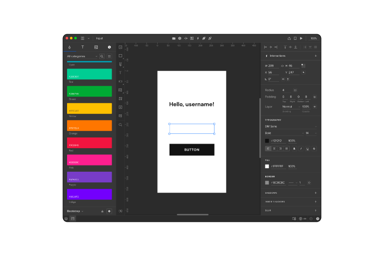

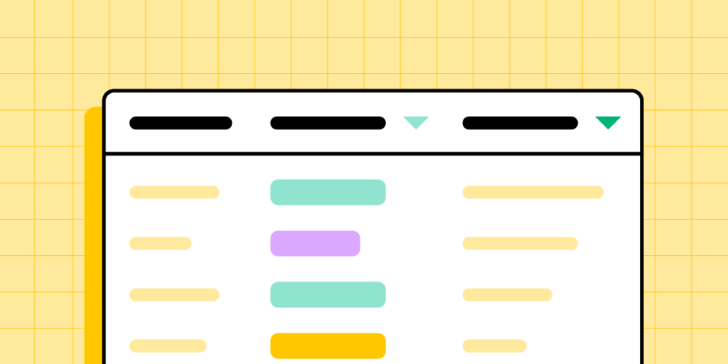
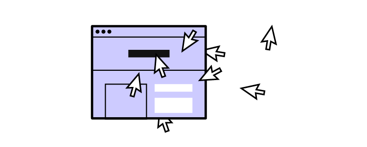

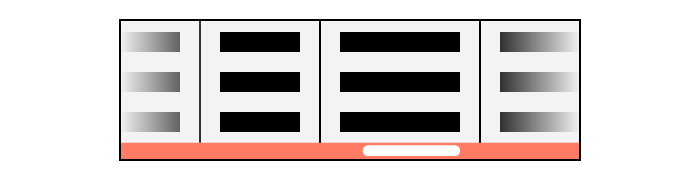
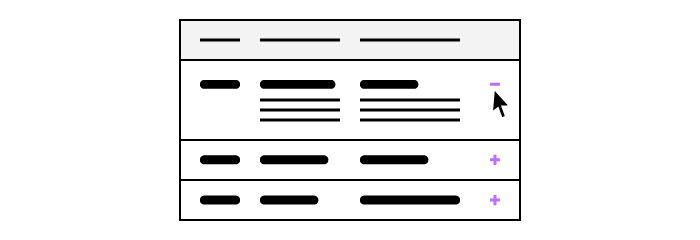
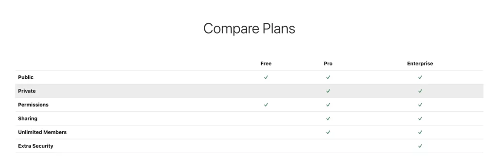

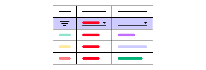
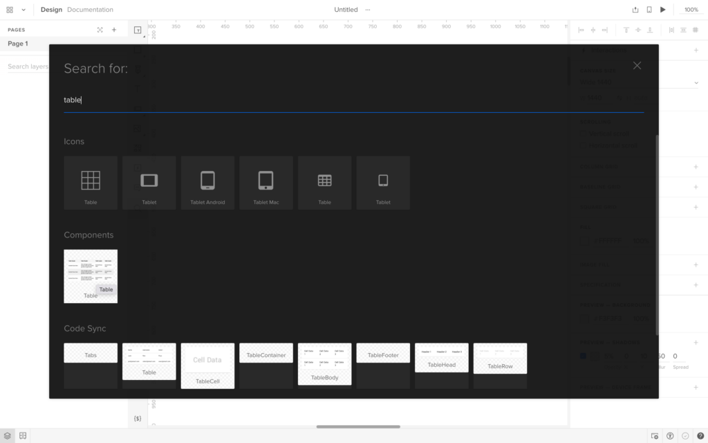
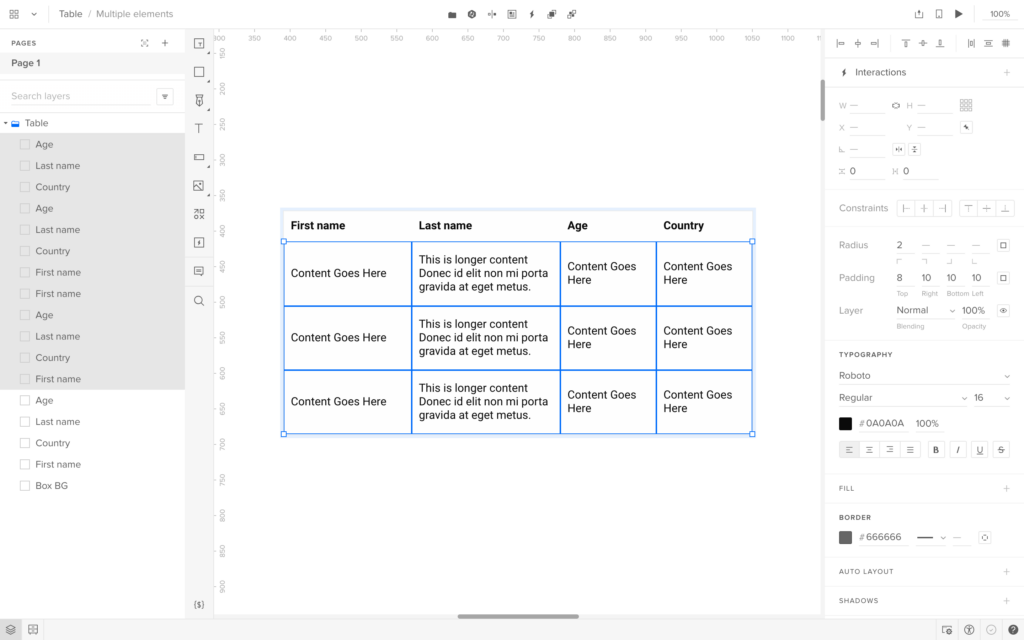
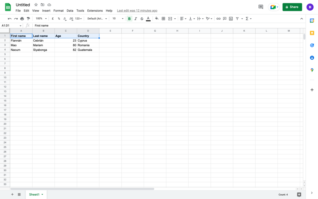
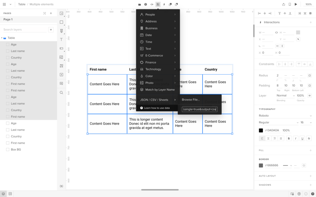
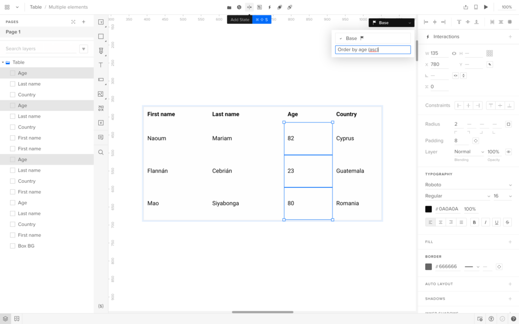
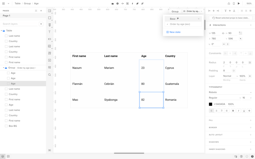
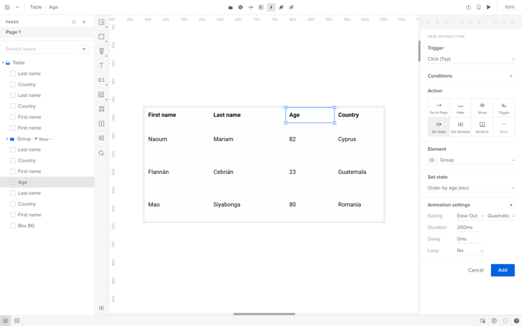
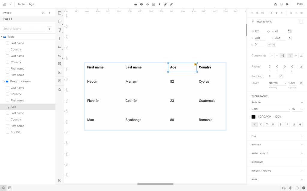
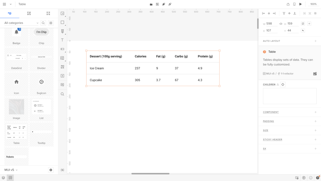

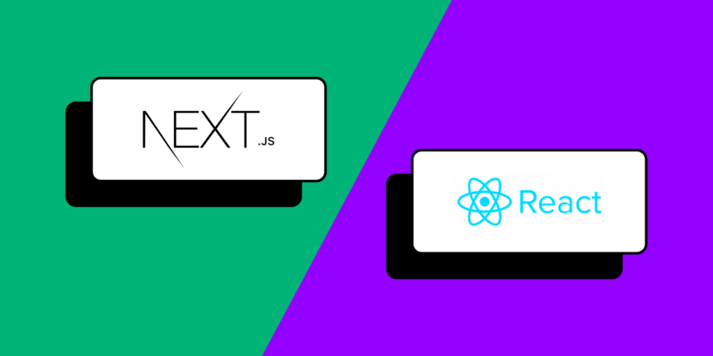


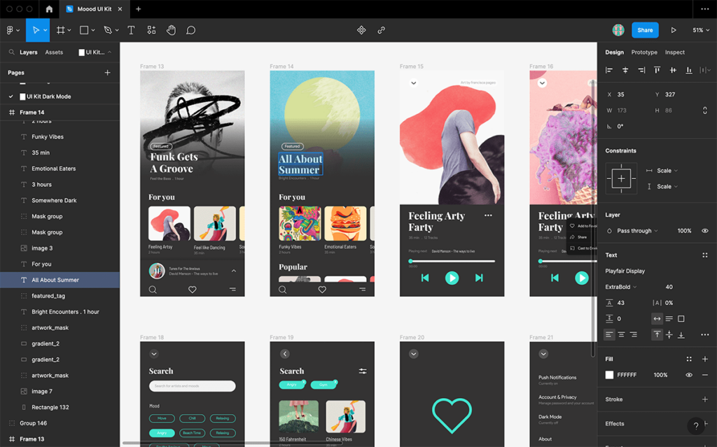
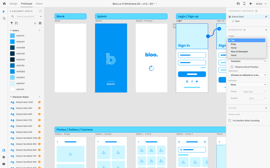


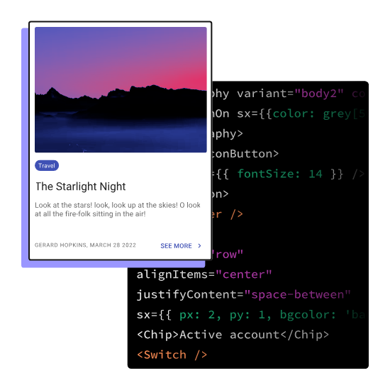
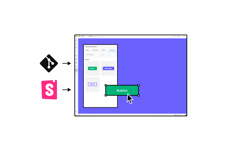


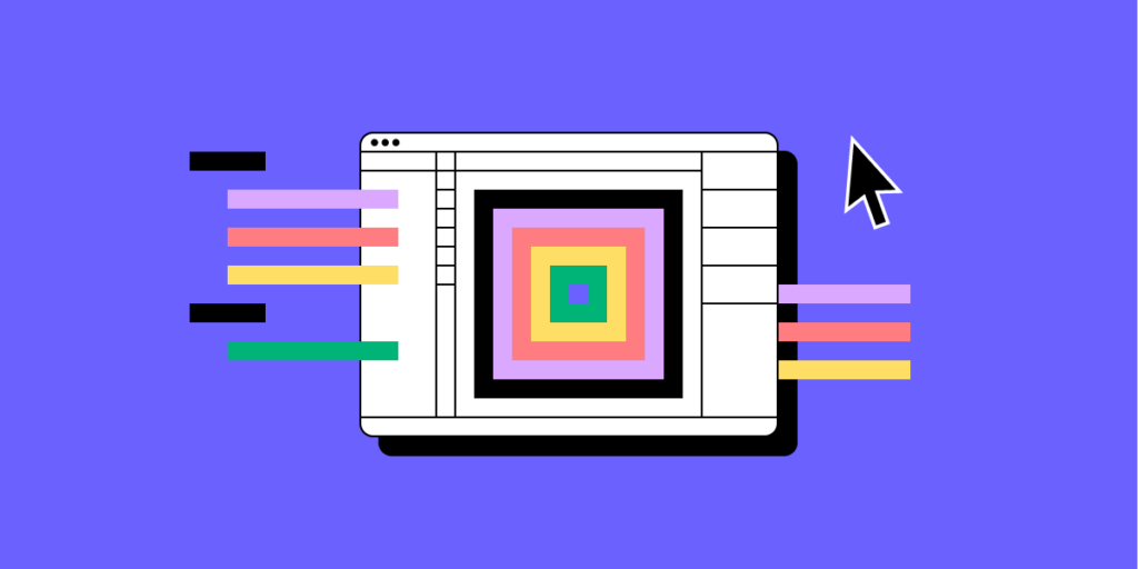
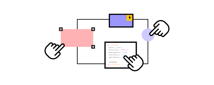


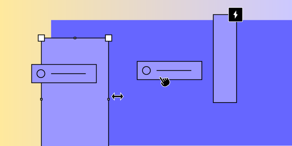
![How to Prototype for Edge Cases in UX Design [Guide]](https://studio.uxpincdn.com/studio/wp-content/uploads/2024/10/Dashboard-Design-Principles.webp)