As a designer, learning about software development tools can help improve design projects and find ways to enhance collaboration with engineers. Such proactive approach can also help design projects increase buy-in for initiatives.
A great example is how Delivery Hero’s product team leveraged front-end debt to get buy-in for their Marshmallow Design System. By understanding how engineers develop components and the errors that add to front-end debt, Delivery Hero’s product team presented a business case that stakeholders couldn’t refuse.
We’ve put together a list of 11 software development tools that can help designers collaborate with engineers better–and some of these can improve design processes too!
Streamline product development workflows and enhance prototyping with the world’s most advanced collaborative design tool. Visit our Merge page for more details and how to request access to this revolutionary component-driven prototyping technology.
Common Use Cases for Software Development Tools
There are tons of tools available for engineers. These tools vary depending on the tech stack, workflows, product, organization size, etc. There are several common reasons why engineers use programming tools:
IDE (Integrated Development Environment) – for writing code
Testing – tools to evaluate and correct code errors
Repository hosting – project hosting, package managers, development tools, etc.
Automation – task and workflow automation
Prototyping – UI and component prototyping
Understanding these tools and what they do can help design teams collaborate to find solutions.
11 Common Software Development Tools
1. GitHub
GitHub is a software development management platform allowing engineers to build, host, share, document, scale, and collaborate on development projects. While there are several similar platforms, GitHub is by far the largest and most widely used.
GitHub offers private and public (open-source) hosting for every type of developer, from beginners and hobbyists to experts and multinational enterprise organizations.
While most designers will never use GitHub, it can offer significant benefits to the design process, like component-driven prototyping with UXPin Merge.
Merge syncs a React component library from a repository (like GitHub) to UXPin so designers can use ready-made UI components (the same ones engineers use for development) for prototyping and testing. Visit our Merge page for more details and how to request access.
2. Storybook
Storybook allows software development teams to build UI components and interfaces in isolation. They can also collaborate with other programmers and invite leads and stakeholders to review UI elements before release.
For example, let’s say your design team builds a new button with multiple states, and you want to know how these will translate to code. Engineers can create the component in Storybook and share a link for designers to preview the button in isolation.
Another significant benefit for design teams is that Storybook integrates with UXPin Merge, allowing designers to import a Storybook component library for prototyping and testing. Where UXPin’s Git integration only works with React, Storybook allows for more front-end technologies, like Vue, Ember, Angular, and more.
3. Jira
Jira is a widely-used project management tool for software development, particularly for agile teams. This crucial DevOps tool streamlines engineering workflows while enhancing collaboration and productivity.
Jira is part of the Atlassian product suite, allowing engineering teams to integrate multiple tools to scale and optimize workflows. It also integrates with the productivity tool Trello to enable organization-wide task and project alignment.
4. BitBucket
BitBucket is another Atlassian product and offers similar features to GitHub, but companies primarily use it for private repositories. The platform is built for enterprise software development, with tools and features to optimize workflows, issue tracking, testing, pipeline management, integrations, etc.
Bitbucket software tools that you hear about
BitBucket syncs with Jira through Jira issue IDs, automating many operational tasks, like updating tickets and notifying cross-functional teams connected via Trello–simplifying DevOps and DesignOps responsibilities.
5. Docker
Docker is a software development tool for developing and deploying web and mobile apps through virtual container environments. Using Docker ensures your application runs the same across multiple operating systems and environments, including iOS, Windows, Android, Linux, etc. If engineers need to change a specific container (like iOS), it won’t impact the other environments.
This cross-platform management solution means the software is system agnostic reducing code while making it easy to deploy and maintain.
The concept of containers can appear complicated for those with limited technical knowledge, so we highly recommend checking out this video from Kyle at TechSquidTV for a foundational understanding of Docker.
6. Visual Studio Code
Visual Studio Code (VS Code) is a popular free IDE (Integrated Development Environment) or code editor from Microsoft. The IDE’s built-in Git (a version control system) allows engineers to connect to source code management (SCM) tools and platforms like GitHub or BitBucket.
VS Code offers an extensive library of extensions to integrate with other software development tools for many programming languages, including Javascript, Python, Java, PHP, HTML, and TypeScript, to name a few.
7. Microsoft Azure
Microsoft Azure is a cloud software development platform with the tools, resources, and services to build, manage, scale, and run applications.
Azure integrates with Microsoft 365, enabling organization-wide collaboration for startups and enterprises alike.
8. GitLab
GitLab is a comprehensive end-to-end product development workspace with tools and services for every stage of the DevOps lifecycle. It also features Design Management–a tool for product, UX, and engineering team members to collaborate on wireframes, mockups, prototypes, and other design artifacts.
Designers using UXPin Merge will also benefit from better GitLab’s Storybook integration. Engineers can add components to the product’s Storybook, which syncs to UXPin via Merge, streamlining design system component releases and updates.
9. Bootstrap
Bootstrap is a responsive front-end framework engineers often use when prototyping websites and web applications. The framework offers a comprehensive CSS grid system and Javascript plugins for out-of-the-box styling and functionality.
Bootstrap is available as a plugin for many design tools and comes standard with every UXPin plan. UXPin Merge users can take prototyping to another level by importing React Bootstrap components using UXPin’s npm Integration.
These ready-made Bootstrap components allow designers to prototype faster and focus on solving problems rather than designing from scratch. They can hand off designs to engineers who can import the same React Bootstrap npm package and copy JSX changes from UXPin to begin front-end development.
10. Chrome DevTools
Chrome DevTools is a debugging and web page inspection tool for Google Chrome. Engineers can debug Javascript and edit CSS in real time to visualize changes before and after writing code.
Chrome DevTools is relatively easy to use, meaning designers can collaborate with engineers and recommend changes, especially during quality assurance for websites and web apps.
Another helpful feature for designers is the ability to test page load performance, including assets. Designers can identify problematic assets (images, video, etc.) and iterate on alternatives to help engineers optimize performance.
Apple’s Safari browser offers a similar tool called Web Inspector.
11. AWS
Amazon Web Services (AWS) is a comprehensive data storage, content delivery, and developer services platform for websites and digital products. One of AWS’s best features is its vast server network spanning 84 zones across 26 geographic locations–enabling companies to deliver products closest to their customers anywhere worldwide.
AWS also offers DevOps services and the powerful web-based text editor, Cloud9 IDE, for writing, running, and debugging code. The platform’s pricing plans include the AWS Free Tier for building prototypes while providing startups with an affordable entry to market.
UXPin Merge – The Best Software Development Tool for Designers and Engineers
Designers: don’t get sufficient fidelity or functionality using design tools
Engineers: takes too long to build prototypes, limiting what they can test
UXPin Merge allows product development teams to sync a design system from a repository to UXPin’s design editor so design teams can prototype using ready-made components–the same ones engineers use to build the final product.
Design teams drag and drop Merge components to build new UIs–allowing them to focus on products and features rather than building from scratch. Merge components are fully interactive with properties defined by the design system, ensuring “baked-in” cohesion and consistency for every prototype.
This drag-and-drop solution is also great for engineers and product teams with limited UX skills and design tool experience. We’ve seen this work for a small startup at TeamPassword and the enterprise level at PayPal.
PayPal’s internal product development teams use Merge to prototype and test new products. The UX team has built a design system using Microsoft Fluent, including UI templates to give product teams approved components.
Bridge the gap between design and development and design better user experiences for your customers with one of the world’s best software development tools. Visit our Merge page for more details and how to request access.
The BASIC UX framework is as simple as its name suggests. Designers measure a product against a set of UX principles to identify usability issues. These principles apply to web design, mobile apps, and other digital products.
What makes BASIC UX great is it’s a checklist template design teams can adopt and adapt to meet their product requirements and user needs. It’s a holistic product development approach that accounts for usability and accessibility.
Design products your customers will love with the world’s most advanced interactive design and prototyping tool. Sign up for a free trial and start designing better user experiences for your customers with UXPin.
What is the BASIC UX Framework?
BASIC UX is an acronym describing five essential user experience design principles for building “usable products.” It’s unclear who developed the framework, but it surfaced around 2016.
There is a BASIC UX website, but there is no mention of any person or affiliations. It’s a bit like bitcoin and Satoshi Nakamoto. Still, BASIC UX works as a checklist for evaluating user experience in digital products.
“BASIC UX is a set of common principles that test something’s overall user experience. The problem that this framework is attempting to address is the need for common UX language and understanding in teams and organizations.” – BASIC UX website.
The purpose of BASIC UX is for product design teams to ask themselves a series of questions related to each principle–similar to the 5 Whys problem-solving framework. If designers can answer yes, they move on; if no, they must find a solution.
The BASIC UX Framework’s 5 UX Principles
The BASIC UX framework uses five UX principles.
B = Beauty
A = Accessible
S = Simplicity
I = Intuitiveness
C = Consistency
Within each principle are a series of questions. These are questions from the BASIC UX framework, but design teams can add questions or create a checklist relevant to their product.
Beauty
Beauty represents aesthetically-pleasing design. Human beings are drawn to beauty in all facets of life, including the websites and applications we use.
Visual design is not the only consideration for beauty in BASIC UX; it includes interaction design, animations, information architecture, and other elements that deliver a holistic user experience.
Does the design use high-quality media (images, graphics, video, etc.)?
Is it properly aligned with the layout?
Accessible
Accessibility is a vital UX design component. Designs must meet Web Content Accessibility Guidelines (WCAG) to ensure a digital product or website is accessible to all users, including those with disabilities.
Products built to accommodate people with disabilities and assistive technologies are often easier to use, which ultimately benefits everyone.
BASIC UX asks four fundamental questions, but an accessibility checklist can guide design teams in evaluating a product comprehensively.
We design products to make people’s lives easier. Simplicity is key to delivering that promise to users. Providing users with clean, minimal user interfaces with only the content needed to complete the desired task is critical for good UX.
Cluttered UI design, with multiple CTAs, poor instructions, and too much copy, increase cognitive load, making it difficult for users to make choices or complete tasks. Simplicity eliminates unnecessary design elements and only provides users with what they need.
Users expect an intuitive user experience. It’s why designers use internationally recognized design patterns for solving core usability issues and prioritize content to meet user needs.
Designers must reduce learning and ensure the user never has to relearn a product after new releases and upgrades. Documentation must help users understand a product and how to complete tasks.
Questions to ask for intuitiveness:
Is the functionality clear?
Is the navigation obvious?
Can the user achieve their goal with little or no initial instructions?
Is this the fastest way for the user to complete this task?
Can a user predict the outcome?
Consistency
Consistency is the foundation for usability and good design. The more consistent a product, the easier it is to predict and use. In a Medium article on BASIC UX, Dan Smith writes:
“Consistency is the thread that holds BASIC UX together. A beautiful product is consistent. An accessible product is consistent. A simple product is consistent. An intuitive product is consistent.”
Designers must always try to reuse components and UI elements wherever possible. Copy, CTA labels, and other text must also use consistent language, fonts, spacing, and sizing.
Building a design system is essential for eliminating inconsistencies, reducing UX debt, improving user experience, reducing time-to-market, and other common product development issues.
Does it appear in the correct place at the right time?
Are the language, media, and branding consistent with the system?
Does it perform tasks and functionings consistently every time?
How to use the BASIC UX Framework
BASIC UX is an excellent framework for evaluating existing rather than new products. Designers can use BASIC as a user experience checklist to check if features, UI components, interactions, etc., meet a company’s UX requirements.
BASIC UX is also beneficial as a before and after comparison for projects. Design teams can use the checklist to check they deliver a project that improves upon any issues identified in the initial BASIC evaluation.
Enhance BASIC UX Principles With UXPin
UXPin is an advanced code-based design tool enabling designers to go beyond basic prototyping and testing. With code-based design, you can build fully functioning forms, validate passwords, create personalized, dynamic user experiences, and acquire meaningful feedback from usability testing and stakeholders.
Maintain consistency with UXPin’s Design Systems. Save your product’s components to a centralized design system that every team member can access from the canvas. Add descriptions for documentation and set permissions to prevent unauthorized changes.
Discover how UXPin can revolutionize your UX design process to deliver products that meet BASIC UX requirements while satisfying business goals. Sign up for a free trial to explore all of UXPin’s advanced features.
It’s predicted that by 2023, the mobile apps market will reach $935 billion in sales. Pretty impressive, right? However, to get a piece of that cake, you need to make sure that your app design is not only pleasing to the eye but also easy to use. Only then you’ll be able to generate high user engagement.
Let us walk you through a few things that your entire team, and especially your mobile app designer should keep in mind while building the best app.
Ready to create an app prototype? Use UXPin and simplify hi-fi prototyping. Build an interface that looks and behaves like a real app, even though it’s yet to be developed by your software engineers. Get better feedback from tests, show stakeholders what the app will be like, and make it easy for developers to see what you want them to build. Try UXPin for free.
3 Steps of an effective design process
There are three app design steps you’ll need to map out and follow to launch a successful product. This is your design process. It’s how you and your team ‘keep your eye on the prize.’:
Plan and research
Design and development
Launch and test
Let’s look at them below.
Step one: Plan & research
During the initial phase, you’re going to define exactly what your product is, how it helps, who it helps, and what your app does that rivals don’t. These are the foundations for building a popular app with a clear user base.
Start by clearly outlining what you want to achieve – in broad strokes. Detail the problems users face, how you think you’ve solved those issues. This is mobile designing at its most innovative and creative.
Focus on your users. The most successful app designs are centred around the user – from who they are to what they want. Call on focus groups, surveys, and phone & face-to-face interviews to uncover what users really want from your app design. They will challenge your assumptions. This is a good thing.
At the same time, analyze your competitors. Even the smallest playing fields have big players. What do they do well (and not so well)? How can you best them?
With all this data, you can then assess, pare back, and refine your goal into a single, shareable vision.
Step two: Design & development
The next step in the process sees you visualize your app design. You’ll start with wireframes – basic mockups that are just useful enough to gather reflexive feedback from users, stakeholders, and your team.
As you progress, you can start building up a consistent design system for color, typography, sizing, and other visual elements. These UI and UX designs will follow through to your high-fidelity prototypes. Such functional mobile designing mock-ups let you continue testing and optimizing the app throughout the design process.
You can then hand over designs to the development team who will build the app. It’s important to prevent bottlenecks during this stage. Designs can so easily tumble back and forth between design and development teams, threatening to derail entire projects as one side asks for X and the other side delivers Y.
When developing your app, you can speed up interactive prototyping and harmonize the design-development hand-off by using software like UXPin. It’s a design tool that lets designers create a prototype that looks, feels, and behaves like the final product. Try it for free.
Step three: Launch & test
Ok, one final test and it’s all systems go. Finally, all your app designing experience comes together for the product launch. That might strike the end of the design process, but the journey is only just beginning.
As you follow the design process, you’ll be assessing the product at various stages. And it doesn’t stop there. To ensure your app remains relevant, popular, usable, and used, continue to collect user feedback that offers new directions for refining.
As a mobile app designer, you need to keep everything aligned to the same objective. It’s all too easy for team members to lose focus, not understand their role, or give in the mission or project creep. Your communication matters.
Offer clarity with a well-defined concept. Before you start app design work, you should be able to articulate:
The purpose – what is your app for?
The audience – who is it for?
The use-case – how will it be used?
The benefits – why choose you over a competitor?
Required resources – what’s needed to develop the app?
Success metrics – how will you measure success?
2. Calculate the budget
Calculate a realistic budget as part of your strategy. It’s crucial for keeping the project on track, as it’ll help prevent mission creep – which sees design and development teams add extra features, leading to spiraling costs and hours of wasted time.
In other words, it actively harms the product design and development (and it’s even more costly if users turn off from these untested features).
This will also help you allocate resources most effectively. A budget should help detail what’s being designed in terms of UI design and UX design, as well as how it’s being developed.
3. Establish the KPIs
What does success look like? As you build a detailed app design strategy, focus on the metrics that really matter to you. There’s no single yardstick against which success should be measured. It’s up to the mobile app designing team to determine a few of the most relevant metrics to your app and your objective.
Number of downloads. Download figures show you whether users like your product enough to install it. If the figure’s too low, you know you’ll need to test ways to increase installs.
Churn rate. Churn shows how many users are uninstalling your app, or not opening it. Use this data to explore what it is that’s driving away users.
Session counts. Session counts and times show the number of users who open your app and how long they stay active within it. It’s a good base to start if you want to figure out why people stay (or go).
These three stages form the basis for a successful 7-step app design strategy. Explore the other four in our dedicated article How to create an app design strategy.
Creating great user experiences
The 5 principles for outstanding user experiences are:
1. Usability
Mobile device screens are small – and that limited space means adjusting your designs accordingly. Actions should be easy to tap, swipe, scroll, and hold with one hand. Avoid forcing users into performing fiddly actions (think of those annoying pop-ups with minuscule X buttons that are difficult to press). It should be obvious to users what to do and how to do it.
2. Familiarity
Familiarity of user interface creates a more engaging and intuitive user experience. There’s no need to reinvent the wheel (or redesign the app). Search bars go at the top, options lurk behind hamburger menus, settings are under the cog icon.
When you use familiar mobile design patterns in your mobile app UI, the onboarding process of new users won’t be difficult.
3. Consistency
You don’t really want users to even think about their actions – it should ‘just work.’ Consistent design principles are really important for making it happen. A good example is always using the same button that indicates adding an item to a shopping cart in your eCommerce app, so users act on instinct.
Another great one is sticking to one or two fonts, so that you increase readability, as well as make your design consistent. At a broader level, every screen in your app should be consistently you to better brand yourselves and immerse the user.
Use UI kit or even better, a component library with a pre-made interactive UI elements such as Material Design, to stay consistent.
4. Accessibility
App designing for accessibility means considering the broad range of mobile devices on the market – and an even broader range of users. Does your app demand a high-speed internet connection? Can users with physical limitations still use your app?
5. Appeal
At the end of the day, a mobile app designer wants users to love their product. When building your own app, factor in audience appeal. Focus on how you can design experiences that are
Simplicity is about making key actions easy to find on-screen. The best way to do this is to limit each screen to one or two core actions. Through an engaging design hierarchy, you can then focus a user’s attention to the right places.
Look at the Amazon app as an example. It offers a masterclass in simple app navigation. Users aren’t overwhelmed with choices. The interface is clean, clear, consistent, leaving users in no doubt what steps to take, whether it’s searching for products or hitting the buy button.
2. Built for mobile
Design your app for mobile devices. It might sound obvious, but all too often mobile app designers effectively ‘port’ a website. While HTML-based apps give you a bit more freedom to update across platforms, the experience is less desirable. You’ll typically find web-like Android and iOS apps laggy, underpowered, and poorly optimized for mobile devices.
Great app design means respecting the user (and how they engage with your product). Ultimately, app designing in this way, in a highly competitive, user-focused marketplace, is a major risk.
3. True design tools
To create truly seamless experiences for all your users, you need the right tools for the job. This gives you the flexibility to build app designs in an efficient workflow, with tools dedicated to your craft.
Design and prototyping tools like UXPin help you realize your ideas precisely as envisioned. The mobile app designing software helps designers and developers build creative, consistent products from wireframes to ready-to-launch apps. And by giving designers access to the same real-world code components used by your developers, you can ensure expectations match reality, no coding skills required. To find out the must-have features in your software, see the section Choosing the right app design tool.
So much for theory – let’s now look at some examples of great app design below.
Example One: Google Maps
Google Maps is a prime example of the app design mantra ‘form follows function.’ It’s perfectly built to fulfill its objective – helping users navigate the entire world from their desktop or mobile device.
The map app makes it simple for users to find specific locations, search by category, and get directions to just about any destination. Better still, it delivers incredible value to its users through imagery, reviews, street views, business information, and sat-nav capabilities.
Despite being loaded with functionality (and stuffed with the whole world), the Google Maps interface is delightfully subtle, never threatening to overwhelm the user. Even if you’ve never used an app before, you’ll know how to get around Google Maps, and how to get around using it.
Example Two: Pocket
Pocket is a clever app that lets you save articles and media to read or watch later.
The app’s interface is fresh and modern. Navigation is smart and intuitive. The experience centers the user, from easy-to-use actions to distraction-free options for concentrated reading. It even works without an internet connection, so you’ll always have something to read on-the-go.
In keeping with all successful apps, user testing was critical to improving today’s iteration of Pocket. Thanks to Google Ventures, developers were able to gather feedback from five users unfamiliar with the app. That feedback was used to create its classically simple interface.
Little wonder Pocket recently won a Webby award for its UX design. But what else would you expect from developers Mozilla, the firm behind the Firefox browser?
Example Three: Etsy
Etsy is the beating ‘art’ of the ecommerce apps, where creators and shoppers meet. The Etsy app is a notable example of simple, effective web and mobile app design – but perhaps that’s to be expected from the arts and crafts supremo.
Crack open Etsy and, unlike so many eCommerce apps, you’re not immediately bombarded with sales messages, deals, star products, and other irritations that clutter user interface. All users need to do is search for what they want or try Etsy’s suggestions.
It’s a strongly visual experience. Images take center-stage, alongside simple product headings. No prices or product names to distract you as you browse. It makes the user experience much more gentle and serene no matter if you use Etsy on Apple or Android devices.
Discover more real-world examples like Airbnb, TripAdvisor, and Uber in our dedicated article on great app designs.
How to avoid common app design mistakes
Don’t add too many features at once
There’s nothing wrong with a feature-rich mobile app. But one of the most common mistakes is when mobile app designers throw all those features into the app at once. Even the most highly functional apps add features over time. This allows them to see what works, what doesn’t, what users want, what they don’t. And it means the app delivers on its singular objective first.
When you begin the app designing process, start off with the core purpose of your mobile application. Make it guide your mobile app development process. You can then add additional features as your app grows in popularity. Be sure to test these features individually. Otherwise, the risk is that you’ll overwhelm users, clutter up your app, and waste precious resources on something that has no real viability.
Maintain a regular updates schedule
The development process starts when your product launches – and it doesn’t stop. Don’t let your app fester after launch. Maintain a regular schedule for updates. It’s a great way to attract and retain users, keeping your app feeling fresh and innovative.
After each update, check out reviews (or, better yet, conduct in-depth testing) to understand where improvements can be made in future.
Test with diverse user personas
User testing offers insights into how your app performs. And the best way to get the most valuable feedback is by drawing on the broadest possible range of users. When building a test group, choose different types of users – think gender, age, and background. All of them will be attracted to your app for varied reasons, and those reasons may surprise you.
By calling on a broad range of user personas, you’re better placed to identify specific and general behaviors that help improve the product. Without a diverse user group, you risk getting locked in a feedback loop, appealing only to a selected few. This can lead to poor app design, which can be expensive to fix post-launch. It’s better to get it right during the design-development phase, and lots of different user types will help.
Read more about the mistakes you should avoid in new app design in our article about bad app design.
Choosing the right app design tool
What should you be looking for when selecting the best design tool for your job? Here are a few characteristics you should keep an eye out for.
1. Simple design-dev handoffs
The moment the design team passes over their concept to development is one fraught with anticipation. It’s a stage in the process where bottlenecks are common, and projects have been known to come to a total standstill as some team members might debate over what the app needs to do versus what’s actually possible.
For this reason, you’ll want to choose a mobile app designing tool that simplifies the passing of design to development. UXPin gives designers the opportunity to design highly realistic prototypes. When devs see the prototype, they can use UXPin to generate CSS automatically.
This leads to easier design handoffs, since user experience and interface design as well as app development processes are connected. They all can meet in one tool. Try it for free.
2. Real-world data
One of the biggest issues with prototypes is just how artificial they feel. All that lorem ipsum and knocked-up design elements break immersion in test groups and fails to showcase the true flavor of your concept. It simply doesn’t look believable, or even look how it should at all.
The best design tools let you populate your prototypes with real-world data. Names, locations, text, and images can all be inserted into designs to better reflect what users will actually see when the product launches. Real-life data like this also gives your team and other key stakeholders a greater impression of what’s being built long before you invest resources into design and development.
3. Collaboration and sharing features
Collaboration is an essential part of the design process – from chewing over product concepts and strategizing your next steps to communicating core functions to other teams. With so many ideas bouncing around, it’s sometimes difficult to log everything and keep everyone fully informed. And that harms the perfecting of your app.
So, choose an app design tool that makes it simple and easy to share ideas and collect & collate feedback. UXPin features support for PDF, PNG, and HTML exports so everyone on your team can check out the latest designs.
To further enhance collaboration and sharing between teams, the UXPin Mirror app offers authorized users the ability to live-preview mock-ups on mobile devices. It’s the ideal way to understand how your app design looks, feels, and acts on other devices, be it Android or iOs. And with edits displayed in real-time, you’ll be able to compare before-and-after shots.
App design trends to watch out for in 2022 and beyond
1. Multidirectional navigation
Scrolling remains the primary way users experience apps today. Up and down and the occasional tap or input. It’s a functional means of navigation, but it’s not fulfilling – even if everything else on the screen is.
Multidirectional navigation introduces a more engaging experience than traditional and limited scrolling. Modern apps are deploying horizontal and vertical sliders that let users swipe and scroll through the app, to evoke more instinctive, natural interactions.
You’ll find this type of design heavily featured in multimedia and dating apps that let you swipe left and right to find everything from stunning shots and radio stations to potential life-partners.
2. Inclusive designs
Mobile devices are for everyone – and your app should be, too. They’re in the pockets and hands of youngsters, pensioners, and everyone in between. Unless you’re targeting a very niche market, a modern app needs to feature inclusive design.
You’re not just appealing to a broad user-base. You’re designing an app that’s accessible and usable by that audience. Whether they’re on a phone or a tablet, have physical disabilities or other accessibility issues.
Subtitles are one of the most common trends in inclusive design. Other examples include using buttons that are big and bold, reaching younger children and those with visual impairments. The same goes for sizing options and adding alt text to images for users with screen readers.
Color blind mode is another accessible feature worth including for those who need it. To make sure you’re creating fully inclusive app designs, UXPin hosts a ton ofaccessibility features, including a color-blind simulator and contrast checker, making it simple to build experiences for all.
3. Dark mode
Dark mode isn’t a new trend in app design. But it is an ongoing one. Users today want apps to be easy on the eye – even, or especially, when we roll over at 3 in the morning to check our inbox. Generally speaking, good UX is not blinding users with a bright white screen if dark mode is available.
Dark mode fits comfortably in mobile app design, as both an accessibility feature, and a user-focused enhancement. A classic case of ‘If they don’t need it, they want it.’ By switching to darker colors, users experience less eye strain, so they’re more comfortable using your app at all hours of the day.
For bonus UX points, let users set a dark mode schedule that turns on at specific times.
The road towards creating a successful, user-friendly mobile app can be lengthy and
time-consuming. The good news is, however, it does not have to be an arduous one!
If you follow a well-thought-out strategy, you’ll be boosting your chances of market success. For starters, it’s important that you divide your app design process into three phases – planning & research, design & development, and launch & continuous testing. Make sure to have a clear understanding of your budget and KPIs. It’s also equally important to use the right mobile app design tools.
If you’re just about to embark on your mobile app designing journey, we recommend taking UXPin for a spin. You’ll be using the absolute-best solution for team collaboration, leverage real data in your prototypes, and make design handoffs as easy as can be.
Irrespective whether you’re creating android or iOS app design there are a number of mistakes which you should avoid at all costs if you don’t want to design a bad UI. Among others, these are:
Including too many features which clutter the design
Did you know that there are about 2.8 million apps on the Google Play store and another 1.96 million on Apple App Store? This means that we don’t have to grind our teeth and tolerate bad app design. For anything we need, we can simply turn to one of the tens, if not hundreds of competing mobile apps.
So, the million-dollar question is – how to avoid user dropout in your app product design? Among others, it’s essential to spot and avoid the most common mistakes in iOS and Android app designs.
Most product design teams build a prototype to test their app design idea and avoid mistakes. If you want to design a prototype, try UXPin, it’s a design tool that allows you to build highly interactive prototypes that are ready for tests. Try UXPin for free.
9 new app design mistakes worth avoiding
Here are a few mistakes that you should avoid while creating android app designs and iOS app designs.
A big mistake that a lot of people make when designing a mobile app is incorporating too many features into the app straight off the bat. While you may want your app to cover a wide range of tasks, including too many features might end up taking away from the app’s core purpose.
In the first place, cover the core purpose, and only when the app becomes more popular and people become used to using it should you start to integrate new features slowly. This will avoid confusion, and it will allow your users to adjust to your user interface as the app evolves.
With that being said, you still need to know when to stop. If you bring in too many features, your app might end up with an information overload, that is your app becoming too cluttered and confusing, despite bringing in the features gradually.
Poor information architecture results in bad app design as the layout and structure of your app’s information aren’t easy to understand or use. As a result, users will be confused about navigating your app and will likely end up abandoning it.
Common problems with poor IA in mobile apps include:
Having too many screens or pages, which can be overwhelming for users and make it challenging to find the information they need
Not using clear and concise labels for buttons and other interface elements.
Having navigation that is not intuitive or easy to use
Using complex or unfamiliar terms instead of plain language
Placing important information in unexpected or hard-to-reach places
It is essential to consider your users’ needs and ensure that your app’s ease of use. By following some basic principles of good UX, you can help make your app more successful among your target audience.
The mobile app development process does not end with its launch. It begins there. So, regular app updates are critical for attracting new users and retaining the existing ones. Although it’s not related to your design process, be sure to gather user feedback once you release the app and try to implement new functionalities.
You can do this by keeping a check on reviews. It will help you get a clear view of the shortcomings and make app improvements as and when needed.
#4 Not displaying key information in a quick and prominent manner
An app’s first appearance and appeal are crucial in enticing a target audience. The first time they use the app, a user forms an opinion about its user interface and functionality. A user may not give an app a second chance if it appears to be complicated or boring, i.e., offers bad UX design and poor user interface design.
The importance of displaying useful information on the initial screen cannot be overstated. All relevant icons, such as login, logout, home page, search bar, contact information, and any other key features, should be on the initial screen.
On top of the above, the loading speed of the app should also be taken into account as a key aspect. Hence, the need for designing light-weight experiences – otherwise, users become bored and lose interest if it takes too long to start the app or load any critical feature. Finally, an app’s color palette should correspond to its function.
An app for professional usage, for example, should not have a quirky colour scheme, while leisure applications should not be dreary or monotonous. Users may become bored and have a bad first experience if the colors aren’t vibrant and solid.
User testing allows you to gather insights about usability, functionality, speed performance, and user experience by letting real people test out your mobile app.
It’s important to test across different types of users – from different gender, ages, and background as they might have different reasons for using your product displaying different behavior patterns.
This way, you can get an idea of the diversity in your users and identify unique behavior or what can be generalized to improve your design. So the takeaway here is to do user research prior to UX design! That’s not all, though.
Test your design with every user set. Show them different design examples, do other types of user testing, and check if you really have the right answer to a problem AKA good design.
If you test with just one user type, you risk being misled by actions that might be accidental or in a spur of the moment. This can lead to bad app design, and – as a result – low conversion rates and usability issues further down the line. It can be significantly more expensive to fix these once your mobile app has launched rather than performing user testing on multiple personas beforehand.
#6 Not launching an MVP version of your mobile app
Daving Stellini of All Front brings up another common mistake among app creators – launching a full-blown app based on assumptions, instead of going with a minimum viable product.
The idea behind an MVP is to identify one critical problem your users have and how you are going to solve it. This way you can focus on your main value proposition and prioritize core features that your users need the most. Instead, businesses add too many non-critical functionalities to impress stakeholders.
The result is a clustered design that can overwhelm visitors and lead to poor user experience. You also create more work for your developers which can result in slow development and delayed launch. All of this can have a negative impact on your business including discouraging people from using your mobile app, low perceived value and low-profit margins.
I had a chance to work on iOS and android app designs for one of the popular airlines. Our company had an extensive website with more than 3000 pages and an old iOS app.
Our job was to build new iOS and android apps that would keep the website functionality, including booking, offers, travel documents, and many other pages. My team and I designed apps from scratch. All the decisions were based on our deep research, interviews with users, and business. We knew all the customers’ problems, and new apps worked perfectly for new users.
When we analyzed the stats, we found out that new users had a better conversion rate than users who already had an account. So all user testing and interviews were based on the behaviors of new users. And we didn’t focus on the current web audience.
The problem was that existing users already had preferences and behaviors that didn’t match the new app structure. That’s why we had many drop-offs and found later users closed an app to continue the flow on the web.
The problem was solved by educational screens and tips for existing users. Also, the structure and IA of the web were updated later based on the mobile experience.
#8 Not including CTAs that would encourage users to share data
Ashley Regan-Scherf, Content Marketing Executive at RGC Advertising
Two of the most important key performance indicators (KPIs) for mobile apps are user downloads and logins. One of the most common mistakes web designers experience is not including enticing enough calls to actions or content to ensure their users hand over personal details, create logins, and interact further with the app.
However, it’s one thing to encourage app users to register, but it’s quite another to make them do so without annoying them enough that they delete the app. For example, some people are cautious of apps that collect too much data, so it’s a good idea to make it optional for users to sign up or register to use your app.
To avoid this common mobile app design mistake, UX design team should offer a good user experience to entice customers to sign up for the app without expecting anything in return. This could mean exploring products before urging them to subscribe, for example, if you’re developing a mobile application.
In iOS and android app designs, avoid hamburger menus unless you have a really compelling reason to use them. All too often, we see these menus being used when in all honesty, they shouldn’t be. Hamburger menus are the very design elements that hide features, reducing their value, and they are hard to reach with one hand when located in the top left corner.
There are many alternatives you can use instead, but we favor having core features visible to users as much as possible to improve user engagement and only reverting to a hamburger for secondary features if the app is complex.
Use UXPin for Good App Design
Want to avoid costly design mistakes? UXPin lets you design prototypes that behave like the final product. This way, you can test the real user experience and observe how your users interact with an app, not what they think they would click on, choose or go to. Start UXPin free trial.
If recent studies are to be believed, that’s how long users spend in apps on their mobile phone every day. It’s a massive 30% jump over the last two years – propelled by tech innovations, better understanding of app design UI UX, and, of course, the pandemic.
And 4.2 hours is just the global average. In certain territories, the average time mobile users are on their apps is more than five hours!
App usage is up. Screen time is up. iPhone and other smartphones sales are up. The digital space grows more competitive by the day. With so many companies vying for an audience’s undivided attention, it’s critical to create the best mobile app design possible. The one that grabs their attention, meets their needs, and, most importantly, keeps them coming back for more. And that’s what we will cover in this article.
Want to prototype a mobile app? Try UXPin to design your app’s prototype that looks and feels like a finished product. Add life to your prototype by using variables, states, and conditions that transform your prototype into a design that can be interacted with. Try UXPin for free.
What is mobile app UX design?
Putting the end user first. In a nutshell, that’s what the mobile app design user experience is all about. It emphasizes creating seamless, user-friendly, and intuitive experiences that chime with what the target audience wants, how they want it, whether it’s about an Apple or Android phone, tablet, or even a wearable device.
The best mobile app design takes into account the function of the app. The look. The feel. The need it fulfills in a user’s life.
Take the Twitter app as an example. Like most big tech companies, it offers a masterclass in getting app UX design right (if we ignore the constant tinkering and updates that seem to annoy half the user-base, of course). Almost anyone, anywhere in the world – whoever they are, whatever device they’re on – can pick up the Twitter app and use it efficiently.
To help you nail app design UX that really excites your users, let’s look at the best mobile app design practices.
5 principles of mobile app design
1. Usability
You have limited space on a mobile screen. Don’t waste it. We’ve all come across apps that fill the screen with clutter, or make X’s on pop-ups too small to press (rendering the whole app unusable – and a candidate for uninstallation). The trick is to find the balance between what your users need to see, and what you need to show to help them achieve their goal.
2. Familiarity
Users like what they know. Whether they realize it or not, they’ll carry that over even when an app design changes with future updates. Maybe it’s muscle memory. Maybe it’s just subconscious. A really good example of this is the ‘search’ icon. Instinctively, we look for this in the top-right corner of the screen. Because that’s where it’s found on almost every app and website. Use data to see what works. Build out from there. There’s no need to reinvent the wheel if it’s clear that users are familiar with the existing design (you can just make it smarter).
3. Consistency
Consistency is important to create seamless user experiences. Design consistency is all about making sure your app follows a single principle throughout. The colors for a particular action, for example, are always the same or feature the same words. A green tick for ‘approve’. A red ‘X’ for no. It allows users to navigate an app without even thinking about it, or worrying they’re on the wrong screen entirely.
4. Accessibility
Modern apps need to appeal to a seriously broad range of users – so that means taking into account the physical limitations of certain users, but also the many different devices that are being used (and where they’re being used – not everyone has access to super-fast internet speeds). You should also consider how your users are accessing functions. For instance, 51% of those over 55 rely on voice functions to access services within an app. An accessible app should reach as many users as possible.
5. Appeal
You want your users to enjoy their time with your app. So, ‘appeal’ should feature high on your mobile app design needs. The app shouldn’t just be a means to an end. You’ll want to deliver an experience that they want to use again and again – whether your aim is to get them to spend more money, or simply spend more time with you.
How to achieve the best mobile app design
1. Create an easy learning experience
Users like an experience that does what they need it to do, in the way they need it, without them even having to really think about it. Building an easy learning experience is the way to ‘train’ users to use your site.
Think of it as a video game. In Super Mario Bros., players are ‘trained’ to achieve their goals – press A lets them jump. Jumping on an enemy eliminates the threat. Eliminating an enemy rewards them with a coin (success!). By the time they face the final boss, players have learned all the necessary mechanics that allow them to win the game.
Steep learning curves will, inevitably, frustrate and discourage people from using an app. For this reason, you’ll want to apply minimalist app design principles that keep things really clear and streamlined. So, for instance, making key functions like a search bar or a link to the home page easy to reach and highly visible.
You don’t want to make users trawl through multiple menu options to reach these, and other popular actions. At the same time, you can add necessary but less popular functions within a collapsible menu, to reduce on-screen clutter.
2. Use push notifications wisely
Push notifications might not be a core part of your mobile app, but they play a major part in the overall app design UX since they help increase user engagement.
However, it’s really important to make sure you’re not just spamming app users with push notifications all the time. Deploy them only when relevant, and when users will consider them valuable. A great example of this is through Uber, which pushes through notifications to a user’s phone when they’re offering a specific deal, usually on a specific day. Or Duolingo, which sends practice reminders when a user hasn’t logged on after a specific number of days.
If you have access to the right data, you might try the same thing – sending push notifications on days when they’re more likely to place an order, or when offering sales on items in a range they’ve previously purchased from before.
Where possible, give your app users control over when and why they receive push notifications.
3. Put familiarity at the center
Base your beautiful app design on what works and what users are comfortable using. It’s easy to want to create all-new experiences that do things in new ways. But the truth is, when it comes to the best mobile app design concepts, building on what’s come before is often best.
That’s because users won’t even need to think about how to use your app. They’ve already done it before, on a thousand apps and websites. The trick is to make it feel new and engaging and on-brand, without disrupting the user journey.
Head to any eCommerce app and you’ll find an experience that’s very similar to the one provided by Amazon. The basket icon at the top-right of the screen. The product images, followed by a description, then the option to ‘Buy now’. And that’s because Amazon has ‘trained’ app users in how to purchase products. So, it makes sense for others to follow Amazon’s lead, to help increase conversions and build an experience that’s familiar to users across the globe.
4. Remember that your users are on the move
Mobile app design means you’re not just building experiences for the small screen. You’re building experiences that fit the user’s environment. You can’t blame (or stop) users from using mobile devices on the go, right? But you can craft minimalist app design experiences that ‘fit’ into that portable landscape.
Sure, they may be on your app. But then a sharp dress catches their eye in a shop window. A friend calls them over. That may break the user’s concentration. If you make it simple for them to dive straight back in where they were, it doesn’t have to break the user flow. Look at how users are using your mobile app, too. Are they looking to be entertained for endless hours or want a two-minute distraction between real-world tasks?
On the design side, remember users who are on the move will lack precision motor control, so don’t make buttons and actions fiddly. Think touch and gyro to help them navigate. And consider what users see. Whether you’re building a website or an app, designs should always be simple to parse at a single glance. This becomes even more important for users on the go, bobbing their heads as they walk and getting distracted by the world around them.
5. Don’t clutter your design
Prioritize simplicity in mobile UX design. That’s all users really want from a mobile application. Just look at the top downloads in any app store.
To bring this to life in your own beautiful app design, avoid clutter at all costs. It risks confusing and frustrating users.
Let’s say you’ve developed a smart translation app. There are loads of elements you could squeeze onto the page. Dictionaries, ‘word of the day’, options to translate voice and text, take a test… But decide what’s the core action you want on any single screen.
A clear focus means you won’t be tempted to clutter up the screen. Build this minimalist app design around one-handed navigation. Whether it’s a text field or a call-to-action button, it needs to be easy to see, read, and reach with one thumb.
Keep visual hierarchy top of mind. Use images, colors, different fonts, and sizes to direct users to the right place. Instead of using loads of text, display information visually wherever possible – a really great example of this is Google Calendar’s Schedule View. Graphic design is still important in UI design.
6. Use autocomplete and one-click actions where possible
As part of your ‘simple’ design look for other ways to remove friction.
Auto-completing forms, offering auto-sign-in, and one-click actions are good examples, especially if you’re deploying an eCommerce app.
For instance, everyone knows how hard it is to correctly input an address on a mobile screen. And, even if it isn’t, they may still need to look elsewhere (the contacts app, a wallet, even a little black book) to make sure they get it right. Autocomplete forms remove this. As do quick actions like ‘order again?’. In one tap, users have completed the user journey.
7. Remember about voice UI
When you’re focusing on beautiful app design, it’s easy to build around touch. Beauty is in the eye of the beholder. So, we consider the visual elements of the design first. We ask ‘does it look nice?’ and ‘is it a minimalist app design?’ and wonder what buttons a user needs to press to achieve their objectives. But don’t neglect voice user interface.
Voice UI – present in every smart speaker and almost every modern smartphone – lets your users interact verbally. VUI may become as much important as visual design in the coming years.
No need to touch or even look at the screen. It makes your app instantly more accessible, increasing your user base to include those with motor disabilities (or just those who want to use your app while driving their car).
The design process for planning Voice UI can take a long time to plan and execute when it comes to the app development process. Such user interface design requires a lot of ux research, testing and an extensive prototyping stage. Yet, it’s worth doing, especially if you want to make your user interface design accessible.
Use Those Tips in Your Next App Design UX
Nothing is more important than your users. They’re the ones downloading your app, coming back each day. In the competitive digital space, designers and developers can’t afford to create unfulfilling user experiences. The kind that overwhelms or leaves them lost, forcing them to hit ‘Uninstall’ faster than The Flash can sprint.
Good mobile app design UX has trained us all to expect the app to serve our needs, not the other way around. User-centric designs need to be intuitive to navigate and simple to use. As natural as opening the mail or closing a door. But a million times more fun for them.
Try UXPin for Mobile App Design
Ready to apply mobile app design tips? Sign up for UXPin’s trial and start prototyping your mobile app. UXPin is a powerful design tool that makes interactive prototyping fast and easy. Use variables, states, and conditions to breathe life into your design, share it with your stakeholders and see how they move around your app instead of just admiring its looks.
Apple. Facebook. Twitter. Google. Pinterest. These companies all have one thing in common–they create habits among their users. People use these products habitually on a daily basis, and they’re so compelling that many of us struggle to imagine life before they existed.
But creating habits is easier said than done. Even though I’ve written extensively about behavior engineering and the importance of habits, there are few resources to give designers the tools they need to design and measure customer habits. That’s why I wrote “Hooked: How to Build Habit-Forming Products,” which explains the four-step Hook Model that can help form habits among your users.
Design habit-forming digital products your customers will love with UXPin’s design tool. Prototype at higher fidelities with real-like functionality for improved testing and results. Sign up for a free trial.
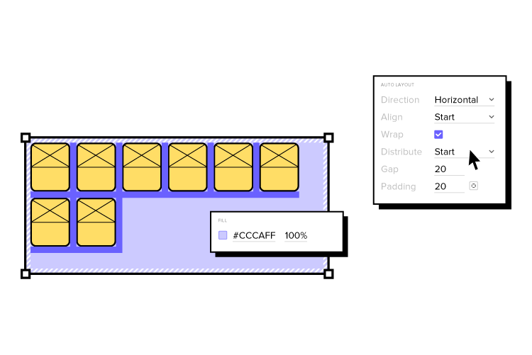
Build advanced prototypes
Design better products with States, Variables, Auto Layout and more.
Nir taught as a Lecturer in Marketing at the Stanford Graduate School of Business and Design School and has worked in the video gaming and advertising industries, where he learned and applied behavioral strategies and techniques for influencing users.
Nir Eyal’s Hooked Model is based on behavioral design–how to influence user behavior through product design.
Human beings are creatures of habit. If you can design a habit-forming product, you essentially have someone “hooked,” thus increasing usage, user engagement, customer life cycle, growth, and other crucial business metrics for long-term success.
The hooked model is one of the most effective behavioral design frameworks because it identifies patterns that keep users habitually engaged. Most importantly, Nir’s Hooked methodology aims to apply these methods ethically so that companies deliver habit-forming products customers love.
Here is more about the Hooked Model from the creator himself, Nir Eyal.
The Hooked Model
Before we take a look at Habit Testing, it’s important that we familiarize ourselves with the Hook Model–aka the Hooked Model.
As described in my book, the Hook Model is a four-step process businesses use to hook users and form new habits among them. The four parts of the model include trigger, action, investment, and variable reward.
Trigger
The trigger is the spark for a behavior that gets someone into a system. There are two types of triggers:
External Triggers
Internal Triggers
The external trigger alerts users with something like an email, link, or icon. Internal triggers happen within the system and are formed as users cycle through successive hooks while using the product.
Action
Action is the behavior taken when a user anticipates a reward–for instance, the action of clicking on an image on your Facebook feed.
When you click that image, you anticipate that you’ll be taken somewhere interesting, such as the latest listicle on Buzzfeed. This anticipation is essential to the model because it draws upon usability design to drive users to take action.
Variable Reward
The variable reward is the part of the model that allows you to create a craving in users. Rather than using a conventional feedback loop, you can serve a multitude of potential rewards to hold a user’s interest.
For example, Pinterest does this by showing you images that are relevant to your interests along with other things that might catch your eye.
Investment
The investment phase is the part where the user now has to do some work. Think of it as giving back to the product, which can take time, data, effort, social capital, or money.
But this isn’t solely about swiping their credit cards. Investment is an action that will improve the product, such as inviting new people into the system, giving feedback on features, etc.
The Hook Model is a great way to start considering how you bring users into a system, hook them and keep them there through variable rewards and internal triggers. In the end, you’ll be able to build habits among your users that will have them coming back for more.
An Introduction to Habit Testing
Habit Testing fits perfectly into the Hook Model.
With Habit Testing, you’re better able to answer three vital questions:
Once you’ve released your site or app into the wild, you must start reviewing data. Don’t track everything: focus on when users interact with your website, including the path of their visit.
Let’s go through the three steps of Habit Testing.
Step One – Identify
The first step is where we look at the first question of Habit Testing: “Who are the habitual users?”
Here are some tips for doing that:
Define the characteristics of a devoted user. Ask yourself how frequently someone should use the site, assuming that you will resolve most bugs and the product is nice and polished.
Be real with yourself. If you’re working on a social network app like Instagram, you’d expect habitual users to be on the app many times a day. But if you’re building a movie recommendation site, you might not expect people to visit more than three times per week.
Crunch the numbers. Once you know how often someone should use your site, check the data to see how they stack up against expectations. Create a cohort analysis as a baseline for measuring upcoming iterations.
When defining the frequency of use, don’t be overly optimistic by thinking only of super users. Aim for a reasonable guess. For example, you could average the product use between yourself and your coworkers.
The more frequently someone uses a product, the more likely they’ll form a habit.
An excellent way to measure whether someone will actually use your product is to see whether your team is using it. Take, for example, Twitter. The social media giant was born within Odeo–the original company Biz Stone and Jack Dorsey founded. They knew they were on to something with Twitter because the engineers couldn’t stop playing with it.
In any case, you’ll hopefully have at least a few users who interact frequently enough with your product for you to call them devotees.
Editor’s note: To learn more about how to influence customer behavior with design, check out the free e-book Interaction Design Best Practices.
Step Two – Codify
The next step is to codify the steps devotees took using your product so you can understand what hooked them.
First, how do you know you have enough devotees? A safe guideline is roughly 5%.
Keep in mind, however, that your rate of active users will need to be much higher to sustain your business. If at least 5% don’t find your product useful, you have a problem. If you have that 5%, it’s time to find the Habit Path, a series of similar behaviors shared among your most loyal users.
Not every user will interact with your product in the same way. Each one will have a unique data fingerprint, which will reveal usage patterns that will help you discover the Habit Path.
Let’s go back to Twitter. The social media app discovered that once new users followed enough other members to odds of more people using their site increased.
Here’s how you determine which of the steps in the Habit Path were critical for creating devoted users:
Create a hypothesis. Where was the turn that turned passers-by into devotees? This hypothesis could feel like assuming causation from correlations–but it’s the best you’ll have in the murkiness of launching a new product.
Talk to users: Learn how they use the product and why they use it. For instance, you can walk them through the actual steps that got them hooked.
Step 3 – Modify
Now that we have a hypothesis, it’s time to return to the build. We need to measure, learn and take new users down the Habit Path we’ve discovered.
For example, leveraging their Habit Path, Twitter’s onboarding process suggests accounts for new users to follow. You’ll want to do something similar once you’ve identified the path that turns onlookers into devoted users of your product.
Design Habit-Forming Products With UXPin
UXPin is a design tool that enables designers to prototype and test at higher fidelity with real-like functionality. Usability participants and stakeholders no longer have to “imagine” what a feature does with UXPin’s fully functioning interactive prototypes.
This higher fidelity and functionality means design teams get meaningful feedback and accurate results during testing with end-users. The limitations of a design tool no longer constrain designers. Instead, they can focus on building products and features customers will love.
Discover how code-based design can revolutionize your product development and deliver high-quality user experiences to your customers. Sign up for a free trial to explore UXPin’s advanced prototyping features.
A product and its design system are ever-evolving projects. As the product scales, designers must create new UI patterns and components to meet business goals and user needs while solving usability challenges.
UXPin’s Patterns allow design teams to combine existing Merge components with standard UI elements to create new UI patterns and save them to a UXPin library.
Create a fully-integrated design system and deliver a single source of truth to your product development teams with UXPin Merge. Head over to our Merge page for more details and how to request access to this revolutionary code-based design technology.
Reach a new level of prototyping
Design with interactive components coming from your team’s design system.
What is UXPin Merge, and how can it help you?
Merge allows you to import a component library‘s elements hosted in a Git repository, Storybook or npm package to UXPin’s design editor, so the entire team uses the same design system. Then, designers can use those elements and build prototypes that are fully consistent with end product.
Traditionally, most design systems feature two UI libraries:
Although many organizations claim this dual system is a single source of truth, achieving it takes a lot of time and resources.
UXPin Merge is genuinely a single source of truth because there is only one component library. Designers and engineers use the same UI elements and patterns from the same repository.
You can sync React components using Merge for Git or UXPin’s Storybook Integration for other popular front-end technologies like Vue, Ember, Web Components, Angular, and more.
Designers can also import the npm packages of open-source component libraries like MUI, Bootstrap, Ant Design, Lightning, etc., through Merge’s npmIntegration to build fully-functioning prototypes or a minimum viable product (MVP).
What is the UXPin Patterns?
Patterns is a Merge-exclusive feature enabling design teams to combine Merge components and standard UXPin UI elements to build more complex UI patterns.
In the context of Brad Frost’s Atomic Design, Patterns allows designers to take atoms and molecules (foundational UI elements and components) to build larger, more complex designs like organisms and templates (cards, forms, navigation, headers, footers, etc.)
Some of the most common use cases for UXPin Patterns include:
Creating advanced components not available in your current library
Save properties for your most commonly used component variants
Grouping and saving Merge elements into bigger UI patterns
Sharing new UI patterns with design teams to enhance consistency
Promoting new patterns for engineers to add to the component library
Designers can combine UI elements from multiple component libraries or UXPin Classic components to create new patterns. This flexibility is beneficial if your design system doesn’t have the parts required for a new UI pattern.
For example, let’s say you want to build a header navigation with dropdown menus, but your current design system doesn’t have them. You can use UXPin’s npm Integration to import a dropdown menu from MUI (or another open-source library) and use it to build the new navigational pattern. Engineers can read MUI’s docs and view the JSX code to understand how to code your new pattern and add it to the design system.
3 Benefits of UXPin Patterns
Patterns offer three primary benefits to product development and design system teams. The common thread among these three benefits is that Patterns provides a comparable alternative when your Merge repository doesn’t have what you need.
1. Nesting UI Elements to Build Complex Components
Even with a comprehensive design system, designers often have to create new components and patterns as the product evolves. Often, these patterns don’t exist in the design system, so designers must build them from scratch every time.
Designing from scratch can add valuable time to your project, especially if you’re building something like a graph or data table. Instead, you can create these complex patterns once and save them to your UXPin Pattern library. You can also share these with other designers so teams aren’t doing duplicate work or creating inconsistencies.
While many design tools offer this functionality, none allow you to manipulate and combine code components. With Patterns, designers take on a hybrid designer/engineer role capable of building fully functioning, complex UIs without writing a single line of code.
2. Reusing Properties for the Same Component
Even though Merge allows designers to build prototypes significantly faster than image-based design tools, there’s always room to create greater efficiency.
For example, you might want to save patterns for various Merge form input or button states, like default, error, warning, and success. With Patterns, you can set these up once and save them to your pattern library, ready to drag and drop for the next user interface.
These pre-built patterns are especially useful for design sprints or making quick changes during stakeholder meetings and user testing. Instead of fiddling with properties in UXPin’s Properties Panel, you simply drag the desired pattern onto the canvas, ready to go!
3. Promoting & Testing new Design System UI Elements
New UI elements don’t magically appear in your design system. The DS team must build and test these patterns before release. With UXPin Patterns, the DS team can combine existing components with UXPin Classic or open-source libraries to test and iterate at higher fidelity and functionality.
Component-driven prototyping with UXPin Merge and Patterns allows designers to test and iterate with less input from engineers, who are free to focus on developing the final component and working through any design system technical backlogs.
With Patterns, design teams don’t have to wait for engineers to develop the new component. They can use the prototype pattern created by the DS team to continue the design and testing process without compromising fidelity and functionality.
UXPin Patterns is a fantastic tool for creating one-off or rarely-used UI components. These patterns aren’t used enough for promotion to the design system, but design teams still need access to them.
Storing these in your UXPin Patterns Library provides the benefits of fully functional Merge components without adding them to the design system’s repository. Engineers can store the component in a separate repository and use it when needed.
How to use UXPin Merge Patterns?
This quick demo shows how easy it is to create a new Merge Pattern in UXPin. We’re using the same components we imported for our MUI npm Tutorial, which you can check out here.
The pattern below features three MUI components imported using Merge’s npm Integration and two UXPin Classic text elements–not going to win any design awards, we know!
But even a simple pattern like this takes some setting up, so it would be nice to eliminate that repetitive task by creating a reusable pattern.
Step 1
Add and arrange the components you want for your pattern. Remember, you can combine multiple component libraries and UXPin Classic elements.
Step 2
Set the properties for the Merge components.
We’ve created an email input field with a placeholder and some help text for accessibility. We’ve also made this field required so users know they must complete it.
Next, we’ve added an MUI checkbox that users must check to accept marketing from us.
Lastly, we’ve chosen an MUI button and set it to primary so it’s obvious where users must click once they complete the email field and checkbox.
Here is an example of the email component’s Properties Panel.
Step 3
Switch to the Patterns tab on the left sidebar above your component library.
Step 4
Select the group of UI elements or a single component you want to save as a pattern. Click the large white + Add button in the left sidebar, and your new pattern will appear.
Step 5
Click on the pattern’s name to change it to something more descriptive or to align with your design system’s naming convention. Once you have multiple patterns, you can use UXPin’s search feature to filter what you need.
Deleting a Pattern
You can also delete any old patterns by clicking the pencil icon (“Enter edit mode”) below.
Select the patterns you want to remove and click Delete.
Creating Different States
Now that we have a default pattern, we might want to create additional states to optimize our workflow further.
For example, we can set up an error state pattern triggered when the user doesn’t enter an email address.
We could also create a disabled state for the button that’s only active once the user enters a valid email address and checks the marketing terms.
Now we have three newsletter patterns ready to start prototyping. Designers can drag and drop to make quick changes without worrying about setting properties or switching individual components from the pattern.
Ready to streamline your workflows with UXPin Merge and Patterns? Request access to Merge and let’s get going.
With limited resources and competition from other departments, creating a compelling business case for UI/UX design initiatives is crucial to secure buy-in. You must prove you have the best solution and can execute your initiative successfully.
This article discusses how user experience design professionals can create a convincing UX business case, including an example from the UAE-based home delivery service, Delivery Hero.
Use UXPin to create a fully functioning prototype to support your business case. Stakeholders and usability participants can engage with prototypes like they would the final digital product. Sign up for a free trial to discover how code-based design can revolutionize your UX workflows and usability testing to improve product development.
Build advanced prototypes
Design better products with States, Variables, Auto Layout and more.
What is a Business Case?
A business case outlines the benefits of a project, initiative, or strategy and why the company or department needs it. A UX business case relates specifically to design-related projects–for example, building a design system, purchasing a design tool, or investing in a big UX research project.
Through a business case, the UX team must:
Demonstrate a need (or problem) for the expense(s)
Offer a design solution
The solution is often more effective when paired with a value proposition. How will this project deliver an ROI for design and the organization?
Why do you need a Business Case for UX?
Getting buy-in from stakeholders can be challenging, particularly for UX projects. Many non-designers don’t understand user-centered design principles or design thinking and are reluctant to make design investments.
Your UX business case must show stakeholders how improving a product’s customer experience is good for the bottom line. For example, a design system is a significant investment. Stakeholders often can’t see how a library of reusable components will deliver business value, so designers must demonstrate this value through a business case.
Delivery Hero’s Business Case Value Proposition
Delivery Hero is an excellent example of using a value proposition in a business case for a design system. After several attempts at pitching their design system to stakeholders, Delivery Hero’s product design team realized they had to make a more convincing case, including a real-world case study and value proposition.
Delivery Hero’s product design team used a single screen to compare building a user interface with and without a design system. The results were staggering:
Building without a design system – total time: 7.5 hours
Building as a reusable component – total time: 3.25 hours
The experiment demonstrated a 57% time reduction in front-end effort and zero percent front-end debt with a reusable component.
Front-end debt had become a compounding issue for Delivery Hero, so eliminating this problem and reducing delivery time by almost 60% demonstrated a significant return on investment for stakeholders.
Delivery Hero’s stakeholders were impressed with the results and gave the go-ahead for the company’s design system, Marshmallow–read more about Delivery Hero’s story here.
What should you include in a UX Business Case?
Now that you understand a business case’s purpose and importance let’s explore the points to include.
Executive Summary
Mission Statement
Market
Problem Statement
Proposed Solution & Value Proposition
Risks
Roadmap
Required Resources
Team
It’s important to note that you won’t always use all these points, only those relevant to your business case and project. The goal is to keep your business case thorough but concise. If stakeholders want to see the research, you can present that separately.
Executive Summary
An executive summary summarizes your business case and its sections. Essential elements to include in a business case executive summary are:
The problem
Your solution
Mission Statement
The mission statement summarizes the project’s purpose and goal. It’s usually a few sentences and can appear on the same slide as your executive summary. The mission statement guides the design process while uniting team members and stakeholders on a common idea and purpose.
If your UX business case is for an internal initiative, you can replace this section with The Users and identify who your project aims to serve. For example, a design system helps product, UX, and engineering teams, but it also positively impacts end-users. You can represent your end-users with personas so stakeholders can empathize with real people.
“Select and emphasize problems that will appeal to your audience.”
When pitching to stakeholders, demonstrate how the problem impacts the business, rather than only focusing on the design team.
In Delivery Hero’s case, the product team showed that their current project workflow accumulated front-end debt, inconsistencies, and slow time-to-market, ultimately costing the business time and resources.
If you’re presenting a problem that directly impacts users, you may want to include UX artifacts like a customer journey, user research, and other UX insights to give stakeholders a clear understanding of the issue.
Framing the Problem:
Laura’s next step is to frame the problem around your target audience:
Identify the core problem
Outline who the problem impacts and how
Describe the adverse effects on your audience and the business
Proposed Solution & Value Proposition
Describe how your solution solves the company’s problem and its value proposition. The value proposition is critical for your business case. It describes the value and return on investment (ROI).
Stakeholders are less concerned about solving workflow issues than business-related impacts. How does your solution deliver an ROI?
Amber Jabeen from Delivery Hero’s design system team says your solution must use business metrics and KPIs to describe the positive benefits for the organization. How will you reduce costs, increase revenue, improve time-to-market, or make the product more competitive?
Risks
A thorough business case also considers the risks and how you plan to tackle them. Stakeholders like to see that you’ve looked at your solution from multiple angles and prepared for potential issues.
In her article, Laura van Doore from Atlassian says, “Be realistic, rather than utopian…If you sell the dream too much and present a utopian story of success-only, your case will seem too biased and might get chucked to the bottom of the pile.”
Roadmap
Another critical element to your business case is a timeline or roadmap. How long will it take to deliver the project, and when can the company expect to see the value you outline in your solution. What are your KPIs so stakeholders can monitor progress?
Again, it’s important to use relevant business metrics. For example, when discussing human resources, estimate the total hours per department, i.e., design, product, engineering, etc. This breakdown allows stakeholders to see how the project affects the company’s human resources and other projects.
Required Resources
What resources will your project need?–human, financial, technical, design, etc. If possible, include multiple scenarios to give stakeholders options based on available resources.
Think about what resources you’ll need before, during, and after the project delivery. For example, a design system requires a design audit before you start, people to build and deliver it, and a team to manage and scale it. As a design system matures, it requires more resources.
Team
Describe your core team behind the business case and the people you’ll need to deliver and scale the project, most notably:
Your business case must include a pain point that adversely impacts the product, its users, and the business. Stakeholders are less likely to take action if you only show how a problem affects team members.
Suppose you can prove that problem creates rework (extra cost), usability issues (losing users and producing costly support tickets), technical debt (extra cost), and slow time-to-market (less competitive and revenue loss). In that case, you have a real pain point to grab stakeholders’ attention.
2. Build a value proposition
Build a value proposition around your pain point. Your solution must solve the issue and deliver a return on investment. Remember to be realistic and show stakeholders you have weighed the risks.
3. Identify your biggest supporters and sponsor
Finding leaders and stakeholders outside of UX to support your business case will give it more weight. They will advocate that:
The problem you identify is real.
Your solution and value proposition are the best option.
Include these advocates in your business case and possibly a quote from your most influential stakeholder.
4. Show before you tell
People outside of UX have trouble understanding user experience and design thinking principles. Explaining the problem isn’t enough; you must show them what’s wrong and how it impacts the business.
As we saw from Delivery Hero, Amber’s team presented an experiment showing the inefficiencies and problems costing the company time and money. They proved their solution could solve the problem and deliver value to the organization.
If you present a theory to stakeholders, they’ll send you back for proof. Take the time to conduct tests and experiments to prove you can execute your solution, and it works!
5. Talk business metrics
Your problem and solution must include numbers to support your business case. Stakeholders want to see metrics and KPIs to assess:
The state and scale of the issue
How your solution improves these numbers
6. Don’t go alone – build your network
Talk to cross-functional team members, leaders, managers, and everyone impacted by the problem to get their support and buy-in for your solution before presenting a business case to stakeholders. When you have the organization behind your project, it’s more likely to get approval from decision-makers.
Support Your Business Case With a UXPin Prototype
UXPin’s code-based design tool allows designers to build fully functioning prototypes with code-like fidelity and functionality. Instead of imagining how a feature will work, UX designers can accurately replicate the final product experience–creating a more convincing business case for stakeholders.
App design tools help craft smoother design processes – breathing life into concepts and bringing teams closer together.
However, mobile app development processes are often fraught with frustrations. Especially at the design handoff stage, which can derail the entire project through an endless volley of back-and-forths.
If you’re struggling to foster cross-departmental collaboration, if your user interface designs aren’t coming out like the prototyping tool promised, or the workflow feels inefficient, then looking for a better alternative to your current mobile app design tool is a must.
But what key features should you look for when choosing your app design software? Let’s see what are your options if you want to build a prototype of your next mobile app, gather feedback, and pass your product design to developers for their app building process.
Any app design software needs to let you build prototypes for various stages of your design process. You may want the start with creating wireframes – basic, non-functional templates used to communicate a broad outline of your UI design, so this is the feature you may focus on.
But you’ll also need to design fully functional mock-ups that look, work, and feel exactly like the finished mobile application. These are essential when conducting user testing and gathering feedback (which helps to make your app user-friendly.)
A top app design tool like UXPin makes it simple to innovate designs at every stageof a mobile app design.
UXPin will let you build an interactive prototype that’s high-fidelity by default. By setting up custom triggers and conditional interactions, which only activate after a user performs a specific set of actions, you can effectively breathe life into previously non-interactive prototypes – whether it’s a simple click-through or advanced animations.
The app design software makes it really simple to create more than onedefault state for these elements. You can create a single button with default behavior depending on a user’s action. To help tailor the experience further,variables offer a way to store inputs and take actions based on that data.
Ideally, you want your prototypes to mirror the final product as closely as possible. It’s vital, getting buy-in from stakeholders in the company, gathering user feedback, keeping everyone working on the project on track, and nailing that awesome vision for eCommerce store, Android application, or an Apple plugin.
But one of the biggest obstacles to keeping that vision ‘pure’ is the back-and-forth between design and development. An exasperated ‘I want it to X’ met with an equally exasperated ‘It doesn’t work like that, the transitions are completely off.’
That’s why you need a design tool that doesn’t have a huge learning curve for your developers to get it. Tools like UXPin has a Spec mode in which your engineers can inspect the design, be it for a web app or mobile one, and clearly see what should be built and how it should behave before they start implementing the prototype in their development platform.
2. Easy design handoffs
Design handoffs are a tricky part of the process. Design proudly hands over their brilliant ideas – only to be met with stone-code reality. Bottlenecks are pretty common, irritations become frustrations, projects feel like they grind to a halt as the teams go back and forth with fresh ideas to make it all work as imagined.
Any UX app design tool worth its weight in gold needs to make these handoffs smoother. For the good of the design process and everyone involved in it.
Because UXPin is a high-fidelity app design tool, developers will be immediately familiar with the components laid out by designers (and design projects automatically generate CSS details for devs). Just to keep everyone on the same path, all project-specific specs and documentation are a few clicks away.
The result is a smoother design handoff. Designers know what’s possible and developers know how it all works. Some designers are using Zeplin or Marvel to pass on their designs from Figma or Proto.io to developers, but with UXPin you can design interactive prototypes of MacOs, Android or web apps, and hand them over to developers without switching to another tool.
Other people skip prototyping phase and they go straight to no-code app builders. It’s okay to use them when you’re a beginner who learns their craft or if you are making an MVP, yet complex, comercial apps may find no-code solutions hinder their ability to scale.
3. Designed for fast iterations
A robust design process goes big on iterations. They’re a snapshot of the project at various stages. Instead of sharing an actual work in progress, you can link to previous iterations to help you assess design ideas (and assumptions, thoughts, and hunches).
Ideally, your mobile app design tool needs to be able to quickly create iterations of a project – and just as quickly let you pull up an older iteration if user testing reveals a flaw in the latest design. In UXPin, you’re easily able to grab past iterations.
UXPin Merge extends that level of control to all your different versions. At best, using different design system versions for different prototypes can be frustrating. At worst, they can derail the workflow. UXPin Merge makes it quick and easy to manage and move between each project’s library.
4. Ability to manage the design system within your app design tool
A design system is a set of standards and standard components used by everyone on the project to design and develop a product. Think of it as a bible for your mobile app design that says, ‘This is the way.’
Teams that build without a design system in place don’t just risk the odd bit of inconsistency for users looking for intuitive, frictionless experiences. They risk hitting the brakes on the design process, as time and resources are thrown away creating and recreating components.
When you’re looking for the best app design tool, Design System management is a necessity.
In UXPin, theDesign System lets you create and maintain a comprehensive library of interactive components to ensure consistency from design to development and beyond.
Prototypes don’t always need to feel like prototypes. When they’re two steps up from a sketch on a napkin, that’s fine. However, as your project begins to take form, you’ll want to start populating the prototypes with real-life data that replicates what users might actually see, like names, cities, and text, and images.
That doesn’t have to mean hours spent downloading stock images and copy-pasting lorem ipsum. UXPin lets you insert and sync real data into prototypes, giving designs a detailed polish. Teams can see how the finished article should look.
But a bigger benefit comes during user testing. If your app design tool can more accurately recreate the real-life UX design, then user feedback becomes much more valuable and actionable (and they won’t be distracted by immersion-breaking walls of lorem ipsum).
6. Advanced collaboration features
Collaboration is the backbone of the creative industry. You only have to look at how a vague but genius flash of inspiration in one mind grows into a fully realized app to see that. And with the rise in hybrid working, choosing a mobile app design tool means choosing advanced collaboration features that bring teams together, remotely and in real-time.
UXPin makes live collaboration as easy as possible. With Slack and Jira integration, in a few clicks you can transform communications and project management, and improve visibility over any design edits made by team members.
Whether you’re working in real-time on a design, sharing project status with the team via email or Slack, or waiting for stakeholder approval, UXPin’s collaboration tools keep colleagues on the same page.
7. Sharing your designs with the team
Sharing isn’t just caring. It plays a strategic and tactical role in successful collaboration. Designers bounce ideas around with each other. When the thoughts start flowing, it can be hard to keep track of all the brilliant concepts. It means the right mobile app design tool needs to be equipped with friction-free sharing options to effortlessly communicate ideas that might make the design an even bigger success.
Let’s start with the basics. UXPin supports the popular PDF, PNG, and HTML exports – so as long as your colleague can turn on a computer, they can probably view your designs.
The UXPin Mirror app, meanwhile, lets authorized users live-preview prototypes on mobile devices. It’s a great way to see how your app looks and feels, with edits updated in real-time to make before-and-after comparisons a breeze.
These app design tools make it easier to collect feedback from the rest of your team to refine a product into its best possible iteration.
High-fidelity Prototyping with UXPin
Not all app design tools are equal, though. And not every tool packs features that seamlessly drive you from initial idea to final iteration. It’s critical to assess where your current processes are lacking and how a tool like UXPin can improve them. This can be done through real-time collaboration and smooth design handoff that let design and development teams work seamlessly.
If you’re just about to launch an app (or update your existing one), then it’s essential to be aware of the latest app design trends. Here is a list of the top eight evolvements that you should be aware of in the coming years.
8 Mobile and Desktop App Design Trends Worth Knowing About
1. No password login
Simplicity has always been critical to app design. Great designers build innovations that draw the eye. The details easily parsed by the user – without them even needing to think about it – create a seamless, free-flowing user experience.
And nothing is simpler than ‘nothing’.
That’s why no password logins are one of the latest user experience app design trends to consider. No forgetting passwords. No resetting passwords. No trial and error as users guess their way through or rely on password managers.
Facial recognition is one option, if you want passwordless solutions in your app. Apple’s FaceID and Windows Hello for Android have familiarized users with simply looking at the camera to unlock the system, so you’re building on existing foundations.
Fingerprint sensors are already in place on most modern phones. In the smartphones’ sphere, most banking apps already feature this because a fingerprint is a lot less guessable than a password you can write down.
Voice recognition, popularized by Alexa and Google Home, offers another login method. Still, it’s worth considering whether, in a world where most phones are switched to silent or vibrate, your users will be comfortable using this outside the house.
So long as you offer the traditional alternative (it’s also a good backup when you’re not looking your best), ease the user journey with no password logins.
2. Designing for inclusivity
Everyone’s using mobile devices these days. Phones and tablets aren’t just for youngsters, oldsters, and the somewhere-in-between stars.
Kids today learn how to crack find videos on YouTube before they learn the alphabet. Elderly users have grown up during the technological revolution of the last thirty years. Folks with physical and mental disabilities rely on phones and tablets to keep them connected.
That informs one of 2022’s biggest trends in app development: inclusivity.
Your mobile app design needs to consider everyone who’s using your app. Accessibility is key to creating experiences that are appealing to everyone and usable by anyone. After all, it makes no sense to cut off potential audiences when you can be inclusive of all.
There are tons of ways to create an inclusive experience and earn points for UX design trends.
You might want to make tappable buttons big and bold – helping those with visual impairments or younger children. Or bump up the font size, adjust typography and add alt text to imagery, for the benefit of those using screen readers. Popping subtitles on videos is one of the most common ways to increase accessibility for those that need it (and those that just like to watch videos without the sound up). Adding a colorblind mode for those that need it. Really simple solutions that open up your app to a broader user base.
Want to make sure you’re creating accessible, inclusive designs? Use a tool like UXPin, which offers a whole range ofaccessibility features like a color blind simulator and a contrast checking feature, so you can be confident you’re building app experiences that work for everybody.
3. The use of augmented reality
Everyone’s talking about the metaverse. Augmented reality is a step towards that future – where the digital and the real are indistinguishable.
AR is one of several app design trends that takes advantage of device features to create a more interactive experience, inserting itself into a user’s life in fresh, new ways (so, users aren’t just mindlessly scrolling as they stare at the screen).
Let’s say you’ve developed an app to increase geography knowledge among students. The easiest angle would be a series of Wiki-style pages, maybe a quiz or three. But imagine if users could scan a code and view a virtual globe right on their mobile’s screen. And as they dive in for a closer look at the world, the app displayed location-based information, supplemented by artificial intelligence.
That’s a lot more powerful than boring walls of text and a library of videos and images.
That’s essential to the user and your goals.
Smaller design teams may find AR a bit tricky to implement. It’s a pretty technical undertaking, after all. But if you have the power already, you’re ready for the challenge, or you’re ok with outsourcing, augmented reality implementation will put you in a strong position in the years ahead.
4. Incorporating gaming in app design
Gaming is big business. Globally, theindustry is worth more than $138bn – putting it well above the value of even the biggest Hollywood blockbuster machine. Everyone’s got a phone in their pocket, a console under their TV. Gaming, in other words, is accessible in unimaginable ways.
But there’s another good reason gaming is one of the major trends in app design in 2022: interactivity.
Just like augmented reality, whether it’s the principal reason to download your app or an optional extra that keeps users coming back, gaming creates an entertaining space for users. It’s not just screen-based dialogue.
Similarly, many online reading classes utilize these interactive milestones and reward systems to keep young students motivated throughout their learning journey.
Duolingo is a great example of adding a gaming aspect to an app. Rather than mimicking fusty old textbooks and hard-to-follow listening and translating tests, it makes learning a new language fun. It adds novel ways to challenge users. As a user progresses, they unlock new levels, new challenges to prove themselves. Just like in gaming.
5. Multidirectional navigation
Up and down is so last year, right?
Ok, not really. It’s an integral part of the mobile experience. But multidirectional navigation is a mobile app design that means you don’t have to limit yourself to traditional scrolling.
By introducing horizontal as well as vertical sliders, users can scroll and swipe their way around your app in a way that’s intuitive and interactive. It’s fulfilling in a way that simple, overly familiar vertical navigation in web design isn’t.
Multidirectional navigation is a core function in multimedia apps – swipe to see the next radio station, music artist, or video. And social media dating apps are famous for it. ‘Swipe right’ and ‘swipe left’ have already entered popular parlance. No wonder it’s become one of the latest UX design trends to watch out for.
6. Putting illustrations at the forefront
Nothing says ‘phony’ faster than a stock image. Our eyes glaze over. Our trust-o-meter starts to ping.
So, expect to see illustrations take center-stage over the coming months. Drawings help build and humanize your brand.
Visuals are important in mobile app design – your testing has probably already shown that users respond better to human faces than inanimate objects, for instance. Illustrations act to signal to users what you’re about, what they need to do, displaying information in a way that, and, in many cases, it’s unique to you and enticing to your target audience.
They also help make otherwise unengaging screens, data visualization, and graphs look more approachable.
Let’s go back to the geography app we’ve mentioned above. A wall of text about the capital city of Canada isn’t going to entice anyone half as much as a series of screens broken up into bite-sized paragraphs and complemented with ‘home-grown’ illustrations.
By putting illustrations to the forefront of your app design, you can effortlessly (and instantly) create a warm, comfortable environment for the user.
All in all, don’t underestimate the power of graphic design, as illustrations are one of the leading UI design trends.
7. Dark mode as one of the latest app design trends
Dark mode has been an unbeatable trends in the recent years. An evergreen in the world of app design trends. It’s been around for ages, and it’s just as relevant now as it’s always been. A simple toggle switch and a ‘negative effect’ that makes navigation easier on the eye, especially at night.
Yet, despite its intense popularity among users, there are some brands that still haven’t incorporated dark themes into their desktop and mobile applications. So, for many businesses, it’s a chance to attract users’ attention. To offer something that’s intensely popular among users before anyone else does.
Better still, it’s a chance to. After all, the user experience is critical to successful mobile app design. Dark mode eases eye strain (and can also look really cool), meaning users are comfortable using your app any time of day without getting blasted by rays of white light.
If you want to get super-technical, you could also offer a dark mode schedule. This would let the mode kick in during certain hours of the day (or, more appropriately, night).
8. Transparent elements
You may have already heard of transparent elements when it comes to the latest app design trends. It’s sometimes known as glassmorphism. And it’s a way to create a lightweight aesthetic by letting on-screen elements ‘float’ on the screen.
The main design characteristics of glassmorphism are:
Layering, placing one element over another rather than directing users to a new screen
Transparency – particularly the ‘frosted glass’ effect that overlays an element in the foreground while blurring out the background
Stand-out colors to help users differentiate actionable elements
Borders around the transparent element, again to help users understand the limits of the transparent element.
To create a great glassmorphism user interface, you need to consider the background as much as the foreground. For example, a really bright, vivid background without too much detail highlights the tonally different transparent foreground, making it simple, visible, and super-clear to direct users to their next action in the app.
Which Trend Are You Going to Follow?
User Experience and User Interface Design are all about the user. They always were. Always will be.
Little wonder, then, that the biggest trends in app design continue to be focused around how to create simple experiences for users that ‘just work’, exactly as they should, and exactly how they want.
Successful mobile app designs can attract and retain users. You don’t want to expend resources on capturing an audience, only to have them uninstall it because they can’t find their way around the app, or because the experience itself is flawed.
Because, when competition in the mobile app space is so high, companies can’t afford not to follow the trends. The best app experiences are those that users don’t even need to think about. That meet their needs before they even know they need them. And create a comfortable on-screen environment that keeps them coming back for more.
It’s time to put this knowledge into practice. Design user-friendly, highly realistic prototypes in our design tool, UXPin. Learn more about it.
Component-driven prototyping significantly improves user testing while providing stakeholders with realistic product design expectations. UXPin’s npm integration enables design teams to use open-source component libraries to design fully functioning, high-fidelity prototypes.
Get on board the code-based design revolution with UXPin’s Merge technology and npm Integration. Discover more about component-driven prototyping that maximizes the use of design systems, improves design handoffs, and scales design significantly.
Bring UI components via Git repo, Storybook, or through our newest npm integration. Learn more about UXPin Merge.
Reach a new level of prototyping
Design with interactive components coming from your team’s design system.
What is UXPin Merge?
UXPin Merge is a code-based technology allowing you to sync a component library hosted in a repository, Storybook or as an npm package to UXPin’s design editor. Designers can use these UI components to build prototypes that look and function like the final product.
Any changes engineers (or the design system team) make to functional components in the repository automatically sync to UXPin, notifying design teams of the update. Merge includes version control, allowing team members to switch to an older design system version if needed.
This single source of truth enhances collaboration while reducing the burden on DesignOps and the DS team to manage two design systems–one for design tools and the other for code.
What is UXPin’s npm Integration?
UXPin Merge required engineering expertise to set everything up until now. Not every team has valuable engineering resources for the setup, so we came up with a way of integrating npm components to UXPin.
Merge’s npm Integration gives designers complete control over installing and managing open-source component libraries available as npm packages. Designers can import and customize components to meet their prototyping needs using an intuitive interface. It requires zero coding skills to set everything up.
If you want to learn about npm for designer, read our introductory guide: What is npm package?
The Benefits of Working With Ant Design
Ant Design is the product of the Ant Group–a Chinese-based conglomerate of several tech/finance organizations, including Alipay, Huabei, and Yu’ebao, to name a few.
Organizations have used Ant Design to build a multitude of applications, including B2B, B2C, and enterprise products. The comprehensive design system includes React, Angular, and Vue component libraries, with a complementary icon set. You also get Ant Design Mobile for building native applications.
Ant Design npm Integration With UXPin Merge
Ant Design’s React component library is available as an npm package (antd). Designers can import Ant React components using UXPin’s npm Integration and customize properties in the Merge Component Manager.
If design teams want to use Ant Design with other design tools, they must use one of Ant Design’s static vector-based UI kits, but with UXPin’s npm Integration, designers have access to the same components engineers use.
Component-driven prototyping with Ant Design creates a single source of truth between designers and engineers while ensuring the highest consistency between UX and product teams.
With UXPin’s npm Integration, you can choose which Ant Design React props you want to import–color, size, icons, states, etc.
Assigning Properties in Merge Component Manager
Our npm Integration includes Merge Component Manager–your central control for importing and managing each Ant Design’s component properties.
UXPin’s npm Integration works with React components, so you can follow Ant Design’s React documentation to reference which props you want to import. Once you set these up in Merge Component Manager, the component’s properties appear in UXPin’s Properties Panel.
For example, there are six types or variants of an Ant Design button:
Primary
Ghost
Dashed
Link
Text
Default
These button types (and all other properties) appear as a dropdown in the Properties Panel for designers to choose. Props can appear as text fields, checkboxes, code editors, etc., depending on the component.
Connecting UXPin to the Ant Design npm Package
Navigate to your UXPin dashboard and click “New Project.”
Name your project and click “Create New Project.”
Click “New prototype” to open the project in UXPin’s design canvas.
Click the dropdown at the bottom of the Design System Libraries tab in the lefthand sidebar, and click “New library.”
Your sidebar and available libraries may differ from the example.
Select “Import React Components” and click “Next.”
Name your library. This name is purely for your reference and won’t impact the import.
You also need to grab the npm package repository name, which you find under Install on Ant Design’s npm page. Copy and paste the Install contents from npm into the “Library package name” field (delete everything preceding antd).
To import component styling properties, Merge requires the path to Ant Design’s CSS (antd/dist/antd.css). You can find this under Usage in Ant Design’s React installation instructions.
Importing Ant Design Components
UXPin will automatically redirect you to the canvas once you complete the npm integration. Now it’s time to select the Ant Design components you want to import.
From the lefthand sidebar, click “Open Merge Component Manager.”
Merge Component Manager will open in a new tab.
Click “Add new component.”
Enter the name of the component you want to import.
You’ll find the correct naming convention in the Ant Design docs under Component API. Ant Design’s components use CamelCase with no spaces. Always capitalize the first letter. For example, Date Picker would be DatePicker.
For this tutorial, we will import an Ant Design Button as our first component and add it to a new category called General. We recommend using the same categories as Ant Design’s docs, so designers and engineers have the same reference point.
You can add multiple components to a single import, saving you time repeating steps two and three.
Click “Import Components.”
Click “Publish Changes” in the top right to initialize the import process.
The first time you do this for a new component, it might take a minute or two.
Once the import is complete, click “Refresh Library” to update the changes in your project library.
If you follow these instructions step-by-step, you’ll notice you have a category (General) and your first component (Button) in the left sidebar.
Click on the Button to begin adding properties. You can find these React props in Ant Design’s documentation under API in Components > General > Button.
Adding Component Properties with Merge Component Manager
Property name: enter “type” (always use lowercase for props)
Display name: This is for your reference, but something descriptive that both designers and engineers use–we’ve gone with “Type” to keep things uniform
Description: Add a short description or instructions for designers–we’ve used “Type of button”
Property type: “enum”–allows you to create a dropdown display the six styles
Property control: “select”
Options: Add the options from Ant Design’s API docs–primary, ghost, dashed, link, text, default
Default value: Your preference–we’ve gone with “default” as per Ant Design’s docs
As you complete the component’s properties, you’ll notice a component preview will appear and change according to your preferences.
Once you have completed all the fields, click “Add property.”
Then “Save changes.”
Lastly, “Publish library changes.”
Component-Driven Prototyping in UXPin
Once you import the Ant Design components and properties you need, prototyping in UXPin is as simple as drag-and-drop to build layouts. We created this simple email sign-up form using three Ant Design components in less than a minute.
When you select an Ant Design component, the properties you created in Merge Component Manager appear in the righthand Properties Panel.
Try building an Ant Design prototype with UXPin’s npm integration. Discover how component-driven prototyping can revolutionize your product development workflows to deliver better user experiences to your customers. Learn more about UXPin Merge.
Component-driven prototyping is the next iteration of user experience design. Designers no longer design from scratch, and engineers write less code.
The result? Better cross-functional collaboration, faster time-to-market, superior consistency, fewer errors, better testing, meaningful stakeholder feedback, and smoother design handoffs.
Sound too good to be true? All of these benefits are possible and more with UXPin Merge. Visit our Merge page for more details and to request access.
Reach a new level of prototyping
Design with interactive components coming from your team’s design system.
What is Component-Driven Prototyping?
Component-driven prototyping is a product design methodology where designers use ready-made UI elements to build user interfaces (UIs). Instead of designing from scratch, design teams drag and drop interactive components to build prototypes.
Storybook is a popular tool for this development strategy, allowing engineers to build and manage components in isolation.
Component-driven prototyping works similarly. Instead of designing from scratch, design teams focus on building UIs with ready-made components using an open-source UI library or the product’s design system.
The components are usually fully interactive with defined properties, like color, typography, size, style, etc., allowing designers to prototype, test, iterate, and deliver design projects much faster with greater accuracy.
Component-Driven Prototyping Methodology
While component-driven development was the inspiration behind component-driven prototyping, Brad Front’s Atomic Design principles are the foundation for the design methodology.
Atomic Design uses a progressive approach to building UIs, starting with the smallest UI elements and scaling. Instead of designing from scratch, designers combine these elements to create larger components, templates, and complete user interfaces (pages).
Atomic Design’s five elements include:
Atoms: Foundational UI elements like HTML tags, fonts, animations, and color palettes. Designers cannot break these elements down.
Molecules: Atoms combine to create small, interactive components like form labels or input fields.
Organisms: These complex UI components offer greater interactivity designers use to solve usability and accessibility problems. Examples include logos, search fields, and primary navigation.
Templates: Define the structure for different website/application sections, like a blog feed, carousels, testimonials section, or footer. Templates include a grouping of atoms, molecules, and organisms to create these larger structures.
Pages: A complete screen using a collection of templates to create a cohesive user interface that aligns user needs with business goals.
8 Benefits of Component-Driven Prototyping
1. A Single Source of Truth
The most significant benefit of component-driven prototyping is enhanced collaboration between design and development. Designers and engineers work with the same component library hosted in a repository or in an npm package or Storybook.
A tool like UXPin Merge facilitates this connection between design and development, giving departments access to a single component library. Design teams use visual UI components, whereas engineers see the code behind them–the same elements from different perspectives.
2. Design Consistency
This single source of truth is excellent for maintaining consistency across design and development. With built-in interactivity and styling, designers only have to worry about combining UI components to create user interfaces, eliminating common issues like variations in color, typography, sizing, border radius, correct iconography usage, etc.
Design consistency also benefits engineers who receive approved, uniform components and user interfaces–crucial when multiple teams work on the same product.
3. Shareable
Sharing components across design teams helps to maintain design consistency while streamlining UX workflows and designer collaboration.
While static UI kits allow designers to share UI elements, these kits lack fidelity and functionality. Designers must set these up themselves, leading to interaction design inconsistencies and drift.
Sharing a component library gives designers visual elements, interactions, styling, and any other constraints the design system sets.
4. Smoother Design Handoffs
The design handoff is traditionally a stressful, fiction-filled process for designers and engineers. Designers use tools, videos, documentation, and static designs to demonstrate what a prototype is “supposed to do.”
Design handoffs in a tool like UXPin Merge eliminate uncertainty and reduce documentation because engineers have the same components. Each component’s interaction and styling properties help designers stay within technical constraints, so engineers rarely see designs they can’t replicate.
5. Meaningful Feedback
Usability participants and stakeholders also benefit from component-driven prototyping. Fully interactive prototypes give everyone realistic expectations of the final product and its capabilities. The higher fidelity and functionality mean design teams get meaningful, actionable feedback from stakeholders and end users.
6. Faster Iterations
Designers can iterate on feedback from testing and stakeholders much faster using a component-driven prototyping workflow. The drag-and-drop design process and easy access to properties enable designers to make changes on the fly. PayPal experienced this increased efficiency after switching to UXPin Merge:
“We build high-fidelity prototypes much quicker, and we get immediate feedback after the session. If there’s something we can fix immediately, we make that change before the next participant and get feedback much faster than before.” Erica Rider, Senior Manager for UX – Developer tools and platform experience at PayPal.
UXPin Merge users benefit from a tool like Patterns, allowing design teams to save multiple versions of a single component in a shared pattern library. Instead of using UXPin’s Properties Panel, designers switch out UI elements and patterns to iterate faster.
7. Built-in Responsive Design
Responsive design is a time-consuming task for designers. They must create multiple layouts for a single screen, adding significant time to design projects. A better solution is to develop responsive components, so designers only have to build one prototype for all layouts.
With Merge’s component-driven prototyping solution, the design system team can wrap components in an iFrame to make them responsive to multiple viewports. Designers can switch between these layouts using a dropdown when previewing designs.
8. Scaling Design
The drag-and-drop nature of component-driven prototyping means non-designers can build prototypes at higher fidelity and functionality than highly skilled UX designers using image-based design tools.
When PayPal switched to UXPin Merge in 2019, they were able to train product teams to complete 90% of design projects. UX designers mentored product teams and helped with complex usability issues–reducing the need for more UX professionals while allowing them to focus on high-level user experience initiatives.
A component-driven workflow significantly reduces the learning curve and speeds up prototyping, making the design process more accessible to non-designers.
Companies Using Component-Driven Prototyping Workflows
PayPal and TeamPassword both use component-driven prototyping to eliminate inconsistencies and provide positive user experiences for their customers.
We chose these examples because PayPal is a massive multi-national organization, while TeamPassword operates with a small team.
Both companies have experienced significant benefits from switching to UXPin Merge and adopting a component-driven prototyping workflow.
PayPal
PayPal is a fantastic component-driven prototyping success story. After switching to UXPin Merge, the organization delivers design projects 8X faster than they were previously using image-based design tools.
“We did a one-page vector-based design with another design tool we use at PayPal. And then the exact same prototype in UXPin using our Merge component library. Using Merge, our designer took around eight minutes, while using the other design tool, the same prototype took over an hour!” Erica Rider, PayPal
“A common internal issue is that product teams often see UX design as a bottleneck. So, our strategy was to start with removing that bottleneck and enabling the product teams to do the design on their own.” Erica Rider, PayPal
TeamPassword
Password management is a highly competitive industry where organizations must win trust to secure and retain customers. Design plays a significant role in strengthening the brand and creating consistent user experiences that earn customer trust and loyalty.
“Customers entrust us with sensitive information in their login records. Inconsistencies or an outdated design can cause some customers to question whether we are technologically up to date enough to keep that information secure. Front-end development builds trust and confidence in the backend performance.” Tony Caccavo, Director of Operations at TeamPassword
This component-driven workflow allows TeamPassword to design, test, and ship products quickly with high consistency–vital for operating in such a competitive landscape.
How to Start Component-Driven Prototyping?
Creating a single source of truth between design and development is easier than ever. UXPin Merge allows organizations to import a component library, so designers and engineers use the same UI elements.
Importing Components
Designers can import an open-source component library using UXPin’s NPM Integration or, with help from engineers, sync a product’s design system using Merge’s Git or Storybook integration.
Prototyping
The design process is the same whichever method you choose to sync components with UXPin.
Drag Merge UI elements onto the canvas and make changes via the Properties Panel. You can also combine elements using UXPin Patterns to create larger, more complex components.
Connect components to build prototypes for usability testing or present to stakeholders.
Test and iterate until you find the perfect solution. UXPin allows you to test in the browser with Preview and Share or use UXPin Mirror for mobile testing.
UXPin Merge serves as a single source of truth across the organization, helping to manage and scale your product’s design system. Any changes to the component library’s repository automatically sync to UXPin’s design editor, notifying teams of the update.
UXPin Merge’s Version Control keeps track of releases and allows designers to switch to an earlier version, giving complete control over updates.
Ready to give component-driven prototyping with UXPin Merge a try? Visit our Merge page for more details and how to request access to this revolutionary technology.
Maturing and scaling DesignOps is crucial for long-term success. But where do you start, what do you track, and how do you measure the right metrics?
We took inspiration from the NN Group’s DesignOps Framework and questions from our UXPin Community to create a checklist template DesignOps practitioners can use to track and measure maturity.
Sync your component library to UXPin’s editor to create a single source of truth and increase adoption with UXPin Merge. Check out Git for React libraries or our Storybook integration for other popular front-end frameworks. Discover UXPin Merge.
Reach a new level of prototyping
Design with interactive components coming from your team’s design system.
Using Metrics to Track DesignOps
Without tracking DesignOps efforts, it’s impossible to know whether changes are successful or the organization’s maturity level. These metrics are also crucial for reporting success to stakeholders, getting buy-in, and scaling Ops.
Picking the Right Metric
Our December 2021 webinar with Patrizia Bertini looked at the ROI of DesignOps and picking the right metric. Patrizia framed DesignOps metrics in two categories, efficacy vs. efficiency.
Efficacy is about behavior and doing the right things. It can be subjective and challenging to measure.
Efficiency is measurable and quantifiable using numbers, percentages, and ratios.
Stakeholders like seeing efficiencies because it clearly shows cause and effect. But efficacy is just as significant because behavioral and subjective improvements help to increase efficiencies, thus helping to scale and mature DesignOps.
Watch the webinar again on our YouTube channel and learn how Patrizia approaches efficacy and efficiency. Subscribe for upcoming webinars on DesignOps, design leadership, and design systems.
Using a DesignOps Framework as a “Maturity Checklist”
The NN Group’s DesignOps framework is an excellent template for understanding the “DesignOps landscape.” DesignOps leaders can use this framework as a checklist for tracking maturity and identifying areas for improvement.
The survey reported that “organizations only did 22% of recommended DesignOps efforts, did not have DesignOps-dedicated roles, and had low DesignOps maturity overall.”
Using this framework as a guide, DesignOps practitioners can create a checklist to track progress and maturity.
According to the framework, there are three primary DesignOps areas:
How we work together
How we get work done
How our work creates impact
How We Work Together
“How we work together” scored the lowest in NN Group’s DesignOps maturity survey with an 18% average. The category “Humanize: Enable development and growth” was the poorest performer in this area.
Executives and Design/DesignOps leaders must be particularly concerned with poor performance in this area because it correlates to collaboration, communication, teamwork, hiring, and skills development–metrics related to UX output.
Organize: team structure
Building the “right team” is crucial for a project’s success. The NN Group’s survey identified three critical areas for improving DesignOps maturity:
Shared design team organizational structure
Balanced design teams with complementary roles and skills
Design leaders are peers with leaders from other departments
Collaborate: effective communication
Design’s role is understood and agreed by design team members and stakeholders
Communication channels for designers to share UX knowledge and insights
Work environments encourage internal and cross-functional collaboration
Formal channels for team members to share interests and passions
Humanize: Enable development and growth
Consistent hiring and interviewing practices that encourage objective candidate assessment
Defined onboarding milestones and goals with regular check-ins for new team members
Clearly defined paths for designer career development
Existing processes for regular skills evaluation to identify growth opportunities
Awareness of DesignOps services
Another way to frame “How we work together” is awareness–socializing work to build awareness and engagement across the organization. Some examples include:
Awareness of skills – essential for building the right teams
Awareness of skill gaps – crucial for long-term growth and scaling UX
Awareness of career status and opportunities – inspiring individual development and growth to retain talent and keep employees motivated
Brand and culture recognition – keeps UX in touch with the organization’s broader vision
Want to get better in the “How We Work Together” area? Get our free eBook about the first pillar of DesignOps and learn about this important aspect of DesignOps. Get it here: DesignOps Pillar: How We Work Together.
How We Get Work Done
How we get work done relates to project workflows, tools, processes, and protocols. This area is usually a primary focus for DesignOps because it influences productivity, project delivery, and consistency.
The NN Group’s DesignOps maturity survey showed a 20% average across all metrics.
Standardize: Use consistent tools and processes
Standardized, documented design process shared with stakeholders and used by internal design teams
Design is adequately incorporated in the development process
Designers work with standardized UX principles that guide work for consistent project delivery
Designers use a consistent toolset for creating UX artifacts
Design tools integrate with external partners, primarily product and engineering
Centralized, searchable, shared research artifacts and insights
Shared, easy access to design artifacts
Prioritize: Decide what to focus on and why
Design teams operate at a realistic capacity–i.e., there is enough time for proper research, design, prototyping, testing, documentation, and delivery
Realistic timeframes and budgets for design projects
Usefulness of DesignOps Services
We add one more component to the NN Group’s framework, the “usefulness of DesignOps services.”
Design leadership and stakeholder’s awareness of design projects’ status
Design team health
Successfully completed design programs
Design system impact–productivity, efficiency, time-to-market, consistency, etc.
How our Work Creates Impact
Impact is the final DesignOps area of focus. While Impact scored highest on the NN Group survey at a 30% average, many metrics were below or near single digits!
Design advocacy plays a crucial role in scaling and maturing this DesignOps component.
Enable: Cultivate organization-wide use of design activities
Design activities and methods are available to external partners to use
Design skills training for non-designers–i.e., design thinking for problem-solving
Employees outside of design participate in design processes–i.e., ideation, prototype testing, design sprints, UX research, etc.
Adoption of DesignOps services
We add another layer to the Impact component: Adoption. Adoption and completion are crucial for Impact because it gives DesignOps case studies and success stories to share with the organization and stakeholders.
Adoption of tools, processes, and systems–encouraging change
Attendance for design events, design team members, external partners, and stakeholders
Projects that follow standardized design processes
With a fully integrated design system syncing design, product, and development, teams spend more time focused on building amazing products with little or no designing and coding from scratch. Iress created a “fully integrated design system“ with UXPin Merge, giving them:
Design in (no) code
No design drift
Consistent design
Seamless (no) handoff
Eliminate many DesignOps challenges with a single code-based design solution from UXPin Merge. Request access to this revolutionary technology and start building better product experiences for your customers.
Material Design is one of the most popular design systems. If you own an Android device, you use Material Design daily. Many companies use the Material Design System as a foundation for building mobile and web applications.
The system’s comprehensive component library and resources, including Material Icons (now Material Symbols), give organizations and startups the building blocks to scale products infinitely without designing from scratch.
This article explores Material Symbols and other Material resources you can use for your next product development project.
Material Design UI and Icons come standard with every UXPin plan. Sign up for a free trial to build beautiful apps with UXPin and Material Design today!
Build advanced prototypes
Design better products with States, Variables, Auto Layout and more.
What is Material Design?
Material Design is a design library developed by Google, including UI components, icons, typography, and more. Every Material component includes guidelines for implementation, usage, anatomy, behavior, and more to help designers and engineers achieve the best results while delivering high-quality user experiences.
Google launched the first version of Material Design at the 2014 Google I/O Conference. In May 2021, Google released Material Design 3, including notable features like Dynamic Color, foldable device components, and design tokens.
Material Symbols Launch
One of Material Design’s most exciting recent updates was the launch of Material Symbols–a customizable icon set with over 2,000 open-source icons in five styles. You can still find all your favorite Material Icons, but now you have more flexibility and customization to meet your product and brand’s requirements.
Material Icons are still available but don’t offer the same customization as Symbols. You can only adjust the size and density versus the four variable options with symbols.
Material Icons Set
Google has kept the old Material Icons, albeit fewer than the Symbols catalog. Icons are available in five styles, Outlined, Filled, Founded, Sharp, and Two-tone.
Material Symbols – What’s New?
Material Icons has moved under Google Fonts, offering a variable icon set in three styles, Outlined, Rounded, and Sharp. Designers also have the option to customize the icon set with four variables or axes:
Fill: Fill or unfilled appearance
Weight: Defines the symbol’s stroke from 100 to 700 weight
Grade: Granular adjustments to the symbol’s thickness to convey emphasis
Optical size: Size icons to 20, 24, 40, or 48 pixels
The variable methodology allows engineers to store multiple variations in a single font (or icon) rather than several files. By reducing the file size and number of files, engineers enjoy better performance and fewer assets to manage.
Three Styles
Google also introduced three new styles to match a brand’s identity and UI design.
Outlined: Clean and light. Designers can adjust the icon weight to complement the product’s fonts.
Rounded: The curved aesthetic works well with rounded logos and heavier fonts.
Sharp: Designed to match UIs with straight edges and 90-degree corner styling.
You can download Icons and Symbols in SVG or PNG format. We recommend using SVG for its performance and customization benefits. PNG files are much larger and more complicated for designers and engineers to edit and resize.
Google allows you to customize your Icons and Symbols before downloading, so you have a finalized asset to use in your project.
CSS/CDN
Material Symbols provides a CSS file for website installations similar to what you use for Google Fonts. The problem with this method is that it requires your website to make additional requests, which can severely affect performance.
If you’re planning to use more than one Material Symbol, it’s better to use another method for installation.
Operating Systems & Frameworks
Material Icons and Symbols offer downloads for Android and iOS to install as project assets, with code snippets for implementation. Material Design includes instructions for Flutter (a Google-developed programming language) and Angular. React instructions are available in MUI’s documentation.
Designer Usage
Most design tools offer plugins or extensions for Material Icons. If you’re using UXPin, the complete Material Icons set comes standard with every plan.
You can also import your own SVG icons, edit them in UXPin and save them to your Design System to share with other team members.
Never use different weights for your icons and text. Google makes it easy to pair these assets with Material Symbols’ Weight customization variable. Ensure you always match the font weight with the icon weight to achieve a clean and consistent aesthetic.
Correct font weight.
Incorrect font weight.
Sizing & Alignment
Always match the icon size and alignment with the text. Users must be able to read both and recognize they’re related. Google recommends designers “shift down the baseline of symbols to approximately 11.5% of the type size.” This technique will keep icons and text uniform and aligned.
Material Icons Accessibility
Google provides brief but helpful advice to designers about icon accessibility. Designers must always use meaningful, descriptive labels with icons, especially for navigation. Icons without text labels can appear ambiguous and confusing to users. Designers must also include alt text for screen readers and other assistive technologies.
Target size is also a crucial factor for icons. People with large fingers or hand disabilities might accidentally hit the wrong icon button, causing confusion and frustration.
Google recommends designers use a minimum target size of 48 pixels. If you’re using a 20-pixel icon, provide enough padding to make the total target area 48 pixels.
Designing with Material Design’s Icons in UXPin
With several icon sets, including Material Icons, preinstalled with UXPin, designers don’t have to install plugins or upload external files. Here’s how easy it is to add icons to your project.
Step One – Click the icon element
Click the icon element in the Quick Tools panel to the left of the canvas. Alternatively, you can use the keyboard shortcut OPTION+I (on Mac) or ALT+I (on PC).
Step Two – Draw an icon on the canvas
Click and drag a square where you’d like the icon to appear on the canvas. Hold down SHIFT to maintain an equal width and height.
Step Three – Icon properties panel
Once you draw an icon, an icon properties panel will appear on the right Properties Panel. You can select Material Icons or one of the other sets, including Fonts Awesome, Retina Icons, and a UXPin set, to name a few.
Step Four – Select an icon
Scroll through the available Material Icons to find what you need. Click on any icon in the properties panel (while you have the icon selected on the canvas) to make your selection.
Step Five – Adjust icon properties
Once you have chosen an icon, you can style it using the Properties Panel above the Icon section. Below the Color Picker is a dropdown with available design systems, including Material Design, so designers don’t have to copy/paste HEX codes from elsewhere.
Step 6 – Add interactions
At the top of the Properties Panel, you’ll find Interactions. Add interactions, animations, transitions, etc., to make your icons interactive. For example, we might want this user icon to open a personalized profile page.
Material Icons are just one convenience of working in UXPin. Our goal is to help designers build prototypes quicker and with greater functionality and fidelity as image-based design tools.
Using one of UXPin’s built-in design libraries, designers can drag and drop elements to build interactive prototypes in minutes. We’ve included five popular design libraries to accommodate every type of project, from websites to web and mobile applications for enterprise and B2C products.
Every UXPin plan includes Material Design, iOS, Bootstrap, Foundation, and User Flows, with each library’s interactive elements, colors, text styles, and icons.
UXPin’s Design Systems feature allows designers to build a design system from scratch, automatically categorizing the library into Colors, Assets, Typography, and Components. You can also set up permissions and include documentation for designers and engineers to follow.
Build better prototypes that accurately replicate the final product experience using UXPin’s code-based design tool. Sign up for a free trial to discover the possibilities of designing with UXPin.
When you look at the apps that have hit thousands, if not millions of downloads (and boast thousands of happy reviews!), you might wonder: is there an ‘it’ factor they all share? Among others, whether an app has a high download and retention rate comes down to great app design. Namely, there are certain UI/UX design principles that can keep users coming back for more.
Use UXPin and design a prototype that will surely become the next great app! Sign up for a free trial and use its incredible component-driven prototyping approach to build your app’s user interface. Leverage the tool’s power to create a design using a single art board that you can add interactivity to instead of linking multiple art boards to simulate interactions.
9 App Design Examples – What Makes for a Great App Design
We’ve reached out to a group of product and design experts to learn about their favorite app design examples and what exactly makes them love their favorite mobile apps. Here’s what they told us.
1. Wolt App – putting great user experience first
Uladzislau Luchkouski, Head of Design at Orangesoft
The Wolt app is a prominent example of great app design that’s user-friendly. Wolt is a food delivery app that prioritizes superior UX design by offering unmatched categorization, search, and content display, no matter whether you download its iOS app for Iphones or access it on Android devices.
But what makes Wolt a standout in the niche is the overall flow of order placement and wait time in their user interface. Every single step is thought out and aims to address all possible customer needs.
Delivery Settings – an in-built translator, customization tools, and the ‘Order Together’ feature drive maximum personalization for the app user, thus improving the user experience.
Search – an intuitive search user interface with easily discoverable food items, meal categories, and dynamic pricing leaves no place for uncertainty and displays accurate pricing for each option.
Checkout – the app implements an innovative ‘Slide to Confirm’ form instead of the usual ‘Tap Yes’ feature. This nice touch ensures that there is no accidental touch and the customer is fully aware of placing an order.
Wait time and delivery – the Wolt app turns the hangry wait times into a quirky tapping game. Thus, the ‘In Delivery’ interface displays a timer with a big tappable button where the user needs to tap as many times as possible. If the user beats the target number, the delivery fee is completely free.
2. Google Maps – function over form
Can Burak, Executive Creative Director at 2fresh.com
When it comes to app design, form follows function. Being able to deliver the promise you give to users is far beyond having a cool user interface design. In that regard, Google Maps delivers great value, and it’s one of the best app designs.
The app brings the world onto your screen and is an example of responsive app design done well. It’s available both as a web and native mobile application. While I opt for a web app on my laptop or desktop, I use it as a native app on my mobile device. I use the offline maps functionality particularly often.
I like the integration of the target destination in the form of text, photos, and comments. And I find great value in its core functionalities. As demonstrated, product design is all about the value and experience.
The app’s UI design is decent to deliver this promise. Nothing fancy or nothing to show off in here. When it comes down to functionality, subtle UI design is the best, which goes for any app, be it a banking app, a fitness app, and more.
If I were to name a downside of Google Maps from a user perspective, I’d say that I’m disappointed by the fact that resolution is crippled over time and that high-resolution satellite images are reserved for Google Earth.
3. Pocket – example of app redesign powered by users
Another app design example worth looking at is Pocket. This amazing software allows you to save articles or movies to watch later, even if you don’t have access to the Internet, which is an awesome design concept. Pocket, in fact, recently received a Webby Award for user experience design. The app was reworked in large part thanks to Google Ventures.
They enlisted the help of five users from their target audience who had never used the app before, and they used their feedback to design the app’s simple interface. The end outcome is visible to all with improved usability and a better experience.
4. Pinterest – simplicity of use
Sharon van Donkelaar, CMO and Head of Growth at Expandi
I really love Pinterest’s mobile app, not only because of its minimalist and visually appealing display but also because of how simple it is to use it and find what you’re looking for.
The app certainly has a clear and comprehensive UI design that, without taking much space on the screen and taking the focus away from all the beautiful visuals, allows users to move from one place to the next in the smoothest fashion.
Besides, the fact that with the mobile app you can do everything you’d do on the Pinterest website is the cherry on top of one of the most neatly designed mobile app UI designs I’ve recently used on my smartphone.
I love that you can video chat with high-quality resolution, and also text people anywhere in the world. It is perfect for work as you can also communicate with this app through your computer. This multi-platform application is also highly protected, and you will feel secure that only you are seeing your own content between other people.
You can also join groups of people with similar interests to you, not unlike Facebook. This all-in-one app can also nurture your creative side as you can create your own stickers to send to others. This app is fun, simple to use, and overall is a really pleasing app to look at.
6. Uber – simplicity and user-friendliness
Daniel Florido, Chief Web Development & Designer, Director of Pixelstorm
As a website and app designer, I’m always looking for inspiration in the form of well-designed UIs and clever UX. One great mobile app design example is the Uber app.
Uber is a popular ridesharing app that makes it easy to get around town quickly and conveniently. I love Uber’s design because of its simplicity and user-friendliness. The interface is intuitive, with large buttons that are easy to tap and clear information displayed uncluttered.
One of the standout features of the Uber app is its map view, which makes it easy to see exactly where your driver is in your current location. Another feature that I love is easily splitting fares with other riders, which can be a real lifesaver when traveling in a group or with friends.
So those are just a few of the things that make the Uber app’s design great. If you’re ever looking for inspiration for your web or app design projects, I highly recommend checking out Uber and seeing what makes it such a great user experience.
As someone who works in eCommerce, I really love the design of the Etsy app purely due to its simplicity and the fact that it doesn’t overwhelm you with products from the start. A lot of eCommerce apps can really throw products in your face with sales and featured products. Etsy simply gives you a search bar and some suggestions for the type of product you may be looking for.
The homepage of the app doesn’t give any prices or product names and is very visual, using only images and headings to narrow down your search. Because of this image-based design, it makes scrolling through the different headings feel very smooth.
8. Airbnb – setting a new standard for easy search
I have always loved and tried to base a lot of what I do at my business off of the app design and UX of the greats. One great app design example is the Airbnb app. The overall experience is fantastic, irrespective of the device you use thanks to the responsive app design. But one particular feature that stands out to me is the search – the way that users can easily search for and find exactly what they are looking for.
Whether it’s a room in a specific location, or an entire apartment to rent, the app makes it quick and easy to find exactly what you need. Overall, the Airbnb app has set the bar high for other apps in terms of great design and UX, and I believe that it truly exemplifies what great app design and UX should look like.
9. TripAdvisor – great app design for various user goals
I’m awed by Tripadvisor’s app. Intuitive? Check. Great graphics? Definitely. Consistent branding? Yes. Tripadvisor’s overall user experience is the promise of the digital revolution bringing the world to your hand, realized.
The app’s unique differentiator is versatility. It caters to people looking for guided experiences in trip planning as well as users looking for a restaurant recommendation nearby. That’s a rarity in travel apps but not surprising from a company that’s been in the travel business for over two decades.
What’s Your Example of Great App Design?
What makes an app great goes beyond responsive app design. Among others, it involves simplicity of use, which allows users to quickly meet their goals, minimalistic design that isn’t overwhelming and prioritizing function over form. Feel free to inspire yourself with our list while designing your own mobile app.
It’s your turn now. Use the powerful lessons you’ve just discovered and design a fully interactive prototype using UXPin’s best features. There’s no limits to what you can build if you put your mind to it. Sign up for a free UXPin’s trial.
We use cookies to improve performance and enhance your experience. By using our website you agree to our use of cookies in accordance with our cookie policy.

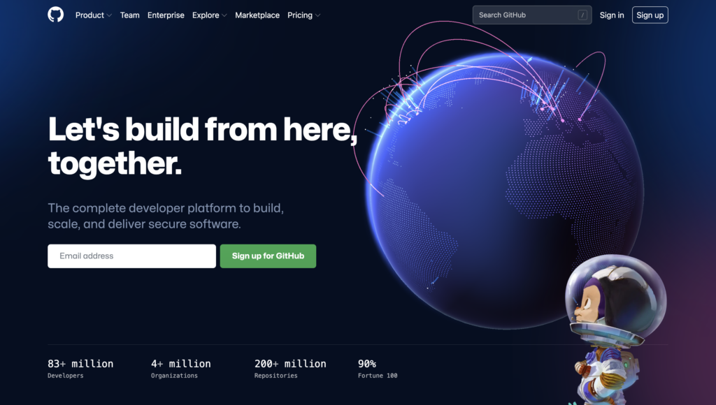
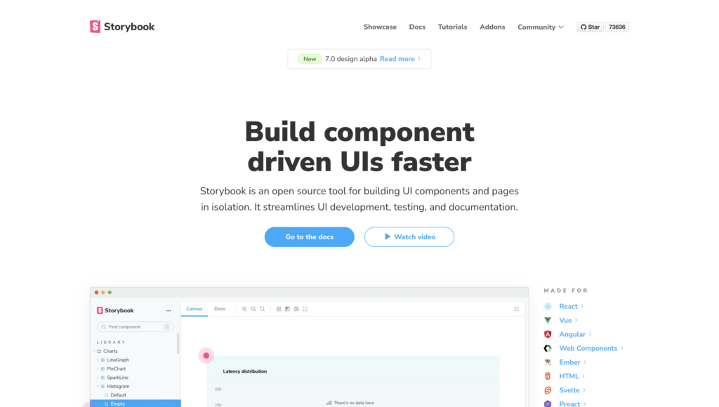
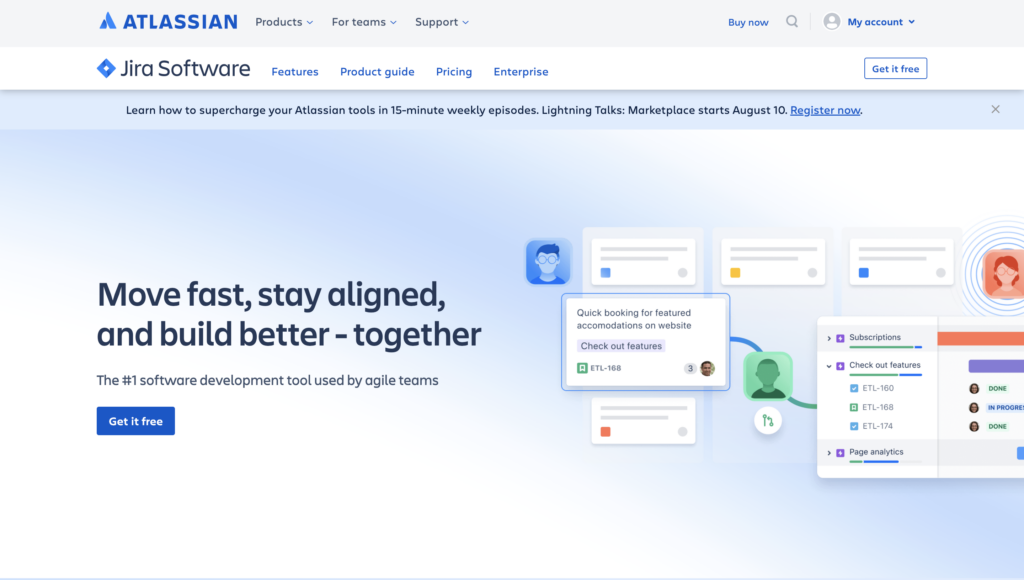
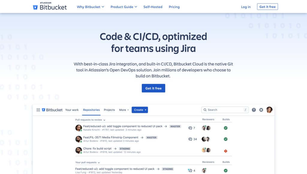
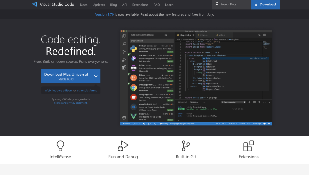
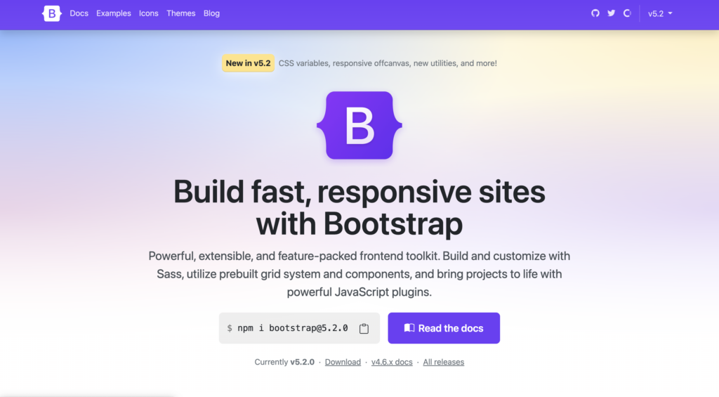
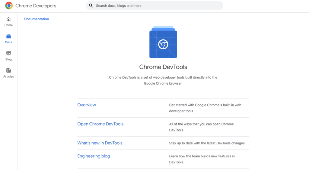
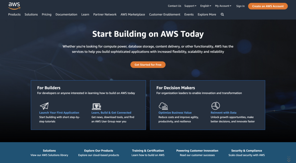
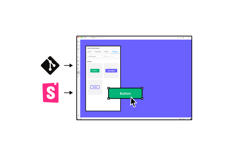

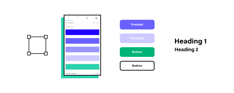

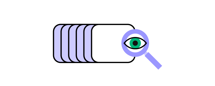


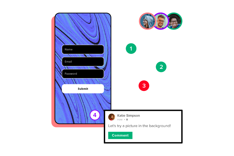


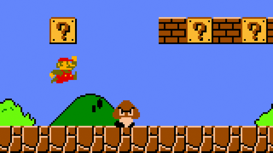
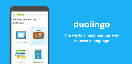
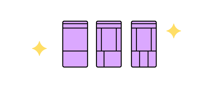
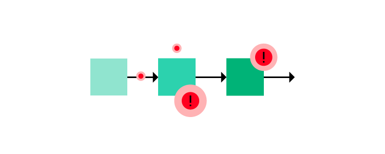


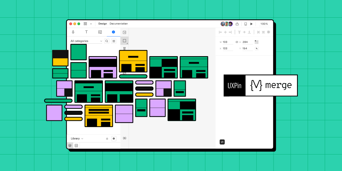

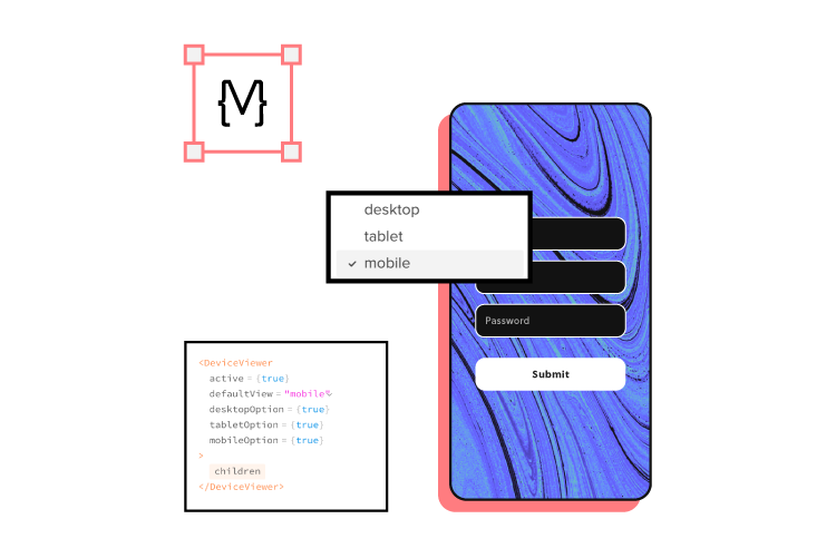

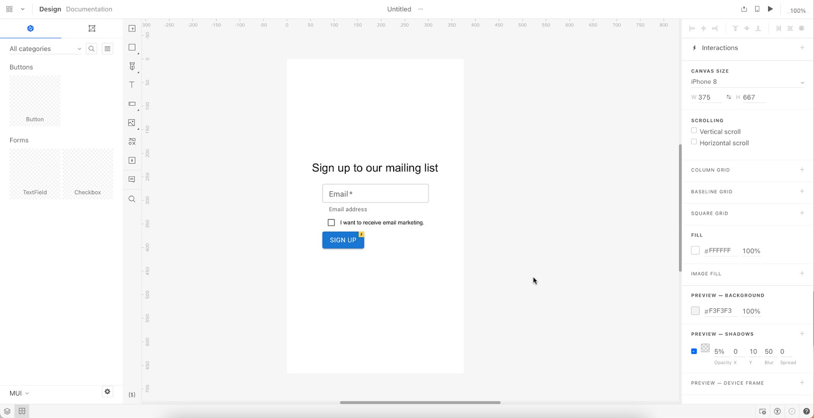
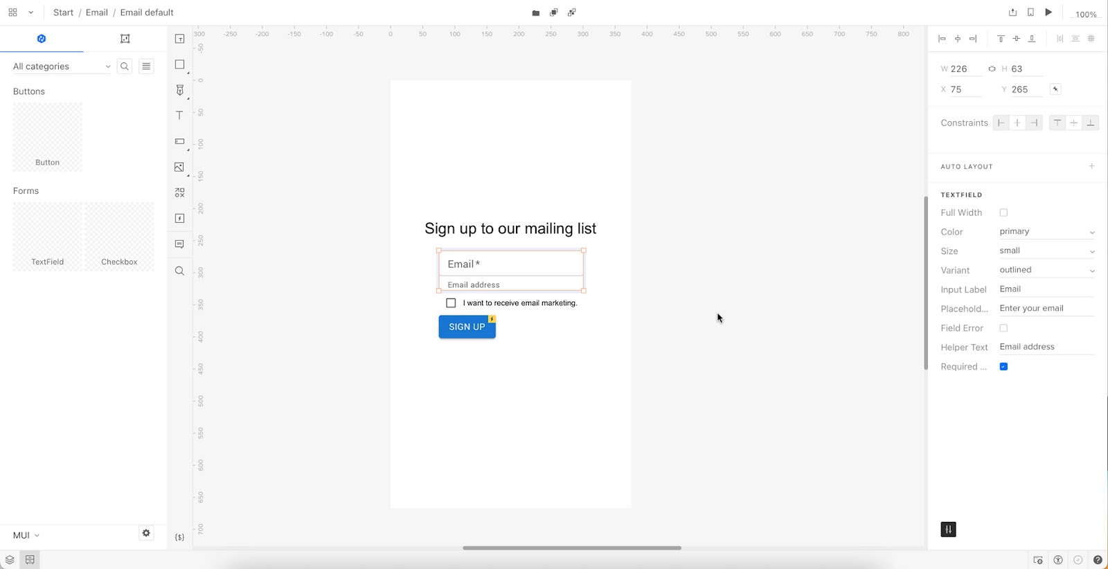
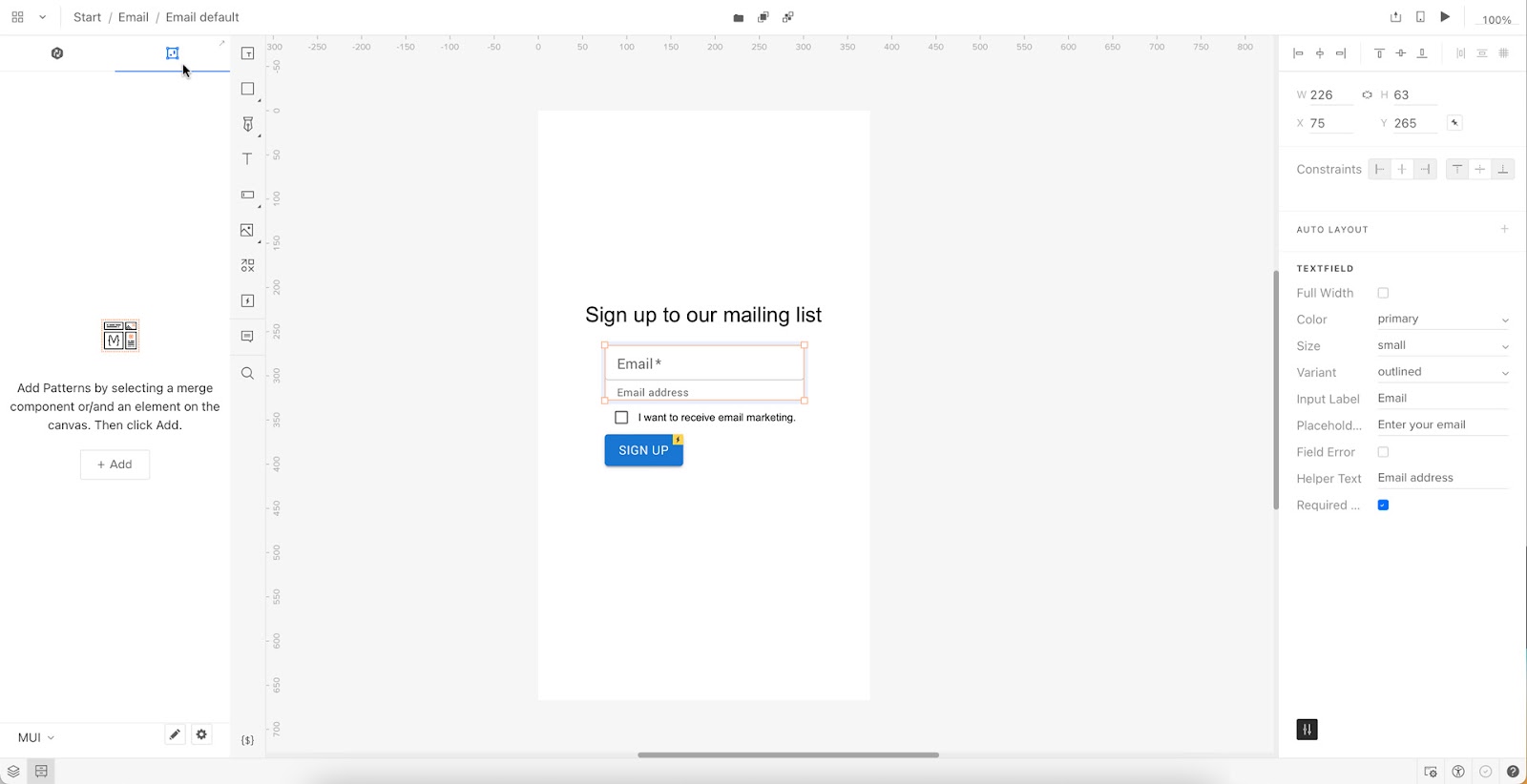
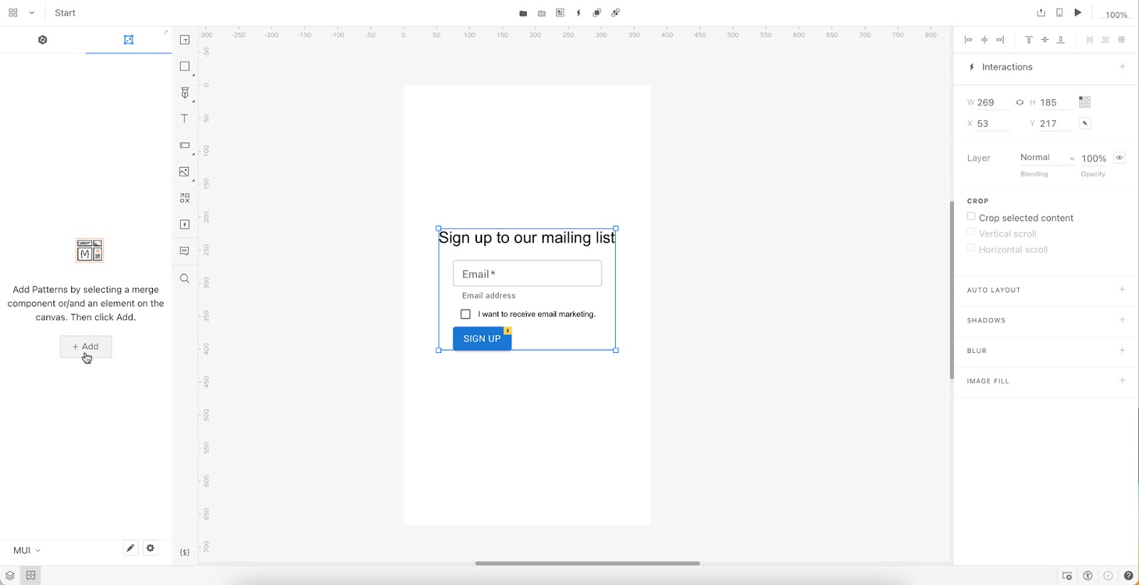
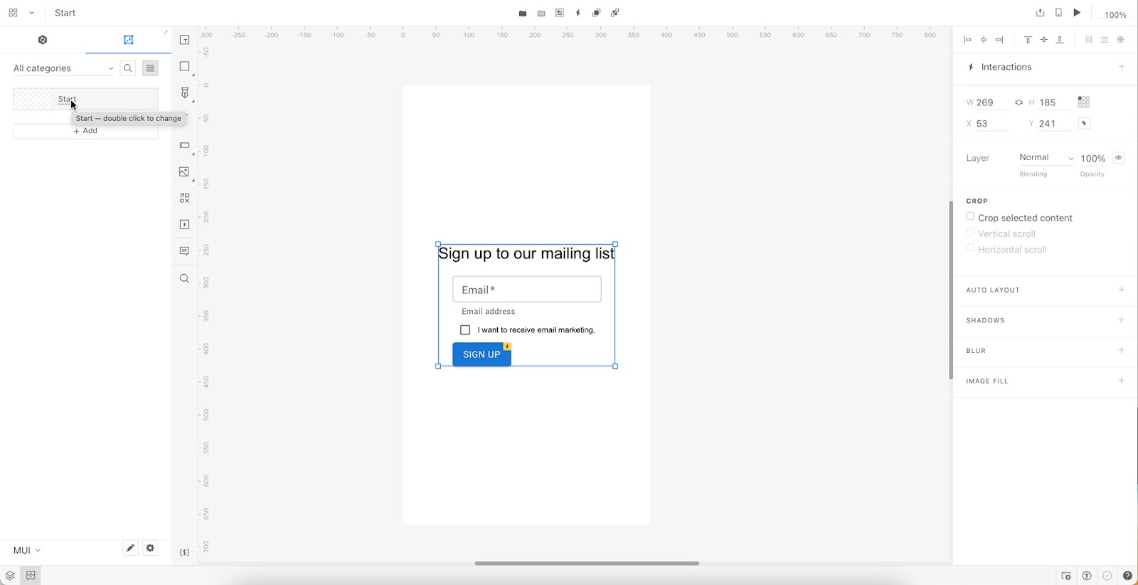
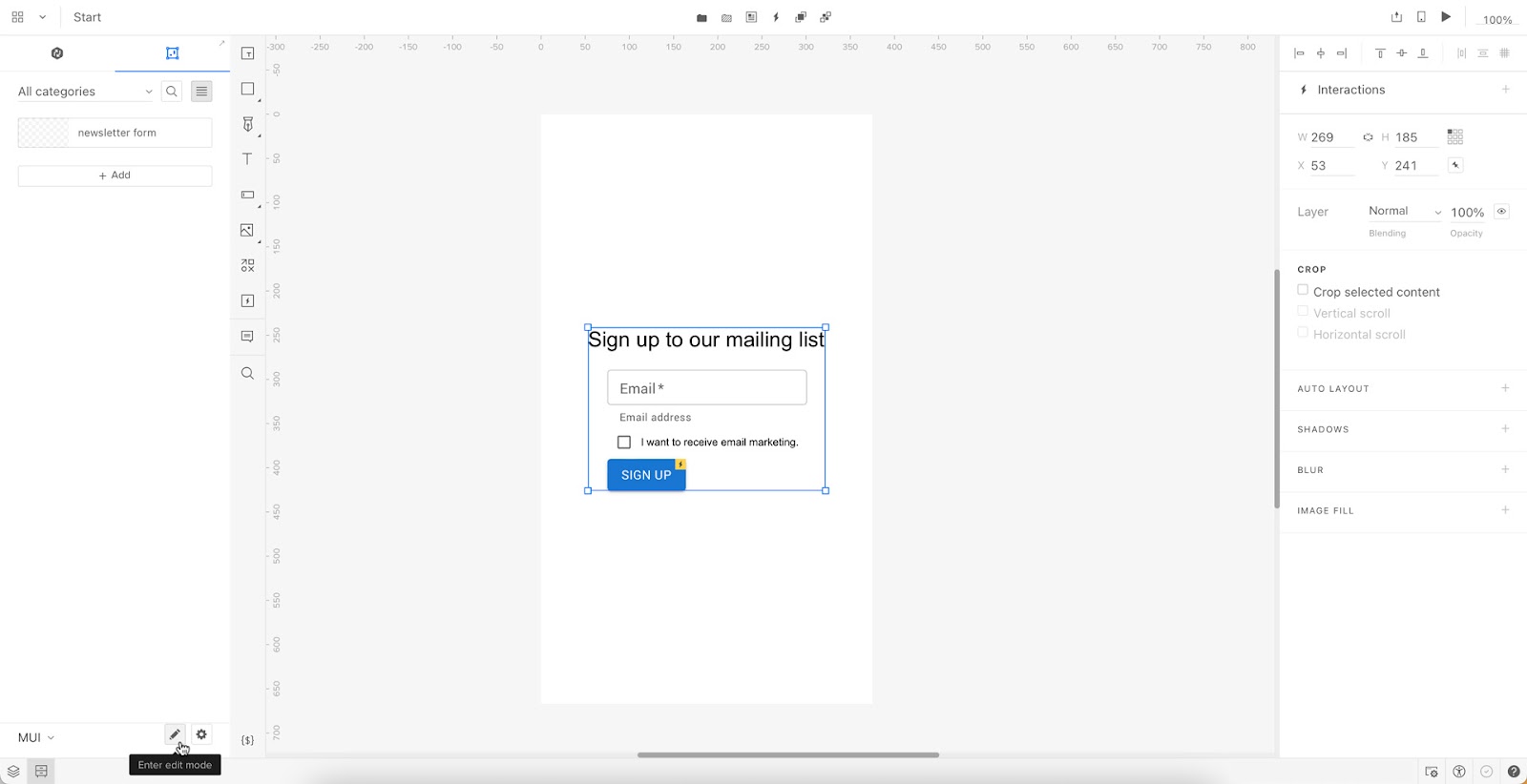
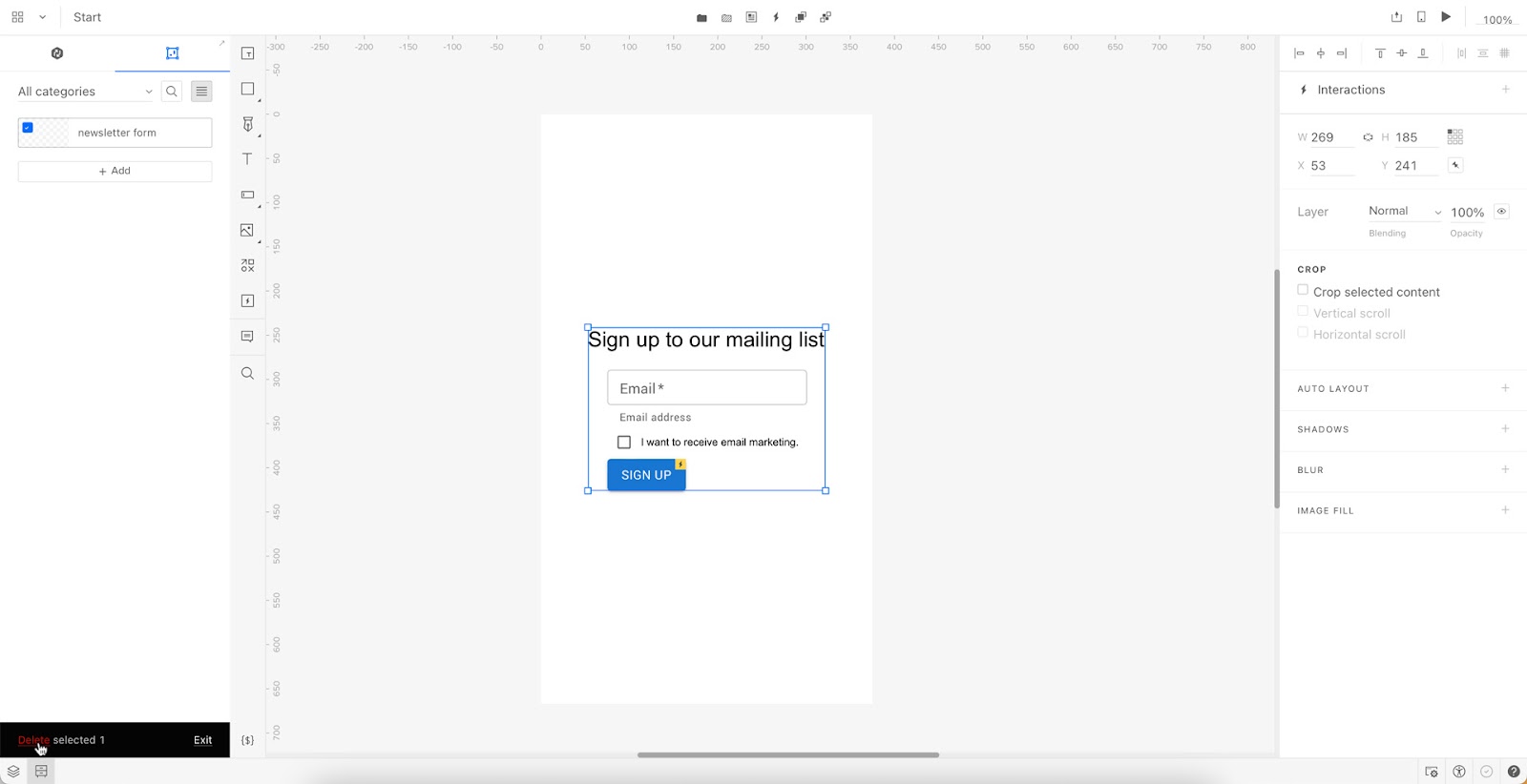
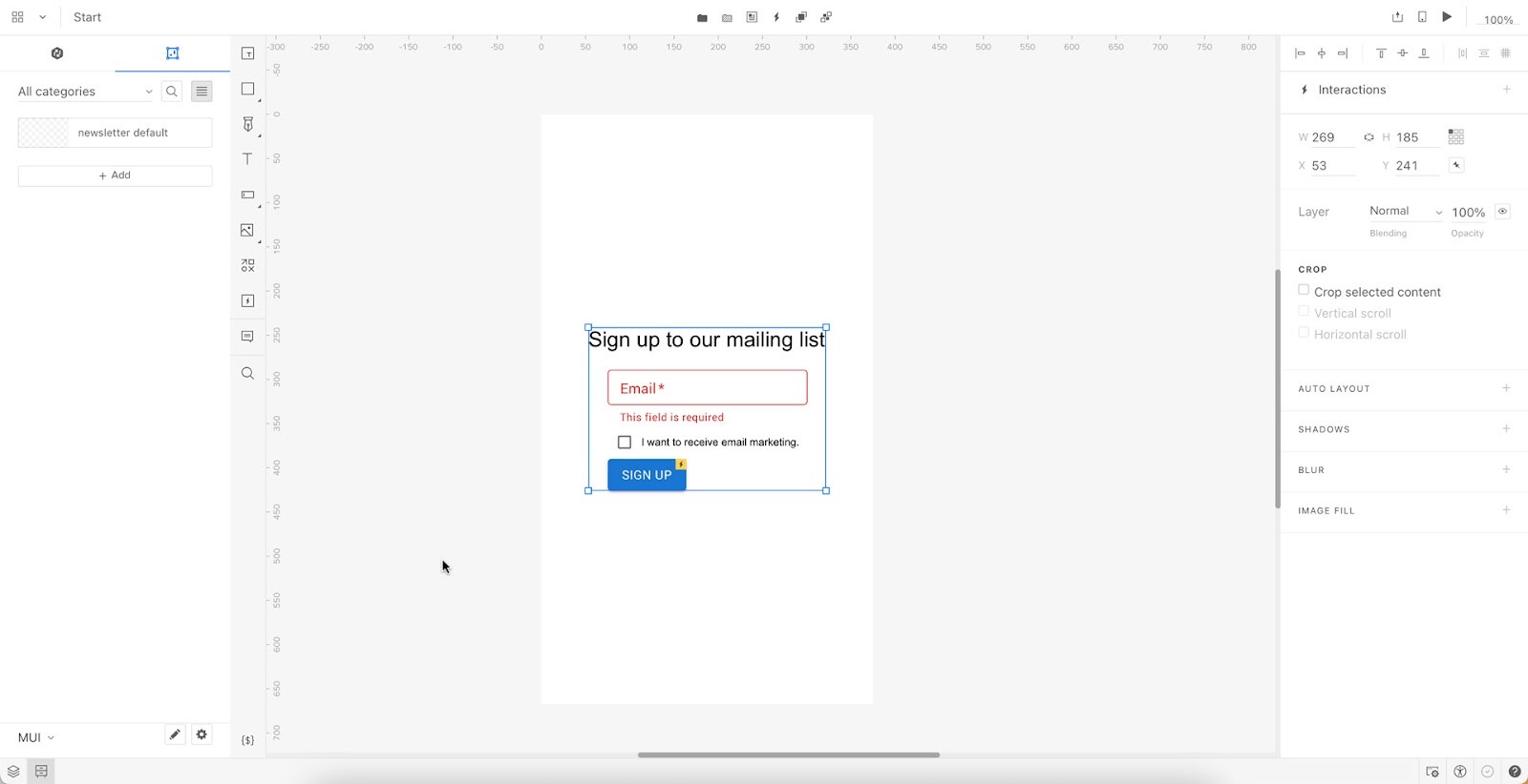
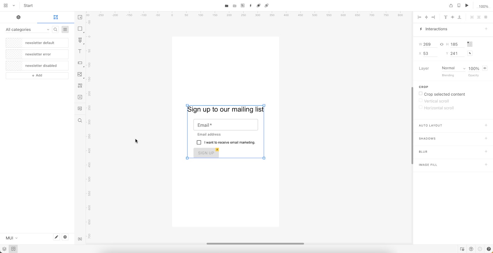

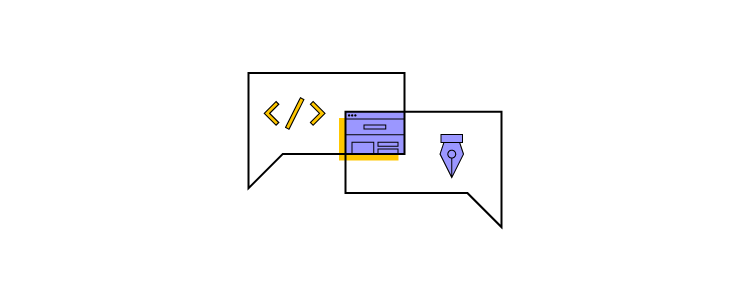


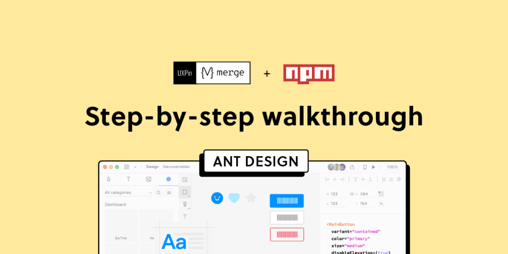
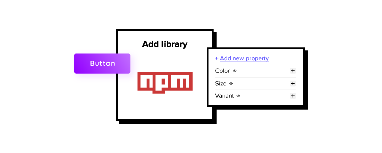

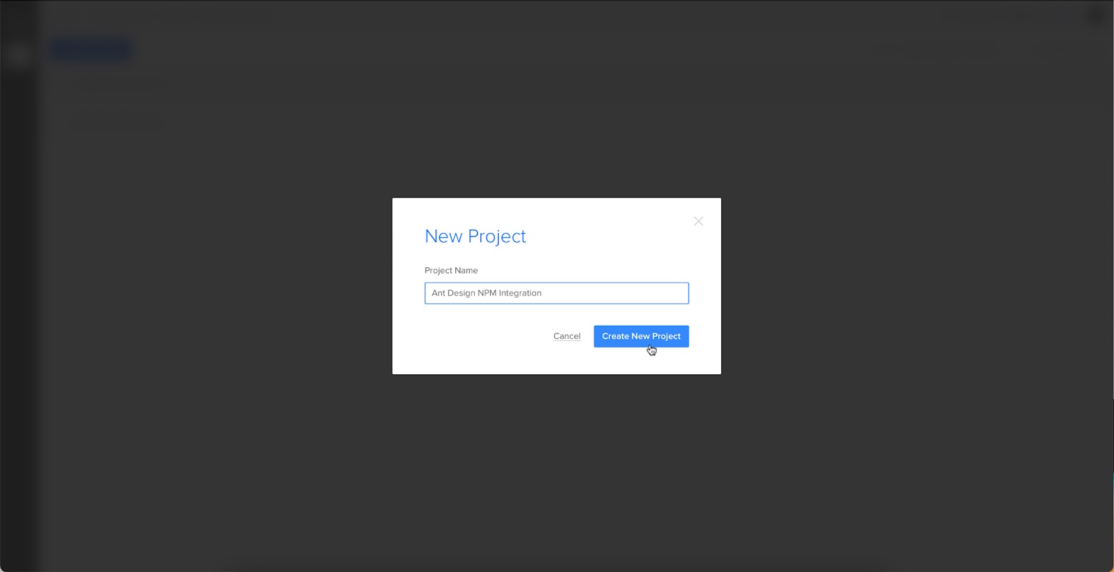
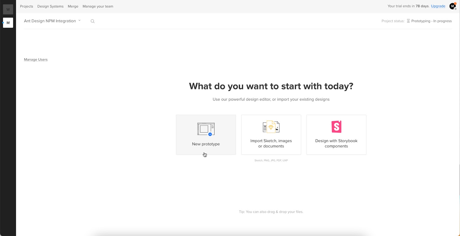
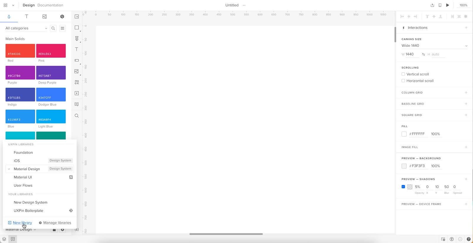
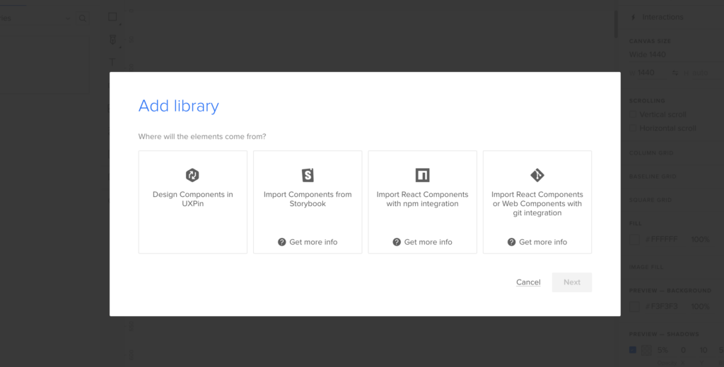
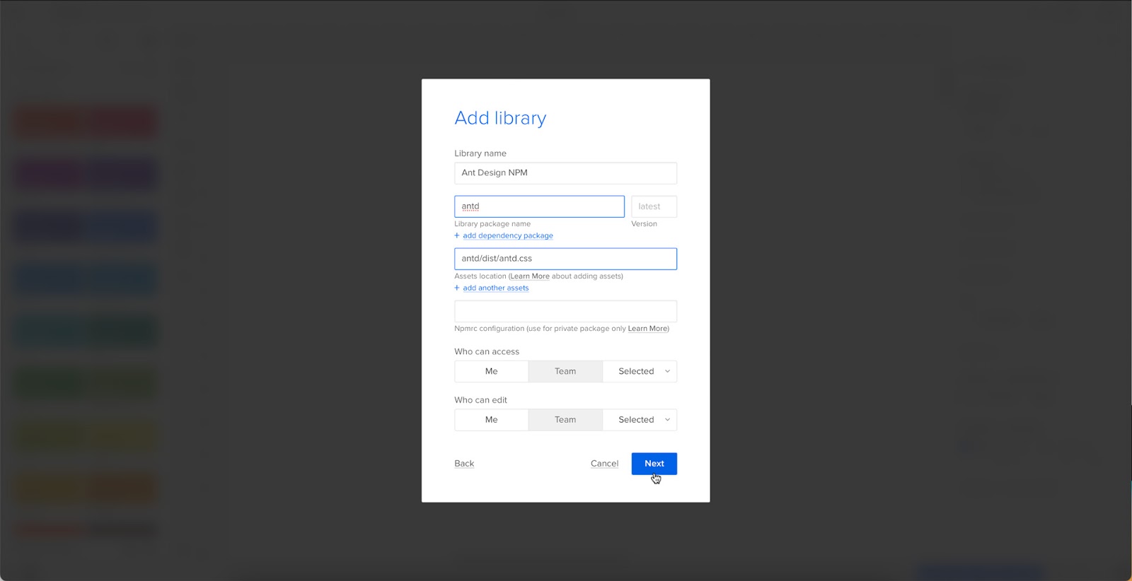
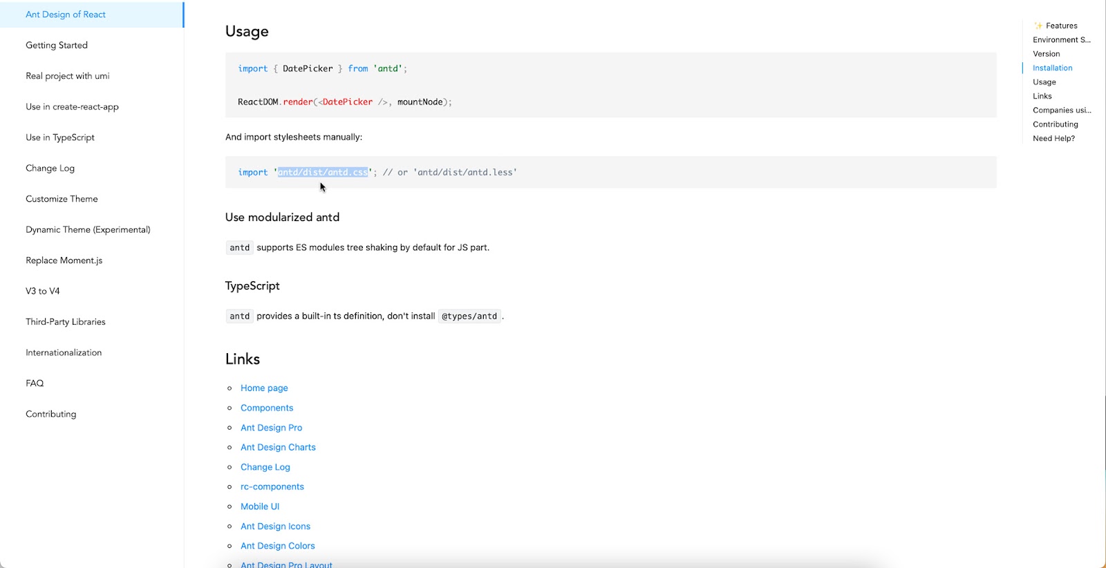
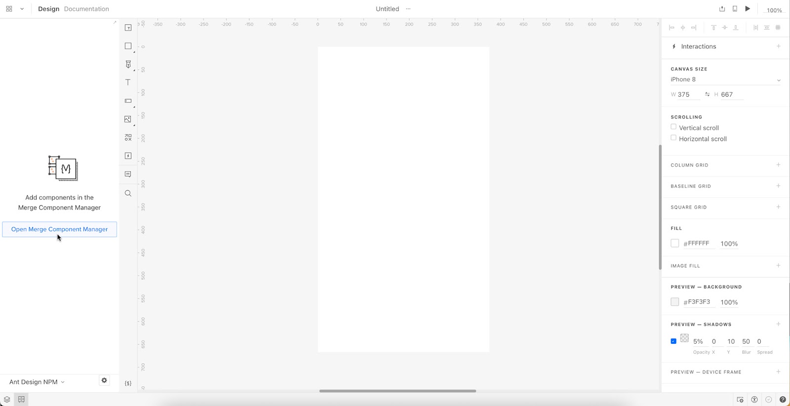
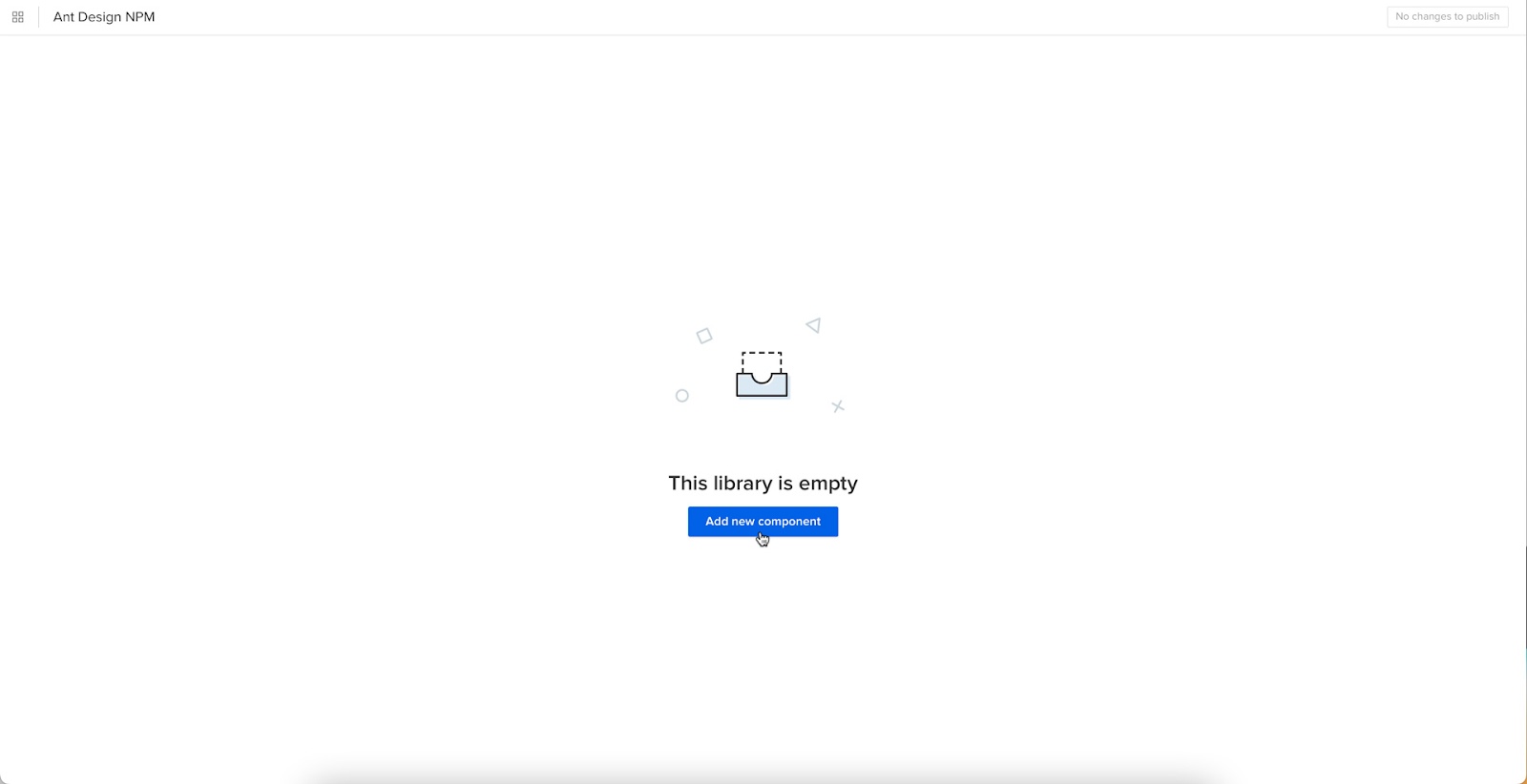

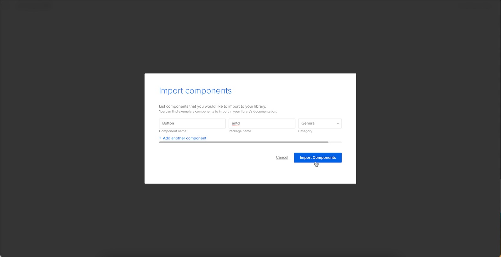
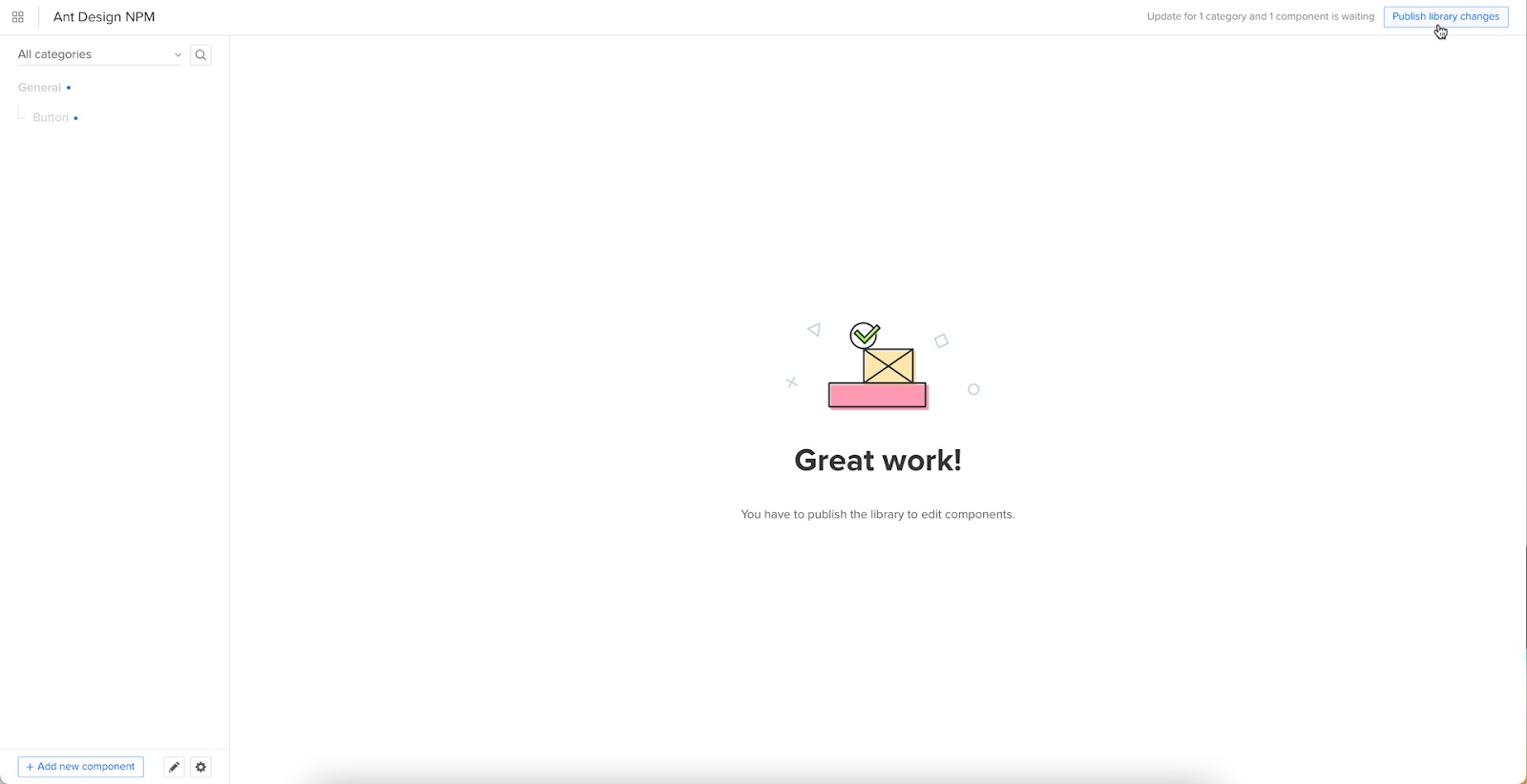
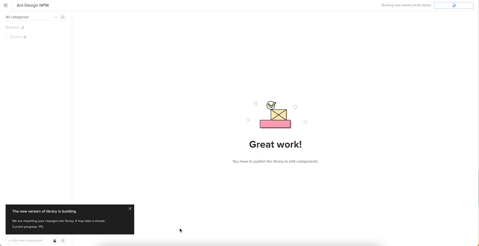
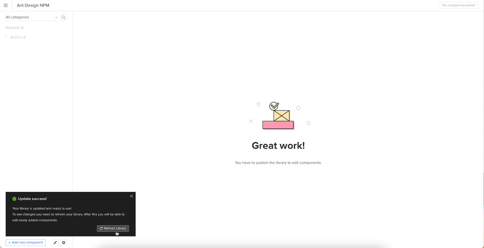
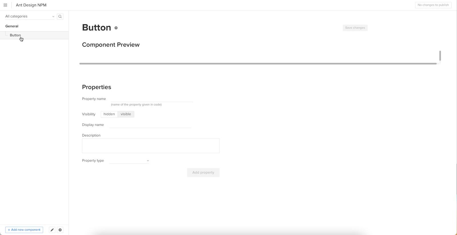
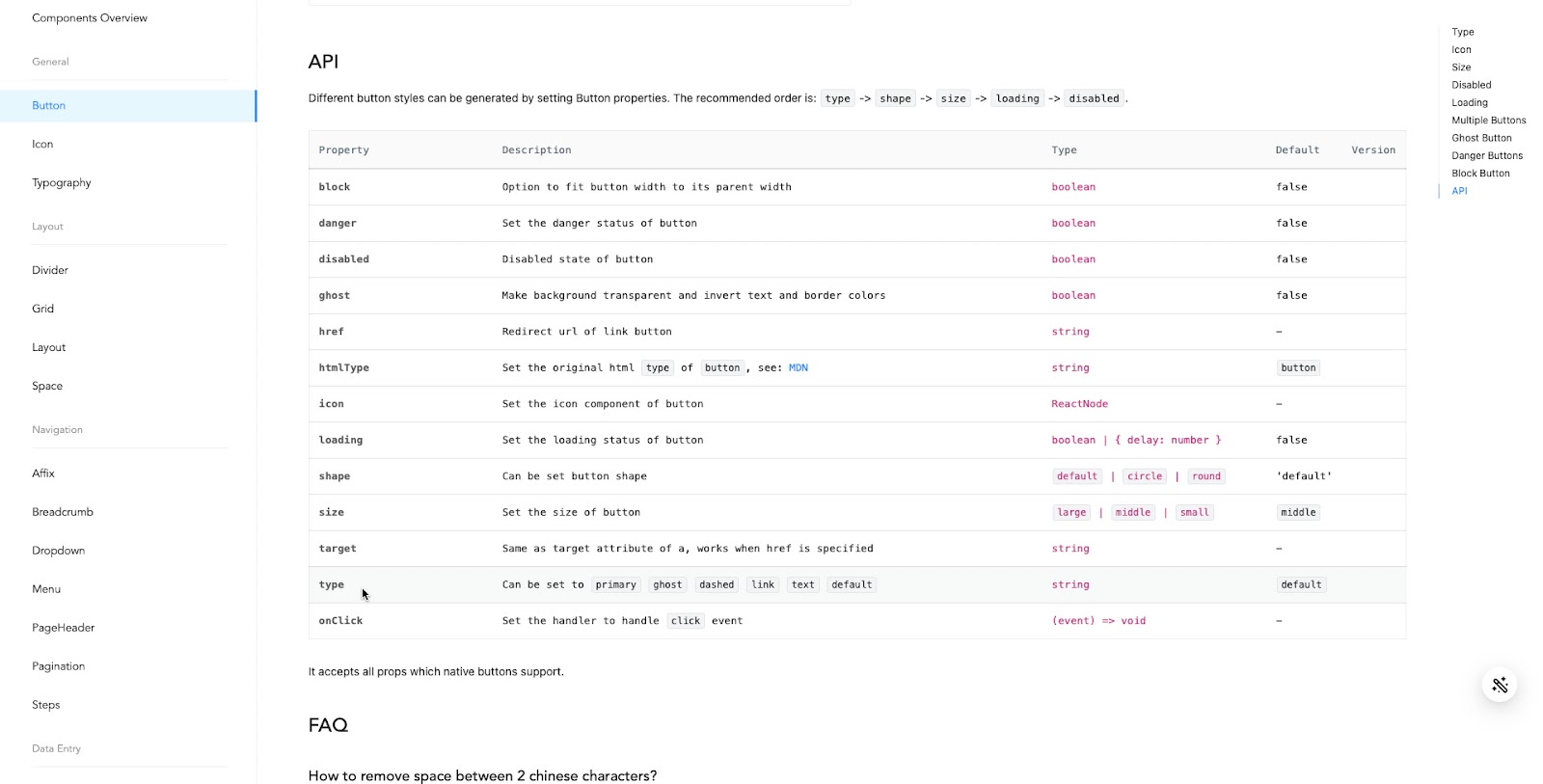
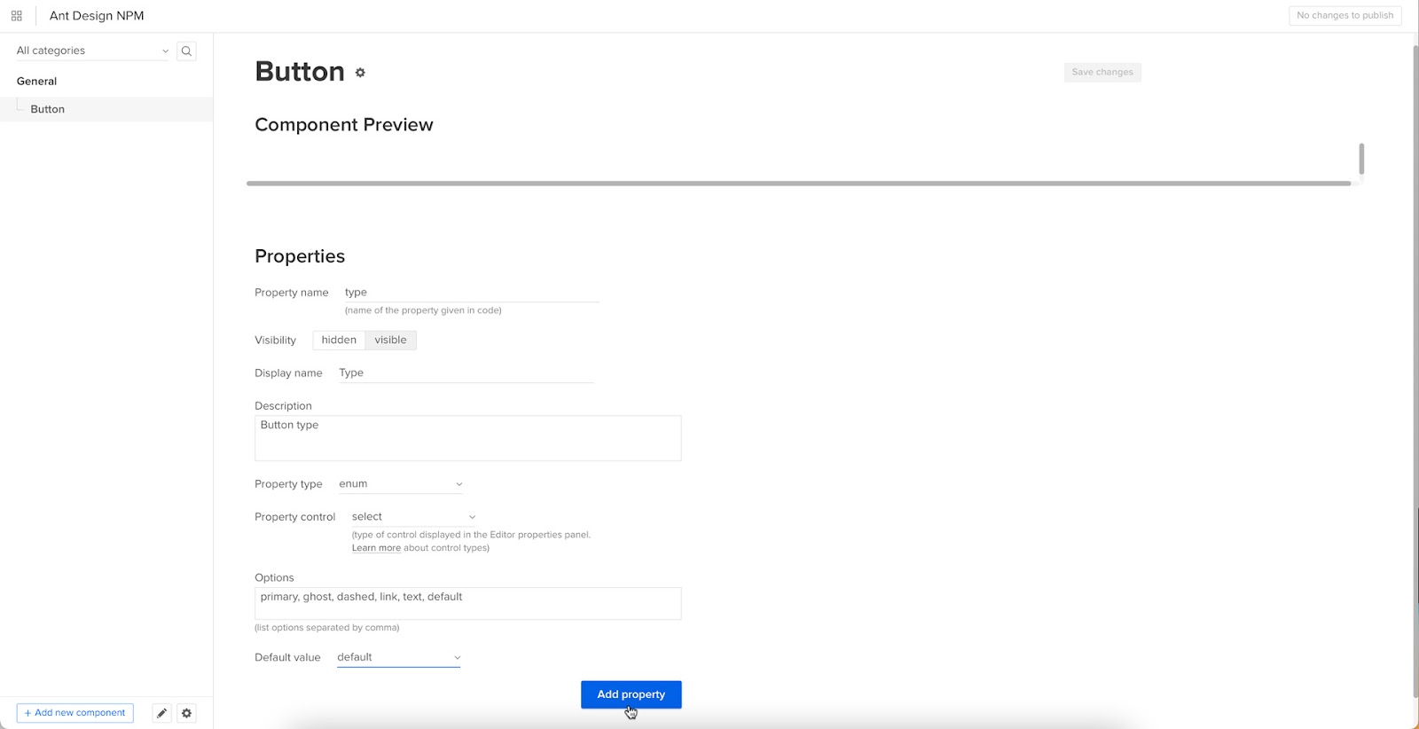
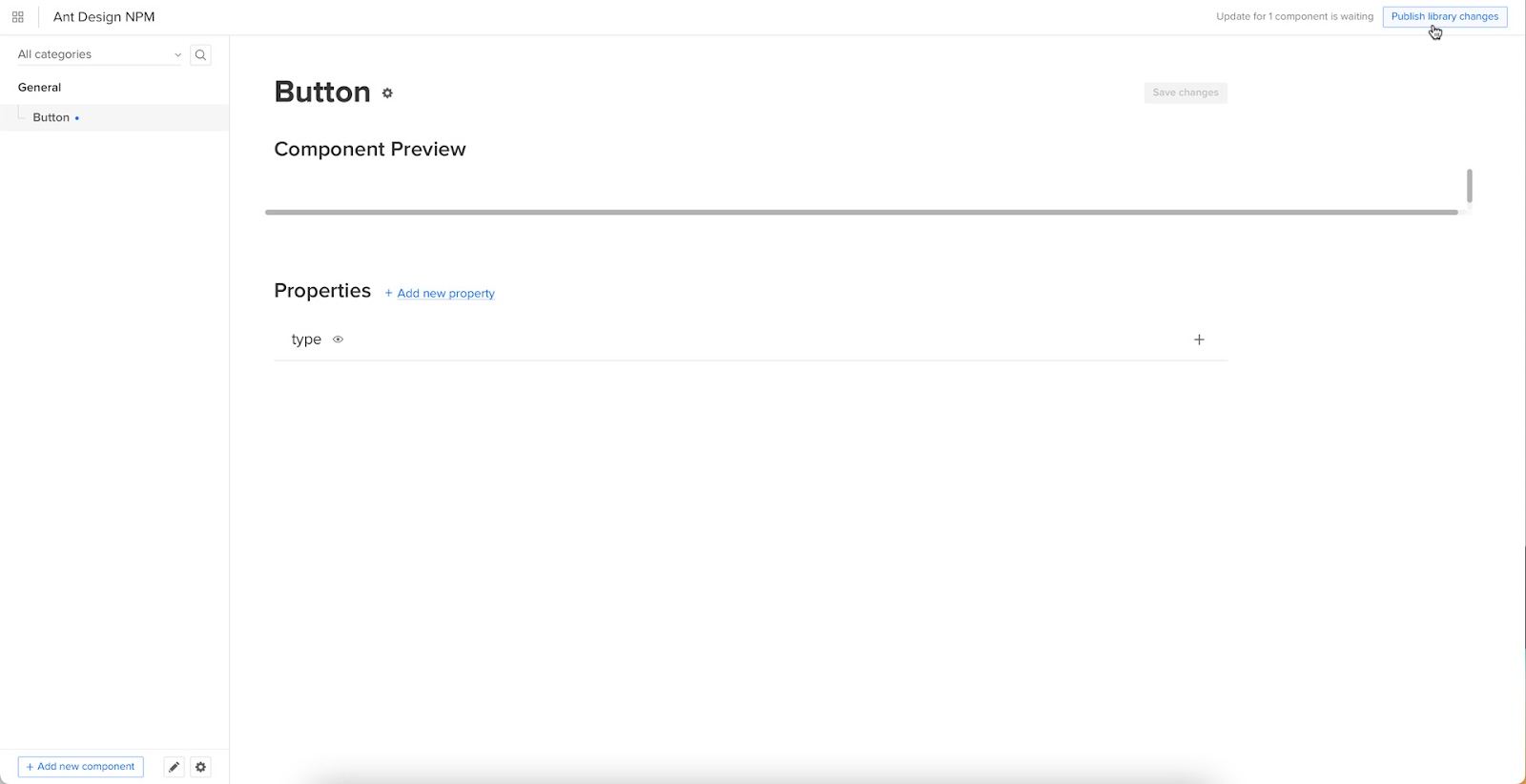
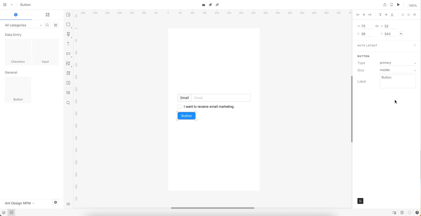


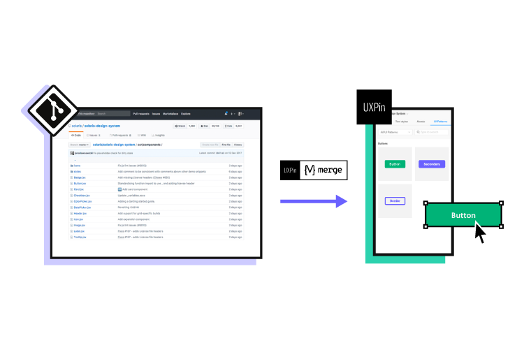

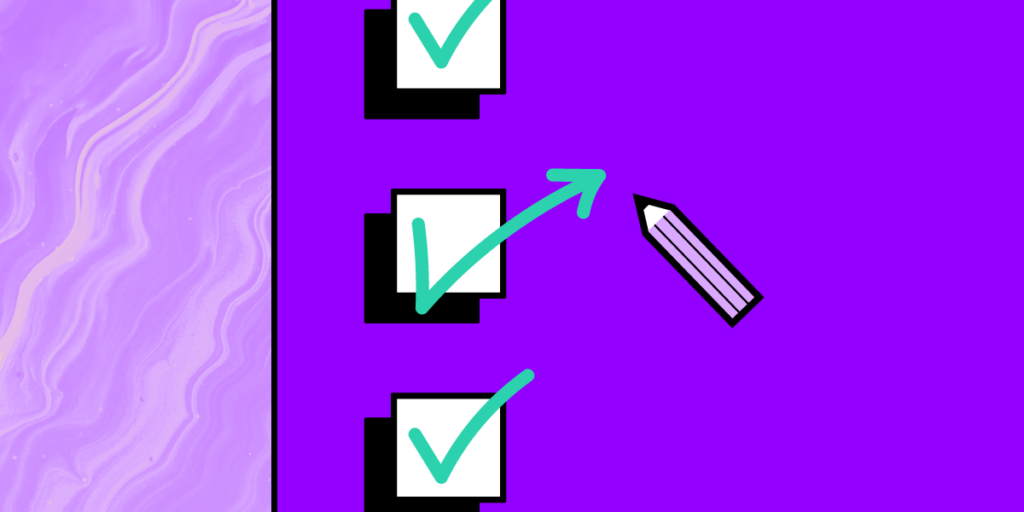
