Material Design Icons – Building Blocks of Web and App Design

Material Design is one of the most popular design systems. If you own an Android device, you use Material Design daily. Many companies use the Material Design System as a foundation for building mobile and web applications.

The system’s comprehensive component library and resources, including Material Icons (now Material Symbols), give organizations and startups the building blocks to scale products infinitely without designing from scratch.

This article explores Material Symbols and other Material resources you can use for your next product development project.

Material Design UI and Icons come standard with every UXPin plan. Sign up for a free trial to build beautiful apps with UXPin and Material Design today!

Build advanced prototypes

Design better products with States, Variables, Auto Layout and more.

Try UXPin

What is Material Design?

Material Design is a design library developed by Google, including UI components, icons, typography, and more. Every Material component includes guidelines for implementation, usage, anatomy, behavior, and more to help designers and engineers achieve the best results while delivering high-quality user experiences.

design system atomic library components

Google launched the first version of Material Design at the 2014 Google I/O Conference. In May 2021, Google released Material Design 3, including notable features like Dynamic Color, foldable device components, and design tokens.

Material Symbols Launch

One of Material Design’s most exciting recent updates was the launch of Material Symbols–a customizable icon set with over 2,000 open-source icons in five styles. You can still find all your favorite Material Icons, but now you have more flexibility and customization to meet your product and brand’s requirements.

Material Icons are still available but don’t offer the same customization as Symbols. You can only adjust the size and density versus the four variable options with symbols.

Material Icons Set

Google has kept the old Material Icons, albeit fewer than the Symbols catalog. Icons are available in five styles, Outlined, Filled, Founded, Sharp, and Two-tone.

Material Symbols – What’s New?

Material Icons has moved under Google Fonts, offering a variable icon set in three styles, Outlined, Rounded, and Sharp. Designers also have the option to customize the icon set with four variables or axes:

  • Fill: Fill or unfilled appearance
  • Weight: Defines the symbol’s stroke from 100 to 700 weight
  • Grade: Granular adjustments to the symbol’s thickness to convey emphasis
  • Optical size: Size icons to 20, 24, 40, or 48 pixels

The variable methodology allows engineers to store multiple variations in a single font (or icon) rather than several files. By reducing the file size and number of files, engineers enjoy better performance and fewer assets to manage.

Three Styles

Google also introduced three new styles to match a brand’s identity and UI design.

  • Outlined: Clean and light. Designers can adjust the icon weight to complement the product’s fonts.
  • Rounded: The curved aesthetic works well with rounded logos and heavier fonts.
  • Sharp: Designed to match UIs with straight edges and 90-degree corner styling.
material-design-icons-types

Build Your Own Material Icons

If you can’t find the icon you need in Material Symbols’ vast catalog, Google includes guidelines for designing custom icons, including:

  • Design principles: best practices to create clear iconography that’s meaningful and helpful to users.
  • Icon sizes and layout: how to set up the grid size and layout for designing icons using a design tool.
  • Grid and keyline shapes: techniques for creating consistent a consistent icon set.
  • Icon metrics: icon design anatomy including corners, weight, stroke, and complexity.

Following these helpful guidelines, you can utilize Material’s comprehensive icon set while including a few relevant to your brand.

How to Use Google’s Material Icons & Symbols

There are several ways designers and engineers can use Material Icons and Symbols

Downloading SVG or PNG

You can download Icons and Symbols in SVG or PNG format. We recommend using SVG for its performance and customization benefits. PNG files are much larger and more complicated for designers and engineers to edit and resize.

Google allows you to customize your Icons and Symbols before downloading, so you have a finalized asset to use in your project.

CSS/CDN

Material Symbols provides a CSS file for website installations similar to what you use for Google Fonts. The problem with this method is that it requires your website to make additional requests, which can severely affect performance.

If you’re planning to use more than one Material Symbol, it’s better to use another method for installation.

Operating Systems & Frameworks

Material Icons and Symbols offer downloads for Android and iOS to install as project assets, with code snippets for implementation. Material Design includes instructions for Flutter (a Google-developed programming language) and Angular. React instructions are available in MUI’s documentation.

Designer Usage

Most design tools offer plugins or extensions for Material Icons. If you’re using UXPin, the complete Material Icons set comes standard with every plan.

You can also import your own SVG icons, edit them in UXPin and save them to your Design System to share with other team members.

Using Material Icons and Symbols With Typography

Google’s Material 3 documentation offers tips and best practices for pairing icons with typography.

Weights

Never use different weights for your icons and text. Google makes it easy to pair these assets with Material Symbols’ Weight customization variable. Ensure you always match the font weight with the icon weight to achieve a clean and consistent aesthetic.

Correct font weight.

Incorrect font weight.

Sizing & Alignment

Always match the icon size and alignment with the text. Users must be able to read both and recognize they’re related. Google recommends designers “shift down the baseline of symbols to approximately 11.5% of the type size.” This technique will keep icons and text uniform and aligned.

Material Icons Accessibility

Google provides brief but helpful advice to designers about icon accessibility. Designers must always use meaningful, descriptive labels with icons, especially for navigation. Icons without text labels can appear ambiguous and confusing to users. Designers must also include alt text for screen readers and other assistive technologies.

Target size is also a crucial factor for icons. People with large fingers or hand disabilities might accidentally hit the wrong icon button, causing confusion and frustration.

Google recommends designers use a minimum target size of 48 pixels. If you’re using a 20-pixel icon, provide enough padding to make the total target area 48 pixels.

Designing with Material Design’s Icons in UXPin

With several icon sets, including Material Icons, preinstalled with UXPin, designers don’t have to install plugins or upload external files. Here’s how easy it is to add icons to your project.

Step One – Click the icon element

Click the icon element in the Quick Tools panel to the left of the canvas. Alternatively, you can use the keyboard shortcut OPTION+I (on Mac) or ALT+I (on PC).

Step Two – Draw an icon on the canvas

Click and drag a square where you’d like the icon to appear on the canvas. Hold down SHIFT to maintain an equal width and height.

Step Three – Icon properties panel

Once you draw an icon, an icon properties panel will appear on the right Properties Panel. You can select Material Icons or one of the other sets, including Fonts Awesome, Retina Icons, and a UXPin set, to name a few.

Step Four – Select an icon

Scroll through the available Material Icons to find what you need. Click on any icon in the properties panel (while you have the icon selected on the canvas) to make your selection.

Step Five – Adjust icon properties

Once you have chosen an icon, you can style it using the Properties Panel above the Icon section. Below the Color Picker is a dropdown with available design systems, including Material Design, so designers don’t have to copy/paste HEX codes from elsewhere.

Step 6 – Add interactions

At the top of the Properties Panel, you’ll find Interactions. Add interactions, animations, transitions, etc., to make your icons interactive. For example, we might want this user icon to open a personalized profile page.

Check out UXPin’s Interactive UI Patterns and App Examples to see how UXPin’s features work and what’s possible with code-based design.

Improve Prototyping and Testing With UXPin

Material Icons are just one convenience of working in UXPin. Our goal is to help designers build prototypes quicker and with greater functionality and fidelity as image-based design tools.

Using one of UXPin’s built-in design libraries, designers can drag and drop elements to build interactive prototypes in minutes. We’ve included five popular design libraries to accommodate every type of project, from websites to web and mobile applications for enterprise and B2C products.

uxpin autolayout

Every UXPin plan includes Material Design, iOS, Bootstrap, Foundation, and User Flows, with each library’s interactive elements, colors, text styles, and icons.

UXPin’s Design Systems feature allows designers to build a design system from scratch, automatically categorizing the library into Colors, Assets, Typography, and Components. You can also set up permissions and include documentation for designers and engineers to follow.

Build better prototypes that accurately replicate the final product experience using UXPin’s code-based design tool. Sign up for a free trial to discover the possibilities of designing with UXPin.

9 Experts Share Examples of Great App Design

9 examples of great app design according to experts

When you look at the apps that have hit thousands, if not millions of downloads (and boast thousands of happy reviews!), you might wonder: is there an ‘it’ factor they all share? Among others, whether an app has a high download and retention rate comes down to great app design. Namely, there are certain UI/UX design principles that can keep users coming back for more.

Use UXPin and design a prototype that will surely become the next great app! Sign up for a free trial and use its incredible component-driven prototyping approach to build your app’s user interface. Leverage the tool’s power to create a design using a single art board that you can add interactivity to instead of linking multiple art boards to simulate interactions.

9 App Design Examples – What Makes for a Great App Design

We’ve reached out to a group of product and design experts to learn about their favorite app design examples and what exactly makes them love their favorite mobile apps. Here’s what they told us.

1. Wolt App – putting great user experience first 

Uladzislau Luchkouski, Head of Design at Orangesoft

Source: Sky News

The Wolt app is a prominent example of great app design that’s user-friendly. Wolt is a food delivery app that prioritizes superior UX design by offering unmatched categorization, search, and content display, no matter whether you download its iOS app for Iphones or access it on Android devices.

But what makes Wolt a standout in the niche is the overall flow of order placement and wait time in their user interface. Every single step is thought out and aims to address all possible customer needs.

  • Delivery Settings – an in-built translator, customization tools, and the ‘Order Together’ feature drive maximum personalization for the app user, thus improving the user experience.
  • Search – an intuitive search user interface with easily discoverable food items, meal categories, and dynamic pricing leaves no place for uncertainty and displays accurate pricing for each option.
  • Checkout – the app implements an innovative ‘Slide to Confirm’ form instead of the usual ‘Tap Yes’ feature. This nice touch ensures that there is no accidental touch and the customer is fully aware of placing an order.
  • Wait time and delivery – the Wolt app turns the hangry wait times into a quirky tapping game. Thus, the ‘In Delivery’ interface displays a timer with a big tappable button where the user needs to tap as many times as possible. If the user beats the target number, the delivery fee is completely free.

2. Google Maps – function over form

google maps satellite

Can Burak, Executive Creative Director at 2fresh.com

When it comes to app design, form follows function. Being able to deliver the promise you give to users is far beyond having a cool user interface design. In that regard, Google Maps delivers great value, and it’s one of the best app designs.

The app brings the world onto your screen and is an example of responsive app design done well. It’s available both as a web and native mobile application. While I opt for a web app on my laptop or desktop, I use it as a native app on my mobile device. I use the offline maps functionality particularly often. 

I like the integration of the target destination in the form of text, photos, and comments. And I find great value in its core functionalities. As demonstrated, product design is all about the value and experience.

The app’s UI design is decent to deliver this promise. Nothing fancy or nothing to show off in here. When it comes down to functionality, subtle UI design is the best, which goes for any app, be it a banking app, a fitness app, and more.

If I were to name a downside of Google Maps from a user perspective, I’d say that I’m disappointed by the fact that resolution is crippled over time and that high-resolution satellite images are reserved for Google Earth.

3. Pocket – example of app redesign powered by users

Jay Soni, Marketing Director at Yorkshire Fabric Shop.

Another app design example worth looking at is Pocket. This amazing software allows you to save articles or movies to watch later, even if you don’t have access to the Internet, which is an awesome design concept. Pocket, in fact, recently received a Webby Award for user experience design. The app was reworked in large part thanks to Google Ventures. 

They enlisted the help of five users from their target audience who had never used the app before, and they used their feedback to design the app’s simple interface. The end outcome is visible to all with improved usability and a better experience.

4. Pinterest – simplicity of use

Sharon van Donkelaar, CMO and Head of Growth at Expandi

I really love Pinterest’s mobile app, not only because of its minimalist and visually appealing display but also because of how simple it is to use it and find what you’re looking for.

The app certainly has a clear and comprehensive UI design that, without taking much space on the screen and taking the focus away from all the beautiful visuals, allows users to move from one place to the next in the smoothest fashion.

Besides, the fact that with the mobile app you can do everything you’d do on the Pinterest website is the cherry on top of one of the most neatly designed mobile app UI designs I’ve recently used on my smartphone.

5. Viber – super fun to use 

Adam Moore, Founder of SocialPlus

Source: Google Play

I love that you can video chat with high-quality resolution, and also text people anywhere in the world. It is perfect for work as you can also communicate with this app through your computer. This multi-platform application is also highly protected, and you will feel secure that only you are seeing your own content between other people.

You can also join groups of people with similar interests to you, not unlike Facebook. This all-in-one app can also nurture your creative side as you can create your own stickers to send to others.  This app is fun, simple to use, and overall is a really pleasing app to look at. 

6. Uber – simplicity and user-friendliness 

Daniel Florido, Chief Web Development & Designer, Director of Pixelstorm

As a website and app designer, I’m always looking for inspiration in the form of well-designed UIs and clever UX. One great mobile app design example is the Uber app.

Uber is a popular ridesharing app that makes it easy to get around town quickly and conveniently. I love Uber’s design because of its simplicity and user-friendliness. The interface is intuitive, with large buttons that are easy to tap and clear information displayed uncluttered.

One of the standout features of the Uber app is its map view, which makes it easy to see exactly where your driver is in your current location. Another feature that I love is easily splitting fares with other riders, which can be a real lifesaver when traveling in a group or with friends.

So those are just a few of the things that make the Uber app’s design great. If you’re ever looking for inspiration for your web or app design projects, I highly recommend checking out Uber and seeing what makes it such a great user experience.

7. Etsy – great app design doesn’t overwhelm you 

Granger McCollough, CEO & Founder, Elite Patio Direct

As someone who works in eCommerce, I really love the design of the Etsy app purely due to its simplicity and the fact that it doesn’t overwhelm you with products from the start. A lot of eCommerce apps can really throw products in your face with sales and featured products. Etsy simply gives you a search bar and some suggestions for the type of product you may be looking for. 

The homepage of the app doesn’t give any prices or product names and is very visual, using only images and headings to narrow down your search. Because of this image-based design, it makes scrolling through the different headings feel very smooth.

8. Airbnb – setting a new standard for easy search

Trevor Larson, CEO and Founder of Nectar

I have always loved and tried to base a lot of what I do at my business off of the app design and UX of the greats. One great app design example is the Airbnb app. The overall experience is fantastic, irrespective of the device you use thanks to the responsive app design. But one particular feature that stands out to me is the search – the way that users can easily search for and find exactly what they are looking for. 

Source: Google Play

Whether it’s a room in a specific location, or an entire apartment to rent, the app makes it quick and easy to find exactly what you need. Overall, the Airbnb app has set the bar high for other apps in terms of great design and UX, and I believe that it truly exemplifies what great app design and UX should look like.

9. TripAdvisor – great app design for various user goals

Patricio Paucar, Co-founder of Navi

I’m awed by Tripadvisor’s app. Intuitive? Check. Great graphics? Definitely. Consistent branding? Yes. Tripadvisor’s overall user experience is the promise of the digital revolution bringing the world to your hand, realized. 

The app’s unique differentiator is versatility. It caters to people looking for guided experiences in trip planning as well as users looking for a restaurant recommendation nearby. That’s a rarity in travel apps but not surprising from a company that’s been in the travel business for over two decades.

What’s Your Example of Great App Design?

What makes an app great goes beyond responsive app design. Among others, it involves simplicity of use, which allows users to quickly meet their goals, minimalistic design that isn’t overwhelming and prioritizing function over form. Feel free to inspire yourself with our list while designing your own mobile app.

It’s your turn now. Use the powerful lessons you’ve just discovered and design a fully interactive prototype using UXPin’s best features. There’s no limits to what you can build if you put your mind to it. Sign up for a free UXPin’s trial.

16 Timeless Web Navigation UI Patterns

Navigation UI design plays a significant role in a website’s aesthetics, functionality, and user experience. Designers must design a navigation UI experience that benefits business and user needs.

This article explores 16 web navigation patterns, with tips on applying these and when to use them. We also provide examples so you can model the success of the world’s leading websites and brands.

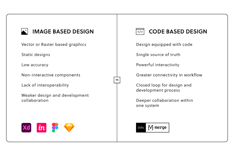
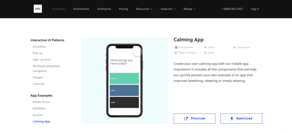
UXPin’s advanced code-based design tool gives you the features to build fully functioning navigation prototypes for websites, mobile apps, games, and other digital products. It’s revolutionary Merge technology allows you to import ready-made components, such as navigation to the design editor and preserve its interactivity from prototype to production. Request access to Merge.

Reach a new level of prototyping

Design with interactive components coming from your team’s design system.

3 Navigation UI Tips for Website Design

Tip #1: Mobile-First Approach

Mobile-first design has a significant impact on a website’s navigation user interface. Smaller screens force UX designers to prioritize the navigation menu and reduce unnecessary UI elements or place them elsewhere–like in the footer navigation.

Tip #2: Use Trusted Patterns

UX designers must use standardized design patterns to avoid usability issues. For example, the hamburger menu is the universally recognized icon for opening the navigation on websites and mobile apps. Using a different icon will likely confuse users.

Tip #3: Keep it Simple

Designers can use user research, product analytics, and usability testing to determine what matters most to users and how to prioritize navigation accordingly.

Keeping navigation designs clean and simple is crucial for user experience and providing users only with what they need.

16 Web Navigation UI Patterns That Stand the Test of Time

  1. Search
  2. Notifications
  3. Table of Contents
  4. Sticky or Fixed Navigation
  5. Vertical Navigation
  6. Navigation Drawers
  7. Popovers
  8. Modals
  9. Call to Action Buttons (CTA)
  10. Mega Menu
  11. Featured Content
  12. Related Content
  13. Footer Navigation
  14. Bottom Bar Navigation
  15. Breadcrumbs
  16. Dropdown Menu

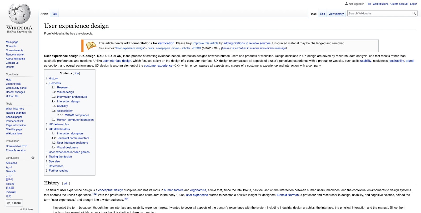
Search allows users to find specific content. While they might get there via a website’s navigation, search provides a quicker, more direct route. For a content-heavy website like Wikipedia, search is the primary navigation because it’s impossible to place links to every piece of content in a navigational menu.

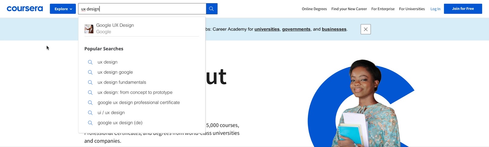
On websites where users use search often, UX designers must make the search bar or icon to open it visible at all times. A great example is how the online learning platform Coursera makes search visible across all screen sizes. 

Coursera’s search bar is the most prominent header component on desktop.

On mobile devices, a search icon is visible opposite the hamburger icon.

Coursera’s header design tells us that most visitors use the website’s search to find courses. Coursera displays links to relevant courses and related “Popular Searches” to help users find what they need faster.

2. Notifications

Websites with user profiles must have a way to inform users of messages and engagement. The industry-standard notification icon is the bell, usually illuminated with a number indicator when the user has unread notifications.

Notifications are crucial for social media products because they inform users and increase engagement, so we often see the notification icon prominent in header navigation across all screen sizes.

3. Table of Contents

A table of contents (TOC) helps users “jump” to the content they value most. TOC is also good for SEO (search engine optimization) because it enables users to navigate a webpage faster, reduces scrolling (especially for mobile users), and increases page engagement.

Make sure to include a “back to top” button so users can jump back to the TOC and navigate to another section.

4. Sticky or Fixed Navigation

Sticky or fixed navigation keeps the header menu visible at the top of the screen. A sticky nav takes up valuable screen real estate, so designers often shrink the navigation bar’s width to minimize its footprint. Some websites use an “invisible sticky header,” which only appears when the user begins scrolling up, thus maximizing the available screen space.

Fixed headers allow users to navigate the website without returning to the top of the screen. Many eCommerce websites use sticky navs to reduce bounce rates and increase conversions. Users are more likely to navigate multiple pages–another critical SEO factor.

5. Vertical Navigation

Vertical navigation is particularly helpful for navigating single-page applications like social media platforms, email inboxes, CRMs, maps, etc.

Many products use vertical navigation for documentation so that users can jump to different topics quickly. We use a sticky sidebar vertical navigation for UXPin’s documentation so that users can navigate between topics without scrolling.

6. Navigation Drawers

We often see navigation drawers (accessed via a hamburger menu icon) used for responsive mobile web designs. Designers also use them for desktops when there are many menu items or to preserve as much screen space as possible.

7. Popovers

Popovers indirectly aid navigation by providing additional context to a menu item before a user clicks. This functionality prevents users from navigating forward and backward as they try to find what they need.

If users have a lot of content to explore, popovers can help them preview menu items before deciding, ultimately saving time.

We also see popovers used for virtual tours during the onboarding of new users, where instructions appear over specific UI elements to explain functionality. These popovers are usually accompanied by next, back, or close/end tour buttons so users can read and absorb content in their time.

8. Modals

Modals are similar to popovers, but they’re user or system-activated instead of hovering. We often see modals on eCommerce websites displaying promotional material or additional product information before navigating to a product page.

Netflix uses modals to display supporting content for its videos. If you hover over a Netflix menu item and click the down icon, a modal appears with additional info like the description, genre, episodes, cast, etc.

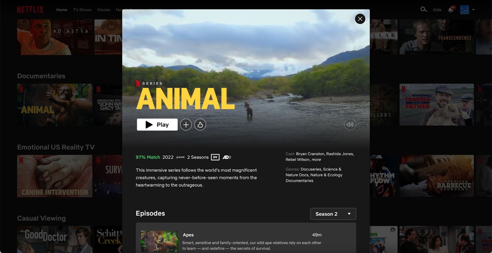
Modals are useful for displaying content to users before navigating to another page. Like popovers, modals provide helpful context to menu items before users decide to navigate away from the current screen.

9) Call to Action Button (CTA)

A call to action is designed to attract a user’s attention to a specific task or action, i.e., “Buy Now,” “Sign Up,” “Login,” etc. We often see these CTAs on landing pages or in website hero sections above the fold.

Placing CTAs in navigation bars increases clicks due to the prime location and the high likelihood it’ll be the first thing someone sees.

UX designers often place CTAs in navigation bars to entice users to sign up or create an account. CTAs generally take up space, so designers must ensure they offer value to users and not only the business.

Returning to our Coursera example, the header navigation UI’s primary CTA asks users to “Join for Free.”
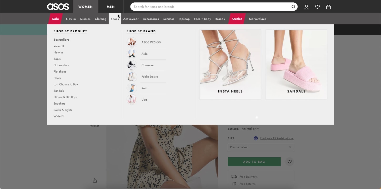
10. Mega Menu

Mega menus are popular for eCommerce because they allow designers to create complex navigation UIs with product categories, images, videos, featured products, etc.

A mega menu aims to display high-value products and content to increase clicks. As these menu items sit above the fold in the header navigation, it’s more likely that users will see them.

This example from ASOS allows customers to shop by best sellers or top brands with two image cards (likely featuring collections of the store’s most popular products).

Long-form content websites like blogs, news publications, etc., place featured content in navigation UIs (usually in a mega menu) to highlight their best stories.

Featured content can make navigation busy, so UX designers must practice caution and only include critical information, such as the image and headline.

Many websites and web apps suggest related or recommend content based on what someone is consuming. We often see these navigation blocks at the end of an article or connected to a video on a streaming service.

Related content aims to keep users engaged on a website or platform, ultimately increasing business value.

Footer navigation (also called secondary navigation for websites) is where designers place secondary links and content. Websites often place sign-up forms, social links, latest blog posts, contact info, policies, etc. 

This footer content is important to users, but it’s not critical for completing tasks and would take up valuable real estate in the header nav.

14. Bottom Bar Navigation

Bottom bars are common in mobile apps, but many websites and web applications use these navigation UIs to enhance the mobile experience. A bottom navigation bar works best for websites with fewer than five primary menu items, with three to four optimal. 

These bottom bars provide a few business and user benefits, including:

  • Reduces tapping and scrolling for mobile users
  • Replicates the desktop experience with the main navigation always visible
  • Streamlines user flows, helping users navigate faster
  • Increases business value as users are more likely to explore the website

The downside to bottom navigation is that it can be intrusive, especially when reading articles. This bottom bar UI pattern is best for eCommerce, web apps, forums, and other websites where users need to navigate quickly between products and features.

15. Breadcrumbs

News sites, blogs, and eCommerce websites often use breadcrumbs to show users where they are on a website and the category tree for the page they’re currently on.

eCommerce giant ASOS uses breadcrumbs so users can find similar products based on multiple categories. In this example, ASOS uses breadcrumbs to show the path from the product to the home page:

Home > Women > Festival > ASOS DESIGN babydoll mini skater dress in animal print.

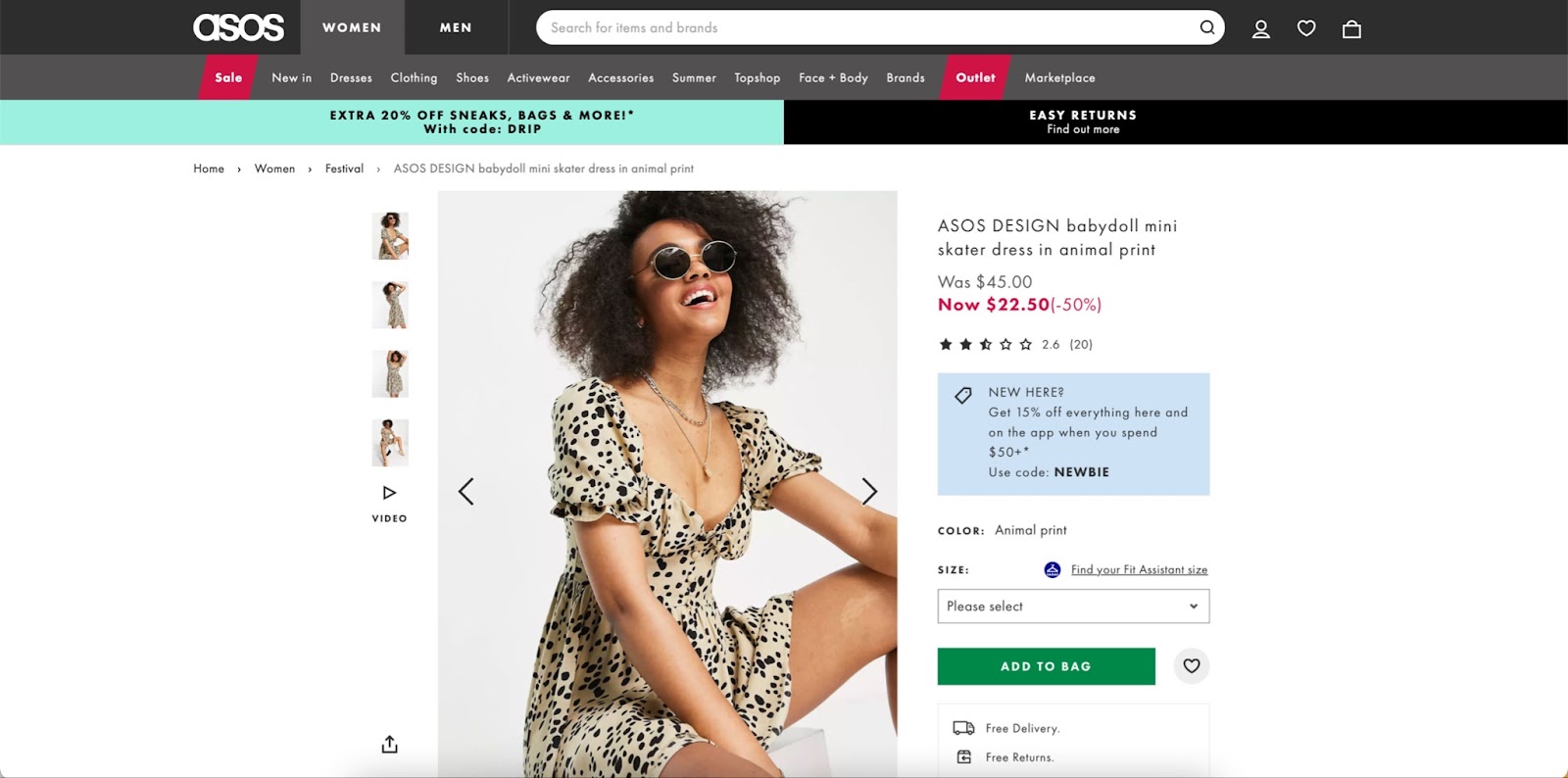
Shoppers can click on any of these breadcrumbs to view related products in that category.

16. Dropdown Menu

Dropdown menus allow designers to include multiple links in the header navigation. For example, at UXPin, we have six primary nav links, four of which are dropdowns with additional menu items.

UX designers must design dropdown menus carefully as they can create usability and accessibility issues. Users must use these dropdowns on screen readers and their keyboard instead of only a mouse or tapping. The links should also have enough margin and padding so users don’t accidentally click the wrong menu item, which can be frustrating.

Prototyping Navigation UIs in UXPin

UXPin enables designers to build complex prototypes with code-like fidelity and functionality. Our Multilevel Dropdown Navigation demonstrates several core UXPin features designers can use to create navigation UI prototypes.

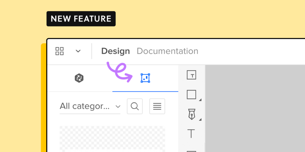
Syncing Code Components With Merge

Merge is UXPin’s proprietory code-based technology that allows you to sync a component library or design system with UXPin’s design editor. You can sync basic UI elements, like a functioning toggle switch, to complex components, including a fully functioning navigation bar complete with states and interactions.

Instead of redesigning a product’s navigation UI for every project, designers simply drag and drop components to build prototypes and begin testing.

Enhance your prototyping and testing to deliver better products to your customers. try UXPin Merge and sync your design system with a design tool using Git, Storybook or npm integration.

Switching Design Toolstack to Design at Scale

Switching Design toolstack to design at Scale

Scaling UX is a challenge many design leaders encounter. With limited resources, it’s often impossible to hire more designers. But even if you do have the resources, is hiring to scale a viable and sustainable strategy?

This article looks at how organizations can scale design simply by switching their tool stack. We also provide an example of how this strategy was successfully implemented at the enterprise level–meaning it can work for anyone, especially cash-strapped startups.

Scale design with the world’s most advanced component-driven prototyping tool.

Scaling Design – More People or Better Tools?

When scaling design, we often think of hiring more people. Organizations consider increasing their designer-to-developer ratio, thinking that adding more designers and researchers is the best way to scale.

There are two problems with this approach:

  1. It’s expensive and increases monthly overheads
  2. It doesn’t scale inefficient processes and workflows

How PayPal Scaled Design by Switching Tools

In 2019, Erica Rider, Senior Manager for UX – Developer tools and platform experience at PayPal, was stuck with the challenge of scaling design without hiring new people. 

At the time, Erica had five designers (including herself), +-100 products, and over a thousand engineers working on PayPal’s internal product development projects.

They had many usability and consistency issues. As Erica says in her interview with UXPin, “no two products looked the same!”

Erica’s idea was to empower product teams to build and deliver projects. The problem was most product team members had little or no experience with design tools. Teaching them UX practices and new tools would be time-consuming and more expensive than hiring new designers!

Eventually, Erica came across UXPin Merge–a technology that syncs a component library from a repository to UXPin’s design editor. This technology meant PayPal’s product teams could drag and drop approved components to build new user interfaces. Erica could also set constraints via the React component’s props to ensure product deliveries met a high standard of cohesion and consistency.

By switching tools, Erica scaled design itself rather than her department. PayPal’s product teams complete 90% of their projects, with UX designers acting as mentors and helping when a challenging usability issue arises. 

Switching to Merge has also significantly reduced time-to-market. Product teams can create a one-page UI 8X faster (with substantially higher fidelity) with Merge than experienced UX designers could using an image-based design tool. 

You can read more about PayPal’s story here. And watch Erica’s Design Value Conference talk from May 2022, where she talks about educating the organization about user experience to hold everyone accountable for delivering user-friendly products.

The Landscape of Design Tools

The Evolution of Design Tools

Wireframing and prototyping for web design and usability testing began in the 1980s. In 1990, Adobe released Photoshop 1.0, the UX design industry standard for many years.

lo fi pencil

In the 2000s, we saw a greater emphasis on user experience design and the importance of prototyping and testing. While a wide range of design and prototyping tools were available, they were all iterations of Photoshop 1.0 that rendered raster graphics. 

The tools revolutionized UX workflows but matured very little to meet the fidelity and functionality of code. UX designers had to rely on engineers (and still do at many organizations) to build prototypes for solving complex usability issues.

Nowadays, we have tools for every stage of the design process, including design system tools for managing and scaling design systems.

The Code-Based Design Revolution

We also have a new breed of design tool–code-based design tools capable of building prototypes that accurately replicate code fidelity and functionality.

code design developer

Code-based design allows designers to test user actions and functionality they could previously only achieve using code prototypes. Or, if they could build them in an image-based tool, it would take many hours (even days) and countless frames to achieve the desired result.

For example, with UXPin, designers can build prototypes that capture user inputs, perform form validation, verify a username and password, build a functional checkout flow with computational components, and more.

In 2019, UXPin released Merge, revolutionizing the prototyping and testing process. Merge allows designers to build prototypes using the same component library as engineers. You can sync React components via Git or Storybook for other front-end technologies, including Angular, Vue, Ember, and more.

This single source of truth eliminates drift, enhances user testing, improves cross-functional collaboration, and streamlines the handoff and development process.

As we saw in the PayPal case study above, Merge empowers non-designers to build, test, and deliver design projects. Organizations can scale design and its operations without hiring more designers.

Request access to UXPin Merge and see how powerful it is.

How to Introduce a New Tool to the Team in 6 Simple Steps

eSignature giant HelloSign created this six-step strategy for introducing a new digital tool to your team.

Step 1: Keep the initial introduction simple

Don’t overwhelm team members with an information overload about your new tool and how it works. Instead, design a strategy to educate and implement the tool slowly.

If you’re introducing a design tool like UXPin, perhaps you only get designers to use it for prototyping at first–since this is UXPin’s strongest advantage over image-based tools.

Step 2: Hear out your challengers (and find your champions)

Change is hard for many people. Even if you can demonstrate that your new tool will solve their problems, the overwhelming thought of change and learning a new system makes them reluctant.

We’ve seen this reluctance with organizations implementing design systems and new tools. Finding advocates and supporters who will help you convince others to adopt your new solution is crucial. 

In How to Evangelize a Design System? we outline some strategies for getting stakeholder buy-in and promoting adoption. Also, check out What is Design Advocacy? for techniques on engaging with and educating team members.

Step 3: Practice answering the hard questions

Sit with your implementation team to prepare answers for skeptics. Reluctant stakeholders and team members will always look for holes in your plan, so preempt and prepare for the hard questions.

team collaboration talk communication ideas messsages

If you come across a question you haven’t thought of, avoid arguing your point and instead answer with, “Great question. I’ll have to research that more and get back to you.”

Step 4: Don’t just share features; share specific examples

Demonstrating what something can do is far more effective than listing the tool’s features. When PayPal switched to UXPin Merge, they used an experiment to demonstrate the tool’s capability to reduce a single page prototype design time from over an hour to under ten minutes.

Results like that are hard to argue against. Find examples to demonstrate a new tool’s effectiveness, and frame those benefits to your audience.

Step 5: Give team members the autonomy and resources to explore

Some people learn by reading documentation; others prefer to watch tutorial videos, and then you get people who what to learn by playing with the new tool.

Give team members the options to learn and discover through a medium that works best for them. Host demos and Q&As so people can learn first-hand and ask questions.

Step 6: Listen to (and use) feedback

Be open to feedback and be willing to try ideas and suggestions. People will be more inclined to reciprocate when you show that you’re flexible and open to ideas. It also gives team members ownership, thus increasing the likelihood of adoption.

You can set up a Slack channel, create a feedback form, organize Q&As, workshops, etc., to engage with team members and encourage feedback.

Get a taste of Merge technology. See how much more consistent and scalable your prototyping gets once you switch to using UXPin with Merge. Request access to UXPin Merge.

Good App Design – Top 8 Best Practices to Follow

Good app design

We spend a lot of time on mobile devices, and it’s hard for us to imagine our lives without our favorite apps. However, the number of applications for Iphones or Android smartphones we can choose from is huge, and it’s safe to say that people won’t tolerate bad mobile design. 

In the following article we’re going to take a look at a few best practices, which you can use to make sure your app design interface is flawless! It’s not a step-by-step tutorial, but an easy walk-through of successful app design.

Good App Design TL;TR

  • Before you even begin working on the design, be sure to understand the app’s purpose – whom you’re serving, why, how, and what value you’ll be adding to their lives.
  • Avoid web-like experiences. These are hardly optimized for mobile devices and are now a big ‘no’ in terms of UX design and UI design.
  • Prioritize app consistency and remember to constantly collect feedback from users.

Do you need to design a good app? Sign up for UXPin’s trial and see how easy it is to build an app prototype in this code-based design tool.

With UXPin you don’t need to draw multiple art boards to simulate your product. It allows you to add interactions, expressions, and variables that make your design feel like a finished product that is ready to be tested.

Sign up for a UXPin trial and start prototyping!

The Consequences of Bad App Design

Great app design is effortless. Intuitive. Everything works, just as it should, without users even thinking about how to do what they want to do. Bad app design is like placing a boulder in the middle of the road. It forces users to deviate from their path, changes the flow, or – the worst case scenario – has them backing off in search of another app that does what you don’t. 

heart love like good

Bad app design, i.e., the kind that confuses people, causes friction during the experience, or simply overwhelms them. Simply put, it has serious impacts on your app’s success. 

1. User drop-outs

You don’t just want to attract new users – you need to retain and keep them coming back to your application, thus increase metrics such as DAU or MAU (see other UX metrics). Poorly designed apps can’t deliver on that. As the user-base crumbles, it harms your business. 

2. Low or no engagement

Every app designer wants users to engage with their product – and the less user-friendly the app’s user interface is, the less likely it is that those that stick around actually engage with it. It affects game apps, productivity apps, ecommerce apps and other kinds of apps. With so much choice in the digital marketplace, users will go elsewhere.

3. Lack of referrals

Word-of-mouth is a powerful tool. The majority of users aren’t willing to spread a good word about an app or leave a great review of a mobile app that’s not user-friendly.

Even die-hard fans of your startup or previous products will find it difficult to endorse an app, meaning potential ‘evangelists’ won’t tell others ‘You gotta try this iOS app’.  And if they do, users don’t want to hear, ‘But if you do, remember you need to X, Y, and Z, before it works.’ Today’s users just don’t want to use an app if the learning curve is steep.

8 App User Interface Practices for Good App Design

Follow these mobile app design guidelines to build a product users will love. 

1. Prioritize mobile users

User-centric design is paramount. Because if an app isn’t built for the people that actually use it, then it’s little more than a vanity project. Users are used to everything being crafted for them. Whether it’s an easy ecommerce experience, like the kind provided by Amazon, or simple actions, like swiping right on a dating app, each component of the design needs to be designed with the user (and the device) in mind. 

mobile screens pencils prototyping

Apps that don’t take a user-centric approach are destined to fall out of favor with users drifting to rival apps and sites. 

Testing can help you figure out how they use your site, letting you tweak the design until you find something that totally meets their needs. 

Read more about mobile-first responsive design.

2. Make it easy to navigate

Make it as simple as possible to get around – that’s just good mobile app design guidelines. If a user wants to reach their account information, or take a key action (like, ‘Play game’ or ‘Buy now’) then it should be obvious exactly how to do that. Remove the awkward moment when users think, ‘Is this right…?’, because it destroys usability of the app.

A simple app design interface isn’t the same as an underpowered one. It’s about removing what isn’t important and focusing attention on one or two core actions per screen. 

Take Facebook app as an example. It’s one most of us are familiar with, and it’s a masterclass in intuitive navigation. No one has to pause and think how to post an update or find the messenger icon. Familiarity and consistency are key to creating easy navigation.

So, the search button is found in the top-right corner, just as it is on countless other apps and sites. The menu button, also in the top-right, is shown as a three-line button. So, users know what it is, where it is, and how it works. Users aren’t overloaded with information and input options. Plus, their onboarding process goes way smoother this way.

3. Use the right app design tools

When following tried-and-tested mobile app design guidelines, think about how you’re going to craft your product. 

If you’re keen to get your app to market quickly without compromising on quality, choose the right app design tools. You wouldn’t build a skyscraper with wood shavings. And, even if you did, just how close to your initial idea would it be? 

You and your team won’t want to fiddle with clunky workarounds. Forcing design tools to do what they were never meant to do. It harms product development and risks shattering that original vision. 

The tools you use are absolutely critical to bringing your app to life in a way that chimes with your original vision and what your users crave. So, look for good app design tools that are specifically made for product designers in the website & app design and development space – like UXPin.

uxpin autolayout

UXPin helps designers and developers stay efficient, consistent, and creative every step of the product design process – from prototyping to simplifying those sometimes tricky design hand-offs.

UXPin has multiple features that will make you design user interfaces fast and efficiently. It also helps you adhere to accessibility standards, easily test your prototype with the simulate mode, and it aims to make front-end developers build products according to your vision by giving them access to code.

Sign up for a free trial now.

4. Remember about feedback

Feedback is, of course, a really important part of product design – it helps you refine your product, turning a good app design into a great one. 

Users love feedback just as much. There’s nothing more frustrating, as a user, than tapping a button. And nothing happens.

That lingering sense of dread as they wonder, ‘Did it work? Is it doing what I want?’ 

That’s bad app design, pure and simple. Because it leaves the user adrift, even if just for a second or three. Users aren’t just used to ‘instant gratification’ here. They positively demand it (there’s a reason good website design dictates load times of no more than about three seconds). Without feedback, they can’t tap back fast enough, even if the action is still processing. The result is a lost user, and potentially a win for your competitors. 

One of the best examples of this is the Domino’s pizza tracker. It offers users feedback at every stage of the order. They’re not worrying whether their order went through – they can just open the app and see where it’s at and when it’ll be delivered. 

Source: WSJ

In your own app, use animations and transitions, audio and physical signals, like a vibration, to tell users that their action has been a success. 

5. Understand the app purpose

The why is just as important as the what and the who and the how

Take time to really understand why you’re building your app. It’s all about finding your purpose in the digital space. 

Let’s say you’re making a user-generated video social network. If your reasoning is, ‘I have an app idea for a social media mobile application because TikTok is popular’, that’s not a good enough why. TikTok already addresses a particular user pain point. In order to succeed, your app needs to do more than that. It needs to fill a niche, achieve new results in new ways. 

Understanding the why at an early stage of mobile app development – ideally, right at the beginning – informs the direction of the project for everyone involved. 

6. Avoid web-like experiences for mobile apps

Dare to be more than a website on mobile. Apps, especially the ones made for smartphones like Android or Apple, have some things in common with web design. Yet, there are things you should consider when designing mobile app UI.

Creating web-like experiences in an app should be avoided. – for two main reasons: 

screens prototyping

If you’re essentially ‘porting’ a website to an app, the tech limitations will impact your final product. Your app won’t work in the same way that a native app can. It’s true to say that HTML-powered apps that work across operating systems are easier to update. But it also means they’re prone to lag and are generally less capable than apps designed specifically for the iOS and Android platforms. 

The result is a bad user experience – a cardinal sin when building apps made with the user in mind. Web-style apps lack interactivity. That fundamentally changes what users can do and how they do it. 

If it doesn’t do what users want, in the manner they expect, they’re sure to find native apps (those built for specific platforms) that do. 

7. Don’t include too many notifications

Notifications are a necessary part of making an app – whether you want to highlight an important message or want users to perform a particular action. But they also disrupt the user flow, which means it’s important you strike the right balance. How quickly do you press ‘No thanks’ a website asks if they can view your location? And how frustrating is it to X an annoying pop-up? The same is true in an app and the notifications that pile up in the home screen. 

Bad app design throws real-time notifications at a user with reckless abandon. At that point, the focus is on the app’s functionality, not what the user wants (and the user, frankly, wants as few notifications as possible).

Frequency is important. But so is the content of those notifications. If you’re disrupting the user journey just to tell them how to do something they’ve done a million times before, then it only serves to frustrate them. 

Make your notifications useful or necessary (or both). A reminder to redeem their points or an item is still in their cart, for instance, is great; a reminder that pressing ‘Buy’ lets them buy an item isn’t. 

8. Prioritize design consistency

Have you ever tapped onto a new screen and thought – just for a second – that you’re in the wrong app? Gone is the familiar, replaced by a whole new style. It’s a pretty jarring experience (and one that might even see you closing the app, your mind filled with well-earned distrust). Consistency is more than using one color scheme or typography.

responsive screens

When creating a consistent design, make sure you align:

  • Font type
  • Spacing
  • Images and icons
  • Navigational elements

Consistency is important in great app design. Avoid changing UI elements up too much, at a screen-to-screen level, or introducing too many different concepts all at once. It risks overwhelming and confusing users. 

Best App Design is Within Your Reach

Given how most of us interact with services and products on mobile devices, no business can afford offering a bad mobile app design experience. Luckily, as we’ve shared in this piece, there are a set of best practices you can follow as you work on your application.

Sign up for UXPin trial and use those tips above to design a powerful prototype that follows good app design principles.

Brand Consistency – Check How You Can Boost it with Design

brand consistency

UX design has a significant impact on brand consistency. A product’s visual aesthetic and usability are often the first thing people notice and, therefore, must relate to the brand and create a strong first impression.

Brand consistency in UX design goes beyond using a brand logo, correct colors, and fonts. Designers must create an experience that mirror’s the company’s image, makes sense for the product, and appeal to the target audience. This article explores the importance of brand consistency in UX design and how designers can create on-brand product experiences.

Design consistent user experiences with UXPin’s revolutionary Merge technology. Request access and discover how a single source of truth can ensure your organization delivers consistent, on-brand product experiences with every release.

What is Brand Consistency?

Brand consistency refers to how a company delivers consistent messaging and stays true to its core brand values across every touchpoint. This consistency relates to everything from visual design and copywriting to how employees engage with customers or solve problems.

Brand Consistency in UX Design

Design and UX are vital for brand consistency because these are components customers see and experience when engaging with a product or service. A company can have an excellent name, slogan, logo, brand messaging, etc., destroyed by a poor user experience.

Why Does Brand Consistency Matter?

A brand gives a company human-like characteristics, making it easier for customers to relate and engage. Here are several reasons why design leads and stakeholders must prioritize brand consistency in UX.

Reason #1: Building Trust

If you meet someone and they tell you they stand for one thing, but their actions contradict this, you might become suspicious. If you notice more of these inconsistencies, you stop believing them and lose trust.

The same is true for brands, probably more so. People want to see consistency, even down to a product’s typography, colors, and microinteractions.

In a case study from the password manager, TeamPassword, Tony Caccavo, Director of Operations, stated, “Brand is essential in this market. Customers entrust us with sensitive information in their login records. Inconsistencies or an outdated design can cause some customers to question whether we are technologically up to date enough to keep that information secure. Front-end development builds trust and confidence in the backend performance.”

Reason #2: Strengthens Brand Recognition

Brand consistency enables customers to find your business and other products in app stores, social media, and physical locations. A great example is the global mega-brand Virgin.

Virgin competes successfully in multiple industries worldwide, including services, experiences, and physical and digital products. Loyal customers immediately recognize Virgin’s signature red and white branding–associated with its high-quality service delivery, playful nature, and friendly customer service.

Reason #3: Boosts Sales and Marketing Efforts

Strong brand consistency can have a significant impact on revenue, according to a Lucidpress study. The latest State of Brand Consistency Report found consistent branding can increase revenue by 33%–a trend that appears to be growing, as indicated by a 10% increase since Lucidpress’ 2016 report.

Reason #4: Design and Development Efficiency

Branding, or any design inconsistencies, result in design drift, bugs, rework, technical debt, project delays, etc. These inconsistencies lead to poor customer experiences, but they also create workflow and delivery inefficiencies that cost organizations valuable resources.

To overcome these design and development inefficiencies, companies build design systems, including brand guidelines, to ensure teams deliver a consistent user experience across all touchpoints.

How to Increase Brand Consistency Through UX Design

Much of brand consistency is about building trust. If your company’s actions contradict messaging, people lose confidence in the brand. Here are six tips to ensure products deliver a consistent brand message.

Build a Design System with a Brand Style Guide

Design systems solve several big problems for companies implementing them, most notably cohesion and consistency–for the product and workflows.

A comprehensive design system includes brand guidelines that help reinforce the organization’s messaging and brand identity. Design systems ensure every project delivers the same design language, using the same principles and component library, creating a consistent brand experience for users.

Universal Design Patterns

Design patterns create familiarity, reducing a product’s learning curve and human cognitive load. These universally recognizable patterns give products a foundational consistency to strengthen the brand.

Furthermore, when a product is easy to use, customers are more likely to use and recommend it, thus increasing brand trust and affinity.

Showcase Your Brand’s Voice & Tone Using Design

Like a product’s messaging and copy, the color palette and visual elements must represent the brand’s voice and tone. The best way to define these UI elements is by testing designs with potential customers.

UX design agency Divami does this by developing a brand’s personality based on UX research. When Divami designed Celes Care, “a specialized healthcare platform – For Women, By Women,” they wanted to create a feminine UI without using the stereotypical “all pink.” By testing the color scheme, the agency found a “soft, mellow” palette that, most importantly, end-users associated with the brand’s personality.

Internal vs. External Brand Consistency

Internal consistency refers to the user experience within a product, while external consistency includes a suite of products. While each product might differ slightly, designers must meet a high level of consistency between products.

Apple has a wide range of hardware and software, but the brand’s physical and digital design features leave no ambiguity about who made it. Apple’s design consistency across products strengthens its brand and customer loyalty.

This consistency is easier to manage when the organization designs, develops, and manufactures every product, but what happens with third-party marketplaces?

Products like Shopify, Salesforce, Atlassian, and others, rely on third-party apps to complement their core product(s). While every app offers different features and functionality, the product’s design system ensures each matches the core product. 

For example, app developers must follow Shopify Polaris to ensure that every app in its marketplace meets Shopify’s guidelines (including branding) for content, design, components, and patterns. Even if someone uses multiple apps from different suppliers, it feels like one Shopify product.

Visual Design Consistency

Minor UI design details like spacing, sizing, layouts, colors, etc., can impact brand consistency. When these UI elements are consistent across all UIs, users can focus on completing tasks rather than thinking and searching for content and features.

Furthermore, designers must use consistent microinteractions, page transitions, and notifications that align with the brand’s voice and tone. Again, a design system can solve many of these issues, so user interfaces are always on-brand and consistent.

Be Transparent

Transparency is a significant factor in building trust and brand affinity. Designers must make features simple and transparent so users can complete any task, even those that adversely impact the business, like unsubscribing or canceling a paid plan.

A product must always inform users of a financial incentive, like affiliate referrals, sponsors, third-party data sharing, etc. Designers must also avoid clickbait or deceptive links that ultimately damage trust and brand.

Increase Brand Consistency With UXPin Merge

Merge enables you to sync a component library from a repository to UXPin’s design editor, so designers use the same UI elements as engineers. Any changes to the repository automatically sync to UXPin, creating a single source of truth across the organization.

The design system team can give designers the freedom to change components via React props (or Args for our Storybook integration). They can also hardcode and restrict specific properties teams aren’t allowed to change, like brand assets, colors, typography, microinteractions, etc.–maintaining brand consistency across the organization for every product release.

Programing brand elements and core values into the design system mean product teams can focus on developing new products rather than worrying about small (yet critical) design decisions.

Merge also streamlines the design handoff process because engineers already have copies of the components in a repository. Furthermore, UXPin renders JSX code for each component’s props. Engineers simply copy/paste components from the library and any changes from UXPin to start front-end development.

11 Powerful Lessons on Building and Scaling an Enterprise Design System

Powerful Lessons on Building and Scaling an Enterprise Design System

In May 2022, UXPin had the pleasure of hosting the lovely Amber Jabeen, DesignOps Director at Delivery Hero MENA (talabat), for a webinar titled: Enterprise Design System – How to Build and Scale.

This article summarizes part of Amber’s talk where she discusses her team’s challenges with getting design system buy-in and what she would have done differently.

Amber is a co-author of UXPin’s free eBook DesignOps 101: Guide to Design Operations. The book covers six chapters and provides an introduction to DesignOps and how to implement the practice.

Build, scale, share, and mature your design system in UXPin.

What Most Teams do to Win Design System Buy-In

In 2019, Delivery Hero was undergoing the all too familiar growing pains that many startups experience. Delivery Hero had nine teams working on the product with no UI library or design system. The startup had developed silos, and there was lots of duplication, making it difficult to scale, resulting in a “highly fragmented user experience.” 

user choose statistics group

Amber and her team decided a design system was the best solution to their problems. So, they set about creating a case to get buy-in from stakeholders.

Run a Design Audit

Delivery Hero’s product team started with a design audit. The audit report revealed many user interface inconsistencies, including:

  • Several different CTAs
  • No typography styling standards
  • Multiple icon styles

Amber notes in her talk, “…our design language was all over the place. This was a big moment of realization.”

The team used the audit report to build a business case and presented it to Delivery Hero’s leadership, resulting in buy-in to redesign the app.

The product team started by redesigning key screens and user flows. The new design was more consistent, cleaner, better aligned with the brand, and improved the user experience.

Build a UI Library With UI patterns

The product team used the redesign to create a UI kit and style guide, including colors, typography, elevation, UI patterns, and components.

Delivery Hero’s product department scaled, onboarding new designers. Amber notes that even with this growth, consistency improved across Delivery Hero’s design projects, and they were able to scale design.

First Attempts at Building a Component Library

Having successfully designed a source of truth for designers, Delivery Hero’s product team wanted to do the same for engineering. Amber and her team put together another business case for a component library.

The business case outlined the core benefits of a Delivery Hero design system:

  • A single source of truth between design and development
  • Better user experience
  • Strengthened brand affinity
  • Faster experimentation, prototyping, and testing

Delivery Hero’s leadership liked the presentation and saw value in the product team’s proposal, but the answer to building a code component library was no! There was no money or resources for a design system.

Rethinking the Approach

Amber’s team went back to the drawing board. They decided to ship their new designs using the style guide to the entire app. The project took three months and was a huge success for the product development team.

Over the next six months, Delivery Hero shipped lots of new features and experiments. The product team’s new designs were fresh and consistent. The problem was, without a source of truth for engineers, Delivery Hero’s final releases lacked cohesion and consistency.

The product team decided to do another series of audits. They took screenshots of design handoff vs. production, which revealed many inconsistencies, including missing content and UI elements. These audits showed that Delivery Hero was collecting debt with every release.

Building a Convincing Case for Delivery Hero’s Design System

Delivery Hero’s design system team didn’t have any engineers, so they had to partner with a developer to build and test a component for their new pitch to leadership.

designops efficiency person

Amber’s team built a component for Delivery Hero’s ‘No results’ screen and experimented with vs. without a design system:

  • Building without a design system – total time: 7.5 hours
  • Building as a reusable component – total time: 3.25 hours

The product team only recorded front-end development time. The experiment demonstrated a 57% time reduction in front-end effort and zero percent debt with a reusable component.

Amber’s team used this new data to present another case for building a component library. Delivery Hero’s leadership was impressed by the results and gave the go-ahead to develop a design system.

Today, Delivery Hero’s design system, Marshmallow, has 30+ components in its UI kit and code UI library managed by a dedicated design system team–unifying design and development with a single source of truth.

Marshmallow includes:

  • A design system website
  • A dedicated Slack channel
  • Guidelines (brand, code, design, copy, etc.)
  • Design language
  • Protocols for working and communicating
  • A code component library
  • An icon template
  • A UI kit
  • UI examples
  • Design system governance procedures

Learn how to create a design system from scratch here: Design Systems: Step-by-Step Guide to Creating Your Own.

Getting Buy-In and Scaling for Building an Enterprise Design System

mobile screens pencils prototyping

Reflecting on lessons learned, Amber offers six pieces of advice for getting buy-in for an enterprise design system.

Start with a real pain point

Identifying a pain point that’s adversely impacting the product, users, and business is a crucial first step. Amber and her team used an auditing system to identify a significant drift between design and development.

Build the value proposition

Use the pain point(s) to build a value proposition for your business case. Your solution must solve the problem and deliver a return on investment for stakeholders.

Identify your biggest supporters and sponsor

Amber recommends finding support from other departments to back your design system pitch. These advocates will support your claim that 1, “this is a real problem for the company,” and 2, “this is the best solution.”

Show before you tell

Amber says the mistake she made in her first pitch was telling a story without proof. When the team showed stakeholders what a component library could do, their story became more compelling, and the business case was convincing.

Talk business metrics

“If we don’t tie the business case of the narrative with KPIs or the metrics that impact business, then the story is not complete.” Amber Jabeen

Amber says your business case must include design system metrics to demonstrate how the problem costs the company resources and what the solution will do to help.

Don’t go alone – build your network

Pitch your business case as a network of cross-functional partners, including tech, design, product, marketing, customer services, etc., to demonstrate that your design system is a solution for the organization and not just something to make the design team’s life easier.

Watch Amber’s entire one-hour webinar on YouTube.

Code-Based Design Systems With UXPin

Sync your design system’s component library with UXPin’s editor to create a single source of truth between design and development using our proprietary Merge technology.

Website Design for Higher Conversions – A Quick How-To Guide

Website Design For Higher Conversion Rates

It takes 50 milliseconds for visitors to form an opinion about your business from your website’s design. A poor user experience creates a negative sentiment resulting in high bounce rates and conversion loss.

Understanding UX design’s impact on a website’s conversion rate is key to removing potential roadblocks, creating business value, and delivering a higher ROI for design projects. This article explores how website design impacts conversions and how design teams can improve marketing campaigns.

Design better user experiences using meaningful insights from prototyping and testing your conversion rate optimization ideas in UXPin. Discover how code-based design can enhance UX workflows, increase website conversions, and create better experiences for your customers. Sign up for a free trial.

Build advanced prototypes

Design better products with States, Variables, Auto Layout and more.

Try UXPin

What is Website Conversion Optimization?

idea 1

Website conversions include successful sales, leads, form completions, and other tasks you want visitors to complete. Website conversion optimization is a practice of increasing opportunities for visitors to complete these tasks.

Much of this conversion optimization comes down to web design and user experience–a task for UX designers. Designing for optimization means UX teams must understand what users need and how the user interface can guide them to that goal quickest.

Why is Design Important for Conversion Rates?

Web design plays a crucial role in conversion rates. Here are some stats to support this case:

Setting the First Impression

A website’s design is often the first customer touchpoint and how people perceive your brand. Impressing customers with an aesthetically-pleasing user interface, experience, and content is the first step toward converting website traffic to revenue-generating customers.

Enhances SEO

Search engine optimization (SEO) is vital for websites because it delivers free organic traffic. UX designers must understand how search engines crawl and index web pages to optimize content, layouts, and hierarchy.

Read more about UX and SEO on our blog.

Accessibility

accessibility

Web accessibility is another SEO factor, but it’s also critical for creating inclusive website experiences. UX designers must factor in disabilities like low vision, color blindness, blindness, cognitive disabilities, deafness or hearing impairment, and mobility impairments to ensure websites meet Web Content Accessibility Guidelines (WCAG)–a legal requirement in many jurisdictions.

Promotes Trust

Trust is a significant factor in converting visitors. Customers want to know they can trust your company and website before handing over money or personal information. Good web design tells customers you care about your brand, value their business, and want to give them a good user experience–like welcoming people into a physical store.

Design ROI

Aside from user experience, designers must also recognize the importance of increasing conversions for design’s return on investment. Increasing opportunities and conversions establishes design’s value within the organization.

Design Tips and UI Patterns That Boost Conversions

testing user behavior pick choose 1

1. Call to Action (CTA)

CTAs are crucial for conversion optimization. They grab users’ attention with an offer with a UI element to take the desired action–like call-to-action buttons or an email form. CTA buttons are usually colorful and larger than other content to signify their importance and encourage engagement.

2. Landing pages

According to HubSpot research, “more landing pages a business has on its website, the more leads it generates.” Designers and marketers can collaborate to design high-quality, lead-generating landing pages.

Unlike regular web pages, landing pages remove all navigation and links to eliminate distractions and focus users on a single product or CTA.

3. Testimonials

Testimonials or reviews are vital for displaying social proof, especially if they’re from prominent figures or brands. Testimonials tell website visitors that others are using your product and are happy with what they received.

According to marketing software giant HubSpot, “People consult reviews and testimonials to determine whether or not they trust a product, service, and even a seller.”

4. Value Proposition

Your value proposition tells customers what problem your product solves. For example, if you’re selling high-speed internet, your value proposition is that customers can “stream Netflix and YouTube videos with no buffering or interruptions.” Nowhere do you mention high speed or internet; you’re selling the solution.

Marketers generally put value propositions above the fold, next to the CTA. Customers see the solution (value proposition) to their problem and follow the link to sign up.

5. Contact Information

People often visit business websites to find contact information like email addresses and phone numbers. Many websites include these contact details in a header bar above the main navigation, so users don’t have to scroll or navigate to another page to find them.

Designers must instruct engineers include a “tel:” or “mailto:” HTML link attributes so users can click to email or call.

6. Pricing

Pricing is another reason people visit company websites, particularly SaaS and other service-based businesses. A pricing table UI pattern comparing your product’s plans is helpful for users, and the transparency builds trust. Designers must always include CTAs for users to sign up for their preferred option and begin the onboarding process.

7. Human Faces

user laptop computer

Using relevant human faces for product images is crucial for creating a human connection while making the content relatable. Your about page must also include profile images of team members to give your brand a personal touch.

Onextrapixel has an interesting article, On How To Use Human Face To Improve User Experience,” with examples from some of the biggest brands’ websites.

8. Negative Space

Negative space or whitespace is an excellent web design technique for drawing attention to specific content, like a CTA, important elements, or copy. Designers must also use appropriate negative space for text and UI elements to enhance readability and separate content.

9. Case Studies

Case studies are essential for B2B websites to demonstrate how your product solves problems and delivers results.

For example, our UXPin blog features a case study about How PayPal scaled How PayPal Scaled Their Design Process with UXPin Merge.” Adoption from one of the biggest tech companies in the world gives Merge significant credibility and demonstrates that the product works.

10. Loading Speed

While loading speed optimization is typically the engineering team’s responsibility, designers can do a lot to reduce the page load time, including:

  • Use responsive design best practices and optimize layouts and content for desktop, tablet, and mobile devices.
  • Eliminate unnecessary “nice-to-have” features and functionality that don’t get users to their goals faster.
  • Find ways to reuse components and microinteractions to minimize CSS and Javascript file sizes.
  • Use JPG rather than PNG and scale and optimize images according to placement and web layout.
  • Use SVG for logos, icons, and other graphics.

Conversion Rate Optimization

Here are some tips design teams can use to analyze and optimize a website’s conversion rate. Designers can use these tests for existing websites or test new ideas.

A/B testing

A/B testing (split testing) is a technique for comparing two designs to determine which performs better. It’s an iterative process where UX designers make small changes to optimize websites and landing pages.

The secret to successful A/B testing is to compare minor changes, like color, copy phrasing, fonts, images, etc. Comparing two completely different designs makes it difficult to tell what specifically increased conversions.

Multivariate Testing

Multivariate testing is similar to A/B testing, but design teams test multiple designs instead of only two variations. Designers can test multiple layouts simultaneously to arrive at the best option faster.

These tests only work for high-traffic websites where designers can split visitors into multiple groups and still have a large enough sample size to achieve accurate results.

Heatmaps

image5

Heatmaps provide insights into how website visitors engage with a webpage and content, notably hover, scroll, and click/tap interactions. Design teams use this data to determine:

  • Are CTAs and user journeys obvious?
  • What navigational links are most important?
  • How far do users scroll?
  • Are there any UI elements distracting visitors from desired actions?
  • Is there a link or content further down the page that users find more valuable than what’s above the fold? i.e., does the visual hierarchy match user behavior?

Google Analytics for Designers

Google Analytics (GA) can tell designers a lot about demographics, user flows, traffic sources (organic, social media, referrals, etc.), and behavior. It’s a fantastic tool for identifying the best and worst-performing pages and where users often exit funnels. Designers can use GA data to identify issues and run tests and interviews with end-users to pinpoint the problem.

We recommend reading Alice Walker’s The ultimate guide to Google Analytics for UX designers to understand the tool and its capabilities better.

Improve Prototyping and Testing to Enhance Website Conversions in UXPin

collaboration team prototyping

One of the challenges UX teams have when prototyping and testing website designs are that image-based design tools lack fidelity and functionality.

Without replicating a user flow or code’s fidelity and functionality, UX designers cannot get accurate feedback and insights. They must rely on front-end developers to program code-based prototypes.

With UXPin’s code-based design tool, designers can achieve the same fidelity and functionality without writing a single line of code. UXPin prototypes deliver accurate, actionable results during testing, allowing designers to solve more usability issues before the design handoff.

Designers can build exact replicas of website user flows, landing pages, eCommerce checkouts, and more to test, iterate, and optimize prototypes with real end-users.

Get a clearer picture of your website’s user experience with accurate prototyping and testing in UXPin. Sign up for a free trial to discover how code-based design can optimize your website design for higher conversion rates.

How to Help Fight Front-end Debt as a Designer?

Enterprise DS Webinar How to Help Fight Front end Debt as a Designer

Designers and engineers must understand each other’s challenges and work together to solve them. Designers want the entire product development team to understand user experience and design thinking, while engineers need team members to help fight front-end debt.

This article explores front-end debt, common solutions to the problem, and how design teams can assist engineers in reducing it. We also demonstrate how Delivery Hero used front-end debt as a business case for developing their design system–thus enhancing the product development process for designers and engineers.

Reduce technical debt with a single source of truth between design and development using UXPin Merge. Explore Merge how it can keep unity across the organization, fight front-end debt, and speed up your product development process. Request access to UXPin’s Merge technology.

What is Front-End Debt?

Front-end or technical debt is the accumulated development work due to workarounds and shortcuts to meet project deadlines. These short-term solutions allow engineers to ship products faster, but the fixes collect in a backlog as “debt.”

Like financial debt, if engineering teams don’t manage technical debt properly, it can have devastating consequences for the product, user experience, and organization.

Front-End Debt vs. Design Debt

Design debt is the required UX practices (research, design, testing, etc.) designers skip meeting project deadlines. For example, the design team implements a new UI pattern but doesn’t have time to test it adequately, not knowing its impact on usability, accessibility, etc.

If your product doesn’t have a design system, design debt results in many UI inconsistencies, like color, typography, UI patterns, layouts, etc. Design inconsistencies (no matter how small) create a negative user experience and damage the brand.

These small design debts compound to create significant usability issues. When paired with technical debt, it can be challenging to pinpoint the root cause, impacting workflows, releases, users, and revenue.

How do Devs Prevent & Manage Front-End Debt?

designops picking tools care

It’s important to note that technical debt is a product of programming, and some debt is unavoidable. The secret is not to eliminate debt but to prevent unnecessary backlogs.

Established companies and enterprise organizations have the staff and resources to employ a dedicated technical debt team. For cash-strapped startups and smaller companies, prevention is always better than cure. Here are some tips to prevent and manage front-end debt.

Educate Teams

The first step to minimizing front-end debt is to educate teams about its impact. Engineers, product teams, and UX designers must understand front-end debt, how it compounds, its adverse effects, and how each department can do its part.

Set Engineering Standards

Every organization (including startups) must implement programming standards and best practices. Engineers must write uniform code and follow company protocols for workflows, documentation, and releases.

These standards will prevent sloppy work and reduce accidental debt from accumulating.

Track & Document Everything

When engineers incur front-end debt, they must track and document it thoroughly, including:

  • Add a job to the backlog (Jira, Trello, etc.)
  • Describe the reason(s) for incurring debt
  • Outline what the team should have done
  • Provide a roadmap to fix the problem

This documentation will streamline fixes and save time. Like debt, these small time savings compound to minimize costs.

Adhere to Project Deadlines

Team members and stakeholders must adhere to project deadlines and avoid schedule changes that force engineers into unrealistic timelines. These changes often shift resources, creating a domino effect of backlog debt.

Automate Testing

Taking time to write automated tests for your product’s common programming errors is an excellent debt prevention strategy. Engineers must get into the habit of writing tests when they find bugs to eliminate future recurring debt.

Implement a Design System

Design systems are highly effective for reducing front-end debt while enhancing consistency and collaboration between designers and engineers.

An approved, standardized component library gives engineers a foundation to write less front-end code, thus reducing errors and increasing productivity. 

How Designers Can Help Prevent Front-End Debt

responsive screens

Design and product teams also have a responsibility to reduce front-end debt. Here are some tips to minimize front-end debt during the design process.

Understand Front-End Limitations

It’s crucial for design and product teams to understand their product’s technical limitations and constraints. Working within these constraints streamlines design handoffs and reduces any new code engineers must write to complete projects.

Collaborate Early & Often

Designer/engineer collaboration must start early in the design process rather than only at handoffs. This communication helps designers and engineers understand each other’s challenges, allowing them to offer appropriate solutions.

For example, engineers might have a solution to a usability issue that’s better for designers and reduces development time for engineers.

Use Code-Based vs. Vector-Based Design Tools

One of the biggest challenges between design and development is that designers and engineers speak different languages and work within different constraints.

Code-based design tools like UXPin enable designers to build fully functioning, high-fidelity prototypes. Instead of using GIFs, animated videos, and other workarounds to replicate code, UXPin prototypes look and function like the final product.

Moreover, its Merge technology allows you to import UI components from Git, Storybook, and npm repository, so that you use the exact building blocks of your product. Read more about it: What is UXPin Merge and how does it work?

uxpin merge comparison 1

Advocate for a Fully Integrated Design System

In his article Re-Imagining Iress Design Tools, Design System Product Owner at Iress, Nick Elliott describes the four stages of design system maturity and how his team used UXPin Merge to develop a fully integrated design system.

A fully integrated design system uses a single component library for design and development. Designers drag and drop to build prototypes, and engineers copy/paste code to develop the final product. There’s no designing from scratch and no writing front-end code.

While this scenario might seem hard to believe, enterprise organizations like Iress and PayPal use UXPin Merge to ship products with minimal new design or code. Sign up for a free trial and explore how Merge works with our MUI integration.

Building a Business Case for a Design System

UXPin recently hosted a webinar with Amber Jabeen, DesignOps Director at Delivery Hero (talabat). During her talk, Amber discussed how her team collaborated with an engineer to build a business case for a design system.

Amber’s team started by auditing releases over a few months, comparing designs to the final release. Their research showed that every Delivery Hero project release incurred front-end debt, costing the company significant time and resources.

Amber’s team found that most of this debt was due to design drift. They ran an experiment to create a UI with vs. without a design system. The results showed a 57% saving on time-to-market with zero debt. Amber used this data for her business case and got the go-ahead to build Delivery Hero’s Marshmallow design system.

Fight Front-End Debt with UXPin Merge

How can you ensure that you don’t acquire front-end debt in the future? One of the ways is using the design tools that enhance the collaboration between designers and engineers. UXPin powered with Merge technology allows you to use the exact UI elements that your devs use to build products at the prototyping stage.

Since you are designing with the building blocks of your app or website, your engineers have an easier job with developing your designs and not recreating the same components over and over again. They can release products faster while staying consistent with the design. Request access to Merge to explore its powerful features.

The Beginner’s Guide to Capturing UX Requirements

Capturing UX requirements is an essential process before teams can begin working on a project. These requirements are vital in guiding a project on its path to success.

There are three components to capturing UX requirements: business, user, and technical. Understanding each and how to capture the relevant data is crucial for designers to comprehend the project’s scope and objectives correctly.

Enhance your product development process with the world’s most advanced code-based design tool. Design, prototype, and test faster with higher fidelity and functionality. Sign up for a free trial to discover how code-based design can enhance your organization’s design projects.

What are UX Design Requirements?

Gathering UX design requirements (also called UX requirements) is a discovery process including conducting interviews, discussions, and document gathering for designers to understand what they need for a project and why.

These UX requirements form part of the project’s requirements which the entire team (product, UX, engineering, business, etc.) uses to guide the product development process.

What is the Purpose of UX Gathering?

This gathering process occurs before designers begin working on a project to guide early research and set goals and expectations. They must understand user needs, business goals, technical specifications/limitations before starting the project.

For example, how do UX researchers begin researching users if they don’t know who they are? The UX gathering process tells designers where to start and what metrics determine a successful project completion.

These are some reasons for Gathering UX requirements:

  • Most importantly, to understand users and their needs. This user research is not as thorough as the empathize or research stage of the design thinking process. It’s simply a foundational understanding of the product’s user experience, so UX designers know where to begin.
  • To set project goals and objectives
  • Understand business goals from a stakeholder’s point of view and align these goals with users
  • Learn about technical constraints and how they impact the project
  • Eliminate ambiguity and misunderstanding

Types of UX Design Requirements

search observe user centered

UX gathering falls into three primary categories:

  • Business
  • User
  • Technical

Business Requirements

UX designers must answer the question, “What does the business want to achieve from this project?” An example of a business requirement might be, “Increase new user sales conversion by 20% without affecting retention.”

Team members use stakeholder interviews and other documentation to gather and understand these business requirements.

Business requirements include:

  • Project timeline
  • Project scope
  • Branding rules
  • Various departmental goals–business, marketing, sales, customer services, etc.
  • Competitors
  • Stakeholder expectations

User Requirements

Who are the users, and what do they need from this project? Are there any specific usability or accessibility issues designers must solve? UX designers use several methods to gather these user requirements:

  • User interviews
  • Surveys
  • Dairy studies

Technical Requirements

Technical requirements fall into two categories:

  • Functional: Outlines the product’s specifications, technical capabilities, and limitations
  • Non-functional: Describes the product’s performance, such as usability, performance, data integrity, and maintenance

The requirements will answer key technical questions for design teams:

  • What is the product’s operating system (iOS, Android, Windows, etc.)?
  • What devices will the product operate on (mobile, tablet, web, smart devices, etc.)?
  • What front-end framework does the product use (React, Vue, Angular, etc.)?
  • What are the product’s technical limitations?

Who is Responsible for Gathering These Requirements?

A representative from each department within the project is responsible for gathering the relevant requirements. For example:

  • Business: Business analyst or consultant
  • User: UX Lead, researcher, or designer
  • Technical: Tech Lead, data analyst

The above is an example of a typical project. These responsibilities will vary depending on the company, project, etc.

How to Capture UX Design Requirements

team collaboration talk communication

There is no standardized step-by-step process for gathering UX requirements. The process, steps, methods, and responsibilities will differ depending on the organization and project.

There are several methods for capturing UX design requirements. The aim is to gather data relevant to your project and compile them into a single document for everyone on the project. 

In some cases, the document might link out to other documentation, like the branding guidelines of a design system. For example, Stack Overflow’s design system Stacks has a comprehensive brand principles section for teams to reference.

The first step is gathering the relevant business, user, and technical requirements. There might be some overlap in the activities team members perform to get this data. For example, surveys and interviews are relevant to business and user requirements.

Business Requirements

  • 1:1 Interviews – meeting with individual stakeholders and experts allows you to discuss specific topics in detail
  • Workshops – an opportunity to discuss issues with multiple stakeholders and team members
  • Documentation – reviewing various business guidelines, manuals, and other documentation relevant to the project
  • Competitor research
  • Surveys
  • Storyboards
  • Moodboards

User Requirements

  • User interviews
  • Usability testing existing products
  • Existing user experience research–user personas, journeys
  • Surveys
  • Diary studies
  • Focus groups
  • Storyboards

Technical Requirements

  • Technical stakeholder interviews
  • Systems reviews
  • Technical documentation and specifications
  • Data analysis

Create a Low-Fidelity Prototype

Design teams often create a basic paper prototype for stakeholder and expert interviews. These low-fidelity prototypes help reference product features or provide context for explanations.

Design teams can also use these prototypes as part of the UX requirements documentation to demonstrate basic functionality, constraints, add context, etc.

With UXPin’s built-in design libraries, UX designers can build high-fidelity mockups and prototypes in minutes. These UXPin prototypes provide better clarity, and designers can share them with stakeholders via URL–perfect for today’s modern remote work environments. Sign up for a free trial to experience faster prototyping at higher fidelity with UXPin.

Document UX Requirements

Documenting the relevant business, user, and technical requirements is crucial. This documentation will provide UX designers with a starting point and reference for the project.

We recommend keeping your UX requirements document concise so that it’s easy for team members to digest. 

Categorizing your UX requirements document will help team members find the information they need. Here are some recommendations for UX requirement categories:

  • User stories & personas: Generated from user requirement gathering.
  • Task flows: Generated from the user and business data detailing possible user decisions and outcomes.
  • Style guides: Various guides for visual design elements like color palettes, typography, components, media content, etc. (Read our guide to creating a style guide).
  • Specifications: Definitions for technical and functional aspects like states, modes, interactions, product parameters, frameworks, operating systems, security requirements, etc. (Read our guide to writing a product specifications document).
  • Manuals: Any standard operating procedures, policies, guides, principles, or manuals relating to the product or organization.
  • Competitor research: Generated from business requirements.

Best Practices for Gathering UX Requirements

task documentation data

Learning From Stakeholders & Experts

Stakeholder interviews are crucial for understanding business needs and high-level strategies. These are some considerations for getting the most out of these interviews:

  • Set goals relating to what you want to know from each stakeholder
  • Research your stakeholders beforehand to understand their role and what they want to achieve
  • Avoid assumptions and bias by pretending you know nothing–ask questions even if you think you know their answer
  • Practice active listening, giving stakeholders and experts time to answer thoughtfully, leaving gaps to allow for elaboration
  • Document the interview with notes and video/audio recordings (with their permission, of course)

For further reading, Adam Fard offers excellent interview advice in his article, The ultimate guide to stakeholder interviews: understand your clients.

Getting the Best Results From Surveys

Surveys are excellent, inexpensive research tools for acquiring quick feedback and sentiment. These recommendations apply to user and stakeholder interviews:

  • Short surveys reduce dropoffs and increase the likelihood of completion
  • Five questions are optimal, eight maximum
  • Prioritize questions with the most important first
  • Keep questions brief, preferably one sentence
  • Closed questions (yes/no, multiple choice) are easy for participants to answer and researchers to analyze

Conduct Meaningful User Interviews

During the UX requirements gathering process, user interviews can help validate existing research or learn about changes. These guidelines will help you get meaningful feedback from users:

  • Ask open-ended questions so as not to bias answers.
  • Always leave an appropriate amount of silence at the end of an answer in case the interviewee wants to add or elaborate.
  • Record interviews (with the participant’s signed consent) for future reference and analysis.
  • Humans tend to withhold information or misinterpret facts. Don’t rely on interviews as a single source of truth. Compare with data and analytics to get an accurate picture.

Faster Prototyping With UXPin

Time is one of the biggest barriers to building high-fidelity prototypes. UX designers rely on paper or wireframes because they’re quick to create and iterate.

With UXPin’s built-in design libraries, UX designers can drag and drop components to build high-fidelity mockups and prototypes to present to stakeholders, users, and experts during the UX requirements gathering process.

uxpin autolayout

The ability to create high-fidelity prototypes at any stage of the UX design process or even when gathering UX requirements means designers get meaningful, actionable feedback from users and stakeholders.

Revolutionize your product development process with the world’s most advanced prototyping and testing tool. Sign up for a free trial to discover how UXPin’s code-based design solution can enhance your end-to-end design process and deliver better product experiences for your customers.

DesignOps Resources – A Collection of Top Links

Researching DesignOps can take you down a rabbit hole of blog posts, whitepapers, webinars, talks, communities, and more! What if you had everything bookmarked in a single resource with links to all the best DesignOps resources? Well, here it is!

This comprehensive list of DesignOps resources includes everything from articles to tools and networking communities.

These DesignOps resources are brought to you by UXPin Merge–the world’s most advanced code-based design tool built to overcome many DesignOps challenges. Request access to Merge and improve the UX design process and streamline product development.

What does DesignOps do?

DesignOps (short for Design Operations) refers to optimizing design processes, people, and technologies to improve the design organization and deliver business value for stakeholders.

The DesignOps role looks at several core areas:

  • Operations management: Developing a Design roadmap and setting long-term goals
  • Process design: Identifying frameworks, templates, methodologies, and tools to optimize operational processes
  • Project management: Optimizing design workflows, assigning projects, setting timelines, and removing any bottlenecks
  • Communication & Collaboration: A point of contact between Design and the rest of the organization while eliminating silos
  • Onboarding: Orienting and training new team members
  • Design team culture: Creating and implementing team building and culture initiatives
  • Budgeting: Managing Design budget allocation and justifying costs
  • Legal: Creating any legal documentation for designers and user testing
  • Procurement: Managing procurement processes for Design
  • IT and Security: Working with IT to integrate tools with other software and ensure everything is security compliant

DesignOps Tools

  • UXPin Merge – A code-based design tool to sync a component library to UXPin’s design editor
  • Adele – A repository of publicly available design systems and pattern libraries
  • Storybook – An open-source tool for building UI components and pages in isolation (more for DevOps but can use to display component examples in design systems. Also syncs with UXPin Merge)
  • Pattern Lab – A Brad Frost project for creating Atomic Design Systems
  • Mechanic – an open-source framework that helps design teams to create web-based design tools

DesignOps Websites & Blogs

Single Articles

designops increasing collaboration talk

A collection of articles from design leaders and DesignOps managers.

DesignOps Talks

camera video play

DesignOps Books and eBooks

Books

eBooks

DesignOps Podcasts & Interviews

search observe user centered

Interviews

Podcasts

DesignOps Communities

designops increasing collaboration group collab

DesignOps Events

Streamline DesignOps with UXPin Merge

One of the biggest DesignOps headaches is design system operations and finding ways to enhance collaboration between design and development. The DS team works hard to sync UI kits with component libraries, a time-consuming manual process prone to error.

UXPin Merge allows you to sync a component library from a repository to UXPin’s design editor, so designers and engineers use the same components.

Any changes to the repository automatically sync to UXPin, so designers and engineers always work with the most up-to-date components–a single source of truth across the organization.

Top 8 Design Podcasts that You Should Listen to

There are podcasts for everything now nowadays, including UX design. These design podcasts provide incredible insights from leading UX experts from some of the biggest and most innovative companies. One problem–where do you find them, and which are the best design podcasts?

Here are UXPin’s best design podcasts featuring many UX experts and innovators. While many of these podcasts focus on design topics, some episodes feature product, business, tech, engineering, career advice, and entrepreneurship.

Change how you and your team design, prototype, test, and release products with UXPin, the world’s most advanced code-based design tool. Sign up for a free trial to explore all of UXPin’s exciting features.

1. Design Details

design details is one of the top design podcasts

Topics: design process, culture, career, product, tech

Hosts: 

  • Brian Lovin: Product designer at GitHub. Previously at Meta (Facebook), Buffer
  • Marshall Bock: Design Lead at YouTube Gaming. Previously at Google

Notable episode: Twitter’s Follow Button

Listen on:

Launched in 2014 and featuring over 400 episodes, Design Details is one of the oldest and most popular design podcasts. Hosts Brian Lovin and Marshall Bock have extensive experience working at the world’s biggest tech companies, which makes for fascinating listening. 

Design Details offers insightful and humorous takes on the latest UX, product, and engineering trends, including deep dives into random components, like our favorite episode on Twitter’s Follow Button.

2. Re:Considering Podcast

reconsidering is a great design podcast

Topics: career, workplace, wellness

Hosts:

  • Meredith Black: Founder of DesignOps Assembly
  • Bob Baxley: SVP Design at Thoughtspot. Previously at Apple, Pinterest, Yahoo!
  • Aarron Walter: Director of Product, US COVID Response

Notable episode: Resilience and career change with Maria Giudice

Listen on:

Reconsidering’s hosts are well-known design industry advocates and leaders with extensive knowledge and experience. The podcast goes beyond design to offer career, relationship, and workplace advice to become a better designer and human.

3. The Rosenfeld Review

rosenfeld review top design podcast

Topics: career, design process, state of design

Host Louis Rosenfeld: Publisher and Founder at Rosenfeld Media

Notable episode: Amplify, Not Optimize with Dave Malouf

Listen on:

Lou Rosenfeld talks with many brilliant, interesting changemakers in the UX world and beyond. The podcast focuses on current UX and business trends, how these influence companies, and strategies for scaling design and processes.

Rosenfeld also features four popular UX communities:

4. Brave UX with Brendan Jarvis

brave ux best design podcast

Topics: career, design process, user research, building design culture

Host Brendan Jarvis: Managing Founder of The Space InBetween agency

Notable episode: The importance of executive leadership staying connected to customers with Janelle Estes

Listen on:

A passion project of New Zealand-based agency Space InBetween. The Brave UX podcast “Unpacks the stories, learnings, and expert advice of world-class UX, design, and product management professionals; Brendan Jarvis is on a mission to help you create better products.”

5. UX Pathways

best design podcasts is ux pathways

Topics: career, workplace

Host Marc Majers: Author and lead user experience researcher at Progressive Insurance.

Notable episode: Jeff Sauro, Principal at MeasuringU

Listen on:

UX Pathways offers advice to aspiring UX designers from industry leaders. These bite-sized episodes range from a few minutes to just under a half-hour featuring experts in UX, user research, web design, product design, and design leadership.

6. UI Breakfast

ui breakfast best design podcasts

Topics: design, product, marketing

Host Jane Portman: Founder of Userlist

Notable episode: Object-Oriented UX with Sophia Prater

Listen on:

Behind Design Details, UI Breakfast is one of the most consistent and long-running design podcasts, with more than 200 episodes. Host Jane Portman releases a new episode every week featuring industry experts in UX, design, product, sales, marketing, customer service, entrepreneurship, business, and more.

7. UX Podcast

UX podcast best design podcast

Topics: design, product, marketing, tech

Hosts:

  • James Royal-Lawson: Designer, digital analyst, and economist
  • Per Axbom: Designer, coach, and visual explainer

Notable episode: Creating a better society with Don Norman Part 1 & Part 2

Listen on:

Sweden-based designers James Royal-Lawson and Per Axbom have been hosting the UX Podcast twice a month since 2011 with over 280 episodes. The duo chats to design experts from around the world, including a two-part episode featuring the legend Don Norman, NN Group Co-Founder, and Principal.

8. UX Like Us

UX Like us

Topics: design, research, engineering, product, DesignOps

Hosts:

  • Roman Bercot: Product Innovation & Design Leader
  • Larry King (no, not that Larry King!): Product Design Leader

Notable episode: Designers in Space

Listen on:

UX Like Us covers a range of UX, product, and engineering topics with global industry experts. Hosts Roman Bercot and Larry King look at thought-provoking topics many UX experts aren’t thinking about, like UX design for space products and the unique challenges facing designers in space!

Code-Based Design With UXPin

UXPin’s code-based design tool empowers UX designers to build prototypes that accurately represent the final product. Instead of “imagining” that a UI element does something, UXPin prototypes do it!

One of the challenges UX designers face is replicating a code experience using image-based design tools. We’re still using visual design tools and techniques to design for user experience and coded products.

UXPin is the next generation of user experience design tools–taking the familiar design tool UI and adapting it to render HTML, CSS, and Javascript instead of vector graphics.

The result? A sophisticated design tool capable of creating prototypes that look, feel, and function like the final product. Designers can build and test:

  • Fully functioning forms capable of capturing data to create dynamic user experiences
  • Build a fully functioning end-to-end checkout experience capturing customer information, credit card details, and shipping information
  • Validate email and password fields with helpful, actional error messages to test with usability participants
  • Create multiple states for a single component for buttons, dropdowns, accordions, and more, all in a single frame
  • Use Conditional Interactions to add javascript-like functionality to prototypes, allowing you to replicate code-like experiences
  • Connect APIs to test integrations and triggers with external products

With UXPin, the possibilities are endless, empowering design teams with high-fidelity prototypes that deliver meaningful results from usability testing and stakeholders.

Join the code-based design revolution. Sign up for a free trial to explore all of UXPin’s advanced features today!

User Analysis – Best Methods to Get Quality Insights

User analysis

A user analysis provides the foundational research for a project. Design teams use this research to guide design decisions, identify opportunities, get stakeholder buy-in, practice empathy, and prioritize the project roadmap.

Understanding the components of user analysis and how to combine the results to create actionable insights is crucial for designing a successful product that aligns user needs with business goals.

Get accurate, actionable usability testing results with the world’s most advanced end-to-end design and prototyping tool. Sign up for a free trial to discover how code-based design can revolutionize your product development to deliver better experiences for your users.

Build advanced prototypes

Design better products with States, Variables, Auto Layout and more.

Try UXPin

What is a User Analysis?

A user analysis studies the human behavioral impact on product design. UX designers use quantitative and qualitative data to understand user behavior and guide design decisions.

Research teams create personas and use cases based on user flows to understand how users will use a digital product. For example, UX designers want to know customers’ demographics, circumstances, environment, process, and devices they use to order a beverage when designing a coffee ordering app. 

This analysis will help designers design the appropriate features for customers to order coffee through an application.

Who is Responsible for Conducting a User Analysis?

The person or team responsible for conducting a user analysis will depend on the organization and the product’s maturity. UX designers/researchers are usually responsible for early-stage user analysis or product redesigns.

Product managers/designers/owners often take over user research for established products, bringing UX designers in to collaborate or solve complex usability issues.

Further reading: Check out this article for more details about product designers vs. UX designers and how their roles differ.

When Should You Conduct a User Analysis?

There are three primary situations where teams conduct a user analysis:

  • Designing a new product
  • Redesigning an existing product
  • Designing a new feature for an existing product

No matter the circumstance, a user analysis most often occurs early in the UX design process. Design teams use the results to set project goals, guide ideation, and design decisions.

Why is User Analysis Important?

User analysis answers questions about end users’ tasks and goals to guide design and development decisions. 

Through this analysis, teams can identify roles and characteristics that aren’t always possible through market research, such as state of mind, use cases, environment, frequency of use, and how users engage with competing products.

Reason #1: User Analysis Eliminates Assumptions and Bias

A comprehensive user analysis gives customers a seat at the table. Instead of determinations based on stakeholder direction, bias, assumptions, internal politics, and other factors, teams let user research guide the decision-making process.

Reason #2: User Analysis Identifies Opportunities

User analysis helps teams align customer needs with business goals. Researchers also use a user analysis to look for improvements, competitive edges, market gaps, and other opportunities.

User Analysis Methods

User analysis methods fall into two categories:

  • Quantitative data: Measurable, but it doesn’t show the cause of action
  • Qualitative data: Subjective, but you get a chance to uncover the “why”

In UX design, no data set is more valuable than the other. Using one data set only tells part of the story. UX researchers combine quantitative and qualitative data to understand users, competitors, and the market. 

Quantitative Data

user choose statistics group

Quantitative research produces numbers, time, ratios, and other measurable data. This quantifiable data is relatively easy to analyze because analysts can identify a baseline and measure whether something goes up or down. 

Quantitative data also tells designers and researchers about user demographics, which they combine with qualitative data to create personas–a vital UX research tool.

Qualitative Data

team collaboration talk communication ideas messsages

User experience design places a high value on qualitative data. While measurable data is important, it often can’t explain “the why.” UX researchers use qualitative data to understand the root of issues and opportunities.

For example, quantitive data from Google Analytics will show a high drop-off rate for an eCommerce checkout flow. When UX designers conduct interviews, users express feeling frustrated and overwhelmed completing the checkout’s lengthy form.

Without this qualitative data, the team might assume the problem lay in pricing, payment methods, or shipping charges rather than simply fixing the checkout form.

5 User Analysis Artifacts

There are several UX artifacts researchers and analysts use to conduct a user analysis, including:

  • User personas
  • User stories
  • User journey maps
  • User content matrix
  • User task matrix
  • Task analysis

1. User Personas

User personas are the foundation of UX research and analysis. This UX artifact aggregates user demographics, goals, behaviors, and beliefs into a one-page document with a fictional name and profile image to represent a user group.

Design and product teams use personas to help create a human connection, making it easier to empathize. Personas also create a foundation for developing other UX artifacts like empathy maps, user journeys, storyboards, flows, etc.

2. User Stories

Personas provide designers with a clear idea of who the product is for, and a user story outlines how they might use it. These stories help designers understand the environment, motivation, circumstance, and mindset of a user as they complete various tasks.

Agile Coach and Senior Consultant at Industrial Logic, Bill Wake, created a simple guideline to follow when developing user stories. Bill’s user-story methodology provides value to the business and users in a single iteration using the acronym “INVEST.”

  • Independent: The user story should be self-contained, so it doesn’t depend on other stories
  • Negotiable: Avoid too much detail, so user stories are flexible and adaptable
  • Valuable: User stories must deliver value to the end-user
  • Estimable: You should be able to estimate the resources needed for a user story
  • Scalable: Keep the user stories lightweight so they can be tasked and prioritized with a certain level of certainty
  • Testable: Explain the acceptance criteria, so the team knows when a story is complete

Another user story methodology is Intercom’s job stories–a framework designed to remove user persona ambiguity by focusing on causality instead. According to Intercom, job stories are more actionable because they focus on motivation rather than implementation.

3. User Journey Maps

testing user behavior prototype interaction

Also referred to as user experience maps or customer journey maps.

Where the user story provides motivation and context, the user journey map creates a step-by-step visualization of a persona completing a task. Journey mapping uncovers the critical customer moments that designers can optimize to create a more valuable user experience.

Here are four tips for creating valuable, actionable user journey maps:

  • Uncover the truth: Scour your user research for quantitative and qualitative data on the experiences you’re mapping. Consider various sources like web analytics, call center logs, and customer surveys and interviews. Triangulate user data to fill knowledge gaps.
  • Chart the course: Experience maps should contain the lens (persona through which teams view the journey), the journey model (touchpoints across all channels), and takeaways (design principles and insights from the mapping process).
  •  Tell the story: Map a beginning, middle, and end for user needs. Identify what insights are essential to the narrative and what are “nice to have.” Your map must have a user needs hierarchy (what stands out immediately versus what sinks in later).
  • Circulate the map: Present it in meetings, post it on the wall, and print it, so team members and stakeholders see it. The aim is for everyone to use your map as a lens to see the world as customers do.

4. Task Analysis

Designers, engineers, product managers, and stakeholders often build products they don’t necessarily use or industries they’re unfamiliar with. A task analysis seeks to solve that issue by providing insights and context.

A task analysis looks at how users complete tasks, including details like:

  • Mindset
  • Users’ environment
  • Actions (in physical and digital environments)
  • Duration or time-on-task
  • Frequency of use
  • Task difficulty

Unlike user stories and journeys that focus on users, a task analysis dissects the activities users must complete. 

5. User Task Matrix

When analyzing multiple personas, researchers can use a user task matrix to compare various tasks and metrics. This matrix can help rank tasks in order of importance so designers can identify key audiences, validate value propositions, and prioritize the product roadmap accordingly.

The example from Paper Protos below displays seven tasks and three personas for booking an airline ticket.

user task matrix for user analysis

By comparing these personas, it’s clear that “searching travel routes” is the most important task all for users, while “refer travel guide (luggage restrictions) before booking the ticket” only matters to one group.

Stephanie Troeth, UX Consultant at MailChimp, takes a more connective approach to user task matrices. Stephanie’s matrix technique below provides a broader snapshot of personas and the experience map by looking through the lens of contexts for behaviors and motivations.

mailchimp user task diagram

Stephanie’s user matrix is more visual, making it easier for teams to identify patterns and prioritize accordingly.

6. User Content Matrix

A content matrix helps teams visualize existing content, how it satisfies user needs, identify improvements, and prioritize content updates. Analyzing your product’s content matrix helps eliminate redundant, outdated, or trivial content.

Here are four primary benefits of a content matrix:

  • Acute awareness of priorities: Knowing what content is present in your product (and why) helps shape questions about its relevance and value to users and the product.
  • Addressing operational constraints: As you fill out the matrix, you may discover new constraints to solutions. For example, users may need a frequently updated home screen on your app, but you might find that you don’t have the technical resources to do so. A content matrix prompts evaluations to help you discover “second-best” options, so you don’t move forward under false assumptions.
  • Developing a uniform language: A content matrix helps maintain consistency in tone and terminology while avoiding jargon, slang, and other confusing terms.
  • An accurate sense of scale: The better you understand the scale of content for your product, the better your design decisions. A matrix lets you visualize your product’s matrix and prioritize resources accordingly–i.e., evaluating 100 vs. 1,000 screens of content.

How to Prioritize your Findings?

Once you have completed your user research and analysis, you will have a comprehensive picture of your users, the problems your team must solve, and their priority level.

A prioritization matrix allows the team to visualize design features to separate “nice-to-haves” from “must-haves.” Often teams end up with overwhelmingly long feature lists that are difficult to narrow down.

Here are some tips for prioritizing your design objectives:

  • Top Task Analysis: Give qualified users a randomized list of easy-to-accomplish tasks and ask them to pick their top five so you can identify what’s most important to them.
  • Gap Analysis: Ask customers to rate prioritized features in order of importance and satisfaction. Next, use the formula: Importance + (Importance – Satisfaction) to determine feature priorities.
  • Kano Modeling: Ask users to rate which features they would miss most when removed from a product. This satisfaction gap shows “must-have” versus “nice-to-have” features.
  • Quality Function Deployment: Start with a prioritized list of tasks or features (from top-tasks analysis) and combine this with a list of functions (from the company). A QFD ranks the features that best meet user needs.
  • Pareto Analysis (the 80/20 rule): This method can quickly differentiate “must-have” features from “nice-to-haves.” Sort your features from highest to lowest (e.g., most votes in a top task, most revenue, etc.), add up the total, then compute the percentage for each item. The features that score highest are your most important.
  • Cause & Effect Diagrams: Since UX issues can be complex, this analysis can expose multiple causes for each problem, letting you troubleshoot effectively. Create a set of cause-and-effect diagrams by asking “why?” to uncover the root causes rather than the symptoms.
  • Failure Mode Effect Analysis: This helps you understand the adverse effects of specific actions. It can highlight cases where you can improve the product by fixing what’s broken rather than adding features. An FMEA generates a Risk Priority Number based on commonality, severity, and difficulty of problems.

Recommended reading: The Guide to UX Design Process & Documentation.

Get Meaningful Analysis Results from UXPin Prototypes

UXPin’s code-based design tools enable design teams to build fully functioning prototypes that look and feel like the final product. Create code-like user interfaces and interactions for actionable usability testing results and meaningful feedback from stakeholders.

Sign up for a free trial to enhance your end-to-end design process and deliver high-quality user experiences for your customers with UXPin.

9 Tips to Design Faster and Tricks in UXPin

Tips to design faster and tricks in UXPin

Our goal at UXPin is for designers to spend less time designing and building and more time testing and iterating on ideas. We have a ton of shortcuts and features to help designers prototype faster and get more meaningful results during testing.

We’ve compiled a list of our top 9 tips and tricks to design faster in UXPin. If you’re new to code-based design, sign up for a free trial and follow the tips in this article to discover how UXPin makes prototyping quicker and more enjoyable.

Build advanced prototypes

Design better products with States, Variables, Auto Layout and more.

Try UXPin

One-Page Design vs. Multiple Artboards

Image-based design tools require designers to duplicate multiple artboards to create basic functionality and interactions. The transitions often look “unnatural” and don’t provide an authentic user experience.

With UXPin, you can create multiple interactions for a single screen without switching artboards, just like you would using the final product. UXPin’s Calming App is an excellent example of you can create interactions and animations on a single screen.

Calming App Design Fast Example

The Calming App has four screens, each with microinteractions and animations triggered by a user tapping a button. When you click “Start” on the app’s “Breathe” section, the screen completely transforms with a pulsing animation–all of which we designed using a single frame in UXPin.

Feel free to download and install our Calming App to see how UXPin’s designers built this immersive prototype. If you don’t have a UXPin account, sign up for a free trial and follow the instructions in the download attachment to install the app.

Refresh Data

Finding and adding dummy data to your prototypes can feel like a waste of time. Even if you have a well-organized content library, you still have to copy/paste and upload it accordingly.

loading

In UXPin, you can add dummy data to your project with just a few clicks or use our Match Content by Layer Name feature to populate fields automatically.

UXPin also allows you to refresh dummy content instantly using our Refresh Data shortcut CMD+SHIFT+D on Mac or CTRL+SHIFT+D on Windows.

Scrollable Content

Depending on the design tool you use, creating scrollable content can be a time-consuming exercise. With UXPin’s Crop and Scroll feature, you can add vertical or horizontal scrolling in just two clicks.

  • Step One – Add your content to the prototype so that everything is visible (even if this means your content overflows off the artboard. See example.)
  • Step Two – Make sure you have the content selected and check the box “Crop selected content,” and choose whether you want it to scroll vertically or horizontally.
  • Step Three – Crop your content to the edge of the prototype, so the excess is hidden.

When you preview your prototype, the content will scroll according to your settings.

Copy and Paste Styles

Copy and Paste styles from one component to another without impacting the second’s content in just two shortcut commands. 

  • Copy: CMD+OPTION+C on Mac or CTRL+ALT+C on Windows
  • Paste: CMD+OPTION+V on Mac or CTRL+ALT+V on Windows

This shortcut will only copy/paste styles, not interactions–but we have a shortcut for that too :)

Copy and Paste Interactions

If you also want to copy and paste a component’s interactions, you can use this UXPin shortcut:

  • Copy: CMD+SHIFT+C on Mac or CTRL+SHIFT+C on Windows
  • Paste: CMD+SHIFT+V on Mac or CTRL+SHIFT+V on Windows
interaction click hi fi 1

Hide a Page from Preview

You have to present a prototype you’re working on to stakeholders, but you don’t want to show them parts you still haven’t completed. You can duplicate the prototype, delete the extra screens, and present what you’ve completed. 

There are several issues with this approach:

  • Wastes time
  • Leads to multiple project files, each with different screens missing
  • Increases the likelihood of errors
  • Any notes you or stakeholders make on the second prototype must be copied to the original
  • Causes confusion with others working on the same project

A more straightforward solution would be to hide the screens you don’t want people to see and share the prototype link–which is what UXPin’s Hide a Page from Preview does. You can hide any screens you don’t want to appear in the prototype and reveal them again with a single click.

Advanced Animations

UXPin renders HTML, CSS, and Javascript, allowing designers to create code-like interactions and animations. Using UXPin’s properties panel, designers can choose the type of animation and tweak its settings to achieve the desired result.

Designers can take interactions to the next level with Conditional Interactions. Create a set of “if-then” and “if-else” rules to trigger dynamic user experiences that accurately represent a coded product.

With UXPin’s advanced animations, designers can create immersive, intuitive prototypes that make sense to the user experience.

Accessibility Features

While we all know the importance of creating inclusive products, accessibility can sometimes feel like a chore because designers have to use plugins or external tools to test UIs.

accessibility contrast wcag

With built-in accessibility features, designers don’t have to leave UXPin to test their color choices. UXPin provides two tools for testing on the fly:

  • Contrast Checker: Check your prototypes against WCAG standards with an indicator for levels AA and AAA.
  • Color Blindness Simulator: Test how color blind users will see your prototypes by switching through the eight types of color blindness.

Built-in Library of Icons and Forms

Building forms and icons from scratch take up significant time when you want to build a quick prototype. Most design tools have third-party libraries, but you still have to search through these to find what you need.

UXPin comes with a vast library of icons built-in, including Google’s Material UI, Font Awesome, Pixel, and Retina icon sets. You can also import your own SVGs and make edits inside UXPin.

UXPin also includes basic form elements designers can use as-is or customize to meet their needs.

Try Advanced Prototyping in UXPin

Ready to try these tips and tricks for yourself? We have several example projects that showcase UXPin’s advanced design and prototyping features. Sign up for a free trial and discover how code-based design can revolutionize your prototypes to create better user experiences for your customers.

Discover Patterns – Quickly Build and Keep New Components in a Merge Library

BlogHeader Patterns 1200x600

Improve the speed and consistency of your design process with the new Merge feature – Patterns, which makes building and reusing new components or their variants a breeze. Experiment with new UI elements while staying in line with what’s feasible, expand your design system, or save time on setting the same properties over and over again.

Try UXPin’s Patterns for free. Sign up for UXPin’s trial.

Build advanced prototypes

Design better products with States, Variables, Auto Layout and more.

Try UXPin

Why Should You Try UXPin Merge?

UXPin Merge is a powerful technology for bringing code components into UXPin’s design editor. Design teams can use fully functional elements and build interactive prototypes with them. The teams that use UXPin Merge have found that it helped them achieve a higher maturity of their design system as well as scale design even if their designers were seriously outnumbered by developers.

We’re constantly evolving Merge, working on the ways designers can bring components to UXPin or use them in the editor. We’ve just launched Patterns – a feature that allows you to build and keep complex components inside UXPin.

Build a Robust Design Library at Speed

Aside from importing a code component library to UXPin via Storybook, Git or NPM package, you can have a design library in UXPin with predefined UI components that you quickly reuse in your prototypes.

The new Merge feature makes you a way more productive designer, helps you scale your design system, and allows you to try out new components that are not yet coded. Now it’s way easier to:

  • Save and reuse variants and properties of your components.
  • Combine your Merge components into bigger, more advanced elements.
  • Create and share new components with predefined presets that are not yet in code.

Patterns acts as a standard UXPin library, but it allows you to go beyond atoms and basic components into more complex ones. You can also mix Merge with Classic components and try out new elements without asking developers to code them first.

How Can You Use Patterns?

Patterns is exclusive for Merge users and it works with all Merge integrations, that is Git repository, Storybook, and NPM package.

See UXPin’s docs and read the instructions on how to use Patterns.

Patterns is available on trial with the Storybook integration. Experience the speed and swiftness of using code components in your design process, try UXPin for free.