What Is ResearchOps and Why Is This Role So Useful

ResearchOps

ResearchOps is an emerging practice in the UX space. Companies have realized the importance of effective user research to create products that best serve the customer.

Traditionally, user research was part of a UX designer’s role, but companies are now dedicating entire teams to manage user research, including the people, tools, processes, and operations.

ResearchOps manages these elements to optimize and streamline an organization’s user research.

UXPin is a design tool ResearchOps can use for effective collaboration between UX designers, researchers, and developers. With UXPin, researchers can use high-fidelity prototypes with actual data for usability studies.

Reach a new level of prototyping

Design with interactive components coming from your team’s design system.

What is ResearchOps?

In early 2018, user researchers worldwide came together to discuss and shape ResearchOps, and define its place within the organizational structure.

A team of 60 organizers ran 34 workshops worldwide in a project aptly named #WhatisResearchOps. Together these “ResearchOps-ers” arrived at the following definition:

“ResearchOps is the people, mechanisms, and strategies that set user research in motion. It provides the roles, tools, and processes needed to support researchers in delivering and scaling the impact of the craft across an organization.”

Why ResearchOps Matters

As UX and user research teams grow, so too do the people, tasks, costs, communications, processes, and tools necessary to maintain them. ResearchOps absorbs these time-consuming components so UX teams can focus on design and research.

ResearchOps also connects user research teams with the rest of the organization to communicate with stakeholders.

Essentially, ResearchOps takes care of the bureaucratic processes that often slow down UX deadlines, thus making teams more efficient.

ResearchOps Responsibilities

The #WhatisResearchOps project came up with a fantastic mind map outlining the ResearchOps’ roles and responsibilities. We can summarize this mind map as follows:

Recruiting

Recruiting participants is one of ResearchOps’ primary responsibilities. ResearchOps must recruit, screen, schedule, and compensate research participants.

This important administrative task frees user research teams to focus on conducting research and compiling the necessary reports.

Governance

To comply with increasing data privacy regulations and maintain a high standard of ethics, ResearchOps must continually update an organization’s research privacy policies while managing user data responsibly.

ResearchOps plays a crucial role in minimizing access to personally identifiable information (PII) within an organization. 

ResearchOps governance tasks include:

  • Understanding data privacy regulations and applying relevant standard operating procedures to user research, communications, and data storage
  • Establishing ethical standards for user research and communication
  • Formulating consent forms in line with data privacy regulations
  • Managing PII study materials’ storage, sharing, and disposal—interview scripts, audio, and video recordings

Knowledge Management

Companies that conduct a lot of research build extensive libraries of data. ResearchOps must collect and organize this data to make it easy for teams to find and reference through research repositories. 

These research repositories also prevent teams from repeating studies, saving precious time and resources.

Tools

User research and ResearchOps rely on many tools, including equipment, software, and hardware. These tools require admin processes such as procurement, licensing, permissions, onboarding, and planning. 

Here is a breakdown of how ResearchOps manages tools:

  • Applications to handle and store PII
  • Ensuring that research tools conform to data privacy regulations
  • Research tools for usability studies, surveys, and interviews (AV equipment, etc.)
  • Managing access and permissions
  • Facilitating the onboarding and training for tools and processes.
  • Maintaining subscriptions and licenses for tools

Research Spaces

Research spaces are vital for conducting effective, accurate user research. ResearchOps must find and manage both virtual and physical spaces for teams to conduct research.

This important logistical role gives research teams adequate space to conduct research while providing participants with a comfortable environment for accurate feedback.

Training & Mentoring

ResearchOps plays a vital role in training researchers and non-researchers with the latest and best research practices. This training also extends to ethics and compliance, so teams never stray onto the wrong side of regulation.

ResearchOps must also provide mentoring for new researchers to streamline onboarding.

As well as physical training, ResearchOps must create the standard operating procedures for research methods and which studies to apply.

Some training and mentoring responsibilities include:

  • Arranging outside speakers and training
  • Hosting team training events
  • Team building exercises
  • Social events
  • Peer review sessions
  • Brainstorming sessions to improve user research

Internal Communications

ResearchOps is responsible for all internal UX research communications, including providing reports and updates to the rest of the organization. This feedback helps the company recognize the importance of user research, which can help secure funding and resources.

ResearchOps’ internal communication might include:

  • Creating a UX research-team purpose to align with the organization’s mission statement
  • Communicating research wins
  • Generating case studies to showcase how user research contributed to solving product issues or increasing revenue/user signups
  • Sharing regular progress reports and research insights

Budgeting

Budget management is another essential ResearchOps responsibility. This fiscal responsibility ensures teams have the resources to conduct quality studies. 

ResearchOps must also prioritize spending to align with the rest of the organization’s projects and goals.

ResearchOps budgeting includes:

  • Tracking operational spending
  • Syncing with inter-departmental budgeting
  • Facilitating budget approvals
  • Allocating budgets at the project and user research level

The Value of ResearchOps

The most significant benefit of ResearchOps for an organization is efficiency. With the support of ResearchOps, UX teams can focus on the tasks that directly enhance the user experience.

This efficiency helps organizations achieve their goals faster while maintaining high research standards and staying compliant.

For small teams, a dedicated ResearchOps team or individual might not be feasible, but as a startup scales, the necessity for this department increases.

How ResearchOps & DesignOps Work Together

As ResearchOps and DesignOps have evolved from UX, it’s only natural that these entities align to optimize teams and workflows. For many companies, ResearchOps is not its own department but rather a DesignOps division. 

The DesignOps role has been around for some time, while ResearchOps is still in its infancy. As the discipline evolves, we’ll likely see more companies, including DesignOps and ResearchOps roles.

When you look at each department’s core purpose and responsibilities, you notice a clear division between the two, but there are areas of overlap.

ResearchOps & DesignOps Overlap

The biggest overlap between DesignOps and ResearchOps is shared goals and values. While their processes and responsibilities don’t always overlap, they must align towards a common goal.

These teams must also work together to compile comprehensive, big-picture insights and reports for the rest of the organization.

ResearchOps Tools

Another area where ResearchOps overlaps with DesignOps is through shared tools. UXPin Merge, for example, helps cross-functional collaboration where research teams can use fully functional high-fidelity prototypes built with ready React or Storybook components for testing.

ResearchOps tools fall into several categories, including:

  • Managing assets and insights—research repositories
  • Data analysis, analytics, & tracking
  • Project management
  • Team collaboration and communication
  • Wireframing, prototyping & mockups
  • Storytelling and reporting
  • Scheduling
  • Accessibility testing
  • Survey, polling, & research tools
  • Virtual research spaces
  • Design collaboration
  • Transcribing and note-taking
  • User journey mapping
  • Information architecture
  • Budget management

Outside of these tools, ResearchOps might also need AV and recording equipment for lab studies.

How to Get Started with ResearchOps

Getting started with ResearchOps begins with identifying your researcher’s biggest pain points. What tasks and processes slow research progress? These tasks and processes will likely be administrative for most companies, the core function of a ResearchOps role.

Other questions you might want to consider include:

  • Does your organization need a better way to manage and access research data?
  • Do you ever have trouble recruiting the right study participants?
  • Have you ever found yourself accidentally repeating user studies?
  • Does your user research ever go over budget?
  • Are research insights and reports comprehensive enough, and do teams deliver these on time?
  • Are your organization’s research practices compliant? 
  • Do your usability studies operate smoothly?

A good place to start is surveying your research teams to find out where their pain points lie. You can also connect with other departments and stakeholders to find out if they experience any problems with user research. 

By answering these questions and assigning a cost to your user research teams’ issues, you can measure the feasibility of a ResearchOps position.

The Individual’s Path to ResearchOps

Although ResearchOps manages user research, it’s actually a project management discipline. While it’s helpful to understand the UX process, it’s more beneficial to have a project management background for a ResearchOps position.

TL;DR

ResearchOps is an emerging role born from UX with a growing international community.

ResearchOps aims to provide support to researchers by managing and optimizing the time-consuming administrative processes that slow progress.

UXPin for ResearchOps

UXPin is a collaborative design tool that enables teams to scale products and features faster. 

With UXPin Merge, ResearchOps can equip researchers with high-fidelity prototypes with React or Storybook components and actual data. These interactive prototypes provide users with an authentic user experience, thus producing valuable, accurate study data.

Discover Merge and start designing better products with UXPin.

Why You Should Switch to Code-Based Design

Why You Should Switch to Code Based Design

Since the very beginning of digital product design, the default way of designing user interfaces has been image-based.

Designers have been drawing different states of the mobile app or web designs using graphic design tools – GIMP, Fireworks, Sketch, or now Figma, Invision, Adobe XD (which you can in Adobe Creative Cloud) – and then the development teams have been writing code that would replicate what has been drawn.

Over the years this method has proved to have considerable limitations. What limitations are those and is there an alternative? Read on to find out.

Drive design process improvements, take care of operations, and boost collaboration with engineers with UXPin Merge. Request access to see if this design technology is for you. Discover UXPin Merge.

Reach a new level of prototyping

Design with interactive components coming from your team’s design system.

The Problems with Image-Based Design

In the image-based design approach, designers produce a set of static artboards representing different states of the interface and forward them to software developers to code interactive interfaces on their basis. This brings about a lot of troubles for not only the UI design but also the whole product development process – let’s have a closer look at them.

  • Lack of interoperability: There is virtually no connection between designers’ and developers’ universes. Designers work outside of the constraints set up in code and therefore, unknowingly, create things that are very difficult and expensive to code. 
  • Lack of accuracy: As the image-based tools use completely different methods for rendering the result of the designers’ work, texts, gradients, and colors that have been carefully chosen look different in code when an engineer applies the same specs. Some details are missing and some ideas that looked great on a static image are simply impossible to recreate on an actual working product. The handoff then turns into a nightmare. 
  • Static designs: Image-based design only allows for building static artboards, so even simple behaviors (e.g. expanding a dropdown) quickly become unmanageable. Interactive components can’t be reused and there’s no way of setting states of elements, defining variables for content, or using conditional logic. There are prototyping tools out there that fake the interactions but none actually use the ultimate language that creates the clickable elements in real life – the code. 
  • Weak design-engineering collaboration: Even if you use a style guide or a design system, image-based design tools are completely separate from the engineering processes. They’re rather abstract and – unlike technologies used by developers – can’t be experienced by users as the final product. This lack of interactions or having very limited ones, and the inability to import components from code keeps engineers and designers disconnected and frustrated with one another. As a result, not only the handoff drift appears, but also the final user experience suffers.

The benefits of code-based design 

This alternative approach to product design allows designers to render their design intent directly in code… without even knowing how to code! Whenever they draw something, the tool creates relevant HTML, CSS or Javascript, and engages the browser, showing the result visually. This totally flips the entire software designing process, making it more efficient and beneficial for everyone involved. The benefits are as follows.

Code-Based Design Ensures High-Fidelity and Interactivity

Unlike image-based tools, the code-based approach provides 100% match between the intent of a designer and a code-able result. That’s because code-based tools use the same technology as those used in web development to render all of the design projects. As a result, designers can benefit from the full power of code without any coding expertise.

Code-based design tools allow for drawing objects that move, interact, and create complex patterns – on the highest level of interactivity. Before coding the final version, software developers can fully experience the product instead of just imagining how it should work.

There’s no redundant code, so the software works quickly and it’s easy to maintain it. And as the provided designs reflect the approved standards for software development, the final products created by a given company or a software house are consistent with one another. 

Code-Based Design Bridges Gap Between Design and Development 

The code-based design establishes a common language for both designers and software developers. Since everyone involved in the process uses the same technology, there are fewer misunderstandings between teams, especially on the handoff stage.

ou can even go a step further and use a technology such as Merge which allows you to take components that have already been coded by engineers and import them into your code-based design tool. It uses elements that can actually be coded – because those ready and interactive components come from developers.

This establishes a single source of truth for your entire software project – all the components and documentation are stored in a components library like Git (importing React components), npm or Storybook and designers and engineers are connected in one collaborative, creative process, preventing misunderstandings and frustrations from building up.

Also, it helps to avoid inconsistencies in the user interface, code, and documentation – which in the long run saves a lot of time and money by optimizing the design process.

Code-Based Design Provides Endless Possibilities 

Code-based design allows you to have richer prototyping options. And with the aforementioned Merge tool you can greatly extend them.

You can create your own components that can be reused all across interfaces of different products you work on. This saves your entire team a lot of time and effort on designing, coding, and testing particular elements – you only need to do it once. And this also means there are fewer bugs in your products.

Code-Based Design Allows for Powerful Interactions

Using code-based design allows you to create prototypes that look and behave exactly like the final product built by developers. Instead of linking artboards, code-based design tools use the most advanced interactions on the components level, allowing designers to create highly reusable interactive design systems.

Simply put: designers draw interfaces with text fields that can be clicked in, checkboxes that can be checked and unchecked, and so on. Goodbye, static artboards!

PayPal and Code-Based Design

Don’t just take our word for it – some of the top UX designers in the industry corroborate what we say. UX Design team at PayPal did a test of Merge, our new technology in our code-based design tool. Our solution has accelerated their work while giving them the power to easily create their own beautiful high fidelity prototypes consistent with their Developer Console standards.

When compared with an image-based tool, the design quality was much better and there were fewer errors. Also, unlike the competing image-based software, the drop-downs, calendar buttons, and data table controls made using UXPin Merge were interactive. And the entire designing process took less than 1/6th of the time spent doing the same job using the competing software!

Try it Out!

As you can see, switching from image-based to code-based design is a no-brainer. It can only save your team time, effort – and frustrations. To unleash the power of merging the design and development workflows, request access to UXPin Merge.

Useful Tips for Great App Icon Design

Useful Tips for Great App Icon Design

Icon design plays a crucial role in helping users navigate interfaces. Icons replace words so that UX designers can create a clean, easy-to-navigate user experience.

Designing an icon set provides users with a unique, on-brand experience while providing helpful directions and instructions.

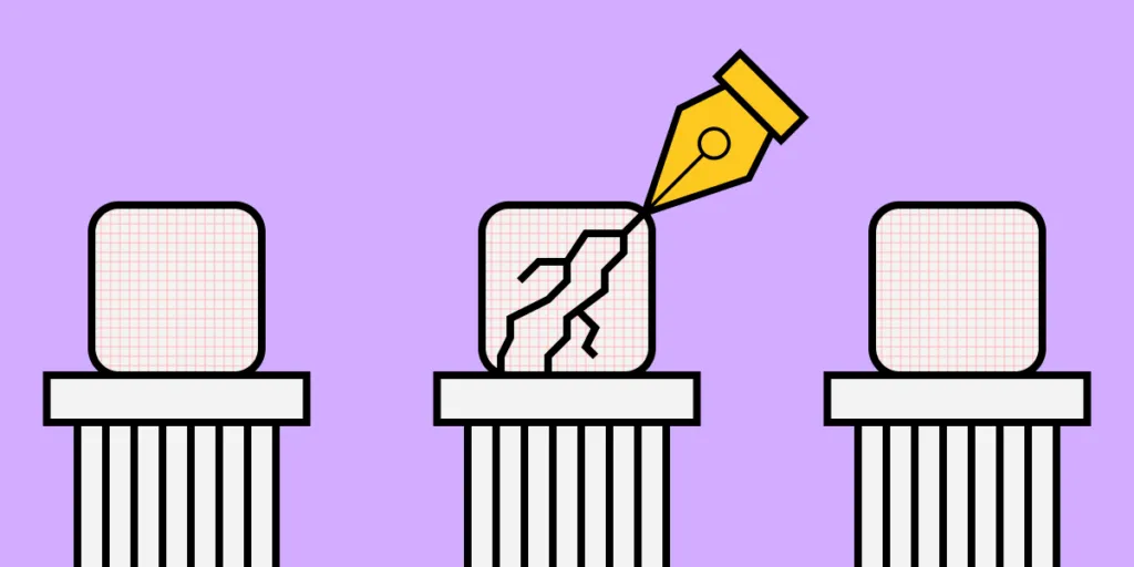
Icon design has many challenges as designers must find the perfect balance between form and function for these communicative symbols. Icons need to look beautiful while conveying an important message to the user.

UXPin makes icon design effortless, especially if you are working with a team. You can get started with a 14-day free trial and start creating beautiful icons for your next project.

What is Icon Design

Humans have used symbols throughout our existence. These small but highly technical illustrations provide a universal language for service, directions, features, warnings, design, marketing, and much more.

1 50

Icon design creates a visual representation of a program, entity, data, interactions, or actions in software, websites, and applications. These universally recognizable icons enable users from around the world to navigate quickly through a website or application.

A Brief History of Icon Design

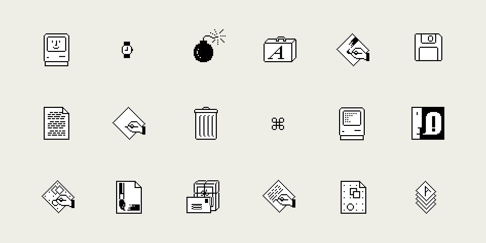
Graphic designer Susan Kare is widely recognized as the pioneer of pixel art and modern icon design. Her work dates back to the early 1980s at Apple, where she designed interface elements and contributed to Apple’s typefaces.

Susan designed all of Apple’s icons and typefaces on graph paper before drawing everything out pixel-by-pixel on a Mac, nothing like the sophisticated UX design tools we have today! By 1984, Susan had switched to the first release of MacPaint, which made icon design much easier.

Susan Kare’s icons. Source.

Some of Susan Kare’s early icons include scissors (‘cut’), a finger (‘paste’), a paintbrush, and a pencil.

Icon Design Process

Icon design starts with identifying which icons your project will need. It’s a good practice to list all of your design’s pages, actions, navigation, and interactions, so you can identify where you might need icons.

Some considerations for icon design:

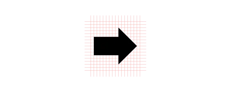
  • Try to keep your icons as simple as possible with minimal detail. Many icons live in a 24×24 pixel world. So, if you have too much detail, your icons will appear as incoherent blobs.
  • Don’t try to reinvent the wheel for universally recognizable icons like the cog for settings or heart for like. It’s important to exercise creativity when designing an icon set, but don’t forget to maintain a user-centered approach. In UXPin you can freely use ready Material Design icons that are waiting for you in ready libraries.
  • Uniformity is what separates an average icon set from a great one. If you are working in a team, you must develop a guideline for everyone to follow. For example, maintaining a 5px corner radius for every stroke.
  • You also need to ensure your icons are on-brand while conforming to the project’s design system.

Due to their small size, icon design can appear deceptively simple. But, with all of the above to consider, things can get technical and require a lot of thought.

Consistency in Icon Design

Maintaining consistency is challenging when designing icons, especially when working in a team.

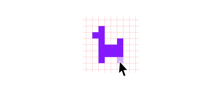
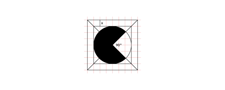
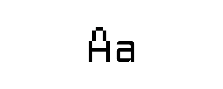
The first step is to decide on a grid. Always use a 1px grid, as this will give you the best visual reference for your canvas. 

Next, you need to decide if you are designing in multiples of 8 or 10? Most icon sets follow multiples of 8 with sizes of 16, 24, 32, 40, 48, and so on. 

To maintain consistency, decide which multiple will be your base size for designing all your icons. For example, if you’re designing at 512 pixels, make sure you design all your icons at 512 and then scale up or down.

Some designers prefer to start with the largest size they’ll need for the project and then scale it down as required. It’s often easier to remove strokes than it is to add them.

Stay On-Pixel

One trick to maintaining consistency is staying “on-pixel.” Like a child coloring in the lines, you want all of your icon’s strokes to remain inside the gridlines rather than straddle them. If you need to straddle a gridline, center your strokes to maintain an on-pixel aesthetic.

1 copy 6

Staying on-pixel will help keep your icons clean and consistent as you scale up and down. It’s also an excellent way to maintain uniformity across your icon set.

To Fill or Not to Fill

Another consideration for clarity and consistency is whether your icons are stroke (sometimes referred to as line or outline), fill or an icon set with both variations. In most cases, branding will play a key role in whether your icons use a stroke or fill design.

Stroke icon design is fantastic for capturing detail, while filled icons are bolder, providing the user with more clarity.

Technical Rules

Your strokes, shapes, corners, curves, and angles should be mathematically precise to maintain consistency across your icon set. Even if you’re aiming for a hand-drawn aesthetic, sticking to numbers rather than freehanding your icons will help maintain uniformity.

For example, are your ends rounded or square? Are you using whole number increments or decimals? What are your portrait and landscape ratios? What are your angle increments?

1 copy 7

Like any design system, your technical rules will evolve as you grow your icon set. Even for a small icon set, keeping detailed documentation will allow you and your team to maintain consistency. These rules also streamline onboarding or handover.

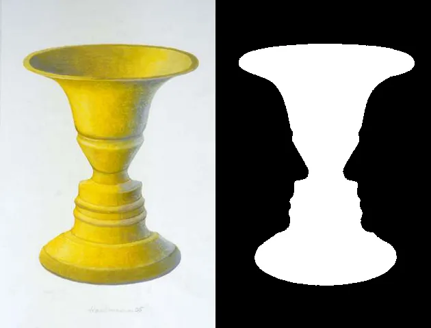
Clarity in Icon Design

While it’s important to inject your brand’s creativity into your designs, your icons must make sense to the user. Think of icon design as a language rather than illustrations. What message do you want to send to the user?

For example, if you have a “view” action, an eye icon would make the most sense. You could also use a camera or a pair of binoculars (both used to “view” things), but the user might relate these symbols to capturing an image or sightseeing.

If you’re designing an icon for something new or unfamiliar to the user, do some research to figure out how to convey your message visually. 

Follow the Rules of Icon Design

If you approach icon design as a universal language, you’ll recognize the importance of sticking to a set of rules and principles. 

If you’re giving someone directions, you’re going to point where to go, not wave at them. The same is true for icon design. The house icon always means home icon, search is always a magnifying glass icon, and the bin icon always represents delete.

Google’s Material Icons feature a vast library of standardized symbols to reference if you are ever stuck. Redesigning versions of Material Icons will help keep your icon set universally recognizable.

Color in Icon Design

Incorporating color can help keep your icons on-brand or draw users’ attention to important actions or features. Color can also assist users with navigation by using a different colored icon for an active state.

1 copy 8 1

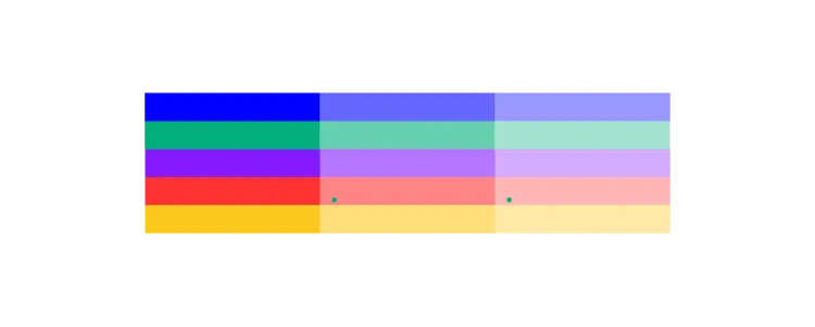
Designers must exercise caution when using more than one color as icons become challenging to read.

Generally, two colors for icon design work best with a different color for the background and symbol. As you scale icons beyond 64 pixels, it becomes a little easier to incorporate several colors and shading without losing any detail.

Accessibility

If you are using color, make sure you test your icon designs against your project’s backgrounds, as sometimes icons are difficult to see without the right contrast

15 copy

Considering accessibility is crucial when choosing colors because icons are small and can be challenging to see. Using our built-in contrast checker will ensure your icons stand out for users with visual impairments.

Cultural Meaning

Icon designers must also consider how different cultures will interpret colors, hand gestures, and symbols. If you are designing a product for a specific marketplace, some local language and culture research can prevent users from misinterpreting or misunderstanding an icon’s meaning.  

White Space

White space is another factor designers need to consider to make icons legible and accessible. White space also adds balance resulting in a visually pleasing experience for users.

Because icons have to scale down (sometimes 20 times or more from the original size), white space plays a critical role in maintaining the design’s form.

Iconic…icons

1 copy 9

The at (@) symbol is possibly one of the most used icons today. It’s found in email addresses and used to tag accounts on social media but has an ancient history. The @ dates back to the early 1,300s when it was used to capitalize the letter ‘A’ in Amen.

The peace sign is another universally recognizable icon, first used in 1958 for an anti-nuclear protest in England. Gerald Holtom designed the symbol using the N and D (representing Nuclear Disarmament) from the Semaphore alphabet.

The International Symbol of Access, often referred to as the wheelchair symbol, is used worldwide and online to represent accessibility features for people with disabilities. Danish design student Susanne Koefed designed the icon in 1968. The original design was headless; several years later, a circle was added to the top for the character’s head.

The power icon is a combination of the | and O found on analog power switches. With the advent of digital electronics, the power switch changed to a button, so designers combined the two symbols with the | nested inside a broken circle (representing the O).

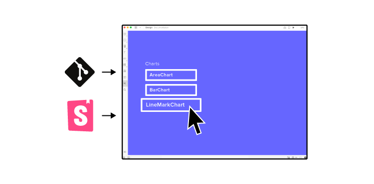
Designing Icons with UXPin

UXPin is the perfect tool for icon design. You can invite your team to collaborate on your icon set, use the built-in icon library and share the project’s URL for clients to review and provide feedback. 

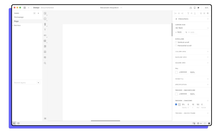
UXPin also makes it super easy to set up a grid for your icon design. Here is an example to create 24-pixel icons in UXPin.

  1. Choose a canvas or create a custom one. We used a 340×720 canvas for this example.
  2. Set your COLUMN GRID to 10 x columns, 24px width, 10px gutter, 5px offset.
  3. Set your BASELINE GRID to auto columns, 24px height, 10px gutter, 0px margin.

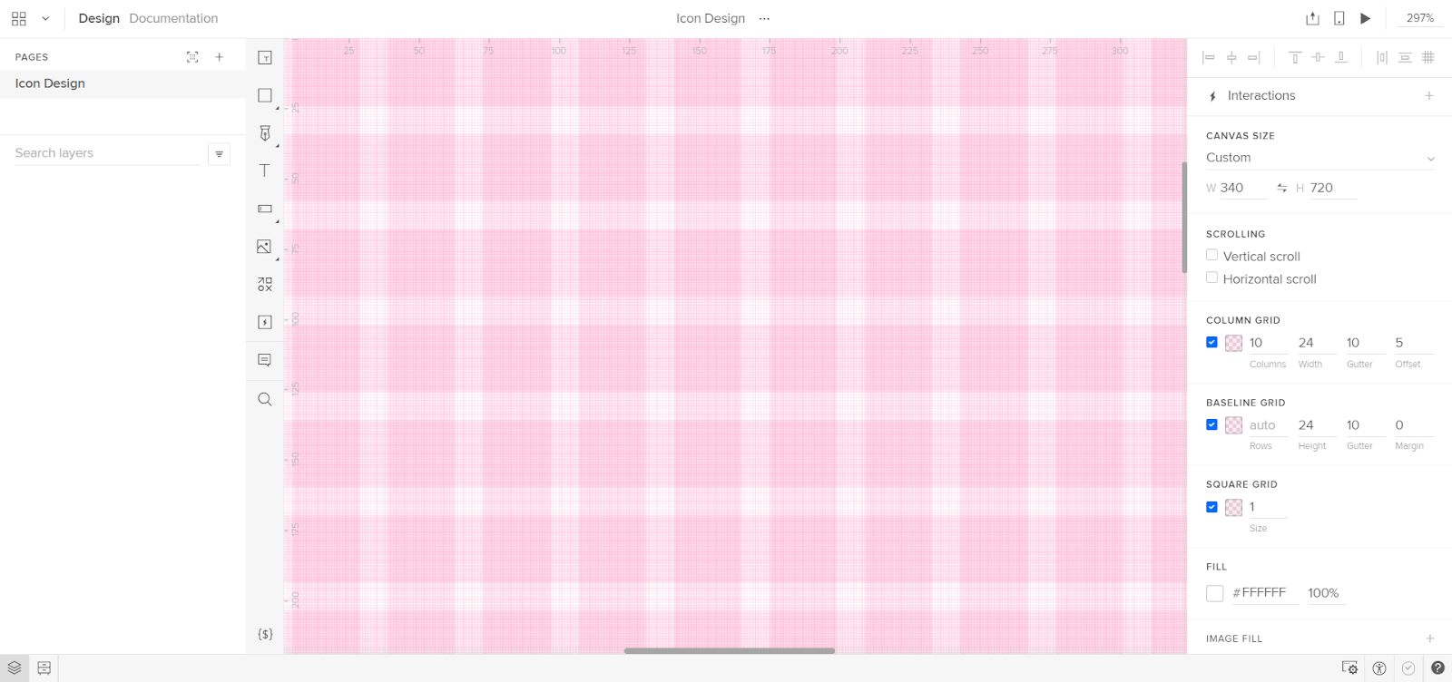
Adjust your width and height to suit your icon design requirements. Try it for yourself! Start designing icons in UXPin today with a 14-day free trial.

Storybook Best Practices That Will Improve Your Product Development Process

Storybook Best Practices That Will Improve

Storybook integration with UXPin makes it easier than ever for you and your team members to build digital products from a UI library of approved, interactive components.

Better workflow and more effective product development? Here it comes. Request access to UXPin Merge and instead of drawing UI components to create a layout, import the ones you have in Storybook and assemble production-ready designs in minutes. Discover UXPin Merge.

Design UI with code-backed components.

Use the same components in design as in development. Keep UI consistency at scale.

Find a naming convention that helps everyone find components

Storybook has a search feature that can help people find the stories and components that they want to add to new projects. The search, however, relies on you remembering the name of what you want to find. You don’t have to remember the name perfectly, but you need to get pretty close. Otherwise, you get stuck browsing through endless files until you happen upon the asset you need.

Choose a naming convention that eliminates this problem. Realistically, it doesn’t matter what convention you select. [ComponentName].stories.[js|jsx|tsx] works well for a lot of teams. That might not work for you, though. 

The most important thing is that you choose one naming convention and require everyone to use it. You don’t want any rogue components living in the nooks and crannies of your design system.

Stick to Storybook’s CSF format

When you export components from Storybook, the file will default to CSF format. Some designers and developers feel tempted to change the format to fit their editing software. That’s never a good idea. CSF format helps ensure that metadata stays with your files when you move them to other environments.

Besides, Merge users don’t have a reason to change file extensions. Just integrate the tools and add your UI component libraries to UXPin’s editing and prototyping environment.

We’re keeping these Storybook best practices as simple and actionable as possible so everyone can understand them. If you want more information on using CSF, visit this Storybook tutorial on the topic.

A word of warning: most of it will probably make more sense to your developers than your designers. Don’t worry if the tutorial looks like nonsense to you. Storybook and Merge give you drag-and-drop design environments that you can learn quickly.

Work on one story at a time

Clients want results quickly. That’s the nature of building digital products. Some people respond to incessant emails by multitasking. Then what happens? They end up wasting a lot of time-solving problems and organizing the messes they made jumping from project to project.

Take a mindful approach by working on one story at a time. Seriously, it will help you organize every aspect of your project, give you better results, and help you reach milestones faster.

When you start working on a story, continue adding and testing components in an organized way until you reach a good stopping point. This will help ensure that all of your components get put in the right stories and you track your project’s progress accurately.

Of course, this doesn’t mean you can only work on one project until you complete it. You just need to schedule your day so that you focus on one story at a time. 

Move methodically. Storybook and Merge take a code-based approach to design, so you already have tools that will save your team a lot of time. Don’t feel rushed.

Talk to your development team to determine whether you need custom documentation

Should you use the DocsPage that comes as Storybook’s default, or should you create custom documentation? Universally, there isn’t a right or wrong answer to this question. One option, however, probably makes more sense for the types of products your team develops. 

Unless you have plenty of experience with JavaScript, you will need to talk to your development team about the best way to document components. Turn to the people who know what they’re talking about, and rely on them to decide which approach suits your design and development needs.

Take time to play with Storybook

Storybook has a sandbox that lets you take creative risks without hurting other components in your story. Seriously, it’s one of the best things about Storybook, so you need to take advantage of it. 

Playing is not a waste of time. It’s one of the most effective ways to learn how a tool works (and doesn’t work). The hours you spend exploring now will make you a better Storybook user in the future. Think of it as practice. But have fun while you do it!

Get involved with the Storybook community

Storybook has a lot of tutorials that will help you find effective ways to create UI component libraries and design systems. The tutorials can’t answer every question, though.

That’s where the Storybook community comes in. Like most open-source tools, Storybook has an active community of users and developers. Get involved so you can trade insights and tips with others.

Connecting with the community will also help you stay informed of Storybook updates and how they might affect your design process.

Get started with Storybook and UXPin!

How can you take advantage of Storybook best practices when you don’t integrate it with your favorite design tool? Integrate the two and start designing with code components today. Discover UXPin Merge.

Low-Code and No-Code Tools – What Are They?

Low Code and No Code Tools

There is an ever-growing hype around no-code and Low-Code Application Platforms (LCAP). It seems like every week a new low-code product hits the market. Some low-code products target a specific niche, while others work on solutions to eliminate the necessity for coding for a broad spectrum of apps, software, and tools.

The beautiful thing about low-code and no-code development is that it makes building apps and tools more accessible, especially for young entrepreneurs with a big idea and little or no capital.

Many LCAPs allow users to integrate with APIs and infrastructure architecture like Google’s Firebase, enabling companies to build affordable apps and plugins for existing software.

Low code development is also beneficial for UX research and testing. UX designers can create fully functioning prototypes using an LCAP to conduct better user tests before handing designs to engineering teams. This type of low-code workflow could save significant time and money when shipping new products or features.

Low Code vs. No Code – What’s the Difference?

To most people, low-code and no-code development are interchangeable terms meaning the same thing. Most development tools that claim to be no code still allow users to insert some code (usually CSS) for customization, which essentially makes them low code.

The most common and widely accepted term is low code (sometimes Low-Code Application Platforms – LCAP), which refers to low code and no-code development environments.

Still, there are a few subtle differences between low code and no code.

No-Code Application Platform

No-code builders usually come with pre-built templates where users can only change logos, images, and text.

These no-code platforms also allow users to connect to simple databases like Google Sheets or Airtable. No-code development is highly accessible because it enables users with no technical skills to build a functioning app.

Low-Code Application Platform

Low-code builders might also provide users with templates but allow for more customization, like editing page/column layout, adding CSS or Javascript, and connecting APIs. 

Low-code platforms might also allow users to connect to more technical databases like Google’s Firebase, Parse, or AWS Amplify.

Many enterprise applications like SAP and Salesforce provide low-code tools so that businesses can build apps to integrate with their software.

How Does Low-Code Development Work?

Low-code platforms typically use a drag-and-drop builder to place elements on the page of an app (mobile, desktop, wearable device) or website. These elements include things like text, images, buttons, navigation, etc. Within each of these elements, users can also pull data from a database, create actions and animations, and more.

Each element is effectively a widget that the low-code platform uses to compile an app or website. Some low-code platforms offer hosting options, which means the user doesn’t have to worry about exporting the code and finding an appropriate hosting environment.

Low-Code in the Design Process

Low-code is fast becoming an essential tool in the design process too. Let’s start with the fact that if a design tool is code-based, not image-based, then the built prototype behaves much closer to the end-product and the interactions can get extremely realistic. 

Another perk of low-code design tools is that they can empower whole product teams. Low-code design software makes it easy for product teams with little or no design experience to build products and interfaces with design libraries composed by the UX team.

A perfect example of this is UXPin Merge. Designers can use Merge to import ready UI code components to UXPin and design with them right away. Those ready elements can come from developers’ Git repositories or Storybook.

Product teams can then use those components to design new products and user interfaces. The best part is that the interactions are already there, so the prototype that teams build is high-fidelity and aligned with all the company’s standards.  

Because team members use production-ready components, the engineering team can build the final product much faster.

Check out how low-code compares to traditional design and development process in this blog post.

Low-Code Product Design from PayPal DesignOps 2.0

A fantastic example of low-code product design in practice is PayPal’s DesignOps 2.0. Using UXPin Merge, PayPal’s UX designers and developers built a design library of 60+ components for product teams to work with.

This code-based design library allows PayPal’s product teams to build products with minimal input from the UX team. The engineering process is also much faster, with developers completing more than 80 percent of product development work without assistance from the UX team.

Low-Code Development Benefits

The most significant advantages of low-code development are speed and accessibility. Anyone can turn an idea into a workable app, often within a few hours.

Here is a closer look at the benefits of low-code development:

  • Speed – Low-code development allows teams and individuals to build applications fast. Even a simple app can take days for engineers to code into a functioning product. More complex apps can take weeks or even months.
  • Reduce costs – Engineering is one of the most expensive steps when building apps and websites. Some elements, like security, require specialized engineering skills, which are costly and time-consuming. 
  • Easy deployment – Low-code platforms often provide one-click deployment and hosting. Hosting an app or website comes with many challenges, especially if you don’t know anything about servers and hosting environments.
  • Concept testing – Low-code platforms are fantastic for startups to build a cheap product to test a new concept or idea. A successful proof of concept could help startups secure crucial seed-stage funding. Established companies might use a low-code platform to build a new service, plugin, or add-on to test before investing in development.

Disadvantages of Low-Code Development

While there are many advantages to low-code platforms, there are several disadvantages you might want to consider.

  • Scalability – While low-code platforms are excellent for proof of concept, these apps aren’t scalable because they are confined to the platform’s limits. Still, once your app starts producing revenue, you can invest in hiring developers and come up with a scalable solution.
  • Limited innovation – Low-code platforms also have a significant limitation on innovation. Again, you have to work within the confines of the platform you’re working with and, therefore, cannot write potentially innovative code or algorithms.
  • Expensive hosting – While it’s cheaper and faster to build low-code applications, hosting on low-code platforms offer is exponentially more expensive than a regular hosting service, especially as you scale.
  • Performance – There are a couple of factors where low-code development can negatively impact performance. Firstly, because these systems provide a one-size-fits-all solution, it’s likely that there will be lots of redundant and unused code in your final application. Secondly, if you’re using a low-code hosting service, this is likely a shared hosting environment, which is not ideal for speed and performance.
  • Security – Apps that process sensitive and consumer data might not be secure enough to pass privacy laws in some parts of the world. For example, the EU’s GDPR and California’s CCPA are very strict about managing personal data. 

What Can You Build With Low-Code and No-Code Platforms?

Many people are surprised to learn what you can build with low-code application platforms. For example, with a popular LCAP like Bubble, you can create everything from simple APIs to complex social media platforms, SaaS applications, accommodation reservation platforms (like Airbnb), and much more.

Some LCAP platforms even provide the functionality to create Javascript functions, and sophisticated user flows using a drag-and-drop builder.

Custom Software Add-Ons & APIs

Low-code development is perfect for businesses that need a custom add-on to integrate with existing software. 

For example, a company can build a low-code app that connects to their accounting software for employees to log their hours. This kind of app isn’t profitable for the company, so spending tens of thousands of dollars on a custom app doesn’t make financial sense. 

In the above scenario, someone from the accounts department could build and deploy a low-code app that works precisely how they want it within a day.

A perfect example of this is Zoho Creator, a low-code app builder that allows companies to build native iOS & Android apps that integrate with their current systems.

SaaS products

There are a growing number of startups building simple SaaS products using low-code platforms. Because these startups don’t have to rely on designers and engineers, they can keep overheads low and scale fast.

Education

Low-code is a perfect solution for building educational tools and apps. These apps could be as simple as capturing new student applications to customized virtual classrooms where students can watch videos, submit homework, interact with classmates, download course notes, receive report cards, and much more.

These are just a few examples of low-code applications, but the use cases can be exhaustive, especially when looking at the potential for cash-strapped developing nations seeking to digitize systems for essential services.

Will Low-Code Replace Developers?

While there will always be a need for developers, low-code application platforms are the future of app development. 

The LCAP industry is moving fast. It’s creating new opportunities for startups while allowing established companies the ability to upgrade and improve legacy systems.

According to Gartner, an S&P 500 research and advisory company, “By 2023, over 50% of medium to large enterprises will have adopted an LCAP as one of their strategic application platforms.

As AI/machine learning technology merges with LCAP, hiring a developer to code an app will be the equivalent of choosing a steam train over the hyperloop. It won’t be long before we see highly complex enterprise applications built using intelligent LCAPs that perform automated upgrades for device compatibility or meet the latest security requirements.

The Future of Low-Code Application Platforms

According to Brandessence Market Research, the low-code market will be worth $65.15 billion by 2027 and $187 billion by 2030.

Software giants like Salesforce, Microsoft, Appian, Oracle, and Agile already have a strong foothold in the low-code market and continually improve these systems to provide their clients with more customization.

It’s likely that instead of building software, these companies will provide the tools for customers to develop their own applications, perfectly adapted to meet their exact business needs.

It is crucial to point out that these low-code application platforms won’t exist without developers and engineers to drive innovation. We’ll be confined to the limitations of low-code applications, even those powered by AI.

Low-code won’t necessarily replace developers but instead, change the systems and tools engineering teams build.

If you want to connect design and development using low-code platforms that anyone in a product team can use, try a free trial of UXPin with Storybook integration. Experience the power of code-based design tools to build digital products faster. 

Who Is a Web Designer: All You Need to Know

Who Is a Web Designer

Love that website you see? Having fun with the links, the buttons, and the colors that mesmerize you? How about the typeface that makes it easy for you to read? 

That’s all the work of web designers whose work brings you the slick websites you visit every day. 

How the website behaves, how it scrolls, and the initial impressions you gather from the visuals are all backed by a web designer’s intuition, experience with design, color theory, typography choices, and the art of visual design. 

Behind the scenes, web developers build and manage code, scripts, and the infrastructure for websites. 

Web designers work with web developers to create websites compatible with all devices, such as desktops, laptops, tablets, or smartphones. 

Web designers use their creativity and knowledge of design principles to create memorable user experiences for website visitors, while also building websites for performance and results.

If you’re looking to expand your skill in web design, start experimenting with UXPin. UXPin is a design tool that will help you from wireframing to hi-fi prototyping. You should sign up for the UXPin free trial now.

Who is a Web Designer?

Web designers are experts in aesthetics where the ultimate goal is to drive business results.

The goals that a designer will typically affect are lead generation, conversion to signup, brand awareness, and new customers.

Web designers bring a range of skills to the table that they use to achieve these goals. Some of these skills include:

  • Graphic art (images, logos, and diagrams)
  • Page design (the layout of a web page)
  • Product design (onboarding flows, form design, functionality) 
  • Consumer behavior research (how the consumer actually responds to the product)
  • UX/UI research and design
  • Reporting on business goals
  • Planning for business goals

What skills does a web designer have?

At a more granular level, these are the more focused skills a designer will work with:

  1. Principles of design 
  2. Web design languages (HTML, CSS, and a working knowledge of JavaScript). Some web designers also segway into learning web development languages such as Python, Ruby, and React
  3. Typography 
  4. Color theory 
  5. Graphic composition 
  6. Responsive design
  7. The principles of user experience (UX) design
  8. The principles of user interface(UI) design
  9. Design strategy

In a designer’s daily life the required skill set and the associated responsibilities go way beyond the basics.

To get a better idea of how designer’s think, check out this resource on Jacob’s law. This site pulls in info about UX design, UI design and more.  

What are the KPI of a web designer?

The KPI a designer uses will depend on the exact strategy in play. However, some typical measurements designers take on their work are as follows:

  • Conversions from web page visitor to lead
  • Engagement on pages (i.e. button clicks, downloads)
  • Click through rates
  • Brand awareness scores (measured in a variety of ways)
  • User behaviour throughout the site (measured in page view funnels)
  • Time on page
  • Time spent watching a video
  • Scroll depth (measured by heat map tools such as hotjar

What tools does a web designer use?

Web designers deliver their work using several tools, ranging from the humble notepad to tech-powered, code-based design tools like UXPin.

Primarily, web designers and the tools they use are just as varied and personalized as web designers themselves — based on workflow requirements, needs, skills, and the projects they work on. 

Some web designers choose to focus on specific CMS systems and platforms. This affects the tools and web design workflows they might end up using. 

Here are a few web design tools that designers use for their projects and workflows: 

Design Thinking Tools (For conceptualizing, visualizing, and mockups) 

Design is an evolutionary process. Starting from concepts and prototypes moving to user feedback, and then pulling that feedback back into the final prototype version. It’s an iterative process that requires rebuilding based on how your customers are actually using the product.

To learn more about phases of design thinking, check out our article on design thinking tools

While you could do web design magic on the back of a napkin, web designers need something more functional and powerful. 

SurveyMonkey Concept Testing

With templates specifically built for web designers, you can use SurveyMonkey to run surveys and polls to gather quick and definitive feedback on customer needs, user satisfaction and more. 

Typeform 

If you need more control, and if you love to add some character to your forms, you can use Typeform. 

VideoAsk

Want more engagement? How about going face-to-face with your audiences while still gathering feedback, asking questions, and more? VideoAsk by Typeform allows you to use video to ask questions and get your answers by just sharing a single link. You can also use conditional logic, multi-response fields, and more. 

Tool for Web Design Starting from Wireframing up to Hi-Fi Prototyping 

After web designers ask questions and gather insights, it’s time to put concepts into something more tangible. Since an actual website build is still far away, prototyping is a necessary in-between process to bring life into your web design concepts. 

UXPin 

UXPin is a website prototyping tool that allows you to not only make designs, but also see how the designs interact and function with the help of advanced interactions, states, and conditions.

You can pull in the existing components from your developers’ libraries, and include them easily in your prototypes. This saves a ton of time for you and developers, as well as helps maintain consistency. 

The best way to understand prototyping tools is to sign up for a UXPin free trial and start experimenting. 

Other CMS-specific tools & workflows: 

As a web designer, if you gravitate towards specific CMS systems, the choice of web design tools will vary. 

You will still use tools like UXPin for concepts, wireframes, mockups, prototypes, design iterations, and more. But sometimes you’ll need specific tools or features built into the platforms themselves to complete web design projects.

Popular CMS solutions such as WordPress and design solutions such as Webflow might require slightly different pathways and workflows.  

Web designer vs. web developer: what’s the difference? 

Some people tend to use the phrases “web designers” and “website developers” interchangeably. However, they’re completely different roles in a web development team. 

Web designers focus on visual design, UX, UI, branding, how the content interacts with design, and the user experience with the product. 

Meanwhile, web developers focus on what’s “under the hood”. Web developers build out the site with code, and focus on making sure the site renders fast and is always live.

Some web designers foray into web development. Some web developers also get their hands wet with web design. 

There’s a rich and varied interplay between the two career tracks, but there’s so much work to be done that the trades typically get divided between the lines of “web designer” and “web developer”.

What are some examples of great web design?

Looking for some inspiration and examples of great web design?  

Here are some of our favorite examples of great design:

Chili Piper

Notice the large, unmistakable, and only call-to-action on the homepage of Chili Piper? It’s built to generate leads while still providing value to end-users. 

The CTA itself is appealing, simple (just an email grab), and promises an Instant Inbound ™ Preview in 30 seconds flat. 


Also, notice the clean navigation menu, the colors used, the contrast, and the clear call-to-action button on the top right corner of the nav menu. 

ThoughtSpot

Can a simple navigation menu be “more” than just a menu? Going beyond the functionality of the navigation menu usually found on websites, ThoughtSpot put an ebook download right into their nav menu. This means this nav bar is getting conversions, even though it’s just a navbar. How cool is that!?

Also, check out that eye-popping tombstone graphic and loud content topic using the word “death”.

ThoughtSpot is a SaaS platform that provides businesses with analytics solutions for modern data stacks. 

You could achieve this with our UXPin multi-level dropdown element

Trivago 


We love minimalistic, results-oriented designs at UXPin. Trivago is a hotel aggregator you might be familiar with. 

It all starts with this minimalistic home page. Notice how everything else looks a little faded in comparison to just the “search” element, which is found front and center on the site? 

The site has a focus. It does only “one thing” and tries to do it right. Meanwhile, all those logos not only act as social proof but also clearly lets you know where the properties are going to be sourced from (to help compare and deliver the information to you). 

Want to see examples of interactive web designs? Go here

Who are some great web designers in history? 

There are several thousands of web designers who do impressive work, and you only have to look at certain sites like Awwwards and Behance to check out some of the best web designers you can find. 

Thankfully, a few of the best web designers do have their work put up for the world to see. Here are some of the greatest web designers we know of: 

Berners-Lee:

Berners-Lee invented HTML and designed one of the first websites on the web. Built for the European Organization for Nuclear Research, here’s the first website Berners-Lee built for distributing access to information about other researchers, research projects, and more. 

While we are talking about the world’s early web designs, here’s a look at Aliweb – the world’s first search engine. 

Shane Mielke

Shane is as accomplished as web designers can be, with six Adobe Sites of the Day, two Awwwards, 36 FWA Sites of the Day, four FWA Mobile Sites of the day, two FWA Sites of the Month, and 3 Adobe Cutting Edge Awards. 

Shane also published a book called Launch it: A Handbook for Digital Creatives. Shane’s portfolio tilts heavily towards designing movie websites. 

Dan Cederholm 

As the Co-founder of Dribble, author, and keynote speaker, Dan Cederholm is a Massachusetts-based web designer known for standards-based web design. 

Having worked with the likes of EA (Electronics Arts), YouTube, Microsoft, MTV, ESPN, and Google, his accomplishments and the web design career itself should go in some sort of a hall-of-fame for web designers. 

Jan Cavan Boulas 

Working as a product designer at Automattic – the company that runs and manages WordPress, WooCommerce, Tumblr, and JetPack – Jan Cavan designs products that millions of people use. If there’s a list of web designers working to make the web a better place, Jan Cavan Boulas will take the top few spots. 

She speaks at several design conferences, published books, and focuses primarily on app design.

Yaron Schoen 

Founder of Made For Humans (a web design shop) and recently holding the title of design lead at Twitter, Yaron is a Brooklyn-based web designer focusing on interface design. 

Yaron has an impressive list of clients that other web designers might kill for. Featuring National Geographic, AOL, Pixable, Travelocity, and several others, he has an entrepreneurial spirit which led him to start several other projects such as Float.

Conclusion

Give your web design learning and your web design career an amazing start by getting educated in who is a web designer and what they do. 

Extend your learning to make the design work for business’s goals, and use the right tools of the trade. 

Start by signing up for UXPin and take it for a spin now.

Storybook Frameworks You Can Use to Build Component Libraries

Storybook Frameworks You Can Use to Access and Build Component Libraries

Building component libraries can make UI development efficient and failure-proof. Some of the advantages of making a component library include:

  • Creating a single source of truth that keeps everyone in line with your current guidelines.
  • Scaling quickly when you need to meet a significant milestone or release date.
  • Improving collaboration and communication in product teams.
  • Reducing code duplication to prevent redundant work.
  • Building digital products that work on multiple devices.

UXPin offers Storybook integration. Try it now to build interactive layouts of your app.

Storybook for React

React is a JavaScript library with plenty of benefits. We’ve posted about our appreciation for React features like:

  • Component reusability.
  • Stable code with easy options to fix glitches.
  • Short learning curve, especially for anyone familiar with JavaScript.
  • Reliable engineering team that keeps the library working.
  • Conditional statements within the JSX extension.

React is a natural fit for Storybook because the framework already offered a way to change individual components without affecting others in the UI library. Storybook makes that feature even more effective by isolating components. The sandbox lets you build an entire UI without wading into many technical details.

React Storybook framework will also help you document your components, which makes reuse easier than ever, and visually test components to avoid buggy code.

If you want to learn more about using React with Storybook, read Storybook’s introduction to React and visit the website Component Driven User Interfaces.

Vue

The Vue Storybook framework offers all of the essentials that you would get from Storybook for React. The biggest difference between Storybook for Vue and React frameworks is that you cannot get the graphQL add-on, which can make it slightly more difficult to integrate with other tools.

Many developers like Vue because it has a small size but doesn’t compromise performance. It offers a solid tooling ecosystem, reactive two-way data binding, and virtual DOM rendering.

Angular

The Storybook Angular framework gives you all of the essentials and add-ons that you get with React.

It makes sense to choose Angular when you have a small development team that would rather focus on extending the functionality of HTML with plain JavaScript. Anyone with basic JavaScript coding skills can use this framework, which could help you save money, decrease development time, and avoid mistakes.

Angular’s simplicity doesn’t make it weak. You still get excellent features, including directives, reusable components, data binding, and localization.

Community Storybook frameworks

Community frameworks don’t have large communities behind them, so they don’t tend to get updated as often as major Storybook frameworks like React and Vue. 

Although they aren’t the best options for Storybook, the open-source tool still works with:

  • Ember
  • HTML
  • Mithril
  • Marko
  • Svelte
  • Riot
  • Preact
  • Rax

Keep in mind that you will lose some features when you use these Storybook frameworks. Only Ember on Storybook has all of the essentials (Actions, Backgrounds, Docs, Viewport, and Controls). None of the community frameworks have graphQL support. They also miss numerous other add-ons, which could make it more difficult for you to finish projects quickly.

Still, Storybook’s flexibility extends to these frameworks. They aren’t perfect, but they will work.

DIY Storybook frameworks

Storybook is an extremely flexible tool that lets you scaffold a new framework specifically for your team. Storybook has always done an excellent job helping users succeed, so it’s not surprising to see that the website has a comprehensive tutorial for going with a new Storybook framework.

Integrate Storybook and UXPin to build digital products more efficiently!

Once you have your component libraries established in Storybook, you can easily import them to UXPin. It’s so easy that the process literally takes about one minute.

After integrating UXPin and Storybook, you can manage your UI component libraries from within Storybook. Any change you make will automatically take place in UXPin libraries, too. That way, you can maintain a single source of truth in Storybook and create fully functional prototypes in UXPin with Merge technology.

Storybook and Merge will make your development processes more efficient and effective by putting the power of code-based design into everyone’s hands. You want efficiency, right? So get the Storybook integration now and start exploring the benefits!

8 Common Prototyping Mistakes Plus Tips on How to Avoid Them

8 Common Prototyping Mistakes

Prototyping is one of the best ways to validate design ideas before time and resources are wasted on ideas that are not viable. While there is no single “perfect” way to create a prototype, there are common mistakes that designers make. These mistakes can affect the suitability of your prototype and slow down the design process. Here are eight common prototyping mistakes and tips on how to avoid them. 

Mistake # 1: Prototyping without a clear goal

The first prototyping mistake is starting a prototyping project without a clear goal of what it intends to achieve. Will the prototype be used to test a new website or test a specific flow such as the check-out flow? Who will be the stakeholders? What’s the timeline? This goal will act as the north star that guides the entire prototyping process and prevents the project from veering off course. Additionally, a good goal also defines what success looks like and how to measure it. Use frameworks such as SMART to make sure that your prototyping project has clear objectives. 

Mistake # 2: Prototyping too early 

Often, designers rush into the prototyping process before having a clear picture of the design solution they are going for. They are tempted to just open up a prototyping tool assuming that the design solution will take shape on its own. The problem is that prototyping tools force designers to focus on details such as layout and alignment instead of high-level design concepts.

By skipping the ideation process – or rushing through it – you can get locked in on the first design solution that you come up with, which may not be the best one. To avoid making this mistake, ensure that you do the following:

  • Use design thinking to brainstorm several design solutions before choosing the one you are going to prototype. For best results, involve internal stakeholders such as product managers in this process. 
  • Even when you are doing rapid prototyping, come up with sketches, mockups, or wireframes of different design solutions. 
  • Sketch or wireframe each of your main pages or screens before prototyping them. This will reduce the amount of time you spend on creating the prototype. 

Mistake #3: Using the wrong prototyping tool 

When choosing a prototyping tool, the first thing that you should consider is the level of fidelity that you require. However, most designers default to the prototyping tool that they know how to use or the one that their company provides. This leads them to create prototypes that are the level of fidelity that the tool provides, which is sometimes limited because of the image-based approach, instead of code-based.

If you need a low fidelity prototype, then you can use a whiteboard or pen and paper to create a paper prototype. If you need a high-fidelity prototype that looks real and is as interactive as the real thing, then UXPin is the best choice. It makes it easy for you to create life-like prototypes using advanced interactions, variables, and states. 

Whatever prototyping tool you choose, make sure that it aligns with your goals. Don’t create a super high fidelity digital prototype when a low fidelity one would have been enough or vice versa. 

Mistake #4: Using placeholder text and images instead of real data 

Prototypes should be as close to the final product as possible. When you use placeholder text such as Lorem Ipsum, it creates the impression that it’s just a test version of the product which disrupts the usability testing process. Plug in pre-existing content or rope in the writing department to provide you with copy and content for your rapid prototypes. 

UXPin has built-in data such as names, cities, and images that will make your prototypes look and feel like the real thing. No need to spend a lot of time looking for stock images or using Lorem Ipsum. You can also import your data as well. 

Mistake #5: Not prioritizing interactivity

A good prototype is made up of more than just simple page transitions. It should also provide a realistic user experience. When you are creating a prototype, ensure that its user interface responds to user manipulation the way the final design would.

You will miss out on the opportunity to get feedback on functionality, like how expandable menus work and conditional navigation flows when you don’t create interactive prototypes. Interactivity can give startups an edge over their competitors especially when used in mobile apps. Additionally, a fully clickable prototype will make the design handoff and development process easier. 

Mistake #6: Asking for feedback late in the process

One of the best ways to take your prototype to the next level is by asking for feedback from different people throughout the process. Show the prototype to other designers and ask for their feedback. You can also get feedback from developers and the product design team to gauge their gut reactions.

Avoid the common prototyping mistake of working in a silo until it is too late or too expensive to incorporate feedback. For best results, use the feedback to make changes to the next iteration of the prototype and ask for feedback often. 

Mistake #7: Getting too attached to a prototype

At the end of the day, one of the prototype’s purposes is to simply test ideas and get validation. However, some designers make the mistake of being too attached to a prototype and thinking that it has to be perfect. So they end up over-prototyping by spending too much time and effort on the prototype. If you are prone to get carried away, focus your prototyping workflow on designing the minimum viable interaction instead of adding all the bells and whistles. 

Mistake # 8: Being discouraged by failure

After user testing or stakeholder feedback, your design solution will either be validated or invalidated. While this can be disheartening, you should not view it as a failure. Prototyping is about testing ideas and assumptions and not all of them are validated. Instead, look at it as a learning opportunity that will improve your next prototype. 

Avoid prototyping mistakes

While there are no specific best practices of how to prototype, there are mistakes that can make you waste time and money. Avoiding these common mistakes will help you create a prototype that gets useful user feedback on time and on budget. Create life-like prototypes using UXPin’s prototyping tool today – sign up for a trial.

Does Your Team Need a Design Operations Manager?

Design operations managers have become increasingly important as more companies turn to digital products that help them connect with customers and streamline processes. If your design team members work on several projects simultaneously, it makes sense to bring in someone who knows how to manage designers and developers.

As a relatively new position, design operations managers often wear a lot of hats. Plus, the job description may vary, so you can customize your position to fulfill specific tasks. But no matter how you define it, a design operations manager can improve your product development process.

A design operations manager can improve project workflows

Building a successful digital product means time and money. Today, most teams assume the best results arise from collaborative Agile project management. Perhaps that’s true. But knowing which approach is best for your group to make successful products efficiently means reviewing project guidelines and testing other concepts.

A knowledgeable design operations manager can explore options like Scrum and Kanban to decide whether they could improve your project workflows.

Design and development teams that use code-based design tools like UXPin Merge might find they get the best results from creating unique workflows. PayPal, for example, uses a system that integrates design and DevOps into a single flow.

Encourage your design operations manager to explore opportunities for workflow improvement. It may take some time now, but the effort will save your team time and effort in the long run.

Build a team of professionals who can contribute specific skills to projects

A design operations manager should know how to review your project requirements and build a team of professionals with the specific skills needed to meet goals.

Maybe your team makes fairly simple products, so you only need one designer and a couple of developers. But creating more interactive, expressive digital products might mean bringing in new talent. Your design operations manager should know how to vet applicants to hire:

  • Animation designers
  • Project managers
  • Brand managers
  • Art directors
  • Content creators
  • UI/UX testers

The more advanced your products become, the more skills you’ll need to complete projects. A design operations manager can ensure that you hire the right people.

Save money by keeping your team at the perfect size (and scale when needed)

Does your team work together to create user-friendly designs, generate prototypes, and build market-ready products?

If you have too few people on your team, you’ll struggle to meet milestones and keep up with your competitors. With too many employees, potential contributors lack challenges and you waste money. An experienced design operations manager can audit your team to determine whether you need fewer or more members and proceed with onboarding new members of the product design team. 

Like many companies, you probably have projects that require extra help from time to time. Instead of overextending your team, the design operations manager can help you scale quickly by reaching out to reliable freelance designers and developers and help collaborate. 

The manager should also know which tools and processes make scaling the design process easier. For example, your team can move much faster when it already has a design system that defines UI patterns, establishes consistency, and provides access to approved assets to facilitate design work. 

Get quality assurance from a design operations manager

You make digital products that look terrific to your employees, managers, and stakeholders. Have you taken the extra step to test your products for quality assurance?

The best approach to quality assurance testing depends on your goals. If your design operations program manager has a clear vision of these goals, they can manage testing to ensure the target market finds value in your product.

That said, some internal products might not require extensive testing. Here, you might just send prototypes to a few coworkers and ask them for feedback.

But market-facing products that generate revenue need in-depth testing. Your design operations manager might recruit users to test and provide feedback. A/B testing could settle questions about whether one version of an app works better than the other. Perhaps this is an opportunity to get AI involved in usability testing.

You don’t want to release products that people won’t buy or result in complaints and poor reviews. That may seem obvious, but risky, untested products can hurt your company. Get a designops manager who knows how to provide quality assurance to improve products and avoid failure.

Know your team completes every task before releasing products

Ideally, you maintain checklists that show when project tasks are complete. Let’s say Robert is designing an app’s navigation, so he reports when it’s finished. Adelle is adjusting the code to ensure the app looks perfect on every device, so she reports when she completes that job.

This approach usually works well. But is someone overseeing the checklist to ensure tasks get completed on time and in the right order? A project manager can handle this, but does that person know which approach in the design team works best for each type of project?

Here is another opportunity for a design operations manager to step in and improve the product development process. Plenty of apps exist to assign tasks and monitor completion. Someone experienced with these tools can choose the best option for each project. The project manager might monitor progress, but it takes someone with a broader vision to decide how to measure and ensure that progress.

UXPin Merge makes your design operations manager’s job easier

Nearly all design and development teams that build digital products can benefit from a design operations manager’s insight.

You don’t want to overburden your new manager, though. That’s certain to create a stressful work environment that damages relationships and makes progress more difficult.

Make challenges easier by requesting access to UXPin Merge. Merge helps streamline your development process by taking a code-based approach to design. Designers use imported interactive components from developers’ libraries like Git or Storybook, so it cuts down the design process time. Plus, you can test the fully functional prototypes before sending designs to the development team.

Get access to Merge today so you can make your design operations manager job easier and improve your product development process.

9 Principles of Mobile App Design

App design is a combination of UI and UX design to build out a usable piece of software. Modern users don’t have patience for apps that are confusing to use. Ideal mobile app design is good-looking, functional, and straightforward all at the same time. 

So, how do you measure good app design? A good app is measured by good UX.

Users should be able to navigate your application without needing to think. If they can instinctively figure out the design, they’ll continue to use your application again and again. 

In this article, we’re going to look at the 9 principles of mobile app design and how you can incorporate them into your design work.

Here at UXPin, we use these principles on a regular basis. If you’re looking to boost your design skills, get on to the UXPin free trial and start prototyping now.

Build advanced prototypes

Design better products with States, Variables, Auto Layout and more.

Try UXPin

Principle 1: Make it Easy

Prove your app’s value by giving users what they want right away.

Normally, when someone downloads an app, he or she wants to use it for performing a specific task. Try to make a great first impression once they open your app. Don’t interrupt them while they’re using your app – or at least don’t interrupt them immediately.

Let users do what they want to do. Users are there to find specific information, perform an action or consume some kind of content. If they can’t do what they want easily, they might close your app and never come back.

Break down big tasks into really easy steps

Cognitive load measures the mental effort needed to complete a task. Minimize the cognitive load of using your app so that users can navigate step-by-step. They shouldn’t view it as a chore that needs to be done. 

Let’s take a checkout process as an example: you could ask users for information all at once, but they’ll find it easier to fill in information over multiple steps: their shipping address, billing information, credit card information, etc.

Tell the user exactly what they need to do

Your design should make it clear what the user needs to do. If you suspect that an integral part of your layout may confuse your users, use visual aids to explain what needs to be done. For instance, you can use a tooltip or a caption to provide instructions.

Don’t hide important information

If you want the user to use your application effectively, turn their attention to the most important elements of your app. You can do so by increasing the font size, adding whitespace, and making sure that the element’s color contrasts well with the background color.

Navigation elements should always be visible and they should facilitate the completion of high-value tasks. 

Principle 2: Make the navigation of your app predictable

People get used to the design patterns they encounter every day. For instance, they will expect to be able to swipe through pictures. Make sure you adhere to the typical navigation methods of the Internet. 

Your users have an expectation of how to navigate the app

Your users’ past experiences of using other apps will inform their expectations for using all applications, including yours. Incorporate these common patterns into your design to allow them to easily navigate your app.

Take inspiration from UX design trends and most common patterns used today, but don’t blindly implement them without considering their fit with your application. If necessary, slightly modify these patterns to fit the overall context of your design.

Make sure to follow the commonly accepted navigational principles for the structure of your app. Sometimes users will instantly understand the purpose of a certain feature or a page. For instance, people will recognize the purpose of the “what’s new” page, or “search” field. Use these universally recognized concepts to simplify your app’s design.

Make sure to check out the design guidelines published by developers of iOS and Android operating systems. These documents describe proven design patterns used in excellent layouts today. 

Follow the 3-click rule

Users should be able to access any part of your app in less than three clicks. Keep the hierarchy of your navigation bar simple.

Doing so will make sure it’s easy for your users to keep a mental map of what’s going on in your app. Also, make sure your app shows the name of the page. 

Whenever there’s an error, let people return to the homepage or try to redirect them to other pages that might interest them.

Save users’ progress

Users today are busy and easily distracted. They might close your app to respond to an email or watch a new episode of their favorite TV show. Save their progress so that they can come back and finish their task without having to start over. 

If you want to learn what your users do on your website or app, perform task analysis. Here’s a guide for that: Task Analysis – How to Find UX Flaws.

Make it accessible across multiple devices

If you have a desktop website and a smartphone app, both channels should automatically save the activities and progress of logged-in users. People should be able to use the app and the website interchangeably. For instance, online shoppers might browse products on their phones, but place an order on a desktop computer. 

Principle 3: Follow the basic laws of app navigation

Don’t make up your own language

In some cases, it’s better to rely on basic principles of app design. People easily understand the design frameworks they encounter every day. Your layout should fall in line with those expectations. 

X in the top right-hand corner

A lot of applications feature X in the top right corner. Users instinctively know that clicking it will close the application.

Avoid dramatically changing the function of common symbols. For instance, the user expects X to close the window. Don’t use X as a symbol for any other action.

Save Button

Your app should also have a “Save” button at the bottom of a page.

Light coloured text field for inputs

Normally, input field lines are light-colored. Ideally, they should match the color that the users associate with your brand. It is rare to see input fields with black borders. 

Principle 4: Have a great, clear, and prioritized page design

Label products descriptively

Make sure the names you choose for products are descriptive and appealing. For instance, a customer might find it hard to see the difference between “standard shipping” and “regular shipping”. Pick labels that showcase the differences between the two options. 

You can use techniques like Card Sorting to get the feel of customers’ mental models. 

Showcase the most important menu items

Your navigation should facilitate the completion of the most important and high-value tasks. Show the most important features in the primary menu and leave everything else for the secondary menu. Use Visual Weight techniques to divert users’ attention to where it matters.

Changing font size, background contrast, and surrounding whitespace can help you divert users’ attention to the most important features of your application. 

F pattern vs. Z pattern

Most users aren’t going to read text from start to finish. They are more likely to scan multiple paragraphs of text. The first few words of the opening paragraphs get the most attention. That’s where you should place your most important messages to ensure that users don’t miss them. This scanning behavior is described as an F pattern. 

Users scan visual content in a Z-shaped pattern. Place your most important visuals in the areas where they are most likely to be seen by the users, following the Z-shape pattern on your webpages. 

Principle 5: Have brand image consistency

The buttons, input fields, and other elements of your application should be based on your brand image, so you need to have it consistent.

Have navigation consistency

If your application is based on an existing website, make sure its navigation works similarly to that of a website. Don’t change the color palette or other basic functionality to avoid confusion. 

Make sure your users can predict most of the time how your app will work and look.

Mobile users don’t have the advantage of hovering and having a cursor to help them guess the outcome of their actions. Carefully design the elements to help users recognize their purpose.

Principle 6: Minimize input and commitment from the user

Don’t ask for set-up information up front

Users see your app as a solution. Most people are focused on solving their problems. Don’t bother them with questions, account registrations, or signup forms right away. 

Let users use your app freely until it’s absolutely critical to login, give a credit card, or whatever the action may be.

For example, Medium allows its users to enjoy a limited number of high-quality articles before asking them to create an account and subscribe. 

Minimize the need for typing

Users find it hard to precisely type on their smartphones. Try to get the desired information without asking them for text input. 

If you can’t think of an alternative, provide input masks as a formatting guideline.

Prefill as much data as possible

Instead of asking users to write down their location, ask them to share their location and use a smart tool to fill in their address based on GPS data.

Provide optional inputs

Don’t ask users for unnecessary information. If you’d like to collect the data, give users the option to fill out the form or leave it empty if they wish.

Autofill wherever possible

In some cases, you can use the phone’s features to automatically fill in the fields. For instance, some apps allow their users to provide payment information by holding their credit cards in front of the camera. 

Principle 7: Loading should be fast and well communicated

Users are impatient when it comes to waiting for the app to load. Make sure your app loads fast to minimize any friction. 

Show something

If you’re loading, make sure your user knows it’s loading and not broken.

Seeing a blank loading screen might lead your users to think that your app doesn’t work. People are used to seeing some sort of loading indicator – a progress bar or a loading spinner. 

Load parts of the content gradually to display something as soon as possible. This way, users can start using the app right away, even if their Internet connection is unstable. 

Offer a visual distraction during loading

You can use simple loops or progress bars to display loading progress, but users are more likely to keep waiting if you create a simple, but entertaining loading animation. 

Principle 8: Optimize your app for mobile, and diverse mobile users

If your app is going to include a lot of text, make sure that it scales well on all types of screens. Text is much easier to read when each line contains no more than 40 characters. You should also adjust the line spacing. 

If your app involves visual content like images and videos, make sure your app can be viewed in both – portrait and landscape modes. 

Make sure your pages are built for mobile

When building a layout for your app, design easily clickable and properly spaced-out buttons. Users shouldn’t accidentally click something they’re not supposed to. For instance, put enough space between the Back and Next buttons to avoid accidental clicks.

Make sure your pages are built for different kinds of devices

Your app will be viewed on smartphones with 4-inch screens as well as 12+ inch tablets. Make sure your content properly scales to fill available space on larger screens. Make sure pages don’t look crowded on small screens. 

Principle 9: Do app design for humans

Font Size

A sizable portion of Internet users today have impaired vision. Use a font size of at least 16px so that your text is legible to everyone.

Color blindness

You shouldn’t rely solely on colors to communicate with your users. You should also use symbols so that color-blind people can understand the message.

Deafness

Your app should be adapted for the deaf and hard of hearing, especially if it contains sound components. Video and audio content should be captioned and subtitled.  

Disabilities

HTML has built-in features to communicate the meaning of the content. For instance, you can use alt attributes to describe the visual images for people who can’t see. Read more about accessibility standards in UX.

Gender selections

Unless the core functionality of your app revolves around the user’s gender, don’t ask them to specify their gender. If you run a simple business like a car rental service, there’s no need to know the customer’s gender. It also pertains having inclusivity by default in your visual and content design.

Design interfaces in UXPin

Designing an app from scratch is a lot of work. Thankfully, you can use UXPin and its built-in accessibility features to design an app that is accessible to everyone. You can start creating beautiful code-based designs right away by signing up for a 14-day free trial

Negative Space – How Best to Use It in Website and App Design

Negative space

Have you ever viewed an image or photograph that you really like and wondered why it looks so interesting and engaging? Or maybe you’ve wondered why a scene in a movie or TV show triggers a strong emotional response.

Is it the subject matter or the artist’s use of perspective? Perhaps. But then think about your favorite websites or user interfaces; what is it about how they look that makes you enjoy using them. Maybe it’s something about the colors or the fonts used on the webpage or app. Or maybe what you’re reacting to in all these examples is something else altogether: negative space.

​​

Design any website, app or a landing page in minutes. Try UXPin, end to end design app for advanced prototyping and design handoff. Sign up for a free trial.

Build advanced prototypes

Design better products with States, Variables, Auto Layout and more.

Try UXPin

What is negative space?

At its most straightforward, negative space is the space around or between the subject of an image. You can see it all the time, whether it’s the white space surrounding the text of this blog post or the black background behind a model’s face in a stylish black and white photo. But beyond that, negative space can also add more information or meaning to the subject. But more on that later.

First, let’s look at what design looks like without negative space.

A world without negative space.

Chances are, as a kid, you might have encountered the Where’s Waldo (also called Where’s Wally) series of books. You know the ones, with all the intricately drawn bustling crowd scenes with hundreds of characters. And somewhere within each scene is the subject of the image, Waldo (or Wally). Sometimes it could take hours to find the little figure with his distinctive round black glasses and red and white striped clothes and hat. There’s not a shred of negative space to be found in any of those drawings.

Well, imagine if that’s how we all created our designs. Imagine trying to read this post if all the letters and lines were squeezed up tight against each other, or worse still, covered in text from other blog posts. Or imagine trying to use an app designed with all the layout elements crammed together, like Where’s Waldo. It just wouldn’t work. An app or website designed like Where’s Waldo would be unusable. If you’re old enough to remember what some website designs looked like in the 1990s, you’ll understand why.

How to use negative space in design

When it comes to web pages and app design, negative space has a vital role to play. The considered use of negative space allows a web page or app to “breathe,” which helps draw greater attention to the crucial elements included on a page or app screen. Plus, clever use of negative space can help create a hierarchy of information so that not all aspects compete for the viewer’s attention simultaneously.

A thoughtful approach to negative should try to achieve:

  • better scannability of a page or app.
  • enhanced visual hierarchy.
  • intuitive bonds between the different elements of a page or screen.
  • an overall less cluttered feel.
  • improved user focus on core features while reducing distraction.
  • added style and elegance to a page or screen.

The difference between big and small spaces

How you use negative space in web design or app screen also depends on whether you are applying it to a small or large space.

Larger spaces

When working with larger spaces, such as the overall design and layout of a web page or app screen, you need to look at the overall content when applying negative space. Questions to ask yourself include:

  • Can negative space be used to separate elements?
  • Does your text need to be divided into columns?
  • How big should you size your margins and padding?
  • How much distance between images should you use?

This type of negative space significantly affects the user’s visual flow. Whether it is potential guidance or strong push, it can let the attention lead to where you want them to stay.

Smaller spaces

Smaller spaces require a different kind of negative spacing. These include design elements such as:

The negative space you assign to smaller design elements primarily emphasizes the overall clarity of a website or app screen, especially the amount of negative spacing associated with typography

Negative space directly influences the readability of text on a page or screen. If there’s not enough space between your lines of text, they become hard to read and demand additional effort from the user.

What is negative space: Creative negative spaces

One example of a creative negative space is the image known as Rubin’s Vase. It was developed in the early 20th Century by the Danish psychologist Edgar Rubin and is a famous example of an optical illusion.

negative space design
Source

In the image on the left, the yellow vase is the subject, and the white background is the negative space. But if you look at the black and white image on the right, you might instead see the profiles of two male faces. Now look back at the picture on the left. The negative space in the original image also contains the same two male faces. The yellow vase is still the subject, but the negative space conveys additional information to the viewer.

You don’t think optical illusions are relevant to corporate designs? Well, think again. Take a look at the FedEx logo.

logo negative space
Source

Look between the E and the X. Notice anything? It’s an arrow. A subliminal reinforcement of the kind of business FedEx is known for. Another example of the creative use of negative space.

How UXPin can help you improve your use of negative space

The next time you begin a new design, remember to consider the impact of negative space on your design and user experience. With UXPin, you can create designs and prototypes and preview your work across multiple devices. Collaborate with your team members or business partners to get feedback on your use of negative space. Get started on your next negative-spaced design project with UXPin today- on free 14-day trial.

Storybook Design System: It’s Time to Reap Its Many Benefits

Since you’re here, there’s a good chance that you have used our design-with-code  Merge technology to build fully functional prototypes. (If you haven’t taken that step yet, try for free our Storybook integration.)

Recently, we took a giant leap forward by releasing an integration with Storybook

We don’t want to assume that you know a lot about Storybook and the advantages you get from combining it with Merge. To make sure you and everyone else understand why this matters so much, we’ve put together some of the top benefits of using the Storybook design system and write a quick tutorial to get you started.

By the time you get to the end of this post, we know you’ll feel our excitement!

Storybook design system as a single source of truth

Digital design projects can get messy, especially when you have multiple people working on several jobs at once. The Storybook design system reigns in the chaos to give everyone involved a single source of truth and make it easy to test components

Your fellow product team members may not be on the same page with all the standards and there might be just too many back-and-forths about making sure that the design has everything that’s needed for the development stage. In that case, you need to centralize all your knowledge in a better way. An interactive design system that keeps everyone on the same track is the answer.

With the Storybook design system, any change that you make gets updated everywhere. You don’t run into problems with one person having the 20.2 version while someone else follows the 21.1 version. You eliminate that madness by creating a digital design system that gives the same information to everyone.

Storybook also makes it easier than ever for your team members to find the components they want. The component finder and sidebar will direct them to results that match their search queries. If you can use Google, you can find the right components in your Storybook design system. (If you can’t use Google… how did you even get here?)

Storybook design system inspires creativity without (adverse) consequences

Unlike a lot of design and development tools, Storybook lets you build UI components and test them in isolated sandboxes. 

So, you can create interactive components without damaging other aspects of your design system or components library. 

You can explore your most creative ideas without fear. You might find a unique approach that adds to your brand’s aesthetic and functionality. Even if you don’t reach those goals, you can’t hurt anything by trying.

Integrating Storybook and Merge eliminates design-development inconsistencies

Clearly, we’re big fans of code-based design at UXPin. We saw a lot of designers and developers working against each other. The problems almost always came from miscommunication and the lack of a single source of truth. The two types of professionals didn’t have a common language, so they often struggled to understand each other. Designers worked with image-based technology, whereas development focused on code. 

Merge helps solve those problems by giving your teams a no-code, drag-and-drop design environment that’s still powered by code. Designers can create new products by pulling from the component library, making a few adjustments, and sending it on to the developers. The developers already have the code for those elements, so they cut down the time to build digital products.

When we discovered Storybook, we knew that we had found kindred spirits who understood that visual design needed to evolve into the code-based design. 

After a lot of work, we built an integration that would let our users access their Storybook design systems. You don’t have to worry about add-ons or APIs. You integrate the two and start using your Storybook design system within Merge’s editing and prototyping platform.

The remarkable thing is that your prototypes will function just like the final product. Storybook excels at building atomic components that make testing extremely easy. Basically, if the components work correctly, the user interface will also work correctly.

Now, you don’t have to think about inconsistencies between your original design and the finalized product. 

How to integrate Storybook with UXPin

It’s time to wade into the technicalities of integrating Merge and Storybook. Hold your breath! Just kidding. It’s actually very easy.

First, you need a UXPin trial account. Sign up and we can make that happen.

You also need a Storybook, which you can install from here. (Make sure you get version 6 or above.) If you have a private Storybook URL, contact us at sales@uxpin.com for some extra help. Import your components to Storybook if you already have some. 

Assuming that you have a public Storybook, just follow these steps: 

  • Open a new prototype in the UXPin Dashboard.
  • Choose “Design System Libraries” and click “New Library”.
  • Choose “Import Components from Storybook” (see, we made it simple!)
  • Paste the URL of your Storybook.
  • Start making something amazing!

From now on, any change that you make to your Storybook design system will also get updated in UXPin.

Not getting the results you want? You can find more detailed integration instructions here.

Experience the advantages of integrating Storybook 

Several editing and prototyping tools have add-ons and plug-ins that let you move designs to Storybook for development. We decided to be the first ones to do this the other way around so that you won’t have to design everything from scratch.

Get your Storybook integration today so you can start designing faster with code-based, interactive components. You won’t believe how quickly your team members start building digital problems once you’ve integrated with Storybook.

How to Design an Unforgettable Splash Screen that Delights Your Users

How To Design A Splash Screen

“You never get a second chance to make a first impression” that’s how the saying goes. This applies to interacting with new people and when users experience your application for the first time. Research shows that it takes 50 milliseconds for users to decide whether they are going to stay on your app or leave.

That’s why splash screens are important, they set the stage for how your users are going to perceive and experience your application. This article will discuss what splash screens are, why they are important, and the best practices for designing them.

Design websites, apps, and other digital products in UXPin. Build powerful prototypes that are fully interactive and ready to share with stakeholders, developers. Try it for free.

Build advanced prototypes

Design better products with States, Variables, Auto Layout and more.

Try UXPin

What is a splash screen?

A splash screen is an introductory screen that users see when they launch your app or website. It is a chance to build your brand identity and it keeps users occupied while your app loads in the background. This screen can either be an image, graphic, logo, or animation sometimes coupled with a progress bar.  

Why do you need a splash screen?

Splash screens were frequently used when devices were slow and the Internet was even slower. Nevertheless, they still matter today with fast Internet and faster devices because of the following reasons.

Keep users occupied during startup 

Even though apps have become much faster, the truth is that they still require a few seconds to set up before users can interact with them. Maybe your user needs to enter their log-in details again or some images need to be loaded or some homepage data needs to be loaded before the user enters the app. The splash screen keeps the user occupied while these background tasks are executed so that they can have a seamless experience.

Plus, splash screens with progress bars reduce app abandonment. They tell the user exactly what’s going on and how long they have to wait which reduces anxiety and makes the wait feel shorter. 

Welcome users and set the stage for their in-app experience

A splash screen sets the standard of what your users should expect when they start interacting with your app. Welcoming users and setting expectations is very important because if users perceive your app positively in the early instances of interacting with it, they are likely to perceive that they had a positive experience.

The splash screen serves the same purpose as the grand entrance in a hotel or a business complex. The entrance signifies that you are entering into a sophisticated and high-quality establishment. Similarly, when a user taps onto your app’s icon they are immediately transported into your app’s world. A splash screen is a chance to welcome the user and set the stage for a phenomenal experience. 

Best practices for designing a splash screen 

Before we talk about the best practices for creating a great splash screen, it’s important to note that not all mobile apps need to have splash screens. Sometimes splash screens create unnecessary friction especially when an app is used often. For instance, imagine having to go through a 3-second splash screen every time you checked your WhatsApp messages (even after 3 minutes), that would be annoying right? 

Here are the best practices for creating splash screens that welcome your visitors and create a great first impression. 

Make it as short as possible

Splash screens should follow the 3-second rule which states that they should not last for more than 3 seconds. If your splash screen lasts for more than 3 seconds, then it will frustrate regular app users and take away from the user experience. Additionally, if you expect users to use your app regularly (at least once a day, like messenger apps) then use the 1-second rule or eliminate it altogether. 

If your application takes longer than 3 seconds to load, use a skeleton screen instead of a splash screen. Skeleton screens show a skeleton of the final user interface which reduces user anxiety. Slack uses skeleton screens very well. 

Keep simple but memorable 

Since you only have 3 seconds to make an unforgettable first impression, use simple but bold designs. You need to strike a delicate balance between overloading your users with a million different animations and creating a cold and sterile splash screen. 

Most designers use bold colors, arresting images, and animated logos on their splash screens. Kindle app is a great example of a simple but eye-catching splash screen. Avoid putting adverts and other self-serving messages that users don’t care about on your splash screen. 

Reduce wait time anxiety

When users don’t know if your app has crashed or if it is still loading, there is a high chance that they will abandon it. That’s why progress bars and progress animations are very useful in reducing user anxiety. They let users know how long they need to wait which reduces the chances of them abandoning your app. If your app has a short wait time, you can use spinners but if it has a longer wait time, progress bars are more appropriate because spinners can cause frustration when they seem to be spinning forever. Google Workspace uses a progress bar very well. 

Add an element of surprise and delight 

If you have enough time and budget on your hands, you can add some fun and personality to your splash screen. Fun animations and splash screens that fade seamlessly into the UI are some of the ways that you can delight your users. As always, be careful of going overboard.

A great way of doing this is by making the elaborate splash screen appear only when the user first launches the app. Check out these examples:

Design unforgettable splash screens 

A splash screen is a gateway that opens up your app to your users. A great splash screen can increase user perceptions of your app and strengthen your brand awareness. Design an unforgettable welcome screen with UXPin’s all-in-one tool that merges design and engineering. Try UXPin for free.

Git for Designers – All You Need to Know

Git for Designers 1

As designers, our final goal is to make great products for the end user. This is why our collaboration with developers is paramount in every product we build. We come up with a product’s concept. Create mockups and prototypes. Then hand over the final design to developers to get the project live.

In this scenario, a designer’s role is supposed to end once the final design is delivered to the development team.

But in reality, this linear system (from designer to developer) barely exists in the product development lifecycle. Here’s why:

  • Designers need to be part of the product development, from concept to launch for the project to be successful.
  • The fact that the first prototypes rarely become the final product. So designers must follow up to make changes based on reviews from users and other team members – as well as provide guidance on how to implement certain designed elements for proper user experience.

This is why real-time collaboration, even during launch, between designers and developers, is vital to the success of every project. Your team needs to go back and forth on features, change design elements, and get reviews from other team members.

This is no big deal for us as designers. Of course, there are a lot of tools and features for us to collaborate.

But the trouble arises when we need to collaborate with developers. Here’s why:

  • Designers don’t work with code, and developers don’t work with design resources.
  • As teams, we also use different tools to get the work done.

Question is, as teams that need to work together, how can we collaborate when we don’t even use the same tools?

Ultimately, the solution lies in finding a common ground – a single source of truth.

UXPin with Merge technology allows developers and designers to work together to get projects live. UXPin Merge allows you to pull your git elements into the UXPin design editor, so you can easily design with components that already exist on your site or other teams have developed. On top of that, those components are production-ready, so you don’t need to add interactions or wonder if they are in line with the standards.

You also don’t need to know how to code or dive in Git as the component is presented visually, whereas for developers that is still ready code that they can use to build a product. Apart from Git integration, UXPin offers syncing with Storybook libraries to bring ready UI components from there as well.

Reach a new level of prototyping

Design with interactive components coming from your team’s design system.

What is Git?

Git, in technical terms, is a version control software. It is a program that tracks changes made by developers to code and saves these changes for future references.

It allows developers to revisit their previous changes. You can undo code changes without messing with the entire source code. In short, it helps to quickly find the issue and fix it.

Git is open-source, free software that can be downloaded and used on your personal computer.  Since it works locally on your PC, once installed, you don’t need an Internet connection to use it.

As a designer, the closest example of how Git works is how the “History Panel” in Photoshop operates. In Photoshop, the history panel lists all the moves, additions, edits, effects, and everything that you added to get your final image. That’s what Git does for developer teams.

What is Github?

In technical terms, Github is a cloud-based, repository hosting service. Thus, it’s an online interface  for storing and accessing all your Git resources. Most popular GitHub alternatives are BitBucket and GitLab.

All the edits developers make to their code, which are tracked and saved by Git, are stored inside Github. Here, developers are able to access this code once they’re online. They can share their code with other developers, and receive feedback and edits. They can also make changes to code shared by other developers.

Github offers seamless collaboration for developers to work on one another’s code.

If Git represents the images, documents, files, and pages of a website, then Github is the hosting provider where these resources (Git repos) are stored.

Git and Github differences summarized

  1. Git can be used to track your changes offline without sharing it with the others. Github, on the other hand, is cloud-based and is more of a collaboration platform.
  2. Git creates snapshots or paper trails of all the changes developers make to a project, and saves these changes. Github is where these paper trails or snapshots are stored and made accessible to other developers for collaboration.
  3. Git is completely free and open-source. Github offers free plans for individuals and small organizations, and paid plans for big teams and enterprises.

So in short, these two are complementary tools that help you collaborate, build softwares, record and rewind any change to fix errors real quick.  

Git for Designers: When Designers Need Git

Git may be built primarily for developers and IT teams, but the need for designers to work closely with developers these days means Git has become an important tool for us as well.

But at what point Git will come in handy for a designer? 

  • When you create mockups and prototypes and need to submit your final work to developers.
  • When you need to make certain design changes to a product that is already in production or already launched.
  • You also use Git when you need to give guidance to developers on how to implement certain design elements for excellent user experience.
  • When you need to build a shareable workflow that is accessible by both design and developer teams.

Git for designers: Using Git vs Github

These days, everybody is using Github. But that journey starts from Git. With Git, you’re able to build a design workflow that can be shared with developers. Every change or addition you make is saved, allowing you to go back in time to make changes.

While Git gives you this paper-trail power, Github gives you the power to collaborate with other designers and share your designs with developers.

How to get started with GitHub using the GitHub desktop app?

While you could just use Github from your browser, the desktop app offers great features as well and allows you to contribute to projects from your operating system. Here’s how to get started:

How to create a Github Account

To get started, go to https://github.com/. Once on the homepage, go to the top-right corner of the page and click on the “Signup” button. 

Follow the prompts to enter your email address, create a password for your account as shown below:

In your next steps, head over to your email and enter the launch code from Github into the next window. This will take you to your first dashboard.

Once in your dashboard, you can configure your two-factor authentication and add a bio to your profile using the “Settings” pane, which you can access by clicking on the arrow beside your profile picture. 

How to Install Github on your computer

To get the Github desktop app, you need to visit https://desktop.github.com/ and select the appropriate operating system to download. 

Launch the application after the download is complete and follow the prompts to install Github on your desktop. 

You’ll be taken to the welcome page once the app is done installing. 

Once installed, you may get prompts to help you link your desktop app to your account – Github calls this Authentication. 

If you don’t get these prompts, here’s how to link your desktop app and your Github account you created a while ago:

Step 1: Click on “File” on the upper left of the desktop app and select “Options” from the drop-down list. 

Step 2: Click on “Sign In” beside the “Github.com” option. You’ll be prompted to sign in using the browser. 

Step 3: Click “Continue with browser” to continue. This will take you to Github.com on your browser where you enter your email/username and password. 

Once you enter your details, your browser will prompt you to open this link using your desktop app

Step 4: Click on “Open GitHubDeskTop” from the browser prompt.

This will bring you back to your desktop app, now displaying your username as shown below:

At this point, you’re ready to start using your Github account by creating a repository. Here’s how to get started. 

Git for Designers: How to Make a Repository on Github

First, what’s a repository? 

In the layman sense of the word, a repository is a receptacle or place where things are deposited, or stored. This is the same for a repository in Git. 

A Git repository is a storage location for your code. It is where versions of your coded designs are found, which you can access anytime you need them. It tracks all the changes you make to your project and builds a history of these changes throughout the project’s lifecycle. 

Once you start the project, you can create a repo/repositories inside the project. Here’s how:

Since your desktop app is new, you will see a list of options on what to do on the homepage. 

Step 1: Click on “Create a New Repository on your hard drive

Step 2: In the next window that pops up, enter the repository name and description, and click on “Crete repository

Step 3: In the next step, you’ll see that your repository is only available on your PC. You alone can see and edit it. 

To collaborate with other teams or let someone else review your work, you need to publish this repository.

Click on “Publish repository” to get it live. 

And your Git repository is now live. 

How to Commit a Change in Github

Committing a change in Github means you’re saving the changes and edits you made to your local repository. 

For instance, when you make changes to a Google Doc online, these changes are saved automatically. But this isn’t the case with Github. You have to save these changes, thus, commit a change. 

Here’s how to commit changes. 

Step 1: On your Github desktop app, click on “View on Github” next to the “open the repository page on Github in your browser” window. 

This will take you to the repository page on your browser where you can make changes. 

Step 2: In the browser window that opens, click on the Edit icon on the upper-right corner of the repository window. 

In the next window, your repository will open for you to make all the changes you want.

Step 3: Once you’re done making all the changes, scroll down and click on “Commit Changes

Now, all your changes are saved to the repository.

What are Branches and how do you merge them?

Just like how tree branches protrude away from the main tree, Github branches do the same. They’re a set of codes or changes that you make to your repository that have their own unique name. 

Designers and developers use branches to experiment with new features and ideas or fix certain problems without touching the main repository. 

When you create a branch, you do so to work on certain things that you don’t want to affect other changes made by your team. 

How do I create a branch and merge it?

Once you’re done building a feature or fixing the bugs that you created the branch for, a way to add it to the original project is to merge it. 

Go to the “Branch” button on the top menu of the Github desktop app. Clicking on it will bring up a list of drop-down options. 

To create a branch, click on “New Branch” and follow the steps. Use the “merge into current branch” menu if you want to merge different branches.

At this point, we all know that Github is a library or a database where we host our Git repositories. It’s also where we are able to collaborate with others. 

But Github isn’t the only library or database platform out there for hosting Git resources. Here are other options available:

Gitlab

The closest to Github in terms of interface and use and an open-source tool, Gitlab is an excellent Git library used by many teams. It has many features, including issue tracking, code management, Wikis, and continuous integration with a lot of development tools among others. 

Bitbucket

Another great Git repository hosting platform is Bitbucket. Available for Windows, Mac, Android, iOS, and Linux, Bitbucket has great features including commit history, code management, branch comparisons, and offers developers unlimited private repositories for free for up to 5 users. 

Top 5 alternatives to Git repository

Aside from Git, there are at least 5 great hosting platforms with similar functionalities.

  1. SourceForge
  2. Launchpad
  3. Google Cloud Source Repositories
  4. AWS CodeCommit
  5. Apache Allura

Bring UI components from Git to UXPin

Git and Github are built for developer teams. But as designers, these tools have become powerful for us not just for creating and saving projects, but also for collaborating with developer teams. If you’re a designer out there working with developers or just wanting to keep a clean workflow, Git and Github are great tools to get you started. Remember that you can leverage Git repositories with UXPin Merge technology to bring the design and development process together and use a single source of truth.

Engaging, interactive websites and what you can learn from them

16 Enchantingly Interactive Sites You Cant Ignore

Some sites look good and some sites function well, but there are some interactive websites that do both with an extra sense of magic.

These websites engage us on a deeper level, command our attention, and take root in our imagination. They draw us into their world and make us forget our own — if only for a moment.

In this post, we’ll analyze 16 interactive websites with brilliant design. We’ll explain how you can learn from them to be a better designer. Continue reading Engaging, interactive websites and what you can learn from them