UX Design Degrees – Which Universities and Courses Are Worth it?

degrees in ux design

User experience design is an exciting, multi-faceted discipline exploring how human behavior intersects with the digital products we use. UX designers represent the customer within an organization, ensuring products balance user needs with business goals. 

This article explores the skills you’ll need as a UX designer, various career paths, as well as courses and degrees that will get you there.

Impress potential employers with a UX portfolio of fully functioning high-fidelity prototypes. Sign up for a free trial to explore advanced design and prototyping with UXPin.

Build advanced prototypes

Design better products with States, Variables, Auto Layout and more.

Try UXPin

Do You Need a Degree in UX Design?

Most designers used to learn UX design on the job, but growing popularity of the field made it a competitive occupation. That’s why you may consider formal education in design, university degree or recommended course.

Of course, you will meet practitioners who have no university degree in UX design and they’re amazing at their job, but education and having a portfolio can help you get the first job.

A UX portfolio is still a major selling point because it shows your problem solving skills and your understanding of the design process. It also helps recruiters see if you are the right fit for the team.

UX Designer Soft Skills

The word design in UX design often leads people to confuse the discipline with graphic or visual design. While those are facets of UX design, it’s more about designing experiences rather than beautiful aesthetics.

Here are some soft skills UX designers need to design successful user experiences. Some of these skills may surprise you if you’re unfamiliar with UX design.

Empathy

Empathy is a vital skill for UX designers and is the first stage of the design thinking process. Most projects UX designers work on will be for products they don’t use themselves. They must use empathy to understand problems from a user’s perspective and design a solution to meet those needs.

heart love like good

Empathy is also a valuable skill for working in teams. Putting yourself in the shoes of product managers, engineers, stakeholders, etc., can reduce friction while seeking ways to improve collaboration.

Active listening

Active listening and empathy are closely related. To empathize effectively, UX designers must listen without developing assumptions, biases, or conclusions that prevent them from getting to someone’s core problems. They’re also not waiting for their turn to talk, leaving “dead air” for someone to think, and not interrupting while they speak are crucial for active listening.

To understand what someone might think, UX designers must also pay attention to non-verbal communication during user testing and interviews, like eye movements and facial expressions. Users often don’t tell you everything because maybe they’re embarrassed or think the information is irrelevant. Identifying these opportunities to ask meaningful questions helps designers become better listeners.

Communication skills

Communication is another vital UX design soft skill. UX designers must communicate on many levels, probably more than most departments.

team collaboration talk communication ideas messsages

UX designers communicate in the following ways:

  • End users (interviews, testing, etc.)
  • Other designers
  • Cross-functional collaboration (product teams, engineers, marketing, customer service, etc.)
  • Stakeholders (reporting, presenting ideas, general feedback)

You’ll also have to learn to communicate with clients if you work for an agency.

Negotiation

Negotiation is probably not the first thing that comes to mind when you think about UX design, but designers negotiate on many levels:

  • With stakeholders to get buy-in for ideas and resources
  • Working with other teams and departments when solutions or ideas clash
  • When collaborating with engineers
  • Advocating for users

Designers must know when to be assertive and when to compromise. Poor negotiation skills could lead to too many compromises, adversely impacting a product’s usability and UX strategy.

Creative thinking

UX designers must be open-minded, creative thinkers. Every project will have constraints, so designers must have excellent problem-solving skills to work within these to find solutions while pushing the limits of innovation to stay competitive.

idea collaboration design dev 1

Most UX design courses and university degrees teach designers how to improve creative thinking through ideation techniques like how might we,” crazy eights,” and even coming up with the worst possible idea to get the creative juices flowing.

Business

Every design project has a business intent, whether selling products, acquiring/converting leads, increasing userbase/engagement, or getting donations for a non-profit. It’s a designer’s job to marry these business goals when designing the ideal solution.

Understanding business value and organizational complexities will help UX designers manage relationships with stakeholders better while maximizing a product’s value to the organization.

UX designers with managerial, leadership, or even founder aspirations, must understand business management and how a business operates.

UX Designer Hard Skills

These are the hard skills you’ll need as a UX designer. Most UX design degrees and courses teach these as part of the syllabus. Within these hard skills are different UX frameworks and systems–too many to discuss in this article!

There are also plenty of books, YouTube videos, and other resources for UX designers to develop and hone these hard skills.

Design thinking

Design thinking is central to the ethos, workflow, and principles behind human-centered design. It prompts designers to focus on the customer at every stage of the design process to deliver products and services that people will want and use.

process brainstorm ideas

There are five stages to the design thinking process:

  1. Empathize – Discover what your users need
  2. Define – Determine the problem you want to solve
  3. Ideate – Develop possible solutions to users’ problems
  4. Prototype – Create prototypes
  5. Test – Test your prototypes with users & stakeholders

Designing wireframes and mockups

Most designs start with wireframes–basic shapes and outlines of a product or website, usually in black and white. Designers create these wireframes on paper and using design tools.

Wireframing is essential to the design process because it enables designers to design, test, and iterate ideas fast while using the least resources possible.

Designers add basic navigation and connect user flows during the digital wireframing process. Wireframes also give digital products a foundational structure to create mockups.

Mockups are static visual representations of the final product’s appearance, including colors, typography, UI components, etc. 

Prototyping

Prototypes are functioning replicas of the final product. Designers build prototypes at every stage of the design process, including paper prototypes (low-fidelity prototyping), before they even start working with digital design tools where they create high-fidelity prototypes.

screens process lo fi to hi fi mobile 1

Prototyping is core to a UX designer’s job because these UX artifacts allow them to test ideas with real-world users and stakeholders. 

UX research

UX research covers three primary areas:

  • Customers/users
  • Competitors
  • Market

UX designers consolidate this research to understand user problems, identify opportunities, and ensure solutions meet market benchmarks and expectations.

User interviews and testing

Interviews and testing allow UX designers to engage with users, understand their problems, and the environments where they use the final product.

Information Architecture

Information Architecture (IA) organizes screen and navigational structure to align with user and business goals. The aim is to prioritize content so that users efficiently navigate products, find features, and complete tasks.

Basic programming

UX designers typically don’t write code, but they design code-based products. Learning programming basics (HTML, CSS, and Javascript) enables designers to understand technical limitations while envisioning how their designs will translate into code.

code design developer

UX designers who learn code, including popular front-end frameworks like React, Angular, Vue, etc., increase their value to employers (meaning higher salaries) while opening more career opportunities.

UX Career Paths

In startups and small companies, UX designers cover most or all UX design roles and responsibilities. But in larger organizations, you find more specialist roles, including UI designers, researchers, and content designers/UX writers, to name a few. 

These are typical career paths and jobs advertised for UX designers.

UX designer

In larger teams with multiple UX specialists, UX designers focus solely on the product’s user experience. They look at user experience holistically rather than focusing on a specific area, like UI or interaction design.

UX researcher

UX researchers cover all aspects of UX research and user testing. They also look at product analytics, marketing data, customer service tickets, etc., to understand user behavior across multiple touchpoints.

search observe user centered

UX researchers gather research relevant to the project and compile it into various UX research artifacts that drive design decisions.

UI Designer

UI designers are responsible for user interface design, including components and UI patterns customers use to navigate and complete tasks. They are visually creative, and some of a UI designer’s tasks include graphic design, particularly when it comes to iconography and other graphics.

Interaction designer

An interaction designer creates the motion and animation that respond to user interactions like taps, swipes, scrolls, etc. This human-computer interaction (HCI) is crucial for user experience because it gives digital products life and makes them enjoyable.

UX writer

UX writers (also referred to as content designers in some organizations) focus on the language and text (including images and video) that appears throughout a digital product, particularly regarding error messages. They must ensure text is on-brand while conveying the right message and instruction.

UX engineer

UX engineers work in a hybrid role between UX design and front-end development. They build code prototypes for testing complex user experiences and collaborate with front-end engineers to develop the final product.

settings

They have expert HTML, CSS, and Javascript skills and typically work with at least one front-end framework like React, Angular, Vue, etc. UX engineers also understand the UX design process and how to apply design thinking.

Product designer

Product designers are product custodians. They must maximize a product’s lifecycle by ensuring it remains relevant and competitive. They conduct ongoing user research to improve and optimize a product’s user experience while looking for business opportunities to increase its value.

What are Great UX Design Courses?

Here is a list of online courses that will give you the foundational knowledge to start your UX career.

  1. General Assembly: A UX bootcamp with one-on-one coaching to land design jobs
  2. Nielsen Norman Group: UX training and events from one of the world’s leading user experience institutions
  3. Avocademy: A mentor-focused learning platform for those of you who want to get foundational and advanced knowledge of UX design. It’s core program lasts 8 weeks and will give you a great intro
  4. Springboard: A free curriculum covering the topics you would find in a UX design degree program 
  5. Superhi: An introductory UX design course 
  6. HackDesign: A comprehensive UX design program created by industry professionals with lots of resources and projects 
  7. UX DesignEdge: Training and consulting to improve your UX design skills with the latest strategies and trends 
  8. DesignLab: UX/UI design course with a community of mentors
  9. Google UX Design Professional Certificate (Coursera): A UX design certificate program taught by Google employees
  10. FutureLearn: A foundational UX and visual design course
  11. edX: a range of UX and computer science courses, bachelor’s degrees, and master’s degrees from leading universities

End-to-End Design With UXPin

No matter your UX career path, you’ll need a design tool for prototyping and testing your ideas. UXPin’s advanced features enable designers to build prototypes that look and feel like the final product, resulting in meaningful feedback from usability testing and stakeholders.

With built-in design libraries and common form elements, you can build fully functioning high-fidelity prototypes, test, edit, and iterate much faster than other design tools.

Ready to get started? Sign up for a free trial to build your first prototype with UXPin. 

9 Differences Between iOS and Android UI Design

iOS vs Android app design

Apple’s iOS and Google’s Android are the two leading operating systems for mobile apps. While app developers have complete autonomy over their product’s aesthetics, native guidelines and design differences exist for each platform.

This article looks at iOS and Android app design differences, which can impact a product’s functionality and aesthetics. Applying these principles to your designs creates a holistic platform experience. Products that seamlessly integrate with the native operating system look professional while creating familiarity and minimizing learning curves.

Use UXPin’s built-in design libraries for iOS and Material Design to prototype and test for both platforms. Create fully interactive prototypes that accurately replicate iOS and Android user experiences. Sign up for a free trial to discover UXPin’s advanced prototyping features.

Build advanced prototypes

Design better products with States, Variables, Auto Layout and more.

Try UXPin

Platform-Specific UI Design Guidelines

iOS and Android each follow different interface design and app development rules and guidelines:

  • Android = Material Design (Maintained by Google)
  • iOS = Human Interface Guidelines (HIG) (Maintained by Apple)

Why do Android and iOS Have Guidelines?

Rather than dictating your product’s aesthetics, these guidelines instruct app developers on using components and adapting UIs to meet platform requirements and constraints.

task documentation data

Platform guidelines aim to create a seamless user experience between the device and third-party applications. Without these controls, every app will be wildly different, forcing users to learn a new interface for each product. 

As we know from basic user experience design principles and design psychology, making users think increases cognitive load, causing frustration and ultimately leading them to abandon a product–and maybe switch from Android to iOS or vice-versa.

Android – Material Design

Android devices follow Google’s Material Design guidelines and principles. What’s unique about Material Design over HIG is that it’s an open-source, themeable library that companies use to build a wide range of digital products, including iOS apps–not only for Android devices.

Google released Material Design 3 in 2022, which included a fresh aesthetic and new features, including design tokens to “streamline the work of building, maintaining, and scaling products with a design system.”

iOS – Human Interface Guidelines (HIG)

Apple’s Human Interface Guidelines (HIG) contain guidance and instructions for designing and developing products for Apple’s products.

Apple’s iOS design resources provide designers with design files and templates for Apple products, including iPads, iPhones, Apple Watches, MacOS, etc.

What is the Difference Between Android and iOS UI Design? 

1. Screen sizes

One of the benefits of designing for iOS is that Apple controls every device and screen size. Designers can apply designs to various Apple templates and predict how their products look and feel.

On the other hand, Android is the Wild West regarding devices and screen sizes. There are so many viewports it’s impossible to test products on everyone within allowable timeframes and budgets.

2. Unit of measurement and target size

iOS and Android use different units of measurement and target sizing:

  • iOS = pt (points) – 1 pixel = 0.75pt
  • Android = dp (density-independent pixels/dips) – 1 pixel = 1dp

Tap target sizes also differ between platforms:

  • iOS = 44 x 44pt or 59 x 59px
  • Android = 48 x 48dp or 48 x 48px

3. Navigation

Navigation is one of the most significant differences between the iOS and Android user experience. For one, the always-visible bottom navigation on Android devices doesn’t exist on iOS.

Android’s bottom navigation allows users to:

  • View all open apps
  • Return to the home screen
  • And go back to the previous screen

On iOS, there is no return to home or back button, but users can view all open apps by swiping up from the bottom left.

The top navigation bar (top app bar on Android) is similar for both platforms, with a back button to the left, a title center, and other action buttons to the right.

iOS will often use text buttons for the top navigation bar’s right actions when there is only one, like “Edit,” whereas Android always uses icons.

4. Floating Action Button (FAB)

The Floating Action Button (FAB) is unique to Android devices and rarely featured in iOS applications. The FAB is a screen’s primary call to action. For example, Twitter uses the FAB to create a new Tweet, while Gmail uses it for composing a new email.

iOS’s primary CTA always lives on the far right but moves between the top navigation bar and bottom tab bar, depending on the screen’s layout.

5. System Fonts

iOS and Android use different san serif system fonts; however, the style and weight are very similar:

  • iOS: San Francisco
  • Android: Roboto

iOS also provides the New York typeface as a serif option.

Developers don’t have to use these system fonts, but many do to imitate the platform’s user experience and optimize performance (fewer files and requests).

Aside from system fonts, HIG and Material Design each have detailed guidelines on typography styles, sizing, weights, and usage/best practices.

6. iOS flat design vs. Material Design elevation

Another key difference between HIG and Material Design is elevation. HIG guidelines recommend a flat design, while Material Design uses shadows.

A great example of this difference is Airbnb’s FAB to open the map. At first glance, these UIs look identical, but you’ll notice the Android version uses a shadow for the FAB, whereas the iOS doesn’t.

7. Date pickers

Android uses a standard calendar interface for date pickers, while iOS uses three scrolling wheels for day, month, and year. There are exceptions to these rules. For example, iOS often reverts to a calendar for date ranges, and Android uses scrolling wheels for some time selectors.

8. Dialogs and Alerts

Alerts and Dialogs are modals that interrupt tasks with critical information, usually with two CTAs to confirm or cancel an action. For example, confirming that the user is sure, they want to delete an item.

HIG calls these modals Alerts, while Material Design refers to them as Dialogs. Each platform has specific guidelines and anatomy that designers must follow.

Material Design uses snackbars to provide low-priority messages that don’t require action, usually informing users of system feedback, like confirming something has been saved to a user’s favorites. 

9. Tabs

Tabs allow users to switch views on a screen. Traditionally, Material Design used Tabs, but Google has changed to a Segmented Button in Material Design 3, which now looks more like HIG’s Tab Views component.

Segmented Buttons support three functions:

  • Selecting options
  • Switching views
  • Sorting elements

HIG’s Tab View is for switching views only. The platform uses Segmented Controls for option selection.

Advanced Mobile Application Design With UXPin

UXPin’s code-based design tool enables designers to take interactive prototyping beyond what’s possible with traditional image-based tools.

With built-in libraries for iOS and Android UI design, UX designers can build fully functioning prototypes to test the user experience for both platforms–in the browser with Adaptive Versions or via UXPin Mirror on mobile devices.

UXPin’s built-in iOS and Material Design libraries include font styles, icons, assets, and components so designers can drag and drop to build native UIs fast!

idea design brainstorm 1

Designers can customize these native components and save them to a Design System to share with other team members–for example, a custom iOS Alert and Material Design Dialog for testing an app UI on both platforms.

UXPin makes cross-platform prototyping easy with pre-made screens for iOS, Android, and the Web. Three grid styles enable design teams to structure canvases to meet platform-specific layouts and guidelines.

Fully interactive mobile prototypes

Designers can build fully interactive, immersive prototypes using four key UXPin features:

UXPin States allows designers to create multiple states for a single component to mimic code-like interactivity. Each state can have different properties and interactions that respond to user engagement and system changes. 

For example, a button can have a default, hover, active and disabled state that changes according to mouse or tap interactions. Designers can also use States to build complex components like accordions, dropdown menus, carousels, and more.

With UXPin’s Interactions, designers can add motion to create fully animated prototypes that respond to user engagement. UXPin offers a wide range of mobile-specific triggers, including tap, swipe, press & hold, focus, and more, to enable accurate native testing.

Variables enable designers to capture user inputs and use that data elsewhere in the application to create dynamic, personalized prototype experiences–like personalizing a greeting or instructing the user to confirm the details they’ve entered before checkout.

UXPin’s Expressions take prototyping to the next level with Javascript-like functions that increase prototyping scope and complexity. Designers can validate forms, structure dates, format text from user inputs, check password criteria (symbols, letters, numbers), and more!

Enhance your iOS and Android app design with the world’s most advanced design tool. Build prototypes that accurately replicate the final product experience for improved testing and meaningful, actionable results. Sign up for a free trial to build your first interactive prototype with UXPin today.

Task Analysis – How to Find UX Flaws

task analysis

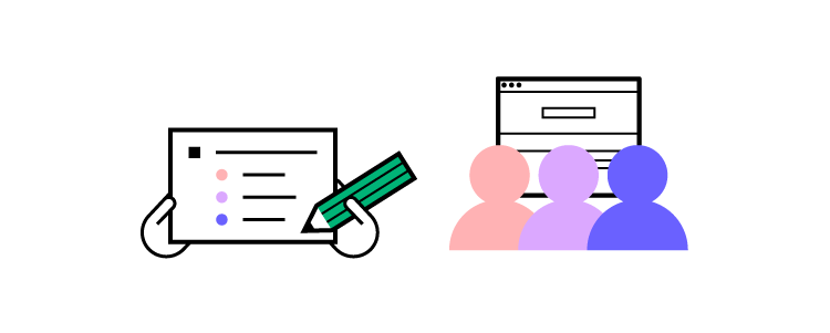
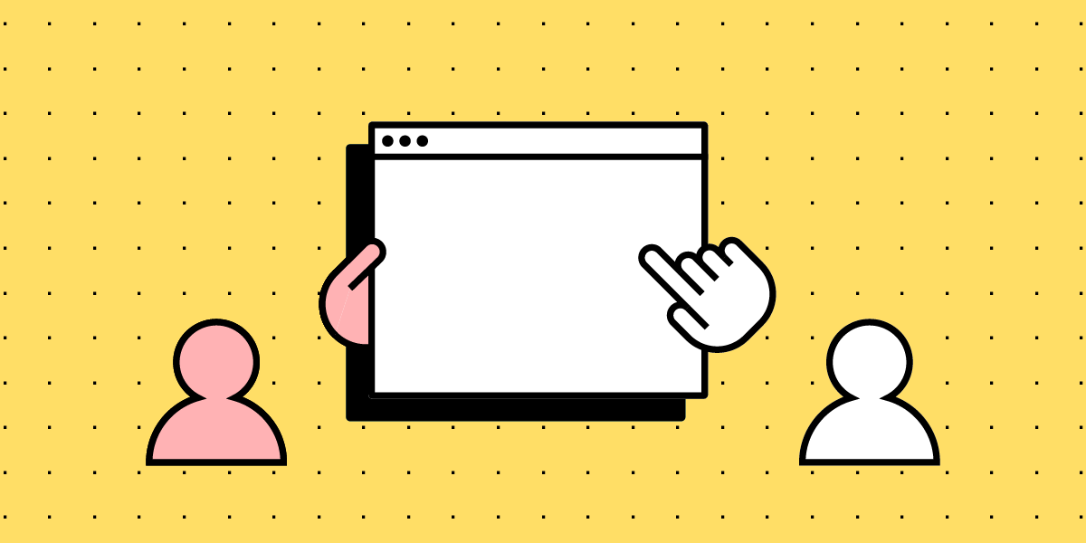
A task analysis is a vital user research method for understanding how users complete tasks, including what triggers them to start, their actions, and how they know when it’s complete.

Mapping these tasks allows designers to empathize with users by analyzing their actions, struggles, and environmental influences while pinpointing opportunities within user flows to improve a product’s user experience.

Optimize your user experience with UXPin–the world’s most advanced UX design tool. Sign up for a free trial to explore UXPin’s design and prototyping features. 

Build advanced prototypes

Design better products with States, Variables, Auto Layout and more.

Try UXPin

What is Task Analysis?

Task analysis is a research framework for analyzing users’ steps and behaviors to complete a task. While this is a standard UX research methodology, people use task analysis in many industries, including physical products, industrial design, health and safety, and education, to name a few.

Designers must consider multiple human characteristics, including mindset, emotional state, environment, and limitations (cognitive and physical). They also look at the frequency, complexity, time on task, and other related factors for a holistic map of the task and surrounding influences.

What is the purpose of a task analysis?

A task analysis aims to understand tasks and processes from a user’s perspective and the problems the digital product must solve. If a design doesn’t solve these problems or prioritize features correctly, it won’t adequately meet user needs and possibly fail.

search files 1

For example, an onboarding sequence requires users to upload a profile picture, but during a task analysis, designers realize some people don’t have a profile picture or want to take a fresh pic for the app. Adding a feature to take a selfie using the user’s smartphone camera within the app solves this problem while streamlining the onboarding process.

A task analysis also tells designers what they must not build–features that users won’t need or use. Understanding what a product doesn’t need is just as important because it simplifies the user experience and reduces costs.

Types of Task Analysis

There are two types of task analysis in UX design:

  • Hierarchical Task Analysis
  • Cognitive Task Analysis

Hierarchical Task Analysis

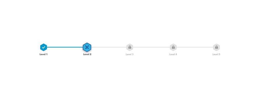
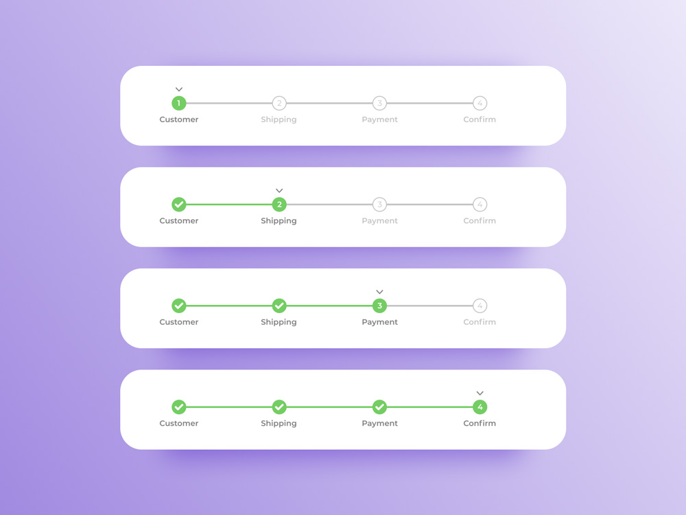
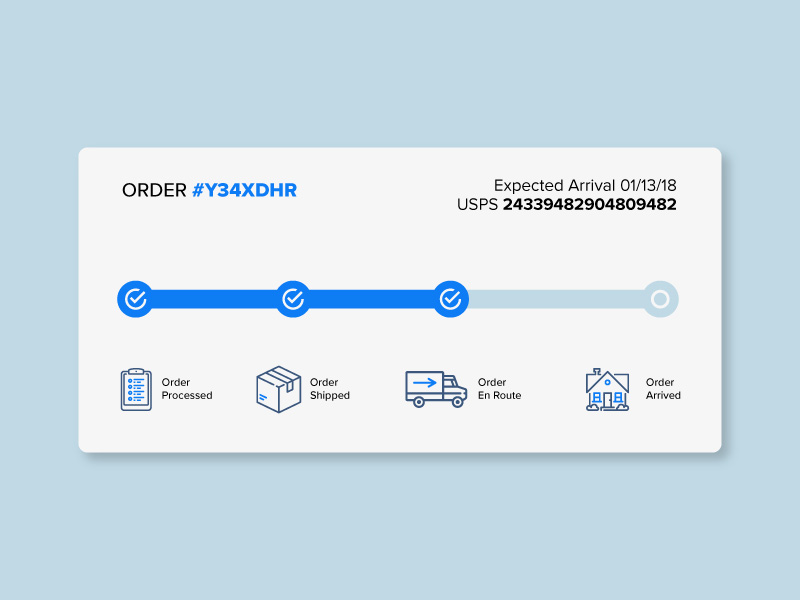
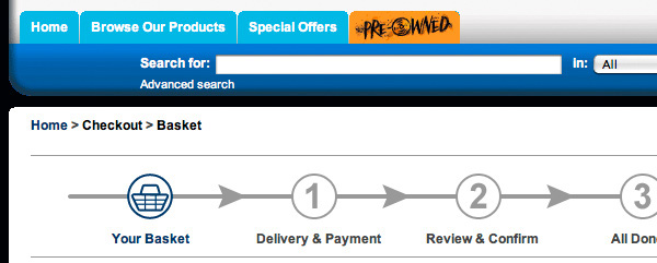
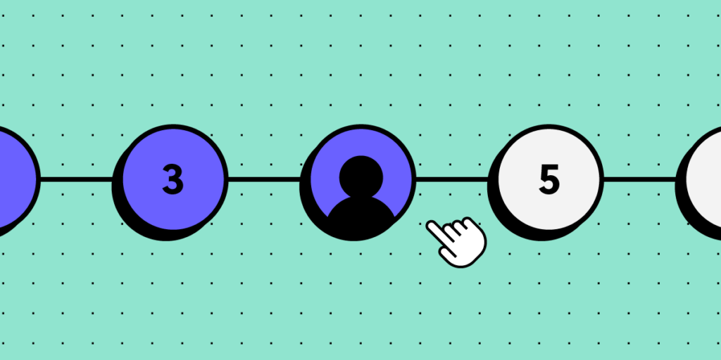
A hierarchical task analysis breaks an entire process into individual steps and identifies and prioritizes the subtasks within each phase from starting point to completion.

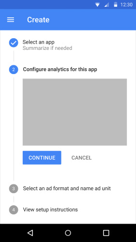
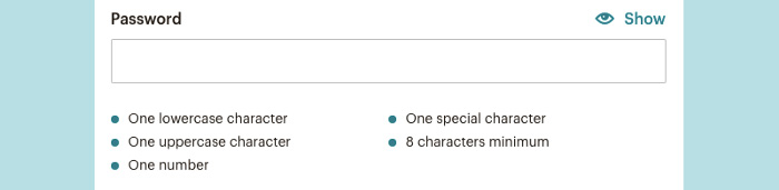
For example, the first step in a user flow is to sign into the app. This first step has three subtasks:

  • Enter username
  • Enter password
  • Click/tap “Log In” button

Prioritization is key during a hierarchical analysis because it identifies what users need and when.

A hierarchical analysis will also tell designers if there are too many subtasks within a step, which may overwhelm users making the task difficult to complete.

Cognitive Task Analysis

Where a hierarchical task analysis identifies the steps and subtasks, a cognitive task analysis seeks to observe the user’s actions, emotions, and behavior throughout the process.

Designers focus on the mental effort that’s required to complete each step and subtask (smaller steps) to understand the product’s intuitiveness and identify any pain points.

process direction way path 1

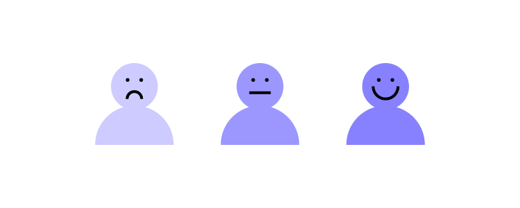
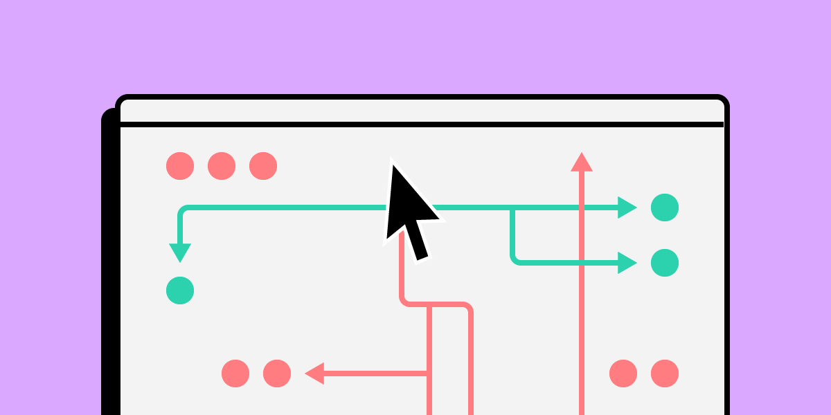
Flowcharts allow designers to map tasks from start to finish, noting each critical decision point. At these decision-making moments, designers note the user’s emotion and behavior, usually with keywords–i.e., angry, frustrated, happy, confused, disengaged, etc.

Often these queues come from how users react, like someone scrunching their face in confusion when trying to complete a task or action. Designers can use these opportunities to ask questions and pinpoint what is wrong.

When to Conduct a Task Analysis

Design teams conduct task analysis throughout a product’s lifecycle. It’s an essential tool in the early stages of the design process when researchers are trying to frame the problem correctly.

Researchers use task analysis results to create customer journeys, and user flows that guide ideation and prototyping.

How to Conduct a Task Analysis

Below is a typical task analysis process and the outcomes design teams seek to achieve.

testing observing user behavior 2

Phase 1: Research

The research phase involves gathering data to define the specific task and users. Typical UX research methods for a task analysis include:

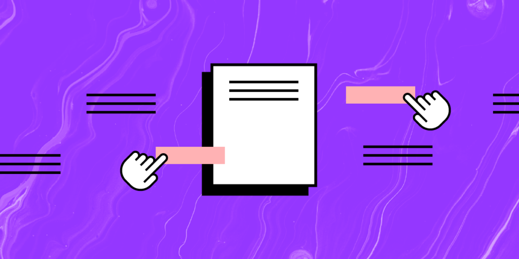
  • Field studies: Going to locations where users use a product to understand the environment and external factors–for example, going to an airport to observe travelers using a check-in and boarding app.
  • Diary studies: Users document using your product over a period. This research method is a good alternative to field studies when users don’t typically use a product in one location.
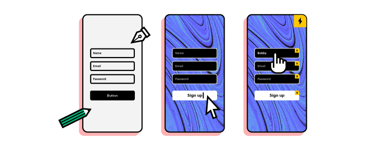
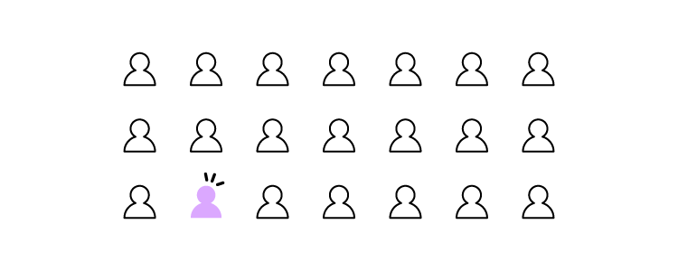
  • User interviews: UX researchers talk to end-users to understand how they complete tasks, including the user’s goal, what triggers them to start, each step, and pain points/frustrations.
  • Usability testing: Designers build a prototype of the user flow (task) and test it with end users, noting each step, behavior/reactions, and how users complete the task (often, there is more than one way).
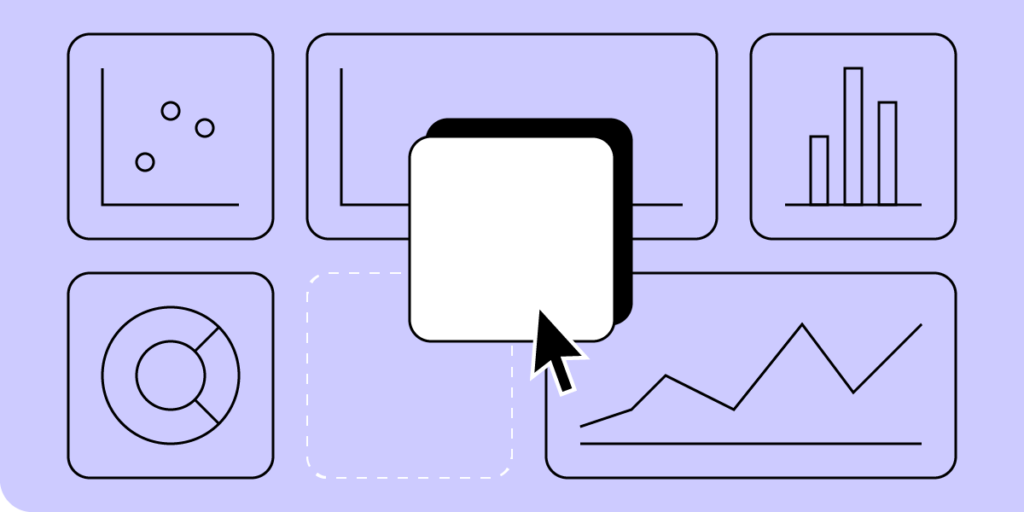
  • Product analytics: Tools like Google Analytics allow design teams to conduct a User Flow Analysis to understand users’ steps to complete tasks. This analytics data is excellent for pinpointing dropoffs and bottlenecks to research further.

Researchers must aim to answer four key questions during the research phase to prepare for the task analysis:

  • Trigger: what triggers users to start the task? This trigger could be internal (like an emotion) or external (like a time of day or event).
  • Desired outcome (end goal): what does the user want to achieve? How do they know when the task is complete?
  • Knowledge: what skill or knowledge must users have to start and complete the task? For example, if your product is only in English, they must know the language.
  • Artifacts: what tools and information will users need to complete this task? i.e., credit card details, passport number, etc.

Phase 2: Break the task into subtasks

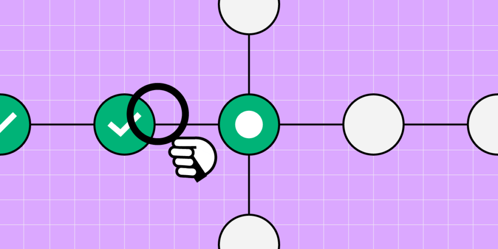
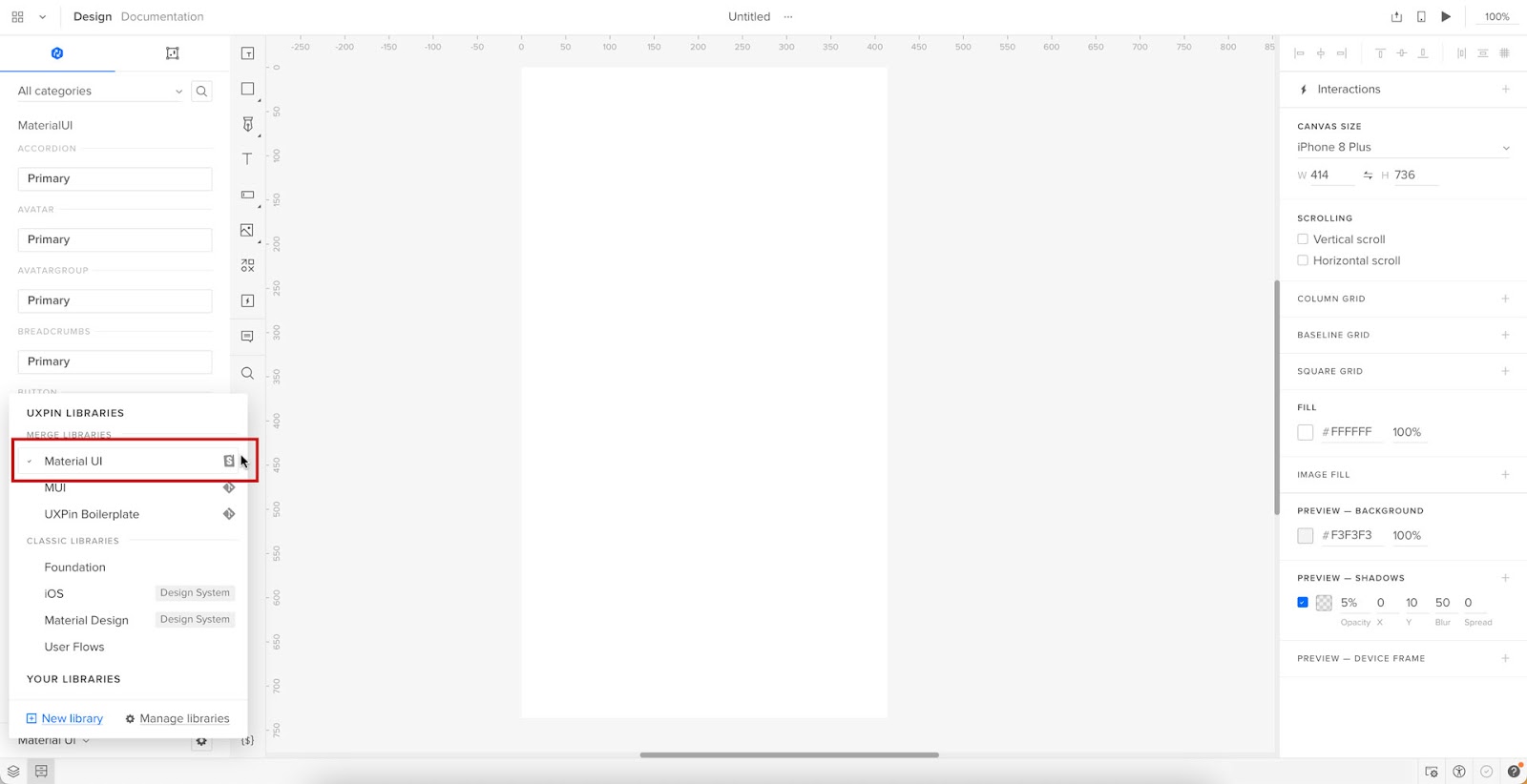
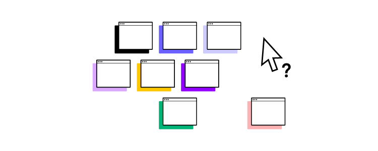
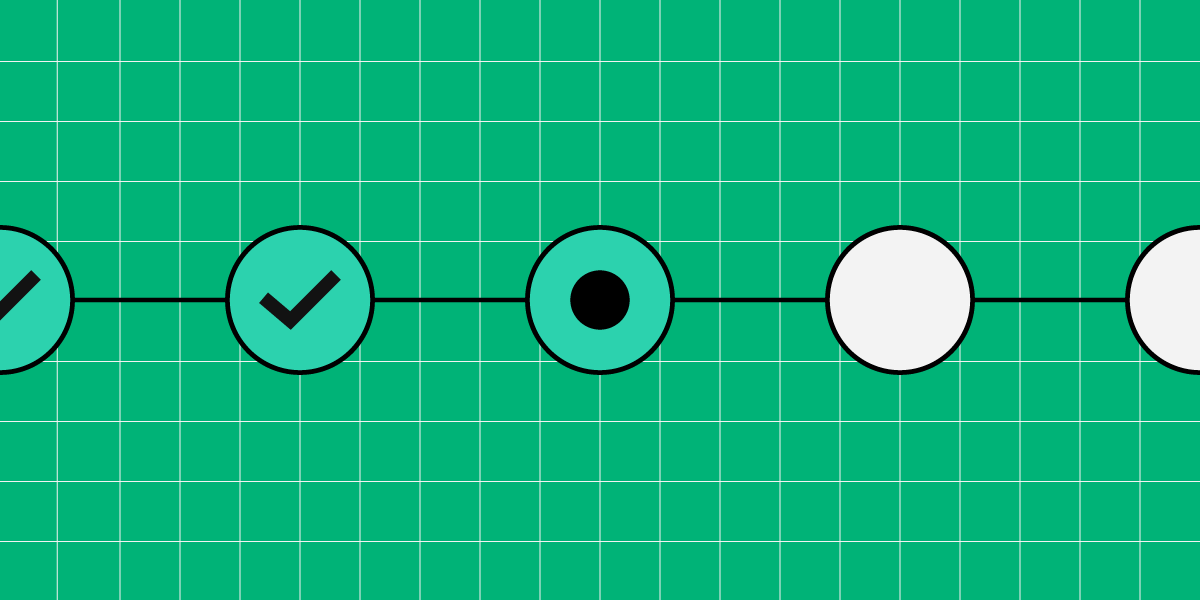
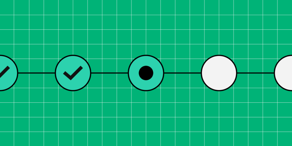
Designers break the task into steps and subtasks using a task analysis diagram (hierarchical task-analysis diagram) or flowchart. You can create these artifacts using a whiteboard and sticky notes, a digital tool like Miro, or UXPin’s User Flows built-in library.

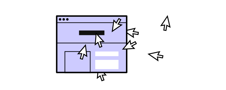
UXPin’s User Flows library allows design teams to build task analysis flowcharts and diagrams, including components for:

  • Flow lines: movement and direction through the task
  • Blocks: various types and colors to represent steps, actions, and decision-making
  • Icon blocks: system feedback, including errors, success, info, warning, etc.
  • Labels: for flow lines and steps
  • Devices: graphical representations for laptops, desktops, smartphones, tablets, etc.
  • Gestures: standard mobile gestures for taps, swipes, and scrolls

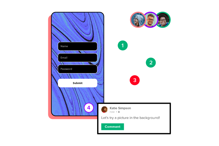
Creating task analysis flowcharts and diagrams in UXPin keeps all UX artifacts in one tool, making it easier to archive, share and collaborate. UXPin’s Comments allow design teams to collaborate internally or seek input from product managers, engineers, and other stakeholders.

Phase three: Analyze the task and subtasks

The last step is to analyze the task and subtasks and add supplementary data about the process and its impact on users. They may note these details on the flowchart or task analysis diagram or create a separate artifact telling a story–similar to a user journey map.

process

During this analysis, designers look at the following:

  • The number of steps and subtasks–are there too many? Are there any redundant tasks? Are there opportunities to reduce and streamline?
  • Time-on-task–how long does it take to complete the task and subtasks? What can designers do to reduce this time?
  • Task frequency–how often do users complete this task ( hourly, daily, monthly, etc.)? Are there any repetitive actions designers can eliminate (adding a feature to save someone’s personal information)?
  • Physical effort–what do users have to do physically to complete tasks? How does this physical effort impact accessibility and users with disabilities?
  • Cognitive effort–the task and subtasks’ impact on cognition and the mental processes required (cognitive task analysis).

What’s next?

Once design teams complete the task analysis, they’ll have a visualization of the user flow, bottlenecks, and pain points. They can use this research artifact to continue the design process, usually moving into the ideation and low-fidelity prototyping phase.

Examples of Task Analysis

Here are several high-level task analysis examples you can use as experiments to test your knowledge. 

  • Getting car insurance quotes
  • Creating a social media post
  • Ordering food through a food delivery app
  • Finding a plumber to fix a broken pipe
  • Purchasing an online course

Improve Task Analysis With UXPin

Prototyping is crucial for usability testing and observing user behavior. Without the right tools, designers can’t replicate real-world product experiences, limiting what they can learn through prototyping.

UXPin’s advanced prototyping capability enables designers to build fully functioning replicas of the final product, including mimicking complex tasks like eCommerce checkouts, form validation, and API calls, to name a few.

Usability participants can interact with UXPin prototypes exactly how they would using the final product, resulting in accurate testing and meaningful feedback during the task analysis research phase.

These results allow designers to confidently identify task pain points and opportunities for improvement, thus improving design project outcomes.

Improve your task analysis with accurate prototyping and testing using UXPin. Sign up for a free trial to explore UXPin’s advanced features.

App Personalization – How to Get it Right?

app personalization 1

In 2021, Google and Apple saw around 140 billion downloads in their app stores – a 20% growth in just two years. That’s a lot of demand to cater to! Still, with the multiple options on the market, today’s app users want more than ‘just’ an app that works properly. They want a UX that aligns with their specific, individual needs. 

With the “one size fits all” model failing some app designers, how do we ensure that users get the level of personalization and app customization they crave?

UXPin makes it easy to design a prototype that looks and feels like an end-product. With its stellar features, you can build prototypes that your users and stakeholders can actually interact with. It makes user testing a lot smoother. Try UXPin for free and design your first app today!

Build advanced prototypes

Design better products with States, Variables, Auto Layout and more.

Try UXPin

What is App Personalization?

At its most basic level, app personalization can be defined as the process of building an application that meets the unique needs of a specific audience. 

But there’s a little more to it than that. How do we know which personalization elements different audience members want? How do we ensure they’re satisfied with the existing UX? And which app customization elements matter more than others? 

Thanks to the ever-growing number of tools and analytics available today, developing an app that features top-shelf customization options and personalization features is getting easier.

screens process lo fi to hi fi mobile 1

Whether enriching the feedback a user receives after signing up or using predictive algorithms to learn about what motivates and interests them, app personalization has evolved into a data-driven art that requires creativity and an innovative mindset.

Why is App Personalization Important?

When it comes to mobile apps, the overwhelming majority of consumers are on the hunt for one thing. An app that offers them the products and services they need based on unique user histories, individual interests, and special preferences. Getting personalization wrong can be an app killer.

The customer experience is driven by how we’re able to personalize the journey for them. Generic, cookie-cutter processes are outdated and known to push users away, while apps tailored for convenience, ease, and efficiency are taking center stage. 

Studies and research cases all point to some intriguing data driving demand for more app personalization. Nearly 58% of people feel more positive toward companies that remember who they are. Two-thirds expect brands to understand their needs without communicating them, while nearly three-quarters (72%) of customers will only engage with brands that offer personalized messaging.

user bad good review satisfaction opinion

Businesses are taking notice, too. Marketers are leading the charge, with 60% stating that their content is extensively personalized. As of 2022, 84% of companies agree that personalization is critical to enriching the user experience.

Users want to feel like they matter, that they’re more than just a number on the network. User engagement is key, and being able to do more than simply thanking someone by name for signing up or making a purchase is the secret to getting your mobile app personalization strategy right.

Mobile Personalization, Segmentation or Customization

Before diving into what makes for effective mobile app personalization, we must understand our different user app segments and their role in formulating a strategy that works. 

While personalization and customization are used interchangeably, they’re different. Both concepts refer to how we can design the user experience to boost engagement, but at the fundamental level, they are responsible for distinct outcomes:

  • Personalization – involves using data analysis to leverage digital technology and tools to personalize product offers and direct messaging to existing or prospective clients. Personalization happens before something reaches the customer and is the responsibility of the brand or company. 
  • Customization – is the process of allowing the customer to input their preferences or requirements in altering a product or service to suit their needs. While app customization happens in real-time, brands must create an environment for the consumer to do so.

Here’s an example of personalization versus customization in action:

“ABC Brands sells coffee at outlets around the country, allowing users to order on their app for collection. When you have the option to add cream, sugar, soy milk, or sprinkles to your order, that’s customization. But when you open the app, and it already knows which three coffees you prefer, your favorite outlet, and the time you usually get your caffeine fix – that’s personalization.”

user choose statistics group

But to ensure that we have access to the data we need to personalize our app offerings and in turn, the level of customization available, we first need to understand whom we’re targeting. We need to know about our user app segments. 

The depth of both effective personalization and comprehensive customization is predicated on providing a UX that encourages engagement. But while these require an understanding of the target audience, segmentation gives us a way to do just that. 

  • User segmentation – refers to the process of dividing (or segmenting) the target market into smaller, more manageable groups of customers based on their shared interests, needs, and preferences. 

Segmentation involves many considerations, criteria, and elements and can be challenging to execute effectively. Always keep your app’s needs and objectives in mind when segmenting your market according to any one of these most prevalent factors. 

  1. Demographics – relate to the age, gender, income level, employment status, and even race of your customers. They allow brands to understand what different groups of people are looking for based on easy-to-identify mainstream factors. 
  2. Geolocation – refers to the physical location of someone. Apps access this information to give us insight into where people live, where they work, and the places they spend most of their time. 
  3. Lifetime revenue – gives us an understanding of how long a person has been a customer. It also tells us which groups spend more than others, allowing developers to design a UX that affects each group differently. 
  4. Psychographics – are those parts of your customers’ lives that define who they are. Things like cultural identity, their world view, their political leanings, and even religious factors. Psychographics play a significant role in what people can expect from the brand associated with the app. 
  5. Behavioral segmentation – provides valuable insight into how people in a market behave. In the case of apps, we’re looking at things like screen time, bounce rates, app retention, and on-screen hotspots. This data is crucial to understanding user behavior and getting app personalization right.
designops picking tools care

Psychographics and behavioral segmentation are vital to designers looking to nail their app personalization UX since they’re geared specifically to providing you with app-related consumer information. Developers can identify the key user needs and goals from these metrics and can thus customize and personalize the mobile app experience more effectively. 

How to Personalize any Mobile App

Once you have an idea of which user groups you should be focussing on, you’ll have a much clearer picture of how to go about your mobile app design and personalization strategy.

1. Leverage user segments

Once you’ve put in the effort of getting a deeper understanding of your app segments, you’ll need to ensure each one gets the attention it deserves. And this is the beauty of app customization and personalization – you get to provide a personalized experience for each. 

Your app’s ROI – and longevity – will depend heavily on giving every user the most comprehensive and rewarding UX possible. But resources can only go so far, and you’ll still want to ensure that your most lucrative and valuable customers take priority. So, invest in a personalization strategy that balances out each group’s needs and prospective returns.

2. Refine the onboarding experience

First impressions matter, especially with apps, so pay attention to user onboarding. This easily overlooked mobile app personalization component is critical for stable user retention and keeping app engagement rates high.

Ask for the user’s name (but beware of asking too many unnecessary personal questions) from the outset and use it where necessary. Offer free trials of upgrade features, and discounts for early in-app purchases, and remember to gently remind them to keep using it.

3. Craft content that reflects good personalization

This is where your mobile app personalization efforts really come to the fore. Tailor your app and well-researched digital content to meet your users’ every need. It should reflect previous interactions, their unique interests, and anticipate their desires. 

Innovate with different approaches and try to find a way to balance basic personalization with characteristics that’ll impress and please your users. Relevance is all-important, so put your research and segment data to good use. 

4. Enable push notifications

Push notifications are your app’s way of getting noticed on devices. But be very careful of how ‘pushy’ you want your app to be, and promoting relevant content.

Mobile users will appreciate relevant notifications that help them, like special offers, product recommendations, highlights from the newsfeed or location-based information, vital information related to the app itself, and current updates linked to their interests. A great tip is adjusting notifications to user preferences.

5. Personalize beyond the app

You can create a personalized app experience beyond the app. This boosts brand loyalty and demonstrates your commitment to effective personalization. 

Email marketing that shows the customer that you’re aware of where they are in their app journey is a valuable re-engagement opportunity. Notifications that help an app user pick up where they left off or remind them of a new app feature or product offer are also excellent personalization motivators. 

Duolingo, for example, rewards its users for progress and encourages them to keep going through highly personalized emails and reminders. 

The best way to approach mobile personalization

Before you can start personalizing your app, you’ll need a starting point. Prototyping is considered one of the most effective and efficient ways to test, refine and perfect your app before you jump into development – especially on the personalization front. 

UXPin is an all-in-one design tool for creating an interactive prototype that will grant you detailed user feedback from users interactions with your prototype. UXPin also have a ton of features that will help you design with live data and user input that will be shared from one screen to another. 

Prototyping with UXPin allows you to identify the factors that matter most to your customers, weed out the elements they don’t want and perfect your personalization strategy without wasting valuable time and money on failed versions. Give UXPin a shot by signing up for a free trial

What is Content Design?

Content design

Content design has evolved to become a crucial role in the UX design process. Teams rely on content designers to ensure products deliver the highest quality content that meets user needs precisely when they need it.

Do you struggle to build accurate prototypes as a content designer? Build fully functioning prototypes with UXPin Merge, the world’s most advanced user experience design tool. Import your product’s design system to create a drag-and-drop prototyping environment for faster testing and iterations.

Bridge the gap between design and development, get meaningful feedback from stakeholders, and gain accurate results during usability testing. Visit our Merge page for more details and how to request access.

Reach a new level of prototyping

Design with interactive components coming from your team’s design system.

What is Content Design?

Content design encompasses a digital product’s content strategy, including text, images, video, maps, graphs, and other graphics that communicate with users. A content designer’s primary goal is presenting the right content to users when needed–like a helpful error message with explicit instructions to fix a problem.

Although content design falls within the UX realm, content designers often work in cross-functional teams or consult on projects–like helping the sales team craft an email or writing scripts for customer service.

The evolution of content design

Content design is a relatively new term coined by Sarah Richards (now Sarah Winters, founder of Content Design London) while working for the UK’s Government Digital Service, which designs and develops the country’s digital products.

Traditionally, organizations tasked UX writers or copywriters with adding words to user interfaces or editing copy. But as the role evolved, UX writers approached their role as a UX designer does. So, UX writers became content designers to reflect this change.

While content design primarily focuses on words, they do sometimes use images, videos, and graphics to communicate with users; therefore, content designer makes more sense than UX writer.

Beyond creating copy, content designers identify where content must go, its hierarchy, and the type (text, image, video) to solve user needs adequately. They rely on user research and data to identify what content a product and user interface needs. Content designers work with UX writers, graphic designers, and other content creation professionals to produce these assets.

Content design vs. UX writing

Many organizations use content designer and UX writer interchangeably, but slowly these are becoming different UX specializations.

  • UX writer: focuses solely on a digital product’s copy.
  • Content designer: a holistic approach to content (text, image, video), including hierarchy, structure, messaging, voice, tone, etc.

What Does a Content Designer do?

Content designers collaborate with other UX professionals throughout the design process. They must understand user needs, communication, and language to produce helpful and informative content.

Content designers don’t only solve problems; they also collaborate with marketing teams to create user-centered content for landing pages, sales funnels, email nurturing sequences, and other lead/sales touchpoints.

1. Research

Like any user experience role, research is the core of a content designer’s decision-making. Content marketing design must understand users’ needs, wants, motivations, and desires to increase conversions. In contrast, task-related product content focuses more on solving problems, providing context, and eliminating pain points.

search observe user centered

Content design research methods include:

  • User interviews: an essential content design research method because end-users will tell designers what they need–i.e., a map, graph, written instructions, etc.
  • Desk research: industry reports, case studies, survey data, etc.
  • Competitive analysis: understanding how competitors use content
  • UX benchmarking: industry, competitor, and product benchmarks
  • Product tracking & analytics: using tools to learn about customer behavior and identify bottlenecks
  • User feedback: collect customer service tickets or opinions that highlighted cases in which a product’s language or instructions were unclear to the user

Content designers use this research to identify what content users value and how to prioritize accordingly. Examples of the UX artifacts they create to guide ideation, prototyping, and testing, include:

  • Personas: designed specifically for content, including the language they use, how they communicate, messaging that triggers them, what they value, the content they need, etc.
  • User journey maps: visualizing user journeys to identify motivations, thinking processes, and what information people need at each step
  • Storyboards/scripting: a deeper dive into the user’s journey, including scripting interactions and conversations
  • User flows: the screens and navigation for the design project–for example, an onboarding sequence

2. Ideation

Next, content designers collaborate with UX professionals and other team members to ideate solutions that meet user needs. They consider where users will see this content (mobile app, website, ad, social media, etc.) and what medium will impact users most (text, images, video, graphics, etc.).

idea 1

Content designers explore words and language that will deliver instructions and messaging succinctly. They also consider the content’s voice and tone, which must be coherent and consistent with the rest of the product while following brand guidelines.

Content designers work with other designers ideating on solutions for various design ideas and layouts. They also meet with team members from legal, financial, marketing, customer service, industry experts, etc., to get feedback and make improvements.

3. Prototyping and testing

Nick Cowan from GOV.UK shares how they used the Page Editor Chrome Extention to test ideas by changing the text on a page–content designers can also use the “inspect” feature available on most browsers, including Chrome and Safari.

They can screenshot these changes to create rudimentary prototypes for testing different content and messaging ideas with the target audience and stakeholders.

screens prototyping

Content designers may not have the skills or time to build prototypes. They must rely on other UX designers or engineers for their prototyping needs.

Design tools like UXPin enable content designers to create prototypes that accurately replicate the final product–without the learning curve and complexities of traditional design tools.

UXPin’s built-in design libraries allow content designers to drag and drop UI components to build user interfaces for testing. They can also import Figma, Sketch, or Photoshop files from other designers for prototyping in UXPin. Content designers can collaborate with team members and stakeholders, getting feedback via UXPin’s Comments

Content Design Best Practices

Avoid irrelevant content

Content designers must keep content relevant to solving a user’s problem and completing tasks. Sometimes well-intentioned content, like providing additional context or information, can cause more harm than good.

Comprehensive research and user interviews are the best way to avoid irrelevant content while giving users only what they need to make a decision.

Design, don’t “fit in”

One of content designers’ biggest challenges is “fitting in” to an available space rather than designing. Content designers must involve themselves early in the design process to ensure the team designs around content users’ needs rather than trying to fit in.

A great example of designing around content is Sarah Winters’s redesign of GOV.UK’s bank holiday page, which Giles Turnbull describes in this YouTube video.

During user interviews, Sarah and her team discovered that most users wanted to know the date of the next UK bank holiday. The old page (below) had too much information, which overwhelmed users and took time to find the next bank holiday date.

The redesign prioritized the content users value most, with the next bank holiday in large highlighted text and the following holidays below in chronological order.

By designing rather than fitting in, GOV.UK’s content designers created a page that serves users while eliminating redundant, distracting information.

Share and encourage feedback

Sarah Winters shares in a blog post about content design, “We share quickly and easily to get feedback. We know having fresh eyes on a piece of work is generally a good thing.”

Feedback from other designers, product managers, stakeholders, and users is crucial for the content design process. These perspectives help content designers refine ideas and deliver the best solution for users.

Use simple messaging

Content must be straightforward to understand and digest with simple language and readability. Some tips to improve messaging include:

  • Avoid jargon and ambiguity
  • Use short sentences and paragraphs
  • Maintain a consistent voice
  • Find the best format–use bullet points, italics, bold, etc., to make content easier to read
  • Use an active vs. passive voice

Learn to use a design tool

Content design is designing! Content designers must be comfortable using design tools and building prototypes. Relying on other designers will result in compromises.

As Emma Schmidt, Content Designer at Dropbox, notes about design tools, “…in the case of content design, mocking up your writing demonstrates a basic understanding of visual hierarchies and your fluency in design, and it offers perspective.”

Content Design Resources

Content Design With UXPin Merge

Prototyping and testing are vital for content design testing and iterating. But many content designers and UX writers lack the skills to build quality prototypes. Nick Cowan from GOV.UK and his team used a Chrome extension to create screenshots for prototypingnot a scalable, dynamic, or adaptable methodology!

PayPal faced a similar problem when trying to scale its internal design operations. Erica Rider, Senior Manager for UX – Developer tools and platform experience at PayPal, needed a design tool to enable product teams to design UIs–people with little or no design tool experience.

Erica and her team discovered UXPin Merge, a technology that allowed PayPal to sync its Fluent UI design system hosted in a repository to UXPin’s design editor. Product teams use the design system’s templates (graphs, charts, and other content), components, and patterns to prototype, test, and deliver new products.

logo uxpin merge 1

One-page prototypes that used to take experienced UX designers more than an hour to build now take product teams less than 10 minutes–with greater fidelity and full functionality.

Content designers are in a similar position to PayPal’s product teams, where prototyping and testing are essential, but they must rely on other designers or engineers to build prototypes. UXPin Merge creates a drag-and-drop design solution that reduces the design tool learning curve, maximizes consistency, and increases prototyping scope.

Switch to the world’s most advanced prototyping tool to increase your content design team’s value to the design process. Visit our Merge page for more details.

Bring Fluent Design System for React into UXPin with Storybook

Bring Fluent Design System for React into UXPin with Storybook

Open-source design systems offer an opportunity to develop high-quality products at a rapid pace. By solving foundational usability and accessibility challenges, organizations can focus on product development and solving problems.

Fluent UI is an open-source design system favored by companies developing enterprise products. The comprehensive component library allows organizations to build apps for the Microsoft ecosystem while enabling full customization and flexibility through theming for any product.

Import your Fluent UI design system into UXPin using our revolutionary Merge technology to create a single source of truth between design and development. Visit our Merge page for more details and how to request access.

Reach a new level of prototyping

Design with interactive components coming from your team’s design system.

What is the Fluent UI Design System?

Fluent UI is a design system built and maintained by Microsoft. The open-source design system has two functions:

  1. A design language and component library for developing Microsoft 365 products–much like Lightning does for Salesforce
  2. A themeable component library for building enterprise applications outside of the Microsoft ecosystem

The comprehensive design system includes components and patterns for building cross-platform applications, including platform-specific UI elements for web, Windows, iOS, Android, and macOS.

Every component and pattern includes basic states and interactivity to enhance cohesion and consistency for cross-platform product development. These features allow organizations to focus on the product and user experience rather than designing, prototyping, testing, and iterating from scratch.

The Benefits of Using Fluent UI Design System

Aside from cohesion and consistency–which you get from most open-source component librariesFluent UI has many benefits for B2B and enterprise product developers.

Seamless Microsoft 365 Product Experiences

If your company uses Microsoft 365 for email, Excel, Word, Teams, etc., Fluent UI is a fantastic design system for internal products–even if they don’t sync with Microsoft 365.

Creating a seamless UI design from inbox and spreadsheets to warehouse inventory systems and data visualization gives employees a familiar user experience in every workspace, reducing learning curves which ultimately improves collaboration and productivity.

Enterprise Product Development

Enterprise UIs often have more complex architecture, layers, and data than B2C applications. Designing from scratch requires significant resources adding to the burden and complexities of developing and maintaining the final product.

An open-source library like Fluent UI eliminates hundreds (possibly thousands) of hours of building and testing components from scratch. Instead, product teams can effectively drag and drop Fluent UI components to develop new products.

Fluent UI includes a comprehensive library from Basic Inputs to more complex patterns like date pickers, list UIs, navigational components, notifications, modals, and more. The design system is also themeable, making it easy to adapt the library to integrate with other products or meet brand requirements.

Organizations also benefit from free maintenance as the Fluent UI team matures the design system, ensuring products meet foundational usability and accessibility requirements.

Component-Driven Prototyping With Fluent UI

Component-driven prototyping uses ready-made UI elements to build prototypes during the design process rather than designing from scratch.

The benefit of this prototyping methodology is that design teams can go from sketching and paper prototyping straight into high-fidelity prototyping, bypassing the time-consuming process of designing new UI elements.

For example, designing tables from scratch is particularly tricky and time-consuming. Fluent UI comes with many list UIs with implementation instructions and best practices.

Designers can choose an appropriate list for their project, add relevant content, and begin testing immediately. This document library UI, for example, would require many hours of designing, testing, and iterating. Fluent UI eliminates that work, so designers can focus on solving the core user need rather than drawing lines, circles, squares, etc.

While Fluent UI offers many benefits, building prototypes using traditional design tools have constraints that limit testing–like non-functioning inputs, date pickers, and other user controls.

With UXPin Merge, designers achieve code-like fidelity and functionality!

As a code-based design tool, UXPin Merge enables component-driven prototyping, where designers can build exact replicas of the final product without writing a single line of code!

Advanced Component-Driven Prototyping With UXPin Merge

UXPin Merge allows organizations to sync a component library from a repository, so designers use the same UI elements as engineers. Instead of using one of Fluent UI’s UI kits, designers use the design system’s React components in UXPin’s design editor.

These Merge components include Fluent UI’s React props defined by the design system, like color, size, interactivity, states, functionality, etc. These props appear in UXPin’s Properties Panel so designers can adjust components to meet product requirements.

How PayPal Uses Fluent UI and UXPin Merge

Before PayPal switched to UXPin Merge, the company’s internal products were inconsistent and fraught with usability issues.

As Erica Rider, Senior Manager for UX – Developer tools and platform experience at PayPal, notes in an interview with UXPin, “None of PayPal’s product teams had experienced UX people or UI developers. The result was a range of usability and design consistency issues—no two products looked the same!”

Erica decided on Fluent UI: “We settled on Microsoft’s Fluent design system with UI controls for our internal tools development because they’re more enterprise-focused and better suited to internal user interfaces.”

Fluent UI gave PayPal the UI controls and consistency to focus on product development rather than building and managing components. The company uses a private GitHub repo to host its themed Fluent UI library, including custom components and user interface templates that minimize any need to design from scratch.

With constraints set by code in the repository, PayPal’s product team completes 90% of design projects. UX designers act as “user experience mentors,” helping with complex usability issues and continuous coaching.

Since the switch to Fluent UI and UXPin Merge, PayPal’s product teams deliver products 8X faster than experienced UX designers could previously using image-based tools.

A Single Source of Truth

The most significant benefit of using a design system like Fluent UI and Merge is that it creates a single source of truth across all product development teams.

With every Fluent UI component coming from a single repository, designers and engineers work within the same limitations and constraints. Any changes to the repo automatically sync to UXPin, notifying design teams of the update. Designers can use UXPin’s Version Control to switch to any version of the design system in any project at any time!

Fast-Track Product Maturity

Achieving product and design system maturity takes considerable time and resources. With Fluent UI, a startup can fast-track years of research and development to compete with Fortune500 software companies with their first release!

Instead of worrying about developing components, Fluent UI users can focus on product innovation and solving problems. The design system has all the UI elements to scale a product with little or no design (or programming) from scratch.

How to Import Fluent UI Components Into UXPin

Designers have two options when importing Fluent UI’s React component library. Both options require engineering collaboration to correctly set up the file structure and repository.

Git Integration

UXPin’s Git Integration only works with React components and connects directly to a repository. Engineers can use UXPin’s boilerplate repo as a template to set everything up. UXPin’s technical support is on hand to guide companies through this process and ensure the design system syncs correctly.

Once the initial connection is complete, UXPin will automatically sync any changes and notify designers of the update.

Storybook Integration

UXPin’s Storybook Integration also works with React but also enables organizations to sync Fluent UI’s Vue, Angular, and Ember libraries.

Storybook is a fantastic tool for developing and managing UI components in isolation. UXPin’s Storybook best practices ensure organizations get the most out of Storybook and Merge.

Using Storybook Components in UXPin

Once the Storybook setup is complete, the component library will appear in the left sidebar under Design System Libraries. The Storybook icon will appear next to the library’s name, like this Material UI example below (note the MUI library has a different icon for the Git Integration).

Designers drag and drop components from the library to build user interfaces. They can also combine these Storybook components or elements from other libraries using UXPin Patterns.

UXPin Patterns offer two significant benefits:

  • Creating new UI components and templates to scale the design system (designers can share and use these to continue prototyping while waiting for engineers to add them to the repository)
  • Saving multiple states or versions of a component for faster changes during prototyping and testing

Using Args and Props

Organizations can use React props or Storybook Args to set component properties that appear in UXPin’s Properties Panel. These props and Args ensure designers stick to the design system’s guidelines for styling, like colors, typography, states, shadows, and other crucial values.

Designers can apply different properties using dropdowns, checkboxes, text fields, etc., to achieve an on-brand result with minimal effort every time.

These properties also help engineers develop the final product faster because they already have the components and styling in the repository–ensuring absolute cohesion and consistency with every release!

Start Designing With Merge and Fluent UI Today!

Leverage the power of UXPin Merge and Fluent UI to develop enterprise products that exceed customer expectations with high-quality user experiences. Visit our Merge page for more information and how to request access to sync your design system or open-source component library.

5 Mistakes that Kill Collaboration Between Designers and Developers

We’ve looked at how to make it easier for designers and developers to work together. But what roadblocks and workflows work against this collaboration?

We’ve researched common mistakes design teams and product managers make when working with software engineers and how they can collaborate better. Reducing friction and roadblocks creates a smoother product development process while increasing Design’s value.

Enhance collaboration and bridge the gap between design and development with UXPin Merge. With this tech, you can bring your component library’s elements to UXPin and create functional prototypes that we’ll be developed exactly as you designed them. Check more about it. Visit our Merge page.

Reach a new level of prototyping

Design with interactive components coming from your team’s design system.

1. Using Image-Based Prototypes

Whether you’re an early-stage startup or part of an enterprise software development team, design handoffs are often a time of friction between designers and engineers. One of the biggest causes for this tension is prototype fidelity.

Image-based design tools produce poor prototypes that lack fidelity and functionality, making them hard to interpret and understand–for engineers, stakeholders, and usability participants.

Design teams have two options:

  1. Collaborate with front-end designers or UX engineers to build better prototypes
  2. Switch to a code-based design tool

The latter is a better solution because it removes reliance on engineering teams, significantly enhances prototyping capabilities, improves testing, and facilitates better designer/developer collaboration for smoother design handoffs.

uxpin collaboration comment mobile design

The benefits of using a code-based design tool

UXPin’s code-based design tool enables designers to build prototypes that accurately replicate the final product experience. 

Engineers and stakeholders never have to “imagine” doing something because UXPin’s fully interactive prototypes provide an experience comparable to code.

Here are four UXPin features that enhance prototyping:

  • States: Apply multiple states to a single element or component, each with different properties, interactions, and animations.
  • Interactions: Create complex interactions with advanced animations and conditional formatting for dynamic user experiences.
  • Variables: Capture and store user inputs and use that information to take actions or personalize a product flow.
  • Expressions: Create fully functioning forms, validate passwords, update shopping carts, and more with Javascript-like functions.

Sign up for a free trial to discover these and other advanced UXPin features.

2. Not Clarifying Design Decisions

One of the biggest mistakes designers can make is not clarifying the why behind design decisions. How can engineers understand or empathize when they don’t know what user problems you’re trying to solve?

The key to clarifying design decisions is to be proactive. Get developers involved throughout the design process and avoid design handoff surprises.

designops picking tools options

Designer and business leader Antonia Horvath offers excellent advice for improving collaboration and including engineers in design decisions:

  • Dev/design pairing: designers watch engineers build a feature after design handoff to understand the process and observe engineering challenges. Ideally, this process works best in person, with both team members in front of the same screen asking and answering questions live.
  • Ideate together: bringing engineers into ideation sessions allows them to understand the thought process behind design decisions while leveraging their technical know-how to improve ideas.
  • Design critiques: traditionally a design team ritual, but including engineers in the odd critique can bring new ideas from a fresh perspective. Engineers also benefit by understanding the design thinking process behind decision-making.
  • Designer/engineer retrospectives: an agile software development practice where teams reflect on outcomes from each iteration and discuss improvements. Designers and engineers can conduct retrospectives at the end of every release to identify design handoff’s pain points and solutions. 

3. Not Educating Engineers About User Experience

Contrary to popular belief, UX teams are not solely responsible for a product’s user experience–it’s the entire organization’s responsibility. However, without effective design advocacy driven by UX designers, no one willingly learns about user experience.

As Erica Rider, UX Lead EPX at PayPal, pointed out at Design Value Conference 2022, companies have a significant control/accountability imbalance.”

  • UX designers have zero control over UX delivered to users but 100% accountability.
  • Engineers have zero accountability for UX delivered to users but 100% control.

The UX team’s role is to educate engineers about user experience and for both departments to share the responsibility.

Erica has developed systems to ensure “the UX team works with engineers to deliver a good user experience at PayPal, but the engineers are accountable for the final product.”

One of the biggest hurdles is a shift in thinking. Everyone outside of UX thinks the designer’s role is aesthetics and UI design.

Erica’s education methodology was to shift engineers thinking of user experience away from aesthetically-pleasing user interfaces to problems that cause bottlenecks and roadblocks over which engineers have absolute control. Some examples include:

  • Latency: If you click a button and it takes too long to load, that’s a poor user experience.
  • Availability: If a URL doesn’t load, that’s a poor user experience.
  • Security: If someone hacks my account, that’s a really bad user experience!
  • Error messages that are not “human-readable” or have no way for the user to resolve them: “Error Code 1578-B1273 – FAILED!” Why do you show users this message without telling them what it means or how to fix it? Another poor user experience.

Developing an organization-wide user experience mindset (starting with engineers) will increase empathy for users while sharing the responsibility.

4. Not Sharing User Research Findings

In a UX Tools article, Taylor Palmer shares insights from interviews with engineers about “how user research helps them create better experiences.”

Engineers care about user research because it helps them understand design decisions and, as one developer puts it, “make sure we’re building the right thing.” 

Developers don’t need access to the design team’s entire user research archives, nor do they have time to sit in user interviews. They prefer summaries, notes, and recorded interviews. 

testing user behavior prototype interaction

How to share user research with engineering teams

Taylor Palmer put together a list of ideas for sharing UX research with engineers:

  • Meetings to share research projects and insights
  • Linking design files with research summaries so engineers can understand the “why”
  • Creating an open-door policy for interviews and usability studies
  • Getting feedback on all UX artifacts, including wireframes, mockups, and prototypes (low and high-fidelity)
  • Creating and sharing your internal research repository–over and above summaries so engineers can delve deeper into research if necessary
  • Sharing notes from design meetings and ideation sessions
  • Creating a regular user experience newsletter

5. Not Having a Single Source of Truth

One of the most significant challenges for product development teams is overcoming the disconnect between designers and engineers.

Designers and engineers speak different languages without a single source of truth from a fully integrated design system. The results? 

Poor collaboration, design drift, friction, and other negative consequences adversely impact user experience and product quality.

design system components

How to create a single source of truth

Creating a design system doesn’t guarantee you’ll have a single source of truth. Traditional methods for building design systems mean designers and engineers use separate “truths.”

Of the four stages of design system maturity, this is stage three. Getting to stage four requires a tool to bridge the gap between design and development, where designers and engineers use the same component library.

Nick Elliott, Design System Product Owner and Regional Head of Product Design at Iress, refers to stage four as fully integrated:

  • Design in (no) code: designers drag and drop to build UIs using code components from a repository–no designing from scratch.
  • No design drift: UX teams, product designers, and engineers use the exact same components resulting in zero drift and less UX/front-end debt.
  • Consistent design: components include properties and interactivity defined by the design system, so designers don’t have to think about colors, typography, states, etc.
  • Seamless (no) handover: engineers already have exact copies of every component used for prototypes. It’s a matter of copying and pasting from the repository for front-end development, reducing the need to write code.

Iress used UXPin Merge to sync design and development. Merge pulls Iress’ component library from a repository into UXPin so designers can build code-based prototypes that look and feel like the final product–and designers don’t need to see or write any code!

This shared single source of truth means designers and engineers speak the same language and work within the same technical constraints. Reducing friction and streamlining workflows in the process. Visit our Merge page for more details and how to request access.

How UXPin Merge Syncs Design and Development for Better Collaboration

You’ve heard the results, but how does UXPin Merge work? Merge allows organizations to sync their design system from a repository to UXPin’s design editor.

Organizations can connect a React design system directly to UXPin using the Git Integration or Storybook for other front-end technologies, including React, Angular, Vue, Ember, and HTML, to name a few.

The component library appears in UXPin’s left sidebar for designers to drag elements onto the canvas to begin prototyping. Each UI component includes properties defined by the design system, like colors, sizing, typography, states, etc.

Designers can switch between these using dropdowns and selectors in the Properties Panel. Any changes render as JSX, making it easy for engineers to copy and paste to begin the development process.

Get your entire product development team to speak the same language with a code-based design solution from UXPin Merge. Visit our Merge page for more details and how to request access to this revolutionary technology.

How to Design Better Progress Trackers and Control User Expectations

progress trackers

Progress trackers are one of the many ways designers communicate with users. These UI design patterns provide context, track progress, improve usability, and, in some cases, motivate users to complete forms and tasks.

Designing progress trackers requires a comprehensive understanding of the process and empathizing with users–how are they feeling while completing this task, and what can a progress tracker do to alleviate any frustration and anxiety?

Create fully interactive progress tracker prototypes that look and function like the final product. Sign up for a free trial to discover how UXPin can enhance prototyping and testing to create better user experiences for your customers.

Build advanced prototypes

Design better products with States, Variables, Auto Layout and more.

Try UXPin

What is a Progress Tracker?

Progress trackers are UX patterns displaying the number of steps, the user’s current status, and overall progress in completing a task. These progress trackers are particularly useful for completing long forms with multiple stages, like eCommerce checkouts, insurance/medical onboarding, visa/passport applications, and other instances where organizations require lots of data.

Breaking forms into manageable chunks reduces cognitive load, which ultimately increases conversions. These steps also allow users to save their progress and return to complete the form later.

Progress trackers vs. Progress indicators

Progress trackers are step-by-step guides showing users where they are and where they’re going, while progress indicators are animated UI patterns used to indicate a system is loading or processing a request.

This example from Material Design shows the two types of progress indicators designers use, linear and circular.

A progress tracker, on the other hand, communicates a step-by-step process–as seen in this example from Ben Mettler.

Why are Progress Trackers Important?

According to IBM’s Carbon Design System, progress trackers increase task completion. “Use progress indicators to keep the user on track when completing a specific task. By dividing the end goal into smaller sub-tasks, it increases the percentage of completeness as each task is completed.”

Progress trackers are a way to manage a user’s expectations. It shows that you respect their time by being transparent and helpful, which builds trust in the product and brand. 

For example, if you have to complete a 10-page form and only get one page at a time, you’ll have no idea how long it’ll take to complete. You might not have the time or required documentation (payment details, ID, vehicle information, etc.) to complete the form. You become frustrated and lose trust whenever the facilitator hands you another page without feedback.

Suppose the facilitator instead gave you the 10-page stack upfront, highlighting each stage with a descriptive title, and informed you of your progress as you completed each step. In that case, you’d have more trust in the process–which is what progress trackers do for digital products.

A good progress tracker shows the user what steps they must complete, including descriptive labels, i.e.:

  1. Cart
  2. Delivery address
  3. Payment details
  4. Confirmation

This simple eCommerce example displays each step and informs users what information they’ll need to complete the checkout process. Users can prepare the information required to complete the checkout efficiently.

When do Designers use Progress Trackers?

There are two primary instances where designers use progress trackers:

  • Progress
  • Status

They indicate progress

As described above, forms and processes are the most common UIs where designers use progress trackers. They improve the user experience and are vital UI elements for accessibility, as per WAI UX design guidance: “define visual and non-visual instructions to communicate the total number of steps and the current step in multi-step forms and processes.” 

They show status

Status trackers communicate progress from an organization, so users don’t have to contact support for updates. We also see status trackers in products like productivity apps and project management software informing users of progress towards goals.

Typical status tracker examples include shipping trackers, user application processing, eCommerce orders, error handling, food delivery, and task updates, to name a few.

6 Progress Tracker Design Tips

1. Create clear visual cues

Whether you’re designing a progress or status tracker, your design pattern must be explicit, informing the user where they are, what they have completed, and the steps to completion.

A common method is to use color, like this example from Alexander Mochalov via Dribbble.

Alexander uses color and a progress bar with an arrow showing users exactly where they are in the checkout process. A checkmark tells users they have completed the previous step successfully.

2. Use descriptive labeling

Displaying the steps in a multi-stage process is not enough, especially when you have more than three steps. While there are exceptions, designers must use descriptive labels to communicate with users and provide context.

This progress tracker example from Arvind Sathe via Pinterest is visually appealing but doesn’t provide enough feedback about the process.

Conversely, Will Flourance’s example uses explicit labeling to inform users of each stage of the delivery process, including the expected delivery date.

3. Separate progress trackers from similar UI patterns

Breadcrumbs and header navigation can clash with progress trackers causing cognitive overload and confusion. Breadcrumbs and progress trackers are particularly confusing because they look similar visually.

This example from Gamestation via a Smashing Magazine article shows a progress tracker below a breadcrumb. Designers have used distinctly different UI patterns to differentiate the two.

Instead of using a breadcrumb, Gamestation could provide a “Back” button to return to the previous screen. This button would eliminate confusion while allowing users to stop the transaction if they wanted.

Eliminating distracting UI elements, especially navigational items, helps users focus on completing the task.

3. Provide offramps

Many products and eCommerce checkouts lock users into a process with no offramps. They remove all navigation, so the user’s only option is to complete the process.

Forcing people to complete a process creates a negative user experience and erodes trust in the brand. Designers must offer users offramps, like a Back button (as described above), to exit the process or “Save Progress” functionality to return later.

4. Apply logical progression

Progress trackers must use logical progression towards the final goal. Most languages read from left to right, so it’s logical for designers to create a relevant left-to-right progress sequence. However, some languages read right to left, meaning designers must adjust UIs.

For example, Arabic, Hebrew, Kurdish, and Persian are right-to-left languages. Designers must adjust the logical progression to accommodate these user groups.

5. Use microinteractions to guide users

Microinteractions are trigger/feedback loops that communicate with users. Designers can use these microinteractions at the end of each step by animating the progress bar, showing movement towards an end goal.

Microinteractions are also helpful for highlighting errors and showing users where they went wrong. A typical example is a jiggle animation on a form field the user hasn’t completed correctly or left empty.

6. Create responsive progress tracker experiences

Designers must consider the progress tracker user experience across multiple viewports. For example, a horizontal progress tracker might not fit on a mobile device, so using a vertical pattern might be a better option.

This example mockup from Nick Babich shows a vertical progress tracker pattern for a mobile app.

Designing Progress Trackers in UXPin

UXPin’s advanced features empower designers to create prototypes comparable to the final product. These fully functioning, high-fidelity prototypes improve testing to eliminate usability issues for a better overall user experience.

UX designers can use these four interface design features from UXPin to build better progress trackers and other UI patterns.

Interactions

Interactions are critical for building interactive prototypes. UXPin Interactions offer many desktop and mobile triggers so designers can create interactive experiences with smooth, realistic animations relevant to the user’s device.

Conditional Interactions take interactivity to another level where designers can set “if-then” and “if-else” conditions to create immersive, dynamic user experiences, giving prototypes a code-like quality.

States

UXPin States allow designers to create multiple states for a single UI element that change with user interactions. For example, a single button can have several states, like default, hover, active, disabled, clicked, etc.

Designers can use UXPin States to create interactive progress trackers that mimic code-like functionality, like animating the progress bar or changing an icon from a number to a checkmark.

Variables

One of the biggest challenges with prototyping progress trackers and forms is that inputs don’t function in design tools as they do with code–limiting what designers can test accurately during the design process. In UXPin, text fields are fully functional and interactive.

With Variables, designers can capture data from user inputs and use it elsewhere in the prototype. For example, capturing a user’s personal and payment information in a multi-step form and displaying it on the confirmation screen.

Expressions

Expressions allow users to replicate code functionality, like updating a shopping cart or checking if a password meets specific criteria (i.e., character length, numbers, and symbols).

When building an eCommerce user flow, designers can use Expressions to calculate a customer’s cart and then dynamically adjust the total once the customer chooses a shipping option, accurately replicating a code-like experience.

To explore these advanced features and many more, sign up for a free trial to discover how UXPin can enhance your prototyping and deliver exceptional user experiences to your customers.

What is a Design Critique and How Can it Improve Your Designs?

What is a design critique

Collecting feedback is an integral part of a product designer’s work – one which allows them to make sure that the product they’re designing is both intuitive and adds value to users’ lives. However, it’s not just about asking fellow designers, stakeholders, and developers for their opinions, per se. It’s about getting the most out of design feedback – and here’s where a design critique procedure is the most effective way of doing this. 

Design critiques offer a tried-and-tested approach the opportunity for their prototypes to be explored and for user experience flaws to be quickly identified and fixed.

What is a design critique? How should you structure your design feedback sessions? Why is feedback so important for making better design decisions? In this article, we’ll cover everything you’ll need to know to improve your product designs through targeted design critiques!

UXPin is a design tool that enables real-time collaboration. It’s an end-to-end solution that covers the whole design process, from working on basic user flows to building interactive prototypes that can be easily shared with stakeholders and product managers. Try it for free now.

Build advanced prototypes

Design better products with States, Variables, Auto Layout and more.

Try UXPin

What is a Design Critique?

In product design, feedback is key. It leads to good design and positive culture in which designers can flourish. Design critique simply refers to the process of analyzing a design or prototype to determine if it meets the criteria and requirements of the project.

What kind of feedback or pointers do designers seek from design critiques?

  • The design or prototype’s alignment with business objectives: Does it solve the user’s pain points? Has the designer implemented the features and capabilities outlined in the product strategy? Does the design adhere to the company or client’s branding? 
  • The usability of the product and user flow: How accessible is this design? Is it intuitive and easy to use? How well does the prototype meet basic usability principles? Is the user flow clear?
  • Judging the technical feasibility of the design project: Simply, can this be built with the development team’s resources and the project timeframe? Will this application be able to run on end-user devices? 

Remember, design critiques aren’t brainstorming sessions or usability tests. They’re a method for designers to get specific, actionable feedback from stakeholders about prototypes, wireframes, and other deliverables, so they can give constructive feedback and find the perfect design solution. 

The primary goal of design critiques is to improve the product design – and so, the discussion should be focused on the objectives of the design project.

What does design critique look like?

Design critiques usually take the form of meetings or round-table discussions where designers share their prototypes for discussion. A design critique panel is made up of a handful of designers, developers, analysts, or other key stakeholders. 

There are two main types of design critiques. These are:

  • Standalone critiques: Purpose-planned meetings to gather feedback on one particular aspect of a design.
  • Design reviews: Fuller evaluations of a prototype to judge its success in achieving product design heuristics. These tend to dive deeper into the usability, creative process, and project goals. 

These days, design critiques don’t need to be held in person, or even at a set time. With real-time collaboration tools like UXPin, design critiques can be delivered asynchronously through iterative feedback. 

Why are design critiques important? Can they really help you make better design decisions? 

Are design critiques worth the hassle? Do they really improve the product’s design and usability?

Absolutely. Design critiques help break down silos, where individual designers or teams are disconnected in their approach from other colleagues and the wider business objectives.

Incorporating stakeholder feedback from the early stages of a product’s design process helps focus the features and objectives of the application. Here’s how: 

  1. Critiques reinforce the business objectives and pain points: Many designers get distracted by the visual design and lose sight of its strategic aims. A design critique is a great opportunity for stakeholders and product owners to remind designers what the product should be capable of.
  2. Find a consensus between teams: By analyzing a design and sharing actionable feedback, designers can work collaboratively. They also use critiques to reach a consensus with developers on the features and functionality that should be included in a product. This results in a far more seamless development process.
  3. Promotes an agile, iterative design ethos: Critiques allow design teams to quickly identify and correct problems. This fast-paced approach to product design helps dramatically cut down development time.

Who should be involved in a design critique?

What roles are important to implement to ensure a successful design feedback session?

Here are a few key ideas: 

  • Facilitator: They are responsible for conducting the design critique and leading the session. A facilitator will define the scope of the critique and set out what sort of feedback should be collected. This is usually an executive, such as a VP of Design or Lead Designer. 
  • Presenter: This is usually the designer that created the prototype or design that’s being critiqued. They’re responsible for showcasing the design, providing the necessary context, and discussing the goals of the prototype. A great presentation results in better feedback.
  • Critiquers: These are the people with the opinions. Remember, critiquers don’t need to be designers. They can be anyone who may have useful feedback on the product design – for example, developers, other executives, or clients. They’ll need to be specific on what’s not working and provide constructive pointers on how to improve.

How big should a design critique panel be? It’s important to get a variety of viewpoints, but larger groups are difficult to facilitate. We recommend anywhere between 3 to 7 members. 

Step-by-Step: How to Structure a Design Critique

There are three key steps to a constructive design critique session. Let’s discuss them:

Step 1: Set out the goals and scope of the design critique

Before a design critique session begins, the facilitator should set out clearly what the scope and expectations of the critique are. This should be communicated through a written meeting agenda

Here’s what it should clarify: 

  • What design is being critiqued? 
  • What is the scope of the feedback? What areas of the prototype should the feedback be focused on?
  • How long will the session last? How will feedback be collected and minuted?
  • What specific roles do panel members have? How should critiquers use their expertise to guide their discussions?
  • What are the main goals and business objectives of the product? Who is the primary audience? What are the problems and pain points you’re trying to solve? What KPIs are being measured here?

It’s also important for presenters to prepare the presentation and share the prototype with the rest of the panel. before the meeting to gather their thoughts!

Pro tip:  We recommend letting critiquers explore the design solution before the session takes place. You can do so by sending over the designs in an interactive, collaborative tool like UXPin. Your participants will be able to easily add notes and ideas they’d like to cover during the meeting.

Step 2: Ask the right questions to encourage relevant feedback

How can you make sure you’re getting the right feedback? NN Group’s Chief Designer Sarah Gibbons suggests using one of these two key approaches during Q&A sessions: 

  • Round robin: Participants take turns explaining their perspectives and asking questions until everyone has contributed. They can then ask follow-up questions once everyone has had a turn. This ensures that each panel member has a chance to share feedback.
  • Filling feedback quotas: Some participants may struggle to give their point of view, fearing it’s too harsh. A facilitator can transform it into a constructive criticism sessions, asking panel members to share a set number of positive and negative observations. This is a great starting point to find critical points. You should find that a more natural conversation will result where participants will carry on sharing their perspectives freely.

Step 3: Don’t forget about follow-ups

A key tenant of agile and iterative design is collecting follow-up feedback. Presenters should regularly keep a panel updated on how their feedback is being implemented in design iterations. 

Why is it important? 

  • Participants will feel motivated by the use of their feedback. This will boost the overall effectiveness of critiques across your organization.
  • Panel members can provide follow-up pointers if they believe their feedback has been misunderstood or ignored. 
  • The iterative changes can generate new feedback – positive or negative. 

With UXPin, it’s easy to share prototypes and collect feedback directly on your designs. As a result, you’re able to speed up your design iterations.

Among others, UXPin helps team work better together:

  • enables real-time collaboration – you can see how others interact with your designs as they review them
  • allows easy access to the prototype – you can share the link to the prototype via email. Your design critique participants don’t have to be UXPin users to ick on the link and they can start providing feedback
  • lets you ping and send email notifications to specific team members to ensure that you’ve collected all insight, so you can derive the highest quality insights. 

Unlock agile product design and facilitate critiques with UXPin

Actionable feedback guides to great product design. Many designers struggle to break out of silos and worry about sharing their unfinished work with others.

Design critiques are a brilliant way to formalize this and turn it into a regularity. With good critiques, designers can easily collect relevant and actionable feedback on product prototypes. By incorporating designer and stakeholder feedback into the UX design process, you can reinforce your business goals and design products that better meet user needs.

How should you structure design critiques? The role of the facilitator here is crucial, as defining the scope of exploration can help designers get the most useful feedback from critique sessions.

To support the collaborative approach that design critiques and agile feedback promote, it’s worth using a collaborative design tool. With UXPin, you can build interactive designs easily and invite your team and stakeholders to collaborate on your projects.

Try it out for free and see how it can help you improve your product design process.

What is Design Simplicity and How to Achieve it?

design simplicity

Design simplicity is a term companies use without truly understanding its meaning. As discussed in this article, simpler isn’t always better, and how designers apply simplicity can have positive and negative effects.

This article defines what UX design simplicity is (and isn’t), some common misconceptions, and strategies for implementing its principles.

Simplify your product design and development process with UXPin Merge–technology that allows you to design prototypes using production-ready components, and thus bridging the gap between design and engineering. Visit our Merge page to learn more about this revolutionary technology and how it can enhance simplicity in design.

Reach a new level of prototyping

Design with interactive components coming from your team’s design system.

What is Design Simplicity?

Design simplicity refers to the UX principle of helping users achieve goals efficiently using intuitive UIs and minimal roadblocks. To achieve this, designers must understand user needs, their end goals, and the tools and features they need to complete tasks.

Simplicity isn’t always the best option. The users, product, context, and environment all play a critical role in balancing design simplicity with usability.

Simplicity in Design Does NOT Mean…

Simplicity in design is probably better defined by what it is not. The word simplicity is somewhat subjective, and therefore, open to misinterpretation. Here are three common misconceptions about design simplicity.

1. Simplicity is not minimalist

When people hear design simplicity, they often think it refers to minimalismthis is an incorrect assumption. Minimal design creates beautiful aesthetics, but that doesn’t mean it’s practical or helpful.

There is always a time and place for minimalism, but designers must present the appropriate tools and UI elements for users to complete tasks efficiently.

For example, this Shopify Theme creates minimalism by hiding the primary navigation behind a hamburger for desktop users. This design looks great, but shoppers must click twice to navigate.

Creating additional steps in the name of minimalism does not conform to the principles of design simplicity. Designers must be mindful of how minimalism impacts the user experience and find an appropriate balance.

2. Design simplicity is not about aesthetics

Design simplicity is not about aesthetics. While it’s crucial to create beautiful UIs, it must not be at the expense of user experience. Aesthetics include static images, video, UI components, styling, and microinteractions.

Designers must always consider the value of design decisions and whether making something look aesthetically pleasing impairs usability. For example, using elaborate, drawn-out animations might seem like an excellent way to impress users, but it slows progression resulting in a poor user experience.

3. Simplicity is not simplification

This heading might seem contradictory, but it’s another common misconception about design simplicity. Oversimplifying a product or feature can create negative consequences or dull the user experience.

For example, eliminating user verification to simplify onboarding results in bots, spammers, and other criminal elements accessing the product that harm the company and its users. Simplifying this onboard process means:

  1. Making sure the system sends users a verification email immediately
  2. The email has minimal text and a clear CTA to complete the verification process
  3. The user can log in and begin using the product

Check how to create a secure user experience in our article Designing for Security.

Designers must also consider when to simplify. For example, simplifying a game, so users always win doesn’t present enough of a challenge, and players will lose interest. The simplification in this scenario lies in the game’s controls–giving players the appropriate tools and features to complete difficult tasks.

How to Apply Good Design Simplicity

With a clear understanding of design simplicity’s misconceptions, it’s time to look at some guiding principles and strategies and how to apply them.

1. Designing only what’s essential

One of the essential ingredients to design simplicity is only providing the UI elements and features users need to complete a task. Executing this simplicity effectively means designers must have clear objectives while understanding users, their circumstances, and the environment where they’ll use the product.

Delivering what’s essential might seem obvious, but too much reduction leads to minimalism–which we’ve already established we want to avoid. Designers must consider multiple scenarios rather than getting users to a single end goal.

mobile screens

For example, when designing an eCommerce checkout, it’s tempting only to push shoppers in one direction–complete the purchase! What about shoppers who change their minds and want to go back or save their cart for a later date?

The essential elements in this scenario are controls to complete checkout efficiently while providing offramps for shoppers who change their minds.

Complex products and UIs require more thought, UX research, and testing. Designers must reduce and prioritize content as much as possible to avoid cognitive overload, guiding users to complete tasks efficiently.

Coherency, consistency, and familiarity

Coherency, consistency, and familiarity are essential design simplicity components. Maintaining these three factors throughout a product requires attention to detail and effective cross-functional collaboration.

A design system is the most effective method to achieve coherency, consistency, and familiarity in product development. Organizations can build a design system from scratch or use an open-source component library to ensure designers and engineers deliver high-quality outputs with minimal errors.

PayPal uses Microsoft’s Fluent UI design system with UXPin Merge for the company’s sixty-plus internal products. When Erica Rider, Senior Manager for UX – Developer tools and platform experience at PayPal, joined the company, PayPal’s products lacked cohesion and consistency, resulting in countless usability issues.

By adopting a design system and using Merge to sync design and development, Erica created a single source of truth that enables PayPal’s product team to deliver projects 8X faster than before with significantly higher quality.

“Rather than separating design, prototyping, and development, UXPin Merge allows us to create an integrated flow where we engage engineering and product teams throughout the process. As a result, the product’s final quality has improved dramatically”–Erica Rider, PayPal

Offering the easiest solution

Design simplicity requires designers to think of the easiest path to completing a task. Ideally, designers want to reduce friction and obstacles to minimize cognitive load–there are exceptions to this rule, which we describe in this article about good and bad cognitive friction.

Designing an easy-to-use UI includes removing distractions and minimizing options. For example, designers often hide header and foot navigation for eCommerce checkouts and landing pages, so users only have one task to focus their attention.

Test, test, and test again

Testing is the best way to understand users and whether a design solution works. Seeing users struggle with a task and identifying the cause allows designers to fix the issue and simplify the process.

Testing is also an ideal space to see how users use a product and identify redundant features. Removing features and elements people don’t use helps minimize UIs and distractions.

Conduct routine UX audits

Routine UX audits are excellent for identifying usability issues that adversely impact simplicity. User testing and research during the design process often don’t tell the whole story. Designers must review analytics and monitoring tools to understand how users navigate the product and its features.

testing user behavior prototype interaction

Designers can use UX audit insights to prioritize content, visual hierarchy, navigation, add/remove features, restructure layouts, and improve information architecture to simplify the user experience.

The progressive disclosure approach

Progressive disclosure is an interaction design technique for complex tasks and user flows. The idea is to break tasks into digestible steps to simplify a complicated process.

We commonly encounter progressive disclosure when a company has to capture lots of user data–insurance, visas, medical services, etc. Instead of presenting everything on one screen, designers split the form into multiple steps and categories. This user interface design technique makes forms less intimidating, allowing users to focus on one step at a time.

Learn more: What is Progressive Disclosure?

John Maeda’s 10 Laws of Simplicity

Graphic designer, visual artist, and computer scientist, John Maeda is arguably the godfather of simplicity. John’s 2006 book, “The Laws of Simplicity,” outlines 10 principles for design, technology, business, and life.

  1. Reduce: remove what isn’t needed
  2. Organize: makes complex systems easier
  3. Time: saving time feels like simplicity
  4. Learn: knowledge makes things simple
  5. Differences: balancing simplicity and complexity
  6. Context: “What lies in the periphery of simplicity is not peripheral”
  7. Emotion: more emotion is better than less
  8. Trust: simplicity = trust
  9. Failure: some things aren’t meant to be simple
  10. The one: subtract the obvious and add the meaningful

Simple UX Design With UXPin Merge

Simple design applies to the UX process as well as user experience. Bridging the gap between design and development enhances collaboration and streamlines handoffs while reducing errors and front-end debt.

UXPin Merge is an end-to-end product design solution that creates a single source of truth between designers and engineers. Merge allows organizations to sync a component library from a repository to UXPin’s design editor so everyone uses the same design system.

uxpin merge git react storybook library

These ready-made, interactive components simplify workflows by giving designers the building blocks to create fully functioning prototypes that look and feel like the final product. With no designing from scratch, designers can focus on product development rather than component development.

Merge simplifies the design handoff process because engineers work with the same component library. Devs simply import the components from the design system’s repository and apply the JSX changes from UXPin to start front-end development. Less documentation. Less communictation between departments. Faster time to market!

Simplify your product development process with UXPin Merge. Visit our Merge page for more details and how to request access.

6 UX Security Tips for Product Designers

Cyber security in design

In the second quarter of 2022, internet users worldwide fell victim to around 52 million data privacy breaches. This clearly shows the importance of cybersecurity, and that the role of a UX designer goes beyond making apps user-friendly. It’s about finding balance between usability and security, which need to go hand in hand.

In this piece, we’re going to focus on security UX. We will tell you how to use product design to protect your users’ data and detect vulnerabilities, as well as share a few tips on designing for data privacy and building security features.

Need to design a functionality that can be prone to data breach? UXPin is an end-to-end design tool that will help you with that and much more. You can design wireframes, interactive prototypes, and handle design handoff. Try it for free.

Build advanced prototypes

Design better products with States, Variables, Auto Layout and more.

Try UXPin

What Should Designers Know about Cybersecurity?

A designer’s job is to make sure that navigating through a digital product is easy and pleasant. They always put users’ needs at the front.

A designer’s job is to make sure that navigating through a digital product is easy and pleasant. They always put users’ needs at the front. However, if we add cybersecurity to the equation, creating a frictionless experience becomes a challenge. At least that’s what a lot of designers might think. 

team collaboration talk communication ideas messsages

The truth is, designers don’t have to choose one over the other. Making a product secure doesn’t mean it will be hard to use. Usability and security can co-exist, instead of competing. Let’s take a look at three statements that will help us debunk the myth about the relationship between the two. 

  • Most people don’t know what cybersecurity risk is – If you make a product too secure, for example, by including geolocalization to services or notifying that an HTTPS certificate on a site they really want to visit has expired, it will push people into finding a way to bypass it. Think of things like VPNs for the former, or just heading over to the site despite Google’s instructions, for the other.
  • Security doesn’t mean locking everything down – If you want people to stick to your security measures, you should ideally make them invisible. If you can’t, use UX design to make them feel less like obstacles blocking users on their user journeys, and more like advocacy for their data security.
  • Design isn’t only about making things easy – If you find yourself making everything fast and easy, you probably need to understand users’ intent deeper. Sometimes you need to slow people down to highlight what’s important.

How can you protect your users’ data with design?

We’ve already clarified that both design and UX security are two important elements in the product development process. Still, it might initially seem that they are isolated from one another. After all, doesn’t security relate to the coded app itself, while design in the prototyping stage has nothing to do with security execution? Not quite. 

designops picking tools care

Let’s take UX copy, for one.

With the right prototyping tool, instead of displaying the ubiquitous “lorem ipsum” on your wireframes, you can use real-life copy to inform your user about a number of security areas, like the reason why you require two-factor authentication. 

Just think of how important 3DS verification has become for bank apps in recent years. This extra security level isn’t something happening in the backend of the app or website. It requires human action. When you design a 3DS verification module, the screens should show the exact message you want to display to users.

What it says depends on a number of factors – like, whether you’re legally obliged to conduct double identification, or it’s just recommended. In the case of the former, you’ll have to build out a user flow that blocks access unless the user completes the verification process. While, in the latter, you can simply encourage them to use a tool like Google Authenticator for that extra, recommended security layer.

By creating a well-thought-out ID authentication flow and providing the actual copy for it, you’ll collect accurate feedback. You’ll also understand whether the instructions and reasons for each step were clear. If you detect any bottlenecks, you’ll be able to improve your future iterations. 

With that in mind, here’s a breakdown of seven tips that will help you ensure the highest cybersecurity and UX security standards in your designs.

7 tips on designing for data privacy and cybersecurity

1. Make authentication simple  

No one likes all the formalities related to signing up or logging into an app. Among others, we can fail to remember the password, and might not be able to find our phones when there’s an SMS code we need to enter. Or even CAPTCHA, asking you to click on all images with ships or traffic lights. As mentioned in the previous section, a lot of how frustrating this process is comes down to your design.

Think of how you can simplify two-factor authentication or single sign-ins with the least possible effort.

If you’re designing a web or mobile app, then you could generate a unique URL and deliver it to your user’s email. Once they’ve clicked on it, they’ll already be logged in. No passwords necessary.

Another way to go about it is leveraging what the user always has on them, quite literally. A person who wants to switch on their phone or other device faces the camera, so you could go with Face ID or the simpler fingerprint authentication. 

Or, better yet, you can explore automation to run two-factor authentication for the user. A great example comes from the Revolut app. When you want to see your credit card details, the app sends a verification SMS.

Still, you don’t have to do any copy/pasting, because – as soon as your phone receives the message – Revolut automatically draws up the code into the app. This means zero effort on the user’s end. As you can see, there are ways to guarantee the highest security standards while retaining good UX.

2. Let users know that phishing attacks happen

Data privacy plays an important role in preventing phishing. An online fraud where criminals pretend they’re a legitimate business and undertake steps to steal sensitive information. This can be done via email, phone, text, advertising, or other means.  Education is the first step to addressing this problem. UX designers can prevent or at least reduce the probability of security risks by using pop-ups that would inform users of potential security threats. This, however, has to be done in a non-obtrusive way. 

Along with these precautions, personal dark web monitoring can further help by alerting users if their credentials have been compromised and are circulating online, helping them take immediate action before damage occurs.

Additionally, design teams can go one step further and build security forums and team collaboration tools, which would allow users to report spam. These would help with protecting others from falling victim to cybersecurity and phishing attacks. 

3. Introduce easy navigation 

An intuitive desktop, mobile app or website is also more likely to be a secure one. After all, if your users know what each step does and are shown alerts for any cybersecurity threats, they’ll be more aware of the risks and use the digital product responsibly. Since intuitiveness is also one of the guiding principles of great UX, you’ll not only make it more secure but also enjoyable for the user.

After you’ve created a step-by-step user journey, try to fill the screens with copy that is both simple and specific about the end result. Anticipate user questions and concerns. Whenever you ask for an atypical piece of personal information, like “what was your mother’s maiden name?”, tell the user why. For example, that you’re only going to use the data to verify your identity if you ever talk to customer service outside the app.

This pledge to transparency will help put the user at ease and make them appreciate your dedication to their data protection.

4. Create a prototype before releasing your app 

We know that making design both user-friendly and secure isn’t a piece of cake. That’s why to minimize the risk of getting it wrong, it’s good practice to test your app prior to releasing it. And this involves creating a prototype. 

By using a tool like UXPin you will be able to quickly design an app prototype along with a login sequence. You can include features that will positively contribute to security UX such as authentication, and verify how users will respond to them.

Instead of making assumptions, you can observe how users interact with your design, and make adjustments if necessary.  UXPin also helps with maintaining UI consistency, which positively impacts user trust. 

5. Track long login times 

Among others, cookies observe and count the duration of each individual user session. When a user agrees to cookies, they allow to be identified every time they visit your product or website. When it comes to session duration, the rule of thumb is that the longer you’re logged into a service, the bigger the threat of someone hacking into it. 

The risk is particularly high whenever you’re idle in an app, i.e., it’s still running in the background, but you’re not using it. If there’s no automatic logout, then you could stay in the service for weeks on end. 

For this reason, designers should create a pop-up or timer that shows when the end user is going to be logged out unless they confirm they want to stay on. An app or website could have an automatic logout timer (for example, 24 hours for an e-commerce store, or even just a few minutes for bank accounts). 

If a hacker is successful in breaking into your user’s device, but your app has an automatic logout, then they’re much less likely to access the data stored in your product. It’s a win-win for both you and your user. While you’ll avoid any security breach penalties, your user – if they ever become a victim of an attack on their device– will be grateful that you’ve limited the fallout of the attack.

6. Collect only necessary data 

To guarantee data privacy, you should aim at collecting necessary data only. And when you no longer need it, make sure to destroy it. There is a common belief that the more data you collect, the more personalized user experience you can create. While this statement is true, you should always put data security first. Pay a lot of attention to your data collection methods, and how you frame your questions. 

In terms of notifications and permission requests, you should only consider them when you’re certain that end users will accept them. Also, make sure that both opening a user account as well as closing it is easy. 

UX designers should also keep an eye out on what data is collected by third parties, and if possible, anonymize personal data. However, in order to do that they have to be aware of data privacy regulations including GDPR, HIPAA, and any other industry-specific ones. 

7. Test security UX

Last, but not least, you should audit your security regularly. This will mean looking at two things – whether you’re compliant with the highest cyber security standards, and how each element of your interface is advocating for user data protection.

One of the methods you should apply is called regression testing. It’s a quality assurance process that helps you detect any bugs or usability glitches in an app. These might happen after you’ve changed a piece of code or altered an element of the interface. Generally speaking, the more contributors there are to your app’s design and code, the more likely the occurrence of these issues.

Running security audits and so-called bug bash sessions will help you ensure that your product is always easy to use, free of broken elements, and as efficient as can be. 

Design Secure Apps in UXPin

Security and design are not only two important factors in the product development lifecycle – they’re connected in more ways than one. While the roles of software developers and system administrators in security are well established, this can’t be said about the designer. And unrightfully so, as they’re one of the first product team members to set the tone for the app’s security standards, as early as in the wireframing stage.

Designers are not only responsible for building out the security module layout. They’re also in charge of explaining the importance of security to users, and even educating them about how they can minimize the risk of unauthorized access through responsible use. Internally, design teams should adopt secure practices too – such as using a password manager for teams to protect and manage shared credentials across collaborative projects.

For this reason, it’s important for designers to use a prototyping tool that allows them to test UX. One of such tools is UXPin. It allows you to create designs with real-life UX copy, collect feedback in an iterative approach, and facilitate better design-developer handoffs. Give it a try, and see how you can set your app for success! Sign up for a free UXPin trial.

What is Aesthetic-Usability Effect?

aesthetic usability effect

The aesthetic–usability effect gives UX designers fascinating insights into human behavior and why they must avoid prioritizing usability over visual appeal. Striking the right balance between form and function plays an important role in building a successful product.

A digital product’s aesthetics is the primary driver to entice users, while good user experience and usability retain customers. Apple is a fantastic example of this theory in practice. Apple’s products look sleek and attractive and deliver an exceptional user experience.

Even with Apple’s myriad of issues, including broken cables, terrible customer service, and mediocre product releases, Apple customers are loyal and quick to forgive–the aesthetic–usability effect might be one way to explain this loyalty.

Enhance prototyping and testing with the world’s most advanced design tool. Sign up for a free trial, and design user experiences your customers will love with UXPin.

Build advanced prototypes

Design better products with States, Variables, Auto Layout and more.

Try UXPin

What is the Aesthetic-Usability Effect?

The aesthetic-usability effect is a psychological occurrence discovered by researchers Masaaki Kurosu and Kaori Kashimura, studying human-computer interaction (HCI) at the Hitachi Design Center in the 90s. Studies found that humans perceived aesthetically-pleasing products with usability problems as more usable than better-performing ones with less appealing visual design aesthetics.

Before prioritizing form over function for your next redesign, it’s crucial to note that the aesthetic-usability effect works on first impressions. As users use a product more, the usability issues (and even aesthetics) become annoying and frustrating.

The aesthetic-usability effect is also limited to minor usability issues–problems that aren’t obvious to users when they first use the product. If your app crashes, takes too long to load, has broken links, or has other frustrating problems, the aesthetic-usability effect probably won’t help.

color id brand design

Don Norman’s Nielsen Norman Group (NN Group) notes a study where users initially found the beautiful hero image on a website appealing, only to revise their opinion to “annoying” the second time when they battled to navigate and complete tasks.

Designers must also consider that beauty is subjective across cultures and demographics. Color schemes, typography, words, symbols, and other UI elements carry different meanings to various user groups. For example, a Korean user might perceive a UI as less appealing to someone in the United States.  

The key takeaway is the aesthetic-usability effect works to entice users but won’t retain them if the product is difficult to use. Designers must use UX research to determine what users consider aesthetically pleasing.

Cognitive Style & The Aesthetic-Usability Effect

Humans fall into two cognitive style orthogonal dimensions:

  • Verbalizers: more influenced by words or verbal associations
  • Imagers: more influenced by images and aesthetics

A 1999 study on these two groups found that, interestingly, “user preference was significantly different between imagers and verbalizers, but that of the usability factor was not.”

Why Are Aesthetics Important for Interface Design?

As we see from the aesthetic-usability effect, great usability is not enough to entice people to use your product or even like it when it performs well. Finding a balance between form and function is crucial for product design, especially for startups or businesses entering a new market.

Competitive advantage

The first thing the aesthetic-usability effect tells us is that visually-appealing products and UI design provide a competitive advantage. Products that look great and perform well have a better chance of attracting new customers.

More tolerant users

Another key insight from the Hitachi Design Center’s study is that users are more tolerant of beautiful design. As long as you’re making a conscious effort to fix usability problems and communicating this to customers, they’re less likely to abandon your product–but don’t count on this retention lasting!

Positive affect

A 1999 study, A Neuropsychological Theory of Positive Affect and Its Influence on Cognition, found that “Positive affect systematically influences performance on many cognitive tasks,” including positively impacting “memories, working memory, and creative problem-solving.”

heart love like good

This “affect” could explain why users are more forgiving of usability issues when experiencing positive feelings toward a beautiful user interface. If designers solve these usability issues, they can leverage the aesthetic-usability effect and positive attitudes to enhance a product’s usability, creating a positive holistic user experience.

The Aesthetic-Usability Effect & User Testing

Designers must be mindful of the aesthetic-usability effect during user testing because it can bias the results. As we saw with the NN Group’s website study example, a user’s first impression was positive but changed the second time they used it.

Designers must observe user behavior carefully during testing because someone’s feedback might be positive, but they struggled at certain moments while completing tasks.

testing observing user behavior

An NN Group article, First Rule of Usability? Don’t Listen to Users states, “To design the best UX, pay attention to what users do, not what they say. Self-reported claims are unreliable, as are user speculations about future behavior. Users do not know what they want.”

The article goes on to say how usability study participants will often rationalize their behavior, which could influence poor design decisions.

To avoid bias from the aesthetic-usability effect and other influences, designers must use multiple data points, including usability testing, interviews, analytics, user research, etc., to get a holistic picture of the design and user pain points.

Designers must also consider how the aesthetic-usability effect will impact stakeholder feedback and the possibility of favoring one design choice over another because it looks better.

How to Apply the Aesthetic-Usability Effect Principle in Product Design

There is no one thing designers can do to leverage the aesthetic-usability effect. Instead, designers must use a holistic approach to visual design, considering multiple factors influencing a product’s appeal.

Color Scheme

Your product or website’s color scheme plays a crucial role in beauty and aesthetics, resulting in positive feedback from users. Conversely, colors that clash immediately elicit negative emotions.

UX agency, Conversation demonstrated how PC World’s mismatched color scheme resulted in 40% of users saying the site looks “botched.” PC World’s designers used colors for a campaign that clashed with the brand’s blue and purple UI elements.

Conversation found, “According to color harmony theory, bright blue and red colors that they use for their promo campaign wouldn’t necessarily match their main brand color, purple.”

While color preferences differ from person to person, colors that clash significantly impact a user’s first impression. Designers must also pay attention to images and other visual content to reduce conflicting contrasts wherever possible.

Cluttered UIs

The ability to read and absorb content plays an essential role in aesthetics. Cluttered UIs, small illegible text, and too many options can overwhelm users, making a user interface less attractive.

Designers must prioritize content, create clear visual hierarchies, and use whitespace to separate UI elements as a foundation for aesthetically-pleasing design.

Whitespace

If you scroll through Behance or Dribbble, you’ll notice that the best designs use whitespace for aesthetics. Apple uses whitespace to perfection throughout its products and marketing touchpoints. 

If you scroll through Apple’s homepage, you’ll notice how the tech giant uses generous whitespace throughout–usually with centered content to focus user attention. Apple also uses a predominantly black and white color scheme, with blue for links/CTAs, and the occasional red accent.

Consistency

Design consistency plays a vital role in usability and aesthetics. Consistency enables users to think less because they can find UI elements faster and predict outcomes.

Designers can enhance a product’s consistency by creating a design system. Design systems don’t only solve design inconsistencies but improve cross-functional collaboration and reduce time to market.

Motion

Microinteractions and animations are also crucial characteristics of aesthetics and usability. Interactive components breathe life into a digital product, giving users vital feedback as they navigate user interfaces.

Avoid Pitfalls of The Aesthetic-Usability Effect With UXPin

One of the challenges with prototyping is that design tools don’t have the same fidelity or functionality as the final product. Prototypes look beautiful but don’t accurately represent the user experience, adversely impacting the feedback and results during user testing.

The problem is that designers are trying to get accurate user feedback with tools that render vector graphics for a product developed in code. They can design beautiful UIs that deliver excellent results during testing but fail to meet user needs and expectations after release.

With UXPin, designers get the simplicity of a design tool with the fidelity and functionality of code. Instead of vector graphics, UXPin renders code, allowing designers to build prototypes comparable to the final product.

This increased fidelity and functionality mean designers can leverage the benefits of the aesthetic-usability effect using UXPin and avoid the pitfalls user testing might not reveal with an image-based prototype.

Get meaningful feedback at every stage of the design process with UXPin’s high-quality prototypes. Design beautiful UIs and reduce usability issues to deliver positive user experiences to your customers. Sign up for a free trial to explore UXPin’s advanced design, prototyping, and testing features.

How to Deal with FinTech Legacy Systems

fintech legacy systems

Many organizations struggle to free themselves of legacy systems and the headaches they possess. These outdated ecosystems present many challenges, including user experience and digital innovation.

The burdens of legacy technology are why challenger banks can compete with traditional banks, adopt sophisticated technology, and deliver products to customers significantly faster.

This article explores the challenges of legacy systems and their adverse impacts on business and customer experience. We also look at how FinTech companies outperform traditional financial service providers without these legacy burdens and what the latter can do to modernize.

Modernize your UX workflows and create a single source of truth between design and development with UXPin Merge to deliver products faster while reducing time to market. Visit our Merge page for more details and how to request access.

Reach a new level of prototyping

Design with interactive components coming from your team’s design system.

What are Legacy Systems?

Legacy systems are hardware, software, and other outdated technology organizations still use. The company that built the legacy system is usually no longer in business, or they’ve stopped offering updates and support for the product.

Without updates and support, the organization must employ IT experts to maintain and operate the legacy system. The talent pool for these systems is small, so labor is expensive, and they often have to fabricate hardware replacements at high costs because parts aren’t readily available.

designops picking tools options

Legacy systems also require a significant amount of space. Many organizations operate on systems that are 30-50 years old. The hardware for these legacy systems is bulky, requiring significant real estate to operate and maintain efficiently. Institutions must also worry about data integrity and ensuring they don’t lose everything when a system crashes–and legacy systems do crash! 

Legacy systems are still widely used in the banking sector and government institutions. Not only are legacy systems expensive to maintain, but they present significant security risks.

According to a Forbes article, most US Federal Government systems are outdated. The US Treasury is one of the oldest systems at 51 years old, closely followed by Health and Human Services at 50.

Legacy Systems and User Experience

These technical issues present a challenge for UX designers trying to design a good user experience for a back-end held together with adhesive tape and bubble gum. Legacy systems offer several critical challenges for product teams:

  • Poor performance: front-end applications must wait for API (application programming interfaces) calls to legacy systems
  • Scalability limitations: legacy systems impede innovation
  • Poor cross-platform experience: restrictions on what users can do with mobile banking apps vs. desktop applications
  • Budget constraints: legacy banking systems are expensive–consuming valuable resources that could go to UX and digital product innovation
  • Silos and bureaucracy: make it challenging to compete with fast-moving FinTech startups and institutions that have embraced technology
  • Security constraints: legacy systems are more vulnerable to attack, adding more complexity and limitations

What Makes FinTech More Successful?

FinTech products solve the same problems as organizations running legacy systems but can compete because they have fewer constraints.

Here are some ways FinTech outcompetes multinational financial institutions with decades of experience and expertise.

1. FinTech moves fast

Speed to market is one of FinTech’s greatest strengths. With modern technologies, efficient workflows, and no silos or bureaucracy, FinTech product teams can innovate and deliver projects fast.

FinTech companies are also free to test and adopt new technology, like machine learning, blockchain powered by a web3 rpc provider, and artificial intelligence, which significantly enhance product quality and customer satisfaction.

designops efficiency person

This efficiency makes app-first investment products like Robinhood, and digital banking providers like Monzo, Chime, and Nubank, to name a few, successful. They offer clients a comparable financial product through sophisticated applications they continually innovate.

Traditional financial institutions battle to compete because they’re slow to market and are always two steps behind faster, agile FinTech organizations.

2. User-centric

FinTech organizations adopt a user-centric mindset for decisions and innovation. They understand user needs better than traditional financial institutions because they’re more in tune with modern digital software development, specifically, user experience and design thinking.

search observe user centered

This user-centric approach enables FinTech organizations to prioritize customer needs and focus on core banking products that meet expectations–creating better trust, adoption, and retention.

3. Better data analytics

Data integrity and quality are significant issues for legacy system financial institutions. Legacy systems prevent holistic real-time analytics, which slows decision-making and innovation.

Conversely, modern FinTech organizations have high-quality real-time end-to-end analytics allowing them to identify issues and opportunities.

responsive screens

These valuable insights enable stakeholders to make educated decisions aligned with the company’s vision, roadmap, and customer expectations.

4. UX research and user testing

UX research and user testing are facets of user-centered design adopted by FinTech organizations. These valuable UX insights, paired with quality analytics, provide FinTech organizations with more detailed, holistic customer personas.

This deeper understanding of customer behavior enables FinTech designers to prioritize products and services that meet user needs while identifying unique business opportunities.

5. Cross-functional product development

Many successful FinTech organizations use Agile environments and cross-functional product development teams. These modern workflows minimize silos, align teams, reduce errors (UX debt/technical debt), and facilitate faster, more accurate project delivery.

designops increasing collaboration group

FinTech organizations are also more adept at remote work environments, allowing them to draw from a global talent pool and onboard much faster.

Traditional financial institutions suffer from silos and, due to regulatory requirements and company policies, take longer to onboard talent and build teams.

How Designers Can Help With Modernizing Legacy Systems

1. Measuring and reporting

Measuring and reporting are vital components of modernizing legacy systems, including:

Using these methodologies is just the first step. Design teams must use these insights to present quantitative data to stakeholders. For example, 

what is the cost of poor user experience from legacy systems, and what are the potential returns for modernization?

When Talabat’s product team battled to get investment for a design system, they built a business case around the costs of front-end debt. The team measured the time it took to develop a UI with and without a design system. The results demonstrated significant losses for Talabat’s front-end debt, convincing stakeholders to invest in the product’s design system.

Your problem and solution must include numbers to support your business case. Stakeholders want to see metrics and KPIs to assess:

  • The state and scale of the issue
  • How your solution improves these numbers

2. Prioritizing effectively using design thinking

Designers can use design thinking to prioritize projects and identify opportunities that maximize business value. Finding the balance between desirability, viability, and feasibility is an effective research technique for innovative products that deliver sustainable long-term growth and success.

  • Desirability: what do customers need vs. want? Needs are more valuable because people can’t live without them.
  • Viability: can the company afford it, and does it make business sense?
  • Feasibility: do you have the resources to build it? Is it right for the business? And, how long will it take to deliver?

Finding the sweet spot in this trifecta can maximize business value while solving customer needs. To be successful, the entire organization must embrace design thinking and user experience principles.

Design advocacy and design thinking workshops are crucial in getting buy-in from team members and stakeholders and steering them towards a modern, user-centered mindset.

As legacy-constrained institutions adopt these design thinking principles, it gets harder to justify “the old way of doing things” at the expense of users and the business.

3. Creating a single source of truth

Many organizations, including those on legacy systems, still operate without a design system. Even the “modern” digital payment giant PayPal only adopted a design system for its internal products in 2019!

design system components

Design systems ensure there’s an organization-wide single source of truth. Streamlining product development workflows and maximizing cohesion and consistency reduces usability issues while allowing designers to focus on solving user problems rather than building components for every project.

Although a single source of truth won’t solve your company’s legacy challenges, it’s a step towards modernizing workflows and reducing time-to-market–a significant issue for slow-moving financial institutions.

Digital Transformation With UXPin Merge

logo uxpin merge 1

UXPin Merge is an excellent tool for modernizing legacy systems and reducing time-to-market. After adopting UXPin Merge in 2019, PayPal’s product designers were able to build UIs 8X faster than before.

Merge also revolutionized PayPal’s development process and scaled design output without employing more UX team membersa key factor for organizations struggling with budget constraints!

Synced design and development

PayPal’s UX Lead EPX, Erica Rider, chose Microsoft’s Fluent UI design system. The DS team created custom components and templates, so designers only had to drag and drop elements to build user interfaces. As Erica calls it, “a ‘snap-together’ type design.”

design and development collaboration process product communication 1

PayPal used Merge to sync its Fluent UI React library to UXPin, so designers had all the same components. They used React props to set styling and interactivity constraints which designers adjust via UXPin’s Properties Panel.

Streamlined design handoffs

Design handoffs in Merge are seamless, almost non-existent–a far cry from the chaotic mess many organizations deal with when releasing new products and features!

With designers and programmers using the same component library, most front-end development is copy/paste and adjusting props to meet designs. UXPin provides JSX code, so designers can copy that too!

Minimal designing and coding from scratch reduce errors, technical debt, and time-to-market while enhancing collaboration and user experience.

Are outdated business processes and legacy systems affecting your UX team’s ability to compete and meet customer expectations? Create a single source of truth to enhance product development workflows and deliver better user experiences to your customers with UXPin Merge. Visit our Merge page for more details and how to request access.

The Playful Power of Card Design UI

card design UI

Card UIs appear in many digital products, websites, and enterprise applications. Understanding card layout, visual hierarchy, and basic best practices are crucial for designing great card user interfaces.

This article explores card user interface design, the anatomy of cards, common use cases, and design inspiration for your next project.

Design, prototype, and test card UIs at higher fidelity and functionality with UXPin Merge. Visit our Merge page to learn more about component-driven prototyping and how to request access to this revolutionary user experience technology.

Reach a new level of prototyping

Design with interactive components coming from your team’s design system.

What is a Card in UI Design?

Google’s Material Design succinct description says, “Cards contain content and actions about a single subject.” Cards are design patterns UX teams use to display content so that it’s easy for users to digest.

A card can be as simple as a title and image, such as this one from Google Maps.

Card Design UI Google Search

Or, more complex, like this card from Instagram with an image, logo, dropdown/overflow menu, multiple actions, a comment section, and a date stamp.

Instagram Card Design UI

Designers generally use cards to display a collection of content rather than a stand-alone item. These cards tell users that the content is related–like images in your Instagram feed or the latest blog posts on a website’s homepage.

Card Anatomy

We’ve borrowed this helpful dissection from Google’s Material Design depicting a card’s anatomy. Not every card will have these elements in this layout, but it’s an excellent illustration of the typical items designers use to create UI components.

Anatomy of Card Design UI
  1. Container: every card must have a container to house its content. These containers create separation between cards and surrounding content.
  2. Thumbnail: an avatar, logo, or icon, usually displaying ownership or relation. Instagram uses this thumbnail for the user’s profile pic.
  3. Header text: the card’s name or title. For a blog post, this might be the article’s H1 title.
  4. Subheading: a subheading may contain additional information, like the date or location.
  5. Media: cards often contain a relevant image or video. The Google Maps card above show pictures of Central Park and The Metropolitan Museum of Art on each card. Cards can have a single media item or carousel with multiple images and videos. 
  6. Supporting text: a summary or description of the card and its contents.
  7. Buttons: CTAs with text (Read more, Add to cart, Buy now, etc.).
  8. Icons: actions using icon buttons (like, share, etc.).

Buttons and icons allow users to perform various actions, but cards don’t need these actions to be interactive. Designers can make the entire card a link to a piece of content (a blog post) or embed actions (a double tap to like an Instagram post).

4 Types of Card UI Designs

There are many advantages of card UI designs, but one of the most important is the ease in recreating them in unique ways that will convey a website’s personality. There are a variety of card types, and when looking at the most popular and effective, the following four styles show up most consistently. 

1. Pins

Based on the Pinterest platform, Pins are easily the most recognizable card layout. While 72 percent of internet users will access the web solely with smartphones by 2025, Pinterest is already accessed via mobile devices by 80 percent of their users. Unfortunately, the quick growth in popularity of this style of card UI was its downfall. Sites using Pins today often appear unoriginal. 

2. Flat Design

Microsoft took a step away from the skeuomorphism employed in its early software designs and instead embraced bright colors and simple visuals. When looking at popular card patterns, their interface was likely the earliest widespread example most people were introduced to. Since that time, however, these cards have evolved to better reflect modern tastes. 

3. Masonry (Grid)

One of the easiest card UI patterns to understand and browse is the masonry-style framework. These cards are arranged in a logical order, and they’re typically displayed in neat grids featuring equal spacing between cards. 

4. Magazine Style

You once would only see Magazine Style interfaces on news and entertainment websites, but its popularity has pushed its use into other types of online platforms. Even content-heavy domains – such as portfolios and blogs – have taken to using this type of card. The layout merely features a text tag or teaser image that links to a full article on another page. 

Regardless of the style of card UI being utilized, the main point is to showcase a large amount of content in a way that’s easily digestible to users without the potential of overwhelming them.

Common Use Cases for Cards UI Design

We see cards everywhere, from web design and mobile apps to games and streaming services. Here are some common use cases for card UI design and the problems they aim to solve.

Media cards

Designers use media cards to display visual content for social media posts or articles. The media (image or video) and title (headline) are prominent to attract attention and engagement. Most news websites use media cards to display their articles–like this example from the BBC’s homepage.

Card Design UI of BBC

Modal cards

Modal cards are similar to media cards but present the user with several actions on tap/click. Streaming services, in-flight services, and car infotainment UIs use modal cards to display TV shows, movies, and other content.

These streaming cards generally feature an image of the program’s poster with a title. When the user clicks/taps a card, a modal appears with several options, like play, add to favorites, rate, etc.

Product cards

Product cards are optimized for selling products and services. They usually have a media item, product title, price, and CTA (Buy Now or Add to Cart).

Product cards might include additional information to create FOMO and entice shoppers, including a sale/discount tag, review score, and availability. This example from the Local Shopify theme displays the typical UI elements designers use for eCommerce product cards.

Product Card Design UI

List cards

List UIs often use cards to display content like music playlists, contacts, tasks, etc. List cards generally feature a title, subtitle, and image (perhaps a checkbox for task cards). Designers might include a menu icon or swipe interactions to reveal the card’s options (edit, delete, archive, etc.).

This list card example from a Spotify playlist shows the artist/album image, song title, and artist’s name. The three-dot icon to the right opens a menu with several options.

spotify list design

Data cards

Data cards display analytics, graphics, and statistical information on an app’s dashboard UI. These UI cards are most common in enterprise design, but they also appear in consumer products like activity trackers, budgeting apps, and banking apps, to name a few.

This example from Purrweb UI/UX Studio on Dribbble shows how designers use cards to show users their four recent transfers.

Property cards

Real estate listings and booking platforms like Airbnb and Booking.com use similar UI card layouts:

  • Listing title: number of rooms or type of accommodation
  • Subtitle: location or distance from the area you’re searching
  • Price: purchase/rent/per night
  • Description: 1-3 sentences describing the property or icons highlighting key features (rooms, bathrooms, etc.)
  • Star rating (booking apps): guest reviews
  • Favorite icon button: adds the property to your favorites
  • CTA: Book or Contact

These property cards allow users to scan many options as quickly as possible. Clicking back and forth is time-consuming, creating a poor user experience. Designers must use UX research and user interviews to find out what data user value most.

Advantages of Card UI Design

As with any digital tool currently available, you’ll find those who absolutely love user interface cards and those who prefer other methods. If you’re still on the fence, check out the following advantages and why they can help you reach a wider audience while improving the user experience. 

1. Intuitive Usability

Click and drag manipulation makes designing a card user interface simple for you, but the overall concept also provides ease for your users. It’s easy to decipher the information presented on card at a glance, and the variety of projects it can be used for (e.g. art, commerce, literature, etc) is seemingly limitless. 

2. Ideal for Aggregated Content 

If your website aggregates any type of content, the card UI is one of the best options on the table. This interface design makes it easy for users to find the information they’re looking for without being bogged down by what appears to be endless content. 

3. Easy to Browse

Regardless of the project type, the ease in which card designs allow browsing cannot be disputed. Cards are easily viewed as a page is scrolled, and you can make certain elements stand out by increasing their sizes relative to the surrounding content. 

4. Shareable

Pinterest is the sole case study necessary to prove how shareable card UI designs are. These are essentially the digital equivalent of a business card. The visual design shows users exactly what you want them to see without forcing them to digest unnecessary content. 

5. Versatility 

You understand your users better than anyone else, so you know what they expect from your content. Whether they’re looking for minimalist or elaborate displays, these cards can create just that. You can choose the level of complexity that works best. 

6. Easy Manipulation for Personal Creativity 

The material design of your website or mobile app can be easily manipulated with card patterns. This makes it simpler to add your own personal creativity to the design, and since this allows better brand presentation, it improves the overall user experience. 

Disadvantages of Card Design

There are also drawbacks to card UI design, but understanding these in advance can help you avoid the most common issues. It all comes down to how you implement the usage of the design patterns, so don’t let these potential problems deter you from what could be a great improvement on your website. 

1. They Can Be Played Out

Card interfaces are a type of experience design, but users have been experiencing them for a while. If you’re not original in your presentation, the people visiting your website could see these as non-creative and played out. 

2. Require Nuanced UX Design

You can do just about anything with card UI tools, but you must remain nuanced in their presentation. It’s great to be able to provide detailed information to your users, but if this isn’t done subtly, the design may seem unprofessional. 

3. Risk of Cluttered Feel

Your landing pages may have a cluttered feel if you don’t use appropriate negative space. Focus on your design patterns and ensuring the cards don’t bleed over into each other. This can take the potential for a great user experience and completely destroy it. 

7 Best Card UI Practices

There are many strategies used to design effective card user interface patterns, but some of these practices are so essential that every professional will advocate their use. The following were presented by Carrie Cousin in her free ebook on web design trends

  1. Negative space: Effective card UI designs are all about organization, so make sure to use sufficient negative space (e.g. padding, borders) to avoid a cluttered screen. 
  2. One card, once concept: The cards you use are meant to simplify your site’s structure. Don’t accidentally undercut this focus by adding too much complexity to your cards. 
  3. Suitable images: Most images used on cards are small, so only utilize clear pictures. Also make sure they’re cropped to display appropriately where they’ll be used. 
  4. Simple typography: The text on card UI designs will be small just like the utilized images, so maintain legibility with simple typography. 
  5. Be unique: Since it’s one of the most popular user interface designs, you need to stand out when using cards. This could include anything from adding video, animated effects or new color schemes. We’ll discuss this more below. 
  6. Consistent grid: Ensure that your grid has the same spacing between cards while utilizing breakpoints and respecting various card sizes. 
  7. Apply Fitt’s Law: Check our Interaction Design Best Practices guide for an in-depth explanation of Fitt’s Law. When applied to cards, it dictates that the entirety of the card be clickable rather than just the image or text. This simplifies user interaction. 

Your job is going to get more difficult as your card UI designs get smaller. This makes it imperative for you to properly apply the fundamentals of design in order to convey your message to users. 

Personalizing Cards 

As one of the main benefits of user interface card designs, it’s important to know how to take advantage of personalization strategies. It’s possible, for instance, to change the size of any specific card. This can depend upon how much content you want to display or whether the goal is to prioritize one card over another. 

By shrinking or expanding any card UI pattern, you can dictate how much information is going to be displayed. You can also control whether just the text or image shows, the size of specific elements, and many other variations. This will greatly influence the overall personal style of the layout. 

You’ll also find that many designers opt to play with animation in their cards. Oftentimes the animation only occurs when the user hovers the cursor over a card, and this tells the user that the card is a clickable feature. 

Some sites even go as far as letting users manipulate the card UI themselves. This is typically only an option on mobile websites, but desktop sites are increasingly offering the ability. Users can move cards around on their own or even stack various designs on top of each other for easier navigation of a page. 

Cards Design UI in Action

Here are five card UI tips and design inspiration for your next project.

1. Create visual hierarchy

The first step for card design is to create a visual hierarchy–what content matters most? It’s a good practice to structure cards with the most important content as high or large as possible. Color, whitespace, and fonts are also effective for creating separation and hierarchy.

For example, most product cards feature a large, attractive image, followed by the title and CTA. The price is slightly smaller, but its proximity to the eye-catching image and surrounding whitespace makes it stand out as the customer scans the card. This information is most likely to get the user to take action.

Card Design UI of a shopping cart item

2. Minimize content

Too much content results in messy cards and increases cognitive load. Designers must reduce UI elements and, most importantly, keep text to a minimum.

As UX Designer Andrew Coyle states in this article, “The card should provide just enough information to help a user determine if they should further engage.” Andrew shows how reducing text to a maximum of 100 characters, or three lines, creates a cleaner aesthetic that’s easier to digest.

Minimize content of card UI

3. Differentiate actions

Another great tip from Andrew Coyle is clearly differentiating the primary and secondary actions. The best option is to use a filled button for your primary action and a text or flat button for the secondary, as displayed in Andrew’s example.

best practices of Card Design UI

Material Design calls the primary action the card itself since most cards are clickable and don’t need CTAs. Supplemental actions belong in the card’s footer, including buttons and icons, as displayed below.

Material Design Card Design UI

If you have more than two supplemental actions, Material Design recommends using an overflow menu to keep the card clean and uncluttered.

Another Material Design Card Design UI

4. Create responsive card layouts

One of the most significant benefits of cards is their responsiveness. Designers can easily create a comparative user experience across multiple viewports.

The key is maintaining visual hierarchy while resizing and aligning cards to fit desktop, tablet, and mobile devices. This example from Material Design shows mobile and desktop/large tablet versions of the same card. Notice how the image, title, and call to action catch the eye in both designs.

Example of Card Design UI  from Material design

5. Use one swipe gesture per card

Swipe gestures allow designers to hide actions, thus keeping cards clean and minimal. Multiple gestures (including an image carousel) can create confusion and usability/accessibility issues.

This example from Material Design demonstrates how multiple gestures create confusion, particularly for users with cognitive and dexterity disabilities.

Prototyping Cards With UXPin Merge

With UXPin Merge, design teams can import a UI component library from a repository to prototype and test using the same interactive components, including cards, which engineers use to develop the final product.

Merge cards include responsive layouts, buttons, typography, colors, images, icons, interactivity, and other properties defined by the design system so designers can focus on building and testing UIs–avoiding the time-consuming task of designing cards from scratch!

Designers can use UXPin Patterns to combine static UI elements and other Merge components to create new cards and promote them to the design system. Patterns are also helpful for creating multiple card states, allowing for quick changes during user testing or stakeholder meetings.
Discover how component-driven prototyping with UXPin Merge can enhance your card design to create better user experiences for your customers. Visit our Merge page to find out how to request access.

Form Input Design Best Practices

form inputs

Form inputs allow users to engage with digital products, brands, and other users. Choosing the appropriate input field and structure is crucial for designing a good form UX so users can complete tasks efficiently.

This article looks at individual input elements, the problems they solve, and how UX teams use them. We also provide tips on designing form inputs and common mistakes that could introduce usability or accessibility issues.

Increase prototyping speed and testing capabilities with fully functioning form input fields using UXPin. Bring interactive components to UXPin and assemble your prototypes, using those elements as a single source of truth between designers and engineers. Achieve parity between design and code. Explore UXPin Merge.

Reach a new level of prototyping

Design with interactive components coming from your team’s design system.

What are Form Inputs?

A form input (form field) is a UI element for capturing user feedback and data. Input types or form controls include checkboxes, date pickers, radio buttons, text inputs, toggles, and selects/dropdowns. Forms must also have a submission method like a submit button, link, or keyboard action (enter).

What are Form Input Attributes?

Form input attributes create rules and context for users. These attributes also provide the appropriate controls–like displaying a numeric keypad on a mobile device for a phone number field.

Five essential HTML form input attributes UX designers must pay attention to:

  • Required: means the user must complete the input to submit the form
  • Disabled: an input state that prevents a user from making changes–usually until they perform another task or for “readonly” inputs
  • Type attribute: the type of input that defines the formatting–for example, a password type hides the characters while an email type requires the @ symbol and domain extension (.com, .co.uk, etc.).
  • Label: tells users what the input is for–i.e., Password, Name, Email, etc.
  • Helper Text: provides an additional label for context and accessibility. 

Types of Form Inputs

Here are several common form inputs and how designers use them.

Text Input

Text inputs (or text input fields) allow designers to capture a wide range of information, most notably names, emails, passwords, addresses, and other text-based user data.

If you need a user to enter information that’s longer than one sentence, it’s better to use a text area over a text field. Text areas are larger and allow more text–like the message section of a contact form.

Date Pickers

Date pickers provide a format that makes it easy for users to select a day, month, and year. They also ensure that users use the correct separators like commas, backslashes, and dashes.

UX designers have several date picker UI options and configurations. Choosing the right one depends on the user, device, and operating system (iOS, Android, Windows). This article offers helpful tips on designing the perfect date picker.

Selects/Dropdowns

Selects or dropdowns allow designers to present users with a collection of choices. Dropdowns work best for fixed variations or options–like a list of countries or t-shirt sizes. For long lists like countries or states, providing a search field allows users to find their choice quicker. 

These dropdowns give users choices while ensuring they provide an accurate answer. For example, misspelling a country or state could result in an eCommerce order not reaching the customer.

Checkboxes

A checkbox performs two primary functions:

  • Allows users to make two or more selections
  • Provides a method to acknowledge legal requirements–like accepting terms and conditions or email newsletter opt-ins

Radio Buttons

Radio buttons perform a similar function to checkboxes but only allow one choice instead of multiple. For example, choosing a shipping option or answering yes/no questions.

Toggles

Toggles or toggle switches are basic on/off (boolean) form inputs. Switches offer users a quick method for making yes/no, on/off decisions. If you’re looking for an example, both Android and iOS mobile devices use toggle switches in their settings.

File input

File inputs allow users to upload images and documents. UX designers must use helper text to tell users which format the file input will accept, i.e., PNG, JPG, PDF, etc.

Understanding Form Input States

design prototyping collaboration interaction

Input states allow UX designers to communicate with users through color and messages. The example below from Material Design Form shows how designers can use states for context and guidance.

  • Inactive: an input where the user has entered information
  • Focused: highlighted to show the user’s current selection
  • Activated: a completed input
  • Hover: shows desktop users that this is an interactive input when they move their cursor over it
  • Error: alerts the user to a problem–i.e., an incomplete field or incorrect information
  • Disabled: tells the user they can’t interact with the input

Every input element offers similar state variations to help users navigate and complete forms.

Using Form Input Prefixes and Suffixes

Prefixes and suffixes help users enter the correct information and format. For example, if you need the weight of something, adding lbs or kg suffix tells users explicit instructions for entering the right numbers. 

UX designers can also use dropdowns for prefixes and suffixes to allow users to enter the data in a familiar format. For example, United States users might choose lbs and Canadians kg.

Prefixes are most commonly used for county code selection to capture the correct telephone numbers.

Why Good Form UX is Important?

testing user behavior prototype interaction

Forms offer significant business opportunities, but poor design or too many form inputs can hinder user experience, adversely impacting conversions.

The first rule for good form UX is only requesting the information necessary for users to complete a task. For example, an eCommerce checkout form needs a customer’s full name, delivery address, email, contact number, and payment details (including billing address if different from the delivery address).

While capturing your customer’s age and gender might be valuable for marketing purposes, this additional form data adds to the completion time, is intrusive, and may prevent people from completing it.

The same rule applies to any form. Do you need a user’s name to create a new account, or will an email for verification suffice? UX designers must reduce form inputs and avoid capturing irrelevant data as a foundation for a good form user experience.

How to Design Great Form Inputs

1. Use short, descriptive input labels

Input labels must be short, descriptive, and fully visible. This example from Material Design shows how long labels can confuse users.

2. Use an appropriate color contrast

Form inputs are not the place for branding or creative color schemes. Choose a background color that contrasts nicely with the placeholder and input text.

3. Convey input requirements

Passports can cause confusion and frustration if UX designers don’t tell users the field’s requirements. UX Designer Salim Ansari shows how to design a password input field with explicit instructions.

Adding a “Show” button allows the user to double-check they have entered everything correctly, avoiding a potential time-wasting error.

4. Distinguish between required and optional

Telling users which fields are required and optional can reduce errors while allowing people to choose what they want to share. The standard practice is to add an asterisk (*) for required fields, but many designers place (required) in brackets next to form labels to be more explicit and help with accessibility.

UX designers must also consider the impact optional fields have on cognitive load and conversions. If a form field is optional, should you include it at all?

5. Put placeholder text

There is some debate about placeholders and their usage. UX Designer Andrew Coyle (formally Google, Flexport, Intuit) outlines several scenarios in this article about the dos and don’ts of placeholder text. 

“It is tempting to provide text help for complex forms or omit input labels to improve aesthetics. However, employing placeholder text to do so causes many usability issues.” – wrote Andrew Coyle in the linked article.

Some highlights from Andrew’s article:

  • Don’t use placeholders or inline labels in place of labels
  • Don’t use placeholders in place of helper text
  • Use a lighter color shade for placeholder text to differentiate from the entered text
  • Placeholders should not disappear when a user clicks inside the input field, only once they enter the first character

6. Structure inputs to reduce thinking

Structured inputs tell users exactly what data and format you want. It also reduces thinking to complete forms faster. This example from Andrew Coyle shows a typical telephone number input field in a US format with an area code and two parts for the number.

7. Enable autocomplete

Autocomplete (autofill) allows users to complete forms much faster, especially for addresses–like using the Google Maps API to find an address.

If a user has an account, using this data to autofill a form saves significant time, increasing conversions while creating a positive user experience.

8. Use default values with caution

Default values offer similar benefits to autocomplete, allowing users to complete forms faster. However, default could result in errors or confusion. For example, location tracking to set a default value for a user’s country might be incorrect if they’re away from home or using a VPN.

9. Design mobile-friendly input fields

Mobile-friendly or responsive design is crucial for good form UX. Designers must use one-column layouts and optimize all form elements for touch/tap interactions. 

Design Fully Functioning Form Inputs in UXPin

The problem with using a design tool to prototype input fields is that they don’t provide the same fidelity and functionality as code, limiting what designers can test during the design process.

With UXPin, input fields, including text inputs, function as they do in the final product. Instead of rendering static images like most design tools, UXPin renders HTML, CSS, and Javascript, giving designers the superpowers of code without writing a single line!

These superpowers enable design teams to build form prototypes indiscernible from code for accurate, meaningful feedback from usability studies and stakeholders.

Variables allow designers to capture user input data and use it elsewhere in the prototype, like personalizing a welcome message or populating a user’s account profile.

This example sign-up form created in UXPin shows how designers can use an email variable to personalize the confirmation screen after form submission.

Design teams can take form input testing to the next level with Expressions. In the same example, we see dynamic error messages when users don’t complete a form correctly.

You can also use Expressions for form validation, computational components, and matching password criteria to create realistic prototype experiences.

Use UXPin Merge and Import UI Components

Stop designing form inputs from scratch. Find ready-made components, such as Material Design forms, and enjoy their full interactivity and function thanks to UXPin Merge. It’s a technology that allows you to share a single source of truth between designers and devs, so the work of putting forms and other UI design elements doesn’t get duplicated by two teams. Visit Merge page to learn more.