Website scannability is essential for creating a positive, user-friendly experience. Users want to find content that solves their problem and return to their lives. Facilitating that by designing for scannability creates trust, increasing the likelihood that visitors will return or convert.
This article describes the various scanning patterns users adopt for different tasks and best practices to increase your website’s scannability.
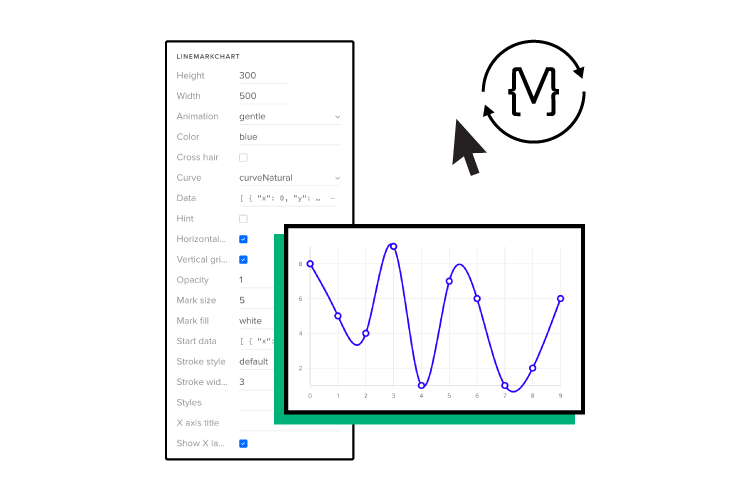
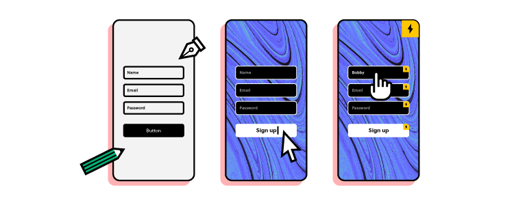
Build high-fidelity prototypes that deliver accurate results during usability testing. Learn what your end-users value most and prioritize web content to increase scannability. Sign up for a free trial to discover advanced prototyping with UXPin.

Table of contents
What is Website Scannability?
Website scannability describes how easily users can find content by scanning a web page. UX designers use subheadings, white space, bulleted lists, and visual hierarchy to help users find what they need faster.
For example, we use a table of contents and subheadings to make this article more scannable. Our blog generally attracts people interested in product design, so we use eye-catching CTAs to try our design tool for free.
Why is scannability important for web design?
Users are spoilt for choice on the Internet. If your website doesn’t solve their problem, they’ll find one that does! Often you might have the answer users need, but a poor user experience and cluttered user interfaces force them to find a better alternative.
Designers must optimize web design for a user’s attention rather than beautiful look and feel. People want to scan web pages to find what they need and exit.
Nielsen Norman Group research found that “79 percent of our test users always scanned any new page they came across; only 16 percent read word-by-word.”
In another NN Group study, “Users often leave Web pages in 10–20 seconds, but pages with a clear value proposition can hold people’s attention for much longer. To gain several minutes of user attention, you must clearly communicate your value proposition within 10 seconds.”
Your website must not only provide users with the features and content they need but present it in a way that it’s quick to digest and take action if necessary. If you don’t deliver this user experience, a competitor will!
Scanning Patterns–How Users Scan Web Pages
The NN Group’s famous 2009 Eyetracking Web Usability study identified several scanning patterns people use to scan web pages.
- F-pattern
- Spotted pattern
- Layer-cake pattern
- Commitment pattern
- Zigzag pattern
- Exhaustive review
F-Pattern
The F-pattern is the most common scanning pattern, especially for articles or pages with lots of text. Users scan the first few paragraphs from left to right (or opposite for right-to-left languages) and then the beginning of each line as they scroll down the page, occasionally reading a heading or sentence/paragraph of interest–creating an F shape.
To grab these “f-pattern” users, including a summary or table of contents at the top of the page will grab their attention and entice them to read further, increasing the likelihood of action (purchase, lead, etc.).
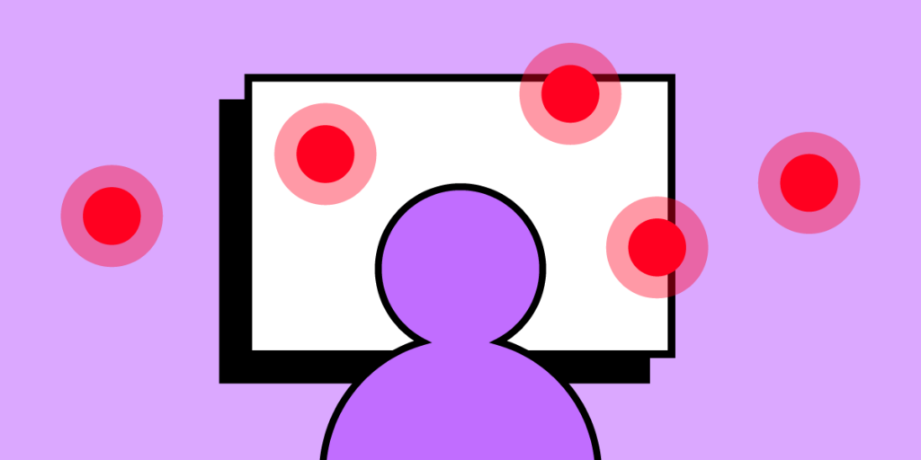
Spotted pattern
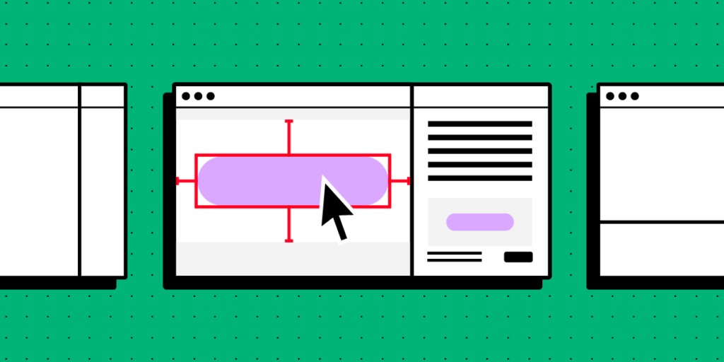
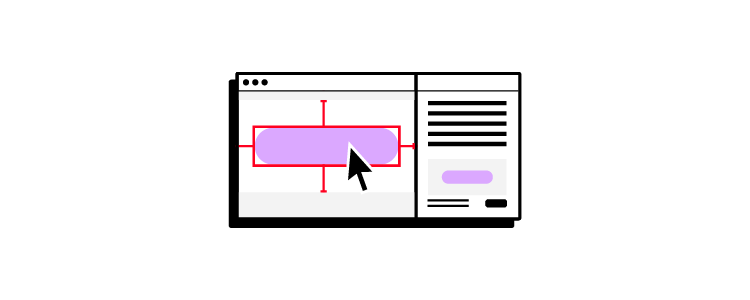
Users adopt a spotted pattern when searching for something specific–for example, a word, heading, address, or date. Different content types and formats can also influence spotted pattern scanning, like bulleted lists, styling (bold, italics), prominent CTAs, typography, etc.
The NN Group eye-tracking study asked users to find information about an individual’s education on Wikipedia. The eye-tracking software found that users scanned around the page searching for relevant keywords, eventually focusing on the word “studies,” where they found the answer.
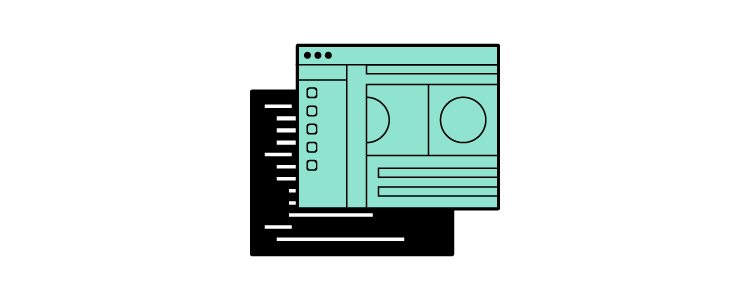
Layer-cake pattern
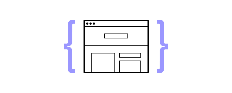
The layer-cake pattern describes how users scan a page’s headings and subheadings to find a specific body of text. For example, if someone were looking for information about layer-cake patterns on this page, their eyes would jump from heading to heading, locate this subheading and read the content below.
Commitment pattern
The commitment pattern describes users who read every word on a page rather than scanning. They usually trust the source, are highly interested in the topic, or need detailed instructions (recipes, directions, documentation, etc.).
Zigzag pattern
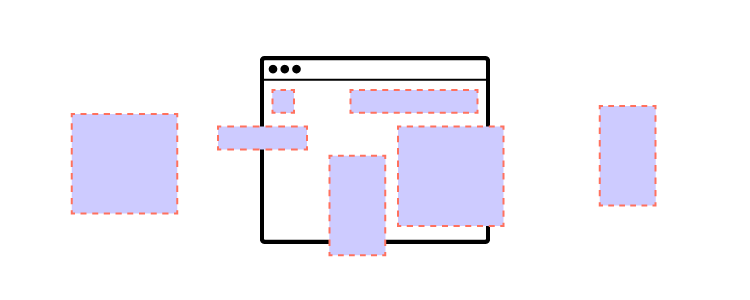
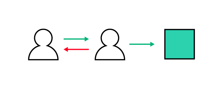
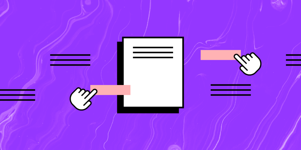
Users digest two-column layouts using a zigzag pattern. Many websites use these designs to describe their services or how a product works. Designers typically place text in one column and an accompanying image in the next in two styles:
- Alternating layout: images and text alternate from left to right for each row
- Aligned layout: images and text appear in one column (either left or right)
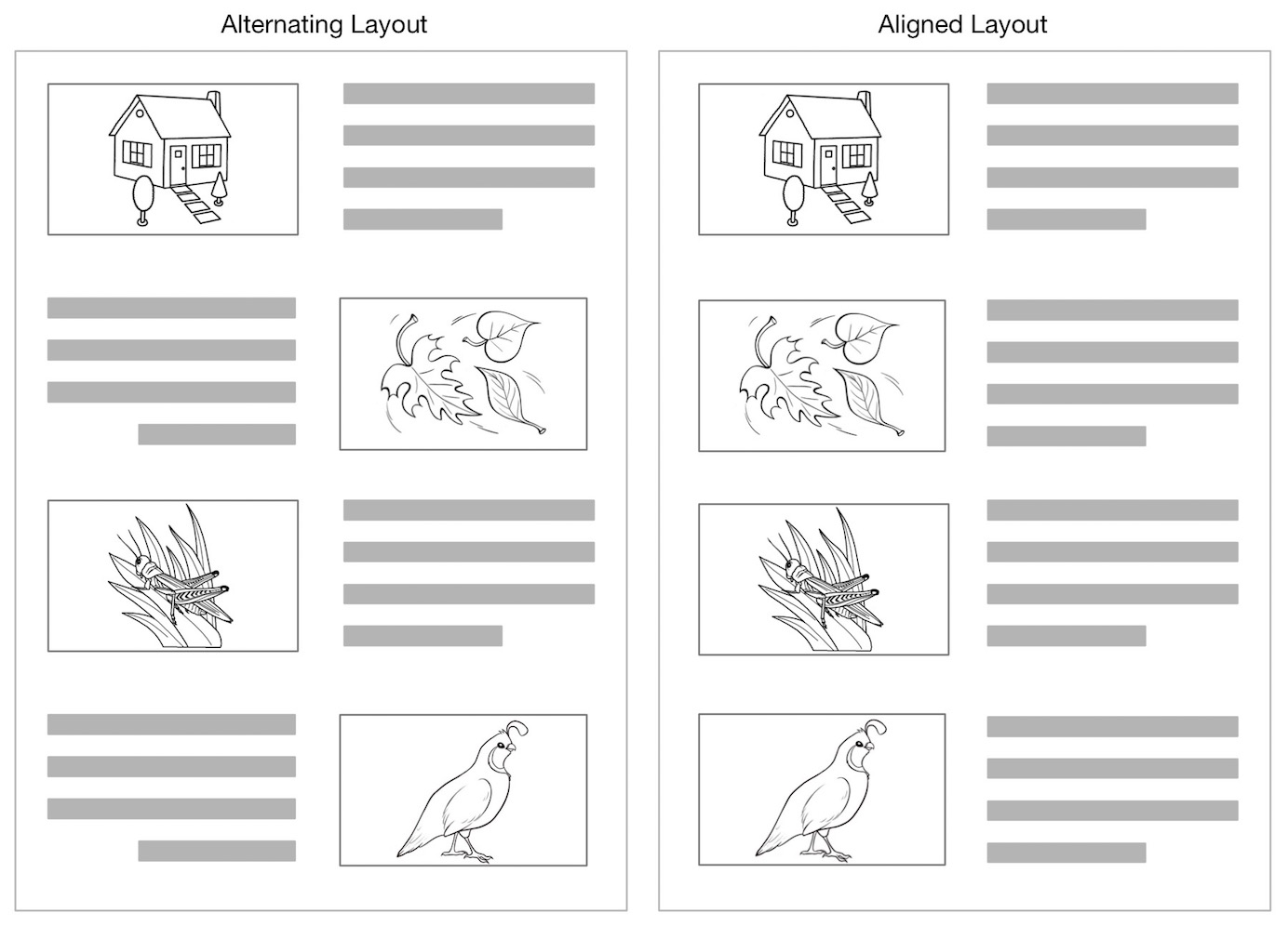
An NN Group study found that “an alternating list layout caused users to stumble.” Conversely, “users scanned efficiently on pages where text and imagery were vertically aligned.”
While the alternating list might keep things interesting, it’s probably not a good option for complex topics or if you’re creating content for users with cognitive disabilities.
Exhaustive review
An exhaustive review describes users who repeatedly scan the same page or content, looking for something–for example, scanning up and down a product’s documentation repeatedly, unable to find an answer to your problem.
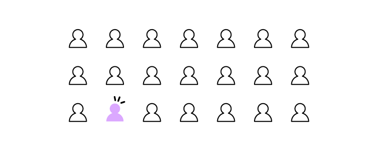
But this pattern has some nuances. The exhaustive review may indicate heightened interest. Users interested in something will fixate on it over and over–like an outfit on Pinterest or a dream destination on Instagram.
Users also adopt an exhaustive review of landing pages or high-cost products to decide if the item will solve their problem adequately. They may read parts of the page, returning to specific texts to ensure they make the right decision.
How to Make Websites and Pages Scannable
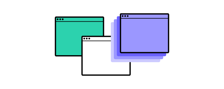
Visual hierarchy
UX designers use visual hierarchy to attract attention to important content through:
- Size: using larger text, images, buttons, etc., to differentiate from similar UI elements
- Gestalt principles: how UI elements appear related through proximity, similarity, symmetry, etc.
- Color: using a specific color or contrast only for important content immediately attracts attention
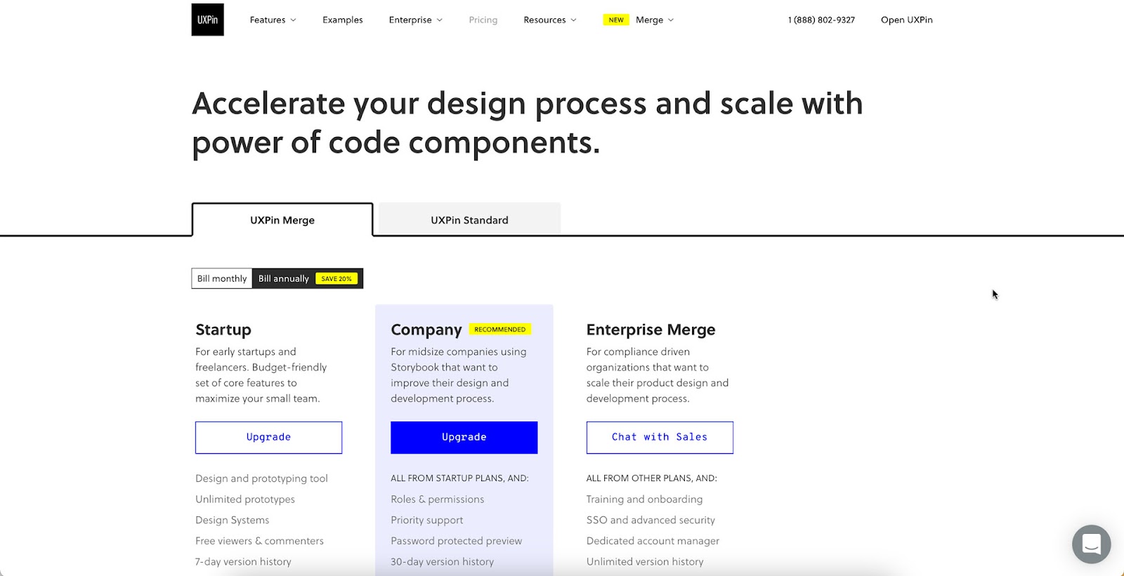
For example, our pricing page highlights UXPin Merge’s bestselling plan for companies using a color hierarchy.
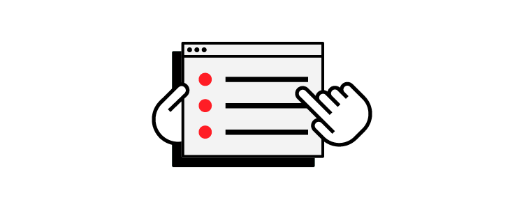
Limit choice
Pages with too many options take longer to scan and digest. If you’re trying to get users to take a specific action, limiting their choices will help them focus and decide.
Negative space
Negative space (whitespace) creates separation to make pages more scannable, but designers can also use it to attract attention. We use ample whitespace around our homepage feature boxes, headings, and text, making the content easier to read and digest.
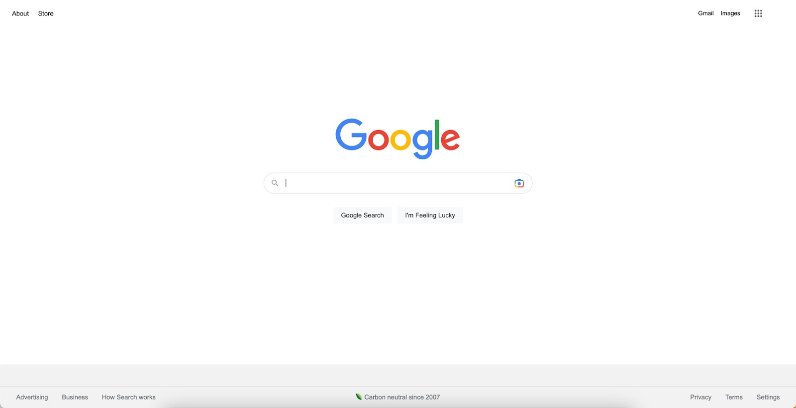
Google’s homepage uses a more extreme negative space design to draw attention to most users’ primary reasons for visiting the page, search!
Headings and subheadings
Headings (h2 elements) create an anchor for a specific topic–in this case, How to Make Websites and Pages Scannable–while subheadings represent sub-topics or provide context, i.e., Headings and subheadings. Users can scan pages easier and only read content relevant to their needs.
Pairing these headings with a table of contents at the top of the page enables users to locate content faster.
Short paragraphs over blocks of text
Blocks of text (walls of text) are difficult to read on screens. Search engine optimization (SEO) experts Brain Dean from Backlinko and Neil Patel advocate using short paragraphs (usually one or two sentences) to optimize for readability and scannability.
Notice how we use short sentences and paragraphs in this blog post. We also create space between paragraphs, headings, and other content to make text, making the page more scannable while increasing text legibility.
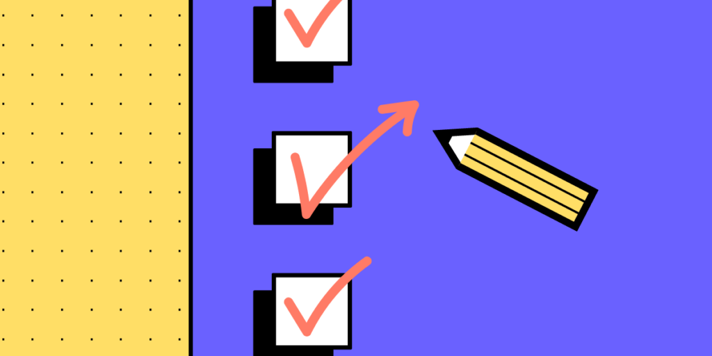
Bulleted lists
If you’re making more than two points, using a bulleted list is easier to scan and digest than a paragraph. For example, under the subheading “Visual hierarchy” above, we used a bulleted list for size, Gestalt principles, and color. If we had to write this as a paragraph, we’d have to increase the word count, making it more difficult to scan and read.
Typography
Designers often use different typography for headings and body text. This differentiation creates visual anchors for users to scan a page much faster. Font weights, sizing, and color are also effective.
Prominent Call-To-Action (CTAs)
Users often visit web pages to complete a specific task, like contacting a business, completing an application, or buying a product. Prominent CTAs draw attention, so users save time searching for specific information and get persuaded to complete the task.
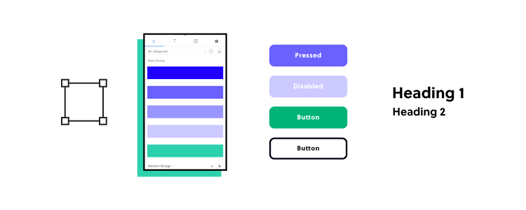
Design Better User Experiences With UXPin
Prototyping and testing are the core of user experience design. Designers learn from testing designs with their target audience, iterating until they find a solution that meets their needs.
Unfortunately, most image-based design tools don’t offer prototyping features that allow accurate testing. Designers must rely on external platforms or UX engineers to build prototypes–increasing time and costs!
UXPin’s advanced design tool enables UX teams to build advanced interactive prototypes that look and feel like the final product–allowing designers to identify UI pain points and opportunities during testing.
Increase your design team’s prototyping speed and capabilities with the world’s most advanced design tool. Sign up for a free trial to discover interactive design with UXPin.


