Which UX Metrics Should You Be Tracking?

User experience is often ambiguous, making it challenging to identify the right UX metrics and KPIs. Design and product teams want to know whether their solutions work while stakeholders are interested in various projects’ ROI.

Choosing the right user experience metrics and KPIs is crucial for organizations to evaluate UX successes and measure themselves against the competition. This article looks at these indicators and which ones to use for measuring various facets of the customer experience.

Increase UX value and deliver better quality digital products with the world’s most advanced user experience design tool. Discover how UXPin’s code-based design tool can enhance your product design workflows and deliver better product experiences for your customers. Sign up for a free trial.

Build advanced prototypes

Design better products with States, Variables, Auto Layout and more.

Try UXPin

Why Track UX Metrics and KPIs?

Tracking UX metrics tell design teams and stakeholders whether the org’s UX strategy is working and the success of each design project. 

User experience and usability are vital for a successful product because these metrics tell companies how satisfied people are using their products and whether design solutions fulfill their needs correctly.

Customer satisfaction is important for retention, conversions, and other marketing and sales metrics that ultimately impact the organization’s bottom line.

UX KPIs benchmark performance and track progress over time to ensure companies meet various UX goals and objectives.

Types of UX Metrics

Like any measurement framework, there are two types of UX metrics:

  • Qualitative data: Sentiment, loyalty, usability, user satisfaction, and other subjective data
  • Quantitative data: Numbers, ratios, and other measurable data

The challenge with measuring user experience is that many metrics are qualitative. Quantitative is relatively simple to analyze; numbers either go up or down. Analysts and stakeholders must treat qualitative data with greater scrutiny, as it’s easier to misinterpret or bias data (purposely or incorrectly).

Net Promoter Score (NPS)

The Net Promoter Score (NPS) is a crucial UX metric because it measures how likely customers are to recommend your product. A high NPS indicates that your product solves users’ problems and that they’re inclined to share that experience with others.

user bad good review satisfaction opinion

NPS is determined by asking whether customers are satisfied with a product or feature on a scale of one to ten (one lowest, ten highest). Companies categorize the results into three groups:

  • Promoters (scores of 9 or 10): Your most loyal customers
  • Passives (scores of 7 or 8): Satisfied customers unlikely to recommend your product
  • Detractors (scores of 0 to 6): Unhappy customers who may stop using your product and possibly discourage others

System Usability Scale (SUS)

The system usability scale (SUS) is a 10-question questionnaire that provides UX designers with a digital product’s overall usability score. SUS dates back to the 80s and is still considered a good UX metric for measuring usability.

We recommend reading this HubSpot article for a deeper understanding of SUS and how to use this important UX metric.

Customer Satisfaction Score (CSAT)

A customer satisfaction score (CSAT) measures how happy or satisfied customers are with a product or feature. You measure CSAT in a couple of ways:

  • Yes/No questions: “Did this product help you complete task X?” Produces a percentage score.
  • Scale (i.e., 1-10): “How satisfied are you with your experience today?” (including a scale from 1-10 with unsatisfied on one end and satisfied on the other). Produces an aggregate score based on the scale.
heart love like good

Time-on-Task

Time-on-task determines the average time it takes users to complete a specific task. It’s a fantastic indicator of a product’s efficiency, especially for enterprise products designed to increase productivity and performance.

Unlike CSAT, time-on-task requires no input from users. Instead, designers use analytics tools that measure and aggregate results.

Customer Effort Score (CES)

Organizations use a customer effort score (CES) to measure how easy it is for a customer to complete a task. You measure CES by asking users about their experience with a scale for their answer. 

For example:

  • Question: “How easy was it to use feature X?”
  • Scale 1-10: 1 = Very difficult, 10 = Very easy

Error Rate

Error rates indicate how often a product or feature prevents someone from completing a task. System error rates are critical UX metrics because they can deter customers from using or recommending a product.

We represent error rates as a percentage with the goal of keeping them as low as possible. A high error rate indicates a significant usability issue designers must investigate and fix immediately.

Completion Rate

A completion rate (or task success rate) tells you how many times people complete a task. Completion rates are excellent indicators of a broader problem, like bugs or usability issues. If the completion rate suddenly drops, there may be a system error or usability issue resulting from a new release.

testing user behavior

Many factors impact completion rates, so product teams can monitor this metric as an indicator that something has gone wrong.

Engagement

Engagement is another indicator of customer satisfaction and enjoyment. It tells organizations how often customers use and interact with a product. UX designers must combine several metrics to determine user engagement. For example (these will differ depending on the product):

  • How long do users use the product?
  • The number of pageviews.
  • How much scrolling do they do?
  • Do they engage with content and other users?
  • The number of tasks they complete while using the product.

Each product and organization will have different methodologies and metrics for measuring engagement.

Conversion Rates

Conversion rates are crucial as they determine the percentage of conversions for completing forms, sales, signups, transactions, and other business metrics.

Designers must pay careful attention to this business metric because design decisions can have positive and negative outcomes for conversions.

How to Track UX Metrics and KPIs

There are several tools and techniques for tracking UX metrics and KPIs. This step-by-step process provides a brief outline of how to track and measure performance.

Step One – Defining Benchmarks

Benchmarks are a point of reference, usually a starting point for organizations to measure performance for both qualitative and quantitative metrics. Defining benchmarks is crucial for measuring UX metrics because they determine whether something has improved or deteriorated.

For example, time-on-task is a common quantitative UX metric used to determine how long it takes users to complete a specific goal, like purchasing a product. UX designers would have to benchmark how long it takes to buy a product at the start of a project to determine whether they’ve improved on that metric or not after release.

Step Two – Set Goals and Key Performance Indicators

  • Goals: What the organization what’s to achieve
  • KPIs (Key Performance Indicators): The milestones organizations use to track performance toward goals

Setting goals gives design teams a target for improvement. Organizations typically set a big long-term goal with multiple KPIs to measure performance.

scaling process up 1

For example, the Net Promoter Score (NPS) measures how likely customers are to recommend your product, usually measured from 0-10, with ten being the most likely. The product’s current NPS is six, and stakeholders want a 50% increase to nine or higher in 12 months with a 12.5% increase every quarter.

  • Benchmark: 6
  • Goal: 9
  • Four Quarterly KPIs: 0.75-point increase each quarter

Step Three – Measuring Performance

With goals and KPIs in place, teams must use various analytical software and techniques to measure performance. Some examples of this software include:

  • Hotjar: Hotjar is a fantastic qualitative measurement tool with screen recorders and heatmaps to monitor user behavior. Hotjar also includes a quick survey tool for websites and mobile apps to measure various UX metrics.
  • Baremetrics: Baremetrics measures more quantitative data like churn rates, conversions, revenue, and other numerical data.
  • Google Analytics: Google’s free analytics tool for tracking users, including flows, time-on-task, conversions, etc.
  • Optimizely: An A/B testing tool to compare performance between two designs.

Step Four – Reporting UX Metrics

Reporting UX metrics allows design teams and stakeholders to track performance toward long-term goals and measure the success of each design project.

A UX metric report generally displays four key data points (usually on a graph or graphic):

  • Benchmark or starting reference
  • Target KPI
  • Performance against KPI
  • Desired goal

UX reporting must be succinct and transparent. UX designers must include references for gathering and analyzing the data so that team members and stakeholders can check their findings.

Step Five – Acting on UX Metrics

Design teams must have actionable plans to respond to KPIs. For example, what happens if performance deteriorates or you don’t meet a specific KPI?

UX metrics aren’t a framework for collecting data; they’re supposed to provide UX designers with indicators to iterate and improve–for users and the organization.

Improving Product Performance With UXPin

Creating a helpful, enjoyable, and engaging user experience that fulfills customers’ needs is a goal every UX designer strives to achieve. Designing a great user experience starts with using the right tools.

UXPin’s code-based design tool empowers UX teams to build accurate prototypes to test and identify usability and accessibility issues. Solving these issues before release is crucial for meeting an organization’s UX strategy and goals.

uxpin collaboration comment mobile design

Unlike image-based prototypes that render vector graphics, UXPin generates HTML, CSS, and Javascript, enabling designers to replicate a coded product’s functionality and fidelity accurately.

UXPin also empowers UX designers to address usability and accessibility issues with fast prototyping to find a solution. Whether you use your own design system or a built-in design library, UX designers simply drag and drop components to build quick prototypes for usability testing.

Not only is it faster to prototype using UXPin, but UX designers also enjoy higher fidelity and functionality, providing meaningful, actionable results from usability participants and stakeholders.

Improve your product’s user experience and streamline UX workflows with the world’s most advanced design, prototyping, and testing tool. Sign up for a free trial to experience UXPin’s code-based design features.

DesignOps Strategy – How to Grow the Design Operations Team?

DesignOps Strategy How to Grow the Team

DesignOps has become a crucial operational function for many organizations. Some companies still operate without a dedicated DesignOps practitioner or team, working around bottlenecks and inefficiencies.

According to a 2020 NN Group survey of 557 UX practitioners, “organizations only did 22% of recommended DesignOps efforts, did not have DesignOps-dedicated roles, and had low DesignOps maturity overall.” 

This article explores four stages of DesignOps maturity and the goals you should set at each stage to scale and grow your team.

Are you still using outdated image-based design tools? Join UXPin’s code-based design revolution with advanced Merge technology syncing design and development with a single source of truth that’s fully interactive and reusable.

Stage 0: Nobody is Responsible for DesignOps

For products with small-cross functional teams working together, the motivation for DesignOps is low. Something the NN group calls a “Scattered Team Structure.”

Product managers, design leads, and managers are responsible for various operational activities–hence the Ops work is “scattered” among team members. At his Design Value Conference 2022 talk, Omkar Chandgadkar, Senior UX Designer at Amazon, called this stage Designing a plane while flying it because UX teams operate reactively or tactically rather than strategically.

This was true during the early days of Airbnb, where product teams consisting of designers and engineers worked closely in the same office, interacting and engaging throughout the day. They worked closely and solved operational challenges together, an “all hands on deck” growth strategy. 

But Airbnb’s success and growth meant teams separated, and silos emerged–a common problem among fast-growing startups and enterprise organizations.

“…we reached a tipping point where things suddenly became harder. Teams could no longer all fit on the same floor… Access to information, design standards, workstream collisions, and quality issues all became very real problems.” Excerpt from Adrian Cleave’s DesignOps at Airbnb article.

At this stage, Airbnb developed its Design Language System, and DesignOps was born.

Key DesignOps Stage Zero Resources

Stage 1: DesignOps team of One

The first stage of DesignOps is what the NN Group calls the “Solitary Team Structure.” DesignOps becomes a team of one dedicated full-time to the role. As Salomé Mortazavi, Director of DesignOps at SiriusXM, points out in her Design Value Conference 2022 talk, “70% of DesignOps departments are a team of one.”

When starting as a DesignOps team of one, Salomé recommends practitioners begin by listening and taking notes. Get to know the people, space, processes, etc.,–in group and one-on-one environments.

This listening approach will expose the company’s organizational and systemic problems. The DesignOps practitioner also builds trust with teams and stakeholders because they can identify and articulate the organization’s issues.

The goal for DesignOps stage one is to identify bottlenecks and issues and prioritize fixes accordingly. Salomé uses a Design Maturity Index to identify issues and themes. Some of these DesignOps must be solved, while others will fall on design leadership.

Key DesignOps Stage One Resources

DesignOps Stage 2: Hiring DPMs

Once a practitioner has a few successes and the organization sees value in scaling DesignOps, it’s time to start building your team. NN Group defines this as the “Specialized” DesignOps stage because the practitioner identifies the need for a dedicated team member in specialized areas.

Design program managers (DPMs) are often the first hires when building a DesignOps team. These DPMs might work alongside teams to streamline day-to-day workflows or focus on specific areas like onboarding, tool curation, licensing, etc.

While DesignOps has an impact and solves problems, stage two is still very tactical rather than strategic. The DesignOps team is effective for solving problems and developing short-term solutions, but they don’t have a roadmap or spend little time on long-term goals.

Key DesignOps Stage Two resources

Stage 3: Scaling DesignOps

A mature DesignOps team operates under a “Distributed” or “Elevated” structure according to the NN Group’s DesignOps Team Structures. DesignOps leans towards strategic operations with roadmaps, long-term goals, and monitoring project trajectories in these mature structures.

There’s a dedicated DesignOps leader who is inward-looking and process-oriented. In Measuring DesignOps Impact, Associate Design Operations Director at Babylon, Patrizia Bertini summarizes the DesignOps Leader role in five bullet points:

  • Mission: the How / the performance
  • Focus: End-to-end design process & teams
  • KPIs: Team health, spending, & performance metrics
  • Deliverables: Ops roadmap & strategy
  • Skills: Change management

And the Design Program Manager’s using the same five points:

  • Mission: Execute Ops roadmap
  • Focus: Align processes to execute
  • KPIs: Program metrics
  • Deliverables: Blueprints, project status
  • Skills: Process & project management

Patrizia Bertini defines three DesignOps areas for intervention:

  • Business operations: Managing budgets, resources, and other business-related design functions.
  • Workflow and design operations: A holistic view of the end-to-end design process. How do designers get from concept to final product?
  • People operations: Considers the human aspect of design teams, like skills development, communication, and culture.

You can watch the webinar about measuring DesignOps on UXPin’s YouTube channel.

Scaling DPMs in a Mature DesignOps Environment

DPMs use frameworks to apply either tactical or strategic strategies for projects. In DesignOps Layers of Impact, Maggie Dieringer uses a “framing and scaling” methodology to determine:

  • Where is your time best spent?
  • How do you ensure that you’re having the most impact with that time?

Rather than looking for the “right” to do something, Maggie’s framework identifies where DPMs can have the most impact through three framing factors:

  • What’s the size of the design team and the state of the organization?
  • What type of resourcing and allocation environment are we operating in?
  • What level is my primary design partner?

Once Maggie has the answer to these framing factors, she looks at increasing her impact depending on a spectrum of engagement with zoomed-in on one end and zoomed-out on the other:

  • Zoomed-in: Working with teams on day-to-day tasks
  • Zoomed-out: Advocating, strategy, and planning

Maggie outlines a support DPM trajectory based on her framing factors and level of impact by answering five questions:

  1. Which activities and environments bring me job fulfillment day-to-day?
  2. Which activities will have the most impact and influence right NOW on the team I support?
  3. How can I leverage my partner to work on the things that are important to my career?
  4. How can I use my team size to influence the desired behavior and engagement?
  5. Do I thrive doing tactical or strategic activities (or both)?

She also considers:

  • Where are you today?
  • Where do you want to be?
  • Where does your team want to be?

Key DesignOps Stage Three Resources

Scaling and Maturing DesignOps With UXPin Merge

As a DesignOps team of one, your time and resources are limited. As you mature, you want to focus on high-level strategies and long-term goals. Ensuring design teams have the tools to grow and scale is crucial for every DesignOps team.

UXPin Merge solves many DesignOps challenges, giving practitioners and DPMs the time to focus on strategic initiatives and creating value. With this technology, you can use your dev’s component library in your design process.

It speeds up prototyping, design handoff and product development. Request access to UXPin Merge and start prototyping with interactive UI elements that are a single source of truth between design and development.

Mobile Design Systems – Tips and Examples

Many digital products only exist on mobile, but they often adapt web component libraries for native mobile apps. According to a Clarity 2020 talk, “less than 10% of public design systems support platforms other than the web?”

Unlike web-based design systems, mobile design systems must adapt to native operating systems and platform-specific UI patterns.

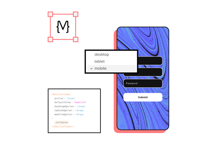
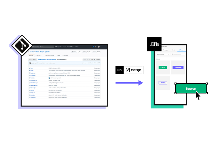
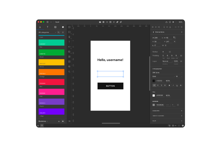
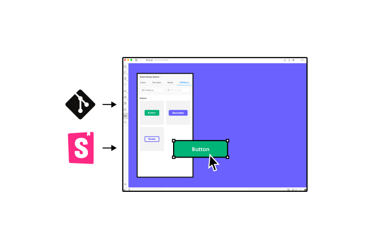
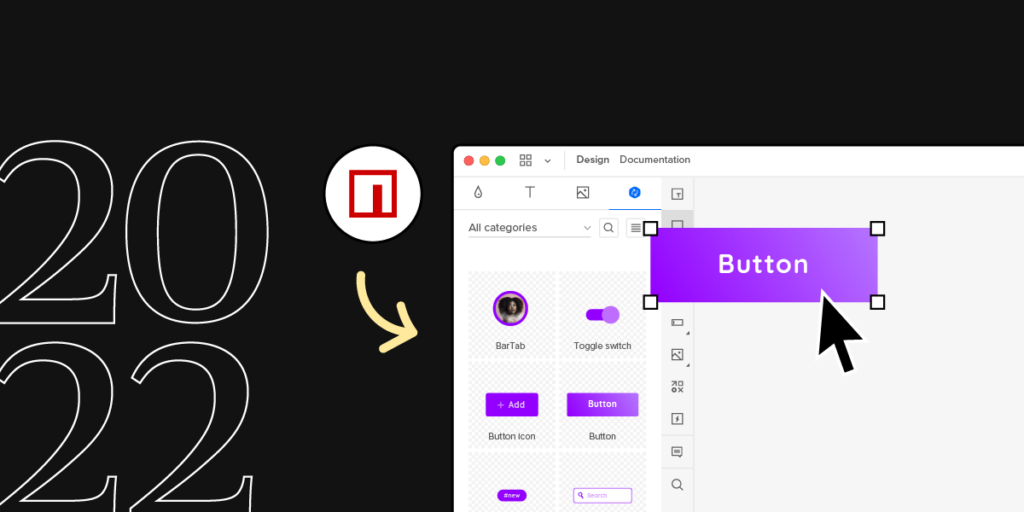
What if you could sync the code components from a mobile design system and use them in design? UXPin’s Merge technology allows you to bring coded UI components to UXPin’s design editor and use them to build functional prototypes. Reach the new heights of consistency. Request access to UXPin Merge.

Reach a new level of prototyping

Design with interactive components coming from your team’s design system.

The Importance of a Mobile Design System

Many design systems include responsive components, which are great for web app usage but might not be suitable for native mobile applications. For example, UI elements like alerts, snackbars, date pickers, etc., render differently on iOS vs. Android native applications.

It’s not unusual for an Android app to use a floating action button (FOB), whereas this component doesn’t exist on iOS, which may confuse Apple users.

So, a responsive design system alone isn’t enough when designing a native user experience. UX designers must create a mobile design system that adheres to platform-specific policies, guidelines, UI patterns, best practices, and constraints.

Maintaining Cohesion and Consistency

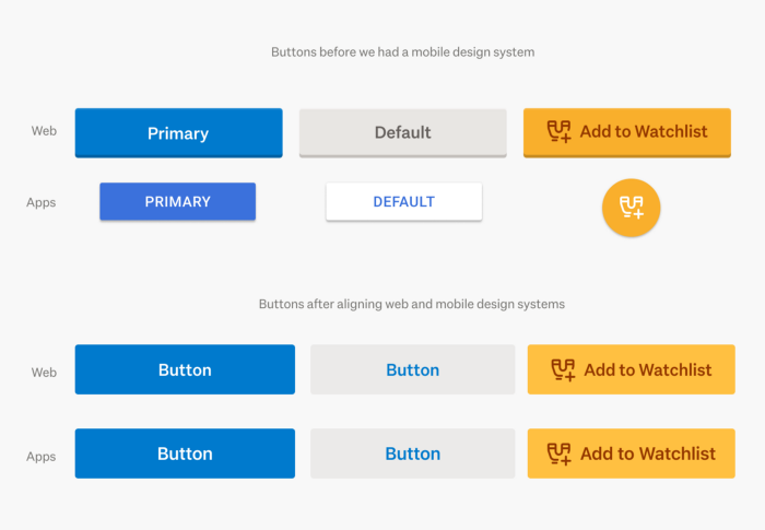
One of the most significant benefits of a design system is cohesion and consistency. Teams deliver projects with minimal design drift and errors when everyone uses the same component library.

Native applications can disrupt this cohesion and consistency by rendering shapes, sizes, colors, and other UI elements differently to the design system’s guidelines.

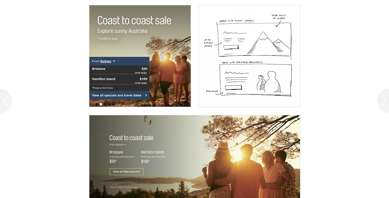
A great example of this inconsistency is how Trade Me’s component library changed after implementing a mobile design system. You will notice that the app’s buttons looked more like native buttons before implementation. The redesign helped align these components with the web component library to deliver a more consistent and cohesive cross-platform user experience.

buttons in Trade Me mobile design systems
Source

Tips for Creating a Mobile Design System

Identifying Mobile Design System Components

Building a mobile design system starts with listing your product’s components. It’s good to screenshot user interfaces from iOS and Android versions of your product to visualize your product’s aesthetics across platforms.

The aim is to identify each UI element while looking for inconsistencies. For example, you might find you have different button styles for iOS and Android, which may differ from your web component library.

Leveraging Native UI Design Patterns

Google’s Material Design and iOS Human Interface Guidelines provide comprehensive libraries of components and documentation for building respective native applications.

UX designers can use this documentation as a foundation to guide design decisions to deliver a familiar user experience. For example, how can designers leverage a feature like Android’s FOB to enhance the product and user experience? And how will that component look in the product’s design system?

Component Library Theming

If you’re building a mobile design system from scratch, adapting an open-source component library is an excellent strategy for developing and scaling fast.

UX designers can leverage expertly designed component libraries thoroughly tested for usability and accessibility to focus on building and scaling their products instead of creating everything from scratch.

Open-source mobile React libraries like MUI, Ant Design Mobile, NativeBase, and UI Kitten provide themeable components UX designers can adapt to meet brand and product specifications.

Bottom-Up Designing With Atomic Design

Using Brad Frost’s Atomic Design principles gives designers a bottom-up approach to designing elements, components, and UI patterns. The idea is to start from the smallest elements, or atoms, and scale your designs to complete pages.

Applying Atomic Design practices enables designers to create a solid foundation of reusable components to develop and scale a design system. This Atomic approach also encourages the DS team to reuse the same building blocks (“atoms,” “molecules,” and “organisms”) for designing new UIs rather than creating new parts from scratch–thus keeping the design system lean and efficient.

5 Great Examples of Mobile Design Systems

These five high-quality open-source mobile design systems offer comprehensive libraries of themeable components for developing native and cross-platform applications.

We’ve chosen these five because they provide clear design language, UI kits, and component libraries, so designers and engineers can collaborate using the same UI elements. These examples offer dark/light themes, accessibility features, and adaptive designs for multi-platform product development.

You can customize these mobile design systems to meet brand and product requirements or use the component libraries as inspiration for building your design system from scratch.

NativeBase

mobile design system nativebase

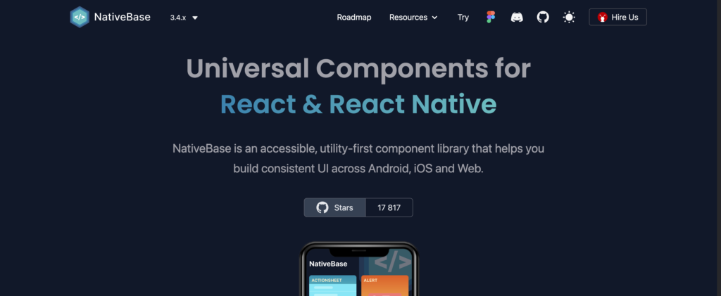
NativeBase is a cross-platform React toolkit for developing iOS, Android, and web applications. The themeable component library makes it easy to change the global color palette, type scale, font stacks, breakpoints, spacing, border-radius values, and more.

NativeBase is fully accessible using React Native Aria, “React Hooks to build accessible React Native design systems,” giving design and engineering teams a solid foundation for building accessible products.

NativeBase includes a component library for engineers and a matching UI kit for designers. The library provides comprehensive documentation for usage, best practices, theming, and templates for building mobile applications.

UI Kitten

UI Kitten mobile design system

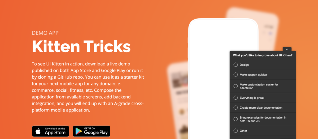
UI Kitten is a React Native UI library version of the Eva Design System. Designers can use UI Kitten and Eva to develop multi-platform applications for any device. The comprehensive UI ecosystem includes Eva Icons with over 480 commonly-used icons to complement its UI components.

Eva and UI Kitten are highly customizable, with features designed specifically for enterprise design. UI Kitten provides documentation for implementing the design system for new and existing products, with comprehensive step-by-step getting started guides.

Material Design System

Material Design Mobile Design System

Google’s Material Design System is one of the largest and most comprehensive design systems in the world. In 2022, Google released Material Design 3, which includes important native updates for foldable devices and Android 12. 

Even though Material is a Google/Android product, the design system includes a library of iOS-specific native components, so designers can easily build cross-platform applications.

Material Design is highly customizable with theming for color, typography, dark/light mode, shapes, spacing, and more. Designers also have over 2,500 Material Symbols (icons) in three styles to complement their designs accordingly.

UXPin includes Material Design’s UI kit and MUI’s React component library built-in–no additional plugins, extensions, or uploads are required. Sign up for a free trial to use these component libraries to develop your mobile design system today.

Ant Design Mobile

ant design mobile system

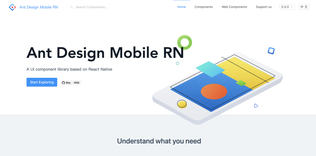
Ant Design Mobile is an open-source design system used by many Chinese-based organizations, including Alipay, Koubei, and Taobao, to name a few.

The comprehensive design system includes native mobile and web component libraries to build multi-platform digital products. Ant provides platform-specific UI patterns for Android and iOS, so designers simply drag and drop to start prototyping and testing.

Ant Mobile Design offers UI kits for popular design tools and component libraries for React, Vue, and Angular, making it one of the most versatile design systems worldwide.

REI Cedar

rei cedar design system

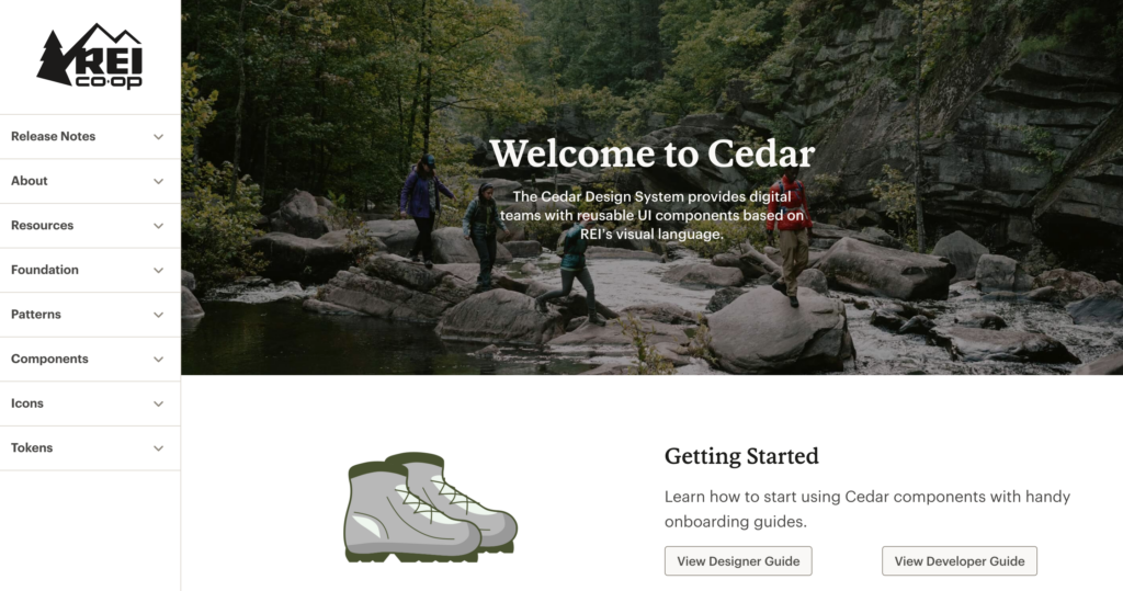
REI’s Cedar is a cross-platform design system with platform-specific (Android, iOS, web, etc.) components and patterns. Cedar’s excellent documentation includes resources for designers and developers with CodeSandbox examples of every element.

Cedar includes guidelines, behavior, best practices, dos and don’ts, and accessibility recommendations below every component and UI pattern. The UI kit and component library use design tokens to customize color, sizing, spacing, motion, forms, breakpoints, typography, and more.

Bonus – More Cross-Platform Design Systems

We highly recommend checking out these design systems for inspiration and guidance when developing your own design system. 

These design systems are for creating products on the respective platforms rather than building standalone applications, but it’s helpful to see how these organizations use components, write documentation, etc.

Building, Managing, Scaling, and Sharing Mobile Design Systems in UXPin

UXPin offers a solution no matter where you are in design system maturity. You can create your own design system from scratch or import an established code-based component library using our Merge technology.

Building a Design System From Scratch

Designers can use UXPin’s built-in design system feature to build a design system from scratch. UXPin automatically segments the system into Colors, Typography, Assets, and Components, with the option to add descriptions for documentation.

The design system team can set permissions for the design system and its components to prevent unauthorized changes. They can also share the design system with team members, external collaborators, and stakeholders–even if they don’t have an active UXPin account.

Engineers can use the design system’s style guide to create theme tokens for development to streamline future design handoffs.

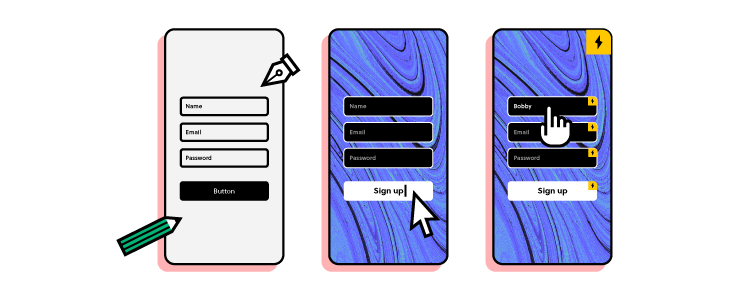
Merge Design and Development

Use UI coded components from your design system as a single source of truth. Request access to UXPin Merge. Merge syncs code components from a repository to UXPin’s editor, so designers and engineers use the same design system.

Using the same component library means designers and engineers work within the same constraints, thus streamlining design handoffs and product development workflows.

With standardized, approved components, engineers no longer have to interpret design files, prototypes, and documentation; they simply copy/paste from the repository and any UXPin changes to begin the development process.

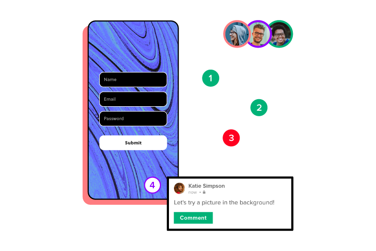
Designers can use code components to build fully functioning prototypes that enhance usability testing with meaningful, actionable results from end-users. Merge also improves feedback from stakeholders who can use and interact with prototypes as they would using the final product. Request access to UXPin Merge.

7 Best Practices Worth Including in Your App Design Strategy

7 best practices worth including in your app design strategy

Why does Twitter chime with users? What is it about Amazon that keeps us all coming back for more? 

Awesome mobile app design ideas don’t just happen. That first, exciting spark of inspiration might be lightning fast. But building that out into a tangible product that users love demands a strong mobile app design strategy. 

If you want your app to take off, there are certain ‘best practices’ that are absolutely worth adding to your existing strategy. If you’re already doing some of these, you may also find it useful to look at where improvements can be made. 

Make sure these seven best practices are built into your app design strategy from the start – they’re core to the design process, not an afterthought or a nice-to-have. This will ensure you’re building the most successful app you can. 

Creating an App Design Strategy – 7 Best Practices to Follow

1. Know your target audience inside out

Good mobile app design revolves around the user. If you can’t point to any element of the design process and answer ‘what’s in it for the user?’, then it needs reworking or rethinking. 

And the only way to build a user-centric app is to gain a deep understanding of your target audience. Everything, like a profiler. Who are they? What do they want? Why do they like your competitor? What don’t they like?

You can apply the following methods to learn about your potential users: 

  • Competitive analysis. Identify which apps you’re up against (and make tons and tons of notes and actionable insights based on your research). It’s a crowded market, so you may find it easier to limit this to the top three-to-five competitors. Use software and product reviews sites to get a feel for what users like and dislike about them. It’ll breed app design ideas that hit the mark.
  • Social media. Social media platforms offer a good insight into how the competition positions its brand. That helps you understand audience preferences and what really matters to them. Most importantly, it reveals how users engage with your rivals. Those findings can totally redefine your app design strategy.
  • Surveys, interviews, and focus groups. Get it straight from the horse’s mouth. There’s no better way to really get inside the heads and hearts of potential users than by directly talking to them. A mix of surveys, face-to-face and phone interviews, and focus groups helps glean. Some, for example, might feel like they’re on the spot during a sit-down chat. So, they give the answers they think you want to hear – not their true thoughts and feelings. 

2. Define your app design idea

What does your app do? Not generally. Not vaguely. This isn’t a single-sentence elevator pitch. Your app’s objective needs to be specific. Because if it’s not, the app development becomes a resource drain. 

Clearly defined app design ideas keep everyone on the same page. Each member of the design and development team knows what they’re creating – and how their roles fit into realizing that concept. 

As a base requirement, you should know:

  • What is the purpose of this app design idea? 
  • Who are you building it for?
  • How will people use it?
  • Why should they choose your app over another? 
  • What resources are needed? 
  • How will you measure success? 

3. Figure out your budget

Early on in the process, set a budget for developing your mobile app. This is a good way to avoid mission creep – the ‘art’ of adding more and more features to a product, resulting in spiraling development costs and, in many cases, failure. Your budget will help you decide which features you want to add (and which can be dropped or returned to at a later date). 

Align the budget to a project timeline with objective-based milestones. It’ll help you keep finances on track. 

Laying out a budget determines not just what you’re going to develop, but how you’re going to develop it. For instance, you might find it best to build a whole new team from scratch, if you’re a start-up. Or grow an existing team. Or use a specialized tech partner – these companies act as an experienced, external in-house team without the risks that come from the wholesale outsourcing of your app design idea. 

4. Learn how to activate users (making sure they stick around)

Long before your user downloads your app, you should have a pretty good idea of how you’re going to keep them around. What is it about your app that will ‘activate’ users, make them want to open it every day and spend time there rather than in another app? 

Part of this goes back to understanding the target audience and defining your mobile app design ideas. Let’s say your users are looking for snackable 10-minute sessions in an app they check out while they’re on the go. Your design, content, and experience will be totally different from an app that’s built for users who want to spend hours browsing products. Because if it isn’t, users probably won’t come back.

Amazon offers a masterclass in activating its users. Its app is consistently popular because it’s built for mobile use. And it does exactly what the user wants: makes it really simple to shop for a range of items. 

Meanwhile, Twitter is ready-made for bitesize chunks of content that can be consumed quickly in sharp bursts of time like waiting for the bus (or even for hours, if you get lost doom-scrolling). More recently, Wordle did the same in the gaming app sphere. Users just couldn’t get enough of it. Boom. Activation activated! 

Wordle game is one of the successful app right now
Source: XDA Developers 

Focus on that one thing that activates your users. 

5. Agree on KPIs

You’ll often hear the words ‘what does success look like?’ thrown about in pitch meetings. And, ok, it’s a pretty ugly, business-y phrase that no one in the real world would ever dream of using. But it’s still an important conversation to have. You can’t know if your app’s achieving its objectives if you haven’t really set any. 

For this reason, you want to set out key performance indicators (KPIs). These are the metrics against which you’ll measure your app design idea. And there are a bunch you could potentially use. Heaps and reams of data to parse. 

Instead of reviewing them all, choose a few metrics that are best aligned with your vision and your goal. These include: 

  • The number of downloads – Do users like your product enough to install it? What needs to change to boost this? 
  • Monthly active users – Does your user base stick around and check in regularly? If not, why not?
  • Daily active users – What makes your most engaged users log in every day? 
  • Churn – How many users are leaving or uninstalling or ignoring your app? What is it about the experience that’s driving them away?
  • Session count and time – How many users keep your app open and active and for how long? Why? 

6. Choose the right mobile app design tool stack

Bringing concepts to life is often easier said than done. For many, this can be a seriously frustrating part of the design process. After all, you’ve got a picture in your head. Somehow, that needs to be communicated to the team, who can then execute it. 

 The trick is to deploy the right tools to the right teams to make that vision a reality. So, make choosing the right tool stack a key part of your app design strategy. 

Your designers and developers will have preferences. Those need to be taken into account (they’ll hopefully be masters at using them, giving them the confidence, experience, and knowledge to build a better product. But you should also consider how well those tools play with other software. If they don’t properly integrate into your existing software, or require slow, clunky workarounds to get them talking to each other, they may not be the right choice. 

UXPin is one of those tools that helps create a seamless workflow – a start-to-finish-and-beyond-type tool that lets designers begin the creative work from building lo-fi wireframes to crafting hi-fi, pixel-perfect prototypes of your mobile app. 

This ‘concept art’ uses the same real-life code components your developers use to actually build the final product. So, they don’t need expert coding skills to make a design that works how intended – and can continue being worked on post-launch without hand-offs that go back-and-forth endlessly between teams. And because it’s important that your team feels comfortable mastering UXPin, it integrates with other popular design and dev tools like Sketch, Slack, and Jira.

7. Implementing a feedback & improvement design process

‘Continuous refinement’ is the real buzzword when developing your mobile app design ideas. It’s as much a mindset as it is part of your overall process. A way of thinking that constantly questions, ‘how can we make things better for our users?’. 

To make ongoing improvements that actually matter, introduce a feedback loop. This should be a combination of comments and reviews from your users and behavioral data analysis: how do users use your app, what do they do, what don’t they do?

It’s about going back to the start – conducting interviews, focus groups, and surveys – to better understand how users respond to your app’s interface and experience. That doesn’t mean you need to act upon every comment a user makes. Who has time for that?

Instead, create a system where valuable, actionable data can help direct features and updates aligned to business objectives. It’ll simplify the design and development process – but also helps build buy-in from key stakeholders across the company. 

A strong feedback loop will help you see where refinements can be made, continuously. 

So, you’ve centered the user, championed their needs, aligned their desires and loves to your own business objectives, and used that to determine the ongoing development of your app. 

Execute Your App Design Strategy with UXPin

A winning strategy draws on all of these best practices to put all your mobile app design ideas into the hands of users. And the great thing about each of these concepts is how well they work in tandem together (just like your tool stack, right?).

You can only specifically define your app strategy by fully knowing your audience. The budget will determine where to focus your refinements. Each one integrates with the others, creating an intuitive, easily adoptable process.

Try UXPin and explore the tool that creates meaningful experiences for designers, developers, and users. 

Fintech Design – A Compilation of the Best UX Tips for Product Designers

FinTech is a challenging industry for any discipline, but especially so for UX designers. FinTech design requires designers to study financial regulations, which could differ between states and countries. These financial regulations are often detailed and extensive, meaning lots of reading before designers can even begin a project.

This article explores the basics of FinTech product design, including best practices to ensure your products are user-friendly, compliant, and provide maximum value to your customers.

Whether you’re a FinTech startup designing a cryptocurrency product or an established multinational looking to revolutionize its mobile banking app, UXPin provides a technology that allows you to design prototypes with interactive components that come from your design system. Find out more about it.

Reach a new level of prototyping

Design with interactive components coming from your team’s design system.

What is FinTech?

FinTech (Financial Technology) describes a market sector that produces financial technology products and services. These financial products include applications, APIs, or even algorithms that seek to innovate and improve the industry.

What are examples of FinTech?

Here are some FinTech examples:

Check out Insider Intelligence’s article on FinTech startups for more FinTech examples.

Fintech UX Design Challenges

idea collaboration design dev 1

1. The Challenge of Compliance

Regulatory compliance is one of the biggest FinTech design challenges. If you’re designing a product for multiple countries or a global audience, your designs might change for each market to comply with different laws.

For example, regulations like Anti-Money Laundering (AML) and Know Your Customer (KYC) have detailed protocols which impact onboarding and user flows. These regulations add extra layers of complexity relating to user identification, privacy, fraud prevention, accessibility, and even terrorism, to name a few.

To complicate things further, states and countries update these laws or introduce new ones regularly, meaning UX researchers and designers must revise designs to maintain compliance–which could disrupt the product roadmap or UX strategy.

2. Meeting Customer Expectations

Aside from regulation, user experience designers also have to overcome customer expectations from legacy banking and financial services. For example, many neobanks don’t have physical branches for customers, so the app must provide tools and features that replicate the in-person experience.

3. Embracing Product Complexity

Another challenge for FinTech design is the product complexity and how UX designers create a cohesive ecosystem. Something Forbes refers to as a switch from fragmentation to ecosystem.”

Traditional banking and financial providers have different departments working on each product—for example, credit, cheque, savings, mortgage, loans, etc. Design teams risk designing fragmented products rather than a holistic ecosystem with a seamless customer experience without proper communication and collaboration.

4. Security Protocols

FinTech security protocols impact UX workflows and how designers conduct, share, store, and analyze research. UX teams must comply with various security protocols, like ISO-27001 and ISO-27002.

UX designers must also encourage users to adopt safe practices, like secure passwords, not sharing OTPs (One Time Pins), or being cautious with text and email links.

8 FinTech App Design Tips

design and development collaboration process product communication

1. Clean UI Design

Clean, minimal UIs are essential for any digital product, but more so for FinTech designs which must often make space for disclaimers, policy links, and other required information. 

Progressive disclosure is a popular strategy for designing complex FinTech UIs. UX designers only display critical and required content to users with additional information “hidden” behind tooltips, dropdowns, accordions, modals, and other UX patterns.

Using a progressive disclosure approach helps designers create clean UIs while providing users with content when they need it.

2. Clear and Simple Language

Financial products and services are notoriously difficult to understand, with terms and conditions too long and complicated for most people to comprehend.

Simplifying language and providing users with clear expectations are crucial for FinTech product design. It also helps build trust with users who may not understand financial jargon or the implications.

For example, a credit application could affect a user’s credit score. UX designers must explain this and other critical information within the constraints of a mobile screen, usually in a few bullet points.

3. Accessibility

Accessibility is essential for any digital product, but it’s especially crucial for FinTech designs. In countries like Norway and Australia, products must meet Web Content Accessibility Guidelines (WCAG) 2.0 level AA standard. 

This article from PowerMapper provides a list of countries and their relevant accessibility requirements.

4. Helpful Visualizations

Visualizing data helps users digest and understand information quicker. UX designers can also use colors to separate figures, like income vs. outgoings.

5. Use Appropriate Keypads

Completing forms on a mobile device requires users to switch between numbers, letters, and special characters. FinTech forms are typically longer than other digital products, with more fields for users to complete.

UX designers can streamline this process by telling mobile devices which keypad to use, including:

  • Number-first keypad
  • Date picker
  • Email field (ensures @ and .com appear on default)

6. Use Descriptive, Helpful CTAs

There must be no misunderstanding about what will happen when a user clicks a CTA. For example, if someone is completing a loan application, the form’s CTA must “Apply” rather than the usual “Submit” or “Send.”

7. Help, Don’t Hinder

Sadly it’s still common to see digital products hiding features that allow customers to cancel or downgrade a service. UX designers must always seek to help users complete tasks, including those that would enable customers to end a subscription or opt-out.

There might be clear guidelines for opting out of paid services in some jurisdictions, so always ensure your designs meet regulations and best practices.

8. Optimize for Mobile

Many users (especially under 30s) want to complete tasks on their mobile, either through a mobile application or browser. If your FinTech product doesn’t have a mobile application, ensure the website/web app is optimized for mobile users, providing the same experience as desktop.

If you have a mobile application, make sure users can complete the same tasks as they would using a desktop. Many products limit what users can do via a mobile app which can cause frustration or have negative implications–like not being able to downgrade a service or canceling a recurring payment.

Overcoming Common FinTech Usability Challenges

testing user behavior

Here are some common FinTech UX scenarios and how to overcome them. We’ve taken these examples from Google’s UX Playbook for Finance.

Educating & Converting Users

One of the challenges designers face is educating users about complex financial products while getting them to convert. Here are some recommendations for a typical mobile onboarding flow:

  • Use bullet points to summarize your offering and regulatory information
  • Keep value proposition above the fold with CTA to reduce scrolling and increase the likelihood of conversion
  • Reiterate value proposition at the top of onboarding forms
  • Include social proof (TrustPilot widget) to build credibility and trust
  • Use clear CTAs, i.e., “Sign up and Get Quotations.”
  • Prefill form fields when an existing user applies for a new product or service
  • Use progress bars to show users where they are in the process

Displaying Large Amounts of Data

FinTech products often have to display lots of data on a single screen, especially challenging on mobile devices with limited real estate. Here are some recommendations to help maximize space and reduce cognitive load:

  • Ensure primary CTAs standout with descriptive labels
  • Use outline/ghost buttons for secondary CTAs
  • Use color and consistent spacing to separate content
  • Create a clear distinction between headings and body copy
  • Use an easy-to-read, legible typeface
  • Hide secondary content behind carousels, accordions, and tooltips

Streamlining Long Forms

FinTech products often have to collect a lot of personal information to comply with legislation. These forms can take a long time and could appear overwhelming to users. Here are some tips to streamline long forms:

  • Tell users how long you predict it will take to complete the form at the beginning to manage expectations.
  • Divide your form into sections and separate these into steps (make sure users can easily navigate forward and backward at all times).
  • Use progress indicators to show how much users must still complete.
  • Only ask for the information required to complete the application. Avoid redundant fields like the person’s title, gender, and race that aren’t irrelevant to financial institutions.
  • Don’t use dropdown menus for fewer than three options. A radio or checkbox makes for quicker selection.
  • Allow users to save progress to return when they have time.
  • Use numeric keypads for appropriate fields (date of birth, contact numbers, US zip codes, credit card numbers, etc.)
  • Provide helpful placeholders and error messages to guide users. Error messages must have clear, actionable instructions for users to fix the problem.

Build Products 8X Faster With UXPin Merge

Merge is a design technology that allows orgs to sync a component library to UXPin’s editor, so designers can build prototypes using fully functioning coded UI elements that developers use to at the production stage.

Curious to see how UXPin Merge could revolutionize the workflows of your business? Learn more about Merge and see how you can get started with it.

5 Powerful Insights About Design Value From Dave Malouf

Dave Malouf is a DesignOps expert and industry veteran. He’s contributed to developing the practice, including sharing his knowledge through blog posts, interviews, and talks.

UXPin hosted a free webinar with Dave where he shared his insights on a Holistic Design Operations approach to enterprise design.

UXPin Merge is the ultimate DesignOps tool. Simplify and automate many DesignOps challenges with a code-based design tool that bridges the gap between designers and engineers. Sign up for a free trial to explore UXPin’s advanced features, including its powerful Merge technology via our MUI integration.

5 Takeaways from Dave Malouf on DesignOps

We’ve put together five ideas from Dave’s talks and blog posts to help improve your Design Operations. You can find links to all these resources at the end of this article.

1 – Create “Intentional Spaces”

In Amplify Design, Dave talks about how “intentional spaces and processes encourage serendipity, emergence, and exploration.” He says spaces (where teams work, collaborate, and ideate) are one of the most “valuable pieces for amplifying the work of designers.”

Dave’s favorite workspace is a team pod surrounded by whiteboards with a high-top desk or podium in the center. This setup works for both designers and cross-functional teams.

Team members sit facing the whiteboards so they can focus undistracted. They can also look up at the whiteboard for notes or ideas they’ve scribbled.

The high-top desk in the center encourages collaboration. Team members use the high-top to address the rest of the team with questions, ideas, or presentations. This “intensional space” facilitates work while fostering communication and collaboration. 

Dave’s intentional spaces method aligns with another DesignOps expert, Salomé Mortazavi, who talks about a practices-first approach–optimizing practices (the way people work) rather than processes.

Salomé presented some of her ideas about approaching design operations at Design Value Conference that UXPin hosted in March.

2 – Define What Designers Amplify

In his famous DesignX Community talk, Amplifying Design Value (also published on his Medium account), Dave outlines ways Ops can increase Design’s value within the organization through:

  • Form giving: How form creates value–line, layout, composition, color, type, texture, volume, negative space, juxtaposition, alignment, flow
  • Clarity: From information architecture that enables users to use a digital product
  • Behavioral fit: How design provides an intuitive user experience that streamlines or compliments a real-world activity
  • Exploration: How designers discover possibilities through sketching and trying ideas

3. Write a Design Manifesto for Better Futures

Dave wrote a design manifesto to compliment form giving, clarity, behavioral fit, and exploration. The manifesto starts with the prefix; Designing happens better when…

  • different activities happen at their most appropriate cadence
  • intensional spaces & processes encourage serendipity, emergence, exploration
  • a balance of both quantitive and qualitative data are synthesized into actionable insights
  • collaboration & inclusion are balanced with coordinated, focused development
  • the exploration of a multiplicity of narratives have people gaining meaning across possible futures
  • we understand that what attracts and motivates engaged designers is different from others
  • we mutually understand & value what quality design output, AND quality practice is

4. Discover the Four Laws of Design Program Management

Dave has four vectors or laws a Design Program Manager must consider when managing design work:

  1. Fidelity: Providing the right support for different fidelities in the end-to-end design process
  2. Collaboration: Creating an environment to encourage collaboration to happen naturally and scheduling collaboration at critical parts of the design process
  3. Cohesion: Ensuring teams and projects work cohesively towards “a singular vision”
  4. Reflection: Creating time and spaces for teams to reflect, evaluate work, thinking, and creativity

5. Increase Design Value Through DesignOps

In How does DesignOps increase your design value? Dave identifies three areas where DesignOps leaders can amplify Design’s value:

Staff

Hiring, developing, and retaining the best people with your available resources. When Dave talks about “hiring,” he doesn’t only refer to attracting the most experienced and expensive “rock stars.” 

designops increasing collaboration group

Investing in employee development or finding people with the highest potential and strong leadership is often better in the long run. 

Dave looks at four aspects of people operations:

  • Onboarding: How quickly can you develop highly functioning employees?
  • Reward & recognition: How does your organization recognize good work, and are the rewards relevant to each individual?
  • Developing people: Does your organization create paths and opportunities for growth and leadership?
  • Career ladders: Defining criteria for growth helps manage expectations while setting standards for hiring the right team members.

Infrastructure & Tools

DesignOps leaders must choose tools wisely. As Dave points out, “in the digital world, there is a stack of tools, digital and analog, that impact the use of their tools at the point of contact of craft.”

lo fi pencil

A case in point is how Erica Rider of PayPal tested many design tools before arriving at UXPin Merge. Erica needed a design tool to empower non-designers (PayPal’s internal product team) to design, prototype, test, and handoff new products.

With UXPin Merge, PayPal’s product teams drag-and-drop components to build fully functioning prototypes 8X faster than the experienced UX team using traditional image-based design tools.

Finding tools to fit the craft is crucial for team members to produce great work.

Governance & Workflow

Bureaucracy can often impede or slow team members from working or adopting new tools and processes. DesignOps must evaluate governance and workflows, removing roadblocks to increase delivery quality and pace.

Learn more from Dave Malouf

Here are some resources to learn more from Dave’s knowledge and experience:

Increase Design’s Value With UXPin

With UXPin’s code-based design tool, designers and engineers speak the same language–facilitating better collaboration with smoother design handoffs.

Enhance your organization’s end-to-end design process to deliver a greater design ROI. Sign up for a free trial to explore all of UXPin’s advanced features.

What is Live-Data Prototype and How to Create One?

live data prototype

One of the challenges with prototyping using a design tool is the lack of fidelity and functionality, preventing designers from completing comprehensive and accurate user testing.

Live-data prototypes seek to solve this prototyping issue by replicating the dynamic experience of code with data from user inputs. Designers must work with a front-end developer or UX engineer to build a code-based prototype capable of performing live-data functionality.

What is a Live-Data Prototype?

A live-data prototype uses information from user inputs, databases, and APIs to create dynamic, customized experiences–like the final product. For example, capturing a user’s name from a signup form to create a custom welcome message.

Live-data prototypes usually test a single task or sequence triggered by a user, like an API, a one-time-pin email/text, or other complex user interactions. The prototype might be one or two screens or even a single component.

Due to it being a resource-intense process, designers reserve these live-data prototypes for features that could involve usability issues or cause product failure–thus justifying the time and resources to build it.

Unfortunately, designers can’t build live-data prototypes using image-based tools. They usually have to rely on engineers to develop something in code when using those vector design tools, which is a rather time-consuming and expensive exercise.

Nevertheless, there’s an alternative. An advanced prototyping tool, such as UXPin and its revolutionary Merge technology that empowers teams to use the same UI elements in design and code, thus using the same source of truth. We will see how it works in just a moment.

Reach a new level of prototyping

Design with interactive components coming from your team’s design system.

How do you Build a Live Data Prototype?

design prototyping collaboration interaction

Product design teams have a few options when building a live-data prototype:

  • Code: HTML, CSS, and Javascript provide the same functionality and fidelity as the final product giving accurate and actionable feedback, but designers need engineers to build them.
  • Low-code builders: Gives designers control to build prototypes without engineers but within the platform’s constraints, limiting what designers can test.
  • Design tools: Code-based design tools like UXPin provide designers with complete control to build, prototype, and test with live data, APIs, code components, etc.

Live Data vs. Real Data

It’s important to distinguish the difference between live data and real data prototypes.

Live data prototypes provide live, dynamic data. The information changes dynamically in sync with the source. Let’s look at a basic signup form with a name and email address as follows:

  • Name: Joe King
  • Email: joeking@uxpin.com

A live-data prototype allows Joe to enter her name and email. Joe can change her mind and use a different email or even make a spelling error. A live-data prototype will capture the data Joe enters as is.

Real-data prototypes are static. Designers must pre-populate a real-data prototype using Joe’s information because the form fields don’t function and can’t capture data. While the prototype uses Joe’s real name and email, the information is static and can’t change or respond to interactions.

Live-Data Prototype Example

Designers can build live-data prototypes using UXPin’s code-based design tool. A great example is UXPin’s free signup form template which uses States, Variables, and Conditional Interactions to simulate email and password validation and personalized email confirmation.

The prototype reacts to user inputs with error messages for the email and password fields. The password must be longer than eight characters, and the email must be formatted correctly. If the user clicks the “SIGN UP” button without entering anything, an error message says, “Can’t be blank” below the relevant input.

You can follow these instructions to edit UXPin’s free signup form template.

When Should You Use Live-Data Prototyping?

This list is by no means exhaustive, but these are the most common use cases for live-data prototypes. 

1. User Triggered Features

Live data prototyping is beneficial for testing notifications or APIs that rely on user data or interactions. For example, if you’re designing a two-step authentication using text or Google Authenticator, testing this feature with a live-data prototype is crucial.

2. MVP Testing

Live-data prototypes are excellent for startups wanting to test an MVP (minimum viable product). The team can use this MVP to test an idea’s desirability, viability, and feasibility–testing and iterating before they commit to the product development process

These live-data prototypes are comprehensive enough to get accurate results for a proof of concept but lean enough that it doesn’t take long to build and make changes.

3. A/B Testing

Marty Cagan describes how SVPG (Silicon Valley Product Group) uses live-data prototypes for A/B testing during product discovery. The product team can build two lightweight options of the same screen or flow to test the best option before committing to development.

The Pros & Cons of Live-Data Prototyping with Image-Based Tools

testing user behavior prototype interaction

Prototyping with live-data has its pros and cons. It can garner you a more meaningful feedback from decision-makers, get you more accurate tests results and help you make fewer errors. The downsides of live-data prototyping are slower work, limited scope, and a need to get buy-in for that approach.

Pro #1 – Meaningful Stakeholder Feedback

One of the challenges with image-based prototypes is that designers aren’t able to create a realistic product experience for stakeholders–making it difficult to get buy-in.

With image-based prototypes, stakeholders and usability participants have to “imagine” that they’ve entered their details or the app has performed a complex task.

Live-data prototypes give stakeholders an accurate representation of the product. It responds to their inputs, creating a dynamic, personalized user experience.

Pro #2 – Improved Usability Testing

Every UX designer’s goal is to test and solve usability issues before the design handoff. Live-data prototypes significantly increase fidelity and functionality, giving design teams actionable feedback from user testing.

For example, how do designers test whether form errors help solve a user’s problem? The dynamic nature of a live-data prototype allows designers to test multiple scenarios, like spelling errors, password validation, email formatting, etc.

Pro #3 – Fewer Errors

Live-data testing allows designers to solve more usability issues during the design process. Fewer errors mean less rework, saving companies labor costs.

Con #1 – Slow Prototyping

Live-data prototyping relies on engineers to develop prototypes. Unlike drag-and-drop design tools, coding takes time. It also requires more team members to build the prototype, resulting in higher costs and a slower time-to-market.

Con #2 – Getting Buy-In

Unless you’re a designer with coding skills or a UX engineer, building a live-data prototype isn’t possible without a developer. This means you must get buy-in from the engineering team and stakeholders.

Con #3 – Limited Scope

The time and resources needed to create a live-data prototype mean designers are limited by what they can build and test. For this reason, designers usually reserve these prototypes for big problems that require accurate results.

Live-Data Prototyping Without Engineers Using UXPin

With a design tool like UXPin, designers can build advanced live-data prototypes without involving engineers so much, thus amending for some of the downsides of live-data prototyping we’ve mentioned above.

UXPin prototypes don’t only benefit designers during testing; they also streamline the design handoff process because engineers can see exactly how everything is supposed to function with minimal documentation and explanation.

Functioning User Inputs

Most prototyping tools don’t have functioning form inputs–making it impossible to test features that rely on user data. UXPin’s code-based prototypes feature functional inputs that designers can program to imitate code.

text typing input 1

UXPin’s Signup Form example demonstrates how designers can test common errors and validation that typically require code prototypes. 

Using APIs with UXPin

Designers can use IFTTT to connect UXPin prototypes to other products and services via webhooks. For example, sending a Google Calendar invitation for a meeting booking app.

IFTTT has over 700 services you can connect to your UXPin app, including email, SMS, project management, internet of things products, chat, social media, and more.

By integrating external services through IFTTT, designers can connect live-data prototypes in a few clicks without the help of engineers. UXPin provides actions for GET or POST HTTP requests so designers can send or receive API data.

Importing Real Data

Designers can also import real data into UXPin prototypes using JSON, Google Sheets, or CSV. UXPin also allows designers to populate fields using dummy data using the Match Content by Layer Name feature or Unsplash for images.

loading

These content and data features allow designers to populate any field no matter the source–live data, real data, or dummy data.

Fully Functioning Prototypes with UXPin Merge

Designers can take live-data prototypes to the next level with UXPin Merge. Sync a design system or component library to UXPin so designers can build fully functioning prototypes using code components.

With Merge, designers can build high-fidelity prototypes with the same functionality as engineers using code. Instead of writing code, designers simply drag-and-drop components to build live-data prototypes.

uxpin merge react sync library git

Here are some examples of live-data prototypes designers can build using Merge:

  • Fully functioning date pickers
  • Graphs and charts that change according to user inputs
  • Data grids that users can filter, sort, and edit
  • Functioning pagination and search fields
  • Various forms, including signups, email subscriptions, etc.
  • eCommerce and ordering flows

Live-data prototyping in Merge means designers don’t have to rely on engineers to build prototypes. They also don’t have to get buy-in from stakeholders every time to justify the additional resources.

Merge also makes code-based prototyping more accessible to the rest of the organization. PayPal’s product team, who had little experience with design tools, can build prototypes 8X faster with Merge than experienced UX designers using traditional design tools.

With UXPin Merge, every prototype can be an immersive live-data prototype. And, designers can build these fully functioning prototypes faster than traditional image-based design tools.

Most Important UX Artifacts That You Should Create

ux artifacts

Designers produce many UX artifacts throughout the product development process. These records help design teams iterate on previous work and provide valuable documentation for stakeholders, design handoffs, R&D, and future projects.

This article explores common UX deliverables and how each artifact guides the next. We’ll also discuss which UX artifacts matter most to different teams and stakeholders.

Keep your UX artifacts like design files, documentation, components, prototypes, wireframes, and mockups in one centralized design tool. Sign up for a free trial.

Build advanced prototypes

Design better products with States, Variables, Auto Layout and more.

Try UXPin

What is a UX Artifact?

UX artifacts (or UX deliverables) are the research records, sketches, design files, prototypes, reports, and other documentation that design teams produce during a project.

Key Benefits of UX Artifacts

  1. Outlines project scope and define business, user, and technical requirements (UX design requirements document).
  2. Documenting the design process, so design teams can iterate on previous work and avoid duplication.
  3. Synthesizes research to guide the design thinking process and further decision-making.
  4. Simplifies communication and collaboration between teams and stakeholders.
  5. Enables design teams to research and understand user needs and pain points.
  6. UX artifacts provide valuable documentation for onboarding new team members.

3 Types of UX Artifacts

screens prototyping

To simplify matters, we’ve created five categories for UX artifacts to cover in this article, including:

  • Research
  • Design
  • Testing

Research Artifacts

Research artifacts include everything associated with research throughout the design process. Here are some common research artifacts:

  • UX design requirements document
  • Research plan
  • User research
  • Competitor research
  • Market research

Let’s look at a few of these in greater detail.

User Research

User research artifacts are essential for the early design process. These documents help designers understand users to make human-centered design decisions. User research artifacts include:

  • Personas: A fictional person representing a user group. Personas provide UX designers with a human representation to focus their empathy and understanding.
  • Empathy maps: A practice to empathize with users to visualize what they think, say, do, and feel when encountering a problem or situation.
  • User journey maps: A step-by-step visualization of a user’s journey as they complete a task.
  • Storyboards: Similar to journey maps but focus more on illustrations and storytelling to visualize an idea or concept.
  • User flows: A start to finish visualization of a user’s journey through a digital product–like an eCommerce checkout process.

Competitor Research

UX designers use competitor and market research to gain a broader understanding of a product’s demand and gaps for opportunities. A typical competitor research artifact is a competitive analysis report–a document summarizing competitor research completed at the start of a design project.

Learn how to do Competitive Analysis for UX.

Design Artifacts

mobile screens pencils prototyping

Design artifacts will likely make up the bulk of artifacts designers create during the design process, including:

  • Sketches & paper prototypes
  • Wireframes
  • Sitemap/information architecture diagrams
  • Mockups
  • Prototypes
  • Style guide

Sketches and Paper Prototypes

Designers create sketches and paper prototypes to iterate on ideas before committing to the digital process. They also use these paper artifacts as a template reference when designing digital wireframes and mockups.

Wireframes

Wireframes are usually the first artifacts designers create when transitioning from paper to digital. Designers use wireframes to determine each user interface’s structure and layout while providing a foundation for low-fidelity prototyping.

Sitemap and Information Architecture Diagrams

A sitemap (also referred to as information architecture) visualizes each product or website’s pages and how they’re linked. This information architecture is an essential UX artifact as it guides several key design and development decisions:

  • Total number of screens required for the project and how to design them
  • How to structure each user flow
  • Which UI elements to use when connecting screens (i.e., a button or link)
  • How to prioritize content and navigation
  • Where to place navigational links (i.e., header vs. footer)

Mockups

Mockups are accurate visual representations of the final product’s look, including UI design elements. These designs are static but provide a foundation for high-fidelity prototypes.

Prototypes

Designers build low-fidelity and high-fidelity prototypes as they iterate on ideas throughout the design process. Low-fidelity prototypes allow designers to test user flows and information architecture, while high-fidelity prototypes are valuable artifacts for user testing and stakeholder feedback.

High-fidelity prototypes also provide engineers with a reference during the development process. They use these artifacts to understand each screen’s layout and how the product must function.

One of the challenges with image-based prototypes is they lack fidelity and functionality, making them difficult to understand, creating friction between designers and engineers.

UXPin is a code-based design tool–meaning designers and engineers can speak the same language. Designers can use UXPin’s advanced features like States, Interactions, Variables, and Expressions to build prototypes with code-like fidelity and functionality. Sign up for a free trial to discover how UXPin can enhance your end-to-end design process.

Style guide

A product’s style guide tells designers important information like colors, typography, logos, branding guidelines, and other visual and interaction design instructions. Style guides are crucial UX artifacts because they help designers maintain consistency and reduce design drift.

Linked to a product’s style guide is a pattern library–a group of components that solve usability issues, like cards, navigational menus, CTAs, etc.

Testing Artifacts

testing observing user behavior

Testing provides valuable data for designers to identify problems and opportunities to improve a digital product. These artifacts usually include important UX metrics for product roadmaps, project KPIs, and the overall UX strategy.

UX researchers also generate data and documentation during usability testing, which is crucial for identifying issues and opportunities or validating design ideas.

Some testing artifacts include:

  • Survey reports
  • Usability reports
  • Analytics reports
  • UX audits

Survey Reports

Surveys usually produce a one-page report displaying the results. Designers use this data to make decisions or for presentations to stakeholders.

Usability Reports

Usability testing is a crucial part of the user experience design process. Every usability test produces a report describing specific issues and recommendations for fixing. 

Analytics Reports

Analytics gives design teams insights into user behavior and how they navigate a digital product. Analysts can generate various analytics reports, depending on what designers want to learn and analyze. 

Designers use analytics reports to identify issues and opportunities as well as validate research and test results.

UX Audit Reports

“A UX audit is a quality assurance (QA) process that reviews an existing digital product to ensure it meets business, user experience, and accessibility requirements.”

A UX audit report summarizes the process, including actionable next steps, like fixing a broken link or replacing outdated content.

Who Uses UX Deliverables?

Research from the NN Group identified three key entities that use UX artifacts outside of the design department:

  • Internal stakeholders
  • External stakeholders/clients
  • Engineering teams

Internal Stakeholders

  • Wireframes
  • High-fidelity interactive prototypes
  • Competitive analysis report
  • User journey maps
  • Testing reports

External Stakeholders

  • Competitive analysis report
  • User journey maps
  • Testing reports
  • High-fidelity mockups and prototypes

Engineering Teams

  • Sitemap
  • User flows
  • Style guide & pattern library
  • High fidelity prototypes and mockups
  • Wireframes
  • Design handoff documentation

Creating, Sharing, and Managing UX Artifacts in UXPin

uxpin design color mobile

UXPin provides designers with an end-to-end design solution, including creating, sharing, and managing UX artifacts. Let’s look at a few of these in detail.

Wireframes, Mockups, Prototypes

Designing wireframes, mockups, and prototypes are crucial for developing and testing ideas. Designers can use UXPin to design these artifacts and share them with team members for collaboration or stakeholders for feedback.

UXPin’s Comments feature allows team members and stakeholders to provide feedback on designs and assign comments to designers who can make them as resolved once actioned. 

Keeping these artifacts and feedback in one place makes it quicker for designers to test and iterate, streamlining the design process.

Design Systems

UXPin’s intuitive Design Systems feature allows teams to build, share, and manage a project’s visual design elements, including:

  • Components
  • Colors
  • Typography
  • Assets

A dedicated designer or DS team can manage the project’s design system by adding descriptions/documentation and setting permissions to prevent team members from making unauthorized changes.

UXPin’s Design Systems is an integrated feature, so you don’t need extra plugins or applications for it to function–keeping everything in one centralized design tool.

Documentation

Design handoffs are notoriously stressful for designers and engineers. Designers often create multiple artifacts across several formats to explain designs and prototypes.

UXPin is optimized for design handoffs, allowing design teams to create documentation on prototypes–no more external PDFs or explainer videos showing designers what something is “supposed to do.”

UXPin also creates additional documentation automatically in Spec Mode, allowing engineers to:

Engineers can also communicate with designers via UXPin’s comments to ask questions about specific UI elements.

Preview and Share

Many design tools don’t offer the ability to prototype and test, while others provide limited functionality not suitable for accurate testing. 

UXPin’s Preview and Test feature allows designers to launch prototypes with the click of a button. Preview and Share allows researchers to conduct tests with users and even make quick changes to iterate during testing–again, no external plugins or applications are required!

Use UXPin for Product Design

Design better experiences for your users and keep your most valuable UX deliverables in one place with UXPin. Discover how code-based design can revolutionize your product design process. Sign up for a free trial.

Omkar Chandgadkar from Amazon – Implementing DesignOps as a UX Designer

DVC Omkar

At UXPin’s first annual Design Value Conference in March 2022, we hosted five design industry leaders to understand Design and DesignOps at some of the world’s biggest organizations.

Omkar Chandgadkar is a Senior UX Designer at Amazon Alexa Smart Home with a practical step-by-step approach to DesignOps. The humorous title of his Design Value Conference talk, “How to design a plane while flying it,” starts by discussing common design team challenges and how to develop strategic processes to achieve long-term goals.

One way to improve the end-to-end design process while enhancing cross-functional software development collaboration is through UXPin Merge

Sync your design system’s component library to UXPin’s editor, so designers, product teams, and developers all work with the same UI elements. Sign up for a free trial to explore code-based design and advanced UXPin features. Get a taste of Merge while using MUI kit in UXPin.

Common Design Team Challenges

Omkar starts his talk by highlighting three common issues with design teams using a plane-design analogy:

  • Stuck on a blueprint: “We spend a lot of time on the big picture vision, but we ship none of those things.”
  • Baggage fell off on the runway: “Most of our design gets scoped back and then never revisited post MVP launch.”
  • Designing a plane while flying it: “I feel like I am involved at the last minute, for specs that were needed yesterday.”

Omkar has two solutions for these challenges that design teams can apply at all stages of the software development process.

  1. Connecting the dots map: To help you get unstuck and gain momentum when faced with different tactical or strategic projects.
  2. Design offerings: A proactive approach for you to be intentional about project intake to maintain a balance of tactical and strategic.

Framework One: Omkar’s Connecting the Dots Map

Omkar simplifies the software development process into sets of activities and milestones (dots) for design, product, and engineering. 

“Stepping into Design Operations is about realizing where these dots from different disciplines should intersect before moving to the next milestone.” Omkar Chandgadkar is a Senior UX Designer at Amazon Alexa Smart Home.

DesignOps practitioners must understand how artifacts across design, product, and engineers are interconnected. 

  • What are these points of interaction?
  • How do these artifacts inform each other?

How are Decisions Interconnected?

designops increasing collaboration group

The aim of the connecting the dots map will help you identify how your orgs make decisions and how these decisions are interdependent. To connect the dots, Omkar asks four critical questions:

  1. What areas can we invest in?: Shared documentation of the project’s current state, like a customer journey map.
  2. What are the best ways to solve these problems?: Your product vision or “north star.”
  3. What do we solve first?: This might be a shared set of launch goals, slide deck, etc.
  4. What is the experience?: What are we shipping right now? i.e., sprint plans, design specs, wikis, etc. Launch-readiness documents.

To see Omkar’s Connecting the Dots Framework in action, check out the example scenario from 7:00 in his Design Value Conference talk.

Framework Two: Omkar’s Design Offerings

Omkar’s Design Offerings framework encourages DesignOps practitioners to take a step back and ask themselves, “What value does Design’s involvement add to different stages of product development?”

Omkar uses the Design Offerings framework in conjunction with Connect the Dots to create a set of product offerings from Design to the business. Examples include:

Horizons Class Project: A compelling product vision we can aspire towards in the next “x” years. Value:

  • Reinvigorate product backlog
  • Explore “What ifs”
  • Build a compelling pitch to get customers/product team excited

Mountains Class Project: An end-to-end design for a major product launch this year. Value:

  • Launch products that are usable and useful
  • Spend time on end-to-end customer experience, edge cases

Plains Class Project: Optimized experience for an existing product to improve basic usability. Value:

  • Refine and define UX patterns and update components
  • Quick fixes for unimportant areas of the product
  • Fix usability issues

Omkar recommends DesignOps marketing these offerings to PMs proactively, saying, “These are packages Design can offer your projects.” Omkar even created brochures, delivered them to PMs, and left them in public spaces to advocate for Design’s value.

scaling process up 1

Omkar uses his offerings to decide what type of support Design offers during project intake or when working through his product backlog. These offerings allow DesignOps to immediately identify next steps, assign resources, and begin work.

How to Use Omkar’s Frameworks?

Connecting the Dots Map:

  • As a reference to navigate projects and create project plans
  • As a mechanism to identify gaps in previously made decisions

Design Offerings:

  • As a vehicle to educate partners about how they can benefit from design
  • As an intake mechanism to balance tactical and strategic projects

To shift from “designing a place while flying it” (tactical) to a more strategic approach, Omkar’s frameworks help:

  • Connect the dots on how decisions are made in your org. Use it to be proactive about future decisions and illuminate past decisions.
  • Identify design offerings based on this mapping and use them for marketing design value and as an intake mechanism.
  • Balance the distribution between your tactical and strategic projects through regular introspection.

Watch Omkar Chandgadhar’s Design Value Conference talk, How To Design a Plane While Flying It, for an in-depth explanation of his DesignOps frameworks and methodologies. You can also check out the complete list of Design Value Conference 2022 talks here.

Improve Design’s Offerings With UXPin Merge

UXPin Merge is a fantastic tool for creating Design value across the organization. Merge empowers non-designers, like product managers, to design, prototype, and test products without the help of UX designers.

PayPal’s Erica Rider proved this concept when she and her team created DesignOps 2.0–a framework where product teams complete 90% of design projects with UX designers providing mentorship, support, and stepping in to fix complex UX problems.

UXPin Merge also creates value for engineering teams and streamlines design handoffs. With a single source of truth between designers and engineers, UXPin Merge reduces drift, writing code, errors, and other time-consuming activities linked to image-based design tools.

Engineers no longer have to interpret or imagine what a prototype does because they use the same components with the same properties, interactivity, and functionality.

What is Design Advocacy?

design advocacy

Design advocacy has grown in popularity over the last decade as UX designers seek to educate non-design teams and stakeholders about the importance of user-centered solutions and user experience.

Design advocates take on many forms, from UX designers to c-suite executives with firsthand experience. The goal of a design advocate is to create ripples throughout the organization to transform thinking towards user-centered values.

Enhance your product’s user experience with code-based design from UXPin. Create high-fidelity prototypes that accurately replicate the final product, resulting in meaningful feedback from usability testing and stakeholders. Sign up for a free trial to discover how UXPin can revolutionize your UX design process.

What is a UX Design Advocate?

A design advocate is a UX practitioner dedicated to educating and collaborating with non-design teams and stakeholders about user experience while promoting design interests, user-centered design ideas, and design thinking.

Design advocacy is typically an inward-facing role where advocates work with design teams, stakeholders, and other departments on design-related matters. 

  • With design teams, avocates work primarily to instill the org’s design values and build company culture. 
  • With stakeholders and non-designers, they’re showcasing design’s value and looking for collaboration opportunities.

In some instances, design advocates will also connect externally with end-users through online forums or live events. Whether an advocate works internally or externally depends on the product and organization.

What is the Difference Between Advocacy and Persuasion?

Advocacy is about standing up for design interests and having a seat at the table, whereas persuasion tries to convince people to think or act like you.

Design advocacy is not about forcing people to adopt design practice; it’s about including design thinking and principles in their work. The goal is to get non-design team members and stakeholders to stop and think, “Does this decision serve our interests and our customers?”

Why is UX Design Advocacy Important?

Many stakeholders and non-design teams lack user experience understanding, believing that UX is only about making things look aesthetically pleasing. While this might seem trivial, it can have adverse implications for design projects, resulting in a perceived “design failure.”

For example, let’s say you’re building an app where stakeholders instruct designers to prioritize content and CTAs for business interests. But, user research and testing show that customers prioritize different content and features. 

search observe user centered

Users become frustrated with the product because it’s not intuitive, or they have to navigate to menus and submenus to find what they need–resulting in simple tasks taking longer than they should. Several things might happen as a result:

  • Customers stop using the product, switching to a competitor
  • Customer service tickets increase
  • Conversions and sales decrease
  • Negative reviews damage the brand’s reputation

These issues have adverse consequences for the organization, and stakeholders blame UX. The real problem was prioritizing business goals and assumptions over user research and user-centered design.

Stakeholders aren’t necessarily at fault; they simply lack a foundational understanding of user experience–this is where design advocates come in.

What is an Example of Design Advocacy?

We’re going to share two examples of design advocacy at two enterprise organizations–one at PayPal and the other at GM.

Advocating for User Experience at PayPal

In her Design Value Conference 2020 talk, Erica Rider, UX Lead EPX at PayPal, talks about how she advocates UX principles to product and engineering teams to hold everyone accountable for user experience–not just UX.

Erica realized a significant control/accountability imbalance in the product development process:

  • UX designers have zero control over UX delivered to users but 100% accountability.
  • Engineers have zero accountability for UX delivered to users but 100% control.

Erica believes the accountability should be balanced or fall on the delivery team. She works to educate engineers to understand user experience and measures their success through a purpose-built wizard.

By advocating for design and user experience principles, Erica has found a middle ground with her engineering counterparts to improve product delivery for her users.

You can learn more about Erica’s approach from her 30-minute Design Value Conference talk, DesignOps 2.0 – Scaling Design.

Proof That Design Advocacy is Effective – A GM Case Study

Talking at Miro Distributed 2020, Jerra Murphy, UX Researcher & Design Strategist at General Motors, discusses her strategies for advocating design and user experience at the motor industry giant.

Jerra uses design thinking workshops and shared experiences to educate stakeholders about users and their frustrations. Her biggest success was with GM’s Director of Global Innovation, Tanya Skilton, who realized her approach to products was flawed.

“Early on, I made the mistake of assuming that business-focused, high-level discussions about problems and products to solve them was adequate information with which to design and create products! How very wrong I was!

Working with you [Jerra] to create UX-focused research showed me how questions can be asked to genuinely learn about a problem or need versus simply reinforcing my pre-conceived notions about that user or problem.”

Firstly, hats off to Tanya for being open to new ideas and to Jerra for doing such a great job shaping the thinking towards design at GM. You can watch Jerra’s entire 30-minute talk here.

This example from GM reinforces our earlier statement, “Stakeholders aren’t necessarily at fault; they simply lack a foundational understanding of user experience.”

What is the Best Way to Advocate for Design?

Here are some ways to advocate for design across the organization, from partnerships to including stakeholders in design activities and even implementing new design practices.

process direction 1

1. Cross-Functional Collaboration

Collaboration is one of the keys to successful design advocacy. Design advocates must find ways to work with departments to share information and the value of user research.

Here are some examples of how design team can collaborate with others to offer value in other parts of the organization:

  • There is a lot of value in sharing information with sales and marketing teams. Both teams look at user behavior but through a different lens. Sales and marketing often have valuable data designers can use to support research, and UX can provide existing user research to optimize campaigns.
  • User research can help business teams identify opportunities for new users or markets. Design advocates can offer to share this valuable information to improve product-market fit–increasing UX’s influence in business decisions that serve users and the organization.
  • Data scientists have valuable insights into user behavior, the problems UX can solve, and how to prioritize accordingly. UX advocates can share user research data as another data point for analysts to develop a clearer picture and understanding of customer behavior.

Finding these collaborative opportunities is an integral part of being a design advocate and increasing the department’s value within the organization.

2. Workshops

Design thinking workshops are fantastic for educating non-design teams and stakeholders about design processes and how design thinking solves problems. Design workshops were one of the ways Jerra Murphy worked her magic at GM–and look at the results!

3. Invites to User Interviews

User interviews allow stakeholders to view the usability testing process and how UX designers develop solutions to user problems and identify opportunities.

User interviews are also an excellent opportunity for stakeholders to watch how users struggle with usability issues or poorly designed UIs, creating empathy for future decision-making.

4. Invites to Design Sprints

Design sprints allow stakeholders and non-design team members to experience the end-to-end design process firsthand in under a week. They’ll get a crash course into design thinking and processes and see user reactions to their solutions.

5. Storytelling

Jerra Murphy of GM often uses storytelling to tell user stories and UX successes. Over time, Jerra has found that sharing UX artifacts aren’t the best method for presenting these stories to stakeholders. They make sense to designers but aren’t visual enough for stakeholders.

Jerra looks for ways to tell UX stories that are relevant to the listener, usually with lots of visuals connecting the dots between the user and business goals, for example.

When telling a user or UX story, think about your audience and use appropriate language and visuals to get your message across.

6. Advocacy Through DesignOps

DesignOps is a popular vehicle to drive design advocacy. DesignOps practitioners create efficiencies within design and measure the impact in other parts of the organization.

They work on several initiatives to increase design’s value (some of these draw parallels with a design advocate’s job), including:

  • Encouraging and facilitating cross-functional
  • Cross-functional information sharing
  • Skills development
  • Instilling design principles and building team culture
  • Career development and coaching
  • Design team goal setting and mentoring
  • Developing tools and processes for better cohesion and consistency

Learn more on the topic by reading our ebook titled DesignOps 101: Guide to Design Operations.

UXPin – The Ultimate Design Advocate for Your Users

User testing is a crucial part of the design process. But, if your prototypes can’t replicate the product experience, you won’t get accurate results. With UXPin’s code-based design tool, designers can build prototypes with code-like fidelity and functionality for better user testing.

uxpin collaboration comment mobile design

UXPin prototypes also result in better, more meaningful feedback from stakeholders. Instead of “imagining” doing something, UXPin’s code-based prototypes offer advanced functionality, creating immersive experiences your stakeholders love.

Switch to UXPin’s code-based design solution and start creating more value and efficiencies for design advocates to talk about. Sign up for a free trial to experience how UXPin can create better user experiences for your customers.

DesignOps Beyond Design Team at PayPal: How to Work with Engineers?

Erica Rider (UX Lead EPX @ PayPal) and PayPal are no strangers to UXPin. Erica has been very vocal in her praise for UXPin Merge over the years and how the technology revolutionized PayPal’s internal product development process.

At Design Value Conference 2022, Erica talks about PayPal’s DesignOps 2.0, a new framework for scaling design at the digital payment giant.

UXPin Merge played a crucial role in helping PayPal develop its new product development workflow. Request access to UXPin Merge and explore UXPin Merge and discover how code-based design can revolutionize your end-to-end design process. Sign up for a free trial and give UXPin Merge a try by designing with code components via our integration with MUI library.

Traditional DesignOps vs. DesignOps 2.0

With only five UX designers, including herself, Erica realized that a traditional DesignOps model wouldn’t fit PayPal’s needs. DesignOps’ principles work well for large design orgs but wouldn’t suit a 5-person team.

With more than one thousand engineers, DesignOps at PayPal had to incorporate design and development in a streamlined end-to-end product development workflow.

DesignOps 2.0 had to:

  • Provide users a consistent and predictable user experience across all tools
  • Enable product teams to successfully deliver useful and usable products
  • Scale design significantly as efficiently as possible without adding new designers

After trying several popular enterprise design solutions, Erica and her team realized they had to create a hybrid DesignOps/DevOps framework. Instead of creating DesignOps, Erica and her team operationalized design within DevOps.

Evolution of Responsibilities

designops increasing collaboration group

Erica realized one of the keys to realizing her vision was shifting the user experience responsibility from UX to the rest of the organization. Incorporating design into DevOps meant that product and engineering teams had to deliver products with a “good user experience.”

Product Teams

Product teams had to take on some UX responsibilities, including:

  • Deliver products with a good user experience
  • Conduct user research in collaboration with the UX team
  • Design prototypes with guidance from the UX team

UX Teams

UX designers evolved from designers to visionaries and mentors. The department’s responsibilities changed to include:

Enable “Self-Service UX” for product teams

  • Design and research tools easy for PD teams to learn and use

Provide mentorship and guidance to PD teams

  • Team teams design thinking, user-centered design
  • Help teams understand their place in the platform

Design solutions at a platform level

  • Services that can be shared or are needed by most products

Solve big UX problems

Educating Engineering Teams About User Experience

Erica had to shift engineers’ thinking of user experience as aesthetically-pleasing UI to problems that cause bottlenecks and roadblocks.

She created a product development workflow to demonstrate the user experience from an engineer’s perspective:

  • Failed build–don’t know why? = poor user experience for engineers
  • API contract changed–didn’t know that changed; who do I talk to? = poor user experience for engineers

Erica also discussed several user experience issues with product and engineering teams, including:

  • Latency: If you click a button and it takes too long to load, that’s a poor user experience.
  • Availability: If a URL doesn’t load, that’s a poor user experience.
  • Security: If someone hacks my account, that’s a really bad user experience!
  • Error messages that are not “human-readable” or have no way for the user to resolve them: “Error Code 1578-B1273 – FAILED!” Why are you showing this message to users without telling them what it means or how to fix it? Another poor user experience.

Erica used these examples to educate engineering teams about user experience as a full-stack problem. UX cares about these engineering issues, latency, availability, security, etc., because these all impact the user experience.

Evolving PayPal’s DesignOps 2.0 Process

designops efficiency person

When Erica introduced DesignOps 2.0 in 2019, it was to scale design and make work easier for a small design team.

Now that the process is operational, Erica and her team are looking at optimizing DesignOps 2.0 for product teams to deliver better products rather than a system to reduce designer workload.

Erica is working on a system to operationalize user research. The “Getting to DesignOps 2.0” roadmap still has three critical user research components to complete:

  • Developing an understanding of the user
  • Measure the success of UX
  • Holding PD teams accountable

Accountability is one of Erica’s biggest challenges to overcome. Most companies have a significant control/accountability imbalance:

  • UX designers have zero control over UX delivered to users but 100% accountability.
  • Engineers have zero accountability for UX delivered to users but 100% control.

To deliver a great product with a good user experience, Erica believes designers and engineers must have balanced control and accountability. The UX team works with engineers to deliver a good user experience at PayPal, but the engineers are accountable for the final product.

Measuring the Success of UX

designops efficiency speed optimal

Erica and her team developed a wizard tool that automatically tracks user behavior and success rates during the product development process. This tool allows the UX team to track and identify issues.

Continuous & automatic collection of user metrics:

  • Developers do not need to code anything special
  • Automatically feed data for every instance of the wizard component to PayPal’s dashboards

Tracking time-to-complete and drop off rates:

  • Total time to complete the workflow
  • Time to complete each step
  • Total drop off percentage
  • Step with the highest drop off rate (used to identify step-specific issues)

Real-time qualitative data with strategic interrupts:

  • Trigger interrupts when users are having trouble
  • Only when a user meets the criteria

Baseline and benchmark analysis built-in:

  • Is your time to complete going up or down?
  • Is your drop-off rate improving?

We recommend watching Erica Rider’s 30-minute Design Value Conference talk for an in-depth explanation and context of PayPal’s DesignOps 2.0.

UXPin Merge Scaled Design in Erica’s Team

uxpin merge react sync library git

UXPin Merge played a pivotal role in helping Erica achieve her vision for PayPal’s new product development system.

Merge allowed Erica to empower product teams to build fully functioning prototypes without endless documentation and training–an impossible feat for a small UX team!

PayPal syncs 63 React prototyping components from a repository to UXPin’s design editor, so product and engineering teams use exactly the same UI elements–a single source of truth across the organization.

Working with engineers, Erica used React component props to set constraints and allow design flexibility. These constraints enable PayPal’s product teams to deliver consistent quality across its 100+ internal products.

If UXPin Merge can scale design for an enterprise organization with five designers and 1,000+ engineers, imagine what it could do for you! 

Sign up for a free trial to give a UXPin Merge a try by prototyping with an MUI library’s components synced to UXPin. Request an access to see full possibilities of designing with code components.

UX Engineer Portfolio – A Short Guide with Examples

ux engineer

Springboard’s online learning platform lists UX engineers (aka UX unicorns) as one of the most in-demand jobs in 2022. Creating an attractive UX engineer portfolio will help you stand out.

We share tips on how to build a UX engineer portfolio, what info to share, and examples at the end for inspiration.

Improve collaboration and bridge the gap between design and development with the world’s most advanced UX design and prototyping tool. Discover how UXPin Merge can revolutionize your product development process. Learn more about UXPin Merge.

Reach a new level of prototyping

Design with interactive components coming from your team’s design system.

Who is a UX Engineer?

A UX engineer (user experience engineer), also called a UI engineer/developer or UI/UX engineer, is a hybrid UX designer/developer position. They’re typically front-end developers who understand design thinking, design principles, and accessibility.

UX engineers are experts in primary front-end programming languages like HTML, CSS, and Javascript. It’s their job to assist designers in building high-fidelity prototypes and developing front-end UI elements and interactivity.

People often think of UX engineers as the bridge between design and development because they possess the knowledge and skills to collaborate with designers and engineers.

UX Engineer Skills

  • Design thinking
  • Visual design
  • interaction
  • UI design
  • Web design
  • Web development
  • Mobile app development
  • Version control
  • Human-Computer Interaction (HCI)
  • Design systems
  • Debugging & Testing
  • Navigation and Information Architecture
  • Responsive design and development
  • High-fidelity prototyping

Why do You Need a UX Engineer Portfolio?

Whether you’re planning to work as a freelancer or looking for a full-time position, a portfolio is an opportunity to showcase your skills and experience.

design and development collaboration process product

UX engineers must use their portfolio to demonstrate that they’re competent at UX and front-end development and capable of working on cross-functional teams.

How to Create a UX Engineer Portfolio?

UX engineers have a couple of options when creating a UX portfolio website:

  1. Use a content management system (CMS) – WordPress, Squarespace, etc.
  2. Build a static website using HTML, CSS, and Javascript

A CMS is easier to maintain, while a static website offers UX engineers more creativity and flexibility. A static website is also an opportunity for a UX engineer to showcase their complete skill set, from design to front-end development.

The Building Blocks of UX Portfolio Website

  • Homepage
  • About
  • Portfolio
  • Contact

Some UX engineers include a blog, but the fewer distractions, the better.

designops picking tools care

It’s important to think about your users when building a portfolio website. They’re potential clients/recruiters who want to know who you are and view your portfolio–prioritize content accordingly.

Homepage

Use your homepage to briefly introduce yourself (one or two sentences), an overview of your skillset, and links to your work (portfolio page). You could also include two CTAs above the fold, one linking to your portfolio and the other to your contact page.

About Page

Use your about page to share your knowledge, experience, and work history. You should also include a list of design and development tools you’re competent with. 

Include mentions and links to industry-related talks, articles in publications, etc.; this helps to present yourself as an expert, increasing the likelihood of landing a big job!

Keep personal information to a minimum–your users want to know about your professional expertise rather than pics of your cat.

Portfolio

Your portfolio page is the most important page on your website. We recommend sharing 3-5 of your best projects. If you prefer to land work as a UX engineer, include projects showing the end-to-end product development process where you had to collaborate with designers and engineers.

Check out The Anatomy of a UX Engineer Portfolio Case Study below for details about how to structure each case study.

Contact

Use a simple contact form for people to get in touch with the following fields:

  • Name
  • Email
  • Message

Remember to include links to relevant professional social accounts. Avoid including your email address and contact number, as this could lead to lots of spam!

The Anatomy of a UX Engineer Portfolio Case Study

Here is the anatomy of a UX case study, including extra parts relevant to UX engineers. Our best advice is to keep words to a minimum, so it doesn’t take people too long to read and digest your case studies.

task documentation data

1. Introduction

Use three paragraphs to explain the project, client/employer, the need for the new product or feature, and your role.

2. Problem Outline

Use 1-3 sentences to define your users and the problem the project had to solve. 

3. The Design Process

Use three paragraphs to describe your involvement in the design process and how you collaborated with design teams, including applying design thinking to understand the problem and develop solutions.

You might also include whether you used a design system and your part in the design handoff. These are key parts of a UX engineer role because it demonstrates how you enhance collaboration between design and development.

Important UX artifacts for this part of your portfolio include:

  • Ideation notes & sketches
  • UX research
  • Screenshots of high-fidelity prototypes

List the design tools you worked with when collaborating with design teams.

The Development Process

Use 1-3 sentences to describe your role in user interface development and how you collaborated with engineers. Include the tools, software, and tech stack you used to compile and test your code.

It’s essential to highlight challenges during the development process and what you did to overcome these. Employers want to know you’re capable of finding solutions to technical problems.

We also recommend how you turned design files into functioning code, the various iterations, any challenges, and how you arrived at the final product.

Product designer and UX engineer Adham Dannaway shows how he went from wireframe to final product by placing the two screenshots side-by-side.

Important UX Engineer Platforms

To increase your exposure and chances of landing the best jobs, we recommend these platforms for UX engineers:

  • LinkedIn: LinkedIn is great for UX engineers because they can take tests to prove their understanding of UX design skills and programming.
  • CodePen: A community-based platform where developers can share code–great for demonstrating your programming skills. You can even embed CodePens, so people don’t have to leave your portfolio website.
  • GitHub: Sharing links to your GitHub profile allows prospective clients and employers to see your contributions and personal projects.

Make sure you include links to these platforms on your website so people can explore more of your work.

5 UX Engineer Portfolio Examples

Xenia Lin – US-based UX Engineer

Xenia’s portfolio homepage includes an introduction about her skills, work, and experience. Xenia uses this space to highlight her skills in both design and development and her passion for building extended reality experiences.

Matt Farley – Canadian-Based Product Designer & UX Engineer

Matt’s portfolio homepage features a minimal UI with a clear CTA, “Say Hello,” taking visitors to his contact page to get in touch. Matt also includes several key sections on his homepage, including:

  • Designer, front-end developer, and mentor skills
  • Recent work
  • Companies Matt’s worked with
  • His startup projects
  • Testimonials

Matt’s footer includes a clear CTA and his social links.

Adham Dannaway – Australian-Based Product Designer & Front-End Developer

Adham’s homepage features a cool hero animation with “designer” on one side and “<coder>” on the other. Below the fold are links to some of his latest work. Adham’s header navigation provides links to the rest of his portfolio website and social media.

Helen Khor – UK-Based UX Engineer

Helen uses her homepage to showcase various projects. She includes a link to the project on GitHub and the prototype. While Helen’s UI is simple, she presents the most essential information and links for people to view her work.

Ata Dogan – AR Product Designer @ Meta

Ata’s portfolio website features an immersive video of his work, processes, and talks. It’s a creative idea to introduce himself and his work. Ata’s about page provides a brief introduction, his speaking engagements, and links to his social media. He also includes a link to his CV in the header navigation.

Bridging the Gap With UXPin Merge

UXPin Merge allows you to sync a UI component library from a repository to UXPin’s editor so designers can build fully functioning prototypes with code components.

Using code components to build prototypes means UX engineers have less work during UI development. Merge simplifies the design handoff process because UX designers and UX engineers speak the same language–a single source of truth!

uxpin merge git react storybook library

Any changes to components in the repository automatically sync to UXPin, so design teams can prototype and test with the latest iterations.

UX engineers can use component props (or Args with our Storybook integration) to allow designers to adjust properties in UXPin. Any changes render JSX, which engineers can copy/paste to start development. Request access.

How to Prototype a Dashboard?

How to prototype dashboard 1

We often associate dashboard design with enterprise products. But dashboards are everywhere, including social media applications, games, and even our mobile devices. These dashboards show users critical information in a succinct visualization that’s easy to digest.

Let’s explore dashboard UI design and prototyping plus some best practices to ensure you create amazing dashboard user experiences for your customers.

UXPin is an advanced code-based design tool allowing you to create accurate dashboard prototypes for meaningful, actionable feedback from usability participants and stakeholders. UXPin’s Merge technology helps bring teams together by allowing them use a single source of truth in the product development process. Learn more about UXPin Merge.

Reach a new level of prototyping

Design with interactive components coming from your team’s design system.

What is a Dashboard?

A dashboard is a user interface element that allows users to visualize important information (like analytics, status, statistics, reports, etc.), complete administrative tasks, and tweak settings. 

The user interfaces for your mobile phone or desktop settings are dashboards. If you’ve ever used WordPress, Shopify, or another CMS (content management system), the admin UI is a dashboard. Your online banking user interface is a dashboard.

Dashboard Types

Choosing a dashboard design depends on the functionality and information you want to give users. There are four types of dashboard UI designs:

  • Analytical: Displays data visualizations
  • Operational: Shows real-time or short-term data
  • Strategic: Visualizes long-term goals with KPIs and status
  • Tactical: Displays high-level performance monitoring 

Type 1. Analytical Dashboard UI Design

Product designers use analytical dashboards to simplify and display vast amounts of data. These dashboards show a high-level overview of data in single numbers or graphical representations.

Analytical dashboards generally look at historical data so users can identify trends to make predictions or decisions. For example, a marketer will use an analytical dashboard to analyze key demographics, user locations, and traffic sources to create a marketing strategy.

Type 2. Operational Dashboard UI Design

Operational dashboards show real-time or short timeframe data so users can monitor a system or operations. The data on operational dashboards changes regularly, often in real-time, relating to data-source changes.

Operational dashboards usually display operation-critical information near the top–where most users’ eyes focus on first. For example, a logistics manager will use an operational dashboard to monitor real-time warehouse activities and respond to potential issues.

Type 3. Strategic Dashboard UI Design

A strategic dashboard allows users to track performance against KPIs towards long-term goals. These dashboards summarize complex data so users can identify strengths and weaknesses.

Strategic dashboards usually display a goal, current status, and the projections required to meet the target. Strategic data might also include previous periods or years. For example, a sales manager will use a strategic dashboard to view performance on sales targets and compare the previous year, quarter, month, week, and day to track progress.

Type 4. Tactical Dashboard UI Design

A tactical dashboard is a strategic/operational hybrid, allowing users to monitor performance towards an objective–like completing a project.

Tactical dashboards allow users to visualize overall and segmented performance to guide strategies and decision-making. For example, a project dashboard shows overall progress and which tasks the team must still complete. The tactical dashboard will also flag potential issues, like missed or upcoming deadlines, for a project manager to follow up.

Check out this article from Datapine for more information and examples on dashboard UI types.

Dashboard UI Design Elements

UI Designers use several key elements to display different types of data. These graphical representations make it easy for users to visualize and compare information.

Data Tables

Data tables (similar to an Excel sheet) are important in dashboard design because we can use them to create other UI elements like charts, gauges, pies, and graphs. Tables usually take up a lot of space, so designers place these on secondary pages where users can analyze the data behind a visualization.

Bar Charts

Bar charts are fantastic for comparing data on a timeline–like monthly revenue. The visualization of varying heights means users can instantly compare different data points.

Pie Charts

Pie charts visualize data distribution across multiple points that make up a whole. We often see pie charts in expense tracking applications because they allow users to visualize their expenses and see where they spend the most.

Graphs

Graphs are most helpful in tracking performance or trends over a specific period. The lines make it easy to see which way a trend is moving and changes at various key intervals (like months of a year).

Gauges

Designers can use gauges to display progress or status. A progress gauge can include a numerical value/s, giving the user two visualizations for better clarity.

Designers can also use gauges to indicate status when monitoring a specific system. For example, a warehouse management system might use a gauge to display the packer’s current performance towards meeting a daily target with poor, below average, acceptable, and optimal. If the indicator drops below acceptable, the manager can investigate and attend to any performance issues.

Metrics or Numbers

Designers can use metrics to show a key value or support a visualization–for example, a number representing the current revenue.

Metrics are most effective when they stand alone, making it easy for users to digest the information and reducing cognitive load.

Dashboard UI Design Process

The Data School’s eBook, Dashboard Prototyping and Feedback, outlines a four-step dashboard design and prototyping strategy. We’ve modified this slightly to include a comprehensive six-step end-to-end dashboard design process:

  1. Review
  2. Sketch
  3. Feedback
  4. Prototype
  5. Test
  6. Design Handoff

Step 1. Review

designops picking tools care

The first step is to review the research to define your dashboard’s goals and requirements. Designers must align the user’s needs with the available data to determine how to structure and prioritize the design.

Make a list of the UIs and elements you’ll need to start sketching. Arranging these elements by importance will help prioritize your dashboard UI.

Step 2. Sketch

lo fi pencil

Designing dashboards is complex and time-consuming. It’s crucial that designers sketch and refine ideas before committing to high-fidelity mockups and prototyping.

Designers use sketches to determine how best to represent the data. If you have multiple graphics on a single UI, sketch them in isolation before combining them on a single paper screen.

 The Data School’s eBook recommends asking two questions as you sketch:

  • What decisions does the user need to make?
  • What does the user need to know to make those decisions?

Dashboards are busier than most other UI layouts, so keep data to a minimum. If you have lots of critical data, consider categorizing the information and splitting them over two or more pages.

Step 3. Collect Feedback

team collaboration talk communication ideas messsages

Feedback from team members and stakeholders is essential before designers commit to digital mockups and prototypes. This input can help improve designs and iron out issues before the time-consuming digital process. 

Keep in mind that there might be a few rounds of iteration before proceeding to the next step.

Step 4. Prototype

idea collaboration design dev

Use paper prototypes and notes, create your wireframes, digital mockups, and prototypes. We recommend using a component library or UI kit, so you don’t have to start from scratch.

UXPin features built-in design libraries, including Material Design UI, Bootstrap, and Foundation–excellent libraries for dashboard prototypes.

You can also sync your design system or a component library to UXPin using Merge. UXPin powered by its Merge technology is an excellent choice for prototyping dashboards because it allows designers to build fully functioning graphs and charts–an impossible task with image-based design tools.

Step 5. Test the prototype

testing user behavior

Prototyping and testing is an iterative process. UX designers must test prototypes comprehensively to ensure usability issues don’t affect the final product.

It’s important to get feedback from end-users and key stakeholders to ensure designs meet users’ needs while maximizing business value.

Step 6. Handoff the design

code design developer

Dashboard design handoffs are complex and tricky. We recommend following this design handoff checklist to streamline the process and improve collaboration between designers and engineers.

Dashboard UI Design Best Practices

Here are some user interface tips for good dashboard design.

Prioritize Content

It’s important to ask users what data matters most during the research phase to guide the design process. Try to separate data between “mission-critical” and secondary, so you know how to prioritize and arrange content. Read about UX Content Strategy.

Less is More

Always look to reduce your dashboard layout as much as possible. Dashboards UIs are busy, which can severely impact cognitive load and usability.

Mobile-First UI Design

It’s easy to make a dashboard look great on a desktop. The real challenge is creating a mobile-friendly dashboard. Adopting a mobile-first dashboard design strategy can help solve two problems:

  • Making your dashboard accessible for mobile users
  • Reducing UI elements

Be Consistent

Consistency is essential for any UI, but for complex dashboard designs, it’s vital! A design system can help keep typography, colors, spacing, layouts, and other UI elements consistent throughout your design.

Double Margins

In 10 Rules for Better Dashboard Design, designer Taras Bakusevych recommends using double margins and white space to separate content. It’s difficult to read when content touches the margins or is too close together.

Don’t Scroll!

Taras also says one of the biggest design mistakes is making dashboards scrollable. Summarize as much as possible, move it to a new screen or create tabs so users can switch between content.

Be Flexible

It’s impossible to create a one-size-fits-all dashboard layout. Users will have different needs and priorities even within an organization or individual project.

Providing the functionality for users to arrange their dashboards to meet their needs creates a positive user experience while solving the one-size-fits-all challenge.

Design Dashboards Using UXPin Merge

UXPin Merge will allow you to design dashboard UI accurately. Instead of prototyping static designs, designers can assemble dashboard UI using pre-made functional components that will behave like a real dashboard that was built by a developer.

Build your first dashboard UI using true components that come from your dev’s library. Simply drag and drop ready-made elements to build fully functioning dashboards and other user interface elements. 

Web Design Tools for Fast and Efficient Design

web design tools

Building a website is more accessible than ever. There are tons of web design tools catering to everyone, from newbies to professional designers and developers.

We’ve put together a list of the best website design tools and we organized it into three categories (feel free to jump to the section that best describes your web design tool needs):

  • Beginners: No experience with design or web development. You rely on templates and drag-and-drop tools to build and host your website without coding or design.
  • Intermediate: You have some design or development experience, but you’re looking for the best content management system, tools, plugins, and integrations to complement your skills.
  • Expert: You have a product team, UX/UI designers, and engineers, but you’re looking for tools to optimize collaboration and streamline workflows.

UXPin is an end-to-end code-based design tool for wireframes, mockups, prototypes, testing, design systems, documentation, and more. Sign up for a free trial and discover how code-based design can enhance your UX workflows to deliver superior user experiences for your customers.

Build advanced prototypes

Design better products with States, Variables, Auto Layout and more.

Try UXPin

Web Design Software for Beginners

user choose statistics group

These beginner web design tools will allow you to build a professional website or minimum viable product without any design or coding experience.

1. Squarespace for Websites

Cybernews recently named Squarespace one of the best website builders for small business, and it’s easy to see why. Squarespace is a popular no-code website builder and content management system for people with little or no web design experience. Many freelancers, including professional designers, also use Squarespace because the platform is so user-friendly.

Squarespace is a better option than popular no-code web builders like Wix or Weebly because it offers more functionality and the ability to scale.

You can choose from a wide range of professionally designed templates to customize to meet your needs, like changing colors, fonts, layouts, and assets. Squarespace features one-click hosting, so your website is live as soon as you’re ready. You can also purchase a custom domain or use an existing one from another platform, like GoDaddy or Google Domains.

2. GetResponse

GetResponse is an all-in-one business solution with a website builder, landing pages, email marketing, conversion funnels and automation, signup forms, webinars, and much more! If you’re looking for an affordable, comprehensive web design tool, it doesn’t get better than GetResponse.

GetResponse also has a Free-Forever Plan, including one website, one landing page, forms, and email marketing for fewer than 500 subscribers. The platform features a drag-and-drop editor for websites, email template builder, and forms, so people with no design or coding experience can manage the technical aspects of their business.

3. Bubble for Web Apps

Bubble is a fantastic no-code platform for building web applications. You can’t deploy Bubble apps to mobile app stores like Apple App Store or Google Play, but users can access them through desktop and mobile browsers.

You can build a Bubble app from scratch or choose from hundreds of templates for apps, including chat/forums, social media, project management, accounting, property listings, holiday listings, and more.

Bubble also has many plugins and integrations to extend your app’s functionality or integrate with other digital products. 

4. Glide for Web Apps

Glide is similar to Bubble but uses Google Sheets or Glide’s Data Editor for content management and database hosting. Like Bubble, Glide apps are only accessible through the browser, but users can download the application directly to their device, bypassing device app stores.

Intermediate Web Design Software

design prototyping collaboration interaction

Here are four tools for designers, product managers, or developers to enhance their web design projects. 

1. Strapi for Content Management

Strapi is an open-source headless Node.js content management system you can use with almost any tech stack, website, web, or mobile application. This versatile CMS integrates with many programming languages and front-end technologies, including, React, Vue, Gatsby, Next.js, Flutter, and others.

Strapi is an excellent alternative to popular content management systems like WordPress, Drupel, and others because you’re not confined to a specific programming language, like PHP or Javascript. You can use any tech stack with Strapi for eCommerce sites, static web pages, blogs, and applications.

Contentful offers similar features to Strapi, but it’s not open-source with high monthly subs.

2. Ghost for Publishing

Ghost is an open-source content management system that also offers hosting plans. Ghost is designed specifically for publishers–like bloggers, magazines, subscription sites, etc.

With a focus on publishing, Ghost doesn’t have the same complex dashboard layout as WordPress and other content management systems. The headless CMS is far more lightweight, with a beautiful user interface that’s easy to navigate. Ghost comes with SEO features built-in, so you don’t need extra plugins or integrations.

Some major tech companies use Ghost, including Unsplash, DuckDuckGo, Airtable, freeCodeCamp, CloudFlare, and many others.

3. UXPin for UX Design

UXPin is a code-based end-to-end UX design and prototyping tool with advanced features allowing you to create UI mockups and prototypes with higher fidelity and functionality.

You can work with UXPin in the cloud or download the software to your Windows or Apple desktop.

https://www.youtube.com/watch?v=dgkz9CQV_PY

Some of UXPin’s advanced features include:

  • Auto Layout: Allows designers to distribute, size, and align elements fast. UXPin’s Auto Layout works on Flexbox principles, making it easy for engineers to understand at design handoff.
  • Components: Reusable UI elements designers can use to build consistent digital products. You can also share Components through UXPin’s design system feature.
  • Design Systems: UXPin’s Design System feature lets you build, manage, share, and scale a custom design system with a style guide and documentation. Several built-in design libraries, including Material Design UI, iOS, and Bootstrap, allow you to start prototyping immediately.
  • States: Create multiple States for a single component with different properties to replicate CSS and Javascript interactions like hover, tap, active, disabled, etc.
  • Variables: Capture data from user inputs to take actions or use the information in other parts of your prototype–like a personalized welcome message or populating a user’s profile page.
  • Expressions: Take Interactions to the next level with Javascript-like functions that allow you to create code-like dynamic prototypes. With UXPin’s Expressions, you can update a shopping cart, validate forms, or check passwords meet specific criteria–functionality that’s impossible to achieve with traditional image-based prototypes.

Check out how UXPin stacks up to traditional image-based tools like Adobe XD, Figma, InVision Studio, Framer, and Sketch

Sign up for a free trial to explore all of UXPin’s advanced design, prototyping, and testing features.

4. Google Web Designer

Google Web Designer (GWD) is a free graphic design tool for creating HMTL5-based videos, animations, and motion graphics. Designers can use GWD to create engaging HTML5 content and assets for their website projects.

GWD is a fantastic tool for creating custom ad banners or eye-catching CTAs with motion or video. You can even set an exit URL if someone clicks the content, taking them to a product or promotion.

If you’re using a code-based tool like UXPin, these HTML videos will have full functionality for prototyping and testing.

Web Design Software for Teams & Experts

designops picking tools care

These advanced web design tools are perfect for cross-functional product development teams to optimize processes and workflows. 

1. UXPin Merge for Design & Web Development Collaboration

Merge is a powerful UXPin add-on that allows you to sync a component library hosted in a repository to UXPin’s design editor for designers to build fully functioning high-fidelity prototypes.

These code components have the same fidelity and functionality as those hosted in the repository, so your prototypes look and work exactly like the final product or website.

Design handoffs are much smoother because engineers already have copies of the components in the repository. UXPin renders any component changes in JSX, so engineers simply copy/paste to start the development process. 

uxpin merge component responsive 1

If developers update components in the repository, the changes automatically sync to UXPin, notifying design teams of the new release. This single source of truth enables you to ship consistently with a quicker time-to-market, even for enterprise products–discover how PayPal scaled its design process with Merge.

2. Storybook for UI Components

Storybook is an open-source tool for front-end developers to host, review, edit, and share individual UI components. Storybook also works with Merge, allowing you to sync React, Vue, Angular, Ember, and other front-end components to UXPin.

https://www.youtube.com/watch?v=WXgUfZLCPfE

Engineers can share Storybook components with leads and stakeholders for review and feedback before publishing. You can also embed Storybook components in your design system documentation to provide context and examples for team members.

3. GitLab for DevOps

GitLab is a DevOps platform encompassing multiple tools for an end-to-end development process. With GitLab, your team has a simplified development workflow to ship products faster with enhanced consistency and cohesion.

GitLab allows leads and stakeholders to visualize and monitor the development process to track projects and identify bottlenecks. Whether you’re a startup looking to scale or build enterprise products, GitLab has a solution to meet your development workflow.

4. LambdaTest for Product Testing

One of the challenges with building websites, web, and mobile applications is testing across multiple browsers and devices. LambdaTest is a cloud-based tool that automates your product testing across 3000+ browsers and operating systems.

You also get geolocation testing to ensure your customers enjoy a consistent user experience, no matter where they are in the world.

LambdaTest’s integrated debugging tool flags issues for developers to fix. You can integrate LambdaTest with many tools and platforms to optimize workflows and collaboration, including GitLab, Asana, GitHub, Bitbucket, and others.

Design for the Web with UXPin

Web design can become much faster if you use the right tools. One of the best tools is UXPin. It’s great for high-fidelity prototyping with advanced interactions at scale. Try it for free for 14 days.

How to Create an Effective App Design Process

How to create an effective app design process

Without the right app design steps in place, it’s like rolling a dice and wishing for a six. Sure, the app you unleash into the marketplace may be a hit. More likely, it risks sinking without a trace because it didn’t appeal to the target audience and didn’t work the way it should. 

Effective mobile app design processes are laser-focused on testing, from that exciting initial concept, and continuously post- launch. Testing functionality and usability. Testing user demands. Testing the boundaries of what your design and dev team can achieve.

Design your first app with UXPin. An end-to-end design tool for building interactive prototypes that behave like a fully developed app. Sign up for a free trial and see how fast you can design your app and share it with your stakeholders.

3 Major Benefits of Creating an Effective App Design Process

If you’re creating a new mobile application, an effective app design process brings three major benefits. You’ll get your product to market faster. You’ll build a successful app that really hits your users’ spot. And you’ll stop wasting unnecessary time and money on an app that doesn’t work (or, at least, doesn’t work for your users). 

The app design steps aren’t set in stone – every business is different, after all – but we’ve mapped out the general process every successful design and development team follows to reach a successful launch, and well beyond. Along the way, you’ll learn more about your users, your market, and your business.

Explore how to get from that first spark of inspiration to a fully-fledged and fleshed-out app. 

3 Steps that You Should Follow in the Mobile App Design Process

To build a successful product, your process needs three core app design steps:

  • Plan & research
  • Design & app development
  • Launch & continuous testing

Let’s look at what you’ll need to apply at each stage of the mobile app design process. 

1. Plan & Research

What are your business goals?

Your app design process starts with a solid foundation: what do you (and your end-users) want? 

Start broad. Write down every goal. Every problem and every solution. Then step back and assess. Now you’ll be able to see a path towards your true goal – tangled and overgrown and only just visible, but it’s there. 

lo fi pencil

It’s really important, here, to have a single vision. One that can be easily communicated to all stakeholders including the C-suite. 

‘Create a mobile app’ doesn’t tell anyone anything. 

‘Create a mobile app for stockbrokers’ offers the team direction. 

‘Create a mobile app that lets stockbrokers share professional advice’ gives everyone a clear objective, and how their work will make that vision a digitally tangible product. 

With your business goals and specification in place, you can then work up a design team’s to-do list and define the delivery time frame.

Who will the user be?

Next, it’s time to dig deeper into who your user is and the broader market. That “sharing app for stockbrokers” only tells half the story. It doesn’t contain any detail about the target audience, demographics or how their use computers or mobile devices. These are the sort of factors that now need to be built up.

Don’t let assumptions run the mobile app design process. Run user research. Assess your initial ideas through:

  • Focus groups
  • Surveys
  • Phone and face-to-face interviews

This feedback will tell you what your users really want, what are their pain points, and what they like. So, you don’t spend months building an app that doesn’t meet their expectations.

When you run the user research, turn it into personas that will guide you throughout the full application design process and refine your app idea.

Who are your competitors?

You know the user and their needs. But how much does the team know about the market you want to operate in? The most successful app design processes include a heavy dose of competitor analysis. It’s like a CEO of a retail company ordering products from a competing store online or browsing around their brick-and-mortar store, aiming to understand the way they operate (and, ultimately, defeat them). What’s working, what isn’t? What do they do well, what don’t they do at all? What makes top competitors popular, what misses the mark completely?  

Ideally, you should analyze only a few companies – especially when developing an MVP. It will keep your research hyper-focused (and won’t overwhelm you as you refine your vision). 

Try out existing android, iOs, and web apps on the market. You might spot an opportunity straight away by reviewing the existing use cases and checking what the real users think about one app or the other.

To see what users make of the same product, head to review sites like G2Crowd, Capterra, and Serchen. The findings can be revealing. Don’t neglect social media, either. Undertake a deep dive of competitor profiles using social listening tools to make the research phase more efficient. 

2. Come up With a Design & App Development Process

mobile screens

Engage in wireframing

Wireframing is a 2D mock-up of a product. It’s typically simple, lacking color and styling, and it won’t feature any functionality. Wireframes help visualize your app information architecture without wasting tons of precious resources on a product that isn’t viable, doesn’t meet business goals, or just doesn’t work at all. During the wireframing stage, remember to make sure that your app design layout is in line with the Apple and Google app store guidelines. Otherwise, your app could be rejected. 

Hopefully your wireframes are bang-on target. All that user and competitor research has paid off. Which means you can begin scraping feedback from real users, or even colleagues, and key stakeholders across different departments.

It’s really easy to collect and collate this feedback using UXPin for wireframing. Just to make it easier, those serving up their views don’t even need a UXPin account to leave feedback. They can just add comments in the Editor and on Preview screens. The tool lets you add two kinds of comments in UXPin

  • Team comments.Team comments are internal – only those added as team members via Team Management can leave and see them. 
  • Public comments. Public comments are visible to everyone – even if they don’t have a UXPin account. You can explore more about how to ask the right questions in our guide Tips on Asking for Feedback. Use that feedback to refine the vision, direction, and scope of your app design layout.
team collaboration talk communication ideas messsages

Start thinking about the design system

After you’ve started working on your wireframes and collected feedback, it’s a good time to also start considering your design system. It entails a style guide with visual elements such as:

  • Color & typography
  • Sizing and spacing
  • Imagery and animations
  • UI components

Having a design system in place will help you speed up your work as you engage in the next steps and ensure that your design is consistent as you bring your app to the market. A step-by-step guide on design systems is here: Creating a Design System: The 100-Point Process Checklist.

In UXPin, you can create and maintain your own Design System or use one of the available design system library that are already in the app. Sign up for UXPin’s trial and see how easy prototyping is when you have a design system in place.

Proceed with high-fidelity prototypes

Low-fidelity prototypes like wireframes give you a good idea of how the app will look. But it doesn’t tell you how it works. For that, you’ll need to work up a high-fidelity prototype. 

There’s more to this than just an app design layout. Hi-fi prototyping blends user interface (UI) considerations like how the app looks with user experience (UX) factors like how the app behaves and how users interact with it. 

screens process lo fi to hi fi mobile 1

UXPin is tailor-made for this prototyping phase of the app design process. Your team can build clickable prototypes that are fully interactive. That’s because UXPin’s powerful advanced features, such as variables, expressions, and states. Elevate your prototyping to be more life-like than vector-based prototypes. Sign up for a trial.

The aim is to create a functional product fit for usability testing. It’s a way to let potential users (and your testers) try out the app to see how well it meets their needs – and pick up on any possible problems to be addressed before you start product development. 

Develop the app

It’s time to see how well the groundwork was laid. Or, to put it in Star Wars terms, ‘this is where the fun begins…’ by handing off the app UI design to front-end and backend developers who will code it into reality. There’s that flurry of emotions welling inside. Excitement. Tension. Joy. Frustration as designs go back and forth between the teams until they finally do what you need them to do. 

Efficiency is critical. It’s not an effective app design process without it, and the endless back and forths can really put the brakes on your momentum, or worse, stall a project seemingly indefinitely. To harmonize the workflow, UXPin lets designers build clickable prototypes with the same code used by front-end developers. So, design team knows what’s possible and devs know precisely how to recreate the UI design in fully functional code. 

3. Launch & Continuous Testing

Test the app with real users (and launch a beta version)

You now have an app. Or something that looks and works a lot like the finished product should. So, it’s time to test it among your target market to see what they make of it. Just as you did when you were determining the end-user all that time ago, organize focus groups to assess the product. Throw in remote usability tests, as you did during the prototyping stage, to assess navigation and interactions. 

Don’t just seek praise. Seek feedback to make your app even better (and iron out any annoying bugs).

Here’s the step way too many mobile app developers miss: the beta phase

A beta version of your app is a great way to observe user behavior. It opens up your user base. More users means more feedback that can translate into meaningful design tips – and who doesn’t love exclusive access to an app, anyway?

Then there’s the financial factor. If you jump straight to launch, and find you need to make changes, it costs a lot more to make those tweaks to the ‘finished’ product. UXPin simplifies testing, since you can observe the user truly interacting with the app and design elements, such as signup forms, data tables, etc.

Test your app with a robust prototype before you expend time, money, and all those other far-too-precious resources on developing the final iteration of your mobile app.

Launch the app

Of all the app design steps, this is arguably the most thrilling. The launch. The moment when the hard work of your whole team is delivered into the world for all to see (and download and love and use on a daily basis). 

Ok, let’s not get carried away. Before you launch, give your app one final check: does your app still meet the Google and Apple app store guidelines? A lot may have changed from the last time you checked. You’ve come too far to have your app rejected at the final hurdle. You need to make sure your product is 100% ready. 

All right, after that check, it’s time to launch. 

Collect user feedback & refine the mobile app experience

But the launch doesn’t mean the story’s over. In user experience and visual design as well as app development, the product launch is really the beginning of the journey. Everything that came before was just a prologue. UI/UX design is all about refining and reiterating on the initial idea. It’s the reason why Facebook initiated so many UI and UX changes, particularly in the years when usage exploded. The core idea remained – how users accessed the platform’s options evolved. 

user bad good review satisfaction opinion

Your users know what they want. 

Their feedback tells you how you can give it to them. 

You should still continue running focus groups and usability tests. Alongside these, monitor social media platforms, app store reviews, and customer satisfaction and UX design surveys. Make use of all the feedback collection methods you can. Just like during the app testing stage, the more data you can collect, the more on-point your innovations will be.

If you have access to a tool that helps you filter feedback by user sentiment, then that’s going to be invaluable. Congratulations – someone left a positive review. That’s ripe for the marketing team to help build social proof. Oh no – several users said they found menu navigation slow and clunky. Now, you’ve identified an area where you can make your app even better. 

Continuous product refinement ensures you’re always meeting market and user needs. 

Build High-Fidelity Prototypes in UXPin

App design process is pretty easy to follow once you understand its distinctive phases. Yet, you can be almost certain that you will hit a lot of bumps, especially when doing the testing part.

Spending a lot of time on testing with real users, letting them interact with a prototype and experience it can help you save loads of money and ensure your success. Use the prototyping tool that helps you design real interactions, not simulate them. Try UXPin and check how much you can gain.