Symmetry vs. Asymmetry in Design – How to Use Visual Balance

Asymmetry vs Symmetry in Design

Visual balance plays a pivotal role in shaping user experiences and perceptions. Crafting an engaging digital landscape that effectively communicates the message and keeps users returning for more hinges on a designer’s ability to master the art of balance.

From exploring the core concepts of symmetry and asymmetry to learning practical techniques for achieving a sense of balance, this article will give you the knowledge and insights to make informed design decisions that resonate with your target audience.

Effortlessly incorporate visual balance in your designs with UXPin, an end-to-end design tool that makes it easy for you to build, share, and hand over prototypes for development. Sign up for a free trial and build an interactive prototype with symmetry and asymmetry tips that are outlined in this article. Get the most out of UXPin’s advanced design features.

Build advanced prototypes

Design better products with States, Variables, Auto Layout and more.

Try UXPin

Importance of Visual Balance in Design

Visual balance is a fundamental principle that influences user experience and is crucial in guiding a viewer’s attention. A well-balanced user interface makes it easier for users to navigate and interact with a digital product. Understanding the concepts of asymmetry and symmetry in UX or graphic design is essential for creating visually appealing and user-friendly digital products.

When a user interface is balanced, it creates order and stability, putting users at ease and allowing them to focus on content and completing tasks. Conversely, a lack of balance feels chaotic and disorienting, resulting in a poor user experience.

Design teams must consider visual balance’s impact on user experience, as it is vital to crafting designs that communicate their intended message and foster positive interactions.

How visual balance relates to asymmetry and symmetry in design

symmetrical vs asymmetrical min
Source: Mammoth Memory

Asymmetry and symmetry are two contrasting approaches to achieving visual balance in design.

  • Asymmetry involves using different design elements arranged to achieve harmony
  • Symmetry relies on the equal distribution of visual elements, often through mirroring or repetition

Each approach has unique benefits and challenges, and understanding both can empower designers to make informed decisions about which method best suits their project. By the end of this article, you’ll clearly understand these concepts and how to apply them to your product design workflow.

What is Symmetry in Design?

design system abstract

Symmetry is a visual balance achieved by arranging elements to mirror each other or follow a pattern. In design, this often means creating compositions where elements on one side of an axis are reflected or repeated on the other side, producing a sense of harmony and order.

Types of symmetry

  • Reflectional symmetry: Elements mirrored across a central line or axis. Examples include a butterfly’s wings or a website header’s left and right halves.
  • Rotational symmetry (radial symmetry): Elements arranged around a central point maintain their position when rotated. Examples include a circular logo or a radial menu design.
  • Translational symmetry: Elements repeated at regular intervals while maintaining their orientation. Examples include a patterned background or a row of icons in a toolbar.
  • Bilateral symmetry: Elements have a single axis of symmetry, creating a mirror image along a central line. Examples include human faces or symmetrical logo designs with a vertical dividing line.

Benefits of using symmetry in design

  • Symmetry brings a sense of order and harmony (balance) to a design, making it easier for users to navigate and understand the content. It helps guide the user’s eye and creates a natural flow, contributing to an intuitive user experience.
  • Symmetrical designs often appear aesthetically pleasing and familiar, as our brains naturally recognize and appreciate patterns. This familiarity can contribute to a positive user experience, as users are more likely to trust and engage with interfaces that feel familiar and visually appealing.
  • Perfect symmetry in design also promotes stability and consistency, giving users a sense of reliability and coherence throughout a product. This symmetry helps establish brand identity and foster user loyalty, as users expect a consistent experience each time they interact with the product.

Examples of symmetrical balance

  • Grid systems and layout: Use grid systems to organize content and elements in symmetrical patterns–for example, create a 12-column grid for a web design layout, evenly distributing elements across columns.
  • Consistent use of shapes and sizes: To maintain symmetry, use consistent shapes and sizes for similar UI components–for example, use the same size and shape for all buttons within a user interface.
  • Alignment and distribution of elements: Align and distribute elements evenly to create a symmetrical balance–for example, align text and images on a central axis or distribute icons evenly across a navigation bar.
  • Color balance and contrast: Ensure that colors are distributed evenly across the design to maintain balance–for example, balance a dark-colored element on one side with a similarly dark element on the opposite side.

What is Asymmetry in Design?

prototyping elements components building

Asymmetry in design strategically uses an unequal or imbalanced arrangement of elements to create visual interest and guide users’ attention. In contrast to symmetry, asymmetrical compositions do not rely on mirroring or repeating elements, but rather, they use varying sizes, colors, and shapes to achieve visual balance.

Benefits of using asymmetry in design

  • Asymmetrical designs can evoke a sense of dynamism and energy, capturing users’ attention and making digital products more memorable. By breaking away from predictable patterns, asymmetry adds a unique, artistic flair to a user interface, setting it apart from the competition.
  • Asymmetry creates visual interest and emphasis, drawing attention to specific elements or areas within a design. This strategy is effective for guiding users toward key content or actions–like a call-to-action button or important instructions.
  • By strategically using asymmetry, designers can prioritize user interactions and engagement, ultimately enhancing the overall user experience. Asymmetrical designs invite users to explore and interact with the interface, increasing engagement and user satisfaction.

Examples of asymmetrical balance

  • Rule of thirds and golden ratio: Apply the rule of thirds or the golden ratio to create visually appealing asymmetrical layouts–for example, position a key element, like a call-to-action button, at the intersection points of the rule of thirds grid.
  • Balancing visual weight: Consider different factors to balance visual weight in an asymmetrical composition:
    • Size and scale: Balance larger elements with smaller ones–for example, pair a large, bold heading with a smaller, lighter subheading.
    • Color and contrast: Use contrasting colors to create balance–for example, offset a dark-colored element with a lighter-colored element in another part of the design.
    • Texture and patterns: Balance complex textures or patterns with simpler ones–for example, combine a detailed background pattern with clean, minimalistic foreground elements.
  • Layering and hierarchy: Organize elements using layers and establish a clear visual hierarchy to guide users through the content–for example, stack elements in a layered fashion, with the most important elements appearing more prominently.
  • Negative space and focal points: Leverage negative space to create focal points and achieve asymmetry–for example, use ample white space around a critical element to draw attention and create an asymmetrical balance within the composition.

What to Consider When Choosing Between Symmetry and Asymmetry?

search files 1

The purpose of the design

Consider the primary purpose of your design when deciding between symmetry and asymmetry. For example, a symmetrical design might be more appropriate if you create a user interface for a banking app that prioritizes trust and stability.

Conversely, if you’re designing a web page for a music festival, an asymmetrical design could better capture the event’s dynamic and energetic atmosphere.

Target audience preferences and expectations

Consider the preferences and expectations of your target audience. For example, if you’re designing a website for a luxury brand, a symmetrical layout might appeal to users who appreciate elegance and sophistication.

An asymmetrical design, on the other hand, may be more effective for a younger, more adventurous audience interested in exploring unique and unconventional content.

What message or emotion do you want to convey?

The emotions or messages you want to convey influence whether you choose symmetry vs. asymmetry.

Symmetrical designs often communicate stability, harmony, and order, while asymmetrical designs can evoke excitement, curiosity, and creativity. For example, a symmetrical layout might be ideal for a professional portfolio showcasing your attention to detail. An asymmetrical design better reflects innovative and disruptive styles.

Cultural and contextual factors

Consider cultural and contextual factors when choosing to use asymmetry vs. symmetry. Some cultures may have specific associations with certain design principles, so it’s essential to understand your audience’s cultural background.

Additionally, consider any industry-specific design trends or expectations that might influence your decision.

Advanced UX Design With UXPin

Take your product design to new heights with UXPin’s sophisticated prototyping tools and features:

  • States: allow designers to create multiple states for a single UI element and design complex interactive components like dropdown menus, tab menus, navigational drawers, and more.
  • Variables: capture data from user inputs and create personalized, dynamic user experiences–like populating a profile screen from onboarding data.
  • Expressions: Javascript-like functions to create complex components and advanced functionality–no code required!
  • Conditional Interactions: create if-then and if-else conditions based on user interactions to create dynamic prototypes with multiple outcomes to replicate the final product experience.

Design product experiences that delight and engage users with the world’s most advanced interactive prototyping tool. Sign up for a free trial to explore UXPin’s features today.

Top Books About Product Design that Will Push Your Skills Forward

Top Books About Product Design

As UX designers, our prime job is to enhance user experience via creative, technologically-sound designs. The market out there is constantly evolving, and as dynamic professionals in the UX design field, it’s essential for us to explore new arenas to boost the quality of our work. UX books are a great way to gain insight into new areas of UX design and open our minds to collaborations we never knew existed. 

UX books help you gain a fresh perspective, helping you refine your craft, and come up with unique, impressive ideas. This makes working as a team with developers a complete cakewalk, as you’re in the position to contribute value-enhancing solutions to the team. 

So if you’re looking for the best books about product design to hone your craft, your search has ended right here! We’ve curated a list of the best product design books. Read on!

Simplify product design process, optimize design handoff, and improve collaboration between design and engineering. Discover UXPin Merge, a revolutionary technology for bridging the gap between code and design. Request access.

Reach a new level of prototyping

Design with interactive components coming from your team’s design system.

“The Design of Everyday Things” by Don Norman

Don Norman is synonymous with modern UX design. His book ‘The Design of Everyday Things’, published back in 1988, offers deep insight into the relationship between any product and its user.

It helps you understand how you can bridge the gap between what a product is intended to do, and how the user understands it. The best part about this book (which was published three decades ago) is that its content is still relevant – just as it was back then.

Best for: 

  • UX designers looking for a fresh perspective towards designing.
  • Product managers who want to discover fundamentals of interaction design.

Topics covered:

What you’ll find:

  • Five principles to optimize the relationship between a product and a user via design.
  • Simple rules (with examples) to help you create Human-centered Design (HDC).

“Don’t Make Me Think” by Steve Krug

Steve Krug’s “Don’t Make Me Think” is a simple, straight-to-the-point book on UX design. The book’s title itself is intriguing, indicating that every time a UX designer creates something, it should be with the approach of “not making the user think.”

Steve emphasizes on ‘simplicity’ of UX design, rather than the superficial aspects such as impressive user interface or lengthy content. He has elaborately explained the concept in this book.

Best for: 

  • Anyone involved in creating digital products.

Topics covered:

  • Common-sense approach towards app and web design.

What you’ll find:

“Hooked: How to Build Habit-Forming Products” by Nir Eyal 

Nir Eyal wrote this product design book to help designers and business people understand what it takes to win over and retain users. He sheds light on the Hook Model, i.e., a four-step process he’s seen in many successful products.

In this book, you’ll learn what makes people want to return to your website, app, or product. Spoiler alert – it doesn’t have to come down to paid ads like retargeting campaigns!

Best for: 

Topics covered:

  • User behavior and psychology.

What you’ll find:

“Lean Startup” by Eric Ries

This book is the perfect guide for budding (and established) entrepreneurs, and it redefines the way startups are established. ‘’Visualize, Steer, Accelerate’ are the three aspects Eric Ries points to as the secret behind successful businesses.

The book also helps us understand the importance of creating value-based products for customers rather than focusing on innovation of products. 

Best for: 

  • Entrepreneurs or anyone planning to start their own venture.
  • Designers who want to adjust their product design process to a lean environment.

Topics covered:

  • How to exercise the freedom to experiment with product development.
  • How to measure success and failure optimally.

What you’ll find:

  • Five main principles for creating a lean startup.
  • How to mitigate against innovation risk in a budding or growing startup.

“Change by Design” by Tim Brown

In his book, Tim Brown elaborately describes how the role of design has changed dramatically over the years.

Today, design is more disruptive and plays a critical role in the success of any new product in the market. Designers need to work toward incremental innovations to reinvent products, services, and business models – and this book precisely tells you how to do it.

It talks about how designers need to employ their sensibilities and methods to match the needs of people with strategies compatible with the viability of the business. 

Best for: 

  • Enterprise-level managers who want to introduce innovations.
  • UX designers looking to hone their design decision making skills.

Topics covered:

  • Evolution from design to design thinking.
  • How to offer impeccable user experience to users.

What you’ll find:

  • Techniques and strategies of design for businesses at all levels.
  • Approach toward design thinking.

“Laws of UX: Using Psychology to Design Better Products & Services” by Jon Yablonski

Human psychology plays an important role in UX design, and that’s precisely what Jon Yablonski has emphasized in this book. Understanding how users interact with different interfaces is one of the most important non-technical skills that every UX designer should have.

The book is a practical guide on how to apply psychological principles to build products and experiences, backed by examples of popular apps.

Best for: 

  • Senior UX designers.
  • Product managers.
  • Startup owners.

Topics covered:

  • User behavior and psychology that is most useful for UX and UI design.
  • Framework for applying psychological principles in design and product development.

What you’ll find:

  • Predictive models, inclusive of Fitts Law, Jacob’s Law, and Hick’s Law.
  • Tips for effortless application of psychological principles in the design process.

“Solving Product Design Exercises: Questions & Answers” by Artiom Dashinsky

Artiom Dashinsky’s book is indeed a perfect guide for beginner UX designers who are figuring their way out of the world of UX design. It helps decode the approach to solving design exercises, practice product design, and prepare designers for Ux or UI design–focused interviews.

The book also gives insight into the skill set requirements for modern designers, and how they can adjust to the changing market. 

Best for: 

  • Beginner UX designers or designers looking to switch jobs.

Topics covered:

  • Preparing for design interviews.
  • Building an impressive portfolio for landing an attractive design job.
  • Stepping up your design career with additional skills, such as graphic design.

What you’ll find:

  • A 7-step framework for solving product design exercises.
  • 30+ examples of exercises similar to those used by reputed companies.
  • Five full solutions for product design exercises.


“Continuous Discovery Habits: Discover Products That Create Customer Value and Business” by Teresa Torres

A designer’s role is dynamic – it keeps changing with time and the requirements of users. This is precisely why, as a designer, your job doesn’t end in creating an enjoyable user interface.

You also have to work on it continuously to ensure the products and services remain relevant and add value to users. This is the topic Teresa Torres focuses in her book, “Continuous Discovery Habits”.

https://www.youtube.com/watch?v=_23QuT-PVFk

Best for: 

Topics covered:

  • Ways to constantly evolve the UX of products and services to maintain their relevance among users.

What you’ll find:

“Just Enough Research” by Erika Hall

This guidebook by Erika Hall talks about how good user research (which is the backbone of UX design) is more about asking the right questions and finding the answers to them.

From the UX design perspective, this book is super helpful, as it lists out trusted and effective research methods that you can implement right away, irrespective of the size of your team or budget you’re currently working with.

Best for: 

  • UX designers at all levels of experience.
  • Product managers who want to build a user-centric product.

Topics covered:

  • Research methodology to be followed to gain the right insights into designing UX for any product.

What you’ll find:

  • Framework for designing a thorough research process for products.
  • How to align the goals of the product with the expectations of stakeholders.
  • Methods to gather and assess data.

Bonus reading: Free eBooks from UXPin

We’ve listed out the top 9 UX designing books, and we hope you’ve found just the right pick for your next product design read. We also recommend that you take a look at UXPin’s free ebook library. Dive in and explore the diverse collection of books we’ve written on mobile & web prototyping, wireframing, usability testing, mastering the design process, and more.

If you’re looking for a tool that supports some of the world’s top product design teams, take a look at UXPin Merge. Among others, it allows you to create consistent prototypes with React, Storybook, and npm components. Ready to take it for a spin? Request access to UXPin Merge.

UX Customer Journey — How to Map Out User Experience

ux customer journey

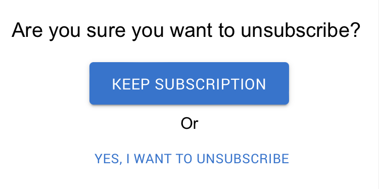
Customer journey maps are effective visualizations that help organizations understand their customers and create better experiences. Product teams use these journey maps during the design process to solve usability issues, streamline user experiences, and identify opportunities that help the organization achieve its business goals.

Creating customer journey maps requires research, collaboration, the right tools, and an appropriate visualization format. Luckily, there are plenty of tools to streamline journey mapping, which we cover later in this article.

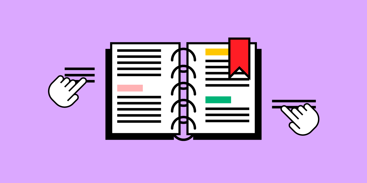
Build fully interactive prototypes of your user journeys that accurately represent the final product experience. Sign up for a free trial and enhance your customer experiences with UXPin.

Build advanced prototypes

Design better products with States, Variables, Auto Layout and more.

Try UXPin

What is a UX Customer Journey?

A customer journey represents the steps customers go through when interacting with a product, service, or business process. Companies use journey maps to visualize this end-to-end process and identify customer needs across multiple touchpoints.

User journey map vs. customer journey map

While the theory and application are similar, there is a slight difference between a user journey map and a customer journey map:

  • User journey map: A visual representation of the steps to complete a specific task or goal.
  • Customer journey map: A broader view of the entire customer experience across multiple touchpoints, including all the interactions with an organization.

Benefits of mapping the customer journey

Mapping customer journeys offer many benefits for organizations and teams, notably improving user experience and customer satisfaction by identifying pain points and opportunities.

Some key benefits of customer journey maps include:

  • Enhanced customer understanding: helps organizations gain insights about their target audience’s needs, preferences, motivations, and pain points by visualizing the experience from the customer’s point of view.
  • Pinpoint issues and opportunities: allows teams to identify which steps cause difficulty or frustration for customers. Conversely, the organization can find areas for improvement and innovation.
  • Streamlined and consistent experiences: organizations can identify and fix inconsistencies and gaps across multiple touchpoints, creating a more cohesive and consistent user experience.
  • Improve customer satisfaction and loyalty: by streamlining and optimizing product processes, organizations improve customer satisfaction leading to increased loyalty, recommendations, and growth.
  • Informed decision-making: journey maps help teams across the organization make decisions about design, development, marketing, etc. Many organizations use these visualizations to prioritize features, updates, and investments.
  • Cross-functional collaboration: customer journey maps allow organizations to visualize how customers pass through each department, creating opportunities for teams to collaborate and find ways to improve the customer experience at each touchpoint–UX design, marketing, customer support, social media, etc.
  • Creating benchmarks and continuous evaluation: organizations can use customer journey maps to evaluate projects and how products evolve and improve with releases.

Customer Personas – The Foundation for Customer Journey Maps

user choose statistics group

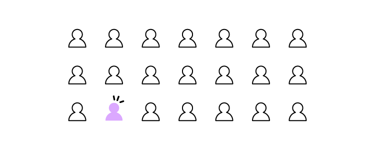
A user persona (customer persona) is UX research artifact design teams use as a fictional representation of a user group, including their demographics, behaviors, goals, and pain points.

These user personas are the foundation for customer journey maps because they provide the framework for understanding how different types of users engage with the organization and its products.

For example, if a company is designing a fitness app, the research team might create personas for three primary user groups:

  • Gym-goers
  • Runners
  • Yoga practitioners

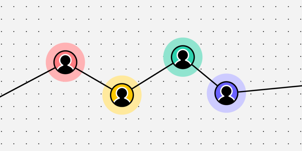
These three user personas will have different needs, priorities, goals, challenges, and ambitions. Their interactions with your brand and how they enter customer journeys will also differ.

Incorporating personas into the customer journey

User personas give designers a start and end goal for customer journey maps. They can use the persona’s behavioral patterns to highlight how these users interact with a product or service and tailor content that meets their needs.

Returning to our fitness app example above: Researchers learn that yoga users prefer to use the desktop application at home, while gym-goers use the mobile app in their local gym. The runners view their daily running program on a mobile device before their run and don’t view the app again until they return.

The customer journey maps for these three users will look completely different, each with varying steps, challenges, and goals.

This example demonstrates how customer journeys for each persona vary and the importance of separately acknowledging each group’s needs, behaviors, challenges, and goals.

Stages of a Customer Journey

direction process path way

There are several key stages of a customer journey:

  1. Awareness: the moment someone becomes aware of your brand through social media, paid ads, word-of-mouth, etc.
  2. Consideration: customers research your product and compare it to others by reading reviews, comparing prices, and evaluating features.
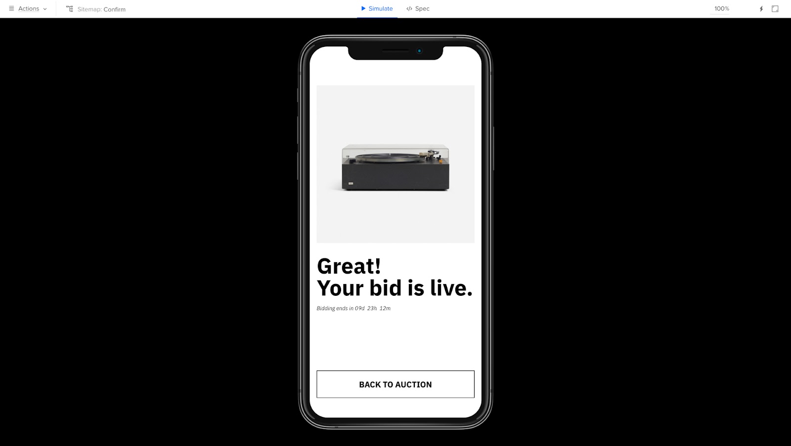
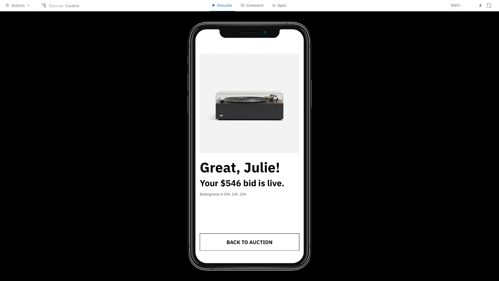
  3. Onboarding: once customers decide to use your product, they set up an account and learn to use its features. If your product uses a freemium model, these people may be users before converting to paying customers.
  4. Engagement: customers regularly use and engage with your product, its features, and its content. During engagement, they often upgrade to paid services and make purchases.
  5. Support: customers may require support during their journey. Organizations must answer questions (customer service, docs, etc.), identify ways to streamline experiences, and reduce support queries.
  6. Retention & loyalty: when customers have positive engagement and support experiences, they will continue using the product and recommend it to others.

Touchpoints and Channels

Touchpoints and channels are points of interaction between a brand and its customers.

Touchpoints

Touchpoints are the interaction points between a customer and a brand, including physical, digital, and emotional. Some touchpoint examples include paid ads, social media posts, customer service interactions, and product experiences.

Channels

Channels are the mediums or platforms delivering these touchpoints–for example, social media platforms (Facebook, Instagram, Twitter, etc.), email marketing, ad channels (Google Ads vs. Facebook Ads), digital products, and physical locations (stores, service centers, events, etc.).

Organizations map these touchpoints and channels to identify areas for improvement and optimize the customer experience.

Emotions, Motivations, and Pain Points

Understanding a user’s emotions, motivations, and pain points throughout the customer journey is crucial, as these elements drive user actions and decision-making.

Here is a rough outline of how these core user elements relate to each other:

  • Emotions: The feelings people experience at each stage of the customer journey, including excitement, happiness, frustration, disappointment, and anger. Designers use empathy maps to visualize these emotions across the customer journey. 
  • Motivations: The reasons why people take action at different stages of the customer journey.
  • Pain points: The challenges or obstacles customers experience during a customer journey.

By identifying these factors at each stage of the customer journey map, product teams can create solutions to reduce and mitigate problems while streamlining customer experiences.

Creating a Customer Journey Map

testing user behavior pick choose

Select the appropriate format and tools for your journey map

The format and tools required for your journey map will depend on its complexity, level of detail, and available resources. Here are some tips:

  • Consider your audience: who is the journey map for, and what are their needs? Do you need a high-level overview or a detailed step-by-step analysis?
  • Choose a format: the level of detail will dictate the structure and medium of your journey map, including flowcharts, diagrams, infographics, and spreadsheets.
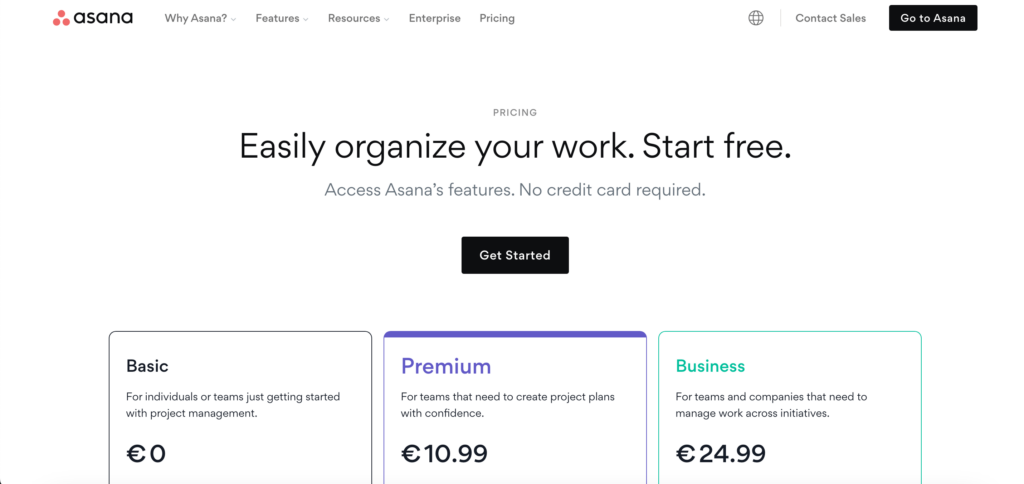
  • Use tools: there are many tools for creating and sharing high-quality journey maps, including Lucidchart, UXPressia, Canva, Miro, Mural, and design tools.
  • Find collaborators: identify teams, stakeholders, and departments that can offer insights and different perspectives about your customers to make journey maps as accurate and relevant as possible.

Collect and incorporate data from various sources

  1. List the touchpoints and channels customers will have with your brand for the specific journey, including website, social media channels, customer service, etc.
  2. Gather research data from customer surveys, user research, user interviews, analytics (product, social media, etc.), and other relevant sources.
  3. Analyze the data to identify patterns, trends, and behavior. The key is to find common customer pain points and friction across the journey.
  4. Create a visual representation of your customer journey, illustrating touchpoints and interactions and noting customer emotions, motivations, and pain points at each stage.

Visualize the customer journey in a clear and engaging way

Use your research to create a visualization of your customer journey. Start by sketching the journey and touchpoints or create a simple flow diagram mapping each step.

We recommend using customer journey map templates from Mural, UXPressia, or Miro to streamline the process and produce beautiful visualizations to share with your organization. You can even use a free whiteboard tool like Google Jamboard or create your journey map in a spreadsheet.

Recommended reading from UXPressia: Customer Journey Mapping Mistakes and How to Avoid Them.

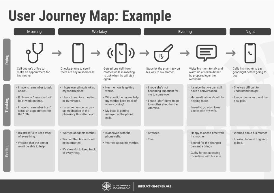
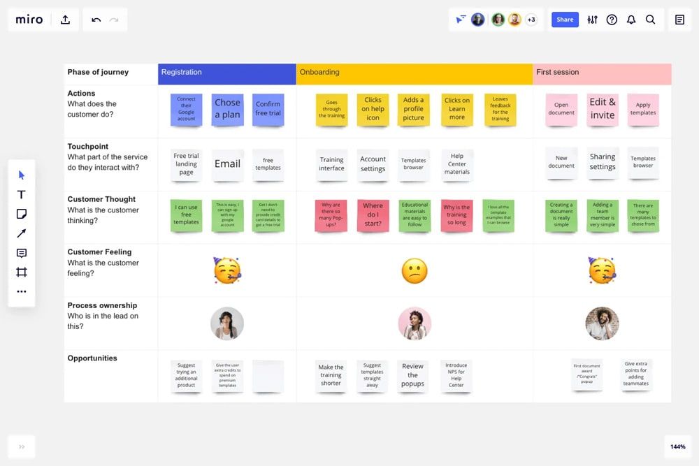
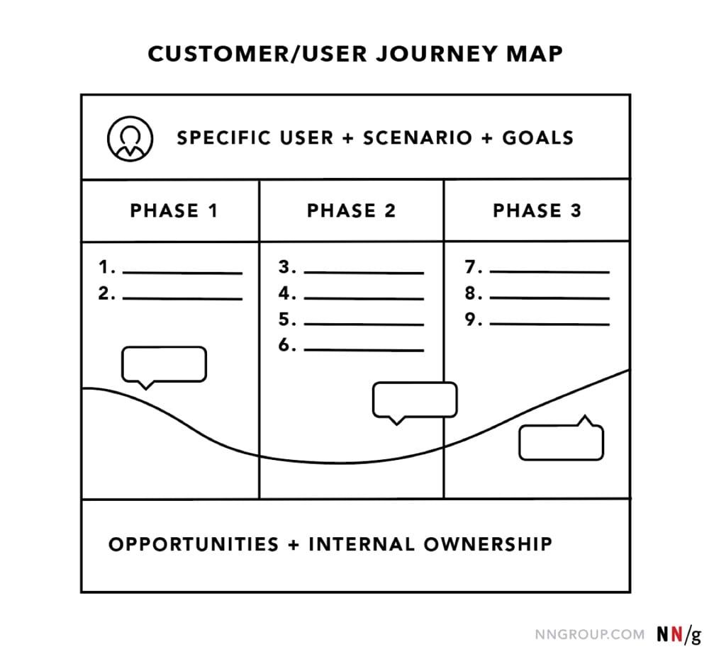
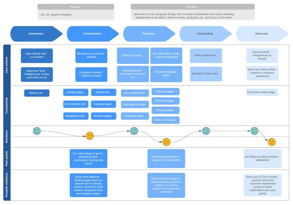
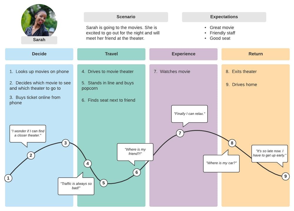
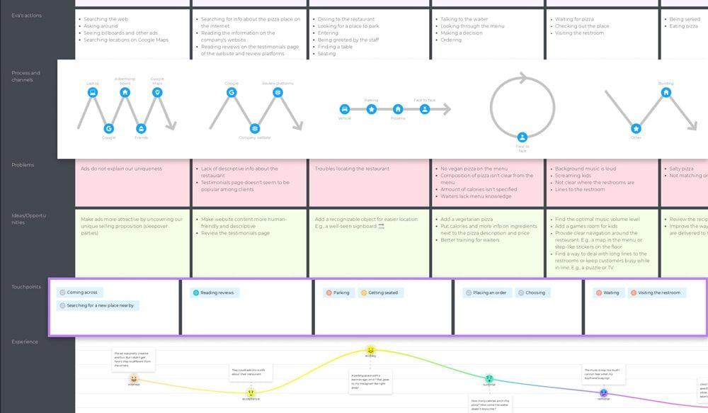
Customer Journey Map Examples of Templates

Here are some customer journey map examples of templates that you may use at work or as an inspiration for your own visualizations.

user journey map interaction design example min
Source: Interaction Design Foundation
customer journey map example miro min
Source: Miro
nngroup customer journey map min
Source: NN Group
lucidchart customer journey map example min
Source: Lucidchart
basic customer journey map example min
Source: Lucidchart
customer journey map example uxpressia min
Source: UXPressia

Design, Prototype, and Test Customer Experiences with UXPin

Prototyping and testing are crucial for iterating and evolving customer experiences. Designers must assess various user experiences within a customer journey to ensure they’re free of roadblocks, usability issues, and friction.

Product design teams can use UXPin’s advanced features to build prototypes that accurately replicate the final product experience. These interactive prototypes give designers meaningful, actionable feedback from usability participants and stakeholders to iterate and improve. Create beautiful, intuitive product experiences your customers will love with UXPin. Sign up for a free trial.

Chat User Interface Design – A Quick Introduction to Chat UI

Chat User Interface Design

User-friendly and accessible chat UI design is essential for modern applications, as it significantly impacts the user experience and overall satisfaction with the product or a service. With the right approach and tools, you can create a chat user interface that enhances communication and engagement for your application.

Design accurate prototypes replicating the final messaging app experience, including fully functioning forms and advanced interactivity. Sign up for a free trial to build your first interactive prototype with UXPin.

Build advanced prototypes

Design better products with States, Variables, Auto Layout and more.

Try UXPin

What is Chat UI?

Chat UI (User Interface) is the design and layout for a chat application. These applications range from peer-to-peer messaging like WhatsApp and Slack to web chat (live chat) between company representatives and users, like Intercom and Zendesk.

Web chat applications are typically found on websites and digital products and enable users to chat with a company representative or leave a message for a response via email.

Web chat UIs have evolved significantly over the last decade and now have many features beyond communication, including documentation, FAQs, and other widgets. Organizations use these chat applications to streamline customer service and give users a user-friendly support experience.

Peer-to-peer chat has also come a long way. People use apps like WhatsApp, Slack, Facebook Messager, and social media DMs for personal and professional conversations, including video calling and the ability to send images, documents, videos, and other attachments. 

Chat App UI Design Elements & Patterns

Here are some key elements to consider when designing an intuitive, user-friendly chat app.

Input field

Input fields are vital for chat applications because they allow users to type and send messages. Chat inputs must be easy to access (with both mouse and thumb/finger) and allow multiline editing. If the text remains on one line, the user can’t see the entirety of their message for review and editing purposes before sending.

Send button

The chat app must have a button or icon to send a message. The device’s keyboard (web or mobile) is also helpful for submission, like the “Enter” key on a desktop keyboard, so users don’t have to reach for their mouse and click “Send.”

Message bubbles

messenger alert group min
Source

Message bubbles help users distinguish their message from others. These bubbles are particularly helpful for group chats with multiple users. Apps usually use different colors for the sender and receiver’s messages so users can differentiate between them.

Timestamps

Timestamps indicate the date and time when a message was sent or received. These UI elements are crucial for users to derive timelines, context, and timing and can help resolve disputes.

Avatars

Avatars or profile pictures had a human touch to chat UIs, reminding users of the person they’re communicating with. These are particularly helpful for group chats with many users, as it allows people to differentiate members simply by their avatar, making messages easier to scan.

Typing indicators

chat indicator min
Source

Typing indicators tell users when someone is entering a message. These UI elements are helpful if the user is expecting a reply or to avoid sending multiple messages simultaneously.

Error Handling for Chat User Interface Design

Error handling is crucial for chat UIs. It lets users know when something is wrong and how to fix it. These error messages can also avoid misunderstandings and conflicts. For example, imagine you send an important message, and it fails to send, but the app doesn’t inform you.

Here are some tips for UX designers regarding error handling for chat UIs:

  • Appropriate placement: Position error messages close to relevant UI elements so users can identify the issue. For example, a bold red exclamation mark and failed error message draw attention to the bubble that didn’t get sent.
  • Actionable feedback: Provide clear instructions about the failure and its cause. For example, “Unable to send! Poor network connection” informs users there may be an issue with their WiFi or data.
  • Retry mechanisms: Implement functionality for users to fix a problem quickly, i.e., offering a “Resend” button next to the error to avoid retyping the message.

Designing Chat UIs for Chatbots

testing user behavior prototype interaction

Set clear expectations

Inform users that they’re talking to a chatbot immediately with its purpose, capabilities, and limitations so they understand what to expect. There’s nothing more frustrating than typing a long message only to be greeted by a chatbot that can’t understand the problem.

Quick responses and actions

Offer suggestions, prompts, and examples to help users navigate the conversation and fully leverage the chatbot’s capabilities. For example, instead of “how can I help you?” provide a list of categories to narrow down the user’s problem and offer suggestions within each category to get a solution faster with as little typing required as possible.

Create a conversational flow

Design the conversational flow to feel natural and engaging, like the user is speaking with another human. AI models like ChatGPT and IBM’s Watson are excellent at mimicking conversational flow and providing succinct, helpful responses.

Ask for feedback

Feedback can help enhance chatbot experiences and refine language models. Ask users to review the chatbot’s performance and report issues at the end of the conversation to iterate and improve its functionality and user experience.

Chat UI Design Accessibility

accessibility

Accessibility is vital for designing inclusive chat user interfaces that accommodate users with various disabilities, including visual, auditory, cognitive, and motor impairments.

Here are some guidelines for designing accessible chat user interfaces:

  • Support for assistive technologies: The first step is to ensure chat UIs are compatible with assistive technologies, including screen readers, magnifiers, and speech recognition software, so that all users can engage in conversations.
  • Use high-contrast colors: Choose colors that create sufficient contrast for users with visual impairments or color blindness to read text. UXPin offers built-in accessibility tools to help designers test UIs on the fly without leaving the design canvas.
  • Use legible text: Legibility is vital for chat UIs. Designers must choose a readable typeface with sufficient text size. Using native fonts is the best option to avoid readability issues.
  • Keyboard navigation: Ensure that users can operate and navigate chat UIs using their keyboard. This functionality helps users with cognitive disabilities and makes it easier for screen readers to use chat UIs.
  • ARIA (Accessible Rich Internet Applications): Utilize ARIA attributes to provide context and information for users who rely on assistive technologies.
  • Clear and concise instructions: Provide users with straightforward instructions and use plain language for labels. For example, there’s no need to get creative with naming the “Send” button, as this will confuse people.
  • Offer customization: Allow users to customize chat UIs, most importantly text size, font (serif or sans serif), and color schemes so they can adapt the interface to meet their preferences.
  • Touch target size: Ensure that touch targets for interactive elements are large enough and users with motor impairments can use them.

Frameworks to Develop a Chat UI

Here are popular tools and frameworks product teams can use to develop chat user interfaces with less effort.

Many of these frameworks are compatible with UXPin Merge, meaning designers can import the code components into UXPin’s design editor for prototyping and testing with end-users.

Learn more about code-to-design product development and how to get started.

Gifted Chat

Gifted chat is a React Native app UI kit for web and mobile chat applications. The comprehensive solution includes customizable UI components and features, including avatars, timestamps, UI templates, and other essential chat interface elements.

React Native is compatible with UXPin Merge through the Storybook Integration.

React-Chat-UI

React-Chat-UI is a ReactJS chat UI library with customizable components for building and scaling chat applications.

ReactJS is compatible with UXPin Merge through the Storybook and Git Integration.

Vue-advanced-chat

Vue-advanced-chat is compatible with all Javascript frameworks, most notably Vue, Angular, and React. The comprehensive chat UI library includes advanced features like featuring message threading, file uploads, internationalization, and more.

Vue, Angular, and React are compatible with UXPin Merge through the Storybook Integration.

How to Design a Chat User Interface

design prototyping collaboration interaction

Here is a simple design framework for developing a chat interface.

Research and analysis

Start by defining your target and their needs. If you’re designing a web chat interface, you’ll have two primary users, each with different needs, the chat host (customer service representative) and the end user.

You’ll also need to determine whether this is a mobile or web app. If you’re designing a cross-platform application, you’ll need desktop and native (iOS or Android) chat UI elements, which will require prototyping and testing multiple screen sizes and operating systems.

Once you know who you’re building your chat UI for, you can list the key requirements and features. Studying competitors and seeing how they use design patterns, solve usability issues, and implement error messages is also a good idea.

Meeting with developers and discussing the chat app’s technical requirements is critical. Are you designing from scratch, using one of the above frameworks, or using an open-source component library like MUI or Fluent UI?

Sketching and wireframing

prototyping paper pencil lo fi

Use your UX research to guide the design process. Sketch your wireframe layouts and create paper prototypes to explore different user flows.

Share your wireframes with stakeholders for feedback and iterate until you have a paper prototype incorporating the UI elements and features your chat UI needs.

Digital wireframes and mockups

lo fi prototyping wireframe 1

Convert your paper prototypes to digital wireframes to test basic interactivity and navigation. Digital wireframing is also helpful for designing each chat screen’s structure and the project’s information architecture.

Once you have completed the wireframing process, add your content, typography, and color to create high-fidelity mockups resembling the final aesthetic, notably:

  • Background, chat bubbles, and text colors–what color scheme will you use, and how do the colors contrast for readability?
  • It’s also crucial to consider how emojis, GIFS, and other graphics will render in your chat bubbles and whether the colors mask these elements.
  • Conduct accessibility tests for color contrast and color blindness to ensure users with visual impairments can read ‌chat messages.
  • Test your mockups in light and dark modes to ensure the UI elements, error messages, and content remain visible.
  • Remember to design mockups for desktop and mobile app notifications and consider how these will render on multiple devices and operating systems.

Prototyping & usability testing

testing observing user behavior 1

Chat UIs require a lot of interactivity and data capture from inputs–functionality you can’t get with image-based tools like Figma or Sketch. UXPin is a code-based design tool, meaning UI elements function in prototypes as in the final product.

Designers can build a fully functioning chat UI, allowing users to send and receive messages for a realistic prototyping experience. These advanced prototypes also provide stakeholders with an accurate representation of design concepts, so they can provide meaningful, actional feedback to iterate and improve.

You must also conduct accessibility tests to ensure the prototype passes Web Content Accessibility Guidelines.

Design handoff

Prepare your prototypes, mockups, and documentation to hand off to developers. UXPin’s Spec Mode provides devs with an intuitive user interface to inspect element properties, measure distances, review documentation, read the style guide, and download assets.

Teams can also collaborate using UXPin’s Comments, tag/mention team members, and assign comments as actionable tasks they can resolve once completed.

Chat App Design with UXPin

Create a real-world chat app prototype using UXPin’s advanced prototyping features.

  • Use advanced components from built-in libraries MUI or Fluent UI, including date pickers, data visualizations, dropdown menus, and more.
  • Connect external apps and services using the IFTTT API.
  • Create dynamic interactivity with UXPin’s States, Interactions, Variables, and Expressions.
  • Add real data from Google Sheets, CSV, or JSON files.

Design your chat user interface using the world’s most sophisticated design tool. Sign up for a free trial to build your first chat prototype.

5 Key Design System Challenges and Lessons Learned

Key Design System Challenges

A report UXPin co-published with Whitespace identified five enterprise design system challenges at some of the world’s leading organizations. Within these five challenges, the common thread is “how do we achieve a single source of truth?”

This challenging question pertains to everything from design system documentation and components to tools and governance. Organizations struggle to maintain consistency and cohesion, which ironically is what a design system is supposed to accomplish.

Learn from 19 globally recognized companies about design system challenges and how to overcome them in our insightful report. Get your free copy.

Create an efficient design process and help your designers and developers share a single source of truth in both of their workflows. Discover more about UXPin Merge.

Reach a new level of prototyping

Design with interactive components coming from your team’s design system.

The Challenge of Tools

Most companies still use image-based design tools like Figma and Sketch during the design process. While these tools are easy to learn and make product design accessible for designers, they have many shortcomings, most notably limited interactive prototyping capabilities.

Companies rely on plugins or build custom solutions to complete these image-based tool stacks, which increases costs and creates workflow complications.

A single source of truth is the primary goal for every organization using a design system. Ideally, they would have a single tool for the entire product development process.

A solution to the tool challenge

Some companies have found a solution to the tooling challenge with UXPin Merge, allowing designers to build prototypes with coded UI components. This component-driven product development workflow gives organizations the single source of truth they want while allowing designers and engineers to work within their comfort zones.

Design teams still use a design tool during the design process but use fully interactive code-based UI components in UXPin rather than the image-based UI kits they’d use in Figma or Sketch. 

Merge syncs UXPin to the company’s design system repository via Git or Storybook, so designers use the same components during the design process as engineers use to develop the final product.

The Challenge of Documentation

scaling prototyping

Documentation is the biggest design system maturity challenge for the companies we interviewed. Maintaining and updating a design system and its documentation is a resource-hungry process that slows maturity.

Design system documentation helps facilitate buy-in, training, and workflows with usage guidelines and rules. The purpose of this documentation is to increase adoption while ensuring teams deliver consistent UI experiences.

While documenting a design system sounds simple in theory, with no proper industry standard, companies struggle to execute this effectively. Some documentation solutions include:

  • PDFs
  • Online portals
  • Slack channels
  • Whiteboard tools (Miro, Mural, etc.)

Another challenge is that many companies manage more than one version of a design system–a component library for developers and a UI kit for designers. Furthermore, design teams might require multiple variations for each tool–i.e., designing in Figma and prototyping in Zeplin.

The design system team must manage library and documentation updates for all these platforms and solve any platform-specific challenges. 

A solution to the documentation challenge

Modeling the documentation from successful design systems like Google’s Material Design, Shopify Polaris, Stack Overflow’s Stacks, and others allow organizations to copy what works. Finding tools that automate and unify documentation is also crucial for reducing operational burdens and accelerating design system maturity.

German-based software development agency dotSource is a fantastic example of overcoming documentation and the single source of truth challenges by switching tools. dotSource uses UXPin Merge and Storybook to manage its design system.

Using this combination, the company has achieved a real single source of truth where:

  • There are no inconsistencies
  • One change automatically syncs design and code
  • Documentation is always up to date
  • Seamless collaboration between design and development

The Challenge of Governance

Design system governance is vital for adoption and maturity, but implementing effective processes is challenging for teams who must constantly prove ROI to management–consuming valuable time and resources.

A solution to the governance challenge

Political and financial C-level support is the most effective method for overcoming design system governance challenges. Acquiring this support requires the design system team to build a strong business case that speaks to the needs and concerns of stakeholders.

Delivery Hero’s product team secured C-level support by creating a value proposition around the problem of technical debt. The team used an experiment to demonstrate how reusable design system components reduced project delivery by 57% with zero debt.

“People outside of UX have trouble understanding user experience and design thinking principles. Explaining the problem isn’t enough; you must show them what’s wrong and how it impacts the business.” Amber Jabeen DesignOps Director at Delivery Hero.

The Challenge of Adoption

team collaboration talk communication

Many organizations aim to achieve strong awareness and support of the design system for maximum success and company-wide adoption. Education and implementation make this adoption slow and challenging.

Adoption is particularly challenging for design-driven organizations and those with competing systems and workflows. A lack of C-level support also reduces adoption rates due to the increased effort it takes for the design system team to reach multiple teams and departments.

A solution to the adoption challenge

Organizations must treat design systems like products that require effective communication and marketing strategies for success. Some of the ways organizations overcome design system adoption include:

  • Involving HR and DesignOps in change management processes
  • Organizing design system workshops and meetups
  • Making the design system team more accessible through Slack, email, and other channels
  • Approaching teams individually
  • Hosting regular design system update meetings
  • Producing marketing and training materials

Delivery Hero uses a three-component adoption strategy for its Marshmellow design system:

  • Gamify: Delivery Hero uses four adoption tiers for design system usage and awards users. Team members can visualize their success on a dashboard, and the DS team encourages them to hit their next target.
  • Socialize: The DS team involves the organization in the design system’s key decisions and hosts regular events to connect with users and discuss challenges and successes.
  • Celebrate: The DS team celebrates every small win as a symbol of progress toward 100% adoption. They celebrate individual team members and overall adoption, creating a buzz and excitement about the design system.

The Challenge of Maturity

designops efficiency speed optimal

Design system maturity varies across organizations and industries. Development-driven product development teams are ahead of their design-driven counterparts due to the use of code components in design and development processes.

Most organizations are at design system maturity level three, with designers using an image-based version of the code component library. Many refer to this as a “single source of truth,” but it’s still one step away from being a fully integrated design system using one library. 

A solution to the maturity challenge

As stated in the introduction, the common thread throughout the whitepaper is “how do we achieve a single source of truth?” This single source of truth is the key to achieving complete design system maturity–Stage Four – Fully Integrated.

The goal is to bring design and development into one iterative process where design handoffs, drift, inconsistencies, and technical debt are no longer issues.

UXPin Merge has proven to solve these challenges at the startup and enterprise levels. Bringing code components into the design process is the best solution for achieving stage four design system maturity–unifying designers and engineers while maximizing product coherence and consistency.

Merge’s code-to-design workflow solves many challenges outlined in our whitepaper:

  • UXPin does the job of multiple tools used in standard image-based workflows, eliminating the need for separate platforms for design, prototyping, testing, etc.
  • Using Merge with Storybook allows developers to generate documentation simultaneously with component releases and updates.
  • Merge streamlines governance by reducing burdensome operational tasks and manual workflows.
  • Increases adoption by delivering interactive components allowing designers to build advanced prototypes more efficiently and consistently.
  • Using Merge accelerates maturity, allowing even startups and one-person product teams to reach stage four.

Getting Started With UXPin Merge

Organizations have two options to get started using UXPin Merge for their design system:

After the initial setup with UXPin, Merge works automatically behind the scenes syncing component updates to UXPin’s design editor, so designers and engineers always work with the same library.

Merge’s drag-and-drop design workflow makes design more accessible, even to non-designers like product owners, developers, and other stakeholders, allowing more people to build prototypes and test ideas within the organization.

Solve your design system challenges, and deliver higher quality products with fewer inconsistencies and debt using the world’s most advanced design tool. Visit our Merge page for more details.

Discoverability in UX and UI Design — 9 Techniques to Try

Discoverability in UX

Discoverability is crucial in effective UX design as it ensures users can effortlessly find and access features and content within an interface. A well-executed discoverability strategy helps users explore and interact with the interface more efficiently while increasing user engagement and retention, contributing to the overall success of a website, application, or product.

We explore the topic of discoverability in UX, its importance, how to test discoverability, techniques to improve, and real-world examples from Google Maps, Airbnb, Spotify, and Slack.

Get meaningful feedback about your product’s discoverability with immersive, interactive prototyping experiences from UXPin’s advanced features. Build your first interactive prototype with UXPin. Sign up for a free trial.

Build advanced prototypes

Design better products with States, Variables, Auto Layout and more.

Try UXPin

What is Discoverability in User Experience Design?

Discoverability in UX describes how easily users can understand, find, identify, and access a design product’s features, functions, or content. The user may not know these elements exist or the product’s full capability, so it’s essential for design teams to create discoverability and awareness.

For example, many mobile apps offer the option to swipe content for options like archive or delete–a typical feature in task apps and even Gmail. Without making this swipe feature discoverable, users may never use it and not enjoy the product’s full capability for streamlining tasks.

Optimizing discoverability creates more intuitive and enjoyable user experiences where users can complete tasks and actions effortlessly.

The importance of discoverability

Discoverability directly impacts user experience and how users interact with digital products. Good discoverability enables users to quickly and easily find, understand, and use the features and content they need. 

This satisfying user experience results in more engagement and longer retention while increasing the likelihood that people share their positive experiences with others.

Here are several reasons why designers must pay attention to discoverability:

  1. Intuitive interactions: Discoverability ensures that users can navigate and operate an interface with minimal effort with minimal guidance or instructions. This intuitive experience reduces user frustration and cognitive load.
  2. User satisfaction: When users can effortlessly locate and use features or content, they are more likely to have a positive experience and be satisfied with the product. This satisfaction can lead to increased engagement, retention, and brand loyalty.
  3. Faster learning curve: Improved discoverability helps users learn products and interfaces faster, allowing them to complete tasks more efficiently.
  4. Accessibility: Good discoverability ensures that users with different abilities, including visual, auditory, or cognitive impairments, can also easily find and interact with elements in the interface.
  5. Increased conversions and retention: When users can find content and complete tasks efficiently, they are more likely to continue using the product or service, make purchases, and recommend it to others.
  6. Reducing support demand: When users can quickly discover and understand features, they are less likely to contact customer support, reducing costs and the need for support services.
  7. Competitive advantage: Well-optimized discoverability results in better user experiences and satisfaction, resulting in a competitive advantage and stronger brand reputation.

Discoverability vs. findability – what’s the difference?

Discoverability refers to a user’s ability to understand a product and its capabilities and locate content and features they may not be aware of. Findability is more focused on specific features within a product, like finding a piece of blog content or a particular setting in the account preferences menu.

Check out this 3-minute video from the Nielsen Norman Group for a brief explanation of discoverability vs. findability.

Measuring and Testing Discoverability

testing user behavior prototype interaction

Designers continually evaluate discoverability to identify issues and areas for improvement. Here are some methods UX teams use to measure and test discoverability.

Usability testing

Usability tests allow designers to observe how to complete specific tasks within a product or user interface. These insights enable design teams to understand people’s actions and decisions–for example, did they use the navigation or search? Could they find the easiest route to complete tasks?

Designers can use these observations to redesign user interfaces to meet user needs and behavior–like moving the search functionality to the header of a mobile app instead of the navigational drawer where users couldn’t find it.

Heatmaps and clickmaps

Heatmaps and clickmaps allow designers to analyze users’ behavior within a product, including interactions, scrolling, clicks, mouse movements, and more. Design teams can use this data to determine which areas get the most attention and which elements remain undiscovered or underutilized.

Analytics and metrics

Analytics from products, tools, social media, and integrations provide design teams with behavioral insights such as page views, time on page, bounce rates, click-through rates, etc. These metrics allow designers to monitor discoverability implementations and identify areas for improvement.

A/B testing

A/B tests enable design teams to compare two interfaces and determine which version performs better for discoverability. This data-driven testing technique delivers the best results when testing the impact of minor adjustments, like element positioning, colors, language, comparing different assets (image or video), etc. If you A/B test multiple changes simultaneously, it’s difficult to tell which one was responsible for achieving the desired outcome.

First-click testing

First-click testing measures which element or task users interact with first, most often. This user research methodology is essential for discoverability as it tells designers whether a desired action or path is obvious.

For example, you may have a CTA on the home screen to initiate a feature, but the user’s first click is the hamburger menu because they expect to find it there rather than realizing the shortcut. Designers can conduct further tests, such as interviews, to learn why users aren’t using the shortcut and make necessary adjustments.

User surveys and interviews

Surveys and interviews provide UX research teams with direct feedback to learn how easily people find features or content and the challenges they may encounter.

Techniques to Improve Discoverability

designops picking tools care

Here are some UX design techniques for improving a product’s discoverability.

Progressive disclosure

Progressive disclosure is a design technique that gradually reveals features and content. This progressive approach prevents users from feeling overwhelmed, allowing them to learn and discover a product’s full features and capabilities in “manageable chunks.”

Tooltips and hints

Designers use tooltips and hints to draw attention and explain content or features. The hint catches the user’s eye by jiggling, enlarging, or changing the color of an element, and the tooltip popups up to provide information and context. This technique is a standard and highly effective onboarding strategy for introducing users to a product.

Contextual onboarding

Contextual onboarding is a dynamic onboarding methodology that adapts to user behavior rather than presenting someone with knowledge about the entire product. This technique is more relevant and meaningful to users because it doesn’t overload them with information until required.

Clear visual cues

Designers use icons, colors, typography, sizing, whitespace, and contrast to make important features and content stand out, making them more discoverable.

Visual hierarchy

Arrange content and features in a logical and intuitive visual hierarchy so that it’s easy to discover. Visual hierarchy also helps users understand related content and features, which can enhance the product experience.

Consistent design language

Design consistency, such as color schemes, icons, and typography, helps users develop a mental model of your product’s interfaces, making it easy to discover and interact with content and features.

Effective navigation and information architecture

A clear, consistent, and easy-to-use navigation system, including menus, breadcrumbs, and sitemaps, help users discover and explore content and features.

Promote and recommend content

Many products use personalized algorithms that help users discover relevant information, features, and content based on their interests, browsing history, and other factors.

Accessibility

Designers must pay attention to accessibility, ensuring that users with diverse abilities and assistive technologies can discover and interact with content. A product may be fully discoverable for someone using their hands, but users using a keyboard or screen reader may have trouble finding or accessing the same content or features.

Real-world Examples of Discoverability

lo fi pencil

Here are some real-world examples where design teams have successfully applied discoverability.

Airbnb

In 2022, Airbnb redesigned its home screen to make its stays and types of properties more discoverable. The redesign uses a horizontal tab menu listing different property types above the search results. This feature allows users to find stays they might not have considered–for example, a historical building or tree house.

Google Maps

Google Maps uses multiple UI elements to help users discover features and content. A scrollable horizontal menu below the search field lets users quickly search restaurants, hotels, grocery stores, and other places of interest. The map also highlights points of interest and tourist attractions, so locating them without searching is easy.

Spotify

Spotify is the master of discoverability, suggesting hidden gems you never knew existed, from podcasts and artists to songs and entire playlists. The app is also in tune with your schedule and will often recommend playlists relevant to your environment or time of day, like mood music on Sunday or a focus playlist during work hours.

Slack

Discoverability is also crucial for SaaS and enterprise product design. Slack’s sidebar highlights the product’s key features and allows users to find communication channels and workspaces. The “Threads” feature is particularly helpful as users can scroll through multiple replies rather than clicking in and out of changes and message threads, reducing time-in-app and making them more productive–a crucial feature to discover!

Enhance Discoverability With UXPin

Interactive prototyping enables design teams to visualize and test discoverability with end users. UXPin’s advanced features allow designers to experiment with different layouts, navigation systems, and other UI design elements to find the most effective discoverability solutions.

UXPin’s interactive prototypes enable designers to get meaningful, actionable feedback from usability testing and stakeholders to iterate and improve.

By leveraging UXPin’s powerful features and capabilities, designers can create interfaces prioritizing discoverability, enhancing the overall user experience and the product’s success. Sign up for a free trial.

Stakeholder Interview Questions – What to Ask About During Discovery?

stakeholder interview questions

Stakeholder interviews can be an anxious and overwhelming experience for first-timers wanting to impress. These interviews are crucial for UX design because they provide valuable details, context, and insights that guide projects–information designers can only get through relevant stakeholders and experts.

This article provides a seven-step template for planning and conducting stakeholder interviews, including how to prepare questions. 

Get meaningful feedback from stakeholder interviews with high-quality interactive prototypes from UXPin. Try UXPin’s advanced design and prototyping features. Sign up for a free trial.

Build advanced prototypes

Design better products with States, Variables, Auto Layout and more.

Try UXPin

Internal vs. External Stakeholders

Internal stakeholders are people within an organization, including employees, management, execs, the board, and shareholders. These internal stakeholders are directly interested in the company’s decision-making and operations.

External stakeholders are indirectly interested in the organization, such as customers, suppliers, experts, creditors, and the community. These people don’t have decision-making power, but the company’s actions can affect them. For example, raising prices impacts customers, while discontinuing a product might affect suppliers.

This article will focus on internal stakeholders (and external experts) and how to interview them for design projects.

What is the Role of Stakeholders in Design Projects?

Stakeholders provide input on a design project’s goals, objectives, requirements, scope, budgets, and timelines. Stakeholders also offer feedback, support, and advice throughout the design process to ensure the project successfully meets its goals and objectives.

Understanding each interviewee’s role and interests can help improve communication and ensure the project meets their expectations.

What is the Purpose of a Stakeholder Interview?

testing user behavior pick choose

Stakeholder interviews serve several purposes.

Understand business goals

Stakeholders have a high-level view of a project’s goals and objectives and how these relate to their department and the organization. Interviewing stakeholders before kick-off helps designers understand their strategic priorities and how these relate to the project.

Understand project constraints

Every project has constraints designers must work within–technical, budget, time, labor, etc. Stakeholders can help designers understand these limitations and how these might affect the project’s design and final release.

Understanding end-user needs

Stakeholders often initiate a design project because they’ve identified a user need or pain point. Talking to these stakeholders helps designers understand the problem, review existing user research, and discuss additional UX research they may need.

Stakeholder feedback sessions

Designers meet for regular feedback sessions with stakeholders throughout the design process. During these sessions, designers must explain concepts and ask stakeholders about feasibility and practicality. For example, the design team might have an idea and want to speak to a technical stakeholder to learn whether the product’s current tech stack can support it.

Stakeholder buy-in and support

Designers often have to get buy-in at various stages of the design process. These interviews include speaking to key stakeholders and getting support from decision-makers who can help advocate for design concepts and initiatives.

Mediating conflicting views

It’s not unusual for stakeholders to have conflicting views based on each department’s different strategic goals and priorities. These interviews can be tricky as designers must mediate interviews to find a win-win solution. For example, designers might present a concept that incorporates both ideas with some degree of compromise from both parties.

How do you Prepare and Conduct a Stakeholder Interview?

designops increasing collaboration talk

Step 1: Conduct a stakeholder analysis

A stakeholder analysis is a process of identifying the people who have a vested interest or power to influence a project. Designers can use their findings to list and segment stakeholders so that they can focus on key decision-makers and their business needs.

Further reading: What is Stakeholder Analysis and How Product Teams Should Do It?

Step 2: Research the stakeholder

The first step is understanding your stakeholder’s position, interests, and goals and how these relate to your project. This preparation will help tailor your questions and conversation to their needs.

The biggest mistake you can make is asking stakeholders irrelevant questions or being poorly prepared–especially for busy experts, managers, and execs.

Step 3: Set your interview goal(s)

What insights do you want to learn from the stakeholder? Exploring why you want to speak to a stakeholder is crucial for setting the interview’s goals.

Some interview goal examples include:

  • What are the stakeholder’s business goals?
  • What are the product’s technical limitations?
  • What is the stakeholder’s definition of success for this project?
  • Who are the major competitors?
  • What are the project’s key performance metrics/indicators (KPIs)

Defining a goal for the interview will enable you to craft and ask the right questions

Step 4: Prepare a list of questions

Prepare a list of questions that will help gain insights into the stakeholder’s needs and expectations. The best approach to interviewing stakeholders is to ask questions as if you know nothing about the topic. This style of question encourages stakeholders to explain and elaborate in greater detail.

Stakeholder interview questions are similar to user interviews. You want to ask open-ended questions to get unbiased answers. Identify points where you want stakeholders to elaborate or go into more detail based on your interview goals.

Adam Fard, founder of the UX agency Adam Fard recommends keeping the tone conversational. “Remember, the interview should be steered in a more conversational direction. Although preparing specific questions is important, avoid asking them in a way that makes it seem like you’re just checking off bullet points on a list.”

It’s also good to prioritize your questions and ask them in order of importance in case the interview runs out of time.

Step 5: Set an agenda

Create an agenda with the topics you want to cover and how much time to spend on each. Structuring your interview will help keep the conversation flowing and ensure you get through all your questions.

Stakeholder interviews typically last 30-60 minutes, so be realistic about the time it’ll take to cover each topic.

Step 6: Conducting the interview

If the stakeholder allows it, recording interviews is best for future reference and analysis. Recording interviews negates the need to take detailed notes, allowing you to focus 100% on the stakeholder’s answers. If you don’t get permission to record the interview, get a team member to take notes so you can focus on the conversation.

Start by introducing yourself, the project you’re working on, and the reason for the interview–the goal you set in step two.

Always start your questions by asking the stakeholder about their role in the organization and their interests in the project. You’ll also want to ask what their team/department is working on (i.e., their priorities), what metrics they’re tracking, and their goals for the quarter/year. This information will help you understand their reasons and motivations.

Sarah Gibbons from the NN Group recommends using open-ended probing follow-up questions when you want more detail or clarity, for example:

  • Tell me more about that…?
  • Can you expand on that…?
  • Can you give me an example…?
  • Can you tell me about the last time that you did…?
  • How do you feel about that…?

Or, relating to specific ideas:

  • Tell me why you felt that way.
  • Tell me why you did that.
  • Why is that important to you?
  • Why does that stand out in your memory?

These questions are more important than the initial question because they’ll give you reasoning and insights into what the team has already tried, so you don’t waste time going down the same path.

Once you have gone through your questions, finish the interview by asking, “who else should we talk to?” This question is especially crucial if the stakeholder cannot provide a comprehensive answer or is unsure about specific details.

Step 7: Follow up

It’s good practice to follow up with an email thanking the stakeholder for their time and reminding them about any additional information or resources they would share.

Enhance Stakeholder Relationships and Increase Buy-in With UXPin

UXPin’s interactive prototypes allow stakeholders to experience design concepts like they would the final product. These high-quality prototypes offer several key benefits for stakeholder relations:

  • Boost confidence in design teams
  • Increase buy-in for ideas
  • Better usability testing
  • Identify and test more business opportunities
  • Improve stakeholder feedback
  • Enhance the final product user experience
  • Minimize design handoff friction
  • Reduce time-to-market

With UXPin’s Comments, stakeholders can leave feedback on specific features and assign comments to team members, even if they don’t have a UXPin account–perfect for collaboration with non-designers.

Enhance stakeholder collaboration and relationships with high-quality interactive prototypes from UXPin. Sign up for a free trial to explore UXPin.

What is Product Design?

What is product design

Businesses that prioritize product and good design have a significant advantage. With so many choices for software products on the market, users are looking for apps that cater to their specific needs and use cases.

In fact, 32% of customers will abandon a brand or product if they have just one bad user experience. That’s precisely why teams must focus on continuously improving their product. 

Still, the specifics of what ‘product design’ entails may not be clear. What is product design, really?

Increase teamwork during the product design process. Use an advanced prototyping tool that makes it easy to collaborate on the design from start to finish. Speed up product development process by using interactive components in prototyping. Discover UXPin Merge.

Reach a new level of prototyping

Design with interactive components coming from your team’s design system.

What is Product Design?

Product design refers to the process of creating and improving digital products that address the specific problems and use cases of your target users. To do this, design teams will need to: 

  • Conduct user research to understand who a product’s users will be.
  • Identify common pain points that frustrate users. 
  • Brainstorm potential solutions to these user needs and find out how well they solve them.
  • Understand how their product will fit into a user’s regular workflow. 
  • Strive towards achieving a business goals that stakeholders want.
  • Test and iterate a product design based on user feedback

The end goal here is to design a product that is built around users’ needs and anticipates how the users will engage with a product. 

The Difference Between Product Design and Industrial Design

color id brand design

Originally, the term ‘product design’ was used interchangeably with ‘industrial design’. The latter is reserved to describe the act of designing and creating real-life, material products. As the name already reveals, it was coined to describe the newly-found ability to create mass products for millions of users after the start of the industrial revolution. 

For the first time in history, designers were propelled to develop solutions that weren’t heavily customized to fit the exact user. Rather, they were intended for universal use for users with various needs, at an attainable price.

Examples of industrial design can be found everywhere – from your toaster and the spoon you stir your morning coffee with, to the ergonomic desk chairs you can find at your office.

With the rise of digital products, there is now a tendency to use ‘industrial design’ and the term ‘product design’ separately. The latter is commonly used to describe the process of creating visual design for mobile and web apps. Just like their physical counterparts, these products also need to follow the right product design practices and be constantly refined to stay relevant. 

In this chapter and throughout this guide, we’ll refer to ‘product design’ as the process of creating intuitive interface design for digital products. Let’s go!

5 Stages of Product Design Process

mobile screens pencils prototyping

While the process of designing products is unique to each product and industry, most designers list five common stages in product design. These are: 

  • Empathize: Product designers must learn and understand the user of the product. Who are they? What are their likes and dislikes? How do they approach problems? What types of issues with similar products frustrate them the most? At this stage, they build out detailed user personas which serve as the pillar for any new product design. This stage also involves empathizing with the business. It’s crucial to understand the business needs that stakeholders have.
  • Define: Here, product designer role is to identify the specific user needs a product should focus on. They should use the personas created in the previous step to evaluate which problems to tackle with their problem-solving skills. 
  • Ideate: Designers will then brainstorm solutions to these user needs – perhaps, using techniques like design thinking, user journey mapping or storyboarding to explore and expand creative ideas. At this stage, all ideas are welcome – designers get absolute freedom to discuss potential solutions to user needs and problems.
  • Prototype: Designers build a prototype to test whether the product solves the necessary user problems. Prototyping also helps designers determine if they’re building the right design solution. Some designers build a low-fidelity prototype that is devoid of any interaction design, while others jump to high-fidelity prototyping and create interactive mockups of the end-product.
  • Test: Finally, designers test design concept (the prototype) with real users to collect feedback. This involves feedback from stakeholders, developers, and above everyone else, users. The more resemblant of the actual product the prototype is, the more accurate the feedback from user testing will be. 

Bear in mind that – while the above steps might seem chronological – product design isn’t a linear, one-off process of designing a user interface. It’s iterative, in which product designers continuously refine their solutions and fine-tune them for the market, testing user flows and adding useful functionalities.

What is the Role of Product Design in Product Development?

team collaboration talk communication

As we’ve explained in our guide on product development, designers are involved in every step of the product development lifecycle. 

In the earliest stages, designers create early prototypes and wireframes to visualize products. On top of their principal task of creating visuals, product designers also engage in research, such as A/B testing, running interviews, and communicating with other product managers on the product roadmap. 

Curious about product design career? Read our how to become a product designer guide.

Product design precedes software development. It unlocks a sense of clarity of what solutions should be delivered as part of the product, and how they should look and operate for the end user. As the product goes live, designers and developers collaborate closely on refining the app or website. Or, at least, that’s the approach that distinguishes the best product development teams out there!

A great example of this approach can be observed at Segment. Their Head of Product Design, Hareem Mannan, calls it a dual-track framework. In it, designers and other product team members are all involved in two simultaneous actions – discovery and delivery.

  • Discovery: Designers look to research and discover new ideas and validate them through testing and prototypes. This phase is driven by feedback – whether that’s from internal sources or collected from real users via surveys, interviews, or usability testing sessions.
  • Delivery: Once a design team has a solid idea of how the product should look or how it can be improved, they can proceed with drafting up the designs. Great UX design is achieved when designers and engineers work with the same components and collaborate together. 

How can designers validate design ideas? You should collect insights from users to help identify what they need from a product. This warrants surveys and user interviews to help collect data. These insights should be combined with broader analysis. This includes:

  • Exploring what competitors are doing, by taking a look at their site, and verifying what people say about them on social media and product review sites 
  • Addressing the current market conditions – will developing a feature or proceeding with a specific design help you position yourself against competitors? Also, will the product design improvement contribute to the price customers are willing to pay? This leads to the last point, i.e.:
  • Identifying how to outperform key competitors using great product design. Is there a better way to help users complete their journeys in products like yours? Perhaps, you can simplify the checkout process, or reorganize the information architecture?

Ultimately, to ensure a balance between delivery and discovery, prototyping is key.

By using a prototyping solution like UXPin Merge, designers and developers can use the same code components while collaborating on product. The ability to validate design ideas and move them quickly into the delivery and coding stage helps shorten production times and ensures consistency. 

The Design Team’s Role in the Final Product

design and development collaboration process product

Product design involves ideating, designing, and delivering a product that accurately solves your users’ needs. It’s important to remember that product design isn’t just for building physical products anymore. Web apps, websites, and mobile apps design also involves numerous iterations and prototype testing.

While it’s a common misconception that product design refers to the initial phase of developing a product, in actuality, product design is an iterative process.

How so? As customer needs change, so must your product development and design process. Product design should be consistently improved upon, and new solutions should be constantly explored, developed, and tested. 

In fact, this responsibility to build and adapt products to suit your users extends beyond the product design team. It’s the responsibility of the whole organization.

Successful product design circulates around perfecting practices and using the right prototyping tools. Here’s where a solution like UXPin Merge can do wonders. It allows designers to prototype faster, get more quality testing results, while also streamlining the design-developer handoff, thus reducing time to market and costs. 

Instead of designing from scratch, designers drag and drop UI coded components to build fully functioning code-based prototypes that look and work like the final product. Discover UXPin Merge.

Fluent UI vs MUI – Designer’s Comparison

FLUENT UI VS MUI

​​Building scalable React applications from scratch is a challenging, resource-hungry endeavor. Fluent UI React, and MUI streamline this process by giving product teams comprehensive UI libraries to design, prototype, test, and develop high-quality, scalable digital products faster.

We explore these popular open-source ReactJS UI libraries in 2023 and why you might choose Fluent UI or MUI for your next project. We also introduce code to design and how to bring components from these design systems into the design process to enhance prototyping and testing capabilities.

Introduce fully interactive Fluent UI and MUI components at the prototyping phase. Build high-fidelity prototypes that have code-like fidelity and functionality. Discover UXPin Merge, a solution that makes it possible to introduce code to design. Learn more.

Reach a new level of prototyping

Design with interactive components coming from your team’s design system.

An Introduction to Fluent Design System and MUI 

The Fluent Design System (Fluent UI React) and MUI (Material UI) are popular design systems primarily used for cross-platform products. The comprehensive front-end Javascript libraries include patterns like charts, graphs, advanced tables, data grids, and more, making it easy for product developers to build and scale enterprise user interfaces.

Microsoft developed the Fluent Design System in 2017 to rebrand the Microsoft Design Language (Metro). Microsoft used Fluent UI across its product ecosystem, including Windows and Microsoft 365.

While MUI is based on Google’s Material Design, the open-source project has no affiliation with Google. MUI’s founders created the UI library in 2014 to unify Material Design and React. It’s now one of the most widely used React libraries, with over 2.5 million weekly downloads on npm.

Code-to-Design Approach – A Single Source of Truth

code design developer

MUI and Fluent UI offer UI kits for popular design tools, but wouldn’t it be easier if designers and engineers used the same components from design to development? This single source of truth workflow is precisely what UXPin Merge does for product development teams.

Code to design is a product development workflow that brings coded UI components into the design process using UXPin and Merge. Designers get the best of both worlds, a familiar design tool user interface with fully interactive UI elements.

UXPin Merge comes standard with the React component libraries for Fluent UI and MUI. Designers simply drag and drop components from UXPin’s Design Libraries to build fully functioning prototypes.

With Merge, design teams get all the functionality and interactivity that comes standard with Fluent UI and MUI, including fully functioning date pickers, charts, data visualizations, and more.

Design Principles

design and development collaboration process product communication 1

MUI and Fluent UI’s design principles are closely aligned. Both focus on motion, texture, and cross-platform experiences. 

MUI’s design principles

MUI follows the design principles of Google’s Material Design 2:

  • Material is a metaphor: The UI library is inspired by real-world textures, light, and shadows. Its purpose is to reimagine the mediums of paper and ink.
  • Bold, graphic, intentional: Material Design uses typography, grids, space, scale, color, and imagery to create hierarchy, meaning, and focus for immersive user experiences.
  • Motion provides meaning: Subtle feedback and coherent transitions focus users’ attention while maintaining continuity. Elements transform and reorganize the environment with interactions generating new transformations.

Fluent UI’s design principles

Fluent’s design language aims to facilitate seamless cross-platform experiences that look “natural on every platform.” The design system’s five core principles include:

  1. Light: The use of light and illumination to create a sense of depth, focus, and spatial awareness in the interface.
  2. Depth: The utilization of layering and depth to create a sense of hierarchy and relationship between UI elements.
  3. Motion: Purposeful animations and transitions that enhance the user experience and help guide users through interactions.
  4. Material: Using different materials (acrylic, metallic, etc.) to create a sense of texture and physicality in the interface.
  5. Scale: Designing for various screen sizes and input methods, ensuring the interface remains consistent and usable across different devices.

Component Libraries

design system atomic library components

MUI and Fluent UI have extensive component libraries capable of delivering high-quality cross-platform applications.

Fluent UI component library breakdown

Fluent UI has over 240 UI components with controls for React, Web Components, Windows, iOS, Android, MacOS, and cross-platform user interfaces.

Fluent UI also works with other front-end UI frameworks, including Angular, Vue, Ember, and Webpack.

MUI component library breakdown

MUI has over 200 React UI components, with an additional 240+ in MUI X, its advanced library. While MUI has a massive component library, these are primarily for web and desktop applications, lacking the same native capability as Fluent UI.

Templates

Fluent UI and MUI provide starter templates for building applications. Fluent UI’s templates are designed specifically for Microsoft products, while the MUI template marketplace offers an extensive range of dashboards, websites, eCommerce, landing pages, and more.

Customization and Theming

design system library components

Fluent UI and MUI offer similar theming and customization, including core elements like color, typography, spacing, and other style properties. Both UI libraries allow dark mode switching, making it easy to create light and dark versions of your application.

While both libraries offer excellent customization, MUI is considered more customizable due to its extensive theming options, versatile component styling, and customization APIs.

Some aspects which make MUI more flexible for customization include:

  1. The sx prop: enables inline styling for easy customization without requiring additional CSS classes or separate style objects.
  2. Customization APIs: experimental_extendTheme is an API that extends the default theme giving developers more flexibility and greater customization.
  3. Global style overrides: MUI allows developers to override a component’s default styles globally using the theme object. Using style overrides provides developers with more flexibility and better maintainability.
  4. Tokens: allow you to change color, fonts, sizes, and spacing for components. MUI also enables you to add custom theme tokens to control any aspect of any UI element.

Fluent UI’s Theme Designer makes creating an exportable theme palette easy, with options for primary, text, and background colors. Developers can export the colors to CodePen in React, JSON, or PowerShell formats.

Design System Accessibility and Internationalization

team leaders teams

Accessibility

Fluent UI and MUI prioritize accessibility and internationalization for developers to create inclusive products that serve a diverse global user base.

Both libraries offer core accessibility features for components, including:

  • Keyboard navigation
  • ARIA attributes
  • Accessible roles (provide additional information for assistive technologies)

Each library also offers unique accessibility features.

Fluent UI offers more assistive technology features, like “FocusZone” and “FocusTrapZone,” to manage focus in complex components and dialogs. Additionally, the “Announced” prop provides screen readers with comprehensive updates on system status for copying, uploading, lazy loading, and more.

Unique to MUI is the VisuallyHidden utility, which allows screen readers to ‘see’ off-screen content.

Internationalization

Fluent UI and MUI provide utilities and styling for right-to-left (RTL) languages. The design systems also include external integrations with localization libraries like i18next or formatjs (previously react-intl).

MUI supports component-level localization for relevant patterns like date pickers, time pickers, and calendars–features not supported without integrations in Fluent UI.

Documentation and Community

Fluent UI and MUI have excellent documentation and active communities for questions and support.

Documentation

Fluent UI and MUI provide detailed docs for components, usage examples, API references, code samples, and customization/theming.

MUI’s “How-to guides” provide additional support with details and steps for typical developer tasks and workflows, like using Typescript, routing, responsive UI, testing, internationalization, and accessibility, to name a few.

Communities

Fluent UI’s community is significantly smaller than MUI but still active and growing. Most communication happens on Fluent UI’s GitHub repository, where developers can report issues and contribute.

MUI’s GitHub repository is a developer go-to, but the design system also has several support channels, including various Discord communities, Stack Overflow, a blog, and premium support.

Here are some recommended use cases for Fluent UI and MUI. Both design systems are excellent for enterprise applications, but Fluent UI has better native and cross-platform capabilities and features.

Fluent UI Use Cases

Microsoft product ecosystem

One of Fluent UI’s primary purposes is for developers who want to build custom apps and services for the Microsoft product ecosystem, notably Microsoft 365.

Cross-platform enterprise applications

With a wide range of web, desktop, and native components, Fluent UI is an excellent choice for cross-platform applications. The enterprise-specific UI library, including data tables, charts, graphs, forms, and more, makes it easy to develop products that cater to business needs while creating seamless experiences across multiple devices and operating systems.

Complex web applications

Fluent UI’s advanced navigation components, like CommandBar, Nav, Breadcrumb, and Pivot, make it an excellent choice for applications with complex navigation structures or hierarchical content.

MUI Use Cases

Responsive web applications

MUI is excellent for building scalable, responsive, user-friendly web applications. The extensive library includes everything from basic inputs to complex data grids suitable for developing many types of web apps.

Customizable websites and web apps

MUI’s powerful theming and styling capabilities allow for granular control over each component’s appearance and functionality. This flexibility makes MUI the better choice for projects that require high levels of customization while maintaining ultimate consistency.

Enterprise applications

MUI combined with MUI X enables product teams to build advanced, responsive web applications, including complex components like tree views, data grids, sparklines, pagination, data filtering, and more.

Build Interactive Prototypes With UXPin Merge

uxpin merge component sync

With UXPin Merge, product teams no longer have separate design systems for designers and engineers. Merge connects UXPin to your design system’s repository, so designers use the same components in the design process as engineers use to develop the final product.

Any changes to the repository automatically sync to UXPin’s design editor, notifying teams of the update–creating a single source of truth across the organization. This code-to-design workflow simplifies product development, whether you’re a multi-national enterprise or a fledgling startup.

Startup TeamPassword uses a custom MUI library to prototype and test new releases in UXPin. When the team completes prototyping, they have production-ready code to develop the final product.

Build your first interactive prototype with the built-in Fluent UI and MUI design systems. Discover UXPin’s code-to-design solution.

404 Page Best Practices – Top 5 UX/UI Design Tips

404 page best practice

No matter how incredible the design is, 404 pages can frustrate your users. The UX design team’s goal is to provide the fastest solution to fix the error with minimal effort.

404 pages are an interesting facet of website design. Some designers choose to be creative, while others clearly have better things to do–like this example from the blogging platform Ghost. 404 error page. 5 minutes. Done.

This article reviews 404 pages from some of the world’s leading brands, including tips and best practices.

Design, prototype, and test your web design with the world’s most advanced design tool. Start designing incredible user experiences with UXPin Sign up for a free trial.

Build advanced prototypes

Design better products with States, Variables, Auto Layout and more.

Try UXPin

What is the Purpose of a 404 Page?

A 404 error occurs when someone types the wrong URL, or the page doesn’t exist. They may have entered the address incorrectly or clicked a “broken link.” A 404 page informs the user of this error.

404 error history

The earliest models of personal computers had 64k RAM or less. Programmers needed to keep things simple. They developed a classification system for program functions. Input errors got assigned to class 400.

There are four class 400 input errors (status codes).

  1. 400 Bad Request. The input is in the wrong syntax.
  2. 401 Unauthorized. The user cannot access without a username and password.
  3. 403 Forbidden. The user doesn’t have permission to access the file.
  4. 404 Page Not Found. The user entered or linked to a URL that doesn’t exist.

In these early days, the computer gave no solutions, just an error code–not very helpful. Many websites still don’t offer much help or explanation other than the title “404 Page Not Found,” resulting in a poor user experience and missed opportunity.

Why do you need a 404 page?

If you don’t have a dedicated 404 page, the user’s web browser will generate one. This example is what they might see:

regular 404 page

Browser-generated 404 web pages provide a terrible user experience, resulting in lost visitors and potential conversions. The only way to fix it is by editing or retyping the URL–which many people won’t do. This process is particularly frustrating and time-consuming for someone using a mobile device.

A custom 404 page allows designers to take control of the error and provide a smooth user experience to fix it.

How to Design a 404 Page?

A 404 landing page design must be simple and helpful. Here are four key design elements to include.

  • Header navigation: allows users to find the content and features they are looking for.
  • 404 error title: explicitly describes the error type so users immediately know what has happened.
  • Error message: summarize the error in a sentence. Unfortunately, with a 404 error, it’s difficult to determine what went wrong other than the page doesn’t exist.
  • Links: the link or links on your 404 error page will depend on your website and content. For example, Google’s 404 error page provides one link to the homepage via the company’s logo.

The news publisher BBC provides several options:

  • A purpose-built header navigation with popular content categories
  • A link to the homepage
  • Search box
BBC's 404 page

Custom 404 Page Best Practices

Error prevention

The first step must be 404 error prevention. While it’s near impossible to control human error–i.e., entering the wrong address–there are steps webmasters can take to prevent 404s from occurring.

While some of these tasks are beyond a designer’s responsibility, as advocates for user experience, designers must ensure the relevant team monitors and addresses these issues.

  • Broken internal links are links from one page to another on your website, which are easy to fix and prevent 404 errors. Regular UX audits will ensure these broken links are identified and fixed.
  • It’s essential to use 301 redirects when deleting pages or changing URL structure. These redirects provide a good user experience and help with SEO.
  • Use tools like Ahrefs, Ubersuggest, and SEMRush to find broken backlinks and contact the publishers to correct the mistake—usually an SEO manager’s responsibility.

Implementing these error-prevention processes will reduce the likelihood of 404 errors, creating a better user experience for your website visitors.

Keep it simple – “Don’t make me think”

404 pages are annoying and frustrating, especially if it’s content you need urgently. Designers must avoid clutter by providing users with the fastest solution to move on. Here are two excellent examples from PayPal and YouTube.

Global payment giant PayPal have a simple 404 page that’s easy to read and understand with minimal thinking. The header and footer navigation are visible above the fold, meaning users can find the appropriate links without scrolling.

best practices of 404 error page

YouTube takes design simplicity to the next level on its 404 page with a monkey graphic, short explanation, logo (linked to the homepage), and search field.

404 page from Youtube

With both examples, users don’t have to read and process what has happened; they can simply move on.

The opposite of this example is HubSpot. While we love HubSpot’s products, their 404 page is very busy and confusing. There’s no reference to a 404 or error; you must read the first few lines of text before realizing what’s happening.

Copywriting tips for 404 page

Maintain brand consistency

404 pages must maintain brand and design consistency so that users know they’ve arrived at the correct website. Providing a smooth user experience to solve the issue will help strengthen brand affinity.

One of the best 404-page examples we’ve found is from the awwwards website. Awwwards’ designers have created a beautiful 3D-style 404 page that looks fantastic and fits the brand–showcasing the best web design.

best practices 404 page for UI design

Lego’s 404 page is another example where designers have nailed the on-brand experience with humor and business value. The Lego Movie character Emmet, the construction worker, appears concerned, while the call-to-action (CTA) is “Start shopping”–an excellent strategy for eCommerce 404 pages.

Lego's best 404 page design

Use humor–with caution

The problem with using humor is that it’s subjective. What one person finds funny, another will find annoying for a 404 page. If you’re going to use humor, make sure it doesn’t require too much reading to interpret, or you’ll make a frustrating experience worse, particularly for users with cognitive and learning disabilities.

Our UXPin 404 page features a fun design and caption, but it’s still very clearly a 404 error, and we provide a bright blue button taking users to safety.

best practices for 404 page copy

IMDB’s 404 is another excellent example of on-brand humor. The page features a large speech bubble with a 404 ERROR in bold and a movie quote, replacing the keyword with “page.”

In this example, it’s “I am Jack’s missing page”a quote from the 1999 blockbuster phenomenon Fight Club. This quote changes each time, providing users with a link to the movie.

Humorous 404 page

Business opportunities and increasing conversions

Designers can utilize 404 pages to promote products or steer users to revenue-generating opportunities. Like humor, it’s important to approach this design strategy with caution–it must be clear this is a 404 page and that you’re not trying to take advantage of a bad situation.

VPN provider NordVPN provides links to its VPN plans and features. This strategy works well for NordVPN because they only sell one product on this website, so most visitors want to view either of these pages.

best practices 404 page from Nord VPN

Productivity app Monday.com uses a minimal 404-page design. The primary CTA in the center of the screen helps users by directing them to the homepage, while a second CTA lower on the screen encourages visitors to try the product.

Monday's best practices 404 page

Website Design With UXPin

Designing websites and error pages with most image-based design tools is relatively simple, but getting accurate results during testing is nearly impossible. Designers must rely on external tools or get engineers to build code-base prototypes.

UXPin is a code-based design tool that allows designers to achieve the same results with prototypes as front-end devs do with code. The best part. Designers use UXPin exactly as they would with any popular image-based tool and don’t have to write a single line of code.

Interactive prototyping

UXPin’s interactive prototypes respond to user triggers like clicks, taps, swipes, scrolls, etc., providing users with a prototype experience that’s indistinguishable from the final product.

UXPin also connects to APIs via IFTTT, allowing teams to import live data, send emails, sync calendars, send a Tweet, or link to IoT devices from a prototype built using a design tool.

These interactive prototypes allow designers to increase prototyping scope, thus solving more issues while identifying more business opportunities.

Advanced code-based features

UXPin has four key features that set it apart from other popular design tools. These features allow designers to create complex user interfaces and components that look and feel like the final product.

  • States: allow designers to create multiple states for a single UI element and design complex interactive components like accordions, carousels, steppers, and more.
  • Variables: capture data from user inputs and create personalized, dynamic user experiences–like a welcome message using data from the name field in a signup form.
  • Expressions: Javascript-like functions to create complex components and advanced functionality–no code required!
  • Conditional Interactions: create if-then and if-else conditions based on user interactions to create dynamic prototypes with multiple outcomes to accurately replicate the final product experience.

With UXPin’s advanced prototypes, designers can test form error handling, error pages, and other usability issues during the design process, ensuring users have the correct information to fix problems fast.

Start designing better websites and digital products with the only design tool built for accurate user experience prototyping and testing. Explore UXPin’s advanced features. Sign up for a free trial.

Dark Patterns in UX Design — Which Ones Are the Most Deceptive?

Dark Patterns

User experience design is a powerful discipline with a fine line between assistance and manipulation. Organizations often use dark patterns to trick users into decisions they otherwise wouldn’t choose. Sometimes these dark patterns don’t have malicious intent, but the result is the same.

Understanding dark patterns and their consequences is crucial for UX design teams. These deceptive design techniques harm users and could have legal consequences resulting in hefty fines from organizations like the FTC (Federal Trade Commission).

Get accurate results during usability testing using fully functional interactive prototypes from UXPin. Sign up for a free trial.

Build advanced prototypes

Design better products with States, Variables, Auto Layout and more.

Try UXPin

What are Dark Patterns?

Dark patterns are design techniques that manipulate and deceive users into taking specific actionsor directing them away from an intended action, like unsubscribing or downgrading. These techniques exploit cognitive biases or misdirect users to benefit the organization at the expense of their customers.

UK-based UX specialist Harry Brignull coined dark patterns when he started darkpatterns.org–an organization founded to educate companies about deceptive design patterns.

Do Dark Patterns Work?

The short answer–Yes! Dark patterns are highly effective. And many organizations, including leading tech businesses and online retailers, use these shady design techniques.

In 2018, the Norwegian tech watchdog Forbrukerrådet published a report showing how tech companies nudge users into sharing personal information. This report leads to changes in legislation, including GDPA and CCPA.

In 2021, the California Consumer Privacy Act made a range of privacy-related dark patterns illegal – including certain kinds of trick wording, hidden small print, misdirection, and bait and switch.”

Common Types of Dark Patterns

user search user centered

Bait and switch

Bait-and-switch dark patterns lure customers into using a product under attractive terms, then change the conditions once engaged, forcing them to accept the outcome–usually a paid service. Many apps use this bait-and-switch strategy to trick customers.

For example, imagine you download a “free” filter application and spend time adjusting the settings. When you achieve your desired result and go to export the image, the app informs you that you’re using one of the “paid” features and need to pay to save this image or upgrade to a premium plan.

Users will often accept these terms begrudgingly because they’ve already invested the time, and the feature they use is essential for the desired result.

Disguised ads

Disguised ads look like regular content, so users click them. These are common in newsfeeds, where the ads are designed to look like any other article with a headline and image. You’ll also find these in search engines where the top few results are ads, but they look like actual results.

Search engine providers place a small “Ad” tag to differentiate these, but it’s easy for someone not paying full attention to click it thinking it’s a regular search result.

Forced continuity

Forced continuity occurs when someone signs up for a free trial which rolls into a paid subscription. This dark pattern is prevalent in SaaS, and many companies are guilty of deploying this strategy.

The best way to avoid forced continuity is by not taking credit card details for free trials or not automatically continuing the service at the end of the trial without the user explicitly accepting.

Hidden costs

Hidden costs are fees or charges not disclosed until the user is about to confirm payment. Have you ever got to the final step and gone, “Hey! Why is it $28? The price quoted was $19.99.” And then you see a “service fee” or some other ambiguous term. 

Sometimes the hidden costs are more legitimate, like VAT which the company only discloses at checkout. Companies can avoid these hidden costs by notifying customers below pricing–for example, “VAT and taxes calculated at checkout.”

Misdirection

Misdirection uses design patterns commonly used for one action for another that favors the company’s business interests. For example, you’re unsubscribing from a paid service, so you click “Cancel” in your billing account.

The next screen is a confirmation screen, but the company shows the primary CTA as “Keep subscription” and the confirmation to unsubscribe in a smaller text link like this example below.

Companies know that most people function on “autopilot,” thinking that the primary CTA is the requested action, and unconsciously click “Keep subscription.”

Roach motel

Roach motel is another sinister dark pattern designed to keep users from canceling a paid service. Companies intentionally hide the cancel feature using several techniques:

  • Placing the cancelation at the bottom of an unsuspecting screen
  • Making users contact customer support–and jump through multiple hoops
  • Only allowing users to cancel on the desktop app and not mobile

Ironically, these products’ signup and payment features are usually super efficient and helpful, with immediate access to customer support during checkout. The second you’re signed up, the efficiency to leave disappears, and you feel trapped in an irreversible contract.

Confirmshaming

Confirmshaming is another tactic companies commonly use to guilt or shame someone for making a choice contrary to the company’s interest. The most common example is when an eCommerce store offers shoppers a discount for signing up for their newsletter with two options:

  1. “Yes, I want to save 20% on my order!”
  2. “No, I prefer to pay full price for my items.”

The second option makes people feel foolish, “why would you want to pay more?” Confirmshaming dark patterns are highly manipulative and exploit human emotions, forcing them into actions they otherwise wouldn’t have chosen.

Trick questions

Trick questions use words or phrases that mislead users. Like the misdirection tactic, trick questions prey on people’s unconscious actions to mundane tasks like clicking terms and conditions when signing up.

For example, a user might mistakenly check a box saying, “Would you like to opt out of not receiving exclusive offers and promotions from our partners?”

Read that carefully…

“Would you like to opt out of NOT receiving exclusive offers and promotions from our partners?” Most people will miss the double negative connotation and check the box, thinking they’re opting out when the opposite is true.

These trick questions are especially problematic for users with cognitive disabilities or non-native language speakers who don’t fully understand the sentence.

Privacy Zuckering

Privacy Zuckering is named after Facebook CEO Mark Zuckerberg, infamous for misleading privacy policies and settings. This type of dark pattern is still prevalent across every industry and country because data is so valuable–some call it the new gold.

Companies that make privacy policies difficult to understand with convoluted legal jargon or intentionally hide privacy settings (like turning data sharing on and off) are guilty of Privacy Zuckering.

This dark pattern is so problematic that Apple released a privacy update to iOS 14, allowing users to opt out of tracking and choose which apps they share data with.

Pre-selected options

Pre-selected options used to be more prevalent until the release of GDPR and CCPA, which prohibit this dark pattern–like pre-selecting the checkbox to confirm someone has signed up for a mailing list. New legislation requires users to check these boxes themselves, with instructions to review the terms and conditions. Still, this practice occurs, leading to users signing up for services they don’t want.

UX Designers – The Adults in The Room

success done pencil

UX designers are crucial in advocating for users (their fellow humans) and ensuring user interface design follows the highest ethical standards and intent.

Here are ten ways designers can avoid dark patterns and ensure non-designers understand the ramifications of using them (which may include costly legal issues for an organization):

  1. Prioritize user needs: focus on addressing user needs over exploiting them for short-term gains. This focus will build trust and increase the customer life cycle.
  2. Clarity and simplicity: make sure content and instructions are easy to understand. Avoid using confusing jargon or hiding important information.
  3. Transparency: ensure users fully understand the implications of their choices and the data you collect. Use opt-ins with plain language, so people always know what they’re signing up for.
  4. Opt-out by default: never pre-select options, even for mundane tasks and features. Users must always have control over what they want and take explicit action to opt in.
  5. Easy opt-outs: conversely, companies must make it easy for users to end paid features or unsubscribe from services. Avoid burying opt-outs or making users jump through hoops to cancel something.
  6. Establish ethics: creating internal ethical guidelines signed off by key stakeholders ensures teams follow best practices and avoid dark pattern strategies.
  7. Education and awareness: create resources that explain dark patterns and how these negatively impact people.
  8. Advocate for users: UX designers must be the voice of users within an organization and call out unethical conduct.
  9. Testing and user interviews: design teams must test content and UIs regularly with end-users to determine whether content or features are confusing or misleading.
  10. Accessibility and inclusivity: designers must consider the needs of diverse people, including those with disabilities, to ensure everyone understands critical language and features–particularly for decisions with financial and personal data implications.

Prototype and Test With UXPin

Build fully interactive prototypes that accurately replicate the final product experience with UXPin’s code-based design tool. Unlike image-based tools, UXPin allows designers to achieve fidelity and functionality similar to code, increasing testing scope so design teams can solve more usability issues and identify better opportunities during the design process.

Sign up for a free trial to build your first interactive prototype with UXPin and deliver the meaningful user experiences your customers deserve.

What Designers Can Do to Ensure a Smooth Design Handoff

The Responsibilities of Developers During Design Handoff 1

If you are close or are finishing up your design after a series of iterations, then you are probably anticipating the next step—the design handoff. There are many ways to unsuccessfully pass along your designs to the development team.

To help ease your mind and make this process easier, we have compiled a list that will help you thoroughly prepare for a design handoff. All so you can avoid any misunderstandings between you and the developers.

Design prototypes with a single source of truth between design and engineering. Bring interactive components to UXPin and reduce the friction during the design handover. Visit our UXPin Merge page.

Reach a new level of prototyping

Design with interactive components coming from your team’s design system.

6 Designer’s Tasks for Smooth Design Handoff

Standardize naming conventions

Using appropriate and coherent terms will ensure that there is no confusion between you and the developer. For example, instead of naming stages of your product with “Latest” or “Newest,” it is best to keep it simple and use, for example, “v1,” “v2,” “v3,” and so on. 

This will make it easy to see the various versions of your design from the original to the latest and will help the developer navigate your design process. You’ll also want to familiarize yourself with developer handoff terms. A good resource for this is the BEM notation guide.

Read more about terminology in our Content Design System Guide.

Build interactive prototypes

Even the most beautiful prototype fails to communicate what developers need to build if it’s static. That’s why adding interactivity to your design is so crucial. You can do that by using advanced prototyping features like States, Variables, and Expressions.

There’s also another way. You can bring coded components to design and build prototypes that are fully interactive by default. Read more about it in our previous article: What is component-driven prototyping?

Annotate and explain your design decisions

Since you will be handing off multiple digital assets and designs to the developer, it is important to build a habit of annotating them. This will give the developer context of what each asset is. You should also explain each design and why you created it in the way you did.

Using a design handoff tool like UXPin will make this annotation process a lot easier. It will allow you to collaborate on your designs in real time and create contextual documentation.

You can add detailed descriptions of each element in your design which will help clarify the function each of them offers. There is also an option to include accessibility guidance for greater clarity.

Create templates or checklists for the future

For the most part, every design handoff process will involve similar structure. So, to make it easier for future design handoffs, it is best to create a template or a checklist that will help you make the process more efficient. This will ensure uniformity and a seamless transition from designer to developer.

It will also save you a lot of time because you will already have a good process to follow and won’t have to reinvent the wheel every time you have a design handoff.

Prepare specification

Specifications help developers understand CSS properties, be it heights, widths, spacing, font sizes, etc. Design tools usually automate this process. UXPin, for example, have a built-in Spec Mode that helps developers select UI elements to view specifications.

UXPin Spec mode will help you with developer handoff

UXPin also automatically generates starter CSS that developers can copy. And when you’re designing prototypes with interactive components, your devs can copy the code behind those components into their workflow. Read more about how UXPin Merge technology simplifies design handoff.

Improve cross-team communication 

Smooth communication is important for any project – and the design handoff process is no exception. That’s why it’s important to bring the developer into the design process at an early stage. This way, you’ll have more time to introduce and explain all of your designs and ideas. 

This will be beneficial not only for the development team but also for you as a designer. Namely, you’ll be able to take advantage of their technical expertise by asking them for feedback during the design process.

By keeping an open dialogue, you can discuss with them which design components are working well and what needs improving. You’ll also be able to understand how you can implement positive changes to your design.

To summarize, good communication will:

  • Give the developers context and background knowledge of the design
  • Create a faster and more efficient design handoff process
  • Keep the developer on the same page, which will ultimately result in faster and more accurate development of the design
  • Avoid misunderstandings related to the design handoff.

As you can see, involving developers early in the design handoff is one of the best things you can do in the product development process. We discuss it in more detail in the next section.

Involve developers early in design

Oftentimes, design teams make the mistake of separating their work from the developer’s work. As a result, there can be a lot of confusion during and after the design handoff. This can lead to faulty development and more time that you’ll have to spend clearing up any misunderstandings.

So, in order to create a streamlined process, versus a fragmented one, you’ll want to include the development team early on. To accomplish this, there are three main steps you should follow:

  • Seek insight from developers—During the design process, it is always important to at least have some idea of how your design will translate to an actual website or app. So, in order to make design handoff smoother, it is important to seek insight and advice from developers early on.
  • Include developers in talks with stakeholders—Ultimately, the stakeholder is not looking for a well-designed prototype but for a good product. So, by including developers in conference calls or talks early in the design process, you can ensure that both the design team and development team have a sense of clarity. Hence, they’ll have a good understanding of what the end result should look like.
  • Sharing design ideas with developers—It is a lot easier to correct any potential problems with a design while they are still in the “ideation phase” instead of the prototyping phase. So, before carrying out any major design ideas, it is best to check in with developers to see if what you want to build is feasible.

Improve Design Handoff with UXPin

All in all, communication is key. Instead of seeing the design and development teams as separate, it is best to see them as one. So, involving the development team in the design process and making sure everyone is on the same page will help create a seamless design handoff.

In practice, using a tool like UXPin will allow you to create prototypes with components that come from your design system. This will make it very clear to developers how each component is meant to function and create a seamless transition process. 

Bring components from Git repo, Storybook, npm to UXPin and streamline your design handoff process. Learn more about it.

Designing the Overlooked Empty States – UX Best Practices

Empty states are a pause, not a dead end. Whether a user stumbles across an empty state due to first-use, accomplishment, or error, your product needs to guide them to the next logical step.  

This article explores empty states and their vital importance for UX design. We also offer some tips with real-world examples from leading product developers.

Have you ever tried interactive prototyping? Interactive prototypes enhance testing so designers deliver meaningful product experiences to their users. Design your first interactive prototype with UXPin. Sign up for a free trial.

Build advanced prototypes

Design better products with States, Variables, Auto Layout and more.

Try UXPin

What are Empty States?

An empty state is a UI design pattern telling users the system has no content to display. Some empty states instruct users on how to find, create, or add content to the screen.

Designers also use empty states to communicate a screen/feature’s purpose with tips and instructions. For example, Gmail’s empty state tells users how to customize the inbox’s tabs.

empty state ui design example

Types of Empty States

Empty states represent a pivotal point in the user journey. Each is an opportunity to build rapport, drive engagement, educate, entertain, or delight users.

There are four primary empty states users encounter in product design:

  1. First use: When new users first interact with a digital product.
  2. User cleared: The user has just completed a task or cleared all content associated with the app or site.
  3. Error state: The user has encountered a roadblock during the interaction.
  4. No data: The system has no data to display or no results from a search query.

Many designers overlook the opportunities for empty states to engage users. They tend to focus more on the associated tasks and features rather than optimizing empty states for engagement.

Empty State Examples

Here are four user interface design examples of when and how to use the types of empty states mentioned above.

First use/onboarding

Onboarding or first use empty states, present users with a blank canvas with instructions to get started. These screens must invoke action, typically with a primary call to action button.

Facebook Messenger’s empty state install screen has a lot going on in a small space, but the primary CTA is prominent using plain language.

facebook empty state

Let’s explore what users can do on this empty state screen:

  • Lets you know that you can take pictures or record videos in-app
  • Exerts social pressure by telling you how many of your Facebook friends are using the app
  • Allows you to look up additional information about the app before installing
  • An adorable graphic to create rapport and encourage engagement

Facebook Messenger’s install screen is a fantastic example of how designers can use empty states to encourage and educate first-time users.

Completing tasks/user cleared

Empty states are an opportunity to prompt users toward new interactions or congratulate them on completing tasks. This feedback acts as a placeholder and reward, helping to develop habit-forming products.

These “user-cleared” empty states are essential for encouraging further engagement. Here are three things to incorporate in task completion empty states:

  1. Step 1: First, inform the user they have completed the task
  2. Step 2: Reward the user–i.e., congratulate them
  3. Step 3: Steer them toward the next step

We’ll use the WritekUpp app for iOS as an example:

image03
  1. Step 1: “You’ve got no more tasks”
  2. Step 2: “Well done you!”
  3. Step 3: “To create another task, simply tap below.” followed by the CTA: “Create New Task”

Error states

Errors are inevitable and can happen on both ends–from the user and the system. What’s important is telling the user what went wrong, why it happened (to avoid future occurrences), and what to do next.

This example from the iOS App Store shows what happens when users follow a link to an app unavailable in their region. The App Store informs the user what went wrong “Item Not Available” and why “The item you’ve requested is not currently available in the UK Store.”

image01

What’s missing from the App Store in this example is what to do next–which likely causes frustration. A good option would be “Search for similar apps available in your region.”

Humor can help people feel better about errors but must not confuse or create added friction. This error screen from Piccsy is an excellent example of subtle humor. Here, Piccsy presents users with an illustration linking to the artist and a CTA to return to the app.

image05

IMDB uses a similar humorous strategy with its 404 page. The page informs the user that the URL “was not found” with a link to return to the homepage. IMDB also includes a 404-altered quote from a movie, linking to the film’s IMDB page.

image02

What’s clever about the IMDB 404 error page is that it educates and entertains. Users might discover a new movie while being amused by a humorous quote.

No data

Empty states must help users find content when the system doesn’t have answers. This example from DuckDuckGo shows what happens when there are no results for a query–rare with the sheer volume of content on search engines.

First, DuckDuckGo displays the user’s query, “No results found for [QUERY].” This prompts the user to check their keyword for errors. Next, the search engine offers suggestions to fix the problem:

  • Make sure all words are spelled correctly.
  • Try different keywords.
  • Try more general keywords.
  • Try fewer keywords.

These “no data” empty states can frustrate users because the system doesn’t have an answer. Keeping user interfaces clean with actionable advice can help them solve the problem–as DuckDuckGo does above.

Empty State Design Tips

Use visual cues

Visual cues through empty-state illustrations or GIFs help users understand what to do next. These must be relevant to the action while offering encouragement. Most importantly, the graphics mustn’t distract users.

For example, Google uses a document illustration to accompany the CTA, “Drop files here or use the ‘New’ button.” The simple image is relevant to the task, doesn’t distract the user, and draws attention to the instruction.

Offer suggestions

Suggestions help guide users with directions and ideas to get started. For example, Spotify’s new playlist empty state includes a CTA to add songs but also offers “Recommended songs” based on the playlist’s name–meaning if the user renamed the playlist to something more descriptive, “90s rap playlist,” they might get better recommendations.

Personalize empty states

Personalizing empty states with user data (i.e., their name) or personalized content creates a more meaningful experience, increasing engagement and product satisfaction. For example, Facebook Messager’s install screen shows the user’s friends also using the service.

Make empty-state copy meaningful

Microcopy expert and UX writer Kinneret Yifrah, argues that empty-state copy must be meaningful. She structures copy with three key elements:

  • Heading: describes the state
  • Motivation: how will it benefit the user or how to do it
  • CTA: descriptive call-to-action button

Using this structure, we can create an empty state for an example alert:

  • Heading: You haven’t set up any alerts yet.
  • Motivation: Alerts will keep you updated, so you won’t have to worry about missing out on something important.
  • CTA: Create alert

Following Kinneret’s user-focused strategy will help create meaningful copy that motivates users to take action.

Prototype and Test Empty States With UXPin

With UXPin’s advanced features, designers can create empty-state prototypes that replicate the final product user experience accurately. UXPin prototypes are fully interactive with immersive code-like functionality, giving design teams actionable feedback to test and iterate for higher-quality outcomes.

Interactive prototyping

Interactive prototypes respond to user engagement like clicks/taps, swipes, scrolls, etc. Additionally, UXPin’s prototypes allow designers to capture data from user inputs and use them elsewhere in the application. These prototypes include navigation, transitions, animations, popups, and other interaction design characteristics that accurately replicate the final product experience.

For example, our example Auction app allows users to select an item and place a bid.

The confirmation screen tells the user their bid is live and when the auction ends. A prominent CTA takes the user back to the auction’s homepage.

With UXPin, you can make this screen more personalized using Variables, including the user’s name and their bid captured from the previous screen.

While the auction app doesn’t have an empty state, it demonstrates the powerful functionality UXPin offers designers for accurate prototyping and testing.

Actionable feedback

Better prototypes result in meaningful, actionable feedback from usability participants and stakeholders. Designers can solve more problems while identifying valuable business opportunities during the design process.

Smooth design handoffs

These prototypes also streamline design handoffs because front-end developers can visualize exactly what the product must do. UXPin prototypes require less explanation and documentation, allowing product teams to release products faster with less friction between design and development.

Design, prototype, and test at higher fidelity with code-like functionality in UXPin. Sign up for a free trial to build your first interactive prototype with the world’s most advanced UX design tool.

Build advanced prototypes

Design better products with States, Variables, Auto Layout and more.

Try UXPin

7 Pricing Page Examples and Design Lessons that Come with Them

pricing page min

An effective pricing page is crucial for highlighting your value proposition and increasing conversions. Designing a pricing page requires a clear understanding of your potential customer’s problems and using the correct UI elements and content to show your product is the solution.

We’ve reviewed seven leading organizations to see how these companies use design to create high-converting pricing landing pages. We also explore different pricing models you might want to copy from companies like Google, Asana, Hubspot, and Mailchimp.

Design high-converting pricing pages with fully functional onboarding flows in UXPin. Explore UXPin’s advanced design and prototyping features. Sign up for a free trial.

Build advanced prototypes

Design better products with States, Variables, Auto Layout and more.

Try UXPin

What Should a Pricing Page Include?

A pricing landing page must communicate your product’s value while building trust and credibility with potential customers. Here are six things to consider when designing pricing pages.

Clear pricing & descriptions

Each plan must include straightforward pricing and descriptions so that customers can compare options, make a decision, and take action. If your pricing is confusing, forcing customers to do math or overthink, there’s a good chance they’ll leave and find a competitor.

Call-to-Action Button

CTAs must be prominent and explicit. For example, is the user buying a plan or contacting sales? Many enterprise products require demos and onboarding, meaning users can’t simply purchase a plan and start using the service. Using explicit language for CTAs provides transparency while managing expectations.

Some examples include:

  • Buy Now/Get Started
  • Start Free Trial
  • Contact Sales
  • Subscribe

Pricing table 

A pricing table or comparison chart is essential for offering multiple plans. These tables allow potential customers to compare pricing options and relevant features to decide which plan best meets their needs.

For example, an email marketing software provider may offer 1,000 subscribers on the Basic Plan and 5,000 on its Standard Plan. A comparison table lets customers quickly decide which option is better according to their database–and what they can expect to pay as they scale.

Curious about designing tables? Read: Table UX Design Best Practices

Payment options

Payment options are another vital question pricing pages must answer. You can include these below your comparison table in an FAQ section with answers to other common questions.

Trust indicators

Trust indicators like testimonials, reviews, and other social proof help build legitimacy and trust. These indicators are particularly beneficial when they mention numbers and data. Testimonials from reputable organizations strengthen your product’s credibility, resulting in higher pricing page conversion rates.

Terms and conditions

Highlighting key points from your terms and conditions provides transparency and trust. Refunds and cancellations are two critical deciding factors. Alleviating these concerns in plain language helps manage expectations so potential customers can make an informed buying decision.

7 Best Pricing Page Examples

Semrush

Semrush pricing page ui design

Keyword research tool Semrush (see Semrush’s pricing page) uses a clean black text on white background layout for its pricing page. The vibrant green buttons and large pricing stand out, so visitors don’t have to read or scan to find them–allowing for faster decision-making.

Semrush uses a switcher for users to quickly see the difference between paying annually or monthly. The designers also highlight the saving in a secondary color, so users don’t have to calculate the discount.

This SaaS pricing page from Semrush is an excellent example of using visual hierarchy, color, and spacing to make content easy to scan and digest quickly.

Asana

Asana pricing page examples

Asana’s pricing page captures users’ attention with free signup and “No credit card required” to access all features, followed by a “Get Started” call-to-action button.

This is an excellent strategy to get potential customers to use your product immediately with no risk, and the copy reflects that. Additionally, the platform uses a freemium model, so people can use Asana until they’re ready to use the premium features.

Freemium pricing models are an excellent way for users to use your product without risk or obligation. As the tool integrates into their daily workflow, they are less likely to leave, increasing the likelihood of converting to a paid plan as their needs grow. Thus, the design prioritizes this business decision.

Help Scout

helpscout pricing page ui

Help Scout’s pricing page highlights the brand’s core message of helping people–perfect for a customer service SaaS platform. The simple three-tier pricing table highlights the company’s best plan with a bright blue button, utilizing color to their best advantage.

Help Scout uses two radio buttons for users to switch between annual and monthly pricing and highlights the 20% saving for the annual payment (Learn more about persuasive design patterns.)

Help Scout also follows the rule of third in their pricing page table design. They show you three different plans, and it is only below the table that they mention offering special plans for nonprofits.

Help Scout is a Certified B Corporation, planting a tree for every new customer. This environmentally-friendly commitment makes customers feel good about their buying decision, strengthening Help Scout’s brand of helping people.

Psychology and UX design have their overlapping areas. Learn more about it in the article: Should UX designers be aware of psychology?

Google Workspace 

Google workspace pricing page design

Google Workspace’s pricing page announces the platform’s 14-day trial in the heading and pricing models in the subheading. Adding these pricing options high on the page outside of the tables makes it easy for users with screen readers to get pricing fast. This pricing introduction is an excellent example of accessibility benefiting all users, as everyone can read and understand Google Workspace’s pricing instantly.

Google uses icons with text to showcase what customers get with every plan, allowing people to decide without scrolling. The pricing page also highlights the “MOST POPULAR” plan, with a bright blue “Get started” call-to-action button.

Another excellent user-friendly feature is the sticky secondary header keeping the four pricing plans and CTAs visible as users scroll down the comparison table. Users never have to scroll up to remember which plan they’re viewing and can take action as soon as they decide.

Mailchimp

pricing page design exaple ux ui mailchimp

Mailchimp’s pricing page features three product categories and multiple plans within each. Designers use tabs below the header to separate the three categories, keeping the UI clean and easy to read.

Mailchimp displays two dropdowns above the pricing table, one for the number of contacts and a second currency switcher, which is a great thing to replicate if you create multiregional UX experience.

This layout from Mailchimp is an excellent example of understanding what users need and fitting a complex pricing model above the fold so they don’t need to scroll to make a buying decision.

Hubspot

hubspot pricing design

Hubspot’s pricing page is another example of a complex yet user-friendly pricing design. Like Mailchimp, Hubspot’s designers have done an excellent job of keeping everything on one page with the most crucial information above the fold.

Hubspot uses two tabs below the header to separate pricing categories for enterprise vs. small businesses/individuals. A left sidebar shows Hubspot’s bundles and the company’s five products with a currency switcher.

Hubspot offers three pricing models:

  1. Annual commitment pay upfront
  2. Annual commitment pay monthly
  3. Month-to-month

Hubspot also gives users more control with an option to create a custom bundle and purchase specific add-ons depending on their needs.

Simplified

best examples of pricing pages for designers to copy

Simplified uses awards and social proof from real users, including social media posts, to demonstrate the product’s success. Like Google Workspace, the pricing page shows what every plan includes above the pricing table.

A switcher enables customers to view pricing billed monthly vs. yearly. When yearly is selected, a new UI element appears on each table showing the relevant discount.

Simplified’s four pricing tiers provide a “Best for…” below each plan, allowing users to understand which option best suits their needs–i.e., personal use, small teams, growing teams, and high-growth. This detail is helpful as it answers “which one is right for me?” You can easily replicate this by addressing your plans to your user personas.

Pricing Page Prototype With UXPin

Your website’s pricing page is the most crucial web page. Designers must use buyer personas when designing pricing pages to understand what users need to make a buying decision.

With UXPin’s advanced prototyping features, designers can build prototypes that accurately replicate the pricing page experience, including complex UI components and interactivity.

  • Use States to create monthly/yearly pricing switchers, tabs for multiple pricing categories, component states, and much more.
  • With States and Variables, you can create a fully functioning stepper to show pricing when users increase/decrease seats, contacts, etc.
  • Keep user interfaces clean by hiding less critical content like FAQs behind accordions.
  • Create dropdown menus for users, CRM contacts, currency switchers, etc.

In addition to pricing pages, designers can prototype the onboarding user experience with fully functioning signup forms and APIs. With UXPin’s advanced prototypes, designers can identify potential roadblocks while discovering valuable business opportunities during the design process. Try UXPin for free.

5 UI Components in Atomic Design

UI Components in Atomic Design

Atomic Design: once an obscure concept, it’s gained popularity in recent years. And it’s a hot interface design trend for good reason. When done correctly, Atomic Design allows design teams to deploy truly unique design systems. What’s more, these design systems offer unparalleled high-quality, consistent interfaces, which benefits end-users and developers alike.

In this post, we’ll discuss the ins and outs of Atomic Design, and what you need to know about the UI components within it.

Make it easier for your design team to adopt atomic design methodology. Design component-based prototypes. Bring React components to UXPin with its revolutionary Merge technology. Learn more about UXPin Merge.

Reach a new level of prototyping

Design with interactive components coming from your team’s design system.

The 5 UI Components of Atomic Design

Atomic Design is a web design theory pioneered by Brad Frost. A student of chemistry, Frost used the basis of the periodic table to develop this mental model of component-based design and development. In chemistry, a group of atoms combine to form a single molecule, which can then be combined into a series of progressively larger molecules and organisms.

Frost adapts this process as the foundation of his Atomic Design approach.

1 16

In essence, Atomic Design consists of five elements that build on one another. They are as follows:

  • Atoms. In Atomic Design, as in chemistry, atoms are the basic elements that help inform everything. In the world of web applications, atoms are the foundational elements, such as HTML tags, fonts, animations, and color palettes. Web design “atoms” can also be less concrete. Examples include buttons or forms.
  • Molecules. Molecules are the next-largest building block. Created by the joining of different atomic elements, molecules are complex by nature. Because they’re the product of various atoms, though, it’s possible to break them down, conceptually, into UI elements that are easier to digest. Examples of web design molecules include the things that become the backbone of the larger design system, such as form labels or input field.
  • Organisms. Atoms combine to form molecules, and groups of molecules form organisms. In the world of Atomic Design, organisms are the UI elements that shape both the appearance and functionality of a website. They’re also the elements that start to impact user interface. The way a developer arranges molecules informs the site experience and the complexity of the finished product. Examples of organisms include logos, search fields, and main navigation which together may form a header organism.
  • Templates. At this phase of the Atomic Design process, we start to break with the chemistry analogy and shift back into the lexicon of front-end development, as a whole. Templates, then, are “organisms” strung together at the page-level or beyond. Templates, online atoms, organisms, and molecules, are highly concrete. They provide a fixed context for the more abstract pieces to fit and are responsible for pulling the site together into something resembling its final form. An HTML wireframe is an excellent example of a template.
  • Pages. Pages, finally, are the final element of Atomic Design. According to Frost himself, pages are the specific instances of templates. Pages are the most tangible element of all and are the places users spend most of their time. They’re also one of the most essential phases of the Atomic Design process since the final iteration of pages is where developers get to see whether the entire design system is effective or not. In short, the final appearance of the pages dictates whether the product design is ready to launch, or whether the developer needs to loop back and make changes to earlier UI design elements.

The Benefits of Atomic Design

Now that we’ve discussed the basic UI components of Atomic Design, let’s take a deeper dive into why these components are beneficial, and why it’s emerged as such a popular approach to structuring a design system.

Atomic Design allows for a “mix and match” approach

2 17

With Atomic Design methodology, developers can take UI elements independently, rather than as a single brick that needs to move as one. This allows developers to reuse, repurpose, or pair atomic components with other elements to form new, more complex components.

Atomic Design generates straightforward layouts

3 14

This is true for both developers and final users. For developers, the code of sites created with Atomic Design is easier to read and understand. For users, atomically designed sites are easier to navigate and more intuitive. When and if developers need to go back into the site to make changes in its content structure, Atomic Design makes it easy to identify each element and what it represents and alter things accordingly.

Atomic Design creates a simpler UX design, overall

While the basics of Atomic Design may sound complex, the fact is that sites created from a place of Atomic Design contain fewer UI components, overall.

Here’s why:

When developers have a list of basic building blocks (including atoms, molecules, and organisms) available before they begin to build a user interface, they’re more likely to employ existing infrastructure than they are to create new UI elements needlessly.

The end result is fewer components, which makes for leaner, easier-to-use sites.

Atomic Design Enhances UI Components

The world of web design is intensely UI-focused right now, and for good reason. As customers become more advanced and discerning, web development needs to keep up. Fortunately, Atomic Design makes it easy to do just that. By simplifying otherwise-complex web development outlooks, Atomic Design streamlines workflows for developers and promotes better UIs for end users.

Design with reusable components in UXPin. Bring React components to product design and follow atomic design principles in prototyping. Learn more about UXPin Merge.