Striking the right balance between user and business goals is crucial for an organization and its products’ success. To deliver win-win solutions, product teams must encompass user objectives, desires, and challenges while meeting a company’s strategic goals.
We explore user vs. business goals and common associated KPIs. We also look at two real-world examples from Airbnb and Spotify, where product teams were able to balance these goals successfully.
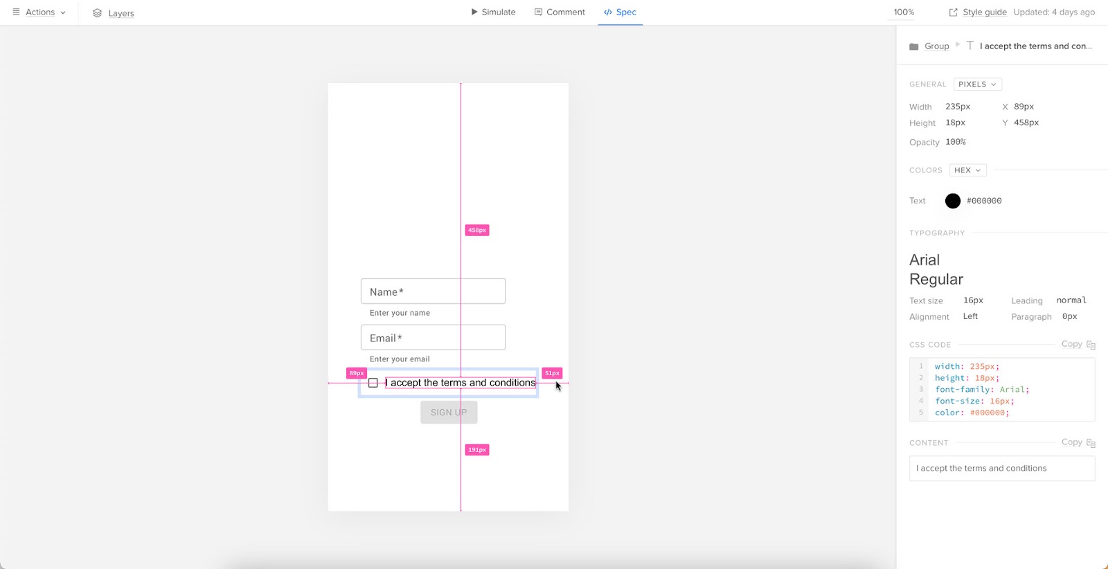
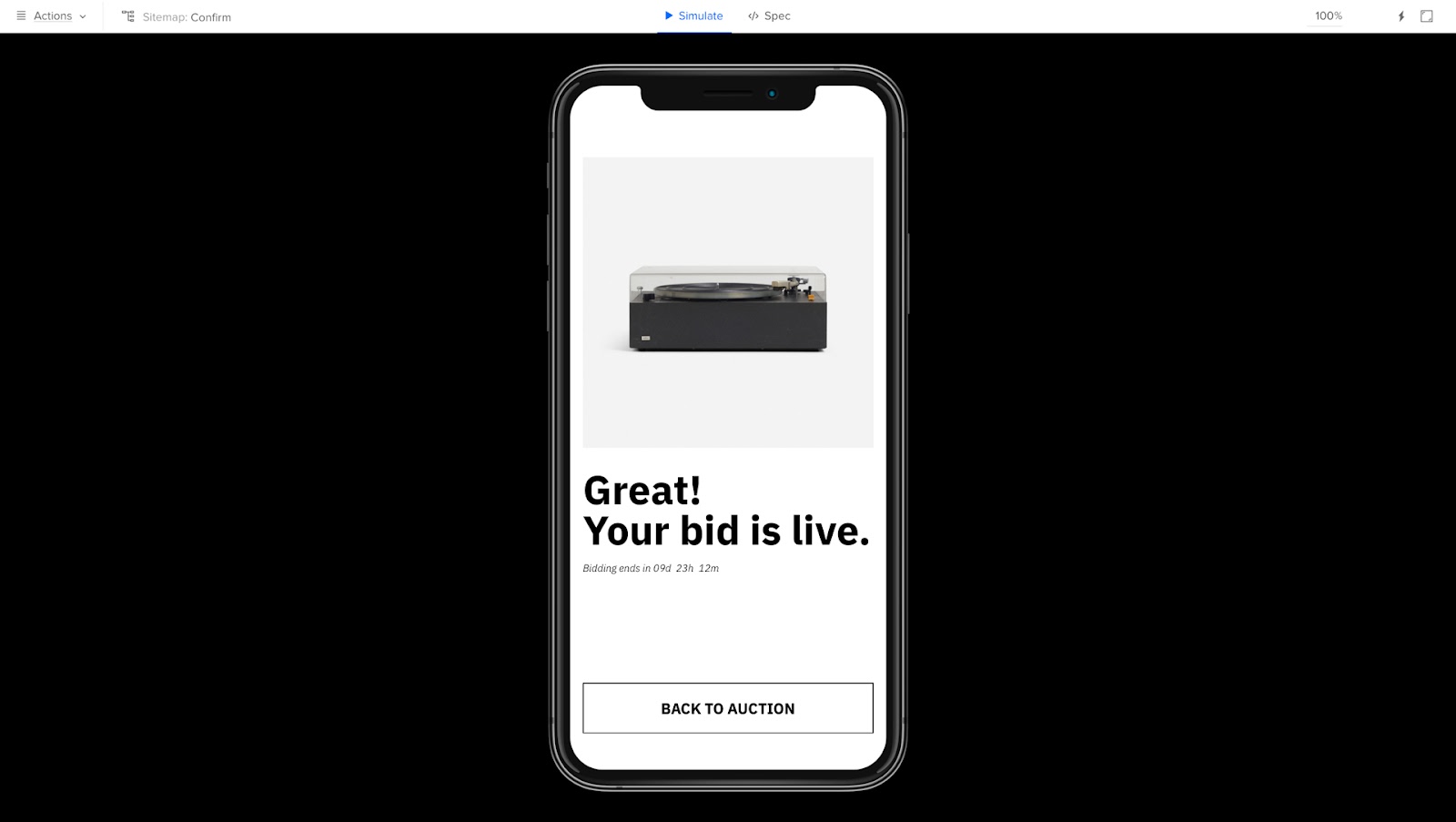
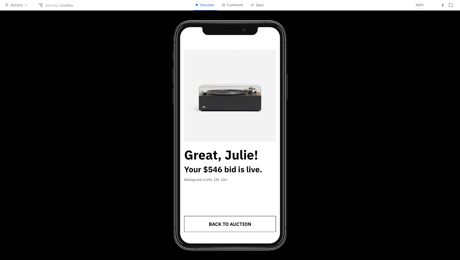
Build fully interactive prototypes to enhance testing with end-users and stakeholders. Get meaningful feedback throughout the UX design process to deliver digital product experiences that meet user and business needs. Sign up for a free trial.

User Goals vs. Business Goals
What are User Goals?
User goals refer to the objectives, desires, or problems users want to achieve, satisfy, or solve when using a product. Understanding and prioritizing user goals ensures a product is usable, functional, and delightful–the core principles of design thinking.
What are Business Goals?
Business goals are the objectives that a company aims to achieve through its product or service. Some examples include increasing revenue, expanding market share, or improving brand reputation.
Understanding User Goals & KPIs

User goals vary depending on the type of product and its target audience. Some common user goals and KPIs organizations use to track them.
Efficiency
Users want to complete tasks efficiently with minimal effort. Products must streamline processes and reduce users’ time to complete tasks and accomplish goals.
KPIs for efficiency:
- Task completion time
- Number of clicks/steps/interactions required to complete a task
Usability
Users want products that are easy to understand, learn, and operate. Intuitive products with simple navigation and helpful guidance enhance the user experience.
KPIs for usability:
Accessibility
Designers must create product experiences that cater to diverse users and abilities. Features like adjustable font sizes, alternative input methods, and compatibility with screen readers are essential to delivering inclusive user experiences.
KPIs for accessibility:
- Level of compliance according to an accessibility checklist.
Personalization
Personalization enhances the product experience with content and features tailored to meet individual needs and preferences. Satisfying this need increases enjoyment, retention, and the likelihood that someone will share their positive experience.
KPIs for personalization:
- Percentage of users who customize settings
- Number of customizations available
- Number of customizations utilized
Reliability
Users expect products to work consistently without errors–especially if they’re paying for something. Products must function correctly without errors, glitches, or performance issues to maintain user trust and satisfaction.
KPIs for reliability:
- Technical error rates (crashes, downtime, etc.)
- Mean Time Between Failures (MTBF)
- Mean Time to Recover (MTTR)
Security and privacy
Users expect organizations to secure personal information and data. mplementing robust security measures, transparent privacy policies, and offering a credit monitoring service reassures users that their data is protected. Using trusted tools such as a Windows VPN further strengthens data protection by encrypting traffic and reducing exposure to online threats. It also helps users maintain anonymity online, ensuring their sensitive activities remain shielded from unauthorized tracking.
KPIs for security and privacy:
- Number of security incidents
- Number of data breaches
- Number of privacy complaints
- Number of privacy complaints per jurisdiction
Aesthetics
An attractive and visually appealing product can enhance the customer experience and contribute to a favorable product perception. Good aesthetics also reinforce a brand’s identity and make a product stand out from its competitors.
KPIs for aesthetics:
- User feedback on design elements (interviews, reviews, surveys, etc.)
Enjoyment
Incorporating elements of fun, delight, or entertainment can make a product more engaging and enjoyable.
KPIs for enjoyment (engagement metrics):
- Average session length
- Retention rate
- Frequency of use
- Net Promoter Score (NPS)
Social interactions
Users often seek social interaction or the ability to share their experiences with others. Integrating social features or facilitating user communication can improve a product’s appeal.
KPIs for social interactions:
- Number of comments, likes, shares, etc.
- Average follows per account
- Number of invitations sent to friends
Support and assistance
Providing accessible and responsive customer support and comprehensive documentation or tutorials can enhance user satisfaction and build loyalty.
KPIs for support and assistance:
- Number of customer support tickets
- Customer support response times
- Ticket resolution rates
- Satisfaction scores from support interactions
Understanding Business Goals & KPIs

Business goals vary depending on the business, industry, and the organization’s strategic priorities. Here are some common company goals you’ll find across multiple sectors in product design.
Revenue growth
Increasing sales and revenue is a primary objective for most businesses. The product design team can contribute to revenue growth by creating appealing, functional, and well-priced products. They can also streamline revenue-generating interfaces and user flows to increase revenue. For SaaS companies specifically, tools like Baremetrics provide critical visibility into subscription metrics like MRR, churn, and customer lifetime value, helping product teams understand how design decisions impact revenue directly.
KPIs for revenue growth:
- Total daily/weekly/monthly/quarterly/annual revenue
- Revenue growth rate
- Average revenue per user (ARPU)
Market share expansion
Market share is a crucial product metric because it represents a company’s percentage of an industry’s total sales. Increasing market share relies on organizations being competitive in many factors. Those most relevant to product teams are innovation, features, performance, and good user experience, to name a few.
Innovative design can help differentiate a product and make it more attractive to potential customers, thus increasing market share.
KPIs for market share expansion:
- Market share percentage
- Market penetration rate
- Customer acquisition vs. industry/competitor benchmarks
Customer acquisition
Acquiring new customers is crucial for business growth and influences many other business objectives. Designing products that cater to the needs and preferences of target audiences can help attract new users and convert them into paying customers. For B2B sales teams, Sendspark enables personalized video outreach at scale, combining AI voice cloning and dynamic personalization to create individually tailored prospecting videos that significantly improve engagement and conversion rates.
KPIs for customer acquisition:
- Number of new daily/monthly/annual customers
- Customer acquisition cost (CAC)
- Conversion rates (from trial to paid plans, subscribers/users to customers, etc.)
Customer retention
Keeping existing customers engaged and satisfied (customer life cycle) is essential for long-term success. Product design can help improve customer retention by addressing user feedback, implementing feature requests, and continuously refining the user experience.
KPIs for customer retention:
Brand reputation and recognition
A strong, consistent brand identity can help businesses stand out and build consumer trust. Product design can enhance brand reputation by ensuring that products align with the company’s values, aesthetics, and overall brand strategy.
KPIs for brand reputation and recognition:
- Measuring brand awareness
- Net Promoter Score (NPS)
- Periodic sentiment analysis
- Social media sentiment analysis
Cost reduction
Costs impact profit, which means lower salaries, bonuses, and shareholder returns. Businesses often seek to reduce product development, manufacturing, or support-related costs.
Efficient product design can minimize these costs in several ways:
- Optimizing product performance (reducing server costs)
- Reducing input costs
- Simplifying workflows and processes
- Improving product quality
- Reducing time to market for new releases
- Reducing support tickets
KPIs for cost reduction:
- Product design costs (design, prototyping, testing, etc.)
- Product development costs (programming, servers, API requests, etc.)
- Operational costs
- Labor time and costs
- Employee onboarding costs
Scalability
Businesses must often scale to meet increasing demand or expand into new markets–especially growth-hungry startups. Product design teams must consider scalability to ensure products and supporting resources can adapt or grow to meet future needs.
KPIs for cost scalability:
- Time to market for new product releases
- System performance under increased load or demand
- Product adaptability to new markets or customer segments
Innovation and differentiation
Remaining relevant and competitive requires continuous innovation. Product teams are crucial in driving innovation by exploring new technologies, products, and approaches.
KPIs for cost innovation and differentiation:
- Number of new features or product improvements released
- Percentage of R&D budget allocated to innovation
- Number of patents filed or industry awards received
Regulatory compliance
Businesses must ensure products comply with relevant laws, regulations, and industry standards. Product teams must ensure that products, UIs, and processes meet regulatory requirements, making necessary adjustments for specific jurisdictions–for example, Californian and European users. To verify that these localized experiences are functioning correctly, developers often use a static residential proxy to simulate a connection from a specific region and audit the site as a local user would.
KPIs for regulatory compliance:
- Number of compliance audits passed
- Number of non-compliance incidents
- Fines or penalties incurred due to non-compliance
Environmental and social responsibility
Many companies prioritize sustainability and social responsibility initiatives, particularly in countries and states where the laws mandate they meet specific goals and requirements. Product teams can contribute to these goals by reducing e-waste (digital waste), optimizing performance (reducing server requests), and reducing product file sizes to minimize storage.
KPIs for environmental and social responsibility:
- Measuring and reducing greenhouse gas emissions related to the product
- Measuring and reducing energy consumption during the design and development process
- Measuring and reducing e-waste
- Measuring the social impact of products
How do you Balance Business Goals and User Goals?
Balancing business goals and user goals is challenging. It requires continuous iteration to develop features and improvements that address user needs and business goals.
Here are two real-world examples where product teams have managed to strike the right balance.
Example 1: Spotify
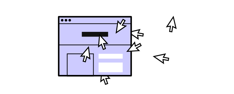
User goals: Spotify users want a personalized and enjoyable listening experience, with easy access to their favorite songs, artists, and playlists. They also appreciate discovering new music based on their preferences.
Business Goals: Spotify aims to grow its user base and increase revenue through premium subscriptions and ads. Product teams also constantly update the user interface, features, and performance to maintain a competitive advantage in the streaming industry.
Balancing Approach: Spotify addresses user and business goals by investing in algorithms that generate personalized playlists, such as Discover Weekly and Release Radar. These features enhance user satisfaction by providing tailored music recommendations, encouraging users to spend more time on the platform, increasing ad exposure, and driving subscription upgrades. By focusing on features that improve the user experience while also supporting its revenue model, Spotify successfully balances user and business goals.
Example 2: Airbnb
User Goals: Airbnb guests want a seamless booking experience, accommodation variety, and reliable communication with hosts.
Business Goals: Airbnb aims to grow its network of hosts, increase bookings, and generate revenue through service fees. The company also wants to maintain its reputation as a trusted accommodation marketplace.
Balancing Approach: Airbnb addresses user goals by investing in an intuitive user interface, robust search and filtering capabilities, and a reliable messaging system between guests and hosts. To meet its business goals, Airbnb offers support and resources for hosts to improve their listings and customer service, such as the “Airbnb Host Resource Centre.” (for the UK, but there are similar resources for other countries.)
By implementing a review and rating system, Airbnb ensures transparency and trustworthiness for guests and hosts. This balance between user and business goals has been vital to Airbnb’s growth and success.
Design user-centric products your customers will love while impressing stakeholders with fully interactive prototypes. Sign up for a free trial to explore UXPin’s advanced features.