How Functional Prototypes Improve Usability Testing?

Make Fully Functional Prototypes to Improve Usability Testing

Launching a successful digital product takes a lot of effort. Working hard, however, does not ensure that users will adopt your product. 

The truth is users may resign from your product, because you haven’t tested the product before release.  If you skipped creating an advanced, fully functional prototype and decided to go with a low-fidelity one and then went into the development stage, there was no room for any reliable usability tests.

Only now do you realize that you spent countless hours building a product that is not as successful as you anticipated. 

Let’s learn from this hypothetical mistake by taking a closer look at the importance of usability testing and why you need functional prototypes to get accurate results from your trials.

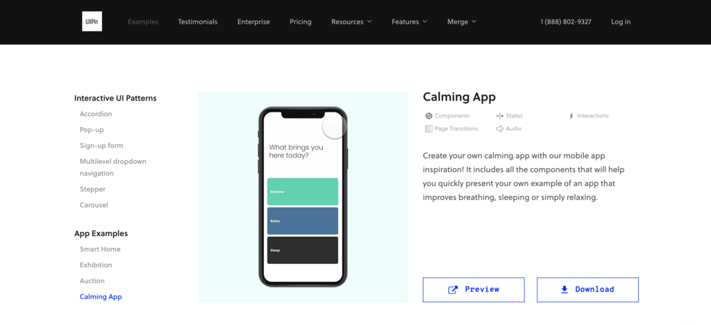
Build functional prototypes without missing deadlines. Use UXPin Merge and use functional components that can be assembled into ready-to-test prototypes in minutes instead of hours. Discover UXPin Merge.

Reach a new level of prototyping

Design with interactive components coming from your team’s design system.


Most Digital Products Fail

The odds of success are not in your favor. That’s not a pessimistic outlook. That’s just what the numbers say. 

Only about 0.5% of apps succeed. Let that sink in. If you build 200 apps, the statistics say that only one of them will succeed. What happens to the rest of them?

  • 67.8% never reach 1,000 downloads.
  • 17.9% never reach 1,000 active users.
  • 5.8% don’t retain users, meaning they probably get deleted and forgotten.
  • 5.8% don’t earn any revenue. Nothing in return for all of that work!
  • 1.4% make some money but never turn a profit. 

You can’t deny the math, but you can test your products before committing to launch.

After this heavy dose of reality, you might wonder why user testing even matters. What’s the point?! One out of 200 apps turns out to be successful! 

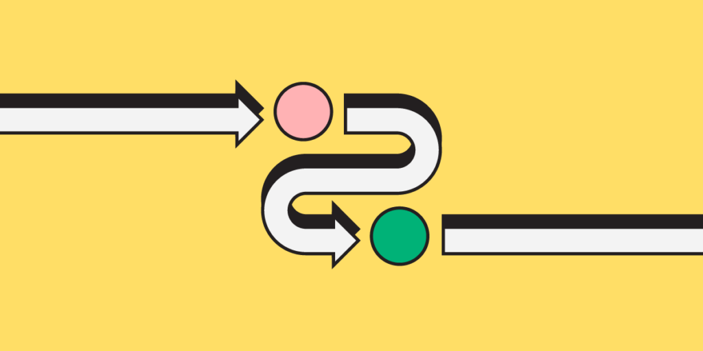
Fully Functional Prototypes Give You Perspective

Let’s put this into perspective so you can see the true benefits of working prototypes and user testing. 

First, a lot of those apps are worthless. They don’t perform functions that anyone wants. If you have seen the second season of Silicon Valley, you probably remember the “Bro app.” All it does is send the word “bro” to other people who have the app. Silicon Valley did an excellent job skewering some of the insane trends in technology. With the Bro app, the show lampooned all of the meaningless products out there.

The internet has thousands upon thousands of Bro apps.

user search user centered

Second, a lot of companies don’t spend enough time developing and testing their apps. According to appinventiv, 24% of developers spend three months or less working on their products before launch. Some of those companies launched their apps within one month. Is it feasible to research the market, design your product, develop your product, test it for quality assurance, and launch within a month? That seems unlikely.

Third — and this brings us to the heart of the matter — very few designers have the benefit of user testing with fully functional prototypes with interactive features and real data.

team collaboration talk communication ideas messsages

If you casually say to someone, “I’m going to make an app that sends the word ‘Bro’ to people,” you’ll probably get some encouragement from well-meaning friends. You’ll get a much different response when you put the app in their hands and tell them how much it will cost to develop, launch, and market.

With functional prototypes, you gain a perspective that you rarely get from mockups that don’t do anything except sit on the page (or screen).

Early Usability Testing Saves You Time and Money

You’re a project manager with two designers and three developers on your team. Over one year, you can expect to pay your designers about $53,400 each and your developers about $114,300 each. Your small team costs $449,700 per year, plus benefits. (These are the median salaries in the United States. Professionals might get paid different amounts in your area.)

Obviously, you want to get as much productivity as possible from your staff. You cannot make that happen when you wait until the end of the development process to test your products. When you enter the usability testing phase, you might discover that your developers spent a week adding a feature that no one even wants to use. What a waste!

user bad good review satisfaction opinion

Early usability testing that happens during the design phase speeds up your process (and shifts more of the responsibility to employees who earn lower salaries). With fully functional prototypes, you might discover that an interaction doesn’t perform as expected. You might learn that most users prefer one layout over another. You might find out that people despise the core concept of your product!

It’s always better to learn these things early in the process. If usability testing shows that you have a terrible concept, throw it out now before you dedicate more money toward it. You can always come up with a better idea.

Calming App Design Fast Example

By creating interactive components in your prototypes with states, conditions, and interactions, you do not need to rely on your developers to create a feature before you test it. Tools like Adalo — a no-code app builder that lets entrepreneurs and business teams design and build custom database-driven apps without requiring developers — exemplify how prototyping can be accelerated to validate concepts quickly.

Also, you can send your prototype to anyone. They don’t need UXPin accounts. As long as someone has the right link to your project, they can interact with the prototype and leave comments.

Not sure how to improve product usability? Start with these 5 User Experience Principles to Help Guide Your Work. Nothing’s more effective than doing the job right the first time.

Working Prototypes Break Down Barriers Between Designers and Developers

You might worry that your prototype — as functional as it seems — might not perform as precisely as your end product does.

logo uxpin merge 1

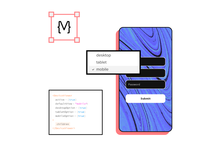
Merge eliminates your concerns as each component is fully coded. No, you don’t need to know how to write a single line of code! It’s easy because as a designer you look at the interactive UI and developer looks at the production-ready code of the same component. One element, yet two perspectives.

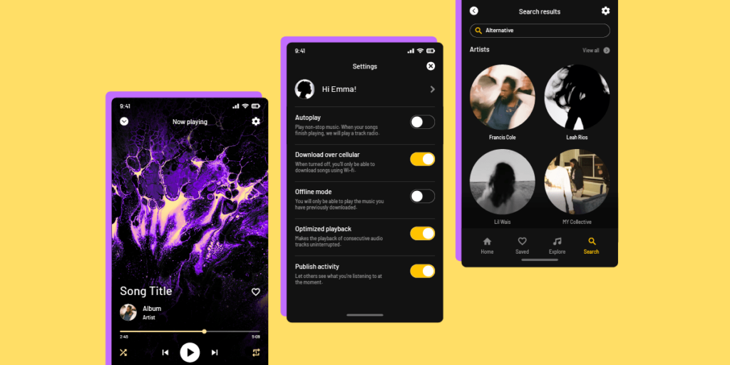
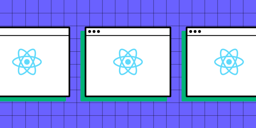
Merge’s code-based approach to design also means that your developers can create new products from existing components. You already know how the features behave, so you can fit them together in inventive ways and offer your users new tools. Once you have a library of React components or a Storybook, it’s easy to put them together and know how they will interact.

Get started with Merge to test fully functional prototypes

Merge isn’t one of those prototyping tools that only give you an imitation of the final product. You get fully functional prototypes that you can start testing immediately. What’s most important, it takes you 10x faster to build a hi-fi prototype to test out.

Get started with Merge today so you can see how much easier, faster, and less expensive digital products become when you can improve usability testing with prototypes that work just like the final product.

A Simple Recipe to Building Resilient Design Operations

A Simple Recipe to Building Resilient Design Operations

As organizations strive to streamline their design processes and enhance collaboration, DesignOps serves as the backbone to align design objectives with business goals.

UXPin recently hosted a webinar with three DesignOps experts titled Strategies for Building a Resilient DesignOps Practice, which provided valuable insights and strategies. 

The webinar featured a panel of three industry experts:

  • Salomé Mortazavi, Senior Director of DesignOps and Design Systems at SiriusXM
  • Meredith Black, a seasoned DesignOps consultant
  • Adam Fry-Pierce, Chief of Staff for UX Leadership at Google

These highly knowledgeable individuals brought unique perspectives and experiences, discussing the challenges and opportunities in DesignOps.

Streamline redundant operational tasks and workflows with a single source of truth from UXPin. Visit our Merge page for more details and how to request access.

Reach a new level of prototyping

Design with interactive components coming from your team’s design system.


Pinpoint the Real Needs of Design Teams

designops increasing collaboration talk

It’s essential to understand and address the real needs of design teams when building a resilient DesignOps practice. One of the fundamental challenges that design teams face is the lack of alignment between design and the overall business strategy. This misalignment can lead to inefficiencies, communication gaps, and resource constraints that hinder the design process.

Creating a common vision

A pivotal step in addressing the needs of design teams is to create a common vision. This shared vision involves aligning the design team’s objectives with the business’s broader goals. By establishing a shared understanding of the role of design within the organization, teams can work more cohesively and effectively.

Learn about creating Design Team Vision Statement.

Streamlining workflows

Another critical aspect of supporting design teams is streamlining workflows. Design teams often encounter bottlenecks and inefficiencies due to fragmented processes. DesignOps can help design teams overcome these challenges by streamlining workflows to improve efficiency while fostering a more collaborative environment.

Implementing design systems

The implementation of design systems is an effective way to address communication gaps and resource constraints. Design systems provide a set of standards and guidelines that help maintain consistency across different design projects, facilitating better communication and collaboration among team members.

Aligning roadmaps with maturity models

Aligning roadmaps with maturity models is beneficial in the design planning process, including assessing the design practice’s current state and identifying improvement areas. By aligning roadmaps with maturity models, design teams can ensure their efforts focus on achieving specific milestones and objectives.

Check out: Iress Quests of Achieving the Final Level of Design Maturity.

Rightsize the DesignOps practices

designops increasing collaboration group

Rightsizing DesignOps practices is essential for tailoring operations to the specific needs and maturity of the design teams, including aligning the DesignOps roadmap with the organization’s maturity model, which helps define areas of focus within the dimensions of maturity.

Using maturity models

ds maturity

One effective approach is to align DesignOps roadmaps around a maturity model by gathering the design leadership team and discussing qualitative challenges, needs, and goals. The maturity model helps outline focus areas and identify and prioritize themes. This alignment ensures that DesignOp’s efforts focus on achieving specific milestones and objectives that align with the organization’s maturity.

Read a Checklist to Track DesignOps Maturity.

Advocacy for design inclusion in planning

Another critical aspect is advocacy for the inclusion of design in the organization’s planning process. Sometimes design is not seen as an essential planning component, so it takes advocacy from the design team to change this perception. By advocating for design and demonstrating its value, DesignOps can ensure that design is a key consideration in the organization’s planning and decision-making processes.

Internal focus and team growth

In addition to aligning with organizational goals, it’s vital to focus internally on the design team’s needs. This alignment involves assessing how the team can grow and how to provide designers with development prospects. Sometimes designers may get stuck working on the same type of project, and it’s essential to provide them with diverse opportunities that contribute to their growth and development.

Read our eBook about design teamwork: DesignOps First Pillar: How We Work Together.

Identify and Establish Critical Cross-Functional Partnerships

designops increasing collaboration group collab

Establishing critical cross-functional partnerships is essential for the success of DesignOps. These partnerships ensure that the design operations align with the goals and incentives of other teams and departments within the organization.

Understanding goals and incentives

One of the key aspects of establishing cross-functional partnerships is understanding the goals and incentives of partners. It is essential to recognize that different teams and departments have distinct goals and motivations that drive their actions.

By understanding these goals and incentives, DesignOps can align its efforts with those of other teams and work towards common organizational objectives. This alignment is crucial for ensuring that DesignOps integrates with the broader organizational goals and doesn’t operate in isolation.

Balancing urgency and importance

Another important consideration in establishing cross-functional partnerships is balancing urgency with importance. While it is important to focus on building culture and connecting designers, it is also crucial to recognize that urgency often takes precedence. DesignOps must focus on driving value for design organizations while ensuring efficiency.

Scaling and scoping DesignOps

When establishing cross-functional partnerships, it is also essential to consider the scale and scope of DesignOps, including assessing the unique needs of different teams and determining the appropriate scale and scope of DesignOps to meet these needs.

Starting slow and understanding the nuances of the team and organization can help identify what types of support and resources they need. This systematic approach ensures that DesignOps is rightsized and tailored to the organization’s specific needs.

Measure and Impact: How to tell a story about the ROI of DesignOps

designops efficiency speed optimal

Measuring the impact and telling a story about the ROI of DesignOps is essential for justifying its role within an organization and focusing on the critical aspects that drive value for design and cross-functional teams.

Focus on impact

One of the vital aspects of measuring DesignOps is focusing on impact. DesignOps practitioners must resist the urge to do everything and instead concentrate on the most critical things. It is important to recognize that the size of the DesignOps team does not necessarily equate to impact. Therefore, focusing on efforts that are low cost but high reward is essential.

Building the foundation

Before adding layers to DesignOps, you must build a solid foundation by focusing on the essential aspects that drive value for design and cross-functional teams. Once you lay this foundation and there is buy-in from the organization, you can start adding additional layers while being mindful not to detract from the core value that DesignOps provides.

Internal scaling and multipliers

In times of austerity, getting creative with scaling efforts is crucial, which does not necessarily involve increasing headcount but may involve partnering with managers or leaders interested in DesignOps. It may also affect unlocking opportunities for design leads interested in processes and DesignOps activities. These internal multipliers can help scale efforts without necessarily increasing costs.

Transitioning designers to DesignOps

Another approach to scaling DesignOps is transitioning designers to DesignOps roles. Many designers may already be performing DesignOps activities without realizing it. By transitioning these designers to DesignOps roles, organizations can leverage their understanding of design to drive value for DesignOps.

Scope Impact: Cost Centers and Revenue Generators – Metrics in our Sphere of Control

designops efficiency person

It’s essential to focus on business needs through cost centers and revenue generators when scoping the impact of DesignOps. This scoping involves establishing robust cross-functional partnerships and focusing on metrics within DesignOps’ sphere of control.

Focus on business needs

Identifying the critical aspects that drive value for the business and focusing efforts on these aspects is vital for impact scoping. It is essential to recognize that while there are many things that DesignOps can do, focusing on those that have the most significant impact on the business creates the most value and ROI.

Establishing cross-functional partnerships

Establishing strong cross-functional partnerships involves building relationships with other departments and functions within the organization, such as engineering, product, and technical program managers. These partnerships ensure that DesignOps is aligned with the organization’s broader goals and can contribute to achieving them.

Personal relationships as an investment

Building personal relationships with cross-functional partners allows DesignOps to better understand other departments’ and functions’ goals and needs, which helps align efforts while focusing on metrics within DesignOps’ sphere of control.

Adapting to changing times

DesignOps must be agile and adaptable to change by being resilient and looking for opportunities to grow and develop, even in times of austerity. By being flexible and resilient, DesignOps can continue to drive value for the business, even during change.

DesignOps and ChatGPT (+ Other Generative AI)

In the context of DesignOps, artificial intelligence (AI) and generative models like ChatGPT can significantly streamline design processes and enhance productivity. Here’s how:

Automating routine tasks

AI can automate routine and repetitive tasks in the design process, freeing designers to focus on more complex and creative aspects of their work. For example, DesignOps practitioners can use AI to automate design asset generation, user interface components, and even entire layouts based on predefined rules and guidelines. Adalo‘s AI-powered generation pairs with a visual canvas to enable teams to design and publish custom database-driven apps without code, accelerating the entire development lifecycle.

Rapid prototyping

Generative AI models can assist in rapid prototyping by generating design concepts based on specific inputs. Leveraging AI can significantly speed up the design ideation and concept development phase, allowing designers to explore a broader range of ideas in less time.

User research and data analysis

AI can also assist in user research and data analysis. For example, AI can analyze user behavior data to identify patterns and trends, providing valuable insights to inform design decisions. DesignOps can also use AI to conduct user testing and gather feedback, automating the otherwise time-consuming process of collecting and analyzing user responses.

Enhancing collaboration

AI models like ChatGPT can improve collaboration by serving as virtual team members generating ideas, providing feedback, and assisting with various tasks. These AI assistants can enhance the efficiency and productivity of design teams, especially in remote and distributed work environments.

Enhance designer and developer collaboration by bridging the gap with UXPin’s Merge technology. Create a single source of truth across the organization, eliminate drift, reduce time to market, and minimize debt with one tool. Visit our Merge page.

What Is Green UX? Definition, Best Practices & Resources

Green UX min

Everything we do affects the planet. From recycling and saving water to going electric and reducing our environmental impact – all of these make a difference. But what about web and mobile apps? Yes, these digital resources also play an important role in how much damage gets done to the environment. 

According to the IEA, the average person’s annual energy-related carbon footprint is around 4.7 tonnes of CO2. Data centers and transmission networks are responsible for about 1% of global energy consumption. These are big numbers, but people can do more to bring them down.

This article unpacks the concept of Green UX. It explores what teams can do to pursue it and the tools and resources available in the fight against the climate crisis.

Bridge the gap between designers and developers and build digital products faster. Use UXPin Merge technology, the only end-to-end prototyping technology for bringing code-based components to design. Optimize your workflow. Discover UXPin Merge.

Reach a new level of prototyping

Design with interactive components coming from your team’s design system.


What is Green UX?

Green UX means focusing on how ecologically sustainable a product is. It involves considering what designers and developers can do to minimize the product’s impact. In other words, it’s all about ensuring that the result of UX design efforts is environmentally conscious and ‘greener’.

But Green UX starts with aligning team project goals by implementing eco-conscious prototyping principles into early product design. This drives an increased sense of responsibility among team members. All this while fostering the development objectives aimed at educating customers while serving them.

How Designers Can Reduce Carbon Footprint

prototyping design drawing pencil tool

Sustainable design is already an important consideration for many. And encouraging customers to play their part makes for good business. But going green with web and mobile apps is essential to the fight against climate change.

Here are some tips and best practice ideas that allow designers to boost sustainable design ambitions.

1. Upload smaller images and files where possible.

loading

The bigger the file, the longer it takes to load in the app. Aside from hurting the user experience, images and files that take longer to load demand more of the device’s power. And unnecessary power consumption isn’t great for those eco-friendly goals. 

Prototyping aims to prove that an app’s design works. So save the attractive parts for later. This is why prototypes shouldn’t boast high-res images or oversized files. There’s no point in using high-resolution images when designing minor elements for small-screen mobile devices in any case.

Instead, use a JPEG image or a file format with similar efficiency properties. The difference in quality on a smaller screen won’t be noticeable. And the far smaller file size will help the app to run smoothly without degrading function or design. 

2. Use file formats will take up less space.

file folder

Storage space matters. The format chosen for saving files plays an important role in how much space is needed to store them. Since designers must continually transfer, download, and import files, larger ones can also chew up resources. This can affect performance and increase energy output.

Picking the right file formats for prototypes is essential to green UX. Besides ensuring optimal load performance, efficient file formats mean more effective space usage. Naturally, avoid formats that may compromise the project and pick from the more efficient formats available.

Opting for file formats like SVGs over embedded videos or GIFs lowers both page load times and storage space. For example, one designer shared that the decision to use SVGs for animations instead of video or GIFs helped reduce the page load speed from 8.75 to 412 ms. and page size from 1.6 MB to 389 KB.

Similarly, turning to CSV versus larger data file types is ideal for improving sustainability while still using a widely utilized file format and decreasing its data usage. For teams managing extensive data operations, tools like Integrate.io can help optimize data pipelines and transformations, ensuring efficient data handling without unnecessary overhead.

3. Choose a simpler design over a complicated one.

designops picking tools options

Keeping things on the design front simple means less time, resources, and energy invested in developing web and mobile apps. Lighter design elements and uncomplicated design structures allow designers to save time – and energy – creating them. “Less is more” design approaches are tried-and-tested UX angles, and end-users prefer the uncomplicated journey over a congested one.

Prototypes with oversized multimedia and complex JavaScripts consume more to build and roll out. Eliminating unnecessary components allows a smoother UX, limiting the chances of problems. Custom fonts, optimized images, and structures demanding fewer HTTP requests are effective green UX enablers.

CSS image sprites are always a good idea. They allow designers to combine optimized images into easy-to-access collections. This reduces server redirects and saves on bandwidth. With all pictures, logos, and other visual elements in one place, designers can decrease carbon emissions.

4. Prioritize design accessibility.

accessibility

Product design accessibility and usability don’t have to be sacrificed in pursuing Green UX. In fact, they can be incorporated into the sustainable UX design mission. By prioritizing things like readability and navigation, users spend less time in the app, saving on CO2 output.

Content presented in a light and accessible layout allows users to understand what they’re doing faster. This also helps with improving the overall experience. At the same time, an intuitive app architecture makes for more efficient navigation. This enables users to reach their target content in fewer clicks. Easier-to-read content clearly laid out and easily interpreted improves design appeal for everyone.

Designers can consider reducing app interface clutter. Doing so makes things clearer and minimizes page load volumes. Improving findability with content organized into helpful categories means better efficiency. Clear menus are a must-have for any good UX too.

5. Optimize user journeys.

process direction way path 1

A user journey optimization is essential to reducing app energy outputs. With around 90% of the time spent on peoples’ smartphones taken up by apps, attention spans are decreasing.

Apps with more content naturally demand more time from the user and, thus, requiring more instead of less energy. Congested pages can lead to higher rates of page abandonment. They also complicate key information discoverability, resulting in missed CTAs.

Designers should consider optimizing user journeys to assist people in getting from A to B quicker. When users get distracted or confused, app time spikes as they struggle to reach their goals.

Usability testing is an effective way to identify the points in these journeys where people are drifting off-course. Designers can streamline them by addressing real user problems more efficiently. UX professionals should also ensure that every page element supports the user journey. They can do this by minimizing the steps and time taken to reach goals.

6. Create a prototype.

uxpin merge component responsive 1

Possibly the most effective Green UX action design teams can take is to develop a prototype. This allows them to test the app out before heading into full-scale development.

Prototyping: 

  • Helps avoid feature bloat
  • Reduces redesigns
  • Prevents serious mistakes
  • And ensures the product design process is more efficient.

But building a functional prototype can still increase CO2 output if the process is not managed correctly. From presenting only essential features to soliciting feedback faster, effective prototyping is critical. 

UXPin Merge is the ideal tool for efficient prototyping. UXPin delivers realistic prototypes because it helps you use your app’s components in prototyping. It allows advanced feedback sourcing and a more engaging experience for users.

Merge technology helps design teams reuse their UI coded components, sourced from developer repositories. UXPin means faster prototype delivery, efficient design handoffs, and an optimized design process. What better way to deliver prototypes while minimizing output and an app’s carbon footprint?

Resources & Tools

designops increasing collaboration talk

Here are some resources and tools perfect for helping teams pursue a Green UX agenda when developing their app UX.

  • Image formats – For understanding the differences between PNG, GIF, JPEG, and SVG formats. This StackOverflow community analyzes the best options for figuring out the optimal file formats for design teams.
  • Reducing file sizesTinyPNG is an effective tool for compressing WEBP, JPEG, and PNG files. The web app decreases selected colors without compromising the image.
  • Optimizing team collaborationMural.co makes teamwork easy and fast. This intuitive digital whiteboard tool will save teams time and effort, reducing energy output.
  • Green UX and digital sustainability resources – This ScreenSpan blog post offers a library of resources for teams looking to learn more about digital sustainability.
  • The Green UX checklistManoverboard’s Green UX checklist is the ideal starting point for design teams. Perfect for those looking to follow a step-by-step sustainability agenda.
  • Motivation & inspiration – Boasting content, videos, and speakers who understand the need for Green UX, sustainableux.com is an MIT-affiliated resource worth exploring.

Switch to Green UX

From developing the digital product to rolling it out and the energy required to run it, everything matters. Green UX is an often-overlooked UX design concept. It means designing a user experience that thinks about the planet. It helps designers build something with a reduced carbon footprint. At the same time, ensuring that end-users still enjoy the benefits of a clean, effective UX and UI design.

But it extends beyond the direct ecological impact of web pages or mobile apps. It allows designers – and eventually users – to think differently. It’s a concept that is growing in stature, and it is being rolled out across many different industries and platforms. 

Everybody wins with a Green UX agenda – not just the planet. With a more sustainable approach to design, an app’s user experience is seen as more beneficial. It appeals to a more environmentally conscious market. Go green. Go Green UX. Your app will thank you.

Release products faster with UXPin’s Merge technology. Design realistic prototypes fast and keep consistency between design and code. Streamline your DesignOps processes. Discover UXPin Merge.

High-Fidelity Prototype – How to Create One in UXPin?

high fidelity prototype min

Fidelity refers to the level of detail and realism in a prototype or design. It represents how closely the prototype resembles the final product in terms of visual design, interactions, and functionality. High-fidelity prototypes are highly realistic and aim to simulate the final user experience as closely as possible.

High-fidelity prototypes (hi-fi prototypes) include visual and interactive elements that align with an actual product’s user interface, such as accurate colors, typography, interactions, animations, and imagery. These prototypes offer users and stakeholders a more immersive and realistic experience, enabling them to better understand the end product’s look and feel.

Designers create high-fidelity prototypes in the later stages of the design process to test and validate concepts, gather user feedback, and refine the user experience. These prototypes allow designers to assess the usability and effectiveness of the interface, identify potential issues or improvements, and make informed product design decisions.

Make better design decisions with fully interactive prototypes with UXPin’s Merge technology. Visit our Merge page for more details and how to request access.

Reach a new level of prototyping

Design with interactive components coming from your team’s design system.


High-Fidelity vs. Low-Fidelity Prototypes

Designers use high-fidelity and low-fidelity prototypes at separate stages of the design process for different purposes and goals.

Low-fidelity prototypes (lo-fi prototypes) are simplified design concepts typically created using rough sketches, wireframes, or basic digital mockups. Designers create these lo-fi prototypes early in the design process to iterate on many ideas collaboratively and as quickly as possible.

Low-fidelity prototypes focus on the design’s core structure, information architecture, and functionality. They are quick and easy to create, allowing designers to explore and iterate on multiple design ideas without investing excessive time and resources.

High-fidelity prototypes are more detailed and realistic representations of the final design that closely resemble the finished product’s intended look, feel, and functionality, incorporating visual design elements, interactive features, and realistic content. Design teams create high-fidelity prototypes later in the design process to finalize concepts before the design handoff.

Planning Your High-Fidelity Prototype

Designers complete most research and planning during the early stages of the design process. So this step is about synthesizing and reviewing the findings to guide high-fidelity prototyping.

Defining the purpose and objectives of your prototype

Define the specific goals you want to achieve with your high-fidelity by determining what aspects of the design you want to test, evaluate, or showcase to stakeholders.

For example, if you’re designing an eCommerce website:

  • Objective: test the user flow of adding items to the cart and completing the checkout process.
  • Purpose: identify any usability issues and optimize the conversion rate.

Applying user goals from UX research

Thorough UX research must precede prototyping, so designers know what to build and who they’re building it for before jumping into a prototyping tool. Understanding user goals helps tailor a high-fidelity prototype to meet the target audience’s needs and preferences.

For example, if you’re designing a mobile app for fitness enthusiasts, your target audience might be individuals interested in tracking their workouts and progress. This user group’s goals include setting fitness objectives, tracking calories burned, and analyzing workout statistics. Using this research, designers can plan features and interactions accordingly.

Outlining the key functionalities and interactions

Determine the core elements your prototype needs to achieve the desired user experience while meeting the above goals and objectives. Identifying these key functionalities helps you prioritize your design efforts and ensure your prototype captures the essential interactions and user flows.

For example, if you’re designing a flight booking mobile app, key functionalities might include:

  • Searching for flights
  • Filtering search results
  • Viewing flight details
  • Selecting seats
  • Booking payment and confirmation
  • Viewing “my bookings”

Designing the Visual Elements

Designers use research, sketches, and wireframes as a foundation to design the visual elements of a high-fidelity prototype. When designing the visual elements, designers consider various aspects such as typography, colors, iconography, and imagery.

The product’s typography and colors must align with the brand identity and enhance readability. A product’s iconography communicates actions and features using familiar and intuitive symbols. Imagery, including illustrations and photos, enhances the user experience and conveys the desired message.

Designers must also consider how these design elements impact accessibility, including color contrast, legibility, and assistive technologies.

Leveraging open-source component libraries

Designers can accelerate the visual design process by using open-source component libraries–i.e., MUI, Ant Design, or Fluent UI. Designers can leverage ready-made visual elements, such as buttons, forms, and navigation bars, to reduce the time and effort required to design and maintain consistent visual language throughout the high-fidelity prototype.

UXPin offers tools and features to simplify the UI design process. They can also use one of UXPin’s built-in Merge libraries to build screens and layouts simply by dragging and dropping UI elements. These components are interactive by default and contain properties defined by the design system, facilitating faster, streamlined, and consistent UI design. For teams building and managing applications at scale, Adalo provides a no-code alternative that lets you design, build, and publish database-driven apps across iOS, Android, and web without requiring developers.

Once this stage is complete, designers will have a set of high-fidelity mockups ready to build interactive prototypes.

Adding Component Interactions and Animations

Designers define different states, such as hover, active, or disabled, to reflect the user’s interactions with the elements. They also create transitions between components to simulate the dynamic behavior of the final product and provide a more realistic user experience. For example, a button remains disabled until users complete a form’s required fields.

Additionally, designers incorporate microinteractions and animations. Microinteractions are small, subtle, and purposeful animations that provide feedback and guide users through their interactions with the prototype. These microinteractions make prototypes feel more engaging and interactive but also communicate important information to the users and guide them through the interface more intuitively.

Leveraging Merge’s interactive components

UXPin’s Merge technology allows designers to bring code components from a repository into the design process. These UI elements contain properties, including interactions, defined by the design system.

This code-to-design methodology means designers never have to worry about setting up component properties, including styling and interactions. Each component’s variants appear in UXPin’s Properties Panel for designers to select. For example, choosing a component’s state.

Designers can also add microinteractions using UXPin’s Interactions feature, which includes triggers and actions for keyboard and mobile.

Simulating User Flows

Mapping user flows and navigation paths

Designers define the logical sequence of screens and the user’s journey through a digital product, including identifying entry points, exit points, and the various paths users can take to accomplish their tasks. This user journey map ensures a seamless and intuitive navigation experience for users.

Defining interactions

Designers use interactive elements such as buttons or links to establish connections between screens according to the user journey map. These connections allow users to navigate different screens and simulate the transitions and interactions they will encounter in the product.

Taking care of transitions

Designers use animations, transitions, and interactive elements to simulate how users interact with the prototype. For example, a button click might trigger a modal to appear, or scrolling might reveal additional content.

By the end of this process, designers are ready for testing your hi-fi prototype with end-users.

Testing and Iterating

Testing is an iterative process where designers continuously improve the high-fidelity prototype by incorporating user feedback and refining the design to create a more effective and user-friendly solution.

Here is a high-level overview of the high-fidelity prototyping process:

  1. Conduct usability testing sessions with representative users to evaluate the high-fidelity prototype and gather valuable feedback on its usability.
  2. Present the prototypes to stakeholders for business value feedback.
  3. Collect and analyze user and stakeholder feedback and insights regarding their interactions, comprehension, and overall experience with the prototype.
  4. Identify areas for improvement and make changes to the prototype based on the feedback received.
  5. Refine the design to address usability issues and enhance the overall user experience.
  6. Repeat the iterative testing and refining process to ensure the prototype meets user needs and aligns with design objectives.

Sharing and Collaborating on Prototypes in UXPin

Sharing UXPin prototypes for feedback and review

UXPin’s Preview and Share lets designers share designs and prototypes with team members and stakeholders. UXPin allows designers to choose what they want to share, including the Sitemap, Comments, Spec Mode, and Documentation.

UXPin share links are available on the open web, meaning anyone with the link can access the project. Designers can password-protect projects so only team members and stakeholders can access them.

Collaborating with team members and stakeholders

UXPin’s Comments feature makes collaborating with team members and stakeholders easy. They can comment directly on the interface, tag one another, assign comments, and resolve them after the appropriate action. With Team and Public Comments, even those without a UXPin account can participant in the feedback process.

Smoother developer collaboration and design handoffs

Building high-fidelity prototypes with code components bridges the gap between the design and development process because designers and engineers speak the same language interpreted through UXPin’s Merge technology.

Designers and engineers see the exact same component, just through a different lens. Designers see the visual elements in UXPin, and engineers work with code in their IDE. This single source of truth reduces friction because designers and engineers work within the same constraints. These constraints also prevent design drift, technical debt, and inconsistencies, creating a more harmonious product development process.

Build better high-fidelity prototypes faster and with more interactivity to enhance user testing and streamline stakeholder collaboration. Learn more about hi-fi prototyping with UXPin Merge.

Top Methods of Identifying User Needs

identifying user needs min

User needs are the specific requirements and expectations of users that a product or service should fulfill to provide value and enhance their experience. These needs represent users’ perspectives, goals, motivations, pain points, and other human factors.

By identifying and addressing user needs, UX designers can create relevant, usable, and possible solutions for the target audience. User needs help define the scope and direction of the product development process, influencing key decisions such as functionality, features, layout, and interaction design.

Understanding user needs also enables designers to prioritize design elements, allocate resources effectively, and make informed design decisions. Make better design decisions with UXPin’s interactive prototypes. Sign up for a free trial to explore UXPin’s advanced features.

Build advanced prototypes

Design better products with States, Variables, Auto Layout and more.


Try UXPin

Desk research

Desk research (secondary research) is valuable for gathering information and insights to understand user needs based on existing data from various internal and external sources, often supported by market research software that helps teams organize findings and spot trends faster. This data can come from published materials, academic papers, industry reports, social media, online resources, and other third-party data sources.

User interviews

team collaboration talk communication

Interviews are a widely used user research method that involves direct conversations with end users to gather insights, understand their perspectives, and uncover their needs. 

Researchers ask questions and prompt participants to share their experiences, opinions, and expectations about a product or service. Interviews provide rich qualitative data and allow researchers to delve deeper into users’ thoughts and emotions.

  • Structured interviews: follow a predetermined set of questions and a fixed order, allowing for consistency and comparability in data collection. They help gather specific information from participants systematically.
  • Semi-structured interviews: offer more flexibility, combining predefined questions with the freedom to explore additional topics and follow up on participants’ responses. This approach encourages participants to express themselves more freely, providing richer insights.
  • User story interviews: focus on understanding users’ goals, motivations, and behaviors by having them narrate their experiences through storytelling. These interviews capture the user’s journey and provide valuable context for understanding their needs and expectations.

Surveys and questionnaires

heart love like good

Surveys and questionnaires are popular user research methods that systematically collect data from many participants. Surveys typically consist of questions designed to gather quantitative or qualitative data about users’ preferences, opinions, behaviors, and demographics. 

They provide researchers with a structured approach to gathering insights from a broader audience, allowing for statistical analysis and identification of trends.

  • Surveys: allow researchers to reach a wide audience and collect data efficiently, providing quantitative insights. Surveys are beneficial for gathering feedback on specific features, user satisfaction, or demographic information.
  • Likert scale questionnaires: use a series of statements or items with response options, allowing participants to rate their level of agreement or disagreement. This method provides researchers with quantitative data to statistically analyze user preferences, perceptions, or attitudes.

Observation and field studies

testing observing user behavior

Observation and field studies are user research methods that directly observe users in their natural environment to gain insights into their behaviors, needs, and experiences.

Researchers can gather rich qualitative data that helps uncover user needs and understand the context in which people use products or services.

  • Contextual inquiry: combines observation and interviewing techniques to understand users’ workflows and the context in which they perform tasks. Researchers observe users in their work or living environment and engage in conversations to gain deeper insights into their needs, motivations, and challenges.
  • Ethnographic research: involves immersing oneself in the users’ cultural or social context to better understand their behaviors, values, and norms. Researchers spend an extended period with the users, observing and participating in their daily activities, to uncover deep insights that influence design decisions.
  • Diary studies: involve participants documenting their experiences, behaviors, or interactions over time. Participants record their thoughts, activities, and emotions in a diary or journal, providing researchers with detailed and longitudinal data. Diary studies offer insights into users’ daily lives, habits, and pain points, helping to identify patterns and uncover unmet needs.

Focus groups

user choose statistics group

Focus groups are small groups of participants engaging in a guided discussion about a specific topic or product. This method allows researchers to collect qualitative data by leveraging group dynamics and participant interactions. 

Participants can share their opinions, ideas, and experiences in a focus group, providing valuable insights into user needs and preferences.

  1. Plan and conduct effective focus groups by defining clear objectives, selecting appropriate participants, creating a discussion guide, and facilitating the session effectively. Creating a comfortable and inclusive environment encourages participants to express their thoughts and opinions freely.
  2. Analyze and synthesize focus group data to identify patterns, themes, and key insights. This analysis involves transcribing or reviewing the discussion, extracting meaningful data points, and organizing them into categories. Researchers can use affinity mapping or thematic analysis techniques to make sense of the data and draw meaningful conclusions.

Usability testing

testing user behavior pick choose

Usability testing evaluates a product or interface’s usability and user experience. It involves observing users performing specific tasks and providing feedback on their interactions. Usability testing helps identify usability issues, understand user behavior, and gather insights for improving the design.

  • Moderated usability testing: a researcher facilitates the session and guides participants through predefined tasks while observing their interactions and gathering feedback. The researcher can ask follow-up questions, clarify uncertainties, and delve deeper into participants’ thoughts and experiences.
  • Remote usability testing: researchers use video conferencing or screen-sharing tools to observe their interactions and gather feedback.
  • Thinking aloud: participants are encouraged to verbalize their thoughts, feelings, and decision-making processes as they navigate a digital product. This narration provides valuable insights into users’ cognitive processes and helps uncover usability issues.

Data Analysis and Synthesis

task documentation data

Data analysis and synthesis is a crucial step in user research that involves organizing, examining, and interpreting the collected data to derive meaningful insights. When research involves data from multiple sources or systems, tools like Integrate.io can help consolidate and transform research data across databases and platforms, enabling researchers to combine qualitative findings with quantitative metrics for more comprehensive analysis.

Qualitative analysis

UX researchers use qualitative analysis methods to analyze and make sense of qualitative data, such as interview transcripts, observation notes, and open-ended survey responses.

  • Thematic analysis involves identifying and categorizing recurring themes, patterns, and concepts within the qualitative data. Researchers review the data, generate codes or labels to represent key ideas, and then group similar codes into broader themes to identify meaningful patterns.
  • Affinity diagrams organize qualitative data by grouping related ideas or concepts. Researchers write each finding on sticky notes and then arrange and rearrange them on a wall or board to discover connections and identify patterns or themes.
  • Narrative analysis examines the structure, content, and meaning of individual stories participants share. Researchers analyze the storytelling elements, underlying themes, and narrative arcs to gain insights into users’ experiences, perspectives, and motivations.

Quantitative analysis

Quantitative analysis methods analyze numerical data and metrics collected through surveys, questionnaires, and quantitative research studies.

  • Statistical analysis applies various statistical techniques to analyze and interpret quantitative data. Researchers use measures of central tendency, dispersion, correlation, and statistical tests to identify data relationships, trends, and patterns.
  • Data visualization represents quantitative data using charts, graphs, and other visual representations. Visualizing data helps researchers and stakeholders easily understand patterns, trends, and relationships within the data.
  • Pattern recognition helps identify recurring patterns, trends, or anomalies within quantitative data. Researchers look for clusters, outliers, or other patterns that can provide insights into user behavior, preferences, or trends.

Combining multiple methods

Combining multiple research methods enables researchers to validate ideas and identify user needs from various sources, providing more accurate and reliable data.

  • Triangulation: Combining multiple user research methods, such as interviews, observations, and surveys, to cross-validate findings and increase the reliability and validity of the data.
  • Mixed-methods approach: Integrating qualitative and quantitative research methods, such as combining interviews with surveys or usability testing with analytics, to comprehensively understand user needs and obtain richer insights.

Integrating User Needs into Design

Designers analyze and interpret user research findings to identify specific design requirements that address user needs. These requirements serve as guidelines for the design process, ensuring that the resulting solutions align with user expectations and user-centered design principles.

Designers create several documents and visualizations to guide the design process, including user need statements, personas, case studies, and other UX artifacts.

Design teams also meet with stakeholders to integrate business goals and user needs. They must consider user feedback, conduct usability testing, and incorporate iterative feedback loops to achieve the right balance. This iterative approach allows designers to continuously refine their solutions based on user needs, preferences, and feedback.

Advanced Prototyping and Testing With UXPin

UXPin’s advanced prototyping features enable design teams to build accurate replicas of the final product. These fully interactive prototypes allow designers to observe and analyze user behavior, preferences, and pain points, validating whether designs effectively address user needs.

Users and stakeholders can interact with user interfaces like they would the final product, giving designers meaningful, actionable insights to iterate and improve.

Whether you’re a startup looking to validate a new product idea or an enterprise team looking to scale your DesignOps, UXPin has a solution for your business. Sign up for a free trial to explore the world’s most advanced UX design tool.

90s Websites – Key Characteristics & Examples

90s website min

Trends have a way of repeating themselves. This is perhaps most apparent in fashion – the 1970s drew inspiration from the 1950s, and in a cycle that repeated itself about every 20 years. That said, this design cycle is not exclusive to clothing trends – it can also be seen in other areas, including website design. 

In recent years, we’ve seen quite a few references to the early days of the world wide web. In this piece, we discuss the main traits of 90s-inspired digital design and give you a few most prominent examples. If you’d like to give your designs that 1990s ‘feel’, you’ve come to the right place.

Build realistic prototypes of websites or apps in minutes in UXPin. Make your prototypes behave like an end-product with UXPin’s powerful features like variables, states, and expressions. Start prototyping. Sign up for a free trial.

Build advanced prototypes

Design better products with States, Variables, Auto Layout and more.

Try UXPin

90s Website Key Characteristics

The early days of the world wide web were iconic, but not nearly as efficient as today’s Internet experience. This breakdown of the most eye-catching and enjoyable aspects of 90s website design is intended to be used as a muse.

When the right amount of nostalgia is mixed with decades of advancement, beautiful and functional websites can be created.   

Patterned background

The 90s were a lot of things, but they certainly weren’t minimalistic! Bright colors and patterns were a staple of the decade, especially when it came to website backgrounds. The night sky, studded metal, bright geometric patterns, and repeating logos were just a few of the bold backgrounds that would catch your eye some 20-30 years ago.

The busy nature of these backgrounds might make them seem unreasonable, especially when streamlining website design for ease of use. In cases where these designs overwhelm other factors on the web page that might be true. Still, the human brain loves patterns. Research suggests that looking at repeating patterns can reduce stress, since they are a form of visual stimuli often found in nature.

So how can you create your own 90s-inspired website background? You have a few options, with the most simplistic being a search for “free repeating background”. 

If you find something you like, add it to your site, and if you don’t, check out sites like Pixabay. A search for repeating patterns will provide you with hundreds of options. If you’re still not satisfied with your findings, create your own design or you hire an artist to bring your background pattern ideas to life.

For some extra 90s magic, you can incorporate an animated background. Sites like Textures Town offer 3D animated designs to fit a variety of themes. The site itself is also a great source of retro inspiration. 

Navigation

Today, website navigation is a core factor when it comes to user experience and attention retention. But that wasn’t always the case. In the 90s most websites were cluttered with links and options that lacked clean categories.

AliWeb, the world’s oldest search engine, is an interactive example of this navigation style. You’ll quickly notice that the navigation of this site is “stacked” unlike navigation on similar search engines, like Google.

ali web 90s website

Sub-navigation systems, most commonly identified as drop-down menus, were not invented until the late 90s to early 2000s. As a result, the most iconic 90s websites used lists of links, icons, or flash animations. User-friendly navigation and 90s-era navigation don’t have to be mutually exclusive. 

Research suggests that the order of website menu items has little effect on the ease with which people locate their options, but the best results come from menus with 10 or fewer options. This suggests that the right balance of 90s-designed menu options can be both, functional and fashionable.

Clickable icons

Menu icons and banners are a common sight on most webpage templates. These simple navigation tools allow words to guide visitors through sites, but icons used to be a preferred method. Embedding images with links allowed early websites a creative and eye-catching alternative to simply listing links with uniform text.

CSS, or cascading style sheets, used to simplify the structure of current web pages was not available in the 90s. Icons offered a simplified and stylish form of navigation that was easy to identify. In some cases, the icons would be suited to their background as if they were interacting with it, or they would stand in stark contrast to it.

90s web design
Source

Apple offers a great example of the effectiveness of well-placed image icons. The icons used today for Apple’s clock, calculator, and notepad are reminiscent of their original forms because their design supports ease of use.

Bright, bold, and boxy icons may be the closest to authentic 90s website design styles, but this form of navigation can be designed with a modern twist to suit your style. 

Animations

One of the most unforgettable, and arguably enjoyable, aspects of 90s website design was the animations. A cursor with a trail of hearts, shooting stars, swimming fish, and a myriad of other whimsical animations brought web pages to life.

Animations came about through the use of Flash. They were cutting-edge and accessible during a period when there were limited resources to make web pages stand out. Animations were most commonly incorporated into mouse movement and clickable icons, but they could also be a part of the background. 

The goal was to make interacting with a website more exciting, and early designers were on to something. Human eyes are drawn to movement, especially when other items in view are unchanging.

Design aspects and preferences may have changed over the years, but eyes and perception have not. This makes animations a valuable tool to this day. Through (the still available) Flash animation software, you can create animations unique to your site’s needs.

The color palette of the 90s

Some periods in history can be defined by popular colors that appeared in everything from fashion to furniture, and the 90s was one of those eras. The color palette of the 90s, especially that which appeared on websites, was split into the two main groups listed below.

space jam nineties web design

Memphis Style

The brighter designs apparent in the 90s fell into a category known as Memphis style. This included bold primary colors, pastels, and neon colors that were often used in contrast with black and white. Geometric shapes were commonly incorporated into Memphis design and a main focus was creating a visually stunning contrast.

This style originated in the 80s and is apparent in the fashion of that decade. Memphis style went on to inspire many web designers of the 90s, and it is still occasionally referenced in modern design.

Grunge Style

The darker side of 90s web design fell into a color pallet known as Grunge style. In stark contrast to Memphis, Grunge is neutral and dark. Black, grey, brown, and beige took center stage in gloomy designs. Inspiration was drawn from the rising alternative rock scene, also known as Grunge bands.

These two styles may feel mutually exclusive, but they can be blended together to create unique designs inspired by all color pallets of the 90s. By mixing bold colors in muted forms or creating brutal designs with geometric aspects, Memphis and Grunge can create a spectrum of 90s style. 

Fonts

Based on all the other attributes of 90s website design, it’s safe to assume that font styles would be anything but simple. Fonts were used like another form of art, and regardless of what color pallet a site followed, fonts tended towards being bold. Bubbly, boxy, and brushed fonts were common for titles while smaller texts tended towards playful fonts like Comic Sans.

Finding the ideal combination of color, animation, and font for your design can seem daunting, but with a functional prototype, 90s-inspired visions can come to life. With UXPin, you can work on creating web designs reminiscent of the era and revive the nostalgia of the 90s in every detail. With an interactive prototype that behaves like a final product, it is possible to test every aspect, including those 90s animations. Sign up for a free trial.

Website Examples From The 90s

Descriptions are great, but some of the best inspirations for designs are visual. Let’s look at two iconic websites in their 90s era to see how they stood out.

NASA

Being at the forefront of science and technology, NASA had to create a webpage that centralized relevant information in an iconic way. Their first webpage, from 1994, did so with a textured grey background. Colorful but grainy images on buttons intended for navigation stood out against the dull background. 

image5 min


The drop shadows and embossed logo across the screen made this webpage as modern as it could appear in the 90s. Most importantly, its design made it possible for students, educators, and scientists to reference all things NASA in one place.

Lego

The colorful and creative nature of Legos fit perfectly with design trends in the 90s. When their first site was released in 1996 it incorporated texture with a Lego-studded background. The site also incorporated motion with many of its Lego person icons being animated. 

The icons on the Lego page may have been pixilated, but the color contrast and creativity worked into their web design captured their audience’s attention regardless. 

image4 min

Design your 90s website in UXPin

Drawing design inspiration from 90s trends is natural, especially as more and more aspects of 90s design resurface in modern culture. Luckily, the technological barriers that restricted web design of that decade have since been simplified. But the ability to experiment with nostalgic patterns, colors, fonts, and animations is just a few clicks away thanks to powerful prototyping tools like UXPin.

Today’s trend toward simplicity and user-friendly design can be skillfully blended with iconic characteristics of the 90s in any way you choose. UXPin allows for web design that is detail oriented and fully functional even in its prototype phase. This way, you can interact with every retro design aspect prior to launch to ensure they are as functional as they are fashionable. Ready to blend retro style with modern UX and UI capabilities? Try UXPin today.

How to Scale Design Systems with UXPin – A Practical Guide

image1 min

A design system serves as a single source of truth, grouping all elements that allow teams to design, prototype, test, and develop a product. This system includes pattern libraries, coded component libraries, code samples, APIs, and documentation. 

Organizations use the four-level design system maturity scale to gauge the evolution of design systems. 

The ultimate goal for many organizations is to attain Level 4 maturity in a design system, a stage characterized by fully integrating coded components into the design process.

However, most linger indefinitely at level three because they lack the tools, systems, knowledge, and resources to achieve level-four maturity.

UXPin Merge aims to simplify design system maturity by translating coded UI components into visual elements designers can use in the design process, thus bridging the gap between design and development.

Transform your design workflow with UXPin Merge and embrace the future of component-driven prototyping. Achieve level four design system maturity faster and with fewer resources. Visit our Merge page.

Reach a new level of prototyping

Design with interactive components coming from your team’s design system.


The Design System Maturity Scale

Design System Product Owner and Regional Head of Product Design at Iress, Nick Elliot, got the inspiration for this design system maturity scale from TJ Harrop, Design System Product Manager at the NSW Government.

UXPin offers tools and features to support organizations at every level of maturity. The comprehensive toolset also enables organizations to accelerate progress toward level four.

UXPin for levels 1 and 2

ds maturity 1 2
  • Level 1: The organization doesn’t have a design system but might have common assets defined and some documentation.
  • Level 2: The organization has design components and can provide HTML and CSS guidelines. These are not yet coded components but patterns that require development.

UXPin Merge for levels 3 and 4

ds maturity 3 4
  • Level 3: The organization has two libraries with design and development still operating in separate silos:
  • Level 4: The organization has a fully integrated system with a single source of truth where designers and engineers use the same design system components and documentation. There is no design drift and no coding or interpretation required to build interfaces.

Scaling a Design System from Levels 1 to 3 in UXPin

Navigating the platform

UXPin is a code-based, full-stack UX/UI design platform that removes constraints in collaboration between designers and developers. UXPin covers the entire UX process from ideation to handoff, including high-fidelity prototyping.

Designers can access UXPin’s Design Libraries without leaving the canvas, which includes colors (tokens), text styles, assets (icons and logos), and design elements (components).

Documentation is a crucial aspect of design systems, but it’s challenging to create and maintain. UXPin automatically generates documentation for each library, including colors, typography elements, assets, and pattern libraries. Designers can edit these pages and add information, such as use cases and tips for each component’s usage.

UXPin also includes a component spec tool, allowing devs to explore its properties and grab CSS. This tool is essential for developers who need guidance on recreating patterns in code.

This inspection tool is essential for maturity levels one and two or when teams release new elements and patterns, as it enables developers to convert design mockups into functioning components for the UI library.

Building the design system’s foundation in UXPin – levels one and two

Designers can create components from scratch using UXPin’s Forms, Shapes, Text, and Box tools as a foundation. They can also edit master components in isolation, including adding interactions.

Unlike image-based tools, designers don’t need to create multiple frames or duplicate elements to add component interactivity in UXPin. For example, they can design several button states, like default, hover, active, disabled, etc., simply by editing the master component’s interactions and properties to change based on user or system actions.

UXPin’s Documentation provides space for the design system team to add code examples beside visual components, including CSS, Handlebars, HTML, Javascript, JSX, Ruby, and PHP, to name a few.

These features allow design teams to navigate levels one and two, giving them a complete pattern library with documentation in UXPin.

Level three maturity

Once the pattern library is complete and devs have successfully converted the components to code, the organization is at level three maturity.

Many organizations refer to this level as a single source of truth, but there are, in fact, two libraries and two sets of documentation to update and maintain.

While level three is significantly better than level two, there are many DesignOps challenges when maintaining and updating separate libraries:

  • Double the time and resources
  • The necessity for many tools in the design process–i.e., a design tool, prototyping tool, documentation, etc.
  • Slow updates due to managing releases for multiple platforms
  • Errors and inconsistencies
  • Teams working with out-of-date design system versions
  • Design and engineers speak different languages
  • Lack of fidelity and interactivity for prototyping in the design process

Another challenge with level three is that the code is often not production ready. Some organizations have design system repositories, but many at this level rely on guidance code from documentation. Without a coded component library hosted in a single repository—or leveraging tools that can govern API access to your component library—the development process is open to errors and inconsistencies.

Fully Integrated – Level Four Maturity

At level four, designers use code components in the design process, pulled from the same repository developers use to build the final product. In UXPin, this component-driven prototyping methodology is made possible by Merge technology.

Merge fetches UI components from a repository and renders them in UXPin for design teams to build prototypes. The benefits of this workflow include:

  • High fidelity and pixel-perfect parity
  • Consistent user experience
  • Faster design and development
  • Code reuse
  • Simplified governance
  • Harmony between designers and developers
  • A real single source of truth

Merge Integrations

Organizations have three primary methods for importing components:

Bridging the gap

Traditional design software provides prototypes, assets, documentation, and redlining, but this doesn’t fully bridge the gap. The prototypes are mid-fidelity at best and require translation and assumptions, which can lead to product drift and increased costs.

Level 4 bridges the design development gap with coded components from a repository, serving as a single source of truth. Developers leverage these components in code, while platforms like DreamFactory provide governed API access to ensure secure, role-based integration with your component libraries and backend systems. UXPin Merge translates the code and integrates the components with its toolset.

Using Merge results in high-fidelity prototypes that are fully functional and testable without assumptions. It ensures pixel-perfect parity between design and development, faster design processes, code reuse, and ultimately higher profits. It also leads to better collaboration and understanding between designers and developers.

Understanding Merge’s Capabilities

Component properties

Components imported into UXPin through Merge are driven by properties defined in the design system’s repository. These properties are the same as those used by developers. For example, a button component can have label, color, and variant properties, which designers can adjust in UXPin’s Properties Panel.

Real code components

The components in UXPin Merge are real code components. Component behavior, such as hover effects, is inherent in the code and doesn’t need to be configured by the designer. Using code in the design process ensures high fidelity between the design and the final product.

Atomic Design methodology

In the Atomic Design methodology, designers build components from the smallest building blocks, called atoms, up to more complex patterns (molecules, organisms, templates, and pages). In UXPin Merge, designers can compose components using other components, each with its own configurable properties.

Component composition

UXPin doesn’t restrict designers to the initial composition of components. They can modify components by adding or removing elements. For example, removing the header from a card component, adding a video player, and adjusting the typography are all possible in UXPin.

Spec Mode with JSX code

Spec Mode in UXPin provides clean JSX code as configured by the designer with properties. This JSX ensures that developers can access the exact code needed to recreate the component as designed.

Fully testable prototypes

Because the components are coded and have inherent behavior, the prototypes built with UXPin Merge are fully functional and testable without assumptions. This enhanced testing is particularly useful for components with states, such as dropdowns and tabs.

Collaboration and documentation

UXPin Merge facilitates collaboration between designers, stakeholders, and developers by providing access to documentation, properties, behavior, and rule sets for components.

Accessibility and configuration

Designers can configure components for accessibility by exporting ARIA tags as properties, allowing for screen reader testing. This configuration can also help achieve more complexity, such as enabling or disabling checkboxes or filtering a data table.

Data components

Dashboards and tables are near impossible to prototype in traditional design tools due to their complex interactivity. With Merge, designers can import a data grid component for sorting, selecting, and filtering. They can populate the data by copy-pasting from a spreadsheet or through an API connection within the component.

Inter-component communication

Components can communicate with each other in UXPin. For example, a button can trigger a dialog component, much like it would in the final product. The dialog has an ‘open’ property that controls its visibility, which designers can activate using a button (or any other element).

Version Control

UXPin Merge includes Version Control, essential for scaling and future-proofing a design system. Each prototype links to a version of the design system, and designers can switch between different versions or branches. This versioning is helpful in testing new versions, working with different themes, or managing multiple products that use the same design system.

Responsive design

If a component has responsive properties, its media queries will reflect in UXPin. This responsiveness allows designers to create a single prototype that is adaptive to different breakpoints.

Adaptability and scalability

UXPin Merge is adaptable and scalable, allowing for various use cases such as testing prototypes with new versions of the design system, managing different themes for different products or clients, and rolling out new design systems with new components.

Unlock the full potential of your design system by bridging the gap between design and development with UXPin Merge. Experience the power of component-driven prototyping and ensure consistency in your projects. Visit our Merge page.

Best Examples of Product Design

Best Examples of Product Design min

As technology continues to advance, so do human expectations. The average person spends about 10 hours a day on devices while interacting with thousands of different platforms. When coupled with the downtrend in attention spans, little room is left for products that are not designed with the user experience in mind.

In today’s article, we are going to explore a curated list focused on iconic examples of product design. Our goal is to decipher the following:

  • What makes a design accessible?
  • How can ease of use be constructed?
  • Why are some products more user-centric?

Speed up product design, improve collaboration with engineers, and prototype fully functional interfaces 10x faster. Try UXPin Merge, powerful technology for advanced prototyping for designing with UI components. Discover UXPin Merge.

Reach a new level of prototyping

Design with interactive components coming from your team’s design system.


Apple

As both an ecosystem and its individual products, Apple focuses on ensuring a diverse array of clients can enjoy its technology with ease. Apple accessibility features include adaptations for:

  • Vision. Individuals with visual impairment can go beyond bold text with a voiceover of what’s on the screen, zoom features that clarify what’s going on in the environment, and Braille integration. These features can be combined and customized with a variety of other visual adaptations that are constantly being improved. 
  • Hearing. Accommodative aspects for people with hearing impairment include subtitles on everything from videos to real-life conversations. Apple has even designed hearing devices that are intended to further highlight their auditory assisting features. 
  • Mobility. Aside from vocal navigation on their equipment, Apple also offers adaptive devices to suit various ranges of mobility. Some of them are also capable of pairing with eye-tracking software to make navigation possible without device contact.
  • Cognitive. Apple allows its users to filter their experience of the world in an accommodating way, all the way down to bothersome background noise and distractions on certain platforms.

Google

It’s no coincidence that of all the search engines available, Google covers 90% of the global market. Aside from creating an iconic brand, Google has designed a user experience like no other. They played to the public’s attention span and susceptibility to information overload by trimming their platform down to the necessities.

Google’s clean formatting, simple search bar, and efficient algorithms have made internet searches easily obtainable without instruction. Even Google’s applications are neatly designed, both in their appearance on the search page and as a main page. When this ease-of-use design is combined with speed, an undeniably effortless experience is created.

Discord

Connection and collaboration are key when it comes to digital interactions, but not every product is designed to be shared. Discord bridged this gap in the gaming world where its ease of use has since popularized it as a mode of connection for many topics.

Discord is one of the best product designs for communication because of its functional simplicity. This platform is simple enough to navigate during gameplay, yet complex enough to be customized to a group’s specific needs. Customizations include:

  • Joining or creating a server, which can be a large public group or a small private group.
  • Creating channels within the server to ensure multiple topics can be discussed without confusion.
  • Sending direct messages and pinging individuals for quick communication.
  • Determining the format of preferred communication, verbally or through text.
  • Text, emojis, user names, and icons can also be customized to suit each player’s preference.

Netflix

Variety is a valuable tool for entertainment, but it can become overwhelming when too many options are on the table. Netflix addressed the choice overload dilemma presented by the ever-growing motion picture industry through intelligent design.

A compilation of thousands of shows and movies is made both easily navigable and seemingly endless through Netflix’s recommendations. Specific titles are chosen to fit each viewer’s interests through an algorithm that considers many changing factors.

Whether viewers select a title that is recommended or one that falls outside of their normal preference, they can access that title on multiple platforms with ease. Streamed entertainment is available on gaming consoles, phones, and many other devices with the same easy-to-navigate format.

The compatibility and customizations available through Netflix’s design have created an iconic user experience in the media streaming industry.

TikTok

Social media is a core source of connection, entertainment, and information. Sendspark and similar platforms have shown the power of personalized video content, and TikTok’s approach to social media created a format that has improved the user experience to a point worth emulating.

What is their design secret?

  • Full-screen media feed
  • Clear but non-obstructive options for interaction
  • Endless short-format content personalized for viewers by an algorithm
  • Accessibility options intended to foster diversity.

This curated and innovative design has boosted TikTok into a global sensation that can be navigated with a few simple swipes. With expanding accessibility options, like auto-captions and photosensitive warnings, the company’s user base can be expected to continue its growth.

With over 150 million users in America alone, TikTok stands as one of the best examples of product design.

Airbnb

The modern-day solution to stress-free travel planning required simplicity. This is exactly what Airbnb delivered. Booking a rental requires about 4 simple steps and can be completed on a variety of devices for travelers who are always on the go.

Renters simply check the availability of their desired lodging, click reserve, confirm, and pay in most cases. Some rentals may require a review of policies and contact with the owner before the reservation is completed. Still, either way, booking approval is very clear and concise.

With such a simplified reservation design, Airbnb’s point of sale is inviting and instills confidence in users who may be making an otherwise daunting purchase.

Zoom

As businesses continue to grow on a global scale and many industries shift to a work-from-home system, virtual forms of group communication are a pillar of success. However, a platform for communication is only as effective as it is accessible. Zoom shows great awareness of this concept through its user-centered design.

Colleagues working on a project or even entire classes can be held on Zoom because it is designed to function on an intuitive level. Each individual has access to a clear set of tools allowing them to start, schedule, or join a meeting with a single click.

Once in a meeting, users are also given a set of controls that are both uncomplicated and effective for communication at any group size. These controls include:

  • The ability to mute or shut off their video
  • Viewing present participants
  • Text chat during calls
  • Screen sharing 
  • Recording the meeting
  • Reaction icons that do not disrupt the meeting.

Host-specific controls also exist and more unique customizations, like background filters, can be navigated with ease. 

The Key To Prototype Success

All seven of the companies discussed in this article have obtained a strong presence in their industries through their unique designs. But how did they come to fruition? When it comes to large-scale products like these, trial and error are important, however, prototypes are the defining factor.

Without a prototype that allows for testing, editing, and constant improvement, an ideal design cannot be created. This remains true regardless of the product’s purpose. Careful prototyping allows for user testing and helps identify issues early on.

The key to prototype success is using the right platform that allows for the creation of every alteration needed to perfect and market a design. 

Powerful Prototyping 

With the proper technology, prototyping becomes a powerful tool for businesses. Much like the companies discussed above, the prototyping process itself should be accessible, customizable, and easily navigable for the best results.

In a way, UXPin is the eighth company on this list, but its product design is ideal for creating product design. Here, products can be refined down to the smallest details and displays can be created to tell every company’s unique journey.

Using code components in the design process lets you create interactive prototypes quickly, with no coding skills. The result is efficient editing that allows for user testing and interactive stakeholder experiences.

Collaborate, test, iterate, and display prototypes to hone in on your perfect product design through a single tool with UXPin.     

Best product designs ace user experience prototypes

Today’s technology users are accustomed to designs that elevate the user experience in all aspects of life. Whether it’s searching the web or renting a vacation home, excellence in the area of user-focused design defines a company’s success.

The best examples of product design focus on three main points;

  • Accessibility
  • Ease-of-use
  • Customization

All the above are best accomplished through iterations and refinements of a product design prototype. The effort associated with creating a functioning prototype can be daunting, but not with an all-encompassing tool like UXPin.

Boost UXPin’s power of creating fully interactive prototypes and try its Merge technology. Bring coded UI components to design editor and build prototypes 10x faster. Discover UXPin Merge.

10 Fun Design Team Activities to Try Out in 2023

Fun Design Team Activities

Successful designs are the result of a cohesive and creative design team. But how do leaders build teams that are rich in these skills? There may not be a universal formula for creating the perfect team, but fun design team activities offer room for collaboration and exploration. 

Team building starts with engagement, and when done well, it results in a strong design culture. This article explores the ways in which you can support active involvement and encourage collaboration in your design team.

Boost your team happiness with a design technology that reduces duplicated work to zero. Try UXPin Merge and design prototypes with components that are interactive by default and reusable across the whole product development process, from design to development. Discover UXPin Merge.

Reach a new level of prototyping

Design with interactive components coming from your team’s design system.


How Do You Engage a Design Team?

Recent studies suggest that as much as 18% of employees are disengaged in their work. With the remote workplaces and fractured team structures that followed in the wake of COVID-19, encouraging engagement is no simple task.

Before pursuing any of the following activities, customize these concepts to best suit your team’s needs and your design operation goals. Some workplaces may allot time for activities, while others may require voluntary attendance outside of company hours.

To maximize involvement, be sure to accommodate the needs of everyone in your group. The design team may even benefit from the involvement of other teams within your company, so keep an open mind as you refine these activities to support your team vision statement.

Ask team members to name examples of good and bad design

image 2

Comparing exercises help refine an individual’s perspective of what makes a good design. When coupled with the opportunity to choose self-identified examples of good and bad design, this can also highlight diverse perspectives.

Start by having each employee name three examples of design that they qualify as “good“. These choices can then be discussed amongst the team in a way that allows each member to explain the aspects that they are drawn to in designs. These personal interpretations inspire self-reflection in individuals and the adoption of various perspectives for the group, as patterns in preferences are noticed.

This method can also be used in reverse. Instead of identifying three examples of good design, team members can identify and discuss examples of bad design. To keep this exercise constructive, especially in the face of conflicting views or in large groups, it is helpful to have a moderator.

Set up design team book club

Reading has been found to evoke engagement, especially when you apply deep reading practices. This form of literary interpretation is the result of readers drawing connections between other materials or real-world applications. And what better way to encourage these connections than to create a design team book club?

Much like a regular book club, one member would choose a book for the group to read, set a designated time frame to read the book, and then facilitate a conversation about it. Books focused on design and technology might be the most directly related to improving your team’s skills.

Still, classic titles concerning other topics can also support growth. You may be surprised to find that a variety of books can be related to your team’s work.

Organize a design workout

color id brand design

Most people align workouts with sports, but a workout can be any form of training intended to improve a set of skills. Innate skill and strength may help some teams succeed, but the most successful teams work out diligently to refine their skills as a group. In this sense, a design team is no different from a sports team!

Design-centered workouts can range from individual prompt-based design sketches to group challenges focused on communication. When generating workouts for a team, consider the factors that will impact team participation, like time and location.

Play a Tarot Card game

user choose statistics group

Context is key, and a special set of tarot cards can make that clear. With a set of tech tarot cards teams can view concepts and designs in relation to the many contexts they might end up in, such as environmental or relationship impacts.

This activity puts a focus on product impact. Also, much like standard tarot cards, each of the tech cards is intended to invoke ideas of both positive and negative outcomes. Teams can pass around a few cards from the deck and share their interpretation of how designs would fair in the face of each context.

Not only will this exercise highlight diverse views with a team, but it may also reveal areas of improvement on projects. Best of all, these cards can be downloaded from The Artefact Group for physical or virtual use.

Question mingle

team collaboration talk communication ideas messsages

Is a team really a team if its members don’t know each other? Whether your design team is new or old, there is a good chance it can benefit from some team building. Question mingling is an activity that encourages employees to ask each other questions in an effort to build relationships, trust, and learn each others’ strengths.

The setup is simple. Each employee gets to jot down three questions. Then, members pair up, ask each other their questions, and trade questions before meeting with another member. Time limits and a moderator are important to keep this activity flowing smoothly, especially when it comes to big groups and tight timelines.

“This VS That” game

button interaction click hover

There are few things as engaging as friendly competition, and that is exactly what this activity promotes. The “This VS That” game requires your team to be split into two groups that will host a spirited debate to decide which one of their topics wins.

The moderator picks the two combating topics and they can be as silly or serious as you see fit. One team can formulate an argument for waffles while the other stands for pancakes, or you can use this activity to encourage the assessment of two designs.

The goal is to get each team communicating and thinking creatively, so whether there is a true winner is completely up to you.

Hold 15 min, voluntary calls

user laptop computer

A global study from 2021 found that about 1 in every 5 workers felt as if their organization did not care about them as a person. So how can you help team members feel like valued individuals in a team, rather than a corporate number?

Making time for conversation that goes beyond current projects can help your team members see their colleagues as individuals and also feel seen. Getting to know teammates on a more personal level allows for deeper team bonding and it can be a fun activity.

The key to keeping these 15-minute calls fun is ensuring they are voluntary. This way colleagues who like to chat will be engaged in this activity and more introverted individuals will not be pushed out of their comfort zone.

Share future design trends

scaling prototyping

It can be easy to get caught up in the current moment, so engaging in activities that encourage forward-thinking can keep your team on their toes. A facilitated discussion regarding future design trends can spark some interesting and possibly profitable concepts from your team.

  • How will data-driven algorithms impact our industry?
  • What does AI have in store for the future of design?
  • How will nostalgia-influenced design differ in the future from what it was in the recent past?

Every future-focused question you can come up with is an opportunity to explore future design trends as a team.

Escape rooms

Problem-solving is an important skill in the world of design, and it is even more useful when possessed by a team. Instead of waiting for your team to encounter problems in projects and hoping they will learn to problem-solve as a team in a timely fashion, you can prime them for problem-solving.

Escape rooms are the perfect playground for teams to explore each other’s strengths, compensate for weaknesses, and collaborate. In a way, escape rooms mirror the deadlines and creative collaboration needed to complete projects at work, but without any repercussions.

You might be surprised to see how many people are familiar with and excited about escape rooms when you offer this activity. Individuals from other teams might also want to get involved in some company-wide collaboration.

Bonus: create activities for the entire product team (devs included!)

When team-building activities are opened up to the entire product team, the options for engaging individuals expand. When designers are paired with software developers or other product-centric team members, interesting side projects are created.

Some companies may come up with competitions like hackathons to encourage collaboration between team members. A software company, Netguru, held an interdisciplinary competition to develop an NGO app, resulting in a functional app for Poland’s largest charity within 4 weeks!

Activities targeted at the entire product team can be a force for good that benefits worthy causes, company collaboration as a whole, and individual development.

At UXPin, the value of collaboration on this level is a driving factor behind our function. With a centralized design process and the option to use UI coded components in prototypes, employees from all parts of a product team can collaborate with ease. Adalo offers a similar no-code approach to building database-driven apps that can bring the entire team together in creating functional solutions. Check how to connect designers and devs fast. Discover UXPin Merge.

Pagination Examples that Work – We Analyzed the Most Effective Strategies

Pagination examples min

Pagination is a design pattern used to divide content into separate pages. It’s a fundamental component of digital product design, particularly important when dealing with large amounts of data or content, like e-commerce sites, blogs, data tables, or any other content-heavy platform.

Sometimes pagination design patterns are visible, like the examples above, but other times it’s invisible like the infinite scroll patterns often found in social media feeds.

The primary purpose of pagination is to enhance the user experience by making content more manageable and navigable, ensuring users aren’t overwhelmed with an avalanche of information all at once.

Role of pagination for user experience

Pagination plays a crucial role in facilitating easy navigation and access to information. It offers users a clear pathway through the content, making it easy to locate specific items or revisit previous pages. 

Additionally, pagination helps reduce the amount of data loaded simultaneously, improving loading times and overall website performance. 

Design teams must implement pagination thoughtfully, as incorrect usage can cause confusion and frustration, resulting in poor engagement and user satisfaction.

Enhance your product’s engagement and user satisfaction with advanced prototyping and testing. Sign up for a free trial to build an interactive pagination prototype with UXPin.

Build advanced prototypes

Design better products with States, Variables, Auto Layout and more.


Try UXPin

Analyzing Effective Pagination Design Strategies

Numbered pagination

Numbered pagination is one of the most familiar and widely used pagination methods. 

Benefits of numbered pagination:

  • Clear navigation: Users can easily identify their current position and navigate to specific pages directly.
  • Better for SEO: Each page with a unique URL is indexable, allowing search engines to crawl all pages.
  • Scalability: Works well with large content volumes spread over multiple pages.

A classic example of numbered pagination would be a blog directory, where each page presents a set number of blog post summaries. Users can quickly jump to a specific page to find the post they’re interested in.

Infinite scroll

Infinite scroll automatically loads the next page’s content when users reach the bottom of the current one. 

Benefits of infinite scroll:

  • Smooth, uninterrupted browsing experience: Users can continue scrolling without manually loading new pages.
  • Ideal for mobile browsing: It’s touch-friendly and reduces the need for precise clicks.

A popular use case of infinite scroll is social media platforms like Instagram, where users browse a continuous stream of posts without navigating to a new page.

Load more button

A ‘Load More’ button combines features of numbered pagination and infinite scroll. Users click a button to load the next page of content at the bottom of what’s already on the screen.

Benefits of load more button:

  • Control over content load: Users decide when to load more content, reducing potential overwhelm.
  • Good for performance: Reduces initial page load time, as not all content loads simultaneously.

An e-commerce site is an excellent example of load more pagination. Users can load more products when they’re ready to view more, providing a balance between continuous browsing and loading speed. Load more pagination also allows users to locate the web page’s footer without content automatically loading.

Table pagination

Table pagination is helpful for data tables where content is arranged in rows and columns. When working with large datasets that need to be displayed in organized formats, implementing proper pagination ensures users can efficiently navigate through records. Platforms like Integrate.io, which handle complex data integration and transformation pipelines, rely on effective table pagination to help teams visualize and manage large volumes of data across their data warehouses and databases.

Benefits of table pagination:

  • Improved readability: Users can easily read and compare data by limiting the number of rows per page.
  • Better performance: Loading limited data at a time improves loading speed.

Data tables use table pagination to view the next or previous entries. These patterns often allow users to control the number of rows per page, giving them more control.

Pagination Examples

Numbered pagination example

The UXPin’s blog is an excellent example of basic numbered pagination. Users can navigate forward and backward or jump to a specific page using the numbers.

numbered pagination example min

Infinite scroll example

As of March 2019, Airbnb has more than six million listings worldwide. A search could produce hundreds, even thousands of listings, each with multiple images and text content. Airbnb uses infinite scroll pagination to provide a frictionless browsing experience where users never have to load the next page manually.

Load more button

Amazon uses a load more button for many product listings, like this example for Amazon vouchers. Load more pagination is common for eCommerce websites where users typically want more time to browse. This control also allows users to scroll to the page’s footer and access secondary links, like return policies, shipping, contacts, and other important information.

load more button pagination example min

Table pagination

Table pagination helps users load and navigate through large volumes of database records. This example from Razy Hassan via Dribbble uses a dropdown to select the number of records per page combined with a truncated numbered pagination.

table pagination example min

Pagination Accessibility

Pagination is critical in interaction design and helping people with disabilities navigate a user interface effectively. Pagination provides a predictable, consistent content structure while facilitating easy navigation.

But pagination can also cause usability and accessibility challenges for users with motor disabilities and screen readers or confuse those with cognitive impairments. Designers can employ various strategies to make pagination more accessible and inclusive:

  • Ensure there is sufficient contrast between text and background
  • Use obvious hover and focus states
  • Provide ample click/touch targets
  • User clear labels in plain language
  • Implement ARIA (Accessible Rich Internet Applications) roles and properties for assistive technologies

Pagination Best Practices

Clear navigation indicators 

Use obvious symbols or terms for the previous and next buttons, and highlight the current page using a prominent active state. This clarity helps users understand where they are in the sequence of pages.

For instance, Google uses unclickable black text to indicate the current page in search results.

google pagination min

Include first and last page buttons

First and last buttons allow users to jump to the beginning or end of a list, which is particularly helpful when you have many pages with a structured or chronological order–like content within a specific date range or alphabetical order. You want to avoid using first and last buttons when this kind of structure doesn’t exist, which could lead to users navigating unnecessarily.

To avoid overwhelming users, limit the number of page links displayed at once. Consider using an ellipsis or a dropdown to condense the list if you have many pages. For example, our UXPin blog uses an ellipsis and allows users to jump 70 pages ahead to find older content faster.

Responsive design

Ensure your pagination design adapts well to different screen sizes. Designers can achieve this by reducing the number of visible page links on smaller screens.

For example, Google uses different pagination patterns for its desktop and mobile search results. The desktop search results use a standard numbered pagination. For mobile devices, designers have opted for infinite scroll to reduce the necessity to tap a small focus area, providing a more user-friendly mobile experience.

SEO-friendly pagination

Implement rel=”next” and rel=”prev” tags to help search engines understand the relationship between paginated pages. Developers can also use canonical tags to tell SERPs which page to index–Moz has an excellent article on canonical URLs, and you can check out Google’s official pagination documentation for SEO.

How to Design a Pagination Pattern

Use this framework as a template for designing pagination patterns:

  1. Define the use case: Before you begin, it’s essential to understand what type of content you’re paginating and the user’s goal. Are they casually browsing or searching for something specific? The answer to these questions can guide the most effective pagination type.
  2. Choose the right pagination style: Based on your use case, choose the appropriate pagination style. For example, numbered pagination might be best for designing a blog. In contrast, a photo gallery might benefit from infinite scrolling.
  3. Design the interface: Consider the visual layout of your pagination controls. They should be easy to find but not intrusive. Make pagination controls large enough to click or tap easily, highlighting the active page number for clarity.
  4. Ensure accessibility: Make your pagination controls accessible to everyone, including appropriate ARIA labels for screen readers and ensuring high contrast for those with visual impairments.
  5. Test and iterate: As with any design element, testing your pagination design with real users is crucial. Gather feedback and make necessary adjustments. Remember, the goal is to make navigating your content as easy and intuitive as possible.
  6. Keep SEO in Mind: Lastly, ensure your pagination is SEO-friendly for web design projects. Collaborate with devs to use proper tags and avoid duplicate content to help search engines accurately index web pages.

Interactive Pagination Prototyping With UXPin

UXPin gives designers advanced features to prototype and test with code-like fidelity and functionality. With UXPin, designers can create fully interactive prototypes indistinguishable from the final product to test complex functionality, like chatbots, API requests, pagination, form validation, and more.

Unlike traditional design tools which generate vector graphics, UXPin renders HTML, CSS, and Javascript behind the scenes, increasing prototyping scope and creativity.

These advanced prototypes enable design teams to get accurate, meaningful feedback from usability testing and stakeholders for higher-quality outcomes that meet user needs and business goals.

Build your first interactive prototype to test and iterate your pagination design with UXPin. Sign up for a free trial.

5 Inspiring React Web Apps with Great UX

React web app min

In the ever-evolving landscape of web applications, React has emerged as a preferred choice for app makers. The open-source Javascript library’s powerful features and flexible ecosystem enable the development of engaging, high-performance web apps with exceptional user experiences.

We explore the benefits of using React from a UX perspective. We also look at five examples of the world’s most prominent React apps and how React facilitates a good user experience for these digital products.

Design your applications using React components imported from Git, Storybook or through an npm package. Drag and drop them in a design environment and copy them into dev workflow. Discover UXPin Merge.

Design UI with code-backed components.

Use the same components in design as in development. Keep UI consistency at scale.


Asana

asana react example min

Asana is a project management platform helping teams organize work and collaborate effectively. The platform offers robust features such as task management, workflow visualization, team collaboration, and integrations with other tools, making it a go-to choice for teams of all sizes. Its clean and intuitive interface design reduces friction and increases productivity.

React UX highlights

  1. Simplicity and clarity: Asana’s interface is clean, with a simple layout makes it easy for users to navigate and find the information they need. It presents tasks and projects clearly, reducing cognitive load for users. The use of React enhances simplicity and clarity by enabling the creation of reusable UI components. This ensures a consistent look and feel throughout the app, reducing complexity and maintaining simplicity.
  2. Visual workflows: Asana provides visual project timelines and Kanban boards, making it easy for users to see the progress of tasks and projects at a glance. React contributes to these visual workflows through its efficient rendering capabilities, enabling smooth and fast updates of the visual elements for an uninterrupted user experience.
  3. Real-time updates: Asana offers real-time updates and notifications, ensuring users are always aware of task changes, comments, or updates. React’s efficient data handling and state management capabilities make these real-time updates possible, keeping the user interface in sync with the underlying data without unnecessary page refreshes.
  4. Intuitive interactions: From creating tasks to setting due dates, the interactions on Asana are intuitive and straightforward, contributing to a smooth user experience. React enhances these interactions by offering a robust event-handling system, enabling interactive UIs that respond to user inputs seamlessly.

Facebook

fb react web app min

Facebook is one of the world’s largest social networking platforms, boasting around 3 billion active users. It provides an online space where users can connect with friends, share content, join groups, and engage in many other social activities.

React UX highlights

  1. Personalized user feed: Facebook’s personalized user feed delivers content tailored to each user’s preferences and interactions, creating a unique and engaging experience. With React, Facebook can efficiently update and render these personalized feeds, ensuring a smooth, up-to-date experience that engages users.
  2. Interactivity and responsiveness: Facebook is highly interactive–from liking and sharing posts to real-time messaging and video calling. React’s efficient event-handling system enhances these interactions, providing a responsive and seamless user experience.
  3. Real-time notifications: Users on Facebook receive real-time notifications about friend requests, messages, comments, and more. React’s state management capabilities allow for these real-time updates, ensuring the interface stays current without requiring page refreshes.
  4. Consistent design across platforms: Facebook maintains a uniform design and experience across its website and mobile apps, ensuring users can switch between platforms seamlessly. React (and React Native for native apps–iOS, Android, etc.) enables this consistency, allowing developers to create reusable components across different platforms.

Airbnb

react web app airbnb min

Airbnb is an online marketplace that connects people seeking accommodations with those offering them, allowing users to book unique homes and experiences worldwide. The platform provides a vast selection of listings, intuitive search, filter options, and seamless booking procedures, making it a popular choice for travelers.

React UX highlights

  1. Intuitive search and filters: Airbnb’s platform makes it easy for users to specify accommodation preferences with its intuitive search and robust filtering options. React’s component-based architecture allows for creating complex, customizable search and filter components, ensuring a smooth and user-friendly experience.
  2. Interactive map view: Alongside the list view of properties, Airbnb offers an interactive map view, allowing users to explore properties in their chosen location visually. React enhances this feature by efficiently rendering and updating map components based on user interactions.
  3. Detailed listings: Airbnb provides comprehensive information about each listing, including photos, amenities, host details, and reviews. React’s capabilities for handling complex data structures and state management allow for the efficient rendering of these complex components, ensuring a smooth user experience.
  4. Smooth booking process: Airbnb’s straightforward and user-friendly booking process provides real-time availability and pricing information, including currency conversions. React’s state management and real-time updating capabilities streamline this checkout user flow, providing users with accurate, real-time data as they navigate the booking steps.

Netflix

netflix react web app min

As a global streaming service, Netflix offers a vast library of films and television series, including in-house productions. Thanks to its personalized content recommendations, user-friendly interface, and seamless streaming experience, Netflix dominates the streaming industry, serving over 200 million subscribers worldwide.

React UX highlights

  1. Personalized content recommendations: Netflix uses sophisticated algorithms to curate and recommend content based on user behavior and preferences. React boosts this process, efficiently rendering and updating personalized content feeds to ensure a smooth, bespoke user experience that sustains subscriber engagement.
  2. User-friendly interface: The design of Netflix’s interface leans heavily towards ease of use, with intuitive navigation and a clean, visually appealing layout. The component-based architecture of React enhances this design, allowing the development of reusable UI components that maintain a consistent look and feel throughout the application.
  3. Seamless streaming experience: Netflix delivers high-quality streaming seamlessly across a wide range of devices. React’s efficient rendering and state management capabilities are crucial in this seamless experience, reducing latency and promoting smooth, uninterrupted viewing.
  4. Interactive features: Netflix offers interactive previews, ratings, and user profiles. With its robust event-handling system and component lifecycle methods, React powers these interactive features. It ensures real-time feedback and updates, contributing to a more engaging user experience.

Slack

slack react web app min

Slack is a widely-used communication platform that fosters collaboration among small and large teams. It successfully integrates messaging, file sharing, and video/voice calls in a single platform, thus facilitating seamless communication and efficient workflows. Integrate.io is an example of how platforms like Slack leverage low-code data integration to connect with other enterprise tools through ETL and reverse ETL pipelines, ensuring that communication data flows seamlessly across the organization.

React UX highlights

  1. Organized Conversations: Slack organizes conversations into channels, ensuring discussions remain on-topic and easy to follow. React’s component-based architecture aids in managing these distinct areas of the interface, ensuring quick updates and a smooth user experience.
  2. Integrations: Slack offers many integrations, including tools like Google Drive, GitHub, and Trello. This level of integration simplifies workflows by providing a unified platform for various tasks. React’s flexibility plays a significant role by enabling seamless interaction with different APIs and services.
  3. Real-time Interaction: Slack’s real-time messaging system keeps teams connected, fostering collaboration. React’s efficient state management ensures users see updates instantly without page refreshes, enhancing the interaction experience and productivity.
  4. Customizable Notifications: Slack allows users to customize notifications, ensuring they stay focused without missing important updates. The flexibility of React supports this customization, allowing the app to efficiently manage changes in user settings and provide a tailored experience.
  5. Search Functionality: Slack’s powerful search functionality lets users quickly locate past conversations or files. React enhances this feature by facilitating fast rendering of search results, ensuring a smooth, uninterrupted user experience.

Why Web Apps Use ReactJS?

The React library promotes code reuse and modularity through its component-based architecture, enabling developers to construct complex user interfaces from small, isolated pieces of code.

Under the hood, Node.js, a powerful JavaScript runtime, often powers the server-side operations of these React applications, creating a seamless full-stack development experience.

React’s virtual DOM (ReactDOM) optimizes rendering and improves app performance, efficiently handling high-load applications. With JavaScript at its core, React allows seamless integration with other JS libraries and frameworks, providing a flexible app development environment.

React’s support for server-side rendering (converting pages to HTML, CSS, and Javascript in the browser) also aids in SEO, ensuring that web apps are discoverable and performant—a critical feature many libraries and frameworks (Angular, Vue, etc.) cannot replicate effectively.

How React impacts web app UX

React’s fast rendering creates a smooth, lag-free user experience critical for user engagement and satisfaction. A perfect example of React’s performance in action is Facebook, one of the most complex web applications in the world.

The ability to effortlessly reuse components throughout an application helps maintain design consistency and coherence for uniform user interfaces and interactions.

5 Criteria for a Great React UX

1. User-centric design

User-centered design focuses on the needs and preferences of the target audience. React’s component-based architecture and flexibility allow developers to create highly customizable user interfaces that cater to specific user expectations and deliver a tailored experience.

2. Performance and speed

A critical aspect of great UX is ensuring that web apps deliver the highest speed and performance. React’s virtual DOM and efficient rendering mechanisms help achieve this by minimizing updates to the actual DOM, leading to a smoother user experience with minimal latency, even in complex applications.

3. Consistency and predictability

Consistency and predictability in a web app’s design and interactions are essential for enhancing user satisfaction. React’s component-based structure promotes the reuse of UI elements across the application, ensuring a consistent look and feel and providing predictable user interactions.

4. Accessibility and inclusiveness

Designers must make web apps accessible to all users, regardless of their abilities, devices, or assistive technologies. React’s ecosystem offers a range of libraries and tools to implement accessibility best practices, ensuring an inclusive user experience.

5. Feedback and responsiveness

Providing timely feedback and responsiveness in web apps is crucial for maintaining user engagement. React’s state management capabilities and component lifecycle methods enable developers to handle user interactions efficiently, providing real-time feedback and updates. This instant feedback creates a more interactive and engaging user experience, fostering user satisfaction and loyalty.

How TeamPassword Using React for Prototyping

Password manager TeamPassword uses a custom React MUI design system to develop its products. The startup doesn’t have a design team, meaning engineers must do all the prototyping and testing before releasing new features.

“Customers entrust us with sensitive information in their login records. Inconsistencies or an outdated design can cause some customers to question whether we are technologically up-to-date enough to keep that information secure. Front-end development builds trust and confidence in the backend performance.” Tony Caccavo, Director of Operations at TeamPassword.

The engineering team imports their React design system into UXPin using Merge, allowing them to leverage UXPin’s drag-and-drop design environment to build prototypes and make changes significantly quicker than writing code.

TeamPassword gets all the benefits of code with the simplicity of UXPin’s design interface allowing the company to ship UX-optimized releases fast. UXPin renders JSX, meaning React developers can copy/paste production-ready prop changes to develop the final product.

Prototype your React web applications with fully functional components to enhance testing with actionable feedback from test participants and stakeholders. Visit our Merge page for more details.

How Do You Incorporate Feedback into Your Designs?

how do you incorporate feedback into your designs min

Constructive feedback provides UX designers with different perspectives, helping to highlight areas that may require improvement or revision. This process is essential as designers are often too close to their projects, blinding them from possible flaws or enhancements.

Feedback helps align product design with user needs and business goals, improving the design’s usability, user experience, and business value. Incorporating feedback can foster more collaborative, user-centric, and outcome-focused designs.

Does your design tool elicit good feedback? Deliver products that exceed user needs and stakeholder expectations. Discover how UXPin can enhance your prototyping capability to elicit more meaningful, actionable feedback. Sign up for a free trial.

Build advanced prototypes

Design better products with States, Variables, Auto Layout and more.

Try UXPin

Understanding Feedback

search observe user centered

It’s important to understand what type of feedback you receive, who it’s from, and its relevance. This understanding will help differentiate valuable feedback vs. negative feedback and what information you use to drive decision-making.

Constructive vs. destructive feedback

Constructive criticism aims to foster improvement and is generally given with positive intent to drive design decisions. For example, a colleague might say, “The call-to-action button doesn’t stand out. Maybe making it more prominent would lead to higher user engagement.” 

Conversely, destructive feedback is negative, unhelpful, and does not provide any direction for improvement. An example would be, “I don’t like the design. It’s dull.”

User vs. stakeholder or client feedback

User feedback refers to insights provided by a product’s end-users, often gathered through user testing or surveys. For example, a user might suggest, “I prefer websites and apps with dark mode because I suffer from screen fatigue.”

Stakeholder feedback typically comes from people involved with a design project. For example, a stakeholder from the branding team might say, “This color scheme doesn’t align with our brand identity.”

Peer vs. expert feedback

Peer feedback refers to input from fellow designers or colleagues, typically during design critiques or standups. An example might be, “I think we need to adjust the typography to improve readability.” 

Expert feedback comes from seasoned professionals or individuals with significant experience or expertise in a specific domain. An expert might provide insights such as, “The current design might have accessibility issues for visually impaired users. This project requires a color contrast of Level AA–contrast ratio of at least 3:1 for text not smaller than 24px or 4.5:1 for text smaller than 24px.”

This example demonstrates that peers might spot a problem but not know how to fix it. Designers must contact domain experts to gather more data and implement a suitable solution.

Techniques for Eliciting Great Design Feedback

team collaboration talk communication ideas messsages

Asking the right stakeholder questions

It’s crucial to ask the right questions when eliciting feedback from stakeholders. Instead of general queries like “What do you think of this design?” guide your reviewers with more specific questions about your design goals. 

For example, asking, “Do you think we have prioritized the primary and secondary navigation appropriately?” or “Does the color scheme evoke the emotions we’re aiming for in our target audience?” These pointed questions will encourage more targeted, actionable responses that you can incorporate into your designs.

Using open-ended questions

Open-ended questions can be a powerful tool for eliciting user and stakeholder feedback. Unlike closed questions that limit responses to yes or no, open-ended questions encourage users to share their thoughts, feelings, and ideas in detail.

For example, rather than asking, “Do you like feature X?” you could ask, “How does this feature X help you?” By allowing users to express their thoughts freely, you gain deeper insights into their experiences and needs, which can guide you in refining your design.

Setting clear expectations

Feedback is more valuable when designers set clear goals and expectations. Clarify what kind of feedback you’re seeking and when you need it. For example, if you’re in the initial design stage, you may say, “I’m looking for feedback on the overall layout and color palette by the close of business tomorrow.” This way, reviewers understand the feedback’s scope and urgency, enabling them to provide more thoughtful, timely responses.

Design Feedback Framework

Here is a basic design feedback framework designers can apply to users and stakeholders.

designops picking tools care

Step 1: Set your feedback goal

Before you even start collecting feedback, it’s essential to identify the purpose and goal. What aspect of your design are you focusing on? Is it usability, aesthetic, or functionality? Or are you interested in how well your design aligns with your target audience’s expectations? 

By establishing clear feedback goals, you can set the direction for your feedback session, ask the right questions and ensure responses are meaningful and actionable.

Step 2: Identify who you need feedback from

Identifying the right stakeholders for your feedback session is crucial. For example, if it’s a question about usability, you have to recruit participants from a specific user group, while a technical question will require input from an engineering stakeholder. In some instances, you may need diverse feedback to ensure your solution meets many needs.

Identifying who you need to speak to and what questions to ask is essential for gathering feedback to propel your project forward while meeting user and business goals.

Step 3: Collect feedback

Once you’ve defined your goals and identified your audience, it’s time to collect feedback. You might do this through one-on-one interviews, group workshops, or digital tools for remote feedback collection. For asynchronous or on-the-go surveys, tools like Google Forms, Typeform, or survey links embedded in The QR Code Generator (TQRCG) offer practical ways to gather input. QR codes can be added to onboarding documents, internal Slack messages, design mockups, or even printed handouts during client presentations to allow quick access to feedback form. Remember to create a comfortable space (virtual or in-person) for stakeholders and users to express their thoughts. Be sure to ask open-ended questions to encourage in-depth responses.

Step 4: Organize responses

You’ll often have lots of data and UX assets at the end of a feedback session. For example, one 30-minute interview will produce several transcript pages, a video, notes, and a report. You must organize and store these so it’s easy for team members to fetch and analyze the data.

To make sense of it all, you need to organize and categorize the feedback–for example, usability, aesthetics, functionality, technical, etc. This step will make it easier for you to analyze and prioritize the feedback.

UX researchers often use tools like Condens, Dovetail, and Productboard as asset repositories to organize and distribute data.

Step 5: Evaluate

Once you’ve organized the feedback, it’s time to analyze the data objectively. Focus on understanding the underlying concerns or ideas behind what users and stakeholders have shared. Look for common themes or recurring issues, as these can highlight areas to prioritize.

Step 6: Prioritize

After evaluating the feedback, you may have several changes, but they’re not equally important. It’s essential to prioritize these changes based on their impact on the overall user experience and the project’s goalsaccording to the goals you set in Step 1. You can add the non-essential items to the product’s backlog.

Step 7: Implement

Now that you’ve identified and prioritized the necessary changes, it’s time to implement them. For example, stakeholders have asked designers to improve conversions with a more prominent CTA. The design team must build prototypes based on the feedback to begin testing.

Step 8: Iterate and improve

The process doesn’t end with implementing the changes. The next step is to prototype and test these changes with users and stakeholders to see if they’ve improved the design.

Collect feedback on these new iterations, evaluate them, and make further changes if necessary. Design is an iterative process, and each round of feedback takes you one step closer to a design that meets user needs and business goals.

Incorporate feedback with UXPin

The quality of your prototype significantly impacts the quality of feedback you get from users and stakeholders. Digital products are highly interactive, but the prototypes from traditional design tools are not! 

This lack of interactivity limits prototyping scope, the questions designers can ask, and the feedback quality. For example, most design tools don’t have functioning input fields. Design teams must use multiple frames or plugins to achieve basic functionality–which still doesn’t provide a realistic user experience.

A stakeholder might comment, “This button doesn’t do anything,” or “Why can’t I enter my name in this input field?” Unfortunately, these are the frustrating limitations of image-based design tools.

Better Design Decisions with Interactive Prototypes

UXPin is a complete end-to-end design tool with features to create wireframes, mockups, and high-fidelity prototypes faster and with enhanced functionality. 

UXPin is interactive by default. When designers add an input field to the canvas, it’s fully functional and ready to receive data–no plugins or additional frames required.

Designers can use UXPin’s Variables to capture user inputs and create dynamic prototypes to impress stakeholders while providing usability participants with a realistic user experience.

Variables are just one of UXPin’s many advanced prototyping features:

  • Conditional Interactions: take interactions to the next level with if-then and if-else rules to determine outcomes based on user actions.
  • Expressions: design Javascript-like functionality to validate passwords or update a shopping cart.
  • States: create multiple variants of a component that respond to specific user interactions, including dropdown menus, accordions, image carousels, and more.
  • IFTTT: connect other apps or products to create realistic prototyping experiences, like adding an event to a user’s calendar or sending an email verification.

Ready to see how UXPin can enhance your digital product design process? Sign up for a free trial.

A Designer’s Guide to Content Inventory

Content Inventory

A content inventory is a comprehensive and structured collection of all the content assets within a digital product or website. It’s a detailed catalog that captures information about each piece of content, including its location, format, metadata, and key attributes.

Managing a content inventory is essential for user experience as it provides a centralized and organized view of the content landscape, allowing designers to understand the content’s breadth, depth, and relationships.

With a content inventory, UX designers can clearly understand the content’s scope and structure, enabling them to plan and create user-centered experiences effectively. 

By managing the content inventory, designers can ensure that content is properly structured, labeled, and accessible, improving navigation, findability, and overall user satisfaction. The content inventory is a foundational tool for content strategy, governance, and optimization efforts, ultimately contributing to a seamless and engaging user experience.

Create a single source of truth and streamline design operations with UXPin Merge. Visit our Merge page for more details and how to request access.

Reach a new level of prototyping

Design with interactive components coming from your team’s design system.


What is a Content Audit?

A content audit systematically and thoroughly evaluates the content inventory within a digital product or website. It involves reviewing and analyzing the content to assess its quality, relevance, accuracy, and effectiveness in meeting user needs and business goals–like the company’s content marketing strategy.

UX designers use content audits to identify content gaps, redundancies, inconsistencies, and areas for improvement, enabling them to make informed decisions about content strategy, organization, and optimization.

Who is Responsible for a Content Audit?

team collaboration talk communication

Typically, a content audit is a collaborative effort involving multiple stakeholders. The primary responsibility for a content audit often lies with the UX design team, specifically the content designers or strategists. These individuals possess the expertise and knowledge to effectively assess and evaluate the content.

Do you need a content designer?

A dedicated content designer plays a crucial role in content management and strategy. They take ownership of the content audit process, working closely with the UX design team, content creators, and stakeholders. 

A content designer’s responsibilities include:

  • Collecting and analyzing content.
  • Identifying gaps and redundancies.
  • Organizing the content inventory.
  • Documenting findings.

They collaborate with stakeholders to implement content improvements based on the audit’s recommendations, ensuring the content aligns with user needs and business goals

The content designer also contributes to content strategy development, guiding the creation and maintenance of high-quality, user-centered content across digital platforms. Their expertise helps establish consistent brand messaging, tone, and style while ensuring content meets accessibility, SEO, and usability standards.

How to Conduct a Content Audit

design system components

Collect existing content

Start by identifying the content sources and compiling a comprehensive inventory list. This process involves gathering all the content assets from various sources, such as web pages, documents, images, videos, and downloadable files.

Create a structured inventory including URL or location, content type, metadata, and other relevant information to ensure a thorough content representation.

The NN Group recommends using a spreadsheet (Google Sheets or Excel) for managing content inventories and audits. Spreadsheets have all the required features, and the design team can invite collaborators from across the organization without investing in additional tools and subscriptions.

Analyze content

Review the content inventory for relevance and accuracy. Assess the quality and consistency, considering factors such as readability, tone, language, and alignment with brand guidelines. 

Evaluate the effectiveness of the content in meeting user needs and business goals, ensuring it provides value, supports key messages, and aligns with the overall user experience strategy.

Organize it into categories

Categorize the content based on topics or themes to create a logical organization. Establish a content hierarchy or structure that reflects the relationships between different content pieces.

This organization helps users navigate the content more effectively and enhances their overall experience. Consider user personas, user journeys, and information architecture principles when organizing the content.

Assess content gaps and redundancies

Identify any missing or outdated content that must be created or updated. Eliminate redundant or overlapping content to streamline the user experience and ensure clarity and consistency. By identifying gaps and redundancies, you can optimize the content ecosystem and ensure that users can easily find the information they need without confusion or frustration.

Document findings and recommendations

Create a comprehensive content inventory report that documents the findings from the audit. Include an analysis of the content, highlighting strengths, weaknesses, and areas for improvement. 

Based on the audit’s findings, outline actionable recommendations for content enhancement, restructuring, or removal. Provide clear guidelines for content creators and stakeholders to implement the recommended changes, fostering a user-centric approach to content management and improving the overall user experience.

When Should You Conduct a Content Audit?

timer

There are several instances where UX teams might want to consider conducting content audits:

  • Website redesign or migration: Conduct a content audit before a website redesign or migration to evaluate the existing content’s relevance, accuracy, and quality. This audit helps inform decisions on what content to keep, revise, or remove during the redesign process.
  • Content strategy development: Perform a content audit when developing a content strategy to gain insights into the current content landscape, identify gaps and redundancies, and inform future content planning and creation.
  • User experience optimization: Conduct a content audit to improve the user experience by ensuring the content is organized, structured, and easily accessible. This optimization helps identify improvements, such as updating outdated content or adapting content for different devices.
  • SEO and keyword analysis: You can also leverage an AI blog post title generator to come up with headline variations that align with your keyword strategy and attract more clicks. Use a content audit to assess the performance of existing content in search engine rankings, identify keyword opportunities, and optimize content for improved visibility and search engine optimization.
  • Compliance and legal requirements: Regular content audits ensure compliance with legal and regulatory standards, such as data privacy, accessibility, and copyright. The UX team can identify potential risks or address non-compliant content.

Best Practices and Tips for Successful Content Inventory

image 1

Involve stakeholders and subject matter experts

Collaborate with individuals from various teams, including content creators, designers, developers, and subject matter experts, to gather insights and ensure comprehensive coverage of the content landscape. 

Engaging stakeholders throughout the process promotes a shared understanding of content goals and facilitates a more accurate and thorough inventory.

Maintain version control and documentation

Establish a clear system for tracking changes, updates, and revisions to the content inventory, ensuring everyone works from the most up-to-date version.

Document important details, such as content sources, metadata, and relevant notes or observations, to provide a comprehensive record for future reference and maintain consistency and accuracy.

Consider scalability and future content updates

Anticipate future growth and changes in content, ensuring the inventory framework and structure can accommodate new content and adjustments. A flexible inventory design allows for easy additions, modifications, and scalability as the content landscape evolves. 

This proactive approach ensures that the content inventory remains valuable and effective long-term, even as the team adds new content or the strategy evolves.

Tools and Resources for Content Inventory Management and Audits

Content inventory spreadsheet templates

Content inventory templates provide a structured framework for capturing essential information about each piece of content, including metadata, URLs, page titles, and descriptions. 

Tools like Google Sheets, Microsoft Excel, Notion, or Airtable offer customizable templates specifically designed for content inventory purposes. These templates streamline the inventory process, allowing you to efficiently input and analyze content data.

The NN Group provides a list of standard inventory attributes you can use as a foundation for your spreadsheet:

  • Name or title of the piece of content (not the page title, the actual name or title); if it doesn’t have one, give it a clear name or summarize what it is
  • URL or link to where it lives
  • Author, owner, or source (who wrote or created it, who owns it, is it user-generated, fed in from somewhere else, etc.)
  • Subject matter or topic it relates to
  • Format (article, video, image, web part or component, webpage type, PDF)
  • Creation or last-modified date
  • Metadata (page title, meta description, alt text, etc.)
  • Where raw files reside, internally

Content analysis and mapping tools

Tools like Smartocto and Siteimprove enable you to analyze and visualize content hierarchies, relationships, and performance metrics. For organizations managing complex content ecosystems across multiple platforms, Integrate.io can help streamline content data pipelines, transforming and syncing content metadata across your analytics and reporting systems.

These tools provide data-driven insights to uncover content gaps, redundancies, and opportunities for optimization. Utilizing these tools lets you make informed decisions about content strategy, information architecture, and user experience.

Here are a few content inventory tools for analysis and mapping:

Collaboration and project management software

Collaboration and project management software facilitates effective teamwork and streamlined content inventory workflows. 

Tools like Trello, Asana, Notion, or Jira help teams collaborate, assign tasks, set deadlines, and track audit progress.

Content Prototyping With UXPin Merge

UXPin Merge enables content designers to build interactive prototypes that replicate the final product experience accurately. With UXPin Patterns, designers can create multiple instances of interactive components or interfaces and quickly swap these during usability testing or stakeholder feedback sessions to get instant feedback on different types of content.

UXPin Merge’s drag-and-drop workflow empowers non-designers to build and test prototypes at a higher fidelity and with greater interactivity than traditional design tools.

Take your content strategy to the next level with interactive prototyping from UXPin Merge. Visit our Merge page for more details and how to request access.

3 Types of Accessibility Testing Tools that You 100% Need

accessibility testing tools min

Accessibility testing evaluates digital products or services to ensure they can be accessed and used by individuals with disabilities. It involves assessing various websites, applications, or content aspects to identify and address barriers that hinder users with disabilities.

UX teams aim to identify and rectify issues related to visual, auditory, motor, and cognitive impairments, making their digital products more inclusive and usable.

Accessibility testing is crucial because it helps ensure equal access and usability for all individuals, regardless of their abilities. It plays a vital role in creating inclusive digital experiences that comply with accessibility standards and guidelines, such as the Web Content Accessibility Guidelines (WCAG 2.0) and Section 508.

Test your designs without leaving the canvas with UXPin’s built-in accessibility features. Sign up for a free trial to explore the world’s most advanced UX design tool.

Build advanced prototypes

Design better products with States, Variables, Auto Layout and more.


Try UXPin

Understanding Accessibility Guidelines

The most widely recognized and adopted guidelines are the Web Content Accessibility Guidelines (WCAG) developed by the World Wide Web Consortium (W3C). It covers various aspects of accessibility, including visual design, multimedia, navigation, forms, and assistive technologies.

WCAG uses four principles: Perceivable, Operable, Understandable, and Robust (POUR), to categorize accessibility, accompanied by specific success criteria. These criteria outline the requirements that digital products must meet to be considered accessible.

WCAG has three conformance levels:

  • A (basic)
  • AA (intermediate)
  • AAA (advanced)

Achieving a higher conformance level indicates a higher level of accessibility.

This article focuses on accessibility tools. You can learn more about accessibility and testing here:

Types of Accessibility Testing Tools

eye accessibility wcag

Accessibility testing tools fall into three primary categories:

  • Automated testing tools
  • Manual testing tools
  • Hybrid testing tools

What are automated testing tools?

Automated Testing Tools are software applications designed to scan and evaluate digital products for accessibility issues automatically. These tools use algorithms and predefined rules to analyze web pages or applications, identifying potential violations of accessibility standards and guidelines.

They can detect common issues like missing alternative text for images, improper heading structure, and color contrast accessibility problems.

While Automated Testing Tools are valuable for identifying specific types of accessibility issues, it’s important to note that they have limitations and cannot fully replace manual testing and expert judgment.

What are manual testing tools?

Manual Testing Tools are tools that require human intervention and evaluation to assess the accessibility of digital products. Unlike automated testing tools, which rely on algorithms and predefined rules, manual testing tools involve direct interaction with the product, thorough inspections, and expert judgment.

Teams use manual testing tools to conduct in-depth evaluations of various accessibility aspects, such as keyboard navigation, screen reader compatibility, and cognitive accessibility. These tools often include checklists, guidelines, and testing methodologies to guide testers through the evaluation process.

What are hybrid testing tools?

Hybrid Testing Tools are a combination of both automated and manual testing approaches in accessibility testing. These tools leverage the benefits of automation to streamline the testing process while incorporating human evaluation for a more comprehensive assessment.

Teams use hybrid testing tools to take advantage of the efficiency and speed of automated testing, which can quickly scan and identify common accessibility issues. These tools often integrate with automated accessibility testing engines or APIs to analyze code (HTML, CSS, Javascript), markup (ARIA, alt text, etc.), and design elements.

Hybrid testing tools also provide room for manual inspection, allowing testers to conduct deeper evaluations, assess user interactions, and identify complex accessibility barriers that may require human judgment.

Automated Accessibility Testing Tools

axe by Deque

example of accessibility testing tools

Developed by Deque Systems, axe offers a comprehensive set of features to identify and address accessibility issues, helping to ensure that digital products are usable by individuals with disabilities. The automated accessibility testing tool evaluates the accessibility of web pages and applications.

Pros:

  • axe provides extensive automated accessibility testing capabilities, scanning web pages and applications for various accessibility issues.
  • You can integrate axe into various development workflows and environments, including popular web browsers and frameworks.
  • axe generates detailed reports highlighting accessibility violations and provides guidance on how to fix them.
  • You can customize axe’s rulesets to fit your specific accessibility requirements and preferences, allowing for more targeted and tailored testing.
  • axe has an active and supportive community, offering resources, documentation, and ongoing updates to stay aligned with evolving accessibility standards.

Cons:

  • axe’s automated analysis may not fully understand the context and intent of specific design elements or interactions, leading to potential limitations in identifying nuanced accessibility barriers.
  • axe’s accuracy and effectiveness relies on the quality and accuracy of the underlying code and markup. axe may not capture issues related to poorly structured code or incomplete implementation.

WAVE

best accessbility testing tools

WAVE (Web Accessibility Evaluation Tool) is a widely used automated accessibility testing tool developed by WebAIM. It helps evaluate web content for accessibility issues and provides visual feedback for identifying potential problems.

Pros:

  • User-friendly interface and intuitive visualizations make it easy to understand accessibility issues.
  • Provides detailed reports with clear explanations of accessibility errors and warnings.
  • Offers a browser extension for quick on-page accessibility testing.
  • Supports testing of both live websites and local development environments.
  • Available as a free browser extension and an online tool.

Cons:

  • Limited to automated testing and may not detect all accessibility issues.
  • Requires manual interpretation of results for accurate assessment.
  • The tool may not fully capture some features, such as dynamic content or complex web applications.

Pa11y

Pa11y is an open-source automated accessibility audit tool that helps identify accessibility issues in web pages. It allows developers and testers to automate accessibility testing and integrate it into their development workflow.

Pros:

  • Supports multiple testing standards, including WCAG and Section 508, providing comprehensive accessibility evaluation.
  • Offers a command-line interface for easy integration with build processes and continuous integration tools.
  • Provides detailed reports with specific accessibility errors and warnings.
  • Allows customization of testing rules and thresholds to match project requirements.
  • Available as a free and open-source tool, allowing customization and community contribution.

Cons:

  • Requires technical knowledge to set up and configure.
  • Pa11y relies solely on automated testing, which may not capture all accessibility issues.
  • Requires manual interpretation of results for accurate assessment.
  • Limited support for dynamic content and complex web applications.

Manual Testing Tools

UXPin

uxpin accessibility wcag color picker

UXPin provides designers with two built-in accessibility tools to test UIs on the fly, including a contrast checker and color blindness simulator.

Pros:

  • Enables designers to test colors without leaving the design tool.
  • Automatically identifies text colors with insufficient contrast.
  • Displays results for all types of color blindness and allows designers to preview interfaces as a user with each visual impairment would see it.
  • Doesn’t require plugins or external tools when testing designs in UXPin.

Cons:

  • Limited to testing color only.
  • Only works with UXPin designs (but you can import Figma and Sketch files).

NVDA

NVDA (NonVisual Desktop Access) is a free accessibility tool and open-source screen reader designed for Windows. It enables users with visual impairments to navigate and interact with digital content by converting on-screen information into synthesized speech or Braille output.

Pros:

  • A free and open-source screen reader for Windows, making it accessible for users with visual impairments.
  • Supports various web browsers (Chrome, Firefox, Internet Explorer, and Edge), applications, and document formats, allowing comprehensive testing across different platforms.
  • NVDA is actively maintained and regularly updated, ensuring compatibility with the latest technologies and accessibility standards.
  • It offers customizable settings and options, allowing testers to simulate different user experiences and preferences.

Cons:

  • NVDA is limited to the Windows operating system, so it may not be suitable for testing on other platforms like macOS or Linux (you can use VoiceOver in conjunction with NVDA to cover all platforms)
  • There may be slight differences in interpretation and rendering compared to other assistive technologies, so it’s important to conduct additional testing with multiple tools.
  • NVDA requires some level of familiarity and training to use effectively, particularly for accurately interpreting complex web content and interactions.
  • Support resources are limited, and users may need to rely on community forums or documentation for assistance.

Hybrid Testing Tools

Storybook Testing

accessibility testing tool in storybook

Storybook is a web-based open-source tool primarily used for developing UI components in isolation. The free tool offers a built-in accessibility toolkit that helps developers identify and address accessibility issues within their components.

Pros:

  • Storybook’s accessibility tool seamlessly integrates into the component development workflow, allowing developers to catch accessibility issues early in development.
  • By testing components in isolation, developers can focus specifically on their accessibility and ensure they meet the required standards.
  • The tool provides visual feedback on accessibility violations, making it easier for developers to identify and understand the issues.
  • Integrates with UXPin Merge to provide product teams with design and development accessibility testing capability.

Cons:

  • Storybook’s accessibility tool focuses primarily on the accessibility of UI components and may not comprehensively evaluate the entire website or application.
  • The platform requires developers to manually check and address accessibility issues, which may require some accessibility expertise.
  • While Storybook offers customization options, it may require further configuration to align the tool with specific accessibility requirements.

Google Lighthouse

Google Lighthouse is an open-source web accessibility testing tool. It includes an accessibility auditing feature that evaluates a website’s adherence to accessibility standards.

Pros:

  • Google Lighthouse thoroughly evaluates accessibility issues, covering a wide range of accessibility best practices and guidelines.
  • Lighthouse’s accessibility tool is part of a suite of performance audits, allowing users to assess multiple aspects of their website simultaneously.
  • The tool generates detailed reports highlighting specific accessibility issues and suggestions for improvements.
  • Chrome extension allows you to test user interfaces on the fly.

Cons:

  • Using Lighthouse effectively may require technical knowledge and familiarity with web development tools.
  • Lighthouse focuses specifically on web accessibility and may not be suitable for evaluating accessibility in native mobile apps or other digital products.
  • While Lighthouse automates some aspects of accessibility testing, manual testing is still necessary to evaluate specific interactive or dynamic components.

Accessibility Insights

Accessibility Insights is an open-source accessibility testing tool developed by Microsoft. It provides automated and manual testing features to help identify and fix accessibility issues in digital products.

Pros:

  • Accessibility Insights offers automated tests to quickly identify common accessibility issues and manual testing capabilities for evaluating more complex interactions.
  • The tool integrates seamlessly with popular web browsers and developer tools, making it convenient for developers and testers to incorporate accessibility testing into their workflows.
  • Provides detailed guidance on how to fix identified issues, including code examples and best practices.

Cons:

  • While the tool offers extensive features, there may be a learning curve for users new to accessibility testing.
  • Accessibility Insights primarily focuses on web accessibility and may not be as suitable for evaluating native mobile apps or other non-web digital products.
  • Some features have compatibility limitations with specific browsers or development environments.

Streamline your accessibility testing with UXPin. Sign up for a free trial to explore UXPin’s advanced design and prototyping features.

8 Design System Best Practices that Top Enterprise Companies Follow

Design System Best Practices for Enterprises

Together with Whitespace, we hosted a webinar for hundreds of tech professionals titled: How to Overcome Challenges of Scaling a Design System? DesignOps and Product Design Leadership expert Dave Malouf moderated the event with speakers from two enterprise multinationals:

This webinar provided interesting insights into how two enterprise giants approach design systems, including maintenance, scaling, and governance.

Achieve design system maturity and a single source of truth with UXPin Merge. Visit our Merge page for more details and how to request access.

Reach a new level of prototyping

Design with interactive components coming from your team’s design system.


Benefits of a Design System

Before we get into the webinar, we wanted to highlight the high-level benefits of a design system:

  • Improved consistency and coherence: Design systems establish a unified visual design language and functionality, ensuring a cohesive user experience across products and platforms.
  • Enhanced collaboration and communication: By serving as a single source of truth, design systems facilitate better teamwork among designers, developers, and stakeholders, streamlining handoffs and reducing miscommunications.
  • Faster design and development process: Reusable components and guidelines within a design system enable teams to accelerate their workflows, reducing the time spent on designing and coding individual elements.
  • Scalability and maintainability: Design systems are built for adaptability, allowing product teams to easily update, expand, and maintain their products while preserving consistency and usability.
  • Better user experience and product quality: By providing a structured approach to design, design systems help deliver a refined, high-quality user experience that meets user needs and expectations.

Do you recognize any challenges in your organization related to the benefits above? The next step is to build a business case. Here’s how teams at Sage and Weir Group secure funding and resources for their design systems.

Acquiring and Maintaining Funding and Resources for Design Systems

designops efficiency person

Building a case for large federated design teams at Weir Group

Ryan Kane, who works for the Weir Group–a large corporation with numerous federated design teamsargues that the efficiency savings realized from design systems can make a compelling case for funding. 

The company can save significant resources by avoiding the redundancy of rebuilding and redesigning components across different projects. 

Ryan explains this saving through the lens of coded and design components and considers the broader scope of design language systems that cater to teams relying on low-code or no-code solutions

This broad approach ensures that all teams benefit from time-saving, consistency, trust, and a coherent product experience regardless of their development approach.

A fascinating part of the Weir Group’s strategy includes creating lighter versions of their React and React Native components to suit configuration needs. It also extends the design system’s benefits to teams not directly engaged in development but that use bought and configured solutions like Adalo, Treehouse, and other platforms for rapid application development.

An additional layer of complexity in larger organizations is the various tech stacks, which may include systems like Salesforce and SAP, further reinforcing the need for an adaptable design system.

A creative approach from Dave Malouf

Dave Malouf described how his team at Northwestern Mutual used accessibility as a foundational argument for acquiring design system funding. Dave’s team partnered with legal to demonstrate the organization could build accessibility into the design system and avoid regulatory challenges–which could lead to potential fines and lawsuits in some jurisdictions.

Dave’s example shows how teams must assess the product and industry landscape holistically to build a case for a design system and other UX initiatives.

Learning from experience at Sage

Julian Vaniere’s experience at Sage differs slightly. His team started their design system proactively, based on knowledge from a manager who had previously created a design system at Intuit. They didn’t need to justify each step but instead focused on adoption and eventual constraints

Vaniere’s team focuses on patterns more than components, which they see as making a significant difference. Sage’s global and diverse products drive this focus, including HR software, ERPs, accounting software, and more. Sage is working towards a seamless experience across these products and needs rather than perfect consistency.

The key to securing and maintaining funding and resources for a design system depends on an organization’s unique circumstances. 

Demonstrating cost and efficiency savings, scalability, and the ability to deliver a seamless user experience across diverse products and regions can make a compelling case. It’s crucial to think beyond patterns and consider larger design language for a more inclusive and comprehensive design system.

Making the Development Process More Efficient

scaling prototyping

Julian Vaniere provides insight into how Sage structures its design system efforts and highlights the importance of focusing on accessibility. His team comprises various roles, with five UX/UI designers and an Accessibility Designer.

Julian drives the accessibility initiative in his organization, which adds another dimension to their design system. He indicates that having an Accessibility Designer on the team is crucial as it ensures that products are accessible to all users. This accessibility is essential to creating a seamless user experience, regardless of geographical location or user needs.

Developers want to build rather than make design decisions

According to Julian, developers at Sage are most interested in building features; they typically prefer not to spend time fixing accessibility or making design decisions. This tendency among developers can justify the cost of a design system team who can efficiently handle these aspects. This separation of responsibility allows developers to focus on what they do best – building features.

Vaniere’s team implemented the concept of “accessibility champions” within each team. These individuals can leverage their knowledge and expertise to guide the rest of the organization, clarifying precisely what everyone must do for accessibility.

How design systems enable devs to focus on development

A design system can facilitate the dev team’s desire to focus on building features rather than design decisions or accessibility by providing guidelines and components. This unified design language streamlines the development process and ensures consistency across different projects and products.

With roles like Sage’s Accessibility Champions, the knowledge and expertise about design considerations, including accessibility, can be efficiently distributed among design teams, creating a more focused and efficient development process while reinforcing the cost-effectiveness of a dedicated design team.

Maintaining Great Work When Things Get Tight

image 12

The Weir Group has a federated structure consisting of individual businesses with a corporate function on top. Each business uses the same design language but has autonomy regarding strategies and budgets.

The corporate level manages the design language, but Ryan emphasizes that no one truly “owns” the design language–it’s a living, breathing entity for which the entire community is responsible. 

The challenge many design organizations face

The rationale for the so-called ownership at the corporate level is to have a dedicated resource that isn’t juggling too many responsibilities. In many companies, design teams often bear the dual burden of delivering design on products and projects while also maintaining and growing the design language. Inevitably, when resources become tight, maintaining the design language is deprioritized.

Join our next webinar: Strategies for Building a Resilient DesignOps Practice.

Distributed, shared responsibility

To compensate for this deprioritization, Ryan’s team segregates the design work and the maintenance of the design system. The federated businesses handle the hands-on design work, while the centralized design system team manages the maintenance and growth of the design system.

This delegation of responsibilities ensures the organization’s design teams focus on products and design projects while the corporate team manages design system maturity and maintenance.

Design systems are never complete

The Weir Group runs a “contribution model” for its governance. They acknowledge the design system is an evolving entity and should never be considered complete. 

The design teams in the federated businesses are empowered to design and develop new components based on emerging use cases that the library doesn’t cater to. Teams then contribute these components back to the central library via UXPin Merge, similar to GitHub releases.

This approach has multiple benefits:

  • Eliminates duplication of effort by allowing teams to contribute to one central library. 
  • Fosters efficiency, with empowered teams across the business contributing to a shared resource, guided by a corporate function overseeing it all.
  • Ensures the maintenance and growth of the design system even when resources are limited.

Build, Scale, Mature, and Distribute Your Design System With UXPin Merge

The Weir Group uses UXPin Merge as a single source of truth for its federated design teams. Ryan Kane’s team utilizes UXPin Merge’s Version Control to sync and distribute changes to the entire organization. A complex task for traditional DesignOps teams is fully automated with UXPin Merge.

“With UXPin Merge, we’ve removed duplication and created efficiency where we’ve got empowered teams contributing to one central library–the design system’s repository–with a corporate function managing and maintaining it.” Ryan Kane, Head of UX Design at The Weir Group.

Are you still using multiple design tools for designing, prototyping, and testing your design projects? With DesignOps working tirelessly to sync and update design system changes?

Create a single source of truth and automate redundant, time-consuming tasks with UXPin Merge. Visit our Merge page for more details and request access.