Can User Reviews Help You Design Better UI?

user reviews

User reviews and feedback are essential for product evolution and growth. Organizations can use this feedback to fix product issues and improve the user experience. Teams may also identify new opportunities for growth and revenue.

This article reveals how design teams can use customer feedback to solve problems and improve products. We also provide an example of how a business went from no customers to a billion-dollar unicorn in less than a decade simply by talking to users.

Enhance your product’s user experience and get meaningful feedback with advanced prototyping from UXPin. Sign up for a free trial to start designing amazing experiences customers want to share!

Build advanced prototypes

Design better products with States, Variables, Auto Layout and more.

Try UXPin

Why are User Reviews Important?

Product analytics are essential for identifying design issues and successes, but they don’t tell you why. This quantitative data is crucial in analyzing users but doesn’t tell you what they think or feel.

You might generate lots of leads or enjoy high conversion rates, but if your customers are unhappy with the user experience, it’ll be hard to retain them–jumping ship to the first competitor with a better offer!

User reviews and feedback help design teams understand customer sentiment and identify issues (or successes) that analytics can’t tell you.

Case Study – Coinbase’s User Review Success Story

In a podcast aired in July 2022, Coinbase Founder and CEO Brian Armstrong talked about how he used customer feedback to change the then startup’s business model and add functionality to buy Bitcoin through the app.

“In Y-Combinator, they often tell you, ‘talk to your customers, prove your product,’ try to find product/market fit.” On a call with one customer who signed up but never used Coinbase, Brain learned that people who didn’t have Bitcoin had no use for the product. At the time, buying Bitcoin was a challenge, so people didn’t know how to add crypto to their Coinbase Wallet.

Brain asked his customer, “If I put a buy Bitcoin button in there [the app], would you have used it?” The customer answered, “Yeah, maybe.”

After adding a buy Bitcoin button to the Wallet, Coinbase experienced tremendous growth and is now a multi-billion dollar company employing 5,000+ employees globally. The catalyst for this success?–Brain talking to his customers to understand their needs and feelings about the product.

Before chatting to his users, Brain had no paying customers, and Coinbase generated no income. He doubted his product and whether he should continue. Had he relied on analytics to tell him his product didn’t work, Coinbase would not exist!

Engaging with customers and taking action on user reviews and feedback is essential for delivering products and features people want.

Where Can You Find User Reviews?

There are many ways product teams can collect customer feedback. Here are some of the most popular methods:

  1. Product or website widgets
  2. Support tickets and chats
  3. Asking customers questions
  4. Questionnaires
  5. Social media (reviews, hashtags, etc.)
  6. App Stores and Review Websites
  7. Forums & Communities

1. Product or Website Widgets

Several tools allow you to place widgets on your website or application to collect customer feedback. A great example is Hotjar’s Feedback widget which lets users rate their experience and comment on specific UI elements or content.

search observe user centered

These feedback tools offer widgets to gather feedback for multiple UX metrics, including:

  • Net Promoter Score (NPS): How likely are people to recommend your product on a scale of 1-10.
  • Customer Satisfaction Score (CSAT): Yes or no questions that indicate whether customers are happy with a product or feature.
  • Customer Effort Score (CES): Asking customers how difficult it is to complete tasks–typically on a scale of 1-10.
  • System Usability Scale (SUS): A 10-question questionnaire that provides UX designers with a digital product’s overall usability score.

2. Support Tickets and Chats

Tracking support tickets and chats are excellent feedback sources for identifying trends–for example, customers can’t find a specific feature or don’t know how to complete a task.

UX designers can use this feedback to test further and pinpoint the issue for fixing. UX benchmarking is crucial for these fixes because it tells the organization if the redesign solves the problem–i.e., reducing support tickets.

3. Asking Customers Questions

As we saw in the Coinbase example, asking customers questions is essential for user experience and growth. Asking customers why can help understand what needs or expectations your product doesn’t fulfill.

team collaboration talk communication ideas messsages

For example, asking customers why they’re closing their account or downgrading their plan could help improve the product. You can add these customers to a mailing list and try to win them back when you release features they were missing.

4. Questionnaires

Questionnaires are excellent resources for learning what customers like or dislike. UX designers must look beyond UX research and gather insights from other departments, like sales, marketing, customer support, etc., to understand the customer experience at every touchpoint.

5. Social Media

Social media is a fantastic place to find user reviews, understand brand sentiment, and engage with customers. Beyond user ratings, social media managers can use Twitter, Facebook, and Instagram to search for branded-related keywords, hashtags, and posts and find out what customers say about the product.

Social media is also an excellent resource for researching customers’ opinions about competitors to identify opportunities and avoid failures.

6. App Stores and Online Reviews

Your product’s app store and review sites (Trustpilot, Yelp, TripAdvisor, etc.) provide feedback from real end-users. You to filter by star-rating and keywords to drill into specific problems or customer sentiment.

Team members can also provide a customer support email address in replies to engage with users and get more details about their experience.

7. Forums & Communities

Industry or product forums and communities are excellent for identifying problems and opportunities. Users often visit these platforms to ask questions or seek help.

Creating a community forum for your brand will allow you to engage with customers and prioritize feature releases through upvoting. Customers can also use the platform to report bugs or request new features.

How User Reviews Help You Become Better?

User reviews are only helpful if your team uses them to take action. These are some ways customer reviews can guide UX:

  • User-centered design: Reviews help UX designers see products from a user’s perspective and help them empathize better.
  • Analyze performance: Organizations can monitor reviews to gauge performance. For example, if negative reviews stop after a feature release, it’s a good sign the new design fixed the problem.
  • Optimize user experience: Feedback and reviews help designers make tweaks and adjustments to optimize a product’s user experience–thus retaining customers and attracting new ones.
  • UX benchmarking: Organizations can use product and competitor reviews to set UX benchmarks and product goals.
  • Reduce churn: Monitoring user reviews and feedback enables design teams to identify and respond to issues before they result in lost business.
  • Increase referrals: Customer referrals are excellent, low-cost leads. Improving NPS and CSAT scores increases the likelihood of customers sharing your product.

Negative vs. Positive Reviews What to Use?

Teams must pay equal attention to negative and positive reviews, here’s why:

  • Negative reviews: Tell you why customers are unhappy and how to fix it
  • Positive reviews: Tell you why customers love your product and brand

Analyzing these reviews can also help prioritize features and fixes. For example, if you have overwhelming negative reviews for a specific feature, it’s probably best to focus on fixing that before releasing something new!

Teams can also analyze competitors’ negative and positive reviews to improve features and avoid making similar mistakes.

Top 8 User Review Tools

Here are several popular user review and feedback tools:

  1. Hotjar: Feedback and surveys
  2. Lucky Orange: Live chat, form analytics, surveys
  3. Crazy Egg: Website/product optimization, including surveys and error tracking
  4. FullStory: UX optimization with “frustration signals” and journey mapping
  5. VWO: Advanced user tracking and A/B testing templates
  6. Survicate: Customer surveys with multiple integrations
  7. CustomerGauge: User and account level enterprise feedback tool
  8. SurveySparrow: Enterprise omnichannel experience management with surveys, NPS software, chatbots, and assessments

User Experience Optimization With UXPin

Once you identify issues or opportunities, testing ideas and hypotheses are essential for finding the right solution. With UXPin, design teams can build advanced prototypes that accurately replicate a final product experience.

They can use these prototypes to improve user testing and get meaningful feedback from stakeholders. People can use and engage with UXPin prototypes as they would with a code prototype, eliminating the need to “imagine” what a feature is supposed to do.

collaboration team prototyping

Designers then can create dynamic experiences with functioning user signup flows, eCommerce checkouts, password validation, and other experiences impossible to replicate with traditional image-based design tools.

Designers can build prototypes based on user feedback to test UIs and pinpoint issues. They can also create prototypes of competitor products to understand how they compare and identify opportunities for improvement.

Optimize UX workflows and enhance your product’s user experience with a code-based design solution from UXPin. Sign up for a free trial to improve prototyping and testing with UXPin–the world’s most advanced design tool.

What is User Feedback?

user feedback

User feedback is collecting opinions of real users about their experience of using the product that designers want to create or already created.

After people use the product, they share what they like about it or what was confusing. Such information helps designers understand the user’s perception of the product and make it more enjoyable and useful for the people who use it.

Get accurate user feedback using advanced prototypes during the design process to iterate and improve before the product development phase. Create your first interactive prototype with UXPin. Sign up for a free trial.

Build advanced prototypes

Design better products with States, Variables, Auto Layout and more.

Try UXPin

What is User Feedback?

User feedback in UX design is direct user input about a product’s design, functionality, and overall experience. This feedback informs product managers about what works, what doesn’t, and potential improvements.

Rather than relying on assumptions or theoretical models, UX or product designers use this feedback as a foundation to refine and enhance designs, ensuring they align with user needs and expectations.

Why is User Feedback Important?

User feedback guides the design process, ensuring the team’s solutions align with user needs and expectations. Here are several reasons why feedback is essential:

  1. Informed Decisions: Instead of relying on guesswork, designers use real insights from users to make design decisions, keeping the process rooted in reality.
  2. Enhanced Usability: User feedback highlights areas where users struggle, allowing designers to promptly address and rectify usability issues.
  3. Elevated Customer Experience: When designers understand users’ likes, dislikes, and preferences, they can craft delightful experiences that resonate with the target audience reducing churn while increasing retention.
  4. Promotion of Inclusive Design: Diverse feedback ensures that design solutions cater to a wider audience, making products more accessible and inclusive.

When to Ask for User Feedback

User feedback is not a one-time event; it’s a continuous process that guides and influences the design process from the initial concept to the final product. Here are some typical scenarios at various stages of the UX design process:

  1. Ideation Stage: Initially, designers seek feedback on general concepts or ideas to identify potential user needs and pain points. It’s about understanding users and framing the correct problems to solve.
  2. Prototyping Stage: When rough drafts or prototypes exist, designers gather user responses to validate or challenge their design assumptions. This stage aims to minimize usability issues early, saving resources and time.
  3. Testing Stage: Designers implement user feedback to refine prototypes, improving usability and functionality. The goal is to catch any remaining issues before a broader rollout.
  4. Post-launch Stage: Collecting user feedback is crucial even after the product launch. Combined with a UX audit, this feedback reveals real-world usage patterns and issues that may not have surfaced during testing. Insights gathered here drive future iterations and enhancements.

How to Collect User Feedback

These are the common types of user feedback methods designers use throughout the design process.

User interviews

When: During the ideation and prototyping stages.

User interviews dive deep into users’ needs, behaviors, and experiences. Designers engage in one-on-one discussions to gain insights beyond surface-level responses, uncovering nuanced details that quantitative methods might miss.

Surveys and questionnaires

When: During the ideation and post-launch stages.

Surveys and questionnaires offer a way to efficiently gather feedback from larger user groups. Designers pose targeted questions to pinpoint specific areas of interest or concern, making it easier to chart refinements.

Usability testing

When: During the prototyping and testing stages.

Usability testing allows designers to observe users interacting with a product or prototype. This method offers a clear view into where users struggle, succeed, or get confused, giving designers actionable feedback to enhance functionality and flow.

Feedback buttons and forms

When: Utilized post-launch.

In-app feedback buttonsNet Promoter Score (NPS), Customer Satisfaction Score (CSAT), etc.–and feedback forms embedded within a product offer users an easy avenue to share their thoughts in real-time. This continuous feedback loop helps designers address pain points and make iterative improvements.

Analyzing user behavior

When: Across all stages, especially post-launch.

Understanding user behavior through in-product tracking and analytics tools (Hotjar, Google Analytics, etc.) becomes vital. By observing how users navigate, what features they use most, and where they drop off, designers gain a holistic view of user patterns, informing design choices and revealing areas for improvement.

How to Analyze and Incorporate User Feedback

user search user centered

Step 1. Prioritizing user feedback:

Prioritizing user research requires a systematic approach to figure out what to tackle first:

  • Weigh feedback against your product roadmap and objectives. Not all feedback aligns with the project’s intended direction or vision.
  • Consider the volume and frequency. If multiple users highlight the same issue, it demands immediate attention.
  • Evaluate the impact. Assess if addressing the feedback will significantly enhance the user experience or if it’s a minor tweak.

Spotting patterns in user feedback is essential for refining UX design effectively:

  • Group similar feedback. Clustering product feedback into categories can help understand broader user sentiment and needs.
  • Use analytics tools. User behavior metrics can reinforce or challenge identified patterns along with direct feedback.
  • Engage with the team. Regular feedback sessions with the design and development teams can help connect the dots and unveil deeper trends.

Step 3. Iterating Based on User Feedback

Once you’ve prioritized feedback and identified patterns, it’s time to incorporate feedback:

  • Make changes rooted in user requirements. Ensure that your iterations address the genuine concerns and needs of your users.
  • Test your changes. Before fully implementing adjustments, test them using a prototyping tool with a subset of users to validate their effectiveness.
  • Continuously collect feedback from customer support, interviews, social media, feature requests, and user reviews. The feedback loop doesn’t end with one round of changes. Keep the channels open for users to share their thoughts on the new iterations.

Tips for Asking the Right Questions

Open-ended vs. closed-ended questions

Open-ended questions allow users to express their feelings, perceptions, and experiences in their own words. These questions delve deeper, extracting qualitative feedback that helps designers grasp the ‘why’ behind user behaviors.

For example, instead of asking, “Did you find the navigation easy?” (a closed-ended question), you could ask, “How did you feel about the navigation experience?” This framing allows users to elaborate, share nuances, and provide richer feedback.

Avoiding leading questions

Leading questions nudge users towards a particular response, contaminating genuine feedback. They often introduce bias, making it challenging for designers to capture unbiased opinions. It’s vital to phrase questions neutrally to ensure the feedback remains unbiased by any presuppositions.

For example, instead of asking, “Do you think our new homepage looks better?” a neutral question would be, “How do you feel about the changes to our homepage?”

Encouraging honest feedback

Creating an environment where users feel comfortable sharing both positive and negative feedback is crucial. Assure users that their opinions, whether good or bad, are valuable and will improve the product. It’s beneficial to emphasize that constructive criticism is welcome.

For example, instead of asking, “How was your experience with our platform?” you could frame it as, “We’re looking for ways to improve. Could you share what you liked and where we can improve?”

Being specific in queries

Precise questions can lead to more actionable insights. Vague questions might leave users confused or unsure about how to answer. You can extract detailed feedback that directly informs your design decisions by targeting specific aspects or functionalities of your design.

For example, rather than asking, “Do you like our website?” a more specific query might be, “What are your thoughts on the checkout process on our website?” This framing narrows the focus and prompts users to think about that feature.

Example of User Feedback in UX Design

A music streaming app was facing consistent drop-offs on its sign-up page. User conversion remained suboptimal despite an intuitive interface and a compelling value proposition. The UX team initiated user interviews and usability testing sessions to get to the root of the issue.

During these sessions, a recurring theme emerged: users felt overwhelmed by the many data fields they had to fill in on the registration page. Additionally, they were uncertain about how the company would use or share their data, leading to trust concerns.

The product team took several steps to incorporate this feedback:

  1. Simplified the Sign-up Process: The team reduced the number of mandatory fields during onboarding, asking only for essential information. They moved secondary user details to the profile completion stage post-sign-up.
  2. Added Tooltips and Information: Designers added tooltips to input fields explaining why the company needed specific data and assured users of its confidentiality.
  3. Implemented Progressive Disclosure: Instead of presenting all information at once, designers used progressive disclosure techniques. The interface shows users just enough content to complete the immediate task, offering more details when requested–i.e., accordions, dropdowns, popups, etc.

Post-implementation, the app saw a significant rise in successful sign-ups, with a 30% increase in conversions from the registration page. Feedback loops with real users highlighted the pain points, and the swift incorporation of this feedback led to tangible improvements in user experience and conversion rates.

Incorporating Feedback With UXPin

UXPin’s advanced design features enable design teams to create prototype experiences that look and feel like the final product. These immersive prototypes elicit high-quality, actionable feedback for designers to make accurate adjustments and fixes during the design process.

With UXPin’s Comments, designers can share feedback from users and stakeholders and assign them to specific team members for action. As designers make changes, they can resolve comments for further testing and iterating.

Collect accurate feedback with UXPin’s advanced prototypes to enhance your product’s user experience faster than traditional design tools. Sign up for a free trial to build your first interactive prototype with UXPin.

What is a Tooltip? Definition, Types, and Best Practices

Tooltip Best Practices min

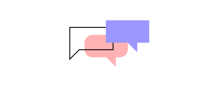
A tooltip can be defined as a UI element that contains text that pops up to provide a definition or additional information to a user. Tooltips are vital in improving usability, reducing user confusion, and facilitating efficient task completion. They empower users with on-demand information at the point of need so users can make informed decisions, navigate interfaces more effectively, and understand the functionality of interactive elements.

Key takeaways:

  • Tooltips are UI modals with a text that is available to user by hovering or clicking an element of a user interface.
  • Tooltips can give feedback, instructions or clarification to the users who are attempting to accomplish their goals.
  • Tooltips should appear next to the element they are trying to address; they should also be consise, consistent with the rest of the UI design, and built with an accessibility in mind.

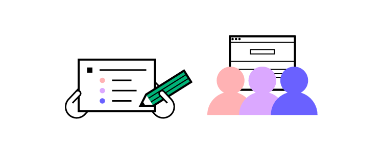
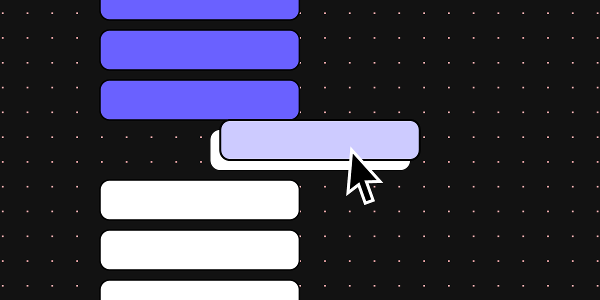
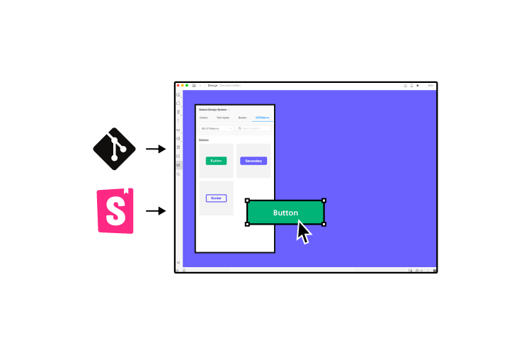
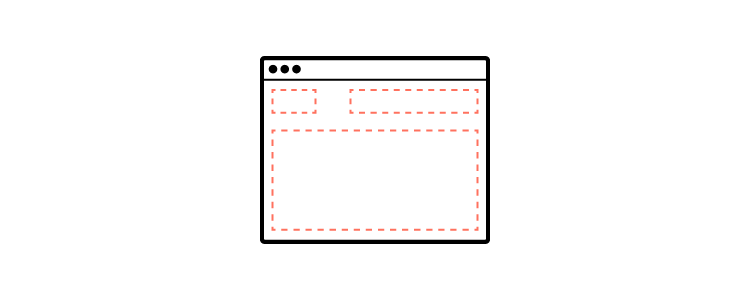
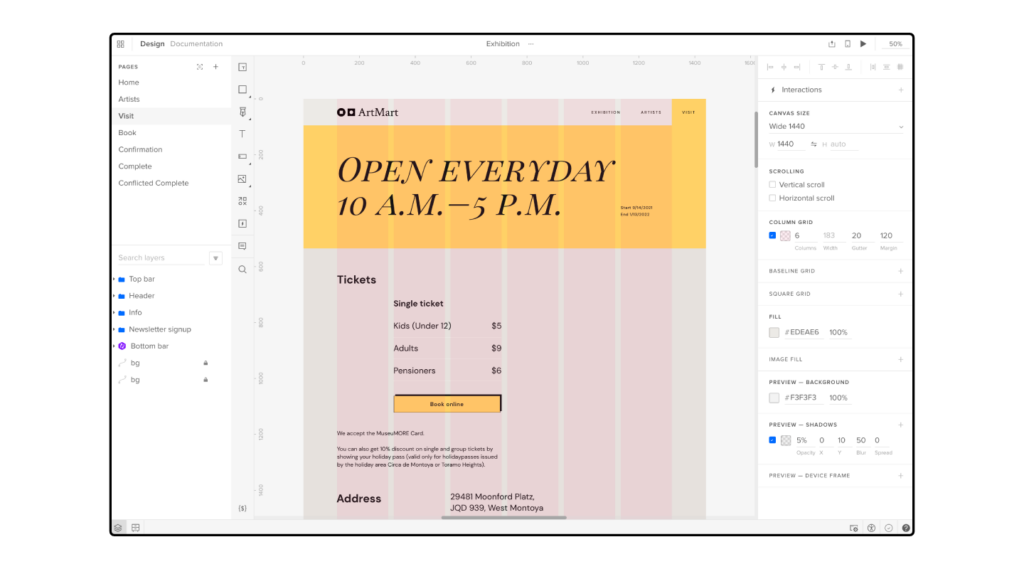
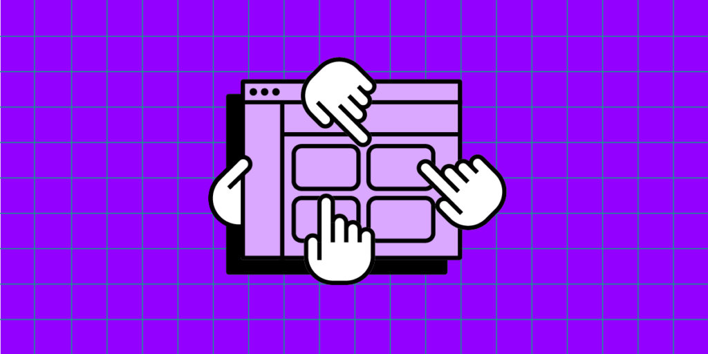
Create fully interactive elements in UXPin to improve testing and deliver higher-quality outcomes. Design tooltips, sortable data tables, and accordion menu in UXPin. Sign up for a free trial.

Build advanced prototypes

Design better products with States, Variables, Auto Layout and more.

Try UXPin

What is a Tooltip?

A tooltip is a small, contextual modal overlay providing essential information or guidance when users interact with an element in a user interface, typically by hovering over or tapping it on mobile devices. It offers a way to deliver concise and helpful content that can enhance the user experience by providing clarifications, explanations, or instructions.

Common Tooltip Examples and Use Cases

Providing explanations for unfamiliar terms or jargon: Tooltips can offer brief definitions or explanations for technical terms, acronyms, or industry-specific terminology, helping users understand the meaning without leaving the current context–GMail uses tooltips to describe the names of its inbox tabs.

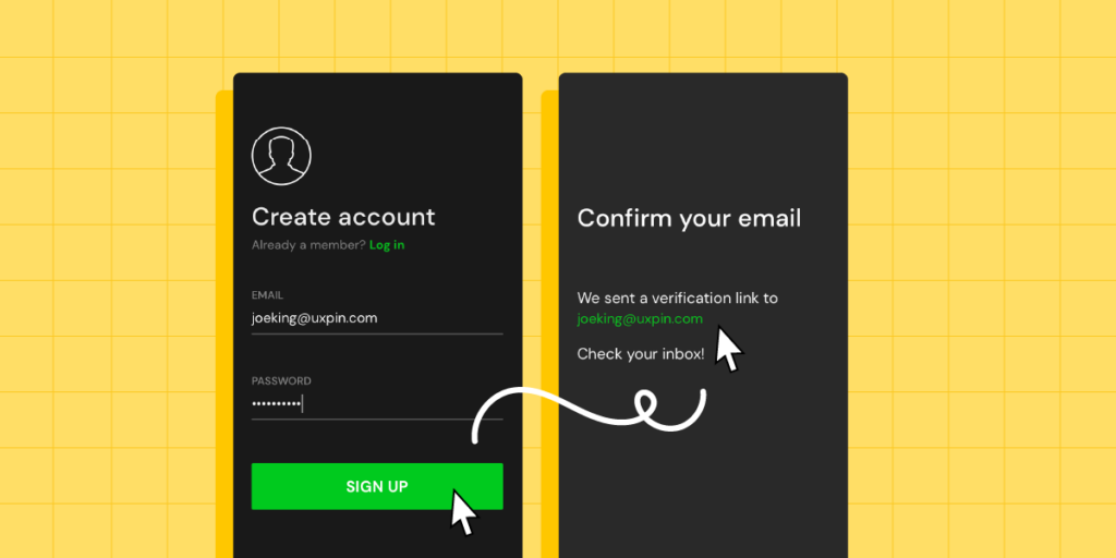
Displaying error messages or validation feedback: Tooltips can provide real-time feedback to users when they encounter errors or input invalid data, offering specific guidance on correcting the issue and ensuring a smooth form-filling experience–Designer Denys Sergushkin shows how to help users complete forms using a tooltip.

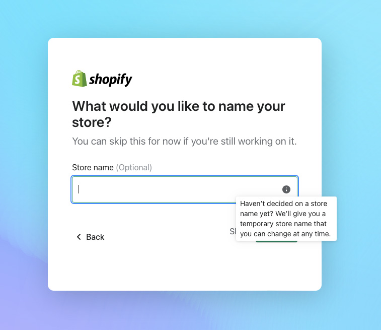
Offering tips and hints for form fields: Tooltips can offer guidance or suggestions to users when filling out form fields, such as providing examples of the expected format, offering advice for valid input, or highlighting any specific requirements–Shopify uses a tooltip to streamline user onboarding by offering to generate a random store name they can change later.

Indicating keyboard shortcuts: Tooltips can display keyboard shortcuts for specific actions or commands, helping users learn and utilize shortcuts to navigate the interface more efficiently–UXPin’s design interface uses tooltips to educate users about shortcuts.

Showing hidden or truncated content: Tooltips can reveal additional or truncated content that is not fully visible within a constrained space, allowing users to access the complete information without overwhelming the interface–YouTube does this for long video titles.

Types of Tooltips

Informational tooltips

Informational (informative) tooltips provide context about a particular element or feature on the interface. Designers use these to offer a brief description, explain the purpose or functionality of an icon or button, or provide tips on using a new feature.

For example, an informational tooltip can describe the purpose of a bin icon is to “Delete” something. These informational tooltips are critical for permanent actions like deletion, as they can prevent unwanted outcomes.

Instructional tooltips

Instructional tooltips guide users in performing a specific action or completing a task. They provide step-by-step instructions or walkthroughs, helping users understand how to use a feature or accomplish a particular goal.

For example, instructional tooltips can guide new users through setting up an account, providing clear instructions on each required field and the necessary steps to complete the registration.

Validation tooltips

Validation tooltips provide real-time feedback on user input or actions. Designers often use these for form fields to indicate whether the entered data is valid or to highlight errors or missing information. 

For example, when a user enters an incorrect email format in a signup form, a validation tooltip can appear near the email field, stating, “Please enter a valid email address.” This immediate feedback helps users correct errors and ensures the accuracy of the input.
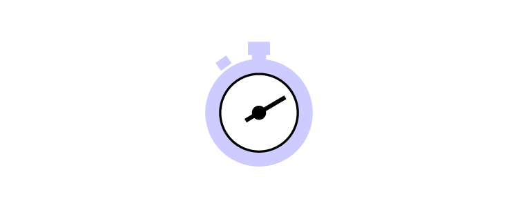
Progress tooltips

Progress tooltips show users the status or progress of a task, process, or loading. Product teams use these to inform users about the progress of a file upload, a download, or a complex operation that requires some time to complete. Progress tooltips keep users informed and alleviate any uncertainty or frustration caused by waiting for a process to finish.

How to Design Effective Tooltips

Tooltip placement and positioning

Designers must consider tooltip placement with the target element to ensure optimal visibility and accessibility. Here are some tips to optimize tooltip placement:

  • Position the tooltip close to the target element, preferably adjacent or slightly above or below.
  • Avoid placing tooltips too far away from the target element, as it can lead to confusion or make it difficult for users to associate the tooltip with the relevant component.
  • Ensure the tooltip popup does not block or cover the target element, which can hinder user interaction and create frustration.

Positioning tooltips for optimal visibility and accessibility:

  • Position the tooltip in a location that grabs the user’s attention without obstructing other essential UI elements or interrupting the user’s workflow.
  • Consider the user’s eye flow and natural reading, which differs depending on the text direction.
  • Avoid overlap with other tooltips or UI elements to prevent clutter and confusion.
  • Pay attention to the tooltip’s proximity to the edges of the screen to avoid cutoff or cropping, particularly on smaller devices or screens with limited real estate.
  • Consider accessibility guidelines, notably providing enough space around the tooltip and using appropriate color contrast between the tooltip and the background for visually impaired users.

Tooltip length and content

Designing good tooltips involves crafting concise and explicit messages that provide helpful and actionable information to users.

Craft concise and clear tooltip messages:

  • Keep tooltips concise, using as few words as possible to convey a helpful, informative message.
  • Use concise language to ensure that users can quickly scan and understand the information without feeling overwhelmed by excessive text.
  • Avoid unnecessary or redundant information that can confuse or distract users from the main message of the tooltip.

Use plain language and avoid jargon:

  • Use straightforward language that’s easy to understand, regardless of their familiarity with the subject matter.
  • Avoid technical jargon or industry-specific terminology that may be unfamiliar to users and hinder their comprehension of the feature.
  • Consider the target audience and use language that aligns with their knowledge and expertise to ensure clarity and accessibility.

Incorporate helpful and actionable information:

  • Focus on providing relevant and helpful information so users understand the target element’s purpose or functionality.
  • Include actionable instructions or tips that guide users on interacting with the element or achieving their desired goals.
  • Consider the tooltip’s context and tailor content to address specific user needs or pain points.

Visual design

Designing effective tooltips involves considering their visual presentation to ensure they are visually appealing and consistent with the overall UI design and branding.

Choose appropriate visual styles and aesthetics:

  • Select a visual style that aligns with the overall design language of the product.
  • Ensure that the tooltip’s visual design matches the brand’s tone and personality to maintain consistency and cohesiveness.
  • Use consistent typography, colors, and iconography in tooltips to create a harmonious visual experience and reinforce the brand’s identity.
  • Align the visual elements of the tooltips with the overall UI design to ensure seamless integration within the user interface.
  • Choose colors that complement the UI and provide sufficient contrast for readability.
  • Select a legible typography style that matches the UI’s overall typography hierarchy.
  • Incorporate relevant icons or visual cues to enhance the understanding and context of the tooltip content.

Tooltip interaction and behavior

Here are some key considerations for tooltip interaction and behavior to ensure a seamless user experience:

  • Determine the appropriate trigger for displaying tooltips based on user actions. Common triggers include hover, click, or tap.
  • Ensure the tooltip trigger is intuitive and discoverable for users, providing clear visual cues or affordances.
  • Set an appropriate delay for the tooltip to appear after the trigger event, allowing users enough time to perceive and interact with the tooltip.
  • Implement a smooth transition for tooltips to avoid abrupt appearances or disappearances that may disrupt the user’s focus.
  • Optimize tooltips for touch devices by considering the absence of hover states. i.e., users can trigger tooltips with a long press or ‘information’ icon for touch-enabled interfaces.
  • Ensure tooltips are responsive and adapt to different screen sizes and orientations, avoiding overlap with other UI elements.

Tooltip accessibility

Ensure tooltips are accessible to all users, including those with disabilities:

  • Ensure that users can access tooltips and interact using keyboard navigation, as some users rely on keyboard-only navigation for accessibility.
  • Ensure that tooltips are screen-reader-friendly so that users with assistive technologies can understand the tooltip content.
  • Follow accessibility guidelines and standards, such as the Web Content Accessibility Guidelines (WCAG), to ensure that tooltips meet accessibility requirements.
  • Use appropriate ARIA attributes (Accessible Rich Internet Applications) to provide additional information and context to assistive technologies.

Common Pitfalls and Mistakes to Avoid

While tooltips can be valuable for enhancing user experience, it’s essential to be aware of common pitfalls and mistakes in tooltip design to avoid usability issues, confusion, and information overload. 

Here are some key points to consider:

  • Don’t overwhelm users with tooltips that appear frequently or for every element on the page. Use tooltips sparingly and only when necessary to provide additional information or clarification.
  • Ensure that the information provided in the tooltip is truly valuable and adds meaningful context to the user’s interaction.
  • Avoid excessive text. Keep the message concise and focused on the most critical information.
  • Use plain language and avoid technical jargon to ensure everyone understands the tooltip content.
  • Trigger tooltips only where users require additional information or clarification. Avoid displaying tooltips that offer redundant or irrelevant information.
  • Keep content relevant to the user’s context and support their goals or tasks.
  • Set an appropriate delay for displaying tooltips, allowing users enough time to move their cursor or interact with the element before the tooltip appears.
  • Provide a clear and intuitive way for users to dismiss or hide tooltips if they are no longer needed.

Improve UX Design Testing With UXPin

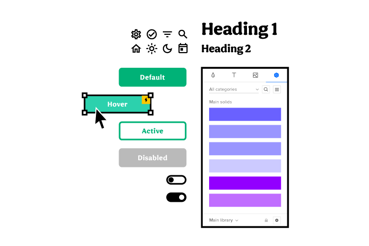
Testing and optimizing tooltip interactions is crucial during the design process. UXPin’s advanced Interactions provide multiple triggers, actions, and animations to give participants and stakeholders a realistic prototype experience indistinguishable from the final product.

Unlike traditional image-based design tools, which generate vector graphics, UXPin renders HTML, CSS, and Javascript behind the scenes, giving designers increased prototyping capabilities and code-like interactivity.

With higher fidelity and functionality, design teams can build interactive prototypes and user flows to test microinteractions like tooltips, notifications, animated progress bars, and much more.

Solve more usability issues with UXPin’s interactive prototyping capabilities while optimizing business goals during the design process. Sign up for a free trial to design better tooltips and interactions for your digital products.

Version Control for Design – Why Is it Worth Having it?

Version control has been a software engineering best practice for decades. A version control system (VCS) allows engineers to collaborate efficiently while working independently.

With the rise of design systems, version control has become an essential part of cross-functional collaboration and maintaining a single source of truth across the organization.

UXPin Merge’s Version Control System gives you the flexibility to manage your library version for each design project and effortlessly switch between each version. Discover how UXPin Merge can revolutionize your product design process and enhance cross-functional collaboration. Read more about Merge.

Reach a new level of prototyping

Design with interactive components coming from your team’s design system.

What is a Version Control?

Version control is a method of maintaining a historical record of each update and release for data sets, software, documentation, and other projects.

The practice dates back to 1962 with IBM’s OS/360 IEBUPDTE software update tool, which many people consider the precursor to version control systems.

Version control is most commonly associated with software development, but we see these systems in many other tools, including spreadsheets and word processors.

For example, Google Sheets’ Version History records changes, including who made them and the date. You can also switch between versions which are especially helpful if you’ve made a mistake and can’t remember what changes you or a collaborator made.

The most popular and widely used example of software version control is Git. Git is a version control system that keeps a historical record of software changes while enabling multiple engineers to simultaneously work on the same project.

Every Git version records code changes, who made them, and the date. An excellent example of this version history in action is viewing the releases on a GitHub repository like this one from UXPin Merge Tools.

What is the Difference Between Version Control and Backup?

Version control includes a master file with multiple versions. A backup is a copy of the master file stored elsewhere. Backups are essential because you don’t lose the entire project if something happens to the master file’s location.

For example, you might have a project stored in a repository like GitHub for everyone to access with backups on your local server and another cloud-based option. If for some reason, GitHub goes down, your team can switch to the backup and continue working.

What is Source Code Management?

Source code management (SCM) refers to version control tools like Git, Subversion, CVS, Perforce, and ClearCase. SCM tracks code changes and assists with conflicts when merging branches. If there is an error, you can easily switch to a previous version. You can also use SCM to manage permissions, preventing unauthorized changes.

When working with hundreds or even thousands of engineers tracking updates can be chaotic. Basic version control isn’t enough to facilitate this volume of work. For example, if developers make conflicting changes to a CSS file, SCM identifies these conflicts and prevents overwrites. 

Atlassian has an excellent article on SCM if you wish to dive deeper into the topic.

Git Tags vs. Branches

  • Git Branch: Software has a master or develop branch and multiple “checkout” branches for feature updates and bug fixes. As developers complete checkout branches, they merge with the master to become part of the software.
  • Git Tag: Tags are a snapshot or reference to a commit on a branch. You can have multiple tags on a single branch to reference each release. 

Dev Community breaks down tags vs. branches in this article.

What are the Three Types of Version Control?

These are the three types of version control and their differences.

  • Local Version Control System: Every project version is stored locally on an individual’s computer. There is no central repository, so team members must share the entire repository directly rather than syncing to a master repo. Local version control is most effective for solo projects or where teams don’t have to work simultaneously.
  • Centralized Version Control System (CVCS): Uses a centralized server to host the master repository. When engineers commit changes, they update a branch on the centralized repo.
  • Distributed Version Control System (DVCS): Each engineer downloads the entire repository and version history. Whenever they commit changes, they only update their local repository. When engineers complete their work, they push (upload) the entire repository to the centralized master.

Centralized and distributed version control systems both have a master repo; they just make commits and updates differently. GeeksforGeeks breaks down this topic with pros and cons here.

What is Version Control for Designers?

Version control for designers is any record of changes to a design output like prototype or a design system. It helps designers stay on track, go back to old versions of their design artifact or update their current work.

Why Designers Need a Version Control?

Traditional local-based UX design tools made it difficult for designers to collaborate. There was no centralized version control for designers to commit changes.

Cloud-based design tools changed that. Designers can now collaborate on the same project and sync changes to centralized cloud storage, usually hosted or linked directly to the design tool.

UXPin’s Iterations feature is an excellent example of version control for designers. Designers can retrieve, delete, and create iterations of a prototype. While you can’t merge iterations, this feature helps maintain a version history and allows designers to collaborate on the same design file simultaneously.

Version control also helps designers with onboarding or handoffs to new teams. New team members can view a product’s version history to see how the product has evolved and what the previous team has already tried.

Version Control for Design Systems

Designers also use version control for design systems by creating different versions for each component library update. Depending on the design tool, these updates will occur either automatically or manually.

If designers use image-based design tools, the design system team will need to maintain two copies of the system, one as a UI kit and the other as a component library.

In a fully integrated design system, designers and engineers sync to the same component library hosted in a repository. Any changes to the repository automatically update for all teams. 

A Fully Integrated Design System With UXPin Merge

UXPin Merge is an excellent example of a fully integrated design system with version control. Merge allows you to sync a component library from a repository to UXPin’s design editor, so designers and engineers use the same design system.

Merge components have the same interactivity and functionality as those hosted in the repo–giving designers the ability to create high-fidelity mockups and prototypes that accurately replicate the final product.

You can sync React components to UXPin directly using Git or other front-end frameworks via our Storybook integration. When the design system team makes changes to the repository, UXPin automatically sends an update to the design editor, notifying design teams of the new version.

This single source of truth allows designers and engineers to collaborate better while facilitating smoother design handoffs with little or no drift.

Using Branches and Tags in UXPin Merge

UXPin Merge gives designers two version control options:

  • Branch: Prototypes will only automatically update when there is a change to the branch you’re using. Using the Branch option means you’re always working with the latest design system version.
  • Tag: Prototypes will always reference the tag version unless you switch to Branch or another tag. Using the Tag option gives designers a choice to upgrade versions when they’re ready.

Designers can also use the “Latest” checkbox to update prototypes with the newest components automatically. This feature can streamline design workflows because designers don’t have to update prototypes manually.

With UXPin Merge and version control, teams can work independently with less non-productive communication, like “what’s the latest design system?” or “can you send me your design files.” This independence allows companies to scale and iterate quicker–speed-to-market being a crucial competitive advantage.

Tips for Implementing and Improving Version Control for Design

Build a Design System

Scaling design is challenging. For most organizations scaling design means hiring more designers. A design system allows organizations to build products faster with fewer designers.

Design systems also allow teams to implement an effective version control system that benefits design teams and the entire organization. With version control, designers, engineers, and stakeholders can view design system updates, what’s changed, and why.

This version control is especially important for monitoring the progress of a design system roadmap and keeping teams informed of the latest releases.

Incorporating Governance

A version control system is only effective with proper design system governance. Governance ensures a design system maintains its integrity with scheduled and controlled version releases.

With proper governance, each version release goes through processes and protocols to ensure new components and patterns meet certain quality and usage requirements.

Scheduling Releases

Creating a release schedule is crucial for managing version control effectively. The design system team can ensure that quality assurance and documentation updates are followed correctly with a strict release schedule.

A regulated release schedule also keeps teams notified of the latest version. For example, designers and engineers know to expect design system updates every Friday. The release schedule will also appear on the design system roadmap, managing expectations for teams and stakeholders.

Improve Version Control With UXPin Merge

Many design systems claim to have a single source of truth. But, unless you have a fully integrated design system with designers and engineers using the same component library, your version control requires manual updates for UI kits and design files.

With UXPin Merge, you can scale design without increasing your payroll while enhancing collaboration between design and development. See how Merge can optimize and automate releases for designers and engineers. Find out more about UXPin Merge.

Storybook 7.0 – Why You Should Be Excited

Storybook 7 and UXPin integration

Storybook is a huge productivity boost for development teams, helping them scale their work and stay on the same page. The tool is launching its new version that you can also leverage in UXPin. The new update introduces some major improvements and extends Storybook’s capabilities.

Bring Storybook’s components to UXPin and design prototypes that look and behave like the end-product. Keep consistency between design and development and unite teams with a single source of truth. Try UXPin’s Storybook integration.

Reach a new level of prototyping

Design with interactive components coming from your team’s design system.

What Storybook 7.0 has to offer?

logo storybook

The official launch of Storybook 7.0 is planned on March 14th. You can try it on beta and experience its benefits before the official release. Learn more about it in Storybook’s article about plans for 2023.

Better performance

Storybook’s team upgraded the tool’s performance significantly. They managed to make it 2x faster compared to its previous version.

More compatible integrations

The new version of Storybook makes integrations easier. By launching Frameworks API, Storybook now supports Vite, NextJS, and works on supporting SvelteKit. This also enabled them to think of integrations with new frameworks like Remix, Qwik, SolidJS, and more.

More extensive testing

They added code coverage reporting. Now it’s transparent which lines of code in the components and libraries are tested by the user’s stories.

Improved documentation

Storybook has a few updates for documentation. One of them is that Storybook’s team upgraded documentation to version 2 of MDX. They also simplified the way of importing stories (component examples) in docs.

Integrate Storybook 7.0 with UXPin

uxpin merge git react storybook library

UXPin supports Storybook 7.0. Go ahead, sync your Storybook components with UXPin. It’s super easy and gives you a host of benefits that will improve your product design and development process.

Create prototypes with Storybook components

The components that you bring to UXPin are more than just a visual representation of what you have in Storybook. They are fully functioning, allowing you to test real user interactions. That’s what high-fidelity prototyping should be about.

Foster cross-functional collaboration

The integration will help you break the silos between product design and engineering. The teams will share the same components which will prevent them from inconsistencies between design and development.

Streamline design handoff

By building prototypes with fully functional components, designers are able to smooth out the design handoff process. Storybook components can become a single source of truth that both teams share, so there’s no need for extensive documentation or misalignment.

Here’s how to integrate with Storybook

The integration can take less than a minute. You need a link to a Storybook library you want to use (public or private), log in to UXPin and add a new library by pasting the link in the box: “Import Storybook components.”

Get a guided tour of UXPin’s Storybook integration.

Try UXPin and Storybook 7.0

Storybook is a great tool for UI component quality control, but it will help you maintain and scale the design system once combined with UXPin. Start designing interactive prototypes with Storybook components. Try UXPin’s Storybook integration for free.

What is a Workable Prototype?

workable prototype

Designers create different types of prototypes depending on the project and its requirements. One of a commonly used type of prototypes is a working prototype or a workable prototype. We will go over the definition of a workable prototype, learn when this type is useful, and what the steps of designing a working prototype are.

Key takeaways:

  • A workable prototype is an interactive model of the final product. Designers build such a prototype to test their solutions with real users. A workable prototype is a high-fidelity design which means that it closely resembles the end-product’s experience.
  • Component-driven prototyping is the best methodology for creating working prototypes. It saves you time on adding interactions and keep your design consistent from the start.
  • Building workable prototype allows designers to test their design choices, user flow, and see if they create a smooth user experience. To get the most insight, include real images and copy when designing a workable prototype.
  • One of the best technology for working prototypes is UXPin Merge, because it helps you use your app’s building blocks – React components – in the prototyping process.

Create interactive working prototypes to get better feedback and insights with UXPin’s revolutionary Merge technology. Discover UXPin Merge.

Reach a new level of prototyping

Design with interactive components coming from your team’s design system.

What is a Workable Prototype?

A workable prototype is an interactive representation of an end-product. It’s called “workable” because it allows people to engage with and the prototype, experiencing its features and functionalities.

Unlike a static or image-based prototype, a workable prototype enables users to navigate to different screens, interact with various elements, and perform actions that simulate user flows.

When to Build a Workable Prototype

Design teams typically build a workable prototype in the later stages of UX design process after validating the design concept and major features through earlier iterations.

This prototype serves as a functional representation of the final product that helps assess its usability, gather user feedback, and verify key interactions and user flows.

Types of Prototypes

responsive screens prototyping
  • Low-fidelity prototypes: Basic representations with minimal details, often created using paper sketches or digital wireframes. Designers use low-fidelity prototypes in the early stages of the design process to quickly explore and validate design concepts before investing significant time and resources in more complex designs.
  • High-fidelity prototypes: Advanced and visually polished prototypes resembling the finished product, including realistic visuals, clickable elements, animations, and simulated user flows. Designers use high-fidelity prototypes in later stages of the design process to gather detailed feedback on usability and interactivity.
  • Paper prototypes: Prototypes created using paper materials, such as hand-drawn sketches or cutouts, are cost-effective for brainstorming and testing design concepts. Designers use paper prototypes in the early stages of the design process to iterate quickly, gather initial feedback, and make rapid design decisions before moving to more detailed digital prototypes.
  • Functional prototype: Prototypes focusing on demonstrating core functionalities, enabling users to perform key tasks and actions. Product teams might use functional prototypes to test specific functionalities and workflows of the product, ensuring they meet user needs and expectations.
  • Interactive prototypes: allow users to interact with the interface and experience product functionality, often created using design software or prototyping tools. Designers use interactive prototypes throughout the design process, especially during late-stage user testing and validation, to provide users with a realistic and interactive experience.

What Makes a Prototype Workable?

testing user behavior prototype interaction

A prototype should effectively communicate the product’s concept and demonstrate its viability to be “workable.” It must have the features and interactivity to elicit meaningful feedback from users and stakeholders to inform further design iterations and decision-making.

A workable prototype must possess specific features and characteristics to be effective for user testing. Here are key aspects that contribute to making a prototype workable:

  • Functionality: A workable prototype should demonstrate the core functionality of the final product, showcasing the main features and interactions that users will experience.
  • Interactivity: It should allow users to interact with the prototype, providing a hands-on, realistic experience of the final product. 
  • Navigation: The prototype should include a clear and intuitive navigation system that enables users to move between screens or sections seamlessly.
  • Visual design: The working prototype must reflect the final product’s UI design, including branding and aesthetics, to provide a realistic user experience.
  • User flow: The prototype should capture the essential user flows and key interactions, allowing users to complete tasks and achieve goals within the prototype.
  • Real content: Designers must use real content and data, giving users a true sense of the user interface’s layout and media elements to determine whether these contribute to or hinder the user experience.

We have emphasized “providing a hands-on, realistic experience of the final product” because many image-based design tools lack the features to create real-world prototype experiences. Organizations must combine several tools and platforms to increase fidelity and functionality.

How a Component-Driven Workflow to Improve Working Prototypes

Component-driven prototyping is a design methodology inspired by component-driven development where devs reuse UI elements for front-end development. Designers mimic this engineering workflow in UXPin by importing code components using Merge technology. Instead of code, designers work with visual elements like in any other design tool.

Ultimate consistency

Merge components include properties and interactivity defined by the design system. For example, a button’s colors, sizes, variants, content, and states are available for designers to adjust using UXPin’s Properties Panel.

These baked-in properties offer many benefits for design teams:

  • No designing from scratch
  • Eliminates errors or changing properties which result in drift
  • Organization-wide consistency
  • More time spent focused on product and user goals

Realistic working prototypes

Component-driven prototyping significantly improves prototyping fidelity and functionality because design teams can build exact replicas of the final product, giving user testing participants and stakeholders realistic user experiences without writing a single line of code–and significantly faster than image-based tools.

Design a Workable Prototype in 5 Steps

prototyping elements components

Following these steps will enable you to build a working prototype that effectively communicates the product concept, aligns with user needs, and provides a solid foundation for further development and refinement.

  1. Define the objectives and scope to ensure that it aligns with the desired outcomes and provides a clear direction for the design process.
  2. Conduct thorough user research to understand user needs, preferences, and pain points. Gather requirements from stakeholders and users to inform the prototype’s design and functionality.
  3. Build the prototype using the right tools, like UXPin with Merge technology, to create an interactive prototype resembling the final product.
  4. Conduct usability testing with representative users to evaluate the prototype’s effectiveness and gather feedback on its usability, functionality, and overall user experience.
  5. Iterate and refine the prototype based on feedback to address any issues or concerns and improve its overall performance and user satisfaction.

Best Practices for Workable Prototypes

Keep the prototype focused and aligned with user needs

Ensure the prototype addresses the core user needs and goals by focusing on the key features and functionalities essential for user testing and validation.

For example, when designing a mobile banking app, the prototype should prioritize crucial tasks like checking account balances, transferring funds, and making payments rather than including unnecessary features that may distract or confuse users.

Balance realism and usability

The prototype must be realistic enough to provide users with a sense of the final product’s look and feel but also functional and easy to navigate. 

For example, when designing an eCommerce website, the prototype should showcase real product images and descriptions while maintaining a streamlined and intuitive user interface that facilitates smooth browsing and purchasing.

Use real content and data

Incorporate real content and data in the prototype whenever possible to make the user experience more authentic. This realistic experience helps users better understand and evaluate the product’s value and usability. 

For example, when designing a travel booking app, use real destination names, prices, descriptions, and images to give users a realistic and immersive experience, improving their ability to make informed decisions.

Without this accurate data, users may use the prototype differently than the final product, giving you inaccurate insights to make changes during the design process and adversely affecting the project’s success.

Involve stakeholders and users in the prototyping process

Collaborate with stakeholders and involve users in prototyping to gather valuable feedback and ensure the prototype meets their expectations. This collaboration helps validate design decisions, identify potential issues, and incorporate diverse perspectives.

For example, including feedback from business stakeholders, doctors, nurses, and patients when developing a medical app ensures the prototype addresses different types of user groups’ requirements, enhances usability for everyone, and meets industry standards.

Building Working Prototypes With UXPin Merge

One of the biggest challenges for prototyping during the product design process is designers lack the tools and skills to build working prototypes. They’re limited by the tool’s vector-based constraints, which causes issues in testing prototypes with users and stakeholders.

UXPin’s Merge technology removes those constraints by bridging the gap between design and development. Designers use the exact same UI library during the design process as engineers developing the final product. Not only does this mean better collaboration, but it vastly improves prototype quality for users and stakeholders.

“The C-suite people and the directors are able to give us stronger feedback about the ultimate direction because they experience the features and goals of these prototypes rather than just commenting about how these boxes don’t look like a text field.” – Erica Rider, former UX Lead EPX at PayPal.

Smoother design handoffs

With design and engineering teams using the same component library, handoffs are seamless, almost non-existent, because developers already have the code to start the development process. UXPin renders production-ready JSX, so devs simply copy/paste to develop the final product according to the design team’s prototype and mockups.

Stop wasting time and resources using multiple design platforms and workarounds to build realistic prototypes. UXPin is a full-stack design tool that enables designers to create prototype experiences indistinguishable from the final product–all the power of code without writing a single line.

Level up your prototyping capability with the power of UXPin’s Merge technology. Visit our Merge page for more details and how to request access.

Designing a Nonprofit Website for Better Conversions

designing a non profit website min

Are you running a nonprofit oragnization? Then, you know how tough it might be to get people to engage in the cause, leave a donation or support your efforts in any other ways. Those activities can all be conversions on your non-profit website. Web design may help you increase those conversions. Let’s see how.

Key takeaways:

  • Nonprofits set up websites to stay in touch with donors and volunteers but they can also collect payments, recruit volunteers, and grow their organization. All those activities can be understood as conversions.
  • The best nonprofit websites include Charity: Water, Doctors without Borders, and the Red Cross.
  • To drive conversions, nonprofits need to be constantly updated, stay clear about their goals, mission, and vision, as well as be well-designed.
  • Well-designed non-profit website are responsive, accessible, secure, and easy to navigate. Let’s see what that means.

Design, prototype, test, and optimize mission-driven websites with the world’s most advanced user experience design tool–UXPin. Use this tool to design a website that can be implemented quickly and send it to devs for fast development. Discover its all capabilities. Sign up for a free trial.

Build advanced prototypes

Design better products with States, Variables, Auto Layout and more.

Try UXPin

What is a Nonprofit Website?

A nonprofit website is a website run by a nonprofit organization to stay in contact with its audience composed of donors, beneficiaries, and volunteers.

Aside from its informational benefit, a website helps nonprofits get donations, find new volunteers, and fans of the organizations. In other words, generate conversions.

Before we dive into how to do that, let’s explore the top nonprofit websites and discuss why they work.

Best Nonprofit Websites Examples

Here are some of the world’s biggest nonprofits and how they use their websites to inspire action.

Charity: Water

non profit web design example

Charity: Water uses compelling visuals and storytelling to educate visitors about its cause. The nonprofit makes donations effortless with a donation form in the hero section where visitors can choose a pre-set amount or enter a custom one.

Doctors Without Borders

nonprofit website design example

Doctors Without Borders provides a user-friendly experience with large text and clear messaging. Immediately below the fold, the organization offers surety of where funds go and the scale of its operations. This information builds trust through transparency while informing donors about how Doctors Without Borders uses its funding to make an impact.

WWF (World Wildlife Fund)

npo web design

The WWF’s web design is an excellent example of displaying primary and secondary drop-down menu CTAs discussed earlier in this article. Visitors can donate money or adopt an animal in trouble to support its care and rehabilitation. WWF also uses a basic three-link primary menu to streamline navigation.

The Red Cross

redcross web design

The Red Cross offers visitors vast content and resources, which designers have organized with an efficient and user-friendly information architecture. These resources provide credible news sources for many publications and media outlets, positioning The Red Cross as the leading authority for humanitarian aid. 

The Red Cross also uses high-quality visuals to create an emotional connection, and the website’s bright red donate button is prominent against the dark nav bar, creating an obvious CTA for visitors.

Who is a Non-Profit Website Users?

The first step to optimizing a nonprofit organization’s website begins with understanding your audience. Who are they? What motivates them?

In-depth user research will reveal these insights, giving you valuable data to drive design decisions that cater to your audience’s needs and expectations.

Donors, volunteers, and beneficiaries

Every nonprofit website caters to a diverse group: donors looking to contribute, volunteers offering time and skills, and beneficiaries needing assistance. Recognizing the unique objectives and motivations of each segment ensures content resonates.

For example, donors might want compelling stories and financial transparency, volunteers look for event schedules and roles, and beneficiaries prioritize available resources and support methods.

The role of audience analysis in nonprofit web design

Understanding the audience’s preferences, behaviors, and pain points enables designers to craft a website layout, content, and navigation tailored to meet specific needs. 

For example, a nonprofit website may prioritize fundraising with a donation button in the header and hero section. However, most website visitors want to volunteer, and designers have placed this link in the footer, thinking it’s less important.

With this user feedback, designers might add a secondary CTA above the fold for volunteers. This redesign would still prioritize donations but allow volunteers to sign up easier.

Design Checklist for High-Converting Nonprofits

A lot of people who run nonprofit organizations make a mistake of making the website purely informational, but it should convert visitors into donors or volunteers. Here’s what you need to create a high-converting non-profit website.

1. Check if your site can be used on mobile

Search engines prioritize mobile-friendly websites for mobile results. Since most people use mobile devices for browsing, your nonprofit must optimize the user experience for this large cohort.

2. Test site’s navigation

Website navigation helps visitors move through the page, accomplish goals, and find the right information.

You typically have three navigation spaces on a website:

  • Primary navigation: the nav bar in your website’s header
  • Secondary navigation: the website’s footer
  • Hero CTA: the main call to action button in your hero section or nav bar

When visitors find what they need effortlessly, they’re more inclined to interact, donate, or volunteer. Minimizing options in the header is an excellent way to increase conversions. For example, a typical nonprofit might want three primary navigation elements and a CTA above the fold, with the rest of the links in the footer.

3. Scannability

Scannability is the ability of a site visitor to move through content quickly. It impacts readability, comprehension, and user experience. There are a couple of recognized patterns of how a site visitors scan pages, which depend on the geography and type of content. Consider them in order to create a content that’s easy for the eyes and understanding.

4. Apply accessibility best practices

Prioritize website accessibility to ensure all visitors, including those with disabilities, can engage seamlessly. Implementing features like screen reader compatibility, high-contrast modes, and keyboard navigation is essential for NPOs. Not only does it broaden your audience reach, but it also underscores your organization’s commitment to inclusivity.

When your site can be accessed by everyone, it builds trust and fosters broader community engagement.

5. Use CTA buttons

To drive conversions, you need to CTA buttons that will prompt your audience to take action. Button placement, copy, and the action that follows it depends on what you want to accomplish.

For example, a nonprofit website may prioritize fundraising with a donation button in the header and hero section. However, most website visitors want to volunteer, and designers have placed this link in the footer, thinking it’s less important.

With this user feedback, designers might add a secondary CTA above the fold for volunteers. This redesign would still prioritize donations but allow volunteers to sign up easier.

If you want to discover how to design a great button, check out our guide on button design.

6. Include secure payment options

Incorporate reliable and well-known payment gateways like Stripe, PayPal, and Square into your site. Using these familiar services creates trust, increasing donors’ likelihood of contributing. Display security badges prominently, reassuring visitors that their financial information remains protected.

7. Take care of privacy and data protection

Have you heard about “Privacy by design”? Always be transparent about how you use donor and visitor data. Display a clear privacy policy, letting visitors know their information won’t be sold or misused.

Active assurance of data protection not only builds trust but also complies with global privacy regulations.

What Other Elements a Nonprofit Website Should Include?

Optimizing a nonprofit website doesn’t only mean making it easy for users to complete tasks. You must strategically use content, design elements, layouts, and visuals to elicit desired actions.

Clear mission statement and goals

Place your mission statement and goals front and center on your homepage. They should convey your nonprofit organization’s purpose clearly and succinctly, attracting potential donors and volunteers to your cause.

Stay consistent

Brand consistency helps build trust, builds rapport, and engages website visitors. Maintaining this consistency across every facet, including messaging, color scheme, typography, layouts, and interactions, is crucial so everything feels intuitive and users never have to think about their actions.

Use high-quality visuals and videos

Images, illustrations, and media help tell your story and engage users. Many nonprofits use visuals to grab people’s attention and highlight an important cause–for example, a polluted beach or a sea animal covered in oil. These media elements are powerful for tapping into human emotions, encouraging people to take a specific action.

Comprehensive “About Us” page

Visitors often want to know who drives the cause. Dive into your organization’s history, values, team, and milestones on the About Us page. When crafted authentically, this section builds trust and forms an emotional connection by showcasing your nonprofit’s journey.

Impact stories and testimonials

Stories resonate more than statistics. Share real-life impact stories and testimonials, offering a firsthand look at the lives your nonprofit touches. These tales, whether in text, images, or video, act as persuasive endorsements, motivating others to support and engage with your mission.

Show certifications, awards, and recognitions

Showcase your nonprofit’s credibility by highlighting any certifications, awards, or recognitions your organization has earned–preferably as high on the homepage as possible. These accolades act as third-party endorsements, affirming your organization’s dedication to its cause and operational integrity.

Mention partnerships and affiliations

Prominently feature any alliances or affiliations with reputable organizations. Such partnerships lend your nonprofit added legitimacy. When potential donors recognize familiar organizations or brands standing beside you, it enhances their confidence in your mission.

Transparent display of funds usage

Build trust by showing where the funds go. Display a clear breakdown of expenditures–illustrating how much covers administrative costs, supports fieldwork, etc. When you demonstrate the tangible impact of contributions, potential donors feel more compelled to get involved.

Regular updates and blog posts

Keep your audience in the loop. Post regular updates and news, ensuring everyone knows about the latest progress, hurdles, and achievements. Being a thought leader is crucial for modern brands. By leading the conversation with regular updates, your nonprofit will stand out as the go-to source for information, increasing your exposure and likelihood of success.

These core website components lay the foundation for building rapport and trust with your target audience. Next, you must optimize for conversions.

Design Better Websites With UXPin

Are you looking to optimize your nonprofit’s website and increase your online presence? Design interactive prototypes that look and feel like the final product, allowing product teams to solve more usability issues and identify better opportunities during the design process.

Designers can use UXPin’s advanced features to mimic code-like functionality, like a donation checkout flow, signing up for a newsletter, or completing a volunteer form. UXPin prototypes give design teams actionable insights to iterate and improve before investing in the costly website development process.

Build captivating websites your users will love with the world’s most advanced UX design tool. Try UXPin for web design. Sign up for a free trial.

The Latest UXPin Updates – Summer 2023

Top 10 good website designs

We’re reviving our series at UXPin’s blog to inform you about new features, updates, and upcoming product releases. In this one, you’ll read about new ways of adding and styling links, using eye-dropper, and editing components’ props.

🔍 Access specs for grouped elements

Aside from inspecting components one by one, you can now get the specs for borders, radius, and CSS of grouped elements, including the ones that were added with Auto Layout

🔗 Enjoy a greater control over linking

Add a clickable link on a specific word, a string of words, or even a whole paragraph within one text box. Select the text you want to add a URL to or link it to any other page within the prototype.

That’s not all! Style the hyperlink to match your design system. Make your prototype hyperrealistic from now on. Try it now.

👁️ Smoother Eye-Dropper

Enjoy a faster and more intuitive Eye-Dropper. When picking colors, you can select an Eye-Dropper once and adjust the colors. No need to be constantly reselecting it. That’s one less step in designing.

🔢 Merge: Set up decimal places in number props

Hey, for those of you who use Merge tech, for coded components with number props, such as grid (flex), you can now add numbers with decimal places to make your prototypes even more accurate.

Learn more about UXPin Merge.

🖱️ Merge: Embed JSX code into a chosen element 

Create advanced Merge components faster. Select a Merge component and pass its JSX code into the node property of another element. This works on UXPin’s canvas and in the library and it will come in handy when building prototypes.

🫣 Merge: Hide nested components

Nesting components? If you want to hide components that are nested together, do that without the need of ungrouping them or removing them entirely. Add toggle interaction to hide layers in nested components.

Give new updates a try in UXPin. Sign up for free and build an interactive prototype today.

Shared Insights, Shared Vision – Democratization and its Impact on Operations

Democratization and its Impact on Operations 1 min

UXPin invited Ethnio to talk about how DesignOps and ResearchOps teams can collaborate to be more effective and create more impact. Ethnio outlines a strategy for using research democratization, tools, and automation to keep product, UX, and research teams in sync.

Ethnio demonstrates how organizations can:

  • Recruit, schedule, and pay participants for global research studies using Ethnio
  • Conduct high-quality usability testing with interactive UXPin prototypes using Merge technology

Streamline cross-functional collaboration and automate many DesignOps challenges with UXPin’s Merge technology. Visit our Merge page for more details and how to request access.

Reach a new level of prototyping

Design with interactive components coming from your team’s design system.

Introducing Ethnio

Ethnio is a UX research CRM designed to streamline research operations. The platform allows UX researchers to automate everything from participant recruitment to scheduling, quotas, and incentive payouts.

Ethnio’s flagship product, Intercepts, allows UX researchers to target and recruit participants from inside product ecosystems–web and native–so researchers can speak to real users who actually use their products.

In this article, Ethnio outlines how Operations teams can use tools and automation paired with an effective democratization practice to create better relationships and operational efficiencies. 

Using UX Research Democratization to Bridge the Gap

DesignOps and ResearchOps teams can leverage research democratization to enhance collaboration between departments. Democratization–paired with the right tools and automation–can help Ops teams create a greater impact for the organization while designing better product experiences.

“Research is a practice of rigorous curiosity, and the role of researchers in an organization is to help the people they work with make better decisions. At scale, this means building intentional, responsible, and sustainable systems of learning with and from the people you want to serve.” Behzod Sirjani, Research Advisor and Program Partner at Reforge.

What is UX research democratization?

UX research democratization is about “making research (collecting, storing, sharing, and accessing) accessible and possible for anyone within an organization, regardless of their role. It aims to break down traditional barriers and hierarchies, allowing cross-functional teams to contribute to and benefit from user insights.”

Improving collaboration and research insights

Democratization helps remove operational friction by allowing each team to see and understand the work of the other. It brings together researchers, designers, and product teams, improving communication, streamlining workflows, and developing high-quality research insights.

The result is a holistic design and research approach leveraging the organization’s collective intelligence. This democratization not only accelerates the design process but also improves the quality of the final product, ultimately delivering a more compelling and satisfying user experience while maximizing DesignOps and ResearchOps’ impact.

“When we talk about impact, we must ensure that we wear our business hats more than our researcher hats. It’s crucial to understand that from the business perspective, research is not just about running studies, but about providing value that the company can use to achieve its goals.” Carol Rossi, Expert Researcher, and Consultant.

So, how does utilizing research democratization, tools, and automation work in practice?

Recruit, Schedule, Test, & Pay Participants using Ethnio & UXPin

Let’s say you are an operations expert in design or research, and you want to support your designer in talking directly with some prospective customers as part of a sprint. 

Here’s the flow for reducing their time and effort to as little as possible and letting Ethnio do all the screening, scheduling, and paying participants for their time. 

On the design end, DesignOps can invite researchers to collaborate in UXPin, sharing feedback and insights on interactive prototypes.

This brief case study will demonstrate how Research Ops and DesignOps teams can collaborate effectively and efficiently using their respective tools.

Step 1: Add designers as facilitators to a study

ethnio facilitator min

Ethnio allows researchers to add stakeholders to participate in participant interviews or usability studies as observers, facilitators, or collaborators—even if they don’t have an Ethnio account. Creating these connections enables UXRs to automate communications for key stakeholders and participants.

Step 2: Invite DesignOps to connect the right tools

ethnio tools connect min

Keeping team members and stakeholders in sync with research initiatives is crucial for effective collaboration. Ethnio lets researchers connect their team’s meeting and scheduling tool stack, like Teams, Google Calendar, and Zoom, to automate communications and make it easy for team members to attend studies and interviews.

Step 3: Setup and collaborate on research quotas

Research quotas are vital for collecting data from representative user groups within your target audience. The industry standard is to use color-coded spreadsheets, which team members manage and update manually—one of the most time-consuming Research Ops tasks, especially when running multiple complex projects.

“A lot of our customers have struggled to manage multiple spreadsheets, Google Forms, and manually scheduling and paying participants. Ethnio helped automate and streamline this entire process.” Kyle Robertson, Product Specialist at Ethnio.

Ethnio simplifies quotas through automation and an intuitive UI to visualize an entire campaign. Researchers can also invite designers, product managers, and other stakeholders to review and approve, ensuring they recruit the right participants every time.

ethnio quota review min

Connect Ethnio to Slack, and the platform will automatically ping team members and stakeholders to review the participants the instant they meet quota criteria. This simple automation streamlines quota selection in today’s async work environments.

Step 4: Scheduling

Scheduling is a challenge for UX researchers managing multiple simultaneous campaigns. Trying to sync participants with stakeholder availability can be complex and time-consuming. Automation is critical to increasing efficiency while ensuring the right team members and stakeholders are in the loop.

Ethnio can use fast mode to pick the best participants, automatically send calendar invites to participants and observers, and put each session on the facilitator’s calendar with their secure dynamic Zoom meeting.

Step 5: Running a usability study with UXPin

The day arrives to conduct the usability study. It’s time to bring UXRs into the design tool stack to share insights and collaborate.

Designers use UXPin with Merge technology to create an interactive prototype using the same component library engineers use during development.

This advanced prototype allows participants to interact with the user interface like they would the final product, providing accurate, meaningful insights for designers to iterate and improve.

DesignOps can invite UXRs and other stakeholders observing the session to collaborate and share feedback using UXPin’s Comments. Like Ethnio, collaborators don’t need a UXPin account to use Comments. They can annotate UIs and tag team members to discuss features and pain points. UXPin integrates with Slack to automate effective cross-functional collaboration.

“Our stakeholders are able to provide feedback pretty quickly using UXPin. We can send them a link to play with the prototype in their own time, and UXPin allows them to provide comments directly on the prototypes. UXPin’s comments functionality is great because we can follow along and mark comments as resolved once we address them.” Erica Rider, former UX Lead EPX at PayPal.

Step 6: Incorporating feedback

Ethnio 02

The design team can analyze user feedback to improve prototypes. Making changes is as easy as drag-and-drop with Merge components, meaning designers can iterate and test efficiently.

Once testing is complete, designers can hand off to devs for engineering and release. The development team already has the code, so it’s as easy as copying and pasting the production-ready JSX from UXPin to streamline development.

In the meantime, researchers are finalizing the study in Ethnio.

Step 7: Pay the participants

The study is over, and it’s time to pay participants. Many organizations use third-party applications to deliver payouts in cash or via gift cards. The problem with these apps is that they increase costs and expose participant data to third parties, creating legal complications for organizations.

Ethnio’s native Incentives allow UXRs to pay participants in any currency worldwide in seconds. Pay via bank transfer, electronic rewards (Amazon, PayPal, and gift cards), and dozens of other payment methods. Participants can also choose to donate their incentive to 40+ global charities.

ethnio incentives min

Democratization in Action

The journey from research to final product development demands seamless collaboration and efficiency. Our use case with Ethnio and UXPin Merge demonstrates how democratized research practices can revolutionize this journey for greater operational impact and user experiences.

With Ethnio and UXPin Merge in operations’ tool stacks and an effective democratization practice, teams can optimize traditional UX and research processes to deliver better outcomes.

Enhance User Testing With Interactive Prototypes Using Merge Technology

UXPin’s code-to-design solution enables designers to bring code components from a repository into the design process, enhancing prototype fidelity and functionality–without writing a single line of code.

Merge components are exact replicas engineers use to develop the final product, complete with styling and interactive properties. This single source of truth means designers and engineers speak the same language and work within the same constraints. Design handoffs are smoother with minimal documentation and explanation because design and development teams pull components from the exact same repository.

Ready to see how code-to-design can revolutionize your design process and enhance cross-functional collaboration? Visit our Merge page for more details and how to request access.

What is Mobile Navigation? And How it Impacts User Experience

mobile navigation 1 min

Mobile navigation refers to designing and implementing menus, controls, and interactions that enable users to navigate a digital product’s content and features. It encompasses the placement, visibility, and functionality of navigation elements, such as menus, icons, tabs, and gestures.

Well-designed navigation facilitates intuitive and effortless user interactions, allowing users to discover and access the desired content or functionality easily. Conversely, poor navigation can cause frustration, confusion, or high bounce rates, leading to a negative user experience and possibly abandonment.

Enhance your navigation prototyping with the world’s most advanced UX design tool. Sign up for a free trial and build your first interactive prototype with UXPin.

Build advanced prototypes

Design better products with States, Variables, Auto Layout and more.

Try UXPin

What is Mobile Navigation?

Mobile navigation is a set of UI elements that help end-users move through the app or mobile website, access desired pages, and find information quicker. Those UI elements include buttons, icons, and menus. Most mobile apps and websites use familiar mobile navigation patterns. Let’s explore them.

Types of Mobile Navigation Patterns

Designers should carefully evaluate their product needs to determine the most appropriate design pattern for optimal user experience. Here are six common navigation patterns designers use for mobile interfaces.

  • Hamburger Menu: The hamburger icon is a popular navigation pattern that consists of a horizontally stacked icon resembling a hamburger. When tapped or clicked, it expands to reveal a hidden menu with navigation options. Designers use the hamburger pattern for its space-saving benefits and ability to provide access to secondary or less frequently used features.
  • Tab Bar Navigation: Tab bar navigation is a horizontal bar of tabs used to segment and organize content. Each tab represents a different section or category, allowing users to switch between them with a single tap. Tab bars provide quick and easy navigation, making them ideal for applications with distinct sections or workflows.
  • Bottom Navigation: Bottom navigation patterns are fixed to the bottom of the screen with 3-5 primary destinations. Each item typically includes icons or labels representing different sections or pages. A bottom navigation bar offers easy access to primary features and promotes thumb-friendly interaction, making it suitable for apps with few top-level destinations.
  • Navigation Drawer: The navigational drawer slides in from the side or top of the screen with a list of navigation options. Designers often use navigational drawers for websites or as secondary navigation to complement the bottom nav for a mobile app.
  • App bar: The app bar, also known as the top bar or action bar, is a navigation pattern located at the top of the screen. It often includes the app’s title, logo, navigation icons or tabs, and additional actions or settings. The app bar provides quick access to essential features and context-specific actions and can serve as a consistent element throughout the app.
  • Gesture-based navigation: Swipe gestures involve horizontal or vertical swiping motions to navigate between screens or interact with content. Users can use swiping for tasks like navigating image galleries, switching between tabs, or revealing hidden menus. It provides a natural and intuitive way to navigate forwards and backward between screens, enhancing the overall user experience.
  • Full-screen navigation: Full-screen navigation utilizes the entire screen to display navigational links, providing a focused and immersive experience. It often involves gestures, such as swiping or tapping, to reveal menus, navigation elements, or content.
  • Floating action button (FAB): The floating action button is a prominent circular button that floats above the content and provides access to the app’s most important or frequently used action. It can be used for tasks like creating new content, initiating a chat, or making a call.

Key Considerations for Mobile Navigation Design

Here are three things to consider when choosing a mobile navigation pattern for your app or digital product.

Account for limited screen real estate

Designers must consider the limited screen real estate to select the correct pattern, prioritize nav items, and streamline the design for optimal usability.

For example, collapsible menus or combining navigation items under a single menu icon (such as the hamburger menu) can help save valuable screen space while still providing access to critical sections of an app or website.

Plan touchscreen interaction

Mobile navigation design must account for touchscreen interactions, such as taps, swipes, and gestures. Designing touch-friendly navigation elements with sufficient tap targets and intuitive swipe gestures enhances the user experience.

For example, utilizing swipe gestures to navigate between screens or implementing thumb-friendly navigation buttons makes interactions effortless and intuitive.

Think about user context and goals

Understanding the user’s context and goals is vital when designing mobile navigation. Organizing navigation options based on user preferences, location, or the stage of their journey can improve usability.

For example, a food delivery app could prioritize search functionality on the home screen during lunchtime when users are in a buyer’s mindset, while during off-peak hours, it could promote discounts and specials to encourage more sales.

Best Practices for Mobile Navigation Design

code design developer
  • Apply clear labeling: Use descriptive labels that accurately convey the purpose of navigation elements, ensuring users can easily understand and navigate the app.
  • Leverage icons and visual cues: Utilize recognizable and intuitive icons along with visual cues to assist users in understanding the navigation options and actions available.
  • Keep consistency across screens: Maintain a consistent navigation structure, placement, and style throughout the app to provide familiarity and ease of use.
  • Prioritize important actions: Organize navigation elements based on their importance and relevance, emphasizing primary actions and minimizing clutter for a seamless user experience.
  • Responsive and adaptive design: Ensure the navigation design is responsive and adapts to different screen sizes and orientations, providing optimal usability across various devices.
  • Think about accessibility: Implement accessibility features such as appropriate color contrast, sufficient touch target sizes, and support for assistive technologies to make navigation inclusive for all users.
  • Collect user feedback: Conduct user testing and gather feedback to evaluate the effectiveness of the navigation design, making iterative improvements based on usability testing results.

4 Common Mobile Navigation Pitfalls to Avoid

mobile screens pencils prototyping

Hidden or obscure navigation elements

Avoid hiding essential navigation elements, such as menus or buttons, behind ambiguous icons or gestures. Users should easily locate and access navigation options without guessing their purpose.

For example, using an unlabeled obscure navigation icon without clearly indicating its function can lead to confusion.

Overloading the navigation with options

Avoid overwhelming users with too many navigation choices, as the interface can be cluttered and confusing. Prioritize essential options and simplify navigation to provide a focused, streamlined experience.

For example, a messaging app with numerous secondary navigation options and submenus can become overwhelming and hinder the core messaging functionality.

No or unclear feedback

Provide users with clear visual or interactive feedback when interacting with navigation elements. Visual cues, animations, or haptic feedback can confirm user actions and help them understand the system’s response. For example, highlighting the selected tab in a tab bar or providing microinteractions when users tap a link enhances user feedback.

Poor usability and discoverability

Understanding the impacts of discoverability and usability is crucial for designing intuitive mobile navigation. Users must know how to navigate user interfaces and access a product’s key features. For example, you don’t want to bury your app’s most essential features in a multi-layered dropdown menu where people are unlikely to find or use them.

Advanced Mobile Navigation Techniques

mobile screens

Gestural navigation and interactions

Explore innovative gestural interactions for navigation, such as swiping, pinching, or using multi-touch gestures. Utilizing a user’s device interactions creates a more intuitive user experience, giving your product a competitive edge. For example, a news app could allow users to swipe left or right to switch between articles or pinch to zoom in on images.

Voice and AI-powered navigation

Integrate voice user interactions and AI capabilities to offer hands-free navigation. For example, a VUI within a recipe app could guide users through the navigation and provide voice-controlled commands for hands-free cooking.

One-handed navigation

There are many instances where users use mobile devices with one hand. Designers can prioritize navigation items to meet user needs and even offer the option to optimize the experience for left-handed individuals.

Interactive Mobile Navigation Prototyping With UXPin

Build fully interactive prototypes with UXPin to test and optimize your navigation patterns. With UXPin’s advanced prototyping features, designers can create complex UI components and navigation interactions to enhance prototyping capabilities and solve more problems during the design process.

For example, this multilevel dropdown menu offers intuitive interactivity to replicate the final product experience accurately.

Designers can use UXPin Mirror (for iOS and Android) to test navigation prototypes on mobile phones–like this smart home app example demonstrating card and list navigation. Mobile app users can also swipe left and right on the cards to utilize gestures.

UXPin’s mobile triggers for Interactions include tap, double tap, swipe (left, right, up, down), press hold, and release hold. Depending on state changes and other interactivity, designers can also program many system/app triggers.

Discover how interactive prototypes can enhance your testing capability with UXPin. Sign up for a free trial to explore UXPin’s advanced features.

6 Tools for Usability Testing

Usability Testing min

Usability testing evaluates the effectiveness and efficiency of a product or website by observing how real users interact with it. It involves conducting structured tests with representative users to identify usability issues and gather insights for improving the overall user experience.

Usability testing is vital in validating design decisions, uncovering usability problems, and informing design iterations during the UX design process. By directly involving users and collecting their feedback, designers can gain valuable insights into how well their product meets user needs, its intuitiveness, and if it effectively supports users in achieving their goals

It helps bridge the gap between the designer’s perspective and the actual user experience, allowing for data-driven design decisions and ultimately leading to more user-centric and successful products.

Key takeaways:

  • Usability testing is an evaluation process that involves observing and gathering feedback from real users while they interact with a product, service, or system.
  • Usability testing can be divided into moderated, unmoderated, and remote types. The biggest difference between them is whether the test facilitator is actively involved in the testing process by asking follow-up questions, helping the user out or he or she is just watching.
  • The best apps for usability testing are FullStory, Maze, UXtweak, User Zoom, Hotjar, Userfeel.

Want the highest quality of usability test results? Work on your prototype. Low-fidelity prototypes won’t tell much about your product’s experience. High-fidelity ones quite the opposite. Create fully functional prototypes that grant you the best usability test results. Discover UXPin Merge.

Reach a new level of prototyping

Design with interactive components coming from your team’s design system.

Types of Usability Testing

There are three types of usability testing methods:

  • moderated testing – a session is conducted by a facilitator who guides the participant
  • unmoderated testing – a session is conducted by a facilitator who stays silent and observes the participant
  • remote testing – this type of session is run without the physical presence of a facilitator

Let’s explore them one by one.

Moderated testing

A facilitator guides users through predefined tasks and prompts while observing their actions. 

Pros: The facilitator can clarify questions, gather in-depth insights, and provide real-time support.

Cons: Time-consuming and may induce bias due to facilitator influence.

Unmoderated Testing

Users complete tasks independently without a facilitator’s presence. 

Pros: Cost-effective, flexible, and allows for larger sample sizes.

Cons: No one to clarify questions or observe users’ thought processes.

Remote Usability Testing

Due to advances in technology and usability tools, most usability testing is remote rather than in-person these days. Remote testing allows participants to perform usability tests from their location, typically using screen sharing and video conferencing tools.

Pros: Geographic flexibility is convenient for remote participants and allows researchers to test anyone worldwide.

Cons: Limited control over the testing environment and potential technical issues.

Further reading: this article focuses specifically on tools. You can dive deeper into usability testing processes here:

FullStory

fullstory usability testing

FullStory is a powerful user testing tool that allows you to record and analyze user interactions on your website or application. The platform has many integrations. Teams can view prototype and user actions, gather page insights, take notes, and share these with team members and stakeholders.

Key features

  • Session Replays: FullStory records and replays user sessions, allowing you to watch how users navigate your website or application.
  • Heatmaps and Analytics: FullStory generates heatmaps and provides detailed analytics to help you understand user engagement and behavior patterns. 
  • Frustration Signals: Get automated signals for an abandoned cart, a negative app review, or user churn to stay on top of issues and make necessary adjustments.
  • Segmenting and Filtering: FullStory allows you to segment and filter user sessions based on various attributes such as location, device type, or specific user actions. This segmentation helps you focus on specific user groups or behavior patterns for deeper analysis.
  • Cross-platform testing: Web, desktop, and mobile testing capabilities allow you to evaluate the usability of your apps and websites. You can conduct mobile-specific studies and gather insights into the mobile user experience.
  • Search and Findability: The tool provides powerful search functionality, enabling you to search for specific user interactions, errors, or events.
  • Collaborative Sharing and Annotations: FullStory allows teams to share session replays and add annotations to specific moments in the recordings. This feature facilitates collaboration and makes communicating findings and insights with stakeholders easier.
  • Integration and API: FullStory offers integrations with other tools and platforms, allowing you to combine usability testing data with other data sources for comprehensive analysis. It also provides APIs for custom data integrations and automation.

Maze

maze best tool for usability testing

Maze is a usability testing platform for evaluating and improving the user experience of interactive prototypes. Its focus on task-based UX testing and metrics-driven insights can help designers make data-informed decisions and iterate on their designs.

Key features

  • Prototype Testing: Maze allows you to conduct usability testing on interactive prototypes, enabling you to gather user feedback and insights early in the design process.
  • Task-Based Testing: Create task-based scenarios for users to complete while interacting with your prototypes. This approach allows you to observe how users navigate through your product and identify any usability issues or pain points they encounter.
  • Metrics and Analytics: Maze provides quantitative metrics and analytics to measure and evaluate the usability of your prototypes. You can track success rates, completion times, and other performance indicators to gain insights into user behavior and identify areas for improvement.
  • Remote Testing: Maze offers remote testing capabilities, allowing you to conduct usability testing with participants anywhere in the world. This feature provides flexibility and convenience in recruiting and engaging diverse users.
  • Insights and Reports: The tool generates visual reports and insights based on user testing data, helping you communicate findings and share actionable recommendations with stakeholders.
  • Integration and Collaboration: Maze integrates with various design and prototyping tools to incorporate usability testing into your existing design workflow. It also offers collaborative features that enable team members to share and collaborate on user testing projects.

UXtweak

uxtweak tool for usability testing

UXtweak is a user-friendly user-testing platform that offers valuable features for capturing user behavior, collecting feedback, and visualizing user journeys. Its focus on session recording and visualizations can help uncover usability issues and make informed design decisions.

Key features

  • Session Recording: UXtweak allows you to record user sessions, capturing their interactions and behaviors as they navigate your website or application. 
  • Heatmaps and Clickmaps: Generate heatmaps and clickmaps that visualize user interactions, such as mouse movements, clicks, and scrolling behavior for user interfaces.
  • Surveys and Feedback Collection: The tool offers survey and feedback collection features, enabling you to gather qualitative feedback from users. 
  • User Journey Mapping: UXtweak allows you to create user journey maps, visualizing the end-to-end customer experience across different touchpoints.
  • Collaboration and Insights Sharing: The tool provides collaboration features that enable you to invite team members and stakeholders to view and analyze user data together. It also facilitates easy sharing of insights and findings, enabling effective communication and collaboration within the team.
  • Privacy and GDPR Compliance: UXtweak provides options to anonymize user data and obtain user consent, ensuring that your usability testing practices align with data protection regulations.

User Testing (UserZoom)

usertesting usability testing tool

User Testing, previously, UserZoom is a user research platform offering features for remote studies, user research, metrics analysis, and participant management. Its comprehensive set of tools and analytics makes it suitable for organizations conducting in-depth usability studies and gathering actionable insights to improve their digital products.

Key features

  • Remote Usability Testing: the tool allows you to conduct remote usability testing, enabling you to test your digital products with users worldwide.
  • User Research Tools: it offers a range of UX research tools, including questionnaires, card sorting, tree testing, and task-based studies.
  • Metrics and Analytics: The tool provides a variety of metrics and analytics to measure the usability and effectiveness of your designs. You can analyze task completion rates, time on task, success rates, and other performance indicators to identify areas for improvement.
  • Behavioral Analysis: User Testing (UserZoom) allows you to analyze user behavior through session recordings, heatmaps, and clickstream analysis.
  • Tree Testing: Ask users to find the right location for completing key tasks and evaluate your information architecture and hierarchy early in the design process.
  • Participant Recruitment and Management: The tool provides participant recruitment and management features, making finding and engaging with target users for your usability studies easier. You can screen participants, schedule sessions, and track their progress within the platform.

Hotjar

hotjar one of the best usability testing tool

Hotjar offers a range of features such as heatmaps, session recordings, feedback collection, and conversion rate optimization tools. It provides valuable insights into user behavior, helps optimize the user experience, and enables data-driven decision-making for website improvements.

Key features

  • Heatmaps: Hotjar offers heatmaps that visually represent user interactions on your website or app. These heatmaps show where users click, move their mouse, or scroll, providing valuable insights into user behavior and areas of interest.
  • Session Recordings: Record and playback user sessions on your website to observe how users navigate, interact with specific elements, and identify usability issues or pain points.
  • Feedback and Polls: Hotjar enables you to collect user feedback through customizable on-site surveys and polls. 
  • Funnel and Form Analysis: The tool provides conversion funnel and form analysis capabilities, allowing you to track user journeys and identify conversion bottlenecks or form abandonment. 
  • Conversion Rate Optimization (CRO) Tools: Hotjar offers CRO tools such as A/B testing and behavior-based targeting. These features help you test different variations of your website, analyze user responses, and make data-driven decisions to optimize conversions.
  • User Recruitment and Panel: Hotjar provides a user recruitment and panel feature that allows you to find and recruit specific user segments for research purposes. 

Userfeel

userfeel tool for usabilitytesting

Userfeel is a comprehensive usability testing tool that offers remote testing capabilities, task-based testing, and detailed reporting. It provides valuable insights into the user experience, helps identify usability issues, and supports data-driven design decisions.

Key features

  • Remote User Testing: Userfeel allows you to conduct remote usability testing with participants worldwide. Test participants can provide their feedback and complete tasks on your website or app while recording their screen, voice, and actions.
  • Screen Recording and Audio: Userfeel captures screen recordings of participants’ interactions with your website or app, including mouse movements and clicks.
  • Task-based Testing: Userfeel enables you to create specific tasks for participants to complete during the testing session. You can define the goals and actions you want participants to perform, allowing you to evaluate the usability and effectiveness of your website or app.
  • Participant Filtering and Targeting: Userfeel allows you to filter and target participants based on specific demographics, such as age, location, and language. This feature helps you gather feedback from your target audience and ensure representative insights.
  • Detailed Reports and Analytics: Userfeel provides detailed reports and analytics, including usability ratings, time-on-task metrics, and qualitative feedback from participants. 
  • Competitive Benchmarking: Userfeel offers competitive benchmarking capabilities, allowing you to compare your website or app’s usability against industry standards or competitors. This feature helps you gain insights into the strengths and weaknesses of your design.

Build Test-Ready Prototypes with UXPin

Among many usability testing apps, a select few have proven to be the most popular among the people who run tests. They include FullStory, Maze, UXtweak, User Zoom, Hotjar, and Userfeel. By leveraging these powerful tools, product design teams can unlock valuable insights and facilitate design improvements that result in intuitive and user-friendly websites, desktop and mobile apps or other digital products that resonate with their target audience.

Get authentic, actionable user feedback that you can quickly incorporate into your design by letting your users interact with a prototype that they can click on, swipe through, fill out with their data and more. Build one with UXPin and transform your design workflow with UXPin Merge. Discover UXPin Merge.

How UXPin Helps Document360 Improve Team’s Productivity

Case Study with Document360 min 1

The level of prototyping fidelity isn’t important for users alone. It also helps stakeholders visualize the final product and decide whether the product development team is heading into the right direction. We’ve invited one of our long-time customers, Kovai.co, to tell us why and how they’re using UXPin.

Kovai.co has a portfolio of companies. BizTalk360, Serverless360, Churn360, and Document360. It is the last one that’s a highlight of today’s article. Document360 has been UXPin’s customer for over 10 years, using the tool to build high-fidelity prototypes that are clickable and consistent with the existing product’s style guide.

UXPin is an end-to-end design tool that connects the full design process. It makes it easy to build an interactive prototype that follows your design system rules and hand it over for development. Check it out. Sign up for free.

Build advanced prototypes

Design better products with States, Variables, Auto Layout and more.

Try UXPin

Document360’s Design Team

The Document360 design team consists of four UX designers who use UXPin extensively. Their primary role is to rapidly prototype the functionality and provide a workable prototype that meets the business requirements. 

The team follows human-centered design principles with all UX processes based on its foundational concepts. The key objective is to maximize the user experience while optimizing the design for business goals.

Human-centered design requires teams to build solutions that puts humans that are using the product in the center. Document360’s team does that by testing their solutions with real users and incorporating gathered feedback into the next iteration of the design. They can get quality feedback because the prototypes that they create are fully interactive (read more about it here.) Let’s see how the team creates such prototypes.

Document360’s design team follows this step-by-step process:

  1. Plan user flow based on the business requirement.
  2. Create clickable, high-fidelity mockups of the product using UXPin.
  3. Test the prototypes with real users to gather feedback.
  4. Analyze the test results and implement necessary changes to the design, refining the user experience based on user input. This also gathers data based on human behavior and user interaction with the design to make data-driven decisions.
  5. Work closely with developers to implement the design and ensure the user experience is consistent with the intended design.

Document360’s design team uses UXPin’s Spec mode to calibrate the design elements based on the screen size and other technical requirements that product managers share with them. In a matter of 5 days, they’re ready to send a polished prototype to production, which means that they stay within one sprint. 

They take data-driven decisions based on the product analytics and feature adoption. The engagement cost (measured in terms of user clicks) and time taken to complete an activity (measured in terms of seconds) are involved in design tweaking for producing optimal designs.

How does UXPin Fit In?

Prior to UXPin, designers were using wireframe-based tools. However, it was not well received by the product managers, developers, and product owners.

It was hard for stakeholders to visualize the final output of the design as wireframes lack complexity and interactivity. Plus, developers couldn’t understand what designers wanted them to build, so the product went through a lot of iterations, which prolonged the whole product development process. The lack of clarity in the wireframe based design was the major problem that they were looking to solve.

More efficient workflow

With UXPin Document360 is able to execute the designs for their product quickly. The designers built a library of design elements that can be reused across their product. This helps them keep consistency, design faster, and streamline the design decision-making process. “The prototyping workflow with UXPin aligns with our product design philosophy,” says Saravana Kumar, CEO, Document360.

Enhanced team collaboration

UXPin helps them build a design prototype that will be showcased to the product owner and product manager for feedback. They aren’t the only ones who comment on the design. The developers also provide feedback that’s related to the technical feasibility.

Thanks to the ability for other team members to leave comments on particular aspects of the design components, the design team knows what needs iterations. The stakeholders also get notified when the comments are being addressed, so communication is a lot smoother than with other tools.

Showcasing how the product will work

Designers are able to execute how the end-product is supposed to work, including validating text inputs and creating clickable UI elements. They produce a workable prototype in a matter of hours, using interactive prototyping features, such as conditional logic and expressions that are discussed in great detail in a separate article: 7 Advanced Prototyping Features You Must Try.

The team says that they “greatly appreciate the way we can execute the design components and build condition-based UX interfaces. We’re able to provide a visual walkthrough of how a product feature should work. UXPin is a great communication tool.”

Build Your First Prototype Today

Document360’s story shows that the tool you use impacts more than just the final output. It makes the process easier too. The team has managed to work out a transparent, collaborative, and efficient design process thanks to the tool they’re using – UXPin. Follow their path and try interactive prototyping in UXPin today. Sign up for a free trial.

12 Design Collaboration Tools for Fast and Organized Work

Best Design Collaboration Tools for In House Product Teams

The design process is a collaborative effort where designers seek input and ideas from other design teams, product teams, engineers, and other stakeholders. Design collaboration tools help bring these people and ideas into a centralized workflow to increase productivity and streamline projects.

UXPin Merge is a design technology that’s able to sync design and development, so designers and engineers share a single source of truth and work more collaboratively. Take your design collaboration to a level that allows you to work at scale ans bridge communication gap between designers and devs. Learn more about how UXPin Merge brings design and engineering closer.

Reach a new level of prototyping

Design with interactive components coming from your team’s design system.

What Makes a Good Design Collaboration Tool?

Here are some things to consider when choosing design collaboration tools for your organization:

  • Integrations are essential to syncing other platforms and departments. These integrations also automate workflows to reduce operational redundancies so teams can focus on more important tasks.
  • Single sign-on (SSO) helps reduce time switching between tools while providing security benefits. Check with your IT department about SSO requirements and which tools they recommend.
  • Try to use products within your existing suite wherever possible. For example, Microsoft 365 and Google Workspace offer chat, file storage, whiteboarding, and project management products, to name a few. Keeping everything in one place increases productivity while reducing costs.
  • Try to find tools that solve multiple problems. Again, Microsoft 365 and Google Workspace are great examples, but you can also find comprehensive design tools. For example, UXPin offers features for design collaboration, design systems, wireframing, mockups, interactive prototyping, and testing (native and web).

UXPin Merge

One of the biggest product development challenges is creating a single source of truth between design and development. Even the best design systems have two separate libraries:

logo uxpin merge

UXPin Merge solves this issue by importing a component library hosted in a repository into UXPin, so designers use the same UI elements during the design process as engineers use for front-end development–a true single source of truth!

Once you connect Merge to your repository, UXPin automates everything else. Any changes to the repo automatically sync to UXPin and notify design teams of the update. Merge’s Version Control lets designers switch versions and control when they want to update a project.

uxpin design system components states icons 1

Merge is just one element of UXPin’s end-to-end design tool. Designers can use UXPin, like any other design tool, to create wireframes, mockups, and interactive prototypes. Designers can test web designs in the browser or use UXPin Mirror for mobile apps (iOS and Android).

UXPin’s Comments enable designers, product teams, engineers, and stakeholders to discuss design files and prototypes in real-time–even if they don’t have a UXPin account. Slack and Jira integrations keep everyone connected with design project updates.

There are three ways to use Merge:

  • npm integration: import components from open-source libraries from the npm registry
  • Git Integration: connect Merge directly to a React repository
  • Storybook Integration: use any Storybook component library, including React, Angular, Vue, and other front-end technologies

This leads us to our next design collaboration tool…

Storybook

logo storybook

Storybook is a sandbox of sorts for developing UI elements in isolation. While engineering teams primarily use Storybook, the platform’s UI Review feature enables designers, product teams, and other stakeholders to test components and provide feedback before release.

Storybook is an essential tool for cross-functional design system teams, where designers and engineers work closely to build, update, and maintain components. Storybook’s Merge integration automates releases to design teams, so designers and engineers are always in sync.

Miro

Miro is a cloud-based collaborative ideation tool for whiteboarding and brainstorming ideas. Design teams use Miro for in-person and remote team collaboration, including workshops, design sprints, and collaborative prototyping.

Mural

Mural is an excellent Miro alternative, and both platforms offer comparable features and pricing–it comes down to which user interface you prefer. 

Google Jamboard

Google Jamboard is perfect if you’re looking for a free whiteboarding tool. The downside of Jamboard is that you don’t have access to the templates available with Miro and Mural, so you’ll have to create everything from scratch.

Slack

Slack design collaboration tool

Slack has become the town hall for many organizations where teams can communicate, collaborate, share files, record videos (Loom alternative), and host calls.

Slack is a fantastic design collaboration tool because its extensive integration options mean teams can connect tools and platforms from other departments.

Google Chat & Spaces

google workspace is another design collaboration tool

If your organization uses Google Workspace for email and cloud storage, it makes sense (and saves money) to use Google Chat & Spaces instead of paying extra for Slack and other messaging apps.

Google Spaces works similarly to Slack, where you can create different channels or connect directly with team members through Chat. Its seamless integration with the Google Workspace suite means product development teams keep collaborative efforts, including file sharing, calendars, spreadsheets, documents, presentations, etc., in one centralized platform.

Google Chat offers native integrations with many design tools and connects to Zapier to sync with other products and platforms.

Notion

project management tool notion is also design collaboration tool

Notion’s minimalist UI, the vast range of templates, and versatility make it an excellent project management tool for product development teams. Teams can use Notion for product roadmaps, meeting notes, task management, wikis, documentation, and more.

Jira

jira is not your typical design collaboration tool

With its issue tracking and DevOps integrations, Jira is one of the most popular project management tools for software development. If your organization uses other Atlassian products, Jira is an obvious choice with many benefits and integrations.

Trello

Trello is a simple kanban design collaboration tool

One of Jira’s native integrations is the popular design project management tool Trello–another Atlassian product. Trello’s many workspace features allow for brainstorming, meetings, task management, CRM (perfect for user testing participants), and calendar syncing at every stage of the design process.

Asana

Asana is a fantastic Trello alternative with similar features and many integrations to keep designers connected to the rest of the organization. Asana’s task automation and project tracking features help streamline design operations.

ProofHub

ProofHub is a comprehensive product management platform with features for every department, including design, engineering, and product teams.

Unlike other project management tools, which charge per user/seat, ProofHub works on a flat-rate model with unlimited users–great for cash-strapped startups and multi-national organizations with thousands of employees.

Improve Cross-Team Collaboration with Merge

Traditional product development workflows create silos because everyone is using different tools. Often these tools don’t sync, resulting in manual updates that cause errors and delays.

UXPin Merge brings UX teams, product teams, and engineers into a single product development workflow where everyone is connected via a single source of truth–a process PayPal’s Erica Rider refers to as DesignOps 2.0.

https://www.youtube.com/watch?v=vzrv9bmig4M

Merge creates a drag-and-drop design environment that makes prototyping accessible to more team members. For example, PayPal’s product teams (who had no previous design tool experience) build, test, and handoff all of the organization’s internal products. The lean UX team jumps in to assist with complex usability issues and provides user experience mentoring.

Merge’s ready-made components include properties and interactivity defined by the design system, so there’s no need to design from scratch, significantly reducing the design tool and prototyping learning curve.

Prototype quality is another significant Merge benefit. Because Merge prototypes use the same UI components as front-end engineers from the same repo, designers can build replicas indistinguishable from the final product.

These prototypes enhance usability testing but also result in meaningful feedback and collaboration from stakeholders. 

“One of the significant impacts of UXPin Merge is our ability to create higher fidelity prototypes. There’s a lot more confidence from everyone (including designers, C-suite, directors, and developers) about what the final product will look like, the user experience, and interactivity—giving us higher quality feedback from stakeholders.” Erica Rider – UX Lead EPX @ PayPal

Enhance your design workflows and achieve higher-quality design project outcomes with the world’s most advanced collaborative design tool. Visit our Merge page for more details and how to request access.

Product Design Degrees That Will Help You Land A Job

Product Design Degrees

Choosing the right degree for your dream job can be a daunting task. The average cost of a four-year degree program that’s earned while living on campus is $26,000 to $223,000. Regardless of what university you choose and the price you pay, these costs make finding a job after graduation from a state university is crucial. 

So, what are the best product design degrees for landing your dream job?

To help you navigate the world of product design degrees, we have broken down the important steps required to enter this industry. There are plenty of unique paths for reaching your goal of working in product design. These product design programs are intended to inspire your journey and help you conceptualize how to effectively chase your design dreams.

Build advanced prototypes with interactive inputs, conditional logic, and real data using an end-to-end design tool – UXPin. Try UXPin for free today.

Build advanced prototypes

Design better products with States, Variables, Auto Layout and more.

Try UXPin

Do you Need a Product Design Degree to Land a Design Job?

Product design is a field that is heavily reliant on hands-on skills and lived experience. A bachelor’s degree is a direct way to learn foundational skills in product design, but it isn’t a strict requirement. A mentor, internship, or full-time job can teach you design basics and it can be an effective alternative to an art and design degree.

Overall, there are three common paths for learning the skills required to land a job in product design or opening your own design studio:

  • bachelor’s degree
  • self-taught
  • bootcamps.

What Product Design Roles Can You Choose from?

responsive screens prototyping

The product design industry is very diverse. There are a multitude of positions and titles to consider as you work your way into this field. Knowing exactly where you would like to work and what title you would like to have is not a requirement for choosing a product design program, but it can be helpful.

Some of the most common roles in product design have been listed below for you to explore. The summaries of these roles are intended to help you gain a better concept of what design jobs exist and what skills they require. If one stands out to you, dive deeper and ensure whatever path you choose teaches the skills needed for that position.  

UX designer

The UX in this title stands for user experience, and this design role is as broad as it sounds. UX designers are commonly in charge of everything from collecting data on how user-friendly an application is to implementing methods to improve the user experience.

Individuals in this position are a representative of the users of an application. It is up to the UX designer to make the customer experience as positive as possible, so a wide skill set is beneficial. Research, organizing information, and prototyping are just a few of the skills commonly required to succeed in this role. 

UI designer

While a UX designer focuses on information flow and data regarding user interactions, UI designers fall more into the digital design category. UI stands for user interface, this is the visual display of an application including accessibility and intuitive design. It is up to UI designers to create a cohesive platform where all screen layouts work together and individually.

Individuals in this position influence the end-users’ interactions and interpretations of an application through design factors like color schemes, interactive elements, and how content is laid out.

To create a successful interface, a UI designer must be able to collaborate, build mockups, and have a strong understanding of UI design elements

UX UI Designer

Larger companies with an adequate budget tend to have UX and UI designers who collaborate on projects. However, smaller companies have a tendency to combine these roles due to their relationship. A UX/UI designer takes on the responsibilities of both positions, fulfilling a majority of the roles in a product design team.

Upholding this dual title requires a combined set of skills, with some interesting additions. Project management, the ability to refine or learn new skills, and the ability to work alone are also useful in this position.

UX Researcher 

UX designers rely on research specific to their product and target audience to make improvements, but where does all of that information come from? Well-staffed teams often have a member devoted to facilitating and organizing the results of user research.

A UX researcher’s studies can produce measurable data, as well as interpretive data. Thriving in this role requires a good understanding of research methods, data interpretation, and collaboration with the rest of your product development team. 

UX Writer

While user experience normally focuses on functional designs, it is not void of words. A UX writer is responsible for all of the guiding text present in an application. Their goal is to add writing that compliments the functionality of a design

Information Architect

Much like an architect designs sound structures, an information architect creates strong information paths. Good information architecture ensures easy user navigation, reduces errors, and helps end-user achieve their goals.

Product Designer

The title of product designer can cross into UX designer territory in companies where one individual is expected to perform a broad array of tasks. In situations where product designers and UX designers are both present, the product designer takes on more of a management-like role.

Product designers assist with product design, but they also help the team stay on target with product goals. Having a broad understanding of UX skills as well as experience in design leadership is crucial for this role. 

13 Skills to Break into Product Design

design system atomic library components

Here are some of the abilities and skills that are essential for anyone working in product design:

  1. Interaction – This is a foundational social skill regarding communication. Your ability to interact with colleagues in a productive and concise way can impact product design quality.
  2. UI Design – Even if you aren’t striving for the specific title of UI designer, it is crucial to have an understanding of UI design. The user interface drives the user experience, so understanding how to interact with and improve UI design is a foundational skill for all roles. 
  3. Facilitation – Facilitation is a leadership skill that includes the ability to guide, manage, and prepare a team for success. This skill can apply to a whole project or to smaller goals within a project. Regardless, facilitation is a powerful tool for teamwork in design.
  4. Collaboration – A successful product design is the result of work from multiple individuals. Without the ability to collaborate with team members, it would not be possible for intricate designs to be created with efficiency and effectiveness. 
  5. UX Design – A background in UX design is important when it comes to customizing applications to the product at hand as well as the target users. UX design includes many specialties, but having a foundational understanding offers you an opportunity to grow into various related roles. 
  6. High Work Standards – High-quality products are the result of high work standards. Having high work standards shows an ability to critically review and pursue improvement. This is a skill that benefits every project. 
  7. Efficiency Efficiency is an effort to generate maximum production with minimum waste. In the world of product design, this can refer to how you converse with colleagues and the methods used to complete projects. 
  8. Decision MakingDecision making is so much more than decisiveness and confidence. Skillful decision making requires resources and often involves collaboration with teammates. 
  9. User Research / User Testing – Regardless of your specialty or position in a design team, user research is going to play a part in your decisions and actions. Individuals with an understanding of user research will be most effective at interpreting its implications and influencing areas of improvement. 
  10. Customer and User Focus – You may never personally interact with users, but they are the focus of your design. Maintaining a customer and user focus inspires impactful improvements.
  11. Storytelling – The ability to convey the user’s story is incredibly useful in the designer’s day-to-day work. Among others, it supports you in your interactions with fellow design team members, and helps you make the product vision and users’ goals and challenges seem relatable to stakeholders.
  12. Business acumen – also known as business savviness, this trait characterizes designers who quickly understand changes in the product’s business circumstances and know how to best address them through design iterations.
  13. Project management – there are a lot of tasks that a product designer will have to handle. Good project management skills are necessary to ensure work is completed on time and to a high standard. 

3 Routes to Landing a Role in Product Design

direction process path way

Bachelor’s Degree in Product Design

With a four-year time investment and tuition costs, getting a bachelor of fine arts (BFA) requires high time and financial input in most cases. However, this is also the most traditional route and may be a requirement for product design positions, especially in larger corporations.

Product design students gain understanding the foundational aspects of product design. Your coursework will include design history, visual arts basics (like color theory, typography, etc.) and aspects of computer-aided design.

Earning a product design major has some added benefits. This form of education exposes you to regular collaboration with peers so you can practice the communication and teamwork skills that will be required in a job setting.   

Self-taught

With the right amount of drive and self-discipline, it is possible to teach yourself the basics of product design. How long this takes and how much you learn is completely up to you, so setting expectations and using good sources are important.

Earning a position with a self-taught background may require you to display your skills at interviews, as there is no degree or previous job history to back up your skills. You will also have to find unique ways to practice critical thinking and collaboration skills that are required for most design roles.

“Collaboration in product design isn’t a luxury, it’s a necessity. As a Product Designer, you’re at the intersection of various roles – from Product Managers and Engineers, to Data Analysts and Stakeholders. Each brings unique insights and perspectives to the table. Embracing and harmonizing these diverse viewpoints forms the core of effective collaboration and leads to innovative, user-focused designs. After all, every pixel in a design is often the result of multiple minds at work.” – Florian Bölter, Senior Product Designer & founder of Open Doors, a curated job board and community for junior designers.

Here are some helpful resources to guide your journey in the right direction if you decide to teach yourself.

Bootcamps

Bootcamps are an investment that is typically less expensive and faster than an undergraduate program or master’s degree. These programs help you explore design and decide if it’s the right career path for you, as they teach technical skills that are useful and align with job requirements in the product design industry. 

The problem-specific design courses (such as human-centered design methodology) can be a great refresher if you have some education in design, and they can help you refine your knowledge on specific topics.

Here are a few helpful courses to consider:

Finding your Future in Product Design

The product design industry is constantly changing and growing. Product design degrees are becoming more common in universities, but there are multiple ways to acquire the necessary skills and a place in product development. 

Whether you choose the traditional route, teach yourself or attend bootcamps, there are plenty of UX roles to specialize in and many skills to learn. The beauty of the product design industry is that there is no one way to succeed.

Focus on all of the problem-solving skills and design skills you are working on without worrying about the added pressure of understanding the ins-and-outs of product development.

Leverage the best tools to move your career forward. Try UXPin, an end-to-end design tool for prototyping, design handoff, and design systems. All you need for creating a life-like representation of product is there. Try UXPin for free today.

10 Product UX Design Tips for Building Top-Notch Solutions

product design tips

User experience design helps you sell your product, and keep the users’ engaged. It’s a universal principle no matter what product design role you hold, be it industrial design, graphic design, or digital product design. It’s also true regardless of the tool you’re using. It can be Figma, Sketch, or our tool – UXPin. UX can make or break your product.

We’re here to help you figure out what to do to create an outstanding user experience design of your product. Let’s start.

Looking for a prototyping tool that brings the whole team together? UXPin Merge is an innovative technology that allows you to prototype interactive user interfaces by dragging and dropping React components onto the canvas. See how it works. Discover UXPin Merge.

Reach a new level of prototyping

Design with interactive components coming from your team’s design system.

1. Prioritize UX Writing

text typing input 1

There are many exciting design career paths. UX writing is a great gem in the product designer’s skill set. It helps you with customer experience more than you might assume. The written word guides users through the product, helps them with problem-solving, and communicates your brand.

How can you improve your UX writing? Make sure your copy has following features.

  • Succinct – Be concise and use short sentences.
  • Customized – Use a language that resonates with your users.
  • Clear – Avoid using passive voice.
  • Easy – Use imagery to illustrate your point and guide user’s eyes.
  • Digestable – Avoid long blocks of texts and make the content more scannable.

For more tips on writing and using other forms of content, check our other articles:

2. Test Product Design Often

testing observing user behavior 1

Product UX design testing is the process of checking how end-users interact with your product – in particular, whether they run into problems and can quickly recover from them or they are left on their own.

Running usability tests before releasing your product is always good idea. Most product teams perform tests at the design stage when there’s still room for ideation. They can afford to do a few iterations of the product because they are still figuring things out, checking what user flow or interaction design works and what doesn’t and optimize their user journey.

Many startups continue to overly focus on adding functionalities instead of solving an existing user need. This can lead to retention or engagement problems where people stop using the product shortly after downloading it.

Testing a wireframe or functional prototype before turning it into a new product helps you save design teams’ resources but it also refocus all stakeholders on what’s important – creating a great user experience for actual users. Once that is tackled, it’s way easier to meet business goals.

3. Stay Close to Users

Whether a product fulfills business needs or not is important to its growth. Yet, that growth is bound to stall if product development team forgets that they are creating the product for the user.

The best user experience design perfectly addresses users’ needs. As we covered before, it cannot be based on a hunch. Designers and product managers need to work together to keep in touch with their target group once their product is on the market. You need to get information directly from your users.

Some tools that may come in handy:

  • Persona development – even though being a UX artifact at the ideation phase, UX personas are a great insight into what users you need to observe carefully.
  • Qualitative analysis – reach out to your users and ask them for an interview; this is great if you want to get to the “why” behind their actions and choices; a great tool for market research before developing a new functionality.
  • Quantitive analysis – use heatmaps, NPS scores, Google Analytics and other UX data that will help you observe users behavior; we will cover it below.

Talk to your users regularly and don’t fail to recognize and respond to their needs and problems

4. Interactive Prototyping

interaction click hi fi 2

Getting opinions on your design decision without actually showing your visual designs is close to impossible. If you want to have a constructive discussion and get feedback from all key stakeholders including your users, developers, product managers, etc. then you need an interactive prototype.

And there is no better way to create one than witth UXPin Merge. Forget about jumping between tools to bring your designs to life. Our platform allows you to build prototypes with React, Storybook or npm components that have interactivity built into them. Check more about it. Discover UXPin Merge.

5. Observe User Behavior Regularly 

user search user centered

As designers, we might come with an assumption that users will know how to use a functionality or use it according to our vision. Still, it’s not until we actually put the designs or digital product out to the open that we can verify if we were right.

For this reason, it’s crucial to watch how your users interact with the product. The good news?  It doesn’t have to be live in order for you to start collecting behavioral insights. You can run usability testing sessions with as few as 5 users to spot 75% of issues.

In your observations, make sure to do the following:

  • Observe what users are doing exactly, and compare their actions to your assumptions
  • Record the interactions to identify every detail and draw conclusions 
  • When taking note of user behaviors, consider the wider context (for example, what time of day or device are they using to complete specific actions?)
  • Aim to spot repetitive patterns – if you see that users behave the same way while going through the same step of the user journey, you might be on to a wider issue.

6. Manage User Errors

designops picking tools care

Error management is one of the eight ergonomic criteria for digital interfaces. It circles around two aspects:

  • How well you describe an error to a user and help them solve it, and
  • Whether you analyze the mistakes to refine the user experience.

Why is it so important? Users come to your product with various objectives, levels of tech-savviness, and they use a variety of devices to access it. The same in-app mistake might be very simple to handle for one user, and completely confusing to another. Your error management process must account for this.

Make sure that you treat it holistically, i.e., extend your understanding of the word ‘error’ beyond technical glitches or feature bloat. Think of each occurrence as an opportunity to make the product more inclusive and, ultimately, user-friendly.

7. Run Design Feedback Sessions

testing user behavior

Nothing great is made alone. Collecting feedback from fellow designers is an important element of the product design process – one that companies for the likes of Spotify and Apple swear by.

There are several ways they can benefit you and the product team. Firstly, getting a pair (or several pairs) of fresh eyes on your work can help you refine your user interface design.

It opens you up to new perspectives and ideas, which might have been hidden in hindsight. Secondly, they reinforce design team culture, as you incorporate others’ opinions and concepts into your UI design.

There should be a clear itinerary for each feedback session – we recommend following a design critique procedure

8. Consult Design Decisions with Devs

team collaboration talk communication ideas messsages

As designers are part of a wider product development team, it’s as important to communicate with engineers as with fellow designers. 

Whenever you have an idea for a functionality but aren’t sure if it’s technically feasible, reach out to the dev team. They’re the ones who will be able to either green light your idea or tell you which parts you’ll need to re-work to make your designs possible to implement.

Better yet, use UX design tool that is built with design-developer collaboration in mind. For instance, UXPin lets you use the same code components used by devs to roll out new designs for your product. 

Using it as a source of truth will make it easy to collaborate with developers and ensure your designs can be implemented into the live product. To learn more, read our Code to Design guide.

9. Don’t Fall Prey to Trends 

design system 2

Be reasonable about implementing changes according to the latest trends. While they indicate what is currently popular in UX (or the wider digital world), always ask yourself – does it fit my audience?

For example, if 70% of your users are 60 years old or more and aren’t tech-savvy, incorporating elements of VR might not be the best option. However, it might be perfect if your users belong to Gen Z and report spending hours on TikTok every day.

To sum up, observe the latest evolvements in UX product design trends, but always prioritize your users over exciting new features.

10. Avoid Too Many Changes at Once

timer

Even if you have a backlog of several improvements, don’t be tempted to roll them out all at once. Limit yourself to a maximum of two changes and observe their influence. Do they solve the issues they were built out to fix? Do people know how they work and what purpose they serve?

If you implement too many changes simultaneously, you won’t be able to assess their impact. Also, remember that people like familiarity. If they log into your product and see too many alterations, they might become anxious. And this is quite the opposite of what you want to achieve.

Product UX Design is a Collaborative Game

The internet is full of advice on how you can get your UX product design right. Still, what works for one company won’t necessarily apply to a product like yours. To get it right, you need to base your design decisions on user data – their feedback, profile, and how they engage with your product.

The remaining part of the equation is working with your team collaboratively. Use a product design tool that not only offers great prototyping capabilities, but is also built to boost team collaboration. See how our technology can support cooperation with fellow designers and members of the software team alike. Discover UXPin Merge.