UX Architect vs. UX Designer – What’s the Difference?

A UX Architect is a person responsible for the structure of the product and user flow. She or he works on the verge of UX design and engineering. This role has emerged as the UX space is continually growing and evolving, with new UX roles and departments popping up from time to time.

We’ll explore what a UX architect does, and the roles and responsibilities for UX designers and UX architects differ and overlap. At the end of this article, we provide a brief overview of how UXPin can help UX teams collaborate effectively.

Key takeaways:

  • UX architect is a hybrid role that sits in between design and engineering.
  • UX architects build information architecture, create wireframes, and take care of technical feasibility of the project.
  • They differ from UX designer in that they have engineering skills and they prioritize clear information architecture.

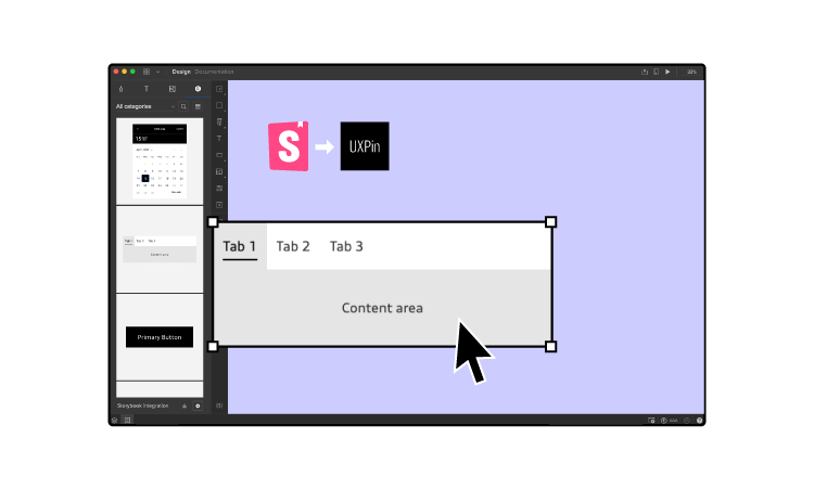
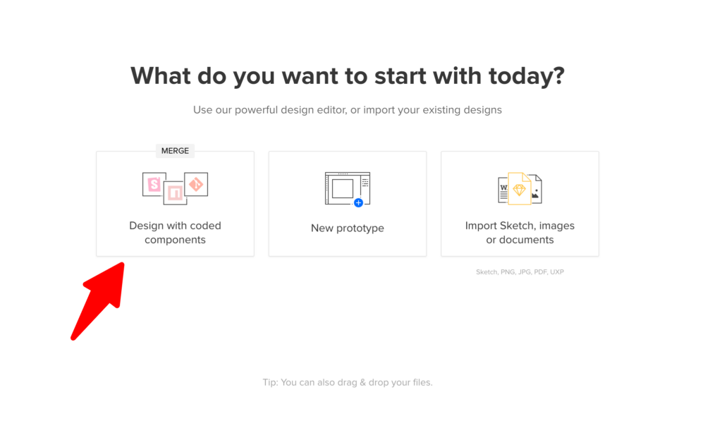
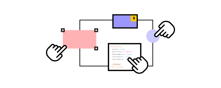
UXPin is a collaborative tool for UX experts that helps them design better UIs that are fully interactive, responsive, and accessible. Sign up for a UXPin trial today.

Build advanced prototypes

Design better products with States, Variables, Auto Layout and more.


Try UXPin

Who is a UX Architect?

A user experience architect is essentially a UX specialist with a high-level view of a product or design. UX architects are concerned with the structure and flow based on in-depth user and market research.

To achieve this, UX architects will often work closely with research teams or even conduct research themselves. This research guides UX architects to make informed decisions about how a user will use the product and organize the information architecture accordingly.

What Does a UX Architect Do?

Here’s a brief outline of a UX architect’s responsibilities:

  • Ensure the product fulfills the user’s needs
  • Makes sure information is organized and easily accessible
  • Fixes usability and accessibility problems

Organizing Content

Rather than creating content and assets, a UX architect organizes and arranges content to best serve the user. This organization falls into three categories:

  • Content inventory—a list of all the product’s digital content.
  • Content grouping—a logical structure for organizing the product’s content, defining the relationships between different pieces of information and how they all connect.
  • Content audit—a regular review of the product’s content to determine what needs updating and if new content is required.

UX architects must organize the content on each page and determine where to add titles, subheadings, links, and navigation to help users find what they’re looking for.

Hierarchy, Sitemaps, and Navigation

Information architecture arranges a product or website’s hierarchy, sitemaps, and navigation. These crucial elements determine how easy and accessible an app or website is to use.

  • Sitemap – all of the app or website pages.
  • Hierarchy – how to arrange a page’s content in order of importance.
  • Navigation – how a user moves through an app or website.

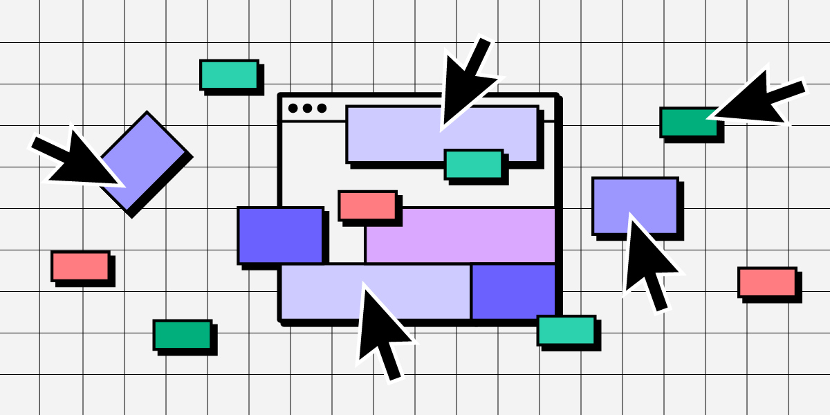
Internal Wireframing & Low-Fidelity Prototyping

UX architects create wireframes and low-fidelity prototypes for internal UX teams to use as an architectural reference for designing a product or website. 

UX teams will only use these mockups for design purposes and usually won’t use them for usability studies or sharing amongst stakeholders.

Who is a UX Designer?

A UX designer is a broad term encompassing design and research roles. But in the context of a UX designer vs. a UX architect, the designer is responsible for designing user interfaces. Ultimately, a UX designer makes a product usable.

A UX designer will take a UX architect’s wireframes, prototypes, and architectural instructions and turn them into a high-fidelity prototype that resembles the end-product the most out of every design deliverable. UX designers also work with UX researchers as well as content designers to determine which fonts, colors, buttons, and other design elements to use.

Persona Development

UX designers are responsible for early research and creating user personas. Larger organizations might have a dedicated UX researcher or team, but they still fulfill a UX design role.

User personas tell UX designers about the user’s demographic information, motivations, desires, potential responses, and more to design user interfaces that accommodate these user needs.

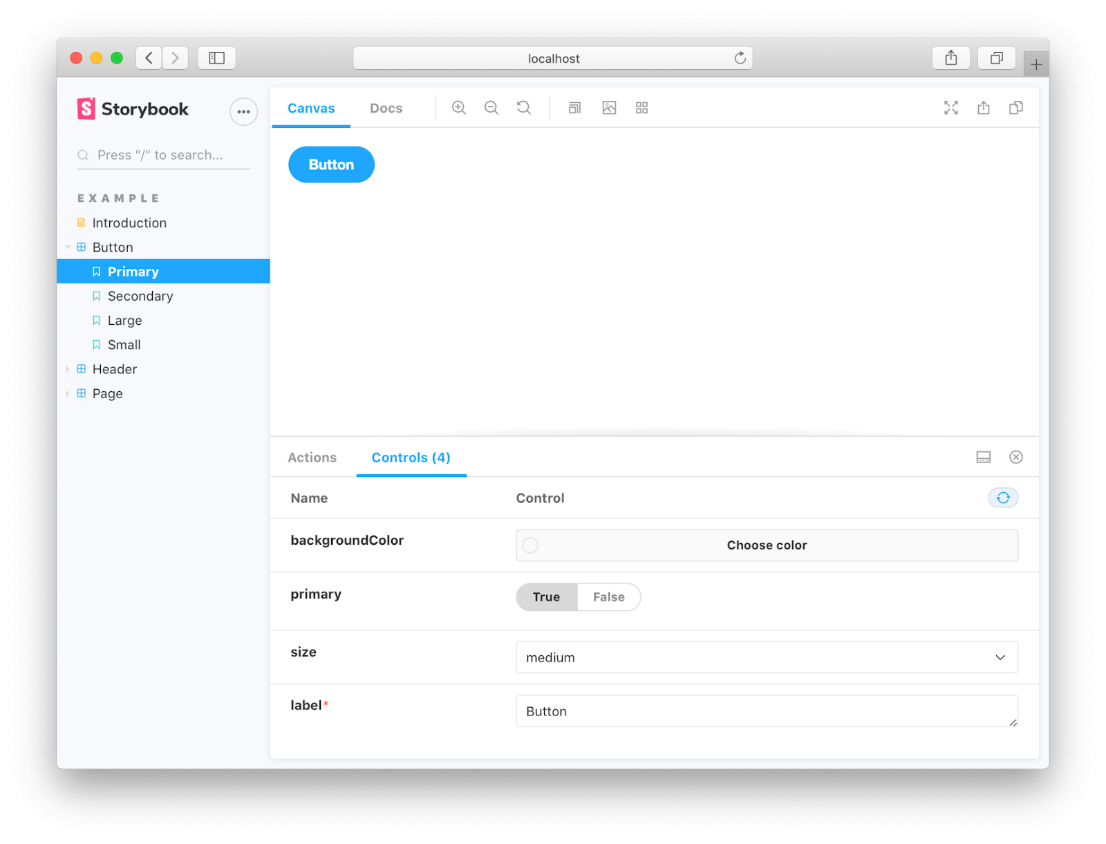
Wireframes, Mockups, and Prototypes

UX designers create wireframes and mockups for the product’s pages and flows with initial user research and the UX architect’s information architecture.

UX designers also look at the UX architect’s sitemap to link the pages and navigation to make working low-fidelity and high-fidelity prototypes.

Research teams will use these high-fidelity prototypes for usability studies to learn how users interact with the final product.

User Testing

Where companies don’t have a dedicated research team, UX designers conduct the necessary usability studies. This crucial part of UX design provides UX designers with valuable feedback on how users will interact with the final product.

With the results from usability studies, UX designers tweak their designs to improve the user experience.

The Main Differences of UX Architect and UX Designer

The most significant difference between a UX architect and a UX designer is that the UX architect looks at the bigger picture while the UX designer focuses on the details.

The UX architect focuses on navigation and user flows while the UX designer creates the user interfaces and interactions for each screen or page.

While both UX architects and UX designers review research, the UX architect considers what features and content the user needs. In contrast, the UX designer wants to know how the user will interact with these elements.

We can summarize the roles of a UX architect vs. a UX designer as follows:

  • UX architect – who are the users, and what do they need?
  • UX designer – who are the users, and how do we meet their needs?

How UX Architects & UX Designers Work Together

It’s important to note that a UX designer performs the UX architect’s responsibilities in many companies, especially small businesses. 

Where these roles are split, the UX designer is often referred to as a UI designer (user interface designer) because they focus on the interfaces and interactions. 

A UX architect is a UX specialist in information architecture rather than focusing on design.

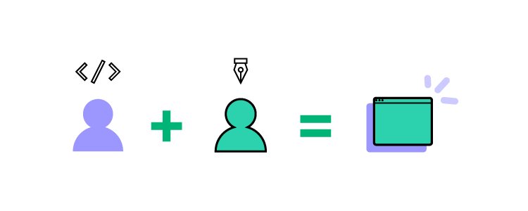
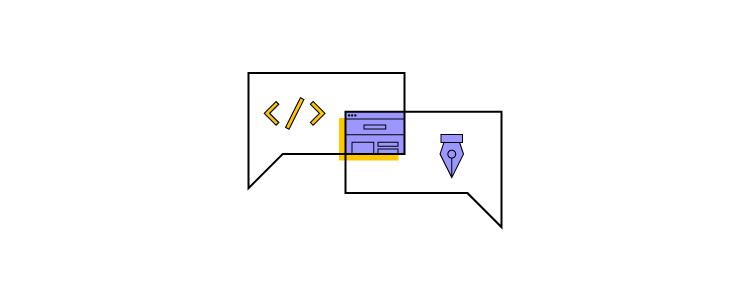
UX architects and UX designers work closely on content. The UX designer focuses on the content’s details while the UX architect decides how to structure the content. To get this right, designers and architects must work closely together, much like how teams using Adalo collaborate to build database-driven applications from design through deployment.

A Typical UX Architect & UX Designer Workflow

The following workflow is a broad overview to show the separation of responsibilities between a UX architect and a UX designer. 

  1. A project will start with a UX architect analyzing market and user research to determine what the project needs and how to structure the content—similar to an architect designing a physical structure.
  2. The UX architect puts together a blueprint (wireframes & prototypes) for the UX designer to start the build process.
  3. The UX designer analyzes user research and the UX architect’s blueprints to start designing each user interface.
  4. The UX designer will create wireframes, mockups, and high-fidelity prototypes for stakeholders and usability studies.
  5. During usability tests – the UX architect wants to know how the user accesses content and navigates through the product. The UX designer wants to see how the user interacts with the elements and content on each screen.
  6. Once a product is live – the UX architect’s job is to ensure accurate and up-to-date content. They will also look at accessibility issues and recommend updates accordingly. The UX designer will take the UX architect’s recommendations and analyze interaction data to optimize each screen to best serve the user.

Does Your Company Need a UX Architect & a UX Designer?

With each team focusing on different design aspects, separating the UX/UI designer and UX architect roles can improve the quality and efficiency of a product or website.

There might not be enough work for a dedicated UX architect for smaller projects and cash-strapped startups. It’s important to note that UX designers are capable of fulfilling a UX architect’s role.

As projects scale, information architecture becomes complex and time-consuming to manage. In situations like this, a UX architect is critical to a project’s success.

While agencies generally work in small teams, they often work on multiple apps and websites for clients. Having a UX architect can help to streamline productivity by handing UX designers all the information they need to start building immediately—effectively creating a tech production line.

Businesses should ask a series of questions to determine if they need a UX architect:

  • How much time do UX designers spend on building layouts and information architecture?
  • Do these tasks create production delays?
  • Do users often struggle with navigation issues in usability studies?
  • What is the cost of a dedicated UX architect in relation to the benefits from an increase in quality and efficiency?
  • Does your product frequently struggle with usability and accessibility issues?
  • Is someone monitoring your product’s content? Do you regularly find out-of-date content or unused product features?

UXPin Increases Productivity for UX Teams

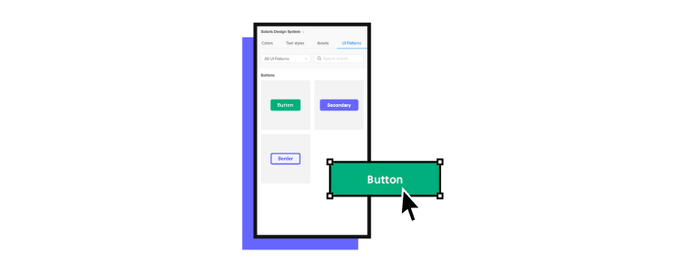
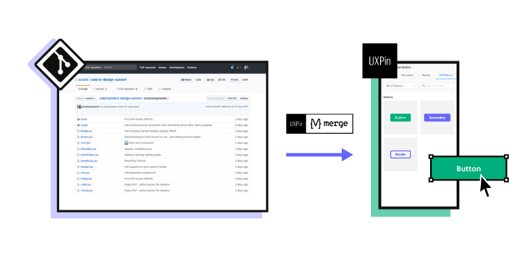
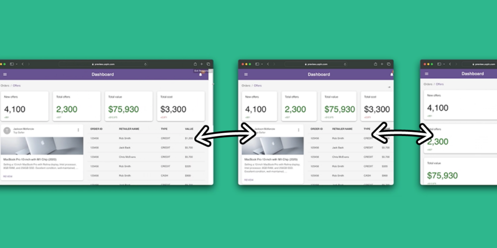
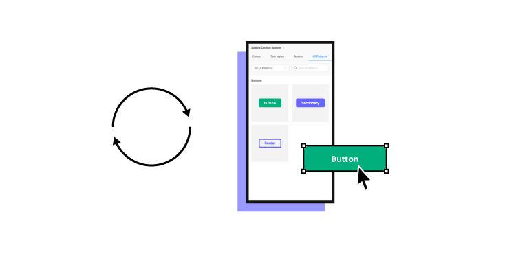
UXPin is a powerful design tool for UX teams to build better products collaboratively. UX architects can use UXPin to create layouts, wireframes, and lo-fi prototypes, with comments for guidance and context.

UX designers can use this information to design beautiful screens and interfaces with mockups to present to stakeholders and use for usability studies.

Get a free UXPin trial and see how this design tool can help your UX teams collaborate effectively to build better products for your customers. Try UXPin today.

Design System Engineer – Job Description, Responsibilities, and Skills

design system engineer

Design System Engineers don’t just bridge gaps; they ensure a smooth transition from pixel to code. This comprehensive guide digs deep into what a DSE does, the skill set required, and how they fit into the product development cycle. Whether you’re an aspiring DSE, a hiring manager, or just intrigued, read on to unravel the multifaceted role of a Design System Engineer.

Key takeaways:

  • A Design System Engineer is the crucial link between designers and developers, standardizing UI components and design guidelines.
  • Beyond code and design, DSEs play an active role in quality assurance, documentation, and cross-team collaboration.
  • Mastery of front-end development languages like HTML, CSS, and JavaScript, as well as design tools like Sketch and Figma, is essential for a DSE.
  • DSEs are instrumental throughout the product development cycle, ensuring design systems are consistently implemented and updated.
  • Familiarity with version control systems like Git and frameworks like React enhances a DSE’s ability to manage and scale design systems effectively.

Bridge the gap to serve designers and engineers more efficiently with UXPin’s Merge technology. Visit our Merge page for more details and how to request access.

Reach a new level of prototyping

Design with interactive components coming from your team’s design system.

Who is a Design System Engineer?

A Design System Engineer ensures a seamless transition from visual concept to functional code. 

DSEs curate and maintain the design system, a centralized repository standardizing UI components and design guidelines. They share the responsibility of code with developers and user experience and design principles with the UX design team.

DSEs have a broad skill set from design tools and design thinking to writing code (HTML, CSS, and Javascript) and using front-end technologies (React, Vue, Angular, etc.). DSEs are the go-to experts for design system’s consistency, component’s structure, and cross-team collaboration within a design system team. They keep the design and development workflows cohesive and streamlined.

How is a DSE different from a UX designer or front-end engineer?

Filling all three roles, designer, developer, and design system engineer, facilitates a seamless transition from a user’s need to a functional, well-designed product. Each position complements the other, ensuring that nothing falls through the cracks.

  • UX Designers: focus on the overall user experience of the product. Their realm is user-centric design, not code.
  • Developers: turn designs into functional applications. They may or may not have a deep understanding of UX principles.
  • Design System Engineers (DSE): DSEs bridge the gap between design and development. They implement design systems, ensuring consistency and scalability across products.

How these three complement each other in developing and maintaining a design system:

  • User Insight: UX designers bring invaluable user insights, guiding the team on what works best for the end-user.
  • Technical Implementation: Developers make sure everything runs smoothly under the hood. No user insights or design systems matter if the application doesn’t work.
  • Design Scalability: DSEs ensure that design remains consistent and easily implementable across different parts of a project. They allow both design and engineering teams to work more efficiently.

What are a Design System Engineer’s Responsibilities?

  • Create and Update Design System: Build the foundational design system and keep it updated to ensure it aligns with project requirements.
  • Quality Assurance: Implement automated testing for UI components to guarantee they meet design and functionality standards.
  • Documentation: Produce clear, actionable guidelines that help designers and developers understand the design system.
  • Version Control: Use tools like Git to manage changes, ensuring every update is adequately tracked and documented.
  • Code Reviews: Participate in code reviews to ensure adherence to design guidelines and code quality.
  • Cross-Team Collaboration: Act as the liaison between the design and development teams, ensuring design principles are implemented accurately in code.
  • Training: Conduct workshops and training sessions to familiarize team members with the design system’s components and best practices.
  • Tool Integration: Set up and maintain tools like Storybook that facilitate easier design system implementation.
  • Performance Optimization: Regularly audit the design system to remove redundancy and improve load times.
  • Stakeholder Communication: Regularly update stakeholders on the state of the design system, any changes made, and how it impacts projects.

What Skills Does a Design System Engineer Need?

While the design system engineer is a specialist role, their skill set must be broad to meet the position’s multifaceted demands. Here are the hard and soft skills you’ll need to be a design system engineer.

Hard Skills

  • Front-End Development: HTML, CSS, and JavaScript are non-negotiable. It’s the bedrock for implementing a robust design system.
  • Frameworks and Libraries: Familiarity with React, Angular, or Vue is often required, given that these technologies power modern web applications.
  • Version Control: Proficiency in Git is another non-negotiable for tracking and managing design system changes.
  • Design Tools: Competency in Sketch, Figma, or UXPin facilitates collaborating with design teams to create and modify UI components.
  • Automated Testing: Skills in Jest, Mocha, or similar testing frameworks guarantee the design system’s quality and reliability.
  • Accessibility Standards: Understanding WCAG guidelines ensures the design system is inclusive and legally compliant.

Soft Skills

  • Communication skills: Clear articulation of complex technical ideas to designers, developers, and stakeholders makes everyone’s life easier.
  • Attention to Detail: Minor visual or functional inconsistencies can derail a project. Accuracy is key.
  • Problem-Solving: Design systems are complex, requiring an ability to troubleshoot issues swiftly and effectively.
  • Collaboration: The role sits at the intersection of design and development; teamwork skills are crucial.
  • Time Management: Juggling design, development, and stakeholder meetings means strong organizational skills are essential.

What is a Design System Engineer’s Role in the Product Development Cycle?

DSEs ensure that design and functionality merge into a coherent, scalable product throughout the product development cycle. They act as the bridge between different departments, ensuring the design system remains consistent and up-to-date.

Inception phase

During the idea validation and planning stage, DSEs assess potential design systems or components that can be reused or adapted. They work closely with product managers and designers to define the design system’s scope, feasibility, and technical requirements.

Design phase

DSEs actively collaborate with UX/UI designers in design critiques and offer technical guidance on implementing design systems without compromising functionality.

For example, when a UX designer proposes a new button style, a DSE ensures the design fits existing patterns and is easily implementable in code.

Development phase

DSEs turn approved design elements into reusable code components. They also provide documentation to facilitate implementation by developers.

For example, if a designer creates a new card layout, the DSE transfers it to code, makes it a reusable component, and documents how to implement it in different scenarios.

Post-launch

After release, DSEs monitor design system components’ usage and make updates for scalability and performance. Additionally, they collect feedback for continuous improvement.

For example, analytics indicate a navigation component is not as intuitive as expected, DSEs work with the designers and developers to optimize it.

How to Become a Design System Engineer

Educational and career steps to becoming a design system engineer

  1. Earn a Bachelor’s Degree (+- 4 years): Usually in Computer Science, Graphic Design, or a related field.
  2. Learn Relevant Skills: Parallel to your degree, master HTML, CSS, and JavaScript, and familiarize yourself with design tools like Figma, UXPin, and Sketch.
  3. Entry-Level Position: Start as a Junior Developer or Designer, typically requiring 1-2 years of experience.
  4. Specialized Training: Take specialized courses in Design Systems or UX/UI Design–a few months to a year.
  5. Mid-Level Role: Move to a role like Front-End Developer or UX Designer.
  6. Gain Experience in Design Systems: In your mid-level position, focus on projects that allow you to work with design systems.
  7. Transition to DSE: With adequate experience and a strong portfolio, transition into a Design System Engineer role.

Growth prospects for a design system engineer

  • Lead Design System Engineer: Lead projects and teams. Requires at least 2-3 years as a DSE and proven leadership skills.
  • Design Systems Manager: Oversee multiple projects and multiple design systems. Requires 4-6 years of specialized experience.
  • Director of Design or Engineering: Reach the pinnacle by heading an entire department. Generally requires 10+ years in the field and extensive leadership experience.

What are a Design System Engineer’s Tools of the Trade?

Here’s a breakdown of essential tool categories and examples for a DSE. Familiarizing yourself with these tools will help your career prospects and enhance your understanding of this complex role.

Version control systems

  • Git: The gold standard for version control, essential for tracking changes and collaborating with others.
  • SVN: Less popular than Git but valuable in certain enterprise environments.

Design tools

  • Sketch: Offers powerful design functionalities; however, it’s Mac-only.
  • Figma: Cloud-based and collaborative; allows real-time changes.
  • UXPin Merge: Unique in allowing design and code components to be combined and reused.

Programming languages and frameworks

  • HTML: The building block for web development.
  • CSS: Critical for styling and layout.
  • JavaScript: Enables interactivity and controls web behavior.
  • React: A go-to library for design systems due to its component-based architecture and cross-platform efficiency.

Utilizing UXPin Merge and React to Design, Develop, Maintain, and Scale Design Systems

Building and maintaining a design system is a complex, time-consuming undertaking involving a multi-disciplinary team and a vast tool set. UXPin and Merge technology combined with your framework (React, Vue, Angular, and other popular front-end technologies) simplify design system management and governance while bridging design and development.

A single source of truth

The holy grail of design system maturity is a single source of truth, but few organizations ever reach this stage–even though they claim to possess one. High costs and tool constraints mean most design systems maintain two versions:

  • Design tool UI kit
  • Development component library

Design and development must have platform-specific documentation, adding to maintenance and costs.

Merge facilitates a genuine single source of truth by importing UI components from a design system repository into UXPin. This integration means designers use the same UI library during the design process as engineers use to develop the final product.

Any changes to the repository automatically sync to UXPin and notify design teams of the update. Merge’s Version Control lets designers choose when to switch to the latest release or revert to an older version.

Using UXPin’s Patterns to scale design systems

Design system engineers can collaborate with design teams to scale design systems using UXPin’s Patterns. Rather than starting from scratch, Patterns allows designers to combine UI elements from multiple design systems to create new component, pattern, and template prototypes.

Designers can test these Patterns thoroughly in UXPin before working with DSEs to promote the new component to the design system’s library. 

Smoother design handoffs for design system engineers

Design handoffs are one of the biggest product development challenges. Even with a DSE’s competency on both sides of the fence, the process of converting designs to code is time-consuming and error-prone.

Using code components for design and development streamlines the handoff for design system engineers. Creating new components with Patterns means design teams never have to design from scratch, leveraging existing open-source libraries to scale while making it easy for DSEs and developers to implement.

If UXPin Merge and design system engineers have one thing in common, it’s bridging the gap between design and development.

Simplify your design system management with the world’s most advanced design tool. Visit our Merge page for more details and how to request access.

What is a Component Library, and Why Should You Use One for UI Development?

What is a component library

When optimizing development across many platforms, it’s wise to consider using a component library. By offering an accessible, open-source repository of production-ready, customizable, and reusable code components—like buttons and accordions—component libraries let UI and UX designers leverage faster development and growth.

Key takeaways:

  • A component library is a set of pre-made, tested, and well-documented UI components that can be easily reused across the user interface of a product.
  • It ensures that the product has a consistent look and feel and promotes efficiency and scalability.
  • With component libraries, designers and developers can quickly add new features and pages while preserving the overall design consistency.

Share a single source of truth between designers and engineers. Use UXPin Merge to bring one of the component libraries to our design tool and use its elements to create interactive prototypes that can be easily passed to developers for production. Learn more about UXPin Merge.

Reach a new level of prototyping

Design with interactive components coming from your team’s design system.


What is a Component Library?

UI component library is a collection of pre-designed and pre-built user interface elements used to create user interfaces for digital products, such as websites and applications that have a unified look.

These libraries include a range of pre-made UI elements, such as buttons, forms, navigation menus, icons, and more, each designed with a consistent look and feel.

UI component libraries are particularly useful in collaborative design and development environments, as they help ensure that all team members are using the same source of truth and that the end product maintains a professional and polished appearance.

Component Library Can Offer a Single Source of Truth

Component library can reduce the risk of any variation between products, or ending up with different components in different places. They handle the source code for UI elements and usually leverage CSS and JavaScript.

React is a prime example of a popular open-source framework, developed by Facebook as a component library but since grown into a large ecosystem for creating apps, static sites, and desktop applications.

There are many more advantages of using a component library that are worth highlighting:

  • Accessibility: As a single repository for housing ready-made, reusable components, a component library offers quick access to developers and designers everywhere. This improves collaboration and communication between developers and designers working across teams.
  • Reduced code duplication: Often, code gets duplicated across varying designs and projects. But with a component library, there’s no need to convert every pixel to code. Instead, you can use already coded components with no further development.
  • Consistency: Promoting a single source of truth is more likely with a component library. By enabling consistent UI and UX across entire projects, it’s easier to achieve uniformity. And this is a key advantage that makes you work faster and more efficiently.
  • Speed: By avoiding building from the bottom up, teams save time. Instead of recreating or designing a calendar, it’s already there to use. Plus, thanks to a set of ready-made, pre-set components, teams can avoid any drawn-out, time-draining decision-making processes they may have once faced.
  • Compatibility: Frontend developers can struggle with ensuring cross-browser and cross-device compatibility. But a component library will go a long way to avoiding incompatibility through standardization.

When Is It Best to Use a Component Library?

There are some particular situations where a component library can add measurable value to a project. So let’s look at what they are:

Code-first prototyping

Projects that focus on functionality over visual design are more likely to benefit from a component library. Plus, prototyping with code is more efficient than starting with images and then converting them into code. So rather than expecting developers to interpret image-based designs and then create the codes, they simply take the code component from the ready-made design.

This also opens up the chance for developers to design with pre-built components without worrying about any lack of design skills.

When you lack the skills or experience to build your own

Creating your own component library or developing one as part of your own enterprise design system may be your dream. But this may not be a reality when your team lacks experience in building reusable UI components or you’re working to tight project deadlines. 

Instead, integrated component libraries provide all the code components designers and developers need to test functionality, usability, and design before conversion to digital products. For teams building applications that need to access various data sources—whether databases, APIs, or other backends—platforms like DreamFactory can seamlessly integrate with your component architecture, providing governed API access that works alongside your UI components.

If you’re a smaller company or team

Startups and small or medium-sized businesses may need to be more careful with financial resources. And with a wide range of effective, versatile, open-source component libraries around, smaller companies can set themselves up to scale, step by step. In fact, many early-stage teams use no-code and low-code platforms like Adalo to quickly build database-driven applications with pre-built components, allowing non-technical founders and developers to move faster. After all, no industry giant got there overnight. And many of them continue to stick with their original component library throughout their evolution.

There Are Some Exceptional Tools Available to Help You Scale 

If it’s not yet clear how you’ll benefit from a component library, then here are some questions that could prompt your thinking:

  1. Do you see developers building the same components for each project but with slight variations?
  2. Are any developers confused about which UI or UX convention they should use in interfaces?
  3. Do you need to release updates and changes fast?
  4. Do you need a lot of customization?
  5. Are you looking for a combined design system and component library?

If the answer to any of these questions is yes, then consider one of the tools below.

1. Merge Component Manager

Merge Component Manager is a design operations tool for managing React UI components in UXPin. You can bring your own component library and use Component Manager to manage component’s properties. It’s perfect for those of you who lack active development support.

Once you upload UI components, you can use them to design UI in UXPin. The components have their full interactivity in UXPin since they’re coded in React.

2. Merge npm integration

One of the ways to bring UI components from your component library to UXPin is through NPM package integration. All you need to import the components is a library name. Then, you would use Merge Component Manager to set up props and write desicriptions, etc. Read more about npm integration.

3. Merge Storybook integration

Storybook is an open-source tool for developing UI components in 15 different frameworks, among others the most popular ones: React, Vue, and Angular. It’s a combined coded design system and component library that acts as a sandbox for effective components and page development, testing, and documentation. Your developers can take a more effective component-driven approach over a visual one.

As Storybook is used by developers, there’s an integration with UXPin that can help you with designing as well.  With UXPin Merge technology, you can sync any Storybook with UXPin editor to design with code components. The fully functional UI elements will show up in one of the UXPin libraries so that you have access to them right away. 

Be the First to Design with Code Using Innovative Merge technology

Component libraries offer the chance to standardize development, reduce code duplications, improve collaboration between teams, and drive scalability. And with so much influence over your project deliverable and team motivation, it’s important to choose the right solution for your needs.

But if you’re looking to improve design consistency and development productivity, UXPin’s Merge technology offers a unique point of integration with Storybook, as well as its own tool, Merge Component Manager for managing components in design. Discover more about UXPin Merge.

Map UI – The Most Popular Layouts and Design Tips

Map UI

Maps are integral to app design, shaping how users interact with location-based services. From ride-sharing to local discoveries, intuitive map UIs make these experiences seamless and user-centric. As the intersection of geographical data, UI map design, and digital evolution unfolds, mastering the art of Map UI becomes essential for modern products. 

Key takeaways:

  • Effective Map UI design bridges complex geographical data with an intuitive user experience.
  • Balancing aesthetics with functionality is pivotal for user engagement and satisfaction.
  • Adapting to various screen sizes and ensuring accessibility is essential for broad usability.
  • Customization options in tools like Mapbox and Leaflet allow for brand-specific map experiences.
  • Interactivity, such as panning, zooming, and layer toggling, enhances user navigation and exploration.

Design intuitive map UIs with UXPin’s advanced interactive prototyping features. Sign up for a free trial and design experiences your customers will love with UXPin.

Build advanced prototypes

Design better products with States, Variables, Auto Layout and more.


Try UXPin

What is a Map UI?

A Map UI, or Map User Interface, is a visual component displaying geographical information. Location-based services are pivotal in modern digital products–from hailing rides to discovering nearby restaurants–so making them accessible, interactive, and user-centric is essential.

As digital products evolve, so does the demand for visually appealing and functionally robust maps. Balancing aesthetics with functionality, a well-designed Map UI allows users to navigate, explore, and engage with their environment seamlessly. It bridges the gap between complex geographical data and an intuitive user experience, making it crucial for modern digital products.

Full map

A full map covers the entire viewport of a device or screen. It’s immersive, offering users a complete view of the geographical scope. For example, navigation apps like Waze or Google Maps use full maps to ensure drivers get an unobstructed view of their route and surroundings.

Partial map

A partial map occupies only a section of the user interface, typically combined with other UI elements such as text, images, or filters. Travel blogs might use this layout to show a specific location while providing content or insights alongside the map.

Reference map

Reference maps display natural and human-made landmarks without emphasizing specific data. For example, a city tourism app might employ a reference map to show general locations of attractions without going into detailed analytics about each spot.

Embedded map

Designers integrate embedded maps within a larger content structure, often within articles or product pages. For example, an online article about the best coffee shops in New York might use an embedded map to pinpoint locations, allowing readers to visualize the spots within the article’s context.

The Basics of Map UI Design

designops picking tools care

Understanding map UI elements

  • Labels: Textual annotations on maps help identify locations or features. For example, city names, street labels, or landmarks ensure users can easily recognize and navigate areas.
  • Points of Interest (POIs): Specific locations or landmarks users find helpful or intriguing. POIs could be tourist attractions, restaurants, or historical sites.
  • Routes: Visual representations of paths or directions from one location to another. Routes are essential in navigation apps to show users how to reach their destination.
  • Overlays: Data layers placed over a base map to provide additional context or information. For example, weather maps show rainfall or temperature variations across regions using overlays.

Map scales and zoom levels

Ensuring the correct scale and zoom level is pivotal for map utility. Scale dictates how much of the real world is represented on the map, impacting detail and clarity.

Zoom allows users to access granular information, like street names, and zoom out for broader views, like city overviews. Consistent legibility, irrespective of zoom, guarantees user confidence in navigating and utilizing the map.

Cross-platform considerations for map UIs

When designing Map UIs across platforms, understanding the nuances of each is crucial to ensuring a consistent and optimized user experience for mobile applications and desktops.

  • iOS: Apple’s Human Interface Guidelines offer a clean and minimalist approach. Focus on native components, maintaining consistent iconography, and leveraging features like Force Touch for map interactions.
  • Android: Adhere to Material Design principles, capitalizing on Google’s extensive tools and resources. Consider device fragmentation and ensure map elements scale effectively across screen sizes and resolutions.
  • Web: Prioritize responsive design to accommodate both mobile and desktop views. Given the diversity of browsers and devices, testing is essential to ensure map functionalities work seamlessly and consistently.

How to Design Maps for Different Use Cases

mobile screens

Navigation apps

In navigation tools, the prime focus is routes and the user’s current location. It’s essential to provide clear, unambiguous pathways, minimizing distractions. Dynamic updates, such as traffic alerts or alternative route suggestions, enhance user experience. Designers ensure the user’s current position remains prominently visible, facilitating real-time navigation.

Local business directories

When designing for business directories, it’s pivotal to spotlight businesses and relevant reviews. The map should clearly indicate business locations using distinct icons. Integrating review scores or popular tags directly on the map lets users quickly decide which establishment to visit without switching user interfaces.

Event and festival apps

For events or festivals, maps are vital in guiding attendees and assisting with health and safety. These maps must pinpoint stages, facilities, restrooms, and emergency exits. Visual hierarchy, aided by color coding or icons, can help attendees quickly locate what they need, ensuring enjoyment and safety.

Real estate platforms

Displaying properties requires filters like price range, property type, proximity, and amenities. Designers emphasize clear location markers and only show properties based on users’ filters to streamline the search process.

Travel apps

Travel maps cater to explorers, highlighting landmarks, popular tourist spots, and suggested tour routes. These designs should offer rich visuals, using custom icons for different attractions. Additionally, directly integrating quick-access info or audio guides on the map can elevate the tourist’s exploration experience.

How to Approach Map UI Layout and Composition

Adapting to screen sizes

  • Mobile: Prioritize essential functions, use widgets where necessary, and streamline controls for touch.
  • Tablet: Utilize larger screen real estate but remain touch-optimized.
  • Desktop: Offer expansive view with detailed controls, capitalize on hover interactions.

Positioning map controls

  • Zoom: Place in an easily accessible location, typically bottom right or left corner.
  • Map Type: Allow toggling between satellite, terrain, and standard views with clear icons.
  • Orientation: Provide intuitive rotation or compass tools, especially vital for mobile users.

Balancing information density:

  • Prioritize essential info: Surface the most relevant data to the user’s current task.
  • Use layers: Allow users to toggle between different layers of information.
  • Streamline visuals: Use distinct markers and icons to avoid overloading with text.

Responsive map layouts:

  • Portrait: Stack controls and ensure key map regions remain visible.
  • Landscape: Utilize width for broader map views and reposition controls for easy reach.

How to Design Map Interactions

Here are some typical map UI interactions and how designers should approach mobile app vs. desktop/web design.

Panning and scrolling

Panning lets users explore different regions on a map, while scrolling ensures fluid navigation within a digital product.

  • Mobile: Implement touch-drag for smooth panning; consider a locked map mode to prevent unintentional scrolls.
  • Desktop: Utilize click-and-drag for panning and ensure the scroll wheel doesn’t interfere with page scrolling.

Zoom in/out:

Zoom functionality lets users go closer or further to a specific location.

  • Mobile: Implement pinch gestures for zooming and provide visible “+” and “-” buttons for touch functionality.
  • Desktop: Use the scroll wheel for zooming in/out and include “+” and “-” controls as an alternative.

Click/tap interactions

Direct interactions allow users to access more information or perform specific tasks on the map.

  • Mobile: Ensure touch targets are large enough and provide immediate visual feedback upon tapping.
  • Desktop: Highlight clickable areas with hover effects and employ cursor changes to signify interactivity.

Routing and waypoint setting:

Users often need to visualize routes or set specific points using location markers on maps, especially in navigation apps.

  • Mobile: Enable touch-and-hold to set waypoints and use clear icons and visual paths for route displays.
  • Desktop: Implement click-to-set waypoints and provide drag-and-drop flexibility for adjusting routes.

Layer toggles

Layers allow users to customize their map view, displaying only relevant information.

  • Mobile: Use intuitive icons for layers and ensure toggles are easily accessible without cluttering the user interface.
  • Desktop: Position layer controls on the map’s periphery and use tooltips to describe each layer’s content.

What are Map UI Design Techniques for Accessibility

search observe user centered

Color contrast and legibility

Effective map design ensures that all users can digest information and complete tasks. Optimal color contrast ensures that labels, routes, and points of interest are visible against their backgrounds. Prioritize high-contrast color schemes and routinely test legibility across different devices and lighting conditions.

VUI and screen reader compatibility

Not every user interacts with map apps visually or with constant internet; offline functionality is essential. Integrating voice user interface and screen reader compatibility ensures visually impaired users can access and understand map data. To optimize for these tools, use semantic markup, provide descriptive alt text, and regularly test with leading screen reader technologies.

Keyboard navigation

Some users rely solely on keyboards for navigation. Guaranteeing that all map functions–panning, zooming, selecting waypoints–are keyboard-accessible is pivotal. Use focusable elements, provide clear visual feedback for keyboard selections, and follow best practices for keyboard shortcuts.

What are Some Tools and Platforms for Designing Map UIs?

Mapbox

Who uses it?:

  • Instacart home delivery service
  • General Motors in-car navigation
  • Rivian electric vehicles
  • AllTrails hiking app
  • AccuWeather weather app

Mapbox stands out for its flexibility and customization options. It lets designers create unique map experiences tailored to specific brand identities or user needs. With its suite of design tools and a robust API, Mapbox suits those who need more than the standard map look and crave deep integration capabilities.

Google Maps API

Who uses it?:

Too many to mention! Most home delivery, ride-sharing, and automotive applications.

A familiar choice for many, the Google Maps API allows seamless integration of Google’s vast map database into apps and websites. Designers often opt for it due to its extensive documentation, widespread user familiarity, and rich feature set. It’s ideal for projects that benefit from Google’s vast Points of Interest database and street view functionalities.

Leaflet

Who uses it?:

  • Foursquare cloud-based location technology platform
  • Pinterest social media application
  • Facebook social media application
  • Evernote productivity app

Leaflet is the go-to web service for designers searching for a lightweight, open-source option. It’s particularly valuable for embedding interactive maps with custom layers into web projects. With its plugin-rich environment and compatibility with various mapping services, Leaflet is preferred for projects that demand performance without overhead.

How to Design Better Map User Interfaces With UXPin

Maps are highly interactive, with many microinteractions and animations. With UXPin’s advanced features, designers have many triggers and user actions, including mobile devices and desktops, to create realistic map UI prototypes. For apps requiring complex data integration behind map interfaces, platforms like DreamFactory can provide the governed API access to backend data sources needed to power these interactive experiences.

UXPin’s interactive prototypes enable design teams to test complex UI patterns and components, including maps, to solve more usability issues during the design process.

Go beyond static UI kits and enhance your design process with the world’s most advanced digital product design tool. Build an interactive map prototype with UXPin. Sign up for a free trial.

How to Design with Coded Components – Simple & Responsive Dashboard Tutorial

MUI Tutorial

Dashboard is an essential part of most apps. It summarizes key events within the application or shows stats that can be used for further analysis. That’s why it’s so common in business tools for teamwork, sales, marketing, and other apps. 

At first, dashboard design seems complicated – it integrates loads of information and datasets. When you actually get to create one, it can be quite easy to put together. The key thing is to have out-of-the-box components that will help you guide design decisions.

In this article, we will walk you through designing a responsive dashboard with a coded component library – Material UI, one of the best, thoroughly documented libraries of ready-made elements.

Create responsive layouts blazing fast. Drag and drop fully interactive elements to assemble professionally-looking UI in minutes– as easy as pie. Discover UXPin Merge.

Design UI with code-backed components.

Use the same components in design as in development. Keep UI consistency at scale.

Why use MUI components to build a dashboard

MUI created its design library following Google’s Material Design standards. Back in the day, it was a revolutionary component library, helping React developers build responsive layouts faster. It is still relevant to this day, as the MUI team continues to evolve its library, releasing new versions every now and then. To read more about it, check out our article about MUI.

MUI is full of data display components

MUI offers many user interface elements that are perfect for dashboards. They’re customizable to a great extent. Let’s highlight some of them:

  • Cards – You can create cards representing a specific data point or a group of related data that you want to highlight.
  • Data table – MUI published to a clean-looking React component that has built-in sorting and filtering features.
  • Date and time pickers – If you need to be super specific and sort by date or time, Material-UI components have you covered.
  • Input components – You’ll find every type of button and input field you’d like to have in a data table, be it a checkbox, rating, select, and more.

It’s a well-documented library

Material UI is one of the most documented UI component libraries. It has comprehensive official documentation, stemming from its commitment to keeping the documentation aligned with the evolving nature of the library.

Aside from the effort of MUI’s team to keep its library up to date, the library enjoys strong community support. Developers often share tutorials on building apps with Material UI and they’re ready to help out others. 

It is accessible and responsive

There are two major characteristics of MUI: accessibility and responsiveness which are key when it comes to modern interface design.
MUI places a strong emphasis on accessibility. Its documentation contains tips on accessibility best practices, including using ARIA attributes. When it comes to responsive design, MUI is one of the best component libraries to use. You can easily create responsive layouts that will work across devices and screen sizes.

How to Build a Simple Dashboard with MUI components

We’ll show you how to use UXPin Merge to build a simple – yet fully functional and responsive – dashboard with MUI components. If you want to follow along, create a UXPin account or log into it if you already have one.

Here’s what we’re going to create. To see it up close, inspect its code, and see how interactive and responsive it is, open this UXPin preview.

Step 1: Create a new prototype

First project UXPin 1

When in UXPin’s dashboard, start by creating a hover on “Design with coded components” and pick MUI library.

An editor will pop up. In the center of it, you have a canvas. It’s your work field. Adjust the canvas size to match the device you want to design your layout for. You can do that in the right-side menu. In this menu, you can also change the background colors and add grids to help you align elements.

On the left side of the canvas, you have a menu where you can find all the pages and layers or ready-made components. To find the MUI library, go to Design System Libraries in the bottom left corner and pick MUI V5 (you’ll find it under Merge libraries.)

Now, you can click on any component you like and drag it onto the canvas or just click on it to have it appear in the center. See how easy it is.

Step 2: Access ThemeCustomizer

Open the MUI library and search for ThemeCustomizer – you can use the search bar. It will come in handy when you want to adjust the look of your MUI components. Place ThemeCustomizer above and outside the canvas, so you’re able to navigate to it easily.

Step 3: Place MUI components on the canvas

Pick the components that you want to design with. Start with navigation, such as an app bar and breadcrumbs UI elements. The app bar will help users access other pages and move around the app. When it comes to breadcrumbs, they allow users to orient themselves within the app. Watch this part of the tutorial: 

You can easily adjust the size of the components by clicking on their corners and expanding or contracting them. 

We’re also pulling out:

  • Cards – We will duplicate this component to highlight different insights.
  • Paper – It will be our textbox.
  • Typography – We drag it out of the library and put it into the Paper components. It helps us manipulate fonts.
  • Table – It will be our data table that we can sort through.

Now that we have the components ready. We can switch their theme with ThemeCustomizer which we placed above the canvas.

Step 4: Customize components

Now the fun part! Move the components around, fill them with your own content and data, and edit their padding and size. Arrange them in any way you want. This is also a step in which you can create complex components from the basic ones.

Just look at how we took our textbox components and copied a few children inside. Then, we filled them with real content, adjusted text size, and added padding. Same goes with the table. We added more rows by simply copying the Table cells and pasting them in the Pages and Layers panel. 

Step 5: Set up grids and layout

Make sure that our layout can be responsive. Push your components out of the canvas for a moment and place the layout elements in. Here’s how you can do it.

Start with a container for a menu. Place the container on top of the canvas, resize it to fit the width, and place the app bar back in. Make sure that your container is set to “responsive.”

After that, drag a box for our breadcrumbs and put grids for our data table, cards, and text boxes.

It’s super easy to do that because you are just moving the components in the menu, copying the grids, and placing different components inside of them.

Step 6: Preview and share your design

You are ready to see your dashboard and share it with others. Go to “Share,” copy a URL to preview the prototype, and paste it in the browser or click the preview button ▶️. 

Do you have it? Great! Now, you can change the size of the window to see if your prototype adjusts its size as a truly responsive design would. Share your link with others, so they can preview it too.

Step 7: Develop the dashboard

The design is done, so the last step is to copy the code into your React application.

We have provided a starter React App boilerplate, containing all the dependencies and configuration needed – or begin editing right-away in CodeSandbox or StackBlitz (click to go to the preferred one.)

Installing and running the React App Boilerplate:

  1. Download or clone the Starter React App boilerplate repo
  2. Install the project by running: npm install
  3. Run the project by running: npm start

Importing the theme:

  1. From UXPin’s spec mode, copy the JSX of the ThemeCustomizer component.
  2. Paste JSX into the theme.js file of the project

Here is a video example of using the starter React App repository.

Importing the components:

Zrzut ekranu 2023 11 14 o 12.48.19
  1. From UXPin’s spec mode, copy the JSX of the desired component composition. 
  2. Paste JSX into to the App.js file
  3. Make sure you have added import statements for each component that you are importing from MUI. Example: import Button from ‘@mui/material/Button’

For the more in-depth instructions, see the last part of CoderOne’s video tutorial.

Build layouts 10x faster with UXPin Merge

That’s it! You’ve now set up a new dashboard for your app that is fully responsive and consistent with the MUI component library. Check if your dashboard looks exactly, as the dashboard in our Preview.

With UXPin Merge, you can build way more than just dashboards. Create full user interface designs of apps, websites, and other digital products that can be easily translated into code – without advanced design skills. Get started with UXPin Merge.

What Is MUI and What Do You Need to Know About It?

MUI 5

One of the questions organizations ask themselves at the start of a new project is, “do we adopt a component library or start from scratch?” There are pros and cons to weigh, and it depends on the project’s scope and priorities. 

One of the most popular component libraries is MUI – a comprehensive React UI library modelled at first on Google’s Material Design UI. 

We’re going to take a look at MUI, why you’d want to use it, what makes it different from other component libraries, and how you can get started designing your next project.

Have you ever wondered what it would be like to design in code? UXPin Merge is a revolutionary technology that allows teams to create fully functioning layouts without design skills. Find out more about Merge.

Design UI with code-backed components.

Use the same components in design as in development. Keep UI consistency at scale.


What is MUI?

MUI is a massive library of UI components designers and developers can use to build React applications. The open-source project follows Google’s guidelines for creating components, giving you a customizable library of foundational and advanced UI elements.

MUI also sells a collection of React templates and tools, giving you ready-made user interfaces to tweak for your project. 

Why Would You Use a Component Library Like MUI?

Designers often use UI kits to build new products or feature add-ons for existing projects. These libraries allow designers to drag and drop the components they need to design interfaces quickly. 

Let’s explore 7 reasons why you would want to use the MUI component library.

1. Faster Time-to-Market

In today’s highly competitive tech landscape, time-to-market is a metric that organizations always seek to optimize. A component library gives designers and developers a massive headstart with thoroughly tested UI elements ready to go.

Designers can drag and drop elements to build user interfaces and customize components to meet product and branding requirements. Design teams can spend more time designing great customer experiences rather than getting bogged down building and testing UI components from scratch–a process that increases time-to-market significantly!

Usability testing is much faster because designers can prototype, test, and iterate quickly. If a user interface isn’t working during testing, they can make changes on the fly, drawing from a massive library, to get instant feedback from participants and stakeholders.

When it comes to the design handoff, engineers can install the component library and copy/paste changes from prototypes and style guides to develop the product without starting from scratch.

2. A Single Source of Truth

One of the biggest design system governance challenges is maintaining a single source of truth. It’s not uncommon for product teams, UX designers, and developers to have out-of-sync design systems–resulting in errors, rework, and massive headaches and challenges for DesignOps.

Using MUI’s component library can significantly reduce these challenges while creating a single source of truth between design and development. Designers and engineers will still have separate design systems (image-based for designers and code for engineers), but MUI gives them the same starting blocks.

When using Merge with UXPin’s code-based editor, designers and engineers use the same design system components synced via a single repository. Any updates to the repo sync back to UXPin, notifying designers of the changes. You can connect Merge using Git for React component libraries or Storybook for other popular technologies.

3. Design Consistency

Consistency is vital for user experience, building trust, and brand loyalty. Using the same UI components allows designers to increase consistency while minimizing errors and rework.

4. Scalability

Scalability is another vital product design factor. If you’re building a design system from scratch, designers must design, prototype, and test new components before scaling the product.

With MUI’s comprehensive UI library, designers can search for the components they need to prototype and scale right away. Engineers can copy/paste the identical React components from MUI and customize them to the designer’s specifications.

MUI X includes a library of advanced React components teams can use to scale complex products even faster, including data grids, date pickers, charts, pagination, filtering, and more.

5. Easy Maintenance

A component library like MUI comes with detailed documentation for installing, using, updating, and customizing components. Designers and engineers can use this framework to maintain the organization’s design system, making it easier to establish governance systems and protocols.

MUI also provides how-to guides for migrating from one version to the next. So, organizations can take advantage of the latest UI styles, technologies, and trends whenever MUI releases an update.

6. Accessibility

Those experienced with setting up a design system will know the time and money it takes to ensure every component passes accessibility standards. MUI’s designers have taken great care in designing components to meet WCAD 2.0 accessibility guidelines – reducing the work for researchers and designers.

It’s important to note that even when you design interfaces using accessible components, you must still test navigation and user flows to ensure the product as a whole meets accessibility standards.

7. Skills Empowerment

MUI’s open-source component UI library empowers startups and young entrepreneurs to build new products–especially in developing nations where they don’t have the same access to education, mentoring, and skills transfer. Platforms like Treehouse complement this by providing online coding education and training to help developers master the skills needed to work with these libraries effectively.

The library is also incredibly beneficial for charities, non-profits, NGOs, and similar organizations who want to develop products and tools but don’t have the budget to invest in a design system. 

Anyone can leverage the skills of MUI’s talented designers and developers using the same component library used by Fortune 500 companies to develop sophisticated digital products and compete in a global market.

What Makes MUI Stand Apart From Other Component Libraries?

Google’s Material Design UI is arguably one of the best and most comprehensive design libraries in the world. By building on top of Material Design, MUI delivers a React component library to match.

The ability to easily customize MUI using its Theming feature and the libraries’ excellent documentation make it accessible to build products for multinational corporations or a single developer with a product idea.

Because MUI is so widely used, there is a massive global community of designers, researchers, and developers to reach out to for guidance and support. Added to the fact that React is one of the most popular front-end frameworks, makes MUI an attractive component library.

MUI – Interesting Facts and Figures

Here are some interesting MUI facts and figures:

Note: MUI’s stats continue to climb. These facts were accurate as of Jan 2022.

  • MUI started in 2014 as Material UI but decided to change its name to differentiate itself from Google. Many people assumed Material UI was a Google product.
  • MUI has over 2,200 open-source contributors.
  • There are over 2,3 million NPM downloads of MUI per week.
  • Over 73,700 stars on GitHub.
  • Of the 1,488 respondents to MUI’s 2020 survey, 35% of developers worked in an organization with less than five people.
  • In the survey, 27% of developers use MUI for enterprise applications, while 20% use the library for admin dashboards.

UXPin’s MUI 5 Kit

Using UXPin Merge’s MUI integration, you can leverage the power of prototyping with UI React components.

MUI helps you create designs with fully functioning code components. With a single source of truth, designers, developers, product teams, and others can collaborate more effectively with fewer errors and friction.

Higher fidelity means better usability testing with meaningful feedback from participants and stakeholders. The result? A better overall user experience and increased business value.

Find out more about UXPin’s MUI kit and how you can sign up to request access to this revolutionary code-based design technology: MUI library in UXPin: Design Faster.

Syncing a Component Library With UXPin Merge

With UXPin Merge, you can build fully functioning high-fidelity prototypes with an open-source component library. With complex UI components like menus, forms, tabs, data tables, date pickers, accordions, and more, you can build beautiful and functional layouts in minutes. Check out Merge.

Inventory App Design – A Comprehensive Guide

inventory app design

Efficient inventory management is essential for the success of any eCommerce organization. Manually tracking and recording inventory using pen and paper can be time-consuming and prone to errors. To overcome these challenges, many businesses are turning to inventory management apps to save time and improve accuracy.

We will explore the key elements of designing an effective inventory app that provides a seamless user experience and enhances productivity.

Design app’s UI with UXPin Merge, a drag-and-drop design tool for creating beautiful app designs with no design skills. Check it out. Discover UXPin Merge.

Design UI with code-backed components.

Use the same components in design as in development. Keep UI consistency at scale.


Why Inventory App Design is Important?

Effective inventory management is crucial for small businesses and large organizations. It ensures that the right products are available at the right time, avoids stockouts, reduces carrying costs, and optimizes overall operational efficiency.

An inventory management app can significantly enhance these benefits by providing real-time visibility into inventory levels, creating efficient automations, and enabling data-driven decision-making.

UX Design in Inventory Apps

When designing an inventory app, user experience (UX) should be at the forefront of your mind. A well-designed app should be intuitive, easy to navigate, and provide a seamless workflow for users. Good UX design enhances user satisfaction and minimizes errors.

UI Design in Inventory Apps

User interface (UI) design focuses on the visual and interactive elements of an app. It encompasses the layout, typography, colors, icons, and overall aesthetics. A visually appealing and user-friendly UI design creates a positive impression, improves usability, and engages users.

Do You Need to Design Your Own Inventory App?

responsive screens

Nowadays, a lot of organizations pick a ready-made inventory management software, either provided by a SaaS business or optimizing an open-sourced ones. Those out-of-the-box solutions are enough if you sell regular inventory, but if you sell custom products, you might want to build your own web app or mobile app with Adalo, a no-code app builder that enables entrepreneurs and business teams to design, build, and publish custom database-driven apps without any coding required.

Then, you can personalize an inventory dashboard to your needs and get other benefits like:

  • Competitive Advantage: A custom app inventory system can give you a competitive edge. It can be designed to include unique features and functionalities that set you apart from your competitors.
  • Scalability: As your business grows, your inventory management needs will evolve. A bespoke system can be built with scalability in mind, ensuring it can adapt to your future needs without major disruptions or the need to switch to a new system.
  • Enhanced Security: Security is paramount when managing your inventory and customer data. With a custom solution, you have greater control over security features and can implement robust measures to protect sensitive information.
  • Efficiency and Automation: Your custom app can be tailored to automate routine tasks, improving efficiency and reducing human error. This can save you time and resources, allowing your team to focus on more strategic activities.

How to Design an App Inventory Management System

collaboration team prototyping

The development of an inventory app starts with gathering requirements, conducting research, creating wireframes, mockups, and prototypes, as well as collaborating with developers to bring the app to life. It’s vital to ensure that the app meets the functional and aesthetic requirements while delivering a seamless user experience.

Step 1: Analyze Requirements

The process starts with a thorough discussion of business needs, objectives, and the specific challenges you are facing with your current inventory management system (if any). You need to understand your workflows, user roles, and any unique features you require to be able to design the perfect dashboard.

This step also involves studying existing inventory management apps in the market to identify design patterns, usability issues, and areas for improvement. Analyzing competitor apps will help you understand industry standards, identify gaps in the market, and gain inspiration for innovative features.

Some of the features that you definitely want in an inventory management system are:

  • Real-Time Inventory Tracking: A core feature of any inventory app is real-time inventory tracking. Users should be able to view accurate stock levels, track item movements, and receive notifications for low stock or out-of-stock items. Real-time data ensures that users have up-to-date information for efficient decision-making.
  • Barcode Scanning and QR Code Integration: To streamline the inventory management process, integrate barcode scanning and QR code capabilities into your app. This feature allows users to quickly scan product codes, update inventory records, and reduce manual data entry errors.
  • Order and Reorder Management: To enable users to manage orders and reorder inventory seamlessly within the app. This feature should include functionalities such as creating purchase orders, tracking order status, managing supplier information, and automating reorder notifications based on predefined thresholds.
  • Reporting and Analytics: Provide users with comprehensive reporting and analytics capabilities to gain insights into inventory performance, sales trends, and forecasting. Customizable reports, visualizations, and data export options will empower users to make informed decisions and optimize inventory management strategies.
  • User Permissions and Access Control: Implement robust user permissions and access control features to ensure data security and privacy. Different user roles should have varying levels of access and functionality within the app. This feature allows for efficient collaboration while maintaining data integrity.

Step 2: Get to Design and Prototyping

Once we have a clear understanding of your requirements, the team will create wireframes and prototypes of the inventory management app. This stage allows you to see how the system will work and make any necessary adjustments.

Here are some essential considerations for creating an intuitive and visually appealing user interface (UI) and user experience (UX).

  • Information Architecture and Navigation: Develop a logical and intuitive information architecture that organizes the app’s content and user flow. Use clear and consistent navigation patterns, such as a menu bar or sidebar, to help users easily navigate between different sections of the app.
  • Visual Design and Branding: Create a visually appealing design that aligns with the branding and aesthetics of the business. Use a consistent color palette, typography, and iconography throughout the app to create a cohesive and professional look.
  • Responsive Design for Multiple Devices: Ensure that the app is responsive and optimized for various devices, including desktops, tablets, and smartphones. Responsive design allows users to access and manage inventory on the go, improving flexibility and productivity.
  • Streamlined Workflow and Task Efficiency: Design the app’s workflow in a way that minimizes unnecessary steps, reduces cognitive load, and maximizes task efficiency. Use clear and concise labels, tooltips, and error messages to guide users through each task and prevent errors.
  • Gestures and Interactions: Consider incorporating intuitive gestures and interactions, such as swiping, pinching, and long-pressing, to enhance the user experience. These interactions should feel natural and provide users with a sense of control.
  • Prototyping and Usability Testing: Once the initial design is ready, it’s crucial to prototype the app and conduct usability testing to validate the design decisions. Prototyping allows users to interact with the app’s interface and provide feedback, while usability testing helps identify any usability issues.

Step 3: Develop the Inventory App

With a validated design, it’s time to move into the development phase and bring the inventory app to life. Collaborate with developers to ensure a smooth implementation process.

Work closely with the development team to integrate the app with the necessary backend systems and databases. DreamFactory provides a self-hosted platform that offers governed API access to any data source, enabling seamless integration between your inventory app and enterprise databases while maintaining role-based access control and security. This integration will enable real-time data synchronization, data storage, and retrieval.

Step 4: Test the App

Thoroughly test the app in different scenarios and environments to identify and fix any bugs or issues. Conduct comprehensive quality assurance to ensure the app meets the desired performance, security, and compatibility standards.

At this stage, prepare for the app’s deployment by creating documentation, conducting training sessions, and providing ongoing support. User training is essential to ensure that users understand how to effectively use the app’s features and maximize its benefits.

Step 5: Release

The design process does not end with the app’s launch. Monitor user feedback, gather analytics data, and continuously strive to improve the app’s performance and user experience. Regularly release updates and new features based on user needs and market trends.

Once you get confident that your app works great, consider integrating additional functionalities such as predictive analytics, demand forecasting, and integration with third-party tools to further enhance the app’s capabilities.

Streamline app inventory design with UXPin Merge

Now that you have a comprehensive understanding of the key elements of designing an effective inventory app, it’s time to put your knowledge into action.

UXPin Wireframe 101 – A Short Guide for Product Teams

uxpin wireframe

Creating wireframes is a critical step in the UX design process, serving as the blueprint for the final product. This guide offers an in-depth look at how to build effective wireframes using UXPin, an end-to-end design tool that stands out for its code-based technology and built-in features. 

The article provides a detailed, step-by-step approach, from assembling basic UI elements to incorporating user feedback. Learn how UXPin’s unique features, like interactive form elements and code-to-design capabilities, can streamline your design process, improve collaboration, and contribute to a more intuitive user experience.

Key takeaways:

  • UXPin offers code-based wireframing capabilities that enable designers to create fully interactive and functional wireframes.
  • UXPin stands apart from other design tools by offering built-in features like design libraries and advanced prototyping capabilities.
  • UXPin facilitates a seamless transition from wireframing to high-fidelity prototyping, allowing for complex interactions and even API integrations, making it a comprehensive full-stack design solution.

Streamline your design process and build wireframes faster with UXPin. Sign up for a free trial to explore UXPin’s full-stack design solution.

Build advanced prototypes

Design better products with States, Variables, Auto Layout and more.


Try UXPin

What is a UX Wireframe?

A UX wireframe is a low-fidelity visual blueprint representing a user interface’s underlying framework. Typically devoid of color, graphics, and intricate details, it primarily focuses on space allocation, content prioritization, and intended functionalities. 

Designers craft wireframes in the early stages of the design process to communicate the structure of a webpage, app, or system. Their primary purpose is to establish the basic layout and interaction patterns before diving into detailed mockups and hi-fi prototypes.

What are the Benefits of Wireframing?

mobile screens

Wireframing offers a range of benefits that streamline the design process and foster effective communication among team members. Here’s a rundown of its advantages:

  • Clarity: Wireframes remove ambiguity by visually representing the layout, providing a clear roadmap for everyone involved.
  • Efficiency: By resolving issues early, wireframes save time and resources in the later stages of development.
  • Alignment: Wireframes help align stakeholders and team members on the project’s goals and functionalities.
  • Usability: They provide an opportunity to assess the user experience, ensuring intuitive navigation and layout.
  • Collaboration: Wireframes serve as a tool for discussion, allowing designers, developers, and stakeholders to offer early design feedback.
  • Prioritization: They help identify the most crucial elements of a design, allowing for effective content hierarchy.
  • Flexibility: Wireframes make it easier to iterate and make changes, serving as a lo-fi model for experimentation.
  • Architecture: Wireframes provide the foundation for a digital product’s information architecture.

Is UXPin the Right Tool for Wireframing?

UXPin is an end-to-end design tool with excellent wireframing capabilities. Designers have several features to create interactive wireframes effortlessly:

  • Box: a flexible UI element that allows you to add text
  • Shapes: rectangle, oval, circle, rounded, line, arrow, polygon, and star
  • Text: basic text block
  • Forms: a set of foundational unstyled form elements, including a button, textarea, select/multi-select, checkbox, and radio button
  • Hotspot: make any element or a specific location on a UI interactive
  • Icons: choose from several icon sets, including Material Design, Fonts Awesome, Retina Icons, and more.

Unlike other design tools, UXPin’s UI elements are interactive by default. For example, all UXPin’s Form elements are fully functional. You can drag a checkbox or radio onto the canvas, and it already has clickable on/off interactivity.

These interactive elements allow design teams to gather more data and feedback during the wireframing process before moving to the design process’s more costly, high-fidelity phase.

What is the Difference Between UXPin and Other Wireframing Tools?

UXPin’s most significant differentiating factor is that the platform uses code-based technology. Rather than generating vector graphics like Sketch or Figma, UXPin renders HTML, CSS, and Javascript behind the scenes. 

This code-based approach gives design teams enhanced functionality to build fully interactive wireframes and prototypes. For example, in image-based tools, an input field is a graphical representation, whereas, in UXPin, it’s a functional input capable of capturing, storing, and sharing user data.

Built-in features vs. plugins

Another differentiator is that UXPin offers more features as standard than other wireframing tools, eliminating the need for plugins and extensions. UXPin plans come with Design Systems, built-in design libraries, Content and Data, Fonts (Google and custom), Accessibility Features, and much more–many of which would need plugins with other design tools.

Code-to-design

UXPin’s Merge technology allows design teams to import code components into the design process for prototyping. Designers can create fully functioning interactive prototypes using the same UI library devs use for the final product.

If your engineering team uses a specific wireframe component library, you can import this into UXPin using Merge. There are also several built-in Merge libraries, including Material UI, MUI, Ant Design, Fluent UI, and UXPin Boilerplate, which you can use to build interactive prototypes–allowing you to go from wireframing to high-fidelity prototyping to test concepts and ideas fast.

How to Build a Wireframe in UXPin

Here are ten steps for building a wireframe in UXPin, including gathering feedback and collaborating with stakeholders.

You will need a UXPin account to follow this step-by-step tutorial. Sign up for a free 14-day trial if you don’t have one.

Step 1: Open UXPin and create a new project

  • Open UXPin and click the blue + New project button.
  • Enter a project name and click Create New Project.
  • The next screen asks, “What do you want to start with today?” Click New prototype.

Step 2: Choose the wireframe’s canvas size

Choose your wireframe’s canvas size in the Properties Panel on the right. UXPin provides a wide selection of standard viewports, including TVs, desktops, tablets, mobile, and wearables, to name a few. Use Grids and Guides to help maintain horizontal and vertical consistency.

Step 3: Create pages for each screen

Unlike Figma or Sketch, which use artboards and frames, UXPin uses a separate page for each screen.

  • Select Pages & Layers at the bottom of the left sidebar,
  • Click the + icon at the top of the sidebar to create a new page. You can also use the OPTION+N keyboard shortcut.
  • Double-click on the page name to change it–we’ve created two pages: Login and Welcome.

Pro tip: Use the built-in User Flows library to design your user journeys and information architecture to determine the number of screens and navigational layouts for your project.

Step 4: Create wireframe UI elements

You can assemble wireframe patterns and layouts using UXPin’s Shapes, Forms, Boxes, etc. Auto-Layout lets you manage group elements effectively, including size, gap, alignment, distribution, and more. Use UXPin’s Components feature to create reusable wireframe elements for faster iterating and maximum consistency.

Step 5: Define interactions

We will add a basic navigation interaction from the Login to the Welcome screen for this demonstration.

  • Click on an element to select it and click Interactions in the Properties Panel.
  • Create a navigation interaction as follows:
    • Trigger: Click (Tap)
    • Action: Go to Page
    • Page: Select Welcome from the dropdown
    • Click Add to complete the interaction

Learn how to set up Interactions, including Triggers, Actions, Animations, and Conditions.

Step 6: Collaborate and gather feedback

How to go From Wireframe to Prototype in UXPin

Going from wireframing to prototyping is easy in UXPin. You can design your components from scratch to build mockups or use a design system to generate high-fidelity interactive prototypes quickly.

UXPin provides four key features to enhance your prototyping capability:

  • States: allow you to create multiple states for a single UI element and design complex interactive components like menus, drawers, and more.
  • Variables: capture data from user inputs and create personalized, dynamic user experiences–like a custom welcome message after signing up.
  • Expressions: Javascript-like functions to create complex components and advanced functionality–no code required!
  • Conditional Interactions: create if-then and if-else conditions based on user interactions to create dynamic prototypes with multiple outcomes to replicate the final product experience accurately.

Increase prototyping complexity with APIs

UXPin’s IFTTT integration allows you to connect external products and services through an API connection. For example, adding an appointment to a user’s calendar or sending an email, like a welcome message. If you need more robust backend integration capabilities, DreamFactory provides a self-hosted platform for governed API access to enterprise data sources, enabling you to connect your prototype with real backend systems and data for more authentic testing scenarios.

With UXPin’s Design Systems, advanced prototyping features, and API capabilities, you can create complex product replicas without technical expertise or input from engineers. These sophisticated prototypes enable you to get meaningful feedback from users and stakeholders to improve product user experiences.

Build wireframes and prototypes faster using the world’s most advanced product design tool. Sign up for a free trial to create your first interactive wireframe with UXPin.

FullStory Integration – Test Usability inside UXPin

fullstory integration with uxpin

Here’s some news that will make you rethink how you’re running usability testing. UXPin has an integration with FullStory, one of the leading product analytics tools. Get valuable insights on how your end users will interact with your product right at the prototyping stage.

Key takeaways

  • UXPin integrates with FullStory, so you can get quality insights about your design on the prototyping stage.
  • UXPin and FullStory integration is available for everyone – you just need an active FullStory account to support it in UXPin.
  • Test your products before committing resources to having them built, get quality test results, and run remote testing sessions with ease.

Design fully interactive prototypes that your test subjects can use like end-products. Build sortable data tables, interactive input fields, and clickable buttons that can be easily handed off for development. Get a free trial of UXPin.

Build advanced prototypes

Design better products with States, Variables, Auto Layout and more.

Try UXPin

About UXPin and FullStory Integration

UXPin is an end-to-end design tool for building prototypes and handing them to the development team. Many design teams use UXPin’s preview mode to test the prototype’s user flow and get feedback from real users. The feedback helps them iterate on design and build an end-product that their users love.

image4

When integrated with FullStory, UXPin gives the designers even more power when conducting user testing. They don’t need to worry about recording the session, writing down what users did, where they clicked or what they couldn’t understand. FullStory has their back. FullStory tracks the user’s behavior, making it super easy for you to conduct usability tests right in UXPin.

Catch every detail

With FullStory integration, designers can rest assured that every user action will be documented. They can analyze it later or share it with stakeholders for additional feedback. It makes testing a lot easier, doesn’t it?

Focus on facilitating

When you have a tool that records your users every move, you can focus on what you’re good at– facilitating the session. Gain the time to ask follow-up questions, record where users have their points of friction, and any feedback that they had to you. When a tool documents users’ movements, you get a bandwidth to focus on their reactions.

Run remote tests

UXPin’s FullStory integration simplifies remote user testing for you. It gives you a way to run tests without the need to be in the same room as your test participants and everything gets recorded. How does it work?

  1. Send your prototype to your test subjects.
  2. Run a live test – they don’t need a UXPin account to interact with the prototype.
  3. See how FullStory saves their actions for you.

Record stakeholder feedback

The same way you send your prototype to users, you can share it with any stakeholder who needs to see the design. Track whatever they do and act on feedback fast.

How does it work?

image6

The integration with FullStory is available for everyone who uses UXPin. To use it, you need to have an account in UXPin and FullStory. Here’s how to sync the tools together.

  1. Log in to UXPin.
  2. Go to the Integration page in Settings.
  3. Paste in your FullStory Org Id and click ‘Apply.’
  4. Open the prototype that you want to enable tracking for.
  5. Open the Share modal and select the “Record user’s actions.’ 
  6. Copy the preview link listed below.

Find more details on how to connect and use integration in our help documentation.

image3

UXPin is making this integration available for trial users, too. So, go ahead, give this integration a shot. Start a free UXPin trial.

image5

Try our FullStory integration

Conduct user testing sessions right at the prototyping stage. Learn how end-users interact with your design before committing resources to having it built.

Since design and prototyping is a much lower investment from the business point of view for the company, such product teams can create a better ROI on their work and ship their products to market faster, gaining the upper hand over their competitors.

What makes UXPin stand apart from other prototyping tools is that all visual elements and UI components are, in fact, HTML & CSS-based, which gives you the power of creating fully interactive prototypes without asking devs to help you.

Check how UXPin’s FullStory integration works. Sign up for a free trial.

Design Insights – 15 Tricks to Get them

design insights

Design insights are the foundation for successful product design and user experience, bridging user needs and business objectives. This comprehensive guide unpacks the importance of these insights, offering strategies to gather, analyze, and utilize them effectively. We explore various methods like user interviews, usability testing, design research, and advanced techniques like AI and machine learning.

Key takeaways:

  • Design insights provide a critical foundation for human-centered design, guiding decision-making and reducing project risks.
  • Various methods, including user interviews, usability testing, and analytics, can be employed to gather robust design insights.
  • Proper analysis of these insights involves categorizing the data, validating with stakeholders, and prioritizing actionable steps to make impactful changes during product development.
  • Advanced tools like UXPin offer code-based, fully interactive prototypes that allow designers to test and iterate more accurately than traditional methods.
  • Leveraging multiple data sources, such as crowdsourcing and real-time feedback, can provide more profound, actionable design insights.

Make better decisions using design insights with UXPin’s advanced prototyping capabilities. Sign up for a free trial to build your first interactive prototype.

Build advanced prototypes

Design better products with States, Variables, Auto Layout and more.


Try UXPin

What is a Design Insight?

A design insight is a deep understanding of user needs, behaviors, and challenges. Insights are pivotal for informing good design decisions. Typically derived from a blend of data and observations, insights bridge the gap between user needs and business goals.

Why are Design Insights Important?

Drive user-centricity

Insights keep the focus on the user. Design isn’t about what you think looks good; it’s about solving problems for real people. Insights allow you to shape a user experience tailored to actual user needs and behaviors rather than assumptions and biases.

Reduce risks

Relying on solid insights avoids the pitfalls of designing something that looks great but has poor UX. Without a clear understanding of user needs, you may spend weeks or months delivering something that no one uses, resulting in massive losses for the organization.

Inform iterations

Design insights are the data points that enable you to test a hypothesis rigorously. Data points you to where adjustments are needed, ensuring that each iteration is more successful than the last.

Align teams

Insights provide a common ground for design teams, developers, and stakeholders to align their efforts. They eliminate subjectivity, making the design process more efficient while eliminating guesswork and disputes about what to build.

Enhance ROI

A design grounded in solid insights is more likely to succeed, improving metrics like user engagement, conversion rates, and customer satisfaction. This data-driven decision-making results in a better return on investment (ROI) for the design project.

How to Gather Design Insights

design and development collaboration process product

Obtaining robust design insights demands a multifaceted approach. Each method offers unique perspectives on user behavior, user needs, and business goals.

Run user interviews

Arrange face-to-face or virtual meetings with users. Structure your interviews with a combination of open-ended and targeted questions. Encourage stories rather than simple yes-no answers–for example, if you’re building a trip planner, you might ask, “Could you walk me through how you planned and booked one of your favorite vacations?” Always ask “Why?” to dig deeper into someone’s thought process.

Perform usability testing

Usability testing pinpoints exactly what elements improve or impede user interaction, steering your design modifications. Designers use prototypes to observe user interactions and flows and generate insights to guide the next steps.

Do UX research

Various UX research methods exist, including contextual inquiry, desk research, user feedback, ethnographic studies, user personas, and eye-tracking, to name a few. UX research provides empirical data that either supports or refutes your design assumptions.

Interview others

Other people who are involved in the product development and growth offer insights about business objectives, technical constraints, marketing initiatives, product goals, etc. These insights come from internal sources, including:

  • Designers: Insights into visual design, usability, and user needs
  • Researchers: Have a deep understanding of end users, their behaviors, and other user-centered data
  • Developers: Technical limitations and capabilities
  • Product Managers: Product roadmap, analytics and metrics
  • Executives: High-level business goals and revenue targets

Analyze the product’s use

Monitor user engagement metrics like session durations, click-through rates, and conversion rates. These insights tell designers when and what problem occurs. For example, a high bounce rate often indicates a mismatch between user expectations and the website’s content. The next step is to conduct interviews to determine the why behind the high bounce rate.

Heatmaps

Heatmaps illustrate where users focus their attention, offering a visual guide to your design’s strong and weak spots. Designers utilize tools like Crazy Egg or Hotjar to obtain these visual insights.

Market research

Market research uncovers trends and user expectations, which should inform your design strategy. For example, market research finds that “75% of users in the 18-34 age bracket prefer mobile apps that offer dark mode settings.”

Designers could prioritize implementing a dark mode feature, ensuring it is easily accessible within the app. This decision directly responds to market demand, likely increasing user engagement and satisfaction among the 18-34 age bracket.

Competitor analysis

A competitor analysis informs industry standards and unveils opportunities for differentiation. Designers often focus on usability, feature set, and user reviews for a well-rounded comparison.

A/B testing

A/B testing offers empirical evidence on what works between two design options, allowing designers to focus on what works and ditch what doesn’t. Testing one element at a time–a button color or a headline–is vital to measure its impact accurately.

AI and machine learning

AI goes beyond reactive data interpretation, offering forecasts on user behavior based on existing data. Leverage platforms like TensorFlow or RapidMiner for powerful predictive analytics.

Social listening

In our hyper-connected world, social listening offers real-time feedback, making it invaluable for adaptive design strategies. Platforms like Hootsuite, Qualtrics, or Mention can automate social listening and track mentions of your brand, product, or relevant keywords.

Leverage crowdsourcing

Use platforms like Reddit or specialized design forums to gather diverse viewpoints. You can also set specific design challenges to attract relevant feedback. The more specific you are, the more actionable the insights. If you’re having a hard time getting feedback, you can also add Reddit comments to boost our post’s visibility.

Implement real-time feedback loops

Integrate in-app pop-ups or chatbots to capture user feedback as they interact with your design. Quick post-interaction surveys can offer instant data without hampering the user experience.

Surveys and questionnaires

Craft questions that are open-ended but focused. Instead of asking, “Was everything okay?”, probe deeper with questions like “What challenges did you face?” Distribute your surveys through multiple channels like emails, in-app notifications, and social media to ensure a wide range of responses.

Correlate Data Sources

Combine data sources for deeper insights. For example, you might correlate user survey insights with analytics data to get a fuller picture. When managing data across multiple sources, platforms like Integrate.io can help with low-code data integration and transformation pipelines to consolidate your insights into actionable intelligence. Trend forecasting can also be more accurate when pulling data from multiple places.

How to Analyze Design Insights

Research insights are worthless if organizations don’t use them to make decisions or drive change. Designers use insights with design thinking and problem-solving methodologies to develop effective solutions.

Here’s a step-by-step framework to help you analyze and use your design insights.

Categorize the data

  • Step 1: Sort Information: Classify your insights by source and relevance. Whether it’s from user interviews or market research, keep them separate but accessible.
  • Step 2: Identify Patterns: Look for recurring themes or issues from multiple sources to identify correlating patterns.

Validate the insights

  • Step 3: Cross-reference: Validate your findings by comparing them across different sources. For instance, if users complained about a feature in interviews, does the usability testing support this?
  • Step 4: Confirm with Stakeholders: Brief your stakeholders and ensure your insights align with business goals.

Prioritize action items

  • Step 5: Create a Priority List: Rank the insights based on the impact and effort required. Tackle the ones that yield the highest impact with the least effort first–these will drive ROI and get you early wins.
  • Step 6: Set Deadlines: Associate each action item with a timeline to keep the team accountable. Make sure these deadlines are realistic and align with your organization’s capacity.

Implement changes

  • Step 7: Make Adjustments: Begin implementing changes in your design based on prioritized insights.
  • Step 8: Document: Keep a detailed record of the changes and why.

Monitor impact

  • Step 9: Use Metrics: Employ analytics tools to measure the impact of your changes. You can also use prototypes to test the implementation before release.
  • Step 10: Iterate: Use new data to make further adjustments–test, make changes, and iterate.

Share knowledge

  • Step 11: Debrief: Share these findings with the team once you’ve made changes and observed the outcomes.
  • Step 12: Update Company Insights Database: Keep an insights database for future projects. This database avoids duplicate work and builds valuable first-party data.

Prototype and Test Design Insights with UXPin

UXPin offers powerful code-based features to translate design insights into working prototypes for accurate testing. Designers can build fully interactive prototypes to test hypotheses and use meaningful data to iterate and improve with greater accuracy and confidence.

Step 1: Create your designs

Designers can design from scratch or use one of UXPin’s built-in design libraries to build prototypes fast. UXPin also allows you to import Sketch or Figma designs for prototyping.

Step 2: Add interactive elements

Use UXPin’s rich interactive elements to build realistic components, patterns, and prototypes. Some unique UXPin features include:

  • States: Allow you to create multiple states for a single UI element and design complex interactive components like dropdown menus, tab menus, navigational drawers, and more.
  • Variables: Capture data from user inputs and create personalized, dynamic user experiences–like a custom welcome message after signing up.
  • Expressions: Javascript-like functions to create complex components and advanced functionality–no code required!
  • Conditional Interactions: Create if-then and if-else conditions based on user interactions to create dynamic prototypes with multiple outcomes to accurately replicate the final digital product experience.

Step 3: Conduct usability testing

Record user interactions and gather qualitative feedback. The real-time data you collect with UXPin is more valuable because your prototypes are fully interactive, unlike traditional static image-based design tools.

Step 4: Share prototypes with stakeholders

Generate shareable links and send prototypes to stakeholders for feedback via UXPin’s Comments. Comments make it easy for stakeholders to interact with the prototype and share valuable feedback through annotations.

Step 5: Iterate with confidence

UXPin’s interactive prototypes provide actionable insights to iterate and improve on feedback with confidence. Make data-driven design decisions, redesign, retest, and refine until your metrics indicate success.

Generate better design insights with interactive prototypes to deliver high-quality user experiences. Sign up for a free trial to explore UXPin’s advanced prototyping features.

Breaking Down Silos to Improve Digital Product Development

Understanding DesignOps and Its Role in Design Teams copy

Breaking down silos makes it easier for everyone involved in a project to work together towards a common goal. Unfortunately, traditional working environments make cross-team collaboration different.

Newer tools with a code approach can give you an easier way to eliminate organizational silos. Explore one of them – UXPin Merge. UXPin powered with Merge technology help to break the silos between design, development, and product teams at your organization. It allows you to build prototypes with a single source of truth – coded components. Discover UXPin Merge.

Reach a new level of prototyping

Design with interactive components coming from your team’s design system.

Why Do You Need to Break the Silo Mentality?

Silos create inefficiencies that can adversely affect your teams. You might not even know that silos exist within your organization. Once you learn to notice their effects, though, you will likely spot departmental silos everywhere and see how they interfere with your company achieving a common goal.

Here are 5 common problems created by silos:

  • A narrow focus on individual tasks that do not contribute to the bigger picture.
  • Continued functionality issues that no one within the design team knows how to solve.
  • Longer product development, testing, and release timelines.
  • Lack of insight into how the company could improve its product development process.
  • Inefficiencies that add to project expenses and disappoint stakeholders.

6 Practical Tips to Break Down Silos

image 1

With these issues in mind, consider how the following steps could break down silos and build a better company culture.

Tip #1: Form a leadership team that includes a representative from every department

You can build trust and improve communication by creating a leadership team that includes at least one representative from every department. The leadership team can keep the big picture in mind while steering the project toward its final goal.

Tip #2: Establish a unified vision before breaking the common goal into individual tasks

Communication doesn’t always trickle down to every member of a team. You can eliminate this problem by creating a unified vision and breaking the common goal into individual tasks. The tasks can get assigned to teams.

If you start with small tasks and hope that they come together in the end, you will likely find disappointment.

Tip #3: Invite team members from different departments to meetings

The pandemic forced companies to adopt remote working environments. Luckily, videoconferencing apps stepped up to help colleagues and freelancers from all over the world engage with each other in virtual environments.

Since you might need to invite marketers, developers, designers, and other colleagues, you should choose a videoconferencing service that can accommodate several people. You can even get marketing teams engaged to learn from their insights and help them plan for how they will sell the finished product.

Some of the top options include:

If you expect fewer or more participants, you can usually choose plans that match your unique needs. Choosing the right plan helps ensure that you get input from different teams without spending more money than necessary.

Many teleconferencing apps will also let you track metrics and record your meetings so you can focus on interacting with colleagues instead of taking notes. You should notice improved employee engagement when people can talk to each other without writing down their thoughts. You have to put a premium on engagement when working with remote teams.

Tip #4: Choose collaboration tools that appeal to all departments

Until recently, designers and developers often found themselves at odds when creating digital products. Even when they share long-term goals, their specializations encourage them to think about creating products in different ways.

That’s why there’s drift when it comes to the handoff process. It’s best to use a tool that will allow both devs and designers to collaborate without getting in each other’s ways. A solution with code-powered technology can help with that. 

When designers use already-coded components that can be easily reused, there’s no room for a disconnect between what is designed and what can be coded. Not to mention the time efficiency that tools like that offer – both with designing and coding the final product based on the prototype. 

Create a design system that contains all approved assets

Every team working on a product should have access to a design system that contains all approved assets and components. A design system ensures that diverse teams work toward a shared aesthetic and function even when they do not spend much time talking to each other.

When you go for a code-to-design approach in design on top of that, you don’t have to worry about syncing the changes in the code with the design components as that can be done automatically. Thanks to that you have all the approved assets up to date. 

Share information between teams as you make progress

Regular updates can incentivize developers, designers, and team members of other departments to stay focused on their projects.

Working in a vacuum often feels like a thankless—or even pointless—task. Someone designing icons might lose inspiration because they do not see what role the icons will play in the product. Similarly, a developer tweaking interactive forms might not see the point of their work until they witness it in action.

When you reach a milestone, celebrate by showing how everyone’s cumulative efforts have taken you closer to your ultimate goal. If possible, you might enjoy lunch or a drink together. If you work remotely, you can still enjoy a fun meeting that focuses more on building excitement and trust than working on the project.

Eliminate organizational silos with UXPin Merge

UXPin has always been a code-based tool for digital design. UXPin Merge takes the technology a step further by letting designers design with production-ready components That means developers get the opportunity to review designs from the perspective of fully functional code and quickly implement it

UXPin Merge also works in conjunction with several systems, including Material UI, CA Technologies Mineral UI, and IBM Carbon. This approach makes it even easier for engineers to participate in prototype development and making sure designers use components that have already been coded.

Discover more effective, collaborative ways to solve DesignOps challenges. UXPin Merge can help break down silos, reduce design inefficiency, and improve customer experience to meet your company’s goals better than ever.


Design to React code – How UXPin Merge Speeds it up

design to react code

Converting designs into functional React code is a pivotal step that often comes with challenges such as misinterpretation, inefficiency, and inconsistency. Emerging technologies like UXPin’s Merge aim to streamline this antiquated process by facilitating a code-to-design workflow, allowing you to design with React components. 

Key takeaways:

  • The traditional design-to-code workflow often results in lost design details, extended iteration cycles, and version inconsistencies.
  • UXPin’s Merge technology offers a code-based design approach streamlining the transition from design to functional React code.
  • Merge allows you to import React components directly into UXPin’s design editor for a more dynamic and interactive design experience.
  • With UXPin’s Merge, changes to React components in the repository automatically sync, making maintenance and customization easier.
  • The code-to-design workflow in UXPin provides both time efficiency and higher fidelity between the initial design and the final product.

Design with React code using an intuitive design interface and Merge technology. Discover UXPin Merge.

Design UI with code-backed components.

Use the same components in design as in development. Keep UI consistency at scale.


How Do You Convert Designs to React Code?

In the traditional product development workflow, designers craft mockups and prototypes, often using tools like Sketch or Figma. They then hand off these designs and documentation to developers who translate them into functional React code.

The handoff usually involves exporting designs into a standard format, perhaps annotated with extra details like dimensions, colors, and assets. 

This process relies on designer/developer cooperation or a solo dev with both skill sets. Since it takes many years to develop competency in design and development, not many people choose to master both. There are other challenges.

What are the Challenges of Getting Design to React Code?

code design developer
  1. Lost in Translation: Despite the best efforts, some design details often get lost or misinterpreted during the handoff.
  2. Iteration Lag: If the developer needs clarification or the designer needs to make changes, the iterative cycle elongates, wasting time and resources.
  3. Component Inconsistency: Without a shared language or toolset, designers and developers can end up creating their own versions of the same reusable components, leading to inconsistency.
  4. Static Designs: Traditional design tools often produce static mockups, not accounting for dynamic data and states, leaving gaps in the representation of the final product.
  5. Version Confusion: As design and code evolve, keeping track of the most current version becomes a nightmare.

Why we need a better alternative

The legacy workflow has its merits, but it’s far from optimal in a world where user experience can make or break a product. Add the component-centric architecture of React, and the room for error widens. 

Here’s why we need a better alternative to the traditional design-to-code workflow:

  1. Time Efficiency: The traditional method extends project timelines. Shorter development cycles are not just a desire; they’re a need.
  2. Design Integrity: The fidelity of the final product to the initial design often gets compromised. A new approach can uphold the designer’s vision to the tee.
  3. Dynamic Reality: Today’s UI is interactive and data-driven. Static design handoffs can’t encapsulate this dynamic and interactive reality.
  4. Consistency: A consistent UI requires a single source of truth for designers and developers, which the traditional model lacks.
  5. Feedback Loop: Real-time collaboration can iron out issues on the fly instead of post facto corrections.

The traditional model also makes it challenging and time-consuming for solo devs to prototype and test. They must either learn a design tool or build, test, and iterate in code, adding significant time to the project.

Luckily, there is an alternative to this legacy design workflow where you can design using React code.

How Do You Design in React?

design and development collaboration process product communication 1

Wouldn’t it be easier to drag and drop UI components to prototype user interfaces instead of writing and editing React code? That’s precisely what UXPin’s Merge technology does.

Unlike Figma, Adobe XD, and other image-based UI design tools, UXPin is code-based, rendering HTML, CSS, and Javascript behind the scenes. This code-based technology means you can use code components on the design canvas in a no-code environment with Merge technology.

Merge lets you import React components from a repository into UXPin’s design editor. The UI elements appear in UXPin’s Design System Libraries for you to drag and drop for prototyping. You can edit styling and interactivity via the Properties Panel defined by the component’s React props.

How UXPin Merge helps you design with React code components

Devs can use the standard Properties Panel interface or switch to JSX mode for a more familiar code environment. Any changes you make to the React components in the repository automatically sync to UXPin, allowing you to update, maintain, and customize your UI elements, patterns, and templates.

This code-to-design workflow gives developers the best of both worlds–complete control over the codebase and repository with the simplified workflow of a design tool interface. Instead of editing code, devs can drag and drop to move components about the UI or make adjustments via the Properties Panel.

How to Connect Merge to Your Repository

uxpin merge react sync library git

UXPin offers two ways to sync a component library:

Git Integration (React only): 

Direct connection to a React component repository (GitHub, GitLab, etc. ). We recommend the Git Integration because it gives you Merge’s features, including:

Storybook Integration

Connect any Storybook to UXPin, including React, Vue, Angular, Ember, and more. While you don’t get all the Merge features, Storybook offers many benefits, including addons and plugins for managing component libraries.

npm Integration and Merge Component Manager

You can also use the npm integration and Merge Component Manager to import individual UI elements from open-source design systems on the npm registry.

UXPin offers several built-in Merge design systems to start prototyping without any setup process, including Fluent UI (Git), Ant Design (npm integration), MUI (Git), Material UI (Storybook), or UXPin Boilerplate (Git).

How to Add React Components and Sync to UXPin Using Merge’s Git Integration

Once you have created a UXPin account and completed the onboarding processrequest access to Mergeyou can start setting up your repository using the Merge boilerplate repository.

Prerequisites for this step-by-step tutorial from UXPin’s docs:

  • You have completed the Easy Start tutorial (request access to Merge).
  • You’re familiar with HTML, CSS, and Javascript.
  • You have at least a basic understanding of React.js.

Step 1: Run the dev environment

Start by running your Merge Dev environment. Execute npm start at the root, which runs the following script:

uxpin-merge –webpack-config ./webpack.config.js –wrapper ./src/UXPinWrapper/UXPinWrapper.js –uxpin-domain merge.uxpin.cloud

  • –webpack-config: Specifies the webpack config location.
  • –wrapper: Use if your React components need a wrapper, like a theme provider.
  • –uxpin-domain: Points Merge to the correct server.

Step 2: Naming conventions

Maintain identical directory, filename, and component names.

  • Example: ./src/NewComponent/NewComponent.js

Step 3: Export component

Ensure your component has an export default.

  • Example: export default NewComponent;

Step 4: Define props

Use PropTypes or Flow for props definition (Typescript interfaces scheduled for release). They become editable in UXPin’s Properties Panel.

Step 5: JSX preset

Create a JSX preset file within a presets directory inside your component folder.

  • Example: ./src/NewComponent/presets/0-default.jsx

Step 6: Update config

Finally, add the component to uxpin.config.js, located in the root directory.

Step 7: Restarting Merge

After adding new components, restart the Merge process by hitting CMD+C in the terminal. If you get a lifecycle error upon starting a new Merge process, type killall node -9 into the terminal and try again.

How the React Code to Design Works in UXPin

Once you have completed the initial setup, Merge will automatically sync any changes to UXPin’s Design System Libraries. Merge’s Version Control notifies you of the update, and you can choose when to switch to the latest release. Version Control also lets you change to earlier design system versions.

Setting up pages

Unlike traditional design tools using frames and artboards, UXPin uses a pages approach–a more familiar project structure for developers. You can add and manage your project’s pages in the Pages & Layers panel left of the design canvas. You can also view all pages to get an overview of your project file.

UXPin offers many standard page/screen sizes for desktop, TV, mobile (iOS, Windows, Android), tablet, wearables, and more. You can also create a custom viewport.

Designing with React code components

Drag and drop components onto the design canvas to create prototypes. Merge components “snap together” so you can create seamless layouts that look like a coded UI.

You can adjust the UI element’s properties via the Properties Panel and add Interactions for page transitions, animations, and microinteractions. UXPin offers Javascript-like Conditional Interactions with “if-then” and “if-else” conditions to create dynamic prototypes indistinguishable from code.

Any APIs, interactivity, or other properties you program in the repo are available in UXPin, allowing you to generate accurate replicas of the final product.

How to grow your component library with UXPin’s Patterns

With UXPin’s Patterns, you can evolve your design system by combining UI elements without writing code. You can use any Merge libraries imported using the Git or npm integrations–unfortunately, this feature is not available for Storybook.

Once you create a new pattern, you can save it to your Pattern’s library and share it with team members. This feature allows you to prototype and test comprehensively before committing the UI element to code, saving countless hours of fixes and front-end debt.

Patterns also lets you:

  • Save multiple variants of a pattern to optimize prototyping workflows.
  • Design with advanced components–even if they are not in your design library.

Design to code faster

Designing with React components creates a smooth, seamless transition from the design process to development. Simply import the component library to your project and copy the layouts from UXPin. Merge produces production-ready JSX to copy/paste from UXPin’s Spec Mode to your IDE.

Use Case: How Code to Design Simplifies Design for Non-Designers

TeamPassword is a five-person startup with two developers and no designers. The development team switched to React in 2022 and adopted a custom version of MUI. TeamPassword’s engineers use Merge to sync their UI library to UXPin for prototyping and testing.

Merge enables TeamPassword to ship products and features much faster with higher consistency and fewer errors, giving them an edge in the highly competitive security tech market. They have also eliminated drift because they use the same components for design and development, similar to how startups leverage no-code platforms like Adalo to accelerate app development without heavy engineering resources.

“Brand is essential in this market. Customers entrust us with sensitive information in their login records. Inconsistencies or an outdated design can cause some customers to question whether we are technologically up-to-date enough to keep that information secure. Front-end development builds trust and confidence in the backend performance.” Tony Caccavo, Director of Operations at TeamPassword

Ditch design to code and switch to UXPin’s code-to-design workflow to prototype and test faster. Visit our Merge page for more details and how to request access.

Low Code vs Traditional Development – Which is Best for You?

image2

Traditionally, any software project called for a high upfront investment and an expert team, who would spend months on creating code. Fast forward to today, and the software development process has become much more accessible, with solutions like low code keeping the need for manual coding at a minimum. 

In this piece, we look at what low code development is, where it overlaps with design, and how it fits into the wider product development process.

Key takeaways:

  • Low code development is a method of creating an app with a pre-built components; it differs from traditional development, because a developer doesn’t need to start coding from scratch.
  • Low code democratizes software development, increases its speed, simplifies maintenance, decreases costs, and makes coding a collaborative experience.
  • Traditional development provides full control over the process but it tends to be more time-consuming and requires a higher level of coding expertise.

Try our low code UI design solution – UXPin Merge. It allows you to drag and drop coded components to create layouts and user flows for your app. Join our revolution. Discover UXPin Merge.

Design UI with code-backed components.

Use the same components in design as in development. Keep UI consistency at scale.


What is low code development?

Low code development is a software development method that simplifies and speeds up the app development process by allowing you to code through a graphic user interface. Instead of following a traditional app development environment that relies on text, you create your app by using prebuilt, drag-and-drop elements. This helps keep the need for manual coding at a bare minimum. Platforms like Adalo exemplify this approach, pairing AI-powered generation with visual multi-screen canvases so entrepreneurs and business teams can design, build, and publish custom database-driven apps to mobile and web stores without requiring developers.

On top of software development, product team members can also use low code solutions to create prototypes and deploy the latest version of the app to the live environment.

While you might have also heard of an approach called “no code development”, it’s not synonymous with low code. As the names already hint, the former entirely eliminates the need to write script and can be used by those who have zero coding knowledge. Meanwhile, low code might call for a small amount of coding.

How does low code development differ from a traditional development process?

There are significant differences between low code and traditional development processes, which mainly relate to the development speed, cost, and customization options. Let’s take a look at each one in more detail. 

Coding democratization

Since low code solutions offer a visual interface and pre-built components, they can be used even by those who have very limited coding skills. They include a library of ready-made templates and drag-and-drop tools that users can take advantage of. This makes low code platforms much more accessible. The traditional app development process, on the other hand,  cannot be done without the involvement of developers, who usually have to be proficient in multiple programming languages. It includes a lot of manual work.

Development speed

One of the biggest advantages of using low code platforms is improving the speed of product development. A lot of stages of the development process, including prototyping and testing, can be automated. In traditional app development, programmers write code from scratch, and then Q&A specialists run extensive testing, and the development team implements iterations when necessary. All this prolongs the product launch. 

Customization

When it comes to customization, low code platforms perform great if you want to mainly stick with standardized functionalities. If you want to get a bit more creative and stand out, for example, by offering a wide range of integrations, you’ll be better off going with the traditional product development process. Customized, complex, and unique features require manual coding.

Maintenance

As elements in low code solutions are standardized and ready-made, and therefore thoroughly tested, they include fewer bugs and integration problems. However, the downside is that these functionalities are not as sophisticated as in the case of those developed by programmers. The traditional development process grants more control over maintenance and offers more scaling possibilities, but also requires continuous product updates, which are done manually by developers. 

Collaboration

Since low code platforms require little coding skills, they can be understood and used by individuals with no tech background. This, in turn, encourages collaboration between IT and business teams and creates a more inclusive development environment. The traditional app development process, on the other hand, relies heavily on specialized knowledge, which might lead to friction between developers and non-technical team members. 

Cost

Low code should be your go-to approach if you want to create a simple product, the cost of development will be much lower than in the case of a traditional development process, with faster time to market. But you need to be aware of licensing fees, the more licenses you require the higher your costs will be. If you decide to develop your app using the traditional app development process, then you might have to invest more upfront but you will have total control of your costs. 

How to tell which one is better for your project?

In summary, low code development offers speed, accessibility, and ease of use but may be limited in handling complex, highly customized applications. Traditional development provides full control, flexibility, and scalability but tends to be more time-consuming and requires a higher level of coding expertise. The choice between low code and traditional development depends on the specific project requirements, the complexity of the application, and the available development resources. Some organizations may even use a hybrid approach, combining low code and traditional development.

Low Code and Traditional Development Follow the Same Process

Regardless of whether you decide to follow the traditional coding route or turn to low code solutions, you’ll need to follow the same steps of the product development. Software development is the penultimate stage, preceded by ideation, research, prototyping, and design.

Here’s a brief overview of the seven steps of the product development process:

Step 1: Ideation

You begin by meeting together as a team to generate and brainstorm ideas. The goal is to unravel your creativity, explore various solutions, and assess their initial viability.

Step 2: Research & Idea Screening

After shortlisting the most promising ideas, you move on to proof of concept – researching and validating them against potential users and the broader market. Some methods include running surveys and interviews with those who share the same traits as your target audience. Once you’ve proven the idea promising and worth further exploring, you can move on to prototypes.

Step 3: Prototyping

Here’s where you generate your very first visuals. Prototypes come in two forms – low fidelity (lo-fi) and high fidelity (hi-fi). Depending on where you want to test them out, you could work with a digital prototype or a physical one (like cut-out, paper wireframes).

Step 4: Detailed UI Designs

High-fidelity prototypes created with tools like UXPin closely emulate your real-life product. They come with all the interactivity and branding you want in the live app to give testers the full experience.

Step 5: Validation & testing

At this stage, you engage in the final validation of your designs. You collect feedback from testers, brainstorm with other members of the team, and aim to distinguish your solution from any competitors on the market.

Step 6: Development

Traditionally, this step is often called the “developer handoff”. Your design team provides your software engineers with the complete design, along with comprehensive design guidelines and specifications. Developers use these guidelines as they translate the designs into the coded app.

Step 7: Launch

Lastly, you create a go-to-market strategy and bring your app to the market.

You can learn more about each stage by giving our product development guide a read. For the sake of this piece, however, it’s important that you understand how critical the transition between the design and development phases is for your turning your idea into an outstanding product. Let’s discuss how it affects both your low code and traditional development projects.

Why Design Matters for Low Code and Traditional Development

Here’s what a strong focus on design brings to the table:

1. Idea validation & minimizing risk: Lack of product-market fit and running out of cash are the top two reasons for startup failure. Both could be avoided by validating the app idea by asking testers to interact with the prototype. This way, you can ensure that you won’t invest your time and financial resources into launching a product that won’t resonate with the market or still needs significant refining.

3. Keeping your go-to-market process cost-efficient: Creating prototypes, both low- and high-fidelity, can be an incredibly cost-effective and insightful process. By using a product design tool like UXPin, you create visuals that reflect the end product’s functionalities, features, and overall ‘feel’. Additionally, if you already have any coded components of your app, you can merge them into your prototypes. This only accelerates design testing and further minimizes your upfront financial investment. This brings us to the next point.

4. Iteration and improvements: As you haven’t committed to coding the end app yet, you can continuously improve and iterate your designs. This agility lets you incorporate feedback from testers and react to any market trends or fluctuations that require design changes.

5. Alignment with resources: It’s hard to figure out how much money you’ll have to invest in app development without having a well-defined design. It allows you to effectively allocate resources, know what technology to use, how much time it requires to develop it, and what skills you need to successfully complete the project. 

6. Enhanced communication: Good design often leads to better communication among those involved in the project, including stakeholders and potential investors. Since it visually shows your ideas, it’s easier for everyone to grasp your vision, provide feedback, and get buy-in. By using the right prototyping tools such as UXPin, not only can you bring new products to the market faster, but also significantly improve communication between developers and designers. 

Try Low Code with UXPin Merge

Facilitate your product team’s work by allowing them to use drag-and-drop for coding. Build beautiful and fully functional UIs with UXPin Merge. Accelerate your product development process. Discover UXPin Merge.

Overengineering — What is it and How Design Can Help?

overengineering

Striking a balance between innovation and usability is essential. However, many organizations fall into the costly overengineering trap, adding unnecessary complexities that diverge from user needs, often overshadowing the primary product purpose. Explore the signs your product is overengineered and the steps you can take to prevent this resource-hungry problem.

Key takeaways:

  • Overengineering introduces unnecessary complexities to products, distracting from user-centric design and functionality.
  • Manifestations of overengineering include feature bloat, redundant processes, and overly advanced tech in simple products.
  • Regular user feedback, product analytics, and competitor analysis can help identify signs of overengineering.
  • Combatting overengineering involves adhering to design principles like clarity and simplicity, using iterative design processes, and leveraging tools like UXPin’s Merge.
  • Unifying design and development teams through shared UI libraries and systems reduces drift and the risk of over-complicated solutions.

Reduce overengineering, front-end debt, and other common product development challenges. Discover UXPin Merge, the only design technology that makes it easy to prototype with coded components from Git, Storybook or npm package. Visit our Merge page for more details and how to request access.

Design UI with code-backed components.

Use the same components in design as in development. Keep UI consistency at scale.


What is Overengineering?

Overengineering occurs when designers or developers add unnecessary complexity to digital products rather than focusing on what users need. While aiming for perfection, they complicate processes, interfaces, or functionalities. 

Overengineering stems from a few sources:

  • Predicting distant future needs
  • Misunderstanding users
  • Technological over-exuberance

What are Examples of Overengineering?

Knowing what it looks like in real-world scenarios is essential to identify overengineering. Here are typical examples where the urge to do too much overshadows the user’s actual needs. 

Example #1: Feature bloat in software products

Think of a word processing tool developed for basic document editing but ends up with numerous advanced features better suited for graphic design or database management. Such additions confuse average users and divert resources from improving core functionalities.

Example #2: eCommerce platforms with complex checkouts

Instead of a straightforward three-step checkout process, an online store incorporates unnecessary steps like quizzes to determine shopping preferences or overly detailed account creation protocols. These additions add friction, often leading to cart abandonment.

Example #3: Redundant user onboarding flows

A task management app has an onboarding process with multiple screens and excessive tutorials. Design teams thought they were helping users but created roadblocks and friction. Users seeking quick solutions might find this cumbersome and abandon the product.

Example #4: Physical products with overly advanced tech

Consider a toaster with Wi-Fi connectivity, voice commands, and a dozen bread settings. While it sounds cutting-edge, most users only want evenly toasted bread without navigating a tech maze each morning.

Example #5: Websites with overdone animations and interactions

Some websites prioritize aesthetics so much that they inundate users with animations, autoplay videos, and hover effects on every element. This overengineering hampers page load speed and distracts from the primary content.

Example #6: Mobile apps with unnecessary permissions

An alarm clock app requesting access to contacts, messages, and media files is a classic overengineering case. Such overreaches often raise privacy concerns and deter downloads.

How to Identify Overengineering

Step 1: Conduct regular user feedback sessions

Engage your core user base through surveys, interviews, and usability tests. Listen for indications that they’re overwhelmed, confused, or unable to pinpoint the product’s primary function.

Step 2: Analyze feature usage metrics

Product analytics are an excellent indicator of overengineering. Keep a keen eye on how users adopt new features. Employ analytics tools to monitor which features users frequently access. If significant portions of your product remain untouched, it’s a sign of overengineering or misunderstanding user needs.

For example, many companies have rushed to implement AI into their products in 2023. Imagine a photo-editing app’s analytics reveal that only 10% of users use the AI voice-controlled editing tool, whereas 90% stick to basic editing features.

While counting lines of code isn’t a direct measure of overengineering, an inflated code count for simple functionalities may be telling.

Step 3: Review software development complexity

Evaluate how intricate the development process is for each feature. A bloated or overly complex codebase can be a telltale sign of overengineering. Consider software engineering best practices to avoid ‘nice-to-haves’ and unnecessarily intricate solutions.

Step 4: Check iteration and maintenance duration

If updating or fixing small sections of your product demands excessive time, the product might be overengineered. Products should be modular and easily maintainable.

Review the need for frequent refactoring in the codebase. Regular rewrites or significant changes indicate complexities that could be due to overengineering.

Step 5: Evaluate onboarding and training time

How long does it take new users to understand your product? A steep learning curve often indicates unnecessary complexity.

Step 6: Benchmark against competitors

Compare your product’s feature set and complexity with direct competitors using a service safari to identify if your product is more complex without clear added value.

Step 7: Consult cross-functional teams

Get feedback from designers, developers, product managers, and stakeholders on whether the product’s complexity aligns with its goals.

How to Combat Overengineering in a New Product

Using design thinking–desirability, viability, and feasibility

  • Desirability: Ground your designs in real user needs. Conduct in-depth user research, including interviews and surveys, to establish what users genuinely want or need. This data ensures that every design choice aligns with user requirements, effectively curbing the urge to add unnecessary UI elements. Ensure that every design aligns with business requirements to add true value and avoid unnecessary complexities.
  • Viability: Ensure your design choices support overarching business needs by continually weighing the design’s potential impact on the business regarding revenue and brand perception. Adopt a disciplined approach, asking tough questions about the long-term business value of each design feature or element.
  • Feasibility: Maintain close-knit collaboration with the development team to understand the product’s technical limitations and capabilities. By designing with an awareness of what’s technically feasible, you prevent creating unnecessarily complex designs, saving valuable time and resources.

Read more about desirability, viability, and feasibility in product design in our top article about it.

User-centered design approach

Ground every design decision in user insights using methods and processes that place the user front and center:

  • Deep Dive into Research: Start every project with comprehensive user research to identify pain points, needs, and aspirations. Utilize tools like user personas and journey maps to visualize and prioritize this information.
  • Prioritize Feedback: Make user feedback an integral part of the design process. Use tools like feedback forms, usability testing sessions, and A/B testing to collect and act on this input.
  • Continuous Validation: The user-centered design approach requires ongoing validation, constantly checking your designs against user needs, ensuring alignment, and avoiding unnecessary complexity.

Iterative design and prototyping

Rapid prototyping and iterative design are your best defenses against overengineering:

  1. Start Simple: Always start with the most basic version of your design, focusing on core functionalities. Low-fidelity wireframes or paper sketches are effective starting points. Focus on creating an MVP first, ensuring you’re addressing core needs before adding supplementary features.
  2. Iterate Often: As feedback comes in, refine the design. This progressive refinement ensures you build a solid foundation rather than piling on unnecessary features.
  3. Embrace Failures: Recognize that not every iteration will be perfect, so you can pivot without wasting time on over-complicated solutions. Implementing an Agile methodology can further support iterative design, as it emphasizes adaptability and user feedback.

Following clear design principles

Setting clear and concise design principles aligns product teams with a common goal and purpose. Here are some typical examples of design principles to help with overengineering:

  • Clarity Over Creativity: While we strive to be design innovators, clarity should always be the priority. Ensure that users can intuitively understand and navigate your designs.
  • Consistency is Key: Maintain consistency in UI elements, typography, and color schemes. This uniformity reduces cognitive load and avoids the pitfall of designing overly complex interfaces.
  • Simplicity Matters: Less is often more. Eliminate unnecessary elements and prioritize content and features that add genuine value to the user.

Remember the KISS (Keep It Simple Stupid) and YAGNI (You Aren’t Gonna Need It) principles–overcomplicating often leads to more problems than solutions.

Leverage design systems to align teams

Design systems help streamline and standardize design and development with a shared UI library, guidelines, documentation, and principles.

  • Unified Components: Design systems provide reusable components to ensure consistency while discouraging one-off, overengineered solutions.
  • Documented Guidelines: With clear guidelines on design, typography, and interaction patterns, you prevent “reinventing the wheel” and keep designs within established efficient boundaries.
  • Facilitate Collaboration: A well-maintained design system eases the collaboration between designers, developers, and other stakeholders, ensuring everyone is on the same page and reducing the likelihood of overengineering. Design systems also promote extensibility, ensuring that they remain cohesive and manageable as products evolve. When design and development teams work from unified data access platforms, they can further reduce unnecessary architectural complexity.

UXPin’s Merge technology further streamlines design decisions by unifying teams through consistent design patterns.

How to Solve Overengineering With UXPin Merge

Product developers can use UXPin’s Merge technology to import code components into the design process, bridging the gap between design and development while creating an organization-wide single source of truth.

Unifying teams with a single UI library

Using the same UI library for design and development eliminates drift and inconsistencies, preventing teams from creating the glut that often leads to overengineering. Designers have the same constraints in UXPin as engineers developing the final product because they pull components from the same repository.

These UI elements have styling, interactions, APIs, and other properties ‘baked-in,’ so designers build solutions focused on user needs rather than designing from scratch–which often leads to drift and overengineering.

Designers and developers speak the same language

Designers often use additional platforms and workarounds to mimic code’s fidelity and functionality, leading to features or implementations that don’t align with reality. 

Using code components in the design process means designers and programmers speak a unified language backed by code, translated by Merge. Designers use visual elements, and engineers use the code behind them so they’re always aligned and grounded in reality. Merge promotes transparency between writing code and design, ensuring both aspects progress in harmony.

Leveraging microservices architecture combined with UXPin Merge can further modularize functionalities, reducing chances of overcomplication.

Enhanced user testing

These interactive components allow designers to build prototypes that look and feel like the final product. End users and stakeholders can interact with Merge prototypes like they would the end product, providing design teams with meaningful, actionable feedback during the design process.

Designers can use this data to make accurate, data-driven decisions, reducing unnecessary features and the possibility of overengineering.

Stop overengineering and enhance your product development process with UXPin Merge. Visit our Merge page for more details and how to request access.

What is Storybook and Why Your Product Team Needs it?

Storybook is a crucial tool in the context of building a UI component library. It simplifies the process of designing, sharing, and collaborating on UI components.

Your team can easily showcase and test individual components, ensuring they adhere to your style guide and work seamlessly. This streamlines design handoff, enhancing the product development process.

Key takeaways:

  • Storybook streamlines UI component library development.
  • It facilitates design, testing, and sharing of components.
  • It’s a great tool for modern product teams .

With UXPin Merge, you can integrate Storybook and UXPin, so your product team can finally start exploring design in the best code-based, atomic environment. Discover what UXPin Merge is about.

Design UI with code-backed components.

Use the same components in design as in development. Keep UI consistency at scale.

Test radical ideas in isolated sandboxes

When you create components, you undoubtedly go through several versions before you decide which one to use. Even if you’re just making the shape of a button, the designer in you insists that you try it with blocky edges, rounded edges, slightly more rounded edges, and ridiculously rounded edges. You cannot move on to the next task until you have seen what your component looks like on the screen,

Storybook understands this, so it lets you test all of your ideas—no matter how wild they might seem—in isolated sandboxes.

You’ll discover how much time this ultimately saves you when you start working with interactive components. What happens when you click the button with ridiculously rounded edges to submit text to a website? Turns out, the edges are way too round and the button is nearly impossible for someone with accessibility challenges to use. Now, throw that one out and test the others until you find the one that works best. You can play as much as you want without influencing anything outside of the sandbox.

Related tip: Storybook now has an add-on that will help you test components to make sure they meet accessibility standards.

Your designers have pre-approved components, so they can build freely!

Atomic UI components break down the design into small pieces. Your new designer doesn’t have to stare at your style guide for an hour before feeling confident enough to make a password-retrieval request form.

Instead of working from scratch, they open your UI component library to find all of your approved components. If they can integrate Storybook with their design tool, it gives a whole new level of flexibility as well. From this point, the work becomes about as straightforward as possible. They:

  • Choose an empty text field from the component library.
  • Adjust the field’s size just to make sure it looks attractive on the page.
  • Add a “submit” button from—no surprise here—the component library.
  • Adjust the button’s position.
  • Add some text so users know what information to provide.

That’s it. They don’t have to knock on your door, send you a Slack message, or try to reach you on Teams. The components in the UI library are already approved, so there’s no reason to seek permission.

This aspect alone is going to save your designers tons of time because they simply adjust components instead of creating them from nothing. Perhaps more importantly, you will have more time and fewer headaches because you get to concentrate on your work without getting interrupted millions of times a day (slight exaggeration, but it feels like that many on some days).

Designers hate code and coders hate design: Storybook is their peace treaty

How many visual designers do you know who have enough coding experience to work as developers? The answer is: very few.

How many sighs do you hear pour from your development team when your designers send over new visuals? The answer is pretty close to infinite.

Everyone knows why the disconnect between visual design and development teams exists. They don’t have a common language that makes them effective communicators. Of course, your developers are frustrated! The designers keep sending over ideas that will take too much time to figure out or they ask for tweaks in components that already exist!

Storybook erases this problem by giving designers and developers an interpreter that makes communication easier.

In Storybook, designers can combine and adjust components without knowing how to code. They just access the Controls function and make changes. It literally takes seconds to alter designs.

Just as importantly, Storybook will interpret the changes and update the design’s code. When it reaches your developers, they already have code that makes sense.

Yes, they should review and test UIs to make sure they function as intended. Yes, they should test the entire product in case some stray character ruins everything. For the most part, though, your developers become gatekeepers who can focus on other aspects of their jobs… like actually building behind-the-scenes functionality that will process payments, recommend products, and perform other tasks that help your company generate more revenue.

UXPin + Storybook = ❤️

Now that UXPin and Storybook integrate, you can move your UI component library from Storybook and use it directly in your product design and prototyping application.

You get the best of both worlds. And you get it really, really fast without any complications. If you’re curious to learn more about streamlining product development with UXPin Merge, request access here.