Building a React design system from scratch requires careful planning and consideration. Input from multiple departments and stakeholders is crucial for creating a component library that serves the organization and its end users.
This article is an introduction to React design systems and how to approach component development, documentation, governance, design tools, and more. We also have a step-by-step guide to building a design system which covers 12 essential topics.
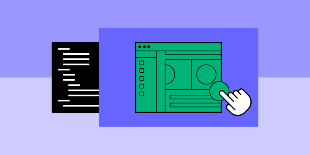
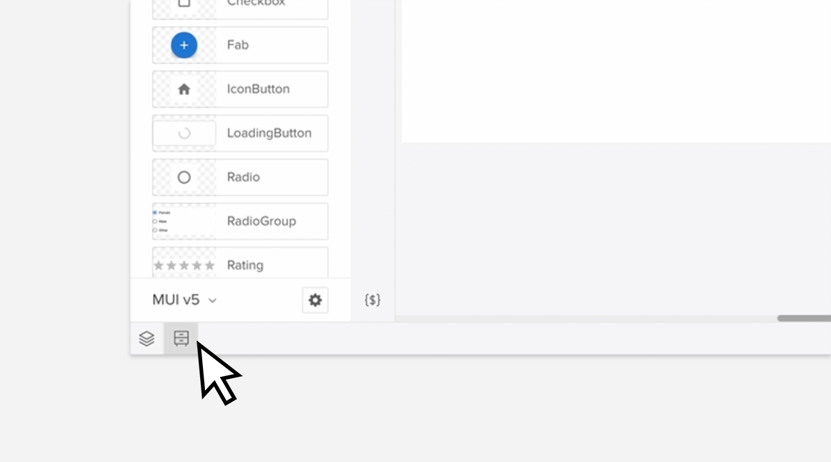
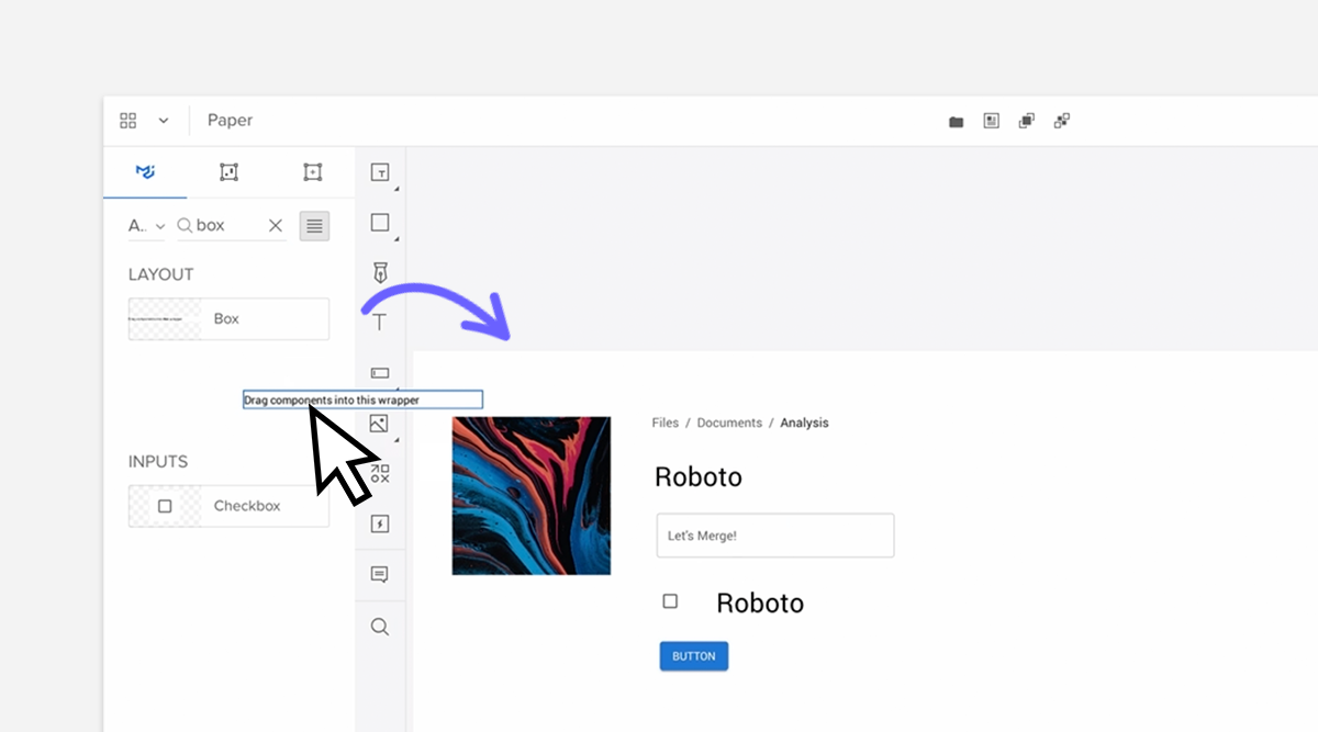
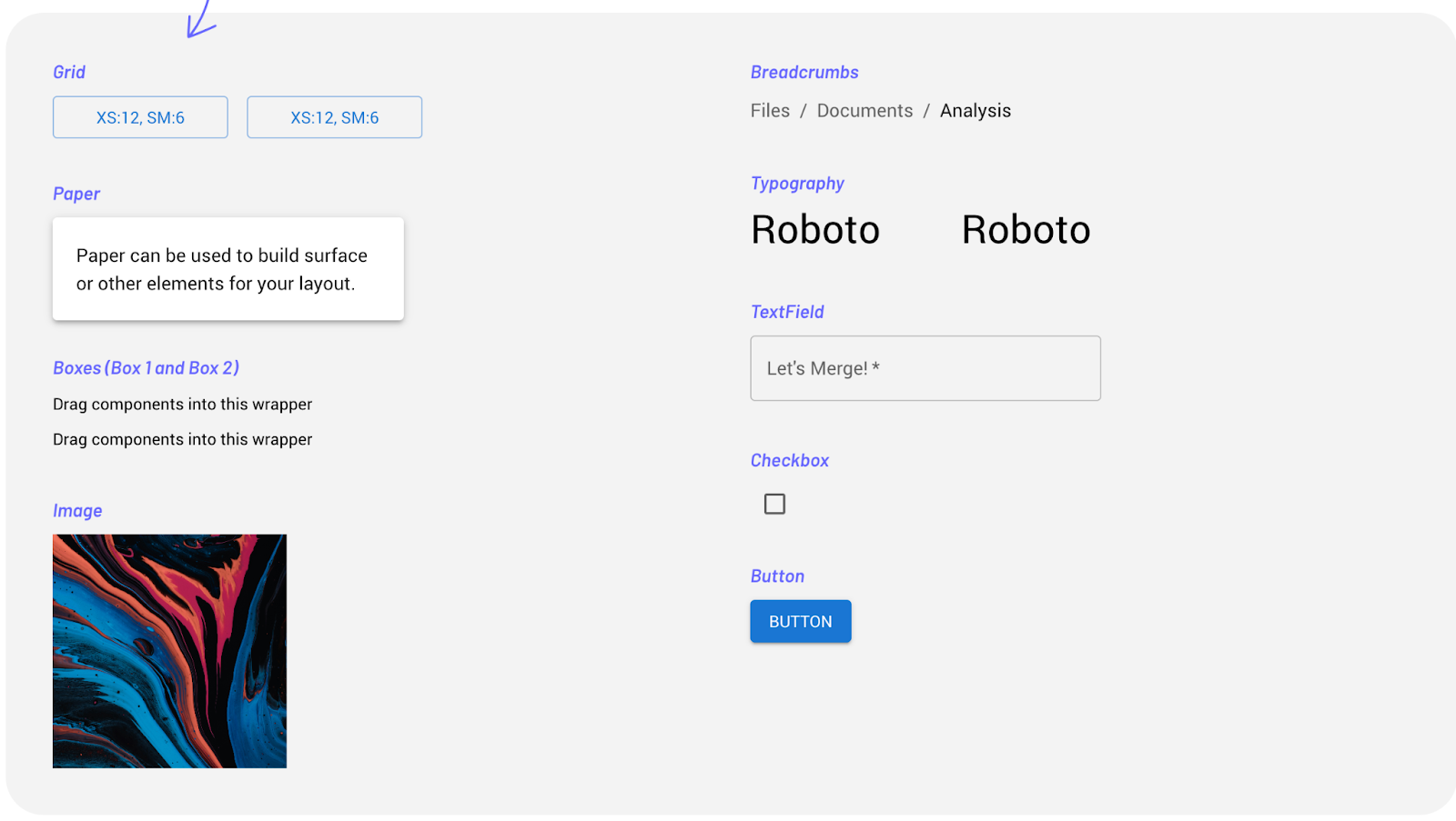
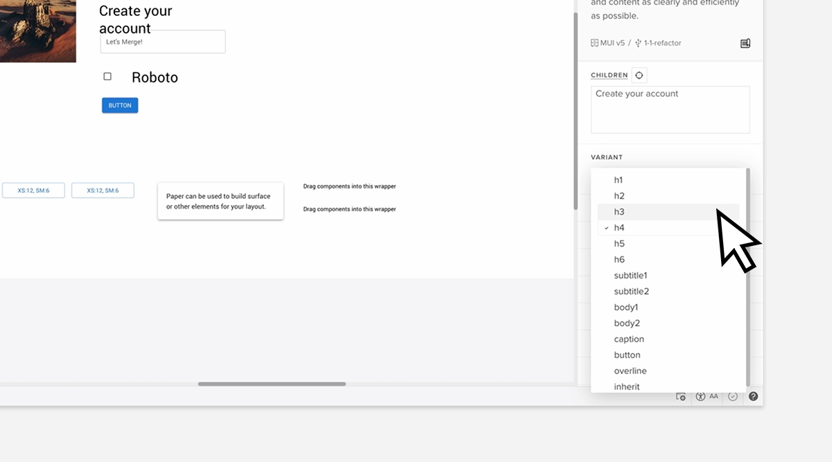
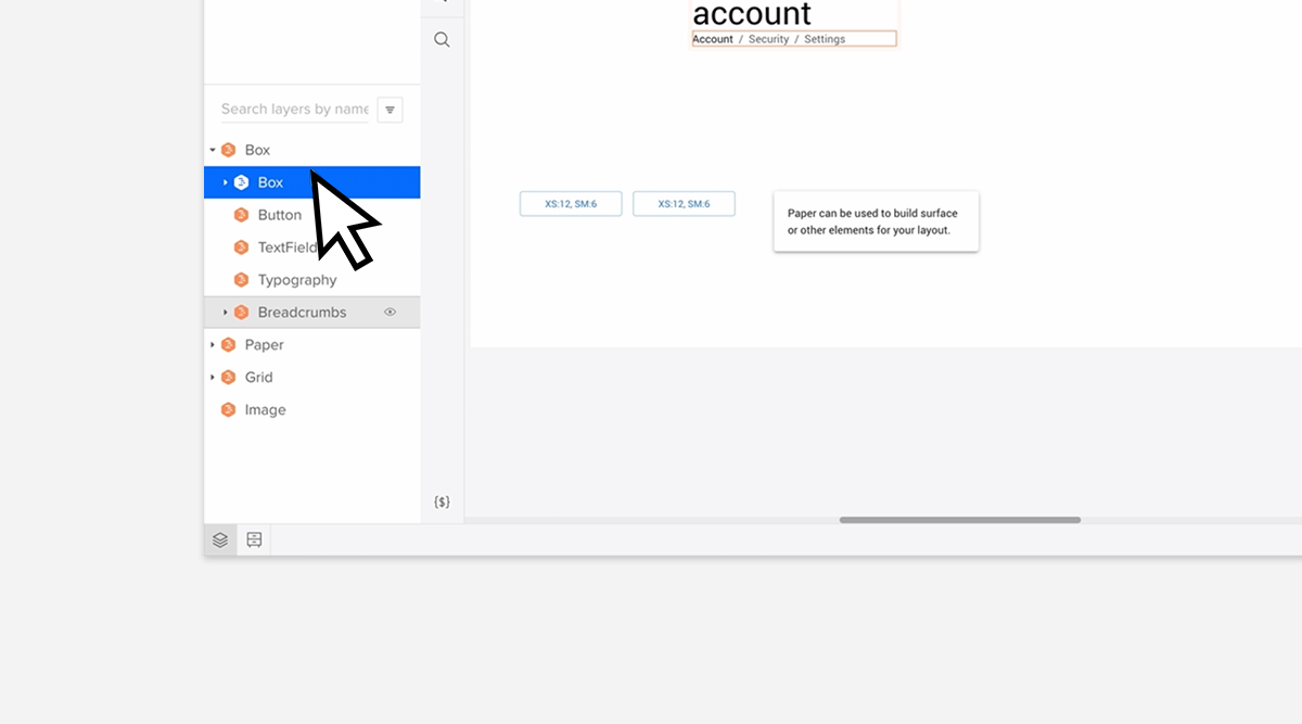
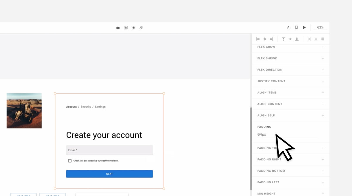
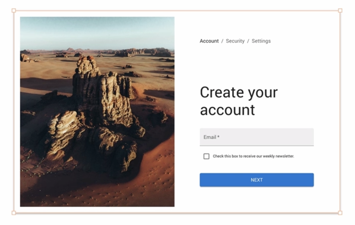
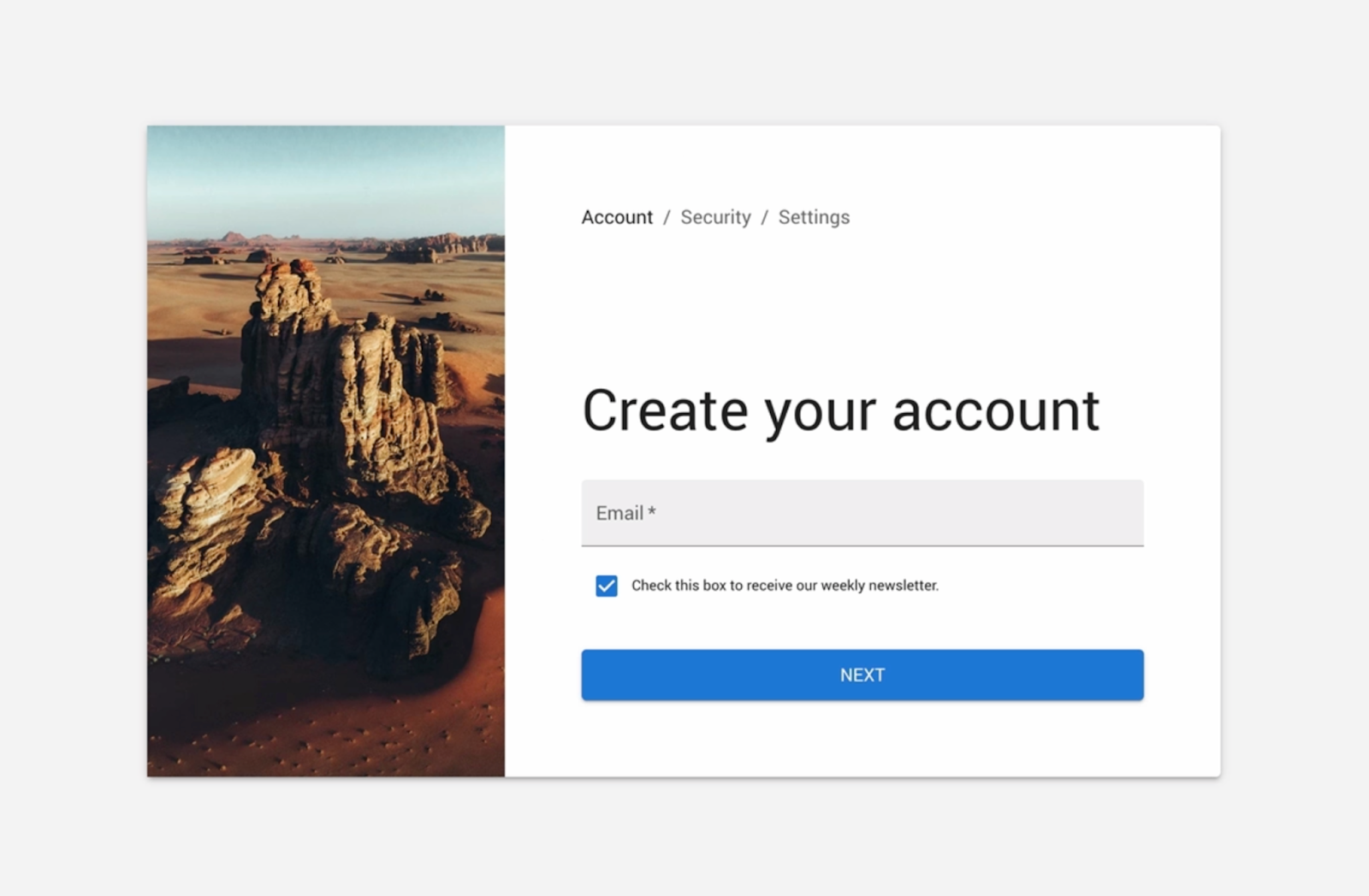
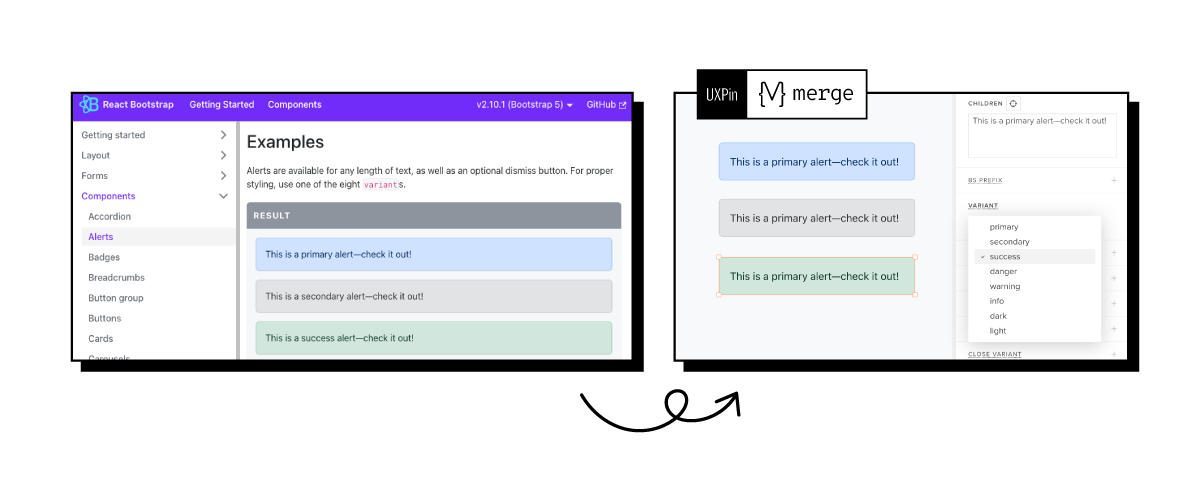
Bring UI components to UXPin and create well-designed prototypes based on your React design system. Speed up your development by building apps 10x faster. Discover UXPin Merge.

What is a React Design System?
A React Design System is a collection of reusable UI components and guidelines built specifically for use with React, a popular JavaScript library for building user interfaces. It encompasses a set of pre-designed, customizable components such as buttons, forms, navigation bars, cards, and more, along with guidelines for their usage and implementation within React applications.
The main purpose of a React Design System is to promote consistency, efficiency, and scalability in UI development by providing a unified set of components and design patterns that can be easily reused across projects. By leveraging a React Design System, developers can streamline the development process, reduce code duplication, and ensure a cohesive and polished look and feel across their applications.
Key components of a React Design System typically include:
- Reusable Components: A library of React components that encapsulate common UI patterns and functionalities, such as input fields, dropdown menus, modals, and tabs.
- Design Guidelines: Clear documentation and guidelines on how to use each component, including information on props, styling options, accessibility considerations, and best practices for integration within React applications.
- Theming and Customization: Support for theming and customization, allowing developers to easily adapt the design system to match their brand identity and design requirements.
- Responsive Design: Components designed to be responsive and adaptable to different screen sizes and devices, ensuring a consistent user experience across desktop, tablet, and mobile platforms.
- Accessibility: Considerations for accessibility, with components designed to meet accessibility standards and guidelines, ensuring that applications built with the design system are usable by all users, including those with disabilities.
Overall, a React Design System provides a solid foundation for building React applications, enabling developers to create consistent, high-quality user interfaces with minimal effort. It promotes collaboration, efficiency, and maintainability, making it an invaluable tool for teams working on React-based projects.
The Benefits of a React Design System
There are many benefits to using or building a React design system. React’s component-driven development approach makes it the perfect modular-style UI library for design systems. Front-end developers can strip React components down to atoms and combine these to create new UI elements, patterns, and templates.
React is one of the most widely used UI libraries, which offers many benefits for building design systems:
- A big community of developers to ask questions and solve problems
- An abundance of Javascript tools and integrations
- Many well-established design systems for inspiration
Which companies use React design systems?
Here is a short list of companies using React for their design systems:
- Instacart’s Snacks
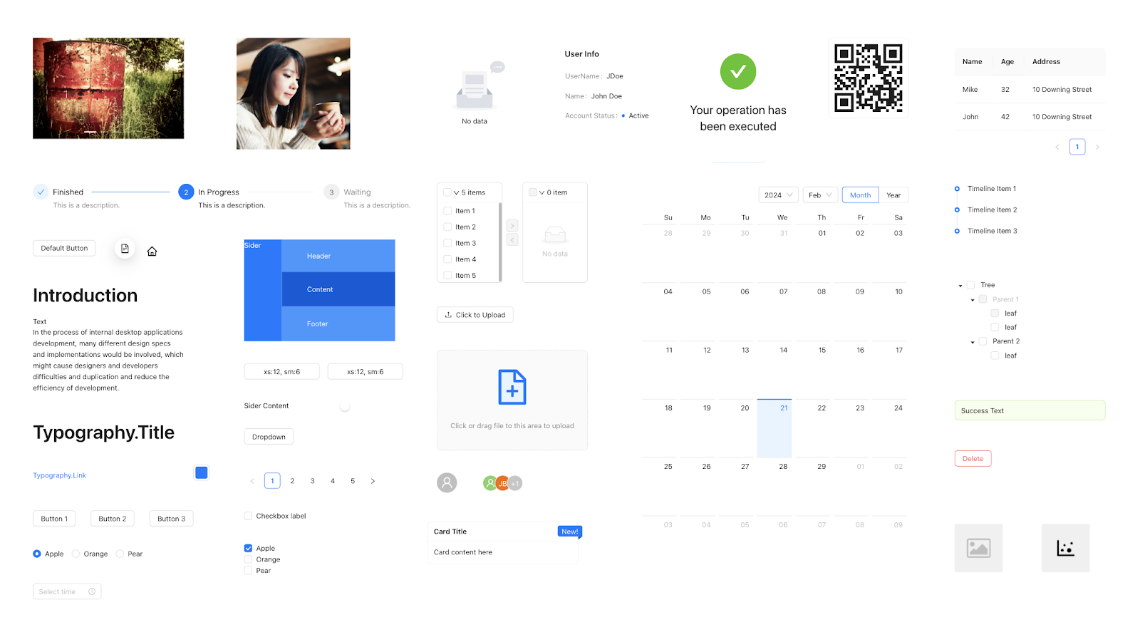
- Shopify Polaris
- Atlassian Design System
- Salesforce Lightning
- IBM’s Carbon Design System
- Microsoft’s Fluent UI
- MUI (Material UI)–built on Google’s Material Design
We recommend checking out these design systems to learn about component syntax, documentation, guidelines, and other design system factors.
Check out Adele for more design system inspiration. It’s a repository of publicly available design systems and pattern libraries with links to GitHub repos to download and analyze.
React Design System Fundamentals
Understanding Atomic Design Principles
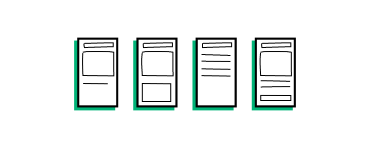
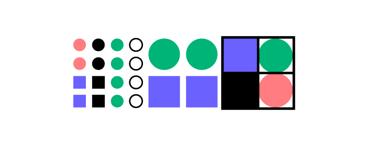
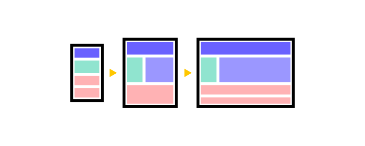
Atomic Design is a system created by Brad Frost where he organizes UI elements into five categories:
- Atoms: foundational UI elements you cannot break down further–e.g., HTML tags, fonts, buttons, animations, and color palettes.
- Molecules: groups of atoms create components that serve a specific function or purpose. e.g., search input, nav links, dropdown menu, etc.
- Organisms: Complex UI patterns that combine to create user interfaces. e.g., a header nav bar, footer, image carousel, etc.
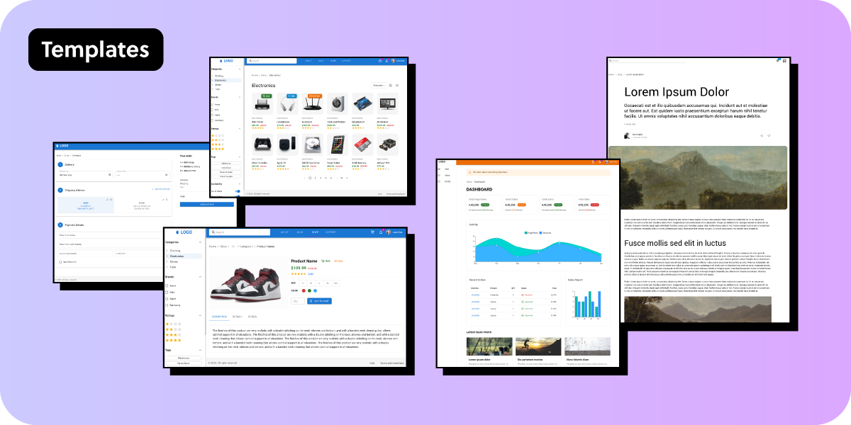
- Templates: represent a complete user interface with multiple organisms working together. e.g., a dashboard, news feed, chat UI, etc.
- Pages: represent the different instances of the template and how content changes within the screen–for example, refreshing content in a newsfeed or receiving a message through chat.
Why is Atomic Design important for React design systems?
The Atomic Design methodology enables you to leverage React’s modularity and reusability benefits. By approaching a design system as a sum of many atoms (or Lego pieces), it’s easier to develop a flexible, scalable UI library that can adapt and evolve with your product.
The design system team can build new components and patterns much quicker by combining atoms and molecules. This modular approach also makes building one-off solutions easier and more cost-effective because it’s a matter of combining what you have rather than developing from scratch.
The role of components in a React design system
React components are the building blocks that help ensure consistency, reusability, and maintainability across user interfaces and apps. These UI elements serve many vital purposes, including:
- Modularity: React components are modular by design, making it easy to combine, reuse, and manage the UI library.
- Consistency: React’s effortless reusability enables developers to build design principles, styles, and interactions into each component and recall it anywhere in the application.
- Reusability: Developers can leverage a UI library of reusable components to save time and resources when developing new products. This reusability also reduces errors and technical debt because devs don’t have to write code from scratch.
- Customizability: developers can easily customize specific components while still adhering to design guidelines or affecting the UI library, allowing for flexibility when necessary.
- Maintainability: With components stored in a centralized repository, developers can push updates and bug fixes from one place, making it easy to maintain and improve the design system and its products.
- Scalability: Engineers can extend and adapt React components to evolve with products and new technology.
- Accessibility: Developers can incorporate foundational accessibility standards at the component level, making it easier to implement product-wide.
The importance of using design tokens
Design tokens incorporate the core values of a React design system. These tokens contain properties such as colors, typography, spacing, sizing, states, interactivity, and more to maintain a consistent design language across multiple platforms, devices, and operating systems.
A design token can contain many values for multiple platforms. For example, UXPin’s homepage uses yellow for CTAs. The hex code for this yellow is #FCC821, which you can represent in several ways:
- HEX: #FCC821
- RGB (CSS): rgb(252, 200, 33)
- RGBA: rgba(252, 200, 33, 1)
- Octal (Android/Flutter): 77144041
We can encapsulate all four values under one design token:
- cta-background-primary
So, if you’re implementing this color in any platform, you use the token instead of the code. Design tokens also make cross-functional collaboration easier because everyone uses the same language rather than one team referencing the HEX, another the RGB, and another the octal–which can get confusing and lead to errors.
Design tokens also allow the design system team to implement product-wide modifications simply by changing the properties in the token file. For example, the team can change the cta-background-primary design token from yellow to blue across the product ecosystem by adjusting the four codes in one place rather than updating every instance or stylesheet individually.
Getting Started with a React Design System
On the surface, a design system appears simple. But, in reality, these UI libraries are complex organisms with many moving parts. Here are some things to consider when planning your React design system.
These factors will lay the foundation for your design system’s governance protocols and procedures. For this reason, it’s essential to document every stage of this early decision-making process.
Mono-repo vs. poly-repo repositories
Decide whether to use a single repository (mono-repo) or multiple repositories (poly-repo) for your design system’s React component library.
Mono-repos simplify dependency management and make it easier to work on multiple packages simultaneously. Poly-repos offer more modularity and isolation between packages, making it easier to maintain and use individual components independently.
Accenture shares the pros and cons of using mono vs. poly-repos.
Component organization
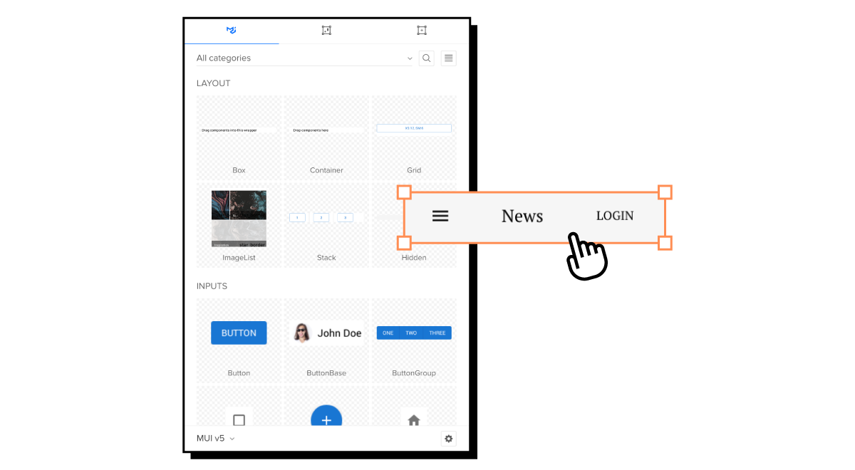
Organize your component library in a way that makes the most sense to your product and team. For example, you can group components by functionality, domain, or Atomic Design–MUI organizes its UI library by functionality:
- Inputs: Button, Switch, Text Field, etc.
- Navigation: Drawer, Menu, Pagination, etc.
- Layouts: Box, Container, Grid, etc.
- Data Display: Avatar, Icons, List, etc.
No matter how you categorize these components, each must have its own source code, styles, tests, and documentation.
Design token management
Centralize design token management in a dedicated folder or package controlled by the design system team. This centralized management helps facilitate better maintenance and governance while simplifying changes and updates.
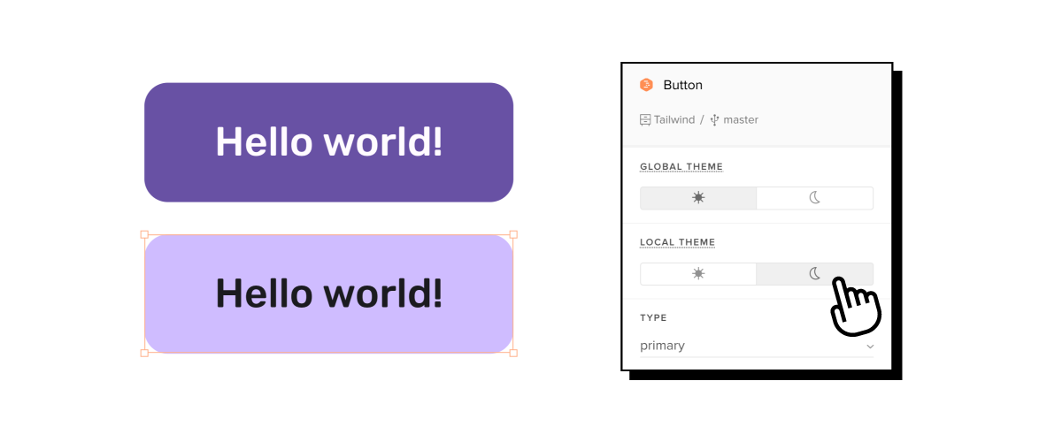
Theming and customization
Design system theming and customization are vital for modern product development, typically requiring at least two themes, light and dark modes. Multi-brand design systems require greater customization and flexibility, so you must consider these factors before developing.
Check out “Theming and Theme Switching with React and styled-components” from CSS Tricks for details on how to set up themes for React libraries.
Documentation
Design system documentation is vital for successful adoption and consistent implementation. The docs must include your design language, guidelines (content, design, code, accessibility, etc.), style guide, use cases, code examples, tools, and other critical information.
A tool like Storybook can help centralize your design system’s documentation management and updates. You can sync your Storybook to UXPin using Merge and create a single source of truth across design and development.
Testing
Plan a structure for managing and organizing your component tests–another reason to consider Storybook. Storybook offers built-in component testing automation with multiple bug-prevention tests, including visual, interaction, accessibility, snapshot, and more.
Versioning and release management
Establish your React library’s versioning strategy and release management process to ensure your design system remains updated and compatible with your products.
Design tools
Designers will need access to your React design system for prototyping and testing. A common strategy is to use vector-based tools, but this means updating and maintaining two formats of your React design system:
- The component library in the repository
- UI kits for design teams
With UXPin Merge, you can import your React library into UXPin’s design editor so designers and engineers use the exact same UI components. There are a couple of options for syncing code components. Learn more about them and discover UXPin Merge.


