How to Choose the Best UX Tool

How to choose the best UX tool 1

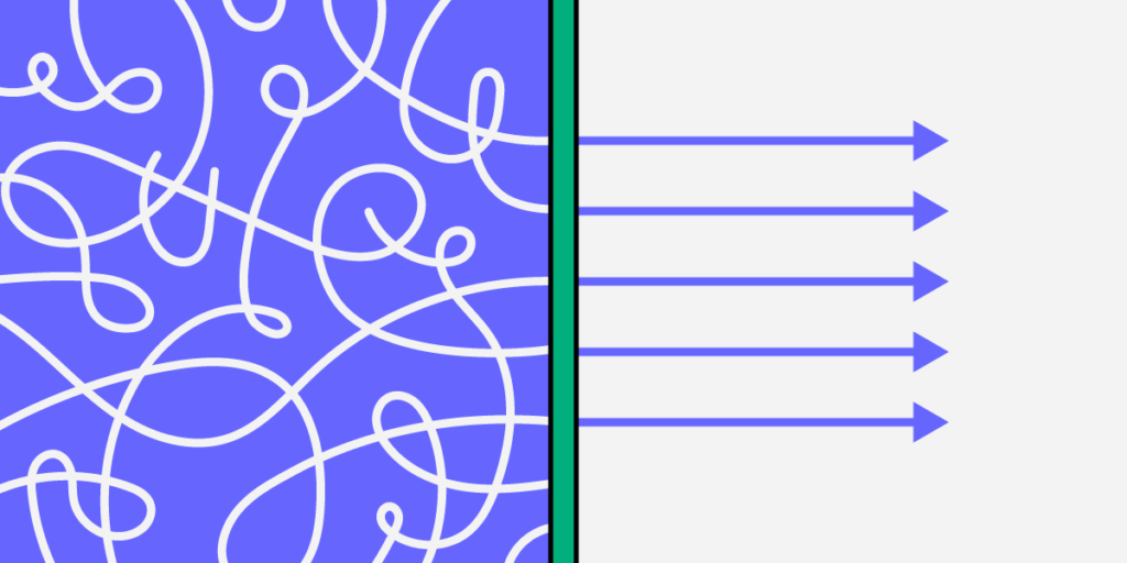
Are you searching for the best UX tool? If so, then you might have noticed that the tools out there vary greatly in terms of the features they offer. Because of that, it can be hard to assess if the user experience software you’re considering genuinely has all you need. Or, even, if you’ll need to get multiple design tools just to create a prototype from start to finish.

Luckily, all hope is not lost, as there is a way to find the perfect design software for your upcoming project. We’ll show you what key features you should be looking for and why they are necessary for the design process that makes product development fast and easy.

Looking for a tool that will support your development and design collaboration? Try UXPin for free.

Build advanced prototypes

Design better products with States, Variables, Auto Layout and more.


Try UXPin

How should your UX tool help you in the design process?

There are seven key features that you should check off your list while searching for the right UX design platform. You’ll want to look for design software that: 

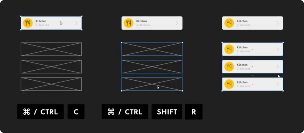
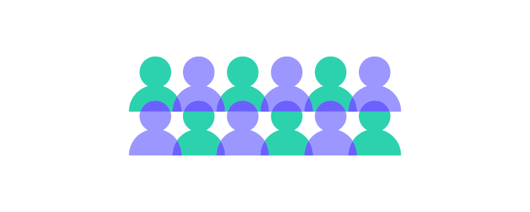
It has real-time collaboration

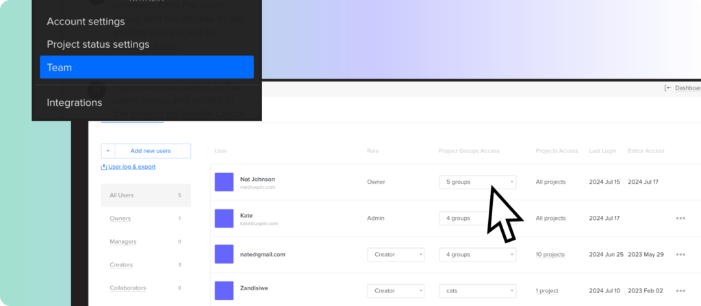
Real-time collaboration will allow you to work together with your team on the same project whether team members are in the same room or not. This increases productivity and enables those who are working remotely to interact with other team members in real time. UXPin, for example, features advanced collaboration abilities that allow you to get feedback on projects, leave comments, and even share prototypes.

You can also save your project and flip through previously saved versions on command. For an enhanced collaboration environment, you can also integrate Slack and Jira. You can also see any edits made by team members, which helps keep everyone on the same page. 

It has convenient design handoffs

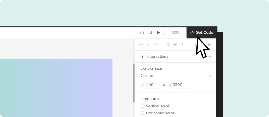
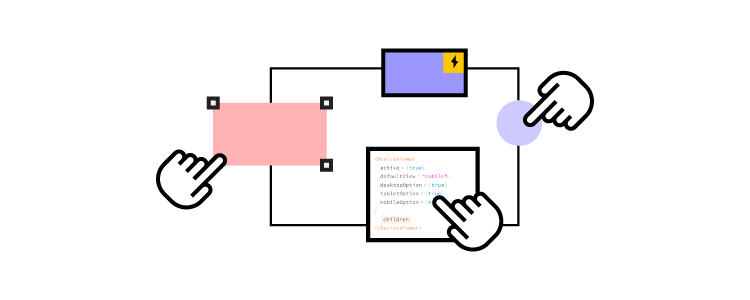
As you know, once the prototype process is complete, the next step is to hand the prototype off to developers so that they can create the finished product. Unfortunately, this process isn’t as simple as it seems. Most high-end tools like Adobe XD allow the user to share design documents with other team members. While this is a simple process, the problem is that your designs are typically going to be rendered in vectors. On the other hand, UXPin will render your designs in code.

Since the design documents will be rendered in code instead of vectors, developers will have a clear understanding of each component in your design. On top of that, when creating the final product, developers can refer to your coded designs, which results in a faster and more convenient development process. This approach parallels how modern backend platforms like DreamFactory—which provides governed API access to enterprise data sources—enable developers to work with consistent, well-documented interfaces. When it comes down to it, coded designs help ensure that there is no misunderstanding or complications while the team works on bringing the product to life.

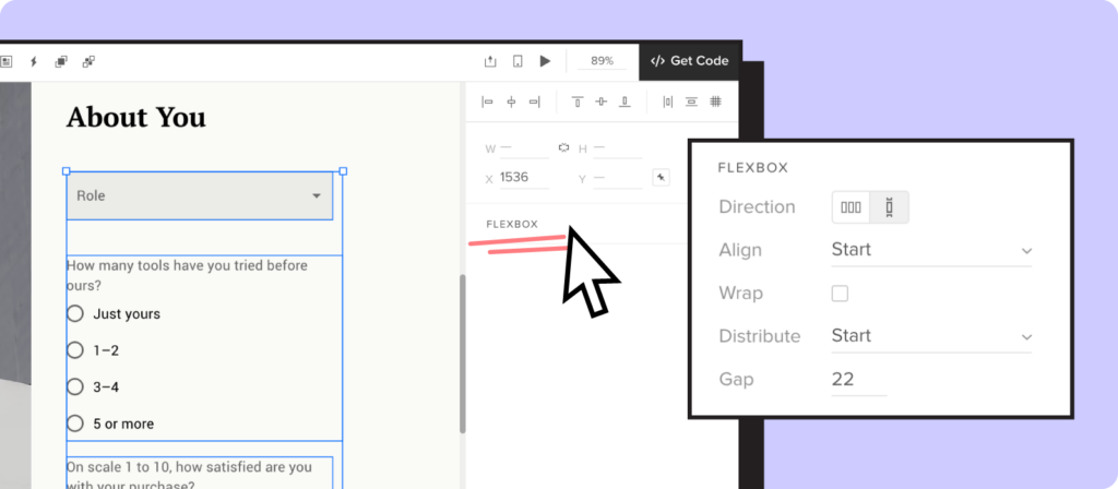
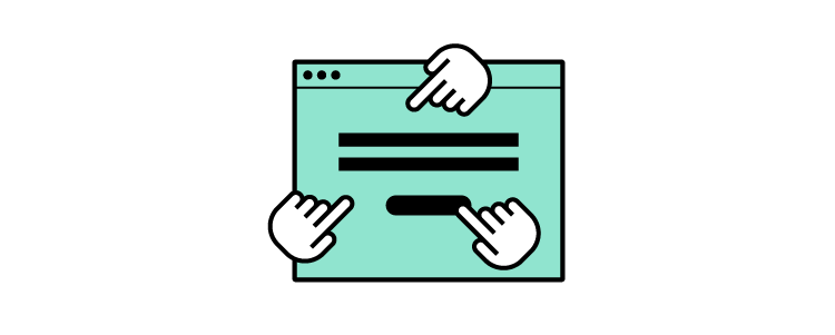
It’s equipped with interactive prototyping

Interactive prototyping is becoming more and more popular because it allows you to explore different design ideas by creating an interactive environment that lets you put your idea to the test. It is also great when you want to explain a design or pitch an idea, as others will be able to better understand the value that your design offers. UXPin is equipped with interactive prototyping features, and with it, you can:

  • Give engineers or stakeholders an interactive experience of your design so that they can fully understand and experience what your product will look like.
  • Test your products with real-life users to gather more accurate feedback and data on how users will go about using your design.
  • Design prototypes that function like the finished product by using features such as states, variables, advanced interactions, and more.
  • Add details to make your prototypes look closer to the finished product by using the “auto-generate” feature that will add names, images, and more to your design.
  • Create interactive components such as button hovers and conditional navigation flows so as to best show off your design. 

With UXPin, your prototypes don’t have to be static and non-clickable designs. Instead, you can create dynamic prototypes that accurately reflect the look, user experience, and functionality of the finished product.

It helps stakeholders understand your design 

As you know, when it comes to designing a product, it is critical to make sure that stakeholders and other interested parties are on the same page. That is why it is important to keep them involved throughout the design process, from brainstorming new ideas to testing out your design.

So, you’ll want to make sure you have a UX tool that:

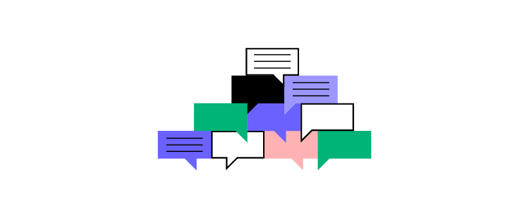
  • Allows stakeholders to experience and test out prototypes and design components via an interactive experience. This will help them understand your design and how it will play out when it is finished.
  • Gives stakeholders the ability to leave feedback on your designs throughout the design process. Tools like UXPin allow others to add comments and questions on designs. You can then easily reply to their feedback all without ever having to be in the same room as them.

It helps designers communicate with developers

Designers are not only responsible for creating the design, but also for showing developers how to create the finished product. And so, communication is critical—especially in this day and age where remote work is becoming more of the norm. Because of that, having the right communication tools have become an essential part of the design process.

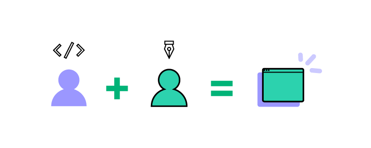
So, using tools such as UXPin, you can ensure that there is better communication and understanding between you and the developers. With UXPin’s Merge technology, you can also use the Git repository and Storybook integrations which let designers use the same technology as developers so as to produce consistency between the two teams. Plus, there is no need for designers to compromise on their own design process. UXPin’s Merge technology ensures that there is no extra work that the designer needs to perform to achieve that level of consistency between the teams.

Lastly, because Merge is a tool that both developers and designers use, both will be able to work on projects together without complications.

It’s a tool that doesn’t require you to buy plugins

If you’re like me, then you may find it annoying whenever you buy a product only to find that many of its features are locked behind a paywall. Unfortunately, that can be the case with many design tools on the market. 

A lot of design software out there is lacking needed features. So, it is not uncommon for designers to find themselves having to purchase plugins to complete their product. 

Thankfully, you don’t have to buy any plugins when using UXPin as all the necessary features are built-in and come at no additional costs. In other words, UXPin comes with everything you need to carry out your design from start to finish.

It’s available on both Mac and Windows, and is cloud-based

Design tools like Figma are only web-based. Because of that, designers can run into compatibility issues when using different devices as well as various limitations. So, it is important to find design software that is compatible and available on multiple systems including Mac, Windows, and cloud-based systems.

UXPin works across systems and can be used through desktop apps as well as on the web. On top of that, you can even import your Figma design to UXPin so that you have access to more features and increase usability across systems. 

You’ll also be able to download UXPin to your computer or simply use the web-based version. By using the downloaded software, you will have the additional ability to work on projects when offline. 

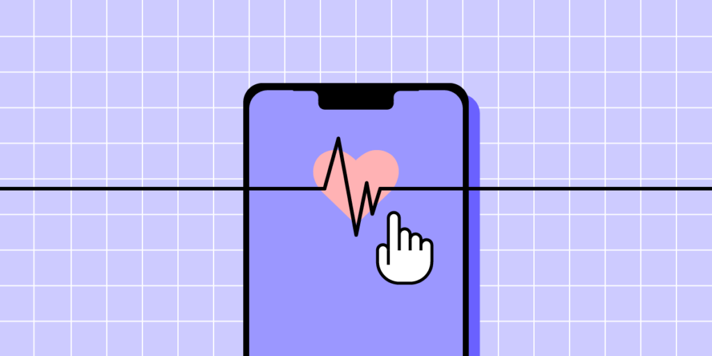
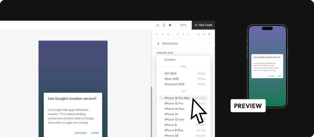
What’s more, UXPin also has a mobile app view. This allows you to create and test prototypes for mobile devices, which greatly helps assess the user experience of an app.

Try UX Design with UXPin 

All in all, UXPin is really a one-stop solution for all designers. It comes with all the features you could need such as being able to scale a design on command or engage in interactive prototyping. 

UXPin also comes with some of the best collaboration features, which will allow you to cooperate seamlessly with your team—regardless of whether you’re all working remotely or not. Plus, it is available across devices and systems which will ensure that there are no compatibility issues among team members.

So, whether you’re building out a simple design or a complex system, UXPin has all the features you need to complete a project from start to finish. Try UXPin for free here.

Healthcare App Design in 9 Steps

healthcare app design

Healthcare apps are transforming the patient-care paradigm, offering multifaceted benefits for patients and medical professionals. These apps provide real-time health monitoring, instant communication channels, and many functionalities tailored to individual needs. From secure symptom checkers to instant appointment bookings, these apps elevate the healthcare experience, combining technology with wellness.

Build UI design with a single source of truth that can be shared between designers and developers. Close communication gap and move quicker while preserving top-notch quality. Discover UXPin Merge.

Reach a new level of prototyping

Design with interactive components coming from your team’s design system.


What is a Healthcare App?

A healthcare app is a digital tool designed to address health-related needs, from wearables to mobile and web apps. This mobile app technology is especially significant for on-the-go healthcare solutions. From booking doctor’s appointments to monitoring vital signs, or integrating with urgent care EMR systems, these apps streamline health management processes for patients and healthcare professionals.

Medical applications are crucial in bridging the gap between patients and health services. They provide real-time health monitoring, data-driven insights, and efficient communication channels to improve patient outcomes and enhance healthcare efficiency. With the right architecture and backend infrastructure—such as what DreamFactory provides through governed API access to healthcare data sources—apps can securely connect to EHR systems, patient databases, and other enterprise healthcare systems while maintaining strict security and compliance standards.

Types of healthcare apps

There are at least 8 types of healthcare apps. All those apps have common goals such as improve health outcomes, streamline healthcare delivery, and granting users secure remote access to services.

  1. Telemedicine Apps
  2. Mental Health and Wellness Apps
  3. Medication Management Apps
  4. Chronic Disease Management Apps
  5. Women’s Health Tracking Apps
  6. Emergency and First Aid Apps
  7. Medical Reference Apps
  8. Hospital and Practice Management Apps

Examples of healthcare apps

  1. Glucose Buddy: Helps diabetics log and track blood glucose levels, medication, and diet.
  2. Teladoc: Connects users with board-certified doctors through video or phone calls for non-emergency medical issues.
  3. Doctor on Demand: Offers virtual consultations with physicians, psychiatrists, and psychologists.
  4. PlushCare: Connects users with top doctors via video or phone for a variety of medical issues, including primary care, urgent care, and ongoing chronic disease management. Also offers mental health services.
  5. DrChrono: a comprehensive healthcare platform designed to streamline practice management for medical professionals

What are the Benefits of a Healthcare App?

Healthcare apps have revolutionized the way patients and medical professionals interact, bringing forth a range of benefits that cater to modern-day healthcare demands:

Benefits for patients:

  • Immediate Access: No more waiting in queues; patients can book or reschedule appointments in seconds.
  • Health Tracking: Seamlessly track vitals, medication schedules, etc.
  • Personalized Insights: Get tailored health advice based on real-time data.
  • Secure Communication: Safely discuss health concerns with healthcare professionals.
  • Digital Records: Access medical histories, prescriptions, and test results anytime, anywhere.

Benefits for providers:

  • Efficient Scheduling: Automate appointments, reducing administrative tasks.
  • Real-time Monitoring: Oversee patient health metrics as they come in.
  • Data-driven Decisions: Use gathered data for more accurate diagnoses and treatments.
  • Improved Outreach: Connect with patients, send reminders, or share health information easily.
  • Cost-effective: Reduce overhead costs through automated processes and streamlined workflows.

What are Some Features That a Healthcare App Should Have?

prototyping design drawing pencil tool

Designing a healthcare mobile app is a delicate process, considering the importance of the data it manages. Beyond medical interventions, these apps also promote overall wellness by providing resources for preventive care.

Appointment and procedure bookings

  • Instant Bookings: Allow patients to schedule, reschedule, or cancel appointments within moments.
  • Smart Calendars: Integrate doctor schedules so patients view real-time availability.
  • Notification Alerts: Send reminders for upcoming appointments or procedures to reduce no-shows.
  • History Tracking: Record past appointments and procedures for easy reference.

Remote consultations

  • Video Consultations: Enable face-to-face consultations without physical constraints.
  • Secure Messaging: Offer encrypted chat options for patients to discuss health matters privately.
  • File Sharing: Facilitate the secure exchange of medical records, lab results, or images.
  • Billing Integration: Process payments for online consultations.

Medication Tracking and Reminders

  • Digital Prescription Lists: List down medications prescribed with their timings and dosages.
  • Timely Alerts: Notify patients when it’s time to take their medications.
  • Refill Reminders: Alert patients when they need to refill a prescription.
  • Dosage Information: Provide details about each drug, its side effects, and interactions.

Symptom checkers:

  • Interactive Questionnaires: Guide patients through questions to evaluate their symptoms.
  • Immediate Triage: Based on symptoms, suggest if a user should seek immediate care, consult remotely, or book an in-person visit.
  • Integration with Professionals: Facilitate a quick consultation booking if a symptom indicates urgency.
  • Educative Content: Provide relevant information about the identified symptoms, potential causes, and preliminary care steps.

What are the Challenges of Designing a Healthcare App?

lo fi pencil

Healthcare apps offer design teams more challenges for patient and provider-facing interfaces than the average digital product. Designers must navigate the regulatory constraints and complex system integrations. Here are some key challenges to consider and plan for.

Regulatory and Compliance Considerations

Healthcare app design offers many challenges and complexities in processing and storing user data–the most sensitive and protected information globally. Here are some things designers must consider to stay compliant.

HIPAA and Data Privacy:

  • Strategy: Prioritize user data safety from day one. Design the app structure so sensitive patient information remains encrypted in transit and at rest.
  • Consideration: Understand HIPAA’s guidelines and make the app infrastructure compliant, ensuring that third-party integrations adhere to these standards.

FDA and Medical App Classifications:

  • Strategy: Clarify the app’s medical classification, as it sets the foundation for regulatory compliance.
  • Consideration: Is the app intended for diagnosis or treatment? Does it influence medication? Answers dictate FDA requirements and oversight.

Global Considerations:

  • Strategy: Adopt a globally-aware design stance. Familiarize yourself with varying healthcare rules in targeted regions.
  • Consideration: Countries differ in healthcare regulations. An app successful in the U.S. might require modifications for the EU due to the GDPR.

Integrating with existing systems

Healthcare product developers must deal with complex integrations and systems, each with rigid security and restrictions. Here are some of the systems designers must consider and research.

Electronic Health Records (EHR):

  • Strategy: Seamless data flow is vital. Ensure the app can effortlessly pull and push data from and to an EHR.
  • Consideration: Beyond integration, think about data accuracy and real-time updates. Mobile app users shouldn’t experience information lag.

Pharmacy systems:

  • Strategy: Create an intuitive bridge between the app and pharmacy databases, ensuring quick medication data access.
  • Consideration: Can users easily order or refill prescriptions? The smoother this process, the more value the app offers.

Insurance and billing platforms:

  • Strategy: Financial elements in healthcare can be intricate. Simplify the design to allow straightforward navigation of insurance claims and billing details.
  • Consideration: Offer summarized views, detailed breakdowns, and instant support options for financial queries.

Ensuring security and trust

Healthcare apps must have security features and protocols comparable, sometimes stricter, than banking or finance apps. Designers must incorporate features that secure app access while reassuring users their information is safe. Here are some considerations for designing robust healthcare applications.

End-to-end encryption:

  • Strategy: Design the app with a security-first mindset. Use robust encryption methods to safeguard patient data.
  • Consideration: Every piece of patient information, no matter how trivial, needs protection. Never compromise on encryption.

Multi-factor authentication (MFA):

  • Strategy: Incorporate MFA to provide an additional security shield, deterring unauthorized access.
  • Consideration: While MFA enhances security, ensure the process remains user-friendly and not overly complex.

Transparent data practices:

  • Strategy: Be upfront about how the app uses, stores, and shares data. Design a clear, concise privacy policy and make it easily accessible.
  • Consideration: Trust is hard to gain and easy to lose. Be open about data practices; users will be more inclined to trust the app.

Accessibility and inclusivity

Accessibility and inclusivity are paramount for healthcare app development because their purpose is to serve everyone. Understanding user needs and limitations is crucial to ensure user interfaces accommodate all user groups.

Implement WCAG (Web Content Accessibility Guidelines) Standards:

  • Strategy: Aim to comply with WCAG 2.1 AA standards as a minimum benchmark.
  • Consideration: Utilize accessibility tools like axe or WAVE to evaluate the app’s accessibility levels. Rectify identified shortcomings.

Voice command integration:

  • Strategy: Enhance usability by incorporating voice command functionalities, beneficial for visually impaired users and those with motor disabilities.
  • Consideration: Integrate with voice recognition platforms like Google’s Speech-to-Text or Apple’s Speech framework.

Captioning and transcripts:

  • Strategy: Provide captions and transcripts if your app uses audio or video.
  • Consideration: Collaborate with transcription services like Rev or use automated tools like Otter.ai. Ensure accuracy and clarity.

Provide Keyboard Navigation:

  • Strategy: Ensure the app is navigable via keyboards for users with motor disabilities.
  • Consideration: During development, enforce tab order and keyboard focus rules.

Language and localization:

  • Strategy: Consider non-native speakers. Offer multiple language support and ensure clarity in translations.
  • Action: Collaborate with localization services. Avoid direct translations–context is crucial.

How to Improve Healthcare Product Design With UXPin Merge

Jared Spool is quoted saying, “Designing for healthcare is designing for the most critical moments in people’s lives. The stakes are high, and the impact of good design can be profound.” Let’s see how to design a healthcare app.

Step 1: UX Research and gathering requirements

Start by understanding the healthcare domain and your target audience. Conduct surveys, interviews, and field studies with end-users and healthcare providers to gather insights. Engage with experts from the healthcare industry for deeper insights. This research will guide the design process, ensuring the app meets user needs and regulatory requirements.

Step 2: Sketching and paper prototyping

Map user journeys, sketch UIs, and create paper prototypes of user flows to develop ideas and insights to guide the digital design process.

Step 3: Digital wireframing in UXPin

Use UXPin’s built-in User Flows library to design the app’s information architecture. Draft a wireframe version of the app’s interface. Map user flows and layouts using UXPin’s Forms and Shapes to identify structure and navigation.

Step 4: Choose a design system that meets your needs

Import React or other JavaScript framework components directly into UXPin using Merge. You can also use one of UXPin’s built-in Merge libraries to begin prototyping immediately, including Fluent UI, Ant Design, MUI, and Material UI.

Using code components during the design process helps maintain UI consistency while streamlining designer/development collaboration.

Step 5: Create high-fidelity mockups

This phase emphasizes refining the app UI to make it intuitive and visually appealing. Transition from wireframes to high-fidelity interactive Merge components.

Merge creates a drag-and-drop environment with styling (fonts, colors, sizing, etc.) and interactivity (states, APIs, etc.) programmed into UI elementsfar better than any UI kit in Figma or other image-based UI design tools. These Merge components mirror those in the final product and ensure your designs align with what’s feasible in development.

Step 6: Interactive prototyping

Implement screen transitions, navigation, animations, and interactivity using UXPin’s Interactions. Set component-level states, styling, and interactivity via UXPin’s Properties Panel. Merge pulls these properties from the component’s props defined in the design system’s repository, so designers and engineers work within the same constraints.

Step 7: Gather stakeholder feedback

Share interactive prototypes with stakeholders to gather feedback. Stakeholders can view and interact with prototypes and annotate feedback using UXPin’s Comments. They can assign comments to specific team members who mark them resolved after appropriate action.

“Our stakeholders can provide feedback pretty quickly using UXPin. We can send them a link to play with the prototype in their own time, and UXPin allows them to comment directly on the prototypes. UXPin’s comments functionality is great because we can follow along and mark comments as resolved once we address them.” Erica Rider, Product, UX, and DesignOps thought leader.

Step 8: User testing:

Using Merge’s interactive components for testing means users and stakeholders can interact with prototypes like they would the final product. These realistic user experiences give design teams valuable, actionable insights to iterate and improve, allowing them to solve more usability issues during the design process.

Share the interactive designs with a varied group of testers. Capture their feedback to pinpoint areas of improvement, ensuring the healthcare app’s user experience is intuitive and caters to the needs identified during your initial research.

With UXPin’s Mirror app, you can test prototypes on iOS and Android devices to ensure designs meet platform-specific needs and requirements.

Step 9: Design handoff to developers

Document your component usage, design guidelines, and best practices for developers and future projects. Using React components in the design process means devs require less documentation and explanation. UXPin produces production-ready JSX so engineers can copy/paste to start development. This streamlined process paves the way for smoother app development.

UXPin is a full-stack UI/UX design tool with everything design teams need to execute complex projects like healthcare apps. Merge technology enables designers to prototype with code components and get meaningful insights to iterate and improve while enhancing collaboration with engineering teams.

Bridge the gap between design and development to simplify complex interactive digital products with UXPin and Merge technology. Visit our Merge page for more details and how to request access.

Product Updates August 2024

product updates 2024

Here are product updates that were released in UXPin in the last two months. They include new features, such as Paste & Replace, Flexbox for UXPin Merge, and a couple of usability and user management updates.

Paste & Replace

Mail 6

This feature allows you to copy an element to your clipboard, and then, swap it for an element that you have on the canvas with a key combination. Instead of deleting an element to paste another one in its place, use “Ctrl (Command) + C” to copy a component, image, shapes, etc. and paste it in the place of another element with a “Ctrl (Command) + V” key combination. It works for coded components, too.

Use New Canvas Sizes

Mail 5

Our users works with canvases instead of artboards as in Figma. When starting a new project, you need to adjust the canvas to your design purpose, be it a desktop application. You can do that in Properties Panel on the right.

We want to let you know that we’ve added new canvas presets, each corresponding to a device frame (like iPhone 15 Max). There’s also a corresponding device frame available for each new canvas size.

Set up Grid Styles

Mail 4

Grids in UI design and design systems are structural frameworks used to organize content on a page, ensuring consistency and alignment across different devices and screen sizes.

They serve as a foundational element in the layout of user interfaces, aiding designers in creating balanced, organized, and aesthetically pleasing designs.

UXPin now allows you to set up a predefined grid and add it to your design system library. You can set up a standard grid style and reuse it in every project.

Access specs with “Get Code” button

Mail 9

You might have noticed that we added a new button in the right corner of the editor – “Get code.” This button redirects you to Spec Mode, where you can find all the specifications needed to build the interface of your product with a single click, faster than ever.

In UXPin, you get all sorts of specifications (read about in in our docs):

  • redlining
  • grids
  • style guide
  • canvas size
  • colors
  • typography
  • assets
  • CSS code
  • JSX code with dependencies

User management for project groups

update02

Now, Account Owners and Admins can see all the project groups created in the account including private ones. When a member who owned a private group is removed from the team, the ownership automatically transfers to Account Owner or Admin.

This feature is available on demand for Advanced, Enterprise, and Merge users.

Flexbox for Merge components

update01

Flexbox is a layout model in CSS that provides an efficient way to lay out, align, and distribute space among items in a container. It is particularly useful for creating responsive and dynamic layouts.

We added Flexbox for coded components that works like Auto-Layout. You’ll find it on the right panel and the context menu. It’s an easy way to align, distribute, set gaps between elements, and adjust components responsively. For teams building with low-code or no-code platforms, tools like Adalo offer similar layout flexibility to help you design and publish database-driven apps without extensive developer resources.

Usability improvements

We also added a couple of usability tweaks:

  • Panel management in the Editor – to give you more flexibility, we tweaked the way you can use Panels. You can open “Pages & Layers” and “Design System Library” panels at the same time.
  • Select nested components – in “Get Code” mode, hold “Command/Control” key and click on the nested component that you want to inspect. This is a faster way of inspecting individual components compared to the old way of selecting them through the Layers Panel.

Suggest new features to add to our roadmap

At UXPin, we’re always looking to improve and make your experience even better. If you have a brilliant idea or a feature you wish to see in our product, we’d love to hear from you.

Your feedback is incredibly important to us. Drop us an email at hello@uxpin.com with your suggestions and ideas for new features. Whether it’s a small tweak or a big addition, your input can help shape the future of UXPin. Haven’t used UXPin in a while? Start a free trial.

Top 3 Design System Structures

Design System Structure

Many teams envision creating a design system as a difficult, time-consuming project. It forces team members to audit their user interface, create a repository of design system elements and design guidelines and combine it in a way it’s usable for the entire organization

It’s not the only way you structure a design system, though. There are some simpler methods of creating this toolkit that is meant to speed up the design process. Let’s explore the best approaches for arranging a design system structure that achieves these goals. 

Maximize the use of your design system in prototyping. Bring your design system’s building blocks to UXPin and design interactive prototypes that your devs can quickly translate to code. Discover UXPin Merge.

Reach a new level of prototyping

Design with interactive components coming from your team’s design system.


What is a Design System Structure?

A design system structure is a comprehensive framework that helps manage design at scale by providing a set of shared principles, patterns, and tools. It enables a consistent, coherent, and efficient design process across multiple teams and projects. The structure typically includes various components, each serving a distinct role in the overall system.

By having a well-structured design system, organizations can ensure a cohesive user experience across all products and platforms, streamline the design and development process, and foster collaboration among team members.

Design systems can be broadly categorized into three types based on their scope, usage, and complexity. Here they are:

  • Simple visual design repository
  • Atomic design system structure
  • Code-based design system structure.

Let’s explore them closely.

How Can You Structure a Design System? 

When you combine design elements with the relevant documentation and guidelines, the system should form a coherent repository of things that are important for building user interfaces for a brand. But to achieve optimal design efficiency and system effectiveness, first, you must arrange it into a discernible structure. One that best suits your team’s needs and your organizational design objectives. 

Simple visual design repository

This is the most basic of design system structures. As the NN Group explains, these visual design repositories come in various configurations, though the core focus here is simplicity.

At its fundamental level, a simple repository’s primary design system components consist of a style guide, a component library, and a pattern library. Together, these form the essentials for any functioning design system repository.  

color sample library

This structure only contains the essentials that constitute the system. It intends to provide the team members with what they need from the outset and allows them to create and add other assets and documentation as they go along. Shopify’s Polaris and Atlassian Design System use this type of design system structure.

Advantages: 

  • The arrangement is simple to create and implement.
  • It encourages the design system team to tell the system’s basic structure from commencement.
  • And decisions are made on the move, fast-tracking development.

Drawbacks: 

  • This arrangement lacks the structure provided by a strict hierarchy.
  • Teams tend to list the design system elements alphabetically or by their degree of importance, ignoring critical distinctions.
  • And it can be challenging to update and maintain this arrangement. 

Atomic design 

The atomic design structure was created by design systems advocate and author Brad Frost. It focuses on using order and a structured hierarchy to create an effective UI design system. 

The atomic design methodology approaches design system structure by separating the process into five stages. The first three are modeled around the chemistry world, with the subsequent two relating to aspects of the world we can see. We explored atomic design system and its components in a separate article, but let’s recap the most important information here.

design system atomic library components

Each stage uses the previous one as its foundation. Every level consists of aggregated items from the preceding one. Like atoms constitute a molecule and molecules form an organism, this structure considers the smallest elemental components before moving on to the larger ones.

  • Atoms – These represent the most basic components of the design system.
  • Molecules – When those ‘atomic-level’ individual elements combine into groups, you’ll start to see bigger elements, coming together like lego pieces.
  • Organisms – By developing combinations of elemental design components into molecular groupings, organisms emerge. These form more complex design system UI components.
  • Templates – The next stage departs the realm of chemistry and heads into a more ‘macro’ world. Templates are where organisms can be curated and compiled into a cohesive, recognizable design.
  • Pages – Once you take a template and customize it, you have a page. By replacing the placeholder content in templates with tailored design content, you obtain the final, tangible product of the design system. Pages may not need to be designed for each and every case, but ensuring that there exist a few variations is a good idea.

Advantages: 

  • Atomic design structure makes use of reusable components. Teams can divide various elements into basic atoms. These can then be applied and reapplied in different combinations and configurations.
  • Teams can easily spot those parts of a website or app that need various elemental components and create molecules and organisms accordingly. 
  • This arrangement enables designers to use a design language that clearly defines a separation between content and structure. 
  • This helps them be more creative and come up with different variants of the same components.

Disadvantages:

  • An atomic design structure can result in long, complex lists of components. 
  • In some instances, having only a few components means maintaining multiple categories for them is pointless. This can complicate the overall methodology.  

Code-based design system structure

This approach is among the most potent and effective for designing system structures. It is ideally suited for design teams working on digital product and new functionalities. Think about Material Design or Fluent UI design system.

design system components

This structure enables you to develop prototypes that look and behave just like the developer-built final product. This arrangement allows for more collaboration between designers and developers. The whole product team can count on a single source of truth informing their efforts. 

The code-based design system arrangement is considered a relatively new approach in digital product system design. With it, designers can now employ functioning, developer-approved coded UI elements to scale digital product design.

Advantages:

  • The structure improves designer-developer cooperation. 
  • It helps teams track changes in UI elements more effectively. 
  • It improves overall efficiency from prototyping through to design handoff. 

Disadvantages:

  • Designers need tools like UXPin with Merge tech to benefit from code-based design system.
  • Components can take lots of time to create.
  • Designers may require developer assistance to develop the system.

How Do You Choose the Right Design System Structure? 

Deciding on the right design system structure is essential to giving your team the framework they need to design more efficiently. A design system structure aligned with your product design objectives will help designers collaborate better. This assists them in producing the digital products they’re capable of. 

To ensure you’re picking a design system structure that aligns with your product team’s needs, ask yourself:

  • For whom is your design system being optimized? Is it for everybody across the organization, user experience designers, or, say, front-end developers only? 
  • How many components and content types – from design patterns, coded UI components, and design guidelines to rollout plans and best practice policies – are you looking to integrate into the system? 
  • At what stage of maturity is your design system currently at?

Effective design systems are dynamic entities capable of adapting to the challenges that come with growth and change. A design system’s inherent value lies in its ability to reduce the duplication of effort and facilitated collaboration

Why UXPin Prefers a Code-Based Design System structure?

Using coded components in a design system enables sharing among design and developer teams. This allows them to rely on a single source of truth and to collaborate more effectively.

code design developer

Teams across the organization can also manage all their design and prototyping projects simultaneously. This maintains a higher degree of consistency. In turn, developers can get stuck into translating design patterns into developer’s language. With a code-based structure in place, integrations with backend systems become more straightforward—DreamFactory provides a self-hosted platform that gives governed API access to any data source, allowing developers to connect design systems seamlessly with enterprise applications and databases.

UXPin Merge uses a code-based design system structure to design prototypes with a single source of truth. With it, designers can create prototypes for digital products that are consistent with developer’s workflow. Discover UXPin’s code-to-design solution.

Color Tokens in Open Beta – Simplify Color Management

CT blog

As part of our commitment to help you create consistent user interfaces, we’re excited to introduce Color Tokens — a powerful tool that brings a new level of precision and organization to your design workflow.

In open beta, you can set up a color token library, easily update your design system and control colors of your components. In the future, you will be able to facilitate the full design process with colors. Follow along the advice posted in this article. Set up a UXPin account. Try UXPin for free.

Build advanced prototypes

Design better products with States, Variables, Auto Layout and more.

Try UXPin

What are Color Tokens?

Color tokens are a set of predefined, reusable variables representing colors used in a design system.

cloud sync data

Instead of manually applying hex codes or RGB values across different elements, designers can now use these tokens to ensure uniformity, consistency, as well as simplify updates and maintenance of colors in their design system.

Learn more about design tokens: What are design tokens?

Why Are Color Tokens Important?

Color Tokens help keep designs consistent by using the same colors across projects. They make updates easy, reducing manual work. They also help teams use a common set of colors, so everything looks cohesive and in line with company standards.

  1. Consistency: By using Color Tokens, teams can ensure that the same color values are applied consistently across all design assets, eliminating discrepancies and maintaining brand integrity.
  2. Efficiency: Tokens streamline the design process by reducing the need for repetitive tasks. When a color change is required, tokens can help designers and engineers do it quickly, saving time and reducing errors.
  3. Collaboration: Color tokens facilitate better collaboration between designers and developers. With a shared language and defined color standards, design handoffs are smoother, and the implementation is more accurate.

How to Access Color Tokens in UXPin

color tokens uxpin

Before you can access Color Tokens, you need to set them up. You can do that manually or convert an existing library into a Color Token library. See UXPin’s documentation for detailed instructions: Color Design Tokens.

Convert an existing library

If you created a Color library in UXPin before July 17th, 2024, you can convert it to a token library and use the saved colors as token colors.

Open the existing library, click Library Settings and Click ‘convert library to use colors as tokens’. Save changes and you’re good to use those colors as tokens.

Set up a new library

To create a Color Token library, you need to navigate to Design System Library in UXPin. Open Design System Libraries (or press “cmd” + “2” to get there faster).

Then, at the bottom of the panel, click “+ New library”. Navigate to the colors section and get ready to add Color Tokens.

You can set up Color Tokens in two ways:

  • Copy colors from selected elements – select one or more elements on the canvas and click “+Add” in the library panel to add the colors as tokens.
  • Type in a color HEX code – enter the HEX codes to set up Color Tokens automatically.

The colors from your library will also appear in the Color Picker, so you can quickly apply them to elements on the canvas. Select the element that you want to switch a color of and choose an appropriate color from the library.

This trick works for setting up the colors for properties like fill, border, and shadow.

What Can You Do with Color Tokens in UXPin?

  1. Change colors of elements that you have on the canvas – Pick an element and add a color to it from the saved Color Tokens.
  2. Update colors in your design system – If you use a design system, you can now try new colors and change your design system library for a more modern look.
  3. Maintain a uniform look within a project – Access the same Color Tokens in every new prototype that you and your teammates create within a project.
  4. Share Color Tokens across your organization – Share your design system library with tokens across your organizations, so everyone can use the same Color Tokens.
  5. Manage Color Tokens as you like – Set up new Color Tokens, update existing ones, share them with your team, and more. 

A Step Towards Comprehensive Design Tokens

Introducing Color Tokens is just the beginning. At UXPin, we understand that Design Tokens extend far beyond color. As part of our commitment to creating a robust design system, we are actively working on expanding our token offerings to include typography, spacing, and other design elements.

This comprehensive approach will further enhance consistency, improve scalability, and streamline the entire design-to-development workflow.

Use code-backed components in both design and development. Build advanced prototypes effortlessly and generate production-ready code directly from the design. Try UXPin for free.

Admin UI — How to Design it Fast for a React App

Admin UI

Admin UI is a graphical user interface designed for administrators to manage and control a system, application, or website. This interface is distinct from the regular user interface and provides advanced features and controls necessary for overseeing and configuring various aspects of the system.

The Admin UI often includes functionalities such as user management, access control, system configuration, monitoring, and reporting tools. It is designed to be intuitive for administrators and typically requires authentication to access to ensure security.

The specific features and design of an Admin UI can vary depending on the context, such as whether it’s for a web application, server, database, or any other system that requires administrative oversight. Admin UIs are crucial for simplifying complex administrative tasks and ensuring that administrators can efficiently and securely manage the underlying system or application.

Build a React app Admin UI with UXPin Merge — a drag-and-drop UI builder that allows you to create interfaces with React components, and then, export their code with a single click. Try UXPin Merge for free.

Design UI with code-backed components.

Use the same components in design as in development. Keep UI consistency at scale.


What is Admin UI?

Admin UI (short for Administrative User Interface) is a graphical interface designed for administrators to manage and control system settings, user permissions, and other advanced configurations in a simplified and intuitive manner.

It’s an essential tool that empower app providers, website owners, and system administrators to effectively configure, manage, secure, and monitor their applications and systems, contributing to the smooth operation and success of the digital services they provide.

It provides security against unauthorized access to data, handling backend of an app, website or system, and other things that administrators are tasked with. For systems that require careful data governance—such as those serving enterprises or local applications with sensitive information—solutions like DreamFactory provide an additional layer of security by offering self-hosted, governed API access to any data source with role-based access controls.

What are Admin UI examples?

WordPress Dashboard

admin ui example

Take WordPress. Its admin panel serves as a great example of a high-quality Admin UI design due to its user-friendly UX design, powerful features, and widespread adoption. It’s designed with a focus on user-friendly navigation. The menu structure is intuitive, making it easy for users, including those with limited technical expertise, to find and manage various functionalities.

The WordPress Admin dashboard design provides a comprehensive overview of the site’s key metrics, recent activity, and quick access to essential tasks. This summary allows administrators to grasp the site’s status at a glance.

This admin UI panel is modular, allowing users to rearrange and customize widgets on the dashboard. This flexibility enables administrators to tailor the interface based on their specific needs and preferences. It also incorporates security features, including password strength indicators, user role management, and the ability to enforce two-factor authentication through plugins.

eCommerce Dashboard

eCommerce admin ui

Another example of Admin UI is a dashboard that we built to show our users how to use coded components in UXPin. This dashboard features different sales metrics that are essential for the business, a couple of charts, order history, and a quick employee FAQ to help with onboarding. For subscription-based businesses managing these metrics, Baremetrics offers subscription analytics and revenue recovery tools that integrate with your payment systems to track MRR, churn, and other critical SaaS metrics.

You can edit this admin dashboard example. See it up close here: Ant Design Dashboard Example.

What should be in an admin dashboard?

App providers, website owners, and system administrators build administrative user interfaces to handle following tasks:

  1. System Configuration and Management: Admin UIs provide a dedicated space for configuring and managing various aspects of a system, application, or website. This includes settings related to functionality, user roles, permissions, and system preferences.
  2. User Management: Admin UIs allow administrators to manage users efficiently. This includes tasks such as user registration, authentication, role assignment, and user profile management. Admins can also monitor user activity and take appropriate actions.
  3. Content and Data Management: Admin UIs enable the management of content and data within an application or website. This involves tasks such as creating, editing, and deleting content, as well as organizing data in a structured manner.
  4. Access Control and Security: Admin user interfaces play a crucial role in access control and security management. System administrators can define user roles, permissions, and restrictions to ensure that sensitive information is protected, and only authorized individuals have access to certain features or data.
  5. Real-Time Monitoring and Analytics: Such user interfaces often include an admin dashboard for monitoring the performance and usage of the mobile or web app (or website.) This may involve tracking user activity, analyzing system logs, and generating reports to gain insights into how the system is being used.
  6. Debugging and Troubleshooting: For system administrators, Admin UIs serve as a valuable tool for debugging and troubleshooting issues. They can view error logs, diagnose problems, and take corrective actions without delving into the technical details of the underlying infrastructure.
  7. Updates and Maintenance: Admin UIs facilitate the process of updating and maintaining the application or website. This includes applying patches, installing updates, and managing version control to ensure that the system remains secure and up-to-date.
  8. Customization and Configuration: Admin UIs often allow for customization and configuration of the user interface itself. This can include themes, layouts, and other visual elements that suit the preferences of the administrators.
  9. Workflow Automation: Admin UIs may include features that enable administrators to automate certain workflows and tasks, streamlining repetitive processes and increasing overall efficiency.
  10. Enhanced User Experience for Administrators: By providing a dedicated and user-friendly interface for administrators, an Admin UI ensures that those responsible for managing the system can do so efficiently and with minimal friction. This improves the overall user experience for administrators.

Your admin UI design will depend on the task that you need an admin panel for. For examples, CRM apps need real-time monitoring and analytics dashboard UI, while CMS need a wide range of customizations as well as content and data management.

How to design an Admin UI for a React app?

testing user behavior prototype click

React Admin UI can be designed pretty fast once you use UI components that come from an open-source React library like the one created by Material Design or Bootstrap teams. Such components will be a foundation of your design system, ensuring that the Admin UI design is consistent and high-quality.

For the purpose of this tutorial, we will show you how to quickly assemble an interactive admin dashboard with MUI components. In our app, you may find an admin dashboard template. We have also UI kits that make React UI design super easy and fast.

Let’s start.

Step 1: Pick UI components.

Material Design offers a rich set of pre-designed components that serve as the foundation for your admin UI. From navigation bars to data tables, Material UI provides a comprehensive suite of components. Identify the components that align with your admin dashboard requirements, ensuring a consistent and professional appearance.

You can preview the components in MUI documentation or jump straight to UXPin to see which components we offer as part of our Merge library. To do that, start a new project, create a new prototype, and pick the Library and Design System icon from the bottom-left corner. Next, search for MUIv5 and preview all the components. If you want to group components together, you may use a responsive flexbox.

We recommend you following UI components for building admin user interface:

  • Table – it’s a data display component for building a basic table, data table, dense table, and manage sorting and selecting; more about in official documentation.
  • Bar Chart – one of MUI-X chart components for expressing quantities.
  • Line Chart– a MUI-X chart component for showing trends.
  • Pie Chart – the last MUI-X chart component that we want to highlight here.
  • List – a data display component for different types of lists that can be fully interactive.
  • Typography – one of the handy data display components for input.
  • Select – an input component that allows users to pick an item from a drop-down list; more about how to style it in official docs.
  • Menu – a complex navigation component.
  • Breadcrumbs – a handy navigation component to add for user-friendly websites.
mui library in uxpin

They all belong to our built-in Merge library, so you can easily find them in UXPin. We also have more input, navigation components, as well as the ones for theming.

Step 2: Arrange UI components and change their properties.

Assemble the chosen components to create the layout of your admin dashboard. MUI’s modular structure allows for easy arrangement and customization. Adjust properties such as colors, typography, and spacing to match your app’s branding and visual identity. This step ensures a cohesive design that resonates with your users.

If you want to learn more about using MUI components in UXPin, watch this part of our mini-course on using UXPin’s library.

Step 3: Set up interactions.

Enhance user experience by adding interactive elements. MUI components in UXPin come with built-in interactivity, but you can further customize or add event handlers to meet specific requirements. Consider incorporating features like collapsible panels, responsive navigation, and tooltips to make your admin UI intuitive and user-friendly.

UXPin’s editor is code-based, so you’re working with a fully coded components, but you also have an option of adding interactions, like clickable menu that leads you to another page, an alert popping up in front of the users or input validation. You can add such interactions with variables, interactions, and expressions. More about them in our docs.

Step 4: Share your admin dashboard with stakeholders for review.

Before moving forward, share your admin dashboard prototype with stakeholders for feedback. Material-UI’s components not only enhance design consistency but also facilitate a quicker review process. Collect input on the layout, usability, and overall aesthetics to ensure alignment with the project’s goals.

UXPin has a Preview mode that allows you to see design as if it was a real thing, and share it with your stakeholders for feedback. This is a great feature, because UXPin’s design’s are fully interactive, and you don’t need to leave a tool for other people to test them by themselves. It helps with stakeholder reviews.

The shortcut for accessing the preview is Command + P.

The preview also contains a sitemap, and for mobile designs, you can use our Mirror App and run an app on hand-held devices.

Step 5: Export React code to develop the app.

Once your admin dashboard design is approved, UXPin simplifies the process of exporting React code off your MUI-based design. This code can be seamlessly integrated into your React app, saving development time and ensuring a smooth transition from design to implementation.

Just go to the Preview mode we discussed earlier, navigate to Spec Mode and then, export the code. You can open the code directly in Stackblitz or just copy it to another dev environment that you’re using.

Design more than Admin UI in UXPin

Designing an Admin UI for a React app becomes a seamless process when utilizing powerful and well-designed UI components. MUI, with its extensive library and flexibility, allows developers to create a consistent, visually appealing, and interactive admin dashboard. By following these steps, you can efficiently design and implement an Admin UI that meets both user and stakeholder expectations.

Ready to explore design in UXPin? With our pre-built templates, trial kits, ready React components, you will become a design wizard instantly. Just drag and drop components on the canvas, adjust their props, and you’re ready for the product development phase. Try UXPin for free.

Bootstrap vs React Bootstrap — A Quick Overview

healthcare app design

Bootstrap is a popular open-source front-end framework for developing responsive and mobile-first websites. It was developed by Mark Otto and Jacob Thornton at Twitter and released in 2011. Bootstrap itself does not use React, but there are integrations like React-Bootstrap that provide Bootstrap components as React components. This library eliminates jQuery dependency and are more suitable for React projects. Let’s discuss the differences between the two.

Build fully functional user interfaces with React components 10x faster. Use UXPin Merge, a UI builder for React apps to plan the layout, test user experience, and start React development super fast. Try UXPin Merge for free.

Design UI with code-backed components.

Use the same components in design as in development. Keep UI consistency at scale.


What is Bootstrap?

Bootstrap is a popular open-source front-end framework used for developing responsive websites. Developed by Mark Otto and Jacob Thornton at Twitter, it was initially released in 2011.

Bootstrap was created to address the challenges of developing consistent, responsive, and user-friendly web applications across different browsers and devices. Before Bootstrap, web developers often faced issues with cross-browser compatibility and had to create custom styles and UI components from scratch, which was time-consuming and often led to inconsistencies.

Before launching Bootstrap, developers mostly wrote their own custom CSS to style their web applications (which involved a steep learning curve) or used boilerplates like HTML5 Boilerplate. They also used JavaScript and jQuery plugins to add interactivity and dynamic elements to their websites. This included custom scripts for modals, carousels, and other interactive components.

Bootstrap’s introduction provided a comprehensive, all-in-one solution that simplified the development process, leading to its rapid adoption and popularity among web developers.

The newest version of Bootstrap is Bootstrap 5 which was released to bring modern updates, improved features, and better performance (such as the removal of jQuery, enhanced grid and form systems, a new utilities API, etc.)

When to Use Bootstrap

  • Quick Setup: Bootstrap allows for rapid development of prototypes and MVPs. Its pre-styled components and responsive grid system make it easy to get a project up and running quickly.
  • Reusable Components: Use ready-made Bootstrap CSS’s components like buttons, forms, modals, and navigation bars without having to design them from scratch.
  • Built-In Responsiveness: Bootstrap’s grid system and responsive utilities make it easier to create layouts that work well on various devices and screen sizes without extensive custom CSS.
  • Mobile-First Approach: Designed with a mobile-first philosophy, ensuring good performance on mobile devices, and making front-end development easier.
  • Community Support: Extensive community resources, themes, and plugins are available, making it easier to find solutions and enhancements.

Consider other frameworks or custom solutions when:

  • Your project demands highly customized user interface.
  • Performance is a top priority and you need a lighter framework.
  • You’re building a single-page application and need a full-featured JavaScript framework with integrated UI components.

Examples of Projects Ideal for Bootstrap

Bootstrap is heavily involved in the View Layer of MVC model. It provides a wide range of CSS styles and components to create responsive, visually appealing, and consistent user interfaces. It’s a versatile and powerful development framework for responsive design, and consistent UI.

Here are some examples of Bootstrap use cases:

  • Corporate Websites: For company websites where a professional and consistent design is important, Bootstrap provides the necessary tools to create a polished user interface.
  • Landing Pages: Quick and responsive landing pages for marketing campaigns can be efficiently built using Bootstrap’s grid system and pre-styled components.
  • Personal Blogs and Portfolios: For personal projects like blogs or portfolios, Bootstrap’s ease of use and customization options make it a great choice to get started quickly.
  • Admin Dashboards: Many admin dashboard templates are built with Bootstrap due to its comprehensive component library, which makes it easy to create complex user interfaces.
  • Educational Projects: If you’re working on a school project or learning web development, Bootstrap can help you implement web designs quickly and understand fundamental web development concepts.

Several well-known companies use Bootstrap for their web development needs due to its flexibility, ease of use, and responsive design capabilities. Most notable examples are Twitter (the birthplace of Bootstrap), Spotify, and LinkedIn.

Does Bootstrap uses React?

Bootstrap itself does not use React; it is primarily a CSS framework with optional JavaScript components that are built using vanilla JavaScript and jQuery. However, there are integrations and libraries that combine Bootstrap with React.js to leverage the strengths of both.

The most popular Bootstrap and React integration is React Bootstrap, which comes in handy when you are creating single-page applications. If you’re building React applications that need to communicate with data sources, you might also consider DreamFactory, a self-hosted platform providing governed API access to any data source for enterprise apps and local LLMs.

What is React Bootstrap?

React Bootstrap is a Javascript library that integrates the popular Bootstrap framework with React, providing Bootstrap components as React components. This integration allows developers to use Bootstrap’s styles and components in a way that is idiomatic to React, avoiding the need for jQuery and ensuring compatibility with React’s component-based architecture.

Key Features of React Bootstrap

  1. Bootstrap Components as React Components: React Bootstrap provides a comprehensive set of Bootstrap components that have been converted to React components. This includes buttons, forms, modals, tooltips, carousels, and more.
  2. Reusability: Components can be reused across different parts of the application or even in different projects.
  3. Scalability: Each component encapsulates its own structure, style, and behavior, making it easier to manage and scale individual parts of the application.
  4. No jQuery Dependency: React Bootstrap eliminates the need for jQuery, which is required by the original Bootstrap’s JavaScript components. This makes it more suitable for modern React applications.
  5. Customizable and Extensible: Just like Bootstrap, React Bootstrap components are highly customizable. You can override default styles and behaviors to fit your application’s needs.
  6. Declarative Syntax: React’s declarative syntax improves code readability and maintainability. Developers can easily understand the structure and flow of the UI by looking at the component tree.
  7. Virtual DOM: React uses a virtual DOM to efficiently update and render only the parts of the UI that have changed. This results in better performance, especially for large and dynamic applications.
  8. Consistent API: React Bootstrap components are designed to have a consistent API, making them easy to use and integrate into your React application.
  9. Responsive Design: The library retains Bootstrap’s responsive design capabilities, allowing you to create layouts that work well on various devices and screen sizes.
  10. Built with React Principles: Components are built following React best practices, ensuring compatibility with React’s lifecycle methods, hooks, and state management.

Can Bootstrap Replace React?

No, Bootstrap cannot replace React. Bootstrap and React serve different purposes in web development, and they are often used together rather than one replacing the other.

Bootstrap is a front-end CSS framework. It is primarily used for styling and layout. React, on the other hand, is a JavaScript library for building user interfaces. It is primarily used for managing UI logic and state. Bootstrap and React have two different roles and use cases.

They are often used together to leverage the strengths of both. For example, you can use React to manage the dynamic and interactive aspects of your web app, while Bootstrap provides the styling and responsive design. Libraries like React-Bootstrap make it easier to use Bootstrap components within React applications, providing pre-styled Bootstrap components as React components.

There are other JavaScript frameworks and libraries that can serve as alternatives or replacements for React, such as Vue, Angular or Svelte.

For native mobile applications using JavaScript and React, use React Native. It’s a framework developed and maintained by Facebook, React Native uses the same design principles and component-based architecture as React but is tailored for mobile app development.

What is better — Bootstrap or React Bootstrap?

Feature Bootstrap React-Bootstrap
Primary Use CSS and JS framework React component library
Integration Can be used with any project Specifically for React
JavaScript Dependency Requires jQuery for JS components No jQuery dependency
Component-Based No Yes
Customization Custom CSS or SASS React props and state
Learning Curve Easier for non-React projects Easier for React developers
Dynamic Behavior Custom JS or jQuery Handled through React
  • Choose Bootstrap if:
    • You are not using React or are using a different front-end framework or library.
    • You need a quick and easy way to style a static or server-rendered site.
    • You are comfortable managing JavaScript behavior separately or with jQuery.
  • Choose React-Bootstrap if:
    • You are building or planning to build a React application.
    • You want to follow React best practices and patterns.
    • You prefer managing your UI components as React components, taking advantage of React’s state management and lifecycle methods.

Ultimately, the choice depends on your project’s requirements and your web development environment. For React projects, React-Bootstrap offers a more seamless and integrated user experience, while for non-React projects, Bootstrap provides a robust and versatile styling solution.

What is React Bootstrap used for?

React-Bootstrap is a great choice for beginners. The ability to quickly prototype and build applications helps beginners grasp core concepts without being overwhelmed by the intricacies of CSS, web page design and JSX, which is a syntax extension for JavaScript that allows you to write HTML-like code within your JavaScript files.

Corporate Websites

Build professional websites for businesses with responsive layouts and consistent design that fit the ecosystem of digital products.

Blogs

Develop a blog or CMS with features like post creation, editing, and displaying content.

E-commerce Platforms

Build online stores with product listings, shopping carts, and checkout processes.

Admin Dashboards

Create powerful and interactive admin dashboards for managing data and analytics.

Social Media Platforms

Develop social networking sites with user profiles, posts, and messaging features.

Educational Platforms

Create online learning platforms with course listings, user profiles, and interactive content.

Landing Pages

Check out this React-Bootstrap example of a pricing page that you can build in UXPin.

Use React Bootstrap to Build your App’s UI

Boostrap and React Bootstrap are both frontend toolkits — they simplify front-end development workflow. If you are building a React-based web app, React-Bootstrap is the better choice. Bootstrap relies on jQuery for its JavaScript components, which can be unnecessary overhead in a React project. React-Bootstrap eliminates the need for jQuery, aligning with modern JavaScript practices and ensuring a lighter, more efficient application.

If your project does not use React or if you need a quick, static site, standard Bootstrap might be more straightforward and quicker to implement. However, for dynamic, interactive applications, React-Bootstrap’s component-based approach offers greater flexibility and scalability.

To build React app with React Bootstrap components, choose UXPin Merge. It’s a powerful builder and the only prototyping tool that allows you to use real React Bootstrap components to build your app. Try UXPin Merge for free.

DesignOps at Uber – Who Are Design Program Managers?

DVC Maggie

At UXPin’s Design Value Conference in March 2022, we hosted five design industry leaders to understand Design and DesignOps at some of the world’s biggest organizations.

One of those speakers was Maggie Dieringer, Senior Design Program Manager at Uber. Maggie has worked as a DPM at Uber since 2016 on the Rides and Eats products and has gained valuable experience working alongside some of the world’s best tech talent.

In her 30-minute talk at Design Value Conference 2022, Maggie shared insights about how she helped build Uber’s DesignOps from the ground up. Maggie talks about her practical approach to DesignOps, including three key “framing factors” DPMs must consider when working with design teams and stakeholders.

Enable your designers and engineers to use a single source of truth in design and code. Use UXPin’s revolutionary Merge technology to solve some of the biggest DesignOps challenges. Explore what UXPin Merge is about.

What is Design Program Manager?

Design Program Managers are professionals responsible for overseeing and coordinating the design processes within an organization.

They ensure that design projects are executed efficiently, align with business objectives, and meet quality standards. DPMs act as a bridge between design teams and other departments, facilitating communication and collaboration to achieve the desired outcomes.

What are Key Responsibilities of Design Program Managers?

Design Program Managers play a crucial role in bridging the gap between design teams and other departments, ensuring that design projects are completed on time, within budget, and to the highest quality standards. They manage resources, mitigate risks, and continuously seek ways to improve design processes and outcomes.

  1. Project Management:
    • Plan, organize, and manage design projects from inception to completion.
    • Develop project timelines, milestones, and deliverables.
    • Monitor project progress and adjust plans as needed to meet deadlines.
  2. Team Coordination:
    • Coordinate activities of cross-functional teams, including designers, developers, and marketing professionals.
    • Facilitate effective communication among team members to ensure alignment and collaboration.
    • Assign tasks and responsibilities to team members based on their skills and expertise.
  3. Stakeholder Management:
    • Serve as the primary point of contact for stakeholders, including clients, executives, and other departments.
    • Communicate project status, risks, and issues to stakeholders.
    • Gather and incorporate stakeholder feedback into the design process.
  4. Resource Allocation:
    • Allocate resources, including personnel, budget, and tools, to ensure project success.
    • Manage resource constraints and identify potential solutions to resource-related challenges.
  5. Quality Assurance:
    • Ensure that design outputs meet quality standards and align with the organization’s brand and goals.
    • Conduct regular reviews and critiques of design work to maintain high standards.
    • Implement processes for continuous improvement in design quality.
  6. Risk Management:
    • Identify potential risks and issues that could impact project success.
    • Develop and implement mitigation strategies to address risks.
    • Monitor and adjust risk management plans as necessary.
  7. Process Development:
    • Develop and refine design processes and workflows to improve efficiency and effectiveness.
    • Implement best practices and standards in design project management.
    • Train team members on new processes and tools.
  8. Budget Management:
    • Develop and manage project budgets.
    • Monitor expenditures and ensure projects stay within budget.
    • Provide financial reports and updates to stakeholders.
  9. Performance Tracking:
    • Track and report on key performance indicators (KPIs) related to design projects.
    • Use data and metrics to evaluate project success and identify areas for improvement.
    • Implement performance improvement initiatives based on data insights.
  10. Innovation and Trends:
    • Stay updated on industry trends, tools, and technologies in design and project management.
    • Introduce new ideas and innovations to improve design processes and outputs.
    • Foster a culture of creativity and innovation within the design team.

DPMS is short for Design Program Manager. It’s Maggie’s role at Uber.

DesignOps at Uber

When Maggie started at Uber, two people were on the DesignOps team, including herself. The team’s scope covered seven categories:

  • DesignOps: tooling, facility management, org management, DPM brand, etc.
  • Portfolio Planning: annual and six-month planning, scaling practices across teams, MTR, headcount comms, etc.
  • Roadmap Management: prioritization, managing cutlines, stack ranking with leadership, scoping, sequencing, QA, advocates for quality, etc.
  • Comms & Events: external brand, recruiting experience, office culture, team/internal/industry events, team meetings, celebration and recognition, team health, etc.
  • Modeling, Tracking, Reporting: Resourcing & allocation, negotiation of work, dependency tracking, intake of work, UX allocation reporting, kickoffs, crit management, design review templatization, etc.
  • Finance & Growth: budget/T&E/morale tracking, headcount allocation, growth narrative, playbooks and toolkits, etc.
  • Learning & Development: training, internal/external skill shares, external design events, onboarding, talent reviews/promo management, career paths, competencies, inspiring teams, external speakers, etc.

As of March 2022, Uber’s DesignOps team has grown to 16 team members, supporting six offices (in US/CAN, EMEA, and LATAM), with an additional four team members who work cross teams at strategic DesignOps positions.

  • TeamOps & ResearchOps x 6 team members
  • Product DPMs x 12 team members
  • Director & Strategic x 4 team members

Uber’s Approach to Framing & Scaling the DPM Role

Maggie shared her team’s strategy for increasing the DPM’s influence at various levels. She talked about three things.

  1. Framing and scaling DPM (around your needs depending on your organization’s current priorities)
  2. Increasing DPM impact
  3. Supporting DPM trajectory

Framing and Scaling DPM

Ask yourself, “where is your time best spent?” and “how do you ensure that you’re having the most impact with that time?”

Maggie believes there is no right or wrong way to do something, but instead, we should frame our work to focus on impact. This approach aligns with one of Uber’s DesignOps principles, which reads: “Our success is based on the impact our work has on product, business, design, and customer experiences. This impact may be organizational, strategic, or executional.”

Maggie identifies the three framing factors that have the most impact in her day-to-day:

  • What’s the size of the design team and the state of the organization?
  • What type of resourcing and allocation environment are we operating in?
  • What level is my primary design partner?

Framing Factor One: Size & State of the Design Org

designops increasing collaboration group collab

The state and size of your organization have a significant impact on what level you’re managing and supporting teams.

“Regardless of the state of the organization or the team’s size, we meet the teams where they are at.” Maggie Dieringer, Senior Design Program Manager at Uber

State:

  • How long has the team been around?
  • What is the organization’s level of maturity?

Size:

  • How big is the design team, area, sub-area, or portfolio you’re supporting?

State of the Design Org

Maggie defines the team’s state and maturity on a spectrum from nascent to established. This definition is important because a DPM’s approach is very different at opposite ends of the spectrum.

For example, a DPM will focus on implementing processes and frameworks to facilitate growth and development in a nascent organization. Conversely, for established teams, a DPM focuses on evolution, iteration, evangelizing, and improving existing processes and frameworks to accommodate growth.

Size of the Design Org

Size is another component of the first framing factor. Maggie uses a similar spectrum with 10-15 team members on the low end and 30-50 on the high end. 

The industry standard is one DPM for every 10-15 designers, but this ratio isn’t the reality for many DesignOps experts.

For a 15:1 ratio, DPMs are able to integrate with the design team to offer granular support, including tasks like:

  • Meeting with IC designers daily
  • Managing and running team meetings
  • Attending and running design reviews
  • Project management
  • Optimizing collaboration on a micro level

As the ratio increases, DPMs lean more towards a high-level approach:

  • Meeting with IC designers monthly
  • Meeting with managers daily
  • Going to crits every few months
  • Attending design reviews to help connect the dots
  • Collaboration at a macro level
  • Vision exercises

Framing Factor Two: Design Team Resourcing

designops increasing collaboration group

The way you set up your engagement and staffing model, as well as the allocation and organizational strategy, can have an immense impact on how DesignOps can and will lean in.

Engagement Model:

  • What type of staffing engagement does the team operate in?

Allocation:

  • Is the team you support well-staffed or operating lean?

Engagement Model

Maggie uses a spectrum to identify the organization’s staffing model with “flexible” on one end and “fully dedicated” on the opposite. Like size in Framing Factor One, the staffing model can help determine on what level DPMs can engage with teams.

In a flexible model, DPMs may need to go deep into one area, whereas in a fully dedicated model they may zoom out and focus more holistically across many areas.

Allocation

Another consideration for resourcing is whether the company is constrained on resourcing, in growth mode (actively hiring), or somewhere between. In a constrained staffing model, DPMs must be creative, working with all available resources.

In growth mode, DPMs have more freedom to look at high-level vision and what the organizational growth strategy could look like.

Framing Factor Three: Level of Partnership

designops increasing collaboration talk

Level:

  • Are you partnering mainly with the ICs (individual contributors), Leads, Manager, or a Director?

Exposure:

  • Has your partner worked with a DPM before?

Level

When working with Design Managers and middle management, Maggie has found that she focuses more on a single area and activities like load balancing, team health, education on how to work with design, and other supporting roles.

On the other end of the spectrum, at the director level, DPMs work on organizing the leadership team who reports through the director, organizational strategy, looking at cross-team dependencies, scaling programs, and broader, more team-wide activities.

Exposure

The second consideration for factor three is your partner’s exposure to DesignOps, and have they worked with a DPM before? If your partner is unfamiliar with DesignOps, it’s crucial to educate them about the DPM role and set expectations. 

Maggie says it’s important for DPMs to outline their roles and responsibilities at the beginning of a partnership, including what they don’t work on, to set clear boundaries and expectations.

Increase DPM’s Impact

designops efficiency speed optimal

Increasing your impact as a DPM depends on the desired level of engagement for you and your team. Again Maggie uses a spectrum to assess the activities.

DPMs are more hands-on when zoomed in, working with teams on day-to-day tasks. When zoomed out, DPMs focus more on advocating, strategy, and planning.

The team’s size and designer/DPM ratio have a significant influence on whether DPMs can operate at a zoomed-in or zoomed-out level of engagement.

“We use our size to help drive the desired DPM engagement.” Maggie Dieringer, Senior Design Program Manager at Uber

Support DPM Trajectory

designops efficiency person

Maggie asks these five crucial questions often when considering DPM’s long-term goals:

  1. Which activities and environments bring me job fulfillment day-to-day?
  2. Which activities will have the most impact and influence right NOW on the team I support?
  3. How can I leverage my partner to work on the things that are important to my career?
  4. How can I use my team size to influence the desired behavior and engagement?
  5. Do I thrive doing tactical or strategic activities (or both)?

Maggie recommends that DPMs complete a framing exercise using the three factors above to plot where they think they can have the most impact.

Based on the activities mentioned in the three framing factors:

  • Where are you today?
  • Where do you want to be?
  • Where does your team want to be?

Watch Maggie’s full 30-minute DesignOps Layers of Impact webinar on YouTube. If you prefer reading, head onto the blog post that recaps the full conference.

Increase DPM Impact With UXPin Merge

UXPin Merge helps you enhance design consistency and collaboration between design and development teams. It’s one of the tools that every DPM should have in their arsenal to optimize design process and create impact faster. Check out UXPin Merge and see how it can help you mature design at your org.

Want to Convert Design To Code? Here’s A Better Way

Want to Convert Design To Code Heres A Better Way

Whether creating a web page, Android app, or iOS app, most traditional designers start their work by creating static images with tools like Adobe XD, Figma, or even Photoshop. The designs might look aesthetically pleasing but they are not even close to being ready to be converted into code. Alternatively, some teams are exploring no-code app builders that pair visual design with AI-powered code generation, enabling entrepreneurs and business teams to design and publish custom apps directly without the traditional handoff process.

After the designing phase, designers need to add interactions that will show developers and testers how UI elements correspond with one another, what affordances they need to account for, and any other animations that will be present in the end-result. Then, designers pass those prototypes to developers who turn designs into code, and the circle of back and forth commentaries begins.

It’s time to move beyond this tedious process by taking a code-based approach to design. Once you think about the waste of time of animating or annotating vector-based design to communicate interactions, it quickly becomes obvious that your design team needs a better way to create products that users will love. 

Bridge the gap between design and code once and for all with UXPin Merge. Bring your coded design system to UXPin’s design editor for hi-fi prototyping and quality usability testing. Discover UXPin Merge.

Reach a new level of prototyping

Design with interactive components coming from your team’s design system.


What is design to code?

Design to code is the process of translating a design mockup or prototype to code that can be implemented by developers to create functional user interfaces. This process involves converting graphical elements, layout structures, interaction designs, and other visual components into HTML, CSS, and possibly JavaScript code that can be interpreted by web browsers or other platforms.

Design to code is a crucial step in the product development as it means going from a concept of a product to an end-result. It ensures that the visual and interactive aspects of a product or application are accurately represented in the final implementation. This process often involves collaboration between designers and developers to ensure that the design intent is preserved while addressing technical constraints and requirements.

Challenges of converting design to code

  • Ideation and Product Development – Coming up with ideas to be turned into products or features.
  • Design Conceptualization – Communicating ideas to the design team.
  • Design Review and Feedback – Reviewing the work of the design team and giving some feedback.
  • Tool Limitations – Designers struggling with the limited possibilities of adding advanced interactions in their design tool. 
  • Communication – A lot of back-and-forth in the designer-dev communication, trying to smoothen some prototype inconsistencies.
  • Iterative Refinement – Adding some tweaks until the product fulfills the original vision.

These steps can take weeks or months to complete. Even when you use a tool like Avocode and Anima to turn PSD, Figma, and others that turn designs into code, you still need relentless prototype and product testing to ensure that all interactions work as they were designed.

You still need to deal with unnecessary steps because Avocode and Anima can only convert designs into code. They do not offer a designing environment that can use code to design a UI.

Design to code wastes time and money

Not surprisingly, the serpentine process of passing work between product managers, designers, and developers quickly becomes expensive. In the United States, website developers with associate’s degrees can expect to earn about $35.46 per hour (€ 29.5). The longer development and prototyping take, the more it costs to bring the product to market.

Without code-based design, though, the process will always involve backtracking and repeating steps. It’s clear that the design to code handoff process wastes time and money.

Thankfully, Strom knows enough code to build a complicated homepage without relying on design tools for every step. Unfortunately, few designers have the experience to create digital products from code. However, online learning platforms like Treehouse now offer browser-based coding education for career changers, helping designers build the technical skills needed to bridge the design-to-code gap.

Prototyping suffers with design to code

You can improve the design to development process slightly by encouraging your designers to learn basic code. Knowing the fundamentals of HTML and CSS gives designers a shared understanding that helps them anticipate the needs of developers.

It makes the process even better when designers know some front-end JavaScript and Ajax because it gives them insight into how much work it will take developers to turn their static designs into interactive components.

Some coding experience also helps designers understand the limitations of development. It can make a huge difference when graphic designers have a baseline understanding of what developers can and cannot do.

However, the code-to-design approach doesn’t mean that a designer must know all of that. It’s enough to sync developers’ repo where they store UI code components with the design tool editor to empower designers to use the production-ready parts in their designs. Not only is it faster but also much more consistent with the design standards. Thanks to this, you can avoid all the reviewing and repetition stages in the whole product development process. 

Without a code-based approach to design, you end up with prototypes that don’t function as anticipated, which inevitably means you end up wasting even more resources. 

Make designing and prototyping easier with a design tool based on code generation

A tool that enables having your UI code components imported to a design library is much more efficient than the one that converts an image to code.

UXPin Merge bridges the gap between the process of translating prototype to code. Teams use the same UI elements throughout their processes, both to design a product and to develop it. Thus, there’s no misalignment, duplicated work, and misunderstandings. Teams can ship products faster and with ease.

Improve workflow with code components

Instead of interpreting image-based designs and turning the ideas into code, developers just take the components that were used in a design from their library to build ready products. 

As the code-powered prototypes already behave like a final product, there’s no need for additional reviewing steps – the result of developers’ work will be pixel-perfect to the designers’ work. 

Test user interfaces and interactive design elements with fully functional prototypes

You need to meet the project manager’s specifications before you embark on turning a prototype into a product you can release.

UXPin Merge gives your team members an opportunity to test the functionality of interactive components before committing to a development process.

With UXPin Merge, though, it’s often difficult to tell the difference between the prototype and the finalized product. That’s how strong initial testing becomes when you build digital products with code and use real data to test interactions.

Request access to UXPin Merge for code-based designing and prototyping

You don’t have to continue the tedious process of building products from a design-first perspective. Shorten your go-to-market process, improve collaboration between departments, and take control of your designs with UXPin Merge. Now, you can test building UI with UXPin Merge by using built-in Merge libraries. Try UXPin Merge for free.

11 Best Material UI Alternatives

Material ui Alternatives min

Material UI, developed and maintained by MUI, is a popular React component library that implements Google’s Material Design guidelines. It offers a comprehensive set of reusable and customizable components, such as buttons, cards, menus, form elements, predefined styles, and themes.

The library promotes a modular and structured approach to building user interfaces, enabling developers to create visually consistent and responsive designs. With Material UI, developers can streamline their front-end development process and deliver intuitive and visually appealing web apps.

Use Material UI’s React components for prototyping and testing your design without the need of translating pixels into code. Discover how smooth prototyping can be. Try UXPin Merge for free.

Ant Design

ant design

Best for: web applications, cross-platform applications, native apps

The Ant Design library is a comprehensive UI component library developed by Ant Design that offers a wide range of reusable and well-documented components for building high-quality applications. It follows the principles of the Ant Design system, emphasizing a clean and minimalist design aesthetic with a focus on usability and accessibility.

The library also provides powerful features like internationalization support, theming capabilities, and responsive design, making it a popular choice among developers for creating professional and user-friendly interfaces.

Developers can quickly create consistent and visually appealing interfaces by leveraging its extensive collection of components, including forms, tables, navigation menus, and more. 

The Ant Design system also offers libraries for mobile and charts, giving product teams a comprehensive set of components and patterns for a wide variety of cross-platform applications.

React-Bootstrap

react bootstrap

Best for: web applications

React-Bootstrap is a widely used React UI library for building responsive web applications with React. It combines the power of React’s component-based architecture with Bootstrap’s flexibility and styling capabilities, offering a comprehensive set of pre-designed and customizable components.

React-Bootstrap provides a range of UI elements such as buttons, forms, modals, navigation menus, and more, allowing developers to rapidly create visually appealing and functional interfaces.

React-Bootstrap’s detailed docs and active community support simplify web development by providing reusable and well-tested components, enabling developers to focus on building robust and user-friendly applications.

Fluent UI

fluent ui

Best for: web applications, iOS & Android applications, native apps, cross-platform applications

Fluent UI is a robust and comprehensive design system developed by Microsoft that provides reusable components and styling options for building cross-platform and mobile apps. The library follows the principles of Fluent Design, focusing on clarity, content prioritization, and smooth animations. 

It offers a consistent and cohesive experience across different platforms and devices, making it suitable for many cross-platform and mobile projects.

With its extensive documentation and active community, Fluent UI empowers teams to build intuitive and accessible user interfaces that align with Microsoft’s design language. From buttons and forms to complex data grids and charts, Fluent UI provides the necessary tools to deliver delightful and user-centered experiences.

Read about the differences between Material UI and Fluent UI.

Carbon Design System

carbon design mui alternative

Best for: web applications, iOS & Android applications, native apps, cross-platform applications

Built on the principles of IBM’s design philosophy, Carbon focuses on simplicity, clarity, and purposeful interactions. It provides a range of components, from buttons and forms to data visualizations and icons, enabling designers and developers to create intuitive and visually appealing interfaces.

With its modular and flexible architecture, the Carbon Design System promotes reusability and scalability, making it suitable for large-scale enterprise applications and smaller projects. The system’s documentation and resources empower teams to maintain design consistency and streamline collaboration.

Tailwind CSS

tailwind

Best for: web applications

The Tailwind CSS library enables developers to rapidly build custom user interfaces using a utility-first CSS framework. It provides a comprehensive set of pre-defined utility classes, eliminating the need for writing custom CSS styles.

The library supports React, Vue, and HTML. Developers can easily apply these utility classes to HTML elements, giving them granular control over the appearance and behavior of their UI components

Tailwind CSS promotes a modular approach to styling, where devs can combine classes to create unique and responsive designs. It offers utilities for layout, typography, colors, spacing, and more, allowing developers to create consistent and visually appealing interfaces with minimal effort.

Semantic UI

semantic

Best for: web applications

Semantic UI is a versatile front-end framework that offers a wide range of semantic and intuitive components for creating user interfaces. It provides a comprehensive collection of pre-designed UI elements for web applications, including buttons, forms, menus, cards, and modals.

The framework follows a natural language naming convention, making it user-friendly and easy to understand. Developers can leverage Semantic UI’s extensive set of CSS classes to build visually appealing and responsive designs quickly. The library supports React, Meteor, Ember, and Angular front-end frameworks.

Semantic UI supports theming and customization, allowing developers to customize the appearance of their UI components to align with their project’s branding. With its intuitive syntax and detailed documentation, Semantic UI is a valuable tool for designing and developing modern web interfaces.

Foundation

foundation

Best for: web applications, email templates, landing pages

Foundation is a responsive front-end framework with CSS and JavaScript components for building modern, mobile-friendly websites. It offers a comprehensive toolkit with a modular approach, allowing developers to customize and tailor their designs to meet specific project requirements.

Devs can easily create responsive grids, navigation menus, forms, buttons, and other UI elements that adapt seamlessly across different screen sizes. The framework also includes a powerful JavaScript library that enables interactive features and smooth animations.

With its extensive documentation and active community support, Foundation empowers developers to create visually appealing and highly functional web interfaces.

Chakra UI

chakra ui

Best for: web applications

Chakra UI is a modern and accessible React component library for streamlining user interface development. The library supports several frameworks, including React, Next.js, Meteor, and Gatsby, to name a few.

The project was founded by Segun Adebayo of Nigeria, making it one of the most prominent open-source component libraries to come out of Africa.

Chakra UI provides pre-designed components and utility functions, allowing developers to create visually appealing and responsive websites. Developers can leverage Chakra UI’s customizable and reusable components, such as buttons, forms, cards, and navigation elements, to design intuitive and accessible user interfaces.

The library also focuses on accessibility by adhering to WCAG standards, ensuring that the created interfaces are usable by individuals with disabilities. Chakra UI’s simplicity, flexibility, and robust documentation make it a popular choice among developers looking to build efficient and visually stunning React applications.

Bulma

bulma mui alternative

Best for: web applications, landing pages

Bulma is a lightweight and modern CSS framework based on Flexbox, providing a flexible and responsive grid system and a set of ready-to-use UI components. The framework’s intuitive class naming convention supports quick and efficient styling, while its modular architecture ensures scalability and customization.

Bulma’s simplicity, extensive documentation, and community support make it a popular choice for projects of all sizes. Whether you’re building a landing page, a dashboard, or an eCommerce site, Bulma provides a solid foundation for building aesthetically pleasing and functional interfaces.

Styled Components

styled components is material ui alternative

Best for: web applications, landing pages

Styled Components is a popular JavaScript library that allows developers to write CSS directly in their JavaScript code using tagged template literals. It provides a way to encapsulate styles within components, making them more maintainable and reusable. 

Styled Components is widely used in the React ecosystem and offers seamless integration with popular UI frameworks and libraries. Developers can create dynamic and responsive styles by leveraging the power of JavaScript, including the ability to access component props and states. The library offers many features, including support for CSS-in-JS, automatic vendor prefixing, and theme management.

PrimeReact

primereact

Best for: web applications, landing pages

PrimeReact is a comprehensive UI component library for React applications, offering ready-to-use components and advanced features. It provides a wide range of UI elements, including buttons, inputs, tables, modals, and charts, for various digital products.

PrimeReact follows a responsive design approach, ensuring components adapt well to different screen sizes and devices. The library also offers powerful features, such as data binding, filtering, sorting, and pagination, making it suitable for building data-intensive applications. 

By leveraging PrimeReact’s pre-built components and features, developers can save time and effort, resulting in faster development cycles and improved user experiences. The library is regularly updated, ensuring compatibility with the latest React versions and providing ongoing support and bug fixes.

High-Quality Prototypes with UXPin’s Code-to-Design Methodology

UXPin’s Merge technology enables product teams to import these and other open-source design systems into UXPin’s design editor so designers can prototype and test using code components.

Use the same components in the design process as you would use to develop the final product. Build immersive prototype experiences for user testing and stakeholders, providing meaningful feedback to iterate and improve concepts. Share a single source of truth across the product development environment, from early-stage design to development and the final product. Try UXPin Merge for free.

Join our Free Webinar: “Removing Friction from Design System Workflows”

1200x600 blogpost webinar 3

Collaboration doesn’t end at the design handoff stage, right? Yet, seldomly is it discussed what happens next. We’re inviting you to a webinar that will show you how enterprise teams like Porsche, IBM, and Salesforce collaborate to boost their design system adoption and scale consistency.

Spoiler alert! You can replicate those strategies to amplify collaboration at your organization. Join us on Wednesday, May 29th, for a free webinar: “Removing Friction from Design System Workflows.”

👉 Save your free spot here.

What will we cover during the webinar?

Wanna ship products faster? Then, you need to master processes and tools that will get you there. This webinar will give you first-hand experience on what you can do to keep the speed of action in a multi-disciplinary team of engineers, designers, and stakeholders.

You’ll learn:

  • How to empower developers and designers to communicate using live examples
  • How to increase the adoption of your design system with interactive documentation
  • How to streamline efficient bug reporting and updating the design system library

👉 Save your spot here.

About the expert

We invited Tomek Sułkowski to host this webinar. He’s a DevRel and a founding engineer of StackBlitz – an in-browser dev environment for building web apps. He helps teams optimize the browser development environment by utilizing a variety of built-in, open-source, and commercial tools.

During the webinar, he will explain how to enhance collaboration between designers and developers, as well as, stay in control of design system adoption with dev environments, version control systems, and design tools.

Sign up to discover the secrets of real-time collaboration and boost quality of output.

👉 Save your spot here.

5 Amazing Blog Layouts for a Beautiful Blog Design

empty states

A blog layout refers to the structure and organization of content on a blog — a webpage that features various types of content, from paragraphs of text to high-quality images or eye catching graphics. Blog content can be about company updates, how-to manuals, personal stories, and more.

From a design perspective, a blog is often optimized for readability and navigation, with features such as categories, tags, archives, and search functionality to help users find content of interest. Additionally, blogs often incorporate images, videos, and animations to make user experience more enjoyable and unique.

In this article, we will go through the most important elements of the blog layout and we will show you a list of best blog designs that you can copy.

Create a well-optimized and user-friendly blog layout with UXPin Merge – drag-and-drop UI builder that makes web design extremely easy. Choose components, arrange them on the canvas, and then, change their properties to create a unique UI that reflects your brand. Try UXPin Merge for free.

Design UI with code-backed components.

Use the same components in design as in development. Keep UI consistency at scale.


What is a blog?

A blog is a type of website or section of a website that is regularly updated with new content, typically in the form of articles, posts, or entries. These entries are often displayed in reverse chronological order, with the newest content appearing first.

Blogs can cover a wide range of topics and purposes, including personal journals, professional insights, news updates, tutorials, reviews, and more. They often provide a platform for individuals or organizations to share their thoughts, expertise, or experiences with an audience.

Overall, blogs play a significant role in web design as they provide a dynamic and engaging way for creators to connect with their audience and share content online.

What to include in a blog layout?

A blog layout can have various design elements that influence navigation and user experience. Le’s go through some of them.

Header

The header is situated on the top of the page. It usually contains the blog title or logo, along with navigation menu that features links to other pages of the blog, such as blog homepage, about page, contact page, and blog categories.

By appearing at the top of the page, the header provides a consistent visual element throughout the blog. This consistency helps users orient themselves and reinforces the blog’s brand identity across all pages.

Additionally, the header is often the first thing visitors see when they land on the blog. A well-designed header creates a positive first impression, drawing visitors in and encouraging them to explore further.

Blog content area

This is where the blog articles are displayed. Each post typically includes a title, the author’s name, publication date, content (text, images, videos), and social sharing buttons.

A well-designed content area enhances the overall user experience by making it easy for visitors to read and engage with the blog posts. Clear typography, appropriate use of white space, and sufficient contrast between text and background contribute to readability.

Moreover, content areas are important for boosting search engine optimization. Including relevant keywords in the content areas, such as in the body text, subheadings, and meta descriptions, helps search engines understand the topic of the blog post. This increases the likelihood of the blog post appearing in search engine results pages (SERPs) when users search for those keywords.

Search engines prioritize content that provides value to users and is well-organized. Content areas that offer insightful, informative, and well-structured content are more likely to rank higher in search results. Additionally, well-organized content makes it easier for search engine crawlers to index and understand the content, which can positively impact SEO.

Sidebar

The sidebar is located either on the left or right side of the main content area and often contains additional elements such as:

  • Search bar — Allows users to search for specific content within the blog.
  • Blog categories and tags — Help users navigate and filter content based on topics or themes.
  • Recent articles — Lists links to the most recent blog posts.
  • Featured articles — Highlights links to the blog’s most popular or trending content.
  • Call to action links — Allows users to perform an action that’s desired by the blog owner, such as subscribe to the blog’s RSS feed or email newsletter, located here to maximize conversions.
  • Social media links — Links to the blog’s social media profiles for users to follow or share content.

The footer typically contains links to important pages, such as the privacy policy, terms of service, copyright information, and contact details. It may also include additional navigation links or widgets.

Footers contribute to the overall design consistency of the blog by providing a uniform layout and visual style across all pages. Consistent placement of elements such as navigation links, copyright information, and links to other pages reinforces the blog’s brand identity and professionalism.

5 Examples of blog layouts

We gathered a collection of successful blog designs to show you how to create your own blog design.

Animalz

animalz blog layout

A perfect example of a minimalist design a business blog of content marketing agency — Animalz. With a black and white color scheme, this blog is structured like an online newspaper (matrix web structure). It has a prominent blog post with a featured image at the center of the page, and the rest of the articles are positioned as cards.

You can use MUI components that are built-in UXPin if you want to create a similar blog. Take a menu component and put it on the canvas, then arrange a couple of cards in responsive layout structure.

Zen habits

zen habits blog layout

This is a lifestyle blog example that knows well its target audience — individuals interested in personal development, mindfulness, simplicity, productivity, and minimalism. Zen Habits, founded by Leo Babauta, focuses on helping people cultivate habits and lifestyles that promote mindfulness, and overall well-being.

The blog structure reflects those values. With an ample use of white space, elegant typography, and minimalist color scheme, the website design evokes the feelings of serenity, focus, and peace.

Our trial kit contains a similar blog card template that you may use as a landing page of your blog. Like in Zen habits, it features the most recent article. You can quickly add a button with a call to action at the end that makes readers see more articles from the author.

Huberman Lab

huberman lab blog layout

A blog can also feature a list of podcasts and Huberman’s Lab is a great example of that. Andrew Huberman is a neuroscientist and professor at Stanford University who is known for his work on brain plasticity, neuroscience, and optimizing human performance.

Besides its minimalistic color palette, you should note an excellent search option on this blog. It’s very user-friendly and helps you find the right information without scrolling through the entire archive. The blog has also well-thought-out categories to make the target audience focus on the topics they’re interested in.

Travelfloss

travel blog layout

People write travel blogs for various reasons, often driven by personal passion, professional interests, or a combination of both. That’s why we included a well-known travel blog in this article. Travelfloss is a blog with travel tips and gear reviews. It’s a great blog for anyone who wants to learn about real travel experience.

They have a well-made navigation menu that features their social media accounts and a great footer with the best links that make the site easy to consume. Every blog entry has lots of eye-catching photographs that make reading more enjoyable.

What also stands out as a design element are tags that also aid navigation. Travelfloss is easy to replicate if you’re looking for a user-friendly blog template.

Sixteen Ventures

business blog layout

Here’s another example of a business blog. Lincoln Murphy, the author behind Sixteen Ventures is a Customer Success expert who consults the teams wanting to improve their customer experience. At first, his blog looks like any other WordPress theme, but it a well-designed sidebar that we haven’t seen so far.

If you want to advertise other ventures to your audience, a sidebar is a great solution. You can promote your newsletter there, invite people to listen to a podcast or sign up for your course.

Blog layout best practices

Here are seven best practices for blog layout design:

  1. Clear and intuitive navigation: Make sure that visitors can easily find their way around your blog. Use a clear and intuitive navigation menu that prominently displays categories, tags, and other important sections.
  2. Mobile responsiveness: With an increasing number of users accessing websites from mobile devices, it’s crucial to ensure that your blog layout is responsive and looks good on smartphones and tablets. Opt for a responsive design that adjusts seamlessly to different screen sizes and orientations.
  3. Readable typography: Choose a legible font for your blog posts, headings, and navigation elements. Pay attention to font size, line spacing, and contrast to ensure optimal readability, especially on smaller screens. Aim for a font size of at least 16 pixels for body text.
  4. Visual hierarchy: Use visual cues such as headings, subheadings, bold text, and bullet points to create a clear hierarchy of information. This helps readers scan your content quickly and find the most important points. Employ whitespace generously to enhance readability and create a sense of balance.
  5. Engaging multimedia content: Incorporate multimedia elements such as images, videos, infographics, and interactive widgets to enhance your blog posts and make them more engaging. Visual content can break up long blocks of text, illustrate concepts, and capture readers’ attention.
  6. Consistent branding: Maintain a consistent visual identity across your blog, including colors, typography, imagery, and logo placement. Consistent branding helps reinforce your blog’s identity and makes it easier for visitors to recognize and remember your brand.
  7. Optimized loading speed: Optimize your blog layout for fast loading times to provide a smooth user experience. Minimize unnecessary elements, use efficient coding practices, and optimize images and multimedia files to reduce page load times. A fast-loading blog not only improves user satisfaction but also contributes to better search engine rankings.

By following these best practices, you can create a blog layout that not only looks appealing but also provides a user-friendly experience, encourages engagement, and supports your blogging goals.

Create a blog layout in UXPin

A well-designed blog prioritizes readability and navigation, offering features like categories, tags, and search functionality to guide users seamlessly through the content. By incorporating multimedia elements such as images, videos, and animations, blogs enhance the overall user experience, making it both enjoyable and engaging.

For those looking to streamline the design process, tools like Adalo and UXPin Merge offer intuitive drag-and-drop functionality, allowing you to create custom UI designs with ease. With the ability to select components, arrange them on the canvas, and customize their properties, these no-code platforms empower you to bring your vision to life effortlessly.

Begin your journey towards a well-optimized and user-friendly blog layout today with UXPin Merge. Try it for free.

DesignOps – How to Improve Your Design Workflow and Operations

DesignOps How to Improve Workflow

With the fierce competition on the market, hiring top design talent is no easy feat. However, bringing a group of experienced, skilled people into one place is only part of success. Among others, to build a thriving product design team you must also invest in design operations (also known as DesignOps).

We’ve written a whole ebook about DesignOps that will help you understand the role and see if you would be great as a DesignOps leader. Get it here: DesignOps 101: Guide to Design Operations.

In this article, we’ll explain what DesignOps is and how you can use it to improve the digital design system in your organization. We’ll discuss areas such as cross-team collaboration, goal setting, and information exchange systems, along with using the right DesignOps software.

A great software piece that supports your design operations is UXPin. Together with its Merge technology, it helps you scale design to the extraordinary level. Start building prototypes by dragging and dropping real building blocks of your app and streamline design. Check out UXPin Merge.

Reach a new level of prototyping

Design with interactive components coming from your team’s design system.

What is DesignOps?

You may have heard about DevOps, but what is DesignOps?

DesignOps (short for Design Operations) is the optimization of design processes, people, and technologies to streamline product design and add business value. Among others, it circles around:

DesignOps is a relatively new term, which is why you might be wondering – how did it come to life? 

In the past, designers used to wear many hats. They did the UX research, wrote UX stories, wireframing, and more. While this approach might still work well for some teams, it is unproductive at scale. Here’s where DesignOps comes in, helping orchestrate teamwork and building clear structure and roles.

That being said, DesignOps isn’t an isolated, ‘design-team-only’ exercise reserved for design organizations. It requires lots of information sharing with other stakeholders (especially, software developers). By following a set of practices, your designers can enhance the quality of these interactions, focus on effective goal completion, and free the time for other initiatives.

Why is design operations gaining more ground?

For starters, both business and user requirements are becoming more complex (which also means that clients are also becoming more unforgiving). According to a report by PwC, one in three customers will leave a business after just one bad customer experience. Unsurprisingly, the challenge to keep up with client expectations also accelerates product development life cycles. And, as teams try to keep up with a growing workload, there’s the risk of miscommunication among designers and between designers and developers

Teams might work in isolation on the basis of inconsistent requirements, which negatively affects the delivery timelines and, ultimately, the UX. DesignOps practices help companies overcome these bottlenecks and create harmony between design and development teams. 

Let’s now take a closer look into the role of DesignOps Management.

The Role of DesignOps

The main role of design operations management is to protect the time of the design team so that they can focus on doing their jobs without obstacles or distractions. You can read more about it in our DesignOps 101 ebook. Here is how a DesignOps role plays out day-to-day:

Operations management

This role involves creating a clear design roadmap of what the long-term goals of the design team are and how they can be achieved. It is also their job to assess the headcount of the design team and identify any skill gaps. 

Process design

DesignOps plan and manage the design process by creating design systems and mapping out the design tools that the team needs. They create the frameworks of how the design team should collaborate with product teams and any other team within the entire organization.

Project management 

They are in charge of design workflows, assign projects, set timelines, and remove any bottlenecks. The DesignOps team schedules daily standup meetings to find out the progress of design projects. They also organize and run design sprints. 

Creating a communication strategy

The design operations manager acts as the liaison between the design team and the rest of the organization. They evangelize the value of design and set team meeting agendas.

The design leader ensures communication flow with product managers and a product development team. DesignOps creates a system for storing all the files and resources that the design team needs for easy retrieval. 

Onboarding new hires

They orient new staff, train them, and ensure that they fit into the design team. Hiring new design staff, such as UI or UX designers, is also part of their mandate.

Building the culture of the design team

The DesignOps team organizes workshops and training for the professional development of the design team. They also provide professional and emotional support for designers within their team and organize team-building activities to create a sense of community in the design team

Budget allocation and control

DesignOps establishes how much it costs to run the design team and justifies these costs. Once the budget is approved, they are in charge of how it is distributed within the design team. 

Legal 

Working with the legal team to create NDAs and participant release forms that are used during user testing

Managing the procurement process

Liaising with the procurement department to streamline how the design team makes purchasing decisions. 

IT and Security

Coming up with the technological roadmap of the design team and working with the IT department to ensure the compatibility and security of design tools.

Tips to improving your design workflow and operations

With the above in mind, let’s now discuss some tips that will help you improve design operation practices in your organization.

1. Let your designers focus on designing

While it might seem like a no-brainer, as mentioned earlier, some companies still expect designers to play multiple roles. Sometimes, a single designer conducts user research, designs the information architecture, UI, and handles UX writing.

While this approach might be effective if you’re a small team or an early-stage startup, bear in mind that it’s not a scalable approach. In the long run, burdening designers with other tasks may hamper the quality of their work.

2. Check the efficiency of your design process

Organizations use various product design and development methods. Some organizations might follow the Design Thinking process, while others might focus primarily on Google’s Design Sprints.

The bottom line is making sure you’re applying the best methodology out there.

With DesignOps, you can find and eliminate inefficiencies in the design workflow. This lets your design team achieve more with less time and resources. As a result, by optimizing work and team performance, you might avoid unnecessary hiring.

3. Use tools for effective remote product design collaborations

While, at small organizations, collaboration between designers might happen organically, it’s not the case with larger (and, especially, remote) teams. To collaborate effectively, it’s important to equip your designers and other product development team members with the right set of tools. Here’s where DesignOps software brings immense value.

UXPin’s Merge is one such tool. For starters, your designers can use UI components imported from your software developers’ Git repo or Storybook. Instead of spending time on creating prototypes from scratch, they can design directly with elements made with real-life code. This way, your team can focus more time on the actual design and maintain consistency with the coded product.

That being said, tools are just part of the puzzle – the remaining element is following the right communication practices, which we discuss next.

4. Establish collaboration routines

Collaboration routines, such as daily standups or weekly meetings, which are usually performed by agile teams, encourage your designers to share regular status updates and – if needed – ask for support. 

An example of how you can instill effective collaboration routines comes from none else but Google. Sophia Chiu, who started off as an intern and now works as an Interaction Designer for the tech giant, says that routines helped her find common ground with the rest of the team

Each week, UX specialists have the opportunity to present their design iterations in front of others and engage in a brainstorming and feedback session. After working in a modest group, they are then given the option to share their designs with the entire, cross-functional product development department. 

This is just one of the many ways you can create an open communication flow among your team members.

5. Make sure that all designers have a clear career path for progression

While hiring people with the right skillset is not an easy task, retaining them is even harder. Fortunately, DesignOps practices can help to tackle these challenges by creating clear career development paths. As the design process matures, the team can feature more specialized roles which will enable designers to acquire new skills. All the while, more experienced individuals will get the opportunity to be promoted to more senior roles.

6. Encourage designers to work collaboratively

Pair programming is frequently used among developers as a way to reduce bugs and errors. In DesignOps, designers can adopt similar models to enhance the efficiency of the design work.

Here are three such pair designing models.

  • Generator and synthesizer

In this model, two designers are paired together to try to generate as many designs as they can. At the same time, they evaluate and synthesize them to create the best one. One designer, i.e., the ‘navigator’, focuses on brainstorming and generating ideas. Meanwhile, the other designer acts as the ‘synthesizer’, and analyzes and raises questions to validate the designs. This approach can help the pair of designers to come up with ideas and evaluate them effectively.

  • Cross-disciplinary pairing

This method is appropriate for product development team members who specialize in different disciplines. It can be used by both designers and non-designers. For example, when designing for an extremely specialized sector, the designer can pair with a domain expert who can provide valuable insights for the design.

A designer can also pair with a front-end engineer in the so-called cross-disciplinary pairing. Such a cross-functional team exercise will provide the designer with an opportunity to experiment with the real-life, coded UI rather than a wireframe. 

  • Pair sketching

Designers can use the pair sketching method to develop wireframes together. In this model, one designer takes the role of the navigator and describes the concept, while the other creates the sketches accordingly. Next, they can switch roles and repeat the same process.

7. Set clear goals for the design team

Clearly communicating the company’s or project’s goals can act as a great motivator for the design team. After all, it helps them to understand the significance of their contribution. 

Objectives and Key Results (OKRs) are one way of achieving a sense of greater, cross-team purpose. 

Individual (i.e., per-employee) OKRs will help your designers see how their work objectives fit as an element of the greater design puzzle. As a result, they’ll know how their work contributes to the overall outcome of the project.

That being said, it’s also important to measure goals’ achievement progress. A metrics dashboard displaying progress within the team will help keep team members motivated and understand where they might be falling behind.

8. Create a cross-team information sharing system

Removing silos is arguably the top most important reason for building out information sharing systems as part of your DesignOps strategy. To illustrate its importance, let’s once again refer to an analogy from the software development operations’ (DevOps) world. 

Michael Mazyar of Samanage makes a great point of stating that “within silos, the development team might not report a software bug to operations out of fear of being reprimanded. Without an honest and open information sharing system, workflow is not only delayed, but the potential for misinformation increases.” 

The same could potentially happen within your design team, who might not inform others of an ongoing situation. For instance, if they were to encounter a usability glitch, your developers, designers, and operations should all get together to discuss a number or areas, for instance:

  • Does it cause financial loss?
  • How does it affect the overall UX? 
  • Is there a risk of user drop-off?
  • How long would it take to fix & how much would it cost?

With a clear cross-team information communication system, you’ll be able to proactively identify and rectify problems with minimum impact on the end-users.

9. Consider creating a shared vocabulary

A typical content marketing team has a set of editorial guidelines they follow which helps them communicate effectively, and retain the right communication standard. Similarly, design teams should adopt a set of guidelines and a common design language to retain consistency across all their projects.

As an example, Airbnb has adopted a DLS (Design Language System). It consists of a set of components that comply with clearly established principles and patterns. DLS enables all employees to use a shared vocabulary understood by all departments within the organization. This greatly enhances the quality of communication while eliminating ambiguities and discrepancies.

Scale DesignOps with UXPin Merge

The number of challenges that companies face today is growing; customers become more demanding, new products are launched faster, while product life cycles shorten. One of the ways to tackle these challenges is by introducing DesignOps. Not only will it improve your design workflow, but it will also let designers focus on what they do best i.e. design digital products.

All of this will help you build products and services that perfectly correspond to clients’ needs and that are intuitive to use which will positively impact the user experience. If you’re looking for a tool that will improve your design workflow by making collaboration between your designers and software engineers smoother then check out UXPin Merge.

15 Timeless Prototyping Articles for UX Practitioners

List of UX Articles

Prototyping is one of the most useful UX practices available. Rather than showing your static design, prototypes are the living design.

Luckily, there’s no shortage of advice online, so if you’re looking for some quick reads on prototyping, check out our favorites below.

Still reading articles without practicing prototyping? Start creating with one of the best tools for interactive prototyping. Unlock 14 days of free trial and get a taste of variables, interactctions, and states that transform the way you build a prototype. Try UXPin for free.

Build advanced prototypes

Design better products with States, Variables, Auto Layout and more.


Try UXPin

1. Three Metaphors for Prototyping

This clever and thought-provoking piece better explains the heart of prototyping through three novel metaphors. A great read for UX practitioners of any level of experience, Matt Yurdana’s article helps understand the point of prototyping by seeing it from a new light.

2. Why Designers Should Never Skip Prototyping

Our own Ben Gremillion explains straightforward why prototyping is not just helpful, it’s practically necessary. If you’re not quite sold on the idea, or new to designing in general, this is a good piece to start

3. Prototyping Your App

In this helpful piece, Javier Cuello gives an overview of a basic prototyping process, exclusively for apps. Because app prototyping has different goals, even prototyping veterans would find this article helpful in translating the process to this new format. For those looking to move beyond prototypes and actually build and launch apps, Adalo offers a no-code app builder that lets you design, build, and publish custom database-driven apps to the Apple App Store, Google Play Store, and web without requiring code or developers.

4. How to Build Functional Prototype Fast

Many designers ignore prototyping because they view them as wasteful. This is a misconception, as, with the right tools, prototypes can be built from existing documents and later progressed into new documents. We explain how to build interactive, testable prototypes in UXPin.

5. Paper Prototyping

Shawn Medero discusses everything a UX practitioner needs to know about paper prototyping. While this style has its obvious limitations, for certain purposes nothing is better. This all-inclusive guide explains how, when, and why to use paper over digital mediums.

6. Hi-Fi Prototypes: Design is Our Muse, Code is Our Medium 

Heather Daggett’s perspective on prototypes is something all UX practitioner’s can learn from. Her article gives a good examination of the theory of prototypes, and why she prefers high fidelity. While she suggests coding, even designers who aren’t familiar with this can still learn from topics like “The Prototyping Mindset.”

7. Exploring the Problem Space Through Prototyping 

One of the most reliable voices in UX design, Jared Spool pens an article that lives up to his reputation. His calculated analysis of prototyping reveals how to use it to explore the three dimensions of the problem spaces (technology, business, and users), plus breaks up prototype design into four phases.

8. Creating Perfect User Flows for Smooth UX

Marek Bowers wrote an excellent piece for our blog all about user flows, including how to make them and why they’re important. The article also goes into detail about creating user flows for prototyping, and if implemented can increase low-fidelity prototypes.

9. How Prototyping is Replacing Documentation

Getting philosophical about prototyping, Ian Schoen not only gives a concise description of the prototyping practice, he also analyzes its role in the future of design, and how modern prototypes are making more traditional deliverables obsolete.

10. Rapid Front-end Prototyping with WordPress

Daniel Pataki explains a very specific process of prototyping, using WordPress templates. While this process isn’t for everyone, he makes a few good points to support his favorite method, as long as you’re familiar with WordPress templates and emphasize the rapidity of prototyping.

11. 3 Top Ways to Build a Website Prototype

Another piece from our team, this practical article by Jerry Cao dissects the 3 best methods for the common website prototype. This clear-cut article lists out the theory, process, and pros & cons of the most effective ways to build website prototypes, with real-life examples.

12. 10 Tips for Prototyping Your Designs 

This article gives ten standalone pieces of advice for prototyping in general. Almost common sense in their simplicity, and yet neglected enough to warrant reminding, these tips range from “make user interactions as simple as possible” to how to design for a prototype for a specific audience.

13. Sketching in Code: The Magic of Prototyping

For designers that know code, building coded prototypes can save a lot of time and manpower when it comes time for development. David Verba explains what to pay attention to when building a prototype in code.

14. Best React Prototyping Tools

If designers don’t know how to code but they want to enjoy the benefits of coded prototypes, they can use visual design tools to build their design with React components. Check out what tools make it possible.

15. Design Better and Faster with Rapid Prototyping 

In the age of Agile and Lean UX, designers are making more prototypes, and faster. Lyndon Cerejo’s classic article explains the rapid prototyping process: why making and testing more prototypes will ultimately have a better effect on the final product, and how to reduce waste at the same time.

More Comprehensive Guides

While these articles are nice for quick tips and refresher lessons, to fully understand all the nuances of prototyping, as well as the other documentations like wireframing and mockups, a more complete guidebook works better.

If you’d like to know the finer details, download our UX Design Builder’s Bundle. This package offers 3 of our most popular design ebooks, the complete guides to Wireframes, Mockups, and Prototypes. Over 350 pages and notable real-life examples like Google Ventures and Apple are available in this single free bundle. Download it now.

Ready to practice prototyping? UXPin is a prototyping tool that makes design and development teams collaboration easy. What you can design, you can put in code. Try UXPin for free.

Angular vs React vs Vue – Which Framework You Should Use

Angular vs React vs Vue

As a developer, you definitely heard about Angular, React, and Vue and the constant discussions and comparisons around which one is better. Of course, all three of them are used for building web, mobile apps, and fast development of UI through the use of components. 

However, that doesn’t mean they are the same as Angular offers a wide range of pre-built features available to the user, React is really minimalistic in terms of features whereas Vue stands somewhere in the middle.

So, in that regard, if you are a UI developer who wants to learn one of these technologies, but can’t decide which framework to learn, a detailed comparison might help.

Building a new app? Don’t forget to build a prototype to test your product with real user and check if they can use it. One of the easiest to use tools for designing a prototype is UXPin. Its Merge technology makes it easy to bring React components to design tool and build a high-fidelity prototype in less than a day. Discover UXPin Merge.

Reach a new level of prototyping

Design with interactive components coming from your team’s design system.


Market Popularity and Demand 

Each one of the mentioned technologies have their own purpose in regards to how to approach and handle a specific project. 

For example, Angular is an extensive front-end framework that lets you develop dynamic single-page web apps, suited for large-scale enterprise projects. However, Vue and React are also capable and flexible enough to be used in both enterprise or start-up level projects when developing UI through the use of components.

Talking simply from a pure job-market aspect, React and Angular are probably the more popular and in-demand when compared to Vue. Vue is the newer one among the three, but slowly taking over, with major companies moving to Vue.

Community and Ecosystem

When choosing a framework you want to learn, an active community and development are part of a growing and stable ecosystem. All of the mentioned frameworks are under active development and maintenance while being used by thousands of developers. That means there are people willing to help you out and share their knowledge with you.

Angular Ecosystem

Angular is the oldest of the three frameworks, and it has been around since 2010. Being developed and maintained by Google, Angular offers a lot of ready-made components for any new and aspiring UI developers who are looking to start building mobile and web apps.

It features a lot of pre-built components from Google’s Material Design visual design language to CSS themes.

React Ecosystem

Developed by Facebook back in 2013, React is the second oldest framework on our comparison list. Since then it has grown massively in popularity and amassed a big community.

2 copy 3

When compared to Angular and Vue, React may be the winner in terms of overall ecosystem maturity and component availability as well as community. Also, it offers integrations with other platforms and tools like Git or UXPin.

Vue Ecosystem

Developed in 2014 Vue is the youngest when compared to the other two frameworks, but has grown a lot in popularity.

When it comes to data binding, Vue made a lot of things easy for developers. Speeding up mobile and web app development with Vue means using the most popular open-source projects within the ecosystem so you can take advantage of input components.

Ease of Use

Let’s take a look at the complexity of Angular, React, and Vue, their syntax and which one is the easiest to learn.

Syntax

When it comes to syntax and structuring your code, it’s probably a matter of personal preference. Some developers like to use TypeScript while others stick to JavaScript and there’s really no argument here because syntax doesn’t impact anything in terms of performance.

However, in terms of complexity as to which framework is easiest to learn and which one has the steepest learning curve, we pit Vue against Angular since React is the least demanding.

And if you really don’t like the way a certain library handles the code in terms of syntax, you should probably not work with that framework on a daily basis.

So in terms of syntax and structure complexity, Angular will be the most demanding because projects in Angular use TypeScript, the JavaScript superset and it’s something you’ll have to learn additionally. If you’re considering a career change into web development, Treehouse offers online coding education with browser-based learning and live instructor support to help you master these languages and frameworks.

As a component-based framework, Vue utilizes single file components and plain JavaScript so you’ll probably find code written in JS only although it offers TypeScript support too. 

Compared to Angular, Vue syntax is the easiest to learn and to grasp for any newcomer dev and UI developer since it doesn’t mix HTML and JavaScript.

As mentioned, React is the easiest one to learn both in terms of web and UI development.

Components

When talking about components, the main premise behind their use is speeding up the development process by reusing code since that’s the most important aspect in open-source, component-based libraries like Angular, React, and Vue.

React

3 40

You can think of components as the building blocks in React. They help you reuse pieces of code, modify behavior or render parts of the webpage in a different way without too much hassle through the use of input properties.

Furthermore, they go well with objects called props which store valuable object attribute data and they also have the ability to pass that data from one component to another.

With that being said React components are really powerful in terms of composition, and reusing code between components.

Angular

1 49

Angular is also a component-based framework where the components or directives (Angular components are called directives) utilize templates to define basic parameters.

So, the directives or components in Angular usually contain the basic behavior parameters like metadata within a template. It is advised to use TypeScript with Angular for the best experience when working on projects.

Vue

2 46

Being a highly customizable component-based progressive framework, you can create amazing, modern-looking, intuitive UI systems with flawless component behavior. It’s based around View components.

Which One is the Best – Vue, React or Angular?

When comparing the three most popular JavaScript frameworks, there is no absolute best when it comes to UI development since all three are under a very active development.

However, based on many aspects that we’ve covered, like community and ecosystem, syntax, ease of use, or components, you should make your choice based on both the projects you want to work on and the team you’re going to be a part of.

What are the differences between React and Angular?

Summing up, here are the differences between React and Angular:

  1. Architecture: React is a JavaScript library for building UI components, while Angular is a comprehensive framework offering features like two-way data binding and dependency injection.
  2. Language: React primarily uses JavaScript (or JSX), while Angular uses TypeScript, a superset of JavaScript.
  3. Syntax: React uses JSX for defining components, while Angular uses HTML templates with Angular-specific syntax.
  4. Data Binding: React primarily uses one-way data flow, while Angular supports both one-way and two-way data binding.
  5. Size and Performance: React’s core library is smaller, allowing for more control over bundle size, while Angular’s framework includes more features out-of-the-box, potentially resulting in a larger bundle size.
  6. Learning Curve: React has a smaller API surface, making it easier for developers to learn, while Angular has a steeper learning curve due to its comprehensive nature and additional concepts.
  7. Community and Ecosystem: Both React and Angular have vibrant communities and extensive ecosystems of libraries and tools to support web development.

What are the differences between React and Vue?

Here’s a quick comparison of React and Vue.js:

  1. Architecture: React is a JavaScript library focusing on UI component development, while Vue.js is a progressive framework for building user interfaces, offering a more structured approach out-of-the-box.
  2. Language: React primarily uses JavaScript (or JSX), while Vue.js supports both JavaScript and JSX, but its official documentation often uses plain JavaScript to demonstrate concepts.
  3. Syntax: React uses JSX for defining components, while Vue.js uses a template syntax that closely resembles HTML, making it more approachable for developers familiar with HTML.
  4. Data Binding: React primarily uses one-way data flow, while Vue.js supports both one-way and two-way data binding, providing flexibility in managing component data.
  5. Size and Performance: React’s core library is relatively small, allowing for efficient bundling, while Vue.js has a slightly larger core size but offers great performance optimization and flexibility in bundle size.
  6. Learning Curve: React has a smaller API surface, making it easier for developers to grasp, while Vue.js is known for its gentle learning curve, making it suitable for beginners and experienced developers alike.
  7. Community and Ecosystem: Both React and Vue.js have active communities and extensive ecosystems, but React’s ecosystem tends to be larger and more mature, while Vue.js’ ecosystem is growing rapidly with a focus on simplicity and flexibility.

Push components to design editor

No matter which of these 3 you will choose, you can benefit from UXPin’s Merge technology and bring your React components to the design editor to avoid designing and building prototypes from scratch. Opting for Vue or Angular? Try UXPin Merge’s Storybook integration. Learn more about it. Discover UXPin Merge.