Interactions are vital for prototyping because they provide usability participants and stakeholders with a realistic user experience. The problem many designers have is building interactive components is time-consuming, and the results are underwhelming in most design tools.
Discover component-driven prototyping with UXPin Merge and how you can use interactive components to create fully functional prototypes to enhance cross-functional collaboration and user testing. Visit our Merge page for more details and how to request access to this revolutionary UX design technology.

What are Interactive Components?
Interactive components (or interactive elements) are reusable UI elements from a design system and include interactivity by default. This interactivity is a game-changer for designers who usually work with UI kits and have to add interactions for every project.
Design teams can set interactions, states, and other animations to create immersive prototypes that accurately represent the final product.
Interactive Components Benefits
Here are several benefits of interactive components.
1. Fewer Artboards
Traditionally, creating interactions using a design tool required multiple artboards to achieve basic functionality. Designers can achieve the same results with a single artboard using interactive components.
2. Faster Time to Market
Creating fewer artboards means less design work for designers, and interactive components are reusable, so designers only have to set interactions once–saving significant time during the design process.

Once engineers are familiar with the approved components, the design handoff process is much easier, saving further time on project delivery.
The result of all these time savings?–faster time to market.
3. Increased Consistency
UI kits increase design consistency, but they still leave some ambiguity regarding interactions. Designers must set these interactions themselves, leading to errors and inconsistencies–especially if the project doesn’t specify interactivity guidelines!
Interactive components have interactivity “baked in,” so everyone has the same states, microinteractions, and animations. These baked-in interactions increase consistency while enhancing efficiency because designers have fewer setup tasks and errors to fix.
4. Better Testing and Feedback
User and stakeholder feedback is crucial for design projects. This feedback drives decision-making to deliver user-centered products that align with business goals.
Most design tools lack the fidelity and functionality to perform simple interactions engineers achieve with a few lines of code. Interactive components make it easier to replicate code functionality, resulting in immersive, realistic prototypes for usability testing and stakeholders.
5. Increase Design System Adoption
One of the DS team’s jobs is evangelizing the design system to increase adoption. Interactive components are a powerful tool in design system evangelism because they create efficient workflows for product development teams, thus increasing the likelihood of adoption.
6. Scaling Design
At UXPin, we’ve seen how component-driven prototyping and interactive components help scale design. Our favorite example is how PayPal used UXPin Merge to scale its design process without hiring new staff.
Connecting Merge to interactive components hosted in a repository allowed PayPal’s product teams (with little or no UX/design tool experience) to complete 90% of design projects 8X faster than skilled UX designers previously could.
Interactive components made the design process more accessible to non-designers because they reduced the learning curve significantly.
PayPal’s UX team built an interactive component library, including layouts and templates, and used React props to set design system constraints. Product teams simply drag and drop to build prototypes for usability testing and design handoffs.
Interactive components allow orgs to give more UX responsibilities to non-designers, like product teams (or engineers in the case of another UXPin Merge user, TeamPassword), thus scaling design with growing the UX team.
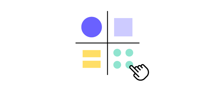
You can create interactions depending on the conditions like click, hover etc. on the ready components!
How to Incorporate Interactive Components in UXPin Prototypes?
To incorporate interactive components into your product prototypes, there are many steps you can take. Make sure that forms can actually be filled out; boxes can be checked; and links can be clicked on.
Make as many components of your design actually workable as you can; this allows users to have the experience of trying to use the product, and it can give you some insight into how your product works and how people will (or want to) use it.
Using Interactive Components in UXPin
Since the first release of UXPin more than a decade ago, interactive components have been core to our design tool, providing designers with a solution to build prototypes that accurately replicate the final product experience.
UXPin has four powerful features to create interactive components:
- States: Create multiple state variants, each with different properties and interactions for a single component.
- Variables: Capture user input data and use it to create personalized, dynamic user experiences.
- Expressions: Javascript-like functions to create complex components and advanced functionality–no code required!
- Conditional Interactions: Set if-then and if-else conditions based on user interactions to create dynamic prototypes with multiple outcomes to accurately replicate the final product experience.
One helpful strategy is including pre-built components (called “forms” at UXPin) that you can easily drag and drop in our platform. (No need to design these from scratch!)
Advanced Component Customization with UXPin
In UXPin, components are not just static design elements; they offer advanced customization capabilities that enable designers to create dynamic, interactive prototypes.
Unlike traditional static components, UXPin components can be enhanced with multiple states, conditional logic, and even real data integration. This flexibility allows designers to create high-fidelity prototypes that closely mimic the functionality of the final product.
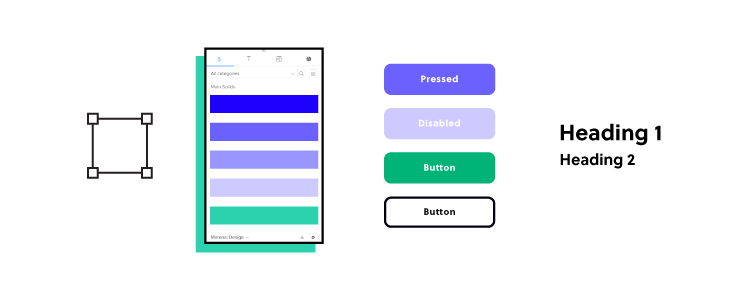
- Multiple States: Each component in UXPin can have multiple states (e.g., default, hover, active), which can be easily switched within the prototype. This feature allows designers to showcase different interactions and user flows without needing to create separate screens for each variation.
- Conditional Logic: UXPin allows components to change dynamically based on user actions or predefined conditions. For example, a form component can display error messages or success notifications based on the user’s input, providing a realistic preview of the user experience.
- Data Integration: Components in UXPin can integrate with live data, making them highly functional for testing and development. By connecting components to real data sources, designers can create prototypes that behave like real applications, enhancing the accuracy and effectiveness of usability testing.
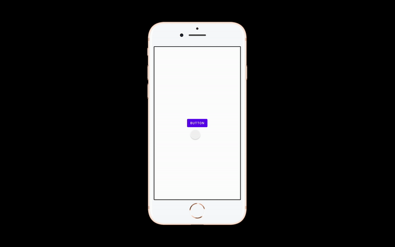
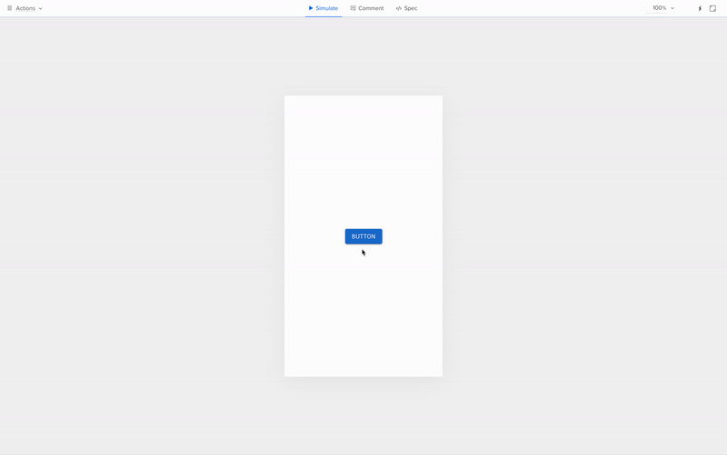
4 Examples of Interactive Components in UXPin
Here are some interactive component examples from our examples page to see how you can start. For now, let’s see what you can do with states, variables, expressions, and conditional logic.
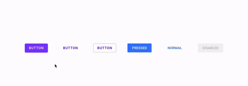
Example 1: Button
Example 2: Input and text area
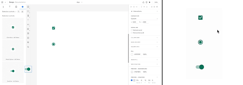
Example 3: Radio button
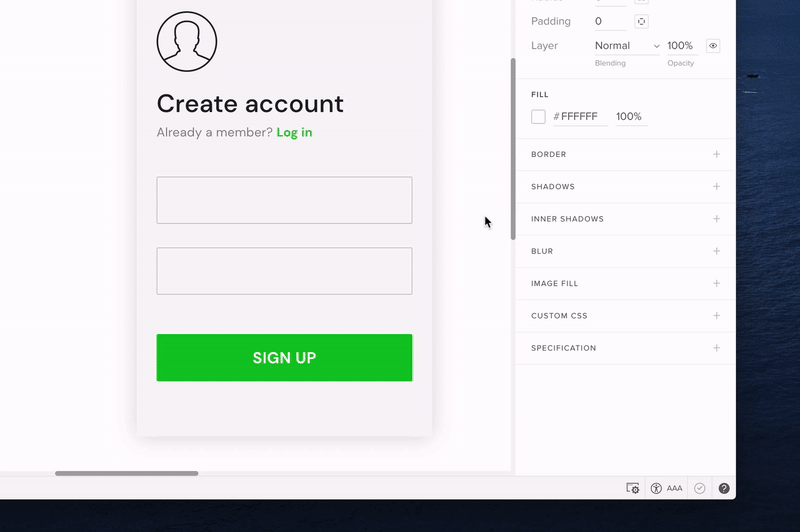
Example 4: An interactive sign-up form

→ Download a ready .uxp file to import into your UXPin account.
Want to create one by yourself? Here’s a tutorial.
Interactive Components in UXPin Merge
Merge takes component-driven prototyping and interactive components to another level. Instead of designers building components in UXPin, Merge imports a design system library from a repository.
These Merge UI elements are truly interactive components because behind them is code from a front-end framework like React, Vue, Angular, etc. You can import your organization’s design system or use an open-source library.
Designers don’t ever have to see or write code to use Merge components; they only work with the visual elements to build fully functioning prototypes. They also have access to component properties via UXPin’s Properties Panel to make changes within the design system’s constraints.
Learn more about Merge and how to request access.
Designing with Merge Interactive Components
Step 1: Grab Components From the Design System
There are three ways to import interactive components into UXPin using Merge:
- Git Integration: Connect a React component library directly to UXPin
- Storybook: Sync front-end frameworks like Vue, Angular, HTML, Ember, Web Components, and more (see the complete list here)
- npm Integration: Import open-source libraries from the Node Package Manager (npm)–a fantastic DIY option for designers. Read more about the npm Integration and how it works.
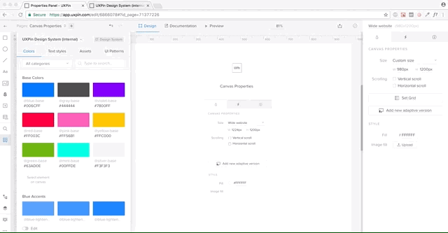
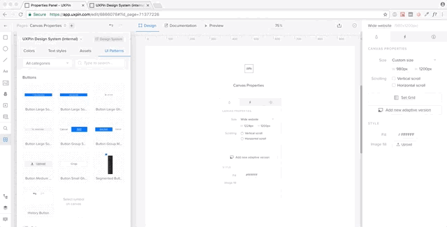
Imported Merge components appear in UXPin’s Design System Libraries in the left sidebar. Designers click or drag the UI elements they need from the sidebar to appear on the canvas. They can also use multiple design systems and UXPin elements and even combine them to create new components which they can save as Patterns.
Step 2: Make Changes
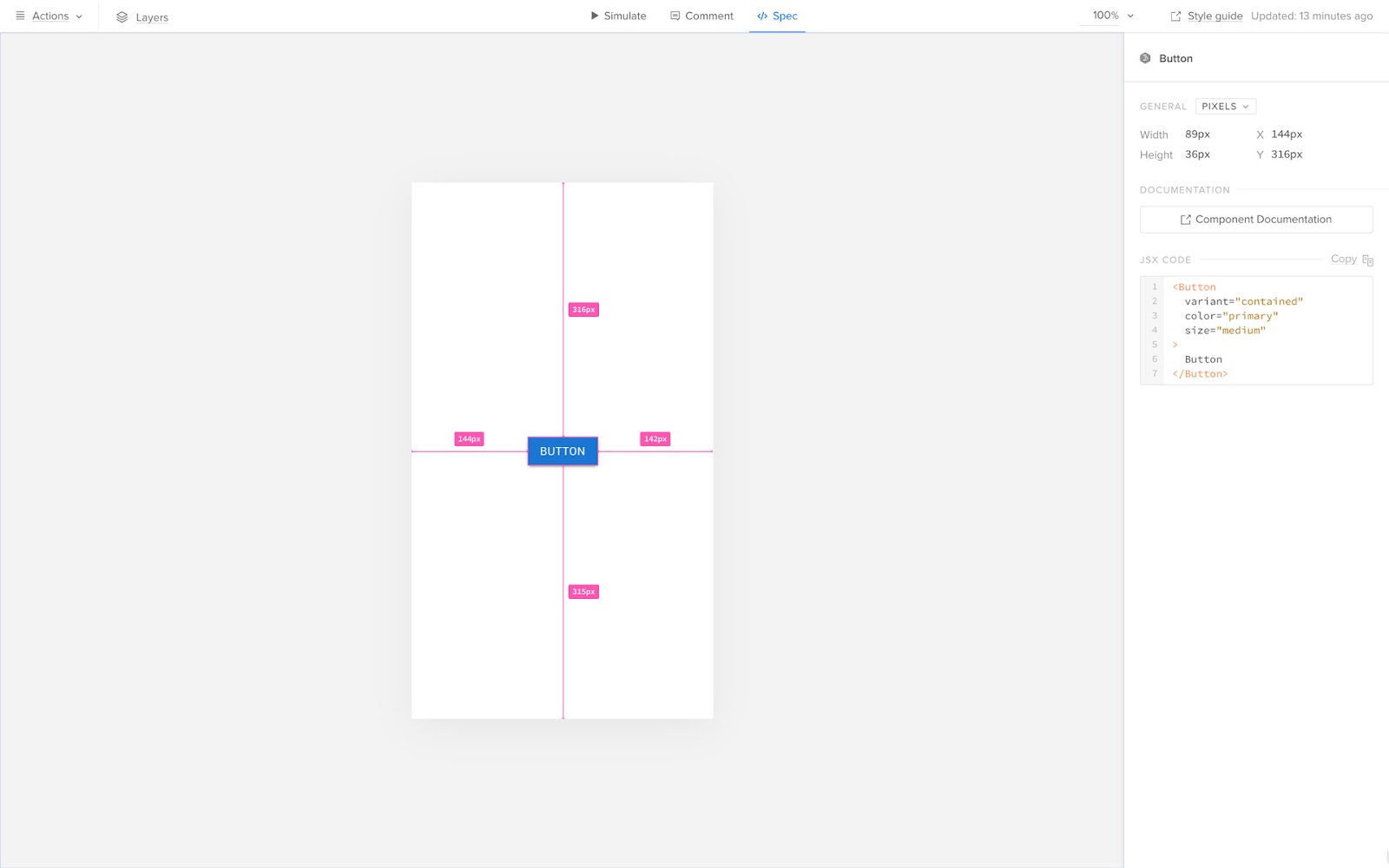
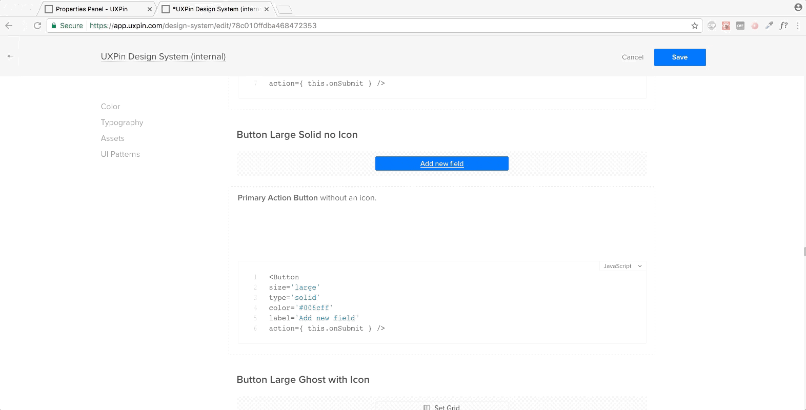
When designers click on a Merge component, its properties appear in the righthand Properties Panel. Those with technical skills can switch to JSX and adjust the code directly–a flexible workspace to match your preferred workflow.
Step 3: Share and Test
Designers can use Preview and Share for usability testing or when sharing prototypes with stakeholders. UXPin’s Comments feature allows teams and stakeholders to collaborate on prototypes and assign comments for team members to action.
Step 4: Design Handoff
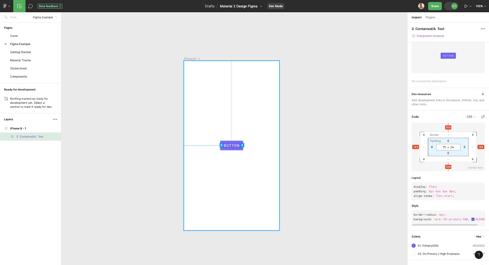
Preview and Share also features Spec Mode, where engineers can inspect elements and click on Merge components to view and copy JSX changes. Designers can also include prototype documentation with annotations explaining each element and user interface.
Check out Design Handoff: What it Looks Like with UXPin Merge for a short tutorial.
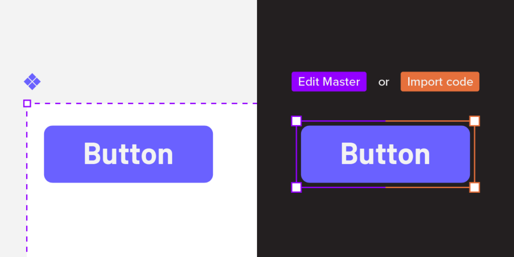
Interactive Components UXPin Merge vs. Figma
Here’s a quick overview of how Figma’s interactive components feature compares to UXPin Merge components.
Single Source of Truth
Figma’s interactive components allow designers to replicate some fundamental interactions. However, organizations must still manage two design systems–one UI kit for designers in Figma and a separate component library hosted in a repository.
The problem with this workflow is it requires additional resources to manage and update two systems while increasing the likelihood of errors.
With Merge, design teams and engineers pull components from the same repository. Designers see visual elements, and engineers use the code behind them. Any changes to the repository automatically sync to UXPin and notify all teams of the update. Designers can also use Version Control to switch between different design system versions.
Fully Interactive
Figma’s interactive components aim to mimic code, whereas code powers Merge, giving design teams fully interactive UI elements.
With Figma’s interactive components, you’re essentially creating states. With Merge, you get complex functionality like real date pickers, data tables, graphs, inputs, responsive design, and much more!
Smoother Design Handoffs and Cross-Functional Collaboration
Design handoffs are seamless, almost non-existent when using Merge because designers and engineers use the same component library. Design teams can’t make changes outside of properties set by the design system, so there are no surprises for engineers.
Merge significantly reduces development time because engineers can copy/paste production-ready code from the repository and grab component props from UXPin to begin front-end development.
Figma’s components are vector-based artboards. Although many plugins convert Figma design files to code, it’s rarely usable, and engineers must still re-program it to meet their product’s format and structure.
In summary, Merge is a code-based technology that syncs design and development to form a single source of truth. Figma’s interactive components offer basic functionality (mostly state variants) that reduces the number of artboards designers use to create interactions.
Use our Figma plugin to copy Figma designs into UXPin. Reach higher interactivity of prototyping.
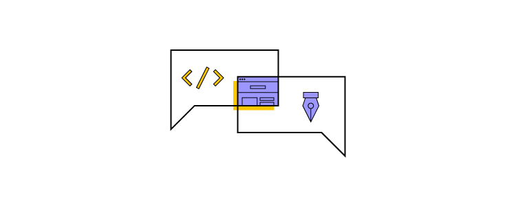
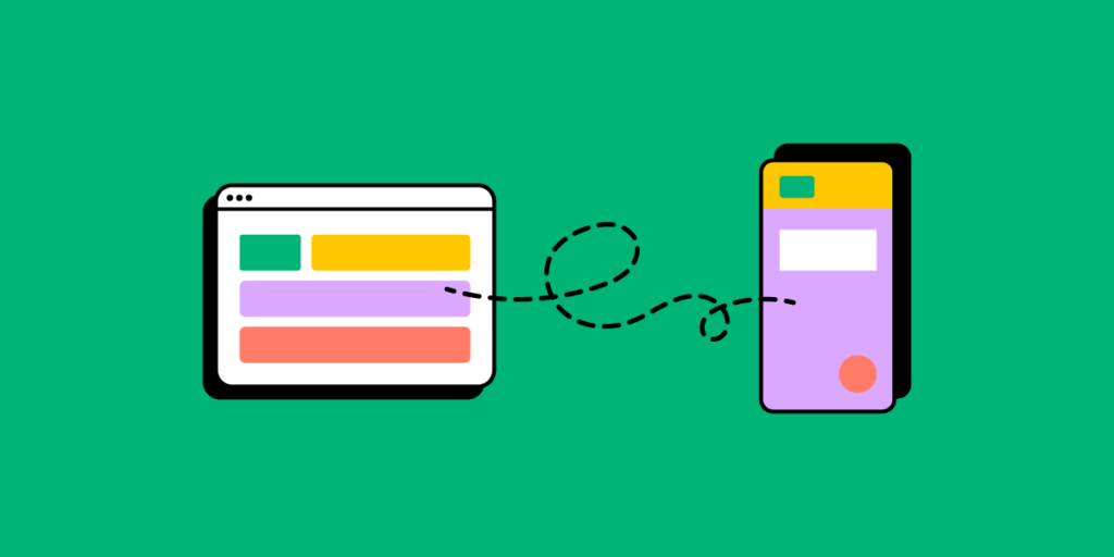
Bridging Design and Development with UXPin Merge
One of the standout features of UXPin is its Merge technology, which bridges the gap between design and development by allowing designers to use actual code components within their prototypes. This feature ensures that the components in UXPin are the same as those in production, maintaining consistency and reducing the risk of discrepancies between the design and the final product.
- Code-Based Components: With UXPin Merge, designers can import coded components from a repository (like GitHub) and use them directly in their design projects. These components are not just visual representations; they are the actual components that will be used in the final product, complete with all the functionality and interactivity defined by the development team.
- Single Source of Truth: By using code-based components, UXPin ensures that there is a single source of truth for both designers and developers. This approach eliminates the need for redundant handoffs and rework, as any changes made in the design are immediately reflected in the code, and vice versa. This seamless integration fosters better collaboration and streamlines the product development process.
How to Get Started Prototyping With UXPin Merge
Ready to get started with component-driven prototyping in UXPin using Merge? You have two options:
- Open-source libraries: Open-source libraries are best for teams who lack an active dev support or they just want to get some basic understanding of how they can work with components before comitting to them.
- Private design systems: If you’d like to sync your product’s private design system to UXPin, visit our Merge page to request access, and one of UXPin’s technical staff will contact you to help with onboarding.


