UI localization is the process of adapting a user interface to fit the cultural, linguistic, and regional preferences of different user groups. This adaptation involves translating text, adjusting layouts, adapting date and time formats, converting currencies, and modifying graphics or symbols to ensure that the design feels natural to users in specific locales.
UI localization is crucial for global products as it provides a seamless and accessible experience for diverse audiences. It allows users to interact with a product in a way that feels familiar and intuitive, which can increase engagement, satisfaction, and overall usability.
With UXPin, designers can easily build flexible layouts, handle right-to-left and left-to-right language adjustments, and adapt components like currency, date, and time formats to match local expectations. UXPin’s powerful tools make it simple to create globally accessible designs from the start, saving time and ensuring a natural, intuitive experience for users everywhere. Ready to design for the world? Try UXPin for free.

What is UI Localization?
UI Localization is the process of adapting a user interface (UI) to meet the linguistic, cultural, and functional expectations of users in different regions or languages. It’s a critical part of creating globally accessible products, ensuring that users feel comfortable and engaged when interacting with an interface, regardless of their location or cultural background.
Localization goes beyond simple translation, addressing everything from language and layout adjustments to cultural relevance and legal compliance, making the product feel “native” to each audience.
What Does UI Localization Involve?
Here are the key components of UI localization:
- Language Translation: Translating the UI text into the target language is the most direct form of localization. However, it’s not just about translation; it also involves cultural adaptation to ensure the meaning is contextually appropriate. For example, idioms, phrases, or product names may need to be modified.
- Layout Adjustments: Different languages vary in text length and direction. For instance, English is generally concise, while languages like German or Russian tend to have longer words, potentially requiring additional space. Right-to-left (RTL) languages like Arabic and Hebrew require UI adjustments to accommodate the reversed layout direction.
- Date, Time, and Number Formatting: Different regions have distinct date, time, and numerical formats. For example, while the U.S. commonly uses the “MM/DD/YYYY” date format, many European countries prefer “DD/MM/YYYY.” Localizing these elements enhances clarity and usability.
- Currency and Units of Measure: Users expect prices in their local currency and measurements in familiar units (e.g., kilometers vs. miles). Properly localizing these details improves accuracy and trust in the interface.
- Culturally Relevant Imagery and Symbols: Imagery, color schemes, and icons often carry cultural meanings, so localization ensures these elements are relevant and appealing in each target region. For example, the color white is associated with purity in some cultures but can signify mourning in others. Similarly, certain gestures, like a thumbs-up, might have positive connotations in one culture but be offensive in another.
- Consistency with Brand and User Experience: Localization must also maintain a cohesive brand identity across different regions. Localization balances brand consistency with cultural customization, ensuring that while the product feels native in each region, it still aligns with the global brand values and user experience.
Where Does UI Localization Fit in the Design Process?
UI localization should be integrated early in the design process rather than treated as a final adjustment.
Localization considerations can impact design decisions from layout flexibility to text expansion handling, and anticipating these needs during the wireframing or prototyping stage saves time and resources later. Working alongside localization experts, designers can create adaptable layouts and reusable components that accommodate various languages and cultural needs.
Imagine you’re designing a checkout page for an international e-commerce store. Your goal? Make sure every user, whether in Paris or Tokyo, feels right at home.
- Language and Text: In English, your checkout button might say “Buy Now,” but in French, it needs to say “Acheter maintenant,” which is longer. To accommodate this, you design flexible buttons that expand to fit different text lengths.
- RTL Layouts: For Arabic-speaking users, the entire layout shifts to a right-to-left format. The shopping cart icon moves to the right, and text alignment reverses, creating a familiar experience for these users.
- Currency and Payment Options: U.S. users see USD, but Europeans see euros and region-specific payment methods like iDEAL. You ensure these currency symbols and payment options are easy to spot.
- Date and Number Formatting: For credit card expiration dates, you adjust the format based on the locale. U.S. users expect MM/YY, while other countries might prefer DD/MM/YY.
- Compliance and Privacy Notices: For European customers, you add a GDPR-compliant consent checkbox, while California users see a CCPA notice.
Each step creates a seamless experience, making every user feel like the interface was designed just for them—no matter where they are.
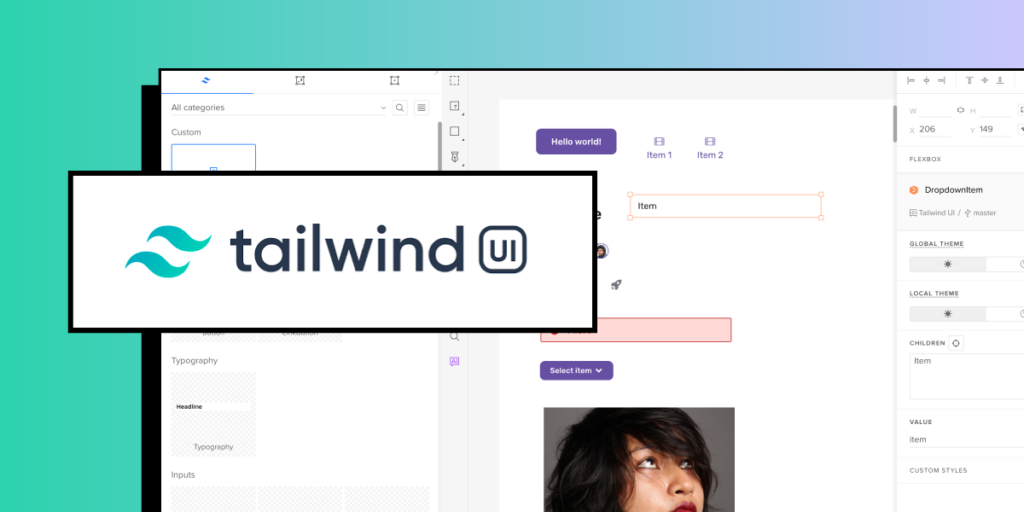
How to Handle UI Localization in UXPin?
Handling localization in UXPin involves designing with flexibility in mind so that your prototypes can adapt to different languages, formats, and user expectations across regions.
Here’s a step-by-step approach to effectively localize your designs in UXPin.
Use Flexible Layouts for Text Expansion
Different languages vary in text length, which can impact UI spacing and layout. When designing in UXPin, use flexible, responsive layouts that allow elements like buttons, text fields, and menus to expand or shrink without breaking the design. For instance, keeping adequate padding around text blocks ensures that longer translated text doesn’t overflow.
Design for Right-to-Left (RTL) and Left-to-Right (LTR) Languages
If you’re designing for regions that use RTL languages (like Arabic or Hebrew), UXPin allows you to easily adjust alignment, position, and spacing. You can create two versions of the same screen (one for LTR and one for RTL), or use mirrored layouts. Consistent use of flexible layouts can make this adjustment easier and help maintain alignment.
Prepare for Different Date, Time, and Number Formats
For international users, date, time, and number formats vary (e.g., “MM/DD/YYYY” vs. “DD/MM/YYYY” for dates). In UXPin, create prototype variations that reflect these differences based on your target regions. You can also add notes for developers to specify how these formats should change depending on user location.
Create Component Variants for Currency and Units
UXPin allows you to set up component variants, which is useful for adapting elements like prices or units of measurement. For instance, you can create a “Price” component with different currency symbols or formats (e.g., $, €, ¥) so that developers know to adjust the display depending on the locale. If your application needs to handle dynamic pricing and billing data across regions, Baremetrics provides subscription analytics and revenue recovery with native integrations across Stripe, Braintree, and other payment processors, helping ensure accurate currency and pricing localization.
Use Icons and Symbols Carefully
Localization goes beyond text, so consider how icons and symbols are interpreted in different cultures. UXPin’s library includes various icons that can be swapped out depending on region-specific preferences. Always test for cultural appropriateness, especially for icons or symbols that might not translate universally.
Document Localization Notes
In UXPin, you can annotate designs to provide localization instructions. Adding notes about translation, text length constraints, and any RTL adjustments gives developers clear guidelines, ensuring that the final product aligns with your localized design intent.
Test Prototypes for Regional Usability
Once your localized versions are set up, test each prototype to make sure they’re usable for users in different regions. UXPin allows you to create interactive prototypes that reflect the localized experience, which you can then share with users or stakeholders for testing and feedback.
Summary
UI localization is essential for creating a truly user-centered design that resonates with a global audience. By incorporating localization into the design process from the beginning, designers ensure that users worldwide have an intuitive, culturally relevant, and seamless experience with the product, regardless of where they are or what language they speak.
In UXPin, you can create adaptable, region-friendly prototypes that meet the needs of a global audience, allowing for a seamless transition to development with localization built in from the start. Try UXPin for free.