Node.js is a server-side JavaScript runtime, while React.js is a client-side UI library. They are not competing technologies — they serve different layers of the stack and are frequently used together to build full-stack JavaScript applications. Node.js handles backend logic, APIs, and server operations; React handles everything the user sees and interacts with in the browser.
This guide breaks down what each technology does, where they overlap, and how to choose between them (or use both) for your next project.
Building a React front end? UXPin Merge lets you design with production-ready React components — the same ones your developers ship. Drag, drop, and export clean JSX. Try it free.
What Is Node.js?
Node.js is an open-source, cross-platform runtime environment that executes JavaScript outside the browser. Built on Google Chrome’s V8 engine, it compiles JavaScript directly to native machine code for high-performance execution.
Key characteristics of Node.js
Event-driven, non-blocking I/O — handles thousands of concurrent connections with minimal overhead, making it ideal for real-time applications.
Single language across the stack — JavaScript on both client and server reduces context switching for development teams.
npm ecosystem — access to over 2 million packages through the Node Package Manager, the largest open-source registry in the world.
Cross-platform — runs on Windows, macOS, and Linux with no code changes.
Common Node.js use cases
RESTful and GraphQL API servers
Real-time applications (chat, collaboration tools, live dashboards)
Server-side rendering for React and other frameworks
Build tools and CLI utilities
Who uses Node.js?
Major companies rely on Node.js in production:
Netflix — reduced startup time significantly by moving server-side rendering to Node.js.
PayPal — doubled requests per second compared to their previous Java stack while cutting response times.
LinkedIn — rebuilt their mobile backend with Node.js, dramatically improving performance.
Uber — uses Node.js for their real-time matching system, handling massive network request volumes.
What Is React.js?
React.js is a JavaScript library developed by Meta (formerly Facebook) for building user interfaces. It uses a declarative, component-based architecture that makes building interactive single-page applications faster and more predictable.
Key characteristics of React
Virtual DOM — React creates an in-memory representation of the UI. When state changes, it calculates the minimal set of DOM updates needed, resulting in fast rendering.
Component-based architecture — every piece of the UI is a self-contained, reusable component with its own state and logic.
JSX syntax — a JavaScript extension that lets you write HTML-like markup directly in your JavaScript files.
Unidirectional data flow — data flows from parent to child components through props, making applications easier to debug.
Common React use cases
Single-page applications (SPAs)
Complex dashboards and data visualization
eCommerce storefronts
Progressive web apps (PWAs)
Design system component libraries
Node.js vs React.js: Side-by-Side Comparison
Feature
Node.js
React.js
Type
Runtime environment
UI library
Runs on
Server (backend)
Browser (frontend)
Primary purpose
Server logic, APIs, data processing
Building user interfaces
Architecture
Event-driven, non-blocking I/O
Virtual DOM, component-based
Language
JavaScript (server-side)
JavaScript + JSX (client-side)
Package manager
npm / Yarn
npm / Yarn (uses Node.js)
Scalability focus
Handling concurrent connections
Managing complex UI state
Created by
Ryan Dahl (2009)
Meta / Facebook (2013)
Node.js: Advantages and Disadvantages
Advantages
High performance for I/O operations — the non-blocking event loop handles data-intensive operations efficiently.
Massive ecosystem — npm offers packages for virtually any functionality.
Full-stack JavaScript — one language for frontend and backend simplifies hiring and code sharing.
Excellent for microservices — lightweight and modular architecture fits microservice patterns.
Strong corporate backing — supported by Microsoft, Google, IBM, and the OpenJS Foundation.
Disadvantages
Poor for CPU-intensive tasks — the single-threaded model bottlenecks on heavy computation (image processing, complex calculations).
Callback complexity — although async/await has largely resolved “callback hell,” legacy codebases can still be challenging.
npm package quality varies — not all community packages are well-maintained or secure.
Requires async programming expertise — developers must understand event loops and non-blocking patterns.
React.js: Advantages and Disadvantages
Advantages
Fast UI rendering — the Virtual DOM minimizes expensive real DOM manipulations.
Reusable components — build once, use everywhere across your application.
Huge community — extensive libraries, tools, and learning resources.
Flexibility — works with any backend technology; not opinionated about your stack.
Strong design system support — React’s component model is the foundation of most enterprise design systems.
Disadvantages
View layer only — you need additional libraries for routing, state management, and API calls.
Steep learning curve for beginners — JSX, hooks, context, and ecosystem choices can overwhelm newcomers.
Rapid ecosystem changes — best practices evolve quickly (class components → hooks → server components).
SEO challenges for SPAs — requires server-side rendering (via Next.js or Node.js) for full search engine visibility.
Using Node.js and React Together
Node.js and React are complementary, not competing. In a typical full-stack JavaScript architecture:
React renders the frontend — user interfaces, interactive elements, and client-side routing.
Node.js powers the backend — API endpoints, database queries, authentication, and file serving. For enterprises needing secure, governed API access across multiple data sources, DreamFactory provides a self-hosted platform delivering controlled API access to any database or data source.
Popular full-stack combinations include:
MERN stack — MongoDB, Express.js, React, Node.js
Next.js — a React framework that uses Node.js for server-side rendering and API routes
T3 stack — TypeScript, tRPC, Tailwind CSS, with React on the frontend and Node.js on the backend
This pairing allows teams to use JavaScript everywhere, share validation logic between client and server, and hire from a single talent pool.
When to Choose Node.js, React, or Both
Choose Node.js alone when building APIs, CLI tools, microservices, or real-time backends that don’t need a complex frontend.
Choose React alone when your backend already exists (in Python, Java, Go, etc.) and you need a modern, interactive frontend.
Choose both when building a new full-stack application and you want a unified JavaScript codebase from server to browser.
Build React App UIs With UXPin Merge
Once you’ve decided React is the right choice for your frontend, the next step is designing the UI. UXPin Merge lets you design with real, production-ready React components — not static mockups. What you design is exactly what gets built, eliminating the handoff gap between design and development.
Try UXPin Merge free and start building React interfaces that are ready for development from day one.
Frequently Asked Questions
Is Node.js a framework or a library?
Neither. Node.js is a runtime environment that allows JavaScript to execute on the server. It provides the infrastructure to run JavaScript outside the browser, but it is not a framework like Express.js or a library like React.
Can React work without Node.js?
Yes, in production. React runs in the browser and doesn’t require Node.js at runtime. However, Node.js is needed during development for tools like npm, bundlers (Vite, webpack), and development servers. You can also use Node.js for server-side rendering of React apps.
Is Node.js backend or frontend?
Node.js is primarily a backend technology. It runs on the server and handles tasks like API logic, database operations, file system access, and authentication. However, it also powers frontend build tools (Vite, webpack) and development servers.
Should I learn Node.js or React first?
If you’re interested in building user interfaces, start with React. If you want to build APIs and server logic, start with Node.js. Most full-stack JavaScript developers eventually learn both. A solid understanding of core JavaScript is a prerequisite for either.
Can Node.js and React be used in the same project?
Absolutely. This is one of the most common web development setups. React handles the frontend UI while Node.js (typically with Express.js) serves the API backend. Frameworks like Next.js combine both in a single project, with Node.js handling server-side rendering and API routes.
What is the MERN stack?
MERN stands for MongoDB, Express.js, React, and Node.js. It’s a popular full-stack JavaScript architecture where MongoDB provides the database, Express.js and Node.js power the backend API, and React builds the frontend interface. The entire stack uses JavaScript, simplifying development.
Prototyping is how design teams test ideas before committing engineering resources to build them. The fidelity of your prototype — how closely it resembles the final product — determines what questions it can answer and at what stage of the design process it’s most useful.
This guide explains the differences between low-fidelity and high-fidelity prototypes, the strengths and limitations of each, when to use them, and how modern tools are making it possible to reach high fidelity faster than ever.
Ready to prototype at any fidelity level? UXPin supports everything from quick wireframes to fully interactive, code-backed prototypes with Merge. Start a free trial and build your first prototype today.
What Is a Prototype?
A prototype is an interactive simulation of a product or feature that allows users, stakeholders, and team members to experience and test the design before development. Unlike static mockups or wireframes, prototypes include clickable elements, navigation flows, and — at higher fidelity levels — realistic interactions and data.
Prototypes serve three critical functions:
Validation: Testing whether a design solution actually works for users.
Communication: Showing stakeholders and developers exactly what the intended experience looks and feels like.
Risk reduction: Catching usability issues, missing features, and flawed assumptions before engineering investment.
Low-Fidelity Prototyping
Low-fidelity (lo-fi) prototypes are rough, simplified representations of a product’s layout and flow. They strip away visual design, real content, and detailed interactions to focus on structure and navigation.
What Low-Fidelity Prototypes Look Like
Paper prototypes: Hand-drawn sketches of screens that can be shuffled and rearranged during workshops.
Digital wireframes: Basic grayscale layouts created in a design tool, using boxes, lines, and placeholder text.
Clickable wireframes: Linked wireframe screens that simulate navigation flows with simple click/tap transitions.
Advantages of Low-Fidelity Prototyping
Speed: You can create a lo-fi prototype in minutes, making it easy to explore multiple concepts quickly.
Low cost: Minimal time investment means you can discard ideas without regret.
Encourages honest feedback: Because lo-fi prototypes look unfinished, reviewers focus on structure and flow rather than visual details like color or typography.
Accessible to everyone: Anyone can sketch — you don’t need specialized software or design skills to create a paper prototype.
Ideal for co-design: Lo-fi prototypes are great for collaborative workshops where multiple people contribute ideas simultaneously.
Limitations of Low-Fidelity Prototyping
Limited realism: Users can struggle to imagine the final experience from a wireframe, leading to less reliable usability test results.
No micro-interactions: Animations, transitions, hover states, and form validation can’t be represented.
Gap to development: Wireframes don’t contain enough detail for developers to build from — additional specification work is needed.
Stakeholder risk: Some executives struggle to evaluate wireframes and defer judgment until they see “the real thing.”
High-Fidelity Prototyping
High-fidelity (hi-fi) prototypes closely resemble the final product in visual design, content, and behavior. They use real UI components, actual (or realistic) content, and interactive logic to simulate the production experience.
What High-Fidelity Prototypes Look Like
Pixel-perfect visual designs with accurate colors, typography, spacing, and imagery.
Interactive components: Buttons that trigger actions, forms that validate input, tabs that switch content.
Realistic data: Actual content or realistic sample data instead of “Lorem ipsum.”
Transitions and animations: Page transitions, loading states, micro-interactions.
Code-backed prototypes: Components sourced from production code that behave exactly like the shipped product.
Advantages of High-Fidelity Prototyping
Accurate usability testing: Users interact with a realistic experience, producing more valid test results.
Stakeholder confidence: Executives can evaluate the actual design intent, making approval faster.
Developer clarity: High-fidelity prototypes serve as a living specification, reducing misinterpretation during development.
Micro-interaction testing: Test animations, error states, loading behaviors, and edge cases.
Direct-to-production potential: With code-backed prototyping tools, the prototype itself can generate production-ready code.
Limitations of High-Fidelity Prototyping
Higher time investment: Creating detailed, interactive prototypes takes longer than wireframing — though modern tools are rapidly closing this gap.
Resistance to change: When a prototype looks finished, stakeholders may resist changes, even when testing reveals issues. Teams can anchor to a polished design.
Risk of premature detail: Jumping to high fidelity before validating the concept can lead to polishing the wrong solution.
Low-Fidelity vs. High-Fidelity: A Side-by-Side Comparison
Dimension
Low-Fidelity
High-Fidelity
Visual detail
Grayscale, placeholder content
Full visual design, real content
Interactivity
Basic click-through navigation
States, logic, animations, form validation
Creation time
Minutes to hours
Hours to days (faster with component libraries)
Best for
Concept exploration, IA validation, workshops
Usability testing, stakeholder review, dev handoff
Feedback focus
Structure, flow, content priority
Visual design, interactions, usability details
User testing validity
Moderate
High
Developer utility
Low — requires additional specs
High — can serve as living documentation
When to Use Each Approach
Use Low-Fidelity Prototypes When:
You’re in the discovery or ideation phase and need to explore multiple directions quickly.
You want to validate information architecture and navigation before investing in visual design.
You’re running design sprints or co-design workshops with non-designers.
The project scope is unclear and requirements are still being defined.
You need quick internal alignment on the general approach before detailing any single direction.
Use High-Fidelity Prototypes When:
You need to conduct usability testing that produces reliable, actionable results.
You’re presenting to executives, clients, or investors who need to see the full experience.
Developers need a detailed, interactive reference for implementation.
You’re testing micro-interactions, animations, or edge cases that can’t be represented in wireframes.
You’re doing A/B testing or user acceptance testing where prototype realism affects the validity of results.
Skip Low-Fidelity Altogether When:
If your team uses a component-based design tool with a shared library, you can often start at high fidelity and move just as fast as wireframing. When you drag a production button component onto the canvas instead of drawing a gray rectangle, you’ve added zero extra time — but gained realistic behavior, consistent styling, and developer-ready output.
This is exactly how teams using UXPin Merge work. Merge imports production React components (or components from libraries like MUI and shadcn/ui) directly into the design canvas. Building with real components is as fast as wireframing — but every prototype is immediately high-fidelity and code-backed.
How Modern Tools Are Closing the Fidelity Gap
The traditional assumption — that low-fidelity is fast and high-fidelity is slow — is increasingly outdated. Several developments are collapsing the gap:
Component-Based Design
When designers work with pre-built, reusable components from a design system, assembling a high-fidelity screen takes minutes, not hours. UXPin Merge takes this further by importing coded components, so every prototype inherits real props, states, responsive behavior, and accessibility attributes automatically.
AI-Assisted Design
UXPin Forge generates complete, high-fidelity layouts from text prompts, image uploads, or URL references — using the team’s actual production components. Instead of spending time on initial wireframes, designers can start with an AI-generated layout that already uses the correct design system, then refine it with professional design tools.
Forge’s conversational iteration means you can modify the generated design in place (“move the search bar to the header,” “add a data table below the chart”) without regenerating from scratch. This workflow gets teams from idea to testable prototype dramatically faster.
Production Code Output
With code-backed prototyping, the boundary between prototype and product disappears. Prototypes built in UXPin Merge export as production-ready JSX that developers can use directly — eliminating the traditional handoff step where designers create specs and developers reinterpret them. Enterprise teams using this approach report up to 50% reduction in engineering time.
Frequently Asked Questions
What is the difference between low-fidelity and high-fidelity prototypes?
Low-fidelity prototypes are simplified representations — wireframes, paper sketches, or basic clickable screens — that focus on layout, navigation, and user flows without visual design details. High-fidelity prototypes closely resemble the final product with accurate visuals, real content, interactive components, and realistic behavior. Low-fi is fast for early exploration; high-fi is essential for usability testing and developer handoff.
When should I use a low-fidelity prototype?
Use low-fidelity prototypes in early design stages when you need to explore multiple concepts quickly, validate information architecture, get rapid stakeholder feedback without committing to visual design, or facilitate co-design workshops. Their rough appearance invites more open critique from reviewers.
When should I use a high-fidelity prototype?
Use high-fidelity prototypes when you need to conduct realistic usability testing, present to executives for sign-off, test micro-interactions and animations, hand off specifications to developers, or validate that a design works with real content and data.
Can AI help me create prototypes faster?
Yes. AI design tools like UXPin Forge generate high-fidelity layouts from text prompts, image uploads, or URL references using real production components. This lets teams start with a functional prototype they can iterate on, reducing the journey from idea to testable prototype significantly.
What is the best tool for high-fidelity prototyping?
The best tool depends on your workflow. UXPin is particularly strong for high-fidelity prototyping because it supports interactive states, variables, conditional logic, expressions, and — with Merge — real coded components from your production design system. Prototypes behave like the actual product, making usability tests more valid and developer handoff seamless.
Do I always need to start with low-fidelity and work up to high-fidelity?
Not necessarily. The traditional workflow moves from low-fi to high-fi, but modern tools have blurred the line. With component-based design tools like UXPin Merge, you can start at high fidelity by dragging production components onto the canvas — it’s as fast as wireframing but produces a realistic, testable prototype from the start.
Start Prototyping at Any Fidelity Level
The right fidelity level depends on where you are in the design process and what questions you need to answer. Low-fidelity prototypes help you explore and align; high-fidelity prototypes help you validate and ship.
UXPin gives you the flexibility to work at any fidelity level — from quick wireframes to fully interactive, code-backed prototypes powered by Merge. Combined with Forge, UXPin’s AI assistant, you can go from a text prompt to a testable, high-fidelity prototype in minutes.
The video game industry represents one of the most challenging and rewarding domains for UX designers. Game UX blends the rigor of usability engineering with the creative demands of interactive entertainment — requiring designers to think about everything from HUD clarity in a fast-paced shooter to the emotional pacing of a narrative RPG’s menu system.
This guide explores what game UX design involves, how it differs from traditional product UX, the key design disciplines within game studios, and how to build a career in this growing field.
Whether you’re a UX professional exploring game design or a game developer looking to sharpen your UX skills, interactive prototyping is essential for testing ideas early. Try UXPin for free to build interactive prototypes with states, variables, and conditional logic — ideal for mapping out game menu flows and UI systems.
What Is Game UX Design?
Game UX design is the process of designing the interface layer that sits between the player and the game’s mechanics. This includes heads-up displays (HUDs), menus, settings screens, control mappings, onboarding tutorials, accessibility options, and in-game feedback systems.
The goal is to remove unnecessary friction so players can focus on what matters — the gameplay experience itself. A well-designed game UI is invisible in the best sense: players don’t notice it because everything works exactly as expected.
Game Design vs. Game UX Design
These two roles are closely related but serve different functions:
Game designers define the rules, mechanics, progression systems, level design, and narrative structure that make a game engaging. They create the core experience.
Game UX designers design the interface through which players access and interact with those mechanics. They handle menus, HUDs, control schemes, tutorials, and feedback — ensuring the game is usable, learnable, and accessible.
In smaller studios, one person may wear both hats. At larger companies like Riot Games, Ubisoft, or Naughty Dog, game UX is a specialized discipline with dedicated teams.
How Game UX Differs from Product UX
Traditional product UX (SaaS, e-commerce, enterprise tools) optimizes for efficiency — helping users accomplish tasks as quickly as possible. Game UX operates on a fundamentally different principle:
Dimension
Product UX
Game UX
Primary goal
Task completion
Engagement and enjoyment
Friction
Always minimized
Strategically used for challenge
Feedback
Confirmation and error states
Rich, multi-sensory (visual, audio, haptic)
Onboarding
Guided tours, tooltips
Progressive disclosure through gameplay
Emotional design
Trust and confidence
Excitement, tension, satisfaction, discovery
Input methods
Mouse, keyboard, touch
Controllers, motion, VR, touch, voice
Despite these differences, the underlying UX principles — user research, usability testing, information architecture, consistency, and accessibility — apply equally to both domains.
Core Responsibilities of a Game UX Designer
HUD Design
The heads-up display is the persistent interface overlay that shows players critical real-time information: health, ammunition, maps, objectives, and team communication. Effective HUD design balances information density with visual clarity. Too much data overwhelms players; too little leaves them guessing.
Key considerations:
Prioritization: Show only what the player needs at any given moment. Use contextual HUDs that appear and fade based on gameplay state.
Readability: High-contrast text, clear iconography, and legible fonts at various screen sizes and distances (especially for console games played on TVs).
Customization: Let players reposition, resize, or toggle HUD elements based on preference.
Menu and Navigation Systems
Game menus (main menus, pause menus, inventory screens, settings) must be navigable with every supported input method — mouse, keyboard, gamepad, and sometimes touch. Consistency across menus reduces cognitive load, and a clear visual hierarchy helps players find what they need quickly.
Onboarding and Tutorials
Great game onboarding teaches mechanics through play rather than walls of text. The best tutorials are:
Progressive: Introduce one concept at a time, in context.
Interactive: Have the player perform the action rather than just read about it.
Skippable: Experienced players should be able to bypass tutorials without penalty.
Revisitable: Provide an in-game reference (like a help menu or control overlay) players can access later.
Feedback Systems
Feedback is the backbone of game UX. Every player action should produce a clear, satisfying response — visual effects on hit, audio cues for pickups, haptic vibration on impact, screen shake on explosions. Feedback must be:
Immediate: Delayed feedback breaks the sense of control.
Proportional: Bigger actions produce bigger responses.
Multi-sensory: Combining visual, audio, and haptic feedback creates richer experiences.
Distinct: Different actions should feel different — a headshot shouldn’t feel like a body shot.
Accessibility
Game accessibility has become a critical area of game UX. Modern best practices include:
Colorblind modes and customizable color palettes
Remappable controls for all input methods
Subtitle size, background, and speaker identification options
Difficulty modifiers and assist modes
Audio descriptions and visual alternatives for audio cues
Motor accessibility: auto-aim, toggle vs. hold options, one-handed control schemes
Games like The Last of Us Part II and Forza Horizon 5 have set industry benchmarks for accessibility, proving that inclusive design makes games better for everyone.
The Viewing Experience: UX for Game Spectators
With the rise of Twitch, YouTube Gaming, and esports, game UX now extends to spectators, not just players. Spectator-focused UX includes:
Spectator modes: Camera controls, player-perspective switching, and overlay information for broadcast.
Readable HUDs at stream resolution: Elements must remain legible at 720p or even lower when viewers watch on phones.
Esports overlays: Player stats, team information, and event brackets that complement rather than clutter the game view.
Games designed with spectator UX in mind — like Valorant, League of Legends, and Rocket League — gain an organic marketing advantage through the streaming ecosystem.
The Game UX Design Process
Game UX follows a similar iterative process to product UX, adapted for the unique constraints of game development:
Research and discovery: Analyze the target audience, competitor games, and platform conventions. Conduct player interviews and review community feedback for sequels or live-service games.
Wireframing and prototyping: Map out menu flows, HUD layouts, and onboarding sequences using wireframes and interactive prototypes. Test navigation patterns before investing in art assets.
Playtesting: Observe real players interacting with the game in controlled sessions. Track where players get confused, miss information, or fail to learn a mechanic. Playtesting in games is the equivalent of usability testing in product UX — and it’s just as essential.
Iteration: Refine designs based on playtest data. Game development cycles (especially for AAA titles) often span years, so UX solutions are tested and revised many times.
Implementation and polish: Work closely with UI engineers and artists to implement final designs, fine-tune animations, and ensure consistency across all screens and states.
For prototyping game menus, settings flows, and companion app interfaces, tools like UXPin provide the interactive states, variables, and conditional logic needed to simulate complex UI behavior without writing engine code. This lets game UX teams test and validate concepts before committing development resources.
Career Paths in Game UX
Game UX is a broad discipline with several specialized roles:
UX Designer (Game UI/UX)
The generalist role: designing menus, HUDs, onboarding, and interaction patterns. Most game UX careers start here. Requires a strong portfolio of wireframes, prototypes, and case studies showing problem-solving within game contexts.
UX Researcher / Player Researcher
Focused on playtesting, survey design, behavioral analytics, and translating player data into design recommendations. This role is heavily data-driven and often requires experience with quantitative and qualitative research methods.
UX Writer / Narrative UX
Crafting in-game microcopy — tooltip text, menu labels, tutorial instructions, error messages — that guides players without breaking immersion. In narrative-heavy games, this role overlaps with the writing team to ensure UI text aligns with the game’s voice and tone.
Accessibility Specialist
A growing role focused entirely on making games playable by people with diverse abilities. Accessibility specialists audit every aspect of the game experience and advocate for inclusive design throughout the development cycle.
UX Director / Design Lead
Senior role overseeing the UX vision for an entire game or product line. Responsibilities include setting design standards, mentoring junior designers, coordinating across disciplines, and representing UX in production leadership meetings.
Frequently Asked Questions About Game UX
What is game UX design?
Game UX design is the discipline of designing interfaces, controls, menus, feedback systems, and onboarding experiences that help players navigate and enjoy a video game. Unlike gameplay design (which defines the rules and mechanics), game UX focuses on usability — ensuring that HUDs, settings, tutorials, and in-game information are intuitive and accessible.
What is the difference between game design and game UX design?
Game designers create the gameplay mechanics, rules, levels, and narrative arcs that make a game fun. Game UX designers create the interface layer — menus, HUDs, control mappings, tutorials, and accessibility settings — that lets players interact with those mechanics comfortably. Both roles collaborate closely but focus on different aspects of the player experience.
What does a game UX designer do day to day?
A game UX designer conducts player research, creates wireframes and prototypes for menus and HUDs, designs onboarding and tutorial flows, runs playtests to identify usability issues, defines interaction patterns for various input devices, and collaborates with game designers, artists, and engineers to implement solutions.
How is game UX different from traditional product UX?
Traditional product UX optimizes for task efficiency — helping users complete goals quickly. Game UX balances efficiency with engagement, sometimes intentionally adding friction to create challenge and satisfaction. Game UX also involves real-time feedback systems, dynamic difficulty, immersive aesthetics, and emotional pacing that are rarely found in productivity software.
What skills do I need for a career in game UX?
Core skills include user research and playtesting, wireframing and prototyping, interaction design, information architecture, accessibility standards, and familiarity with game engines (Unity, Unreal Engine). Soft skills like cross-functional collaboration and presenting design rationale to non-design stakeholders are equally important.
Can UX design tools like UXPin be used for game UI prototyping?
Yes. While game-specific interactions ultimately need testing in-engine, UXPin is well suited for prototyping game menus, settings screens, HUD layouts, onboarding flows, and companion app interfaces. UXPin’s interactive states, variables, and conditional logic let you simulate complex UI behaviors before committing engineering resources. Try UXPin for free to start prototyping.
Level Up Your Game UX Process
Great game UX is invisible to players — and that’s the highest compliment. Every menu that loads instantly, every HUD element that appears at exactly the right moment, and every tutorial that teaches through play rather than text is the result of deliberate UX design.
Whether you’re designing for mobile games, AAA console titles, or VR experiences, prototyping and testing UI concepts early will save your team significant rework downstream. Sign up for a free UXPin trial to build interactive prototypes with the states, variables, and conditional logic that game UI demands.
Great website design accomplishes two things at once: it serves the user and it serves the business. The best websites are more than attractive — they’re intuitive, fast, accessible, and engineered to guide visitors toward a clear goal.
We’ve curated 15 outstanding website designs that demonstrate modern design principles in action. For each example, we break down what makes it effective and why the design decisions work — so you can apply the same thinking to your own projects.
UXPin is a powerful collaborative design tool for creating responsive websites with interactive, testable prototypes. Start a free trial and bring your website designs to life.
What Makes a Website Design Stand Out?
Before diving into examples, here are the qualities that consistently separate great website designs from average ones:
Clear purpose — visitors understand what the site offers within seconds
Strong visual hierarchy — the most important content and actions are immediately visible
Intuitive navigation — users can find what they need without thinking
Fast performance — pages load quickly on all devices and network conditions
Responsive layout — the design works beautifully on mobile, tablet, and desktop
Accessible design — content is usable by people with varying abilities
Consistent brand identity — typography, color, imagery, and tone reinforce the brand
Effective calls to action — the design guides users toward meaningful conversions
The best website designs achieve all of these while still feeling unique and memorable. Let’s look at how real websites pull this off.
15 Best Website Design Examples
1. Stripe
Stripe consistently sets the standard for developer-focused web design. The site uses clean typography, generous white space, and subtle gradient animations to communicate a technically complex product in an approachable way.
What works: The homepage presents Stripe’s value proposition in a single sentence above the fold, followed by a visual product demo that shows (rather than tells) what the platform does. Code snippets are rendered with syntax highlighting, speaking directly to the developer audience. The color palette shifts between sections, keeping the long-form homepage engaging without feeling disjointed.
Key takeaway: Let your audience see the product in action. Interactive demos and real code examples are more persuasive than abstract descriptions.
2. Linear
Linear is a project management tool with a website that mirrors its product philosophy: fast, focused, and beautifully minimal.
What works: A dark interface with precise typography and carefully crafted animations that load instantly. The homepage uses scroll-triggered transitions to reveal product features in context. Every animation serves a purpose — demonstrating speed, showing the UI, or highlighting a workflow.
Key takeaway: Performance is design. A fast, responsive website builds trust and mirrors the quality of the product itself.
3. Apple
Apple needs no introduction. Their website is a masterclass in visual storytelling — using full-bleed imagery, cinematic scroll effects, and minimal text to create an immersive product showcase.
What works: Apple uses scale and contrast to draw attention. Product images are enormous, backgrounds shift from light to dark, and typography is large and deliberate. Navigation is minimal — just a single row of product categories. This restraint keeps focus on the products.
Key takeaway: Let the product be the hero. When imagery is strong enough, less text means more impact.
4. Notion
Notion‘s website communicates the flexibility of a complex product without overwhelming new visitors. The design uses playful illustrations, clean layouts, and progressive disclosure to introduce features gradually.
What works: The homepage leads with a clear value proposition and an immediate “Get started” CTA. Below, use cases are organized in tabbed sections — so users can self-select their interest (project management, wiki, docs) without scrolling through irrelevant content. Illustrations are custom and on-brand, adding personality without slowing the page.
Key takeaway: Let users choose their own path. Tabbed and segmented layouts reduce cognitive load for complex, multi-use products.
5. Vercel
Vercel targets developers with a dark, code-forward aesthetic that communicates speed and technical sophistication. The homepage features live performance metrics and animated deployment visualizations.
What works: The design leads with social proof (logos of companies using Vercel) and immediately demonstrates the product through animated terminal sequences. Dark mode is default — matching the environment where developers spend most of their time. Typography is crisp, and the grid is disciplined.
Key takeaway: Design for your audience’s environment. A dark, technical aesthetic resonates with developers because it feels like home.
6. Airbnb
Airbnb demonstrates how to design a content-heavy marketplace that still feels clean and inviting. The search experience is the hero — a prominent search bar with intuitive date and guest pickers above the fold.
What works: Category tabs let users browse by travel style (trending, beachfront, cabins, tiny homes), and high-quality photography does the selling. The grid layout adapts seamlessly from desktop to mobile, and card-based content provides consistent structure for thousands of diverse listings.
Key takeaway: For marketplace and content sites, searchability and consistent content structure are more important than flashy visuals.
7. Spotify Design
Spotify Design is a window into Spotify’s global design team. The site uses vibrant colors, abstract shapes, and bold typography to create an experience that feels as creative and energetic as the music platform itself.
What works: Large, expressive headings draw users into articles. The color palette shifts per section, creating visual variety without breaking consistency. Page transitions and hover animations are smooth and purposeful — never gratuitous.
Key takeaway: A brand-centric editorial site can take more creative risks. Bold color and oversized type work when they serve the brand personality.
8. Webflow
Webflow practices what it preaches — their website is a showcase of what’s possible with modern web design, featuring smooth animations, interactive demos, and responsive layouts that look stunning on every device.
What works: The homepage includes an interactive product demo that lets visitors experience Webflow’s editor without signing up. Customer showcases provide social proof while doubling as design inspiration. The site architecture is well-organized, with clear paths for different audiences (designers, marketers, agencies).
Key takeaway: If your product is visual, let people experience it on the marketing site. Interactive demos convert better than screenshots.
9. Mailchimp
Mailchimp has become a reference point for brand-forward web design. Their use of custom illustration, a distinctive yellow palette, and playful typography makes the brand instantly recognizable.
What works: The design system is incredibly consistent — every page feels cohesive, from the homepage to deep product feature pages. Custom illustrations add personality and explain complex concepts without relying on dense copy. The information architecture is clean, making it easy to navigate a broad product suite.
Key takeaway: Strong brand identity and a consistent design system let you scale content while maintaining quality and recognition.
10. Duolingo
Duolingo brings its gamified learning experience to the marketing site with bright colors, playful character illustrations, and clear, concise messaging.
What works: The homepage CTA (“Get started”) appears immediately, reducing friction for new users. Social proof is prominent — “The world’s #1 way to learn a language” — and the design uses Duo the owl as a consistent mascot across all touchpoints. The site loads fast and works flawlessly on mobile, which matters for an audience that primarily uses the mobile app.
Key takeaway: Extend your product’s personality to the marketing site. Consistent character, tone, and visual language strengthen brand recognition.
11. Framer
Framer uses cinematic scroll animations and a dark, premium aesthetic to position itself as a sophisticated web design platform. The homepage is effectively a product walkthrough disguised as a marketing page.
What works: Each scroll section demonstrates a different capability through animated product UI. Templates are showcased as interactive previews rather than static images. The visual language is modern and clean, with a restrained color palette that lets the template designs speak for themselves.
Key takeaway: Show capability through demonstration. Animated product walkthroughs are more engaging than feature lists.
12. Pentagram
Pentagram, one of the world’s most respected design firms, uses an ultra-minimal website that lets their work do all the talking. Large project images, minimal navigation, and almost no explanatory text.
What works: The portfolio grid is elegant and spacious. Hovering over a project reveals the client name and project type — information on demand without cluttering the grid. The restraint is intentional: a design firm’s website should demonstrate design confidence through what it leaves out.
Key takeaway: For portfolio and agency sites, let the work be the centerpiece. Minimal UI keeps attention on the creative output.
13. Headspace
Headspace uses warm colors, rounded shapes, and friendly illustrations to create a calming digital experience that mirrors its meditation product.
What works: The color palette (warm oranges, soft blues, gentle gradients) immediately communicates the brand’s personality: approachable and calming. Navigation is simple, content is concise, and CTAs are prominent without feeling pushy. The illustration style is unique and instantly recognizable.
Key takeaway: Your website’s visual mood should match the emotional promise of your product. Headspace feels calm because it’s designed to feel calm.
14. Arc Browser
Arc (by The Browser Company) uses a bold, colorful design with playful animations to differentiate itself in a category (web browsers) that’s typically bland and technical.
What works: The homepage leads with a product video that demonstrates Arc’s unique interface in seconds. The color scheme is vibrant and unconventional — shifting gradients that feel alive and energetic. Copy is conversational and confident, matching the product’s personality as a browser built for creative professionals.
Key takeaway: In commoditized categories, bold visual identity becomes the differentiator. Don’t be afraid to look different from competitors.
15. Raycast
Raycast is a productivity tool for developers and designers with a website that’s fast, dark, and extremely well-crafted. The design mirrors the product’s promise of speed and efficiency.
What works: The homepage features an interactive product tour that lets visitors try keyboard shortcuts and see the tool in action. Dark mode, monospace typography, and precise spacing signal that this is a power-user tool. Extensions are showcased in a marketplace-style grid that demonstrates ecosystem breadth.
Key takeaway: Interactive product demos on the marketing site reduce the barrier to understanding — especially for tools that are hard to explain with static images.
Common Patterns Across Great Website Designs
Looking across these 15 examples, several patterns emerge:
Clear value proposition above the fold — every site communicates its purpose within seconds
Strong visual hierarchy — primary CTAs stand out, secondary content is accessible but not competing
Performance as a feature — fast-loading sites build trust and reduce bounce rates
Consistent design systems — repeated patterns, colors, and components create cohesion across pages
Content-appropriate interactions — animations serve a purpose (demo, delight, or direction) rather than existing for their own sake
Mobile-first thinking — every design works on small screens, not just large ones
Social proof — logos, testimonials, and usage numbers build credibility
How Good Website Design Delivers Results
Good web design isn’t just about aesthetics — it’s a business tool. A well-designed website performs across multiple metrics:
Conversion rates — clear CTAs, reduced friction, and trust signals drive more sign-ups, purchases, and leads
SEO performance — clean code, fast load times, mobile responsiveness, and structured content improve search rankings
Brand perception — professional, consistent design builds credibility and differentiates you from competitors
User engagement — intuitive navigation and pleasant experiences keep visitors on-site longer
Designers must also consider responsive design and how a website performs across devices. With mobile traffic exceeding 60% globally, a mobile-first approach is no longer optional. For product teams managing complex integrations, ensuring that backend systems are properly configured is equally important — DreamFactory provides secure, self-hosted enterprise data access that enables frontend teams to connect to any data source through governed APIs, so your designs can reliably access and display the information users need.
Design Better Websites With UXPin
Turning design inspiration into a working website starts with the right prototyping tool. UXPin lets you design fully interactive, responsive website prototypes that you can test with real users before development begins.
Multiple canvas sizes — design for desktop, tablet, and mobile simultaneously
Merge — design with production-ready components from MUI, shadcn/ui, Bootstrap, or your own component library
Forge — generate website layouts from a text prompt, image upload, or URL. Forge uses your team’s real components, so every generated design is on-brand and production-ready
Take your website design from inspiration to interactive prototype — start a free trial with UXPin today.
Good website design balances visual appeal with usability. Key elements include clear visual hierarchy, intuitive navigation, fast load times, responsive layouts, readable typography, accessible color contrast, and effective calls to action.
What are the key elements of modern web design?
Modern web design emphasizes clean layouts, generous white space, clear typography, subtle purposeful animations, responsive design across all devices, accessibility compliance, and fast performance. Component-based design systems are standard for maintaining consistency at scale.
How do I design a website that converts?
Place your primary CTA above the fold, use visual hierarchy to guide attention, reduce form friction, build trust with social proof and professional design, and ensure fast load times. Test layouts with interactive prototypes before committing to development.
What tools are best for website design?
UXPin is ideal for website design because you can create interactive, responsive prototypes with real production components. UXPin Forge can generate website layouts from text prompts, and Merge lets you design with your team’s actual component library.
How important is responsive design?
Essential. Mobile devices account for over 60% of web traffic, and Google uses mobile-first indexing. Responsive design should include adaptive typography, touch-friendly interactions, and performance optimization for varying network conditions.
Where can I find website design inspiration?
Top sources include Awwwards, CSS Design Awards, SiteInspire, Dribbble, and Behance. Studying leading brands in your industry is also valuable — focus on how designs solve user problems, not just how they look.
A UX competitive analysis is one of the most valuable research activities a design team can perform. It reveals how competitors solve similar problems, surfaces design patterns that users already understand, and uncovers gaps where your product can differentiate.
The goal isn’t to copy what competitors do — it’s to make more informed design decisions by understanding the landscape your users navigate every day.
This guide covers what a UX competitive analysis is, when to do one, the six most effective research methods, and a step-by-step process for conducting your own.
Get better results from competitive research by testing your design improvements with interactive prototypes. Sign up for a free UXPin trial to build high-fidelity prototypes that look and function like the real product.
Build advanced prototypes
Design better products with States, Variables, Auto Layout and more.
What Is a UX Competitive Analysis?
A UX competitive analysis is a structured evaluation of competing products’ user experiences. Unlike market competitive analysis (which focuses on pricing, positioning, and features), a UX competitive analysis specifically examines how competitors design their products — the interaction patterns, visual design, information architecture, and usability.
This analysis provides actionable insights that help design teams:
Understand established patterns users already expect
Identify usability strengths to learn from and weaknesses to exploit
Justify design decisions with evidence rather than opinion
Why Should You Conduct a UX Competitive Analysis?
Your users don’t experience your product in isolation. They compare it — consciously or not — against every other digital experience they’ve had. Understanding those reference points is essential for designing something that feels better.
Specific benefits include:
Understand your market position: See where your product’s UX stands relative to competitors
Learn from others’ mistakes: Identify usability failures in competing products and ensure you avoid them
Discover competitive advantages: Find gaps in competitors’ experiences that your product can fill
Inform design decisions: Use evidence from the competitive landscape to prioritize your UX roadmap
Support stakeholder conversations: Concrete competitive insights are more persuasive than abstract design arguments
Spot industry trends: Understand where interaction patterns and design standards are heading
When Should You Conduct a UX Competitive Analysis?
UX competitive analysis is valuable at several points in the product lifecycle:
During Discovery and Product Planning
When building a new product or feature, competitive analysis helps you understand the landscape before committing to a design direction. It’s a critical part of discovery-phase research that informs personas, user journeys, and feature prioritization.
Before Major Redesigns
If you’re redesigning an existing product, a competitive audit reveals what standards have shifted since your last design cycle. Users’ expectations evolve as they interact with newer, better-designed products — your redesign needs to account for those shifting baselines.
To Identify Market Gaps
Competitive analysis can surface unmet needs or underserved use cases that your product could address. These gaps are opportunities for differentiation — not just in features, but in design quality, accessibility, or workflow efficiency.
As an Ongoing Practice
The most mature design teams treat competitive analysis as a recurring activity — reviewing competitors quarterly or biannually. Markets and competitors change. A one-time analysis becomes stale; a regular cadence keeps your team informed and responsive.
6 Research Methods for UX Competitive Analysis
Each method provides a different lens on the competitive landscape. The best analyses combine several methods for a comprehensive view.
Method 1: Heuristic Evaluation
Evaluate competitor products against established usability heuristics (like Jakob Nielsen’s 10 heuristics) to identify strengths and weaknesses in their UX.
How to do it:
Select 8-10 usability heuristics as evaluation criteria
Walk through key tasks in each competitor’s product
Score each heuristic on a severity scale (1-5)
Document specific examples of violations and good practices
Compile scores into a comparison matrix
Best for: Broad usability assessment across multiple competitors. Fast to execute, doesn’t require test participants.
Method 2: Feature Comparison Matrix
Create a structured spreadsheet that maps features and capabilities across all competitors. This surfaces gaps and overlaps quickly.
How to do it:
List all features relevant to your product category
For each competitor, note whether they have each feature and how well it’s implemented
Use a consistent rating scale (e.g., absent / basic / good / excellent)
Identify features where you can outperform or differentiate
Best for: Understanding feature parity and identifying opportunities for differentiation.
Method 3: Task-Flow Analysis
Map the steps each competitor requires to complete a key task (e.g., signing up, checking out, finding support). Compare the number of steps, decision points, and potential confusion areas.
How to do it:
Identify 3-5 core tasks that all competitors support
Complete each task in each product, documenting every screen and interaction
Count steps, note friction points, and capture screenshots
Create side-by-side flow diagrams for comparison
Best for: Understanding efficiency and friction in core user journeys.
Method 4: UX Benchmarking
Measure quantitative UX metrics across competitors — task completion rates, time on task, error rates, and satisfaction scores.
How to do it:
Define 3-5 benchmark tasks and corresponding metrics
Recruit participants to complete tasks across each competitor
Measure task completion rate, time on task, errors, and post-task satisfaction (SUS, SEQ)
Compare scores in a structured report
Best for: Data-driven comparisons that stakeholders find persuasive. Requires more time and participant recruitment.
Method 5: User Review Mining
Analyze user reviews on app stores, G2, Capterra, Reddit, and social media to understand what real users praise and criticize about competitors.
How to do it:
Collect reviews from multiple sources for each competitor
Code reviews by theme (usability, performance, features, support)
Identify recurring pain points and delighters
Map findings to design opportunities for your product
Best for: Understanding real user sentiment without recruiting participants. Complements other methods with qualitative depth.
Method 6: Comparative Usability Testing
Test your product directly against competitors with real users. Participants complete the same tasks in both products, providing direct comparison data.
How to do it:
Identify key tasks to test (use the same tasks across products)
Recruit 5-8 participants from your target audience
Have participants complete tasks in your product and 1-2 competitors (counterbalance the order)
Measure task success, time, errors, and satisfaction
Conduct follow-up interviews to understand preferences
This method is especially powerful when combined with high-fidelity prototypes — you can test design improvements against competitors before committing to development.
Best for: Direct evidence of where your product outperforms or underperforms competitors. Most persuasive for stakeholders.
How to Conduct a UX Competitive Analysis: Step by Step
Here’s a practical framework for running a UX competitive analysis:
Step 1: Define Your Objectives
Be specific about what you want to learn. “Understand the competitive landscape” is too vague. Better objectives:
“Identify the fastest onboarding flow among our top 5 competitors”
“Evaluate accessibility compliance across competitor dashboards”
“Find differentiation opportunities in our checkout experience”
Step 2: Identify Competitors
Select 4-6 competitors: a mix of direct competitors (similar product, similar audience) and indirect competitors (different approach, same problem). Include at least one market leader and one emerging player.
Step 3: Define Evaluation Criteria
Create a structured framework with specific criteria. Common categories:
Visual design: hierarchy, consistency, typography, use of space
Content: clarity, tone, helpfulness, information architecture
Accessibility: color contrast, keyboard navigation, screen reader support
Performance: load times, responsiveness, mobile experience
Step 4: Conduct the Analysis
Choose 2-3 methods from the six above, based on your objectives and available resources. Document everything with screenshots, recordings, and structured notes.
Step 5: Synthesize Findings
Organize findings into a clear report with:
Executive summary with key takeaways
Competitor-by-competitor profiles
Comparison matrices and scoring tables
Identified opportunities and threats
Prioritized design recommendations
Step 6: Act on Insights
The analysis is only valuable if it influences decisions. Translate findings into:
Design backlog items and user stories
Updated design principles or guidelines
Prototype explorations for identified opportunities
Benchmark metrics to track improvement over time
Prototyping and Testing Competitive Insights With UXPin
The real value of competitive analysis comes when you use insights to design something better — then validate your improvements with users.
UXPin is ideal for this process because its prototypes behave like real products:
Build realistic alternatives: With Merge, create prototypes using real production components — so your competitive usability tests compare genuine product experiences, not simplified mockups.
Test faster with Forge: Use Forge to quickly generate design alternatives based on competitive insights. Describe the improvement you want to test, and Forge builds a working prototype from your component library.
Iterate in real-time: Forge’s conversational AI lets you modify layouts and flows during the analysis process — explore “what if” scenarios without starting designs from scratch.
Share and test seamlessly: UXPin prototypes can be shared via URL for remote usability testing and stakeholder review.
Design systems also play a key role in competitive advantage. A mature design system ensures consistency and speed — letting your team ship better experiences faster than competitors who design from scratch each time.
Turn competitive insights into better designs. Start a free trial to prototype and test improvements with UXPin.
A UX competitive analysis is a systematic evaluation of competing products’ user experiences. It examines navigation, task flows, visual design, accessibility, and usability to identify strengths, weaknesses, and opportunities for your product.
How do you conduct a UX competitive analysis?
Identify 4-6 competitors, define evaluation criteria, analyze using methods like heuristic evaluation, feature matrices, and task-flow analysis. Document findings with screenshots and scores, then translate insights into design improvements.
When should you do a UX competitive analysis?
During discovery for new products, before major redesigns, when entering new markets, or as a regular quarterly/biannual practice. It’s also valuable when user research reveals pain points that competitors may have solved.
What’s the difference between UX and market competitive analysis?
Market analysis covers pricing, positioning, features, and business strategy. UX analysis focuses specifically on the user experience — interface design, interaction patterns, task efficiency, accessibility, and satisfaction.
What tools help with UX competitive analysis?
UXPin for prototyping alternative designs and testing improvements, screen recording tools for documenting competitor flows, spreadsheets for comparison matrices, and user testing platforms for comparative studies.
How many competitors should I analyze?
Analyze 4-6 competitors — a mix of direct and indirect competitors. Include at least one market leader and one emerging player. Depth matters more than breadth: a thorough analysis of 5 competitors outperforms a shallow review of 15.
Prototypes, MVPs, and proofs of concept are three distinct validation tools that product teams use at different stages. Understanding when and how to use each one can save months of wasted effort and help you build the right product for the right audience.
Here’s a quick summary of all three before we dive deeper:
Prototype — A representation of the final product used to test design ideas, gather user feedback, and show stakeholders how the experience will work. Not production-ready.
MVP (Minimum Viable Product) — A fully functional product with only the core features needed to find early adopters and validate product-market fit.
Proof of Concept (PoC) — An exercise that tests whether an idea is technically feasible, commercially viable, and worth pursuing before any major resource commitment.
Key takeaways
A prototype tests UX and UI design with target users to find the best possible solution. An MVP tests the market to find early adopters. A proof of concept validates whether the project is worth building in the first place.
Prototypes range from non-functional sketches to highly interactive simulations. MVPs must be fully functional. PoCs don’t need to be functional at all — they just need to prove feasibility.
All three are iterative, user-informed processes. Each relies on feedback loops to guide decisions and reduce risk.
Build fully interactive prototypes using real production components with UXPin Merge. Or use UXPin Forge, the AI design assistant, to generate functional prototypes from a text prompt — constrained to your actual design system so everything stays on-brand. Start a free trial.
Reach a new level of prototyping
Design with interactive components coming from your team’s design system.
What Is a Prototype?
A prototype is a preliminary model of a product that simulates its key interactions and visual design. It lets designers, stakeholders, and users experience the product concept before any code is written for production.
Prototypes exist on a spectrum of fidelity:
Low-fidelity prototypes — paper sketches, basic wireframes, or simple click-through mockups. Fast to create, ideal for early-stage ideation.
Mid-fidelity prototypes — interactive wireframes with basic transitions and user flows. Good for validating information architecture and navigation.
High-fidelity prototypes — pixel-perfect, interactive simulations that closely replicate the final product’s look, feel, and behavior. Best for usability testing and stakeholder sign-off.
The primary goal of prototyping is learning. You’re testing whether users can complete tasks, whether the flow feels intuitive, and whether the visual hierarchy communicates the right information.
How to Build a Prototype
UX designers or product designers typically own the prototyping process. They collaborate with researchers, developers, and stakeholders to gather requirements, define scope, and translate ideas into testable experiences.
Traditional design tools produce image-based prototypes — essentially clickable pictures that can’t replicate real component behavior. Tools like UXPin Merge take a different approach, letting designers build prototypes with actual production code components. The result is a prototype that behaves exactly like the real product — with working form validation, conditional logic, and realistic states — so user testing generates far more meaningful feedback.
For teams that want speed, UXPin Forge generates functional prototypes from text prompts, image uploads, or URL references. Because Forge uses your team’s real React components, every generated screen is production-ready from the start. And for entrepreneurs and business teams looking to prototype custom app experiences rapidly, Adalo is a no-code app builder that pairs AI-powered generation with a visual canvas, letting you design, build, and publish database-driven apps to iOS, Android, and web without writing code.
When to Use a Prototype
Testing a new user flow or interaction pattern before development begins
Getting stakeholder alignment on the product’s look and feel
Running usability tests with real users to validate assumptions
Communicating design intent to engineering teams during design handoff
What Is an MVP?
An MVP (Minimum Viable Product) is the simplest version of a product that delivers enough value to attract early users and generate real-world feedback. Unlike a prototype, an MVP is a live, functional product — it just has a deliberately limited feature set.
The term was popularized by Eric Ries in The Lean Startup, where the guiding idea is: build the smallest thing that lets you test a business hypothesis with real customers, then iterate based on data.
Characteristics of a Good MVP
Functional — users can actually accomplish their core task
Measurable — you can track engagement, retention, and conversion
Viable — it delivers enough value that people will use it (and ideally pay for it)
Minimal — no feature bloat; only what’s necessary to test the core value proposition
When to Use an MVP
You’ve validated the concept (via PoC or prototype) and want to test market demand
You need to acquire early adopters and start building a user base
You want real-world usage data to guide product decisions
You’re seeking product-market fit before scaling development
What Is a Proof of Concept (PoC)?
A proof of concept is a small-scale test designed to verify that an idea, technology, or business model is feasible. It answers one fundamental question: “Can this work?”
A PoC doesn’t need to look polished, work end-to-end, or be usable by customers. It just needs to demonstrate that the core concept is viable — whether that’s a technical capability, a market opportunity, or a financial model.
Common Forms of a Proof of Concept
Technical PoC — a small piece of working code that demonstrates a novel algorithm, integration, or technology is feasible
Business PoC — a market study, landing page test, or financial model that validates demand or revenue potential
Design PoC — a conceptual mockup or scenario that tests whether a particular UX approach can address a user need
When to Use a Proof of Concept
The technology is unproven or carries significant technical risk
Stakeholders or investors need evidence before committing resources
You’re exploring a new market or business model
Prototype vs MVP vs Proof of Concept: Key Differences
While all three are validation tools, they differ in purpose, audience, fidelity, and timing. Here’s a side-by-side comparison:
Dimension
Prototype
MVP
Proof of Concept
Primary question
Is this the right design?
Do people want this product?
Can this work?
Audience
Users, stakeholders, designers
Early adopters, paying customers
Internal team, investors
Functionality
Simulated (not production code)
Fully functional
Minimal or none
Fidelity
Low to high
Production-quality
Varies (often rough)
Goal
Validate UX and design decisions
Validate product-market fit
Validate feasibility
Timeline
Days to weeks
Weeks to months
Days to weeks
Outcome
Design insights and iteration
User data and revenue signals
Go/no-go decision
How Prototype, MVP, and PoC Work Together
In practice, these three tools often form a sequential validation pipeline. You don’t always need all three, but when risk is high, this sequence reduces uncertainty at each stage:
Proof of Concept — Validate the core idea is technically and commercially feasible. If the PoC fails, you save significant time and money.
Prototype — Design and test the user experience. Iterate on interactions, flows, and visual design until usability testing confirms the approach works.
MVP — Build and ship the minimum functional product. Acquire real users, gather behavioral data, and iterate toward product-market fit.
Real-World Example: FinPin (Personal Finance App)
Imagine a startup called FinPin that wants to build a personal finance application with AI-powered financial forecasting:
Proof of Concept: FinPin builds a small-scale version of the AI forecasting algorithm. They test its accuracy with sample data and present findings to investors. The PoC demonstrates the technology works — securing seed funding.
Prototype: The design team uses UXPin Merge to build interactive prototypes with real UI components. They test three different dashboard layouts with target users, iterate based on feedback, and arrive at a validated design before any production development begins.
MVP: FinPin’s engineering team builds a web app with account linking, expense tracking, and basic budgeting. They launch to a small beta group, track engagement with analytics, and use real user data to decide which features to build next.
Build Better Prototypes With UXPin
Whether you’re validating an early concept or preparing for MVP development, prototyping is the critical step that ensures you’re building the right thing.
UXPin Merge lets designers work with real, production-grade React components — so prototypes behave exactly like the final product. Stakeholders interact with real UI elements, not static pictures, which means feedback is more accurate and the transition from design to development is seamless.
UXPin Forge accelerates prototyping further. Describe what you need in plain language, upload a sketch, or paste a URL — and Forge generates a functional prototype using your team’s actual component library. You can iterate conversationally, modifying layouts and content in place without regenerating from scratch.
The result: prototypes that drive better decisions, faster validation, and smoother engineering handoff — with production-ready JSX output that developers can use immediately.
Start a free trial to build your first interactive prototype with UXPin.
What is the difference between a prototype and an MVP?
A prototype is a non-functional or semi-functional model used to test design ideas and gather user feedback. An MVP is a fully functional product with minimal features, designed to test the market and attract early adopters. Prototypes test design; MVPs test product-market fit.
When should I build a proof of concept instead of a prototype?
Build a proof of concept when you need to validate technical or commercial feasibility before investing in design or development. A PoC answers “Can we build this?” while a prototype answers “Should we build it this way?”
Can a prototype evolve into an MVP?
Yes, but they serve different purposes. Prototypes are typically learning tools that get discarded or reworked. MVPs are built for real users. Teams often progress from PoC → prototype → MVP as they validate feasibility, design, and market fit.
What tools are best for building prototypes quickly?
UXPin is one of the most effective prototyping tools because its Merge technology lets designers use real production components. UXPin Forge further accelerates the process by generating prototypes from text prompts or images using your actual design system.
How long does it take to build a prototype, MVP, or PoC?
A PoC typically takes days to a few weeks. Prototypes take one to four weeks depending on fidelity. MVPs usually require one to three months since they need functional code and infrastructure.
Do I always need all three?
No. The approach depends on risk. If the technology is proven, skip the PoC. If you’re iterating on an existing product, you might only need prototypes. Use all three when building something novel with both technical and market uncertainty.
Scrolling patterns define how users move through your content and interact with your interface. The right pattern shapes pacing, engagement, and usability — the wrong one buries critical content or frustrates visitors.
With user attention on the web shorter than ever, choosing the right scrolling pattern is one of the highest-impact decisions in web design. In this guide, we break down the four most proven scrolling patterns, when to use each, and how to prototype them effectively.
Want to build and test scrollable prototypes with real components? Try UXPin free — create interactive, scrollable layouts and test them with real users before writing a single line of production code.
Build advanced prototypes
Design better products with States, Variables, Auto Layout and more.
What Are Scrolling Patterns?
A scrolling pattern is a design approach that determines how content is revealed as a user scrolls through a page. It affects layout, navigation, content loading strategy, and overall user experience.
Unlike static page layouts, scrolling patterns actively shape the user’s journey through your content. They control:
Pacing — How quickly or slowly users consume information
Engagement — Whether users stay curious or lose interest
Navigation — How easily users orient themselves within the page
Performance — How and when content loads, impacting speed and responsiveness
Choosing the right scrolling pattern depends on your content type, audience expectations, and the actions you want users to take.
The 4 Types of Website Scrolling Patterns
1. Long Scrolling
Long scrolling presents all (or most) of a page’s content in a single, continuous vertical layout. Users scroll down through sections sequentially, and the page doesn’t require clicks to navigate between content blocks.
When to use long scrolling:
Storytelling and narrative content — case studies, product launches, brand stories
Landing pages with a single conversion goal
Mobile-first designs where scrolling is the primary interaction
Single-page applications (SPAs) with sequential content flow
Best practices:
Chunk content visually — Use distinct sections with clear headings, background color changes, or horizontal rules to signal progression
Provide orientation cues — Sticky navigation, progress indicators, or a “back to top” button help users know where they are
Front-load value — Place the most important content and your primary CTA above the fold; don’t rely on users scrolling to the bottom
Optimize for performance — Lazy load images and defer off-screen content to keep initial page load fast
Modern examples: Apple product pages are the gold standard of long scrolling — each section reveals a feature with bold visuals and minimal text, guiding the user through a deliberate narrative. Stripe’s landing pages similarly use long scrolling to walk visitors through complex product value propositions in a digestible format.
2. Fixed Long Scrolling
Fixed long scrolling (also called sticky scrolling) combines long-scroll layouts with fixed or pinned elements — headers, sidebars, CTAs, or content panels that remain visible as the user scrolls past.
When to use fixed long scrolling:
Documentation or tutorial pages where navigation must persist
E-commerce product pages with persistent “Add to Cart” elements
Dashboards and data-heavy interfaces
Any long page where users need persistent access to key actions or navigation
Best practices:
Keep fixed elements minimal — A sticky header or sidebar is helpful; multiple fixed elements competing for space creates visual clutter
Account for mobile — Fixed elements consume proportionally more screen space on small devices; use collapsible or show-on-scroll behaviors
Use scroll-triggered transitions — Fixed elements can change state as the user scrolls (e.g., a compact header replacing a full hero section)
Respect accessibility — Ensure fixed elements don’t obscure content or interfere with keyboard navigation and screen readers
Modern examples: Documentation sites like React’s official docs use a fixed sidebar for section navigation while the main content scrolls. Many SaaS pricing pages pin a comparison header so users can reference plan names as they scroll through feature lists.
3. Infinite Scrolling
Infinite scrolling automatically loads new content as the user approaches the bottom of the page, creating the impression of an endless content stream. There’s no explicit “next page” action required.
When to use infinite scrolling:
Social media feeds and content discovery platforms
Image and video galleries (Pinterest, Unsplash)
News aggregators and blog indexes
Any context where browsing — not searching — is the primary behavior
When NOT to use infinite scrolling:
Goal-oriented tasks — E-commerce search results, knowledge bases, or anything where users need to locate specific items
Content with a footer — If your footer contains important links (legal, contact, sitemap), users will never reach it
SEO-critical pages — Search engines may not index dynamically loaded content unless you implement proper fallbacks
Best practices:
Provide a “Load More” alternative — Give users explicit control rather than auto-loading; this improves accessibility and avoids unwanted data usage on mobile
Implement SEO fallbacks — Use progressive enhancement with server-rendered HTML and pagination URLs that search engines can crawl
Show loading indicators — Skeleton screens or spinner animations set clear expectations during content loads
Let users save position — If a user clicks an item and then navigates back, restore their scroll position rather than reloading from the top
4. Parallax Scrolling
Parallax scrolling creates a sense of depth by moving background and foreground content layers at different speeds as the user scrolls. The effect adds dimensionality and visual interest to otherwise flat page designs.
When to use parallax scrolling:
Brand storytelling and marketing sites where visual impact matters
Portfolio sites and creative showcases
Product launch pages that need to create a memorable first impression
Interactive data visualizations and infographics
When NOT to use parallax scrolling:
Content-heavy pages where readability is the priority
Applications or dashboards where users need to work efficiently
Accessibility-sensitive contexts — parallax motion can trigger vestibular disorders in some users
Best practices:
Use CSS-only parallax where possible — background-attachment: fixed and transform: translateZ() techniques perform better than JavaScript scroll listeners
Respect prefers-reduced-motion — Always provide a fallback for users who have motion sensitivity enabled in their OS settings
Optimize assets — Parallax layers often involve large images; compress aggressively and use modern formats (WebP, AVIF)
Simplify on mobile — Many parallax effects don’t translate well to touch devices; consider disabling or simplifying the effect on smaller screens
Don’t overdo it — One or two tasteful parallax sections add visual interest; an entire page of competing parallax layers feels gimmicky and disorienting
How to Choose the Right Scrolling Pattern
Use this decision framework to select the best pattern for your project:
Factor
Long Scrolling
Fixed Long Scrolling
Infinite Scrolling
Parallax
Best for
Narrative, landing pages
Docs, e-commerce, dashboards
Feeds, galleries, discovery
Brand stories, portfolios
Mobile experience
Excellent
Good (with care)
Good
Use sparingly
SEO friendliness
High
High
Needs fallbacks
High
Performance impact
Low–Medium
Low
Medium
Medium–High
Accessibility
Good
Good
Needs a11y work
Needs motion fallbacks
Prototyping Scrollable Experiences Before Development
The best way to validate a scrolling pattern is to test it with real users in a prototype — before investing engineering effort.
UXPin makes this straightforward. You can build fully interactive, scrollable prototypes with fixed headers, layered parallax effects, and simulated infinite scroll — all without writing code. If you’re managing complex data across multiple interfaces, connecting your prototype to live data sources via DreamFactory — a self-hosted platform providing governed API access to any data source — lets you test scrolling patterns with realistic, production-quality information.
For teams using a design system, UXPin Merge takes this further. Connect your production React components and design scrollable layouts with real, code-backed elements. Your prototype behaves exactly like the final product — including scroll behaviors, responsive breakpoints, and interactive states.
Need a fast starting point? Forge, UXPin’s AI design assistant, can generate scrollable page layouts from a text prompt using your component library. Describe a “long-scroll landing page with a sticky header and three feature sections,” and Forge produces a working prototype built with real components — ready to test and iterate.
Frequently Asked Questions About Website Scrolling Patterns
What are the 4 types of website scrolling patterns?
The four main types are: (1) Long scrolling — all content on a single continuous page, (2) Fixed long scrolling — long scroll with pinned navigation or UI elements, (3) Infinite scrolling — new content loads automatically as you reach the bottom, and (4) Parallax scrolling — background and foreground layers move at different speeds to create visual depth.
When should I use infinite scrolling vs. pagination?
Use infinite scrolling for content discovery (social feeds, image galleries) where users browse without a specific target. Use pagination for goal-oriented tasks (search results, product catalogs) where users need to find specific items and return to known positions. For SEO-critical content, pagination is generally safer because all content is accessible to crawlers.
Does parallax scrolling hurt website performance?
It can if implemented carelessly. Heavy images, JavaScript scroll listeners, and complex layering cause jank, especially on mobile. Mitigate this by using CSS-only parallax techniques, lazy loading images, compressing assets into modern formats (WebP/AVIF), and testing on low-powered devices.
How do scrolling patterns affect SEO?
Long scrolling and parallax pages are fully crawlable by search engines. Infinite scrolling can cause issues if dynamically loaded content isn’t in the initial HTML. Implement progressive enhancement with server-rendered content, proper pagination fallbacks, and structured data to ensure search engines index all content.
What is the best scrolling pattern for mobile?
Long scrolling is the most natural fit for mobile because vertical swiping is the primary interaction. Fixed elements (sticky headers, floating CTAs) work well but should be minimal to avoid consuming too much screen space. Parallax effects should be simplified or removed on mobile due to performance and usability concerns.
How can I prototype scrolling patterns before development?
Use a prototyping tool that supports real scroll behaviors and interactivity. UXPin lets you build scrollable prototypes with fixed elements, parallax layers, and infinite scroll simulations. With Merge, you can design with real code components so your prototype’s scroll behavior matches the final product exactly.
A UX design framework gives your team a repeatable, structured approach to creating user-centered digital products. Rather than prescribing exactly what to do, these frameworks provide a shared mental model — a common language that aligns designers, developers, and stakeholders around the same goals.
In 2026, with AI-assisted design accelerating the pace of product development, frameworks are more important than ever. They ensure that speed doesn’t come at the cost of quality or consistency.
Key takeaways:
A UX design framework is a structured approach designers follow to create consistent, user-friendly digital products.
Frameworks guide decision-making, improve collaboration, and accelerate project delivery.
Process-oriented frameworks (like Lean UX or Double Diamond) guide how your team works. Behavioral frameworks (like the Fogg Behavior Model or Hooked Model) shape specific feature outcomes.
Modern tools like UXPin Forge let teams prototype with production components, making frameworks easier to implement at speed.
Apply these frameworks in practice using UXPin — the code-based design and prototyping tool trusted by enterprise product teams. Start a free trial to explore all features.
Build advanced prototypes
Design better products with States, Variables, Auto Layout and more.
What Is a Design Framework?
A design framework is a set of tools, workflows, protocols, and processes that guide how a team approaches design projects. It provides a systematic method for solving problems and delivering work.
Frameworks are especially valuable for:
Onboarding — New team members understand where they are in the process and what comes next.
Scale — In large organizations with multiple cross-functional teams, a framework ensures consistency across products.
Alignment — Designers, developers, and product managers share a common process vocabulary.
Design frameworks guide teams rather than dictating every decision. They provide a systematic path to finding solutions while leaving room for creativity and context-specific judgment.
Why Do Teams Need Design Frameworks?
The core benefits of adopting a design framework include:
Productivity — Teams deliver projects methodically and predictably.
9 UX Design Frameworks Worth Knowing
The right framework depends on your project’s goals — whether you’re optimizing a delivery process, driving user engagement, or tackling a completely new problem space. Here are nine frameworks that cover the full spectrum.
1. User-Centered Design (UCD)
User-Centered Design places end-users at the center of every decision. The process begins with deep user research and cycles through ideation, prototyping, and testing — repeatedly — until the solution meets real user needs.
Key principles of UCD:
Empathy for users — Research comes first. Designers study user behaviors, goals, and pain points before proposing solutions.
Focus on usability — Products should be easy to learn, efficient to use, and minimize errors.
Prototyping and testing — Create prototypes early, test with real users, and iterate before handoff.
Continuous improvement — UCD is never truly “done.” Post-launch feedback loops drive ongoing refinement.
When to use UCD: Ideal when you have direct access to users and time for iterative research cycles. Works well for B2C consumer products, healthcare applications, and accessibility-critical projects.
2. Double Diamond
Developed by the UK Design Council, the Double Diamond framework splits the design process into four phases across two diamonds:
Discover — Explore the problem space broadly through research.
Define — Narrow down to a specific, well-articulated problem statement.
Develop — Generate and prototype a range of possible solutions.
Deliver — Converge on the best solution, test it, and ship.
The power of Double Diamond lies in its alternation between divergent thinking (expanding possibilities) and convergent thinking (narrowing focus). This prevents teams from jumping to solutions before fully understanding the problem.
When to use Double Diamond: Excellent for complex, ambiguous challenges where the problem isn’t yet well-defined — common in enterprise product design and service design.
3. Lean UX
Lean UX borrows from lean startup methodology and emphasizes rapid experimentation over extensive upfront documentation. The cycle is: Think → Make → Check.
Core practices:
State assumptions as hypotheses (“We believe that [change] will result in [outcome] for [user segment]”).
Build the smallest viable prototype to test each hypothesis.
Measure outcomes, learn, and iterate quickly.
Lean UX works naturally with agile development. Teams that use tools like UXPin Merge can prototype with production-ready components directly, so there’s no fidelity gap between what the designer validates and what gets built.
When to use Lean UX: Best for agile teams, startups, and any environment where speed-to-learning matters more than polished deliverables.
4. Design Thinking
Popularized by Stanford’s d.school, Design Thinking is a human-centered approach with five stages:
Empathize — Understand users through observation and interviews.
Define — Synthesize research into a clear problem statement.
Ideate — Brainstorm solutions without judgment.
Prototype — Build low-fidelity representations of ideas.
Test — Validate with real users and refine.
Design Thinking encourages non-linear exploration. Teams can circle back to earlier stages as new insights emerge.
When to use Design Thinking: Versatile enough for almost any project, but particularly powerful when tackling problems that require creative, non-obvious solutions.
5. Fogg Behavior Model
BJ Fogg’s behavior model states that behavior change happens when three elements converge: Motivation, Ability, and a Prompt.
Motivation — Does the user want to take this action?
Ability — Is the action easy enough to complete?
Prompt — Is there a clear trigger at the right moment?
When a product feature isn’t driving the desired behavior, the Fogg Model helps diagnose whether the problem is motivation, friction, or timing.
When to use the Fogg Model: Ideal for conversion optimization, onboarding flows, and any feature where you need users to take a specific action.
6. Hooked Model
Nir Eyal’s Hooked Model is a four-step framework for building habit-forming products:
Trigger — An external or internal cue that initiates a behavior.
Action — The simplest behavior in anticipation of a reward.
Variable Reward — A payoff that satisfies the user’s need but leaves them wanting more.
Investment — The user puts something into the product that increases future value.
When to use the Hooked Model: Best for consumer apps, social platforms, and subscription products where retention and daily engagement are critical metrics.
7. Jobs to Be Done (JTBD)
The Jobs to Be Done framework reframes product design around the “job” a user is trying to accomplish, rather than demographic profiles or feature lists.
The core insight: people don’t buy products — they hire them to get a job done. A JTBD statement follows this format: “When [situation], I want to [motivation], so I can [expected outcome].”
When to use JTBD: Powerful for product strategy, prioritization, and positioning. Use it when you need to understand why users choose your product over alternatives.
8. Agile UX
Agile UX integrates UX design directly into agile development sprints. Rather than completing all design work upfront, designers work one to two sprints ahead of developers.
Key practices:
Design spikes that run parallel to development sprints.
Shared backlogs that include UX tasks alongside engineering work.
Regular design reviews within sprint ceremonies.
Agile UX is easier to execute when designers and developers work from the same component library. With UXPin Merge, designers prototype using the team’s actual React, MUI, or other code-backed components — so what gets designed is exactly what gets built.
When to use Agile UX: Essential for product teams working in sprints who need to ship continuously without sacrificing design quality.
9. Design Sprints
Google Ventures’ Design Sprint compresses months of work into five days:
Monday — Map the problem and choose a target.
Tuesday — Sketch competing solutions.
Wednesday — Decide on the best approach.
Thursday — Build a realistic prototype.
Friday — Test with real users.
Modern AI design tools make Thursday’s prototyping phase dramatically faster — UXPin Forge, for instance, can generate functional UI layouts from text prompts using your production components.
When to use Design Sprints: Perfect for validating new product ideas, resolving strategic disagreements, or kick-starting a project with high uncertainty.
How to Choose the Right Design Framework
No single framework fits every situation. Consider these factors when choosing:
Factor
Recommended Framework
Ambiguous problem, need deep user research
User-Centered Design, Double Diamond
Fast-paced agile team, need to ship quickly
Lean UX, Agile UX
Need creative, breakthrough solution
Design Thinking, Design Sprints
Optimizing engagement or conversion
Fogg Behavior Model, Hooked Model
Product strategy and positioning
Jobs to Be Done
Many mature product teams combine frameworks — for example, using JTBD for strategic discovery, Double Diamond for problem definition, and Lean UX for iterative validation within sprints.
Applying Design Frameworks with the Right Tools
A framework is only as effective as the tools that support it. Rapid prototyping and testing are central to virtually every framework listed above.
UXPin supports framework-driven workflows by letting teams prototype with production-fidelity components. With Merge, drag and drop your team’s actual React, MUI, or shadcn/ui components. With Forge, generate entire layouts from a text prompt — constrained to your production design system.
Try UXPin free and see how code-backed design accelerates any framework.
Build advanced prototypes
Design better products with States, Variables, Auto Layout and more.
Frequently Asked Questions About UX Design Frameworks
What is a UX design framework?
A UX design framework is a structured, repeatable approach that guides how design teams research, ideate, prototype, and test digital products. It provides shared language and processes to ensure consistency, collaboration, and user-centered outcomes.
What is the difference between a design framework and a design methodology?
The terms are often used interchangeably. In practice, a methodology describes the overall philosophy (e.g., human-centered design), while a framework provides a more specific, step-by-step structure (e.g., Double Diamond’s four phases).
Which UX design framework is best for agile teams?
Lean UX and Agile UX are designed specifically for sprint-based workflows. Both prioritize rapid experimentation, hypothesis-driven design, and close collaboration between designers and developers.
Can I combine multiple UX design frameworks?
Yes — and most mature teams do. For example, you might use Jobs to Be Done for strategic discovery, Double Diamond for problem definition, and Lean UX for iterative validation within sprints.
How do design frameworks improve team collaboration?
Frameworks provide a shared process vocabulary that aligns designers, developers, product managers, and stakeholders. Everyone understands what phase the project is in and what outputs are expected, reducing miscommunication and rework.
What role does prototyping play in design frameworks?
Prototyping is central to nearly every framework. It allows teams to externalize ideas, test with real users, and gather feedback before committing to development. Higher-fidelity prototypes built with production components yield more reliable test results.
React (ReactJS) remains the most widely used front-end library in 2026, powering everything from social media platforms and streaming services to enterprise dashboards and SaaS products. Its component-based architecture makes it easy to build, maintain, and scale complex user interfaces.
We’ve assembled 20 examples of React websites and web applications to showcase the library’s versatility — from household-name consumer apps to high-performance enterprise tools.
Key takeaways:
React is used by companies of all sizes — from startups to Meta, Netflix, and PayPal.
The library excels at single-page applications, dashboards, and content-heavy sites.
React’s ecosystem (Next.js, Remix, React Native) extends its reach to server-rendered sites, static sites, and mobile apps.
Teams building React products can use UXPin Merge to design with the same React components that ship to production.
Design UI with code-backed components.
Use the same components in design as in development. Keep UI consistency at scale.
What Can You Build with React?
React developers use the library for everything from marketing sites to complex real-time applications:
Single-page applications (SPAs) — Gmail, Trello-style apps without page reloads.
Content platforms — News sites, blogs, social media feeds.
Dashboards and admin panels — Data-heavy interfaces with frequent state updates.
Enterprise SaaS — Multi-team products with shared component libraries.
When to Use React (and When Not To)
Use React when: Building complex, interactive web applications with frequent data updates — especially SPAs, dashboards, and products with shared component libraries.
Consider alternatives when: Building a simple static website (HTML/CSS or a static site generator may suffice), or native mobile apps (React Native or Flutter offer better native performance).
20 React Websites and Web App Examples
1. Facebook
Facebook is the most famous React website — parent company Meta created the library in 2012. React was built for the Facebook newsfeed: when someone likes a post, only that component updates instead of the entire page reloading. Meta uses React across its entire product ecosystem.
2. Netflix
Netflix uses React for its browsing interface on desktop and mobile web. The streaming giant chose React for fast rendering and component-based structure, enabling rapid UI feature testing. Netflix also uses React to power Gibbon, its custom rendering framework for TV devices.
3. PayPal
PayPal uses a React-based implementation of Microsoft’s Fluent Design across 60+ internal products. PayPal also uses UXPin Merge, allowing its 5-person UX team to prototype and test with the same React components developers ship — enabling a small team to support over 1,000 developers.
4. Instagram
Instagram’s web application is built entirely with React. The library’s efficient rendering handles image-heavy feeds, stories, reels, and real-time interactions without full page reloads.
5. Airbnb
Airbnb uses React for search, listing, and booking interfaces. Complex filtering, map integration, and dynamic pricing displays benefit from React’s component model. Airbnb has contributed significantly to the React ecosystem through open-source tools.
6. Dropbox
Dropbox rebuilt its web experience with React for better performance. The file management interface — with drag-and-drop, folder navigation, and sharing dialogs — fits naturally with React’s stateful component approach.
7. Twitter / X
Twitter (now X) uses React for its web client. Real-time tweet feeds, notifications, and interactive features like polls and spaces leverage React’s efficient update model for high-frequency data changes.
8. Reddit
Reddit rebuilt its desktop experience using React. Nested comment threads, real-time voting, awards, and subreddit customization create a complex UI that benefits from React’s component isolation.
9. Uber
Uber’s rider and driver web dashboards are built with React, powering real-time map interfaces, trip management, and the Uber for Business corporate travel platform.
10. Shopify
Shopify uses React (via its Polaris design system) for the merchant admin dashboard where millions of store owners manage products, orders, and analytics. Shopify’s Hydrogen framework, built on React, powers custom storefronts.
11. Notion
Notion’s web application leverages React for its flexible block-based editor. Every block — text, table, kanban, calendar, database — is a React component, making drag-and-drop composition possible.
12. Discord
Discord’s desktop and web clients are built with React, managing complex state across chat channels, voice indicators, server lists, and inline embeds — all updating simultaneously.
13. Asana
Asana’s project management web app uses React. Multiple view modes (list, board, timeline, calendar) share the same data but render through different React component hierarchies.
14. Figma
Figma’s interface panels, toolbars, and layer management are built with React (the canvas uses WebGL). React handles the interaction between property panels, component libraries, and collaboration indicators.
15. Stripe
Stripe uses React for its developer dashboard and documentation. Interactive API docs, live code examples, and account management showcase React’s ability to create polished developer-facing products.
16. WhatsApp Web
WhatsApp Web uses React to mirror the mobile messaging experience. Real-time delivery, contact management, and media sharing all run through React components.
17. Repeat
The SaaS platform Repeat uses Next.js (built on React) for its website and web application, featuring immersive animations powered by Next.js’s rendering and asset optimization.
18. Vercel
Vercel — the company behind Next.js — builds its dashboard and website with React. Real-time build logs, domain management, and analytics demonstrate React’s suitability for developer tooling.
19. Linear
Linear is a modern project management tool built with React. Its buttery-smooth interface, keyboard-first navigation, and real-time sync demonstrate what’s possible with optimized React architecture.
20. Codecademy
Codecademy’s interactive learning platform uses React for its in-browser code editor, lesson navigation, and progress tracking — combining real-time code execution with course content management. Treehouse, another online coding education platform, similarly leverages modern web technologies to build interactive learning experiences where students can write and test code directly in their browser while building a job-ready portfolio.
Designing React UIs: From Prototype to Production
React’s component-based architecture creates a gap when design tools use static layers instead of real components. Designers create one version; developers rebuild from scratch.
UXPin Merge eliminates this gap. Designers work with the same React components developers use — configuring props and building interactive prototypes that output clean JSX.
Need to go faster? UXPin Forge generates React UI layouts from text prompts — constrained to your production design system. AI gets to 80%; professional tools handle the last 20%. Output is production-ready JSX.
Enterprise teams like PayPal use this approach to support 60+ products with a small UX team, achieving up to 50% reduction in engineering time.
Use the same components in design as in development. Keep UI consistency at scale.
Frequently Asked Questions About React Websites
What is ReactJS used for?
ReactJS is a JavaScript library for building user interfaces — primarily web applications. It’s used for SPAs, dashboards, social media platforms, e-commerce sites, and enterprise SaaS products.
Which major companies use React?
Meta (Facebook, Instagram), Netflix, PayPal, Airbnb, Uber, Shopify, Twitter/X, Discord, Reddit, Notion, Stripe, and thousands of others.
Is React good for building websites?
React is excellent for interactive, data-driven websites. For simple static websites, plain HTML/CSS or a static site generator may be simpler. React shines with complex state and frequent data updates.
What is the difference between React and Next.js?
React is a UI library for components and state. Next.js is a framework built on React adding server-side rendering, static site generation, file-based routing, and API routes.
Can designers work with React components?
Yes. UXPin Merge lets designers drag and drop real React components on a canvas, configure props, and build interactive prototypes — without writing code. Output is production-ready JSX.
Is React still relevant in 2026?
Absolutely. React remains the most popular front-end library by adoption, with a massive ecosystem (Next.js, Remix, React Native), strong corporate backing from Meta, and continued innovation through React 19.
Product design is the process of creating a digital product’s interface, interactions, and overall experience — from initial research through prototyping, testing, and iteration. It sits at the intersection of user needs, business goals, and technical feasibility.
Great product design is why some apps feel effortless while others frustrate you within 30 seconds. It’s not just about making things look good — it’s about making them work well for the people who use them.
This guide covers the full product design process: what the role involves, how it differs from UX design, the step-by-step process for creating a product design, prototyping best practices, real-world examples, common pitfalls, and how to get started in the field.
Key takeaways:
Product design is a holistic discipline that encompasses user research, interaction design, visual design, prototyping, and testing — all aimed at creating digital products that are useful, usable, and desirable.
The product design process follows five core steps: empathise, define, ideate, prototype, and test — though in practice it’s iterative, not linear.
Prototyping is the most critical feedback mechanism in the process. The higher the fidelity, the more reliable the insights.
Modern tools like UXPin Merge and Forge allow designers to prototype with real production components and AI assistance, significantly accelerating design cycles.
Design products faster with UXPin Merge. Drag and drop real, code-backed components to build prototypes that behave like the final product — no handoff friction, no guesswork. Discover UXPin Merge.
Reach a new level of prototyping
Design with interactive components coming from your team’s design system.
What Is Product Design?
Product design is the practice of designing digital products — web applications, mobile apps, SaaS platforms, internal tools — that solve real user problems within business and technical constraints.
It’s broader than UI design (which focuses on visual presentation) and broader than UX design (which focuses on the overall experience). Product design encompasses both of those, plus strategic thinking: understanding the market, defining the right problem to solve, measuring outcomes, and iterating based on evidence.
A product designer’s work typically includes:
User research and persona development
Information architecture and user flows
Wireframing and low-fidelity exploration
Visual/UI design and design system contribution
Interactive prototyping and usability testing
Collaborating with engineering on implementation
Defining and tracking design success metrics
Product Designer vs. UX Designer: What’s the Difference?
The roles overlap significantly, and in many organisations the titles are interchangeable. However, there are meaningful differences in scope:
Dimension
Product Designer
UX Designer
Scope
End-to-end product — from strategy to ship
User experience and usability
Business involvement
Contributes to roadmap and prioritisation
Focused on user needs and usability
Metrics
Product KPIs (activation, retention, revenue)
Usability metrics (task success, time-on-task)
Deliverables
Strategy docs, prototypes, specs, design system tokens
Wireframes, flows, research reports, prototypes
Collaboration
Works closely with PM, engineering, data
Works closely with research, design, content
In short: all product designers do UX design, but not all UX designers own the full product scope. At smaller companies, these roles converge into one person. At larger organisations (think enterprise product teams), the roles may be more distinct.
The Product Design Process: 5 Steps
Product design follows a five-step process rooted in design thinking. In practice, these steps overlap and loop — you’ll return to earlier stages as new insights emerge.
Step 1: Empathise — Understand Your Users
Everything starts with understanding the people you’re designing for. This means getting out of the building (or onto a video call) and observing how real users work, think, and struggle.
Key activities at this stage:
User interviews: One-on-one conversations to understand goals, frustrations, and workflows. Aim for 5–8 interviews to identify patterns.
Contextual inquiry: Observe users in their natural environment — at their desk, in their workflow, using their existing tools.
Survey data: Quantitative surveys complement qualitative interviews. Use them to validate patterns at scale.
Analytics review: If an existing product exists, study behavioural data. Where do users drop off? What features go unused?
Persona creation: Synthesise research into 2–4 archetypical users that represent your audience’s key segments.
Step 2: Define — Identify the Problem
Research without synthesis is just noise. In the Define phase, you consolidate findings into a clear problem statement.
A good problem statement follows this format: “[Persona] needs a way to [user need] because [insight from research].”
At this stage you should also:
Map user journeys showing current pain points
Prioritise problems by severity and frequency
Align with product management on which problems to solve first
Define success metrics — how will you know if your design solves the problem?
Step 3: Ideate — Generate Solutions
With a sharp problem definition, explore many possible solutions before committing to one. Quantity matters here — you’re looking for breadth.
Sketching and whiteboarding: Rapid, low-fidelity exploration. Don’t optimise — generate.
Crazy Eights: Fold a sheet of paper into 8 panels and sketch 8 ideas in 8 minutes. Forces speed over perfection.
Competitive analysis: Study how other products solve similar problems. Not to copy, but to understand the solution landscape.
Design studio workshops: Bring designers, engineers, and PMs together to sketch solutions independently, then share and build on each other’s ideas.
At enterprise scale, UXPin Forge can accelerate ideation: describe a solution concept in natural language and get a working layout built from your production components in seconds. This lets you explore more ideas faster than manual wireframing.
Step 4: Prototype — Make It Tangible
Prototyping converts ideas into something users can interact with and give feedback on. The fidelity should match the stage of the project:
Low fidelity (early stage): Paper sketches, basic wireframes. Fast to create, good for testing information architecture and flow.
Medium fidelity (mid stage): Clickable wireframes with real content. Tests navigation, layout, and task completion.
High fidelity (late stage): Pixel-perfect prototypes with real interactions, states, and data. Tests the full experience — visual design, micro-interactions, and edge cases.
The most effective product design teams prototype at high fidelity as early as possible. This is where tools matter. Traditional image-based design tools cap out at medium fidelity — you can make things look right, but they can’t behave right.
UXPin Merge changes this equation. Because Merge uses real, code-backed components from your production design system, every prototype inherits production behaviour: real states (hover, active, disabled, error), real responsiveness, and real accessibility. The result is prototypes that users can’t distinguish from the real product — which means the feedback you get is dramatically more reliable.
Enterprise teams have seen significant results with this approach. PayPal’s 5-person UX team uses Merge to support 60+ products and 1,000+ developers — and the combination of Forge and Merge has delivered 8.6x faster design-to-prototype cycles for enterprise teams.
Step 5: Test — Validate With Real Users
Testing closes the loop. Put your prototype in front of real users and observe what happens.
Moderated usability testing: Guide users through specific tasks while observing their behaviour and thinking aloud. 5 users typically uncover 80% of usability issues.
Unmoderated testing: Remote tools record users completing tasks on their own. Good for scale but lacks the depth of moderated sessions.
A/B testing: Compare two design variations with real traffic to measure which performs better on a specific metric. Requires a live product.
Accessibility testing: Test with keyboard-only navigation, screen readers, and users with disabilities. This should be part of every testing round, not an afterthought.
After testing, return to earlier stages as needed. Product design is iterative — every test reveals something new that refines your understanding of the problem and the solution.
Product Design Best Practices
Prioritise UX Writing
The words in your product are part of the design. Button labels, error messages, onboarding copy, and empty states all affect usability. A confusing label creates a support ticket. Clear, concise microcopy prevents it. Invest in UX writing from day one, not as a polish pass at the end.
Design for Error States
Every flow has a happy path and an unhappy path. Great product design accounts for both. What happens when a form submission fails? When the user has no data yet? When the network drops? Design these states explicitly — they’re often the moments where trust is built or broken.
Observe Real User Behaviour
Analytics tell you what happened. Observation tells you why. Schedule regular user sessions — even 15-minute check-ins — to stay grounded in reality. Products designed from a desk drift from user needs over time.
Introduce Changes Gradually
Radical redesigns disorient users. When possible, roll out changes incrementally. Feature flags, staged rollouts, and in-app changelogs help users adapt without feeling lost.
Use a Design System
A design system is the foundation of consistent product design at scale. It encodes your visual language, interaction patterns, and accessibility standards into reusable components — so every designer and developer ships work that looks and behaves consistently.
With UXPin Merge, your design system isn’t just a Figma file — it’s the actual production component library synced into the design tool. When a designer uses a Button component in UXPin, it’s the same Button component running in production. This eliminates the gap between “as designed” and “as built.”
Prototyping Best Practices for Product Design
Define What Each Prototype Needs to Show
Before opening your design tool, write down the specific questions this prototype needs to answer. “Does the user understand the navigation structure?” is a good question. “Does the product look nice?” is not — it’s too subjective and doesn’t drive decisions.
Use Rapid Prototyping When Under Time Pressure
When deadlines are tight, start with the highest-risk user flow and prototype only that. You don’t need every screen to test your riskiest assumption. With Forge, you can generate a full screen from a text description in seconds — then refine with UXPin’s professional design tools for the final 20% that needs polish.
Match Fidelity to Your Stage
Don’t waste time on pixel-perfect high-fidelity prototypes for early-stage exploration. And don’t test critical interaction patterns with low-fidelity wireframes. Match fidelity to the question you’re trying to answer.
Test Prototypes With Real Users
Internal feedback is useful, but it’s no substitute for watching actual target users interact with your prototype. Their mental models, vocabulary, and expectations are different from yours.
Export and Hand Off Cleanly
When the prototype is validated and it’s time to build, the handoff should be seamless. With UXPin Merge, there’s essentially no handoff — the prototype already uses production components with real props and structure. Developers can inspect the component tree and export production-ready JSX directly.
Great Examples of Digital Product Design
Apple
Apple’s product design across iOS, macOS, and their hardware ecosystem exemplifies consistency and attention to detail. Their Human Interface Guidelines set a standard for systematic design thinking — every interaction, animation, and layout follows clear principles. The result is products that feel intuitive to billions of users across wildly different contexts.
Linear
Linear has redefined what enterprise productivity tools can feel like. Their project management tool is fast, keyboard-driven, and opinionated — proving that B2B software doesn’t have to be clunky. Every interaction is considered, from the command palette to the way issues transition between states.
Notion
Notion’s block-based interface is a masterclass in progressive disclosure. The product appears simple on first use but reveals deep power as users explore. Their design balances flexibility with structure — a genuinely hard product design problem solved elegantly.
Common Product Design Mistakes
Aggressive Popups and Interruptions
Modal dialogs asking users to sign up, rate the app, or enable notifications within seconds of opening are a trust-breaker. Interruptions should be earned, not forced. Let users experience value before asking for anything in return.
Overly Complex Navigation
If a user needs to navigate through three levels of menus to find a core feature, the information architecture has failed. Prioritise discoverability. Test navigation with card sorting exercises and tree tests before committing to a structure.
Inconsistent UI Patterns
When the same action looks different on different screens — different button styles, different confirmation flows, different feedback patterns — users lose confidence. A well-maintained design system prevents this by encoding consistency into the components themselves.
Designing Without Data
Intuition is useful but unreliable. Product design decisions should be grounded in user research, analytics, and testing data. “I think users want this” is a hypothesis, not a strategy.
Getting Started in Product Design
Formal Education
Bachelor’s degrees in Interaction Design, Human-Computer Interaction (HCI), Industrial Design, or Visual Communication provide strong foundations. Programmes at schools like Carnegie Mellon, RISD, and the Royal College of Art are well-regarded. However, a degree is neither necessary nor sufficient — your portfolio matters more. For a faster path to employment, many designers pursue online education through platforms like Treehouse, which offers browser-based coding and design learning with live instructor support and college-credit courses.
Self-Directed Learning
Many successful product designers are self-taught. Key resources include:
Books:Don’t Make Me Think by Steve Krug, The Design of Everyday Things by Don Norman, Lean UX by Jeff Gothelf
Practice: Redesign existing products, contribute to open-source design systems, and build your own side projects
Bootcamps
Intensive bootcamps (8–24 weeks) like Springboard, Designlab, and General Assembly offer structured curricula with mentorship and career support. They’re a faster path than a 4-year degree, though the depth is necessarily shallower.
Essential Books for Product Designers
Hooked by Nir Eyal: A framework for building habit-forming products through the Hook Model (trigger, action, variable reward, investment).
The Lean Startup by Eric Ries: The foundation of iterative product development — essential for understanding how product design fits into the Build-Measure-Learn cycle.
Laws of UX by Jon Yablonski: A concise, visual guide to the psychological principles that underpin effective interface design.
Continuous Discovery Habits by Teresa Torres: A practical framework for integrating ongoing user research into weekly product decisions.
Design Better Products With UXPin
Product design is ultimately about reducing the distance between a user’s need and a working solution. Every unnecessary step in your process — static mockups that don’t behave like code, handoff gaps that introduce bugs, design-development misalignment that triggers rework — makes that distance longer.
UXPin Merge eliminates these gaps. Design with real, production-grade components from libraries like MUI, shadcn/ui, or your own custom system. Prototypes behave like the final product because they’re built from the same code. And with Forge, you can go from idea to interactive prototype in seconds — just describe what you need and let AI generate it using your real components.
Enterprise teams report up to 50% reduction in engineering time with Merge, because the design-to-code gap practically disappears.
A product designer is responsible for the end-to-end design of a digital product — from user research and problem definition through wireframing, prototyping, visual design, usability testing, and collaboration with engineering on implementation. Unlike roles focused on a single discipline, product designers work across the full stack of design: strategy, interaction, visual, and system design.
What is the difference between product design and UX design?
Product design encompasses UX design but extends further into business strategy, product metrics, and cross-functional collaboration. A UX designer typically focuses on usability, user flows, and research. A product designer also participates in roadmap decisions, defines success metrics (activation, retention, revenue), and works closely with product managers and engineers to prioritise what gets built.
What are the 5 steps of product design?
The five steps are: (1) Empathise — understand users through research; (2) Define — articulate the problem clearly; (3) Ideate — generate a range of possible solutions; (4) Prototype — build testable representations; (5) Test — validate with real users. The process is iterative — teams regularly loop back to earlier stages as they learn more.
Why is prototyping important in product design?
Prototyping lets you test ideas with real users before investing in development. It reveals usability issues, validates assumptions, and aligns stakeholders around a shared vision of the product. Higher-fidelity prototypes — especially those built with production components via tools like UXPin Merge — provide the most reliable feedback because they behave like the real product.
What tools do product designers use?
Product designers commonly use design tools (UXPin, Figma, Sketch), prototyping tools, user research platforms (Maze, UserTesting), analytics tools (Amplitude, Mixpanel), and collaboration tools (Miro, FigJam). UXPin is distinctive in that it supports both professional design and code-backed prototyping with real components — and its AI assistant, Forge, can generate layouts from text prompts using production design system components.
How do I build a product design portfolio?
Focus on 3–5 case studies that demonstrate your process, not just final screens. Each case study should cover: the problem you identified, your research approach, solution exploration, prototyping and testing, final design, and measurable outcomes. Show your thinking, not just your output. Include the constraints you faced and the trade-offs you made — this is what hiring managers care about most.
A tooltip is a small UI element that displays contextual information when a user hovers over, focuses on, or taps a trigger element. Tooltips provide on-demand clarification — they surface the right information at the right moment without cluttering the interface.
When designed well, tooltips reduce confusion, speed up task completion, and improve discoverability. When designed poorly, they obstruct content, frustrate users, and create accessibility barriers. This guide covers everything you need to know: tooltip types, placement rules, content guidelines, interaction patterns, accessibility requirements, and the most common mistakes to avoid.
Key takeaways:
A tooltip is a contextual overlay that appears on hover or focus to provide supplementary information about a UI element.
The four main types are informational, instructional, validation, and progress tooltips — each serving a distinct purpose.
Effective tooltips are concise (under 150 characters), positioned near their trigger element, and designed with keyboard and screen-reader accessibility.
Tooltips should supplement the UI, not replace labels, instructions, or error messages.
Build and test fully interactive tooltips in UXPin — with real states, hover triggers, and transitions — before committing to code. Sign up for a free trial.
Build advanced prototypes
Design better products with States, Variables, Auto Layout and more.
What Is a Tooltip?
A tooltip is a floating text label that appears when a user interacts with a trigger element — typically by hovering with a mouse, focusing with a keyboard, or long-pressing on a touch device. The tooltip disappears when the user moves away from the trigger.
Tooltips belong to a broader category of UI components called overlays (which also includes popovers, dropdowns, and modals). What distinguishes a tooltip from other overlays is its purpose: tooltips provide supplementary, non-essential information. They should never contain content that a user needs to complete a task — if the information is essential, it belongs in a label, description, or inline message instead.
Where Are Tooltips Used?
You’ll find tooltips throughout modern interfaces:
Icon buttons: Describing the action performed by icon-only buttons (e.g. hovering a pencil icon reveals “Edit”)
Truncated text: Showing the full text of a label that has been shortened with an ellipsis
Form fields: Providing additional context about what a field expects (e.g. “Must be at least 8 characters”)
Data visualisations: Displaying exact values when hovering over chart segments or data points
Toolbar icons: Labelling tools in a toolbar (e.g. “Bold”, “Italic”, “Insert Link”)
Feature discovery: Highlighting new or less-obvious features
Types of Tooltips
Informational Tooltips
The most common type. Informational tooltips provide a short definition or description of the trigger element. Examples: explaining a technical term, describing what an icon does, or clarifying a setting.
Best for: Icon buttons, technical labels, abbreviations, and settings with non-obvious effects.
Instructional Tooltips
Instructional tooltips guide the user on how to interact with an element. They’re commonly used during onboarding flows or to teach keyboard shortcuts (“Press ⌘K to open command palette”).
Best for: Onboarding, progressive disclosure of advanced features, and shortcut hints.
Validation Tooltips
Validation tooltips provide real-time feedback on user input — typically in forms. They appear when a field receives focus or when the user’s input triggers a validation rule. Example: “Password must include at least one number.”
Best for: Form fields with specific formatting requirements. Note: validation tooltips should supplement, not replace, persistent error messages.
Progress Tooltips
Progress tooltips display status information attached to progress bars, step indicators, or loading elements. Example: hovering over a file upload progress bar reveals “3 of 7 files uploaded — 42%.”
Best for: Progress bars, multi-step workflows, and loading indicators.
How to Design Effective Tooltips
Placement and Positioning
Tooltip placement is critical — a misplaced tooltip that covers the trigger element or overflows the viewport destroys its utility.
Preferred position: Above the trigger element, centred horizontally. This is the convention users expect.
Fallback positions: Below, left, or right — used when the preferred position would cause the tooltip to overflow the viewport edge.
Arrow indicator: Use a small triangular arrow (caret) pointing from the tooltip to the trigger element. This visually connects the tooltip to its context.
Offset: Maintain 4–8px of space between the tooltip and the trigger to prevent accidental dismissal.
Viewport awareness: Implement collision detection so the tooltip automatically repositions when it would otherwise extend beyond the screen. Most component libraries (including MUI and shadcn/ui) handle this out of the box.
Content Guidelines
Keep it short. Aim for 1–2 lines, ideally under 150 characters. If you need more, consider a popover instead.
Be specific. “Deletes the selected items permanently” is more useful than “Delete.”
Don’t repeat the label. If a button already says “Save”, a tooltip that says “Save” adds nothing. Instead, add context: “Save changes to this draft.”
Use sentence case. It’s easier to read and feels less sterile.
Avoid interactive content. Tooltips should not contain links, buttons, or form elements. If you need interactivity, use a popover.
Visual Design
Background: High-contrast solid background — typically dark grey or near-black (#1a1a1a to #333333) with white text, or the inverse in dark mode.
Typography: Use your body font at a smaller size (12–14px). Ensure legibility against the tooltip background.
Border radius: Match the border radius of other small components in your design system (usually 4–8px).
Shadow: A subtle elevation shadow helps the tooltip stand apart from underlying content.
Max width: Constrain width to 200–300px to prevent overly wide tooltips that disrupt layout.
Interaction and Behaviour
Trigger: Hover (desktop), focus (keyboard), long-press (mobile). Avoid click-to-open on desktop — that’s a popover pattern.
Delay: Apply a short entrance delay (100–300ms) to prevent tooltips from flashing during casual mouse movement. Display immediately for keyboard focus.
Duration: The tooltip should persist as long as the user hovers or focuses on the trigger. Disappear immediately (or after a short 100ms fade) when they leave.
Animation: A subtle fade-in/fade-out (150ms) feels polished without being distracting. Avoid slide or scale animations — they slow down rapid scanning.
Grouping: When tooltips appear on multiple adjacent elements (e.g. a toolbar), reduce the entrance delay on subsequent tooltips to avoid a sluggish feel.
Tooltip Accessibility
Tooltips are frequently implemented with accessibility gaps. Follow these rules to make them inclusive:
Use aria-describedby to connect the tooltip to its trigger element, so screen readers announce the tooltip content.
Make tooltips keyboard-accessible. Tooltips must appear when the trigger element receives keyboard focus (Tab key), not just on mouse hover.
Allow dismissal with Escape. Users should be able to close the tooltip by pressing the Escape key (per WAI-ARIA Tooltip pattern).
Don’t put essential content in tooltips. Screen reader users may not encounter tooltips reliably. Critical information should be visible in the base UI.
Ensure sufficient contrast. Tooltip text and background must meet WCAG 2.2 AA contrast requirements (4.5:1 minimum).
Use role="tooltip" on the tooltip container to identify it as a tooltip to assistive technologies.
Tooltip vs. Popover vs. Toast: When to Use Each
These three overlay patterns serve different purposes and are often confused:
Pattern
Trigger
Content Type
Interactivity
Dismissal
Tooltip
Hover / Focus
Short text (read-only)
None
Automatic (on hover-out / blur)
Popover
Click / Tap
Longer text, forms, links
Yes
Click outside or close button
Toast
System-triggered
Status messages
Optional action button
Auto-dismiss after timeout
If you’re unsure whether to use a tooltip or a popover, ask: does the user need to interact with the content? If yes, use a popover. If the content is purely informational and brief, use a tooltip.
Common Tooltip Mistakes to Avoid
Using tooltips for essential information. If users can’t complete a task without the tooltip content, that content should be visible in the UI — not hidden behind a hover.
Making tooltips too long. If your tooltip needs a paragraph, use a popover or inline help text instead.
Covering the trigger element. A tooltip that obscures the element it’s describing defeats the purpose. Ensure proper offset and positioning.
Missing keyboard support. Many tooltip implementations only trigger on mouse hover, making them invisible to keyboard and screen-reader users.
Overusing tooltips. If every element on a page has a tooltip, users learn to ignore them. Reserve tooltips for elements where the label alone is insufficient.
No entrance delay. Without a delay, tooltips appear and disappear rapidly as the user moves their mouse, creating a flickering, distracting experience.
Inconsistent styling. Tooltips should follow the same visual language (colour, font size, border radius, shadow) across your entire product.
Prototyping Tooltips With UXPin
Testing tooltip behaviour in static mockups is nearly impossible — hover states, delays, and positioning are inherently interactive. This is where UXPin’s code-based design approach makes a real difference.
UXPin lets you build fully interactive tooltip prototypes with states, variables, and conditional logic. You can create hover-triggered tooltips that appear with realistic delays, position themselves correctly, and display dynamic content — all without writing code.
With UXPin Merge, you can go even further: use the actual tooltip component from your production library (whether that’s MUI, shadcn/ui, or your custom system) directly on the design canvas. The component behaves exactly as it will in the shipped product — same positioning logic, same accessibility attributes, same animations.
And with Forge, UXPin’s AI assistant, you can generate complete screens with tooltips already configured. Describe what you need — “a settings form with help tooltips on each field” — and Forge builds it using your real components, ready for testing. For teams building no-code or low-code apps, Adalo offers a complementary approach, letting you design and deploy custom database-driven apps with integrated UI components like tooltips without requiring developers.
A tooltip is a small floating text label that appears when a user hovers over, focuses on, or long-presses a trigger element in a user interface. It provides brief, supplementary information — such as a description, definition, or instruction — without permanently taking up screen space. Tooltips are one of the most common overlay patterns in web and mobile UI.
What is the difference between a tooltip and a popover?
A tooltip appears on hover or focus and contains short, non-interactive text. A popover appears on click or tap and can contain longer content, links, forms, and other interactive elements. Tooltips dismiss automatically when the user moves away; popovers require explicit dismissal (click outside or close button). If the user needs to interact with the content, use a popover.
How long should tooltip text be?
Keep tooltip text under 150 characters — ideally 1–2 short lines. Tooltips are meant for quick, glanceable information. If you need to communicate more than a couple of sentences, switch to a popover, inline help text, or a link to a help article.
Are tooltips accessible?
Tooltips can be accessible when implemented correctly. Key requirements: they must appear on keyboard focus (not just mouse hover), use aria-describedby to connect to their trigger, include role="tooltip", be dismissable with the Escape key, and meet WCAG contrast ratios. Essential content should never be tooltip-only — it must also be available in the base UI.
When should I use a tooltip vs. a label?
Use a visible label whenever possible — it’s always more discoverable and accessible. Use a tooltip only when space is severely constrained (e.g. icon-only buttons in a dense toolbar) or when you need to provide supplementary context that would clutter the interface if always visible. The rule of thumb: if removing the tooltip would prevent a user from completing a task, the content should be a label, not a tooltip.
How do I prototype interactive tooltips?
Most image-based design tools can only show a tooltip’s visual state — not its interactive behaviour. UXPin’s code-based approach lets you prototype tooltips with real hover triggers, entrance delays, and positioning logic. With UXPin Merge, you can use your production tooltip component directly on the canvas, so what you test is exactly what ships.
Where basic search returns a flat list of results, advanced search gives users the tools to refine, filter, and zero in on exactly what they need. When done well, it transforms a frustrating needle-in-a-haystack experience into one that feels fast, precise, and empowering.
Advanced search is especially critical for products with large content sets — eCommerce catalogs, SaaS platforms, knowledge bases, and enterprise applications. According to Nielsen Norman Group research, users who successfully apply search filters are significantly more likely to find what they need and feel satisfied with the experience.
In this guide, you will learn what advanced search UX is, its key UI components, how AI is reshaping search in 2026, common pitfalls to avoid, and real-world examples from leading products. We also cover how to prototype and test advanced search patterns effectively.
Build advanced prototypes
Design better products with States, Variables, Auto Layout and more.
What Is Advanced Search?
Advanced search is a feature that allows users to narrow results using specific parameters — filters, facets, date ranges, Boolean operators, or category selectors — rather than relying on a single keyword box. It is widely used in eCommerce (filtering by size, color, price), enterprise tools (filtering by status, assignee, date), and content-heavy platforms (filtering by type, topic, author).
The core purpose is to reduce information overload and help users reach their goal faster. The more content a product contains, the more important advanced search becomes.
How Advanced Search UX Impacts User Behavior
Advanced search directly influences engagement, satisfaction, and conversion:
Efficiency: Users who can filter results find items faster, reducing time-on-task and frustration.
Perceived control: Giving users refinement tools makes them feel empowered rather than lost.
Conversion: In eCommerce, users who use filters convert at significantly higher rates than those who browse unfiltered catalogs.
Retention: A satisfying search experience builds habits — users return to platforms where they know they can find things quickly.
Key UI Elements of Advanced Search
Search Bar Design and Placement
The search input field should be prominent, wide enough for typical queries, and placed where users expect it — typically the top of the page or within a persistent header. Include a clear search icon, placeholder text hinting at what users can search for, and a visible submit button or keyboard shortcut.
Predictive Search and Auto-Complete
As users type, auto-complete suggestions appear in real time, accelerating the search process and reducing spelling errors. The best implementations show a mix of query completions, category shortcuts, and even product previews (in eCommerce). Sophisticated systems use NLP to handle typos and synonyms gracefully.
Filters and Faceted Search
While often used interchangeably, filters and facets serve slightly different purposes:
Facets are more granular, multi-dimensional attributes — size, color, brand, material — that users combine to progressively narrow results.
Both are essential for products with large, attribute-rich datasets. Display active filters clearly so users know what is currently applied and can remove individual filters easily.
Handling “No Results” Scenarios
No search system is perfect. When a query returns zero results, your empty state should:
Clearly state that no matches were found.
Suggest spelling corrections or alternative queries.
Offer links to popular or related content.
Provide an option to broaden the search or clear filters.
The goal is to keep users engaged and exploring, not staring at a dead end.
Leveraging Device Context
Location data, language preferences, and browsing history can make search results more relevant and personalized. A food delivery app surfacing nearby restaurants or a travel site defaulting to the user’s home airport are examples of contextual search done well.
The Role of AI and Machine Learning in Advanced Search
In 2026, AI is no longer a “nice to have” for search — it is the expectation. Modern search systems leverage:
Natural Language Processing (NLP): Understands conversational queries, synonyms, and intent — not just keywords.
Semantic search: Matches meaning rather than exact terms, returning relevant results even when the wording differs from the indexed content.
Personalized ranking: Uses past behavior to surface the most relevant results for each individual user.
Visual search: Lets users upload an image to find similar products — increasingly common in fashion and home décor.
Conversational search: Chat-based interfaces that let users refine results through a dialogue rather than static filters.
Google’s search engine, Amazon’s product search, and Spotify’s recommendation engine all rely heavily on these techniques. For your own products, integrating these capabilities starts with clean data architecture and thoughtful UI design. Enterprise applications can leverage DreamFactory, a self-hosted platform providing governed API access to any data source, to power intelligent search on top of diverse backend systems and on-prem LLMs.
Common Advanced Search Pitfalls (and How to Avoid Them)
Overcomplicated filter UI: Too many options overwhelm users. Keep filters relevant to the current context and conduct user testing to identify which filters matter most.
Hidden search features: If users can’t find advanced search, they won’t use it. Make it discoverable — a visible “Filters” button or expandable panel.
Poor auto-complete: Irrelevant or lagging suggestions erode trust. Invest in NLP-driven auto-complete with typo tolerance.
Ignoring natural language queries: Users increasingly phrase searches conversationally. If your system only supports exact-match keywords, consider NLP or semantic matching.
Unhelpful “no results” state: A blank page with “No results found” is a dead end. Always offer alternative paths.
No filter feedback: Users need to see how many results remain after applying each filter and be able to remove filters individually.
Mobile neglect: Advanced search must be fully functional on mobile. Design with responsive behavior and touch-friendly controls.
5 Examples of Excellent Advanced Search UX
Airbnb
Airbnb’s filter panel is a masterclass in managing complexity. Despite offering dozens of refinement options — property type, price range, number of bedrooms, amenities, accessibility features — the UI remains clean and intuitive. Checkboxes, sliders, toggle chips, and clear category groupings help users narrow millions of listings to a manageable shortlist in seconds.
Instagram
Instagram combines predictive search with tab-based categorization — For You, Accounts, Audio, Tags, and Places. This lets users switch context quickly and explore results through different lenses without retyping their query.
GitHub
GitHub serves a highly technical audience that expects precision. Its search syntax lets developers query by language, file path, repository owner, and more — while a sidebar of clickable filters provides the same power for users who prefer a visual approach.
Zalando
Zalando’s fashion marketplace uses predictive search alongside comprehensive faceted navigation — size, brand, color, price, material, and more. The result count updates in real time as users adjust filters, giving immediate feedback on how each filter narrows the catalog.
Amazon
Amazon’s search stands out for its adaptive filters. Search for “brown boots” and you see boot-specific facets (shaft height, heel type, outer material). Search for “wireless headphones” and the facets change entirely (connectivity, driver size, noise cancellation). This context-aware filtering helps shoppers navigate Amazon’s enormous catalog with surprising efficiency.
Prototyping and Testing Advanced Search in UXPin
User testing is non-negotiable for search design. But traditional design tools cannot replicate search behavior — you can’t simulate auto-complete, dynamic filtering, or result updates with static frames.
UXPin solves this. Its code-based engine lets designers build search prototypes that behave like the real thing:
Variables capture user input from the search field and pass it to other components.
With UXPin Merge, you can prototype search using your production React components — the same text inputs, filter chips, and result cards your developers will ship. This means usability testing results translate directly to the production experience, with no surprises at handoff.
Need to generate a search interface quickly? UXPin Forge can produce a complete search layout — including filter panels and result grids — from a text description, using your design system’s actual components.
Sign up for a free trial to start prototyping advanced search experiences that look and feel like the final product.
Frequently Asked Questions about Advanced Search UX
What is advanced search UX?
Advanced search UX refers to the design patterns and interactions that let users refine search queries beyond a basic keyword box. It includes filters, faceted navigation, auto-complete, sorting options, and contextual suggestions — all designed to help users find exactly what they need with minimal effort.
What is the difference between filters and faceted search?
Filters apply broad categories (e.g., date range, content type). Facets are more granular, multi-dimensional attributes often used in eCommerce (e.g., size, color, brand, material). Faceted search lets users combine multiple facets simultaneously to narrow results progressively.
How does AI improve advanced search?
AI enhances advanced search through natural language processing (understanding conversational queries), personalized ranking (surfacing results based on user behavior), semantic search (matching intent rather than exact keywords), and intelligent auto-complete that predicts user needs before they finish typing.
What should a “no results” page include?
A good “no results” page should include a clear message, spelling correction suggestions, links to popular or related content, an option to broaden the search or remove filters, and possibly a way to contact support. The goal is to keep users engaged.
How do I prototype advanced search interactions?
Use a code-based prototyping tool like UXPin that supports Variables, Conditional Interactions, and API connections. This lets you simulate real search behavior — auto-complete, dynamic filtering, and results updates — producing reliable usability testing insights before development.
What are common advanced search UX mistakes?
Common mistakes include overcomplicating the filter UI, hiding the advanced search feature, providing poor auto-complete suggestions, ignoring natural language queries, displaying unhelpful “no results” pages, and failing to optimize search for mobile devices.
The terms design system, pattern library, style guide, and component library are often used interchangeably — but they refer to distinct concepts that serve different purposes. Understanding the differences is critical for building consistent, scalable products and for effective communication across design and engineering teams.
This guide explains what each one is, how they relate to each other, and how UXPin helps organizations unify all four into a single, code-backed source of truth.
Quick Comparison: Design System vs. Style Guide vs. Pattern Library vs. Component Library
A design system is the comprehensive, single source of truth that governs how a product is designed and built. It encompasses all of the items below — style guides, pattern libraries, and component libraries — plus overarching design principles, governance processes, contribution guidelines, and documentation.
Think of a design system as the operating system for your product’s design and development. Major design systems include Google’s Material Design, IBM’s Carbon, Salesforce’s Lightning, and Shopify’s Polaris.
What a Design System Typically Includes
Design principles — the “why” behind design decisions
Design tokens — colors, spacing, typography values as code variables
Component library — coded, reusable UI elements
Pattern library — recurring UX solutions and page layouts
Governance model — who maintains the system, how changes are proposed and approved
What Is a Style Guide?
A style guide defines the visual and brand rules for your product. It answers questions like: What colors do we use? What font sizes? How much spacing between elements? What tone of voice do we write in?
A Style Guide Typically Covers
Color palette — primary, secondary, semantic (success, error, warning)
Typography — font families, sizes, weights, line heights
Logo usage — clear space, minimum sizes, color variants
A style guide is a subset of a design system. On its own, it ensures visual consistency, but it doesn’t provide reusable code or interaction patterns.
What Is a Pattern Library?
A pattern library is a collection of reusable UX solutions — recurring design patterns that solve common user experience problems. Unlike components (which are individual UI elements), patterns describe how components work together to accomplish a task.
Search with filters — search bar + faceted filtering + results list
Data table with actions — sortable table + bulk actions + pagination
Onboarding sequence — progressive disclosure, tooltip tours, empty states
Form validation — inline errors, success states, required field indicators
What Is a Component Library?
A component library is a collection of reusable, coded UI elements — the atomic building blocks that make up your interface. In modern development, these are typically built in React, Vue, Angular, or as web components.
Common Components in a Library
Buttons, inputs, checkboxes, radio buttons
Dropdowns, modals, tooltips, popovers
Cards, tables, tabs, accordions
Navigation bars, sidebars, breadcrumbs
Alerts, toasts, progress indicators
The component library is where design meets code. It’s the part of the design system that developers directly import and use in production.
Design System vs. Component Library: What’s the Difference?
This is one of the most common points of confusion. A component library is a part of a design system — not the whole thing. A design system includes the component library plus design principles, governance, documentation, tokens, and patterns.
An analogy: if a design system is a car, the component library is the engine. Essential, but not the complete vehicle.
Pattern Library vs. Component Library: What’s the Difference?
Components are individual UI elements (a button, an input field). Patterns describe how components are composed to solve a user problem (a login form that uses buttons, inputs, links, and validation messages together).
In Brad Frost’s Atomic Design framework: components are atoms and molecules; patterns are organisms and templates.
How UXPin Merge Unifies Design Systems
Most design tools force teams to maintain two parallel systems: a design-tool version (Figma/Sketch components) and a code version (React/Vue components). They inevitably drift apart, causing inconsistencies and handoff friction.
UXPin Merge solves this by letting designers use the actual coded component library directly in the design tool. This means:
One source of truth — the code IS the design. No drift, no duplication.
Automatic sync — when a developer updates a component in the repo, UXPin designs update automatically.
Production-accurate prototypes — prototypes behave exactly like the final product because they’re built with real components.
Design token integration — tokens from your style guide are built into the components, ensuring visual consistency.
Pattern composition — designers assemble patterns from real components, so the pattern library is live and functional.
Enterprise teams at PayPal, Xerox, and TeamPassword use UXPin Merge to maintain unified design systems that serve both designers and developers from a single codebase.
Do I need all four — a design system, style guide, pattern library, and component library?
Not necessarily. Start with what your team needs most. Many small teams begin with a component library and style guide, then grow into a full design system as the organization scales. The key is having a single source of truth that both designers and developers reference.
What’s the best way to start building a design system?
Begin with an audit of your existing UI. Identify the most-used components, document their visual styles (creating your style guide), and codify them into a component library. Then add usage guidelines, patterns, and governance. Tools like UXPin Merge let you build your design system directly from your codebase.
How is a design system different from a UI kit?
A UI kit is a static collection of design elements (usually in Figma, Sketch, or XD). A design system is a living, governed ecosystem that includes coded components, documentation, design principles, and processes. UI kits are a starting point; design systems are the destination.
Can a design system work across multiple products?
Yes. Enterprise design systems like Material Design, Carbon, and Lightning are built specifically to serve multiple products and platforms. The key is building flexible, well-documented components with clear theming and customization capabilities.
How does UXPin Merge help with design system adoption?
UXPin Merge eliminates the “two sources of truth” problem by bringing production code components directly into the design tool. Designers don’t need to learn a separate system — they design with the same components developers use, ensuring consistency and making adoption natural.
Understanding the differences between wireframes, mockups, and prototypes is essential for every UX designer, product manager, and developer. Each serves a distinct purpose in the product design lifecycle—and using the right deliverable at the right stage can dramatically improve efficiency, stakeholder alignment, and final product quality.
In this guide, we break down exactly what wireframes, mockups, and prototypes are, when to use each one, and how modern tools like UXPin help teams move from concept to production-ready designs faster than ever.
TL;DR: Wireframe vs. Mockup vs. Prototype
Deliverable
Fidelity
Purpose
Interactivity
Wireframe
Low
Structure & layout
None (static)
Mockup
Medium–High
Visual design & branding
None (static)
Prototype
Low–High
Interaction & usability testing
Clickable / functional
What Is a Wireframe?
A wireframe is a low-fidelity, structural blueprint of a page or screen. Think of it as the skeleton of your design—it shows where elements like headers, content blocks, images, and navigation will sit, without worrying about color, typography, or imagery.
Key Characteristics of Wireframes
Grayscale or monochrome—no branding, colors, or real images
Focus on layout, information hierarchy, and content placement
Quick to create—can be sketched on paper or built digitally in minutes
Ideal for early-stage discussions with stakeholders
Paper Wireframes vs. Digital Wireframes
Paper wireframes are hand-drawn sketches. They’re perfect for rapid brainstorming sessions and initial concept exploration because they require zero tools and encourage free thinking.
Digital wireframes are created in design tools like UXPin, Figma, or Balsamiq. They’re cleaner, easier to share with remote teams, and can evolve into higher-fidelity deliverables. With UXPin Merge, you can wireframe using actual coded components from your design system—meaning your wireframes are already structurally accurate from day one.
What Is a Mockup?
A mockup is a medium-to-high-fidelity static representation of how the final product will look. Unlike wireframes, mockups include visual design details: colors, typography, icons, images, and spacing.
Key Characteristics of Mockups
Pixel-perfect visual design that represents the final UI
Includes branding—logos, color palettes, typography, imagery
Static—no clickable interactions or transitions
Used for stakeholder approval of visual direction
Mockups bridge the gap between structure (wireframes) and behavior (prototypes). They answer the question: “What will this actually look like?”
What Is a Prototype?
A prototype is an interactive simulation of the final product. Prototypes let users click buttons, navigate between screens, fill in forms, and experience the product’s behavior before a single line of production code is written. Whether you’re building a web application or a mobile app, Adalo and other no-code platforms have made it easier than ever for teams to create fully functional prototypes without requiring extensive development resources.
Key Characteristics of Prototypes
Interactive—supports clicks, hovers, transitions, and animations
Range from low-fidelity (clickable wireframes) to high-fidelity (near-production simulations)
Essential for usability testing with real users
Used to validate user flows, interactions, and business logic
Low-Fidelity vs. High-Fidelity Prototypes
Low-fidelity prototypes are essentially clickable wireframes. They test navigation flows and information architecture without the distraction of visual polish.
High-fidelity prototypes closely mirror the final product. They include real content, polished visuals, micro-interactions, and conditional logic. With UXPin Merge, teams can build high-fidelity prototypes using production-ready React, Vue, or web components—so what you prototype is exactly what gets built.
When to Use Wireframes vs. Mockups vs. Prototypes
When to Use Wireframes
Early discovery phase—exploring concepts and layout ideas
Stakeholder alignment—getting buy-in on structure before investing in visual design
Information architecture—mapping out content hierarchy and page structure
Rapid iteration—when you need to explore multiple approaches quickly
When to Use Mockups
Visual design approval—presenting the look and feel to stakeholders
Brand consistency—ensuring the UI aligns with brand guidelines
Developer handoff—providing pixel-perfect specs for implementation
Marketing materials—creating realistic screenshots for presentations
When to Use Prototypes
Usability testing—validating designs with real users before development
Complex interactions—testing forms, multi-step flows, and conditional logic
Stakeholder demos—showing how the product will actually work
Developer communication—eliminating ambiguity about intended behavior
Best Tools for Wireframes, Mockups, and Prototypes in 2026
Code-backed components via Merge; interactive states, conditional logic, variables
Figma
Mockups, basic prototypes
Collaborative design, large plugin ecosystem
Balsamiq
Wireframes
Intentionally low-fidelity sketch aesthetic
Axure RP
Complex prototypes
Advanced logic and documentation
Adobe XD
Mockups, prototypes
Integration with Creative Cloud (note: being sunset)
Why UXPin Stands Out
Unlike image-based design tools, UXPin is a code-based design platform. With UXPin Merge, designers work with the same React, Vue, Angular, or web components that developers use in production. This means:
Wireframes are structurally accurate from the start
Prototypes behave like the real product—with states, variables, conditional logic, and API integrations
Design-to-development handoff is seamless—because designs are already built with real code
Design system governance is built-in—any update to the component library propagates to all designs automatically
Try UXPin Merge for free and experience the difference between designing with images vs. designing with code.
Frequently Asked Questions
What is the main difference between a wireframe, mockup, and prototype?
A wireframe shows structure and layout (low fidelity, static). A mockup shows visual design including colors, typography, and branding (high fidelity, static). A prototype simulates interactivity so users can click, navigate, and test the experience (low to high fidelity, interactive).
Should I wireframe before creating a prototype?
In most cases, yes. Wireframing first lets you validate the layout and information architecture without investing time in visual design. However, with tools like UXPin Merge, you can wireframe with coded components and rapidly evolve into a functional prototype—reducing the need for separate stages.
Can I skip mockups and go straight from wireframe to prototype?
Yes, especially if your team uses a design system with established visual patterns. When components already have defined styles and behaviors (as they do in UXPin Merge), you can go from wireframe to interactive prototype without a separate mockup step.
What is the best tool for prototyping in 2026?
For high-fidelity, production-accurate prototyping, UXPin is the leading choice because it uses real code components. Figma is popular for basic prototyping, and Axure RP is strong for complex logic. The best tool depends on your team’s workflow, design system maturity, and fidelity requirements.
How do wireframes, mockups, and prototypes fit into an Agile workflow?
In Agile, wireframes are typically used during sprint planning or discovery to quickly explore solutions. Mockups may be created for high-visibility features. Prototypes are used for usability testing within the sprint. Tools like UXPin allow designers to iterate rapidly within sprint cycles because prototypes are built with production components.
Component-driven prototyping is a design methodology where prototypes are built using reusable, code-backed UI components instead of static, pixel-drawn screens. Instead of designing every screen from scratch, designers assemble interfaces from a library of pre-built, production-ready components — the same components developers use in the final product.
This approach fundamentally changes how design and development teams collaborate, reducing handoff friction, eliminating design drift, and accelerating time-to-market. UXPin Merge is the leading platform enabling component-driven prototyping at scale.
Component-Driven Prototyping vs. Traditional Prototyping
Aspect
Traditional Prototyping
Component-Driven Prototyping
Building blocks
Static shapes, images, vector layers
Real, coded UI components
Fidelity
Simulated interactions
Production-accurate behavior
Consistency
Manual — requires discipline
Automatic — components enforce consistency
Handoff
Specs, redlines, guesswork
Clean — designs already use real code
Design system sync
Manual updates, frequent drift
Auto-sync from codebase
Time to prototype
Slow — drawing from scratch
Fast — assembling from components
How Component-Driven Prototyping Works
The methodology follows a clear workflow:
Build (or import) a component library — your design system’s components (buttons, inputs, cards, navigation, etc.) are available as real, interactive elements in the design tool.
Assemble screens from components — designers drag and drop components onto the canvas, configure their properties (variants, states, content), and compose them into complete interfaces.
Add interactions and logic — connect screens with navigation, define conditional logic (if user does X, show Y), bind data to components, and create realistic user flows.
Test with real users — because prototypes behave like the real product, usability testing yields more reliable, actionable insights.
Hand off to development — developers receive designs built with their own components. No interpretation required, no pixel-matching, no surprises.
8 Benefits of Component-Driven Prototyping
1. A Single Source of Truth
When designers and developers use the same components, there’s one source of truth — the code. No more maintaining separate design files and code libraries that inevitably diverge.
2. Unbreakable Design Consistency
Components enforce consistency automatically. A button looks and behaves the same everywhere, because it is the same button — not a copy, not a recreation, the actual component.
3. Faster Prototyping
Assembling screens from pre-built components is dramatically faster than designing from scratch. Teams report up to 8x faster prototyping speeds with component-driven workflows.
4. Smoother Design-to-Development Handoff
The biggest pain point in product development — design handoff — becomes nearly frictionless. Developers don’t need to interpret static mockups. They see exactly which components are used, with which props, in which configuration. This clean transition is especially valuable for teams managing multiple product integrations or complex data flows that need backend support — tools like DreamFactory can complement this workflow by providing governed API access to the data sources that power those components.
5. More Meaningful Feedback
Stakeholders interact with prototypes that look, feel, and behave like the real product. Their feedback is based on actual experience, not imagination.
6. Faster Iterations
Need to change a component? Update it once in the library, and every instance across every prototype updates automatically. No more manually finding and fixing every occurrence.
7. Built-in Responsive Design
Coded components already have responsive behavior built in. Prototypes automatically adapt to different screen sizes without designers creating separate mobile, tablet, and desktop versions.
8. Scalable Design Operations
Component-driven prototyping scales with your organization. As your design system grows, every new component is immediately available to every designer. Large teams maintain consistency effortlessly.
Real-World Examples
PayPal
PayPal uses component-driven prototyping with UXPin Merge to maintain consistency across their extensive product suite. Their design system components are shared between design and development, enabling rapid iteration while ensuring brand consistency across hundreds of interfaces.
TeamPassword
TeamPassword adopted UXPin Merge to bridge the gap between their small design team and development team. By prototyping with real React components, they reduced handoff time and eliminated design-to-code discrepancies.
Xerox
Xerox’s enterprise design team uses component-driven prototyping to manage complex, multi-product design systems. UXPin Merge allows them to maintain a unified component library across products while giving individual product teams the flexibility to compose unique interfaces.
How to Start Component-Driven Prototyping
Step 1: Audit Your Existing Components
Catalog the components your development team already has. Most teams have a React, Vue, or Angular component library — even if it’s not formally documented as a “design system.”
Step 2: Set Up UXPin Merge
UXPin Merge connects directly to your component repository (Git, npm, or Storybook). Import your existing components into UXPin’s design canvas with their full props, states, and behaviors.
Step 3: Train Your Design Team
Help designers understand the component library: what’s available, how to configure props, and how to compose components into patterns. UXPin makes this intuitive — components appear in a familiar design tool interface.
Step 4: Prototype and Test
Start building prototypes from your component library. Add interactions, define user flows, and conduct usability testing with prototypes that behave like the real product.
Step 5: Refine and Scale
As you build, identify missing components and patterns. Add them to the library, and they’re immediately available to the entire team. This creates a positive feedback loop: the more you prototype, the stronger your design system becomes.
Component-driven prototyping is a design methodology where prototypes are built using reusable, coded UI components instead of static designs. Designers assemble interfaces from a library of production-ready components, resulting in prototypes that behave like the real product.
How is component-driven prototyping different from regular prototyping?
Traditional prototyping uses static images and simulated interactions. Component-driven prototyping uses real, coded components with actual behavior, states, and responsive properties. The result is higher fidelity, better consistency, and smoother developer handoff.
Do I need a design system to do component-driven prototyping?
You need a component library, which is a core part of a design system. However, you don’t need a complete, formal design system to start. Even a small set of coded components can power component-driven prototyping. The design system can grow organically.
What tools support component-driven prototyping?
UXPin Merge is the leading tool for component-driven prototyping, as it directly imports React, Vue, Angular, and web components into the design canvas. Storybook provides a development-side component browser. Some teams also use custom setups with code sandboxes.
Is component-driven prototyping only for large teams?
No. Teams of any size benefit from component-driven prototyping. In fact, small teams benefit the most because it multiplies their output — one designer can produce high-quality, consistent prototypes much faster by assembling from pre-built components.
We use cookies to improve performance and enhance your experience. By using our website you agree to our use of cookies in accordance with our cookie policy.

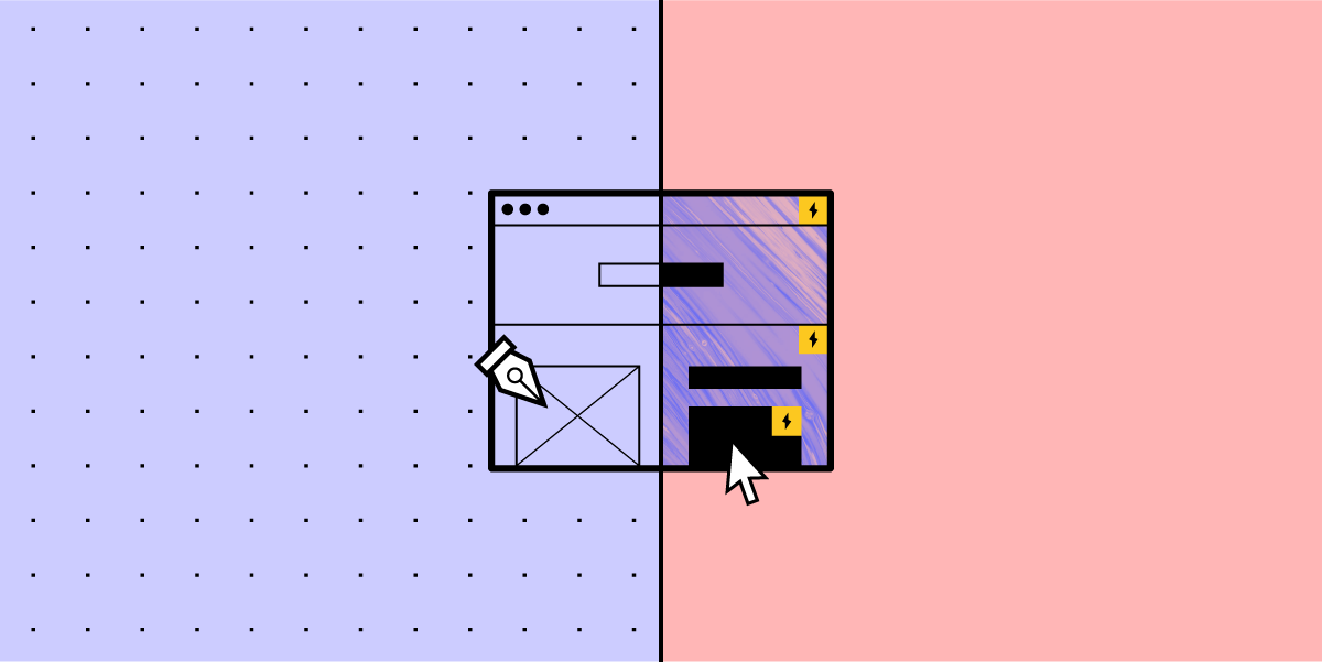


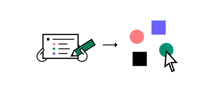

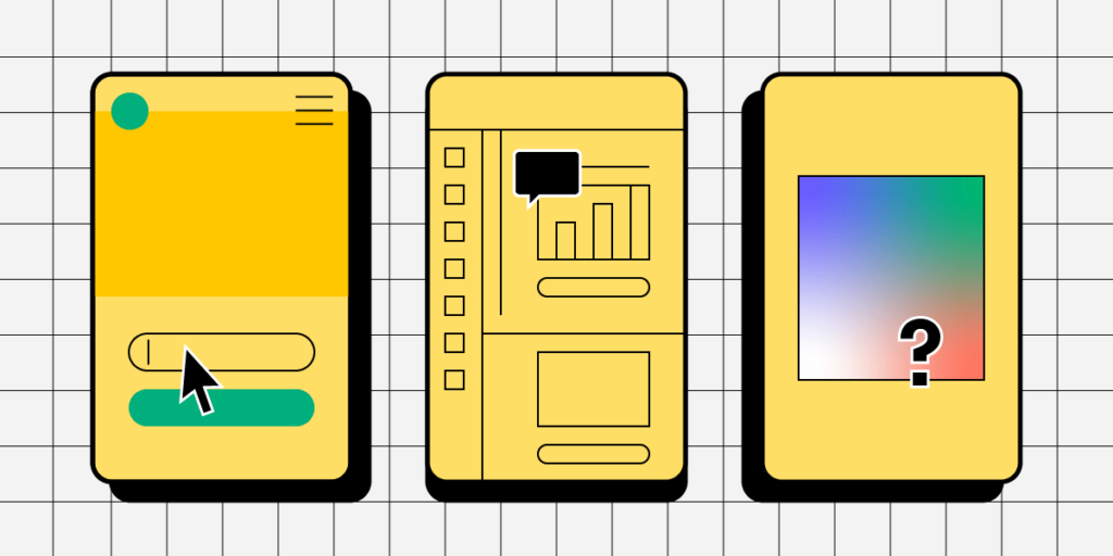

![4 Types of Website Scrolling Patterns Every Designer Should Know [2026]](https://studio.uxpincdn.com/studio/wp-content/uploads/2016/06/Scrolling.png)