A Guide to Creating Your First React App

A Guide to Creating Your First React App 1

Most developers can create their first React apps rather quickly because they already have experience using JavaScript. Let’s see how the two are related, what you need to build your first React app, and how to practice React.

Key takeaways:

  • Developers who know CSS and JS have easier time building their first app.
  • React is super popular and there are many resources that will help you build your first React app.
  • You can use UXPin’s Merge technology to create and test your React app prototypes.

Speed up development of your first React app with UXPin’s Merge technology. Bring React components to UXPin’s design editor and build fully functional prototypes that can be quickly turned into the real pp. Request access to UXPin Merge.

Design UI with code-backed components.

Use the same components in design as in development. Keep UI consistency at scale.

CSS and JS Give You Skills to Build First React App

Assuming that you know CSS and JS, you already have many of the skills that you need to understand a React app guide and start building your first app. If you feel confused at first, keep at it for a few days. Also, take time to read Thinking in React. Many developers say that it helps that the five-step tutorial helps immensely.

Top Reasons to Use React to Build Your First App

If you’re a beginning developer who enjoys using JavaScript to build apps, you may wonder why other people in your field get excited about React. You will discover the reason once you reach a point in your career where you need to build applications that perform complex functions. At some point, JavaScript becomes a huge pain because it doesn’t cater to the needs of today’s app developers.

You should build React app because it:

02 4
  • Offers reuseable components that will save you time in the long run.
  • Avoids the pitfalls of DOM.
  • Has a robust community of developers who freely contribute tools and advice.
  • Is rapidly becoming the industry standard.

Learning to build with React also gives you access to numerous design patterns. Some recommended patterns that you should learn from the beginning include:

  • Stateless components
  • Conditional rendering
  • Render props
  • Controlled components
  • React hooks

You can gain a more in-depth understanding of React design patterns by reading The Best React Design Patterns You Should Know About.

What are the Differences between React and JavaScript?

01 4

Despite the similarities between React and JS, you will have to overcome some hurdles before you can use React proficiently. Some of the differences that stand out the most include:

Difference #1: How you build a UI

In JavaScript, you create the interface in your HTML document, which reaches out to a server for your code. With React, you define the UI in the browser. At first, it feels unnatural to add such a short bit of HTML. Realistically, though, you get the same result. The difference is that React works within the browser, and JS needs help from a server.

Difference #2: How you divide functionally across apps

The ways developers use JavaScript have gotten so complex that JS code often looks unbearably complex. As a result, you end up keeping a lot of files open while working on the same app. React makes projects more manageable by splitting features into components. Each component holds all of the code that it needs to perform. As a result, you get code that looks more like a short list than a cluttered library.

Difference #3: How the app manages user data

When JS, data submitted by the user gets stored in a document object model (DOM) that the browser handles. For example, when you enter your name in a text field, the information goes to the DOM before transferring it to a server. React stores user data as variables. From the user’s perspective, nothing changes much. On the backend, data becomes much easier to manage.

What Else Do You Need to Build Your First React App?

If you have experience with JavaScript, CSS, and HTML, you’re already very close to using React. Before you can build anything with React, though, you need to install:

  • Node.js: an open-source runtime environment that allows developers to run JavaScript code on the server-side.
  • PowerShell: a scripting and automation framework that allows users to manage and automate various tasks in Windows environments.
  • npm: a package manager that simplifies the process of managing and distributing reusable code modules and libraries.
  • Create React App: it isn’t the only coding environment available, but it’s probably the best.

You might not need a toolchain for your first React project. However, you might want to check out options like:

All of these development tool kits will come in handy. You don’t have to use them, but you should. They will make your life a lot easier.

Practice Before Building Your First React App

No matter how many apps you have built with JavaScript, you will need more than a React app guide to start making applications in React. W3Schools has a primer that will teach you how to build a simple application.

You can gain more experience by:

Create and test your React app prototypes in UXPin

UXPin makes it easy for you to create and test React app prototypes. Check out Authoring and Managing JSX Presets to see how easy it is to test your code in UXPin. You just have to drop your components into the UXPin Editor canvas to determine whether they work as intended.

With UXPin Merge you can go even one step further and build whole designs using React as it lets you import and keep in sync coded React.js components from Git repositories to the UXPin Editor.

In short: whatever you can code in React, you can show in your prototype. Also, if you work closely with a design department, it’s extremely beneficial as the handoff process is shortened and friction in the communication process is gone.

test react app in UXPin

No matter how much app development experience you have, UXPin can help. Use the cloud-based tool’s collaboration feature to share your ideas with others. They can view your projects and leave feedback without creating their own UXPin accounts. As long as you give them the right link, they will have access to your prototypes.

You can also use UXPin to explore ideas before committing anything to code. Built-in libraries give you quick, easy ways to test features. If you like the way they work, you can build your own versions with tweaks that suit your product.

Design with live coded components that aren’t just flat symbols but are already production-ready and interactive. Request access to UXPin Merge.

What is Design-Driven Development?

design driven development

Prioritizing user experience and functionality has reshaped how we approach software creation, leading to the rise of design-driven development (DDD). This approach isn’t about aesthetics–it’s about understanding, empathizing, and delivering solutions that resonate with end users.

Key takeaways:

  • Design-driven development prioritizes user experience, transforming design from an afterthought to a guiding force in product creation.
  • A DDD approach ensures products resonate with end-users, reducing revisions and accelerating time-to-market.
  • Product design and functionality address real-world user needs rather than assumed wants.
  • Challenges in DDD arise from balancing aesthetics with utility, managing designer-developer handoffs, and navigating organizational silos.

UXPin’s Merge technology bridges the design-development gap, enhancing collaboration and facilitating realistic, user-centric prototyping. Deliver design-driven products that resonate with your users with UXPin’s Merge technology. Discover UXPin Merge.

Reach a new level of prototyping

Design with interactive components coming from your team’s design system.

What is Design-Driven Development?

Design-driven development (DDD) places design at the forefront of product creation. Rather than treating design as a mere aesthetic afterthought, DDD emphasizes its pivotal role in dictating the direction and functionality of software.

The industry’s shift from the rigid Waterfall model to the adaptive Agile project management framework highlighted the need for rapid iterations and user-centric solutions. DDD harnesses the power of design to guide these iterations, ensuring products function and resonate with end users.

Understanding DDD requires recognizing its impact on the software development lifecycle. Developers receive a clear roadmap from design teams early on. It informs new features, architecture, and even the code itself. The result? Products that your target audience loves, fewer revisions, quicker time to market, and a more streamlined development process.

What is an Example of Design-Driven Development?

code developer design 3

Consider the rise of a fictional startup, “FitStride,” aiming to revolutionize fitness tracking for urban walkers.

The traditional approach might begin with developers creating an algorithm to track steps and then building a basic user interface around this. The problem with this approach is that it makes many assumptions about the end product and its features–which FitStride may end up undoing or redesigning.  

FitStride’s team opts for a design-driven development approach to understand users’ needs and design appropriate solutions.

They start with user research. Urban walkers express frustrations over apps that don’t distinguish between leisurely strolls and brisk commutes. With this insight, UX designers craft an interface that lets users tag walking type and mood. They also include a feature suggesting optimal routes based on the user’s walking pace and intended mood, like ‘relaxed’ or ‘hurried.’

With a design in hand, developers now have a clear blueprint. They create an algorithm to differentiate between walking types and another to suggest routes. They ensure smooth integration of these functions with the interface.

Upon launch, FitStride garnered praise for its intuitive design and unique features, affirming the efficacy of a design-driven approach.

While this is a short fictional example, it demonstrates how the product development team used UX research and design insights to fulfill an actual human need.

How Does Design-Driven Development Work?

image 1

Understanding Design-Driven Development requires a dive into its step-by-step procedure. Each phase is instrumental in ensuring the user stays at the center of the development cycle. Here’s how it unfolds:

Step 1: User Research

The cornerstone of DDD is understanding the user primarily through:

  • Surveys and Interviews: Gather essential insights by engaging users in direct conversations (in-person or remote) and questionnaires. It’s not about asking what they want but understanding their pain points, needs, and aspirations. This information serves as raw data for decision-making.
  • User Personas: Synthesize data into representative user profiles after collecting it. These personas aren’t merely fictional characters but are informed by real feedback. Personas help teams visualize who they’re designing for, ensuring a clear, user-focused direction.
  • Journey Maps: Designers use personas to map user journeys. Mapping every user interaction allows you to pinpoint areas of friction and moments of delight. This exercise offers a holistic view of the user experience.

Step 2: Requirement Gathering

Clarity is crucial. This phase narrows the broad insights collected during the research phase, sorts, and prioritizes to guide next steps and design decisions.

  • Collaboration Between Stakeholders: A product’s success depends on aligning everyone’s vision. Regular touchpoints between developers, designers, and business stakeholders are imperative to ensure everyone is on the same page regarding user needs and business objectives.
  • Creating a Feature List: List potential features, always rooted in user needs. The aim isn’t to add as many features as possible but to select those that genuinely enhance the user experience.

Step 3: Design and ideation phase

  • Sketching and ideation: A cross-functional team collaborates to ideate on solutions. Input from team members with diverse skill sets and organizational goals ensures designers develop designs that serve users and the company.
  • Creating a design: Designers switch to a design tool to create wireframes and mockups. Wireframes decide navigation and architecture, while mockups refine UI design elements like buttons, menus, but also colors and fonts. In some cases, teams also collaborate with specialized external design partners—like agencies focused on dashboard UI/UX, landing page visuals, or WordPress Design Services for content-rich sites. These services can accelerate early-stage design exploration, particularly for projects where internal resources are limited.

Step 4: Prototyping and user testing designs

  • Tools and Platforms for Prototyping: Leveraging the right prototyping tool is vital for accurate user feedback. UXPin’s Merge technology enables designers to import React components into the design editor to build interactive prototypes that look and feel like the end product.
  • Gathering User Feedback: Using interactive prototypes, engage users to interact with the design. Their feedback reveals usability issues, business opportunities, and areas for improvement.

Step 5: Design handoff and development

  • Handoff Between Designers and Developers: Effective communication ensures the developers understand the design’s intent so that the final product aligns with user needs.
  • Design Systems and Component Libraries: Establishing a common design system ensures uniformity across the product, enhancing usability.

Step 6: Iterative feedback loop

Step 7: Launch and iterate

The journey doesn’t end at launch. Product teams must evaluate the design’s impact on the end product and real-world experience.

  • Release Strategies: Whether you opt for a phased rollout or a complete release, the strategy depends on user feedback and business goals.
  • Continuous Feedback and Iterative Development: Post-launch, the product evolves. Maintaining a feedback loop ensures the product continually aligns with user needs and market demands, refining and improving with every iteration.

What are Some Design-Driven Development Challenges?

image 2

Embracing design-driven development promises user-centric products, but the journey isn’t without challenges. 

Striking a balance between form and function

  • Challenge: Aesthetics matter, but an overly elaborate design can overshadow functionality, leaving users with a beautiful product that doesn’t serve their needs effectively.
  • Solution: Prioritize functionality as the foundation. Set a functional foundational layer and design elements that enhance user experience without compromising usability. Regularly testing designs with users can also highlight when form hinders function.

Ensuring seamless designer-developer handoff

  • Challenge: Miscommunication between designers and developers can lead to a product deviating from its intended design, wasting time and resources.
  • Solution: Implement regular touchpoints and reviews between designers and developers throughout the development cycle. UXPin’s Merge technology is an excellent tool for bridging the gap between design and development for smoother, seamless design handoffs.

Avoiding scope creep while meeting user needs

  • Challenge: As projects progress, it’s tempting to add features or make changes that weren’t initially scoped, potentially jeopardizing project timelines and budgets.
  • Solution: Maintain a laser focus on the defined user personas and their core needs. While feedback is invaluable, weigh each proposed change against its impact on the primary user goals. If a suggested feature doesn’t align with these goals, consider tabling it for future iterations or conducting further research.

Overcoming organizational silos

  • Challenge: In many organizations, departments work in isolation, creating disjointed processes that can stifle the collaborative nature of DDD.
  • Solution: Foster a culture of cross-functional collaboration. Regular workshops and joint sessions can encourage departments to understand and appreciate each other’s roles. Shared objectives and KPIs can also ensure everyone works towards a unified goal.

How to Enhance Your Design-Driven Development Process With UXPin Merge

Robust designer/developer and cross-functional collaboration is vital for a successful design-driven development strategy. Traditional image-based tools open rather than close this gap with a divide between static designs and interactive code products.

Bridging the design-development divide

In traditional DDD workflows, designers craft mockups that developers translate into code–a process prone to discrepancies. UXPin’s Merge technology switches this workflow by creating a code-to-design workflow where designers import code components into the design process, eliminating static image-based tools and successfully bridging the gap between design and development.

Facilitating rapid, informed iteration

Using Merge’s code components means designers can craft prototypes that accurately resemble the final product. This authenticity ensures accurate user testing and meaningful feedback based on realistic interactions and dynamic user experiences that are impossible to create with traditional design tools.

Ensuring cohesive stakeholder communication

UXPin Merge doesn’t just bridge the gap between designers and developers; it also offers a unified platform where stakeholders can review and comment. Product teams reduce miscommunication and overlooked suggestions by centralizing feedback using UXPin’s Comments and Slack integration.

Create a design-driven development workflow rooted in reality with UXPin’s Merge technology. Discover UXPin Merge.

Design System Contribution Model – How to Set it Up

design system contribution model

Navigating design system contribution can be challenging, often demanding coordinated efforts from multiple stakeholders. This article serves as a comprehensive guide, laying down the structured roadmap of a design system contribution model to standardize practices and ensure quality. From identifying key stakeholders to creating an agile workflow for contributions, it covers every aspect, including how tools can boost your contribution process.

Key takeaways:

  • A Design System Contribution Model standardizes how new elements are added to a design system, ensuring quality and consistency.
  • Governance, versioning, and documentation are essential elements in controlling and tracking the evolution of a design system.
  • UXPin’s Patterns feature accelerates the contribution process, allowing quick iterations and real-world testing of new design system components.

Streamline your design system contribution process while bridging the gap between design and development with UXPin’s Merge technology. Visit our Merge page for more details and how to request access.

Reach a new level of prototyping

Design with interactive components coming from your team’s design system.

What is a Design System Contribution Model?

A design system contribution model is a structured roadmap for adding or modifying new elements in a design system. It outlines:

  • Who can contribute
  • What qualifies for a contribution
  • How to go from proposal to implementation

This model standardizes practices, ensuring that the design system evolves in a consistent and controlled manner.

Why Do You Need a Design System Contribution Model?

Organizations use contribution models to overcome the challenges of decentralized digital product development using distributed teams. Design systems often span multiple teams and departments, from designers to developers to product managers. Without a structured approach to contributions, you risk inconsistencies, duplicated efforts, and the dilution of the design system’s quality.

How a Contribution Model Helps Evolve a Design System

The contribution model safeguards a design system’s integrity. It acts as a quality filter, ensuring that every addition aligns with the system’s goals and standards. Setting clear rules and processes helps coordinate multiple stakeholders, thus streamlining efforts and fostering collaboration. This model keeps the evolving design system coherent and efficient.

Who are the Stakeholders in a Design System Contribution Model?

mobile screens pencils prototyping

Here are five typical stakeholders for a design system contribution model:

  1. Designers
  2. Developers
  3. Product Managers
  4. Quality Assurance Engineers
  5. Stakeholders

Designers

Designers are the primary creators and curators of the design system. They contribute graphic elements, UI components, and layout templates. Their expertise ensures the design system aligns with user needs, style guide, and design language.

Developers

Developers implement the designs into reusable code. They ensure the design system remains technically feasible and efficient, turning design assets into functional components. Their contributions often include code samples, technical documentation, and updates on platform limitations.

Product Managers

Product Managers are the bridge between business objectives and design goals. They prioritize contributions based on project needs, timelines, and strategic alignment. By defining the scope and setting priorities, they control the rate and direction at which the design system evolves.

Quality Assurance Engineers

QA Engineers ensure that both the design and code meet quality benchmarks. They validate that contributions adhere to defined guidelines and don’t introduce errors or inconsistencies. Their role is critical for maintaining the design system’s reliability and integrity.

Stakeholders

Management includes executives and decision-makers who provide the resources and support for the design system. They may not contribute directly, but their approval often dictates the scope and scale of contributions. The design system team must inform and align management to ensure long-term investment in the system.

Examples of Design System Contribution Models

Example #1: Pluralsight

Pluralsight’s design system contribution model employs a structured approach, facilitating bug reporting through GitHub issues and feature proposals via bi-weekly meetups or GitHub. 

Contributing code follows a specific guide and demands adherence to coding conventions, thorough testing, and the use of the design system itself in new components. 

Submissions go through Pull Requests (PRs), which require review by the Design System team, often involving multiple rounds of feedback. The Design System team prioritizes the review of submitted PRs within a 7-day window and updates affected packages after merging. The process encourages teams to contribute regularly and real-world testing of the newly implemented features.

Example #2: Atlassian

Atlassian’s design system contribution model emphasizes participation and contribution. Participation includes open communication via Slack channels and bi-weekly Design System sparring sessions for robust feedback. 

The design system team only accepts specific contributions: code bug fixes, Figma library corrections, and documentation updates. It does not accept small enhancements or major changes.

The restriction on larger contributions is due to the time needed to consider the system-wide impact, but the company encourages engagement through participation channels for ongoing collaboration and support.

Example #3: GOV.UK

GOV.UK’s Design System has a strict contribution model that ensures high-quality components and patterns. Contributions begin with a proposal demonstrating a new component or pattern’s usefulness and uniqueness. Proposals meeting these criteria undergo a review by the Design System working group.

Before publication, the Design System working group scrutinizes the implementation to ensure it is usable, consistent, and versatile based on defined criteria, including user research, coding standards, and versatility across services.

For community resources or tools linked to the Design System, a set of checks ensures it has a clear owner, aligns with the system’s standards, and meets other requirements, including documentation and support.

Example #4: Zalando

Zalando’s design system relies on a contribution model that balances centralized governance with decentralized contributions. 

A central team called ZDS mainly maintains the design system and provides standard components and styles to feature teams. 

When these feature teams, which focus on different segments of the customer journey, identify a need for a new component or modification, they reach out to the ZDS team. Teams submit contributions, ranging from light (minor tweaks) to heavy (new components), through a Google Form that updates a GitHub board for tracking.

The contribution process is structured and involves multiple steps, including proposal, kick-off, collaboration, and review. ZDS hosts weekly meetings to review contribution tickets and provides “Open House” sessions for in-depth discussions. Communication and collaboration are essential, with contributors encouraged to document everything on GitHub and involve the right stakeholders for effective decision-making.

After ZDS finalizes a contribution, several steps ensure the update is well-communicated and integrated before merging the Pull Request. These include:

  • Updating the design system documentation and design files,
  • Showcasing changes in a weekly demo
  • Sending out email newsletters to keep both designers and developers in the loop.

This holistic approach ensures that Zalando’s design system is consistent yet flexible to the needs of a large organization.

Example #5: Nord Health

Nord’s contribution model balances centralized governance and community input. Product teams can propose new features or design tweaks that fit their needs, while a central design system team oversees the overall direction, ensuring quality and consistency. 

The design system team categorizes contributions into light, medium, and heavy. Teams submit their ideas through a contribution ticket that syncs to an issue tracker backlog for review every Monday.

The contribution process involves multiple steps, starting with an initial conversation to understand the requirement and avoid rework. The design system team schedules a kick-off meeting for medium and heavy contributions to finalize the scope and timelines. Nord values collaboration and often pairs its team members with the contributing product team to focus on specific requirements.

Nord provides a comprehensive set of tools and guidelines for contributors, from a Figma Design file and GitHub repository to Slack channels and various design guidelines. These supporting resources facilitate a smooth contribution process and ensure all new additions align with Nord’s high standards for accessibility, usability, and design consistency.

What do you Need to Create a Design System Contribution Model?

Governance: Who owns the design system?

Ownership determines control and accountability. Designate a core team to govern the design system. This team sets guidelines, approves contributions, and ensures the system meets user needs and business goals. Without clear ownership, you risk creating a fragmented system.

Versioning: How to manage updates?

Control design system updates through a robust versioning strategy by implementing semantic versioning to differentiate between minor tweaks, feature additions, and breaking changes. This approach minimizes disruption while allowing the system to evolve and adapt.

Version control prevents conflicts and keeps everyone on the same page.

Documentation standards: What should be included?

Each component or guideline should have documentation detailing its purpose, usage scenarios, and limitations. A well-documented system accelerates onboarding and encourages consistent implementation across projects.

Read this article to learn more about documenting design systems.

How to Create a Design System Contribution Process

success done pencil

The design system contribution process is a structured workflow that guides how team members propose, develop, review, and integrate new features (components, patterns, guidelines, etc.) into the existing design system.

This process involves initial evaluation based on set criteria, an internal review of proposals, a collaborative phase of design and development, and a final review and approval by designated stakeholders.

Here are five key steps of a typical contribution process or workflow.

Perform initial evaluation

  • Decide what you aim to contribute–a new UI component, design pattern, or a set of guidelines. Clearly defining the type of contribution filters out irrelevant or redundant inputs right from the start.
  • Set rigid criteria for what makes a valid contribution. Criteria could range from code quality to relevance and usability.
  • Create a checklist to evaluate contributions quickly. If a contribution fails the checklist, it doesn’t proceed to the next stage. This step saves time and ensures quality.

Make a plan

  • Outline the submission process. Use templates to standardize proposal submissions, ensuring contributors provide all necessary information.
  • Describe your internal review process, including automated checks, peer reviews, and reviews from governing teams.

Pitch it in a presentation

  • Invite stakeholders for a feedback round. This step ensures the proposal aligns with both user needs and business goals.

Design the contribution model

  • Clarify the collaboration process between designers and developers. Pinpoint which tools facilitate effective communication and design handoffs.
  • Specify the tools and platforms teams must use in the development and design stages. Uniform tools enhance collaboration and reduce friction.

Seek approval

  • Determine how many review cycles a contribution goes through and what each process entails. Multiple rounds can ensure rigor but avoid needless complexity.
  • State who decides whether a contribution gets accepted or rejected–typically the governance team or a lead stakeholder, maintaining the system’s integrity.

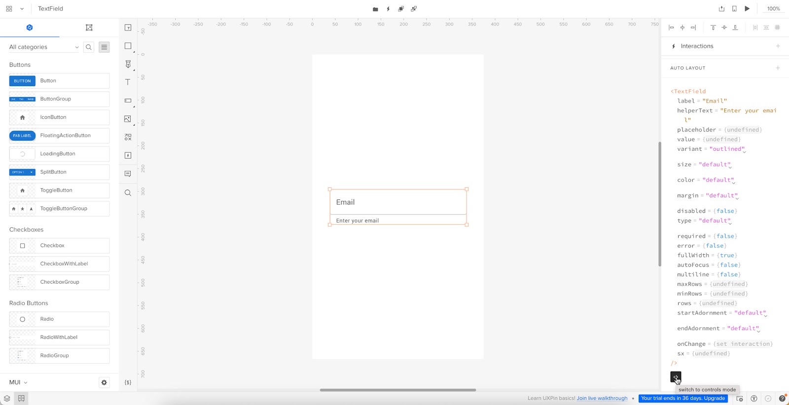
Streamlining Design System Contribution with UXPin

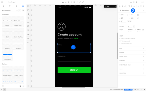
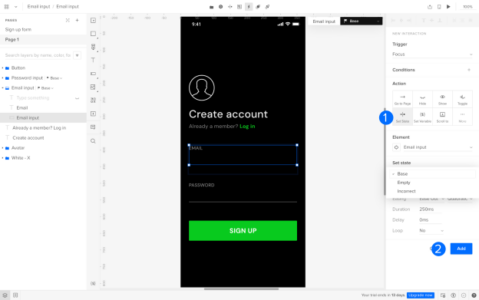
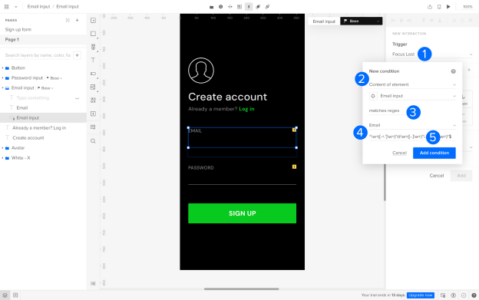
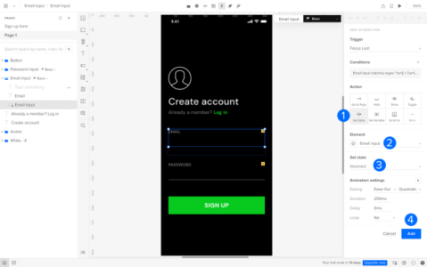
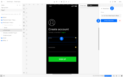
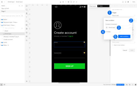
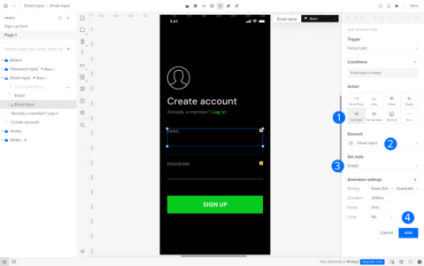
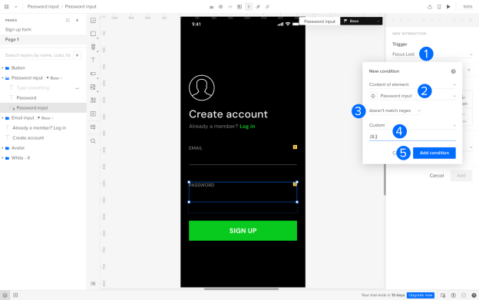
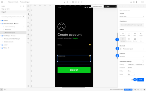
UXPin’s Patterns streamlines contribution by empowering designers to prototype and test code components in the design process. It eliminates the need to develop new patterns and components before testing, letting designers instantly create, test, and share new patterns by combining existing Merge UI elements. 

For example, a team working on an eCommerce platform can quickly assemble a new product card for the homepage with updated micro-interactions, use Patterns to save it, and pass it to developers and other designers for immediate feedback and implementation.

This agile workflow accelerates the contribution process, allowing quick iterations and real-world testing. UXPin’s Patterns feature ensures that all contributions are not just theoretical but immediately usable, bridging the gap between design and development teams. By using Patterns, you’re not just contributing to a design system–you’re making it more dynamic, collaborative, and aligned with the needs of your evolving product.

Evolve your design system with the world’s most advanced UX design tool. Visit our Merge page for more details and how to request access.

React for Designers – A Designer’s Guide to React

React for designers

Learning React for designers–is it necessary? Can you build code prototypes without learning to code? These are common questions among product development teams and designers.

Most designers don’t want to learn to code. Learning React or even the basics of HTML, CSS, and Javascript takes a lot of time. A designer’s time is better spent investing in user experience and solving design challenges.

It’s a bit of a catch-22 because to improve usability testing and user experiences, you need high-quality prototypes that look and feel like the final product–something image-based tools don’t facilitate. For most designers, better prototyping capabilities drive the motivation to learn React.

What if you could get all the benefits of React for prototyping and testing without relying on engineers or writing code yourself? A solution already exists with UXPin Merge!

Key takeaways:

  • React is a library that helps devs build interfaces with reusable components which makes apps scalable and easy to maintain.
  • Designers can learn React to better understand development; there’s even a movement “React for designers” that advocate for this.
  • Designers don’t need to learn React if they use UXPin Merge–a powerful design technology that lets them create prototypes with coded React components just as if they would use pixel-based UI components.

UXPin Merge allows you to sync UI coded components from a Git repository, npm or Storybook into UXPin’s design editor so designers can use the same UI elements (React, Vue, Angular, etc.) that engineers use for development. Learn how to request access to this revolutionary technology. Visit our Merge page.

Reach a new level of prototyping

Design with interactive components coming from your team’s design system.

What is React?

React is an open-source front-end Javascript library developed by Facebook. According to an August 2022 survey, React is still the most widely-used front-end framework–a position React has held for several years.

React’s component-based workflow enables engineers to create reusable components they can call anywhere in a user interface by writing a single line of code. This component-based approach makes React an excellent framework for component libraries and design systems.

What is React for Designers?

design and development collaboration process product communication

React for designers is a movement to educate designers about React and other front-end frameworks. The idea is that learning React will empower designers to build interactive prototypes or, at the very least, better understand technical constraints and the development process.

Should Designers Learn React?

Designers don’t need to learn React, but if they take an introductory course, they can gain many attractive benefits.

Here are four common reasons why designers learn React:

#1: Career development: programming expertise is advantageous if you plan to climb the corporate ladder–even within Design. The higher you climb, the more important it is to learn the technical aspects of product development for communication, collaboration, and decision-making.

#2: Higher paying jobs: a natural transition for a UX designer who codes is to a front-end developer or UX engineer. According to Glassdoor, the average UX designer makes under $100k in the United States, while the average UX engineer earns over $120k. On average, engineers earn more than designers. Design and development expertise increases your value to an organization and earning potential.

#3: Skills development: understanding the engineering aspects of digital product development can improve cross-functional collaboration. Learning React can also help designers understand technical impacts on user experience and how to solve these problems during the design process.

#4: Better prototyping: unfortunately, image-based design tools limit what designers can test during the design process. To improve prototyping capabilities, designers must rely on engineers to build code-based prototypes–a time-consuming and expensive process. Designers who code can make these prototypes themselves to enhance usability testing.

UXPin Merge – The Fastest Way to Design with React

UXPin Merge allows designers to import React (and other frameworks) component libraries into UXPin to build fully functioning React prototypes–without writing a single line of code!

logo uxpin merge 1

Designers use these React components in UXPin like any other design tool, dragging and dropping UI components to build user interfaces. The only difference is that Merge components are fully interactive and include colors, spacing, typography, sizing, and other properties defined by the component library or design system.

What do React components look like in UXPin?

This text field from MUI’s component library demonstrates how designers see and edit React components in UXPin. The text field is fully functional and ready to prototype out of the box.

build React prototype in UXPin Merge

The properties displayed in UXPin’s Properties Panel relate to React props from the component library’s repository. Designers can switch modes and view the component’s React props in JSX. 

preview React props in UXPin

This JSX also makes design handoffs much easier because engineers simply copy/paste the code for front-end development.

Code-based vs. image-based design tools

Image-based design tools use plugins and extensions to bring React to design, but the generated code is rarely usable for engineers. Why? Because these plugins scan UIs and “guess” what the code should be. There are many ways to develop React components, so this code is usually redundant, meaning it’s faster for the engineers to code from scratch than restructure plugin-generated code.

Read more: Design to Code or Code to Design?

UXPin is a code-based technology, meaning it renders code as it’s written in the repository instead of vector graphics. Engineers already have exact versions of the components in their repo, so it’s a matter of adding the component library as a project dependency and copying the JSX from UXPin to develop the final product.

UXPin Merge technology gives designers all the benefits of prototyping a React app or website without learning React!

Examples of Companies Prototyping with React Components

From startups to agencies, and enterprise design teams, here are examples of companies prototyping with React components during the design process.

PayPal

PayPal’s internal product development team switched to UXPin Merge in 2019. Erica Rider, UX Lead EPX at PayPal, discovered Merge while looking for tools and systems to scale her 5-person UX team, which serviced 60+ products and supported 1,000+ engineers!

PayPal uses a React Fluent UI design system with custom components, patterns, and templates. Erica and her team have built the library to minimize design decisions, so product teams only focus on creating products to solve user problems.

The system works so well that PayPal’s product teams build one-page prototypes 8X faster than experienced UX designers using image-based tools could previously.

“Before, with our limited resources and designers, a one-page product would take two or three months just to design mockups. Now product teams can design and deliver a product within the same time frame.”Erica Rider – UX Lead EPX at PayPal.

TeamPassword

TeamPassword uses UXPin Merge slightly differently. With no UX team, TeamPassword’s engineers must do all the prototyping and testing. The two-person team used to do this with code, but it took a lot of time to test, edit, and iterate.

TeamPassword’s engineering team now uses UXPin Merge for developing and testing new products using a custom MUI component library. With production-ready React code, TeamPassword’s engineering team saves significant resources by not writing front-end code to deliver new products and UI updates.

dotSource

German-based digital product consulting and development agency dotSource uses UXPin’s Storybook Integration to import libraries for multiple frameworks, including React, Vue, Angular, Ember, etc. This flexibility means dotSource’s design team can use UXPin Merge with almost every client and product the company collaborates on.

One of the most significant benefits of using UXPin Merge is that design system properties are “baked in” to every component. As an agency collaborating with various organizations and their internal teams, these baked-in React properties create constraints that guarantee ultimate UI consistency.

Using code components in the design process also makes cross-functional collaboration easier for dotSource’s teams while facilitating smooth, effortless design handoffs–which are usually more challenging when working with external contractors.

Iress

Financial services software developer Iress uses UXPin Merge to create a single source of truth for the organization’s design system. With designers and engineers using the same component library, there’s better cross-functional alignment and understanding of technical constraints.

“UXPin Merge will help us create more interactive and realistic prototypes. People can tab around or see the same interactions – hover styles, animations, etc. – as they would expect in a real app. We can do more insightful user testing and discover usability issues much earlier in the process.” Nick Elliott – Design System Product Owner and Regional Head of Product Design at Iress.

Like PayPal, Nick sees the benefit of UXPin Merge for non-designers “It will give non-designers access to a tool, whereby they can also experiment and have exposure to the same design considerations.”

Try React Prototyping Tool

There are three ways designers can get started designing with React components using UXPin Merge:

  • npm Integration: import open-source React component libraries available as npm packages into UXPin using the Merge Component Manager (the quickest and easiest way to get started as a designer).
  • Git Integration: sync a React repository directly to UXPin. Requires engineering collaboration to set up.
  • Storybook Integration: supports more front-end frameworks via Storybook, including Vue, Angular, React, Ember, and more.

Designers can also take advantage of UXPin’s MUI integration which comes standard with all Merge plans.

Ready to get started? Visit our Merge page for more details and how to request access.

Code or Design – Which is a Better Source of Truth?

Code or Design

The global design system’s community, Into Design Systems, hosted a webinar in July 2023 where guest speaker Marcel Bertram talked about “Systematic Design With Code.” Marcel made some interesting comparisons about designing using vector-based vs. code-based design tools and how organizations can use the latter to create a single source of truth.

Into Design Systems is a virtual design systems conference for the global Design and DesignOps community, including designers, developers, Design Leads, design managers, DesignOps practitioners, and many others. The community-driven initiative shares knowledge to help evolve the industry and its members.

Marcel Bertram is a Brand Design Specialist leading the Design System team at a global automobile manufacturer. He is also the Co-Founder & UX Coach at MUDX.design, a consultancy for UX Design Operations.

This article is based on Marcel’s Into Design Systems live titled “The Power of Design, Code & Ai in Design Systems.” We have summarized Marcel’s talk into its key points, but you can watch the entire 3-hour webinar here.

Key takaways:

  • Vector-based design tools arose from a need to provide scalability and clarity across different resolutions in the digital landscape.
  • The release of UXPin’s Merge technology in 2019 marked a significant shift in design paradigms, blending code components directly into the design process for a unified UI library.
  • Recognizing code as the “source of truth” ensures consistency, efficiency, and a holistic understanding of application mechanics across design and development teams.
  • German-based software agency dotSource utilized UXPin Merge to bridge the gap between design and development, synchronizing code, design, and documentation.
  • UXPin’s Merge technology advances modern prototyping, enabling designers to test realistic user interactions and gain accurate insights during the design process.

Use coded components as a single source of truth between designers and developers. Bridge the gap in the process and release products faster. Learn more about it. Discover UXPin Merge.

Reach a new level of prototyping

Design with interactive components coming from your team’s design system.

Why Are There Vector-Based Design Tools?

In the early days of digital design, there was a pressing need to replicate the precision of physical art. Instead of constructing images from tiny dots, as pixel-based methods do, vectors use mathematical equations to shape graphics. As a result, these images stay sharp and scalable, no matter how you adjust their size.

Traditional graphic design laid the groundwork for vector tools. The industry adopted tools like Adobe Illustrator because they consistently delivered crisp visuals across platforms and resolutions. As the need for adaptable designs surged with the rise of websites, applications, and digital ads, designers naturally gravitated toward vector-based tools. Their choice wasn’t just aesthetic–it addressed the practical demands of the digital landscape.

The code-based revolution

While vector-based tools have helped get us to where we are today, they haven’t evolved to bridge the gap between design and development–until the release of UXPin’s Merge technology in 2019

Merge’s code-based approach brings code components into the design process, so designers can use the same UI library for prototyping as engineers to develop the final product.

Vector-Based vs. Coded Design Systems

Digital product design is slowly shifting from traditional vector-based systems to the innovative code-based approach. The integration of code in the design process has changed how developers and designers collaborate, streamlining the entire product development process. 

Let’s explore this evolution and understand its implications on design systems and prototyping.

Understanding vector-based systems

What are they?

  • These are tools that use mathematical equations to represent images in computer graphics. Popular examples include Figma and Adobe Illustrator.

Advantages:

  • Suitable for static prototyping and visual designs.
  • Intuitive for designers to visualize, draft, and make rapid alterations.

Limitations:

  • Lacks the dynamism of real-life applications.
  • Can’t always accurately emulate user interactions, transitions, or advanced component behaviors.
  • Doesn’t represent the intricacies and possibilities of code.

Understanding coded design systems

What are they?:

  • Design tools that use actual coded components on the design canvas, like UXPin.

Advantages:

Limitations:

  • Only the design system team can implement changes–which is good for governance.

Code as the Source of Truth

The final digital product is based in code. Developers work with code. The design team uses a vector-based tool, creating a gap between them and the final product. Therefore, recognizing code as the central reference point or the “source of truth” is pivotal.

This philosophy ensures:

  1. Consistency and cohesion: Ensuring that designers and developers draw components from the same repository ensures uniformity across the board.
  2. Efficiency: With everyone referencing the same library and documentation, there’s less room for miscommunication or discrepancies.
  3. In-depth understanding: Encourages designers to understand the core mechanics of how applications function, fostering a more holistic design approach.

A Single Source of Truth with UXPin Merge – dotSource’s Case Study

uxpin merge component sync 1

Before switching to UXPin Merge, German-based software development agency dotSource had a problem:

Promoting new patterns and components to a design system involves many redundant processes. Most design system releases require updating in at least three places:

  1. The design system’s codebase (component library)
  2. The design team’s UI kit (design tool)
  3. The design system’s documentation

“Instead of a ‘single source of truth’ that gives ‘three single sources of truth’ for every UI component–this seems counterintuitive and increases errors. If the design system’s update process and technologies don’t align, the team ends up with redundant work because a single change requires three updates.”

dotSource found the only solution to this problem was to implement a code-based design process, creating a true single source of truth between design and development.

The company uses Merge technology to import a product’s design system into UXPin so designers can prototype using code components.

“We use UXPin’s Storybook integration, which allows designers to use our design system’s Storybook components in UXPin’s design editor. The result: a perfect synchronization of code, design, and documentation, making it possible for:

  • Designers to participate in QA and help developers identify bugs
  • Close collaboration between designers and engineers
  • Better testing and faster iterations with high-fidelity interactive components (component-driven prototyping)”

Modern Prototyping – Static vs. Interactive

code developer design 3

Static prototyping

Using vector-based tools like Figma works well when the objective is to gauge comprehension or aesthetics. It provides a static visual representation without intricate interactive layers.

Designers typically move from a vector-based tool to a prototyping tool, which adds costs and operational burdens, and they still don’t achieve results comparable to code.

Interactive prototyping

Code-based design tools increase prototyping scope for more comprehensive functionality and user journey tests. Tools like UXPin can emulate real interactions, toggle functionalities, input field behaviors, and more, offering a realistic user experience.

UXPin’s Merge technology goes beyond what you can see into how a prototype feels in a real-world scenario. Design teams can use insights from testing to iterate and improve with greater accuracy. Designers enhance usability and can identify more business opportunities during the design process, increasing their value to the organization.

Transitioning to a Code-Based Design Workflow

prototyping elements components

The world of digital design is vast and ever-evolving. While vector-based tools serve their purpose in initial design phases, embracing the advantages of coded design system systems is the way forward. This integrated approach reduces inefficiencies and miscommunications while ensuring a more authentic user experience during testing.

As designers and developers continue to collaborate, it’s crucial to remember that our ultimate goal is to craft user-centric, efficient, and aesthetically pleasing applications. Understanding and utilizing the right tools is a significant step in that direction.

Increasing design system maturity with UXPin Merge

UXPin’s Merge technology currently leads the code-based design revolution with tools and features that meet the needs of modern product development teams.

It can take years for organizations to reach full design system maturity–a fully integrated system with designers and developers using the same UI library and documentation. Most never get there, maintaining multiple sources of truth like our friends at dotSource.

UXPin Merge is the bridge to that gap. Organizations can create a fully integrated design system from the start, circumventing many years of wasted resources.

With UXPin Merge, you can:

Ready to join the code-based revolution? Visit our Merge page to learn how to create a single source of truth for your design system and develop better product experiences for your users.

Multi-Brand Design System – How to Get Started

multi brand design system

Developing digital products from scratch requires a lot of resources. Multi-brand design systems enable organizations to build once, duplicate, and customize–saving thousands of design and development hours.

This centralized approach to design systems means organizations can share costs across different brands while providing a framework to enter markets with new products much faster.

Sync your component library with UXPin’s design editor using our revolutionary Merge technology to create a single source of truth across design and development. Visit our Merge page to learn more and request access.

Reach a new level of prototyping

Design with interactive components coming from your team’s design system.

What is a Multi-Brand Design System?

A multi-brand design system is a set of guidelines, assets, and rules that allows for the efficient and consistent user interfaces across multiple brands or sub-brands within a larger organization. Multi-brand DS ensures harmony and efficiency in the design process while allowing each brand to shine with its unique personality within the broader context.

How Does it Differ from a Standard Design System?

GroupUI used internal Volkswagen research to compare multi-brand vs. regular design systems, discovering that “multi-brand design systems share costs and enable real collaborative development.”

The results across four key metrics were staggering when comparing multi-brand vs. regular design systems:

  • 25% cheaper and faster UI design work
  • 30% increased development efficiency & efficacy
  • 30% reduction in future managed costs
  • 3-4 times faster to market

But for us, there’s one word that sets them apart–flexibility. Multi-brand design systems are optimized for flexibility, enabling product teams to leverage an existing component library to develop products for another brand.

Conversely, companies build mono-brand design systems around principles and constraints that limit flexibility. These limitations ensure designers deliver projects to high standards of quality and consistency.

Facilitating change through design tokens

Most multi-brand design systems use design tokens to facilitate global styling changes, for example, adapting colors, typography, corner radius, spacing, etc., to meet brand requirements simply by modifying the token’s property.

In this way, multi-brand design systems share a lot of parallels with themeable open-source component librariesbuilt to facilitate change. A multi-brand design system is essentially a template or toolkit with an adaptable codebase, design language, and brand guidelines.

Multi-Brand Design System Examples

1. Forge from Harry’s

Using design tokens is one aspect of a multi-brand design system. Organizations must also make the component library customizable. Personal care brand Harry’s used Brad Frost’s Atomic Design (or layering as they call it) approach to build its multi-brand component library, Forge.

Forge uses two layers:

  • Base layer (or sub-components): “flexible base components that cannot be deconstructed further.” Product teams only change styling properties for these base components–possibly through design tokens.
  • Complex layer (“second layer “): “multiple base components arranged in specific and opinionated ways.”

By structuring components in “layers,” Harry’s built a multi-brand component library that enabled product teams to keep brand-agnostic layers and swap brand-specific ones to customize user interfaces.

Forge’s layered-component structure also facilitates flexibility because individual brands can use sub-components like Lego blocks to build a design system for a new product.

“With the Forge, brands are free to combine sub-components to create solutions tailored to their users without requiring any changes to the component library.”Mae Capozzi, Senior Software Engineer at Harry’s

Forge’s design system governance offers product managers four options for promoting new patterns:

  • Existing Option A: Build custom components
  • Existing Option B: Try to reuse components from the existing codebase
  • New Option C: Assemble “new” components out of Forge base components
  • New Option D: Use an out-of-the-box Forge component

2. Volkswagen’s GroupUI

Volkswagen’s GroupUI is a multi-brand design system serving some 15+ brands. At the time of recording a webinar with Into Design Systems in 2022, only several of Volkswagen’s brands had adopted GroupUI, including VW, Skoda, Audi, Porche, Man, Scania, and RIO.

Unlike a tech company, Volkswagen has many design layers, including real-world (tangible) products and digital products. 

“You have to bring two things together-the vertical harmonization of touchpoints within one brand. For example, the harmonization of in-car HMI, web applications, and apps, plus some internal VR/AR applications. And then the horizontal harmonization of technology.”Thorsten Jankowski, User Experience Lead Group IT, Volkswagen AG.

Volkswagen has multiple touchpoint layers within each brand, including:

  • Web technology
  • Native applications
  • AR & VR driver systems
  • Automotive UIs

GroupUI focuses on web technology but must align with each brand’s vertical as much as possible to create a consistent user experience across every touchpoint.

For example, when a customer purchases a vehicle through a brand’s website, the user experience and UI must be consistent from website to email marketing and in-car user interfaces.

GroupUI’s Multi-Brand Design System Principles

To achieve this level of flexibility and customizability while maintaining a consistent brand experience across every vertical and touchpoint, GroupUI developed a set of “overarching principles:”

GroupUI’s over overarching principles help guide the group through three pillars that intersect toward a common goal:

  • Flexibility
  • Collaboration
  • Transparency

Flexibility over rigidity: GroupUI is framework-agnostic, meaning brands can adopt a framework (React, Angular, Vue, etc.) that best serves their purpose and goals. To achieve this, GroupUI’s core component library uses Web Components, is token-based, and facilitates Snowflakes.

Global collaboration over stakeholder focus: GroupUI aims for “continuous evolution as a common goal” by putting the group’s needs ahead of a single brand or stakeholder. This generic strategy increases trust. GroupUI’s team works continuously on evangelism and distribution to promote generic over brand-specific implementation.

Transparency over complex documentation: GroupUI uses a centralized backlog for issues and design solutions. This centralization reduces silos vertically within each brand and horizontally across the entire group while facilitating an ecosystem for brands to learn and evolve together.

3 Tips for Building a Multi-Brand Design System

Tip #1: Use fewer tools to increase adoption

The first step to building a multi-brand design system is minimizing design tools! More tools mean the design system team must maintain multiple platforms.

When News UK built its multi-brand design system for The Times, The Sun, Virgin Radio, and The Sunday Times, to name a few, Nick Dorman, Head of Design Systems, found that using multiple tools resulted in a “disjointed solution.” Implementing simple changes would take days or weeks because the DS team had to update and verify changes across each platform systematically.

News UK chose an image-based design tool which helped unify Design but still meant they had to maintain two design systems:

UXPin Merge is a far better design tool solution for multi-brand design systems. Merge syncs a component library hosted in a repository to UXPin’s design editor, so designers and engineers use the same UI elements. Any updates to the repo automatically sync to UXPin, notifying design teams of the changes–creating a single source of truth across design and development. 

Tip #2: Choose a framework-agnostic design system

As we learned from Volkswagen, a framework-agnostic design system allows brands to use a tech stack that best serves their needs. GroupUI supports Web Components/HTML, Angular, and React–the three frameworks used across Volkswagen’s brands. Brands can preview these components through a centralized Storybook, including guidelines and documentation.

Like Forge, GroupUI’s design system works in layers so teams can build components to meet their needs. A brand theme defines each component and nested component’s properties.

Designers can also benefit from a framework-agnostic design system with UXPin Merge. Merge’s Storybook integration enables design teams to sync any Storybook-compatible framework with UXPin’s design editor–eliminating the need for creating UI kits.

At design handoff, engineers install the framework’s package, apply the appropriate theme and copy component changes rendered by UXPin to complete front-end development.

Tip #3: Adopt atomic design methodology

Adopting an Atomic Design methodology is an excellent strategy to future-proof your multi-brand design system. Volkswagen, Harry’s, and News UK applied Atomic Design principles to build flexible, themeable design systems.

The idea is to create a base layer of core components or building blocks that never change. Engineers nest these core components inside a themed master component to apply brand-specific styling via design tokens.

This example from Volkswagen shows two tab patterns. One for Porsche, the other for Volkswagen. Notice how the tab patterns and nested components are identical; only the theme property changes for each brand.

Volkswagen example of tab patterns

Building components and patterns using this Atomic methodology make it easy to scale the multi-brand design system while providing each brand with a framework to scale individual design systems.

Build Your Multi-Brand Design System With UXPin Merge

Multi-brand design systems are complex beasts with lots for design system teams to consider. The design system team must find ways to simplify workflows, reduce tools, and minimize time-consuming tasks.

As we saw with News UK, using multiple tools creates a massive burden for design system teams updating and maintaining several platforms. 

UXPin Merge solves this design tool challenge by providing designers with a single design, prototyping, and testing solution. No plugins or extensions–everything design teams need is built-in.

Merge has the added benefit of syncing design and development to create a single source of truth across every brand–impossible to achieve with traditional image-based design tools.

With UXPin Patterns, design teams can combine building blocks from a multi-brand design system to promote new patterns for the component library. UXPin Patterns is also helpful for saving multiple component variants, so designers can save time during prototyping by dragging and dropping elements to find the right solution fast!

Sync design and development while unifying multiple brands through a single component-driven design solution. Discover UXPin Merge.

How to Become a Product Designer

how to become a product designer

Are you navigating the journey to becoming a product designer? This guide reveals the product design essentials you’ll need to master, from skills and qualifications to networking and career progression. Discover how to align business goals with user needs, craft compelling products, and grow in the ever-evolving product design landscape.

Key takeaways:

  1. Mastering a mix of hard and soft skills, from wireframing to effective communication, is crucial for a successful career in product design.
  2. Formal education in design or computer science can provide a strong foundation, but alternative paths like online courses and self-study are also viable.
  3. Networking through industry events and communities and finding a mentor can fast-track your professional growth.
  4. Career progression in product design often moves from junior roles to specialized or managerial positions, with each stage demanding different levels of expertise.
  5. A well-crafted resume and interactive portfolio can make you stand out in job applications, so focus on tailoring your experience and showcasing quantifiable achievements.

Stand out from the crowd with interactive prototypes using the world’s most advanced product design tool. Sign up for a free trial to explore UXPin’s features and further your design skillset.

Build advanced prototypes

Design better products with States, Variables, Auto Layout and more.

Try UXPin

What do Product Designers do?

A product designer strategizes, conceptualizes, and delivers solutions that solve user problems. They align business goals with user needs, navigating the product lifecycle from market research to final execution.

Product designers map user flows, create wireframes and craft high-fidelity prototypes. Beyond visuals, they often work with cross-functional teams, including developers, UX designers, and product managers, to bring a product from idea to market.

Is product design the same as a UX designer?

Unlike UX designers, who focus mainly on the usability and functionality of a product, product designers own the entire design process. This ownership goes beyond user experience to include user interface design and often front-end development.

Where UX designers focus on the user experience, product designers look broader on the entire customer experience. They must understand how customers enter and exit the customer lifecycle to optimize usability and profitability.

What is the role of a Product Designer?

These core responsibilities reflect the full-spectrum ownership that a product designer has over the design process:

  • Market Research: Identifies user needs and market gaps to inform design strategy.
  • Wireframing: Creates basic layout structures to guide the project’s visual and content elements.
  • Prototyping: Develops high-fidelity prototypes to visualize the end product and conduct usability tests.
  • User Testing: Executes user interviews, usability tests, and surveys to gather insights for design iteration.
  • Design Handoff: Coordinates with developers, supplying all visual assets and design specifications for coding.
  • Quality Assurance: Reviews implemented designs in the development environment to ensure they meet design specifications.
  • Cross-Functional Collaboration: Works with product managers, UX designers, and developers to align goals and deliver a unified user experience.
  • Documentation: Creates and updates design specifications and libraries, ensuring team members implement designs consistently.
  • Performance Metrics: Monitors KPIs like user engagement and conversion rates to measure the design’s impact.

What Skills Do You Need to Be a Product Designer?

Hard Skills

  • Sketching & Wireframing: Mastery of sketching techniques to visualize design ideas rapidly.
  • Prototyping Tools: Proficiency in design tools (UXPin, Figma, Adobe XD, Sketch, etc.) for high-fidelity prototyping.
  • Coding: Basic knowledge of HTML, CSS, and JavaScript helps create interactive prototypes and enhances communication with developers.
  • Design Systems: Understand how to build and maintain a scalable design system.
  • User Research: Able to conduct user interviews, surveys, and usability tests.
  • Data Analysis: Skills in interpreting analytics data to make informed design decisions.
  • Responsive Design: Expertise designing user interfaces that adapt to various screen sizes.
  • Visual Design: Command over UI design elements like typography, color theory, and grid systems.

Soft Skills

  • Communication: Clear articulation of design choices and the ability to persuade stakeholders.
  • Problem-Solving: Exceptional analytical skills to identify problems and conceive practical solutions.
  • Collaboration: Works seamlessly in cross-functional teams and understands the value of collective input.
  • Time Management: Balances multiple projects and deadlines without sacrificing quality.
  • Empathy: Tuned into user needs, motivations, and pain points for user-centric design.
  • Adaptability: Open to change and quick to adopt new tools or processes as needed.
  • Attention to Detail: Ensures no design element is overlooked, contributing to a polished end product.

What Qualifications do I need to Become a Product Designer?

success done pencil

There are many pathways to becoming a product designer. You can go the formal education route and get a degree or use online resources and courses to educate yourself.

Formal education

  • Bachelor of Fine Arts (BFA) in Graphic Design: Provides a strong foundation in design principles and visual communication.
  • Bachelor’s Degree in Interaction Design: Focuses on designing interactive digital products.
  • Master of Fine Arts (MFA) in Design: For those looking to specialize further and gain a competitive edge.
  • Bachelor’s in Computer Science: Gives you a foundational understanding of programming and development, which can make you more effective in designing digital products.

Online design courses and workshops

  • Coursera: Offers courses from universities and colleges on product design.
  • Udemy: Specializes in shorter, practical courses on specific design tools or techniques.
  • General Assembly: Provides intensive bootcamps focused on UX and product design.
  • Interaction Design Foundation: Membership-based platform for more academic courses.
  • IDEO: A leading design thinking organization with various product and design-related courses.

Self-study

Here are some books to help sharpen your product design skillset:

What is the Career Progression of a Product Designer?

designops efficiency person

What is a typical product design career path?

  • Junior Product Designer: Generally, a starting point for those fresh out of school or with less than two years of experience. Focuses mainly on executing design tasks under supervision.
  • Mid-Level Product Designer: With around 3-5 years of experience, mid-level designers take on more complex projects and may begin to specialize.
  • Senior Product Designer: After 5-8 years in the field, expect to lead design projects, mentor junior staff, and often have a say in strategic decisions.
  • Lead Product Designer: Requires at least 8-10 years of experience. Leads large-scale projects and often oversees a design team.

What are the possible product design specializations?

  • UX Specialist: Delves deep into user research and experience design. Requires a strong grasp of analytics and user behavior.
  • UI Specialist: Focuses on the visual elements of a product, including color schemes, typography, and overall aesthetics. A background in graphic design can be beneficial.
  • Front-End Development: Some product designers specialize in the technical aspects, including writing code. Requires proficient skills in HTML, CSS, and JavaScript. Modern product development includes front-end framework skills like React, Vue, Angular, etc.
  • Interaction Designer: Specializes in creating engaging interfaces with well-thought-out behaviors. Requires a keen understanding of human psychology and behavior.

What are some product design leadership and management roles?

  • Design Manager: Manages a team of designers, oversees projects and reports to higher management. Often requires a blend of design skills and managerial expertise.
  • Director of Design: Responsible for setting and executing the design strategy for the entire organization. Often part of the executive team.
  • VP of Product Design: One of the top-level executives focused on design. Requires extensive experience and a proven track record in leadership and various product design roles.
  • Consultant/Advisor: With years of expertise, some product designers work as consultants for companies or startups, helping shape their product design strategy.

How to Build a Network and Find a Mentor as a Product Designer

Networking opportunities

  • Industry Conferences and Meetups: Attend design-focused events to meet industry professionals and gather insights. Choose conferences that align with your interests and career goals for maximum impact. Consider bringing conference swag and use it as an icebreaker to introduce yourself.
  • Online Forums and Groups: Join specialized online communities on professional platforms like LinkedIn or industry-specific Slack channels. Engage in meaningful discussions to gain knowledge and make connections.

Finding a product design mentor

A mentor offers industry insights, practical advice, and invaluable feedback you won’t find in textbooks. They accelerate your growth by guiding you through real-world challenges.

Search within your existing network, alumni associations, or LinkedIn. ADPList is another helpful resource for finding mentors. Don’t hesitate to reach out with a well-crafted message that shows your respect for their work and clearly outlines what you seek from the mentorship.

How to Land Product Design Jobs

testing observing user behavior 1

We borrowed this product designer resume strategy from Dribbble:

  1. Review the job description to identify gaps: Tailoring your resume to meet the job description’s requirements will help you stand out. You may identify specific skills or experience you have but haven’t included in your resume template.
  2. Choose a format (chronological or functional resume format): Recruiters favor a chronological resume to display career growth. If you’re targeting entry-level positions, focus on education and skills using a functional layout.
  3. Don’t be boring–show off your design skills: The standard PDF or Word doc isn’t sufficient to stand out as a product designer. Many product designers use a professional web-based portfolio to showcase their skills and experience. 
  4. Use metrics: showcase projects where you’ve led or significantly contributed to the design process. Use quantifiable metrics to demonstrate impact.

How to Stand Out With Interactive Prototypes from UXPin

Stand out from the crowd and show off your product design skills with interactive prototypes from UXPin. Most product designers choose popular image-based tools like Figma or Sketch, but these platforms lack the features and functionality to go beyond basic prototyping.

UXPin is a code-based design tool with features to build fully interactive prototypes that look and feel like the final product. You can include links to your interactive prototypes with your resume to impress recruiters and stand out. 

Get a step ahead and enhance your product design skills with UXPin’s sophisticated tools and features. Sign up for a free trial to build your first interactive prototype.

Functional Prototype – A Short Guide for Digital Product Designers

Functional Prototype 1 min

A functional prototype is a working model of a product that demonstrates its core functionalities. Through UXPin’s Merge technology, designers can seamlessly convey their designs to developers. 

Key Takeaways:

  • A functional prototype is a practical representation of a product, showcasing its main functions.
  • UXPin’s Merge technology integrates interactive React components into design editors, allowing designers to communicate seamlessly with developers, test prototypes, and transition designs to development.
  • Functional prototypes offer insights into user behavior, validate designs, and drive improvements.
  • Crafting a functional prototype involves designing with interactions, conducting tests, and embracing a learning process.
  • By leveraging Merge technology, designers bridge the gap between prototype creation and development through shared, interactive React components.

Merge technology integrates React components into a design editor, allowing designers to create prototypes. These interactive React components are utilized by developers in the final product. After designers construct and test prototypes with users, the design is prepared for development. Discover how UXPin Merge works.

Reach a new level of prototyping

Design with interactive components coming from your team’s design system.

What is a functional prototype?

A functional prototype is a dynamic representation of how a product design works. It lets you interact with the product to understand its features and flaws, helping you refine your design for a better user experience.

While traditional prototypes might simulate the appearance or layout of a product, they often fall short in depicting its actual behavior. Functional prototypes, on the other hand, introduce the invaluable element of interactivity. Every click, swipe, or scroll is more than a predefined animation—it’s a glimpse into the user’s journey, offering insights into the product’s usability and efficiency.

Functional vs non-functional prototype?

Functional and non-functional prototypes primarily differ in the depth of interactivity they offer. Functional prototypes go beyond appearances, letting you experience a product’s behavior, while non-functional prototypes offer a visual preview without being able to interact with the prototype.

Functional Prototype:

A functional prototype thrives on its ability to mimic the actual functionality of a product design. It’s not just about appearances—it’s about actions, interactions, and user experiences. When you interact with a functional prototype, you’re navigating through a scenario that closely mirrors what a user will do in the product. The features work, the buttons click, and the user flow replicates the real product.

Functional Prototype Example:

Imagine you’re designing a mobile app for a fitness tracker. A functional prototype would allow users to navigate through the interface, tap on buttons to simulate exercise tracking, and even experience the app’s real-time feedback as if they were logging an actual workout. This prototype showcases not only the design but also the real-world usability of the app.

Non-Functional Prototype:

A non-functional prototype predominantly emphasizes the visual aspect of a product. It may look like the final product, sporting its design system components and layout, but it’s devoid of the dynamic interplay that defines user interactions. A non-functional prototype is like a static snapshot—a mere preview of how the product might appear, rather than how it truly functions.

Non-Functional Prototype Example:

Continuing with the fitness tracker app, a non-functional prototype would capture the visual essence of the app—the layout of screens, the arrangement of buttons, and the overall aesthetic. However, it would lack the ability to simulate interactions. Users wouldn’t be able to tap on buttons or simulate workout tracking; they would merely be able view the app’s static visual representation.

What are the benefits of functional prototyping?

Performing functional prototyping offers several advantages:

How do you create a functional prototype?

For this process, we will create a functional prototype of a signup form to check if the email and password inputs are filled out and validate the email format as well as the password length for a truly real user experience. This is how your hypothetical functional prototype of a signup form will look like:

1. Set up your canvas

After selecting the blank document from the dashboard, the artboard will open up, and there you can create your signup form.

functional prototype in uxpin

Identify the screen size of the platform on which your sign-up form will work on:

  • Scroll to Canvas size
  • Select your canvas size
adjust canvas size for prototyping

2. Begin by designing your layout with UXPin Libraries

Once the blank document is open, you’ll see the canvas:

  1. Go to Design System Libraries
  2. Select UXPin Libraries
uxpin libraries for prototyping
  1. Select a library to add components to your canvas. You can create your own library of components to easily drag and drop elements into your canvas, in this scenario, let’s use the iOS library.
ios library in uxpin

Design the layout of your sign-up form by adding elements like email and password inputs, along with labels and buttons.

3. Make the email and password input an interactive element

  1. Select the email input field
  2. Go to Interactions
go to interaction
  1. Go to Trigger
  2. Set the trigger to Focus
go to trigger
  1. Scroll to Action and select Set State
  2. Go to Element and select Email input
image1

Next, we will set the state and add the interaction:

  1. Go to Set State and select Base
  2. Click on ‘Add’ 
email input in functional prototype

Repeat this prototyping process for the password input field.

3. Add a validation logic

Set up logic to check if the email and password fields are filled out. Display error messages if not. Add a new interaction:

  1. Select the email input
  2. Go to Interactions
  3. Go to New Interaction
validation logic in prototyping

Next, set up the condition to detect if the email input field is empty:

  1. Change the trigger to Focus Lost
  2. Go to Conditions and select Content of element in the first field
  3. Select Email input (it should be auto selected)
  4. Select the condition is empty
  5. Click on Add condition to finish
add email field in functional prototype 1

Next, we will confirm the new interaction:

  1. Under Action, select Set state
  2. Change the Element to ‘Email input’
  3. Set state to ‘Empty’
  4. Go to Add 
image6

Repeat this prototyping process for the password input field.

4. Set up an Email Format Validation

Next, we will add a condition to ensure the email input follows a valid email format. Follow the steps above to create a new interaction on the email input field.

  1. Set the trigger to Focus Lost
  2. Select Content of element as ‘email input’
  3. Set the condition to matches regex
  4. Select Email
  5. Click on Add condition
image11

Next, we will confirm the new interaction:

  1. Under Action, select Set state
  2. Change the Element to ‘Email input’
  3. Set state to ‘Incorrect’
  4. Go to Add 
image6

5. Set up a Password Length Validation

Add logic to verify the length of the password input meets the required criteria.

Follow the steps above to create a new interaction on the password input field.

  1. Set the Trigger to Focus Lost
  2. Select Content of element as ‘password input’
  3. Set the condition to doesn’t match regex
  4. Select Custom and enter criteria for the password input
  5. Click on Add condition
image11

Next, we will confirm the new interaction:

  1. Under Action, select Set state
  2. Change the Element to ‘Password input’
  3. Set state to ‘Incorrect’
  4. Go to Add 
image14

7. Test the Prototype

Interact with the prototype to experience the flow and test the validations. Ensure it provides an accurate representation of the final product’s behavior.

By following these steps, you’ll create a functional prototype of a sign-up form that showcases the validation of email and password inputs using UXPin.

Design Functional Prototypes with UXPin Merge

Functional prototypes are a vital link between design and development, as demonstrated by our exploration of UXPin’s Merge technology. Merge seamlessly combines design and development by integrating dynamic React components. 

This real-time collaboration lets designers test interactive models and streamlines the design-to-production process. Discover UXPin Merge.

Figma Component Library vs UXPin Component Library – Which is Better?

figma component library

Figma Component Libraries are a great way to create and share reusable UI elements with team members. Designers can use Figma components to build user interfaces and prototypes, and they help to maintain consistency across projects. 

However, Figma Component Libraries have some limitations, such as the inability to create interactive prototypes. UXPin Merge is a better alternative to Figma Component Libraries, as it allows you to create fully interactive prototypes that look and feel like the final product.

Key takeaways:

  • Figma Component Libraries are a great way to create and share reusable UI elements.
  • UXPin Merge is a better alternative to Figma Component Libraries, allowing you to create fully interactive prototypes.
  • Figma Component Libraries have limitations, such as the inability to create interactive prototypes.
  • Merge imports UI components into the design process from a repository, creating a single source of truth between design and development.
  • Merge lets you create fully interactive prototypes using code components in the design process to improve testing.

Switch from basic prototyping in Figma to advanced prototyping in UXPin. End the screen spaghetti now. Discover UXPin Merge.

Reach a new level of prototyping

Design with interactive components coming from your team’s design system.

What is a Figma Component Library?

A Figma component library lets you create and share Figma Components and Styles with team members by publishing the file. Team members can access this shared file and use the components and styles as a design system.

Your design team can change these components and styles and push them to the library. You can create permissions, so only authorized team members can modify the component library.

What are Figma Components and Component Instances?

A Figma Component is a single reusable UI element that forms part of a component library. According to Figma’s documentation, you can save many things to the Component Library, including:

You can view these master components in your primary component file or under the assets tab in the left sidebar. 

Component Instances are copies of the library component used to create user interfaces and prototypes. For example, you might have an app bar component in your library that appears on 20 screens. Those 20 app bars are instances of the library component. 

Whenever you update the library component, all its instances will change, too. Figma will notify designers whenever a component is updated, and they can choose when to accept the latest version.

What are Figma Styles?

Styles allow you to maintain consistency across teams and projects so everyone uses the same properties and values.

Figma lets you save reusable style properties, like colors, typography, sizing, spacing, border radius, etc. The equivalent of variables in CSS. Instead of entering a HEX code or font size value, you choose a predefined style–i.e., Primary Blue or Headline 1.

How do I Find the Component Library in Figma?

There are a couple of ways to locate your Figma component library:

  1. If you’re working inside the design library file, right-click on the component and select Go to main component. You can also click the Figma Component icon in the right sidebar next to the component’s name. 
  2. If you don’t have access to the main file, you won’t be able to access the Figma component library, but you can view all the components under the Assets tab in the left sidebar.

How do I use Components From the Figma Component Library?

  1. Click the Assets tab in the left sidebar.
  2. Search for an asset using the search field or select a library from the dropdown below.
  3. Click or drag a component from the Assets tab onto the canvas.
  4. Adjust the component’s properties and variants under the Design tab in the left sidebar.

You can redesign components by detaching any instance. Any edits you make to a detached instance won’t impact its former component or instances. Once you complete the changes, you can save this as a new component, which will appear in your Assets folder.

What are the Limitations and Challenges of Figma’s Component Library?

While Figma’s component library makes it easy to reuse and share UI elements, there are some limitations to what you can do with them:

  1. Figma components create aesthetically pleasing UI designs but lack the functionality to build interactive prototypes, limiting the scope of what designers can achieve.
  2. Design teams require additional tools and plugins to make Figma components more interactive, increasing costs and workflow complexity.
  3. Components help design teams build user interfaces and basic prototypes in Figma, but they’re not developer-friendly and might misalign with code UI components.
  4. Detaching instances is convenient for creating new components but means design teams can edit and manipulate UI elements without authorization.
  5. If you’re using Figma’s Component Library for a design system, the DS team must maintain two versions–one for Figma and the other in code.

Do you want to stay static or get better results with interactive prototyping? Enter Merge–the world’s most advanced UX design technology.

UXPin Merge – The Best Alternative to Figma Libraries

UXPin’s Merge technology imports UI components into the design process from a repository (Github, Bitbucket, GitLab, etc.). Design teams can use these fully interactive code components to build prototypes that look and feel like the final product.

Built-in styling and interactivity

Merge components have properties like styling and interactivity “baked-in,” so design teams never worry about entering the correct values or copying animations from a code component library. 

The design system team uses React props or Storybook Args to define these properties, which appear in UXPin’s Properties Panel. For example, a button’s states, text styles, colors, sizes, icons, and interactions are available for designers to select via dropdowns. 

Merge eliminates design drift and prevents unauthorized modifications to UI elements. Designers cannot detach Merge components and modify them. Only the design system team can change code components in the repository that syncs to UXPin and notify designers of the update.

A single source of truth

Many design tools claim to offer a single source of truth. But the reality is these image-based solutions require updating in multiple areas, including design tools, prototyping tools, documentation, and the code UI library.

As German-based software development agency dotSouce points out: 

“Promoting new patterns and components to a design system is chaotic, with many redundant processes. Most design system releases require updating in at least three places: the design system’s codebase (component library), the design team’s UI kit (design tool), and the design system’s documentation. Instead of a “single source of truth” that gives “three single sources of truth” for every UI component–this seems counterintuitive and increases errors.”

With Merge, the entire product development team–UX designers, product teams, and engineers–pull components from the same repository. Any changes to the repo automatically sync to UXPin, notifying designers of the update–a real single source of truth.

Instead of updating a UI kit, code components, and relevant documentation, the design system team pushes one release to everyone simultaneously.

How to use a Merge Component Library in UXPin

Once the design system team completes the setup, the component library is available in UXPin. Here’s a step-by-step tutorial on how to use a Merge component library:

Step 1. Open Design System Libraries

All your design systems will appear under Design System Libraries in UXPin’s left sidebar. 

There are two categories:

Step 2. Select your design system

Select the design system you want to work with, and UXPin will open the component library in the left sidebar. 

Above the library, you have a Components and Patterns tab (more on Patterns shortly…). Components contain your component library, and a dropdown displays the available categories–i.e., buttons, switches, cards, icons, etc.

Step 3. Using the component library

Click a component to add it to the canvas.

View the component’s properties and make adjustments via the right-hand Properties Panel.

Repeat this process to build user interfaces and prototypes.

Step 4. How to use UXPin’s Patterns

Patterns allow you to create new components and templates by combining multiple UI elements from a design system. You can use components from more than one component library to test new patterns before promoting them to the design system.

Patterns are also helpful in creating multiple states or variants of a component. For example, you may want a light and dark mode version for a user interface, but your design system only has the light variant. You can create this dark mode variant in UXPin, save it to Patterns, and even share it with team members.

Step 5. Prototyping and testing using interactive components

You have two options for testing prototypes in UXPin:

Merge prototypes enable design teams to create complex prototypes using the same components engineers use for development. Stakeholders and users can interact with Merge prototypes like they would the final product, giving design teams meaningful feedback to iterate and improve. 

Using high-quality interactive prototypes means designers can solve more usability issues and identify better business opportunities during the design process.

Step 6. Design handoff

The transition from design to development is seamless with Merge because developers and engineers use the same UI library. UXPin generates production-ready JSX so developers can copy/paste the code to their IDE for development.

Bridge the gap between design and development with the world’s most advanced product design tool. Visit our Merge page for details on how to get started.

Is MUI for Figma the Best Solution for Designers? [+ Alternative Inside]

figma mui

MUI (Material-UI) is a widely-used React UI framework built on Google’s Material Design principles, empowering organizations with customizable components and styles to align with brand standards. 

This article delves deep into its MUI for Figma’s capabilities and limitations. We also explore the alternative approach of integrating MUI with UXPin’s Merge technology, including a real-world example of how a startup redesigned its product using MUI React components in the design process.

Key takeaways:

  • MUI (Material-UI) is a React UI framework based on Google’s Material Design, allowing customization to match brand guidelines.
  • While MUI for Figma provides a design kit, it lacks the interactive features of MUI’s React library, potentially leading to design inconsistencies.
  • It also can lead to performance issues due to its size and dependency on plugins like Token Studio.
  • UXPin’s Merge technology offers an alternative, allowing designers to prototype using actual React components, bridging the gap between design and development.
  • TeamPassword successfully utilized UXPin Merge with MUI to enhance its product development workflow, demonstrating the efficiency of a code-to-design approach.

Prototype and testing using MUI’s React library within the familiarity of a design tool using UXPin’s Merge technology. Visit our Merge page for more details and how to request access.

Reach a new level of prototyping

Design with interactive components coming from your team’s design system.

What is MUI?

mui uxpin merge

MUI (Material-UI) is a popular React UI framework that provides a set of components and styles based on Google’s Material Design. Organizations can use MUI’s theming features to customize the UI library to meet product and brand specifications.

Why would you use MUI?

MUI gives organizations a comprehensive design system to build products without designing from scratch. The product team can create a custom design system by making a few tweaks and adjustments, potentially saving years of R&D.

MUI is also useful for developing new products. A product team or startup can use the Material UI library without making any theme changes to build an MVP for testing. Utilizing the design system enables the team to design products quickly, with a comprehensive library optimized for user experience and accessibility.

How Much Does MUI for Figma Cost?

There is a free community MUI for Figma library, but it offers limited components and no support. If you want the entire UI library, you must purchase an MUI for Figma license on MUI’s website. As of August 2023, a license for one editor is $79. If you have a large team, this can add up quickly, and you must update the license annually.

MUI’s official documentation states, “The number of licenses purchased must correspond to the maximum number of editors working concurrently in a 24-hour period. An editor is somebody contributing changes to the designed screens that use the UI kits. No licenses are required for viewing the designs.”

You can avoid these extra fees and prototype using fully functioning MUI React components in UXPin. MUI is one of UXPin’s built-in design libraries, which comes standard with all Merge plans. Read more about designing with MUI in UXPin using Merge technology.

How do You Integrate Material UI in Figma?

You can open the file from the community page to use the free Figma MUI library. Click the Open in Figma button to start using MUI in a new project.

If you are using the full library, you’ll need to follow these instructions.

How to Import MUI for Figma

  • Navigate to your drafts or organization in Figma.
  • Click on the “Import” button to import the MUI file.

How to use MUI in Figma

There are two methods for working with the MUI library in Figma:

Design directly in the MUI file: This method is fine for the free version, but MUI doesn’t recommend this for the full library due to the file’s size.

Use the MUI file as a library: This is the preferred method for using MUI in Figma. To do this:

  • Go to the assets panel in Figma.
  • Click on the library icon.
  • Publish the MUI file as a library.

How to customize the MUI library in Figma

There are two ways to customize the colors in the MUI library:

  1. Token Studio Plugin: This method is faster and allows for composition, meaning you can use one color to generate another.
  2. Figma’s Native Tokens: If you prefer not to use third-party plugins, you can utilize Figma’s native tokens to make color changes.

How to change global settings with Token Studio

The Token Studio plugin lets you quickly change global settings across all components, such as border-radius or font family. For example:

  • To change the global border radius, open the plugin, navigate to the “Border radius” group, and edit the value.
  • To change the font family, navigate to the “Typography” group in the plugin and adjust the font settings.

How do you enable Figma MUI Dark Mode?

To enable dark mode for the entire MUI library using Token Studio:

  • Open the Token Studio plugin.
  • Check the box for the group you want to enable (e.g., “Dark Mode”).
  • Optionally, change Figma’s color mode to dark mode to see the changes.

What are the Challenges and Limitations of Figma MUI?

MUI’s Figma library is excellent for UI design and static prototypes but lacks interactivity for accurate testing. Here are some key challenges designers experience when using Figma’s MUI library.

MUI for Figma is a UI design kit–not an interactive design system

While the Figma MUI library will save you many hours of designing from scratch, it doesn’t provide MUI’s interactions. Designers must still set these up in Figma for every project.

Creating interactivity for Figma components will never align with MUI’s React library devs use. The components will look similar, but designers must follow MUI’s documentation closely to ensure they implement the correct actions, states, and animations.

Editable components

The design system team can manage MUI components from the main library file to prevent unauthorized changes; however, designers can detach instances and adjust UI elements, resulting in design drift and inconsistencies.

Dependency on plugins

MUI for Figma requires plugins like Token Studio to function correctly. Plugins can introduce another layer of complexity and potential compatibility issues, and Token Studio is a premium feature, adding to monthly costs.

In a “Getting Started” tutorial, MUI notes there may be syncing issues between the Token Studio plugin and Figma’s native tokens, potentially leading to inconsistencies if not managed properly.

Performance issues

Due to MUI’s large Figma file size, design teams might experience performance issues, especially when working directly inside the library file.

What is the Alternative to Using MUI in Figma?

A better way of designing with the MUI library is to use UXPin’s Merge technology to build prototypes using React components inside the design editor. 

There are two ways you can use MUI in UXPin:

  • Using the built-in MUI library
  • Connecting your custom MUI library

How to use UXPin’s built-in MUI library

UXPin offers several built-in Merge libraries, including MUI, Fluent UI, Ant Design, MUI, Material UI, or UXPin Boilerplate. These are all React libraries featuring interactive components from a GitHub repository. 

The benefit of using UXPin’s MUI library is that styling and interactivity are “baked in” to each component, so designers never have to set these up. They also can’t detach components from a master instance and make changes, meaning they must use the design system as defined in the repository.

They simply drag UI elements from the Design Libraries sidebar onto the canvas and adjust redefined React props via the Properties Panel.

These built-in libraries are excellent for prototyping because designers only have to focus on building user interfaces and adjusting predefined MUI properties–i.e., styling, variants, states, navigation, etc.

If you want to use a custom MUI design system with your brand colors and styling, it’s better to use one of Merge’s other integrations.

How to sync a custom MUI library to UXPin

UXPin’s Merge technology allows you to import any design system, including a themed MUI library, via two integrations:

These two integrations require technical input to set up, but once complete, Merge will automatically sync updates to UXPin, so designers and engineers always use the same component library–creating a single source of truth across the organization.

How to use MUI components in UXPin

Whether you use UXPin’s built-in library or a custom MUI design system, the workflow is the same. You can find the library under Design System Libraries to the left of the canvas.

Select the Merge design system, and the library’s components, colors, typography, and assets appear in the left sidebar. Click or drag UI elements onto the canvas to build user interfaces.

“UXPin Merge enabled us to perform this “snap-together” type design. We provide product teams with components they can drag and drop to build user interfaces.”Erica Rider, Product, UX, and DesignOps thought leader.

Merge makes design more accessible to non-designers

Design tools are challenging for non-designers. There’s a learning curve that many developers don’t have the time to master. They typically revert to what’s familiar, writing code.

While code prototypes are excellent for testing, they’re time-consuming and costly. Developers end up releasing products and features with usability issues and other inconsistencies.

How TeamPassword Used Merge and MUI to Redesign and Scale fast

Security startup TeamPassword experienced this challenge before switching to UXPin. The two-person developer team didn’t have any design skills, and to move fast pushed updates with minimal testing. They also used an outdated tech stack but, with limited resources, couldn’t simply rebuild the product from scratch.

TeamPassword doesn’t have a UX designer, so the engineers must design, prototype, test, program, QA, and ship everything themselves.

The startup decided to switch to MUI and React for the product’s redesign. They wanted a solution to prototype and test using React components without writing or editing code every time. Without any design skills, they needed a tool that provided a simple design workflow.

UXPin’s Merge technology stood out as the obvious choice. TeamPassword’s developers synced their custom React MUI library, including product-specific patterns, templates, and user interfaces, to UXPin using the Git Integration so they could test new products using interactive prototypes.

Using Merge and MUI revolutionized TeamPasswords product development workflow, making the two-person developer team highly effective and efficient from design to final product.

Why Code to Design is Better for Prototyping With MUI

Figma design systems are great for UI design and basic prototyping, but designers must rely on external tools and plugins to build interactive prototypes for accurate testing. This outdated design-to-code workflow is time-consuming, costly, and inefficient.

UXPin’s code-to-design workflow brings MUI’s React components into the design process, offering many benefits for product teams:

  • Bridging the gap between design and development with a single source of truth defined by code.
  • Seamless handoffs with less documentation and explanation.
  • Defining properties in the design system repository eliminates drift and inconsistencies.
  • No designing or programming from scratch results in faster time to market, making organizations more competitive.
  • Centralized design system management requires fewer resources and removes many operational burdens, making Ops teams more effective.

Ready to build your first interactive prototype with Merge technology? Visit our Merge page for more details and how to request access.

What’s the Difference Between Figma vs AdobeXD vs UXPin?

Difference Between Figma vs AdobeXD vs UXPin

Figma, AdobeXD, and UXPin are three leading user experience design tools for designing digital products. We compared these three platforms and how they stack up regarding UI design, mockups, prototyping, and collaboration. Read on to discover which design tool is best for your project demands and team needs.

Key takeaways:

  • By integrating seamlessly with the Creative Cloud suite, AdobeXD facilitates a smooth design workflow with tools like Photoshop and Illustrator.
  • Figma is a platform best for real-time collaboration, enabling simultaneous design by multiple users.
  • UXPin stands out as a code-based design tool, allowing for complex prototypes and bridging the gap between design and coding with its Merge technology.
  • Choosing the right design tool hinges on project complexity, collaboration needs, integration preferences, and prototyping capabilities.

Solve hidden usability issues and identify more business opportunities during the design process with the world’s most advanced user experience design tool. Create a single source of truth across design and development. Discover UXPin Merge.

Reach a new level of prototyping

Design with interactive components coming from your team’s design system.

What is AdobeXD?

adobe xd logo
  • Price: $82.49 for Creative Cloud (includes 20+ creative desktop and mobile apps including Photoshop, Illustrator, InDesign, Premiere Pro, and Acrobat)
  • Best for: Adobe users, UI design
  • Feature overview:
    • Seamless integration with Creative Cloud, including Photoshop and Illustrator.
    • Auto-Animate enables smooth micro-interactions and transitions, enriching prototype realism.
    • Voice prototype integration helps designers test voice user interfaces.
    • Repeat Grid facilitates rapid duplication of design elements, optimizing repetitive tasks and ensuring design consistency.

AdobeXD is a user experience and user interface design tool from Adobe’s extensive Creative Cloud suite. AdobeXD is a platform for designing, prototyping and sharing interactive designs. Its integration within the Adobe ecosystem allows designers to effortlessly transition between tools like Photoshop or Illustrator, streamlining their design process.

What is Figma?

figma
  • Price: $12 – $75
  • Best for: UI design, collaboration
  • Feature overview:
    • Real-time collaboration enables multiple users to design simultaneously, fostering teamwork and instant feedback.
    • Integration capabilities offer many plugins and third-party apps, enhancing the platform’s functionality.
    • Browser and desktop applications.
    • Dev mode makes it easy for engineers to analyze designs and convert them to code with starter CSS.
    • With Variables, designers can change component properties based on user interactions.

Figma is a vector-based design platform built for real-time collaboration. As a browser-based tool, it eliminates barriers to access, ensuring teams can work synchronously regardless of location or device. Figma’s intuitive interface and powerful prototyping capabilities make it a favored choice for UX professionals. 

The tool’s emphasis on collaboration, with features allowing multiple designers to edit a project simultaneously, has redefined teamwork in the design space, cementing Figma’s position among top-tier design tools.

Does Adobe own Figma?

Adobe announced its planned acquisition of Figma in September 2022. However, the deal still hasn’t gone through and must pass regulatory scrutiny, including an August 2023 European Commission investigation. The regulator’s primary concern is Adobe’s acquisition, which “may reduce competition in the global markets for the supply of interactive product design software and for digital asset creation tools.”

If this deal goes through, it’s rumored that Adobe will discontinue AdobeXD and bundle Figma into Creative Cloud as its user experience design tool.

What is UXPin?

Logo
  • Price: $39-$149
  • Best for: UI design, interaction design, design systems
  • Feature overview:
    • Browser and desktop applications.
    • Advanced interactive prototyping allows designers to solve more usability issues and identify better business opportunities during the design process.
    • Real-time collaboration and communication using UXPin’s Comments.
    • States allow designers to create multiple states for a single UI element and design complex interactive components like dropdown menus, tab menus, navigational drawers, and more.
    • Variables capture data from user inputs and create personalized, dynamic user experiences–like their name and profile image in the app bar.
    • Expressions Javascript-like functions to create complex components and advanced functionality–no code required!
    • Conditional Interactions create if-then and if-else conditions based on user interactions to create dynamic prototypes with multiple outcomes to accurately replicate the final product experience.
    • Design with code components (React, Vue, Angular, etc.) using UXPin’s Merge technology.
    • Connect APIs and other digital products using UXPin’s IFTTT integration.
    • Create and share a component library with UXPin’s Design Systems, including assets, documentation, UI elements, colors, and typography.
    • Cross-platform prototype testing with UXPin Mirror for native applications (iOS and Android).

UXPin is a code-based design tool enabling designers to create realistic prototypes effortlessly. The tools Forms and built-in design libraries allow designers to build mockups and prototypes, test, and iterate faster than traditional image-based design tools like Figma and AdobeXD. 

UXPin’s USP is its ability to render code rather than vector graphics. This code-based approach increases prototyping scope and enhances testing for better feedback from stakeholders and users.

Take digital product design to the next level with UXPin’s Merge technology. Designers can import UI components from a repository and build fully functioning prototypes that look and feel like the final product.

What is the Difference Between UXPin and Figma?

At first glance, UXPin and Figma appear similar. Designers will find component libraries and layers to the left and properties and interactions to the right with the design canvas center for both tools. This familiarity makes switching tools easy, especially for UX designers who like to design in Figma and prototype in UXPin.

Here are some of the key differences between UXPin and Figma:

  • UXPin is code-based, while Figma is image-based. UXPin’s code-based approach means designers can create code-like functionality and interactions that are impossible to replicate in Figma or AdobeXD.
  • UXPin has functioning form fields, including text inputs. Conversely, Figma’s input fields are unusable, non-interactive graphical representations.
  • Code-to-design vs. design-to-code. Figma is a design-to-code tool, meaning developers must convert static designs into code. While UXPin offers a design-to-code workflow, it also provides a code-to-design solution, allowing designers to import code components into the design process using Merge.
  • Figma uses artboards and frames, while UXPin separates screens into Pages.

Which Design Tool is Best for Prototyping?

Image-based design tools like Figma and AdobeXD are great for wireframing, mockups, and basic low-fidelity prototyping but cannot compete with UXPin’s interactive prototyping capabilities.

For example, you can create aesthetically pleasing forms and user flows in Figma and AdobeXD, but the inputs aren’t interactive, so designers can’t get meaningful insights during testing. They must use external tools or work with engineers to build working prototypes

Conversely, with UXPin’s interactive features, including States, Interactions, Variables, and Expressions, designers can design interactions, user flows, and functionality that mirrors a code-based prototype. These advanced features significantly increase prototyping scope, eliminating the need to include developers–even for complex prototype functionality and API integrations.

How to Choose a Design Tool?

Below are pivotal decision-making criteria to help steer you toward Figma, AdobeXD, or UXPin:

  1. Project scope and complexity: Any three tools offer comparable experiences and outcomes for straightforward designs. However, if you want to build interactive prototypes or sync design and development, then UXPin is the best option.
  2. Collaboration needs: Figma’s simultaneous multi-user functionality becomes indispensable if real-time collaboration sits high on your list. UXPin offers a similar solution via its Comments feature, which integrates with Slack.
  3. Platform accessibility: Figma and UXPin’s browser-based applications are essential for prioritizing access anywhere. Conversely, if you’re an Adobe Suite loyalist, AdobeXD better fits your ecosystem.
  4. Integration and extensions: Figma’s rich integration ecosystem stands out if your workflow thrives on third-party plugins. However, seamless sync with tools like Photoshop would point you to AdobeXD. UXPin and Merge technology is best if you prioritize syncing design and development.
  5. Feedback loop: A streamlined feedback process can be pivotal for modern asynchronous product development. UXPin’s Comments on Preview allows stakeholders and other teams–even if they don’t have a UXPin account–to annotate feedback on prototypes, including assigning comments to specific team members.
  6. Advanced prototyping: UXPin offers the most sophisticated prototyping capabilities, but AdobeXD’s voice prototyping is a unique and helpful feature for VUI designers.
  7. Single source of truth: UXPin is the only one of these three tools to offer a code-to-design solution via Merge technology. Merge bridges the gap between designers and engineers with a single UI library for design and development, creating a seamless product development workflow and frictionless handoffs.
  8. Learning curve: While AdobeXD, Figma, and UXPin offer comparable learning curves, UXPin’s advanced features will take slightly more time to master. The payoff? Rapid design iterations and a faster time to market.

“I liked Figma a lot. It’s a huge improvement over my previous go-to design tool, Balsamiq. But now that I’ve learned how to leverage the powerful scripting capabilities of UXPin and design interactive UIs with the same live HTML UI controls that my engineering colleagues will use in the finished product, there’s no way I could go back.” Anthony Hand, Senior UX Designer.

Why UXPin’s Code-to-Design Outshines Figma and AdobeXD

While Figma and AdobeXD deliver on visual design, UXPin’s code-to-design approach sets it apart by bridging the gap between design and development. By rendering actual code instead of vector graphics, UXPin ensures a prototype’s authenticity, sidestepping the common pitfalls of misinterpreted vector-based prototypes and interactivity.

UXPin’s Merge technology integrates UI components from repositories, enabling fully-functional high-fidelity prototypes that accurately reflect the end product. Figma and AdobeXD rely more on visual representations, often requiring additional tools or developers to bring designs to life. This streamlined efficiency positions UXPin at the forefront of a seamless, accurate, and rapid design-to-development process.

Join the code-to-design revolution to create better designs, improve designer/developer collaboration, and deliver better user experiences for your customers with UXPin and Merge technology. Visit our Merge page for more details and how to request access.

What is New at UXPin? We’re Back with Another Product Update

PRODUCT UPDATES

It’s about time you log into UXPin app, build a new prototype and discover all those changes we’ll be talking about it here. Join us for a new product update.

Take a look on our design technology for designing with UI coded components that are interactive by default. Discover UXPin Merge.

Reach a new level of prototyping

Design with interactive components coming from your team’s design system.

Mobile prototype QR code on Preview

01

A new convenient way of previewing a prototype is here. Share your mobile version of design using a QR code on preview. Open the UXPin Mirror app, scan a QR code on preview, and enjoy testing the design as if it were a final app.

Search comments by authors & assignees

02

Search for comments left by a specific author or assignee – it works for email domains, too. So if someone from @uxpin.com left you a bunch of comments, you can find them much quicker than before, with no additional scrolling. 

Search & replace color or fonts

03

Zoom into UXPin’s layers panel to discover a new search for specific fonts or colors within a page. You’ll get a list of matching components that you can then adjust or replace. 

Font Awesome Update

04

Font Awesome is one of the most popular icon libraries. We upgraded it to the newest version 6. 

Export selected pages

05

Instead of bulk export, select pages of your prototype that you want to save or send.

Blur the background of your prototype

06

Be it functional or aesthetic, gain full control over what should “pop” by applying background blur to elements. Provide a visual hierarchy to your design, take ownership of directing user’s attention, and use it to identify inactive or inaccessible elements.

Ready to revolutionize your design process?

All of the updates that we shared will make design work smoother for you, but they won’t tackle all design dilemmas like smooth design handoff or better process. For that, you need UXPin Merge. Discover what UXPin Merge is all about.

Design Strategy — Definition, Scope, and Value

Design Strategy min

A design strategy’s importance lies in bridging the gap between business aspirations and user needs. Creating alignment across all design decision-making enables more effective and efficient product development. Its strategic approach ensures organizations don’t just design for design’s sake; instead, design teams generate value for both the business and its users.

Key takeaways:

  • Design strategy is a plan that indicates how design is supposed to meet business and user goals.
  • Design strategy contains various analyses, design objectives, and a plan of implementation to accomplish goals set by UX and UI designers.
  • Design strategy is a valuable deliverable that helps team focus, define goals, and scope of their work.

Execute your design strategy with a single tool to align cross-functional product development teams. Visit our Merge page to learn more and request access.

Reach a new level of prototyping

Design with interactive components coming from your team’s design system.

What is a Design Strategy?

A design strategy is a comprehensive plan outlining how UX design can help accomplish business needs and user goals. It actively integrates business objectives with creative solutions to solve user problems, fostering better products, services, and experiences.

What’s Included in a Design Strategy?

A design or DesignOps leader typically delivers the design strategy as a written document, either as a PDF or via the organization’s intranet, project management software, or knowledge-sharing repository.

A comprehensive design strategy encapsulates several elements to guide design efforts toward achieving business objectives and meeting user needs. It often includes:

  • Business Objectives: Clearly outline the business goals the design aims to support, such as revenue growth, market expansion, or customer retention.
  • User Needs: Detail the target users’ needs, preferences, and expectations based on thorough user research.
  • Market Analysis: Provide an overview of the market environment, including industry trends and competitor offerings.
  • Design Objectives: Specify what the design aims to achieve regarding user experience and interface aesthetics.
  • Implementation Plan: Include a roadmap outlining implementation, including key tasks, timelines, and resource allocation.
  • Performance Metrics: Identify the KPIs to measure the effectiveness of the design strategy.

How the Business Strategy & Design Strategy Work Together

While distinct, business and design strategies work harmoniously to propel an organization forward. The business strategy centers on market analysis, competitive advantage, and financial planning. It lays the groundwork for an organization’s overarching goals, including market expansion, revenue growth, and customer retention.

Conversely, design strategy concentrates on applying design to achieve these business goals. It merges creative problem-solving with business objectives, focusing on customer experiences and interface aesthetics. It shapes how products, services, and user experiences align with customer needs and business aspirations.

Despite their differences, true innovation occurs at the intersection of business and design strategies. Organizations can deliver superior products and services that fulfill user needs and drive business success by syncing business vision with user-centric design.

The Scope of a Design Strategy

The scope of a design strategy extends far beyond aesthetics into various aspects of an organization, guiding the creation and development of products, services, and brand identity to ensure alignment with both business and user goals.

Areas of influence

  • Product: The design strategy shapes the creation of products, ensuring they meet user needs and deliver a compelling user experience, thus driving engagement and loyalty.
  • Service: In service design, the strategy ensures the service aligns with user expectations and business objectives, promoting consistency and quality.
  • Branding: It guides brand development, ensuring brand consistency in messaging and visuals across all platforms to enhance brand recognition and trust.
  • Marketing: Design strategy also influences marketing materials and campaigns, assuring they communicate effectively with the target audience, support brand identity, and drive conversions.

User experience (UX) and user interface (UI)

Design strategy plays a vital role in UX and UI development. It’s the blueprint UX/UI designers follow to create engaging, intuitive, and user-friendly interfaces. By putting the user at the center of the design process, a well-defined design strategy ensures that the end product or service meets the user’s needs and aligns with the business’s strategic goals.

Understanding a Design Strategy’s Value

A design strategy offers value to both the organization and its designers. It serves as a framework guiding product development, branding, and service design, keeping user needs and business goals in harmony. For designers, it provides clear direction and aligns their creative efforts with strategic objectives, increasing the efficacy and relevance of their work.

Contributes to business success

  • ROI: A robust design strategy can drive ROI by creating products or services that resonate with users, leading to higher engagement and revenue.
  • User Satisfaction: The strategy ensures products align with the organization’s design principles to create intuitive and practical experiences that drive user satisfaction and loyalty.
  • Efficiency: The design strategy streamlines the product development process, saving time and resources by providing a clear direction.
  • Brand Perception: Consistent and meaningful design enhances brand perception and trust, contributing to a strong brand reputation.

An example of how a design strategy delivers value

Netflix is one of the most famous examples of employing design thinking and an effective design strategy to drive business growth. Using a design strategy centered on user behavior and preferences, Netflix successfully developed features such as personalized recommendations and an intuitive interface. 

This user-centered approach not only retains existing users by providing an engaging experience but also attracts new users through positive word-of-mouth. This design strategy aligns with their business goal of growing and retaining a healthy user base, ultimately leading to increased ROI and market share.

What to track to prove the value of a design strategy?

Tracking these UX metrics and key performance indicators (KPIs) can provide quantitative evidence of a design strategy’s value, aligning it with business goals and user satisfaction.

  • User Engagement: Measures like session length, page views, and active users can indicate how engaging your design is.
  • User Satisfaction: Surveys or user feedback can reveal how satisfied users are with the design. Net Promoter Score (NPS) is a standard metric used.
  • Conversion Rates: This indicates the percentage of users performing a desired action, such as purchasing or signing up for a newsletter. A higher conversion rate often signals a successful design.
  • User Retention: The number of users who return to use your product or service over a specific period can highlight the long-term appeal of your design.
  • Revenue Growth: An increase in sales or revenue can directly link the design strategy’s impact on business objectives.
  • Time on Task: How long it takes users to complete a task using your design can indicate its usability and efficiency.
  • Error Rate: The frequency of user errors when interacting with the product or service can reveal areas of the design that need improvement.

A design strategy must also assess internal operational value, including workflows, tools, time-to-market, efficiency, etc., to get a holistic view of design investments and ROI.

For example, a new design may not necessarily impact the end user, but the new process or tool introduced to deliver it reduces the project cost, ultimately increasing profitability.

Tracking DesignOps’ value in a design strategy

DesignOps practitioners can also track efficacy and efficiency metrics within design teams to quantify the value of workflow investments relating to the strategy. 

Efficacy is about behavior – doing the right things. It produces qualitative results that are often subjective. Some efficacy example metrics include:

  • Empathy and ongoing user engagement
  • Ideation and experimentation cycle times
  • Composition of teams’ skills (skill matrix)
  • Design skills’ distribution
  • Perceived value of design by cross-functional partners
  • Designer satisfaction and retention

Efficiency is measurable and quantifiable using numbers, percentages, and ratios. It’s about the processes and doing things correctly. You can set a baseline or status quo marker and measure DesignOps’ impact against that metric.

Some examples of measuring efficiency include:

  • Tools’ ROI (cost/engagement/adoption)
  • Testing and prototyping lead time (time)
  • Number and type of quality reviews
  • Team productivity (resources utilization)
  • End-to-end delivery time (time)

How to Create a Design Strategy

Creating a design strategy requires thorough preparation before delving into actual strategy development. It involves understanding the organization’s business model, the target audience, and the market environment. It’s crucial to clearly understand business goals, user needs, and the organization’s expectations for design’s ROI.

Understanding business goals and user needs

Start by understanding the business goals and user needs. Business requirements might include expanding market share, enhancing customer retention, or driving revenue growth. 

Conversely, user needs focus on the functionality, accessibility, and usability of the product or service. The aim is to create a design that aligns with these parameters, creating a symbiosis between business goals and user satisfaction.

Here are four common ways to understand business goals and user needs:

  • Conduct stakeholder interviews with executives, managers, and team members. Their insights can reveal the organization’s strategic goals, pain points, and expectations for design.
  • User interviews and surveys provide invaluable insights into user needs, expectations, preferences, and pain points. This primary research can help understand what users want from a product or service.
  • Analyzing user behavior data can provide insights into what users like or dislike about the current design.
  • Market Research helps understand industry trends and competitor offerings to determine what users might want or expect.

Implementing Design Strategy in DesignOps

DesignOps is instrumental in implementing and managing design strategy. It’s their responsibility to operationalize the strategy, bridging the gap between the design team and other business functions. 

DesignOps ensures the alignment of design work with strategic goals, optimizes processes, and fosters collaboration for the seamless execution of the design strategy.

Incorporating the design strategy

  • Alignment: Ensure everyone involved, including stakeholders, designers, and developers, understands the design strategy and its objectives.
  • Roadmap Development: Create a detailed roadmap outlining the actions necessary to implement the design strategy.
  • Workflow Optimization: Streamline design workflows to execute the strategy, reducing bottlenecks and encouraging productivity efficiently.
  • Resource Allocation: Assign the right resources, including people and tools, to the right tasks in the strategy execution.
  • Measurement: Define and track KPIs that reflect the effectiveness of the design strategy, enabling continuous improvement.

Challenges and how to overcome them

  • Misalignment: Discrepancies between design efforts and strategic objectives can hinder progress. Regular alignment meetings and open communication can help tackle this issue.
  • Resource constraints: Limited resources can slow down strategy execution. Efficient resource allocation and prioritization can help manage this challenge.
  • Resistance to change: Implementing a new strategy often comes with resistance. Change management techniques, including training and support, can aid in overcoming this resistance.
  • Inconsistent measurement: Assessing the design strategy’s effectiveness is challenging without the right metrics. Identifying and tracking relevant KPIs can address this challenge.
  • Collaboration issues: Without smooth collaboration between teams, strategy implementation can fail. Encouraging a collaborative culture and using collaborative tools can mitigate this issue.

Enhance Product Design With UXPin Merge

Does your current design tool stack support seamless cross-functional product development?

UXPin’s Merge technology bridges the gap between design and development, allowing DesignOps to focus on strategic design initiatives that create value for the organization.

Optimize design workflows while enhancing designer/developer collaboration to deliver higher-quality products more efficiently. Discover UXPin Merge.

Figma Design System vs UXPin Design System – A Deep Comparison

Figma Design System min

Design systems streamline the product design process, ensuring consistency and scalability across teams. Figma and UXPin, offer robust solutions, each with unique features tailored to different needs. This article explores Figma’s Team Library, its benefits, and potential drawbacks. We also present an alternative to Team Library with UXPin’s Design Systems and Merge technology.

Key takeaways:

  • Figma’s Team Library facilitates creating and sharing design systems, ensuring consistency.
  • Figma’s Design Systems, while advanced, still present challenges in bridging the gap between designers and developers.
  • UXPin’s Merge surpasses Figma’s Team Library in centralized management, ultimate consistency, and supporting multiple front-end technologies for a unified design-to-development process.

Create a single source of truth across your organization and simplify your product development process with UXPin’s Merge technology. Discover UXPin Merge.

Reach a new level of prototyping

Design with interactive components coming from your team’s design system.

Can you Create a Design System in Figma?

The Team Library feature allows designers to create design systems in Figma. They can publish and share UI components and styles across different files and projects. When design elements are updated, every design file using them remains consistent and up-to-date, keeping the entire organization in sync with the latest release.

What is Atomic Design–And How Does it Apply to a Figma Design System?

Figma has designed its Team Library around Brad Frost’s Atomic Design principles. Atomic Design breaks user interfaces down as follows:

  • Atoms: These are the fundamental building blocks of a webpage, such as color styles, labels, text styles, and spacing.
  • Molecules: When you combine several atoms, like colors, with a label and a shape, you get molecules. Examples include buttons, form inputs, and checkboxes.
  • Organisms: Joining multiple molecules results in organisms. These can be more complex UI elements like sidebars or headers.
  • Templates: When you combine various organisms, you create templates that form a page’s overall layout.

Figma’s atomic units: components and styles

Components and styles are the atomic units of Figma’s design system:

  • Components: Reusable design elements, such as buttons or icons.
  • Styles: Design specifications, such as colors or typography.

These elements reside in the original files where the design system team created them. To make them accessible across different files, the file owner can publish them to the Team Library.

How do you Access Figma’s Team Library?

Once you publish components and styles, you can find them in Figma’s Team Library:

  1. Create or open a design file.
  2. Open the Team Library from the Assets tab.
  3. Search or browse for the desired team library.
  4. Enable the library to make its components available in the assets panel.

With the Team Library enabled, designers can easily drag and drop instances of these components into their design files, ensuring design consistency.

Key features of Figma’s Design System

  • Styles: Define component colors, text, effects, and layout grids.
  • Variables (beta): Store reusable values like color values, numbers, and text to make components semi-interactive or switch between light and dark modes. 
  • Variants: Create variants and states for components and patterns.
  • Design tokens: Dynamic styles the design system team can share across multiple design files to centralize changes and updates.
  • Storybook: Designers can embed Figma designs with Storybook components and import stories alongside relevant Figma components for reference.
  • Library Analytics: Allows the Design System Team to monitor usage and adoption of patterns and components.
  • Version History: View a Figma file’s version history and restore old versions.

What are the Disadvantages of Using Figma’s Team Library?

While Figma’s Design Systems have evolved to simplify designing, the tool still doesn’t bridge the gap between designers and engineers. The design system team must manage two libraries, one for Figma and another for code.

UXPin co-published with Whitespace in 2023, where we interviewed 19 globally recognized companies about design system challenges and how to overcome them in our insightful report. These companies used image-based tools like Figma and Sketch

We learned that a single source of truth is the primary goal for every organization. Companies rely on plugins or custom solutions to achieve this goal, increasing costs and creating workflow complications.

Here are some of the key challenges with using image-based tools for design systems:

  • Organizations never achieve a single source of truth because designers and developers use separate libraries–a UI kit for Figma and code components for developers.
  • Updates require changes in multiple places, including the design system repository, Figma, prototyping tool, and relevant documentation.
  • Without centralized control over a single UI library, errors occur with teams using different versions.
  • Design handoffs require lengthy documentation to explain interactions. Even with Figma’s 2023 releases, designers can’t achieve interactivity comparable to code.
  • Designers must use additional tools and plugins for prototyping and testing, increasing costs, operational burdens, and the likelihood of mistakes.

How does UXPin’s Design Systems Compare to Figma’s Team Library?

UXPin offers two solutions for design systems, depending on your maturity:

  • Design Systems feature: Create a design system, including components, assets, typography, and docs.
  • Merge technology: Import a code component library from a repository into UXPin for prototyping and testing.

UXPin Design Systems

UXPin Design Systems works similarly to Figma’s Team Library. Organizations can create design systems and share these with team members. The design system team can set permissions to prevent unauthorized changes and ensure the system’s integrity.

Leveraging UXPin’s built-in design libraries

Organizations can use one of UXPin’s built-in design libraries as a foundation to build and scale a design system faster, including iOS, Material Design, Bootstrap, and Foundation.   

Better interactivity

Figma and Sketch are image-based design tools, meaning designers can only create static prototypes with minimal functionality. UXPin is powered by code. Instead of generating vector graphics, the canvas renders HTML, CSS, and Javascript behind the scenes.

Using a code-based platform like UXPin means designers can achieve interactivity that closely mimics components in the final product, including fully functional input elements, state management, and complex UI patterns.

Four features that separate UXPin from other design tools:

  • States: allow designers to create multiple states for a single UI element and design complex interactive components like dropdown menus, tab menus, navigational drawers, and more.
  • Variables (very different from Figma’s Variables): capture data from user inputs and create personalized, dynamic user experiences–like their name and profile image in the app bar.
  • Expressions: Javascript-like functions to create complex components and advanced functionality–no code required!
  • Conditional Interactions: create if-then and if-else conditions based on user interactions to create dynamic prototypes with multiple outcomes to accurately replicate the final product experience.

With UXPin’s advanced code-based features, organizations don’t need external tools or plugins for prototyping and testing, reducing costs, redundant workflows, and operational tasks.

UXPin’s Design Systems helps with the early and middle stages of design system maturity. With Merge technology, organizations can achieve the final stage, a fully integrated single source of truth.

How to Achieve a Single Source of Truth With Merge Technology

Merge technology allows organizations to reach ultimate maturity–where designers and developers work with the exact same component library. A single update syncs changes to Design and Engineering, including documentation.

A real single source of truth

With Merge, organizations can import a UI library from a repository into UXPin so designers can use the same design system components during the design process as engineers use to develop the final product. Any changes to the repository automatically sync to UXPin and notify teams of the latest version.

“With this new UXPin Merge approach, we see a more collaborative, integrative design process. Rather than separating design, prototyping, and development, UXPin allows us to create an integrated flow where we engage engineering and product teams throughout the process. As a result, the product’s final quality has improved dramatically.” Erica Rider, Product, UX, and DesignOps thought leader.

Version Control keeps teams in sync

Designers can use UXPin’s Version Control to choose when to switch to the latest release or revert to older versions when needed. With designers and engineers in sync with the same versioning, there’s never any confusion or miscommunication–one changelog for the entire design system.

What Makes Merge Better Than Figma’s Team Library?

Using Figma’s Team Library requires organizations to maintain two versions of a design system (sometimes more if they use different tools for prototyping and testing). With Merge, they only need to maintain one–the design system’s repository.

Centralized management

The design system team manages a centralized repository that serves design and engineering teams. This centralized management gives the team complete control over the component library, updates, governance, documentation, and promoting patterns.

Ultimate consistency

Managing a design system from one place prevents unauthorized changes to the component library. Properties, including interactivity and styling, are “baked-in” to components and patterns. 

Unlike Figma, where designers can detach and adjust components, Merge elements, and their properties are fixed. Designers can only work with the properties defined in the design system’s repository, which appear in UXPin’s Properties Panel.

The design system team can define component properties using React props or Storybook Args, which designers can view and adjust via the properties panel. 

These constraints mean designers and engineers always work within the same parameters and limitations, resulting in pixel-perfect consistency with every release. Merge eliminates drift while significantly reducing UX debt and technical debt.

Supports multiple front-end technologies

Organizations can sync most Javascript front-end technologies to UXPin using two integrations:

Figma’s Storybook plugin only lets designers visualize components and Stories, whereas UXPin’s Storybook Integration imports the component library to build fully interactive prototypes inside the design editor.

One tool for design, prototyping, and testing

Due to Figma’s interactive limitations, many companies must utilize different tools for design and prototyping–for example, Zeplin for prototyping. With Merge technology, design teams never have to leave UXPin, simplifying workflows and reducing costs.

Using code components in the design process means designers can build prototypes that look and feel like the final product, increasing prototyping scope and improving feedback from stakeholders and user testing.

Using open-source component libraries to prototype and evolve

UXPin has several built-in Merge libraries, including Fluent UI, Ant Design, MUI, and UXPin Boilerplate. Designers can use these Merge libraries to build fully functioning prototypes or MVPs for testing. 

Organizations using Merge’s Git Integration can combine components from these libraries to build and test new patterns, facilitating the design system’s evolution without engineering assistance.

Ready to take your product design to the next level with a code-based solution from UXPin? Sync design and development with a single source of truth using Merge technology. Visit our Merge page for more details and how to request access.

How to Design a Date Picker that Makes Your UI Shine

Date picker UI design

Date pickers are some of the most familiar UI patterns in digital product design. UX designers use date pickers on websites, applications, games, enterprise software, operating systems, and more.

Designers must understand how these date pickers will work across screen sizes, operating systems, devices, etc., to test the impact on the product’s aesthetics, functionality, and overall user experience.

UX designers can’t build date pickers using traditional image-based design tools…but they can with UXPin Merge! This technology allows you to import a fully functional date picker from Git repository or npm package, as well as bring one from Storybook.

The date picker that you will sync to UXPin will behave like a date picker in the end product. No need to link static artboards to create interactions! Request access to Merge.

Reach a new level of prototyping

Design with interactive components coming from your team’s design system.

What is a Date Picker?

Date pickers are UI patterns that allow users to choose a specific date, time, or combination of both–for example, selecting a date of birth. The purpose of these date pickers is to streamline date capture while ensuring format consistency.

Why are Date Pickers Necessary?

People worldwide use different date formats. For example, the United States places the month before the day (mm/dd/yyyy), whereas the UK uses the day, month, year format. 

Although these differences seem subtle, a database cannot distinguish whether the user uses the US or UK format. It can only decipher a date correctly in one or the other format. Let’s look at October 1, 2022, numerically:

  • US: 10/01/2022 (10 January 2022 in the UK)
  • UK: 01/10/2022 (January 10, 2022, in the US)

In this example, the database would interpret each entry as January rather than October.

Users can also enter this same date multiple ways and use different separators. Here are a few examples:

  • Oct 1, 2022 
  • Oct 1, 22
  • 1 Oct 2022
  • 1 Oct 22
  • 10-01-22 / 01.01.2022 / 10/01/22 
  • 22/10/01 / 2022/10/01

Date pickers eliminate ambiguity and ensure systems receive a consistent, accurate format by users selecting the day, month, and year individually.

Date Picker UI Design for Mobile vs. Desktop

Mobile Date Picker

It’s important for designers to recognize how mobile operating systems like iOS and Android display date pickers to users. The native iOS picker uses an infinite scroll UI, while Android applications use a calendar view displaying the entire month.

A mobile date picker aims to make it accessible to a user’s thumb reach. iOS allows users to scroll using their thumb, while Android’s UI is optimized for thumb taps.

While you can use a custom date picker from your design system, using the native options creates familiarity and reduces the product’s learning curve. If you decide to use native date pickers for mobile apps, make sure you’re not creating usability issues, as we pointed out with iOS.

Desktop Date Picker

Most desktop websites and applications use calendar date pickers. The extra space and mouse make it easy for users to choose a date with just a few clicks. Many products also provide an input field for users to enter a date manually.

Numerical date input fields work well on desktops too. UX designers must include a placeholder and helpful error messages to guide users toward the correct format.

5 Types of Date Picker UI Design

Numerical Input Field

The most basic date picker is a numerical input or text input field. These fields might include a modal popup with a date picker, or users must type out the date with separators.

Some products offer users the option to type the date or use a modal, like this example from US Web Design Systems.

date picker component in US web design system

Placeholders must show users how to format the date, i.e., MM/DD/YYYY. UX designers can take this further by applying an auto-format for the date where separators appear as users complete the month and day. Designers can also add helper text below, so users know how to complete the form. See the example.

Dropdown Date Selector

Designers commonly use dropdown date-selectors for websites and desktop applications. These date pickers work well with a mouse, but with little space between options, they might be challenging for mobile device users, especially those with large fingers and thumbs.

Dropdown selectors take up more space than a single input field with a calendar modal. And they’re more time-consuming to complete because users have to select the day, month, and year individually.

Dropdown selectors are best for desktop applications and websites but might create bottlenecks for onboarding forms.

Scrolling Date Pickers

Scrolling date pickers work similarly to dropdowns as users choose a day, month, and year separately. These scrollers are most useful on mobile devices where users can use their thumbs to scroll to a day, month, and year.

Many users complain that scrolling date pickers are not suitable for dates far in the future or past. Scrolling through decades takes time and can be challenging for users, especially those with hand or finger disabilities.

The iOS default date picker is the most common example of a scrolling date picker; however, Apple often uses a calendar picker for dates far in the past or future.

Calendar Date Picker

Calendar UIs are the most commonly used date pickers. These calendar date pickers work well across operating systems, devices, and screen sizes.

As people are used to seeing calendars in physical and digital formats, these date pickers create familiarity for users, reducing cognitive load and the product’s learning curve.

Calendar UIs are especially helpful for date range pickers, allowing users to visualize their choice and make quick adjustments.

Timeline Pickers

Timeline pickers work well for selecting a short date range (up to a week) or timeframe (a few hours). Timeline UIs are especially useful on mobile devices because users can drag indicators to choose a start and end date. 

While you can use timeline pickers for dates, they’re best suited for selecting a time window.

Date Picker UI and UX Best Practices

Date Picker Accessibility

Poorly designed date pickers can be frustrating for users with disabilities and screen readers. Keeping things simple is crucial to ensure date selection is accessible to all users.

Here are some recommendations for making date pickers accessible:

  • Use explicit labels for your date fields. For example, if someone is booking an appointment, label the field Appointment Date or Choose an Appointment Date so screen readers and users with cognitive disabilities know what date you need.
  • Include format hints in the placeholder and above or below the input field. This validation makes date pickets more accessible while benefiting all users with clear instructions.
  • Users must be able to use a date picker using touch, a mouse, screen readers, and a keyboard. UX designers must test date pickers to ensure all users and devices can interact with the UI and choose a date effortlessly.
  • Separating day, month, and year fields make it easy for screen readers and keyboard users to enter dates. UX designers can also include a button or calendar icon for users to complete their selection using a calendar, a win-win for all users. (See this date picker example from USWDS).
uswds date picker

Date picker accessibility resources:

Show Current Date

It is important to show users the current date and their selection on calendar pickers. Highlighting the current date gives users a reference for their choice, which is especially important for booking travel and appointments.

Differentiating between the current date and the user’s selection is crucial to avoid confusion. Material UI clarifies this distinction with an outline for the current date and a shaded background for the selected date.

MUI date picker UI example

Block Unavailable Dates

Choosing a date only to find it’s unavailable is one of the most frustrating user experiences. Users have to start their selection over and try until they find availability. Blocking out unavailable dates allows users to choose without returning to the calendar.

Provide Additional Critical Decision-Making Data

Many travel booking apps, including Booking.com and Airbnb, show the price per night below each date so users can find the best rates. This information creates a positive user experience because the product helps users save money.

date picker examples

Reduce Unnecessary Data

Calendar user interfaces can be busy and overwhelming. Designers must reduce as many UI elements, lines, and other content to make the calendar easier to read and complete tasks. For example, users don’t need to see the days of the week when choosing their date of birth.

UX designers must also use solid backgrounds for modal overlays to block out content behind the calendar, which may confuse users.

How to design a date picker in UXPin

UXPin is an advanced prototyping tool used to create interactive, dynamic, high-fidelity prototypes. Where most prototyping tools require designers to create multiple artboards to prototype just one interaction, UXPin enables designers to use States, Variables, and Conditions to create fully-functioning pages.

To insert a date picker in UXPin, start by clicking on the “Search All Assets” search icon (command + F / Ctrl + F) in the vertical toolbar.

date picker ui uxpin

Next, search for “date” or “calendar” using the input field.

Several options will be available under the “Components” heading, some of which are best for touch users and others for keyboard users. “Input calendar”, however, provides a calendar for touch users and an input field for keyboard users, offering the best of both worlds and is perhaps the simplest solution overall.

how to find date picker ui component

Styling the date picker Component

UXPin Components are already designed to offer great user experiences, but you’ll probably want to style them to match your brand’s visual identity and app/website’s aesthetic. To do this, use the Properties panel on the right.

customizing date picker ui

If you’re using UXPin Design System Libraries (especially Text Styles and Color Styles), you can utilize the Styles that you’ve already established to help maintain some degree of visual consistency between the date picker Component and the rest of your design.

To customize your component, select the Layer that you’d like to style, navigate to your UXPin Design System Library after clicking on the “Design System Libraries” icon (⌥ + 2 / alt + 2), and then select the Style that you’d like to apply to the Layer.

date picker design

Using real Components instead

Rather than reinventing the wheel by inserting and styling the same Component over and over again, designers can use production-ready Components that’ve already been built by developers. You can pull them from Git, Storybook, or NPM (no coding required) and they’ll look and work just like the real thing (because they are). Learn about UXPin’s technology that makes this happen. Request access today.