What is a Front-End Engineer?

frontend engineer

Front-end engineers play a crucial role in shaping the visual and interactive aspects of software applications, contributing to the overall success of the product. They are the ones who develop the user interface and user experience of websites and web applications, ensuring they are visually appealing, interactive, and optimized for performance across various devices and browsers.

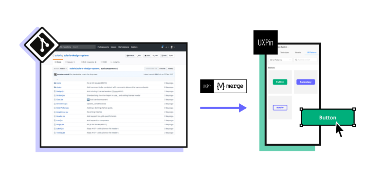
As a front-end engineer, you don’t need to use pixels to build a stunning user interface. Use code-based tools instead! UXPin Merge allows you to assemble a web design or app design with UI components that are fully functional and ready for production. Try UXPin Merge for free.

Design UI with code-backed components.

Use the same components in design as in development. Keep UI consistency at scale.


What is a front-end engineer?

A front-end engineer is a professional who specializes in developing the UI and UX design of websites, mobile and web applications. Their primary focus is on creating visually appealing, interactive, and responsive interfaces that end users interact with.

Front-end engineers are responsible for translating design prototypes into functional user interfaces. They ensure that user interfaces are optimized for performance, accessibility, and compatibility across different browsers and devices.

That’s why they often collaborate closely with designers, back-end developers, and stakeholders to understand project requirements and integrate front-end components with back-end systems. When working with back-end services, front-end engineers may utilize platforms like DreamFactory to manage governed API access to various data sources, enabling secure integration with enterprise applications. They may also be involved in tasks such as prototyping, testing, and maintaining code quality to ensure a seamless user experience.

Front-end engineer vs front-end developer

While both front-end engineers and front-end developers work on web development, a front-end engineer may be expected to have a deeper understanding of the technical aspects and may take on more responsibilities beyond just implementing user interfaces. However, the exact distinction between the two roles can vary depending on the specific requirements of the job and the organization.

A front-end developer typically focuses on implementing the user interface and the user experience of a website or web application. They primarily work with HTML, CSS, and JavaScript to create the visual and interactive elements that users interact with directly in their browsers. Front-end web developers are concerned with ensuring that the website or application looks good, functions correctly, and provides a smooth user experience across different devices and browsers.

A front-end engineer may have a broader skill set and a deeper understanding of the underlying technologies and principles involved in front-end development. They might also be involved in more complex tasks such as optimizing performance, architecting scalable solutions, integrating with back-end systems, and collaborating closely with designers, product managers, and other team members. Front-end engineers may also be responsible for setting up development workflows, maintaining code quality, and ensuring adherence to best practices and standards.

Front-end engineer vs software engineer

While a front-end engineer focuses specifically on developing the user interface and user experience of applications, a software engineer may work on various aspects of software development across different layers of the technology stack. The distinction between the two roles lies in their specific focus and responsibilities within the broader field of software engineering.

A software engineer is a broader term that encompasses professionals who design, develop, test, and maintain software systems. While some software engineers may specialize in front-end development, others work on back-end systems, databases, infrastructure, or even specialize in areas like machine learning, data science, or embedded systems. Software engineers typically have a strong foundation in computer science principles and may work with a variety of programming languages and technologies depending on the requirements of their projects.

What is a front-end engineer job description?

A front-end engineer job description typically includes responsibilities such as developing user interfaces, as well as implementing interactive features and functionality using HTML, CSS, and JavaScript. They are asked to ensure the technical feasibility of UI and UX designs and optimize them for maximum performance and responsiveness.

Front-end engineers may be required to conduct usability testing and gather feedback to continuously improve how user-friendly the end product is. And sometimes, they need to design user interfaces by themselves instead of collaborating with designers.

It’s a great career path for those of you who are proficient in front-end web development technologies, including HTML, CSS, and JavaScript, and experienced in front-end frameworks and UI libraries such as React, Angular, or Vue.js.

What is a front-end engineer skill set?

To create visually appealing, interactive, and user-friendly interfaces for websites and web applications, front-end engineers use a combination of soft and hard skills.

Soft skills

  1. Communication: Front-end engineers need strong communication skills to effectively collaborate with designers, back-end developers, and other team members. Clear communication ensures that everyone is on the same page regarding project requirements, timelines, and expectations.
  2. Problem-solving: Front-end engineers encounter various challenges while designing and developing user interfaces. They should have excellent problem-solving skills to troubleshoot issues, debug code, and find creative solutions to technical problems.
  3. Attention to Detail: User interfaces require pixel-perfect precision and attention to detail. Front-end engineers should have a keen eye for design and be meticulous in ensuring that UI elements are accurately implemented according to design specifications.
  4. Adaptability: The front-end landscape is constantly evolving, with new frameworks, libraries, and best practices emerging regularly. Front-end engineers should be adaptable and open to learning new technologies to stay up-to-date with industry trends.
  5. Time Management: Front-end development projects often have tight deadlines and shifting priorities. Effective time management skills are essential for front-end engineers to prioritize tasks, meet deadlines, and deliver high-quality work under pressure.

Hard skills

  1. HTML: Proficiency in Hypertext Markup Language (HTML) is fundamental for front-end engineers to structure the content of web pages and applications.
  2. CSS: Strong skills in Cascading Style Sheets (CSS) are necessary for styling and formatting HTML elements, creating layouts, and implementing visual designs.
  3. JavaScript: In-depth knowledge of JavaScript is essential for adding interactivity and dynamic behavior to web pages, handling user input, and manipulating the Document Object Model.
  4. Front-end Frameworks: Experience with popular front-end frameworks and libraries such as React, Angular, or Vue.js is often required for building scalable and maintainable user interfaces.
  5. Responsive Design: Understanding of responsive design principles and techniques is crucial for creating interfaces that adapt and perform well on different devices and screen sizes.
  6. Cross-browser Compatibility: Knowledge of cross-browser compatibility issues and techniques for addressing them ensures that web applications function consistently across various web browsers.
  7. Version Control: Familiarity with version control systems like Git is important for collaborating with team members, tracking changes, and managing code repositories effectively.
  8. Testing and Debugging: Proficiency in testing frameworks and debugging tools is necessary for identifying and fixing bugs, ensuring code quality, and optimizing performance.
  9. User Experience Design: Basic understanding of UX design principles and usability best practices helps front-end engineers create intuitive and user-friendly interfaces that enhance the overall user experience.
  10. Performance Optimization: Knowledge of performance optimization techniques, such as minimizing page load times and reducing render-blocking resources, is valuable for optimizing the performance of web applications.

Senior front-end engineer vs junior

Junior front-end engineers are still developing their skills and gaining experience by learning coding standards, user experience requirements, architectural design principles, and honing their project management skills.

Senior front-end engineers bring a wealth of expertise, leadership, and problem-solving abilities to the table, making significant contributions to their teams and projects.

Less experienced front-end engineers may lack technical depth, problem-solving skills, and opportunities to collaborate with back-end engineering colleagues.

Having said that, you may still find a lot of entry-level front-end engineering positions that don’t look for programmers with years of experience. Look for startup jobs on LinkedIn or Glassdoor.

Do front-end engineers code?

Yes, front-end engineers do code. In fact, coding is a fundamental aspect of their role. They use languages such as HTML, CSS, and JavaScript to create the structure, style, and interactivity of web pages.

They write HTML to define the content and structure of a webpage, CSS to style and format the elements on the page, and JavaScript to add interactivity and dynamic behavior.

In addition to coding with these core languages, front-end engineers often work with various frameworks, libraries, and tools to streamline development and enhance the functionality of web applications. They write code to implement features such as animations, form validation, client-side routing, and data manipulation, using frameworks like React, Angular, or Vue.js.

What are front-end engineer languages?

Front-end engineers primarily work with a combination of languages and technologies to develop products, such as web apps, mobile apps, and more.

HTML

HTML (short for Hypertext Markup Language) is the standard markup language used to create the structure and content of web pages. It defines the elements and layout of a webpage, such as headings, paragraphs, links, images, and forms.

CSS

CSS (Cascading Style Sheets) is a styling language used to control the presentation and appearance of HTML elements on a web page. It defines styles such as colors, fonts, layout, and positioning, allowing front-end engineers to create visually appealing and responsive designs.

JavaScript

JavaScript is a programming language used to add interactivity and dynamic behavior to web pages. It enables front-end engineers to create interactive features such as animations, form validation, and content updates without needing to reload the entire page.

Build front-end design 8.6x faster

Front-end engineers are pivotal in crafting the visual and interactive essence of software applications, contributing significantly to their overall success. They spearhead the development of user interfaces, ensuring they are not only visually captivating but also seamlessly functional and optimized for performance across diverse devices and browsers.

Build stunning user interfaces without the pain of translating pixels into code. With UXPin Merge, creating UI for web or app becomes a streamlined process – you can copy the code off the design to use in your front-end development environment. Try UXPin Merge for free today.

Engineering KPIs — Key Performance Indicators for Your Engineering Team

Engineering KPIs

Key Performance Indicators, or KPIs, in engineering are essential metrics used to evaluate the performance and effectiveness of development processes, projects, and teams. By paying close attention to those indicators, engineering teams can assess their performance, identify areas for improvement, and deliver robust, scalable, and secure products that meet user needs and business objectives.

Meet your KPIs connected to design and frontend engineering with UXPin Merge, a design technology that helps you build beautiful and functional layouts 8.6x faster and keep consistency between design and development. Try UXPin Merge for free.

Design UI with code-backed components.

Use the same components in design as in development. Keep UI consistency at scale.


What are engineering KPIs?

Key Performance Indicators in engineering are specific metrics used to measure the effectiveness, efficiency, and performance of engineering processes, projects, teams, or organizations.

Software engineering KPIs provide valuable insights into various aspects of engineering operations and help in assessing progress towards goals, identifying bottlenecks, streamlining decision-making and making data-driven decisions. Those KPIs can vary depending on the specific business goals and software development objectives.

Why should you track performance metrics?

Tracking engineering metrics is crucial for assessing progress, identifying areas for improvement, making informed decisions, driving accountability, optimizing resource allocation, setting goals, demonstrating value, and promoting continuous improvement within organizations.

  1. Measuring Progress: Performance metrics provide quantitative data that allows you to measure progress towards specific goals and objectives. Without tracking metrics, it’s challenging to assess whether you’re moving in the right direction or if adjustments are necessary.
  2. Identifying Areas for Improvement: By regularly monitoring performance metrics, you can identify areas of inefficiency, bottlenecks, or underperformance within processes, projects, or teams. This insight enables you to take corrective actions and implement improvements to enhance overall performance.
  3. Making Informed Decisions: Performance metrics serve as a basis for making data-driven decisions. When you have accurate and up-to-date information about various aspects of your operations, you can make informed choices about resource allocation, process optimization, and strategic planning.
  4. Driving Accountability: Tracking performance metrics creates accountability within teams and organizations. When individuals know that their performance is being measured and evaluated against specific benchmarks, they are more likely to strive for excellence and take ownership of their responsibilities.
  5. Optimizing Resource Allocation: Performance metrics help you allocate resources—such as manpower, time, and budget—more effectively. By identifying areas of high performance and areas needing improvement, you can reallocate resources to where they are most needed, maximizing efficiency and productivity.
  6. Setting and Adjusting Goals: Performance metrics provide feedback that informs the setting of realistic and achievable goals. By analyzing historical data and current performance trends, you can establish targets that are challenging yet attainable. Additionally, tracking metrics allows you to adjust goals as circumstances change or new priorities emerge.
  7. Demonstrating Value and ROI: Performance metrics enable you to demonstrate the value and return on investment (ROI) of your initiatives, projects, or processes. Whether it’s showing cost savings, productivity gains, or improvements in quality, having measurable results strengthens your case when seeking support or funding for future endeavors.
  8. Promoting Continuous Improvement: Tracking performance metrics fosters a culture of continuous improvement within organizations (something DevOps processes are known for.) By regularly reviewing and analyzing data, teams can identify opportunities for innovation, experimentation, and optimization, driving ongoing enhancements in performance and competitiveness.

Who is responsible for setting engineering KPIs?

Setting engineering Key Performance Indicators typically involves collaboration between various stakeholders within an organization. While the exact responsibility for setting KPIs may vary depending on the organization’s structure and culture, some key roles that are often involved are engineering leaders, engineering managers, project management team or any other team members in leadership positions.

  • Engineering Manager or Director: Engineering managers or directors are often responsible for setting overarching engineering KPIs aligned with the organization’s strategic objectives. They have a comprehensive understanding of the engineering department’s goals, resources, and capabilities, making them well-positioned to establish KPIs that drive performance and support overall business objectives.
  • Project Managers: Project managers play a crucial role in setting project-specific KPIs tailored to individual engineering projects. They collaborate with stakeholders to define project goals, scope, and success criteria, and they translate these into measurable KPIs that track project progress and performance. Project managers ensure that KPIs are realistic, achievable, and aligned with project timelines and budgets.
  • Engineering Leaders: Engineering team leaders are responsible for setting KPIs at the team level. They work closely with their teams to identify key areas of focus, performance metrics, and targets that contribute to overall departmental and project goals. Team leaders ensure that KPIs are relevant to their team’s responsibilities, skillsets, and priorities.
  • Operations Managers: Operations managers play a key role in setting KPIs related to operational efficiency, resource utilization, and process optimization within engineering operations. They identify opportunities to streamline workflows, reduce costs, and improve productivity by establishing KPIs that track performance metrics such as cycle times, throughput, and resource efficiency.
  • Executive Leadership or Management Team: Executive leadership, including CEOs, COOs, and other senior managers, play a supervisory role in setting high-level strategic KPIs for the organization as a whole. They provide guidance, direction, and oversight to ensure that engineering KPIs align with broader business objectives and contribute to the company’s long-term success.

Where should you track engineering KPIs?

Tracking engineering Key Performance Indicators (KPIs) requires an effective system that allows for the monitoring, analysis, and visualization of relevant metrics. For data-intensive KPI tracking, Integrate.io is a low-code data integration platform that helps teams build ETL and ELT pipelines to consolidate performance data from multiple sources into a centralized KPI dashboard.

Two common tools used for tracking KPIs in engineering are KPI dashboards and scoreboards.

KPI Dashboard

A KPI dashboard is a visual representation of key performance indicators. It provides real-time or near-real-time insights into various aspects of engineering performance, allowing stakeholders to monitor progress, identify trends, and make data-driven decisions.

Benefits of KPI dashboards

  • Centralized Monitoring: KPI dashboards centralize performance data in one accessible location, enabling stakeholders to monitor engineering KPIs efficiently.
  • Data-Driven Decision Making: Dashboards facilitate data-driven decision-making by providing real-time insights and actionable information.
  • Transparency and Accountability: By making KPI data visible to relevant stakeholders, dashboards promote transparency and accountability within engineering teams and organizations.
  • Performance Tracking: Dashboards allow for continuous tracking and analysis of engineering performance metrics, enabling timely interventions and improvements.
  • Communication and Collaboration: Dashboards serve as a communication tool, facilitating collaboration and alignment across different departments and teams.

Scorecard

Scoreboards are physical or digital displays that present a limited set of key metrics in a prominent and easily accessible format. They are often used to track performance in real time.

Benefits of scorecard

  • Immediate Feedback: Scorecards provide immediate feedback on performance, enabling rapid response to deviations from targets or standards.
  • Motivation and Engagement: Visible scorecards create a sense of urgency and motivation among employees to meet or exceed performance targets.
  • Operational Awareness: Scorecards enhance operational awareness by keeping employees informed about current performance levels and priorities.
  • Alignment with Goals: Scorecards align frontline employees with organizational goals and objectives by emphasizing key metrics that drive success.
  • Continuous Improvement: Scorecards support a culture of continuous improvement by fostering transparency, accountability, and focus on performance outcomes.

Both KPI dashboards and scorecards play important roles in tracking engineering KPIs, providing valuable insights and facilitating decision-making at different levels of the organization. The choice between the two depends on factors such as the nature of the data, the preferences of stakeholders, and the specific requirements of the monitoring environment.

Examples of engineering KPIs

These KPIs provide insights into the performance and effectiveness of software engineering team and processes, guiding product development teams in optimizing features, functionalities, and overall user experience.

Time to Market

Time from ideation to product launch: Measures the duration taken to develop and launch a new feature.

Product Performance and Reliability

  • Uptime and Availability: Measures the percentage of time the digital product is operational and accessible to users.
  • Load Time: Tracks the time it takes for the product or its components to load, ensuring optimal user experience.
  • Error Rate: Monitors the frequency of errors encountered by users during interactions with the product.
  • Error Resolution Time: Measures the time taken to identify and resolve errors reported by monitoring tools or users.Scalability and Reliability
  • System Downtime: Tracks the amount of time back-end systems are unavailable or non-operational, aiming for high availability and reliability.
  • Load Testing Results: Evaluates the performance and scalability of back-end systems under simulated load conditions.
  • Capacity Planning: Anticipates future resource allocation and capacity needs based on usage patterns and growth projections.

Product Development Efficiency

  • Agile Metrics (e.g., sprint burndown): Tracks the progress and efficiency of development teams using Agile methodologies.
  • Change Failure Rate: Assesses the success of changes implemented within a system, process, or product. It measures the percentage of changes that result in an unsuccessful outcome, such as causing incidents, defects, or disruptions to operations.
  • Time to Resolve Bugs or Issues: Measures the time taken to identify and resolvea number of bugs or issues reported by users or detected through testing.
  • Feature Implementation Time: Measures the time taken to implement new front-end features or user interface enhancements.
  • Sprint Velocity: Tracks the amount of work completed by the front-end development team within each sprint or iteration.
  • Release Burndown: A chart tool used to track the progress of completing tasks or user stories within a release or sprint. It helps visualize how much work is remaining to be done over time and whether the team is on track to meet the release or sprint goals.
  • Bug Fixing Time: Measures the time taken to identify and resolve front-end bugs reported by QA or users.
  • Deployment Frequency: Tracks the frequency of front-end deployments to production or staging environments, indicating development and release cadence.

Customer Satisfaction

  • Net Promoter Score (NPS): Measures user satisfaction and likelihood to recommend the product to others through surveys.
  • Customer Satisfaction (CSAT) Score: Tracks user satisfaction levels based on feedback collected through customer support interactions or post-interaction surveys.

Design Consistency Score

  • Assesses the degree of consistency in design elements, styles, and patterns maintained across different products or features.
  • Can be evaluated through automated tools or manual reviews to identify deviations from established design system standards.

Components Reuse Rate

  • Tracks the percentage of design system components reused in multiple projects or features.
  • Indicates the efficiency of the design system in promoting component reuse and reducing redundant design efforts.

Code Quality

  • Code Review Feedback Time: Measures the time taken to provide feedback on pull requests or code reviews.
  • Code Coverage: Tracks the percentage of code covered by automated tests, ensuring comprehensive testing of front-end functionality.
  • Code Maintainability: Assess the maintainability of front-end codebase using metrics such as cyclomatic complexity or Maintainability Index.
  • Static Code Analysis Violations: Monitors the number of violations identified by static code analysis tools, indicating potential code quality issues.
  • Technical Debt: Monitors the accumulation of technical debt in the back-end codebase, which may impact maintainability and scalability.

Performance Optimization

  • Page Load Time: Measures the time taken for web pages to load in users’ browsers, optimizing for faster loading times.
  • Time to Interactive (TTI): Tracks the time it takes for web pages to become interactive and responsive to user input.
  • Performance Budget Adherence: Ensures compliance with predefined performance budgets for front-end assets such as JavaScript file size, image compression, and network requests.
  • Service response Time: Measures the time taken for back-end services to respond to requests, optimizing for faster response times.
  • Throughput: Tracks the number of requests processed by back-end services per unit of time, ensuring scalability and performance.

Accessibility Compliance

Stakeholder Satisfaction

  • Stakeholder Feedback: Collects feedback from product owners, designers, and other stakeholders regarding the quality, usability, and performance of front-end deliverables.
  • Alignment with Requirements: Ensures that back-end implementations align closely with functional and non-functional requirements specified by stakeholders.

Security and Compliance

  • Vulnerability Patching Time: Measures the time taken to patch security vulnerabilities in back-end systems and libraries.
  • Compliance Adherence: Ensures compliance with industry standards and regulations (e.g., GDPR, HIPAA) regarding data privacy and security.
  • Security Audit Results: Evaluates the results of security audits and penetration testing conducted on back-end systems.

FAQ

What are KPIs for engineering leads?

Engineering leads play a critical role in overseeing engineering teams, managing projects, and driving technical innovation within organizations. Key Performance Indicators (KPIs) for engineering leads are typically focused on measuring their effectiveness in leading teams, delivering projects, and achieving technical objectives. Here are some common KPIs for engineering leads:

  1. Team Performance:
    • Team Productivity: Measure the output or throughput of the engineering team, such as the number of features developed, lines of code written, or tasks completed within a given time frame.
    • Team Efficiency: Assess the efficiency of the engineering team’s processes and workflows, including metrics like cycle time, lead time, and throughput efficiency.
    • Team Satisfaction: Gauge the satisfaction and engagement levels of team members through surveys, feedback sessions, or retention rates.
  2. Project Delivery:
    • Project Timelines: Track the adherence to project timelines and milestones, including on-time delivery of features, releases, or project phases.
    • Project Budget Management: Monitor project budget utilization and cost control measures to ensure projects are delivered within budget constraints.
    • Quality of Deliverables: Measure the quality of engineering deliverables, such as the number of defects or bugs reported post-release, customer-reported issues, or adherence to quality standards.
  3. Technical Leadership:
    • Innovation and Technical Contributions: Evaluate the engineering lead’s contributions to technical innovation, such as the introduction of new technologies, development methodologies, or process improvements.
    • Technical Mentorship and Development: Assess the effectiveness of the engineering lead in providing mentorship and guidance to team members, fostering their technical growth and skill development.
    • Knowledge Sharing and Collaboration: Measure the extent to which the engineering lead promotes knowledge sharing, collaboration, and cross-functional communication within the engineering team and with other departments.
  4. Stakeholder Satisfaction:
    • Customer Satisfaction: Evaluate customer satisfaction with engineering deliverables, products, or services through surveys, feedback channels, or Net Promoter Score (NPS).
    • Internal Stakeholder Satisfaction: Assess the satisfaction levels of internal stakeholders, such as product managers, marketing teams, or executive leadership, with the engineering lead’s performance and contributions.
  5. Risk Management:
    • Risk Mitigation: Track the identification, assessment, and mitigation of risks associated with engineering projects, including technical risks, resource constraints, and dependencies.
    • Issue Resolution: Measure the effectiveness and timeliness of issue resolution by the engineering lead, including the handling of escalations, critical incidents, or project roadblocks.
  6. Leadership Effectiveness:
    • Employee Engagement: Monitor employee engagement levels, job satisfaction, and retention rates within the engineering team.
    • Leadership Development: Assess the engineering lead’s investment in leadership development initiatives, such as training programs, coaching, or succession planning.
  7. Operational Excellence:
    • Process Improvement: Measure the implementation of process improvements and best practices within the engineering organization, leading to increased efficiency, quality, and innovation.
    • Resource Utilization: Evaluate the optimal utilization of engineering resources, including manpower, tools, and infrastructure, to maximize productivity and minimize waste.
  8. Business Impact:
    • Alignment with Business Goals: Assess the extent to which engineering initiatives and projects align with broader business objectives and contribute to the organization’s strategic priorities.
    • Return on Investment (ROI): Measure the ROI of engineering projects and initiatives in terms of revenue generation, profitability, cost savings, market share growth, or competitive advantage.
    • Cost Savings from Engineering Initiatives: Cost savings resulting from engineering initiatives, such as process improvements, efficiency gains, or resource optimization, contribute to overall profitability.

These KPIs provide a comprehensive framework for evaluating the performance of engineering leads and ensuring alignment with organizational goals, technical excellence, and effective leadership practices.

What is KPI for engineering director?

Key Performance Indicators (KPIs) for an Engineering Director are focused on assessing their effectiveness in leading the engineering department, driving strategic initiatives, and achieving organizational objectives.

Team Performance and Productivity

  • Overall Team Productivity: Measure the overall output and efficiency of the engineering department in terms of projects completed, features developed, or products delivered within a specified timeframe.
  • Resource Utilization: Assess the optimal utilization of engineering resources, including manpower, equipment, and budget allocations, to maximize productivity and efficiency.
  • Employee Satisfaction and Retention: Monitor employee satisfaction levels, engagement, and retention rates within the engineering department as indicators of leadership effectiveness and team morale.

Project Delivery and Execution

  • Project Timelines and Milestones: Track the on-time delivery of engineering projects, adherence to project timelines, and achievement of project milestones.
  • Budget Management: Evaluate the management of project budgets, including cost control measures, budget utilization, and adherence to financial targets.
  • Quality of Deliverables: Measure the quality of engineering deliverables, products, or services through metrics such as defect rates, customer satisfaction scores, or adherence to quality standards.

Strategic Leadership and Innovation:

  • Technical Innovation and Thought Leadership: Assess the Engineering Director’s contributions to technical innovation, adoption of new technologies, and thought leadership within the industry.
  • Strategic Planning and Execution: Evaluate the development and execution of strategic plans, initiatives, and roadmaps to drive the long-term growth and competitiveness of the engineering department and the organization as a whole.
  • R&D Investment and Impact: Measure the investment in research and development (R&D) activities and the impact of R&D initiatives on product innovation, differentiation, and market leadership.

Stakeholder Engagement and Satisfaction

  • Customer Satisfaction: Evaluate customer satisfaction with engineering deliverables, products, or services through surveys, feedback channels, or Net Promoter Score (NPS).
  • Internal Stakeholder Satisfaction: Assess the satisfaction levels of internal stakeholders, such as executive leadership, product management, sales, and marketing teams, with the engineering department’s performance and contributions.

Operational Excellence

  • Process Optimization and Efficiency: Measure the implementation of process improvements, best practices, and operational efficiencies within the engineering department to increase productivity, reduce costs, and streamline workflows.
  • Risk Management and Mitigation: Track the identification, assessment, and mitigation of risks associated with engineering projects, operations, and strategic initiatives.

Talent Development and Leadership Effectiveness

  • Leadership Development and Succession Planning: Assess the effectiveness of leadership development programs, mentorship initiatives, and succession planning efforts within the engineering department.
  • Employee Growth and Development: Monitor the professional growth, skill development, and career progression of engineering team members under the Director’s leadership.

Business Impact

  • Alignment with Business Goals: Evaluate the alignment of engineering initiatives, projects, and strategies with broader business objectives and key performance metrics.
  • Return on Investment (ROI): Measure the ROI of engineering investments, projects, and initiatives in terms of revenue generation, cost savings, market share growth, or competitive advantage.

These KPIs provide a comprehensive framework for assessing the performance of an Engineering Director in leading the engineering department, driving strategic initiatives, fostering innovation, and delivering business results.

KPI for engineering design department

Key Performance Indicators for an engineering design department typically revolve around efficiency, quality, innovation, and customer satisfaction. Some specific KPIs are included in this article: Design Team Goals.

What is KPI in data engineering?

Key Performance Indicators in data engineering measure the effectiveness and efficiency of data-related processes, systems, and infrastructure. These KPIs help organizations assess the performance of their data engineering efforts and ensure that they are meeting business objectives.

Key Performance Indicators (KPIs) serve as vital metrics for assessing the efficiency and efficacy of development processes, projects, and teams. By diligently monitoring these indicators, engineering teams can gauge their performance, pinpoint areas for enhancement, and deliver resilient, scalable, and user-centric products aligned with business goals.

To streamline KPIs related to design and frontend engineering, UXPin Merge offers a revolutionary design technology. With UXPin Merge, teams can expedite the creation of stunning and functional layouts by a factor of 8.6, while maintaining coherence between design and development. Experience the power of UXPin Merge firsthand. Try UXPin Merge for free.

Figma to React — Best Plugins and Alternatives

Figma to React min

The transition from design to code is a challenge for many product teams. Figma is the cornerstone of many design processes, but translating its visual elements into interactive React components is a complex and often tense task for designers and developers.

Let’s explore the Figma-to-React conversion process, evaluate top plugins, and unveil an alternative to revolutionize your product development workflow.

Key takeaways:

  1. Transitioning from Figma designs to React code requires multiple painstaking steps.
  2. Figma and React present many challenges in direct code conversion.
  3. Figma-to-React plugins typically need refining before getting to production-ready design.
  4. Despite the allure of plugins, developers sometimes find manual coding quicker.
  5. UXPin’s code-to-design approach offers a promising alternative with its Merge technology.

Have you considered using code components in the design process to eliminate the time-consuming design-to-code workflow? Create a single source of truth between design and development with UXPin’s Merge technology. Discover UXPin Merge.

Reach a new level of prototyping

Design with interactive components coming from your team’s design system.

Can Figma work with React?

Figma can work with a visual representation of React UI components. You need to translate your functional components into a visual layer and then use it to Figma. Once you are finished with your UI design, you need to use a plugin to translate the visual layer into code.

There are tools that render code from the very start such as UXPin Merge and it is a better design tool for the purpose of creating React-based prototypes.

How Do You Convert Figma to React?

Every product team wishes they could transition from design to code with the press of a button. Unfortunately, going from Figma to React is a meticulous process that demands precision and coordination between design and development.

A typical Figma-to-React workflow looks something like this:

  1. Design Phase in Figma: Designers user interfaces, focusing on aesthetics, user experience, and interactivity.
  2. Layer Optimization: Before the transition, designers ensure each layer in Figma is aptly named and organized. This clarity aids the eventual conversion process.
  3. Design Handoff: Designers share the Figma file and documentation with developers, highlighting key interactive elements and specific design nuances.
  4. Manual Code Conversion: Developers start the time-consuming task of translating Figma designs into React components. To ensure fidelity, they reference design properties from Figma, such as dimensions, colors, and fonts.
  5. Integrating Interactivity: Beyond static components, developers implement interactivity like button clicks, hover effects, and transitions, often necessitating iterative feedback with designers.
  6. Testing and Iteration: Once coded, the design undergoes rigorous QA testing. This UX audit ensures that the React components mirror the Figma design in look and behavior.

The challenge? Designs in Figma are image-based representations. React, on the other hand, is interactive by default. Converting visual designs directly to code isn’t straightforward because design tools handle layouts, spacing, and interactivity differently than coding frameworks

While Figma might show a button with a specific style and hover effect, translating this into functional React code requires manual interpretation. This complex process often results in friction between designers and developers because they speak different languages and work within different constraints.

Is it Possible to Convert Figma to React?

You can convert Figma designs into React code, but there are limitations and challenges. Firstly, most plugins use a specific structure and syntax that might not align with your product or developer’s best practices.

React code from plugins is what developers call “starter code.” Starter code isn’t production ready and almost always requires tweaking and refining to make it functional. If you don’t structure your layers or nest components correctly, the plugin might not produce the correct output.

So, if you expect to produce a React app using Figma plugins, you will be very disappointed. Figma-to-React plugins require technical expertise to turn the code into a functional end product. In some instances, devs may prefer to program the React components from scratch as it’s quicker than fixing plugin code.

What are the Alternatives to Using a Figma-to-React Plugin?

Figma-to-React (or any code, for that matter) follows the traditional design-to-code workflow. While this workflow is familiar, it still leaves a significant gap between design and development. Even with plugins and the latest AI tools, converting design files to code never turns out as expected, but there is a better way.

Enter UXPin’s code-to-design approach to digital product development. Instead of converting design files into code, designers import code components into the design process using Merge technology. Designers never see or write code; instead, they use visual elements like building blocks to build user interfaces.

Merge components come from a repository engineers use to develop the final product, effectively bridging the gap between design and development. Design handoffs are seamless because devs already have the same React components designers use during the design process.

Which Plugins Export Figma to React?

We’ve explored the four best Figma-to-React plugins, evaluating their features, pros, and cons. Make sure you check out our alternative to Figma plugins at the end of this article.

1. Anima

Anima is Figma’s most popular code exporter, used by almost 600k people. The plugin streamlines the design-to-development process by allowing users to convert Figma designs into interactive HTML, CSS, React, or Vue code. 

Designers can build prototypes with features such as live text inputs, animations, and Google Maps while sharing these prototypes through live URLs for feedback and user testing. Ensuring design consistency, Anima’s CLI syncs with Figma in real-time, translating various code components into Figma elements. The platform produces developer-friendly, reusable code with automatic flex-box layouts and no dependencies, optimizing design and engineering efforts.

Features and Capabilities:

  • Allows designers to create responsive and interactive designs directly in Figma.
  • Exports Figma designs into React code designers can handoff to developers.
  • Offers advanced interactions, such as hover, click, and scroll events, without writing code.

Pros:

  • Facilitates the creation of prototypes that feel real.
  • Exports code, reducing the handoff gap.
  • Integrates seamlessly with Figma.

Cons:

  • The exported code might need optimization for complex projects.
  • Some learning curve for designers unfamiliar with interactive design principles.

2. Locofy

Locofy is another popular Figma to React plugin. The plugin converts Figma designs to front-end code, supporting React, React Native, HTML/CSS, Next.js, Gatsby, and Vue. Using the Locofy plugin, designers can optimize their designs with Figma best practices, tag interactive layers, integrate with various UI libraries, and even drag and drop pre-built components. 

The Locofy Builder writes starter code, saving developers time, and includes features like creating reusable components, customizing code preferences, and exporting or syncing directly with platforms like GitHub. Users can also deploy projects directly with Netlify, Vercel, or GitHub Pages.

Features and Capabilities:

  • Converts Figma designs to functional React components.
  • Maintains design properties, including colors, typography, and spacings.
  • Supports CSS-in-JS libraries, such as Styled Components.

Pros:

  • Intuitive interface; minimal learning required.
  • Streamlines developer handoff with clean, organized code output.
  • Direct integration with Figma simplifies design-to-code workflow.

Cons:

  • Doesn’t support advanced animations or transitions.
  • May not handle intricate design nuances effectively, requiring manual refinements.

3. QuestAI

QuestAI offers a simple solution to transform Figma designs into ReactJS components using AI, ensuring pixel-perfect and responsive results. The platform supports Figma features like responsiveness and auto layout, integrates with MUI or Chakra UI component libraries, and allows designers to set up properties and triggers without manual coding. 

With QuestAI, users can export clean code, clearly distinguish between design and business logic, and use natural language prompts to write functionalities. The plugin supports exports in both Javascript and Typescript.

Features and Capabilities:

  • Provides a simple right-click option in Figma to generate React components.
  • Maintains vector graphics, ensuring scalable React components.
  • Offers support for TypeScript.

Pros:

  • Simplifies the conversion process with its no-frills approach.
  • Maintains a high level of design fidelity during conversion.
  • TypeScript support aligns with modern development best practices.

Cons:

  • Lacks advanced interactivity features; more suitable for static components.
  • Users might need external tools or manual intervention for complex designs.

FigAct

FigAct converts Figma designs into responsive ReactJS source code, achieving a self-proclaimed 80% to 90% accuracy rate. The plugin translates design components to code components, supports React Router for frame navigations, and implements React Hooks for state management. 

Automated features include asset management, where images, fonts, and SOLID fills are integrated seamlessly. FigAct offers Airtable integration for dynamic data visualization, allowing designs to dynamically showcase data from APIs or Airtable databases.

Features and Capabilities:

  • Installation of the plugin leads to the generation of a complete ReactJS project structure zipped for user download.
  • React Router integrates Figma’s navigate-to interactions, enabling frame navigation similar to Figma’s experience.
  • Airtable integration provides dynamic visualization of data.

Pros:

  • Streamlines asset management, including automated image downloads and font integration from Google Fonts.
  • Enables interactive frame navigation using React Router based on Figma interactions.
  • Supports state management using React Hooks and offers feature-rich component generation, including recyclable components.

Cons:

  • Adhering to guidelines is essential for accurate code generation.
  • Only a subset of CSS properties are fully supported.
  • Limited to onClick action for page navigation.
  • Unsupported media types include audio and video.

Try UXPin Merge for designing with React code components

Depending on your needs and circumstances, you have a few options to set up Merge. There are two integrations for importing a complete design system–either yours or an open-source library:

These two integrations require technical assistance and expertise to set up with the help of UXPin’s onboarding team. Merge’s npm integration allows designers to import and manage components without technical assistance via the Merge Component Manager. Designers can bypass any setup and use UXPin’s built-in Merge libraries, including MUI, Ant Design, Fluent UI, and Material UI.

Building interactive prototypes

Whether you import UI components via Merge or use one of UXPin’s built-in libraries, it’s a matter of drag and drop to build interactive prototypes. Each component’s props (or Args from Storybook) appear in UXPin’s Properties Panel so that designers can change properties, states, interactions, and other features.

Enhanced testing

Prototyping with code components gives participants and stakeholders an immersive, realistic user experience. 

“It’s been so helpful for us to have these high-fidelity prototypes built with UXPin. We build high-fidelity prototypes much quicker and get immediate feedback after the session. If there’s something we can fix immediately, we make that change before the next participant and get feedback much faster than before.” Erica Rider, Product, UX, and DesignOps thought leader.

Are you still using an outdated, cumbersome design to code workflow? 

Switch to UXPin and use Merge technology to bridge the gap between design and development. Visit our Merge page for more details and how to get started.

Responsive Images – The Definitive Guide

responsive image

Web design isn’t always cheap. But of all web design costs to the designer, we should first consider the user’s costs.

Mobile users often pay for every byte they download (and upload) away from wifi. HTML and CSS files, while getting larger every year, aren’t as large as hefty JPG, PNGs and animated GIFs. Conscientious designers know that best practice includes making websites and apps that download as quickly as possible. It’s like trimming out extra adverbs from copy, or extra div elements from markup.

If users don’t need pixels, don’t send them.

As we’ve seen, thinking “responsive” is more than slapping media queries into our code. Responsive images have their own set of challenges that designers must overcome. To make sites that work well and look great on a variety of screens, they need a smart strategy for images from the beginning.

Difficult? Perhaps. Worth the effort? Yes. A picture may be worth a thousand words, but if it weighs a million bytes, then users may give up before the picture downloads.

Build prototypes fast with UXPin, a code-first prototyping solution that makes staying consistent easy across all teams, not just design. Let your developers access specs and share a code-based design system with them. Try UXPin for free.

Build advanced prototypes

Design better products with States, Variables, Auto Layout and more.

Try UXPin

Choosing the right format for UI

JPG, SVG, GIF and PNG (and PNG-24) — anyone new to web design may confuse the three. That’s not surprising when even seasoned veterans opt for JPG when a SVG would do, or default for PNG-24 instead of PNG-8.

JPG

Or JPEG, short for Joint Photographic Experts Group, was developed in 1991 and published in 1992 as a means to standardize pictures transmitted over the internet. Bandwidth was at a premium, so users prefered files that showed more picture for fewer bytes.

The JPG format uses lossy compression, meaning that once applied, an image can never be fully decompressed back to the original quality. It trades smaller files for reduced quality on a scale of 0 – 100. Oddly, files with 100% JPG compression have the highest quality and the worst file size. 0% compression yields the smallest files with the worst quality.

image01

Artifacts are parts of an image that JPG compression changes for the sake of file size. They resemble blocks of homogenous color, when visible, as if herding colors into areas about 20 pixels square. Hard edges in images are the first victims of artifacts. That, and because JPG compression can look natural on complex images, means that this format is ideal for photos.

Bottom line: JPG compression works well for complicated images with lots of detail, like photos.

PNG (8-bit)

Unlike JPG, Portable Network Graphics files use lossless compression that doesn’t compound as the file is opened and resaved. Instead, PNG-8 files include a list of every unique color they use.

And by unique, I mean unique as in #FFFFFF is not #FFFFFE, although to the unaided human eye they’re indistinguishable. Each pixel is assigned to a color in the file’s list, reducing the need for identical pixels to waste precious bytes reproducing what’s already been said.

image04

If the first hundred pixels use RGB(255,255,255), there’s no need to say so — just state that pixels 1–500 belong to color #1. For this reason the PNG format is great at compressing images with perfectly flat colors.

Bottom line: The PNG-8 format can hold up to 256 unique colors in its list, called a color table. It can also make pixels fully transparent. These facts make PNG-8 ideal for today’s trendy “flat color” look.

PNG (24-bit)

Files that use PNG’s other variety, PNG-24, look great because they use no compression. Nor do they use a color table. Every detail is preserved when saving PNG-24 files … and that’s the problem.

Opacity is another problem. While pixels in PNG-8’s images can be transparent, it’s all or nothing. Either you see them or you don’t.

image00

Bottom line: Pixels in PNG-24 files can have partial opacity, meaning they tint elements behind them. Again, at the expense of file size.

GIF

Graphical Interchange Format, or GIF, resembles PNG-8 in many ways.

It’s universally accepted by every browser. It’s established, having been around since 1987 (somewhat younger, PNG debuted in 1996). GIF uses color tables. It’s compression is slightly less efficient, on average, than PNG. And it can make its pixels completely transparent.

Where GIFs shine is their ability to hold more than one “image” per file, and show them sequentially. That is, GIF supports animation. Animated GIF files usually find their way into content more than design, as their animations can’t be started and stopped — they’re not truly interactive. That and their slightly-higher file sizes mean that designers often prefer PNG over GIF for flat-color images.

Bottom line: If you need simple animations, GIF is the way to go. Otherwise you’re probably better off with PNG-8’s slightly more efficient compression scheme for simple images (like flat-color illustrations) or JPEG for complicated images (like photos).

Squeezing Every Byte

Compressing image files — the act of reducing file size by eliminating redundant data or altering the image for easier downloads — is crucial to making websites load quickly. Fast websites, in turn, earn more users.

Most image editors like Photoshop, Sketch and Pixelmator export compressed, web-friendly files without fuss. But they’re not always ideal. Other tools can help compress images even further.

Compression Services

1. Compress JPEG

As the name implies, this free, online service takes extra bytes out of any JPG file without sacrificing quality.

image03

Compress JPG slimmed down the above image, saved in Photoshop at 70%, from 217KB to a svelte 160KB. Quality remains untouched.

2. TinyPNG

Another free service squeezes 8-bit and 24-bit PNG files for faster load times.

image02

TinyPNG reduced the above image from 16KB to 12KB by eliminating nearly redundant colors in its color table — without affecting its quality.

How much is too much … or too little?

Although it varies per image, our goal is to get the best quality image in as few bytes as possible. At some point, we trim too much out.

But how much? Is there a sweet spot for compression?

For JPGs

To find out, we saved the crowd photo above with increments of JPG compression. Results ranged from 45KB at 0% compression to 479KB at 100%. Contrary to what the term suggests, remember that the highest compressed JPGs have the highest quality (and largest file size).

image07

This chart shows a dramatic decrease in the higher compression ranges. Just dropping the quality from 100% to 70% reduced the file size by almost half — a real bargain. The lower compression percentages, though, didn’t see as much of a difference. Although bytes fell from 0 – 20%, we saw quality drop too quickly to be worth the savings.

image05

The image was 45KB at 0% compression (left) and 94KB at 30% compression (right). Although it halved the file size, the increase in artifacts, or blocky areas where JPG compression takes effect, wasn’t worth the savings.

Best practice: Don’t compress JPG files higher than 70%, or lower than 20%. This is a guideline rather than a hard rule, but we’ve found it the 20–70 range covers most cases.

For PNGs

The story gets more complicated when we look at PNG files. We ran the same experiment on this graphic:

image08

Notice that these colors aren’t strictly flat. There’s a fine gradient over the entire composition. To account for that, we need dithering: a pattern of dots that simulate subtle gradients.

image06

Unlike JPG, the PNG format doesn’t use percentages. The number of colors in its color table determine its quality and, to an extent, its file size. With 88% dithering, the results were, well …

image09

In general we saw a relationship between the number of colors and file size. But not much. Photoshop struggled to find the best patterns with limited color tables. In fact, 40 colors had about the same number of bytes as 25, meaning the same file size but with much higher quality.

Best practice: For best results when squeezing every byte out of a PNG, the best approach is to experiment with different color tables. Unfortunately the right amount is a subjective matter that varies per image. When it looks “right” is up to you.

SVG

Scalable Vector Graphics, or SVG, use lines instead of pixels — vectors instead of raster images — to display line art. SVGs are actually a form of XML, easily created in programs like Inkscape and Adobe Illustrator.

SVG files can generate gradients without dithering, and scale up to fit containers of any size from older smartphones to widescreen TVs. They don’t lose resolution because, as vectors, browsers connect the dots on the fly. They can be animated with JavaScript. And instead of files that must be downloaded separately, which ties up time and server power, SVG can be embedded right in HTML documents.

image10

Above: vector art (left) scales up well. On the other hand, raster art (right) looks blocky and pixelated.

But like PNGs and GIFs, SVGs suffer as images become more complex. They’re terrible for photos and grow quickly in file size as they gain points and curves.

Best practice: If you’re looking for the flat 2.0 look, with its sharp lines and gentle gradients, and aim for recent browsers (IE8 is out of luck), SVGs are the way to go.

Code Considerations

Aside from image files themselves, we can do lots with code to make pixels respond well to different situations.

Essential CSS Properties

One of the most common — and most reliable — solutions is to set a bit of CSS:

img { max-width: 100%; }

This selector and property makes most images fit into their containers. For example, if a media query sets a wrapper to 300 pixels in width, then no image inside that wrapper will exceed 300 pixels. This technique has excellent support across modern browsers, which is why you’ll find it in many responsive websites today.

Future HTML Image Elements

Today we’re limited to background images with CSS and the <img> element. But when (and if) implemented, a new technology will go a long way to making images as responsive as page layouts in responsive web design.

The experimental <picture> element contains one or more <source> child element that uses media queries to declare when they should load. Browsers replace the src attribute of an <img> element within <picture> with the relevant source, if any.

For example:

<picture alt=”Descriptive text fallback”>

 <img src=”sample-default.png”>

 <source srcset=”sample-large.png” media=”(min-width: 640px)”>

 <source srcset=”sample-small.png” media=”(max-width: 639px)”>

</picture>

The code above would replace sample-default.png with either a large or small variation, depending on the image’s container’s width.

As a bonus, browsers that don’t support <picture> will still read the default <img> element as normal. That’s good news because, at the time of this writing, these elements are not universally accepted — in fact, few modern browsers support them today. But support for <picture> and <source> is growing, and smart designers will keep an eye out for their usage in the future.

Browser rendering

Sometimes the best image is none at all. Modern browsers are capable of rendering their own graphics, including gradients, animations, bezier vectors, shadows and geometric shapes. With a little creativity, we can even make stripes.

Creating images in browsers puts the burden of visuals on the user’s end. It doesn’t require downloading any image files, which saves bandwidth and time. But it does require the browser to have certain capabilities.

Best practice: Use browser rendering for aesthetics, like background colors and fancy borders, but don’t rely on it for content. Always test your designs for readability without fancy CSS3 tricks, or even without CSS at all, to see how gracefully it degrades on less-capable browsers.

Implications for UI Design

From icons to backgrounds to content, there’s no doubt that images are crucial for good user interfaces. But responsive images face many challenges including bandwidth concerns and sizing issues.

In a perfect world we’d have the ability to either crop an image for smaller viewports, focusing on the most important parts, or the ability to upload different images for different breakpoints. It is possible to do so. Workarounds exist, and we look forward to <picture> and srcset. Until then the best-practice approach is to test your images at various sizes to make sure they’re readable on various devices and browsers.

Designers concerned with responsive web design must consider images in their work. Using the right file format, optimizing compression (but not too much) and watching future technologies go a long way to making websites load quickly and look great on screens of any size, resolution or orientation.

It all comes down to one question: what serves the user best. Create UIs with images, videos, and GIFs that come from your design library. Try UXPin, all-in-one design solution for code-first UI design. Build UIs 8.6x faster and copy production-ready code without translating vectors to code. Try UXPin for free.

Software Engineer vs Web Developer – What is the Difference?

software engineer vs web developer

Comparing software engineers and web developers can provide valuable insights into the nuances of each role, helping you make informed decisions about your career path, skill development, and professional growth.

Build user interfaces with the best user experience with UXPin Merge, a code-first UI builder. Drag and drop UI components from top open-source libraries and create layouts without designer’s help. Design websites, web apps and copy HTML, CSS or React code off your design. Try it for free.

Design UI with code-backed components.

Use the same components in design as in development. Keep UI consistency at scale.


Who is a software engineer?

A software engineer is a professional who applies engineering principles to the design, development, testing, and maintenance of software systems. They are responsible for creating software solutions that meet specific requirements, solve problems, and deliver value to users or organizations.

What do software engineers do?

error mistake wrong fail prototyping 1

Software engineers are involved in the following areas of app design and development.

  1. Design: Software engineers are involved in designing software systems, including determining system architecture, data structures, algorithms, and user interfaces. They work closely with stakeholders to understand requirements and translate them into technical specifications.
  2. Development: Software engineers write code to implement the design of software systems. They use programming languages, frameworks, and tools to develop applications, modules, or components that perform various functions and tasks.
  3. Testing: Software engineers are responsible for testing software to ensure its quality, reliability, and performance. This includes writing and executing test cases, debugging and fixing defects, and conducting performance optimization of software products.
  4. Maintenance: After deploying software, engineers are involved in its ongoing maintenance and support. This may include troubleshooting issues, applying updates or patches, and making enhancements or improvements based on user feedback or changing requirements.
  5. Collaboration: Software engineers often work as part of a multidisciplinary team, collaborating with other engineers, designers, product managers, and stakeholders. Effective communication and teamwork are essential for delivering successful software projects.
  6. Continuous Learning: The field of software engineering is constantly evolving with new technologies, tools, and methodologies. Software engineers engage in continuous learning to stay updated with the latest trends and best practices in the industry.

They can specialize in various domains such as web development, mobile app development, embedded systems, data science, artificial intelligence, and more. They may work in diverse industries including technology, finance, healthcare, e-commerce, entertainment, and government.

Who is a web developer?

A web developer is a specialized type of software developer who focuses specifically on building websites and web applications that run on the internet. Web developers use technologies such as HTML, CSS, and JavaScript to create the visual and interactive components of websites.

They also work with backend technologies like server-side scripting coding languages (e.g., PHP, Python, Ruby) and databases to manage data and server-side logic.

Web developers may specialize in frontend development, focusing on the user interface and client-side scripting, or backend development, focusing on server-side logic and database management. They can also become full-stack web developers who create both, frontend and backend of application development.

They collaborate with designers, content designers, and other developers to create websites that meet client requirements and user needs.

What is a web developer job?

prototyping hi fi interactions desktop

The job of a web developer primarily involves designing, building, and maintaining websites and web applications. Here’s a breakdown of the key aspects of a web developer’s job:

  1. Web Design: Web developers collaborate with designers or utilize their design skills to create the visual layout and user interface of websites. This involves using technologies like HTML (Hypertext Markup Language) for structuring content, CSS (Cascading Style Sheets) for styling elements, and possibly JavaScript for interactive features.
  2. Frontend Development: Frontend development refers to implementing the visual and interactive elements of a website that users see and interact with directly in their web browsers. Web developers use frontend technologies such as HTML, CSS, and JavaScript frameworks like React.js, Angular, or Vue.js to create responsive, user-friendly interfaces.
  3. Backend Development: Backend development involves building the server-side logic and database management functionalities that power websites and web applications. Web developers use server-side programming languages such as Python, PHP, Ruby, or Node.js to handle requests from the frontend, interact with databases (e.g., MySQL, MongoDB), and perform various computations or data manipulations.
  4. Web Application Development: In addition to static websites, web developers often work on dynamic web applications that require more complex functionality, such as user authentication, data processing, and real-time updates. This may involve implementing RESTful APIs (Application Programming Interfaces) to enable communication between the frontend and backend components of the application.
  5. Testing and Debugging: Web developers are responsible for testing their code to ensure it functions as intended and is free of errors or bugs. This may involve manual testing, automated testing, or using debugging tools to identify and resolve issues.
  6. Optimization and Performance Tuning: Web developers optimize websites and web applications to improve performance, loading times, and user experience. This may include optimizing code, images, and other resources, implementing caching mechanisms, and following best practices for web development.
  7. Maintenance and Updates: After launching a website or web application, web developers are responsible for ongoing maintenance, updates, and troubleshooting. This includes fixing bugs, applying security patches, adding new features, and ensuring compatibility with different web browsers and devices.

Overall, the job of a web developer encompasses a wide range of tasks related to designing, building, and maintaining websites and web applications to meet client requirements and user needs.

What software engineer and web developer have in common?

Both software engineers and web developers share several commonalities despite their distinct roles and focuses within the field of software development. Here are some key similarities.

Technical Skills

Both roles require proficiency in programming languages and technologies. While the specific languages and frameworks may vary, both software engineers and web developers need to write code to create functional and efficient software solutions.

Problem-Solving Abilities

Both roles involve solving complex problems and implementing solutions that meet user needs and project requirements. Whether it’s designing a software architecture or troubleshooting a bug in a web application, problem-solving skills are essential for success in both roles.

Understanding of Software Development Lifecycle

Both software engineers and web developers typically follow similar processes and methodologies for software development, such as Agile or Waterfall. They understand concepts like requirements gathering, design, development, testing, deployment, and maintenance.

Focus on User Experience

Both roles emphasize the importance of creating user-friendly and intuitive software products. Whether developing a desktop application or a web interface, software engineers and web developers prioritize usability and strive to deliver a positive user experience.

Quality Assurance and Testing

Both software engineers and web developers are responsible for ensuring the quality and reliability of their software products. They perform various testing activities, such as unit testing, integration testing, and user acceptance testing, to identify and address issues before deployment.

While software engineers and web developers may specialize in different areas and technologies, they share a common foundation of skills, methodologies, and principles essential for developing high-quality software solutions.

Project management

Project management is a valuable skill for both job titles. While their primary focus is on technical aspects of development, both roles often require collaboration with other team members, adherence to project timelines, and effective communication with stakeholders.

Collaboration and Communication

Both roles involve collaborating with cross-functional teams, including designers, product managers, quality assurance engineers, and stakeholders. Effective communication skills are essential for conveying ideas, discussing requirements, and coordinating efforts to deliver successful projects.

Evolving skill sets

Technology in both software engineering and web development is constantly evolving, so professionals in both fields must stay updated with the latest trends, tools, and best practices. Continuous learning and skill development are crucial for staying competitive and advancing in both careers.

Key differences between software engineer and web developer

design and development collaboration process product communication 1

While there are overlaps in skills and responsibilities, these differences highlight the distinct roles and focuses of software engineers and web developers within the broader field of software development.

Scope of Work

Software engineers work on a wide range of software applications, systems, and platforms, which can include desktop software, mobile apps, embedded systems, and more. They may be involved in developing complex software solutions that are not necessarily web-based.

Web developers specialize in building websites and web applications that run on the internet. Their focus is primarily on the development of web-based interfaces, functionalities, and interactions.

Technologies and Tools

Software engineers may work with a diverse set of programming languages, frameworks, and tools, depending on the specific requirements of the project. They might use languages like Java, C++, Python, or Swift and frameworks like .NET, Spring, or Django.

Web developers primarily work with web technologies such as HTML, CSS, and JavaScript for frontend development. They may also use frontend frameworks/libraries like React.js, Angular, or Vue.js, as well as backend technologies like Node.js, PHP, Ruby on Rails, or Django.

Development Environment

Software engineers often work in various development environments, including IDEs (Integrated Development Environments) and text editors, depending on their language and platform preferences. They may also need to set up development environments for different operating systems and environments.

Web developers typically work with web development tools and environments tailored for frontend and backend development. These may include code editors like Visual Studio Code, Atom, or Sublime Text, as well as web development frameworks and libraries specific to web development.

Types of Projects

Software engineers can work on diverse projects, including standalone applications, enterprise systems, embedded software for devices, operating systems, and more. Their projects may involve a wide range of complexities and functionalities.

Web developers primarily work on projects related to websites and web applications. This can include e-commerce sites, content management systems, web portals, social media platforms, and various web-based tools and services.

Career Paths and Specializations

Software engineers have diverse career paths and can specialize in areas such as software architecture, systems development, machine learning, cybersecurity, and more. They may also advance into roles like technical leads, engineering managers, or software architects.

While web developers can also specialize in frontend or backend development, their career paths may be more focused within the realm of web development agencies, e-commerce companies, digital marketing firms, or as freelance developers specializing in web projects.

Which tech career is better?

testing observing user behavior 1

Both software engineering and web development offer rewarding career opportunities with their own unique challenges and advantages.

The tech industry and job market demand for both web developers and software engineers fluctuates over time and can vary depending on industry trends and technological advancements. Web developers may be in high demand in industries such as e-commerce, digital marketing, and online services.

Software programmers may be highly sought after in industries that require complex software systems, such as finance, healthcare, and technology.

As a beginner, consider which field aligns more with your interests, aptitude, and long-term career goals. If you’re passionate about building complex software systems, working with different programming languages, and solving challenging problems, software engineering might be a better fit. Then, find engineering bootcamps or get a computer science bachelor’s degree to learn fundamentals of computer programming with help from platforms like Treehouse, an online coding education platform with browser-based learning and live instructor support.

On the other hand, if you’re drawn to creating visually appealing websites, working with web technologies, and seeing immediate results, web development could be more suitable. An average salary for web developer is lower than for software engineer but this career may be much more rewarding for those of you who appreciate working on visually appealing and interactive projects.

What is frontend engineer?

A frontend engineer is a subset of web developers who focus specifically on building the client-side of web applications. They are responsible for creating the user-facing portion of websites or web applications, including layout, design, and interactivity.

Frontend engineers work closely with designers to implement visual elements and user experience (UX) designers to ensure a smooth and intuitive user interface. They primarily work with HTML, CSS, and JavaScript frameworks like React, Angular, or Vue.js to build responsive and interactive web interfaces.

While software engineers have a broader scope and can work on various types of software projects, web developers and frontend engineers specialize in building web applications and focus on different aspects of the development process. Web developers may work on both frontend and backend components, while frontend engineers specifically focus on the client-side of web development.

Build UI with UXPin Merge

Create top-notch user interfaces effortlessly with UXPin Merge, the ultimate code-first UI builder. Simply drag and drop UI components from leading open-source libraries, crafting layouts without needing a designer’s assistance. Whether it’s websites or web apps, UXPin Merge lets you design with ease, allowing you to copy HTML, CSS, or React code directly from your designs. Try it for free.

What is Product Thinking and Why it Matters?

product thinking

Product thinking is where UX design and product management intersect to deliver outcomes that create value for the organization and its users. There are several frameworks for product thinking, but the underlying concept is always the same–finding a problem-solution fit with clear goals and measurable KPIs for a successful product.

Whether you’re a startup or a multinational organization, developing a product-thinking mindset is crucial for modern product development and its highly competitive landscape. Some variation of what you plan to build already exists. It’s about identifying problems and opportunities competitors haven’t seen or aren’t fulfilling.

Experimentation is core to product thinking and finding the right solution. These experiments require MVPs or prototypes to test ideas and hypotheses. UXPin Merge is a powerful design tool empowering product teams to build high-fidelity, fully functioning prototypes with little or no design tool experience. Visit our Merge page for more details.

Reach a new level of prototyping

Design with interactive components coming from your team’s design system.


What is Product Thinking?

Product thinking is a problem-solving methodology for developing valuable solutions for user problems. It looks at how users, technology, and business goals intersect to deliver products that benefit customers while generating a positive return on investment.

One of the fundamental aims of product thinking is to ship value rather than features. Instead of, “this is nice; customers will love it,” product thinking forces teams to ask, “Does this solve a problem? Will customers use it? Is it valuable for customers and the organization?”

Product thinking is crucial for extending a product’s lifecycle as product teams explore new problems, users, and markets. 

Product thinking vs. design thinking

Product thinking is a holistic method for understanding users, the market, competitors, business goals, and other influencing factors. When an organization designs a new product, the product management team uses product thinking to understand the problem and decide how to solve it using technology.

design and development collaboration process product communication

Design thinking is more user-centered and focuses on solving a specific user problem. Where product thinking defines what to build, design thinking considers the user experience and solving specific usability issues within a product.

The biggest overlap between these methodologies is that they place users and user problems front and center. The primary differentiator is that product thinking is a broad mindset encompassing multiple factors and complexities, while design thinking focuses on user experience.

The Product Thinking Process

In a webinar with Mind the Product, Merissa Silk outlines a three-part product thinking framework. The framework has many hallmarks of the design thinking process but with a broader scope and a greater emphasis on business goals, the market, and competitors.

Problem

Product managers start by identifying the problem. This first stage looks similar to the empathize and define steps of the design thinking process but looks beyond users to understand the market and competitors. Product teams identify a user problem and analyze it from multiple perspectives to determine the value of solving this issue. 

There are two key research tools product teams use to define the problem:

  • User personas: understanding users, their motivations, habits, environment, and problems
  • JTBD (jobs to be done): a technique for visualizing markets, customers, needs, competitors, and customer segments from multiple perspectives to identify innovative solutions

There are two templates product teams can use to define problems for stakeholders.

Basic template:

Advanced template (5W1H):

  • What is the problem?
  • Who does it impact?
  • Why is this problem important?
  • Where does the problem occur?
  • When does the problem occur?
  • How could we solve this problem?

Opportunity

Next, product teams assess how they might solve the problem and what that will mean for the organization and its users, including the size of the opportunity and the return on investment. They also look at the market opportunity and how solving this problem might increase the organization’s market share or attract new customers.

While assessing the opportunity, product teams may build prototypes to test ideas and hypotheses. Additionally, organizations managing multiple bets simultaneously often use product innovation portfolio management software to prioritize which opportunities are worth pursuing based on strategic fit and ROI, complemented by tools like Baremetrics that help track the financial metrics and revenue impact of each initiative.

Solution

Finally, product managers must analyze the results and decide which solutions solve the problem best. They must consider multiple factors, including:

  • Possible ROI
  • Constraints–including financial, human resources, and technical limitations
  • How does solving this problem align with the current product roadmap
  • Does this new product align with organizational goals?

How to Use Product Thinking for Building Products

Ex-Google PM Prashant Nair outlines a Practical Template for Product Thinking. Prashant makes the case that product thinking isn’t linear like many product frameworks. Instead, product teams use “continuous recalibration” as they move through the process and identify opportunities.

prototyping elements components building

Prashant’s product thinking template has eight “boxes,” each with a set of questions to dig deep and stress test ideas.

  1. Users
  2. Market
  3. Solution
  4. Build
  5. Team
  6. Measure
  7. Research
  8. Iterate

PMs start by going through each box systematically and can jump to any box when an idea or opportunity arises.

Users

The first box is identifying your users and understanding their needs. You might ask:

  • Who are the direct users?
  • Who are the impacted users?
  • What are the users trying to achieve?

These are examples; you might have specific questions about your product or market. This step aims to understand your users deeply, their motivations, problems, goals, needs, wants, etc. Using this data, you can create personas to guide the product thinking process.

Market

The second box looks at the market:

  • How are the use cases being met today?
  • Do you see any gaps/opportunities?
  • Are those gaps big enough worth solving?
  • Why are market players not solving this problem?

The primary aim of box two is identifying marketing opportunities and assessing whether there is value in solving them. When you identify a problem, it’s crucial to dig deeper and understand why competitors aren’t addressing this issue.

Solution

The first two boxes are designed to find problems and opportunities. The following two boxes focus on solutions and delivery, which brings us to the third box, Solution:

  • Does our solution address the gaps providing value to the users?
  • Can we sufficiently monetize the value so that our solution is sustainable?
  • Have we uncovered any 10X innovation?

Build

The fourth box looks at building an MVP while identifying any challenges:

  • How can we test our solution quickly and cheaply?
  • How can we anticipate issues and unblock the team?
  • How can we ensure a smooth landing?

The build box aims to test solutions. PMs need a cost-effective way to test hypotheses–i.e., prototyping. During the prototyping phase, product teams might identify a new opportunity, returning them to an earlier box to research further. From there, they might jump back to the build box to iterate on a new idea and so on.

At the same time, PMs must anticipate any issues related to the solution; some examples include:

  • Regulations or legal implications
  • Organizational limitations and capacity
  • Cost and resource challenges
  • Technical constraints

Lastly, PMs must look at how they might enter the market with this solution and what that process might look like.

Team

The fifth box looks at the organization’s current resources:

  • Do we have the right skills and motivations?
  • Are incentives aligned?
  • Do we have funding/sponsorship to see this through?

The team box is crucial because if you don’t have the skills or resources, the solution is redundant, and you must return to the drawing board. 

PMs must also assess whether the solution aligns with the organization’s values, goals, and roadmap. You may have an excellent solution, but if it pulls the organization in a new direction, that could have adverse implications.

Measure

The sixth box looks at key performance indicators (KPIs) for success and failure:

  • What metrics will tell us if we are heading in the right direction?
  • Have we built the instrumentation to track continuously?
  • When things fail, do we have enough granularity to know what is failing?

PMs will identify business and product metrics and measure these across multiple demographics like location, age, language, gender, etc.

The most important thing when designing these metrics is granularity–do you have the ability to pinpoint issues? 

Research

Continuous research helps keep product teams in touch with market and competitor changes. Some questions the team might ask include:

  • Are we tracking external factors?
  • Are we able to generate insights?
  • Are the insights making it to the correct forums?

It’s crucial to keep track of external factors like market and competitors because it could render your product redundant. For example, if you’re developing a new crypto product in the United States and the government passes legislation requiring new licenses and oversight, this could increase your time and cost to market. Your company might not have the resources to meet these new requirements.

Any external changes will force PMs to return to earlier boxes to address the new problem and adapt the current solution. Without these research systems in place, PMs risk delivering a product that no longer fits the market or serves users.

Iterate

The final box is Iterate, which is something that applies to all boxes:

  • Have we fostered a culture of experimentation?
  • Are we making data-driven decisions?
  • How fast can we adapt?

Google is one of the world’s leading tech innovations. One way they achieve this is by encouraging experimentation and framing failures as learning experiences, eliminating negative connotations. Innovation and great products come from many iterations. When team members are afraid of failure, they don’t try new things, resulting in mediocre outcomes.

Product teams must measure each iteration using KPIs defined in the Measure box. Those KPIs are crucial for telling team members when something isn’t working and why. They can use this data to make changes and iterate. Data-driven decision-making also informs teams when to abandon an idea altogether.

Product teams must go through each box systematically to create a baseline. Then, when they make a change to one box, they have to recalibrate the other seven to get a holistic view of the product idea.

What is a product mindset?

A product mindset is a way of thinking and approaching problems with a focus on creating value for users or customers. It’s a mindset commonly found in product management, design, and development disciplines, but it can be applicable to various fields and industries.

Product vs project mindset

A project mindset and a product mindset represent two distinct approaches to managing initiatives within an organization, often seen in the realms of project management and product management, respectively.

A product mindset is about adopting a holistic approach to creating and managing products, with a relentless focus on delivering value to users while adapting to changing market dynamics and customer needs.

The primary focus of a project mindset is on delivering specific outputs or deliverables within the constraints of time, budget, and scope. Success is often measured by how well the project adheres to these constraints.

While both mindsets involve planning, execution, and management of initiatives, they differ in their focus, approach, and lifecycle. A project mindset is suited for managing temporary endeavors with well-defined objectives, while a product mindset is more suitable for building and evolving products to meet the ongoing needs of users and the market.

Clarity on this can help you decide between a product manager vs. project manager across different phases of the product lifecycle.

UXPin Merge – The Ultimate Product Design Tool

UXPin Merge enables UX designers and product teams to build fully functioning prototypes using interactive components. Product teams can iterate on new ideas and test hypotheses faster than traditional design tools or code.

“With UXPin Merge, some of our product managers can build similar one-page prototypes in eight to ten minutes—the same time it takes our experienced designers in UXPin! Before, with our limited resources and designers, a one-page product would take two or three months just to design mockups. Now product teams can design and deliver a product within the same time frame.” Erica Rider, UX Lead EPX at PayPal

Revolutionize your product thinking and build better MVPs with the world’s most advanced design tool. Visit our Merge page for more details.

Should Designers Code?

Should Designers Code

The argument about how design fits into the workflow of web development is a constant struggle.

We often hear designers say, “can we develop these new onboarding flows and put them into the app?! It will massively improve our conversions.”

Then, developers come back with “no. Those onboarding flows are much more complicated than you think, and they use elements we’ve never coded before. I don’t think we should do this.”

And that’s just a basic example.

Let’s take that situation and scale it up to a team of 20 developers and 5 designers. The result is inconsistencies in design patterns, broken onboarding flows, one week of wasted developer time, slow mobile web-pages, and one date picker that looks like it’s from 1995.

Here at UXPin, we’ve seen this situation happen over and over again. UXPin with Merge technology helps designers build interfaces with coded components from MUI, Ant design, and more. The components look like flat UI components on the surface but they are, in fact, ready for production. Try UXPin Merge for free.

Reach a new level of prototyping

Design with interactive components coming from your team’s design system.


Where does the designer to developer disconnect come from?

We see a disconnect between designers and developers, as the designers are tasked to imagine what could be, and the developers are tasked with the materialisation of it.

Some people say the solution is that designers should learn to code. If designers could code, then they would understand the challenges at play when developing the product.

On the other hand, some people say that developers should design. If developers just had a better design mind from the get-go maybe we wouldn’t need the designer at all.

As we know, both of these perspectives are completely wrong. 

Developers and designers: two completely unique roles

1 48 1

Developers have a specific skill set. They know deeply how to put websites and apps together. But understanding how a user will respond to an app is not intuitive. The UX needs to be researched and reiterated. It’s a full time job to study your users and identify how they move through your app.

Designers need to be looking at their population of users to identify how they behave. Constant and reiterative design needs to occur before an app can be positioned well to cope with the behaviour of users. 

UX designers have a unique skill set for understanding user psychology, and they need to be focused on careful experimentation on pages.

But how do developers cope with the constant demands of designers while simultaneously building the product according to the customer’s needs?

We need a tool that helps designers use code without coding

Even if a designer knew how to code, the challenge of optimizing design implementation would remain. Understanding the whole product’s existing components, functionalities, and branding takes a ton of time, regardless of who is doing the work.

2 45

If we’re aiming to design in a way that re-uses the most pre-existing components, we would still need someone to go and catalogue everything existing in the app to date. As well, other analysis would need to take place to make sure the designs fit the exact parameters.

We can’t assign this operations job to the designer or the developer, as both of these roles are already well defined. The designer’s role is already a full time job, with deliverables related to UX research, UX design, and conversion rate optimization. A developer has their hands full with building and coding features.

We need a real solution that improves the design and development workflow.

We need a tool that outlines all of the existing components and elements in a specific repository in a visual, drag and drop way. This would allow designers to pick and choose from the menu of existing components while making new designs.

Introducing UXPin Merge

3 39

UXPin with Merge technology is a design tool that leverages dev tools through Git and Storybook integrations. Sounds great, but what does that mean?

First, we have Git integration. Merge allows you to import existing components from your Git repo into UXPin design editor.

Second, we have an integration with Storybook, an open source UI development tool.

logo storybook 1

UXPin has built an integration with Storybook that allows you to use your existing design components directly in Storybook. This means you can use a library of your existing design components when building out your next UI changes.

Then, you can just pass the design to a developer and have him use the code that he already has to build your new product.

Let’s dive in deeper.

Part 1 – UXPin Merge

UXPin Merge is a drag-and-drop UI builder for creating interfaces with coded components. It has built-in libraries available on trial and paid plans.

It also allows you to import your design components from your Git repository or Storybook into the UXPin editor. This integration is currently only for the React framework, allowing you to pull in React components and work with them directly in UXPin.

4 28

Your components will get stored in your UXPin design libraries, and any new components or updates will automatically sync into your library.

The functions of your components, and how they function, are also directly visible in your UXPin editor. This allows you to see mouse-overs, auto-fills, text field suggestions, emphasis animations and more directly in your UXPin editor.

Everything that you design with UXPin Merge will be coded exactly to spec by your developers. Why? Because all of the code in your design already exists in devs’ Git Repo. Your developer won’t have to make anything new.

Part 2 – The UXPin Storybook integration

The UXPin storybook integration allows you to use your existing design components, imported from Storybook- public or private. As in Git integration, you can change properties and add new interactions to parts of the ready components if you want to.

Consistency achieved

UXPin Merge solves DesignOps problems quickly. Designers use components that are already existing in order to do their design. If they need to change items, they know exactly which components to change, as well as every page that will be affected once that change is made.

Header UXPinStorybook copy

There aren’t three versions of the same component throughout your site, making your site easy to build, change, and keep consistent. 

Should designers learn to code? 

Why learn to code if you can do your job with a no-code interface.

For designers, learning to code will give you a wider perspective, and give you more life experience to draw from when designing your app. However, it’s not necessary to learn to code when you can improve your design-dev communication by using the right tools. 

Therefore, as the world trends towards making code more accessible through platforms like Adalo, our answer to this question trends towards “no”. Designers should improve themselves not by learning to code, but by getting better and better at design.

We build teams so that we can bring people with different skills together. We need people who are thinking about UX 100% of the time so that our apps can actually measure up to the needs of our users. We need people who can code rapidly, and we need them to code without being weighed down by UX design questions. 

With UXPin Merge we can bring these two sides together so that the two sides of our web development teams can actually work together easily.

Laravel with React — How to Build a Web App Fast

Laravel with React

Building a web app using Laravel with React offers a winning combination of robustness, efficiency, flexibility, and user experience. By leveraging the strengths of these technologies and their respective ecosystems, we can create a modern, scalable, and competitive web app that meets the needs and expectations of our users and stakeholders.

Build a Laravel app with React for front-end design. Create interfaces with easy-to-use coded UI components in a design tool, and then, copy them into your dev environment. Yes! It’s possible. Try UXPin Merge.

Design UI with code-backed components.

Use the same components in design as in development. Keep UI consistency at scale.


What is Laravel?

Laravel is an open-source PHP web framework designed for building modern web applications following the Model-View-Controller architectural pattern. Developed by Taylor Otwell, Laravel provides developers with a streamlined and expressive syntax, along with a comprehensive set of tools and libraries, to simplify and accelerate web development.

As a PHP framework, Laravel provides a structured and organized approach to PHP web development. It offers features such as routing, database management, templating, authentication, and more, all of which are optimized for PHP developers. By using Laravel, PHP developers can build robust and scalable web applications more efficiently, without having to reinvent the wheel or deal with low-level implementation details.

There are several alternatives to Laravel such as Symfony, Codelgniter, and more. Laravel is great for building simple, single-page web applications or enterprise-grade solutions.

Why would you use Laravel back-end?

Laravel provides a rich set of features out-of-the-box, including a powerful Object-Relational Mapping called Eloquent, an expressive query builder, routing, middleware, authentication, and authorization systems. These features allow you to focus on building your application logic rather than reinventing the wheel for common web development tasks.

The PHP framework is optimized for performance and scalability, with features such as built-in caching, queuing, and database optimization. Additionally, Laravel’s modular architecture and support for microservices and distributed systems make it suitable for building scalable and high-performance applications that can handle increased traffic and user load. The best Laravel web development companies leverage these features to deliver robust enterprise solutions.

Laravel is great as a back-end for:

  1. Content Management Systems – Laravel provides the necessary tools for managing and presenting content efficiently.
  2. E-commerce platforms – developers can leverage Laravel’s integrations with popular payment gateways, such as Stripe and PayPal, to create secure shopping experiences.
  3. Social networking sites – Laravel provides the foundation for implementing user profiles, news feeds, messaging systems, and more.
  4. CRM and ERP systems – Laravel has features to manage customer data, track sales, automate business processes, and integrate with third-party services. For data integration across CRM platforms and other business systems, tools like Integrate.io provide low-code ETL and reverse ETL pipelines to keep your customer data synchronized across the entire tech stack.
  5. API-driven applications – Laravel’s built-in support for API development, including RESTful API and JSON API resources, makes it well-suited for building API-driven applications.
  6. Job boards and platforms: Laravel is a great framework for managing job listings, handling user registrations and profiles, and automating notifications and reminders.
  7. Portals: Engineers can leverage Laravel’s authentication and authorization systems to manage user access, track performance, and deliver personalized experiences.

Why would you pair Laravel with React?

Pairing Laravel with React offers a powerful combination of robust back-end functionality and dynamic front-end interactivity. React’s component-based approach allows for modular and reusable UI development, seamlessly integrating with Laravel’s backend logic. In that vein, there are a few reasons why developers opt for Laravel React combination:

Enhanced User Experience

React’s component-based architecture and virtual DOM enable the creation of interactive and dynamic user interfaces. By integrating React with Laravel, you can build a modern and responsive frontend that enhances the user experience, providing seamless navigation, real-time updates, and rich interactive features.

Optimized Performance

React’s efficient rendering and virtual DOM reconciliation algorithm result in faster rendering and improved performance, especially for complex and data-intensive applications. By offloading the UI rendering to the client-side with React, you can reduce server load and enhance overall application responsiveness.

Decoupled Frontend and Backend

Pairing Laravel with React enables you to adopt a decoupled architecture, where the frontend and backend are separate and communicate via Laravel API. This separation of concerns allows for greater flexibility, scalability, and maintainability, as changes to one part of the application do not affect the other. It also facilitates parallel development, allowing frontend and backend teams to work independently and focus on their respective areas of expertise.

Scalability and Performance

Separating the frontend and backend allows you to scale each part of the application independently based on demand. You can deploy additional frontend servers or leverage content delivery networks (CDNs) to distribute static assets efficiently. This scalability ensures that your application can handle increased traffic and user load without sacrificing performance or responsiveness.

Code Reusability

React’s component-based architecture promotes code reusability, allowing you to create reusable UI components that can be shared across different parts of your application. By building reusable components with React, you can reduce development time, minimize code duplication, and maintain consistency across your application’s UI.

Rich Ecosystem and Tooling

React’s extensive ecosystem and tooling provide a wealth of libraries, frameworks, and development tools to streamline frontend development. You can leverage tools like Create React App, React Router, and Redux to scaffold projects, manage routing, and handle state management efficiently. Additionally, React’s vibrant community and ecosystem ensure long-term support, stability, and compatibility for your frontend development needs.

Single Page Applications

React is well-suited for building single-page applications that provide a seamless and immersive user experience. By pairing Laravel with React, you can create SPAs that load dynamically and handle navigation and state changes gracefully, without requiring full-page reloads. This results in a more fluid and responsive user experience, similar to that of a native desktop or mobile application.

How to pair Laravel with React Quickly

If you want to start a new Laravel project, you need to start by brainstorming what kind of features and functionalities you want your Laravel application to have. Then, begin by creating layouts. You can use UXPin Merge for that part.

UXPin Merge is a powerful UI builder that allows you to drag and drop coded React components to build interactive, production-ready React interfaces. You can use one of the built-in libraries such as Material UI, Bootstrap or Ant design or bring your own Javascript library to the tool.

You can use ready React components such as data tables, buttons, menus, footers, and build an app 8.6x faster than with other tools.

This eliminates the need of setting up a project step-by-step, as your UI project comes preconfigured when copying it from UXPin Merge. To learn about the full process, watch our webinar about using Laravel with React.

Turn Figma Designs into Interactive Prototypes

Turn Figma Designs into Interactive Prototypes

Figma is a great tool for creating beautiful mockups and collaborating in real-time with other designers. It is one of the best for building a portfolio and showing off your skills. When working in an enterprise-level company, Figma might not be enough, as it’s difficult to translate its design into code.

This is where UXPin comes in. It helps designers and developers communicate and use a shared library of UI components which can be copied from design to development workflow. No translation needed. That’s why we decided to build a Figma plugin and help you bring Figma design to UXPin for more robust prototyping. Sign up for a free trial to build your first UXPin prototype today!

Build advanced prototypes

Design better products with States, Variables, Auto Layout and more.

Try UXPin

Design in Figma. Prototype in UXPin.

We get it. You love designing in Figma! But, you also prefer the higher fidelity and functionality you get from prototyping in UXPin. If this is you, UXPin’s Figma plugin gives you the best of both worlds–design your mockups in Figma, and copy your screens to UXPin for prototyping.

While this workflow offers the best of both worlds–and we encourage teams to implement solutions that work best for your product and circumstances–designers must use two tools when they can use UXPin for everything. UXPin is effective as a design and prototyping tool and comes packed with features to scale UX beyond what’s possible in any image-based tool.

Why does it make sense to prototype in UXPin vs. Figma?

Figma, Adobe XD, Sketch, and others render static vector graphics, meaning designers can’t replicate code, and when they do, it takes a lot of effort, workarounds, and additional tools.

UXPin is a code-based design tool. This doesn’t mean designers work with code; UXPin renders HTML, CSS, and Javascript behind the scenes to give designers the same fidelity and functionality as code.

These four features powered by code allow designers to create more advanced prototypes in UXPin.

States

UXPin States allows designers to create multiple states for a single component. For example, a button can have several states, which include different properties triggered by user interactions.

States also allow designers to create complex components like functioning dropdown menus, steppers, carousels, accordions, and more.

Interactions

Designers can create complex UXPin Interactions constrained by code rather than a design tool’s limitations. UXPin also offers many Triggers, Actions, and Animations to design immersive prototype experiences.

Conditional Interactions with “if-then” and “if-else” conditions allow design teams to create dynamic prototypes that respond to user inputs and triggers. This Javascript-like interactivity lets designers see how design decisions impact the user experience and pinpoint areas for improvement.

With these realistic interactions, stakeholders and engineers need little explanation making the feedback process and design handoffs more productive.

Variables

It’s impossible to test forms in most design tools, including Figma. Why? Because the fields are images rather than inputs. In UXPin, form fields function as if they were developed by an engineer. UXPin gives designers text inputs, checkboxes, radios, selects/dropdowns, multi-selects, and buttons ready to use out of the box.

With Variables, designers can capture user inputs from prototypes and use that data elsewhere in the application. For example, capturing a user’s information during signup and using the name field to create a personalized welcome message.

Expressions

UXPin’s Expressions enable designers to take prototyping far beyond the possibilities of any other design tool. Validate passwords and other form fields, design a functioning shopping cart that updates based on user interactions, create dynamic error messages, and more.

When combined with other UXPin features like States, Interactions, and Variables, Expressions enable designers to build prototypes, and user flows indistinguishable from code.

Learn more about these and other advanced UXPin features in this YouTube tutorial from UX design influencer Jesse Showalter.

5 Reasons to Turn Your Figma Mockups into Interactive UXPin Prototypes

1. High-Fidelity Prototyping

Figma: Beautiful-looking vector mockups that unfortunately don’t replicate real-like functionality or fidelity, making prototypes challenging to interpret for devs and stakeholders.

UXPin: Code-like fidelity and functionality allow designers to create immersive, dynamic prototype experiences indistinguishable from the final product–less documentation, smoother design handoffs, and faster time-to-market.

There is a big difference between a high-fidelity mockup (what Figma, Sketch, Adobe XD, etc. produce) vs. a high-fidelity prototype that looks and feels like the final product. UXPin offers genuine high-fidelity results where prototypes need little or no explanation because they respond to user interactions like code.

2. Bridging the Gap Between UI Design and REAL Prototypes

Figma: Design and develop UI design ideas in Figma

UXPin: Push past Figma’s limitations to create advanced prototypes in UXPin

While Figma offers the features to create beautiful designs and mockups, designers hit a brick wall at the prototyping stage. UXPin’s Figma plugin allows design teams to leverage the best qualities of both tools to create high-fidelity prototypes in UXPin.

process direction 1

Make changes and iterate on UI designs in UXPin, or only use it as a prototyping tool using Figma for designing and editing–the choice is yours!

3. Enhanced User Testing

Figma: Testing limited to basic click/tap interactions, user flows, and navigation

UXPin: Immersive prototypes that accurately replicate the final product

Figma’s vector-based constraints and limitations prevent accurate testing. Designers must use multiple frames to achieve basic interactivity, and many components are impossible to reproduce.

As a code-based design tool, UXPin enables designers to build prototypes limited only by  the feasibility of what devs can build–without writing a single line of code! These complex, dynamic prototypes give design teams valuable insights to improve the user experience and identify business opportunities.

Designers also pinpoint critical usability and accessibility issues when testing with UXPin prototypes, resulting in less UX debt and higher quality design project outcomes.

4. Faster Iterations

Figma: Multiple frames and components to mimic end-product’s behavior–changes and redesigns are time-consuming

UXPin: Uses layers and states on a single screen allowing changes in a few clicks

One of the challenges with prototyping in Figma is that designers must create multiple frames and components to mimic code’s interactivity. These interactions feel awkward and non-intuitive. They’re time-consuming to design and make changes.

In UXPin, designers work with pages and layers. Instead of switching between multiple frames and pages, designers work on a single canvas, making changes via the Properties Panel. This workflow is more intuitive and facilitates faster iterations so that designers can solve issues much quicker.

5. Smoother Design Handoffs

Figma: Lots of documentation, back and forth comms with devs, videos/GIFs to mimic interactions, and links to other tools

UXPin: Prototypes replicate the end-product experience and interactivity, reducing the need for lengthy documentation and additional tools

Designers often use tools like After Effects and others to replicate motion and interactions. Why? Because design tools lack fidelity and functionality. Designers also create transitions and interactions that engineers can’t reproduce due to technical constraints. Switching between multiple tools and files is also confusing, time-consuming, and increases errors.

With UXPin, designers don’t have to use additional tools because they can design components and interactions that accurately mimic code. No need for videos/GIFs, back-and-forth communication, and long-winded PDFs to explain what the prototype is supposed to do.

Designers can create documentation in UXPin with annotations on prototypes, so engineers and stakeholders don’t have to switch between multiple files–everything is in one place! Devs and stakeholders can use UXPin’s Comments on Preview to ask questions, tag team members, and even assign comments for edits.

With realistic prototypes, supporting documentation, and collaboration in one place, design handoffs are smoother with less friction in UXPin.

UXPin–An End-to-End Design Solution

While you can design in Figma and prototype in UXPin, it means using two tools when you only need one! UXPin offers a comparable design experience to Figma, including collaboration, wireframing, information architecture design, mockups, and designing components from scratch!

With UXPin’s end-to-end design solution, designers don’t need to switch between tools because they can do everything inside UXPin, including building, managing, and sharing a design system.

Reducing tools not only streamlines UX workflows but also reduces costs, allowing design leaders to reallocate valuable resources elsewhere.

uxpin collaboration comment mobile design

Stakeholders have little time or patience to decipher image-based prototypes and the accompanying documentation. UXPin prototypes need less explanation, allowing stakeholders to enjoy a final product experience. This immersive experience elicits meaningful stakeholder feedback while increasing buy-in for design solutions.

Say goodbye to the limitations of image-based design, and hello to enhanced prototyping, collaboration, and design outcomes with UXPin. Discover how UXPin can revolutionize your product design workflows and deliver exceptional user experiences to your customers. Sign up for a free trial.

Figma Plugin Tutorial – Copy and Paste Design from Figma to UXPin

UXPin Figma Plugin Release

Designers are always looking for ways to improve their prototypes–for stakeholder feedback, accurate user testing, and design handoffs. Figma is a fantastic design tool but lacks prototyping features, meaning designers must use external tools.

UXPin has a plugin for Figma called UXPin – Copy. Paste. Prototype. Designers can literally copy Figma designs to UXPin and add interactivity to static Figma mockups. Let’s see how it works.

Key takeaways:

  • UXPin’s plugin for Figma helps you turn static Figma designs into interactive prototypes. that behave like an end-product.
  • The plugin is free to use, but it needs to be installed in Figma.
  • After clicking Command+V in UXPin (or Control+V), you can paste your Figma design to UXPin.
  • Once you have a design copied to UXPin, you can add interactions (variables, expressions, and states).

Turn static Figma mockups into designs that have interactivity baked into them. Improve collaboration between designers and developers and simplify design handoff. Sign up for a free trial.

Build advanced prototypes

Design better products with States, Variables, Auto Layout and more.

Try UXPin

What is Figma?

Figma is a web-based design tool used primarily for interface design. It allows multiple designers to work on the same project simultaneously, enabling real-time collaboration and feedback.

Figma is popular among designers and design teams for its ease of use, powerful features, and ability to streamline the design process.

Figma allows designers to ass interactivity to the UI design by linking different screens together. This isn’t the best solution for usability testing or design handoff. You want to be precise in those scenarios to avoid rework and miscommunication. This is where UXPin fills in for Figma’s blind spots.

What is the difference between Figma and UXPin?

Both Figma and UXPin are design tools that boost collaboration. Figma focuses on designer end of the spectrum, while UXPin tries to fill the gap between design and development.

Figma allows designers to design beautiful static mockups but lacks advanced prototyping features. Designers must use additional tools or rely on engineers to build interactive prototypes–adding time and resources to design projects.

UXPin is powered by code, significantly enhancing its capability for creating high-fidelity, fully functioning prototypes that accurately replicate the end product’s experience. Design teams can create prototypes and hand them off to developers for production without any extra tools that need to translate design to code.

What’s great about UXPin is that it has a technology for handling MUI, Ant design, Bootstrap, and other open-source UI components that look and behave exactly like they do in the end product. Using it, you can reach ultimate consistency between design and code. Read more about UXPin Merge.

Integrate Figma with UXPin to make UI interactive

Even though UXPin is an end-to-end design tool, we recognize that many designers love designing their wireframes and mockups in Figma. So, we created the UXPin – Copy. Paste. Prototype. plugin to allow design teams to export their Figma designs into UXPin for prototyping–the best of both worlds.

This step-by-step guide will demonstrate how to install the UXPin plugin for Figma, copy designs into UXPin, and what they can expect from UXPin’s advanced, interactive prototyping capabilities.

Note: UXPin – Copy. Paste. Prototype. works best with the Chrome browser or when copying from the Figma to UXPin desktop applications.

We’re using the Moood Music App UI Kits, which you can download from the creator, Fabrx’s website.

Step 1: Install the plugin

You’ll find the UXPin – Copy. Paste. Prototype. plugin in Figma’s Community. Click “Try it out” to install.

Step 2: Copy a Figma design

Open a Figma project and select the screen you want to copy. We recommend copying one screen at a time. Select the frame or drag your cursor around the components you want to copy.

Step 3: Activate the plugin

Right-click on the design, navigate to Plugins > Saved Plugins > UXPin – Copy. Paste. Prototype.

Figma Plugin

In Figma’s desktop app, the plugin will copy automatically. In Chrome, you must click “Copy to Clipboard” to trigger the copy process.

uxpin figma plugin copy

A message will appear at the bottom of the screen saying “Copied to clipboard” once complete.

Step 4: Paste into UXPin

Create a project in UXPin, and open it. Use the paste shortcut COMMAND+V or right-click Paste > Paste Here.

Drag the design to position it if necessary.

If you have more than one screen, add a new page and repeat steps 2 & 3.

Note: In Figma, you have multiple screens on a single artboard or view, whereas UXPin uses a single screen per page. You’ll notice this workflow is more intuitive when you create prototypes with interactions and page transitions.

Step 5: Add interactivity

Once you have imported your Figma designs, it’s time to create interactive prototypes in UXPin. We have several example apps and patterns demonstrating UXPin’s prototyping features. You can also follow our example YouTube video for this application.

Here are some examples of UXPin’s prototyping features.

A desktop Carousel example demonstrates three methods for creating animated carousels. One is automatic, while the other two rely on a click/tap trigger.

UXPin’s sign-up form example demonstrates how designers can create fully functioning forms that capture user data (using UXPin’s Variables) and use it elsewhere in the prototype–like a personalized confirmation screen.

The sign-up form uses a combination of Interactions and Expressions for dynamic error messages that respond to user inputs.

Interactive prototyping in UXPin

This stepper example shows how you can combine an interactive button with an input field–a standard eCommerce UI pattern. Users can use the + or – buttons to step up or down or use the input field to enter a custom amount.

The bottom line is that design teams can recreate in UXPin most of what engineers can do with HTML, CSS, and Javascript. Designers can connect to APIs using IFTTT (If This, Then That) to go beyond any image-based design tool’s capabilities.

Step 6: Share prototype with stakeholders

Stakeholder feedback is an essential part of the design process. The problem with image-based prototyping is that stakeholders battle to interpret designs, adversely impacting the design team’s ideas and buy-in.

UXPin prototypes look and feel like the final product, so there’s no confusion about what the designs should do. Stakeholders can interact with UXPin prototypes, including completing forms, making purchases, upgrading/downgrading plans, and more. 

Designers use Preview and Share to share prototypes in the browser or UXPin Mirror for mobile applications. They can also password-protect designs so that only those authorized can view them. 

UXPin Comments allow stakeholders to share feedback on prototypes. They can assign comments to team members who can action and mark them as resolved once complete. You can add these extra team members and stakeholders for free, allowing everyone to collaborate in UXPin without purchasing additional users for non-designers.

Step 7: Run usability tests

As with stakeholder feedback, designers can use Preview and Share to test in the browser or UXPin Mirror for native app testing.

With UXPin’s advanced prototypes, design teams receive meaningful, actionable feedback from usability participants, allowing them to identify more problems and opportunities.

UXPin uses a component-based approach to designs, meaning designers create fully interactive components rather than multiple frames as they would in image-based design tools. The result is fewer screens, making it easier and faster to test and iterate.

Step 8: Design handoff

Design handoffs are much smoother with less confusion in UXPin. Prototypes look and feel like the final product, giving engineers an immersive understanding of triggers, interactions, animations, and user flows.

Designers can include prototypes, design files, documentation, assets, and technical specs for engineers to examine. With final product-like functionality and fidelity, prototypes need less explanation and documentation.

Team members can use UXPin Comments to collaborate throughout the design handoff, keeping everything in one location, minimizing errors and “missed” files.

Create prototypes that are fully interactive

UXPin’s code-based features enable designers to go beyond what’s capable in image-based design tools like Figma, Adobe XD, InVision, and others.

Here are five UXPin features to take your prototyping to the next level.

States

Many design tools offer features to change component states, but these are limited to basic interactivity, like active, hover, disabled, etc. UXPin’s States enable designers to create complex components, including fully functioning accordions, multilevel dropdown navigation, and carousels.

Interactions

Interactions are the heart of any prototype or digital product. Without interactivity, the prototyping scope is severely limited. UXPin’s Interactions include multiple Triggers, Actions, and Animations to create immersive experiences that respond to user engagement and system changes.

Designers can use Conditional Interactions to design “if-then” and “if-else” conditions (similar to Javascript functions) to recreate dynamic “code-like” outcomes–as the user would experience using the final product.

Variables

UXPin comes with several form elements that respond to user engagement like they would in code. Designers can use UXPin’s Variables to capture user inputs and use that data elsewhere in the prototype.

In the sign-up form example above, the prototype captures data from the email input to tell that an email was sent to the address they entered and to check their inbox–accurately replicating a typical sign-up confirmation screen with dynamic user information.

Expressions

Expressions allow designers to increase prototype complexity with code-like functionality. Returning to our sign-up form, we used Expressions to ensure the email and password inputs met specific criteria and triggered error messages when they weren’t met.

Some of the data designers can use in Expressions include: 

  • Numbers – matching numerical values
  • Strings – text specified in double quotation marks, e.g., “Text”
  • Content of elements – content of an element specified in single quotation marks, e.g., ‘Box’
  • Function – any of the supported functions, e.g., length(string)
  • Boolean values – true or false value

When designers combine these features, the possibilities are endless. They’re only constrained by code, thus enhancing prototype capability and developer collaboration.

Component import

Code import is a way to sync development components with UXPin. If you want to increase productivity, reach consistency, and collaborate better with engineers, here’s something for you. With this import, you can bring components from Git, Storybook, or npm, and speed up every part of product design process, from prototyping to design handoff.

Don’t let image-based design tools limit prototyping scope. Improve prototypes with UXPin for better stakeholder feedback and user testing. Design the user experiences your customers deserve with the world’s most advanced design tool. Sign up for a free trial.

Button Design – Get Site Visitors to Actually Click Your Buttons

Buttons are essential components in any digital product. While there are many ways to design a button, designers must follow principles and best practices to create familiar and intuitive user experiences.

Button design is more than choosing a shape and color. Designers must consider a button’s states, placement, size, responsiveness, consistency, icon usage, suitable text/labels, and more.

Design beautiful UI elements that look and function like code components using UXPin. Sign up for a free trial to explore the world’s most advanced design, prototyping, and testing tool.

Build advanced prototypes

Design better products with States, Variables, Auto Layout and more.


Try UXPin

What is a Button?

A button in UI and UX design is a graphical element typically appearing as a clickable area on a digital interface. Its primary purpose is to convey a specific call to action (CTA), thereby directing user interaction within the system.

Buttons serve as interactive cues informing users that an action will occur upon activation. Through various visual cues such as color, text, and states, including disabled states when applicable, buttons effectively communicate with users, guiding them through the interface and facilitating desired interactions.

Despite its seemingly straightforward nature, the strategic implementation of buttons is crucial for ensuring intuitive and efficient user experiences across digital platforms.

Many digital products and websites use buttons and links incorrectly. There is a simple rule to follow when deciding between a button or link: Links are for navigation, and buttons are for performing actions.

Types of button UI

There are four types of buttons, and each button conveys a different message to users:

  • Contained Button: Often used as the primary button for CTAs and important actions. Contained buttons use a background color with contrasting text.
  • Outlined Button: Also referred to as a secondary or ghost button, and often placed next to a primary button as an alternative action, like “Cancel” instead of “Submit.” Outlined buttons use a transparent background with a contrasting border and text.
  • Text Button: Also called a flat button and often used for low important actions, like date pickers. Text buttons have no background or border, with only the label colored and visible.
  • Toggle Button: Designers use toggle buttons for two or more related actions–like switching dark/light mode on an app or bold, italic, and underline in word processors. Designers use states to indicate which option is active.

Modern mobile apps also use a floating action button (FAB) for important actions. Designers often place FABs at the bottom of the screen so that it’s a thumb’s reach from the user.

The basics of button UI design

Source: UXDesign.cc

Designers and engineers can modify several button properties:

  • Background – The background of a button refers to the color or image that fills the area behind the button’s content. It’s essential for providing visual contrast and emphasis, helping the button stand out against the surrounding interface elements.
  • Label – The label of a button is the text or symbol displayed on its surface, conveying the action or function associated with the button. A clear and concise label ensures users understand the purpose of the button and encourages interaction.
  • Icon – An icon is a graphical symbol or representation often used alongside or instead of text in a button. Icons can enhance visual communication, particularly for actions with universally recognized symbols, and contribute to a clean and minimalist design.
  • Padding – Padding refers to the space between the content of a button (such as text or icon) and its edges. Adequate padding ensures that the button’s content is visually separated from its border, improving readability and touchability on both desktop and mobile devices.
  • Margin – Margin is the space around the outside of a button, separating it from neighboring elements. Proper margin helps maintain visual balance and prevents overcrowding, allowing users to interact with buttons without accidental touches or clicks.
  • Border – The border of a button is the visible line or stroke that outlines its shape. Borders can be solid or dashed, and they contribute to the button’s visual appearance and hierarchy within the interface.
  • Border radius – Border radius refers to the curvature of the button’s corners. Applying a border radius creates rounded corners, softening the button’s appearance and adding a touch of visual elegance to the design.
  • Drop shadow – A drop shadow is a visual effect that creates the illusion of depth by adding a shadow beneath the button. This effect helps lift the button from the background, making it appear more prominent and tactile. Drop shadows can enhance the overall aesthetics and usability of a button in UI design.

What are typical button UI states?

Designers use states to provide context and communicate with users. There are six types of button states. We explain them briefly here, but if you want to read about them at length, we have a dedicated article about button states.

  1. Default: How a button looks without any state. A default button could be contained, outlined, or flat, depending on your UI design and design system
  2. Active: Tells the user they have pressed the button
  3. Hover: Activated when a mouse cursor hovers over a button. Hover tells the user this is a clickable element
  4. Focus: Used to indicate selection when using the keyboard or assistive technologies
  5. Disabled: Indicates the user can’t click the button until completing another task
  6. Loading: Communicates the system is processing the user’s action

What are the best practices for designing button UI?

Designers must follow certain principles for designing buttons and user interfaces. Use these button design best practices to guide your next project.

Button Hierarchy and Placement

Designers must consider button hierarchy and placement to provide users with clarity and highlight the most important action. Google’s Material Design recommends designers must create emphasis through color:

  • High emphasis (Primary): Use a bright color, preferably a contained button, to show this button is most important. Avoid using more than one high-emphasis button on a single screen.
  • Medium emphasis (Secondary): Use a lighter shade of your high-emphasis color to signify this button is less important. 
  • Low emphasis (Tertiary): Use a text button or outlined button with a transparent background to show users its low importance.

By applying button hierarchy principles, users can complete important actions without much thought. If you use a single button for every action, users will have to examine each to determine which one they must press.

Correct button placement is also essential to guide users through a digital product. If you place two buttons side-by-side, always use a contained button as the primary action and outlined or text button for the secondary action. 

For example, if you have “Save” and “Cancel” at the bottom of a form, “Save” would be the primary action with the higher emphasis.

Button Consistency

Designers must use buttons consistently throughout a digital product. If you use a contained button for a primary action on one screen, repeat this choice throughout.

Designers must also be consistent with button sizes, fonts, icons, colors, border radius, whitespace, and other properties to create a familiar user experience that’s easy to navigate.

Button Sizing & Spacing

Size matters when it comes to buttons, especially on mobile applications where users use their fingers. Designers must use appropriate button size and spacing to ensure users don’t accidentally hit another element. 

Designer Taras Bakusevych recommends making UI elements a minimum of 48×48 pixels to avoid touch target errors. 

Button Labels

Labels should be as short and meaningful as possible. Designers must also keep labels on a single line for legibility. 

Button text language is also critical for conveying the correct message and action to users. For example, if you’re removing a song from a playlist, the correct phrasing would be “Remove” instead of “Delete.” Delete might confuse the user into thinking they’re deleting the song from their device or application.

Capitalization is also a critical factor designers must consider. Google Material Design recommends using uppercase for languages that allow it, while UX Movement says to use sentence-style capitalization.

The argument for sentence-style capitalization is better for users with reading disabilities like dyslexia. Google reasons that uppercase “is to distinguish the text label from surrounding text.”

The best option is to test your product with users. Color, contrast, size, UI layout, and many factors impact legibility, so there is no one-size-fits-all for capitalization.

Button Accessibility

Accessibility is a critical factor in modern UX design and product development. Designers must test UIs using tools and diverse usability participants to ensure buttons and other UI elements meet accessibility standards.

The color contrast between the label and background is one of the biggest considerations for button accessibility. With UXPin’s built-in accessibility features, designers can test color blindness and contrast on the fly–keeping them focused in UXPin rather than turning to external tools.

Label size, spacing, and padding can also impact accessibility. These properties are harder to test using tools, so designers must use usability testing to get meaningful results.

Devices & Screen Sizes

Recognizing how buttons look across different devices and screen sizes is crucial for designers. For example, dialog boxes look completely different on Apple devices compared to Android. The floating action button also looks different on iOS vs. Android.

Designers also need to consider how buttons will appear across multiple screen widths. For example, a button with a long label might not look the same on mobile vs. desktop.

Designing Buttons in UXPin

Designing buttons using an image-based design tool can be challenging. The static nature of image-based tools means buttons lack interactivity, functionality, and fidelity.

With UXPin’s code-based design tool, designers can create authentic user experiences with components that look and function like code. Here are some of UXPin’s advanced features to enhance your button design.

Components

Designers can build buttons from scratch and save them as Components to reuse throughout the design. Designers can also share these components through a shared design system to maintain consistency throughout the team.

States

UXPin States allow designers to create multiple states for a single UI component, like a button. For example, you can design the six-button states mentioned above, each with different properties that change according to user and system actions.

Designers can also use UXPin’s States for other components like carousels, dropdown navigation, accordions, and more.

Interactions

Create code-like interactivity using UXPin’s Interactions. Designers can choose from an extensive list of triggers and actions for desktop and mobile interactions. 

UXPin takes interactivity one step further with Conditional Interactions, allowing you to create dynamic, unique experiences based on user and system actions.

Variables & Expressions

With Variables and Expressions, designers can build high-fidelity prototypes with interactivity mirroring code.

For example, using UXPin Variables, designers can create a dynamic pay button that displays a variable total from a shopping cart, “Pay $25.” With dynamic content generation, you can even personalize buttons and calls-to-action in ways that engage users at scale.

Source: Stripe

You can also use Variables to create a personalized user experience during testing, like a welcome message with the name from user input or populating a profile page.

With Expressions, designers can validate form fields, like emails and passwords, and even disable a button until the user completes a form’s required fields.

With UXPin’s advanced prototyping features, the possibilities are endless. Designers can design prototypes that look and function like code, saving countless hours developing an identical prototype simply for testing purposes.

Sign up for a free trial and start building your first UXPin prototype immediately. Install one of UXPin’s free example apps to see how to create working buttons and other UI components.

Webinar Announcement – Build Products 8.6x Faster

1200x600 blogpost webinar 2

Want to build web apps faster? Join our upcoming webinar for busy developers who have no time to learn vector-based design tools. Our experts will walk you through creating a UI design by dragging and dropping React components from top libraries like Material UI.

That’s just the beginning! They will also show you how to copy code off the design and use it to build a Laravel app. This kind of workflow is proven to speed up design by 8.6 times. How do we know it? Our customers measured it!

Join our webinar. Save your spot here: How to speed up building your product 8.6x.

Learn about rapid design and development

By the end of the webinar, you’ll understand how to develop apps in a span of one day.

You’ll see in detail:

  • Why developers need a code-first design tool
  • An overview of the Merge interface
  • Building UI with React components
  • Integrating generated React components into a web application
  • Advanced Merge features and the roadmap

Ready to speed up your workflow?

We’ll share a recording with you and there will be time to ask your questions. Get equipped with the latest knowledge on web development for 2024. Merge expert Jack Behar and full-stack developer Jason Gilmore on March 26 for a one hour introduction to Merge.

Jack and Jason will introduce Merge by designing React components in Merge and then integrating the exported React code into a Laravel application. 

Join us here: How to speed up building your product 8.6x.

See you there!

React Design System – Where to Start?

React design system

Building a React design system from scratch requires careful planning and consideration. Input from multiple departments and stakeholders is crucial for creating a component library that serves the organization and its end users.

This article is an introduction to React design systems and how to approach component development, documentation, governance, design tools, and more. We also have a step-by-step guide to building a design system which covers 12 essential topics.

Bring UI components to UXPin and create well-designed prototypes based on your React design system. Speed up your development by building apps 10x faster. Discover UXPin Merge.

Design UI with code-backed components.

Use the same components in design as in development. Keep UI consistency at scale.

What is a React Design System?

A React Design System is a collection of reusable UI components and guidelines built specifically for use with React, a popular JavaScript library for building user interfaces. It encompasses a set of pre-designed, customizable components such as buttons, forms, navigation bars, cards, and more, along with guidelines for their usage and implementation within React applications.

The main purpose of a React Design System is to promote consistency, efficiency, and scalability in UI development by providing a unified set of components and design patterns that can be easily reused across projects. By leveraging a React Design System, developers can streamline the development process, reduce code duplication, and ensure a cohesive and polished look and feel across their applications.

Key components of a React Design System typically include:

  1. Reusable Components: A library of React components that encapsulate common UI patterns and functionalities, such as input fields, dropdown menus, modals, and tabs.
  2. Design Guidelines: Clear documentation and guidelines on how to use each component, including information on props, styling options, accessibility considerations, and best practices for integration within React applications.
  3. Theming and Customization: Support for theming and customization, allowing developers to easily adapt the design system to match their brand identity and design requirements.
  4. Responsive Design: Components designed to be responsive and adaptable to different screen sizes and devices, ensuring a consistent user experience across desktop, tablet, and mobile platforms.
  5. Accessibility: Considerations for accessibility, with components designed to meet accessibility standards and guidelines, ensuring that applications built with the design system are usable by all users, including those with disabilities.

Overall, a React Design System provides a solid foundation for building React applications, enabling developers to create consistent, high-quality user interfaces with minimal effort. It promotes collaboration, efficiency, and maintainability, making it an invaluable tool for teams working on React-based projects.

The Benefits of a React Design System

There are many benefits to using or building a React design system. React’s component-driven development approach makes it the perfect modular-style UI library for design systems. Front-end developers can strip React components down to atoms and combine these to create new UI elements, patterns, and templates.

React is one of the most widely used UI libraries, which offers many benefits for building design systems:

  • A big community of developers to ask questions and solve problems
  • An abundance of Javascript tools and integrations
  • Many well-established design systems for inspiration

Which companies use React design systems?

Here is a short list of companies using React for their design systems:

We recommend checking out these design systems to learn about component syntax, documentation, guidelines, and other design system factors.

Check out Adele for more design system inspiration. It’s a repository of publicly available design systems and pattern libraries with links to GitHub repos to download and analyze.

React Design System Fundamentals

design system components

Understanding Atomic Design Principles

Atomic Design is a system created by Brad Frost where he organizes UI elements into five categories:

  • Atoms: foundational UI elements you cannot break down further–e.g., HTML tags, fonts, buttons, animations, and color palettes.
  • Molecules: groups of atoms create components that serve a specific function or purpose. e.g., search input, nav links, dropdown menu, etc.
  • Organisms: Complex UI patterns that combine to create user interfaces. e.g., a header nav bar, footer, image carousel, etc.
  • Templates: represent a complete user interface with multiple organisms working together. e.g., a dashboard, news feed, chat UI, etc.
  • Pages: represent the different instances of the template and how content changes within the screen–for example, refreshing content in a newsfeed or receiving a message through chat.

Why is Atomic Design important for React design systems? 

The Atomic Design methodology enables you to leverage React’s modularity and reusability benefits. By approaching a design system as a sum of many atoms (or Lego pieces), it’s easier to develop a flexible, scalable UI library that can adapt and evolve with your product.

The design system team can build new components and patterns much quicker by combining atoms and molecules. This modular approach also makes building one-off solutions easier and more cost-effective because it’s a matter of combining what you have rather than developing from scratch.

The role of components in a React design system

React components are the building blocks that help ensure consistency, reusability, and maintainability across user interfaces and apps. These UI elements serve many vital purposes, including:

  • Modularity: React components are modular by design, making it easy to combine, reuse, and manage the UI library.
  • Consistency: React’s effortless reusability enables developers to build design principles, styles, and interactions into each component and recall it anywhere in the application.
  • Reusability: Developers can leverage a UI library of reusable components to save time and resources when developing new products. This reusability also reduces errors and technical debt because devs don’t have to write code from scratch.
  • Customizability: developers can easily customize specific components while still adhering to design guidelines or affecting the UI library, allowing for flexibility when necessary.
  • Maintainability: With components stored in a centralized repository, developers can push updates and bug fixes from one place, making it easy to maintain and improve the design system and its products.
  • Scalability: Engineers can extend and adapt React components to evolve with products and new technology.
  • Accessibility: Developers can incorporate foundational accessibility standards at the component level, making it easier to implement product-wide.

The importance of using design tokens

Design tokens incorporate the core values of a React design system. These tokens contain properties such as colors, typography, spacing, sizing, states, interactivity, and more to maintain a consistent design language across multiple platforms, devices, and operating systems.

A design token can contain many values for multiple platforms. For example, UXPin’s homepage uses yellow for CTAs. The hex code for this yellow is #FCC821, which you can represent in several ways:

  • HEX: #FCC821
  • RGB (CSS): rgb(252, 200, 33)
  • RGBA: rgba(252, 200, 33, 1)
  • Octal (Android/Flutter): 77144041

We can encapsulate all four values under one design token:

  • cta-background-primary

So, if you’re implementing this color in any platform, you use the token instead of the code. Design tokens also make cross-functional collaboration easier because everyone uses the same language rather than one team referencing the HEX, another the RGB, and another the octal–which can get confusing and lead to errors.

Design tokens also allow the design system team to implement product-wide modifications simply by changing the properties in the token file. For example, the team can change the cta-background-primary design token from yellow to blue across the product ecosystem by adjusting the four codes in one place rather than updating every instance or stylesheet individually.

Getting Started with a React Design System

design system atomic library components

On the surface, a design system appears simple. But, in reality, these UI libraries are complex organisms with many moving parts. Here are some things to consider when planning your React design system.

These factors will lay the foundation for your design system’s governance protocols and procedures. For this reason, it’s essential to document every stage of this early decision-making process.

Mono-repo vs. poly-repo repositories

Decide whether to use a single repository (mono-repo) or multiple repositories (poly-repo) for your design system’s React component library.

Mono-repos simplify dependency management and make it easier to work on multiple packages simultaneously. Poly-repos offer more modularity and isolation between packages, making it easier to maintain and use individual components independently.

Accenture shares the pros and cons of using mono vs. poly-repos.

Component organization

Organize your component library in a way that makes the most sense to your product and team. For example, you can group components by functionality, domain, or Atomic Design–MUI organizes its UI library by functionality:

  • Inputs: Button, Switch, Text Field, etc.
  • Navigation: Drawer, Menu, Pagination, etc.
  • Layouts: Box, Container, Grid, etc.
  • Data Display: Avatar, Icons, List, etc.

No matter how you categorize these components, each must have its own source code, styles, tests, and documentation.

Design token management

Centralize design token management in a dedicated folder or package controlled by the design system team. This centralized management helps facilitate better maintenance and governance while simplifying changes and updates.

Theming and customization

Design system theming and customization are vital for modern product development, typically requiring at least two themes, light and dark modes. Multi-brand design systems require greater customization and flexibility, so you must consider these factors before developing.

Check out “Theming and Theme Switching with React and styled-components” from CSS Tricks for details on how to set up themes for React libraries.

Documentation

Design system documentation is vital for successful adoption and consistent implementation. The docs must include your design language, guidelines (content, design, code, accessibility, etc.), style guide, use cases, code examples, tools, and other critical information.

A tool like Storybook can help centralize your design system’s documentation management and updates. You can sync your Storybook to UXPin using Merge and create a single source of truth across design and development.

Testing

Plan a structure for managing and organizing your component tests–another reason to consider Storybook. Storybook offers built-in component testing automation with multiple bug-prevention tests, including visual, interaction, accessibility, snapshot, and more.

Versioning and release management

Establish your React library’s versioning strategy and release management process to ensure your design system remains updated and compatible with your products.

Design tools

Designers will need access to your React design system for prototyping and testing. A common strategy is to use vector-based tools, but this means updating and maintaining two formats of your React design system:

  • The component library in the repository
  • UI kits for design teams

With UXPin Merge, you can import your React library into UXPin’s design editor so designers and engineers use the exact same UI components. There are a couple of options for syncing code components. Learn more about them and discover UXPin Merge.

UI Design vs. UI Development – What’s the Difference?

There are many software and web development roles and responsibilities–from initial concept to design and delivery, QA, and lifecycle management. UI design and UI development are two crucial roles that impact how users engage and interact with a user interface. These roles are especially important in delivering high-quality mobile design services that ensure seamless user experiences across devices.

This article compares the practice of UI design vs. UI development, the people behind these roles, and how they work together to deliver digital products.

Key takeaways:

  • UI design is the process of designing user interface of a product while UI development is the process of programming this design.
  • UI design and UI development appear on opposite ends of the software development process.
  • UI designers and UI developers work together to create products that are feasible, desirable, and viable.

Build designs of user interfaces that can be quickly developed. Use React, Storybook or npm components in UXPin’s design editor and create production-ready prototypes on the fly. Discover UXPin Merge.

Reach a new level of prototyping

Design with interactive components coming from your team’s design system.


What is UI Design?

color id brand design

UI design (User Interface Design) is the process of designing user interface elements, layouts, and interactions–everything users see and interact with. For instance, a European travel and hospitality company partnered with ScienceSoft to adapt its desktop booking application UI for mobile users. ScienceSoft’s UI designer created a responsive mobile interface in two weeks, preserving the brand’s visual style while introducing mobile-friendly navigation. The approved design was later used in frontend development to deliver a consistent user experience across devices. These elements include images, animations, sliders, text fields, buttons, etc. Like user experience design, UI design decisions are based on user needs and testing.

What does a UI designer do?

A UI designer is responsible for designing the visual elements of a digital product or application that users interact with. Their primary focus is on creating a user-friendly and aesthetically pleasing interface that not only enhances the overall user experience, but also communicates what actions are possible within a given user interface (clicking a button, navigating to the homepage, typing in text.)

What are UI designer skills and responsibilities?

UI designers are responsible for the UI design process. Their role includes:

  • Product aesthetics: branding, visual design
  • Research: understanding context of use and users
  • Testing: making sure that design is easy to follow for the user
  • Design: creating prototypes, mockups, interaction design, animations, viewport layouts (responsive design)

What are UI designer’s qualities and skill set?

  • Visually creative
  • Web design
  • Graphic design
  • Design principles and design thinking
  • Interested in visual design
  • User journeys and personas
  • User research
  • Typography
  • Balances form with function
  • Looks at user interaction and behavior
  • Task orientated

What is UI Design Process?

UI designers follow the same design thinking process as other UX professionals but complete different activities within the framework:

  • Empathize: focuses on the user’s environment, movements, and actions
  • Define: focuses on each step users need to take to achieve their goals
  • Ideate: looks at the elements and components users will need to navigate a product
  • Prototype: designs mockups and interactivity for high-fidelity prototypes
  • Test: tests how users interact with the product and ask practical questions

Further reading: UX vs. UI Design – The Differences You Need to Know.

What Software does a UI Designer Use?

UI designers generally use the same design tools and software as other UX designers. These tools allow them to design, prototype, and test user interfaces.

The goal for any UI designer is to create high-fidelity prototypes that look and function like the final product. Code-based design tools like UXPin have revolutionized how UI designers prototype and test digital products.

Some of UXPin’s advanced prototyping features include:

  • States: Create multiple states for a single component with separate properties for interactions and system changes.
  • Conditional Interactions: Create dynamic user experiences with Javascript-like “if-then” and “if-else” rules that respond to user and system actions.
  • Variables: Store user inputs and take actions based on that data–like displaying a customized welcome message from the user’s name input.
  • Expressions: Write Javascript-like functions that perform complex tasks, like form validation, computational formatting, and more.

Discover these and more advanced UXPin features with a free 14-day trial–no payment details necessary!

What is UI Development?

design and development collaboration process product communication 1

UI development is the process of programming client-facing interfaces. Like UI design, the UI development process includes writing code for images, animations, sliders, text fields, buttons, etc.

What is a UI developer?

A UI developer is responsible for implementing the visual design of a website or application. While UI designers focus on creating the overall look and feel of the interface, UI developers bring those designs to life by writing the code that enables the interface to function on the web or within an application.

What are UI developer skills and responsibilities?

Depending on the product and organization structure, the UI development role might fall on a front-end developer, UX engineer, or full-stack engineer. Their responsibilities include (these will vary depending on the engineering team’s structure):

  • UI component development
  • UI maintenance
  • Styling architecture
  • Implementation
  • Technical feasibility
  • Backlog management
  • Performance
  • Query architecture
  • Search engine optimization

What is the difference between Front-End Development vs. Back-End Development?

Engineers divide programming into two separate disciplines, front-end, and back-end development.

  • Front-end development: Focuses on developing “client-facing” interfaces using HTML, CSS, and Javascript.
  • Back-end development: Write server-side code to connect front-end interfaces to databases, APIs, authentication, etc. Some programming languages include Java, Ruby, Python, and Javascript, to name a few.

Further reading: Front-End vs. Back-End: What’s the Difference?

What Software does a UI Developer Use?

Like any engineer, UI developers use an integrated development environment (IDE) to examine and write code. Modern IDEs feature various extensions to interface with engineering tools like Git, package managers, repositories, APIs, etc.

Further reading: The 7 Essential Tools for Frontend Web Development.

UI Design vs. UI Development

code design developer

With UI design and UI development defined, it’s clear to see these disciplines appear on opposite ends of the software development process. UI design happens during the design process, while UI development occurs during the engineering process.

While these are separate disciplines, UI designers and UI engineers must work together to deliver a successful final product.

It’s important to note that not every organization has a UI designer and UI engineer role. Here are some positions that might fulfill these UI roles and responsibilities:

  • UI design: UX engineer, visual designer, graphic designer
  • UI development: Front-end developer, UX engineer/UX developer, full-stack engineer

How UI Designers and UI Developers Work Together

Here is a typical workflow demonstrating how a UI designer and UI developer would collaborate on a project:

  1. UI designers start a design project with various forms of UX research to understand users, competition, the market, product, etc. They use user-centered design processes to understand the problem from a user’s point of view.
  2. UI designers will meet with UI developers early in the design process to discuss technical limitations, design handoff procedures, and documentation requirements.
  3. UI designers work with other UX designers to design, prototype, and test user interfaces, layouts, and components. In some instances, the UI developer might collaborate with the design team to build basic code prototypes to test complex UI components.
  4. Once the design process is complete, UI designers prepare prototypes and documentation for the design handoff.
  5. UI designers and UI developers might meet to discuss designs and ensure engineers understand everything correctly during the design handoff process.
  6. UI developers work with the rest of the engineering team to convert designs into functioning code.
  7. UI designers work with the design and product teams to complete the QA (quality assurance) process to ensure the final release meets design specifications.

The Importance of UI designer and UI developer collaboration

Modern software development relies on exceptional UI design and development.

Designers ensure the product meets users’ needs and thoroughly test user interfaces and UI components to ensure they meet usability and accessibility standards. Without this prototyping and testing phase, usability issues impact the product, resulting in a poor user experience resulting in avoidable costs on multiple fronts–customer service, rework, losing customers, etc.

UI developers also play a crucial role in delivering successful software releases. They must ensure the final UI meets design specs and test code for bugs and performance. They’re also responsible for managing code, including updates to packages, APIs, security, etc., to ensure the product maintains its integrity and consistency over time.

To achieve this, designers and engineers must collaborate throughout the software development process–which can be challenging in large organizations where silos and poor communication are common.

UI designers and UI developers often work with DesignOps and DevOps to help bridge the gap between these disciplines to improve operational processes and collaboration.

Better Designer-Developer Collaboration With UXPin Merge

team collaboration talk communication

The Drift Challenge

One of the challenges designers and engineers face is that they speak different languages.

  • Designers = image-based static mockups and prototypes
  • Engineers = code, browsers, operating systems, databases, etc.

Without in-depth knowledge and experience of one another’s disciplines, it’s hard for designers and programmers to understand the other’s limitations, constraints, and other challenges. Bridging that gap is crucial for organizations to deliver products successfully, on time, and on budget.

The Code-Based Solution

UXPin Merge has revolutionized the traditional UX workflow with a code-based design solution allowing orgs to sync a component library from a repository to UXPin’s editor, so designers build prototypes using fully functioning UI elements and components.

Merge components retain exactly the same properties as those in the repository, including interactivity, so designers can simply drag and drop to build UIs. Engineers can also set various props (for React or Args for Storybook) to allow designers to customize components in JSX or via UXPin’s Properties Panel. Any changes to these props render JSX, which engineers can copy/paste to begin development.

collaboration team prototyping

This Merge-powered workflow enhances collaboration and understanding between UI designers and UI developers because they’re speaking the same language with the same constraints–a truly single source of truth for your org’s component library.

UXPin has also recently announced the upcoming release of Merge Component Manager–a tool that reduces developer involvement in importing and managing coded UI components. Less reliance on engineers means designers can get up and running with Merge much faster.

“It used to take us two to three months just to do the design. Now, with UXPin Merge, teams can design, test, and deliver products in the same timeframe. Faster time to market is one of the most significant changes we’ve experienced using Merge.” Erica Rider, UX Lead EPX @ PayPal

Discover how UXPin’s Merge technology can revolutionize your design processes. Get access to UXPin Merge.

How to Use Tailwind to Build Responsive UI Design

Tailwind UI

Tailwind provides a set of pre-designed and pre-built styles that you can apply directly to your HTML markup. Unlike traditional CSS frameworks, which often come with pre-defined components and styles, Tailwind focuses on providing low-level utility classes that you can combine to create custom UI designs.

To start a project, front-end developers typically install it via npm or yarn and then include the generated CSS file in your HTML. Once installed, they start applying utility classes to HTML elements to style them according to UI design requirements.

Tailwind CSS is often used to build a wide range of web applications and websites, such as landing pages, dashboards, admin panels, eCommerce sites, and of course, rapid prototyping.

Want to create interactive prototypes with Tailwind UI components? UXPin Merge gives you a library full of official Tailwind UI components that you just drag and drop on the canvas. Then, you just copy the code and paste it into your project for product development. Try UXPin Merge for free.

Design UI with code-backed components.

Use the same components in design as in development. Keep UI consistency at scale.

What is Tailwind CSS?

Tailwind CSS is a different way to style your website from traditional CSS framework. Think of it as a set of predefined building blocks (or Lego pieces,) but for your website’s style. Instead of writing a bunch of CSS rules, you could use pre-made classes directly in your HTML code.

Imagine you want to style a website, and you’re faced with the task of writing a lot of CSS code to make things look good. Now, traditional CSS involves creating rules for each element, defining margins, paddings, colors, and more. It can be time-consuming and sometimes a bit repetitive.

Tailwind simplifies styling by providing a set of pre-made classes that you can apply directly to your HTML elements, making the styling process more efficient and flexible.

For example, instead of writing:

cssCopy code

.button { background-color: #3490dc; color: #ffffff; padding: 10px 20px; border-radius: 5px; }

You can just apply these styles directly in your HTML using Tailwind classes:

htmlCopy code

<button class="bg-blue-500 text-white p-2 rounded-md">Click me</button>

Here, each class (bg-blue-500, text-white, p-2, rounded-md) represents a specific style. So, bg-blue-500 gives the button a blue background, text-white makes the text white, p-2 adds padding, and rounded-md gives it rounded corners.

Tailwind is highly customizable. If you decide you don’t need a particular style or you want to add your own, you can easily tweak this framework to fit your needs. Tailwind has also a plugin system that allows you to extend its functionality. You can add third-party plugins or create your own to tailor the framework to your specific needs.

You can hear that web developers call Tailwind a utility-first CSS framework. In the context of Tailwind CSS, “utilities” refer to small, single-purpose classes that directly apply styling to an element. These utility classes are named based on their purpose, making it easy to understand what each class does. They are the building blocks of the framework and can be combined to create complex styles.

What can you build with Tailwind CSS?

Here are some examples of what you can build with Tailwind CSS:

  1. Responsive Websites: Tailwind’s responsive utility classes make it easy to create websites that adapt to different screen sizes, providing a seamless experience across devices.
  2. Web Applications: Tailwind can be used to build the user interface of web applications. Its modular utility classes allow for quick and efficient styling of application components.
  3. Landing Pages: Tailwind is well-suited for designing and styling landing pages. Its simplicity and ease of use make it a popular choice for quickly prototyping and building marketing pages.
  4. Blogs and Content Websites: Whether you’re building a personal blog or a content-heavy website, Tailwind’s utility classes make it easy to style text, images, and other content elements.
  5. E-commerce Sites: Tailwind can be applied to the design of product listings, shopping carts, and checkout pages in e-commerce websites. Its flexibility allows for customization to match specific brand requirements.
  6. Dashboards and Admin Panels: Web applications with dashboards and admin panels often benefit from the modular and customizable nature of Tailwind CSS. It provides the tools to create a clean and functional user interface.
  7. Prototypes and Rapid Development: Tailwind is popular for quickly prototyping ideas and for projects that require fast development. Its utility-first approach allows developers to iterate rapidly without needing to write custom CSS for every style.
  8. Portfolio Websites: Tailwind can be used to build stylish and responsive portfolios for showcasing personal or professional projects. Its utility classes enable the creation of visually appealing layouts.
  9. Documentation Sites: Tailwind can be employed to style documentation and help center websites. Its simplicity makes it easy to create clean and readable documentation layouts.
  10. Custom UI Components: Tailwind can be used to style custom UI components, allowing developers to create unique and visually appealing interfaces and responsive design.

Where to take Tailwind components from?

There are a few different sources where you can find Tailwind CSS components and resources. One notable resource is Tailwind UI, a premium set of professionally designed components and templates.

Tailwind UI was created by the founders of Tailwind CSS, Adam Wathan and Steve Schoger. The primary motivation behind creating Tailwind UI was to provide a set of professionally designed, ready-to-use UI components and templates that seamlessly integrate with Tailwind CSS. The goal was to offer front-end developers a premium resource for building beautiful and consistent user interfaces with ease.

One of the main selling points of Tailwind UI is the quality of its designs. The components and templates are professionally crafted by Steve Schoger, known for his expertise in design. This ensures a polished and visually appealing look for your web applications.

Here are some examples of the types of components and templates you can expect from Tailwind UI:

  1. Navigation Components — you can find navbars, dropdowns or mega menus.
  2. Form Components — components for building forms, such as Input fields, checkboxes and radio buttons, select dropdowns, buttons, and for gorups.
  3. Content Display Components — those include cards, modals and popovers, alerts, badges, and tooltips.
  4. Typography and Text Components — for adding headings, blockquotes, lists, and text styles.
  5. Grid and Layout Components — you’ll find container, grid system, and flexbox utilities.
  6. Media Components — they include image cards, galleries, and responsive video components.
  7. Utility Components — spacing, margin, flexbox, alignment and visibility utilities.
  8. Templates — the library has templates for landing pages, dashboards, eCommerce products, pricing, and blog layouts.

These are just a couple of examples, and Tailwind UI provides a comprehensive set of components and templates that cater to different use cases in web development. Each component is designed to be flexible and customizable, allowing you to easily adapt them to fit the specific needs and branding of your project.

The components in Tailwind UI are often built with the principles of good design and usability in mind, thanks to the expertise of Steve Schoger, who is known for his work in design and user interface aesthetics. Overall, Tailwind UI aims to save developers time by providing high-quality, ready-to-use components that align with the Tailwind CSS framework.

What makes Tailwind different from Material UI and Bootstrap?

Tailwind CSS, Material UI, and Bootstrap are all popular libraries in web development, but they differ significantly in their approach to styling and the user interface.

As we covered already, Tailwind follows a utility-first approach. It provides a set of low-level utility classes that you can apply directly in your HTML markup to build your styles. This approach is highly flexible and allows for more granular control over styling. It’s often favored for rapid prototyping and customization.

Bootstrap and Material UI are widely used for quickly building responsive websites. Bootstrap comes with a set of pre-designed components and styles. It follows a more component-centric approach, providing developers with a set of ready-made UI components that can be easily customized through a theming system. Developers can modify variables like colors and fonts to match their brand.

MUI, on the other hand, is a React component library that implements Google’s Material Design guidelines. MUI like Bootstrap is component-centric, providing a set of pre-designed React components. It’s easy to customize and it has a large and active community with good support and documentation.

How to create a responsive UI design with Tailwind

lib tailwind

You don’t need to spend time reading documentation to create a Tailwind UI design. Here’s how you can do it quickly with UXPin Merge.

UXPin Merge is a prototyping tool that allows designers and developers to create and collaborate on interactive UI design seamlessly. It’s part of UXPin, which is known for its focus on collaborative design. UXPin Merge specifically emphasizes the integration of design and development workflows, enabling faster design and development processes.

In this article, we will show you how to create a UI design with Tailwind UI and UXPin.

Then, we will give you quick tips on installing Tailwind CSS. To follow along the article, sign up for UXPin and start your trial.

Step 1: Pull Tailwind UI components out of the library.

UXPin Merge comes with a built-in library of Tailwind UI components. This library includes a collection of pre-designed UI elements, such as buttons, cards, forms, and more, adhering to the Tailwind CSS styling principles.

To start designing, Design System Libraries in UXPin. Access them by clicking the Design System Libraries icon in the bottom bar or with the Option + 2 keyboard shortcut.

Then, scroll to Merge libraries and you’ll see Tailwind UI among React libraries like MUIv5 (see how to design with it,) Ant design or React Bootstrap. The Tailwind library isn’t React-based for now. You can copy HTML only off your design while using it.

Place components that you like on the canvas. It can be button, card, whatever you need to build an interface.

Step 2: Generate complex components with ChatGPT.

Up until this point, we were using children. Based on the atomic design principles, children are the smallest building blocks that together make up molecules and organisms. Atomic design, coined by Brad Frost, is a methodology that breaks down web design into its fundamental building blocks, facilitating the creation of consistent and scalable user interfaces.

To learn more about atomic design, follow our article Atomic UI Components or read Brad Frosts’s article.

For bringing the so-called “molecules,” use UXPin Merge’s AI Component Creator that assists in generating components. This can be particularly useful for creating dynamic or custom components that you may need for your project. The AI Component Creator leverages machine learning to understand design patterns and generate code snippets or components based on your design.

Read ou guide on speeding up design with AI Component Creator and ChatGPT.

Step 3: Use Custom Component to bring whole layouts in.

image2

We’re not leaving atomic design methodology yet, because there is a way of importing organisms, that is combinations of molecules that form distinct sections or components of an interface, into UXPin.

The built-in Tailwind UI library has a New Custom Component option for directly copying UI components, patterns, and full layouts from the Tailwind UI website into your UXPin project. The components can be customized and themed in UXPin.

At the top of Tailwind library inside the editor, you will see a see-through component with a plus sign. It’s our Custom Component. Go to Tailwind UI website, copy a code from examples or components pages and paste it into UXPin’s Custom Component. Then, save the component to Patterns for future reuse.

See how Sage uses this feature in our Product Tour.

Step 4: Edit properties of components

Now that you have building blocks of your interface, adjust properties of your UI components, so your design feels consistent and professional. A properties panel appears on the right once you click on the component you want to adjust. You can change colors, text, add state, and any special styling that you have in mind.

This is also the place of switching themes. For that, you have two options.

  • Global themes — pick a light or dark theme for the full page.
  • Local themes — pick a light ot dark theme for each component.

Here you can also add interactions. Decide what should happen if a user clicks a button, such as take them to the next page, make a modal appear or disappear, etc. You’ll also be able to set a property for coded components.

Step 5: Copy the code to your dev’s environment

The layout is done, time to build the thing. Go to “Preview mode” > “Spec mode.” and click on the component you want to copy the code of, or export the full prototype in one click by using one of the export functions. That’s a good start for building the app.

If you haven’t yet, set up a new project that will use the Tailwind UI library. Create a new HTML file and link to the Tailwind CSS and Tailwind UI stylesheets in the <head> section. Alternatively, use our Stackblitz integration and have a project preconfigured there.

Build layouts 8.6x faster with Tailwind UI

Tailwind CSS stands out for its unique approach to styling. Unlike conventional CSS frameworks, Tailwind offers a collection of pre-designed styles through low-level utility classes, allowing front-end developers to craft custom UI designs effortlessly. Installation involves a simple npm or yarn setup, followed by the application of utility classes directly to HTML elements to meet specific UI design requirements.

Tailwind CSS finds its application in diverse web projects, ranging from landing pages and dashboards to admin panels, eCommerce sites, and rapid prototyping.

For those seeking interactive prototypes with Tailwind UI components, UXPin Merge presents an ideal solution. This tool provides a library brimming with official Tailwind UI components, facilitating a seamless drag-and-drop experience on the canvas. Copy the generated code and integrate it into your project for efficient product development. Try UXPin Merge for free.