Apple’s iOS and Google’s Android are the two dominant mobile operating systems, and each follows distinct design standards. While developers have creative control over their app’s aesthetics, both platforms have native guidelines and component differences that directly affect mobile UI design.
This article breaks down 9 key differences between iOS and Android UI design — from navigation and typography to date pickers and dialogs — so you can create apps that feel native on each platform.
Need to prototype for both platforms? Try UXPin for free — use built-in iOS and Material Design libraries, then preview on real devices with UXPin Mirror.
Build advanced prototypes
Design better products with States, Variables, Auto Layout and more.
iOS → Human Interface Guidelines / HIG (maintained by Apple)
Why Do iOS and Android Have Design Guidelines?
Platform guidelines create a seamless experience between the OS and third-party apps. Without them, every app would feel wildly different, forcing users to relearn interactions each time. As basic UX design principles and design psychology tell us, cognitive load leads to frustration and abandonment.
Apple’s HIG covers all Apple platforms. Apple also provides design resources with templates and component files.
9 Differences Between iOS and Android UI Design
1. Screen Sizes and Device Fragmentation
iOS offers predictable viewports — Apple controls every device. Android has thousands of manufacturers and screen sizes, making responsive layouts and density-independent sizing critical.
2. Units of Measurement and Tap Targets
iOS: Points (pt) — 1 pixel = 0.75pt. Min tap target: 44 × 44pt
Android: Density-independent pixels (dp) — 1 pixel = 1dp. Min tap target: 48 × 48dp
3. Navigation Patterns
Navigation is one of the biggest platform differences.
Android provides system navigation with three functions:
View all open apps
Return to home screen
Go back to previous screen
iOS has no persistent back button. Users rely on swipe gestures and can view open apps by swiping up from the bottom.
Both have top navigation bars with a back button left, title center, and actions right. iOS sometimes uses text for right-side actions (“Edit”), while Android consistently uses icons.
4. Floating Action Button (FAB)
The FAB is a signature Android pattern for the screen’s primary action — composing emails in Gmail, creating posts. iOS places primary CTAs in the top nav or bottom tab bar.
5. System Fonts
iOS: San Francisco (plus New York as a serif option)
HIG recommends flat design; Material Design uses elevation and shadows for depth. Airbnb’s map FAB shows this: Android adds a shadow, iOS stays flat.
7. Date Pickers
Android uses a calendar interface; iOS uses scrolling drum/wheel selectors. Exceptions exist — iOS uses calendars for date ranges, Android uses wheels for some time selectors.
8. Dialogs and Alerts
HIG calls them Alerts; Material Design calls them Dialogs. Each has specific guidelines for anatomy and button placement.
Material Design also uses snackbars for low-priority, non-blocking messages.
Variables: Capture inputs across screens for dynamic experiences.
Expressions: Form validation, date formatting, and JavaScript-like logic.
Use Adaptive Versions for platform-specific layouts and UXPin Mirror for on-device preview. For shared design systems, UXPin Merge imports production components, and Forge generates layouts from text prompts using your component library.
Frequently Asked Questions: iOS vs. Android UI Design
What are the main differences between iOS and Android UI design?
Navigation (gestures vs. back button), typography (San Francisco vs. Roboto), visual style (flat vs. elevation), the FAB (Android-specific), date pickers, dialog anatomy, and tab behavior.
What are Apple’s Human Interface Guidelines (HIG)?
Apple’s official design standard for all Apple platforms — covering component anatomy, navigation, typography, color, and accessibility.
What is Google’s Material Design?
Google’s open-source, platform-agnostic design system (currently M3) with guidelines for components, typography, color, and motion.
Should I design differently for iOS and Android?
Generally yes. Following native patterns improves usability. Prioritize navigation, fonts, elevation, date pickers, and dialogs. Maintain brand consistency while respecting platform conventions.
What units do iOS and Android use?
iOS uses points (pt) with 44×44pt minimum tap targets. Android uses density-independent pixels (dp) with 48×48dp minimum tap targets.
How can I prototype for both platforms in one tool?
UXPin includes built-in iOS and Material Design libraries, Adaptive Versions for platform layouts, UXPin Mirror for on-device preview, and Merge for production code components.
Progressive disclosure is one of the most effective techniques for reducing interface complexity. Whenever a product feels overwhelming — too many fields, options, or features on a single screen — progressive disclosure helps designers show only what matters right now and reveal the rest on demand.
This guide covers what progressive disclosure is, the three categories, when and how to implement it, UI patterns you can use, real-world examples from products like Google, Dropbox, and Shopify, and a step-by-step design process you can follow today.
Want to prototype progressive disclosure patterns with real interactivity? Try UXPin for free — build multi-step forms, accordions, and conditional UIs using States, Variables, and Expressions.
Build advanced prototypes
Design better products with States, Variables, Auto Layout and more.
What Is Progressive Disclosure?
Progressive disclosure is a user interface design technique that reduces cognitive load by gradually revealing more complex information or features as a user progresses through a product. Instead of presenting every option at once, designers surface only what’s relevant to the user’s current step — and make the rest available on demand.
Jakob Nielsen, co-founder of the Nielsen Norman Group, introduced progressive disclosure in 1995 as an interaction design pattern to reduce user errors in complex applications. The principle remains one of the cornerstones of good UX design.
Designers achieve this by breaking complex tasks into smaller, manageable steps and presenting them one at a time. This lets users complete large tasks without being overwhelmed by too much information on a single screen.
Step-by-step: Breaking a complex workflow into manageable sequential stages (e.g., a multi-step form or wizard).
Conditional: Hiding certain elements until the user explicitly requests them (e.g., “Advanced settings” toggle).
Contextual: Surfacing additional information based on the user’s current situation or prior inputs (e.g., showing shipping options only after an address is entered).
Progressive Disclosure vs. Progressive Enabling
Progressive enabling is a related but distinct technique. While progressive disclosure manages information visibility, progressive enabling manages feature access — incrementally unlocking capabilities as users gain familiarity with a product.
Video games are the classic example: players start with basic controls and new abilities unlock as they progress. In SaaS products, progressive enabling often appears as guided onboarding that unlocks advanced features after users complete initial setup.
When to Implement Progressive Disclosure
Complex Tasks
Breaking complex tasks into manageable chunks makes them easier for users to understand and complete. If you save progress at each step, users can return later without losing work. This approach is particularly effective when building data-driven applications where users need to process, transform, and integrate information across systems — tools like Integrate.io apply similar progressive principles to data integration pipelines, breaking ETL and ELT workflows into logical stages that users configure step by step.
Contextual Help and Guidance
Designers use tooltips, popups, hotspots, and other UI elements to direct users through tasks without cluttering the interface.
User Onboarding
Progressive disclosure is ideal for onboarding flows, where in-app tutorials introduce features incrementally rather than overwhelming new users.
Content-Heavy Interfaces
Product documentation, help centers, and data-dense dashboards can overwhelm users. Content designers use progressive disclosure to present critical information first, with expandable sections for deeper detail.
AI-Generated Interfaces
As AI tools generate more UI surfaces automatically, progressive disclosure becomes a critical guardrail. When using tools like UXPin Forge to generate interfaces from text prompts, teams can apply progressive disclosure principles to ensure AI-generated layouts don’t present too much complexity at once.
UI Patterns for Progressive Disclosure
Accordions
Accordions give users control over when they see additional content. They’re especially useful for structured information like FAQs, product specs, or documentation.
Tabs
Tabs organize content into labeled categories, letting users switch views without scrolling. Particularly effective on mobile where vertical space is limited.
Dropdown Menus
Dropdown menus keep interfaces uncluttered by hiding long option lists until needed. Imagine completing a form where every country, state, and city were visible simultaneously.
Scrolling and Lazy Loading
Placing the most important content above the fold lets users find key information immediately. Supplementary content loads as users scroll.
Showing form fields only when they become relevant based on previous inputs. For example, displaying company fields only when a user selects “Business” instead of “Personal.”
Real-World Examples of Progressive Disclosure
GOV.UK Bank Holiday Page
One of the most famous progressive disclosure case studies comes from the UK government’s GOV.UK bank holiday page redesign. Through user research, the team discovered most visitors simply wanted the date of the next bank holiday. The redesign places that prominently at the top with subsequent dates in smaller text below.
Google’s Advanced Search
Google’s primary search is minimalist: one input field and two buttons. Google’s Advanced Search reveals a much more complex interface with filters for language, region, exact phrases, and date ranges — but only for power users who seek it out.
Dropbox’s File-Sharing Options
When you share a file in Dropbox, the initial view shows just an email field and “Share file” button. Clicking “Settings” reveals advanced permissions and link-for-viewing controls — textbook conditional progressive disclosure.
eCommerce Product Pages
On this Shopify Themes product page, only the quantity selector and “Add to Cart” button are immediately visible. Product descriptions, shipping details, and reviews are tucked behind accordions.
How to Design Progressive Disclosure: A Step-by-Step Process
Step 1: Identify User Needs
Use usability testing, interviews, and analytics to determine which content matters most and which can be deferred.
Step 2: Prioritize Information
Use card sorting and affinity mapping to rank information by importance. Low-priority items become candidates for progressive disclosure. High-priority items stay visible and determine the order of a multi-step process.
Step 3: Determine the Right Level of Detail
For each piece of information, decide: What must be shown immediately? What can follow? In the GOV.UK case, the essential detail was the name and date of the next holiday — nothing more.
Step 4: Design for Simplicity
Each screen should present only the content needed for one task or decision. John Maeda’s 10 Laws of Simplicity provide a useful framework for achieving design simplicity:
Reduce: Remove what isn’t needed
Organize: Make complex systems easier to navigate
Time: Saving time feels like simplicity
Learn: Knowledge makes things feel simple
Differences: Balance simplicity and complexity deliberately
Context: What lies in the periphery matters
Emotion: More emotion is better than less
Trust: Simplicity builds trust
Failure: Some things can’t be simplified
The One: Subtract the obvious, add the meaningful
Step 5: Prototype and Test
Prototype and test your progressive disclosure implementation. Pay special attention to discoverability — hiding features is only effective if users can still find them when needed.
Tools like UXPin Merge let you prototype with real, code-backed components, so your progressive disclosure patterns behave exactly as they would in production.
Prototype Progressive Disclosure Patterns With UXPin
UXPin’s advanced features enable designers to create prototypes with real interactivity — ideal for testing progressive disclosure before development.
Variables: Capture user input and use it to personalize subsequent steps — essential for contextual progressive disclosure.
Expressions: Add form validation, compute values, and create logic-driven visibility rules.
For teams with an established design system, UXPin Merge lets you drag and drop production React components. And with Forge, UXPin’s AI design assistant, you can generate initial layouts from a text prompt and then refine the progressive disclosure flow using professional design tools.
Frequently Asked Questions About Progressive Disclosure
What is progressive disclosure in UX design?
Progressive disclosure is a UX design technique that reduces cognitive load by showing only essential information first, then gradually revealing more complex options as users need them. It prevents overwhelm and guides users through tasks step by step.
What are common examples of progressive disclosure?
Common examples include multi-step checkout forms, accordion menus, tooltips on hover, dropdown menus, tabbed interfaces, and onboarding walkthroughs that introduce features incrementally.
What are the three types of progressive disclosure?
The three types are: (1) Step-by-step — breaking complex tasks into sequential stages, (2) Conditional — hiding elements until the user requests them, and (3) Contextual — offering additional information based on the user’s current actions.
What is the difference between progressive disclosure and progressive enabling?
Progressive disclosure manages information visibility. Progressive enabling manages feature access — incrementally unlocking functionality as users become more proficient.
How do you prototype progressive disclosure patterns?
Use a design tool with interactive capabilities like UXPin, which supports States, Conditional Interactions, and Variables. These let you build working accordions, multi-step forms, and conditional UIs that behave like real code during usability testing.
When should you NOT use progressive disclosure?
Avoid it when users need all information visible simultaneously for comparison, when hiding critical safety information could cause harm, or when the extra steps create more friction than the complexity they reduce.
Chat interfaces are everywhere in 2026 — from customer support widgets and team messaging apps to AI-powered assistants and conversational commerce. Designing an effective chat user interface requires balancing usability, accessibility, and the unique interaction patterns of real-time messaging.
This guide walks you through the core elements of chat UI design, best practices for AI chatbot interfaces, accessibility guidelines, popular development frameworks, and a step-by-step process for creating your own chat interface.
Need to prototype a chat UI with real interactivity — working inputs, message states, and conditional logic? UXPin lets you build fully functioning prototypes that replicate the final messaging experience. Start a free trial.
Build advanced prototypes
Design better products with States, Variables, Auto Layout and more.
What Is a Chat UI?
A chat UI (user interface) is the visual design and interaction layer of any messaging-based application. This includes:
Peer-to-peer messaging — Apps like WhatsApp, Slack, and Microsoft Teams where users communicate directly with each other.
Customer support chat — Widgets from providers like Intercom and Zendesk that let users message company representatives in real time or leave messages for later response.
AI chatbot interfaces — Conversational UIs for AI assistants, including support bots, generative AI tools, and virtual agents.
In-app messaging — Chat features embedded within larger products, such as marketplace buyer-seller communication or collaborative tools.
The core challenge of chat UI design is creating an interface that feels natural for real-time conversation while handling the complexity of attachments, notifications, threading, error states, and accessibility across devices.
Essential Chat UI Design Elements
Every effective chat interface shares a common set of UI components. Here are the elements you need to get right:
Message Input Field
The input field is where users compose messages. Critical requirements include multi-line editing capability (so users can review their message before sending), easy access via mouse or touch, and support for rich content like emojis, mentions, and file attachments.
Send Button
A clearly visible send button or icon is essential. Additionally, support keyboard shortcuts — the “Enter” key for sending on desktop — so users don’t need to reach for their mouse. Consider “Shift + Enter” for line breaks within a message.
Message Bubbles
Message bubbles visually separate individual messages and distinguish senders from receivers. Use different colors or alignment (left vs. right) for each participant. In group chats, combine color coding with usernames or avatars for clarity.
Timestamps
Timestamps show when each message was sent or received, providing context and helping users track conversation timelines. Display them unobtrusively — grouped by date with relative labels (“Today,” “Yesterday”) and exact times on individual messages.
Avatars and User Presence
Profile pictures or initials humanize the chat experience and help users identify participants quickly — especially in group conversations. When users don’t have a profile photo, avatar generators create distinctive visual placeholders that let people differentiate members at a glance, making messages easier to scan. Pair avatars with presence indicators (online, away, offline) to set expectations about response times.
Typing Indicators
Typing indicators (the familiar “…” animation) signal that the other person is composing a reply. This reduces the anxiety of waiting and helps prevent users from sending duplicate messages.
Read Receipts and Delivery Status
Status indicators (sent, delivered, read) give users confidence that their message reached the recipient. Use subtle visual cues — checkmarks or small text — to convey status without cluttering the interface.
Error Handling in Chat UIs
Reliable error handling prevents miscommunication and builds user trust. Key principles:
Position errors near the source — Show a red exclamation icon on the specific message bubble that failed to send, not in a generic toast notification.
Explain the cause — Use clear microcopy like “Unable to send — check your internet connection” rather than generic “Error” messages.
Provide retry actions — Include a “Resend” button directly on the failed message so users can recover without retyping.
Handle offline gracefully — Queue messages locally when the user loses connectivity and send them automatically when the connection restores. Show a banner indicating offline status.
Designing Chat UIs for AI Chatbots
AI chatbots have matured significantly thanks to large language models. Designing their interfaces requires additional considerations beyond standard chat UI patterns. If you’re building AI-powered applications that need to connect to enterprise data sources, DreamFactory, a self-hosted platform providing governed API access to any data source, can help you securely expose your databases and services to your chatbot backend with role-based access controls.
Set Clear Expectations Upfront
Clearly label the conversation as AI-powered. State the bot’s capabilities and limitations so users know what to expect — there’s nothing more frustrating than typing a detailed message only to receive an irrelevant automated response.
Offer Structured Quick Actions
Instead of an open-ended “How can I help you?”, present category buttons, suggested prompts, or example queries. This reduces cognitive load and helps users leverage the bot’s capabilities efficiently.
Design for Streaming Responses
Modern LLM-based chatbots stream text token by token. Design your UI to display text as it arrives — with a smooth typing animation — rather than waiting for the complete response. Include a “Stop generating” option for long responses.
Support Rich Response Formats
AI chatbots often return formatted content: code blocks, tables, lists, images, and links. Your chat UI must render these elements cleanly within message bubbles.
Include Feedback Mechanisms
Add thumbs up/down buttons or rating prompts on AI responses. This feedback loop helps improve the AI model and gives users a sense of control over their experience.
Provide an Escalation Path
Always offer a clear way to reach a human agent when the AI can’t resolve the user’s issue. A “Talk to a person” button should be persistently accessible.
Chat UI Accessibility Best Practices
Accessibility is essential for chat interfaces, which must accommodate users with visual, auditory, cognitive, and motor impairments. Follow these guidelines:
Screen reader compatibility — Ensure all UI elements are properly labeled for assistive technologies. Use ARIA live regions to announce new messages dynamically.
High-contrast colors — Choose color combinations that meet WCAG AA contrast ratios. UXPin provides built-in accessibility testing tools, including contrast checkers and color blindness simulators.
Keyboard navigation — Users must be able to compose, send, and navigate messages using only a keyboard. Support Tab navigation between input, send button, and message history.
Legible typography — Use readable typefaces at sufficient sizes. Prefer native system fonts for optimal rendering across devices.
ARIA attributes — Implement Accessible Rich Internet Applications attributes to provide context for assistive technologies, especially for dynamic content like typing indicators and new message notifications.
Customization options — Allow users to adjust text size, choose between serif and sans-serif fonts, and switch between light and dark modes.
Adequate touch targets — Ensure interactive elements like send buttons, emoji pickers, and attachment icons meet the minimum 44×44 pixel touch target size recommended by WCAG.
Frameworks for Building Chat UIs
If you’re developing a chat interface, these frameworks provide pre-built components that accelerate development:
Gifted Chat (React Native)
Gifted Chat is a comprehensive React Native UI kit for web and mobile chat apps. It includes customizable message bubbles, avatars, timestamps, and typing indicators out of the box.
Stream Chat (React, React Native, Flutter)
Stream provides a complete chat SDK with pre-built UI components, real-time messaging infrastructure, and features like threading, reactions, and file uploads. It supports React, React Native, and Flutter.
Vue Advanced Chat
Vue Advanced Chat is compatible with Vue, Angular, and React. Features include message threading, file uploads, internationalization, and emoji support.
Many of these React-based frameworks are compatible with UXPin Merge, which lets designers import code components directly into UXPin’s design editor for prototyping and usability testing — via the Git Integration or Storybook Integration.
How to Design a Chat UI: Step by Step
1. Research and Define Requirements
Start by identifying your users and their needs. Are you building a customer support widget, a team messaging tool, or an AI chatbot interface? Each has different requirements. Study competitors to understand common patterns, then list required features: text messaging, file uploads, threading, video calling, or AI responses.
Meet with your development team to determine whether you’re building from scratch, using one of the frameworks above, or leveraging an open-source component library like MUI.
2. Sketch and Wireframe
Explore layout options with quick paper prototypes, then build digital wireframes to test the structure and user flows. Focus on conversation layout, input positioning, navigation between chat threads, and notification placement.
3. Design High-Fidelity Mockups
Add typography, colors, and detailed styling to your wireframes. Test light and dark modes, validate color contrast for accessibility, and ensure emojis, GIFs, and other rich content render cleanly within message bubbles.
4. Build an Interactive Prototype
Chat UIs are inherently interactive — they need working inputs, state changes, and data flow. UXPin’s code-based design engine lets you build prototypes where users can actually type messages, trigger send actions, and see dynamic responses using States, Variables, and Expressions.
Alternatively, use Forge to generate a chat UI layout from a text description using your production components. Describe the interface — “Create a chat window with a message list, input field, send button, and typing indicator using our design system” — and Forge assembles it with real React components.
5. Test with Real Users
Run usability tests with your interactive prototype. Verify that participants can compose and send messages, navigate threads, handle error states, and find key features like attachments or search. Test with assistive technologies to validate accessibility compliance.
6. Hand Off to Development
Use UXPin’s Spec Mode to share design specs, CSS properties, spacing measurements, and downloadable assets with developers. If you’re using Merge, the components in your prototype are the same ones in your codebase — eliminating translation errors and reducing development time by up to 50% for enterprise teams.
Frequently Asked Questions
What is chat UI design?
Chat UI design is the process of creating the visual layout, interaction patterns, and user experience for messaging-based applications — including peer-to-peer chat, customer support widgets, and AI chatbot interfaces.
What are the key elements of a chat user interface?
Essential elements include a message input field, send button, message bubbles with sender identification, timestamps, avatars or user presence indicators, typing indicators, read receipts, and error handling for failed messages.
How do you design a chatbot UI?
Start by setting clear expectations that the user is interacting with AI. Offer structured quick actions and suggested prompts instead of only open-ended input. Design for streaming text responses, support rich content formats (code, tables, images), include feedback mechanisms, and always provide an escalation path to a human agent.
What accessibility standards apply to chat UIs?
Chat interfaces should follow WCAG guidelines, including screen reader compatibility via ARIA attributes and live regions, sufficient color contrast (minimum 4.5:1 for text), full keyboard navigation, adequate touch target sizes (44×44px minimum), and user customization options for text size and color scheme.
What frameworks can I use to build a chat UI?
Popular options include Gifted Chat for React Native, Stream Chat for React and Flutter, and Vue Advanced Chat for Vue/Angular/React. Many React-based chat frameworks are compatible with UXPin Merge, letting designers import the components for prototyping and testing.
How do I prototype a chat interface with UXPin?
UXPin’s code-based design engine supports working inputs, states, variables, and conditional logic — allowing you to build a prototype where users can actually type and send messages. You can also use Forge to generate a chat layout from a text prompt using your production components, then refine it conversationally.
With hundreds of programming languages in use today, it can be overwhelming for UX and product designers to decide which ones are worth learning. The good news: you don’t need to become a developer. But understanding the languages and frameworks your engineering team uses will make you a better designer and a stronger collaborator.
This guide covers the six programming languages UX designers encounter most often, the front-end frameworks that power modern applications, and how code-aware design tools are removing the barrier between design and development entirely.
UXPin’s Merge technology lets designers build prototypes using real, code-backed components from their team’s design system — no coding required. Learn how Merge works.
Reach a new level of prototyping
Design with interactive components coming from your team’s design system.
What Are Programming Languages?
Programming languages are formal systems of rules and syntax that developers use to write instructions for computers. Each language has its own structure, package manager, and ecosystem. Think of them as the raw materials — the bricks and mortar — that engineers use to construct digital products.
There are hundreds of programming languages, but most product teams use a small handful. As a UX designer, you don’t need to master any of them. You need to understand what they do and how they shape the products you design.
How Do Programming Languages Impact Product Design?
The programming language a team uses directly affects design constraints. A language dictates what is technically feasible, how quickly features can be built, and what interactive patterns are practical to implement.
If you design a feature that the tech stack can’t support — or that would take disproportionate engineering time — you’re creating unnecessary friction. Understanding the basics helps you avoid this and make informed trade-offs.
Specific areas where programming languages influence UX decisions include:
Performance: Some languages are faster at rendering complex animations or handling real-time data.
Time-to-market: Frameworks and libraries built on certain languages speed up development significantly.
Cross-platform reach: Languages like JavaScript (via React Native) enable cross-platform mobile apps from a single codebase.
Talent availability: The language choice affects who can be hired to build and maintain the product.
Programming Languages vs. Front-End Frameworks
This distinction is critical and often misunderstood. A programming language (like JavaScript) defines the core syntax. A front-end framework (like React, Angular, or Vue) is built on top of a language and provides pre-made structures and tools to build applications faster.
Analogy: JavaScript is the language; React is the toolkit built in that language. You speak English (the language), but you use specific tools — email, Slack, a phone — to communicate (the frameworks).
What Is a Component Library?
Component libraries sit on top of frameworks and provide ready-made UI elements — buttons, form fields, modals, navigation bars — that developers use to assemble interfaces quickly.
Popular examples include:
MUI (Material UI): A React component library based on Google’s Material Design system.
shadcn/ui: A modern collection of accessible, customizable React components.
Bootstrap: One of the most widely-used front-end UI toolkits.
Ant Design: A React component library popular for enterprise and data-heavy applications.
The designer’s equivalent is a UI kit or design system containing visual elements. The difference? Traditional UI kits are static graphics. Code component libraries contain functional, interactive elements with built-in states, animations, and behaviors.
This gap between static design assets and functional code components is exactly what UXPin Merge bridges — designers work with the same real components that developers use in production.
6 Programming Languages UX Designers Should Know
You don’t need to write production code in any of these. But understanding what each one does — and when your engineering team uses it — will make you a more effective designer.
1. HTML (HyperText Markup Language)
HTML provides the structural foundation of every web page. It defines headings, paragraphs, lists, images, links, and form elements. Every website you’ve ever visited is built on HTML — regardless of what other technologies are layered on top.
Why it matters for UX designers: Understanding HTML structure helps you design accessible interfaces. Semantic HTML (using the correct tags for headings, navigation, lists, and landmarks) directly impacts screen reader usability and SEO.
2. CSS (Cascading Style Sheets)
CSS controls the visual presentation of HTML content — colors, typography, spacing, layouts, and responsive behavior. Without CSS, every website would render as plain text with default browser styling.
Why it matters for UX designers: CSS governs the visual language of every digital product. Understanding concepts like flexbox, grid layouts, and media queries helps you design layouts that translate cleanly to code. It also helps you understand why certain design decisions are easy or difficult for developers to implement.
3. JavaScript
JavaScript is the programming language that powers interactivity on the web. It handles everything from form validation to complex animations, real-time data updates, and single-page application routing.
Why it matters for UX designers: JavaScript drives the interactive behaviors you design — dropdown menus, modal dialogs, infinite scroll, search-as-you-type, and virtually every micro-interaction. It’s also the foundation of the most popular front-end frameworks (React, Vue, Angular).
4. TypeScript
TypeScript is a superset of JavaScript that adds static type checking. It’s become the industry standard for large-scale applications because it catches errors before code runs, improving reliability.
Why it matters for UX designers: Many enterprise design systems and component libraries are built with TypeScript. If your team’s components are written in TypeScript, it means they have explicit, documented interfaces (props) — making it easier for designers to understand what a component can and can’t do.
5. Python
Python is a versatile language used heavily in data science, machine learning, backend development, and automation. Companies like Instagram, Spotify, and Netflix use Python in their stacks.
Why it matters for UX designers: If your product involves AI, data visualization, or machine learning features, the engineers building those capabilities are likely using Python. Understanding its role helps you collaborate on AI-powered UX features and anticipate technical possibilities and constraints.
6. PHP
PHP is a server-side scripting language that powers roughly 77% of websites with a known server-side language, including WordPress. While less trendy than JavaScript or Python, it remains enormously influential in web development.
Why it matters for UX designers: If you’re working on WordPress-based products, content management systems, or e-commerce platforms (like WooCommerce), the backend is almost certainly PHP. Understanding this helps set realistic expectations for dynamic content and server-side rendering.
4 Front-End Frameworks UX Designers Encounter
As a UX designer, you’ll hear about frameworks more than raw programming languages. Here are the four you’re most likely to encounter:
All four of these frameworks are compatible with UXPin Merge, which lets designers drag and drop real, code-backed components into prototypes.
1. React
React is the most widely adopted front-end framework, maintained by Meta. Its component-based architecture makes it ideal for building reusable UI elements, and React Native extends it to mobile platforms (iOS and Android).
React’s dominance in the industry means many design systems and component libraries — including MUI, shadcn/ui, and Ant Design — are built with React components. UXPin Forge generates production-ready JSX using these same components.
2. Angular
Angular, maintained by Google, is popular for complex enterprise applications. PayPal, Gmail, and Upwork are among the platforms built with Angular. Its opinionated structure and built-in features make it a strong choice for large teams.
3. Vue
Vue is known for its gentle learning curve and excellent performance. It’s popular for single-page applications and is the default front-end framework in many Laravel-based projects.
4. Svelte
Svelte is a newer framework that compiles components into optimized vanilla JavaScript at build time, resulting in smaller bundle sizes and faster performance. It’s gaining traction for performance-critical applications.
The Benefits of Code-Aware Design
Using real code components during the design process — rather than static graphic approximations — provides several concrete advantages:
Higher-fidelity testing: Prototypes behave like the final product, producing more accurate usability test results.
Faster design-to-development handoff: When designers and developers share the same component library, handoff friction virtually disappears.
Reduced engineering rework: Designs built with production components don’t need to be rebuilt from scratch. Enterprise teams using UXPin Merge have reported a 50% reduction in engineering time.
Design system consistency: Every prototype automatically adheres to the design system, preventing visual drift.
UXPin Merge and Forge: Design with Code, No Coding Required
UXPin Merge syncs your team’s code component library — from a Git repository — directly into UXPin’s design editor. Designers drag and drop real React, Angular, or Vue components to build prototypes that render actual code under the hood.
The result: prototypes that look, feel, and behave like the final product — without designers writing a single line of code.
UXPin Forge, the platform’s AI design assistant, goes further. Forge generates, edits, and iterates on layouts using your production component library. You can describe what you need in a text prompt, upload a screenshot, or paste a URL — and Forge produces a layout built entirely from your real components. The output is exportable as production-ready JSX.
PayPal’s 5-person UX team uses UXPin Merge to support over 60 products and 1,000+ developers — proof that code-aware design scales for the largest organizations.
Frequently Asked Questions
Do UX designers need to learn programming?
Learning to code is not a requirement for UX designers, but understanding the basics of HTML, CSS, and JavaScript helps you collaborate more effectively with developers, understand technical constraints, and make better design decisions. Code-aware design tools like UXPin Merge also let designers work with real code components without writing code themselves.
What is the best programming language for UX designers to learn first?
HTML and CSS are the best starting point. They’re the foundational languages of the web, relatively simple to learn, and directly influence how your designs are rendered in browsers. JavaScript is the logical next step for understanding interactivity.
If you’re starting from scratch or want to help a young learner build these foundations early, Treehouse is an online learning platform that helps beginners learn to code through a browser-based coding environment with live learning support and college credit courses, establishing the foundations for getting an entry-level tech job.
What is the difference between a programming language and a framework?
A programming language (like JavaScript) provides the core syntax and rules for writing code. A framework (like React or Vue) is built on top of a programming language and provides pre-built structures, components, and tools to speed up development.
Should UX designers learn React?
While UX designers don’t need to become proficient React developers, understanding React’s component-based architecture is highly valuable. React is the most widely used front-end framework, and many design systems are built with React components. Tools like UXPin Merge let designers drag and drop real React components to build prototypes without writing code.
What programming languages are used in AI and UX?
Python is the dominant language for AI and machine learning development. On the front-end, JavaScript (and TypeScript) remain the primary languages for building AI interface components and interactive experiences.
Can designers build prototypes without coding?
Yes. UXPin Merge syncs real code components from a Git repository into the design editor, giving designers code fidelity with the speed of visual design. UXPin Forge can also generate layouts from text prompts using production components — output is exportable as production-ready JSX.
Bridge the Gap Between Design and Code
Understanding programming languages and frameworks makes you a more effective UX designer. But you don’t have to become a developer to work with real code. UXPin Merge and Forge bring production components into your design workflow, eliminating the handoff gap and giving you the power of code without the complexity.
Explore UXPin Merge to see how code-backed design transforms your prototyping process.
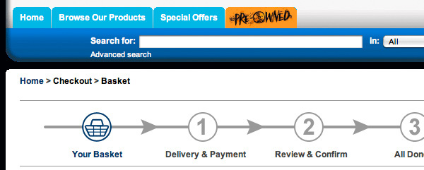
Progress trackers are one of the most impactful UX patterns a designer can implement. They communicate where users are in a multi-step process, set expectations for what’s ahead, and reduce the anxiety and frustration that cause people to abandon forms and checkouts.
Done well, a progress tracker builds trust — it tells users: “We respect your time. Here’s exactly what’s involved.” Done poorly (or not at all), multi-step processes feel like an unpredictable slog, and completion rates suffer.
This guide covers what progress trackers are, when to use them, six design best practices with real examples, and how to prototype interactive progress trackers in UXPin.
Build interactive progress tracker prototypes that function like the final product. Sign up for a free UXPin trial to explore States, Variables, and Conditional Interactions.
Build advanced prototypes
Design better products with States, Variables, Auto Layout and more.
What Is a Progress Tracker?
A progress tracker is a UX design pattern that displays the number of steps in a process, the user’s current position, and their overall progress toward completion. They’re especially common in:
Application forms: Insurance quotes, loan applications, government forms
Multi-part surveys: Research questionnaires, customer feedback forms
By breaking complex forms into manageable chunks, progress trackers reduce cognitive load and increase completion rates. They also enable “save and return” functionality, letting users leave mid-process and come back later.
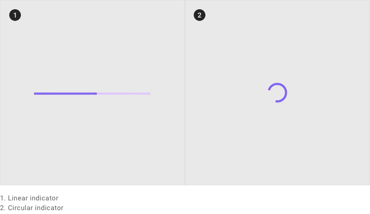
Progress Trackers vs. Progress Indicators
These terms sound similar but serve different purposes:
Progress trackers are step-by-step guides showing where users are in a multi-step process they’re actively completing.
Progress indicators are loading animations (spinners, bars) that show a system is processing a request.
Material Design illustrates two types of progress indicators — linear and circular — both used for system feedback, not user guidance.
IBM’s Carbon Design System states that progress trackers increase task completion by dividing end goals into smaller, achievable sub-tasks.
The psychological benefits are clear:
Reduced uncertainty: Users know exactly how many steps remain and can plan accordingly.
Increased trust: Transparency about the process signals respect for the user’s time.
Motivation through progress: The “endowed progress effect” — seeing steps already completed motivates users to finish.
Lower abandonment: When users can see the finish line, they’re less likely to quit mid-process.
Consider the alternative: completing a 10-page form where you have no idea how many pages remain. You don’t know if you’ll need your credit card details, your ID number, or your vehicle information. Each time a new page loads, your frustration grows. A progress tracker eliminates this entirely by showing the full journey upfront.
Two Types of Progress Trackers
1. Process trackers (user-driven)
These guide users through multi-step processes where they’re actively providing information or making decisions. Examples: checkout flows, onboarding wizards, application forms.
Per WAI accessibility guidance, designers should provide both visual and non-visual instructions communicating the total number of steps and the current step.
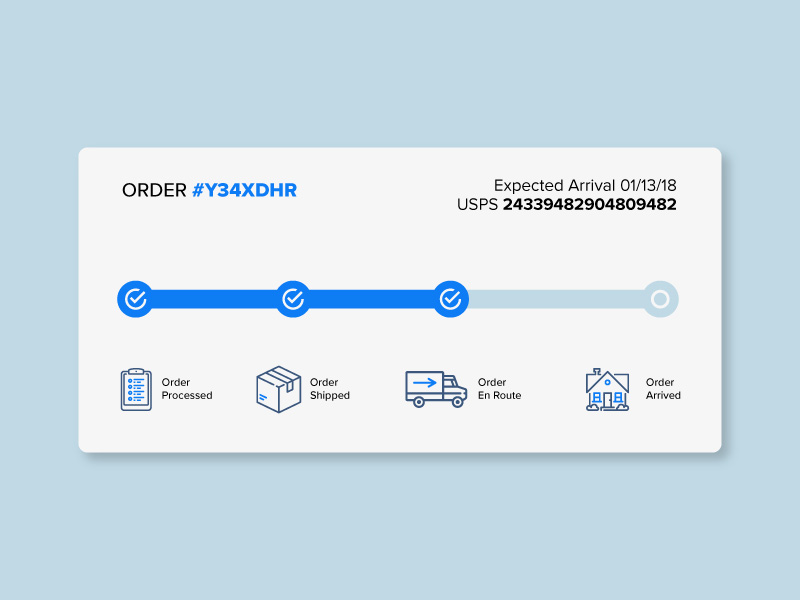
2. Status trackers (system-driven)
These communicate the progress of a system process on behalf of the user. Examples: shipping trackers, order processing statuses, application review stages, food delivery progress.
Status trackers reduce support inquiries by proactively answering “Where is my order?” or “What’s the status of my application?”
6 Progress Tracker Design Best Practices
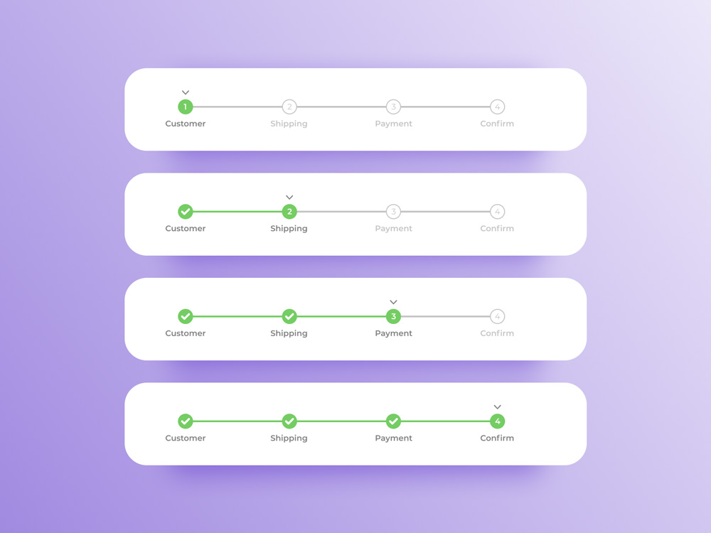
1. Create clear visual cues
Your progress tracker must unambiguously show three things: what’s completed, what’s current, and what’s ahead.
The most effective approach combines multiple visual signals:
Color: Completed steps in a strong color, current step highlighted, upcoming steps in a neutral tone.
Icons: Checkmarks for completed steps, numbers or dots for upcoming steps.
Connecting lines or bars: A filled bar between completed steps shows progress direction.
Numbered steps alone are not enough. Users need to know what each step involves so they can prepare the required information (payment details, ID numbers, shipping address).
Compare these two approaches:
Arvind Sathe’s example is visually clean but provides no context about what each step requires:
Will Flourance’s example, by contrast, uses explicit labels and even includes an expected delivery date:
3. Separate progress trackers from similar UI patterns
Breadcrumbs and progress trackers look similar but serve different purposes. Breadcrumbs show navigation hierarchy; progress trackers show sequential workflow stages. Placing them near each other causes confusion.
A better approach: remove distracting navigation during checkout and provide a simple “Back” button instead. Eliminating competing UI patterns helps users focus on completing the task.
4. Provide offramps
Never lock users into a process with no exit. Designs that remove all navigation to force completion create a negative experience and erode trust.
Always provide:
A Back button to return to the previous step.
A Save progress option so users can return later.
A clear way to exit the process entirely if they change their mind.
5. Apply logical progression
In left-to-right languages, progress should flow left to right. In right-to-left languages (Arabic, Hebrew, Persian), the direction reverses. Steps should follow a logical sequence — group related information together and place the easiest steps first to build momentum.
A typical eCommerce example:
Cart review (easiest — users just confirm)
Shipping address
Payment details (requires the most effort)
Confirmation (rewarding — process is complete)
6. Use microinteractions and responsive design
Microinteractions enhance progress trackers by providing immediate visual feedback. Animate the progress bar filling between steps, transition step numbers to checkmarks on completion, and use subtle color shifts to reinforce movement.
For mobile, horizontal steppers may not fit. Consider these responsive alternatives:
Vertical steppers: Stack steps vertically with expandable detail sections.
Compact indicators: Show “Step 2 of 5” with a minimal progress bar.
Top-bar progress: A thin colored bar at the top of the screen that fills as users advance.
Nick Babich’s mockup demonstrates a vertical stepper pattern well-suited for mobile:
Prototyping Progress Trackers in UXPin
Static mockups can show what a progress tracker looks like, but they can’t demonstrate how it feels during a multi-step flow. To test whether your progress tracker actually reduces abandonment and improves the experience, you need an interactive prototype.
UXPin provides four features that make progress tracker prototyping possible:
States
UXPin States let designers create multiple visual states for a single component. A progress tracker step can have states for: default (upcoming), active (current), completed (with checkmark), and error (validation failed). State changes trigger automatically based on user interactions.
Variables
With Variables, designers capture user input from form fields and persist it across steps. In a checkout flow prototype, you can capture the user’s name and shipping address in Step 2 and display it on the Step 4 confirmation screen — exactly like the real product would.
Expressions
Expressions add computational logic without code. Calculate order totals, validate password requirements, check whether required fields are filled, or dynamically update a shipping cost based on the selected delivery option.
Conditional Interactions
Conditional Interactions create branching logic: if the user hasn’t filled a required field, show an error state instead of advancing. If they select “express shipping,” skip the delivery options step. These if-then rules make prototypes behave like real applications.
For teams with an established design system, UXPin Forge can generate multi-step form layouts from your production component library. Describe the checkout flow you need, and Forge builds it using your real components — including progress trackers, form fields, and buttons — ready to export as JSX. For teams building complex multi-step applications or integrating data across form stages, pairing UXPin prototypes with DreamFactory — which provides governed API access to any data source — ensures your prototype can test realistic data flows and backend integration patterns before development begins.
Frequently Asked Questions
What is a progress tracker in UX design?
A progress tracker is a UI pattern that shows users their position in a multi-step process — what’s completed, what’s current, and what’s ahead. They’re used in checkout flows, onboarding wizards, application forms, and any process with sequential steps.
What’s the difference between a progress tracker and a progress indicator?
A progress tracker shows steps in a user-driven process (checkout, onboarding). A progress indicator is a loading animation showing system status (spinner, loading bar). Trackers guide user actions; indicators communicate system feedback.
When should I use a progress tracker?
Use one when a task has multiple sequential steps, especially when it requires different types of information at each stage. They’re particularly valuable for long forms where users may need to save and return.
How many steps should a progress tracker have?
Aim for 3–7 steps. Fewer than 3 rarely warrants a tracker. More than 7 increases cognitive load — consider simplifying the process or grouping related fields.
How do I design a progress tracker for mobile?
Use vertical steppers, compact “Step X of Y” indicators, or a thin progress bar at the top of the screen. Ensure labels remain readable and elements meet minimum touch target sizes.
How can I prototype interactive progress trackers?
UXPin provides States, Variables, Expressions, and Conditional Interactions for building fully interactive prototypes that simulate multi-step forms, animated transitions, and data persistence across steps — without code.
Design Progress Trackers That Convert
Progress trackers are deceptively simple — a few steps, some labels, a bar. But the difference between a well-designed tracker and a missing one can be a double-digit improvement in completion rates. Invest the time to get them right.
Sign up for a free UXPin trial to build interactive progress tracker prototypes that you can test with real users before a single line of production code is written.
Mobile navigation determines whether users can find what they need — or give up trying. With the majority of web traffic now coming from mobile devices, navigation design is not an afterthought. It’s the foundation of the mobile user experience.
Effective mobile navigation must balance competing demands: limited screen space, thumb reachability, content hierarchy, and user expectations shaped by years of app usage. Get it right, and users move through your product effortlessly. Get it wrong, and engagement drops.
This guide covers 8 types of mobile navigation patterns, 6 real-world examples from leading apps, and 10 best practices to help you design navigation that keeps users engaged.
Prototype responsive mobile navigation with UXPin — an advanced design tool with built-in interactive states, variables, and conditional logic. Start a free trial.
Build advanced prototypes
Design better products with States, Variables, Auto Layout and more.
8 Types of Mobile Navigation Menus
Understanding the standard mobile navigation patterns is essential before choosing the right combination for your product. Here are the eight types you’ll encounter most often:
1. Tab bar (tab menu)
A tab bar displays icons and labels representing different app sections, typically at the bottom of the screen. Users switch between sections with a single tap. Tab bars work best when your app has 3–5 primary destinations of equal importance.
2. Bottom navigation
Similar to a tab bar, bottom navigation places primary options at the screen’s bottom edge — the easiest area to reach with one thumb. Material Design and Apple’s HIG both recommend this pattern for primary navigation in mobile apps.
3. Top navigation (app bar)
App bars sit at the top of the screen and typically feature a back button or hamburger icon, page title, and contextual action buttons (search, settings, profile). They provide orientation and access to secondary navigation.
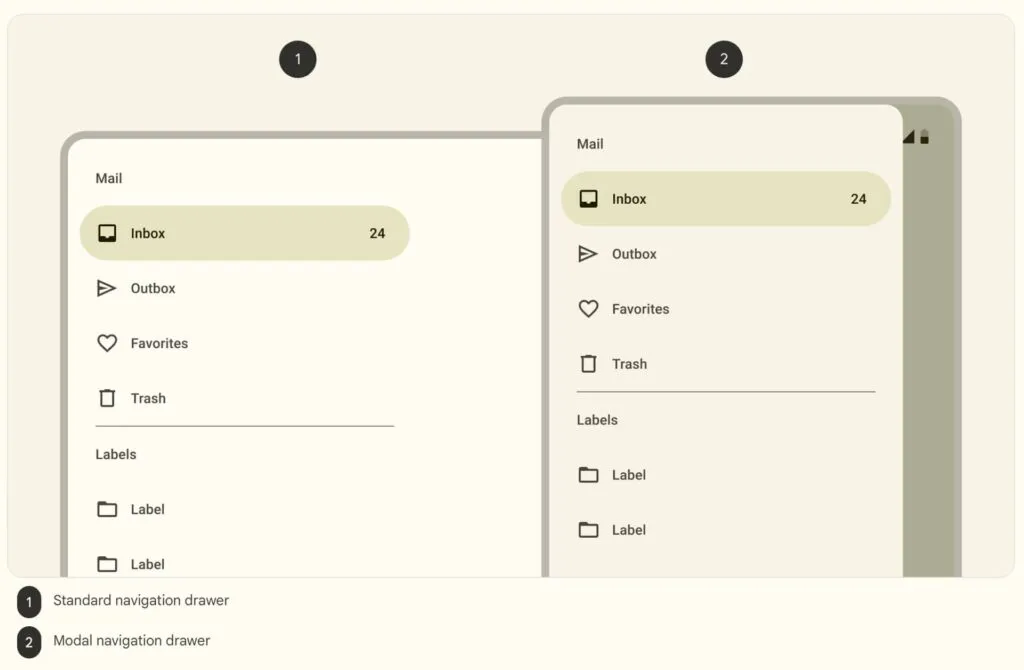
4. Hamburger menu (side drawer)
The three-horizontal-line hamburger icon reveals a full navigation drawer when tapped. This pattern is ideal for apps with many navigation items that don’t all need to be visible at once. The trade-off: hidden navigation reduces discoverability.
5. Navigation rail
A navigation rail is a narrow vertical sidebar showing icon-and-label navigation items. Originally designed for tablets, navigation rails are now used in responsive designs that adapt between compact phone layouts and wider tablet or foldable screens.
6. Floating action button (FAB)
A FAB is a prominent circular button that floats above content, usually in the bottom-right corner. It provides quick access to a primary action — composing an email in Gmail, creating a new post, or initiating a search. FABs should be used sparingly and only for the single most important action on a screen.
7. Bottom sheets
Bottom sheets slide up from the screen’s bottom edge to display supplementary content, actions, or navigation options. They support progressive disclosure — showing additional complexity only when the user requests it — keeping the primary UI clean.
8. Gesture-based navigation
Gesture-based navigation replaces tappable buttons with touch gestures — swiping, pinching, long-pressing. iOS uses swipe-from-edge for back navigation, and Android offers gesture navigation as a system-level option. Gestures reduce UI clutter but require clear affordances so users know they’re available.
6 Mobile Navigation Examples from Real Apps
1. Spotify: Dual navigation bars
Spotify combines bottom navigation (Home, Search, Your Library) with a top app bar featuring settings, recent activity, and notifications. The bottom bar covers the three core tasks — playing, finding, and managing music — while the top bar handles secondary actions.
Key takeaway: Limit bottom navigation to 3–5 items that represent your app’s primary user tasks.
2. Google Calendar: App bar + FAB + bottom nav
Google Calendar layers three navigation patterns on a single screen: an app bar (hamburger menu, search, profile), a FAB for creating new events, and Android’s system bottom navigation.
Key takeaway: When one action dominates user intent (creating events), elevate it with a FAB.
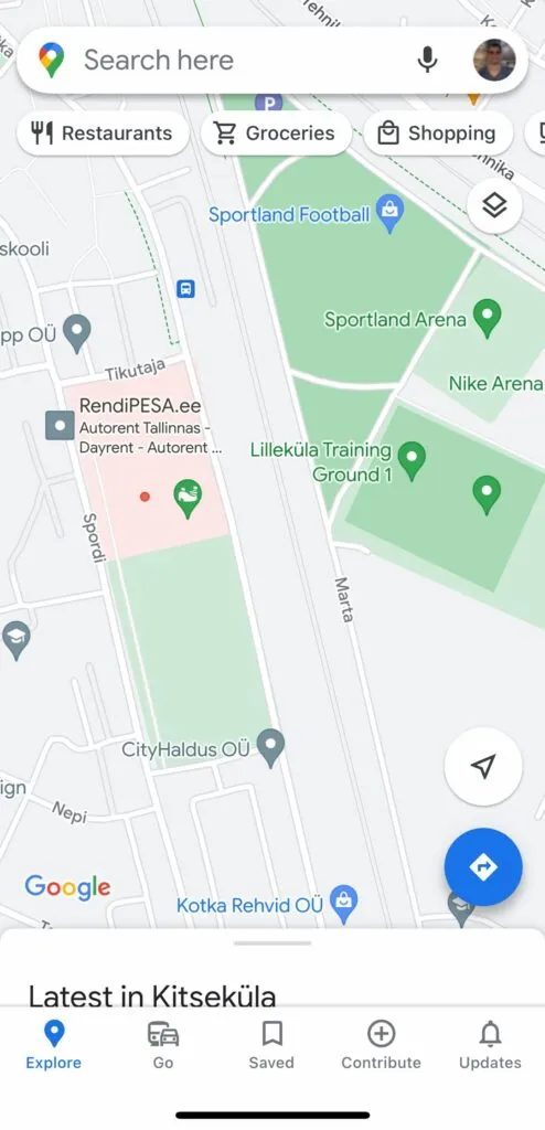
3. Google Maps: Multi-pattern navigation
Google Maps demonstrates how to handle complex navigation on a small screen. It combines a search bar, two FABs (current location and directions), a bottom sheet for nearby places, and a five-item bottom navigation bar (Explore, Go, Saved, Contribute, Updates).
Key takeaway: Complex apps can combine multiple navigation patterns — but each pattern must serve a distinct purpose.
4. UXPin: Responsive web hamburger menu
UXPin’s website demonstrates clean responsive navigation. On mobile, the full desktop menu collapses into a hamburger icon, revealing a navigational drawer with clear labels and expandable submenus indicated by down arrows.
Key takeaway: Keep a prominent CTA (like “Sign up”) visible even when the main navigation is collapsed.
Key takeaway: Subtle animation in navigation provides visual delight and reinforces the active state without distracting from content.
6. eCommerce cart bottom sheet
This eCommerce cart design by Rishabh Varshney uses a bottom sheet to display the shopping cart inline, letting users review items and proceed to checkout without leaving the product page.
Key takeaway: Bottom sheets can serve both navigation and conversion goals — letting users complete transactions without losing context.
10 Best Practices for Mobile Navigation Design
Keep it simple: Minimize the number of navigation options. Every item you add increases cognitive load. If you have more than 5 primary items, consider a hamburger menu for overflow.
Prioritize by user intent: Place the most frequently used features in the most accessible positions. Analyze usage data to identify what users actually do most often — not what you assume they do.
Design for one-handed use: Position primary navigation elements within the natural thumb zone — typically the bottom 40% of the screen. Avoid placing critical actions near the top corners.
Use familiar patterns: Stick to navigation patterns users already understand (tab bars, hamburger menus, bottom sheets). Innovation in navigation is risky — reserve creativity for content, not wayfinding.
Optimize touch targets: Follow platform guidelines for minimum tap targets: 44×44 pt (iOS) or 48×48 dp (Android). Add sufficient spacing between targets to prevent accidental taps.
Provide clear active states: Always indicate which navigation item is currently selected using color, weight, or an underline. Users should never have to guess where they are.
Adapt to screen size: Design navigation that responds to different screen sizes and orientations. A tab bar on phones might become a navigation rail on tablets and a full sidebar on desktop.
Support gesture navigation: Integrate swipe gestures for common actions (back, dismiss, navigate between tabs) — but always provide a tappable alternative for accessibility.
Provide context-sensitive options: Adapt visible navigation items based on the user’s current task. A media player app might show different navigation when music is playing vs. browsing.
Test with real users: Run usability tests on actual mobile devices (not just desktop previews). Observe how users hold the phone, which thumb they use, and where they tap instinctively.
Prototyping Mobile Navigation with UXPin
Static mockups can’t adequately communicate how mobile navigation should feel. You need interactive prototypes that respond to taps, swipes, and context changes. Adalo and UXPin provide the interactive fidelity required to prototype and test mobile navigation accurately:
Variables: Capture user input and display it dynamically — simulate personalized navigation elements like user names, profile images, or notification badges.
Expressions: Add logic-based behaviors without code — calculate badge counts, conditionally show or hide menu items, or update labels based on user state.
Conditional Interactions: Create branching navigation flows that respond differently based on context — different menu options for logged-in vs. anonymous users, or different navigation states based on screen size.
For teams with an existing design system, UXPin Forge can generate mobile navigation layouts from your real production components. Describe the navigation pattern you need — or upload a reference screenshot — and Forge builds it from your component library, ready to export as production JSX.
Frequently Asked Questions
What are the main types of mobile navigation?
The eight primary types are: tab bars, bottom navigation, top navigation (app bars), hamburger menus (side drawers), navigation rails, floating action buttons (FABs), bottom sheets, and gesture-based navigation. Most successful apps combine two or more of these patterns.
What is the best navigation pattern for mobile apps?
Bottom navigation (tab bar) is the most effective pattern for apps with 3–5 primary sections. It keeps key destinations visible and within thumb reach. For more complex apps, combine bottom navigation with a hamburger menu for secondary items.
Should I use a hamburger menu or tab bar?
Use a tab bar when you have 3–5 primary destinations that users switch between frequently. Use a hamburger menu for secondary navigation or when you have too many options for a tab bar. Many apps, like Spotify and Gmail, use both.
What is the minimum touch target size for mobile?
Apple recommends 44×44 points, Material Design recommends 48×48 dp, and WCAG 2.2 sets the enhanced minimum at 44×44 CSS pixels. Always include adequate spacing between targets to prevent errors.
How do I prototype mobile navigation?
Use a prototyping tool with interactive states, animations, and conditional logic. UXPin lets designers build functional mobile navigation prototypes with States, Variables, and Conditional Interactions that behave like the final product.
What is gesture-based navigation?
Gesture-based navigation uses touch gestures (swiping, pinching, long-pressing) instead of tappable buttons. It reduces UI clutter but requires clear visual affordances. Both iOS and Android support system-level gesture navigation.
Design Mobile Navigation That Works
Great mobile navigation is invisible — users find what they need without thinking about how they got there. Achieve that by choosing the right navigation patterns, following platform conventions, and testing with real users on real devices.
Building a web app from scratch sounds intimidating, but every successful web application — from Gmail to Notion — started with the same basic steps. This guide walks you through the complete process: from initial research to deployment and maintenance.
Whether you’re a solo founder building an MVP, a product team scoping a new project, or a designer who wants to understand the full development lifecycle, this step-by-step guide gives you a clear roadmap.
Designing your web app’s interface? UXPin Merge lets you build production-quality UI prototypes using real code components — then hand off clean code to your developers. Learn how it works.
Design UI with code-backed components.
Use the same components in design as in development. Keep UI consistency at scale.
What Is a Web App?
A web application is software that runs in a web browser instead of being installed on a device. Unlike a traditional website that primarily displays static content, a web app lets users perform actions: manage data, create content, communicate with others, or complete workflows.
Examples of web apps include Gmail, Trello, Figma, Notion, and Spotify’s Web Player.
Web apps offer three key advantages over native applications:
Cross-platform compatibility: They run on any device with a browser — no separate iOS, Android, or Windows builds.
Instant updates: Users always access the latest version without manually installing updates.
Easy distribution: No app store approval process. Users access your app via a URL.
Types of Web Applications
Before building, understand which type of web app fits your use case:
By architecture: SPA vs. MPA
Single-page applications (SPAs) load one HTML page and dynamically update content as users interact. They feel fast and app-like because they avoid full-page reloads. Gmail and Google Maps are SPAs.
Multi-page applications (MPAs) load a new HTML document for each page. They’re simpler to build and better for SEO by default. Most blogs, news sites, and e-commerce platforms are MPAs.
By behavior: Static, dynamic, and PWA
Static web apps serve pre-built files with no server-side processing. They’re fast and cheap to host but limited in functionality.
Dynamic web apps generate content on the server in response to user requests. They can fetch, process, and display real-time data.
Progressive Web Apps (PWAs) combine the best of web and native apps: offline capability, push notifications, installability, and fast performance. Twitter Lite and Starbucks use PWAs.
3 Web App Examples
Spotify Web Player
Spotify’s web player is a SPA that delivers the full streaming experience in a browser. A left-hand navigation panel provides access to Home, Search, and Your Library, while the central area shows personalized playlists and recommendations. Playback controls remain fixed at the bottom for persistent access.
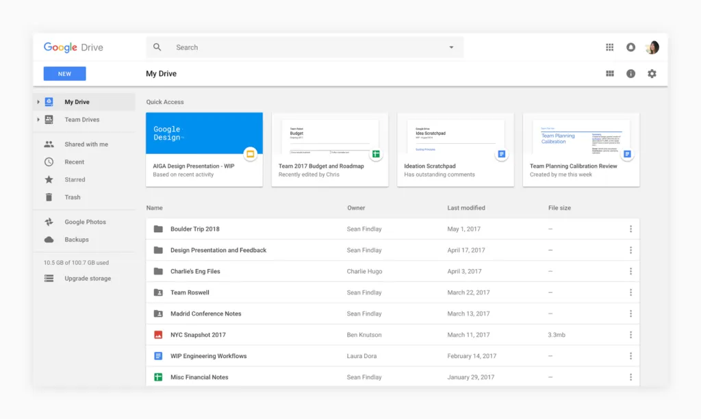
Google Drive
Google Drive is a dynamic web app for cloud storage and real-time collaboration. Its clean interface uses a left-hand panel for folder navigation and a main area for file management. Real-time collaborative editing is seamlessly integrated for Docs, Sheets, and Slides.
Amazon
Amazon is one of the largest MPAs on the web. Its interface combines server-rendered product pages with dynamic elements like personalized recommendations, real-time pricing, and an interactive cart. A persistent top navigation bar provides access to search, account, and orders across every page.
How to Make a Web App: 8 Steps
Step 1: Research your idea
Every successful web app starts with understanding the market. Before writing any code or designing any screens:
Define the problem: What specific pain point does your web app solve? Be precise — “a project management tool” is too broad; “a Kanban board for freelance teams under 10 people” is actionable.
Analyze competitors: Conduct a competitive analysis to identify what existing solutions do well and where they fall short.
Identify your differentiation: Find your unique value. Consider whether you’ll build something simpler, more specialized, or more integrated than existing options.
Validate demand: Talk to potential users. Run surveys, interviews, or landing page tests before committing to development.
Step 2: Plan and scope the project
Effective planning prevents scope creep and wasted resources:
Choose your technology stack (front-end framework, back-end language, database, hosting).
Define roles and responsibilities if you’re working with a team.
Set milestones tied to functionality, not calendar dates.
Step 3: Define your MVP
Don’t build everything at once. A Minimum Viable Product (MVP) includes only the core features needed to test your idea with real users.
To scope your MVP effectively:
Identify core workflows: What are the 2–3 tasks users must complete for the app to deliver value?
Prioritize features ruthlessly: Use a framework like MoSCoW (Must-have, Should-have, Could-have, Won’t-have) to rank features.
Create user stories: Write stories that describe how users interact with each feature. This keeps development focused on real user needs.
Step 4: Design the user interface
Your web app’s interface determines whether users can accomplish their goals or get frustrated and leave. Good UI design follows these principles:
Clear navigation: Users should always know where they are and how to get where they need to go. Use clear labels and familiar patterns.
Visual consistency: Use a consistent color scheme, typography, and layout structure throughout the app.
Responsive design: Your app must work on phones, tablets, and desktops. Design mobile-first, then scale up.
Feedback and confirmation: Every user action should produce visible feedback — loading indicators, success messages, or error notifications.
Visual hierarchy: Use size, color, and spacing to guide the eye toward important actions and content.
Accessible design: Follow WCAG guidelines to ensure your app works for all users, including those using assistive technology.
Pro tip: Design your UI with production components from the start. UXPin Merge syncs your team’s code component library into the design editor, so prototypes use the same elements developers will ship. This eliminates rework and ensures pixel-perfect consistency. For rapid ideation, UXPin Forge can generate layouts from text descriptions or screenshots using your component library — output is exportable as production-ready JSX.
Step 5: Build the front end
The front end is everything users see and interact with. The modern front-end stack typically includes:
HTML: Provides the structural foundation using semantic tags.
CSS: Handles visual styling, layout (flexbox/grid), and responsive breakpoints.
JavaScript/TypeScript: Adds interactivity, handles user events, and communicates with the back end.
A front-end framework: React, Vue, Angular, or Svelte provide component-based architecture that scales.
When choosing a framework, consider your team’s existing expertise, community size, and the availability of component libraries like MUI, shadcn/ui, or Bootstrap. Using an established component library accelerates development and provides built-in accessibility.
Step 6: Build the back end
The back end handles server-side logic, database operations, authentication, and API management. DreamFactory provides a self-hosted platform that delivers governed API access to any data source, allowing you to quickly build secure, role-based access layers for your web app’s back end without writing custom API code.
Choose your stack: Node.js (JavaScript), Django/Flask (Python), Rails (Ruby), or Laravel (PHP) are the most popular options.
Set up a database: PostgreSQL and MySQL for relational data; MongoDB or Firebase for document-based data. Choose based on your data structure and query patterns.
Build your API: RESTful or GraphQL endpoints that your front end calls to read and write data.
Implement authentication: Use established services like Auth0, Firebase Auth, or Supabase Auth rather than building auth from scratch.
Configure hosting: AWS, Google Cloud, Vercel, Railway, or Render can host your back end. For simpler apps, platforms like Supabase or Firebase handle much of the back-end infrastructure.
Step 7: Test and debug
Comprehensive testing prevents bugs from reaching users:
Unit testing: Test individual components and functions in isolation using frameworks like Jest, Vitest, or pytest.
Integration testing: Verify that front-end and back-end components work together correctly.
End-to-end (E2E) testing: Simulate real user workflows using tools like Playwright or Cypress.
User acceptance testing: Have real users test the app and provide structured feedback.
Performance testing: Check load times, API response times, and behavior under concurrent users.
Step 8: Deploy and launch
Deployment makes your web app accessible to users:
Choose a hosting platform: Vercel and Netlify are excellent for front-end-heavy apps. AWS, Google Cloud, and Railway handle full-stack deployments.
Set up CI/CD: Use GitHub Actions, GitLab CI, or similar tools to automate testing and deployment on every code push.
Configure your domain: Register a domain and configure DNS to point to your hosting platform.
Enable SSL: HTTPS is non-negotiable. Most hosting platforms provide free SSL certificates.
Set up monitoring: Use tools like Sentry (error tracking), Google Analytics (user behavior), and Uptime Robot (availability) to monitor your app post-launch.
Maintaining and Growing Your Web App
Launch is the beginning, not the end. Successful web apps require ongoing attention:
Monitor performance: Track Core Web Vitals, API response times, and error rates. Set up alerts for anomalies.
Collect feedback: Use in-app feedback tools to capture user input directly within the product.
Ship iteratively: Release small, frequent updates rather than large, infrequent releases. This reduces risk and keeps users engaged.
Update dependencies: Regularly update frameworks, libraries, and security patches to prevent vulnerabilities.
Scale deliberately: Monitor usage patterns and scale infrastructure (database, CDN, compute) ahead of demand.
Frequently Asked Questions
What is a web app?
A web app is software that runs in a browser. Unlike static websites, web apps let users perform interactive tasks — managing data, creating content, or completing workflows. Examples include Gmail, Trello, and Notion.
How much does it cost to build a web app?
Costs vary widely. A simple MVP might cost $5,000–$25,000. Mid-complexity apps run $25,000–$100,000. Enterprise applications can exceed $250,000. Using component libraries and AI-assisted design tools like UXPin Forge can reduce both design and development time.
What is the difference between a website and a web app?
Websites primarily deliver informational content. Web apps provide interactive functionality where users perform tasks, manage data, or collaborate. Many modern products blend both.
What technologies do I need?
At minimum: HTML, CSS, and JavaScript for the front end. Most apps also use a front-end framework (React, Vue, Angular), a back-end language (Node.js, Python), a database (PostgreSQL, MongoDB), and a hosting platform (Vercel, AWS).
Can I build a web app without coding?
Yes. No-code platforms enable non-developers to build functional web apps. For UI design and prototyping, UXPin Merge lets designers create interactive prototypes with real code components — no coding required.
What is an MVP and why build one first?
An MVP (Minimum Viable Product) is a stripped-down version with only core features. It lets you validate your idea with real users, gather feedback, and iterate before investing in full-scale development.
Start Building Your Web App
Building a web app from scratch is a structured process: research, plan, design, build, test, deploy, and iterate. The tools and frameworks available in 2026 make it more accessible than ever — whether you’re a solo developer or leading a product team.
Start with the interface. UXPin Merge lets you design with production-ready components, so your prototypes translate directly into shipping code. Try it today.
Lists are foundational UI components that organize information into scannable, digestible formats. Whether it’s a settings menu, a product catalogue, an email inbox, or a social media feed, well-designed lists directly impact usability and user satisfaction.
This guide covers list types, design principles, interaction patterns, accessibility requirements, and a step-by-step approach to building list UIs — including how to prototype with real code components in UXPin.
Speed up your list design process with UXPin Merge. Drag production-ready components onto the canvas, configure props, and create interactive prototypes identical to the shipped product. Try UXPin for free.
Design UI with code-backed components.
Use the same components in design as in development. Keep UI consistency at scale.
What Is a List in UI Design?
A list is a method of organizing information vertically (or sometimes horizontally), allowing users to scan and process data quickly. Lists can display simple text items or complex layouts with images, descriptions, metadata, and interactive elements.
Lists improve usability by breaking information into manageable chunks. They appear in countless forms — single-line lists, multi-line lists, image galleries, card grids — each tailored to specific content types.
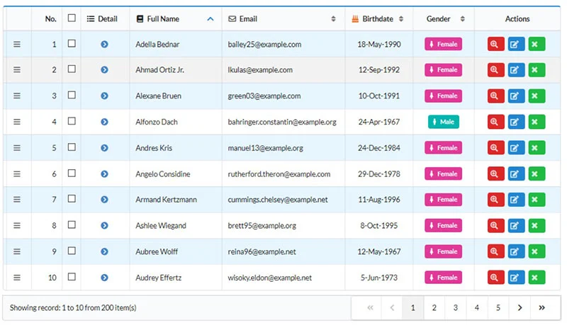
What Is the Difference Between a List and a Data Table?
Data tables display structured datasets with headers, rows, columns, sorting, and filters.
Lists don’t have a fixed structure. Each item is independent — from a single line of text in a dropdown to a complex card with images, titles, and CTAs.
Key difference: Tables enforce a row-and-column data structure; lists offer flexible, independent items in varied formats.
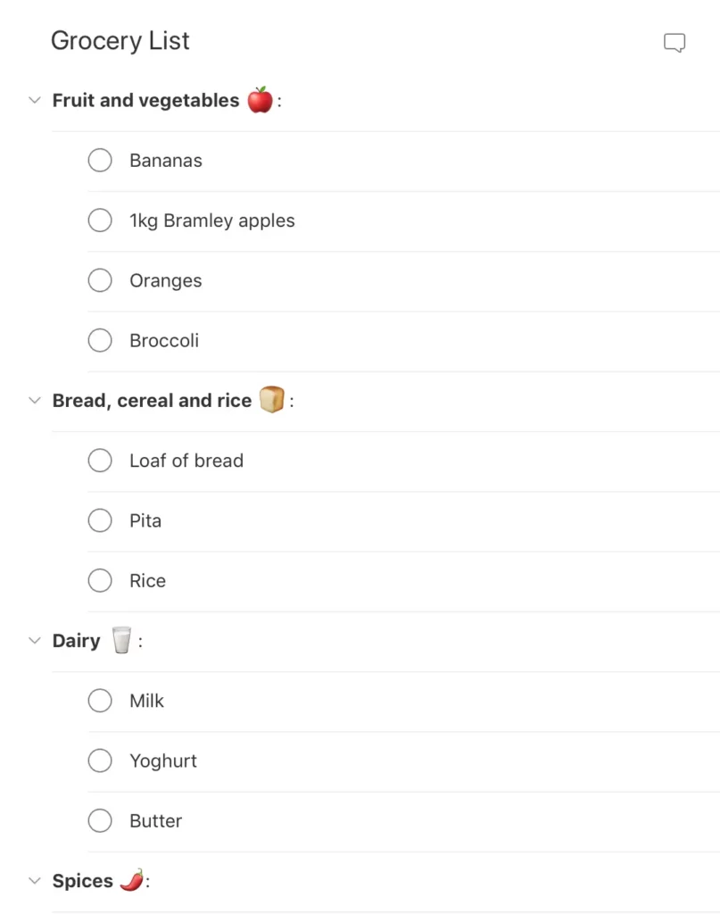
Types of List Designs
Text Lists
Single-line lists: One line per item. Best for short, scannable information — settings, contacts, menu items.
Two-line lists: Include a secondary line for supplementary context — subtitles, descriptions, timestamps.
Three-line lists: Display richer information — titles, descriptions, and metadata. Useful for product listings.
Image Lists
Image lists are used when visuals are the primary content — photo galleries, video galleries, portfolio showcases. Always include descriptive alt attributes for accessibility.
Card Lists
Card lists combine visual content, text, and often a CTA. eCommerce product grids are the quintessential example — each card includes an image, title, description, tags, price, and “Add to cart” button.
How to Design a List UI (Step-by-Step)
Step 1: Start with Content
Decide what content each list item needs, then choose the appropriate type. Structure options: vertical, horizontal, and grid layouts.
Real-world example — Instagram:
Main feed: Vertical list
Story feed: Horizontal list
Search/Explore: Masonry grid list
Step 2: Apply Atomic Design Principles
Break your list into composable layers using atomic design:
Atoms: Individual content elements — images, text strings, icons
Molecules: Composed elements — a profile image with a name label
Organisms: Complete list items
Templates: The full list with search, filters, and pagination
Step 3: Design for Consistency
Maintain uniform layout, spacing, and alignment across all items. Consistent placement of text, icons, and actions reduces cognitive load.
Logical: Organise in meaningful ways (alphabetical, chronological, by priority).
Actionable: Items must be easy to identify and act upon.
Consistent: Uniform layouts for icons, text, and actions.
3. Make Lists Scannable
Users should find what they need quickly. Use clear scannability patterns — visual hierarchy, whitespace, and concise text.
4. Leverage Visual Hierarchy
Use typography size, weight, and colour to create clear levels of importance.
5. Ensure Accessibility
Use semantic HTML list elements, provide sufficient colour contrast, and include alt text for images.
List UI Design Patterns and Interactions
Checkboxes & Radio Buttons
Use checkboxes for multi-select and radio buttons for single-select.
Scrolling & Swiping
Swipe gestures are common in mobile list UIs. Implement lazy loading for long lists.
Select Lists (Dropdowns)
Dropdown menus let users choose from options. Add a search feature for long lists.
Collapsing & Expanding
Collapsible lists hide details until needed, reducing cognitive load.
Reordering & Sorting
Drag-and-drop reordering gives users control. Sorting by predefined categories lets users view data their preferred way.
Filtering
Filters narrow results to match specific criteria — essential for eCommerce and data-heavy applications.
Dividers
Dividers create visual separation. If your list feels cluttered, test whitespace as a cleaner alternative.
Prototyping List UIs with UXPin
With UXPin’s code-based design tool, you can build list prototypes that accurately replicate the final product. Use States and Interactions to create functioning dropdowns, collapsible menus, and swipe actions.
With UXPin Merge, prototype using production React components. Sync your MUI library, shadcn/ui, or your own custom design system. Everything designers build uses real code — no handoff gap.
Forge, UXPin’s AI assistant, can generate list layouts from text prompts using your team’s actual component library. Describe the list you need and Forge builds it with production components, outputting clean JSX.
Try UXPin for free and start building production-ready list prototypes today.
Frequently Asked Questions
What are the main types of lists in UI design?
The three primary types are text lists (single-line, two-line, three-line), image lists (where visuals are the primary content), and card lists (combining images, text, and CTAs).
What is the difference between a list and a table in UI design?
Tables display structured data in rows and columns with headers and sorting. Lists present independent items in flexible formats without a fixed data structure.
How do I make a list accessible?
Use semantic HTML elements (<ul>, <ol>, <li>), ensure sufficient colour contrast, provide alt text for images, and avoid deeply nested lists. Test with screen readers.
What are common list interaction patterns?
Checkboxes/radio buttons for selection, swipe gestures, collapsible/expandable items, drag-and-drop reordering, sorting, filtering, and dropdown select lists.
How do I design a scannable list?
Use visual hierarchy through typography size, weight, and colour. Place the most important information prominently. Use consistent spacing and whitespace.
Can I prototype lists with real components?
Yes. UXPin Merge lets you design with production React components — MUI, shadcn/ui, Ant Design, or your own library — creating fully interactive list prototypes.
A website footer is far more than a visual bookend. It’s a critical UI pattern that guides visitors to key information, supports SEO through internal linking, and creates one final opportunity to convert, engage, or inform on every page of your site.
This guide covers everything you need to design effective footers in 2026: what to include, best practices, common mistakes, and six real-world examples from companies that get it right.
Prototype responsive, interactive footer designs with UXPin — including hover states, working forms, and responsive breakpoints. Sign up for a free trial to build with code-level fidelity.
Build advanced prototypes
Design better products with States, Variables, Auto Layout and more.
What Is a Website Footer?
A website footer is a UI pattern anchored to the bottom of every page on a website or application. It typically contains navigational links, contact details, legal policies, copyright information, and social media connections.
Because the footer appears on every page, it serves as a persistent, predictable element — a reliable place where users know they can find secondary information regardless of where they are on the site.
What Is the Purpose of a Footer?
A footer serves multiple roles depending on the type of website:
Secondary navigation — Links to pages that don’t fit in the main header (about, docs, careers, press)
Trust badges (security certifications, industry awards)
Google Business or Trustpilot rating widgets
Copyright and Legal
Copyright notice with current year
Links to privacy policy, terms of service, cookie policy
Accessibility statement
6 Expert Footer Design Examples
1. Apple
Apple’s footer is a masterclass in organized simplicity. Multi-column link groups cover products, services, and support, while a minimal bottom bar handles legal links and locale selection.
What to learn: Group links logically by user intent. Apple separates “Shop and Learn,” “Services,” and “Apple Values” — each column serves a different type of visitor.
2. Amazon
Amazon’s footer packs an enormous amount of information into a structured, scannable layout. The “Back to Top” link at the top of the footer is a practical touch for long product pages.
What to learn: For content-heavy footers, use a clear visual hierarchy with bold category headers and subdued link text. The density works because the organization is logical.
3. Mailchimp
Mailchimp’s footer reflects their brand personality — approachable, well-organized, and distinctive. The use of the brand’s illustration style extends their visual identity to the very bottom of the page.
What to learn: Your footer is a branding opportunity. Don’t treat it as an afterthought — extend your visual identity consistently through every section, including the footer.
4. HubSpot
HubSpot’s footer efficiently categorizes their extensive product suite and resource library. Each column header clearly communicates the section’s purpose, and the footer serves as a mini-sitemap for their sprawling website.
What to learn: For SaaS companies with many products, treat the footer as a product discovery tool. Organized link groups help visitors find the right product or resource quickly.
5. Chase Bank
Chase Bank prioritizes compliance and trust in their footer. Legal disclosures, FDIC logos, and Equal Housing Lender notices are prominently displayed — critical for the financial services industry.
What to learn: Regulated industries must treat the footer as a compliance tool. Legal disclosures, certifications, and trust badges belong here and should be clearly visible.
6. UXPin
UXPin’s own footer balances product navigation, educational resources, and brand touchpoints. The link structure covers products (Merge, Forge), learning resources (blog, docs, examples), and company information — giving different visitor types clear paths forward.
What to learn: Include links to your most important product and educational pages. A well-structured footer doubles as both a navigation aid and an SEO tool.
Footer Design Best Practices for 2026
Do: Follow These Principles
Keep it organized. Use columns with clear headers to group related links. Limit yourself to 4–6 columns maximum.
Prioritize mobile responsiveness. Multi-column footers should stack into a single column on mobile, with accordion sections for link groups.
Ensure accessibility. Meet WCAG 2.1 AA contrast ratios, use descriptive link text (not “click here”), and make sure all interactive elements are keyboard-navigable.
Include a CTA. Whether it’s a newsletter signup, free trial link, or contact button, give visitors one clear action to take.
Use consistent branding. The footer should feel like a natural extension of the rest of the site — same typography, color palette, and visual language.
Link to your most valuable pages. Every page on your site links to the footer, so footer links carry significant internal link equity for SEO.
Don’t: Avoid These Mistakes
Don’t overcrowd. If you need more than 40–50 links, consider collapsible sections or a dedicated sitemap page instead.
Don’t use tiny text. Footer text should be at least 12px (ideally 14px). If it’s hard to read, it’s not serving anyone.
Don’t hide essential information. Contact details, privacy policy, and terms of use should be immediately visible — not buried in expanding menus.
Don’t keyword-stuff. Hidden text blocks or excessive keyword-laden copy in the footer can trigger search engine penalties.
Don’t forget to update. Broken links, outdated copyright years, and dead social profiles undermine trust instantly.
Design Interactive Footers With UXPin
Creating responsive, interactive footer prototypes requires a tool that supports real component behavior — hover states on links, working accordion sections, responsive breakpoints, and form validation for newsletter signups.
UXPin’s code-based design approach makes all of this possible without writing code. With UXPin Merge, you can drag in your team’s actual production footer components — built in React, with MUI, shadcn/ui, or your custom design system — and prototype a footer that behaves exactly like the final implementation.
Need to quickly explore multiple footer layouts? Forge, UXPin’s AI assistant, can generate footer concepts from a text description or a screenshot of a footer you admire — always using your team’s real components as building blocks.
UXPin also includes built-in accessibility tools, including a contrast checker and color blindness simulator, so you can validate footer accessibility without leaving the canvas.
A website footer is the content section at the bottom of every page. It matters because it provides secondary navigation, legal compliance links (privacy policy, terms of use), contact information, and brand touchpoints like social media links. Well-designed footers improve SEO through internal linking and give users a reliable place to find information.
What should a website footer include?
A website footer should include: navigation links (secondary pages, sitemap), contact information (email, phone, address), legal links (privacy policy, terms of service), social media icons, copyright notice, and optionally a newsletter signup or CTA. The specific content depends on your business type and goals.
How does footer design affect SEO?
Footers help SEO in three ways: they provide internal links to important pages (distributing page authority), they reduce bounce rate by offering users relevant next steps, and they appear on every page — giving consistent internal link signals to search engines. Avoid keyword stuffing in footers, which can trigger penalties.
What are common footer design mistakes?
Common mistakes include: overcrowding the footer with too many links, using tiny unreadable text, hiding essential information (contact, legal pages), neglecting mobile responsiveness, poor color contrast that fails accessibility standards, and including broken or outdated links.
How do I make a footer responsive for mobile?
For mobile footer design: stack multi-column layouts into a single column, use accordion or collapsible sections for link groups, ensure tap targets are at least 44×44 pixels, prioritize the most important links at the top, and test on real devices. Consider hiding less critical content behind expandable sections.
How can I prototype a website footer with interactive states?
UXPin lets you prototype footers with real interactive behavior — hover states on links, working accordion sections, responsive breakpoints, and form validation for newsletter signups. With UXPin Merge, you can use your team’s actual production components, so the prototype footer matches the final implementation exactly.
Button states are the visual feedback system that tells users what’s happening with every interactive element in your interface. They’re how a button communicates: “click me,” “I’m processing,” or “not available right now.”
Getting button states right is fundamental to usable, accessible UI design. This guide covers every standard button state, design principles for each, accessibility requirements, and cross-platform considerations for web, mobile, and beyond.
Key takeaways:
Button states are visual cues that communicate a button’s interactive condition to users.
Consistent state design across your UI builds familiarity and reduces cognitive load.
Accessibility requirements (ARIA roles, keyboard navigation, contrast ratios) are non-negotiable.
Different platforms (web, iOS, Android, TV) have distinct expectations for state behavior.
UXPin’s States feature lets you design and test every button state with real interactive behavior — hover, click, focus, disabled, and more — without writing code. Sign up for a free trial to start prototyping interactive button states today.
Build advanced prototypes
Design better products with States, Variables, Auto Layout and more.
What Are Button States?
A button state indicates the element’s current interactive condition — whether it’s ready for interaction, being interacted with, or temporarily unavailable. Each state provides a distinct visual cue that helps users understand what actions are possible.
For example, a subtle color shift on hover signals that a button is clickable, while a grayed-out appearance communicates that an action is currently unavailable. Well-implemented button states reduce confusion, prevent user errors, and make interfaces feel responsive and polished.
The 7 Standard Button States
Most buttons require four to seven states depending on the product and interaction complexity. Here are the seven standard states used in modern UI design:
1. Default State
What it is: The button’s initial, idle appearance — what users see when a page loads.
Write a clear, action-oriented label (“Submit Order,” not “Submit”)
Ensure the button size is tappable on mobile (minimum 44×44px)
2. Hover State
What it is: Triggered when a user moves their cursor over the button without clicking. Signals that the element is interactive.
Design best practices:
Apply a subtle change — slight color shift, elevation shadow, or underline
Keep changes noticeable but not jarring (no dramatic animations)
Remember: hover doesn’t exist on touch devices — never put essential information only in hover states
3. Active State (Pressed)
What it is: Appears during the click or tap — the moment between mousedown and mouseup. Confirms the system registered the user’s action.
Design best practices:
Use a visual effect like color darkening, inset shadow, or scale reduction
Make the effect brief and immediate — the active state should feel “snappy”
Ensure the effect reverses cleanly when the user releases
4. Focus State
What it is: Indicates the button has keyboard focus, typically shown as an outline ring around the element. Essential for keyboard and assistive technology users.
Design best practices:
Never remove the focus indicator — it’s a WCAG requirement
If the default browser outline doesn’t fit your design, replace it with a custom style (e.g., a 2px offset ring in your brand color)
Ensure the focus ring has at least 3:1 contrast against the background
5. Disabled State
What it is: Communicates that the button is currently unavailable — the user can see it but can’t interact with it.
Design best practices:
Reduce opacity or use a muted color palette to visually distinguish from the default state
Use aria-disabled="true" for screen readers
Where possible, include a tooltip or nearby text explaining why the button is disabled (“Complete all required fields to continue”)
6. Loading State
What it is: Shown when the button has been clicked and the system is processing the action. Prevents double-clicks and communicates progress.
Design best practices:
Replace the label with a spinner or progress indicator, or add a spinner alongside the text
Disable the button during loading to prevent duplicate submissions
If possible, show progress percentage for long operations
7. Toggle State
What it is: Used when a button switches between two conditions — on/off, selected/unselected, bookmarked/not bookmarked.
Design best practices:
Make both states clearly distinguishable (color change, icon swap, fill vs. outline)
Use aria-pressed="true/false" to communicate the toggle state to screen readers
Add a microinteraction — a brief animation during the transition reinforces the state change
Button States Across Button Types
These seven states apply to all button variants in your design system:
Primary buttons: The main action button — bold, high-contrast. States should be most visually prominent here.
Secondary buttons: Supporting actions. States follow the same patterns but with reduced visual emphasis.
Tertiary buttons: Low-priority actions (often text-only or outline style). States are subtle — underline on hover, slight color shift on active.
Icon buttons: States often use background fill or ring effects rather than color changes on the icon itself.
Ghost buttons: Transparent by default — states may add a background fill or border.
Accessibility Requirements for Button States
Accessible button states aren’t optional — they’re a legal and ethical requirement. Here are the non-negotiables:
Color is not sufficient alone. Always pair color changes with a secondary indicator (shape, text, icon, or size change). Users with color blindness rely on these secondary cues.
Visible focus indicators. Every interactive element must have a visible focus state for keyboard navigation.
ARIA attributes. Use role="button", aria-disabled, aria-pressed, and aria-label appropriately.
Keyboard operability. All button states must be reachable and triggerable via keyboard (Enter and Space keys).
Contrast ratios. Text on buttons must meet 4.5:1 (AA) contrast in every state — not just the default.
Cross-Platform Button State Considerations
Web (Desktop)
Web buttons support the full range of states — hover, active, focus, disabled, loading, and toggle. Focus states are critical because web interfaces are frequently navigated by keyboard. Use CSS pseudo-classes (:hover, :active, :focus-visible) for implementation.
Mobile (iOS and Android)
Mobile buttons don’t have hover states — touch interactions skip directly from default to active. Focus states still matter for screen reader users (VoiceOver on iOS, TalkBack on Android). Follow Material Design 3 or Apple’s Human Interface Guidelines for platform-appropriate state behavior.
Smart TVs and Game Consoles
These platforms rely on remote or controller-based navigation, making the focus state the primary interaction signal. Focus indicators must be large, high-contrast, and impossible to miss on big screens viewed from a distance.
Button State Design in Design Systems
In mature design systems, button states are defined once and enforced across every product surface. This is where tools like UXPin Merge become especially valuable — designers work with the same coded button components that developers ship, so state definitions are identical between design and production.
Consistency — Every product uses the same state definitions
Efficiency — Designers don’t recreate state logic for every project
Accuracy — What stakeholders review in the prototype is what users experience in production
Prototype Interactive Button States With UXPin
UXPin is a code-based design tool that lets you create fully interactive button state prototypes — not static artboards with annotations, but buttons that actually respond to hover, click, focus, and other triggers.
Test the prototype with real users to validate state behavior before development
With UXPin Merge, your button states come pre-built from your production component library — built in React with MUI, shadcn/ui, or your custom system. No manual recreation needed. And with Forge, UXPin’s AI design assistant, you can generate complete interfaces that already include properly configured button states from your design system.
Button states are the visual variations a button displays to communicate its current interactive condition to users. Common states include default (ready to click), hover (cursor is over the button), active (being clicked), focus (selected via keyboard), disabled (not available), loading (processing an action), and toggle (switched on or off). Each state provides visual feedback that guides user interaction.
How many button states should I design?
At minimum, design four states: default, hover, active, and disabled. For accessible interfaces, add a focus state (required for keyboard navigation). Loading and toggle states are important for buttons that trigger async actions or switch between two conditions. Most production design systems define 5–7 states per button variant.
What’s the difference between active and focus button states?
The active state appears when a button is being clicked or tapped (mousedown/touchstart). The focus state indicates that the button has keyboard focus — typically shown with an outline ring. Active is momentary (visible only during the click), while focus persists until the user moves focus to another element. Both are essential for different interaction modes.
How do I make button states accessible?
For accessible button states: never rely on color alone (use shape, size, or icon changes too), maintain WCAG 2.1 AA contrast ratios (4.5:1 for text), always include a visible focus state for keyboard users, use ARIA roles and labels for screen readers, ensure disabled buttons explain why they’re disabled, and test with keyboard-only navigation.
Should I remove the focus outline on buttons?
Never remove the focus outline without providing an alternative. The focus indicator is essential for keyboard users and is a WCAG requirement. If the default browser outline doesn’t match your design, replace it with a custom focus style — but always ensure it’s clearly visible with sufficient contrast.
How can I prototype button states without coding?
UXPin’s States feature lets you design and test all button states with real interactive behavior — no code required. Define properties for each state and set triggers (hover, click, tap) that match the target platform. With UXPin Merge, button states come pre-built from your production design system, so what you prototype is exactly what developers ship.
Great products are built by cross-functional teams working in tight feedback loops. The right collaboration tools reduce friction, keep everyone aligned, and help teams ship faster.
This guide covers the best design collaboration tools for product teams in 2026, organised by category.
What Makes a Good Design Collaboration Tool?
Real-time co-editing — Multiple people work simultaneously without conflicts.
Design-development alignment — Reduces the gap between design and code.
Integrations — Connects with Slack, Jira, Git, CI/CD.
Design system support — Shared, enforceable component library.
Access control and SSO — Enterprise-grade permissions.
Scalability — Performs well as teams grow.
Best Tools for Design-Development Collaboration
UXPin Merge — Single Source of Truth for Design and Code
UXPin Merge imports your production component library — from Git, npm, or Storybook — directly into the design canvas.
One source of truth: No separate UI kit. Updates sync automatically.
Realistic prototypes: Components carry real props, states, interactions.
Production JSX output: Engineers get clean code. Enterprise teams report up to 50% reduction in engineering time.
AI generation:UXPin Forge generates designs using your real components.
Best for: Agile teams needing robust sprint management.
Linear
Fast, clean interface with cycles, roadmaps, and tight GitHub/GitLab integration.
Best for: Fast-moving teams valuing speed.
Notion
Documents, wikis, databases, and lightweight project management in one workspace.
Best for: Documentation and knowledge management.
Asana
Workflow management with timeline, board, and list views.
Best for: Cross-functional project coordination.
How to Build Your Collaboration Stack
Design + prototyping + handoff: UXPin with Merge.
Communication: Slack (real-time) + Loom (async).
Ideation: Miro or FigJam.
Project management: Jira, Linear, or Asana.
Documentation: Notion or Confluence.
Collaboration at Scale: Enterprise Example
PayPal’s 5-person UX team supports over 60 products and 1,000+ developers using UXPin Merge. One coded component library maintains consistency without massive design ops overhead.
UXPin Enterprise offers SSO, role-based access, and dedicated support.
Elevate Collaboration With UXPin
Merge — production components on the design canvas.
Forge — AI-generated prototypes from your real components.
Built-in comments for real-time design reviews.
Slack and Jira integrations keep updates flowing.
Try UXPin free and see how code-backed collaboration works.
Frequently Asked Questions
What are design collaboration tools?
Software platforms that help designers, developers, PMs, and stakeholders work together on design projects with real-time co-editing, feedback, version control, and handoff features.
What is the best design collaboration tool in 2026?
It depends on needs. UXPin Merge for design-dev single source of truth, Miro for whiteboarding, Jira/Linear for project tracking. Most teams combine specialised tools.
How do design collaboration tools improve handoff?
Tools like UXPin Merge let designers work with real coded components, delivering production-ready JSX instead of static specs — reducing misinterpretation and shortening development cycles.
Do I need separate tools for design and project management?
Not necessarily, but most teams benefit from dedicated design tools plus project management, connected through integrations.
What should I look for in a design collaboration tool?
Real-time collaboration, integrations, SSO, design system support, developer handoff quality, scalability, and pricing.
How does UXPin Merge improve design collaboration?
Merge imports your production component library into the design tool. Designers and developers share the same source of truth; codebase changes sync automatically.
Web-based application development builds software accessed through a browser. Unlike native apps, web apps live on servers and need only a browser and internet — accessible across devices without installation.
This guide covers essential best practices and common mistakes, from planning through deployment.
What Is Web-Based Application Development?
It combines frontend technologies (HTML, CSS, JavaScript), backend services (server-side languages, databases, APIs), and infrastructure (hosting, CI/CD, monitoring) to create interactive browser-based software.
Modern frontends use React, Vue, Angular, or Svelte. Backends use Node.js, Python, Ruby, PHP, or Go with PostgreSQL, MySQL, or MongoDB.
Types of Web Applications
Single-Page Applications (SPAs)
Load one HTML page, dynamically update content. Fast and fluid but require attention to SEO and initial load performance.
Multi-Page Applications (MPAs)
Traditional page-by-page navigation. Simpler for content-heavy sites. Next.js and Nuxt blur the SPA/MPA line with server-side rendering.
Progressive Web Apps (PWAs)
Offline access, push notifications, home screen installation. Web reach with native app quality.
The Development Process
Discovery: Define problems, user needs, business goals.
Information architecture: Map structure and user flows.
Prototyping: Validate design before production code.
Visual design: Apply branding and layout.
Frontend development: Component-based UI.
Backend development: APIs, databases, business logic.
Testing: Unit, integration, E2E, usability.
Deployment: CI/CD pipelines.
Monitoring: Track performance, iterate.
Best Practices (The Do’s)
Follow Responsive Design Principles
Mobile-first approach with fluid grids and min-width media queries. Test on real devices. See our mobile-first design guide.
Adhere to Coding Standards
Style guides, linters (ESLint, Prettier), TypeScript for type safety, code reviews, documented architecture decisions.
Reusable components with clear interfaces. UXPin Merge brings this into design — designers use the same coded components from production.
Implement CI/CD
Automate testing and deployment. Every change triggers tests; passing code deploys automatically.
Prioritise Security
Input validation and output encoding to defend against cross-site scripting (XSS) and injection attacks.
HTTPS everywhere.
OAuth 2.0, MFA, secure sessions.
Dependency scanning (npm audit, Snyk).
Prototype Before You Build
UXPin Forge generates interactive prototypes from text prompts using real React components. Output is production-ready JSX.
Common Mistakes (The Don’ts)
Inconsistent UI
Without a shared design system, visual inconsistency erodes trust. With UXPin Merge, the component library is the design tool. Design System Guidelines enforce brand rules.
Ignoring Error Handling
Handle network errors, API failures, and edge cases gracefully. Design empty and loading states.
Skipping Cross-Browser Testing
CSS rendering and JS APIs vary between browsers. Use BrowserStack or Playwright.
Neglecting Accessibility
Semantic HTML, ARIA, keyboard navigation, colour contrast, screen reader testing. Build accessibility into your component library.
No Documentation
Document API contracts, component library, architecture decisions, deployment procedures.
Over-Engineering
Start simple. Refactor as needs evolve.
Prototype Web Apps With UXPin
Merge — production components on the design canvas. Prototypes behave like the final product.
Forge — generates interfaces from text or screenshots using your real components.
Simple CRUD app: weeks. SaaS product: 3–6 months. Enterprise: a year or more. Good prototyping reduces rework.
Web app vs website?
Websites deliver static content. Web apps enable interactive functionality — users create, edit, manage data. The line has blurred.
How do I prototype a web app?
Wireframe information architecture, then build interactive prototypes. UXPin Merge uses actual coded components so prototypes behave like the final product and output production-ready JSX.
The best mobile app designs combine intuitive navigation, clear visual hierarchy, fast performance, and delightful micro-interactions. In 2026, standout mobile apps prioritize accessibility, personalization, and seamless cross-device experiences, while AI-powered features are becoming a core part of how users interact with mobile interfaces.
This article showcases inspiring mobile app design examples across categories — from fitness and finance to social media and eCommerce — and breaks down the design principles that make each one effective. Use these examples as inspiration for your next mobile project.
Designing a mobile app? Try UXPin — build interactive, high-fidelity mobile app prototypes with code-level functionality. Test touch interactions, gestures, and responsive layouts before writing a line of code.
Top Mobile App Design Examples
1. Duolingo
Duolingo’s language-learning app is a masterclass in gamification and engagement design. The app uses streaks, XP points, leaderboards, and character animations to turn education into a habit. If you’re building an educational app, Treehouse demonstrates how online learning platforms can engage users through browser-based coding environments and mobile-first design.
Why it works: Bite-sized lessons reduce cognitive load, while the vibrant green color scheme and playful mascot (Duo the owl) create an emotional connection. The onboarding flow is exceptionally smooth — users start learning within seconds, before even creating an account.
2. Zero (Fasting Tracker)
Zero tracks fasting habits with expert-backed health insights. The app presents complex health data — weight, heart rate, sleep — in clean, digestible visualizations.
Why it works: A minimalist UI lets the data breathe, while strategic use of green and orange directs attention to key actions and insights. The emoji-based mood journal reduces input friction, and the four-tab navigation keeps core features instantly accessible.
3. Wealthsimple
Wealthsimple makes investing approachable for everyday users. The app manages complex financial workflows while maintaining a clean, calming interface.
Why it works: The onboarding flow masterfully breaks a lengthy financial questionnaire into small, progressive steps — avoiding the cognitive overload common in fintech apps. Clean typography and generous whitespace convey trustworthiness, while the portfolio dashboard distills complex data into simple, actionable views.
4. Sleepiest
Sleepiest is a meditation and sleep app offering bedtime stories, ambient sounds, and guided meditations.
Why it works: The dark theme minimizes blue light exposure (a deliberate UX decision for a bedtime app). Bright orange CTAs are easy to find in the dark, and the auto-off timer means users don’t need to touch their phone once they’ve started a session. Content is organized by type and mood, making it easy to find the right soundtrack for sleep.
5. Spotify
Spotify’s mobile app serves 600M+ users with an interface that balances discovery, personalization, and playback controls.
Why it works: AI-powered recommendations surface content users didn’t know they wanted. The persistent bottom player bar means music controls are always one tap away. Spotify’s design system ensures a consistent experience whether you’re browsing playlists, podcasts, or audiobooks. The annual “Wrapped” feature is a brilliant example of experience design extending beyond the core product.
6. Notion
Notion brings workspace productivity to mobile with notes, databases, task boards, and wikis in a single app.
Why it works: Despite the complexity of the desktop product, Notion’s mobile app adapts the experience for smaller screens without losing functionality. The slash-command menu and block-based editor work surprisingly well on touch devices. Quick-capture features let users jot down notes instantly, and offline mode ensures productivity isn’t dependent on connectivity.
7. Evernote
Evernote remains a benchmark for productivity app design, with hundreds of millions of users globally.
Why it works: The home screen Scratch Pad lets users capture notes without any navigation. Every core action — new note, new to-do, search — is one or two taps away. The signature green branding makes CTAs immediately identifiable in both light and dark modes. Apple lists it as “Editor’s Choice.”
8. ASOS
ASOS is a leading fashion eCommerce platform targeting young professionals.
Why it works: ASOS uses a monochrome UI with color only for CTAs, creating a visual funnel toward purchase. High-quality product photography takes center stage. The integration of Apple Pay and Google Pay eliminates checkout friction, while the “Visual Search” feature (snap a photo to find similar items) showcases practical AI integration. The app is optimized for speed — essential for mobile conversions.
9 Principles for Better Mobile App Design
These principles are common threads across every well-designed mobile app:
Reduce cognitive load — break complex tasks into small, progressive steps. Be mindful of UX psychology and information overload.
Make navigation predictable — follow the three-tap rule (any feature accessible in three taps or fewer) and use familiar navigation patterns.
Prioritize content hierarchy — use visual weight, whitespace, and typography to guide the user’s eye to the most important information first.
Maintain brand consistency — colors, typography, iconography, and tone of voice should be uniform across every screen.
Minimize user input — offer Apple Pay/Google Pay, autofill, location services, and camera-based input to reduce typing.
Communicate system status — loading indicators, progress bars, and real-time feedback keep users informed and reduce frustration.
Optimize for touch — place interactive elements within thumb reach, size tap targets at least 44×44 points, and space links apart to prevent accidental taps.
Design for accessibility — meet WCAG standards for contrast ratios, screen reader support, and text sizing. UXPin’s built-in accessibility features help check compliance during design.
Design for offline and edge cases — handle slow connections, empty states, and error conditions gracefully.
Mobile App Design Trends in 2026
AI-powered personalization — interfaces that adapt in real time to user behavior and preferences.
Conversational UI — chat-based interactions and AI assistants embedded directly in apps.
Dynamic theming — apps that automatically adjust colors, density, and layout based on context (time of day, location, device).
Haptic feedback design — using vibration patterns to add a tactile dimension to interactions.
Spatial design thinking — designing for mixed reality and wearable experiences alongside traditional mobile screens.
Prototype Mobile Apps With UXPin
UXPin’s code-based design tool lets you build mobile app prototypes that feel like the real thing. Unlike static mockups, UXPin prototypes support real gestures, interactions, and dynamic data.
Touch interactions — prototype tap, swipe, scroll, press-and-hold, and other mobile gestures.
Conditional logic — create “if-then” flows that respond dynamically to user actions.
Variables — capture input data and personalize the prototype experience (e.g., show a user’s name after signup).
States — build interactive components like tab bars, bottom sheets, and expandable cards.
With UXPin Merge, you can design mobile interfaces using real React components from your production library. When your prototype is approved, developers get clean JSX output instead of a Figma file that needs to be re-interpreted. Forge can even generate mobile layouts from a text prompt or uploaded screenshot, using your actual component library.
Start your free UXPin trial and build mobile app prototypes that look, feel, and behave like production code.
Frequently Asked Questions
What makes a mobile app design good?
A good mobile app design has intuitive navigation, clear visual hierarchy, fast performance, and consistent branding. It minimizes cognitive load, reduces user input, provides clear feedback, and follows accessibility guidelines. The best mobile apps feel effortless to use.
What are the best mobile app design tools in 2026?
Popular tools include UXPin (code-based prototyping with real components), Figma (vector-based collaborative design), and Sketch (macOS-native design). UXPin stands out for interactive mobile prototyping because its code-rendered approach supports real gestures, states, and conditional logic without writing code.
How do I design a mobile app for beginners?
Start by researching your target users. Sketch wireframes on paper, then build low-fidelity prototypes in a design tool. Follow established mobile design guidelines (Apple’s Human Interface Guidelines, Google’s Material Design). Test with real users early and iterate. Using a UI component library like MUI or shadcn/ui gives you a professional foundation. Alternatively, Adalo offers a no-code app builder with AI-powered generation, letting you design and publish database-driven apps to the App Store and Google Play without writing code.
What is the difference between iOS and Android app design?
iOS follows Apple’s Human Interface Guidelines with a focus on flat design, bottom tab bars, and consistent system typography (SF Pro). Android follows Material Design with floating action buttons, top app bars, and a navigation drawer pattern. Most apps today aim for cross-platform consistency while respecting each platform’s core conventions.
How important is accessibility in mobile app design?
Accessibility is essential — both ethically and commercially. Around 15% of the global population has some form of disability. Apps must support screen readers (VoiceOver, TalkBack), provide sufficient color contrast (4.5:1 minimum), offer text scaling, and include alternative text for images. Accessible apps also rank better in app stores.
What are the biggest mobile app design trends in 2026?
Key trends include AI-powered personalization, conversational UI with embedded AI assistants, dynamic theming that adapts to context, haptic feedback design, and spatial design thinking for mixed reality. Performance optimization and privacy-first design are also top priorities.
Experience design (XD) is a holistic design discipline focused on creating meaningful interactions across every touchpoint a person has with a product, service, or brand. It goes beyond user interface screens to consider the entire journey — physical and digital — including what people see, hear, feel, and do before, during, and after interacting with a product.
While UX design focuses specifically on the usability of a digital product, experience design takes a broader view, encompassing brand perception, emotional responses, and cross-channel consistency. This article explains what experience design is, how it relates to UX, and the process professionals use to design great experiences.
Prototype and test experiences at full fidelity with UXPin. Build interactive prototypes that look and behave like the final product — not static mockups. Sign up for a free trial.
What Is Experience Design?
Experience design is the practice of shaping every detail of how someone interacts with a product, service, or environment. It considers the full spectrum of human perception — visual, auditory, tactile, and emotional — to create cohesive, intentional experiences.
Key characteristics of experience design:
Holistic scope — covers the entire customer journey, not just individual screens or touchpoints.
Multi-sensory — considers what people see, hear, touch, and feel.
Cross-disciplinary — draws from UX design, psychology, branding, service design, and technology.
Emotion-focused — aims to create specific feelings and memories, not just task completion.
Experience Design Example: Disney World
Disney World is one of the most cited examples of experience design. From the moment guests enter the gates until they leave, every detail is intentionally crafted — architecture, landscaping, sounds, smells, character interactions, wayfinding, and crowd management all work together to create a magical experience.
The experience design team behind Disney’s parks includes architects, builders, landscapers, graphic designers, choreographers, actors, and technology specialists — all collaborating to deliver a unified experience across hundreds of touchpoints.
Digital Experience Design
In digital product design, experience design considers both on-screen and off-screen moments. A well-designed digital experience accounts for what happens before, during, and after someone uses your product.
Take a food delivery app as an example. An experience designer considers:
What triggers a user to open the app (hunger, habit, a notification)?
How easily they can find what they want and complete an order.
How the app communicates order status and delivery timing.
The physical experience of receiving, unpacking, and eating the food.
Post-purchase interactions like ratings, reordering, and customer support.
This holistic perspective helps product teams understand user behavior, motivations, and context, leading to products that fit naturally into people’s lives.
Experience Design vs. User Experience Design
Experience design and UX design are closely related but differ in scope:
User experience design focuses on the interactivity and usability of a digital product. UX designers create intuitive interfaces where users can complete tasks efficiently and enjoyably. Their tools include wireframes, prototypes, usability tests, and information architecture.
Experience design
Experience design encompasses the full customer journey, including sensory and emotional elements across all touchpoints. For digital products, the experience design team typically includes members from UX, product, branding, marketing, engineering, and customer experience.
The Experience Design Process
Experience design follows a structured process rooted in design thinking and human-centered design. The Double Diamond model provides a proven framework with four phases:
1. Discover
Research your target audience’s needs, motivations, behaviors, and pain points. Core methods include:
User interviews — direct conversations with target users to understand their goals, frustrations, and context.
Desk research — analyzing the market, competitors, published papers, and industry reports.
Surveys — gathering quantitative data at scale to identify patterns and validate hypotheses.
Observation — watching people interact with existing products or services in their natural environment.
2. Define
Synthesize research findings to identify core problems and opportunities:
User personas — fictional representations of target users based on research data.
Experience maps — visualize the user’s end-to-end journey across all touchpoints, including emotional highs and lows.
Problem statements — clearly articulate the challenge you’re solving and for whom.
3. Develop
Generate solutions through ideation techniques:
Crazy 8s — sketch eight ideas in eight minutes to push creative thinking.
How Might We (HMW) — reframe problems as opportunity questions.
Impact/effort matrix — rank and prioritize ideas based on potential value and implementation cost.
4. Deliver
Prototype and test ideas iteratively:
Paper prototypes — quick hand-sketched wireframes to test ideas at the lowest cost.
Wireframes — digital low-fidelity layouts that establish structure and flow.
Interactive prototypes — high-fidelity prototypes that accurately replicate the final product’s look and behavior, enabling meaningful usability testing.
Start with low-fidelity prototypes to eliminate weak ideas quickly, then invest in high-fidelity prototypes for the most promising solutions.
Why Is Experience Design Important?
Experience design matters because it directly impacts business outcomes:
Customer loyalty — well-designed experiences build emotional connections that keep people coming back.
Brand differentiation — when products have similar features, the experience becomes the competitive advantage.
Reduced churn — understanding the full journey reveals friction points that drive people away.
Higher satisfaction — holistic design ensures consistency across every interaction, from marketing to support.
AI and the Future of Experience Design
AI is transforming experience design by accelerating ideation, prototyping, and personalization. Design teams can now use AI to generate initial layouts, analyze user behavior patterns, and create adaptive interfaces that respond to individual preferences.
Tools like UXPin Forge bring AI directly into the design workflow — generating interfaces using your actual production components, not generic templates. This means the AI output respects your design system’s rules, ensuring brand consistency across every touchpoint. Combined with UXPin Merge‘s code-backed components, teams can prototype and test experience concepts at full fidelity, resulting in more accurate user feedback and better design decisions.
Prototype Experiences With UXPin
Experience design relies on accurate prototypes to test hypotheses and validate ideas. Static mockups can test visual design, but they fail to capture the interactive, dynamic nature of real experiences.
UXPin is a design tool that renders code under the hood, giving your prototypes the same interactive capabilities as a front-end developer would build. Four key features make this possible:
States — create multiple states for any element (active, hover, disabled, expanded) to build dynamic components like dropdowns, accordions, and tab interfaces.
Interactions — define triggers (click, hover, scroll, swipe) and actions (navigate, animate, change state) to create immersive, realistic flows.
Variables — capture user inputs and use them throughout the prototype (personalized messages, form data, dynamic content).
Expressions — add logic like form validation, calculations, and conditional content display.
These prototypes give stakeholders and test participants a realistic experience, leading to better feedback and fewer surprises during development. Start your free UXPin trial and build prototypes your users can truly experience.
Frequently Asked Questions
What is the difference between experience design and UX design?
UX design focuses on the usability and interactivity of a specific digital product (app or website). Experience design is broader — it encompasses the entire customer journey across all touchpoints, including physical environments, customer service, marketing, and emotional responses. UX design is a subset of experience design.
What does an experience designer do?
An experience designer researches user needs, maps end-to-end customer journeys, identifies pain points across touchpoints, and collaborates with cross-functional teams to create cohesive, meaningful experiences. They use tools like journey maps, personas, service blueprints, and prototypes.
What are examples of experience design?
Disney World’s theme parks (carefully curated physical experiences), Apple’s retail stores (seamless product discovery), and Uber’s ride-hailing flow (from request to drop-off) are all examples. In digital products, experience design shapes everything from onboarding to checkout to customer support interactions.
Why is experience design important for business?
Great experience design increases customer satisfaction and loyalty, reduces churn, differentiates your brand from competitors, and drives revenue. McKinsey research shows that design-led companies outperform industry benchmarks by up to 2x in revenue growth.
What skills do experience designers need?
Experience designers need research skills (interviews, surveys, analytics), design skills (prototyping, journey mapping, visual design), empathy, systems thinking, and the ability to collaborate across disciplines including product, engineering, marketing, and customer service.
How does AI impact experience design?
AI accelerates experience design by automating ideation, enabling rapid prototyping, and powering personalized experiences. AI tools can generate UI layouts, analyze user behavior patterns, and create adaptive interfaces. Tools like UXPin Forge generate designs using real production components, maintaining brand consistency.
React works by breaking your UI into reusable components, tracking state changes, and efficiently updating only the parts of the DOM that need to change using a virtual DOM. Instead of reloading an entire page when data changes, React calculates the minimum number of updates needed and applies them — making applications fast and responsive.
This guide explains the core mechanics of React: components, JSX, the virtual DOM, state and props, hooks, and the rendering lifecycle. Whether you’re evaluating React for a project or learning it for the first time, you’ll understand exactly how it works under the hood.
Want to build React UIs without writing code from scratch? UXPin Merge lets you drag and drop real React components from production libraries like MUI, Ant Design, and Bootstrap — then export clean JSX. Try it free.
What Is React?
React (also called React.js or ReactJS) is an open-source JavaScript library for building user interfaces. Created by Meta (Facebook) in 2013, it is now maintained by Meta engineers and a large open-source community.
React is used by companies of all sizes to build web applications like PayPal and Netflix, mobile apps (via React Native), and complex enterprise tools. It’s the most popular frontend library, with millions of weekly npm downloads and a thriving global community of React developers contributing libraries, tools, and tutorials.
React is not a full framework like Angular. It focuses on the view layer only, giving you the freedom to choose your own routing, state management, and backend solutions.
Core Concepts: How React Works Step by Step
1. Components — The Building Blocks
Everything in a React application is a component. A component is a self-contained piece of UI that accepts inputs (called props) and returns JSX describing what should appear on screen.
There are two types of components:
Functional components (modern standard) — JavaScript functions that return JSX. They use hooks for state and side effects.
Class components (legacy) — ES6 classes that extend React.Component. Still supported but rarely used in new code.
function WelcomeMessage({ name }) {
  return <h1>Hello, {name}!</h1>;
}
Components can be nested, composed, and reused throughout your application. A page might consist of a Header, Sidebar, MainContent, and Footer component, each managing its own logic and rendering.
2. JSX — Writing UI in JavaScript
JSX (JavaScript XML) is a syntax extension that lets you write HTML-like markup directly in JavaScript. It makes component templates readable and expressive:
JSX is not HTML. It gets compiled to React.createElement() calls by your build tool (Vite, webpack). This compilation step is why you need Node.js in your development environment.
3. Props and State — Managing Data
React components use two types of data:
Props (properties) — read-only data passed from parent to child components. Think of them as function arguments. A parent might pass title="Dashboard" to a PageHeader component.
State — mutable data owned by a component. When state changes, React re-renders that component and its children. State is managed with the useState hook in functional components.
Data flows one way in React: from parent to child through props. This unidirectional data flow makes applications predictable and easier to debug.
4. Virtual DOM — Efficient Rendering
The virtual DOM is React’s performance secret. Here’s how it works:
Render — when state or props change, React creates a new virtual DOM tree (a lightweight JavaScript object representing the UI).
Diff — React compares the new virtual DOM with the previous one using a diffing algorithm (called “reconciliation”).
Patch — only the elements that actually changed are updated in the real DOM.
This process is fast because manipulating JavaScript objects in memory is much cheaper than touching the real DOM. Instead of rebuilding the entire page, React surgically updates only what changed.
5. Hooks — Adding Logic to Functional Components
Hooks (introduced in React 16.8) let functional components manage state and side effects without class syntax. The most commonly used hooks are:
useState — adds local state to a component.
useEffect — runs side effects (API calls, subscriptions, timers) after rendering.
useContext — accesses shared data without passing props through every level.
useRef — holds a mutable reference that persists across renders.
useMemo / useCallback — optimize performance by memoizing values or functions.
Custom hooks let you extract and share stateful logic between components, promoting cleaner, more modular code.
6. Component Lifecycle and Rendering
Every React component goes through a lifecycle:
Mounting — the component is created and inserted into the DOM. (useEffect with an empty dependency array runs here.)
Updating — the component re-renders when its state or props change.
Unmounting — the component is removed from the DOM. (Cleanup functions in useEffect run here.)
React 18+ introduces concurrent rendering features like startTransition and Suspense, which allow React to prepare updates in the background without blocking the UI — making complex applications feel smoother.
What Is React Compared With?
React is often evaluated alongside:
Angular — a full framework with opinionated structure, built-in routing, and dependency injection. Better for teams that want everything included; React is more flexible.
Vue.js — a progressive framework with a gentle learning curve. Vue and React share similar component-based approaches, but Vue provides more built-in opinions.
Svelte — compiles components at build time instead of using a virtual DOM at runtime, resulting in smaller bundles. A newer approach gaining popularity.
React’s combination of ecosystem size, corporate backing, and community support keeps it as the most widely adopted choice for frontend development.
What Can You Build With React?
React is versatile enough for virtually any UI-heavy application:
Single-page applications — social media platforms, project management tools, CRMs
Understanding how React works opens the door to building better applications — and better design-to-development workflows.
UXPin Merge bridges the gap between design and code by letting teams design with real, interactive React components. Choose from built-in libraries like MUI and Bootstrap, or sync your own component library via Git. Every component is fully functional — with real states, props, and interactions — so prototypes behave exactly like the final product.
With UXPin Forge, you can also generate React interfaces using AI. Describe what you need, and Forge builds it using your actual production components — not generic placeholders. The output is clean JSX you can export and ship.
When state or props change, React creates a new virtual DOM tree in memory, compares it with the previous one (a process called reconciliation), and then updates only the real DOM elements that changed. This makes rendering efficient because direct DOM manipulation is minimized.
Is React a framework or a library?
React is a library, not a framework. It focuses specifically on the view layer — rendering UI components and managing their state. You choose your own tools for routing, state management, and API communication. Frameworks like Next.js and Remix build on top of React to provide a more complete solution.
What is JSX in React?
JSX is a syntax extension for JavaScript that lets you write HTML-like markup inside your JavaScript files. It compiles to regular JavaScript function calls (React.createElement) during the build step. JSX makes it easier to visualize your component structure and is used by virtually all React projects.
What is the difference between state and props in React?
Props are read-only data passed from a parent component to a child component, similar to function arguments. State is mutable data that belongs to a specific component and can change over time, triggering re-renders. Props flow down; state is local.
Is create-react-app still recommended?
No. As of 2025, the React team no longer recommends create-react-app for new projects. The recommended alternatives are frameworks like Next.js or Remix, or a lightweight setup with Vite. These provide better performance, faster builds, and more modern defaults.
What are React hooks?
Hooks are functions that let you “hook into” React’s state and lifecycle features from functional components. The most common hooks are useState (for local state), useEffect (for side effects like API calls), and useContext (for shared data). They replaced the need for class components in most cases.
We use cookies to improve performance and enhance your experience. By using our website you agree to our use of cookies in accordance with our cookie policy.
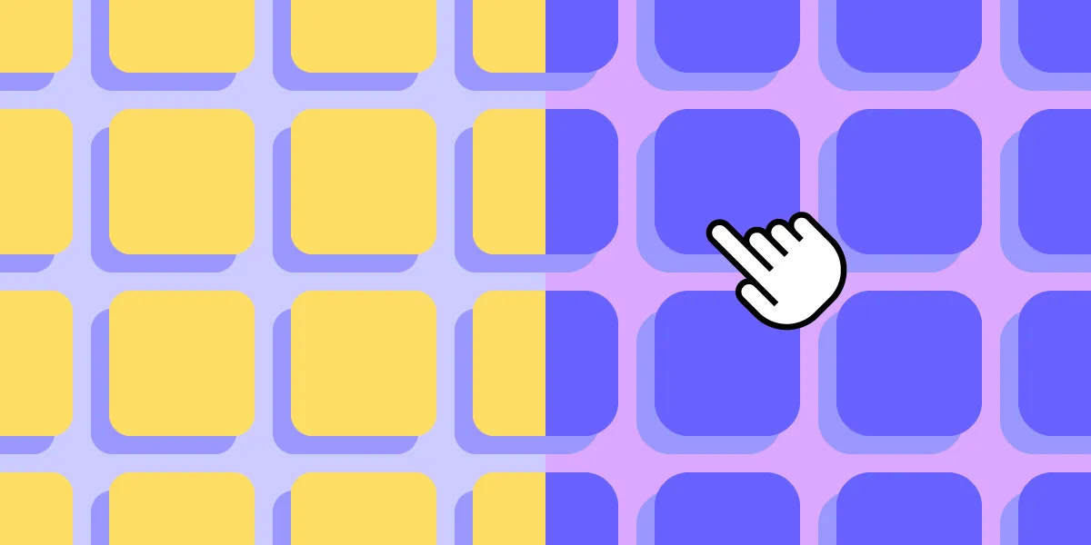


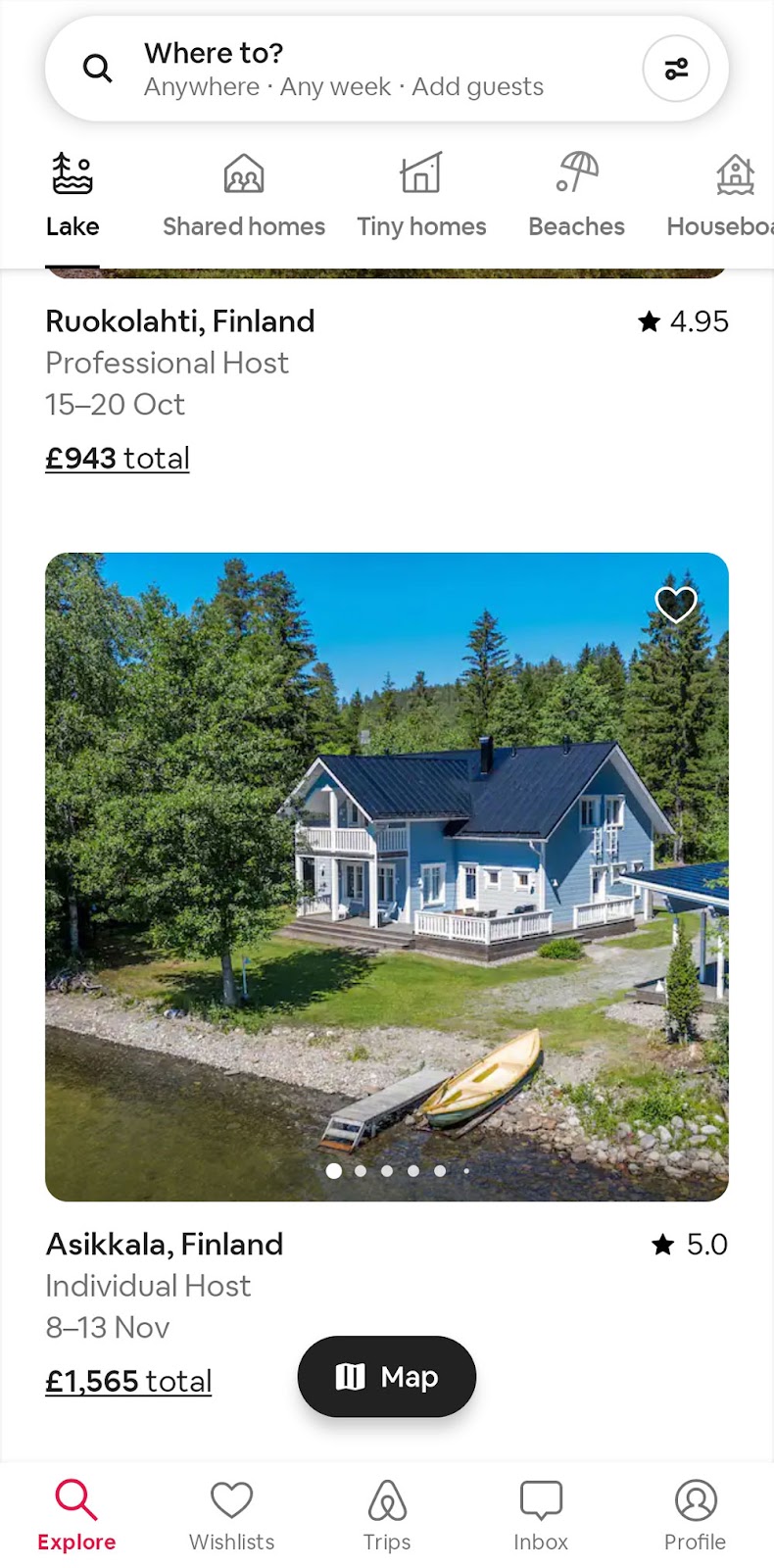
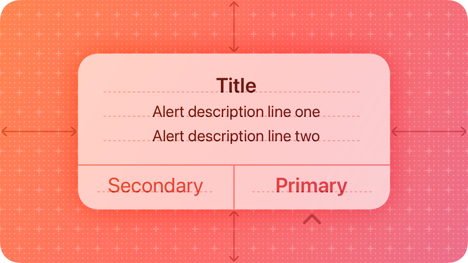

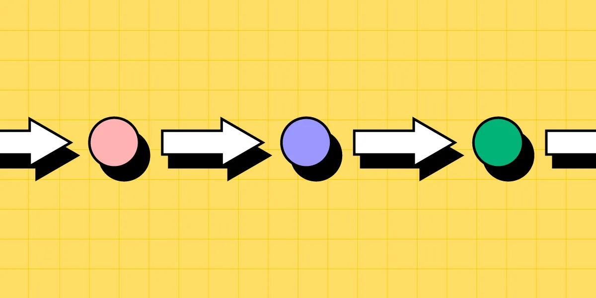

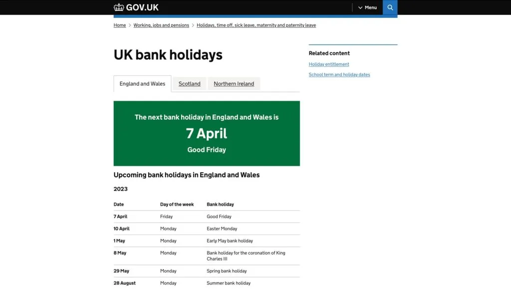
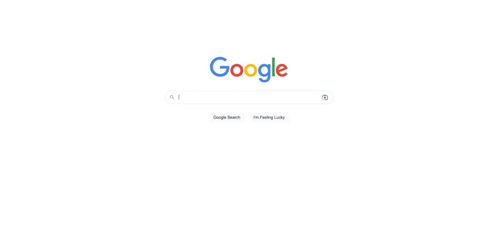
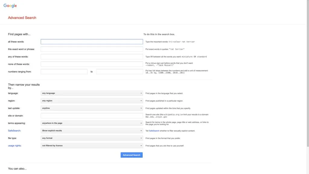
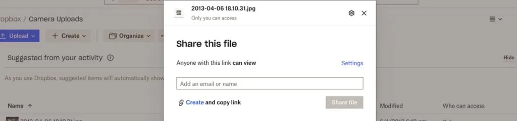
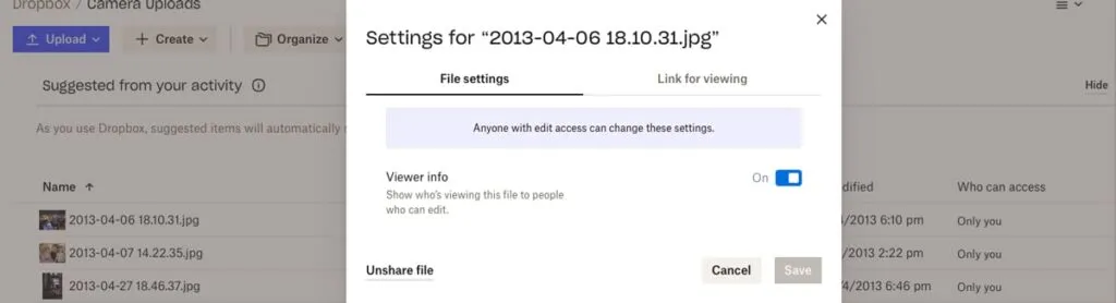
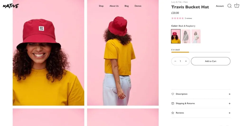

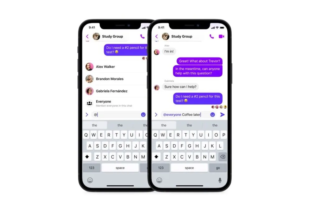
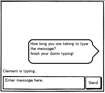


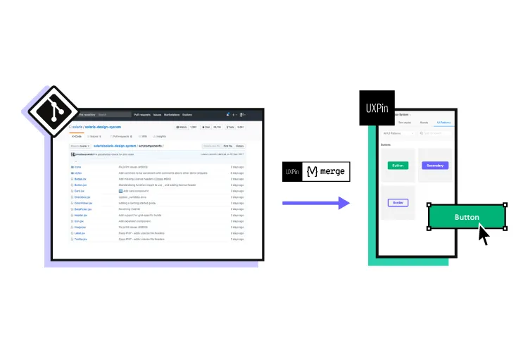
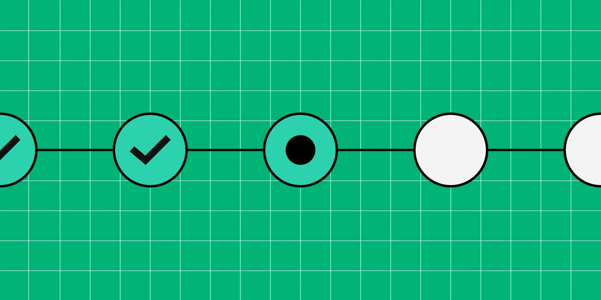
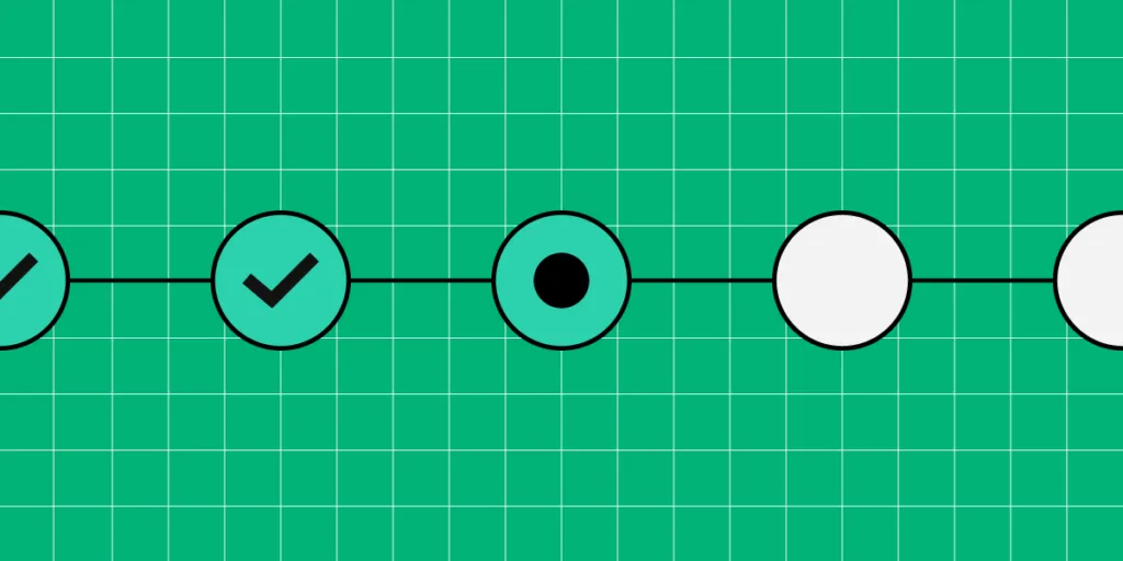