Design Iteration: The Complete Guide to Iterative Design (2026)


Design iteration process — the complete guide to iterative design

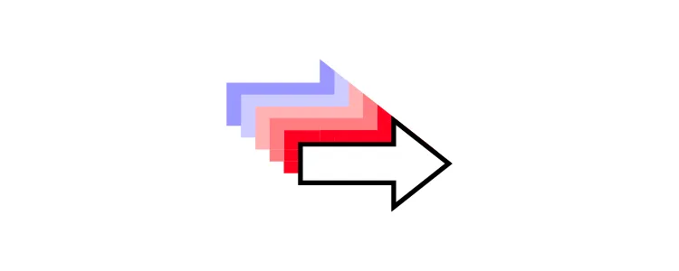
Design iteration is the engine that drives every successful product. Instead of trying to get the design perfect on the first attempt — an approach that almost always fails — iterative design uses short, focused cycles of building, testing, and refining to converge on solutions that genuinely work for users.

This guide explains what design iteration is, why it’s essential, the five stages of the iterative design process, where iteration is used across disciplines, best practices for faster cycles, and how AI-powered tools are compressing iteration timelines in 2026.

Need to iterate faster? UXPin Merge lets teams prototype with production-ready React components, so every iteration reflects the real product — not an approximation. Pair it with Forge to generate starting layouts in seconds using your actual component library. Try UXPin for free.

What Is Design Iteration?

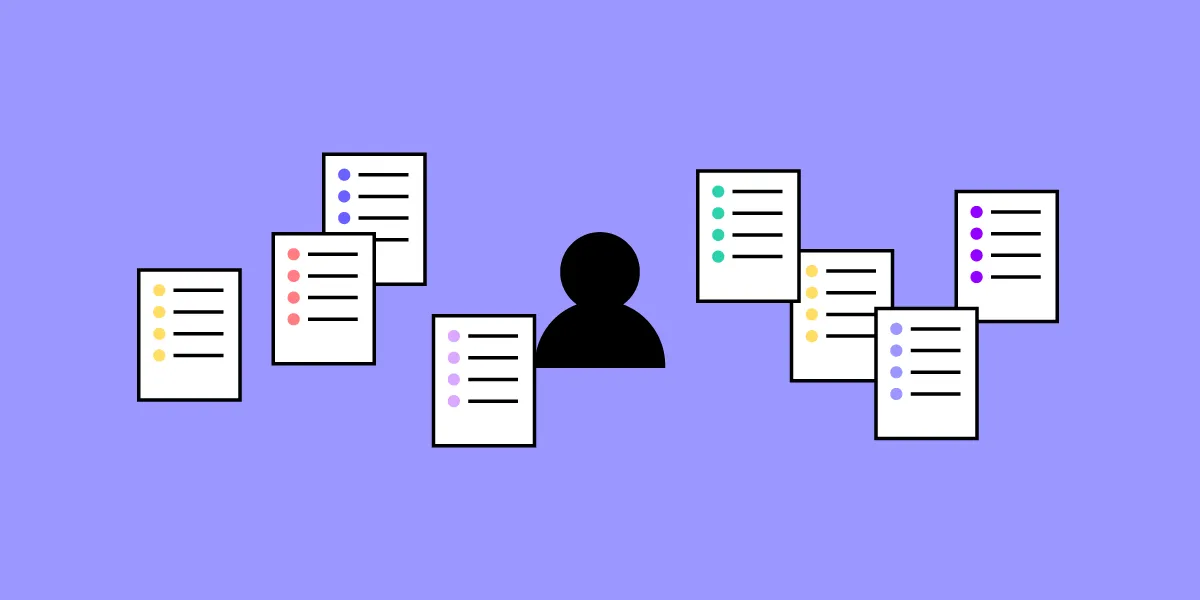
Design iteration is the repeatable process of improving a product — or a specific part of a product — through short, focused cycles. Each cycle, or “iteration,” can take the form of a high-fidelity prototype, a mid-fidelity wireframe, a low-fidelity sketch, or even a simple diagram like a sitemap.

The goal is not to reach perfection in one pass. It’s to learn something from each cycle — what works, what doesn’t, what users actually need — and apply those lessons to the next version.

Why Is Design Iteration Essential?

Jumping straight into development without iterating is the most expensive mistake in product design. When the first version a user sees is the shipped product, the journey from “worst possible version” to “best possible version” becomes enormously costly.

Iterative design mitigates this risk by:

  • Surfacing problems early — when they’re cheap to fix.
  • Validating assumptions — before they become expensive code.
  • Incorporating real feedback — from users, stakeholders, and data.
  • Building team alignment — through shared artifacts everyone can react to.

A better approach to designing user interfaces is to iterate in cycles. You learn along the way, using feedback and evidence to inform how the design should look and function. The path won’t be straight, but you won’t move completely in the wrong direction either.

Benefits of an Iterative Design Process

scaling process up

It Saves Time and Resources

An iterative process almost always saves the most time because it provides regular feedback that propels the team forward at a steady pace. Positive feedback confirms you’re on the right path; negative feedback redirects you before you’ve invested too much. With no feedback, you risk rushing to the finish line only to fail — a far costlier outcome.

It Facilitates Cross-Functional Collaboration

Iteration gives stakeholders regular opportunities to provide feedback and share ideas. Designers, engineers, product managers, and even customers contribute perspectives that no single person could generate alone.

It Addresses Real User Needs

Without iteration, designers risk working in an isolated bubble — becoming too introspective, making hasty assumptions, and falling into unproductive perfectionism. A structured iterative process keeps the team focused on user needs and ensures decisions are grounded in real feedback rather than guesswork.

It Enables Parallel Workflows

For developers, iterative design means implementation can begin even while design is still in progress. Validated components and screens can move to development while other parts of the product are still being refined — shortening overall delivery timelines significantly.

UXPin prototypes can be shared with stakeholders in seconds. Designers can begin collecting contextual feedback comments as reviewers test iterations that look and function like the real product.

Where Is Iteration Used?

process direction

Iteration isn’t limited to design. It’s a foundational principle across multiple disciplines:

Iteration in Design

Iteration is central to most design methodologies, including human-centered design, design thinking, lean UX, design sprints, and rapid prototyping. Regardless of the methodology, teams can address multiple user needs concurrently by running parallel iterative processes.

Iteration in Software Development

Agile and scrum methodologies are built on iteration. Development teams work in sprints — short, focused cycles that produce incremental, shippable improvements. An iterative approach makes it possible for design and development to work in tandem, combining agile UX and agile development to build out features collaboratively.

Iteration in Project Management

At a higher level, iteration can become the overarching rhythm of an entire project or product lifecycle. It provides stakeholders with regular progress updates, generates data for measuring success metrics, and can even be applied to improving internal operations like DesignOps and DevOps.

Iteration in Research

Research itself benefits from iteration. Card sorting studies, tree tests, and concept tests can be run in cycles — each round building on the previous one’s findings. The research doesn’t always produce a “designed” deliverable; sometimes the output is simply a refined set of requirements that informs the next design iteration.

The 5 Stages of the Iterative Design Process

responsive screens prototyping

While specific methodologies vary, the iterative design process generally follows five distinct stages:

Stage 1: Planning

The planning stage is about choosing which problem to solve in this iteration. This decision should be fueled by evidence — user feedback from previous iterations, analytics data, support tickets, or stakeholder observations.

In structured methodologies like the design sprint, teams use techniques like “How Might We” statements and dot voting to prioritize the highest-impact opportunity.

The output of this stage is a clear, focused problem statement: “What should we improve in this iteration?”

Stage 2: Ideation

The objective is to generate as many solution concepts as possible — good and bad — usually through sketching or structured exercises like Crazy 8s. Quantity matters more than quality at this stage; divergent thinking produces unexpected ideas that convergent thinking alone would miss.

Eventually, the team selects the most promising concept and frames it as a user story with a clear problem statement, an actionable task, and enough visual detail to guide prototyping.

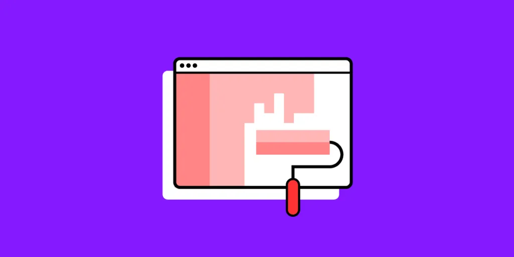
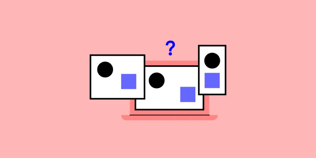
Stage 3: Prototyping

Prototyping turns the selected concept into something testable. The fidelity should match the question you’re trying to answer — a paper sketch is sufficient for validating a flow concept, but a high-fidelity interactive prototype is needed for testing visual design and micro-interactions.

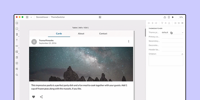
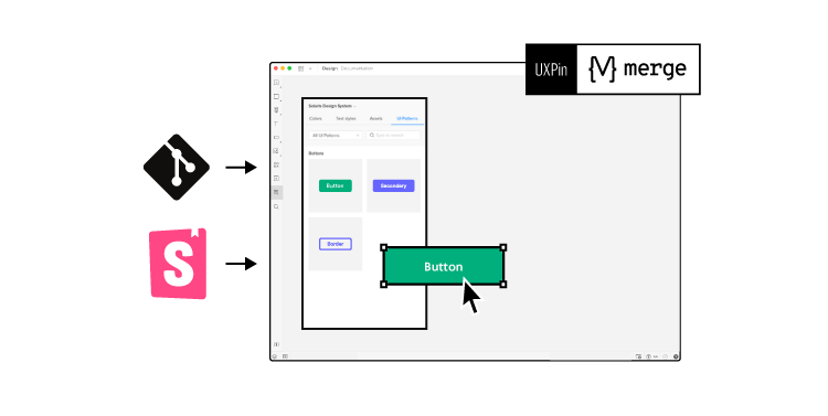
Speed matters here. Use a design tool that supports your workflow without friction. UXPin is built for rapid iteration — and with Merge, your prototypes use the same coded components as production, so you never need to rebuild anything when moving from iteration to implementation.

For the fastest possible starting point, UXPin Forge generates initial layouts from a text description, uploaded image, or URL using your team’s actual component library. You can then iterate conversationally — “Add a filter bar above the data table” — and Forge modifies the design in place without regenerating.

Stage 4: Testing

Testing determines whether the prototype solves the targeted problem — and how well. The goal is to learn as much as possible, not to implement anything yet. Use the appropriate research method:

  • Usability tests: Watch users attempt the key task. Where do they succeed? Where do they stumble?
  • A/B tests: Compare the new design against the current version with real traffic.
  • Stakeholder reviews: Gather feedback from product managers, engineers, and business stakeholders.
  • Heuristic evaluation: Have UX experts audit the design against established usability principles.

Document all feedback, findings, and insights — they’ll fuel both the review stage and future iterations.

Stage 5: Review

The review stage is about synthesizing research findings and deciding what happens next. A conclusion typically falls into one of three categories:

  • “Ship it” — the iteration solved the problem. Move to implementation.
  • “Refine it” — the direction is right, but specific elements need adjustment. Circle back to prototyping.
  • “Rethink it” — the core concept didn’t work. Circle back to ideation with new insights.

How AI Accelerates Design Iteration in 2026

AI is compressing the iteration timeline at every stage — particularly prototyping, where the most time has traditionally been spent.

Faster First Drafts

UXPin Forge generates an initial layout from a text prompt, image, or URL using your production component library. What previously took a designer 2–4 hours — assembling a first-draft screen from individual components — now takes minutes. This means more iteration cycles per project, not fewer.

Conversational Refinement

Instead of rebuilding a layout to test a variation, designers can describe the change conversationally: “Make the sidebar collapsible,” “Swap the table for a card grid,” or “Add a date range filter.” Forge modifies the existing design in place, preserving what works while changing what needs testing.

Design System Guardrails

Because Forge generates exclusively from your team’s production components, every iteration is automatically consistent with your design system. There’s no risk of AI inventing off-brand elements or introducing inconsistencies between iterations. Design System Guidelines enforce your brand rules across every AI-generated output.

Production-Ready Output

Every iteration built with Merge components can be exported as clean JSX. When a design iteration passes testing, it doesn’t need to be recreated by engineering — it can go directly into the codebase. Enterprise Merge customers report up to 50% reduction in engineering time for this reason.

Best Practices for Design Iteration

idea

Do: Fail Fast and Learn

Adopt a “fail faster” mentality. The purpose of early iterations is to discover what doesn’t work while the cost of change is still low. Every failed concept eliminates a wrong direction and brings you closer to the right solution.

Do: Stay Flexible

Design methodologies provide structure, but they should never become rigid processes that prevent adaptation. It’s up to the team to decide which problems to prioritize, how many iterations a feature needs, and when to pivot based on new evidence.

Do: Work Asynchronously When Possible

Multiple designers can iterate on different parts of a product simultaneously. Developers can begin implementing validated components while other areas are still being refined. This parallel workflow shortens delivery timelines significantly.

Do: Collaborate Early and Often

Which problem should we solve? Which concept is strongest? Is the prototype ready for testing? What does the feedback mean? Fresh perspectives from cross-functional teammates — designers, engineers, product managers, researchers — improve the quality of every decision.

task documentation data

Don’t: Let Scope Creep In

Once the problem for an iteration has been defined, resist the temptation to address additional issues in the same cycle. Note new opportunities for future iterations, but keep the current cycle focused. Scope creep slows progress and makes it difficult to measure the impact of individual changes.

Don’t: Skip Testing

An iteration without testing is just a revision — you’re changing things without evidence. Even informal testing (a quick hallway usability test or a 5-minute stakeholder review) is better than no testing at all.

Frequently Asked Questions About Design Iteration

What is design iteration?

Design iteration is the repeatable process of improving a product through short, focused cycles of planning, designing, prototyping, testing, and reviewing. Each cycle produces a more refined version based on feedback and evidence, progressively converging on a solution that works for users.

What are the 5 stages of the iterative design process?

The five stages are: (1) Planning — identify the problem to solve; (2) Ideation — generate multiple solution concepts; (3) Prototyping — build a testable version; (4) Testing — gather user feedback; (5) Review — synthesize findings and decide whether to ship, refine, or rethink.

How many iterations does a typical design project need?

There’s no fixed number — it depends on problem complexity and feedback quality. Simple features may need 2–3 iterations; complex flows might need 5–10 or more. Iterate until testing shows the design meets its success criteria.

How does AI speed up design iteration?

AI design tools like UXPin Forge generate initial layouts from text prompts, images, or URLs using production components. Designers iterate conversationally — requesting specific changes without regenerating from scratch. This compresses the prototyping phase from hours to minutes.

What is the difference between iterative design and agile development?

Iterative design focuses on refining user experience through repeated design-test-refine cycles. Agile development is a broader software delivery methodology using sprints to build and release working software incrementally. They often work in tandem — design iterations inform what gets built in development sprints.

What tools support fast design iteration?

The best tools support the full design cycle without switching apps. UXPin offers wireframing, prototyping, usability testing, and developer handoff in one tool. With Merge, prototypes use real production components. Forge adds AI-generated layouts for even faster starting points.

Start Iterating Faster with UXPin

The best design processes iterate quickly, test constantly, and eliminate friction between design and development. UXPin Merge makes every iteration production-accurate by using real coded components. Forge accelerates the prototyping stage with AI-generated layouts from your component library.

The result: more iteration cycles per project, higher-fidelity testing, and a seamless path from validated design to shipped product.

Try UXPin for free and experience faster design iteration today.

Data-Driven Design: A Step-by-Step Framework for Evidence-Based UX (2026)


Data-driven design is the practice of using empirical evidence — analytics, user research, A/B tests, and behavioral data — to guide design decisions instead of relying on intuition alone. When done well, it leads to products that better serve user needs, higher conversion rates, and more efficient design iterations.

This guide explains what data-driven design means in practice, how industry leaders apply it, the key data sources every designer should leverage, and a step-by-step framework for embedding data into your design workflow.

Want to turn data insights into testable prototypes faster? UXPin Merge lets you build fully interactive prototypes with production-ready components, so your A/B tests and usability studies reflect the real product — not a static approximation. Start a free trial.

What Is Data-Driven Design?

Data-driven design is a methodology where quantitative and qualitative data serve as the primary inputs for design decisions. Instead of debating whether a CTA should be blue or green in a meeting, a data-driven team runs an A/B test and lets user behavior settle the question.

This doesn’t mean data replaces creativity — it means data reduces guesswork. Designers still need taste, empathy, and vision. But every assumption gets validated (or invalidated) with evidence before it ships to production.

Data-Driven vs. Data-Informed Design

These terms are often used interchangeably, but there’s an important distinction:

  • Data-driven: The data makes the decision. The variant with the best performance metric wins, regardless of other factors.
  • Data-informed: Data is one input alongside designer judgment, brand strategy, technical constraints, and qualitative context. The team interprets the data and makes a holistic decision.

In practice, the best teams are data-informed. Pure data-driven decisions can optimize locally (improving a single metric) while missing the bigger picture. For example, a pop-up modal might increase email signups by 15% but hurt overall brand perception — something the data alone won’t tell you.

Why Data-Driven Design Matters

Making design decisions without data is like navigating without a map. You might reach your destination, but the route will be longer, costlier, and less predictable. Here’s what a data-driven approach provides:

  • Reduced risk: Testing assumptions before full implementation prevents expensive mistakes.
  • Faster iteration: Clear metrics tell you quickly whether a change is working, so you can double down or pivot.
  • Stakeholder alignment: Data provides a common language that resolves subjective debates (“I like this better”) with objective evidence.
  • User-centricity at scale: As products grow, designers can’t rely on personal empathy alone. Data reveals patterns across thousands or millions of users.
  • Measurable ROI: Connecting design changes to business metrics (conversion, retention, NPS) demonstrates the value of design investment.

How Leading Companies Use Data-Driven Design

Google

Google’s design culture is famously data-oriented. Product teams run thousands of A/B tests annually, and even subtle changes — like the shade of blue on a link — are validated with behavioral data before rollout. Google’s Material Design system itself evolved through extensive usability research across global markets.

Netflix

Netflix uses viewing data, completion rates, and engagement patterns to inform everything from thumbnail selection (dynamically personalized per user) to the layout of browse categories. Their recommendation engine is a product of data-driven UX — presenting the right content at the right time to maximize viewing satisfaction.

Spotify

Spotify combines listening behavior data with qualitative research to refine features like Discover Weekly and Wrapped. Their design team uses behavioral cohort analysis to understand how different user segments interact with the app, then designs personalized experiences accordingly.

Amazon

Amazon’s relentless experimentation culture runs continuous A/B tests on virtually every element of the shopping experience — product page layouts, checkout flows, recommendation placements. Their “one-click buy” button was a data-validated innovation that dramatically reduced purchase friction.

Airbnb

Airbnb’s design team pioneered the use of data storytelling — combining analytics with qualitative host and guest research to redesign the search experience, pricing tools, and trust indicators. Their design system evolved through continuous data feedback loops.

Types of Data for Design Decisions

Effective data-driven design requires both types of data working together. Quantitative data tells you what is happening; qualitative data explains why.

Quantitative Data

Quantitative data is measurable and numeric. It reveals patterns at scale:

  • Analytics metrics: Page views, session duration, bounce rates, conversion rates, feature adoption rates
  • A/B test results: Statistical comparisons between design variants
  • Task performance metrics: Completion rate, time-on-task, error rate, learnability (improvement over repeated use)
  • System metrics: Load times, API response times, crash rates — all of which affect UX

Qualitative Data

Qualitative data captures user attitudes, motivations, and context:

  • User interviews: In-depth conversations revealing mental models, frustrations, and goals
  • Usability test recordings: Watching users attempt tasks and noting where they struggle
  • Open-text survey responses: Themes and sentiment from user feedback
  • Support tickets and app store reviews: Real-world complaints and praise from active users
  • Contextual inquiry: Observing users in their actual work or life environment

Essential Data Sources and Tools

Web and Product Analytics

Tools like Google Analytics, Mixpanel, Amplitude, and PostHog track user behavior across your product. Set up event tracking for key interactions (not just page views) to understand how users move through flows. Funnel analysis is particularly valuable — it shows exactly where users drop off in critical paths like onboarding or checkout.

Heatmaps and Session Recordings

Heatmap tools (Hotjar, FullStory, Microsoft Clarity) visualize where users click, scroll, and hover on a page. Session recordings let you watch individual user journeys. These tools bridge the gap between quantitative metrics (“30% drop-off on this page”) and understanding why (“users can’t find the CTA below the fold”).

A/B and Multivariate Testing

A/B testing platforms (Optimizely, LaunchDarkly) let you run controlled experiments comparing design variants with real users. Multivariate testing goes further by testing combinations of changes simultaneously. Ensure your sample size is large enough for statistical significance before drawing conclusions.

User Surveys and Interviews

Surveys (Typeform, SurveyMonkey) capture attitudes and preferences at scale. Interviews provide depth. A common framework is to use surveys to identify what to investigate, then follow up with interviews to understand why.

Usability Testing

Moderated and unmoderated usability tests observe real users attempting tasks in your product. Tools like Maze, UserTesting, and Lookback facilitate remote sessions. Even 5 usability tests can uncover 80% of major issues (as per Jakob Nielsen’s research).

Implementing Data-Driven Design: A Step-by-Step Framework

Step 1 — Define Goals and Success Metrics

Before collecting data, define what success looks like. Use the HEART framework (Happiness, Engagement, Adoption, Retention, Task success) or OKRs to set clear, measurable goals. Example: “Reduce checkout abandonment from 68% to 55% within one quarter.”

Step 2 — Collect Baseline Data

Measure current performance before making changes. Set up analytics events, run baseline usability tests, and survey current users. This baseline becomes your comparison point for evaluating the impact of design changes.

Step 3 — Identify Patterns and Opportunities

Analyze the data to find friction points, drop-off patterns, and unmet user needs. Look for convergence between quantitative signals (high bounce rate on a page) and qualitative signals (users complaining about that page in interviews). The strongest insights come from data triangulation — when multiple sources point to the same issue.

Step 4 — Generate and Prototype Solutions

Design solutions for the identified problems and build testable prototypes. This is where a tool like UXPin Merge becomes valuable — prototyping with real coded components means your test prototype behaves exactly like the production product, so test results are more valid and directly actionable.

For rapid exploration, UXPin Forge can generate layout variations using your team’s actual component library, giving you a head start on creating testable design alternatives. Describe the problem context — “Redesign the onboarding flow for users who drop off at step 3” — and Forge produces a functional starting point you can refine.

Step 5 — Test and Validate

Run A/B tests or usability studies with the new designs. Compare results against your baseline metrics. Be disciplined about statistical significance — don’t call a test early because the numbers look promising at 60% of sample size.

Step 6 — Implement, Monitor, and Iterate

Ship the winning variant and monitor real-world performance. When your prototypes are built with Merge components, the transition from validated design to production is seamless — developers can inspect the actual component code and copy production-ready JSX, reducing engineering time by up to 50%. Data-driven design is not a one-time project — it’s a continuous cycle. The insights from this round inform the goals for the next.

How AI Is Transforming Data-Driven Design in 2026

Artificial intelligence is amplifying every stage of the data-driven design process:

  • Automated analysis: AI tools can process massive datasets — session recordings, survey responses, support tickets — and surface patterns that would take humans weeks to identify.
  • Predictive modeling: Machine learning models can predict which design changes are most likely to improve key metrics, prioritizing the highest-impact experiments.
  • Personalization at scale: AI enables dynamic interfaces that adapt to individual user behavior in real time — something static A/B tests can’t achieve.
  • AI-generated design variations: Tools like UXPin Forge generate UI layouts from text prompts using production components, letting teams quickly create multiple design alternatives for testing.
  • Design System Guidelines enforcement: When AI generation is constrained to your production design system, every variant it produces is already on-brand and accessible — reducing the number of things you need to test.

The key is ensuring that AI-generated designs remain consistent with your design system. Forge achieves this by constraining generation to the team’s actual component library — so every AI output follows established design guidelines and exports as production-ready JSX.

Common Pitfalls in Data-Driven Design

Confirmation Bias

Cherry-picking data that supports a preferred design while ignoring contradictory evidence. Combat this by pre-registering hypotheses before running tests and having someone outside the design team review results.

Vanity Metrics

Tracking metrics that look impressive but don’t correlate with user or business value. Total page views, for example, mean little without understanding engagement quality. Focus on actionable metrics — task completion rate, time-to-value, retention, and revenue per user.

Data Without Context

A 20% increase in clicks could be good (users are engaging more) or bad (users are confused and clicking everything to find what they need). Always pair quantitative data with qualitative understanding to interpret what the numbers actually mean.

Analysis Paralysis

Collecting and analyzing data indefinitely without making a design decision. Set decision deadlines and accept that good-enough data is better than perfect data that arrives too late.

Privacy and Ethics

Data collection must respect user privacy and comply with regulations (GDPR, CCPA). Be transparent about what data you collect, minimize data retention, and never use data to manipulate users against their interests.

Balancing Data with Creativity

Data-driven design doesn’t mean creativity is dead. Data tells you where the problems are and whether your solutions work — but it doesn’t generate the solutions. The best products emerge from a balance:

  • Use data for validation, not ideation. Let creative instinct propose bold solutions; let data confirm which ones resonate.
  • Reserve space for innovation. Data reflects current user behavior, which is shaped by current options. Truly novel features can’t be data-validated before they exist — only after launch.
  • Trust qualitative data. When five users tell you the interface is confusing, that insight is valid even if the quantitative conversion rate looks fine. The numbers might catch up later — or a competitor might fix the problem first.

Frequently Asked Questions About Data-Driven Design

What is data-driven design?

Data-driven design is a methodology where design decisions are guided by quantitative and qualitative data rather than assumptions or personal preference. Designers collect evidence from analytics, user research, A/B tests, and usability studies, then use that evidence to inform layout, feature prioritization, content strategy, and interaction patterns.

What is the difference between data-driven and data-informed design?

Data-driven design lets the data make the decision — the option with the best metrics wins. Data-informed design uses data as one input alongside designer intuition, brand strategy, and qualitative context. Most experienced teams practice data-informed design, because data reveals what happened but not always why.

What types of data do UX designers use?

UX designers use quantitative data (analytics, A/B test results, conversion rates, task completion times, error rates) and qualitative data (user interviews, usability test recordings, survey responses, support tickets). Combining both types gives a complete picture of user behavior and motivation.

What are the risks of relying too heavily on data in design?

Over-reliance on data can lead to local optimization at the expense of innovation, because data reflects current behavior, not future possibilities. Other risks include sample bias, metric misinterpretation, privacy concerns, and analysis paralysis — spending so much time studying data that design progress stalls.

How does AI change data-driven design in 2026?

AI accelerates data-driven design by automating pattern detection in large datasets, generating design variations for testing, personalizing interfaces in real time, and predicting user behavior. AI design tools like UXPin Forge can generate UI layouts from data requirements using production components, giving teams a faster starting point for iterative testing.

What tools support a data-driven design workflow?

A data-driven workflow typically involves analytics tools (Google Analytics, Mixpanel, Amplitude), heatmap and session recording tools (Hotjar, FullStory), A/B testing platforms (Optimizely, LaunchDarkly), user research tools (Maze, UserTesting), and a design tool that supports rapid iteration. UXPin Merge lets teams prototype with real coded components so test results translate directly to production.

Start Making Data-Driven Design Decisions

Data-driven design isn’t about eliminating intuition — it’s about backing your best ideas with evidence. The combination of clear metrics, user research, iterative testing, and rapid prototyping creates a design process that consistently delivers better outcomes.

UXPin Merge accelerates this process by letting you prototype with real coded components from your design system. Every prototype you test behaves like the real product — so your data is more reliable and the transition from validated design to production is seamless.

Try UXPin for free and build data-driven prototypes with production-ready components.

AI Personas: How to Create, Validate & Use AI-Generated UX Personas (2026)


AI has fundamentally changed how UX teams create and maintain user personas. What once required weeks of interviews, survey analysis, and synthesis can now be accelerated with large language models — producing structured, data-informed personas in minutes instead of days.

But speed without substance is useless. This guide covers how to create AI personas that are genuinely useful for design decisions: the right prompts, the right data inputs, the validation process, and how to integrate AI-generated personas into your actual design workflow.

Once your personas are defined, bring them to life in your designs. UXPin Forge lets you generate interfaces tailored to specific user segments using your team’s actual production components. Try UXPin for free.

What Are AI Personas?

AI personas are user profiles created or enhanced with the help of artificial intelligence. Like traditional personas, they represent distinct user segments with defined demographics, goals, pain points, behaviors, and contexts of use. The difference is in how they’re produced:

  • Traditional personas: Built manually from primary research — user interviews, surveys, field observations, and analytics — over a period of days or weeks.
  • AI personas: Generated by feeding research data (or hypotheses) into an AI model, which synthesizes the information into structured persona documents in minutes.

AI doesn’t replace the research — it accelerates the synthesis. The quality of an AI persona is directly proportional to the quality of the data you provide as input.

Why Use AI for Persona Creation?

There are legitimate advantages to AI-assisted persona development, alongside important caveats:

Advantages

  • Speed: Generate draft personas in minutes, not weeks. This is particularly valuable for early-stage projects that need directional guidance before formal research is complete.
  • Scale: Create multiple persona variants for different segments, edge cases, or markets simultaneously.
  • Dynamic updates: Re-run the generation process as new data arrives, keeping personas current instead of letting them become stale documents.
  • Gap identification: AI can highlight missing data points in your research, prompting you to investigate areas you might have overlooked.
  • Consistency: AI-generated personas follow a consistent structure, making them easier to compare across segments and share across teams.

Limitations

  • No empathetic depth: AI hasn’t sat across the table from a frustrated user. The emotional nuance that comes from direct observation can’t be synthesized from text data alone.
  • Plausibility ≠ accuracy: AI generates personas that sound convincing even when based on insufficient data. Without validation, you risk designing for fictional users.
  • Bias propagation: If your input data contains biases — demographic, cultural, or methodological — AI will reflect and potentially amplify those biases in the output.
  • Over-reliance risk: Teams may skip real research entirely if AI-generated personas feel “good enough,” leading to a false sense of understanding.

How to Create AI Personas: Step-by-Step

Step 1: Gather Your Research Data

Before prompting any AI tool, collect the data that will ground the personas in reality:

  • User interview transcripts or summarized notes
  • Survey results with demographic and behavioral data
  • Analytics segments (from Google Analytics, Mixpanel, Amplitude, etc.)
  • Customer support ticket themes and common complaints
  • Sales call notes and CRM data
  • App store reviews and social media feedback

The more real data you provide, the more useful the AI output will be. If you don’t have research data yet, AI can generate hypothetical personas — but treat them as assumptions to test, not validated profiles.

Step 2: Define Your Persona Structure

Decide what fields each persona should include. A standard structure:

  • Name and photo placeholder (for humanization)
  • Demographics: Age, role/title, industry, company size, location
  • Goals: What they’re trying to accomplish (primary and secondary)
  • Pain points: Frustrations, obstacles, and unmet needs
  • Behaviors: How they currently solve problems, tools they use, workflows
  • Motivations: What drives their decisions (efficiency, cost, quality, status)
  • Tech proficiency: Comfort level with technology and design tools
  • Quote: A representative statement that captures their perspective
  • Scenario: A brief story showing how they’d interact with your product

Step 3: Write Effective AI Prompts

The prompt quality determines the output quality. Here are proven prompt patterns for 2026’s most capable models:

Basic persona generation prompt:

“Based on the following user research data [paste data], create a detailed UX persona that includes: name, age, job title, company size, goals, pain points, behaviors, motivations, tech proficiency, a representative quote, and a usage scenario. The persona should represent the [segment name] user segment for a [product type].”

Multiple personas prompt:

“Based on this research data [paste data], identify 3-4 distinct user segments and create a complete persona for each. Highlight the key differences between segments in terms of goals, pain points, and product expectations.”

Persona stress-test prompt:

“Here is a persona we created [paste persona]. Act as a senior UX researcher and critique it: What assumptions does it make that aren’t supported by the data? What data gaps should we investigate? What edge cases does this persona miss?”

Competitive context prompt:

“Here is our persona [paste persona] and a list of competitor products they might use [list tools]. For each competitor, describe how this persona’s workflow would differ and what friction points would drive them to switch.”

Validation prompt:

“Here is a persona we created [paste persona] and here is new user interview data [paste data]. Does the interview data support, contradict, or add nuance to this persona? Suggest specific updates based on the evidence.”

Step 4: Generate and Iterate

Feed your data and prompts into your chosen AI tool (ChatGPT, Claude, Gemini). Review the first output critically:

  • Does the persona feel specific enough to drive design decisions, or is it generic?
  • Are the pain points actionable — do they suggest design solutions?
  • Does the scenario reflect realistic behavior you’ve observed (or expect to observe)?
  • Are there any implausible details that seem fabricated?

Iterate with follow-up prompts until the persona is sharp, specific, and useful. Don’t settle for generic outputs — push the AI to be concrete.

Step 5: Validate Against Real Data

Cross-reference AI-generated personas with actual evidence:

  • Analytics check: Do the described behaviors match real usage patterns in your analytics?
  • Interview check: Can you find quotes from real user interviews that support each pain point?
  • Team check: Share personas with customer support, sales, and success teams. Do they recognize these users?
  • Usability check: Use the personas to make design decisions, then test those decisions with real users. Do outcomes improve?

Step 6: Integrate Personas into Your Design Workflow

Personas are only valuable if they influence actual design decisions. Make them actionable:

  • Reference specific personas in design critiques: “Would Sarah (our power user persona) find this workflow efficient?”
  • Use personas to prioritize features in your backlog based on the highest-value user segments.
  • Create scenario-based prototypes that test how each persona would complete key tasks.
  • Update personas quarterly as new research and analytics data accumulates.

When you’re ready to translate persona insights into actual designs, UXPin Forge can generate interfaces tailored to specific user scenarios using your team’s production component library. Describe the persona’s task — “Create a dashboard for a data analyst who needs to monitor 5 KPIs at a glance” — and Forge produces a functional layout built from real components that you can refine and test immediately.

Best Practices for AI Persona Development

Always Ground Personas in Real Data

The single most important rule: never treat AI-generated personas as facts unless they’re validated against real user research. AI excels at synthesis and structure, but it can’t observe user behavior or feel user frustration.

Keep Personas Specific and Actionable

A persona that says “wants an easy-to-use product” is useless — every user wants that. Push for specifics: “Needs to configure a complex data pipeline in under 10 minutes without reading documentation.” Specific pain points drive specific design solutions.

Create Anti-Personas

Define who your product is not for. Anti-personas help teams avoid feature creep and maintain focus on the core user segments that drive value.

Use Personas Across the Organization

In practice, cross-functional use depends on the personas being accessible inside the same systems where teams already work. AI integrations are relevant here because they make it easier to move research context and outputs between design, support, and delivery workflows.

Share personas with engineering, marketing, sales, and support teams. When everyone references the same user models, cross-functional alignment improves. AI-generated personas are easy to produce in formats suited for different audiences — detailed documents for designers, summary cards for engineers, talking points for sales.

Combine AI Personas with Journey Mapping

Once you have validated personas, use AI to generate journey maps for each one — mapping their experience across awareness, consideration, onboarding, regular use, and advocacy stages. This extends the persona’s utility beyond a static profile into a dynamic tool for identifying design opportunities.

From Personas to Prototypes: Closing the Gap

The biggest weakness of traditional persona work is the gap between insight and action. A persona document sits in a shared drive; the actual interface gets designed weeks later, often by someone who didn’t read the persona closely.

AI design tools help close that gap. With UXPin Forge, you can go directly from a persona scenario to a functional UI layout:

  1. Define the scenario: “Enterprise admin managing access permissions for 200+ users across multiple regions.”
  2. Generate the interface: Forge assembles a layout using your team’s production components — data tables, filters, role selectors, bulk action buttons.
  3. Iterate conversationally: “Add a search bar above the user table” or “Show a confirmation modal for bulk role changes.” Forge modifies the design in place.
  4. Test with real users: Share the Merge-powered prototype — which behaves exactly like the production product — to validate whether the persona’s needs are met.

This workflow compresses the persona-to-prototype cycle from weeks to hours, and because everything is built from production components, the validated design can go straight to engineering as exportable JSX.

Frequently Asked Questions About AI Personas

What are AI personas in UX design?

AI personas are user profiles generated or enriched with the help of AI tools like ChatGPT, Claude, or Gemini. They represent user segments based on data inputs — demographics, behaviors, goals, and pain points — and can be created, iterated, and updated faster than traditional manually-researched personas.

Can ChatGPT create accurate UX personas?

ChatGPT can generate plausible persona structures and details, but accuracy depends on the quality of your input data. If you provide real research data — interview summaries, survey results, analytics segments — ChatGPT produces useful draft personas grounded in evidence. Without real data, it generates fictional personas that should be treated as hypotheses, not facts.

How do AI personas differ from traditional personas?

Traditional personas are crafted manually from primary research over days or weeks. AI personas can be generated in minutes from the same data sources, updated dynamically as new data arrives, and produced in multiple variants simultaneously. However, AI personas lack the empathetic depth from direct human observation and should always be validated against real research.

What are the best AI tools for creating UX personas in 2026?

The most widely used tools include ChatGPT (OpenAI), Claude (Anthropic), and Gemini (Google). Specialized UX research platforms like Dovetail and Condens offer AI-assisted persona features. For turning personas into actual designs, UXPin Forge can generate interfaces tailored to specific user segments using production components.

Should I replace traditional user research with AI personas?

No. AI personas are best used to complement traditional research, not replace it. Use AI to generate draft personas quickly, identify gaps in your research, create variations for edge cases, and keep personas current between research cycles. Foundational insights should still come from direct user contact — interviews, usability tests, and contextual inquiry.

How do I validate AI-generated personas?

Validate by cross-referencing with real analytics data, testing against interview transcripts, sharing with customer-facing teams for reality checks, and using personas in usability tests to see if the design decisions they inform actually improve outcomes for real users.

Turn Persona Insights into Real Designs

Creating AI personas is only the first step. The real value comes when persona insights translate into design decisions that measurably improve the user experience.

UXPin Forge helps bridge that gap — describe a persona’s task or scenario, and Forge generates an interface using your team’s actual production components. Because Forge is constrained to your design system via Merge, every generated screen is consistent with your brand and exportable as production-ready JSX.

Try UXPin for free and start designing for real users today.

Responsive vs Adaptive Design: Key Differences and How to Choose [2026]

Responsive design vs adaptive design comparison diagram

The responsive vs. adaptive design debate has been a staple of web design discussions for over a decade — and in 2026, the answer still depends on your project’s constraints, audience, and goals.

Responsive design uses fluid grids and CSS media queries to create layouts that continuously adjust to any screen size. Adaptive design detects the device and serves one of several pre-built, fixed-width layouts optimized for specific breakpoints.

In this guide, we break down both approaches in detail — how they work, when to use each, common mistakes to avoid, and real-world examples — so you can make the right choice for your next project.

Need to prototype responsive layouts? Try UXPin free — design with multiple breakpoints and test responsive behavior before writing production code.

Build advanced prototypes

Design better products with States, Variables, Auto Layout and more.


What’s the Difference Between Responsive and Adaptive Design?

At a fundamental level, both approaches solve the same problem: making websites work well across different screen sizes. They differ in how they accomplish this.

Aspect Responsive Design Adaptive Design
Layout approach Fluid — elements resize fluidly within a flexible grid Fixed — layout snaps to pre-defined widths at specific breakpoints
Number of layouts One layout that continuously adapts Multiple distinct layouts (typically 4–6) for different screen sizes
Implementation CSS media queries, relative units (%, em, rem, vw) Server-side or client-side device detection, separate layout templates
Content Same content across all sizes (can be reordered/hidden) Can serve different content per device
URL structure Single URL Single URL or separate URLs (e.g., m.example.com)
Maintenance One codebase to maintain Multiple layout templates to maintain

How Responsive Design Works

Responsive web design (RWD), introduced by Ethan Marcotte in 2010, builds on three technical foundations:

  1. Fluid grids — Layout widths are defined in relative units (percentages, fr units in CSS Grid) rather than fixed pixels
  2. Flexible images — Images scale within their containers using max-width: 100% and modern techniques like srcset and the <picture> element
  3. CSS media queries — Style rules are applied conditionally based on viewport width, height, orientation, or other characteristics

In 2026, responsive design has evolved significantly. Modern CSS features like Container Queries, Subgrid, and the :has() selector make truly component-level responsive design possible — components can adapt to their container rather than just the viewport.

How Adaptive Design Works

Adaptive design pre-builds multiple fixed-width layouts — typically for common breakpoints like 320px, 480px, 768px, 1024px, 1200px, and 1440px. When a user visits the site, the server or client detects the device/viewport and serves the appropriate layout.

Key characteristics:

  • Layouts are tailored precisely for each target device category
  • Content can be fundamentally different per device (not just rearranged)
  • Performance can be optimized per device (serving smaller assets to mobile)
  • Requires more upfront design and development effort

How to Tell if a Website Is Responsive or Adaptive

The simplest test: slowly resize your browser window.

  • If the layout fluidly adjusts as you drag — elements smoothly resize, reflow, and reposition — it’s responsive
  • If the layout snaps to a different configuration at specific widths (with no smooth transition between them) — it’s adaptive

You can also inspect the CSS: responsive sites use relative units and media queries extensively, while adaptive sites often use fixed pixel widths within each breakpoint range.

Why Use Responsive Web Design?

Responsive design is the default recommendation for most web projects in 2026. Here’s why:

Advantages

  • One codebase — Maintain a single HTML/CSS/JS codebase that works everywhere
  • Future-proof — Fluid layouts adapt to new device sizes automatically (foldables, ultra-wide monitors, in-car displays)
  • SEO-friendly — Google recommends responsive design and uses mobile-first indexing; single URLs prevent duplicate content issues
  • Cost-effective — Less design and development effort than creating multiple adaptive layouts
  • Consistent experience — Users get the same content and features regardless of device

Challenges

  • Performance trade-offs — Mobile devices may download assets they don’t display (though loading="lazy" and <picture> mitigate this)
  • Design complexity — Creating a single layout that works beautifully from 320px to 2560px requires careful planning
  • Content compromises — Sometimes the desktop experience genuinely needs different content than mobile, and responsive design makes this harder

Examples of Responsive Web Design

Slack — Slack’s marketing site is fully responsive with smooth transitions between breakpoints. The navigation collapses into a hamburger menu on mobile, feature grids reflow into stacked cards, and hero sections adapt their typography scale.

Shopify — Shopify’s site demonstrates how complex, content-rich pages can be responsive. Product feature pages, pricing tables, and documentation all flow naturally across screen sizes using a consistent responsive grid system.

Dribbble — Dribbble’s portfolio grid is a masterclass in responsive layout. The grid seamlessly adjusts column counts based on viewport width, and each shot card maintains its aspect ratio and visual impact at every size.

Why Use Adaptive Web Design?

Adaptive design remains relevant for specific scenarios, even in 2026.

Advantages

  • Optimized experiences per device — You can tailor content, interactions, and visual design specifically for each device category
  • Better performance control — Serve only the assets and code needed for the target device; no unnecessary downloads
  • Ideal for legacy modernization — Adding adaptive layouts to an existing desktop site is often simpler than refactoring it to be fully responsive
  • Device-specific features — Leverage device capabilities (GPS, camera, accelerometer) with tailored interfaces

Challenges

  • Higher maintenance — Multiple layout templates increase design and development workload
  • Gap devices — Devices that fall between your defined breakpoints may get a suboptimal layout
  • SEO risks — Separate mobile URLs (m.example.com) create duplicate content issues; even single-URL adaptive sites may serve content inconsistently to crawlers
  • More upfront work — Designing 4–6 distinct layouts requires significantly more initial investment

Examples of Adaptive Web Design

Amazon — Amazon uses adaptive techniques to serve fundamentally different experiences across devices. The mobile experience prioritizes search and one-tap purchasing, while the desktop version exposes more browsing categories and comparison features.

IHG (InterContinental Hotels Group) — IHG’s booking experience adapts significantly between mobile and desktop. The mobile version simplifies the booking flow and surfaces location-based features, while the desktop version provides richer filtering and map-based search.

Responsive vs. Adaptive: How to Choose

Use this framework to decide:

Choose Responsive If… Choose Adaptive If…
You’re building a new site from scratch You’re adding mobile support to an existing desktop site
You need a single codebase for maintainability Mobile and desktop need fundamentally different content or flows
SEO is a priority (Google recommends responsive) Performance on low-powered mobile devices is critical
Your budget favors one layout over multiple You have resources for multiple layout templates
You’re designing for an unpredictable range of devices You’re targeting a known set of device categories

The hybrid approach: Many teams combine both strategies — using responsive fluid layouts as the base, with adaptive techniques at key breakpoints to serve different content, optimize performance, or change interaction patterns for specific device categories.

Common Responsive and Adaptive Design Mistakes

1. Designing Desktop-First

Starting with the desktop layout and then “shrinking” it for mobile almost always produces a compromised mobile experience. Design mobile-first — establish the core content and interactions on the smallest screen, then progressively enhance for larger viewports.

2. Ignoring Touch Gestures

Mobile users interact with swipes, taps, and long presses — not mouse clicks and hovers. Design for touch targets (minimum 44×44px), replace hover interactions with tap alternatives, and leverage native gestures where appropriate.

3. Making Buttons and Touch Targets Too Small

Tiny buttons that work fine with a mouse cursor become impossible to tap accurately on a phone. Follow Apple’s 44pt and Google’s 48dp minimum touch target guidelines.

4. Prioritizing Visual Design Over Performance

A beautiful responsive site that takes 8 seconds to load on mobile is a failed design. Prioritize Core Web Vitals: LCP under 2.5s, FID under 100ms, CLS under 0.1. Use performance budgets and test on real mid-range devices.

5. Using Separate Mobile URLs

Creating a separate m.example.com site creates SEO challenges (duplicate content, diluted link equity) and maintenance burden. Unless you have a compelling reason for separate URLs, use a single-URL approach with responsive or adaptive rendering.

6. Not Planning for Future Maintenance

The device landscape changes constantly — foldable phones, car displays, smart TVs. Choose an approach (responsive is usually better here) that gracefully handles new form factors without requiring a redesign.

Prototyping Responsive and Adaptive Designs

Before committing to development, prototype your responsive or adaptive layout to validate breakpoint behaviors, content reflow, and touch interactions. UXPin supports multi-breakpoint design — create a single project with layouts for mobile, tablet, and desktop, then preview and test each viewport in the browser.

For teams using a design system, UXPin Merge lets you prototype with real, production-grade React components. Your responsive breakpoints behave identically to production because the components are production components. Pre-built libraries like MUI and Bootstrap already include responsive behavior, so your prototypes are responsive out of the box.

Need a fast starting point? UXPin Forge generates responsive layouts from text prompts using your component library — describe a “responsive dashboard with a collapsible sidebar and data cards that stack on mobile,” and Forge produces a working prototype ready for testing and refinement.

Frequently Asked Questions: Responsive vs. Adaptive Design

What is the difference between responsive and adaptive design?

Responsive design uses fluid grids, flexible images, and CSS media queries to create a single layout that continuously adapts to any screen size. Adaptive design detects the device and serves one of several pre-defined, fixed-width layouts optimized for specific breakpoints. Responsive is fluid; adaptive is discrete.

Which is better: responsive or adaptive design?

For most projects in 2026, responsive design is the better default. It’s recommended by Google for SEO, requires less maintenance (one codebase), and handles new device sizes automatically. Adaptive design is a better fit for legacy modernization, performance-critical mobile experiences, or cases where mobile and desktop need fundamentally different content.

Does Google prefer responsive design for SEO?

Yes. Google officially recommends responsive web design because it uses a single URL per page, making it easier for crawlers to index and avoiding duplicate content issues. With mobile-first indexing, a responsive site with a single URL is the most SEO-friendly approach.

Can you combine responsive and adaptive design?

Absolutely. Many modern sites use a hybrid approach — responsive fluid layouts for general adaptation, combined with adaptive techniques that serve different content, image sizes, or component structures at specific breakpoints. This offers the best of both worlds.

How do I test responsive and adaptive designs?

Test across real devices (not just browser resizing) and use browser developer tools for viewport emulation. For prototyping, UXPin supports multiple breakpoints so you can design and preview layouts across screen sizes. With UXPin Merge, responsive prototypes use real code components, so breakpoint behaviors match production exactly.

Is adaptive design still relevant in 2026?

Yes, but for specific use cases. Adaptive design remains valuable for legacy system modernization, performance optimization on low-powered devices, progressive enhancement strategies, and situations where mobile and desktop experiences need fundamentally different content or interaction patterns. Most new projects, however, start with responsive design as the foundation.

What Is npm? The Complete Node Package Manager Guide for 2026

What is npm – Node Package Manager explained for designers and developers

npm (Node Package Manager) is the default package manager for Node.js and the world’s largest software registry. It lets developers install, share, and manage reusable JavaScript packages — from tiny utility functions to complete UI component libraries like MUI and shadcn/ui.

If you work with modern web applications — whether you write code or collaborate with people who do — npm is part of your workflow. This guide explains what npm is, how it works, and why it matters for both developers and designers building digital products in 2026.

npm is also a key enabler of code-backed design workflows. With UXPin Merge, teams can bring npm-published React components directly into the design canvas — so designers work with the same components developers use in production. Try UXPin for free.

Design UI with code-backed components.

Use the same components in design as in development. Keep UI consistency at scale.


What Is npm (Node Package Manager)?

npm consists of three distinct components:

  1. The npm registry — a massive public database of JavaScript packages. As of 2026, the registry hosts over 2.5 million packages, making it the largest software registry in the world.
  2. The npm CLI (command-line interface) — the tool developers use to install, update, and manage packages from the registry.
  3. The npm website (npmjs.com) — where you can search for packages, read documentation, and manage organisation-scoped packages.

npm is installed automatically when you install Node.js. If Node.js is on your machine, you already have npm.

What Is a Package Manager?

A package manager automates the process of installing, updating, configuring, and removing software libraries (called “packages” or “dependencies”). Without a package manager, developers would need to manually download code, place it in the right directory, and keep track of versions — a process that doesn’t scale.

npm is the package manager for the JavaScript ecosystem. Other languages have their own: Python has pip, Ruby has gem, and PHP has Composer. In the JavaScript world, npm competes with alternatives like Yarn and pnpm, but npm remains the default and most widely used.

What Is the npm Registry?

The npm registry is a public database where developers publish reusable code packages. When you run npm install react, npm fetches the React package from this registry and installs it in your project.

The registry hosts packages of every kind:

  • UI component libraries: React, MUI (Material UI), Ant Design, shadcn/ui
  • Utility libraries: Lodash, date-fns, Axios
  • Frameworks: Next.js, Express, NestJS
  • Build tools: Webpack, Vite, ESBuild
  • Testing tools: Jest, Vitest, Playwright

Organisations can also publish private packages scoped to their team — this is how many companies distribute internal component libraries. In fact, this is exactly how UXPin Merge’s Git integration works: your team publishes React components via npm, and Merge syncs them into UXPin’s design editor so designers can build with production code.

Key npm Concepts

Dependencies vs. DevDependencies

Dependencies are packages your application needs to run in production. They’re installed with npm install <package> and listed in the "dependencies" section of your package.json.

DevDependencies are packages needed only during development — things like testing frameworks, linters, and build tools. They’re installed with npm install --save-dev <package> and listed under "devDependencies".

When you deploy to production, you typically run npm install --production, which skips devDependencies to keep the production bundle lean.

The package.json File

package.json is the manifest file for every Node.js project. It contains:

  • The project’s name, version, and description
  • A list of all dependencies and their version ranges
  • Scripts for common tasks (build, test, start, lint)
  • Configuration for tools like ESLint, Babel, or Jest

You create a package.json by running npm init in your project directory. Every time you install a package, npm updates this file automatically.

The package-lock.json File

package-lock.json records the exact version of every installed package (and every sub-dependency). While package.json uses version ranges (e.g. "^18.2.0"), the lock file pins exact versions to ensure every developer and CI environment installs the identical dependency tree. Always commit package-lock.json to version control.

Essential npm Commands

Here are the commands you’ll use most often:

Command What It Does
npm init Creates a new package.json file
npm install Installs all dependencies listed in package.json
npm install <package> Installs a specific package and adds it to dependencies
npm install --save-dev <package> Installs a package as a devDependency
npm update Updates all packages to the latest version within the specified range
npm uninstall <package> Removes a package from the project
npm run <script> Runs a script defined in package.json
npm audit Checks installed packages for known security vulnerabilities
npx <package> Runs a package without installing it globally

Understanding npm as a Designer

If you’re a designer, you might wonder why npm matters to you. Here’s why: modern design-development collaboration increasingly relies on shared component libraries — and those libraries are distributed through npm.

When your development team publishes a React component library to npm, those components carry all of the production styling, behaviour, and accessibility features baked in. Traditionally, designers would work with static mockups that approximated these components — creating a persistent gap between design intent and production output.

This is the problem UXPin Merge solves. Merge syncs npm-published React components directly into UXPin’s design canvas. Designers drag and drop real production components — complete with props, states, and interactions — to build prototypes that are functionally identical to the production UI.

The result:

  • Designers and developers share a single source of truth
  • Prototypes behave like the real product (because they are the real components)
  • Design handoff becomes trivial — the component names, props, and structure are already production-ready
  • Enterprise teams like PayPal have used this approach to support 60+ products with a 5-person UX team

What Can You Do With npm in a Design Workflow?

Understanding npm unlocks several capabilities for design-development collaboration:

  • Install and explore component libraries: Run npm install @mui/material to see exactly what components are available, their props, and their variants.
  • Run Storybook locally: Many component libraries include Storybook. Clone the repo, run npm install && npm run storybook, and you can interact with every component in isolation.
  • Set up UXPin Merge: The UXPin Merge CLI tool is installed via npm. It’s how you push your component library into UXPin’s editor.
  • Prototype with production components: Once Merge is set up, every component in your npm package is available on UXPin’s canvas — with full interactivity and real props.

npm vs. Yarn vs. pnpm

All three are JavaScript package managers. Here’s how they differ:

Feature npm Yarn pnpm
Default with Node.js Yes No No
Speed Good (improved significantly in v7+) Fast Fastest
Disk usage Standard Standard Efficient (hard links)
Monorepo support Workspaces Workspaces Native
Lock file package-lock.json yarn.lock pnpm-lock.yaml

For most teams, npm is the safe default. If you’re working on large monorepos or care deeply about install speed and disk efficiency, pnpm is worth evaluating.

Bridging Design and Development With UXPin Merge

npm is the backbone of modern JavaScript development — and increasingly, it’s the backbone of modern design systems too. When your component library is published as an npm package, it becomes the single source of truth that both designers and developers can work from.

UXPin Merge bridges the gap by bringing those npm-published components directly into the design environment. And with Forge, UXPin’s AI assistant, you can generate entire layouts by describing what you need — and Forge builds them using the real components from your npm-synced library. The output is production-ready JSX, not static mockups.

Try UXPin for free and experience what it’s like to design with real, npm-published components.

Frequently Asked Questions About npm

What does npm stand for?

npm stands for Node Package Manager. It is the default package manager for the Node.js JavaScript runtime environment. It provides a command-line tool for installing packages and a registry that hosts over 2.5 million reusable JavaScript packages.

Is npm free to use?

Yes. npm is free and open source for public packages. The npm CLI is included with every Node.js installation at no cost. npm also offers paid plans for organisations that need private package hosting, advanced security features, and team management.

What is the difference between npm and Node.js?

Node.js is a JavaScript runtime — it lets you execute JavaScript code outside a web browser. npm is the package manager that comes bundled with Node.js. Think of Node.js as the engine and npm as the tool that lets you install add-ons for that engine.

What is the difference between npm install and npx?

npm install downloads a package and saves it to your project. npx runs a package without installing it permanently — useful for one-off commands like npx create-react-app my-app. If the package isn’t installed locally, npx fetches it temporarily, runs it, and discards it.

How does npm relate to design systems?

Modern design systems are implemented as component libraries published to npm. This makes npm the distribution mechanism for production UI components. Tools like UXPin Merge can sync these npm-published components directly into a design tool, so designers prototype with the exact same code components developers use — creating a true single source of truth.

Should I use npm, Yarn, or pnpm?

For most projects, npm is the right choice — it’s the default, universally supported, and has improved significantly in recent versions. Consider pnpm if you work with large monorepos or want better disk efficiency. Yarn is also solid but has less momentum in 2026. All three are compatible with the same registry and package.json format.


Design Constraints: 7 Types Every UX Team Faces and How to Overcome Them [2026]

Design constraints in UX — 7 types and how to overcome them

Whether you work in an early-stage startup or a multinational enterprise, design constraints limit or influence every design project and its outcome. Seasoned designers know that true creativity often emerges when you confront and master the constraints that shape your work.

This guide covers the seven most common types of design constraints, a practical framework for overcoming them, and how modern tools — including AI-powered design assistants — can eliminate many of the roadblocks UX teams face in 2026.

Key takeaways:

  • Design constraints are restrictions that influence the creative and technical decisions made during the design process.
  • The seven main types are: technical, financial, legal/regulatory, organizational, self-imposed, talent, and project-specific.
  • A problem-based framework helps teams systematically identify, prioritize, and overcome constraints.
  • Code-backed design tools and AI assistants can eliminate many prototyping and collaboration constraints entirely.

Eliminate prototyping constraints, bridge the gap between designers and engineers, and deliver exceptional user experiences with UXPin Merge. Visit our Merge page for more details and how to request access.

Reach a new level of prototyping

Design with interactive components coming from your team’s design system.


What Are Design Constraints?

Design constraints are limitations or restrictions in the design process imposed by internal and external factors. These constraints impact the final product, so it’s critical that everyone in the organization is aware of them and considers these limitations before every project.

The seven common types of design constraints are:

  • Technical constraints: how a product’s tech stack and engineering capabilities limit design possibilities
  • Financial constraints: departmental and project budgets that restrict resources
  • Legal and regulatory constraints: laws and regulations design teams must follow
  • Organizational constraints: culture, structure, policies, and internal bureaucracy
  • Self-imposed constraints: each designer’s workflow preferences and creative decision-making
  • Talent constraints: designer skills, experience, and team composition
  • Project-specific constraints: limitations unique to the project, including time, scope, and available team members

Let’s explore each type in detail and discuss practical strategies for overcoming them.

Technical Constraints

Technical constraints significantly impact design projects because they dictate how far designers can push creative and innovative boundaries.

Technical design constraints — code and development limitations

Common technical constraints include:

  • Device and operating system limitations: iOS and Android constraints, screen sizes, processing power, and form factor differences
  • Accessibility constraints: how assistive technologies like screen readers and voice control impact design decisions
  • Performance constraints: the impact of user bandwidth, server infrastructure, and rendering capabilities on what designers can include
  • Integrations and APIs: limitations from third-party services, data formats, and API rate limits
  • Tech stack constraints: how the choice of front-end frameworks (React, Vue, Angular) and back-end technologies affects what’s feasible in design
  • Design system constraints: the available components, tokens, and patterns in a team’s design system shape what designers can build

One powerful way to reduce technical constraints is to design with real, code-backed components. When designers use the same UI elements as engineers — through tools like UXPin Merge — the gap between what’s designed and what’s technically feasible shrinks dramatically. Designers can see exactly what the component library supports, and prototypes behave identically to the production application.

Financial Constraints

Financial constraints impact many areas of the design process, including human resources, tools, user research, project scope, and technology. While many see financial constraints as a roadblock, they often drive creative thinking and design innovation through bootstrapping and inventive workarounds.

Common ways financial constraints impact the design process:

  • Limiting the scope of each discipline (research, wireframing, prototyping, interviews, testing)
  • Reducing the number of iterations and testing rounds a team can afford
  • Dictating which design tools the team can use
  • Determining the size and experience level of the design team

AI-powered design tools can help offset financial constraints significantly. For example, UXPin Forge allows a single designer to generate production-quality layouts in seconds — reducing the person-hours needed per project and enabling smaller teams to accomplish more. PayPal’s 5-person UX team uses UXPin Merge to support over 60 products and 1,000+ developers — a scale that would normally require a much larger design organization.

Legal constraints primarily impact content and user data in UX projects. These laws change depending on the country and industry, so designers must rely on guidance from legal counsel and stakeholders to ensure compliance.

Key areas where legal constraints affect design:

  • Privacy laws: dictate what data designers collect, how they collect it, the legal notices they give users, and how they obtain consent — notably, General Data Protection Regulation (GDPR) in the European Union and the California Consumer Privacy Act (CCPA).
  • Accessibility laws: require designers to make user interfaces accessible for users with various impairments — for example, the Americans with Disabilities Act (ADA) in the United States and the European Accessibility Act (EAA), which took effect in 2025.
  • Intellectual property laws: govern copyright for original works, including text, images, video, and AI-generated content. Designers must also consider whether their work infringes on competitor trademarks and other IP protections.
  • Industry-specific regulations: industries like finance (PCI-DSS), healthcare (HIPAA), and government (Section 508) have strict rules about privacy, security, and accessibility that significantly shape UI design — particularly login flows, authentication, and data display.

Using a governed design system helps with legal compliance. When all UI components are pre-built with accessibility standards and regulatory requirements baked in, individual designers are less likely to inadvertently create non-compliant interfaces. UXPin’s Design System Guidelines feature enforces brand and compliance rules across all AI-generated output, ensuring that even Forge-created layouts respect your organization’s regulatory constraints.

Organizational Constraints

Organizational constraints describe limitations imposed on design by other parts of the company. These limitations often relate to the organization’s values, culture, company vision, and competing interests from other departments.

Common organizational constraints:

  • Time constraints: deadlines set by stakeholders can impact how designers research, prototype, and test design ideas.
  • Brand guidelines: an organization’s brand influences stylistic and messaging decisions across every product and touchpoint.
  • Marketing and business goals: designers often have to balance user needs with organizational goals, which can limit design choices.
  • Design system constraints: available components, design principles, style guides, guidelines, and design system governance impact how designers create products.
  • Organizational silos: poor communication and collaboration lead to silos that hamper progress. Silos often cause duplicate work, delays, design drift, inconsistencies, and other friction.
  • Design’s perceived value: how the organization perceives the UX department can impact resource allocation and buy-in, limiting what designers can do.

Self-Imposed Constraints

Self-imposed constraints come from the designers themselves — relating to the choices and preferences during the design process. These include which design tool they use, the workflows they follow, whether they use the product’s design system, and how much they lean on AI assistance versus manual design.

In 2026, self-imposed constraints increasingly include decisions about how to use AI tools. Designers who learn to effectively combine AI generation (for the initial 80% of a layout) with manual professional design (for the final 20%) can overcome many self-imposed productivity constraints.

Talent Constraints

Talent constraints relate to the skills and specialists available to the design team. It’s important to know every designer’s skill set and expertise so that managers can assign people who complement one another. Understanding talent constraints enables managers to source the right people and determine when to hire specialist contractors for specific design projects.

Suppose an organization is working on a complex digital product redesign. The demand for talented UX/UI designers is high due to the project’s scale and complexity, but the organization struggles to find and hire enough qualified designers within the required timeframe.

This is where code-backed design tools provide a force multiplier. UXPin Merge allows less experienced designers to produce production-quality prototypes by working with pre-built, battle-tested components. And with Forge, even non-designers can generate usable UI layouts from simple text prompts — constrained to the organization’s real component library so the output always respects brand and design system rules.

Project-Specific Constraints

Project constraints create design problems that otherwise don’t exist or are rare for an organization. For example, designers might have to complete a project in a shorter timeframe than they’re used to, requiring adapted workflows or different tools to accomplish the desired outcome.

Consider a scenario where a company decides to overhaul its website to align with a rebranding initiative. The marketing team has planned a major product launch, and the redesigned website needs to be ready before the launch date — just a few weeks away. Under these conditions, tools that accelerate the design-to-prototype cycle become critical. Teams using UXPin Forge and Merge have reported up to 8.6x faster design-to-prototype cycles compared to traditional image-based workflows.

How to Overcome Design Constraints

In many organizations, overcoming constraints is a DesignOps function. The DesignOps team must reduce limitations and roadblocks to maximize the department’s output and organizational value.

DesignOps efficiency framework for overcoming design constraints

This problem-based framework will help you overcome design constraints starting with your organization’s biggest challenges. A problem-based approach allows you to solve a specific issue and its related constraints, increasing the impact of each solution.

  1. Define the problem: What challenge are you trying to solve? This could be reducing time-to-market, increasing designer productivity, or improving design-development handoff quality.
  2. Identify the constraints: List the constraints related to this problem — budget, resources, time, technical limitations, organizational silos, etc.
  3. Prioritize the constraints: Determine which limitations are most consequential and prioritize accordingly.
  4. Brainstorm solutions: Meet with appropriate experts, team members, and stakeholders to brainstorm solutions. Create a list of possibilities.
  5. Evaluate the solutions: Consider the pros and cons of each idea and determine which has the highest feasibility with the most significant potential impact.
  6. Choose a solution: Select the solution you believe will deliver the best results and put plans in place to implement it.
  7. Test and iterate: Create KPIs to measure your solution’s effectiveness and refine over time to optimize results. Don’t be afraid to abandon poor-performing ideas and iterate on new ones.

Define the Problem: Efficacy vs. Efficiency

In a webinar with UXPin, DesignOps expert Patrizia Bertini outlined how practitioners must frame problems to measure results from solutions. Patrizia argues that it’s essential to recognize the difference between efficacy and efficiency because you evaluate these differently.

Efficacy uses qualitative metrics, including:

  • Empathy and ongoing user engagement
  • Ideation and experimentation cycle times
  • Composition of teams’ skills (skill matrix)
  • Design skills distribution
  • Perceived value of design by cross-functional partners
  • Designer satisfaction and retention

Efficiency is measurable and quantifiable using numbers, percentages, and ratios:

  • Tools’ ROI (cost/engagement/adoption)
  • Testing and prototyping lead time (time)
  • Number and type of quality reviews
  • Team productivity (resource utilization)
  • End-to-end delivery time (time)

Reducing Design Constraints With UXPin Merge and Forge

Traditional design workflows and image-based tools present many constraints for designers — most notably, prototyping fidelity and functionality, which have cascading adverse effects:

  • Limited user testing scope and unreliable test results
  • Inability to spot usability issues during the design process
  • Fewer problem-solving opportunities before development begins
  • Limited stakeholder comprehension, impacting buy-in and approval cycles
  • Less ability to identify business opportunities through prototyping
  • Poor designer/developer collaboration and challenging design handoffs

Merge: Design With Production Components

UXPin Merge solves these issues by syncing your product’s component library directly to UXPin’s design editor. Designers use the same UI elements during the design process as engineers use to develop the final product.

Merge components are fully interactive and function in UXPin exactly as they do in the repository and production application. This interactivity provides design teams with a component-driven workflow that increases project scope and enables significantly faster testing and iterations.

Merge also breaks down silos and operational constraints because designers and engineers share a single source of truth. Design handoffs with Merge are seamless, requiring less documentation because engineers already use the same component library. UXPin renders JSX, so engineers can copy and paste production-ready code directly from prototypes.

Enterprise customers report up to a 50% reduction in engineering time when using this code-backed workflow. Pre-built libraries like MUI, shadcn/ui, Bootstrap, and Ant Design are available out of the box.

Forge: AI That Respects Your Constraints

UXPin Forge is UXPin’s AI design assistant. Unlike generic AI tools that generate pixel-based mockups, Forge generates, edits, and iterates using real React components from your production codebase. The output is exportable as production-ready JSX.

This is particularly powerful for overcoming multiple constraint types simultaneously:

  • Time constraints: Forge generates initial layouts in seconds, not hours
  • Talent constraints: even less experienced team members can produce professional designs
  • Design system constraints: all AI output is constrained to your actual component library, so designs are always on-brand and buildable
  • Financial constraints: smaller teams can produce more work without hiring additional designers

You can prompt Forge with text descriptions, upload images, or paste URLs — and then iterate conversationally. Forge modifies the design in place without regenerating the entire layout, so refinement is fast and precise.

“Our stakeholders are able to provide feedback pretty quickly using UXPin Merge. We can send them a link to play with the prototype in their own time and UXPin allows them to provide comments directly on the prototypes. UXPin’s Comments functionality is great because we can follow along and mark comments as resolved once we address them.” — Erica Rider, UX Lead EPX at PayPal.

Eliminate prototyping limitations with a code-based design solution. Iterate faster to deliver high-quality projects, even under the tightest constraints. Start a free UXPin trial to see how Merge and Forge work together.

Frequently Asked Questions About Design Constraints

What are design constraints?

Design constraints are limitations or restrictions imposed on the design process by internal and external factors. They include technical limitations, financial budgets, legal requirements, organizational policies, talent availability, self-imposed choices, and project-specific restrictions. Understanding and managing these constraints is essential to delivering great design outcomes.

What are the 7 types of design constraints?

The seven main types are: (1) Technical constraints — tech stack and device limitations, (2) Financial constraints — budget restrictions, (3) Legal and regulatory constraints — privacy laws, accessibility laws, IP rules, (4) Organizational constraints — culture, brand guidelines, silos, (5) Self-imposed constraints — designer workflow choices, (6) Talent constraints — team skills and availability, and (7) Project-specific constraints — deadlines, scope, and resources unique to a project.

How do you overcome design constraints?

Use a problem-based framework: define the problem, identify related constraints, prioritize by impact, brainstorm solutions with your team, evaluate feasibility, choose the best solution, and then test, measure with KPIs, and iterate. The key is to tackle the most impactful constraints first rather than trying to address everything at once.

Can design tools help reduce design constraints?

Yes. Modern code-backed design tools like UXPin Merge reduce many common constraints — especially the gap between design and development. By letting designers work with real production components, teams eliminate prototyping fidelity issues, reduce handoff friction, and accelerate iteration cycles. AI assistants like UXPin Forge further reduce constraints by generating layouts from production component libraries in seconds.

Are design constraints always negative?

No. Constraints often drive creative thinking and innovation. Budget limitations can push teams toward simpler, more elegant solutions. Brand guidelines ensure visual consistency across products. Technical constraints force designers to consider real-world implementation early. The key is understanding which constraints to accept and work within, and which to actively work around or eliminate.

What role does DesignOps play in managing design constraints?

DesignOps teams are responsible for reducing the limitations and roadblocks that prevent design departments from delivering their best work. This includes optimizing tools, processes, and workflows; managing budgets and resource allocation; breaking down organizational silos; and measuring both the efficacy (qualitative impact) and efficiency (quantitative output) of design operations.

Functional vs Class Components in React: Differences, Examples & When to Use Each [2026]

Functional vs class components in React comparison

React’s component-based architecture is central to how modern UIs are built. But not all components are created equal — React supports two distinct component types: functional components and class components.

Understanding the differences between them is essential for writing clean, maintainable React code — and for making informed decisions about your codebase’s architecture.

Key takeaways:

  • Functional components are JavaScript functions that accept props and return JSX. With Hooks, they can manage state, side effects, and context.
  • Class components are ES6 classes extending React.Component with a render() method, explicit lifecycle methods, and this-based state management.
  • Functional components are the modern standard — React’s latest features (Server Components, Suspense, concurrent rendering) are designed for functional components.
  • Class components are not deprecated — they remain fully supported but are effectively in maintenance mode for new development.

Building a React application? Try UXPin to design your UI with real React components — drag and drop production-grade elements from libraries like MUI or shadcn/ui, and export production-ready JSX.

Reach a new level of prototyping

Design with interactive components coming from your team’s design system.


What Are Class Components?

Class components are React components defined as ES6 JavaScript classes. They extend React.Component (or React.PureComponent) and must include a render() method that returns JSX.

Basic class component structure:

import React, { Component } from 'react';

class UserProfile extends Component {
  constructor(props) {
    super(props);
    this.state = {
      isExpanded: false,
    };
  }

  toggleExpand = () => {
    this.setState(prevState => ({
      isExpanded: !prevState.isExpanded,
    }));
  };

  render() {
    const { name, role } = this.props;
    const { isExpanded } = this.state;

    return (
      <div className="user-profile">
        <h2>{name}</h2>
        <p>{role}</p>
        <button onClick={this.toggleExpand}>
          {isExpanded ? 'Show Less' : 'Show More'}
        </button>
        {isExpanded && <div>Extended profile content...</div>}
      </div>
    );
  }
}

Key Characteristics of Class Components

  • State management — Use this.state and this.setState() to manage component state
  • Lifecycle methods — Access a rich set of lifecycle hooks: componentDidMount, componentDidUpdate, componentWillUnmount, shouldComponentUpdate, and more
  • The this keyword — Class components rely on this to access props, state, and methods, which requires careful binding
  • Error boundaries — As of 2026, class components are still the only way to implement error boundaries using componentDidCatch and getDerivedStateFromError

Advantages of Class Components

  • Explicit lifecycle control — Lifecycle methods make it clear when specific logic runs during a component’s life
  • Error boundaries — Only class components can serve as error boundaries (catching and handling render errors in child components)
  • Familiar to OOP developers — Developers with object-oriented programming backgrounds may find classes more intuitive initially
  • Mature ecosystem — Older libraries and codebases may be designed around class component patterns

Disadvantages of Class Components

  • Verbose boilerplate — Constructors, super(props) calls, this binding, and explicit lifecycle methods add significant code overhead
  • this binding complexity — Forgetting to bind event handlers is one of the most common React bugs in class components
  • Hard to reuse stateful logic — Sharing logic between class components required patterns like Higher-Order Components (HOCs) or render props, which often created “wrapper hell”
  • Excluded from new features — React Server Components, the use() hook, and other modern APIs are designed exclusively for functional components

What Are Functional Components?

Functional components are JavaScript functions that accept props as an argument and return JSX. Before Hooks (React 16.8), functional components were “stateless” — limited to rendering UI based on props. Since Hooks, they can do everything class components can — and more.

Equivalent functional component:

import React, { useState } from 'react';

function UserProfile({ name, role }) {
  const [isExpanded, setIsExpanded] = useState(false);

  return (
    <div className="user-profile">
      <h2>{name}</h2>
      <p>{role}</p>
      <button onClick={() => setIsExpanded(!isExpanded)}>
        {isExpanded ? 'Show Less' : 'Show More'}
      </button>
      {isExpanded && <div>Extended profile content...</div>}
    </div>
  );
}

Notice the difference: no class syntax, no constructor, no this, no render() method. The component is simpler, shorter, and easier to read.

Key Characteristics of Functional Components

  • State with useState — Declare state variables directly without a constructor
  • Side effects with useEffect — Replaces componentDidMount, componentDidUpdate, and componentWillUnmount in a single, unified API
  • Context with useContext — Access context values without wrapper components
  • Custom Hooks — Extract and share stateful logic across components as simple functions
  • No this keyword — Eliminates an entire category of bugs

Essential React Hooks

Hook Purpose Class Component Equivalent
useState Manage local component state this.state / this.setState()
useEffect Handle side effects (data fetching, subscriptions, DOM updates) componentDidMount, componentDidUpdate, componentWillUnmount
useContext Access React context static contextType or Context.Consumer
useReducer Complex state logic with dispatch Manual state management with setState
useRef Access DOM elements or persist values across renders React.createRef()
useMemo / useCallback Memoize values and functions for performance shouldComponentUpdate / PureComponent

Advantages of Functional Components

  • Less boilerplate — Significantly shorter and more readable code
  • No this confusion — Closures handle variable scoping naturally, eliminating binding issues
  • Custom Hooks enable reuse — Extract stateful logic into reusable functions that can be shared across components and projects
  • Better testing — Pure functions are easier to test in isolation
  • Required for modern React — Server Components, concurrent features, use(), and other new APIs only work with functional components
  • Smaller bundle sizes — Functional components typically transpile to less code than class equivalents

Functional vs. Class Components: Head-to-Head Comparison

Feature Functional Components Class Components
Syntax JavaScript function ES6 class extending React.Component
State useState Hook this.state / this.setState()
Lifecycle useEffect Hook Explicit lifecycle methods
Logic reuse Custom Hooks HOCs, render props
Error boundaries Not supported (need a class wrapper) Supported
Server Components Supported Not supported
Code volume Less verbose More boilerplate
React team recommendation Recommended for all new code Supported but not recommended for new code

When to Use Each Type

Use Functional Components When:

  • Writing any new React component (this is the standard in 2026)
  • Building applications with React 18+ features (concurrent rendering, Suspense, transitions)
  • Using React Server Components
  • Creating shared logic with Custom Hooks
  • Prioritizing code readability and team onboarding speed

Use Class Components When:

  • Implementing error boundaries (still class-only as of React 19)
  • Maintaining existing class-based codebases where full migration isn’t feasible
  • Working with legacy libraries that require class component patterns

Best Practices for React Components in 2026

1. Default to Functional Components

For all new code, use functional components with Hooks. This aligns with the React team’s recommendation and ensures compatibility with current and future React features.

2. Keep Components Small and Focused

Each component should have a single responsibility. If a component is doing too much, extract sub-components or move logic into Custom Hooks.

3. Use Custom Hooks for Shared Logic

Instead of duplicating stateful logic across components, extract it into a Custom Hook (e.g., useForm, useFetch, useAuth). Custom Hooks are one of the most powerful patterns in modern React.

4. Migrate Class Components Incrementally

You don’t need to rewrite your entire codebase at once. Functional and class components are fully interoperable. Migrate one component at a time, starting with simpler components, and prioritize components that would benefit from Custom Hooks.

5. Use TypeScript for Component Contracts

TypeScript interfaces and generics provide compile-time safety for props, state, and Hook return types. This catches errors early and makes component APIs self-documenting.

6. Build with a Component Library

Rather than building every component from scratch, leverage established component libraries like MUI (Material UI), shadcn/ui, or Ant Design. These libraries provide production-quality, accessible, and well-tested functional components.

Designing with React Components in UXPin

Understanding the difference between functional and class components matters not just for development — it matters for how design and development teams collaborate.

UXPin Merge bridges this gap by letting designers work directly with real React components — whether they’re functional or class-based. Import your production component library into UXPin, and designers drag and drop the same components developers build with. The result is prototypes that look, behave, and output code exactly like the final product.

This approach eliminates the traditional handoff gap where designs are “translated” into code. With Merge, the prototype is code. Developers can copy production-ready JSX directly from the prototype. Enterprise teams report up to a 50% reduction in UI engineering time when using this workflow.

UXPin Forge takes this further with AI. Describe a UI in plain language — “a user settings page with a profile form, notification toggles, and a danger zone section” — and Forge generates the layout using real components from your library. Output is clean, production-ready JSX using your actual functional (or class) components.

Connect your component library via Git integration or use the Merge CLI tool to keep your design environment synchronized with your codebase.

Ready to design with real React components? Start a free UXPin trial and build your first production-grade prototype in minutes.

Frequently Asked Questions: Functional vs. Class Components

What is the difference between functional and class components in React?

Functional components are JavaScript functions that accept props and return JSX. Class components are ES6 classes extending React.Component with a render() method. Since React Hooks (introduced in v16.8), functional components can handle state, side effects, and context — capabilities previously exclusive to class components.

Should I use functional or class components in 2026?

Functional components are the standard for all new React code in 2026. The React team recommends them, and React’s latest features — Server Components, concurrent rendering, Suspense — are designed exclusively for functional components. Class components still work but are considered legacy for new development.

Are class components deprecated in React?

No. Class components are not officially deprecated and remain fully supported. They will continue to work in current and future React versions. However, new React features are designed for functional components, effectively placing class components in maintenance mode.

What are React Hooks and why do they matter?

Hooks are functions (useState, useEffect, useContext, etc.) that let functional components use React features that were previously class-only. They enable simpler, more composable code, eliminate this-binding issues, and allow logic reuse through Custom Hooks.

Can I use functional and class components together?

Yes. Functional and class components are fully interoperable. You can nest class components inside functional components and vice versa. This makes incremental migration straightforward — convert components one at a time without breaking your application.

How do React components work in UXPin?

UXPin Merge lets you import real React components (both functional and class) directly into the design tool. Designers drag and drop production components to build prototypes that behave exactly like the final product. Forge, UXPin’s AI assistant, generates layouts using your real components and exports production-ready JSX.

UX Design Process: The Complete 7-Step Guide for 2026

UX design process diagram showing the 7-step workflow from research to launch

The UX design process is a systematic, iterative series of steps teams follow to create user experiences that are both usable and valuable. In 2026, this process is evolving rapidly — AI design tools are compressing timelines, code-backed prototyping is closing the design-to-development gap, and cross-functional collaboration is happening earlier than ever.

A well-defined UX design process keeps cross-functional teams aligned, ensures quality at every stage, and helps organizations ship products that solve real user problems.

In this guide, you’ll learn each of the seven steps in the UX design process, best practices for 2026, and how modern tools — including AI-powered design assistants and code-backed prototyping — can accelerate each stage without sacrificing quality.

Reach a new level of prototyping

Design with interactive components coming from your team’s design system.


What Is UX Design?

UX (User Experience) design is the discipline of shaping every aspect of a user’s interaction with a product — from the first impression to long-term satisfaction. It encompasses research, information architecture, interaction design, visual design, and usability testing.

Great UX design is invisible: when done well, users accomplish their goals effortlessly. When done poorly, they feel frustrated, confused, and leave.

What Is a UX Design Process?

A UX design process is a repeatable framework that guides design teams from understanding a problem to shipping a solution. It provides structure without rigidity — teams adapt the process to their product, timeline, and organizational context.

The UX design process typically includes these core activities:

  • Research — Understanding user needs, behaviors, and pain points
  • Definition — Framing the right problem to solve
  • Ideation — Exploring possible solutions
  • Design — Creating wireframes, mockups, and prototypes
  • Testing — Validating solutions with real users
  • Handoff & Launch — Delivering designs to engineering and shipping to production

UX Design Process vs. Design Thinking: What’s the Difference?

Design Thinking is a high-level problem-solving methodology popularized by IDEO and Stanford’s d.school. It has five phases: Empathize, Define, Ideate, Prototype, and Test.

The UX design process operationalizes these principles for product teams. Where Design Thinking gives you the mindset, the UX design process gives you the execution plan — complete with tooling decisions, fidelity levels, testing protocols, and development handoff.

Think of Design Thinking as the philosophy and the UX design process as the practice.

Why Is a Structured UX Design Process Important?

Without a clear process, teams fall into common traps: designing for themselves rather than users, skipping validation, or rebuilding features post-launch. A structured UX design process delivers:

  • Alignment — Everyone from stakeholders to developers shares the same understanding of the problem and solution
  • Efficiency — Catching issues during prototyping is dramatically cheaper than fixing them in production
  • Quality — Consistent process produces consistent results across projects and teams
  • Scalability — Enterprises like PayPal, where a 5-person UX team supports 60+ products and 1,000+ developers, rely on well-defined processes and design systems to maintain quality at scale

The 7 Steps of the UX Design Process

Step 1: Define Project Scope and Goals

Every successful UX project starts with a clear definition of what you’re solving and for whom. This step aligns the team before any design work begins.

Key activities:

  • Conduct stakeholder interviews to understand business objectives
  • Define success metrics (KPIs) — conversion rates, task completion times, satisfaction scores
  • Identify constraints: budget, timeline, technical limitations, and regulatory requirements
  • Write a project brief or design charter that captures scope, goals, and non-goals

Practical tip: Define what “done” looks like before you start. A clear definition of success prevents scope creep and makes it easier to evaluate solutions objectively.

Step 2: Conduct UX Research

Research grounds your design decisions in real user needs rather than assumptions. In 2026, this step blends traditional qualitative methods with data-driven behavioral insights.

Common research methods:

  • User interviews — One-on-one conversations that uncover motivations, frustrations, and mental models
  • Surveys — Quantitative data from a broader audience to validate qualitative findings
  • Analytics review — Existing product data (heatmaps, funnel drop-offs, session recordings) that reveals actual behavior
  • Competitive analysis — Understanding what alternatives exist and where they fall short
  • Contextual inquiry — Observing users in their actual environment to understand workflows

Outputs: User personas, journey maps, empathy maps, and a research synthesis document that the entire team can reference throughout the project.

Step 3: Analyze Findings and Create Information Architecture

After research, synthesize your findings into actionable structures that guide design decisions.

Key activities:

  • Affinity mapping — Cluster research findings into themes and patterns
  • User flows — Map the paths users take to accomplish their primary goals
  • Information architecture (IA) — Organize content and features into a logical structure
  • Card sorting — Validate your IA with actual users

This is also where you decide on navigation patterns, content hierarchy, and the overall structure of the experience.

Step 4: Design Wireframes and Prototypes

This is where ideas become tangible. Start with low-fidelity wireframes to explore layout and flow, then increase fidelity as the design matures.

Fidelity progression:

  1. Sketches — Quick pen-and-paper explorations to generate options rapidly
  2. Low-fidelity wireframes — Grayscale layouts focusing on structure and content placement
  3. High-fidelity mockups — Polished designs with real typography, color, and imagery
  4. Interactive prototypes — Clickable (or fully functional) prototypes that simulate the real product experience

Modern tools have compressed this progression significantly. With UXPin Forge, designers can describe a UI in plain language and receive a high-fidelity layout built from real React components — jumping from concept to interactive prototype in minutes rather than days. Forge uses your actual production component library, so output is inherently consistent with your design system and its Design System Guidelines enforce brand rules across every generated screen.

For teams already maintaining a component library, UXPin Merge lets you drag and drop production-grade components directly into your canvas, creating prototypes that look and behave exactly like the final product. Libraries from MUI, shadcn/ui, Bootstrap, and Ant Design are available out of the box.

Step 5: Conduct Usability Testing

Testing validates (or invalidates) your design decisions with real users before engineering begins.

Types of usability testing:

  • Moderated testing — A facilitator guides participants through tasks in real time
  • Unmoderated testing — Participants complete tasks independently, often remotely
  • A/B testing — Compare two design variants to measure which performs better
  • Guerrilla testing — Quick, informal tests with available participants to get fast feedback

Why prototype fidelity matters for testing: Testing with high-fidelity, interactive prototypes produces more reliable feedback. When a prototype looks and behaves like a real product, participants react authentically rather than imagining how things “would” work. Prototypes built with real code components (like those created in UXPin Merge) are especially effective because interactions, states, and edge cases are already functional — forms accept input, buttons have hover states, and conditional logic works.

Step 6: Iterate and Refine Based on Feedback

Usability testing almost always reveals issues. This step is where you address them — not in a single pass, but through cycles of targeted refinement.

Best practices:

  • Prioritize findings by severity: critical usability blockers first, then friction points, then polish items
  • Don’t redesign everything — make targeted changes and retest
  • Share test recordings and findings with stakeholders to build alignment around changes
  • Document design decisions and the rationale behind them for future reference

AI tools can accelerate iteration cycles. Forge‘s conversational interface lets designers describe changes in natural language — “make the sidebar narrower and move the CTA above the fold” — and see those changes applied immediately using real components, without regenerating the entire layout. This makes each iteration cycle faster and more precise.

Step 7: Hand Off to Development and Launch

The final step bridges design and engineering. Historically, this has been one of the most error-prone stages — designs lose fidelity when developers interpret static mockups.

Key handoff deliverables:

  • Design specifications (spacing, typography, colors)
  • Interaction documentation (hover states, animations, error handling)
  • Asset exports
  • Annotated prototypes

Closing the handoff gap: Tools like UXPin Merge fundamentally change this step. Because prototypes are built with production React components, developers receive clean JSX code rather than a specification document to interpret. Enterprise teams using Merge report up to a 50% reduction in engineering time for UI implementation.

You can also connect your own component library via Git integration or the Merge CLI tool, ensuring that the components in your prototypes stay synchronized with your production codebase.

Best Practices for the UX Design Process in 2026

Apply User-Centric Thinking at Every Stage

User-centricity isn’t just a research phase activity. Every decision — from information architecture to button placement — should trace back to a documented user need. Keep personas and journey maps visible and referenced throughout the project.

Practice Empathy Beyond Research

Empathy extends to understanding developer constraints, business pressures, and accessibility requirements. The best UX designers consider every stakeholder’s perspective, not just the end user’s.

Build and Maintain a Design System

A robust design system accelerates every step of the UX design process. It provides reusable, consistent components that reduce decision fatigue and ensure brand coherence across products.

Modern design systems go beyond static libraries. With tools like UXPin Merge, your design system components are backed by real production code — what you design is exactly what gets built. This eliminates the “design drift” that occurs when developers rebuild components from static specifications.

Communicate and Collaborate with Developers Early

Don’t wait until handoff to involve engineering. Include developers in design reviews, prototype walkthroughs, and usability testing. Early collaboration catches technical constraints before they become expensive redesigns.

Use AI to Accelerate, Not Replace, the Process

AI-powered design tools can dramatically speed up the initial phases of design — generating layout options, suggesting component arrangements, and producing first drafts from text prompts or reference images. The key is to use AI for the first 80% and apply professional design judgment for the final 20%.

UXPin Forge exemplifies this approach: it generates designs using real components from your production design system, ensuring that AI output is always on-brand and technically implementable. Designers then refine, polish, and test these AI-generated starting points. Teams report 8.6x faster design-to-prototype cycles when combining Forge with Merge.

Enhancing the UX Design Process with UXPin

Fully Interactive Prototypes

UXPin goes beyond static mockups. Build prototypes with states, variables, conditional logic, and real data — giving testers and stakeholders a true preview of the final product experience.

Code-Backed Components with Merge

With UXPin Merge, design with the same React, Angular, or web components that developers use in production. Pre-built component libraries from MUI, shadcn/ui, and Bootstrap are available out of the box.

AI-Powered Design with Forge

Forge generates, edits, and iterates on designs using your production component library — from text prompts, image uploads, or URL references. Output is exportable as production-ready JSX. Forge’s conversational AI lets you iterate in place without regenerating entire screens.

Quality User Testing

Because UXPin prototypes behave like real applications, usability testing produces more accurate, actionable results. Test on any device with shareable prototype links.

Streamlined Developer Handoff

Developers inspect and copy production-ready JSX directly from UXPin’s Spec Mode. No more interpreting static mockups or rebuilding components from screenshots.

Ready to streamline your UX design process? Try UXPin free and experience the difference of designing with real, production-grade components.

Frequently Asked Questions About the UX Design Process

What are the 7 steps of the UX design process?

The seven steps are: (1) Define project scope and goals, (2) Conduct UX research, (3) Analyze findings and create information architecture, (4) Design wireframes and prototypes, (5) Conduct usability testing, (6) Iterate and refine based on feedback, and (7) Hand off to development and launch. Each step is iterative — teams cycle back to earlier stages as new insights emerge.

What is the difference between the UX design process and Design Thinking?

Design Thinking is a broad problem-solving methodology with five phases (Empathize, Define, Ideate, Prototype, Test). The UX design process is a more granular, production-focused workflow that applies Design Thinking principles specifically to building digital products, including practical steps like design system maintenance, development handoff, and post-launch iteration.

How long does a typical UX design process take?

Timelines vary by project complexity. A simple feature redesign may take 2–4 weeks, while a full product design can span 3–6 months. Using code-backed prototyping tools like UXPin Merge can compress timelines significantly — enterprise teams report up to a 50% reduction in engineering time for UI implementation.

How does AI change the UX design process in 2026?

AI accelerates the initial 80% of design work — generating layouts, suggesting component arrangements, and producing first drafts from text prompts or reference images. Tools like UXPin Forge go further by constraining generation to your actual production component library, producing output that’s both on-brand and exportable as production-ready JSX. Designers apply professional judgment for the final 20%.

Why is high-fidelity prototyping important in the UX design process?

High-fidelity prototypes produce more reliable usability testing results because participants interact with realistic UI behaviors rather than imagining how things would work. Prototypes built with real code components (like those in UXPin Merge) are especially effective because interactions, states, and edge cases are already functional.

What is design handoff and how can you improve it?

Design handoff is the transfer of design specifications to developers for implementation. Poor handoff causes inconsistencies, delays, and costly rework. Modern tools minimize this gap — UXPin Merge lets developers copy working JSX directly from prototypes rather than interpreting static specifications. Connect your component library via Git integration to keep design and code in sync.

Top 5 Prototyping Tools in 2026: AI, Code Components & Comparison

Top 5 prototyping tools in 2026 comparison — UXPin, Figma, Framer, Axure RP, ProtoPie

A prototyping tool is software that helps designers create interactive replicas of a digital product — used for usability testing, stakeholder reviews, and developer handoff. In 2026, the best prototyping tools go beyond simple click-through mockups: they incorporate AI generation, code-backed components, and production-ready output.

This guide compares the top 5 prototyping tools available today, covering their strengths, limitations, AI capabilities, and ideal use cases — so you can choose the right tool for your team’s workflow.

Key takeaways:

  • UXPin leads in production-fidelity prototyping with code-backed components (Merge) and AI generation (Forge) that uses your real design system.
  • Figma is the most popular design tool with solid basic prototyping and a massive community.
  • Framer excels at web-focused design with AI-powered site generation and direct publishing.
  • Axure RP handles complex conditional logic and data-driven prototypes for enterprise workflows.
  • ProtoPie specializes in advanced animations, sensor-based interactions, and multi-device prototyping.

Build advanced prototypes

Design better products with States, Variables, Auto Layout and more.


Try UXPin

1. UXPin — Best for Production-Fidelity Prototyping

UXPin prototyping tool interface showing interactive prototype with code-backed components

UXPin is a code-based design and prototyping tool where AI generation, professional design capabilities, and production code output all operate from the same source of truth — your actual component library. Unlike image-based tools, UXPin prototypes are fully interactive: forms accept input, states change dynamically, and conditional logic drives real user flows.

AI-Powered Design with Forge

UXPin Forge is an AI design assistant that generates, edits, and iterates on UI layouts using real React components from your production design system — not generic pixels. You can prompt Forge with text descriptions, upload a reference image, or paste a URL, and it produces a working layout that you can refine with professional design tools.

Because Forge is constrained to your team’s actual component library, every AI-generated screen is automatically on-brand and technically implementable. The output is exportable as production-ready JSX. Teams report 8.6x faster design-to-prototype cycles when combining Forge with Merge.

Code-Backed Components with Merge

UXPin Merge lets designers build prototypes using the exact same React, Angular, or web components that developers use in production. Sync your component library via Git integration, npm, or the Storybook integration.

Pre-built libraries are available for popular frameworks including MUI (Material UI), shadcn/ui, Bootstrap, and Ant Design.

The result: prototypes that look and behave exactly like the final product. Developers can copy clean JSX directly from Spec Mode — enterprise teams using Merge report up to a 50% reduction in engineering time for UI implementation.

Advanced Prototyping Features

Beyond AI and code-backed components, UXPin includes built-in features that most tools need plugins for:

  • States — Create multi-state components (tabs, toggles, accordions) without separate frames
  • Variables — Store and reuse values across a prototype to simulate real data flow
  • Conditional Interactions — Build “if/then” logic that adapts the prototype to user input
  • Expressions — Use JavaScript-like expressions for calculations and dynamic content
  • Auto Layout — Flexbox-based layout that mirrors production CSS behavior
  • Built-in Accessibility Checker — Validate contrast ratios and accessibility during design

UXPin is available as a desktop app (Mac & Windows) and in the browser. Prototypes can be tested on any device using shareable links or the UXPin Mirror mobile app.

Best for: Teams that need high-fidelity, interactive prototypes with real code output — especially enterprise design teams managing complex design systems.

Start a free trial of UXPin to explore Forge, Merge, and advanced prototyping.

2. Figma — Best for Collaborative Design and Basic Prototyping

Figma prototyping tool interface

Figma is the most widely adopted design tool globally, known for its real-time collaboration, extensive community resources, and robust plugin ecosystem. Figma’s prototyping features let you create click-through prototypes with transitions, animations, and basic interactive components.

Prototyping Strengths

  • Real-time multiplayer editing for team collaboration
  • Component variants and interactive components for basic state changes
  • Smart Animate for smooth transitions between frames
  • Massive community with free templates, plugins, and UI kits
  • Browser-based with desktop apps for Mac and Windows

Prototyping Limitations

While Figma is excellent for visual design, its prototyping has notable gaps for advanced workflows. Form inputs remain limited — you cannot test flows that require users to type information. Conditional logic, dynamic data, and multi-state interactions require workarounds with multiple frames rather than built-in functionality.

Figma prototypes are image-based, meaning they approximate the final product visually but don’t replicate production behavior. This can lead to usability testing results that miss issues only visible with real component behavior.

Best for: Design teams focused on visual design and collaboration who need basic prototyping for early-stage concept validation.

For a detailed breakdown, see our UXPin vs Figma comparison. You can also import Figma designs into UXPin for interactive prototyping.

3. Framer — Best for Web-Focused Design and Publishing

Framer prototyping tool interface

Framer has evolved from a prototyping tool into a web design and publishing platform. Its AI feature lets you describe a website layout and receive a customizable design instantly — making it one of the fastest options for creating web prototypes.

Prototyping Strengths

  • AI-powered site generation from text descriptions
  • Direct publishing to live websites with hosting included
  • Layout tools and an Insert Menu for rapid design iteration
  • Smart Components with Variants and Variables for interactive states
  • Built-in CMS for content-driven websites

Prototyping Limitations

Framer is optimized for marketing websites and landing pages rather than complex application UIs. It lacks the deep interactivity features (conditional logic, expressions, multi-state components) needed for prototyping enterprise dashboards, forms-heavy workflows, or multi-step user flows. Its output is Framer-specific code, not reusable production components.

Best for: Designers and small teams building marketing websites, landing pages, and portfolio sites who want to go from design to live site quickly.

4. Axure RP — Best for Complex Enterprise Prototyping

Axure RP has been an industry standard for enterprise UX prototyping for over a decade. It offers deep conditional logic, data-driven content, and comprehensive documentation capabilities that make it popular with UX teams working on complex enterprise applications.

Prototyping Strengths

  • Conditional logic and dynamic panels for complex interaction flows
  • Repeaters for data-driven prototypes (tables, lists, feeds)
  • Built-in documentation and specification features
  • Robust support for form validation and multi-step workflows
  • Team projects with version control

Prototyping Limitations

Axure’s visual design capabilities feel dated compared to modern tools. The learning curve is steep, and prototypes don’t produce reusable production code. Collaboration is less fluid than browser-native tools, and the community and ecosystem are smaller than Figma’s or UXPin’s.

Best for: Enterprise UX teams that need to prototype complex, logic-heavy workflows with detailed documentation — especially in regulated industries like healthcare and finance.

5. ProtoPie — Best for Advanced Animations and Multi-Device Prototyping

ProtoPie specializes in creating sophisticated interaction prototypes with realistic animations, gesture support, and sensor-based triggers. It’s the tool of choice when you need to prototype experiences that go beyond screen taps — including voice, tilt, proximity, and multi-device communication.

Prototyping Strengths

  • Advanced animation and micro-interaction design
  • Sensor-based interactions (gyroscope, sound, camera)
  • Multi-device prototyping — screens communicate with each other
  • Import designs from Figma, Sketch, or Adobe XD
  • ProtoPie Connect for in-venue demos and kiosk prototypes

Prototyping Limitations

ProtoPie is a prototyping-only tool — you cannot do visual design work inside it. Designs must be imported from other tools, adding a step to the workflow. It doesn’t generate production code, and its strengths are most relevant for mobile and IoT experiences rather than standard web application design.

Best for: Teams prototyping mobile apps, IoT interfaces, automotive dashboards, or any experience that requires realistic animations and sensor-based interactions.

Prototyping Tool Comparison Table (2026)

Feature UXPin Figma Framer Axure RP ProtoPie
AI generation Forge (uses real components) Limited (plugins) AI site builder No No
Code-backed components Yes (Merge) No Partial No No
Production code output JSX CSS only Framer code No No
Conditional logic Yes Limited Limited Yes (advanced) Yes
Real form inputs Yes No Partial Yes Yes
States/Variables Yes Basic variants Variants Yes Yes
Multi-device testing Yes (Mirror app) Yes Yes Yes Yes (multi-device sync)
Design system support Git sync, npm, Storybook Libraries Components Libraries Import only
Direct web publishing No No Yes No No
Free plan Free trial Yes Yes (limited) Free trial Free tier

How to Choose the Right Prototyping Tool

The right prototyping tool depends on your team’s priorities:

  • You need production-fidelity prototypes and code outputUXPin with Merge and Forge
  • You prioritize real-time visual collaboration → Figma
  • You’re building marketing websites and want to publish directly → Framer
  • You need complex conditional logic and detailed specs → Axure RP
  • You’re prototyping advanced animations and sensor experiences → ProtoPie

For enterprise teams managing design systems at scale, the ability to prototype with real production components is a game-changer. PayPal’s 5-person UX team, for example, supports 60+ products and 1,000+ developers using UXPin Merge — because prototypes built with production code eliminate the handoff gap entirely.

What Happened to Adobe XD and InVision?

If you’ve used prototyping tools in the past, you may remember Adobe XD and InVision. Both have been discontinued:

  • Adobe XD was sunset in 2023. Adobe shifted its focus toward Figma after the acquisition attempt and has encouraged users to migrate.
  • InVision shut down its services in late 2024 after years of declining market share. It was once the leading prototyping platform but couldn’t compete with more capable tools.

If you’re migrating from either tool, UXPin offers a significant upgrade — especially for teams that need advanced interactivity and code-backed components. Learn more about UXPin Merge.

More Design Tool Comparisons

Explore how other prototyping tools compare to UXPin:

Start Prototyping with UXPin

If your team needs prototypes that produce real results — accurate usability testing, clean developer handoff, and consistent design system usage — UXPin is built for you.

With Forge, you can generate your first interactive layout from a text prompt in minutes. With Merge, every prototype you ship is built with production components. And with UXPin’s advanced features — States, Variables, Expressions, and Conditional Interactions — you can create prototypes that behave exactly like coded products.

Sign up for a free trial and discover what production-fidelity prototyping can do for your team.

Frequently Asked Questions About Prototyping Tools

What is the best prototyping tool in 2026?

The best prototyping tool depends on your workflow. UXPin is the strongest choice for teams that need production-fidelity prototypes — it uses real code components and its AI assistant (Forge) generates layouts from your actual design system. Figma is best for collaborative design with basic prototyping. Framer excels at web publishing. Axure RP handles complex enterprise logic. ProtoPie is ideal for advanced animations.

What is the difference between image-based and code-based prototyping?

Image-based prototyping tools create visual representations using vector shapes that mimic UI elements. Code-based prototyping tools like UXPin let you design with actual coded components — buttons click, inputs accept text, and states change dynamically. Code-based prototypes produce more accurate usability testing results and generate production-ready code output.

Can AI generate prototypes automatically?

Yes. UXPin Forge generates full-page layouts from text prompts, image uploads, or URL references using real React components from your design system. The output is production-ready JSX that you can refine with professional design tools. Framer also offers AI-powered generation for web layouts.

Which prototyping tool produces production-ready code?

UXPin produces clean, production-ready JSX output. Because prototypes are built with real React components via UXPin Merge, developers can copy component code directly from Spec Mode — eliminating the traditional design-to-code handoff gap.

Is Figma or UXPin better for prototyping?

Figma is excellent for collaborative visual design with basic prototyping. UXPin is stronger for interactive prototyping — supporting states, variables, conditional logic, expressions, and real form inputs. UXPin also offers code-backed components (Merge) and AI generation (Forge). See our detailed UXPin vs Figma comparison.

What happened to Adobe XD and InVision?

Both tools have been discontinued. Adobe XD was sunset in 2023, and InVision shut down in late 2024. Teams have migrated to Figma, UXPin, or Framer. For teams that need advanced prototyping, UXPin offers the most capable upgrade path with Merge and Forge.

Ant Design (AntD) Guide: Components, Benefits & How to Prototype with AI (2026)

Ant Design (AntD) component library guide for enterprise UI development

Ant Design is one of the most popular design systems for building enterprise web applications. Its comprehensive component library, clear design language, and strong React ecosystem make it a go-to choice for product teams solving complex B2B design problems in 2026.

Key takeaways:

  • Ant Design is a collection of high-quality UI components covering buttons, forms, navigation, data tables, modals, data visualizations, and more.
  • It follows the “Ant Design Language” — a set of principles emphasizing clarity, efficiency, and simplicity.
  • Ant Design supports React, Vue (Ant Design Vue), and Angular (NG-ZORRO) frameworks.
  • It has a strong global community of designers and developers with active maintenance and frequent updates.
  • You can prototype with real Ant Design components using UXPin Merge, and generate layouts instantly with UXPin Forge.

With UXPin Merge, design teams can import Ant Design UI components to build fully functioning prototypes. This article outlines the benefits of working with Ant Design, its vast component library, and how to build Ant Design prototypes that look and feel like the final product.

Create a single source of truth between design and development with UXPin Merge. Visit our Merge page for more details and how to gain access to this advanced prototyping technology.

Reach a new level of prototyping

Design with interactive components coming from your team’s design system.


What is Ant Design (AntD)?

Ant Design is an open-source design system developed by the Ant Group — parent company of Alibaba, Alipay, Huabei, and MYbank. The component library supports React, Vue, and Angular front-end frameworks.

Ant Design includes layouts, iconography, typography, navigation, data entry/forms, data visualizations, and more. Design tokens allow organizations to customize the component library to meet your product requirements.

In 2026, Ant Design remains one of the most downloaded UI libraries on npm, with over 90,000 GitHub stars and a growing ecosystem of extensions, templates, and third-party integrations.

Key Ant Design Benefits

One of the primary reasons product developers choose Ant Design is its comprehensive component library and features. You can find virtually every type of UI pattern, including data visualizations, making it an excellent choice for enterprise products.

Design prototyping collaboration interaction workflow

Here are the key Ant Design benefits that make it popular among software developers:

  • Well maintained: Ant Design’s team continually improves the design system with frequent updates. Engineers report finding few or no bugs in production usage.
  • Comprehensive library: Ant Design has a component, pattern, or icon to solve virtually every design problem. Each element has multiple variants to accommodate different scenarios.
  • Native library: Ant Design Mobile offers an extensive library for building native cross-platform applications.
  • Animation library: Ant Motion provides animations for common patterns and micro-interactions to complement its web and native component libraries.
  • Third-party libraries: Ant Design’s third-party React libraries include data visualizations, infinite scroll, maps, media queries, and more.
  • Internationalization-ready: Built-in i18n supports languages from around the world with the option for developers to add custom locales.
  • Forms: An extensive form library with excellent form handling, validation, and dynamic field management.
  • Scaffolds: 100+ template projects for dashboards, reports, tables, admin UIs, chat, logins, and more.
  • TypeScript compatible: Full TypeScript support with type definitions included.

Material Design vs. Ant Design

Material Design and Ant Design present more similarities than differences. Both offer comprehensive design systems for building cross-platform applications with excellent documentation and large global communities.

Theming

Material Design and Ant Design both use design tokens for theming, making it easy for developers to customize UI components and patterns. Ant Design v5 introduced a more flexible token-based theming system that allows fine-grained control over every visual property.

Accessibility

Accessibility is one of the most significant differences between the two. Material Design has accessibility “baked in” to every component with principles and best practices. Ant Design leaves more accessibility responsibility to developers, though community contributions continue to improve AntD’s ARIA support.

Tech Stack Compatibility

Material Design is the best option for cross-platform Flutter applications. For React apps, Material Design is available through MUI (Material UI), which you can also use in UXPin with Merge.

Ant Design accommodates React, Vue, and Angular frameworks, making it accessible to a wider range of development teams.

Ant Design vs. Bootstrap

Bootstrap is one of the oldest front-end CSS frameworks for building responsive websites and web applications. Many engineers use Bootstrap for prototyping because they can leverage the framework’s CSS and JavaScript libraries to develop websites quickly.

Like Ant Design, Bootstrap supports React, Vue, and Angular. The biggest difference is that Bootstrap is a framework, whereas Ant Design is a full design system with documented design principles, comprehensive component variants, and a richer set of enterprise-grade patterns.

Bootstrap is a better option for building marketing websites and simpler web apps, whereas Ant Design offers more specialized components for building complex enterprise and native cross-platform applications.

What Can You Build With Ant Design?

Ant Design’s vast library of components, patterns, templates, and icons makes it possible to develop both B2B and B2C digital products. The design system’s form and data visualization patterns make it especially popular for enterprise applications.

Enterprise Companies Using Ant Design

  • Yuque: knowledge management platform
  • Alibaba: the world’s largest online marketplace
  • Baidu: one of the world’s largest AI and Internet companies with multiple products built on Ant Design
  • Fielda: a mobile data collection application for field research
  • Moment: project management software
  • Videsk: video-based customer service platform
  • Solvvy: chatbot software from Zoom
  • Ant Financial: one of China’s leading FinTech organizations

Ant Design’s Design Language

Design system atomic library components illustration

1. Design Values

Ant Design’s Design Values include principles and patterns for solving common usability problems. The design system has four core values:

  1. Natural: products and user interfaces must be intuitive to minimize cognitive load.
  2. Certain: designers must use components and patterns consistently to enhance collaboration and deliver consistent user experiences.
  3. Meaningful: products must have clear goals and provide immediate feedback to help users focus on tasks without distraction.
  4. Growing: designers must consider the human-computer interaction symbiosis and design for scalability.

2. Motion Principles

Ant Design defines three Motion Principles:

  1. Natural: motion should be based on the laws of nature with smooth, intuitive animations and transitions.
  2. Performant: animations must have low transition times and not impact a product’s performance.
  3. Concise: designers should create justified, meaningful interactions while avoiding excessive animations that don’t add value.

3. Global Styles

The Global Styles section includes color, layout, font, icons, and dark mode guidelines.

Ant Design’s Palette Generation Tool generates a ten-shade palette based on your product’s primary color. While simpler than the Material Theme Builder, it provides a solid foundation for consistent color usage.

The font scale and line height guidelines are based on user reading efficiency calculated at an average distance of 50cm (20 inches) with a 0.3-degree angle. The base font is 14px with a line height of 22px.

Ant Design’s icons are available as outlined, filled, and two-tone variants, with instructions for creating custom icons that conform to the design system’s iconography principles.

Ant Design Components

Here is an overview of the Ant Design component library and its key categories.

General

General components include buttons, icons, and typography. There are five button types: Primary (main CTA), Default (secondary CTA), Dashed, Text button, and Link button. Button properties include Danger (high-risk actions), Ghost (outlined), Disabled, and Loading (spinner with disabled state to prevent duplicate submissions).

Layout

AntD’s layout components include dividers, a 24-column responsive grid system, and space components for alignment, direction, and sizing.

Navigation

Navigational patterns include affix (sticky elements), breadcrumbs, dropdowns, menus, page headers, pagination, and steps (wizards).

Data Entry

Ant Design’s Data Entry components are what make it a preferred choice for enterprise application development. Product teams can build complex enterprise UIs with these out-of-the-box patterns:

  • Auto Complete input fields
  • Cascading dropdown menus
  • Checkboxes
  • Date pickers
  • Forms (with built-in validation)
  • Inputs (text and number)
  • Mentions (user tagging)
  • Radio buttons
  • Ratings (icons and emojis)
  • Select menus
  • Sliders
  • Switches
  • Time pickers
  • Transfer select boxes
  • Tree selectors
  • File uploads

Data Display

Data display components handle visualizing and presenting data to users:

  • Avatars, Badges, Calendars, Cards, Carousels
  • Collapse (accordions), Comments, Descriptions (records/orders)
  • Empty states, Images, Lists, Popovers
  • Segmented controls, Statistics (numerical dashboards)
  • Tables (with sorting, filtering, pagination), Tabs, Tags
  • Timelines, Tooltips, Trees

Feedback

Feedback components communicate system status to users: Alerts, Drawers, Messages (system feedback at screen top), Modals, Notifications, Popconfirm, Progress bars, Result pages (success/fail/error), Skeletons (lazy loading placeholders), and Spinners.

Other

Additional components include anchor (table of contents), back to top, and config provider for grouping components with shared configuration.

Importing Ant Design React Components into UXPin

One of the persistent challenges with any design system is that although there’s “a single source of truth,” designers and engineers still use different UI elements in practice — designers work with image-based UI kits while engineers use a code-based component library.

UXPin Merge solves this by creating a real single source of truth. Software developers can bring their product’s design system or open-source component library (like Ant Design) into UXPin, so designers use the same UI elements for prototyping that engineers use to build the final product.

Merge components are powered by code, giving designers complete interactivity and all properties defined by the design system. For example, an Ant Design button includes hover and click interactions by default — no additional setup required in UXPin.

Designers can access each component’s properties (color, size, type, content) via the Properties Panel to make changes.

UXPin renders these as JSX so that engineers can copy/paste from Spec Mode to begin development — no drift, 100% consistency every time.

Generate Ant Design Layouts with Forge

For teams using Ant Design, UXPin Forge adds another powerful workflow. Forge is UXPin’s AI design assistant that generates full-page layouts from text prompts, image uploads, or URL references — using real Ant Design React components.

Describe what you need (“a dashboard with a sidebar menu, stats cards, and a data table using Ant Design components”), and Forge produces a working interactive layout in seconds. Because Forge is constrained to your Ant Design component library, every generated screen uses real AntD components with proper props and styling.

You can then refine the layout conversationally — “make the table wider, add a filter bar above it” — and Forge modifies in place without regenerating the entire design. Output is exportable as production-ready JSX.

Ant Design npm Integration

UXPin’s npm integration allows designers to import UI elements from open-source component libraries hosted in the npm registry, including Ant Design (antd).

Using the Merge Component Manager, designers add Ant Design’s npm details:

  • Package name: antd
  • Assets location: antd/dist/antd.css

UXPin connects to Ant Design’s GitHub repo via npm, and designers can use Ant Design’s documentation to choose the components and properties they need for prototyping.

Follow this step-by-step guide for importing Ant Design components into UXPin.

You can also watch CoderOne’s YouTube tutorial, which walks through the setup and building a basic prototype:

Build fully functioning Ant Design prototypes that produce meaningful results during usability testing. Increase your design team’s value by solving more problems during the design process while identifying more opportunities. Visit our Merge page to find out more and how to request access.

Frequently Asked Questions About Ant Design

What is Ant Design (AntD)?

Ant Design (AntD) is an open-source design system developed by the Ant Group — parent company of Alibaba and Alipay. It provides a comprehensive library of high-quality React, Vue, and Angular UI components designed specifically for building enterprise-grade web applications with consistent, polished user interfaces.

Is Ant Design free to use?

Yes, Ant Design is completely free and open-source under the MIT License. You can use it in both personal and commercial projects without any cost. The design system is actively maintained with regular updates and has a large global community of contributors.

What frameworks does Ant Design support?

Ant Design primarily supports React, but also offers libraries for Vue (Ant Design Vue) and Angular (NG-ZORRO). Ant Design Mobile provides components for native cross-platform mobile applications, and Ant Motion offers animation libraries for micro-interactions and transitions.

How does Ant Design compare to Material Design (MUI)?

Both are comprehensive design systems with large component libraries and active communities. Key differences: Material Design has built-in accessibility features while Ant Design leaves accessibility to developers; Material Design is optimized for Flutter apps while Ant Design better supports React, Vue, and Angular; Ant Design offers more enterprise-oriented patterns like data tables, tree selectors, and cascading menus. Both are available in UXPin MergeMUI library and Ant Design integration.

Can I prototype with real Ant Design components using AI?

Yes. With UXPin Forge and Merge, you can generate Ant Design prototypes from text prompts, image uploads, or URL references. Forge uses real Ant Design React components, so every generated layout is interactive and consistent with the AntD design system. Output is exportable as production-ready JSX.

What types of products is Ant Design best for?

Ant Design excels at enterprise B2B applications — dashboards, admin panels, data-heavy forms, CRM systems, and internal tools. Its comprehensive data entry, data display, and data visualization components make it especially well-suited for complex enterprise products that require polished, functional UIs out of the box.

Alignment in Design: Types, Techniques & Best Practices for UI Layout (2026)

Alignment in design guide — types and best practices for UI layout

Alignment is one of the most fundamental — and most underestimated — principles in visual and UI design. It’s the strategic arrangement of elements relative to one another, a shared edge, or a common baseline. Done well, alignment creates order, harmony, and effortless readability. Done poorly, it makes even beautiful content feel disorganized and unprofessional.

This guide covers every type of alignment used in modern interface design, explains how alignment affects user experience and usability, and walks through practical techniques for applying alignment in your design workflow — from grid systems to Auto Layout and AI-assisted generation.

Create visually polished user interfaces with UXPin’s design toolkit — including Auto Layout with real flexbox properties for pixel-perfect alignment. Sign up for a free trial.

Build advanced prototypes

Design better products with States, Variables, Auto Layout and more.


Try UXPin

What Is Alignment in Design?

Alignment in design refers to the positioning of elements so they line up along a common edge, axis, or center point. It’s one of the four fundamental principles of graphic design (along with contrast, repetition, and proximity) and plays a direct role in how users perceive and process visual information.

Effective alignment achieves three things:

  1. Creates visual connections — elements that share an alignment are perceived as related
  2. Establishes order — a well-aligned layout feels intentional and professional
  3. Guides the eye — alignment creates invisible lines that the reader’s gaze follows naturally

In interface design specifically, alignment is also a key factor in accessibility. Consistent alignment helps users with cognitive disabilities, low vision, and those using screen magnifiers to navigate content predictably.

Why Alignment Matters for User Experience

Alignment directly impacts usability. When interface elements are consistently aligned, users build mental models faster, scan content more efficiently, and complete tasks with less cognitive friction.

Research in visual perception confirms that the human eye naturally seeks patterns and order. Misaligned elements break those patterns, forcing the brain to work harder to interpret the layout. The result: slower comprehension, higher cognitive load, and a less satisfying experience.

Consistent alignment across screens also builds familiarity. Users who know where to expect navigation, headings, and content can move through an interface confidently — which directly improves engagement, task completion rates, and satisfaction scores.

For enterprise design teams managing complex product suites, alignment consistency across dozens of screens is nearly impossible without a systematic approach. This is where design systems and code-backed components become essential — they encode alignment rules directly into the components designers use.

Types of Alignment in UI Design

There are several alignment types, each suited to different design contexts. Understanding when to use each one is key to creating layouts that communicate clearly.

Horizontal Alignment

Horizontal alignment positions elements along the horizontal (left-right) axis. It’s the most common alignment type and has the biggest impact on text readability.

Left alignment in design example showing text aligned to left edge

Left alignment is the default for body text in left-to-right languages. It creates a strong, consistent starting edge that the eye returns to with each new line. Left alignment is the most readable option for paragraphs, lists, and form labels.

Center alignment in design example showing centered heading text

Center alignment works well for hero sections, headings, and short text blocks that need visual emphasis. Avoid center-aligning long paragraphs — without a consistent left edge, readers lose their place between lines.

Right alignment in design example showing right-aligned text

Right alignment is used sparingly in LTR interfaces — typically for numerical data in tables, dates, prices, or secondary navigation elements. It creates a clean right edge that works well when paired with left-aligned labels.

Justified alignment stretches text to fill the full width of a container. While it creates clean edges on both sides, it can produce uneven word spacing (called “rivers”) that hurt readability — especially on narrow screens. Use justified text cautiously and only in wide columns with proper hyphenation.

Vertical Alignment

Vertical alignment positions elements along the vertical (top-bottom) axis. It’s essential for aligning content within rows, cards, navigation bars, and flex containers.

  • Top alignment — anchors elements to the top of a container. Common in card layouts, table rows, and multi-column content.
  • Middle (center) alignment — vertically centers elements within their container. Ideal for navigation bars, icon-and-label pairs, and single-line items.
  • Bottom alignment — anchors elements to the bottom. Useful for footers, captions, and aligning elements of different heights to a common baseline.

Edge Alignment

Edge alignment means multiple elements share a common edge — left, right, top, or bottom. This is the most powerful alignment technique for creating clean, structured layouts because it establishes strong invisible lines that organize the entire page.

Design systems enforce edge alignment through grid columns and consistent margins. When every element on a page aligns to the same vertical edges, the layout feels unified — even if individual sections differ in content type or density.

Baseline Alignment

Baseline alignment positions text elements so their baselines (the invisible line text sits on) are aligned. This is critical when placing text of different sizes side by side — for example, a heading next to a subtitle, or a price next to a currency symbol. Baseline alignment creates typographic harmony and prevents text from appearing to “float” at different heights.

Alignment Techniques for Better Layouts

Use Grid Systems

Grid systems provide the structural backbone for consistent alignment. A typical responsive grid uses 12 columns with consistent gutters, giving designers a framework to position content predictably across breakpoints.

Common grid types include:

  • Column grids — divide the layout into vertical columns (most common in web design)
  • Modular grids — add horizontal rows to create a matrix of modules (useful for dashboards and card layouts)
  • Baseline grids — align text to a consistent horizontal rhythm (important for typographic harmony)
  • Compound grids — combine two or more grids to handle complex layouts with varying content types

Use Consistent Spacing

Alignment alone isn’t enough — spacing must be consistent too. Use a spacing scale (e.g., 4px, 8px, 16px, 24px, 32px) to ensure margins and padding follow a predictable rhythm. Consistent spacing reinforces alignment and makes layouts feel polished. Many design systems define spacing tokens to enforce this systematically.

Leverage Auto Layout and Flexbox

Modern design tools and CSS frameworks use flexbox and auto layout to handle alignment programmatically. Instead of manually positioning each element, you define alignment rules (e.g., “center vertically, distribute horizontally with 16px gaps”) and the layout engine handles the rest.

This approach is more reliable than manual placement because alignment rules persist as content changes — labels get longer, cards gain content, or screens resize. UXPin’s Auto Layout uses the same flexbox model that developers use in CSS, which means alignment behavior in your prototype matches alignment behavior in production.

Use Alignment in Component Design

Alignment should be built into individual components, not just page layouts. A well-designed button component, for example, should center its label vertically and horizontally within its container. A card component should align its title, description, and CTA to consistent edges.

When working with code-backed components through UXPin Merge, alignment rules are already encoded in the component code. Designers don’t need to manually align internal elements — the component handles it automatically, just as it does in production.

Intentional Misalignment

Sometimes breaking alignment creates visual interest. An image that bleeds outside the grid or a pull-quote offset from the text column can draw attention effectively. The key is intent — misalignment should feel deliberate, not accidental. Always ensure the underlying grid structure supports the overall layout so users can still navigate easily.

Alignment Best Practices for UI Design

  • Stick to one primary alignment per section. Mixing left, center, and right alignment within the same section creates visual chaos. Pick one and be consistent.
  • Use left alignment for text-heavy content. It’s the most readable option for body copy, lists, and form fields in LTR languages.
  • Align related elements to the same edge. Labels and their inputs, headings and their body text, icons and their descriptions — related pairs should share an alignment.
  • Maintain alignment across pages and screens. Consistent alignment builds familiarity. Users should find navigation, headings, and content in predictable positions throughout the product.
  • Use grids to enforce alignment systematically. A well-defined grid prevents alignment drift as new content and features are added over time.
  • Consider alignment across breakpoints. An element that’s left-aligned on desktop might need to be center-aligned on mobile to look correct in a single-column layout. Plan alignment strategies for every screen size.
  • Balance alignment with other design principles. Alignment works alongside symmetry, white space, contrast, and proximity. Don’t optimize for alignment at the expense of visual hierarchy or readability.
  • Test alignment with real content. Placeholder text like “Lorem ipsum” often has uniform line lengths. Real content varies — test with production copy to ensure alignment holds up.

Common Alignment Mistakes to Avoid

  • Center-aligning long text blocks — Without a consistent left edge, readers struggle to track from line to line. Reserve center alignment for short headings and CTAs.
  • Mixing alignment types in a single row — A left-aligned label next to a center-aligned input creates visual tension. Keep elements within the same row on the same alignment axis.
  • Ignoring optical alignment — Some shapes (circles, triangles, play buttons) need to be positioned slightly outside their mathematical bounds to appear visually aligned. Trust your eyes, not just the alignment grid.
  • Relying on manual placement instead of layout rules — Manual nudging breaks down as content changes or new team members join. Use auto layout and grid constraints to enforce alignment programmatically.

Simplify Alignment With UXPin

UXPin’s design interface makes alignment straightforward with built-in tools for precise element positioning:

  • Auto Layout uses real flexbox properties to handle alignment and distribution automatically. Elements reflow and realign as content changes — exactly the way they will in production code.
  • Align and Distribute tools in the Properties Panel let you snap-align selections with one click.
  • Keyboard shortcuts speed up alignment for power users — align left, center, right, top, middle, or bottom without leaving the canvas.
  • Merge components have alignment pre-built into their code, so internal element positioning is always consistent.

Because UXPin’s Auto Layout uses the same flexbox model that developers use in CSS, designs translate to code accurately — reducing misalignment bugs and back-and-forth during development.

For teams that want even faster results, UXPin Forge generates properly aligned layouts from text prompts using your team’s real components. Every generated screen respects the spacing, alignment, and layout rules defined in your design system — no manual adjustment needed for the structural foundation.

Simplify your design process and achieve polished layouts fast. Sign up for a free trial to build your first interactive prototype with UXPin.

Frequently Asked Questions About Alignment in Design

What is alignment in design?

Alignment is the deliberate positioning of elements relative to each other, a shared edge, or a baseline. It creates visual order, establishes relationships between elements, and guides the user’s eye through a layout. Good alignment makes interfaces feel professional and easy to navigate.

What are the main types of alignment in UI design?

The main types are horizontal alignment (left, center, right, justified), vertical alignment (top, middle, bottom), edge alignment (aligning to a shared edge or grid line), and baseline alignment (aligning text baselines). Left alignment is best for body text, center alignment works for headings and CTAs, and edge alignment creates structured page layouts.

Why is alignment important for user experience?

Alignment reduces cognitive load by creating predictable visual patterns. Users scan content faster, understand element relationships, and navigate interfaces with less effort when alignment is consistent. Poor alignment creates visual noise that slows comprehension and makes interfaces feel unpolished.

How do grid systems help with alignment?

Grid systems provide an invisible structure that ensures consistent spacing and alignment across a layout. They define columns, gutters, and margins that elements snap to, maintaining consistency across pages and screen sizes. Common types include 12-column grids, modular grids, and baseline grids.

What design tools help maintain alignment?

UXPin provides Auto Layout (using real flexbox properties), snap-to-grid, alignment guides, and smart distribution tools for precise alignment. Because Auto Layout uses the same model as CSS flexbox, designs translate accurately to code. UXPin Forge can also generate aligned layouts from text prompts using your component library.

When should I break alignment intentionally?

Break alignment deliberately to draw attention — such as offsetting a CTA button or pulling an image outside the grid. The misalignment should look intentional, not accidental, and the underlying grid structure should remain intact so the overall layout stays navigable.

Corporate Website Design: 10 Inspiring Examples & Best Practices (2026)

Corporate website design examples showcasing professional layouts and brand consistency

Corporate website design is the practice of creating an online presence that communicates a company’s brand, values, products, and services in a professional, user-friendly way. A well-designed corporate website builds credibility with stakeholders, supports marketing and recruitment, and provides customers, investors, and partners with the information they need to engage with the business.

In 2026, the bar for corporate web design is higher than ever. Users expect fast load times, mobile-first layouts, accessibility compliance, and seamless navigation. AI-powered design tools are making it possible to prototype and iterate on corporate websites faster, while design systems ensure brand consistency at scale.

In this guide, we explore 10 standout corporate website examples, break down the design best practices that make them effective, and show how modern prototyping tools can help your team design, test, and ship corporate websites faster.

Reach a new level of prototyping

Design with interactive components coming from your team’s design system.


What Is a Corporate Website?

A corporate website is the official online presence of a company or organization. Unlike e-commerce stores or SaaS product marketing sites, corporate websites primarily serve multiple audiences simultaneously:

  • Brand communication — Presenting the company’s identity, mission, and values
  • Stakeholder engagement — Serving customers, investors, job seekers, partners, and media
  • Trust building — Establishing credibility through professional design, social proof, and transparency
  • Information delivery — Making products, services, news, and company information easily accessible

The best corporate websites balance these goals while maintaining usability, accessibility, and visual appeal across all devices.

10 Corporate Website Design Examples Worth Studying

These corporate websites demonstrate design principles worth emulating — from minimalist product showcases to complex multi-brand architectures.

1. Apple — Minimalism and Product-Led Design

Apple’s corporate site exemplifies minimalism done right. Clean typography, generous whitespace, and hero-scale product imagery create a premium feel. Navigation is simple and flat — users can reach any product or support page within two clicks. The site’s responsive design maintains its visual impact from 4K displays down to mobile screens.

Key takeaway: Let your product visuals do the heavy lifting. Reduce interface clutter so the brand experience takes center stage.

2. Microsoft — Scalable Navigation for Complex Product Portfolios

Microsoft’s site manages extraordinary content complexity — dozens of products across enterprise, consumer, and developer audiences — with a clear mega-menu navigation system and audience-segmented pathways. Each product vertical has a consistent template structure that feels unified despite the diversity of content.

Key takeaway: For large organizations, invest in scalable navigation patterns and templated page structures maintained through a design system.

3. Salesforce — Visual Hierarchy That Drives Action

Salesforce balances enterprise credibility with an approachable, colorful aesthetic. The homepage uses a clear visual hierarchy: headline value proposition → social proof (customer logos) → product category cards → featured content. CTAs are prominent without being aggressive.

Key takeaway: Use visual hierarchy deliberately to guide corporate visitors from awareness to action.

4. UBS — Trust and Clarity in Financial Services

UBS demonstrates how financial institutions can feel modern and accessible. The site uses a restrained color palette, authoritative typography, and a content-first layout that puts market insights and client services front and center. Accessibility is prioritized throughout.

Key takeaway: In regulated industries, clarity and trust signals (credentials, awards, regulatory information) matter more than visual flair.

5. Johnson & Johnson — Purpose-Driven Corporate Storytelling

J&J’s corporate site leads with purpose — health innovation and social responsibility are foregrounded over product promotion. Engaging photography, editorial-quality content, and a clear information architecture help navigate a brand portfolio spanning pharmaceuticals, medical devices, and consumer health.

Key takeaway: Corporate sites for conglomerates should lead with the corporate narrative (mission, values, impact), with clear paths to subsidiary and product content.

6. Stripe — Interactive Product Demonstrations

Stripe proves that developer-focused companies can have beautiful corporate sites. Animated code snippets, gradient backgrounds, and product demos are embedded directly into the page. The site functions as both a marketing asset and a product experience.

Key takeaway: Embed interactive product demonstrations into your corporate site to let visitors experience your offering without signing up.

7. Meta — Separating Product and Corporate Narratives

Meta’s corporate site separates its product ecosystem (Facebook, Instagram, WhatsApp) from its corporate narrative about innovation and responsibility. Clean segmentation, editorial-style content, and a dedicated newsroom create transparency at scale.

Key takeaway: Large tech companies should decouple product marketing from corporate communications — each audience needs a dedicated experience.

8. The Volkswagen Group — Multi-Brand Architecture

VW Group showcases how an automotive conglomerate presents multiple brands (Porsche, Audi, Lamborghini) under a unified corporate umbrella. The site uses a consistent design language while allowing each brand’s personality to shine through on its dedicated section.

Key takeaway: Multi-brand companies need a corporate design system flexible enough to accommodate brand variations while maintaining structural consistency.

9. IBM — Design System-Driven Consistency

IBM’s site balances thought leadership content (research, case studies, whitepapers) with product marketing. IBM’s Carbon Design System ensures every page follows consistent patterns. The site is a masterclass in scaling enterprise web design through systematic component usage.

Key takeaway: A mature design system is the backbone of consistent corporate web design at scale. IBM’s Carbon system demonstrates how organizations can maintain quality across thousands of pages.

10. Patagonia — Values-Driven Brand Integration

Patagonia demonstrates that corporate sites can reflect strong values without compromising usability. Environmental activism content is seamlessly integrated with product commerce. Rich storytelling, full-bleed imagery, and an authentic tone of voice differentiate it from typical retail sites.

Key takeaway: If your brand has a strong mission, weave it into every page — not just an isolated “About” section.

Corporate Website Design Best Practices for 2026

Create a Clean, Professional Layout

Corporate audiences — investors, partners, job seekers — form trust impressions in milliseconds. A clean layout with deliberate whitespace, consistent grid structure, and clear content hierarchy signals professionalism and attention to detail.

  • Use a 12-column grid system for consistent alignment
  • Maintain generous padding between sections (48–96px minimum)
  • Limit your color palette to 2–3 primary colors plus neutrals
  • Ensure consistent spacing using an 8px base grid system

Prioritize User-Centric Navigation

Corporate websites serve diverse audiences — each with different goals. Your navigation must make it easy for any visitor type to find what they need within 2–3 clicks.

  • Use audience-segmented pathways (“For Investors,” “For Job Seekers,” “For Partners”)
  • Implement a well-organized mega-menu for complex sites with deep hierarchies
  • Include a prominent, functional search bar for quick access
  • Add breadcrumbs for deep content hierarchies to support wayfinding
  • Ensure navigation is keyboard-accessible and works with screen readers

Design Responsively and Mobile-First

Over 60% of web traffic is mobile, and Google uses mobile-first indexing. Your corporate site must perform flawlessly on every device.

  • Design for mobile first, then scale up to tablet and desktop
  • Test touch targets (minimum 44×44px for interactive elements)
  • Ensure navigation works on touch devices — avoid hover-dependent menus
  • Optimize images and media for mobile bandwidth with responsive srcset
  • Test on real devices, not just browser resize

Maintain Strong Visual and Brand Consistency

Every page should feel like it belongs to the same brand. Inconsistent typography, color usage, or component styles erode stakeholder trust.

The most effective approach is a design system with documented guidelines for every visual element. Tools like UXPin Merge take this further — your design system components are backed by real production code, so the components you use in prototyping are identical to those on the live site. This eliminates the “design drift” that occurs when developers rebuild components from static mockups.

Establish Clear Visual Hierarchy

Guide visitors’ eyes to the most important information first. Use size, weight, color, and positioning to create a deliberate reading path through each page.

  • Headings should follow a clear H1 → H2 → H3 hierarchy
  • Primary CTAs should be visually distinct through size, color, and positioning
  • Use cards and content blocks to group related information
  • Deploy whitespace strategically to draw attention to key elements

Prioritize Accessibility (WCAG 2.2 Compliance)

Accessibility is both a legal requirement and a business imperative. Corporate websites should meet WCAG 2.2 AA standards at minimum.

  • Ensure color contrast ratios meet AA standards (4.5:1 for normal text, 3:1 for large text)
  • Provide alt text for all meaningful images
  • Make all functionality keyboard-accessible with visible focus indicators
  • Use semantic HTML and ARIA labels correctly
  • Test with screen readers (NVDA, VoiceOver) and keyboard-only navigation

Highlight the Brand’s Mission and Values

Modern stakeholders — especially job seekers and investors — evaluate companies on their values, ESG commitments, and social responsibility. Don’t bury these on an obscure “About” subpage.

  • Feature mission-related content prominently on the homepage
  • Dedicate pages to sustainability, diversity, and community initiatives
  • Use authentic storytelling (employee voices, impact data) rather than generic corporate statements

Include Interactive and Engaging Elements

Static pages struggle to hold attention in 2026. Incorporate interactive elements that add value without distracting from content:

  • Product demos and interactive feature tours
  • Data visualizations and animated infographics
  • Video content (company culture, product explanations, leadership messages)
  • Interactive timelines for company history or product roadmaps
  • ROI calculators or self-service assessment tools

Optimize for Search Engines (SEO)

Corporate websites compete for visibility across hundreds of branded and non-branded search queries. Solid technical SEO and content optimization ensure your site is discoverable.

  • Optimize page titles, meta descriptions, and heading structure for target keywords
  • Implement structured data (Organization, WebSite, BreadcrumbList, FAQPage schemas)
  • Maintain fast Core Web Vitals (LCP < 2.5s, INP < 200ms, CLS < 0.1)
  • Create a logical internal linking structure across sections
  • Publish fresh, authoritative content through a blog or newsroom

Feature Social Proof and Trust Elements

Corporate credibility is built through evidence, not claims. Include throughout your site:

  • Client logos and partnership badges
  • Customer testimonials and detailed case studies
  • Awards, certifications, and industry recognition
  • Press mentions and media coverage
  • Key metrics (customers served, revenue, global presence)

How UXPin Helps Teams Design Corporate Websites

Designing a corporate website involves multiple stakeholders, complex navigation structures, and strict brand guidelines. UXPin provides the tools to manage this complexity efficiently.

Real Code Components for High-Fidelity Prototypes

With UXPin Merge, design teams use the same production components developers build with — React, Angular, or web components from libraries like MUI, shadcn/ui, or Bootstrap. Prototypes look and behave exactly like the final product, which means stakeholder reviews are based on reality — not approximation.

AI-Accelerated Page Design with Forge

UXPin Forge can generate corporate page layouts from text prompts, image uploads, or URL references — using your actual component library. Describe a “hero section with company value proposition, three service cards, and a client logo strip,” and Forge produces a working layout with real components in seconds. Designers then refine the last 20% with professional design tools.

This approach delivers 8.6x faster design-to-prototype cycles compared to building every layout from scratch — critical when a corporate website redesign may involve dozens of unique page templates.

Design Consistency Through Shared Systems

Connect your corporate design system via Git integration and every designer on your team works with the same up-to-date components. Design System Guidelines in UXPin ensure that even AI-generated layouts follow your brand rules — typography, color, spacing, and component usage stay consistent across every page.

Efficient Design-to-Development Handoff

Because UXPin prototypes are built with production code, the handoff gap effectively disappears. Developers inspect and copy JSX directly from Spec Mode. Enterprise teams using Merge report up to a 50% reduction in engineering time for UI implementation — a significant advantage for corporate website projects with tight launch deadlines.

Responsive Design Testing

Preview corporate website designs across breakpoints directly in UXPin. Responsive layouts adapt in real time, so you can validate the mobile, tablet, and desktop experience before any development begins.

Ready to prototype your next corporate website? Try UXPin free and design with real, production-grade components from day one.

Frequently Asked Questions About Corporate Website Design

What makes a good corporate website design?

A good corporate website combines a clean professional layout, intuitive navigation, strong brand consistency, responsive design, clear visual hierarchy, accessibility compliance, and social proof elements. It should communicate the company’s mission, products, and values quickly while guiding visitors toward key actions like contacting sales, exploring products, or applying for jobs.

How much does a corporate website redesign cost?

Costs vary widely by scope. A template-based refresh may cost $5,000–$25,000, while a fully custom enterprise website with complex integrations and content migration can range from $50,000 to $500,000+. Using design systems and code-backed prototyping tools like UXPin Merge can reduce costs by compressing the design-to-development timeline.

What are the essential pages for a corporate website?

Essential pages include: Homepage, About/Mission page, Products or Services pages, Contact page, Careers page, News/Blog section, Leadership/Team page, and Legal pages (Privacy Policy, Terms of Service). Many corporate sites also benefit from Investor Relations, Sustainability/ESG, and Partner/Integration ecosystem pages.

How do you maintain brand consistency across a corporate website?

Use a design system with documented guidelines for typography, color, spacing, component usage, and tone of voice. Tools like UXPin Merge enforce consistency by letting design teams work with the same production code components used on the live site — eliminating visual drift between design files and deployed pages.

Should a corporate website be designed mobile-first?

Yes. Over 60% of web traffic comes from mobile devices, and Google uses mobile-first indexing. Design responsively with mobile as the baseline, then enhance for larger screens. This ensures strong SEO performance, accessibility, and a good experience for all visitors regardless of device.

How can I prototype a corporate website before development?

Use a code-backed prototyping tool like UXPin Merge to build high-fidelity prototypes with real production components. For faster iteration, UXPin Forge generates page layouts from text prompts using your component library. This lets you test navigation, responsive layouts, and interactive elements with stakeholders before engineering begins — reducing rework and accelerating launch timelines.

Symmetry vs. Asymmetry in Design: Types, Examples & How to Choose (2026)

Asymmetry vs Symmetry in Design

Visual balance plays a pivotal role in shaping user experiences and perceptions. Crafting an engaging digital landscape that effectively communicates the message and keeps users returning for more hinges on a designer’s ability to master the art of balance.

From exploring the core concepts of symmetry and asymmetry to learning practical techniques for achieving a sense of balance, this article will give you the knowledge and insights to make informed design decisions that resonate with your target audience.

Effortlessly incorporate visual balance in your designs with UXPin, an end-to-end design tool that makes it easy for you to build, share, and hand over prototypes for development. Sign up for a free trial and build an interactive prototype with symmetry and asymmetry tips that are outlined in this article. Get the most out of UXPin’s advanced design features.

Build advanced prototypes

Design better products with States, Variables, Auto Layout and more.


Try UXPin

Importance of Visual Balance in Design

Visual balance is a fundamental principle that influences user experience and is crucial in guiding a viewer’s attention. A well-balanced user interface makes it easier for users to navigate and interact with a digital product. Understanding the concepts of asymmetry and symmetry in UX or graphic design is essential for creating visually appealing and user-friendly digital products.

When a user interface is balanced, it creates order and stability, putting users at ease and allowing them to focus on content and completing tasks. Conversely, a lack of balance feels chaotic and disorienting, resulting in a poor user experience.

Design teams must consider visual balance’s impact on user experience, as it is vital to crafting designs that communicate their intended message and foster positive interactions.

Symmetry vs. Asymmetry at a Glance

Symmetry Asymmetry
Visual feel Ordered, calm, formal Dynamic, energetic, creative
Best for Corporate sites, banking apps, portfolios Marketing pages, creative studios, entertainment
Hierarchy Even distribution of visual weight Directed focus via contrast and scale
Risk Can feel static or predictable Can feel chaotic if not balanced carefully
Common tools Grid systems, mirroring, repetition Rule of thirds, golden ratio, negative space

How visual balance relates to asymmetry and symmetry in design

symmetrical vs asymmetrical min
Source: Mammoth Memory

Asymmetry and symmetry are two contrasting approaches to achieving visual balance in design.

  • Asymmetry involves using different design elements arranged to achieve harmony
  • Symmetry relies on the equal distribution of visual elements, often through mirroring or repetition

Each approach has unique benefits and challenges, and understanding both can empower designers to make informed decisions about which method best suits their project. By the end of this article, you’ll clearly understand these concepts and how to apply them to your product design workflow.

What is Symmetry in Design?

design system abstract

Symmetry is a visual balance achieved by arranging elements to mirror each other or follow a pattern. In design, this often means creating compositions where elements on one side of an axis are reflected or repeated on the other side, producing a sense of harmony and order.

Types of symmetry

  • Reflectional symmetry: Elements mirrored across a central line or axis. Examples include a butterfly’s wings or a website header’s left and right halves.
  • Rotational symmetry (radial symmetry): Elements arranged around a central point maintain their position when rotated. Examples include a circular logo or a radial menu design.
  • Translational symmetry: Elements repeated at regular intervals while maintaining their orientation. Examples include a patterned background or a row of icons in a toolbar.
  • Bilateral symmetry: Elements have a single axis of symmetry, creating a mirror image along a central line. Examples include human faces or symmetrical logo designs with a vertical dividing line.

Benefits of using symmetry in design

  • Symmetry brings a sense of order and harmony (balance) to a design, making it easier for users to navigate and understand the content. It helps guide the user’s eye and creates a natural flow, contributing to an intuitive user experience.
  • Symmetrical designs often appear aesthetically pleasing and familiar, as our brains naturally recognize and appreciate patterns. This familiarity can contribute to a positive user experience, as users are more likely to trust and engage with interfaces that feel familiar and visually appealing.
  • Perfect symmetry in design also promotes stability and consistency, giving users a sense of reliability and coherence throughout a product. This symmetry helps establish brand identity and foster user loyalty, as users expect a consistent experience each time they interact with the product.

Examples of symmetrical balance

  • Grid systems and layout: Use grid systems to organize content and elements in symmetrical patterns–for example, create a 12-column grid for a web design layout, evenly distributing elements across columns.
  • Consistent use of shapes and sizes: To maintain symmetry, use consistent shapes and sizes for similar UI components–for example, use the same size and shape for all buttons within a user interface.
  • Alignment and distribution of elements: Align and distribute elements evenly to create a symmetrical balance–for example, align text and images on a central axis or distribute icons evenly across a navigation bar.
  • Color balance and contrast: Ensure that colors are distributed evenly across the design to maintain balance–for example, balance a dark-colored element on one side with a similarly dark element on the opposite side.

What is Asymmetry in Design?

prototyping elements components building

Asymmetry in design strategically uses an unequal or imbalanced arrangement of elements to create visual interest and guide users’ attention. In contrast to symmetry, asymmetrical compositions do not rely on mirroring or repeating elements, but rather, they use varying sizes, colors, and shapes to achieve visual balance.

Benefits of using asymmetry in design

  • Asymmetrical designs can evoke a sense of dynamism and energy, capturing users’ attention and making digital products more memorable. By breaking away from predictable patterns, asymmetry adds a unique, artistic flair to a user interface, setting it apart from the competition.
  • Asymmetry creates visual interest and emphasis, drawing attention to specific elements or areas within a design. This strategy is effective for guiding users toward key content or actions–like a call-to-action button or important instructions.
  • By strategically using asymmetry, designers can prioritize user interactions and engagement, ultimately enhancing the overall user experience. Asymmetrical designs invite users to explore and interact with the interface increasing engagement and user satisfaction.

Examples of asymmetrical balance

  • Rule of thirds and golden ratio: Apply the rule of thirds or the golden ratio to create visually appealing asymmetrical layouts–for example, position a key element, like a call-to-action button, at the intersection points of the rule of thirds grid.
  • Balancing visual weight: Consider different factors to balance visual weight in an asymmetrical composition:
    • Size and scale: Balance larger elements with smaller ones–for example, pair a large, bold heading with a smaller, lighter subheading.
    • Color and contrast: Use contrasting colors to create balance–for example, offset a dark-colored element with a lighter-colored element in another part of the design.
    • Texture and patterns: Balance complex textures or patterns with simpler ones–for example, combine a detailed background pattern with clean, minimalistic foreground elements.
  • Layering and hierarchy: Organize elements using layers and establish a clear visual hierarchy to guide users through the content–for example, stack elements in a layered fashion, with the most important elements appearing more prominently.
  • Negative space and focal points: Leverage negative space to create focal points and achieve asymmetry–for example, use ample white space around a critical element to draw attention and create an asymmetrical balance within the composition.

What to Consider When Choosing Between Symmetry and Asymmetry?

search files 1

The purpose of the design

Consider the primary purpose of your design when deciding between symmetry and asymmetry. For example, a symmetrical design might be more appropriate if you create a user interface for a banking app that prioritizes trust and stability.

Conversely, if you’re designing a web page for a music festival, an asymmetrical design could better capture the event’s dynamic and energetic atmosphere.

Target audience preferences and expectations

Consider the preferences and expectations of your target audience. For example, if you’re working on App design or creating a website for a luxury brand, a symmetrical layout might appeal to users who appreciate elegance and sophistication.

An asymmetrical design, on the other hand, may be more effective for a younger, more adventurous audience interested in exploring unique and unconventional content.

What message or emotion do you want to convey?

The emotions or messages you want to convey influence whether you choose symmetry vs. asymmetry.

Symmetrical designs often communicate stability, harmony, and order, while asymmetrical designs can evoke excitement, curiosity, and creativity. For example, a symmetrical layout might be ideal for a professional portfolio showcasing your attention to detail. An asymmetrical design better reflects innovative and disruptive styles.

Cultural and contextual factors

Consider cultural and contextual factors when choosing to use asymmetry vs. symmetry. Some cultures may have specific associations with certain design principles, so it’s essential to understand your audience’s cultural background.

Additionally, consider any industry-specific design trends or expectations that might influence your decision.

Applying Visual Balance With UXPin and Forge

Applying symmetry and asymmetry effectively requires the right prototyping tools. UXPin provides professional-grade design capabilities, and with Forge — UXPin’s AI design assistant — you can generate and iterate on layouts using real React components from your production design system. Forge gets you to an 80% draft in seconds; UXPin’s precision tools handle the last 20%:

  • States: allow designers to create multiple states for a single UI element and design complex interactive components like dropdown menus, tab menus, navigational drawers, and more.
  • Variables: capture data from user inputs and create personalized, dynamic user experiences–like populating a profile screen from onboarding data.
  • Expressions: Javascript-like functions to create complex components and advanced functionality–no code required!
  • Conditional Interactions: create if-then and if-else conditions based on user interactions to create dynamic prototypes with multiple outcomes to replicate the final product experience.

Whether you’re building symmetrical grid layouts or dynamic asymmetrical compositions, UXPin gives you the professional design tools to craft pixel-perfect interfaces. With Forge, you can describe the layout you need in plain language and get a working prototype built from your actual component library — then refine every detail with UXPin’s advanced prototyping features. Start your free trial to see how UXPin and Forge accelerate your design workflow.

Frequently Asked Questions: Symmetry vs Asymmetry in Design

What is the difference between symmetry and asymmetry in design?

Symmetry arranges design elements as mirror images or repeated patterns around an axis, creating order and harmony. Asymmetry uses different elements arranged in non-mirrored ways to create visual interest while still achieving balance through contrast, scale, colour weight, and strategic use of negative space.

When should I use symmetry in design?

Use symmetry when your design needs to communicate stability, trust, professionalism, or formality. Symmetrical layouts work well for corporate websites, banking apps, professional portfolios, and any product where users expect order, predictability, and a sense of reliability in the interface.

When should I use asymmetry in design?

Use asymmetry when you want to convey energy, creativity, or dynamism. Asymmetrical layouts are effective for marketing sites, creative portfolios, entertainment platforms, and products targeting audiences who appreciate unique, unconventional designs that stand out from competitors.

What are the four types of symmetry in design?

The four types are: (1) Reflectional symmetry — elements mirrored across a central axis; (2) Rotational symmetry — elements arranged around a central point; (3) Translational symmetry — elements repeated at regular intervals; and (4) Bilateral symmetry — a mirror image along a single central line, similar to reflectional but specifically with one axis.

How does visual balance affect user experience?

Visual balance directly impacts how comfortable and confident users feel navigating a product. Balanced designs create order and stability, making interfaces easier to scan and use. Imbalanced designs feel chaotic and disorienting, increasing cognitive load, reducing user confidence, and causing users to leave.

Can you combine symmetry and asymmetry in one design?

Absolutely. Many successful designs use a symmetrical overall layout (like a grid system) with asymmetrical elements within sections to create focal points and visual interest. For example, a symmetrical page structure with an asymmetrical hero section draws attention to key content while maintaining overall order and usability.

UX Persona Examples: 4 Ready-to-Use Templates for UI Design (2026)


UX persona examples for UI design with templates

As UX/UI designers, we build products for real people — not abstract demographics. A user persona transforms research data into a human you can empathize with and design for.

Saying “women aged 35-60” gives you a number. Saying “42-year-old Martha, married with two teenage sons, who juggles meal planning with a tight budget” gives you a person. That shift from data to story is what makes personas effective at guiding design decisions.

This guide covers what user personas are, how to build them step by step, and 4 detailed persona examples you can use as templates for your own projects.

Build prototypes informed by your personas with UXPin. Use Variables and States to create personalized experiences that match specific user scenarios. Try UXPin for free.

Build advanced prototypes

Design better products with States, Variables, Auto Layout and more.

Try UXPin

What Is a User Persona?

In UX/UI design, a user persona is a fictional character based on real research data that represents a typical product user. Personas help designers clarify who they’re designing for and empathize with their audience’s needs, behaviors, and goals.

A well-crafted persona captures motivations, frustrations, decision-making patterns, and technical proficiency — insights that help designers anticipate user actions and create interfaces aligned with real expectations.

Personas are built from research: user interviews, surveys, analytics, and behavioral observation. They’re structured representations of patterns found across multiple real users — not guesses.

How to Build a User Persona: Step by Step

Step 1: Give the Persona a Memorable Name

Combine a first name with their role or function for easy reference in team discussions.

Naming a UX persona

Examples: “Artie the Accountant” for SaaS targeting CPAs, “Pam the Pet Groomer” for a pet care app.

Tip: Add a stock photo or illustration. Visual elements aid recall in workshops and reviews.

Step 2: Add Demographics and Context

  • Age, gender, marital/family status
  • Occupation and income level
  • Location and education
  • Technology comfort level

Condense their personality into a representative quote — one sentence capturing their mindset.

Step 3: Identify Frustrations and Pain Points

Identifying UX persona frustrations

Document problems the user wants to solve. These pain points become the problems your product must address.

Step 4: Identify Goals and Aspirations

Identifying persona goals

What does success look like for this user? Goals define the ideal experience and guide feature prioritization.

Step 5: Review and Update Regularly

Personas aren’t static. Refine them during usability testing and update after launch based on real user feedback and behavioral data.

4 UX Persona Examples for UI Design

Below are four detailed examples spanning different product types. Use them as templates for your own projects.

UX persona template

Persona Example 1: Mobile Website for a Supermarket

Product: A mobile site showing store inventory, aisle locations, and user shopping lists.

Helen the Homemaker

  • Age: 35 | Gender: Female | Status: Married
  • Children: Two girls, ages 7 and 9
  • Occupation: Stay-at-home parent
  • Education: Associate’s degree | Income: $65,000/year household
  • Location: Joplin, Missouri
  • Quote: “Family comes first.”
  • Sources: Social media groups, blogs, TV, radio
  • Goals: Quality groceries on budget
  • Frustrations: Juggling tasks, wasting time searching for items
  • Aspirations: Efficient meal planning to focus on family
University UX persona

Persona Example 2: University Website

Product: Responsive university site with schedules, syllabi, events, and campus activities.

Freddie the Freshman

  • Age: 18 | Gender: Male | Status: Single
  • Occupation: Full-time student
  • Education: High school diploma | Income: $500/month allowance
  • Location: Austin, TX
  • Quote: “Make the most of it while you can.”
  • Sources: Social media, university newspaper, campus apps
  • Goals: Balance academics with social life
  • Frustrations: Competing activities, missing deadlines
  • Aspirations: Full college experience — academic and social
Rental car UX persona

Persona Example 3: Rental Car Virtual Concierge App

Product: Mobile app for reservations, digital check-in/check-out, and trip assistance.

Business Class Ben

  • Age: 43 | Gender: Male | Status: Married
  • Children: Three daughters (13, 15, 16)
  • Occupation: Manufacturing equipment sales | Education: MBA
  • Income: $140,000/year
  • Location: Based in Illinois — travels U.S., Canada, U.K.
  • Quote: “You have to make sacrifices to get ahead.”
  • Sources: Business news, industry publications, sales blogs
  • Goals: Minimize travel friction to focus on selling
  • Frustrations: Exhausting travel, slow processes wasting time
  • Aspirations: Efficient and even enjoyable business travel
Trucking dispatch UX persona

Persona Example 4: Enterprise Trucking Dispatch System

Product: Dispatch system for oversize freight: load assignments, permits, route planning, fuel optimization.

Heavy Haul Henry

  • Age: 51 | Gender: Male | Status: Divorced
  • Children: One daughter, age 22
  • Occupation: Truck driver, oversize load specialist
  • Education: Some college | Income: $112,000/year
  • Location: Based in Tulsa, OK — travels U.S. and Canada
  • Quote: “Six days on the road — just get me home safe.”
  • Sources: Radio, trade publications, word of mouth
  • Goals: Safe routes and correct permits without hassle
  • Frustrations: Inaccurate maps, dead spots, complex permits
  • Aspirations: Easy tools for routing, fuel stops, overnight parking

From Personas to Prototypes: Bringing Users Into Your Design Process

Personas only create value when they actively influence design decisions:

Prioritize features by persona goals. If your primary persona’s top frustration is slow checkout, that flow gets attention first.

Personalize prototype testing. Adalo and other no-code tools help teams quickly build persona-driven prototypes, while UXPin’s Variables let you populate prototypes with persona-specific data — names, locations, preferences — making tests realistic.

Test against persona scenarios. “Helen needs to find whether organic eggs are in stock and add them to her shopping list” is far more actionable than “test the search feature.”

Generate persona-driven layouts with AI. UXPin Forge lets you describe a persona’s scenario and generate an interface using your production component library — fast exploration of different design approaches for different user types.

For teams using UXPin Merge, prototypes use the same code-backed components that ship to production — no fidelity gap between testing and the final product.

Try UXPin for free and create persona-driven interactive prototypes today.

Frequently Asked Questions About UX Personas

What is a user persona in UX design?

A fictional, research-based character representing a typical product user, including demographics, goals, frustrations, and behavioral patterns to inform design decisions.

How many personas should a project have?

3 to 5 personas. Too few oversimplifies; too many makes prioritization difficult. Focus on segments with meaningfully different goals.

What information should a persona include?

Memorable name, demographics, representative quote, goals, frustrations, technology comfort, information sources, and behavioral insights tied to your product.

What’s the difference between user and buyer personas?

User personas represent people who use the product (informing UX). Buyer personas represent purchasers (informing marketing/sales). In B2B, they’re often different people.

How do you validate personas?

Research through interviews, surveys, and analytics. Validate by testing designs against persona goals. Update regularly based on new feedback and data.

How can personas improve prototyping?

They guide feature prioritization, flow testing, and content inclusion. In UXPin, use Variables to personalize prototypes with persona data for realistic testing.

White Label Design: How to Build Rebrandable Products With Flexible Design Systems (2026)


White label design system with rebrandable components

White label design lets agencies and product teams build a single product that multiple companies can buy, rebrand, and sell as their own. Instead of starting from scratch for every client, teams create a flexible foundation — then customize it with different colors, typography, logos, and content.

This approach saves significant design and engineering resources. But building a white label product that is genuinely rebrandable, accessible, and production-ready requires a well-structured design system and the right tooling.

In this guide, we cover what white label design is, key challenges, how to build a flexible white label design system, theme-switching strategies, and how tools like UXPin Merge accelerate the process. Sign up for a free trial to start building rebrandable prototypes today.

What Is White Labeling?

White labeling is the process of creating a single product or service that multiple companies can rebrand and sell as their own. The manufacturer focuses on production; the reseller handles marketing, sales, and customer relationships.

A familiar example is Amazon’s Basics range — Amazon purchases white label products from manufacturers and sells them under its own brand, leveraging its distribution network rather than manufacturing capabilities.

What Is White Label Design?

White label design applies this concept to digital products. An agency or product team builds apps, websites, or SaaS tools that companies can purchase and rebrand with their own identity.

WordPress themes are a common example. A developer builds a template and lists it on marketplaces like Themeforest. Any company can buy it and customize fonts, colors, imagery, and content to match their brand.

In theory, this sounds simple. In practice, building a genuinely flexible white label product is one of the more challenging design problems.

Key Challenges of White Label Design

Products Must Be Fully Rebrandable

White label products serve two customers: the end user and the company buying the product. The primary objective is making the product rebrandable — a purchasing company must be able to customize the design system to match their brand identity.

White label design serving two customers

Flexible Information Architecture

White label products need diverse page layouts and navigational structures while maintaining flexibility for different brand requirements. But too much flexibility introduces cost and complexity.

Accessibility Across All Variations

Every theme variation must comply with WCAG accessibility standards — testing color contrast, keyboard navigation, and screen reader compatibility for each customization.

Accessibility testing for white label design

The solution to these challenges is a flexible, token-driven design system.

Building a White Label Design System

A successful white label product is built on a design system that adapts to any brand’s visual identity. Following atomic design principles provides the modularity required.

A white label design system has three layers:

  • Elements — Colors, typefaces, icons, grids, spacing (design tokens)
  • Components — Buttons, tabs, form fields, navigation items
  • Modules — Cards, forms, hero sections, data tables, carousels

Elements (Design Tokens)

Elements have the biggest impact on rebrandability. Modern white label systems use design tokens — named variables for colors, spacing, and typography. Swapping a brand’s color palette is as simple as updating token values.

Components

Components are what users interact with most. Flexibility here is more subtle: brands adjust border radii, swap content alignment, or add/remove icons within buttons.

Modules

With flexible components, designers assemble modules to create any page layout a customer needs. If atomic design principles are applied correctly, building pages becomes drag-and-drop.

Modular page layout for white label design

White Label Customization Workflow

  1. Element level: Update color tokens and typography. Upload brand assets.
  2. Component level: Adjust shapes, button styles, and content configuration.
  3. Module level: Assemble page layouts from rebranded components.

Why Theme Switching Is Essential for White Label Products

Theme switching is the backbone of white label flexibility. At minimum, products need light and dark secondary color palettes with corresponding color scales for accessibility.

Theme Switching With UXPin Merge

With UXPin Merge, designers import production React components via Git integration and switch themes with a few clicks using styled-components or CSS variables.

UXPin Merge theme switching for white label design

Using UXPin Merge and Forge for White Label Design

Prototyping with real code. UXPin Merge lets designers build fully functioning prototypes using the same React components that ship to production.

Client presentations. Switch themes live, populate with real data, and make on-the-fly adjustments during demos — without touching code.

AI-assisted layout generation. UXPin Forge generates page layouts from text prompts using your production component library. Because Forge is constrained to your design system, every generated screen is on-brand and ready for theme switching.

Production-ready output. Enterprise teams using Merge have reported up to 50% reduction in engineering time for component-based projects.

UXPin Merge code components for white label prototyping

How to Get Started With White Label Design in UXPin

  1. Connect your component library via Git integration, or use a prebuilt library like MUI or shadcn/ui.
  2. Define color palettes, typography scales, and spacing tokens per client.
  3. Drag and drop code-backed components to assemble page layouts.
  4. Use theme switching to verify designs across light/dark modes and brand configurations.
  5. Use Forge to generate new page layouts, then refine with professional design tools.
  6. Hand off to development — developers reference the same components used in the prototype.

Sign up for a free UXPin trial and see how code-backed design and theme switching can transform your white label workflow.

Frequently Asked Questions About White Label Design

What is white label design?

White label design is building a digital product that multiple companies can purchase and rebrand as their own. The manufacturer handles production while resellers customize branding and sell to their customers.

What is a white label design system?

A flexible component library built to support multiple brand identities using design tokens, atomic design principles, and theme-switching capabilities for easy rebranding with minimal code changes.

What are the biggest challenges?

Making the product broadly appealing yet easily rebrandable, building flexible information architecture, maintaining accessibility across themes, and balancing customization with consistency.

How does theme switching work?

Theme switching uses design tokens — named variables for colors, typography, and styles — to swap visual properties across an entire product instantly. Tools like UXPin Merge support this through styled-components and CSS variables.

How can AI help with white label design?

AI tools like UXPin Forge generate layouts from text prompts using your production component library. Every screen is automatically on-brand and compatible with your theme-switching setup.

What tools are best for white label products?

Look for tools supporting code-backed components, theme switching, and design system management. UXPin Merge lets teams import production React components, apply brand themes instantly, and prototype with real code.