Does Storybook Work With Figma? [+ What to Use Instead]

Storybook Figma min

Storybook Connect for Figma aims to link Storybook stories to Figma designs to streamline UI review and design handoff. Storybook Connect has its limitations. As you’ll learn in this article, UXPin Merge’s Storybook integration is a better alternative to Figma Storybook plugins.

Key takeaways:

  • Storybook Connect for Figma allows you to link Storybook stories to their corresponding Figma designs but doesn’t import the components directly into Figma for manipulation.
  • The plugin depends on manual URL linking, making it vulnerable to broken links and requiring additional effort for setup.
  • UXPin Merge offers a more comprehensive solution by importing an entire Storybook library for prototyping, creating a single source of truth between design and development.

Bring Storybook components into the design process with UXPin’s Merge technology. Visit our Merge page for more details and how to request access.

Reach a new level of prototyping

Design with interactive components coming from your team’s design system.

Does Storybook Work With Figma?

Storybook Connect is the official Storybook Figma plugin made by Chromatic–a cloud service for Storybook that automates workflows for UI feedback, visual regression testing, and documentation.

What is Storybook Connect for Figma?

Storybook Connect links Storybook stories to their corresponding Figma designs. This plugin enables teams to compare the live implementation with design specs, accelerating the design handoff and UI review processes.

Key Storybook Connect’s features include:

  • Connecting Storybook stories and Figma design components or variants to keep design and implementation in sync.
  • Designers can interact with the Storybook component in Figma, giving them a real-time understanding of how a component functions.
  • Identifying reusable components, helping to maintain consistency across projects.
  • Evaluating how closely the implemented UI matches the design specifications.
  • Setting up private projects and control who can access them.

Alternative beta plugin: story.to.design

At the time of writing this article, story.to.design is a beta plugin that claims to generate a Figma UI kit of Storybook stories. It’s also important to note that story.to.design does not support private GitHub repositories. 

While story.to.design looks promising, developers must use a specific syntax and layout to import and update the stories in Figma–which might not align with your development workflow.

The story.to.design plugin will require technical expertise to set up, and you might have to set up a separate repository to ensure the library aligns with story.to.design’s code requirements.

How do you use Figma With Storybook?

Once you have installed Storybook Connect, there are three steps to connecting your stories to Figma components:

  1. Select a Figma component or variant.
  2. Run the Storybook Connect plugin.
  3. A window opens, allowing you to paste a link to a specific story.
  4. A Storybook logo appears below the components properties on the right.
  5. Click View Story to open a new window within Figma displaying a live implementation of the Storybook component.

And that’s it! Designers can interact with the Storybook component to understand how it works and copy the interactions into Figma.

What are the Limitations of Figma Storybook Integration?

Here are some of the limitations and challenges with using Storybook Connect.

Does not import Storybook components into Figma

One of the most notable limitations is that the plugin does not import Storybook components directly into Figma. Instead, it links Storybook stories to their corresponding Figma designs. While you can interact with the live implementation within Figma, you can’t manipulate the Storybook components as native Figma elements or use them for prototyping.

Dependent on URL linking

Storybook Connect relies heavily on URL linking between Storybook and Figma. After running the plugin, you must find the correct story and copy/paste the link in Figma–a lot of manual work for each component!

If the URL structure changes or there are connectivity disruptions, the links may break, requiring manual intervention to restore them.

Limited to specific addons for UI review

While the plugin does offer some Storybook addons for UI review, such as the Measure and Outline addons, it may not support all the addons your devs use in Storybook.

Storybook Connect does not bridge the gap

Storybook Connect fails to bridge the gap between design and development. Designers still work with image-based tools and components, while devs build with code. 

The plugin marginally streamlines the design and design handoff by removing the need to switch between Figma and Storybook to reference design and code component libraries.

How to Solve Figma Storybook Limitations With UXPin

With UXPin’s Merge technology, you can import an entire Storybook library into UXPin and use the components to build and test prototypes. Unlike Storybook Connect, designers and engineers don’t use separate libraries.

Instead, the integration creates a single source of truth between design and development where designers use the same UI elements for prototyping as engineers use to develop the final product.

What is UXPin Merge, and how does it work?

Merge syncs code components from a repository to UXPin’s design editor. Designers can use these components in the design process to build interactive prototypes indistinguishable from the final product. There are three ways to import code components using Merge:

  1. Git Integration (React only): Direct connection to any GitHub repository, giving full access to Merge features, including Patterns, Version Control, and JSX authoring.
  2. Storybook Integration: Connect any Storybook library, including React, Vue, Ember, Angular, and more.
  3. npm Integration: Import components from open-source libraries on the npm registry using the Merge Component Manager.

How Merge solves Figma’s Storybook limitations

Does import Storybook components into Figma

Storybook Connect doesn’t import code components into Figma, and designers can’t use these for prototyping. Merge’s Storybook Integration does import Storybook components into UXPin, and design teams can use them for prototyping.

Is not dependent on URL linking

Merge does not use URLs or other manual methods to import components. Instead, Merge imports the actual UI elements, templates, and patterns from your Storybook repository into UXPin. Once the initial setup and connection are complete, Merge automatically syncs repo updates to UXPin and notifies design teams of the change.

Is not limited to specific addons for UI review

Merge does not require addons or plugins to function. It connects directly to the repository, meaning any plugins or addons won’t impact syncing. This connection won’t interfere with engineering workflows or best practices, making it easy for product development teams to adopt.

Successfully bridges the gap between design and development

Merge bridges the gap between design and development by syncing teams through a single component repository. Designers and developers use the exact same components from the exact same repository.

“In UXPin, UI components look and behave exactly as they do for developers, effectively bridging the gap between design and development–a real single source of truth.” dotSource – a German-based digital product consulting and development agency.

More reasons to use Merge’s Storybook Integration

  • Enhanced user testing: Designers can build prototypes that accurately represent the final product, allowing them to test complex interactions and even API integrations without engineering assistance.
  • Meaningful feedback: Stakeholders can interact with Merge prototypes like they would the final product, giving designers meaningful, actionable insights to iterate and improve.
  • Streamlined handoffs: Merge handoffs are smoother than a typical design-to-code workflow because there is no way to modify Merge components in UXPin other than the Storybook Args available in the Properties Panel. 
  • Zero drift: Storybook Connect gives designers a reference for designing components, which they can interpret in many ways or completely ignore. Merge components give design teams the same limitations and constraints as developers, eliminating design drift and inconsistencies.

How do you use UXPin With Storybook?

Merge’s Storybook Integration lets you connect any public or private Storybook, enabling you to keep your components secure with token-based verification and manage library access in your team.

Setting up

Merge’s Storybook Integration connects directly to a repository, so you will need technical assistance from your engineers to set this up properly. Check out UXPin’s docs for more details, including contacts for UXPin’s technical support team, who will assist you in getting started.

How to find Storybook components in UXPin

Once the setup is complete, your new Storybook library will appear in the left sidebar under UXPin’s Design System Libraries tab. 

Storybook libraries will display the Storybook logo to the left of the library name, like in the Material UI example below.

How to use the Storybook components in UXPin

Click or drag Storybook components from UXPin’s Design System Libraries onto the canvas.

The component’s properties, defined by Storybook Args, will appear in the Properties Panel. You can adjust these to get the desired variant, state, interactivity, etc.

Add UI elements to create user interfaces and build prototypes. You can add page transitions and other interactivity using the Interactions feature at the top of the Properties Panel.

Design handoff

Share designs and prototypes with developers using Preview and Share. Developers can analyze UIs and inspect individual components using Spec Mode. UXPin automatically links to the component’s story, so there is no confusion about which pattern or UI element devs are viewing.

And that’s it! You’ve learned how to set up a Storybook library in UXPin and build prototypes using code components. 

How a Code to Design Workflow Streamlines Product Development

Storybook Connect embeds components into Figma for designers to reference. This plugin solves a minor problem for design teams–switching between Figma and Storybook. The manual process of linking each component is time-consuming and prone to error. Connecting the wrong story in Figma can cause confusion and create friction between designers and engineers.

A code-to-design workflow eliminates manual processes and updates. DesignOps can focus on creating impact rather than spending time and resources manually updating and maintaining UI kits to meet repo releases.

UXPin’s Merge technology automates redundant tasks and successfully bridges the gap between designers and engineers. The transition from design to development is seamless, and developers require less documentation to build the final product.

“With this UXPin Merge workflow, we have overcome redundant processes and eliminated UX debt from design system updates. UX consistency is no longer an issue, and we have no design drift.” dotSource – a German-based digital product consulting and development agency.

Sync design and development with one tool and powerful Merge automation. Visit our Merge page for more details and how to get started.

Prototyping in Figma vs UXPin – Possibilities & Limitations

Figma Export to HTML min

Figma prototypes are great for visualization of what the end-product can look like, explaining design decisions, and planning user flow. They fall short when it comes to testing your prototype. This is where UXPin prototypes shine. UXPin helps designers create interactive prototypes that bring quality test results. Let’s analyze both tools.

Key takeaways:

  • Figma offers real-time collaboration in a vector-based design environment, while UXPin provides advanced interactive prototyping through a code-based approach.
  • Due to advanced features like Merge, complex interfaces can be built significantly faster in UXPin than Figma.
  • A comparison test revealed that prototyping in UXPin was 8X quicker and more interactive than in Figma.
  • While Figma excels at creating static UI mockups, low-fidelity prototypes, and collaborative design, it lacks interactive prototyping capabilities.

UXPin’s Merge technology allows design teams to build code-based prototypes streamlining the design-to-development transition, offering cost and time savings.

Bridge the gap between design and development and build advanced interactive prototypes using UXPin’s Merge technology. Visit our Merge page to learn more and how to request access.

Reach a new level of prototyping

Design with interactive components coming from your team’s design system.

What is Figma?

Figma is a vector-based design tool that enables real-time collaboration. Designers can use Figma to create various design assets, from wireframes to mockups to prototypes and information architecture.

Figma was founded in 2016 as a browser-based vector graphics editing tool, making it an interesting alternative to Adobe products which dominated the market at that time. Many UX/UI design teams fell in love with the simplicity of Figma and started to use the tool in their job – designing user interfaces.

Figma prototypes are great for explaining to other teams what design should look like. The tool is amazing at making creative prototypes, design explorations, and powerful drawings. Figma prototypes lack advanced interactivity that stays within dev’s environment constraints. It’s what UXPin is great at.

What is UXPin?

UXPin is a code-based full-stack design tool for cross-functional collaboration. UXPin’s biggest benefit is its interactive prototyping capabilities. Designers can build fully functional prototypes that look and feel like the final product. The platform also makes creating wireframes, mockups, map user flows, and information architecture effortless with built-in libraries and forms.

UXPin prototypes can behave like a real product, because designers can put real interactions in their prototypes, store user input while testing, and use real data.

The design tool incorporates all the benefits of an easy-to-use interface with powerful code-backed features allowing designers to:

  • Build robust interactive prototypes.
  • Get high-quality, meaningful feedback from users and stakeholders.
  • Streamline design handoffs.

What is the Difference Between Prototyping in Figma vs UXPin?

While Figma offers a reliable solution for prototyping with its collaborative capabilities and component-based approach, UXPin goes further with advanced interactions and a seamless transition from design to development with its Merge technology.

“With UXPin Merge, you can build complex interfaces in half an hour to one hour. In Figma, those interactions would take a week.” Larry Page, UX Lead Designer at Optum.

Figma falls into the “legacy design tool” category. While it’s easy to use, and designers can achieve beautiful Figma designs, the platform hasn’t evolved to meet modern UX design standards.

Here is a quick comparison of UXPin and Figma’s prototyping capabilities.

Figma:

  • Basic interactions and transitions: Figma allows designers to add basic clickable transitions, making the mockups more engaging.
  • Component creation and design systems: Designers can create shareable, reusable components to maintain UI consistency. 
  • Collaborative design capabilities: Multiple designers can simultaneously work on the same design, streamlining the design process and promoting collective creativity.

UXPin:

  • Advanced interactive prototyping: UXPin goes a step further with its sophisticated prototyping abilities. Features such as States, Interactions, Variables, and Expressions facilitate a more realistic prototype closer to the final product.
  • Code-to-design with Merge: Designers can import React components into the design process, allowing them to build prototypes indistinguishable from the final product. Merge helps bridge the gap between design and development, aligning both processes for seamless product delivery.
  • Real-time collaboration and user feedback: UXPin’s Comments facilitate cross-functional collaboration with team members and stakeholders. Yet, its edge lies in capturing user feedback directly on the prototype, enabling iterative design refinements based on tangible user insights and stakeholder feedback.

How Figma and UXPin Compare–a Real-World Case Study

Senior UX Designer, Anthony Hand, wrote a Medium article comparing UXPin and Figma’s prototyping capabilities. The team created a custom Microsoft Fluent web library, including relevant brand colors and third-party icons.

Anthony used a Fluent UI kit in Figma and imported a React UI library GitHub repository into UXPin using Merge technology. The React components included styling and interactive properties defined in the repo and necessary controls and APIs.

Conversely, the Figma UI kit was a static version of the Fluent Design System, requiring designers to set up relevant variants and interactions–albeit with significantly less fidelity and functionality than the React components in UXPin.

The experiment

Anthony created the same single-page reporting prototype on both platforms to compare UXPin and Figma’s prototyping efficiency. It took him an hour to design the page in Figma and just eight minutes in UXPin.

“The UXPin prototype had live dropdowns, calendar buttons, a sortable data table, and even an interactive Highcharts pie chart!” Anthony Hand, Senior UX Designer.

The prototype Anthony created with UXPin was better quality, had fewer errors, and featured interactive elements thanks to its use of live Microsoft Fluent controls. Conversely, the Figma prototype lacked these interactive qualities, relying on rasterized images that reduce real-time interaction–even though it took more than 8X as long to create.

Anthony’s conclusion

While Figma serves as a web-based evolution of familiar graphic design platforms and is an advancement over older tools, it still has limitations. UXPin stands out with its focus on “interactive prototypes” through a code-based design approach, allowing designers to create designs that feature live code elements, enhancing the interactivity and realism of the prototypes. Additionally, UXPin offers capabilities for complex interactions on a single page with minimal learning requirements.

“I liked Figma a lot. It’s a huge improvement over my previous go-to design tool, Balsamiq. But now that I’ve learned how to leverage the powerful scripting capabilities of UXPin and design interactive UIs with the same live HTML UI controls that my engineering colleagues will use in the finished product, there’s no way I could go back.” Anthony Hand, Senior UX Designer.

Is Figma Good for Prototyping?

Figma is undoubtedly a fantastic UI design tool but lacks the features necessary to create realistic interactive prototypes. Designers can still do some prototyping in Figma. Here are some examples of where the platform is most useful during the design process:

  • Static UI mockups: Figma’s intuitive user interface and features make designing mockups effortless.
  • Low-fidelity prototypes: Figma is great for low-fidelity wireframe prototypes since these only require basic transitions between screens.
  • Information architecture: Designers can organize screens on a single artboard to map and visualize a product’s architecture and user flows.
  • Collaborative design: Figma makes real-time collaboration easy, allowing teams to leave comments, run design critiques, access version history, and more.

What are Figma prototyping limitations?

Here’s where you might want to consider UXPin instead:

  • Interactive prototyping: Figma offers simple click/tap interactions. Capturing user data and creating complex components like dropdown menus, carousels, accordions, and date pickers aren’t possible in Figma–limiting what designers can test.
  • Live data and APIs: Unlike UXPin, you can’t import live data with Figma. These complex integrations require engineering input, increasing time and resources, making them unfeasible for most projects.
  • Code-to-design: Figma works on a design-to-code approach, meaning developers must convert designs into code–a time-consuming and complex task. With the help of Merge, UXPin’s code-to-design workflow means designers can build code-based prototypes with the same building blocks developers use, significantly reducing development time while creating a seamless product development workflow.

Why is it Better to Prototype in UXPin?

The common theme throughout this article is interactivity. Modern digital products require designers to test ideas using interactive prototypes. Why?

  • Development is time-consuming and expensive. Solving issues during the design process can save organizations countless time and resources, reducing wasteful expenditure.
  • User experience is crucial for product adoption, engagement, and retention. Interactive prototyping allows designers to solve usability issues during the design process and enhance the product’s user experience.

When designers use image-based tools for prototyping and user testing, they miss usability issues and business opportunities during the design process. They must add these changes to the product’s UX and technical backlog, increasing debt and avoidable costs.

How interactive prototyping reduces UX debt

Merge reduces wasteful and avoidable UX and technical debt with better testing and smoother design handoffs. The design team can import interactive components from a design system repository for prototyping. This fully interactive component library increases prototyping scope, allowing designers to build exact replicas of the final product–impossible to do with image-based tools like Figma.

Users and stakeholders can interact with Merge prototypes like they would the final product, giving design teams accurate, meaningful insights to iterate and improve. 

Design handoffs require less documentation and explanation because designers and engineers use exactly the same components. Devs can import the same UI library from the same repository, apply JSX changes from UXPin, and deliver the end product.

“UXPin Merge reduced our engineering time by around 50%. Imagine how much money that saves across an enterprise-level organization with dozens of designers and hundreds of engineers.” Larry Page, UX Lead Designer.

Faster prototyping and iterations

Merge effectively creates a no-code, drag-and-drop prototyping environment for designers. As we learned from Anthony’s case study, switching to Merge allowed him to build a prototype 8X faster in UXPin than Figma using the same UI library.

Making changes to components and prototypes is quick and efficient using UXPin’s Properties Panel. Still, designers can increase efficiency by creating multiple variations and states for a single UI element and saving these in UXPin’s Patterns. Instead of making adjustments in the Properties Panel, designers simply swap components to get instant feedback during testing.

“It’s been so helpful for us to have these high-fidelity prototypes built with UXPin. We build high-fidelity prototypes much quicker and get immediate feedback after the session. If there’s something we can fix immediately, we make that change before the next participant and get feedback much faster than before.” Erica Rider, Product, UX, and DesignOps thought leader.

Take your prototyping to the next level with interactive components using UXPin’s Merge technology. Visit our Merge page for more details and how to request access.

8 Fullproof Methods of Collecting In-App Feedback [+Tools]

in app feedback min

In-app feedback is a user review or rating of their experience with an app that’s collected while the user performs a task in the app. Designers or product managers place a widget or a pop-up in the app to learn what a user thinks and feels about the app. It helps to streamline app UX and prevent user churn.

In this article, we will discuss best practices, tools, and techniques for collecting in-app feedback. Let’s start.

Key takeaways:

  • In-app feedback refers to user feedback collected from real users in the exacvt moment they’re using an app.
  • It helps designers stay close with users, get immediate feedback on a working app, and improve its experience.
  • In-app feedback techniques include surveys, questionnaires, widgets, screenshot and annotations tools, bug reports, and user reviews.
  • To collect user feedback, remember to keep it non-invasive, quick, and compelling.

Solve more problems during the design process with high-quality, interactive prototypes from UXPin. Start building better product experiences for your users. Sign up for a free trial.

Build advanced prototypes

Design better products with States, Variables, Auto Layout and more.

Try UXPin

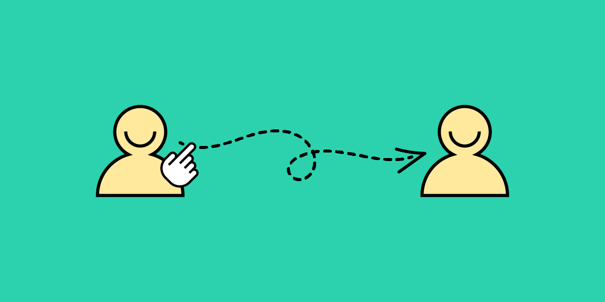
What is an In-App Feedback?

In-app feedback is a user opinion collected within an application that sheds light on user experiences, preferences, and potential pain points. Unlike external surveys, social media, or app ratings, this feedback captures real-time reactions and user insights, giving product teams a contextual understanding of how people interact with specific app features. 

Organizations leverage in-app feedback to find opportunities for improving UX, ensuring their solutions align seamlessly with user expectations and enhance the overall customer experience.

Why Does In-App Feedback Matter?

Prioritizing in-app feedback means valuing genuine user experiences over assumptions and ensuring product managers implement changes based on user needs. These user-centric improvements increase customer satisfaction leading to increased retention while reducing churn.

Reason 1: Staying in touch with users

In-app feedback provides an unfiltered channel into the user’s thoughts and feelings. This first-party data is invaluable as it allows product teams to capture app users’ sentiments directly where interactions occur, fostering a clearer understanding of user satisfaction and areas of friction.

Reason 2: Fast insights

Real-time in-app feedback offers immediacy other collection methods can’t. Users can instantly communicate issues, delights, or confusion, allowing product teams to address concerns without delay, ensuring an agile response to user needs.

Reason 3: Real-time understanding of users

Contextual feedback is highly valuable for UX research and understanding the user experience “in the moment.” We humans tend to forget. So interviewing someone a few days or weeks after their experience may differ from when it’s actually happening.

In-product feedback gives teams a contextual perspective on how users navigate, interact, and react to specific features, shedding light on potential improvements and innovations.

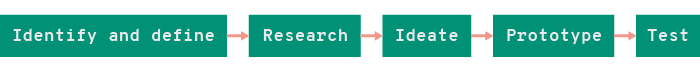
In-App Feedback Tools and Techniques

In-app surveys and questionnaires

  • Best time to use: After major interactions or task completions.
  • Tools: Typeform.

In-app surveys and questionnaires let you pose targeted questions to users as they navigate, extracting specific insights. For example, after a user completes a new feature or flow, a quick survey can assess their experience.

Pros:

  • Direct insights about specific app features or processes
  • Structured data that are easy to quantify and analyze

Cons:

  • Risk of interrupting user experience if not timed correctly
  • Overusing feedback surveys can lead to fatigue

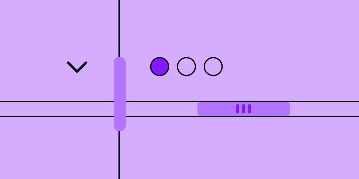
Feedback widgets and buttons

These embedded tools within your app interface offer users a quick way to provide feedback, including net promoter score (NPS) and customer satisfaction score (CSAT). For example, post-onboarding, a thumbs up/down button can gauge whether users feel confident about using the product.

Pros:

  • Simplifies the feedback process for users
  • Can lead to higher response rates

Cons:

  • Limited depth of insights due to simplicity
  • Can clutter the interface if not integrated seamlessly

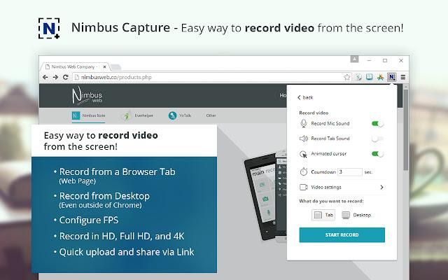
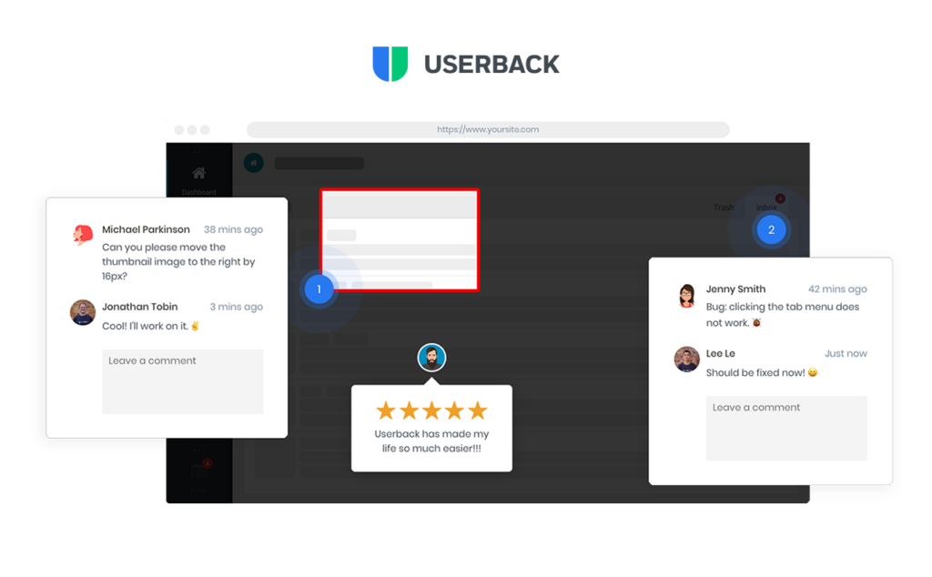
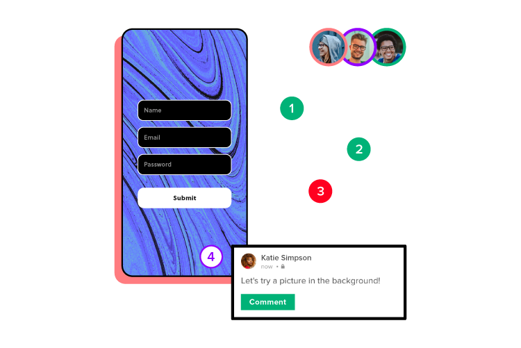
Screenshot and annotation tools

These tools allow users to capture specific app screens and highlight issues or areas of interest, offering visual context. For example, a user encountering a display glitch can screenshot the error and instantly report it.

Pros:

  • Provides visual context for more accurate issue identification
  • Empowers users to pinpoint exact problems

Cons:

  • Might have compatibility or stability issues
  • Needs user proficiency for effective utilization

Session recordings

  • Best time to use: Continuous monitoring, especially during new releases.
  • Tools: FullStory.

Recording user sessions captures real-time interactions, providing a step-by-step view of a customer journey. This data is valuable when diagnosing unexpected user drop-offs.

Pros:

  • Offers a holistic view of user interactions
  • Helps identify unintuitive app flows

Cons:

  • Privacy concerns if not handled with transparency
  • Can demand significant storage and analysis time

Heatmaps

  • Best time to use: When analyzing user interaction patterns with UI elements.
  • Tools: HotJar, Microsoft Clarity

Heatmaps visualize where users tap, swipe, or linger on your app screens, indicating areas of interest or confusion. For example, a hotspot might reveal an unintentional focal point.

Pros:

  • Offers a visual representation of user activity
  • Highlights design elements that draw attention

Cons:

  • May not provide the ‘why’ behind observed patterns
  • Needs sufficient data points for accuracy

Chatbots and AI-driven feedback collection

  • Best time to use: Post interactions or during help/support queries.
  • Tools: Built-in in your chatbot app like Intercom or LiveChat.

Product teams can leverage AI chatbots to gather feedback by conversationally interacting with users. 

For example, post-interaction, a chatbot might ask, “Was this solution helpful?”

In time, these AI chatbots will get more advanced and notice patterns where users struggle. For example, “I noticed you spent a long time completing the form; was everything ok?”

Pros:

  • Enables real-time, interactive feedback collection
  • AI can adapt to user responses for deeper insights

Cons:

  • Can feel impersonal or robotic
  • Requires sophisticated setup and maintenance

Bug reports

  • Best time to use: Continuous monitoring, especially during new releases.
  • Tools: Instabug.

In-app bug reporting tools allow users to immediately report issues they encounter, streamlining the feedback-to-fix journey. If an app crashes, a prompt might appear asking for feedback.

Pros:

  • Facilitates quick identification of technical problems
  • Direct channel from problem discovery to report

Cons:

  • Relies on the user’s willingness to provide feedback post-disruption
  • Can lead to redundant reports if many users face the same issue

Customer support emails

  • Best Time to Use: Immediately after technical issues or crashes.
  • Tools: Intercom or Helpscout.

Channels like feedback forms, in-app messaging, and customer support allow product teams to learn about users and their pain points. Beyond troubleshooting, these mobile app feedback channels enable users to voice concerns, provide suggestions, or seek clarity on app functionalities.

Pros:

  • Real-time feedback allows users can share their thoughts or report issues instantly
  • Direct interaction assures users that there’s a team ready to assist and value their input, building trust
  • Detailed conversations dive deeper into user challenges and perspectives

Cons:

  • Users want immediate feedback. Delays in support responses can lead to user dissatisfaction
  • Maintaining a responsive customer support system demands a dedicated team and other valuable resources
  • Customer support representatives must manage expectations. Unresolved issues can lead to unfavorable user reviews or public complaints

How to Encourage Users to Give In-App Feedback

React quickly

Position feedback prompts where they’re most relevant, ensuring they resonate with users’ in-app experiences. Avoid disrupting users during crucial tasks to increase the likelihood of participation.

For example, after completing a checkout process, a brief survey asking about the experience feels timely and relevant, maximizing the chance of user engagement. Conversely, asking the shopper while entering their payment details is poor timing, adversely impacts the user experience, and may increase abandoned carts.

Offer incentives or rewards

Users are more inclined to provide feedback if they see a tangible benefit. Product teams can offer rewards or incentives to acknowledge the value of the user’s time and insights. 

For example, offering in-game currency or power-ups in exchange for feedback on a game’s new level or feature. This incentive entices players and ensures more comprehensive feedback.

Craft compelling Call-to-Action

A well-crafted call-to-action (CTA) motivates users without overwhelming them. Keep CTAs clear, concise, and direct, emphasizing the ease and benefit of providing feedback.

For example, instead of a generic “Give Feedback” button, use “Help Us Improve in 30 Seconds!” This CTA offers a clear timeframe, making users more likely to engage. Content designers can help you find the best CTA for your case.

Best Practices for In-App Feedback Collection

Respect users’ time

When collecting feedback, value the user’s time. Ensure that prompts, questions, and surveys are clear, concise, and easy to navigate. A user who encounters a straightforward and brief survey is more likely to complete it, ensuring you get the insights you need without frustrating them.

Be transparent with users

Clearly communicate the purpose of collecting feedback and how the organization uses this data. Users are more inclined to share insights when they know their data is secure and won’t be misused.

For example, a simple statement, “We value your privacy. We use your feedback to make app improvements and never share this information with third parties,” builds trust.

Test your approach often

Feedback tools aren’t a set-and-forget; they require ongoing refinement. Regularly test these tools to ensure they function correctly and resonate with users. A continuous iteration of analyzing, modifying, and retesting ensures your feedback mechanisms remain effective and user-friendly.

Prioritize gathering feedback

Evaluate user responses based on relevance, frequency, and potential impact on user experience. Designers must also consider the product roadmap and objectives when prioritizing what to tackle first.

Addressing the most pressing issues first ensures you tackle users’ most significant pain points and enhance the overall user experience. 

Tools and techniques to understand feedback

Closing the feedback loop: informing users of changes

After acting on feedback, inform respondents about the changes made. This follow-up shows appreciation for their input and reinforces trust in your commitment to improvement–they know your messaging about improving the app is sincere, and they’re more likely to give feedback again.

For example, when releasing an app update, highlight “Improvements made based on your feedback!” in the release notes. This simple acknowledgment fosters a stronger relationship between users and product teams.

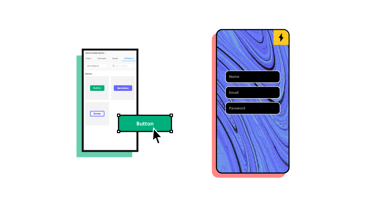
Design Solutions to In-App Feedback Easier With UXPin

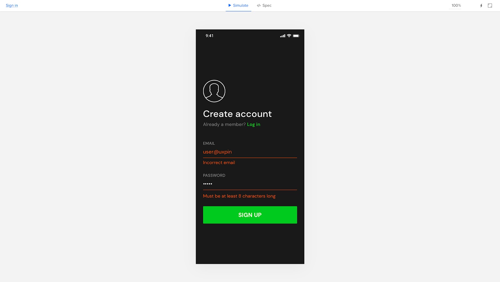
UXPin’s advanced features allow product teams to build prototypes that accurately replicate the final product experience. They can use customer feedback to simulate problems or usability issues and develop effective solutions. Designers can preview prototypes in the browser or via UXPin Mirror (available for iOS and Android) for mobile app testing. 

Some of UXPin’s advanced features you won’t find in traditional image-based design tools:

  • States: design complex interactive components like dropdown menus, tab menus, navigational drawers, and more.
  • Variables: capture data from user inputs and create personalized, dynamic user experiences–like their name and profile image in the app bar.
  • Expressions: create complex components and advanced functionality–no code required!
  • Conditional Interactions: create if-then and if-else conditions based on user interactions to design dynamic prototypes with multiple outcomes to accurately replicate the final product experience.

UXPin’s IFTTT integration allows design teams to connect APIs and simulate real-world product experiences, workflows, and use cases–like sending a notification email or adding an event to a user’s calendar.

Use these and many other features to build your first fully interactive prototype with UXPin. Sign up for a free trial.

The 4 Types of Creative Website Scrolling Patterns

Scrolling

Creative scrolling patterns let you adjust the pace, delivery, and interactivity of the content. Considering that our attention span on the web has dropped to about 8 seconds, a delightful scrolling experience certainly prolongs user interest.

In this post, we’ll examine the most common and time-tested scrolling pattern. As explained in the free e-book Web UI Patterns 2016 Vol.1, each pattern is creative yet proven usable through years of refinement.

UXPin helps you build interactive, scrollable prototypes even on trial. Try UXPin and all its advanced features for free. Sign up for trial.

Build advanced prototypes

Design better products with States, Variables, Auto Layout and more.

Try UXPin

What are Scrolling Patterns?

Scrolling patterns are the various ways content is presented to the users as they scroll down a web page. Scrolling patterns influence how users engage with the content and how they feel about it.

Choosing the right scrolling pattern depends on the nature of the content, the user experience you want to create, and the specific goals of your website or application. A thoughtful selection of scrolling patterns can enhance engagement, guide user navigation, and contribute to a positive overall user experience.

Types of Scrolling Patterns

Here are some common scrolling patterns:

  1. Traditional or Sequential Scrolling – This is the most common scrolling pattern where users scroll vertically through content in a linear manner, one section at a time.
  2. Infinite Scrolling – New content continuously loads as users scroll down. It’s often used in social media feeds and content-heavy websites.
  3. Parallax Scrolling – It creates an illusion of depth by moving background and foreground elements at different speeds as users scroll.
  4. Fixed or Sticky Elements – In this pattern, certain elements, such as navigation menus or headers, remain fixed in place as users scroll.
  5. Carousel or Slider – They allow multiple pieces of content to cycle through horizontally as users scroll. They’re useful for presenting a variety of information in a limited space.
  6. Full-Page Scrolling: Each scroll action takes users to a new full-page section, often with unique visual designs or interactions. It’s often used in portfolios or promotional websites to create a visually impactful experience.
  7. Scroll Snap: Scroll snap ensures that the page automatically aligns with defined points or sections as users scroll, creating a more controlled scrolling experience.
  8. Minimal Scrolling: In this pattern, the content is presented on a single screen without requiring users to scroll. It’s often used for landing pages with minimal content or single messages.

Long Scrolling

Le Mugs

Le Mugs Long Scrolling image

Take It

Take it app long scrolling image UXPin blog

Beoplay

Beoplay long scrolling

Flickr

Flickr long scrolling image at UXPin

Problem

A site has so much eclectic content that a multi-page format would be too difficult to navigate.

A site wants to tell a story in a smooth, linear fashion.

Solution

Create a single-page, long-scrolling site to consolidate your content in a single place. This works great for social media sites and others with user-generated content, where part of the fun is browsing through everything all at once, and the content is diverse and difficult to categorize because it’s always updating.

The prominence of mobile browsing supports the long scrolling pattern since smaller screen sizes call for more scrolling.

Combined with the infinite scrolling pattern described below, long scrolling can create a completely immersive browsing experience. If users are searching for something in particular, a more structured navigation system like Amazon’s works better — but for explorability, long scrolling is the fastest and most fun for users.

Tips

  • Use sticky navigation. Disorientation and the inability to go back are the innate drawbacks of long scrolling, but a fixed menu allows users to move freely.
  • Long scrolling can have a negative effect on SEO.
  • Don’t autoplay heavy media like videos, since in abundance they drastically slow down loading.
  • You don’t have to commit to a single-page format with long scrolling: often sites feature a central long-scrolling home page that links out to traditional secondary pages, like Facebook and Twitter’s separate profile pages.
  • For one-off long scrolling on specific page sections, try the fixed technique described below.

Fixed Long Scrolling

Squarespace

SQUARE SPACE WEBSITE

UXPin Tour

UXPin website image

Problem

A site could benefit from the advantages of long scrolling but doesn’t want to convert entirely from a multi-page structure.

Solution

Fixed long scrolling sites display information that might otherwise require multiple sections within one long-scrolling section. The effect feels like a “scroll within a scroll”.

Tips

  • When deciding what to include in a fixed scroll section, make sure you only choose content that fits within a unified theme or category. Each part of Squarespace’s fixed scroll section, for example, focuses on explaining how to “Create a beautiful website” for different business types.
  • Place CTAs in at the end of each of each fixed-scroll frame.
  • As the UXPin product tour page shows, you can also consider adding a “scroll progress bar” to the top navigation. The pattern helps add a greater sense of pace if you have more than 3-4 frames.

Infinite Scrolling

True Tube

image02

Tumblr

image05

By Kato

image09

Imgur

image06

Problem

Content is better organized on a single page, but there’s too much to load all at once.

Solution

With the infinite scrolling pattern, content is loaded as needed to provide a more paced experience. Infinite scrolling proves useful for single-page sites with more than a few screens worth of content, especially with multimedia galleries.

Infinite scrolling creates a rhythm for social media sites, where users are continually entertained with new content without clicking or waiting.

The problem with infinite scrolling is when users lose their place, though there are ways around this. Sticky navigation is the best way to give your user mobility in a near-infinite sea of content.

Tips

  • In addition to sticky navigation, there are other methods to help infinite scrolling’s disorientation. A jump-to-section option, as with Tumblr, lets users return to the start if they become lost.
  • Infinite scrolling can be combined with pagination for more accurate searches. For example, Facebook allows users to search timelines by year.
  • Don’t be constrained by the traditional loading circle — your choice of icon is an opportunity to deepen your site’s identity. Facebook, Tumblr, Imgur, and others all have custom loading signifiers.

Tasteful Parallax Scrolling

The Walking Dead

image08

Oakley: Airbrake MX

image07

The Boat (SBS)

image04

McWhopper

image13

Problem

Users are not engaged enough in long scrolling formats.

Solution

Give your long scrolling site more impact with a parallax effect. Known to the video game industry for decades, this pattern refers to the layers of a two-dimensional image moving at different speeds when scrolling, i.e., the foreground and background moving at different speeds, or differing layers of the background. The effect creates a mesmerizing three-dimensional feel.

The parallax effect unlocks the more creative aspects of scrolling, especially when combined with scroll-triggered animations. This style lends itself to storytelling sites, building a more immersive and stimulating experience with better visuals.

The Walking Dead uses parallax and other scrolling techniques (i.e., atypical direction since the frames move left to right as you scroll down) to deepen their narrative. While not necessary, the differentiated backgrounds make just watching the scroll more enjoyable. It also makes sense for the context of the site since the character react to the scroll.

Tips

Create scrollable prototypes in UXPin

Apply what you’ve just learned in practice and build an interactive prototype that works like a real product. Use UXPin, build prototypes up to 10x faster, share them with your team, and streamline developer’s handoff by having them easily translate your design into code. Try it now.

How to Bring Bootstrap Components to UXPin – npm Integration Walkthrough

Bootstrap NPM Integration

UXPin’s npm Integration empowers design teams to prototype at a higher fidelity and with code-like functionality. Component-driven prototyping in UXPin allows designers to create prototypes that previously required engineers to code.

With npm Integration, teams can bring component libraries to UXPin’s design tool and leverage full interactivity of shared components without complicated technical setup. Let’s see the tutorial to learn how fast it is to integrate components and use Merge.

Bring UI components to UXPin from Git repo, Storybook, or through our newest npm integration. Learn more about UXPin’s Merge technology.

Reach a new level of prototyping

Design with interactive components coming from your team’s design system.

What is UXPin Merge?

UXPin Merge is a code-based technology that enables component-driven prototyping for design teams. Instead of designing from scratch, designers use production-ready UI elements from a repository to build high-fidelity, fully functioning prototypes.

uxpin merge component responsive 1

Designers work with visual elements, and engineers the code behind them, creating a single source of truth for the entire product development team. Teams like PayPal or TeamPassword improved the quality, speed, and consistency of their design with UXPin.

What is UXPin’s npm Integration?

Using UXPin Merge for a private design system requires some engineering knowledge to set up the repository for syncing. But, to use an open-source component library, design teams can complete the npm Integration using an intuitive dashboard.

logo uxpin merge npm packages

Designers can manage component imports and properties using Merge Component Manager. For example, you can import a button from Bootstrap’s component library and its nine variants:

  • Primary
  • Secondary
  • Success
  • Danger
  • Warning
  • Info
  • Light
  • Dark
  • Link 

These variants appear in UXPin’s Properties Panel as a dropdown. Merge also includes basic hover states for most components, so designers don’t have to worry about these minor details and can begin prototyping immediately.

Design teams can find component properties to import via the React Bootstrap docs. They can import every property or only those relevant to the project.

The Benefits of Working With Bootstrap

Bootstrap is one of the oldest and most comprehensive mobile-first front-end frameworks available for React, Vue, and Angular. UXPin’s npm integration uses the React Bootstrap component library, but you can import the Vue or Angular versions using our Storybook Integration.

bootstrap logo vector

Bootstrap is best for building responsive websites and web applications, but you could use the React library for mobile app design projects. Bootstrap’s extensive collection of form elements, responsive tables, and other relevant components makes it an excellent option for web-based enterprise products.

We recommend checking Bootstrap’s Examples page to see what’s possible with this comprehensive front-end framework.

Bootstrap npm Integration With UXPin Merge

You can import Bootstrap components into UXPin’s design editor using the npm package (react-bootstrap). Merge Component Manager allows you to import each UI element and its available properties.

With component-driven prototyping in UXPin, design teams get the same fidelity and functionality as engineers because the elements come from the same repository. Designers can replicate whatever engineers can do with repository components in UXPin via the Properties Panel.

merge component manager npm packages import library

You can assign these properties using Bootstrap’s React props found in the framework’s documentation.

Assigning Properties in Merge Component Manager

Merge Component Manager is a central hub for importing and managing your npm components. You can import as many of these as you need to complete your project. 

You also have control over how many properties you import. For example, if you’re only going to use the Bootstrap button’s primary and secondary variants, you only need to import two instead of all nine.

Connecting UXPin to the React Bootstrap npm Package

Step 1

Navigate to your UXPin dashboard and click “New Project.”

Step 2

Name your project and click “Create New Project.”

Step 3

Click “Design with Merge components” and “+ Add new Library.”

Step 4

Select “Import React Components with npm integration” and click “Next.”

Step 5

Name your library. This name is purely for your reference and won’t impact the import.

Merge requires two Bootstrap packages for the npm Integration to work. You’ll need React Bootstrap (react-bootstrap) and Boostrap (bootstrap).

Lastly, you must include a path to Bootstrap’s CSS file for component properties to work in UXPin. You can find this path under CSS in React-Bootstrap’s documentation.

  • bootstrap/dist/css/bootstrap.min.css

Importing React Bootstrap Components

Once you complete the steps above, UXPin will redirect you to Merge Component Manager. You can also get there from the canvas following Step 1.

Step 1

From the lefthand sidebar, click “Open Merge Component Manager.”

Merge Component Manager will open in a new tab.

Step 2

Click “Add new component.”

Step 3

Enter the name of the component you want to import.

You’ll find the correct naming convention in React Bootstrap’s documentation.

We’ll import a Bootstrap button for this tutorial and create a new category called “Components.” We recommend using the same categories as React Bootstrap’s docs so designers and engineers have the same reference point.

You can add multiple components to a single import, saving you time repeating steps two and three.

Click “Import Components.”

Step 4

Click “Publish Changes” in the top right to initialize the import process.

The first time you do this for a new component, it might take a minute.

Step 5

Once the import is complete, click “Refresh Library” to update the changes in your project library.

If you follow these instructions step-by-step, you’ll notice you have a category (Components) and your first component (Button) in the left sidebar.

Step 6

Click on the Button to begin adding properties. You can find these React props in React Bootstrap’s documentation under API in Components > Button.

Adding Component Properties with Merge Component Manager

We’ll add a couple of button properties using React Bootstrap’s documentation.

Button Label

Step 1

You set a React Bootstrap button label using the children property as follows:

  • Property name: enter “children” (always use lowercase for props)
  • Display name: This is for your reference, but something descriptive that both designers and engineers use–we’ve gone with “Label” to keep things uniform
  • Description: Add a short description or instructions for designers
  • Property type: “string”
  • Property control: “textfield”
  • Default value: Your preference–we’ve gone with “Button”

As you complete the component’s properties, you’ll notice a component preview will appear and change according to your preferences.

Step 2

Once you have completed all the fields, click “Add property.”

Then “Save Changes.”

Lastly, “Publish library changes.”

Try Component-Driven Prototyping in UXPin

Once you import the React Bootstrap components and properties you need, prototyping in UXPin is as simple as drag-and-drop to build layouts. We created this simple email sign-up form using three Bootstrap components in less than a minute.

When you select a Bootstrap component, the properties you created in Merge Component Manager appear in the righthand Properties Panel.

Try component-driven prototyping with UXPin’s npm Integration today. Bring Bootstrap’s npm components and discover how quickly your product gets from ideation to development. Release features much faster.

Merge npm Integration – Another Way of Importing Components

Here’s a designer-friendly way of bringing UI code components into UXPin’s editor. It’s our npm integration that makes Merge accessible to teams who lack active engineer’s support.

Try npm integration to speed up interactive prototyping and stay 100% consistent with the final product. The npm components will behave like a lego bricks that you can drag and drop to build advanced prototypes. Discover UXPin Merge.

Reach a new level of prototyping

Design with interactive components coming from your team’s design system.

Revolutionize Your Design Process with UXPin Merge

UXPin with Merge technology allows you to create a new level of fidelity and interactivity in  prototypes, smoothen design handoff, and unify designers and devs’ work with a single source of truth. It truly streamlines product development process.

Move Away from Static, Change to Fully-interactive Design

Gone are the days of static prototypes. Companies, especially the ones that reached a higher design maturity level, look for more efficient ways of prototyping. Linking lifeless artboards, translating design to code with imperfect tools, and documenting nuanced interactions time and time again adds more work and stalls growth.

This is where Merge comes in. With this technology, you can create prototypes with the elements that have true functionality built into them. It scales design like it did for Erica’s team at PayPal.

Streamline Collaboration Between Design and Development

With Merge, the design and development teams work with the same interactive components throughout the entire production process. Designers use the UI components, whereas developers copy the ready code from the very same design.

The translation of design into code is already there. Getting the most of a single source of truth unites design and engineering and simplifies the design handoff stage. In short: designers are happy, same as developers, and they don’t waste time on back-and-forths. 

Use Accurate UI Components that Guarantee Design Consistency

Coded UI components used in the design process make the prototypes consistent from start to finish. The product is being built according to the designer’s intention. The best part – designers don’t even need to deal with code.

The outcome is that there is no drift between design and the end product’s look and feel which is extremely time and energy consuming without Merge technology.

The Third way of Importing UI components to UXPin Merge

Before you can design with true components, you need to import a component library. There are three ways of bringing coded components to UXPin Merge.

merge component manager npm packages import library
  • Git integration – developers use Git to host source code and its history; it requires technical help to import code components into UXPin.
  • Storybook integration – Storybook stores public and private component libraries that you can bring to UXPin.
  • npm integration – that gives designers a lot of autonomy.

Merge npm integration – What Do You Get?

Many design teams might struggle with the Merge Git integration if they lack developer’s active support. To make it easy for them to benefit from Merge, we’re releasing a designer-friendly way of importing a component library to UXPin.

How to use npm integration? 

Time to see how you can use npm integration. Let’s start with a written description of how to do it.

Import npm Components to UXPin

An npm is an online registry of packages with ready-made development elements that you can download to use in your project. Some of the most popular open-source design systems are being distributed in this way.

You can use Adele (UXPin’s design system repository) to find which design system is in an npm package. Just scroll to the final column to see the way of distribution.

Alternatively, you can upload your own React-based component library to npm and use it in UXPin.

Here’s how to do the steps of bringing the npm design system into UXPin.

1. Add a New Library to UXPin Merge

Once you know which React-based design system to use, it’s time to sync it with UXPin Merge. Go to the Merge Tab in your UXPin dashboard and add a library via npm package. You need to provide an npm package name and the version you want to use. If your documentation requires it, add styles to the “assets location” field. 

2. Configure UI Components

Open Merge Component Manager and specify components you want to import. You can categorize the components the way you want to. After publishing components, manage their properties and define which you want to import. Go to the library documentation to find the names and types of properties.

3. Start Creating Fully Interactive Prototypes

Time to create your first design. Go to the design editor and drop components on the canvas. See how easy it is to change the properties of the components you use! To check the components’ interactivity, go to “Preview” mode. 

Finished your prototype? Now, you can just pass the project link to your fellow developer so that they can copy the code from your design and check the specs. 

Follow our instructions and import interactive components

1. Watch a step-by-step video that tells you how to use the integration

We prepared a video walk-through of the integration. Watch it to learn how you can import an npm design system to UXPin.

2. Import npm components from MUI to UXPin

Would you like to bring MUI to UXPin? Our step-by-step article will guide you through the process.

How to import MUI components to UXPin?

3. Import npm components from Ant Design to UXPin

Ant Design is one of the most popular libraries. When you log in to UXPin, you will see some of the Ant Design components that we’ve imported through npm. They are ready for you to use. Check how we imported them to UXPin in this article.

How to import Ant Design components to UXPin?

Use npm integration + Patterns

Once you import everything you need and save changes, you can build more complex components out of basic ones or save components with properties to avoid repeating the same steps over and over. In other words, create Patterns.

Read all about it: Patterns documentation.

Try Merge npm integration

With npm integration, you don’t need developers’ help to bring coded UI elements to UXPin. The designers can import and manage the UI components by themselves in UXPin. Just the way they want.

Bring UI components through npm integration. Connect the design and development team with a single source of truth and break organizational silos. Sign up for a 14-day trial to test the integration.

Bring MUI Components to UXPin – npm Integration Walkthrough

MUI NPM Integration

With UXPin’s npm Integration, designers can import npm component libraries to build fully functioning prototypes. These high-fidelity prototypes enable designers to test features, interactions, and functionality impossible to achieve with traditional vector-based design tools.

Build fully interactive prototypes with real building blocks of your app. Try UXPin Merge and sync MUI with Merge and bridge the gap between designers and devs. Discover UXPin Merge.

Reach a new level of prototyping

Design with interactive components coming from your team’s design system.

What is UXPin’s npm Integration?

Firstly, it’s important to understand UXPin Merge because our npm Integration is the latest iteration of this game-changing technology.

Merge allows you to sync a design system’s component library to UXPin’s design editor so designers can prototype using fully interactive components that come from their design system.

This component-driven prototyping creates a single source of truth where designers and engineers work with the same design system. Any changes to the repository automatically sync to UXPin, so teams always use the latest version.

Enter npm Integration

merge component manager npm packages import library

Previously, designers needed an engineer’s help to connect and sync Merge. You needed someone proficient at a Git repository or Storybook. But, with UXPin’s npm Integration, designers (or DesignOps) can complete the integration using an intuitive user interface without writing any code.

If the component library exists as an npm package, you can connect it to UXPin through Merge and import the UI elements needed to start prototyping. Open-source design libraries like MUI work best with the npm Integration because they have a consistent naming convention, file structure, and documentation.

The Benefits of Working With MUI

MUI is a React component library based on Google’s Material Design UI. The comprehensive design system is excellent for prototyping because it has everything you need to build UIs fast.

The MUI team has done fantastic work to ensure components solve foundational usability and accessibility issues, giving you a ready-to-go product development solution.

MUI is themeable, so you can use it as a foundation to build your design system or take advantage of the comprehensive library to test UI elements when trying to find new patterns for your product’s component library.

MUI npm Integration With UXPin Merge

MUI has design kits for a few image-based design tools, but with UXPin, you can import its fully functioning component library–the same foundational components engineers use for development.

MUI components in UXPin look exactly like any other static component but have the same fidelity and functionality as code–UXPin renders HTML, CSS, and Javascript in the backend rather than vector graphics.

When you import UI elements into UXPin, you also get MUI’s component states out of the box. If you’ve ever set these up in an image-based design tool, you’ll know how time-consuming and complicated it can be to add basic states and assign them to the properties panel. With UXPin’s npm Integration, you can import these states with a few clicks!

Assigning Properties in Merge Component Manager

The Merge Component Manager allows you to set up properties for each MUI component.

You can use MUI’s docs to choose which React props you want to import for each component. Once imported, these React props appear in UXPin’s righthand Properties Panel, allowing you to customize individual UI elements.

For example, an MUI button has several color properties:

  • Primary
  • Secondary
  • Success
  • Error
  • Info
  • Warning

When you import these props via the Merge Component Manager, a dropdown appears in the Properties Panel, allowing you to select the desired color. The same applies to variant (contained, outlined, text), size (small, medium, large), and other multi-option props.

There are several property types, including boolean, function, string, array, and enum, to name a few. You can import any MUI React props found in the documentation according to your prototyping needs.

Connecting UXPin to the MUI npm Package

Step 1

Navigate to your UXPin dashboard and click “New Project.”

Step 2

Name your project and click “Create New Project.”

Step 3

Click “New prototype” to open the project in UXPin’s design canvas.

Step 4

Click the dropdown at the bottom of the Design System Libraries tab in the lefthand sidebar, and click “New library.”

Your sidebar and available libraries may differ from the example.

Step 5

Select “Import React Components” and click “Next.”

import npm package

Step 6

Name your library. This name is purely for your reference and won’t impact the import.

You also need to grab the npm package repository name, which you find under Install on MUI Material’s npm page. Copy and paste the Install contents from npm into the “Library package name” field.

Delete everything preceding the @ symbol (so you only have @mui/material), leave everything else as default, and click “Next.”

Importing MUI Components

UXPin will automatically redirect you to the canvas once you complete the npm integration. Now it’s time to select the MUI components you want to import.

Step 1

From the lefthand sidebar, click “Open Merge Component Manager.”

Merge Component Manager will open in a new tab.

Step 2

Click “Add new component.”

Step 3

Enter the name of the component you want to import.

You’ll find the correct naming convention in the MUI docs under Component API. MUI’s components use CamelCase with no spaces. Always capitalize the first letter. For example, bottom navigation would be BottomNavigation.

Let’s import an MUI Button as our first component and add it to a new category called Inputs. We recommend using the same categories as MUI’s docs, so designers and engineers have the same reference point.

You can add multiple components to a single import, saving you time repeating steps two and three.

Click “Import Components.”

Step 4

Click “Publish Changes” in the top right to initialize the import process.

step 4 publish changes

The first time you do this for a new component, it might take a minute or two.

Step 5

Once the import is complete, click “Refresh Library” to update the changes in your project library.

If you follow these instructions step-by-step, you’ll notice you have a category (Inputs) and your first component (Button) in the left sidebar.

Step 6

Click on the Button to begin adding properties. You can find these React props in MUI’s documentation under Component API > Button.

Adding Component Properties with Merge Component Manager

Let’s add a few MUI button properties using the React props from the documentation.

Button Label

Step 1

A button label (or content) in MUI uses the “children” React prop.

  • Property name: enter “children” (always use lowercase for props)
  • Display name: This is for your reference, but something descriptive that both designers and engineers use–we’ve gone with “Label”
  • Description: Add a short description or instructions for designers–we’ve used “Button’s label or CTA”
  • Property type: “node” as per MUI’s docs
  • Property control: “textfield” (note: this field will only appear once you select a property type and will differ depending on your selection)
  • Default value: Your preference–we’ve gone with “Button” (note: MUI capitalizes button labels)

As you complete the component’s properties, you’ll notice a component preview will appear and change according to your preferences.

Step 2

Once you have completed all the fields, click “Add property.”

Then “Save changes.”

Lastly, “Publish library changes.”

Component-Driven Prototyping in UXPin

Once you import the MUI components you need, prototyping in UXPin is as simple as drag-and-drop to build layouts. We created this simple email sign-up form using three MUI components in less than a minute.

When you select an MUI component, the properties you created in Merge Component Manager appear in the righthand Properties Panel.

Ready to discover the possibilities of component-driven prototyping in UXPin? Try the MUI npm Integration (or other open-source component libraries available on npm).

Top 6 npm Packages for Component-Driven Prototyping

Component-driven prototyping with UXPin Merge allows designers to build accurate replicas of the final product. Unlike other design tools that render static graphics, UXPin is powered by code so that designers can create high-fidelity, fully functioning prototypes.

UXPin’s npm integration gives designers the freedom to import components and patterns from open-source design systems. They may need a single UI element to create a new pattern for an existing design system or use the npm integration to build a fully functioning MVP during a design sprint.

Discover how UXPin Merge can help you build interfaces with React components from npm. Discover UXPin Merge.

Design UI with code-backed components.

Use the same components in design as in development. Keep UI consistency at scale.

About Prototyping with npm Components

Before we dive into UXPin’s npm integration and the packages you can import for prototyping, it’s important to understand Merge–the technology that makes component-driven prototyping with npm libraries possible.

Merge enables companies to sync a design system hosted in a repository to UXPin’s design editor so designers can build prototypes using the same component library as engineers.

These “ready-made” UI elements include properties and interactivity defined by the design system’s code. A component in Merge looks and functions the same as the final product because it’s an exact replica.

Designers use Merge components like building blocks, dragging and dropping to build new UIs, and fully functioning prototypes. They can also use Patterns to combine UI elements and build new components.

Merge’s strongest feature is its ability to sync design and development, creating a genuine single source of truth across the organization via the design system’s repository. Any changes to the repo automatically sync to UXPin, notifying product teams of the change.

1. Ant Design

Ant Design is an open-source design system developed and maintained by the Chinese tech giant Ant Group. The component library is available for React, Angular, and Vue and includes Ant Design Mobile for building cross-platform and mobile applications.

Ant Design is a fantastic “all-rounder” with components for B2C products, enterprise applications, websites, and cross-platform apps. The design system also features an icon set, dark mode, animations, and interactivity.

Importing the Ant Design npm Package

Ant Design npm integration Library settings:

  • Library name: Ant Design NPM – The Library name has no impact on the import
  • Package details: antd – must correspond to the Ant Design npm registry
  • Assets location: antd/dist/antd.css – required for styling Ant Design React props

Leave everything else as default and click Save Changes.

Further reading: Check out this step-by-step guide for importing Ant Design components via the UXPin npm integration.

2. Bootstrap

Bootstrap is one of the oldest and largest responsive front-end frameworks. Engineers often use Bootstrap for basic CSS styling and Javascript functionality when building website and web application prototypes.

UXPin’s npm integration uses the React Boostrap, which includes the same out-of-the-box features and functionality as the original Bootstrap. We recommend React Bootstrap for prototyping responsive websites and web applications.

Importing the React Bootstrap npm Package

React Bootstrap npm integration Library settings:

  • Library name: Bootstrap NPM Integration – The Library name has no impact on the import
  • Package details: react-bootstrap – must correspond to the React Bootstrap npm registry
  • Dependency package name: bootstrap – React Boostrap requires the Bootstrap dependency to work in UXPin
  • Assets location: bootstrap/dist/css/bootstrap.min.css – required for styling React Boostrap props

Leave everything else as default and click Save Changes.

Further reading: Check out this step-by-step guide for importing React Bootstrap components via the UXPin npm integration.

3. MUI

MUI is a React library built based on Google’s Material Design UI. The comprehensive design system features everything you need to develop an array of digital products, plus more than 2,000 Material Design Icons.

Due to its comprehensive component library, MUI is a popular choice for enterprise products, cross-platform applications, and MVPs.

Importing the MUI npm Package

MUI npm integration Library settings:

  • Library name: MUI NPM – The Library name has no impact on the import
  • Package details: @mui/material – must correspond to the MUI npm registry

Unlike React Boostrap and Ant Design, MUI doesn’t require dependencies or assets to work in UXPin. Leave everything else as default and click Save Changes.

Further reading: Check out this step-by-step guide for importing MUI components via the UXPin npm integration.

4. Semantic UI

Semantic UI is an excellent alternative to Bootstrap. The Semantic UI React framework has a more modern aesthetic, simple features, and highly customizable components. Semantic UI includes FontAwesome built-in–the most extensive icon library in the world.

Like Bootstrap, Semantic UI is best for prototyping websites and web applications.

Importing the Semantic UI React npm Package

Semantic UI React npm integration Library settings:

  • Library name: Semantic UI – The Library name has no impact on the import
  • Package details: semantic-ui-react – must correspond to the Semantic UI React npm registry
  • Dependency package name: semantic-ui-css – Semantic UI React requires the Semantic UI CSS dependency to work in UXPin
  • Assets location: https://cdn.jsdelivr.net/npm/semantic-ui@2/dist/semantic.min.css – required for styling Semantic UI React props

Leave everything else as default and click Save Changes.

Further reading: The Library settings are similar to React Bootstrap. Follow the Bootstrap tutorial for a step-by-step guide, and use the Semantic UI React docs to replace library and component settings accordingly.

5. Carbon Design System

Carbon is a design system developed and maintained by IBM with React, Angular, and Vue versions. The simple yet comprehensive design system includes a large component and pattern library, an icon set, pictograms, motion, and instructions for theming.

Carbon is an excellent design system for B2B and enterprise product design. Carbon’s data visualization documentation makes it the perfect choice for product teams developing dashboard and report user interfaces.

Importing the Carbon Design System npm Package

Carbon Design System React npm integration Library settings:

  • Library name: Carbon NPM – The Library name has no impact on the import
  • Package details: @carbon/react – must correspond to the Carbon Design System npm registry
  • Assets location: https://unpkg.com/carbon-components/css/carbon-components.css – required for styling Carbon Design System’s React props
Carbon npm package

Leave everything else as default and click Save Changes.

6. Grommet

Grommet is a React-based framework that is great for building mobile-first prototypes that are accessible and responsive. Used by Netflix, Uber, Hewlett Packard, this design system is easily themable and you should definitely give it a shot.

Importing the Grommet npm Package

Grommet npm integration Library settings:

  • Library name: Grommet NPM
  • Package details: grommet – must correspond to the Grommet npm registry
  • Assets location: https://v2.grommet.io/components

Leave everything else as default and click Save Changes.

When we add that Semantic UI button to the canvas and select it, those same properties appear in UXPin’s Properties Panel. We can adjust these properties to change the button’s styling instantly.

How to Import npm Components to UXPin

Merge npm integration gives design teams the control and flexibility they needed to import and manage React components in UXPin without engineering support.

Using the Merge Component Manager (MCM), designers can import individual components and their properties via the library’s npm package. There’s no code required, and setup takes a few minutes.

Designers can use these open-source components to build new patterns for an existing design system or create a minimum viable product (MVP) using fully functioning UI elements.

Using Merge Component Manager (MCM)

Merge Component Manager (MCM) is where designers manage npm imported component libraries.

You must follow the library’s documentation and naming conventions when importing components, or the import won’t work. UXPin’s npm integration must find a component and its properties using the repository’s naming convention, so if you reference the React props incorrectly, MCM can’t locate it.

We’ll use a Semantic UI button to illustrate how to reference React props when importing components. You’ll find these React props in the design system’s documentation.

When importing a component’s property, the Property name in MCM must match the React prop name from the documentation.

In this case, we’re importing the children prop, which gives a Semantic UI button its label.

The Display name is what designers will see in UXPin’s Properties Panel.

We’ve imported children, circular, color inverted, secondary, size, and type, which you can see in this screenshot.

Those MCM Property names correspond to Semantic UI’s documentation which you see in the two following screenshots.

Rules for Choosing an npm Components

  1. It’s important to note that designers can only use the npm integration to import design systems with React component libraries, and it must have an npm package.
  2. The design system must serve your product’s needs. Are you designing a B2B product? Are you prototyping a web, mobile, or cross-platform application? Do you want to complement an existing design system or build something from scratch? For example, if you’re building a website or web application, Bootstrap or Semantic UI are excellent choices, whereas Ant Design is probably better for mobile and cross-platform digital products.
  3. It’s worthwhile researching open-source design systems to ensure the library has the UI elements you need. The library must also have documentation with setup instructions and a list of the available React props. These props will allow you to change a component’s properties like color, shape, interactivity, size, icon, etc.

Design with npm Components in UXPin

Here we outlined 6 npm component libraries that you can try with UXPin Merge. Ready to start prototyping with one of these design systems? Try npm integration to test those packages and experience what component-driven prototyping can give you. Discover UXPin Merge.

Review Card — How to Design it

review card min

Review card is a design element that appears on websites and applications to highlight feedback about a product, service or experience.

Solve more usability issues during the design process and deliver incredible user experiences for your customers with UXPin’s interactive prototypes. Sign up for a free trial to explore UXPin’s advanced features.

Build advanced prototypes

Design better products with States, Variables, Auto Layout and more.

Try UXPin

What is a Review Card?

A review card displays user feedback in a compact, visual format on digital platforms. It’s a familiar UI pattern that presents a user’s evaluation—often accompanied by a rating, comments, and sometimes user-related information. 

Review cards display social proof and insights from previous customers, enhancing brand trust, transparency, and credibility to facilitate a conversionsignup, purchase, download, etc.

Core Components of a Review Card

Profile information

Allowing reviewers to customize their identity enhances the authenticity of feedback, including:

  • Making the reviewer to post their name offers a personalized touch to the review.
  • Allowing reviewers to upload their profile picture makes them more relatable.
  • Adding the option to share a reviewer’s location upon consent can also help users understand someone’s view–for example, someone from the UK might find a dish “too spicy,” while someone from India thinks it has “excellent flavor!”

User-generated content

A review card displays the reviewer’s feedback, including:

  • The review text provides context and meaning behind the rating, emphasizing a specific experience or narrative.
  • The review date helps users understand the relevance and timeliness of the feedback. For example, a product received unfavorable reviews two years ago, but more recent feedback is positive about the same experience–showing the brand’s willingness to improve.
  • The reviewer’s images and videos help create more credibility and transparency. For example, Google My Business allows users to upload photo and video content which helps prove the reviewer was at the location and that real people are leaving feedback.

Interactivity features

Making review patterns interactive helps with community-driven moderation while increasing shares and engagement. Some interactivity designers might consider includes:

  • Including rating system (stars, points, etc.) to quickly determine the reviewer’s experience.
  • Adding helpful/unhelpful voting buttons lets others validate the review’s accuracy.
  • Allowing brands to reply to customer reviews enables them to address concerns and thank reviewers.
  • Adding social share buttons, as people like to share online reviews with friends or across different platforms, amplifying the brand’s reach.

Examples of Review Card UI Patterns

Adidas reviews

adidas review card example

Adidas is a great review card UI example for eCommerce. It encourages reviewers to rate its shoes on overall star rating, size, width, comfort, and quality. This five-point rating system gives shoppers a snapshot of the product’s performance while providing Adidas with valuable data to pinpoint issues and improvements.

Amazon reviews

amazon review card ui example

Like Adidas, Amazon is another good example of an eCommerce review card design. It customizes reviews to meet the product’s features and user needs. For example, this Kindle review interface lets customers rate its built-in light, touch screen, and “easy-to-hold” characteristics.

Yelp reviews

yelp review card example

Yelp is a review site and it makes a great job of focusing on text feedback. The review pattern prioritizes the star rating, text, and media content

The review form also prioritizes long-form text with prompts like food, service, and ambiance to prompt reviewers on what to mention.

Trustpilot reviews

yelp review card example

Like Yelp, Trustpilot’s review card prioritizes text content and its signature green-star review component. The footer allows users to like, share, or report the review and also displays the brand’s reply.

Apple App Store

apple app store review card example

The app stores for Apple and Android prioritize a mobile-friendly experience, meaning their review cards must be minimal, only displaying the most crucial information.

This example from the Apple App Store displays the review’s headline, star rating, date, and reviewer’s username. Above, users can see the product’s rating out of five, rating distribution across the five stars, and total ratings. There are also CTAs above and below the review card for users to submit feedback.

Shopify App Store

shopify app store review card example

Many platforms have app stores for third-party applications and integrations. Shopify’s review card appears below each app description so store owners can read peer feedback. 

The minimalist design uses a 2-column layout for desktop so users can see the app’s review breakdown and text reviews. They can also filter reviews by star rating.

Review Card Design Tips & Best Practices

mobile screens pencils prototyping

Simplicity and clarity

Avoid clutter. Make it scannable.

The examples above from top platforms and brands demonstrate that a review card should allow users to grasp the main points at a glance by eliminating unnecessary elements and focusing on the essentials like ratings, reviewer names, and the review text.

Consistency in design

Ensure all review cards follow a uniform pattern.

UI and brand consistency are essential for building trust. Review cards must be consistent with the product’s design principles and integrate seamlessly with the surrounding user interface and patterns. This uniformity lets users predict where to find specific information, making their browsing experience smoother and more intuitive.

Use whitespace and hierarchy

Make content easier to read.

Whitespace creates separation between components and patterns to enhance readability and scalability while reducing visual fatigue. Designers must apply whitespace and visual hierarchy techniques to review cards so users can read and absorb content with minimal mental effort.

Design interactive elements

Clearly distinguishable buttons or links.

Designers must make buttons and text links obvious using different colors, underlining, icons, etc. These immediately identifiable interactive elements enable users to complete relevant actions, like sorting, filtering, liking, etc., creating immersive, enjoyable review card experiences.

Minimize friction

Minimizing friction through an intuitive and fast review process ensures more users provide feedback. People are more motivated to leave negative reviews, so if you want to encourage more positive ones, you must make every step effortless.

For example, Amazon sends customers a follow-up email or app notification post-purchase to prompt immediate, spontaneous feedback. Amazon’s review UI is simple and intuitive, and they can share images and videos about their product experience effortlessly.

Add filtering and sorting options

Filtering and sorting enable users to choose how to consume reviews to find the people or content that resonate with their experience or expectations. 

For example, Yelp allows users to filter reviews based on rating, time, or relevance and even look for specific keywords for efficient, tailored brand research.

Adapt review cards for different platforms

Designing consistent cross-platform experiences.

The cross-platform experience is crucial for modern digital products and review card design. For example, users can access Netflix on TVs, mobile devices, PCs, and tablets. Designers must design review cards for each platform while maintaining the highest standard of consistency.

  • Responsive design: Designers must maintain the same user experience when they stack or scale review card elements for different screen sizes. Read more about responsive design.
  • Native components vs. web components: Designers can leverage platform-specific UI elements familiar to users, ensuring a cohesive native experience (iOS, Windows, Android, etc.). Conversely, web components offer broader compatibility, ensuring review cards look and function consistently across browsers and devices.

High-Quality Interactive Prototyping With UXPin

Testing interactive elements is challenging with traditional image-based design tools. For example, creating a dynamic, fully interactive user flow for writing a review isn’t possible using Figma or Sketch.

UXPin is powered by code, giving designers the same fidelity and functionality capabilities as devs for building interactive prototypes. Design teams can create a review user flow prototype, including:

  • Interactions and States for interactive elements like links and buttons.
  • Capture a participant’s text review, name, date, and star rating using Variables from a form and display it on a review card.
  • Use UXPin’s IFTTT integration to send users a thank you email for sharing their feedback.

Better feedback

With UXPin, designers can increase prototyping scope to solve more problems and identify business opportunities during the design process. Designers get better feedback from stakeholders and usability participants to iterate and improve designs using accurate, meaningful data.

Smoother handoffs

UXPin’s prototypes also facilitate a smoother design handoff process with less friction between designers and engineers. Designers don’t need supporting documentation or videos recreating interactivity because they have the tools to build these experiences, interactions, and animations with UXPin.

Streamline your design process, increase prototyping scope, and get better feedback from stakeholders and users with UXPin. Sign up for a free trial to create your first interactive prototype with UXPin.

Product Designer vs. UX Designer – A Comparative Analysis

product designer vs ux designer

Two digital product design roles that often confuse people are product designer vs. UX designer. Essentially, both of these roles focus on product development, and both use the design thinking process for problem-solving.

So, what’s the difference between a product designer and a UX designer? Which position are you better suited for? And does your company need to fulfill both roles?

Key takeaways:

  • UX designer is responsible for building a user experience of a digital product while product designer is tasked with creating and scaling UX and UI design of a product.
  • UX design is a process of creating product’s user experience while product design is a process of creating product’s design which includes other design areas, like user interface and design systems.
  • A lot of tasks of a UX designer and product designer overlap. They are both following a user-centered design process and create prototypes at work. Product design, tough, may involve running workshops, doing usability test, and testing the product’s UX after its release.

UXPin is a design tool built to enhance collaboration between UX and product teams. UX designers and product designers can use UXPin to comment, assign tasks, and communicate throughout the design process. Sign up for a free trial.

Build advanced prototypes

Design better products with States, Variables, Auto Layout and more.

Try UXPin

Who is a UX Designer?

Product designer

UX designers focus on solving usability issues and ensuring products follow a logical flow. They are heavily involved in early user and market research to identify and understand user problems and develop design solutions to fix them. If it’s a new product or feature, a UX designer is responsible for turning a concept into a working prototype, including designing UI elements and components.

User experience designers study cognitive psychology and how this impacts design and interaction to make digital products more enjoyable for customers while identifying business value opportunities. Sometimes UX designers are also tasked with designing user interface (UI design) which examines how customers interact with individual elements and components.

UX Designer Job Description & Responsibilities

UX Designer Skill Set

Average UX Designer Salary in the United States

According to Glassdoor, in 2021, UX designers earn an average of $95,944 per annum in the United States.

UX Designer

Who is a Product Designer?

Product designers generally work with existing digital products. They perform many of the same tasks as UX designers but focus more on developing an existing product, designing new features, and maintenance.

Product designers also work closely with sales and marketing teams to find business value opportunities through competitor, market, and user research. They play a significant role in ensuring a digital product stays relevant and competitive, evolving with market trends and customer demands.

Rather than designing new elements and components, product designers usually build user interfaces using an existing design system using a drag-and-drop style design tool. A general understanding of HTML, CSS, and JS may come in handy in the job of a product designer.

PayPal’s product team uses UXPin Merge to build product interfaces. By syncing UXPin’s design editor to a company repo, product designers use fully functioning code components to design new products and features.

PayPal’s product designers now use the power of Merge technology to build one-page, fully functioning prototypes in less than 10 minutes! That’s eight times faster than an experienced UX designer using a popular vector-based design tool! Learn more about UXPin Merge and how you can sign up to request access for your company.

Product Designer Job Description & Responsibilities

  • Product management
  • Regular user, market, competitor research
  • Using research to identify business opportunities that align with user needs
  • Ensure products stay relevant and up-to-date
  • Define and manage product roadmaps
  • Create and execute product strategies
  • Ensure product design and development meets budget constraints
  • Identify ways the product can increase market share, revenue, and attract new users
  • Understand the design and development process and the relevant constraints for product design
  • Working with sales and marketing teams to 
  • User experience design, visual design
  • Presenting ideas and specifications to UX designers, developers, and other stakeholders
  • Collaborating with UX designers to design customer experiences
  • Usability testing
  • Designing prototypes—mostly high-fidelity

Product Designer Skill Set

  • Product design
  • Problem-solving
  • Project management
  • The ability to empathize
  • Public speaking—for interviews and presentations
  • General understanding of HTML, CSS, Javascript
  • Creative and critical thinking
  • Long-term planning and strategy
  • Technically proficient
  • Business acumen
  • Data science
  • Research

Average Product Designer Salary in the United States

According to Glassdoor, in 2021, product designers earn an average of $105,448 per annum in the United States.

Learn how to become a product designer in our separate guide.

Product Design vs UX Design

There are a lot more similarities than there are differences between UX and product designers.

The most significant difference between UX designers and product designers is their design roles rather than any specific tasks in a product lifecycle—development, introduction, growth, maturity, saturation, decline.

UX designers develop products and features before entering the market (during a product lifecycle development stage). In contrast, product designers manage, refine and evolve the product for the remainder of its lifespan.

UX designers often return to a project when the design system needs updating or when product designers have usability issues they’re struggling to fix.

Design Approach

  • Both designers apply the design thinking process with a human-centered approach. They design products based on users’ needs.
  • People often mistakenly assume that UX designers focus on the user and product designers focus on business needs. While each might lean in those directions, UX and product designers always consider both the user and business during research and design.
  • UX and product designers often work in cross-functional teams, and therefore must have good communication skills.

Research

  • UX designers and product designers conduct similar research, but UX dives deeper into users and behavior, whereas product designers lean towards market and competitor analysis.
  • UX designers drive early research and user testing before a product’s release.
  • Product designers conduct tests on existing products when implementing new features, solving user issues, or looking for business opportunities.

Tools

  • UX designers primarily use prototyping and testing tools.
  • In contrast, product designers are generalists and often work with various tools for design, data analysis, design systems, and more.

Prototyping

  • UX designers create a range of prototypes throughout the design process, including paper and digital.
  • Product designers are less likely to use paper or other low-fidelity prototypes and mostly build high-fidelity prototypes utilizing the product’s design system.

Testing

  • UX designers conduct usability testing before a product or feature launch to meet user experience requirements.
  • Product designers test existing products to identify usability issues and business opportunities. They also test new products and interfaces they design.

Summary

While there is a lot of overlap between the two design roles, product designers and UX designers both offer significant value to an organization. UX designers complete a product’s initial design work before handing the baton to product designers—who essentially become the product’s caretakers.

During the early stages of product design, UX designers must focus heavily on users and their needs to find design solutions. These solutions must align with the organization’s vision and business goals.

Product designers also focus on users, but they generally inherit a product where UX designers have identified and fixed most usability issues. So, the product designers focus more on business value and keeping the product attractive and relevant.

You could argue that product designers are generalists (design, marketing, data analysis, coding, user behavior) while UX designers are user experience specialists.

Design Collaboration With UXPin

UXPin enhances design collaboration between UX and product teams with features like built-in documentation, design systems, comments (including tagging and assigning), and Preview and Share for prototypes.

Merge is another powerful feature that bridges the gap between design and development, making it easier for non-designers (like product teams) to build fully functioning high-fidelity prototypes.

By syncing the design editor with code components from a repository, UXPin Merge allows the entire organization to work with the same design system components, thus providing a single source of truth

Any changes engineers make to the repository updates the design system for the entire organization. DesignOps no longer has to worry about updating individual departmental design libraries and systems because everyone uses the same version!

Find out more about UXPin Merge and how you can sync the design editor with your preferred technology through a Git or Storybook integration.

Getting Started With UXPin

Ready to find out how code-based design can improve prototyping and testing for UX designers and product designers?

Four powerful UXPin features to enhance prototype fidelity and functionality:

  • Design different States and properties for any element or component based on user and canvas actions.
  • Use Variables to capture and store user data, and update elements based on that information.
  • Set Conditional interactions or rules that trigger secondary interactions or animations.
  • Expressions let you create Javascript-like functions for your prototypes—like updating shopping carts or validating user inputs.

Try UXPin with your team today! Sign up for a free trial to improve designer collaboration and enhance prototypes with code-based technology from UXPin.

What is Happy Path in UX Design?

Designing happy paths is every designer’s priority. Happy paths create positive user experiences, increasing product adoption and retention.

Key takeaways:

  • Happy path is optimized series of steps that a user takes to complete their goal.
  • The opposite to a happy path are edge cases and error states.
  • To design a perfect happy path use clear visual cues, contextual helpers, simplify your design, provide feedback and test your prototype before handing it over to engineers.

Design digital product experiences users love with UXPin, an advanced prototyping tool. Sign up for a free trial.

Build advanced prototypes

Design better products with States, Variables, Auto Layout and more.

Try UXPin

What is a Happy Path in UX Design?

A happy path in software development describes a frictionless, error-free user flow. The user completes their task as intended without problems resulting in a “happy user experience.” The intent is not to make users feel happy. Instead, designers must create an efficient, intuitive user flow that meets the user’s expectations.

For example, a first-time user wants to create an account for a new mobile app.

  1. The user opens the app and is immediately presented with a signup screen.
  2. The user can enter their name and email address or use a social login for faster onboarding.
  3. They enter their name and email and click a large signup button.
  4. The user immediately receives an email to verify their account.
  5. They open the email and click the verification link, redirecting them to the application where they can begin using the product.

There are actually two happy paths in this example. The user could use a social login, ending the process at step two. Both use cases provide a smooth, frictionless user experience where users can signup.

Another name for a happy path is happy flow.

Why is a happy path important?

Happy paths are crucial for digital product design because they create positive user experiences. Products that serve users by delivering what they need with optimal efficiency increase usage, engagement, and retention.

So, what is a golden path, then?

A golden path is a term coined by Spotify to describe the optimal workflow and environment for backend engineers. Organizations have copied this concept with their own variations, notably Paved Road (Netflix) and Silver Path. These concepts are not related to UX or happy path.

Edge Cases and Error states – The Opposite of Happy Paths

process problems error mistake

You’d expect the opposite of a happy path to be a sad path, a bad path, or an unhappy path–but these are not terms design teams use. Instead, designers use edge cases and error states to describe problematic user flows.

Edge cases

Edge cases are scenarios outside of the expected behavior of users or technology. These anomalies are often tricky to solve during the design process as designers don’t think to expect them.

For example, a digital product’s iOS app may render an animation differently from the Android and Web versions, creating an unexpected usability issue.

When Apple released its new M1 chips in 2021, the laptops were incompatible with many apps and services. Developers had to release patches or compatible versions to accommodate Apple’s new chips.

Other edge cases include:

  • A specific screen reader unable to navigate a user interface
  • Slow internet connections
  • The combination of a browser, device, and application causes a digital product to crash

Error states

Error states prevent users from completing a specific task due to a system failure, incorrect user input/action, or other issues. Unlike edge cases, designers can usually anticipate error states and provide users with steps to fix the problem.

A typical example of an error state is the red error messages on form fields. If the user doesn’t complete the field correctly, an error message appears to help them–i.e., “Password must be at least 8 characters long.”

10 Best Practices for Creating Happy Paths

designops efficiency arrow

Design simple user interfaces

Design simplicity is the key to creating happy paths and positive user experiences. Designers provide users only the UI elements and features needed to make decisions and complete tasks.

Use clear visual cues

Visual cues like arrows, icons, color, typography, visual hierarchy, and other UI elements guide users, making it obvious what to do next. When users don’t have to overthink their actions, they move through user flows efficiently to complete tasks.

Offer shortcuts and offramps

Shortcuts allow users to complete tasks as quickly as possible. These shortcuts allow people to skip less important steps in a user flow or pre-filling forms with data from someone’s account. For example, allowing users to save delivery or credit card details means they don’t need to enter them for future purchases.

Offramps make it easy for users to back out or save a task to complete later. For example, include a back button to a user flow or a “save for later” option.

Helpful error messages

Designers must test error states to ensure messages help users fix issues. Error messages must provide clear instructions for resolving a problem so users can continue on the happy path as quickly as possible.

Contextual helpers

Tooltips, popups, and other contextual helpers streamline onboarding while educating users about elements and features. Contextual help enables users to solve problems without referencing documentation or contacting support.

Progress indicators

Progress indicators manage expectations by telling users where they are and what they still need to do to complete a task. This feedback keeps users engaged and motivated as they move through your happy path.

Personalization

Personalization is an excellent way to keep users engaged and provide a happy user experience. For example, apps like YouTube, Instagram, and TikTok use personalization in algorithms to suggest content based on viewing history.

Make it easy to ask for help

Many organizations intentionally make customer support difficult to access–adding to the frustration of being stuck. Providing help when people need it is crucial for creating happy paths to completing tasks. Apps like Intercom and Zendesk provide users instant access to FAQs, documentation, and customer support to solve problems in-task.

Feedback and microinteractions

Microinteractions provide feedback to confirm user actions and display status. For example, if you click a button to submit a form, a spinning loading icon tells the user the system is processing their action. These helpful microinteractions give users confidence the app is working correctly while navigating them through tasks and problems efficiently.

Test, test, and test again

Lastly, the best method for designing happy paths is engaging with users through testing. User testing confirms that your happy paths solve user needs while identifying better ways to create UIs.

When UX designer Kai Wong and his team tested their prototype with a visually impaired user, they discovered that the screen reader confirmed the user’s social security number out loud–meaning anyone nearby would hear it. This test revealed that the team’s happy path created a security vulnerability for screen readers–not a happy path for some!

Happy Path Testing With UXPin

Design tools often don’t provide a happy path for designers during user testing. These image-based tools lack the fidelity and functionality to test user flows and interactions effectively.

With UXPin, designers can create exact replicas of digital product experiences with code-like fidelity and interactivity. These fully interactive prototypes enable teams to conduct high-quality tests, identify more usability issues, and get meaningful feedback to optimize happy paths during the design process.

Advanced prototyping features

  • States: Create multiple state variants, each with different properties and interactions for a single component.
  • Variables: Capture user input data and use it to create personalized, dynamic user experiences.
  • Expressions: Javascript-like functions to create complex components and advanced functionality–like password validation for forms or a fully functioning checkout flow.
  • Conditional Interactions: set conditions to create multiple dynamic, happy path scenarios based on user interactions, accurately replicating the final product experience.

Interactive prototyping

These features enable designers to design prototypes with code-like functionality and fidelity. UXPin’s Calming App is an example of these four features in action with smooth transitions, animations, and microinteractions, providing an immersive, intuitive user experience.

The “Relax” feature includes real audio clips embedded in the prototype–impossible to create using traditional image-based design tools. Designers also have access to real data and APIs to develop prototypes indistinguishable from the final product with just a few clicks.

Software testing error states

These advanced features allow designers to test error states with helper text, alerts, snackbars, and other UI elements. The example below demonstrates how designers can combine UXPin’s States, Variables, Expressions, and Conditional Interactions to display form field error messages for many possible scenarios.

Better stakeholder feedback and smoother design handoffs

Interactive prototypes don’t only benefit users with exceptional experiences; they also receive better feedback from stakeholders. Designers don’t have to explain designs to stakeholders because UXPin’s prototypes function like the final product.

Design handoffs are smoother, with less friction, because UXPin prototypes require less interpretation and documentation. Engineers can use UXPin’s Spec Mode to inspect properties, measure distances, copy starter CSS, and view the product’s style guide–everything required for development in one place.

Solve more problems and design immersive happy paths with UXPin’s advanced prototyping features. Sign up for a free trial.

Rapid Prototyping Process and Fidelity – A 5-Minute Guide

Prototyping in the Design Process

Rapid prototyping accelerates the prototype phase, so design teams can push final designs to engineering teams faster. As Facebook Mark Zuckerberg once said, “Move fast and break things!”

Striving for perfection can cost precious time, putting product teams a step behind the competition. Rapid prototyping ensures that design teams only focus on a design’s key features and flows to get the project to market quickly.

Key takeaways:

  • Rapid prototyping is a methodology of creating a workable prototype of a product fast, considering key features and screens that are absolutely necessary for the next stages of product development
  • The process of rapid prototyping involves creating a prototype, testing it with users, and iterating it as fast as possible, so the design is ready for development as fast as possible.
  • A rapid prototype allows stakeholders to quickly see how the product will look like and what its user experience will be like before committing resources to building it.
  • Rapid prototyping is efficient, fast, accessible and focused on making a product that users will enjoy.

UXPin’s advanced prototyping features enable design teams to build products faster. Use React components in prototyping and build production-ready prototypes 10x faster. Discover UXPin Merge.

Reach a new level of prototyping

Design with interactive components coming from your team’s design system.

What is Rapid Prototyping?

Rapid prototyping is the process of creating high-fidelity prototypes to test user flows and validate ideas fast. The goal of rapid prototyping is speed. Designers focus solely on optimizing the user experience to prevent getting sidetracked by “nice-to-have” features and aesthetics.

The quicker teams get a product to market, the faster it can generate revenue to fund growth and product improvements.

Rapid Prototyping vs Traditional Prototyping

In comparison to rapid prototyping, the traditional prototyping process follows five well-defined stages:

  1. Sketching – Brainstorm by drawing quick and rough sketches on paper.
  2. Wireframing – Start laying out the skeletal framework with boxes and rough shapes.
  3. Mockups – Inject detail into wireframes with colors, typographies, photos, and other visual design elements.
  4. Prototyping – Add interactivity to mockups by stitching screens together for basic prototypes or adding animations/interactions for advanced prototypes.
  5. Development handoff – The engineering team receive a prototype in order to turn it into the final product.

But with the popularization of new ideas such as Lean UX and rapid prototyping, plus the school of thought that wants to get into coding as quickly as possible, this traditional sequential method is becoming outdated.

Benefits of Rapid Prototyping

To recap, let’s look at the four primary benefits of rapid prototyping:

  1. Saves money – getting products to market faster through rapid prototyping reduces labor costs while enabling products to generate revenue quicker.
  2. Saves time – rapid prototyping catches user pain points during testing eliminating the chance of errors reaching development where changes cost significantly more time and money.
  3. User-focused – with limited time, teams must focus on optimizing the user experience and not get distracted by nice-to-have features.
  4. Accessible – rapid prototyping creates an environment where non-designers can build and test prototypes. This process saves time by eliminating the necessity for product teams to explain ideas to UX designers, who then present designs back to product teams—often over several iterations.

The Rapid Prototyping Process

Rapid prototyping is less of a separate process and more a filter for efficiency. In rapid prototyping, you revise quickly based on feedback and shift swiftly to high-fidelity prototyping to get as quality feedback as you can.

The key to rapid prototyping is setting clear objectives and KPIs, so teams only focus on the tasks required to meet those goals.

The following steps apply to rapid prototyping and testing phases—assuming that you have already completed the early stages of the design process.

Step 0 – Interactive Wireframes

Where rapid prototyping focuses on the final stages of the design process, interactive wireframes bring speed and efficiency to early-stage design.

With interactive wireframes, UX teams have a massive head start as they move into designing mockups and high-fidelity prototypes.

Download our free e-book on interactive wireframes and learn how this early-stage design strategy can help optimize the rapid prototyping process.

Step 1 – Create a Design System

A design system helps designers maintain speed and consistency—essential elements for effective rapid prototyping. Design systems also streamline onboarding new designers or even allow non-designers to build products (like PayPal does with our Merge technology). 

UXPin lets you create a design system from scratch or use popular systems like Google’s Material Design, Bootstrap, or iOS. Additionally, you can use ready-to-use interactive UI patterns to build reusable components fast!

Step 2 – Create Your Mockups

Once your design system is complete, creating mockups is as easy as drag-and-drop.

If you prefer to design in Sketch, UXPin’s Sketch import makes it easy for designers to upload mockups to begin prototyping and testing.

Step 3 – Creating Interactions – The UXPin Way

With your mockups complete, it’s time to connect user flows and add interactions. 

Keep your interactions simple to start. You can even create guidelines for interactions in your design system, so team members just copy and paste. Not only will simple interactions save time, but they also maintain uniformity, keeping the final product clean and consistent. Designers can always come back to refining interactions at a later stage.

Remember, the goal is to only focus on the interactions that matter for users to complete a flow! UX designers must build prototypes that look and feel like the final product to get accurate feedback from testing.

With UXPin, you can create components, variables, add states, and use real data to make your high-fidelity prototypes look and behave exactly like the final product.

  • Components save you time by allowing you to create reusable elements—for example, a button, icon, or card. The Master Component defines the component’s properties, while the Instance Component mirrors the content from its master. Any changes to the Master copies to all Instance Components, allowing designers to make changes to an entire flow by editing a single element.
  • Variables allow you to store user inputs and take actions based on the provided data inside the prototype. UX teams can provide a personalized experience during usability testing and demonstrations to stakeholders—a powerful UXPin feature to enhance rapid prototyping.
  • Another powerful UXPin feature is the ability to create element and component states—for example, default, hover, active, and disabled. Additionally, you can set up triggers to activate or switch between states, like a drop-down or navigation menu.
  • UXPin Merge lets designers take high-fidelity prototypes to a level no other design tool can! As you design with components that were coded, UXPin Merge enables prototypes to look and function exactly like the final product—more on UXPin Merge later in this article!

Step 3 – Test, Tweak, Repeat

Once high-fidelity prototypes are complete, it’s time for testing. With UXPin, you can test prototypes in the browser or download UXPin Mirror (iOS & Android) for testing on mobile devices—you can even lock prototypes in UXPin with password protection to prevent unauthorized access.

UX teams can collect feedback from stakeholders and usability studies to tweak designs before returning to the testing phase to validate the changes.

UX designers might make minor changes during testing to get instant feedback and accelerate the rapid prototyping process.

How UXPin Merge Accelerates Rapid Prototyping

Traditional design tools render vector or raster graphics. While these graphics might look like the final product, they have limited functionality which doesn’t provide meaningful feedback from testing and stakeholders.

Prototypes created this way require the user to “imagine” that they have entered data or activated an element’s state—like adding a product to their cart or playing a video.

UXPin is a code-based design tool. When a designer draws something on the canvas, UXPin renders HTML/CSS/JS code. As UXPin is code-based, we went one step further and introduced Merge technology that integrates with Git or Storybook, and brings all the components your devs coded for the design system into UXPin library so that you can reuse them!  The result? You can prototype with ready and fully interactive UI elements without designing from scratch. 

Test participants and stakeholders no longer have to “imagine” what will happen when they interact with a UXPin prototype because it looks and functions like the final product! Using actual data from JSON, Google Sheets, or CSV, designers can also simulate an authentic product experience and make quick changes to test multiple scenarios.

Not only does UXPin Merge accelerate rapid prototyping with an authentic user experience and meaningful feedback, but it also makes the transition from designing to engineering and on to the final product significantly quicker.

PayPal’s DesignOps 2.0 – A UXPin Merge Success Story

UXPin Merge forms the core of PayPal’s DesignOps 2.0—where product team members (not designers) use rapid prototyping to build interfaces for PayPal’s internal tools.

Essentially, UXPin Merge provides PayPal’s product team with a no-code drag-and-drop tool to build user interfaces and test high-fidelity prototypes with React components. Additionally, PayPal’s product managers import real information from JSON, Google Sheets, or CSV—giving prototypes final product functionality.

Instead of taking part in the prototyping and testing process, PayPal’s UX designers (of which there are only three to 3,000 developers!) act as mentors to product teams, providing guidance and support when necessary.

With code components, PayPal’s engineers can develop the product team’s prototypes significantly faster than using a vector or raster-based design tool.

If PayPal can achieve efficient rapid prototyping with just three UX designers, imagine what UXPin Merge could do for your design process. Discover UXPin Merge.

Reach a new level of prototyping

Design with interactive components coming from your team’s design system.

Top 11 User Interface Design Mistakes and How to Avoid Them

Top 11 user interface design mistakes and how to avoid them

The reality is that humans lack patience. In fact, according to Microsoft, our attention span has dropped to just eight seconds. When you look at it through the prism of digital product design, it gives you very little time to impress your users. This means one thing – you can’t afford any user experience or UI design mistakes!

To help you prevent them from happening, we’ve reached out to product and design team experts. We’ve asked them to share their examples of user interface design mistakes. Here’s what they’ve said.

Key takeaways:

  • Don’t prioritize UI library over creating a design.
  • Test UI design often.
  • Keep your design consistent early on.
  • Focus on usability and not on impressive UI.
  • Polish your UI navigation.
  • Keep your copy to the point.
  • Address user’s needs.
  • Be inclusive.
  • Don’t follow trends blindly.
  • Focus on getting feedback.

Avoid common UI design mistakes by creating interactive prototypes and testing them with real users. Try UXPin Merge technology and speed up building fully functional prototypes that behave like the end-product. Discover UXPin Merge.

Reach a new level of prototyping

Design with interactive components coming from your team’s design system.

What is User Interface Design?

User interface design is the process of creating a graphical user interface of a digital product that is consistent, clear, and easy to understand by people who are using the product. User interface design (UI design) is a task of a UI designer, a person skilled at making graphical interfaces, or a product designer, a person who is responsible for user experience, too. Check out the differences between UX and UI design.

User interface uses well-recognized UI elements such as buttons, input fields, icons or modals to make it easy for the user to communicate with the product.

The process of creating a user interface follows a common set of steps. UI design is based on research, goes through a series of iterations and tests before it is handed over to developers who bring it to life. Let’s explore what mistakes should UI designers avoid.

1. Prioritizing library organization over design

Michael Varga, senior UX/UI designer at Creative Navy UX Agency

As much as we’d like product design to be a rigorously defined design process that is predictable from end to end, it is actually a semi-structured process which is prone to several heuristics and design problems. 

In recent years, many UI or UX design mistakes seem to come about from overcompensating for process errors, one of them is prioritizing library organization over design. Before the age of design systems, designers had messy files and even messier documentation.

Then we got to a point where we created a collection of reusable components that can be combined, alongside guidance in the form of written standards. With a design-centric approach to designing interfaces, we managed to be more organised and deliver faster. But now we’ve reached a point where we’re biased towards organizing libraries rather than focusing on actual prototyping and perfecting our UI design.

One of the most frequent mistakes is disproportionate focus on design organization instead of dedicating resources towards innovation. We have seen many design systems with clean libraries and tidy components which produce an ultimately unusable design. Functionality, information architecture, and testing the design in the real world, should be prioritised over web design aesthetics and design system organization.

2. Not testing the website design enough

Joan Siopes, Digital Marketing Director, Herrman and Herrman PLLC

Designing a website can be a fun and creative process, but it is critical that product designers thoroughly test their graphical user interfaces to avoid any pitfalls in interaction design. Creativity can get in the way of the user experience if designers do not test prototypes and go for shortcuts. Sometimes the most simple design is the most successful—for example, Craigslist and Google. Unchecked artistic effects and aesthetics can hinder the user experience and lead users to leave the page altogether. 

3. Inconsistent design

Bram Jansen, Chief Editor of vpnAlert

In design, consistency refers to making sure that repeatable user interactions and interface elements look and act the same. To explain, let’s refer to some UI design examples of animations on a web page. If one team member’s face turns around before showing the “about me” text, the rest of the team members’ faces should spin around as well. If the first H3 subheading is in dark gray Helvetica with an 18px font size and a 30px bottom margin, the remainder of the h3 subheadings should be the same. 

Planning ahead of time is one of the simplest methods to keep your design consistent. Simply make a list of all of your actions and classify them into groups with comparable or identical visual elements. Finally, choose one UI element and a consistent alignment for each group. Other styleguide elements, such as the same typography, styles, colors or other visual cues, and even the same phrasing and hover effects, should be assigned as well.

4. Focusing too strongly on standing out rather than on usability 

Josh Wright, CEO of CellPhoneDeal

image1

A big mistake that I’ve seen many businesses make when it comes to their user interface designs is that they focus more on trying to stand out or being creative than they do on the usability of their site.

While you definitely want to stand out in some way or another, it doesn’t mean you need to go overboard with graphics and interesting little easter eggs on your website to keep your audience engaged. In fact, having too much going on could make your website harder to use and could cause your audience to become frustrated and move on to your competitors’ sites.

So, rather than focusing solely on the design of your website, you need to remember to focus on things like the usability, intuitiveness, and flow of various actions. This will help you to create a well-rounded experience for your audience and keep them engaged when they’re on your site.

5. Confusing navigation

Sean Nguyen, Director at Internet Advisor  

image3

The top user interface designs mistake that I’ve experienced (in-fact we had this issue when we first started our website) is having confusing navigation. Companies always seem to think that they need to put as much information into their websites as possible and have a variety of webpages for visitors to navigate to. The problem with this is that, while it may seem logical to you, it might not be logical to everyone else.

Confusing navigation can be a website killer. Consumers don’t want to spend most of their time trying to figure out what page matches their needs and they will leave your website quickly if they decide it’s too confusing. It’s important to do your research before deciding how your navigation is going to work, as this will give you insight into what your specific consumers expect from you and what aspects of navigation can be simplified for your business.

6. Too Many Words

Daniel Foley, SEO Manager at MCS Rental Software

image2

Visitors may be oblivious to the website message if there is too much text on the page. After all, if a reader is overwhelmed by a large number of words and paragraphs, he or she will either abandon the endeavor to read or abandon the attempt after a gallant effort.

In any case, irritation, a missed message, and a lost prospect are the end results. So, express what you need to communicate in as few words as possible, or teach this vital rule to your client. Use more images and less text: in digital design, a picture is always worth a thousand words. Along with your graphics, make sure to utilize headers, subheadings, bullets, and boxes.

7. Putting style over substance 

Arek Nowakowski, Product Designer at spacelift.io

image6

Designing user interfaces is all about creating an engaging user experience, helping users accomplish their tasks, and increasing conversions. While doing so, you might make one,  two or twelve interface designs mistakes. It’s essential to learn how to go around it to deliver a usable product.  One of the most common mistakes designers make is putting style over substance. Sadly, a beautiful UI design with a useless UX will not stand the test of time and will not achieve its goals.

First, try to think about the application/website’s flowchart. Validate your ideas with target users, then consider wrapping functional solutions into beautiful UI. Creating a consistent UI is a challenge for every designer. Imagine that your application has several hundred screens, and each of them should use one library of components that have been prepared in a common visual harmony. It may sound obvious, but it can be tricky in real life.

When creating a component library (Design System), ensure you plan every move. Let’s think about whether a given component can be reusable. Don’t close the door behind you.

8. Failing to address your target users’ needs

Nate Torres, Founder at Imaginated.com

image7

For one of my digital marketing clients, I worked with a UX specialist to design a strategy for SEO optimization. When creating a website, it’s not enough to make it look pretty. The theme, style, and tools must be in line with the needs of your target market.

At first glance, one would think there was nothing wrong with our client’s website, yet their website conversion rate was low. The website was creative; it used bold colour contrast and an easy booking process. However, the business provided services targeted towards senior citizens. The design and layout did not match the mood and tone of the services offered or the target market, making the site almost uncomfortable for users.

Moreover, going overboard with creativity and information is never a good sign. Customers are likely to feel overwhelmed by the overload of information and cluttering on the web page that they don’t complete the transaction. Hence, no matter how good your design is, if it does not cater to your target market, it might as well be a dump.

This leads us to the next point below.

9. Forgetting to be inclusive 

Michelle Grewe, Author, Graphic Artist, & Mom at MichelleGrewe.com 

image8

Another example of user interface design mistakes is the lack of inclusiveness.  I have a blind friend who blogs. Imagine how horrified I was to share my website with her, and THEN realize I wasn’t too ADA friendly in my design! While a huge work in progress (several sites here), I have made it a goal to improve the UI for diversability in general.

One major change is my alt text. The alt text should be descriptive, colorful and entertaining. A good writer can create imagery via words. But also, the bulk of my branding is very visual. And I need to brand myself in my alt text just the same because that’s how people using screen readers see.

My blind friend could hit my website, and hear, “Photograph of Michelle Grewe.”

OR she could, instead, hear, “A black and white photo of Michelle Grewe, a white woman in a gray hooded sweater that ties across the top under the neck as if her fashion was trying to mimic the false innocence of Little Red Riding Hood. Reinforcing that look, she is also wearing a silver pendant of Christ. Her dark brown hair sits just below her shoulders, and her wide eyes are looking to the left and at you at the same time like a creepy portrait in a haunted castle from a rejected Scooby Doo episode. Her smile looks like the Cheshire Cat is trying not to smile.”

See. I just branded myself in screen readers.

Deepasha Kakkar, Founder at CRACKITT

The thing about design trends is that they come and go. Just when you think you’ve mastered user interface design, a new trend emerges that forces you to reevaluate your previous strategies. While, as a web developer of mobile apps, you must assess each trend, keep in mind that you will not and do not need to adopt them all.

Do not follow new user interface trends simply because everyone else will be doing the same thing. Rather, reevaluate your performance metrics and determine whether or not the transition applies to web or mobile app.

Several trends may not be supported by sufficient data, resulting in a waste of your money and time on their behalf. Investigate each new trend with caution to ensure that it is the most appropriate technique for your application.

11. Insufficient feedback 

Edyta Garcia, Content & Marketing Manager at EuroFlorist 

image4

One of the most serious, yet very basic interface design mistakes is insufficient feedback. Especially when booking tickets, ordering products online, and processing online payments, insufficient feedback can have huge consequences.

When users do not get immediate feedback, they are not sure whether the action was registered correctly. They might bounce at the checkout stage, or, they may try again, which can result in creating multiple orders by mistake. It would be a shame to lose those users at the last step.

Feedback should be immediate, subtle & easily understandable for the user, so they can flow smoothly through the checkout process. 

Create Great User Interface Designs.

After reading this piece, you surely have a clearer idea of what mistakes you should avoid to ace your interface designs. Among others, make sure to:

  • Pay attention to user feedback
  • Maintain design consistency
  • Apply accessibility guidelines
  • Create simple user journey paths and navigation

If we were to add our own tip to the list above, it’s to use the right user interface design tool, i.e., one that promotes collaboration. Here’s where UXPin’s Merge might be the perfect solution.

Prototype vs MVP vs Proof of Concept— Differences and Similarities

prototype vs mvp vs poc min

When diving into the world of product design and development, there are a lot of terms being thrown around. Today we will focus on the three of them:

  • Prototype is a representation of an end-product for testing design ideas, getting feedback from users, and showing stakeholders and developers what the final product will be like.
  • MVP is a product that stakeholders use to find first users that would be willing to use the product. MVP stands for Minimum Viable Product, because it has all that’s needed to find first users.
  • Proof of Concept is anything that helps you measure the feasibility, viability, and desirability of a product to secure funding, gather resources, and make sure you want to invest in the right thing.

Key takeaways:

  • Prototype’s purpose is to test product’s UI and UX design with its intended users, get feedback, and achieve the best solution possible. MVP’s purpose is to find early adopters and Proof of Concept is there so you can check if it’s worth to build the product in the first place.
  • Prototype needs to be as functional as it’s needed to test the product before comitting the resources to making it. MVP needs to be fully functional and Proof of Concept (PoC) doesn’t need to be functional at all.
  • Prototype, MVP, and Proof of Concepts need to be developed with the focus on the user, they go through a series of iterations that are based on feedback and design validation.

Build fully interactive prototypes to test your concepts using UXPin’s powerful Merge technology. Get accurate feedback during the product design process to validate ideas and iterate faster at higher fidelity than traditional image-based design tools. Discover UXPin Merge.

Reach a new level of prototyping

Design with interactive components coming from your team’s design system.

What is a Prototype?

A prototype represents or simulates a product idea, allowing designers, stakeholders, and users to visualize and interact with its key features and functionalities. Prototypes help validate design concepts, gather feedback, and test usability during the early stages before investing significant time and resources into development.

There are various types of prototypes, ranging from low-fidelity sketches or wireframes to high-fidelity interactive replicas that closely resemble the final product. Designers can quickly iterate, refine, and improve their designs based on user insights, ensuring that the final product meets user needs and business goals.

How to build a prototype

UX designers or product designers are typically responsible for the prototyping process. They collaborate with other team members, such as UX researchers, developers, and stakeholders, to gather requirements, define the scope, and translate ideas into tangible prototypes.

Designers use various tools and methodologies to create interactive visual representations of their ideas and simulate user interactions.

What is an MVP?

An MVP (Minimum Viable Product) is a simplified version of a product that includes only its core features and functionalities aimed at addressing the primary needs of early users. An MVP aims to test and validate the product idea in the market with minimal resources and investment.

An MVP is a functional product, allowing the product team to gather feedback, measure user engagement, and collect valuable data to inform future iterations and enhancements.

An MVP aims to balance delivering value to users and validating the product’s viability while minimizing development costs and time-to-market.

How to build an MVP

Developers typically use a combination of tools and technologies to build an MVP, including programming languages, frameworks, and development platforms specific to the chosen tech stack. They may use foundational programming languages like HTML, CSS, and Javascript or frameworks like React, Angular, or Vue.

Engineering teams collaborate with designers, stakeholders, and other team members to define the MVP’s features, functionalities, and priorities. The development process involves:

  • Implementing core features
  • Integrating with necessary APIs or databases
  • Deploying the product to a testable environment

What is a Proof of Concept?

A proof of concept (PoC) is a small-scale demonstration or experiment that aims to verify the feasibility and potential of an idea. Companies typically use PoCs to test a product’s or technology’s technical or functional aspects before investing significant resources in software development.

A proof of concept focuses on validating key hypotheses or showcasing specific features or capabilities of an idea to stakeholders or investors. It serves as evidence that the concept is possible and has the potential to solve a problem or meet a need.

Unlike a fully functional product, a proof of concept may not be production-ready or designed to be deployed to target users. Instead, its purpose is to demonstrate the viability and value of the idea, paving the way for further development and investment.

How to build a proof of concept

The responsibility for building a PoC lies with a cross-functional team consisting of developers, engineers, designers, and subject matter experts. They collaborate to design and implement a simplified solution, focusing on the core features and functionalities that will validate the concept’s viability.

The tools and techniques organizations use to build a PoC vary due to the diverse nature of digital innovation. For example, an organization may use Python, Java, or C++ combined with various development frameworks. The organization may also incorporate data analysis tools, visualization software, or simulation platforms to run and analyze the PoC.

Comparing a PoC vs. Prototype vs. MVP

Key differences

Purpose and scope:

  • Prototype: Used to visualize and test design concepts, interactions, and user experience.
  • MVP: Developed to find product-market fit and refine the idea in a real-world context.
  • PoC: Created to demonstrate the feasibility and potential value of a product.

Level of functionality:

  • Prototype: Limited functionality that allows to test usability of a product.
  • MVP: Full functionality of features with avoiding scope creep.
  • PoC: No functionality necessary; the goal is to showcase the core concept.

Audience and timing:

  • Prototype: Targets internal teams, stakeholders, and potential users in the early design and development stages.
  • MVP: Intended for early adopters, potential customers, and investors to validate the product-market fit.
  • PoC: Aimed at stakeholders, investors, and potential partners to showcase the viability and potential of a concept.

Similarities and overlaps

Iterative approach:

User-centered design:

  • Teams use user-centered design principles to design prototypes, MVPs, and PoCs.
  • User feedback and insights play a crucial role in shaping the product design process.
  • Teams make iterations to improve the user experience and meet user needs and market demand.

Learning and validation:

  • Companies use prototypes, MVPs and PoCs to learn and validate a business idea or product concept.
  • They provide opportunities to gather feedback, test assumptions, and make informed decisions.
  • Organizations build prototypes to gain insights through user testing and validation to refine the product and make necessary improvements.

Example Case Study for Using a Prototype vs. MVP vs. PoC

Scenario: FinTech startup FinPin is working on a digital product for managing personal finances. The app aims to provide users with a seamless and intuitive experience for budgeting, expense tracking, and financial goal setting.

Prototype

FinPin creates a prototype to validate the user interface and gather feedback from potential users and stakeholders during the concept and design phase. The team builds several variations during this process, including low-fidelity and high-fidelity prototypes.

The low-fidelity prototypes allow design teams to test and iterate quickly–first, with paper before moving onto digital wireframes using a design tool. FinPin’s design team uses these low-fidelity prototypes to create the structure, navigation, and information architecture.

Next, the team converts its low-fidelity wireframes to high-fidelity interactive prototypes. FinPin’s designers use Material UI to build interactive prototypes to save time by leveraging the design system’s vast component library and well-defined design language.

They use UXPin’s Merge technology to prototype and test using React components. This interactive prototyping approach allows the team to gather accurate data and insights to validate ideas and solve usability issues.

These prototypes include color, typography, UI components, and real content, allowing the team to test the designs with end-users and iterate on feedback. Designers optimize the user experience during this iterative process while enhancing the user interface’s business value.

Minimum viable product

After receiving positive feedback on the prototype, FinPin develops a minimum viable product for the mobile app. Instead of creating a mobile app, which is a costly process and time-consuming process, FinPin develops a mobile-friendly web app with the product’s core features.

The MVP includes essential features, including account linking, expense tracking, and basic budgeting capabilities. The goal is to create a functional web application to find first users and see what they appreciate about the app.

The web app also allows them to use tools like Google Analytics and Hotjar to track and analyze user behavior for future improvements. This data enables the team to gather valuable user insights, validate assumptions, and determine the product-market fit before investing further resources in additional features.

Proof of concept

FinPin aims to introduce innovative financial forecasting technology into the app. They build a proof of concept to demonstrate the technology’s feasibility and pitch their idea to investors to secure funding.

The PoC focuses on developing a small-scale, functional version of the forecasting algorithm and integrating it into the MVP. This integration with the MVP allows FinPin to test the accuracy and performance of the technology, evaluate any technical challenges or limitations, and showcase its potential value to potential investors or partners.

The outcomes of the PoC inform decisions on the scalability and viability of integrating the forecasting technology into the final product.

The example above demonstrates the three distinct scenarios where companies and startups use prototypes, MVPs, and PoCs. We can summarize this example as follows:

  • Prototype: design testing
  • MVP: beta testing
  • PoC: concept testing

Advanced Prototyping With UXPin Merge

Whether you’re building a minimum viable product or proof of concept, prototyping is essential to test and validate ideas before committing to the development process.

UXPin’s Merge technology allows designers to bring code components into the design process to enhance prototyping scope and gather meaningful feedback from user testing and stakeholders. These interactive prototypes allow users and stakeholders to interact with user interfaces like they would the final product, providing accurate insights to iterate and improve before the development process.

Create prototypes that drive data-driven decisions for better product outcomes and user experiences. Visit our Merge page for more details and how to request access.

Best Design Feedback Tools – A List of 6 Tools

Best Design Feedback Tools

As an industry, product design has become more interactive than ever before. Whether you’re creating apps, websites, or software, there’s an endless stream of new tools and workflows to help make your design decisions as comprehensive as possible. However, when there are design team members, project managers, and stakeholders who all want to be involved in the project at the same time, things can get messy pretty quickly.

Managing effective feedback process at all stages of the design workflow has become a bit of pain, to say the least.

Fortunately, there are a ton of design feedback tools that can help you gather, organize, and utilize constructive feedback and help keep everyone on the same page. That’s why we’ve compiled a collection of the best design feedback tools to help you find the right one for your specific needs.

Build interactive prototypes that can be easily shared with your team in UXPin. Keep your teammates in the loop and test your designs with users. Sign up for a free trial.

Build advanced prototypes

Design better products with States, Variables, Auto Layout and more.

Try UXPin

How to Pick the Best Design Feedback Tool? 

First off, how do you even know whether a design feedback tool is right for you?

Of course, you need an application that makes collaboration easy and doesn’t do more harm than good. The software and feedback features need to actually benefit your creative efforts, so bear these considerations in mind. This also means that – when choosing the right design collaboration tool – you should check whether it lets you comment on the design when making iterations, or leave feedback on actual, published apps and websites.

Here are a few criteria to search for:

  1. interactivity
  2. satisfying feature set
  3. real-time user
  4. collaborative

Your tool is interactive

Professional design feedback tools must be as interactive as possible. 

In the past, feedback would have been as simple as drawing lines and writing comments on a screenshot, or supplying a designer with a list of things to change, but this just isn’t good enough today.

It wastes so much time having to shift through messy lists of feedback, find what feature a client is referring to, or identify what the bug in question is. 

An interactive tool removes these issues and instead displays actionable feedback in the right places in an organized manner. Everything is clean, easy to follow, and intuitive.

There’s no point in getting a feedback tool that ends up causing more problems than improving productivity.

Offers increased functionality

Despite being a feedback tool, your chosen solution should always be far more capable than this baseline feature. 

The best tools grant access to other functions, such as being able to generate specs and documentation or even manage the entire design process.

For example, connecting with the prototyping process is essential yet often overlooked. 

If colleagues, project leaders, or UX testers provide great design feedback on a certain aspect of the project, you can incorporate it into your prototype, test again, gather more feedback, and then repeat the cycle.

This is a far more effective way to work and will speed up your design process as a whole. Productive design review should be an iterative process that helps to improve the quality of your designs, rather than something that just bogs you down.

Functions in real time

Nowadays, especially with the rise of remote and hybrid ways of working, your collaboration tools need to operate in real-time. This includes displaying design previews, adding comments and annotations, and even video and audio notes for highly-detailed responses.

Allows effortless communication

Communication is everything at all stages of the design process, including when it comes to organizing feedback.

Your design review tool should enable users to add all kinds of comments in any format (text, video, image, GIFs, etc) as well as @mention-specific team members. In order to avoid any confusion, it’s also important that everyone’s on the same page in terms of which tool you’re using and that everyone understands how to use it.

6 tools for collecting design feedback

Let’s now take a look at the design feedback tools that will make the design review more effective and interactive. 

1. Proofhub

One of the best design feedback tools is Proofhub

Proofhub markets itself as a project management application orientated to the needs of designers. Clients or project managers can check in and provide feedback throughout the entire design workflow, annotating the project within the app using a clean overlay approach.

This means designers can eliminate previous issues, like having to search and find feedback in a massive email or Slack threads, access the feedback at any time, and work on a project in real-time.

While fast, effective, and easy to get set up and running, the interface can feel a little clunky and lacks customizability. However, if you can overlook this, it does get the job done.

Features

  • Review all files in any kind of design project with a click
  • Collaborate with all team members, clients, and managers in real-time
  • All past file versions remain accessible simultaneously

2. Atarim

Atarim is one of the best design feedback tool

Atarim is used by over 5,000+ agencies worldwide, including companies like GoDaddy, Elementor, and WPEngine. If you’re looking for a design feedback tool specifically for website building, then it’s worth considering it.

It’s essentially a WordPress plugin that digital development and design teams can use to track changes across the websites they’re building. Atarim lets you add internal comments, collect feedback from clients, and then use the findings to improve the UX and UI. 

This design review app supports screenshots and comments, and can turn any text into a task that can be assigned to a relevant team member.

Atarim can be integrated into other collaboration tools like Trello and Asana, as well as other Kanban boards. While clearly feature-rich, this software can be a little confusing to newcomers, and the learning curve may take some time to climb.

Features

  • Supports internal messages that keep conversations away from clients
  • Give feedback on non-WordPress sites with a few clicks
  • Turn comments on screenshots into assignable tasks

3. UXPin

UXPin is the best design feedback tool

UXPin allows you to catch positive and negative feedback before it becomes costly, that is during the prototyping phase. Non-designers as well as fellow designers can give approvals or leave their not-so-positive feedback before the prototype gets passed on to engineers.

It’s costly for any business to create entire apps, websites, and features, only to have them redesigned from the ground up once clients, stakeholders or product managers want changes made.

Instead, you can use UXPin to generate robust prototypes of individual design elements, acquire feedback, and then implement the changes until your design is given the green light. Next, prototypes can be shared with developers who will polish it off into the final app, making it effortless to bring the best of collaboration and teamwork to your design projects.

Features

  • Create, run, and tweak prototypes in real-time
  • Import Sketch or Figma designs in just a few clicks
  • Create and share preview links to ensure your prototypes are accessible to everyone who needs access
  • Animate between states to create one of the most advanced user testing experiences possible
  • Use ground-breaking variable data storage to create the most life-like prototyping experience
  • Hand over your designs to the engineering team with autogenerated specs and ready-made code.

4. BugHerd

BugHerd is a design feedback tool, one of the best

Whatever you’re designing, you’re going to come across bugs and problems that need addressing. Keeping track of everything and being organized can be a challenge, to say the least. BugHerd addresses this pain point with its visual-heavy feedback tool.

The app is simple. Using a visual interface to display code, screenshots, websites, or whatever visuals you want, clients, stakeholders, and team members can place sticky-note-like comments to provide any kind of feedback, highlight issues, and more.

Features

  • The entire service is hosted in the cloud
  • All comments and feedback are easily accessible and searchable
  • Mark annotations on images provide concise feedback

5. Nimbus Capture

nimbuscapture is a design feedback tool

Sometimes, you’re not going to want a high-end service but rather something simple, quick, and easy, and that’s where Nimbus Capture comes in. It’s a great tool for startups that provides a range of collaboration tools designed for improving feedback and collaboration efforts, the most notable of which is Nimbus Note.

While quick and easy, it’s important to realize that this design review tool can feel a little restrictive when compared to other tools that offer a more integrated service. The UI is a little dated (especially when using the free Chrome extension), and you don’t actually integrate your work into the app.

This means designers are going to be constantly switching back and forth between windows to make changes and review feedback, rather than just working with everything within a self-contained and accessible place.

Features

  • A free Chrome browser extension
  • Users can annotate screenshots using a variety of methods
  • Automatically organize notes using a table of contents

6. Userback

here is userback which is the best design feedback tool

Reviewing feedback takes time, and it’s time wasted if not handled properly. Userback aims to make things easy with its visual feedback tool. Used by companies like Couchbase, Udacity, and more, Userback works within any kind of project, be it web design, app design, and more, and it allows users, clients, and designers to annotate on the fly.

You can specifically mark areas of the screen with interactive comments, mention specific engineers, highlight bugs and potential issues in the code, and even provide client support in real-time.

The app can fully integrate into an extensive range of major services, including Slack, Trello, Asana, WordPress, ZenDesk, GitHub, and so on, and even supports video feedback.

While this is surely a feature-rich solution, Userback is designed for users to provide their feedback once the product has already been launched. It’s not the best choice if you want to do a design critique of wireframes or prototypes. This means that bugs and glitches are possibly already influencing the usability of your product, and the damage could have already been done to the overall user experience.

Features

  • You can draw directly on the design
  • Use video feedback to gather feedback from customers faster
  • A feature request dashboard lets you look at all of the comments and track their status

Use UXPin to Collect Feedback on Prototypes

Great design feedback is an important part of the design process, no matter if it’s a positive feedback or negative, and there are a variety of tools available to help make it as smooth as possible. While some software is more comprehensive than other, each has its own unique set of features that can be tailored to fit your specific needs.

uxpin collaboration comment mobile design

That being said, don’t forget that there’s no stage of feedback more important than prototyping. For this reason, make sure you’re using a tool that allows you to collect feedback early and often, so you can make revisions and create a better design, just like UXPin does. 

It can help make a more quality designs for apps and websites. At the end of the day, your apps will make or break depending on your UX design, and designers have the most important role in creating an experience that users will love.

UXPin is designed at its core with this goal in mind. Try it for free, and you’ll see that design work will never be the same again.