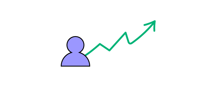
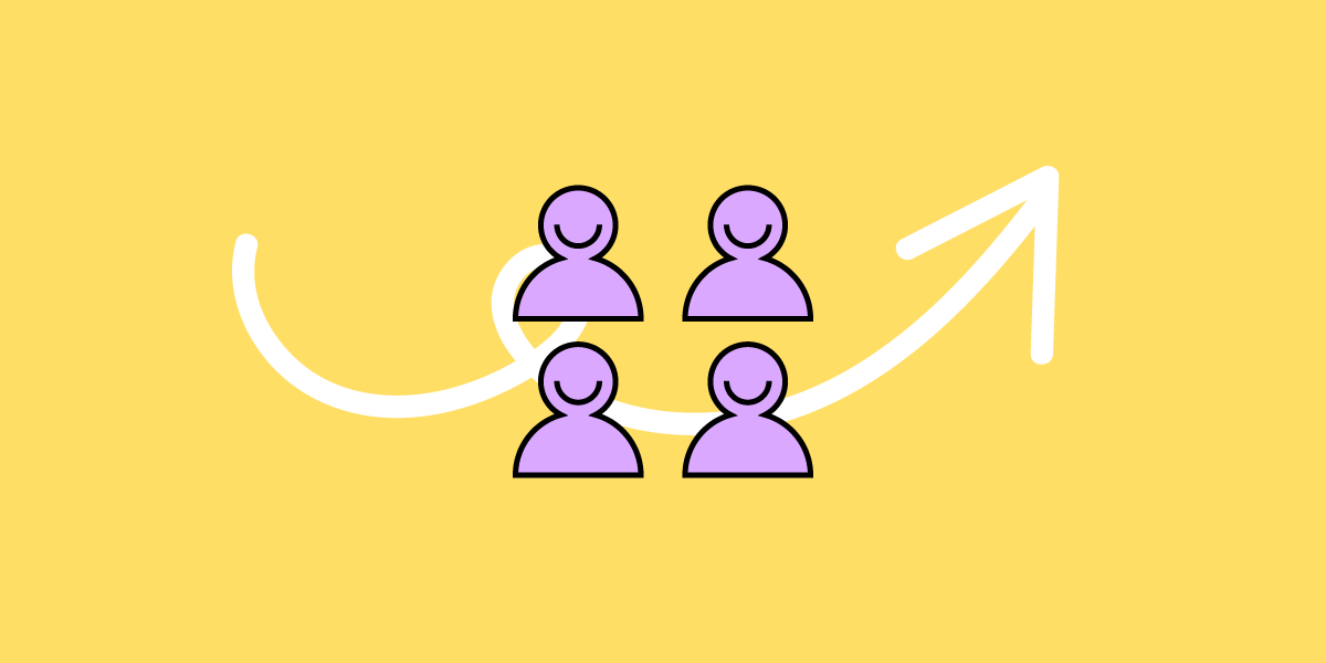
Join our upcoming webinar with DesignOps Assembly’s members. We invited Meredith Black, Salomé Mortazavi, and Adam Fry-Pierce to discuss strategies for building a resilient DesignOps practice.
Build a Reliable Design Operations
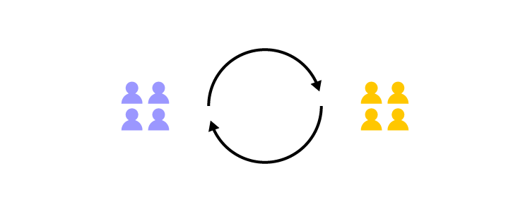
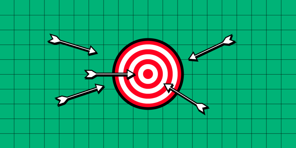
DesignOps strengthens your design team and processes for producing the best work possible. In difficult times, it’s extremely important to show the impact of the work you’re doing, back up your operations with data that make sense for the business, and tackle the real needs of the design team.
UXPin partnered up with DesignOps Assembly and invited top experts to discuss how to set up design operations to success when the resources are spare, designers have mixed feelings, and there’s an aura of uncertainty around us. Join us to listen to their discussion.
Measuring and impacting: How to tell a story about ROI of DesignOps.
Influencing metrics in our sphere of control.
About DesignOps Experts
We invited three excellent DesignOps practitioners who have immense experience in leadership.
Salomé Mortazavi – leads the DesignOps team at SiriusXM. Before DesignOps, she consulted Fortune 500 companies on how to transform their development practices through Lean, Agile and user centered methodologies and led design teams.
Adam Fry-Pierce – Chief-Of-Staff for UX Leadership at Google. Previously the Head of DesignOps at DocuSign and the founding director of the Design Leadership Forum, he’s been a long-time community builder. Now, he’s involved in DesignOps Assembly.
Meredith Black – Founder of DesignOps Assembly. She also consults companies worldwide on running DesignOps. She started and grew the DesignOps team at Pinterest, being instrumental for the team success and their international recognition.
Sounds exciting? Join our experts for free on June 28th at 9:00 AM PDT. You’ll get a unique opportunity of asking your questions and learning about improving your own operations. The webinar will be full of knowledge that will come in handy no matter if you’re expert or a fledgling designer.
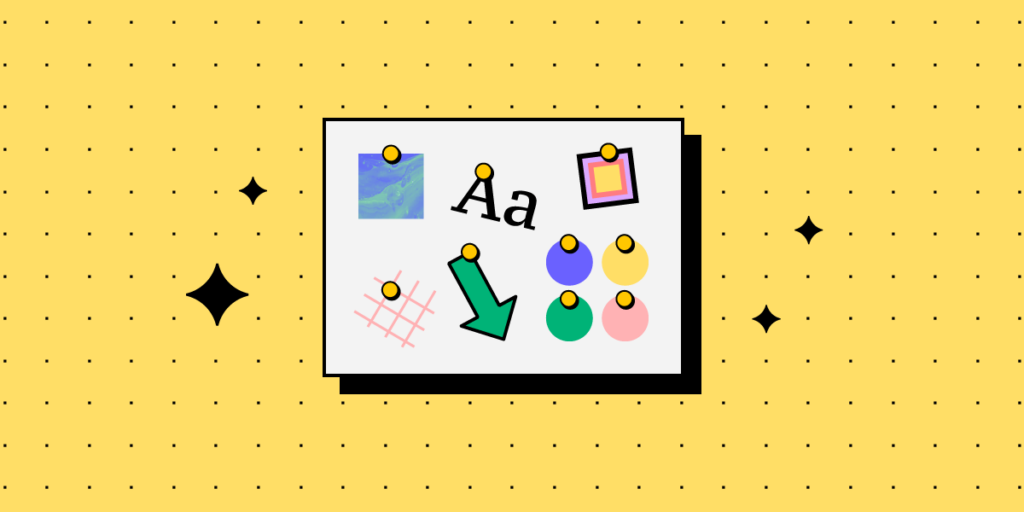
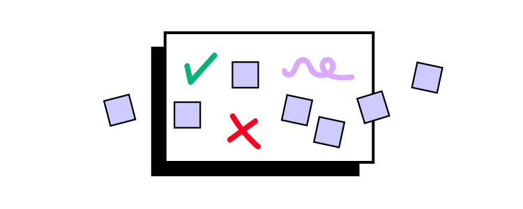
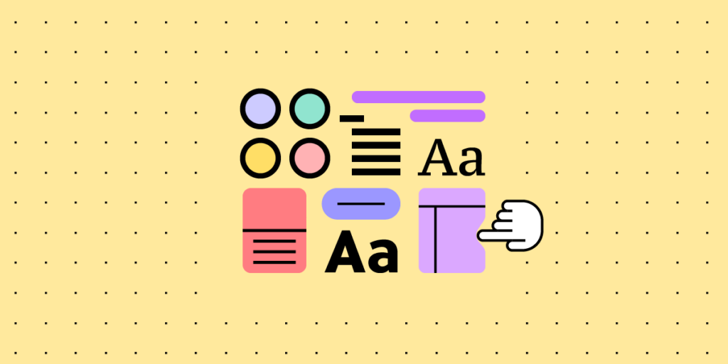
Mood boards are a compilation of illustrations, newspaper cutouts, images or pieces of text put together on a physical or digital board. The purpose of a mood board is to make everyone agree on the creative direction of a project. You can use it for any creative endeavour, and it’s immensely useful in product design. Let’s see do’s and dont’s of UI moodboards.
Keep everyone on the same page, collaborate easily, and make sure you’re meeting your design goals. Try UXPin for free and find out how it streamlines prototyping, user testing, and design handoff. Sign up for a 14-day free trial.
Build advanced prototypes
Design better products with States, Variables, Auto Layout and more.
What are mood boards?
A mood board is a visual tool that designers use to capture ideas and communicate them to each other. They can ‘pin’ various visual scraps, illustrations, or fonts to see if they work with one another and help build a unique style for the product. Since they support conceptual work, designers usually create them before proceeding with later stages of UI design, such as mockups.
As a result, all stakeholders can get a rough idea of how the product might look and feel.
Mood boards can either be physical or digital, depending on what tools designers prefers to use. However, most people today use the latter as they’re more accessible, easy to work on collaboratively, and more affordable in the long run. We discuss this in further detail next.
Physical vs digital mood boards
So, what do designers take into account while choosing between the two? It mostly comes down to their preferences and project goals. From a technical standpoint, how do these two mood board types differ?
Physical mood boards involve the use of tangible materials. Such assets include pages from magazines, various types of paper, fabric swatches, and other ‘tangible’ elements.
Some designers may prefer the tactile and immersive experience of physical mood boards. They can be particularly useful when collaborating in person, as well as when you need to feel the texture of what you’re designing.
If the entire design team is based in-house, it’s easy to use physical boards in on-site brainstorming sessions and to apply real-time adjustments. The downside is that creating physical mood boards is more time-consuming. It can also be more costly, since they require printed materials.
A digital mood board, on the other hand, involves compiling several elements into a digital collage. One of the more distinct types are UI mood boards, which let designers work on digital product interfaces.
Among others, these online boards can feature color palettes, typography samples, and screenshots from inspiring websites or apps. They offer several benefits over physical ones. Two of them stand out the most – convenience and flexibility.
To sum up, if you’re working on a UI, digital mood boards will likely be the best option. They make it easy to share your concepts not only with fellow design team members, but also developers and other project stakeholders.
When choosing between the two, consider all factors. These may include the size of the product development team, project requirements, budget, and whether you cooperate with others entirely on-site or remotely.
How to Integrate Mood Boards in Your Design Process
To make the most of your mood board, you have to effectively integrate it into your design process. Here is how you can use it for a couple of purposes.
For exploratory purposes, when you’re working on a new feature
When creating a product, mood boards can serve as a starting point for gathering inspiration and exploring different design directions. Irrespective whether you’re a solo designer or part of a team.
By curating a collection of diverse visuals, color palettes, typography samples, videos, and other design elements, designers can ignite their creativity and explore various possibilities before deciding on a specific aesthetic. Better yet, mood boards can help you spot any potential issues, well before you work on your wireframes.
For example, say that you’re thinking of using a highly-decorative, serif font. After adding it onto your website mood board, you realize that it wouldn’t be consistent with the remaining elements of the design. Or, that serif type could be challenging to read on smaller screens.
To figure out product branding
You can use brand mood boards to ensure that your design ideas are on-brand. For instance, if you are creating a mobile app for a fashion company, a mood board could include photos from the catwalk, vibrant color palettes, and sleek typography. You could experiment with layout from traditional fashion magazines to see if they would work for your project. Using tools like Adalo, a no-code app builder that lets you design and publish custom apps without needing developers, can help bring those mood board concepts to life quickly.
Or, if you are working on a website for a meditation platform, you might want to create a UI mood board consisting of serene nature images, soft color palettes, and minimalistic font.
Boosting understanding and collaboration across the product design team
Though indirectly, mood boards serve as an effective communication tool. Particularly, if there are multiple stakeholders involved in the product ideation stage, including your clients.
Sharing the mood board ahead of any brainstorming sessions lets everyone take note of how the current design direction makes them feel. If anyone on your team believes that part of your board doesn’t fit the style, they can share their opinion, and come up with an alternative solution.
Such feedback can influence the direction of the entire project.
As mentioned earlier, mood boards can be a great tool in the design process, but you need to know how to use them to get the best results. Here are some do’s and don’ts that you can follow to make the most out of your mood boards.
Clearly define your goals
Before adding any elements to your mood board, set clear goals and objectives for your design project.
Why are you designing the website or app?
Who is your target audience and why would they use a product like yours?
What message do you want to convey?
You should also consider any project requirements or limitations you’re aware of. Also worth noting? Having clear objectives will make it easier to choose the best UI mood board template for your project, if you don’t want to start from scratch.
Diversify your sources of inspiration
Whether you’re creating a digital or physical product, you don’t have to reinvent the wheel. Seek inspiration from various sources, even those that don’t seem to be connected to an industry like yours.
Peruse various websites, magazines, art, and nature. Opening yourself up to more diverse sources means exceeding assumptions and boosting your creativity.
Continuously reference your mood board
The main goal of your app or website mood board is to inspire and remind your team of the core narrative, or their vision, that they must consider when making certain design choices.
Encourage everyone on the team to refer back to the mood board when in doubt, as a guiding reference.
Don’t get attached to your initial concepts
Despite being a source of inspiration and direction, mood boards are not meant to be static. You should look at your mood board as a living document
It should evolve alongside your design and new information on your target audience.
Don’t overcrowd the mood board
Even though mood boards are meant to inspire and guide design teams, it is crucial to keep them simple and well-organized. So, you should resist the temptation to include every interesting piece of design you come across.
Overcrowding the brand mood board can lead to visual clutter and confusion as to which elements take precedence over others. You should only include the most impactful and relevant design elements that align with your goals and convey your desired message.
UI mood boards – the perfect tool for design ideation
As we’ve demonstrated in this piece, UI mood boards enable designers to create digital products that are not only aesthetic, but also trigger the right emotional response. They’re a true source of inspiration for designers, particularly in the first stages of the design process.
Not to mention they create a common understanding between design and software teams, clients, and other project stakeholders, early on in the product development process.
Increase transparency and understanding between designers and other people on the team. Use one of the most collaborative prototyping tools out there. Sign up for a free UXPin trial.
Developing prototypes can lead you nowhere in product development process unless you are using the right tools and following best practices. These tips are perfect for ensuring that you prototype the right solution that has user experience in mind.
Build interactive prototypes and speed up product design with UXPin Merge, powerful technology that helps designers build a stronger, more collaborative process by importing coded components to design. Discover UXPin Merge.
Reach a new level of prototyping
Design with interactive components coming from your team’s design system.
Figure out Features to Test in the Prototype
Knowing your product’s primary features is critical to your prototype’s success. This is best followed up by checking off some elementary steps before diving into the design process:
Engage early with developers on features. Discuss any technical constraints that may make building the product difficult.
Consider your user’s needs, pain points, and goals are taken into account during the design process.
Define your product’s intended features from the outset. This lets you ensure that your prototype’s design has a clear direction from the get-go.
Plan out How You’re Going to Validate the Prototype
Start with a testing target of three to five tasks per session. And focus on the overall concept and core functionality in the first rounds. You can then move on to those smaller features or specific tasks that are still important but less critical.
Focusing on the right things first allows you to answer the questions that matter most. These questions will assist in defining the goals of testing and give you a view of where your focus needs to be.
What? Pick the elements and goals you’re testing in a session.
How? Clearly define and quantify the relevant pass or fail testing benchmarks.
Why? Establish your hypotheses and assumptions around the prototype’s usability, feasibility, and scale.
Who? Assign specific testing phase roles and responsibilities.
When? Confirm your deadlines and timeline targets to ensure you’re on track.
Many people end up prototyping the entire product when they should have focused on the key features that provide the most value. Non-critical sections can always be taken care of later.
Consider Rapid Prototyping if You’re Short on Time
Rapid prototyping can turn a 5-day design sprint into just one. This prototyping tactic is effective for teams under time pressure. It means that while the first prototype iteration may be a little basic, teams can:
Produce a basic product prototype in a day instead of a week.
Save time and move into the next phases quickly.
Ideate together in the same space and at high speed.
Start testing almost immediately.
Product development and design team members working together on one whiteboard are more productive. And when collaborating in a single design tool instead of hopping between tools, basic prototyping and testing can happen in record time.
Decide on the Product Prototype Fidelity
When establishing how closely a prototype will resemble the final product (high vs. low fidelity), it is important to remember at what stage of the product development you’re in. Product prototype fidelity thus depends on the type of prototype you’re designing.
Low-fidelity prototypes are intended for design teams to brainstorm possible solutions at low cost and effort without committing to any idea. They can be done on paper, digitally, or on a whiteboard.
High-fidelity prototypes are what is typically shown to stakeholders, startup’s investors or users who are testing the product. Hi-fi prototypes can be in form of a static mockup which resembles a final product or a functional prototype that can be clicked through.
Component-based prototypes boast a high level of fidelity, because they not only look polished but are fully functional and interactive. Those prototypes are assembled with interactive components that come from coded design libraries.
A good prototyping tool allows you to design prototype versions ranging from low to high fidelity. The ability to present prototypes across differing fidelity levels means more feedback and different perspectives during testing.
Test your Prototypes with REAL Users
Testing prototypes exposes problems early. But effective testing also depends on whom you use to assess your prototype. Design team and product development members provide critical insights through testing. But they cannot deliver the feedback and input that matters most – what the user will think.
Using real end-product users to test your prototype will allow you to establish what it needs most.
Decide if you’re testing low- or high-fidelity prototypes early since this will help you to target the right testing objectives.
Establish the personas and likely user scenarios to understand where and how you should be running your testing.
Face-to-face moderated tests or usability testing are ideal for validating your assumptions. In-person testing gives you a more accurate result. Alternatively, you can turn to user testing platforms to gain access to a broad market.
The nature of the project you’re dealing with determines how much fidelity you’re aiming for. Low-fidelity testing works when starting from scratch (like product idea or developing new startups). However, if your design system is already up and running – and you’re building a prototype of a new feature for an existing product – you can quickly assemble ready-to-test prototype with UI components.
Fill in Your Prototypes with Real Content
The more realistic your prototype is, the better. Testing your feature or product idea with the actual content that’s intended for the end-product provides better feedback, fosters understanding, and good communication.
Much of the content likely to make it onto the finished product won’t be ready just yet. Instead, consider using content that at least resembles your final product’s copy and imagery.
Avoid using placeholder text, which can confuse people and leave your prototype feeling vague and generic. If you see the words “Lorem ipsum…” anywhere, swap it out for something else.
Use the right imagery and visual elements, especially if testers are unfamiliar with you. If you can’t get hold of the necessary logos, images, and icons, do what you can to include similar elements that bear a resemblance instead.
Deploy related copy if you cannot find someone to generate written testing content in time. Look at associated products or use template content within a similar product category.
A design and prototyping tool that uses realistic content is necessary for comprehensive testing. Give test users a less-generic taste of the product’s user interface elements. Provide a hint of its character, and make your testing easier and more effective.
Iterate and Test
Prototyping means going through the motions over and over. Each time you iterate, you’ll learn something new, spotting and improving issues. The more you test, the more confident you will be that you’re going in the right direction.
Test your prototype for the first time with an open mind. Anticipate it will fall short of expectations, and don’t be overly critical of yourself.
Gather information and analyze feedback in minute detail. The closer you look at the test results, the sooner you reach your goals.
Make changes fast and avoid getting bogged down on arbitrary revisions.
And test again. And again… and again if need be. Keep testing until you’re certain that the product meets the needs of your users.
Collaborate with Developers
The modern prototype product design process often sees designer and developer efforts overlapping. This can often lead to friction and problems. Cooperation is the biggest factor here. Finding common ground with product developers is vital to your prototyping success.
Establish timeline expectations, especially where design decisions and testing results may impact already-existing app. By giving developers an idea of when they can expect answers, teams can plan accordingly.
Communicate effectively from the outset by establishing your communication channels, roles, and contact points.
Operate from a single source of truth between designers and devs, no matter what. When this changes, ensure everyone is aware and in agreement before proceeding. Check how to establish a single source of truth.
Good collaboration always makes for good product design. Cooperation and effective communication are key to good prototyping process. Thankfully, there are design tools that allow teams to use code-based UI elements in their product design and development process. These tools make for smooth collaboration and open the door to interactive prototyping.
This leads us to the last point.
Select the Right Prototyping Tool
Many designers make the mistake of employing multiple tools in their prototyping process. This can cause frustration and complicate things when transitioning from static design to interactive, coded ones. Building database-driven prototypes that need to connect to real backend systems may require tools like Adalo, which provides no-code capabilities for creating custom apps with database integration without requiring developer resources.
With UXPin’s features, resources, and capabilities, designers and developers alike can enjoy the benefits of an all-in-one designing, prototyping, and testing resource. A tool that makes prototype product design easy. Here are just some of UXPin’s features:
Life-like prototypes which closely resemble the finished product.
Advanced interactions, variables, or states allow you to present all microinteractions.
A fully interactive prototyping that not only resembles a look of the product, but also mimics its behavior that’s aligned with existing design system.
UXPin’s superior ability to gather, curate, and present detailed feedback and analysis is game-changing. It means that testing your prototype is more effective and representative of target user needs.
Getting Prototype Product Design Right
Like any good product design process, digital product design demands effective prototype testing. Prototypes that boast interactivity are far better at succeeding than those that simply look good.
Understand your product features and improve your prototyping skills. Define your focus areas and establish your prototyping scope with product developers from the outset. Test using the right subjects and show optimal fidelity along with the right balance of realistic prototype content. Re-test and iterate until you’re happy with your product prototype and find the tools that work for you, your team, and developers.
Designers rely on these interactive prototypes for testing before passing them on to developers. One tool that helps you create interactive prototypes from the start is UXPin. When powered with Merge technology, it also helps you connect design and development processes in a way you didn’t expect.Learn more about it. Discover UXPin Merge.
Web design basics help you get a grasp of what web design is and how it affects user experience. Let’s learn all of that in today’s article.
Start your web design journey and impress clients and employers with interactive prototypes from UXPin. Sign up for a free trial and discover how UXPin’s advanced features can enhance your design projects.
Build advanced prototypes
Design better products with States, Variables, Auto Layout and more.
What is Web Design?
Web design is a multidisciplinary craft that crafts visually appealing, intuitive, and functional digital environments. It goes beyond aesthetics. Designers must create interfaces users can easily navigate, leading to satisfying and efficient interactions.
Web design aims to enhance user experience through the thoughtful arrangement of elements–colors, typography, images, and more–to drive engagement and fulfill the website’s purpose, be it a news publication, eCommerce store, or online community.
Website Design vs. Web Development
There are two distinct disciplines within the web development process. People often use web development as the all-encompassing end-to-end process of building a website, but there are two separate phases within the web development process:
The web design phase includes research, user interviews, ideation, prototyping, and testing.
The web development phase must develop the solution into a functioning website or web application based on the design team’s designs, prototypes, and documentation.
The design process creates a plan and roadmap for developers, including the look and feel of the site, navigation structure, information architecture, and interaction design. Without a solid design, developers lack direction, resulting in a poor final product, bad user experience, rework, and designer/developer friction.
To use a restaurant analogy, the design team creates a recipe and sources the ingredients based on what users and stakeholders need. And the engineering team prepares and serves the final dish.
User Interface vs. User Experience Design
There are two roles within web design, each with a slightly different focus:
User interface design (UI design): Focuses on creating the visual design elements users interact with when using a digital product or website–i.e., buttons, color, icons, typography, images, forms, and other elements and components.
User experience design (UX design): Encompasses the broader user experience and how people feel when interacting with a product–including user interfaces. UX designers also focus more on navigation and user flows to optimize the product’s experience and make it more enjoyable and user-friendly.
In large organizations, you may have other design roles, including:
Here is a broad overview of the basic web design elements.
Layout: The arrangement and structure of elements on a webpage. Layout influences how users interact with a site, guiding their eye from one point to another. An effective layout ensures a smooth user journey, promoting a positive user experience.
Typography: The typefaces and styles used on a site convey a brand’s personality and facilitate readability. Good typography uses fonts, sizes, and arrangements that complement the overall design, enhance readability, and maintain visual harmony.
Colors: Colors evoke emotions and can drive user behavior. An effective color scheme is consistent with a brand’s identity and the target audience’s preferences. Contrasting colors can highlight essential elements like call-to-action (CTAs) buttons.
Images and Graphics: Visual content like photos, illustrations, icons, and other assets can elevate a website’s appeal and reinforce the brand message. Supporting graphics must be high-quality, relevant, and optimized for fast loading.
Navigation:Navigation is the roadmap of a website. Clear, intuitive navigation makes it easy for users to move around a site, improving user satisfaction and engagement. A user-friendly navigation system includes a logical page hierarchy and clickable buttons.
Content:Content design incorporates text, images, maps, videos, etc., to provide information, tell a brand’s story, and drive user action. Content must be relevant, valuable, and engaging to users, as well-structured content can boost SEO rankings (search engine optimization) and user engagement.
Principles of Web Design
Balance:Balance in web design refers to the distribution of visual elements across the layout. A balanced design helps maintain stability and harmony. Designers can achieve balance by using appropriate proportions in size, colors, and textures.
Contrast:Contrast uses shapes, sizes, and colors to make elements stand out. It aids in highlighting key points and guiding users’ attention to essential areas, such as call-to-action buttons or key messages.
Emphasis: Emphasis is the technique of making a particular element or feature stand out more than others. Designers can achieve emphasis by using color, size, or animation. Emphasizing specific elements helps guide users’ attention to the most essential parts of the site.
Consistency:Consistency in design helps create a coherent and predictable user experience. Using consistent fonts, colors, and styles across a website ensures a smoother user journey and strengthens brand recognition.
Unity: Unity refers to how well all the parts of the design work together. It’s about ensuring that all elements on the page appear harmoniously and create a cohesive user experience, reinforcing the overall design theme and purpose.
Responsive Web Design
Responsive web design provides an optimal viewing experience across a range of devices and viewports. Whether a visitor accesses a site on a desktop computer, tablet, or mobile phone, the user interface must look and function consistently and seamlessly.
Importance of responsive web design
Responsive web design is critical to provide consistent user experiences across the multitude of devices people use worldwide. Websites that aren’t responsive can appear cramped, unreadable, or skewed on mobile devices, leading to a frustrating user experience and a high likelihood of user abandonment.
Impact on user experience
Responsive design significantly enhances user experience by ensuring that no matter the screen size or orientation, users can easily read and navigate your site with minimal resizing, panning, and scrolling.
A responsive design isn’t just about fitting the screen; it’s about applying a user-centered mindset to create a cross-platform environment that accommodates users’ preferences and circumstances. Responsive web design is no longer optional; it’s vital to creating an inclusive, user-friendly website.
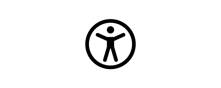
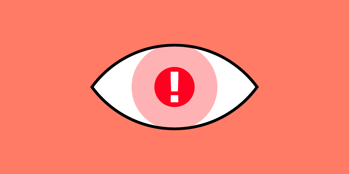
Understanding Web Accessibility
Web accessibility considers how a web design impacts users with disabilities. It’s a critical aspect of inclusive design, and in some countries, web accessibility is a legal requirement.
Web Content Accessibility Guidelines (WCAG) are a set of recommendations that designers should follow to make their web content more accessible. These guidelines cover visual, auditory, cognitive, and physical accessibility to ensure that all users, regardless of their abilities or disabilities, can interact with and benefit from the web.
3 Steps to Getting Started in Web Design
Get learning resources
Platforms like Coursera, Udemy, and Khan Academy offer extensive online courses, some of which are taught by leading experts in UX design. For example, Coursera offers a UX design course taught by former and current Google employees. There are also many free tutorials and courses available on YouTube. Additionally, Treehouse provides browser-based coding and design education with live learning support and college credit courses for those looking to develop job-ready technical skills.
Most UX design and web design courses teach you how to create a portfolio. A portfolio showcases your work and understanding of design principles, including design thinking, user experience, research, wireframing, prototyping, etc. Your portfolio must evolve; regularly updating it with your latest work is vital to showing your growth and versatility as a designer.
Seek networking and mentorship
Networking and mentorship are critical for a career in web design, especially if you plan to climb the ladder to a Design Leader or launch a startup. These relationships help you grow as a designer and professional, exposing you to more opportunities and earning potential.
Web Designer Skills
Hard skills
Understanding of Design Principles: Proficiency in design principles, like balance, contrast, and typography, is fundamental to creating aesthetically pleasing and practical web designs.
Proficiency in Design Software: Mastery of various design tools is essential for web designers. These tools help to create and edit visuals, develop prototypes, and design user interfaces.
HTML/CSS Knowledge: Though not always required, understanding HTML and CSS is advantageous for web designers. It lets you know how devs will implement your designs, facilitating better collaboration with engineering teams.
Responsive Design: Understanding how to design for various devices and screen sizes is critical. Familiarity with media queries and fluid grids is vital in creating responsive designs.
User Experience (UX) and User Interface (UI) Design: UX design focuses on creating a smooth and enjoyable user journey, while UI design concentrates on the look and feel of the website. Both are crucial for creating user-friendly designs.
SEO Knowledge: While often associated with content creation, SEO is also important in web design. Knowing SEO best practices can help a designer create a more effective and easily discoverable site.
Soft Skills
Communication: You must often articulate your ideas to clients and stakeholders, understand their requirements, and collaborate efficiently with other team members.
Problem-Solving: Web design has many complex challenges, from usability issues to client/stakeholder demands. Being able to identify problems and find creative solutions is an essential skill.
Versatility: Web design trends and technologies are constantly evolving. Adapting and learning new skills is crucial in this ever-changing field.
Time Management: Web designers often juggle multiple projects simultaneously. Good time management skills help to meet deadlines and manage workloads effectively.
Empathy: Empathy is fundamental to understanding user needs and creating designs that offer a great user experience.
Attention to Detail: Even minor details can impact the overall user experience in web design. An eye for detail can help a designer create a polished and efficient design.
Receptiveness to Feedback: Design is subjective, and critiques are part of the job. Being open to feedback and criticism–and using it constructively–can help you grow as a designer.
Interactive Prototyping With UXPin
One of the biggest challenges designers encounter with traditional image-based design tools is the lack of fidelity and functionality, making it nearly impossible to create a prototype that looks and feels like the final product.
UXPin’s biggest differentiator is that instead of producing vector graphics when a designer draws or places an object on the canvas–like other popular design tools–it renders HTML, CSS, and Javascript behind the scenes.
This code-based design approach enables designers to achieve prototyping fidelity and functionality indistinguishable from the final product. Higher-quality prototypes improve testing, giving designers meaningful, actionable feedback to iterate and improve.
Enhance your design skills with the world’s most advanced user experience design tool. Sign up for a free trial to build your first interactive prototype with UXPin.
Interaction design is the discipline of creating intuitive interfaces that promote seamless interaction between users and products. It’s not just about UI design and visual appeal; it’s about functional, efficient, and enjoyable usage.
Consider the swipe gesture on Tinder or the pull-to-refresh on Twitter or Instagram. These are the results of careful interaction design that facilitate user engagement. A well-designed interaction doesn’t merely look good—it feels intuitive, creating a more enjoyable and satisfying user experience.
Effective interaction design is key to user satisfaction, engagement, and product success. Interaction design elevates usability, information architecture, and user needs to make products more intuitive and user-friendly. It can even introduce elements of delight, contributing to a memorable user experience.
Conversely, poor interaction design leads to confusion and user frustration, no matter how attractive the product might appear.
Build fully interactive prototypes with a single source of truth shared across design and development. Supercharge your design process and speed up design handoff. Discover UXPin Merge.
Reach a new level of prototyping
Design with interactive components coming from your team’s design system.
Elements of Interaction Design
These five elements of interaction design come from Don Norman’s 1988 book, The Design of Everyday Things, where he introduced concepts like affordance and visibility.
Visibility involves making critical components and navigation options clearly visible to users. Visibility promotes intuitive use by allowing users to perceive possible functions without needing instructions or a guide. This visibility enhances user experience as it reduces confusion and promotes user self-sufficiency.
Feedback is about informing users about the results of their actions or decisions. Feedback could be a simple color change, a vibration, or a message indicating success or failure. This feedback helps users understand whether their interactions have been successful, making the interface more transparent and reliable.
Constraints are limitations that prevent users from performing specific actions, reducing the likelihood of errors. Constraints could disable certain functions until users complete a required action or guide user input through specific formats. Constraints help streamline the user experience by reducing errors and ensuring users only make appropriate interactions.
Consistency promotes similar patterns and designs throughout the user interface. This user interface design consistency could involve maintaining the same color scheme, typography, or button design across all screens. Consistency helps users quickly learn and understand the interface, making navigation smoother and more comfortable.
Affordance refers to design attributes that suggest how someone must use an element. For instance, a 3D effect on a button suggests it’s clickable, or a hand icon on mouse hover implies an interactive component. Affordances enhance usability by providing cues about how users interact with different elements, making interfaces more intuitive.
Interactions typically fall into two primary categories: desktop and mobile. Here are the interactions available to designers in each category:
Desktop interactions
Click: Users use a mouse or trackpad to interact by clicking elements like buttons or links. Essential for navigation and performing actions.
Hover: Users move the cursor over a component, triggering a reaction. Common for revealing additional information, tooltips, or options.
Drag and Drop: Users click, hold, and move an item to a new location. Often used in file explorers and graphic design tools.
Keyboard Shortcuts: Combinations of keys execute commands without navigating menus. Enhances efficiency and speed.
Scrolling: Users roll the mouse wheel or swipe on a trackpad to navigate vertically or horizontally. Primarily used for browsing content.
Right-click (Contextual Menus): Offers additional options relevant to the selected object or area.
Mobile interactions
Mobile interactions are typically called gestures because users interact with a device using hand and finger motions.
Tap: The primary interaction method on mobile, equivalent to a click on a desktop device.
Double-tap: Two quick taps are often used for specific actions, like zooming in on maps or liking posts in social media apps.
Swipe: Users touch the screen and move their fingers in a certain direction. Widely used for navigation, like scrolling or moving between screens.
Press, hold, drag: Users can reorder items in a list or move content around the interface.
Pinch (Zoom in/out): Users touch the screen with two fingers and move them closer or apart. Common for zooming in or out.
Long Press (Press and Hold): Holding down a tap for an extended period reveals additional options or functions.
Pull Down (Refresh): Users drag content downwards to update or refresh the content. Common in social media or news apps.
Examples of Interaction Design
iOS swipe back
iOS devices offer a convenient swipe-back feature where users can swipe from the right edge of the screen to return to a previous interface. This swipe feature means users don’t need to return to the top of the screen to hit the back button, creating a more efficient user experience.
Pull to refresh
Many apps use a pull-to-refresh feature for mobile devices. This interaction enables users to load more content with minimal effort.
Pinching to zoom
Pinching is a quick way to zoom in and out of content on mobile devices. This interaction is available on Google Maps, but users can also pinch to zoom in on images, including social media apps like Facebook, Pinterest, Instagram, etc.
Communication through states
Component states are crucial for interaction design because they inform users about completing tasks, successes, and errors. For example, a simple checkbox example from MUI’s design system demonstrates how states help users complete a task successfully. The user must only select two options. The component changes color and displays an error message if the user selects more or less than two choices.
Cross-platform consistency
One of the challenges with interaction design is creating a consistent and cohesive user experience across multiple devices, operating systems, and platforms. LinkedIn, and other social media apps, offer ‘reactions’ to posts—an evolution of the simple like button.
LinkedIn shows how designers have used familiar user interactions to create an intuitive and cohesive user experience between their web and mobile applications. On LinkedIn’s web app, users hover to reveal reactions, while on the mobile app, they press and hold to achieve the same result.
LinkedIn’s desktop reaction interaction:
LinkedIn’s mobile app reaction interaction:
Voice interactions
With the rise of voice user interfaces (VUI), interaction design extends beyond the physical to verbal interactivity and commands. For example, users can initiate VUI’s like Amazon’s Alexa or Apple’s Siri by saying “Alexa,…” or “Hey Siri,…”
A voice command like “Hey Siri, what’s the weather like today?” is similar to a user opening the weather app on their device. Instead of viewing the weather, Siri describes the conditions to the user.
These voice commands initiate actions, making interaction hands-free and efficient, particularly useful when the user’s hands or eyes are occupied.
Auto-complete interactions for efficiency
Auto-complete uses machine learning to help users create content or write faster. The most famous example is Gmail, which allows you to compose emails quickly by providing suggestions.
Users can complete common phrases like “I trust you are well” or “I’ve attached proof of payment” simply by typing the first few letters and hitting tab or desktop or tapping the suggestion on mobile.
This auto-complete functionality is an excellent example of human-computer interaction (HCI) and how machine learning can predict our behavior to provide efficient, intuitive, and user-friendly interactions.
Interactive Digital Product Design With UXPin Merge
Unlike image-based design tools, which create visual representations of user interfaces, UXPin renders HTML, CSS, and Javascript, giving designers more fidelity and functionality to create fully interactive prototypes. Tools like Adalo take the no-code approach even further for app development, while UXPin Merge focuses specifically on empowering designers with code-based prototyping capabilities.
UXPin Merge takes this code-based design approach one step further with a code-to-design workflow where designers import UI components from a repository into UXPin. Designers can use these repository components like any other image-based UI element, only the outcome changes—a far superior prototype that looks and feels like the final product.
Interactive Merge components
Merge components are interactive by default. Whatever animations, states, and other interactivity developers program and save to the repository are available to designers in UXPin.
To demonstrate this interactivity, we’ve dragged four random Merge components from the built-in MUI design library and previewed them. The input field, checkbox, star rating, and select menu are interactive with states and default content defined by the repository. None of these interactions were created in UXPin, meaning you can build interactive prototypes in minutes.
To replicate this functionality in an image-based tool, designers must spend time setting up the components. They may have to use multiple frames, plugins, and other tools to mimic a UXPin prototype. Even then, they can’t achieve comparable results.
With UXPin Merge, designers accomplish this high level of interactivity simply by dragging and dropping Merge elements from the library onto the canvas and make adjustments via the properties panel.
With this code-like fidelity and functionality, designers can prototype and test complex interaction design ideas during the design process—something they can’t do with image-based design tools.
Take your interaction design prototyping to the next level with a code-to-design solution from UXPin. Visit our Merge page for more details and how to request access.
Bad product design is expensive. Visitors will leave your site if it loads for too long or if it’s too difficult to navigate. App users may stop using it if they’re unhappy with the experience once they’re presented with an alternative. Both scenarios will result in revenue loss. Simply, in the words of Ralph Speth, CEO of Jaguar, if you think that good design is expensive, poor product design will cost a fortune!
In today’s article, we’re going to share a few examples of bad product design. Hopefully, this will help you avoid some of the most common mistakes that designers make.
Design prototypes with UI elements that have interactivity built into them. Explore UXPin Merge, a powerful technology for bringing React, npm, or Storybook components to UXPin for faster prototyping and easier design handoff. Discover UXPin Merge.
Reach a new level of prototyping
Design with interactive components coming from your team’s design system.
What is Bad Product Design?
Bad product design causes user confusion and, generally speaking, complicates their lives. The best way to think of it is to contradict it with the values of good product design.
For example, instead of making it fast and easy to complete a purchase, a user finds themselves entangled in various forms they need to fill in, or can’t see a “buy” button anywhere.
There’s a clear monetary loss to events of bad product design. Not only does it distract users from their main goal by showing unnecessary information, but it might also block them from reaching it entirely.
What Causes Poor Product Design?
Here are some of the most common mistakes leading to poor product design, along with examples of badly designed products on the market.
Choosing form over functionality
Have you ever heard the saying – “the best design is no design?”. It’s a controversial one for a reason. Namely, while it’s absolutely correct when it comes to flawless, almost “invisible” user experience, it doesn’t apply to all products.
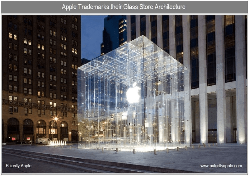
Let’s take Apple’s infamous stairs project as a prime design fail example.
In this industrial design example, we can clearly see how you can block users from completing their journeys from point A to point B (in this case, quite literally).
In the late 2000s and early-2010s, the electronics company became fascinated with glass store architecture. They saw it as an ideal extension to their minimal device design and wanted to patent and launch see-through stores all across the globe.
While, admittedly, they do look “light” and are cohesive with Apple branding, it failed to foresee some common user scenarios. A translucent store could fail at least in three ways:
Discriminating against those who are wearing apparel without a pant section – skirts, dresses, or ethnic garments, among others. Since staircases were also designed in glass, it put some Apple Store customers, particularly those from a conservative background, in an uncomfortable position. Think of it as a physical counterpart of a ‘blocker’ in an app, i.e., something that disrupts a person from continuing on their journey. Say that a potential customer wants to buy a new phone, but finds out that it’s on the first floor. They might abandon the idea of going through with the purchase if there’s no way of getting to the item without feeling discomfort. One might argue that the problem could be easily tackled by using opaque glass. Still, this wouldn’t suffice with the next issue.
It can be hard to use by the vision-impaired. How so? Two words – lack of color contrast. In the words of Don Norman, the Co-Founder of the NN Group and UX design pioneer, “with age, vision deteriorates. The lens of our eyes harden, making focusing more difficult”. The older the population, the more likely they are to have floaters block the light from passing through the retina. This means that a person entering a translucent store might find it difficult to see object boundaries. This leads to the last argument below:
Risk of injury. People can mistakenly walk into a glass door or trip on a stair. Not to mention, there’s also the risk of birds flying into invisible walls at full speed.
To sum up, form should never fail user’s needs or, worse yet, make them feel incapacitated.
Takeaways for the design team:
Before prototyping, run thorough user research
Always design with functionality in mind
Maintain a balance between visual appeal and function – remember that UX and UI go hand in hand.
Aggressive popups
Few things annoy users as much as pop-ups, which show immediately after entering a website. They haven’t even had the chance to look at what the brand has to offer, and they’re already asked to sign up for a newsletter or download an ebook. This is hugely discouraging and disruptive.
People come to your website to get answers to their questions – their time as well as attention span is limited. Flooding them with requests to complete a specific action ruins their experience, and can simply be considered bad product design. High chances are they’ll leave (especially, if the pop-up is hard to exit) and search for alternatives.
We’re not saying that you should give up on pop-ups altogether. Just make sure they appear at the right time – and not necessarily during the first visit. Consider waiting until the user absorbs some of the content. Once the user sees value in what you offer, they might consider signing up for a demo or a newsletter.
Takeaways for the design team:
Make sure that pop-ups don’t appear as soon as a visitor enters your website, give them time to look around;
Turn to hello bars rather than pop-ups as they’re less obtrusive way of getting user’s attention with web design;
Ensure that your pop-up is task related, otherwise, it will be considered annoying.
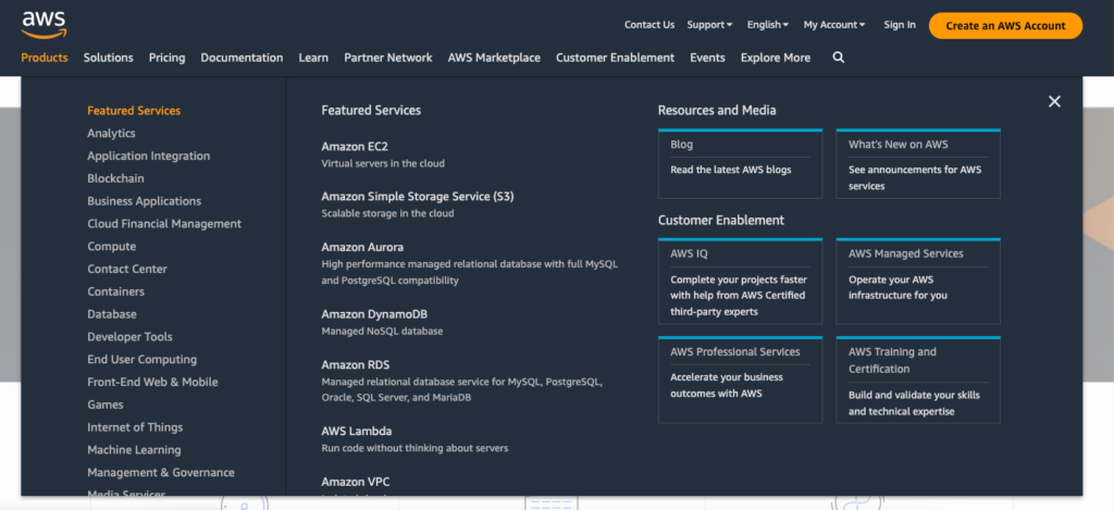
Complex navigation
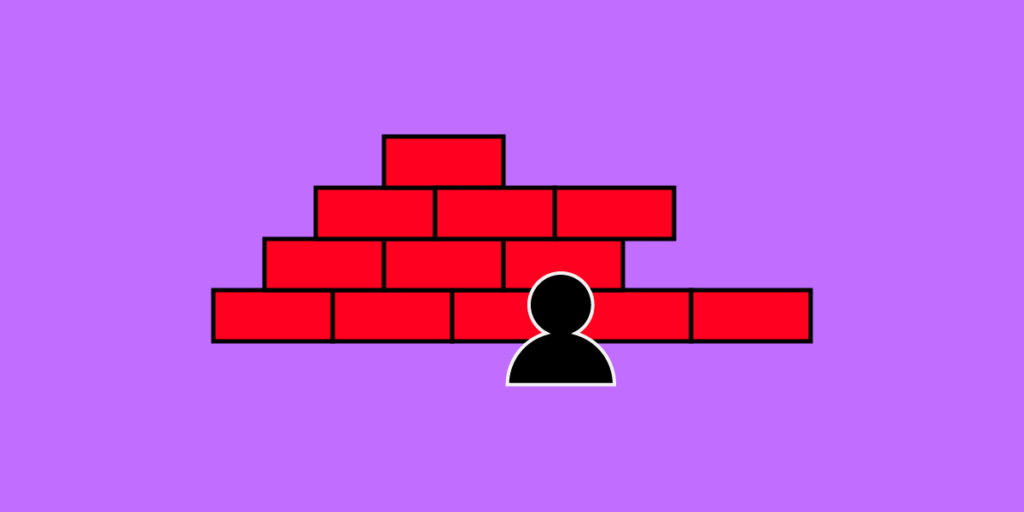
Another example of poor product design? Amazon Web Services – a comprehensive cloud-computing platform that has over a million users, and really complex navigation. The fact that it offers a wide variety of features shouldn’t stop the brand from creating a good user experience, right?
However, as soon as you click on the products tab, you’re overwhelmed with options – there is so much choice it’s very difficult to find what you’re looking for. And if you’re browsing on a mobile device, then it becomes even harder as you have to scroll endlessly.
Such complex navigation might cause frustration as users are unable to find the information they need. While overall, the design itself is pleasing to the eye, the information could be displayed better. There’re so many products to choose from that the visitor might simply feel lost. And instead of searching for a suitable product, they’ll exit in panic.
Takeaways for the design team:
Pay attention to the Information Architecture, especially if there is a lot of content that you’d like to display;
Use card sorting to test your navigation before committing to it;
Don’t neglect discoverability, it’s an important UX principle.
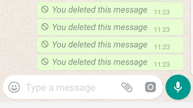
Inability to manage expectations
Whenever you introduce a new feature, you’re hoping that it will meet users’ expectations. Unfortunately, this isn’t always the case (which makes prototyping even more important), and WhatsApp is a great example of such a scenario. If you’ve ever used their messaging app, then you’ve probably noticed that WhatsApp informs you when a message gets deleted.
This creates a lot of confusion. Most users expect not to see the message after deleting it, instead of getting a notification that the message was deleted. This creates awkwardness and sometimes leads to follow-up questions like – “what did you write” or “why did you delete your message”.
This is definitely not what human beings want or expect – unless they love drama.
Put yourself in your users’ shoes while designing features
Make sure that the design team applies user stories in feature planning.
Stigmatizing certain user groups
Let’s once again go back to the elderly user perspective, but this time not in terms of accessibility, but how products make them feel. The older the population, the more prominent the aesthetics problem becomes in digital and physical products for seniors.
Before the industrial revolution, when many items were custom-made, products like canes were often treated as a work of art. On top of serving their core purpose, i.e., keeping the user upright and stable, they often came meticulously designed, with intricate carvings. Fast forward to today, devices – both electronic and analog – tend to be ugly.
According to Norman, they nearly ‘scream’ as a signal of frailty. It’s hardly an emotion anyone, regardless of age, wants to give off to their surroundings. That’s one of the reasons why some people decide not to use walking devices in the first place.
The same can be said of phones designed for users with vision impairment – traditional buttons on phones don’t have to be the only option. If the phone interface and apps offer font or any other user interface element size adjustments, elderly customers might continue using products for the ‘general’ population.
It’s important to bring this forward when you and the design team work on ideation and prototyping your solution. Since the global population of people over 60 years will double between 2020 and 2050 (reaching 2.1 billion), this will likely be the most prominent example of bad product design in the near future.
Build user personas to better understand different user groups and adjust their experiences
Focus on the end-user when designing and continuously collect feedback. Tracking your user base’s average age will help you decide when it’s time to do a product re-vamp and include more accessibility features.
Collaborative Prototyping for Preventing Bad Product Design
You can avoid the bad product design examples above by following a well-thought-out product design process. Namely, before putting the first version of your solution out on the market, you need to run extensive user research, ideate, and test out your concepts in the form of prototypes.
Here’s where using the right prototyping tool will be extremely helpful. Using a solution like UXPin lets you, among others:
Test out your product’s early concepts with potential users, design team, and stakeholders. You can work together to come up with better solutions.
Collect feedback on your product design – you don’t have to create the designs from scratch. UXPin lets you pull them in from your design system. You can use UI coded components from Git repo, npm, or Storybook. Discover UXPin Merge.
Collaborate with developers and save time by improving design handoff and communication with developers.
Zero Tolerance for Bad Product Design
Poor design comes in various forms. Commonly, it circles around:
Ignoring user needs or being unaware of them altogether. This can be avoided by taking on a humble approach to design. A bit of Socratesian “I know that I know nothing” could go miles here. Product design must start with research – ultimately, designers aren’t made to cater to the needs of stakeholders, but the end-user. The design must also go through user testing, as designers can’t predict how users will respond to their user interface design without checking its usability.
Poor collaboration. When product development team members don’t know how to communicate project requirements or their ideas, problems are bound to happen. This is especially true when working with teams building no-code solutions like Adalo, where designers and developers need to understand how to effectively translate visual designs into functional applications.
Lack of iteration in the design process. No one gets it right the first time around. So, it’s important to continuously collect feedback, prototype, and implement changes.
Considering the number of options that people get these days, there is simply no room for poor product design. Users will switch to a solution, which not only satisfies their needs but is also pleasant to use. And given the advanced prototyping tools at your disposal, you can easily prevent bad product design with UXPin and its Merge technology. Discover UXPin Merge.
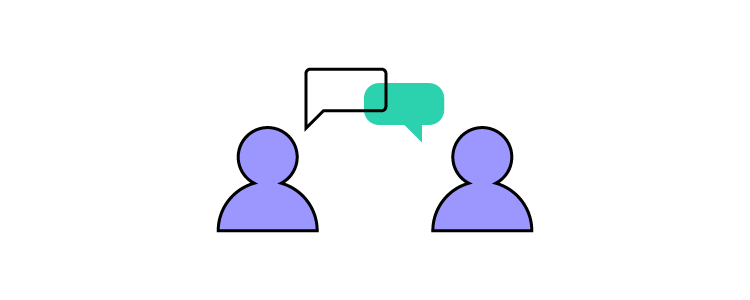
UX designers must collaborate effectively with various teams, departments, and stakeholders to align design with business goals, streamline processes, and create better products that meet user needs and expectations.
When UX designers become effective communicators and collaborators, they enhance their networking skills and contribute to creating exceptional user experiences–emphasizing the importance of UX within an organization.
Streamline and enhance cross-functional collaboration during the design phase of product development process. Create advanced prototypes with built-in interactivity, share them with your team, and execute design handoff without switching between tools. Visit our Merge page to learn more about this technology.
Reach a new level of prototyping
Design with interactive components coming from your team’s design system.
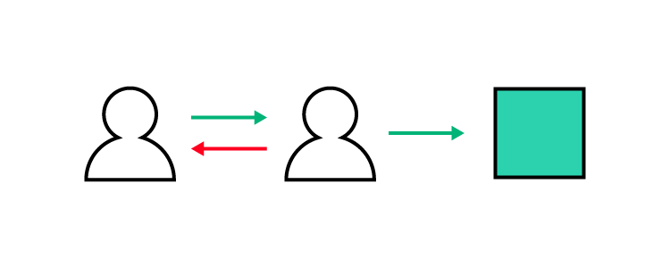
Importance of Cross-Functional Collaboration for UX Designers
As product development becomes increasingly complex, UX designers must work closely with various teams within an organization to ensure a seamless, user-centric experience. Effective collaboration helps align the design with business goals, streamline processes, and create successful products that meet user needs and expectations.
Goals and benefits of effective collaboration within an organization:
Accelerated product development: Collaborative teams can work more efficiently, reducing time to market and improving responsiveness to user demands.
Enhanced innovation: Diverse perspectives from cross-functional collaboration foster creativity and lead to innovative solutions.
Improved decision-making: Informed decisions can be made with input from multiple stakeholders, leading to better outcomes, fewer design problems, and preventing rework.
Greater adaptability: Collaborative teams can more effectively respond to changes in user needs or market conditions, ensuring the product remains relevant and competitive.
Higher employee engagement: Collaboration fosters a sense of ownership, camaraderie, and job satisfaction, resulting in increased productivity and reduced turnover.
How Organizational Structures Impact Cross-Functional Collaboration
Here are four typical UX team structures and how they impact cross-functional collaboration for designers:
Centralized design team structure: Limited exposure to other teams may lead to silos, making it difficult for designers to understand each project or department’s unique requirements and constraints.
Embedded design team structure: Designers may become too focused on their specific project or department, potentially losing sight of the organization’s larger design goals and consistency.
Decentralized design team structure: With design teams dispersed throughout the organization, coordinating efforts and maintaining design consistency can be challenging, leading to potential misalignments and inconsistencies.
Contractual design team structure: Contract designers may not have the same level of access to resources, knowledge, or communication channels within the organization. Providing these external partners with a business phone number can bridge this gap, making it easier to collaborate with internal teams and stakeholders effectively.
Product Managers: Aligning design goals with product strategy, prioritization, and overall business objectives.
Developers: Working closely to ensure design implementation is accurate and efficient while considering technical constraints and possibilities.
Marketing Teams: Collaborating on user research, personas, and user journeys to enrich user data and create targeted, impactful marketing campaigns.
Sales Teams: Gather valuable feedback and insights on customer needs, preferences, and pain points to inform design decisions.
Customer Support Teams: Utilizing their direct contact with users to address issues and gather feedback that helps improve the product experience.
Quality Assurance Teams: Ensuring the design meets usability, accessibility, and performance standards before the product launch.
Executive Stakeholders: Communicating design goals, progress, and results to gain buy-in and support from organizational decision-makers.
The DesignOps Impact on Cross-Functional Collaboration
DesignOps (Design Operations) is a strategic approach to streamlining organizational design processes and workflows. It optimizes resources, tools, and communication among design teams, stakeholders, and other departments. By implementing DesignOps, organizations can foster a collaborative environment that supports creativity, innovation, and efficiency, ensuring that design teams can deliver high-quality, user-centric products.
How DesignOps fosters communication and teamwork
DesignOps plays a crucial role in promoting communication and teamwork by establishing clear channels for collaboration, setting expectations, and defining roles and responsibilities.
DesignOps aims to standardize processes, provide tools for effective collaboration, and align design goals with business objectives, bridging the gap between designers, developers, and stakeholders. This alignment enables cross-functional teams to work together seamlessly, leading to better decision-making, improved product quality, and increased innovation.
Implementing DesignOps to improve collaboration
To implement DesignOps effectively, organizations must first assess their current design processes, identify inefficiencies, and establish clear goals for collaboration.
Next, develop a plan that outlines the necessary tools, processes, and communication channels to support effective collaboration. This plan may include regular cross-functional meetings, design reviews, or workshops to foster teamwork and alignment.
Organizations should monitor the success of DesignOps implementation by tracking key performance indicators (KPIs), such as project timelines, product quality, and employee satisfaction. By continuously refining and adjusting the DesignOps approach, organizations can create a collaborative culture that drives product success.
The Role of Design Systems in Cross-Functional Collaboration
How design systems streamline collaboration
Design systems streamline cross-functional collaboration by providing a centralized, comprehensive, consistent set of guidelines, components, and patterns. A shared design language enables designers, developers, and other team members to work cohesively and efficiently, eliminating miscommunication and reducing the need for repetitive tasks.
Design systems promote a consistent user experience across products and platforms and foster a unified brand identity. By leveraging a design system, teams can focus on brainstorming, innovation, and problem-solving, resulting in better outcomes and user experiences.
Establishing and maintaining a design system within an organization
It’s essential to involve cross-functional teams when building a design system. This collaborative approach ensures that the design system meets the needs of all stakeholders and aligns with business objectives.
Start by documenting existing design components, patterns, and guidelines, then refine them through an iterative process, seeking input from designers, developers, and other team members.
Once you implement a design system, it’s crucial to keep it up-to-date and relevant by continually evaluating its effectiveness, incorporating feedback, and adapting to the organization’s evolving needs. By prioritizing maintenance and regular updates, the design system will remain a valuable asset that supports cross-functional collaboration and drives product success.
Collaboration at Different Stages of the Design Process
Research and discovery phase
During the research and discovery phase, UX designers must collaborate closely with stakeholders and subject matter experts to gather critical information about the project.
This collaboration provides valuable insights into user needs, business requirements, and industry trends. Additionally, engaging with users and other teams helps designers identify pain points, opportunities for improvement, and potential solutions. By fostering open communication and actively seeking diverse perspectives, designers can build a solid foundation for informed decision-making throughout the design process.
Design and prototyping phase
Effective collaboration between UX designers, developers, and other design teams is crucial for creating a cohesive and functional product in the design and prototyping phase.
By working together, teams can ensure that design concepts align with business goals and marketing strategies while addressing technical constraints and feasibility. Open communication channels, regular design reviews, and shared tools facilitate smooth collaboration, enabling teams to iterate on design ideas, address potential issues, and refine the overall user experience.
User testing and validation phase
The user testing and validation phase is critical for ensuring the final product meets user needs and expectations. Collaborating with users, testers, and product managers during this stage helps UX designers gather essential feedback and identify areas for improvement.
By actively engaging with these stakeholders, designers can incorporate feedback into their prototypes, prioritize revisions, and make data-driven design decisions. This collaborative approach ultimately results in a more user-centric and successful product that aligns with user and business goals.
Design Handoffs and Smooth Collaboration
Importance of effective design handoffs
Effective design handoffs are crucial for ensuring a seamless transition from the design phase to the development phase. A well-executed handoff minimizes miscommunication, reduces project delays, and prevents unnecessary rework. By fostering a clear understanding of design specifications, UX designers and developers can work together more efficiently, resulting in a higher-quality product that meets user needs and aligns with business objectives.
Best practices for successful handoffs
To ensure successful design handoffs, designers and developers should adopt best practices that facilitate communication and collaboration. Utilizing tools and technology, such as design collaboration platforms and version control systems, can streamline the handoff process and reduce the likelihood of errors.
Additionally, clear documentation and guidelines for design specifications, including color palettes, typography, and responsive layouts, help developers understand and implement the intended design accurately. By following these best practices, teams can significantly improve the overall efficiency and effectiveness of the handoff process.
Building a strong designer-developer relationship
Cultivating a solid designer-developer relationship is essential for successful collaboration throughout the product development process. By fostering open communication, mutual respect, and empathy, designers, and developers can better understand each other’s perspectives, constraints, and goals.
Regular meetings, shared decision-making, and collaborative problem-solving help build trust and rapport between team members, leading to a more cohesive and successful product. By investing in these relationships, organizations can create an environment that encourages cross-functional collaboration and ultimately drives better user and business outcomes.
Tips for Effective Cross-functional Collaboration
Build trust and rapport with team members: Participate in team-building activities and make an effort to understand each team member’s role, strengths, and challenges to foster a supportive environment.
Encourage open communication and feedback: Establish regular meetings or touchpoints with team members to share updates, discuss challenges, and provide constructive feedback, fostering a culture of transparency and continuous improvement.
Leverage collaboration tools and software: Utilize project management, communication, and design collaboration tools (e.g., Trello, Slack, UXPin Comments) to streamline workflows, improve communication, and ensure everyone can access relevant UX resources.
Continuously improve collaboration skills: Attend workshops, webinars, or conferences focused on collaboration, communication, and teamwork to enhance your ability to work effectively with diverse teams and adapt to different working styles.
Advocate for UX and users: Share user research findings, insights, and success stories with your team and stakeholders to raise awareness about the importance of user-centered design and demonstrate the value of UX in achieving business goals.
UXPin Merge – The Ultimate Collaboration Facilitator
UXPin Merge enhances designer/developer collaboration by bridging the gap between design and front-end development with a single source of truth for your product’s design system.
By bridging this gap, UXPin Merge facilitates better communication and collaboration because everyone “speaks the same language” and works within the same limitations and constraints defined by the design system and the product’s code.
Streamline your product development process and enhance team collaboration with a single source of truth from UXPin Merge. Visit our Merge page for more details and how to request access.
A strong vision statement drives a design team’s actions while contributing to the product and organization’s success. This article explores how to create an effective design team vision statement, understand its purpose, and analyze real-world examples from leading organizations. We also provide a step-by-step framework for developing and implementing your design team’s vision statement.
Align teams with a shared vision and scale design operations with UXPin Merge. For more details and how to request access, visit our Merge page.
Reach a new level of prototyping
Design with interactive components coming from your team’s design system.
What is a Vision Statement?
A design vision statement outlines the long-term goals and desired future state for a product or organization’s design department. It provides designers with a clear direction or “north star” and is a source of inspiration and motivation.
Aligning Vision and Mission Statements
A vision statement and a mission statement combine to provide a comprehensive understanding of an organization’s purpose and direction.
The vision statement outlines the desired future state and long-term aspirations, while the mission statement defines the organization’s core purpose and strategies to achieve the vision. These statements create a cohesive framework that guides decision-making, fosters alignment, and unifies teams toward a common goal.
Importance of a Team Vision Statement
Creating a team vision statement helps establish a foundation for Design’s direction and decision-making processes. An inspiring vision statement encourages teamwork, inspires creativity, and drives innovation by fostering a shared understanding of the design team’s goals and aspirations.
This vision statement anchors the team, enabling designers to navigate challenges and focus on delivering high-quality, user-centric solutions that align with the department’s long-term objectives. When properly implemented, a design vision statement is a powerful tool that fuels the department’s growth and success in line with the company’s mission.
The role of a UX strategy in creating a vision statement
A company’s UX strategy shapes the design vision statement by outlining the desired user experience and guiding design principles. Ideally, a company should establish its UX strategy first, as it serves as a blueprint for the design vision statement, ensuring that the design team’s goals align with the company’s vision statement and broader objectives.
How Design or DesignOps Leaders shape a team vision statement
The Design or DesignOps Leader plays a pivotal role in shaping the vision by facilitating collaboration, fostering a culture of innovation, and guiding the team towards shared objectives. They are responsible for translating the company’s UX strategy into actionable goals, ensuring that the design department’s vision aligns with the company’s values and mission.
Understanding the Purpose of a Team Vision Statement
Aligning goals and values
A team vision statement aligns the design department’s goals and values, ensuring that each team member works cohesively and prioritizes the organization’s overarching objectives while staying true to its core values.
Creating a shared sense of direction
A good vision statement fosters a shared sense of direction by providing a clear roadmap for the team, outlining the desired future state, and inspiring team members to work collectively toward achieving common aspirations.
Guiding decision-making processes
The team vision statement guides decision-making processes within the design department by setting a framework that influences choices and actions, ensuring consistency and alignment with the team’s long-term objectives.
Key Elements of an Effective Team Vision Statement
Clarity and focus
A focused and clear vision statement ensures the concise and effective communication of the design department’s objectives, facilitating a unified effort toward shared goals.
Example of applying clarity and focus: “Empowering our design team to create seamless, user-centric experiences that elevate our brand and inspire customer loyalty.”
Inspirational and aspirational
A compelling vision statement is inspirational and aspirational. It must motivate team members to strive for excellence and establish what the design department seeks to achieve.
Example of applying inspirational and aspirational: “Pioneering innovative design solutions that revolutionize the way users interact with technology, setting new industry standards.”
Reflecting the team’s core values
A vision statement should embody the team’s core values, aligning the design department’s actions and decisions with the principles that define its identity and purpose.
Example of embodying the team’s core values: “Championing empathy, collaboration, and continuous learning as we craft user experiences that are both intuitive and impactful.”
Future-oriented and adaptable
A successful vision statement is future-oriented and adaptable. It enables the design department to navigate evolving market conditions and shifting priorities while maintaining a clear sense of direction and staying true to its foundational principles.
Example of incorporating future-oriented and adaptable: “We are committed to anticipating user needs and staying at the forefront of design trends and technology advancements.”
How to Create a Design Team Vision Statement
Gather insights from team members and stakeholders
The first step is to gather input from team members and key stakeholders. This collaborative approach fosters buy-in and ensures your vision statement considers diverse perspectives. For example, conduct brainstorming sessions or use anonymous surveys to gather insights on team goals, values, and aspirations.
Identify common themes and values
Analyze the feedback to identify recurring themes and shared values that resonate with the team. Look for patterns in the input and highlight aspects that consistently emerge. For example, if team members frequently mention empathy, collaboration, and innovation, these values should inform your vision statement.
Define the department’s purpose and aspirations
Use the themes and patterns from step two to define the design department’s purpose and aspirations. This step involves clearly stating the team’s reason for existing and the desired outcomes they want to achieve through their work. For example, your design department’s purpose may be to create engaging, accessible user experiences that drive customer satisfaction and loyalty.
Craft a concise, memorable statement
Craft a concise and memorable vision statement using the insights gathered that encompass the team’s purpose, values, and aspirations. This statement should be clear, actionable, and easy to remember. For example, “Designing user experiences that delight, empower, and inspire, driven by empathy, collaboration, and innovation.”
Test and refine your vision statement
Share the draft vision statement with team members and stakeholders for feedback. This iterative process ensures your vision statement resonates with the team and organization.
Communicate and implement the vision
After finalizing your design team vision statement, share it with the entire team and integrate it into your daily operations. This step involves incorporating the vision into team meetings, goal-setting processes, and decision-making frameworks. For example, display the vision statement in the team’s workspace, reference it during project kick-offs, and use it as a guiding principle for performance evaluations.
Embedding the Vision Statement into Your Design Culture
Here are some tips for embedding your vision into your organization’s design culture:
Regularly communicate the vision statement with your team to keep it fresh in their minds. For example, you can start team meetings by recapping the vision and highlighting its relevance to current initiatives.
Incorporate the vision statement into onboarding and training to ensure all team members are aligned. For example, discuss how the vision shapes the design department’s work and decisions during onboarding.
Integrate the vision statement into performance evaluations and feedback. For example, discuss how a designer’s work contributed to realizing the vision during performance reviews.
Celebrate successes aligned with the vision to reinforce its importance. For example, when a project embodies the vision statement’s principles, highlight it during a team meeting and praise the team’s efforts.
Vision Statement Examples from Leading Organizations
Design teams can learn from IDEO’s vision statement by embracing the idea that creating a better future is a collective responsibility. This statement empowers designers to take an active role in shaping the world around them and emphasizes the importance of inclusive design practices.
IBM Design
“IBMers believe in progress—that by applying intelligence, reason, and science we can improve business, society, and the human condition. Given our scale and scope, good design is not just a requirement, it’s a deeper responsibility to the people we serve and the relationships we build.”
IBM’s vision statement reinforces the importance of leveraging intelligence, reason, and science in their work and understanding that good design is a fundamental responsibility. The statement also highlights the impact of design on both business and society, emphasizing the role of designers in driving positive change.
MUI’s vision statement focuses on the team’s pursuit of excellence in its tools and processes. This statement highlights the importance of continuously improving and optimizing UI design solutions to serve developers and designers better, ultimately enhancing collaboration and efficiency.
Did you know you can bring MUI components into the design process to create prototypes that look and feel like the final product?
Import any open-source UI library or your company’s design system into UXPin using Merge technology to create a single source of truth across design and development. Learn more by visiting our Merge page.
Design systems have become indispensable for product teams in today’s rapidly evolving digital landscape. A well-implemented design system improves visual consistency and coherence and fosters better teamwork and communication among design teams, developers, and stakeholders. It accelerates the design and development process, enhancing scalability and maintainability and improving user experiences and product quality.
This article explores eight common product development challenges and how a design system can solve them. By recognizing these signs and implementing an effective design system, your team will be better equipped to navigate the complexities of modern product development and deliver exceptional digital experiences to your users.
Design with interactive components coming from your team’s design system.
Sign #1: Inconsistent UI and UX
The problem: Inconsistent user interfaces and user experiences can lead to confusion and frustration for users, negatively impacting their perception of your products.
This inconsistency may stem from design fragmentation, miscommunications, or a lack of standardization among designers and developers working on different parts of a product or multiple products.
How a design system can help: A design system provides a single source of truth with everyone using the same reusable UI components, patterns, layouts, fonts, colors, and guidelines. This shared system ensures consistent visual language and functionality throughout your products.
By establishing clear standards and best practices, a design system reduces the risk of inconsistency and promotes a cohesive, intuitive user experience that strengthens your brand identity and user satisfaction.
Sign #2: Design and technical UI debt
The problem:Design and technical UI debt are the consequences of shortcuts and poor decisions in the design and development process. Over time, these compromises can lead to inconsistencies, usability issues, and a fragmented user experience, resulting in a significant effort to address these problems later.
How a design system can help: Implementing a design system helps prevent design and technical debt by establishing a unified set of UX design principles, components, and a pattern library. This unified approach ensures that designers and developers work with a shared understanding, reducing the likelihood of miscommunications and inconsistencies.
By adhering to the design system’s guidelines, your team can create a cohesive and consistent user experience, mitigating the accumulation of design and technical UI debt in the long run.
Sign #3: Difficulty in maintaining and scaling your product
The problem: Maintaining and scaling its user interface becomes increasingly complex as your product evolves. Design debt accumulates, and the lack of consistent design patterns can make updates and expansions challenging, time-consuming, and resource-intensive.
How a design system can help: A design system lays the foundation for scalable design by providing reusable components, standardized patterns, and clear guidelines that make maintenance and growth more manageable. With a design system in place, you can efficiently introduce new features and make design updates while maintaining consistency and quality. This streamlined approach saves time and resources, enabling your team to focus on innovation and delivering a superior user experience.
Sign #4: Communication gaps between designers and developers
The problem: Communication gaps between designers and developers can lead to misunderstandings, inconsistencies, and delays in product development. Misaligned expectations, differing interpretations of design mockups, or unclear documentation can result in a confusing and inefficient process, impacting the final product’s quality and user experience.
How a design system can help: A design system acts as a single source of truth for both designers and developers, bridging the communication gap by providing clear guidelines, reusable components, and standardized design patterns.
By adhering to the design system, both teams can work more efficiently, with a shared understanding of the design language and implementation methods. This enhanced collaboration reduces the likelihood of misinterpretations and ensures a cohesive, consistent final product that meets the desired user experience and design goals.
Sign #5: Onboarding challenges
The problem: When new team members join a product team, they may face challenges understanding the design language, UI components, and coding practices. This learning curve can result in delays and inefficiencies, as new members may require additional time and resources to get up to speed with the existing design and development workflows.
How a design system can help: By providing clear guidelines, best practices, and reusable components, a design system allows newcomers to quickly grasp the product’s design principles, UI patterns, and coding conventions.
The design system accelerates the onboarding process, allowing new team members to contribute more effectively and efficiently to the product’s development, ultimately enhancing overall productivity and cohesion.
Slow product development leads to missed deadlines, increased costs, and reduced competitiveness, as your product takes longer to reach the market or introduce new features and improvements.
How a design system can help: A design system addresses the slow time-to-market problem by streamlining the entire design and development process.
With a shared UI library and clear guidelines, designers and developers can work more efficiently and collaboratively, reducing the time spent creating, refining, and implementing design elements.
This improved workflow allows the product team to deliver new features and updates more quickly, increasing the product’s competitiveness and enabling a faster response to market demands and user needs.
Sign #7: Duplicated design and development work
The problem: Without a centralized design system, teams often duplicate work when creating or updating UI elements–for example, building multiple versions of an app bar.
This inefficiency can lead to wasted time, effort, and resources, as designers and developers work independently or in silos, unknowingly replicating each other’s efforts or creating inconsistent assets.
How a design system can help: By implementing a design system, teams can significantly reduce duplicated work. A design system provides:
Guidelines that can be easily accessed and applied by all team members
This single source of truth streamlines the design and development process, ensuring everyone works from the same set of resources and follows the same standards, ultimately eliminating redundant efforts and fostering a more efficient, collaborative, and cohesive workflow.
Sign #8: Difficult design handoffs
The problem: Design handoffs can be challenging, time-consuming, and fraught with friction between designers and developers. Designers often struggle to provide developers with all the necessary assets, specifications, and documentation, leading to misunderstandings, delays, and potential rework.
How a design system can help: A design system simplifies design handoffs by providing a clear and standardized framework for communication between designers and developers. With a shared language, a unified component library, styles, and guidelines, both parties can easily reference and understand each other’s work.
This streamlined approach reduces the chances of misinterpretation and ensures that designs are translated into code accurately and efficiently. By fostering better collaboration and alignment, a design system ultimately helps teams deliver consistent and high-quality products with a faster time to market.
Even the best design systems still struggle to solve the single source of truth dilemma because designers and engineers use different design systems:
It can take many years to achieve ultimate maturity, where designers and developers use the same UI library–a real single source of truth. Or, you can bridge the gap from the start using UXPin Merge and circumvent years of work and resources.
Building and Scaling a Design System With UXPin Merge
Merge enables you to sync a component library from a repository, so designers use the same design system during the design process as engineers use to develop the final product. Designers work with visual elements while engineers see the code behind them, creating a single source of truth across the organization.
This code-to-design workflow solves many challenges organizations face with traditional design systems and product development models. The design system team only has to update and maintain one version of the UI library hosted in a single repository, maximizing efficiency while eliminating potential errors from maintaining separate design systems for designers and engineers.
Merge offers three solutions for syncing your design system:
Save time and resources building, scaling, and maintaining your design system with a single source of truth from UXPin Merge. Visit our Merge page for more details and how to request access to this revolutionary design system technology.
Typography is one of the most critical website design factors, as it significantly impacts many other UI design facets, including usability, accessibility, branding, readability, and aesthetics. We explore website typography for UX design, including correct terminology, the basics, and advanced techniques designers can use to improve design decisions.
Design responsive websites faster with UXPin’s advanced prototyping features. Sign up for a free trial to create your first interactive prototype with UXPin.
Build advanced prototypes
Design better products with States, Variables, Auto Layout and more.
Why is Typography Important in Web Design?
Typography significantly impacts a website’s user experience, readability, aesthetics, and accessibility. Well-crafted typography enhances the visual hierarchy, guiding users through a user interface while reinforcing the message and brand identity.
By making deliberate choices about typefaces, sizes, spacing, and other typographic elements, designers can create a cohesive and visually appealing web page that effectively communicates information and engages users.
A carefully chosen typeface can influence user perception and emotions–for example, it may evoke trust, professionalism, or playfulness, shaping the user’s impression of a brand or product. Investing time and effort in refining typography is essential for designers to create user-friendly and visually compelling digital experiences that foster user satisfaction, engagement, and retention.
What is the Difference Between Typography, Typefaces, and Fonts?
Typography is a broader concept that includes text’s overall design, layout, and appearance within a digital or print medium. It’s the art and technique of arranging type, encompassing various aspects like typeface selection, size, line spacing, letter spacing, and text alignment.
A typeface is a collection of characters, symbols, and glyphs with consistent design and visual appearance. Typefaces represent the broader design concept, including various styles, weights, and variations that define a family of fonts. Examples of typefaces include Helvetica, Times New Roman, and Arial.
A font is a specific variation within a typeface. It is a digital representation of a typeface in a particular style, font weight, and size. Each font within a typeface family maintains the overall design consistency while offering different options for emphasis, hierarchy, and aesthetics.
For example, within the Helvetica typeface, you might find fonts like Helvetica Regular, Helvetica Bold, Helvetica Light, and Helvetica Italic.
Typography Basics
Anatomy of typefaces
Understanding the anatomy of typefaces is crucial for designers when selecting and working with fonts. Some key terms to know include:
Baseline: The invisible line on which characters sit.
Cap height: The height of capital letters measured from the baseline.
X-height: The height of lowercase letters, typically measured using the letter ‘x.’
Ascender: The part of a character that extends above the x-height.
Descender: The part of a character that extends below the baseline.
Serif: Small decorative strokes added to the ends of characters in some typefaces.
Counter: The enclosed or partially enclosed space within a character.
Typeface classifications
We classify typefaces into several broad categories, each with its unique characteristics and applications:
Serif: These typefaces have small strokes (serifs) attached to the ends of characters. They often convey a sense of tradition, professionalism, or authority. Examples include Times New Roman and Georgia.
Sans-serif: Sans-serif typefaces lack serifs, resulting in a cleaner, more modern appearance. They are suitable for digital interfaces and offer excellent legibility. Examples include Helvetica and Arial.
Slab-serif: Characterized by thick, block-like serifs, slab-serif typefaces are attention-grabbing and effective for headlines or display purposes. Examples include Rockwell and Clarendon.
Script: These typefaces mimic handwriting or calligraphy, primarily used for logos, invitations, or headers. Examples include Pacifico and Brush Script.
Monospace: Monospace typefaces have a fixed width for each character, making them preferred for coding environments and typewriters. Examples include Courier and Consolas.
Font formats
TrueType (TTF): Developed by Apple and Microsoft, TrueType is a widely supported font format that offers good display quality on various devices and resolutions.
OpenType (OTF): An extension of TrueType, OpenType fonts include advanced typographic features, such as ligatures and alternate glyphs, providing more design flexibility.
Web Open Font Format (WOFF/WOFF2): The WOFF and WOFF2 formats were designed specifically for web use, offering faster loading times and improved compression compared to TTF and OTF formats. They support the same features as OpenType fonts but are optimized for web performance.
Choosing the Right Typeface
Legibility and readability
Selecting typefaces with high legibility and readability is essential to ensure users can easily consume the content on your website. Legibility refers to the clarity of individual characters, while readability encompasses the overall ease of understanding the text.
Choose fonts with clear, distinguishable characters and a balanced x-height, weight, and spacing. Avoid overly decorative or condensed typefaces for body text.
For example: Consider using a sans-serif typeface like Open Sans or Roboto for body text. These are best for on-screen legibility and readability.
Tone and brand identity
Your typeface should align with your brand’s tone and identity, as they can evoke different emotions and perceptions. Serif typefaces often convey tradition and authority, while sans-serif fonts project a modern, clean appearance.
Script typefaces can add a touch of elegance or playfulness, depending on their style. Analyze your brand personality and choose typefaces that support and enhance it.
For example, a sophisticated serif typeface like Playfair Display can help convey elegance and refinement for luxury brands.
Typeface pairing and contrast
Effectively pairing typefaces establishes visual harmony and clear hierarchy. When combining typefaces, look for complementary styles that offer enough contrast to create a distinction without clashing.
Mixing a serif with a sans-serif typeface is standard practice, as it can balance formality and modernity. Consider the weight, width, and x-height to ensure cohesion between the paired typefaces.
For example, designers often pair a serif typeface like Merriweather for headings with a sans-serif typeface like Lato for body text.
Font licensing and legal considerations
It’s crucial to understand and comply with licensing agreements and legal considerations. Fonts are intellectual property, and copyright laws may restrict their usage or require purchasing a license. There are free, open-source fonts available for commercial use. Always review the terms and conditions of a font before using it in your projects.
For example, Google Fonts offers a wide selection of open-source fonts, such as Montserrat and Raleway, free for personal and commercial projects.
Web Font Performance and Optimization
While devs are typically responsible for optimizing fonts, designers must understand the various strategies and best practices so they can collaborate to improve user experience and accessibility.
Selecting a font delivery method
Choosing the correct font delivery method is essential for balancing performance and user experience. There are two options:
Self-hosting: Fonts are stored and served from your server or content delivery network (CDN). This approach provides more control over font files and caching but may require additional maintenance, configuration, and licensing considerations.
Web font services: Fonts are served from an external provider, simplifying licensing, file format conversions, and updates. However, relying on external services can introduce third-party dependencies and potential performance bottlenecks.
Optimizing font files and minimizing file size
Optimizing font files and minimizing their size is crucial for improving web performance and reducing load times. Use tools like Font Squirrel’s Webfont Generator or Google Fonts to generate optimized font files and serve only the necessary font styles, weights, and character sets. Compression techniques, such as the WOFF2 format, can reduce file sizes.
Font loading strategies and performance best practices
Implementing effective font-loading strategies can prevent layout shifts and improve website performance. Some best practices include using font-display CSS property (e.g., swap or fallback) to control the rendering behavior, employing preloading or asynchronous loading techniques, and inlining critical font CSS to reduce render-blocking resources.
Addressing cross-platform rendering issues
Addressing potential rendering issues is essential to ensure consistent typography across various devices and platforms. Test your typography on different browsers, operating systems, and devices to identify inconsistencies.
If you don’t want to get caught up in these technicalities, using a service like Google Fonts is best, as it automatically serves the correct font format to users across multiple devices and platforms.
Typography & Responsive Design
Fluid typography and viewport units: Utilize viewport units (vw, vh, vmin, vmax) to create fluid typography that adapts to different screen sizes. This approach ensures that text scales smoothly as the viewport size changes, maintaining legibility and readability across various devices.
Media queries and breakpoint-based adjustments: Apply media queries to define breakpoints at which your typography styles should adapt to specific screen sizes. Adjust font sizes, line heights, and other typographic properties to optimize readability and maintain visual hierarchy on different devices.
Modular scales and typographic systems: Implement a modular scale to maintain consistent proportions between different text elements, such as headings and body text. A modular scale is a sequence of font sizes based on a predefined ratio, ensuring a harmonious relationship between typographic elements and enhancing the overall design.
Vertical rhythm and line height considerations: Establish a consistent vertical rhythm in your design by setting a standard line height, typically between 1.4 and 1.6 times the font size. This practice improves readability and creates a visually balanced layout, allowing content to flow seamlessly across different devices and screen sizes.
Web Typography Accessibility
Font color contrast and readability
Ensuring sufficient color contrast between text and background is crucial for readability and accessibility, especially for visually impaired users.
Choosing appropriate font sizes and enabling smooth scaling across different devices is essential for maintaining legibility and accessibility.
A standard base font size for body text is 16px, while headings should be proportionally larger. Use relative units like em or rem, which allow users to resize text according to their preferences and ensure proper scaling on various screen sizes.
Supporting screen readers and assistive technologies
Designing typography that works well with screen readers and other assistive technologies is crucial for users with visual impairments or cognitive disabilities.
Use semantic HTML tags, such as headings (h1-h6) and paragraphs (p), to create a clear content hierarchy. This distinction allows screen readers to navigate and effectively communicate the content to users.
Best practices for internationalization and localization
Choose typefaces that support a wide range of characters, accents, and special symbols required by various languages. Also, be mindful of reading direction (left-to-right or right-to-left) and ensure your design accommodates these differences.
Design immersive experiences your users will love with the world’s most advanced design and prototyping tool. Sign up for a free trial to build your first UXPin prototype today.
A sense of urgency is the strategic use of design elements and messaging to create an immediate need for users to take action. Designers can create urgency by leveraging time-sensitive offers, limited availability, or social proof to evoke emotional responses that motivate users to act quickly.
The objective of incorporating urgency into design is to encourage users to make faster decisions, ultimately leading to increased conversions, user engagement, and satisfaction.
Design immersive, fully functioning prototypes to improve testing and deliver better product experiences to your users. Build your first interactive prototype with UXPin. Sign up for a free trial.
Build advanced prototypes
Design better products with States, Variables, Auto Layout and more.
Why is a Sense of Urgency Important?
Incorporating a sense of urgency in digital product design can significantly improve user engagement, drive conversions, and boost overall revenue.
Urgency creates a compelling reason for users to act, reducing indecisiveness and procrastination. A well-implemented sense of urgency strategy can lead to higher conversion rates, user retention, and customer loyalty by tapping into users’ emotional responses and encouraging immediate action. For B2B sales and marketing teams, tools like Sendspark demonstrate how personalized video messaging can create urgency through AI-powered personalization, where urgency tactics like dynamic content and personalized outreach drive faster engagement and decision-making from prospects.
Psychological Principles and Urgency-Driven Design
Understanding the psychological principles behind urgency-driven design is key to effectively leveraging urgency to drive user action.
Psychological principles such as the fear of missing out (FOMO), scarcity, and social proof play a vital role in creating a sense of urgency that resonates with users emotionally.
Designers who fully understand human behavior and design psychology can create compelling experiences that motivate users to take desired actions, leading to increased engagement and conversions.
The Ethics of Creating a Sense of Urgency
Urgency and scarcity are powerful psychological tools influencing users’ behavior and decision-making processes. By tapping into users’ emotions and cognitive biases, designers and marketers can create experiences encouraging users to take specific actions, such as purchasing, signing up for a service, or engaging with content.
However, this power comes with a responsibility to ensure that these strategies are used ethically and do not manipulate or exploit users in a way that could be harmful or detrimental to their well-being.
Designers should approach psychological principles in digital product design carefully and consider the user’s best interests. Creating a sense of urgency should be done to genuinely benefit the user, providing real value and enhancing their experience.
This “ethical urgency” can be achieved by being transparent about the nature of the urgency, using clear and honest messaging, and avoiding deceptive or misleading tactics.
Understanding the Psychological Principles Behind Urgency
FOMO is a psychological phenomenon where individuals experience anxiety or distress over the possibility of missing out on opportunities, experiences, or rewards. This fear can significantly influence consumer behavior, pushing them to take action to avoid potential regret or loss.
FOMO affects decision-making by creating a sense of urgency and prompting users to act quickly. When faced with a limited-time offer or an exclusive opportunity, users may make faster decisions to avoid the feeling of missing out.
Scarcity
Scarcity is a psychological principle that describes the perception of limited supply or availability. It plays a crucial role in creating urgency, as people tend to place a higher value on scarce items and are more likely to act quickly to secure them.
Types of scarcity:
Time-based scarcity: Limited product availability, offer, or opportunity for a specific duration.
Quantity-based scarcity: Limited supply or stock of a product or service.
When a product or service is scarce, people perceive it as more valuable, exclusive, and desirable, making them more likely to take action to obtain it.
Social proof
Social proof is a psychological principle where individuals look to the behavior of others to guide their actions. It plays a critical role in driving action, as people tend to trust and follow the choices made by others, especially when they are uncertain or facing a new situation.
Social proof can increase urgency by showcasing the popularity or demand for a product or service, making users more inclined to act quickly. It fosters trust by validating and reassuring that others have made similar choices and found value in the product or service.
Real-time user data, such as the number of people currently viewing or purchasing a product
Effective Strategies for Implementing Urgency
Time-based urgency
Limited-time offers and promotions: Create exclusive, short-term offers or discounts to drive quick decision-making and incentivize users to act immediately.
Countdown timers: Incorporate countdown timers on offers or promotions to visually communicate the time-sensitive nature of the opportunity and reinforce the sense of urgency.
Design elements for time-based urgency: Use attention-grabbing colors, fonts, layouts, and call-to-actions (CTAs) to emphasize the time-sensitive nature of offers.
Quantity-based urgency
Limited stock or availability: Communicate a product’s limited availability to create a sense of urgency and motivate users to act quickly.
Displaying real-time stock levels: Show the current stock or availability levels to emphasize scarcity and encourage users to take immediate action to secure the product or service.
Design elements to emphasize scarcity: Utilize visual cues, such as progress bars, low-stock indicators, or sold-out tags, to highlight a product’s scarcity and create a sense of urgency.
Leveraging social proof
User reviews and testimonials: Feature positive reviews and testimonials from satisfied customers to build trust and demonstrate the product or service’s value.
Ratings and endorsements: Display ratings, endorsements, or recommendations from industry experts or influencers to validate the quality of the product or service and encourage users to act quickly.
Incorporating social proof in design: Integrate social proof seamlessly into the design by showcasing user-generated content, real-time data, or social media activity to reinforce the popularity and demand for the product or service.
We use quotes as social proof on our sign-up landing page from well-known UXPin clients to create a sense of urgency.
Balancing Urgency with User Experience
Avoiding negative impacts of urgency on user experience
It’s essential to prevent urgency-driven strategies from causing stress or frustration for users. Designers should balance creating a sense of urgency and maintaining a positive user experience by avoiding aggressive tactics or overwhelming users with too many time-sensitive elements.
Ensuring transparency and authenticity
To build trust and credibility, designers must ensure that urgency-based strategies are transparent and authentic. Be clear about the nature of the urgency, use honest messaging, and avoid tactics that may come across as deceptive or manipulative.
Striking the right balance between urgency and user satisfaction
Designers must carefully balance incorporating a sense of urgency and ensuring user satisfaction. Use urgency in moderation to enhance the customer experience and provide genuine value and benefits.
A Step-by-Step Framework for Implementing Urgency in the Design Process
Define your goals: Identify the desired outcomes you want to achieve by incorporating urgency into your design. These include increasing conversions, boosting user engagement, or improving customer retention.
Understand your target audience: Research and analyze your target audience better to understand their needs, motivations, and pain points. This user research will help tailor urgency-driven strategies to resonate with users.
Choose the right psychological principles: Based on your goals and target audience, decide which psychological principles (FOMO, scarcity, social proof, etc.) would be most effective in driving the desired actions.
Identify suitable design elements and tactics: Brainstorm the design elements and tactics required to create a sense of urgency–for example, countdown timers, limited-time offers, real-time stock levels, colors, animations, or user testimonials.
Prioritize user experience: Evaluate urgency tactics against user experience and usability to ensure there are no adverse impacts. Keep the user’s best interests in mind and focus on providing genuine value while creating urgency.
Prototype and test: Incorporate the chosen design elements and tactics into your digital product design. Run A/B tests or user testing to evaluate their effectiveness and ensure they drive the desired actions without compromising user experience.
Monitor and optimize: Continuously monitor your product’s performance to identify areas for improvement. Gather user feedback and analyze data to optimize your urgency-driven strategies and ensure they remain effective and user-friendly over time.
Maintain ethical practices: Use urgency tactics ethically and transparently throughout the design process. Avoid misleading or manipulative tactics and always prioritize the well-being and satisfaction of your users.
Measuring the Effectiveness of Urgency-Driven Design
Key performance indicators (KPIs) to track
Conversion rates: The percentage of users who complete a desired action, such as purchases or newsletter sign-ups.
Engagement metrics: Time spent on a page, click-through rates, and user interactions with urgency-driven elements.
User retention: The rate at which users return to or continue to engage with the digital product over time.
Customer satisfaction: Feedback and ratings from users indicating their overall satisfaction with the product or service. Baremetrics, for example, provides subscription analytics and churn metrics that help track whether urgency-driven strategies are effectively reducing customer cancellations and improving lifetime value.
Analyzing and optimizing urgency-driven designs
Regularly evaluate the performance of urgency-driven designs to ensure they’re effective in driving user action. Use data collected from KPIs and user testing to identify areas for improvement and make necessary adjustments to optimize the designs.
Adapting strategies based on data and user feedback
Continuously refine and adapt your urgency-driven strategies by leveraging data insights and user feedback. This iterative approach allows you to make informed decisions and create an effective, user-centric design.
User-Centered UI Design With UXPin
Most design tools are built for graphic design and adapted for UX. UXPin is a true user experience design tool powered by code, giving designers final-product like fidelity and functionality.
Four features that set UXPin apart from other popular design tools:
Variables: capture data from user inputs and create personalized, dynamic user experiences–like populating a profile user interface from onboarding data.
Expressions: Javascript-like functions to create complex components and advanced functionality–no code required!
Conditional Interactions: create if-then and if-else conditions based on user interactions to create dynamic prototypes with multiple outcomes to replicate the final product experience.
Enhance your product’s user experience with the world’s most advanced UX design tool. Create your first fully functional prototype right on trial. Sign up for a free trial.
What is sabotaging your design system? Is it lack of support from stakeholders? Poor cross-team collaboration? No governance structure?
We joined forces with Whitespace to set up a discussion panel about overcoming challenges of scaling design systems. Join us for free on May 16th and listen to the experts who grow, govern, maintain, and evangelize enterprise design systems.
FinTech design systems help product teams solve fundamental usability issues while moving fast to stay ahead of the competition. But, building a FinTech design system requires significant resources to create, scale, and mature.
Create a single source of truth for your FinTech app with the world’s most advanced design and prototyping tool. Visit our Merge page for more details and how to request access to this revolutionary technology.
Reach a new level of prototyping
Design with interactive components coming from your team’s design system.
A Design System Must Guarantee Consistency
Consistency is one of the primary reasons organizations build a design system. Design consistency“ties UI elements together with distinguishable and predictable actions,” which increases trust, adoption, and usage–vital for successful financial products and banking apps!
Consistency doesn’t only benefit the user experience. It also creates more efficient workflows while reducing front-end and UX debt.
Creating a single source of truth means product teams, user experience designers, and engineers all work with the same components, increasing cross-functional collaboration, streamlining design handoffs, and reducing time-to-market.
While style guides solve many foundational design challenges and inconsistencies, they lack interactivity, and functionality. Design teams can create beautiful user interfaces, but image-based prototypes don’t provide accurate testing or meaningful feedback.
In the highly competitive FinTech landscape, designers must deliver high-quality customer experiences with UIs that enable users to complete tasks effortlessly. The only way to achieve quality outcomes is through high-fidelity prototypes and testing–beyond the limitations of an image-based style guide.
From style guide to component-driven prototyping
This component-driven prototyping workflow allows FinTech UX design teams to build prototypes that look and feel like the final product–something that’s usually only possible with the help of UX engineers or front-end developers.
Merge syncs a design system from a repository to UXPin’s design editor, so designers use an interactive component library instead of a style guide or UI kit to build prototypes.
Merge prototypes look and feel like the final product, enabling FinTech product design teams to go beyond the limitations of traditional design tools and style guides. These immersive, dynamic prototype experiences solve usability issues and pain points while identifying opportunities.
Don’t Overcomplicate Your System
Organizations must view their design system as any other product. It must be user-friendly and solve user problems–in this case, product development member problems.
Codifying a design system into a searchable hub with guidelines, principles, documentation, tutorials, and governance procedures makes it easy to use while providing design teams with clear guidance about using components and building products.
Accessibility is crucial for any digital product, especially FinTech design, where users make critical financial decisions. Designers must consider how design decisions impact users from many backgrounds, including those with disabilities.
One of the challenges with accessibility is it requires attention to detail, adding time to design projects. Design system accessibility allows organizations to solve foundational issues at the component level, reducing the time and effort to make products accessible for all users.
Build a System that Serves the Entire Organization
Your FinTech design system must serve the entire organization. Not only will this help with collaboration, but it’ll help with design system buy-in from stakeholders.
Delivery Hero’s product team built a solid design system business case by demonstrating its value for engineering teams and solving front-end debt. The team proved that Marshmallow wasn’t just a system to make the design team’s lives easier; it had business value and would generate a positive ROI for the organization.
A good design system encourages feedback from every department to ensure it generates maximum value while encouraging design system adoption.
Leverage an Existing Design System
Building a design system is expensive and time-consuming. Many FinTech startups (and large organizations) lack the resources to create a design system from scratch.
Adopting an existing themeable, open-source design system is a fantastic way to overcome the expense of building from scratch while delivering an on-brand, high-quality user experience. For teams building web applications and services that require backend connectivity, pairing a thoughtful design system with a secure data access layer—like DreamFactory, which provides governed API access to enterprise data sources—ensures both your frontend and backend scale together.
Open-source design systems aren’t just for startups.
A Design System Must Serve a Purpose
Think of a design system like any other digital product or feature–does it serve users’ needs? Are your motivations for building a design system based on solving core product development issues?
You won’t get stakeholder buy-in or adoption if you don’t identify these needs and demonstrate the design system’s value.
How will your design system solve workflow bottlenecks and roadblocks?
Do you suffer from design drift and inconsistencies? How will your design system solve these?
What is your current time to market? Can you conduct experiments to demonstrate that a design system will reduce this and what are the cost benefits?
Metrics and KPIs matter when pitching a design system to stakeholders.
Start with a real pain point: what problem will you solve? More importantly, what is it costing the company? Stakeholders take notice when they see actual, provable numbers.
Build a value proposition: how will your design system solve this problem? Be realistic!
Identify your biggest supporters and sponsor: finding leaders and stakeholders who believe in your solution will give your argument merit and weight.
Show before you tell: prove your solution’s effectiveness with results from a case study or experiment.
Talk business metrics: show what this problem costs the company and how a design system will fix this.
Don’t go alone – build your network: get input and support from multiple team members and departments impacted by the problem(s) you’re trying to solve and confirmation that they support your idea.
Track and Report Your Design System’s Success
A design system is not a “one-and-done” solution. You will have to continually prove its positive benefits and ROI to secure the resources necessary to maintain and scale the design system.
Stakeholders want to see that their investment creates a positive change and, more importantly, that team members use it!
Team efficiencies: how long does it take to deliver design projects with vs. without a design system? How does this figure improve with increasing adoption?
Speed to market: does the design system improve delivery from concept to final release?
Effect on code: how does the design system improve design handoffs and reduce designer/engineer friction? Does the design system reduce technical debt?
The design system team must also collect data and feedback on other areas of the business, including:
Increase sales/conversions
Reduced tech support calls
Brand satisfaction
Reduced rework or errors
Employee retention
Labor cost savings
Identifying areas where your design system creates positive benefits and efficiencies are vital for its long-term success.
Gamify: awards for various adoption levels and usage
Socialize: included team members in naming the design system, designed an internal emoji, hosted events, surveyed users regularly, and kept everyone updated with a regular newsletter
Celebrate: Delivery Hero’s DS team made a point of celebrating adoption milestones and Marshmallow’s most prominent users
Delivery Hero’s adoption strategy won’t work in every organization, but it demonstrates that increasing a design system’s usage takes time and effort.
Scaling FinTech Design With UXPin Merge
Design systems can create real impact in terms of process improvements. But the change won’t be sustainable unless you have the right tools that make it easy to share coded design system components, bring them to design, and hand over prototypes that behave like real products. Visit our Merge page to learn more.
Designing a meaningful and impactful future begins with a clear and concise mission statement. This article explores the essential elements of an effective design mission statement, including a step-by-step guide to crafting one that reflects your team’s unique values, principles, and aspirations.
Whether you’re a UX designer, DesignOps leader, or product owner, understanding the importance of a good mission statement is crucial for aligning your team, driving innovation, and inspiring growth.
Create real design process improvements and make an impact on the speed and efficiency of prototyping with component-driven design with UXPin Merge. Sync your dev’s UI components with UXPin and design up to 10x faster. Visit our Merge page for more details.
Reach a new level of prototyping
Design with interactive components coming from your team’s design system.
What is a Design Mission Statement?
A design mission statement guides designers by outlining and defining company values, principles, and aspirations in design. This concise declaration helps define the UX team’s unique approach to product design and serves as a foundation for creative and user experience decision-making.
By establishing a clear sense of direction, a mission statement enables designers to focus on their goals and consistently deliver value to users, stakeholders, and collaborators.
How does a design mission statement fit with the overall UX strategy?
A design mission statement incorporates the overall UX strategy by guiding and aligning design decisions with organizational goals. It fosters consistent, purposeful design choices, enhancing the user experience across products and platforms.
What is a Vision Statement?
A design vision statement outlines the long-term aspirations and desired future state for a product or organization’s design department. It provides designers with a clear direction or “north star” and is a source of inspiration and motivation.
Vision Statement vs. Mission Statement – What’s the difference?
A design mission statement focuses on the organization’s present design objectives, principles, and values. It establishes the foundation for design decisions, ensuring alignment with the organization’s goals.
A design vision statement describes where the organization wants to be in the future, while the mission statement defines its current purpose and approach to design.
Key Elements of an Effective Design Mission Statement
Vision and values
The foundation of a strong design mission statement lies in articulating your team’s aspirations and core beliefs. Clearly define your organization’s purpose and what it stands for, guiding the team toward meaningful outcomes. For example, a company focused on sustainability might emphasize eco-friendly design practices in its mission statement.
Design philosophy and principles
Outline the design approach that underpins your team’s work. You can include aspects like user-centered design, simplicity, or innovation. By expressing these principles, you establish a framework that drives consistent decision-making. For example, if accessibility is a priority, your mission statement could mention a commitment to inclusive design for all users.
Focus on user needs and experience
A successful design mission statement places your target audience at the center, highlighting a dedication to understanding and addressing their needs. Your statement must emphasize the importance of empathy, research, and user testing. For example, you might mention a commitment to providing intuitive, enjoyable, and seamless experiences that solve users’ problems.
Commitment to collaboration and communication
Effective design implementation often requires teamwork and clear communication with stakeholders. In your mission statement, highlight the value of collaboration and transparent dialogue, fostering a culture of openness and constructive feedback. For example, a mission statement could mention fostering cross-functional collaboration to ensure well-rounded and high-quality design solutions that incorporate diverse input and ideas.
Continuous learning and growth
The design and technology landscape is ever-evolving. A strong mission statement should reflect a dedication to improvement and adaptation. Encourage a growth mindset within your team, emphasizing the importance of learning from mistakes, staying updated on industry trends, and refining skills. For instance, your mission statement might underline a commitment to ongoing professional development and experimentation with new design methodologies.
Crafting Your Design Mission Statement
Setting the stage
Before diving into creating your design mission statement, setting the stage for a successful and collaborative session is essential. Involving the right people, preparing the appropriate materials, and choosing the ideal setting will help ensure that your mission statement truly reflects the values and aspirations of your team.
Who to include: Invite key members of your design team, including designers, DesignOps leaders, product owners, and any other relevant stakeholders. Including a diverse group ensures that the mission statement encompasses various perspectives and insights.
The setting: Select a comfortable, distraction-free environment to foster creativity and collaboration. This location could be a dedicated meeting room, a quiet office corner, or a virtual space for remote teams. Ensure the setting encourages open communication and allows for brainstorming and sharing ideas.
Materials: Provide materials to facilitate brainstorming and idea generation, such as whiteboards, markers, sticky notes, and pens. For remote UX workshops, use online collaboration tools like Miro or Mural.
Step 1 – Reflect on your organizational and UX values
Consider your company’s broader values and how they align with your UX team’s objectives. Determine the core values that will guide your design decisions.
Action: List your organization’s values and identify those most relevant to your design team. Reflect on how these values influence your design process and outcomes.
Step 2 – Identify your design principles and philosophies
Establish your team’s fundamental design principles, such as simplicity, user-centricity, innovation, accessibility, etc.
Action: Brainstorm and list the design philosophies that resonate with your team. Consider how these principles shape your team’s design initiatives and problem-solving approach.
Step 3 – Consider the impact you want to make on users, stakeholders, and colleagues
Think about the desired outcomes of your design work and how they contribute to the success of users, the organization, and your team.
Action: List the key impacts you want to achieve through your design work. Reflect on the benefits for users, the company, and your team members.
Step 4 – Balance between idealism and pragmatism
While it’s essential to have aspirational goals, your mission statement should also be grounded in reality. Strive for a balance between lofty ideals and practical, achievable objectives.
Action: Review your mission statement draft and evaluate if the goals are attainable while still being ambitious. Adjust the statement as needed to ensure a balance between idealism and pragmatism.
Step 5 – Involve your team in the process
Gather input from team members and non-designers to ensure the mission statement represents your organization and design team’s values and aspirations.
Action: Organize a workshop or brainstorming session with your team to discuss and refine the mission statement. Incorporate feedback and suggestions to create a statement that truly represents your team.
Step 6 – Keep it concise and memorable
A powerful mission statement is brief, clear, and easy to remember. Aim to communicate your message in a way that resonates with your team and stakeholders.
Action: Edit and refine your mission statement to ensure it’s succinct and straightforward. Remove unnecessary words or phrases, focusing on the most critical elements of your team’s mission.
Examples of Design Mission Statements
We’ve done our best to find mission statements relevant to design. Since these are generally internal documents, they can be challenging to find. Here are three mission statement examples and the lessons you can take from them.
Google’s mission statement
“To organize the world’s information and make it universally accessible and useful.” – Source: Google’s about page.
While not explicitly a design mission statement, Google’s mission statement encompasses its design philosophy, as they aim to create user experiences that are intuitive and accessible to everyone.
Human Experience’s mission statement
“Our mission is to elevate patient safety, create beautiful therapeutic spaces for healing, and establish viable long-term programs. Through our design and consulting work, we advocate for all stakeholders in behavioral health, including patients, hospital administration and staff, and healthcare architects. Simply put, we want to make a difference in the world. When we combine our beliefs with our years of experience, we believe we can.” Source: Human Experience–Who We Are.
Human Experience’s mission statement showcases its commitment to enhancing patient safety and creating therapeutic spaces for healing. They emphasize the importance of considering all stakeholders and advocating for their cause in the healthcare industry. This mission statement demonstrates the power of clearly outlining the purpose and goals of a design team, inspiring change in their field.
Spotify’s mission statement
“Our mission is to unlock the potential of human creativity—by giving a million creative artists the opportunity to live off their art and billions of fans the opportunity to enjoy and be inspired by it.” Source: Spotify Design.
Again, not a design-specific mission statement, but a fantastic example of placing users front and center. Spotify’s mission statement emphasizes the power of human creativity, focusing on the dual goals of supporting artists and inspiring fans.
This statement showcases their dedication to fostering a vibrant creative expression and enjoyment ecosystem. By putting both creators and listeners at the heart of its mission, Spotify highlights the importance of prioritizing the needs and aspirations of its diverse user base.
Updating and Evolving Your Design Mission Statement
Updating and evolving a design mission statement is crucial to maintaining relevance as the design landscape and user needs change. Periodically revisiting the statement ensures it aligns with the organization’s current goals and priorities.
Design teams should consider updating their mission statement when:
Organizational goals shift: Reflect new objectives to keep design efforts focused.
Industry trends change: Adapt to emerging technologies and user expectations.
Team dynamics evolve: Accommodate new members or leadership changes.
User needs expand: Stay responsive to shifting user preferences and requirements.
Design products that align with your company’s vision using the world’s most advanced code-based design tool. UXPin Merge bridges the gap between design and development to create a reliablesingle source of truth across the organization, aligning teams toward a common goal. Visit our Merge page for more details and how to request access.
Testing is vital for ensuring your design system provides the tools, guidance, components, and support teams need to deliver high-quality products efficiently. Design system testing assesses every aspect of the component library, documentation, syntax, accessibility, and more to ensure it meets the organization’s standards and expectations.
This article explores design system testing, when to test, roles and responsibilities, procedures, and tools teams use to conduct various tests.
Create a single source of truth, reduce operation burdens, and minimize errors with a code-to-design design system workflow from UXPin Merge. Visit our Merge page for more details and how to request access.
Reach a new level of prototyping
Design with interactive components coming from your team’s design system.
What is Design System Testing?
Design system testing (design system auditing) evaluates a design system’s functionality, usability, documentation, quality, and consistency. This evaluation aims to ensure the design system meets the requirements and expectations of its users and stakeholders.
A typical design system testing process might include:
Component testing: Evaluate individual components for visual consistency and function as expected.
Pattern testing: Ensure patterns are applied consistently across user interfaces and use cases.
Design file testing: Comparing design files to repository components to ensure designers and engineers share the same UI elements and patterns.
Accessibility testing: Validate that components, patterns, and templates meet design system accessibility standards and guidelines.
Performance testing: Measure the design system’s impact on overall product performance, including load times and responsiveness.
Usability testing: Analyze user research and conduct interviews to ensure the design system supports a positive user experience.
Documentation testing: Review design system documentation, including its guidelines (brand, content, code, design, etc.), to ensure it’s comprehensive and provides adequate user support.
Why is Design System Testing Important?
Design system testing is vital for the integrity of the UI library and the products it serves. Errors and inconsistencies left unchecked can quickly compound into bigger issues for product teams and end-users.
A design system’s primary purpose is to serve as a single source of truth. When a design system is compromised, it no longer serves as a trustworthy source for product consistency and coherence.
How Often Should You Test a Design System?
The frequency of design system testing will depend on multiple factors:
The size and complexity of the design system
Design system maturity
Available resources (labor, time, financial)
Product ecosystem
Frequency of updates
Here are some scenarios and intervals organizations might consider testing a design system.
Regular interval testing
The design system team may create a schedule for regular testing, such as monthly, quarterly, bi-annually, etc. A fixed testing program allows the DS team to plan while managing stakeholder and user expectations.
After significant updates or additions
It’s common for design system teams to audit a design system after a major update or when introducing new components, patterns, or guidelines. This audit ensures the changes function as expected while maintaining high UI consistency and coherence standards.
Addressing usability, accessibility, and performance issues
When product teams identify usability, accessibility, or performance issues, it’s crucial to audit the entire design system. This audit will evaluate the depth of the problem and appropriate corrective action.
It’s important to note that waiting for problems to emerge is not a good strategy for testing a design system. Adopting a more proactive approach, like regular interval testing or post updates, is better for catching and correcting issues early.
A comprehensive design system audit requires a cross-functional team with different expertise. In contrast, smaller or more specific tests may only need one or two specialists.
Depending on the scale and scope, here is a list of team members you might consider for your design system test. Keep in mind that companies may have one team member performing multiple functions listed below. For example, a UX designer may assess design, accessibility, and content, while an engineer covers UI components and QA.
UX/UI designers: assess visual consistency, usability, and overall user experience of the components and patterns. They also check design-specific documentation, tools, and UI kits.
Developers: Front-end and back-end developers evaluate component functionality, syntax, performance, and implementation. They also test the UI library across platforms and browsers.
Accessibility specialists: These team members have up-to-date expertise in accessibility standards and guidelines. They test the design system to organizational and regional accessibility requirements.
QA engineers: Quality assurance (QA) engineers create and execute tests in accordance with the design system’s quality standards.
Product managers or project managers: Many companies treat testing like a project requiring a team member to coordinate and oversee the process, including establishing timelines, allocating resources, and ensuring the team aligns on objectives and priorities. They may also gather findings to produce a final report, including the next steps.
Here are some suggested steps for executing a design system audit.
Define objectives: Establish the goals and objectives of the design system test. i.e., identifying inconsistencies, evaluating accessibility, or assessing performance.
Develop a plan: A test plan outlines the audit’s scope, methods, resources, schedule, and success criteria. An effective test plan must guide testing, assigns roles, and keep team members aligned.
Identify test cases and scenarios: Determine the specific test cases and scenarios team members must use to evaluate various parts of the design system. These must be consistent for every test to ensure you can measure KPIs and performance over time.
Prepare tools and resources: Gather the tools and resources team members need to complete their work, including testing frameworks, accessibility checkers, performance analyzers, usability testing methods, etc.
Execute tests: Conduct tests according to the plan, documenting the results and issues.
Analyze test results: Review tests to identify patterns, trends, or areas of concern. Determine issue severity, prioritize fixes, and add to UX or tech backlogs.
Report findings and recommendations: Prepare a comprehensive report for design system users and stakeholders with test outcomes, findings, and recommendations.
Fix issues and implement improvements: The design system team must implement changes according to the report updating components, patterns, guidelines, and documentation as needed.
Monitor, re-test, and iterate: Test releases to ensure they solve issues appropriately. Monitor changes to assess effectiveness, testing and iterating until you achieve the desired outcome.
Tools for Design System Testing
There are many tools available for testing different aspects of a design system. Here are a few categories and examples.
Visual consistency testing
Percy: A visual testing tool that helps detect visual changes and inconsistencies across components and layouts.
Chromatic: Automates gathering UI feedback, visual testing, and documentation–created by Storybook for built-in tests.
SauceLabs Sauce Visual Testing: Find and fix visual errors and inconsistencies across all browsers and resolutions early in the development lifecycle.
Functionality and integration testing
Jest: A JavaScript testing framework that supports component and integration testing for JavaScript libraries and frameworks, including React, Vue, and Angular.
Cypress: An end-to-end testing tool for testing browser-based web applications.
Accessibility testing
axe: An accessibility testing tool for identifying and resolving accessibility issues in web applications.
Lighthouse: An open-source tool from Google that provides automated auditing for accessibility, performance, and other best practices.
WAVE: A web accessibility evaluation tool that helps identify and resolve accessibility issues.
UXPin: Built-in color contrast checker and color blindness simulators allow designers to test UIs on the fly.
Cross-platform and cross-browser testing
BrowserStack: A platform providing access to various browsers and devices for testing web applications across different environments.
Sauce Labs: A cloud-based platform for automated and manual testing across browsers, platforms, and devices.
Performance testing
WebPageTest: An open-source tool for measuring web page performance, including load times, rendering speed, and optimization recommendations.
Google PageSpeed Insights: A free tool that analyzes web page performance and provides suggestions for improvement.
Digital.ai Continuous Testing: Continuously test functional, performance, and accessibility scenarios on a matrix of devices and browsers with various manufacturers operating systems.
Usability testing
UserTesting: A platform for conducting remote usability tests with real users, capturing their feedback and interactions.
Ethnio: A research ops platform for recruiting participants who use your products and features using intercepts. Helpful for getting feedback from users who interact with specific components or patterns.
Optimal Workshop: A suite of usability testing tools, including card sorting, tree testing, and first-click testing.
UXPin Merge: A tool for building prototypes using components from your design system for accurate high-fidelity usability testing.
Design system documentation and collaboration
Storybook: An open-source tool for building and organizing UI components, making design system testing collaborative and accessible. Storybook integrates with UXPin to bridge the gap between design and development.
UXPin Design Systems: A tool for building, managing, and scaling design systems with shared documentation, assets, and style guide.
A Single Source of Truth With UXPin Merge
Maintenance and governance are the biggest design system challenges, especially when there is no single source of truth between design and development. DreamFactory and similar backend platforms help teams govern API access to data sources, but the design layer still needs its own governance layer.
UXPin Merge bridges the gap between design and development by syncing your design system’s repository with UXPin’s design editor so design and engineering teams use the same component library–creating a true single source of truth across the organization.
Learn more about UXPin Merge’s code to design workflow and how it benefits design systems, including better maintenance, collaboration, and governance. Visit our Merge page for more details.
We use cookies to improve performance and enhance your experience. By using our website you agree to our use of cookies in accordance with our cookie policy.