An effective pricing page is crucial for highlighting your value proposition and increasing conversions. Designing a pricing page requires a clear understanding of your potential customer’s problems and using the correct UI elements and content to show your product is the solution.
We’ve reviewed seven leading organizations to see how these companies use design to create high-converting pricing landing pages. We also explore different pricing models you might want to copy from companies like Google, Asana, Hubspot, and Mailchimp.
Design high-converting pricing pages with fully functional onboarding flows in UXPin. Explore UXPin’s advanced design and prototyping features. Sign up for a free trial.

What Should a Pricing Page Include?
A pricing landing page must communicate your product’s value while building trust and credibility with potential customers. Here are six things to consider when designing pricing pages.
Clear pricing & descriptions
Each plan must include straightforward pricing and descriptions so that customers can compare options, make a decision, and take action. If your pricing is confusing, forcing customers to do math or overthink, there’s a good chance they’ll leave and find a competitor.
Call-to-Action Button
CTAs must be prominent and explicit. For example, is the user buying a plan or contacting sales? Many enterprise products require demos and onboarding, meaning users can’t simply purchase a plan and start using the service. Using explicit language for CTAs provides transparency while managing expectations.
Some examples include:
- Buy Now/Get Started
- Start Free Trial
- Contact Sales
- Subscribe
Pricing table
A pricing table or comparison chart is essential for offering multiple plans. These tables allow potential customers to compare pricing options and relevant features to decide which plan best meets their needs.
For example, an email marketing software provider may offer 1,000 subscribers on the Basic Plan and 5,000 on its Standard Plan. A comparison table lets customers quickly decide which option is better according to their database–and what they can expect to pay as they scale. For SaaS companies that integrate with multiple tools and data sources, platforms like Integrate.io enable seamless data synchronization across pricing tiers, helping customers understand their data workflow costs as they grow.
Curious about designing tables? Read: Table UX Design Best Practices
Payment options
Payment options are another vital question pricing pages must answer. You can include these below your comparison table in an FAQ section with answers to other common questions.
Trust indicators
Trust indicators like testimonials, reviews, and other social proof help build legitimacy and trust. These indicators are particularly beneficial when they mention numbers and data. Testimonials from reputable organizations strengthen your product’s credibility, resulting in higher pricing page conversion rates.
Terms and conditions
Highlighting key points from your terms and conditions provides transparency and trust. Refunds and cancellations are two critical deciding factors. Alleviating these concerns in plain language helps manage expectations so potential customers can make an informed buying decision.
7 Best Pricing Page Examples
Semrush
Keyword research tool Semrush (see Semrush’s pricing page) uses a clean black text on white background layout for its pricing page. The vibrant green buttons and large pricing stand out, so visitors don’t have to read or scan to find them–allowing for faster decision-making.
Semrush uses a switcher for users to quickly see the difference between paying annually or monthly. The designers also highlight the saving in a secondary color, so users don’t have to calculate the discount.
This SaaS pricing page from Semrush is an excellent example of using visual hierarchy, color, and spacing to make content easy to scan and digest quickly.
Asana
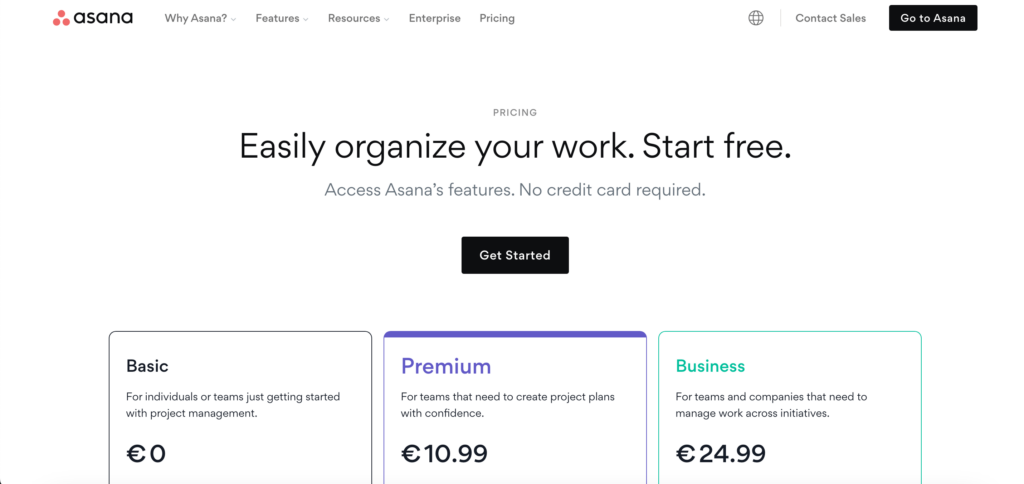
Asana’s pricing page captures users’ attention with free signup and “No credit card required” to access all features, followed by a “Get Started” call-to-action button.
This is an excellent strategy to get potential customers to use your product immediately with no risk, and the copy reflects that. Additionally, the platform uses a freemium model, so people can use Asana until they’re ready to use the premium features.
Freemium pricing models are an excellent way for users to use your product without risk or obligation. As the tool integrates into their daily workflow, they are less likely to leave, increasing the likelihood of converting to a paid plan as their needs grow. Thus, the design prioritizes this business decision.
Help Scout
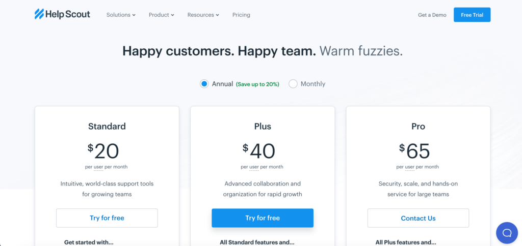
Help Scout’s pricing page highlights the brand’s core message of helping people–perfect for a customer service SaaS platform. The simple three-tier pricing table highlights the company’s best plan with a bright blue button, utilizing color to their best advantage.
Help Scout uses two radio buttons for users to switch between annual and monthly pricing and highlights the 20% saving for the annual payment (Learn more about persuasive design patterns.)
Help Scout also follows the rule of third in their pricing page table design. They show you three different plans, and it is only below the table that they mention offering special plans for nonprofits.
Help Scout is a Certified B Corporation, planting a tree for every new customer. This environmentally-friendly commitment makes customers feel good about their buying decision, strengthening Help Scout’s brand of helping people.
Psychology and UX design have their overlapping areas. Learn more about it in the article: Should UX designers be aware of psychology?
Google Workspace
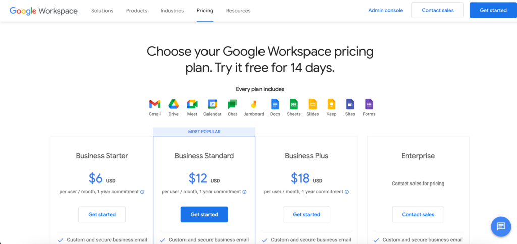
Google Workspace’s pricing page announces the platform’s 14-day trial in the heading and pricing models in the subheading. Adding these pricing options high on the page outside of the tables makes it easy for users with screen readers to get pricing fast. This pricing introduction is an excellent example of accessibility benefiting all users, as everyone can read and understand Google Workspace’s pricing instantly.
Google uses icons with text to showcase what customers get with every plan, allowing people to decide without scrolling. The pricing page also highlights the “MOST POPULAR” plan, with a bright blue “Get started” call-to-action button.
Another excellent user-friendly feature is the sticky secondary header keeping the four pricing plans and CTAs visible as users scroll down the comparison table. Users never have to scroll up to remember which plan they’re viewing and can take action as soon as they decide.
Mailchimp
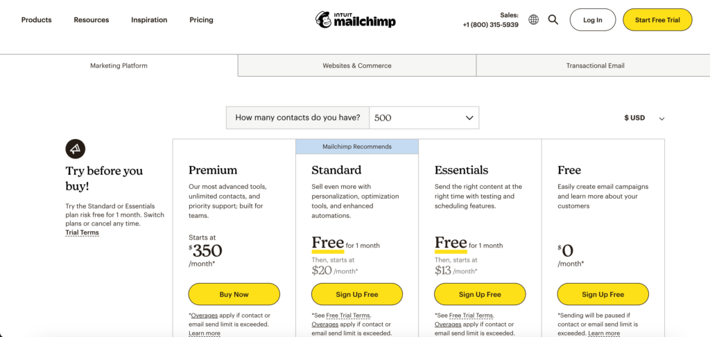
Mailchimp’s pricing page features three product categories and multiple plans within each. Designers use tabs below the header to separate the three categories, keeping the UI clean and easy to read.
Mailchimp displays two dropdowns above the pricing table, one for the number of contacts and a second currency switcher, which is a great thing to replicate if you create multiregional UX experience.
This layout from Mailchimp is an excellent example of understanding what users need and fitting a complex pricing model above the fold so they don’t need to scroll to make a buying decision. For B2B sales teams looking to personalize outreach at scale, platforms like Sendspark can integrate with these pricing pages to deliver personalized video messages that convert prospects at different price tiers into customers.
Hubspot
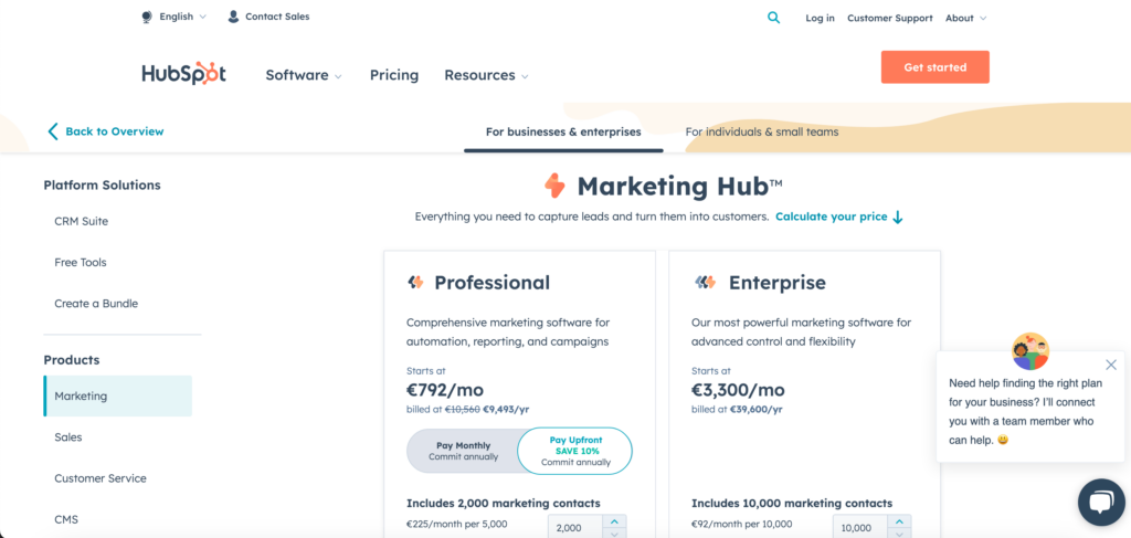
Hubspot’s pricing page is another example of a complex yet user-friendly pricing design. Like Mailchimp, Hubspot’s designers have done an excellent job of keeping everything on one page with the most crucial information above the fold.
Hubspot uses two tabs below the header to separate pricing categories for enterprise vs. small businesses/individuals. A left sidebar shows Hubspot’s bundles and the company’s five products with a currency switcher.
Hubspot offers three pricing models:
- Annual commitment pay upfront
- Annual commitment pay monthly
- Month-to-month
Hubspot also gives users more control with an option to create a custom bundle and purchase specific add-ons depending on their needs.
Simplified
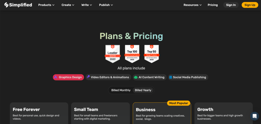
Simplified uses awards and social proof from real users, including social media posts, to demonstrate the product’s success. Like Google Workspace, the pricing page shows what every plan includes above the pricing table.
A switcher enables customers to view pricing billed monthly vs. yearly. When yearly is selected, a new UI element appears on each table showing the relevant discount.
Simplified’s four pricing tiers provide a “Best for…” below each plan, allowing users to understand which option best suits their needs–i.e., personal use, small teams, growing teams, and high-growth. This detail is helpful as it answers “which one is right for me?” You can easily replicate this by addressing your plans to your user personas.
Pricing Page Prototype With UXPin
Your website’s pricing page is the most crucial web page. Designers must use buyer personas when designing pricing pages to understand what users need to make a buying decision.
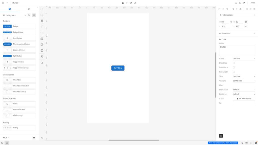
With UXPin’s advanced prototyping features, designers can build prototypes that accurately replicate the pricing page experience, including complex UI components and interactivity.
- Use States to create monthly/yearly pricing switchers, tabs for multiple pricing categories, component states, and much more.
- With States and Variables, you can create a fully functioning stepper to show pricing when users increase/decrease seats, contacts, etc.
- Keep user interfaces clean by hiding less critical content like FAQs behind accordions.
- Create dropdown menus for users, CRM contacts, currency switchers, etc.
In addition to pricing pages, designers can prototype the onboarding user experience with fully functioning signup forms and APIs. With UXPin’s advanced prototypes, designers can identify potential roadblocks while discovering valuable business opportunities during the design process. Try UXPin for free.


![What is Contrast in Web Design? [+7 Tips How to Use it]](https://studio.uxpincdn.com/studio/wp-content/uploads/2023/02/Contrast-in-Web-design-1.png)


