The Persona of a Great Design Leader

design leader

Design leaders champion the design team, user experience, and, most importantly, an organization’s users. They create the company’s design vision and clear a roadmap for designers to achieve its goals and milestones. 

This article explores the design leader’s role, including advice from two highly experienced industry experts who have worked in leadership positions at UXPin, Microsoft, Google, Yammer, O’Reilly Media, and GitHub.

Lead confidently, knowing your designers work with the world’s most advanced digital product design tool. Sign up for a free trial to explore UXPin’s features and start building better user experiences for your customers.

Build advanced prototypes

Design better products with States, Variables, Auto Layout and more.

Try UXPin

What Does a Design Leader do?

Design leaders (Head of Design) guide the design team’s vision and strategy within an organization. They establish and uphold the organization’s design principles and standards while ensuring the design team delivers high-quality work.

A design leader’s responsibilities vary depending on the organization, product, and design team’s needs, but generally, they are strong design advocates who work closely with a company’s leadership team and executives.

Here are some examples of a design leader’s responsibilities:

  • Setting an organization’s design vision and UX strategy
  • Ensuring designers maintain a human-centered mindset focused on solving user needs
  • Mentoring and coaching design team members on design thinking, problem-solving, and career development
  • Maintain a positive user experience and understand how this impacts the overall customer experience
  • Cross-functional collaboration to integrate UX across the product development process
  • Working with senior leadership to align design goals and business goals
  • Setting design principles and standards while ensuring design teams apply these correctly and deliver their best work
  • Managing the department’s budgets and resources
  • Overseeing the recruitment, hiring, and retaining of design talent
  • Leading design projects and initiatives from concept to launch
  • Create effective and efficient workflows for successful, high-quality project delivery

What is the Path to Becoming a Design Leader?

Becoming a design leader typically involves several years of design experience and a track record of delivering successful design projects and initiatives.

Here are a few key steps organizations typically want when hiring a design leader:

  1. A strong design foundation: A bachelor’s degree in a design-related field such as graphic design, industrial design, or user experience design.
  2. Design role experience: working in various design roles will help you gain the knowledge, perspective, and expertise necessary to lead the department.
  3. Skills development: design leaders never stop learning. From early in their careers, they’re constantly studying to develop further skills and expertise–most notably, developing design, technical, management, business, and leadership skills.
  4. Demonstrate leadership potential: to become a design leader, you must demonstrate a desire and track record for leading teams and projects. You must be proactive, informing leadership and management of your ambition to become a design leader so they can give you more opportunities to prove yourself and help with skills development.
  5. Climb the ladder: once you have a strong design foundation and some success leading teams, you can begin applying for promotion to design manager, director, and eventually design leader. Beyond that, you can aspire to VP and C-suite positions.

What are the Qualities of an Effective Design Leader?

In 2017, UXPin’s founder Marcin Treder (now a Senior UX Design Manager at Google), penned his thoughts on what makes a great design leader.

Marcin wrote the following in 2017…

An African proverb says: “If you want to go fast, go alone. If you want to go far, go together”. Maintaining unity without disrupting efficiency is the pinnacle of work for a design leader.

The end game for a great leader is a successful team. A team that then consistently delivers valuable user experiences to the market.

Design leadership greatness comes in many flavors, but at the core lies a common set of experiences and skills.

Great design leaders help teams and users meet their goals.

We might work in completely different organizations and with entirely different products, but some aspects of being a design leader remain the same:

1. Great design leaders are seasoned practitioners, ready to give up the craft

I imagine a great design leader who is not a designer at all–someone who can lead with a love for design and their team. A person with a clear understanding of the design process and the determination to create a vision to help users.

Leading designers without experience is an enormous challenge in building trust and respect, making part of the job challenging–namely, giving tactical feedback or helping designers upskill.

While I’m sure there are great non-practitioner design leaders–I’ve yet to meet one. Typically, great design leaders are experienced practitioners who discover that they do their job better by scaling through a team.

team collaboration talk communication ideas messsages

Instead of directly designing user experiences, design leaders do it indirectly by shaping amazing teams. Growing their design skills becomes secondary to the help they can offer to their teams. They gradually give up the design craft to develop the organization’s design efficiency.

Design leaders design indirectly – through the work of their teams.

Having said that – most design leaders, including yours truly, continue to tinker with small weekend side projects. Why? Because we absolutely love it.

2. Great design leaders are empathetic and generous with their time

A design leader’s primary function is firing themselves from a design job–they need to get out of the way so others can do great work. The best design leader must become the worst designer on the team.

Growing the team’s abilities is the shortest way to scaling design in an organization. Unfortunately, it’s not an easy task. It requires time and a saintly amount of empathy. You have to be there for your team and help them become much better than you are.

3. Great design leaders are preachers and listeners

In my experience, designers are typically more preachers than listeners. Even when we listen, we listen for our turn to comment. And when we comment, we want to be right.

Being a successful design leader requires much more.

In a way, we have to apply the practice of user research to our teams so we can truly understand the problem. We have to listen. And our preaching becomes something completely different.

To make the voice of design heard loud and clear in an organization, we have to be outspoken. But it’s not our voice that the organization needs to hear. It’s the voice of our team.

Great design leaders listen to preach and preach to listen.

Design leaders should serve as loudspeakers for the team to amplify their message. At the same time, design leaders should coach the team to listen to others and be empathetic.

4. Great design leaders are goal-oriented fighters

Great design leaders are fighters tirelessly fighting for the team and users. Both groups need strong advocates in an organization. Both groups want a superb experience. It’s a design leader’s job to remove all obstacles.

The Design Leader Persona

When I realized there’s so much that design leaders have in common, I decided to use a very familiar concept to illustrate it. I created a design leader persona.

Feel free to use this persona to shape your design leadership program, promote and hire design leaders, or use it as a conversation starter about design leadership.

design leader persona sheet

Design Team Leadership best practices

We chatted with Design Leadership expert Cindy Alvarez who shared six best practices from her experience in leadership roles at Yammer, GitHub, Microsoft, and O’Reilly Media.

Here is Cindy’s advice in her own words:

1. Demand objectives from the people you’re working with

Your job as a designer is to solve problems–not to make things look pretty. To do your job, you need to understand the who, why, when, what, where, and how.

People will try to hand you a spec or a list of requirements and say, “I’ve already thought about this a lot; just design it.” Don’t accept that. Insist, politely but firmly, that they tell you what the main goals of this project are.

For any project, one can say, “if it doesn’t achieve X and Y, then we’ve failed.” Are you trying to sell or educate? Reassure or challenge? Are you encouraging exploration or optimizing for speed? Is this a one-time signup or an everyday task? Is the audience skeptical or already enthusiastic?

designops efficiency arrow

People will suggest that you just use a lightbox, the same styling we used for feature Q, or just copy what Company Z is doing. These might be the best solution, but you won’t know unless you push back to the defined objectives.

“OK, I like how Facebook uses that design element to solve X problem. Are we solving X problem, or is our situation different?” or “Yes, using that green button style would be consistent with what we’re doing on screen Y. But on screen Y, the user is completing a one-time configuration; in our case, we’re trying to make a common task as fast as possible. Does it make sense to force consistency for different behavior types?”

2. Shine some light on the design process

I also call this “don’t be magic.”

If you’re a skilled designer and an intuitive listener, you can combine what people are saying and not saying, deduce what they’re hoping to end up with and make it magically appear on your screen. Voila! People will love you for this. It’s a critical skill for early-stage startups and design emergencies.

It’s also terribly non-scalable. It allows people to believe that they are communicating clearly when they’re not. It will enable people to think that design is “just drawing” and that the thousands of implicit decisions you make about visual priority, color, scale, and ordering are arbitrary.

You need to translate out loud: “So it sounds like you’re asking for X and Y, and you like how Company Z solves this problem because they have these similarities to us. And you’re looking to solve problem Q. Is that right?”

You need to explain your design decisions: “I’m using this style because it emphasizes element A, which is the most important action a user must take. I’m deliberately not copying what we do for feature B because the target user is completely different.”

3. Fight for what you believe in (pragmatically)

In past jobs, I’ve worked with designers who were at opposite ends of this continuum:

“Tell me what to design, and I’ll crank it out” < — — — — — > “change 1 pixel, and you’ll destroy my masterpiece.”

Neither is productive. And it’s incredibly hard to learn where on that spectrum is the most effective for you, your personality, and your organization. But you’ve got to try.

If you believe adding that fourth link will clutter the UI, speak up and explain why. Feel free to express your doubts and the risks. And then, if your stakeholders disagree, pick your battles. Sometimes it’s worth it to fight to the death. Usually, it’s not.

4. Be clear on what you will deliver and when

These are the questions that people will have but usually don’t ask:

  • How likely are these designs to change?
  • How final are the details like fonts, icons, and images?
  • Are you going to illustrate the interaction, or will this be static?
  • Are you illustrating the core use cases, multiple edge cases, and usage scenarios?
  • Will everything be done, or ‘enough to get started’?

You’re better off listing what you’ll deliver in writing, with the above questions answered and a date. It will feel like overkill. It will prevent a lot of misunderstandings. Use it as a checklist.

5. Recover and compensate

If something comes up (and it will) and you cannot deliver what you promised, immediately reach out and offer a plan for getting back on track.

Ask to make sure that’s the most convenient/effective plan for the people on your project.

Do not let a deadline slip without a word. Do not go off without a word; work in silence, and re-emerge three days later with all the work done. Speak up immediately, so no one has to wonder or go looking for you.

6. Always be thinking about how we could be doing things better or smarter

Our process is not there to constrain you; it’s there to help the team work more effectively. If it’s not working, chafing at it and making yourself miserable will not help. Trying to sneak around the rules won’t help, either. Complain constructively so we can fix it.

If you find yourself doing the same task repeatedly, stop and ask if there is a way to automate or simplify it. If you feel like your work is wasted, stop and ask why.

Or, if you did something extraordinary, stop and teach your peers what you did. Share successes. Rehash good meetings and projects, not just bad ones. Analyze why things went well, and try to reproduce.

Thank you to Cindy for sharing these tips from her professional career. You can learn more about Cindy via her website or connect with her on LinkedIn.

Go From Good Design to Great Design With UXPin

UXPin is the world’s most advanced end-to-end design tool, enabling design teams to create prototypes that look and feel like the final product.

Here are four key features that set UXPin apart from traditional image-based design tools:

  • States: create multiple states for any element, each with separate properties and interactions.
  • Variables: capture user inputs and take action based on the data to create dynamic, personalized user experiences during testing.
  • Conditional Interactions: create “if-then” and “if-else” rules to execute different reactions to user actions and inputs.
  • Expressions: design functions to perform complex operations traditionally only available with code, including form validation, computational components, simulate password authentication, and more.

Take your design team to the next level with advanced, interactive prototypes that look and function like the final product. Sign up for a free trial to explore UXPin’s features.

Experience Design — What is it and How Does it Relate to UX?

experience design

Experience design is a fast-growing design discipline focused on creating meaningful experiences. Experience designers use an interdisciplinary approach combining design, psychology, and technology to develop user-centered digital products.

This article explores experience design fundamentals and how practitioners use human-centered design techniques to create engaging product and service experiences.

Prototype and test your experiences with final-product fidelity and functionality with UXPin. Explore UXPin’s advanced prototyping features. Sign up for a free trial.

Build advanced prototypes

Design better products with States, Variables, Auto Layout and more.

Try UXPin

What is Experience Design?

Experience design is a process of creating a physical or digital experience of products or services in a way that it engages the people and draws them in. It involves curating every detail across multiple touchpoints and may include what people see, hear, smell, taste–and above else–feel.

Experience Design Example: Disney World

disney experience design example min

Disney World is an excellent example of physical experience design. The Disney team designed a carefully curated experience from the time someone enters the gates until they leave.

The park’s experience design team will likely include hundreds of stakeholders and collaborators, each with different responsibilities, including architects, builders, interior decorators, landscapers, graphic designers, artists, choreographers, and actors, to name a few. Read more about Disney World’s experience design here.

Digital Experience Design

In digital product design, the experience will include physical and digital experiences and often considers how these intersect.

For example, a food delivery app will analyze how someone at work might order lunch: 

  • What are they doing before picking up their phone?
  • What triggers them to place an order?
  • What steps do they take, from picking up their phone to completing the order?
  • What is their experience while using the application? How does the organization curate this experience for users? i.e., do they want them to feel happy or excited, and how must the design influence this?
  • What happens when the food arrives?
  • How do they open and serve their food? Do they transfer it to a plate or eat it out of the box?
  • Do they eat at their desk or in the cafeteria?
  • What do they do with the packaging? Do they recycle it or throw it in the trash?

Considering experiences holistically is crucial for digital product design because it helps product teams understand user behavior, triggers, motivations, and other factors beyond the digital realm, which ultimately impact how and why someone uses a product.

Why is Experience Design Important?

Experience design is crucial for any industry because it influences how people feel when they use a product or service. It also impacts brand perception and the overall customer experience.

user search user centered

Giving people a good experience improves satisfaction and loyalty while differentiating a brand from its competitors. To design this experience successfully, the design team must understand user needs, preferences, expectations, motivations, and other critical factors. Get this experience wrong, and you’ll drive people away rather than attract them.

Experience Design vs User Experience Design

Experience design and user experience design are closely related disciplines with a lot of overlap, but there are subtle differences.

While user experience design refers to the end-user’s experience with a digital product, experience design goes beyond the product. It touches all the senses and it refers to the full customer journey, like experiencing customer service, sales, marketing, onboarding, and offboarding.

User experience design

User experience design refers specifically to the interactivity and usability of a digital product. UX designers aim to create an intuitive, enjoyable user experience, enabling users to complete tasks and actions effortlessly.

Experience design

Experience design refers to any experience (physical and digital) and considers a holistic customer journey, including sensory and emotional elements. Where UX designers are typically responsible for user experience design, the responsibility of experience design will depend on the product, service, or industry. 

For digital products, a typical experience design team will include a cross-functional unit which may consist of team members from:

  • UX design
  • Product
  • Graphic design
  • Branding
  • Marketing
  • Engineering
  • Customer service

Experience Design Process

The experience design process uses identical design frameworks to UX using design thinking and a human-centered design approach.

idea collaboration design dev 1

Service and Interaction Designer Marion Baylé describes how the creative institution, Hyper Island, uses the Double Diamond model to educate students on designing experiences through four phases:

  1. Discover
  2. Define
  3. Develop
  4. Delivery

Discover

The discovery phase involves researching your target audience’s needs, motivations, behaviors, and challenges. Marion argues that interviews are the best experience design research method and reiterates this in her article with an Ideo quote:

“There is no better way to understand the hopes, desires, and aspirations of those you are designing for than by talking to them directly.”

Researchers must speak to the right target audience and interview a diverse subset within the user group(s).

Other experience user research methods include:

  • Desk research: Qualitative and quantitative research on the organization, market, competitors, experts, published papers, etc.
  • Surveys: enable researchers to gather lots of data quickly. Marion emphasizes the importance of asking the right questions to get meaningful feedback.

Define

Next, researchers synthesize the discovery data to define problems and identify opportunities. Experience designers use tools familiar with UX, including:

  • User persona: a fictional representation of a target audience representing their demographics, needs, desires, problems, etc.
  • Experience map: visualizes the persona’s “journey within a given domain by focusing on the broader context of human activity.”–a more complex and holistic version of a typical customer journey map. 
  • Design synthesis: a collaborative “sensemaking process” where researchers summarize and synthesize data to reach a consensus.

Develop

Develop is an ideation process where experience designers use various methods to push creative thinking and develop many ideas quickly. Some examples include:

  • Crazy 8s: a sketching exercise where designers must create eight ideas in eight minutes.
  • How might we (HMW): a problem-solving Q&A exercise.
  • Worst possible idea: an out-of-the-box creative thinking process to generate innovative ideas.
  • Impact/effort matrix: a technique for ranking and selecting the best ideas.

The aim is to have a handful of ideas to prototype and test.

Deliver

The final phase is an iterative prototyping and testing process. Experience designers start with low-fidelity prototypes to narrow ideas to the best solution. The higher the fidelity, the more time and resources are required to create them. So, design teams must eliminate poor-performing ideas during low-fidelity prototyping.

Some of the prototyping techniques used during the deliver phase include:

  • Paper prototyping (low-fidelity): hand-sketched wireframes of user interfaces that enable designers to test various ideas and user flows quickly.
  • Wireframing (low-fidelity): once designers have completed paper prototyping, they recreate the paper mockups in a design tool and connect navigational elements to build user flows.
  • Interactive prototyping (high-fidelity): prototypes that accurately resemble the final product’s fidelity and functionality, including color, microinteractions, transitions, animations, etc.

Experience designers test these prototypes with stakeholders and end-users, iterating until they develop a successful solution. Unlike UX designers who focus on users and usability, experience designers want to create a more holistic, meaningful experience that aligns with the brand, product, users, and real-world activities.

Validate Design Decisions With Interactive Prototyping in UXPin

UXPin is an advanced design tool allowing designers to create final product-like prototype experiences for meaningful results during the design process. These advanced prototypes enable designers to spot more opportunities and solve more problems during testing resulting in a higher-quality final product.

Higher fidelity = better experience testing

Experience design relies on accurate prototypes to test ideas and hypotheses. The problem with traditional image-based design tools is they focus on visual design rather than interactivity. Your prototypes look great but don’t function like the final product, meaning designers don’t get accurate data.

UXPin is an all-in-all design tool that looks and functions like any other popular design tool but renders code instead of vector graphics. This code rendering gives design teams the same prototyping capabilities as front-end developers. Using UXPin’s advanced features, designers can achieve prototyping results comparable to a code prototype.

Exploring UXPin’s advanced prototyping features

Four key features set UXPin apart from other popular design tools:

  • States: enable designers to create multiple states for a single UI element and build complex components like dropdown menus, steppers, carousels, accordions, and more.
  • Interactions: UXPin provides many Triggers, Actions, and Animations to design immersive prototype experiences. Designers can also use Conditional Interactions to create Javascript-like dynamic interactivity that responds to user actions.
  • Variables: collect data from user inputs and use it elsewhere in the application–exactly how variables work in code. Designers can use these variables to personalize user interfaces to give test participants a meaningful, real-world experience.
  • Expressions: allow designers to enhance prototype complexity with form validation, computational components, dynamic error messages, and more. When combined with States, Interactions, and Variables, Expressions enable designers to create functionality comparable to code.

Whether you’re building a new product or redesigning an existing one, UXPin’s sophisticated prototyping features empower design teams to create immersive, interactive experiences. 

These prototypes don’t only offer benefits for testing but enhance designer/engineer collaboration and understanding. Engineers and stakeholders don’t have to “imagine” something happening or use generic data; UXPin prototypes do it!

Design, prototype, and test experiences with the world’s most advanced design tool. Take your user interface design and prototyping to the next level and create digital products your customers will love with UXPin. Start interactive prototyping with UXPin today. Sign up for a free trial.

Design System Maintenance — How to Keep Design System Up to Date?

design system maintenance

Building a design system is no small feat–but that’s just the first step. Design system maintenance is a continuous operation requiring human, time, and financial resources to evolve and mature it.

UX, technology, regulatory, product, and organizational changes require the design system team to manage and update many facets of the design system. This article provides a high-level overview of maintaining a design system, including its governance, audits, roadmap, and maturity.

Optimize your design system’s operational challenges and reduce maintenance with UXPin Merge. Sync design and development to create a single source of truth, reduce debt, and eliminate drift. Request access to Merge.

Reach a new level of prototyping

Design with interactive components coming from your team’s design system.

Treat Your Design System Like a Product

In a Medium article, Nathan Curtis, founder of UX and design systems agency EightShapes, said, “A Design System isn’t a Project. It’s a Product, Serving Products.” 

Framing your design system as a product means the design system team must manage several key aspects:

  • Marketing: increasing design system adoption, update/release announcements, news, etc.
  • UX: creating a good design system user experience (for designers, engineers, product teams, etc.)
  • Engineering: writing and maintaining scalable, error-free code
  • People management: building a successful design system team–even if it’s a team of one
  • Operations: procedures, systems, tools, etc.
  • Governance: process and protocols for maintaining and updating a design system
  • Customer service: logging support tickets and helping users solve problems with component/pattern recommendations
  • Communications: talking to users, advocates, and stakeholders

Effective design system maintenance requires the DS team to create systems and protocols beyond updating pattern libraries to increase the product’s adoption and lifecycle.

design system components

For example, if you have an amazing design system with beautiful code and UI elements, but no one is using it, or it doesn’t deliver a return on investment, stakeholders will likely sunset the project or replace team members.

Start With Governance

Maintaining a design system requires good governance. It’s best to define these before launching your design system so that you’re ready to handle any issues and requests.

These are seven key areas your design system governance must address:

  • Bug reporting and fixing: how do users report bugs, how do you keep a backlog, and how does the team fix these issues?
  • Introducing elements: what is the procedure for adding new components?
  • Promoting patterns: how does the design system team decide whether a new pattern is a one-off or best new practice?
  • Reviewing and adapting patterns: procedures for ensuring new patterns meet design system guidelines and principles.
  • Design system releases: defining a consistent release schedule and quality assurance procedures.
  • Design system auditing: how often do you audit the design system, and what are the methods for analysis and reporting?
  • Documentation: procedures for updating documentation.

Codifying Your Design System

Design system codification organizes a design system’s UI components into a searchable archive or hub with guidelines, principles, documentation, tutorials, governance procedures, and more.

design prototyping collaboration interaction

Here are 11 things to consider when codifying and maintaining your design system’s documentation hub:

  1. Display your design principles and values on the design system’s homepage to remind users whenever they visit.
  2. A brand style guide is essential for maintaining design and copywriting consistency.
  3. The writing style guide provides instructions for all copy, including content, marketing, ALT text, and UX writing–i.e., voice, tone, grammar, slang/jargon/joke/language policies, structure, messages, and labels.
  4. Your design system’s best practices include a list of methods, tools, and processes–for example, how to use image assets or which design tool to use.
  5. Your design system’s website/hub must have easy, searchable navigation so product teams can find components and documentation.
  6. The DS team must provide clear governance for contributing and bug reporting. For example, adding forms on your design system’s website or creating specific Slack channels.
  7. The component library must include an example of each component, a code snippet, interactivity guidelines, use cases/implementation, dark/light variations, dos and don’ts, and variations (size, shape, colors, etc.).
  8. Your color palette must include a swatch and relevant color codes for each platform (iOS, Android, Web, etc.).
  9. Include a complete list of your product’s icons and variations, i.e., outline, circular, color, etc.
  10. Display approved fonts with examples for the various styles, like bold, semibold, regular, light, italic, etc.
  11. Include a list of tools for design, development, accessibility, and cloud storage.

Correctly codifying your design system will reduce errors, increase adoption, and streamline onboarding.

Design System Audits

Design system maintenance starts with a comprehensive audit–if you don’t know what’s wrong, how can you fix it? Design agency Ramotion provides a step-by-step approach for auditing a design system. This audit will assess the following:

  • The design system’s quality
  • Identify gaps
  • Assess resources
  • Analyze consistency
  • Update documentation
design and development collaboration process product communication

It’s important to schedule regular and consistent design system audits. This schedule will depend on the size of your design system and available resources. 

  1. Step one – Create clear audit goals: where will your audit focus, and what are the desired outcomes (reporting, recommendations, actions, etc.)? Over time, you’ll want to develop frameworks for different outcomes to maintain consistency.
  2. Step two – Analyze your resources: the necessary budget, time, and human resource allocation to achieve your audit goals.
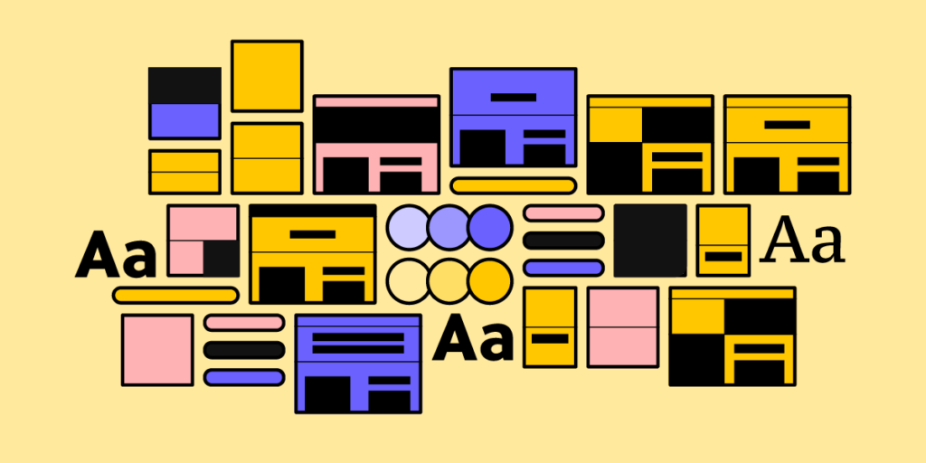
  3. Step three – Conduct a design inventory: the design system team catalogs the component library’s UI elements, patterns, and templates, including the corresponding documentation. They also catalog policies, principles, brand guidelines, and other parts of the design system.
  4. Step four – Categorize UI elements: group UI elements and patterns by categories as they appear in your design system, i.e., buttons, icons, forms, etc. Placing everything side-by-side in categories enables one to visualize the entire design system.
  5. Step five – Identify redundant and missing components: completing step four helps identify duplications, redundancies, and missing components easier. For example, you may notice two buttons with slight variations, which could be redesigned into one element to serve both purposes.
  6. Step six: – Analyze the visual and typographic elements: this step includes all visual elements beyond your components and patterns, including color palette, images, fonts, etc. Does the system apply these properties correctly, and are there any inconsistencies?
  7. Step seven – Perform an accessibility analysis: design system accessibility is the foundation for building accessible user interfaces. Auditors must review accessibility policies and confirm these have been applied correctly across the entire design system. They may also check Web Content Accessibility Guidelines (WCAG) for updates and ensure the design system and its digital products remain compliant.
  8. Step eight – Consider the branding guidelines: auditors must assess components and copy to ensure the entire design system meets brand guidelines.
  9. Step nine – Create a roadmap for the future: use your findings to create a plan and roadmap to fix any issues from the audit.
  10. Step ten – Present your findings: the final step is to present your findings to stakeholders, which may include requesting buy-in for resources to execute your design system roadmap.

Create and Share Your Design System Roadmap

A design system roadmap outlines tasks, milestones, timelines, and deliverables as they relate to:

  • Recent releases
  • What the DS team is currently working on
  • What they will work on next
  • Future releases (6-12 months)

At the end of every audit, the design system team must update this roadmap to align with any updates or changes. For example, the product might be undergoing a redesign, so the team must update the component library. The audit will determine which elements the team must update and how long it will take.

A design system roadmap will influence two other important aspects of its ongoing maintenance:

  • Changelog: chronologically-dated releases and notes
  • Version control: the ability for teams to switch to any available version of the design system

Measuring Your Design System

The DS team must use KPIs to measure the design system and its impact on product development. These KPIs also identify problem areas and where to focus.

design system atomic library components

For example, if adoption remains stagnant, the team must market it better or interview non-users to understand why they’re not using the design system.

 Some design system KPI examples include:

  • Adoption: % of users using the design system and its growth over time
  • Debt (UX & Front-end): the design system’s impact on debt
  • Efficiency: measure how long it takes for teams to build products using the design system vs. not using it. Also, measure how this efficiency changes over time.
  • Time to market: how the design system impacts time to market–again, with the design system and without, and how this changes over time.
  • Writing code: how does the design system reduce writing code, and how this relates to adoption over time.

Design System Maintenance – Michael Todd’s Frequency of Function

Design systems Manager Michael Todd describes his “Frequency of Function” in a Medium article about maintaining a SaaS design system with a small team of two.

Daily tasks:

  • Lead UI design decisions
  • Design system advocacy
  • DesignOps facilitation

Weekly

  • Collaborate with front-end engineers
  • Facilitate design pattern compliance
  • Run a design pattern guild
  • Tracking and reducing UX debt
  • Meet with various stakeholders
  • Maintain and improve design tool libraries

Monthly

  • Consult on the product’s UI design direction
  • Mentor UX designers on systems thinking
  • Anticipate future design system needs

Quarterly

  • Update style guides and documentation
  • Network with product leads and stakeholders

Annually

  • Update the design system’s goals and roadmap

Streamline Design System Maintenance With UXPin Merge

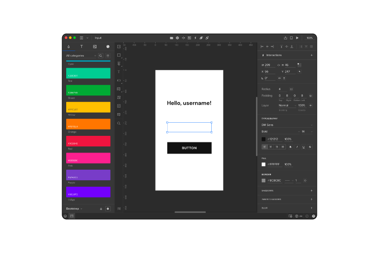
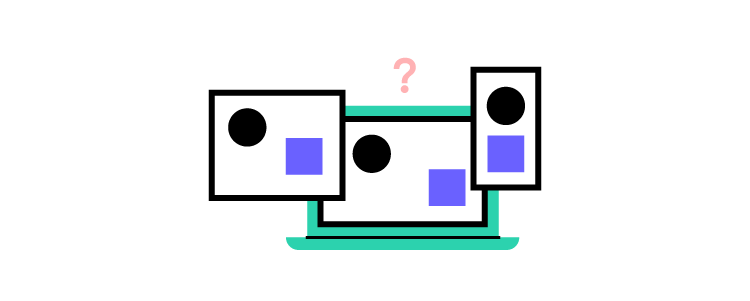
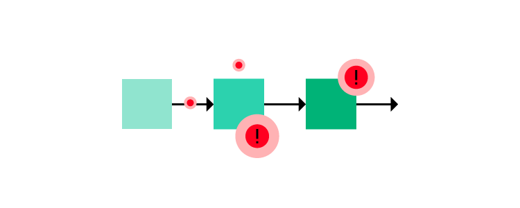
One of the biggest challenges with maintaining a design system is managing and updating separate systems for designers and engineers. Designers use UI kits for design tools, while engineers work with a component library hosted in a repository.

UXPin Merge bridges the gap between design and development by syncing a design system from a repository to UXPin’s design editor, so designers use the same UI components during the design process as engineers use for development.

This single source of truth offers several key benefits for design system maintenance:

  • Managing one component libraryno more image-based static UI kits.
  • No designing from scratchMerge components include properties and interactivity defined by the design system. Designers drag and drop components for an efficient product design workflow.
  • Less front-end development workengineers already have the same pattern library, properties, styling, and interactions.
  • No design driftsignificantly reducing UX and front-end debt.
  • Built-in version controlversioning automatically synced between design and development. Designers can choose when to update and switch to any earlier version of the design system.
  • Seamless handoversenhance workflows to demonstrate the design system’s value, thus increasing adoption while winning resources from stakeholders.

Reduce operational and maintenance redundancies with UXPin Merge–the world’s most advanced end-to-end design tool with sophisticated design systems capabilities. Request access to Merge.

Website Design Ideas for Practicing Design

website design ideas

We’ve put together some of the best website design ideas to delight and inspire you. We’ve also created a seven-step process to generate ideas based on your target audience’s needs and business goals.

Whether you’re a design agency, startup, small business, or solopreneur looking for inspiration, this article will guide you through the best web design trends and how they solve users’ problems.

Prototype and test your website design ideas with UXPin–the world’s most sophisticated design tool. Sign up for a free trial to explore UXPin’s advanced features and create better user experiences for your website’s visitors.

Build advanced prototypes

Design better products with States, Variables, Auto Layout and more.

Try UXPin

How to Create Website Design Ideas

For most businesses, the goal is to attract customers using your website. While aesthetics and visual design are essential for great website design, a user-centered mindset is crucial for your website’s success.

This seven-step process will help determine which website ideas and features work best for your target audience.

Conduct thorough user research

User research includes gathering data about your target audience, their needs, goals, and motivations. UX designers use various methods to collect this data and create user personas, including interviews, surveys, usability testing, and focus groups.

Identify the website’s main objectives

Use your research to determine your website’s primary goals and how it will serve users. It’ll also help you create the messaging and language. For example, a website targeting a teenage audience will look very different from one designed to attract retirees. These users will have different needs and priorities, which is why step one is so important.

Create a user journey map

A user journey map is a visual representation of the steps users take to achieve their goals on the website. It helps to understand the user’s perspective and identify potential pain points and areas for improvement.

Generate design ideas

Use your user research and journey maps (you may have several user flows) to brainstorm design ideas that can help users achieve their goals and solve any pain points identified. UX designers often use sketches and paper prototypes to generate many ideas quickly.

Refine and prioritize the ideas

Review your ideas and select those that align with the website’s objectives and offer the most value to the users. Prioritize the ideas based on their importance and feasibility.

Create wireframes and prototypes

Use the best ideas to create website wireframes and prototypes. Wireframes help visualize the website’s structure and define the information architecture.

You can use the wireframes as a foundation for high-fidelity prototypes to test your ideas and gather feedback from your target audience, other designers, and stakeholders.

Iterate and refine

Use the feedback to make changes and refine your designs. Repeat this process until you have a final website that meets user needs while achieving your business goals–i.e., more signups, sales, blog views, etc.

5 eCommerce Website Design Ideas

Creative hover effects

Ukrainian-based brand Mr. Pops uses a clever emoji hover effect for its product images. This small design choice surprises users while creating a fun and positive brand impression–perfect for an ice cream store.

Key takeaway: be detail-oriented and find subtle ways to be creative and engage users. These small details help brand awareness and encourage people to buy from your online store.

On-brand color palette

Popcorn eCommerce brand Popcornopolis uses bright colors to increase brand awareness and highlight each page’s most important features. Designers have also done a fantastic job of keeping the most important content and CTAs (call-to-action) above the fold on product pages, enabling users to get to the checkout and complete a purchase fast.

Key takeaway: your color scheme is one of the most critical brand elements, but it must also help users complete their goals. It’s also vital to prioritize content and display the most important design elements above the fold to reduce scrollingthis will get users to complete purchases faster.

Bold minimalist typography

Wukiyo uses bold minimalist typography to make text easy to read. The website also uses oversized buttons with a bright blue for the most important CTA–”ADD TO CART.” The blue stands out from the website’s otherwise muted color palette.

Key takeaway: choose a legible font that’s easy to read. You also want to prioritize content, so you only present enough for users to make decisions. And lastly, always make sure your most important CTA is prominent using size and color.

Shopping cart drawer

Premium soda brand Perfy uses bold colors and UI elements to reinforce its brand and product range. A drawer opens when someone adds a product to the cart, revealing the shopper’s basket with a CTA to checkout.

The drawer also provides important messaging to help alleviate any hesitation, including Perfy’s shipping and refund policy. Below that, there are recommended products to increase business value.

Key takeaway: design ways to get users to checkout effortlessly while anticipating and addressing any hesitations. Make sure you use clear, succinct language so users can comprehend messaging quickly and make a decision.

Above the fold product page

Like Popcornopolis, Verve Coffee Roasters uses an above-the-fold, 3-column product page layout. Ample whitespace surrounds the primary CTA with price and quantity selection to help the most important prominent. The product details use keywords rather than lengthy descriptions so that users can make a decision quickly.

Verve’s cart drawer informs shoppers about free shipping while recommending related products to increase transaction value.

Key takeaway: optimize product pages for scannability and reduce the need to read whenever possible by combining text and graphics. Less is always more–don’t be afraid of using white space to make important content stand out. eCommerce web design must incorporate opportunities to increase transaction value with upsells and cross-sells.

5 SaaS/Digital Product Web Design Ideas

Minimalist pricing page design

11Sight’s pricing page uses a black-and-white design with bright green accents to highlight important content and actions. Designers also use a contrasting layout to draw attention to the product’s premium plan, which offers the most value to users and the business.

Key takeaway: design pricing pages that are easy for 

website visitors to understand with minimal text and distractions, and prominent CTAs.

Draw attention with white space

Agorapulse’s homepage uses a single-column design with lots of white space, instantly drawing your eyes to the title and CTAs. Designers also do an excellent job summarizing the product’s key benefits from a user’s perspective. While there are two CTAs, it’s obvious which one is the most important with its bright background and light text.

Agorapulse uses a sticky header navigation bar to keep these CTAs visible as users scroll, so they can take action whenever they’re ready.

Key takeaway: if you have more than one CTA, always ensure the primary action is more prominent than the other. Highlight your product’s benefits over features as high on the web page as possible so your site’s visitors know precisely what your business can do for them.

Tell your story

Venture capital firm Nordic Eye uses video for its homepage hero to tell its brand story and connect with website visitors immediately. Video and visuals are excellent ways to tell users who you are and what you do. Short product demos, walk-throughs, etc., allow users to explore your product and determine whether it solves their problems.

Key takeaway: video is a powerful medium for creating instant connections and demonstrating your product/company’s strengths. Learn about the video optimization tips for user experience.

Speak to your target audience

Investment app Alinea speaks directly to its target Gen Z audience using relatable, empathetic language. Designers use a clever homepage hero design with a prominent CTA, an app store review widget demonstrating social proof, and leading media publications that have featured the product.

Key takeaway: understanding your target audience and what they value most is critical for successful web design. A homepage hero must describe why your product exists and eliminate any doubts before website visitors will take action.

Cross-functional app website

Many digital products offer web and mobile applications. Weera’s homepage gives users three options to use their family-orientated app–web, iOS, and Android. These choices enable users to try your product using their preferred medium, increasing the likelihood of signing up.

Key takeaway: if you have a cross-platform application, allow users to choose how they want to experience your digital product. Placing these choices as high on the page as possible reduces scrolling while increasing conversions.

Resources for website design ideas

Here are some excellent resources if you’re looking for some web design inspiration.

  • Awwwards: a vast collection of some of the world’s best web designs
  • Themeforest: the world’s largest marketplace for WordPress themes, website templates, plugins, and digital tools
  • Behance: a social network for designers to share UI design ideas
  • Dribbble: a Behance alternative

Build Great Websites With UXPin

UXPin’s advanced design technology enables designers to prototype and test their web design ideas with functionality and fidelity comparable to the final product.

With UXPin, designers get meaningful feedback from end-users and stakeholders to iterate with better accuracy, delivering high-quality results.

Whether you’re designing a new website, landing page, eCommerce store, or cross-platform application, UXPin offers the tools and features to create interactive prototypes that look and feel like the final product.

Take your web development to the next level with the world’s most advanced design tool. Sign up for a free trial to explore UXPin’s advanced features.

6 Design Culture Examples and How to Create Your Own

design culture

The design culture examples in this article demonstrate how design-driven companies create positive customer experiences and enhance overall business success.

Creating a good design culture starts with understanding user needs, encouraging collaboration between departments, experimenting with new ideas, investing in the right tools, and developing design team rituals.

Examples from J&J, PayPal, Rexlabs, Google, Revolut, and Dave Malouf demonstrate how these strategies can lead to better decision-making, improved efficiency, and increased innovation.

Build fully functioning prototypes that look and feel like the final product for meaningful feedback from user testing and stakeholders. Create a design culture focused on solving more user problems during the design process with accurate prototyping from UXPin Merge. Visit our Merge page for more details.

Reach a new level of prototyping

Design with interactive components coming from your team’s design system.

What is Good Design Culture?

Good design culture is the practice of proactively incorporating design principles into the product development process. Incorporating these principles takes a lot of work and collaboration. Design avocates must actively work to integrate design culture and user experience values into the company’s culture and daily operations.

These five key factors characterize good design culture:

  • Focus on user experience
  • Commitment to researching and understanding customer needs
  • Advocating for UX and user needs
  • Willingness to take creative risks through experimentation
  • Encourage collaboration between disciplines

Creating a good design culture requires commitment from leadership and collaboration between different departments within an organization.

The importance of design culture

Good design culture can significantly impact the success of an organization’s products and services. It allows organizations to create products that are more attractive, easier to use, and better suited for customer needs.

How do you Create a Healthy Design Culture?

Here are five things you can do to build the foundation for a strong design culture.

Focus on collaboration: Design is a collaborative process. Creating a thriving design culture starts with fostering an environment that encourages collaboration between all stakeholders.

Celebrate successes: Acknowledge and celebrate big and small achievements for design initiatives. This acknowledgment helps foster a culture of creativity and innovation.

Foster open dialogue: Encourage an open dialogue between designers, developers, and other stakeholders throughout the design process. An open forum for ideas ensures everyone is in sync with the project’s vision.

team collaboration talk communication ideas messsages

Encourage experimentation: Give designers the freedom to try new things and experiment. Like successes, teams must celebrate experimentation–succeed or fail. This autonomy encourages creative thinking while celebrating the attempt and what the organization learned rather than the result.

Invest in tools: Investing in the right tools is essential for successful design projects. Designers must have the hardware, software, and resources to create great work and push creative boundaries.

Implement DesignOps: DesignOps can reduce operational burdens and break down silos that adversely impact morale and culture. The DesignOps mindset, which we discuss in DesignOps 101, takes the same strategies and thinking for design projects and applies it to your company structure and work mentality. 

Activities to Enhance Design Culture

Design team rituals

Design culture must flourish within the design department before spreading organization-wide. Design team rituals are an effective way to instill UX principles, foster connections, and create design advocates within the department.

Some design rituals include:

  • Design critiques: designers present ideas and designs for feedback.
  • Coffee rituals: scheduled informal meetups to keep designers connected.
  • Weekly 1:1s: Design leader one-on-ones with team members to discuss their challenges, work in progress, career path, etc.
  • Daily stand-ups: an agile exercise where team members share their daily progress and any blockers/challenges.
  • Check-in/Check-out: morning check-in and afternoon check-out rituals foster communication and allow designers to ask for help if needed.

Design sprints

Design sprints foster a culture of experimentation, collaboration, and rapid prototyping. These intensive, focused sessions encourage a diverse team to solve problems using design thinking principles.

Including participants from different departments creates more design advocates while spreading design thinking and user experience principles across the organization.

Design thinking workshops

Design thinking workshops provide an opportunity for non-designers to learn about and practice design thinking methodologies. These workshops encourage a culture of empathy and problem-solving, which are core UX values.

Participating in design thinking workshops teaches team members how to approach problem-solving and innovation with a user-centered mindset, helping to promote design culture within the organization. Design teams can leverage this organizational mindset to encourage cross-functional collaboration for developing ideas for new products and features.

Invite team members and stakeholders to user testing

User interviews and testing are fantastic opportunities to humanize users and create empathy. Usually, only designers and researchers see how users struggle with problems, leaving other departments and stakeholders to question design decisions.

user choose statistics group

Bringing these parties into user interviews and testing sessions allows them to witness problems firsthand and how design teams use design thinking to solve them.

Design Culture Examples From Six Leading Organizations

Design culture through education at J&J

J&J debuted its design system at a “Lunch & Learn” session where the design team demonstrated how they create interactive prototypes using UXPin Merge.

J&J’s team hosts regular Lunch & Learn sessions where they discuss interactive prototyping and encourage team members and stakeholders to develop their own ideas using anything from basic sketches to high-fidelity prototypes–depending on their available tools and skills.

When team members have a concept to test, they bring it to designers to prototype using the organization’s design system and UXPin Merge. This educational process encourages everyone at J&J to develop product concepts, creating a diversity of ideas and more possibilities for innovation.

DesignOps 2.0 at PayPal

In 2019, PayPal completely reinvented its internal product development process using UXPin Merge. The org’s DesignOps 2.0 creates a single source of truth with UXPin Merge while bringing design and development into a single iterative process.

DesignOps 2.0 educates product teams and engineers about user experience and user-centered principles. Now, everyone in the product development team shares accountability for user experience, including a custom tool to measure UX success in delivering products.

Through DesignOps 2.0, PayPal’s small team of designers has increased their sphere of influence and developed a UX mindset for everyone in the product development process.

Designing a Design Culture at Rexlabs

Yolanda van Kimmenade, a Senior Product Designer at Rexlabs, describes how she and her design team designed a design culture at the software development agency.

Yolanda and her team started by defining the values and behaviors they believed were important to them and the organization, including:

  • Collaboration
  • Inclusivity
  • Continuous learning
  • Open communication
  • Giving and receiving feedback

Next, Rexlabs’ designers created systems and processes to support these values and behaviors, which included:

  • Establishing a shared language and set of tools for communication
  • Setting up regular check-ins and feedback sessions
  • Creating a system for sharing knowledge and resources within the team

Yolanda emphasizes that design culture isn’t static. The design team must revisit and adjust the culture as the organization and products evolve. Rexlabs’ designers created a positive and productive work environment by continuously aligning their culture with their goals and values.

Rexlabs’ design team spread these values through a design ritual called “Scribbles.” 

“We meet every Wednesday for ‘Scribbles’ — alternating in-person and remote meetups. We discuss topics of interest, give each other feedback on designs (e.g., user research insights, user flows, or WIP designs), and have a delicious coffee…During one Scribbles session, the topic turned to our frustrations about processes that needed improvements. Anton Babkov (our head of design and CEO, who gives us business insights and support), suggested we document these challenges and decide how we’re going to tackle them.” – Yolanda van Kimmenade, Senior Product Designer at Rexlabs.

This discovery from Rexlabs’ CEO was made possible by the company’s strong design culture that welcomes giving and receiving feedback.

Building a Better Design Culture at Google

Mike Buzzard, a Design Manager at Google, argues that a strong design culture leads to increased innovation, customer satisfaction, and overall business success.

Mike suggests three key strategies for developing a healthy design culture:

  • Establish clear design principles and apply them throughout the company, so team members understand the organization’s design philosophy and how to make design decisions
  • Invest in ongoing design training and education for all team members to foster continuous learning and improvement
  • Encourage collaboration and communication to create a sense of community, so that team members feel invested in the success of the organization’s design efforts

“I do think Google can become more design-oriented. Signals of that would be in the vocabulary engineers use when talking to designers about their work, or even just a top-down, bottom-up sort of comfort in understanding how design influences the company’s products and culture… The number of people working in UX at Google has multiplied over the last 5 years—that magnitude of growth is partly why we created a team dedicated to UX community and culture, to ensure the health and success of UX across all of Google.” – Mike Buzzard, Design Manager at Google.

Creating a strong design culture at Revolut

In a 2020 Medium article, Lucas Vallim discusses how a strong design culture can lead to better decision-making, improved efficiency, and increased innovation.

designops efficiency speed optimal

Lucas says you must first understand the role of design within the organization and how this fits into the overall business strategy. Conversely, the company must prioritize design and invest in design talent and resources. Additionally, the company should foster a collaborative and inclusive design process and encourage open communication and feedback.

Lucas argues that building a design culture on these values helps the organization better understand its customers while creating more effective and satisfying products.

Using Holistic DesignOps for enterprise design culture

In an informative UXPin webinar, long-time DesignOps advocate Dave Malouf describes how a holistic DesignOps strategy creates a design culture beyond the design team.

Dave argues that the foundation for a holistic design culture starts with communication and collaboration, which helps everyone in the organization understand design, its principles, needs, areas of influence, and potential.

Dave describes three pillars for holistic DesignOps:

  • Delivery operations: how to get things delivered by optimizing efficiency, velocity, and cost reduction.
  • Practice operations: The people, spaces, methods, and tools that make it possible for designers to design.
  • Business operations: Streamlining organizational bureaucracy from finance, IT, procurement, compliance, legal, etc.

Revolutionize your design workflows and bridge the gap between design and development with the only design tool built to solve modern DesignOps challenges. Discover Merge.

8 Most Common Problems in Website Design

what are the most common problems in website design

With so many variables to manage, website design problems often creep in, resulting in a poor user experience and adverse effects on SEO (search engine optimization). Designers and engineers must collaborate to prevent these common web design problems so users can find content and complete tasks with minimal effort.

We’ve identified 8 common web design problems in 2023 and the steps designers and developers can take to reduce or solve these issues.

Design better website experiences with the world’s most advanced design tool. Improve cross-functional collaboration and reduce usability issues with UXPin. Sign up for a free trial to explore UXPin’s features.

Build advanced prototypes

Design better products with States, Variables, Auto Layout and more.

Try UXPin

Not Using Responsive Design

responsive screens prototyping

The problem

Responsive design is one of Google’s primary ranking factors. The tech giant even has a free Learn Responsive Design tutorial to educate designers and engineers. Why? Because Google wants to deliver the best user experience for every result, non-responsive websites are notoriously difficult for mobile users.

The solution

Designers and front-end developers must follow mobile-first web design principles and progressive enhancement to deliver a seamless user experience across the three primary screen sizes, mobile devices, tablets, and desktops.

Web Accessibility

accessibility

The problem

Many websites still ignore web accessibility guidelines, resulting in poor user experiences, particularly for those with disabilities and challenges. Accessibility doesn’t only apply to disabilities. Users endure situational challenges, like slow internet, temporary injuries, or navigating the internet when someone only has one hand free.

Not every website must be accessible. There are projects where designers push creative and technological boundaries, but everyone must have access if your website aims to serve your target audience with helpful information and resources.

The solution

Designers can use a web accessibility checklist to ensure designs meet Web Content Accessibility Guidelines (WCAG). Some accessibility basics include:

  • Color: using a color blindness simulator and contrast checker to ensure users with visual impairments can read and interpret content.
  • Use plain language: content must be free of jargon and slang so users can fully comprehend information and instructions. The outcomes for links and CTAs (calls to action) must be obvious and never “trick” users–whether that’s intentional or not.
  • Header tags: only one H1 title tag per web page. Nested headings must follow the conventional order of H1, H2, H3, H4, H5, and H6.
  • Images: use descriptive alt text for every image and never use images to replace text because users with screen readers can’t see them.
  • Forms: use the label HTML tag for every field and include helper text for additional instructions. Error messages must provide explicit instructions to fix an input issue.

Additional web accessibility resources:

Poor Website Usability

process problems error mistake

The problem

Usability is the foundation for user experience. It’s about getting the basics right so users can easily navigate your website and find features. Some common usability issues include:

  • Broken links
  • Poor navigation
  • Too many steps to complete tasks
  • Unfamiliar UX patterns–increases the website’s learning curve
  • Poor website performance
  • Inconsistent UI design
  • Cluttered user interfaces with redundant UI elements

The solution

Designers must reduce and eliminate wherever possible. For example, simplifying and minimizing steps in user flows so users can get to the end goal faster.

Optimizing usability means designers must remove roadblocks and inefficiencies. For example, eliminate UI elements, animations, and content that distracts rather than serves.

Poor User Experience

heart love like good

The problem

Usability is one aspect of a website’s user experience. User experience considers how people might think and feel as they engage with a website and its features. UX also extends to the customer experience, which includes brand perception.

Organizations place a high emphasis on UX because if someone doesn’t enjoy a web experience, it’s likely they won’t convert or return.

The solution

Designers must understand users’ needs and priorities to optimize a website’s user experience. Human-centered design and design thinking principles help designers understand website visitors and how they can best solve their problems. For example, placing contact information in the header for a local small business or prioritizing the primary navigation menu to meet common browsing habits.

Poorly Executed Content Strategy

The problem

Most people visit websites to find answers to their questions. Designers have many ways to answer these questions using content, for example:

When designers assume what’s best for users, they often use incorrect content. For example, GOV.UK’s old bank holiday page was cluttered and difficult to read.

The content design team conducted user research to understand why people visit this page. They learned that most users wanted to know the date for the next bank holiday. The result was a significantly cleaner user interface with the next date in large highlighted text. The following dates were below this in sequential order.

The solution

Recognizing which content to serve requires a deep understanding of users and their needs.

  • Why is someone visiting your website?
  • What content will answer their question comprehensively and efficiently?

Your header and hero section (above-the-fold content) are prime real estate for serving content that meets user needs. Instead of an irrelevant hero image and CTA, deliver content that helps people find what they need fast. That might be a link to your contact page or your store’s hottest-selling product.

Outdated Content & Design

mobile screens

The problem

Using a web template or WordPress theme is a quick way to build your new website, but the result is often generic, with outdated features–like a feature-packed sidebar or performance-killing hero carousel. The biggest mistake is designing a website before researching the content.

Another related issue is outdated content which could damage your brand and user trust. For example, if your eCommerce site is still running winter promos on the homepage in summer, customers might think no one is managing the store and fear placing an order in case no one processes it.

The solution

Designers must design around content rather than fit content into a template or pre-made UI pattern. This approach will help eliminate redundant UI patterns while delivering exactly what users need in the appropriate format.

Regular UX audits ensure designers spot usability issues, outdated designs, and content so the website is always relevant while providing the best user experience.

Inconsistent Design Language

design system 2

The problem

Design inconsistencies cause confusion, making navigating user interfaces and completing actions difficult. For example, using multiple colors for CTAs or applying different styling (fonts, sizing, colors, borders, etc.) to the same UI elements across separate pages.

These minor inconsistencies require a user’s brain to think and relearn a user interface whenever the components change. 

Design inconsistencies also increase development times because engineers must create new components rather than reuse existing ones.

In short, design inconsistencies create problems for everyone, from users to designers, engineers, and stakeholders.

The solution

Design systems help eliminate design inconsistencies and drift. Reusing the same components, patterns, and templates means engineers can copy/paste existing code rather than designing from scratch.

Most website projects don’t have the resources to develop and maintain a design system. But there are tools designers can leverage to build a design system with minimal resources.

UXPin’s Design Systems feature allows designers to create UI libraries to share with other designers. They can create as many design systems as they like–one for each project if needed. The design system owner can set permissions to avoid unauthorized changes and maintain the library’s integrity.

When designers need to redesign a website, they simply apply new styling to the design system’s components in UXPin rather than starting from scratch.

Saving and reusing these components offers several key benefits:

  • Less designing from scratch
  • Less front-end web development
  • Faster time to market
  • Less drift and inconsistencies
  • Fewer usability issues
  • Enhanced brand and user experience

Unhelpful Errors and 404s

direction process path way

The problem

Errors are bound to happen on every website and digital product. Good UX anticipates these issues and provides solutions to solve them. Most 404 pages try to be comical with a short message, “Oops, looks like this page doesn’t exist,” with a link taking the user back to the homepage. If this is someone’s entry to your website via an external link, it’s a terrible first impression, and they’re almost certain to leave.

Forms are another area where errors often occur, causing frustration for users. When error messages don’t provide adequate assistance, users hit roadblocks, unable to complete tasks.

The solution

404s happen for various reasons, but the one that has the most detrimental effect on bounce rates is when you delete a webpage with no redirect. Users will find your 404 instead of the expected content if that page has external and internal backlinks.

It might seem counterintuitive, but when you delete a page, create a new one explaining that this page no longer exists with links to related content. For example, if you delete a t-shirt from your store, create a custom 404 explaining you no longer sell this product with links to related t-shirts or apparel. You can reuse this 404 for all your t-shirt products or create one for specific categories.

This strategy creates transparency with relevant solutions for users while increasing the likelihood they’ll stay on your website rather than exiting and finding a competitor.

Designers must also create helpful form error messages, including:

  • Highlighting the field with the error
  • Providing helper text with explicit instructions to fix the issue

Solve Common Problems and Reduce Errors With UXPin

UXPin’s sophisticated end-to-end design tool enables designers to build website prototypes with the same fidelity and functionality as developers. These advanced prototypes improve user testing, so designers solve more problems during the design process, resulting in better user experiences and fewer errors.

Solve common issues, enhance designer/developer collaboration, and deliver high-quality user experiences with UXPin. Sign up for a free trial to explore UXPin’s advanced features.

10 Essential Design System Components

design system components 1

Design systems cannot exist without a reusable component library. These design system components create workflow and UI consistency across design and development to minimize drift and streamline handoffs.

But these UI components don’t simply appear. The design system team must first lay the foundation for these UI elements to exist, including design language (design principles) and guidelines that unify teams in building a consistent and cohesive component library.

Sync your design system components hosted in a repository to UXPin using Merge technology for a single source of truth across your product development team. Visit our Merge page for more details and how to request access.

Reach a new level of prototyping

Design with interactive components coming from your team’s design system.

What are Design System Components?

UI components are the foundation for any design system. Front-end developers use these code components to build user interfaces and digital products.

UI components have two dimensions:

  • The visual design element
  • The code snippet that gives the component its styling and interactivity

Most design systems have two versions of these UI libraries:

Understanding UI component properties

Every component has properties that give it interactive and aesthetic characteristics, like color, spacing, typography, state, etc. A design system’s design language and UI guidelines define these properties.

Since many design systems use React, we’ll use this framework as an example of how component properties work.

In React, we call properties “props.” Props contain styling, interactivity, and content. The example below shows the React props for an MUI button.

  • The children prop defines the button’s content, usually a label like “Buy Now” or “Submit.”
  • The color prop defines the button’s color. Each type, ‘inherit,’ ‘primary,’ ‘secondary,’ etc., represents a color from the design system’s theme. Engineers define these using design tokens or variables in the library’s CSS file.
  • The disabled prop is a bool (boolean) which is either true or false. Engineers can use this prop to set a button as disabled until a user completes a task or action–like completing all the required fields on a form.

As you can see from these three examples, component properties can define many characteristics, functionality, and content.

Component Library vs. Pattern Library

UI Components provide the building blocks for creating an effective user interface. Designers use UI components to create various layouts and designs depending on the application’s needs. For example, users can use buttons to trigger actions or navigate between pages, while menus display options or provide access to additional features.  

design system abstract

On the other hand, UI Patterns provide structure and organization for how these components should interact. Design patterns ensure that users can easily find what they need and understand how to use the product. Common UI patterns include navigation bars, search boxes, and dropdown menus. Following established patterns, designers ensure that their applications have a consistent look and feel across all platforms.

Read more about component library vs. pattern library here.

UI Component Structure and Atomic Design

UI components and design patterns comprise of multiple smaller UI elements. Brad Frost’s Atomic Design is the best way to explain this structure and how these smaller parts combine to form the components we see and interact with.

Atoms

Atoms are the foundational elements of a design system and cannot be broken down further. The design system team combines these atoms to create UI components and design patterns. Some atom examples include:

  • Labels
  • Input fields
  • Buttons
  • Color palettes
  • Fonts
  • Icons
  • Animations
  • Design tokens

Molecules

Molecules are UI components or patterns comprised of multiple atoms. These molecules provide functionality within a user interface, for example, a search bar, logo, or navigational links. 

Organisms

Organisms are UI patterns designers use as building blocks for templates and user interfaces. Some examples include navigation bars, image carousels, footers, and sidebars.

The Atomic Design structure continues to templates and pages, which you can read more about in building a component library.

10 Essential Design System Components

This list of design system components is by no means exhaustive. We’ve chosen these ten components to demonstrate their use cases and how they fit within the design system ecosystem.

Buttons

Buttons are one of the most essential design system components. They provide a way for users to interact with a user interface and complete actions, like submitting a form, navigating to a new page, or adding an item to a shopping cart.

When product teams audit products before building a design system, they often find many button variations, which ultimately cause frustration and confusion. Button consistency lets users quickly identify the correct UI element to action or find information.

Text inputs

text typing input 1

Text fields are another common design system component. These input elements enable users to share text or numerical content (like personal details) and access search. Text fields typically have three key properties:

  • Label
  • Helper text (for accessibility)
  • Placeholder

Designers also use prefixes and suffixes to make the input more obvious. For example, a $ symbol as a prefix for USD or lbs/kg as a suffix for weight. In both these examples, users know to include numbers rather than letters.

Checkboxes and radio buttons

Checkboxes are used for multiple select UI patterns, while radio buttons allow users to select a single option from numerous choices.

Toggles (Switches)

Toggle components provide a simple, intuitive way for users to quickly and easily switch between different states or options, reducing the time spent navigating UIs and completing tasks.

Dropdown menus

Dropdown menus reduce clutter on a user interface and allow users to select only the options that are relevant to them. Hiding long lists of options until the user needs them helps create a more organized and user-friendly experience.

Cards

Designers use cards to organize and present information in a visually appealing and user-friendly way. Cards allow users to quickly scan through content, making it easier to find what they need. Cards also provide a consistent look and feel across platforms, creating a unified cross-platform user experience.

Dialog boxes

Dialogs are modals that create a moment of friction for confirming critical or irreversible actions, like deleting something. These dialogs vary visually across platforms, so designers must create multiple versions, including iOS, Android, Web, Windows, etc.

Progress bars

loading

Progress bars are vital feedback components designers use to inform users of their progress during a multi-step task. This feedback helps manage user expectations and limit frustration–i.e., “how long is this going to take!”

Tooltips

Tooltips provide users with additional information about a feature or element on a page. Designers use tooltips to explain the purpose of a button, link, or other UI elements and provide helpful hints and tips for how to use it.

Tooltips are particularly helpful for enterprise design systems where products and user interfaces are more complex. Tooltips can explain features without the user leaving the UI to check the product’s documentation.

Alerts & snackbars

Alerts and snackbars provide users with vital information in a concise, user-friendly, actionable message. Designers use alerts to inform users of errors, warnings, or successes, while snackbars provide contextual information about an action.

Examples of Design System Components

Here are the best examples of leading design systems and their component libraries:

You can find those examples is our list of 8 best design systems.

Component-Driven Prototyping With UXPin Merge

Designers can use design system components from a UI kit to create visually appealing user interfaces. The problem with these image-based tools is they render a vector representation of a UI component with no functionality.

With UXPin Merge, designers use a component-driven prototyping method, similar to component-driven development, to build fully functioning prototypes that look and feel like the final product.

How Merge works

Merge syncs your design system’s UI library hosted in a repository (GitHub) with UXPin’s design editor. Designers use the same components during the design process as engineers use for development, thus creating a single source of truth from concept to final release.

Once you sync Merge to your design system’s repository, any changes to components automatically sync to UXPin’s editor, notifying designers of the update. Merge’s Version Control allows design teams to choose when they want to update and even switch to an earlier version of the design system–for example, when working on an old project.

Johnson & Johnson’s transition to component-driven prototyping

Before switching to UXPin Merge, Johnson & Johnson’s (J&J) design teams used image-based UI kits with separate PDF and print style guides. The problem? 

“…you can never know whether you have updated all of them to meet the enterprise’s current standards. You can hold as many meetings as humanly possible, but an outdated style guide will manage to sit in someone’s desk drawer, just waiting to make your life more difficult a year or two from now.” Ben Shectman, Experience Design Expert Service Leader at Johnson & Johnson

J&J uses Storybook to manage its design system’s development and UXPin Merge for designers. Merge’s Storybook integration enables J&J to sync the two technologies, so designers and engineers use the same UI library from the same repository

“These components keep all the interactivity and are still production-ready, which saves a lot of handoff troubles. It speeds up building digital products, both the design and development process.” Ben Shectman, Experience Design Expert Service Leader at Johnson & Johnson

Fully-functioning prototypes in minutes

In a 2021 webinar with UXPin, Ben Shectman and Gil Gerard of J&J demonstrated how Merge enabled the design team to build a fully functioning prototype of an old UI in under 10 minutes.

PayPal experienced similar results after switching to Merge, where product designers build new one-page, fully functioning UIs in under ten minutes–a process that used to take experienced UI designers more than an hour in image-based tools with limited interactivity.

If Merge can simplify the product development process for these multinational enterprise giants, imagine what it could do for your business. Visit our Merge page for more details and how to request access.

How to Write a Good Design Brief? [+ Templates]

design brief

A design brief is crucial in guiding the design process toward a successful outcome where designers meet client/stakeholder expectations. A good design brief can avoid costly scope creep, missed deadlines, poor communication, and inferior results.

Enhance your design projects with the world’s most advanced collaborative design tool. Create high-fidelity prototypes that look and feel like the end product for meaningful feedback from stakeholders and user testing. Sign up for a free trial to explore UXPin’s features and build your first fully interactive prototype.

Build advanced prototypes

Design better products with States, Variables, Auto Layout and more.

Try UXPin

What is a Design Brief?

A design brief describes a project’s scope, expectations, responsibilities, deadlines, and deliverables specific to designers. It tells designers what to design, who it’s for, and when to deliver it.

Projects that don’t have a comprehensive design brief risk wasting resources, for example:

  • Unnecessary back-and-forth communication between designers and stakeholders
  • Exceeding budgets
  • Misunderstood deliverables and expectations
  • Missed deadlines
  • Scope creep
  • No accountability

What is the purpose of the design brief?

A design brief serves multiple purposes:

  • Most importantly, it informs designers of the problem they must solve–i.e., what they must design.
  • Defines the design project’s goals and features.
  • Tells designers about the target audience, including pain points and needs
  • It defines expectations so designers know how to approach a project and what they must deliver.
  • Ensures UX design teams allocate and prioritize resources to meet time and budget constraints.
  • Defines timelines and deadlines.
  • Informs designers of key stakeholders, i.e., project manager, client, product owner, technical lead, etc.

What is the difference between a design brief and a design specification?

A design brief outlines what designers must create, while the specifications define specific details, including visual design elements, user flows, assets, file formats, accessibility requirements, brand guidelines, technical limitations, etc. Many design briefs include design specs to provide context and guidance for design teams.

How to Create a Design Brief Template

Creating a design brief template can save time while prompting the right questions before writing one at the start of a project.

Project summary

The project summary provides a high-level overview of the project, whether it’s an existing product or something designers are building from scratch. If the brief is for a design agency, the summary might include client details and contact information.

The project overview might also include high-level details like:

  • Industry/market segment
  • Competitors
  • Current challenges
  • Relevant product and user metrics

Summaries are essential for stakeholders who typically don’t need too much detail but want to understand the purpose of the design project.

Project overview

The project overview defines the scope and deliverables. Most importantly, it’ll outline the problem designers must solve or the purpose of the design project.

Some points to include in the overview include:

  • Define the problem
  • What must the team design?
  • Is this a new product or a redesign?
  • Who are the key stakeholders, and what is their involvement?
  • Potential challenges
  • What is not within the project’s scope?

UX research & artifacts

If there is any existing research, the brief will list these UX artifacts with links to a shared project folder. Some examples include:

  • User personas
  • Product analytics
  • Mood boards, empathy maps, user journeys, etc.
  • Interviews
  • Competitor and market research
  • Videos or screenshots showing the problem(s)
  • Existing design files (wireframes, mockups, prototypes, etc.)
  • Brand assets (logos, colors, fonts, etc.)

Project goals

The project’s goals describe what the design must achieve. These are typically business or marketing-related metrics like increasing conversions or reducing a website’s bounce rate.

Most importantly, project goals must be measurable using a baseline and KPIs and have a deadline. For example, “we want to increase the current conversion rate from 1.4% to the industry average of 3% by April 10, 2022.” Designers can analyze the current design, research competitors, conduct tests, see why users might be hesitant to convert, and design an appropriate solution.

Target audience

Most redesigns have an existing target audience and user groups with personas and other user research data. The person compiling the design brief will include a high-level overview of this information, with links to any research.

If there is little or no user data, the UX team will have to research the market and competitors to identify the product’s target audience and create personas, empathy maps, user journeys, etc., for the design project. Conducting this research from scratch will take considerable time, which stakeholders must consider when setting deadlines.

Design requirements

The design requirements (design specifications) describe the visual assets, formats, guidelines, and tools designers must use.

Some examples include:

  • Brand assets (logos, fonts, etc.)
  • Brand guidelines (usually an external link or supporting documentation)
  • Color palette
  • Technical information (front-end framework, CMS, APIs, etc.)
  • Existing design files
  • The project’s design system or UI kit

The design requirements will also include the project’s deliverables, but you can have this as a separate section. Some examples include:

  • What format(s) must designers deliver the project for development–i.e., wireframes, mockups, prototypes, etc.?
  • How and where to save assets
  • Naming conventions

Timelines and budget

The project’s timeline and budget are essential for any design brief. This section lets designers plan, prioritize, and allocate the appropriate resources.

Some considerations for the project’s timeline include:

  • Project roadmap and key milestones
  • Stakeholder feedback sessions
  • Prototyping and testing schedule
  • User interview dates
  • Design handoff date
  • Task dependencies
  • Final release
  • Quality assurance

It’s essential to allocate the project budget to specific tasks or disciplines within the project so that team members can take ownership and manage resources accordingly. For example, defining budgets for the following areas:

  • Research
  • Ideation
  • Design
  • Copywriting
  • Testing
  • Tools
  • Human resources

Additional notes and information

You can create an extra session for additional notes and information. Some examples of what to include here:

  • A link to the project in your project management tool (Trello, Notion, Asana, etc.)
  • Information about the project’s tools
  • Where designers have creative freedom

Design Brief Example Templates

Here are some design brief templates from popular project management tools. 

5 Tips for Writing a Design Brief

designops efficiency arrow

Interviewing clients and stakeholders

Most of a design brief’s details will come from a client or stakeholders. A project manager or design lead’s job is to interview these people and gather the information required to compile the design brief.

Encourage creativity

Designers are experts at finding creative and innovative solutions. A good design brief must guide rather than dictate the creative process. While it’s important to outline your design requirements, it’s just as important to inform designers where they have creative freedom.

Define tasks and decision-makers

An effective design brief delegates tasks and identifies key stakeholders and decision-makers. Assigning these roles at the beginning of a design project creates accountability while eliminating the “too many cooks in the kitchen” scenario. Designers must know who has the final say to avoid adding features or taking instructions from the wrong people.

A succinct way to include these key people in your design brief is by using the RACI project management model:

  • Responsible: who must do the work
  • Accountable: the team leader who ensures the work gets done
  • Consulted: stakeholders who provide input and feedback
  • Informed: stakeholders designers must keep in the loop with high-level progress updates–they do not have any decision-making authority

Effective timelines and deadlines

Many design briefs only include a final deadline, but there are many milestones for a design project. Setting deadlines for each milestone ensures designers prioritize their time effectively and don’t spend too much time in one discipline.

Some critical time milestones include:

  • Project start date
  • Key milestones and timelines–i.e., research, design, prototyping, testing, etc.
  • Stakeholder feedback sessions
  • Design handoff
  • Release date
  • Quality assurance

Plan beyond the scope

Thinking about the future is crucial. There might be a marketing campaign to promote the release or a possible future redesign. Make sure you include these requirements in the design brief.

For example, a marketing campaign will require social media assets. The design brief can instruct designers to provide images and videos in the necessary formats for Instagram, LinkedIn, Facebook, Pinterest, etc.

Getting all the design files, prototypes, and research for future design projects is also crucial because they could save valuable time and resources. Create a shared folder where designers can dump these assets for future reference.

Clear brand expectations

Clear guidelines save time with back-and-forth communication or redesigns because designers used the wrong elements. Create a shared folder or zip file that designers can download and use for the project.

Some key brand assets include:

  • Fonts
  • Logos (dark and light versions in vector format)
  • Brand guidelines
  • Color palette
  • Brand graphics and video
  • Copy

Improve Product Design Projects With UXPin

User testing and client/stakeholder feedback are crucial for delivering design projects. Designers use this feedback to iterate and improve design ideas to deliver great user experiences.

The biggest challenge for designers and stakeholders is poor prototype quality. These inferior prototypes are difficult to interpret, making it difficult to get client/stakeholder buy-in.

With UXPin, designers can build fully interactive prototypes indistinguishable from the final product. They can even connect APIs and use live data to demonstrate the end result accurately. These high-fidelity prototypes get meaningful, actionable feedback from testing and stakeholders, so designers can iterate faster with higher quality outcomes.

Enhance your projects with a sophisticated design tool built for modern UX demands. Sign up for a free trial to explore UXPin’s advanced design and prototyping features.

UX Strategy — How to Create One Effectively

ux strategy

A well-defined UX strategy is as important as your organization’s mission statement. A user experience strategy helps guide UX teams when conceptualizing and designing innovative digital products.

This article is a summary of our free eBook, The Field Guide to UX Strategy, written by acclaimed designer and author Robert Hoekman Jr.

Looking for ways to improve your user experience strategy? Why not try UXPin, the world’s most advanced code-based design and prototyping tool. Sign up for a 14-day free trial and create better user experiences with UXPin.

Build advanced prototypes

Design better products with States, Variables, Auto Layout and more.

Try UXPin

What is a UX Strategy?

user search user centered

A user experience strategy is a plan that aligns UX goals with the product and organization. It defines how the organization wants its customers to experience brand and product interactions, so UX designers always consider the business strategy and its users when making decisions.

A company should consider the following when formulating a UX strategy:

  • How the organization defines its user experience in relation to the brand
  • How UX design aligns with product strategy
  • How user experience aligns with business objectives
  • Detailed user personas from qualitative and quantitative data, including behaviors, expectations, user needs
  • Market trends influence the user experience
  • Competitive research
  • Current product performance against future goals
  • Defining, prioritizing, and executing product goals, objectives, and KPIs
  • User research procedures
  • Reporting findings to stakeholders

The Importance of a UX Strategy

A design thinking process focuses primarily on the user, and rightfully so. But, without a UX design strategy, designers forget about the brand and its goals. A UX strategy brings the organization and end-user into a designer’s focus to align product and brand experiences.

A UX strategy ensures the organization and its stakeholders also have a say during research, design process, and usability testing.

Here are five reasons why it’s essential to have a UX strategy.

  1. Keeps stakeholders updated on user experience and the benefits of UX design
  2. Outlines UX research and design processes
  3. Defines how to measure UX successes
  4. Gives the entire organization an understanding and importance of user experience design
  5. Aligns the brand’s promise with the user experience

Where to Start With a UX Strategy

team collaboration talk communication 1

Developing a UX strategy starts with a discovery process of researching data and interviewing the relevant people, including:

  • Primary stakeholders
  • Secondary stakeholders
  • Current users
  • Beta testers
  • Subject matter experts
  • Users of competing digital products
  • Industry Data

Primary Stakeholders

Your primary stakeholders are the people in charge of the product. Primary stakeholders will be the CEO and CTO in most startups, while more established businesses may have several C-suite members you must engage.

Primary stakeholders generally want to know how the user experience will impact growth, cash flow, business value, and profits.

Examples of questions to ask primary stakeholders:

  • Why have we chosen this revenue model?
  • What do you see as the biggest concerns concerning the user’s experience, and why?
  • What do you think is working well?
  • How do you believe this product compares to its competitors?
  • What metrics would you like to see improved?

Pro tip:  Do your research about what each primary stakeholder is most focused on and ask questions relevant to their role in the business. This understanding will give you meaningful feedback during the discovery phase.

Secondary Stakeholders

Secondary stakeholders are the people responsible for managing departments and executing the organization’s objectives. These stakeholders are important because they understand the company’s constraints and challenges—which ultimately impact the user experience.

Secondary stakeholders include product managers, marketing leads, lead researchers, executives, and other department heads that influence or rely on a product’s user experience.

When interviewing secondary stakeholders, first outline the C-suite’s expectations and concerns. That way, you can explore ways to improve the user experience that align with high-level directives. You should also focus on each secondary stakeholder’s role and responsibilities and how that affects users.

Make sure you keep your questions in line with the stakeholder’s area of interest. Anything outside of that carries a high risk of misleading information and perspective.

Current Users

testing observing user behavior 1

If your product already exists, you can interview current users to get a customer’s perspective of real-world use.

Try to avoid offering compensation for these interviews; this might influence the feedback and opinions they share. Try to keep your interactions to a minimum—preferably one call/meeting under 20 minutes.

When contacting users, explain your role and that you’re researching ways to improve the product.

Tips for interviewing current users:

  • Set up meetings with at least three users. After five or so, you’ll start to hear all the same things the first four said.
  • Invite other team members. For example, another designer or researcher can help take notes while you focus on follow-up questions. Marketers and developers can also benefit from a firsthand understanding of the user’s background and behaviors.
  • Build rapport by asking how they found the product and what features they use most.
  • Instead of asking only about feelings and preferences, ask about behaviors. For example, “What do you do when…” instead of “How do you feel when…”. Open-ended questions provide more meaningful feedback compared to binary yes/no questions.
  • Prepare a list of questions to use as a guideline, but don’t stick to a rigid script like you would during user research or usability testing. Leave room to deviate and explore feedback you might not have considered.
  • Ask lots of follow-up questions when you start discussing the product. No answer is cut and dry. If a complaint starts but then goes nowhere, chase it. Find out what’s causing the grief. Do this for anything that piques your curiosity.

Beta Testers

Interviewing beta testers is often the most challenging part of a UX strategy discovery because these people are less invested in a new product than users of more established products.

A beta tester might be frustrated with bugs or the new product’s lacking features. So, you’ll have to get past those issues to find the actual struggles and problems your product is trying to solve.

Be empathetic. Ask the user about their usage so far, their problems, disappointments, and product wishes. Stress that your purpose is to improve the product experience, and you can’t do it without them.

Subject Matter Experts

Subject matter experts can help provide context to complicated market, product, or user data. Examples of subject matter experts include:

  • Experienced visual designers
  • Programming/technical specialists
  • Behavioral psychologists
  • User researchers
  • Data scientists
  • Project managers
  • Successful startup founders
  • Business consultants

Make sure you prepare well for expert interviews and only ask questions relevant to your product, users, and organization’s goals. Make sure you understand what they are explaining explicitly, and don’t cherry-pick the information that best supports any narrative or bias you or your company holds.

Users of Competing Products

It’s important to understand your competitive advantage and how that impacts your UX strategy. You can do this by researching what users want and how they feel about your competitors’ products.

A quick and easy way to find user pain points is by reading your competitor’s reviews. There are three valuable resources for finding competitor reviews:

If your product has a browser extension, also check the browser stores, like the Google Chrome Web Store.

Look for parallels with your product and make notes of common complaints. Also, check out the positive feedback to see what delights customers. 

Industry Data

Comparing analytics data with user feedback can give you context into patterns and behavior. 

testing compare data

For example, if you have a lot of drop-offs during signup, and users say they battle to navigate the signup flow, then there’s a clear correlation between feedback and data.

Event-tracking tools like KISSMetrics and predictive behavior tools like MadKudu can help determine what user feedback is most meaningful.

At UXPin, we use MadKudu to map user behavior for our purchase flow to find ways to optimize the process and remove any roadblocks.

6 Tips for Creating a UX Strategy

Not sure where to start with your UX strategy? We’ve created a set of free UX Process & Documentation Templates, including a UX strategy template.

Here are six tips to consider when creating a UX strategy.

Maintain a User-Centered Approach

Always stay user-focused when setting goals for your UX strategy. The point of a UX strategy is to align the company’s goals with UX design, not find ways to enrich the business at the user’s expense.

Prioritize Users Over Profits

The user experience should always be transparent. While the business must make money, ensure your UX strategy doesn’t put profits over users. For example, don’t hide or make it difficult for a user to cancel or opt-out of a service.

Define the Company’s User Experience Roadmap

Use stakeholder interviews and user interviews to define the company’s long-term roadmap for UI design and user experience.

Create Specific & Realistic Goals

Use your UX design strategy discovery to identify your product’s design aspirations based on:

Be explicit about your UX strategy’s goals and avoid broad or vague aspirations. Instead of “increase user signups,” define a specific objective, “increase user signups by 15% annually.” Make sure these goals are realistic and based on actual data rather than intuition.

Define Circumstances of Use

Define the circumstances and environments where customers use your products (Who, What, When, Where, Why). Don’t hesitate to detail as much about your end-user and their environment as possible—this will help designers empathize with users when thinking about the user experience.

Remember to consider that the customer experience extends beyond the product to other touchpoints, including ads, messaging, policies, user agreements, and customer support interactions.

Review & Update Your Strategy

The ancient Greek philosopher Heraclitus once said, “The only thing that is constant is change.” This statement couldn’t be more true for the fast-paced tech and UX industry.

Great UX strategists consider adapting to new technologies, market shifts, new legislation, and other forces that disrupt their plans.

Review your UX strategy annually to see where you are and whether you’re on course to meet your long-term goals. Based on the previous year’s performance, you may update these goals or set new ones.

Don’t forget to get your free copy of The Field Guide to UX Strategy, which will help you define, document, execute, and test your UX strategy with methods proven through practice.

How UXPin can Enhance Your UX Strategy

“UXPin’s mission is to enable the best user experiences by merging design and engineering into one world of better, faster product development.”

UXPin’s high-fidelity prototypes feature states, code-based interactions, conditional formatting, variables, data capture and validation, functions, and more to create an accurate replica of the final product—features you cannot get with a vector-based design tool!

These high-fidelity prototypes improve usability testing because participants get the same user experience as the final product. You also get fewer errors which means a faster time to market.

UXPin’s high-fidelity prototypes also significantly improve design handoffs. Thanks to automated design specs, CSS, style guides, and the ability to create documentation inside UXPin, engineers know what each prototype should do—minimizing the back and forth communication we often see between product teams, design teams, and developers during design handover.

Ready to experience how code-based design can improve your company’s UX strategy and reach your user experience and business goals faster? Try UXPin for 14-days to see what code-based design can do for you!

What is Design System Theming? [+ 4 Use Cases]

Design System Theming

Building a design system is expensive. Whether an organization develops from scratch or adopts an open-source design system, theming is crucial for customization. This customization could be as simple as creating a dark mode or a multi-brand design system to accommodate a product suite.

Design tokens and variables are crucial to design system theming, allowing teams to make significant, global changes by editing a few lines of code–sometimes a single digit or letter.

Sync your multi-theme design system to UXPin using our Git Integration for React component libraries. Visit our Merge for Git page for more details and how to request access.

Reach a new level of prototyping

Design with interactive components coming from your team’s design system.

What is Design System Theming?

Design system theming is a process of making a design system flexible to stylistic changes. These changes are made possible through design tokens or stylesheet variables, where engineers make a single change to impact the entire cross-platform ecosystem.

Some examples where organizations use design system theming include:

  • Dark mode: essential for accessibility in modern product development to accommodate users with visual impairments.
  • White labeling: open-source design systems use theming to allow users to customize the component library.
  • Multi-brand design systems: organizations with a suite of products use theming to change a single design system rather than develop multiple component libraries.
  • Marketing campaigns: theming allows product teams to make stylistic changes for marketing campaigns, like green, red, and white for Christmas, red for Valentine’s Day, or red, white, and blue for July 4th.

What are the benefits of design system theming?

A themeable design system enables organizations to reuse a single design system for multiple products or purposes. For example, MUI is one of the world’s most widely used open-source component libraries. MUI’s theming enables brands to customize the library to meet their specific requirements. So, two or more products using MUI can look completely different.

Theming saves product teams considerable time and resources because it allows them to make many changes with minimal effort. The benefit for organizations is that designers and engineers spend more time on product development than messing with styles or designing and programming from scratch.

How Does a Design System Theme Work?

Products use design tokens or variables to represent a specific property–we’ll use color to explain how design system theming works.

color sample library

A design system’s color palette typically has several essential colors:

  • Primary
  • Secondary
  • Error
  • Warning
  • Info
  • Success

For websites and web applications, engineers use a six-digit HEX code to define each color. These HEX codes appear many times across multiple components in the design system. If engineers need to make a change, they must find every instance where the HEX code appears and revise it–which could be hundreds, even thousands of changes.

Using variables

Theming provides a global solution for applying these changes. Engineers assign properties to a variable they use in place of fixed values. So, a primary blue value of #1976d2 becomes “primary” or something to that effect, depending on the design system’s naming convention. A button component may look something like this:

<Button color=”primary”>Submit</Button>

If engineers want to make a global change, they change the primary variable, updating every instance where that variable appears in the product’s stylesheets. Instead of hundreds of changes, they make one.

Creating theme stylesheets

To create multiple themes, engineers only have to update the stylesheet with the variables and give it an appropriate name. For example, a multi-brand design system may have three brands, each with dark and light modes, resulting in six different variable stylesheets:

  • Brand A Light (brand.a.light)
  • Brand A Dark (brand.a.dark)
  • Brand B Light (brand.b.light)
  • Brand B Dark (brand.b.dark)
  • Brand C Light (brand.c.light)
  • Brand C Dark (brand.c.dark)

This button component’s code would look the same for every theme, but the primary variable would reference a different color code.

<Button color=”primary”>Submit</Button>

To apply Brand B Light, engineers import brand.b.light into the component’s file and apply it using a theme property.

What Can You Change With Theming?

Theming happens within a product’s stylesheet, meaning you can create design tokens or variables for any CSS properties. Common theming properties include:

When to Use Design System Theming?

Should you use design system theming? And how much theming will you allow? You also need to consider factors specific to your product and business, including:

  • Framework constraints
  • Platform-specific requirements
  • Supported tech stack
  • Technical requirements and limitations
  • Budget and human resources

Dark mode

Most organizations will only use design system theming to switch between dark and light modes. This type of theming should only impact your design system’s color palette.

dark mode as a theming option for design system

Designers will need to test how these colors appear across many styles, including:

  • Font colors
  • Background colors
  • Borders
  • Shadows
  • Gradients
  • Icon colors

Color contrast is the most important thing designers must focus on for light and dark modes. Contrast significantly impacts users with visual impairments.

With UXPin’s built-in contrast checker and color blindness simulator, designers can test colors for light and dark modes without leaving the design canvas.

Multi-brand design systems

Multi-brand design systems are another reason organizations use theming. Product teams and engineers need more flexibility than color to meet each brand’s requirements. But greater flexibility impacts more properties, meaning more customization.

multibrand design system is when design system theming comes in handy

For example, one theme might use square corners while another uses rounded ones. They may also use different typefaces and font styles. Changing fonts will impact other properties like padding, spacing, margins, line heights, etc.

Cross-platform design systems

Many devices and operating systems have specific styling, or components products must use. For example, you might want to use the system typography for iOS (San Francisco) and Android (Roboto). Each of these would need a different theme to accommodate the fonts and any additional styling, like padding, sizing, line heights, etc.

White-labeling

Software developers often use white-label design systems to deliver products to multiple customers more efficiently. This design system theming requires a lot of customization to meet many scenarios, platforms, brands, and use cases.

If you’re building a white-label design system, you might want to use variables in place of every value to offer complete customizability and flexibility–i.e., everything has a variable.

Design System Theming Resources

Here are some resources to help with your design system theme:

Multi-Theme Design System Prototyping With UXPin Merge

Multi-theme design systems are challenging to develop for engineers but require even more effort for designers. Every theme requires a separate UI kit to use in image-based design tools.

With UXPin Merge, you can sync your multi-theme design system to UXPin’s design canvas, so designers and engineers use the same component library. Any changes to the library, including adding a new theme, automatically sync to UXPin and notify designers of the update–a true single source of truth saving your DesignOps and DevOps teams countless hours of work and collaboration.

Higher-quality prototypes and testing

Theming is currently only available for React with Merge’s Git Integration, which syncs directly to your component library’s repository. Merge components are fully interactive and include properties (via React props) defined by the design system.

Component props appear in UXPin’s Properties Panel so designers can make changes and switch themes with a few clicks. They can also combine components or save multiple versions as Patterns to streamline prototyping and testing by simply swapping Patterns instead of adjusting properties.

These Merge components function as they do in the final product, allowing designers to create exact prototype replicas resulting in accurate, meaningful results during user testing.

Erica Rider, UX Lead EPX at PayPal, describes how UXPin allows her team to iterate faster during testing, “It’s been so helpful for us to have these high-fidelity prototypes built with UXPin Merge. We build high-fidelity prototypes much quicker, and we get immediate feedback after the session. If there’s something we can fix immediately, we make that change before the next participant and get feedback much faster than before.”

Streamlined handoffs

Design handoffs are smoother, almost non-existent with UXPin Merge. Engineers already have copies of every component, so it’s a matter of importing them from the repository, copying JSX changes from UXPin, and replicating the design team’s layouts.

Since switching to UXPin Merge, German-based software developer dotSource enjoys seamless collaboration between design and development,” including some other key benefits:

  • No inconsistencies or design drift
  • One change automatically syncs design and code
  • Documentation is always up to date

Switch to the only design tool that automatically syncs multi-theme design systems between design and development for a powerful single source of truth to reduce DesignOps burdens while optimizing product development workflows. Visit our Merge for Git page for more details and how to request access.

Product Redesign — How to Make it Work

product redesign

A product redesign is an opportunity to improve many aspects of a digital product, most importantly, its user experience, visual design, technical bugs, and business value. Product teams can also extend the product’s lifecycle by making it more relevant and up-to-date with modern trends. 

Improve product redesign scope and achieve significantly better results with component-driven prototyping from UXPin Merge. Visit our Merge page for more details

Reach a new level of prototyping

Design with interactive components coming from your team’s design system.

What is Product Redesign?

A digital product redesign means updating and improving an existing product, like a website, app, software, or game. These redesigns are essential to keep products relevant and competitive with every changing technology, trends, and demand.

The extent of the redesign will depend on the project’s scope, which might include making significant changes to the user interface, functionality, or new features to improve the user experience, meet changing user needs, or address technical issues.

The redesign process typically involves a thorough analysis of the current product, user research to understand the needs and preferences of the target audience, and the development of new design concepts and prototypes. Designers must test and iterate on these prototypes to ensure the final product meets the design brief’s goals and objectives.

Product redesigns are often complex and time-consuming because designers must collaborate with many stakeholders, review past research, and conduct new research.

Why Do We Redesign Products?

error mistake wrong fail prototyping

Improve the user experience

Improving the user experience is often a priority regardless of the redesign project scope. Designers aim to make the product more user-friendly, efficient, and enjoyable. For example, a company might redesign a website to make it more intuitive and easy to navigate.

Technical issues

Designers often collaborate with engineers to solve technical issues or bugs that adversely impact performance or functionality. For example, the engineering team may require a new authentication system to fix a security flaw. Designers must test the new login flow to identify potential usability issues before release.

Organizations often redesign products to stay current with industry trends and best practices. Instagram is an excellent example of redesigning to meet industry trends. The company has made two significant redesigns over the last decade: Stories to compete with Snapchat and Reels to compete with TikTok.

Meet changing user needs

Like technology, users’ needs evolve. Organizations to redesign products to meet these changes. It’s also common for a target audience to change, meaning the organization must redesign the product to meet new needs and priorities.

Improve performance and scalability

When products experience growth spikes, they often have to redesign the product to accommodate new technology, increased traffic, and usage that goes along with the growth.

Optimize for new devices

With new devices and IoT frequently entering the market, designers must update UIs and features to meet demand. For example, in May 2021, Google released Material Design 3, which included new layouts and components to accommodate foldable devices.

Better align with business goals

Product redesigns are often required to align with business goals and objectives. These goals could relate to seasonal promotions, like Christmas, Black Friday, Valentine’s Day, etc., or new products. For example, an eCommerce brand is releasing a new product range and needs a redesign to promote and prioritize it on the website.

Improve brand identity

Companies may want to redesign the product’s visual design and branding to better reflect the organization’s identity or to align with a rebranding. For example, an organization may feel a product’s design looks outdated and want a redesign to make the brand relevant to modern design trends.

Address competitive pressure

Organizations must often redesign products to keep up with or surpass their competitors. For example, the research team identifies demand for a feature or functionality not offered in the market. So, the company redesigns its product to gain this competitive advantage.

Learn to do competitive analysis for UX in our other blog post.

Drive business growth

Redesigns are often necessary to facilitate business growth by entering new markets, attracting new users, retaining existing ones, and increasing engagement and revenue.

The popular blogging platform Ghost redesigned its product over the last five years to focus on the creator economy. Ghost still attracts its original customer base of bloggers and publishers, but the redesign means the platform is a preferred choice for subscription-based businesses and creators.

What is a Typical Product Redesign Process?

These are the steps for a typical redesign process.

prototyping elements components building

Define the goals and objectives of the redesign

Defining goals and objectives is a crucial first step in guiding the redesign process. This step involves meeting stakeholders to list and prioritize the redesign’s business goals while considering user needs.

Conduct a thorough analysis of the current product

Next, designers analyze the current design paying close attention to its features, functionality, user experience, and performance. This analysis will identify any problems or issues designers must address during the redesign.

Conduct user research

User research enables designers to understand the needs, preferences, and behaviors of the target audience for the product. Some user research techniques include interviews, surveys, user testing, focus groups, and existing product analytics. 

Designers use this customer feedback to update user personas or create new ones to guide the redesign process.

Create design concepts and prototypes

Designers analyze the research collected in steps one to three to ideate on design concepts. During this phase, designers may run a design sprint or rapid collaborative prototyping session to iterate over many ideas fast. Step four aims to find a solution that meets the project’s goals and objectives while solving user problems–essentially a balancing act for design teams.

Test and iterate

Testing is an essential part of any design process. Designers present prototypes to stakeholders and conduct usability testing for feedback on ideas. Depending on the project’s budget and scope, designers may iterate several times to refine the concept before the handoff.

Design handoff and development process

Next, designers hand off design files, prototypes, and documentation for engineers to develop the final product. Once engineers complete the development process, designers conduct quality assurance to ensure the final product meets the design project’s specifications.

Monitor and maintain

After the organization releases the redesign, product owners monitor performance through predetermined metrics (KPIs) and gather user feedback. They may use this data to update or improve the product, maximizing its lifecycle and relevance in the market.

Rapid Product Redesign With UXPin Merge

logo uxpin merge 1

UXPin Merge is an advanced code-based technology enabling organizations to sync a design system to UXPin’s design editor, so designers use the same components during the design process as engineers use for the final product.

This component-driven prototyping workflow allows designers to build fully functioning replicas of the final product for accurate usability testing and meaningful stakeholder feedback. 

Version Control for Product Analysis

Merge’s Version Control enables design teams to switch to earlier versions of a design system for prototyping old products–perfect for product analysis purposes. Designers can build prototypes of the existing product to identify issues and opportunities for improvement.

High-fidelity prototyping in minutes

Once designers have completed product analysis and research, they can begin prototyping and testing their solution to iterate and improve. They can build prototypes using the existing component library or create new ones with UXPin’s Patterns feature.

This component-driven prototyping environment enables teams to build, prototype, test, and iterate at a higher fidelity and greater accuracy than traditional design workflows.

In a webinar with UXPin, UX designers from pharmaceutical giant Johnson & Johnson demonstrate how the team builds a fully functioning redesign of a user interface using the organization’s design system in under ten minutes.

PayPal conducted a similar experiment with Merge, where an experienced UX designer built a one-page prototype in under ten minutes using UXPin vs. one hour plus for a traditional image-based design tool.

Usability participants and stakeholders can interact with Merge prototypes like they would using the final product, providing design teams with an accurate representation of the redesign’s user experience and performance.

Smooth, seamless design handoffs

The design handoff process using Merge is a frictionless, smooth experience for designers and engineers. Engineers require less documentation and explanation, with everyone using the same component library. 

UXPin renders JSX, so engineers simply import the components into their project and copy/paste the code from UXPin to complete front-end development.

Automatic updates

If engineers need to add new components to the design system after a redesign, UXPin will track these changes from the repository and automatically update the library for designers. UXPin even notifies designers of the new version, and with Version Control, they can choose when they want to switch to the latest release or return to an earlier version.

Enhance your product redesign process with the world’s most advanced component-driven prototyping tool. Visit our Merge page for more details.

What is Continuous Discovery and How to Get Started?

continuous discovery and why will it improve your UX

If you’ve ever heard about continuous discovery (CD), then high chances are you associate it with the work of product managers. However, this agile approach to research and project refinement isn’t confined to product people work only. It’s also a critical part of how design teams shape products and create value. 

CD offers a method of discovering and adapting products based on customer feedback, allowing both design and development teams to pursue results that provide value to users. 

Once you have all this feedback, time to check if you can use it to improve your product. UXPin is a collaborative, end-to-end design tool that makes it easy to create interactive prototypes that guarantee the most accurate feedback. Sign up for UXPin trial and design your first prototype right away. Try UXPin for free.

Build advanced prototypes

Design better products with States, Variables, Auto Layout and more.

Try UXPin

What is Continuous Discovery? 

Traditional product release involves two main processes: discovery and development/delivery. In the ‘discovery’ phase, product teams decide what to create based on customer needs and pain points. Simply put, you’ll discover what your users need and develop solutions to those problems. 

Over time, however, your customers’ needs and problems may change rapidly. And so, traditional product development doesn’t allow any opportunity space to iterate on existing solutions. 

team collaboration talk communication ideas messsages

In continuous discovery, product people and product design teams use ongoing user research and iterations in order to understand and improve the user experience and business outcome. 

It integrates the “discovery phase” into the entire product development process, and makes sure that day-to-day product decisions are guided by user research and validation. 

Within this, insights are continuously discovered so they can be acted on immediately as they change. These include things like new requirements, problems, or a change in user habits. As a result, you can rest assured that products stay relevant and useful to customers.

How Can UX Design Benefit from Continuous Discovery?

Continuous discovery can guide UX design teams to create good products. 

Here’s how.

Lets designers prioritize work to align with users’ changing needs

Many startups suffer from scope creep, where they focus on solutions and features that aren’t relevant to users. After all, it’s difficult to prioritize based on your user’s needs when they change so frequently. 

Instead, why not let your users tell you their up-to-date problems and pain points? By infusing customer feedback and research into your design decisions, you can prioritize work and features to match your customers’ needs.

task documentation data

Recent data can guide your decision-making process and improve prioritization, saving your team plenty of time and resources. You can also prioritize the product backlog based on user feedback.

Build genuinely user-centric products

Engaging with customer feedback regularly helps you understand what your users want from your product. Without regular insight into user pains and expectations, you risk creating products that have no customer value. 

This is especially the case for design teams, where UX designers can get lost in what a product looks like, and focus less on how a user wants to interact with it. 

This can lead to end products that are disconnected from users’ goals – and so customers simply won’t find it useful enough to keep using it. 

Reveal interesting new solutions and features

Continuous discovery can also help you build user-centric products by presenting new solutions and pain points they would have identified in an initial discovery phase.

Design teams will often have a different understanding of their product than customers, and using data and feedback can help reveal interesting ways to solve customer needs. Sometimes, you might go as far as discovering that users have a completely different image of what your product does than product people.

testing user behavior prototype interaction

Also, this process may very well uncover features and approaches you wouldn’t have thought of before, resulting in a more creative and resilient product.

Uncover market and competitive opportunities 

When you collect feedback from users, chances are the insights you’ll gain will identify gaps in your new product that direct competitors may provide. 

Staying on top of what your users want from your product can help establish yourself in a crowded market and even uncover new growth opportunities. 

For example, customer interviews uncover that users in a specific industry wish your product had a new feature that would help their workflow, focusing on this pain point may further expose your product to a new target sector. That’s a true power of discovery work.

Continual research can help identify patterns and changes in the way your users behave and interact with your product. Identifying trends is an important step to keeping your product relevant to your core audience. 

Where do these behavioral changes come from? How can you identify them? 

  • Users asking for a missing functionality could indicate that your customer’s preferences and needs may have shifted. 
  • Shifts in the UX design orthodoxy may change your users’ expectations. For example, if customers are used to interactive experiences from other apps and services, they’d love to see it in your product.

To integrate such customer input into your product roadmap, your UX design team should examine how these shifts and trends impact both user and business objectives.  

Implementing Continuous Discovery

How should your UX design team approach continuous discovery? Here are a few things to include:

Ensure that you have a steady flow of customer feedback

Gaining actionable insights into how your users interact with your product requires comprehensive user feedback. In essence, icorporating user reviews into your design process helps you make better products. 

Recruiting customers to participate in discovery calls or fill out customer surveys is crucial. By planning customer touchpoints, you’ll be able to find out how your product hinders or enables your customers’ goals.

You’ll need a representative sample size for your product development team members to be confident in your insights and implement effective continuous discovery. 

continuous discovery helps keep track of trends

Different users experience different usability issues and user needs. Reach out to a wide variety of customers from different backgrounds, sectors, and locations. 

The best part? Useful customer feedback doesn’t just come from voluntary means. Customer-facing teams such as sales and customer support will find out useful insights every day from both thrilled and disappointed customers. 

Work with these teams to gather a list of users to contact for honest, grounded feedback.

Agree on the roles in the product discovery process

A product discovery team will often involve three departments: 

  • Designers
  • Developers 
  • Product manager

Each member will likely have a different point of view on how to approach the discovery process. We recommend encouraging leaders from all three of these departments to interact with customers. This will give them an accurate view of the user situation. 

As a result,  all teams’ perspectives are taken into account when discussing user feedback, avoiding inefficient silos. These leaders will then discuss the next steps jointly. In the discussion of solutions, they may bring in more members of their respective teams when needed. 

Keep a clear focus on the outcomes you want to achieve

To avoid scope creep, continuous discovery should stay focused on the outcomes and business objectives that you want to meet. 

That’s where defining team goals is so important. We recommend using OKRs (objectives and key results) methodology to keep your team focused on metrics and goals. 

This process guides teams to both identify what the intended objectives are and keep track of progress through real data. 

designops efficiency arrow

How can design teams ensure that solutions align with desired outcomes? KPIs, or key performance indicators, outline how you can measure whether a design decision creates business value. 

As you engage in product discovery, keeping your OKRs in mind will help you decide whether a piece of feedback from your discussions with users is critical for achieving your team-level goals and reaching crucial business objectives.

Want to explore how the OKR methodology can guide your team? Read our full guide on design team goals.

Use a prototyping tool that makes continuous delivery easier to implement

The secret to effectively adapting products based on user feedback is using a prototyping tool that allows different departments within a discovery to collaborate on product iterations.

Prototyping is a crucial step in the product development process, and involving development teams, product managers, and more in this step can help iron out any potential issues later down the lifecycle. 

That’s why it’s so important to use a prototyping tool that allows teams to work together collaboratively.

uxpin design color mobile

UXPin is a component-driven prototyping tool that lets you build prototypes that act like real products. You create products in the cloud and loop in key team members to ask for comments and revisions

This tool helps product teams maintain UI consistency, speed up design handoff, and help ensure that user feedback is instilled into every design decision. Designers can create interactive prototypes to successfully demonstrate your product’s user experience. 

The increased collaboration and information flow afforded by UXPin support teams as they embrace continuous discovery as part of their process.

Prototype User-Centric Products Through Continuous Discovery with UXPin

Continuous discovery ensures that every design decision is laser-focused on improving your user experience and providing solutions to customer pain points. It keeps your digital products relevant and useful to your target user base – especially in our ever-changing digital world. 

To keep up with shifts in consumers’ tastes and expectations, we recommend using this agile and adaptable approach to product development. 

Collaborative prototyping is a crucial part of this step, allowing product discovery teams to shape and craft the user experience to address customer feedback. That’s where UXPin can help. Our all-in-all prototyping tool allows you to bridge the gap between design and development so that teams can build user-centric products together. Get started with UXPin.

13 UI Terms – A Cheat Sheet for Product Designers

ui term

Entering the UI/UX world is an exciting endeavor for anyone new to the world of design. However, it comes with a few challenges — one being, that there is a whole different language you must wrap your head around. It’s safe to say that some UI terminology is not common knowledge for the everyday person.

Basic concepts can be learned through immersion in the industry, but the more technical language will not come so easily. This means that you must familiarize yourself with it to effectively communicate with designers and developers.

To help you avoid confusion during the design process and to better communicate with co-workers, it is best to become “fluent” in UI terminology. Here’s a list that will certainly come in handy.

Ready to build a prototype and use UI terms in practice? Use UXPin, an advanced end-to-end design tool for building interactive prototypes of digital interfaces. Try it for free.

Build advanced prototypes

Design better products with States, Variables, Auto Layout and more.

Try UXPin

13 UI Terms You Should Be Familiar With

To make it simpler, we have divided the UI design terminology into two main categories—Verbs (Actions Terms) and Nouns (Identifier Terms).

UI Terms – Verbs (Actions Terms)

Click / Tap – An act of tapping, clicking, touching, pressing, and releasing a mouse or screen button. Typically, for touchscreen interfaces, the term “tap” or sometimes even “touch” is used to represent the action. Conversely, the term “click” or “press” is used in reference to a physical button. A lesser-known term that is sometimes used is “long tap.” This term should not be used in the general public but is appropriate to use, for example, in a software specification meant for a UI developer.

Press – An act of pressing a physical button on a user keyboard such as the “Tab” or “Power” button. While it may seem simple, it contains a series of actions to complete. First, the user needs to know that the button exists and whether or not it should be pressed. If pressed, a specific reaction should occur from the system, and that reaction should be associated in the user’s mind with the button. On top of that, it is very rare to have a one-button system which means that there need to be different “levels” of actions that the pressed button can perform.

Type – An act of pressing a key with the intent to type text into the UI. “Type” refers to the appearance of the text (i.e. style, size, color, etc.), and the process of designing/creating text that is appropriate, legible, and appealing to enhance user experience. Designers are responsible for choosing typefaces, alignment and spacing specifications, and ordering the text in a hierarchy to effectively convey the message of the text.

Type is one of the more useful UI terms, referring to the type of text in the UI

Swipe – An act of performing a “swipe” motion that usually involves moving a finger across a touch screen.

Hold – An act of clicking, tapping, or pressing a button without releasing it. In other words, it involves pressing and holding down a button and can be used to describe an action in relation to either mechanical or touch screen buttons.

While these actions may seem simple, they should not be used interchangeably as they describe a very specific interaction. They are especially useful when creating an interactive prototype. UXPin, for example, is a prototyping tool that allows designers to create a prototype by adding element triggers. These triggers will set off a specific action when activated by the user. There are also canvas triggers that can change the canvas state when activated.

UI Terms – Nouns (Identifier Terms)

Field – An area in the Web User Interface (WUI) or Graphical User Interface (GUI) where the user can enter information. Otherwise known as “input fields,” these fields allow users to input personal/non-standardized information and are often used when personal details are needed from the user such as addresses, names, or answers to questionnaire forms. Utilizing fields will allow for an enhanced experience that helps create a better interaction between the interface and the user.

Dialogue – A pop-up that creates a “conversation” between the user and the interface. It can appear before or after an action and typically asks the user for some type of response whether that be through imputing information or completing an action. Dialogues can be used in many ways such as:

  • When there is promotional or some other type of information that you want to show the user without redirecting them to a different page.
  • When there is important information that the user needs to see.
  • When there is information that the user needs to input to continue.
  • When there is information that is not necessarily related to the current page but can provide useful information or updates.

There are three main types of dialogues which include:

  1. Confirm Dialogue: Ideal for situations in which a user may automatically agree to a warning or disclaimer without reading it or realizing the possible consequences.
  2. Forced Interaction Dialogue: Should be implemented when an action is needed from the user to continue.
  3. Detailed View Dialogue: Best when used to display detailed information about an object on the page.

Panel – Some form of panel typically in the form of a control panel or toolbar. For example, a UI panel contains widgets that can be chosen and implemented. Panels can also act as a hub or list of all available widgets that can be used and arranged.

Pane – A section of a window within the WUI or GUI that contains and provides the user with access to additional features and/or additional information. Well-known examples of a pane are the “Preview” pane and the “Explorer” pane. As displayed in the picture below, the “Explorer” pane on the left displays additional folders and drives such as “Documents” that can be accessed with the left pane displaying specific contents of the selected drive—the “Primary Drive.”  

Pane is a UI term often used for sections of windows, like "explorer" and "preview"
Source: Computer Hope

Button – A web or graphical element that performs an action once clicked on. Buttons are a simple way to allow users to perform actions of their choosing simply by clicking on the desired button/action. Buttons are commonplace on web pages and are meant to create a more streamlined experience. As such, it is critical to clearly identify each button with the action that it will execute if pressed. They are also meant to fit within the style of each interface and can therefore come in many forms and sizes. Though they may seem simple on the surface, a considerable amount of time is needed to create, position, and map out what a button will do and how it will blend into the site’s design. All while still being noticeable when needed.

Icon – An image that represents a certain function, idea, or direction. Icons are meant to replace words while still conveying the same meaning in a simpler and more direct form. An example of an icon is a picture of a lock that is meant to represent that a certain function or feature is locked and cannot be accessed by the user. Another one is the ubiquitous magnifying glass for search. Icons are often used on buttons to succinctly communicate the function of the button. Oftentimes, icons are divided up into categories based on interactions, themes, style, etc., and commonly represent real-life objects.

 The UI term "icon" describes an image that represents an action or user goal

Tab – A navigation and divider tool similar to tabs in a filing cabinet or binder. Tabs will often separate different parts of a page or whole pages. Users can interact and organize tabs as well as click on them to “travel” to a specific location. Tabs are usually not used for smaller pages but can be a great tool to divide up and organize larger pages. A common example of tabs being used is on a more global level such as when opening up multiple website pages in a browser—each website page is represented on a tab at the top of the web browser. 

Wizard – A guide or setup assistant that helps the user fulfill a series of actions that are necessary to complete a task. Instead of giving the user all the information and a list of needed actions that need to be completed, a wizard will often simplify the process by dividing up a series of tasks into smaller and related portions. One of the more popular examples of a wizard is the classic e-commerce checkout process. There are often four tasks that need to be completed to buy a product:

  1. Choose to Buy an Item in the Shopping Cart
  2. Enter Delivery Details
  3. Enter Payment Information
  4. Preview and Confirm the Order

By dividing the series of actions that need to be completed into easily understandable, manageable, and logical parts, the user is able to more easily complete a task.

Knowing what a "wizard" is – one of the UI terms you should know
Source: UXDesign.cc

Why Do You Need to Know UI Design Terminology? 

When working in UI, a whole new world of communicating becomes apparent. Buzzwords, jargon, and other niche words in the industry are used throughout the entire design process. It is critical to understand this “language” so as to more accurately communicate with colleagues and to better understand the design process.

Knowing UI design terminology helps in designer-developer communication

Some other ways that understanding UI terminology can be of benefit are:

  • UI terms help colleagues, project managers, and even developers understand how the product should function and behave.
  • Developers are there to bring the designs to life and use well-defined terminology as a guide on how to more accurately develop the design.
  • UI terms help with organizing design files and knowing what each file is meant for.

The design hand-off process can be difficult and can result in a lot of confusion if not done right. However, by using proper UI terms, you can help avoid some of the confusion during the handoff and product development process.

In the long run, understanding and using UI design terminology will help streamline the design and development process, reduce confusion, and serve for more precise communication.

Start Building Your First Prototype

Knowing UI terms will help when it comes to creating an interactive prototype. UXPin is the ideal tool to use when creating interactive prototypes. 

It is a component-driven platform that helps you maintain UI consistency while bringing the design to life. This can result in smoother development and faster product releases.

UXPin can be used to make interactive prototypes of apps, websites, and more. It is used by designers to create a design that behaves like an end product. As a result, designers can show stakeholders and developers not only what the solution will look like, but also present the behavior which leads to better communication and limits misunderstandings. Experience prototyping in UXPin. Start a free trial.

Taming Scope Creep in Product Design

Scope Creep

Scope creep is a common issue in UX design projects. By proactively preventing scope creep, UX designers can ensure that their projects are completed on time and within budget. 

Establishing clear goals and objectives, creating a design brief, encouraging collaboration, planning for the unexpected, and creating a system of governance are all effective ways project teams can reduce project scope creep.

Eliminate designing and coding from scratch to reduce scope creep while creating a single source of truth between design and development with UXPin Merge. Visit our Merge page for more details and how to request access to this revolutionary technology.

Reach a new level of prototyping

Design with interactive components coming from your team’s design system.

What is Scope Creep?

Scope creep occurs when the scope of a project expands beyond its original objectives. Various factors cause scope creep, including changes in user requirements, lack of communication between stakeholders, or inadequate planning.  

When scope creep occurs, it can significantly impact a project’s timeline and budget. It can also lead to increased complexity and difficulty in completing the project. UX designers must be aware of the potential for scope creep and take steps to prevent it.

One way to prevent scope creep is to ensure that all stakeholders are involved in the planning process from concept to project launch. This collaboration will help ensure that everyone clearly understands the project’s objectives and deliverables while staying in sync with any changes.

It’s crucial to set realistic expectations for the timeline and budget of the project to account for any changes ahead of time. UX designers must remain flexible throughout the development process. This flexibility allows them to quickly adapt to any changes during development without completely overhauling their plans or starting from scratch.

By proactively preventing scope creep, UX designers can ensure that their projects are completed on time and within budget.

10 Common Causes of Scope Creep

Here are ten examples of scope creep and what causes them. Use these examples to create systems to mitigate scope creep for future projects.

Poorly defined requirements and project deliverables

When the project requirements and deliverables are not clearly defined, it can lead to scope creep as stakeholders add new features or change existing ones. For example, a client may ask for a website design that includes a blog, then request additional features such as an e-commerce store or a forum later.

Unclear project goals

Scope creep often occurs when stakeholders don’t clearly outline and agree on a project’s goals. Stakeholders and team members try to add more features or adjust existing ones to meet their interests, and no one interjects because they haven’t agreed on the desired outcome or scope.

Poor communication

Poor communication often results in silos across teams and misinformed stakeholders. Without clear communication, stakeholders may be confused or frustrated when teams report unexpected changes or delays, leading to additional requests for changes that were not part of the project’s original scope.

Unforeseen circumstances

Even with excellent planning and clearly defined goals, unforeseen circumstances can derail a project beyond its original scope. Technology changes, new regulations, or a company merger/acquisition can lead to scope creep.  

These unforeseen circumstances are often harder to plan for, so project managers and team leaders must design project scopes for flexibility and have contingencies for critical features and KPIs.

Lack of prioritization

Prioritization helps team members focus on what’s important and allocate resources accordingly. This prioritization also helps with tracking progress and clear goal-setting. Without proper prioritization, teams may spend too much time on less important aspects of a project and even go beyond the original scope within a specific area. 

For example, designers may allocate too many resources to creating a website’s homepage when the most critical part of the project is optimizing product pages for conversions.

Unclear roles & responsibilities

Every project brief must define roles, responsibilities, and decision-makers for every discipline (i.e., research, prototyping, interviews, testing, etc.). Without authority and accountability, team members and stakeholders add features that may not align with the project scope or goals.

Unrealistic deadlines

Setting unrealistic deadlines can lead to scope creep as team members rush through tasks to meet them without considering how they fit into the overall project plan and timeline.

Changing stakeholders

It’s common for new stakeholders to join a project, bringing new ideas and expectations. If the project doesn’t have clear goals, responsibilities, and priorities, new, overzealous stakeholders keen to impress could introduce features or ideas that don’t align with the project’s scope.

Poor risk management

Risk management is vital for planning a project. Project managers must identify any risks and implement plans to mitigate or reduce them while remaining within the project’s scope. This proactive approach will ensure team members don’t adopt a solution that doesn’t align with the project’s goals and objectives.

Poor budgeting and resource allocation

A project’s budget and resource allocation must align with the project’s goals and desired outcomes. Without adequate resources, stakeholders set unrealistic expectations, forcing team members to find alternative solutions, often resulting in scope creep.

How can Designers Help Reduce Scope Creep?

mobile screens pencils prototyping

Create a scope statement

Before beginning a project, designers must establish clear goals and objectives to create a scope statement which includes:

  • Project goals and objectives
  • Project requirements
  • Project scope description
  • Project exclusions
  • Project constraints
  • Project assumptions
  • Project deliverables

Meeting with project stakeholders, including management, the product owner, and the technical lead, will help ensure everyone is on the same page with these above points clearly defined.

During these meetings, design leads must agree on KPIs to manage expectations so stakeholders can monitor key milestones without asking for updates.

Create a design brief

Where a project plan outlines the entire project’s goals, a design brief is specific to the UX team. It’s important to create a template or framework for taking on projects.

Omkar Chandgadkar, a Senior UX Designer at Amazon Alexa Smart Home, created three design offerings or frameworks for UX projects. Each offering had a different scope, from basic usability fixes to a long-term product vision.

Creating these different offerings streamlined project onboarding for Omkar’s team, with design brief templates specific to each one. For example, a design brief to fix a usability issue requires fewer details than a product redesign.

Encourage collaboration

Clear communication and collaboration from before the project begins until post quality assurance is critical for ensuring design projects stay within scope and everyone is in sync.

The first step is to create a collaborative environment between teams, departments, and project stakeholders with

  • Open communication channels for the project (Slack, Teams, etc.)
  • Shared/integrated project management software
  • Schedule regular project meetings and updates with stakeholders
  • Shared resource access (Google Drive, One Drive, Dropbox, etc.)

Plan for the unexpected and document scope changes

No project goes perfectly to plan. Change is inevitable and often necessary for the project’s success. Designers need to remain flexible and open to changes.

For example, during the initial design of Quuu (a content-curating platform for social media), the product team decided to delay the launch in favor of adding a referral system. They realized the feature wouldn’t add much value if implemented after launch, meaning the delay resulted in a positive return on investment.

Create a system of governance to document and approve changes before implementation. This process will allow those responsible to make the final call and notify everyone of the changes. Keeping a record of this process creates transparency and accountability while reducing scope creep.

Reducing Scope Creep and Enhancing Collaboration with UXPin Merge

UXPin Merge enables you to sync a design system to UXPin’s design editor, so designers and engineers use the same component library. This single source of truth enhances collaboration between designers and developers.

Merge is also effective for reducing scope creep. With ready-made, interactive components, designers don’t have to design from scratch minimizing the risk of errors, inconsistencies, and design drift.

Project collaboration

UXPin also facilitates collaboration through Comments. Designers and stakeholders can preview designs and leave comments as feedback (even if they don’t have a UXPin account). Designers and stakeholders can assign comments to specific team members, who can mark them as resolved once complete.

UXPin’s Comments keep everyone in sync with design progress while enhancing feedback and collaboration. UXPin also integrates with project management tools like Jira and Slack to keep teams connected at all times.

Faster time to market

With styling and functionality “baked-in” to every Merge component, designers only focus on building and testing UIs to solve user problems and meet project goals.

UXPin Merge creates a drag-and-drop environment where designers can simply swap UI elements and design patterns with every iteration. These quick changes enable designers to get immediate feedback to test and iterate faster.

“It’s been so helpful for us to have these high-fidelity prototypes built with UXPin Merge. We build high-fidelity prototypes much quicker, and we get immediate feedback after the session. If there’s something we can fix immediately, we make that change before the next participant and get feedback much faster than before.” Erica Rider, UX Lead EPX at PayPal

Streamline project processes, sync designer/developer workflows, and create a single source of truth with UXPin Merge. Visit our Merge page for more details and how to request access.

A Quick Guide to Interactive Prototyping

A Quick Guide to Interactive Prototypes

As digital product complexity increases, so does the need for interactive prototyping. To minimize UX debt and reduce usability issues, designers must test and iterate with the highest accuracy during the design process.

Get the world’s most advanced end-to-end design tool. Create fully functioning interactive prototypes that look and feel like the final product. Sign up for a free trial to explore UXPin’s advanced prototyping features.

Build advanced prototypes

Design better products with States, Variables, Auto Layout and more.

Try UXPin

What are Interactive Prototypes?

mobile screens pencils prototyping

Interactive prototypes respond to user engagement like clicks/taps, swipes, scrolls, etc., accurately replicating the final product experience. These prototypes include navigation, transitions, animations, popups, and other interaction design characteristics.

What is the difference between an interactive and a non-interactive prototype?

The short answer is interactive prototypes have interactivity triggered by user engagement or system changes, while non-interactive prototypes don’t. 

Product teams often call prototypes built using image-based design tools non-interactive, even though they have some basic functionality. Image-based design tools are excellent for designing wireframes and mockups, but they lack features to add interactivity–most don’t even offer functioning input fields.

Designers can only build truly interactive prototypes using a design tool like UXPin or collaborating with UX engineers to develop a code prototype (HTML, CSS, & Javascript)–the latter being the more expensive and time-consuming option. 

High vs. low fidelity interactive prototypes

Designers can create both high and low-fidelity interactive prototypes. Low-fidelity interactive prototypes are usually wireframes with basic interactivity, while the high-fidelity version looks and feels like the final product. Check out an extensive comparison of low-fidelity and high-fidelity here.

Designers use low-fidelity prototypes early in the user experience design process because they’re easy to build and allow faster iterations. This speed enables designers to test many ideas quickly without wasting too many resources. Because these wireframes are interactive, designers can increase the prototyping scope during the early stages.

High-fidelity interactive prototypes are fully functional, offering a comparable, immersive user experience indistinguishable from the final product. These high-fidelity prototypes allow designers to identify usability issues and business opportunities. Insights they wouldn’t get using traditional image-based design tools (non-interactive prototypes).

Benefits of Interactive Prototyping

screens process lo fi to hi fi mobile 1

Accurate usability testing

The closer designers get prototypes to the final product, the more accurate their testing results. One of the challenges with image-based design tools is that designers can’t test UI elements like forms, date pickers, filters, dropdown navigation, accordions, and other “complex” components, without using multiple frames, plugins, and other workarounds.

The problem with these workarounds is that they’re time-consuming to create and don’t provide an authentic user experience. Designers may think they have solved an issue within the design tool’s constraints which doesn’t translate to the final product.

Interactive prototypes increase prototyping scope, so designers get accurate results from usability testing. They can pinpoint usability issues and iterate on solutions.

Meaningful stakeholder feedback

To get feedback and approval, UX designers must present stakeholders with wireframes, mockups, and prototypes throughout the design process. Poor quality prototypes result in stakeholders fixating on what the UI design doesn’t do rather than visualizing the bigger picture.

Designers can present ideas that accurately replicate the final product with interactive prototypes. Instead of “imagining” what a prototype does, stakeholders can engage with user interfaces, components, etc., to get a true sense of what the final product will do.

“There’s a lot more confidence from everyone (including designers, C-suite, directors, and developers) about what the final product will look like, the user experience, and interactivity—giving us higher quality feedback from stakeholders.” Erica Rider, UX Lead EPX @ PayPal, discusses interactive prototyping with UXPin Merge.

Visualizing information architecture and navigation paths

Understanding how users navigate digital products and the different paths is crucial for designing information architecture that meets user needs. Image-based prototyping tools allow basic navigational functionality but lack features for dynamic outcomes, testing search fields, and filters.

Designers must create multiple frames to achieve comparable final product functionality in image-based design tools or rely on UX engineers to build coded prototypes, requiring significant time and resources!

With interactive prototypes, designers can test search fields, filters, and other navigational elements to organize and optimize information architecture to align with user behavior.

Smoother design handoffs with less documentation

Design handoffs are challenging for product development teams. The friction between designers and engineers is usually down to prototype quality or not meeting technical constraints.

Interactive prototypes eliminate ambiguity while conforming to technical constraints with code-like interactivity, providing engineers with an accurate reference for programming.

With a clearer picture of the final product, engineers need less explanation, documentation, or back-and-forth communication for development. 

Design handoffs are seamless if the product design team uses a tool like UXPin Merge for bringing interactive components to UXPin. Engineers install the design system’s package and pull the components they need to replicate the prototype. Merge renders any component changes as JSX for developers to copy and paste.

Learn more about Merge and how to request access.

How to Build Interactive Prototypes in UXPin

Our sign-up form example provides an excellent demonstration of what’s possible with interactive prototyping in UXPin. You can download the sign-up form example and import it to a new project to follow along.

This article provides the steps for creating a new project and importing .uxp (UXPin) files.

Build a mockup

We’re using a template for this example, but you can build mockups from scratch in UXPin.

UXPin works like any other design tool when it comes to designing mockups. Designers can choose from a selection of shapes, freehand tools, text, and boxes. UXPin also provides several function form fields and icons, enabling designers to create high-fidelity mockups much faster.

Check out our documentation for more details about the UXPin Interface and how to design UIs.

Add interactions

You’ll notice some of the elements in the sign-up form example, have a little yellow and black lightning icon, like the one pictured below.

sign up clickable button in an interactive prototype

This icon tells us the component has interactions set up, which you can view by clicking Interactions in the Properties Panel.

Compared to elements with no interactions like this one.

sign up clickable button in an interactive prototype

Select the element you want to make interactive and click Interactions at the top of the Properties Panel and New interaction (in this example, we’re adding interactions to the SIGN UP button).

interactive prototyping of signup form in uxpin

UXPin Interactions have four properties:

UXPin Interactionsand the list of their 4 properties
  • Trigger: a user action that starts the interaction–click/tap, swipe, scroll, etc. UXPin offers 20+ triggers for mobile and desktop.
  • Conditions: allow designers to make rules before the prototype performs an action or design dynamic user flows.
  • Action: what happens after the trigger (assuming this meets any conditions). Actions can be as simple as a page transition or more complex, like an API call or playing a video.
  • Select: below actions is a select property that changes depending on the action. For example, the selector will include a dropdown with available pages if you choose Go to Page.
  • Animation: lastly, you can add animation. UXPin provides many CSS animations with easing, duration, and delay to breathe life into your prototypes.

Our sign-up form button has four interactions:

  • Show confirmation screen: if the user completes the email and password fields correctly, the prototype will open the confirmation page. We’ve used a regex expression to ensure the email field includes an @ and domain extension, and the password must be longer than eight characters. The following error messages appear if the user doesn’t meet these conditions.
  • Email error: if the user doesn’t complete the required email field, an error message appears below the input “Can’t be blank.”
  • Password error: performs the same error message as email above.
  • Set content of Email: creates a Variable for designers to use elsewhere in the prototype. In this example, we use the email variable to tell the user we have sent a verification link to their email address (see below).

UXPin’s Interactions allow designers to create dynamic prototypes that respond to user engagement comparable to code. To achieve similar results in an image-based tool, designers must create multiple frames, predicting potential user actions and outcomes, thus biasing the test’s results. Image-based tools don’t have functioning inputs, limiting the testing scope.

Interactive Prototype Examples

Here are some more interactive prototype examples created in UXPin.

Share Text Between Screens

UXPin’s Variables enable designers to personalize a user experience and pass data between screens, as we saw with the sign-up form’s confirmation screen above. Designers can share a single input, like the user’s name, or populate an entire profile with the user’s full name, address, contact number, and billing information used for eCommerce checkouts.

Follow the Share Text Between Screens to learn more about UXPin Variables.

Scrollable Content

Vertical and horizontal scrolling is a significant facet of the mobile user experience. UXPin lets designers set up scrolling in a few clicks, creating a smooth, intuitive mobile app interface.

Follow the Scrollable Content tutorial to learn more.

Stepper

Steppers are essential eCommerce patterns. They allow users to add multiple pieces of the same item to their cart. Designers can use stepper functionality for volume control, light dimmers, and other incrementally controlled features.

Follow the Stepper tutorial to learn more.

Get started with interactive prototyping in UXPin

Design user experiences your customers love with the world’s most advanced design tool. Sign up for a free trial to discover UXPin’s interactive prototyping features.