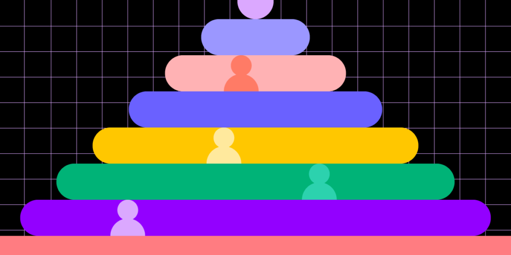
2022 Wrap-Up – A Compilation of Must-Read Articles, eBooks, and Webinars

2022 Wrap Up

This year was full of exciting projects. Our content revolved around design systems, design operations, and design itself! We released an eBook, organized a virtual conference, and released a few features that let the design community experience component-driven prototyping.

Want to try it yourself? Beyond being an all-round advanced prototyping software, UXPin allows designers to build fully functional and interactive prototypes with component libraries imported from Git, Storybook or npm packages. See how it solves design challenges for teams, such as PayPal, Lumen, and more. Explore UXPin Merge.

Reach a new level of prototyping

Design with interactive components coming from your team’s design system.

The Most Engaging Webinar in 2022

We couldn’t have wished for more interesting speakers this year. Carola Cassaro talked about building and advocating for IKEA’s design system. Dave Malouf taught us how design teams can improve operations of the whole organization.

Amber Jabeen made us realize that the design system is more than a collection of reusable patterns and needs to be treated like a product. Her presentation should be bookmarked by anyone who needs to sell the idea of selling the business case for a design system. You can watch it on our YouTube channel where we put the recordings of most webinars.

Top 3 Product Releases

In 2022, we celebrated a few product releases to make interactive prototyping and cross-team collaboration easy.

logo uxpin merge 1

Here are three of them.

  • npm integration – enjoy the easiest way of bringing UI components to UXPin; you import npm components and build production-ready prototypes without dev’s support. Check what the integration is about.
  • Figma copy & paste plugin – import Figma designs to UXPin with our new Figma plugin; keep using the two design tools in unison and streamline your interactive design process. Follow the tutorial.
  • MUI built-in library – build prototypes with MUI components that are interactive by default. Experience fully functional prototyping that requires no code and technical skills. Assemble your first prototype today with MUI.

As Yuga Koda, our CEO, said during our Design Value Conference, UXPin aims at bridging the gap between design and development by giving designers the tools they need to build prototypes that developers can easily translate into code.

3 Most-Read Articles on Product Design

Based on the feedback, we chose three articles that seemed to be the most important ones this year.

  • Top 8 Design System Examples – this article dives into eight design systems used by the most design-driven organizations. Learn more about each of them.
  • Design Consistency Best Practices – some designers see consistency as constraint, others claim that it helps them be more creative. Decide for yourself after reading our article.
  • What is Component-Driven Prototyping? – this approach to prototyping can help teams work more efficiently. Discover what it is and see if it can help your team.

If you want to stay up to date with our content, follow us on Facebook, LinkedIn or Twitter.

Two eBooks to Add to Your Reading List

Those of you who like to read about organizing design teams, setting up team rituals, and improving collaboration, we have something for you.

Apart from writing an introduction to Design Operations, we released another eBook on the field. It was about DesignOps’ First Pillar – How We Work Together. Read both of them:

  • DesignOps 101 – Read the eBook composed of six chapters; discover DesignOps essentials, full of advice on the field that’s coming from leading design operations expert from top enterprises.
  • DesignOps 1st Pillar – Get a deeper insight into design operations by exploring its first pillar and learning about hiring, onboarding and leading a stellar design team.

Happy 2023!

Next year will be full of exciting projects at UXPin. As for this blog, we will continue writing about product design, sharing best practices of creating, maintaining, and scaling work, useful tools, and design hacks for you.

Looking for a tool that will help you bridge the gap between design and development? Try our Merge technology that allows you to bring interactive components from Git repo, Storybook or npm package to UXPin. Move beyond image-based design and create prototypes with UI components from your design library Read more about UXPin Merge.

What Is A User Interface? Definition & Best Practices For UI Design

What is a User Interface

In 2022, there were an estimated 4.95 billion global internet users. That’s more than 60 percent of the world’s population.

For so many people to use smartphones, tablets, laptops, and desktops — not to mention the websites and apps — they need to be easy, efficient, and enjoyable to use. If they’re not, it’s a massive turn-off.

At the heart of this is the user interface (UI). In this article, we’ll explain what is a user interface, why it’s so important, and offer some golden rules for incorporating it into the design of your website or app.

Build advanced prototypes

Design better products with States, Variables, Auto Layout and more.

Try UXPin

What is a user interface?

A user interface (UI) is how we interact with smartphones, laptops, and other devices. It might include a display screen, keyboard, or mouse. 

Each application or website we encounter also has its own UI, the design of which requires careful consideration so that it’s intuitive and satisfying to use. Getting it right is important, especially for businesses — according to a study by Forester, good UI can raise a website’s conversion rate by up to 200%.

color id brand design

The user interface is often talked about alongside user experience (UX). This includes the visual design and experience of a web page, desktop or mobile app screen, how it behaves (for example its load time and responsiveness), and how well users understand the role it plays in their lives. 

Both UI and UX are in the field of human-computer interaction (HCI). Read UX vs. UI Design – The Differences You Need to Know to learn more about interaction design.

What is a graphical user interface (GUI)? How is it different from a UI?

There are different types of user interfaces.

In the early days of computers, information was often presented in command-line interfaces, consisting of text lines on a screen. This was a relatively basic example of a user interface. 

As technology and design advanced, images, icons, and dialogue boxes were added to make interactions more accessible. This is a graphical user interface (GUI). As the name suggests, it’s a UI with the addition of graphics. A graphical user interface is best thought of as a subset of UIs.

Another UI subset is voice user interfaces (VUIs). Examples of these include Amazon’s Alexa and Apple’s Siri. 

The elements of a user interface

User interfaces are made up of elements. They’re the building blocks of apps and websites and are designed to be consistent, so users know what to expect when they’re interacting with the digital product. 

design system abstract

There are hundreds of examples, but common design patterns include:

  • Input Controls — for example, checkboxes, dropdown lists, and buttons
  • Navigational Components — these include breadcrumbs, sliders, and search fields
  • Informational Components – for example, progress bars, notifications, or message boxes
  • Containers — accordions and other elements that help to group content

To learn more about UI elements, read User Interface Elements Every Designer Should Know.

Why is a good user interface key to product success?

Research suggests it takes users just 0.017 seconds to form an opinion about a website. The single most important factor in this snap judgment is how it looks and feels. What’s more, 94% of decisions to exit a site are design related. 

Clearly, the UI is crucial in determining whether a web design or app is a success. And given that most enterprises see these platforms as their ‘shop window’, it may make or break their business, too. Here are more reasons why good UI is important…

Better user acquisition

Having a good design for an app or website is a great way to attract new customers and it can give you a competitive advantage. Here’s an example. 

Let’s say you’re interested in buying a product. There are two companies that sell it — and for the same price. The only difference is that one company’s website is clear and simple to navigate; they showcase the product well with lots of visual elements and present information to help users reach their goals. 

user search user centered

On the other hand, their competitor’s site takes ages to load, is hard to navigate, and when you finally find the product in question, information is buried near the bottom of the page and you can’t find the ‘Checkout’ button. The experience design is horrible. So is the user interface design.

With that in mind, which company do you buy from? It’s a no-brainer, right? 

Higher customer retention 

Attractive user interface design doesn’t just help to attract new customers. If your site or app is simple to use, you can bet they’ll keep coming back regularly. Good UI encourages browsing, so end-users spend more time on your site. It increases the chances of conversion, so you make more sales. And it reduces the probability of users cutting their site visit short and jumping ship to your competitors’ platforms.

Improved brand loyalty 

Of course, if a good UI prompts end-users to keep coming back to your site, it’s inevitable that they’ll develop an affinity with your brand. And loyal customers are incredibly valuable, as they sing your praises to people they know. 

Scalability

The most effective user interfaces are those that incorporate the principles of design simplicity. That means designing only what’s essential and making sure your website or app is coherent, consistent, and user-friendly. It’s about keeping things clear and avoiding confusion by disrupting their mental models.

designops efficiency arrow

When you achieve design simplicity, it’s easier to add new features and develop the infrastructure of your website or app. In other words, it’s scalable. 

To learn more, read What is Design Simplicity and How to Achieve it?

Fewer errors

User testing is an important part of the UI design process. 

There are a number of stages of user testing. As the process goes on, UX designers learn more about user requirements and iron out any problems with user journeys. As they grow in confidence, the designs become workable prototypes that more closely resemble the final product.

When the time comes to hand over the designs to developers, the UX designers have ironed out any problems users had when navigating the website or app prototypes. This saves time and resources; a developer can bring the designs to life knowing that the end product works for the user. 

UX designers are well-placed to offer insights that can help resolve issues during the development process. If a page loads slowly, for example, they can quickly assess the impact it has on the user and help the developer determine whether it’s critical to the success of the final product. 

Accessibility

Good UI requires a website or app to be accessible for all. It’s estimated that as many as one in five people has a disability that makes accessing information online difficult — a significant percentage of your audience. So it’s in your interest to comply with accessibility guidelines. 

For more on that, read Web Accessibility Checklist – 28 Points You Must Comply With

How to approach creating a good UI 

Good UI starts with a prototype.

If a prototype reflects the look, feel, and functionality of a working website or app, it’s easier to get in-depth feedback on the user experience. If a prototype is more basic — for example, static images linked together — it’s hard to know if your designs will work in real life. This could compromise the usability of your final product. 

UXPin is a design tool that helps to create fully-functional prototypes. It’s component-driven, which means that instead of starting from scratch, design teams drag and drop interactive components to build prototypes. This helps to speed up the design and build process. 

Anyone who interacts with prototypes made with UXPin could easily think they’re using the real interface; they can input data, click links, scroll pages, or perform any other task that the designer permits. 

As users interact with prototypes, UXPin captures data that lets designers know what’s working and what needs improvement.

When it’s time to hand over the final designs to developers, UXPin prototypes give developers a clear idea of how the end product is supposed to work. This makes for smoother collaboration between design and dev teams.

Ready to design user interface?

If you were wondering, ‘what is a user interface?’ then hopefully this article has given you a better idea. The UI isn’t just about aesthetics — it determines how people interact with your website or app and, ultimately, how they perceive your brand. 

Designed well, your UI can help you attract new, loyal customers and gain an advantage over your competitors. 

If your UI incorporates the principles of design simplicity, your product should be easier to scale as your business grows. And it’s important not to overlook the importance of making your UI accessible to all. 

At the heart of good UI is user testing. And strong UX design tools such as UXPin can certainly help with that. UXPin contains every feature you need to design fully functional UI prototypes that can be tested with users, before being translated into code and shared with developers. You’ll certainly benefit from its functionality if you’re involved in UI design. 

Design Teams Goals and How to Set Them [With Examples]

Design Team Goals

Any design team needs to know exactly what they’re working towards. Without this, it can be easy to lose focus on the critical aims and goals of their work and projects.

Design team goals are a great way to ensure your team is on track to completing the right tasks and to help productivity and focus throughout the whole team. It can sometimes be hard to know how to correctly set goals, however.

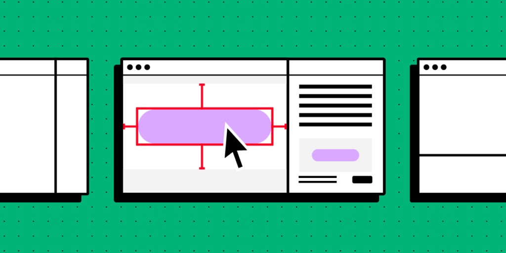
At UXPin, we believe that any design team should be able to work to their full potential. That’s why in this article, we’re going to go over the ins and outs of design team goals, and how to set them. Give your team transparency, ease of work, and understanding by trying out component-driven prototyping. Get access to UXPin Merge and break silos between design and development teams right away. Discover Merge.

Reach a new level of prototyping

Design with interactive components coming from your team’s design system.

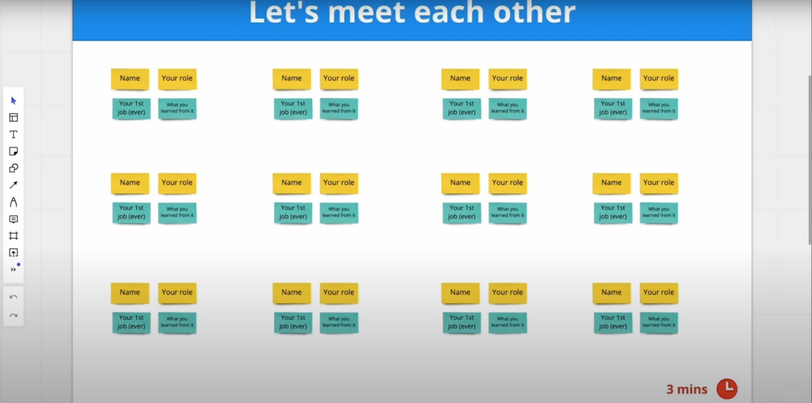
What are design team goals?

Design team goals are set milestones that your designers are expected to achieve in a given time. 

Instead of being specific, a ‘design team goal’ can be fairly broad. The term is frequently used for both larger objectives and smaller tasks, which can lead to confusion. Instead, the consensus is that OKRs (objectives and key results) are the way to go about goal-setting and hitting milestones. 

OKRs are used by many top tech brands and other organizations like Nielsen Norman Group to create goals, evaluate and track progress, and reward achievements within their organization.

The OKR structure is clear and simple and is designed to be straightforward for ease of communication and understanding.

  • An Objective (O) is something that needs to be solved, improved, or achieved for success.
  • Key Results (KR) are measurable indicators and outcomes tracked to show that the problem has been solved. 

OKRs are popular due to how great they are at unifying a team towards a goal and help stakeholders understand what the team wants to achieve.

With this structure, product teams are more likely to work more efficiently and productively towards a target. If they have a tangible target that they can see to attain, they can move towards it and ensure they’re on the right track.

Design team goals are set to enhance collaboration, refine your processes, and help unify your team. OKRs are the best approach for achieving your aims and getting solid results.

Here, we will use this methodology to show you how design team goals can be set to support collaboration, optimize the design process, and foster belonging throughout your team.

Why is it important to set goals for your design team members?

  • To help motivate your team by giving them tangible purpose: By giving your team attainable goals, you help motivate them to produce high-quality work, as they will feel as though their work has a purpose. Otherwise, their work can meander and feel like it’s not contributing to anything positive.
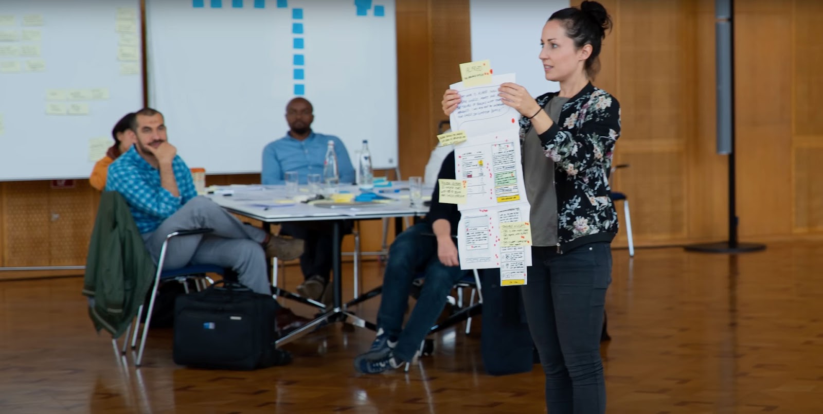
  • To enhance productivity and the quality of collaboration: By giving your design team clear goals, you help them focus much more easily towards achieving them. With this, productivity and the quality of work increase, and team collaboration creates far better results.   
  • To make sure your designers’ work supports company objectives: Making sure your team is working towards the success of your startup or enterprise organization is key. OKRs are ideal for this, as they are the best ways to ensure that your team is working positively in this direction.  

6 examples of design team goals

Improving the user journey

The following example is inspired by Nielsen Norman’s Anna Kaley’s example OKR of working towards improving the experience of customers and prospective buyers. You can measure this through different indicators — this example uses metrics, such as repeat purchases, conversion rates, and journey path abandonment rates.

Objective: Improve the user journey to save people time and effort

  • KR (Key Result) 1: 25% more repeat purchases
  • KR 2: 20% higher conversion rate
  • KR 3: 30% lower user journey path abandonment rates

Improving design–development collaboration

This example’s objective was set for three months and was based on collaboration and workflow. The Key Results are based on making collaboration more efficient and simple to save time.

Objective: Improve the workflow between design and development to save more time

  • KR 1: Reduce design task tickets reopened by development from 40 to 10%
  • KR 2: Reduce the average time of “small improvements” resolved from 10 days to 3 days
  • KR 3: Increase submitted design requests going into execution from 50 to 80%

Introducing new design processes that support team growth

The next example comes from Lattice. Their design team expanded from six to 39 designers over two years, which led to the company deciding to reevaluate the ways they set goals. 

Lattice’s Staff Product Designer ran an annual retrospective, which helped them set three key objectives for the upcoming year. Each objective was established and their respective teams worked to make four key results, one for each quarter of the year. The following example is one of these objectives:

Objective: Evolve processes to keep pace with team growth

  • Q1: Audited our Brand and Product rituals and proposed adjustments 
  • Q2: Drove more frequent design feedback and context sharing (by 2x!) 
  • Q3: Created templates for easier context sharing
  • Q4: Defined processes for brand + product design collaboration

Boosting landing page performance

GTMHub shared the following example based on turning ‘output into outcomes’, this one specifically being centered around improving landing page performance. With this set goal, you can have a certain percentage or number to reach, which can help your team track their performance and can push them when necessary.

Here, a specific team or subset of the design department has been assigned OKRs to help them prosper at this specific task. Their OKR examples include:

Objective: Boost performance through landing page UX/UI

  • KR 1: Double CTA conversion to 16%
  • KR 2: Increase page navigation rate to 5%
  • KR 3: Double product image gallery open rate to 24%  

Make design language consistent

Here, Delivery Hero-Talabat’s Amber Jabeen talks about Delivery Hero’s team struggling with their design language. As it was incredibly confusing and inconsistent, their team found it hard to keep productive and efficient with its mess. So, their team took the challenge to improve it.

The video below covers this process in-depth. It shows the benefits of taking time to improve their design language consistency so everything and everyone is on the same page.

#6 Take control of project intake

In this example, Amazon/Alexa Senior UX Designer Omkar Chandgadkar talks about his aim to take more control over his impact on company operations, from what was a more passive approach to design projects’ intake beforehand. By using goals to change his approach, he managed to make a shift and stay focused on his goals and achievement.

His process here was to move his approach from tactical to strategic, which is a great goal for teams to take more initiative regarding their design work. Certainly, it will affect their design skills as well and contribute to their personal development.

He goes over the full process in this great video.

How do you support your design team in reaching their goals?

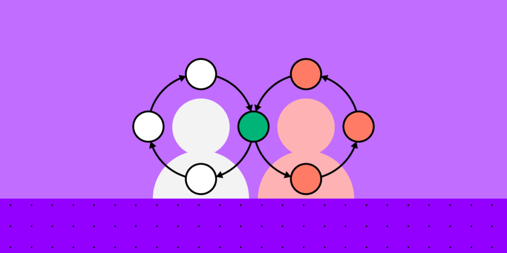
As well as setting clear goals and objectives, a great way to support your team is by taking the initiative to reach out and assist them. This includes allowing and ensuring they have access to the right tools. Especially, those that can help enable their productivity while supporting team-wide collaboration and accelerating their work. 

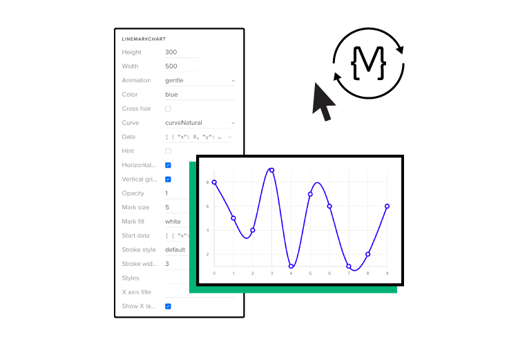
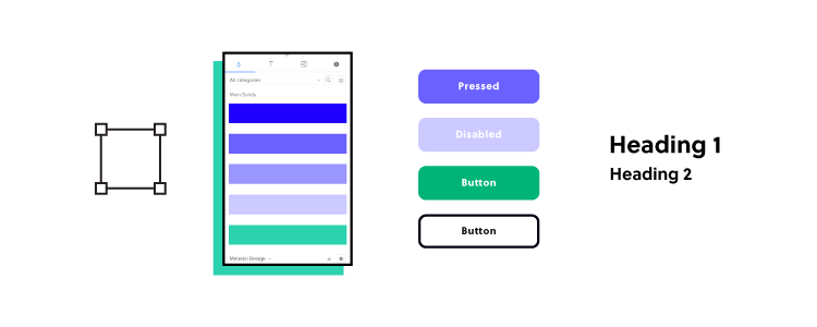
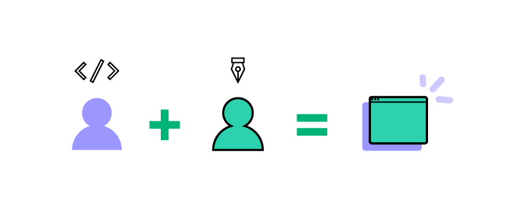
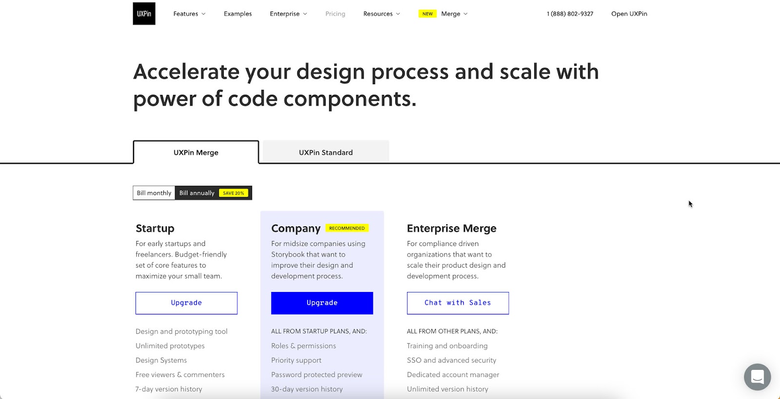
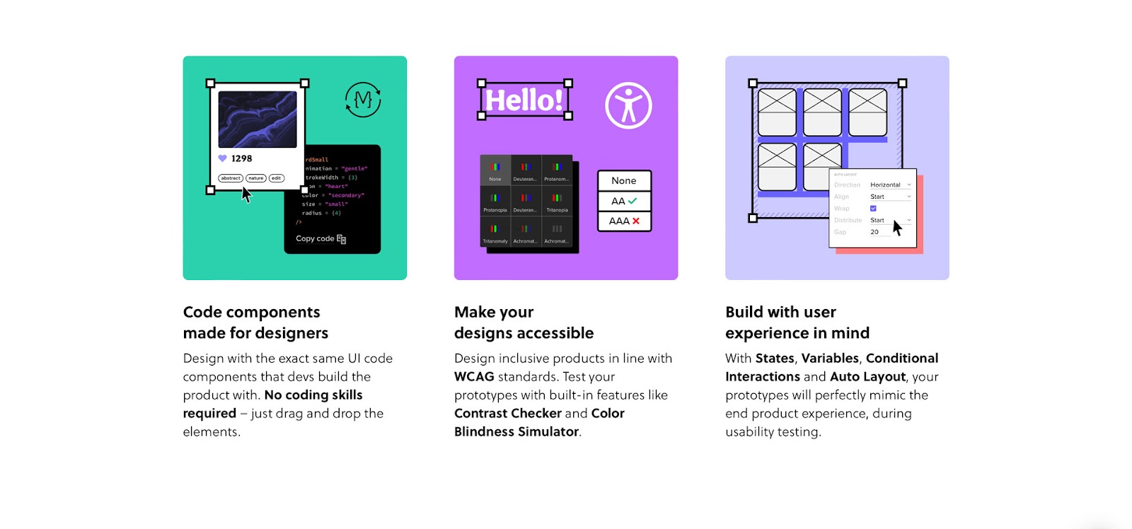
UXPin Merge unlocks your design team’s potential, allowing them to work more collaboratively and efficiently to result in maximum goal achievement. With Merge, designers can bring interactive components into UXPin and work faster and smarter without duplicating work. 

Collaboration is important to any team, and Merge is great for working with your team clearly and quickly. By being able to keep consistency, you can ensure that everything is well-oiled and there’s no confusion as to how systems and components are applied and implemented.

Merge is a great way to strengthen your team — as giving them more transparency, visibility, and understanding will create better design culture and better product design-development team collaboration.

Enable Your Team’s Productivity With UXPin Merge

Design team goals help establish focus and motivation within your team. OKRs make it easier to refine your design and boost the effectiveness of your end product. By creating clear goals, you can ensure that your team is working towards positive outcomes and can overcome crucial DesignOps challenges. 

However, OKRs can’t effectively be achieved without tight communication and team collaboration – especially when there’s a disconnect between your UI and UX design and product development teams.

That’s where UXPin can help. Our prototyping tool allows you to design with the same components that devs use. This helps break down limiting team silos. With UXPin Merge, you can create hi-fi prototypes of products on the fly and understand the actual user experience of the product you’re creating. 

Discover UXPin Merge and see how you can supercharge your team collaboration.

Cross-Platform Experience – An In-Depth Guide for Product Designers

With an ever-growing list of devices, operating systems, and technologies, cross-platform experience design is an essential component of the product development process. 

Many organizations have dedicated teams for iOS, Android, Windows, etc., to ensure products meet platform-specific requirements and user expectations.

Create seamless cross-platform customer experiences with the world’s most advanced UX design tool. Sign up for a free trial to discover interactive prototyping with UXPin.

Build advanced prototypes

Design better products with States, Variables, Auto Layout and more.

Try UXPin

What is a Cross-Platform Experience?

A cross-platform experience (also called platform-agnostic design) describes the user experience comparison across multiple devices, including Web, mobile, tablet, and wearables, in addition to operating systems like iOS, Android, Windows, Mac, etc.

The aim for product developers is to create a comparable, seamless user experience across different platforms and operating systems to ensure their products serve all users.

Designers also want to ensure end users can access the same features and complete tasks regardless of device or operating system. For example, the ability to make a payment from your bank account whether you use the bank’s web portal or mobile app.

Responsive design vs. cross-platform design

Responsiveness is one facet product teams must consider when designing cross-platform experiences. Responsive design is specific to web browsers and how user interfaces look across desktop, tablet, and mobile viewports.

Cross-platform design is a broader concept where designers must consider web browsers, devices, and operating systems, in addition to a product’s user experience on a web, tablet, and mobile apps on iOS, Android, Windows, and other operating systems. For example, a simple alert component will look completely different on iOS, Android, Windows, macOS, Safari, Chrome, and Edge.

Why Designing Cross-Platform Experiences is Important

Business value

From a business perspective, cross-platform design is crucial. In the United States, iPhone enjoys a 65% market share, but there are 2 billion global Android users or a 71.35% market share. Android makes up more than 90% of the market in some countries where iPhones are unaffordable. Not serving either of these markets means you’re leaving a lot of money on the table!

Companies must also consider responsive design and how their website and web applications render across desktop, tablet, and mobile. Many people only use their smartphones to browse the internet; if they can’t purchase products and services efficiently using these mobile devices, these companies lose valuable revenue.

Competitiveness

People expect products to work comparably across multiple devices. If users can’t complete the same tasks on your Web and mobile applications, they’ll find a competitor that does!

Nowhere is this more apparent than in FinTech. Mobile-first/only banking and investing applications have exploded in the last decade as startups aim to fill the gap left by traditional financial institutions. Many of these legacy institutions have been slow to deliver mobile solutions, allowing FinTech startups like Robinhood, Monzo, Chime, Revolut, and others to capture significant market share.

Inclusivity

If you want your products to be inclusive for everyone, then cross-platform design is essential. Apple products like iPhones and Macs are at the high end of consumer electronics–many people cannot afford these luxuries. 

If your products only serve Apple devices or don’t provide a comparable experience on Android, Windows, and the Web, then you’re excluding a massive part of the global population, including marginalized communities who cannot afford Apple’s products.

6 Key Principles of Designing Cross-Platform Experiences

Consistency

The first rule for cross-platform design is maintaining a consistent user experience across Web and mobile applications and operating systems. This consistency includes user interface design, functionality, features, interaction design, and branding, to name a few key factors.

It’s impossible to get precise UI consistency across multiple platforms and devices, but designers can control messaging, interactions, performance, and timing, which must always be consistent.

Seamless experience

A seamless cross-platform user experience means people can complete the same tasks across multiple devices. Additionally, they can start a task on one platform and complete it on another.

For example, you can create an email on the Gmail mobile app, save it to drafts and finish it on your desktop computer at another time. This seamless user experience gives users the flexibility to work and complete tasks according to their specific schedules rather than structuring their lives around technology–i.e., waiting until they get to a desktop to send an email.

Cross-platform usability (Interusability)

Cross-platform usability or interusability describes the user experience and coherency across multiple devices in an Internet of Things (IoT) ecosystem.

Netflix is a familiar example where users can watch on mobile phones, tablets, laptops, and Smart TVs. Within each category are multiple devices, operating systems, and screen sizes. 

Charles Denis and Laurent Karsenty coined interusability in a 2003 publication, Inter-Usability of Multi-Device Systems – A Conceptual Framework, which describes three key components for designing coherent cross-platform experiences:

  • Continuity: facilitating a seamless flow of content and interactions across products, tools, and devices
  • Composition: organizing functionality across products and devices
  • Appropriate consistency: designers must balance UI design consistency with native layouts and patterns

Prioritization and visual hierarchy

Prioritizing content and layouts is crucial for designing cross-platform user experiences. On desktops and Smart TVs, users can see more content and features. On mobile apps and other small screens, designers must prioritize content, often using personalization.

For example, no two Netflix or YouTube accounts look the same. Product developers use personalized algorithms to prioritize content and features to meet each user’s needs and preferences.

Prioritization also includes visual hierarchy. On large screens, there’s space for more content and features. On mobile devices, designers must determine what content is always visible and where they must hide content using accordions, navigational drawers, dropdowns, and other space-saving UI patterns.

Accessibility

Cross-platform accessibility is essential for compliance and ensuring products are fully inclusive. Designers must ensure users can use built-in assistive technologies like voice commands, screen readers, font adjustments, etc.

Designers must also provide dark and light modes to accommodate users with visual impairments. Colors render differently across devices, which impacts contrast and readability.

Adaptability

It’s not always possible to create a product for every device. For example, an enterprise warehouse management system won’t work on smartwatches–the UI and architecture is too complex. But you can create a smartwatch app that receives critical notifications so the user can get to a mobile app or desktop as soon as possible.

While adaptable experiences aren’t always in line with the product’s goals and features, they can provide value and even attract new customers.

3 Tips to Design Cross-Platform Experiences

Design for familiarity

Many apps use native styling and components to create platform familiarity. For example, using the iOS and Android icons instead of your custom set. While these features don’t conform to your brand, they can make the product feel like it was built specifically for the user’s device, thus elevating your cross-platform user experience.

Create design system

Design systems create constraints and solutions for maximizing cohesion and consistency. They also provide product teams with patterns and components to meet platform-specific rules and guidelines.

Material Design’s documentation tells designers how components will look on Android and iOS. For example, this Top App Bar from Material Design provides examples of how each operating system will render the component. The icons, alignment, spacing, and app bar height differ between iOS and Android.

material design components

Creating these cross-platform components ensures designers conduct accurate testing during the design process for the operating systems your product supports.

Use a design library

UXPin includes canvases for the Web, iOS (including iPhones, Apple Watches, and Apple TV), and Android so that you can create layouts for each device. You can also use a custom canvas size to meet your platform’s screen width.

UXPin’s built-in design libraries include iOS and Material Design components, so you can build cross-platform experiences without installing plugins or extensions. Drag and drop platform-specific UI elements to prototype products across both operating systems.

Use the UXPin Mirror app (available on iOS and Android) to test your cross-platform apps on multiple devices. You can also preview prototypes in the browser for testing on smartphones, tablets, desktops, Smart TVs, etc.

Building Cross-Platform Prototypes With UXPin

UXPin includes canvases for the Web, iOS (including iPhones, Apple Watches, and Apple TV), and Android so that you can create layouts for each device. You can also use a custom canvas size to meet your platform’s screen width.

With UXPin’s Design Systems, you can create a cross-platform component library and share it across your organization to keep teams aligned and UIs consistent. Use descriptions to include documentation for each platform and set permissions to prevent unauthorized changes to your design system.

Design better cross-platform user experiences with the world’s most state-of-the-art UX design tool. Sign up for a free trial to explore all of UXPin’s advanced features.

Website Design for Scannability – 8 UI Tips and Proven Reading Patterns

Website Design for Scannability

Website scannability is essential for creating a positive, user-friendly experience. Users want to find content that solves their problem and return to their lives. Facilitating that by designing for scannability creates trust, increasing the likelihood that visitors will return or convert.

This article describes the various scanning patterns users adopt for different tasks and best practices to increase your website’s scannability.

Build high-fidelity prototypes that deliver accurate results during usability testing. Learn what your end-users value most and prioritize web content to increase scannability. Sign up for a free trial to discover advanced prototyping with UXPin.

Build advanced prototypes

Design better products with States, Variables, Auto Layout and more.

Try UXPin

What is Website Scannability?

Website scannability describes how easily users can find content by scanning a web page. UX designers use subheadings, white space, bulleted lists, and visual hierarchy to help users find what they need faster.

For example, we use a table of contents and subheadings to make this article more scannable. Our blog generally attracts people interested in product design, so we use eye-catching CTAs to try our design tool for free.

Why is scannability important for web design?

Users are spoilt for choice on the Internet. If your website doesn’t solve their problem, they’ll find one that does! Often you might have the answer users need, but a poor user experience and cluttered user interfaces force them to find a better alternative.

Designers must optimize web design for a user’s attention rather than beautiful look and feel. People want to scan web pages to find what they need and exit. 

Nielsen Norman Group research found that “79 percent of our test users always scanned any new page they came across; only 16 percent read word-by-word.”

In another NN Group study, “Users often leave Web pages in 10–20 seconds, but pages with a clear value proposition can hold people’s attention for much longer. To gain several minutes of user attention, you must clearly communicate your value proposition within 10 seconds.”

Your website must not only provide users with the features and content they need but present it in a way that it’s quick to digest and take action if necessary. If you don’t deliver this user experience, a competitor will!

Scanning Patterns–How Users Scan Web Pages

The NN Group’s famous 2009 Eyetracking Web Usability study identified several scanning patterns people use to scan web pages.

  • F-pattern
  • Spotted pattern
  • Layer-cake pattern
  • Commitment pattern
  • Zigzag pattern
  • Exhaustive review

F-Pattern

The F-pattern is the most common scanning pattern, especially for articles or pages with lots of text. Users scan the first few paragraphs from left to right (or opposite for right-to-left languages) and then the beginning of each line as they scroll down the page, occasionally reading a heading or sentence/paragraph of interest–creating an F shape.

To grab these “f-pattern” users, including a summary or table of contents at the top of the page will grab their attention and entice them to read further, increasing the likelihood of action (purchase, lead, etc.).

Spotted pattern

Users adopt a spotted pattern when searching for something specific–for example, a word, heading, address, or date. Different content types and formats can also influence spotted pattern scanning, like bulleted lists, styling (bold, italics), prominent CTAs, typography, etc.

The NN Group eye-tracking study asked users to find information about an individual’s education on Wikipedia. The eye-tracking software found that users scanned around the page searching for relevant keywords, eventually focusing on the word “studies,” where they found the answer.

Layer-cake pattern

The layer-cake pattern describes how users scan a page’s headings and subheadings to find a specific body of text. For example, if someone were looking for information about layer-cake patterns on this page, their eyes would jump from heading to heading, locate this subheading and read the content below.

Commitment pattern

The commitment pattern describes users who read every word on a page rather than scanning. They usually trust the source, are highly interested in the topic, or need detailed instructions (recipes, directions, documentation, etc.).

Zigzag pattern

Users digest two-column layouts using a zigzag pattern. Many websites use these designs to describe their services or how a product works. Designers typically place text in one column and an accompanying image in the next in two styles:

  • Alternating layout: images and text alternate from left to right for each row
  • Aligned layout: images and text appear in one column (either left or right)
Zigzag reading pattern for scannable website design

An NN Group study found that “an alternating list layout caused users to stumble.” Conversely, “users scanned efficiently on pages where text and imagery were vertically aligned.”

While the alternating list might keep things interesting, it’s probably not a good option for complex topics or if you’re creating content for users with cognitive disabilities.

Exhaustive review

An exhaustive review describes users who repeatedly scan the same page or content, looking for something–for example, scanning up and down a product’s documentation repeatedly, unable to find an answer to your problem.

But this pattern has some nuances. The exhaustive review may indicate heightened interest. Users interested in something will fixate on it over and over–like an outfit on Pinterest or a dream destination on Instagram.

Users also adopt an exhaustive review of landing pages or high-cost products to decide if the item will solve their problem adequately. They may read parts of the page, returning to specific texts to ensure they make the right decision.

How to Make Websites and Pages Scannable

Visual hierarchy

UX designers use visual hierarchy to attract attention to important content through:

  • Size: using larger text, images, buttons, etc., to differentiate from similar UI elements
  • Gestalt principles: how UI elements appear related through proximity, similarity, symmetry, etc.
  • Color: using a specific color or contrast only for important content immediately attracts attention

For example, our pricing page highlights UXPin Merge’s bestselling plan for companies using a color hierarchy.

visual hierarchy helps make website scannable

Limit choice

Pages with too many options take longer to scan and digest. If you’re trying to get users to take a specific action, limiting their choices will help them focus and decide.

Negative space

Negative space (whitespace) creates separation to make pages more scannable, but designers can also use it to attract attention. We use ample whitespace around our homepage feature boxes, headings, and text, making the content easier to read and digest.

negative space is a good practice for improving website scannability

Google’s homepage uses a more extreme negative space design to draw attention to most users’ primary reasons for visiting the page, search!

negative space use by Google helps you focus on the most important information

Headings and subheadings

Headings (h2 elements) create an anchor for a specific topic–in this case, How to Make Websites and Pages Scannable–while subheadings represent sub-topics or provide context, i.e., Headings and subheadings. Users can scan pages easier and only read content relevant to their needs.

Pairing these headings with a table of contents at the top of the page enables users to locate content faster.

Short paragraphs over blocks of text

Blocks of text (walls of text) are difficult to read on screens. Search engine optimization (SEO) experts Brain Dean from Backlinko and Neil Patel advocate using short paragraphs (usually one or two sentences) to optimize for readability and scannability.

Notice how we use short sentences and paragraphs in this blog post. We also create space between paragraphs, headings, and other content to make text, making the page more scannable while increasing text legibility.

Bulleted lists

testing compare data 1

If you’re making more than two points, using a bulleted list is easier to scan and digest than a paragraph. For example, under the subheading “Visual hierarchy” above, we used a bulleted list for size, Gestalt principles, and color. If we had to write this as a paragraph, we’d have to increase the word count, making it more difficult to scan and read.

Typography

text typing input 1

Designers often use different typography for headings and body text. This differentiation creates visual anchors for users to scan a page much faster. Font weights, sizing, and color are also effective.

Prominent Call-To-Action (CTAs)

interaction click hi fi 2

Users often visit web pages to complete a specific task, like contacting a business, completing an application, or buying a product. Prominent CTAs draw attention, so users save time searching for specific information and get persuaded to complete the task.

Design Better User Experiences With UXPin

Prototyping and testing are the core of user experience design. Designers learn from testing designs with their target audience, iterating until they find a solution that meets their needs.

Unfortunately, most image-based design tools don’t offer prototyping features that allow accurate testing. Designers must rely on external platforms or UX engineers to build prototypes–increasing time and costs!

UXPin’s advanced design tool enables UX teams to build advanced interactive prototypes that look and feel like the final product–allowing designers to identify UI pain points and opportunities during testing.

Increase your design team’s prototyping speed and capabilities with the world’s most advanced design tool. Sign up for a free trial to discover interactive design with UXPin.

Heuristic Evaluation – The Most Informal Usability Inspection Method

Design teams commonly use Jakob Nielsen’s heuristics to evaluate human-computer interaction because they provide a comprehensive user experience audit.

A heuristic evaluation explores ten critical facets of a product’s user experience, allowing design teams to focus on specific usability problems within user interfaces and interactions.

Get accurate insights about your product’s usability performance using advanced prototypes that look and feel like the final product. Sign up for a free trial to discover interactive prototyping with UXPin.

Build advanced prototypes

Design better products with States, Variables, Auto Layout and more.

Try UXPin

What is a Heuristic Evaluation (Heuristic Analysis)?

Heuristic refers to problem-solving and self-education, usually through trial and error. In UX design, heuristics describes the cognitive load or mental capacity required to make decisions and complete tasks. Designers use usability testing to evaluate heuristics and identify issues for fixing.

There are ten usability heuristics, and a heuristic evaluation assesses these to identify a product’s usability performance. These usability heuristics come from Jakob Nielsen’s (co-founder of the Nielsen Norman Group) ten general principles for interaction design which he devised in the early 1990s.

10 Usability Heuristics

Jakob Nielsen created the ten usability heuristics based on research from two other UX and engineering experts, including:

Visibility of system status

Designers use system status indicators for a range of interactions and user tasks. For example, the battery icon on your mobile phone displays the battery life status. This battery life indicator is crucial because it informs users whether they have enough power and when to charge the device. Without it, the device would die intermittently without warning, causing frustration for end-users.

Visibility of system status is crucial for visual feedback–what happens when a user interacts with a component (click/tap, hover, swipe, etc.) or completes an action, like submitting a form? The system must provide feedback to inform the user that something is happening or that it has executed a task.

The following user interface design elements are great examples of visibility of system status:

  • Progress trackers on forms
  • Loading icons
  • System messages (success, warning, error, etc.)
  • Badges on shopping carts, text apps, etc.
  • App notifications

Designers must be careful not to overwhelm users with system status updates and only provide feedback when it’s relevant and necessary.

Match between the system and the real world

There are two rules within match between the system and the real world:

  • Speak the user’s language
  • Follow real-world conventions

Firstly content designers must always use obvious words and language. Facebook’s “News Feed” and “Photo Tagging” are excellent examples of speaking the user’s language. In a podcast with Lex Friedman, early Facebook exec. Chamath Palihapitiya describes how the company chose the most obvious names for Facebook’s features to ensure people knew what they did.

Connected to language are real-world conventions–mimicking real-world experiences and interactions in a digital product. For example, an eBook experience is similar to a physical book, where users can turn pages, highlight text, and add bookmarks.

Matching the system to the real world makes user experiences obvious, reducing the cognitive load required to navigate products and complete tasks. This obviousness is especially important for people learning technology, the elderly, and users with cognitive disabilities.

User control and freedom

Designers must provide exits and offramps for users through edit, undo, redo, back, cancel, etc. The freedom for users to rectify a mistake or change their minds is crucial for a good user experience.

This freedom is especially important regarding financial decisions like purchases or changing a paid service. Giving users this freedom and control builds trust while minimizing fears of exploring a product and its features.

Consistency and standards

There are two facets of consistency and standards:

  • Internal
  • External

Internal consistency and standards apply to your UIs and components, usually defined by your product’s design system or design language. Designers must follow these internal standards consistently to ensure tasks and actions are always obvious to users.

color sample library

External consistency and standards refer to globally recognized UX patterns. For example, the hamburger icon to open a navigational drawer or the cart/trolly icon for eCommerce websites. Breaking these conventions forces users to learn something new, thus increasing their cognitive load.

Following consistency and standards reduces the need to think about actions so that users can locate content and complete tasks with minimal mental effort.

Error prevention

Error prevention is one of the most critical heuristics. Errors can cause significant distress, especially for irreversible actions–for example, transferring money to the wrong bank account or accidentally deleting something.

error mistake wrong fail prototyping

Designers use a strategy called cognitive friction, which creates roadblocks to force users to stop and think before completing an action. For example, a dialog popup after a user clicks transfer confirming the amount, recipient’s name, bank account number, and branch code with the option to confirm or cancel the transaction.

Good user experience design creates these friction points to prevent errors and, in some cases, reverse them. For example, saving recently deleted items for 30 days.

Recognition rather than recall

Humans have limited short-term memory, which means we battle to retain information. Designers must make content visible or retrievable, so users don’t have to remember. For example, eCommerce platforms allow shoppers to save their delivery and billing details, so they don’t have to recall these at checkout.

This concept includes simplifying designs, so users don’t have to refer to the documentation or watch a tutorial to use a product. Designers use form labels, menu items, tooltips, placeholder text, and other reminders to help users complete tasks.

Flexibility and efficiency of use

Flexibility and efficiency of use allow users to complete tasks and actions fast while providing more than one way to execute them. The best example of this principle is copying and pasting. Users typically have three options, depending on the application:

  • Using the app’s primary navigation, Edit>Copy and Edit>Paste
  • Using the mouse’s right-click, right-click Copy, right-click Paste
  • Using the keyboard shortcut, CMD/CTRL+C, CMD/CRTL+V

Another example for you Instagrammers is the double tap to like an image instead of tapping the heart/like icon. 

When users first start using a product, they generally use the most obvious default option, i.e., the app’s navigation or icon in Instagram’s case. But as they become more confident, they use shortcuts to maximize efficiency.

Aesthetic and simple design

User interfaces must be aesthetically pleasing and simple so users can focus on the most critical content and actions without distraction. For example, an eCommerce store wouldn’t run ads on its website because A) it would create a busy UI, and B) competitors’ ads would likely appear, taking the user to another offer.

In a bid to convert users by any means necessary, companies often have too many CTAs on their website or landing page–join our mailing list, purchase this product, follow us on Twitter, Like us on Facebook, book a sales call! Too many options overwhelm users resulting in the opposite effect–they leave!

Designers must prioritize content to support the user’s primary goal or task while eliminating irrelevant and distracting UI elements.

Help users recognize, diagnose, and recover from errors

Error messages must do more than alert users to a problem; they must offer an easy solution to fix the problem. This snackbar example from Google’s Material Design adds an “Undo” action in case the user archived an email accidentally.

Google’s Gmail does a similar recovery action after you send an email with a snackbar allowing users to “Undo” sending–”Oh no! I forgot to add the attachment–*Undo–Thank you, Gmail!”

Other examples where designers help user recover include:

  • 404 errors with helpful links
  • Error messages with a link to activate the solution
  • Input field error messages with explicit instructions to fix the problem

Help and documentation

No one likes to leave what they’re doing to read documentation, but often it’s necessary to diagnose the problem and find a solution. Designers can help users by using walkthroughs, tooltips, popovers, and chat to find answers without leaving the page they’re working on. 

Google Docs provides users with a help popup where they can search the product’s documentation to find a solution. Additionally, there is a link to the Google Docs community and an option to report a problem directly to Google.

The documentation must be easy to search and navigate while providing users with helpful, actionable answers. UXPin’s documentation provides users with the most searched help categories and an option to search (with autocomplete). Each section offers images, GIFs, and written instructions to help users find what they need.

How to Conduct a Heuristic Evaluation

With a clear understanding of each usability principle, it’s time to conduct your heuristic evaluation.

The process of carrying out a heuristic evaluation is the same regardless of the industry or nature of the design project.

  • Phase one–Planning: the design team uses user research to map the heuristic evaluation. They also delegate tasks and define goals.
  • Phase two–Execution: conducting the heuristic evaluation.
  • Phase three–Review: synthesize and review the evaluation and design a plan of action.

Planning

First, teams define which heuristics they’ll use and the evaluation methods. These heuristics should be chosen carefully based on market research, previous user testing, and the principles of careful design.

Next, the team must select the evaluators–the usability experts responsible for the evaluation. Evaluators generally work in pairs to reduce bias and spot more usability issues. These small units must assess one heuristic at a time. Simultaneously evaluating multiple heuristics can result in errors.

Executing

  1. The first step is briefing the evaluators so that they understand the heuristics they’ll use and how the system functions.
  2. The evaluators interact with the system to understand how it works.
  3. The evaluators evaluate the system based on pre-determined heuristics, noting any usability issues they encounter.

Reviewing

Evaluators present their findings with recommended actions to fix the problems. The team collates these into one master document where they create and prioritize tasks to fix the usability issues.

Identify more usability problems and fix errors before they make it to end-users with advanced interactive prototyping from UXPin. Sign up for a free trial to explore UXPin’s sophisticated design tool.

Building a Component Library – A Step-by-Step Guide

building component library

Whether you’re creating a design system from scratch or want better front-end development cohesion and consistency, building a component library is an excellent way to improve your product’s user experience.

A component library will save you significant time in the long run, but it will require a lot of resources and attention to detail to build from scratch. Engineers must consider the product’s current priorities and future possibilities to ensure the component library is scalable.

With UXPin Merge, you can create fully functional prototypes with the UI elements that come from your component library that preserves its functionality when imported into the design editor. Share a single source of truth across design and development. Visit our Merge page for more details and request access.

Reach a new level of prototyping

Design with interactive components coming from your team’s design system.

Component libraries help unify code for improved front-end cohesion and consistency. It also minimizes how much code developers must write to release new products and features.

Most engineers decide to build a component library because they recognize one of several common problems:

  • UI inconsistencies–multiple variations of the same component
  • Programming syntax and markup inconsistencies–different ways of writing and structuring code
  • Ever-increasing front-end debt–backlog of programming bugs and fixes
  • Missed deadlines due to redundant programming and workflows

A component library aims to solve or reduce these issues while providing engineering teams with a scalable front-end framework.

Step 1. Create Interface Inventory

An interface inventory or UI audit is a crucial first step. Audits often uncover many UI and programming inconsistencies engineers must address before building a component library. Sometimes these inconsistencies are subtle, like two slightly different HEX codes, while others are more obvious, like multiple button variants (various sizes, shapes, colors, CTAs, etc.)

error mistake wrong fail prototyping

Design systems expert Brad Frost recommends screenshotting every user interface and cutting out each component. It’s a tedious, time-consuming but essential task to take stock. It’s important to do this inside the actual product rather than relying on project files because it’ll tell you exactly what customers see and expose any errors/inconsistencies.

Sort your components into categories to see what you’re working with. These categories will also form the foundation for your component library.

If you need help sorting your component types, consider copying Google’s Material Design or Apple’s Human Interface Guidelines. Alternatively, you can use Atomic Design to organize UI elements.

An interface inventory is also an excellent resource for advocating your component library to stakeholders. Showing these inconsistencies is often the best way to demonstrate the scale of the problem and the necessity to allocate resources for a component library.

Step 2. Select Tools and Framework

Once you know what to build, you must decide how to build it. If you’re using a Javascript framework (React, Angular, Vue, etc.), we recommend using Storybook to develop and manage individual components.

logo storybook

Storybook allows engineers to build and test components in isolation. You can also create documentation, set up development workflows, and collaborate with engineers and stakeholders.

Syncing design and development

The added benefit of Storybook is that it syncs with UXPin Merge–technology for component-driven prototyping. So, once your component library is complete, you can connect it to UXPin so design teams can build fully functioning prototypes.

logo uxpin merge 1

Merge isn’t only for UX designers. TeamPassword doesn’t have a design team, so the engineering team (of two) must prototype and test user interfaces. TeamPassword used to do this by writing code but wanted a faster method for prototyping and testing.

uxpin merge component sync

TeamPassword syncs its custom MUI component library to UXPin using Merge technology, where they build and test prototypes. 

The process of taking the finished design and developing it into a product got way faster, too. It is so rapid to export the prototype with all the specification and production-ready code. The time that the team normally had to spend on writing front-end code is saved.”

Step 3. Get Components

With your list of components and corresponding categories from the interface audit, it’s time to develop your component library–but where do you start? 

Here are some techniques for building a component library from scratch. We’ve also included some technical resources for developing your library in Storybook. 

design system library components

We recommend following Brad Frost’s Atomic Design methodology to develop components from the ground up. This method will create a modular system to build new patterns and scale your component library.

Atoms

Atoms are components you cannot break down further. They’re also the building blocks or dependencies for the rest of your component library. Atoms include:

  • Labels
  • Input fields
  • Buttons
  • Color palettes
  • Fonts
  • Icons
  • Animations
  • Design tokens

Molecules

Multiple atoms combine to construct molecules–the individual UI components users interact with, including forms, tabs, accordions, etc. For example, a search component = label + text field + button.

Organisms

Organisms are UI patterns that combine two or more molecules. A navigation bar is a common organism example:

  • Logo (molecule)
  • Navigational links (molecule)
  • Search bar (molecule)

Templates

Templates feature multiple organisms and molecules to make a complete user interface. These templates help eliminate redundant workflows to deliver products faster. Some examples include:

Design tokens

Design tokens are vital for building scalable cross-platform component libraries. These tokens contain UI data, including colors, spacing, typography, assets, animations, etc., to style UI components.

A single token contains properties formatted for each platform. For example, Android, iOS, and web browsers use different measurement units:

  • Websites and web applications (pixels/em/rem): 1 pixel
  • Android (dp density-independent pixels/dips): 1 pixel = 1dp
  • iOS (points): 1 pixel = 0.75pt

Engineers can program a token to accommodate each unit of measurement to ensure consistency across every operating system. 

Design tokens also make updates much more straightforward. Instead of modifying multiple files, engineers update the token to make cross-platform changes.

Creating design tokens from the start reduces redundant work while building your component library while future-proofing your code.

Remember documentation!

The most common recommendation from people who have built component libraries from scratch is documentation! Your component library’s docs make collaboration easier by informing other engineers how to develop and maintain components.

You should document every component as you complete it while it’s fresh in your memory. Additionally, you should document every change.

Mikael Sukoinen from Vaadin recommends documenting each component as follows:

  • Overview: component name and description
  • Instructions: how to install and use the component
  • Visual examples: demonstrating a use case for the component
  • Code samples: how to use the component’s API
file folder

Your documentation must also include:

  • HTML, CSS, and Javascript guidelines
  • Testing components
  • Instructions for props for React components (or Args in Storybook)
  • Versioning
  • How to collaborate and share work (project management tools like Jira, Trello, Notion, etc.)

Building a component library in Storybook

Here are some technical guides for building a component library:

Leverage Open-Source Component Libraries to Build Faster

Open-source component libraries provide a foundation to build a component library fast. Engineers also benefit from a scalable syntax–a process requiring many hours of friction and debate among developers.

Customization is the most important thing to consider when choosing an open-source component library. Make sure the library is themeable, preferably through design tokens. You also want something that’s regularly maintained with comprehensive documentation.

While open-source component libraries are themeable, there are limits to how much customization you can do to get a unique aesthetic. You’re also constrained by the library’s syntax and design language, so do your research before making a final decision.

Prototyping and Testing in UXPin With Merge Technology

Storybook is an excellent tool for building your components in isolation and testing them internally–but what about user testing? Unfortunately, Storybook has limitations regarding usability testing in browsers or mobile devices.

Yes, you can build a prototype with code, but making changes and iterating is time-consuming.

Merge allows you to import your component library from a repository to UXPin’s design editor so you can build prototypes to test your new component library. Merge creates a drag-and-drop prototyping environment, eliminating the steep learning curve required for traditional design tools.

This prototyping workflow has worked for tech giant PayPal and a startup of five, TeamPassword. Interestingly, both organizations switched to Merge due to UX scalability challenges. PayPal and TeamPassword have teams with little or no design experience completing UX tasks like prototyping and testing using Merge.

PayPal had five UX designers to over 1,000 engineers servicing more than 60 products. After switching to UXPin Merge, PayPal’s product teams (who had no previous design tool experience) complete 90% of design projects 8X faster than experienced UX designers could using image-based tools.

As a cash-strapped startup, TeamPassword doesn’t have the resources for a UX team but understands the importance of user experience to be competitive. Merge gives TeamPassword’s two-person engineering team a platform to prototype and test user interfaces with end-users–filling the UX designer void. Like PayPal, TeamPassword delivers products and features faster with Merge.

Building a component library requires significant resources. Often engineers don’t have access to a UX team or the knowledge to create and test components using a design tool. UXPin Merge bridges the gap between design and development, so designers and engineers speak the same language.

UXPin Merge empowers designers to build superior prototypes and solve more problems during design projects, but it also empowers engineers to prototype and test in situations where they don’t have UX resources.

Build your component library with Storybook and UXPin Merge. Visit Merge page for more details and how to request access.

What is Design Facilitation and How to Host Your First Session?

Design Facilitation

Workshops and design sprints are standard in most design processes. These collaborative exercises allow design teams to get valuable input from multiple departments and stakeholders.

Design facilitation provides the essential planning and framework to ensure these exercises deliver successful outcomes. Facilitators must guide team members through various tasks and activities to achieve the activity’s goals and define the next steps.

Use workshop insights to produce fully functioning prototypes to test ideas and hypotheses. Sign up for a free trial to build your first interactive prototype with UXPin.

Build advanced prototypes

Design better products with States, Variables, Auto Layout and more.

Try UXPin

What is Design Facilitation?

Design facilitation involves organizing collaborative activities like design sprints, UX workshops, ideation sessions, etc., to ensure the exercise meets its desired goals and objectives.

Rather than telling people what they must do, design facilitation provides the framework (tools, resources, methodology, parameters, and environment) for the activity to achieve successful outcomes.

These can be designer-only exercises or cross-functional activities where other departments and stakeholders come together to solve design or product problems.

Design Facilitation Skills

These are some of the skillsets of a design facilitator:

  • Planning: design facilitators plan and execute events, often involving hiring venues, PA equipment, catering, and other service providers beyond the actual workshop or sprint activities.
  • Public speaking: facilitators must be comfortable speaking to a group and, most importantly, capable of disseminating instructions.
  • Problem-solving: no plan is perfect, and things often go wrong when planning events. Design facilitators must be problem solvers with contingency plans for any eventuality.
  • Enthusiastic/charismatic: people often don’t want to take part in workshops–they do it because they have to. Great facilitators must have the energy and enthusiasm to draw people into the process and encourage participation. 
  • Communication: facilitators must articulate information and instructions in multiple mediums (verbally, in writing, visually) so that people understand what to do.
  • Active listening: as good communicators, design facilitators use active listening when engaging with participants to make people feel like their feedback is valued.
  • Design thinking: a design facilitator must understand design thinking, as many workshop/sprint tools, processes, and frameworks use these foundational user experience principles to achieve desired outcomes.

What does a Design Facilitator do?

lo fi pencil

Design facilitators are responsible for planning, running, and synthesizing results for design exercises. Here is a basic outline of the design facilitation process from planning to completion.

Engages in early planning

A design facilitator’s first step is understanding the primary goal and deliverables. This information will help determine the format (workshop, design sprint, etc.), tools, environment, and people needed to achieve the desired outcome.

The facilitator meets with design leads and stakeholders to define the purpose and goals of the activity. They use this information to determine other elements, including:

  • Outlining an agenda to meet goals and objectives
  • Identifying facilitation tools, frameworks, and resources
  • Choosing the appropriate workshop exercises (how might we, the 5 whys, storyboarding, collaborative prototyping, etc.)
  • Listing the roles (i.e., UI designer, UX designer, product manager, front-end developer, business manager, etc.)

Next, the facilitator sets a date, selects the team, and books a location suitable for the exercise, keeping in mind that this might be a remote activity–for example, a remote design sprint or remote UX workshop.

Selects the team

The size of the team will depend on the exercise. For example, most workshops vary between 7-15 people, while design sprints generally have no more than seven participants.

Design workshops and sprints typically include a cross-functional team with designers, business experts, product managers, engineers, and other stakeholders. The aim is to get diverse perspectives and ideas for the problem you’re trying to solve.

Plans location and logistics

Ideally, the facilitator wants to book a venue close to the participants. This venue might be in the company’s offices or event space nearby. Facilitator Sara Yahyaoui offers three vital tips for selecting a workshop venue:

  1. Visit the location ahead of time to see if it’ll suit your workshop’s needs–at the very least, request images and video to explore the space remotely.
  2. The venue must have walls, windows, and whiteboards for post-its, storyboarding, paper prototyping, etc.
  3. Workshops and sprints require people to move around freely. Sara’s rule is 2-3 chairs for every participant. If you have 30-40 people, ensure the venue has a 100-seat capacity.

Invites team members

Team members usually get advanced notice about the workshop’s date, location, and purpose.

Expert facilitator Dee Scarano from AJ & Smart recommends waiting until a few days (maximum seven days) before introducing yourself, the tools, schedule, etc., so that the information is fresh in people’s minds when they arrive.

Dee’s welcome email includes:

  • A brief introduction as the facilitator and her role in the upcoming workshop–i.e., Hi, I’m Dee. I will be the facilitator for the design workshop on July 10.
  • A Loom video introduction saying hi to everyone (a personal touch we love).
  • Outline the schedule, including the length of the session(s) and any pre-work/homework exercises.
  • If it’s a remote workshop, Dee will notify people of the tools (digital whiteboard, video application, etc.) and even share YouTube tutorials showing people how they’ll use these.

Dee’s Pro Tip: If you’re using tools, create a warm up exercise to familiarize them with it. For example, Dee sends a link to a digital whiteboard with post-it notes for participants to fill in their names, roles, and fun a question (i.e., what you learned from your first job ever?).

Dee’s warm up exercise gets people using the tool so they’re familiar with the basics when they arrive for the workshop.

Facilitates the session – welcome and introduction

The design facilitator’s first important task is to start on time. If people are late, you can fill them in during the first break and see if they have any questions.

Tips for opening a workshop:

  • Introduce yourself as the facilitator and your role during the proceedings
  • Venue formalities–closest toilets, beverage station, break times, meal times & location, and other venue-specific instructions
  • Workshop rules–i.e., how to ask questions, not speak over one another, be respectful of ideas, collaborating, etc.
  • Introducing each team member (people can do this themselves by stating their name, department/organization, and workshop role)

Facilitates the session – explaining the exercises

With formalities out of the way, it’s time to introduce people to the schedule and exercises. Having run hundreds of workshops, Dee Scarano from AJ & Smart has a simple formula to ensure everyone understands the activity and objective:

  • What you are going to do
  • Why you are doing it
  • How you should do it

For example:

  • What: we’re about to do concept sketching
  • Why: we’re all going to make individual concept sketches so that we can look at a diverse range of ideas and make a final choice
  • How: use a sharpie marker and a piece of paper. Look at previous examples and inspiration and sketch your version of a concept idea clearly on the page

People absorb information differently, including verbal, written, and visual instructions, so offering multiple versions will ensure everyone understands the activity and objectives.

Dee’s Pro Tip: Only give one way to complete the exercise. Through hundreds of workshops, Dee has learned that people produce the best results with specific step-by-step instructions rather than allowing them to do what they feel is best.

For example, participants must “use one sheet of paper and a black marker” for concept sketching instead of “use as many pages as you like and any colors you prefer.”

Facilitates the session

Here is an outline of a design facilitator’s responsibilities once the session is underway:

  • Keeping to schedule: an essential task for any facilitator is ensuring everything runs on time, including activities and breaks. The facilitator must always set time limits for exercises and tell participants an exact time–for example, “we have 30 minutes for sketching. You have until 14:30.” Using a centralized clock or timer will help keep everyone in sync.
  • Encourage participation: the aim of inviting a diverse team is to get different ideas. Facilitators must encourage everyone to participate. One way is to ask a team member’s perspective based on their expertise–i.e., to an engineer: does this idea align with our product’s technical constraints?
  • Discussions and debates: design facilitators must balance free-flowing conversation and ideas with closure to keep things moving toward the workshop’s goals. They must recognize when discussions are too long or irrelevant and push participants to a conclusion–for example, voting on the best solution.
  • The decider: a common role for design sprints (but also useful for workshops) for final decision-making–often when there are two strong choices or disagreements. The decider is usually a product owner, CEO, or another high-level stakeholder familiar with the product/project.

Wrapps up and synthesizes the results

At the end of the workshop or sprint, the design facilitator must summarize and document the results with the group, so everyone agrees with the outcome and deliverables. The team might also discuss possible next steps.

Document the workshop by:

  • Take pictures of everything and upload them to a shared drive. 
  • If you use physical whiteboards, copy the final results to a digital whiteboard (Mural, Miro, Google Jamboard) for future reference.
  • Writing a summary report about the workshop and its outcomes.
  • Schedule a follow-up session for feedback and progress.

Improve Your Design Facilitation Skills

search observe user centered

These resources offer facilitation techniques to improve your skills as a facilitator:

Use Workshop Insights to Prototype in UXPin

After most workshops and sprints, the next step is to produce a high-fidelity prototype or MVP to test and iterate. UXPin’s advanced end-to-end design tool enables design teams to build prototypes that look and feel like the final product.

With built-in design libraries, designers can go from concept to fully functioning prototype fast! They can use these immersive prototypes that produce meaningful, actionable results from user testing and stakeholders–allowing product teams to iterate faster than traditional image-based design tools.

Turn your workshop ideas into fully-functioning prototypes with the world’s most advanced design tool. Sign up for a free trial to explore UXPin’s features today!

UX Content Strategy – How to Create and Track it

UX Content Strategy

Content exists across multiple touchpoints sourced from numerous creators. A UX content strategy ensures content production and governance remain high quality and consistency to enhance a product’s user experience while meeting business goals.

We’ll explore two significant factors in developing and maintaining a content strategy:

  1. The content lifecycle
  2. The four elements of a content strategy

A content strategy team uses these facets to create a framework for creating and maintaining a product’s content.

Scale design and improve collaboration across product design and development with UXPin’s Merge technology. Review content of your prototypes easily, speed up design iterations, and share a single source of truth between design and development. Visit our Merge page.

Reach a new level of prototyping

Design with interactive components coming from your team’s design system.

What is a UX Content Strategy? 

A UX content strategy defines a product’s content goals, creation, management, and distribution across multiple touchpoints, including (but not limited to):

  • Digital product user interfaces
  • Websites
  • Blog articles
  • Emails (system notifications, marketing, etc.)
  • Mobile notifications
  • Social media
  • Ads

Content strategists aim to create consistent and coherent messaging across these touchpoints to meet user needs and achieve business goals.

Like a UX strategy, a UX content strategy provides the framework for content designers and UX designers to align the product(s) and brand for a better user experience.

Beyond unifying an organization’s content, UX content strategists work closely with content designers and UX writers to design content that meets user needs precisely when they need it. For example, UXPin’s documentation uses written instructions, text highlights, images, and explainer videos/GIFs to help designers understand the design tool and its features.

Who is responsible for the UX content strategy?

The person responsible for an organization’s UX content strategy varies depending on the organizational structure. For example, many startups don’t have a dedicated content design team. In these small companies, UX designers are responsible for content.

Larger organizations may have a dedicated content strategist, but often content designers will fulfill this role.

What does a Content Strategist do?

Here is an overview of a typical content strategist’s role and responsibilities:

  • Content principles: defines how the organization uses copy, including language, sentence structure, reading level, etc.
  • Content policies: the organization’s content standards and guidelines, including legal requirements like GDPR, CCPA, etc.
  • Voice and tone: the brand’s personality and how to speak to the target users
  • Content roadmap: prioritizing content, assigning tasks, etc., for creating and maintaining content
  • Content audits: auditing content across every touchpoint regularly to ensure its relevant and up-to-date

Who creates the content?

Content strategists work cross-functionally to source content from multiple sources. Here are some examples of the people responsible for creating the various types of content:

  • Copywriters (blogs and other long-form content)
  • UX writers (user interface copy, messages, notifications, labels, etc.)
  • Graphic designers (icons, infographics, maps, and other visual elements)
  • UI designers (user interface elements and components)
  • Video editors (sourcing and editing video content)

The Content Lifecycle in 5 Steps

Meta (formally Facebook) Content Designer Erin Scime created the Content Lifecycle in 2009–a framework referenced on Usability.gov, and content strategists still use it today.

user search user centered

Erin’s five-step content lifecycle is an iterative process where content strategists regularly evaluate the organization’s content needs.

Audit

A content audit works similarly to a UX audit, including interviews and research to fully evaluate a brand’s existing content and business goals. Content designers can audit a single product, project, domain, or organization. A typical content audit includes:

  • Stakeholder interviews: understanding what key stakeholders and departments’ content goals
  • Competitive analysis: research competitors to identify opportunities
  • Market research: analyze the demand and find gaps
  • Catalog content: listing and categorizing all existing content
  • User research: evaluating user personas, user journeys, product data (analytics, heatmaps, etc.), and other UX research to define user needs

The primary aim of a content audit is to understand the organization’s current state, identify issues and opportunities, and how these align with the content, UX, and product roadmaps.

Strategy

The strategy step defines the high-level content needs and priorities, including:

  • Content sourcing, production, and workflows
  • Setting timelines and deadlines for content delivery
  • Content taxonomy (categories, structure, metadata, etc.)
  • Defining the voice and tone

Plan

The strategy phase outlines what content the organization needs, and the plan specifies who, how, and when to create it. Some examples include:

  • Assigning tasks for content sourcing and creation
  • Content management system customization
  • Metadata planning
  • Migration plan
  • Marketing/ad model

Create

Teams create content according to the plan and strategy, including:

  • Create a governance model
  • Copywriting, editing, and review
  • Creating and optimizing assets
  • Quality assurance for branding and SEO

Maintain

With an actionable content roadmap, the content design team uses KPIs to monitor progress. They also plan the next audit to repeat the process. This iterative content lifecycle ensures content stays relevant, serves users, and meets business goals.

The Four Elements of Content Strategy

Brain Traffic, a leading content strategy consultancy founded by content design pioneer Kristina Halvorson, developed the Content Strategy Quad, which the company published in a 2018 blog post.

color sample library

The Content Strategy Quad uses four elements divided into two parts:

Content design: solving user problems through content and UX design strategies.

  • Editorial strategy
  • Experience design

System design: the systems, architecture, interfaces, and technical constraints content designers must work within.

  • Structure engineering
  • Process design

Editorial strategy

The editorial strategy focuses on visual content and copy guidelines, including principles, voice, tone, brand, grammar, etc. If your product uses a design system, the content team will define these guidelines in the documentation.

A great example is Stack Overflow’s Content Guidelines in the company’s Stacks Design System.

Stack Overflow design system outlines ux design strategy

A clear editorial strategy published through a style guide or design system ensures creators deliver consistent content that aligns with brand values and user needs.

According to Brain Traffic, the editorial strategy answers the following:

  • What is our editorial mission?
  • Who are our target audiences?
  • What is our point of view?
  • What are our voice and tone?
  • What brand and language standards must we comply with?

Experience design

Experience design analyzes a product’s user experience and its relation to content. Content designers must assess the product’s different audiences, customer journey maps, and user needs to understand what problems they must solve.

Brain Traffic’s Experience Design aims to answer the following:

  • What are our users’ needs and preferences?
  • What does our content ecosystem look like?
  • What are our customers’ journeys?
  • What content formats do we need?
  • How will our design patterns shape content across platforms–web, mobile, tablet, etc.?

Structure engineering (content engineering)

Structure engineering looks at a product’s information architecture, each interface’s layout/structure, and how users engage with content. 

Brain Traffic’s Content Engineering quadrant aims to answer the following:

  • How will we organize content for browse-and-find?
  • What tags are most intuitive for users?
  • How will we categorize content for efficient management?
  • How will we structure our content for future reuse?
  • What are the requirements for personalization, dynamic delivery, and information architecture?

Process design

Process design focuses on content governance–creation, reviewing, editing, and approval. What is the workflow for the content lifecycle? Who is responsible for each facet of the UX content strategy?

Brain Traffic’s Process Design focuses on the following:

  • How will content move through its lifecycle?
  • What tools will we use to create, deliver, and maintain content?
  • Who is responsible and accountable for content? Who needs to be consulted and informed along the way?
  • What standards and metrics will we use to measure our content quality and performance?
  • How and when do we care for our existing content?
  • Who gets to say no?

Prototype, Test, and Iterate With UXPin Merge

The content design process is no different from a typical user experience design workflow. Content designers must prototype, test, and iterate to find content solutions that meet user needs.

While traditional design tools enable designers to build aesthetically-pleasing user interfaces, they don’t provide the fidelity or functionality for accurate prototyping and testing. Many content designers and UX writers don’t have the skills to use these tools, limiting their prototyping ability.

With UXPin Merge, content designers can sync their product’s design system, including components, patterns, and templates, with UXPin’s design editor to build prototypes that look and feel like the final product.

These ready-made components mean content designers don’t have to worry about designing from scratch, allowing them to focus on dragging-and-dropping UI elements to build fully interactive prototypes to test with end users.

TeamPassword is a fantastic example of how non-designers can leverage UXPin Merge to test a product’s user experience. TeamPassword doesn’t have a UX department, so engineers with no design tool experience build and test prototypes using UXPin Merge.

Users can interact with Merge prototypes like they would using the final product, giving content designers accurate data to test and iterate–for example, fully functioning, dynamic form fields to test error messages based on user engagement.

Get accurate feedback during testing to create meaningful content that solves user needs with the world’s most advanced prototyping tool. Visit our Merge page for more details and how to request access.

Design Handoff Basics – What Do Developers Need from Designers?

The Responsibilities of Developers During Design Handoff

Design handoffs are a tense time. Designers and engineers speak separate languages and work within different constraints, making communication and collaboration challenging.

The first step to bridging this gap is defining what engineers need for development. Communicating these needs at the start of the design process will help designers prepare accordingly and streamline the design handoff process.

We’ve included a list of what engineers need from designers at handoff, what they don’t need, and how to optimize your handovers using sophisticated tools.

One of such tools is UXPin Merge. It enables you to design prototypes with a single source of truth between design and engineering, that is interactive components. Designers can bring their app’s UI elements to UXPin, and share them with devs for easier design handover. Create seamless design handoffs with the world’s most advanced design tool. Visit our UXPin Merge page.

Reach a new level of prototyping

Design with interactive components coming from your team’s design system.

A Design Handoff From a Developer’s Perspective

We’ve talked a lot about designer/developer collaboration and creating better design handoff processes. The key takeaway is designers and engineers must start handoffs early in the design process.

Engineers must provide a list to designers of the files, documentation, assets, and specs they need to develop the final product. The teams must also decide on a file structure and naming convention to make everything easy to locate.

Defining technical and developer needs at the start of a project enables design teams to set up tools, workflows, and infrastructure (files, project management software, etc.) to support a streamlined handoff process.

What do Developers Need From Designers?

code developer design 1

Create a design system (even if your product doesn’t use one)

Many engineers build components in isolation and pull them into project files for front-end development–especially with component-based front-end frameworks like React. Creating a design system or style guide for your projects will help facilitate this workflow, making it easy to develop the final product.

Most design tools require additional plugins or extensions, but UXPin offers its Design Systems feature standard with every plan. UXPin has four categories for Design Systems:

Designers can also include written design system documentation, so everything is in one place. If an existing product already uses elements from your design system, find the correct file names and inform engineers to prevent duplicate work.

Organized components

Beyond creating a design system, designers must organize components so that it’s easier to code them systematically. This example from Material Design arranges UI elements by type.

Material Design is great at organizing components

Designers could also categorize components using atomic design principles:

  • Atoms: foundational elements
  • Molecules: UI components 
  • Organisms: Larger components and patterns

File structure and naming convention

Engineers work with repositories where file structure and naming conventions are essential for successful workflows and collaboration. Mirroring these practices for design projects reduces the “language barrier” between designers and engineers.

Documentation

Designers must create written documentation to support annotations on mockups and prototypes. The written documentation is a story to provide context to interactions, interfaces, and user flows–what happens when a user clicks “element X”? What are the success/error/warning messages? What happens if a user isn’t logged in?

Information architecture

Prototypes and mockups aren’t enough to develop websites and digital products. Engineers need to see how everything goes together and where user flows start and end through information architecture.

Wireframes or flowcharts are the best methods for presenting information architecture. Designers can share these with engineers using Miro or a free tool like Google Jamboard. Alternatively, UXPin provides a User Flows Design Library to build flowcharts for your information architecture.

Engineers can use this information architecture to organize file structures and prepare each screen before they start development.

Mockups and Prototypes

Engineers use mockups to develop each user interface and prototypes to create navigational points, interactions, and animations. The higher the fidelity and interactivity of prototypes, the easier it is for engineers to interpret and replicate them with less documentation and explanation.

prototyping elements components building

While most design tools create beautiful mockups, they lack features for interactive prototyping. UXPin is powered by code, giving designers tools and features to build fully interactive prototypes that look and feel like the final product.

Some key UXPin prototyping features include:

  • States: Apply multiple states to a single element, each with different properties, interactions, and animations. Designers can use States to create simple interactivity like button states or complex components like accordions, multi-level navigation, and more.
  • Interactions: UXPin offers an extensive list of triggers, actions, and animations to replicate code-like interactivity. Conditional Interactions allow designers to create dynamic experiences based on user actions, giving engineers an accurate reference for development.
  • Variables: UXPin features fully functioning forms designers can use to capture user inputs and use that data elsewhere in the prototype. Variables help engineers understand how the product’s inputs must work, including vital error messages to help users complete tasks.
  • Expressions: Javascript-like functions to create complex interactivity like form validation or fully functioning shopping carts. Engineers can use these Expressions as a foundation for writing the product’s Javascript functions.

Specifications

Specifications give engineers detailed information about an interface’s CSS properties like spacing, font sizes, heights, widths, etc. Design tools usually have plugins or extensions to automate this process.

UXPin’s built-in Spec Mode allows developers to select UI elements to view specifications, including automatically generated starter CSS they can copy/paste.

UXPin Spec mode will help you with developer handoff

Checklist

A design handoff checklist itemizes everything designers give to engineers. This checklist is one of the most important documents because it ensures designers remember to hand everything over and engineers confirm that they receive everything.

What Developers Don’t Need

What developers don’t need for design handoffs is just as important as what they do! As you can see above, there are many artifacts, and documentation engineers must reference to develop the final product. Too much information can confuse and delay development while engineers sift through unnecessary documentation.

Engineers don’t need access to your UX research artifacts like user personas, journey maps, competitive analysis, etc. High-level overviews, reports, and summaries are sufficient to outline the problems your designs solve.

Pick Developer-Friendly Design Handoff Tool

Designers who use image-based design tools like Figma and Sketch must rely on additional tools and plugins for design handoffs. These extras increase design costs and create room for error.

Even with these extra tools, designers still battle with fidelity and functionality, limiting prototyping scope. Sometimes, they use videos and GIFs to demonstrate interactions, which need additional context and clarification for engineering teams and stakeholders.

UXPin is an end-to-end design tool with everything designers need from concept to final design handoff. Designers can build prototypes that accurately replicate the final product experience, leaving no ambiguity regarding features, navigation, interactions, and animations.

Engineers can view prototypes, mockups, documentation, specs, and components and download assets from one interface. Teams can collaborate during handoffs via UXPin’s Comments and even assign comments to direct questions to specific team members.

UXPin also integrates with Slack and Jira so product development teams and stakeholders can stay up-to-date with design handoffs and project status.

Using one tool for ideation, wireframing, mockups, prototyping, testing, user flows, design systems, documentation, and design handoffs creates a productive environment for designers as they don’t have to switch between platforms. UXPin’s high-quality prototypes mean designers spend less time explaining features and interactivity, creating a smoother transition from design to code.

Seamless (NO) Handover With UXPin Merge

Where UXPin makes design handoffs easier, UXPin’s Merge technology facilitates a seamless (no) handover process where there is no designing or writing front-end code! Designers drag and drop, while engineers copy/paste.

UXPin Merge syncs a design system (private or open source) hosted in a repo to UXPin’s design editor, giving designers the same component library engineers use to develop the final product. This single source of truth means designers and engineers speak the same languages and work within the same constraints.

Any changes to the component library’s repository automatically sync to UXPin, notifying design teams of the update. Merge’s Version Control allows designers to choose when to switch to the latest version, and they can change to early versions of the design system at any time.

Merge components are fully interactive and include properties defined by the design system, including states, colors, sizing, etc. Designers can adjust these properties via the Properties Panel, which UXPin renders as JSX for engineers to copy at design handoffs.

Nick Elliott, Design System Product Owner and Regional Head of Product Design at Iress, noted that Merge has a huge potential for streamlining the company’s handoff process:

“The engineer no longer needs to start from scratch and already knows what components and settings to use. It will help us avoid the ‘design drift’ we so often see. Things like spacing and typography should all be aligned, as it is all driven from one place.”

Ready to make painful design handoffs a thing of the past? Switch to UXPin Merge create a seamless (no) handover product development process. Visit our Merge page for more details and how to request access.

Customer Experience vs. User Experience – Why the Difference Matters

UX vs CX

Don Norman, the founder of the Nielsen Norman Group and former Apple VP, coined the term user experience or UX in the 90s. Almost two decades later, Tony Hillson from Service Design in New Zealand came up with customer experience or CX. 

Many people incorrectly use CX and UX interchangeably, but these describe different levels of user/customer interactions. We explore CX vs. UX, how these differ/intersect, and the metrics teams use to measure and optimize performance.

Create a great customer experience with a good user experience. Switch to UXPin–the world’s most sophisticated design tool. Build better prototypes to solve more problems while identifying valuable business opportunities. Sign up for a free trial to explore UXPin’s advanced features.

Build advanced prototypes

Design better products with States, Variables, Auto Layout and more.

Try UXPin

What is User Experience (UX)?

UX or user experience describes a user’s journey and interactions with a digital product. Factors impacting user experience include usability, information architecture, navigation, learnability, and visual hierarchy, to name a few.

It’s important to note that users aren’t always customers. For example, website traffic are users, which include customers and visitors. Many digital products offer free plans for users, hoping that these people will convert to becoming paying customers. Optimizing your UX creates a positive customer experience while increasing the likelihood of converting leads.

What is Customer Experience (CX)?

Customer experience describes a customer’s holistic relationship with a brand across multiple touchpoints–including a product’s user experience. The customer experience extends beyond products and UX to include:

  • Buyer’s journey–the process of paying for goods and services
  • Pricing fairness
  • Marketing communications
  • Brand reputation–are people proud to use your products?
  • Customer service interactions
  • The sales process–purchases, upsells, and retention
  • Social media engagement
  • In-store experiences (for retail and physical products)
  • Product delivery–physical (shipping, packaging, etc.) and digital

Within many of these touchpoints are user experiences organizations must manage and optimize.

CX vs. UX – Differences in Focus and Responsibilities

Areas of focus

This simple diagram demonstrates the differences between UX and CX. As you can see, CX encapsulates the user experience. CX is a high-level initiative, whereas UX focuses on digital touchpoints–i.e., website, applications, devices, etc.

Screen Shot 2016-01-11 at 5.49.30 PM

Tesla is a great company to demonstrate these different areas of focus. Telsa’s customer experience may look something like this:

  • Purchasing a car–including interactions with salespeople
  • Taking delivery
  • Interacting with customer service
  • Charging the vehicle
  • Servicing
  • The driving experience
  • Attending Telsa events
  • Vehicle servicing and updates

Within these touchpoints are multiple user experiences:

  • Using Telsa’s website to purchase a vehicle
  • Any Telsa native or web applications
  • Using the car’s digital automotive user interfaces

As you can see, many customer experiences have little or nothing to do with Telsa’s user experiences. 

process problems error mistake

Areas of responsibilities

CX and UX differ in ownership and responsibility:

  • User experience: product development teams (product managers, engineers, UX designers)
  • Customer experience: marketing and customer service teams

While these responsibilities are a generalization and may differ depending on the organization, the key distinction between responsibilities is:

  • User experience: those in charge of technology and digital user interfaces
  • Customer experience: those who directly or indirectly communicate with customers

CX vs. UX – Similarities

Human-centered

CX and UX use human-centered research and personas to understand users/customers and their journeys. Teams use similar methods for collecting this data, including:

  • Product/website analytics
  • Interviews
  • Surveys
  • Customer support tickets
  • User profile/account data

UX designers will also collect data through usability testing, which they may share with other teams.

testing observing user behavior

Retention

CX and UX aim to engage and retain users to create lasting business value. Teams do this by solving problems and creating positive experiences. For example:

  • A customer purchases a product through a brand’s website. The user flow from selecting the product to checkout is effortless, creating a positive user experience, meaning the customer is likely to return.
  • The customer receives their parcel within 48 hours, but it’s not the correct size. The company included return packaging, so the customer simply drops it in the bag provided and uses the brand’s website (user experience) to book a return collection.
  • As soon as the courier collects the parcel, the company credits the customer’s account, and they can purchase the correct size. This positive customer experience increases the likelihood the brand will retain this customer.

Personas and journey mapping

UX and CX use personas and journey mapping to understand their audiences and how they complete tasks. While the structure and focus might differ, the tools and methods are similar.

Understanding UX vs. CX Performance Metrics

Here are a few examples of UX and CX metrics and how marketing and product teams might use them.

Customer lifetime value (CLV)

Customer lifetime value (CLV) is the company’s average expected revenue from a single customer during their business relationship. CX professionals use this metric to guide budget and marketing decisions.

UX teams typically won’t use CLV because it has no direct connection to understanding user behavior or building empathy. UX metrics are more valuable to UX designers when they provide insights into how users think and feel. 

Net Promoter Score (NPS)

Net promoter score is a critical metric most marketing managers/CMOs monitor closely. NPS indicates customer satisfaction and how likely people are to recommend your brand.

Organizations use NPS testing in digital products and real-world experiences. We often see physical NPS systems in airport bathrooms or retail stores asking to “rate your experience” with three faces representing happy, satisfied/content, and poor.

nps testing in stores for better cx

UX designers use NPS scores for digital products to identify issues. For example, if people repeatedly score a specific feature poorly, UX teams can research to determine the problem.

Churn rate

Churn rate is another critical CX metric because it tells organizations the rate at which people stop doing business with you over a specific period, represented as a percentage.

UX teams typically only review churn rates if customers leave a company due to technical issues and poor user experiences.

Error rate

Error rate is a crucial UX metric because it tells designers where users get stuck or can’t complete tasks, resulting in a poor user experience. 

CX professionals don’t necessarily follow error rates. Still, this metric can directly impact churn rates and NPS, at which point marketing and UX teams must collaborate to find a solution fast!

Success rate

The success rate (completion rate) defines how many people complete a specific task. This metric is a gauge for UX designers, particularly after a new release. If the success rate improves, the design is successful; if it drops, there’s a problem.

CX professionals don’t typically follow success rates, but, like error rates, it can affect other CX metrics.

Conversion rate

Conversion rate is another crucial CX metric indicating the percentage of traffic/non-paying users converting to paying customers. For example, if 100 people visit a website and 10 purchase a product, your conversion rate is 10%.

UX teams also use conversions against designs and new releases as a success metric. For example, if the design team fixes a problem with an eCommerce checkout, the conversion rate will tell them whether the new release improves conversions.

How Can UX Improve CX?

UX is one of the strongest influences on the overall CX. If customers can’t complete tasks or solve problems using a brand’s app, website, or other digital touchpoints, this is a negative customer experience that ultimately results in higher churn, fewer conversions, and lowers CLV.

Make customer feedback easy

Make it easy for customers to contact customer service or find help. Add a contact link to your website’s footer and include a help screen in your desktop and mobile apps.

Design seamless cross-platform experiences

Users must be able to complete the same functions across multiple devices and operating systems. Ever wanted to complete a task in a brand’s mobile app, but they find you can only do this via the web application?

This restriction causes frustration for users and may have negative consequences for them, resulting in a poor user experience and customer experience.

Optimize performance

Slow load times are incredibly frustrating for users. If users have to constantly wait for screens to load or actions to complete, they will lose trust in the product/website and find a better alternative. UX designers must collaborate with engineering teams to find solutions to improve product performance and reduce friction in completing tasks.

Cross-functional collaboration

Behind designing, look for ways to collaborate and share information to improve customer experiences with other departments. For example, UX and CX professionals can share data to enrich one another’s personas and journey maps.

Moreover, they can share short videos of their prototypes to collect feedback from marketing teams. A tool like a Free video editor makes this possible without much effort, helping teams communicate ideas more clearly.

Designers can also include marketing team members in design sprints to gain more customer experience insights and improve design projects.

Advocate for design

Design advocacy is a strategy for educating an organization about design thinking and user experience. Design advocates also promote wins for the department–like demonstrating how a design project improved CX metrics.

Design advocacy is essential because it increases the department’s value, making it easier to secure resources for better tools and systems, ultimately improving user experience and CX.

Improve your user experiences across every touchpoint with UXPin. Sign up for a free trial to discover how code-based design can revolutionize your product development workflows to deliver better user experiences to your customers.

What Are User Pain Points?

User pain points

User pain points are the foundation for every design project. Solving these problems creates business value while enhancing a product’s usability and desirability.

The best way to identify customer pain points is through comprehensive prototyping and usability testing. Designers use test results, plus insights from other UX research, to iterate on solutions to solve these problems.

Use the user pain points you discover after reading this article and apply them during your prototyping process. Build highly interactive prototypes in UXPin Sign up for a free trial and build your first prototype today.

Build advanced prototypes

Design better products with States, Variables, Auto Layout and more.

Try UXPin

What Are User Pain Points?

User pain points are the problems, friction, and bottlenecks users experience during their relationship with a product. These pain points can be directly or indirectly related to the product. For example:

  • Direct pain point: the user can’t complete a task
  • Indirect pain point: no network connection–can’t log in

While indirect pain points like network issues aren’t a result of product failure, designers must still find ways to minimize problems like this–for example, storing critical information on the user’s device for retrieval offline.

Types of User Pain Points

Sarah Gibbons from the NN Group describes the three levels of user pain points:

  • Interaction-level: pain points relating to interactions with an organization’s products and team members.
  • Journey-level: pain points pertaining to customer and user journeys.
  • Relationship-level: pain points customer experience during their lifetime with a brand.

At each level are four types of pain points:

  • Financial
  • Product
  • Process
  • Support

Financial pain points

Financial pain points relate to paywalls and premium services that lock users out. While these financial pain points are frustrating, the company must make money to survive, making them necessary.

One way to alleviate these is to be transparent and avoid “tricking” or frustrating users. For example, many products allow users to start a paid task, but they must upgrade to complete it. This process wastes people’s time and amplifies the financial pain point.

Product pain points

Product pain points relate to quality, performance, and usability issues that cause users frustration while using a product–for example, when users struggle to complete tasks or when an app crashes.

Of the four types, product pain points significantly impact user experience, which ultimately affects other business metrics like conversion rates, retention, Net Promoter Score (NPS), and customer churn.

User research and testing are crucial for identifying and solving product pain points. Designers must also conduct regular UX audits for usability and performance issues.

Process pain points

Process pain points are linked to product pain points but focus on user journeys and navigation rather than individual user interfaces and usability.

The aim is to optimize these processes to ensure users can complete tasks with minimal effort. However, there are exceptions to this rule, like applying cognitive friction for critical tasks and journeys.

Customer journey maps and user testing are key to identifying process pain points and designing solutions.

Support pain points

Support pain points relate to how organizations answer user questions or attend to problems. If users can’t complete tasks due to product issues or comprehension, how do they find solutions?

Organizations use many support layers to help users find solutions:

  • Frequently ask questions
  • Product documentation
  • Product messages (error, warning, success, etc.)
  • Brand communities/forums
  • Customer support channels

Design teams must ensure users can locate these services when needed and with explicit messaging and instructions to solve problems as soon as possible.

User Pain Points Research Methods

Design teams must use several research methods to find user pain points.

User personas

User personas are a critical first step to understanding whose problems you’re solving. Personas provide design teams with a user overview, including:

  • Their backgrounds
  • Goals
  • Motivations
  • Frustrations (pain points)
  • Demographics

Product data

Product analytics, heatmaps, and other data help design teams identify problems and bottlenecks. This data is important for understanding how, when, and where pain points occur.

User interviews

User interviews help fill in the blanks and understand why users experience a specific problem. Designers ask open-ended questions to avoid biasing users’ answers resulting in accurate feedback.

These interviews also help product teams empathize with people because they can hear their frustrations, and these impact their lives.

Qualitative market research

Qualitative market research looks at user behavior within a specific market to look for problems (pain points) and opportunities. UX researchers use several methods, including:

  • Focus groups
  • Surveys/questionnaires
  • User interviews
  • Market-related community forums
  • Social media
  • Data analysis

Service safari

A service safari is an immersive research method where UX designers become customers to understand product experiences from a user’s perspective. UX teams conduct service safaris on their own products or competitors to identify pain points and opportunities.

Field studies

Often the best way to solve a problem is to experience it from a user’s perspective in their environment. UX researchers go to places where people use products to observe their behavior and environmental challenges.

User journey mapping

User journey mapping enables design teams to visualize processes and pinpoint problems. Journey maps are crucial for ideation, where design teams create paper prototypes to iterate on solutions.

Customer support tickets

Customer support tickets are often a great place to find product pain points. UX designers can also use these tickets to determine whether a product release fixes the problem–i.e., customer support tickets for that specific issue stop or decline.

Product reviews

Product reviews are another excellent resource for identifying pain points. Designers can analyze reviews of their products to solve problems or research competitors’ products to identify opportunities.

Tips to Solve User Pain Points

Use multiple data points

UX teams must always rely on more than one data point for identifying problems. UX researchers must use several of the above research methods to identify, prioritize, and understand pain points.

For example, interviews are great for understanding issues from a user’s perspective but are unreliable for identifying and prioritizing pain points–the sample size is too small. A user might express an issue during an interview, but this problem isn’t reflected in the broader customer base.

Actively seek user feedback

User feedback is crucial for understanding user problems. UX designers have many tools for collecting this feedback, including chat, contact forms, interviews, surveys, etc.

Tools like Feature Upvote enable product teams to collect feedback and allow users to vote for the features or fixes that matter most. This feedback helps to prioritize pain points according to user needs.

Be transparent

Customer-facing changelogs or product roadmaps tell users you’re aware of specific issues and when to expect a solution. This transparency helps manage expectations while building brand trust.

Test, and then test again!

Designers use prototypes to test user interfaces and flows at every stage of the design process. During early testing, designers use prototypes to identify pain points and opportunities. Later in the design process, designers use high-fidelity prototypes to test and iterate on solutions.

Improve Prototyping to Solve Pain Points Accurately With UXPin

The problem with traditional design tools is they lack the fidelity and functionality to A) diagnose pain points accurately and B) determine if design solutions fix the problem. The disconnect between the prototyping tool and the final product means designers don’t get accurate results and insights.

Poor prototypes also impact stakeholder feedback, crucial for buy-in and determining if designs meet business requirements.

Unlike image-based tools, UXPin allows designers to build interactive prototypes. These immersive prototypes provide accurate testing because the user experience is indistinguishable from the final product–increasing the prototyping scope while delivering meaningful feedback from usability participants and stakeholders.

Advanced prototyping features

These four key features are what set UXPin apart from other popular design tools so designers can build advanced, high-quality prototypes:

  • States: create simple component states (e.g., default, active, hover, disabled, etc.) or build complex UI patterns, including fully functioning accordions, multilevel dropdown navigation, and carousels.
  • Interactions: design fully interactive components with triggers, animations, and actions comparable to code.
  • Variables: capture user inputs from UXPin’s fully functioning forms, including text fields, checkboxes, selectors, and radios and use this data to trigger dynamic interactions or use elsewhere in your prototype–like a personalized welcome message with the user’s name.
  • Expressions: create Javascript-like functions to validate forms, build computational components, check password/email input criteria, and more!

Increase prototyping scope with APIs

UXPin’s IFTTT integration enables designers to take prototyping beyond the design tool to connect other platforms and APIs. For example, pulling real data from your product’s database or sending a verification email using a user’s email address captured from a UXPin prototype.

Connecting APIs extends prototyping scope so designers get an accurate picture of the user experience and the problems they must solve.

Accurate prototypes don’t only help solve more problems–they also create better workflows and engineering collaboration. Engineers need less documentation and fewer back and forth communication, resulting in smoother, frictionless design handoffs.

Improve your product’s user experience and solve more pain points during the design process with UXPin’s advanced prototyping features. Sign up for a free trial and build a better design process with UXPin.

Design Handoff Checklist – 47 Points that Will Guide You Through the Process

Design Handoff checklist

Is design handoff stresses you out? It won’t anymore. Let’s see the exact tasks you need to do to make design handoff better. Let’s explore!

Design handoff doesn’t need to be point of friction between designers and engineers. Use UXPin Merge and bridge the gap between those teams by using a single source of truth. UXPin Merge allows you to bring reusable UI components from devs’ component library to the design editor and make them accessible to designers. Learn more about UXPin Merge.

Reach a new level of prototyping

Design with interactive components coming from your team’s design system.

47-Point Design Handoff Checklist

We’ve created this simple 47-point checklist as a guide for your next design handoff. If you want to learn more about the process itself, head on to our previous article: Create a Better Design Handoff.

During Design

Discovery:

  • Invite developers to attend user interviews when possible. 
  • Circulate bulleted summary of user interview insights with developers.  
  • Conduct a 30-minute to 1-hour stakeholder interview with at least one developer. Use Kim Goodwin’s excellent questions.  
  • Create and quickly review lean personas with developers.  
  • Get developer input and alignment on technical restraints for the design brief.

Planning:

handoff data documentation
  • Ensure developers (or at least the development lead) attends the kickoff.
  • Conduct user story mapping with developers to plan epics and sprints. 
  • Estimate build time for user stories with developers using tactics like planning poker
  • Plan 1-2 design sprints ahead of the development process. 
  • Check which framework the designs must use (Bootstrap, Foundation, custom, etc.). Adapt grids and elements accordingly.  
  • Verify browser support with developers.  
  • After each standup meeting, quickly review the backlog with developers.

Prototyping:

  • Walkthrough user flows and lo-fi prototypes for developer feedback on feasibility.  
  • Start designing extreme viewports (smallest and largest) to accurately “bracket” your content. Consider how your design will respond to screen sizes slightly smaller or larger than your assumptions. 
  • Incorporate rough content (not Lorem Ipsum) into the prototype within the first two iterations. 
  • Invite developers to attend at least one user testing session.  
  • Prototypes account for all interaction states, error states, and transitions between states.  
  • Prototypes account for data extremes (e.g., short and long last names, phone number formats, non-US postcodes). 
  • Circulate all user test recordings with a bulleted summary of insights to developers.  
  • Collect feedback and approval from developers at each iteration of the prototype.

UI Design:

  • With each iteration, rename your design file (v.1, v.2, etc.). Do not rename “Latest” or “Newest.” Upload every new version into a shared repository.    
  • Create as many reusable patterns as possible (menus, links, buttons, panels, etc.) so developers have a component-based system.  
  • Make UI decisions that create consistency for the user experience and codebase.  
  • Get developer buy-in on image formats and sizes.  
  • Create designs in all significant breakpoints on a grid system with guides/overlays. 
  • To preserve typographic integrity, use whole font values and leading values (e.g., 15 instead of 15.75).
  • Use web-safe fonts when possible. Don’t use more than one custom font.  
  • Check that you own the rights for all photography and typography.  
  • Hold a 30-minute to an hour review of final approved mockups alongside the prototype: walkthrough project goals, user stories, interactions, states, and failure states.

During Handoff

handoff spec

Visual Hygiene:

  • Delete all unused layers. Don’t just hide them since that may confuse developers.  
  • Delete all unused guides.  
  • Group and name layers appropriately based on UI modules (navigation, footer, etc.)  
  • Follow a common naming convention with developers (e.g., a “widget” is not the same as a “module”). Consider using BEM notation.  
  • Instead of naming artboards with “FINAL” or “LATEST,” follow a standard versioning protocol (v.1, v.2, etc.). 
  • For easier navigation, collapse all layers before sending off designs.

Assets:

  • Create subfolders within your main project containing all relevant icons, fonts, images.  
  • Include SVGs wherever possible. For raster files, include versions at 2x.

Documentation:

  • Annotate prototypes with use cases, failure states, and interaction nuances. 
  • Annotate the full code snippet (or classes in frameworks) next to every element.  
  • Use an inspection tool to auto-generate visual specs (color codes, dimensions, font sizes, margins, padding, etc.). Avoid redlining as much as possible. 
  • Ensure all documentation stays updated to reflect the final system as it evolves. Developers will refer to the documentation to understand the depth and breadth of the system, using the final prototype as a reference for acceptable behaviors.

After Design Handoff

Accuracy of Build:

handoff code
  • Designers perform an “implementation audit” of each build during the QA process against the final prototype. 
  • Designers attend sprint demos along with PMs.  
  • Acceptance testing includes UX criteria based on the final prototype.

Design System:

  • Describe accessibility requirements and any implications on the development process. For example, Salesforce Lightning: “Our forms offer proper use of <fieldset> and <legend> tags as well as appropriate labeling for input controls.”  
  • Include code snippets for all UI components (menus, buttons, etc.) along with specific descriptions of use cases.  
  • Include links to downloadable UI kits, color swatches, and code repositories (e.g., Github).

Achieve Better Design Handoff with UXPin Merge

What if you could use a tool that makes it impossible for design drift to occur? Bring interactive, fully-functional UI components to UXPin and improve your design handoff instantly. That’s exactly what our Merge technology offers.

Make your designers and developers share a single source of truth between design and code, so they can be on the same page and avoid all the errors of poorly executed design handoff. Bring UI components stored in a Git repository or Storybook. Streamline design handoff with Merge. See how UXPin Merge works. 

What is Collaborative Prototyping?

collaborative prototyping

We’re always looking for new ways to enhance prototyping and cross-functional collaboration. Collaborative prototyping is a “hyper-efficient” sprint methodology to create a prototype in one day.

Bring collaboration between designers and developers to the ultimate level. Introduce a single source of truth for design and create high-fidelity interactive prototypes in minutes that devs can replicate 1:1. Visit our Merge page for more details about this revolutionary technology that united hunderds of teams.

Reach a new level of prototyping

Design with interactive components coming from your team’s design system.

What is Collaborative Prototyping?

Collaborative prototyping (rapid collaborative prototyping) is a design sprint methodology created by Douglas Ferguson, President of Voltage Control, an Austin-based design agency.

Where a typical design sprint takes five days, the collaborative prototyping process produces an outcome in just one. Team members work in parallel on a single digital whiteboard and then collaborate using a design tool to build a prototype. 

While this is a basic prototype, it gives design teams a head start in the design process, allowing them to begin testing and iterating their idea within a day.

What are the benefits of collaborative prototyping?

The main benefit of Douglas Ferguson’s rapid collaborative prototyping method is that it explores many ideas efficiently. As Douglas describes in this article, This approach unleashes the entire Design Sprint team and supports everyone contributing in an efficient and productive manner.”

Rapid collaborative prototyping can produce comparable results in one day if you don’t have a week available for a design sprint. By the end of the day, the team has a basic prototype to start the iterative process of prototyping and testing.

process direction 1

Collaborative prototyping is also an excellent teamwork exercise. Organizations can use a group of designers or a cross-functional team to develop many ideas and iterate on the best solution.

Lastly, rapid collaborative prototyping is just as effective as a remote exercise as in-person. Douglas’s team uses digital whiteboards and design tools for collaborative prototyping so everyone can take part and share their ideas quickly.

With team members connected to the same tools, everyone is focused and engaged during the various collaborative prototyping tasks. Because this prototyping methodology is so short and people can connect from anywhere, it makes the process more accessible to busy stakeholders who generally don’t have time to participate in 5-day design sprints.

The Rapid Collaborative Prototyping Process

Here is an overview of the 7-step rapid collaborative prototyping process.

direction process path way

Note: this process uses sprint terms and methods. Check out this article on Design Sprints for more context and understanding of the methodology.

Preparation

What you will need for a collaborative prototyping session:

  • Time: One full 8-hour day
  • Participants: 3 – 12 team members (7 is optimal for a standard design sprint) – including a decider
  • Design facilitator: 1 (must understand the design sprint framework)

Tools (everyone must have access to these tools to provide input and collaborate):

In-person collaborative prototyping: use a boardroom-style layout so team members can use their laptops and talk to one another.

Remote collaborative prototyping: everyone connects via Zoom (other videoconferencing software).

If your team has never done collaborative prototyping, it’s a good idea to tell them what to expect and the format–you could share this article as a reference.

Step 1. Introduction (5 minutes)

Introduce the rapid prototyping process outlining the steps below and the day’s objective–what problem are you aiming to solve?

Step 2. Storyboard (60 – 90 minutes)

The storyboard should map the user flow you want to prototype–i.e., an onboarding sequence or eCommerce checkout. This first step helps to align team members on the day’s goal with a shared understanding of the problem.

Douglas recommends focusing on four or five key moments in the flow rather than getting too granular. Remember, this prototype is a foundation for further iteration rather than a final solution.

Each team member writes seven steps people will encounter during testing. They review these as a group and vote on the best four or five. The facilitator draws these five steps on the whiteboard using post-it notes, and the team adds details to each step to enhance the story and fill missing gaps.

Step 3. Create a Kanban (30 minutes)

The Kanban lists the tasks on post-it notes in three columns:

  • To do
  • Doing
  • Done

Sort these tasks by priority, with the highest at the top. Team members can self-select tasks by adding their initials to the post-it note, always taking the highest priority first. 

If you’re running an in-person collaborative prototyping session, it’s best to use a physical whiteboard so it’s always visible and everyone can monitor progress.

Step 4. Narrate the Storyboard (20 minutes)

The facilitator recaps by narrating the storyboard to everyone as they follow along. They may add additional notes as they narrate. Team members take individual notes, which the facilitator adds to the Kanban after the recap.

Step 5. Collaborative Prototyping (4 hours)

Create a shared whiteboard divided into sections representing each screen of the prototype. Based on the Kanban tasks, team members place assets and content into each section. 

The stitcher (or design facilitator) organizes the assets on the whiteboard and ensures everything is accurate for prototyping.

lo fi pencil

At the same time, the prototype makers use a design tool to create each screen. They grab content and assets from the whiteboard to produce a mockup for each screen.

Team members communicate through comments and annotations (on the whiteboard and prototype) to maximize efficiency. Sharing feedback on the whiteboard and prototype enables the facilitator to keep track of tasks and follow up where necessary.

This collaborative workflow creates a prototyping production line where each task feeds the next to maximize productivity and efficiency.

Step 6. Adding interactivity

Once the mockups are complete, the team finishes the user flow by adding interactions and pages flow. UXPin’s Interactions allow designers to copy and duplicate interactions. One team member can create interactions for others to replicate throughout the prototype–maximizing collaborative prototyping efficiency.

Step 7. Prototype playback

The final step reviews the prototype and lists any revisions as tasks, adding them to the Kanban. The design facilitator clicks through the prototype, discussing each step. At the same time, the group follows and creates tasks to revise the prototype–for example, during playback, the facilitator notices that the input fields don’t have error messages.

Team members add these revisions to the Kanban and assign them for fixing before testing.

Collaborative Prototyping With UXPin Merge

Douglass’ method is great for getting an initial project. Yet, few teams will be able to complete a prototype that can be pushed to development. For a prototype to be a design handoff ready, designers need to think about every state, micro-interaction, etc. That’s why they need to build a prototype a while longer.

What can significantly enhances prototyping accuracy and efficiency is UXPin Merge. Go from ideation to a fully functioning prototype ready for testing in less than a day! That’s all using interactive building blocks of an app or a website that you want to build.

Use the built-in MUI library or connect your product’s design system to build a fully functioning prototype in minutes. PayPal’s product designers create one-page Merge prototypes that look and feel like the final product using the company’s custom Fluent UI design system in under 10 minutes–perfect for rapid collaborative prototyping.

“With this new UXPin approach, we’re seeing a more collaborative, integrative design process. Rather than separating design, prototyping, and development, UXPin allows us to create an integrated flow where we engage engineering and product teams throughout the process.”Erica Rider, UX Lead EPX @ PayPal.

How Merge Works

Merge lets you sync a design system with UXPin’s design editor so designers can build prototypes using interactive components, complete with basic interactivity, states, colors, sizing, and other properties defined by the design system.

Merge components are interactive by default, saving designers countless hours from adding interactions to user interface elements for each project. The example below shows several UI components from the MUI library, all of which have default MUI interactions. We simply dragged these components onto the canvas and hit preview.

[ADD mui-component-example]

These default interactions make Merge the perfect collaborative prototyping, maximizing consistency when more than one person is working on the same project. Using interactive components means designers create fewer interactions, saving time while allowing them to focus more on navigation and user flows.

For example, creating a dynamic, functioning date picker using an image-based design tool is impossible. With endless date possibilities, designers can’t replicate this component, no matter how many frames they use!

With UXPin Merge, designers can drag a fully functioning date picker from the component library onto the canvas, ready to go.

[ADD date-picker-demo]

With this prototyping efficiency, designers can achieve significantly better results during rapid collaborative prototyping in a shorter time!

Better collaboration

With UXPin Comments, team members can assign comments to each other and mark them as resolved once actioned–perfect for in-person and remote collaborative prototyping sessions. Team members can also filter comments by:

  • Comments assigned to them
  • Unassigned comments
  • Comments from all pages
  • Unresolved comments

The team can also invite stakeholders to preview prototypes and add feedback via Public Commentseven if they don’t have a UXPin account.

Meaningful testing results

Better quality prototypes mean better results during testing. End-users can interact with Merge prototypes during testing as they would the final product–giving designers meaningful, actionable results to iterate and improve much faster.

Designers also get better feedback from stakeholders, who can engage with prototypes and use every feature instead of asking why they can’t use text fields or select a date and time.

“Our stakeholders are able to provide feedback pretty quickly using UXPin. We can send them a link to play with the prototype in their own time and UXPin allows them to provide comments directly on the prototypes. UXPin’s comments functionality is great because we can follow along and mark comments as resolved once we address them.” Erica Rider, UX Lead EPX @ PayPal.

Achieve better results with the world’s most advanced collaborative prototyping tool. Visit our Merge page for more details and how to request access.

Internationalization and Localization – Key Differences in App Design

internationalization vs localization app design

Internationalization is crucial for startups and companies with global aspirations. If organizations want to succeed in an international market and compete locally, they must create relatable, locally relevant product experiences.

Internationalization and localization go beyond translated text and currency changes. Designing experiences related to users, their cultures, and their environments create the trust necessary to increase adoption and grow in global markets.

Prototyping and testing are vital for delivering positive user experiences for a global market. Sign up for a free trial to explore UXPin’s advanced design, prototyping, and testing features.

Build advanced prototypes

Design better products with States, Variables, Auto Layout and more.

Try UXPin

What is Internationalization? 

Internationalization (or what Google calls globalization) is designing and developing digital products to allow language, regional, and cultural adaptations. This flexibility enables companies to adapt products and enter new markets while maintaining the product’s integrity and user experience.

Simple examples of internationalization are language and currency selectors–not specific languages or currency, but the UI design and programming that make it possible. 

The Cuber Shopify Theme uses dropdowns for the store’s internationalization design. Shopify store owners can use these internationalization features to localize their eCommerce store for different countries–i.e., A US-based store providing Mexican Peso and Spanish for a Mexico-based target audience.

This eCommerce example leads us to localization.

What is Localization?

Localization is the process of adapting a product to meet specific market needs, including translation, currency, and cultural changes.

Localization aims to deliver a user experience that’s relevant and relatable–beyond simply changing the language and currency.

For example, it doesn’t snow in New Zealand over Christmas because it’s summer. Referring to snow and keeping warm during December wouldn’t make sense to New Zealanders as it would to Canadians.

Designers must also adapt user interfaces to meet native language markup and structure, like left-to-right (LTR) (i.e., English) vs. right-to-left languages (RTL) (i.e., Arabic, Hebrew).

Product teams must also consider compliance for different locales and legislative impacts on content and user data. GDPR, CCPA, and other data privacy acts dictate how products and websites collect, store, and share user information.

Designers must notify customers in these regions about their cookie policy and allow them to opt out of tracking–like this example from Stack Overflow.

Internationalization and Accessibility

Internationalization is vital for accessibility, inclusive design, and making products localizable. W3C provides an overview of i18n (industry standard abbreviation for ‘internationalization’) and how to make products more inclusive for a global audience.

accessibility

A universal source code base

Product developers must use Unicode for internationalization and architecture. Unicode gives digital products the foundation to translate and serve content in any language.

Engineers must also consider appropriate metadata to support different language structures and markups.

Text direction

Right-to-left languages are complicated for digital product design because they often mix directions within a single line of text. This example from W3C demonstrates bidirectional text in Arabic content.

Designers must collaborate with engineers to ensure these directional nuances are correctly addressed.

Names & addresses

Forms often create confusion for users from different parts of the world. For example, some European countries write the street before the number, whereas in the United States, its number, street.

Some countries don’t have postal codes, so making this a required form field creates a frustrating roadblock for those users.

Designers must also consider name lengths and structure. Some cultures place their family name (surname/last name) first and “first name” second. A person’s name may also have several words–how do they enter this data?

Time zones, currencies, dates

Date formats can cause a lot of confusion and frustration. For example, users can interpret 10/02/2022 as:

  • October 02, 2022, in the United States
  • 10 February 2022, in Europe

A good way around this confusion is to abbreviate the month so everyone can read the date–i.e., Oct 02, 2022. Designers can also separate these fields on forms, so users enter the correct date and databases read and save them correctly.

If your product uses time, it’s crucial to factor in timezones and daylight savings to save and present users with the correct time format.

Currencies present another design challenge. Some currency formats place the symbol before and others after. Thailand, Turkey, Vietnam, and Sweden are four examples where people position the currency symbol after the number.

Cultural norms & expectations

UX teams must do their homework and perhaps hire local UX designers when entering a new market.

For example, thumbs up in the West means good, but it’s insulting in Japan, Bangladesh, and the Middle East! Using thumbs up or thumbs down to rate a service or feature might get mixed results from users in these regions.

Colors, symbols, words, phrases, and metaphors carry different meanings across various languages and cultures. Extensive user and cultural research must be a priority for UX teams, especially when they don’t speak the language.

Further reading and research: W3C provides a list of groups for regional internationalization, including the Americas, Europe, Africa, the Middle East, the Far East, and South East Asia.

Internationalization and Localization Best Practices

1. Avoid metaphors and cultural references

Every country and culture has metaphors and references, but these often don’t translate to a global audience; in some instances, they might be offensive–like a thumbs up in Bangladesh.

Designers must also use descriptive names rather than “clever” cultural references. Australians are renowned for their hilarious slang, but using these in a product would be confusing rather than entertaining.

2. Design internationally-friendly forms

Form field labels, particularly addresses, can create confusion. Designers must design forms that accommodate an international audience.

For example, most countries use “postal code” instead of “zip code.” They also write the entire state/province/county rather than abbreviating it into two letters like the United States (i.e., Florida = FL). An international approach to form labels and field sizes will make forms more globally inclusive.

Further reading: 

3. Design UIs to accommodate translations

Designers must avoid designing UIs to accommodate a single language. As designer John Saito points out in a Medium article about internationalization, “Think of the label ‘New!’ for example. In English, it’s 4 characters with the exclamation point. But in French, it’s 9 characters: ‘Nouveau!'”

John recommends creating a Google Sheet and using a Google Translate function to visualize multiple languages and calculate character count.

We compared a standard CTA, “Sign up,” against ten languages. Sign up has seven (including the space), but most languages have ten or more characters, which could create issues if designers don’t leave enough room.

4. Prototype with real copy

The example above demonstrates the importance of prototyping with real copy. If you’re adapting your product for a new language, translate content on every UI as it would appear in the final product.

As we saw with translations, some words might be longer than the English version requiring the extra UI width.

If your UI element doesn’t have enough space, it will break the text into a new line. This looks unprofessional and might push other components creating usability issues.

5. Don’t embed text in images

Another recommendation from John Saito is not to embed text in images. Even if you translate these, it creates multiple assets which adversely impact performance.

Embedding text in images also excludes users with visual impairments and screen readers.

Text overlays are a good alternative, but they create additional CSS and Javascript, so designers must use this method sparingly.

6. Use relatable content

If you’re going to use content, particularly images and video, make sure it’s culturally relatable. Users must feel like someone from their country or region designed the product specifically for them.

For example, the Google News and Apple News apps use location tracking to present relevant, localized stories. In some instances, this localization might be as changing a picture of NYC for Americans to Nairobi for Kenyan users.

7. Internationalizing Typography

Yona Gidalevitz’s interesting UsabilityGeek article looks at language’s impact on typography. Asian languages like Mandarin, Korean, and Japanese have complex characters which don’t translate well into bold typefaces.

designops increasing collaboration talk

These languages also represent multi-character English words as a single character, requiring a large font for legibility which ultimately alters the UI element or the entire screen.

8. Number formats and separators

Number formats and separators differ in languages and regions. Microsoft’s number formatting for globalization demonstrates that countries will display the number negative five hundred and twenty-seven in four different ways:

  • -527
  • 527-
  • (527)
  • [527]

People also use date and number separators differently. Returning to our example of Oct 02, 2022, we can write this date in at least three ways:

  • 10-02-2022
  • 10.02.2022
  • 10/02/2022

In the United States, people use a comma (,) to separate the thousands, while Germany uses a period (.).

While these might seem like minor issues, they could severely impact usability. Understanding these nuances will help product teams avoid potential problems.

Internationalized Product Design With UXPin

Designing digital products is challenging. Developing multilingual products for a global audience adds an extra layer of complexity for design teams.

With UXPin’s Design Systems, product teams can create multiple design systems for each language to streamline prototyping and testing. Create a new design system from an existing library and edit the components to meet language/market requirements.

Each design system can have locale-specific components, assets, typography, and documentation, giving designers the tools to build localized prototypes for testing.

Avoid the time-consuming process of prototyping and testing for multiple markets with the world’s most advanced user experience design tool. Iterate faster to build inclusive products capable of competing internationally with UXPin. Sign up for a free trial today.