Alignment in Design – Making Text and Visuals More Appealing

alignment in design min

Alignment in design is the strategic arrangement of elements relative to one another or a common baseline, creating order, harmony, and visual appeal. Designers can apply different types of alignment to various design aspects, such as typography, grid systems, and graphic elements.

This alignment is crucial for guiding the user’s eye through content, enhancing readability, and reinforcing the overall design hierarchy. Mastering alignment helps designers craft user experiences that are visually pleasing, functionally efficient, and easy to navigate.

Create visually-appealing user interfaces effortlessly with UXPin’s sophisticated UX design toolkit. Design your first interactive prototype in UXPin right here, right now. Sign up for a free trial.

Build advanced prototypes

Design better products with States, Variables, Auto Layout and more.

Try UXPin

What is Alignment in Design?

Alignment in design refers to the arrangement of elements relative to one another or a common baseline, creating a sense of order, harmony, and visual appeal. 

It involves intentionally positioning text, images, and other elements within a layout to achieve a structured, cohesive, and easily navigable interface. Effective alignment is crucial in guiding the user’s eye through content, enhancing readability, and reinforcing the overall design hierarchy.

The importance of alignment for user experience

Mastering alignment is essential in crafting user experiences that are visually pleasing and functionally efficient. When elements are well-aligned, it helps users quickly understand the interface’s structure, reducing cognitive load and enabling them to complete tasks efficiently.

Consistent alignment across different pages or screens fosters a sense of familiarity and predictability, contributing to improved user satisfaction, engagement, and retention. Alignment is a vital design principle that UX professionals should prioritize to create intuitive and accessible digital products.

Different Types of Alignment

Effective alignment is crucial for creating cohesive and user-friendly interfaces. UX professionals can apply various types of alignment to improve an interface’s visual hierarchy and clarity.

Horizontal Alignment

Horizontal alignment refers to the arrangement of elements along the horizontal axis (left/right). It helps to create a sense of balance and order within a layout.

left alignment in design
  • Left alignment: Elements are aligned along the left edge, creating a consistent starting point for the user’s eye.
center alignment in design
  • Center alignment: Elements are centered along the horizontal axis, often used for symmetrical layouts or emphasizing a particular element.
righ alignment in design
  • Right alignment: Elements are aligned along the right side, often used for secondary content or in right-to-left languages.

Vertical Alignment

Vertical alignment deals with the positioning of elements along §§§§§§§§§§§§§§the vertical axis (top/bottom). It enhances the layout’s structure and guides the user’s eye vertically through the content.

vertical alignment in design
  • Top alignment: Elements are aligned along the top of the page, creating a unified starting point for the user’s gaze.
middle alignment in design
  • Middle alignment: Elements are centered along the vertical axis, often used for equal emphasis or in grid-based layouts.
bottom alignment in design
  • Bottom alignment: Elements are aligned along the bottom edge, typically used for secondary content or footer elements.

Edge alignment

Edge alignment refers to aligning design elements along a common horizontal or vertical edge. This technique establishes a clear visual hierarchy, enhances consistency, and improves the overall layout aesthetics.

Edge alignment can be applied to text and design elements, providing a sense of order and balance within the interface.

Alignment in Typography

The above refers to design or canvas alignment, but we also have typography or text alignment for content. Typography plays a significant role in creating visually appealing and legible user interfaces. Proper alignment in typography enhances readability and reinforces the overall design hierarchy.

Aligning Headings and Body Text

Aligning headings and body text helps establish a clear relationship and guides the user’s eye through the content.

text alignment in design example
  • Left-aligned text: Most commonly used for headings and body text, providing a clean, consistent starting point.
text alignment in design example 2
  • Center-aligned text: Often reserved for headers or short lines of text, creating emphasis and symmetry.
text alignment in design example 3
  • Right-aligned text: Less common but can be used for secondary content or in right-to-left languages.
text alignment in design justified
  • Justified alignment: Aligns the text’s left and right edges, creating a uniform block but can result in uneven word spacing.

Consistent text alignment

Consistent text alignment is essential for creating a visually harmonious and easily navigable interface. Consistent alignment reduces cognitive load, enhances scannability, and reinforces the overall design structure.

Alignment for different languages and scripts

Designers must consider unique alignment requirements for different languages and cultures. 

For example, right-to-left languages like Arabic and Hebrew require right-aligned text, while vertical scripts like traditional Chinese and Japanese may necessitate top-to-bottom alignment.

Alignment in Grid Systems and Layouts

Understanding grid systems

Grid systems provide a structured framework for organizing design elements consistently and logically. They help maintain alignment, balance, and proportion across an interface, contributing to a well-organized and visually appealing layout. These grids are particularly helpful for maintaining consistency across teams.

UX professionals should have a solid understanding of grid systems, including fluid grids, modular grids, and hierarchical grids, to create efficient and user-friendly designs that align elements effectively.

Creating balanced layouts using grid alignment

Proper alignment within grid systems is crucial for achieving balanced and harmonious layouts. By aligning elements along columns, rows, or other gridlines, designers can create a sense of order and cohesion that guides users through the interface.

This alignment minimizes visual clutter and cognitive load, enabling users to complete tasks efficiently and intuitively. Additionally, well-aligned grids contribute to the overall aesthetic appeal of an interface, ultimately enhancing user satisfaction and engagement.

Responsiveness and grid alignment

Responsive web design ensures that interfaces adapt to different screen sizes and devices, providing users with an optimal viewing and interaction experience. Alignment is vital in maintaining a consistent and usable interface across various screen sizes.

UX professionals must understand how elements reposition, resize or reflow according to breakpoints to maintain proper alignment and hierarchy as the screen size changes.

Aligning Visual Elements

Aligning Images and Graphics

Aligning images and graphics enhances the visual hierarchy, creating a cohesive and easily navigable interface. Designers can achieve a well-structured layout by positioning images relative to other elements or within grid systems. For example, aligning images with related text creates a clear relationship between the content and visuals, improving user understanding.

Using alignment in UI components and design patterns

Applying alignment principles to UI components and design patterns is essential for crafting consistent, intuitive interfaces.

For example, aligning buttons or form fields vertically in a form ensures users can efficiently input information without visual distractions. Aligning navigation menus horizontally across the top or vertically along the side of the page helps users quickly locate the desired option.

Consistency in alignment across different design elements

Maintaining consistent alignment across various design elements promotes a sense of familiarity and predictability, improving user satisfaction and engagement.

For example, aligning all headings, body text, and images along a common baseline or grid structure reinforces the overall design hierarchy, making it easier for users to understand the interface’s structure and navigate content across multiple interfaces.

Common Alignment Mistakes and How to Avoid Them

Mismatched alignments

Mismatched alignments occur when designers align elements in a way that conflicts with the overall design structure, causing visual clutter and confusion. To avoid this, ensure that related elements share a common horizontal or vertical alignment. For example, mixing left-aligned headings with centered body text disrupts the visual flow, making it harder for users to scan content.

Inconsistent alignment across design elements

Inconsistent alignment across design elements creates a confusing user experience. To maintain a harmonious and cohesive layout, apply a consistent alignment strategy to all design aspects. For example, if headings are left-aligned, ensure that body text and images follow the same alignment pattern to reinforce the design hierarchy and improve scannability.

Overemphasis on alignment

While alignment is crucial, overemphasizing it at the expense of other design principles can result in a rigid, unappealing interface. Strive for balance by considering other design principles such as contrast, proximity, and white space. For example, ensure designs maintain adequate white space between aligned elements to prevent interfaces from feeling cluttered or overwhelming.

Best Practices and Examples of Alignment

  • Consistent alignment across interfaces: Maintain a consistent alignment strategy across different pages or screens within an interface to create a sense of familiarity and predictability–for example, align all headings, body text, and images to the left throughout an entire website or app.
  • Aligning elements based on their purpose: Use alignment to reinforce the hierarchy and relationships between different design elements–for example, use left-align headings and body text to create a clear visual hierarchy and center-align call-to-action buttons for emphasis.
  • Utilizing grids to maintain alignment: Employ grid systems to ensure consistent alignment and spacing throughout your design, which promotes a cohesive and organized layout–for example, use a modular grid to align images, text, and UI components in a visually pleasing and structured manner.
  • Balancing alignment with other design principles: While maintaining proper alignment, don’t forget to consider other vital design principles such as white space, contrast, and proximity–for example, ensure adequate white space between aligned elements and use contrast to differentiate between primary and secondary content.
  • Adapting alignment for different devices and screen sizes: Ensure alignment strategies are responsive and adapt to various screen sizes and devices to maintain a consistent and usable interface–for example: on mobile devices, stack elements vertically and align them centrally to create a clear and uncluttered layout, while maintaining left alignment for larger screens.

Simplify Alignment With UXPin

UXPin’s intuitive interface makes it easy for designers to align and distribute items and text using Positions and Dimensions in Properties Panel or keyboard shortcuts.

Auto Layout simplifies alignment and distribution, allowing designers to achieve perfect layouts and organize user interfaces effortlessly. Auto Layout uses flexbox properties, allowing designers to achieve realistic UI alignment while creating a shared language and understanding between design and development teams.

Simplify your design process and achieve high-quality layouts fast with UXPin. Sign up for a free trial to build your first interactive prototype today.

Design Team Vision Statement – Definition and Steps

Team Vision Statement min

A strong vision statement drives a design team’s actions while contributing to the product and organization’s success. This article explores how to create an effective design team vision statement, understand its purpose, and analyze real-world examples from leading organizations. We also provide a step-by-step framework for developing and implementing your design team’s vision statement.

Align teams with a shared vision and scale design operations with UXPin Merge. For more details and how to request access, visit our Merge page.

Reach a new level of prototyping

Design with interactive components coming from your team’s design system.

What is a Vision Statement?

A design vision statement outlines the long-term goals and desired future state for a product or organization’s design department. It provides designers with a clear direction or “north star” and is a source of inspiration and motivation.

Aligning Vision and Mission Statements

A vision statement and a mission statement combine to provide a comprehensive understanding of an organization’s purpose and direction.

The vision statement outlines the desired future state and long-term aspirations, while the mission statement defines the organization’s core purpose and strategies to achieve the vision. These statements create a cohesive framework that guides decision-making, fosters alignment, and unifies teams toward a common goal.

Importance of a Team Vision Statement

image 11

Creating a team vision statement helps establish a foundation for Design’s direction and decision-making processes. An inspiring vision statement encourages teamwork, inspires creativity, and drives innovation by fostering a shared understanding of the design team’s goals and aspirations.

This vision statement anchors the team, enabling designers to navigate challenges and focus on delivering high-quality, user-centric solutions that align with the department’s long-term objectives. When properly implemented, a design vision statement is a powerful tool that fuels the department’s growth and success in line with the company’s mission.

The role of a UX strategy in creating a vision statement

A company’s UX strategy shapes the design vision statement by outlining the desired user experience and guiding design principles. Ideally, a company should establish its UX strategy first, as it serves as a blueprint for the design vision statement, ensuring that the design team’s goals align with the company’s vision statement and broader objectives.

How Design or DesignOps Leaders shape a team vision statement

The Design or DesignOps Leader plays a pivotal role in shaping the vision by facilitating collaboration, fostering a culture of innovation, and guiding the team towards shared objectives. They are responsible for translating the company’s UX strategy into actionable goals, ensuring that the design department’s vision aligns with the company’s values and mission.

Understanding the Purpose of a Team Vision Statement

team collaboration talk communication ideas messsages

Aligning goals and values

A team vision statement aligns the design department’s goals and values, ensuring that each team member works cohesively and prioritizes the organization’s overarching objectives while staying true to its core values.

Creating a shared sense of direction

A good vision statement fosters a shared sense of direction by providing a clear roadmap for the team, outlining the desired future state, and inspiring team members to work collectively toward achieving common aspirations.

Guiding decision-making processes

The team vision statement guides decision-making processes within the design department by setting a framework that influences choices and actions, ensuring consistency and alignment with the team’s long-term objectives.

Key Elements of an Effective Team Vision Statement

image 12

Clarity and focus

A focused and clear vision statement ensures the concise and effective communication of the design department’s objectives, facilitating a unified effort toward shared goals.

Example of applying clarity and focus: “Empowering our design team to create seamless, user-centric experiences that elevate our brand and inspire customer loyalty.”

Inspirational and aspirational

A compelling vision statement is inspirational and aspirational. It must motivate team members to strive for excellence and establish what the design department seeks to achieve.

Example of applying inspirational and aspirational: “Pioneering innovative design solutions that revolutionize the way users interact with technology, setting new industry standards.”

Reflecting the team’s core values

A vision statement should embody the team’s core values, aligning the design department’s actions and decisions with the principles that define its identity and purpose.

Example of embodying the team’s core values: “Championing empathy, collaboration, and continuous learning as we craft user experiences that are both intuitive and impactful.”

Future-oriented and adaptable

A successful vision statement is future-oriented and adaptable. It enables the design department to navigate evolving market conditions and shifting priorities while maintaining a clear sense of direction and staying true to its foundational principles.

Example of incorporating future-oriented and adaptable: “We are committed to anticipating user needs and staying at the forefront of design trends and technology advancements.”

How to Create a Design Team Vision Statement

process brainstorm ideas

Gather insights from team members and stakeholders

The first step is to gather input from team members and key stakeholders. This collaborative approach fosters buy-in and ensures your vision statement considers diverse perspectives. For example, conduct brainstorming sessions or use anonymous surveys to gather insights on team goals, values, and aspirations.

Identify common themes and values

Analyze the feedback to identify recurring themes and shared values that resonate with the team. Look for patterns in the input and highlight aspects that consistently emerge. For example, if team members frequently mention empathy, collaboration, and innovation, these values should inform your vision statement.

Define the department’s purpose and aspirations

Use the themes and patterns from step two to define the design department’s purpose and aspirations. This step involves clearly stating the team’s reason for existing and the desired outcomes they want to achieve through their work. For example, your design department’s purpose may be to create engaging, accessible user experiences that drive customer satisfaction and loyalty.

Craft a concise, memorable statement

Craft a concise and memorable vision statement using the insights gathered that encompass the team’s purpose, values, and aspirations. This statement should be clear, actionable, and easy to remember. For example, “Designing user experiences that delight, empower, and inspire, driven by empathy, collaboration, and innovation.”

Test and refine your vision statement

Share the draft vision statement with team members and stakeholders for feedback. This iterative process ensures your vision statement resonates with the team and organization.

Communicate and implement the vision

After finalizing your design team vision statement, share it with the entire team and integrate it into your daily operations. This step involves incorporating the vision into team meetings, goal-setting processes, and decision-making frameworks. For example, display the vision statement in the team’s workspace, reference it during project kick-offs, and use it as a guiding principle for performance evaluations.

Embedding the Vision Statement into Your Design Culture

team leaders teams

Here are some tips for embedding your vision into your organization’s design culture:

  • Regularly communicate the vision statement with your team to keep it fresh in their minds. For example, you can start team meetings by recapping the vision and highlighting its relevance to current initiatives.
  • Incorporate the vision statement into onboarding and training to ensure all team members are aligned. For example, discuss how the vision shapes the design department’s work and decisions during onboarding.
  • Integrate the vision statement into performance evaluations and feedback. For example, discuss how a designer’s work contributed to realizing the vision during performance reviews.
  • Celebrate successes aligned with the vision to reinforce its importance. For example, when a project embodies the vision statement’s principles, highlight it during a team meeting and praise the team’s efforts.

Vision Statement Examples from Leading Organizations

IDEO

We believe a better future is for all of us to design.”

Design teams can learn from IDEO’s vision statement by embracing the idea that creating a better future is a collective responsibility. This statement empowers designers to take an active role in shaping the world around them and emphasizes the importance of inclusive design practices.

IBM Design

IBMers believe in progress—that by applying intelligence, reason, and science we can improve business, society, and the human condition. Given our scale and scope, good design is not just a requirement, it’s a deeper responsibility to the people we serve and the relationships we build.”

IBM’s vision statement reinforces the importance of leveraging intelligence, reason, and science in their work and understanding that good design is a fundamental responsibility. The statement also highlights the impact of design on both business and society, emphasizing the role of designers in driving positive change.

MUI

“We aim high trying to design the most effective and efficient tool for building UIs, for developers and designers.”

MUI’s vision statement focuses on the team’s pursuit of excellence in its tools and processes. This statement highlights the importance of continuously improving and optimizing UI design solutions to serve developers and designers better, ultimately enhancing collaboration and efficiency.

Did you know you can bring MUI components into the design process to create prototypes that look and feel like the final product?

Import any open-source UI library or your company’s design system into UXPin using Merge technology to create a single source of truth across design and development. Learn more by visiting our Merge page.

8 Signs That You Need a Design System

X Signs You Need a Design System min

Design systems have become indispensable for product teams in today’s rapidly evolving digital landscape. A well-implemented design system improves visual consistency and coherence and fosters better teamwork and communication among design teams, developers, and stakeholders. It accelerates the design and development process, enhancing scalability and maintainability and improving user experiences and product quality.

This article explores eight common product development challenges and how a design system can solve them. By recognizing these signs and implementing an effective design system, your team will be better equipped to navigate the complexities of modern product development and deliver exceptional digital experiences to your users.

Deliver high-quality products faster and eliminate costly errors with UXPin Merge. Visit our Merge page for more details.

Reach a new level of prototyping

Design with interactive components coming from your team’s design system.

Sign #1: Inconsistent UI and UX

process direction way path 1

The problem: Inconsistent user interfaces and user experiences can lead to confusion and frustration for users, negatively impacting their perception of your products.

This inconsistency may stem from design fragmentation, miscommunications, or a lack of standardization among designers and developers working on different parts of a product or multiple products.

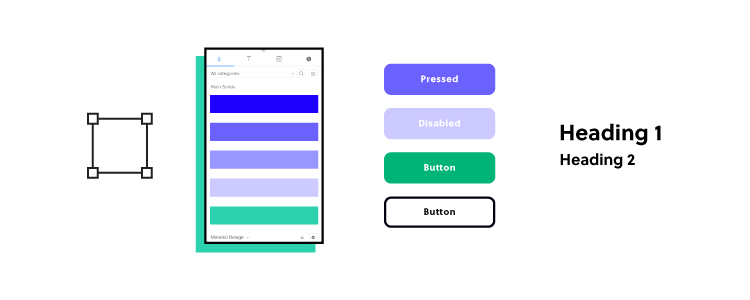
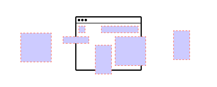
How a design system can help: A design system provides a single source of truth with everyone using the same reusable UI components, patterns, layouts, fonts, colors, and guidelines. This shared system ensures consistent visual language and functionality throughout your products.

By establishing clear standards and best practices, a design system reduces the risk of inconsistency and promotes a cohesive, intuitive user experience that strengthens your brand identity and user satisfaction.

Sign #2: Design and technical UI debt

settings

The problem: Design and technical UI debt are the consequences of shortcuts and poor decisions in the design and development process. Over time, these compromises can lead to inconsistencies, usability issues, and a fragmented user experience, resulting in a significant effort to address these problems later.

How a design system can help: Implementing a design system helps prevent design and technical debt by establishing a unified set of UX design principles, components, and a pattern library. This unified approach ensures that designers and developers work with a shared understanding, reducing the likelihood of miscommunications and inconsistencies.

By adhering to the design system’s guidelines, your team can create a cohesive and consistent user experience, mitigating the accumulation of design and technical UI debt in the long run.

Further reading: how Talabat’s product team used front-end debt to create a business case for their design system Marshmallow.

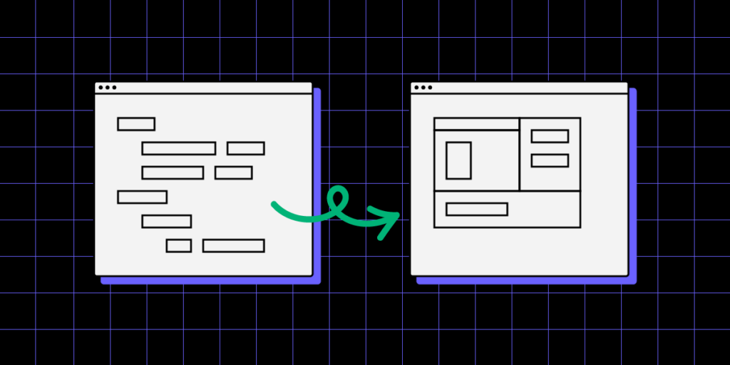
Sign #3: Difficulty in maintaining and scaling your product

design and development collaboration process product 1

The problem: Maintaining and scaling its user interface becomes increasingly complex as your product evolves. Design debt accumulates, and the lack of consistent design patterns can make updates and expansions challenging, time-consuming, and resource-intensive.

How a design system can help: A design system lays the foundation for scalable design by providing reusable components, standardized patterns, and clear guidelines that make maintenance and growth more manageable. With a design system in place, you can efficiently introduce new features and make design updates while maintaining consistency and quality. This streamlined approach saves time and resources, enabling your team to focus on innovation and delivering a superior user experience.

Sign #4: Communication gaps between designers and developers

team collaboration talk communication 1

The problem: Communication gaps between designers and developers can lead to misunderstandings, inconsistencies, and delays in product development. Misaligned expectations, differing interpretations of design mockups, or unclear documentation can result in a confusing and inefficient process, impacting the final product’s quality and user experience.

How a design system can help: A design system acts as a single source of truth for both designers and developers, bridging the communication gap by providing clear guidelines, reusable components, and standardized design patterns.

By adhering to the design system, both teams can work more efficiently, with a shared understanding of the design language and implementation methods. This enhanced collaboration reduces the likelihood of misinterpretations and ensures a cohesive, consistent final product that meets the desired user experience and design goals.

Sign #5: Onboarding challenges

search observe user centered

The problem: When new team members join a product team, they may face challenges understanding the design language, UI components, and coding practices. This learning curve can result in delays and inefficiencies, as new members may require additional time and resources to get up to speed with the existing design and development workflows.

How a design system can help: By providing clear guidelines, best practices, and reusable components, a design system allows newcomers to quickly grasp the product’s design principles, UI patterns, and coding conventions.

The design system accelerates the onboarding process, allowing new team members to contribute more effectively and efficiently to the product’s development, ultimately enhancing overall productivity and cohesion.

Sign 6: Slow time to market

design and development collaboration process product communication

The problem: A slow time to market can result from inefficiencies in the design and development process and complications in coordinating efforts between team members.

Slow product development leads to missed deadlines, increased costs, and reduced competitiveness, as your product takes longer to reach the market or introduce new features and improvements.

How a design system can help: A design system addresses the slow time-to-market problem by streamlining the entire design and development process.

With a shared UI library and clear guidelines, designers and developers can work more efficiently and collaboratively, reducing the time spent creating, refining, and implementing design elements.

This improved workflow allows the product team to deliver new features and updates more quickly, increasing the product’s competitiveness and enabling a faster response to market demands and user needs.

Sign #7: Duplicated design and development work

image 2

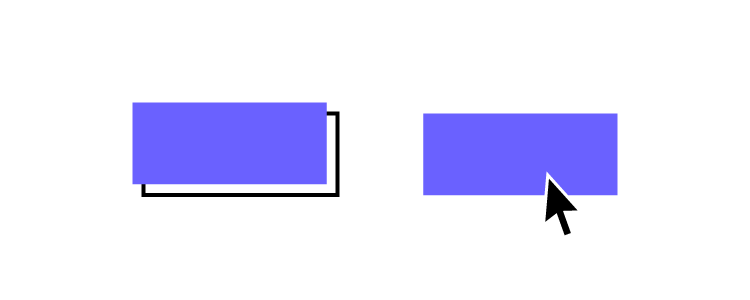
The problem: Without a centralized design system, teams often duplicate work when creating or updating UI elements–for example, building multiple versions of an app bar.

This inefficiency can lead to wasted time, effort, and resources, as designers and developers work independently or in silos, unknowingly replicating each other’s efforts or creating inconsistent assets.

How a design system can help: By implementing a design system, teams can significantly reduce duplicated work. A design system provides:

  • A single source of truth
  • UI library of reusable components
  • Standardized patterns
  • Guidelines that can be easily accessed and applied by all team members

This single source of truth streamlines the design and development process, ensuring everyone works from the same set of resources and follows the same standards, ultimately eliminating redundant efforts and fostering a more efficient, collaborative, and cohesive workflow.

Sign #8: Difficult design handoffs

image 12

The problem: Design handoffs can be challenging, time-consuming, and fraught with friction between designers and developers. Designers often struggle to provide developers with all the necessary assets, specifications, and documentation, leading to misunderstandings, delays, and potential rework.

How a design system can help: A design system simplifies design handoffs by providing a clear and standardized framework for communication between designers and developers. With a shared language, a unified component library, styles, and guidelines, both parties can easily reference and understand each other’s work.

This streamlined approach reduces the chances of misinterpretation and ensures that designs are translated into code accurately and efficiently. By fostering better collaboration and alignment, a design system ultimately helps teams deliver consistent and high-quality products with a faster time to market.

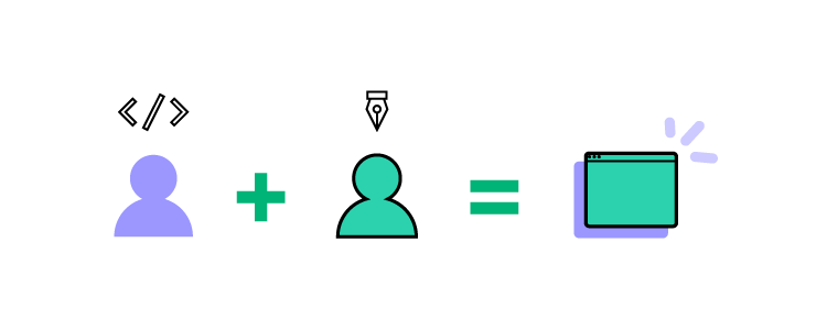
Even the best design systems still struggle to solve the single source of truth dilemma because designers and engineers use different design systems:

It can take many years to achieve ultimate maturity, where designers and developers use the same UI library–a real single source of truth. Or, you can bridge the gap from the start using UXPin Merge and circumvent years of work and resources.

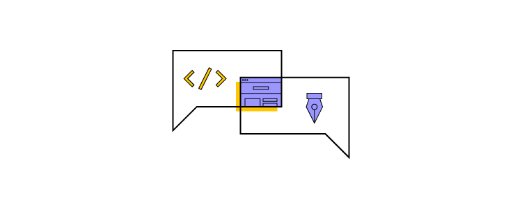
Building and Scaling a Design System With UXPin Merge

Merge enables you to sync a component library from a repository, so designers use the same design system during the design process as engineers use to develop the final product. Designers work with visual elements while engineers see the code behind them, creating a single source of truth across the organization.

This code-to-design workflow solves many challenges organizations face with traditional design systems and product development models. The design system team only has to update and maintain one version of the UI library hosted in a single repository, maximizing efficiency while eliminating potential errors from maintaining separate design systems for designers and engineers.

Merge offers three solutions for syncing your design system:

Save time and resources building, scaling, and maintaining your design system with a single source of truth from UXPin Merge. Visit our Merge page for more details and how to request access to this revolutionary design system technology.

Typography in Web Design — How to Choose a Font?

Typography in web design min

Typography is one of the most critical website design factors, as it significantly impacts many other UI design facets, including usability, accessibility, branding, readability, and aesthetics. We explore website typography for UX design, including correct terminology, the basics, and advanced techniques designers can use to improve design decisions.

Design responsive websites faster with UXPin’s advanced prototyping features. Sign up for a free trial to create your first interactive prototype with UXPin.

Build advanced prototypes

Design better products with States, Variables, Auto Layout and more.

Try UXPin

Why is Typography Important in Web Design?

Typography significantly impacts a website’s user experience, readability, aesthetics, and accessibility. Well-crafted typography enhances the visual hierarchy, guiding users through a user interface while reinforcing the message and brand identity.

By making deliberate choices about typefaces, sizes, spacing, and other typographic elements, designers can create a cohesive and visually appealing web page that effectively communicates information and engages users.

A carefully chosen typeface can influence user perception and emotions–for example, it may evoke trust, professionalism, or playfulness, shaping the user’s impression of a brand or product. Investing time and effort in refining typography is essential for designers to create user-friendly and visually compelling digital experiences that foster user satisfaction, engagement, and retention.

What is the Difference Between Typography, Typefaces, and Fonts?

image 1

Typography is a broader concept that includes text’s overall design, layout, and appearance within a digital or print medium. It’s the art and technique of arranging type, encompassing various aspects like typeface selection, size, line spacing, letter spacing, and text alignment. 

A typeface is a collection of characters, symbols, and glyphs with consistent design and visual appearance. Typefaces represent the broader design concept, including various styles, weights, and variations that define a family of fonts. Examples of typefaces include Helvetica, Times New Roman, and Arial.

A font is a specific variation within a typeface. It is a digital representation of a typeface in a particular style, font weight, and size. Each font within a typeface family maintains the overall design consistency while offering different options for emphasis, hierarchy, and aesthetics. 

For example, within the Helvetica typeface, you might find fonts like Helvetica Regular, Helvetica Bold, Helvetica Light, and Helvetica Italic.

Typography Basics

Anatomy of typefaces

Understanding the anatomy of typefaces is crucial for designers when selecting and working with fonts. Some key terms to know include:

  • Baseline: The invisible line on which characters sit.
  • Cap height: The height of capital letters measured from the baseline.
  • X-height: The height of lowercase letters, typically measured using the letter ‘x.’
  • Ascender: The part of a character that extends above the x-height.
  • Descender: The part of a character that extends below the baseline.
  • Serif: Small decorative strokes added to the ends of characters in some typefaces.
  • Counter: The enclosed or partially enclosed space within a character.

Typeface classifications

We classify typefaces into several broad categories, each with its unique characteristics and applications:

  • Serif: These typefaces have small strokes (serifs) attached to the ends of characters. They often convey a sense of tradition, professionalism, or authority. Examples include Times New Roman and Georgia.
  • Sans-serif: Sans-serif typefaces lack serifs, resulting in a cleaner, more modern appearance. They are suitable for digital interfaces and offer excellent legibility. Examples include Helvetica and Arial.
  • Slab-serif: Characterized by thick, block-like serifs, slab-serif typefaces are attention-grabbing and effective for headlines or display purposes. Examples include Rockwell and Clarendon.
  • Script: These typefaces mimic handwriting or calligraphy, primarily used for logos, invitations, or headers. Examples include Pacifico and Brush Script.
  • Monospace: Monospace typefaces have a fixed width for each character, making them preferred for coding environments and typewriters. Examples include Courier and Consolas.

Font formats

  • TrueType (TTF): Developed by Apple and Microsoft, TrueType is a widely supported font format that offers good display quality on various devices and resolutions.
  • OpenType (OTF): An extension of TrueType, OpenType fonts include advanced typographic features, such as ligatures and alternate glyphs, providing more design flexibility.
  • Web Open Font Format (WOFF/WOFF2): The WOFF and WOFF2 formats were designed specifically for web use, offering faster loading times and improved compression compared to TTF and OTF formats. They support the same features as OpenType fonts but are optimized for web performance.

Choosing the Right Typeface

text typing input

Legibility and readability

Selecting typefaces with high legibility and readability is essential to ensure users can easily consume the content on your website. Legibility refers to the clarity of individual characters, while readability encompasses the overall ease of understanding the text.

Choose fonts with clear, distinguishable characters and a balanced x-height, weight, and spacing. Avoid overly decorative or condensed typefaces for body text. 

For example: Consider using a sans-serif typeface like Open Sans or Roboto for body text. These are best for on-screen legibility and readability.

Tone and brand identity

Your typeface should align with your brand’s tone and identity, as they can evoke different emotions and perceptions. Serif typefaces often convey tradition and authority, while sans-serif fonts project a modern, clean appearance.

Script typefaces can add a touch of elegance or playfulness, depending on their style. Analyze your brand personality and choose typefaces that support and enhance it. 

For example, a sophisticated serif typeface like Playfair Display can help convey elegance and refinement for luxury brands.

Typeface pairing and contrast

Effectively pairing typefaces establishes visual harmony and clear hierarchy. When combining typefaces, look for complementary styles that offer enough contrast to create a distinction without clashing. 

Mixing a serif with a sans-serif typeface is standard practice, as it can balance formality and modernity. Consider the weight, width, and x-height to ensure cohesion between the paired typefaces.

For example, designers often pair a serif typeface like Merriweather for headings with a sans-serif typeface like Lato for body text.

It’s crucial to understand and comply with licensing agreements and legal considerations. Fonts are intellectual property, and copyright laws may restrict their usage or require purchasing a license. There are free, open-source fonts available for commercial use. Always review the terms and conditions of a font before using it in your projects. 

For example, Google Fonts offers a wide selection of open-source fonts, such as Montserrat and Raleway, free for personal and commercial projects.

Web Font Performance and Optimization

loading

While devs are typically responsible for optimizing fonts, designers must understand the various strategies and best practices so they can collaborate to improve user experience and accessibility.

Selecting a font delivery method

Choosing the correct font delivery method is essential for balancing performance and user experience. There are two options:

  • Self-hosting: Fonts are stored and served from your server or content delivery network (CDN). This approach provides more control over font files and caching but may require additional maintenance, configuration, and licensing considerations.
  • Web font services: Fonts are served from an external provider, simplifying licensing, file format conversions, and updates. However, relying on external services can introduce third-party dependencies and potential performance bottlenecks.

Optimizing font files and minimizing file size

Optimizing font files and minimizing their size is crucial for improving web performance and reducing load times. Use tools like Font Squirrel’s Webfont Generator or Google Fonts to generate optimized font files and serve only the necessary font styles, weights, and character sets. Compression techniques, such as the WOFF2 format, can reduce file sizes.

Font loading strategies and performance best practices

Implementing effective font-loading strategies can prevent layout shifts and improve website performance. Some best practices include using font-display CSS property (e.g., swap or fallback) to control the rendering behavior, employing preloading or asynchronous loading techniques, and inlining critical font CSS to reduce render-blocking resources.

Addressing cross-platform rendering issues

Addressing potential rendering issues is essential to ensure consistent typography across various devices and platforms. Test your typography on different browsers, operating systems, and devices to identify inconsistencies.

Employ font smoothing or antialiasing techniques, such as -webkit-font-smoothing or -moz-osx-font-smoothing, to improve the appearance of fonts on screens.

If you don’t want to get caught up in these technicalities, using a service like Google Fonts is best, as it automatically serves the correct font format to users across multiple devices and platforms.

Typography & Responsive Design

scaling prototyping
  • Fluid typography and viewport units: Utilize viewport units (vw, vh, vmin, vmax) to create fluid typography that adapts to different screen sizes. This approach ensures that text scales smoothly as the viewport size changes, maintaining legibility and readability across various devices.
  • Media queries and breakpoint-based adjustments: Apply media queries to define breakpoints at which your typography styles should adapt to specific screen sizes. Adjust font sizes, line heights, and other typographic properties to optimize readability and maintain visual hierarchy on different devices.
  • Modular scales and typographic systems: Implement a modular scale to maintain consistent proportions between different text elements, such as headings and body text. A modular scale is a sequence of font sizes based on a predefined ratio, ensuring a harmonious relationship between typographic elements and enhancing the overall design.
  • Vertical rhythm and line height considerations: Establish a consistent vertical rhythm in your design by setting a standard line height, typically between 1.4 and 1.6 times the font size. This practice improves readability and creates a visually balanced layout, allowing content to flow seamlessly across different devices and screen sizes.

Web Typography Accessibility

accessibility

Font color contrast and readability

Ensuring sufficient color contrast between text and background is crucial for readability and accessibility, especially for visually impaired users.

Following the Web Content Accessibility Guidelines (WCAG), the recommended minimum contrast ratio is 4.5:1 for regular text and 3:1 for large text. Utilize tools like UXPin’s built-in contrast checker and color blindness simulator to evaluate your color palettes on the fly without leaving the canvas. 

Font size and scaling for different devices

Choosing appropriate font sizes and enabling smooth scaling across different devices is essential for maintaining legibility and accessibility. 

A standard base font size for body text is 16px, while headings should be proportionally larger. Use relative units like em or rem, which allow users to resize text according to their preferences and ensure proper scaling on various screen sizes.

Supporting screen readers and assistive technologies

Designing typography that works well with screen readers and other assistive technologies is crucial for users with visual impairments or cognitive disabilities.

Use semantic HTML tags, such as headings (h1-h6) and paragraphs (p), to create a clear content hierarchy. This distinction allows screen readers to navigate and effectively communicate the content to users.

Best practices for internationalization and localization

When designing for international audiences or localizing your content, it’s essential to consider typography best practices that cater to different languages, scripts, and cultural contexts.

Choose typefaces that support a wide range of characters, accents, and special symbols required by various languages. Also, be mindful of reading direction (left-to-right or right-to-left) and ensure your design accommodates these differences.

Advanced Web Design With UXPin

UXPin gives designers the tools and features to go from concept to wireframing and mockup to interactive prototyping faster and with higher fidelity than any other design tool.

Design immersive experiences your users will love with the world’s most advanced design and prototyping tool. Sign up for a free trial to build your first UXPin prototype today.

Creating a Sense of Urgency — Examples and Design Tips

sense of urgency examples min

A sense of urgency is the strategic use of design elements and messaging to create an immediate need for users to take action. Designers can create urgency by leveraging time-sensitive offers, limited availability, or social proof to evoke emotional responses that motivate users to act quickly.

The objective of incorporating urgency into design is to encourage users to make faster decisions, ultimately leading to increased conversions, user engagement, and satisfaction.

Design immersive, fully functioning prototypes to improve testing and deliver better product experiences to your users. Build your first interactive prototype with UXPin. Sign up for a free trial.

Build advanced prototypes

Design better products with States, Variables, Auto Layout and more.

Try UXPin

Why is a Sense of Urgency Important?

Incorporating a sense of urgency in digital product design can significantly improve user engagement, drive conversions, and boost overall revenue.

Urgency creates a compelling reason for users to act, reducing indecisiveness and procrastination. A well-implemented sense of urgency strategy can lead to higher conversion rates, user retention, and customer loyalty by tapping into users’ emotional responses and encouraging immediate action.

Psychological Principles and Urgency-Driven Design

Understanding the psychological principles behind urgency-driven design is key to effectively leveraging urgency to drive user action. 

Psychological principles such as the fear of missing out (FOMO), scarcity, and social proof play a vital role in creating a sense of urgency that resonates with users emotionally. 

Designers who fully understand human behavior and design psychology can create compelling experiences that motivate users to take desired actions, leading to increased engagement and conversions.

The Ethics of Creating a Sense of Urgency

Urgency and scarcity are powerful psychological tools influencing users’ behavior and decision-making processes. By tapping into users’ emotions and cognitive biases, designers and marketers can create experiences encouraging users to take specific actions, such as purchasing, signing up for a service, or engaging with content. 

However, this power comes with a responsibility to ensure that these strategies are used ethically and do not manipulate or exploit users in a way that could be harmful or detrimental to their well-being.

Designers should approach psychological principles in digital product design carefully and consider the user’s best interests. Creating a sense of urgency should be done to genuinely benefit the user, providing real value and enhancing their experience.

This “ethical urgency” can be achieved by being transparent about the nature of the urgency, using clear and honest messaging, and avoiding deceptive or misleading tactics.

Understanding the Psychological Principles Behind Urgency

In his book Influence: The Psychology of Persuasion, Robert Cialdini goes into the following three topics (and more). Nir Eyal’s Hooked: How to Build Habit-Forming Products is another fantastic resource for understanding design psychology.

Fear of Missing Out (FOMO)

FOMO is a psychological phenomenon where individuals experience anxiety or distress over the possibility of missing out on opportunities, experiences, or rewards. This fear can significantly influence consumer behavior, pushing them to take action to avoid potential regret or loss.

FOMO affects decision-making by creating a sense of urgency and prompting users to act quickly. When faced with a limited-time offer or an exclusive opportunity, users may make faster decisions to avoid the feeling of missing out.

Scarcity

Scarcity is a psychological principle that describes the perception of limited supply or availability. It plays a crucial role in creating urgency, as people tend to place a higher value on scarce items and are more likely to act quickly to secure them.

Types of scarcity:

  • Time-based scarcity: Limited product availability, offer, or opportunity for a specific duration.
  • Quantity-based scarcity: Limited supply or stock of a product or service.

When a product or service is scarce, people perceive it as more valuable, exclusive, and desirable, making them more likely to take action to obtain it.

Social proof

Social proof is a psychological principle where individuals look to the behavior of others to guide their actions. It plays a critical role in driving action, as people tend to trust and follow the choices made by others, especially when they are uncertain or facing a new situation.

a visualization of a sense of proof in ecommerce

Social proof can increase urgency by showcasing the popularity or demand for a product or service, making users more inclined to act quickly. It fosters trust by validating and reassuring that others have made similar choices and found value in the product or service.

Types of social proof:

  • Testimonials and reviews from customers or users
  • Endorsements from industry experts or influencers
  • Social media mentions or shares
  • Real-time user data, such as the number of people currently viewing or purchasing a product

Effective Strategies for Implementing Urgency

Time-based urgency

  • Limited-time offers and promotions: Create exclusive, short-term offers or discounts to drive quick decision-making and incentivize users to act immediately.
  • Countdown timers: Incorporate countdown timers on offers or promotions to visually communicate the time-sensitive nature of the opportunity and reinforce the sense of urgency.
  • Design elements for time-based urgency: Use attention-grabbing colors, fonts, layouts, and call-to-actions (CTAs) to emphasize the time-sensitive nature of offers.

Quantity-based urgency

  • Limited stock or availability: Communicate a product’s limited availability to create a sense of urgency and motivate users to act quickly.
  • Displaying real-time stock levels: Show the current stock or availability levels to emphasize scarcity and encourage users to take immediate action to secure the product or service.
  • Design elements to emphasize scarcity: Utilize visual cues, such as progress bars, low-stock indicators, or sold-out tags, to highlight a product’s scarcity and create a sense of urgency.

Leveraging social proof

  • User reviews and testimonials: Feature positive reviews and testimonials from satisfied customers to build trust and demonstrate the product or service’s value.
  • Ratings and endorsements: Display ratings, endorsements, or recommendations from industry experts or influencers to validate the quality of the product or service and encourage users to act quickly.
  • Incorporating social proof in design: Integrate social proof seamlessly into the design by showcasing user-generated content, real-time data, or social media activity to reinforce the popularity and demand for the product or service.

We use quotes as social proof on our sign-up landing page from well-known UXPin clients to create a sense of urgency.

UXPin's sign up form uses client testimonial to boost sense of urgency

Balancing Urgency with User Experience

Avoiding negative impacts of urgency on user experience

It’s essential to prevent urgency-driven strategies from causing stress or frustration for users. Designers should balance creating a sense of urgency and maintaining a positive user experience by avoiding aggressive tactics or overwhelming users with too many time-sensitive elements.

Ensuring transparency and authenticity

To build trust and credibility, designers must ensure that urgency-based strategies are transparent and authentic. Be clear about the nature of the urgency, use honest messaging, and avoid tactics that may come across as deceptive or manipulative.

Striking the right balance between urgency and user satisfaction

Designers must carefully balance incorporating a sense of urgency and ensuring user satisfaction. Use urgency in moderation to enhance the customer experience and provide genuine value and benefits.

A Step-by-Step Framework for Implementing Urgency in the Design Process

  1. Define your goals: Identify the desired outcomes you want to achieve by incorporating urgency into your design. These include increasing conversions, boosting user engagement, or improving customer retention.
  2. Understand your target audience: Research and analyze your target audience better to understand their needs, motivations, and pain points. This user research will help tailor urgency-driven strategies to resonate with users.
  3. Choose the right psychological principles: Based on your goals and target audience, decide which psychological principles (FOMO, scarcity, social proof, etc.) would be most effective in driving the desired actions.
  4. Identify suitable design elements and tactics: Brainstorm the design elements and tactics required to create a sense of urgency–for example, countdown timers, limited-time offers, real-time stock levels, colors, animations, or user testimonials.
  5. Prioritize user experience: Evaluate urgency tactics against user experience and usability to ensure there are no adverse impacts. Keep the user’s best interests in mind and focus on providing genuine value while creating urgency.
  6. Prototype and test: Incorporate the chosen design elements and tactics into your digital product design. Run A/B tests or user testing to evaluate their effectiveness and ensure they drive the desired actions without compromising user experience.
  7. Monitor and optimize: Continuously monitor your product’s performance to identify areas for improvement. Gather user feedback and analyze data to optimize your urgency-driven strategies and ensure they remain effective and user-friendly over time.
  8. Maintain ethical practices: Use urgency tactics ethically and transparently throughout the design process. Avoid misleading or manipulative tactics and always prioritize the well-being and satisfaction of your users.

Measuring the Effectiveness of Urgency-Driven Design

Key performance indicators (KPIs) to track

  • Conversion rates: The percentage of users who complete a desired action, such as purchases or newsletter sign-ups.
  • Engagement metrics: Time spent on a page, click-through rates, and user interactions with urgency-driven elements.
  • User retention: The rate at which users return to or continue to engage with the digital product over time.
  • Customer satisfaction: Feedback and ratings from users indicating their overall satisfaction with the product or service.

Analyzing and optimizing urgency-driven designs

Regularly evaluate the performance of urgency-driven designs to ensure they’re effective in driving user action. Use data collected from KPIs and user testing to identify areas for improvement and make necessary adjustments to optimize the designs.

Adapting strategies based on data and user feedback

Continuously refine and adapt your urgency-driven strategies by leveraging data insights and user feedback. This iterative approach allows you to make informed decisions and create an effective, user-centric design.

User-Centered UI Design With UXPin

Most design tools are built for graphic design and adapted for UX. UXPin is a true user experience design tool powered by code, giving designers final-product like fidelity and functionality.

Four features that set UXPin apart from other popular design tools:

  • States: allow designers to create multiple states for a single UI element and design complex interactive components like dropdown menus, tab menus, navigational drawers, and more.
  • Variables: capture data from user inputs and create personalized, dynamic user experiences–like populating a profile user interface from onboarding data.
  • Expressions: Javascript-like functions to create complex components and advanced functionality–no code required!
  • Conditional Interactions: create if-then and if-else conditions based on user interactions to create dynamic prototypes with multiple outcomes to replicate the final product experience.

Enhance your product’s user experience with the world’s most advanced UX design tool. Create your first fully functional prototype right on trial. Sign up for a free trial.

Join Free Panel “How to Overcome Challenges of Scaling Design Systems”

1200x600 blogpost webinar

What is sabotaging your design system? Is it lack of support from stakeholders? Poor cross-team collaboration? No governance structure?

We joined forces with Whitespace to set up a discussion panel about overcoming challenges of scaling design systems. Join us for free on May 16th and listen to the experts who grow, govern, maintain, and evangelize enterprise design systems.

You’ll hear from:

Join us 👉 Challenges of scaling design systems.

Date: May 16, 2023
Time: 9 AM PT / 6 PM CEST
Where: Online
AboutChallenges of scaling design systems

FinTech Design System – How to Start it?

fintech design system min

FinTech design systems help product teams solve fundamental usability issues while moving fast to stay ahead of the competition. But, building a FinTech design system requires significant resources to create, scale, and mature.

Create a single source of truth for your FinTech app with the world’s most advanced design and prototyping tool. Visit our Merge page for more details and how to request access to this revolutionary technology.

Reach a new level of prototyping

Design with interactive components coming from your team’s design system.

A Design System Must Guarantee Consistency

Consistency is one of the primary reasons organizations build a design system. Design consistency “ties UI elements together with distinguishable and predictable actions,” which increases trust, adoption, and usage–vital for successful financial products and banking apps!

Consistency doesn’t only benefit the user experience. It also creates more efficient workflows while reducing front-end and UX debt.

Creating a single source of truth means product teams, user experience designers, and engineers all work with the same components, increasing cross-functional collaboration, streamlining design handoffs, and reducing time-to-market.

More Than a Style Guide

design system 1

A FinTech design system must be more than a style guide. A true single source of truth is a design system where designers and engineers use the same component library–what Iress refers to as “fully integrated” or stage four of design system maturity.

While style guides solve many foundational design challenges and inconsistencies, they lack interactivity, and functionality. Design teams can create beautiful user interfaces, but image-based prototypes don’t provide accurate testing or meaningful feedback.

In the highly competitive FinTech landscape, designers must deliver high-quality customer experiences with UIs that enable users to complete tasks effortlessly. The only way to achieve quality outcomes is through high-fidelity prototypes and testing–beyond the limitations of an image-based style guide.

From style guide to component-driven prototyping

This component-driven prototyping workflow allows FinTech UX design teams to build prototypes that look and feel like the final product–something that’s usually only possible with the help of UX engineers or front-end developers.

Merge syncs a design system from a repository to UXPin’s design editor, so designers use an interactive component library instead of a style guide or UI kit to build prototypes.

Merge prototypes look and feel like the final product, enabling FinTech product design teams to go beyond the limitations of traditional design tools and style guides. These immersive, dynamic prototype experiences solve usability issues and pain points while identifying opportunities.

Don’t Overcomplicate Your System

Organizations must view their design system as any other product. It must be user-friendly and solve user problems–in this case, product development member problems.

Codifying a design system into a searchable hub with guidelines, principles, documentation, tutorials, and governance procedures makes it easy to use while providing design teams with clear guidance about using components and building products.

One of our favorite design systems is StackOverflow’s Stacks Design System. Stacks uses four categories for its guidelines:

  • Product: software development and individual component guidelines
  • Email: email-specific instructions with templates
  • Content: principles, voice, tone, grammar, etc., for written content across StackOverflow touchpoints
  • Brand: how to represent StackOverflow through design, including logo usage, typography, color, data visualization, etc.
stack overflow design system min

When a design system is easy to use, it creates many benefits for the organization and its customers:

  • Simplifies workflows for faster time to market
  • Streamlines onboarding
  • Increases output consistency and reduces errors
  • Gives designers more time to focus on users
  • Improves cross-functional collaboration and handoffs
  • Ensures design projects meet deadlines (within budget)
  • Facilitates scalability

Prioritize Accessibility

Accessibility is crucial for any digital product, especially FinTech design, where users make critical financial decisions. Designers must consider how design decisions impact users from many backgrounds, including those with disabilities.

One of the challenges with accessibility is it requires attention to detail, adding time to design projects. Design system accessibility allows organizations to solve foundational issues at the component level, reducing the time and effort to make products accessible for all users.

Salesforce’s Lightning Design System includes detailed accessibility guidelines for content, interaction design, and patterns to ensure every product meets W3C standards.

salesforce design system min

Further reading: Our web accessibility checklist and design system accessibility resources provide an overview of where to start.

Build a System that Serves the Entire Organization

Your FinTech design system must serve the entire organization. Not only will this help with collaboration, but it’ll help with design system buy-in from stakeholders.

Delivery Hero’s product team built a solid design system business case by demonstrating its value for engineering teams and solving front-end debt. The team proved that Marshmallow wasn’t just a system to make the design team’s lives easier; it had business value and would generate a positive ROI for the organization.

A good design system encourages feedback from every department to ensure it generates maximum value while encouraging design system adoption.

Leverage an Existing Design System

Building a design system is expensive and time-consuming. Many FinTech startups (and large organizations) lack the resources to create a design system from scratch.

Adopting an existing themeable, open-source design system is a fantastic way to overcome the expense of building from scratch while delivering an on-brand, high-quality user experience.

Open-source design systems aren’t just for startups.

A Design System Must Serve a Purpose

Think of a design system like any other digital product or feature–does it serve users’ needs? Are your motivations for building a design system based on solving core product development issues?

You won’t get stakeholder buy-in or adoption if you don’t identify these needs and demonstrate the design system’s value.

  • How will your design system solve workflow bottlenecks and roadblocks?
  • Do you suffer from design drift and inconsistencies? How will your design system solve these?
  • What is your current time to market? Can you conduct experiments to demonstrate that a design system will reduce this and what are the cost benefits?

Metrics and KPIs matter when pitching a design system to stakeholders.

Amber Jabeen of Delivery Hero failed to secure buy-in for the Marshmallow design system several times before getting approval. Amber’s six key takeaways from this process include the following:

  1. Start with a real pain point: what problem will you solve? More importantly, what is it costing the company? Stakeholders take notice when they see actual, provable numbers.
  2. Build a value proposition: how will your design system solve this problem? Be realistic!
  3. Identify your biggest supporters and sponsor: finding leaders and stakeholders who believe in your solution will give your argument merit and weight.
  4. Show before you tell: prove your solution’s effectiveness with results from a case study or experiment.
  5. Talk business metrics: show what this problem costs the company and how a design system will fix this.
  6. Don’t go alone – build your network: get input and support from multiple team members and departments impacted by the problem(s) you’re trying to solve and confirmation that they support your idea.

Track and Report Your Design System’s Success

A design system is not a “one-and-done” solution. You will have to continually prove its positive benefits and ROI to secure the resources necessary to maintain and scale the design system.

Stakeholders want to see that their investment creates a positive change and, more importantly, that team members use it!

In What to Do After Launching a Design System, we highlight three critical KPIs for getting continuous buy-in and support:

  • Team efficiencies: how long does it take to deliver design projects with vs. without a design system? How does this figure improve with increasing adoption?
  • Speed to market: does the design system improve delivery from concept to final release?
  • Effect on code: how does the design system improve design handoffs and reduce designer/engineer friction? Does the design system reduce technical debt?

The design system team must also collect data and feedback on other areas of the business, including:

  • Increase sales/conversions
  • Reduced tech support calls
  • Brand satisfaction
  • Reduced rework or errors
  • Employee retention
  • Labor cost savings

Identifying areas where your design system creates positive benefits and efficiencies are vital for its long-term success.

Design System Adoption

Adoption is another vital metric for a design system’s success. Delivery Hero’s DS team used a gamification strategy to increase organization-wide adoption. The three-step process included:

  • Gamify: awards for various adoption levels and usage
  • Socialize: included team members in naming the design system, designed an internal emoji, hosted events, surveyed users regularly, and kept everyone updated with a regular newsletter
  • Celebrate: Delivery Hero’s DS team made a point of celebrating adoption milestones and Marshmallow’s most prominent users

Delivery Hero’s adoption strategy won’t work in every organization, but it demonstrates that increasing a design system’s usage takes time and effort.

Scaling FinTech Design With UXPin Merge

Design systems can create real impact in terms of process improvements. But the change won’t be sustainable unless you have the right tools that make it easy to share coded design system components, bring them to design, and hand over prototypes that behave like real products. Visit our Merge page to learn more.

Design Mission Statement – Examples and Tips

design mission statement

Designing a meaningful and impactful future begins with a clear and concise mission statement. This article explores the essential elements of an effective design mission statement, including a step-by-step guide to crafting one that reflects your team’s unique values, principles, and aspirations.

Whether you’re a UX designer, DesignOps leader, or product owner, understanding the importance of a good mission statement is crucial for aligning your team, driving innovation, and inspiring growth.

Create real design process improvements and make an impact on the speed and efficiency of prototyping with component-driven design with UXPin Merge. Sync your dev’s UI components with UXPin and design up to 10x faster. Visit our Merge page for more details.

Reach a new level of prototyping

Design with interactive components coming from your team’s design system.

What is a Design Mission Statement?

A design mission statement guides designers by outlining and defining company values, principles, and aspirations in design. This concise declaration helps define the UX team’s unique approach to product design and serves as a foundation for creative and user experience decision-making.

By establishing a clear sense of direction, a mission statement enables designers to focus on their goals and consistently deliver value to users, stakeholders, and collaborators.

How does a design mission statement fit with the overall UX strategy?

A design mission statement incorporates the overall UX strategy by guiding and aligning design decisions with organizational goals. It fosters consistent, purposeful design choices, enhancing the user experience across products and platforms.

What is a Vision Statement?

A design vision statement outlines the long-term aspirations and desired future state for a product or organization’s design department. It provides designers with a clear direction or “north star” and is a source of inspiration and motivation.

Vision Statement vs. Mission Statement – What’s the difference?

  • A design mission statement focuses on the organization’s present design objectives, principles, and values. It establishes the foundation for design decisions, ensuring alignment with the organization’s goals.
  • A design vision statement describes where the organization wants to be in the future, while the mission statement defines its current purpose and approach to design.

Key Elements of an Effective Design Mission Statement

scaling prototyping

Vision and values

The foundation of a strong design mission statement lies in articulating your team’s aspirations and core beliefs. Clearly define your organization’s purpose and what it stands for, guiding the team toward meaningful outcomes. For example, a company focused on sustainability might emphasize eco-friendly design practices in its mission statement.

Design philosophy and principles

Outline the design approach that underpins your team’s work. You can include aspects like user-centered design, simplicity, or innovation. By expressing these principles, you establish a framework that drives consistent decision-making. For example, if accessibility is a priority, your mission statement could mention a commitment to inclusive design for all users.

Focus on user needs and experience

A successful design mission statement places your target audience at the center, highlighting a dedication to understanding and addressing their needs. Your statement must emphasize the importance of empathy, research, and user testing. For example, you might mention a commitment to providing intuitive, enjoyable, and seamless experiences that solve users’ problems.

Commitment to collaboration and communication

Effective design implementation often requires teamwork and clear communication with stakeholders. In your mission statement, highlight the value of collaboration and transparent dialogue, fostering a culture of openness and constructive feedback. For example, a mission statement could mention fostering cross-functional collaboration to ensure well-rounded and high-quality design solutions that incorporate diverse input and ideas.

Continuous learning and growth

The design and technology landscape is ever-evolving. A strong mission statement should reflect a dedication to improvement and adaptation. Encourage a growth mindset within your team, emphasizing the importance of learning from mistakes, staying updated on industry trends, and refining skills. For instance, your mission statement might underline a commitment to ongoing professional development and experimentation with new design methodologies.

Crafting Your Design Mission Statement

testing observing user behavior 1

Setting the stage

Before diving into creating your design mission statement, setting the stage for a successful and collaborative session is essential. Involving the right people, preparing the appropriate materials, and choosing the ideal setting will help ensure that your mission statement truly reflects the values and aspirations of your team.

  • Who to include: Invite key members of your design team, including designers, DesignOps leaders, product owners, and any other relevant stakeholders. Including a diverse group ensures that the mission statement encompasses various perspectives and insights.
  • The setting: Select a comfortable, distraction-free environment to foster creativity and collaboration. This location could be a dedicated meeting room, a quiet office corner, or a virtual space for remote teams. Ensure the setting encourages open communication and allows for brainstorming and sharing ideas.
  • Materials: Provide materials to facilitate brainstorming and idea generation, such as whiteboards, markers, sticky notes, and pens. For remote UX workshops, use online collaboration tools like Miro or Mural.

Step 1 – Reflect on your organizational and UX values

Consider your company’s broader values and how they align with your UX team’s objectives. Determine the core values that will guide your design decisions.

Action: List your organization’s values and identify those most relevant to your design team. Reflect on how these values influence your design process and outcomes.

Step 2 – Identify your design principles and philosophies

Establish your team’s fundamental design principles, such as simplicity, user-centricity, innovation, accessibility, etc.

Action: Brainstorm and list the design philosophies that resonate with your team. Consider how these principles shape your team’s design initiatives and problem-solving approach.

Step 3 – Consider the impact you want to make on users, stakeholders, and colleagues

Think about the desired outcomes of your design work and how they contribute to the success of users, the organization, and your team.

Action: List the key impacts you want to achieve through your design work. Reflect on the benefits for users, the company, and your team members.

Step 4 – Balance between idealism and pragmatism

While it’s essential to have aspirational goals, your mission statement should also be grounded in reality. Strive for a balance between lofty ideals and practical, achievable objectives.

Action: Review your mission statement draft and evaluate if the goals are attainable while still being ambitious. Adjust the statement as needed to ensure a balance between idealism and pragmatism.

Step 5 – Involve your team in the process

Gather input from team members and non-designers to ensure the mission statement represents your organization and design team’s values and aspirations.

Action: Organize a workshop or brainstorming session with your team to discuss and refine the mission statement. Incorporate feedback and suggestions to create a statement that truly represents your team.

Step 6 – Keep it concise and memorable

A powerful mission statement is brief, clear, and easy to remember. Aim to communicate your message in a way that resonates with your team and stakeholders.

Action: Edit and refine your mission statement to ensure it’s succinct and straightforward. Remove unnecessary words or phrases, focusing on the most critical elements of your team’s mission.

Examples of Design Mission Statements

prototyping paper pencil lo fi

We’ve done our best to find mission statements relevant to design. Since these are generally internal documents, they can be challenging to find. Here are three mission statement examples and the lessons you can take from them.

Google’s mission statement

“To organize the world’s information and make it universally accessible and useful.” – Source: Google’s about page.

While not explicitly a design mission statement, Google’s mission statement encompasses its design philosophy, as they aim to create user experiences that are intuitive and accessible to everyone.

Human Experience’s mission statement

“Our mission is to elevate patient safety, create beautiful therapeutic spaces for healing, and establish viable long-term programs. Through our design and consulting work, we advocate for all stakeholders in behavioral health, including patients, hospital administration and staff, and healthcare architects. Simply put, we want to make a difference in the world. When we combine our beliefs with our years of experience, we believe we can.” Source: Human Experience–Who We Are.

Human Experience’s mission statement showcases its commitment to enhancing patient safety and creating therapeutic spaces for healing. They emphasize the importance of considering all stakeholders and advocating for their cause in the healthcare industry. This mission statement demonstrates the power of clearly outlining the purpose and goals of a design team, inspiring change in their field.

Spotify’s mission statement

“Our mission is to unlock the potential of human creativity—by giving a million creative artists the opportunity to live off their art and billions of fans the opportunity to enjoy and be inspired by it.” Source: Spotify Design.

Again, not a design-specific mission statement, but a fantastic example of placing users front and center. Spotify’s mission statement emphasizes the power of human creativity, focusing on the dual goals of supporting artists and inspiring fans. 

This statement showcases their dedication to fostering a vibrant creative expression and enjoyment ecosystem. By putting both creators and listeners at the heart of its mission, Spotify highlights the importance of prioritizing the needs and aspirations of its diverse user base.

Updating and Evolving Your Design Mission Statement

designops efficiency speed optimal

Updating and evolving a design mission statement is crucial to maintaining relevance as the design landscape and user needs change. Periodically revisiting the statement ensures it aligns with the organization’s current goals and priorities.

Design teams should consider updating their mission statement when:

  • Organizational goals shift: Reflect new objectives to keep design efforts focused.
  • Industry trends change: Adapt to emerging technologies and user expectations.
  • Team dynamics evolve: Accommodate new members or leadership changes.
  • User needs expand: Stay responsive to shifting user preferences and requirements.

Design products that align with your company’s vision using the world’s most advanced code-based design tool. UXPin Merge bridges the gap between design and development to create a reliable single source of truth across the organization, aligning teams toward a common goal. Visit our Merge page for more details and how to request access.

What is Design System Testing? Definition, Benefits, and Process

Design System Testing min

Testing is vital for ensuring your design system provides the tools, guidance, components, and support teams need to deliver high-quality products efficiently. Design system testing assesses every aspect of the component library, documentation, syntax, accessibility, and more to ensure it meets the organization’s standards and expectations.

This article explores design system testing, when to test, roles and responsibilities, procedures, and tools teams use to conduct various tests.

Create a single source of truth, reduce operation burdens, and minimize errors with a code-to-design design system workflow from UXPin Merge. Visit our Merge page for more details and how to request access.

Reach a new level of prototyping

Design with interactive components coming from your team’s design system.

What is Design System Testing?

Design system testing (design system auditing) evaluates a design system’s functionality, usability, documentation, quality, and consistency. This evaluation aims to ensure the design system meets the requirements and expectations of its users and stakeholders.

A typical design system testing process might include:

  • Component testing: Evaluate individual components for visual consistency and function as expected.
  • Pattern testing: Ensure patterns are applied consistently across user interfaces and use cases.
  • Design file testing: Comparing design files to repository components to ensure designers and engineers share the same UI elements and patterns.
  • Accessibility testing: Validate that components, patterns, and templates meet design system accessibility standards and guidelines.
  • Cross-platform and cross-browser testing: Ensure the design system and components works consistently across different devices, platforms, operating systems, and browsers.
    • Performance testing: Measure the design system’s impact on overall product performance, including load times and responsiveness.
    • Usability testing: Analyze user research and conduct interviews to ensure the design system supports a positive user experience.
    • Documentation testing: Review design system documentation, including its guidelines (brand, content, code, design, etc.), to ensure it’s comprehensive and provides adequate user support.

    Why is Design System Testing Important?

    Design system testing is vital for the integrity of the UI library and the products it serves. Errors and inconsistencies left unchecked can quickly compound into bigger issues for product teams and end-users.

    A design system’s primary purpose is to serve as a single source of truth. When a design system is compromised, it no longer serves as a trustworthy source for product consistency and coherence.

    How Often Should You Test a Design System?

    timer

    The frequency of design system testing will depend on multiple factors:

    • The size and complexity of the design system
    • Design system maturity
    • Available resources (labor, time, financial)
    • Product ecosystem
    • Frequency of updates

    Here are some scenarios and intervals organizations might consider testing a design system.

    Regular interval testing

    The design system team may create a schedule for regular testing, such as monthly, quarterly, bi-annually, etc. A fixed testing program allows the DS team to plan while managing stakeholder and user expectations.

    After significant updates or additions

    It’s common for design system teams to audit a design system after a major update or when introducing new components, patterns, or guidelines. This audit ensures the changes function as expected while maintaining high UI consistency and coherence standards.

    Addressing usability, accessibility, and performance issues

    When product teams identify usability, accessibility, or performance issues, it’s crucial to audit the entire design system. This audit will evaluate the depth of the problem and appropriate corrective action.

    It’s important to note that waiting for problems to emerge is not a good strategy for testing a design system. Adopting a more proactive approach, like regular interval testing or post updates, is better for catching and correcting issues early.

    Agile development

    Organizations that follow agile development practices may incorporate regular testing into the development process. This agile approach would mean tests occur more frequently, possibly integrated into sprints or release cycles.

    Who is Responsible for a Design System Audit?

    user pink 1

    A comprehensive design system audit requires a cross-functional team with different expertise. In contrast, smaller or more specific tests may only need one or two specialists.

    Depending on the scale and scope, here is a list of team members you might consider for your design system test. Keep in mind that companies may have one team member performing multiple functions listed below. For example, a UX designer may assess design, accessibility, and content, while an engineer covers UI components and QA.

    1. UX/UI designers: assess visual consistency, usability, and overall user experience of the components and patterns. They also check design-specific documentation, tools, and UI kits.
    2. Developers: Front-end and back-end developers evaluate component functionality, syntax, performance, and implementation. They also test the UI library across platforms and browsers.
    3. Accessibility specialists: These team members have up-to-date expertise in accessibility standards and guidelines. They test the design system to organizational and regional accessibility requirements.
    4. QA engineers: Quality assurance (QA) engineers create and execute tests in accordance with the design system’s quality standards.
    5. Product managers or project managers: Many companies treat testing like a project requiring a team member to coordinate and oversee the process, including establishing timelines, allocating resources, and ensuring the team aligns on objectives and priorities. They may also gather findings to produce a final report, including the next steps.
    6. Content designers or copywriters: Review design system documentation, content guidelines, messaging, tone, voice, etc., for consistency and accuracy across components and patterns.

    Design System Testing Workflow

    process teams

    Here are some suggested steps for executing a design system audit.

    1. Define objectives: Establish the goals and objectives of the design system test. i.e., identifying inconsistencies, evaluating accessibility, or assessing performance.
    2. Develop a plan: A test plan outlines the audit’s scope, methods, resources, schedule, and success criteria. An effective test plan must guide testing, assigns roles, and keep team members aligned.
    3. Identify test cases and scenarios: Determine the specific test cases and scenarios team members must use to evaluate various parts of the design system. These must be consistent for every test to ensure you can measure KPIs and performance over time.
    4. Prepare tools and resources: Gather the tools and resources team members need to complete their work, including testing frameworks, accessibility checkers, performance analyzers, usability testing methods, etc.
    5. Execute tests: Conduct tests according to the plan, documenting the results and issues.
    6. Analyze test results: Review tests to identify patterns, trends, or areas of concern. Determine issue severity, prioritize fixes, and add to UX or tech backlogs.
    7. Report findings and recommendations: Prepare a comprehensive report for design system users and stakeholders with test outcomes, findings, and recommendations.
    8. Fix issues and implement improvements: The design system team must implement changes according to the report updating components, patterns, guidelines, and documentation as needed.
    9. Monitor, re-test, and iterate: Test releases to ensure they solve issues appropriately. Monitor changes to assess effectiveness, testing and iterating until you achieve the desired outcome.

    Tools for Design System Testing

    settings

    There are many tools available for testing different aspects of a design system. Here are a few categories and examples.

    Visual consistency testing

    • Percy: A visual testing tool that helps detect visual changes and inconsistencies across components and layouts.
    • Chromatic: Automates gathering UI feedback, visual testing, and documentation–created by Storybook for built-in tests.
    • SauceLabs Sauce Visual Testing: Find and fix visual errors and inconsistencies across all browsers and resolutions early in the development lifecycle.

    Functionality and integration testing

    • Jest: A JavaScript testing framework that supports component and integration testing for JavaScript libraries and frameworks, including React, Vue, and Angular.
    • Cypress: An end-to-end testing tool for testing browser-based web applications.

    Accessibility testing

    • axe: An accessibility testing tool for identifying and resolving accessibility issues in web applications.
    • Lighthouse: An open-source tool from Google that provides automated auditing for accessibility, performance, and other best practices.
    • WAVE: A web accessibility evaluation tool that helps identify and resolve accessibility issues.
    • UXPin: Built-in color contrast checker and color blindness simulators allow designers to test UIs on the fly.

    Cross-platform and cross-browser testing

    • BrowserStack: A platform providing access to various browsers and devices for testing web applications across different environments.
    • Sauce Labs: A cloud-based platform for automated and manual testing across browsers, platforms, and devices.

    Performance testing

    • WebPageTest: An open-source tool for measuring web page performance, including load times, rendering speed, and optimization recommendations.
    • Google PageSpeed Insights: A free tool that analyzes web page performance and provides suggestions for improvement.
    • Digital.ai Continuous Testing: Continuously test functional, performance, and accessibility scenarios on a matrix of devices and browsers with various manufacturers operating systems.

    Usability testing

    • UserTesting: A platform for conducting remote usability tests with real users, capturing their feedback and interactions.
    • Ethnio: A research ops platform for recruiting participants who use your products and features using intercepts. Helpful for getting feedback from users who interact with specific components or patterns.
    • Optimal Workshop: A suite of usability testing tools, including card sorting, tree testing, and first-click testing.
    • UXPin Merge: A tool for building prototypes using components from your design system for accurate high-fidelity usability testing.

    Design system documentation and collaboration

    • Storybook: An open-source tool for building and organizing UI components, making design system testing collaborative and accessible. Storybook integrates with UXPin to bridge the gap between design and development.
    • UXPin Design Systems: A tool for building, managing, and scaling design systems with shared documentation, assets, and style guide.

    A Single Source of Truth With UXPin Merge

    Maintenance and governance are the biggest design system challenges, especially when there is no single source of truth between design and development.

    UXPin Merge bridges the gap between design and development by syncing your design system’s repository with UXPin’s design editor so design and engineering teams use the same component library–creating a true single source of truth across the organization.

    Learn more about UXPin Merge’s code to design workflow and how it benefits design systems, including better maintenance, collaboration, and governance. Visit our Merge page for more details.

    Affordances 101 – What You Can Learn About User Interactions

    Affordances 101

    Users require physical clues on what they should do on your site and where they should do it. This is where visual clues or affordances come in – they show users what they should do. This article will show you how you can design the best affordances to guide your site users.

    Design advanced prototypes that allow you to test real user experience. Try UXPin, an end-to-end design tool that facilitates collaboration, simplifies design handoff, and makes high-fidelity prototyping fast and easy. Sign up for a free trial.

    Build advanced prototypes

    Design better products with States, Variables, Auto Layout and more.

    Try UXPin

    What is an Affordance? 

    The term affordance refers to the properties of an object that imply how the object can be used. Affordances give clues on how an object can be used to carry out an action. For instance, the slots on a vending machine are affordances, they show you that you can insert something, perhaps a coin in order to make a purchase. The possibility of inserting something into a slot, is its affordance. 

    In the context of UI and UX, affordances are used to help users know what they should do without having to use pictures, labels or instructions. A great example of affordances are buttons, users know that buttons can be pushed because they resemble the buttons that they encounter and push in real life. The likelihood of a user pushing a button is the button’s affordance. 

    Affordances provide useful visual cues and psychological shortcuts that help users understand the tasks that they can carry out on a website or within an app. When used well, affordances make your designs intuitive and easy to use which increases conversion, engagement, and user satisfaction. 

    Affordance vs. Signifier – Key Differences

    What’s the difference between an affordance and a signifier? A signifier indicates that an affordance exists, it can be a mark, a sound or a label. Microcopy on a button that states ‘click to create an account’ is a signifier that indicates the presence of the affordance of pushing a button.

    Types of affordances 

    For you to understand how you can use affordances to improve user interactions, you need to first understand the different types of affordances available. They are: explicit, hidden, pattern, metaphorical, false and negative. 

    Explicit affordances

    These affordances give cues using the physical appearance of an object or language. Buttons that have a high contrast and resemble real life buttons afford pushing. Similarly, an input field with the words ‘enter email address’ affords an email address being entered. Facebook uses explicit affordances on its buttons that are clearly labelled as ‘Log In’ and ‘Create Account’ and on its input fields that are also labeled. 

    Explicit affordances (Source)

    These affordances are said to be explicit because almost anyone can understand how they need to interact with the element, even if they have never interacted with digital interfaces before.

    Explicit affordances are easily discoverable by users and are thus well suited for users who are not tech-savvy and do not understand common design conventions or patterns. These affordances are also useful when you are introducing new or innovative digital interfaces that users are not familiar with.

    Hidden affordances 

    Hidden affordances are not revealed to the user until they take a specific action such as hoovering or mousing over an element. The drop down menu is a hidden affordance where the user cannot see the other menu items unless they click on or hover on the parent tab.

    The Asos Marketplace website uses a drop down menu to display more clothing categories. Users cannot see this drop down menu until they click on the clothing tab.

    Hidden affordances
    Hidden affordances (Source)

    Hidden affordances are used to reduce clutter and emphasize on the hierarchy/level of importance of the actions that users can take.

    However, there is a danger that users might not know how to reveal the hidden affordances. This danger shows that hidden affordances should not be used for important actions and should be reserved for actions that users can do without. 

    Pattern affordances

    Pattern affordances are the most common type of affordance because they rely on patterns that users already recognize. The navigation on the homepage of a website is a pattern that many users understand and therefore many websites, such as Apple, have a navigation on their homepages. 

    Pattern affordances example
    Pattern affordances (Source)

    Another pattern is the logo on a website which takes users back to the homepage when clicked. Users also understand that in a body of text, text that has a different color, is underlined or italicized is almost always a link. 

    Patterns provide useful mental shortcuts for users which removes the need for memorization. Patterns are useful when designing for an audience that is tech savvy but might be confusing for audiences that have less experience with digital interfaces. As a designer, you should be wary of breaking existing patterns because users will have to learn the new pattern before they can recognize it.

    Metaphorical affordances 

    These affordances use real-life objects as metaphors for actions that users can take. Metaphorical affordances are used in many interface icons to inform users of the actions that they can take.

    The magnifying glass icon affords searching, the envelope icon affords sending an email and the plus sign icon affords creating something new like a document or email. 

    Metaphorical affordance example from Medium
    Metaphorical affordances (Source

    These affordances can be contextual as in the case of the magnifying glass ison which affords searching when put next an input field and affords zooming when put in a document viewer. Because of their relationship to real world objects, metaphorical affordances are useful for communicating complex tasks quickly as users can easily understand them.

    Negative affordances 

    These affordances tell users that some design elements are inactive and that they cannot be acted upon. Such affordances include greyed out buttons or input fields that can only be activated if another action is complete. In the example below, the password input field can only be activated when the user clicks on the change button.

    Negative affordance example
    Negative affordance

    Negative affordances are useful in guiding users on the order in which they need to take action. A user cannot submit a form unless they fill out all the fields, so the submit button is greyed out and only becomes active when all the fields are filled out.

    False affordances

    These are affordances that appear to afford one action but actually afford another action or no action at all.  A piece of text that is colored and underlined but not linked is a false affordance. A greyed out button which affords the pattern of being inactive but is actually clickable is a false affordance.

    This is the case on Medium, the ‘Manage Publications’ and ‘Manage Newsletters‘ buttons are greyed out and thus look inactive but they are actually clickable.

    False affordance causes user errors and lower conversions, so designers should avoid them. 

    How to Design the Best Affordances?

    When done right, affordances reduce user errors and cognitive load while improving user experience and increasing conversions. Here are some tips to help you design the best affordances.

    1. Always put the users first by researching their needs and their context. This information will help you to design helpful affordances for your  users. 
    2. Create logical and clear affordances which will make it easy for your users to intuitively understand your affordances.
    3. Use signifiers to provide more information to your users about the affordances you design. You can use text labels, highlights, color and shadows to male affordances obvious. 
    4. Follow common design conventions to make it easy for users to understand your affordances.
    5. Use size to show your users the affordances that they should prioritize.

    Design the Best Affordances 

    Affordances give users metal shortcuts that help them understand the tasks that they can carry out on a digital interface. Use UXPin to create realistic buttons that get clicks and use the pattern library to create clear and consistent affordances throughout your designs.

    Sign up for a free trial of UXPin today and start collaborating with your team on your affordance designs.  

    User Goals vs. Business Goals – Finding the UX Tipping Point

    User goals vs business goals

    Striking the right balance between user and business goals is crucial for an organization and its products’ success. To deliver win-win solutions, product teams must encompass user objectives, desires, and challenges while meeting a company’s strategic goals.

    We explore user vs. business goals and common associated KPIs. We also look at two real-world examples from Airbnb and Spotify, where product teams were able to balance these goals successfully.

    Build fully interactive prototypes to enhance testing with end-users and stakeholders. Get meaningful feedback throughout the UX design process to deliver digital product experiences that meet user and business needs. Sign up for a free trial.

    Build advanced prototypes

    Design better products with States, Variables, Auto Layout and more.

    Try UXPin

    User Goals vs. Business Goals 

    What are User Goals?

    User goals refer to the objectives, desires, or problems users want to achieve, satisfy, or solve when using a product. Understanding and prioritizing user goals ensures a product is usable, functional, and delightful–the core principles of design thinking.

    What are Business Goals?

    Business goals are the objectives that a company aims to achieve through its product or service. Some examples include increasing revenue, expanding market share, or improving brand reputation.

    Understanding User Goals & KPIs

    team collaboration talk communication 1

    User goals vary depending on the type of product and its target audience. Some common user goals and KPIs organizations use to track them.

    Efficiency

    Users want to complete tasks efficiently with minimal effort. Products must streamline processes and reduce users’ time to complete tasks and accomplish goals.

    KPIs for efficiency:

    • Task completion time
    • Number of clicks/steps/interactions required to complete a task

    Usability

    Users want products that are easy to understand, learn, and operate. Intuitive products with simple navigation and helpful guidance enhance the user experience.

    KPIs for usability:

    Accessibility

    Designers must create product experiences that cater to diverse users and abilities. Features like adjustable font sizes, alternative input methods, and compatibility with screen readers are essential to delivering inclusive user experiences.

    KPIs for accessibility:

    Personalization

    Personalization enhances the product experience with content and features tailored to meet individual needs and preferences. Satisfying this need increases enjoyment, retention, and the likelihood that someone will share their positive experience.

    KPIs for personalization:

    • Percentage of users who customize settings
    • Number of customizations available
    • Number of customizations utilized

    Reliability

    Users expect products to work consistently without errors–especially if they’re paying for something. Products must function correctly without errors, glitches, or performance issues to maintain user trust and satisfaction.

    KPIs for reliability:

    Security and privacy

    Users expect organizations to secure personal information and data. mplementing robust security measures, transparent privacy policies, and offering a credit monitoring service reassures users that their data is protected.

    KPIs for security and privacy:

    • Number of security incidents
    • Number of data breaches
    • Number of privacy complaints
    • Number of privacy complaints per jurisdiction

    Aesthetics

    An attractive and visually appealing product can enhance the customer experience and contribute to a favorable product perception. Good aesthetics also reinforce a brand’s identity and make a product stand out from its competitors.

    KPIs for aesthetics:

    • User feedback on design elements (interviews, reviews, surveys, etc.)

    Enjoyment

    Incorporating elements of fun, delight, or entertainment can make a product more engaging and enjoyable.

    KPIs for enjoyment (engagement metrics):

    • Average session length
    • Retention rate
    • Frequency of use
    • Net Promoter Score (NPS)

    Social interactions

    Users often seek social interaction or the ability to share their experiences with others. Integrating social features or facilitating user communication can improve a product’s appeal.

    KPIs for social interactions:

    • Number of comments, likes, shares, etc.
    • Average follows per account
    • Number of invitations sent to friends

    Support and assistance

    Providing accessible and responsive customer support and comprehensive documentation or tutorials can enhance user satisfaction and build loyalty.

    KPIs for support and assistance:

    • Number of customer support tickets
    • Customer support response times
    • Ticket resolution rates
    • Satisfaction scores from support interactions

    Understanding Business Goals & KPIs

    designops efficiency speed optimal

    Business goals vary depending on the business, industry, and the organization’s strategic priorities. Here are some common company goals you’ll find across multiple sectors in product design.

    Revenue growth

    Increasing sales and revenue is a primary objective for most businesses. The product design team can contribute to revenue growth by creating appealing, functional, and well-priced products. They can also streamline revenue-generating interfaces and user flows to increase revenue.

    KPIs for revenue growth:

    • Total daily/weekly/monthly/quarterly/annual revenue
    • Revenue growth rate
    • Average revenue per user (ARPU)

    Market share expansion

    Market share is a crucial product metric because it represents a company’s percentage of an industry’s total sales. Increasing market share relies on organizations being competitive in many factors. Those most relevant to product teams are innovation, features, performance, and good user experience, to name a few.

    Innovative design can help differentiate a product and make it more attractive to potential customers, thus increasing market share.

    KPIs for market share expansion:

    Customer acquisition

    Acquiring new customers is crucial for business growth and influences many other business objectives. Designing products that cater to the needs and preferences of target audiences can help attract new users and convert them into paying customers.

    KPIs for customer acquisition:

    Customer retention

    Keeping existing customers engaged and satisfied (customer life cycle) is essential for long-term success. Product design can help improve customer retention by addressing user feedback, implementing feature requests, and continuously refining the user experience.

    KPIs for customer retention:

    Brand reputation and recognition

    A strong, consistent brand identity can help businesses stand out and build consumer trust. Product design can enhance brand reputation by ensuring that products align with the company’s values, aesthetics, and overall brand strategy.

    KPIs for brand reputation and recognition:

    Cost reduction

    Costs impact profit, which means lower salaries, bonuses, and shareholder returns. Businesses often seek to reduce product development, manufacturing, or support-related costs. 

    Efficient product design can minimize these costs in several ways:

    • Optimizing product performance (reducing server costs)
    • Reducing input costs
    • Simplifying workflows and processes
    • Improving product quality
    • Reducing time to market for new releases
    • Reducing support tickets

    KPIs for cost reduction:

    • Product design costs (design, prototyping, testing, etc.)
    • Product development costs (programming, servers, API requests, etc.)
    • Operational costs
    • Labor time and costs
    • Employee onboarding costs

    Scalability

    Businesses must often scale to meet increasing demand or expand into new markets–especially growth-hungry startups. Product design teams must consider scalability to ensure products and supporting resources can adapt or grow to meet future needs.

    KPIs for cost scalability:

    • Time to market for new product releases
    • System performance under increased load or demand
    • Product adaptability to new markets or customer segments

    Innovation and differentiation

    Remaining relevant and competitive requires continuous innovation. Product teams are crucial in driving innovation by exploring new technologies, products, and approaches.

    KPIs for cost innovation and differentiation:

    • Number of new features or product improvements released
    • Percentage of R&D budget allocated to innovation
    • Number of patents filed or industry awards received

    Regulatory compliance

    Businesses must ensure products comply with relevant laws, regulations, and industry standards. Product teams must ensure that products, UIs, and processes meet regulatory requirements, making necessary adjustments for specific jurisdictions–for example, Californian and European users.

    KPIs for regulatory compliance:

    • Number of compliance audits passed
    • Number of non-compliance incidents
    • Fines or penalties incurred due to non-compliance

    Environmental and social responsibility

    Many companies prioritize sustainability and social responsibility initiatives, particularly in countries and states where the laws mandate they meet specific goals and requirements. Product teams can contribute to these goals by reducing e-waste (digital waste), optimizing performance (reducing server requests), and reducing product file sizes to minimize storage.

    KPIs for environmental and social responsibility:

    • Measuring and reducing greenhouse gas emissions related to the product
    • Measuring and reducing energy consumption during the design and development process
    • Measuring and reducing e-waste
    • Measuring the social impact of products

    How do you Balance Business Goals and User Goals?

    testing compare data

    Balancing business goals and user goals is challenging. It requires continuous iteration to develop features and improvements that address user needs and business goals.

    Here are two real-world examples where product teams have managed to strike the right balance.

    Example 1: Spotify

    User goals: Spotify users want a personalized and enjoyable listening experience, with easy access to their favorite songs, artists, and playlists. They also appreciate discovering new music based on their preferences.

    Business Goals: Spotify aims to grow its user base and increase revenue through premium subscriptions and ads. Product teams also constantly update the user interface, features, and performance to maintain a competitive advantage in the streaming industry.

    Balancing Approach: Spotify addresses user and business goals by investing in algorithms that generate personalized playlists, such as Discover Weekly and Release Radar. These features enhance user satisfaction by providing tailored music recommendations, encouraging users to spend more time on the platform, increasing ad exposure, and driving subscription upgrades. By focusing on features that improve the user experience while also supporting its revenue model, Spotify successfully balances user and business goals.

    Example 2: Airbnb

    User Goals: Airbnb guests want a seamless booking experience, accommodation variety, and reliable communication with hosts.

    Business Goals: Airbnb aims to grow its network of hosts, increase bookings, and generate revenue through service fees. The company also wants to maintain its reputation as a trusted accommodation marketplace.

    Balancing Approach: Airbnb addresses user goals by investing in an intuitive user interface, robust search and filtering capabilities, and a reliable messaging system between guests and hosts. To meet its business goals, Airbnb offers support and resources for hosts to improve their listings and customer service, such as the “Airbnb Host Resource Centre.” (for the UK, but there are similar resources for other countries.)

    By implementing a review and rating system, Airbnb ensures transparency and trustworthiness for guests and hosts. This balance between user and business goals has been vital to Airbnb’s growth and success.

    Design user-centric products your customers will love while impressing stakeholders with fully interactive prototypes. Sign up for a free trial to explore UXPin’s advanced features.

    Advice to New Design System Managers from 5 Experts

    image

    We sat down with five experts to gather insights and advice new Design Systems Managers should consider when taking on a design system position.

    Introducing our five collaborators for this article:

    1. Nina Jurcic is a Product Design Manager and Advisor with expertise in managing efficient Design Systems and design teams.
    2. Nicolas Chatelain is a Design System Designer in the DesignOps team at Orange. Nicolas is involved in growing DesignOps communities (DesignOps Assembly) and mentoring at ADPlist.
    3. Anie Silva Chiba is a UX Design Manager with a strong experience in wireframing, prototyping, and design management.
    4. Justyna Piwowarska is a Design Lead at Klarna and currently leads its Design System Team.
    5. Rikard Nilsson led Klarna’s Design System Team before Justyna for two years and is now a Senior Product Manager at Checkly.

    This article was a collaborative effort with the experts and UXPin’s team. UXPin Merge is a code-based design technology bridging the gap between design and development by syncing your design system’s repository to UXPin’s design editor–creating a single source of truth across design, product, and development. Visit our Merge page for more details.

    Reach a new level of prototyping

    Design with interactive components coming from your team’s design system.

    Understand the Role and Responsibilities

    Nina Jurcic pointed out that “a design system manager acts as a bridge between design, engineering, and product teams. They must manage relationships and safeguard priorities for cross-functional collaboration to thrive.

    Interdisciplinary background 

    Nina Jurcic also directed our attention to the fact that “ideally, [a Design System Manager] should come from a technical, interaction design, or interdisciplinary product background.” She also revealed that “if you are strong in one of these areas, you need a sparring partner who is strong in the other — in my case, that was a front-end lead.”

    This interdisciplinary skillset provides a comprehensive understanding of the needs and challenges of UX designers, developers, and product teams.

    “When you are a Design System Manager, you are simultaneously a UX Researcher, an excellent communicator, a trainer, an entertainer, a sensitizer, a UI Designer…”Nicolas Chatelain.

    Effective communication

    Design System Managers must be able to communicate on multiple organizational levels, from executives to end-users. They must understand the needs of stakeholders, designers, product teams, and developers to facilitate communication and collaboration effectively.

    “Speaking the same language and aligning vocabulary is important to streamline communication and understanding. Avoid trending terms and use those familiar to the team.”Anie Silva Chiba.

    Informed decision-making

    A well-rounded understanding of a product’s design and technical aspects is crucial for making informed decisions when prioritizing features, setting goals, and making trade-offs during the design system development process.

    Problem-solving

    Design System Managers must solve problems across several disciplines and multiple levels. An interdisciplinary knowledge base helps identify and solve issues related to design and development, ensuring that the design system addresses the challenges faced by the teams using it.

    Adaptability

    Design System Managers will need the knowledge and experience to adapt to an ever-changing landscape of digital products and technologies. They must be able to react to these changes and implement updates to keep the design system relevant.

    Operational and strategic skills

    New design system manager’s role demands operational skills and having a broad view of what’s going on.

     “Much of your day-to-day work will be similar to that of a Product Owner or Product Manager — managing the day-to-day operational aspects such as gathering requirements, writing tickets, and prioritising” – revealed Nina Jurcic, Product Design Manager and Advisor – “And while you’ve got one foot in the present, you should ideally be two steps ahead of the other product teams, anticipating their future needs and requirements and incorporating them into your roadmap and strategy.

    Shift Mindset to Internal Products

    Design systems are different from consumer-facing products. Managers must understand that they will focus on enabling product teams to iterate faster and build more confidently.

    “An internal product does not have the hard metric of revenue directly tied to it – you are the enabler that allows product teams to iterate faster and build with more confidence, but it will be difficult to show in revenue terms how much you and your team are contributing.”Justyna Piwowarska and Rikard Nilsson.

    Here are some key points from our experts on an internal product mindset shift.

    Value measurement

    Unlike consumer-facing products, which use revenue metrics, measuring ROI for internal products like design systems is difficult. Design system managers must focus on the indirect value their work delivers, notably:

    User proximity

    Working on internal products means design system managers have direct user access–their colleagues. This proximity gives DS managers a significant benefit over consumer-facing products giving them more effective communication and feedback loops. They can use this proximity better to understand user needs, pain points, and expectations.

    “What you will have, though, is direct access to all of your users, which is a superpower if managed well. Talk to your users weekly or daily if you can.”Justyna Piwowarska and Rikard Nilsson.

    Governance and diplomacy

    As design system managers interact with various stakeholders, they must navigate the complexities of internal politics diplomatically. DS managers must be confident to say “no” to requests that do not align with the design system’s strategy or objectives while maintaining positive relationships with their colleagues.

    Iterative and incremental growth

    Internal products, like design systems, benefit from an iterative and incremental approach to development. Starting small and focusing on the most critical components allows for manageable growth and easier maintenance. This gradual expansion also enables the design system to evolve alongside the organization’s needs and priorities.

    Focus on maintainability

    Design systems require ongoing maintenance to remain effective; conversely, consumer-facing products will have more distinct release cycles. DS managers must prioritize maintainability when creating components and guidelines. This prioritization ensures efficient updates and improvements without disrupting product teams and schedules.

    Start Small and Expand Slowly

    Starting small and expanding slowly is crucial for building a functional foundation before adding complexity to your design system. This incremental approach ensures the core elements of the design system are well-established and scalable, making it easier to build upon them as the system grows.

    “By starting small, you have a better chance of getting it right, and then you can add complexity as you go.”Nicolas Chatelain, Design System Designer at Orange.

    Begin with a limited set of components

    Focus on the most commonly used components and patterns, ensuring these are well-designed, documented, and functional. This solid base allows product teams to use the design system as soon as possible while providing a solid foundation to scale.

    “A Design System is not only made of visuals and code. Remember that products have communication in their essence, the standards that guarantee the coherence of speech with the brand (Tone and Voice). The writing team must participate in this process from the beginning, setting the standards for text structure, hierarchy, capitalization, verb tenses, and other items intrinsic to the field.”Anie Silva Chiba, UX Design & DesignOps Manager.

    Incremental improvements

    Apply Gall’s Law: complex systems that work evolved from simpler systems that worked. Gradually refine and expand your design system, making improvements and adding complexity only when necessary.

    Monitor usage and feedback

    Monitor your design system closely and how product teams use it. Ask for regular feedback on which components are most valuable, and you must prioritize for expansion.

    “Remember, the Design System is not a product under the exclusive responsibility or management of the design team.”Anie Silva Chiba, UX Design & DesignOps Manager.

    Be mindful of organizational needs

    As the design system grows, ensure that it aligns with the overall goals and requirements of the organization. This alignment involves adapting the system to accommodate new products, features, or design trends.

    Avoid over-engineering

    When expanding the design system, focus on practical solutions rather than creating overly complex components or patterns. This focus on practicality will make it easier for product teams to adopt and utilize the design system effectively.

    Get Buy-In and Sponsorship

    Getting buy-in and sponsorship is essential to ensure the success of new design systems. Acquiring this support involves convincing stakeholders and higher-ups within the organization about the design system’s value and ROI.

    “To get started, you need a champion – someone in the organization who understands the importance of a design system and is willing to provide sponsorship and support. Your first task is to secure this sponsorship and build a case.”Nina Jurcic, Product Design Manager & Advisor.

    “Once you have the green light and key stakeholder support, you can assemble a balanced team with diverse skills and industry insights to start working on the design system,” Nina added.

    Involve Stakeholders and Users

    Involving stakeholders and users is crucial for the success of a design system. When design system managers actively engage with their stakeholders and users, they can better understand their needs, expectations, and potential challenges. This involvement ensures the design system remains relevant, valuable, and user-centered.

    “Not everyone will immediately see its value and potential, and that’s okay. Take the time to get to know your stakeholders and bring them on board – establish a regular operating rhythm to keep them informed or involved as needed. In the early stages, spend more time listening than talking.”Nina Jurcic, Product Design Manager & Design System Expert.

    Here are some ways to involve stakeholders and users:

    • Regular communication: set up communication channels (Slack, email, etc.) for stakeholders and users, and create regular meetings, status updates, or progress reports to keep everyone informed.
    • Workshops and training: Organize workshops, training sessions, or demos for users and stakeholders to familiarize them with the design system, gather feedback, and encourage adoption.
    • Collaborative decision-making: Involve stakeholders and users in important decisions related to the design system, such as prioritization of components, design decisions, and setting milestones.
    • Encourage contributions: Allow users to contribute to the design system by adding new components, improving existing ones, or updating documentation. This involvement turns users into creators, fosters a sense of ownership, and ensures that the design system remains relevant and valuable to all teams.

    Resources for New Design System Managers

    Accelerate design system maturity and create a single source of truth from day one with UXPin Merge. Visit our Merge page for more details and how to request access.

    UI Design for Developers – Beginner’s Guide and Tips

    UI design for developers

    Understanding user interface design principles, user experience, and user-friendly design is a strategic advantage for engineers. They can anticipate potential issues and ensure they solve these to avoid debt, redesigns, and friction with design teams. This advantage means product development teams can ship high-quality products faster, with fewer errors, at lower costs.

    Key takeaways:

    • Developers should acquaint themselves with UI terms such as visual hierarchy, consistency, contrast, alignment, proximity, etc. that will make them more sensible to good UI.
    • They may also benefit from understanding rules of typography, color, grid systems, and more.
    • If we were to advise on UI for developers, we would mention that it’s vital for them to understand steps of UX design process and various frameworks that can be used to create user-centered designs.

    UXPin Merge is a developer-friendly design tool for designing layouts using code components from a design system repository. Visit our Merge page for more details and how to request access.

    Design UI with code-backed components.

    Use the same components in design as in development. Keep UI consistency at scale.

    The Importance of User Experience and UI Consistency for Developers

    Developers may want to focus primarily on the technical aspects of their work. However, it is crucial to understand that the user experience and user interface consistency are integral to a digital product’s success.

    One of the most significant consequences of poor UX is the accumulation of UX or technical debt. When development teams prioritize short-term gains, such as rapid deployment, over long-term considerations, such as usability and maintainability, accumulated technical debt leads to increased maintenance costs, reduced development velocity, and an overall decline in product quality.

    User-friendly products are vital for user satisfaction, engagement, and retention. A well-designed user interface that caters to users’ needs and expectations can make the difference between retention and abandonment. By understanding and implementing good UI design principles, developers can create products that are not only visually appealing but also intuitive and efficient to use.

    When programmers understand UI design principles and user experience, they can collaborate and communicate with design teams more effectively. This mutual understanding fosters a more cohesive and efficient product development process, ensuring design and development goals are aligned.

    Fundamental Product Design Principles for Developers

    success done pencil
    • Hierarchy refers to the arrangement of design elements in order of importance, guiding the user’s attention through the interface. For example, using larger fonts for headings and smaller fonts for body text helps users easily distinguish between different sections.
    • Contrast involves using different colors, sizes, or shapes to distinguish between elements and make them stand out. For instance, using a bold color for call-to-action buttons helps them stand out against the background and attract users’ attention.
    • Consistency means maintaining a uniform look and feel across your interface, including colors, fonts, and design elements. For example, using the same button style and color throughout your application ensures a cohesive and predictable user experience.
    • Alignment refers to the placement of elements relative to each other or a common baseline, creating a sense of order and visual harmony. For example, vertically aligning form labels and input fields makes the form appear organized and easy to read.
    • Proximity is the principle of grouping related elements to establish a relationship. For example, placing a label directly above or beside its corresponding input field helps users understand which label belongs to which field.
    • Balance involves distributing elements evenly in your layout, using symmetry or asymmetry to create visual stability. For example, a two-column layout with equal column widths and similar amounts of content creates a balanced and visually appealing interface.
    • Usability and accessibility focus on making your interface easy to use and understand, while accessibility ensures that people with disabilities can access and interact with your product. For example, providing clear navigation, descriptive labels, and adhering to color contrast standards can improve both usability and accessibility.

    Key UI Design Terms and Concepts

    responsive screens

    Typography

    Typography is a crucial aspect of UI design that involves selecting and organizing typefaces, sizes, and spacing to create a visually appealing and easily readable interface.

    For frontend developers, understanding typography means considering factors such as font choice, hierarchy, and legibility to ensure that the text is visually appealing, effectively communicates the content, and supports the overall user experience.

    Color palettes and theory

    Color theory is the study of how colors interact and influence one another and the emotions and perceptions they evoke. In UI design, color helps guide users’ attention, convey information, and create a cohesive visual experience. 

    Frontend developers should understand the basics of color theory, such as the color wheel, color harmony, and color psychology, to create visually appealing interfaces that support the desired user experience.

    Design process stages

    A UX design process is an iterative step-by-step methodology UX teams use to complete projects. These steps vary depending on the product and organization:

    • Discovery: In this stage, designers and developers gather information about project requirements, user needs, and business goals.
    • Define: After gathering insights, the team defines the project’s scope, objectives, and user personas.
    • Ideation: In this creative phase, designers brainstorm and explore multiple design concepts and ideas.
    • Design: Designers create detailed mockups and prototypes of the user interface based on the chosen concept.
    • Prototype: Designers build high-fidelity prototypes that look and function like the final product.
    • Test: Design teams test prototypes with end-users and stakeholders to iterate on feedback and enhance designs.
    • Design Handoff: Designers deliver wireframes, mockups, prototypes, documentation, and assets to engineers for development.
    • UX audit: Design teams evaluate the release to ensure it meets design specifications and doesn’t introduce usability issues.

    Grid systems

    Grid systems provide a structured layout for organizing design elements consistently and logically. They help maintain alignment, balance, and proportion across an interface.

    Frontend developers can leverage grid systems to develop well-structured layouts that are easy to navigate, create balance, and use screen real estate efficiently, ultimately enhancing the user experience.

    Responsive design

    Responsive design ensures interfaces adapt to different screen sizes and devices automatically, providing users with an optimal viewing and interaction experience.

    While most frontend developers are well aware of responsive design techniques, such as fluid grids, flexible images, and media queries, it’s essential to understand how these concepts impact usability and accessibility to ensure user interfaces support all users.

    User flows and navigation

    User flows describe the steps users take to complete a task or achieve a goal within an interface. Effective user flows, and navigation structures guide users through these steps with ease and efficiency. 

    Frontend developers must understand and implement clear and intuitive navigation systems, considering factors like information architecture, breadcrumbs, and menu design, to ensure a seamless and enjoyable user experience.

    Design patterns and components

    Design patterns are reusable solutions to common UI design challenges, while components are the building blocks of an interface, such as buttons, input fields, and cards.

    Frontend developers should be familiar with standard design patterns and the usability cases these UI elements solve. This comprehension will help devs know the correct UI patterns to apply when solving usability issues.

    UX metrics in UI design

    UX metrics are measurable values that help assess the effectiveness and quality of a user interface. Common UX metrics include quantitative measures, such as page load times, click-through rates, and task completion times, as well as qualitative measures, like user satisfaction and perceived ease of use.

    Frontend developers must understand and track relevant UX metrics to make data-driven design decisions and continually optimize and improve the user experience.

    Making Informed Design Decisions

    design and development collaboration process product communication 1

    Importance of collaboration between designers and developers

    Effective collaboration between designers and developers is crucial for creating successful user interfaces. This partnership streamlines the design handoff process, ensuring that both parties clearly understand the project’s goals and requirements.

    For example, a close collaboration can create an interface where the designer’s vision is accurately translated into code, resulting in a seamless user experience that meets aesthetic and functional expectations.

    Understanding the design feedback loop

    The design feedback loop is an iterative process that involves implementing design changes, gathering user feedback, and making further refinements based on that feedback.

    For example, after implementing a new feature, developers can request user feedback through surveys or usability testing from design teams and make necessary UI adjustments, resulting in a more user-centered design.

    Balancing aesthetics and functionality

    Striking the right balance between aesthetics and functionality is crucial for creating a successful user interface. While visually appealing designs make a positive impression and enhance brand perception, they should not compromise usability or accessibility.

    For example, a visually stunning website with unconventional navigation elements may initially impress users, but if it’s not intuitive, they will leave the site frustrated by the poor user experience.

    Improving UI consistency with design systems

    Design systems help improve UI consistency by providing standardized guidelines, components, and patterns. Developers can leverage a design system to ensure their user interfaces maintain a coherent visual design language and adhere to established best practices, leading to a more efficient development process and a better user experience.

    For instance, a design system can prevent inconsistencies in button styles or navigation elements through reusable code, making it easier for users to understand and interact with the interface while streamlining developer workflows.

    Try UXPin Merge

    idea collaboration design dev 1

    UXPin Merge is a collaborative design tool that makes high-fidelity prototyping and testing accessible to design teams and frontend developers.

    Unlike image-based tools like Figma, Sketch, or Adobe XD, UXPin is a code-based design tool. Every component on the canvas is powered by HTML, CSS, and Javascript on the back-end, creating a more accurate environment for digital product design while providing familiarity for devs.

    TeamPassword’s two-person developer team uses UXPin Merge to prototype and test user interfaces before shipping releases. Before, the team would prototype and test in code or simply ship releases to save time, resulting in UI inconsistencies and usability issues–not ideal when managing company passwords!

    TeamPassword adopted a custom version of the open-source MUI design system which helped solve most foundational UI design principles, including accessibility. This foundational usability enables the team to prototype, test, and ship releases faster, with significantly better consistency and quality.

    TeamPassword’s developers have complete control over their React UI library, patterns, templates, and layouts, which sync from the design system’s repository to UXPin Merge. Any changes they make to the repo automatically sync to UXPin.

    Streamline your product development and create interactive layouts fast. Visit our Merge page for more details and how to request access.

    UX Designer Bio Examples and How to Write One Yourself

    UX Designer Bio Examples

    UX Design is a competitive world. Standing out from the crowd is essential for success. Crafting a compelling UX designer bio is a powerful way to showcase your unique value proposition, share your design philosophy, and present your skills and work experience.

    This comprehensive guide explores the best practices for writing an engaging UX designer bio tailored for platforms like resumes, LinkedIn, and personal websites or portfolios. These guidelines and real-life UX designer bio examples will equip you to create a memorable first impression, establish credibility, and set the stage for a successful UX design career.

    Stand out from the crowd by featuring final product-like prototypes in your UX portfolio. Try UXPin’s advanced features and build your first interactive prototype. Sign up for a free trial.

    Build advanced prototypes

    Design better products with States, Variables, Auto Layout and more.

    Try UXPin

    UX Designer Bio Examples

    Entry-Level UX Designer

    Typically, an entry-level UX designer has less than two years of experience. They may have recently graduated from a relevant program or have transitioned from another field into UX design.

    Jenevieve Ghaly is a junior/entry-level UX designer from Los Angeles. Although Jenevieve has limited experience in UX, she highlights the value her psychology degree has for understanding human behavior:

    “Hi! I’m a UX/UI Designer with a background in Psychology, which gives me a unique edge in empathizing with users and improving their experience through design. My research experience has refined my problem-solving skills and user insights. I’m constantly seeking new ways to learn and grow through real-world experiences.

    My skills include user experience design, interaction design, user research, collaboration, problem-solving, and organization. 

    Let’s work together to create a seamless user experience using tools such as Figma/FigJam, Miro, Adobe XD, and Trello.”

    Mid-Level UX Designer

    A mid-level UX designer typically has between 2 and 5 years of experience. They have a solid foundation in UX design principles and have completed multiple projects, demonstrating their skills and ability to work independently or within a team.

    Sandra Ekpechi is a mid-level UX designer from London, UK. Her bio is succinct while highlighting her core skills and experience:

    “Hey there, I’m Sandra 👋🏼

    🌐 I’m a user experience designer at MachineMax based in London, UK. Previously a UI/UX designer at EveryFarmer. I optimize business goals by solving human problems through user research and design.

    🎨💭 I believe a product is wholesome if different kinds of users feel seen during their interactions with the product. Hence, I am passionate about human psychology, inclusive and accessible design, as well as cross-functional collaboration within teams. 

    🧩 In my spare time, I love to build legos, cycle, and binge standups on Netflix.”

    Senior UX Designer

    An expert UX designer has more than five years of experience and has demonstrated high proficiency in their craft. They may have an extensive portfolio of successful projects, a strong understanding of advanced UX design concepts, and possibly a leadership role or mentorship experience.

    Adham Dannaway is an expert UX Designer and Product Designer from Sydney, Australia. We featured Adham’s website in our UX Portfolios article. Adham’s about page showcases his impressive resume with text, case studies, and visual design elements; here is the first paragraph:

    “I’m a product designer based in sunny Sydney, Australia. Since 2005, I’ve enjoyed turning complex problems into simple, beautiful and intuitive designs. When I’m not pushing pixels, you’ll find me cooking, gardening or working out in the park.”–we recommend reading his entire bio for inspiration and ideas here.

    Other notable UX designer bio examples:

    Importance of a Well-Crafted UX Designer Bio

    A compelling UX designer bio showcases your unique value proposition, highlights your skills and experience, and increases professional opportunities. Your bio must inform potential employers, clients, and peers about your background and explain your design philosophy, problem-solving approach, and personal values.

    A UX designer bio aims to create a memorable first impression, establishing your credibility in the field and distinguishing you from other professionals. A well-structured and engaging bio opens doors to networking, collaboration, and career advancement opportunities. Lastly, your bio will be vital in building your personal brand and positioning yourself for success in the competitive UX design landscape.

    5 Key Elements of a Compelling Designer Bio

    Personal brand statement

    A personal brand statement concisely captures your unique strengths and value proposition as a UX designer. It should communicate your design philosophy, the problems you solve, and the impact you create in just a few sentences. This statement must hook readers (recruiters, clients, hiring managers, etc.) and encourage them to learn more about your expertise.

    Relevant experience

    Highlight your relevant experience by showcasing your background in UX design, notable projects you’ve worked on, and the industries or clients you’ve served. Focusing on experiences demonstrating your ability to deliver results and solve design challenges helps establish your credibility and showcases your adaptability in different contexts.

    Skills and expertise

    Emphasize your core UX design skills and any specialized expertise that sets you apart. Consider including your proficiency in design tools, user research methods, prototyping techniques, graphic design abilities, and familiarity with programming languages or front-end frameworks. Showcasing your technical skills (HTML, CSS, and Javascript), hard skills, and soft skills demonstrates your well-roundedness and ability to contribute effectively to a team or design project.

    Accomplishments

    Share your professional accomplishments, such as awards, certifications, or successful projects, to demonstrate your impact in the UX design field and previous organizations. Quantify your achievements using metrics like increased conversion rates or improved user satisfaction scores. Highlighting your accomplishments showcases your ability to drive tangible results and create meaningful user experiences.

    Personal values and characteristics

    Include the values and characteristics that make you a unique UX designer. These can be your approach to collaboration, your dedication to user-centered design, or your passion for continuous learning. By sharing your personal traits, you connect with readers on a deeper level and present yourself as a well-rounded professional with a strong sense of purpose.

    Tailoring Your UX Bio for Different Platforms

    Resume

    Design resume example

    Word count recommendation: 100-150 words

    Your resume bio should be concise and focused, summarizing your core skills, experiences, and accomplishments relevant to the job description you’re applying for. It serves as an introduction to your resume and provides a snapshot of your unique value as a UX designer.

    Example: If the job posting emphasizes user research skills, highlight your experience conducting interviews, surveys, and usability testing, along with any notable outcomes from those projects.

    LinkedIn

    Word count recommendation: 200-300 words

    Your LinkedIn bio (About section) offers more flexibility than a resume bio, allowing you to delve deeper into your personal story, experiences, and professional goals. Use this space to showcase your personality and connect with your network on a more personal level. Also, use keywords strategically in your About section and throughout your LinkedIn bio so you show up in search results.

    Example: Share a brief story about what inspired you to become a UX designer or discuss your passion for creating accessible and inclusive digital experiences.

    Personal website or portfolio

    eugenie lee design user experience portfolio

    Word count recommendation: 300-500 words

    Your UX design portfolio or website bio offers the most freedom to express yourself and provide a comprehensive overview of your UX design journey. Treat this as a space to share your design philosophy, showcase your thought leadership, and further detail your experiences and expertise.

    Example: Explain your unique approach to UX design, such as using empathy to understand user needs or employing iterative design processes to refine and optimize user experiences. You may also create blog posts about your design approach and philosophy–which you can link to from your bio–to establish yourself as an expert or thought leader.

    Best Practices for Writing a UX Designer Bio

    text typing input 1

    Showcase your unique value proposition

    Explain what differentiates you from other UX designers, highlighting your specific skills, background, or niche expertise. 

    For example: “As a UX designer with a background in psychology, I specialize in creating intuitive and emotionally resonant user experiences for mental health apps.”

    Emphasize your design philosophy

    Share the principles that guide your design process and demonstrate how they shape your work.

    For example: “I firmly believe in designing with empathy, putting users at the center of every decision to create products that truly resonate and improve lives.”

    Highlight your problem-solving approach

    Describe your methods for tackling design challenges and showcase how you have successfully applied them in previous projects.

    For example: “Using a blend of data-driven insights and user testing, I develop innovative solutions to complex problems, leading to a 25% increase in user satisfaction in my last project.”

    Quantify your achievements

    Use specific UX metrics to demonstrate the tangible impact of your work, highlighting your ability to deliver results.

    For example: “I have successfully led the redesign of 10+ mobile apps, resulting in a 35% average increase in user engagement and a 20% reduction in churn rate.”

    Demonstrate your ability to work in a team

    Share examples of your teamwork, collaboration, and communication skills to illustrate your value as a team player.

    For example: “As a team lead, I foster a collaborative environment, working closely with developers, product managers, and stakeholders to ensure seamless execution of user-centered design solutions.”

    Keep your bio concise and engaging

    Write a concise bio using active voice and avoiding unnecessary jargon or fluff. A tool like Grammarly can help optimize your bio for grammar, fix sentence structures, and optimize for readability. 

    For example: “I’m a passionate UX designer dedicated to creating seamless, user-centric digital experiences that drive engagement and improve lives.”

    Updating your bio regularly

    Regularly review and update your bio to reflect your latest skills, experiences, certifications, and accomplishments, ensuring it stays current and accurately represents your professional growth.

    For example: “I’ve recently completed Content Design London’s Advanced Content Design course, which has enhanced my expertise in creating user-centered content for digital platforms. This new skill set will enable me to deliver more effective UX design solutions that cater to diverse user needs.”

    Showcase Your UX Skills With UXPin

    Leverage UXPin’s advanced features to build an impressive portfolio exhibiting your wireframing, mockups, and interactive prototyping proficiency. Using UXPin to create visually engaging, high-fidelity prototypes will demonstrate your ability to bring design concepts to life, effectively communicate your design vision, and showcase your problem-solving skills in real-world scenarios.

    Is your current portfolio in Sketch or Figma? Import your projects into UXPin to impress recruiters, clients, and hiring managers with UXPin’s advanced prototyping features. Sign up for a free trial to build your first interactive prototype with UXPin today.

    App Design Mockup — How to Create it Fast?

    app design mockup

    App design mockups play a crucial role in the design process by visualizing a mobile app’s user interface and allowing designers to refine aesthetics and collaborate with stakeholders. By enabling design refinement, facilitating feedback, and enhancing usability evaluation, mockups contribute significantly to the app’s overall success and help create a seamless user experience.

    This comprehensive article covers various aspects of app design mockups, from their essential elements and best practices to leveraging open-source design systems for faster mockup creation.

    Create high-quality mockups and prototypes leveraging the power of code-to-design in the UX design process with UXPin Merge. Visit our Merge page for more details and how to request access.

    Reach a new level of prototyping

    Design with interactive components coming from your team’s design system.

    What is an App Mockup?

    An app mockup is a visual representation of a mobile UI that showcases its layout, UI elements, and overall aesthetics. Unlike wireframes, which focus on structure and functionality, mockups incorporate more UI detail, including colors, typography, and images. Designers use these mockups to refine the app’s aesthetics before moving to high-fidelity prototyping and usability testing.

    Purpose and benefits of creating mobile app mockups

    • Visual communication: Mockups help designers and stakeholders visually understand the app’s design, ensuring everyone is on the same page regarding its appearance and functionality.
    • Design refinement: Creating mockups enables designers to experiment with different design elements, iterating and improving the app’s aesthetics before prototyping and, later, the design handoff.
    • Feedback and collaboration: Mockups facilitate discussions and feedback among team members and stakeholders, allowing for better collaboration and design decisions.
    • Usability evaluation: Although not typically interactive, mockups can provide insights into the app’s usability, identifying potential issues early in the design process.
    • Efficient development: By resolving design-related questions during the mockup and prototyping stage, designers can save engineering time and resources, reducing the need for costly revisions later.

    How do mockups fit into the overall design process?

    Mockups are integral to the mobile app design process, bridging the gap between wireframes and interactive designs (prototypes). They typically follow the wireframing stage, where the design team maps the app’s structure and functionality.

    Once the wireframes are approved, designers create mockups to add visual detail, exploring the app’s aesthetics and UI design elements. After finalizing the mockup, the design team moves into the prototyping phase, adding interactivity and testing the app’s usability.

    This structured approach ensures a smooth transition between each stage of the design process, allowing for iterative improvements and effective collaboration throughout the design process.

    Essential Elements of App Design Mockups

    mobile screens
    • Interface layout and structure: Establish a clear, intuitive design that effectively organizes content and UI elements. Prioritize usability and maintain a consistent structure throughout the app to ensure a seamless user experience.
    • Typography and font choices: Select legible and accessible fonts that align with your brand identity. Consider readability across various mobile devices and screen sizes, and maintain consistency in font usage to create a cohesive visual experience.
    • Color scheme and branding: Choose a color palette that complements your brand identity and enhances the app’s aesthetics. Use colors to create contrast, draw attention to key elements, and improve usability by adhering to accessibility guidelines.
    • Imagery and icons: Incorporate high-quality images and icons to support your app’s content and enhance its visual appeal. Opt for a consistent visual style and optimize graphic elements for various screen resolutions.
    • Interactive elements and navigation: Design clear and intuitive navigation elements, such as buttons, menus, and tabs, to guide users through flows and tasks. Ensure that interactive components are easily identifiable, responsive, and consistent throughout the app to promote a smooth user experience.

    Best Practices for Creating App Design Mockups

    idea collaboration design dev 1

    Start with low-fidelity wireframes

    It’s standard practice to create low-fidelity wireframes before mockups. These wireframes let you focus on the app’s layout fast. This approach enables you to identify and address issues with the app’s structure and information flow early in the design process, ensuring a solid foundation for the mockup and prototyping stages.

    Maintain consistency with design guidelines and principles

    To create visually appealing and functional mockups, follow established design guidelines and principles that involve consistency, hierarchy, and alignment. These best practices will result in a cohesive and professional app design that meets user expectations and promotes a positive product experience.

    Prioritize user experience and usability

    User experience and usability guides the mockup design process. Consider load times, accessibility, and device compatibility to ensure your app caters to diverse users.

    Collaborate and gather feedback

    Actively seek feedback and input from team members and stakeholders during the mockup process. Collaboration encourages diverse perspectives, leading to innovative solutions and more refined designs. Use mockups as a communication tool to facilitate discussions and address concerns before moving on to the prototyping stage.

    UXPin’s Comments feature makes collaboration and feedback effortless–even for collaborators who don’t have a UXPin account. Team members can tag each other, assign comments and mark them as resolved upon completion.

    Iterate and refine your mockups

    Continuously iterate and improve your mockups based on feedback and testing. Refining your designs throughout the process ensures you address issues and deliver a polished, high-quality app. Embrace the iterative nature of design to create a final product that meets user needs and stands out in the competitive app marketplace.

    Leveraging Open-Source Design Systems for Faster Mockups

    design system library components

    What are open-source design systems?

    Open-source design systems (component libraries) are comprehensive collections of reusable UI components, patterns, templates, and guidelines that help designers create consistent and cohesive app mockups more efficiently. By leveraging these design systems, designers can streamline their workflow, maintain a consistent visual language, and focus on refining app-specific features and user experiences.

    Benefits of using open-source UI libraries for app mockup design

    • Time savings: Using pre-built components from a design system can significantly reduce the time spent creating mockups from scratch. For example, drag and drop a navigation drawer onto the canvas instead of designing one from scratch.
    • Consistency: Design systems promote visual and functional consistency across the app. For example, applying the same color scheme and typography throughout the app ensures a cohesive user experience.
    • Scalability: Components in design systems are built for scalability, making it easier to adapt your app for future changes. For example, designers can combine existing elements to create new patterns and components, thus maintaining consistency while scaling quickly.
    • Collaboration: Design systems facilitate better cooperation among designers and developers by creating a single source of truth. For example, shared design assets and guidelines can streamline team communication and handoff.
    • MUI: Modeled off Google’s Material Design, MUI offers a versatile design system with comprehensive guidelines for creating visually appealing and functional cross-platform apps.
    • Fluent Design System: An open-source, cross-platform design system developed by Microsoft with components and patterns for Web, Windows, Android, and iOS.
    • Ant Design: Ant Design focuses on enterprise-level app design, providing a comprehensive set of high-quality components and patterns for desktop and mobile applications.

    Turning Your App Design Mockups into Interactive Prototypes

    button interaction click hover

    What is an interactive prototype?

    An interactive prototype is a dynamic version of an app mockup that simulates the app’s user interface (UI) and functionality, allowing users to interact with and navigate through the app as if it were a fully developed product.

    Unlike static mockups, interactive prototypes include animations, transitions, and clickable elements that accurately represent the app’s user experience. Designers use these prototypes to conduct usability testing, gather user feedback, and refine the app’s design and functionality before moving into the development phase.

    The benefits of interactive prototyping

    • Usability testing: Interactive prototypes enable designers to test the app’s usability and functionality, revealing potential issues before development begins.
    • Realistic user experience: Interactive prototypes accurately represent the final app, allowing stakeholders and users to experience realistic flows and interactions.
    • Improved collaboration: Interactive prototypes facilitate better communication and collaboration between designers, developers, and stakeholders, ensuring everyone understands the app’s intended functionality.
    • Faster iteration: Designers can quickly iterate on interactive prototypes, making adjustments based on user feedback and usability testing to refine the app’s design and functionality.

    Tips for transitioning from mockups to interactive prototypes

    • Identify key interactions: Before creating a prototype, determine the essential user interactions and app flows you want to test and validate.
    • Use code-to-design prototyping tools: Leverage specialized interactive prototyping tools to transform your mockups into interactive prototypes efficiently.
    • Animate transitions: Incorporate animations and transitions to enhance the app’s user experience and provide a more realistic representation of the final product.
    • Conduct user testing: Engage with real users to test your prototype, gather feedback, and identify areas for improvement.
    • Iterate and refine: Continuously iterate on your prototype, incorporating user feedback and usability test results to refine the app’s design and functionality before development begins.

    Designing App Mockups and Interactive Prototypes With UXPin Merge

    UXPin Merge is a code-based technology that allows designers to use fully interactive code components in the product design process without technical skills or writing a single line of code!

    With Merge, designers can go from sketching to wireframing, mockups, and interactive prototyping effortlessly–and in a fraction of the time than traditional UI kits and image-based design tools.

    Another significant Merge benefit is that it creates a single source of truth between design and development. Designers use visual elements for the design process, while engineers use the code behind them, both pulled from the same repository.

    Designers can preview Merge prototypes in the browser or the UXPin Mirror app for native applications–perfect for cross-platform testing. UXPin provides designers with canvases for popular mobile devices, including iPhones, iPad, wearables, and Android.

    Merge allows you to import any open-source component library or your product’s design system into UXPin:

    • Git Integration: direct syncing to React-only design systems hosted in a repository.
    • Storybook Integration: Connect any Storybook to UXPin, including React, Vue, Angular, and Ember libraries.

    Enhance your mockup and interactive prototyping process with the world’s most advanced design tool. Visit our Merge page for more details and how to request access.