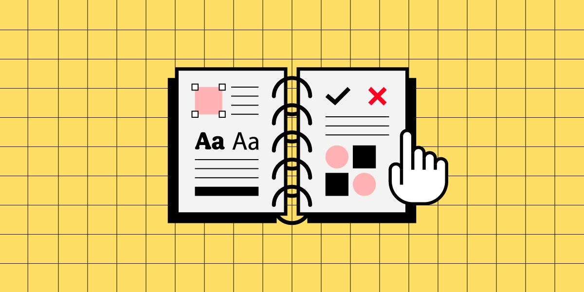
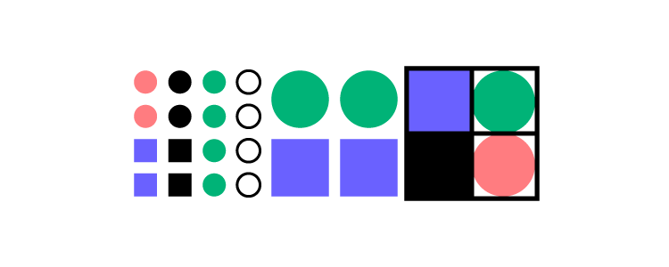
Design system naming conventions are the standardized rules and guidelines used to name elements within a design system. This includes naming design tokens, components, patterns, styles, and any other elements that are part of the design system. A well-defined naming convention is crucial for maintaining clarity, consistency, and ease of use across both design and development teams.
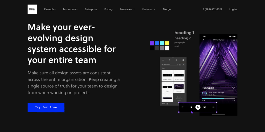
If you’re looking to elevate your design system and create a more consistent, efficient workflow, UXPin Merge is the solution for you. By integrating design and development into a unified process, Merge helps you build a robust design system that scales with your organization and meets the highest standards of quality and consistency. Request access to UXPin Merge.
Reach a new level of prototyping
Design with interactive components coming from your team’s design system.
What is the Naming Convention for Design Systems?
Design system naming conventions are a set of rules for naming the different parts of a design system, like colors, fonts, buttons, and other components. These rules help keep names clear and consistent, making it easy for everyone on the team to understand and use the design system.
Design system naming conventions are typically set by the team responsible for creating and maintaining the design system. It can be governed by a dedicated group of designers and developers who focus on building and managing the design system or design leaders at a company. They establish naming conventions to ensure consistency and ease of use across the system.
Why Are Naming Conventions Important in a Design System?
By following these naming conventions, teams can work together more smoothly and keep the design system organized and easy to update. Design system naming systems help in:
Clarity and Readability: A good naming convention helps team members easily understand what each element is and how it should be used. This is especially important as the design system grows and more people across different teams start using it.
Consistency: Consistent naming reduces confusion and helps ensure that everyone on the team uses the design system in the same way. This is essential for maintaining a cohesive and unified user experience across all products and platforms.
Scalability: As your design system expands to include more components and tokens, a well-structured naming convention makes it easier to organize and manage these elements. It provides a scalable framework that can accommodate new additions without causing confusion or requiring significant restructuring.
Collaboration: Clear and consistent naming conventions improve collaboration between designers and developers by reducing miscommunication. When both teams use the same language and terms, it’s easier to maintain alignment throughout the development process.
9 Key Elements of Design System Naming Conventions
Design Tokens
Design tokens are the core variables that define a design system’s visual properties, such as colors, typography, spacing, and shadows. Naming conventions for tokens should reflect their purpose and usage rather than specific values, ensuring flexibility and scalability. Examples include color-primary, font-size-heading, or spacing-small.
Components
Components are the building blocks of a design system, representing reusable UI elements like buttons, forms, cards, and navigation bars. Consistent naming for components ensures they are easily identifiable and logically grouped, enhancing usability and collaboration. Examples include ButtonPrimary, FormInputText, or CardWithImage.
Patterns
Patterns are reusable combinations of components that address specific design problems or create common UI layouts. Naming conventions for patterns should describe their function clearly, such as LoginForm, NavbarSticky, or ErrorMessageModal.
Modifiers
Modifiers represent variations or states of a base component or token, such as different sizes, colors, or behaviors. Consistent naming for modifiers typically indicates the relationship between the base element and the variation, using a pattern like BaseComponent–Modifier. Examples include ButtonPrimary–Large, ColorPrimary–Dark, or Card–WithShadow.
Utilities
Utility classes or styles are often used for quick, specific adjustments that apply common design tokens, such as margin or padding. Naming conventions for utilities are typically short and descriptive, indicating the property they affect. Examples include u-margin-small, u-padding-large, or u-text-center.
States
States define different conditions of a component, such as active, disabled, focused, or error states. Clear naming for states helps communicate these conditions within the design system. Examples include Button–Disabled, Input–Error, or Link–Active.
Responsive Variants
These are variations of components or styles that adjust based on screen size or device type. Naming conventions for responsive variants typically follow a pattern that indicates the screen size they target. Examples include Button–SmallScreen, Grid–Desktop, or Image–Responsive.
Accessibility Features
Elements or tokens that enhance accessibility might have specific naming conventions to denote their purpose. For example, Button–AriaLabel or Text–HighContrast indicate elements tailored for accessibility.
Brand-Specific Elements
In some design systems, elements may be specific to different brands or themes. Naming conventions for these elements should clearly indicate their association. Examples include Button–BrandA, Navbar–BrandB, or Typography–Corporate.
Top 10 Best Practices for Naming Conventions in Design Systems
A well-organized design system is the backbone of consistent and scalable design work. Naming conventions play a crucial role in this organization by making your design system intuitive and easy to use. Here are ten essential best practices to help you establish effective naming conventions for your design system:
1. Be Descriptive but Concise
Why It Matters: Clear and concise names help everyone on your team quickly understand what each element is for. Long or vague names can lead to confusion and mistakes, slowing down the design and development process.
How to Implement: Choose names that clearly describe the element’s purpose or function without being overly detailed. For example, instead of naming a primary action button btnSubmitActionPrimary, use ButtonPrimary. This name is direct, easy to remember, and effectively communicates the button’s role.
2. Use Consistent Patterns Across the System
Why It Matters: Consistency in naming makes your design system predictable and easy to navigate. When team members know what to expect from the naming structure, they can find and use elements more efficiently.
How to Implement: Establish a naming pattern like [Category]-[Modifier] for design tokens (color-primary, spacing-small) and ComponentName–Modifier for components (Button–Large, Card–WithShadow). Stick to these patterns throughout your design system to maintain consistency.
3. Avoid Specific Values in Names
Why It Matters: Naming tokens with specific values like 16px or #FFFFFF limits flexibility. If the values change, you would need to rename tokens throughout the system, which is time-consuming and error-prone.
How to Implement: Focus on naming tokens based on their function rather than specific values. For instance, use font-size-base instead of font-size-16px. This approach allows you to adjust the value without changing the name, making your system more adaptable.
4. Reflect the Design Intent, Not Just Implementation
Why It Matters: Names should convey how and when an element should be used, rather than just describing what it is. This helps designers and developers understand the intent behind each element, promoting consistent usage across different contexts.
How to Implement: Use names that indicate the purpose of the element. For example, instead of a generic name like color-red, use color-error to specify that the color is intended for error messages. This provides clarity and reduces the risk of misapplication.
5. Document Your Naming Conventions Clearly
Why It Matters: Clear documentation ensures that everyone on your team understands and follows the naming conventions. This is particularly important as new team members join or as the design system evolves.
How to Implement: Create a comprehensive section in your design system documentation dedicated to naming conventions. Include the reasoning behind each rule, along with examples of correct and incorrect naming. Update this documentation regularly to reflect any changes or additions.
6. Use Readable Naming Formats like Camel Case or Kebab Case
Why It Matters: Readable formats such as camel case (ButtonPrimary) or kebab case (button-primary) make it easy to distinguish different parts of a name at a glance, improving clarity and reducing errors.
How to Implement: Decide on a naming format that aligns with your team’s coding standards or design practices. For instance, use camel case for component names (ButtonPrimary, CardWithImage) and kebab case for CSS class names (button-primary, card-with-image). Apply this format consistently.
7. Include Context in Names When Necessary
Why It Matters: Elements that could be used in multiple contexts should have names that specify their intended use. This prevents confusion and ensures elements are applied correctly across different parts of the design.
How to Implement: When naming tokens or components that serve specific functions, include contextual information in the name. For example, use spacing-card-small instead of just spacing-small to indicate that the spacing value is intended for card components.
8. Plan for Scalability from the Start
Why It Matters: A scalable naming convention allows your design system to grow without needing significant changes to existing names. This is crucial as your system evolves to include more components, tokens, and patterns.
How to Implement: Anticipate future needs by choosing flexible naming conventions. For example, if you might add different button types, start with names like ButtonPrimary, ButtonSecondary, and ButtonTertiary. This approach leaves room for expansion without causing confusion.
9. Minimize the Use of Abbreviations
Why It Matters: Abbreviations can make names shorter, but they also risk making them unclear, especially for new team members or collaborators. Only use abbreviations that are universally understood within your team.
How to Implement: Stick to full words unless an abbreviation is commonly accepted and widely recognized. For instance, btn for button is standard, but using fs for font-size might not be immediately clear to everyone.
10. Regularly Review and Update Naming Conventions
Why It Matters: As your design system grows and changes, your naming conventions might need to evolve. Regular reviews help ensure your system remains intuitive and efficient for all users.
How to Implement: Set up periodic reviews of your naming conventions with key stakeholders. Gather feedback from designers and developers to identify any issues or areas for improvement. Be open to making changes that enhance clarity, consistency, or scalability.
Build Prototypes that Are in Line with Your Design System
Establishing effective naming conventions is crucial for any design system’s success. By being descriptive but concise, maintaining consistent patterns, and regularly reviewing your conventions, you can ensure that your design system remains organized, scalable, and easy to use.
Consistency is key to any successful design system. It ensures that your UI components are cohesive, scalable, and easy to maintain across different teams and projects. But achieving this level of consistency can be challenging, especially when it comes to bridging the gap between design and development. That’s where UXPin Merge comes in.
UXPin Merge is a powerful design technology that allows you to integrate real, production-ready code components from your React-based design system directly into your design tool. This integration creates a unified source of truth for both designers and developers, ensuring that everyone is working with the exact same components and styles. Request access to UXPin Merge.
Today we’re sharing a guest post by Nick Moore that originated from collaboration with StackBlitz. Build code-backed prototypes and open them in StackBlitz in one click. Request access to UXPin Merge.
If you know how to ride a bike now and wait five years to ride one again, you’ll likely do just fine once you get back on. Bicycles are intuitive once you’ve learned how to ride them, and the basic design is unlikely to change over time and across bicycles. Reaching this level of usability in software is a little more difficult.
Developers and designers often have to iterate too rapidly to reach bicycle-level reliability, but the intuitive experience of a user logging onto your app as if they were hopping on a bicycle is still something we should aim for—and design systems are the best way to do so.
Even though it’s a high bar, this level of usability pays dividends. Users will adopt your app more readily (reducing churn), use it to greater effect (and feel the benefits), and strengthen your marketing efforts as engaged users recommend and amplify your app.
Building and using a design system is one of the best ways to clear this high bar because design systems allow development and design teams to build and ship quickly while relying on standardized components that reduce friction and confusion.
If you’ve ever encountered a bad design system, then you know the issue: A great one can lift you up, but a bad one can hold you back.
The key is to treat your design system like a fully-fledged product that must remain effective and dependable over time. Without enough investment, design systems will only offer marginal help; with enough investment, design systems can provide consistency and stability while improving the pace of development.
Build responsive layouts fast! Try UXPin Merge, a technology that helps designers and developers create prototypes that are production-ready from the start. With our integration, open UXPin Merge prototypes in StackBlitz with one click. Request access to UXPin Merge.
Reach a new level of prototyping
Design with interactive components coming from your team’s design system.
Build design systems via iteration, not waterfall
For developers, design systems often feel like intrusions from the outside in. The design systems team might have their best interests at heart, but developers know that a bad process with good intentions will still likely lead to a bad product.
After all, developers are well-versed in building a product and iterating over time, with user feedback informing every iteration. Any whiff of a waterfall or waterfall-esque process – where teams build a product in a silo and release it all at once – will make them justifiably skeptical.
The solution is to focus on simplicity over comprehensiveness—at least at first—and build design systems bit by bit over time. By breaking the problem down, platform teams can build simple but essential features, prove the concept’s value, and get feedback that will inform the rest of the work.
Slack provides a good example of this methodology. Back in 2016, millions of people were using Slack, and the company’s codebase was, according to Zack Sultan, Lead Product Designer at Slack, “built in a way that favored time-to-market over maintainability, consistency, or reusability.”
Like many young companies, Slack prioritized finding and pursuing product/market fit before building a codebase suited for scalability and reliability. Some companies encounter breaking issues first and decide to reassess potential tech debt issues, but Slack kept ahead of itself.
“We never encountered a single breaking point in our user interface,” Sultan writes, “but rather a slowly cascading series of inconsistencies, quirks, and discrepancies.” The momentum of the business was growing, and as Slack added more product teams (and more products and features), components started to drift.
Questions soon abounded, Sultan writes. “What does a button look like in Slack? How do you build it? What words do you put in it? It was up to individual teams to make these decisions.”
Many companies correctly notice the problem and then build a mediocre solution by asking a group of developers to cook up a new design system in isolation. Some slowing down is to be expected as companies grow, but a design system developed this way can cause development to come to a screeching halt.
Slack was wary of this potential and focused on finding ways to rebuild and standardize its components without slowing down overall development. “It was a bit like taking a car engine apart piece by piece, and cleaning, repairing, and replacing each part while it accelerated down the highway,” Sultan writes.
Like building a minimum viable product (MVP), design systems need to have core features built well and not many features built poorly. Early on, you’re looking to demonstrate value–not comprehensiveness–even if it means building one single component really well.
“Just one component, thoroughly documented, was immediately valuable,” Sultan writes. By building components one at a time and ensuring each was complete and well done, they were able to create a “virtuous cycle for the system.”
The value of each component, as simple and small as each isolated chunk was, demonstrated the value of the work as a whole. Developers remained invested throughout, and Slack eventually launched its design system, Slack Kit.
Maintain design systems or lose them to tech debt
Let’s imagine, for a moment, that the platform team and design team have worked together – alongside developer feedback – to build the perfect design system. Every developer takes a look and gives it a thumbs up.
Why, then, could you take any one of those developers aside and hear some wariness in their voice when they talk about actually using the design system?
The issue is that developers are very familiar with what happens when a product doesn’t have a maintenance plan. They’ve built products that have fallen by the wayside and created beloved internal tools that managers deprioritized until they died. Eventually, even a great product will fall prey to tech debt if there’s no plan to keep it alive.
For teams building design systems, the solution is to build a flexible design system that they can iterate, maintain, and update over time.
Design systems, by their nature, tend to offer some level of standardization, but over-focusing on standardization can lead to an overly rigid system. If the design system is good, people might not complain at first, but if even a good system is hard to keep up to date and hard to use in non-standard scenarios, people will eventually stop using it.
Instead, platform teams need to build design systems with maintenance as a first principle and map each component across a spectrum of flexibility.
The team behind Encore, Spotify’s design system, faced the same issue we’ve talked about here. As the product changes and the development team grows, writes Charlie Backus, design systems engineer at Spotify, “it can sometimes seem like the team is outgrowing the current set of components and styles.”
As you can see in the selection above, there was a dire need for consistency, despite an equal need for teams to remain creative and driven.
To find a balance, Backus recommends teams develop “an abstract shared vocabulary around component properties” or ensure that the “base properties remain accessible for modification by end consumers.”
The best way to think about this strategy is to imagine a spectrum between configuration (high-abstraction components that developers pass additional parameters to in order to add varied behaviors) and customization (low-abstraction components that developers just add custom styles to).
This spectrum-based approach is useful because it forces teams to think about tradeoffs ahead of time.
On the one hand, as Backus writes, “A more abstract configuration approach can increase consistency and maintainability but at the risk of the system being a bottleneck for outgoing features.” By increasing abstraction, a design system can make development more consistent but potentially slow down development.
On the other hand, Backus continues, “The less abstract customization approach enables quicker feature development; however, the overall consistency of the product can suffer as a result.” Speed increases, in this case, but the likelihood of inconsistencies increases, too.
Backus recommends thinking about maturity to find your spot on the spectrum for any given component. “The more mature a product or feature is, the more beneficial and feasible a configuration approach is. However, the iterative and low-level nature of customization makes it more suitable for prototyping and features which are bespoke, or are still subject to change.”
Like in the Slack example, we’re incorporating concerns that lie outside the immediate purview of the design system. With Slack, they were thinking about the growth of the company, and with Spotify, they were thinking about the growth of features. Mature, well-tested, well-known features can be standardized, but new, still-growing, and one-off features require more flexibility.
Avoid rework by aligning developers and designers
Developers and designers alike often decry meetings, wishing they had more time and space to work. Don’t get us wrong – too many meetings can be a huge drag on focus – but a good meeting can also save you a lot of work. An aligned team, delayed by a meeting, will always be more effective than an unaligned team working hard on the wrong things.
This dynamic is true within teams and departments, but alignment issues can be much more severe between different departments. A development team and design team working on different things, for example, can end up negating each other’s work if the designs are for a feature that isn’t built yet and the feature is built for a design that hasn’t been sketched yet.
Design systems magnify this issue. If a design system isn’t well thought out, all the effort toward building one can be wasted if developers and designers don’t start out using it in an aligned way and maintain alignment over time.
As we said in the first section, the design system can’t feel like a third party designed from the outside in. In the same way, it can’t be a tool that developers and designers only call on occasionally or when absolutely necessary. Instead, a design system should be a language for the design and development teams—both a result of alignment and an anchor that continuously shows how well the teams are aligned.
To see what we mean when we refer to design systems as language, look at Airbnb. Back in 2016, Airbnb was growing rapidly and adding feature after feature. Karri Saarinen, then Principal Designer at Airbnb, writes, “One-off solutions aren’t inherently bad, but if they aren’t built upon a solid foundation, we eventually find ourselves having to pay back accrued technical and design debts.”
To reset these efforts and ensure ongoing sustainability, the Airbnb team looked toward language as a guiding metaphor. “Visual language is like any other language,” Saarinen writes. “Misunderstandings arise if the language is not shared and understood by everyone using it. As a product or team grows, the challenges within these modalities compound.”
Airbnb built a new language via a new design system by looking at where their old designs failed. “We started by auditing and printing out many of our designs, both old and new,” Saarinen writes. “Laying the flows side by side on a board, we could see where and how the experiences were breaking and where we needed to start making changes.”
By focusing on the miscommunications first, Airbnb was able to build a language that used a consensus understanding of shared components as its foundation.
“We felt that we were all working together towards the same idea,” Saarinen writes. “Reviewing our collective work at the end of each day, we began to see patterns emerge. We course-corrected when necessary and started defining our standardized components.”
The team knew they were onto something when, even before the design system was finalized, productivity and consistency sped up in tandem. “One day,” Saarinen remembers, “While putting together a last-minute prototype, our team was able to create nearly 50 screens within just a few hours by using the framework our library provided.”
The early and ongoing boosts to productivity and standardization were a result of building a design system like a shared language. By thinking of the design system first and foremost as a way for developers, designers, and others to communicate and understand each other, the entire company benefited.
Treat your design system like a basecamp
One of the biggest worries developers can feel when a platform team or engineering leader proposes a design system is the tension between the freedom to do new work and the restraints standardization can impose.
Developers often fear that design systems, even when they introduce welcome consistency, can inhibit experimental and exploratory work. Ultimately, developers want to code, and design systems can sometimes feel like a way of reducing coding to boilerplate work.
With this fear and its real risks in mind, companies have to take a different approach to making design systems work for developers: Design systems should be like basecamps for developers and designers on the frontiers of exploration.
The base camp is more stable than the frontier, and the work done there is more routine. In this metaphor, the ultimate purpose of the design system is to give designers and developers resources so that they can explore further with every trek. The design system acts as a dependable foundation, but it doesn’t replace all the work that needs to be done.
With the lessons we’ve outlined here—iterating over time, thinking carefully about flexibility and maintenance, and aligning developers and designers—you can create a design system that developers trust, one they will gladly return to before exploring further.
Create fully functional, production-ready prototypes from the start. With UXPin Merge, what you design is exactly what gets built—eliminating handoff issues and speeding up development. Plus, with our seamless integration, you can open your UXPin Merge prototypes in StackBlitz with a single click for an even smoother workflow. Ready to elevate your design and development process? Request access to UXPin Merge today.
I mean why not? After all, everything is on the web …
As of writing this article 100 Million+ companies have an online presence through their websites.
But AI is here! Does that mean Web Design is dead?
Not at all! AI is changing the game, yes. AI can assist with the heavy lifting, no doubt. But creativity and empathy? Those are things it’s still catching up on. We need to be realistic about what AI can do and separate the hype from practical applications.
In this beginner’s guide, we’ll cover the fundamentals of web design to get you started on your path to becoming the next Mark Wheeler.
I’ll also show you a case study without overwhelming you so you get a sense of what you’ll actually be doing as a Web designer. Hopefully, this will give you a practical understanding of what it’s like to work as a web designer and inspire you to learn more.
Let’s go.
Looking for a tool for web design? Try UXPin, an end-to-end prototyping tool that for creating interactive app and web designs that can be developed within minutes. Try UXPin for free.
Build advanced prototypes
Design better products with States, Variables, Auto Layout and more.
What Is Web Design?
Web design is the creation of visually appealing and functional websites. It involves planning, and designing (not coding) the structure and layout of a website and its content.
Wait, “and its content”?
Yes, more often than not, a company will not hire a separate content planner which can sometimes mean the designer takes on that responsibility. We’ll come back to that later.
Just like other design disciplines, web design also has humble beginnings. In the early 90s, websites were primarily text-based, focusing on information. As the web evolved, visual elements like images and graphics added engagement. Today a website can have hundreds of web elements. Buttons, text, fields, dropdowns, icons, video, sliders, gifs, checkmarks … you name it.
In web design, like many other fields, we face a common challenge: balancing form (how it looks) and function (how it works). This is why we have two specialties – UX for user experience and UI for user interface.
Many experts will categorize the web design process into many parts or phases.
But here is the industry standard:
Discovery Phase > IA and Wireframing > Visual Design > Prototyping > Testing
While these are important, they’re not what this post is about. This post is focused on the fundamental/core principles of web design. Let’s take a look:
The 7 Pillars of Web Design
Not to be mistaken with Principles of Web Design, These are one the first concepts every web designer must be familiar with. These pillars are the foundational elements that ensure a website is effective, engaging, and functional.
Pillar #1: Usability (UX)
Frustration doesn’t have to be vocalized! Usability in UX Design measures how effectively users can interact with and navigate a website to achieve their goals. Oh, and one of the most ubiquitous terms you’ll get used to as a web designer is actually “User Goals”.
What are User Goals? Let’s look at an example:
Sarah, a busy working mother, is looking for a birthday gift for her 7-year-old son. During her lunch hour at work, she uses her iPad to surf internet stores. Sarah’s primary goal is to buy a gift that her kid would enjoy, and her secondary goal is to make the transaction swiftly and effectively.
So, as a Designer, you want to LISTEN to these queues. If you’re designing an eCommerce store in this example, you’d wanna make sure that there are filters. Filters for gifts for example, and maybe you can go down to specifics of what kind of gifts and for what age.
Amazon has a collection of Gift Ideas for example. With sub-optimal filters … take a look:
On this page, Shara could filter by product category, but it’s hard for her to find filters for age range or toy color. And since she’s browsing on a tablet with weak eyesight, the font used in the filter section can be difficult to read – these are the kinds of usability issues that you try to solve.
So, To solve them you have to KNOW the user. There is a simple three-step process approach to getting to know the user:
Define Pain Points > Create Journey Maps > User Personas
We’ll use MOLDO: a sample case study project I was involved in as an example. “Moldo” is an online shopping app for furniture and interior ware.
To understand our users’ needs, my team conducted research through surveys. We analyzed the results, prioritized the feedback, and identified the most common pain points that users were experiencing:
Then, we analyzed the major phases the user will have to go through on the App, and for each phase, we mapped user emotions, actions, and opportunities.
And finally, we have our personas …
Great UX design should consider the following factors:
User’s Goals. As we already saw above: these are User Needs.
User’s Emotions. How does the user feel when using the product?
User’s Context. Where and how is the user using the product? Are there any environmental factors that affect the user’s experience?
You will need to put yourself in the user’s shoes so that ultimately you can be able to create an intuitive design.
What is intuitive design? A design that is easy to use and understand, even for first-time users. This means that the product should be developed to align with the user’s expectations and mental models.
Here is another example …
Our home page has a clear and prominent call to action – a form that explicitly tells users what they need to do next.
The text clearly states the purpose of the product, which is to design UI with code-backed components. It is concise and free of distractions, making it easy for the user to focus on the main message and CTA.
The initial CTA is “Try for free”, which guides the user to take action and try the product. And even tells the user that we prefer their work email.
Again, this is why UX always comes before UI. UX is the why, and UI is the how.
Make it functional, then make it pretty.
We’ve written extensively on this topic in our blog – like Heuristic Evaluation, and UX Requirements feel free to browse around after you finish reading this one.
UI Design focuses on the visual elements of a product, based on UX research findings. Visual elements are the ones a user directly interacts with, such as buttons, menus, and typography.
Its primary objective is to ensure that these interfaces are not only visually appealing but also user-friendly, enhancing overall satisfaction and efficiency in task completion.
I’ve been a UI Designer for half of my career, and let me tell ya, it’s fun. We worry about design movements, hierarchy, layout, interactions, and so on …
To start with, There are three types of UI Elements, Input, Output, and Helper elements, we cover them broadly in an article about UI elements, but let’s look at them quickly:
Input elements. These elements allow users to enter data into the interface. Examples include text fields, checkboxes, radio buttons, drop-down menus, and sliders.
Output elements. These elements display information to the user. Examples include labels, text, images, and icons.
Navigation elements. These elements allow users to move around. Examples include buttons, links, menus, and breadcrumbs.
The UI Design Process
As I mentioned before, UI Design mainly involves the visual design and prototyping (and testing phase shared between UX and UI) part of the design process.
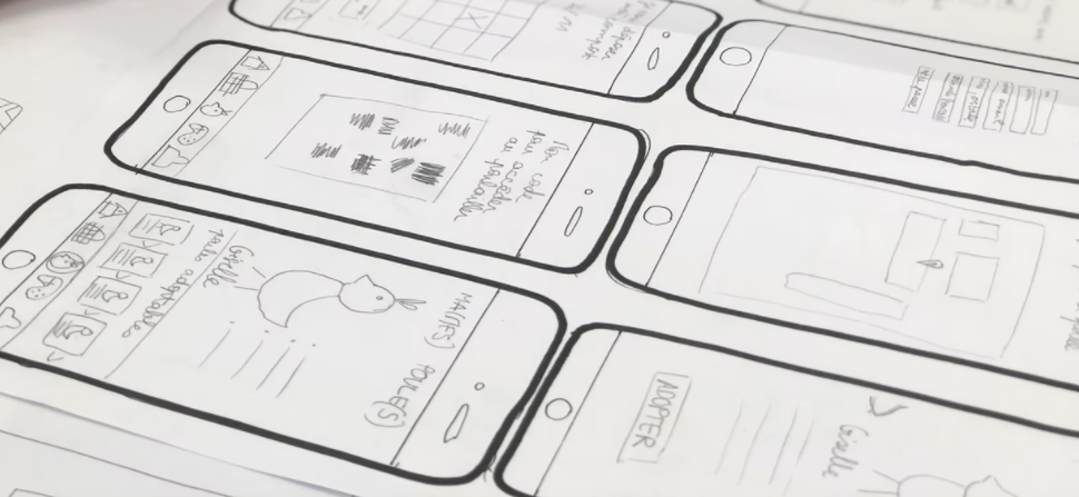
Depending on who you ask, Wireframing is part of UI design. Wireframes are the blueprints for your interface. So it goes like this:
Usually, the UX Designer would provide the IA (Information Architecture) of the app/website, and based on that we can start sketching out the project design scope.
IA is just a fancy term meaning a graph or map of how the content and pages should be structured, and it usually looks something like this:
But it’s the foundation of Wireframing which is the next step.
We use wireframes to define page elements (buttons, forms, images), Arrange content (headers, sidebars, main content areas), and Show basic interactions (click paths, transitions).
You can create wireframes by hand (on paper) or digitally using tools like UXPin or Figma.
Getting back to the MOLDO example, here is what the wireframe looked like:
For most ecommerce products we found that the navigation was visually not inviting or was bulky. So we wanted to make sure that we have our UI balanced between obvious but not lame …
Beyond the optimized design itself, We also adjusted the size of buttons to be particularly bigger than what’s usually a standard in mobile apps.
The point of having a wireframe is to change and iterate to your heart’s content. As you progress through the design process there will naturally be less wiggle room so this is your way of telling your clients, “hey … here is what I’m thinking” and gathering feedback.
As you can see the wireframe stage makes it easy to know what goes where.
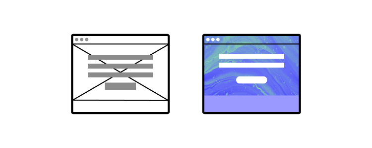
Next, you flesh out the Lo-fi and Hi-fi versions. Lo-fi usually is the flat but colored version of the wireframes. And Hi-fi almost looks like the real product. Sometimes we simply use a prototype and then a mockup.
You can see what a visual design prototype might look like in a design tool, with all the visual elements and layout finalized.
And then finally the polished Mockups … yay!
As UI Designers, we don’t only design how elements look but also how they behave during interactions. AKA animations.
And I’m not necessarily talking about transitions or motion animation.
Animations that guide and interact with the user in a way that feels natural, but consistent. That gives users feedback about their actions, so they know what’s happening.
We call these micro-interactions. are small, purposeful animations triggered by specific user actions (clicking a button, hovering over an icon … so on).
For example: When you click a button, it slightly depresses/shrinks to give visual feedback that your action has been registered.
UI Motion Principles
Consistency. As a user, Ishould experience familiar motion patterns across different parts of an application. I should be able to predict how interactions will unfold. If a button slides in from the right on one screen, it should do the same elsewhere.
Hierarchy. Primary actions (like submitting a form) deserve more attention than secondary ones (like canceling an operation). That’s just an example, but prioritize animations based on their importance within the user flow and website structure.
Realism. UI animations should mimic real-world physics to feel natural. Depending on what you’re going for Objects should accelerate when they start moving (ease-in) and decelerate when they stop (ease-out).
Context. Animations should align with the context and purpose of the interaction. A loading spinner during data retrieval makes sense. A playful bounce effect on a serious error message might not.
Pillar #3: Accessibility
Accessibility in UI design goes beyond just color. Color can not be used as the only way to convey information. Surely, many other disabilities are not related to the human eye.
According to a survey, more than 1 in 4 adults in the United States have some type of disability. That’s a population of more than 83.5M!
Accessibility refers to whether a product or service can be used by everyone, regardless of their abilities or disabilities.
Color Contrast and Text Legibility. Poor color contrast can make text difficult to read, especially for people with limited vision or color blindness. The solution is to use high-contrast combinations (e.g., dark text on a light background or vice versa). Avoid relying solely on color to convey information. Use additional cues like icons or patterns.
Alternative Text (ALT Text) for Images. People who use screen readers rely on ALT text to understand images. ALT text Describe the image’s purpose or content concisely.
Keyboard Navigation and Focus States. Some users rely on keyboard navigation (e.g., screen reader users or those with motor impairments). All interactive elements (buttons, links, form fields) should be keyboard-navigable.
Semantic HTML and ARIA Roles. Proper HTML structure aids screen readers and other assistive technologies. Learn more about ARIA attributes (Accessible Rich Internet Applications).
Captions and Transcripts for Multimedia. Deaf or hard-of-hearing users rely on captions for videos and audio content.
Forms and Error Handling. Forms are critical for user interaction, but poorly designed forms can be frustrating. Label form fields clearly and provide error messages in a perceivable way.
Test with Real Users. Real-world feedback is invaluable. Conduct usability testing with diverse users, including those with disabilities.
Pillar #4: Layout
Layout refers to the arrangement of visual elements within a given space. It is part of UI primarily but decided by factors in UX. A well-designed layout enhances user experience by making content easy to find and understand. Here are some common types of website layouts:
Grid Systems. In a grid-based website layout, elements like margins, flowlines, rows, columns, gutters, and modules work together to create a structured and visually appealing design. Margins define the edges, flowlines guide reading, rows and columns organize content, gutters provide spacing, and modules combine elements into organized groups.
Box Model. The box model represents how elements are rendered on a web page. It includes four components: margin, border, padding, and content.
Flexbox. A powerful layout mode that allows flexible and responsive designs.
Key properties include display: flex, flex-direction, and justify-content.
Using a flexbox system is perhaps the best choice for managing responsive layouts.
Here are the primary types of website layouts, that provide a solid foundation for understanding web design principles:
Fixed Width Layout. The content area has a fixed width, regardless of the screen size.
Fluid Layout. The content area expands or contracts to fit the width of the browser window.
Responsive Layout. A combination of fluid and fixed layouts, using CSS media queries or clamp functions to adjust the layout based on the screen size.
Adaptive Layout. Similar to a responsive layout except it’s specifically arranged in the most suitable way for each device. (Separate layout for each).
Grid Layout. A flexible layout that uses a grid system to organize content into columns and rows.
Learn more about website layouts and how they affect user psychology.
A fundamental principle that greatly impacts layout is balance, which web design relies on. Balance is all about distributing visual elements in a way that creates a sense of harmony.
Symmetrical Balance: Mirror-like fashion, creating a sense of formality and stability. This is often used in traditional designs and logos.
Asymmetrical Balance: Arranged in a way that is not symmetrical but still feels visually balanced. This can create a more dynamic and interesting composition.
Another thing to keep in mind when working with layouts is Negative Space. This is an overlooked design element that differentiates between a noob and a pro.
Did I say “design element”? Yes!
In fact, thinking about negative space as an active element in web design will help you understand how layout works. It’s obvious that when a webpage is cluttered with too many elements, it becomes overwhelming for users.
But what is the point where it stops becoming clutter?
For example, look at this:
Unless you’re intentionally aiming for a busy, maximalist aesthetic and it makes sense for your audience, this approach can be detrimental to focus.
Modern WebUI is almost always incorporated with negative space like this:
Pillar #5: Typography
Typography is the art and technique of arranging type/letters, numbers, and symbols to make written language legible, readable, and visually appealing when displayed.
It’s an entire field of its own.
But in our context of web design, it involves choosing fonts, adjusting the spacing between characters (kerning), the space between lines (leading), and the overall layout of the text. Good typography guides your eye across the page smoothly without making you think too much about it.
It’s a big deal because it’s directly connected to clients’ ROI. So let’s take a look at some typography basics:
Font Families
A font family is a group of fonts that share a common design style. Think of a typeface as a broad category of fonts that share a unified look and feel. Within a typeface, you’ll find individual fonts that vary in size, weight, and style.
Font families are classified into types: Serif, Sans-Serif, Monospace, Display and Handwriting.
Let’s focus on the first three:
Serif Fonts. Have small strokes (called serifs) at the edges of each letter. They exude formality and elegance. Think Times New Roman, Georgia, and Baskerville.
Sans-Serif Fonts. Mostly used on UI and are sleek and modern. They don’t have those little serifs just clean lines. Arial, Helvetica, and Open Sans.
Monospace fonts. Give every letter the same fixed width. Fonts like: Courier New, Consolas, and Inconsolata.
I once designed my own custom font, although I loved Proxima Nova. It took two months and gave me an insight into what works well on the web. It might even be one of the factors that I was nominated for Awwwards.
And from that experience, here are some tips that I’ve learned:
Use regular medium font weights and anywhere between 18-21px for body text.
Don’t use more than two types of fonts. And always stick to one font for the body.
When choosing a font for headlines or titles, feel free to explore more expressive options. Bold, playful, or unique fonts work well here.
Use a clamp function for responsive text.
Always use a different font style for links (usually bold or underlined).
Web-safe fonts, also known as system fonts, are pre-installed on most operating systems. These fonts are readily available to users without requiring any additional downloads.
These should only be used as either a fallback font or if your client only wants raw performance and doesn’t give a dime about custom fonts. Or if other overarching elements on the site compensate for it.
Google Fonts
Google fonts are hosted by Google, making them easy to incorporate into your web projects. You can use the API or directly download them and include them in your projects.
I think while we’re at it it’s good for you to familiarize yourself with some common terms. Like “Glyphs”. So here is a quick rundown:
Each letter, number, punctuation mark, or symbol is a glyph. X-Height is the height of lowercase letters (excluding ascenders and descenders).
Ascenders and Descenders? They are upward-bound strokes of lowercase letters that extend beyond the x-height. The baseline is the invisible tightrope where letters stand. It’s their foundation the ground level.
Kerning is the space between individual characters. And tracking controls the overall spacing across a block of text.
Responsive Design (not to be mistaken with Adaptive Design) is a web design approach that ensures a website adapts seamlessly to various screen sizes and devices
Responsiveness is the ability of a website to adapt its layout and content to different screen sizes and devices, such as smartphones, tablets, and desktops.
Design for mobile first!
It’s often easier to adapt a mobile design to a desktop than the other way around. Since larger screens can accommodate more content, it’s best to start by designing for mobile and prioritizing the most important elements.
Media Queries
Simple but if the user drags the window size they step towards the next set size.
Here is an example:
/* Tablets and smaller */
@media (max-width: 768px) {
.container {
width: 100%;
}
}
/* Mobile devices */
@media (max-width: 480px) {
.container {
width: 100%;
padding: 0 10px;
}
}
Clamp Function
The clamp() function in CSS lets you set a value that’s dynamic between a minimum and maximum. It adjusts based on the screen size or viewport width. So, instead of using media queries, you can have a property (like font size) scale naturally between limits.
Formula: clamp(minimum, preferred, maximum);
Example: Responsive Font Size with clamp()
h1 {
font-size: clamp(1.5rem, 5vw, 3rem); /* Between 24px and 48px */
}
With clamp(), you don’t need to set up media queries for every screen size. The text grows naturally between your set limits, and you don’t even have to calculate it by hand there are great free clamp() generators out there.
Responsive Images
Images can be a big hurdle when it comes to making a website responsive. They can slow down your site if not optimized, or worse, they might look distorted or too large on smaller screens. But, don’t worry, you’ve got a few tricks up your sleeve.
Srcset. The srcset attribute is for delivering different image sizes based on the device. You’re telling the browser “Hey, use this image for mobile, this one for tablet, and this one for desktop.”
Vector Images. SVGs (Scalable Vector Graphics) are amazing because they scale infinitely without losing quality. This makes them perfect for logos, icons, or any simple illustrations.
Image Optimization. Beyond just choosing the right size, you can optimize images to load faster using lazy loading. You can use Webp or any other modern web image format. Read more about what matters for web performance.
Flexible Grid Systems
While responsive images handle the visual content, flexible grids manage layouts across different devices. These grids allow your design to flow naturally, adjusting based on the screen size.
1. CSS Grid
CSS Grid allows you to define rows and columns that automatically adapt to the size of the screen.
While CSS Grid is perfect for two-dimensional layouts, Flexbox is awesome for one-dimensional layouts … think rows or columns.
Here’s how you can use Flexbox to build a simple responsive layout:
.container {
display: flex;
flex-wrap: wrap;
gap: 10px;
}
.item {
flex: 1 1 200px;
}
You can even combine both! For instance, use Flexbox to lay out different sections of your site, and then use Grid inside those sections for more complex layouts.
Now you need to think backwards FROM CSS towards your UI Design tool.
Pillar #7: HTML & Performance
Ultimately, your design will be brought to life in HTML, so having a basic understanding of HTML and CSS can be a huge advantage. It’s not a must for designers to know about this, but it sure helps a lot!
Browsers read HTML like a book, from top to bottom. They create a DOM (Document Object Model) as they go. The simpler this book, the faster it can be built. Believe it or not, it all starts with the designer.
If you’re a designer who understands this, you can start making decisions that not only look great but make life easier for the developer. For example, knowing how HTML is structured (with headers, paragraphs, images, and links) allows you to visualize how content will flow and stack across different devices. It also means you can avoid suggesting IMPOSSIBLE LAYOUTS that would take hours of unnecessary coding.
Benefits of Knowing Code as a Designer
Identify and troubleshoot design issues more efficiently.
Achieve precise control over the layout, typography, and styling of their designs, resulting in a more polished and professional final product.
Experiment with more advanced techniques and create innovative designs that might not be possible for designers who rely solely on visual tools.
Utilize a tool like UXPin much better because they can understand the code behind the elements.
The Handoff: Collaborating with Developers
The designer-developer handoff is often where dreams go to die, but it doesn’t have to be that way. Handoff is transferring a completed web design from the designer to the developer for implementation.
When you understand the basics of HTML and CSS, you’ll know what’s possible, what’s tricky, and how to meet halfway to create something that both looks great and works smoothly.
Developers will appreciate it, too, because you’ll be speaking their language or at least enough of it to avoid miscommunication.
Key Components of Handoff:
Design Files: These typically include:
PSD, Sketch, or Figma files: Contain the visual elements, layers, and styles of the design.
Style guides: Document the typography, colors, and other design elements used in the project.
Wireframes: Provide a basic structure and layout of the pages.
Specifications:
Measurements: Dimensions of elements, spacing, and padding.
Typography: Font families, sizes, weights, and line heights.
Colors: Hex codes or color names for all colors used in the design.
Interactions: Descriptions of how elements should behave when clicked, hovered over, or focused.
Annotations:
Notes and comments: Additional information or instructions for developers.
Placeholders: Indicate where content will be added dynamically.
Design with Implementation in Mind
When designing a responsive navigation bar, knowing that developers can use CSS Grid or Flexbox to make it dynamic can inform your design decisions. You’ll create a flexible layout that adapts to different screen sizes, rather than specifying rigid pixel values for each breakpoint.
This approach streamlines the design-to-development process, reducing the need for back-and-forth revisions. By showing that you’ve considered the build process, you’re more likely to earn the development team’s respect and ensure that your design is implemented as intended.”
Suggest Solutions, Not Just Problems
We’ve all been there – pouring our hearts into a design, only to have it rejected due to technical limitations. But what if you could turn those limitations into opportunities? By having a basic understanding of HTML and CSS, you can collaborate with developers to find alternative solutions that achieve the same visual effect.
For instance, if an animation is deemed too complex, you can suggest using CSS transitions or animations that are easier to implement. This way, you’re not just handing off your design and hoping for the best – you’re actively working with the development team to bring your vision to life.
There are different ways web design can be added as a skill set of other professions like a web developer, freelancer digital marketer and so on but here are the major roles you can embody as a web designer:
UI or UX Designer
Web Design Consultant
UX Researcher
Product Designer
UI/UX Designers and Product Designers are the most common. I’ve personally worked in these exact roles myself.
I just did a search on LinkedIn for “UI/UX Designer” and just today there are 1000+ offers available. And this is just in the United States.
Taking a peek at Indeed shows another 1000+ results:
The best platforms for finding web design jobs are:
Company Websites
Dribbble and Behance
Toptal
Linkedin and Upwork
Traditional Job Boards
Web-designers anywhere between $62K – $112K/yr according to GlassDoor.
You’d also be well-positioned to explore a wide range of entrepreneurial opportunities. Like freelancing, starting a web design agency, selling products, taking web design courses and workshops, and so on.
The Elements of User Experience by Jesse James Garrett
Laws of UX by Jon Yablonski
Conclusion
Even if you’re focused purely on the visual side of things, web design isn’t just about making things pretty. A site has to work in real-world conditions: it needs to load fast, be responsive, and be accessible. Knowing the pillars helps you think beyond the surface and consider what makes a site functional. That also makes working with developers smoother you’re speaking the same language, and you’re both aiming for a seamless user experience.
The perfect website balances purpose and functionality with beauty and simplicity. It’s easy to navigate, works on any device, loads quickly, and is accessible to all users.
At the end of the day, web design isn’t about you, it’s about the people using your product.
UXPin empowers teams to create seamless, interactive prototypes of websites and apps with realistic, fully functional components. Try UXPin for free.
The hamburger menu looks as tasty as it sounds. It’s a design-cum-navigation element, now on almost all apps, that comprises three horizontal lines. It looks like a hamburger. Picture something like this:
Bun, patty, bun.
If you squint, it kind of looks like the Spotify logo:
The UX designer’s hamburger menu saves time and space by storing relevant information in a universally recognized format. All that information is there in one place, and everyone knows where it is. Like how a diner learns what food a restaurant serves by reading the menu, a website visitor accesses different linked sections through one navigational element.
Well, that’s the theory, anyway.
This icon became pervasive in the mid-2010s, and similar to the classic hamburger itself, every UX designer has an opinion about it. For every designer who thinks it frees up screen real estate, another believes it’s a blot on the informational architectural landscape. You might fall somewhere in the middle, but you will change your mind after reading this.
Design apps and websites with a hamburger menu in UXPin. Build prototypes that are responsive and have functional navigation. Test your prototypes with users, hand them over to developers and build your design system without using additional design tools. Try UXPin for free.
Build advanced prototypes
Design better products with States, Variables, Auto Layout and more.
What Is a Hamburger Menu?
A hamburger menu is a UI element consisting of three horizontal lines, resembling a hamburger, typically located in the top corner of a website or app. When clicked or tapped, it reveals a hidden navigation menu or additional options.
The hamburger menu is commonly used in mobile interfaces to save space and keep the layout clean by tucking away less frequently used navigation items. While it’s efficient for mobile screens, some argue it hides important features, leading to lower discoverability.
Those three lines at the top of almost every app or mobile-optimized website? They make up the hamburger menu. Designer Norm Cox cooked up the idea in the early 80s because he thought it was easier to communicate information to people in a list format.
There’s evidence that backs up this theory:
Humans remember facts better when presented with a list.
Fifty-five percent of website users look at lists (seventy percent look at lists with bullet points).
Lists improve the selection-making process for users.
Even that short list above improves readability and breaks down content into digestible “chunks.”
But other research tells a different story.
It all has to do with discoverability. Some website visitors can’t find the links when they’re hidden in a hamburger menu, which affects click rates. And click rates are even lower when designers place the hamburger menu on the top-left of the screen because of how most people scan their devices (center first, then right).
“The implied message is that things at the top of the screen are to be glanced at, not clicked on,” says UX Planet.
Perhaps the most shocking statistic is this one: Forty-eight percent of internet users over 45 don’t know what the icon even means.
So, unless your creative brief is “create a design for only millennials because nobody else must visit our website,” maybe choose something different the next time you consider a hamburger.
It’s Just a Hamburger Menu. What’s the Problem?
The hamburger menu certainly saves space; some would argue it’s easier on the eye. Instead of links stacked up against each other in the sidebar — or, God forbid, sprawled across the top of the home page like trash bags on a downtown sidewalk — the menu keeps everything hidden from sight, facilitating crisp and creative design. It’s like neatly placing everything in a drawer.
But it’s that drawer comparison that irks some designers.
Despite what IKEA tells you, humans put stuff in drawers for one reason:
There’s nowhere else to put it.
That’s why, for some designers, hamburgers are off the menu.
Think about the things you keep in drawers. Now think about the things you keep on shelves. Would you keep a framed photo of Mom in your drawer? Or your Master’s in User Experience Design? Probably not, because you want everyone to see it.
The hamburger menu suggests one thing: The items contained within are of little importance — concealed from public view and brushed under the carpet like a 20-year-old dirty secret that nobody wants to talk about.
Anti-hamburger designers think the menu is little more than an afterthought: There’s nowhere to put it, so let’s put it here. It’s lazy, if not necessarily bad, design.
So what are the alternatives?
A Burger-Free Menu
The most popular alternative to the hamburger menu is probably tabs, especially for app navigation on smaller smartphone screens. Sure, you’re limited to four or five menu items, but the ones featured hold greater importance because you haven’t hidden them away.
“Tabs offer a more modern and useful method to navigate around an app, and the core sections of your application are immediately visible to the user,” says UX designer and software engineer Michael J. Fordham. “If you’re concerned about space, you can implement hide gestures that make the tabs disappear when you scroll down but reappear when you scroll up.”
What else is on the menu?
Floating Hamburger
Again, best served on apps, this alternative provides users with context when they click on the three-line icon. Like tabs, links no longer feel like an afterthought, and they feature more prominently on screens.
Swipes
Think Tinder, where users scroll left or right to navigate apps. Swipes only provide sequential access to pages, though, so won’t suit contexts where users jump to different sections quickly, like store pages.
Ultimately, It’s Your Choice as the Designer
If you’re still hungry for a hamburger, a couple of tips:
Supersize your burger: Make your menu more recognizable so visitors can see it. The links contained within could be critical for the website owner. Make sure people click on them.
Create a secondary menu: Couple the hamburger with secondary access to important pages. (Use one of the menu alternatives above.) You’re probably thinking about the c-word (“clutter”), but you can avoid this by incorporating minimalist elements elsewhere in the design infrastructure. Try it.
Last Bite
Mentioning the hamburger menu in UX design is like bringing up politics at a dinner party. Expect some controversial opinions. Despite what some designers think, it’s not a crime to use the hamburger, and it can be an incredibly effective navigational tool. Just realize its potential downfalls, consider the overall context and try out a couple of alternatives with UXPin before your next bite. When’s the next time you’ll serve up a hamburger?
Join the world’s best designers who use UXPin — not your average UI design and prototyping tool. Start your free trial.
Lists are fundamental components of user interfaces, helping to organize information in a way that’s easy to scan and digest. Whether it’s a simple to-do list or a complex product display, well-designed lists enhance usability and improve the overall user experience. By understanding the principles of list design, designers can create intuitive layouts that streamline navigation and engagement. In this guide, we’ll explore best practices, key principles, and hands-on tips to create visually appealing, functional lists for any UI project.
Optimize your list design process with UXPin Merge. Bring code-backed components to a design editor and create interfaces that are production-ready from the start. Design prototypes that feel like a real product with UI elements that can be shared between design and development. Request access today.
Reach a new level of prototyping
Design with interactive components coming from your team’s design system.
What is a List in UI Design?
In UI design, a list is a method of organizing information vertically, allowing users to scan and process data quickly. Lists can display a variety of content, from simple text items to more complex layouts that include images, descriptions, and interactive elements.
They improve usability by breaking down information into manageable chunks, ensuring users can navigate effortlessly. Lists are versatile and appear in many forms—such as single-line lists, multi-line lists, and image lists—each tailored to specific content types and design needs.
What is the Difference Between a List and a Data Table?
Designers use data tables to display a dataset to users. Tables have a specific structure, including a header, rows, and columns with sorting and filters to find and manipulate data.
Lists don’t have a fixed structure. Each list item is independent rather than part of a structured dataset with rows and columns. The list item could feature a single line of text in a menu dropdown or a complex card component with lots of data.
In summary, the most significant difference between lists and tables is the data structure. Tables have a specific design, while lists can exist in many formats.
Types of List Designs
There are three types of list designs:
Text lists
Image lists
Card lists
Text List Design
There are three types of text lists. These lists typically include text and an image, icon, and other UI elements like a checkbox or radio.
Single-line lists: These are the simplest form of lists, displaying only one line of content per item. They work best for short, easily digestible information, like settings or contact lists.
Two-line lists: These lists include a second line, often used for supplementary information, like subtitles or descriptions. They balance brevity and context, making them ideal for emails or notifications.
Three-line lists: These lists display more detailed information, such as titles, descriptions, and additional metadata. They’re useful for content-heavy items, like product listings or media files.
Image Lists
Designers use image lists when visuals are the primary content–like an image or video gallery. Sometimes a single line of text will accompany the image to provide detail or context.
Where image lists don’t include text, designers must ensure to use descriptive alt attributes so screen readers can navigate the content accordingly.
Card Lists
Card lists typically include visual content and text and may also include a CTA. We often see these card lists in eCommerce store product lists that feature an image, title, short description, category tags, price, and “Add to cart” button.
How to Design a List UI
Step 1: Think Content First
Designers must decide on the best list item design based on the content they want to display.
UX designers have three primary ways to structure content lists: horizontally, vertically, and grid layouts.
List Example: Instagram
An excellent example of these lists in action is Instagram:
Main feed – vertical list
Story feed – horizontal list
Search feed – masonry grid list
UX designers have seemingly endless options and variations within these three list structures.
Step 2: Follow Atomic Design Principles
There are three components to a list design:
The list: All list items together
List item: An individual item in the list
List content: The content that makes a list item–image, text, metadata, title, subtitles, and other user interface elements
It’s helpful to use an atomic design approach when deciding how to put these pieces together.
Atoms: The content within each list item–individual images and text
Molecules: The components within each item–a profile image component
Organisms: Each list item
Templates: The entire list with a search field, filters, etc.
Step 3: Design with Consistency in Mind
Consistency is key in list UI design. Ensure that list items follow the same layout, including the placement of text, icons, and actions. This not only enhances the visual flow but also improves usability, as users learn to anticipate where to find the information they need. A consistent structure reduces cognitive load, making the interface more intuitive.
Step 4: Optimize for Responsiveness
Always consider how your list will appear across different screen sizes. On mobile devices, a vertical list may work best, while on desktops, a grid layout could be more effective. Adjust font sizes, spacing, and layout to maintain readability and usability regardless of device.
Step 5: Test for Accessibility
Lists must be accessible to all users, including those relying on screen readers. Use proper HTML elements like ordered or unordered lists, and avoid nested lists when possible. Additionally, ensure proper color contrast for readability and include alternative text for images.
Best Practices of List UI Design
1. Prioritize User Needs
Good list UI design follows design thinking and user-centered design principles. The list design must match user needs while providing appropriate fields for the content. UX designers must pay attention to responsiveness and how the list will look across multiple devices and screen sizes.
Logical: Organize lists in meaningful ways (alphabetical, numerical, etc.).
Actionable: Ensure items are easy to identify and act upon.
Consistent: Use uniform layouts for icons, text, and actions.
3. Make Lists Scannable
One of the keys to designing a great list UI is making it easy for users to scan content to find what they need. The quicker someone can find what they need, the better the user experience and the more likely they are to use and recommend your product.
4. Leverage Visual Hierarchy
Hierarchy plays a vital role in making lists scannable and easier to read. UX designers have several ways to create this visual hierarchy, including typography, color, spacing, images, etc.
List UI Example: eCommerce
For example, this eCommerce list uses color, size, and typography to separate content and create a visual hierarchy:
Product name: bold black and white typography top center
Product description: smaller grey text
Price: Large dark text
Reviews: Small text with bright star icons
Image: Large circular product image
This product list is an excellent example of a visual hierarchy that makes it easy for customers to scan products by the content that matters most to them–i.e., by product name, description, price, etc.
List UI Example: Spotify
In a more simplified example, Spotify uses font size and color to create a visual hierarchy between the song title and the artist. The different size and color make it easy for users to scan a playlist accordingly.
5. Ensure Accessibility
Lists can cause problems for screen readers, creating a poor user experience for visually impaired users. For example, screen readers can’t decipher nested lists correctly. So, designers should use a heading with an unordered or ordered list instead.
Here are some common list design patterns and interactions that you can apply to website and mobile app design projects.
Checkboxes & Radiobuttons
Checkboxes and radiobuttons are essential UI elements to allow users to make selections and actions on list items. As a general rule, designers use checkboxes for selecting multiple list items and radios for a single selection.
Scrolling & Swiping
Scrolling and swiping allow users to perform multiple actions. For example, many apps allow users to swipe list items left or right–one way to delete the other to archive.
Select lists or dropdown menus allow users to select from several options–like choosing which shipping method they want at checkout. UX designers might also include a search feature for long dropdown menus, a feature we often see for state/province or country lists.
Collapsing & Expanding
Designers can use collapsable lists to hide and show details. Reducing the amount of content that’s always visible is crucial for usability and minimizing cognitive load. Collapsable interactions are also useful for nested lists or submenus.
Reordering & Sorting
Reordering list items gives users control over how they prioritize and experience data. Depending on their preference, they can move items manually up or down the list, usually by dragging and dropping. This customization creates a positive user experience because users can arrange content to suit their needs.
Sorting works similar to reordering, except users choose from predefined categories rather than reorder list items manually. For example, Spotify allows users to sort a playlist by title, artist, album, or recently added.
Filtering
Filtering helps users find what they need much faster. Accommodation booking platforms like Airbnb and Booking.com allow users to apply multiple filters to list properties that suit their needs and preferences.
Dividers
Dividers help create separation between content; however, they can add unnecessary “visual noise.” If your lists get too busy, try testing white space as an alternative content separator.
Designing a List with MUI Components in UXPin Merge
With UXPin Merge, you can sync code components like MUI (Material-UI) into UXPin for fully interactive prototyping. Follow this tutorial to create a list using MUI components.
Step 1: Import MUI Components
Ensure you have your MUI components integrated into UXPin using Merge. This will allow you to drag and drop pre-coded components directly into your design.
Step 2: Add a List Component
In UXPin, navigate to your MUI component library.
Drag the MUI List component into your canvas. This is the container for your list items.
Step 3: Configure List Items
Next, drag in ListItem components within the list container. These components will represent individual list items.
Use ListItemText to add the main content, such as the title or description for each list item.
Step 4: Customize with MUI Properties
With Merge, you can modify component properties like styling, layout, and behavior. For example:
Typography: Adjust fonts, colors, and sizes within the ListItemText to create a visual hierarchy.
Icons: Use ListItemIcon to include interactive icons, such as checkmarks or navigation arrows.
Step 5: Add Interactions
Use UXPin’s interaction panel to add click actions, hover states, or dynamic behaviors. For example, configure the list item to navigate to another page or trigger a modal when clicked.
Step 6: Preview and Test
Use UXPin’s Preview mode to test the list in a fully functional prototype. Check responsiveness and usability across different devices to ensure an optimal experience.
Step 7: Hand-off to Developers
With UXPin Merge, your list UI is code-ready. Developers can directly access the code, ensuring a seamless design-to-development process without discrepancies.
Increase Fidelity and Functionality with UXPin Merge
Take your prototypes to the next level using UXPin’s proprietary Merge technology. Sync your product’s design system or an open-source component library from a repository to UXPin’s editor so designers can build prototypes using fully functioning code components.
You can see Merge in action with our MUI library integration. Using MUI’s React library, designers can build fully functioning list prototypes. MUI’s React components come complete with states and interactions, so designers only have to focus on product design rather than building everything from scratch. Everything you see in MUI’s documentation, designers can replicate in UXPin without writing a single line of code. Request access to UXPin Merge.
You may wonder what the difference between UXPin and Merge is. And, which one is right for my design team?
To put it simply, UXPin is an all-in-one design software that covers the entire product design process together, including design handoff, while Merge is a technology that allow you to bring interactive components to UXPin and design prototypes using them.
Ultimately, Merge technology leads to a more collaborative and faster design process in which both designers and developers can share a single source of truth and create consistent UIs. Check more about UXPin Merge here.
Reach a new level of prototyping
Design with interactive components coming from your team’s design system.
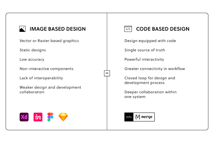
Image-Based vs. Code-Based Design Tools
Before we get into UXPin and Merge, it’s important to understand the difference between image-based and code-based design tools.
When designers hear code-based design tool, they assume it’s a developer tool or must learn code to use it–both are incorrect.
For the most part, designers won’t notice much difference when comparing the two interfaces, except that code-based tools generally have more options for interactivity.
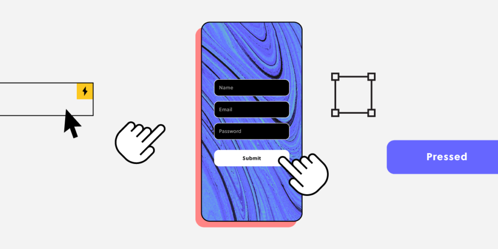
For example, if you create an input field using an image-based tool, it’s just a block on the canvas. In UXPin, an input behaves like it would in the final product. When users click the input, a cursor appears, and they can enter text. With UXPin’s various features, designers can then:
UXPin is an end-to-end code-based design tool for advanced prototyping and testing. Designers can build prototypes that accurately replicate final product interactions and functionality.
UXPin looks and feels like any other design tool but with features that enhance UX workflows, collaboration, prototyping, and testing.
Some of those key features include:
Variables
Interactions and Conditional Interactions
Expressions
Auto Layout
Design Systems
Comments
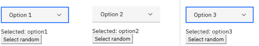
Variables
Variables allow designers to capture data from input fields and use it elsewhere in the prototype. This example from our demo sign-up form demonstrates how you can capture a user’s email address to personalize the confirmation page.
UXPin makes it easy to add Interactions to your prototypes with a few clicks. Designers have an extensive list of Triggers, Actions, and Animations that accurately mimic final product interactivity.
Conditional Interactions take interactivity to another level with if-then and if-else conditions–similar to what Javascript does for devs.
Returning to our demo sign-up form, we see how you can use Conditional Interactions to present users with error messages if they leave the email and password fields blank. Only when the user meets the input’s conditions can they proceed to the confirmation page.
Expressions
Expressions take prototyping to the next level, allowing designers to create dynamic user experiences comparable to code. In our sign-up form prototype, we use Expressions to define the email and input field criteria:
Email: must have the @ symbol and domain extension (.com, .co.uk, etc.)
Password: must be longer than 8 characters
Designers can add as many Expressions to components and prototypes as they like, achieving results indistinguishable from code.
Auto Layout
Many design tools offer auto layout, but UXPin’s Auto Layout uses Flexbox naming and properties to create realistic expectations and improve designer/developer collaboration.
UXPin automatically categorizes Design Systems into:
Colors
Typography
Assets
UI Patterns
The entire library appears in the left-hand sidebar, so designers simply drag and drop elements to build user interfaces.
UXPin also provides five Built-in Design Libraries, including OS, Material Design, Bootstrap, Foundation, and User Flows, so teams can build prototypes or MVPs fast to test ideas and hypotheses at every stage of the design process.
Comments
Comments allow design teams and stakeholders to collaborate, share feedback, assign tasks, and provide context within design projects and on prototype previews.
UXPin allows anyone to use the Comments on Preview feature, eliminating the need to purchase additional users like stakeholders and developers who don’t need access to UXPin’s canvas. Designers can password-protect designs, so only those authorized can view them.
Ready to see what code-based design is all about?Sign up for a free trial to build your first interactive prototype with UXPin today!
What is UXPin Merge?
UXPin Merge is a technology that syncs code components from a repository to UXPin’s design editor. Organizations can use Merge with open-source libraries or import their product’s design system.
Designers use these code components like building blocks, dragging and dropping to build user interfaces.
Merge components include properties defined by the design system, including interactions, states, colors, typography, sizing, etc. These properties appear in UXPin’s Properties Panel, where designers can make adjustments according to prototyping requirements.
You can change the color, size, variant, and add an icon using properties.
Merge pulls these properties from the repository and automatically syncs any changes. For example, if the design system team changes the primary color from blue to red, Merge will detect the update and notify design teams of the new release.
Version Control allows designers to choose when they want to switch to the latest release and can revert to early versions whenever they want.
Is There a Way to Test UXPin Merge?
Yes, you can test UXPin Merge on trial or you can enjoy its features on Merge AI plan that’s perfect when you want to use leverage popular open-source component libraries such as MUI, Ant Design, and Bootstrap without needing to start from scratch.
When you sign up for UXPin Merge, you gain access to three trial kits—MUI, Ant, and Bootstrap—giving you a starting point to experiment and create interactive prototypes using real React code.
Each trial kit comes fully loaded with reference patterns and example components, such as cards, snack bars, and skeleton loaders, which you can use directly in your projects. Additionally, you can browse full layouts, like dashboards, to jumpstart your designs without the need to build from the ground up.
Here’s how UXPin Merge works:
Select a Library: Choose from built-in component libraries like MUI or even custom Tailwind UI components. Simply drag and drop these ready-made components into your design canvas.
Edit Variants and Properties: Customize the components with real React code by toggling between different variants and modifying their properties. You’re not just working with static design assets but actual coded components that behave as they would in production.
Use Custom Code: If you’re working with custom Tailwind UI components, you can paste code directly into UXPin to generate entire UI sections instantly. This feature allows you to skip designing components from scratch and speeds up your workflow by using existing code.
AI-Powered Component Generation: UXPin Merge even integrates AI to help you create code-based components on the fly. For example, you can prompt the system to generate a “Persona Card,” and UXPin will create a fully functional Tailwind CSS-based component directly on the canvas.
Effortless Developer Handoff: Once your design is complete, UXPin Merge makes it easy to hand off your work to developers. Share your prototype through a preview link, and developers can access the real JSX code, dependencies, and functions for each component. This ensures that developers receive production-ready code that they can immediately use in their environments.
With UXPin Merge, there’s no need to waste time recreating components for the design team or manually coding every element from scratch. Merge AI allows designers and developers to work more efficiently by tapping into the power of real React components, ensuring consistency between design and development from the very beginning.
How to Sync Your Design System With UXPin Merge
There are three ways to sync a design system with UXPin Merge:
These three integrations each serve different prototyping and team needs. The Git and Storybook integrations require technical knowledge to set up the components and repository for Merge. UXPin provides a boilerplate for engineers, and our technical team is on hand to guide the setup process.
Storybook is probably the best option for private design systems because engineers can build components in isolation, prototype, and test them before pushing them to UXPin for design teams.
Merge’s primary benefit is that it creates a single source of truth between design and development. Designers and engineers use the same component library from the same repository–creating a seamless design handoff process.
Engineers simply import the component library.
Copy JSX changes UXPin produces from component properties.
And develop the final product according to the design team’s prototype.
This streamlined workflow creates many product development efficiencies, including:
Seamless handoffs with less communication and documentation
Flawless cohesion and consistency
Higher quality feedback from stakeholders
Meaningful, actionable results during testing
High-quality outcomes = better user experience
UXPin to Merge – The Scalable Design Solution
UXPin offers companies a scalable design solution with the tools and features to support your workflow at every stage of maturity.
UXPin Standard is an excellent solution for startups and companies who aren’t using a design system. Designers can build fully-functioning interactive prototypes and MVPs for accurate testing.
UXPin Standard also includes UXPin’s Design Systems feature, so designers can save and share product components, color palettes, typography, and assets.
Scaling With Merge
Whether you’re a fast-growing startup or multinational enterprise, Merge enables companies to scale design operations.
FinTech giant PayPal and leading software developer Iress have both experienced enhanced workflow optimization and collaboration from switching to UXPin Merge.
At the enterprise level, Merge enables teams to move faster because they have a single source of truth across the entire product development team. There’s less friction and better collaboration because designers and engineers speak the same language while working within the same constraints.
What Merge designers use in UXPin to create a button or any other UI component is exactly the same button or what have you as which engineers pull from the repository to develop the final product.
We’ve also seen how Merge helps companies at the startup stages. Startup TeamPassword doesn’t have a UX team, so engineers use UXPin Merge for prototyping and testing. Because Merge creates a drag-and-drop environment, the learning curve is significantly reduced compared to traditional design tools.
TeamPassword’s engineers use components they’ve programmed to build prototypes in UXPin, so they can test, make changes, and iterate fast!
Take your prototyping and testing to the next level with the power of Merge. Visit our Merge page for more details and how to request access.
UX designers know better than anyone — it’s what’s inside that counts. As in, the user’s thoughts and feelings, and how those affect what they say and do.
When created correctly, empathy maps serve as the perfect lean user persona:
They quickly visualize user needs (especially to non-designers)
They fit perfectly into a Lean UX workflow as a starting point for user knowledge (you’ll build more as you prototype and test)
Because they’re quick to create, they’re easy to iterate as you revise assumptions based on real data
They prime stakeholders for your design ideas since they’ve thought beyond their own experiences
That’s what this article is about: a clear-cut, all-inclusive guide on empathy maps, answering why, when, and how to use them.
Let’s get started.
UXPin as a comprehensive design tool that facilitates empathetic design decisions by enabling real-time collaboration and feedback. With UXPin, teams can seamlessly integrate empathy maps into their design process, ensuring that user insights are effectively translated into actionable design solutions. Try UXPin for free.
Build advanced prototypes
Design better products with States, Variables, Auto Layout and more.
What Are Empathy Maps?
An empathy map in UX design is a collaborative tool that helps teams better understand and visualize the user’s perspective. It typically consists of four quadrants that explore what a user thinks, feels, says, and does. By filling out these sections, designers can develop a deeper understanding of user motivations, pain points, and behaviors, which helps guide more user-centered product decisions.
Empathy maps are especially useful during the early stages of the design process to align teams on user insights and drive empathetic design solutions.
When to Use Empathy Maps
Empathy maps are most useful at the beginning of the design process.
Try to complete empathy maps before the product requirements, but after the initial user research. Product strategy is about solving problems, and empathy maps shed light on which problems to solve, and how. This also makes them a great tool for redesigns as well.
When done well, empathy maps create a “UX domino effect” that affects the entire project. Empathy maps affect the product requirements, which affect the product strategy, which affects the wireframes, mockups, prototypes, etc.
However, empathy maps work better if they’re drawn from real data, so they should be made after user research like user interviews. But in a pinch, empathy maps can still be built on your existing knowledge and stakeholder feedback. Quick basic empathy maps offer valuable insight in any meeting — hence the “10-minute persona” nickname.
Empathy Map Format
A common UX empathy map is divided into four quadrants, outlining notes on four different aspects of the user’s internal experience. The quadrants can vary based on needs and preferences, but almost always contain:
Thoughts — Quotes of what the user is thinking, i.e., “I wonder if there’s an example?” or “I hope this doesn’t take long.”
Feelings — The user’s emotional state, i.e. “is confused by the navigation and blames themselves.”
Actions — The user’s behaviors, whether in general or in response to a specific instigator, i.e., “returns to the home page every time they don’t know where to go.”
Sights — Where the user’s eyes go, i.e., “loves the colorful mascot.”
Quotes — Things the user says, similar to thoughts. Can be pulled word-for-word from user interviews, or based on existing knowledge.
Influences — What the user has heard from third parties that might influence how they act, i.e., “They say this is easier to use than Photoshop.”
In addition, at the bottom in some empty space, it’s always a good idea to include:
Problems (“Pains”) — Any obstacles worth considering, i.e., an unfamiliarity with technology, or a short attention span.
Goals (“Gains”) — What the user hopes to accomplish, i.e., complete the task within 5 minutes.
Alternatively, you can summarize the above two areas by filling in the simple statement, “The user needs a way to ________________ because ________________.” Pay attention to the second blank, since user motivation is the real raw material for feature ideas.
Last, you may want to leave a space for general notes, such as the type of device the user is accessing your product from.
Optionally, it may help to include a picture of the user to make the document feel more real.
Empathy Map – The Creation Process
It’s important to note that empathy maps can be created for a general understanding, or for specific tasks and situations. Broad empathy maps are more useful as quick user personas because they are not based on a single user scenario. If you can spare the time, you could create several task-based empathy maps to feed into more detailed personas.
For example, if you’re working on a web app redesign and notice users having difficulty logging in, you can center around the user’s mind as they complete (or ignore) this task. But this information is most relevant to this particular context (logging in). You won’t understand why a user would want to use your web app in the first place.
Let’s examine how to create a broad empathy map as a 10-minute user persona. Before you start the exercise, you will need at least basic understanding of your user segments (e.g. Sally the College Student, Sean the Young Professional).
2. Set aside 30 minutes to 1 hour for the session.
3. Invite the core product team members: product manager, developers, marketers, and of course other designers.
4. Ask a broad question to help unpack everyone’s thoughts and assumptions, e.g. “Why would somebody buy a new iPhone?”
5. Set aside sheets of paper or space on the whiteboard according to the user segments (e.g. one for Sally, one for Sean).
6. Hand out sticky notes and encourage everyone to write down their thoughts regarding each of the empathy map’s four quadrants.
7. Review the completed empathy map and discuss any patterns and outliers.
As you might expect, sometimes it’s difficult to get the creative juices flowing and/or really pinpoint the issues at hand. If your team is stuck, Demian Farnworth of the Copyblogger recommends a moderator posing questions like these to help team members better visualize their users:
What environment are the users in when using your product?
Are they having fun, or do they want to get it over with?
What’s their life like outside of using the product?
What kind of day are they having?
If all else fails, try a bit of role-playing, where one person “plays” the user, and ask them questions or play the role of the product, eliciting responses.
At the end of the session, wrap up what was learned. Did anyone’s opinions change? Is there a better direction to go with the product design? Were any of the responses based on data, or pure assumption? These answers are partly why you made an empathy map in the first place.
Remember that the benefit of empathy maps are their convenience. They’re designed to be a quick collaborative exercise rather than exhaustively thorough. You’ll gather more important insights once you’ve started prototyping and testing your designs with at least 5 users.
What to Do With Finished Empathy Maps
While a large part of empathy maps’ utility are the process of making them, they are still quite useful as documentation.
Share the results of the empathy map with anyone on the product team who wasn’t able to join the exercise. Executive stakeholders, too, might be interested in the more actionable takeaways from the exercise — although you should explain the bottom line upfront, and the reasoning afterward.
If you happen to be using UXPin, you can also upload a picture of the empathy map into your UX project so that others can comment on it as needed.
Next Steps
While broad empathy maps aren’t the most thorough personas, they certainly help everyone think more like a user while checking their own assumptions. Certainly not a bad result for a single 30-60 minute workshop.
If you’re looking for a way to integrate empathy maps into your UX design process seamlessly, consider using UXPin. It offers powerful collaboration tools that allow teams to work together in real-time, making it easier to incorporate user insights into your designs. With UXPin’s interactive prototyping and design system features, you can bring empathy-driven design to life while maintaining consistency and functionality. Try UXPin for free.
Image-rich content drives website engagement, and making sure those images display properly is a crucial part of good UX design. Whether you’re working with photographs, illustrations, or video, an image that’s stretched, squashed, or poorly cropped makes a poor impression for on-site visitors and affects their overall experience on the site.
Determining aspect ratios for optimal viewing on all kinds of devices can be both a chore and a challenge for designers, but today’s responsive design tools and an array of free aspect ratio calculators can make sure that images and video files are displayed in the best light everywhere.
Designing a website or app full of images? Create prototypes of it with UXPin! It’s an end-to-end solution that will cover your full design process and it doesn’t require any plugins for design handoff. See how easy it is. Sign up for a free trial.
Build advanced prototypes
Design better products with States, Variables, Auto Layout and more.
What is Aspect Ratio?
In the most basic way, aspect ratio is the relationship between an image’s width and height. Because aspect ratio reflects an image’s proportions, not its size, the aspect ratio remains the same regardless of size. For example, a square image has an aspect ratio of 1:1, since its height and width are the same. That ratio will hold no matter how large the image is. An image that’s 320x320px will have the same aspect ratio as one that’s 1080x1080px – 1:1.
For images that are not square- that is, horizontal or vertical rectangles of various sizes… Aspect ratio can vary. Common aspect ratios used in photography, video, and other image-based design work include 4:3, 3:2 or 16:9, the basic ratio for many widescreen devices such as televisions and desktop computers.
Although the aspect ratio of an image comes from the relationship of its height and width, multiple subsets of this ratio also help to define image proportions.
Pixel aspect ratio
Pixel aspect ratio (PAR) refers to the proportion of the individual pixels that make up an image. Pixels are typically square, which results in a pixel aspect ratio of 1:1. But images that are optimized for certain types of displays can also have rectangular pixels with an aspect ratio of 4:3 or similar.
Display aspect ratio
Display aspect ratio (DAR) is the most relevant kind of aspect ratio for designers, and it’s the one that’s most commonly associated with the general term. As the name suggests, display aspect ratio refers to the proportions of an image as it appears on screens of various kinds.
Some devices, such as cameras and televisions, have a fixed DAR, so for images to display well on these devices, they need to be optimized for their particular aspect ratio. For example, a typical display aspect ratio for widescreen video to be displayed on a monitor or television screen is 16:9. When images with a different aspect ratio are displayed on these devices, they appear distorted. Digital SLR camera sensors also have a fixed display aspect ratio, which controls how images captured by the camera will be saved and displayed.
Storage aspect ratio
Storage aspect ratio (SAR) is an aspect ratio formula that pertains specifically to encoded digital video files. SAR refers to the width and height relationship in video frame size, and it needs to be consistent across all individual frames in order for the complete video to display properly. In a commonly used formula, SAR x PAR = DAR for most widescreen videos.
Aspect Ratios Affect UI/UX Design
Aspect ratios play an important part in any kind of project that involves capturing and displaying photographs, videos, or other kinds of image-based files in the correct way. For photographers, the camera’s fixed aspect ratio can have a considerable impact on composing a photograph as well as displaying it later on other devices. And for videographers and anyone working with slideshows, animations, and other motion projects, aspect ratio is a key factor for correct display on widescreen and mobile devices.
The shift to responsive web design, which ensures that content displays properly across all devices, helps to resolve a number of problems with setting aspect ratios for individual images. But even in these environments, problems can arise, such as when an image can’t be adjusted for display without compromising either its content or its quality. A simple example is when a square image with a 1:1 aspect ratio needs to fit into a rectangular box on a website page. To accommodate varying image size requirements, proportions, as well as size, may have to be adjusted.
In an increasingly image-driven digital world, videos and images that look even slightly out of proportion contribute to a visitor’s negative impression of a website – and those that are clearly forced into the wrong configurations can even interfere with a site’s usability.
Poorly proportioned product images or a user guide video that’s too stretched to see clearly can affect both a visitor’s willingness and their ability to use the site. Designers, developers and anyone working with images will need to know how aspect ratios work and how to manipulate them for the best visual effect. To streamline the process, a number of aspect ratio calculators, both free and paid, have popped up on the web.
Aspect Ratio Best Practices for Responsive Design
In responsive design, maintaining the correct aspect ratio for images, videos, and UI elements is critical to ensure that your content looks clean and professional across different screen sizes. A well-maintained aspect ratio not only preserves the integrity of your visuals but also enhances the user experience by preventing distortion and awkward cropping on various devices. Here are the best practices to follow when dealing with aspect ratios in responsive design:
1. Use CSS for Maintaining Aspect Ratio
CSS provides tools that make it easy to ensure consistent aspect ratios across different viewports. For instance, the aspect-ratio property (introduced in CSS Level 4) allows you to define the aspect ratio for containers, images, or videos, helping you maintain the correct proportions regardless of screen size. Before this property was widely supported, developers often used the padding-top trick (where padding percentage is based on the width) to preserve the ratio of containers or media elements.
2. Maintain Aspect Ratio for Key Media Elements
Images, videos, and interactive elements are key to a user’s experience, so it’s essential that they are not distorted or cropped when viewed on different devices. Stretching or squishing images can lead to unprofessional-looking designs and frustrate users, especially if the distortion impacts how users interact with visual content.
By preserving the correct aspect ratio, your images and videos will maintain their intended dimensions and scale properly with the screen size. To achieve this, make sure that media queries in your CSS accommodate different viewports while keeping the aspect ratio intact.
3. Use Responsive Images for Performance Optimization
Performance plays a significant role in responsive design, especially on mobile devices where slower connections are common. Using responsive images is key to balancing performance with visual quality. You can use the srcset attribute in your HTML, which provides different image resolutions based on the user’s screen size.
4. Test Across Devices
One of the core principles of responsive design is thorough testing across different devices. What looks great on a desktop might be misaligned on a mobile phone if the aspect ratio isn’t preserved. Use tools like Chrome Developer Tools or online responsive design testers to emulate different devices and screen sizes.
For images and videos with fixed aspect ratios (like 16:9 or 4:3), ensure that the design adapts well across all screen sizes without distortion. Ensure that all dynamic resizing respects the original proportions.
5. Handle Aspect Ratios in Fluid Layouts
Responsive design often involves fluid layouts, where elements resize dynamically based on the screen width. In these cases, setting the aspect ratio is essential to prevent issues like images and containers becoming too narrow or tall. By using percentage-based widths and heights, you can ensure that your content scales properly without disrupting its aspect ratio.
For example, a 16:9 video container might be scaled down to fit a mobile screen, but it should always retain the 16:9 ratio, no matter how much the overall layout changes. Fluid layouts combined with flexible aspect ratios ensure that your design remains consistent and visually appealing on all devices.
Aspect Ratio Calculators
It’s certainly possible to calculate an image’s aspect ratio and resize it manually with the help of some simple mathematics. But that becomes tedious when dealing with many images from multiple sources. With the help of one of the many online aspect ratio calculators, though, you can determine the optimal aspect ratio for any image in a number of different formats, allowing designers to fully optimize each image for optimal viewing.
To use a basic aspect ratio calculator, you’ll need to know the image resolution in pixels and select the type of environment where the image will appear, such as HDTV. The calculator then returns the result as an optimal aspect ratio. This can be especially helpful for video editing, where the video might include slides or images of varying sizes from different sources.
Tools for Aspect Ratios in UX/UI
Other image management tools can also help with getting the aspect ratio right. Image editors such as Photoshop and Canva provide templates designed with optimal aspect ratios in mind, suitable for use in typical situations such as designing website banners, headlines, or social media profiles. Most standard video editing software also allows users to determine and adjust aspect ratios of images to be included as individual frames in the video.
Correctly proportioned images that display well and perform properly are a powerful tool for businesses of all kinds. Getting aspect ratios right makes images look good wherever they’re displayed. Whether you’re selling a product, offering a service, creating an online course or something else, photographs, illustrations or video can attract visitors and keep them engaged.
UXPin’s features make it easy to make sure images are sized and proportioned correctly. With Image Fill, you can choose from a variety of settings that allow you to adjust image size or crop the image while preserving its aspect ratio for perfect positioning.
npm is a package manager for JavaScript that helps developers install, share, and manage libraries or pieces of code that are commonly used in applications. These packages can range from small utility functions to full-fledged UI components like buttons, form elements, or even complex layouts.
npm is also a key enabler of the design-development collaboration that UXPin Merge facilitates. By packaging React components through npm, developers can hand off real, functioning UI components to designers, who can then integrate them into their designs effortlessly. This results in a more consistent and efficient workflow, ensuring that your design system and the final product are perfectly aligned.. Discover UXPin Merge.
Design UI with code-backed components.
Use the same components in design as in development. Keep UI consistency at scale.
What is NPM (Node Package Manager)?
npm or Node Package Manager is an open-source repository of tools engineers use to develop applications and websites.
npm is two things:
A repository for publishing open-source projects. Simplified version: a digital storage and retrieval facility.
A command-line interface (CLI) for interacting with the repository. Simplified version: a tool to communicate with the storage facility.
What is a Package Manager?
Before we can explain what npm package is, it’s essential to understand the idea of a package manager. Think of a package manager as a toolkit for developers.
Let’s say you’re building an application that uses Stripe for payments. A package manager installs all the code your product will need to communicate with Stripe and process payments.
Instead of writing all that code or copy/pasting it from Stripe’s docs, engineers simply enter a command, and the package manager installs the code dependencies they need from Stripe.
There are millions of these packages for everything you can think of to develop an application–like different types of search functionality, APIs, payments, authentication tools, maps, icons, hosting, and more.
You get public open-source repositories (like npm) where anyone can upload and install packages, as well as private package repositories with restricted access.
What is a Command Line Interface?
A command-line interface (CLI) is a text interface developers use to interact with computer programs. This CLI allows you to execute commands to run background operations necessary for software development.
In the case of npm, the CLI allows you to interact with the package registry. For example, engineers can use commands like npm install followed by the package name to install a specific package.
The npm Registry
The npm website is where engineers can search and learn about packages. This website is just a registry and doesn’t host the packages. Instead, engineers use platforms like GitHub, Packagecloud, AWS CodeArtifact, and others to host and distribute packages.
For example, if we look at the UXPin Merge CLI on NPM, it has displays GitHub as the repository and relevant link. Above that is the command to install the UXPin Merge CLI and its dependencies: npm i @uxpin/merge-cli. The “i” after npm is an abbreviation for “install.” So, typing npm install @uxpin/merge-cli would render the same result.
What are Dependencies?
Packages consist of other packages that engineers call dependencies–we know, confusing, right! These dependencies are packages of code that perform different tasks within the project.
For example, the UXPin Merge CLI uses Typescript and therefore requires the typescript package as a dependency. Typescript is just one of the 41 dependencies UXPin Merge CLI requires.
What are Devdependencies?
Looking at the UXPin Merge CLI’s dependencies, you’ll notice 41 Dependencies and 41 Dev Dependencies (also referred to as devDependencies–one word).
Dependencies: The packages required to run a piece of software
Dev Dependencies: The packages needed during the development phase only
Dependencies and devDependencies reside in a separate folder called node_modules, so your packages.json file and project code know where to find them.
What is the package.json File?
There’s a package.json file that provides its metadata and dependencies. When installing the project on your computer, npm will reference the package.json file to install the dependencies and devDependencies.
Instead of installing each dependency individually, you simply type npm install in the command line.
Hosting providers also use the package.json file to install the dependencies (excluding devDependencies) needed to run the project on its servers.
What is package-lock.json?
The package-lock.json specifies the exact version of the package used to build the project. This file locks the dependencies so that when the project is installed, it references the versions used during development rather than the latest release.
Engineers update packages regularly, often changing the way the package works. So, locking your dependencies ensures the project operates as intended.
How to use npm
Here are some common npm commands and what they do:
npm init: Creates a package.json file for your project. If you’re building an application from scratch, npm init will be one of the first commands you use to include key project information. NPM will automatically update your package.json file whenever you install or remove packages.
npm install: Installs all of the project dependencies in a package.json file.
npm install <package-name>: Installs a specific package from the NPM registry and saves it to your node_modules folder. For example, npm install @uxpin/merge-cli will install the Merge CLI.
npm install <package-name> –save: Installs an NPM package and adds it to the dependencies in your package.json file.
npm install <package-name> –save-dev: installs an NPM package and adds it to the devDependencies
npm uninstall <package-name>: Uninstalls a specific package from your project.
npm doctor: Runs diagnostics on your npm installation to check if it has everything it needs to manage your packages.
npm update <package-name>: Updates a specific package to the latest version.
These are just a few of the most common npm commands. You can find the complete list in the npm documentation.
Understanding npm as a Designer
npm is simply a toolkit comparable to plugins or app extensions for design tools. You don’t need to know the ins-and-outs of how packages are created, but it may be useful to know a thing or two about it.
First of all, some of code component libraries are shared as npm packages, such as MUI, Ant Design, etc.
How to find component libraries that are distributed as npm packages? Let’s say you search through Adele, UXPin’s library of publicly available Design Systems, for a component library that you can bring in to UXPin. You pick Shopify’s Polaris and notice that it is distributed via npm.
So, you go to the NPM site, look for Shopify’s Polaris, and find it.
UXPin with Merge technology allows you to import UI elements from component libraries via NPM packages. Then, you can use those elements to put together fully-functional prototypes.
UXPin Merge is usually being set up by a developer. But if you lack the development support, you can use our new tool – Merge Component Manager and manage UI components by yourself.
Even though npm is typically a tool developers use, it plays a crucial role in enabling powerful design workflows—like bringing React components into UXPin for seamless drag-and-drop UI building.
Here’s why npm is important for technical designers working with tools like UXPin Merge:
Access to React Components: If your design system is built using React, npm allows you to package these components and make them accessible for use in other applications or tools—like UXPin Merge. React components that are available as npm packages can be directly imported into UXPin, giving designers the ability to drag and drop real code components into their designs without writing code.
Easily Manage Updates: npm simplifies version control. When a developer updates a package (such as a new version of a button component), npm can automatically manage this update in UXPin Merge, ensuring that designers always work with the latest components from the development team. This ensures consistency between design and development without the need for manual updates.
Collaborate Seamlessly with Developers: npm helps technical designers and developers work from the same source of truth. Developers use npm to publish the components they create, while designers can easily import those components into UXPin using Merge. This ensures that the components designers use for prototyping are exactly the same as the ones developers will implement in the final product.
Improve Collaboration With UXPin Merge
Merge enhances collaboration between design and development because designers and engineers work with the same component library.
Instead of having a UI kit for designers and code for devs, Merge syncs a repository to UXPin’s editor so design teams can build fully functioning prototypes using code components.
You can sync your company’s design system or a component library like MUI so that you only have to drag and drop UI elements to build interfaces. Request access to Merge.
The design system revolution of the last decade has brought with it all sorts of tools and strategies to enhance product development workflows.
Design tokens are one of those tools many design systems, including Google’s Material Design 3 and MUI, have adopted to make UI elements easier to implement, manage, and update.
Announcement: UXPin’s design tokens for colors are in beta! Sign up to get notified when they will be officially released: Design tokens in UXPin.
Optimize your design operations across the entire organizations. Use UXPin Merge, a revolutionary design technology for helping teams use React components in design and development. Learn more about Merge.
Reach a new level of prototyping
Design with interactive components coming from your team’s design system.
What is a Design Token?
Design tokens contain UI data like colors, fonts, spacing, animations, assets, etc. for styling and building cross-platform user interfaces. Instead of hard-coding static values for every operating system, a design token contains multiple formats, allowing front-end developers to use the same variable, whether they’re building an iOS or Android, and even web application.
One of the challenges with cross-platform product development is that operating systems use different style properties and formats. For example, UXPin’s website uses yellow for CTAs. The hex code for this yellow is #FCC821, which you can represent in several ways:
RGB (CSS): rgb(252, 200, 33)
RGBA: rgba(252, 200, 33, 1)
Octal (Android/Flutter): 77144041
Instead of using these static properties, designers and engineers reference a token like “uxpin.cta.primary,” representing all four color codes. The color will always be the same regardless of the platform or programming language.
Design tokens within CSS
To implement design tokens in CSS, they are often converted into CSS variables (also known as custom properties). CSS variables allow you to define reusable values that can be applied throughout your stylesheet, making it easier to maintain and update styles consistently.
Here’s a section you can add to your blog post about Design Tokens within CSS:
Design Tokens within CSS
Design tokens are a crucial part of modern design systems, helping to maintain consistency and scalability across digital products. When used within CSS, design tokens ensure that your styles are cohesive and easy to manage, allowing for a more efficient and streamlined development process.
What are Design Tokens?
Design tokens are the smallest, repeatable elements of a design system that store visual properties such as colors, typography, spacing, and shadows. They act as a bridge between design and code, providing a single source of truth that can be used across various platforms and technologies.
Using Design Tokens in CSS
To implement design tokens in CSS, they are often converted into CSS variables (also known as custom properties). CSS variables allow you to define reusable values that can be applied throughout your stylesheet, making it easier to maintain and update styles consistently.
In this example, design tokens for colors, typography, and spacing are defined as CSS variables. These tokens are then applied throughout the CSS to style elements consistently. If you need to update a style, such as changing the primary color, you only need to update the variable definition, and the change will automatically apply everywhere the token is used.
Types of Design Tokens
Organizations use these design tokens for many style properties, including color palette, size, spacing, assets, and drop shadows, to name a few. When we’re at it – here are the primary types of design tokens:
Color Tokens: Define the color palette used in a design system. Examples include primary colors, secondary colors, background colors, text colors, border colors, etc.
Examples:
color-primary: #007bff
color-background: #f8f9fa
Typography Tokens: Specify text-related properties. These include font families, font sizes, line heights, letter spacing, and font weights.
Examples:
font-family-body: 'Roboto', sans-serif
font-size-heading: 24px
Spacing Tokens: Govern the spacing system, including margins, paddings, and gaps. They ensure consistent spacing throughout the design.
Examples:
spacing-small: 4px
spacing-large: 16px
Sizing Tokens: Define sizes for components and elements. These can include widths, heights, and maximum and minimum sizes.
Examples:
size-button-height: 48px
size-avatar-small: 32px
Border Tokens: Specify border properties, such as width, style, and radius.
Examples:
border-width-thin: 1px
border-radius-medium: 8px
Shadow Tokens: Describe the shadow effects used in the design system, including color, offset, blur, and spread.
Examples:
shadow-small: 0 1px 2px rgba(0, 0, 0, 0.1)
shadow-large: 0 4px 8px rgba(0, 0, 0, 0.2)
Opacity Tokens: Define the opacity levels for elements.
Examples:
opacity-low: 0.3
opacity-high: 0.9
Breakpoints Tokens: Specify the breakpoints for responsive design, dictating how the design adapts to different screen sizes.
Examples:
breakpoint-mobile: 480px
breakpoint-desktop: 1024px
Duration Tokens: Govern the timing of animations and transitions.
Examples:
duration-short: 200ms
duration-long: 600ms
Easing Tokens: Define the easing functions for animations and transitions.
It is said that design tokens were pioneered by Salesforce. In a 2014 article published in Salesforce Designer, Salesforce UX VP Sönke Rohde described how the company uses design tokens to apply the same design principles across multiple platforms and software.
“At Salesforce, we face this very challenge, and we came up with an agnostic solution: we define our design in a single location and use a system to cascade it down to all platforms. We call it our Single Source of Truth. It’s basically a set of JSON files which contain name-value pairs describing our design tokens.” excerpt from Living Design System by Sönke Rohde.
Instead of using static style properties, engineers reference the design token, which pulls the correct value, depending on the platform, from a JSON file. To automate this process, Salesforce developed Theo–“an abstraction for transforming and formatting design tokens.”
What is the Difference between Atomic Design and Tokens?
Atomic design and design tokens are both concepts used in design systems, but they address different aspects of design consistency and scalability.
Atomic design is a methodology for creating design systems developed by Brad Frost. It breaks down user interfaces into smaller, reusable components called atoms, molecules, organisms, templates, and pages (in ascending order of complexity). Atoms are the basic building blocks like buttons, input fields, icons, etc. Molecules are combinations of atoms, organisms are combinations of molecules, and so on.
Design tokens are a set of variables that define design properties such as colors, typography, spacing, etc., in a design system. They are abstract representations of visual design decisions. Rather than hardcoding specific values (like a hex code for a color) directly into UI components, design tokens provide a centralized way to manage and update design properties across an entire design system.
Design tokens deal with the abstraction and management of design properties. They abstract design decisions into variables, allowing for easier maintenance, scalability, and consistency. They provide a single source of truth for design-related values.
3 Design Tokens Examples
Here are three examples of design tokens for typography. These tokens help ensure that typography styles are consistent across different components and platforms.
You use a design system for more than one platform or product
You want an easy way to maintain and update your product’s styles
You plan to update your product design or build new products and features
Material Design also lists two instances where design tokens might be “less helpful:”
You don’t plan to change your product in the next few years
Your product does not have a design system
Benefits of Using Design Tokens
We’ve identified three key benefits to using design tokens.
1. Having a Single Source of Truth
Design tokens are most beneficial for creating a single source of truth–which is what drove Salesforce to start using them. Everyone must speak the same design language when multiple product teams, engineers, and UX designers work on the same product.
Design tokens allow teams to speak the same language, no matter their role, platform, programming language, or responsibilities.
2. Maintaining UI Consistency
UI consistency is a significant challenge when designing at scale. It’s not uncommon for designers to accidentally use slightly different sizing, brand colors, and spacing for a single product! These inconsistencies cause usability issues, increasing engineering and UX debt with every release.
Design tokens eliminate these inconsistencies so that every designer uses the same styles and properties–another single source of truth benefit!
3. Getting Flexibility to Scale
Design tokens give products and design systems flexibility to make changes and scale. If teams need to add platform-specific properties, they simply update the design token.
For example, Android uses octal color codes instead of HEX or RGB. To adapt a design system to accommodate Android, the DS team can add octal codes to each design token to maintain a single source of truth.
These tokens allow engineers to deliver new projects significantly faster with fewer errors or inconsistencies.
This flexibility is also helpful when making changes. For example, if a product changes its typeface from Montserrat to Roboto, the team only has to update the typography token to implement a product-wide change.
How to define a design token structure
While there are no rules for defining your design token structure, this example from Amazon’s Style Dictionary makes the most sense. Many organizations use a similar format for their design tokens.
Amazon’s Style Dictionary uses a hierarchical design token structure:
Category (color, time, line-height, size, asset, content, etc.)
Type
Item
Sub-Item
State
If we wanted to create a design token for a primary active button using this structure, it might look like color_background_button_primary_active or perhaps shortened color-bg-btn-primary-active. This token will contain every type of color code necessary for cross-platform implementation.
The key to a design token structure is consistency. It must use a predictable naming convention so users can easily find tokens and scale the system.
Architecting Tokens with Options and Decisions
UX expert and founder of eightshapes, Nathan Curtis, wrote an excellent article on architecting tokens. Nathan says the first step is to segment your design tokens into Options (or choices) and Decisions.
Options: Creates the base token values. Tokens define what Style Dictionary describes above as categories–color, time, asset, content, etc.
Decisions: Decisions use your Options to create properties for components. For example, interactive color, background color, text color, etc.
The benefit of this system is that if you want to change your white to a different shade, replacing the HEX code under the color Option will automatically sync to every design token and associated UI element.
Naming conventions are a crucial aspect of any design system, ensuring clarity, consistency, and ease of use across design and development teams. A well-thought-out naming convention helps communicate the purpose and function of design tokens, components, and styles, making it easier for team members to understand and use the system effectively. Here are some tips for creating effective naming conventions for your design system:
1. Be Descriptive and Concise
Names should clearly describe the element’s purpose or function without being overly verbose. Aim for a balance between specificity and brevity to ensure names are easy to read and understand.
Example:
Use color-primary instead of main-blue-color.
2. Use Consistent Patterns
Establish a consistent naming pattern or structure that applies across all elements in your design system. This uniformity helps users quickly recognize the type of element they are working with and understand its role in the system.
Example:
Use a pattern like [category]-[modifier], such as color-primary, spacing-small, or font-heading-large.
3. Avoid Ambiguity
Names should be clear and unambiguous, avoiding terms that could be interpreted in multiple ways. This helps prevent confusion and ensures that everyone on the team understands what each token or component represents.
Example:
Instead of button-color, use button-background-color to clarify that the token refers to the button’s background color, not its text or border.
4. Reflect the Design Intent
Names should reflect the design intent rather than specific values. This approach allows for more flexibility and scalability, as the underlying values can change without requiring renaming.
Example:
Use spacing-medium instead of spacing-16px. This way, if you decide to change the medium spacing from 16px to 20px, you don’t have to rename the token.
5. Align with Your Brand and Language
Ensure that your naming conventions align with your brand’s voice and the terminology used within your organization. This alignment creates a cohesive experience for both the design and development teams and ensures consistency in communication.
Example:
If your brand uses specific terminology for sizes (e.g., compact, regular, spacious), incorporate these terms into your token names, like spacing-compact or button-size-regular.
6. Include Context When Necessary
When tokens or components could be used in multiple contexts, include contextual information in the name to clarify their use. This is particularly important for tokens that might have different values or meanings depending on the context.
Example:
Use card-background-color instead of just background-color to specify that the token is for card components.
7. Use Common Abbreviations Sparingly
While abbreviations can save space, overusing them can make your names cryptic and harder to understand. Use common abbreviations where they add clarity and avoid using less common or internal jargon that might confuse new team members.
Example:
bg for background is a common abbreviation and widely understood, so bg-color-primary is acceptable. However, avoid using abbreviations like clr for color.
8. Document Naming Conventions
Document your naming conventions and provide examples in your design system documentation. This helps ensure that everyone on your team understands the rules and follows them consistently.
Example Documentation Excerpt:
“All color tokens should follow the pattern color-[modifier], where [modifier] describes the usage (e.g., primary, secondary, error). Example: color-primary, color-error.”
9. Plan for Scalability
As your design system evolves, new components and tokens will be added. Choose naming conventions that can easily accommodate growth and changes without requiring extensive renaming or restructuring.
Example:
Instead of naming a token button-small, which might be limiting, use button-size-small to leave room for adding other size-related tokens, like button-size-large.
It costs unnecessary time and money making the changes and fixing any corresponding errors.
The Design Token Way
Designer updates a syle in a design tool.
A design tokens generator updates a centralized repository creating platform-specific files (JSON/YAML).
Engineers pull the new repo, add any new tokens, and automatically update the project’s styles.
Using design tokens reduces documentation for design handoffs and saves programming time for engineers. This automated system significantly reduces human error, streamlining the development and QA process.
A Single Source of Truth With UXPin Merge
As digital products get more complex, designers and engineers must find solutions to integrate workflows–a problem UXPin has solved with our revolutionary Merge technology.
Merge allows you to import a component library from a repository to UXPin’s design editor so designers can use the same UI elements engineers use to develop the final product.
Merge components have the same fidelity and functionality as those in the repository. The design system team can use React props (or Args for our Storybook integration) to restrict changes or provide designers with the flexibility to make design decisions.
Whenever engineers make changes to the repository, they automatically sync to UXPin, notifying designers of the update. Merge comes with version control, allowing designers to switch to an earlier version–helpful for updating older projects.
Take your product development to new heights and create a single source of truth with UXPin Merge. Visit our Merge page for more information and details to request access.
Design systems provide you with a complete set of standards to enhance and manage your design efforts – from beginning to end. But in order to build and maintain a functional design system, first, you’ll have to commit time and effort before enjoying the benefits of a well-oiled design machine.
Looking for a design system management tool? UXPin Merge is a technology for bringing design library’s components to UXPin and using them in prototyping. Read more about UXPin Merge.
Reach a new level of prototyping
Design with interactive components coming from your team’s design system.
What is design system documentation?
Design system documentation is a comprehensive guide on using a design system. It contains UI elements, components, and design language together with an explanation of how to use them. It helps share, consume, and execute these rules. This ultimately helps designers and developers to model their efforts around delivering a more predictable UI.
Design system documentation plays a crucial role in facilitating the adoption and implementation of a design system. It helps ensure consistency, efficiency, and predictability in UI design and development efforts, ultimately leading to a better user experience across products and platforms.
Two types of structuring design system documentation
A typical design system comprises a component library encompassing UI design elements and other components along with workflows. Design systems thus work to unify pattern libraries and style guides into a single cohesive experience.
Task-specific design system documentation
According to Heidi Adkisson, Principal UX Designer & Partner at Blink UX, while there are many different design documentation variants, some of the more task-specific types include:
User Stories – allow designers to base their approach on the user needs perspective.
Screen Flow Diagrams – are great for showing how a user might navigate between screens.
Use Cases – offer longer, more objective narratives which hold enormous benefits down the line.
Page-Level Documentation – describes an overview of a page’s function, purpose, and instructions for demos.
Scenario Narratives – outline descriptive narratives around how to perform specific tasks.
Structural design system documentation
Other design documentation types related to docs from a structural perspective and often include:
Object Model– which provides a structural view of a system.
Architecture Map – communicates how the app or site is structured in general.
Standardized Components – talk about standardized elements which are shared across the system.
System Vocabulary – lists the specific words, phrases, and other relevant system-specific language.
Navigational Framework – describes menu items, navigation elements, and control mechanisms.
Why do you need to document your design system?
Design documentation is today an essential component of any design system. From providing context to describing team coordination efforts and maintaining a clear record of the system’s component library, component documentation is fundamental to successful design.
Design system documentation was once considered “non-critical” and was often overlooked. Without ever being exposed to the potential of design system documentation, stakeholders had no idea of the value that documentation could bring.
Following the emergence of Google’s Material Design, it quickly became clear that design documentation was critical. Most design documentation consisted of disorganized notes and bullet points, leaving most of the vital information out of the system. Material Design changed all that, adding the necessary structure and warranting the need to document.
Documenting a design system comes with a raft of benefits as well:
It provides a vision for the team to buy into – By creating design documentation that focuses on people, instead of black and white technical directives, you’re able to establish a clear vision that teams can refer back to when they lose focus.
It gives the design system a clear, material structure – By keeping ahold of processes, designers and developers can better rely on a plan which has been laid out in front of them, instead of existing as an idea or general objective.
It helps you to save resources – A good, high-quality document design infrastructure will save on costly trial-and-error mistakes, allow teams to optimize their time and effort, and ensure that reusable design patterns get recorded and later replicated.
It drives engagement and satisfaction – Big projects can take a hefty toll on teams. Effective design documentation gives them something real to work towards – something they can count on when the going gets tough.
It improves efficiency and productivity – With everything the team needs documented and made available, things get done faster, while keeping everyone on the same page.
Without effective design documentation, successfully designing and delivering a product to market is near-impossible. Design system documentation has become essential by providing the rationale behind specific design decisions and helping users understand and interact with the model.
9 steps to creating design system documentation
Step 1: Understand who is going to use the documentation
The very first step in design system documentation is to kick things off by looking at the market you’re doing all this work for – your users. Without understanding what they want, you’ll likely get your design goals and results very wrong.
Think about categorizing your documentation as a product and your team as the consumers of that product. Focus on who will be using this documentation, what you’ll need to include to give them the context they’re looking for and how to structure it in a way that it’ll be easy to consume.
Step 2: Outline the documentation needs of each component
Next, you’ll need to establish an outline covering the needs of each component and should include design guidelines on:
Patterns
Code snippets
Colours
Images
Fonts
ADA compliance guidelines and more.
Component documentation should consider the needs of your organization first and foremost before considering the outline in the context of other design elements.
Step 3: Create a style guide
Style guides help to establish the basis for the visual presentations of the documentation and offer a guideline for the visual and content elements of a design system. Style guides begin by looking at the other design documentation elements and describe the colors, logo prominence, and overall language tone. Ultimately, they serve as the template for others to use.
Step 4: Create a reusable template that you can share with your team
Then, you’ll need to draft a template your team can reuse over and over while sharing it with one another. Having a recyclable documentation template saves your team time, keeps things consistent and ensures that everyone understands what they’re looking at.
When sharing your documentation files, make sure they’re accessible to all team members while maintaining security standards. If your file is password-protected, you can remove PDF password restrictions to make sharing easier without compromising the integrity of your design system.
Step 5: Develop a single source of truth
Establishing, articulating, and documenting a single source of truth is probably one of the most important product design components. This universally approved agreement centers on everything your design team will be working on. From icons and color schemes to type scales and buttons – if everyone knows and understands what things need to look like, things will flow far more smoothly.
Start either with basic design components, found in your component library – created with tools like UXPin – or commence with the development phase, with React components defining the origins. UXPin, for example, allows you to ensure consistency throughout the company with UXPin Merge’s design system versioning.
Keep creating a single source of truth for your team to design from when working on projects. UXPin Merge offers a design system versioning, allowing you to optimize your single source of truth design approach and to manage code-driven prototyping with it. With tools like UXPin, you can make use of baked-in open-source libraries or import your own design system via Git, Storybook or NPM integration.
Step 6: Include a starter’s kit
Design kits are a sometimes-overlooked component of good design system documentation. However, these necessary resources represent the “starting point” elements that are so essential for good user experience. Starter kits are the perfect onboarding tools and are flexible enough to range from step-by-step guidelines to advanced user manuals.
Step 7: Collect feedback
Feedback lets you know when a design system is working well, and when it isn’t. Some organizations, for example, limit their feedback collection mechanisms to GitHub issues, creating challenges for designers and less-technical role players in giving their thoughts.
Alternative feedback collection methods like website feedback boxes on documentation sites allow users to describe and submit the issue. A streamlined feedback channel without the need to open a GitHub issue allows anyone looking to provide any feedback the ability to do so quickly and via the documentation platform.
Step 8: Distribute the responsibility
Documenting can be a labor-intensive task for which people aren’t always willing to volunteer. But sharing its importance with the team helps them to understand the value of taking care of it. Instead of burdening one person with this challenge, consider sharing the responsibility of doing so across the team. This way, you’ll get a variety of insights as well as make the task easier to accomplish.
Step 9: Update it regularly
Design systems need to be maintained, kept clean, and relevant. Continually keep an eye on identifying potential problem areas, reducing discrepancies, and streamlining the number of active systems.
A good example here would be to establish a single source of truth for your React story code examples for your documentation site and design system components, updated regularly to ensure they align with each other.
UXPin also boasts a regular update feature. Whenever making changes to a master component from a design system, UXPin allows you to update it in the system immediately, ensuring everything stays completely aligned.
Design System Documentation Template
Here is a template that you can use when writing your own design system documentation. Use it as a reference.
1. Introduction
Overview: Provide a brief introduction to your design system. Explain its purpose, key goals, and the value it brings to your organization.
Principles: List the core principles or guidelines that underpin your design system. These might include consistency, accessibility, responsiveness, and scalability.
2. Getting Started
Quick Start Guide: Include a step-by-step guide on how to get started with the design system. This should cover how to access the system, what tools or resources are needed, and any initial setup required.
Installation: Provide detailed instructions for installing any necessary software or dependencies, including commands for installing packages or setting up development environments.
Contributing: Outline the process for contributing to the design system. This might include a guide on submitting changes, creating new components, or reporting issues.
3. Design Tokens
What are Design Tokens?: Briefly explain what design tokens are and why they are important. Design tokens are the visual design atoms of the design system — specifically, they are named entities that store visual design attributes.
Token Categories: List and describe the different categories of design tokens used in your design system. Common categories might include color, typography, spacing, and shadows.
Usage Guidelines: Provide guidelines on how to use design tokens in both design and code. Include examples for clarity.
4. UI Kit
Color: Document your color palette, including primary, secondary, and tertiary colors. Include color codes and usage examples for background, text, and UI elements.
Typography: Define your typography styles, including font families, sizes, weights, and line heights. Provide examples of how to apply these styles in various contexts.
Spacing: Detail your spacing system, including values for margins, padding, and grid spacing. Provide examples of consistent spacing usage.
Icons and Imagery: Describe the guidelines for using icons and imagery within the design system. Include icon libraries, image dimensions, and file formats.
5. UI Components
Component Library: List all available UI components, such as buttons, forms, modals, and navigation elements. Provide a brief description of each component.
Component Usage: For each component, include the following details:
Description: A brief explanation of the component and its purpose.
Anatomy: A breakdown of the component’s structure, including any variants or states.
Usage Guidelines: Best practices for when and how to use the component effectively.
Code Examples: Include code snippets in HTML, CSS, and JavaScript (or React, Angular, etc.) to demonstrate how to implement the component.
Accessibility Considerations: Guidelines for ensuring the component is accessible to all users, including keyboard navigation, screen reader support, and contrast ratios.
6. Patterns
Design Patterns: Document common design patterns used across your product or website. Examples might include forms, navigation, authentication flows, or error handling.
Pattern Usage: For each pattern, provide a description, usage guidelines, and code examples. Explain how patterns can be combined with components to create a cohesive user experience.
7. Brand Guidelines
Voice and Tone: Outline the brand’s voice and tone, including guidelines for writing style, terminology, and messaging.
Logo Usage: Provide rules for logo usage, including minimum sizes, clear space requirements, and acceptable variations.
Brand Assets: Include links to downloadable brand assets, such as logos, fonts, and color palettes.
8. Accessibility
Accessibility Standards: Detail the accessibility standards your design system adheres to, such as WCAG (Web Content Accessibility Guidelines).
Best Practices: Provide guidelines for creating accessible designs and components, including considerations for screen readers, keyboard navigation, and color contrast.
Testing Tools: Recommend tools and techniques for testing accessibility in both design and development.
9. Changelog
Versioning: Explain your versioning system and how changes to the design system are documented.
Recent Updates: Include a log of recent changes, updates, and additions to the design system. Provide links to specific updates or new components for easy reference.
10. Resources
Tools and Plugins: List any tools or plugins that support your design system, such as Figma libraries, Sketch files, or browser extensions.
Training and Tutorials: Provide links to training materials, tutorials, or webinars that help users understand and use the design system effectively.
Support and Community: Include information on how to get support, report issues, or connect with other users of the design system.
Build Prototypes with your Design System
A sound design system needs to be supported by clear, unambiguous component documentation that enriches your component library and revolves around a single source of truth.
As a general good practice rule – documentation is everything. It keeps track of progress, milestones, wins, and losses, lets you go back, review and learn, and – most importantly – allows people to understand and follow the design system itself.
Do you need to ensure that your design system is being implemented? UXPin with Merge technology allows you to use UI components from your design system in prototyping. Simply import them to UXPin, drag and drop them in design editor and create consistent prototypes that look like a finished product. Read more about UXPin Merge.
Now that UXPin has a Storybook integration that breaks down design-dev inconsistencies and makes it easier than ever to manage your UI components library, you might want to take some time to look at Storybook examples.
Plenty of world-renowned websites use Storybook. Look at some of the best Storybook examples that you can use as inspiration for developing your digital products.
Take UI components directly from Storybook and import them to UXPin. Design interactive and visually stunning layouts without extensive design skills. Discover UXPin Merge.
Design UI with code-backed components.
Use the same components in design as in development. Keep UI consistency at scale.
What is Storybook?
Storybook is an open-source tool for developing UI components in isolation for React, Vue, Angular, and other frameworks. It allows developers to build, test, and document components in a standalone environment outside of the main application, promoting better modularity and reusability.
It enhances the efficiency of UI development by providing a focused environment for creating, testing, and documenting UI components, making it easier for developers to build consistent and robust user interfaces.
BBC iPlayer Web
BBC iPlayer Web switched to Storybook when it needed more custom components. Preview their Storybook here: BBC iPlayer Storybook.
A growing number of movie and television show producers now have streaming platforms that let people watch specific content when they like. BBC iPlayer Web makes it incredibly easy for viewers to find specific types of content by title, category, or topic.
When the streaming service started, it built its back end with Node.js. It didn’t take long, though, before the development team decided to make the migration to React. React components were an obvious improvement as the platform grew.
Around 2019, though, the team realized that its approach didn’t work as well as expected. The UX professionals and developers didn’t have a common language that helped them work toward goals. They also found it difficult to locate the components they needed to add content and update the website’s appearance.
Ultimately, the BBC iPlayer Web team realized that they were spending way too much time maintaining their component library.
Storybook became a significant tool that helped them address these problems.
BBC iPlayer Web has a public design system, so you can look at it to learn a few tricks and find inspiration when you feel stuck on a project.
Spend some time browsing BBC iPlayer’s Storybook example. Then, visit the website. You will immediately see how the designers and developers combined components to create a tool that works exceptionally well for viewers.
The Guardian publishes a tremendous number of articles daily. It’s often one of the first news outlets to report on breaking news. It also has frequent articles about sports, culture, and lifestyle topics. Considering that The Guardian covers events all over the world, it needs a fast, reliable way to turn written text into published web pages.
The Guardian Storybook components library (access the Guardian Storybook here) streamlines the design and publication process. Building the design system, however, must have taken quite a bit of time because it includes every component that the well-designed website could possibly need. It even features slightly different versions of designs. For example, the CaptionBlockComponent Story includes:
with defaults
PhotoEssay using html
when padded
with width limited
with credit
when overlayed
No matter what type of caption block the designers want to include, they just have to search the component library, choose the correct option, and add text for the specific story.
The design team even created multiple donut graphs to fit unique circumstances.
Of course, The Guardianalso maintains designs that help readers identify what type of content they’re reading.
A Review headline doesn’t look the same as a Photo Essay headline.
Again, it took a lot of effort to build this Storybook design system. Now that The Guardian editors and publishers have it, though, they can quickly publish coherent content that keeps readers informed without misdirecting them.
Carbon, the design system used by IBM, primarily gets used to build digital products with specific functions, such as adding files to a project, submitting reports, and tracking an activity’s progress. IBM uses Carbon for internal and external products, so you might recognize some of the components in the Storybook UI design system.
This Storybook example contains countless components. You’ll find everything from tabs to pagination. The company just wants to make sure that it has functional tools that share an aesthetic.
The components in Carbon’s design system also tend to have extensive Stories that let coders make subtle changes when necessary.
Even the Basic Checkbox component has 184 lines of JavaScript code in its Story.
The designer or developer can see all of these interactions result from within the same environment. They don’t need to export it to a prototyping app or add it to a designing app. The interactions happen right there to save time and meet expectations.
Salesforce Lightning Design System for React
You can also find a Storybook with components of one of the best design systems – Salesforce Lightning. This design system is based in React, a JavaScript library, which is commonly used for building user interfaces. React is a popular front-end library developed by Facebook that allows developers to create interactive and dynamic UI components.
When we talk about React in the context of design systems, it usually means using React to implement the components and design guidelines provided by the design system.
By leveraging the Salesforce Design System, developers and designers can create applications that not only look great but also provide a consistent and intuitive user experience, ultimately leading to increased user satisfaction and productivity. Additionally, adherence to the design system ensures compatibility and seamless integration with other Salesforce products and services.
Salesforce Lightning Design System was created to be framework agnostic, yet it is still compatible with other front-end frameworks, and developers have the flexibility to choose the technology stack that best suits their needs and preferences.
This Storybook example is based on React and it has UI components such as a data table, checkbox, button, card, carousel, and more.
Audi UI React
Another React-based Storybook is a design system by Audi. Crafted with precision, the Audi Design System serves as the ultimate beacon of truth for our global teams dedicated to crafting Audi’s finest offerings.
From insightful Getting Started guides to indispensable Core Components, this Storybook example empowers every team member, ensuring a unified approach across all Audi products worldwide. The Audi Design System embodies the essence of precision, innovation, and seamless collaboration that the design team at Audi chose as its defining qualities.
It sets the standard for design systems in the automotive industry and beyond. Check out its Storybook to see for yourself. It has navigational, input, text, and many other useful components.
FAQ
1. What is Storybook used for?
Storybook is an open-source tool used for developing, testing, and documenting UI components in isolation. It provides a sandbox environment where developers can create and showcase components independently from the main application. This helps in building components that are reusable, consistent, and well-documented.
Storybook is particularly useful in the development of design systems and component libraries, as it allows developers to visualize and interact with components outside the context of the application, ensuring they function correctly and look as expected. It also supports a range of add-ons for accessibility, responsive design, and performance testing, making it a versatile tool for front-end development.
2. What are some advanced Storybook examples?
Advanced Storybook examples demonstrate the tool’s capability to handle more complex scenarios and enhance the development experience. Here are a few examples:
Component Interactions: Using Storybook’s Controls add-on, you can create interactive components that respond to user input directly in the Storybook UI. This is useful for testing props and states dynamically.
Composite Components: Showcase components that are composed of multiple child components, such as a form with inputs, buttons, and validation messages. This helps in understanding how components work together in a real-world context.
Data Fetching and Mocking: Demonstrate how components behave with data fetching by using tools like MSW (Mock Service Worker) to mock API requests within Storybook. This is particularly useful for testing components that depend on external data sources.
Theming and Styling: Create stories that demonstrate how components adapt to different themes or styles. This is especially useful for design systems that support dark and light modes or multiple branding themes.
Accessibility Testing: Use the a11y add-on to automatically check for accessibility issues in your components and display the results directly in Storybook. This ensures your components are usable for all users, including those with disabilities.
3. What are public Storybooks?
Public Storybooks are Storybook instances that are accessible to the public over the internet. They are typically hosted on platforms like GitHub Pages, Netlify, or Vercel, allowing anyone to view and interact with the documented UI components. Public Storybooks are often used by companies and open-source projects to showcase their component libraries or design systems, providing developers and designers with a comprehensive reference for how each component should look and behave.
By sharing a public Storybook, teams can improve collaboration, provide clear documentation, and promote consistency across different projects. Public Storybooks are also valuable for onboarding new team members and for providing external contributors or users with insights into the UI components available within a project.
4. What is the difference between Storybook for React and Storybook for Angular?
Storybook is a versatile tool that supports multiple frameworks, including React and Angular, but the way it integrates and functions with each framework can differ slightly due to the inherent differences between React and Angular themselves.
Nevertheless, the core purpose of Storybook remains the same across both frameworks: to provide a powerful environment for developing, testing, and documenting UI components in isolation. Both Storybook for React and Storybook for Angular offer robust features that cater to the unique needs of their respective frameworks, ensuring that developers can maintain a consistent and efficient workflow.
5. How can I use Storybook with UXPin Merge?
Using Storybook with UXPin Merge allows you to import your React components directly from Storybook into UXPin, enabling a seamless integration between design and development. This integration ensures that designers are working with the exact same components that developers are using in production, leading to more accurate and efficient design processes. Here’s how you can use Storybook with UXPin Merge:
Set Up Storybook: Ensure that your React components are documented and organized in Storybook. You should have a well-structured Storybook instance with all the components you want to use in UXPin.
Sync Components: Integrate Storybook with UXPin and use UI components in your UXPin design projects, allowing designers to drag and drop components into their prototypes while maintaining full functionality and interactivity.
Design and Iterate: With the components imported from Storybook, designers can create high-fidelity prototypes in UXPin that are consistent with the development environment. This integration helps streamline the design-to-development workflow, reducing the risk of inconsistencies and ensuring that both teams are aligned.
Using Storybook with UXPin Merge is a powerful way to bridge the gap between design and development, ensuring that your UI components are consistent, reusable, and accurately represented across all stages of product development.
Try UXPin Merge and Storybook integration for fast prototyping
Use Storybook components to build interactive prototypes 8.6x faster than with vector-based tools like Figma. Import them to UXPin via our integration with Storybook and build products quickly. UXPin Merge’s Storybook integration lets you import your components within one minute. It doesn’t even require any technical knowledge, especially when you maintain a public Storybook design system. Discover UXPin Merge.
A prototype is an early model or simulation of a product used to test and validate ideas before full-scale production. Prototypes vary in fidelity from simple sketches of a user interface to fully interactive digital models that resemble the final product. They serve to gather user feedback, identify usability issues, and refine design concepts, helping ensure that the final product meets user needs effectively.
Prototyping is one of the most critical steps in the design process, yet prototypes still confuse some designers and project teams.
Key takeaways:
A prototype is a representation of the end-product that is used in order to see if the product teams are building the right solution for their desired users.
There are several types of prototypes: a paper prototype that’s basically a sketch of a product, digital wireframe, functional prototype, and more.
Prototypes differ in terms of their fidelity to the final product. Low fidelity means prototype doesn’t include many details while high-fidelity prototype can be fully functional and behave like a real product.
There are a couple of ways of creating a prototype depending on the level of fidelity you want to achieve. You can start with a paper or build a prototype in code. Let’s discuss what that means.
Build a living example of your product with UI components that come from your design library stored in Git, Storybook or as an npm package. Simplify design handoff and make sure that teams are sharing a single source of truth between design and code. Discover UXPin Merge.
Reach a new level of prototyping
Design with interactive components coming from your team’s design system.
What is a Prototype?
A prototype isa simulation of a final product which design teams use for testing before committing resources to building the actual thing.
Prototypes are essential for identifying and solving user pain points with participants during usability testing. Testing prototypes with end-users enables UX teams to visualize and optimize the user experience during the design process.
Engineering is expensive, and making changes to a final product is often not as straightforward as teams may anticipate. So, finding and fixing errors during the design process is critical.
Another common misconception about prototyping is that it only needs to be done once or twice at the end of the design process— it’s not true.
One of our mottos that we believe at UXPin is “test early and test often.”
According to Elementor’s Director of UX, the website building platform’s designer – there should be an average of four to five prototyping sessions, depending on the complexity of a given UI design.
Teams should create a prototype of every possible iteration of the design—even your early basic ideas for solving a user need. Prototyping shouldn’t be reserved only for beta tests of the final version; you should test basic and more complex versions of the end-product.
If testing a prototype produces new insights about how users interact with your product, then it’s worth taking the time to gather user feedback and iterate—whether that’s paper, low-fidelity or high-fidelity.
Prototyping Tools
A variety of tools and methods are available for creating prototypes in UX design, each offering different features and capabilities. Tools like UXPin, Figma, Sketch, and Adobe XD are popular for creating both low-fidelity and high-fidelity prototypes. These tools allow designers to build interactive prototypes with dynamic elements, transitions, and animations, enhancing the ability to test and refine designs.
In UX design, a prototype serves as a preliminary version of a product, allowing designers, developers, and stakeholders to explore and validate design concepts before full-scale development. Prototyping is a critical step in the UX design process because it bridges the gap between a concept and its final execution, ensuring that the end product meets user needs and expectations.
Qualities of Effective Prototypes in UX Design
Prototypes are crucial tools in the UX design process, embodying several key qualities that make them indispensable for creating successful, user-centered designs:
1. Visualizing and Testing Ideas
Prototypes allow designers to bring their ideas to life in a tangible format, making it easier to explore and test different concepts. This hands-on approach provides a clearer picture of how a design will function in real-world scenarios, enabling designers to make more informed decisions and iterate quickly based on what works best.
2. Enhancing User Experience
An effective prototype goes beyond static visuals by simulating interactive user experiences. This enables designers to identify usability issues early on, ensuring the design is intuitive and user-friendly. By testing these interactions in a prototype, designers can refine the user journey and enhance the overall quality of the final product.
3. Facilitating Feedback and Collaboration
Prototypes serve as a concrete representation of design ideas, making them an excellent tool for gathering feedback and fostering collaboration among team members and stakeholders. By providing a visual and interactive reference, prototypes ensure that everyone involved in the project can review, discuss, and align on the design direction, fostering a more collaborative and consensus-driven development process.
In cases where stakeholders require formal offline documentation for review, you can merge pdf files of various screen flows and specification notes into a single, comprehensive presentation. This keeps all feedback and design versions organized in one professional file that is easy to share across departments.
4. Reducing Development Costs
One of the most valuable qualities of prototypes is their ability to catch design flaws and usability issues early. By identifying and resolving these problems before full-scale development begins, teams can avoid costly changes later in the process. This proactive approach reduces the risk of expensive rework and helps maintain project timelines and budgets.
5. Enabling Rapid Iteration
Prototypes are inherently flexible, allowing for quick changes and adjustments based on feedback, testing, and analysis. This quality is vital for refining the design to meet user needs and achieve project goals. The ability to iterate rapidly ensures that the design evolves in response to real user insights, making it more effective and aligned with the intended user experience.
Types of Prototypes
We’re going to explore prototypes in three types of prototypes: paper, digital, and HTML.
Paper Prototypes
A paper prototype is a prototype that is drawn on a paper or a digital whitebaord. Such a prototype is used during the early design stages, like a design thinking workshop while designers still brainstorm ideas.
Paper prototyping works best during early design stages where design teams collaborate to explore many concepts fast. Team members sketch ideas by hand using simple lines, shapes, and text. The emphasis is on lots of ideas and speed, not aesthetics.
UX Teams lay paper screens on the floor, table, or pinned to a board to simulate user flows. A common practice for testing these prototypes is to have one person play “the product,” switching the sketches according to how the real user behaves.
A low visual/low functional paper prototype.
Advantages of Paper Prototypes
Fast — You can sketch a prototype in minutes, which is why paper works so well for testing lots of ideas. You can draw a prototype quickly (even during a brainstorming meeting), so you haven’t wasted more than a few minutes if an idea falls flat.
Inexpensive — You only need a maker pen and paper to create prototypes, making the process cheap and accessible.
Team-building — Paper prototyping is a collaborative effort, and often teams have fun coming up with fresh ideas. It’s a fantastic team-building exercise, and these free-thinking sessions often inspire creativity.
Documentation — Team members can keep physical copies of paper prototypes, notes, and todos for quick reference during future iterations.
Disadvantages
Unrealistic — No matter how skilled the art or craftsmanship, paper prototypes will never be more than hand-drawn representations of a digital product. So, while they’re quick to draw, paper prototypes produce little or no results when doing user testing.
False positives — Sometimes, paper prototypes don’t validate ideas properly. What seems like a good idea on paper might not work effectively in a digital wireframe.
No gut reactions — Paper prototypes rely on the user’s imagination, adding a break between seeing the stimulus and responding to it. That “gut” reaction is crucial for a successful UX.
Considering these advantages and disadvantages, we recommend paper prototyping only during early-stage design. Once you move from paper to digital, there shouldn’t be any reason to revisit hand-sketched prototypes for the same designs or user flows.
For more information on paper prototyping, check out these helpful resources:
Digital prototyping is an exciting part of the design process. Prototypes start to resemble the final product allowing teams to test and validate ideas.
There are two types of digital prototypes:
Low-fidelity prototypes: a user flow using wireframes
High-fidelity prototypes: a user flow using mockups
Low-fidelity prototypes allow research teams to outline basic user flows and information architecture. High-fidelity prototypes go into more detail, testing user interfaces, interactions, and how usability participants interact with a product.
Designers build prototypes using design tools like Figma, Adobe XD, and others. Sometimes non-designers, from product teams use Powerpoint or Google Slides to simulate user flows.
UXPin is unique because it allows designers to create prototypes that look and function exactly like the final product—something you cannot achieve with other popular design tools!
Advantages of Digital Prototyping
Realistic interactions — Testing with high-fidelity digital prototypes lets UX teams see how users interact with the final product, thus effectively iron out any usability issues.
Flexibility — Test early and test often! You can start with lo-fi prototypes that become progressively more advanced as the product design process moves forward.
Speed — While paper prototypes might be the fastest way to test ideas, digital prototypes are the quickest way to test usability issues. Once a product gets to the engineering stage, changes cost significantly more time and money.
Disadvantages
Learning curve — Before you can build a prototype, you’ll need to learn and understand the software—which is why product teams often use Powerpoint instead of a specialized design tool. The good news is that most design software incorporates the same tools, so it’s relatively easy to switch between them.
Cost — As you move from low-fidelity to high-fidelity prototyping, time and labor costs increase.
A prototype’s success depends on teams outlining clear objectives and KPIs for each usability study. Without a proper plan, designers can get side-tracked, adding unnecessary features and interactions!
Here are some helpful resources for creating digital prototypes:
On rare occasions, teams might build HTML & JavaScript prototypes to get more accurate results. The downside to this approach is that coding comes with considerable time and technical costs.
But with UXPin Merge, that isn’t the case!
Product designers (and non-designers) can create code-based high-fidelity prototypes that look and function like the final product.
For example, with UXPin’s Merge technology, teams can use React components pulled from a Git repository or Storybook components to create fully functional high-fidelity prototypes. With UXPin Merge, participants never have to “imagine” what a button or dropdown will do because the prototype functions like the final product!
Low Visual/High Functional Prototype built-in HTML. (Image credit: Mike Hill)
Advantages
Final product functionality — HTML prototypes provide participants with an accurate model of the final product.
The technical foundation for the final product — Building an HTML prototype provides researchers with a valuable research tool and provides developers with the foundations for building the final product.
Platform agnostic — You can test your prototype on virtually any operating system or device, and the user won’t need to run outside software.
Disadvantages
Dependent on designer skill level — Your HTML prototype is only as good as your ability to code. Poorly coded prototypes could introduce usability issues that don’t have anything to do with UX design!
Inhibits creativity — Coding takes time and focus to build a usable prototype. Designers might not achieve the same level of innovation or creativity as using a familiar design tool.
Here are some helpful resources on HTML prototyping:
There’s no single best process for prototyping; it all depends on the product and application. Below are the three most effective prototyping processes, each intended for different scenarios.
Most designers follow the paper => lo-fi digital => hi-fi digital => code process for prototyping—it’s how we designed UXPin :).
Teams collaborate to develop lots of ideas, sketching wireframes on paper and creating user flows before committing to digital. Here, UX teams will use common brainstorming methods like crazy eights or asking “how might we” questions to get into an end-user mindset.
A lo-fi digital prototype (wireframe) tests crucial elements like navigation and information architecture early in the design process. Teams can use feedback to make quick adjustments to wireframes before committing to mockups.
Once teams complete navigation and information architecture, designers build mockups resembling the final product—adding color, content, interactions, and animations.
When researchers have exhausted testing, UX teams hand over designs to engineers to develop the final product.
Paper => Lo-fi Digital => Code
Going from Lo-fi prototyping to code is an old approach that few teams ever use these days. While lo-fi prototyping is cheap, it doesn’t catch many of the usability issues high-fidelity prototypes expose.
Product developers without design skills might use the paper => lo-fi digital => code method because it’s quicker for them to code than learn how to use a design tool.
The process is exactly like the example above, except that teams will skip the hi-fi digital step.
Low fidelity prototype created during a Yelp redesign exercise.
High fidelity prototype created during a Yelp redesign exercise.
HTML Prototyping => Code
Solo developers might skip any early prototyping methods and go straight to code. With no one to bounce ideas with, it can make sense for a developer to jump straight in.
Essentially, the prototype creates a foundation and evolves into the final product. This prototyping method is only effective for skilled product developers with efficient workflows.
Even designers with excellent design skills might want to avoid this method of prototyping. Low-fidelity and high-fidelity prototyping are significantly faster than building and editing code.
Paper =>UXPin Merge – Hi-fi Prototyping => Code
With UXPin Merge, you can accelerate the UX process through rapid prototyping. Create fully-functioning high-fidelity prototypes using UI code components to provide participants with a life-like model of the final product.
UX teams follow the standard paper prototyping processes as outlined above. Next, designers build high-fidelity prototypes using UXPin Merge just by dragging and dropping ready interactive UI blocks on the canvas.
The outcome: no more “imagining!” Your prototype will work just as the final product. Prototyping in a code-based design tool like UXPin Merge means engineers can build the final product significantly quicker than working with vector-based designs. Discover UXPin Merge.
React, the popular JavaScript library for building user interfaces, has revolutionized web development. Most of you are no stranger to its power and flexibility. But, how can you elevate your React game and ensure your projects are easy to maintain and scale? That’s where this article with React best practices comes into play.
In this guide, we’ll delve into ten essential React best practices to help you create efficient, maintainable, and error-free code. From mastering React components to employing the latest techniques, we’ll equip you with the knowledge you need to excel in building new features for your React projects.
Are you about to design a React app? You don’t need a designer to make it happen! Drag and drop React components from top open-source libraries like MUI, Fluent UI to build responsive layouts in minutes. Discover UXPin Merge.
Design UI with code-backed components.
Use the same components in design as in development. Keep UI consistency at scale.
10 React Best Practices
Master Component Nesting and the Parent-Child Relationships
The first React best practice that we recommend implementing is practicing nesting and parent-child relationship.
If you’ve been building React applications for a while, you’re no stranger to component nesting. But have you ever explored just how deep this rabbit hole goes? Understanding the intricate parent-child relationships within React components is essential.
Parent components, also known as container components, are at the top of the component hierarchy in React. They act as the guardians of state and serve as the glue that binds together smaller components called child components. While child components handle specific functionalities or UI elements, parent components manage the overall structure and data flow of your application.
Example of Parent and Child Components in React
To better understand parent-child relationships, let’s look at a simple example involving a parent component called ParentComponent and a child component called ChildComponent.
ParentComponent.jsx
import React, { useState } from 'react';
import ChildComponent from './ChildComponent';

const ParentComponent = () => {
  const [message, setMessage] = useState('Hello from Parent!');

  const handleChildClick = () => {
    setMessage('Child component clicked!');
  };

  return (
    <div>
      <h1>{message}</h1>
      {/* Passing handleChildClick as a prop to ChildComponent */}
      <ChildComponent onButtonClick={handleChildClick} />
    </div>
  );
};

export default ParentComponent;
This is the parent or container component. It holds the state (message) and a function (handleChildClick) that updates this state. The state is used to manage the data that might be passed down to the child components or used within the parent component itself.
This is the child component. It receives a function (onButtonClick) as a prop from the parent component. When the button in the ChildComponent is clicked, it calls this function, which in turn updates the state in the ParentComponent.
By diving deep into this structure, you gain the power to design applications that are not just functional but elegant in their architecture.
Optimize Re-Renders
In React, optimizing re-renders is crucial for enhancing performance. Two key components, PureComponent and React.memo, aid in this optimization process by preventing unnecessary re-renders.
Both PureComponent and React.memo are powerful tools for optimizing re-renders in React applications. While they differ in their implementation—PureComponent for class components and React.memo for functional components—they both aim to prevent unnecessary re-renders by efficiently comparing props and state. Understanding their nuances and considering the nature of your data can significantly contribute to a smoother and more performant React application.
Using PureComponent
PureComponent is a class component that comes with a built-in shouldComponentUpdate method, automatically performing a shallow comparison of props and state before deciding to re-render. If there’s no change detected in the props or state, it prevents the component from re-rendering, thus optimizing performance.
However, it’s important to note that PureComponent performs a shallow comparison, so for deeply nested data structures or complex objects, it might not efficiently detect changes, potentially leading to unexpected re-renders.
Using React.memo
React.memo is a higher-order component (HOC) in functional components, offering similar optimization capabilities. It works by memoizing the rendered output of a component based on its props. When the component is re-rendered, React.memo compares the previous and new props. If they remain the same, it avoids re-rendering, optimizing performance.
Like PureComponent, React.memo also uses a shallow comparison, so caution is necessary when dealing with deeply nested objects or complex data structures to ensure accurate optimization.
Master Prop Drilling and Context API
Prop drilling is a common technique in React. But to truly master it, you need to explore the nuances. Learn how to pass data efficiently between deeply nested components without making your code unwieldy. And when it comes to state management, don’t stop at basic state or prop passing – take the leap into the world of Context API. Unlock its potential to streamline state management and make your codebase more elegant and maintainable.
Employ React Hooks
React hooks have changed the game when it comes to managing state and side effects in functional components. As an experienced software developer, you should embrace this modern approach.
useState
Use case: for managing component state
While class components have been the traditional home for managing state, functional components with hooks have proven to be more concise and readable. The useState hook is your gateway to efficient state management. It allows you to declare state variables and set their initial values, all within the function body. Gone are the days of constructor methods and this.setState() calls.
With useState, you not only simplify your code but also gain a deeper understanding of the state’s lifecycle, ensuring that your components behave predictably. Whether you’re working on a small project or a large-scale application, the useState hook becomes your go-to tool for handling component state.
useEffect
Use case: for handling side effects, like data fetching and DOM manipulation
Managing side effects, such as data fetching and DOM manipulation, is a fundamental part of many React applications. The useEffect hook provides an elegant solution to this common challenge. It allows you to perform these actions within your functional components without compromising on readability or maintainability.
Dive into the power of useEffect by understanding its lifecycle and dependencies. With it, you can orchestrate a symphony of asynchronous requests and fine-tuned updates, ensuring that your application responds seamlessly to user interactions. As an experienced developer, your ability to wield useEffect effectively is your ticket to crafting smooth, responsive user experiences.
useContext and useReducer
Use case: to simplify complex state management
For complex state management, React hooks like useContext and useReducer offer a lifeline. These hooks simplify the management of shared state and the handling of intricate application logic.
useContext empowers you to access context values from a higher-level component without the need for prop drilling. This results in cleaner, more maintainable code. As an experienced developer, you can harness the full potential of useContext to create a more intuitive and collaborative development process.
When faced with complex state transitions, useReducer comes to the rescue. It streamlines state updates and provides a structured approach to managing more intricate application logic. By implementing useReducer, you enhance your ability to manage complex state flows and improve the predictability and reliability of your applications.
Maintain a Consistent Code Style
In the world of React development, code consistency stands as a guiding principle that experienced developers understand is not to be taken lightly. Whether you’re working on a solo project or collaborating within a team, adhering to a uniform code style is more than just a best practice – it’s a cornerstone of efficient collaboration and enhanced code readability.
Why is Code Consistency Important in React?
Imagine you’re part of a team working on a complex React project. In this scenario, code consistency acts as the unifying force that keeps everyone on the same page. It ensures that no matter who is working on which part of the codebase, the overall structure and formatting remain consistent.
As your React project grows, consistent coding standards facilitate easier maintenance and debugging. It means you can confidently navigate through the codebase, swiftly locate issues, and make changes without constantly adjusting to different coding styles.
Embrace Automation with Prettier and ESLint
For the experienced developer, two indispensable tools come to the forefront: Prettier and ESLint. These tools automate the process of code formatting and style checking, respectively. Prettier, with its ability to automatically format your code, eliminates the need for debates on code formatting during code reviews. It’s your virtual code stylist, ensuring that your code looks clean and polished.
ESLint, on the other hand, is your code quality guardian. It enforces coding standards, identifies potential issues, and helps maintain a consistent coding style. These tools work in harmony to not only enhance your code quality but also make the entire development process more streamlined.
Establish Coding Standards for Consistency
In a team environment, the establishment and enforcement of coding standards are paramount. Experienced developers recognize that creating and adhering to a set of coding guidelines is a fundamental aspect of maintaining consistency throughout the project.
These standards encompass everything from naming conventions for component names and indentation to how to handle comments and spacing. It’s a collective agreement that ensures all team members are speaking the same coding language.
Keep a Clear Folder Structure
Complexity often goes hand in hand with the number of components involved. As a seasoned developer, you understand that managing numerous components within your project requires a systematic approach. The cornerstone of this approach lies in a well-structured component hierarchy, which greatly enhances the manageability of your codebase.
Clear Folder Structure for Improved Organization
The first step in achieving a well-organized React project is to define a clear folder structure. Picture your project as a library, and these folders as neatly arranged bookshelves. Each folder serves as a dedicated space for specific categories of components, ensuring that you can swiftly locate and keep clean code.
Efficient Grouping of Related Components
Within these folders, the grouping of related components is where the magic happens. By categorizing your components logically, you create an easily navigable code landscape. This approach allows you to access, modify, and extend different parts of your React project with ease, even when dealing with a multitude of React components. This systematic grouping not only simplifies your component management but also provides a clear framework for your development team, promoting effective collaboration.
Component Management for Large-Scale Applications
Now, consider the impact of this organization, especially in the context of large-scale applications. With a well-structured component hierarchy and a clear folder structure, you can seamlessly handle the complexities of expansive projects. The ability to maintain, troubleshoot, and scale your application becomes not just achievable but straightforward.
For the experienced developer, the practice of organizing components isn’t a mere technicality; it’s a strategic move. It’s a commitment to efficient code management and collaboration within your team. By maintaining an organized component hierarchy and implementing a systematic folder structure, you’re ensuring that your complex React projects are not just functional but also elegantly structured and highly maintainable.
Agree on Naming Conventions
Consistency in naming conventions is more than just a formality in React development – it’s the keystone of code readability and collaboration. To ensure your React projects are easy to understand and work on, follow the naming guidelines listed below.
Explore Common Naming Conventions
Start by exploring the most prevalent naming conventions used in the React community. Commonly, you’ll encounter conventions for components, variables, and files. Understanding these conventions provides a foundation for creating code that others can easily comprehend.
Learn When and How to Use Different Casing Styles
Naming conventions often involve casing styles, including camelCase, PascalCase, and kebab-case. Each of these styles has a distinct purpose and use case. Dive into when and how to employ each style:
camelCase: Typically used for variable and function names. It starts with a lowercase letter and uses uppercase for subsequent words (e.g., myVariableName).
PascalCase: Commonly used for naming React components and classes. It starts with an uppercase letter and capitalizes the first letter of each subsequent word (e.g., MyComponent).
kebab-case: Frequently used for file and directory names. It employs hyphens to separate words (e.g., my-component.js).
Prioritize Self-Explanatory Names for Clarity
While adhering to conventions is essential, it’s equally crucial to prioritize names that convey the purpose and function of the component, variable, or file. The goal is to make your code as self-explanatory as possible, reducing the need for extensive comments or documentation.
Optimize Component Loading
In the dynamic realm of React development, performance optimization is key, and lazy loading emerges as a valuable technique to achieve just that. Lazy loading, a concept that experienced developers embrace, involves deferring the loading of components until they’re actually needed. This approach holds a myriad of benefits for React applications, from improved initial load times to efficient resource allocation.
Experienced React developers recognize that one of the primary advantages of lazy loading is its ability to optimize initial load times. By loading only the most critical components required for the initial view, your application can start faster and provide users with a more responsive experience. This strategic resource allocation ensures that your application conserves bandwidth and minimizes the initial page load, particularly beneficial for applications with extensive component hierarchies.
To implement lazy loading in your React applications, the combination of React’s Suspense and React.lazy() proves to be a powerful duo. By suspending the rendering of specific components until they’re actually needed, you can significantly enhance the efficiency of your application, reducing the load on the client-side and improving the overall user experience. As a seasoned developer, incorporating lazy loading into your React projects is a step toward building applications that are not just functional but exceptionally responsive and resource-efficient, catering to the demands of modern web development.
Make Use of Functional Components
Functional components have gained prominence in React development. They have numerous advantages over class components.
Class components, which were the conventional way of building React applications, can become verbose and harder to follow as a project grows. They often require more boilerplate code, making it challenging to quickly grasp the core functionality of a component.
In contrast, functional components with hooks offer a cleaner and more straightforward approach. Learn when and how to refactor class components into functional components. Also, choose the right component type based on your project requirements.
Set up Error Boundaries
Handling errors gracefully is essential for creating robust applications. Experienced frontend developers understand that while preventing errors is ideal, preparing for them is equally essential. This preparation involves exploring the concept of error boundaries in React, a practice that not only safeguards your application from unexpected crashes but also ensures a seamless user experience.
To begin, delving into the realm of error boundaries is crucial. It involves understanding the architecture of React components that can gracefully intercept errors and prevent them from affecting the entire application. This level of control allows you to implement error boundaries strategically, enhancing your application’s stability.
Experienced developers recognize that this process involves wrapping specific components or sections of your application in error boundary components. By doing so, you gain the ability to capture and handle errors gracefully, preventing them from cascading throughout the entire application and potentially crashing it.
As you progress in your React development journey, implementing error boundaries in various components becomes second nature. These boundaries act as safety nets, ensuring that even if an error occurs, your application can continue to function and provide valuable feedback to users. Beyond safeguarding your application, well-implemented error boundaries offer valuable insights into the root causes of errors, enabling you to troubleshoot and fine-tune your code for even greater reliability. This approach extends to not only the React code itself but also to other crucial elements of your application, such as CSS and JavaScript, ensuring a comprehensive and robust solution.
What are other React tips?
Here’s a list of lesser-known React tips that can help improve your development workflow and code quality:
Use React Fragments for Cleaner JSX:
React Fragments (<React.Fragment> or the shorthand <>...</>) allow you to group multiple elements without adding extra nodes to the DOM. They are useful for rendering lists or components without unnecessary wrapper divs.
Use Memoization for Expensive Calculations:
React provides the React.memo() higher-order component and useMemo() hook for memoizing the results of expensive calculations. This can improve performance by preventing unnecessary re-renders of components.
Avoid Arrow Functions in JSX Props:
Avoid using arrow functions directly in JSX props, as this can create a new function instance on each render. Instead, define the function outside of the render method and pass it as a prop.
Use the React DevTools Extension:
Install the React DevTools browser extension for Chrome or Firefox. It provides a set of debugging tools specifically designed for React applications, allowing you to inspect component hierarchies, view props and state, and analyze performance.
Use Conditional Rendering with Null or Fragment:
Instead of using ternary operators for conditional rendering, you can use null or React Fragments to conditionally render components. This can result in cleaner and more readable code.
Optimize Component Re-renders with PureComponent:
Use React’s PureComponent class for components that only re-render when their props or state change. PureComponent performs a shallow comparison of props and state to determine if a re-render is necessary, potentially improving performance.
Avoid Using Index as Key in Lists:
Avoid using the array index as the key prop when rendering lists of components. Instead, use a unique identifier from your data, such as an ID or slug. Using the index as a key can lead to unexpected behavior when reordering or modifying the list.
Use React.forwardRef for Higher-Order Components:
When creating higher-order components that need to pass refs to their wrapped components, use the React.forwardRef() function. This allows the higher-order component to forward refs to the underlying DOM elements.
Leverage Context API for Global State Management:
Instead of using prop drilling to pass data down through multiple layers of components, consider using React’s Context API for global state management. Context allows you to share data across components without explicitly passing props.
Use React.memo() for Functional Components:
Similar to PureComponent for class components, React.memo() can be used to memoize functional components and prevent unnecessary re-renders. Wrap your functional components with React.memo() to optimize performance.
Build React Applications with our Best Practices
By deepening your understanding of React components, employing hooks, maintaining code consistency, and following best practices, you’ll be better equipped to tackle any React project with confidence. Combine these practices with a well-structured component hierarchy, naming conventions, lazy loading, functional components, and error boundaries, and you’ll be well on your way to becoming a React virtuoso.
Ready to build apps with React? Before you jump into development, create your app’s layout with UXPin Merge, a drag-and-drop UI builder that will help you design a responsive layout 10x faster. Discover UXPin Merge.
Design system tools help drive adoption while making it easier to scale and maintain. With so many options on the market, how do you know which one is right for your product?
Having worked with design tools for over a decade, we’ve put together seven of the best design system tools–including solutions for both: designers and engineers.
Bring a component library from your design system to UXPin and enjoy the interactivity of component-driven prototyping. Your own components are easier to maintain, keep in sync, and share with devs as a single source of truth for design and code. Request access to UXPin Merge.
Reach a new level of prototyping
Design with interactive components coming from your team’s design system.
UXPin
UXPin allows you to create and manage design systems directly within the platform. You can set up your design guidelines, resources, and documentation early in a project, which helps maintain consistency and ensures that everyone on the team is aligned.
The Design Systems tab in UXPin’s dashboard is the central hub where all your design systems are created and stored. This centralization simplifies access and management, making it easy for teams to work with design systems efficiently.
Flexibility in Creation: UXPin supports creating design systems from scratch or using existing libraries. This flexibility allows teams to either start fresh or build upon a foundation of pre-existing assets, accelerating the design process.
Drag-and-Drop Simplicity: Designers can simply drag and drop the design system’s components and assets to start building layouts, with no need for external files or plugins. With everything integrated inside UXPin, teams achieve maximum consistency and efficiency without needing to leave the tool to access design system documentation.
A well-organized design system includes various resources like colors, typography, assets, and UI patterns. UXPin excels at managing these resources by providing specific sections for each:
Colors and Typography: UXPin allows designers to easily add colors by typing HEX codes, importing from a website URL, or linking directly to CSS files. Similarly, text styles can be managed directly from the editor, making it easy to maintain consistent typography across all projects.
Assets and UI Patterns: Designers can upload images, icons, and other assets in various formats, including SVG. UXPin’s UI patterns feature allows designers to create reusable components and add them to the design system anytime, ensuring that all design elements are consistent and reusable.
Link to documentation: UXPin also makes it easy to link to external documentation for engineers, like a component library hosted in Storybook. This documentation is accessible through UXPin’s Spec mode, where developers can easily access properties such as colors, typography, CSS code, and the component’s origin.
As your design system matures, upgrade to UXPin Merge–a technology that lets you sync a design system from a repository to UXPin’s editor so designers can build layouts using fully functional code components.
With Merge, designers and engineers use the same components, thus creating a single source of truth for your design system. Any updates to the repository automatically sync to UXPin’s editor, notifying designers of the new version.
Teams can use UXPin’s Version Control to switch between different versions of the design system. They also have the freedom to use different versions for each project or prototype.
Zeroheight
Zeroheight is a hub for hosting your design system documentation to share across the organization. Unlike UXPin, where designers can draw components directly from the library, Zeroheight lets you host design files that team members must download and install.
The platform does, however, allow you to embed your design system’s components from Storybook with code snippets.
Zeroheight offers a standard dashboard layout for your design system, similar to Lightning, Polaris, Stacks, and others, with main navigation on the left and a table of contents to the right. This familiar layout helps with onboarding, allowing teams to navigate the design system to find what they need.
You can store all of your design system’s assets in Zeroheight, and the DS team can embed YouTube, Vimeo, Loom, or Google Drive videos for tutorials and explainers.
Supernova
Supernova is an excellent alternative to Zeroheight with a similar layout and features but slightly more functionality.
One of Supernova’s best features is the ability to automatically “convert design data into code or assets for any tech stack.” You can also include starter templates for developers in your product’s formats, like iOS, Android, React, Angular, Flutter, and others, ensuring engineers always have the correct code and assets at the beginning of every project.
Supernova’s VSCode extension syncs your design system to the popular IDE, so developers have everything they need in one place. You can also sync Supernova to popular design tools so designers don’t have to download and import files.
Storybook
Storybook is a popular tool for engineers who want to build and store UI components in isolation. Storybook also integrates with other design and development tools.
One of those tools is UXPin. With Merge’s Storybook integration, you can sync your library to UXPin’s editor so that designers can access the same components–creating a single source of truth.
A sandbox environment inside Storybook makes it easy for engineers to focus on individual UI components, including states and interactions. The dashboard layout allows you to organize and categorize your Storybook component library, so it’s easy to find what you need.
Storybook is a collaborative tool allowing you to review new components with teams and stakeholders to get input and sign-off before publishing. The Chromatic add-on lets you automate visual testing across browsers and gather feedback from QA teams.
Storybook automatically creates basic documentation for each UI component, which you can edit to include your design system’s guidelines, usage, principles, and more.
Pattern Lab is an open-source front-end environment for building, viewing, testing, and showcasing your design system’s UI components. The platform uses Brad Front’s Atomic Design principles that “stitches together UI components” to build patterns and templates.
You can build components in Handlebars or Twigs markup and use a separate JSON file to create variations. Pattern Lab automatically categorizes your elements and displays them in a dashboard-style UI.
Users can inspect each element from the dashboard to view the markup and HTML language with CSS classes. You can also include documentation for each component to give users more information and context.
If you’re building a custom design system management tool, Pattern Lab provides an excellent starting environment for you to customize.
Adobe XD
Out of the box Adobe XD doesn’t provide features for managing a design system, but it does integrate with design system tools like Zeroheight, Frontify, Zeplin, and others.
Like UXPin, designers can share component libraries and assets from your design system–albeit without the context and instructions of documentation and style guides.
The problem with using Adobe XD for mature design systems, is you have separate components for design and development, one code-based and the other image-based for designers to use in XD. You also need additional tools and plugins to sync and manage your design system and deal with design system contribution.
Design System Manager – InVision
Until 2024, Design System Manager (DSM) from InVision was another popular design system management tool. DSM looked and functioned very similar to Supernova or Zeroheight with a clear dashboard layout and intuitive navigation.
DSM synced to InVision’s design tool, so teams could drag components from the design system to build layouts. Like UXPin Merge, it kept design systems unified.
Sadly, InVision is no longer available. It was shutdown in January 2024. If you are looking for a compelling alternative, we recommend you try UXPin Merge.
What to Look for in a Design System Management Tool?
Your design system tool must provide a good user experience for your designers and engineers. Here are some essentials to look for when choosing design system management tools.
Version Control
Versioning is a crucial feature every design system must have. Version control creates a new file for every design system release so that teams can switch between versions. Some of the benefits of design system version control include:
Allows teams to update to the latest design system release when they’re ready–preventing interruptions to workflows
Allows teams to work on the same file simultaneously
Most design systems start as style guides (usually PDF) that designers use to design components and UIs. A style guide provides context and instructions for a design system’s patterns and components–for example, color HEX codes, typography scales, usage, dos and don’ts, etc.
Component Storage
Component examples are most helpful for developers because they’re interactive and include code snippets. This is important because it allows engineers to see exactly how the component is supposed to work.
Asset Storage
It’s important to keep all of your design system assets (logos, images, etc.) with your component library and documentation so everything is in one place.
Documentation & Guidelines
Documentation is the core of every design system. This documentation provides users with principles and guidelines to design products, including:
Every design system must be open to feedback and suggestions. This communication is also crucial for flagging bugs or errors. Including a contact page or comment form in your design system allows teams to submit feedback.
Which Design System Management Tool Will You Choose?
It’s your turn now. Pick a design system tool that fits your needs. Test every tool that we compared here and see which one you like best. To speed up interactive prototyping, scale design operations, and boost collaboration, try Merge. Read more about UXPin Merge.
We use cookies to improve performance and enhance your experience. By using our website you agree to our use of cookies in accordance with our cookie policy.
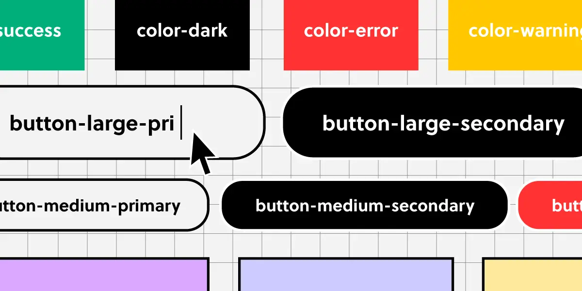


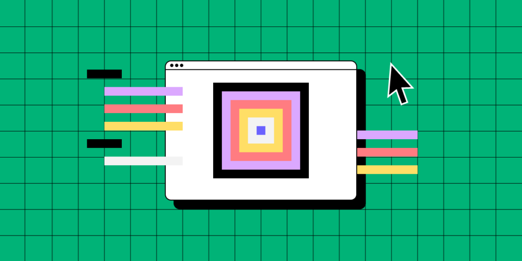
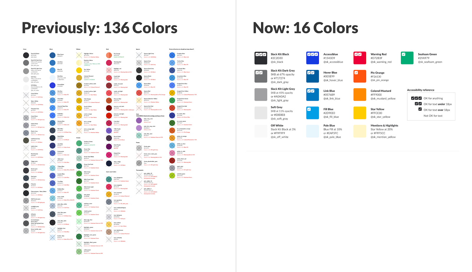
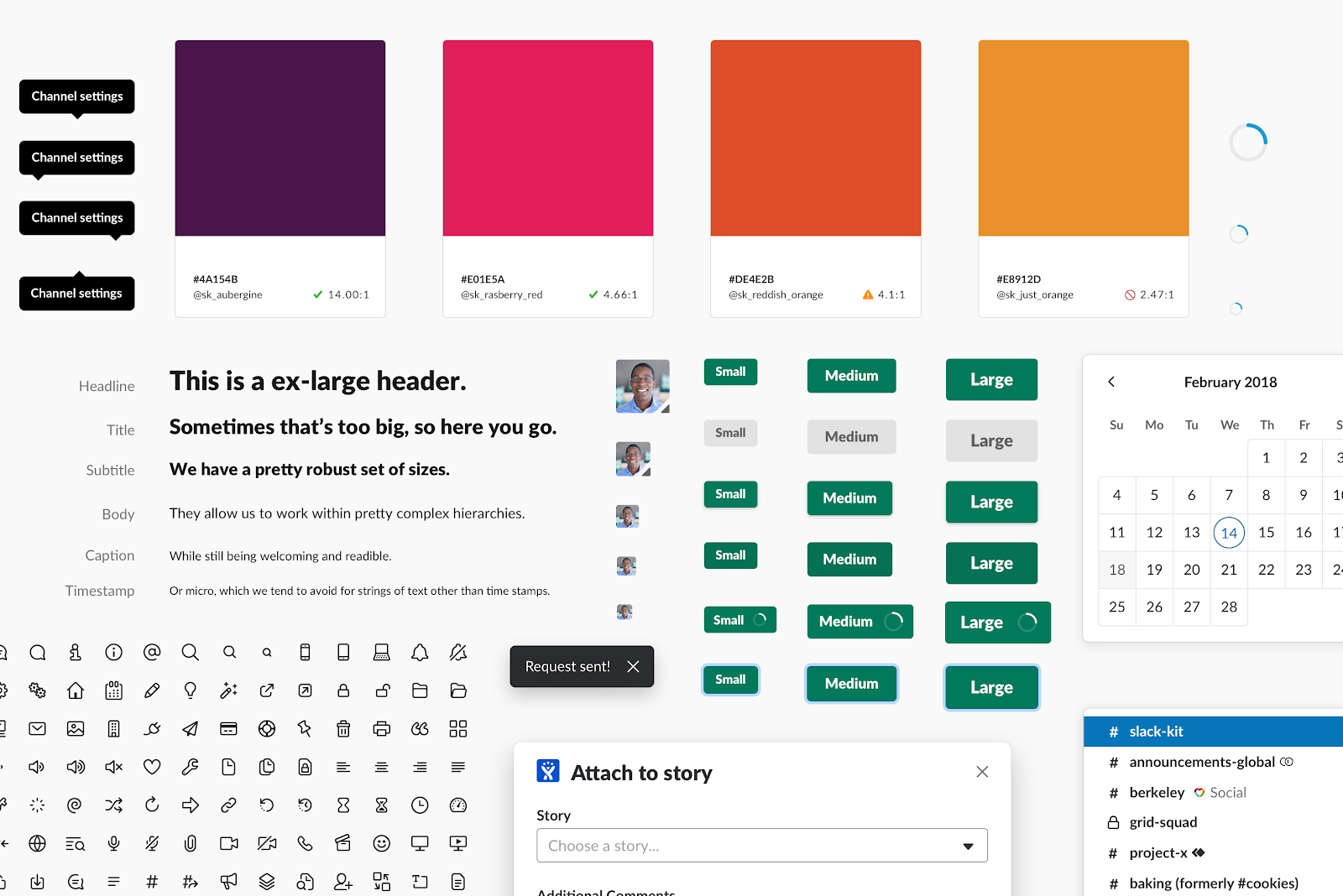
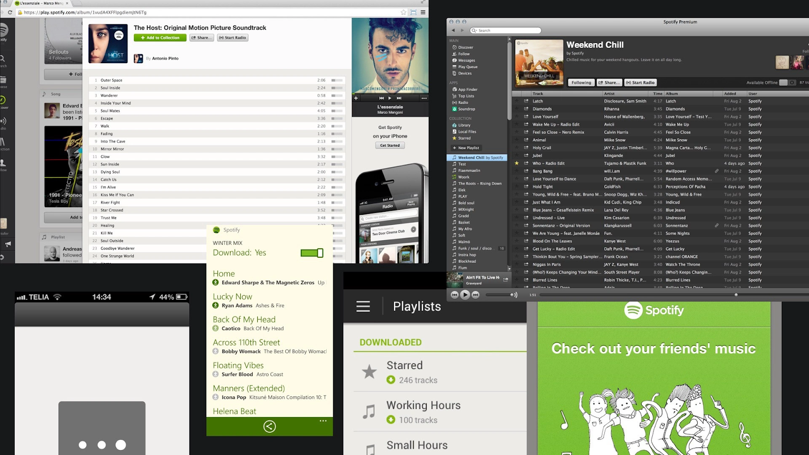
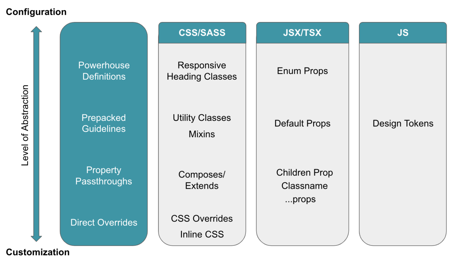
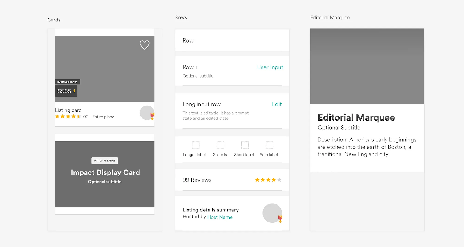


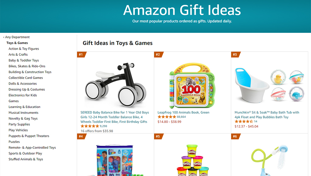
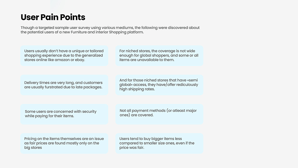
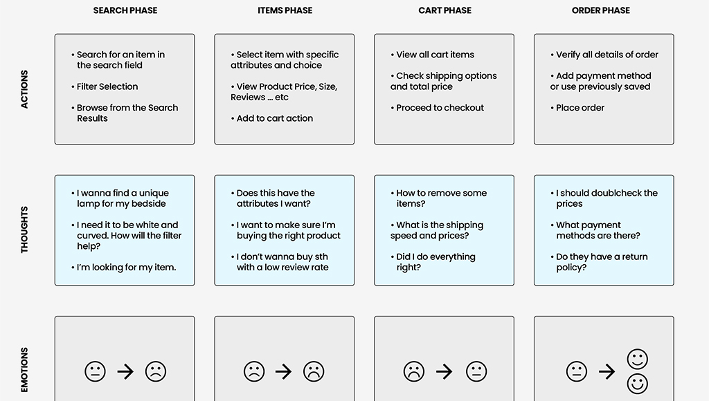
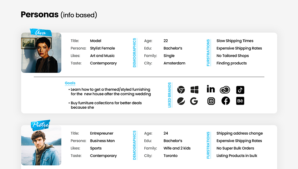


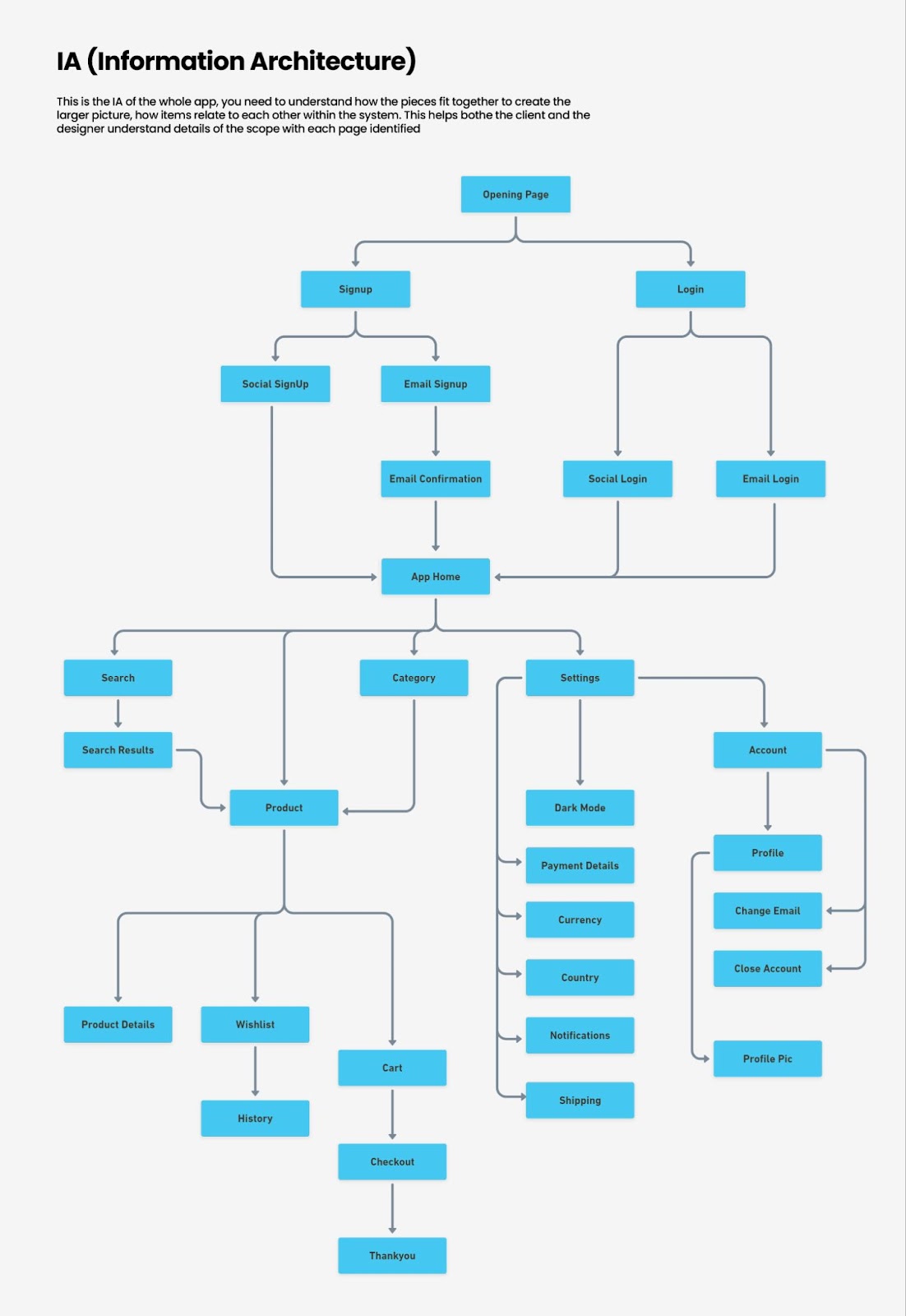
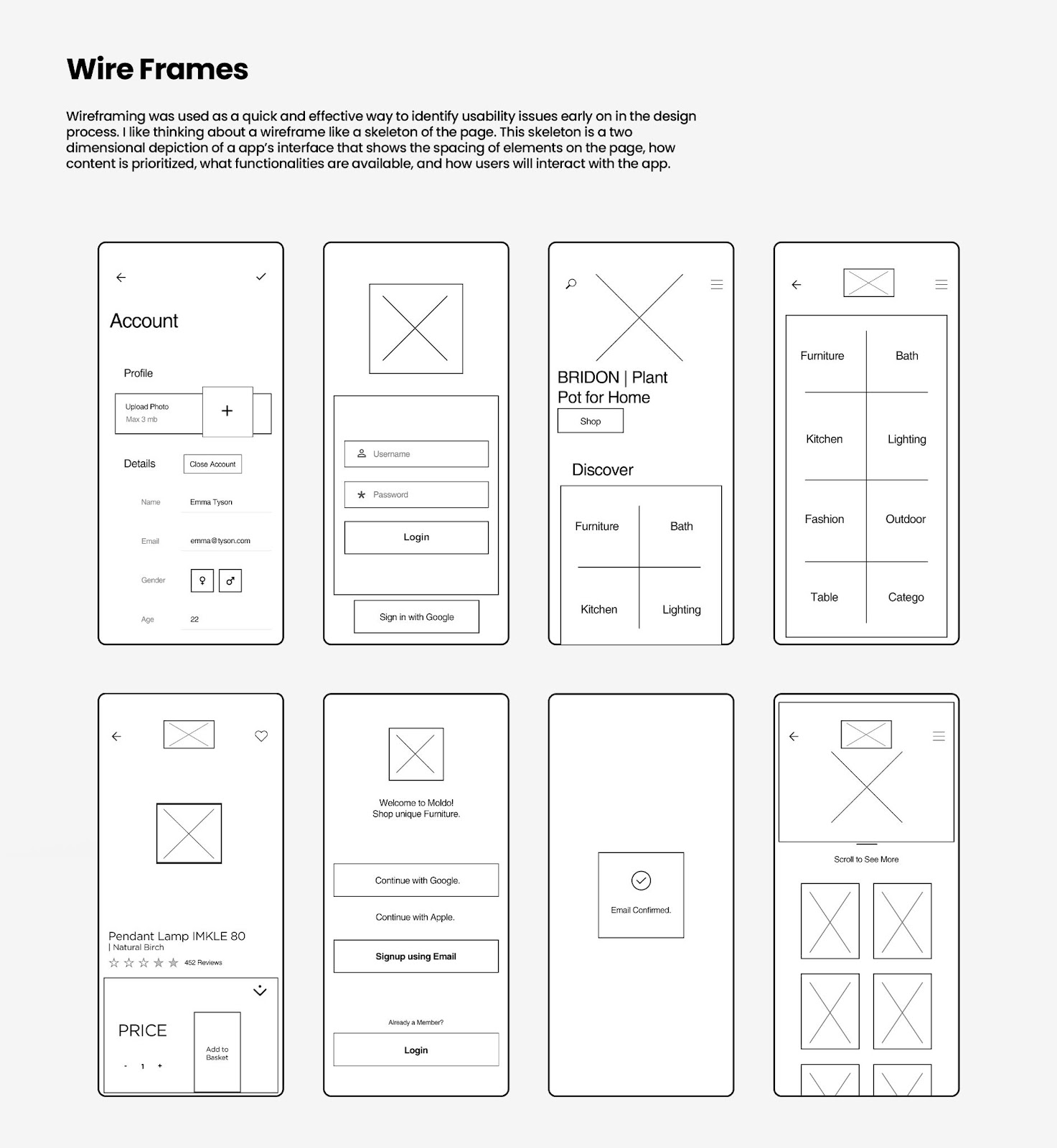
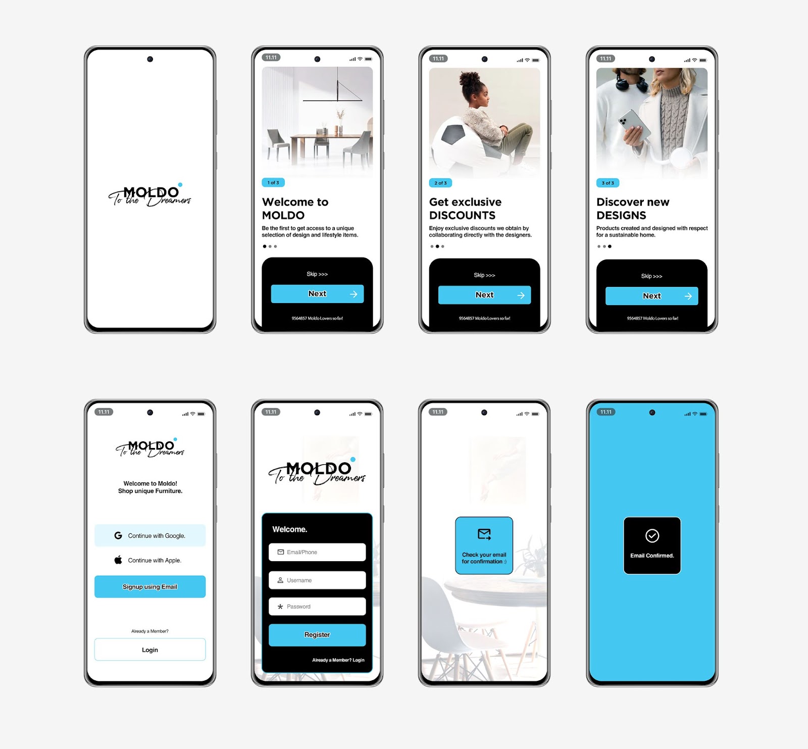


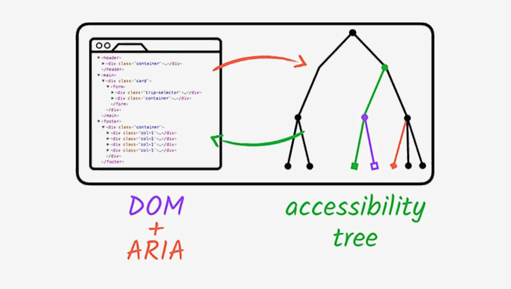

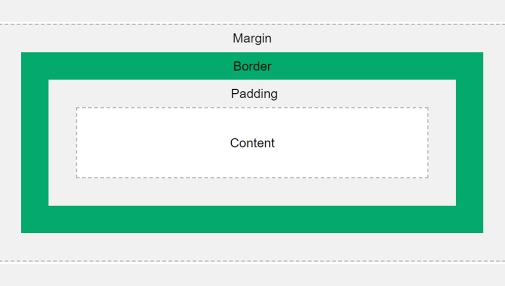

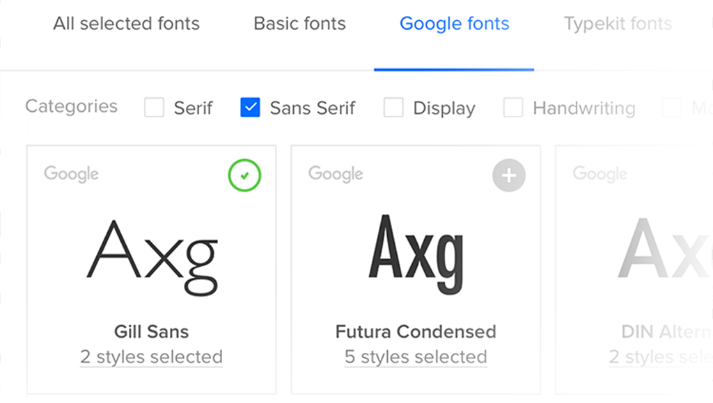


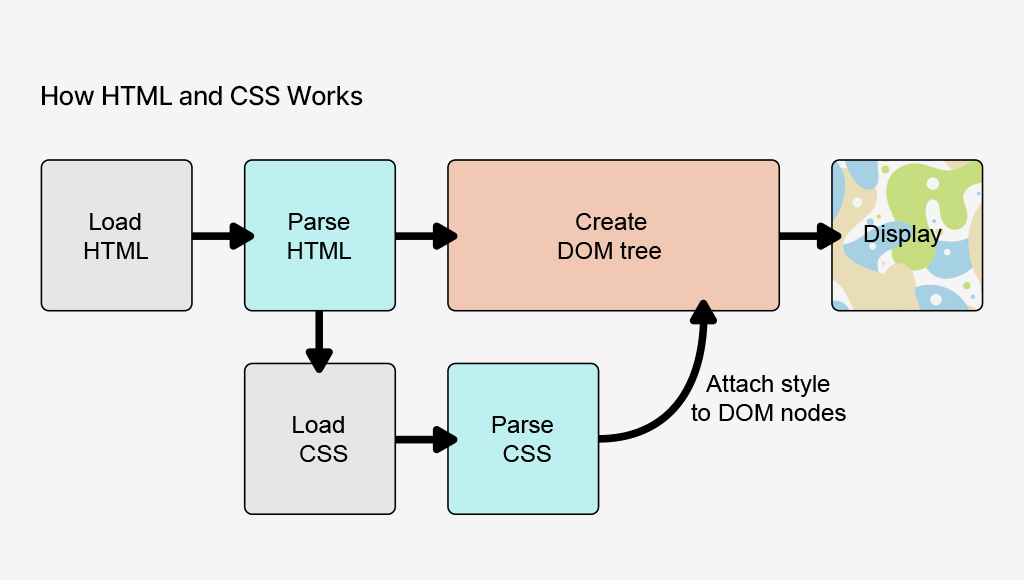
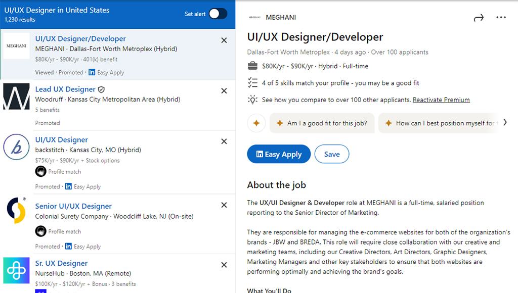


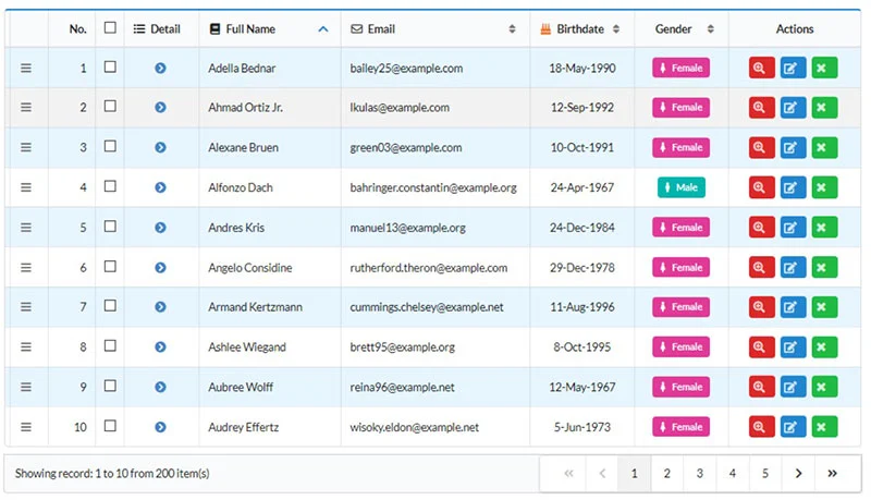
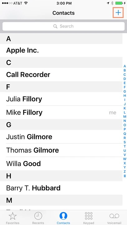
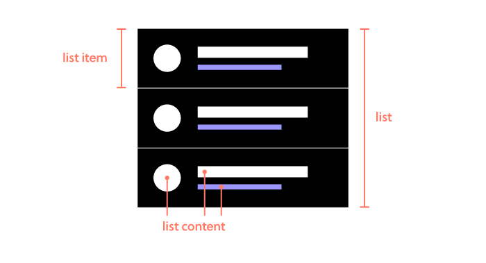

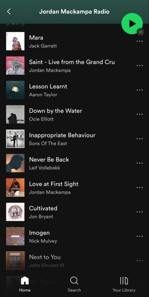

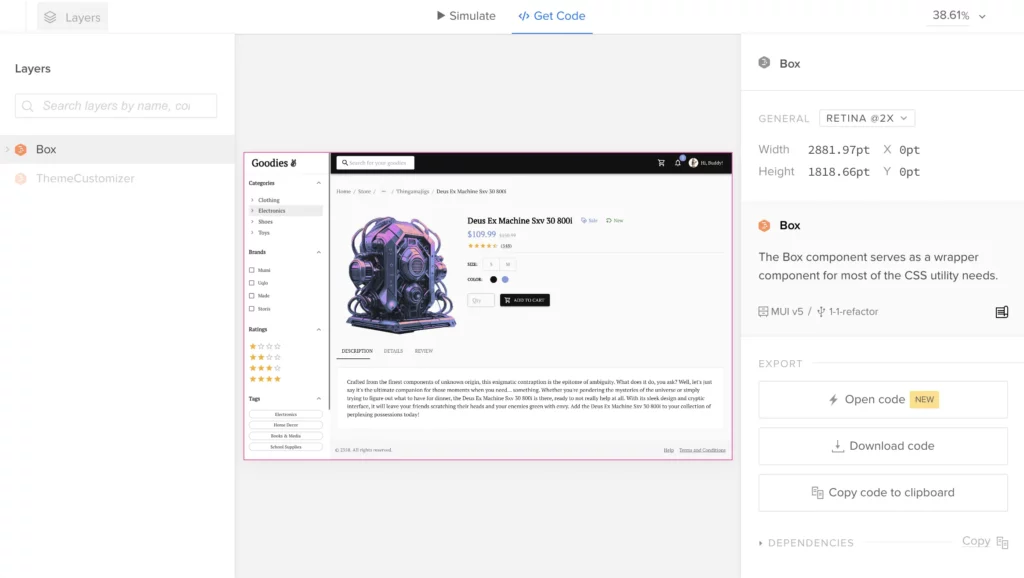
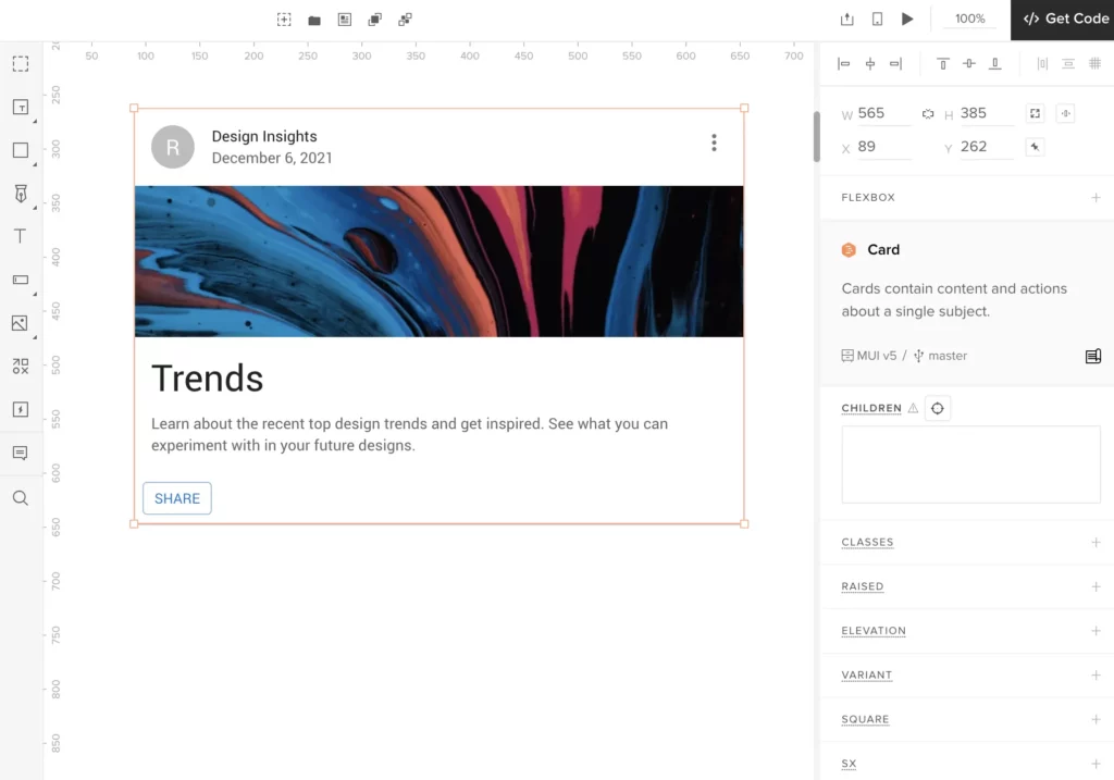
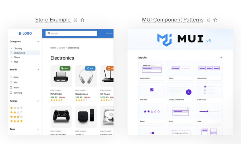
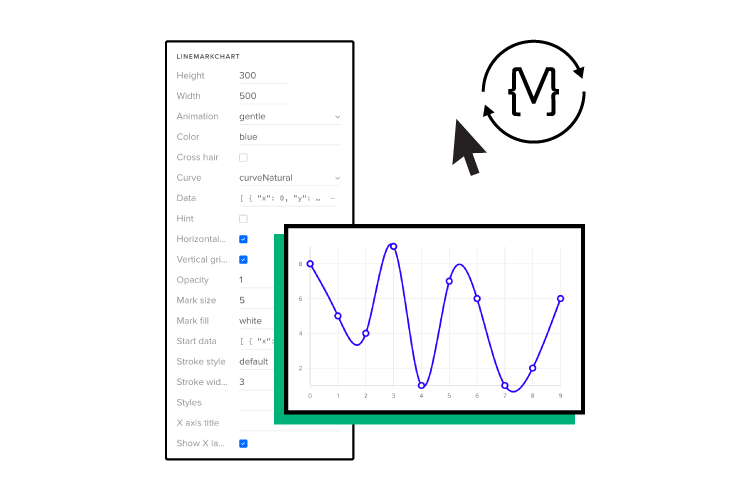
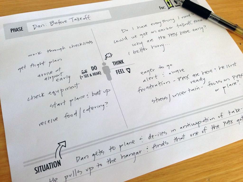
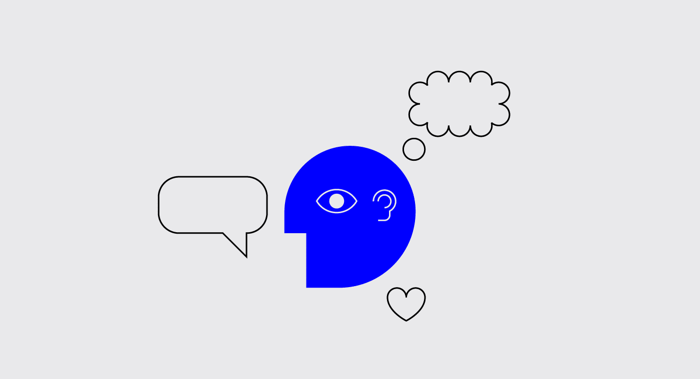
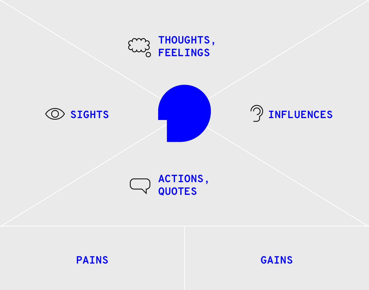
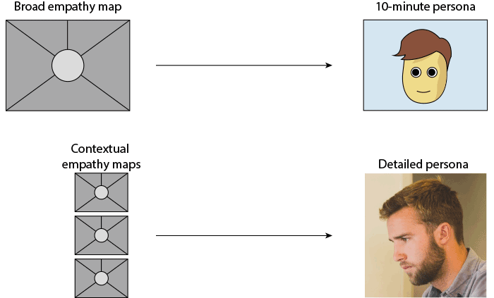
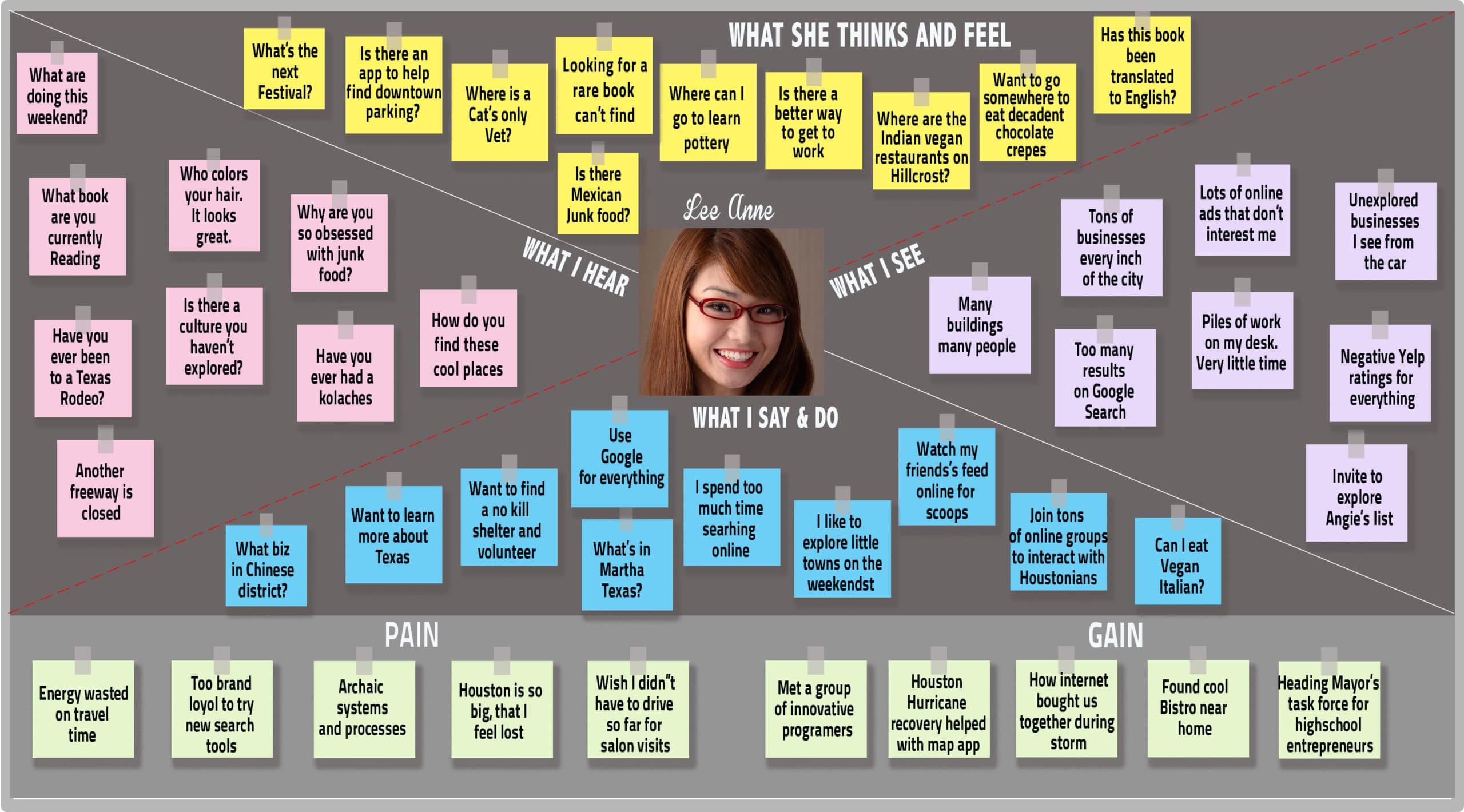


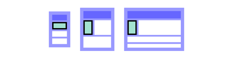
