Here are product updates that were released in UXPin in the last two months. They include new features, such as Paste & Replace, Flexbox for UXPin Merge, and a couple of usability and user management updates.
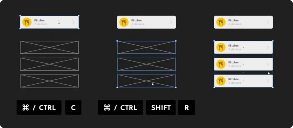
Paste & Replace
This feature allows you to copy an element to your clipboard, and then, swap it for an element that you have on the canvas with a key combination. Instead of deleting an element to paste another one in its place, use “Ctrl (Command) + C” to copy a component, image, shapes, etc. and paste it in the place of another element with a “Ctrl (Command) + V” key combination. It works for coded components, too.
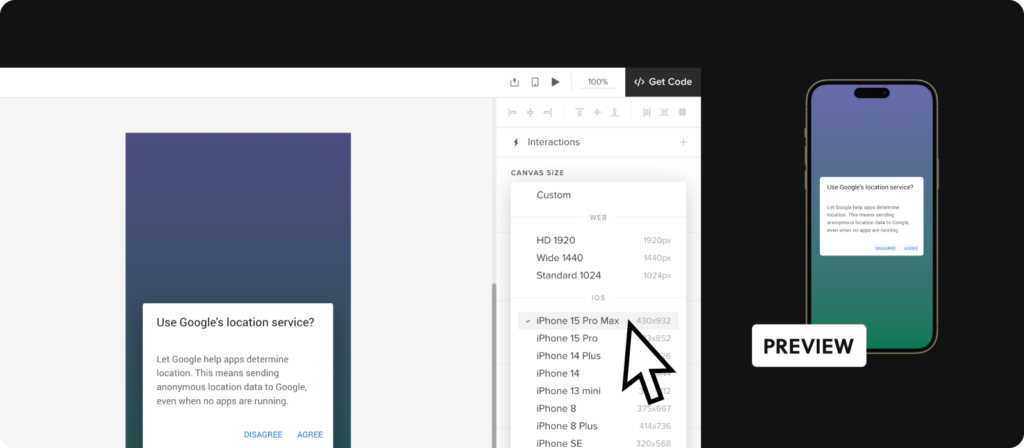
Use New Canvas Sizes
Our users works with canvases instead of artboards as in Figma. When starting a new project, you need to adjust the canvas to your design purpose, be it a desktop application. You can do that in Properties Panel on the right.
We want to let you know that we’ve added new canvas presets, each corresponding to a device frame (like iPhone 15 Max). There’s also a corresponding device frame available for each new canvas size.
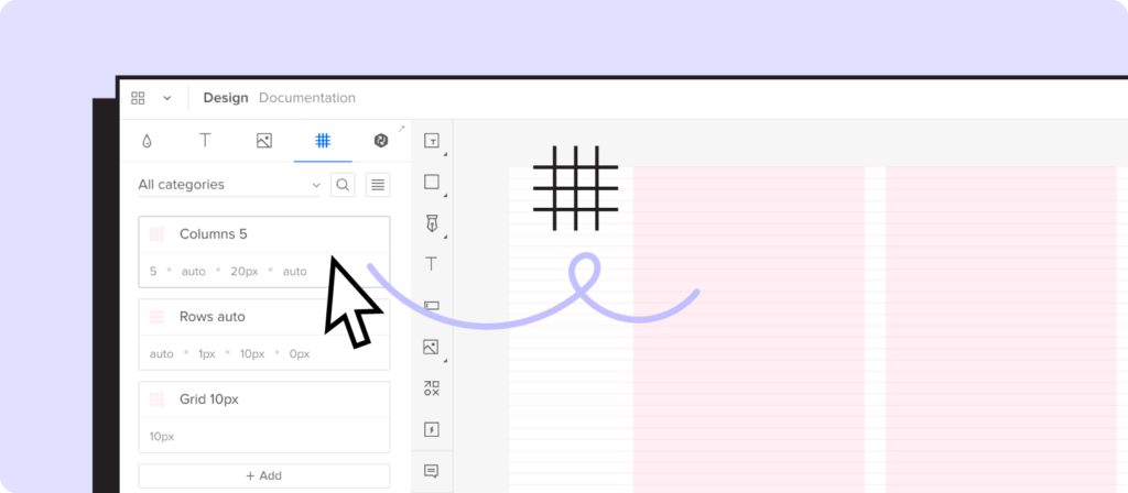
Set up Grid Styles
Grids in UI design and design systems are structural frameworks used to organize content on a page, ensuring consistency and alignment across different devices and screen sizes.
They serve as a foundational element in the layout of user interfaces, aiding designers in creating balanced, organized, and aesthetically pleasing designs.
UXPin now allows you to set up a predefined grid and add it to your design system library. You can set up a standard grid style and reuse it in every project.
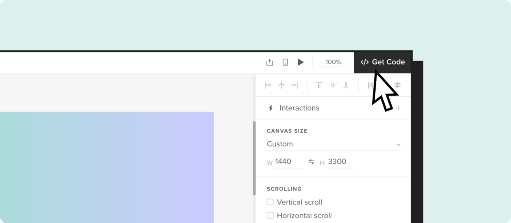
Access specs with “Get Code” button
You might have noticed that we added a new button in the right corner of the editor – “Get code.” This button redirects you to Spec Mode, where you can find all the specifications needed to build the interface of your product with a single click, faster than ever.
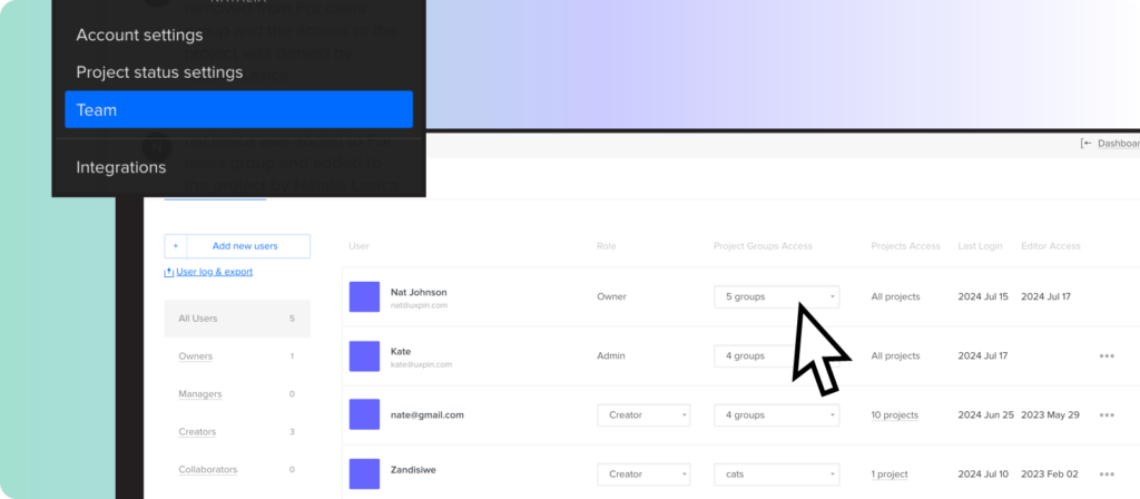
Now, Account Owners and Admins can see all the project groups created in the account including private ones. When a member who owned a private group is removed from the team, the ownership automatically transfers to Account Owner or Admin.
This feature is available on demand for Advanced, Enterprise, and Merge users.
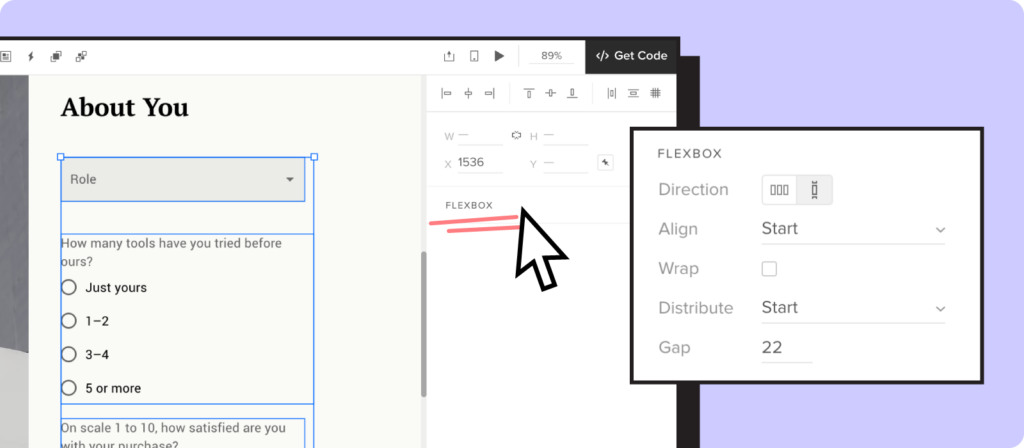
Flexbox for Merge components
Flexbox is a layout model in CSS that provides an efficient way to lay out, align, and distribute space among items in a container. It is particularly useful for creating responsive and dynamic layouts.
We added Flexbox for coded components that works like Auto-Layout. You’ll find it on the right panel and the context menu. It’s an easy way to align, distribute, set gaps between elements, and adjust components responsively.
Usability improvements
We also added a couple of usability tweaks:
Panel management in the Editor – to give you more flexibility, we tweaked the way you can use Panels. You can open “Pages & Layers” and “Design System Library” panels at the same time.
Select nested components – in “Get Code” mode, hold “Command/Control” key and click on the nested component that you want to inspect. This is a faster way of inspecting individual components compared to the old way of selecting them through the Layers Panel.
Suggest new features to add to our roadmap
At UXPin, we’re always looking to improve and make your experience even better. If you have a brilliant idea or a feature you wish to see in our product, we’d love to hear from you.
Your feedback is incredibly important to us. Drop us an email at hello@uxpin.com with your suggestions and ideas for new features. Whether it’s a small tweak or a big addition, your input can help shape the future of UXPin. Haven’t used UXPin in a while? Start a free trial.
Many teams envision creating a design system as a difficult, time-consuming project. It forces team members to audit their user interface, create a repository of design system elements and design guidelines and combine it in a way it’s usable for the entire organization
It’s not the only way you structure a design system, though. There are some simpler methods of creating this toolkit that is meant to speed up the design process. Let’s explore the best approaches for arranging a design system structure that achieves these goals.
Maximize the use of your design system in prototyping. Bring your design system’s building blocks to UXPin and design interactive prototypes that your devs can quickly translate to code. Discover UXPin Merge.
Reach a new level of prototyping
Design with interactive components coming from your team’s design system.
What is a Design System Structure?
A design system structure is a comprehensive framework that helps manage design at scale by providing a set of shared principles, patterns, and tools. It enables a consistent, coherent, and efficient design process across multiple teams and projects. The structure typically includes various components, each serving a distinct role in the overall system.
By having a well-structured design system, organizations can ensure a cohesive user experience across all products and platforms, streamline the design and development process, and foster collaboration among team members.
Design systems can be broadly categorized into three types based on their scope, usage, and complexity. Here they are:
Simple visual design repository
Atomic design system structure
Code-based design system structure.
Let’s explore them closely.
How Can You Structure a Design System?
When you combine design elements with the relevant documentation and guidelines, the system should form a coherent repository of things that are important for building user interfaces for a brand. But to achieve optimal design efficiency and system effectiveness, first, you must arrange it into a discernible structure. One that best suits your team’s needs and your organizational design objectives.
Simple visual design repository
This is the most basic of design system structures. As the NN Group explains, these visual design repositories come in various configurations, though the core focus here is simplicity.
At its fundamental level, a simple repository’s primary design system components consist of a style guide, a component library, and a pattern library. Together, these form the essentials for any functioning design system repository.
This structure only contains the essentials that constitute the system. It intends to provide the team members with what they need from the outset and allows them to create and add other assets and documentation as they go along. Shopify’s Polaris and Atlassian Design System use this type of design system structure.
Advantages:
The arrangement is simple to create and implement.
It encourages the design system team to tell the system’s basic structure from commencement.
And decisions are made on the move, fast-tracking development.
Drawbacks:
This arrangement lacks the structure provided by a strict hierarchy.
Teams tend to list the design system elements alphabetically or by their degree of importance, ignoring critical distinctions.
And it can be challenging to update and maintain this arrangement.
Atomic design
The atomic design structure was created by design systems advocate and author Brad Frost. It focuses on using order and a structured hierarchy to create an effective UI design system.
The atomic design methodology approaches design system structure by separating the process into five stages. The first three are modeled around the chemistry world, with the subsequent two relating to aspects of the world we can see. We explored atomic design system and its components in a separate article, but let’s recap the most important information here.
Each stage uses the previous one as its foundation. Every level consists of aggregated items from the preceding one. Like atoms constitute a molecule and molecules form an organism, this structure considers the smallest elemental components before moving on to the larger ones.
Atoms – These represent the most basic components of the design system.
Molecules – When those ‘atomic-level’ individual elements combine into groups, you’ll start to see bigger elements, coming together like lego pieces.
Organisms – By developing combinations of elemental design components into molecular groupings, organisms emerge. These form more complex design system UI components.
Templates – The next stage departs the realm of chemistry and heads into a more ‘macro’ world. Templates are where organisms can be curated and compiled into a cohesive, recognizable design.
Pages – Once you take a template and customize it, you have a page. By replacing the placeholder content in templates with tailored design content, you obtain the final, tangible product of the design system. Pages may not need to be designed for each and every case, but ensuring that there exist a few variations is a good idea.
Advantages:
Atomic design structure makes use of reusable components. Teams can divide various elements into basic atoms. These can then be applied and reapplied in different combinations and configurations.
Teams can easily spot those parts of a website or app that need various elemental components and create molecules and organisms accordingly.
This arrangement enables designers to use a design language that clearly defines a separation between content and structure.
This helps them be more creative and come up with different variants of the same components.
Disadvantages:
An atomic design structure can result in long, complex lists of components.
In some instances, having only a few components means maintaining multiple categories for them is pointless. This can complicate the overall methodology.
Code-based design system structure
This approach is among the most potent and effective for designing system structures. It is ideally suited for design teams working on digital product and new functionalities. Think about Material Design or Fluent UI design system.
This structure enables you to develop prototypes that look and behave just like the developer-built final product. This arrangement allows for more collaboration between designers and developers. The whole product team can count on a single source of truth informing their efforts.
The code-based design system arrangement is considered a relatively new approach in digital product system design. With it, designers can now employ functioning, developer-approved coded UI elements to scale digital product design.
Advantages:
The structure improves designer-developer cooperation.
It helps teams track changes in UI elements more effectively.
It improves overall efficiency from prototyping through to design handoff.
Disadvantages:
Designers need tools like UXPin with Merge tech to benefit from code-based design system.
Components can take lots of time to create.
Designers may require developer assistance to develop the system.
How Do You Choose the Right Design System Structure?
Deciding on the right design system structure is essential to giving your team the framework they need to design more efficiently. A design system structure aligned with your product design objectives will help designers collaborate better. This assists them in producing the digital products they’re capable of.
To ensure you’re picking a design system structure that aligns with your product team’s needs, ask yourself:
For whom is your design system being optimized? Is it for everybody across the organization, user experience designers, or, say, front-end developers only?
How many components and content types – from design patterns, coded UI components, and design guidelines to rollout plans and best practice policies – are you looking to integrate into the system?
Effective design systems are dynamic entities capable of adapting to the challenges that come with growth and change. A design system’s inherent value lies in its ability to reduce the duplication of effort and facilitated collaboration.
Why UXPin Prefers a Code-Based Design System structure?
Using coded components in a design system enables sharing among design and developer teams. This allows them to rely on a single source of truth and to collaborate more effectively.
Teams across the organization can also manage all their design and prototyping projects simultaneously. This maintains a higher degree of consistency. In turn, developers can get stuck into translating design patterns into developer’s language.
UXPin Merge uses a code-based design system structure to design prototypes with a single source of truth. With it, designers can create prototypes for digital products that are consistent with developer’s workflow. Discover UXPin’s code-to-design solution.
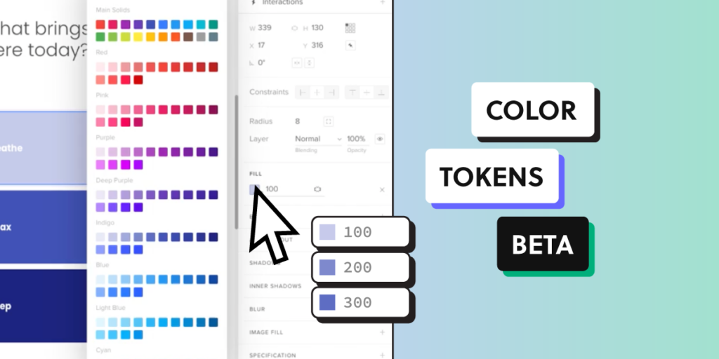
As part of our commitment to help you create consistent user interfaces, we’re excited to introduce Color Tokens — a powerful tool that brings a new level of precision and organization to your design workflow.
In open beta, you can set up a color token library, easily update your design system and control colors of your components. In the future, you will be able to facilitate the full design process with colors. Follow along the advice posted in this article. Set up a UXPin account. Try UXPin for free.
Build advanced prototypes
Design better products with States, Variables, Auto Layout and more.
What are Color Tokens?
Color tokens are a set of predefined, reusable variables representing colors used in a design system.
Instead of manually applying hex codes or RGB values across different elements, designers can now use these tokens to ensure uniformity, consistency, as well as simplify updates and maintenance of colors in their design system.
Color Tokens help keep designs consistent by using the same colors across projects. They make updates easy, reducing manual work. They also help teams use a common set of colors, so everything looks cohesive and in line with company standards.
Consistency: By using Color Tokens, teams can ensure that the same color values are applied consistently across all design assets, eliminating discrepancies and maintaining brand integrity.
Efficiency: Tokens streamline the design process by reducing the need for repetitive tasks. When a color change is required, tokens can help designers and engineers do it quickly, saving time and reducing errors.
Collaboration: Color tokens facilitate better collaboration between designers and developers. With a shared language and defined color standards, design handoffs are smoother, and the implementation is more accurate.
How to Access Color Tokens in UXPin
Before you can access Color Tokens, you need to set them up. You can do that manually or convert an existing library into a Color Token library. See UXPin’s documentation for detailed instructions: Color Design Tokens.
Convert an existing library
If you created a Color library in UXPin before July 17th, 2024, you can convert it to a token library and use the saved colors as token colors.
Open the existing library, click Library Settings and Click ‘convert library to use colors as tokens’. Save changes and you’re good to use those colors as tokens.
Set up a new library
To create a Color Token library, you need to navigate to Design System Library in UXPin. Open Design System Libraries (or press “cmd” + “2” to get there faster).
Then, at the bottom of the panel, click “+ New library”. Navigate to the colors section and get ready to add Color Tokens.
You can set up Color Tokens in two ways:
Copy colors from selected elements – select one or more elements on the canvas and click “+Add” in the library panel to add the colors as tokens.
Type in a color HEX code – enter the HEX codes to set up Color Tokens automatically.
The colors from your library will also appear in the Color Picker, so you can quickly apply them to elements on the canvas. Select the element that you want to switch a color of and choose an appropriate color from the library.
This trick works for setting up the colors for properties like fill, border, and shadow.
What Can You Do with Color Tokens in UXPin?
Change colors of elements that you have on the canvas – Pick an element and add a color to it from the saved Color Tokens.
Update colors in your design system – If you use a design system, you can now try new colors and change your design system library for a more modern look.
Maintain a uniform look within a project – Access the same Color Tokens in every new prototype that you and your teammates create within a project.
Share Color Tokens across your organization – Share your design system library with tokens across your organizations, so everyone can use the same Color Tokens.
Manage Color Tokens as you like – Set up new Color Tokens, update existing ones, share them with your team, and more.
A Step Towards Comprehensive Design Tokens
Introducing Color Tokens is just the beginning. At UXPin, we understand that Design Tokens extend far beyond color. As part of our commitment to creating a robust design system, we are actively working on expanding our token offerings to include typography, spacing, and other design elements.
This comprehensive approach will further enhance consistency, improve scalability, and streamline the entire design-to-development workflow.
Use code-backed components in both design and development. Build advanced prototypes effortlessly and generate production-ready code directly from the design. Try UXPin for free.
Admin UI is a graphical user interface designed for administrators to manage and control a system, application, or website. This interface is distinct from the regular user interface and provides advanced features and controls necessary for overseeing and configuring various aspects of the system.
The Admin UI often includes functionalities such as user management, access control, system configuration, monitoring, and reporting tools. It is designed to be intuitive for administrators and typically requires authentication to access to ensure security.
The specific features and design of an Admin UI can vary depending on the context, such as whether it’s for a web application, server, database, or any other system that requires administrative oversight. Admin UIs are crucial for simplifying complex administrative tasks and ensuring that administrators can efficiently and securely manage the underlying system or application.
Build a React app Admin UI with UXPin Merge — a drag-and-drop UI builder that allows you to create interfaces with React components, and then, export their code with a single click. Try UXPin Merge for free.
Design UI with code-backed components.
Use the same components in design as in development. Keep UI consistency at scale.
What is Admin UI?
Admin UI (short for Administrative User Interface) is a graphical interface designed for administrators to manage and control system settings, user permissions, and other advanced configurations in a simplified and intuitive manner.
It’s an essential tool that empower app providers, website owners, and system administrators to effectively configure, manage, secure, and monitor their applications and systems, contributing to the smooth operation and success of the digital services they provide.
It provides security against unauthorized access to data, handling backend of an app, website or system, and other things that administrators are tasked with.
What are Admin UI examples?
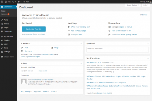
WordPress Dashboard
Take WordPress. Its admin panel serves as a great example of a high-quality Admin UI design due to its user-friendly UX design, powerful features, and widespread adoption. It’s designed with a focus on user-friendly navigation. The menu structure is intuitive, making it easy for users, including those with limited technical expertise, to find and manage various functionalities.
The WordPress Admin dashboard design provides a comprehensive overview of the site’s key metrics, recent activity, and quick access to essential tasks. This summary allows administrators to grasp the site’s status at a glance.
This admin UI panel is modular, allowing users to rearrange and customize widgets on the dashboard. This flexibility enables administrators to tailor the interface based on their specific needs and preferences. It also incorporates security features, including password strength indicators, user role management, and the ability to enforce two-factor authentication through plugins.
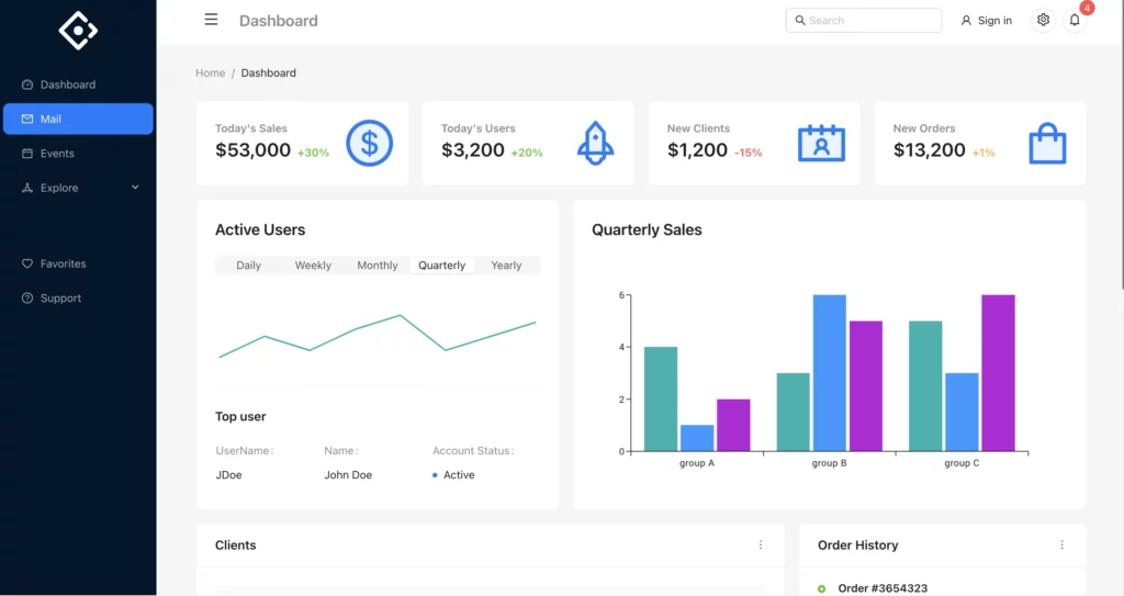
eCommerce Dashboard
Another example of Admin UI is a dashboard that we built to show our users how to use coded components in UXPin. This dashboard features different sales metrics that are essential for the business, a couple of charts, order history, and a quick employee FAQ to help with onboarding.
App providers, website owners, and system administrators build administrative user interfaces to handle following tasks:
System Configuration and Management: Admin UIs provide a dedicated space for configuring and managing various aspects of a system, application, or website. This includes settings related to functionality, user roles, permissions, and system preferences.
User Management: Admin UIs allow administrators to manage users efficiently. This includes tasks such as user registration, authentication, role assignment, and user profile management. Admins can also monitor user activity and take appropriate actions.
Content and Data Management: Admin UIs enable the management of content and data within an application or website. This involves tasks such as creating, editing, and deleting content, as well as organizing data in a structured manner.
Access Control and Security: Admin user interfaces play a crucial role in access control and security management. System administrators can define user roles, permissions, and restrictions to ensure that sensitive information is protected, and only authorized individuals have access to certain features or data.
Real-Time Monitoring and Analytics: Such user interfaces often include an admin dashboard for monitoring the performance and usage of the mobile or web app (or website.) This may involve tracking user activity, analyzing system logs, and generating reports to gain insights into how the system is being used.
Debugging and Troubleshooting: For system administrators, Admin UIs serve as a valuable tool for debugging and troubleshooting issues. They can view error logs, diagnose problems, and take corrective actions without delving into the technical details of the underlying infrastructure.
Updates and Maintenance: Admin UIs facilitate the process of updating and maintaining the application or website. This includes applying patches, installing updates, and managing version control to ensure that the system remains secure and up-to-date.
Customization and Configuration: Admin UIs often allow for customization and configuration of the user interface itself. This can include themes, layouts, and other visual elements that suit the preferences of the administrators.
Workflow Automation: Admin UIs may include features that enable administrators to automate certain workflows and tasks, streamlining repetitive processes and increasing overall efficiency.
Enhanced User Experience for Administrators: By providing a dedicated and user-friendly interface for administrators, an Admin UI ensures that those responsible for managing the system can do so efficiently and with minimal friction. This improves the overall user experience for administrators.
Your admin UI design will depend on the task that you need an admin panel for. For examples, CRM apps need real-time monitoring and analytics dashboard UI, while CMS need a wide range of customizations as well as content and data management.
How to design an Admin UI for a React app?
React Admin UI can be designed pretty fast once you use UI components that come from an open-source React library like the one created by Material Design or Bootstrap teams. Such components will be a foundation of your design system, ensuring that the Admin UI design is consistent and high-quality.
For the purpose of this tutorial, we will show you how to quickly assemble an interactive admin dashboard with MUI components. In our app, you may find an admin dashboard template. We have also UI kits that make React UI design super easy and fast.
Let’s start.
Step 1: Pick UI components.
Material Design offers a rich set of pre-designed components that serve as the foundation for your admin UI. From navigation bars to data tables, Material UI provides a comprehensive suite of components. Identify the components that align with your admin dashboard requirements, ensuring a consistent and professional appearance.
You can preview the components in MUI documentation or jump straight to UXPin to see which components we offer as part of our Merge library. To do that, start a new project, create a new prototype, and pick the Library and Design System icon from the bottom-left corner. Next, search for MUIv5 and preview all the components. If you want to group components together, you may use a responsive flexbox.
We recommend you following UI components for building admin user interface:
Table – it’s a data display component for building a basic table, data table, dense table, and manage sorting and selecting; more about in official documentation.
Line Chart– a MUI-X chart component for showing trends.
Pie Chart – the last MUI-X chart component that we want to highlight here.
List – a data display component for different types of lists that can be fully interactive.
Typography – one of the handy data display components for input.
Select – an input component that allows users to pick an item from a drop-down list; more about how to style it in official docs.
Menu – a complex navigation component.
Breadcrumbs – a handy navigation component to add for user-friendly websites.
They all belong to our built-in Merge library, so you can easily find them in UXPin. We also have more input, navigation components, as well as the ones for theming.
Step 2: Arrange UI components and change their properties.
Assemble the chosen components to create the layout of your admin dashboard. MUI’s modular structure allows for easy arrangement and customization. Adjust properties such as colors, typography, and spacing to match your app’s branding and visual identity. This step ensures a cohesive design that resonates with your users.
If you want to learn more about using MUI components in UXPin, watch this part of our mini-course on using UXPin’s library.
Step 3: Set up interactions.
Enhance user experience by adding interactive elements. MUI components in UXPin come with built-in interactivity, but you can further customize or add event handlers to meet specific requirements. Consider incorporating features like collapsible panels, responsive navigation, and tooltips to make your admin UI intuitive and user-friendly.
UXPin’s editor is code-based, so you’re working with a fully coded components, but you also have an option of adding interactions, like clickable menu that leads you to another page, an alert popping up in front of the users or input validation. You can add such interactions with variables, interactions, and expressions. More about them in our docs.
Step 4: Share your admin dashboard with stakeholders for review.
Before moving forward, share your admin dashboard prototype with stakeholders for feedback. Material-UI’s components not only enhance design consistency but also facilitate a quicker review process. Collect input on the layout, usability, and overall aesthetics to ensure alignment with the project’s goals.
UXPin has a Preview mode that allows you to see design as if it was a real thing, and share it with your stakeholders for feedback. This is a great feature, because UXPin’s design’s are fully interactive, and you don’t need to leave a tool for other people to test them by themselves. It helps with stakeholder reviews.
The shortcut for accessing the preview is Command + P.
The preview also contains a sitemap, and for mobile designs, you can use our Mirror App and run an app on hand-held devices.
Step 5: Export React code to develop the app.
Once your admin dashboard design is approved, UXPin simplifies the process of exporting React code off your MUI-based design. This code can be seamlessly integrated into your React app, saving development time and ensuring a smooth transition from design to implementation.
Just go to the Preview mode we discussed earlier, navigate to Spec Mode and then, export the code. You can open the code directly in Stackblitz or just copy it to another dev environment that you’re using.
Design more than Admin UI in UXPin
Designing an Admin UI for a React app becomes a seamless process when utilizing powerful and well-designed UI components. MUI, with its extensive library and flexibility, allows developers to create a consistent, visually appealing, and interactive admin dashboard. By following these steps, you can efficiently design and implement an Admin UI that meets both user and stakeholder expectations.
Ready to explore design in UXPin? With our pre-built templates, trial kits, ready React components, you will become a design wizard instantly. Just drag and drop components on the canvas, adjust their props, and you’re ready for the product development phase. Try UXPin for free.
Bootstrap is a popular open-source front-end framework for developing responsive and mobile-first websites. It was developed by Mark Otto and Jacob Thornton at Twitter and released in 2011. Bootstrap itself does not use React, but there are integrations like React-Bootstrap that provide Bootstrap components as React components. This library eliminates jQuery dependency and are more suitable for React projects. Let’s discuss the differences between the two.
Build fully functional user interfaces with React components 10x faster. Use UXPin Merge, a UI builder for React apps to plan the layout, test user experience, and start React development super fast. Try UXPin Merge for free.
Design UI with code-backed components.
Use the same components in design as in development. Keep UI consistency at scale.
What is Bootstrap?
Bootstrap is a popular open-source front-end framework used for developing responsive websites. Developed by Mark Otto and Jacob Thornton at Twitter, it was initially released in 2011.
Bootstrap was created to address the challenges of developing consistent, responsive, and user-friendly web applications across different browsers and devices. Before Bootstrap, web developers often faced issues with cross-browser compatibility and had to create custom styles and UI components from scratch, which was time-consuming and often led to inconsistencies.
Before launching Bootstrap, developers mostly wrote their own custom CSS to style their web applications (which involved a steep learning curve) or used boilerplates like HTML5 Boilerplate. They also used JavaScript and jQuery plugins to add interactivity and dynamic elements to their websites. This included custom scripts for modals, carousels, and other interactive components.
Bootstrap’s introduction provided a comprehensive, all-in-one solution that simplified the development process, leading to its rapid adoption and popularity among web developers.
The newest version of Bootstrap is Bootstrap 5 which was released to bring modern updates, improved features, and better performance (such as the removal of jQuery, enhanced grid and form systems, a new utilities API, etc.)
When to Use Bootstrap
Quick Setup: Bootstrap allows for rapid development of prototypes and MVPs. Its pre-styled components and responsive grid system make it easy to get a project up and running quickly.
Reusable Components: Use ready-made Bootstrap CSS’s components like buttons, forms, modals, and navigation bars without having to design them from scratch.
Built-In Responsiveness: Bootstrap’s grid system and responsive utilities make it easier to create layouts that work well on various devices and screen sizes without extensive custom CSS.
Mobile-First Approach: Designed with a mobile-first philosophy, ensuring good performance on mobile devices, and making front-end development easier.
Community Support: Extensive community resources, themes, and plugins are available, making it easier to find solutions and enhancements.
Consider other frameworks or custom solutions when:
Performance is a top priority and you need a lighter framework.
You’re building a single-page application and need a full-featured JavaScript framework with integrated UI components.
Examples of Projects Ideal for Bootstrap
Bootstrap is heavily involved in the View Layer of MVC model. It provides a wide range of CSS styles and components to create responsive, visually appealing, and consistent user interfaces. It’s a versatile and powerful development framework for responsive design, and consistent UI.
Here are some examples of Bootstrap use cases:
Corporate Websites: For company websites where a professional and consistent design is important, Bootstrap provides the necessary tools to create a polished user interface.
Landing Pages: Quick and responsive landing pages for marketing campaigns can be efficiently built using Bootstrap’s grid system and pre-styled components.
Personal Blogs and Portfolios: For personal projects like blogs or portfolios, Bootstrap’s ease of use and customization options make it a great choice to get started quickly.
Admin Dashboards: Many admin dashboard templates are built with Bootstrap due to its comprehensive component library, which makes it easy to create complex user interfaces.
Educational Projects: If you’re working on a school project or learning web development, Bootstrap can help you implement web designs quickly and understand fundamental web development concepts.
Several well-known companies use Bootstrap for their web development needs due to its flexibility, ease of use, and responsive design capabilities. Most notable examples are Twitter (the birthplace of Bootstrap), Spotify, and LinkedIn.
Does Bootstrap uses React?
Bootstrap itself does not use React; it is primarily a CSS framework with optional JavaScript components that are built using vanilla JavaScript and jQuery. However, there are integrations and libraries that combine Bootstrap with React.js to leverage the strengths of both.
The most popular Bootstrap and React integration is React Bootstrap, which comes in handy when you are creating single-page applications.
What is React Bootstrap?
React Bootstrap is a Javascript library that integrates the popular Bootstrap framework with React, providing Bootstrap components as React components. This integration allows developers to use Bootstrap’s styles and components in a way that is idiomatic to React, avoiding the need for jQuery and ensuring compatibility with React’s component-based architecture.
Key Features of React Bootstrap
Bootstrap Components as React Components: React Bootstrap provides a comprehensive set of Bootstrap components that have been converted to React components. This includes buttons, forms, modals, tooltips, carousels, and more.
Reusability: Components can be reused across different parts of the application or even in different projects.
Scalability: Each component encapsulates its own structure, style, and behavior, making it easier to manage and scale individual parts of the application.
No jQuery Dependency: React Bootstrap eliminates the need for jQuery, which is required by the original Bootstrap’s JavaScript components. This makes it more suitable for modern React applications.
Customizable and Extensible: Just like Bootstrap, React Bootstrap components are highly customizable. You can override default styles and behaviors to fit your application’s needs.
Declarative Syntax: React’s declarative syntax improves code readability and maintainability. Developers can easily understand the structure and flow of the UI by looking at the component tree.
Virtual DOM: React uses a virtual DOM to efficiently update and render only the parts of the UI that have changed. This results in better performance, especially for large and dynamic applications.
Consistent API: React Bootstrap components are designed to have a consistent API, making them easy to use and integrate into your React application.
Responsive Design: The library retains Bootstrap’s responsive design capabilities, allowing you to create layouts that work well on various devices and screen sizes.
Built with React Principles: Components are built following React best practices, ensuring compatibility with React’s lifecycle methods, hooks, and state management.
Can Bootstrap Replace React?
No, Bootstrap cannot replace React. Bootstrap and React serve different purposes in web development, and they are often used together rather than one replacing the other.
Bootstrap is a front-end CSS framework. It is primarily used for styling and layout. React, on the other hand, is a JavaScript library for building user interfaces. It is primarily used for managing UI logic and state. Bootstrap and React have two different roles and use cases.
They are often used together to leverage the strengths of both. For example, you can use React to manage the dynamic and interactive aspects of your web app, while Bootstrap provides the styling and responsive design. Libraries like React-Bootstrap make it easier to use Bootstrap components within React applications, providing pre-styled Bootstrap components as React components.
There are other JavaScript frameworks and libraries that can serve as alternatives or replacements for React, such as Vue, Angular or Svelte.
For native mobile applications using JavaScript and React, use React Native. It’s a framework developed and maintained by Facebook, React Native uses the same design principles and component-based architecture as React but is tailored for mobile app development.
What is better — Bootstrap or React Bootstrap?
Feature
Bootstrap
React-Bootstrap
Primary Use
CSS and JS framework
React component library
Integration
Can be used with any project
Specifically for React
JavaScript Dependency
Requires jQuery for JS components
No jQuery dependency
Component-Based
No
Yes
Customization
Custom CSS or SASS
React props and state
Learning Curve
Easier for non-React projects
Easier for React developers
Dynamic Behavior
Custom JS or jQuery
Handled through React
Choose Bootstrap if:
You are not using React or are using a different front-end framework or library.
You need a quick and easy way to style a static or server-rendered site.
You are comfortable managing JavaScript behavior separately or with jQuery.
Choose React-Bootstrap if:
You are building or planning to build a React application.
You want to follow React best practices and patterns.
You prefer managing your UI components as React components, taking advantage of React’s state management and lifecycle methods.
Ultimately, the choice depends on your project’s requirements and your web development environment. For React projects, React-Bootstrap offers a more seamless and integrated user experience, while for non-React projects, Bootstrap provides a robust and versatile styling solution.
What is React Bootstrap used for?
React-Bootstrap is a great choice for beginners. The ability to quickly prototype and build applications helps beginners grasp core concepts without being overwhelmed by the intricacies of CSS, web page design and JSX, which is a syntax extension for JavaScript that allows you to write HTML-like code within your JavaScript files.
Corporate Websites
Build professional websites for businesses with responsive layouts and consistent design that fit the ecosystem of digital products.
Blogs
Develop a blog or CMS with features like post creation, editing, and displaying content.
E-commerce Platforms
Build online stores with product listings, shopping carts, and checkout processes.
Boostrap and React Bootstrap are both frontend toolkits — they simplify front-end development workflow. If you are building a React-based web app, React-Bootstrap is the better choice. Bootstrap relies on jQuery for its JavaScript components, which can be unnecessary overhead in a React project. React-Bootstrap eliminates the need for jQuery, aligning with modern JavaScript practices and ensuring a lighter, more efficient application.
If your project does not use React or if you need a quick, static site, standard Bootstrap might be more straightforward and quicker to implement. However, for dynamic, interactive applications, React-Bootstrap’s component-based approach offers greater flexibility and scalability.
To build React app with React Bootstrap components, choose UXPin Merge. It’s a powerful builder and the only prototyping tool that allows you to use real React Bootstrap components to build your app. Try UXPin Merge for free.
At UXPin’s Design Value Conference in March 2022, we hosted five design industry leaders to understand Design and DesignOps at some of the world’s biggest organizations.
One of those speakers was Maggie Dieringer, Senior Design Program Manager at Uber. Maggie has worked as a DPM at Uber since 2016 on the Rides and Eats products and has gained valuable experience working alongside some of the world’s best tech talent.
In her 30-minute talk at Design Value Conference 2022, Maggie shared insights about how she helped build Uber’s DesignOps from the ground up. Maggie talks about her practical approach to DesignOps, including three key “framing factors” DPMs must consider when working with design teams and stakeholders.
Enable your designers and engineers to use a single source of truth in design and code. Use UXPin’s revolutionary Merge technology to solve some of the biggest DesignOps challenges. Explore what UXPin Merge is about.
What is Design Program Manager?
Design Program Managers are professionals responsible for overseeing and coordinating the design processes within an organization.
They ensure that design projects are executed efficiently, align with business objectives, and meet quality standards. DPMs act as a bridge between design teams and other departments, facilitating communication and collaboration to achieve the desired outcomes.
What are Key Responsibilities of Design Program Managers?
Design Program Managers play a crucial role in bridging the gap between design teams and other departments, ensuring that design projects are completed on time, within budget, and to the highest quality standards. They manage resources, mitigate risks, and continuously seek ways to improve design processes and outcomes.
Project Management:
Plan, organize, and manage design projects from inception to completion.
Develop project timelines, milestones, and deliverables.
Monitor project progress and adjust plans as needed to meet deadlines.
Team Coordination:
Coordinate activities of cross-functional teams, including designers, developers, and marketing professionals.
Facilitate effective communication among team members to ensure alignment and collaboration.
Assign tasks and responsibilities to team members based on their skills and expertise.
Stakeholder Management:
Serve as the primary point of contact for stakeholders, including clients, executives, and other departments.
Communicate project status, risks, and issues to stakeholders.
Gather and incorporate stakeholder feedback into the design process.
Resource Allocation:
Allocate resources, including personnel, budget, and tools, to ensure project success.
Manage resource constraints and identify potential solutions to resource-related challenges.
Quality Assurance:
Ensure that design outputs meet quality standards and align with the organization’s brand and goals.
Conduct regular reviews and critiques of design work to maintain high standards.
Implement processes for continuous improvement in design quality.
Risk Management:
Identify potential risks and issues that could impact project success.
Develop and implement mitigation strategies to address risks.
Monitor and adjust risk management plans as necessary.
Process Development:
Develop and refine design processes and workflows to improve efficiency and effectiveness.
Implement best practices and standards in design project management.
Train team members on new processes and tools.
Budget Management:
Develop and manage project budgets.
Monitor expenditures and ensure projects stay within budget.
Provide financial reports and updates to stakeholders.
Performance Tracking:
Track and report on key performance indicators (KPIs) related to design projects.
Use data and metrics to evaluate project success and identify areas for improvement.
Implement performance improvement initiatives based on data insights.
Innovation and Trends:
Stay updated on industry trends, tools, and technologies in design and project management.
Introduce new ideas and innovations to improve design processes and outputs.
Foster a culture of creativity and innovation within the design team.
DPMS is short for Design Program Manager. It’s Maggie’s role at Uber.
DesignOps at Uber
When Maggie started at Uber, two people were on the DesignOps team, including herself. The team’s scope covered seven categories:
DesignOps: tooling, facility management, org management, DPM brand, etc.
Portfolio Planning: annual and six-month planning, scaling practices across teams, MTR, headcount comms, etc.
Roadmap Management: prioritization, managing cutlines, stack ranking with leadership, scoping, sequencing, QA, advocates for quality, etc.
Comms & Events: external brand, recruiting experience, office culture, team/internal/industry events, team meetings, celebration and recognition, team health, etc.
Modeling, Tracking, Reporting: Resourcing & allocation, negotiation of work, dependency tracking, intake of work, UX allocation reporting, kickoffs, crit management, design review templatization, etc.
Finance & Growth: budget/T&E/morale tracking, headcount allocation, growth narrative, playbooks and toolkits, etc.
As of March 2022, Uber’s DesignOps team has grown to 16 team members, supporting six offices (in US/CAN, EMEA, and LATAM), with an additional four team members who work cross teams at strategic DesignOps positions.
Maggie shared her team’s strategy for increasing the DPM’s influence at various levels. She talked about three things.
Framing and scaling DPM (around your needs depending on your organization’s current priorities)
Increasing DPM impact
Supporting DPM trajectory
Framing and Scaling DPM
Ask yourself, “where is your time best spent?” and “how do you ensure that you’re having the most impact with that time?”
Maggie believes there is no right or wrong way to do something, but instead, we should frame our work to focus on impact. This approach aligns with one of Uber’s DesignOps principles, which reads: “Our success is based on the impact our work has on product, business, design, and customer experiences. This impact may be organizational, strategic, or executional.”
Maggie identifies the three framing factors that have the most impact in her day-to-day:
What’s the size of the design team and the state of the organization?
What type of resourcing and allocation environment are we operating in?
What level is my primary design partner?
Framing Factor One: Size & State of the Design Org
The state and size of your organization have a significant impact on what level you’re managing and supporting teams.
“Regardless of the state of the organization or the team’s size, we meet the teams where they are at.” Maggie Dieringer, Senior Design Program Manager at Uber
State:
How long has the team been around?
What is the organization’s level of maturity?
Size:
How big is the design team, area, sub-area, or portfolio you’re supporting?
State of the Design Org
Maggie defines the team’s state and maturity on a spectrum from nascent to established. This definition is important because a DPM’s approach is very different at opposite ends of the spectrum.
For example, a DPM will focus on implementing processes and frameworks to facilitate growth and development in a nascent organization. Conversely, for established teams, a DPM focuses on evolution, iteration, evangelizing, and improving existing processes and frameworks to accommodate growth.
Size of the Design Org
Size is another component of the first framing factor. Maggie uses a similar spectrum with 10-15 team members on the low end and 30-50 on the high end.
The industry standard is one DPM for every 10-15 designers, but this ratio isn’t the reality for many DesignOps experts.
For a 15:1 ratio, DPMs are able to integrate with the design team to offer granular support, including tasks like:
Meeting with IC designers daily
Managing and running team meetings
Attending and running design reviews
Project management
Optimizing collaboration on a micro level
As the ratio increases, DPMs lean more towards a high-level approach:
Meeting with IC designers monthly
Meeting with managers daily
Going to crits every few months
Attending design reviews to help connect the dots
Collaboration at a macro level
Vision exercises
Framing Factor Two: Design Team Resourcing
The way you set up your engagement and staffing model, as well as the allocation and organizational strategy, can have an immense impact on how DesignOps can and will lean in.
Engagement Model:
What type of staffing engagement does the team operate in?
Allocation:
Is the team you support well-staffed or operating lean?
Engagement Model
Maggie uses a spectrum to identify the organization’s staffing model with “flexible” on one end and “fully dedicated” on the opposite. Like size in Framing Factor One, the staffing model can help determine on what level DPMs can engage with teams.
In a flexible model, DPMs may need to go deep into one area, whereas in a fully dedicated model they may zoom out and focus more holistically across many areas.
Allocation
Another consideration for resourcing is whether the company is constrained on resourcing, in growth mode (actively hiring), or somewhere between. In a constrained staffing model, DPMs must be creative, working with all available resources.
In growth mode, DPMs have more freedom to look at high-level vision and what the organizational growth strategy could look like.
Framing Factor Three: Level of Partnership
Level:
Are you partnering mainly with the ICs (individual contributors), Leads, Manager, or a Director?
Exposure:
Has your partner worked with a DPM before?
Level
When working with Design Managers and middle management, Maggie has found that she focuses more on a single area and activities like load balancing, team health, education on how to work with design, and other supporting roles.
On the other end of the spectrum, at the director level, DPMs work on organizing the leadership team who reports through the director, organizational strategy, looking at cross-team dependencies, scaling programs, and broader, more team-wide activities.
Exposure
The second consideration for factor three is your partner’s exposure to DesignOps, and have they worked with a DPM before? If your partner is unfamiliar with DesignOps, it’s crucial to educate them about the DPM role and set expectations.
Maggie says it’s important for DPMs to outline their roles and responsibilities at the beginning of a partnership, including what they don’t work on, to set clear boundaries and expectations.
Increase DPM’s Impact
Increasing your impact as a DPM depends on the desired level of engagement for you and your team. Again Maggie uses a spectrum to assess the activities.
DPMs are more hands-on when zoomed in, working with teams on day-to-day tasks. When zoomed out, DPMs focus more on advocating, strategy, and planning.
The team’s size and designer/DPM ratio have a significant influence on whether DPMs can operate at a zoomed-in or zoomed-out level of engagement.
“We use our size to help drive the desired DPM engagement.” Maggie Dieringer, Senior Design Program Manager at Uber
Support DPM Trajectory
Maggie asks these five crucial questions often when considering DPM’s long-term goals:
Which activities and environments bring me job fulfillment day-to-day?
Which activities will have the most impact and influence right NOW on the team I support?
How can I leverage my partner to work on the things that are important to my career?
How can I use my team size to influence the desired behavior and engagement?
Do I thrive doing tactical or strategic activities (or both)?
Maggie recommends that DPMs complete a framing exercise using the three factors above to plot where they think they can have the most impact.
Based on the activities mentioned in the three framing factors:
UXPin Merge helps you enhance design consistency and collaboration between design and development teams. It’s one of the tools that every DPM should have in their arsenal to optimize design process and create impact faster. Check out UXPin Merge and see how it can help you mature design at your org.
Whether creating a web page, Android app, or iOS app, most traditional designers start their work by creating static images with tools like Adobe XD, Figma, or even Photoshop. The designs might look aesthetically pleasing but they are not even close to being ready to be converted into code.
After the designing phase, designers need to add interactions that will show developers and testers how UI elements correspond with one another, what affordances they need to account for, and any other animations that will be present in the end-result. Then, designers pass those prototypes to developers who turn designs into code, and the circle of back and forth commentaries begins.
Bridge the gap between design and code once and for all with UXPin Merge. Bring your coded design system to UXPin’s design editor for hi-fi prototyping and quality usability testing. Discover UXPin Merge.
Reach a new level of prototyping
Design with interactive components coming from your team’s design system.
What is design to code?
Design to code is the process of translating a design mockup or prototype to code that can be implemented by developers to create functional user interfaces. This process involves converting graphical elements, layout structures, interaction designs, and other visual components into HTML, CSS, and possibly JavaScript code that can be interpreted by web browsers or other platforms.
Design to code is a crucial step in the product development as it means going from a concept of a product to an end-result. It ensures that the visual and interactive aspects of a product or application are accurately represented in the final implementation. This process often involves collaboration between designers and developers to ensure that the design intent is preserved while addressing technical constraints and requirements.
Challenges of converting design to code
Design-to-code approach creates more steps than you need to create a popular digital product. The process of turning prototype to code probably affects this areas:
Ideation and Product Development – Coming up with ideas to be turned into products or features.
Design Conceptualization – Communicating ideas to the design team.
Design Review and Feedback – Reviewing the work of the design team and giving some feedback.
Tool Limitations – Designers struggling with the limited possibilities of adding advanced interactions in their design tool.
Communication – A lot of back-and-forth in the designer-dev communication, trying to smoothen some prototype inconsistencies.
Iterative Refinement – Adding some tweaks until the product fulfills the original vision.
These steps can take weeks or months to complete. Even when you use a tool like Avocode and Anima to turn PSD, Figma, and others that turn designs into code, you still need relentless prototype and product testing to ensure that all interactions work as they were designed.
You still need to deal with unnecessary steps because Avocode and Anima can only convert designs into code. They do not offer a designing environment that can use code to design a UI.
Design to code wastes time and money
Not surprisingly, the serpentine process of passing work between product managers, designers, and developers quickly becomes expensive. In the United States, website developers with associate’s degrees can expect to earn about $35.46 per hour (€ 29.5). The longer development and prototyping take, the more it costs to bring the product to market.
Without code-based design, though, the process will always involve backtracking and repeating steps. It’s clear that the design to code handoff process wastes time and money.
Popular website designer Matthew Strom found that he could streamline his process by designing with code instead of starting with static images. While building a new homepage for WSJ. Magazine, he found that working with code was often more straightforward and rewarding than taking a vector-first approach. He discovered that the old process became sluggish as he created more images.
Thankfully, Strom knows enough code to build a complicated homepage without relying on design tools for every step. Unfortunately, few designers have the experience to create digital products from code.
Prototyping suffers with design to code
You can improve the design to development process slightly by encouraging your designers to learn basic code. Knowing the fundamentals of HTML and CSS gives designers a shared understanding that helps them anticipate the needs of developers.
It makes the process even better when designers know some front-end JavaScript and Ajax because it gives them insight into how much work it will take developers to turn their static designs into interactive components.
Some coding experience also helps designers understand the limitations of development. It can make a huge difference when graphic designers have a baseline understanding of what developers can and cannot do.
However, the code-to-design approach doesn’t mean that a designer must know all of that. It’s enough to sync developers’ repo where they store UI code components with the design tool editor to empower designers to use the production-ready parts in their designs. Not only is it faster but also much more consistent with the design standards. Thanks to this, you can avoid all the reviewing and repetition stages in the whole product development process.
Without a code-based approach to design, you end up with prototypes that don’t function as anticipated, which inevitably means you end up wasting even more resources.
Make designing and prototyping easier with a design tool based on code generation
A tool that enables having your UI code components imported to a design library is much more efficient than the one that converts an image to code.
UXPin Merge bridges the gap between the process of translating prototype to code. Teams use the same UI elements throughout their processes, both to design a product and to develop it. Thus, there’s no misalignment, duplicated work, and misunderstandings. Teams can ship products faster and with ease.
Improve workflow with code components
Instead of interpreting image-based designs and turning the ideas into code, developers just take the components that were used in a design from their library to build ready products.
As the code-powered prototypes already behave like a final product, there’s no need for additional reviewing steps – the result of developers’ work will be pixel-perfect to the designers’ work.
Request access to UXPin Merge for code-based designing and prototyping
You don’t have to continue the tedious process of building products from a design-first perspective. Shorten your go-to-market process, improve collaboration between departments, and take control of your designs with UXPin Merge. Now, you can test building UI with UXPin Merge by using built-in Merge libraries. Try UXPin Merge for free.
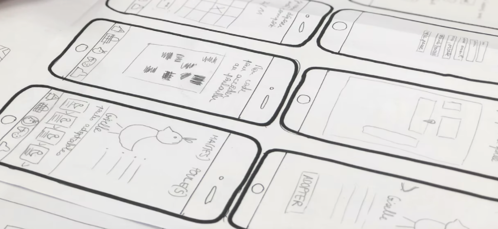
In the high-tech digital UX design world, pen and paper can still be the preferred choices for fast low-fidelity prototyping. Contrary to assumptions, UX teams spend a lot of time away from the computer, writing on sticky notes, whiteboards, notepads, and adding annotations to paper prototypes.
The more planning and preparation designers can do before sitting down at the computer, the quicker they can design wireframes, mockups, and prototypes. Paper prototyping is a crucial part of the early UX design thinking process because it fosters collaboration, allowing designers to explore lots of ideas at a minimal cost.
With UXPin, design and development teams can jump straight from paper prototypes to high-fidelity prototyping, significantly accelerating the design process. Build consistent, high-quality digital experiences. Sign up for a free trial and explore UXPin’s prototyping features today!
Build advanced prototypes
Design better products with States, Variables, Auto Layout and more.
What is Paper Prototyping?
Paper prototyping is the process of developing ideas and designing user flows using hand-sketched “screens” that represent a digital product. Paper prototypes test on a high-level user experience rather than interaction design.
Paper prototypes are low-fidelity because they don’t have any functionality. For this reason, paper prototypes designers rarely share paper prototypes outside of the department.
Design teams often lay paper screens on a desk or flow and imagine how real users would navigate to reach an end goal. The designs are rudimentary and usually sketched in black and white. Content is limited, with only headlines and call to action links displaying any legible text.
Sometimes, teams will build a mock iPhone or Android device using a piece of cardboard to simulate swipes, scrolls, and other basic functionality. These mock devices also allow designers to see how their designs might look within the confines of a mobile phone—especially useful if you’re designing a mobile app.
While the main benefit of paper prototyping is speed, some designers use tools like UI Stencils to design accurate, aesthetically pleasing screen layouts—vital if you plan to present paper prototypes to stakeholders or testing participants.
UXPin’s journey started with a similar paper prototyping product called Web Kit. A paper pad paired with a design tool that automatically turns paper prototypes into wireframes. UXPin has evolved into an end-to-end prototyping solution, allowing you to create prototypes that are production-ready from the start. Try UXPin for free.
Paper Prototyping Digitally
With tools like reMarkable and Apple Pencil, teams can collaborate remotely while enjoying the speed and versatility of the physical paper experience.
Using digital sketch tools can accelerate the paper prototyping process. Designers can make changes faster (without needing to redraw a screen), attach detailed notes, and upload finished prototypes instantly to design tools like UXPin to build high-fidelity prototypes or go with wireframing.
Rapid iteration — It’s easier to discard a paper design that took 5 minutes vs. a digital mockup that you spent more than an hour perfecting.
Low cost — Paper is cheap, and even additional tools and kits won’t break the bank.
Increased creativity — The freedom of pencil and paper fosters experimentation and new ideas. Design tools have their place in the design process but can stifle creativity in the early design stages.
Team-building — Paper prototyping is a rare opportunity where teams get together in a creative environment. Working with pen and paper brings out child-like energy, which can help form bonds and strengthen coworker relationships.
Minimal learning curve — Everyone can sketch ideas, making paper prototyping a great way to involve other departments like marketing, development, and stakeholders.
Documentation — Paper prototypes serve as excellent documentation. Designers can make notes and outline ideas to reference throughout the project. They’re excellent UX artifacts that can even double as study notes for team members to refer to later, or easily organize your findings using a writing platform for better collaboration and retrieval.
Disadvantages:
No user reactions — With no user feedback, it’s difficult to know whether or not your ideas will work. Even if you test your paper prototypes with participants, the feedback will be limited.
Inaccurate feedback — Outside of UX teams, paper prototypes might be challenging to interpret, limiting any accurate or meaningful feedback.
Sign up for a 14-day trial and see how quickly you can turn paper design concepts into high-fidelity prototypes that function like the final product using UXPin.
When to Paper Prototype
Jake Knapp of Google says that “paper prototyping is a waste of time“—but admits that paper prototyping is useful for early-stage conceptualizing.
Once you move from paper to digital, there’s no reason to return. Some designers might return to paper prototyping for new features or a product redesign. But even then, returning to paper prototyping might be unnecessary.
That said, paper prototyping is perfect for early-stage conceptualizing. Its speed, ease, and simplicity make it accessible to all teams (including non-designers) while fostering experimentation and creativity—something you can’t achieve with a digital canvas.
Paper prototyping is the fun part of product design. It’s an opportunity for team members to brainstorm and sketch ideas.
Don’t worry about how beautiful your sketches look. Even the best UX designers aren’t brilliant sketch artists! The goal is to visualize your ideas and get the creative juices flowing.
Creating a paper prototype involves three main steps:
1. Prepare Materials
Gather materials like paper, pens, markers, sticky notes, and scissors. You may also use a whiteboard or large sheets of paper to sketch user interfaces.
2. Sketch Interfaces
Draw basic screens, user interfaces, and key components of the design on separate pieces of paper. Represent user flows by arranging these sketches in sequence.
3. Simulate Interaction
Lay out the sketches in the order of user interaction. Simulate the user experience by manually switching between sketches based on user actions, gathering feedback to refine the design.
Use printer paper and cheap pencils/pens. Ruled or line pads often stifle creativity as designers get side-tracked drawing between the lines rather than developing lots of ideas.
Start with a warm-up! Sometimes it takes a few sketches to loosen up and get into the flow. Crazy eights is a fantastic paper prototyping method to design many versions of the same screen fast. After a couple of crazy eights rounds, you’ll have many ideas to expand on.
Prototype mobile-first or progressive enhancement. Start with the smallest screen and adjust the layout as you scale the viewport (this applies to mobile and web design. Scaling up is much easier than scaling down because you prioritize content and avoid elaborate desktop layouts that don’t translate to mobile. Side note: UXPin’s Auto Layout lets you automatically resize, fit, and fill your designs. A handy feature for mobile-first design.
Stick to one sketch per screen (a piece of paper). Paper prototyping requires you to create user flows by placing pieces of paper in sequences. You’ll also switch these around or add new screens. If you have more than one screen on a piece of paper, you lose this speed and flexibility.
Iterate as the ideas come to mind. The goal is quantity, not quality. When you create lots of paper prototype ideas, you often end up taking bits from each to get the final result—like a Lego set, but with paper.
Planning is crucial for a successful paper prototyping session! Ensure you have enough pens (black fine-tipped markers work best), paper, scissors, glue, post-it notes, index cards, tape, cardboard, and anything else you think your specific project might need. A whiteboard and marker are also great for outlining user flows collaboratively. Pro tip—assign the job of preparing your paper prototyping to an arts & crafts enthusiast! Every team has at least one, and they always make sure you have more than enough of everything you need!
Testing & Presenting Paper Prototypes
Testing & presenting paper prototypes outside of the UX department is always tricky. The stakeholders or usability participants have to “imagine” what will happen, which can confuse or divert focus from what you’re trying to present. Nevertheless, a study by Jakob Nielsen found that 75% of usability issues can be identified with simple, low-fidelity prototypes like paper ones.
Here are some tips for presenting and testing paper prototypes:
Designate one person other than the presenter as play the “human computer” or product simulator – The person playing the human-computer will simulate scrolling, swiping, navigating to different screens, and other functionality.
Rehearse – Rehearsing is essential so that the presenter and simulator are in sync. The presenter can work out a good cadence for the simulator to keep up with the presentation.
Follow standard usability test best practices – Standards like using a minimum of 5 users and recording the tests still apply. You can download our free Guide to Usability Testing for more understanding of usability standards and practices.
If you’re giving users a paper prototype to inspect, ensure you provide guidance and annotations, so they know where to focus and what they’re supposed to test.
Prototyping in UXPin
Whether you’re building a mobile application or a new website, UXPin provides designers with tools to build advanced prototypes; most leading design tools simply can’t!
Don’t take our word for it! Sign up for a free 14-day trial and test UXPin’s powerful prototyping features for your next project.
Material UI, developed and maintained by MUI, is a popular React component library that implements Google’s Material Design guidelines. It offers a comprehensive set of reusable and customizable components, such as buttons, cards, menus, form elements, predefined styles, and themes.
The library promotes a modular and structured approach to building user interfaces, enabling developers to create visually consistent and responsive designs. With Material UI, developers can streamline their front-end development process and deliver intuitive and visually appealing web apps.
Use Material UI’s React components for prototyping and testing your design without the need of translating pixels into code. Discover how smooth prototyping can be. Try UXPin Merge for free.
Ant Design
Best for: web applications, cross-platform applications, native apps
The Ant Design library is a comprehensive UI component library developed by Ant Design that offers a wide range of reusable and well-documented components for building high-quality applications. It follows the principles of the Ant Design system, emphasizing a clean and minimalist design aesthetic with a focus on usability and accessibility.
The library also provides powerful features like internationalization support, theming capabilities, and responsive design, making it a popular choice among developers for creating professional and user-friendly interfaces.
Developers can quickly create consistent and visually appealing interfaces by leveraging its extensive collection of components, including forms, tables, navigation menus, and more.
The Ant Design system also offers libraries for mobile and charts, giving product teams a comprehensive set of components and patterns for a wide variety of cross-platform applications.
React-Bootstrap
Best for: web applications
React-Bootstrap is a widely used React UI library for building responsive web applications with React. It combines the power of React’s component-based architecture with Bootstrap’s flexibility and styling capabilities, offering a comprehensive set of pre-designed and customizable components.
React-Bootstrap provides a range of UI elements such as buttons, forms, modals, navigation menus, and more, allowing developers to rapidly create visually appealing and functional interfaces.
React-Bootstrap’s detailed docs and active community support simplify web development by providing reusable and well-tested components, enabling developers to focus on building robust and user-friendly applications.
Fluent UI is a robust and comprehensive design system developed by Microsoft that provides reusable components and styling options for building cross-platform and mobile apps. The library follows the principles of Fluent Design, focusing on clarity, content prioritization, and smooth animations.
It offers a consistent and cohesive experience across different platforms and devices, making it suitable for many cross-platform and mobile projects.
With its extensive documentation and active community, Fluent UI empowers teams to build intuitive and accessible user interfaces that align with Microsoft’s design language. From buttons and forms to complex data grids and charts, Fluent UI provides the necessary tools to deliver delightful and user-centered experiences.
Best for: web applications, iOS & Android applications, native apps, cross-platform applications
Built on the principles of IBM’s design philosophy, Carbon focuses on simplicity, clarity, and purposeful interactions. It provides a range of components, from buttons and forms to data visualizations and icons, enabling designers and developers to create intuitive and visually appealing interfaces.
The Tailwind CSS library enables developers to rapidly build custom user interfaces using a utility-first CSS framework. It provides a comprehensive set of pre-defined utility classes, eliminating the need for writing custom CSS styles.
The library supports React, Vue, and HTML. Developers can easily apply these utility classes to HTML elements, giving them granular control over the appearance and behavior of their UI components.
Tailwind CSS promotes a modular approach to styling, where devs can combine classes to create unique and responsive designs. It offers utilities for layout, typography, colors, spacing, and more, allowing developers to create consistent and visually appealing interfaces with minimal effort.
Semantic UI
Best for: web applications
Semantic UI is a versatile front-end framework that offers a wide range of semantic and intuitive components for creating user interfaces. It provides a comprehensive collection of pre-designed UI elements for web applications, including buttons, forms, menus, cards, and modals.
The framework follows a natural language naming convention, making it user-friendly and easy to understand. Developers can leverage Semantic UI’s extensive set of CSS classes to build visually appealing and responsive designs quickly. The library supports React, Meteor, Ember, and Angular front-end frameworks.
Semantic UI supports theming and customization, allowing developers to customize the appearance of their UI components to align with their project’s branding. With its intuitive syntax and detailed documentation, Semantic UI is a valuable tool for designing and developing modern web interfaces.
Foundation
Best for: web applications, email templates, landing pages
Foundation is a responsive front-end framework with CSS and JavaScript components for building modern, mobile-friendly websites. It offers a comprehensive toolkit with a modular approach, allowing developers to customize and tailor their designs to meet specific project requirements.
Devs can easily create responsive grids, navigation menus, forms, buttons, and other UI elements that adapt seamlessly across different screen sizes. The framework also includes a powerful JavaScript library that enables interactive features and smooth animations.
With its extensive documentation and active community support, Foundation empowers developers to create visually appealing and highly functional web interfaces.
Chakra UI
Best for: web applications
Chakra UI is a modern and accessible React component library for streamlining user interface development. The library supports several frameworks, including React, Next.js, Meteor, and Gatsby, to name a few.
The project was founded by Segun Adebayo of Nigeria, making it one of the most prominent open-source component libraries to come out of Africa.
Chakra UI provides pre-designed components and utility functions, allowing developers to create visually appealing and responsive websites. Developers can leverage Chakra UI’s customizable and reusable components, such as buttons, forms, cards, and navigation elements, to design intuitive and accessible user interfaces.
The library also focuses on accessibility by adhering to WCAG standards, ensuring that the created interfaces are usable by individuals with disabilities. Chakra UI’s simplicity, flexibility, and robust documentation make it a popular choice among developers looking to build efficient and visually stunning React applications.
Bulma
Best for: web applications, landing pages
Bulma is a lightweight and modern CSS framework based on Flexbox, providing a flexible and responsive grid system and a set of ready-to-use UI components. The framework’s intuitive class naming convention supports quick and efficient styling, while its modular architecture ensures scalability and customization.
Bulma’s simplicity, extensive documentation, and community support make it a popular choice for projects of all sizes. Whether you’re building a landing page, a dashboard, or an eCommerce site, Bulma provides a solid foundation for building aesthetically pleasing and functional interfaces.
Styled Components
Best for: web applications, landing pages
Styled Components is a popular JavaScript library that allows developers to write CSS directly in their JavaScript code using tagged template literals. It provides a way to encapsulate styles within components, making them more maintainable and reusable.
Styled Components is widely used in the React ecosystem and offers seamless integration with popular UI frameworks and libraries. Developers can create dynamic and responsive styles by leveraging the power of JavaScript, including the ability to access component props and states. The library offers many features, including support for CSS-in-JS, automatic vendor prefixing, and theme management.
PrimeReact
Best for: web applications, landing pages
PrimeReact is a comprehensive UI component library for React applications, offering ready-to-use components and advanced features. It provides a wide range of UI elements, including buttons, inputs, tables, modals, and charts, for various digital products.
PrimeReact follows a responsive design approach, ensuring components adapt well to different screen sizes and devices. The library also offers powerful features, such as data binding, filtering, sorting, and pagination, making it suitable for building data-intensive applications.
By leveraging PrimeReact’s pre-built components and features, developers can save time and effort, resulting in faster development cycles and improved user experiences. The library is regularly updated, ensuring compatibility with the latest React versions and providing ongoing support and bug fixes.
High-Quality Prototypes with UXPin’s Code-to-Design Methodology
UXPin’s Merge technology enables product teams to import these and other open-source design systems into UXPin’s design editor so designers can prototype and test using code components.
Use the same components in the design process as you would use to develop the final product. Build immersive prototype experiences for user testing and stakeholders, providing meaningful feedback to iterate and improve concepts. Share a single source of truth across the product development environment, from early-stage design to development and the final product. Try UXPin Merge for free.
Collaboration doesn’t end at the design handoff stage, right? Yet, seldomly is it discussed what happens next. We’re inviting you to a webinar that will show you how enterprise teams like Porsche, IBM, and Salesforce collaborate to boost their design system adoption and scale consistency.
Spoiler alert! You can replicate those strategies to amplify collaboration at your organization. Join us on Wednesday, May 29th, for a free webinar: “Removing Friction from Design System Workflows.”
Wanna ship products faster? Then, you need to master processes and tools that will get you there. This webinar will give you first-hand experience on what you can do to keep the speed of action in a multi-disciplinary team of engineers, designers, and stakeholders.
You’ll learn:
How to empower developers and designers to communicate using live examples
How to increase the adoption of your design system with interactive documentation
How to streamline efficient bug reporting and updating the design system library
We invited Tomek Sułkowski to host this webinar. He’s a DevRel and a founding engineer of StackBlitz – an in-browser dev environment for building web apps. He helps teams optimize the browser development environment by utilizing a variety of built-in, open-source, and commercial tools.
Prototyping, working with design systems, AI-generated Tailwind components, opening in StackBlitz… this Product Hunt launch from UXPin has it all 🤌 pic.twitter.com/yq38x6i5oe
On its most basic level, dark mode turns white backgrounds with black text into black backgrounds with white text. The more you explore dark mode, though, the more design opportunities you will discover.
Why should you bother learning about dark mode designs? Here are a few important reasons to get you motivated.
Discover the power of dark mode with UXPin, the ultimate tool for transforming your design ideas into dynamic, fully functional prototypes. UXPin allows you to effortlessly explore dark mode concepts, bringing them to life in a way that closely mimics the final product. This real-time interaction provides invaluable insights, enabling you to fine-tune your designs to enhance aesthetic appeal and user comfort.
Begin your UXPin journey today with a free trial and see how seamlessly you can convert your dark mode visions into interactive prototypes. Experience the potential of UXPin for yourself — start for free now.
Build advanced prototypes
Design better products with States, Variables, Auto Layout and more.
What is dark mode?
Dark mode is a color scheme that uses light-colored text, icons, and user interface elements on a dark background. It’s a popular feature in many apps and operating systems.
Dark mode can often be toggled on and off based on user preference, and some operating systems and applications can automatically switch between dark and light mode based on the time of day or ambient light conditions.
Many popular apps and operating systems have embraced dark mode, incorporating it into their user interface options due to its benefits like eye strain reduction and battery saving. Notably, major operating systems like Windows 10 and 11, macOS, iOS, and Android all offer system-wide dark modes. This setting influences everything from system menus and taskbars to app interfaces, providing a seamless experience across the device.
Dark mode reduces blue light that can interrupt sleep
When it gets dark, your brain naturally begins to produce more melatonin, the chemical that makes you sleepy. Any type of light can disrupt the melatonin levels, so people should ideally avoid all types of light as bedtime approaches. Although no one has found enough evidence to prove it, some studies link exposure to light at night to increased risks for health problems like obesity, heart disease, and diabetes.
Blue light disrupts melatonin secretion more than other types of light. Unfortunately, computer and smartphone screens bathe your eyes in blue light. Comparative research at Harvard shows that exposure to blue light suppresses melatonin for twice as long as other green light.
Harvard says that people should avoid using bright screens about three hours before bed. Considering that many people look at their phone before going to bed, though, few consumers follow this advice.
Night mode produces significantly less blue light than standard screen settings. Ideally, you shouldn’t use any screens leading up to bedtime. If you do, using dark mode should disrupt sleep much less than standard screen modes that use blue light.
As screentime grows, eyes need more rest
If people only used websites and smartphone apps for short periods during the day, they probably wouldn’t need the benefits of dark mode. Studies show that the amount of time that people spend focused on screens keeps growing, though. Dark mode could serve an important role in curbing the negative health effects without telling consumers to put down their devices—designers and developers don’t want to do that for obvious reasons!
On average, people pick up their phones 58 times per day. Most of the interactions are rather brief:
70% of sessions last less than two minutes.
25% are between two and 10 minutes.
Only 5% of sessions last more than 10 minutes.
Cumulatively, though, all of those interactions add up to 3 hours and 15 minutes of screen time.
These statistics only apply to smartphone use during workdays. Now that more people use computers during work, you can safely assume that many of them can add at least 6.5 hours of screen time to the 3 hours 15 minutes that they spend looking at their phones. Even a conservative estimate shows that people expose themselves to the bright, blue light of computer screens for more than half of the waking day.
Dark mode extends battery life
Smartphone and laptop sellers often use long battery lives as selling points that will convince consumers to spend more money on devices. Battery life certainly matters in a mobile device, but users probably have much more control than they think about how long charges will last.
When testers compared the battery life of iPhones, they found that they could play video for 15 hours on the phone using light mode while the dark mode phone kept working for 20 hours. They got a 33% increase in battery life just by switching to dark mode.
The researchers point out that only smartphones with OLED screens will get the benefit of extended battery life. LCD screens use about the same amount of energy regardless of the type of light they use, so they probably won’t work longer while in dark mode.
You can explore more design options with dark mode
Dark mode gives designers more opportunities to explore design options for their products. A white screen can make it difficult to view certain colors. Light blue, for example, may force you to concentrate on text much carefully against a light background than a dark one.
The move toward darker designs has been much more prevalent in mobile apps than websites. Many app designers like to dim the lights because the darker environment:
Increases contrast between backgrounds, oversized images, and text.
Makes it easier for image-heavy designs to look professional.
Younger people who play a lot of video games have gotten used to dark color schemes, so they expect to find a similar aesthetic used by apps.
Finally, there’s no denying that a black background makes certain colors pop! When you dim the background—or start using completely black backgrounds—you can make light blue, pink, yellow, and other colors stand out. These colors would blend into a white background, but they look stunning against black.
Consumers want the option to choose dark mode
Maybe you don’t care a lot about the effects of blue light, extending battery life, or exploring designs that work better on a black background. All of those points aside, you still care about making your products popular. Unpopular products don’t survive, which could mean that your job title doesn’t survive long, either.
Over the last few years, there has been a significant trend toward dark mode. Tech giants like Google, Facebook, YouTube, Apple, and Twitter have adopted dark mode options, creating an important trend within the design industry. About 70% of software engineers prefer working in Dark Theme IDEs, so it seems natural for them to create tools with dark backgrounds and colored text.
Ultimately, though, the consumer matters most. As more people start watching videos online, dark backgrounds have become standard on websites like YouTube. In August 2019, 2.08 billion people worldwide said that they watched videos on their smartphones. When it comes to viewing videos on computers, 1.87 billion people admitted to it during the same month. Interestingly, a much smaller number (1.64 million) said that they watched online videos via their smart TVs.
Both modes have their place depending on user preferences, the ambient environment, and specific use cases. Many modern devices and apps offer the ability to switch between modes based on the time of day or user settings, providing optimal comfort and usability across different scenarios.
Light Mode Benefits
Better Readability in Bright Conditions: Light mode tends to work better in brightly lit environments, making it easier to read text on a stark white background.
Familiarity and Preference: Many users find light mode more visually appealing and easier to use during the day due to its resemblance to daylight conditions.
Better Color Accuracy: Light mode displays colors more vibrantly and accurately, which is particularly important for tasks that require precise color discrimination.
Dark Mode Benefits
Reduced Eye Strain in Low Light: Dark mode is easier on the eyes in low-light conditions, reducing glare and helping to minimize eye strain during nighttime use.
Energy Efficiency on OLED Screens: On OLED and AMOLED screens, dark mode can significantly reduce power consumption as these displays turn off black pixels completely.
Aesthetically Pleasing: Many users find dark mode stylish and modern, offering a different visual experience that is often perceived as less harsh than light mode.
Potentially Better Sleep: Reducing exposure to bright screens, especially in the evenings, can help decrease blue light exposure, which may improve sleep quality.
Explore more design concepts with UXPin prototypes
Dark mode isn’t the perfect solution for every product’s design. Since consumers and developers like having the option to switch to dark mode, though, it makes sense for more designers to test dark mode concepts.
UXPin gives you an easy way to explore dark mode concepts by turning designs into fully functional prototypes. UXPin prototypes respond to interactions just like their final products will, giving you opportunities to tweak your dark mode versions to make sure they look attractive and make users more comfortable. Start your free UXPin trial to see how easily you can turn your dark mode designs into interactive prototypes. Try UXPin for free.
A blog layout refers to the structure and organization of content on a blog — a webpage that features various types of content, from paragraphs of text to high-quality images or eye catching graphics. Blog content can be about company updates, how-to manuals, personal stories, and more.
From a design perspective, a blog is often optimized for readability and navigation, with features such as categories, tags, archives, and search functionality to help users find content of interest. Additionally, blogs often incorporate images, videos, and animations to make user experience more enjoyable and unique.
In this article, we will go through the most important elements of the blog layout and we will show you a list of best blog designs that you can copy.
Create a well-optimized and user-friendly blog layout with UXPin Merge – drag-and-drop UI builder that makes web design extremely easy. Choose components, arrange them on the canvas, and then, change their properties to create a unique UI that reflects your brand. Try UXPin Merge for free.
Design UI with code-backed components.
Use the same components in design as in development. Keep UI consistency at scale.
What is a blog?
A blog is a type of website or section of a website that is regularly updated with new content, typically in the form of articles, posts, or entries. These entries are often displayed in reverse chronological order, with the newest content appearing first.
Blogs can cover a wide range of topics and purposes, including personal journals, professional insights, news updates, tutorials, reviews, and more. They often provide a platform for individuals or organizations to share their thoughts, expertise, or experiences with an audience.
Overall, blogs play a significant role in web design as they provide a dynamic and engaging way for creators to connect with their audience and share content online.
What to include in a blog layout?
A blog layout can have various design elements that influence navigation and user experience. Le’s go through some of them.
Header
The header is situated on the top of the page. It usually contains the blog title or logo, along with navigation menu that features links to other pages of the blog, such as blog homepage, about page, contact page, and blog categories.
By appearing at the top of the page, the header provides a consistent visual element throughout the blog. This consistency helps users orient themselves and reinforces the blog’s brand identity across all pages.
Additionally, the header is often the first thing visitors see when they land on the blog. A well-designed header creates a positive first impression, drawing visitors in and encouraging them to explore further.
Blog content area
This is where the blog articles are displayed. Each post typically includes a title, the author’s name, publication date, content (text, images, videos), and social sharing buttons.
A well-designed content area enhances the overall user experience by making it easy for visitors to read and engage with the blog posts. Clear typography, appropriate use of white space, and sufficient contrast between text and background contribute to readability.
Moreover, content areas are important for boosting search engine optimization. Including relevant keywords in the content areas, such as in the body text, subheadings, and meta descriptions, helps search engines understand the topic of the blog post. This increases the likelihood of the blog post appearing in search engine results pages (SERPs) when users search for those keywords.
Search engines prioritize content that provides value to users and is well-organized. Content areas that offer insightful, informative, and well-structured content are more likely to rank higher in search results. Additionally, well-organized content makes it easier for search engine crawlers to index and understand the content, which can positively impact SEO.
Sidebar
The sidebar is located either on the left or right side of the main content area and often contains additional elements such as:
Blog categories and tags — Help users navigate and filter content based on topics or themes.
Recent articles — Lists links to the most recent blog posts.
Featured articles — Highlights links to the blog’s most popular or trending content.
Call to action links — Allows users to perform an action that’s desired by the blog owner, such as subscribe to the blog’s RSS feed or email newsletter, located here to maximize conversions.
Social media links — Links to the blog’s social media profiles for users to follow or share content.
Footer
The footer typically contains links to important pages, such as the privacy policy, terms of service, copyright information, and contact details. It may also include additional navigation links or widgets.
Footers contribute to the overall design consistency of the blog by providing a uniform layout and visual style across all pages. Consistent placement of elements such as navigation links, copyright information, and links to other pages reinforces the blog’s brand identity and professionalism.
5 Examples of blog layouts
We gathered a collection of successful blog designs to show you how to create your own blog design.
Animalz
A perfect example of a minimalist design a business blog of content marketing agency — Animalz. With a black and white color scheme, this blog is structured like an online newspaper (matrix web structure). It has a prominent blog post with a featured image at the center of the page, and the rest of the articles are positioned as cards.
You can use MUI components that are built-in UXPin if you want to create a similar blog. Take a menu component and put it on the canvas, then arrange a couple of cards in responsive layout structure.
Zen habits
This is a lifestyle blog example that knows well its target audience — individuals interested in personal development, mindfulness, simplicity, productivity, and minimalism. Zen Habits, founded by Leo Babauta, focuses on helping people cultivate habits and lifestyles that promote mindfulness, and overall well-being.
The blog structure reflects those values. With an ample use of white space, elegant typography, and minimalist color scheme, the website design evokes the feelings of serenity, focus, and peace.
Our trial kit contains a similar blog card template that you may use as a landing page of your blog. Like in Zen habits, it features the most recent article. You can quickly add a button with a call to action at the end that makes readers see more articles from the author.
Huberman Lab
A blog can also feature a list of podcasts and Huberman’s Lab is a great example of that. Andrew Huberman is a neuroscientist and professor at Stanford University who is known for his work on brain plasticity, neuroscience, and optimizing human performance.
Besides its minimalistic color palette, you should note an excellent search option on this blog. It’s very user-friendly and helps you find the right information without scrolling through the entire archive. The blog has also well-thought-out categories to make the target audience focus on the topics they’re interested in.
Travelfloss
People write travel blogs for various reasons, often driven by personal passion, professional interests, or a combination of both. That’s why we included a well-known travel blog in this article. Travelfloss is a blog with travel tips and gear reviews. It’s a great blog for anyone who wants to learn about real travel experience.
They have a well-made navigation menu that features their social media accounts and a great footer with the best links that make the site easy to consume. Every blog entry has lots of eye-catching photographs that make reading more enjoyable.
What also stands out as a design element are tags that also aid navigation. Travelfloss is easy to replicate if you’re looking for a user-friendly blog template.
Sixteen Ventures
Here’s another example of a business blog. Lincoln Murphy, the author behind Sixteen Ventures is a Customer Success expert who consults the teams wanting to improve their customer experience. At first, his blog looks like any other WordPress theme, but it a well-designed sidebar that we haven’t seen so far.
If you want to advertise other ventures to your audience, a sidebar is a great solution. You can promote your newsletter there, invite people to listen to a podcast or sign up for your course.
Blog layout best practices
Here are seven best practices for blog layout design:
Clear and intuitive navigation: Make sure that visitors can easily find their way around your blog. Use a clear and intuitive navigation menu that prominently displays categories, tags, and other important sections.
Mobile responsiveness: With an increasing number of users accessing websites from mobile devices, it’s crucial to ensure that your blog layout is responsive and looks good on smartphones and tablets. Opt for a responsive design that adjusts seamlessly to different screen sizes and orientations.
Readable typography: Choose a legible font for your blog posts, headings, and navigation elements. Pay attention to font size, line spacing, and contrast to ensure optimal readability, especially on smaller screens. Aim for a font size of at least 16 pixels for body text.
Visual hierarchy: Use visual cues such as headings, subheadings, bold text, and bullet points to create a clear hierarchy of information. This helps readers scan your content quickly and find the most important points. Employ whitespace generously to enhance readability and create a sense of balance.
Engaging multimedia content: Incorporate multimedia elements such as images, videos, infographics, and interactive widgets to enhance your blog posts and make them more engaging. Visual content can break up long blocks of text, illustrate concepts, and capture readers’ attention.
Consistent branding: Maintain a consistent visual identity across your blog, including colors, typography, imagery, and logo placement. Consistent branding helps reinforce your blog’s identity and makes it easier for visitors to recognize and remember your brand.
Optimized loading speed: Optimize your blog layout for fast loading times to provide a smooth user experience. Minimize unnecessary elements, use efficient coding practices, and optimize images and multimedia files to reduce page load times. A fast-loading blog not only improves user satisfaction but also contributes to better search engine rankings.
By following these best practices, you can create a blog layout that not only looks appealing but also provides a user-friendly experience, encourages engagement, and supports your blogging goals.
Create a blog layout in UXPin
A well-designed blog prioritizes readability and navigation, offering features like categories, tags, and search functionality to guide users seamlessly through the content. By incorporating multimedia elements such as images, videos, and animations, blogs enhance the overall user experience, making it both enjoyable and engaging.
For those looking to streamline the design process, tools like UXPin Merge offer intuitive drag-and-drop functionality, allowing you to create custom UI designs with ease. With the ability to select components, arrange them on the canvas, and customize their properties, UXPin Merge empowers you to bring your vision to life effortlessly.
Begin your journey towards a well-optimized and user-friendly blog layout today with UXPin Merge. Try it for free.
With the fierce competition on the market, hiring top design talent is no easy feat. However, bringing a group of experienced, skilled people into one place is only part of success. Among others, to build a thriving product design team you must also invest in design operations (also known as DesignOps).
We’ve written a whole ebook about DesignOps that will help you understand the role and see if you would be great as a DesignOps leader. Get it here: DesignOps 101: Guide to Design Operations.
In this article, we’ll explain what DesignOps is and how you can use it to improve the digital design system in your organization. We’ll discuss areas such as cross-team collaboration, goal setting, and information exchange systems, along with using the right DesignOps software.
A great software piece that supports your design operations is UXPin. Together with its Merge technology, it helps you scale design to the extraordinary level. Start building prototypes by dragging and dropping real building blocks of your app and streamline design. Check out UXPin Merge.
Reach a new level of prototyping
Design with interactive components coming from your team’s design system.
What is DesignOps?
You may have heard about DevOps, but what is DesignOps?
DesignOps (short for Design Operations) is the optimization of design processes, people, and technologies to streamline product design and add business value. Among others, it circles around:
DesignOps is a relatively new term, which is why you might be wondering – how did it come to life?
In the past, designers used to wear many hats. They did the UX research, wrote UX stories, wireframing, and more. While this approach might still work well for some teams, it is unproductive at scale. Here’s where DesignOps comes in, helping orchestrate teamwork and building clear structure and roles.
That being said, DesignOps isn’t an isolated, ‘design-team-only’ exercise reserved for design organizations. It requires lots of information sharing with other stakeholders (especially, software developers). By following a set of practices, your designers can enhance the quality of these interactions, focus on effective goal completion, and free the time for other initiatives.
Why is design operations gaining more ground?
For starters, both business and user requirements are becoming more complex (which also means that clients are also becoming more unforgiving). According to a report by PwC, one in three customers will leave a business after just one bad customer experience. Unsurprisingly, the challenge to keep up with client expectations also accelerates product development life cycles. And, as teams try to keep up with a growing workload, there’s the risk of miscommunication among designers and between designers and developers.
Teams might work in isolation on the basis of inconsistent requirements, which negatively affects the delivery timelines and, ultimately, the UX. DesignOps practices help companies overcome these bottlenecks and create harmony between design and development teams.
Let’s now take a closer look into the role of DesignOps Management.
The Role of DesignOps
The main role of design operations management is to protect the time of the design team so that they can focus on doing their jobs without obstacles or distractions. You can read more about it in our DesignOps 101 ebook. Here is how a DesignOps role plays out day-to-day:
Operations management
This role involves creating a clear design roadmap of what the long-term goals of the design team are and how they can be achieved. It is also their job to assess the headcount of the design team and identify any skill gaps.
Process design
DesignOps plan and manage the design process by creating design systems and mapping out the design tools that the team needs. They create the frameworks of how the design team should collaborate with product teams and any other team within the entire organization.
Project management
They are in charge of design workflows, assign projects, set timelines, and remove any bottlenecks. The DesignOps team schedules daily standup meetings to find out the progress of design projects. They also organize and run design sprints.
Creating a communication strategy
The design operations manager acts as the liaison between the design team and the rest of the organization. They evangelize the value of design and set team meeting agendas.
The design leader ensures communication flow with product managers and a product development team. DesignOps creates a system for storing all the files and resources that the design team needs for easy retrieval.
Onboarding new hires
They orient new staff, train them, and ensure that they fit into the design team. Hiring new design staff, such as UI or UX designers, is also part of their mandate.
Building the culture of the design team
The DesignOps team organizes workshops and training for the professional development of the design team. They also provide professional and emotional support for designers within their team and organize team-building activities to create a sense of community in the design team.
Budget allocation and control
DesignOps establishes how much it costs to run the design team and justifies these costs. Once the budget is approved, they are in charge of how it is distributed within the design team.
Legal
Working with the legal team to create NDAs and participant release forms that are used during user testing.
Managing the procurement process
Liaising with the procurement department to streamline how the design team makes purchasing decisions.
IT and Security
Coming up with the technological roadmap of the design team and working with the IT department to ensure the compatibility and security of design tools.
Tips to improving your design workflow and operations
With the above in mind, let’s now discuss some tips that will help you improve design operation practices in your organization.
1. Let your designers focus on designing
While it might seem like a no-brainer, as mentioned earlier, some companies still expect designers to play multiple roles. Sometimes, a single designer conducts user research, designs the information architecture, UI, and handles UX writing.
While this approach might be effective if you’re a small team or an early-stage startup, bear in mind that it’s not a scalable approach. In the long run, burdening designers with other tasks may hamper the quality of their work.
2. Check the efficiency of your design process
Organizations use various product design and development methods. Some organizations might follow the Design Thinking process, while others might focus primarily on Google’s Design Sprints.
The bottom line is making sure you’re applying the best methodology out there.
With DesignOps, you can find and eliminate inefficiencies in the design workflow. This lets your design team achieve more with less time and resources. As a result, by optimizing work and team performance, you might avoid unnecessary hiring.
3. Use tools for effective remote product design collaborations
While, at small organizations, collaboration between designers might happen organically, it’s not the case with larger (and, especially, remote) teams. To collaborate effectively, it’s important to equip your designers and other product development team members with the right set of tools. Here’s where DesignOps software brings immense value.
UXPin’s Merge is one such tool. For starters, your designers can use UI components imported from your software developers’ Git repo or Storybook. Instead of spending time on creating prototypes from scratch, they can design directly with elements made with real-life code. This way, your team can focus more time on the actual design and maintain consistency with the coded product.
That being said, tools are just part of the puzzle – the remaining element is following the right communication practices, which we discuss next.
4. Establish collaboration routines
Collaboration routines, such as daily standups or weekly meetings, which are usually performed by agile teams, encourage your designers to share regular status updates and – if needed – ask for support.
An example of how you can instill effective collaboration routines comes from none else but Google. Sophia Chiu, who started off as an intern and now works as an Interaction Designer for the tech giant, says that routines helped her find common ground with the rest of the team
Each week, UX specialists have the opportunity to present their design iterations in front of others and engage in a brainstorming and feedback session. After working in a modest group, they are then given the option to share their designs with the entire, cross-functional product development department.
This is just one of the many ways you can create an open communication flow among your team members.
5. Make sure that all designers have a clear career path for progression
While hiring people with the right skillset is not an easy task, retaining them is even harder. Fortunately, DesignOps practices can help to tackle these challenges by creating clear career development paths. As the design process matures, the team can feature more specialized roles which will enable designers to acquire new skills. All the while, more experienced individuals will get the opportunity to be promoted to more senior roles.
6. Encourage designers to work collaboratively
Pair programming is frequently used among developers as a way to reduce bugs and errors. In DesignOps, designers can adopt similar models to enhance the efficiency of the design work.
In this model, two designers are paired together to try to generate as many designs as they can. At the same time, they evaluate and synthesize them to create the best one. One designer, i.e., the ‘navigator’, focuses on brainstorming and generating ideas. Meanwhile, the other designer acts as the ‘synthesizer’, and analyzes and raises questions to validate the designs. This approach can help the pair of designers to come up with ideas and evaluate them effectively.
Cross-disciplinary pairing
This method is appropriate for product development team members who specialize in different disciplines. It can be used by both designers and non-designers. For example, when designing for an extremely specialized sector, the designer can pair with a domain expert who can provide valuable insights for the design.
A designer can also pair with a front-end engineer in the so-called cross-disciplinary pairing. Such a cross-functional team exercise will provide the designer with an opportunity to experiment with the real-life, coded UI rather than a wireframe.
Pair sketching
Designers can use the pair sketching method to develop wireframes together. In this model, one designer takes the role of the navigator and describes the concept, while the other creates the sketches accordingly. Next, they can switch roles and repeat the same process.
7. Set clear goals for the design team
Clearly communicating the company’s or project’s goals can act as a great motivator for the design team. After all, it helps them to understand the significance of their contribution.
Individual (i.e., per-employee) OKRs will help your designers see how their work objectives fit as an element of the greater design puzzle. As a result, they’ll know how their work contributes to the overall outcome of the project.
That being said, it’s also important to measure goals’ achievement progress. A metrics dashboard displaying progress within the team will help keep team members motivated and understand where they might be falling behind.
8. Create a cross-team information sharing system
Removing silos is arguably the top most important reason for building out information sharing systems as part of your DesignOps strategy. To illustrate its importance, let’s once again refer to an analogy from the software development operations’ (DevOps) world.
Michael Mazyar of Samanage makes a great point of stating that “within silos, the development team might not report a software bug to operations out of fear of being reprimanded. Without an honest and open information sharing system, workflow is not only delayed, but the potential for misinformation increases.”
The same could potentially happen within your design team, who might not inform others of an ongoing situation. For instance, if they were to encounter a usability glitch, your developers, designers, and operations should all get together to discuss a number or areas, for instance:
Does it cause financial loss?
How does it affect the overall UX?
Is there a risk of user drop-off?
How long would it take to fix & how much would it cost?
With a clear cross-team information communication system, you’ll be able to proactively identify and rectify problems with minimum impact on the end-users.
9. Consider creating a shared vocabulary
A typical content marketing team has a set of editorial guidelines they follow which helps them communicate effectively, and retain the right communication standard. Similarly, design teams should adopt a set of guidelines and a common design language to retain consistency across all their projects.
As an example, Airbnb has adopted a DLS (Design Language System). It consists of a set of components that comply with clearly established principles and patterns. DLS enables all employees to use a shared vocabulary understood by all departments within the organization. This greatly enhances the quality of communication while eliminating ambiguities and discrepancies.
Scale DesignOps with UXPin Merge
The number of challenges that companies face today is growing; customers become more demanding, new products are launched faster, while product life cycles shorten. One of the ways to tackle these challenges is by introducing DesignOps. Not only will it improve your design workflow, but it will also let designers focus on what they do best i.e. design digital products.
All of this will help you build products and services that perfectly correspond to clients’ needs and that are intuitive to use which will positively impact the user experience. If you’re looking for a tool that will improve your design workflow by making collaboration between your designers and software engineers smoother then check out UXPin Merge.
As UX/UI designers, we have to keep in mind that we’re creating a product for real people. A user persona is a perfect tool to humanize our research data. We’ll look at some UX persona examples later.
When we say the target user is women 35-60 years of age, our brains read it as numbers and not people.
But if we say that 42-year-old Martha is married, has two teenage sons and one adult daughter, our brains recognize her as a person.
Build interactive user interfaces with UXPin, an end-to-end prototyping tool that will supercharge the way you design and build UI design. Use features like variables, states, and interactions to design clickable and high-fidelity interfaces that streamline design handoff. Try UXPin for free.
Build advanced prototypes
Design better products with States, Variables, Auto Layout and more.
What is a user persona? UX persona basics
In user experience and user interface design, a persona is a fictional character that represents a typical user of an app, website, or other product, so that designers can clarify their target user and empathize with them.
A user persona contains critical details about a hypothetical user who will interact with the user interface. And therefore, it provides designers with a nuanced understanding of user behavior, shedding light on the motivations, tendencies, and decision-making processes that influence how users interact with a product. This insight empowers designers to anticipate user actions and design interfaces that seamlessly align with user expectations, ultimately enhancing the overall user experience.
These personas are crafted based on extensive research and data collection, allowing designers to empathize with their target audience and design experiences that resonate with them. Let’s see how they are created.
How to build a user persona
Building a user persona in UI design involves creating a fictional representation of your target users to better understand their needs, preferences, behavior, and goals. But before you can create a persona, you’ll need to put a lot of thought and research into it. You want to be sure it accurately reflects real-life users.
Step 1: Give the persona a name
When naming your persona, give the character a first name and combine it with their function. This makes the persona memorable.
A SaaS product for CPAs could have a persona named “Artie the Accountant.” “Millie the Mom” could be a persona for a daycare website.
An app for a pet care business might have a persona named “Pam the Pet Groomer.”
Tip: Add a stock photo or drawing that represents your persona. This helps you identify with the persona and aids memory.
Step 2: Add demographics and interests
Here you give the personal data:
Age
Gender
Marital status
Occupation
Location
Have a summary of the character’s personality. You can condense it into a quote that represents attitudes and feelings.
Step 3: Identify frustrations
Here we look at what the user wants to move away from. What kinds of problems does the user want to solve with your product?
Step 4: Identify wants and aspirations
This helps us find what kind of experience the user wants from the product.
Step 5: Review and update frequently
As we mentioned earlier, you’ll need to refine your persona during the user testing phase of the project. After the product launch, user feedback will help you keep the persona up to date.
4 Persona examples for UX or UI design
UX persona example #1: mobile website for a supermarket
A local supermarket has its store inventory on a mobile website. This allows shoppers to see what items are in stock and in which aisle they can be found. Users can log in and make a shopping list.
Persona name: Helen the Homemaker
Age: 35
Gender: Female
Marital status: Married
Children: Two girls, ages 7 and 9
Occupation: Stay-at-home mom
Education: Associate’s degree
Income: Husband makes $65,000/year
Location: Joplin, Missouri
Quote: “Family comes first.”
Influencers: Oprah, Church leaders
Sources of info: Blogs, Facebook groups, TV, radio
Goals: Get quality groceries for her family and stay on budget
Values: Holds traditional family values
Frustrations: Juggling many tasks
Aspirations: Wants her family, friends, and church acquaintances to see her as a successful homemaker
UX persona example #2: university website
Both the mobile and desktop versions of the site give students access to class schedules, course syllabi, student events, sporting events, fraternity and sorority mixers, and more.
Persona name: Freddie the Freshman
Age: 18
Gender: Male
Marital status: Single
Children: None
Occupation: Student
Education: High school diploma
Income: Allowance from his parents of $500/month on prepaid debit card
Location: Austin, TX
Quote: “Enjoy life while you’re young.”
Influencers: Professors, fraternity brothers
Sources of info: TV, the university newspaper, blogs
Goals: To be well-liked by his peers
Values: Good grades are important, but it’s also important to have a good time
Frustrations: He has to choose which college activities are going to let him keep up with his studies
Aspirations: To get the most out of the college experience
UX persona example #3: rental car virtual concierge
The app lets users reserve a car and check in when they arrive. Their car has a card inside with a scannable code to confirm they picked up the car. The app sends a confirmation that the user shows it to the security person at the exit. It makes dropping off the car convenient as well.
Persona name: Business Class Ben
Age: 43
Gender: Male
Marital status: Married
Children: Three girls, ages 13, 15, and 16
Occupation: Manufacturing equipment salesperson
Education: MBA
Income: $140,000/year
Location: Home in Gary, Illinois – travels all over the U.S., Canada, and the U.K.
Quote: “You gotta make sacrifices to get ahead in life,”
Influencers: Gary Vaynerchuk, Aaron Ross, Trish Bertuzzi
Sources of info: The Wall Street Journal, New York Times, finance blogs, sales blogs
Goals: To earn enough to have a comfortable retirement
Values: Providing good things for his family is the most important
Frustrations: Frequent travel is exhausting and wants to get hotels and rental cars without the hassle
Aspirations: Wants his business travel to be more enjoyable
UX persona example #4: trucking dispatch system
This enterprise software is the next generation in trucking dispatch. It’s designed for trucking companies that specialize in oversize freight that requires a permit.
The system lets dispatch communicate load details, including pickup and drop-off locations, permits required, and appointment times. The driver can accept the work assignment and confirm the completion of pickup and drop-off.
As oversize loads may have route restrictions, the system assists the driver in finding the safest route. It helps the driver find the fueling locations with the best prices.
Persona name: Heavy Haul Henry
Age: 51
Gender: Male
Marital status: Divorced
Children: One daughter, age 22
Occupation: Truck driver, oversize load specialty
Education: Some college
Income: $112,000/year
Location: Home in Tulsa, OK – travels all over the U.S. and Canada
Quote: “Six days on the road and I’m a-gonna make it home tonight.”
Influencers: Radio talk show hosts
Sources of info: Mostly radio, some television, newspapers
Goals: Find the safest routes, get the right permits
Values: Has a strong work ethic
Frustrations: Inaccurate map programs, satellite link dead spots
Aspirations: Find routes, fuel stops, and overnight parking easily
Build prototypes based on your UI deliverables
Build interactive prototypes that you can quickly test with real users and bring UI design at your company to another level. Instead of drawing static pages, create prototypes that communicate interactions and transitions. Try UXPin for free today.
Prototyping is one of the most useful UX practices available. Rather than showing your static design, prototypes are the living design.
Luckily, there’s no shortage of advice online, so if you’re looking for some quick reads on prototyping, check out our favorites below.
Still reading articles without practicing prototyping? Start creating with one of the best tools for interactive prototyping. Unlock 14 days of free trial and get a taste of variables, interactctions, and states that transform the way you build a prototype. Try UXPin for free.
Build advanced prototypes
Design better products with States, Variables, Auto Layout and more.
This clever and thought-provoking piece better explains the heart of prototyping through three novel metaphors. A great read for UX practitioners of any level of experience, Matt Yurdana’s article helps understand the point of prototyping by seeing it from a new light.
Our own Ben Gremillion explains straightforward why prototyping is not just helpful, it’s practically necessary. If you’re not quite sold on the idea, or new to designing in general, this is a good piece to start
In this helpful piece, Javier Cuello gives an overview of a basic prototyping process, exclusively for apps. Because app prototyping has different goals, even prototyping veterans would find this article helpful in translating the process to this new format.
Many designers ignore prototyping because they view them as wasteful. This is a misconception, as, with the right tools, prototypes can be built from existing documents and later progressed into new documents. We explain how to build interactive, testable prototypes in UXPin.
Shawn Medero discusses everything a UX practitioner needs to know about paper prototyping. While this style has its obvious limitations, for certain purposes nothing is better. This all-inclusive guide explains how, when, and why to use paper over digital mediums.
Heather Daggett’s perspective on prototypes is something all UX practitioner’s can learn from. Her article gives a good examination of the theory of prototypes, and why she prefers high fidelity. While she suggests coding, even designers who aren’t familiar with this can still learn from topics like “The Prototyping Mindset.”
One of the most reliable voices in UX design, Jared Spool pens an article that lives up to his reputation. His calculated analysis of prototyping reveals how to use it to explore the three dimensions of the problem spaces (technology, business, and users), plus breaks up prototype design into four phases.
Marek Bowers wrote an excellent piece for our blog all about user flows, including how to make them and why they’re important. The article also goes into detail about creating user flows for prototyping, and if implemented can increase low-fidelity prototypes.
Getting philosophical about prototyping, Ian Schoen not only gives a concise description of the prototyping practice, he also analyzes its role in the future of design, and how modern prototypes are making more traditional deliverables obsolete.
Daniel Pataki explains a very specific process of prototyping, using WordPress templates. While this process isn’t for everyone, he makes a few good points to support his favorite method, as long as you’re familiar with WordPress templates and emphasize the rapidity of prototyping.
Another piece from our team, this practical article by Jerry Cao dissects the 3 best methods for the common website prototype. This clear-cut article lists out the theory, process, and pros & cons of the most effective ways to build website prototypes, with real-life examples.
This article gives ten standalone pieces of advice for prototyping in general. Almost common sense in their simplicity, and yet neglected enough to warrant reminding, these tips range from “make user interactions as simple as possible” to how to design for a prototype for a specific audience.
For designers that know code, building coded prototypes can save a lot of time and manpower when it comes time for development. David Verba explains what to pay attention to when building a prototype in code.
If designers don’t know how to code but they want to enjoy the benefits of coded prototypes, they can use visual design tools to build their design with React components. Check out what tools make it possible.
In the age of Agile and Lean UX, designers are making more prototypes, and faster. Lyndon Cerejo’s classic article explains the rapid prototyping process: why making and testing more prototypes will ultimately have a better effect on the final product, and how to reduce waste at the same time.
More Comprehensive Guides
While these articles are nice for quick tips and refresher lessons, to fully understand all the nuances of prototyping, as well as the other documentations like wireframing and mockups, a more complete guidebook works better.
If you’d like to know the finer details, download our UX Design Builder’s Bundle. This package offers 3 of our most popular design ebooks, the complete guides to Wireframes, Mockups, and Prototypes. Over 350 pages and notable real-life examples like Google Ventures and Apple are available in this single free bundle. Download it now.
Ready to practice prototyping? UXPin is a prototyping tool that makes design and development teams collaboration easy. What you can design, you can put in code. Try UXPin for free.
We use cookies to improve performance and enhance your experience. By using our website you agree to our use of cookies in accordance with our cookie policy.