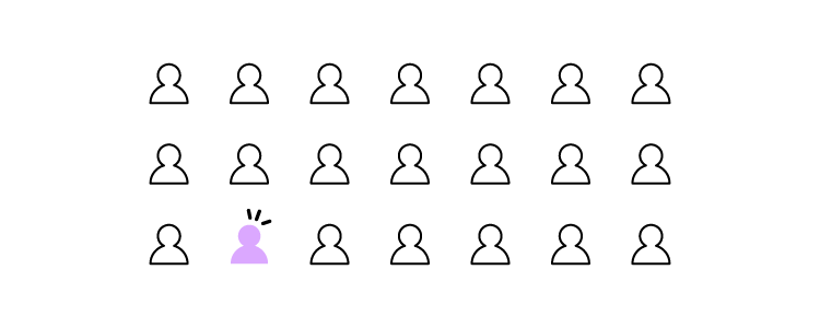
User errors can cause frustration, confusion, and decreased user satisfaction, leading to many undesirable outcomes, including product abandonment. Identifying, understanding, and addressing user errors is crucial for designing user-centered experiences and optimizing product performance.
Solve more usability issues and identify more business opportunities during the design process with fully interactive prototypes from UXPin. Sign up for a free trial.

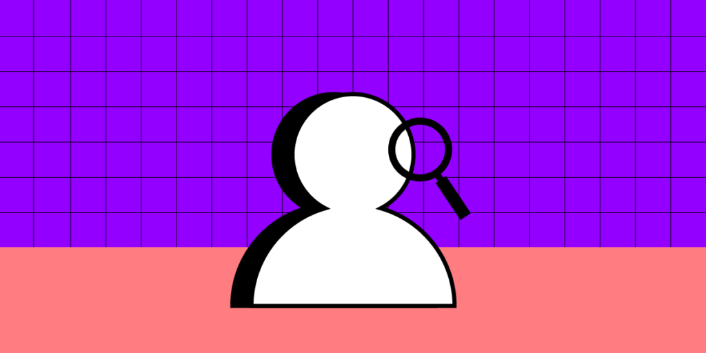
What are User Errors?
User errors are actions or decisions that lead to unintended or undesired outcomes when interacting with a product, system, or interface. Product teams typically classify these into three types of errors:
- Slips occur when users make unintentional errors due to inattention, distraction, or muscle memory.
- Mistakes involve cognitive errors in decision-making or problem-solving processes.
- Violations occur when users intentionally deviate from the expected behavior or rules.
What is an Example of a User Error?
Here are four examples of human errors:
- Data entry error: When filling out a form, a user accidentally types the wrong email address, resulting in failed communication or an inability to access important information sent to that email.
- Navigation error: While browsing an eCommerce website, a user clicks on the wrong product image due to unclear labeling or misleading visuals, leading to frustration and potential loss of sales for the business.
- Misinterpretation error: In a mobile app, a user misinterprets the meaning of an icon and taps on it, expecting one action, but it performs something else. This misunderstanding can lead to unintended consequences and a negative user experience.
- Configuration error: When setting up a software application, a user incorrectly configures the privacy settings, unintentionally sharing personal information publicly or granting excessive permissions, compromising their privacy and potentially exposing sensitive data.
These examples demonstrate how user error consequences can be banal, like clicking the wrong button, to extremely problematic when accidentally sharing sensitive information.
6 Factors Contributing to User Errors
Here are some common factors which contribute to user errors:
- A high cognitive load, such as information overload or complex decision-making requirements, can increase the likelihood of user errors.
- Design complexity, convoluted workflows, or confusing navigation can contribute to user errors by overwhelming or confusing users.
- Lack of feedback, including error messages, notifications, or visual cues, can prevent users from recognizing and rectifying mistakes promptly.
- When users are under time constraints or facing tight deadlines, they may rush through tasks, leading to more frequent errors.
- External distractions or interruptions can divert users’ attention, impairing their ability to focus on tasks and increasing the likelihood of mistakes.
- Insufficient user onboarding, familiarity with the system or interface, or inadequate onboarding can contribute to user errors.
Detecting User Errors
Error logging and analytics
Product teams use error-monitoring tools to gather data on user errors and analyze user behavior and error patterns. These tools capture error data, including error messages, error codes, and contextual information, such as the user’s actions leading up to the error. This data allows UX design teams to identify root causes for mistakes and implement corrective redesigns.
User feedback and support channels
Organizations typically create dedicated feedback channels, such as online forms, feedback buttons (i.e., thumbs up or down), or support email addresses, where users can easily report errors and provide valuable feedback about their experiences.
11 Ways of Preventing User Errors
Clear and intuitive interface design
Don Norman’s concepts of affordances, signifiers, and mapping from The Design of Everyday Things help designers create intuitive interfaces that guide users toward correct interactions and minimize the risk of errors.
For example, using recognizable icons and labels for actions, such as a trash can icon for deleting, helps users quickly identify and execute the intended action without making errors.
Effective onboarding
Effective onboarding provides clear instructions and interactive tutorials, so users can familiarize themselves with the product and understand how to use it properly.
For example, a mobile banking app onboarding process might explain how to set up an account and transact or highlight key security features to prevent user errors.
Thoughtful information architecture
Information architecture organizes content logically and hierarchically, enabling users to navigate a digital product easily. For example, an eCommerce website might categorize products into clear and distinct categories, so someone looking for kid’s clothing doesn’t end up in the men’s section accidentally.
Error prevention mechanisms
Safety nets such as validation checks, error messages, troubleshooting, and confirmations alert users to double-check and correct mistakes before they cause issues.
For example, when a user tries to submit a form with missing required fields, an error message highlights them for the user to complete.
Consistent and familiar pattern and interaction design
Consistent design patterns and interactions help users build familiarity, reduce cognitive load, and minimize user errors. Designers follow established conventions so users can rely on knowledge, mental models, and habits to interact with the product.
For example, consistent navigation menu placement across different website sections ensures users can navigate effortlessly, reducing the likelihood of errors.
User-friendly form design
Optimizing form fields, providing clear labels and instructions, and implementing input validation enable users to enter information accurately. For example, using input masks or providing real-time feedback on the validity of the entered data (such as password strength indicators) can prevent errors and guide users to provide accurate information.
Clear instructions and tooltips
Clear instructions and tooltips provide users with contextual guidance using tooltips and dialogs, helping them understand how to complete tasks or use features.
For example, Google Docs uses tooltips to clarify each icon in the toolbar and provides keyboard shortcuts to educate users on how to use the product more efficiently.
Progressive disclosure
Progressive disclosure is a technique to present information gradually based on user context, preventing overwhelming users with too much information at once. By revealing information progressively, users can focus on what is relevant and avoid errors caused by information overload.
For example, a complex software application might hide advanced settings by default, only revealing them when users request to see or modify them, reducing errors due to overwhelming complexity.
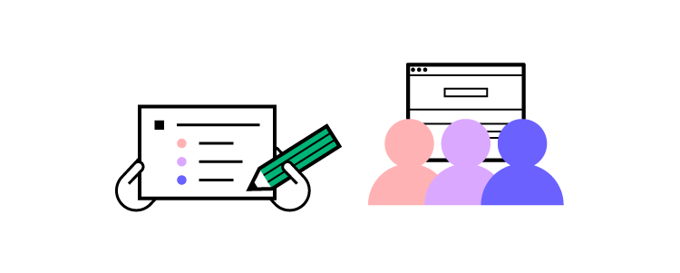
User testing and feedback
User testing and feedback allow designers to solve usability issues during the design process. Design teams collect user feedback to identify potential pain points, uncover usability issues, and make improvements to prevent errors.
For example, conducting usability testing sessions and observing how users engage with an interactive prototype can reveal areas where users struggle or make errors, allowing the design team to refine the interface and minimize those issues.
Smart defaults
Smart defaults can prevent user errors by preselecting sensible options or settings. Designers use smart defaults to anticipate preferences and behavior to provide a more seamless user experience while reducing errors. It’s crucial that product teams don’t abuse smart defaults for profits, as this could lead to mistrust and possible abandonment.
For example, a calendar app might set the default time zone to the user’s location, eliminating the need for user input and possible errors caused by incorrect time zone settings.
Limit user options
Limiting options can help prevent user errors by simplifying decision-making and reducing cognitive load. When users have manageable options, it’s easier to choose without being overwhelmed.
For example, a booking platform might limit payment options to the most popular ones and use progressive disclosure to reveal additional options if the user chooses.
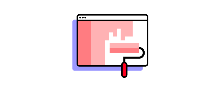
Reduce Errors With UXPin’s Interactive Prototypes
Due to prototyping constraints from image-based design tools, designers often struggle to identify usability issues or design decisions that cause user errors. Design teams either have to rely on devs to build better prototypes or release products and add any problems captured during QA to the backlog–both options increase costs and front-end debt.
With UXPin’s interactive prototyping features, designers can build replicas indistinguishable from the final product, complete with code-like interactions and functionality.
Usability participants and stakeholders can interact with UXPin prototypes like they would the final product, giving design teams meaningful feedback to iterate and improve.
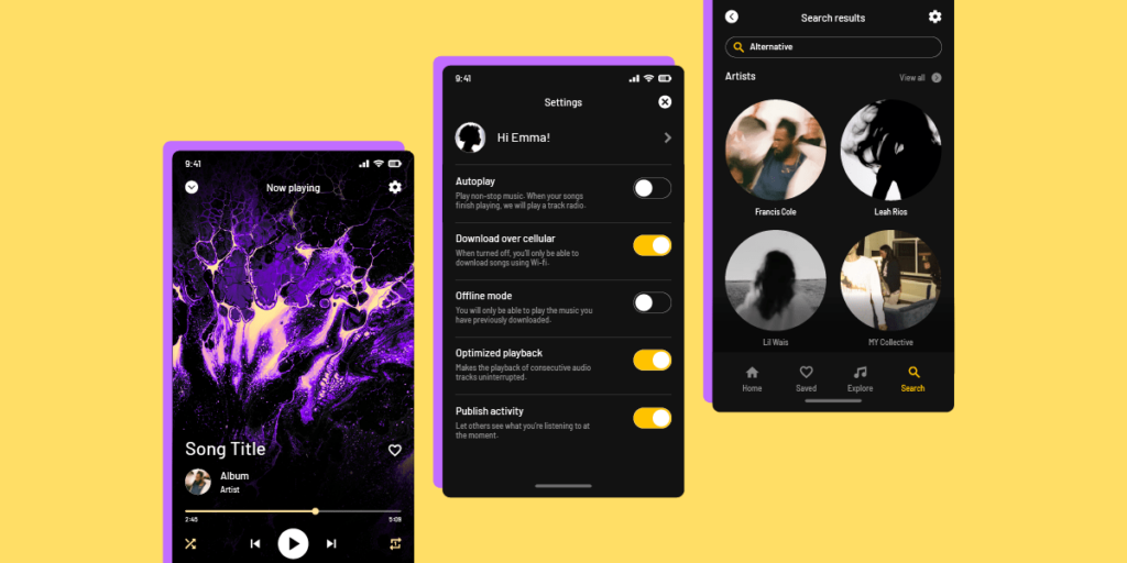
Build fully functioning components
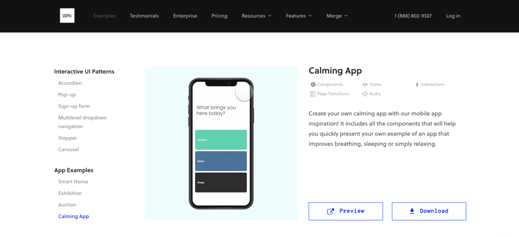
Designers can build fully functioning user interfaces and components in UXPin to enhance testing. For example, this signup form example demonstrates how designers can create field error messages to help users complete forms correctly–accurately replicating the final product experience.
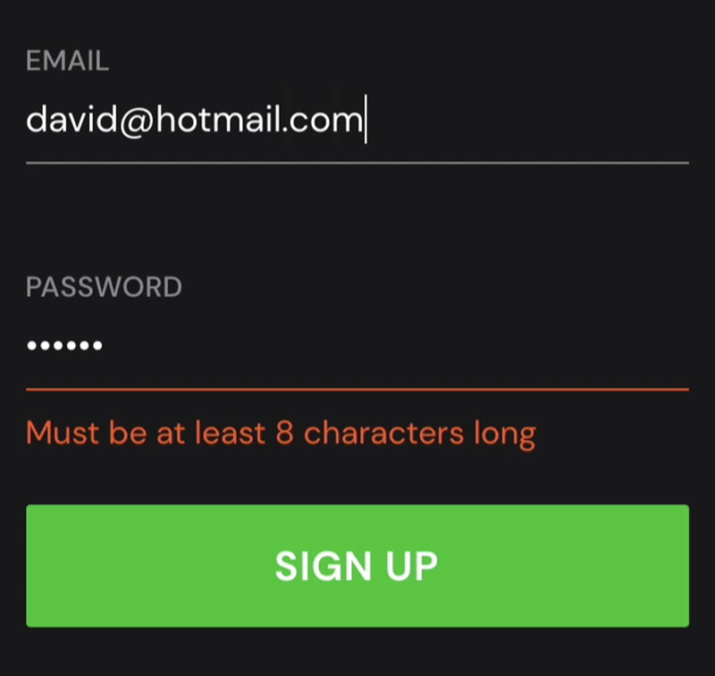
This prototype uses a single frame, with Conditional Interactions hiding and revealing error messages. This simplicity means designers can make changes on the fly and retest to maximize costly testing time.
To achieve comparable results in an image-based design tool, design teams would need to create multiple frames which don’t have the same smoothness or intuitiveness. Making quick changes and iterating fast with a frame-based design canvas is also tricky.
Ready to experience how code-based product design can enhance your prototyping scope to solve more usability issues during the design process? Sign up for a free trial.


