Getting stakeholder and organizational support is crucial for ongoing investment and the future success of your design system. The DS team must prove that employees use the design system and that it delivers a positive return on investment.
In our January 2022 webinar, Defending Your Design System, Carola Cassaro talked about the challenges DS teams face, “We’re all dedicated to designing products that change people’s lives, but we don’t always have the right framework and vocabulary to communicate that impact, especially in the design system space.”
Many designers have a tough time explaining why they need resources to evolve and scale a design system. Tracking the design system’s impact and identifying successes and opportunities can help DS teams get stakeholders’ buy-in to improve and scale.
Design systems are usually a design team initiative. yet, they can help the whole organization. They also help developers in making sure that the front-end is consistent. Tools like UXPin Merge make it easy to use the interactive UI components from your team’s design system across design and development.
Design with interactive components coming from your team’s design system.
Why do You Need Support from Non-Designers?
Design systems require time and resources to maintain and scale. The DS team must prove the design system’s value to acquire those resources.
Demonstrating the design system’s value means team members must adopt it. So, the DS also needs to engage with teams across the organization to encourage usage and gather feedback for improvements.
Getting people to contribute to the design system gives them ownership, resulting in wider use, thus building your case for more resources and support.
How to Encourage Adoption of Your Design System
Many organizations use internal workshops and training sessions to demonstrate the design system, why it was created, how to use it, best practices, and other relevant information.
Invite representatives from all departments so you can generate organization-wide excitement and buy-in. These workshops are also a fantastic opportunity to invite teams outside of design and development to share feedback and ideas. Remember, contribution = ownership = adoption.
Don’t only use workshops to encourage feedback. Set up communication channels (Slack, Asana, Jira, etc.) for teams to submit feedback and ideas.
Once teams start adopting and evangelizing your design system, it’s time to start measuring its impact across the organization.
Getting Support for Design Systems: Three Areas of Focus
The design system team must look at three areas to determine its impact on the product and organization:
Teams: How does the design system improve workflows?
Products: What is the design system’s impact on products and business value?
End-users: How does the design system impact usability?
Let’s look at these three areas in more detail.
Teams
There are three primary metrics you can use to evaluate a design system’s impact on teams:
Design system adoption
Saved resources
Time to market
You can evaluate a design system’s adoption by checking for elements present in repositories and determining the active use percentage–a strategy used by UK Gov Design outlined at GOVDESIGN 2020.
By regularly collecting and plotting this data, you can demonstrate the design system’s adoption over time. You can also plot uptake post workshops to determine their success.
It’s important to measure time on task and other performance metrics before implementing a design system to get a baseline. And then use this baseline to measure the design system’s impact.
PayPal conducted similar tests when switching from image-based design tools to UXPin Merge. Building a single-page prototype using an image-based tool took over an hour vs. eight minutes with Merge–demonstrating an 8X increase in speed resulting in cost and time savings.
Time-to-market is critical for products to compete and stay within budgets. Reducing time-to-market demonstrates to stakeholders that investing and optimizing your design system can provide a competitive edge with fewer resources.
Products
Next, you want to identify design system wins in product performance. Again, we’ll look at three key metrics:
Component coverage
Stability
Brand value alignment
DS teams can test which components are used in products and which are not. These metrics determine the design system’s coverage and relevance across products.
Product stability impacts the entire organization, including the brand itself. DS teams can measure the number and severity of product defects before and after design system implementation to demonstrate how it reduces errors.
Measuring brand affinity is challenging, but in Defending Your Design System, Carola talks about how eBay tested brand alignment by asking customers to rate several brand attributes for page designs pre and post design system. eBay found that design system pages scored higher for overall brand affinity.
End-Users
Lastly, and most importantly, how does your design system impact customers and user experience? Here are three examples of end-user metrics relating to your design system:
Performance
Usability
Customer satisfaction
Load time is an excellent way to measure a product’s performance, a vital metric for customer satisfaction and user experience. Design system components are optimized for performance and reduce bloat, so you should notice faster load times after implementation.
DS teams can use time-on-task, conversion rates, and other task-related activities to test the design system’s impact on usability and accessibility. IBM tested user task completion rates before and after design system adoption and discovered a three-fold increase.
DS teams can use surveys, product reviews, interviews, and other customer feedback to create a trend for before vs. after the design system’s adoption. They can also use these metrics to measure the success of usability and accessibility releases to demonstrate how a design system fixes usability issues and increases customer satisfaction over time.
Pitching a Design System to Stakeholders
In our free download, Evangelizing a Design System, we share a proven template for getting executive and stakeholder buy-in. Here is a three-step process to evangelize your design system:
Collect data to validate the design system’s impact
Identify wins and create a compelling story
Project what the company stands to gain
Step 1 – Collect Data
Collect data as outlined in the Three Areas of Focus above. If you’re unsure where to start, find resources and use cases from successful design systems relevant to your product and company.
Also, check out these resources from our blog for guidance and direction:
Collecting and analyzing data can be lengthy and time-consuming, but it’s a crucial part of building your design system success narrative.
Step 2 – Identify Wins and Create a Compelling Story
In our free download, Evangelizing a Design System, we share a 40+ slide template that’s ready for you to present to stakeholders and executives.
We include actual data from successes at Dropbox, IBM, LinkedIn, Atlassian, and others to strengthen your case and demonstrate what the future holds for your organization.
Highlight your wins in the presentation and use storytelling to explain how you used objective testing to arrive at your final results.
Step 3 – Project What the Company Stands to Gain
To acquire investment, you must demonstrate what the company will gain from allocating resources to scale the design system, that is finding the return on investment (ROI). Combine future projections with case studies from other successful design systems to show the possible return on investment.
Investing in the Right Design System Tools
Investing in the right tools can improve many of the metrics outlined in the Three Areas of Focus above. UXPin Merge is a code-based design tool that allows you to sync a design system hosted in a repository to UXPin’s editor so designers can build prototypes using fully functional code components.
This single source of truth increases adoption and collaboration between departments, even among non-designers, as was the case with PayPal. PayPal also noticed a significant reduction in time-to-market and higher quality feedback from stakeholders who were able to interact with Merge prototypes better than previous image-based design tools.
With a single source of truth, companies also achieve higher rates of consistency and cohesion between design and development. Design handoffs are much smoother because designers use production-ready components to build prototypes, making it easy for engineers to copy/paste and begin development.
When the DS team changes the design system or introduces new patterns and components to the repository, UXPin automatically updates the editor and notifies team members of the latest release.
Discover Merge and take your design system and workflows to the next level with code-based design from UXPin Merge. Request access to UXPin Merge.
AI is set to revolutionize the way design systems are created, managed, and scaled. According to industry experts, AI’s efficiency in automating repetitive tasks like code generation, component resizing, and documentation can significantly reduce the time required to build and maintain design systems. Let’s see if we’re ready to implement Design Systems created and managed by AI.
Design systems powered by AI need to be flexible, data-driven, and scalable. UXPin Merge complements these requirements by providing a unified platform where AI-first design systems can be backed with real code, enhancing both design speed and accuracy. As design systems become increasingly complex, UXPin Merge bridges the gap between designers and developers. Request access to UXPin Merge.
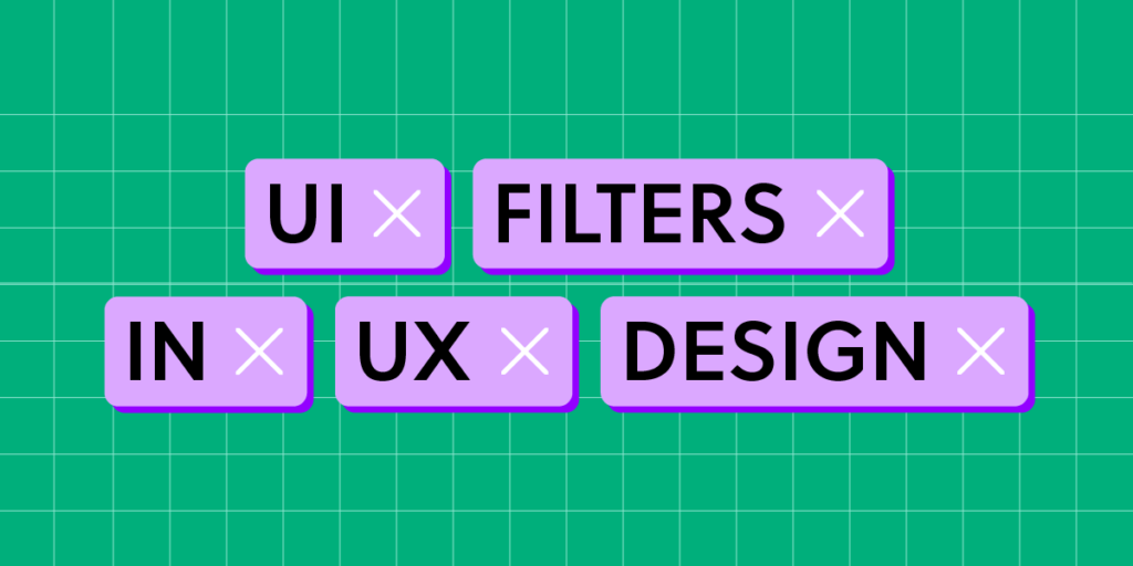
Design UI with code-backed components.
Use the same components in design as in development. Keep UI consistency at scale.
Several companies are already leveraging AI to build and optimize their design systems, focusing on automating repetitive tasks, enhancing scalability, and improving overall efficiency. Here are some notable examples:
GitHub: Diana Mounter, Head of Design at GitHub, mentioned that AI significantly accelerates building and developing design systems, making it easier to generate new layouts and ensure consistency across components. AI enables GitHub to automate tedious design tasks and focus on more strategic, creative work.
Spotify: Spotify uses AI-driven predictive analytics to refine its design system and personalize user experiences. The company’s AI-powered DJ uses algorithms to analyze user data and generate design decisions that align with user preferences and expectations, making their design systems highly adaptive and personalized.
IKEA: Through the IKEA Place app, the company utilizes AI to visualize furniture placements in users’ homes. This application not only helps customers see how items fit in their space but also automates the layout generation process, contributing to IKEA’s internal design system efficiency.
Autodesk’s Spacemaker AI: Spacemaker AI, acquired by Autodesk, uses AI to optimize site planning and urban layouts. The tool automates the creation of complex design models, providing architects and planners with AI-generated suggestions for building layouts based on environmental data such as sunlight and noise levels. This AI-driven approach is integrated into Autodesk’s larger design system strategy, enhancing the scalability and accuracy of design decisions.
These companies showcase how AI can be integrated into design systems to automate repetitive tasks, provide real-time insights, and personalize the user experience—all while maintaining consistency and scalability. As more organizations explore AI-driven design systems, we’re likely to see increased adoption and innovation in this area.
AI can generate code-backed components that adhere to design system guidelines, making it easier to maintain design consistency across products. This ensures that AI-generated designs are aligned with existing design standards and development practices.
Building Multi-Brand Design Systems Fast
AI can analyze design systems to create UI components and design elements that adapt to specific brands. This capability allows designers to deliver unique experiences without compromising on quality or coherence.
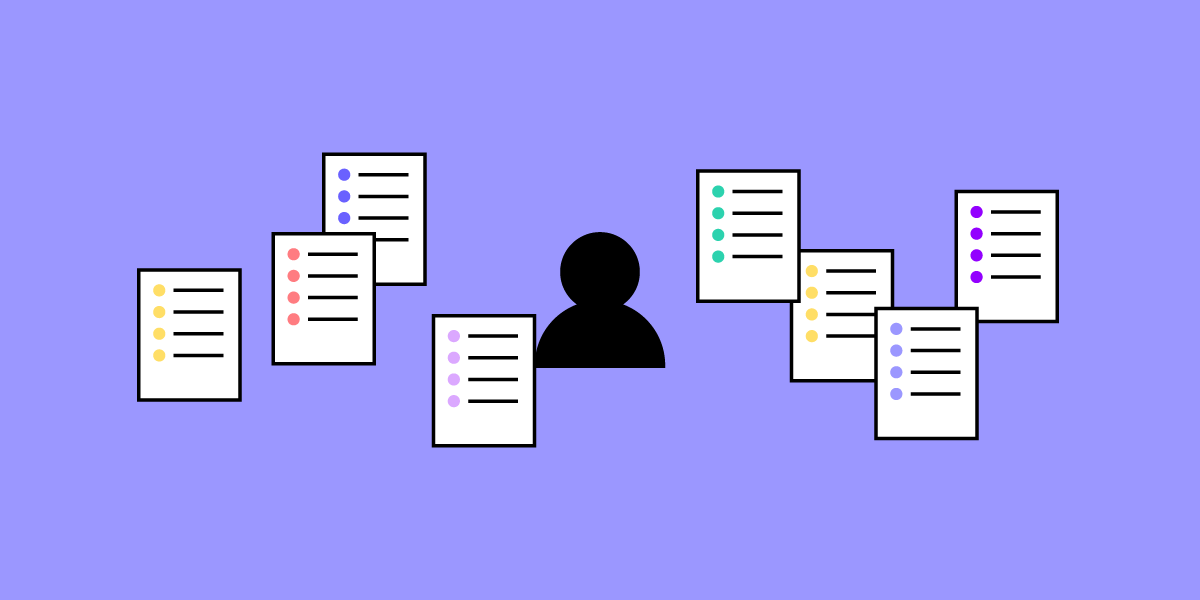
Analysis and Predictions
Who has the time to measure design system effectiveness? This task can be delegated to artificial intelligence tools. AI can monitor user interactions in real-time, providing insights into usability issues and predicting how users will respond to different design elements. This helps designers make informed decisions and iterate faster, ensuring optimal user experiences.
Using Text Prompts to Generate UI Elements
AI can now generate foundational elements of a design system, such as spacing and typography scales, from basic text prompts. This significantly reduces the time needed for initial setup and helps teams maintain a structured and well-documented design system from the get-go.
Ensuring that AI-powered design tools are accessible to all users, including those with disabilities, remains a significant challenge. According to Google Design, AI must be trained carefully to avoid reinforcing biases and to ensure inclusivity for all users.
Dan Mall, founder of Design System University, emphasizes that AI “has not reached the point where it can judge what’s good and what’s not, what might be emotionally resonant with a human audience, and what might just be junk” (as in Webflow’s article about AI.) Therefore, designers must use AI as a complementary tool that supports their creativity rather than as a replacement for human decision-making.
Privacy and Data Security
AI systems often rely on large amounts of user data to generate insights and predict behaviors. Designers need to ensure that this data is collected, stored, and used responsibly to protect user privacy and build trust. AI-driven design systems should prioritize data security and maintain transparency around how user data is leveraged for design decisions, as stated by Adam Fard’s Design Studio.
Top 5 Tips to Address AI-Driven Design System Challenges
Inclusive Training Data – Train AI models with diverse datasets that reflect various demographics, abilities, and cultural contexts. This reduces bias and ensures that generated components cater to a broad range of users, supporting the creation of accessible and inclusive design systems.
Bias Audits and Continuous Monitoring – Regularly audit AI models for bias and ethical fairness. Implement continuous monitoring to detect and address any biased behaviors, ensuring your AI tools remain neutral and inclusive throughout their usage lifecycle.
Iterative Design with Human Oversight – Adopt an iterative design process where AI provides initial suggestions or generates components, but human designers review and refine these outputs. This approach helps maintain human-centered design principles and ensures AI-generated elements resonate with users on an emotional level.
Minimize Data Collection and Enhance Privacy – Limit data collection to what’s necessary for AI training and improvement. Apply anonymization techniques and encryption to protect user data, and clearly communicate data usage policies to maintain transparency and build user trust.
Transparent Documentation and Communication – Document how AI models are trained, the data used, and the ethical steps taken to ensure inclusivity and security. Transparent documentation fosters trust and promotes responsible use of AI in design systems.
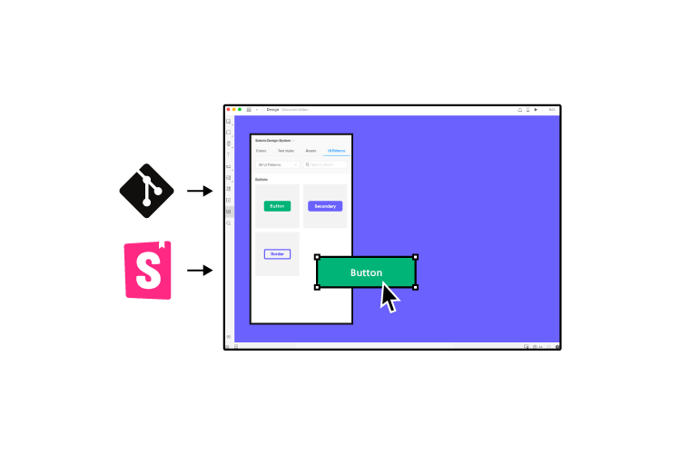
How to Build an AI Design System with UXPin
Many design tools on the market today, like Uizard or Framer, offer AI-powered features for prototyping and automating components, but they lack a unified platform that seamlessly integrates with development. While these tools are effective for quick iterations and ideation, they often fall short when it comes to maintaining design consistency and creating development-ready components at scale.
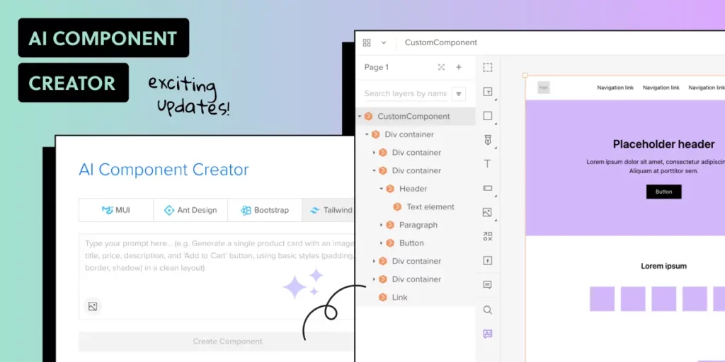
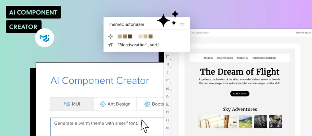
That’s where UXPin Merge stands out. Unlike other tools, UXPin Merge is an end-to-end design platform that enables designers and developers to work with real React or Web components within the design environment. The addition of the AI Component Creator further enhances this capability by automating the generation of code-backed components from text prompts or images, bridging the gap between design and development.
With UXPin, you’re not just designing in isolation—you’re creating a complete, scalable, and consistent design system that is in sync with your development codebase. Let’s explore how you can leverage these powerful features to build an AI-driven design system from scratch.
Step 1: Setting Up Your Design System in UXPin
Old but great explanation of how design systems work in UXPin.
Create a New Design System
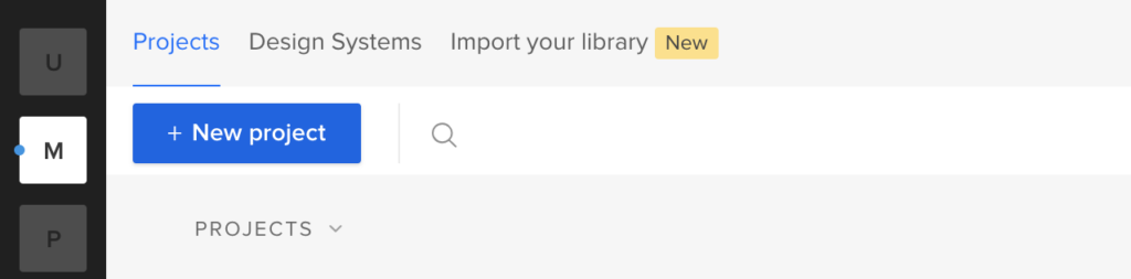
Open UXPin and navigate to the Design Systems tab at the top of your dashboard.
Click the Create Design System button. Choose the option to “Create from Scratch” to start with a clean slate.
Name your design system and define its purpose. For example, “AI-Powered Design System for Web Applications.”
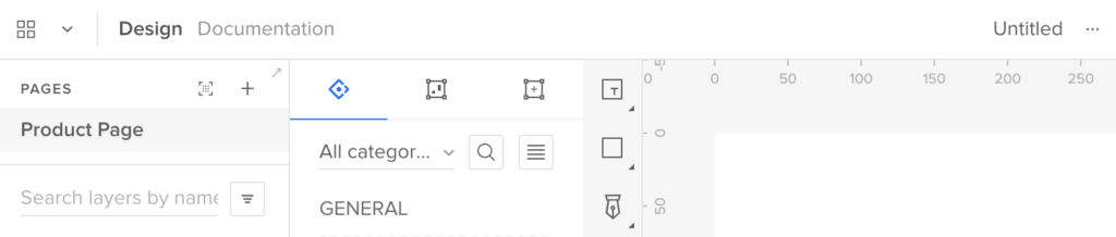
Define Core Elements
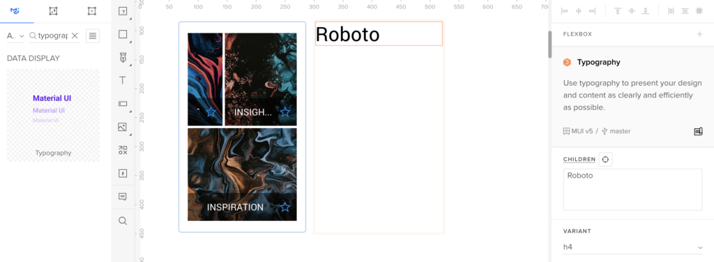
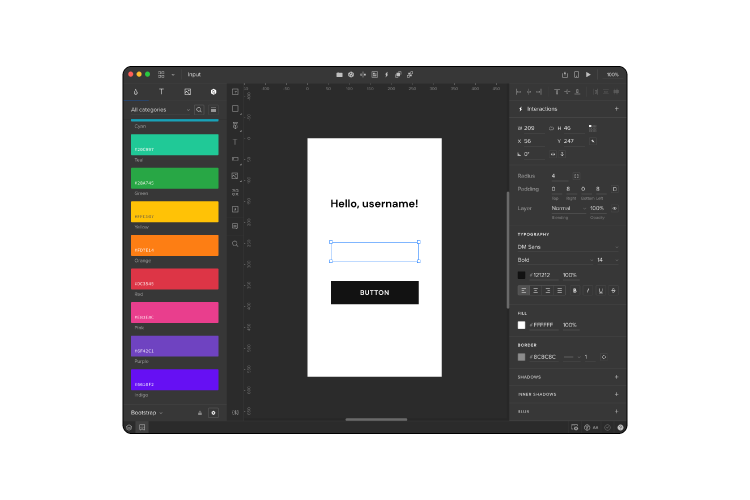
In the design system interface, set up the core elements such as colors, typography, and spacing.
Colors: Add your primary, secondary, and neutral colors. You can type in HEX codes or import colors directly from a website URL.
Typography: Define text styles like headings, paragraphs, and captions by adding font families, weights, and sizes.
Spacing and Grid: Set spacing values and grid structures to ensure design consistency.
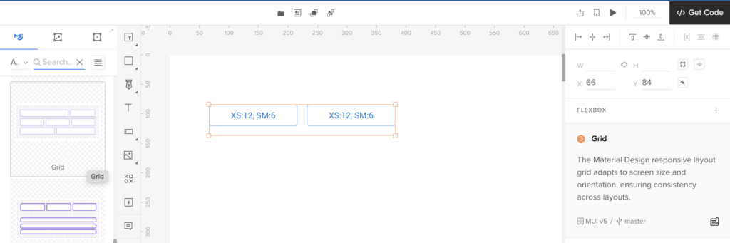
Create Design Tokens Design tokens are style values that represent the design decisions needed to build a UI—such as colors, typography, and spacing. Use design tokens in your design system to maintain consistency and scale your system across different platforms.
Step 2: Generating UI Components with AI Component Creator
Enable AI Component Creator
If you are on the Merge AI plan or have Merge enabled, go to the AI Component Creator in UXPin’s Editor.
Enter your OpenAI API key in the Settings tab to enable the AI functionality.
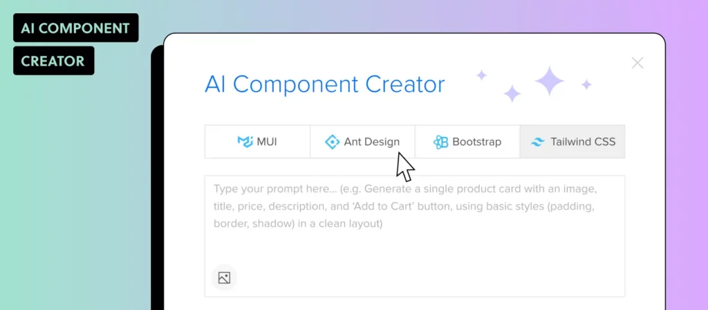
Generate Components from Text Prompts
Open the Prompt tab in the AI Component Creator.
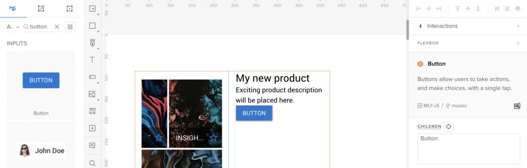
Write a prompt describing the component you want to create. For example: 
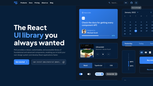
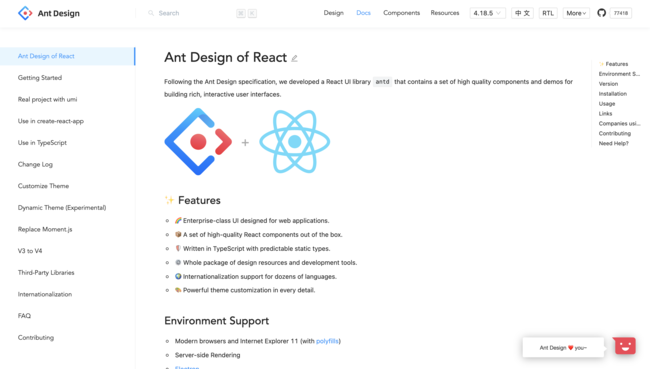
“Create a primary button component with rounded corners, a blue background, and white text. The button should use the MUI library.”
Select the React library you want to use, such as MUI or Ant Design, and click Generate.
Review the generated component. If needed, make adjustments to its properties or styles directly in UXPin.
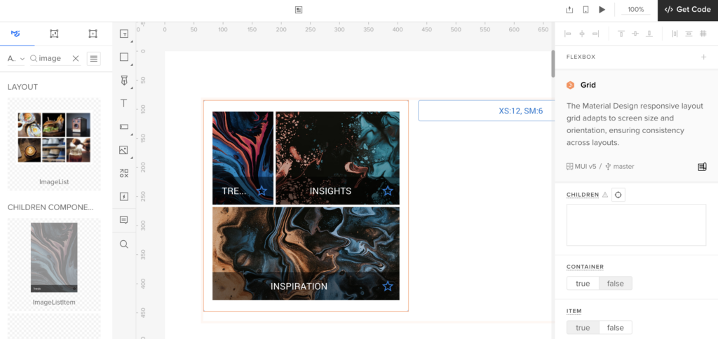
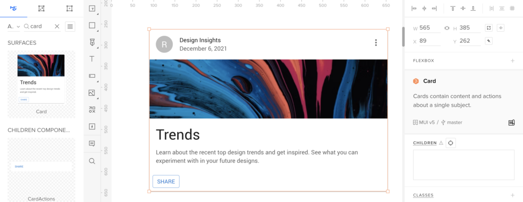
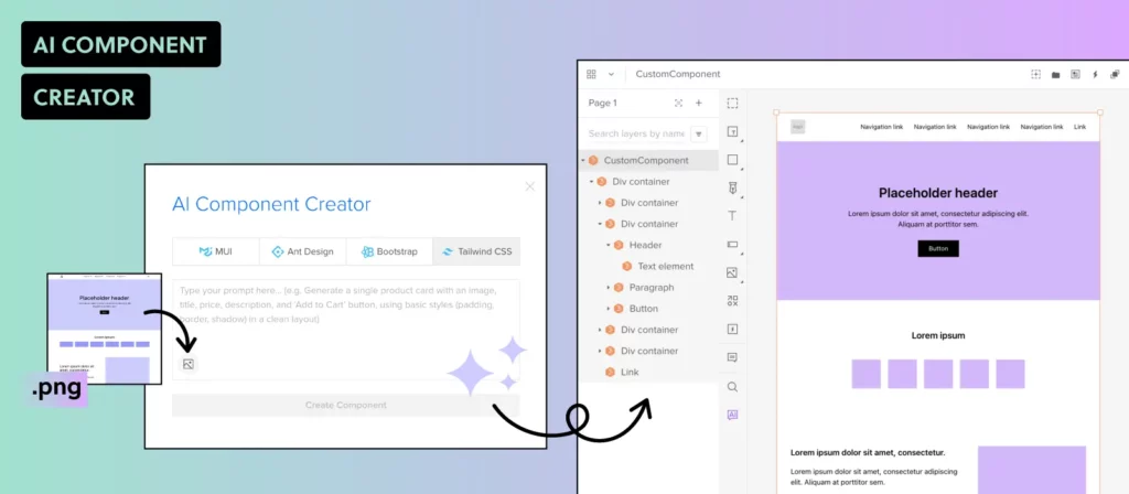
Create Components from Uploaded Images
If you have a visual design that you want to turn into a code-backed component, use the Upload Image option in the AI Component Creator.
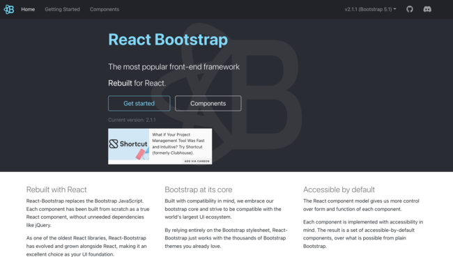
Upload the image, and the AI will analyze it to generate a fully coded component using your selected React library (MUI, Ant Design, or React-Bootstrap).
Review the generated code and structure, and integrate it into your design system’s component library.
Transform Existing UXPin Components
If you already have existing static elements in UXPin, right-click on the component and choose the AI transformation option to convert it into a code-backed component.
The AI will apply the appropriate library (e.g., MUI) and generate code, making the component development-ready.
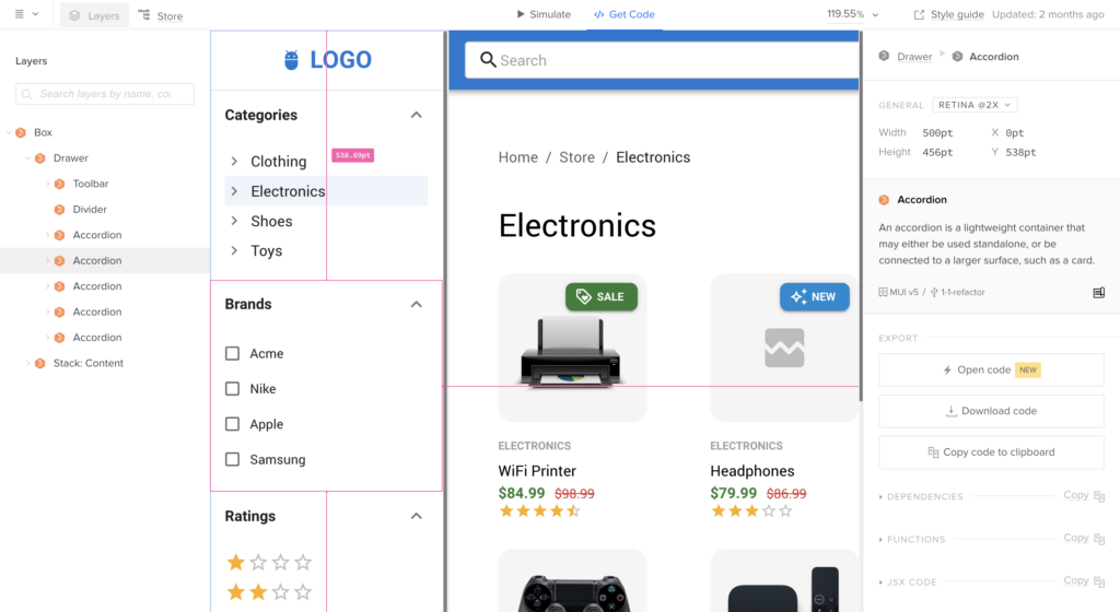
Step 3: Organizing Your AI-Driven Design System
Create and Document UI Patterns
In the Design System interface, go to the UI Patterns section.
Group similar components (e.g., buttons, forms, modals) together and add descriptions to document usage guidelines, props, and variations.
Use the AI Component Creator to generate variations of these components based on text prompts. For example, creating variations of a button with different colors or icon placements.
Add Accessibility Guidelines
Define accessibility standards for your components by adding descriptions and guidelines. For example, set minimum color contrast ratios and ensure keyboard navigation for interactive elements.
Use AI to test components against accessibility standards, such as checking for WCAG compliance or generating accessible labels and alt text.
Set Up Component Variants
In UXPin, create component variants (e.g., primary, secondary, and disabled states for buttons) to cover various use cases.
Define responsive behaviors for components using UXPin’s interactions and breakpoint settings.
Step 4: Create Live Code Integration Using UXPin Merge
Import Code Components with UXPin Merge
Import live code components from your repository using UXPin Merge. Merge allows you to sync your design system with code components, ensuring that the design system reflects the latest codebase.
Document and Share Code-backed Components
Document your code-backed components directly in the design system, adding links to code repositories and usage guidelines for developers.
Use UXPin’s Spec Mode to allow developers to inspect code, view component props, and access documentation—all within UXPin.
Step 5: Maintaining and Scaling Your AI-Driven Design System
Update Components with AI Assistance
As your design system evolves, use the AI Component Creator to update components or generate new ones. AI can help you maintain consistency by adhering to design system rules and standards.
Use AI to Analyze and Optimize the Design System
Implement AI tools like UXPin’s AI Component Creator to analyze your design system for redundancies, inconsistencies, or gaps.
Use these insights to refine and optimize your design system, ensuring it remains scalable and relevant.
Collaborate and Iterate with Stakeholders
Share the AI-driven design system with stakeholders for feedback and collaboration.
Use UXPin’s collaboration features to receive comments and iterate on the design system components quickly.
Ready to Use an AI-Driven Design System?
AI is poised to become a co-pilot in design systems, augmenting the abilities of designers and creating new opportunities for innovation. As AI continues to advance, it will enable more predictive design, personalized user experiences, and greater efficiency in managing and scaling design systems. Designers who embrace AI as a complementary tool will be better equipped to create the next generation of digital experiences that are both intuitive and scalable.
Creating an AI-driven design system in UXPin not only accelerates the design process but also ensures that your components are development-ready and aligned with best practices. By leveraging the AI Component Creator, you can automate repetitive tasks, maintain consistency, and create a scalable design system that bridges the gap between design and development.
Ready to build your own AI-powered design system? Request access to UXPin Merge and start transforming your design process today.
Nowadays, pretty much everyone knows what content writing is. But the same can’t be said about UX writing. And yet this new role within the product design team has become ever so important. So, what is UX writing, how does it fit into the design and product teams and what are the key principles of good UX writing? Read on to find out.
Boost your UX team’s efficiency with UXPin. This cloud-based prototyping tool enables seamless collaboration between UX writers and designers through real-time editing and design sharing. With support for importing real data into your prototypes, UXPin helps bridge the gap between design and development.
Experience UXPin’s capabilities firsthand with a free 14-day trial—no commitments required. Sign up for free.
Build advanced prototypes
Design better products with States, Variables, Auto Layout and more.
What is UX Writing?
UX writing – or user experience writing – is the process of creating user-friendly copy for all user-facing touchpoints, including user interface. And this is not just a decorative text. UX copy informs, guides, urges and helps users take action – and this only works effectively when it is created as a part of a formal product design process.
As great copy within an interactive UX design helps to create a great user experience – one of the keys for a successful product – no wonder it has become an important role on its own.
What Does a UX Writer Do?
UX writers write microcopy used throughout digital products – whether it is a piece of software, a web application, or a mobile app. These pieces of copy are menu labels, buttons, calls-to-action, confirmation and error messages, security notes, etc. UX writers create a copy in such a way that users understand what and why they should do in order to achieve a certain result.
To create a great UX copy, UX writers not only need to create consistent, error- and typos-free copy but also have a thorough understanding of the end-user experience of the product they’re writing for. They need to make it easy for users to take the path that leads towards a particular outcome in a logical, intuitive manner.
For a very long time, it was software developers and graphic designers who would write the microcopy for digital products. Back then UX writing was underestimated and considered a luxury. As a result, the microcopy within the product was often inconsistent and confusing for the user, not to mention that it was sometimes filled with grammar errors and spelling mistakes.
And that’s understandable – nobody can excel at everything, and software developers or designers aren’t an exception to this rule. Especially that they know the product inside out and it’s hard for them to empathize with users.
…and what does UX writer not do
The role of UX writer should not be confused with that of:
technical writer – who does the technical writing and focuses on clarity and accuracy, not on user experience,
content strategist – who plans content strategy, i.e. content on a bigger scale, and doesn’t necessarily write copy,
information architect – who works on, well, information architecture, meaning that (s)he builds sustainable information structures and taxonomies,
content marketing copywriter – who writes marketing copy that attracts leads, converts them into customers and helps to retain them); check the difference between copywriter and UX writer.
UX Writing in a Design and Product Team
UX writers are members of UX teams, and as such they’re expected to conduct or collaborate on conducting the UX research. UX copy and UX design teams work together to discover options that improve the functionality, usability, and accessibility of the final product. As a result, they’re able to both streamline the design process and develop better digital experiences that attract more users.
UX writers also work closely with product developers, focusing on missing logic or a confusing interface, thus influencing the final product that is being developed. UX writers also collaborate with other teams within the organization, such as marketing, legal, and business development, in order to ensure that copy is aligned to brand voice, strengthens product’s UVP, and doesn’t get the company in trouble.
Types of UX Content
The specific types of UX content vary depending on the digital product, but generally speaking the most common types of UX content include:
Great UX writing is all about clean, purposeful lines, making each word count. Superfluity and redundancy are its enemies. That’s why some people compare UX writing to… writing poetry! But great UX writers must also:
Inform about what the product is capable of doing and guide users on how to do it in a logical, easy-to-follow manner.
Look critically at the product flows, anticipate user questions, preempt their frustrations with proactive help and guide them through tasks.
Be clear, concise, unambiguous, and – whenever necessary – break down complicated processes into easy to do steps. UX copy should only give the necessary or requested information at any given time.
Use brand voice and, whenever possible, reinforce the product’s Unique Value Proposition (UVP) to help it stand out from the competition.
Incorporate best content design principles based on research and always create copy in context, directly in a wireframing tool, that shows it with all the fonts, images, buttons etc. UX writers shouldn’t use Word documents or Excel sheets for their copywriting.
How to Use UXPin for UX Writing?
Create Design Context: Use UXPin to design wireframes or prototypes, providing context for your content.
Collaborate in Real-Time: UX writers can work directly within the design file, adding or modifying text while designers see updates instantly.
Define Content Hierarchy: Utilize UXPin’s component system to create consistent content patterns for headers, buttons, and body text.
Use Comments & Annotations: Leave comments to discuss content changes or ideas directly on the prototype.
Prototype with Real Content: Import realistic data to simulate actual user scenarios, making the designs and content more aligned.
This approach enhances collaboration between UX writers and designers, leading to more cohesive and user-focused designs.
Summary
As you can see, having an experienced UX writer on board is the key to improve the overall quality of your product design. Remember that your user interface microcopy is there to help users accomplish their goals. And this is what ultimately will bring more customers to your digital product.
If you’re looking for ways to improve work within your UX team, consider giving UXPin a try. It’s a cloud-based design tool that makes it easy for UX writers and UX designers to collaborate in real-time. It even allows you to import real data into your designs!
Modern websites and apps rely on front-end frameworks to develop, maintain, and scale user interfaces. React’s Javascript library is arguably the most popular front-end framework with many component libraries to build digital products.
We’re going to explore the top React UI libraries and how to choose the right one for your next project.
With UXPin Merge, you can sync any React component library and assemble production-ready layouts super fast. Check out the build-in MUI, Ant design, and React Bootstrap components that are available for free in UXPin’s editor. Drag and drop them on the canvas and simplify React UI design. Try UXPin Merge.
Design UI with code-backed components.
Use the same components in design as in development. Keep UI consistency at scale.
What is React Component library?
A React component library is a collection of pre-built UI components specifically designed for use with React applications. These libraries contain reusable components that cover a wide range of UI elements, such as buttons, forms, modals, navigation bars, cards, and more.
React component libraries aim to streamline the development process by providing ready-made components that adhere to best practices in terms of design, accessibility, and functionality.
What to consider when choosing a React component library
Below are six things to consider when choosing a React library for your next project. This is by no means an exhaustive list, and some of these factors may not apply to the product you’re building.
1. Popularity
GitHub’s star rating allows you to quickly compare each React UI library’s popularity. The weekly downloads on npm also show how many people use the component library. Generally speaking, a React library’s popularity means it’s well established and serves its purpose.
2. Issues
Like star rating, a library’s GitHub issues can tell you a lot about its popularity and how well it’s maintained. Even if the library has minimal issues, do any of these affect the product you’re trying to build?
3. Documentation & Support
Documentation is an important consideration when choosing a React UI library. You want to avoid running to Stack Overflow every time you run into trouble or want to know how to use specific components. Good documentation is updated regularly and gives you a comprehensive understanding of the library.
You also want to know if the React library has support directly from the creators or via a dedicated community forum. There are times when you need expert advice to overcome challenges. The ability to reach out for help (even if that means paying) is crucial to get issues sorted quickly and keep the project moving.
4. Customization
One of the downsides to using a component library is its constraints and lack of customization. For some projects, customization isn’t a factor, but if you’re looking to develop a unique UI, the ability to build your own design system is vital.
Explore the library’s documentation to see if they offer instructions for customizing the components and how easily you can achieve your desired results.
5. Browser or Device Compatibility
Depending on the app you’re designing, you’ll want to know the component library’s browser and mobile compatibility. The quickest way to research browser/device compatibility is by searching GitHub’s issues or Stack Overflow.
6. Accessibility
Accessibility is a time-consuming but necessary consideration for digital product design. If a React library hasn’t considered accessibility when designing components, then it’s something you’re going to have to do yourself, which takes us back to points 3 and 4–documentation and customization.
Which is the best React component library?
The best React component library for your project depends on your specific needs and preferences. It’s recommended to evaluate each library based on factors such as documentation quality, community support, active development, and alignment with your project requirements before making a decision.
Comparing the libraries involves assessing various aspects such as design philosophy, component offerings, theming capabilities, documentation, community support, and ecosystem. Take Material-UI (MUI) and Ant Design as examples.
Material-UI provides a comprehensive set of React components following the Material Design system. It includes components like buttons, cards, forms, navigation, and more, with a wide range of customization options.
Ant Design offers a rich collection of components tailored for enterprise applications, including layouts, forms, navigation, data display, and more. It provides components specific to data visualization and business logic.
5 React Component Libraries
These are our five best React UI libraries for 2024.
Note: Information regarding GitHub stars and NPM downloads are accurate as of March 2024.
MUI is one of the most comprehensive and widely used React component libraries. The library is built on Google’s Material Design UI, one of the most extensive UI kits in the world.
MUI – Components
MUI has a massive component library for designers to build everything from mobile and web applications, websites, and even wearable apps.
MUI Core features fundamental UI components you see in everyday digital products, while MUI X offers a list of advanced React components for building complex user interfaces, like data tables, data pickers, charts, and more.
For those of you who would like to try design with MUI code components, sign up for a UXPin trial and get 14-day access to UXPin. Read more about MUI 5 Kit in UXPin.
MUI – Theming & Customization
One of MUI’s biggest appeals is the ability to theme and customize components. Designers can use MUI as a foundation to scale designs fast but also adapt the library to build a custom design system for their product or organization.
Designers can also take advantage of Material Design and MUI’s comprehensive guidelines to avoid usability issues when customizing components.
MUI also has a template marketplace to purchase React theme templates for dashboards, eCommerce websites, landing pages, and more.
MUI – Documentation
MUI’s documentation is as detailed and comprehensive as its component library. Its curators have taken great care to provide designers and developers with step-by-step instructions and guidelines for installation, usage, customization, accessibility, and more.
There are also tons of videos on YouTube from MUI’s large community of users and contributors offering best practices, tutorials, tips and tricks, how-to guides, and more.
Where to get MUI components from?
You can get MUI components from the following sources:
UXPin’s Built-In MUI Kit: Access pre-built MUI components directly in the UXPin Editor.
MUI Website: Download components and get design inspiration from the official MUI library.
AI Component Creator: Use UXPin’s AI tool to generate custom MUI components from text prompts or images.
These options provide flexibility whether you need ready-made components or custom-coded solutions.
How to generate MUI components with AI?
You can use AI to generate MUI components that you need. The AI Component Creator by UXPin is an advanced tool that helps designers generate fully coded UI components from images, text prompts, or existing elements. It supports React-based libraries like MUI.
By leveraging AI, this tool bridges the gap between design and development, streamlining workflows and eliminating the need for manual coding. It’s perfect for creating consistent, scalable UI components in seconds.
To generate MUI components using UXPin’s AI Component Creator:
Founded in 2011, Bootstrap is one of the oldest and most popular open-source CSS frameworks for websites and web applications. Bootstrap was one of the first CSS frameworks to prioritize mobile-first web development, allowing designers to build and scale responsive websites quickly.
If you’re familiar with Bootstrap, then you’ll instantly recognize React-Bootstrap’s generic-looking component library. Like its CSS predecessor, React-Bootstrap features UI components that favor web design rather than mobile applications.
React-Bootstrap – Theming & Customization
React-Bootstrap is very generic with minimal styling, making it easy for designers to tweak and customize. Bootstrap’s defined classes and variants make it easy to select and customize components using CSS.
Due to Bootstrap’s long history and wide usage, you can find tons of free and premium React-Bootstrap themes and templates for everything from admin dashboards to multiple purpose websites, eCommerce, landing pages, and more.
React-Bootstrap – Documentation
React-Bootstrap has excellent documentation, albeit not as detailed and comprehensive as MUI. React-Bootstrap’s simplicity and naming convention make it one of the easiest React libraries to understand, use, and customize.
Bootstrap is also featured extensively on Stack Overflow, so you’ll likely find answers to most issues. There are also loads of blogs and YouTube videos offering advice, tutorials, design projects, and more.
Where to Get React-Bootstrap Components
You can get React-Bootstrap components from the following sources:
UXPin’s Built-In React-Bootstrap Kit: Access pre-built React-Bootstrap components directly within the UXPin Editor.
React-Bootstrap Website: Explore and download components from the official React-Bootstrap library.
AI Component Creator: Use UXPin’s AI tool to generate custom React-Bootstrap components from text prompts or images.
These options provide flexibility, whether you need ready-made components or custom AI-generated solutions.
How to Generate React-Bootstrap Components with AI
You can leverage AI to create React-Bootstrap components easily with UXPin’s AI Component Creator. This tool converts images, text prompts, or static elements into fully coded React-Bootstrap components, simplifying the design-to-development process.
To generate React-Bootstrap components:
Get an OpenAI API Key from the OpenAI website.
Enable the AI Component Creator by contacting UXPin support if you have the Merge AI plan or Merge enabled.
Open the AI Component Creator from the Editor’s Quick Tools panel.
Paste your API key in the Settings tab.
In the Prompt tab, write a description of the component you want or upload an image.
Select React-Bootstrap as your library, and let the AI generate your component!
Semantic UI React is a popular alternative to React-Bootstrap. Like React-Bootstrap, Semantic UI started as an open-source CSS framework that its contributors used to build React components.
Semantic UI React – Components
Semantic UI React offers an extensive range of UI components for websites and web applications. The components provide cleaner, more modern styling than Bootstrap while remaining minimalist and simplistic.
Semantic UI React uses the FontAwesome icon set, including over 1,600 free icons and 7,864 Pro (paid).
Semantic UI React – Theming & Customization
Semantic UI uses an intuitive, straightforward naming convention that makes it easy to customize components. The documentation also provides a step-by-step guide for theming with Semantic UI React. Unlike MUI and React-Bootstrap, Semantic has very few template options.
Semantic UI React – Documentation
Semantic UI React’s interactive documentation provides you with CodeSandbox examples to inspect the code and play around with components.
The docs also allow you to switch between an example, code, and props to visualize the component from multiple angles.
Ant Design (AntD) is another popular, widely used React component library developed by Ant Group–parent company to Alibaba, China’s biggest online marketplace. Like MUI, AntD offers a vast component library for both web and mobile applications.
AntD is the only React library featured in this article that uses TypeScript – a form of Javascript.
Ant Design – Components
AntD has a massive component library for desktop and mobile, including UI patterns like infinite scroll and pull-to-refresh for mobile devices. Ant Design ProComponents offers a range of advanced React UI elements ( similar to MUI X) for building complex interfaces.
You can also find a vast library of pre-made templates and scaffolds to kick start your project and build UIs much faster.
Ant Design – Theming & Customization
AntD uses design tokens or variables for devs to customize and theme components. The UI library uses Less and provides a complete list of all AntD variables in GitHub.
Ant Design – Documentation
AntD’s comprehensive documentation provides step-by-step instructions for using and customizing. You can also inspect each component in CodeSandBox, CodePen, or StackBlitz.
Where to Get Ant Design Components
You can get Ant Design components from the following sources:
UXPin’s Built-In Ant Design Kit: Access pre-built Ant Design components directly within the UXPin Editor.
Ant Design Website: Download components and explore design inspiration from the official Ant Design library.
AI Component Creator: Use UXPin’s AI tool to generate custom Ant Design components from text prompts or images.
These options allow you to choose between ready-made components or custom AI-generated solutions to meet your project needs.
How to Generate Ant Design Components with AI
You can easily generate Ant Design components using UXPin’s AI Component Creator. This tool leverages AI to convert images, text prompts, or static elements into code-backed Ant Design components—eliminating manual coding and streamlining design-to-development workflows.
To generate Ant Design components:
Get an OpenAI API Key from the OpenAI website.
Enable the AI Component Creator by contacting UXPin support if you have the Merge AI plan or Merge enabled.
Open the AI Component Creator from the Editor’s Quick Tools panel.
Paste your API key in the Settings tab.
In the Prompt tab, write a description of the component you want or upload an image.
Select Ant Design as your library, and let the AI generate your component!
Chakra UI is a Nigerian-based React component library founded by Segun Adebayo. You can choose between Chakra’s free component library or Chakra UI Pro, which offers pre-made complex UI components to build interfaces faster.
Chakra UI – Components
Chakra UI’s component library caters to web-based applications and websites. The library offers the choice between TypeScript or Javascript React components, depending on your preference. Chakra’s designers follow WAI-ARIA standards, so every element is accessible.
The stylish UI components look similar to Semantic UI, with dark and light options available.
Chakra UI – Theming & Customization
Chakra’s designers created the UI library to be fully customized using variables to meet product and brand requirements. Charka also integrates with Create React App, Framer Motion, React Hook Form, and React Table to extend the library’s usage and customization.
Chakra UI – Documentation
Chakra UI has excellent documentation with guides, video tutorials, examples, FAQs, links to connect with core team members, and an active Discord community.
Chakra’s users are extremely passionate and enthusiastic about the React library, and there’s always someone to connect with to ask questions.
Design Using React Components With UXPin Merge
One of the challenges of using a React library is that only few tools allow you to design UIs with real components. UXPin Merge allows you to assemble layouts with React components from Git repo, Storybook, or npm. See how it works. Discover UXPin Merge.
Storybook has become THE DevOps tool for developing and maintaining design systems. The platform’s excellent documentation, intuitive UI, built-in testing, and collaborative features make it the perfect tool for building and releasing components.
Understanding how Storybook works can help designers collaborate with front-end devs better and leverage the platform’s features to improve prototyping and testing.
One of Storybooks best features for design teams is its ability to sync a component library with UXPin using Merge technology. Merge creates a drag-and-drop design environment for assembling layouts fast. Discover UXPin Merge.
Design UI with code-backed components.
Use the same components in design as in development. Keep UI consistency at scale.
What is Storybook?
Storybook is an open-source tool for building, developing, and testing UI components in isolation. It provides a dedicated environment where designers and developers can create, preview, and document components without dealing with the complexities of integrating business logic or data. This isolation allows teams to focus on designing UIs, exploring edge cases, and ensuring consistency across projects.
Storybook integrates with various tools, making it a versatile solution for component-based workflows in React, Vue, and Angular—ideal for teams using UXPin to build comprehensive design systems.
Why Do Devs use Storybook for Design Systems?
These are a few reasons why Storybook Design Systems are so popular among developers.
Reason #1: Developing and testing components in isolation
Storybook enables engineers to develop UI components in isolation. This development workflow is great for design systems and component-driven front-end frameworks like React–which many organizations use for their component libraries.
Before Storybook, engineers would use sandbox platforms like CodePen and CodeSandbox to build and test components in isolation. Storybook offers this sandbox-style development environment with an intuitive user interface for engineers and stakeholders to view, test, and approve UI elements. They can also combine components and build little prototype patterns for testing.
Reason #2: Quality Assurance
Developing in isolation also benefits design system quality assurance. Engineers can invite designers, product managers, and other stakeholders to test and submit feedback on new UI elements before release.
Reason #3: Documentation
Documentation is crucial for component libraries, but it’s often the last thing anyone wants to think about because it’s time-consuming.
Storybook’s DocsPage is a “zero-config default documentation” that automates basic doc creation. Product and engineering teams can expand this documentation to create usage and guideline information.
Reason #4: Single source of truth
Managing the codebase for cross-platform applications is challenging. Storybook provides a single source of truth for testing components and patterns for each platform from a centralized environment.
This centralized environment maximizes consistency, as engineers can view components and patterns side-by-side and collaborate with developers responsible for each platform–iOS, Web, Android, etc.
Reason #5: Accessibility
Storybook’s A11y Accessibility add-on enables engineers to automate accessibility testing. The add-on creates a new Accessibility tab for each element showing WCAG standards in three categories:
Violations: accessibility issues to resolve
Passed: standards met
Incomplete: A checklist of accessibility to-dos
How Do Devs Work With a Design System in Storybook?
Once engineers have set up Storybook and connected to a GitHub repository, they begin developing each component and its variants. For example, a button might have several states, sizes, types, etc.
During the build process, engineers can install Storybook add-ons to automate workflows, integrate with other tools, or enhance the Storybook environment.
Document Storybook Design System
Engineers can add comments to components during the build process to enrich the automatically generated documentation. This example from Storybook’s docs demonstrates how these comments appear in your Storybook UI.
This documentation is crucial for the next step, Review, because it shows stakeholders how front-end developers interpret designs and what each ‘prop’ represents.
Review Storybook Design System
The component is now staged and ready to be promoted to the design system. Engineers can invite designers, product managers, and other stakeholders to review the element to ensure it meets interactive and aesthetic expectations.
Traditionally, engineers would have to create a staging environment or meet with stakeholders to present the component. With Storybook, it’s as easy as visiting a website, making the review process more accessible. Stakeholders can log in on their own time, interact with the component, read the docs, and leave feedback.
If there are any changes, engineers may iterate steps one to three until the new components meet all stakeholder’s expectations.
Test Storybook Design System
Jest and Playwright power Storybook’s framework-agnostic testing. When engineers commit the component, Storybook tests its code to ensure there are no programming errors, including:
Visual tests (visual regression tests): creates screenshots of every commit and compares them to catch UI inconsistencies.
Accessibility tests: runs code against WCAG standards and reports any issues.
Interaction tests: checks interactivity and states to ensure there are issues with links or functionality.
Test coverage: examines code against industry standards, including conditions, logic branches, functions, and variables.
Snapshot tests: identifies markup changes by comparing rendered code to the baseline.
Distribute Storybook Design System
The final step is to update the design system package on GitHub. Once complete, it’ll automatically sync the changes to npm. Engineers can install the updated npm package to use the new component(s).
Syncing Design With Storybook Through UXPin Merge
If your design team works with UXPin Merge, these engineering changes will also be distributed to UXPin’s design editor and notify team members of the latest design system release.
UXPin’s Version Control allows designers to change to the latest release whenever they choose and switch to earlier versions of the design system.
How to Sync Storybook Design System with UXPin
Prepare Your Resources
Ensure you have access to UXPin’s Merge technology.
Obtain your Storybook URL (either public or private).
Integrate with UXPin
Open a UXPin prototype and go to the Design System Libraries.
Click + New Library and select Import Components from Storybook.
UXPin Merge is a technology that bridges (or Merges) the gap between design and development. Organizations can sync a design system hosted in a repository to UXPin’s design editor so designers can use the same component library as engineers to build fully functioning prototypes.
Merge components are fully interactive and include React props (or Args for Storybook) defined by the design system, including colors, typography, states, sizes, etc. These props appear in UXPin’s Properties Panel so designers can adjust components to meet prototyping requirements while maintaining absolute consistency and zero drift.
Enhanced testing and stakeholder feedback
Merge prototypes look and function like the final product because they use the same components. For example, a button in Storybook will render exactly the same in UXPin, including interactivity and styling.
Usability participants and stakeholders can interact with these UI elements and Merge prototypes like they would the final product, giving design teams accurate, actionable testing insights.
“It’s been so helpful for us to have these high-fidelity prototypes built with UXPin. We build high-fidelity prototypes much quicker, and we get immediate feedback after the session. If there’s something we can fix immediately, we make that change before the next participant and get feedback much faster than before.” Erica Rider – UX Lead EPX at PayPal, talking about how UXPin Merge enhances user testing.
Scaling component libraries with UXPin Patterns
Design systems evolve as products grow and scale. The design system team is constantly making changes and promoting new UI elements and patterns.
UXPin Patterns enables design teams to create new patterns for the design system–as one-offs or as a best new practice. Designers can combine UI elements (atoms and molecules) from the design system to create new patterns or use UXPin’s npm integration to import components from open-source libraries if the current library doesn’t support their needs.
Designers can save and share these patterns across the organization, so teams can continue prototyping while they wait for the DS team to follow governance procedures to develop and release the new component–following the five-step Storybook development process outlined above.
Stage four design system maturity with UXPin Merge
Merge solves these four design system challenges by default.
Designers use ready-made components with styling and interactive properties–no designing from scratch. Drag and drop UI elements to design new products.
No code development. Engineers install a package and copy prototypes that use the exact same UI library. UXPin renders JSX for each component, so engineers copy/paste to apply styling and interactivity.
Drift is nonexistent when everyone uses the same component library (design and engineering teams) with the same constraints.
Using the same components with built-in constraints ensures ultimate consistency across design teams.
With Merge, there’s a seamless handoff because designers and engineers use the same single source of truth. Designers don’t have to explain UIs or provide endless documentation explaining their prototypes–they already look and function like the final product.
UXPin reduces the four stages of design system maturity to just two.
Design your library using UXPin’s design editor.
Convert designs to code components, add them to a repository, and sync back to UXPin using Merge. Iterate to scale.
Take your product development to the next level by Merging the two best design and engineering tools for design systems. Request access to UXPin Merge.
We’re thrilled to announce exciting updates to UXPin’s AI Component Creator. After experimenting with generating HTML-based Tailwind UI components, our Merge AI tool now supports MUI, Ant Design, and React-Bootstrap—unlocking more possibilities for designers and developers. But that’s not all!
You can now turn static images into fully coded UI components or transform classic UXPin elements into code-backed designs with just a few clicks, paste an image of UI that will get transformed into code-backed design or automate theming.
Say goodbye to tedious coding and hello to a streamlined design-to-development workflow. It’s time to supercharge your creativity with AI. Try AI Component Creator by yourself. Sign up for a demo.
Reach a new level of prototyping
Design with interactive components coming from your team’s design system.
What is UXPin’s AI Component Creator?
UXPin’s AI Component Creator revolutionizes the way designers and developers work by bridging the gap between design and code.
Imagine a world where you can go from an idea to a fully functional UI component in minutes. That’s the power of UXPin’s AI Component Creator.
This tool now lets you harness the capabilities of React-based libraries like MUI, Ant Design, and React-Bootstrap. Whether you’re working with a static design or a code component, the AI Component Creator transforms text prompts, images, or existing elements into production-ready, code-backed components.
Let’s say you’ve sketched out a UI wireframe or stumbled across a beautiful UI design. Recreating that design and translating it into code would take ages. Thankfully, there’s an easier way of going about it – AI Component Creator.
With UXPin’s AI tool, you can upload the image or write a prompt and—voilà— you get a React component that’s fully consistent with your chosen library: MUI, Ant Design or React-Bootstrap. Have a static element in your UXPin prototype? Transform it into a code-backed component with a right-click. Then, download the code behind the UI elements and speed up React web app development.
This streamlined process ensures consistency, reduces errors, and speeds up the overall workflow, making AI an indispensable ally in the design process. With less manual work and more time for innovation, AI Component Creator empowers you to turn your vision into reality—faster than ever.
Turn Images into Code-Backed Components
With AI Component Creator, transforming static design images into fully functional UI components has never been easier. Simply upload an image of your UI design, and the AI analyzes it to generate code-backed components that are compatible with MUI, Ant Design, React-Bootstrap or Tailwind.
This means you can go from concept to code in seconds, skipping the manual coding process entirely. It’s a powerful feature that bridges the gap between static visuals and interactive, coded designs—perfect for speeding up prototyping and development.
Transform UXPin Components into Coded Ones
The new AI-powered feature in UXPin allows you to transform existing UXPin components into fully functional, code-backed elements in seconds. No need to start from scratch! Simply right-click on any UXPin component and choose the AI transformation option.
AI Component Creator will convert the static UI into a coded element using your preferred library, such as MUI, Ant Design, or React-Bootstrap. This powerful addition ensures that your designs are development-ready, maintaining consistency and speeding up the prototyping process.
Expanded Support for Code-Backed Libraries
We’re excited to announce that UXPin’s AI Component Creator now supports a wider range of open-source libraries that teams based their design systems on, including:
MUI,
Ant Design,
React-Bootstrap,
Tailwind UI.
This update allows designers to generate production-ready components using their preferred library, ensuring design consistency and seamless integration with development standards. Choose the desired library, write a prompt or upload an image, and watch as AI creates fully coded components that match your design system.
Enhanced Theming Options for MUI Components
UXPin’s AI Component Creator supports theming for MUI components, allowing users to generate elements that follow a theme rather than relying on inline CSS styles. This enhancement ensures design consistency across projects while simplifying maintenance and scaling.
By applying themes to AI-generated components, designers can maintain a unified look and feel without manually adjusting styles, making it easier to update and refine designs as requirements evolve. This update empowers teams to create cohesive, production-ready components effortlessly.
AI Use Cases and Benefits for Designers & Developers
Generate UI from Visuals – Upload images of UI designs and generate fully coded components in seconds. Speed up the transition from concept to interactive prototypes.
Transform Static Elements into Coded Components – Convert existing UXPin components into code-backed UI elements. Reduce handoffs and keep designs consistent with development standards.
Generate Components Using Most-Documented Libraries – Choose from MUI, Ant Design, React-Bootstrap, or Tailwind UI to create production-ready components. Maintain design system integrity and facilitate collaboration between design and dev teams.
ApplyConsistent Theming to MUI Components – Create components with MUI themes instead of inline CSS styles. Improve scalability, maintain design consistency, and simplify updates.
Bridge the Design-to-Development Gap – By converting design elements into code-backed components, AI Component Creator minimizes friction between design and engineering. Streamline collaboration, reduce errors, and accelerate development.
How to Access AI Component Creator
The AI Component Creator is available exclusively to users on the Merge AI plan. Additionally, those with Merge enabled in their UXPin account can contact UXPin support to get this feature.
How to start using AI Component Creator
Get an OpenAI API Key: Obtain your key from the OpenAI website.
Open AI Component Creator: Go to the Editor and access it from the Quick Tools panel.
Paste Your API Key: Open the Settings tab and enter the key in the “OpenAI API Key” field.
Use AI Component Creator: Start using the feature.
UXPin’s AI Component Creator generates code-backed UI from images, text prompts, or existing elements to accelerate prototyping and maintain design consistency.
It supports React libraries that are much-loved by UXPin’s users – MUI, Ant Design, React-Bootstrap – enabling designers and developers to create production-ready components within UXPin. The feature helps teams reduce errors and frees up time for creativity and innovation. The tool has an immense impact on improving the design-to-development workflow. Try AI Component Creator by yourself. Sign up for a demo.
A UX design portfolio is a collection of work samples, case studies, projects, and relevant artifacts that showcase a UX designer’s skills, expertise, and experience in designing digital products or services with a focus on enhancing user satisfaction and usability.
Creating a portfolio is a crucial first step for any UX designer. It’s where you showcase your best work and let your skills, as well as your personality, shine through. Recruiters and potential clients will all want to see your portfolio website before hiring you. This is true whether you’re new to the field, or a senior looking for your next step.
When it comes to UX design, it’s not just about what you present, but how. Your website is, in fact, a part of your work.
Create prototypes of an interactive UX portfolio and test it with real users. Use UXPin and create fully functional prototypes with clickable menu, validation in contact forms, and more. Try UXPin for free.
Build advanced prototypes
Design better products with States, Variables, Auto Layout and more.
What is a UX portfolio?
A UX (User Experience) portfolio serves as a comprehensive compilation of a UX designer’s professional journey, presenting an array of work samples, case studies, projects, and pertinent artifacts.
This collection is meticulously crafted to highlight the designer’s multifaceted skills, deep expertise, and extensive experience in the realm of digital product and service design, all with a central emphasis on elevating user satisfaction and usability.
The designer showcases their proficiency in various facets of UX design, including but not limited to user research, information architecture, interaction design, and visual aesthetics. Each component within the portfolio provides a nuanced narrative, offering insights into the designer’s creative process, strategic methodologies, and problem-solving prowess.
This curated collection serves as a powerful testament to the designer’s capabilities, positioning them as a great candidate for employment opportunities or collaborative ventures within the landscape of user-centered design.
16 UX Designer Portfolios
Alex Lakas
Alex Lakas is a UX designer with over a decade of experience working on products everyone uses. He took part in rejuvenating LinkedIn’s feed and gave Google Maps search pages the modern look they have today.
Lakas makes his caliber clear the moment you arrive, with a one-line bio that presents his experience.
A short scroll-down and you’ll find a short but precise list of clients, most of whom are major household names. This isn’t just name-dropping, it’s an important part of any experienced designer’s portfolio. Piquing your visitors’ interest right away with something familiar is the best way to motivate them to check out your work.
While boasting impressive credentials, the website doesn’t rely on that alone. After a few short lines, you’re met with the most important part of any UX portfolio – case studies. Lakas’ case studies present the thought process behind some of his most well-known work, in a clear-cut, easily digestible fashion.
Complete with a slick design that mirrors his UX work, Alex Lakas’ portfolio website is a great example of what any designer should strive for.
Olivia Truong
Olivia Truong is a product designer. She makes that clear the moment you enter her portfolio, in a simplistic fashion that runs through her website, as well as her work.
Truong’s UX portfolio doesn’t offer quotes or credentials. It simply displays four of her projects, in a beautifully designed, minimalistic presentation. The way she presents them, by raising questions such as “how do I manage my events onsite?”, is exactly the thought process a UX designer should have. She asks a question, referring to a common problem, and offers a solution in her case study. In this case, she presents Ticket Manager, an app developed to manage event ticket sales.
The case study is a perfect example of how UX case studies should be. She walks us through the problem she set out to solve, presents her research, and details her design process with a lot of imagery.
Olivia Truong’s portfolio pinpoints what a UX designer should present. It’s a great inspiration for designers just starting out, as it does nothing but highlight her process. If you have even one complete project, this is how to present it.
Ed Chao
Ed Chao is most well-known for his work with Dropbox. He’s designed their web interface, followed by their mobile app, and finally their desktop app UI.
What works best about Chao’s portfolio is the minimalizm. There are very few images and even less text. The few case studies he offers are short and don’t go into too much detail. However, what they do present is the key features and ideas behind his Dropbox UX design. This shows that Chao understands what’s important, and what can be cut out, a great trait for a UX designer.
One small, but important aspect that Ed Chao nails is the contact information. The first thing you’ll see when you arrive at his portfolio is links to his email, LinkedIn and Twitter. This is arguably one of the most important functions of a portfolio website, ensuring potential customers and recruiters can get in touch as easily as possible.
Jung Hoe
Jung Hoe is a UX/UI designer at Wix.com’s Playground. His portfolio website catches your attention immediately with a greeting that rapidly switches languages.
But what keeps visitors interested is the humor. With a backdrop of beautifully animated yellow blobs bouncing around, he presents himself as a “genius baby” transformed into a “fully grown design nerd”. The personality in these lines creates an immediate connection and willingness to discover more.
Scrolling down, it’s clear that this portfolio belongs to a talented and playful UX designer. As a visitor, you can flip a switch between UI/UX work and “Fun Work”. Both of which present a wide range of apps and products he’s designed. Clicking on any project will lead to a detailed case study that includes his research, thought process, and final, as well as scrapped designs.
Whether you choose to browse UX projects, or simply look at Hoe’s “Fun Work”, you’ll eventually reach an eye-catching call-to-action to “Make somethin’ fun together!” with a playful “Hit Me Up!” button leading to his email.
Jung Hoe’s portfolio is an example of how designers can showcase their personalities, as much as their work. But still, maintain a perfectly professional UX portfolio website.
Jamie Choi
Jamie Choi’s website is another example of a great UX portfolio that does exactly what it sets out to achieve, and nothing more.
The simple illustration of Jamie herself, the autumn color palette, and the simplicity in which her projects are presented make scrolling down her website a soothing experience.
The case studies she offers, such as her work designing an online platform for a local bakery, are perfectly precise and detailed. She walks the reader through the challenge, research, analysis, work process, and ultimately design ideas. These case studies go into extreme detail, which is what any recruiter or client would want to see.
What completes Choi’s portfolio website is her about page. Like her case studies, this section includes all the detail it needs to keep you interested, while never being too overbearing.
Jamie Choi’s UX portfolio perfectly balances two of the most important things a portfolio website needs. It provides an in-depth look into her professional work process, while simultaneously creating a feeling of personal familiarity.
Liz Wells
Liz Wells is a Brooklyn-based designer and senior product designer at Squarespace. Her UX portfolio site is stunningly trippy.
The homepage displays five case studies, with nothing but unique typography. You’re only met with an image when you hover over a project, an image which is then smeared across the page as you move your cursor.
What makes Wells’ portfolio truly impressive is her case studies. Her “Sidewalk Toronto” case study, for example, is summed up into a short video. If you wish to know more, you can scroll down to find a hand-drawn sketch of the site map, followed by a project description, as well as the UX challenges and solutions. The case study is accompanied by visuals that give life to her process.
Liz Wells’ UX portfolio leaves nothing to be desired, while perfectly presenting her personality as a designer.
Jeremy Stokes
Jeremy Stokes is a product designer at Duolingo and a former UX design intern at Google. But what’s most special about his work is his passion project – Cultivate.
With Cultivate, Stokes sets out to design a new way of understanding mental health, specifically in the African American community. The project is laid out like any other case study, providing some background into the issue and detailing the process behind building and designing the platform’s concepts.
Another aspect that shines through Stokes’ portfolio is his ability to present himself. His About page is full of imagery and references to his favorite things – video games and cartoons. But he doesn’t settle for just a bio. His portfolio includes his stunning resume, which is as much a part of the portfolio as his case studies.
Jeremy Stokes’ UX portfolio walks a thin line between professional portfolio, and personal website, and does it excellently. Showing visitors your personality can make the difference between being considered for a job, or being forgotten among dozens of other UX designers.
Siriveena Nandam
Siriveena Nandam is a UX designer with an analytical twist. With a background in psychology, Siriveena creates “data-driven solutions that elevate human experiences”, as her website states.
Her portfolio makes it clear that data is the key parameter that runs through her work. The design has a much more technical feel than many other UX portfolios.
As expected, scrolling down her site reveals several case studies. These are the highlights of Nandam’s portfolio, and they’re incredibly detailed.
“Our National Conversation”, a non-partisan news aggregator, is a perfect example of the type of issues Nandam tackles, and the case study includes everything a case study should. It provides a short summary, before diving into her research, analysis, wireframes, and UI designs, all with great detail, as expected from such a technical product designer.
Siriveena’s UX portfolio is an inspiring demonstration of how designers can take serious subjects and technical information and present them in an interesting way. The lack of playfulness doesn’t hinder the visitor’s experience at all and does a great job at differentiating her from the competition.
Eugenie Lee
Eugenie Lee is a UX designer from California, USA. Her portfolio starts off with a short, to-the-point bio about herself. Notice how the above-the-fold section mentions that she is an inquisitive, problem-solving individual, i.e., has two essential UX designer skills. Right under her profile photo, she shares her philosophy. Namely, that there is a solution to every problem if you know how to ask the right questions.
In terms of the color palette, Eugenie chose bold colors like black and orange. These two, paired with various hues of grey, are used throughout the entire portfolio.
Right under the above-the-fold, Eugenie added tags for her skills. Among others, they feature popular prototyping and animation tools.
Scrolling down, there’s a lengthy section on the projects she has worked on. Each sheds light on the entire product design process. Eugenie mentions how she collected briefs, ran preliminary research, and engaged in prototyping. If you head over to her portfolio, you’ll see that she has worked on major projects like the Griffith Observatory and MSN News apps.
Without a doubt, Eugenie Lee’s UX design portfolio is a delight to go through both from an aesthetic and informational perspective. It’s a great example of how you can market yourself in front of prospective clients.
Zhenya Nagornaya
Zhenya Nagornaya is a junior UX/UI designer from Wellington, New Zealand. She recently completed her studies at Uprock Design School. Her portfolio showcases all of her freelance work taken up while studying.
Zhenya has worked on different types of projects, including online magazines, landing pages, and various corporate marketing collateral. These have been selected to show her versatility.
After sharing a few examples of her work, Zhenya moves on to a brief section about herself. Here, she mentions how she pivoted from being a front-end developer to a web designer. Her bio can be read as a cover letter to a potential employer – she’s aware that she doesn’t have much commercial experience, but is willing to learn.
If you’re fairly new to the UX design scene, then this portfolio will be a great source of inspiration.
Yael Levey
Yael Levey is a UX design leader based in London, UK. She has been in the design industry since 2009. Throughout the years, she’s climbed the UX career ladder from an intern role all the way through to becoming a Creative Director at BBC Weather and, currently, Product Design Manager at WhatsApp.
Yael Levey is a prime example of how UX designer portfolios evolve as you proceed to a leadership role. While her LinkedIn profile is filled with endorsements of her hands-on wireframing, user research, and information architecture skills, her online portfolio features leadership content. She synthesizes her past experiences and shares advice with those who want to progress in the UX design field.
That being said, unlike Yael’s website, her Dribble profile focuses on her work. So, you can see some of the projects she’s taken on throughout her career.
This profile is a perfect example of how you can become a thought leader in the industry. Not to mention, it goes to show that some UX design portfolios can also take on a written form.
Jared Bartman
Jared Bartman is a designer, writer, and artist based in the USA. His website serves as a portfolio of the projects he’s worked on since 2021. These, among others, include designs for small businesses and globally-recognized enterprise companies like Nestle and the New York Times.
The website features an ‘About Me’ section where Jared talks about his hard skills and his approach to design. It also has a downloadable CV for those who prefer a formal, traditional work experience overview.
In each of the projects descriptions, Jared sheds light on:
The project objectives, user challenges, and market opportunities
The tools used throughout the project
All the stages of the design process – from research to prototyping and user testing.
If you’re a multidisciplinary designer like Jared, then this portfolio is certainly worth inspiring yourself with.
Henry Dan
Henry Dan is a freelance UI/UX designer with more than seven years of experience in mobile, desktop, and web design.
Henry’s website is a well-rounded portfolio where he shares a short bio, a list of completed projects, and his design philosophy. What’s particularly noticeable is how bold and transparent Henry is about what it’s like working with him. On top of explaining the main stages of the design process (Understand, Explore, Prototype, and Deliver), he clearly mentions that UX design is a collaborative process. Meaning, that he requires the client’s honest input and ongoing communication to ensure successful delivery.
As you scroll down, right after an overview of completed projects, you’ll see a few testimonials from satisfied customers. This is a great way of telling potential clients that not only is he an experienced designer, but also a reliable, trustworthy partner.
Whether you’re a freelance UX designer like Henry or looking to find full-time work, this website portfolio is a perfect source of inspiration.
Stef Ivanov
Stef Ivanov is a London-based UX and UI designer who has fifteen years of experience in design and branding. While he started off as a freelancer, he now works as the Founder of a design studio called Pony (a fact he makes blatantly clear on his personal site, as seen above).
His work has been nominated to Awwwards and featured on outlets like The Next Web and Tech Crunch.
Throughout his site, Stef uses a mix of blue and yellow, complemented with black font and white spacing. Right under the fold, he mentions his extensive UX leadership and design experience to legitimize himself in front of potential clients. He underlines that he’s as focused on design deliverables as he is on helping businesses reach their business goals.
What’s particularly great about this senior UX designer portfolio is that he helps potential clients quickly assess if he’s the right fit. How so? In the ‘Work’ section, on top of short project descriptions, he mentions that his “sweet spot” is taking on both UX and UI work for the same client. He’s also clear that he loves “tricky UX challenges” and enjoys every minute of helping businesses identify and fix what’s blocking their growth.
This is one of the most compelling work descriptions we’ve seen. If you’re clear on the types of projects and/or industries you’d like to work in, then this should be your number-one source of inspiration.
Kimberly Kim
Kimberly Kim is a freelance UX designer and a full-time UX writer at Google. Her portfolio is a simple, yet highly-informative account of her work in both of these roles.
What made us choose it for this round-up is that it’s one of the best examples of a designer showing off their personality. Kimberly’s work colleagues say that she’s “somehow, both super chill & super passionate”. She explains that it’s because she takes work seriously, but not herself. This shines through each of the case studies and sections on her site.
Kimberly’s portfolio is divided into three sections – UX writing, UX design, and an ‘About Me’. When it comes to the first two, what’s great is that each project description starts with a bulleted list of problems she helped solve. This makes it easy for potential clients and employers to see if they’re facing a similar challenge.
The bio page, meanwhile, is the rare kind – equally entertaining, laid-back, and professional. Kimberly mentions the types of projects she can help with and that she prefers informal communication with clients. This helps pre-qualify any potential future customer and boosts the chances of fruitful cooperation.
Fabricio Teixeira
Fabricio Teixeira is a design partner at Work & Co. In the UX community, he’s known as the founder of the UX Collective, the largest design publication on Medium. Fabricio’s UX career spans more than two decades. During this time, he’s worked with multiple tech companies, including Google, Samsung, and Mailchimp.
For his website, Fabricio bet on a one-pager, which starts off with a short bio written by none else (or, rather, nothing else) but ChatGPT. What follows is a list of recent engagements, where he appeared as a lecturer, jury member, or speaker.
As you scroll further down, you’ll see an overview of the awards he received, companies he worked at full-time, and articles he wrote. What separates this UX design portfolio from most is that there aren’t any lengthy project descriptions or mission statements. Instead, Fabricio links to external sites and his social media accounts, treating his site as more of a content hub.
If you, just like Fabricio, would like to link to examples of your work spread across multiple outlets, then this portfolio might just be the perfect example.
What can you include in a UX portfolio?
A typical UX portfolio may include seven components listed below.
Case Studies: Detailed descriptions of projects the designer has worked on, including the problem they were solving, their process, methodologies used (such as user research, wireframing, prototyping, etc.), and the outcomes achieved.
Visual Design Samples: Examples of visual design elements created by the designer, such as wireframes, mockups, prototypes, user interface (UI) designs, etc.
User Research: Insights gained from user research activities, such as interviews, surveys, usability testing, etc., along with how these insights influenced design decisions.
Process and Methodologies: Description of the designer’s approach to UX design, including methodologies, frameworks, tools, and techniques used in their work.
Skills and Expertise: Highlighting specific skills and expertise relevant to UX design, such as information architecture, interaction design, usability principles, accessibility, etc.
Client or Employer Testimonials: Recommendations or testimonials from clients or employers that validate the designer’s skills and professionalism.
Personal Branding: Personal touches that reflect the designer’s personality, style, and unique perspective on UX design.
UX Design Portfolio Tips Based on Examples Above
Based on the examples provided in this UXPin portfolio article, here are actionable UX design portfolio tips:
Highlight Case Studies: Present projects as detailed case studies showcasing your problem-solving process, research, design iterations, and final outcomes.
Simplify Your Presentation: Use minimalistic designs to make your work the focal point, avoiding distractions.
Add Personality: Integrate your unique style and personal story to differentiate yourself from others.
Make Navigation Easy: Ensure clear access to contact information and portfolio sections.
Showcase Key Skills: Mention tools, techniques, and methodologies used to enhance credibility.
Design Your UX Portfolio With UXPin
If you want to design your UX portfolio, why not sign up for a 14-day free trial? By the end, you’ll have another design tool to add to your portfolio!
UXPin is a versatile design and prototyping tool built to bridge the gap between design and development. With features that support high-fidelity prototyping, interactive components, and seamless developer handoffs, UXPin helps designers create prototypes that closely mimic the final product.
In this tutorial, we will cover the essential steps to get started with UXPin, including basic navigation, creating interactive prototypes, and leveraging advanced features like Auto Layout and Merge. Sign up for free to follow along.
Build advanced prototypes
Design better products with States, Variables, Auto Layout and more.
About UXPin
To give you a little background, UXPin has been in the design space for over 10 years. It was co-founded by designers, so a lot of time and effort has gone into making a tool that truly bridges the gap between design and development.
The key differentiator between UXPin and other prototyping tools like Figma, Sketch, InVision, and Adobe XD is that those tools come from a print paradigm. You’re still working with vector or raster-based graphics and building static or flat designs using artboards. While they’re great for visual design, they often require creating multiple screens for different states and interactions.
In contrast, UXPin is a code-based tool, meaning you can create dynamic interactions that allow prototypes to feel like real products. This enables better feedback and collaboration, whether it’s from stakeholders or user testing.
Step 1: Set up a UXPin account
UXPin can be used either through the web or desktop application. While the web version provides the same experience as the desktop version, downloading the desktop app allows offline work and helps mitigate any connectivity issues.
The design editor is divided into three main sections:
Pages & Layers: Displayed on the left sidebar, this shows all layers and pages in your project. You can switch between layers, group elements, and view or add new pages.
Design Canvas: The central area where you build your designs. This displays the width and height of your canvas, as set in the properties panel.
Properties Panel: Located on the right, it allows you to adjust properties for selected elements and manage global canvas settings.
Our documentation provides a deeper dive into the design editor and its features.
1. Pages & Layers
Once you add elements to the canvas, they’ll appear in the Layers sidebar, allowing you to select, group, and rearrange them here. You can view Pages at the top of this sidebar or click the + icon to add more.
The Pages workflow is different from other design tools. In Sketch and Figma, you have all your screens for user flows on a single canvas; in UXPin, you have a separate Page per screen. You can click the Overview icon (OPTION+O) to view all your screens in one interface.
Design System Libraries displays the components and assets for each design system. You can drag these onto the canvas to start prototyping or switch between libraries at the bottom of the sidebar.
3. Design canvas
The design canvas displays your screen’s width and height set in the properties panel. This is where you build your prototypes.
4. Properties Panel
The Properties Panel is where you control properties and interactions for components on the canvas. You can also set the grids, change the background color, and other global canvas settings.
Step 5: Building Your First Prototype
To get started with a basic prototype:
Use the toolbar to add elements to the canvas, such as text boxes, buttons, images, or shapes.
Arrange and group these elements using the Layers panel.
Set up interactions and states using the Properties Panel.
Interactive prototyping is what sets UXPin apart from other design tools. Here’s how to get started:
Creating States: Define different visual states for a component, such as a button that changes color when hovered over or clicked.
Adding Interactions: Set up actions based on triggers like clicks or hover events. Choose from various options, including navigation to another page, changing component properties, or triggering an animation.
Using Variables: Store and manipulate data within your prototype. For example, capture a user’s input and display it on another page.
Conditional Logic: Create complex interactions with if-then or if-else conditions, enabling different outcomes based on user actions.
1. States
UXPin’s States allow you to create component states comparable to code. For example, you can program a button to have a default, active, disabled, and hover state, each one triggered by a separate user or system action.
UXPin’s Interactions allow you to define what happens when users engage with your prototype. Triggers, including desktop and mobile, enable you to create realistic, intuitive prototypes.
Actions determine what happens after the trigger. UXPin provides 20+ actions, including API requests, changing states, navigation, component property adjustments, playing video/audio content, and more.
UXPin also has Conditional Interactionswhich allow you to set if-then and if-else conditions, similar to Javascript. These conditions set the rules to trigger different scenarios based on user and system actions.
For example, you can set up multiple form conditions to trigger error messages for incomplete required fields or incorrect data, like an invalid email address. If all this data is correct, only then will the prototype allow the user to submit the form successfully.
4. Variables
Unlike image-based tools, UXPin’s forms are fully functional out of the box. You can use Variables to capture data from these forms and use them elsewhere in the prototype. For example, capturing a user’s information during a checkout process and displaying it on a confirmation screen for them to verify.
5. Expressions
UXPin’s Expressions are the closest you’ll get to Javascript without writing any code. With Expressions, you can add another layer of complexity, including validating forms, checking password criteria, or building computational components for shopping carts.
When combined, these four advanced prototyping features allow you to create realistic, dynamic prototyping experiences indistinguishable from the final product.
Check out UXPin’s example apps and patterns to see what’s possible using States, Interactions, Variables, and Expressions. You can download these and import them to a UXPin project to look under the hood and see how these features work.
Step 7: Advanced Features – Auto Layout & Merge
Auto Layout
Auto Layout helps organize elements dynamically. Select your components and use the Auto Layout feature to maintain consistent spacing, alignment, and sizing.
How to use Auto Layout:
Select a group of elements.
Click Auto Layout in the Properties Panel.
Adjust spacing, alignment, and padding as needed.
Merge Technology
Merge brings real, coded components into UXPin’s design environment. This helps reduce drift between design and development and allows designers to build with the same components used in production.
How to use Merge
Import components from your Git repo or bring ones from Storybook.
Drag and drop these components onto the canvas.
Modify properties using the same interface developers use in code.
While these look like regular design elements from a UI kit, they’re actually React components pulled from a repository. We’ll use two seemingly identical buttons to illustrate the difference between Merge and a UI kit.
Both are Material Design buttons. The purple one is from Google’s Material Design UI kit, and the bottom one is from the MUI Design System–which uses Material Design as a foundation.
When we click the purple Material Design button, it displays UXPin’s standard Properties Panel, where you can create the component’s styling and interactions.
When we click the blue MUI button, the Properties Panel changes to the Merge variation. Instead of creating properties, you select them based on the React component’s available props–or Args if you’re working with the Storybook Integration.
For example, opening the color dropdown displays the MUI button’s color properties which match MUI’s documentation.
These properties give product teams the necessary constraints to build prototypes with minimal drift or inconsistencies.
In Figma, right-click on a frame and go to Plugins > Development > Export to UXPin.
Copy and paste the Figma frame into UXPin.
All your Figma layers and assets will be imported, allowing you to add UXPin’s interactivity and advanced features.
Note: While UXPin will import layers and assets from Figma, it won’t transfer Figma’s native interactions. You’ll need to recreate these using UXPin’s interaction tools.
Step 9: Collaborating & Sharing Prototypes
Collaboration is seamless in UXPin.
Preview Links: Share a preview link with stakeholders. They don’t need a UXPin account to view the prototype.
Comments: Collect feedback using public or team comments. Public comments are visible to anyone with the link, while team comments are internal.
Get Code Mode: Use Spec Mode for developer handoff, giving developers access to component details like spacing, color, and CSS properties.
Step 10: Finalizing Your Prototype and Handoff
Once you’ve completed your prototype, you can prepare it for handoff:
Use Get Code Mode: Developers can see the properties and specifications of each component.
Merge & Handoff: If you’re using Merge, developers can copy JSX code directly from the prototype.
Get Started with UXPin
We hope you’ve enjoyed this UXPin beginner tutorial. If you haven’t got an account, sign up for a free trial. Build prototypes that can be easily translated to code. Enjoy a better design workflow. Get started here.
Filters are powerful user interface patterns, streamlining user journeys and driving engagement by increasing efficiency and content discovery. We explore UI filter design, providing insights and best practices to help you design user-friendly patterns, including examples from leading tech companies and how they simplify the user experience through filters.
Key takeaways:
UI filters are design elements that aid search within an app or a website.
They directly influence user navigation, ensuring efficient and tailored content discovery.
Prioritizing simplicity, responsiveness, and user control is paramount for effective filter design.
Cross-platform filter design requires a harmonious blend of platform-specific patterns and consistent core functionalities.
Incorporating natural language, progressive disclosure, and accessibility ensures filters cater to all users and their diverse needs.
Advanced design tools like UXPin enable designers to prototype and test interactive filter components, maximizing their impact on the final product.
Design intuitive filters and other interactive components with the world’s most advanced UX design tool. Sign up for a free trial to build your first interactive prototype with UXPin today.
Build advanced prototypes
Design better products with States, Variables, Auto Layout and more.
What is UI Filter in UX Design?
A UI filter is a design element that allows users to narrow down a data set or options based on specific criteria. For example, we use filters for eCommerce stores to find products by size, color, price, etc. A filter UI lets users find what they want quickly, saving time and reducing frustration.
Designers design filters based on user needs to help them navigate content or offerings efficiently. When implemented correctly, filters streamline navigation, making interfaces user-friendly and intuitive.
How Do Filters Affect User Experience?
Filters empower users by controlling how they find and experience content, speeding up tasks, and enhancing engagement with digital products.
Here’s how filters enhance the user experience:
Navigation efficiency: Users don’t waste time scrolling through irrelevant data. For example, instead of browsing through hundreds of shoes on an eCommerce site, users can filter for their size, preferred color, or brand to find the most relevant results.
Personalized content delivery: Filters cater to individual preferences. Consider a news app; by selecting specific categories like ‘Technology’ or ‘Health,’ users receive news tailored to their interests.
Decision-making support: Overwhelming users with options can paralyze decision-making. Filters limit choices, making it easier for users to decide. In a streaming app, rather than sifting through thousands of movies, filters can display only “Top-rated” or “New releases.”
Reduction in cognitive load: Users don’t need to process excessive information. Filters help display only what’s necessary, ensuring users aren’t overwhelmed or fatigued.
Improved Satisfaction and Retention: When users find what they’re looking for quickly and efficiently, they’re more likely to be satisfied and continue using the platform.
What are the Principles of User-Friendly Filter Design?
Simplicity and clarity
The filter interface should be straightforward to understand. Avoid overwhelming users with too many options or using ambiguous names. For example, an online clothing store should have clear categories like size, color, fit, brand, price, etc., rather than intricate sub-filters that confuse shoppers.
Responsiveness and feedback
Filters should apply changes quickly and give users feedback about their actions. For example, displaying a result count of the applied filters tells users how many options they must scroll through, setting expectations and preventing frustration.
Prioritization of filters
Not all filters hold the same importance. By understanding user needs, prioritize the most commonly used filters and hide the rest. For example, an accommodation filter might display the dates, guests, and location in the primary UI with a “View all filters” button or icon to access the rest.
Flexibility and control
Users should feel in command. If they make a mistake, it should be easy to rectify. For example, a “reset filters” button lets users revert to default quickly.
Visibility and accessibility
Filters must be conveniently located and accessed on a page. For example, users are used to seeing filters above results near the search field.
Designing filter user interfaces for cross-platform applications
Building filters for cross-platform applications demands awareness of varying platform-specific UI patterns and best practices. Ensuring consistent user experience across different operating systems while adhering to platform-specific guidelines is vital.
Here are some design decisions to consider when designing cross-platform filter patterns:
iOS Platform-Specific Patterns: iOS design often uses segmented controls for filters. For instance, in a shopping app, ‘Men,’ ‘Women,’ and ‘Kids’ might be segmented controls at the top of the browsing screen.
Android Platform-Specific Patterns: Android UIs frequently employ tabs for primary filtering options. Dropdowns are also standard for secondary filtering or sorting options.
Consistency Across Platforms: While it’s essential to respect platform-specific patterns to maintain a native experience, ensure that the core functionality remains consistent across all platforms and mobile apps. If a filter option exists on iOS, the same should be accessible on Android, even if represented differently.
Adaptive UI Components: Utilize components that adapt to the user’s device and operating system, providing a seamless experience regardless of device.
How to Design Effective UI Filters
Use natural language for filter options
Use words and phrases users naturally use or expect to ensure users understand filter options without ambiguity.
For example, instead of using “Canine” and “Feline” as filter options on a pet eCommerce store, use “Dogs” and “Cats”. The latter terms align more with common user language.
Provide search within filters for extensive lists
When dealing with long lists of filter options, a search function aids users in finding their choice without scrolling endlessly.
For example, an online bookstore with multiple genres provides a search bar within the filter instead of listing every genre. Users can type “thriller” and directly access that genre without navigating a lengthy list.
Utilize progressive disclosure
First, display the most commonly used filters and provide an option to see more if users need further granularity.
For example, a real estate site might show Price, City, and Price Range filters upfront with a “Show More” filtering option for users who want specifics like Bedrooms, Suburbs, and other property features.
Employ visual cues
Visual elements, like colors, icons, and typography, effectively guide users, clarify options, and enhance filter understanding.
For example, color swatches beside filter options give users a visual cue to scan results faster.
Design filters for accessibility
Filters should be usable by everyone, including those with disabilities, considering contrast, screen reader compatibility, and keyboard navigation.
For example, if your app uses color for filter categories, consider adding icons to help color-blind users navigate and scan results.
What are Some Use Cases of Good Filter UI Design?
Airbnb
Airbnb redesigned its filter UI in 2023 to be more accessible and user-friendly. Users can access the search filter overlay via a universally recognizable icon next to the search filter.
Recognizing that price is most important to users, Airbnb offers two UI design patterns for price filtering. Users can scroll to get more granular using large buttons, icons, checkboxes, sliders, and switches to apply preferences.
Booking.com
Like Airbnb, Booking.com must display millions of properties to travelers and uses filters to help narrow options. Booking.com uses a slightly different pattern with the filter icon and label to help with accessibility.
Booking.com also displays a price filter at the top and a list of popular filters below, enabling users to apply choices without too much scrolling. Beside each filter is a number displaying the amount of results per filter, providing users with helpful feedback and managing expectations.
For example, you don’t want to apply a filter and discover no properties, forcing you to return and try again–possibly several times, causing immense frustration.
Spotify
Filter doesn’t always apply to search. It can also help users decide what content they want to access. Spotify has three primary categories:
Music
Podcasts & Shows
Audiobooks
The streaming service uses a button for each category on the home screen for users to filter what content they want to consume. These filters make Spotify’s home screen user-friendly and efficient because users can apply a preference in one click, eliminating the need to search or access navigation.
Amazon
Amazon’s desktop interface displays a search field at the top of the page and filters in a neatly organized left sidebar. Users can apply filters using icons, checkboxes, buttons, or form fields for custom pricing. Selecting an item automatically loads the filter results, eliminating the need for an “Apply Button,” reducing clicks and interactions.
This highly granular filtering is crucial for large databases like Amazon’s product inventory. In the example above, we apply two options in the filtering sidebar to get shoe results from over 50,000 to 202, streamlining the browsing experience to checkout faster.
Google Maps
Google Maps uses a horizontal scroll navigation pattern to display a list of common search categories. Once users apply a broad term like “Coffee,” they can use the secondary filters to apply more granularity and narrow results.
Google Maps’ filtering interface is an excellent example of how designers can help users find what they want with minimal clicks and typing, even when diverse, seemingly endless options are available.
6 Filter UI Design Patterns to Use
On-Screen Filter
Description: This pattern displays filter options directly on the screen without additional interactions. It’s ideal for contexts where users need to quickly toggle or adjust filters, such as eCommerce sites that allow sorting by price, popularity, or category.
Best Use Cases: Suitable for interfaces with few filter options and where users want immediate control without navigating away.
Example: Amazon’s product filters, which show categories and price ranges directly on the results page.
Enhancements: Combine with sticky headers or floating filter bars to keep filters accessible as users scroll.
Filter Drawer
Description: A filter drawer reveals options upon interaction, typically through a tap or swipe. This pattern is useful for mobile devices where screen real estate is limited.
Best Use Cases: Ideal for apps or websites with a large number of filter options that need to be hidden by default.
Example: Airbnb uses a filter drawer that slides in from the side, allowing users to refine search criteria without leaving the results page.
Considerations: Ensure the drawer is easily dismissible and accessible, especially on small screens(Smashing Magazine).
Filter Dialog
Description: A modal or pop-up dialog that presents filters as a separate overlay. This design pattern forces users to focus solely on filtering before returning to the main content.
Best Use Cases: Best for complex filters that require multiple inputs or selections, such as finding specific product attributes or searching flights by multiple criteria.
Example: Expedia uses a filter dialog that allows users to specify flight durations, number of stops, and preferred airlines(Smashing Magazine).
Accessibility Tip: Make sure the dialog is keyboard-navigable and supports screen readers.
Filter Tabs or Scrolling Bar
Description: A horizontal scrollable bar with filter options presented as tabs. Users can switch between tabs to filter content based on specific categories or attributes.
Best Use Cases: Effective for media-rich content like news articles or image galleries, where users need to filter by type (e.g., “All,” “Videos,” “Images”).
Example: Google uses a scrolling filter bar in its search results to switch between different types of content, such as “Images” or “News.”
Key Consideration: Ensure the filter tabs are visible and intuitive to use, with clear labels for each category.
Scoped Search or Pre-Filters
Description: This pattern allows users to define their search criteria before viewing results. Commonly seen as part of a search form, scoped search helps users narrow down the number of results early on.
Best Use Cases: Useful for large databases or eCommerce sites where users might know exactly what they are looking for (e.g., searching for hotels with specific amenities).
Example: TripAdvisor’s search form uses pre-filters to refine the search criteria before displaying results(Smashing Magazine).
Implementation Tip: Use placeholders and tooltips to guide users on how to define search criteria effectively.
Combination Filter (Multi-Select)
Description: This pattern combines multiple filter types, such as checkboxes, dropdowns, and sliders, within one interface. It’s useful when users need to apply a combination of filters, like selecting multiple categories, price ranges, or product attributes.
Best Use Cases: Suitable for complex datasets where users need to refine results based on many criteria.
Example: Zappos uses a multi-select filter interface to refine product options by size, color, brand, and price.
Interaction Design Tip: Allow users to see how each filter affects the results dynamically without reloading the page.
Design Better Filter UI and UX with UXPin
Designing and prototyping filters is challenging in image-based tools like Figma, Adobe XD, and Sketch. While you can achieve excellent visual design results, these design tools lack the features to create interactive prototypes–a big problem for testing an interactive filter component.
UXPin is a code-based design tool. Instead of generating vector graphics, UXPin renders HTML, CSS, and Javascript behind the scenes, giving designers the power of code without writing a single line.
Advanced prototyping features
Designers can use UXPin’s code-based features to build functioning filters that look and feel like the final product without plugins or external tools:
Variables: capture data from user inputs and create personalized, dynamic user experiences–like displaying a user’s selected filters with results.
Expressions: Javascript-like functions to create complex components and advanced functionality–no code required!
Conditional Interactions: create if-then and if-else conditions based on user interactions to create dynamic prototypes with multiple outcomes to accurately replicate the final product experience.
Enhanced testing
With UXPin’s advanced features, design teams can test ideas and get accurate, actionable feedback from end-users and stakeholders. This meaningful feedback allows designers to solve more usability issues and identify better business opportunities during the design process, maximizing their impact within the organization.
Design better interactive components like UI filters with the world’s most advanced digital product design tool. Sign up for a free trial to explore UXPin’s features and create your first interactive prototype.
Data driven design is a method of making design decisions based on data collected by designers. It has a great potential of perfecting design in a way of fulfilling user needs and keeping them happy. Let’s learn all about it.
Discover how UXPin can enhance your data driven design process with the world’s most advanced UX design tool. Unlock the full potential of your design decisions. Sign up for a free UXPin trial.
Build advanced prototypes
Design better products with States, Variables, Auto Layout and more.
What is Data Driven Design?
Data driven design uses quantitative and qualitative data to inform and shape design decisions in digital product development. Designers use actual user behavior and preferences from user research to drive decision-making, creating more effective and user-centric solutions.
This data-driven approach minimizes assumptions and guesswork, resulting in more targeted and relevant product design decisions. By incorporating data into the design process, designers can better understand user needs and enhance user satisfaction, allowing them to balance user and business goals successfully.
What is the Meaning of Data Driven Design?
Being data-driven means making decisions and taking actions based on empirical evidence and insights derived from data analysis, rather than relying solely on intuition, assumptions, or personal opinions.
In a data-driven approach, data serves as the foundation for understanding trends, identifying patterns, and informing strategies across various domains or product development phases.
In the context of UX design, being data-driven means utilizing empirical data and insights to inform the design process and improve the user experience of products.
Examples of Companies Who Use Data Driven Approach to Design
Here are examples of companies known for their data-driven design, relying heavily on research and user data to inform their design decisions:
1. Google
Approach: Google extensively uses A/B testing, user research, and data analytics to inform product design and improvements. Their design decisions are heavily influenced by quantitative data collected from user interactions.
Example: The evolution of Google Search’s interface and features is a prime example, where even minor design tweaks are tested for user engagement and effectiveness before full-scale implementation.
2. Facebook (Meta)
Approach: Facebook employs a data-driven design process, utilizing vast amounts of user data to optimize user experience. They perform continuous A/B testing and leverage user feedback for iterative improvements.
Example: Features like the News Feed and reaction buttons have been refined through rigorous user testing and data analysis to maximize user engagement and satisfaction.
3. Amazon
Approach: Amazon relies on data-driven insights to enhance its website and app design, focusing on improving user experience and increasing conversion rates. They use extensive A/B testing and customer feedback to drive design decisions.
Example: Amazon’s recommendation engine and one-click purchasing feature are results of data-driven design, aimed at improving the shopping experience based on user behavior and preferences..
4. Netflix
Approach: Netflix uses a data-driven approach to personalize user experiences. They employ A/B testing, user surveys, and detailed analytics to refine their interface and content recommendations.
Example: The personalized recommendation system and the interface design changes, such as the introduction of profiles and autoplay previews, are based on user data and testing (HubSpot Blog).
5. Airbnb
Approach: Airbnb uses data-driven design to improve user experience on its platform. They gather extensive user data through testing and feedback to make informed design decisions.
Example: The redesign of Airbnb’s search and booking interface, aimed at simplifying the user journey and improving accessibility, is driven by insights gathered from user data and feedback .
6. Spotify
Approach: Spotify uses data analytics and user research to refine its user interface and feature set. They focus on understanding user listening habits and preferences to enhance the user experience.
Example: The Discover Weekly and Daily Mix playlists are examples of features designed based on user data analysis to create personalized music experiences .
7. Microsoft
Approach: Microsoft adopts a data-driven design approach across its products, including Office and Windows. They collect user feedback and usage data to drive design improvements.
Example: The Fluent Design System, used in Windows and Office, was developed through extensive user research and feedback to create a more intuitive and consistent user experience .
These companies exemplify how leveraging user data and research can lead to better design decisions, ultimately enhancing user experience and achieving business goals.
What’s a difference between UX design and data analytics?
UX design and Data Analytics are two distinct fields. UX design primarily focuses on creating intuitive and user-friendly experiences for digital products or services. It involves understanding user behavior, conducting user research, and designing interfaces that meet user needs.
Data analytics, on the other hand, focuses on analyzing data to derive insights and make informed decisions. It involves collecting, processing, and interpreting data to uncover patterns, trends, and correlations that can be used for strategic planning, optimization, and problem-solving.
They are both crucial for creating successful products. Integrating insights from data analytics into UX design processes can lead to more informed design decisions, while prioritizing user experience can ensure that data-driven insights are effectively communicated and implemented to meet user needs.
Types of Data for Design
There are two types of data UX designers and stakeholders rely on for decisions:
Quantitative data–what, when, and how it happens
Qualitative data–why it happens
Quantitative data
Quantitative data is numerical and measurable, giving designers objective insights into user behavior and interactions. This quantifiable data type is valuable for identifying trends and patterns, allowing designers to make informed decisions based on hard evidence.
For example, a designer might analyze website analytics to determine which pages receive the most traffic or where users tend to drop off, guiding layout and content improvement decisions.
Qualitative data
Qualitative data is non-numerical and focuses on subjective user opinions, feelings, and motivations. This qualitative data helps designers understand the “why” behind user behavior, offering a deeper insight into user needs and preferences.
For instance, conducting user interviews or analyzing feedback from usability testing can reveal user pain points or preferences that inform the design process, leading to more user-centric solutions.
Important Data Sources for Designers
Here are six domains where design teams typically source data:
Analytics tools
User surveys & interviews
A/B testing
Usability testing
Heatmaps & click tracking
Multivariate testing
Analytics tools
Analytics tools (Google Analytics, product metrics, social media analytics, email analytics, etc.) provide designers with valuable quantitative data on user behavior, demographics, and engagement.
These tools offer quantifiable insights into how users interact with a digital product, helping designers identify areas of improvement and optimize the user experience.
For example, a design team might analyze the bounce rate of a specific page to identify issues and make adjustments to retain users and encourage further interaction. Learn about design team goals.
User surveys & interviews
User surveys and interviews are essential for collecting qualitative data, offering insights into user opinions, preferences, and motivations. Designers engage with users directly to better understand their needs and pain points, leading to more informed design decisions.
For example, a design team may conduct user interviews to uncover the reasons behind low adoption rates for a specific feature, guiding necessary improvements or adjustments.
A/B testing
A/B testing (split testing) is a valuable method for comparing two or more design variants to determine which performs better with users. Designers use A/B testing to make informed decisions about the most effective and intuitive design layouts or elements.
For example, a design team might test two different call-to-action button styles to determine which one leads to higher conversion rates, ultimately choosing the version with the best performance.
Usability testing
Usability testing is a crucial step in the design process, allowing designers to observe users as they interact with a product and identify any usability issues.
For instance, a design team might conduct a usability test on a new checkout process and discover that users struggle to find the “Continue” button, prompting a redesign to improve visibility and user flow.
Heatmaps & click tracking
Heatmaps and click-tracking tools, such as Hotjar or Crazy Egg, visually represent user interactions on a website or app, offering insights into user behavior and preferences. Designers can use this data to identify popular elements or areas where users may struggle, leading to more informed design decisions.
For example, a design team might analyze a heatmap of their homepage and notice that users frequently click on an unlinked image, prompting the team to add a link to improve the user experience.
Multivariate testing
Multivariate testing is an advanced technique that allows designers to test multiple variables simultaneously within a single test, providing a more comprehensive understanding of how different design elements interact and impact user behavior.
Multivariate testing is beneficial when optimizing complex layouts or features, as it helps identify the most effective combination of design elements.
For example, a design team might conduct a multivariate test on a landing page, simultaneously comparing different headlines, images, and call-to-action button colors.
Challenges and Limitations of Data-Driven Design
Data collection and privacy concerns
Data collection and privacy concerns are significant challenges for UX designers. They must balance gathering valuable user data, respecting user privacy, and complying with data protection regulations, such as GDPR and CCPA.
Design teams can address these concerns by adopting privacy-by-design principles, collecting only necessary data, and obtaining explicit user consent. Additionally, designers should anonymize data whenever possible and use secure data storage and transmission methods to maintain user trust and adhere to legal requirements.
Potential data biases
Data biases can arise from various sources, such as sampling errors or the influence of pre-existing beliefs. These biases may lead to incorrect conclusions and negatively impact design decisions.
To mitigate potential biases, design teams should:
Strive for diverse and representative samples
Cross-validate data with multiple sources
Continuously question their assumptions
To mitigate potential biases, design teams should strive for diverse and representative samples, cross-validate data with multiple sources, and continuously question their assumptions.
It’s also beneficial to involve a multidisciplinary team in data analysis, as different perspectives can help identify potential biases and improve decision-making.
Misinterpreting data and making incorrect assumptions
Misinterpreting data, poor data, or incorrect assumptions can lead to flawed design decisions and a suboptimal user experience. To prevent this, design teams should approach data analysis with a clear understanding of the context and limitations of the data.
They should verify their findings by triangulating data from various sources and employing rigorous statistical methods when analyzing quantitative data.
It’s vital to involve domain experts and users in the design process. Their input can help validate assumptions and interpretations, ensuring design decisions are expert-vetted and user-centric.
Implementing Data-Driven Decisions in the Design Process
Step 1 – Setting goals and objectives
Designers must establish clear goals and objectives before collecting and analyzing data. This goal-setting process involves identifying the key performance indicators (KPIs) aligning with user needs and business objectives. Setting specific, measurable goals enables designers to ensure their efforts and focus on the most impactful areas of the product or user experience.
Step 2 – Collecting and analyzing data
Once goals and objectives are in place, design teams must collect relevant quantitative and qualitative data from various sources, such as analytics tools, user surveys, and usability testing. Designers must employ rigorous methods to analyze this data, ensuring their conclusions are accurate and free from potential biases.
Step 3 – Identifying patterns and insights
Designers look for patterns and insights in collected data to inform their design decisions. This analysis may involve identifying user pain points, preferences, or behavior trends. By recognizing these patterns, designers can better understand user needs and make informed decisions throughout the design process.
Step 4 – Making data-informed design decisions
With valuable insights, designers can make data-driven decisions to address user needs and meet business objectives. This process involves iterating on the design, incorporating user feedback, and refining the product based on data. Designers often have to adjust or change direction as new data emerge, ensuring solutions remain relevant and practical.
Design teams build prototypes to test ideas and assumptions throughout the design process–from paper prototyping in the early stages to fully functional interactive prototypes later.
Step 5 – Using data to iterate and refine
Throughout the design process, it’s essential to measure the impact of design changes and iterate accordingly continually. Design teams monitor KPIs and gather ongoing user and stakeholder feedback, refining the design to optimize the user experience and achieve the desired results.
By embracing a data-driven approach, designers can ensure their work remains user-centric and aligned with user needs and business goals.
Balancing Data-Driven Design with Creativity and Intuition
While data-driven design is essential for creating user-centric solutions, designers must also remember the importance of creativity and intuition in the design process. Relying on data alone results in stale design decisions that lack originality and innovation.
The importance of intuition and creativity in design
Intuition and creativity play a crucial role in innovative design, allowing designers to think outside the box and generate novel solutions to user problems. These qualities enable designers to empathize with users, anticipate their needs, and craft engaging, memorable experiences that set products apart from competitors.
For example, designers might draw on their intuition and creativity to develop a unique, visually appealing layout that captures users’ attention, increasing engagement and better user satisfaction.
Striking the right balance between data and intuition
Balancing data-driven design with intuition and creativity is essential for producing truly effective, user-centric solutions. Designers should use data to inform and validate their decisions while trusting their instincts and expertise to guide the design process.
For example, a designer might notice a pattern in the data that suggests a specific feature is underutilized. While the data provides valuable insight, the designer’s intuition and creativity can help them identify and implement a more engaging design solution that resonates with users.
Avoiding over-reliance on data
While data is a powerful tool, over-reliance on data can stifle creativity and limit innovation. Designers should be mindful of this risk and ensure they don’t become overly constrained by data, which can lead to generic or unimaginative solutions.
For example, a design team might discover that a specific design pattern is popular among users. While it’s essential to consider this data, designers should also explore alternative solutions, as blindly following trends may result in a product that lacks distinction and fails to meet users’ unique needs.
Common Challenges with Data-Driven Design
Data-driven design has become a critical component of creating user-centered experiences, but it’s not without its challenges. Here are a few common pitfalls design leaders often encounter:
Data Biases
Data can unintentionally reflect biases present in the collection process, leading to skewed insights. For example, if user surveys are only collected from a certain demographic, the resulting data might not represent the entire user base.
Solution: Regularly review data collection methods to ensure diverse representation. Implement cross-validation techniques to identify and minimize biases. Additionally, complement quantitative data with qualitative research to get a more holistic view of user behavior.
Misinterpretation of Results
It’s easy to misinterpret data, especially when drawing conclusions without proper context. A slight increase in bounce rates, for instance, could indicate a variety of issues, such as poor content relevance or technical problems, making it difficult to identify the real cause.
Solution: Pair quantitative metrics (e.g., bounce rate) with qualitative observations (e.g., user interviews) to understand why these changes are happening. Use data visualization tools to spot trends and anomalies more easily.
Ignoring Contextual Factors
In UI design, focusing solely on data can lead to overlooking contextual factors that affect user behavior, such as the physical environment in which users interact with the product or the emotional state of the user at that time. This is particularly relevant when designing interactive elements or complex interfaces where context can heavily influence usability.
Solution: Conduct contextual inquiries to gather insights on how users interact with the product in real-world scenarios. Incorporate these findings into your design hypotheses and use data to validate contextual observations rather than replace them entirely.
Resistance to Change
Team members may resist adopting a data-driven approach due to unfamiliarity or skepticism about the data’s validity. This resistance can slow down implementation and prevent teams from fully benefiting from data-driven strategies.
Solution: Educate the team on the benefits of using data in the design process and provide training on data analysis tools. Create a culture of openness where designers feel empowered to question data interpretations and contribute qualitative insights.
Data Overload
Too much data can be just as problematic as too little. Teams can get lost in the numbers, focusing on irrelevant metrics that don’t align with project goals, leading to decision paralysis.
Solution: Define clear key performance indicators (KPIs) and focus on actionable metrics. Prioritize data points that directly correlate with business goals and user satisfaction, and avoid being swayed by vanity metrics.
By acknowledging and addressing these common challenges, design leaders can leverage data more effectively while maintaining the creativity and innovation needed for exceptional user experiences.
Data-Driven UX Design With UXPin
Making data-driven design decisions relies on good data. Image-based design tools lack the fidelity and functionality to get accurate feedback during user testing, limiting the decision design teams can make.
UXPin is powered by code, enabling designers to build prototypes that look and feel like the final product. These interactive prototypes give designers actionable feedback to iterate and refine ideas while solving more problems and identifying better opportunities during the design process.
Want to see how interactive prototyping can enhance your decision-making ability? Build your first UXPin prototype. Sign up for a free trial.
Mobile-first design is an approach to designing UIs that prioritizes small-screen experience. Given that different devices need different layouts based on their screen size and orientation, it makes sense to design multiple arrangements for your users. This article will show you how to create a mobile-first prototype of a product and transform it into tablet and desktop screens.
Make your own responsive variations right in UXPin. Create a mobile-first design and scale it up for tablet and desktop views in UXPin – an advanced prototyping tool. Go ahead and create a free trial and follow along below.
Reach a new level of prototyping
Design with interactive components coming from your team’s design system.
What is Mobile-First Approach?
The mobile-first approach is designing for the smallest screen and working your way up. It is one of the best strategies to create either a responsive or adaptive design.
The mobile-first approach is a tenet of progressive enhancement. It is the ideology that mobile design, as the hardest, should be done first. Once the mobile design questions are answered, designing for other devices will be easier. What it boils down to is that, the smallest of the designs will have only the essential features, so right away you have designed the heart of your UX.
The opposite approach is graceful degradation. This incorporates all of the complexities right from the start, then strips them away later for smaller devices. The problem with graceful degradation is that when you build the all-inclusive design right from the start, the core and supplementary elements merge and become harder to distinguish and separate. The entire philosophy runs the risk of treating mobile design as more of an afterthought since you’re “cutting down” the experience.
We, along with others, strongly recommend progressive enhancement with a mobile-first approach. In this post, we’ll explain tips & techniques, then finish off with a hands-on lesson in which we build a hypothetical website with the mobile-first workflow.
Mobile-first design is also a response to the realities of modern user behavior and technological advancements, such as increasing mobile usage, future-proofing the design, and more. By prioritizing mobile, designers can ensure a more effective and efficient design process that meets the needs of the majority of users. According to ScienceSoft, over half of global web traffic now comes from mobile devices, and in some of their client projects, mobile usage even exceeds 55%.
Who uses Mobile-First Design?
Mobile-first design has been adopted by numerous organizations across various industries. Here are some notable examples and case studies of companies that successfully implemented mobile-first design.
1. Google
Context: As a leading technology company, Google recognized the shift toward mobile usage early on.
Implementation: Google began encouraging a mobile-first approach through initiatives like AMP (Accelerated Mobile Pages) and mobile-first indexing.
Outcome: Websites adopting Google’s mobile-first guidelines generally experienced improved mobile performance and search rankings. Google’s emphasis on mobile-friendly designs helped shape industry standards and practices.
2. Dropbox
Context: Dropbox transitioned from a desktop-centric service to a mobile-friendly platform to meet user demands for accessibility on-the-go.
Implementation: They adopted a mobile-first approach in redesigning their app, focusing on a simplified, intuitive interface for mobile users first and then scaling up for desktop users.
Outcome: The redesign led to a more consistent user experience across devices and contributed to increased mobile engagement and user satisfaction.
3. BBC
Context: The BBC needed to reach a global audience on various devices, particularly mobile phones, given the increasing consumption of news on the go.
Implementation: They adopted a mobile-first strategy for their website and apps, ensuring content was accessible and optimized for mobile devices.
Outcome: The BBC saw a significant improvement in mobile traffic and user engagement. Their responsive design approach also made it easier to manage content across multiple platforms.
4. Flipkart
Context: Flipkart, a major e-commerce company in India, recognized the growing trend of mobile commerce in the region.
Implementation: They adopted a mobile-first approach to design their app and website, focusing on fast load times, simplified navigation, and a user-friendly interface.
Outcome: This approach contributed to a surge in mobile transactions, with Flipkart reporting that a large majority of their sales came from mobile devices.
5. Airbnb
Context: Airbnb aimed to create a seamless experience for travelers and hosts who increasingly relied on mobile devices.
Implementation: They redesigned their platform with a mobile-first mindset, prioritizing mobile usability and a responsive design that adapted to various screen sizes.
Outcome: The mobile-first design contributed to higher user satisfaction, increased mobile bookings, and a more consistent user experience across devices .
6. Spotify
Context: Spotify needed a mobile-friendly design to cater to users who accessed music primarily through mobile devices.
Implementation: Spotify embraced mobile-first design principles to ensure a seamless, intuitive user interface on mobile devices before adapting it for desktop users.
Outcome: This approach enhanced user engagement and satisfaction, with the majority of Spotify’s user base accessing the service via mobile devices.
Mobile-First means Content-First
If your site is good on a mobile device, it translates better to the rest of devices, be it tablet, desktop computer or laptop. More important, though, is that a mobile-first approach is also a content-first approach. Mobile has the most limitations, screen size, and bandwidth to name a few, and so designing within these parameters forces you to prioritize content ruthlessly.
The mobile-first approach organically leads to a design that’s more content-focused, and therefore user-focused. The heart of the site is content — that’s what the users are there for.
One caveat, though, is that mobile users sometimes require different content than desktop users. Device-specific content can be gauged by considering context — what, in a given situation and a given environment, will your user appreciate more. The best way to plan ahead for these is by creating user scenarios.
Another advantage to the mobile-first approach is that the small-screen breakpoints can better fit around the content. Again, the alternative is worse: having to squeeze an already plump design into a tiny framework. But with the mobile-first approach, the breakpoints develop naturally around content, so you don’t need any awkward edits.
What is mobile-first design framework?
We’ll describe a process that helps our designers at UXPin.
As usual, wireframing is a recommended early step to most efficiently structure your layout. When wireframing or prototyping, we use the responsive breakpoint menu to streamline the process of moving to different screen sizes, starting with the smallest.
These presets layout the proper screen size for you, so you can wireframe keeping only the content in mind.
Our procedure follows these steps: 1. Content Inventory — This is a spreadsheet or equivalent document containing all the elements you want to include. Learn more about doing an inventory of content.
2. Visual Hierarchy — Prioritize the elements in the content inventory and determine how to display the most important elements prominently. Learn more about visual hierarchy.
3. Design with the smallest breakpoints and then scale up — Build the mobile wireframe first, then use that as the model for larger breakpoints. Expand the screen until there’s too much negative space.
4. Enlarge touch targets — Fingers are much wider than pixel-precise mouse cursors, and so need larger elements on which to tap. At the time of this writing, Apple recommends 44 pixels square for touch targets (read about mobile design for iOS and Android). Give hyperlinks plenty of space, and slightly enlarge buttons, and make sure that there’s enough space around all the interactive elements.
5. Don’t count on hovers — It almost goes without saying, but designers often rely on hover and mouseover effects in their interactive work. If you’re thinking mobile-friendly, don’t do that.
6. Think “app” — Mobile users are accustomed to the motion and a modicum of control in their experience. Think about off-canvas navigation, expandible widgets, AJAX calls, or other elements on the screen with which users can interact without refreshing the page.
7. Avoid large graphics — Landscape photos and complex graphics don’t display well when your screen is only a few inches across. Cater to mobile users with images that are readable on handheld screens.
8. Test it in a real device — Nothing beats discovering for yourself how usable a website is (or isn’t). Step away from your desktop or laptop computer and load up your product on a real phone or tablet. Tap through pages. Is the site easy to navigate? Does it load in a timely fashion? Are the text and graphics easy to read?
We prepared for you a tutorial that will explain how to create a mobile-first design. Our mobile-first design tutorial has four steps.
Step 1: Set your content priorities.
Step 2: Design smartphone view.
Step 3: Work on tablet view.
Step 4: Create desktop view.
Step 1: Set your content priorities
A “mobile-first approach” differs from “desktop-first” in that we add information to each progressively larger layout rather than cut away as we design smaller. Thinking mobile doesn’t mean eliminating information. It means sorting information into primary, secondary, and tertiary content.
In this example, we know that the home page should have certain elements, like the company’s name and links to products. A blog post wouldn’t hurt either. But like we said, not everything will fit into a smartphone view, so we set priorities based on what will achieve the site’s goal: selling bikes.
1. The newest model bike
2. The best-selling bike
3. “Find your perfect ride” CTA
4. Company name and hero image
5. Navigation
6. Search
7. The second-best-selling bike
8. Gift certificates
9. A testimonial
10. The latest blog post
Based on that ordered list, we can create with the confidence that our work will solve a design problem of getting sales.
Step 2: Design smartphone view
How much do users need?
Thinking mobile-first forces us to think about what’s really important. In this smartphone view, the top-selling bike and newest model will lead directly to sales, so can we leave other items — such as gift certificates, a less-popular model, the latest news — for inside pages. The final call to action is especially prominent and easy to hit with a single tap of the finger.
Step 3: Work on tablet view
As we design for a tablet-sized view, we’re better able to add secondary information like additional products (e.g. “The Capacitor”). We can also expand the navigation at the top of the page and add content that encourages sales without actually leading to them — namely, the testimonial.
Because more options are available, this can be surprisingly more difficult than deciding what to include in a smartphone UI. The difference between secondary and tertiary elements is a blurry line, and temptation is strong to include everything.
Resist the urge. Use the ordered content list. Like smartphones, space is still limited.
Step 4: Create desktop view
Finally, the desktop view can support as much information as you decide is important. This is where the home page can accommodate all of the information you see fit, whether or not it fits. Notice some of the additional content we’ve included:
Gift certificates
Customer testimonials
Blog post exploring the newest Lightning Bolt bike
Design device-appropriate layouts yourself
#1: UI Design with regular UXPin
If you’re using UXPin, it’s fairly easy to create different layouts for these views.
Open a UXPin prototype.
Tap “Add new adaptive version” at the bottom right of the UXPin editor.
Choose a preset size or enter your own dimensions.
You don’t have to recreate everything from scratch. Choose a size from which to copy your design’s elements.
And that’s it. Switch between breakpoints by tapping the different sizes above your canvas, and adjust each to suit your needs. If you’d like to try prototyping mobile-first yourself, go ahead. Start a free trial in UXPin.
#2: Code-backed design with UXPin Merge
Those of you who use UXPin Merge can use Frames to build fully responsive prototypes.
Open a UXPin prototype.
Select the Frame tool from the Quick Tools Bar.
Click anywhere on the canvas to create a default frame (300 x 100 px), or click and drag on the canvas to create a frame with custom dimensions.
Put code-backed components inside of Frame and manage their properties.
You can preview just a frame of full design in the Spec Mode. Frames in UXPin work similarly to iFrames but offer more flexibility for responsive design. They support dynamic resizing and styling which allows components to automatically adapt their appearance and behavior for different screen sizes, making it easy to ensure a responsive design across all devices. To see how it works exactly, request access to UXPin Merge.
One of the best things about being a part of the design community is that most designers love to exchange ideas, spread knowledge, and share their experiences regardless of their seniority level. You can be a starting designer or an established thought leader, and it’s almost a given that you find a design conference that may teach you something new.
What’s also great about UX conferences is that not all of them target the UX/UI community, but the people who work with them on a daily basis. Product managers, developers and other professionals who work closely with design can find an event for themselves.
Increase design maturity with UXPin Merge. Build a more collaborative design process and bridge the gap between designers and devs by using a single source of truth in your prototypes: interactive components. Discover more about UXPin Merge.
Reach a new level of prototyping
Design with interactive components coming from your team’s design system.
QRCA stands for Qualitative Research Consultants Association. The conference covers research methods, tools, and lessons that will prepare designers for the next era of qualitative research.
Date: Jan 22-25, 2024
Free: No
Where: Virtual & Denver
Audience: UX researchers, marketing researchers
Common topics: qualitative research, research methods, research tools
We will welcome the third edition of a conference dedicated entirely to research. The line up includes UX researchers from top companies: Google, Meta, Dropbox, Delivery Hero, and more.
Product conference that concerns itself with sharing the product success stories from tech product professionals at Silicon Valley’s top tech companies.
At the same time as ConveyUX, there’s a Human-Computer Interaction Conference hosted in Rome, Italy. Join to discuss HCI matters in an interdisciplinary environment.
Interested in AI for design? If so, you can’t miss out on this conference! It focuses on the advances at the intersection of Artificial Intelligence (AI) and Human-Computer Interaction (HCI).
Date: Mar 18-21, 2024
Free: No
Where: Sydney, Australia
Audience: product designers, researchers
Common topics: information architecture, artificial intelligence
Join other professionals who design websites and web apps and learn about weaving artificial intelligence into the process beyond using ChatGPT in UI design.
It’s one of the leading conferences for information architects, designers, and others who create and manage UI and information environments. This year theme is to examine the impact of AI on information architecture.
Being a brainchild of UXInsights, the largest UX research communities in Europe, UX Research Festival invites you to Breda (in the Netherlands) to hear out amazing talks about UX research.
Date: Apr 15-17, 2024
Free: No
Where: Virtual and Breda, Netherlands
Audience: researchers, designers
Common topics: UX research, artificial intelligence
If you’re interested in subjects such as sustainability, future-oriented design, ethical design, this conference will be your cup of tea. Discuss innovative ideas and solutions during 1-day stay in Munich.
Date: May 11, 2024
Free: No
Where: Munich
Audience: UX designers and product managers
Common topics: artificial innovation, innovation, design process
This year’s annual ACM Computer Human Interaction conference is hosted in beautiful Hawaii. It embraces the theme of Surfing the World – which means reflecting the focus on pushing forth the wave of cutting-edge technology and riding the tide of new developments in human-computer interaction.
Organized by UXServices, this conference is a place for gathering Web3 enthusiasts and designers interested in the field. Come and join them online on Discord.
Travel to Prague, an extraordinary European city, to join fellow web designers, developers, marketers, and more discussing innovations in web design and development.
This Polish conference has two tracks: Agile Software Development and Product Design & Management. Yet, there will be a lot of content for product designers, too.
It may be just a day-long, but the Pixel Pioneers is fully-packed with inspirational presentations from leading UX/UI designers and front-end developers.
Hosted by Design Research Society, this conference is about 4 Rs: resistance, recovery, reflection, and reimagination, which we’re sure are relevant to the state of design in 2024.
Date: Jun 24-28, 2024
Free: No
Where: Boston, US
Audience: design research
Common topics: research, leadership, future of design
That international conference on human-computer interaction that is usually held in Gothenburg, Sweden, but this year it will be hosted in the USA. We highly recommend to attend. It’s a great treat for the interaction designers.
Date: Jun 29-July 4, 2024
Free: No
Where: Washington, DC, USA
Audience: product designers, researchers
Common topics: human-centered design, research, leadership
It’s yet another UXDX event, but this one is an Audio-Pacific version. It’s dedicated to Product, UX, Design and Development teams that want to find a way of working together.
It’s the 16th edition of UX Australia. The conference focuses on UX, product and service design, and the surrounding disciplines of research, content, operations, management, and more.
Are you a UX Architect, UI Developer, or a Product Designer that needs to work a lot with engineers? You can’t miss this UX design conference that oh-so-smoothly merges development and design.
Date: Sep 9-11, 2024
Free: No
Where: Freiburg, Germany
Audience: product designers, developers
Common topics: accessibility, web development, design process
Smashing Magazine stops in New York to network with designers and front-end developers, and guess what? UXPin will have a booth there! We can’t wait to meet you.
Date: Oct 7-10, 2024
Free: No
Where: New York, US
Audience: product designers, developers
Common topics: accessibility, web development, design process
Let’s meet in Austria and discuss usability with other UX professionals and participate in talks and masterclasses where handpicked speakers share meaningful hands-on insights.
Date: Oct 15-17, 2024
Free: No
Where: Graz, Austria
Audience: product designers, UX researchers
Common topics: design process, usability, sustainability
From Lisbon travel to a lovely Munich to meet like-minded UX professionals that will discuss design research, presentation, and other aspects of daily UX designer’s activities.
Date: Nov 7-8, 2024
Free: No
Where: Munich, Germany
Audience: product designers, UX researchers
Common topics: design process, design leadership, product growth
Creating UI for the web? Then, you must show up at this conference. Located in a beatiful Spanish city of Malaga, the conference blends the topics of accessibility, UI, UX, and front-end development.
Date: Nov 27-29, 2024
Free: No
Where: Malaga, Spain
Audience: developers, product designers
Common topics: web design, web development
December 2024 Conferences
TBD
Which Design Conferences Are You Attending in 2024?
It seems as if 2024 is going to be full of inspiring and educational content coming from the best speakers in design and product management. Have you found a conference for you? We will definitely keep you posted if any new event comes our way.
Use the knowledge that you acquired from design conferences in practice. Instead of working in siloed environment, unite your team with a single source of truth: interactive components that can be used across design and product. Discover more about it. Check out UXPin Merge.
A well-structured web design process is essential for creating user-friendly, engaging websites that effectively communicate your brand’s message. Whether you’re a designer, developer, or business owner, understanding the website development process can save time, reduce costs, and ensure a seamless collaboration between teams.
To streamline this process, UXPin offers a powerful solution: UXPin Merge. With Merge, you can use a drag-and-drop interface to build fully functional prototypes using actual code components. This unique approach bridges the gap between design and development, reducing inconsistencies and accelerating project timelines. Request access to UXPin Merge.
Reach a new level of prototyping
Design with interactive components coming from your team’s design system.
Step 1: Ideation & Goal Setting
The ideation and goal-setting phase establishes a solid foundation for your web design project. This is where teams come together to define the purpose of the website and set clear, measurable goals. Here are some critical questions to guide this stage:
How will success be measured (KPIs like conversion rates, time on site, etc.)?
With these questions answered, it’s important to establish a timeline and budget. Setting realistic expectations early on can help avoid potential project delays or cost overruns. During this phase, engage all stakeholders to ensure alignment on priorities, deliverables, and constraints.
Tools for Brainstorming
Brainstorming is an essential part of ideation. Leverage tools like Miro, FigJam, and Affinity Board for real-time collaboration and visual organization of ideas. Affinity Board, for instance, is particularly useful for grouping related concepts, making connections, and prioritizing features.
Other tools to consider:
MindMeister: Create mind maps to explore and organize design ideas.
Stormboard: Capture brainstorming sessions with sticky notes, images, and documents.
Lucidspark: A virtual whiteboard for diagramming workflows and gathering team input.
Combining these tools enables teams to turn abstract concepts into concrete plans, providing a solid base for the next steps in the web design process. After brainstorming, consider documenting the insights in a project brief to outline objectives, scope, and key milestones—setting the stage for a streamlined, efficient design process.
For goal setting, web designers and their teams often use a combination of strategic frameworks and digital tools:
Frameworks to Organize Goals
SMART Goals: Goals should be Specific, Measurable, Achievable, Relevant, and Time-bound.
OKRs (Objectives and Key Results): Define high-level objectives and identify specific, measurable outcomes.
Goal Tracking Tools:
Trello or Asana: Manage tasks, deadlines, and goals in a visual format.
Google Sheets: Track goals, timelines, and progress collaboratively.
Notion: Combine note-taking, planning, and goal-setting in one platform.
Miro: Visualize project goals and workflows with diagrams and mind maps.
These frameworks and tools help teams align on goals, prioritize tasks, and track progress throughout the project.
Step 2: Research & Strategy
Research and strategy lay the groundwork for informed design decisions, helping you create a website that resonates with your target audience and stands out from competitors.
Competitor Analysis and Inspiration Sources
Start by evaluating competitor websites to identify strengths, weaknesses, and industry trends. Look for design patterns, content structure, and user experience elements. Tools like SimilarWeb, SEMrush, and Ahrefs provide insights into competitor traffic, user behavior, and content performance.
User Persona Creation and Understanding the Audience
Creating detailed user personas is crucial for aligning the website’s design with user needs and preferences. A persona should include:
Demographics: Age, location, profession
Psychographics: Interests, behaviors, and pain points
User Goals: What users want to achieve on the website
Tools like Xtensio and HubSpot’s Persona Creator help document personas, while Google Analytics provides data on user demographics and behaviors.
Defining Scope, Content Strategy, and Functionality Requirements
Defining the project scope sets boundaries for design and development. Use a scope statement to clarify the deliverables, timeline, and resource allocation. Content strategy, meanwhile, should address:
Messaging: Key topics and tone of voice
Content Types: Blog posts, case studies, product descriptions
SEO Requirements: Keywords, meta descriptions, and internal linking
Lastly, document the functional requirements, such as interactive elements (forms, calculators) and integrations (CRM, e-commerce platform). Tools like Jira, Confluence, and Notion are ideal for tracking scope and feature requirements, ensuring that everyone is aligned and the project stays on track.
This comprehensive approach to research and strategy will ensure your web design project is both user-centered and strategically sound.
Step 3: Sitemap & Wireframing
Once research and strategy are established, it’s time to create a blueprint for the website. The sitemap and wireframing phase outlines the structure and visual layout, ensuring that the site is easy to navigate and meets user needs.
Logical Structure: Organize pages based on user journeys.
Content Hierarchy: Prioritize important pages and define categories (e.g., Home, About, Services, Blog).
Internal Linking: Plan for how pages will connect to each other to enhance navigation and SEO.
Designing Wireframes
Wireframes are low-fidelity sketches that define the placement of elements on each page, such as headers, navigation, content areas, and footers. Wireframes help you focus on layout and functionality before diving into visual design.
When creating wireframes, consider:
Content Placement: Ensure key elements like CTAs, headlines, and visuals are strategically positioned.
Breakpoints: Plan for responsive layouts that work on different screen sizes.
Tools for Wireframing and Sitemap
With UXPin, you can streamline the entire process of creating sitemaps and wireframes, making collaboration and iteration much more efficient.
Creating a Sitemap in UXPin
Use UXPin’s Pages Panel: Begin by creating new pages in the Pages panel, which allows you to structure your sitemap hierarchically.
Organize Pages: Drag and drop pages to establish parent-child relationships, visually representing the structure and navigation paths of your site.
Linking and Navigation: Create interactions between pages to simulate internal linking and user flows.
Designing Wireframes in UXPin
Start with a Blank Canvas: Choose the appropriate canvas size for your project. UXPin’s flexible canvas allows you to design for different devices and screen sizes.
Add Elements from the Component Library: Use drag-and-drop elements like buttons, forms, and text fields from the built-in UI library to quickly build your wireframe.
Create Reusable Components: If certain elements, like headers or footers, will be used on multiple pages, create them as reusable components to maintain consistency across your wireframes.
Establish Layouts and Grids: Use guides and grids to structure your layout and ensure alignment of elements, which is crucial for creating visually balanced designs.
Collaboration and Feedback
UXPin allows for real-time collaboration and feedback, making it easy for your team to leave comments directly on specific elements within the wireframes. Use the commenting features to manage feedback and iterate quickly, ensuring everyone is on the same page before moving to the next step.
This integrated approach in UXPin allows you to manage sitemaps and wireframes seamlessly within a single tool, enhancing efficiency and collaboration while maintaining alignment across all project stages.
Step 4: Visual Design & Prototyping
In this phase, it’s time to turn your wireframes into interactive prototypes using UXPin’s robust design tools. Consistency in branding, testing, and iterating designs are key components of this step.
Importance of Consistent Branding
In UXPin, you can create a design system that includes your brand’s colors, typography, and components. By using the Design System Manager (DSM), you ensure that all elements—buttons, icons, forms—are consistently styled across your prototype, eliminating discrepancies during design handoffs.
Define Branding Elements: Set up your brand’s primary and secondary color palettes, typography styles, and reusable UI elements in UXPin. This ensures that all elements reflect your brand guidelines.
Utilize Design Tokens: Create tokens for consistent spacing, border radii, and shadows, ensuring uniformity across all screens.
Designing High-Fidelity Mockups and Prototypes
High-fidelity prototypes in UXPin allow you to create pixel-perfect designs with interactive components that closely simulate the final product. Here’s how you can build them:
Drag-and-Drop Components: Use UXPin’s library or import your custom components to create layouts quickly. With UXPin Merge, you can build screens using code-backed components, providing a seamless integration between design and development.
Create Interactions and Animations: Use UXPin’s interactive states to show different component behaviors like hover, click, or disabled states. Add microinteractions to enhance user experience, such as smooth transitions or animations.
User Testing on Prototypes for Early Feedback
Testing high-fidelity prototypes early on helps identify usability issues and design flaws before development. UXPin integrates with tools like FullStory to record user interactions and collect insights, making it easier to validate designs with real-world users.
Share Prototypes for Usability Testing: Share a link to your interactive prototype, and use the commenting feature to gather feedback.
Integrate with FullStory: Analyze how users interact with your prototype to understand pain points, drop-offs, and successful flows. Iterate based on these findings to optimize the design.
By leveraging UXPin’s high-fidelity prototyping and testing capabilities, you can create a cohesive visual design and validate it before development, ensuring a smoother project workflow and fewer revisions.
Step 5: Content Creation & SEO Optimization
Creating compelling content is essential for engaging users, while SEO optimization ensures that your content reaches the right audience. Here’s how you can use UXPin to manage and optimize content effectively.
Best Practices for Writing Website Content
Create Clear and Concise Content: Make sure that every piece of content serves a purpose. Use headers and bullet points to break up text, making it easy to scan.
User-Focused Language: Write content that addresses user pain points and needs, and use a consistent tone that matches your brand.
Accessibility Considerations: Make text readable by choosing the right contrast and font size, and add alt text for images to support screen readers.
SEO Tips for Better Visibility and Performance
Keyword Integration: Use primary and secondary keywords naturally throughout the content, and include them in headings, subheadings, and meta descriptions.
Optimize for Core Web Vitals: Use UXPin to design responsive layouts and reduce layout shifts, improving page load speed and user experience, both of which are critical for SEO rankings.
Internal Linking: Use UXPin’s prototyping to map out and link between key content pages, ensuring clear navigation and site structure that search engines can easily crawl.
Integrating Multimedia Elements
UXPin allows you to easily integrate and position multimedia elements like images and videos within your prototypes. Using multimedia effectively can boost engagement and SEO:
Optimize Images: Compress images and use descriptive file names and alt text to help search engines understand the context.
Utilize Video Content: Embedding videos in your designs? Use UXPin to add video and test different placement options. Videos can significantly increase time-on-page and reduce bounce rates, enhancing user experience.
By applying these best practices, you can ensure that your content is both user-friendly and optimized for search engines, giving it the best chance to rank highly and attract organic traffic.
Using UXPin Merge, you can build prototypes with live React components, making your designs as close to code as possible. This feature allows developers to extract production-ready React code directly from the prototype, reducing handoff errors and speeding up implementation.
Export Production-Ready Code: Use UXPin Merge to seamlessly transition designs into code. This process reduces the gap between design and development, minimizing discrepancies.
Live Preview: Use UXPin’s live preview mode to see how your design will render in a browser, ensuring all elements are coded correctly before final export.
Responsive Design Principles and Testing
Responsive design is crucial for delivering a consistent user experience across all devices. With UXPin, you can test responsive layouts and interactions directly within the platform:
Responsive Breakpoints: Use UXPin’s responsive design features to adjust layouts for different screen sizes (mobile, tablet, desktop) and preview them in real-time.
Testing Across Devices: Run interactive tests to ensure designs adapt correctly to different breakpoints, helping you catch layout issues before they reach development.
Collaboration Tips Between Designers and Developers
UXPin simplifies the collaboration between designers and developers through its robust commenting and handoff features:
Design Handoff: UXPin’s Design Specs feature allows designers to share specs, assets, CSS styles, and dependencies with developers. Developers can easily inspect and download the necessary assets and styles, making it easier to implement designs accurately.
Real-Time Collaboration: Designers and developers can leave comments, resolve issues, and track changes in real-time, ensuring continuous alignment throughout the project.
By leveraging UXPin’s development and collaboration tools, you can significantly reduce design inconsistencies and speed up the development cycle, ensuring a smooth transition from design to implementation.
Step 7: Testing & Quality Assurance
Testing and quality assurance (QA) are critical steps in the web design process to ensure that the website functions correctly, provides a positive user experience, and meets the expected standards of quality. Here’s how to execute a thorough QA process using a step-by-step approach:
Types of Testing
Usability Testing: focuses on evaluating how easily users can navigate and interact with the website. This type of testing helps identify areas of friction or confusion in the user journey. QA teams conduct usability testing by observing real users as they complete tasks and noting any difficulties they encounter. The goal is to enhance overall user satisfaction by ensuring an intuitive and seamless experience.
Functionality Testing: ensures that all interactive elements, such as buttons, forms, and navigation menus, are working as intended. This includes verifying links, form submissions, and interactive UI components. Functional tests can be done manually or automated to ensure that there are no broken elements that could hinder user interaction.
Performance Testing: evaluates the website’s responsiveness and speed under different conditions. It includes checking page load times, server response, and resource usage. Performance testing tools can simulate heavy user loads to test how well the website performs under stress.
Cross-Browser and Cross-Device Testing
To ensure a consistent user experience across different devices and browsers, it’s crucial to conduct cross-browser and cross-device testing. Tools like BrowserStack can help by simulating different environments, allowing you to test the website’s compatibility and performance on multiple devices (e.g., smartphones, tablets) and browsers (e.g., Chrome, Firefox, Safari).
Create a Testing Plan: Define which browsers and devices are most relevant for your audience, based on user analytics data.
Execute Cross-Browser Testing: Use tools to check visual appearance, layout consistency, and interactive elements across different browsers.
Test for Responsive Design: Validate that the website adapts well to various screen sizes and resolutions.
Creating a QA Checklist
A comprehensive QA checklist ensures that all aspects of the website are tested and verified before launch. A well-structured QA process includes the following steps:
Test Planning and Design:
Define test cases based on the project requirements, such as form validation, navigation flow, and media functionality. Outline expected outcomes and set up the staging environment to replicate production conditions.
Test Execution:
Execute the planned tests, including both manual and automated testing, as needed. Record all identified defects in a defect-tracking system for efficient management and follow-up.
Defect Management and Reporting:
Report bugs to the development team for resolution, and re-test to validate fixes. Conduct regression testing to ensure that bug fixes do not introduce new issues.
Configuration Management:
Maintain version control and change management throughout the testing process. This ensures consistency and integrity in the testing environment, minimizing risks of unapproved changes or unauthorized access.
Final Release Testing:
Perform final release tests such as smoke tests and performance tests to validate the stability and readiness of the website for launch. If the tests pass, generate a QA report summarizing test results and findings.
By following this structured QA process and using appropriate tools, you can ensure a smooth, error-free launch that provides a high-quality user experience and meets all functional requirements.
Step 8: Launch & Post-Launch Activities
The final step of the web design process is launching the website and planning for its ongoing maintenance and improvement. A successful launch involves more than just pushing the site live; it requires a robust strategy to ensure a smooth rollout, promote the website, and monitor its performance post-launch.
Final Review and Checklist Before Launch
Before going live, ensure the website is thoroughly tested and optimized. Conduct a comprehensive pre-launch checklist, which should include:
Cross-Browser Testing: Verify that the website looks and functions correctly across different browsers and devices.
Performance Testing: Check page load times and server response under various conditions.
SEO Optimization: Confirm that all on-page SEO elements—title tags, meta descriptions, and alt text—are correctly implemented.
Accessibility Compliance: Ensure the site adheres to accessibility guidelines such as WCAG, making it usable for all visitors.
Launch Strategies
Effectively launching a website involves more than just hitting the publish button. A well-coordinated launch strategy will help you maximize visibility and traffic:
Pre-Launch Marketing: Generate buzz by sharing sneak peeks or teasers on social media and through email campaigns.
Launch Day Announcements: Use various channels like newsletters, press releases, and social media platforms to announce the website’s launch. Platforms like Product Hunt can be particularly effective for promoting new products or services.
Partnerships and Influencer Outreach: Collaborate with influencers or partners to expand your reach and create excitement around the launch.
Post-Launch Maintenance and Continuous Improvement
Launching the website is just the beginning. Post-launch, you need a structured plan to gather insights, make improvements, and keep the content fresh.
Gathering User Feedback: Tools like surveys, heatmaps, and FullStory integration can help you analyze user behavior and gather feedback. Use these insights to identify pain points, drop-off areas, and usability issues that need to be addressed.
Surveys: Use tools like Google Forms or Typeform to ask visitors about their experience.
Heatmaps: Tools like Hotjar or Crazy Egg can show you where users are clicking and scrolling, helping you optimize layouts and CTAs.
FullStory Integration: Analyze user sessions to see how they navigate your site, where they struggle, and what features they find most useful. This data helps you make informed decisions on what to improve.
Regular Updates and Content Refreshes:
Plan for periodic content updates, including new blog posts, case studies, or product information, to keep the site relevant and engaging.
Schedule regular SEO audits to identify opportunities for optimization, such as updating meta tags, improving page speed, and addressing broken links.
Implement new features or design enhancements based on user feedback and technological advancements.
Tracking and Monitoring:
Use tools like Google Analytics and Google Search Console to monitor website performance, track key metrics like traffic, bounce rates, and conversion rates, and identify areas for improvement.
Set up alerts for site errors, performance drops, or other issues that may arise, ensuring that you can act quickly to resolve them.
This structured approach to post-launch maintenance and continuous improvement will help you maintain a high-quality website that evolves with user needs and market trends, setting it apart from competitors and ensuring long-term success.
Design Your Website Now
Creating a successful website requires a structured approach to the web design process, covering everything from initial ideation and research to design, development, and post-launch activities. By following these steps, designers and teams can produce user-centric, high-performing websites that meet business goals and provide a positive user experience.
By leveraging UXPin’s all-in-one platform, especially with UXPin Merge, you can streamline the web design process, reduce rework, and ensure a cohesive, high-quality product that meets user needs and business objectives. This comprehensive approach sets you up for success and helps your website stand out from the competition. Request access to UXPin Merge.
Designing an effective product page is essential for any eCommerce site or online store. It’s where customers make their purchasing decisions, so every element needs to be thoughtfully crafted to ensure a seamless user experience. A well-designed product page can significantly impact conversion rates, helping turn casual browsers into loyal buyers.
In this quick tutorial, we’ll guide you through the process of designing a compelling product page using UXPin’s built-in MUIv5 library components. With the power of UXPin and the versatility of MUIv5, you can create intuitive and visually appealing product pages that provide all the necessary information while maintaining a clean, user-friendly layout. Discover UXPin Merge.
Reach a new level of prototyping
Design with interactive components coming from your team’s design system.
What is a Product Page?
A product page is a specific webpage on an eCommerce or company website dedicated to a single product. Its primary purpose is to provide detailed information about the product to help potential customers make an informed purchasing decision. Product pages are a crucial step in the online shopping customer journey, as they aim to convert visitors into buyers by highlighting the benefits and features of the product.
Key Elements of a Product Page
Product Title: Clearly states the name of the product, often including key attributes like brand, model, or size.
Product Description: Detailed text that provides information about the product’s features, specifications, usage, benefits, and any other relevant details.
Pricing Information: Displays the price of the product, including any discounts, sales, or promotional offers.
Call to Action: A prominent button or link, such as “Add to Cart” or “Buy Now,” that encourages the customer to take the next step towards purchasing the product.
Customer Reviews and Ratings: User-generated reviews and ratings that provide social proof and help potential buyers understand others’ experiences with the product.
Availability and Stock Information: Indicates whether the product is in stock or if there are any shipping delays or limitations.
Additional Details: This may include information about shipping, returns, warranties, and customer support.
Related Products or Recommendations: Suggests other products that might be of interest to the customer based on the product they are viewing.
What is the Purpose of a Product Page?
The main goal of a product page is to provide all the necessary information a customer might need to decide whether or not to purchase the product.
It serves as a virtual salesperson, guiding the customer through the features, benefits, and purchasing process. Effective product pages are designed to be user-friendly, informative, and persuasive, aiming to convert site visitors into paying customers.
How to Design a Product Page in UXPin
In this tutorial, we’ll walk you through the process of designing a product page using UXPin’s built-in MUIv5 library components. With these powerful design elements, you’ll be able to create a professional and conversion-focused product page in under 15 minutes.
Step 1: Start a New Project in UXPin
Begin by logging into your UXPin account and starting a new project. Once you’re in the editor, select a Page 1 and name it “Product Page.”
Step 2: Set Up Your Layout
To establish a strong visual hierarchy and ensure your product page is user-friendly, start by setting up a grid layout. You can easily do this by selecting the “Layout” tool from the top menu and choosing a grid that suits your design needs—typically, a 12-column grid is ideal for most eCommerce layouts.
Step 3: Add a Product Image Component
A high-quality product image is essential for any product page. To add an image component:
Go to the MUIv5 library in UXPin.
Drag and drop the ImageList component onto your canvas.
Adjust the size and placement to make the image a prominent feature of the page.
Make sure to use high-resolution images and include multiple angles or variations if available. You can customize the ImageList component to display a gallery of product images, allowing users to swipe through different views.
Step 4: Insert Product Details
Next, you’ll want to add the product title, description, and price. Here’s how you can do it:
Product Title: Drag a Typography component from the MUIv5 library. Set the variant to “h5” for a prominent headline, and type in your product name.
Product Description: Below the title, drag another Typography component and set the variant to “body1.” Here, you can provide a detailed description of the product, highlighting its features, benefits, and specifications.
Price: Finally, use another Typography component for the price. Set it to a slightly larger variant like “h6” to make it stand out. You can also use a different color to draw attention.
Step 5: Add a Call to Action
Your product page needs a clear and compelling call to action. For most e-commerce sites, this is the “Add to Cart” or “Buy Now” button. To add this:
Drag the Button component from the MUIv5 library onto the canvas.
Place it below the product details and adjust its size and position.
Set the button’s variant to “contained” for a solid, noticeable look. You can customize the color to match your brand’s theme.
Make sure your CTA is prominent and easy to find—this is key to driving conversions.
Step 6: Include Customer Reviews and Ratings
Customer reviews and ratings build trust and provide social proof. To add a review section:
Use the Grid component from MUIv5 to create a structured layout.
Inside the grid, use the Rating component for displaying stars and Typography components for review text.
You can also add an IconButton with a “thumbs up” icon to allow users to like reviews, enhancing engagement.
Step 7: Add Related Products or Recommendations
To encourage cross-selling, add a section for related products or recommendations:
Use a Card component from the MUIv5 library.
Add an image, title, and price to each card, mimicking your primary product layout but on a smaller scale.
Arrange these cards horizontally or in a grid layout below the main product information.
Step 8: Finalize and Preview
Once all components are in place, fine-tune the alignment, spacing, and visual hierarchy to ensure a cohesive and polished design. Use UXPin’s Preview Mode to test your design and make any necessary adjustments.
After finalizing your product page design, share it with your team or stakeholders for feedback. UXPin allows for easy collaboration, so you can quickly iterate on the design based on their input.
Create Your Own Product Page Design in UXPin
And there you have it—a fully functional and visually appealing product page designed in under 15 minutes using MUI components. With these steps, you’ve created a user-friendly product page that not only looks great but is also optimized for conversions.
Give it a try and see how quickly you can design a product page that will impress your customers and drive sales. Discover UXPin Merge.
In the world of digital product design, a seamless design handoff is crucial for ensuring that the vision crafted by designers is accurately brought to life by developers. Yet, this phase can often be fraught with miscommunication, inconsistencies, and inefficiencies.
UXPin provides a unique platform that integrates design and development like no other. Whether you’re a designer looking to streamline your workflow or a developer wanting to minimize guesswork, understanding the power of UXPin can revolutionize the way you work. Try UXPin for free.
Build advanced prototypes
Design better products with States, Variables, Auto Layout and more.
Definition of Design Specifications
Design specifications are detailed documents that provide comprehensive information about the functionality, appearance, and behavior of a product.
These specifications serve as a bridge between designers, developers, and stakeholders, outlining all necessary details that help developers translate the design into an end product.
They typically include information such as dimensions, colors, typography, spacing, interactions, and various other elements that are crucial for maintaining consistency and alignment throughout the development process.
Purpose of Design Specifications
The primary purpose of design specifications is to ensure that the vision of a design team is accurately translated into the final product. By providing clear and detailed guidelines, design specifications help reduce ambiguity and misinterpretation during the development phase.
This also serves as a documentation that designers use when a product has been developed to remind everyone, including developers, product managers, and stakeholders how the product was designed, ensuring everyone involved has a shared understanding of the product’s goals and requirements.
Moreover, design specifications serve as a reference point throughout the product lifecycle. They can be revisited and updated as necessary, ensuring that any changes or enhancements to the product align with the original design intent. This consistency is vital in maintaining a cohesive user experience and brand identity across different platforms and updates.
How to Create Design Specifications
Creating design specifications involves several steps, each aimed at capturing the essential aspects of a design in a way that is both comprehensive and easy to understand. Here are the key steps to develop effective design specifications:
Understand the Product Requirements: Start by gathering all necessary information about the product’s goals, user goals, technical constraints, and business objectives. This foundational knowledge helps in creating a design specification that aligns with the overall project vision.
Leave Comments on Your Design: As you develop the design, meticulously leave notes on your design outlining all design decisions, including the reasoning behind them. This includes detailing the visual design (colors, fonts, iconography), interaction patterns, and user flows. Providing context for these decisions helps other team members understand the rationale and ensures consistency.
Automate Design Specifications with Tools: Leverage design tools and platforms like UXPin to create and manage design specifications efficiently. UXPin, for instance, creates the design specs automatically based on the prototype.
Maintain Clarity and Detail: The design specifications should be detailed enough to prevent any misinterpretations but clear enough to be quickly understood. Use clear language, lots of comments, and annotations to enhance comprehension. Including examples of edge cases and describing the behavior of interactive elements can also be particularly helpful.
By following these steps, teams can create robust design specifications that streamline the development process, enhance communication, and ensure a high-quality final product.
How UXPin Simplifies Design Specifications
UXPin offers a robust set of tools for reviewing designs, collaborating with team members, and preparing for developer handoff.
The tool has four modes that help designers create and share design specifications. Each mode serves a unique purpose to enhance every part of design process, from collaboration and feedback to developer handoff.
Simulate mode allows you to bring your interactions and animations to life and see how they work on different devices.
Comment mode is perfect for gathering feedback and collaborating with your team and stakeholders.
Spec mode provides detailed technical information, making it ideal for developer handoff.
Documentation mode ensures that all additional details and explanations are available for a smooth development process.
By effectively utilizing these modes, you can streamline your design workflow, enhance collaboration, and ensure a high-quality final product.
Navigating UXPin
Before we dive into the specific modes, let’s start with the basics of navigating the UXPin Preview interface.
Menu Options
On the left side of the preview window, you will find several options. These allow you to:
Edit Your Prototype: Return to the editor where you can make changes to your design.
Go Back to Your Dashboard: Navigate to your projects dashboard.
Start a Live Presentation: Launch a live presentation to showcase your prototype.
Logout: Sign out of your UXPin account.
Getting to a Site Map
Just to the right of the menu, you’ll see the site map, which displays all the pages in your prototype. You can navigate through these pages here and search for a specific page using the search bar. Additionally, an icon next to a page indicates that documentation has been added to that page.
UXPin Preview
Now, let’s go through each mode in UXPin Preview and understand their functionalities.
Simulate Mode
The Simulate mode brings your interactions and animations to life. Here’s what you can do in Simulate mode:
Preview Interactions and Animations: This mode allows you to see how the interactions and animations designed in the editor behave in a real-time environment.
Device View: You can preview your design on different devices, which is great for ensuring responsiveness and usability across various platforms.
Share Preview Links: Share the preview link of your prototype with stakeholders. They can view and interact with the design directly in Simulate mode, providing an interactive experience without needing access to UXPin.
Zoom and Highlight Interactions: On the right side, there are options to zoom in and out of your design and highlight interactions to see which elements are interactive. This is particularly helpful for reviewing complex designs.
Comment Mode
The Comment mode is all about collaboration and feedback. Here’s how to use it effectively:
View Comments
When you switch to Comment mode, you’ll see pins or icons indicating comments on the design. The color coding of the pins represents the status and type of the comment:
Green: Resolved comments.
Purple: Team comments, visible only to team members.
Red: Public comments, visible to everyone who has access to the preview.
Add Comments
To add a comment, click anywhere on the design. A comment box will appear where you can type your feedback or suggestions. You can also specify if the comment is public or for the team only.
Notify and Assign Comments: You can notify specific team members or assign comments directly to them, making it easier to manage feedback and action items.
Review and Filter Comments: In the top right, there’s an option to review all comments. You can search and filter comments by visibility (team or public) or status (resolved or unresolved). This helps in managing feedback effectively and ensuring nothing is missed.
Spec Mode
Spec mode is the technical side of your design, ideal for developer handoff. Here’s what you can do in Spec mode:
Overview of Page Elements: On the right side, you’ll find a summary of the entire page, including general information like canvas size, grid usage, colors, and typography.
Detailed Element Information: Clicking on any specific element provides automated redlining, which shows the distance between elements, ensuring precise alignment and spacing. You can also view details like size, color, typography, and CSS code. UXPin automatically generates the CSS code for each element, making the handoff to developers seamless.
Style Guide: The style guide section gives an overview of all the design elements used, including colors, typography, and assets. This comprehensive summary helps developers understand the design system and implement it consistently across the product.
Documentation Mode
Documentation mode provides additional details about your design, which are added by designers in the editor. This mode is crucial for sharing context and explanations with developers and stakeholders. Here’s what it includes:
Detailed Annotations: Designers can add notes and explanations for different design elements, providing extra context that might not be immediately obvious. This helps developers understand the intended functionality and behavior of elements.
Comprehensive Documentation: Documentation mode ensures that everyone involved in the project has access to all the necessary information, reducing the chances of miscommunication and errors during development.
Why Use UXPin Merge for Design Specifications?
UXPin Merge offers a transformative approach to managing design specifications by integrating design and development in a way that no other tool does.
For teams looking to improve collaboration, reduce errors, and ensure that designs are implemented exactly as intended, UXPin Merge is an invaluable asset. By providing a single source of truth, automating specifications, and fostering a more integrated workflow, Merge helps teams build better products, faster.
Accessing Design Specifications in UXPin Merge is intuitive and streamlined, providing both designers and developers with immediate access to everything they need:
Real-Time Component Specs: With UXPin Merge, specifications are automatically tied to the code components used in your designs. This means you can access up-to-date specs directly from the design canvas at any time. By clicking on a component, designers and developers can view all relevant specifications—such as color, typography, spacing, states, and interactions—without needing to switch tools or manually document anything.
Interactive Previews and Live Code: Merge provides an interactive environment where you can see live code and real-time previews of your components. This makes it easy to understand how changes in code affect the design. By allowing developers to inspect the code directly from UXPin, you eliminate guesswork and ensure that every aspect of the design aligns with the production environment.
Centralized Documentation and Style Guides: All specifications and documentation are centralized within UXPin, making them easily accessible to everyone on the team. This includes detailed component documentation, usage guidelines, and style guides. By having a single, centralized repository for all specs and guidelines, UXPin Merge simplifies the process of maintaining design consistency across the entire product.
Simplified Handoff with Downloadable Assets and Code: When it’s time for developer handoff, UXPin Merge allows for easy downloading of assets and export of CSS, ensuring developers have all the resources they need to implement the design accurately. This feature greatly reduces the back-and-forth typically required during the handoff process and ensures that the final product matches the design specifications perfectly.
If you’re ready to streamline your design and development process, reduce the friction of handoffs, and maintain consistency across your product, UXPin Merge is the tool you’ve been looking for.
Design specifications are a vital part of the design process, ensuring that every detail of a design is clearly communicated to developers and stakeholders. They serve as a blueprint that guides the implementation of your design, helping to maintain consistency and alignment across your product.
With features like automated redlining, interactive simulations, and built-in style guides, UXPin makes the complex task of managing design specifications simple and efficient. If you’re looking to enhance your design workflow, reduce errors, and create a more cohesive product, give UXPin a try. Its powerful tools and user-friendly interface make it an invaluable asset for any design team. Try UXPin for free.
We use cookies to improve performance and enhance your experience. By using our website you agree to our use of cookies in accordance with our cookie policy.