Web-Based Application Development – Do’s and Don’ts

Web Based App Development

Web-based application development is the process of creating software applications that are accessed and run through a web browser. These applications can be designed to work on various devices and operating systems. Web-based app development process typically involves using technologies such as HTML, CSS, and JavaScript, along with frameworks and libraries, to build interactive and dynamic experiences.

Build interactive web application prototypes and wireframes with a drag-and-drop UI builder. Use fully coded React components and move them around to create beautiful and interactive layout of your app. You don’t need a designer to design anymore. Try UXPin Merge.

Design UI with code-backed components.

Use the same components in design as in development. Keep UI consistency at scale.

What is web-based application development?

Web-based app development is the software development process of creating applications that users can access and interact with through a web browser. Unlike traditional desktop or mobile applications, which are installed on a user’s device, web-based apps are hosted on servers and need the Internet connection to run.

When working on web-based app development, programmers primarily use a combination of web technologies. HTML defines the structure of your content, CSS handles the presentation and layout, and JavaScript brings interactivity to the application. These technologies form the backbone of what’s commonly known as the frontend.

For the backend development, programmers likely use server-side programming languages such as Node.js, Python, Ruby on rails, or PHP, coupled with databases like MySQL, PostgreSQL, or other SQL database. The backend is responsible for processing requests from the frontend, managing data, and performing any necessary business logic.

Types of web applications

There are several types of web applications. We explored them in our previous article about making a web app from scratch. What you need to know is that you can encounter:

  • Single-page applications: Web-based applications that load a single HTML page and dynamically update the content as the user interacts with the app.
  • Multi-page applications: Web applications that consist of multiple HTML pages, with each page representing a distinct view or functionality, requiring full page reloads when navigating between them.
  • Progressive web applications: Progressive web apps (PWAs) provide a native app-like experience, offering features such as offline access, push notifications, and responsive design while being accessible directly through web browsers.

You also have static and dynamic web applications. To explore them, read our article about creating a web app.

What is a web application development process?

testing user behavior prototype click

Web application development process is a systematic approach to creating web apps. It comprises multiple steps that result in building a user-friendly web app. The process is similar to creating a mobile app: it has a design stage with a few iterations, development stage, and testing phase.

Whenever, design and developmenet teams want to add a new feature, they follow the same workflow as if they were building a new web app. They design a feature, iterate on it, and develop it. The same process gets replicated for web development for mobile devices.

The Do’s of web app development

prototyping hi fi interactions desktop

We’re creating a web app. It means that we need to follow a couple of principles regarding app user experience and user interface design as well as software development. We recommend you stick to those do’s.

Follow responsive design best practices

Responsive design is an approach to web app development that ensures a web application’s user interface and layout adapt seamlessly to different screen sizes, resolutions, and device types. The primary goal is to provide an optimal viewing and interaction experience for end users.

Since your users can access your web through a wide range of devices, from desktop computers and laptops to tablets and mobile devices, you need to take care of responsive user interface design.

Some tips about responsive user interface design include:

  • Start with a Mobile-First Approach: Begin your design process by focusing on the smallest screens first, typically mobile devices. This approach ensures that your core content and functionality are prioritized for smaller screens and then progressively enhanced for larger ones.
  • Use Fluid Grids and Flexible Layouts: Implement fluid grid systems and flexible layouts using relative units like percentages and ems instead of fixed units like pixels. This allows your web content to adapt proportionally to the screen size, ensuring a consistent user experience across devices.
  • Use Media Queries for Breakpoints: Use media queries to set breakpoints at which your design will change to accommodate different screen sizes. Adjust your layout, font sizes, and other styles based on these breakpoints to provide an optimized experience for various devices.
  • Test Across Multiple Devices: Regularly test your responsive web design across a variety of devices and browsers. Emulators and browser developer tools can help, but real-world testing on actual devices is crucial to identify and address specific issues that may arise on different platforms.
  • Prioritize Content: Prioritize and organize content based on its importance and relevance to users. Ensure that critical content is accessible and prominent, especially on smaller screens where space is limited.
  • Typography Adjustments: Adjust font sizes and line heights to ensure readability on different devices. Consider using relative units for font sizes to ensure that text scales appropriately across various screen sizes.
  • Consider Touch and Gesture Inputs: Design with touch and gesture interactions in mind, especially for mobile devices. Ensure that buttons and interactive elements are appropriately sized and spaced to accommodate touch input.
  • Accessibility Considerations: Pay attention to accessibility standards. Ensure that your responsive design accommodates users with disabilities and provides a seamless experience for everyone, regardless of their abilities or the devices they use.
  • Performance Optimization: Optimize your website’s performance by minimizing unnecessary assets and reducing the overall page load time. Consider lazy loading images, minimizing HTTP requests, and leveraging browser caching to enhance the user experience.

Want to build an app wireframe that is responsive from the start? Follow our guide on how to do that with UXPin Merge and MUI components: How to Build a Responsive Dashboard?

Adhere to coding standards

Coding standards are a set of guidelines and conventions that developers adhere to when writing code. Coding standards act as a common language, ensuring that all team members write code in a similar manner. This consistency fosters better communication, minimizes misunderstandings, and allows developers to seamlessly switch between different parts of the codebase.

Additionally, when coding standards are followed, it becomes simpler for software developers to identify and fix issues. Debugging becomes a more straightforward process because the code is structured in a predictable way, making it easier to trace the flow of execution and locate potential problems.

Coding standards cover various aspects of coding, including naming conventions, indentation, formatting, and best practices.

Optimize images and media

Optimizing images is crucial for web-based apps because it directly impacts the app’s performance, user experience, and overall loading speed. Large or poorly optimized images can significantly increase page load times, leading to slower user interactions and potentially driving visitors away from a web page or application. Here are some ways to achieve optimized images and media:

  • Compression: Use image compression techniques to reduce the file size without compromising image quality excessively. Tools like ImageOptim, TinyPNG, or online services like Squoosh can help in compressing images effectively.
  • Resize Images: Ensure that images are resized to the appropriate dimensions for their display on the web app. If an image is larger than needed, resizing it can significantly reduce its file size. Use tools like Photoshop, GIMP, or online platforms to adjust dimensions.
  • Choose the Right File Format: Select the appropriate file format for each image. For photographs, JPEG is often suitable, while PNG is ideal for images with transparency. SVG is a good choice for simple graphics and icons. Each format has its compression and quality considerations.
  • Lazy Loading: Implement lazy loading for images, especially for those that are not initially visible on the user’s screen. Lazy loading ensures that images are loaded only when they come into the user’s viewport, reducing the initial page load time.
  • Responsive Images: Use responsive images that adapt to different screen sizes. This prevents unnecessary loading of large images on smaller screens and ensures a better user experience on various devices.
  • Content Delivery Network (CDN): Utilize a Content Delivery Network to distribute images across servers geographically. CDNs reduce latency by serving images from servers closer to the user, further improving loading times.

Leverage caching strategically

Caching is a technique used in web development to store and reuse certain data or resources, reducing the need to repeatedly request and retrieve them from the original source.

It improves the performance and user experience of web applications by minimizing the time and resources required to load and display content. Caching is particularly beneficial for frequently accessed or static data.

Use browser caching, server-side caching, and content delivery networks (CDNs) to reduce the load on servers and improve the overall speed of your web-based application.

Engage in Continuous Integration and Deployment (CI/CD)

CI/CD stands for Continuous Integration and Continuous Delivery, and it represents a set of modern software development practices aimed at improving the development and delivery process.

Continuous Integration is about automating the deployment process of software to staging or production environments. Continuous Delivery focuses on automating the deployment process of software to staging or production environments.

So, set up a CI/CD pipeline to automate the testing, building, and deployment processes. Continuous integration ensures that changes are merged seamlessly, and continuous deployment allows for faster and more reliable updates to your web application.

CI/CD is crucial for web-based apps because it enhances the speed, reliability, and collaboration aspects of the development and deployment process, ultimately leading to a more efficient and competitive development lifecycle.

The Dont’s of web app development

error mistake wrong fail prototyping 1

There are a few no-no’s when it comes to web-based apps. Here are key things that front-end developers and designers need to avoid.

Inconsistent UI

UI consistency in web app development refers to maintaining a uniform and cohesive design across the user interface elements, visual elements, and interaction patterns throughout the entire application. It ensures that users encounter a predictable and harmonious experience as they navigate different pages and sections of the web app.

Consistency involves adhering to established design patterns, styling conventions, and interaction behaviors to create a seamless and intuitive user interface. Here are a few dangers of having an inconsistent user interface:

  • Confusing User Experience: Inconsistencies in the UI can lead to confusion among users. If elements like buttons, navigation menus, or color schemes vary across different pages, users may struggle to understand how to interact with the application, leading to a less intuitive and frustrating experience.
  • Higher Cognitive Load: Users must invest additional cognitive effort to adapt to an inconsistent UI. When design elements behave differently or have varying visual cues, users need to constantly readjust their mental model of the application, resulting in increased cognitive load and potentially hindering their overall experience.
  • Increased Error Rates: Inconsistencies may lead to higher error rates. Users accustomed to a certain interaction pattern may make mistakes when confronted with unexpected changes. This can result in unintended actions, frustration, and a higher likelihood of errors during the use of the web app.

If your UI is inconsistent, you need to redesign your app. Now! Check how other companies updated their UI quickly by using a modern component library that’s perfect for the web-based apps.

Poor usability

Usability encompasses factors such as ease of use, intuitiveness, navigation, and overall user experience. A web app with poor usability often presents challenges that lead to frustration, confusion, and an overall negative user experience.

Identifying poor usability in your web app involves assessing various aspects of user interaction and experience. Here are signs that may indicate your web app’s usability needs improvement:

  • High exit rates on key pages: If users are frequently exiting your web app on crucial pages, such as checkout or registration pages, it may signal usability issues. Analyze exit rates on important pages to identify potential roadblocks or confusing elements.
  • Frequent support requests: An increased number of support requests or inquiries related to how to use the web app may indicate poor usability. Users should be able to navigate and perform tasks intuitively without the need for extensive guidance.
  • Low task completion rate: Users might encounter difficulties in completing tasks, leading to task abandonment, they may leave forms unfilled, not convert to paid users or they won’t invite friends or coworkers to join them in app.
  • Limited user engagement: A lack of user engagement with key features or functionalities may suggest poor usability. Users might not be discovering or using certain elements, indicating that the design or placement is not intuitive.

Not handling users errors

Handling user errors effectively in web applications is crucial for providing a positive user experience and preventing user frustration. Web developers and designers should provide clear and descriptive error messages that convey the nature of the problem and suggest possible solutions.

The text should be written without technical jargon or complex terminology that might confuse users further. Communicate the error in a way that makes sense to the user. Another important thing is the error message placement. Display error messages in proximity to the specific field or area where the error occurred. This helps users quickly identify the problem and understand which part of the form or process needs attention.

Implement real-time validation for user inputs. As users fill out forms, provide instant feedback on whether their input is valid. This proactive approach helps users correct errors before submitting the form.

If you want to create a prototype that can test validation, use UXPin Merge for your web app design. It helps you quickly set up user input validation and test it with real users.

Lack of testing UI before release

The development team may forget about testing the UI before they release the first version of the app. Testing the user interface is crucial for identifying and addressing potential issues that end users may encounter.

Testing the UI early in the development process helps detect design flaws or inconsistencies that may have been overlooked during the design phase. Addressing these issues before the release saves time on redesigning app’s user interface.

Gather feedback from potential users through usability testing sessions. Observing how users interact with the UI can provide valuable insights into areas that may need improvement. You can also release a beta version of your web app to collect feedback, monitor user interactions, and identify any unexpected issues before the full release.

Neglecting cross-browser compatibility

Neglecting cross-browser compatibility is a common mistake in web development that can have significant repercussions on a website’s usability, functionality, and overall user experience.

Cross-browser compatibility refers to the ability of a website or web application to function consistently and effectively across different web browsers. Ignoring this aspect can lead to various challenges and user frustrations, as some users will not be able to use your app or they may encounter performance and layout errors.

Always test UI across various browsers (Google Chrome, Firefox, Safari, Edge, etc.) to ensure that your web app looks and functions consistently across different browser environments. This is crucial for avoiding potential issues specific to certain browsers. There are some tools that can help you with that.

Failing to provide documentation

Documentation serves as a crucial resource for understanding the codebase, facilitating collaboration, and ensuring the maintainability of the web app.

Without proper documentation, app maintenance becomes a challenging and time-consuming process. Documented codebase explanations, architectural decisions, and coding conventions help development team members understand the project more efficiently.

Well-documented code provides clarity on the intended behavior, reducing the likelihood of introducing errors during maintenance. Documented codebase guidelines and architectural documentation are also essential for scaling the app without any problems.

Overlooking security measures

Neglecting security can lead to severe consequences, including data breaches, unauthorized access, and compromised user trust. Since the app is based on web, it is susceptible to common cyber attacks such as SQL injection, cross-site scripting (XSS), and cross-site request forgery (CSRF). These attacks can lead to unauthorized access, data manipulation, and session hijacking, making identity theft protection a crucial aspect of any security strategy.

Neglecting security often results in a lack of incident response preparedness. Without a well-defined incident response plan, software developers and security teams may struggle to contain and mitigate the impact of security incidents promptly.

Build an interactive web application prototype with UXPin Merge

We explored do’s and dont’s of web application development. Do you feel inspired to build your own web-based app? If so, try our drag-and-drop UI builder, UXPin Merge and design with React UI components that come from MUI and other open-source libraries to move from design to development 10x faster. Try UXPin Merge.

GUI Database — Don’t Miss Those Steps When Designing Your Own UI

GUI database

Web developers or database administrators, working with SQL databases streamline tasks such as querying the database, executing SQL code, generating reports, taking backups, and diagnosing application problems related to the database. Building a graphical user interface for your database can make database management easier.

In this article, we explain how you can create a user-friendly database GUI using React components for front-end design. By following our tips, even beginners or non-admin users will find your database intuitive.

Create interactive prototypes of your app GUI. No matter if your creating a web-based, mobile or desktop app, access a full library of essential React.js elements to build GUI with. Build interfaces with a code that you own for utmost security and independence. Try UXPin Merge.

Design UI with code-backed components.

Use the same components in design as in development. Keep UI consistency at scale.

What is a Database GUI?

Database GUI is a graphical user interface of a database. It helps visualize data and makes database management easy. With it, you don’t need to be skilled at database administration in order to use operate on database, because you have graphical elements such as windows, icons, buttons, and menus to interact with instead of using text-based commands or SQL queries.

If your users are not familiar with command-line interfaces (CLIs) or queries, you can create a database GUI for them to interact with. That’s one of the option. The other one is using database GUI tools.

settings

Popular database management systems, such as MySQL, PostgreSQL, Microsoft SQL Server, MongoDB, Redshift and Oracle, often come with their own GUI tools. Additionally, there are no-code tools that provide an SQL GUI for interacting with multiple database systems. Those tools are DBeaver, Navicat, DbVisualizer. They differ in pricing and functionalities, such as syntax highlighting, debugging, and more.

You can always design your own database GUI with drag-and-drop UI builder like UXPin Merge. Your SQL GUI can take many forms, from a mobile app to a web-based app or even a desktop application. This way you own your code 100% and you can store it on a secure server. Try UXPin Merge.

What Functionalities Database GUIs Have?

A typical Database GUI provides a user-friendly environment for tasks. Some of those functionalities include the following:

  1. Data Entry: Users can input, modify, or delete data in the database using forms or input fields.
  2. Querying: Users can create and execute queries to retrieve specific information from the database. This can often be done using visual query builders rather than writing SQL code directly.
  3. Report Generation: Users can generate and view reports based on the data stored in the database.
  4. Dashboard Navigation: Users can navigate through the database structure, explore tables, relationships, and other components visually.
  5. Administration: Database administrators (DBAs for short) often use GUIs to manage and monitor the database, including tasks like user management, backup, and recovery.
  6. Real-time Performance Monitoring: Users can monitor and analyze database performance. Plus, they can track resource usage, query execution times, and other performance metrics.
  7. Cross-Platform Compatibility: Support for different operating systems, such as Windows, macOS, and Linux.

These functionalities collectively provide users with a comprehensive set of tools to interact with databases efficiently, making database management more accessible to users with varying levels of technical expertise.

What Do You Need to Remember When Designing Your Own Database GUI?

Designing a Database GUI (Graphical User Interface) involves careful consideration of various factors to ensure a user-friendly and efficient experience. Here are key considerations to remember when designing your own database GUI:

Compile a list with requirements

task documentation check

Open a doc file or Miro board and brainstorm what you need from an SQL database. Write down the features in terms of Jobs-to-Be-Done framework. It will help you think from the perspective of using the Database GUI instead of enlisting nice-to-have features.

If you haven’t heard about this before, Jobs-to-Be-Done focuses on understanding the practical tasks or problems that we are trying to solve with a product. It takes a form of a statement, “When [situation/context], I want to [functional job], so that I can [desired outcome].”

In the case of SQL development, you may write down a following JTBD statement, “When I’m in an SQL editor, I want to check syntax and code completion, so that I can write accurate and efficient database queries without errors.”

This framework was popularized by Harvard Business School professor Clayton Christensen and his colleagues. But there are other tools that will help you come up with a list of requirements like a design sprint, design thinking workshop or interviewing the users.

Check out our article on CRUD apps to get inspiration for more JTBD statements.

Experiment with layout

lo fi paper prototyping screens

The list is done, so it’s high time you explore UI of your database GUI. You can use UXPin Merge for that. UXPin comes with a pre-built React components that you can drag and drop to find the perfect layout of your elements.

Visual exploration will help you understand what functionalities you need to highlight (a dashboard with columns and rows), which one don’t need to take a center page (admin stuff), and how many pages your database project requires.

With UXPin Merge, you’re not limited to an existing solution for integrating your data sources. You can build a UI and handle the backend later. Open-source, low-code platforms would speed up your app building workflow, yet UXPin Merge will help you create a fully customizable solution that you can scale in any way you want.

Read more about designing in UXPin in our walkthrough on “How to build a responsive data table.

Follow design principles

pixel bitmap raster

Design principles are fundamental guidelines that inform the intentional creation and organization of elements within a system or product.

They serve as a set of rules or best practices that guide the decision-making process during the design phase, ensuring a thoughtful and purposeful approach to solving problems and achieving specific goals.

  • Consistency: Maintain a consistent design language throughout the interface to provide a cohesive and predictable user experience. It relates to typography, color scheme, imagery, but also UX copy, and components.
  • Simplicity: In the world of design, less is more. It makes sense to have more pages than to pack tight your UI with features that users don’t need at this point. JTBD framework will help you decide on the information architecture of your site.
  • Clarity and Readability: Use clear and concise labels for buttons, fields, and menu items., choose legible fonts and appropriate font sizes and ensure proper contrast for readability.
  • Error handling: Implement mechanisms to prevent errors when possible and provide informative error messages with guidance when errors occur.
  • Efficiency: This is more of a UX thing than UI, but pay attention to task efficiency. Optimize workflows to reduce the number of steps required to perform common tasks. Consider providing shortcuts and quick access to frequently used features.

Responsive design

responsive screens prototyping mobile tablet desktop 1

A responsive design allows users to access and interact with the database GUI seamlessly across various devices, including desktops, laptops, tablets, and smartphones. This adaptability enhances accessibility and accommodates diverse user preferences.

Users may need to manage databases or perform queries while on the go or from different devices. A responsive design ensures a consistent and user-friendly experience regardless of the device being used, improving overall usability.

A responsive GUI adapts its layout and functionality based on the screen size, providing an optimal user experience. This adaptation prevents issues such as awkward scrolling, distorted layouts, or elements being cut off, which can occur on non-responsive interfaces.

Consider scalability

scaling prototyping

Your data sources and formats will evolve, and so does your app. Think about the future and design your GUI in a way that it can handle large datasets and complex queries gracefully, ensuring optimal performance as the database grows.

The same goes with adding more features. It’s better to start with a Minimum Viable Product and work your way to a more complex solution than fall prey of a feature creep.

Rethink collaboration

team collaboration

Design welcomes feedback, and so should you. You may may have biases or overlook certain aspects of a project. Feedback from other people helps identify blind spots, allowing you to address issues you might not have considered.

You’re not the only person who will use your database GUI, so show your design to others. Check if they can understand the interface that you are designing and ask them for feedback.

Feedback acts as a quality control mechanism. By collecting feedback, designers can catch errors, inconsistencies, or usability issues that may have been overlooked during the design process, contributing to a more polished and refined final product.

Test with users

testing user behavior prototype click

Testing your database GUI prototype with users is a critical step that offers numerous benefits and contributes to the overall success of your product. Here’s a compelling argument for why you should conduct user testing:

  • Feedback on Design Choices: Users can provide valuable feedback on specific design elements, layout, and features. This feedback helps you understand which aspects are working well and where improvements can be made, guiding further design iterations.
  • Early Detection of Issues: User testing enables the early detection of potential issues before the product is launched. Addressing problems in the prototype phase is more cost-effective than making changes post-launch, saving time and resources.
  • Optimization of Workflows: Understanding how users navigate through your GUI allows you to optimize workflows and streamline tasks. This can lead to increased efficiency and productivity for users interacting with the database.

There are a couple of ways you can test your prototype. We recommend you read about task analysis that you can easily perform once you build a UXPin Merge prototype.

Refine your design

prototyping hi fi interactions desktop

Analyze the results of usability testing. Identify areas where users experienced improvements, as well as any unexpected issues or challenges. Based on the feedback received, refine the design further. Iterate on the changes, addressing any remaining issues or incorporating additional improvements suggested by users.

Don’t forget to document the design changes systematically. Create updated design documentation, including wireframes, user flows, and any revised specifications. This documentation serves as a reference for developers and other stakeholders.

Build a prototype of your database GUI

In this blog post, we explored the essentials of designing a Database GUI for efficient database management. Starting with the benefits for developers and administrators, we highlighted the user-friendly approach using React components and tools like UXPin Merge for interactive prototypes. The Database GUI, a graphical interface, simplifies tasks such as data entry, querying, and administration, catering to users with diverse technical backgrounds.

We delved into popular database management systems and GUI tools, emphasizing the option of designing a personalized GUI with UXPin Merge for complete control and security. If you want to design a database GUI with UXPin Merge, try it for free.

How to Make a Web App from Scratch

how to make a web app

Web apps are software applications that run on web browsers. As with mobile apps, users access web applications to perform tasks, access information, and communicate with others. Creating a web app may seem like a daunting task. This guide will help you get a grasp of what you need to create your own web application.

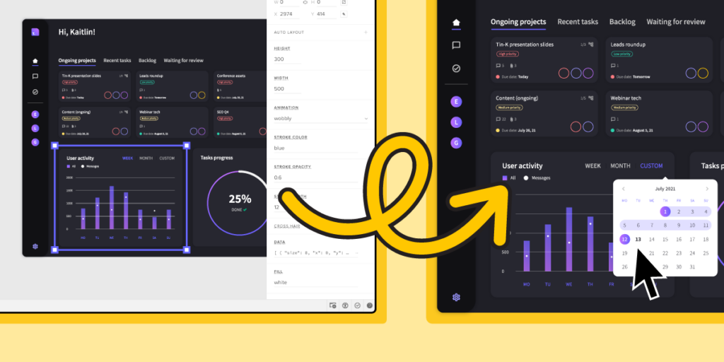
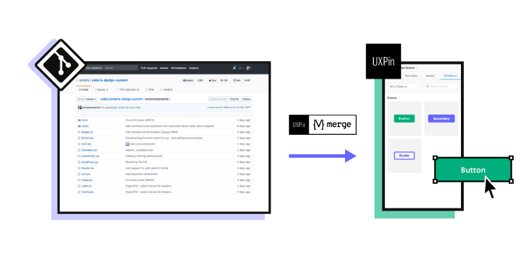
Design a web experiences that your users love. Use UXPin Merge to design a user interface of your web application and quickly translate it into code. Without designers. Discover UXPin Merge.

Design UI with code-backed components.

Use the same components in design as in development. Keep UI consistency at scale.

What is a Web App?

A web application is a type of software program designed to operate within a web browser. Unlike traditional desktop applications, which are launched by your operating system, web apps must be accessed through a web browser. They typically rely on a combination of web technologies, such as HTML, CSS, and JavaScript, to provide a user interface and deliver functionality to users.

Web apps have at least three advantages.

  • cross-platform compatibility — they can run on different devices and operating systems;
  • automatic updates — users don’t need to install updates manually since they access the latest version through the web;
  • easy access — users can access the app from any device with an internet connection.

What are the Types of Web Applications?

responsive screens

There are various types of web applications, which can be categorized based on their structure. One classification is between single-page applications (SPAs) and multi-page applications (MPAs). Additionally, web applications can be distinguished by their behavior and defined as static apps, dynamic apps, and Progressive Web Apps (PWAs).

Web applications can exhibit characteristics from both divisions, and the choice depends on the specific requirements and goals of the application. Modern web development often involves a combination of these approaches to provide the best user experience.

Single-page applications vs multi-page applications

If you consider a web app architecture, you can divide web applications into single-page and multi-page apps.

  • Multi-page applications are traditional web applications with multiple pages where each interaction with the server involves reloading the entire page.
  • Single-page applications are a type of web application that loads a single HTML page and dynamically updates the content as the user interacts with the app.

Instead of relying on the server to handle navigation, single-page applications often implement client-side routing. This means that navigation and page rendering are handled by JavaScript on the client side, reducing the need for server requests.

In multi-page web applications (MPAs), each distinct page has its own HTML document, and navigation typically involves full-page reloads. When a user clicks on a link or enters a URL, the server sends the corresponding HTML document to the browser, resulting in a complete page refresh.

Static vs dynamic vs PWA

Another categorization of web applications comprises static, dynamic, and web apps.

  1. Static web applications — websites that consist of static content and do not involve server-side processing. They are often used for informational purposes.
  2. Dynamic web applications – generate content on the server side and often involve server-side processing. They can fetch and update data in real-time.
  3. Progressive Web Apps — they combine features of both dynamic and static apps but PWAs provide a dynamic, app-like experience with offline capabilities, smooth interactions, and automatic updates.

Both single-page applications and multi-page applications can have static elements. In the context of single-page apps, static content may be loaded initially and then dynamically updated. In multi-page apps, some pages may consist of mostly static content.

Similarly, both single- and multi-page apps can be dynamic. Single-page applications, by design, often involve dynamic content loading and updating. In multi-page apps, dynamic behavior can be implemented within each page or during navigation between pages.

PWAs can be implemented within both single- and multi-page apps. The term “Progressive Web App” refers more to the set of features and capabilities rather than the specific structure. Both single-page and multi-page apps can adopt PWA principles, including offline functionality, fast loading, and app-like experiences.

3 Web App Examples

Examples of web apps include online email services (e.g., Gmail), social media platforms (e.g., Facebook), productivity tools (e.g., Google Docs), and various other applications that you access through a web browser rather than installing on your device. Here are three examples that are worth highlighting.

Spotify web app

spotify web player

Spotify is a music streaming service that provides users access to a vast library of songs, playlists, and podcasts.

The interface is organized around a left-hand navigation panel, including sections for Home, Search, Your Library, and more. The central area features personalized playlists, recommended music, and current listening activity. Users can search for specific songs or artists, create and manage playlists, and explore curated content.

The playback controls, such as play, pause, skip, and volume, are easily accessible at the bottom, and album artwork is prominently displayed. The overall design emphasizes a visually pleasing and user-friendly experience for music discovery and playback.

Google Drive

drive web app

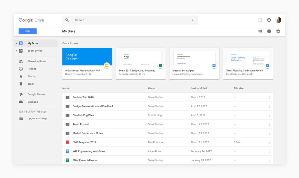
Google Drive is a cloud-based storage and collaboration platform.

The interface is clean and intuitive, featuring a left-hand navigation panel for easy access to folders, documents, and shared drives.

The main area displays the file and folder structure, and clicking on an item opens a preview or an editing interface, depending on the file type. The top bar provides options for creating new documents, searching, and managing settings.

Collaborative features are prominently displayed, allowing users to share and comment on files in real-time.

Amazon

amazon web app

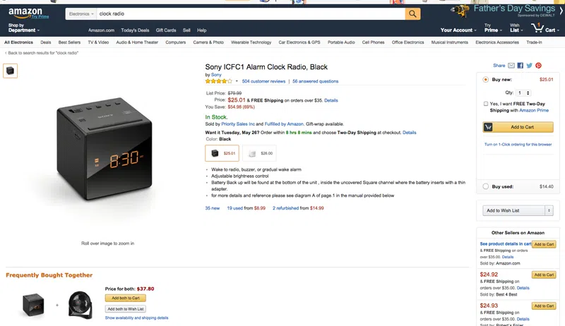
Amazon is a widely-used e-commerce platform that offers a diverse range of products, including electronics, books, clothing, and more. The interface is designed for intuitive navigation and efficient shopping.

The homepage typically features personalized recommendations, deals of the day, and quick access to various product categories. A persistent top navigation bar provides links to key sections like Your Account, Lists, and Cart. The search bar is prominently positioned, allowing users to quickly find specific products.

Amazon’s combination of a vast product selection, user-friendly interface, personalization, and additional benefits make it a great web application for online shopping.

What are the basics of web application development?

collaboration team prototyping

Before diving into the world of web app development, it is important to understand the basics of web development. Web development involves two main components: front-end and back-end development.

Front-end development

Front-end development focuses on creating the user interface and user experience of a web app. It involves HTML, CSS, and JavaScript, which are the building blocks of web design. HTML provides the structure, CSS enhances the visual appeal, and JavaScript adds interactivity to the web app.

Back-end development

On the other hand, back-end development deals with the server-side of the web app. It involves programming languages such as Python, Ruby, or PHP, and databases like MySQL or MongoDB. The back-end handles the logic and functionality of the web app, ensuring that data is processed and stored securely.

How to make a web app, step by step

Research your web app idea

Begin your project by making extensive research about target market, technology stack, and existing solutions. Define your goals, target audience, and desired features (read about: desirability, feasibility, and viability in design.) Conduct market research to identify any existing competitors and analyze their strengths and weaknesses by doing SWOT analysis.

It’s tempting to create a replica of existing web app. Nevertheless, it never ends well. You need to find a unique value for your market and differentiate your web app from the competition. This is usually achieved through making either a more complex or simpler product. Ben Evans has great presentations about that.

Plan your web app project

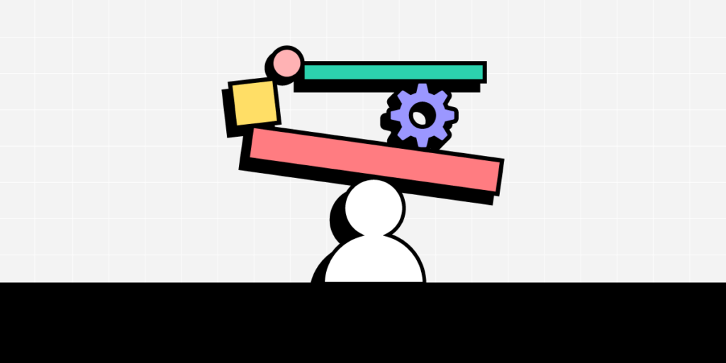
Effective planning is the foundation of a successful web app development process. Before starting any design or software development work, it is crucial to plan your workflow. Create a roadmap and allocate resources accordingly. Set realistic deadlines and milestones to keep yourself on track.

Define your Minimum Viable Product (MVP)

Instead of building a full-fledged web app right from the start, create an MVP to test if you can find customers for your solution. An MVP, or Minimum Viable Product, is a stripped-down version of a product that focuses on delivering the core features to users quickly. It’s an agile and iterative approach to software development, loved mostly by bootstrapped startups.

To define your MVP’s scope, there are at least three more tasks to do:

  • Define core problem – based on your research, articulate the main problem your web app is solving for users. Focus on the key pain points that your MVP should address.
  • List Key Features – identify and list the features to build. Prioritize these features based on their importance to the user and the overall functionality of the app.
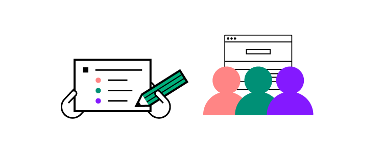
  • Create User Stories – develop user stories for each feature, describing how users will interact with them. This helps in understanding the user’s perspective and ensures that features align with user needs.

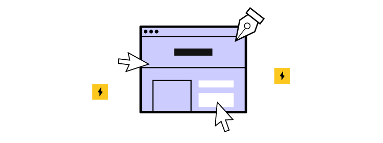
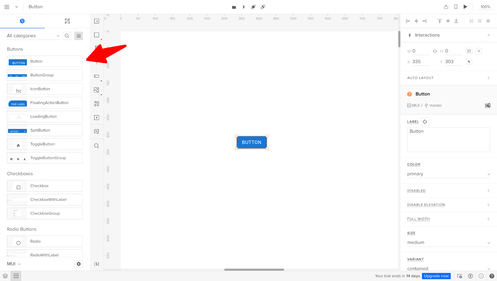
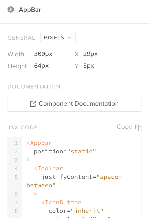
Design user interface

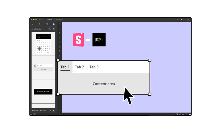
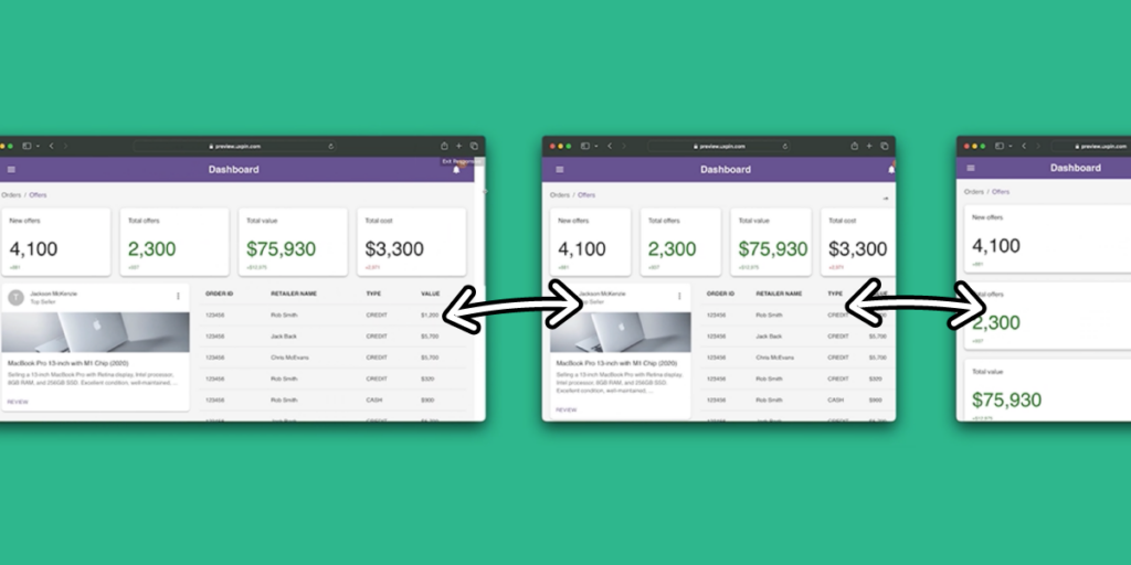
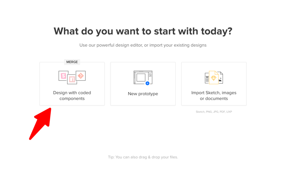
Create a wireframe or prototype of your web app to visualize the user interface and flow. This will give you a clear idea of how different components will interact with each other.

Here are some key principles to keep in mind while designing the UI of your web app:

  1. Navigation – users should be able to navigate through your web app easily. Avoid cluttered interfaces and prioritize simplicity. Use clear labels, icons, and menus to guide users.
  2. Consistency – maintain a consistent design throughout your web app. Use the same color scheme, layout and typography across different pages. This creates a cohesive user experience.
  3. Responsiveness – ensure that your web app is responsive and can adapt to different screen sizes. With the increasing use of mobile devices, it is essential to provide a seamless experience across all devices.
  4. Feedback and confirmation – provide immediate feedback to user actions. Use visual or auditory cues to confirm that an action has been completed successfully. This helps in reducing user uncertainty and provides a sense of control.
  5. Visual hierarchy – use visual cues like size, color, and contrast to prioritize important elements. This helps users to quickly scan and understand the content of your web app.
  6. User persona alignment – ensure that your UI design aligns with the preferences and expectations of your target user personas. Understanding your users’ habits and preferences helps in creating a more user-centric design.
  7. User onboarding – create a smooth onboarding process for new users. Provide guidance and tutorials to help users understand key features. Balancing simplicity with informative elements is crucial during the onboarding phase.
  8. Error handling – design clear and user-friendly error messages. When users encounter errors, provide guidance on how to resolve the issue. Avoid generic error messages and help users understand what went wrong.
  9. Whitespace utilization – use whitespace effectively to improve readability and avoid visual clutter. Well-spaced elements create a clean and organized layout, making it easier for users to focus on the essential content.

Remember to continuously gather user feedback and make iterative improvements to your UI design. User testing and usability studies can provide valuable insights into how users interact with your web app.

Developing the front-end of your web app

Once you have finalized the UI design, it’s time to start developing the front-end of your web app. As mentioned earlier, front-end development involves HTML, CSS, and JavaScript. As you remember from the content above, HTML provides the foundation of your web app. Use semantic HTML tags to structure the content and define the different sections of your web app.

CSS allows you to style your web app and make it visually appealing, while JavaScript brings life to your web app by adding interactivity and dynamic features like handling user interactions, validating input, and fetching data from the back-end.

Consider using front-end frameworks like React, Angular, or Vue.js to streamline the front-end development process. These frameworks provide pre-built components and libraries that can significantly speed up your development process.

Creating the back-end of your web app

Once the front-end is ready, it’s time to create the back-end of your web app. The back-end handles the server-side logic and communication with databases. Here are the steps to create the back-end of your web app:

  1. Set up a server – set up a server to host your web app. This can be done using cloud platforms like AWS, Google Cloud, or Microsoft Azure. Configure the server to handle incoming requests and route them to the appropriate parts of your web app.
  2. Implement the business logic – copy from the design or write the code that handles the core functionality of your web app. This includes processing user input, performing calculations, and interacting with databases.
  3. Connect to a database – choose a suitable database for your web app and establish a connection. This allows you to store and retrieve data efficiently. Common choices include SQL databases like MySQL or PostgreSQL, or NoSQL databases like MongoDB or Firebase.

Ensure that your back-end is secure by implementing robust authentication and authorization mechanisms. Protect sensitive user data and prevent unauthorized access to your web app.

Testing and debugging your web app

Testing and debugging are vital steps in the web app development process. Thoroughly test your web app to ensure that it functions as expected and is free from bugs and errors. Here are some testing techniques to consider:

  1. Unit testing – test each component or module of your web app individually to ensure that they work correctly. Use testing frameworks like Jest or Mocha to automate the testing process.
  2. Integration testing – test how different components of your web app interact with each other. Verify that data flows correctly between the front-end and back-end.
  3. User acceptance testing – invite a group of users to test your web app and provide feedback. This helps identify usability issues and potential improvements.

Debugging is the process of identifying and fixing errors or issues in your web app. Use debugging tools and techniques to trace the source of errors and resolve them. Continuous testing and debugging will ensure that your web app is stable and reliable.

Deploying and launching your web app

Once you are satisfied with the testing and debugging phase, it’s time to deploy and launch your web app. Deploying a web app involves making it accessible to users over the internet. Here are the steps to deploy your web app:

  1. Choose a hosting provider – select a hosting provider that suits your needs and budget. Popular options include AWS, Google Cloud, Heroku, and Netlify.
  2. Set up your domain – register a domain name for your web app and configure it to point to your hosting provider. This allows users to access your web app using a memorable URL.
  3. Deploy your web app – follow the hosting provider’s instructions to deploy your web app. This usually involves uploading your web app files, configuring server settings, and setting up SSL certificates for secure communication.
  4. Monitor and optimize performance – regularly monitor the performance of your web app and optimize it for speed and efficiency. Use tools like Google Analytics to track user behavior and identify any bottlenecks.

Maintaining and updating your web app

Launching your web app is just the beginning. To ensure its success, you need to maintain and update it regularly. Here are some key tasks involved in maintaining your web app:

  1. Monitor performance and security – continuously monitor your web app for performance issues and security vulnerabilities. Regularly update software libraries and frameworks to keep your web app secure.
  2. Collect user feedback – encourage users to provide feedback on your web app. This can help you identify areas for improvement and prioritize future updates.
  3. Fix bugs and issues – address any reported bugs or issues promptly. Regularly release bug fixes and updates to keep your web app running smoothly.
  4. Add new features – keep your web app fresh and engaging by adding new features and functionalities. Analyze user behavior and market trends to identify potential enhancements.

Make your web app

Creating a web app from scratch may seem challenging, but with the right approach and knowledge, anyone can do it. By understanding the basics of web development, planning your project, designing an intuitive UI, developing the front-end and back-end, testing and debugging rigorously, deploying and launching, and maintaining and updating your web app, you can bring your ideas to life.

Remember, the process of making a web app requires continuous learning and improvement. Embrace new technologies, stay updated with industry trends, and never stop experimenting. With dedication and perseverance, you can create a successful web app that fulfills the needs of your target audience.

Start your web app development journey today and bring your ideas to life. Design an interactive prototype 10x faster with UXPin Merge. Read about it here.

What is Operations Automation? [+ Examples to Try]

What is Operations Automation

Operations automation, at its core, entails the strategic incorporation of technology to streamline and optimize various business processes, marking a departure from traditional manual methods.

One of the hottest topics around automation efforts at companies is artificial intelligence. It helps in some areas of process automation, such as software development, identifying inefficiencies, analyzing data, and coming up with templates, but it still needs human intervention.

AI is just one facet of the vast landscape of operations automation. In this article, we delve into the world of automating repetitive tasks, exploring innovative approaches that extend beyond AI services. From ingenious solutions in enterprises to cutting-edge applications elsewhere, we discuss the most common use cases for operations automation.

Build a UI for your operations automation tool 10x faster. Try an easy drag-and-drop design editor that has you using fully coded components. Assemble an interactive prototype without the help of a designer and push it to code in seconds. Discover UXPin Merge.

Design UI with code-backed components.

Use the same components in design as in development. Keep UI consistency at scale.

What is operations automation?

Operations automation refers to the process of using technology to streamline and optimize various operational tasks within an organization. It involves automating repetitive and time-consuming processes, allowing businesses to increase efficiency, reduce errors, and improve overall productivity.

By leveraging the power of automation, companies can free up valuable resources, spend less time on manual work, and focus on more strategic initiatives.

Why do you need operations automation?

design and development collaboration process product

In today’s fast-paced business landscape, organizations are constantly striving to do more with less. With the increasing complexity of operations and the need to handle large volumes of data, manual processes can become a bottleneck. Operations automation can automate routine tasks, enabling employees to focus on more strategic work, and cut down operational costs. By reducing human error and improving accuracy, it can also enhance the quality of outputs.

The benefits of operations automation extend beyond efficiency gains. By automating repetitive tasks, businesses can enhance employee satisfaction by freeing up their time for more meaningful work. With less manual tasks eating up their time, employees have a clear mind to work on their skills and bring new innovative ideas to the table.

Organizations can scale their operations without a linear increase in resources, enabling them to handle growing demands efficiently. Moreover, operations automation provides real-time visibility into workflows, enabling better decision-making and faster response times.

The automation of business processes not only streamlines internal workflow but also plays a pivotal role in enhancing the overall customer experience. By automating repetitive tasks and processes, organizations can improve response times, accuracy, and customer satisfaction.

How can you identify operations to automate?

designops picking tools options

Identifying the right operations to automate is crucial for a successful automation initiative. Here are some steps to help you identify the most suitable processes for automation:

  1. Evaluate repetitive tasks: Identify tasks that are performed repeatedly and consume a significant amount of time and resources. These tasks are prime candidates for automation as they can free up valuable resources.
  2. Assess error-prone processes: Look for processes that are prone to human error. Automating these processes can significantly reduce errors and improve overall accuracy.
  3. Consider scalability: Consider processes that are likely to scale with the growth of your business. By automating these processes, you can handle increased volumes efficiently without adding additional resources.
  4. Analyze process dependencies: Identify processes that are dependent on other processes or systems. Automating these interdependent processes can streamline the overall workflow and improve coordination.
  5. Evaluate ROI potential: Assess the potential return on investment (ROI) of automating a particular process. Look for business processes where automation can lead to significant cost savings or revenue growth.

Example 1: Automations in Project Management

Project management is a critical function for any organization, and automating certain aspects of it can yield substantial benefits. Here are some real-life examples of operations automation in project management:

  1. Task assignment and tracking: Automating the assignment of tasks to team members and tracking their progress can save significant time and effort. By leveraging workflow automation, organizations can ensure efficient resource utilization.
  2. Reporting and analytics: Generating project reports and analyzing data manually can be a time-consuming and error-prone process. Automating these tasks can provide real-time insights and keeping up with metrics, enabling better decision-making and timely interventions.
  3. Communication and collaboration: Automating communication and collaboration processes can improve project team coordination. Tools like project management software and instant messaging platforms can automate notifications, reminders, and document sharing, ensuring seamless communication and collaboration.

See our tutorial of how to build a responsive dashboard in UXPin Merge for examples of UI for this automation.

Example 2: Automations in Helpdesk

Customer support and helpdesk operations can greatly benefit from automation. Here are some examples of how operations automation can transform helpdesk operations:

  1. Ticket management: Automating ticket creation, routing, and escalation can significantly improve response times and customer satisfaction. By leveraging helpdesk automation tools, organizations can ensure that tickets are assigned to the right agent based on predefined criteria, reducing manual intervention.
  2. Knowledge base management: Maintaining an up-to-date knowledge base is crucial for efficient customer support and fast client onboarding. Automating the management of the knowledge base, including updating articles and searching for relevant solutions, can save time and improve the accuracy of information provided to customers.
  3. Self-service options: Automating self-service options, such as chatbots, can provide instant assistance to customers. These automated systems can handle common queries and provide relevant information, freeing up support agents for more complex issues.

Example 3: IT Operations

IT services play a vital role in supporting business operations, and automation can revolutionize IT processes. Here are some examples of operations automation in IT services:

  1. Incident management: Automating incident management processes can improve response times and minimize downtime. By leveraging IT service management tools, operations teams can automate incident ticket creation, routing, and resolution, ensuring efficient incident resolution.
  2. Change management: Automating change management processes can reduce the risk of errors and ensure compliance. By using change management tools, organizations can automate change approvals, notifications, and documentation, streamlining the entire change management process.
  3. Asset management: Automating asset management processes can enhance visibility and control over IT assets. By leveraging asset management tools, operations teams can automate asset discovery, tracking, and lifecycle management, improving resource allocation and minimizing inventory discrepancies.
  4. IT infrastructure: IT operations automation empowers DevOps management to efficiently manage complex networks and systems with minimal manual intervention.

What should you consider when implementing operations automation?

Implementing operations automation requires careful planning and consideration. Here are some key considerations to keep in mind:

  1. Process optimization: Before automating a process, it is essential to optimize it to ensure maximum efficiency. Identify areas for improvement, eliminate redundancies, and streamline workflows.
  2. Change management: Introducing automation solutions may require changes in workflows, roles, and responsibilities. Communicate the benefits of automation and provide onboarding for employees.
  3. Data security and privacy: As automation involves handling sensitive data, it is important to ensure robust security measures are in place, deploying data encryption, access controls, and regular audits to protect confidential information.
  4. Continuous improvement: Automation is not a one-time effort but an ongoing process. Regularly review and analyze automated processes to identify areas for improvement and optimize performance.

What are best practices for operations automation?

To ensure a successful operations automation implementation, consider the following best practices:

  1. Start small: Begin with automating a small, well-defined process to gain confidence and showcase the benefits of automation. Starting small allows for easier troubleshooting and adjustment before scaling up.
  2. Collaborate with stakeholders: Involve all relevant stakeholders, including employees, managers, and IT teams, in the automation initiative. Their input and feedback can provide valuable insights and ensure a smooth implementation.
  3. Test before implementing: Prior to introducing new solution, test if what you’re building makes sense. Test the proposed solution and make sure that employees find it intuitive and user-friendly. To see if your solution is the right one, build a functional prototype of it, using a tool like UXPin Merge.
  4. Measure and track success: Establish key performance indicators to measure the success of automation. Regularly monitor and analyze the impact of automation on efficiency, productivity, and customer satisfaction. Use these insights to make data-driven decisions and further optimize automated processes.
  5. Stay updated: Stay abreast of the latest automation technologies and trends. Regularly evaluate new tools and solutions to ensure that your automation initiatives remain up-to-date and aligned with industry best practices.

Embrace operations automation

By embracing automation, organizations can streamline their operations, enhance efficiency, and improve customer satisfaction. Real-life examples of operations automation in project management, helpdesk, and IT services demonstrate the transformative power of automation.

What areas of your businsess do you want to automate? Why don’t you create a prototype of your solution using UXPin Merge? It’s a drag-and-drop UI builder that makes it easy for developers to design intuitive and pretty UIs without designer’s help. Give it a shot. Discover UXPin Merge.

Top 10 Design Handoff Tools to Try in 2024

Design handoff tools facilitate smoother transitions from design to development. These tools provide engineers with practical documentation, high-fidelity prototypes, and features to communicate and collaborate effectively.

Without an effective design handoff process, designers and engineers spend hours, days, or even weeks of back and forth trying to bridge the gap between design and development.

Streamline your design handoffs by designing with the same components that your developers use to build the end-product. UXPin Merge allows you to bring components from npm, Storybook, or Git repo and drag and drop them in the editor to assemble advanced prototypes. Learn more about UXPin Merge.

Reach a new level of prototyping

Design with interactive components coming from your team’s design system.

UXPin Merge

With UXPin Merge, you can design and hand over code-based high-fidelity prototypes built with React or Storybook components. This single source of truth enables designers and engineers to work with the same UI elements which speeds up time to market.

Once prototypes are ready, designers share them with engineers who using the Spec mode can see the documentation, style guide, comments, as well as copy the JSX code of components that’s fully usable in development.

Since UXPin Merge makes you design with components that are fully coded, you can be certain that you get quality code and no miscommunication.

Check out Design Handoff: What it Looks Like with UXPin Merge for a detailed look at how Merge can optimize your design process and handoffs.

Zeplin

Zeplin is a popular design handoff tool making it easy for designers, engineers, and other team members to communicate and collaborate effectively. It integrates with collaboration tools like Jira, Slack, Trello, and Microsoft Teams.

With Zeplin, designers can create user flows with annotations to provide engineers with context. A style guide allows designers to save colors, text styles, spacing/layouts, design tokens, and components.

The tool also includes code snippets and other styling so engineers can use to kickstart development.

Marvel

Marvel is a popular design tool with similar design handoff features to Zeplin. You can use Marvel-generated mockups to build prototypes or import from other popular design tools.

Marvel generates starter code and CSS from mockups to save time and bridge the gap between design and development. Engineers can inspect each component and download assets from Marvel, avoiding miscommunication and switching between tools.

Sympli

Sympli is a purpose-built version control and design handoff tool. You could say that Sympli is the designer equivalent of the component directory Storybook.

team collaboration talk communication

It integrates with popular prototyping tools to sync UI elements and design systems. Teams can review and collaborate on different elements to provide explanation and context.

Engineers can also view a style guide, spec mode, and specs and assets to start the development process. One of Sympli’s biggest benefits is its ability to sync with IDEs through plugins for Xcode and Android Studio for mobile app development.

Avocode

Avocode creates a design handoff file for the development team. Its “one-click” integrations save designers time by generating downloadable assets, spec mode, and snippets for ten code languages.

Another great feature is Avocode’s design review, allowing designers to invite other teams and stakeholders to critique designs and provide feedback. Designers can iterate on feedback and resync the changes creating a new version so that everyone is aware of the updates.

Design teams can use Avocode’s review feature to discuss inconsistencies and fixes.

InVision

InVision offered their clients Inspect – a design handoff tool that automatically generated design specs and code snippets. Nevertheless, you can’t use InVision for design handoff in 2024. The tool was shut down in January 2024.

If you’re looking for a replacement for InVision, try UXPin Merge – it has a similar suite of integrations and solves major design handoff isssues.

Framer

Framer is a leayout design tool with a code editor to sync and edit React components–a fantastic feature for developers but doesn’t help designers with limited code knowledge and experience.

Designers can’t edit the component’s props in the properties panel as they would in UXPin. Instead, they have to make changes in Framer’s code editor–again, not ideal for those with limited code knowledge.

settings

Designers can, however, use these React components for prototyping and testing, giving designers better fidelity and functionality than other popular image-based tools.

Framer’s high fidelity and functionality make design handoffs smooth and efficient. Engineers can copy code from React components to build new products and UIs.

While Framer’s code-based design technology is excellent for React products, it lacks features for other popular front-end frameworks that UXPin’s Storybook integration provides.

Spectrr

Spectrr is a design specification tool with automated annotations for engineers to inspect components and layouts, including colors, fonts, spacing, and more.

Designers can include notes for each component and instructions for creating responsive layouts. Spectrr also generates a complete CSS file for the project, giving engineers an excellent starter template to begin development.

Adobe XD

Adobe XD got discontinued. It was a widely used UX design and prototyping tool. Designers can hand off to engineers via Adobe XD’s Share feature, including specifications and CSS starter code.

Designers and engineers could collaborate using comments and Adobe XD integrated with popular project management software like Jira, Slack, Microsoft Teams, and others. 

Adobe XD’s Share feature was limited by comparison to other design handoff tools, but you could sync designs to Zeplin for more features and better collaboration.

Figma

Figma is arguably one of the most popular design tools. The original release was similar to Sketch but has since evolved to offer prototyping and testing functionality.

In Figma’s Share Mode, engineers can inspect elements and generate code snippets for web, iOS, and Android. You can also install third-party plugins to generate code for frameworks like React, Flutter, Vue, Ember, Angular, etc.

Figma allows you to add “developer seats” to your design projects, so you don’t have to pay to invite and collaborate with engineers. They have complete access to the project and provide feedback through Figma’s comments feature.

UXPin is a code-based tool that renders HTML, CSS, and Javascript rather than vector files like traditional image-based design tools. The benefit for designers and developers is less drift and realistic designs and expectations.

Why are Design Handoffs so Challenging?

One of the biggest design handoff challenges is prototype fidelity and functionality. Designers must use various tools and methods to replicate code-based features–for example, GIFs and videos to display transitions and animations.

Unrealistic Expectations

The problem with these methods is that they don’t have technical constraints, creating unrealistic expectations for designers and product teams. They’re also not part of the actual prototype, so engineers have to go from a prototype to an external file to watch the video animation and see how it all fits together.

Poor Image-Based Tools for Rendering Code

Another issue is converting a design to code. Most image-based design tools offer plugins or applications that generate an HTML template with accompanying CSS. Designers think this is sufficient, but engineers can’t replicate the designs with this code–the two teams are speaking different languages with insufficient interpretation.

Technical Constraints

Another cause of design drift is the rendering engine of the browser or device displaying your product. The most common example is the drift between colors and gradients from mockups to final code.

Too Many Design Handoff Tools

And lastly, design handoffs often include multiple tools for design files, prototypes, documentation, assets, and collaboration. With everything spread across different locations and platforms, handoffs are prone to mistakes and errors.

These are just a few common design handoff challenges that cause friction between design and development. Many of these issues will be familiar if you’re experienced with the handoff process. Luckily, there are design handoff tools to help expedite and streamline the process.

Better Design Handoffs with UXPin Merge

Why use multiple design handoff tools when you can do everything with UXPin Merge? Streamline design workflows, build fully functioning prototypes, enhance collaboration, and improve your product’s user experience with a single tool. Try UXPin Merge to see how easy product development gets when everything is connected. Request access now.

Product Design Trends for 2024

Product design trends

Every year we’re sit down to observe products’ UIs to determine the trends to come. This year was no different. By looking closely at the trending products, we can pinpoint some trending design patterns and solutions. Let’s discuss them.

Build interactive user interfaces without developers’ help. Try UXPin – a collaborative design tool that allows you to include real interactions. From the push of a button, to complex multi-step forms, give a UXPin a shot on a free trial. Try UXPin for free.

Build advanced prototypes

Design better products with States, Variables, Auto Layout and more.

Try UXPin

There are so many unique, quirky, and engaging graphic design trends this year that we battled to narrow them down. Here are our top product design trends for 2024.

Coded design systems

In 2024, designers will embrace coded design system more. As the new version of Porsche Design System has seen the light of day, more and more designers will see the value of having their design system be integrated with code. They will adopt tools like Storybook and make sure their design system meets user needs of their development team too.

Artificial intelligence

Who haven’t heard about AI in 2023? 2024 will be a year of AI as well. With Google releasing Gemini to updates of ChatGPT, AI will stay on our lips. AI tools have heavily impacted the world of design. Designers can use in research (competitive analysis, user research), artifacts creation, and UX optimization (A/B testing, segmentation, accessibility measurement.)

AI-driven design will be also a thing. A lot of tools are adding AI to their set of features to give designers more time to focus on what matters. Check out how you can use ChatGPT in UI design.

Brutalist typography

Brutalist typography is characterized by a raw, straightforward, and often unadorned approach to typefaces. Popular first in industrial design, the term “Brutalist” originates from the French word “brut,” meaning raw or raw concrete, and this is a feeling that you get when looking at a brutalist typography.

These typefaces are rather simple. Decorative elements, such as serifs or embellishments, are typically minimal or absent. The focus is on clear and direct communication through the use of basic letterforms. Think bold and geometric shapes. The emphasis is on strong, visible letterforms as a stand-alone design elements.

Demand for conversational UI design

The increasing popularity of ChatGPT and advancements in similar conversational AI contributes to a growing demand for chatbot design and conversational UI design. For that reason, it’s important to know how to design an high-quality user interface for that purposes.

Users are becoming accustomed to conversational interfaces that offer seamless interactions. Chatbots, powered by advanced language models, can provide more human-like and contextually relevant responses, raising user expectations for intelligent and responsive digital conversations.

As the use of advanced chatbots becomes a competitive differentiator, businesses are increasingly investing in well-designed chatbot experiences to enhance their brand image, stay competitive in the market, and meet evolving customer expectations.

User-initiated interactive animations

In 2024, interactive animations take center stage as dynamic, motion-driven elements within user interfaces. The goal is to inject dynamism, intuition, and visual allure into UI design. Designers deliberately create surprising microinteractions and animations that are initiated by a user instead of always playing in the background.

Users are empowered to incite these interactive marvels through a range of actions, such as:

  1. Clicking or Tapping: Many interactive animations are triggered by a user clicking a mouse or tapping on a touchscreen device. For example, a button may have a hover effect or change in size and color when clicked.
  2. Hovering: Hover effects occur when a user moves their cursor over an interactive element without clicking. This can reveal additional information, change the appearance of an element, or trigger a subtle animation.
  3. Scrolling: Animations can be tied to the user’s scrolling behavior. As the user scrolls down a webpage, elements may appear, disappear, or transition in response to the scroll action.
  4. Gestures: On touch-enabled devices, gestures such as swiping, pinching, or rotating can trigger interactive animations. This is common in mobile apps and interfaces designed for touch interactions.
  5. Form Inputs: Interactive animations can be associated with form inputs. For instance, a form field might expand or display additional options when the user clicks on it, providing a more interactive form-filling experience.
  6. Voice Commands: In interfaces with voice recognition capabilities, users can provoke interactive animations through voice commands. This is more common in virtual assistants and voice-activated applications.
  7. Interactive Elements: Certain elements within an interface may inherently respond to user interactions. For example, a draggable slider or a collapsible menu can be considered interactive elements that provoke animations when manipulated by the user.

User-initiated interactive animations help to create an illusion of a friendly product and boosts brand identity.

Sustainability

Design can solve real-world problems. In the context of app and web design, sustainability is the practice of creating products in a way that minimizes their environmental impact and ensures long-term viability. This approach takes into consideration various aspects of the design and development process to promote a more eco-friendly and socially conscious digital products.

Key elements of sustainability in app and web design include:

  1. Energy Efficiency: Sustainable design aims to reduce the energy consumption of digital products. This includes optimizing code, minimizing unnecessary features, and employing efficient hosting and server practices. By doing so, designers contribute to lower energy usage and reduced carbon footprints.
  2. Minimalism in User Interfaces: Reducing the number of elements in UI contributes to sustainability. How? A minimalist design approach often leads to lighter, faster-loading websites and apps, which, in turn, require less data transfer and energy consumption.
  3. User-Controlled Animations: Providing users with the option to control or disable animations and other resource-intensive features can contribute to a more sustainable experience. This puts the user in control of their data usage and device performance.
  4. Modular Design: Adopting a modular design approach allows for more scalable and flexible systems. This means that updates and additions can be made without significant disruptions, reducing the resource consumption.
  5. Optimized Images and Media: Compressing and optimizing assets reduce the overall file size of a website or app, leading to faster load times and decreased data transfer. This not only enhances user experience but also minimizes the energy required for content delivery.

Immersive experiences

Immersive design refers to the practice of creating digital experiences that deeply engage users and provide a sense of presence within a virtual or augmented environment. This design approach aims to captivate users by leveraging technologies such as Virtual Reality (VR) and Augmented Reality (AR) to create rich, interactive, and realistic user experiences.

Yes, VR and AR continue to be trends in the world of design. For those of you who don’t know, Virtual Reality is a computer-generated simulation of a three-dimensional environment. Augmented Reality, on the other hand, overlays digital information, such as images, text, or 3D models, onto the real-world environment.

Unlike VR, Augmented Reality does not replace the real world but enhances it by adding digital elements that users can perceive through devices with a camera.

AR has its practical application in eCommerce. It helps users to visualize products in their real-world environment before making a purchase decision. For instance, trying out furniture in one’s living room using an AR app.

It can also be used for educational purposes by overlaying informative content onto real-world objects. This interactive learning experience enhances engagement and understanding.

Virtual Reality found its application in the HealthTech. From pain management and optimizing surgical procedures to gamifying physical therapy, VR is proving a diverse array of use cases.

Particularly notable is its potential to transform the field of behavioral health, as supported by extensive research on its efficacy. VR is actively employed in the treatment of various conditions such as anxiety, post-traumatic stress disorder (PTSD), substance use disorders, and autism.

If you want to create a user-friendly UI for VR or AR, read our guide.

Take Your Product Design to New Heights With UXPin

Code-based design is revolutionizing UX workflows and changing the way designers approach design. With UXPin’s advanced features, product teams can create high-fidelity prototypes that accurately replicate code-based products.

Here are four UXPin features that designers can use to enhance prototypes:

  • States: Apply multiple states to a single element or component, each with different properties, interactions, and animations.
  • Interactions: Create complex interactions with advanced animations and conditional formatting.
  • Variables: Capture and store user inputs and use that information to take actions or personalize a user experience.
  • Expressions: Create fully functioning forms, validate passwords, update shopping carts, and more with Javascript-like functions.

Sign up for a free trial and see how UXPin can optimize design processes, enhance prototyping and testing and create beautiful product experiences for your customers. Try it now.

Calculator Design – How to Prototype a Functioning Calculator with a Design Tool

Calculator design

Calculators break down complex numerical problems into user-friendly solutions. This guide dives deep into calculator UI design, navigating its multifaceted dimensions, from types and fundamental principles to the nuances of mobile vs. desktop design. We also explore how designers can use React components in the design process to test complex calculator functionality.

Key takeaways:

  • Effective calculator UX design seamlessly merges utility with user experience, enhancing user engagement.
  • The type of calculator—simple, scientific, financial, or graphing—dictates its application and targeted user base.
  • Core design principles, such as simplicity, consistency, and intuitive layout, underpin successful calculator interfaces.
  • Adapting calculator designs across devices, from mobile to desktop, demands unique considerations like touch inputs and cross-platform consistency.
  • Leveraging React components in the design process through platforms like UXPin Merge offers dynamic interactivity, bridging the design-development gap.

How do you design interactive calculator prototypes using React components without writing a single line of code? Discover how UXPin’s Merge technology bridges the gap between design and development to significantly enhance prototyping capability for better testing and outcomes.

Reach a new level of prototyping

Design with interactive components coming from your team’s design system.

What is the Function of a Calculator in UI Design?

Calculators help users do instant, on-the-spot numerical computations. Its primary function is to offer users a streamlined interface to input data, perform operations, and see results without leaving the primary application or platform

Digital products rely on key UX metrics like engagement, completion rate, etc. When needed, presenting users with a calculator UI improves these vital metrics, increasing the product’s business value while serving user needs.

Types of Calculators in UI Design

There are four types of calculators designers can use:

  • Simple
  • Scientific
  • Financial
  • Graphing

Simple calculator

Common use cases:

  • Meal planning apps (calculating total ingredients)
  • E-commerce platforms (quick price additions or subtractions)
  • Note-taking tools (swift arithmetic on written content)

The simple calculator handles standard arithmetic operations—addition, subtraction, multiplication, and division. Designers use this type when embedding a quick calculation feature in applications like note-taking tools or basic finance apps.

Scientific calculator

Common use cases:

  • Educational apps for high school and college students
  • Engineering applications (computing formulas or solving equations)
  • Physics or chemistry simulators (calculating reactions or forces)

The scientific calculator aids complex computations, from trigonometry to calculus. It’s essential for applications targeting students, engineers, or professionals dealing with scientific tasks.

Financial calculator

Common use cases:

  • Mortgage calculators in real estate platforms
  • Salary calculators in job portals
  • Investment calculations in stock trading apps
  • Loan interest and payoff calculators in banking apps

Financial calculators help with operations like interest calculations, annuities, or ROI evaluations. Designers embed these in banking apps, investment platforms, or e-commerce sites to assist users in making informed financial decisions.

Graphing calculator

Common use cases:

  • Educational platforms teaching algebra, calculus, or statistics
  • Market trend analysis tools in stock and forex trading platforms
  • Research tools for data scientists visualizing complex datasets

A graphing calculator visualizes mathematical equations, showcasing graphs and plots. Predominantly found in educational tools or advanced analytical platforms, it allows users to grasp trends, intersections, or data relationships through visual representations.

What are the Principles of Good Calculator App UI Design?

screens process lo fi to hi fi mobile 1

Simplicity and clarity:

Users require a straightforward interface to easily input data and get results without unnecessary options or distracting visuals.

Example: Apple’s native calculator app focuses on essential functions. Users can instantly understand and use a clean, minimalist layout without wading through extraneous features.

Consistency in design

Uniform button shapes, colors, and typography facilitate swift navigation and reduce cognitive load.

Example: Apple’s calculator iOS app groups arithmetic operators–addition, subtraction, multiplication, and division–by colors, allowing users to identify and apply them without thinking.

Intuitive layout

An intuitive layout draws from familiar calculator designs and arranges functions logically, aiding rapid data entry and function application.

Example: Financial calculators often position compound interest or annuity functions prominently, reflecting their frequent usage in monetary contexts.

How to Design a Calculator’s Layout & Structure

Grid layout and the arrangement of keys

Establish a grid layout to ensure logical button placement. This foundational design aspect arranges buttons systematically, with most calculators displaying characters in a recognizable four-column by five-row grid. When users see this familiar format, they don’t have to think about how to use it.

Hierarchy of operations and functions

Prioritize operations based on frequency of use. Positioning common operations, such as arithmetic operators, at easily accessible points optimizes user experience. This approach ensures that primary functions stand out, guiding users seamlessly through their tasks.

Importance of spacing and grouping

Implement precise spacing between keys to minimize accidental presses. Group functions by similarity to aid swift location and use. Users can intuitively navigate and select the needed operations when you group related buttons, such as all trigonometric functions.

Designing for different screen sizes and devices

Adapt your calculator design for versatility. A responsive design adjusts and optimizes its layout depending on the device–i.e., smartphone, tablet, or desktop. Ensure your calculator remains user-friendly and maintains its functionality regardless of screen size.

How to Use Visual Design to Improve Calculator User Experience

design and development collaboration process product communication 1

Color psychology in calculator design

Choose shades that invoke precision, reliability, and clarity, such as blues and grays. Complementary colors can differentiate functions, while muted tones minimize distractions. Always prioritize user comfort and focus.

Typography and readability

Select typography that enhances legibility. Fonts with clean lines and ample spacing ensure users can quickly discern numbers and functions. Consider weight and style variations to distinguish between primary actions and secondary information.

Iconography for functions

Craft icons that immediately convey purpose. Simplify complex ideas into recognizable symbols, ensuring users identify functions at a glance. Uniformity in icon style and size promotes a cohesive look and avoids misinterpretation.

How to Enhance Your Calculator UI with Advanced Features and Functionality

testing compare data

Memory functions and history logs

Memory functions and history logs help save users time by storing calculations for later use, allowing for quick reference or modifications. For example, a financial analyst working on yearly projections might use memory functions to save critical figures and easily refer back to them, streamlining their workflow.

Custom themes and personalization

Custom themes and personalization options enhance the comfort of prolonged usage. For example, a user might switch to a dark theme to reduce eye strain.

Integrating AI and voice recognition

AI and voice recognition integration accelerate input and aid in accessibility. For example, with their hands occupied in a lab, a researcher might voice a complex formula and, with AI assistance, receive instantaneous results and scenarios, optimizing productivity.

How Calculator User Interface Design Differs for Mobile vs. Desktop

Designing for touch vs. mouse/keyboard inputs

For touch, prioritize larger, discernible buttons, ensuring they’re tap-friendly. Conversely, you can optimize for precision for mouse and keyboard-driven interfaces with compact layouts and keyboard shortcut functionalities.

Utilizing mobile features

Integrate haptic feedback to confirm input or signal errors, providing a tactile response for mobile app users. Harness gestures like swiping to clear entries or pinching to toggle between basic and scientific modes to streamline user interactions.

Optimizing cross-platform user experience

Users should transition seamlessly between mobile, desktop, or wearables (iOS, Windows, Android, etc.) without relearning the interface. Utilize unified native and web design principles, maintain consistent functionality, and prioritize data synchronization for those using multiple devices.

Calculator UI Design Inspiration

Here are five calculator designs we found on Dribbble.

Example 1: Simple calculator design by Hikmet Atceken on Dribbble.

We like how Hikmet uses the full screen for this simple calculator example. There is adequate spacing between buttons, and Hikmet uses subtle colors to differentiate functionality and hierarchy.

Example 2: Neuromorphic design by Mariana Konstantynova on Dribbble.

Mariana’s savings calculator uses a trendy neomorphism style–perfect for targeting a younger audience. This aesthetically pleasing UI catches the eye, encouraging engagement.

Example 3: Mortgage calculator design by Paramveer on Dribbble.

Paramveer’s mortgage calculator is an excellent example of incorporating many features and functionalities into a compact viewport. Paramveer uses a mix of mobile-friendly components, like sliders and buttons with large touch targets, to optimize the mobile experience.

Example 4: Good example of using color by Ramona Tăbuşcă on Dribbble.

Ramona uses color brilliantly to allow for consistency in light and dark modes. The calculator’s functionality is separated into three distinct color groups, making it easy to identify which buttons to press.

Example 5: Mortgage calculator design by LLT Group on Dribbble.

The LLT Group’s mortgage calculator is an excellent example for users on large screens. The use of whitespace, hierarchy, font size, and color makes it easy for users to identify key values and digest data instantly.

How to Improve Calculator Prototypes With React Components in the Design Process

While image-based design tools like Figma or Sketch are powerful UI design tools, the designs are fundamentally static. These tools can visualize the calculator’s aesthetics but fall short of simulating its intricate interactivity. Creating an effective interactive calculator takes hours of prep and setup–taking valuable resources from actual prototyping and testing.

UXPin is a code-based tool. Instead of producing vector graphics, UXPin renders HTML, CSS, and Javascript behind the scenes. Designers can also import live components from React, Vue, Ember, and other Javascript-based libraries via Storybook–including foundational elements, patterns, interactive widgets, and UI templates.

Using React components in the design process via UXPin Merge proves pivotal for complex, interactive applications like calculators. React’s component-based structure means every UI element is modular and reusable, allowing for real, live interactions within UXPin–without writing any code

This dynamic interactivity mimics the final product much closer than any static design tool can. As calculators demand immediate and precise feedback to user inputs, such real-time functionality testing becomes indispensable, ensuring that design and function align seamlessly.

Using React’s live components in UXPin via Merge bridges the gap between design and development, letting designers test actual functionalities in real-world scenarios. This difference accelerates the design-validation loop and reduces the chances of oversight, ensuring a robust and user-friendly calculator app design.

Go from static and time-consuming to fully interactive, fast, and effortless with UXPin and Merge technology. Visit our Merge page for more details and how to request access.

App Icon Design – 5 Amazing Ideas from Tech Companies

App icon design

One of the most critical choices any app development company will make is the design of the app icon. Good icons are inviting and will increase interaction, while a bad design can slow down adoption and make users less likely to use it. Their first impression will be your app’s icon – it’s what they’ll first see from whatever store they first download your newly-released product, and it’s what they’ll look at every time they launch it. 

Getting the right depiction is not just nice to have; it’s essential if you want your app to be successful. Fortunately, when it comes to crafting icons, there are plenty of places and companies from which to draw inspiration. In this article, we’ll talk about what five top tech companies are doing for app icon design – and what you can learn from these amazing designers.

Key takeaways:

  • App icon design needs to meet a combination of criteria, including aesthetics, functionality, brand representation, and platform-specific considerations.
  • When considering designing your own icons, consider tips by top companies, such as Apple’s emphasis on simplicity or Microsoft’s Fluent Design System balancing innovation with legacy.

Build advanced prototypes

Design better products with States, Variables, Auto Layout and more.

Try UXPin

What is App Icon Design?

App icon design involves creating the perfect icon for your app. It often encapsulates the app’s brand, purpose, and primary features, distilling these elements into a simple, memorable image. Consider color choice, shape, and scalability factors when designing an app icon. 

Furthermore, designers must keep in mind platform-specific guidelines. iOS, Android, and other operating systems have unique design standards to ensure a coherent user experience. We’ll discuss those in more detail when we look at what popular tech companies do for their app icons. 

In essence, app icon design is a blend of aesthetics, functionality, and brand representation, all confined within a small visual space. Given its impression on users and the limited pixel space, getting the best app icon design is crucial.

What Top Companies Say about App Icon Design?

When it comes to design, there’s a lot to learn from the top tech companies as they often employ some of the highest-talent designers on the market. And their market leader position means they usually can set some of the trends. Here’s what Apple, Microsoft, IBM, Atlassian, and Google are doing for app design.

1. Apple

Many people regard Apple as the leader in design. From iconic devices to amazing apps, countless companies look to them for inspiration. Like many platform developers, Apple lists their best practices online. In terms of icon design, here are the three key takeaways from the brand.

First, simple is better. Think about all the memorable icons you’ve seen. Let’s take Facebook or Twitter’s old logo. These are simply a bird and an “f,” respectively. Now, think about Apple’s designs. Apple Music, for example, is nothing but a couple of notes. Each of these icons embraces simplicity. Remember, these graphical depictions tend to be pretty small on user devices. Crafting intricate details gets lost quickly. Great app icon design is bold and recognizable – it’s simple and easy to spot in a sea of apps. Think about how you can make your icon design process result in something simple!

Next, remove text, if possible, or at least keep it to a minimum. Only include text if it is a vital part of your brand. Too many people want to include a company name or a tagline, but that’s often hard to read, especially on smaller devices. Keep your app icon graphical, if possible.

Finally, consider your platform and create alternate app icons if necessary. What looks good on iOS with the rounded corners may not look as good on Android with the circular design. By considering (and tailoring your app icon, too) the platform, you’ll create a unique but unified experience, no matter where people use your app.

2. Microsoft

Microsoft’s Fluent Design System encapsulates the future of user interface and experience design, all while ensuring a profound connection with the company’s historical roots. Regarding app icon design through Fluent, there’s an evident synthesis of past, present, and future – something that designers of modern apps should consider!

Fluent-based icons go beyond mere aesthetics. While they embrace depth, light, motion, and materiality for a modern and interactive user experience, there’s a foundational respect for Microsoft’s legacy. The challenge lies in striking a balance: how does one innovate while respecting and recalling the iconic imagery from earlier software generations? Microsoft wanted to create a facelift for their products while keeping much of that history. Here are a couple of rules they applied: 

Going beyond monochrome. Microsoft’s answer is layered and dynamic icons that nod to the past. These icons maintain familiarity, ensuring long-standing users feel at home while drawing new users with their contemporary look. Color palettes resonate with both legacy themes and modern design paradigms. The textures and materials are current and modern but reminiscent of a tactile, real-world experience.

Balancing legacy with innovation. If your company is not entirely new, there’s much to learn from what Microsoft did with Fluent. In the design process for your app icon, nodding to your company’s history while simultaneously conveying your company’s fresh, new app is vital. By looking at what Microsoft did with Fluent, you can see how to balance that rich history while conveying the bold future you want for your app and company.

3. IBM

People may not think of IBM when they think of apps, but they have developed a compelling design system called the IBM Design Language. Designers should consider a few things that IBM has noted, as these concepts serve as guidelines for our app icons. 

Central to their icon design philosophy is the categorization into four distinct groups: “stroke” and “fill” icons, hero brands, third-party logos, and the unique IBM Plex app icons. This concept hints at something very critical for app icon design – space. Is your icon a stroke icon? A fill one? How are you using the app icon’s available space, or are you using negative space? These are essential considerations.

Additionally, IBM applies the same grid for all icons. Designers craft every IBM icon on a pixel-based grid measuring 32px x 32px for uniformity. This serves as a foundational guideline, ensuring each piece of artwork snaps perfectly into place. However, designers are encouraged to make fine-tuning adjustments during creation to achieve the desired shape.

IBM also maintains icon consistency by creating icon groups. This is vital if you have more than one app because it lets people subtly know that your company is behind all of them. It is not just IBM that does this, of course – so do Apple and Microsoft. You can often tell which company is behind an app just by looking at the icon!

If you’re a designer, it’s worth flipping through the IBM Design Language, as it has many fantastic pointers to achieve the perfect design.

4. Atlassian

As is often the case with any visual art form, various designers and companies have different perspectives. Atlassian emphasizes some things the previous companies have not mentioned – accessibility and avoiding inundating users.

In today’s modern world, accessibility is not a nice to have. It’s a must. Ensure your app’s icon is accessible. This means it should adhere to WCAG contrast ratios and there should be no text with unfamiliar icons. You want people to immediately grasp what your icon and app are about, regardless of their abilities. 

Additionally, Atlassian also encourages people to avoid going overboard with icons. Keep them simple and clean to minimize “icon fatigue.” People look at dozens of app icons daily, and if yours is too visually cluttered or intricate, they will tune out from your app rather than lean into it.

5. Google

Like all the companies above, Google also significantly emphasizes its icons through Material – Google’s app icon design system. While Material has numerous paradigms, three that designers should consider stand out.

First, think about color. The Material guidelines specify which colors to use for active and inactive icons. Additionally, you should differentiate between active and focused versus just active. Designers often leave out the focused state, especially for apps with touch capabilities. 

Next, make complex icons legible. As the companies above note, these must be readable, and Google is no exception to this policy. If you need to adjust icons to ensure they are legible and clear, do so, even if they are system icons.

Finally, Google’s system icons with Material are bold, symmetrical, and minimal. They convey just the amount of information necessary for the user to determine what the action behind the icon does. This design principle is worth considering with your app icon design.

For example, the icons below show just enough information to convey their meaning without being overly complex.

Use UXPin to Prototype Your App Icons

UXPin is the leading solution for crafting user interfaces and prototyping apps. It is also one of the best ways to prototype your app icons and see how users will react to them before finalizing every single little detail across multiple platforms. As you can likely see from the examples above, companies put tremendous thought into app icons to ensure they convey the right message and feel for an app.

If you’re in the design phase for your app, try UXPin for free and prototype your perfect app icon!

The Code-Based Adobe XD Alternative – UXPin Merge

AdobeXD Alternative

Overwhelmed by the plethora of Adobe XD alternatives? Are you looking for an upgrade to Adobe XD rather than a copy of your existing workspace? Discover why UXPin is the best Adobe XD alternative and the benefits of using a code-based design platform. We also introduce Merge and how this revolutionary technology bridges the gap between designers and engineers while creating a single source of truth for design systems.

Key takeaways:

  • Adobe XD was a prominent vector-based design tool, but its standalone version is no longer available for new buyers.
  • Consider intuitive UI, prototyping capabilities, design systems, collaboration features, and cost-effectiveness when seeking an Adobe XD alternative.
  • UXPin Merge is a great choice, offering advanced code-based design capabilities over traditional vector-based tools.
  • Unlike many Adobe XD alternatives, UXPin Merge addresses challenges across the product development spectrum, streamlining workflows for all stakeholders.

Connect design and development teams with a single source of truth – coded components that can be used across prototyping, design handoff, and app development stages of product creation. Learn more about it. Discover UXPin Merge.

Reach a new level of prototyping

Design with interactive components coming from your team’s design system.

What is Adobe XD?

Adobe XD is a vector-based UI/UX design software developed and maintained by Adobe. It caters to web and mobile app design, an end-to-end solution for designers to create wireframes, mockups, and prototypes.

Some noteworthy features include:

  • Vector Design and Drawing Tools: Adobe XD enables designers to create and edit intricate vector designs, ensuring sharp outputs regardless of the display size.
  • Repeat Grid: This feature streamlines design processes. Designers can replicate elements like lists or photo galleries with a few clicks, reducing tedious, repetitive tasks.
  • Prototyping: Designers can link artboards, adding animations and microinteractions to mimic interactivity. 
  • Voice Design: Adobe XD supports voice commands, making designing voice user interfaces and integrating voice triggers possible.
  • Responsive Resize: Automatically adjust and resize elements to fit different screen sizes, ensuring designs look good on all devices.
  • Collaboration Tools: Adobe XD isn’t just for solo designers. Teams can comment, share, and co-edit in real time with in-app collaboration tools.
  • Integration Capabilities: It seamlessly integrates with other Adobe Suite applications and some third-party tools, bridging the gap between prototype and final output.

Is Adobe XD Discontinued?

Contrary to speculation on social media, Adobe has not discontinued Adobe XD. While it’s no longer available as a single application for new buyers, it will continue supporting existing customers. You must purchase the Adobe Creative Cloud All Apps subscription to access Adobe XD as a new customer.

What to Look for in an Adobe XD Alternative?

If you’re an avid Adobe XD user, then you’ll want a design tool that’s comparable or better. Here’s a breakdown of essential aspects:

  • User-Friendly UI: Design tools should simplify, not complicate. An intuitive interface speeds up the design process, reduces learning curves, and increases efficiency.
  • Prototyping Capabilities:
    • Real-time Previews: Witness design changes as they happen.
    • Interactive Prototyping: Add life to prototypes with interactive elements, microinteractions, and animations.
    • Responsiveness: Your tool must allow you to create multiple viewports for designs with minimal effort.
  • Design Systems: A must-have feature in modern digital product design. Guage a design system feature by its ability to bridge the gap between designers and engineers.
  • Collaboration Features:
    • Commenting: Offer insights directly on designs.
    • Sharing: Distribute prototypes for feedback.
    • Real-time Collaboration: An integrated chat feature allows design teams to collaborate without leaving the workspace.
  • Design Handoff: A seamless transition curtails back-and-forths between design and development teams. Look for tools that generate accurate specs, assets, and code snippets.
  • Platform Integration: Integration capabilities mean less juggling between applications, promoting a unified workflow.
  • Cost-effectiveness: A stellar design tool won’t drain budgets. Opt for solutions that offer robust features without a hefty price tag, ensuring value for every dollar spent.

What’s an Alternative to Adobe XD?

While vector-based tools like Adobe XD, Figma, and InVision have dominated the design scene for years, there’s a notable shift towards code-based platforms like UXPin. 

With UXPin’s Merge technology, designers can go beyond basic prototypes to advanced code-based replicas that look and feel like the final product. Some advantages of using Merge and code-based design platforms include:

  • Realistic Interactive Prototypes: Code-based tools like UXPin mirror the final product, allowing designers to get high-quality insights from testing.
  • Dynamic Elements: Unlike static elements in vector-based tools, UXPin has live code UI components with states, styling, logic, and real data.
  • Seamless Handoff: Designers and developers speak the same language based on code via Merge, creating a smoother workflow with seamless handoff and fewer revisions.
  • Superior Performance: Merge components have complex interactions and animations without lag or stutter, accurately replicating a final product experience.
  • Desktop and Web Applications: Designers can use UXPin’s desktop application offline (Windows and MacOS) or web app with a comparable user experience in both environments.
  • All Features Built-in: UXPin is a full-stack design tool with everything designers need from concept to final delivery, eliminating the need for plugins, extensions, and other third-party apps and subscriptions.

How is UXPin Used for Prototyping?

Merge creates a drag-and-drop prototyping environment in UXPin–like Logo blocks for designers. Every component has styling, interactivity, content, and other properties programmed into it from the design system’s repository, ready to start prototyping.

The design system team can include foundational UI elements to complete screen templates so designers can build prototypes faster. Any API components with connections are also available for designers to use in UXPin.

The design system team uses React props (or Args for the Storybook Integration) to give designers access to component properties, like text styles, sizing, colors, interactivity, and more.

Designers grab a component from UXPin’s Design System Libraries and adjust its properties via the Properties Panel. They can also switch to JSX mode to view and make changes in code.

Testing in UXPin with Merge

These fully interactive prototypes increase prototyping scope, allowing designers to build and test complex interfaces and user flows that usually require technical input from devs.

Designers can test prototypes in the browser using Preview and Share or UXPin Mirror for native iOS and Android app testing. They can send stakeholders a link to view the prototype and share feedback by annotating using UXPin’s Comments.

“Our stakeholders are able to provide feedback pretty quickly using UXPin. We can send them a link to play with the prototype in their own time, and UXPin allows them to provide comments directly on the prototypes. UXPin’s Comments functionality is great because we can follow along and mark comments as resolved once we address them.” Erica Rider, Product, UX, and DesignOps thought leader.

How is UXPin Used for the Design Handoff?

Design handoffs with Adobe UX and other vector-based design tools are notoriously challenging, often fraught with friction and many calls with designers trying to explain mockups and prototypes to devs and developers trying to explain technical limitations to design teams.

UXPin’s Merge technology smooths the transition from design to development because every team and department works with the exact same component library, from the exact same repository. This single source of truth means design handoffs require less documentation and explanation.

Engineers simply import the component repository into their project, copy interfaces from UXPin, and apply the same component properties using props or Args.

How is UXPin Used for Design Systems?

UXPin offers a design system solution for every stage of maturity, from creating a design system to a fully integrated UI library using Merge technology where designers and engineers use the same components.

Merge enables organizations to sync a UI library from a repository to UXPin’s design editor so designers use the same design system components in the design process as devs use to develop the final product.

Any changes to the repository automatically push to UXPin and notify teams of the latest release. UXPin’s Version Control allows designers to decide when they switch to the new release, and they can revert to earlier versions whenever they want. 

This code-based approach to design systems gives organizations a real single source of truth, where every team uses the same UI library, and powerful Merge automation keeps everyone in sync with a single release–no need to update code and design separately.

How is UXPin Used for Collaboration?

UXPin’s Comments are perfect for modern digital product design where teams work asynchronously. Slack and Jira integrations keep cross-functional teams in sync and constantly updated.

Comments functions like a chat app within UXPin. Team members can assign comments and mark them as resolved once actioned. Email notifications keep everyone updated. Designers can invite stakeholders to collaborate in UXPin, even if they don’t have an account, reducing the need to purchase extra seats.

Why UXPin Merge Beats the Best Adobe XD Alternatives

Where do Zeplin, Proto.io, Marvel, Figma, and other Adobe XD alternatives get wrong? These graphic design, prototyping, and editing tools focus on optimizing the designer workflow and UI design, neglecting other vital stakeholders and interactivity prototyping.

UXPin and Merge technology benefit the end-to-end digital product development process, including designers, product managers, engineers, DesignOps, and DevOps, by facilitating a single source of truth for cross-functional teams.

While there are many Adobe XD alternatives, UXPin is the only platform that solves many product development challenges by bridging the gap between design and development.

Are you still working with image-based tools with multiple platforms to achieve code-like results?

Switch to UXPin and instantly sync design and development with a single full-stack product design solution. Visit our Merge page for more details and how to request access.

UX Architect vs. UX Designer – What’s the Difference?

A UX Architect is a person responsible for the structure of the product and user flow. She or he works on the verge of UX design and engineering. This role has emerged as the UX space is continually growing and evolving, with new UX roles and departments popping up from time to time.

We’ll explore what a UX architect does, and the roles and responsibilities for UX designers and UX architects differ and overlap. At the end of this article, we provide a brief overview of how UXPin can help UX teams collaborate effectively.

Key takeaways:

  • UX architect is a hybrid role that sits in between design and engineering.
  • UX architects build information architecture, create wireframes, and take care of technical feasibility of the project.
  • They differ from UX designer in that they have engineering skills and they prioritize clear information architecture.

UXPin is a collaborative tool for UX experts that helps them design better UIs that are fully interactive, responsive, and accessible. Sign up for a UXPin trial today.

Build advanced prototypes

Design better products with States, Variables, Auto Layout and more.

Try UXPin

Who is a UX Architect?

A user experience architect is essentially a UX specialist with a high-level view of a product or design. UX architects are concerned with the structure and flow based on in-depth user and market research.

To achieve this, UX architects will often work closely with research teams or even conduct research themselves. This research guides UX architects to make informed decisions about how a user will use the product and organize the information architecture accordingly.

What Does a UX Architect Do?

Here’s a brief outline of a UX architect’s responsibilities:

  • Ensure the product fulfills the user’s needs
  • Makes sure information is organized and easily accessible
  • Fixes usability and accessibility problems

Organizing Content

Rather than creating content and assets, a UX architect organizes and arranges content to best serve the user. This organization falls into three categories:

  • Content inventory—a list of all the product’s digital content.
  • Content grouping—a logical structure for organizing the product’s content, defining the relationships between different pieces of information and how they all connect.
  • Content audit—a regular review of the product’s content to determine what needs updating and if new content is required.

UX architects must organize the content on each page and determine where to add titles, subheadings, links, and navigation to help users find what they’re looking for.

Hierarchy, Sitemaps, and Navigation

Information architecture arranges a product or website’s hierarchy, sitemaps, and navigation. These crucial elements determine how easy and accessible an app or website is to use.

  • Sitemap – all of the app or website pages.
  • Hierarchy – how to arrange a page’s content in order of importance.
  • Navigation – how a user moves through an app or website.

Internal Wireframing & Low-Fidelity Prototyping

UX architects create wireframes and low-fidelity prototypes for internal UX teams to use as an architectural reference for designing a product or website. 

UX teams will only use these mockups for design purposes and usually won’t use them for usability studies or sharing amongst stakeholders.

Who is a UX Designer?

A UX designer is a broad term encompassing design and research roles. But in the context of a UX designer vs. a UX architect, the designer is responsible for designing user interfaces. Ultimately, a UX designer makes a product usable.

A UX designer will take a UX architect’s wireframes, prototypes, and architectural instructions and turn them into a high-fidelity prototype that resembles the end-product the most out of every design deliverable. UX designers also work with UX researchers as well as content designers to determine which fonts, colors, buttons, and other design elements to use.

Persona Development

UX designers are responsible for early research and creating user personas. Larger organizations might have a dedicated UX researcher or team, but they still fulfill a UX design role.

User personas tell UX designers about the user’s demographic information, motivations, desires, potential responses, and more to design user interfaces that accommodate these user needs.

Wireframes, Mockups, and Prototypes

UX designers create wireframes and mockups for the product’s pages and flows with initial user research and the UX architect’s information architecture.

UX designers also look at the UX architect’s sitemap to link the pages and navigation to make working low-fidelity and high-fidelity prototypes.

Research teams will use these high-fidelity prototypes for usability studies to learn how users interact with the final product.

User Testing

Where companies don’t have a dedicated research team, UX designers conduct the necessary usability studies. This crucial part of UX design provides UX designers with valuable feedback on how users will interact with the final product.

With the results from usability studies, UX designers tweak their designs to improve the user experience.

The Main Differences of UX Architect and UX Designer

The most significant difference between a UX architect and a UX designer is that the UX architect looks at the bigger picture while the UX designer focuses on the details.

The UX architect focuses on navigation and user flows while the UX designer creates the user interfaces and interactions for each screen or page.

While both UX architects and UX designers review research, the UX architect considers what features and content the user needs. In contrast, the UX designer wants to know how the user will interact with these elements.

We can summarize the roles of a UX architect vs. a UX designer as follows:

  • UX architect – who are the users, and what do they need?
  • UX designer – who are the users, and how do we meet their needs?

How UX Architects & UX Designers Work Together

It’s important to note that a UX designer performs the UX architect’s responsibilities in many companies, especially small businesses. 

Where these roles are split, the UX designer is often referred to as a UI designer (user interface designer) because they focus on the interfaces and interactions. 

A UX architect is a UX specialist in information architecture rather than focusing on design.

UX architects and UX designers work closely on content. The UX designer focuses on the content’s details while the UX architect decides how to structure the content. To get this right, designers and architects must work closely together.

A Typical UX Architect & UX Designer Workflow

The following workflow is a broad overview to show the separation of responsibilities between a UX architect and a UX designer. 

  1. A project will start with a UX architect analyzing market and user research to determine what the project needs and how to structure the content—similar to an architect designing a physical structure.
  2. The UX architect puts together a blueprint (wireframes & prototypes) for the UX designer to start the build process.
  3. The UX designer analyzes user research and the UX architect’s blueprints to start designing each user interface.
  4. The UX designer will create wireframes, mockups, and high-fidelity prototypes for stakeholders and usability studies.
  5. During usability tests – the UX architect wants to know how the user accesses content and navigates through the product. The UX designer wants to see how the user interacts with the elements and content on each screen.
  6. Once a product is live – the UX architect’s job is to ensure accurate and up-to-date content. They will also look at accessibility issues and recommend updates accordingly. The UX designer will take the UX architect’s recommendations and analyze interaction data to optimize each screen to best serve the user.

Does Your Company Need a UX Architect & a UX Designer?

With each team focusing on different design aspects, separating the UX/UI designer and UX architect roles can improve the quality and efficiency of a product or website.

There might not be enough work for a dedicated UX architect for smaller projects and cash-strapped startups. It’s important to note that UX designers are capable of fulfilling a UX architect’s role.

As projects scale, information architecture becomes complex and time-consuming to manage. In situations like this, a UX architect is critical to a project’s success.

While agencies generally work in small teams, they often work on multiple apps and websites for clients. Having a UX architect can help to streamline productivity by handing UX designers all the information they need to start building immediately—effectively creating a tech production line.

Businesses should ask a series of questions to determine if they need a UX architect:

  • How much time do UX designers spend on building layouts and information architecture?
  • Do these tasks create production delays?
  • Do users often struggle with navigation issues in usability studies?
  • What is the cost of a dedicated UX architect in relation to the benefits from an increase in quality and efficiency?
  • Does your product frequently struggle with usability and accessibility issues?
  • Is someone monitoring your product’s content? Do you regularly find out-of-date content or unused product features?

UXPin Increases Productivity for UX Teams

UXPin is a powerful design tool for UX teams to build better products collaboratively. UX architects can use UXPin to create layouts, wireframes, and lo-fi prototypes, with comments for guidance and context.

UX designers can use this information to design beautiful screens and interfaces with mockups to present to stakeholders and use for usability studies.

Get a free UXPin trial and see how this design tool can help your UX teams collaborate effectively to build better products for your customers. Try UXPin today.

Design System Engineer – Job Description, Responsibilities, and Skills

design system engineer

Design System Engineers don’t just bridge gaps; they ensure a smooth transition from pixel to code. This comprehensive guide digs deep into what a DSE does, the skill set required, and how they fit into the product development cycle. Whether you’re an aspiring DSE, a hiring manager, or just intrigued, read on to unravel the multifaceted role of a Design System Engineer.

Key takeaways:

  • A Design System Engineer is the crucial link between designers and developers, standardizing UI components and design guidelines.
  • Beyond code and design, DSEs play an active role in quality assurance, documentation, and cross-team collaboration.
  • Mastery of front-end development languages like HTML, CSS, and JavaScript, as well as design tools like Sketch and Figma, is essential for a DSE.
  • DSEs are instrumental throughout the product development cycle, ensuring design systems are consistently implemented and updated.
  • Familiarity with version control systems like Git and frameworks like React enhances a DSE’s ability to manage and scale design systems effectively.

Bridge the gap to serve designers and engineers more efficiently with UXPin’s Merge technology. Visit our Merge page for more details and how to request access.

Reach a new level of prototyping

Design with interactive components coming from your team’s design system.

Who is a Design System Engineer?

A Design System Engineer ensures a seamless transition from visual concept to functional code. 

DSEs curate and maintain the design system, a centralized repository standardizing UI components and design guidelines. They share the responsibility of code with developers and user experience and design principles with the UX design team.

DSEs have a broad skill set from design tools and design thinking to writing code (HTML, CSS, and Javascript) and using front-end technologies (React, Vue, Angular, etc.). DSEs are the go-to experts for design system’s consistency, component’s structure, and cross-team collaboration within a design system team. They keep the design and development workflows cohesive and streamlined.

How is a DSE different from a UX designer or front-end engineer?

Filling all three roles, designer, developer, and design system engineer, facilitates a seamless transition from a user’s need to a functional, well-designed product. Each position complements the other, ensuring that nothing falls through the cracks.

  • UX Designers: focus on the overall user experience of the product. Their realm is user-centric design, not code.
  • Developers: turn designs into functional applications. They may or may not have a deep understanding of UX principles.
  • Design System Engineers (DSE): DSEs bridge the gap between design and development. They implement design systems, ensuring consistency and scalability across products.

How these three complement each other in developing and maintaining a design system:

  • User Insight: UX designers bring invaluable user insights, guiding the team on what works best for the end-user.
  • Technical Implementation: Developers make sure everything runs smoothly under the hood. No user insights or design systems matter if the application doesn’t work.
  • Design Scalability: DSEs ensure that design remains consistent and easily implementable across different parts of a project. They allow both design and engineering teams to work more efficiently.

What are a Design System Engineer’s Responsibilities?

  • Create and Update Design System: Build the foundational design system and keep it updated to ensure it aligns with project requirements.
  • Quality Assurance: Implement automated testing for UI components to guarantee they meet design and functionality standards.
  • Documentation: Produce clear, actionable guidelines that help designers and developers understand the design system.
  • Version Control: Use tools like Git to manage changes, ensuring every update is adequately tracked and documented.
  • Code Reviews: Participate in code reviews to ensure adherence to design guidelines and code quality.
  • Cross-Team Collaboration: Act as the liaison between the design and development teams, ensuring design principles are implemented accurately in code.
  • Training: Conduct workshops and training sessions to familiarize team members with the design system’s components and best practices.
  • Tool Integration: Set up and maintain tools like Storybook that facilitate easier design system implementation.
  • Performance Optimization: Regularly audit the design system to remove redundancy and improve load times.
  • Stakeholder Communication: Regularly update stakeholders on the state of the design system, any changes made, and how it impacts projects.

What Skills Does a Design System Engineer Need?

While the design system engineer is a specialist role, their skill set must be broad to meet the position’s multifaceted demands. Here are the hard and soft skills you’ll need to be a design system engineer.

Hard Skills

  • Front-End Development: HTML, CSS, and JavaScript are non-negotiable. It’s the bedrock for implementing a robust design system.
  • Frameworks and Libraries: Familiarity with React, Angular, or Vue is often required, given that these technologies power modern web applications.
  • Version Control: Proficiency in Git is another non-negotiable for tracking and managing design system changes.
  • Design Tools: Competency in Sketch, Figma, or UXPin facilitates collaborating with design teams to create and modify UI components.
  • Automated Testing: Skills in Jest, Mocha, or similar testing frameworks guarantee the design system’s quality and reliability.
  • Accessibility Standards: Understanding WCAG guidelines ensures the design system is inclusive and legally compliant.

Soft Skills

  • Communication skills: Clear articulation of complex technical ideas to designers, developers, and stakeholders makes everyone’s life easier.
  • Attention to Detail: Minor visual or functional inconsistencies can derail a project. Accuracy is key.
  • Problem-Solving: Design systems are complex, requiring an ability to troubleshoot issues swiftly and effectively.
  • Collaboration: The role sits at the intersection of design and development; teamwork skills are crucial.
  • Time Management: Juggling design, development, and stakeholder meetings means strong organizational skills are essential.

What is a Design System Engineer’s Role in the Product Development Cycle?

DSEs ensure that design and functionality merge into a coherent, scalable product throughout the product development cycle. They act as the bridge between different departments, ensuring the design system remains consistent and up-to-date.

Inception phase

During the idea validation and planning stage, DSEs assess potential design systems or components that can be reused or adapted. They work closely with product managers and designers to define the design system’s scope, feasibility, and technical requirements.

Design phase

DSEs actively collaborate with UX/UI designers in design critiques and offer technical guidance on implementing design systems without compromising functionality.

For example, when a UX designer proposes a new button style, a DSE ensures the design fits existing patterns and is easily implementable in code.

Development phase

DSEs turn approved design elements into reusable code components. They also provide documentation to facilitate implementation by developers.

For example, if a designer creates a new card layout, the DSE transfers it to code, makes it a reusable component, and documents how to implement it in different scenarios.

Post-launch

After release, DSEs monitor design system components’ usage and make updates for scalability and performance. Additionally, they collect feedback for continuous improvement.

For example, analytics indicate a navigation component is not as intuitive as expected, DSEs work with the designers and developers to optimize it.

How to Become a Design System Engineer

Educational and career steps to becoming a design system engineer

  1. Earn a Bachelor’s Degree (+- 4 years): Usually in Computer Science, Graphic Design, or a related field.
  2. Learn Relevant Skills: Parallel to your degree, master HTML, CSS, and JavaScript, and familiarize yourself with design tools like Figma, UXPin, and Sketch.
  3. Entry-Level Position: Start as a Junior Developer or Designer, typically requiring 1-2 years of experience.
  4. Specialized Training: Take specialized courses in Design Systems or UX/UI Design–a few months to a year.
  5. Mid-Level Role: Move to a role like Front-End Developer or UX Designer.
  6. Gain Experience in Design Systems: In your mid-level position, focus on projects that allow you to work with design systems.
  7. Transition to DSE: With adequate experience and a strong portfolio, transition into a Design System Engineer role.

Growth prospects for a design system engineer

  • Lead Design System Engineer: Lead projects and teams. Requires at least 2-3 years as a DSE and proven leadership skills.
  • Design Systems Manager: Oversee multiple projects and multiple design systems. Requires 4-6 years of specialized experience.
  • Director of Design or Engineering: Reach the pinnacle by heading an entire department. Generally requires 10+ years in the field and extensive leadership experience.

What are a Design System Engineer’s Tools of the Trade?

Here’s a breakdown of essential tool categories and examples for a DSE. Familiarizing yourself with these tools will help your career prospects and enhance your understanding of this complex role.

Version control systems

  • Git: The gold standard for version control, essential for tracking changes and collaborating with others.
  • SVN: Less popular than Git but valuable in certain enterprise environments.

Design tools

  • Sketch: Offers powerful design functionalities; however, it’s Mac-only.
  • Figma: Cloud-based and collaborative; allows real-time changes.
  • UXPin Merge: Unique in allowing design and code components to be combined and reused.

Programming languages and frameworks

  • HTML: The building block for web development.
  • CSS: Critical for styling and layout.
  • JavaScript: Enables interactivity and controls web behavior.
  • React: A go-to library for design systems due to its component-based architecture and cross-platform efficiency.

Utilizing UXPin Merge and React to Design, Develop, Maintain, and Scale Design Systems

Building and maintaining a design system is a complex, time-consuming undertaking involving a multi-disciplinary team and a vast tool set. UXPin and Merge technology combined with your framework (React, Vue, Angular, and other popular front-end technologies) simplify design system management and governance while bridging design and development.

A single source of truth

The holy grail of design system maturity is a single source of truth, but few organizations ever reach this stage–even though they claim to possess one. High costs and tool constraints mean most design systems maintain two versions:

  • Design tool UI kit
  • Development component library

Design and development must have platform-specific documentation, adding to maintenance and costs.

Merge facilitates a genuine single source of truth by importing UI components from a design system repository into UXPin. This integration means designers use the same UI library during the design process as engineers use to develop the final product.

Any changes to the repository automatically sync to UXPin and notify design teams of the update. Merge’s Version Control lets designers choose when to switch to the latest release or revert to an older version.

Using UXPin’s Patterns to scale design systems

Design system engineers can collaborate with design teams to scale design systems using UXPin’s Patterns. Rather than starting from scratch, Patterns allows designers to combine UI elements from multiple design systems to create new component, pattern, and template prototypes.

Designers can test these Patterns thoroughly in UXPin before working with DSEs to promote the new component to the design system’s library. 

Smoother design handoffs for design system engineers

Design handoffs are one of the biggest product development challenges. Even with a DSE’s competency on both sides of the fence, the process of converting designs to code is time-consuming and error-prone.

Using code components for design and development streamlines the handoff for design system engineers. Creating new components with Patterns means design teams never have to design from scratch, leveraging existing open-source libraries to scale while making it easy for DSEs and developers to implement.

If UXPin Merge and design system engineers have one thing in common, it’s bridging the gap between design and development.

Simplify your design system management with the world’s most advanced design tool. Visit our Merge page for more details and how to request access.

What is a Component Library, and Why Should You Use One for UI Development?

What is a component library

When optimizing development across many platforms, it’s wise to consider using a component library. By offering an accessible, open-source repository of production-ready, customizable, and reusable code components—like buttons and accordions—component libraries let UI and UX designers leverage faster development and growth.

Key takeaways:

  • A component library is a set of pre-made, tested, and well-documented UI components that can be easily reused across the user interface of a product.
  • It ensures that the product has a consistent look and feel and promotes efficiency and scalability.
  • With component libraries, designers and developers can quickly add new features and pages while preserving the overall design consistency.

Share a single source of truth between designers and engineers. Use UXPin Merge to bring one of the component libraries to our design tool and use its elements to create interactive prototypes that can be easily passed to developers for production. Learn more about UXPin Merge.

Reach a new level of prototyping

Design with interactive components coming from your team’s design system.

What is a Component Library?

UI component library is a collection of pre-designed and pre-built user interface elements used to create user interfaces for digital products, such as websites and applications that have a unified look.

These libraries include a range of pre-made UI elements, such as buttons, forms, navigation menus, icons, and more, each designed with a consistent look and feel.

UI component libraries are particularly useful in collaborative design and development environments, as they help ensure that all team members are using the same source of truth and that the end product maintains a professional and polished appearance.

Component Library Can Offer a Single Source of Truth

Component library can reduce the risk of any variation between products, or ending up with different components in different places. They handle the source code for UI elements and usually leverage CSS and JavaScript.

React is a prime example of a popular open-source framework, developed by Facebook as a component library but since grown into a large ecosystem for creating apps, static sites, and desktop applications.

There are many more advantages of using a component library that are worth highlighting: 

  • Accessibility: As a single repository for housing ready-made, reusable components, a component library offers quick access to developers and designers everywhere. This improves collaboration and communication between developers and designers working across teams.
  • Reduced code duplication: Often, code gets duplicated across varying designs and projects. But with a component library, there’s no need to convert every pixel to code. Instead, you can use already coded components with no further development.
  • Consistency: Promoting a single source of truth is more likely with a component library. By enabling consistent UI and UX across entire projects, it’s easier to achieve uniformity. And this is a key advantage that makes you work faster and more efficiently.
  • Speed: By avoiding building from the bottom up, teams save time. Instead of recreating or designing a calendar, it’s already there to use. Plus, thanks to a set of ready-made, pre-set components, teams can avoid any drawn-out, time-draining decision-making processes they may have once faced. 
  • Compatibility: Frontend developers can struggle with ensuring cross-browser and cross-device compatibility. But a component library will go a long way to avoiding incompatibility through standardization.

When Is It Best to Use a Component Library?

There are some particular situations where a component library can add measurable value to a project. So let’s look at what they are: 

Code-first prototyping

Projects that focus on functionality over visual design are more likely to benefit from a component library. Plus, prototyping with code is more efficient than starting with images and then converting them into code. So rather than expecting developers to interpret image-based designs and then create the codes, they simply take the code component from the ready-made design.

This also opens up the chance for developers to design with pre-built components without worrying about any lack of design skills.

When you lack the skills or experience to build your own

Creating your own component library or developing one as part of your own enterprise design system may be your dream. But this may not be a reality when your team lacks experience in building reusable UI components or you’re working to tight project deadlines. 

Instead, integrated component libraries provide all the code components designers and developers need to test functionality, usability, and design before conversion to digital products.

If you’re a smaller company or team

Startups and small or medium-sized businesses may need to be more careful with financial resources. And with a wide range of effective, versatile, open-source component libraries around, smaller companies can set themselves up to scale, step by step. After all, no industry giant got there overnight. And many of them continue to stick with their original component library throughout their evolution.

There Are Some Exceptional Tools Available to Help You Scale 

If it’s not yet clear how you’ll benefit from a component library, then here are some questions that could prompt your thinking:

  1. Do you see developers building the same components for each project but with slight variations?
  2. Are any developers confused about which UI or UX convention they should use in interfaces?
  3. Do you need to release updates and changes fast?
  4. Do you need a lot of customization?
  5. Are you looking for a combined design system and component library?

If the answer to any of these questions is yes, then consider one of the tools below.

1. Merge Component Manager

Merge Component Manager is a design operations tool for managing React UI components in UXPin. You can bring your own component library and use Component Manager to manage component’s properties. It’s perfect for those of you who lack active development support.

Once you upload UI components, you can use them to design UI in UXPin. The components have their full interactivity in UXPin since they’re coded in React.

2. Merge npm integration

One of the ways to bring UI components from your component library to UXPin is through NPM package integration. All you need to import the components is a library name. Then, you would use Merge Component Manager to set up props and write desicriptions, etc. Read more about npm integration.

3. Merge Storybook integration

Storybook is an open-source tool for developing UI components in 15 different frameworks, among others the most popular ones: React, Vue, and Angular. It’s a combined coded design system and component library that acts as a sandbox for effective components and page development, testing, and documentation. Your developers can take a more effective component-driven approach over a visual one.

As Storybook is used by developers, there’s an integration with UXPin that can help you with designing as well.  With UXPin Merge technology, you can sync any Storybook with UXPin editor to design with code components. The fully functional UI elements will show up in one of the UXPin libraries so that you have access to them right away. 

Be the First to Design with Code Using Innovative Merge technology

Component libraries offer the chance to standardize development, reduce code duplications, improve collaboration between teams, and drive scalability. And with so much influence over your project deliverable and team motivation, it’s important to choose the right solution for your needs.

But if you’re looking to improve design consistency and development productivity, UXPin’s Merge technology offers a unique point of integration with Storybook, as well as its own tool, Merge Component Manager for managing components in design. Discover more about UXPin Merge.

Functional vs Class Components – What Do You Need to Know?

functional vs class components

As a web developer, you may have heard of React, a popular JavaScript library for building user interfaces. One of the key features of React is its component-based architecture, which allows you to break down your user interface into reusable and independent building blocks called components.

In this article, we will explore two types of components in React: functional components and class components.

Key takeaways:

  • Class components employ JavaScript classes that extend the React.Component class. 
  • Functional components are similar to JavaScript functions that receive properties (props) and return React elements for rendering.
  • Class components are preferred for complex components that demand precise control over state and lifecycle behavior.
  • Functional components shine in simpler scenarios, embracing a more functional programming approach.

Before you build a React app, you need to design it! Create a stunning, responsive layout without design skills. Use drag-and-drop components that come from the best open-source libraries. Discover UXPin Merge.

Design UI with code-backed components.

Use the same components in design as in development. Keep UI consistency at scale.

What are Class Components?

Class components have been the traditional way of creating components in React and are still widely used in many existing codebases. They offer a more familiar syntax for software engineers coming from object-oriented programming backgrounds and provide more fine-grained control over the component’s behavior.

Class components in React are created using JavaScript classes, which extend the React.Component class provided by React itself. This inheritance grants class components access to React’s features and functionalities.

One fundamental capability of class components is their ability to manage their own internal state using the setState method. This method enables class components to update and handle data that changes over time, allowing the component to re-render when the state is modified.

Additionally, class components make use of lifecycle methods, which are predefined functions that execute at different stages of a component’s existence. They help developers orchestrate specific actions or behaviors at different phases of a component’s lifecycle, enhancing control and customization over how the component behaves and interacts within the application.

Advantages of Class Components vs Functional Components

Let’s see the advantages of class components over the other type.

  • Performance: Class components can optimize performance by reusing instances and updating only necessary parts. This comes in handy when handling large datasets.
  • Internal State Management: They can maintain their own internal state using setState. This allows for handling dynamic data changes within the component itself.
  • Precise Control over Behavior: They offer detailed control and structure, which can be beneficial when dealing with components requiring intricate control over their behavior.

Downsides of Using Class Components

While class components have their benefits, they also come with some drawbacks. One of the main drawbacks is their complexity. Class components have a steeper learning curve compared to functional components, especially for developers who are new to React. The syntax and concepts used in class components, such as the use of this and the lifecycle methods, can be confusing for beginners.

Class-based components are also more verbose compared to functional components. They require more code to achieve the same functionality, which can result in more boilerplate code and make the code harder to read and maintain.

Another drawback of class components is that they can lead to code that is tightly coupled and harder to test. Since class components encapsulate both the UI and the behavior, it can be challenging to isolate and test specific parts of the component. This can make it harder to write unit tests for your components and make your code less modular and reusable.

What are Functional Components?

Functional components are the simpler form of React components. They are essentially JavaScript functions that don’t have their own internal state. They rely on props (short for properties) to receive data and return the JSX that represents the component’s output.

Functional components gained popularity with the introduction of React Hooks that gave the stateless class components the ability to handle state and lifecycle features. Introduced in version 16.8, hooks closed the gap between functional and class components. From that point, functional components could do what a Class component did, but they were simpler and easier to reuse.

Advantages of Functional Components vs Class Components

There are at least three advantages to using functional components in your React project. 

  • Easier to reuse and compose: Since they are just functions, you can easily extract logic into separate functions and reuse them in multiple components.
  • Promoting Functional Programming: They encourage a functional programming style, leading to more modular code that’s easier to reason about and debug.
  • Easier to test: Functional components, lacking internal state and lifecycle methods, are easier to test as they involve straightforward input-output testing based on props.

Best Practices for Using Functional and Class Components

Regardless of whether you choose to use functional or class components, there are some best practices you can follow to write clean and maintainable code. Here are a few tips:

  • Keep your components small and focused: Break down your UI into smaller, reusable components. This makes your code more modular and easier to understand.
  • Use descriptive names for your components: Choose meaningful names for your components that accurately describe their purpose and functionality. This makes your code more readable and easier to navigate.
  • Separate concerns: Separate your UI logic from your business logic. Keep your components focused on rendering the UI and move any data fetching or state management logic outside of the component.
  • Follow the single responsibility principle: Each component should have a single responsibility and do one thing well. This makes your code more maintainable and easier to test.
  • Write unit tests for your components: Test your components to ensure they behave as expected. Use tools like Jest and React Testing Library to write unit tests for your components.

Time to Build a React App Layout

Understanding the strengths and limitations of functional and class components empowers developers to make informed decisions while building React applications.

React Hooks extend the capabilities of functional components, while class components provide control over state and lifecycles. By grasping these concepts and adopting best practices, developers can create robust and efficient React applications.

Now that you have a better understanding of functional and class components, it’s time to put your knowledge into practice. Build your first React app user interface with UXPin Merge, an intuitive design technology that makes it easy to create prototypes with coded components. See how easy it is to build your first frontend design. Discover UXPin Merge.

Map UI – The Most Popular Layouts and Design Tips

Map UI

Maps are integral to app design, shaping how users interact with location-based services. From ride-sharing to local discoveries, intuitive map UIs make these experiences seamless and user-centric. As the intersection of geographical data, UI map design, and digital evolution unfolds, mastering the art of Map UI becomes essential for modern products. 

Key takeaways:

  • Effective Map UI design bridges complex geographical data with an intuitive user experience.
  • Balancing aesthetics with functionality is pivotal for user engagement and satisfaction.
  • Adapting to various screen sizes and ensuring accessibility is essential for broad usability.
  • Customization options in tools like Mapbox and Leaflet allow for brand-specific map experiences.
  • Interactivity, such as panning, zooming, and layer toggling, enhances user navigation and exploration.

Design intuitive map UIs with UXPin’s advanced interactive prototyping features. Sign up for a free trial and design experiences your customers will love with UXPin.

Build advanced prototypes

Design better products with States, Variables, Auto Layout and more.

Try UXPin

What is a Map UI?

A Map UI, or Map User Interface, is a visual component displaying geographical information. Location-based services are pivotal in modern digital products–from hailing rides to discovering nearby restaurants–so making them accessible, interactive, and user-centric is essential.

As digital products evolve, so does the demand for visually appealing and functionally robust maps. Balancing aesthetics with functionality, a well-designed Map UI allows users to navigate, explore, and engage with their environment seamlessly. It bridges the gap between complex geographical data and an intuitive user experience, making it crucial for modern digital products.

Full map

A full map covers the entire viewport of a device or screen. It’s immersive, offering users a complete view of the geographical scope. For example, navigation apps like Waze or Google Maps use full maps to ensure drivers get an unobstructed view of their route and surroundings.

Partial map

A partial map occupies only a section of the user interface, typically combined with other UI elements such as text, images, or filters. Travel blogs might use this layout to show a specific location while providing content or insights alongside the map.

Reference map

Reference maps display natural and human-made landmarks without emphasizing specific data. For example, a city tourism app might employ a reference map to show general locations of attractions without going into detailed analytics about each spot.

Embedded map

Designers integrate embedded maps within a larger content structure, often within articles or product pages. For example, an online article about the best coffee shops in New York might use an embedded map to pinpoint locations, allowing readers to visualize the spots within the article’s context.

The Basics of Map UI Design

designops picking tools care

Understanding map UI elements

  • Labels: Textual annotations on maps help identify locations or features. For example, city names, street labels, or landmarks ensure users can easily recognize and navigate areas.
  • Points of Interest (POIs): Specific locations or landmarks users find helpful or intriguing. POIs could be tourist attractions, restaurants, or historical sites.
  • Routes: Visual representations of paths or directions from one location to another. Routes are essential in navigation apps to show users how to reach their destination.
  • Overlays: Data layers placed over a base map to provide additional context or information. For example, weather maps show rainfall or temperature variations across regions using overlays.

Map scales and zoom levels

Ensuring the correct scale and zoom level is pivotal for map utility. Scale dictates how much of the real world is represented on the map, impacting detail and clarity.

Zoom allows users to access granular information, like street names, and zoom out for broader views, like city overviews. Consistent legibility, irrespective of zoom, guarantees user confidence in navigating and utilizing the map.

Cross-platform considerations for map UIs

When designing Map UIs across platforms, understanding the nuances of each is crucial to ensuring a consistent and optimized user experience for mobile applications and desktops.

  • iOS: Apple’s Human Interface Guidelines offer a clean and minimalist approach. Focus on native components, maintaining consistent iconography, and leveraging features like Force Touch for map interactions.
  • Android: Adhere to Material Design principles, capitalizing on Google’s extensive tools and resources. Consider device fragmentation and ensure map elements scale effectively across screen sizes and resolutions.
  • Web: Prioritize responsive design to accommodate both mobile and desktop views. Given the diversity of browsers and devices, testing is essential to ensure map functionalities work seamlessly and consistently.

How to Design Maps for Different Use Cases

mobile screens

Navigation apps

In navigation tools, the prime focus is routes and the user’s current location. It’s essential to provide clear, unambiguous pathways, minimizing distractions. Dynamic updates, such as traffic alerts or alternative route suggestions, enhance user experience. Designers ensure the user’s current position remains prominently visible, facilitating real-time navigation.

Local business directories

When designing for business directories, it’s pivotal to spotlight businesses and relevant reviews. The map should clearly indicate business locations using distinct icons. Integrating review scores or popular tags directly on the map lets users quickly decide which establishment to visit without switching user interfaces.

Event and festival apps

For events or festivals, maps are vital in guiding attendees and assisting with health and safety. These maps must pinpoint stages, facilities, restrooms, and emergency exits. Visual hierarchy, aided by color coding or icons, can help attendees quickly locate what they need, ensuring enjoyment and safety.

Real estate platforms

Displaying properties requires filters like price range, property type, proximity, and amenities. Designers emphasize clear location markers and only show properties based on users’ filters to streamline the search process.

Travel apps

Travel maps cater to explorers, highlighting landmarks, popular tourist spots, and suggested tour routes. These designs should offer rich visuals, using custom icons for different attractions. Additionally, directly integrating quick-access info or audio guides on the map can elevate the tourist’s exploration experience.

How to Approach Map UI Layout and Composition

Adapting to screen sizes

  • Mobile: Prioritize essential functions, use widgets where necessary, and streamline controls for touch.
  • Tablet: Utilize larger screen real estate but remain touch-optimized.
  • Desktop: Offer expansive view with detailed controls, capitalize on hover interactions.

Positioning map controls

  • Zoom: Place in an easily accessible location, typically bottom right or left corner.
  • Map Type: Allow toggling between satellite, terrain, and standard views with clear icons.
  • Orientation: Provide intuitive rotation or compass tools, especially vital for mobile users.

Balancing information density:

  • Prioritize essential info: Surface the most relevant data to the user’s current task.
  • Use layers: Allow users to toggle between different layers of information.
  • Streamline visuals: Use distinct markers and icons to avoid overloading with text.

Responsive map layouts:

  • Portrait: Stack controls and ensure key map regions remain visible.
  • Landscape: Utilize width for broader map views and reposition controls for easy reach.

How to Design Map Interactions

Here are some typical map UI interactions and how designers should approach mobile app vs. desktop/web design.

Panning and scrolling

Panning lets users explore different regions on a map, while scrolling ensures fluid navigation within a digital product.

  • Mobile: Implement touch-drag for smooth panning; consider a locked map mode to prevent unintentional scrolls.
  • Desktop: Utilize click-and-drag for panning and ensure the scroll wheel doesn’t interfere with page scrolling.

Zoom in/out:

Zoom functionality lets users go closer or further to a specific location.

  • Mobile: Implement pinch gestures for zooming and provide visible “+” and “-” buttons for touch functionality.
  • Desktop: Use the scroll wheel for zooming in/out and include “+” and “-” controls as an alternative.

Click/tap interactions

Direct interactions allow users to access more information or perform specific tasks on the map.

  • Mobile: Ensure touch targets are large enough and provide immediate visual feedback upon tapping.
  • Desktop: Highlight clickable areas with hover effects and employ cursor changes to signify interactivity.

Routing and waypoint setting:

Users often need to visualize routes or set specific points using location markers on maps, especially in navigation apps.

  • Mobile: Enable touch-and-hold to set waypoints and use clear icons and visual paths for route displays.
  • Desktop: Implement click-to-set waypoints and provide drag-and-drop flexibility for adjusting routes.

Layer toggles

Layers allow users to customize their map view, displaying only relevant information.

  • Mobile: Use intuitive icons for layers and ensure toggles are easily accessible without cluttering the user interface.
  • Desktop: Position layer controls on the map’s periphery and use tooltips to describe each layer’s content.

What are Map UI Design Techniques for Accessibility

search observe user centered

Color contrast and legibility

Effective map design ensures that all users can digest information and complete tasks. Optimal color contrast ensures that labels, routes, and points of interest are visible against their backgrounds. Prioritize high-contrast color schemes and routinely test legibility across different devices and lighting conditions.

VUI and screen reader compatibility

Not every user interacts with map apps visually or with constant internet; offline functionality is essential. Integrating voice user interface and screen reader compatibility ensures visually impaired users can access and understand map data. To optimize for these tools, use semantic markup, provide descriptive alt text, and regularly test with leading screen reader technologies.

Keyboard navigation

Some users rely solely on keyboards for navigation. Guaranteeing that all map functions–panning, zooming, selecting waypoints–are keyboard-accessible is pivotal. Use focusable elements, provide clear visual feedback for keyboard selections, and follow best practices for keyboard shortcuts.

What are Some Tools and Platforms for Designing Map UIs?

Mapbox

Who uses it?:

  • Instacart home delivery service
  • General Motors in-car navigation
  • Rivian electric vehicles
  • AllTrails hiking app
  • AccuWeather weather app

Mapbox stands out for its flexibility and customization options. It lets designers create unique map experiences tailored to specific brand identities or user needs. With its suite of design tools and a robust API, Mapbox suits those who need more than the standard map look and crave deep integration capabilities.

Google Maps API

Who uses it?:

Too many to mention! Most home delivery, ride-sharing, and automotive applications.

A familiar choice for many, the Google Maps API allows seamless integration of Google’s vast map database into apps and websites. Designers often opt for it due to its extensive documentation, widespread user familiarity, and rich feature set. It’s ideal for projects that benefit from Google’s vast Points of Interest database and street view functionalities.

Leaflet

Who uses it?:

  • Foursquare cloud-based location technology platform
  • Pinterest social media application
  • Facebook social media application
  • Evernote productivity app

Leaflet is the go-to web service for designers searching for a lightweight, open-source option. It’s particularly valuable for embedding interactive maps with custom layers into web projects. With its plugin-rich environment and compatibility with various mapping services, Leaflet is preferred for projects that demand performance without overhead.

How to Design Better Map User Interfaces With UXPin

Maps are highly interactive, with many microinteractions and animations. With UXPin’s advanced features, designers have many triggers and user actions, including mobile devices and desktops, to create realistic map UI prototypes.

UXPin’s interactive prototypes enable design teams to test complex UI patterns and components, including maps, to solve more usability issues during the design process.

Go beyond static UI kits and enhance your design process with the world’s most advanced digital product design tool. Build an interactive map prototype with UXPin. Sign up for a free trial.

How to Design with Coded Components – Simple & Responsive Dashboard Tutorial

MUI Tutorial

Dashboard is an essential part of most apps. It summarizes key events within the application or shows stats that can be used for further analysis. That’s why it’s so common in business tools for teamwork, sales, marketing, and other apps. 

At first, dashboard design seems complicated – it integrates loads of information and datasets. When you actually get to create one, it can be quite easy to put together. The key thing is to have out-of-the-box components that will help you guide design decisions.

In this article, we will walk you through designing a responsive dashboard with a coded component library – Material UI, one of the best, thoroughly documented libraries of ready-made elements.

Create responsive layouts blazing fast. Drag and drop fully interactive elements to assemble professionally-looking UI in minutes– as easy as pie. Discover UXPin Merge.

Design UI with code-backed components.

Use the same components in design as in development. Keep UI consistency at scale.

Why use MUI components to build a dashboard

MUI created its design library following Google’s Material Design standards. Back in the day, it was a revolutionary component library, helping React developers build responsive layouts faster. It is still relevant to this day, as the MUI team continues to evolve its library, releasing new versions every now and then. To read more about it, check out our article about MUI.

MUI is full of data display components

MUI offers many user interface elements that are perfect for dashboards. They’re customizable to a great extent. Let’s highlight some of them:

  • Cards – You can create cards representing a specific data point or a group of related data that you want to highlight.
  • Data table – MUI published to a clean-looking React component that has built-in sorting and filtering features.
  • Date and time pickers – If you need to be super specific and sort by date or time, Material-UI components have you covered.
  • Input components – You’ll find every type of button and input field you’d like to have in a data table, be it a checkbox, rating, select, and more.

It’s a well-documented library

Material UI is one of the most documented UI component libraries. It has comprehensive official documentation, stemming from its commitment to keeping the documentation aligned with the evolving nature of the library.

Aside from the effort of MUI’s team to keep its library up to date, the library enjoys strong community support. Developers often share tutorials on building apps with Material UI and they’re ready to help out others. 

It is accessible and responsive

There are two major characteristics of MUI: accessibility and responsiveness which are key when it comes to modern interface design.
MUI places a strong emphasis on accessibility. Its documentation contains tips on accessibility best practices, including using ARIA attributes. When it comes to responsive design, MUI is one of the best component libraries to use. You can easily create responsive layouts that will work across devices and screen sizes.

How to Build a Simple Dashboard with MUI components

We’ll show you how to use UXPin Merge to build a simple – yet fully functional and responsive – dashboard with MUI components. If you want to follow along, create a UXPin account or log into it if you already have one.

Here’s what we’re going to create. To see it up close, inspect its code, and see how interactive and responsive it is, open this UXPin preview.

Step 1: Create a new prototype

First project UXPin 1

When in UXPin’s dashboard, start by creating a hover on “Design with coded components” and pick MUI library.

An editor will pop up. In the center of it, you have a canvas. It’s your work field. Adjust the canvas size to match the device you want to design your layout for. You can do that in the right-side menu. In this menu, you can also change the background colors and add grids to help you align elements.

On the left side of the canvas, you have a menu where you can find all the pages and layers or ready-made components. To find the MUI library, go to Design System Libraries in the bottom left corner and pick MUI V5 (you’ll find it under Merge libraries.)

Now, you can click on any component you like and drag it onto the canvas or just click on it to have it appear in the center. See how easy it is.

Step 2: Access ThemeCustomizer

Open the MUI library and search for ThemeCustomizer – you can use the search bar. It will come in handy when you want to adjust the look of your MUI components. Place ThemeCustomizer above and outside the canvas, so you’re able to navigate to it easily.

Step 3: Place MUI components on the canvas

Pick the components that you want to design with. Start with navigation, such as an app bar and breadcrumbs UI elements. The app bar will help users access other pages and move around the app. When it comes to breadcrumbs, they allow users to orient themselves within the app. Watch this part of the tutorial: 

You can easily adjust the size of the components by clicking on their corners and expanding or contracting them. 

We’re also pulling out:

  • Cards – We will duplicate this component to highlight different insights.
  • Paper – It will be our textbox.
  • Typography – We drag it out of the library and put it into the Paper components. It helps us manipulate fonts.
  • Table – It will be our data table that we can sort through.

Now that we have the components ready. We can switch their theme with ThemeCustomizer which we placed above the canvas.

Step 4: Customize components

Now the fun part! Move the components around, fill them with your own content and data, and edit their padding and size. Arrange them in any way you want. This is also a step in which you can create complex components from the basic ones.

Just look at how we took our textbox components and copied a few children inside. Then, we filled them with real content, adjusted text size, and added padding. Same goes with the table. We added more rows by simply copying the Table cells and pasting them in the Pages and Layers panel. 

Step 5: Set up grids and layout

Make sure that our layout can be responsive. Push your components out of the canvas for a moment and place the layout elements in. Here’s how you can do it.

Start with a container for a menu. Place the container on top of the canvas, resize it to fit the width, and place the app bar back in. Make sure that your container is set to “responsive.”

After that, drag a box for our breadcrumbs and put grids for our data table, cards, and text boxes.

It’s super easy to do that because you are just moving the components in the menu, copying the grids, and placing different components inside of them.

Step 6: Preview and share your design

You are ready to see your dashboard and share it with others. Go to “Share,” copy a URL to preview the prototype, and paste it in the browser or click the preview button ▶️. 

Do you have it? Great! Now, you can change the size of the window to see if your prototype adjusts its size as a truly responsive design would. Share your link with others, so they can preview it too.

Step 7: Develop the dashboard

The design is done, so the last step is to copy the code into your React application.

We have provided a starter React App boilerplate, containing all the dependencies and configuration needed – or begin editing right-away in CodeSandbox or StackBlitz (click to go to the preferred one.)

Installing and running the React App Boilerplate:

  1. Download or clone the Starter React App boilerplate repo
  2. Install the project by running: npm install
  3. Run the project by running: npm start

Importing the theme:

  1. From UXPin’s spec mode, copy the JSX of the ThemeCustomizer component.
  2. Paste JSX into the theme.js file of the project

Here is a video example of using the starter React App repository.

Importing the components:

Zrzut ekranu 2023 11 14 o 12.48.19
  1. From UXPin’s spec mode, copy the JSX of the desired component composition. 
  2. Paste JSX into to the App.js file
  3. Make sure you have added import statements for each component that you are importing from MUI. Example: import Button from ‘@mui/material/Button’

For the more in-depth instructions, see the last part of CoderOne’s video tutorial.

Build layouts 10x faster with UXPin Merge

That’s it! You’ve now set up a new dashboard for your app that is fully responsive and consistent with the MUI component library. Check if your dashboard looks exactly, as the dashboard in our Preview.

With UXPin Merge, you can build way more than just dashboards. Create full user interface designs of apps, websites, and other digital products that can be easily translated into code – without advanced design skills. Get started with UXPin Merge.