As a developer, you definitely heard about Angular, React, and Vue and the constant discussions and comparisons around which one is better. Of course, all three of them are used for building web, mobile apps, and fast development of UI through the use of components.
However, that doesn’t mean they are the same as Angular offers a wide range of pre-built features available to the user, React is really minimalistic in terms of features whereas Vue stands somewhere in the middle.
So, in that regard, if you are a UI developer who wants to learn one of these technologies, but can’t decide which framework to learn, a detailed comparison might help.
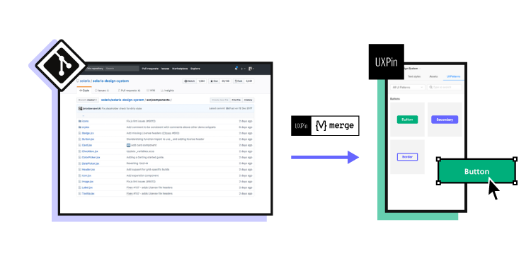
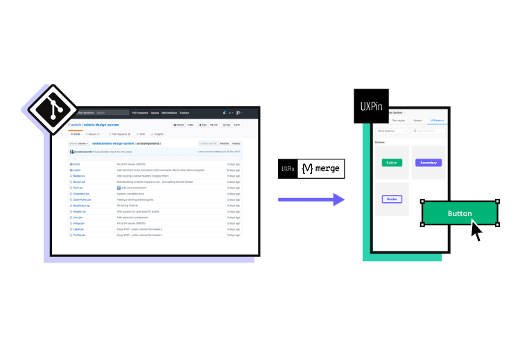
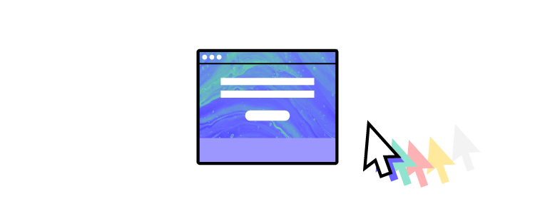
Building a new app? Don’t forget to build a prototype to test your product with real user and check if they can use it. One of the easiest to use tools for designing a prototype is UXPin. Its Merge technology makes it easy to bring React components to design tool and build a high-fidelity prototype in less than a day. Discover UXPin Merge.

Market Popularity and Demand
Each one of the mentioned technologies have their own purpose in regards to how to approach and handle a specific project.
For example, Angular is an extensive front-end framework that lets you develop dynamic single-page web apps, suited for large-scale enterprise projects. However, Vue and React are also capable and flexible enough to be used in both enterprise or start-up level projects when developing UI through the use of components.
Talking simply from a pure job-market aspect, React and Angular are probably the more popular and in-demand when compared to Vue. Vue is the newer one among the three, but slowly taking over, with major companies moving to Vue.
Community and Ecosystem
When choosing a framework you want to learn, an active community and development are part of a growing and stable ecosystem. All of the mentioned frameworks are under active development and maintenance while being used by thousands of developers. That means there are people willing to help you out and share their knowledge with you.
Angular Ecosystem
Angular is the oldest of the three frameworks, and it has been around since 2010. Being developed and maintained by Google, Angular offers a lot of ready-made components for any new and aspiring UI developers who are looking to start building mobile and web apps.
It features a lot of pre-built components from Google’s Material Design visual design language to CSS themes.
React Ecosystem
Developed by Facebook back in 2013, React is the second oldest framework on our comparison list. Since then it has grown massively in popularity and amassed a big community.

When compared to Angular and Vue, React may be the winner in terms of overall ecosystem maturity and component availability as well as community. Also, it offers integrations with other platforms and tools like Git or UXPin.
Vue Ecosystem
Developed in 2014 Vue is the youngest when compared to the other two frameworks, but has grown a lot in popularity.
When it comes to data binding, Vue made a lot of things easy for developers. Speeding up mobile and web app development with Vue means using the most popular open-source projects within the ecosystem so you can take advantage of input components.
Ease of Use
Let’s take a look at the complexity of Angular, React, and Vue, their syntax and which one is the easiest to learn.
Syntax
When it comes to syntax and structuring your code, it’s probably a matter of personal preference. Some developers like to use TypeScript while others stick to JavaScript and there’s really no argument here because syntax doesn’t impact anything in terms of performance.
However, in terms of complexity as to which framework is easiest to learn and which one has the steepest learning curve, we pit Vue against Angular since React is the least demanding.
And if you really don’t like the way a certain library handles the code in terms of syntax, you should probably not work with that framework on a daily basis.
So in terms of syntax and structure complexity, Angular will be the most demanding because projects in Angular use TypeScript, the JavaScript superset and it’s something you’ll have to learn additionally.
As a component-based framework, Vue utilizes single file components and plain JavaScript so you’ll probably find code written in JS only although it offers TypeScript support too.
Compared to Angular, Vue syntax is the easiest to learn and to grasp for any newcomer dev and UI developer since it doesn’t mix HTML and JavaScript.
As mentioned, React is the easiest one to learn both in terms of web and UI development.
Components
When talking about components, the main premise behind their use is speeding up the development process by reusing code since that’s the most important aspect in open-source, component-based libraries like Angular, React, and Vue.
React

You can think of components as the building blocks in React. They help you reuse pieces of code, modify behavior or render parts of the webpage in a different way without too much hassle through the use of input properties.
Furthermore, they go well with objects called props which store valuable object attribute data and they also have the ability to pass that data from one component to another.
With that being said React components are really powerful in terms of composition, and reusing code between components.
Angular

Angular is also a component-based framework where the components or directives (Angular components are called directives) utilize templates to define basic parameters.
So, the directives or components in Angular usually contain the basic behavior parameters like metadata within a template. It is advised to use TypeScript with Angular for the best experience when working on projects.
Vue

Being a highly customizable component-based progressive framework, you can create amazing, modern-looking, intuitive UI systems with flawless component behavior. It’s based around View components.
Which One is the Best – Vue, React or Angular?
When comparing the three most popular JavaScript frameworks, there is no absolute best when it comes to UI development since all three are under a very active development.
However, based on many aspects that we’ve covered, like community and ecosystem, syntax, ease of use, or components, you should make your choice based on both the projects you want to work on and the team you’re going to be a part of.
What are the differences between React and Angular?
Summing up, here are the differences between React and Angular:
- Architecture: React is a JavaScript library for building UI components, while Angular is a comprehensive framework offering features like two-way data binding and dependency injection.
- Language: React primarily uses JavaScript (or JSX), while Angular uses TypeScript, a superset of JavaScript.
- Syntax: React uses JSX for defining components, while Angular uses HTML templates with Angular-specific syntax.
- Data Binding: React primarily uses one-way data flow, while Angular supports both one-way and two-way data binding.
- Size and Performance: React’s core library is smaller, allowing for more control over bundle size, while Angular’s framework includes more features out-of-the-box, potentially resulting in a larger bundle size.
- Learning Curve: React has a smaller API surface, making it easier for developers to learn, while Angular has a steeper learning curve due to its comprehensive nature and additional concepts.
- Community and Ecosystem: Both React and Angular have vibrant communities and extensive ecosystems of libraries and tools to support web development.
What are the differences between React and Vue?
Here’s a quick comparison of React and Vue.js:
- Architecture: React is a JavaScript library focusing on UI component development, while Vue.js is a progressive framework for building user interfaces, offering a more structured approach out-of-the-box.
- Language: React primarily uses JavaScript (or JSX), while Vue.js supports both JavaScript and JSX, but its official documentation often uses plain JavaScript to demonstrate concepts.
- Syntax: React uses JSX for defining components, while Vue.js uses a template syntax that closely resembles HTML, making it more approachable for developers familiar with HTML.
- Data Binding: React primarily uses one-way data flow, while Vue.js supports both one-way and two-way data binding, providing flexibility in managing component data.
- Size and Performance: React’s core library is relatively small, allowing for efficient bundling, while Vue.js has a slightly larger core size but offers great performance optimization and flexibility in bundle size.
- Learning Curve: React has a smaller API surface, making it easier for developers to grasp, while Vue.js is known for its gentle learning curve, making it suitable for beginners and experienced developers alike.
- Community and Ecosystem: Both React and Vue.js have active communities and extensive ecosystems, but React’s ecosystem tends to be larger and more mature, while Vue.js’ ecosystem is growing rapidly with a focus on simplicity and flexibility.
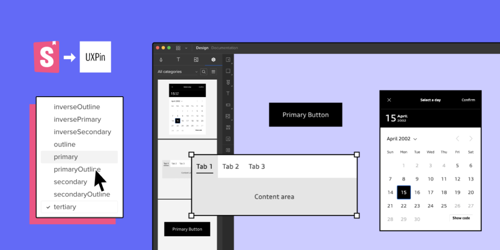
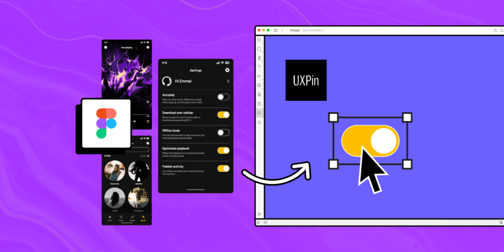
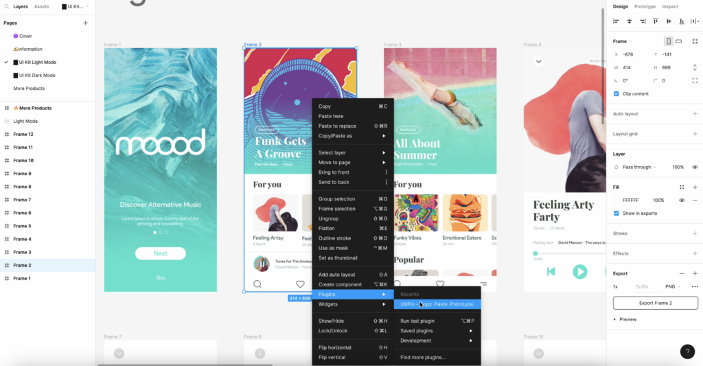
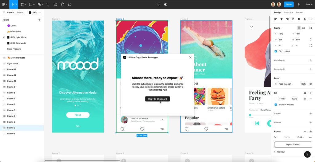
Push components to design editor
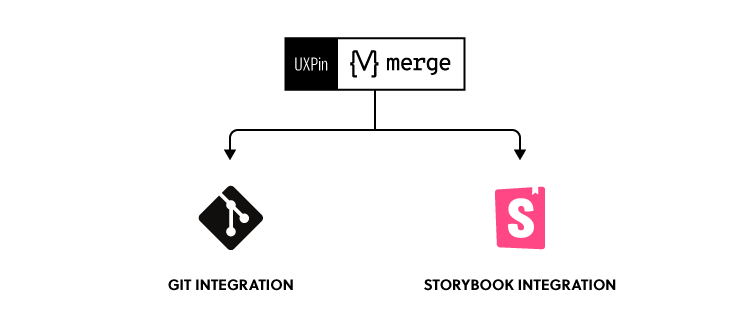
No matter which of these 3 you will choose, you can benefit from UXPin’s Merge technology and bring your React components to the design editor to avoid designing and building prototypes from scratch. Opting for Vue or Angular? Try UXPin Merge’s Storybook integration. Learn more about it. Discover UXPin Merge.


